foundations of drawing
TRANSCRIPT


2

Michelangelo Buonarotti, Studies for the Libyan Sibyl, 1508–1512,red chalk on unknown surface, 11⅜ × 87/16 inches (28.9 × 21.4cm).The Metropolitan Museum of Art (New York, NY). Art Resource,NY.
3

4

5

Copyright © 2017 by Albert F. Gury
All rights reserved.
Published in the United States by Watson-Guptill Publications, animprint of the Crown Publishing Group, a division of Penguin RandomHouse LLC, New York.www.crownpublishing.comwww.watsonguptill.com
WATSON-GUPTILL and the WG and Horse designs are registeredtrademarks of Penguin Random House LLC
Library of Congress Cataloging-in-Publication Data
Names: Gury, Al, author.
Title: Foundations of drawing : a practical guide to art history, tools,techniques, and styles / Al Gury.
Description: First edition. | California ; New York : Watson-Guptill,2017. | Includes bibliographical references and index.
Identifiers: LCCN 2017001750 (print) | LCCN 2017003614 (ebook)
Subjects: LCSH: Drawing—Technique. | Drawing—History. | BISAC:ART / Techniques / Drawing. | ART / Techniques / General. | ART /Study & Teaching.
Classification: LCC NC730 .G89 2017 (print) | LCC NC730 (ebook) |DDC 741.2—dc23
6

LC record available at https:// lccn.loc.gov/ 2017001750
Trade Paperback ISBN 9780307987181Ebook ISBN 9780307987198
v4.1a
7

Foundations of Drawing is dedicated to Mr. JackFrisk, art collector, scholar, and friend.
8

Holly Trostle Brigham, Judith and Flora, 2003, watercolor onpaper, 29½ × 29½ inches (74.93 × 74.93 cm). Private collection.
9

10

11

CONTENTS
Preface: A Life of Drawing
IntroductionWhat Is Drawing?Anyone Can Learn to Draw“Why Can’t I Draw a Straight Line?”
1 Essential History of DrawingBeginnings in PrehistoryThe Ancient WorldThe Medieval WorldThe RenaissanceThe BaroqueThe Nineteenth CenturyBeginnings of the Modern EraThe Modern WorldContemporary Growth and ChallengesToday
2 Essential Drawing Materials
12

Drawing MediumsDrawing ToolsPaperThe Drawing Studio—Furniture and EquipmentStorage, Presentation, and Conservation of Drawings
3 Essential Drawing SkillsHolding Drawing ToolsMeasuringBlending and ErasingMethods of DrawingTypes of LineHatching and Other Descriptive MarksShapeDepth and PerspectiveClosed versus Open FormPlanesTonality, Light, and ShadeTextureComposition and the Compositional Frame
4 Essential Aesthetics in DrawingClassicismRealism
13

AbstractionExpressionism
5 Essential Drawing DemonstrationsDrawing Still LifesDrawing Interiors and ArchitectureDrawing PortraitsDrawing the Human Figure
AcknowledgmentsIndex
14

15

16

PREFACE: a Life of DrawingThe ideas, thoughts, and concepts contained in this book arefiltered through my own experience and that of the manyteachers of drawing who have influenced my development asan artist and teacher. In this book, I try to recreate theatmosphere of my drawing classroom and the richconversations with my students on materials, concepts,aesthetics, and history. For thirty years, I have taughtdrawing to students ranging from complete beginners—including children, teenagers, the elderly, and the learningimpaired—to very experienced artists at the PennsylvaniaAcademy of the Fine Arts. PAFA has produced some of thefinest artists in American history, including Thomas Eakins,Mary Cassatt, Maxfield Parrish, Cecilia Beaux, Daniel Garber,Sidney Goodman, and Vincent Desiderio, and drawing hasalways been at the core of the school’s curriculum—anumbrella for its educational mission. The drawingcurriculum at PAFA is strong and balanced and addressesthe great tradition of academic fine-arts education as well asimportant issues of contemporary artistic discourse and art-making. Beginning with cast drawing, life drawing, anatomy,still-life drawing, interior drawing, and perspective, PAFAstudents are guided through lessons in the formal elements
17

of drawing (shape, form, line, light and shade, perspective,composition, and so on) with the goal of developing a solidknowledge base and an expressive, personal language andvision. Upper-level classes add the concerns of drawing inthe modern world: content, narrative, aesthetics, diversemediums, and personal statement.
18

19

Drawing done by the author at age five.
Thomas Toner, Sketches, date unknown, pencil on paper, 8 × 12inches (20.32 × 30.48 cm). Collection of the author.
Tom Toner did numerous preparatory sketches in pencil, like this one,for his large oil paintings. He loosely sketched the shapes of the figuresand faces with a sharp 6B pencil, then added shading with short hatchlines following the direction of the light. Toner’s drawing technique isderived from approaches used in the fifteenth and sixteenth centuries
20

in Italy and northern Europe by artists such as Pontormo and AlbrechtDürer.
Cast Corridor, Pennsylvania Academy of the Fine Arts (PAFA),Philadelphia.
The Cast Hall and Corridor at PAFA were designed as drawing studiosby the building’s architects, the Philadelphia firm of Furness-Hewitt.The building, a national landmark, was opened in 1876 for America’scentennial celebration. Its cast collection, including more than 160 full-
21

size replicas of Greco-Roman and Renaissance figures, busts, andreliefs, serves a central component of the drawing curriculum at theschool.
22

23

Michelangelo Buonarroti, A Seated Nude Twisting Around, circa1504–1505, pen and brown ink with wash and lead white on paper,dimensions unknown. British Museum, London. © the Trustees ofthe British Museum/Art Resource, New York.
This Michelangelo drawing, probably done from a model, is firstsketched in with fine line in brown ink and pen. The modeling of theforms uses short hatching lines in brown ink following the directionchanges of the surfaces of the figure’s anatomical structures. Strokes ofwhite hatch lines on the very tops of the swelling forms complete thesense of form and light. The tan paper provides a unifying middle tonefor the forms of the figure.
24

INTRODUCTIONFoundations of Drawing is a guide for teachers, students,artists, and the general reader to the traditions and practiceof drawing in Western culture. This overview of the historyof drawing and of drawing materials, concepts, andtechniques provides a practical look at the art of drawing andwill be a useful text for anyone who is interested in learningabout drawing, returning to drawing, studying drawing, orteaching drawing as well as for longtime practitioners of theart. The book takes the point of view that clear informationon the history, materials, and techniques of drawing createsthe ability to understand drawing, make choices, and chartone’s development in drawing with a sense of confidence.
Foundations of Drawing focuses on classic drawingmediums such as pencil and charcoal while also presentingan overview of a broad range of other materials, includingchalk and oil pastels, watercolors, and acrylics. Not allmaterials are discussed in depth, but the essential ones arepresented. Traditional materials and methods are illustratedthrough examples of old master and contemporary drawingsas well as through demonstrations of basic concepts. Theessential elements and concepts of core drawing genres—stilllife, interiors, portraiture, life drawing, and landscape—are
25

presented for foundational drawing study and portfolio-making. More experienced artists can use Foundations ofDrawing as a sourcebook and a point of departure for furtherpersonal growth and artistic exploration.
Drawing is an essential part of a portfolio for art schooladmittance. Drawing shows whether or not the applicant hasa basic ability to understand visual organization and use theformal principals of shape, form, line, light, and perspective.It also shows whether or not the applicant can visualizecreative ideas and concepts.
What Is Drawing?For many centuries, drawing has been a practical approach tovisualizing and planning everything from human figures inan oil painting to designing machine parts, buildings, andtextiles. Simple materials such as graphite pencils, charcoal,and ink have been the primary means for doing the greatmajority of drawings.
26

First grade student, My Family, 2012, crayon on manila drawingpaper, dimensions unknown.
Drawing provides insight into the inner world and perceptions of thechild.
The term drawing now encompasses a wide range oftraditional and nontraditional mediums, approaches, andaesthetics. Modern technology has created new versions of
27

old materials and has sometimes even replaced them. Forexample, fine-point marker pens have added to or replacedolder dip pens and ink bottles for some artists. Some artistsrely on and cherish traditional materials and methods, whileothers draw only on computer screens. And some artistsdraw experimentally using materials their Renaissanceancestors would think very strange: blood, tar, food, andcomputer drawing pads.
Also, the aesthetics of drawing, which traditionally focusedon a figure, an object, or a scene, now include abstract andconceptual forms having little to do with nature and more todo with how the artist personally interprets the world. Oncethought of as the province of trained artists or skilledamateurs, drawing is now recognized as part of the languageof children, the mentally disabled, and self-taught or outsiderartists. Prisoners and victims of social injustice draw in orderto document their social and political experiences.
28

29

Student drawing of Laocoön and His Sons, c. 1990s, white andblack pastel on colored charcoal paper, 24 × 18 inches (60.96 × 45.72cm). School Collection, Pennsylvania Academy of the Fine Arts.
In this student drawing, the structural shapes and gesture lines of thefigure of Laocoön were lightly laid out using vine charcoal. The light onthe sculpture was first described with loosely scumbled (roughed in)strokes of white pastel to establish a strong contrast between light andshade. Highlights within the light mass were added by building uploose strokes of white pastel. The strokes follow the direction of theforms. Shadows were deepened with vine charcoal, with a few edgesand creases emphasized with a stronger, sharper touch of the charcoal.The overall effect is one of soft light and shade and atmosphere.
30

Here, a student is drawing from a cast-plaster replica of the ancientstatue Laocoön and His Sons, the original of which is in the VaticanMuseum, in Rome. The north-facing skylights in the Cast Hall at PAFA
31

provide perfect light for drawing.
This student is making quick gesture sketches of a model with vinecharcoal on newsprint. He has lined up the figures sequentially to
32

compare and correct size, proportion, and movement—and to aid himin learning consistency in scale, line weight, and shape. Such gesturesketches are also called croquis, an old French academic name forquick sketches of a model.
Anyone Can Learn to DrawWith the right tools, clear guidance, and encouragement,anyone can learn to draw. Many people consider taking adrawing class because they remember that they enjoyed it inelementary school; it was something personal that gave thempleasure. This is one of the best reasons for anyone to begindrawing.
Any person can learn the basics of shape, form, line,shading, perspective, and composition—the foundational, or“formal,” elements of drawing. Foundational elements are thegateway; some individuals stop there, having achieved theirprimary goal of being able to sketch simple things forenjoyment and relaxation. Others, however, may feel that thelessons have opened up a new world of interest and will wantto continue the journey—even to a career as an artist. Anyreason for drawing is a good one.
“Why Can’t I Draw a Straight Line?”Being unable to draw a straight line may be very frustratingfor someone learning to draw. But we are not physically
33

designed to draw straight lines. Two anatomical structures inour arms dominate the actions needed to draw: the shoulderand its joint structure and muscles and the wrist and itsconnection to the forearm. The bones all have S-curvedshapes, and the joints are all diagonal and oval ball-and-socket structures. They’re designed to make our limbs movein a curving fashion, which is more economical than straight,angular movements. So when you first try to draw a straightline, you may find it very difficult because your body wantsto make curved, diagonal lines. You must learn to align yourhands, your arms, and their movements to create a straightmovement. Like shooting a basketball, this takes practice andthe ability to control the movements of your hand and arm.
34

Al Gury, Why Can’t I Draw a Straight Line?, 2014, marker on paper,8 × 10 inches (20.32 × 25.4 cm).
Drawing a straight line is a learned action.
35

Al Gury, sketchbook pages, year unknown, marker and ballpointpen on white paper, 8 × 5 inches (20.32 × 12.7 cm).
The freedom and immediacy of drawing in a journal or sketchbookcreates a world of personal exploration.
36

37

ESSENTIALHISTORY OF DRAWING
The Roman historian Pliny the Elder (AD 23–79) crediteddrawing’s invention to the daughter of the Corinthiansculptor Butades (fl. c. 600 BC). As Pliny’s charming storygoes, Butades’s daughter—whom he refers to only as theMaid of Corinth—is anxious over her beloved’s imminentdeparture for war and casts the young man’s shadow on awall with a lamp, then traces the shadow’s outline. Her fatheruses the outline to sculpt a portrait bust of the young man—connecting drawing’s origin to that of sculpture, as well. In
38

reality, drawing began much farther back in time.
39

40

41

The Virgin and Child with Saint Anne and Saint John the Baptist, c.1499–1500, black chalk and touches of white chalk on brownishpaper mounted on canvas, 557/10 × 41⅕ inches (141.5 × 104.6 cm).National Gallery, London/Art Resource, NY.
This da Vinci drawing provides not only a fine example of a preparatorydrawing, but also a rich presentation of the atmospheric effects ofsfumato (where humid atmosphere appears to surround forms) that daVinci introduced into Renaissance artwork.
42

BEGINNINGS IN PREHISTORYThe history of drawing in Western culture begins withmysterious shapes and symbols drawn, scratched, andpainted on cave walls and rock faces in what are now Spainand France. Why and by whom these drawings were madewe may never know for sure; nevertheless, these simple,elegant images reveal a desire on the part of our ancestors todescribe and organize the experience of their lives and theirbeliefs and fears.
Incised lines and dots are among the oldest such images,dating from around 700,000 BC, during the Lower Paleolithicperiod.
It was during the Upper Paleolithic period, from 40,000 to10,000 BC, that many of the finest Stone Age drawings wereproduced. Drawn with charcoal from burned wood andcolored with ocher clays and chalks, these mysterious yetbeautiful images of animals, hunts, hand prints, magical, andfertility symbols tell us of the impulses of the Neanderthals, agroup of early humans closely related to modern Homosapiens. From 35,000 BC onward, physiologically modernhumans began creating more complex artworks withsurprisingly naturalistic images of animals and humans.
43

These primitive works became a great influence on artistsof the early twentieth century, who yearned to return to asimpler and more direct drawing language. Their goal was tofree themselves from the constraints of the conventions ofart-making maintained by the art academies. For example,the Swiss-German artist Paul Klee (1879–1940) utilizedchildlike symbols and lines in his paintings and drawings.The primitive animal shapes and curving and geometric linepatterns in his work recall prehistoric symbols and animaldrawings. He felt this visual language not only freed him tobe purely creative but also touched something deep in thepsyche of the viewer.
The Spanish artist Pablo Picasso (1881–1973) was likewiseinfluenced by the art of indigenous cultures, especially thoseof Africa. A strong visual connection can be seen betweenAfrican masks and Picasso’s abstractions of the human face.And Picasso may also have been influenced by his visit to theLascaux caves in France soon after their discovery in 1940.His many lyrical and deceptively simple drawings of bullsand other animals suggest a connection with cave paintings.Interestingly, both Klee and Picasso were academicallytrained and later made conscious decisions to adoptalternative methods of drawing and art-making.
44

45

Joseph-Benoît Suvée, The Invention of Drawing, c. 1791, black andwhite chalk on brown paper, 21½ × 14 inches (54.6 × 35.6 cm). The J.Paul Getty Museum, Los Angeles.
Suvée’s drawing of the story of Butades’s daughter is one of numerousdepictions by many artists of the romantic myth about drawing’sorigin.
THE ANCIENT WORLDThe development of written language in Mesopotamiaaround 3200 BC introduced a wide array of drawing andwriting tools, many still in use. Sharpened sticks used todraw symbols in wet clay tablets, quill and reed pens, avariety of inks and brushes, and parchment (made fromanimal hides) and papyrus (made from the fibers of thepapyrus plant) were all readily available in Egypt in thefourth millennium BC. Ancient Egyptian scribes, because oftheir ability to read and write, were the recorders of laws,history, and literature. Some of the oldest Egyptian examplesof illuminated, or illustrated, texts date from the OldKingdom, around 2900 BC, and were illustrated by scribesusing simple drawing materials like pens, brushes, inks, andwater-based colors. Their training in the use of writing toolsgave them the skills needed to draw and paint, combiningtext with illustrations and hieroglyphs, or picture words.
46

Modern copy of an ancient Egyptian drawing, water-based ink andpigments on papyrus, 15 × 20 inches (38.1 × 50.8 cm). Collection ofthe author.
Flat shapes and black outlining characterize the symbolic imagery ofancient Egypt.
While training in drawing was primarily reserved forscribes and artisans in ancient Egypt, the ancient Greeksconsidered drawing a discipline important to the educationof a well-rounded male citizen and to the achievement of the
47

good life. By the third century BC, aristocratic Athenianyouths were receiving training in drawing as well as music,literature, and gymnastics. Citizens of ancient Romecontinued the Greek practice of training upper-class youthsin the art of drawing as part of a well-rounded education.
Engraving of images on an ancient Greek vase, 1800s, ink on laidpaper. Collection of the author.
Greek drawing was line oriented and varied between flat outlines andmore organic thick and thin lines, to create a sense of form. TheClassical Greeks of the fifth and fourth centuries celebrated thesupremacy of line over color and expression, thinking that color and
48

expression reflected Dionysian emotional chaos while line exhibitedthe intellectual control of Apollo.
In his Natural History, one of the most completecompilations of knowledge in the ancient world, Pliny theElder puts forward his thoughts on painting and drawing aswell as on colors, art materials, art history, and famousworks of art. Copied and transmitted to later generations,Pliny’s book provided a record of knowledge in the arts formedieval monks, Renaissance scholars, nineteenth-centuryRomantics, and modern artists to follow.
THE MEDIEVAL WORLDThe ancient tradition of training in drawing and calligraphycontinued with the production of Bibles and prayer books inearly Christian and medieval Europe. The oldest to survivedate from the fifth through seventh centuries. The earliestknown complete European book is the St. Cuthbert Biblefrom the seventh century, produced in what is now northernEngland.
In a world increasingly degraded by a poor economy, lackof stable government, and constant warfare, the Church,particularly through the monasteries, became the mainpreserver of book illumination, scholarship, and the arts in
49

general. Monks working in monastic scriptoria—workroomsdevoted to the study, copying, and preservation ofdocuments—produced handwritten manuscripts of biblicaland theological materials, stories of saints and heroes, andcopies of ancient Greco-Roman literature. They kept classicalculture and literature alive by transcribing surviving classicaltexts on papyrus, vellum, and, later, paper made from cottonand linen fibers and then gathering the pages into leather-bound books. Elegant and complex illustrations anddecorations done in pen and ink and colored with water-based pigments were created to illuminate these precioushandmade books. In addition, the monasteries producedfine, usually small-scale, icons for personal devotion. Thesewere drawn and painted on wood panels and colored withwater-based or egg-based tempera pigments.
In their manuscript illuminations, artist-monks not onlytold Bible stories and heroic tales clearly and simply but alsocreated an elaborate and beautiful decorative vocabulary ofplants and animals, imaginary landscapes, and intriguingpictures of daily life to embellish the borders of themanuscript pages. These added visual delight and evenhumor to their works. The style of these drawings rangedfrom naturalistic and volumetric work reminiscent of thethick-and-thin, form-describing, volumetric line of Greek andRoman art to simple, flat, childlike drawings with color filled
50

in between the outlines, not unlike a modern coloring book.
51

52

Unknown artist, late medieval minuscule script manuscript page,ink and watercolor on vellum, 5 × 3½ inches (12.7 × 8.89 cm).Collection of the author.
This is an example of minuscule script, a type used for small devotionalbooks for personal rather than liturgical use.
Training in drawing was essential to the depiction of holyfigures in Bibles and prayer books, and to expedite thattraining, pattern books were developed—collections ofdesigns for faces, scenes, bodies, and objects that could becopied and embellished. One of the oldest to survive, theMacclesfield Alphabet Book, prepared in England around1490, presents fourteen alphabet styles and many decorationsand images for embellishing book pages. Medieval imagesoften depicted artistically stylized sacred characters, andthese stylized forms were used over and over. The forms,characterizations, and symbols of holy figures and saintswere deeply embedded in the visual culture of ChristianEurope and were easily recognizable by viewers. A pattern forthe face of a saint—or that of a sinner, soldier, or king—could be copied from a pattern book and then embellished asthe monk or artisan saw fit. The tradition of the pattern bookhas continued into the modern era in books of decorativepatterns and alphabets that users can copy.
An improved economy and the rise of universities in theeleventh and twelfth centuries in Europe heightened demand
53

for books of all kinds, and texts of classical literature andphilosophy illustrated by beautifully drawn woodcuts orhand-done illuminations were increasingly sought from themonastic scriptoria. Meanwhile, training in drawing was stilla part of the education of a gentleman or lady and became ahobby for the upper classes. Strong drawing skills were anecessary tool for artisans and builders, and the ability todesign and draw buildings, furniture, maps, and other usefulthings continued to be—as it had been since ancient times—a commercially desirable skill. For the working classes,drawing was part of job training rather than a hobby, andpractical training in drawing was offered not only in themonasteries but also under the auspices of master craftsmenin the commercial guilds.
THE RENAISSANCEBy the fifteenth century, the increased production ofpaintings for private consumption demanded finer and morecomplex training in drawing, especially in the forms andaesthetics of classical Greco-Roman art. The earlyRenaissance’s fascination with the classical world encouragedthe study of perspective, anatomy, and color, and themedieval world’s focus on the heavenly realm shifted to the
54

sensual beauty of the natural world. Artists of all kinds nowdesired to depict the world as seen through the lens of Greeknaturalism and the sfumato, or hazy atmosphere, ofLeonardo da Vinci (1452–1519).
In response to the need for better and more exactingtraining in drawing of natural and classical subjects, theItalian Renaissance saw, by the mid-sixteenth century, therise of academies of art and, within them, formal drawingprograms. While the monasteries continued to producemanuscripts and icons, the academies provided art trainingfor secular painters and sculptors. The first, the Accademia eCompagnia delle Arti del Disegno (Academy and Companyfor the Arts of Drawing), was established in Florence in 1563.The academies promoted drawing from original Greco-Roman statues or plaster copies of them, as well as from thelife (that is, nude) model, considered by the academicians tobe the most noble and beautiful of subjects. These practices—drawing from antique statuary and the study of anatomy—along with debates over differing aesthetics, or ideas ofbeauty, have come down to the modern era as time-honoredelements of drawing curricula.
55

Lyndall Bass, student drawing of cast of Andrea del Verrocchio’sDavid, 1970s, sanguine on toned paper, 24 × 18 inches (60.96 × 45.72cm). School Collection, Pennsylvania Academy of the Fine Arts(Philadelphia, PA).
This fine example from the cast drawing classes of the PennsylvaniaAcademy of the Fine Arts is done with delicate light-directionalhatching lines. The figure’s edges and details are finished with organicclosed-form lines.
56

57

Unknown artist, page from fifteenth-century incunabulum, ink,watercolor, and gilding on laid paper, 8 × 5 inches (20.32 × 12.7 cm).Collection of the author.
This page from a book of the feast days of the Roman Church reflectsthe Renaissance interest in classical contrapposto, fine line drawing,and perspective.
58

59

Leonardo da Vinci, Seated Figure (drapery study on linen ground);1452–1519; gray tempera highlighted with white tempera, appliedwith a brush, on linen; 10⅖ × 99/10 inches (26.5 × 25.3 cm). Louvre(Paris). Photo credit: Scala/Art Resource, NY.
Leonardo has worked out the light and shade and the subtleties ofform in this study—a preparatory work for a painting. The light andshadow masses are the primary tonal descriptions. Reflected lights inthe shadows and tonal variations in the light do not diminish thestrength of the primary light statement.
Robert Byrd, Smiling Lady (illustration for Byrd’s Leonardo:Beautiful Dreamer [New York: Dutton Children’s Books, 2003]),sepia pen line over HB pencil with watercolor and colored inks onwatercolor paper, 10 × 22 inches (25.4 × 55.88 cm). Courtesy of the
60

artist.
Robert Byrd combines history, storytelling, and strong characterdevelopment with a whimsical and expressive drawing style. Hisversion of the creation of the Mona Lisa invites the viewer into a day inthe life of Leonardo da Vinci, complete with studio cats.
For many Renaissance scholars and artists, drawing,particularly its focus on the line, was considered the highestand most noble of the arts, deriving from the intellect andtherefore superior to color, which emerged from a moreemotional source. Since ancient times, drawing had beenassociated with the Greek god Apollo, who representedintellectual pursuits. Color was relegated to Dionysius, theill-disciplined Greek god of wine and revelry, and wastherefore thought of as more emotional, less intellectual,even vulgar. The terms Apollonian and Dionysian still definea major dichotomy in aesthetic philosophy, representing thetension between the rational and measured and theemotional and expressive. Apollonian and Dionysian havealso been aligned with other aesthetic polarities such asmale/female, light/dark, and order/chaos.
By the end of the Renaissance, we also see clear moderndefinitions of drawing as “open form” or “closed form”emerging. As described later in this book, open form refersto tonal and atmospheric drawing using light and shade andsoft edges, while closed form describes work done primarily
61

with line contours and with thick and thin modulations ofthe line. Open-form drawing, like color, has been thought ofas more emotional and suggestive, while closed-formdrawing is considered to be more intellectual and pure.
THE BAROQUEBy the seventeenth century, debate centered around twopopular camps: those who held allegiance to the elegant,refined closed-form line of the classicist French masterNicolas Poussin (1594–1665) and another group that reveredthe energy, color, and physicality of the more open-formFlemish master Peter Paul Rubens (1577–1640).
The Poussinists found the highest beauty and aestheticqualities in clear, clean delineations of form and a sense ofbalance, order, harmony, and restraint embodied in thecharacters and subjects. The balanced poetry of the ClassicalGreeks was the prototype for the Poussinists. Human figuresin paintings by Poussin and other classicists often had theappearance of Classical Greek statues. The Poussinists laidthe groundwork for the development of what became knownas the classical ideal, which culminated in the work of Frenchneoclassical painter Jacques-Louis David (1748–1825) and theFrench classicism of the nineteenth century.
62

The Rubenists, a group more varied in its techniques,looked to the late, or Hellenistic, Greeks for a sense ofpassion, energy, and expression.
Rembrandt van Rijn, Self-Portrait, c. 1637, red chalk on paper, 51/16
× 411/16 inches (12.9 × 11.9 cm). National Gallery of Art (Washington,D.C.). Rosenwald Collection, 1943.3.7048. Photo credit: OpenAccess NGA Images.
Rembrandt’s vigorous and expressive use of line and hatching is perfectfor this very human self-portrait.
63

Rejecting the Poussinists’ emphasis on clean line andcontour, the Rubenists might mix great varieties of tones andline marks to create atmosphere and heighten the emotionalintensity of their work. Human figures in paintings byRubens and others influenced by this aesthetic often tookenergetic poses, embodying physical vitality.
THE NINETEENTH CENTURYDuring the eighteenth century, the training of artists movedfrom the workshops of master artists, monasteries, and thehalls of the earlier art academies to official, state-sponsoredschools of fine art. The most important of these, the Écolenationale supérieure des beaux-arts, in Paris, would providethe lead in art education for most of the nineteenth century.Founded in 1648 as a royal school, the École was reorganizedduring the French Revolution to reflect nationalistic goalsand reopened in 1797 under the guidance of French artistssuch as David. The classical ideals of balance, order,harmony, and restraint in compositions and subject matteras well as the intellectual primacy of line over tone or color—the hallmarks of David’s art—were adopted by the École.There, drawing was the pinnacle of training, and classicismand closed-form drawing were preferred. These aesthetic
64

ideals likewise represented the highest goals of the FrenchRepublic.
Jean-Auguste-Dominique Ingres, Self-Portrait, 1822, graphite onwove paper, laid down, 715/16 × 65/16 inches (20.2 × 16.1 cm). National
65

Gallery of Art (Washington, D.C.). Collection of Mr. and Mrs. PaulMellon, 1995.47.51. Photo credit: Open Access NGA Images.
Ingres is the consummate master of closed-form line. Here, the lighthatching lines move perpendicularly to the direction of the light. Amore delicate finishing line is used around the contours of the face,while a bold and direct line describes the clothing and hair.
66
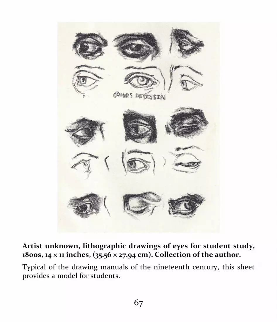
Artist unknown, lithographic drawings of eyes for student study,1800s, 14 × 11 inches, (35.56 × 27.94 cm). Collection of the author.
Typical of the drawing manuals of the nineteenth century, this sheetprovides a model for students.
67

Following the example of the École—often referred to asthe French Academy—the German, Italian, British, Russian,and American academies, among others, established drawingas the center of their educational programs. The classicalideals supported by the French painter David and followedby his artistic heir, Jean-Auguste-Dominique Ingres (1780–1867), guided the teaching of drawing in these academies.
By controlling art education and access to lucrativegovernment commissions, the goal of these nationalacademies was to produce professional painters andsculptors whose careers would uphold the values of the state,the academies, and their aesthetic and political goals. While avariety of other aesthetics were current in fine art education—such as Romanticism, with its rich tonalities andemotionalism—line reigned supreme in the classicallyoriented academies of fine art. Old arguments between openand closed form and feeling versus intellect continued, butthe official academies of art defined classicism and closed-form line as the pinnacle of desirable refinement andeducation. Considered the most difficult and exalted of allsubjects, training in drawing from antique models, anatomy,and life drawing were at the core of academic curricula. Eventoday, we define an “academic” education in the arts in thesame way.
Drawing from antique sources involved first copying
68

drawings or engravings of objects and fragments of statues tolearn qualities of line, form, and shape, as well as hatchingand shading techniques. This practice had begun during theRenaissance in the studios of individual artists as part of theapprentice system and was transferred to the institutionsthat were established to train artists from the sixteenthcentury on. During the nineteenth century, drawing manualsthat included engravings or lithographs of classicalprototypes for students to copy became common tools foracademic teachers. The drawing manual Drawing Course,created by French painter Jean-Léon Gérôme (1824–1904) andlithographer Charles Bargue (c. 1826/27–1883) and publishedin 1866–1871, was a complete academic drawing course.
The student would graduate from copying masterdrawings or engravings to drawing from actual fragments ofsculptures, such as a foot or a head, employing the lessonsalready learned. Finally, full drawings were attempted fromplaster casts of classical heads and figures. Usually, studentswere required to master copying “from the antique” beforethey were allowed to move on to life models and anatomystudy. Copying from the antique provided a practical andsystematic approach to learning how to draw the humanfigure because the subject was clear, consistent, andunmoving—unlike an actual living nude model.
But however subtle and beautiful a classical statue may be,
69

it also represents an abstraction from nature, containing avisible system of measurement as well as a simplification ofthe immense complexity of the human body. Statues andplaster fragments organize the experience of nature andeliminate individual characteristics, which can be adistraction, especially to the beginner. In this academicsystem, it made perfect sense to prepare students by havingthem draw from classical examples before allowing them tomove on to the life model.
When sufficient skills were developed, students wereallowed to work from the nude life model. The nude, in itsclassical, idealized form, was considered the purest and mostbeautiful of subjects. From early Renaissance debates overthe aesthetic and moral validity of nude figures in art, thenude classical figure emerged as the most exalted subject. InChristian theology, man and woman were created in theimage of God and were nude in their perfect innocence andunfallen state in the Garden of Eden. The classical nuderepresented the soul standing naked before God and wastherefore the highest symbol of human aspiration and a mostworthy symbol and subject.
70

71

Thomas Eakins, Study of a Seated Nude Woman Wearing a Mask,1863–66, charcoal and crayon with stumping on paper, 24¼ × 18⅝inches (61.6 × 47.3 cm). Philadelphia Museum of Art (Philadelphia,PA). Gift of Mrs. Thomas Eakins and Miss Mary Adeline Williams,1929.
Wearing a mask to preserve her anonymity, the model is describedwith bold masses of dark and light. Eakins used a variety of marks inthe drawing: contour hatching, rough mass hatching, blending, andline.
Following the guidance of David and his successors, notonly were life models working in the academies chosen fortheir physical resemblance to Classical Greek andRenaissance statuary but academic students were encouragedto modify the appearance of these models in their drawingsso that they would look like the classical prototypes. Forexample, if the body of a model looked classical enough buthis face did not, the student would “adjust” the drawing ofthe face to a more classically Greek form. A typical classicaldrawing of a figure might be done with a sharpened pencil,charcoal, or sanguine (red chalk) stick. The primary formand structure of the figure would be drawn on the paperthrough the use of continuous, modulated (ebbing andflowing, thick and thin) line. Shadows would be added withminimal hatching or blended tones so that the whole effectwould be one of refinement, calm, and balance. Details such
72

as darker accents to line edges or clarification of facialfeatures would be added last. The whole process of making adrawing—from the croquis, or quick gesture sketch, of themodel in action to the finished drawing—might takeanywhere from three hours to a week. The academie, orfinished drawing, was considered the pinnacle of drawingstudy from the life model.
As a counterpoint to classicism, the Romantic traditions,descending from Rubens and Venetian artists like Titian (c.1488/90–1576), rapidly achieved new life and energy in thesocial and political ferment of the first half of the nineteenthcentury. Romantic artists such as French painter EugèneDelacroix (1798–1863) were inspired not by Classical Greekand Poussinist subjects but by the political and social eventsof their own time and by the stylistic energy of forebears likeRubens and Rembrandt. Delacroix’s Liberty Leading thePeople (1830) addressed social revolution in France throughpowerfully expressive figural images and became an icon forRomantic painters.
While the classicists focused on fine modulation of lineand subtle use of color, Delacroix and his followers exploredthe expressive qualities of tonality, rich brushwork,atmosphere, and color interaction. Drawings by Romanticartists exhibited a sensual use of shading and a wide range ofmarks and line variation. Freeing themselves from academy-
73

imposed strictures, the Romantics explored their emotionaland dramatic subjects and encouraged invention and variety.Delacroix’s drawings, in mediums such as charcoal and penand wash, utilized quick, loose, soft, “broken” lines and avariety of rough shadows and casual and responsive hatchingand line accents. Delacroix’s marks were very intuitive,quick, and suggestive, rather than being controlled andmechanical like those of his classicist contemporaries. Hisdrawings and those of his compatriots, including ThéodoreGéricault (1791–1824), exhibited a new sense of energy andimmediacy, even sketchiness. The emotional and physicalreality of Delacroix’s models was always of foremostimportance, never subdued by restrictions derived fromClassical Greek aesthetics.
Paralleling the programs of fine-art education in thenineteenth-century academies were schools of art and designfor students bound for jobs in industry and the trades andcrafts. By the end of the eighteenth century, the guild andapprentice systems for training craftsmen were beginning tobe replaced by trade schools and schools of design. Forexample, design schools such as the École nationalesupérieure des beaux-arts de Lyon in Lyon, France, and theRoyal College of Art in South Kensington, England, providedtraining in drawing skills for adults taking jobs as tapestrydesigners, furniture makers, potters, and the like. A
74

culmination of this trend can be seen in modern designschools and especially in the German Bauhaus School, whichwas highly influential on twentieth-century design. While lifedrawing was part of design and trade schools’ arts curricula,more practical drawing skills—two-dimensional design,perspective, and copying of patterns—were emphasized. Thegoal of these schools was to prepare artisans who woulduphold high standards of design and craft and to promotethe national and ethnic design arts traditions.
For young American artists at this time, especially after theCivil War, the lure of the European academies was strong.American students flocked to the École des beaux-arts inParis and other European academies not only to receivetraining from famous masters like Gérôme but also toexperience the artistic and cultural richness of the Europeancapitals. For example, Thomas Eakins and George Bridgman(1865–1943) both studied with Gérôme at the École. MaryCassatt (1844–1926) studied privately with Gérôme becausewomen were not admitted to the École until late in thenineteenth century. Both Eakins and Cassatt had receivedtheir preliminary training at the Pennsylvania Academy ofthe Fine Arts in Philadelphia, which modeled its drawingprogram on that of the French school.
75

BEGINNINGS OF THE MODERN ERABy the third quarter of the nineteenth century, the influenceof classicism and the dominance of academic curricula beganto be challenged. These challenges came from sources bothwithin and outside the official art world. Artists such asGustave Courbet (1819–1877) passionately espoused personalfreedom and founded the French Realist School, creating artthat reflected the social and political realities of the day. TheBarbizon School of French landscape artists, influenced bythe English landscape painter John Constable (1776–1837) andthe French painters Jean-Baptiste-Camille Corot (1796–1875)and Jean-François Millet (1814–1875), and their emphasis onbrushwork and atmosphere had a profound influence onemerging young artists like Pierre-Auguste Renoir (1841–1919)and Claude Monet (1840–1926). These influences opened upideas about how to describe form, space, texture, and mood.Broken lines, mixtures of mediums and techniques, and anemphasis on light and atmosphere and personal expressionall challenged the classical academic definitions of what artwas and how drawing could be used to create it.
76

77

Gustave Courbet, Young Man Seated, Self-Portrait at an Easel(study), c. 1847, charcoal and black chalk on paper, 17 × 13 inches (45× 34 cm). Louvre (Paris). RF52766. Photo credit: Thierry Le Mage; ©RMN-Grand Palais/Art Resource, NY.
In this Courbet drawing, traditional hatching approaches aretransformed by the powerful and expressive application of the charcoal.The energy of the marks is in keeping with the overall sense ofimmediacy and realism in the image.
78

Edgar Degas, Self-Portrait, c. 1855, red chalk on laid paper, 123/16 ×
79

93/16 inches (31 × 23.3 cm). National Gallery of Art (Washington,D.C.). Woodner Collection, 1991.182.23. Photo credit: Open AccessNGA Images.
Degas is often associated with a broad, loose, and atmospheric use ofpastel. This youthful self-portrait reflects his early training in theclassical methods of hatching and closed-form line.
Throughout the first three-quarters of the nineteenthcentury, especially in France, other aesthetic voices were alsochallenging the supremacy of official taste. For example, theSymbolist painter, lithographer, and draftsman OdilonRedon (1840–1916) created imagery derived from dreams,poetry, and mysterious symbols, laying the groundwork forthe development of Surrealism in the early twentiethcentury. Also outside the mainstream of the academies wasthe Pre-Raphaelite movement in England. Founded in 1848by Dante Gabriel Rossetti (1828–1882) and others, the Pre-Raphaelite Brotherhood focused on literary themes from theBible and Shakespeare as well as on their romanticized ideasof medieval art, producing drawings and paintings that theacademics considered overly sensual and stylized.
80

81

Georges Seurat, Trombonist (study for Circus Side Show), 1887–88,Conté crayon and chalk on buff laid paper, 12¼ × 9⅜ inches (31.1 ×23.8 cm). Philadelphia Museum of Art (Philadelphia, PA). TheHenry P. McIlhenny Collection in memory of Frances P.McIlhenny, 1986.
Of all the masters whose work can be described as open form, oratmospheric, Seurat is the most extreme. The tonalities are created notby a buildup of lines, as was the most common approach in his time,but by dragging the charcoal over the texture of the paper. Similar inappearance to his Pointillist paintings, this drawing’s image is made upof small dots of charcoal.
By the time of the opening of the first Impressionistexhibition in Paris in 1874, new trends and aesthetics—Impressionism, Postimpressionism, Symbolism, and manyothers—already existed in France and elsewhere and wouldsoon overturn the supremacy of the academic traditions,changing the art world forever.
Even so, at the end of the nineteenth century training indrawing was still considered essential to the development ofa well-schooled artist. While the academies had required artstudents to “classicize” their subjects, however, a trendtoward naturalism was emerging—even in the academies. Inthe 1860s, a typical drawing of a life model would be“adjusted” to give the model the appearance of a Greekstatue, but by the 1890s, drawings of models portrayed their
82

subjects’ actual bodies. The common denominator remainedthe study of body structure, line and tone, technique, andanatomy; although the aesthetic goals had changed, theseorganizing concepts continued to be important.
Other attitudes had changed, as well. Ordinary dailyscenes and activities had, earlier in the century, beenconsidered subjects only suitable for practice—not worthy offine, finished works of academic art. By the late nineteenthcentury and the turn of the twentieth, however, city streets,taverns, ordinary interiors and still lifes, and working peoplehad become commonly accepted subjects for theImpressionists, Post-Impressionists, Expressionists, andFauves. These simple subjects provided ample material forexploring the modern interest in shape, pattern, andatmosphere; new techniques; and abstraction. For example,the French artist Georges Seurat (1859–1891), whose paintingswere composed of small dots of paint evenly distributed overthe canvas, created drawings in which charcoal, dragged overthe grain of the paper, produced an effect similar to that ofhis paintings. Drawings by the French painter Henri Matisse(1869–1954) focused on flat line, emphasizing the contours ofhis subjects.
83

THE MODERN WORLDAt the dawn of the twentieth century, classicism,Romanticism, realism, Impressionism, Postimpressionism,Fauvism, modernism, and many other “isms” were jostlingwith and influencing one another. Artwork of all kindsreflected changes in the understanding of beauty and of whatwas worthy of being called art.
In the United States, the Ashcan School of painters, whichincluded Robert Henri (1865–1929), William Glackens (1870–1938), and John Sloan (1871–1951), depicted gritty urbanscenes. Their graphic and literal drawings of urban life wereinfluenced by newspaper illustrations, and, in fact, mostAshcan School members created such illustrations to earntheir living. Their tough realism depicted factories andworkers, crowded city tenements, and the harsh street life ofAmerica’s growing urban centers.
At the same time the Ashcan School painters weredepicting urban America, the Fauves, or “Wild Beasts” (aname coined at the 1905 Salon d’Automne in Paris by thecritic Louis Vauxcelles), were exploring the purity of color,line, and brushwork. In their drawings, the Fauves, led byMatisse and André Derain (1880–1954), utilized childlikelines and marks, echoing their goal of a return to a simplicityand directness in art-making unmediated by the complexities
84

and technical emphasis of academic art training. These worksignored accepted ideals of beauty in favor of the explorationof the formal artistic elements of shape, line, color, andpersonal interpretation as subjects in and of themselves.
Käthe Kollwitz, Self-Portrait, 1908, charcoal on paper, 15 × 12inches (40.5 × 31.1 cm). Graphische Sammlung Albertina, Vienna,Austria; photo: Erich Lessing/Art Resource, NY; © ARS, NY.
Kollwitz uses drawing to create images of the human soul. Her directand unflattering approach to her subjects creates a feeling of empathybetween subject and viewer. Here, she uses her classical training wellin her use of toning, hatching, blending, and line.
85
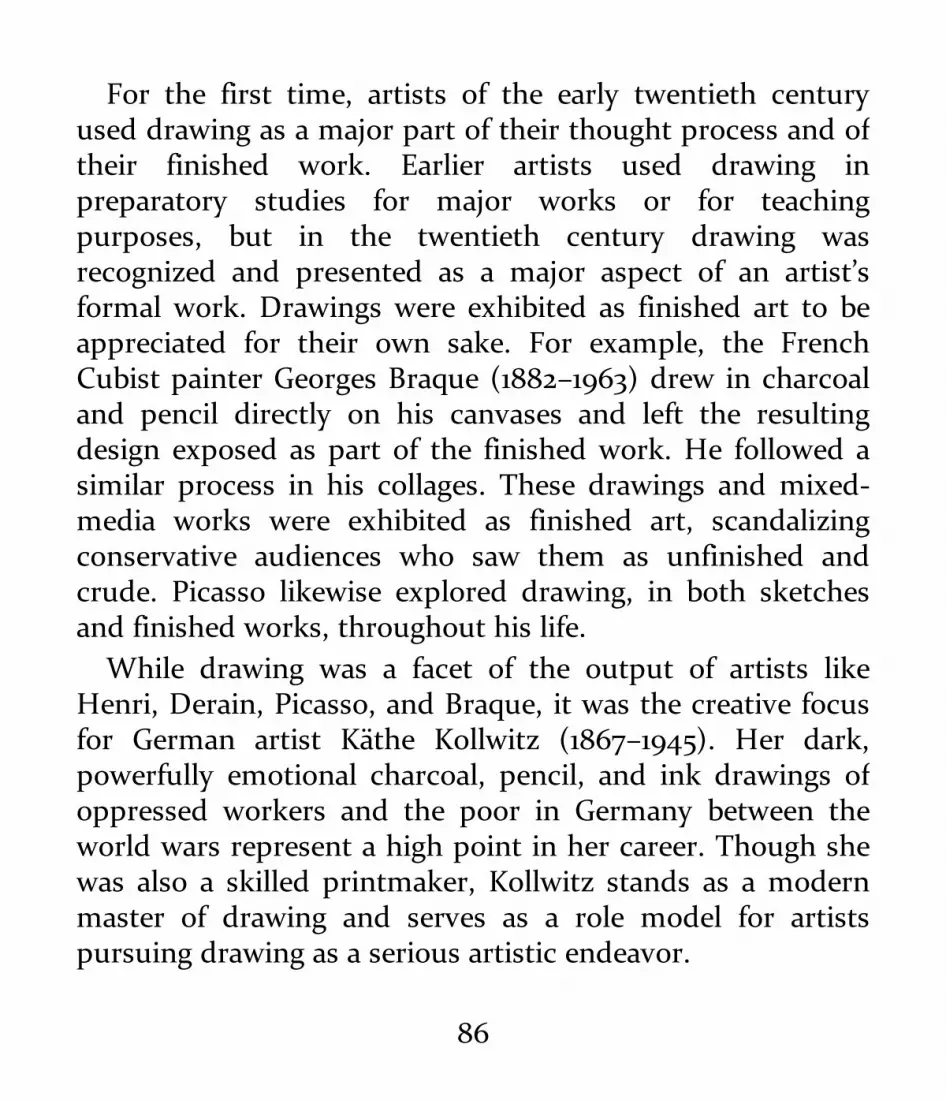
For the first time, artists of the early twentieth centuryused drawing as a major part of their thought process and oftheir finished work. Earlier artists used drawing inpreparatory studies for major works or for teachingpurposes, but in the twentieth century drawing wasrecognized and presented as a major aspect of an artist’sformal work. Drawings were exhibited as finished art to beappreciated for their own sake. For example, the FrenchCubist painter Georges Braque (1882–1963) drew in charcoaland pencil directly on his canvases and left the resultingdesign exposed as part of the finished work. He followed asimilar process in his collages. These drawings and mixed-media works were exhibited as finished art, scandalizingconservative audiences who saw them as unfinished andcrude. Picasso likewise explored drawing, in both sketchesand finished works, throughout his life.
While drawing was a facet of the output of artists likeHenri, Derain, Picasso, and Braque, it was the creative focusfor German artist Käthe Kollwitz (1867–1945). Her dark,powerfully emotional charcoal, pencil, and ink drawings ofoppressed workers and the poor in Germany between theworld wars represent a high point in her career. Though shewas also a skilled printmaker, Kollwitz stands as a modernmaster of drawing and serves as a role model for artistspursuing drawing as a serious artistic endeavor.
86

87

Mary Cassatt, Woman Arranging Her Veil, c. 1890, pastel on paper,sheet: 25½ × 21½ inches (64.8 × 54.6 cm). Philadelphia Museum ofArt, bequest of Lisa Norris Elkins, 1950.
Cassatt’s drawing technique is very close to her painting approach. Avariety of marks, including hatching, line, blending, and scumbling,add up to a vigorous and immediate image.
Drawing’s Journey
Drawing’s long journey—from being thought of as notes andpreparatory sketches to being seen as serious works of artworthy of being collected and exhibited—actually began in theRenaissance. For centuries, drawing was seen as a means to anend. Drawing helped the artist think through and visualize anidea, but the real goal was a finished work in oil or marble.Michelangelo destroyed many of his drawings, thinking ofthem as merely steps in planning his sculptures and paintings.Though he did some finished drawings as illustrations for hispoetry, he mostly considered drawing a means to an end.
Some Renaissance collectors and connoisseurs, however,began to think of drawings by famous masters as objects ofbeauty in and of themselves. Many Renaissance drawingssurvived because collectors believed the drawings allowedthem to glimpse the creative process of important artists likeMichelangelo, Leonardo da Vinci, and Raphael. Othercollectors were simply interested in the methods and materialsof drawing. For example, the Italian artist and author Giorgio
88

Vasari (1511–1574) preserved thousands of drawings by hiscontemporaries. His writings, particularly Lives of the MostEminent Painters, Sculptors, and Architects (1550), helpedelevate the status of the crafts of drawing and printmaking.
Not until the eighteenth century in Europe do we begin tosee drawings commonly commissioned as finished works. TheFrench artist Jean-Baptiste-Siméon Chardin (1699–1779)received many commissions for portraits in pastel. By the endof his career, they were highly valued. Because portrait drawingin pastel was also considered a desirable part of anoblewoman’s education, painters such as Rosalba Carriera(1673–1757) and Louise Élisabeth Vigée Le Brun (1755–1842)were able to gain acceptance and popularity as fine artists.
In the nineteenth century, pastels as finished works becamea common part of many artists’ output. For example, theAmerican expatriate Mary Cassatt and her great friend andadmirer Edgar Degas (1834–1917) further elevated drawings, inparticular pastels, to the status of finished works by exhibitingand selling them as stand-alone artworks.
In 1916, American photographer and gallerist Alfred Stieglitzexhibited the charcoal drawings of Georgia O’Keeffe (1887–1986) at his Gallery 291 in New York. Describing the drawingsas “pure, fine and sincere,” Stieglitz not only launchedO’Keeffe’s career but also gave her drawings the same status asthe works in oil he exhibited by other artists.
Drawing’s importance as an independent art form is showntoday by a steady stream of exhibitions of drawing of all types,by drawing majors in schools of art, and by the work ofcountless contemporary artists who see drawing as an
89

important part of their work or as their whole artistic focus.
CONTEMPORARY GROWTH ANDCHALLENGESAfter World War II, drawing faced both highs and lows inEurope and America. On the one hand, some artists andcritics, demoralized by the tragedy of the war, declared thetraditional realist or representational arts, including drawing,to be dead. Art could be anything or nothing, and traditionalmeans could not approach the complexity of the modernexperience. By the 1960s, under the influence of reports ofthe “death of drawing,” some university art departmentsdiscontinued drawing as part of their students’ training andmany artists gave up traditional mediums in their work,some turning to mediums such as video or installation art.Others gave up art-making altogether, sometimes returningto it after a thoughtful hiatus. For example, the Americanartist Marcia Hafif (b. 1929) gave up painting in the late 1960sbut returned to art through drawing, which she saw as a wayof beginning again with a clean slate. Hafif used pencil andpaper to make simple marks. This allowed her to connectwith traditional materials and ultimately to return to
90

painting.On the other hand, drawing was also being reconsidered as
a primary language and vehicle for personal exploration. TheGerman artist Gerhard Richter (b. 1932) explores drawingwith a variety of mediums and material—often veryexperimental, including attaching a pencil to an electric drill.
Also, representational imagery in a variety of mediums,including drawing, has regained prominence since the 1980s.Exhibitions such as Contemporary American Realism since1960, curated by Frank H. Goodyear and mounted at thePennsylvania Academy of the Fine Arts in 1981, helpedartists, students, and viewers refresh their view ofrepresentational art, including drawing. If subjects such asthe human figure were to be described and interpreted incontemporary ways, drawing could be the vehicle for thisexploration. From the mid-twentieth century on, artists asdiverse as Richard Diebenkorn (1922–1993), Sidney Goodman(1936–2013), and Sarah McEneaney (b. 1955) have useddrawing in vigorous ways to describe their personal journeysand visions—Diebenkorn through line and semiabstraction,Goodman through tonality and urban subjects, andMcEneaney in the documentation of her daily life and privateworld.
91

Sophie Brenneman, We Made Our Own Lascaux, 2016, charcoal,ink, and acrylic on parachute cloth, 56 × 56 inches (142.24 × 142.24
92

cm). Courtesy of the artist.
In this large drawing, Brenneman explores the interaction between thehuman figure and the abstract patterns and mark makings ofmodernist aesthetics.
Marcia Hafif, November 15, 2007, 2007, Faber-Castell pencil 4B onArches 250 lb. paper, 30 × 22 inches (76.2 × 55.88 cm). Courtesy ofthe artist and Larry Becker Contemporary Art (Philadelphia, PA).Photo credit: Larry Becker Contemporary Art, Philadelphia, byZorawar Sidhu.
93

Marcia Hafif, November 12, 2009, 2009, Faber-Castell pencil 4B onArches 250 lb. paper, 30 × 22 inches (76.2 × 55.88 cm). Courtesy ofthe artist and Larry Becker Contemporary Art (Philadelphia, PA).Photo credit: Larry Becker Contemporary Art, Philadelphia, byZorawar Sidhu.
Hafif responds to the pleasure of drawing through the touch of a pencilpoint on paper and minimal and precise marks. The intent is a pareddown response to the physical act of mark-making.
TODAY
94

Now, a renewed interest in academic drawing has emerged asa way of exploring both the craft of drawing and an ideaindicted by critics of 1960s: beauty in art. Small ateliers,attempting to re-create the academic curricula of thenineteenth century, have flourished in the last twenty years.The Florence Academy (with locations in Florence, Italy;Mölndal, Sweden; and Jersey City, New Jersey), the GrandCentral Academy in New York City, and numerous othersmall ateliers uphold the classic, traditional disciplines ofdrawing.
As many modern artists have reexamined drawing, artschools have reinstated or upgraded drawing in theircurricula, often establishing drawing (or works on paper) as amajor equivalent to other fine arts majors like painting,sculpture, and graphic design. Drawing—using traditional,experimental, and mixed media—has become a commonpart of university and art school curricula, as well as a fixtureof commercial art galleries and museum exhibitions.
In art galleries and museums, exhibitions of drawing donewith experimental materials—blood, cut paper, video—areexhibited alongside drawings by old masters.
Not surprisingly, the debates between the Apollonians andthe Dionysians, the Poussinists and Rubenists, thetraditionalists and the avant-garde continue today. In arthistory, university symposia, critical writing, and curriculum
95

design, the role and importance of drawing continues to bevigorously explored by artists, teachers, and scholars.
96

97

ESSENTIALDRAWING MATERIALS
A comprehensive study of drawing includes trying out asmany drawing materials as possible, and so this chapterprovides a practical guide to those that are most commonlyused. The descriptions include basic history, available types,aesthetic properties, and recommendations for the use ofeach.
98

99

100

Student drawing with a graphite pencil.
DRAWING MEDIUMSA great variety of drawing mediums, in many different formsmade by many different manufacturers, are on the markettoday. Some—such as charcoal, water-based paints, and
101

chalks—have been in use for thousands of years and are stillmade the same way they have been since ancient times. Forexample, charcoal has been made by heating and burningwooden sticks since antiquity. Made from the branches ofwillow or other softwoods, today’s vine charcoal sticks arelight, soft, and ideal for quick, easy-to-modify drawings onany surface.
Modern versions of other ancient materials also exist. Forexample, early sanguine drawing sticks, so called for theirreddish, bloodlike color, were made of naturally occurringclay or soft stone. Very popular since the Renaissance,sanguine easily lends itself to both line and tone andproduces drawings characterized by a soft warmth of color.Modern sanguine is composed of a mixture of reddish chalkor clay and gum arabic compressed into a stick or pencilform. Today’s sanguine drawing materials look like theirRenaissance ancestors and produce much the same resultsbut have a more consistent quality.
Other drawing mediums were not invented until thenineteenth or twentieth century, like ink markers and oilpastels. These modern additions have extended the range ofpossibilities available to artists, especially in mixed-mediaworks.
102

Sophie Courtland, pencil sketch of a model, 2014, graphite onwoven sketch paper, 11 × 8 inches (27.94 × 20.32 cm). Courtesy ofthe artist.
A most basic form of drawing is the small pencil sketch in a pocketsketchbook. This compositional study uses a great range of marks toevoke a variety of textures, tonalities, and spatial relationships.
Graphite Pencils and PowderTypically, the modern pencil is a rod of graphite encased inwood. Graphite is a naturally occurring form of carbon. The
103

name graphite derives from the ancient Greek word meaning“to write.”
In Italy, as early as the sixteenth century, cut graphitesticks were encased in carved wooden holders. Graphitequickly replaced the harder, more difficult to use rods of leador silver in use since ancient times. Pencils are still oftencalled “lead pencils,” though lead has long since beenreplaced as a common writing material. Silverpoint, on theother hand, is still used by artists today (see the section onmetal point, this page).
The graphite used today in pencil or stick form is acompound of graphite and clay. This mixture is compressedin molds to form the desired shape, and the hardness orsoftness of the pencil is determined by the amount of clayand the force of the compression. (Softer grades have moreclay and less compression; harder grades have more graphitecontent and a greater degree of compression.) Graphite rodsare placed in wooden shafts to form the familiar modernpencil, but graphite sticks, without a wood casing, are alsoavailable. Graphite sticks come in a variety of shapes, fromthin rods to square sticks. The sticks can be used directly orplaced in a holder. The most common holder is themechanical pencil.
Graphite pencils are ideal for line drawings and lightshading. Pencils come in a range of densities—harder or
104
softer—each designated by a number and letter. H stands forhard and B for soft, and the full range extends from 6H(hardest) to 9B (softest). Artists choose different densities ofgraphite to produce specific aesthetic effects. Harderdensities are desirable for clean, clear line and contourdrawings. Shading with harder densities produces light graytones as well as clearly delineated hatching marks. Softerdensities more easily create dark lines and softer, moreatmospheric shading effects and softer pencils are easier toblend. The common 2B pencil used in schools and offices isan intermediate density. A practical writing tool, it is alsogood for general sketching.
Because of its mineral nature, graphite can have a shinysurface quality, especially when built up heavily on a drawingsurface. Graphite marks are generally easy to erase and blendon all kinds of paper, though the harder the density, themore difficult it is to erase the marks because of the intensecompression of the graphite. The hardest grades may evencut into and damage a soft or thin paper surface.
Graphite pencils can easily be combined with most otherdrawing mediums—but not all. You’ll need to experiment toachieve a clear understanding of how pencil can or cannot bemixed with other mediums. For example, an ink wash can beused to color or shade a light pencil sketch, but a heavydense layer of graphite from a graphite stick will repel water-
105

based ink. Charcoal and pastel can easily be used over lightpencil sketches, while pencil is generally too hard to belayered over charcoal or pastel. Graphite sticks work verywell alone or with graphite pencils to create soft tones andbroad marks. Soft versions are especially useful as analternative to charcoal for shading and tonal work.
Graphite powder is also available. A mixture of graphiteand clay in a loose, powdered form, graphite powder is oftenapplied with a dry brush. The powder can also be easilyblended and mixed with other mediums, such as pastel.Graphite powder can be manipulated much in the same wayas pastels and chalks and may require a protective fixative.Because of their generally less dusty nature, however, pencildrawings (except those made with a very soft pencil grade)do not usually require protection by a fixative. (For more onfixatives, see this page.)
Graphite pencils and sticks can be sharpened with astandard pencil sharpener or shaped with a blade. H-gradepencils will generally retain their properties of delicacy andgrayness even when their points are worn down. B-gradepencils and sticks can be sharpened to fine points for detailsor used with a dull point to provide rich, dark, broad effects.
When deciding which graphite forms to use in your work,consider a number of factors: If a clean, light line drawing isdesired, either for layout or finished art, one of the H-grade
106

series might be desirable. The line will be gray, very clean,thin, and difficult to smear or blend—suitable for artistsdoing technical or highly detailed drawing or who like a lightlayout under a darker pencil finish. With their range ofsofter, darker marks, B-grade pencils are more easilyblended. B pencils and sticks are more desirable for art withsoft atmospheric effects and less so for more precise worksand line-oriented works. Pencils in the range of 6B to 9B canmake extremely dark, velvety marks, and B pencils ofdifferent grades are easily mixed to provide a variety of tonaleffects and shadings. Because of their relative softness, the Bgrades are easily smeared by accident and may require afixative for permanence.
107

108

Brian Baugh, Still Life With Skull, 2005, graphite on paper, 22 × 14inches (55.88 × 35.54 cm). Courtesy of the artist.
Essentially closed form, or contour line–oriented, this drawing utilizesa light touch to create delicate tone changes. Lightly dragging thepencil point over the grain of the paper—a technique called graining—is combined with light hatching and contour line.
109

110

111

Zhi Lin, Horn Player (study for Drawing and Quartering), 2000,graphite on paper, 11 × 8 inches (27.94 × 20.32 cm). Privatecollection; courtesy of Koplin Del Rio Gallery, Seattle.
This preparatory study for a larger, more complicated figural work isfirst laid out in broken lines and planes. The textures and tonalities ofthe forms are built using clean, light, diagonal hatching lines. Detailsare finished with modulated touches of varying line weight.
Another factor to consider when drawing with pencil orgraphite is which paper to choose. Pencil marks are directlyaffected by the hardness, softness, and texture of drawingpapers. B-grade pencils take poorly to very hard hot-pressedpapers that have little texture or are very glossy. Generallyspeaking, H-grade pencils work best with smooth, hot-pressed papers where fine detail is required, while B-gradepencils perform best on more textured cold-pressed papers.
Yet another important consideration is the scale of thedrawing you want to produce. For a drawing smaller than 16× 20 inches, H-grade pencils and B and 2B pencils willprovide fine detail and clarity that works well on a smallerscale because the small size of the drawing requires close-upviewing. As you scale up a drawing to a paper size that mustbe viewed from a few feet away, however, these finer pencilgrades begin to look too thin, gray, and weak. For drawingslarger than 16 × 20 inches, soft grades of graphite pencil,graphite stick, and graphite powder work well because of
112

their darker values and their ability to describe broaderatmospheric and tonal areas. Such pencil drawings look verystrong from a viewing distance of several feet or more.
The finished effect of graphite powder is similar to that ofsoft vine charcoal, though smoother. Even so, there areimportant differences. The various grades of charcoal canprovide vastly more expressive, darker effects than graphite.Even very soft graphite may begin to lose integrity on a largescale, and charcoal may be preferable.
CharcoalArtist’s charcoal is made by heating wood in a closed oven ata temperature high enough to quickly remove all moistureand completely char and soften the wood. Any burned woodcould theoretically be used for drawing, but artists’ charcoalsare soft and consistent in texture and quality. Willow andother softwoods, like linden, are used in the manufacture ofmost artist’s charcoal. Hardwoods like oak are rarely usedbecause they are too dense and fibrous. The character of thewood can affect qualities such as smoothness, darkness, andresponse to paper surfaces.
There are two basic types of artists’ charcoal: vine charcoaland compressed charcoal. Vine charcoal is made fromcharred sticks of soft wood, such as willow, and can beproduced in softer or harder grades depending on the
113

hardness of the wood chosen. Vine charcoal is usually verybrittle and soft, and it can be easily blended or smeared. Itallows for a light touch and is easily erased, though it mightleave a light ghost image on the page afterward. Its formsvary from actual willow sticks, which have all theirregularities of a plant branch, to square and round rods thathave been cut and shaped by commercial saws. Available insoft, medium, and hard densities and in sticks of differentsizes, the charcoal can appear dry and gray or velvety andvery black. Many artists choose a favorite type and brand ofvine charcoal and use it consistently. Some like to make theirown, or they buy unusual forms of vine charcoal made fromirregular chunks of wood.
114

Photo credit: Peter Groesbeck.
Compressed charcoal is made by adding a binder like gumarabic to charcoal powder and then compressing the mixtureunder high pressure. Compressed charcoal comes in a varietyof densities, or grades, from soft to hard, depending on theamount of gum added (the more gum, the harder the grade).It is more permanent and harder to erase than vine charcoal.Generally, compressed charcoal has a bolder, heavier feel andlook than vine charcoal and can produce a broader range of
115

deep darks and black tones than is possible with vinecharcoal.
Both vine and compressed charcoal sticks can be used byplacing their ends or their edges on the paper, and both canbe sharpened to points for more precise lines. The sticks aretoo brittle for a mechanical sharpener, however, and must besharpened carefully with a blade or fine sandpaper. Whenused on their sides, charcoal sticks of both kinds createbroad areas of tone. And both kinds of charcoal can beblended with a paper blending stump (tortillon), a chamoiscloth, a paper towel, or even your fingers.
Charcoal powder is also available commercially; it hassimilar uses in developing tonality and blended effects. It canbe used to create broad, soft, and dark tonal areas, especiallywhen blended into the grain of the paper. Vine charcoalpowder has a softer, less black effect than compressedcharcoal powder, which is generally blacker and darker. Bothtypes are often applied to paper with a soft brush andblended with a brush or stump.
Compressed charcoal is also made into rods for use inpencils bound in wood sleeves or in paper sleeves that areunraveled to expose more charcoal as it is used up. Thepencils come in a variety of densities and are graded in thesame way as the stick form: soft, medium, hard, and so on.
116

Peter Van Dyke, Evening Class, 2009, charcoal on charcoal paper,24 × 18 inches (60.96 × 45.72 cm). Courtesy of the artist.
A light, quick touch using broken line characterizes this figure study.
Because of the protective sheath around the charcoal rod,charcoal pencils can be sharpened with either an electricsharpener or a blade.
Knowing which kind of charcoal to use requiresexperimentation, practice, and an awareness of the aestheticyou want. Many artists use vine charcoal for quick sketchingon a large drawing pad, such as a newsprint pad. Because
117
vine charcoal marks can easily be changed or erased, it allowsfor experimentation and lots of reworking. Some beginningstudents making the transition from pencil to vine charcoalcomplain that the charcoal is messy and hard to control, butthey generally become more comfortable with it. It lendsitself to the exploration of big forms, gesture lines, andbroad, simple tonalities and is excellent for sketching inbeginning life-drawing and still-life classes because of itsflexibility and the ease of correction.
The look of a quick vine-charcoal sketch can be gracefuland light or dark and energetic. In a larger, more finisheddrawing, vine charcoal can provide a wide range of softblended effects as well as strong, dark lines and tones.Because it can be used to create subtle value gradations andlight lines, it is highly desirable for elaborate finisheddrawings. It is also an excellent material for doing anunderdrawing to which compressed charcoal or pastel will beadded. Many artists begin a drawing using vine charcoal forthe layout, basic lines, and tonalities and then work over thelayout with compressed charcoal, Conté, or pastel.Combined with these mediums, vine charcoal can enhancethe subtlety of a drawing.
Compressed charcoal sticks and pencils require a moredefinite hand and a more deliberate decision-making processbecause their dark marks are not easily erasable. For this
118

reason, many artists will lay out a drawing in vine charcoaland add compressed charcoal only when they feel thestructure and look are correct. Utilizing the inherent qualitiesof compressed charcoal—the rich and velvety intensity of thedarks, its boldly expressive qualities, and its permanence—can make a drawing very powerful.
Sidney Goodman, Study of a Hanging Man, 1986, charcoal andpastel on paper, 83½ × 59 inches (212.09 × 149.86 cm). Privatecollection. Courtesy of the artist.
119

The work of Sidney Goodman, the master Philadelphia figurativepainter, exemplifies the word painterly. His use of charcoal and pastelevokes the feeling of atmospheric oil paint on canvas. Initially laid outin broad, loose lines, tonal masses are blocked in broadly with the sideof the charcoal. Edges are clarified by sharper or softer contrasts andtextural differences.
Anne-Louis Girodet de Roussy-Trioson, Academic Study of a MaleHead, 1817, graphite, charcoal and white chalks on tan laidcharcoal paper, 7⅝ × 7¼ inches (19.37 × 18.42 cm). MinneapolisInstitute of Arts (Minneapolis, MN). Gift of funds from ananonymous donor, the Print and Drawing Council, and theFiduciary Fund, 86.39.
This lovely and romantic study utilizes tonal masses that are thenblended and finished with hatching and line touches.
120

The choice to use compressed charcoal pencils depends onwhether fine lines, hatching strokes, or careful details areneeded in the drawing. A drawing done entirely in charcoalpencil will exhibit a strong and definite set of lines andmarks. Like compressed charcoal sticks, charcoal pencilmarks are relatively hard to erase, permanent, and dark.Some artists add sharpened charcoal-pencil lines to completea drawing laid out in soft graphite pencil or vine charcoal.
My general recommendation to beginners is to experimentwith vine charcoal of varying grades to get a feel forcharcoal’s range, then add compressed charcoal sticks orpencils into the mix. In a very short time, you will have agood sense of the possibilities drawing charcoal offers.
As with graphite drawings, paper choices are important.Charcoal works best on paper that has enough grain, ortooth, to hold the charcoal particles well. Papers that aresmooth may resist the charcoal or cause the charcoal to sliparound. Charcoal and pastel papers have a strong tooth andallow for extensive reworking through erasing, blending, andlayering. Other suitable papers that work well with charcoalinclude the rougher grades of sketch paper, newsprint, andcraft papers. Charcoal drawings are very susceptible todamage from accidental smearing. Fixatives are often used topreserve and protect the charcoal layer. Careful storage ofcharcoal drawings is also important. The drawings should be
121

preserved from wear and tear by being layered carefully in astorage container, ideally between layers of acid-free glassineor tissue.
Holders for Charcoals, Pencil Leads,and Chalks
Before the development of wood-encased pencils, simplemechanical holders were often used to provide better drawingcontrol. Drawings, engravings, and paintings from the fifteenththrough eighteenth centuries show artists drawing with thesesimple tools. Common for centuries, simple holders are readilyavailable today from art supplies vendors. These wood, metal,or bamboo holders allow the artist to hold a sharpened piece ofcharcoal, sanguine, graphite, or pastel much like a wood-encased pencil.
Many artists prefer this older device for its versatility and thevariety of materials it can hold, including larger pieces of chalk.
Mechanical pencils, sometimes called filler pencils, are usedfor many forms of drawing, including mechanical drawing, aswell as for writing. In use as early as 1822, mechanical pencilscommonly hold thin rods of graphite or chalk. The pencil’smechanism allows for easy refilling. Artists who require a thinpoint for detail often prefer mechanical pencils.
122

Robert Bohne, Cat and Snow, 2014, charcoal and white chalk onpastel paper, 20 × 16 inches (50.8 × 40.64 cm). Courtesy of theartist.
The abstract shape and design elements of this drawing are verystrong. The sense of depth is very much in tension with the patterns oflight and dark.
ContéConté sticks and pencils are made of dry pigments mixed
123

with wax or clay and compressed into square sticks or thinrods that can be held in a metal or wooden holder or sheath.Conté typically comes in varieties of whites, grays, browns,and blacks and in a range of densities from soft to hard; theharder forms have more binder or wax and the softer less.Softer grades of Conté mix well with charcoal (vine andcompressed) and pastel due to their lower wax content andmore chalk-like nature; the harder grades, which have morewax binder, may not mix well with charcoals and pastels.
Elizabeth Osborne, Leslie, 1969, Conté on paper, 28½ × 22½ inches(72.39 × 57.15 cm). Courtesy of Locks Gallery (Philadelphia, PA).
124

Modern red or brown Conté is often a replacement for thesanguine chalks used in many early master drawings. Theiron-rich red clays and soft reddish stones used to make theearly sanguine and red-chalk drawings are still available buthave largely been replaced by modern equivalents such asConté. Like compressed charcoal, Conté provides a strong,definite, and relatively permanent mark. For this reason, it isoften added over an underdrawing of soft pencil or vinecharcoal. Conté sticks and pencils can be used broadly androughly or sharpened to a point with a blade or sandpaper.Like charcoal and pastel pencils, Conté pencils can also besharpened in an electric sharpener for a fine point.
The aesthetic effects of Conté can be described as rich,bold, and definite. As with compressed charcoal, the choiceto use Conté is driven by a desire for bold expressiveproperties and strong and clear lines, or both. Using brown,gray, or sanguine Conté in addition to black enables the artistto create a drawing that has warmth and variety withoutgoing into full color with pastel. (Conté is also less dusty andsmear-prone than pastel.)
The best papers to use for Conté are cold-pressed papersand charcoal papers that have enough tooth to hold theConté’s chalk grains. Like charcoal and pastel, Conté workswell on toned papers. Soft white Conté is an excellent choicefor creating highlights in a charcoal or Conté drawing done
125

on toned paper.
SanguineFrom the Renaissance through the nineteenth century,sanguine was a common drawing tool. If a drawing isdescribed as having been done in red chalk, that often meansit was created with sanguine. Contemporary drawingproducts labeled as sanguine as well as modern brown andred Conté and pastel simulate the effect of red sanguinechalk, creating a bit of confusion as to how sanguine isdifferent from these products. Named for their blood-red orreddish-brown color, sanguine sticks and pencils are similarto Contés and pastels in composition—powdered pigmentbound with wax and compressed into a stick or pencil form.
126

Unknown Italian artist, A Seated Nude, seventeenth century, redchalk with incising on laid paper, 15⅞ × 93/16 inches (40.4 × 25 cm).National Gallery of Art (Washington D.C.). Joseph F. McCrindleCollection, 2009.70.28.b. Photo credit: Open Access NGA Images.
This graceful figure was probably done in the life-drawing studio of a
127

local atelier. The pose, the structure the model is sitting on, and therelative naturalism of the model suggest a drawing from life.
Eric Jensen, Nude Figure, 1990s, sanguine on laid white paper, 14 ×18 inches (35.56 × 45.72 cm). Collection of the author.
Inspired by the drawings of eighteenth-century Rococo masters, thiswork utilizes a fine-line contour. Form, light, and shade are built by a
128

combination of directional contour hatching and local contourhatching.
Drawings done in sanguine are characterized by a warm,soft, reddish glow. Preferred especially for figure and portraitdrawings, sanguine provides a fleshlike warmth that blackand white drawings cannot. Such drawings are often doneentirely with sanguine, though it is very common for a touchof black Conté or charcoal to be added for emphasis andadditional darks. The traditional trois colours (“three colors”)drawing method refers to a sanguine drawing enhanced bytouches of black and white on toned paper. The reason touse sanguine is similar to that for using brown or red Conté:The warmth of the color may enhance the richness of thedrawing, giving it a stronger feeling of life. Using the troiscolours method lets you achieve a rich range from light todark and warm to cool with minimal means.
Like Conté and pastel, sanguine requires a paper that hasenough tooth to hold the grains of the chalk. Traditionalcharcoal and pastel papers are ideal. Because sanguine tendsto be a middle tone in value, a light middle tone or whitepaper is preferable. Adding black and white allows for agreater range of values.
Pastels
129

Pastels, sometimes called chalk pastels, are made by grindingdry pigments in water and then adding gum arabic as abinder. The wet paste is then formed into round or squaresticks and allowed to dry. Shades and tints of pastel colorsare made by adding white pigment to the paste. Pastelpencils consist of a pastel rod encased in a wooden sheath,much like charcoal, graphite, and Conté pencils.
Jill A. Rupinski, Circle of Change, 2004, pastel on pastel paper, 25 ×52 inches (63.5 × 132.08 cm). Courtesy of the artist.
Rupinski creates a balance between broken-line touches of pastel andstrong shapes. The linear nature of the trees and branches provides agrid through which atmospheric color glows.
Pastels are available in softer or harder densities dependingon the amount of gum binder in the pigment. Different
130

brands have different densities. Like the soft grades ofcharcoal and Conté, most pastels are easily blended. Pastelsmix well with charcoal and soft Conté and can be sharpenedin the same ways—by using a blade or sandpaper for sticksor an electric sharpener for pencils.
The choice to use pastel often comes from a desire toexplore color drawing. The earliest pastel drawings, insixteenth-century Italy and northern Europe, were usuallycharcoal or sanguine drawings enhanced by a few colortouches in the light areas and highlights. Grays wouldsometimes be added in the transitions between light anddark, and browns were added to shadows. By the eighteenthcentury, especially in France, pastel had become a full-colormedium. And by the end of the nineteenth century, pastelwas, like watercolor, considered a serious art form.
Modern pastels provide a rich palette of colors andexpressive properties. Pastel can be built up on the paper,color over color, and then drawn into repeatedly with avariety of strokes and marks. Colors can be mixed andblended on the paper to provide unique colors, shades, andtints. The drawbacks of pastel include exposure to toxicpigment dust, especially when using bright colors, and thevulnerability of the pastel surface to accidental smearing anddamage. Artists who use pastel often wear gloves and a dustmask or they will place wet paper towels under the drawing
131

to catch dust.Pastel sticks, like charcoal and Conté sticks, can be used
broadly to make wide marks, tones, and color passages. Theycan also be used on their edges or points for more precisemarks, such as hatching or linear effects. Pastel pencils areideal for line or hatching techniques as well as for definitionin an otherwise broadly developed pastel surface.
Papers for pastel need to have enough tooth to hold thepastel particles. Pastel papers range from traditional laid andcharcoal papers to paper coated with fine sand for greatertextural possibilities. Fixatives are used to preserve the chalksurface and minimize smudging and smearing. Pasteldrawings, like charcoal and Conté drawings, are best storedin a flat container between sheets of acid-free glassine ortissue.
132

Edgar Degas, Woman Having Her Hair Combed, c. 1886–88, pastelon light green wove paper (now discolored to warm gray) affixedto original pulpboard mount, 28⅛ × 23⅞ inches (74 × 60.6 cm).Metropolitan Museum of Art (New York, NY). Bequest of Mrs. H.O. Havemeyer, 1929, 29.100.35. Photo credit: © The MetropolitanMuseum of Art; Art Resource, New York, NY.
133
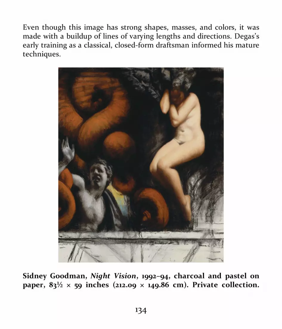
Even though this image has strong shapes, masses, and colors, it wasmade with a buildup of lines of varying lengths and directions. Degas’searly training as a classical, closed-form draftsman informed his maturetechniques.
Sidney Goodman, Night Vision, 1992–94, charcoal and pastel onpaper, 83½ × 59 inches (212.09 × 149.86 cm). Private collection.
134

Courtesy of the artist and his family.
Goodman utilizes one of the most classic pastel techniques in thisimage. He adds colors into a highly developed charcoal drawing. Thisway, the integrity of the tonal drawing is maintained while it isenriched with areas of color. The colors match the tonalities andstructures created by the charcoal.
Powdered PigmentsThe same pigments used to make oil paints, watercolors,charcoals, pastels, Conté, and other mediums are available inpowdered form in many art supply stores. Pure powderedpigments have a variety of uses. Some artists like to use themto make their own oil paints, watercolors, and pastels. Thislabor-intensive process can provide materials of the specificconsistency desired by the artist, which commercial productsmay not provide.
Dry pigments can be used to tone and color drawingpapers by spreading the powder over the paper and blendingit into the paper’s grain. The paper can then be drawn onwith other dry mediums, such charcoal or pastel.
Some artists use dry pigments experimentally whenexploring or extending the range of their drawingapproaches. Others use dry pigments as a planned part of adrawing that requires soft effects as part of a layeringprocess. The characteristics of dry pigments allow an artist to
135
create mixed effects and a variety of layers by combiningblended dry pigments and marks made by charcoal, Conté,pastel sticks, or wet mediums.
Drawbacks include exposure to airborne, potentially toxiccolor particles and the vulnerability of the pigments toaccidental smearing. As with pastel, precautions should betaken to minimize exposure to dust particles. Drawings thatinclude powdered pigments should be stored using the sameprecautions followed with chalk drawings: Place them in aflat container, interleaving sheets of acid-free glassine ortissue between them.
Colored PencilsColored pencils are essentially pigment mixed with wax andthen formed into rods that are encased in wooden sleeves,just like graphite pencils. They also come in water-solubleforms in which the binder is gum arabic. Water-solublecolored pencils work well as an alternative to watercolorwhen a mix of line and wash is needed.
Although they can be erased and blended, colored pencilsare less malleable than graphite pencils because of their waxor gum arabic content. Their hardness or softness isdetermined by the amount of binder in them. The wax orgum arabic binder minimizes toxicity by encapsulating theparticles and binding them together. Though colored pencils
136

are less toxic, there is still a danger from the particles on thehands. Always make sure to wash your hands after usingmost drawing materials.
Colored pencils can be sharpened in the same manner asother pencils, by using a blade or mechanical pencilsharpener. The wax in colored pencils may keep pastels,charcoals, or water-based mediums from adhering well tocolored pencil marks if they are too heavy or broad. Also,colored pencil marks are difficult to blend due to their waxor gum arabic content.
137

Photo credit: Peter Groesbeck.
138

Samuel Thuman, DDT, 2013, colored pencil, marker, and graphiteon illustration board, 13 × 18 inches (33.02 × 45.72 cm).
The colored pencil provides color and texturing in the upper portion ofthe drawing and in the center over the patterning of the woman’sblouse. It also provides the pale blue background. The combination ofmaterials creates interesting illusions of texture, expression, andpattern.
139

The most valuable property of colored pencils is theirability to produce fine lines in a variety of colors. As analternative or addition to graphite pencil, colored pencils canproduce fine, clear line-based drawings in full color. Broadcolor tones can be created through the use of hatching or byusing the broad side of the pencil point roughed over thepaper.
A variety of papers are suitable for colored pencils, fromvellum and hot-pressed papers and illustration boards tomildly grainy sketch paper. Very rough charcoal and pastelpapers may cause colored pencil marks to be unclear, thoughsometimes that is a desired aesthetic effect.
Colored pencil drawings do not usually require a fixativebecause they are less subject to smearing or smudging thanchalk-based drawings. Still, flat storage and acid-freeinterleaving are recommended.
Oil PastelsWhile traditional chalk pastels are made of pigment with alight binder like gum arabic, oil pastels (also called wax oilcrayons) are bound by an oil such as linseed oil, or wax, orboth. Oil pastels have unique characteristics, which someartists describe as being similar both to wax crayons and totraditional chalk pastels. Depending on the brand, oil pastelsmay feel more waxy or more oily; they have varying degrees
140

of maneuverability.Most modern oil pastels are somewhat like children’s
crayons, although they are richer and stronger in color dueto their higher pigment content. They are less fragile thanchalk pastels but do not mix easily with chalk drawingmediums because of the resistant nature of their binders.They mix best with other wax-based mediums, such ascolored pencils and grease pencils. They can be used to drawover dry watercolors but perform poorly on a wet surface.While fixatives are not required for oil pastel drawings, safeflat storage and acid-free interleaving are recommended.
141

Samuel Thuman, Still Life with Clay Head, 2015, oil pastel onpaper, 23 × 19 inches (58.42 × 48.26 cm). Courtesy of the artist.
Grease Pencils and Lithographic CrayonsGrease pencils, also known as china markers, use wax to bindtheir pigment. Commonly, the wax pigment rod is encased in
142

a paper sheath that can be unraveled to expose more of therod. Similar to colored pencils in composition, grease pencils’density is on the softer side but their color range is not asgreat as those of the colored pencils on today’s market.Black, red, blue, green, and white are the most commoncolors.
Used primarily for practical purposes such as markingmeasurements on surfaces, mapping the parameters ofshapes, and making written notations, grease pencils can alsobe used for fine-art drawing purposes. Because the pigmentrod is large and hard to sharpen, grease pencils have a qualitysimilar to children’s crayons.
Lithographic crayons are similar to grease pencils. Theseare made from pigment bound with wax or another oil-basedmaterial. Lithographic crayons make rich dark lines andtones and are not water-soluble.
Children’s CrayonsThe term crayon, with Latin and French roots and in usesince the seventeenth century, describes a great number ofwax-based drawing sticks. The pigment is mixed with a waxbinder and made into sticks, which are either left unwrappedor are wrapped in paper or wood. Although the name crayonis applied, most familiarly, to the waxy drawing sticks usedby children, it is also used for professional artist materials
143

such as Conté crayons.Some adult artists do use children’s crayons, however,
liking their immediacy of color and line. Such crayons maynot have the same chromatic intensity as professionalmediums, but they mix well with all other wax-basedmediums. Like oil pastels, they can be used to draw over drywatercolors. Storage of crayon drawings requires the sameprecautions as other drawings on paper.
Fixatives
Fixatives protect and preserve the surfaces of pastel, charcoal,and other chalk-based drawings. They have a long history.Spritzing the surface of a drawing with milk or gum arabic,either by hand using a small stiff brush or by blowing dropletsthrough a small tube, was common during the Renaissance.Other materials used to fix drawings included shellac andvarnishes mixed with alcohol. These early fixatives providedstability in the short term but often encouraged the growth ofmold, which eventually damaged the paper. Fixativescontaining alcohol and lacquer and applied with an atomizerbecame common in the nineteenth century. These fixativesprays provided better permanency but could yellow the paper.
Modern fixatives come in workable (temporary) andpermanent aerosol sprays. Most are made of non-yellowingacrylic materials that will not damage a drawing when used
144

according to directions. Some artists prefer to not fix theirdrawings, while others like making their own fixatives and useatomizers or older fixing methods to apply them.
Fixatives of any type are potentially toxic and should be usedonly in spaces with very good ventilation, never indoors in anunventilated space. Ventilated spray rooms, portableventilators, exhaust fans, or outdoor use are recommended forhealth and safety. Fixed drawings should be stored in the sameway as other drawings, especially chalk-based works.
InksInks have a long and romantic history. Early inks were madefrom such diverse materials as vegetable and berry juices,walnut juice, squid and cuttlefish ink, and ground charredbones or other carbon materials mixed with water. Thewater-based liquid vehicle for the colorant often includedlacquers, alcohol, or other materials for stability. Some earlyinks were permanent, while others faded or changed colorswith age.
Modern inks are grouped into two types: inks made fromdry pigments dispersed in water and inks made from dyes.Both may have glues and lacquers added for quick dryingand permanence, or they may simply be pigment mixed withwater. Pigment-based inks tend to be more lightfast—meaning they do not fade readily—while dye-based inks may
145

fade. For example, India ink, made from carbon dispersed inwater, is very permanent because of the stability of thecarbon pigment, while the dye pigments used in felt-tipmarking pens are not lightfast. Ink manufacturers providepermanence ratings in their product information, and it is agood idea to consult them.
Inks are generally transparent, but opaque and white inksare also available. Like writing inks, drawing inks come in arange of colors and can be used on surfaces of many kinds.Artists apply inks with pens, brushes, sponges, and a varietyof other tools. Again, experimentation is key tounderstanding the creative properties of inks and the toolsused to apply them.
146

Samuel Palmer, Early Morning, 1825, pen and dark brown ink withbrush mixed with gum on paper, 7⅖ × 917/100 inches (18.8 × 23.3 cm).Ashmolean Museum (Oxford). Photo credit: AshmoleanMuseum/The Art Archive at Art Resource, NY.
His work reminiscent of that of the British artist/poet William Blake(1757–1827) and later, the American Charles Burchfield (1893–1967),Samuel Palmer (1805–1881) creates a fanciful visionary world in his
147

drawings. Here, pen, ink, and wash are used to illustrate a world thatcould easily be inhabited by Hobbits.
148

Peter Groesbeck, My Father Departed, 2000–2013, India ink onpaper, 10 × 10 inches (25.4 × 25.4cm). Courtesy of the artist.
Abstract Expressionism and bad dreams are paired in equal balance inthis wash drawing. Starting freely on the paper with little preparation,marks and washes are built up quickly.
MarkersMarking pens are useful as an alternative to traditional inksapplied with pens and brushes. Markers are hollow tubescontaining permanent (nonreversible, solvent-based) ornonpermanent (reversible) water-based ink with a fibrous,porous nib. Lightfastness is an issue, and productspecifications should be checked carefully.
Markers come in a great variety of colors and sizes, withtips of various types. Fine-point markers simulate some ofthe qualities of traditional dip pens. The fibrous tips of so-called brush pens are longer and more flexible than those ofother markers and simulate the marks made by a pointedbrush. Markers are easily used in conjunction with othermediums such as watercolor and chalks for mixed-mediaeffects.
149

Elizabeth Gallagher, compositional studies for paintings, 2014,markers and pastel on paper, each 4 × 4 inches (10.16 × 10.16 cm).Courtesy of the artist.
The basic design is drawn in black marker. Color is added with markersand pastel.
Watercolor and GouacheWatercolors of one form or another have been present in thehistory of drawing from its beginning. The earliest appear inPaleolithic art in caves and at gravesites. Water-based colorswere commonly used by the Egyptians, Greeks, and Romansfor drawings on documents, books, and frescoes. Beautifulwatercolor designs illuminated medieval Europeanmanuscripts and early machine-printed picture books.
150

Watercolor and gouache have been used historically to colorillustrations first laid out in pencil or ink. Because of this,watercolor and gouache have often been included in thestudy, teaching, and practice of drawing by artists anddesigners. Since the nineteenth century, watercolor has beenacknowledged as a major art form and is the preferredmedium of many artists as a bridge between drawing andpainting.
Watercolors are made by mixing dry pigments with waterand gum arabic. Modern watercolors come in two forms: asdry cakes or as wet paste in tubes. Once they are dried onyour palette, you can easily revive watercolors in either formby adding water.
Watercolors’ permanency, durability, and lightfastnesshave improved considerably since the early nineteenthcentury, and modern watercolors have the same reliablequalities as oil paints and inks.
While traditional watercolor is generally transparent—inthe sense that a color will show through another color laid ontop of it—gouache is an opaque form of watercolor. To makegouache, chalk or clay is added to create greater density andopacity. Like traditional transparent watercolors, gouachecomes dry in cakes or wet in tubes. Watercolor and gouachecan be used together in the same artwork. Traditionalwatercolor makes extremely transparent washes, while
151

washes of gouache range from slightly cloudy to veryopaque.
Al Gury, New Mexico, 1990, watercolor on paper, 11 × 14 inches(27.94 × 35.56 cm).
A light pencil drawing was used to lay out the composition. Colorpatches of thin watercolor were built up until darks and high-chromacolors achieved their full intensity.
152

E. B. Lewis, Waiting for Spring (illustration for Coming On HomeSoon [New York: G. P. Putnam’s Sons, 2004]), 2004, watercolor onpaper, 9½ × 11¾ inches (24.13 × 29.8 cm). Courtesy of the artist.
Lewis lays out the primary drawing in pencil and then adds washes ofcolor, from lightest to darkest. This beautiful watercolor has a softatmospheric quality created by keeping the edges from becoming toosharp and clear.
Varieties of white opaque watercolor have been used forcenturies, often in conjunction with ink drawings. When amaster drawing is labeled as “pen and ink heightened with
153

white,” the word white refers to opaque white watercolorused for highlights in the drawing.
Watercolor or gouache washes are often used as a base forother chalk- or wax-based drawing mediums. Inks appliedwith brushes or pens are a traditional companion ofwatercolors. These mixed-media drawings have been acommon aesthetic form since the late nineteenth century.Today, some artists mix watercolors with other mediumssuch as charcoal, pastel, and graphite pencil.
Storage and care of watercolor works are similar to that ofother works on paper. Storing flat, layering with acid-freeprotective papers, and minimizing exposure to light aid inthe longevity of drawings and other works on paper.
154

155

Tom LaPine, Study in Harmony, 2016, gouache on white paper, 12 ×7½ inches (30.48 × 19.05 cm). Courtesy of the artist.
LaPine first laid out his drawing with pencil and then built up largeblocks of underlying tone with thinned, watery gouache. He finishedthe drawing with dense, flat strokes of gouache to create the effects ofvariety, movement, and color interaction.
AcrylicsDeveloped in the early 1950s, the first true acrylic paints werean immediate success. Acrylic paints have the body andmixability of oil paints and are water-soluble and quick-drying like watercolors. Often used in mixed-media drawingsor as a substitute for watercolor, acrylic is composed ofpigment mixed with water and an acrylic polymer emulsion(polyvinyl acetate).
Acrylics are wet when squeezed from the tube but dryquickly to a non-reversible form. Acrylics can be applied withbrushes just like watercolors and oil paints. Easily thinnedwith water or enhanced by a variety of acrylic mediums,acrylics are often mixed with other drawing mediums, suchas inks, watercolors, and chalks. Acrylics behave much likewatercolor when diluted with water and can also be used likeinks, applied with brushes or dip pens, especially bamboopens.
156

David McShane, Portrait of an Anonymous Young Man(preparatory study), mixed media (pencil, ink, photocopy, andacrylic on paper), 7 × 14 inches (17.78 × 35.56 cm). Photo credit: ©1999 by David McShane and the City of Philadelphia Mural ArtsProgram.
This layered drawing is a preparatory study for one of the manybeautiful murals done by McShane for Philadelphia’s Mural ArtsProgram. He made a pencil drawing, photocopied it, and then paintedover it with acrylic paint. The image is gridded for transferal to a wall.
Some artists complain that the quick-drying property ofacrylics is a drawback, while others prize this quality. Mostacrylics become darker as they dry. The addition of an acrylicmedium to the paint will slow darkening, and keep the paint
157

fresh and wet and looking more like oil paint. Mostcontemporary acrylics are lightfast, but it is advisable toexhibit and store acrylic drawings away from direct sunlight.
Oil Paint (on Paper)Drawings done in oil on paper have been common since thesixteenth century. A technique favored by many nineteenth-century Impressionists and twentieth-century modern artistsis called peinture à l’éssence. In this method, favored byEdgar Degas, the artist squeezes oil paint onto a blotter anddrains out as much of the linseed oil as possible. Theresulting thick paint is then thinned with turpentine andfreely drawn with using a brush on heavily toned or whitepaper. Some of Degas’s studies look like pastels but areactually done using the éssence method, which combines therichness of oil paint with the freedom of watercolor andpastel.
You can also draw with oil paint on paper without drainingaway the linseed oil. This can work well on heavy paper, butthe linseed oil can bleed into and badly stain the paper, andthe excess oil will cause the paper to yellow and becomebrittle.
158

Edgar Degas, oil sketch on brown wove paper, 1875, 18⅞ × 11¾inches (47.9 × 29.8 cm). Philadelphia Museum of Art (Philadelphia,PA). The Henry P. McIlhenny Collection in memory of Frances P.McIlhenny, 1986.
At first glance, Degas’s oil drawings can be mistaken for pastel in theirrich buttery surfaces and deft lines. Degas thought of drawing andpainting as a single activity with similar aesthetic goals.
Metal Point
159

Thin rods of lead, silver, copper, and other soft metals havebeen used since antiquity for drawing and writing. Insilverpoint, a thin rod of sterling silver wire or thin rod ofmetal is sheathed in a holder. Silverpoint makes a fine grayline, and different kinds of paper receive the silver indifferent ways: rougher paper grabs the silver easily, yieldinga darker line, while smoother papers create a thinner, lighterline. Papers coated with washes of clay, watercolor, gouache,or gesso are commonly used for silverpoint and ensure aclean, strong line.
As silverpoint drawings age, the silver tarnishes, becominga beautiful brown color. Fine silverpoint drawings, showingthe silver’s tarnish, were made by the Italian Renaissancemaster Leonardo da Vinci. Although silverpoint drawingremained popular for the remainder of the Renaissance andBaroque eras, its use declined with the invention of graphitepencils in the early 1500s. A revival of silverpoint occurred inthe nineteenth century among artists such as the Pre-Raphaelites, and it remains in use today.
Sterling silver wires can be bought from jewelry supplybusinesses. The thin wire can easily be placed in a modernmechanical pencil. The medium is excellent for line andhatching where high detail and refinement are required.
160
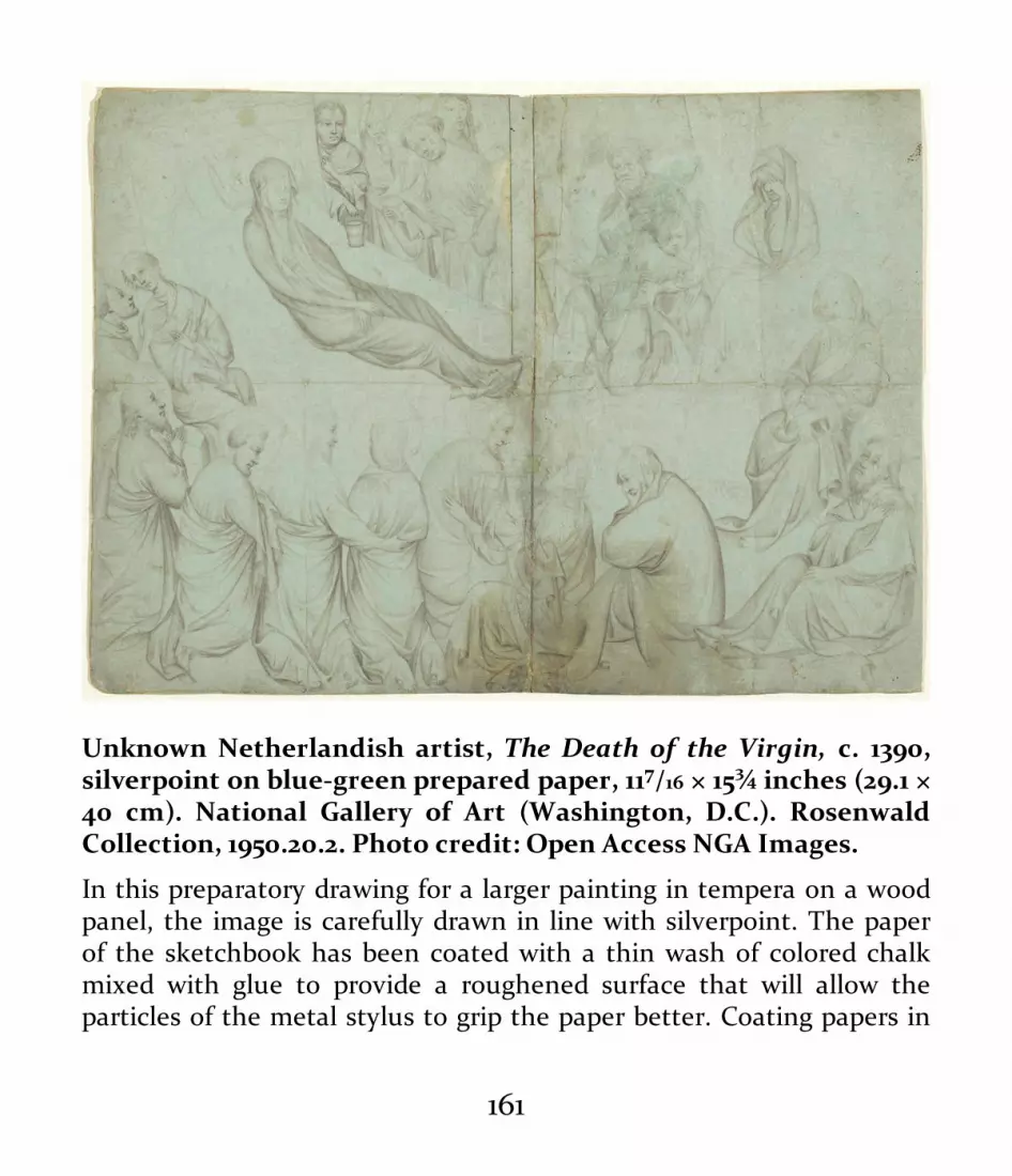
Unknown Netherlandish artist, The Death of the Virgin, c. 1390,silverpoint on blue-green prepared paper, 117/16 × 15¾ inches (29.1 ×40 cm). National Gallery of Art (Washington, D.C.). RosenwaldCollection, 1950.20.2. Photo credit: Open Access NGA Images.
In this preparatory drawing for a larger painting in tempera on a woodpanel, the image is carefully drawn in line with silverpoint. The paperof the sketchbook has been coated with a thin wash of colored chalkmixed with glue to provide a roughened surface that will allow theparticles of the metal stylus to grip the paper better. Coating papers in
161

this manner is a common practice in the use of metal point.
Sgraffito and ScratchboardIts name derived from the Italian word meaning “to scratch,”sgraffito was very common during the Renaissance, andnineteenth-century illustrators often employed sgraffito tocreate simple, strong graphic images. In drawings on paperor wood, a first coat of paint or color, usually light in tone, isput down and allowed to dry. A second coat of another,darker color is applied, and lines are then scratched with apointed metal tool through the top layer to reveal the lighterlayer below. The result is an interesting, often beautifullayered effect.
162

Here are some examples of tools and the effects of scratchboardartwork.
Scratchboard was developed in the nineteenth century asan economical material for achieving effects like those oftraditional sgraffito. Today’s scratchboard is usually a heavywhite paper coated with a layer of black gouache or a verythin black paper. A sharp, pointed metal tool is used toscratch lines through the black layer to create an image madeof white lines. Scratchboard has some of the visual qualitiesof pen and ink and also those of woodcut and woodengraving. Scratchboard is used both in elementary schoolclassrooms and by professional illustrators and artists.
Oil SticksEssentially oil paint in a stick form with a wax additive, oilsticks can be used for many forms of drawing. The addedwax allows the paint to be spread or drawn on paper, canvas,or other surfaces. Oil-stick drawings can be manipulatedwith paint thinners to create washes and blurred lines. Oilsticks can be combined with other drawing mediums or withtraditional painting processes to create interesting anddiverse drawing effects. Like oil paints themselves, oil stickscan adversely affect paper.
Mixed Media
163

The term mixed media refers to any combination of two ormore compatible drawing mediums, such as pencil andwatercolor, watercolor and chalk, gouache and ink, orprintmaking and watercolor. Often thought of as a modernart form, mixed-media drawings have actually been commonsince ancient times, though contemporary artists combine amuch wider range of materials, such as charcoal and collage,acrylic and pastel, and so on.
Mixed-media drawings usually involve a layering process.For example, a pencil drawing might be overlaid with washesof watercolor and then with finishing touches of pastel. Themain consideration is that the materials be compatible.Studying the history of mixed-media drawings can give youan idea of how to proceed, although many modern artistsdisregard the compatibility issue in favor of unique aestheticeffects.
164

165

Martin Campos, Nudes Dancing, 1990s, pastel, charcoal, andgouache on wove toned paper, 24 × 18 inches (60.96 × 45.72 cm).Collection of the author.
This drawing was first laid out in charcoal on off-white paper. Washesof gouache color were then added. Campos finished the drawing withtouches of pastel color. White gouache was used to clarify the contoursand shapes of the figures.
166

167

Al Gury, Nude, 2012, charcoal, pastel, and oil paint on gessoedwatercolor paper, 30 × 24 inches (76.2 × 60.96 cm).
A structural charcoal placement drawing defines the basic forms andcontours of the model. Warm, bright pastel colors are used to heightenthe light. Browns, greens, and purples deepen the shadows. Thicktouches of oil paint added with a brush finish the highlights.
168

169

Edgar Degas, The Star, c. 1876–78, pastel over ink monotype on laidpaper, 17⅜ × 13½ inches (44.1 × 34.3 cm). Philadelphia Museum ofArt (Philadelphia, PA). Bequest of Charlotte Dorrance Wright,1978.
Drawing can even be combined with printmaking. Here, Degas hasdrawn with pastel on an ink monotype. A monotype is an image drawndirectly on a plate of glass, metal, or plastic. The plate is run through aprinting press and the resulting image is a one-of-a-kind print. Amonoprint on glass is usually printed simply by the application ofpressure on the paper by a roller or even a hand.
Digital Drawing
Some students eagerly explore digital drawing while othersavoid it. Many artists debate the artistic legitimacy of digitaldrawing much as they do that of photography. Is it art or not?Is it just a tool or a legitimate form of fine art in its own right?
Regardless of the answer, it’s inarguable that digital drawingis extremely useful. But there are some issues for both teachersand practitioners to consider: Is it necessary for a student tolearn traditional hand-drawing skills if a computer can draw forthem? Is skill in drawing by hand needed to make a really gooddigital drawing? An interesting test is to see whether a studentcan do the same drawing project with equal facility on acomputer pad using a stylus as on a paper using a pencil.Obviously there are differences, but the underlying skills andsensitivities should be the same.
170

What students lack in hand skills may limit their computerdrawing skills. The subtle effects that can be achieved withtraditional drawing materials and techniques should makethose who draw on computers more sensitive to the imagesthey are making and more aware of the aesthetic and creativepossibilities available to them. The goal for artists who areextremely proficient in digital drawing is to incorporate all theirequally strong skills and aesthetic sensibilities in handworkinto the computer art.
Artist, illustrator, and educator Mark Tocchet, whose workin both digital media and traditional materials is highlyacclaimed, has this to say:
“For those of us who started out drawing in traditional media,the tablet and stylus (or more current tablet displays) offerexciting results but lack the same tactile experience that was forus a significant part of drawing. App creators have been aware ofthis for years. Although digital drawing programs can simulatethe interaction of a mark-making tool with a variable surfacegrain (thereby creating much of a tool’s visual character), theartist’s experience creating the mark is quite sterile incomparison. Perhaps a younger generation of artists lessaccustomed to the tactile drawing experience won’t see this aslacking in their digital drawing.
For me, one of the greatest assets of digital drawing is that thework is endlessly editable. An artist can go at the work fearlessly.Whatever looks right can be saved. Whatever bold or exploratorymoves didn’t work out can be eliminated without affectingwhatever came before. Multiple versions can be kept for laterreview, use, or assimilation as the image develops.”
171

TOOLS FOR DIGITAL DRAWING• Mac (Apple) computer• Wacom Intuos tablet• Adobe Photoshop• Adobe Illustrator• SmithMicro Manga Studio• CorelDRAW Graphics Suite• Pixologic Zbrush
Mark Tocchet, Apple Still Life Graphite Process, 2008, Mac
172

OS Corel Painter and Stylus on Wacom Tablet, each 10¼ ×7½ inches (26.04 × 19.05 cm).
Mark Tocchet, Sunshine, 2010, Mac OS, Corel Painter,Adobe Photoshop, and Stylus on Wacom Tablet, 7¼ ×469/100 inches (18.42 × 11.91 cm).
173

DRAWING TOOLSThe drawing tools presented in this section are the mostbasic and common ones used by the great majority of artists,students, and art teachers. Not surprisingly, these tools havechanged very little over the centuries and remain the mostversatile, stable, and practical of drawing materials. Pens,brushes, erasers, and other materials provide the means tovisualize both the first sketches for art images directly frommind to hand to paper. These essential materials also providethe means to take visual ideas through the development andexploratory phases to the final completion of an artwork indrawing material.
174

Photo credit: Peter Groesbeck.
PensPractical tools for notation appeared very early in humanhistory, and the history of pens mirrors the evolution ofculture. Ancient pens ranged from sharpened sticks and
175

bamboo branches to beautifully carved bird-feather quills.Traditional pens in use today can be made from wood,bamboo, quills, metal, and even glass. (Traditional Asianbamboo pens are especially popular.) Historical uses of pensincluded calligraphy, map-making, illustration, letter writing,and fine-arts drawing. The sense of romance surroundingpens is as old as writing itself. Many people collect antiqueand modern pens, and artists often develop a fondness forcertain pens.
176

Arthur DeCosta, Figure Study, 1970s, ballpoint pen on paper, 11 × 8inches (27.94 × 20.32 cm). School Collection, PennsylvaniaAcademy of the Fine Arts (Philadelphia, PA).
In this figure study done by the artist Arthur DeCosta, ballpoint pen isused as a concise tool in delineating the contours and shadow hatchingof the figure. Ballpoint pen is one of the most straightforward andpractical of pen tools.
177

Patricia Traub, Whippet, 1990s, pencil, ballpoint pen, and whitechalk on charcoal paper, 8 × 10 inches (20.32 × 25.4 cm). Courtesy ofthe artist.
The choice of ballpoint and pencil allows Traub to create the preciseand delicate contours, as well as lines of movement and anatomyparticular to a whippet.
Removable pen tips, or nibs, attached to wooden or metalholders, have been made of copper, bronze, steel, and even
178

gold. These were dipped into small bottles of ink, and theliquid would be held in the concave back surface of the pentip. The modern “dip” pen consists of a steel nib, which holdsthe ink, attached to a metal, plastic, or wooden holder.
Drawing pens can create lines of varying strengths andwidths depending on the size of the point, its flexibility, andits ability to hold ink. Dip pens are kept clean by washing orflushing with water or solvents, depending on the type of inkused.
“Filler” pens draw ink from the ink bottle into a reservoir,alleviating the necessity of constantly dipping the pen into abottle. The first reliable fountain pens appeared in the 1850s,though experiments with pens with ink reservoirs aredocumented from the tenth through the early nineteenthcenturies.
Metal and fiber pen tips are easily damaged and should bestored in a container with the pen tips lying flat or standingupright. Fiber-tip pens, such as markers, are prone to dryingout quickly and should be kept sealed when not in use.
Ballpoint pens, fine-point markers, fountain and cartridgepens, fiber-point pens, brush pens, and other types areexcellent modern additions to the artist’s toolbox. All createunique effects, and inks can often be mixed with a variety ofother mediums, especially watercolor and graphite.
179

Greg Biché, compositional study for a painting, 2013, ballpoint penon white paper, 4 × 4 inches (10.6 × 10.6 cm). Courtesy of the artist.
In this quick and exciting design sketch, Biché uses ballpoint pen tocapture the shapes and energy of the visual idea.
180

Al Gury, notes for a landscape, 2010, ballpoint pen in sketchbook.
Ballpoint allows for a quick and energetic notation of the texture andmovement of the trees.
Ballpoint pens are an extremely common and practicalmodern tool for drawing. Invented in the late nineteenthcentury, retractable ballpoint pens came into common use inthe 1930s and 1940s. Designed as a writing tool, ballpointpens are reliable, durable, and provide a variety of linequalities for sketching on a wide range of papers andsurfaces. Many artists use ballpoint pens for sketching insketchbooks.
Fine-point markers, usually containing permanent ink andavailable in a range of tip sizes, are excellent substitutes for
181

traditional dip pens. Dip pens, however, allow greatervariability in the width and organic quality of the line;although fine-point markers can be manipulated to a degree,they maintain a fairly constant line width.
Experimentation and practice will allow you to understandthe aesthetic qualities and uses of each tool, enabling you tomake informed tool choices and develop personalpreferences.
BrushesLike pens and papers, artist’s brushes are surrounded by asense of romance and beauty. Brushes have been a part ofWestern art history for thousands of years. Fine brusheshave been found in Egyptian tombs, and the Romansemployed a great variety of brushes for everything fromfresco painting to encaustic paintings on wood panels.(Encaustic is heated wax mixed with dry pigments andapplied with a brush or painting knife in the manner of an oilpainting.) Medieval manuscript illumination depended onfine, delicate brushes and pens.
182

Claude Lorrain (née Gellée), The Tiber from Monte Mario, 1640–50,brush with brown ink on laid paper, 7¼ × 10½ inches (18.5 × 26.8cm). British Museum (London). PD, Oo.7-212. Photo credit: © TheTrustees of the British Museum/Art Resource, NY.
A soft brush is used to create this superb example of atmospheric andaerial perspective. Lorrain works from lighter washes in the distance torich darker ones in the foreground.
Highly skilled craftsmanship is needed to make finebrushes, but, for practical purposes, a good brush is one
183

that’s suited to what the artist wants to do. For this reason,brushes can be grouped into simple categories: soft brushesand bristle brushes.
Soft brushes made of sable, camel, badger, and othernatural animal hairs are used for both broad and fluid strokesas well as fine detail work. Watercolor painters often preferwell-made soft fur brushes such as sables. Oil painters willoften use soft brushes for surface detail and blending, whilelower layers of paint might be applied with sturdier bristlebrushes. Soft brushes are also often used to apply and blenddry pigments such as powdered graphite and charcoal topaper surfaces.
Soft fur brushes are, however, prone to wear and tear anddo not survive extended rough use. For this reason, bristlebrushes are a good choice for rough work. Bristle brushes areusually made from a stiffer animal hair such as hog or horsehair. Considered less desirable for watercolor because of theirroughness of stroke, bristle brushes work well for heaviermediums such as oil paints, acrylic, and encaustic.
184

Arthur DeCosta, Plant Study, 1970s, pencil, sepia wash, and brushon paper, 11 × 8 inches (27.94 × 20.32 cm). School Collection,Pennsylvania Academy of the Fine Arts (Philadelphia, PA).
In this delicate and lovely drawing, DeCosta first laid out the image indetail with pencil. He used washes to describe basic tonalities and a
185

pointed brush to refine the details.
Rembrandt van Rijn, Young Woman Sleeping, c. 1654, brown inkand wash, some white gouache, 917/25 × 799/100 inches (24.6 × 20.3cm). British Museum (London). PD 1895, 0915.1279. Photo credit: ©The Trustees of the British Museum/Art Resource, NY.
186

In his brush drawings, Rembrandt uses a precise and energetic strokethat is reminiscent of Asian calligraphy combined with the quickness ofthe modern gesture drawing.
Contemporary brushes come in a variety of shapes andlengths: flat, round, and filbert (oval shaped); long, medium,and short. Brushes for calligraphy, illustration, ink,watercolor, oil painting, and other techniques are designedfor those specific purposes.
Today, natural-fiber brushes are augmented by a widevariety of synthetic-fiber brushes and brushlike tools (brushpens, brush sponges). Synthetic brushes are designed toprovide the same range of qualities as their natural cousins,though some artists complain that synthetic brushes don’thave the same subtle and responsive qualities as natural-fiberbrushes.
The care of brushes is an important matter. While afavorite old, worn-down brush can be an excellent tool, dry,stiff, or damaged brushes usually fail to give us the effects wewant. Wet mediums like oil paints, acrylics, or shellac willruin a brush if left to dry on it. Unlike watercolor or gouache,these materials cannot be reconstituted. To make brusheslast, it is essential to wash them with soap and water and tore-form the point after doing so. Commercial brush cleaners,lubricants, and restorers are available, but simple care with
187

soap and water is often best.Brushes should be stored flat or with the tips upright.
Never leave a brush tip down in a jar of water or solvent; thismay irreversibly damage it.
Blending Stumps
Blending stumps (also referred to by their French namesestompes or tortillons) are sticks made of soft paper rolled to apoint. Stumps are used for blending in drawings made ofcharcoal, pastel, or Conté. A versatile tool, the blending stumpcan be used on its side to blend broad areas or on its point forfiner modulations. The paper point of the stump, when dirtiedwith charcoal or graphite, also makes a kind of drawing toolitself. Paper blending sticks are cleaned by lightly sanding thesurface with fine sandpaper.
ErasersErasers come in many forms and produce varying resultsdepending on the eraser’s composition and the drawingmaterials used. Pieces of cloth and soft fine leather such aschamois have been used as erasers since ancient times. Wadsof soft white bread are known to have been used as simple
188

erasers during the Renaissance. Modern erasers are generallymade of rubber, vinyl, and other gum-based and rubberlikematerials.
Kneaded erasers absorb charcoal, graphite, and pastel andleave no “crumbs” on the paper. They can be kneaded likeputty when dirtied, making them clean for further use. It’simportant to note that erasers are used not only to remove orcorrect errors in drawings but also as drawing tools inthemselves, and kneaded erasers are especially desirable forcharcoal and chalk drawings where blotting, blending, andsubtle modulations are desired.
Hard rubber erasers smear and absorb the drawingmaterial and remove it in small crumbs. Rubber erasers arevery good for erasing graphite lines, colored pencil lines, andharder drawing marks where more forceful erasing is needed.Crumbs left behind by rubber erasers must be brushed away.This brushing away may cause abrasion to the drawing, andso it should be done with caution. In addition, repeatederasing in an area with a rubber eraser may cause damage tothe paper itself by wearing away paper fibers and evenmaking a hole in the paper.
Erasers also come in materials such as vinyl and latex.While very effective and leaving less crumbs when used,these erasers can leave smear marks on the paper and havethe same problems as rubber erasers.
189

Chamois cloth, a soft, slightly fuzzy natural or syntheticleather, is also commonly used as an eraser.
PAPERFor many artists, paper has an aura of romance andfascination. Paper as we know it was invented in China abouttwo thousand years ago. Other paperlike materials, such aspapyrus (made from reeds) and parchment (made fromanimal skin), can be traced back much earlier, to the ancientEgyptians. Arriving in Europe during the medieval era,papermaking was a laborious process. In the early fifteenthcentury, papermaking factories and more efficientproduction processes made paper more economical toproduce and therefore more widely accessible. Its appearancecoinciding with the invention of the printing press,commercially made paper rapidly replaced parchment andvellum and aided in the mass production and disseminationof printed books. Artists today use many types of papermaterials, ranging from mass-produced paper to artisanalhandmade papers.
The most common materials for making paper are cottonor linen fibers and wood pulp; the two major types of paperare laid paper and wove paper. To make laid paper, paper
190

pulp mixed with water is allowed to settle on a wire screen orframed mold. The screens consist of a series of vertical wires,which can vary greatly in their width and spacing, held inplace by a few evenly spaced horizontal wires. As the waterdrains away and the pulp is pressed by a weight, the textureof the wire is impressed into the paper pulp. Most drawingand book paper from the fifteenth to the early nineteenthcentury was made in this manner.
Photo credit: Peter Groesbeck.
191

Unknown artist, Portrait of a Boy, 1940s, charcoal on white laidpaper, 20 × 16 inches (50.8 × 40.64 cm). Collection of the author.
One of the beautiful attributes of using laid paper is the additionaltexture and sense of atmosphere it adds to a drawing. The less smoothtexture of the paper fibers and the pattern of the wires remaining inthe laid paper interact with drawing materials to create unique andvaried effects. Here the overall richness and immediacy of the drawing
192
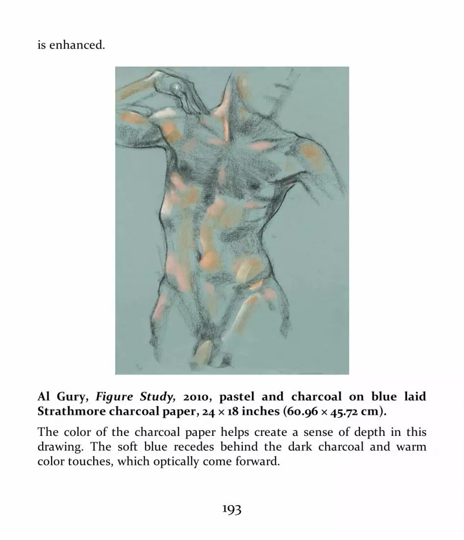
is enhanced.
Al Gury, Figure Study, 2010, pastel and charcoal on blue laidStrathmore charcoal paper, 24 × 18 inches (60.96 × 45.72 cm).
The color of the charcoal paper helps create a sense of depth in thisdrawing. The soft blue recedes behind the dark charcoal and warmcolor touches, which optically come forward.
193

The thickness of a laid paper depends on the amount ofthe paper pulp used, while the surface personality of thepaper depends on the texture and spacing of the wires in thepapermaking frame as well as the density of the pulp.Thicker, less homogenized pulp puts less weight on the wireframe and produces thicker, more rough-textured paper.More finely ground and mixed pulp places greater weight onthe wire frame and produces finer, thinner paper. The manypossible combinations of pulps and screens make for anenormous array of laid papers. Laid paper’s characteristicshave a direct effect on the character of the drawing made onit, and the variety of laid papers has always been a focus ofexploration by artists in their drawings.
The texture of a laid paper and its watermark are clearlyvisible when the paper is held up to the light. Watermarks,which are maker labels impressed into the paper while wet,distinguish papers from one another.
Wove paper, invented in England in the late eighteenthcentury, is the most common type of paper today. In theprocess for making wove paper, paper pulp, often made fromfinely ground wood shavings, is soaked in water. The result isa wet paste of pulp, which is then spread on a woven wirescreen whose mesh is much more even, close, and thin thanthat of the screens used for laid paper. When drained of itswater, the paper is pressed to produce a fine, even surface.
194

The texture of wove paper can be altered by rolling the paperthrough heated or cold presses. Hot-pressed papers aretypically very smooth, while cold-pressed papers retainvarying degrees of the texture of the paper fibers.
195

196

Amedeo Modigliani, Caryatid, c. 1912–14, blue crayon over graphiteon beige wove paper, 24 × 18 inches (61 × 45.7 cm). PhiladelphiaMuseum of Art (Philadelphia, PA). The Louise and WalterArensberg Collection, 1950.
Like laid papers, woven papers (with their variety of textures) directlyaffect the look and character of a drawing. In this beautiful Modiglianidrawing, the fine lines delineating the clean contours of the figure arepossible because of the smoother and closer texture of the wovensurface. The continuous, even surface of this piece of paper allows forunbroken and finer lines.
The choice regarding whether to use a hot- or cold-pressedpaper depends on the quality of line and the aesthetic effectsthe artist wants. Hot-pressed papers, which are lessabsorbent and more resistant to the drawing tool, aregenerally better for fine line work and details. Cold-pressedpapers, which are more absorbent, can be used for a greatervariety of effects. For example, hot-pressed vellum is ideal forpencil or pen and ink, but takes watercolor or charcoal verypoorly. Cold-pressed watercolor paper holds aqueousmediums and chalks well but may be too rough for pens orhard pencils.
Papers are also distinguished by the materials used tomake them and by their qualities of longevity or archivalpermanence. Most papers are made from plant materialssuch as linen, cotton, and wood pulp. Permanence is relative
197

to the amount of acid, or lignin, present in the paper pulp.Cellulose, the primary inert, acid-neutral material in paper,must be separated from lignin, which can cause acidicoxidation and the deterioration of paper. Acid-free papers,free of lignin and pH neutral, are usually labeled as such onthe packaging or in the manufacturer’s catalog.
Most cotton- or linen-based papers are relatively acid freeand stable (unless attacked by mold or insects) because thereis only a small amount of lignin in their fibers and the acidityis easily lowered in the fiber-washing process. During thefirst half of the nineteenth century, however, wood pulpbecame a major material for papermaking because it wasmore economical. Wood pulp–based wove paper was usedfor books, periodicals, and other printed materials. But woodpulp is high in lignin, and paper made from it quickly beginsto yellow, darken, and deteriorate due to its high acidcontent. Such papers typically turn yellow within a year andoften become brittle, deteriorating within a decade or two. Itis important for artists to be aware of the permanence of thepaper they are using. Within fifty years, drawings done onhighly acidic papers like newsprint may be so unstable theycannot even be picked up without crumbling.
The cost of papers reflects the expense of the productionprocess. Fine handmade, acid-free papers are usually themost expensive. Many fine papers are made by small, artist-
198

run companies. Others are produced by large commercialpaper manufacturers. But more expensive does not alwaysmean better. Many artists find that their preferred papers arenot the most expensive, and reasonably priced artist’s papersare readily available today in laid, woven, and acid-freeforms.
Types of PaperKnowledge of and experimentation with a variety of papers isessential to finding your preferred materials. The range ofpapers available is enormous; those discussed here are themajor types that you should be aware of.
Drawing papers come in four basic formats:• Pads with sheets bound to a glued or wire spine• Individual sheets• Rolls• Hard-bound sketchbooksBasic drawing pads come in a range of standard sizes from
3 × 5 inches up to 18 × 24 inches, though larger pads up to 24× 30 inches are also available. The size range of individualsheets is greater, going up to 30 × 40 inches. For larger piecesof paper, you’ll have to purchase a roll; many kinds of paper—from craft paper to fine drawing, print, and watercolorpapers—come in rolls. Your choice of a size of paper
199

depends, of course, on your goal for the artwork.Papers are also identified by weights. The weight is not
that of an individual piece of paper, but rather the weight ofa stack of 500 sheets of paper. The thickness of each sheetdetermines the weight. For example, 20-pound paper is theweight of 500 sheets of thin paper. Examples of this type ofpaper include printer paper, notebook paper, and so on.
By comparison then, 100-pound paper is the weight of 500sheets of thicker paper. The thinner the paper, the lower theweight of a 500-sheet stack. The thicker the paper, theheavier the weight of a 500-sheet stack. Weights of paper arealso affected by the dimensions of the sheet. For example,though smaller in dimension, a 5 × 7-inch sheet of very thickpaper in a 500 sheet stack may weigh more than a 500 sheetstack of thin 8½ × 11-inch paper.
Determining the right weight of paper for your drawingproject is important, especially when you work with wetmediums. In those cases, thin paper will become rippled andcurled by water, while heavier papers will remain flat.
Another element to consider in paper choice is acidcontent. This is usually noted by the designation pH (Powerof Hydrogen). The higher the acid content, the higher the pHnumber. The lower the acid content, the lower the pHnumber. The higher the acid content, the more likely the
200

paper is to yellow and even disintegrate. For example,newsprint, which is made from wood pulp, is highly acidic.Drawings done on newsprint may not have a long lifespan.These drawings may yellow and even begin to crack apartwithin a few years. Acid free papers, such as those madefrom linen or cotton, may have an indefinite life span andnever yellow or disintegrate. Many papers are a combinationof acid-free fibers mixed with wood pulp fibers to cut costsbut still create a paper that is reasonably durable. If the pH ofthe paper is not noted on the paper product, you can contactthe manufacturer for that information.
SKETCH PAPERS AND NEWSPRINTThe term sketch paper refers to a range of papers, fromnewsprint to higher quality acid-free papers. These aretypically sold in pad form and are very practical forclassroom and studio work.
Newsprint is commonly used for charcoal sketching.Because of its low price, newsprint is often used forbeginning drawing and preliminary sketches. Newsprintranges from smooth to rough and is very good for charcoal,markers, pastel, and crayons. It is less appropriate forgraphite pencils and fine-point pens because of its soft,woven, and absorbent texture. Do remember that newsprinthas a high acid content and that drawings made on
201

newsprint will deteriorate over time.
CHARCOAL AND PASTEL PAPERSPapers for charcoal and pastel need to have enough textureto hold the grains of the drawing medium. Laid papers arecommonly marketed for charcoal and pastel, but rough-textured woven papers can be excellent as well. Some pastelpapers are coated with a fine layer of sand bound by glue tothe paper. These provide a rich, toothy texture for the pastelto cling to. Commercial charcoal and pastel papers come in awide variety of colors and textures, and handmade papers arealso popular for these mediums.
COLORED CRAFT PAPERSA wide variety of colored papers in diverse textures, sizes,and hues are available. These include craft papers, printerpapers, construction papers, and decorative papers.Generally used for craft and design projects, they arerelatively inexpensive.
PREPARED PAPERSPrepared papers have an added surface or coating made ofclay, color wash, glue, sizing, or textured materials like sand.For example, silverpoint is often done on clay-coated paperor paper with a gouache or gesso wash to provide a bettergrip for the silver grains.
202

Before the nineteenth century, when a great variety ofcolored papers began to be manufactured, it was verycommon for artists to create their own colored or tonedpapers by laying down a wash of watercolor, gouache, orsomething else over the pale paper surface. In this mannerthey created the exact tone and color they wanted. Manyartists still do this today.
COMMERCIAL PAPERSCommercial papers made for office or industrial use are oftenused for drawing.
Printer paper, letter paper, ledger paper, tracing paper, andso on can all provide excellent and inexpensive surfaces fordrawing. But, if you use a commercial paper, do payattention to its acid content and permanence.
PAPERS MADE FROM RICE AND OTHER FIBERSA great variety of papers made of things other than linen orcotton fibers or wood pulp are available in art supply stores.Rice paper, used for calligraphy and watercolor, is not madefrom rice at all. It derives from the fibers of the rice paperplant, a small tree. Rice papers come in various densities andtextures and can include ornamental elements such ascolored fibers, threads, or even leaves. Mulberry tree bark isalso commonly used to make paper. Typically rough intexture, it has a variety of uses in drawing and craft. Papers
203

made from papyrus, flower petals, and plant bark are alsoavailable.
SYNTHETIC AND ALTERNATIVE SURFACESMany contemporary artists experiment with alternativedrawing surfaces. Plastic sheeting, Mylar, Yupo paper,Plexiglas, glass, metal, ceramic, and fabric all offerpossibilities as drawing surfaces. One of the most commondrawing surfaces in contemporary art is Mylar, whichprovides a paperlike surface but adds translucency to adrawing. Mylar is made from polyethelene. Yupo paper isanother a popular surface for drawers and watercolorists. Itis made from polypropylene.
SketchbooksSketchbooks used to be beautifully hand-bound, with coversof leather or heavy paper. Some contemporary sketchbooksare likewise handsomely hardbound, while others aresoftcover books bound with glue. Sketchbook papers may belaid or woven, hot or cold pressed, and varied in pHdesignations. Some have colored papers. Watercolor-papersketchbooks are excellent for small-scale watercolorsketching.
204

Like papers, sketchbooks come in many sizes and qualities. The smallpocket sketchbook is the artist’s companion.
THE DRAWING STUDIO—FURNITUREAND EQUIPMENTDrawing can be done anywhere, anytime, with the simplestof means. Casual sketching does not require any particularfurniture or equipment, but when setting up a studio, you’vegot to give such matters careful thought. The studioenvironment you create and the drawing equipment you
205

choose can significantly affect the quality of your art. If yourdrawing board is warped, uneven, or too small for the paper,the drawing may be damaged. Your choice whether to drawstanding at an easel or sitting at a tilted drafting table mayaffect your physical connection to the drawing process.
David Wilson, Studio, 2011, pencil on paper, 16 × 20 inches (40.64 ×50.8 cm). Courtesy of the artist.
Wilson shows his working environment via this finely delineated line
206

drawing.
Drawing BoardsBoards should be smooth so as not to affect the texture ofthe drawing. Lumps of dried paint and gouges on the boardwill show up in the drawing and hurt the process and thefinal result. The board should also be the appropriate size forthe paper.
Boards made of wood, Masonite, and fiberboard arecommon. Drawing boards with attached clips can be useful,but the clip may limit the drawing surface of the board. Tape,pushpins, and removable clips are good alternatives (seebelow). For very large drawings, you may need a lighter,more easily portable board; foam core is ideal for very largepaper sizes. Drawing boards should be stored flat to preventwarping.
Clips, Tape, and PinsBasic clips sold in all art stores are essential; spring clampsand bulldog clips are the two most common. Any adhesivetape—masking tape, plastic tape, even duct tape—can beused to secure a drawing to a surface, but to prevent damageto the paper you may want to choose an artist’s tape that willnot stain, tear, or leave residue on the paper. Lightlyadhesive, artist’s tape grips the paper but does not damage it
207

when pulled away. Pushpins or thumbtacks are alsocommonly used to attach paper to drawing boards or othersurfaces. Pins should be used with caution, however, as theholes they poke in the drawing might adversely affect itsaesthetic.
Cutting Tools and RulersUtility knives, scissors, and other cutting tools are useful forsizing and trimming paper. Make sure your cutting tools aresharp; otherwise, you risk damaging the paper. The cuttingsurface is also important: paper can be damaged if cut on adirty or uneven surface. Also, you may want a tool to guidethe blade and protect you when cutting. Rulers with a raisedfence, available in most art supplies stores, prevent you frombeing cut if the blade slips. As an alternative, paper can betorn along the edge of a ruler, producing an attractivedeckled, or roughened, edge. Caution must be taken,however, to keep the tear even and continuous.
Easels, Tables, Stools, and HorsesEasels are essential to many forms of art-making, and a solid,stable easel is an important part of the drawing studio.Different kinds of easels, from tabletop easels to largemechanical studio easels, provide opportunities for a varietyof working methods and processes. Many artists prefer to
208
draw standing or sitting at an upright easel rather than at atable or bench.
A drawing table—also called a drafting table—shouldlikewise be stable and solid, and you should be able to easilyadjust it to the desired angle: flat for watercolor and at acomfortable angle for dry mediums.
Instead of an easel or table, you may prefer to work sittingin a chair with drawing board propped up on a stool in frontof you, which gives you a basic tilted drawing surface. Or,alternatively, you might want to sit on what’s called a horse—a specially designed bench with a seat and a high extensionat one end for propping up the drawing board.
Plumbs, Viewfinders, Grids, and CalipersCarpenter’s plumb bobs have long been a feature of artists’studios. Used to determine alignment and balance in adrawing, they can easily be made with a weight (such as ametal bolt) attached to a string.
Viewfinders are very useful for determining the parametersof a composition. When you’re drawing from a still life or alife model, you may find a viewfinder to be especially helpfulin designing the composition. You can make your ownviewfinder simply by cutting a rectangle in the center of apiece of paper or cardboard, but adjustable plasticviewfinders are sold at art supply stores.
209

For centuries, artists have used grids to help them lay outthe forms of the objects they are drawing. Grids help both indetermining an object’s proportions and its position withinthe composition. A simple grid can be made from a piece ofwire screen bought at a home supply store.
Calipers, commonly used by architects and engineers, arealso used by artists as measuring tools. Especially usefulwhen drawing from observation, the calipers allow you toeasily compare the relative sizes of objects.
210

Here you see a variety of viewfinders, measuring devices, and plumbs.
211

A homemade viewfinder in use.
Lighting
212

Good, clear light, whether from windows or light fixtures, isessential in any studio environment. Fluorescent lightprovides a broad, cool, even light in the room, whileincandescent lights give a warm light with directional focus.Flood bulbs provide a broad warm light, while spot bulbsgive a focused light. Daylight-corrected bulbs and fixtures ofmany kinds are available but may be more expensive. Clip-onfixtures as well as light stands for spots and floods arecommon in studios. Your main concern is to have enoughlight to see well. Natural daylight, both for illuminating astudio and to provide clear vision for materials use, seeingcolor, and so on, has been considered the best form of light.Light coming from a northerly direction through windows ora skylight is the most even and consistent light. Though itstemperature changes slightly from season to season, it is veryconsistent and evenly cool and clean in color. Light throughwindows and skylights from any other direction, while oftenbeautiful, varies greatly in temperature and intensity.Choosing the right lighting for a workspace is both practicaland personal.
STORAGE, PRESENTATION, ANDCONSERVATION OF DRAWINGS
213

Drawings can be affected adversely by light, moisture,fungus, insects, and other factors, and the care and storage ofdrawings is one of the most important aspects of workingwith drawing mediums. The longevity of drawings dependson the choice of materials and on planning for their care andpreservation.
StorageWorks on paper should be kept away from direct light.Direct sunlight is the most damaging, because sunlight’sultraviolet (UV) rays can damage paper and fade drawingmediums. Ambient light from windows may do less damage,but drawings should be kept as far away from windows aspossible.
Drawings that are not being displayed should be placed ina storage container that keeps them flat, clean, and stable.Flat files, Solander boxes, and acid-free paper storage boxesare all good choices. Ideally, the drawings should beseparated by smooth interleaving sheets, which will protectthem from abrasion and from rubbing together. Glassine is atranslucent, extremely smooth acid-free paper typically usedfor interleaving. It is essential that drawings be kept in acid-free conditions, whether through acid-free interleaving oracid-free boxes or file systems. Paper, leather, or plasticportfolios are good alternatives for drawing storage. Again,
214

the interior of the portfolio should be acid free to protect thedrawings.
Matting and FramingMatting and framing present a drawing for viewing while alsoprotecting it. When matting, use acid-free mat board,sometimes called museum board, as well as acid-free backingand mounting tapes. The mat should be thick enough toprovide a space between the drawing and the glass of a frameor other matted drawings lying on top of it in storage.Excellent archival matting systems are available fromcompanies that specialize in archival storage and mattingsystems for drawings, photographs, and other works onpaper.
Drawings usually need to be framed under glass to protectthem from abrasion and the harmful effects of dust, smoke,and other contaminants in the air. Ordinary picture glass iscommonly used, but specialized glass that minimizes UVdamage and glare is readily available.
ConservationAs for painting, sculpture, prints, and other artworks,conservation of drawings is an important concern. Most largemuseums have laboratories for the conservation of works onpaper. The profession of the paper conservator, like that of a
215

painting or sculpture conservator, requires expertise both inthe art-making process and in the chemistry of art materials.But conservation begins with the artist: your own knowledgeof drawing materials and their properties can help ensureyour drawings’ long-term survival. And proper storagepractices can, to a degree, protect and lengthen the life ofeven those done with flawed materials.
216

217

ESSENTIALDRAWING SKILLS
Drawing is both a craft and a form of expression. The two gohand in hand. Skill without beauty and feeling can beadmirable but empty. Expression without a formal languagein which to organize and present the artist’s ideas andfeelings can be shallow and unclear.
218

219

220

Renée Foulks, In the Garden (study), 2003, graphite on paper, 61 ×48 inches (154.94 × 121.92 cm). Courtesy of the artist.
In this skillful preparatory drawing for a large painting, the artist firstlays out the figure and tree in a delicate contour line. Tonalities andtextures are created by a buildup of graining on the texture of thepaper. The drawing is finished with organic contour line.
221

In an artist’s training, should one come before the other?Not necessarily, but at some point you must explore theelements of skill-based training. This chapter describes theformal, skill-based processes of drawing, sequentiallypresenting the foundational elements of line, shape, form,light and shade, depth, and composition. Practical tips onhow to hold drawing tools, measure, and blend are alsodiscussed.
But before addressing specific foundational elements, aword about the famous phrase learning to see. Art teachersoften talk about learning to see. What does this mean? Seeingmeans understanding what you are looking at. Seeing meansclarifying the formal and informal artistic elements of thesubject. Seeing means organizing the experience of the seensubject and filtering that experience through the principles,materials, and processes of drawing to create a strongartwork. It is not magic or even intuition. Learning to see andunderstand what you are looking at means learning how toorganize and translate that experience into shapes, lines,proportions, depth, and other properties through the use ofspecific tools and materials.
HOLDING DRAWING TOOLS
222

The way you hold a pencil or piece of charcoal makes all thedifference in the type, character, and quality of the lines,tones, and other marks you make. Gripping a pencil, pen, orstick of chalk close to the point—the way you do whenwriting—produces short, dark, choppy lines. But grippingthe drawing tool too tightly causes what some peopledescribe, negatively, as a heavy hand. Holding the toolfarther up its body lengthens the mark and allows it to bemore curved, and holding it at arm’s length from the paperallows for broad, sweeping marks.
When working with chalk or charcoal, holding it flatagainst the paper between thumb and forefinger and glidingit smoothly along the paper’s surface produces a graceful,gliding stroke that is easy to curve or keep straight. Never beafraid to break a piece of chalk or charcoal to get the size thatsuits your hand and creates the kind of mark you desire.
You should practice holding drawing tools at differentlengths and in different positions and applying differentamounts of pressure. Take careful note of the kind of markeach technique makes until you can comfortably andconsistently create the mark you desire. Never be afraid toexperiment. To break through your fear, practice makingmarks that are both delicate and aggressive.
223

Gripping a pencil tightly near its point, as you do when writing byhand, produces a short, stiff, dark mark.
224

Holding the pencil farther down the shaft allows for a longer andlighter stroke.
225

This change of hand position allows the pencil strokes to come fromthe whole arm, producing far more graceful and fluid strokes.
226

This variation on the grip shown in the previous image allows for morevariety and movement in the pencil marks.
227

Holding a charcoal stick like a writing implement creates the sameshort, heavy, dark marks as it does with a pencil.
228

Holding the charcoal stick farther back allows for a longer and lighterstroke.
229

This position allows for the lightest touch of all, but you may not haveas much control as you do when using the other hand positions.
230

Here, broad strokes are achieved by holding the drawing tool on itsside flatly against the paper. This works well for charcoal, pastel, andgraphite sticks. Also, this image shows the application of a ground, orimprimatura, used when you create a drawing by erasing or wiping outmarks.
MEASURINGCareful measuring enables you to compare the sizerelationships of objects in space and to create an accurate,proportional composition. The simplest form of measuring isto compare the size of one object to another.
231

Basic MeasuringTo measure, extend your arm to its full length and “lock” it inplace; keeping your arm locked minimizes inaccuracies. Ifpossible, close one eye so that the visual image appears flatand the relationships between objects become more easilymeasurable. Using a tool (a pencil, paintbrush, ruler,calipers, or even your fingers) to measure against, place thetop of the tool at the top of the object to be measured. Placeyour thumb at the bottom of the object. This gives you itsheight, which can then be compared to the height of otherobjects. By turning the tool sideways, you can comparewidths or even diagonal dimensions.
The alignment of objects within the compositional framecan also be gauged by using a measuring tool as simple as apencil, assessing how high or low the objects are inrelationship to one another. Hold the measuring toolhorizontally along the bottom of one object and gauge howmuch higher or lower the other objects are in relation to it.The nearer the object is to you, the lower the bottom of theobject will be in the compositional frame. The farther awaythe object is, the higher it will be in the frame. Besideschecking top and bottom alignments, you can also check thealignments of the objects’ sides or the relative positions ofellipses and angles within the compositional frame.
Choices concerning measuring have a direct relationship to
232
the aesthetic the artist chooses for a given work. For moreexpressive images, you may want to use this simplemeasuring technique in a loose way, but for a very detailed,perspective-oriented work you will want to be very precise.In works that employ distortion or exaggeration, accuratemeasuring is secondary to the feeling of the relationships inthe composition.
Some artists prefer to measure everything in detail firstand then to sketch everything in. Others first sketch freely,measuring later to correct relative sizes, proportions, andrelationships. There is no right or wrong as long as the imageturns out the way you want it to.
233

Measuring should be done with the arm held straight out and locked toavoid movement and error.
234

This position is useful for measuring smaller intervals but requires asteady hand to avoid errors.
235

Accurate measuring has allowed the artist to sketch these objects inthe right sizes, proportions, and relationships to one another. Theobjects can be made larger or smaller on the page, of course; what’simportant is that their proportions and relationships be accurate.
Gridding and Transferring DrawingsGridding is a time-honored practice for measuring whiledrawing as well as for transferring drawings onto canvases,
236

walls, or other surfaces. Gridding helps the artist visuallyalign measurements, foreshortening, and angles using thegrid’s geometric framework, which is composed of evenlyspaced horizontal and vertical lines that divide the visualfield into a series of regular squares.
Some artists like to use a grid to plan the whole image.Others simply use it to check their drawing and identify andcorrect errors. A simple grid can be made by cutting a squarehole out of a piece of cardboard and then taping severalstrings horizontally and vertically across this viewfinder’swindow. You should use the same number of horizontal andvertical strings and make sure they’re evenly spaced. Themore strings used, the smaller the grid squares and the moreprecise the grid. A grid can also be easily made from thewide-gauge screen wire sold at building supply stores.
After developing a preparatory drawing for a painting, anartist may want to transfer the drawing directly to thecanvas. For an exact one-to-one transfer, the dimensions ofthe canvas must be exactly the same as the drawing’s. But it’salso possible to use a gridding system to enlarge the drawnimage when transferring it: Draw a grid over the drawing andthen another of the same proportions onto the larger surface.Each square of the smaller grid will contain lines that can bedrawn in the corresponding squares of the larger grid.
237

Here a grid is being used to help plan and measure the relationshipsbetween objects in a still life.
238

The image as seen through the grid must be transferred to the page inthe same set of relationships.
A grid identical to the one used to view the still life is drawn on thepaper. The shapes and relationships of the objects are drawn exactly asseen through the gridding tool.
There are alternate ways of transferring drawings. You can,for example, create a preparatory drawing the exact size ofthe final surface, then cover the reverse side of the drawingwith soft vine charcoal or chalk. Place the drawing carefullyon the canvas or other surface, and, using a drawing toolsuch as a pencil or even the pointed end of a paintbrush,trace over the contours of the drawing with enough pressurethat the chalk lines are transferred.
239

Or you can prick the contour lines of the drawing with apin or a roulette with metal teeth designed for this purpose.Again, the drawing must be the same size as the surface towhich it is being transferred. Place the drawing on thatsurface and dust the holes in the drawing with charcoal dustusing a soft cloth, powder puff, or a gauze bag filled with thedust. When you lift the drawing up, a dotted line followingthe contours of the original drawing will have beentransferred. Then just connect the dots.
Finally, a drawing can be traced and then transferred toanother surface. Place a piece of tracing paper over thedrawing and draw over its outlines as seen through thetracing paper. (A soft graphite pencil is good for thispurpose.) When the tracing is finished, turn it over and coatthe back of the traced image with a heavy coat of graphite,using the side of a pencil lead or a soft graphite stick. Replacethe tracing paper right-side up on the surface you wish totransfer the image to and redraw the image on the tracingpaper with a pencil, exerting enough pressure that thegraphite on the opposite side of the tracing paper pressesonto the new surface.
Sight-Sizing
240

Sight-sizing is a traditional method of drawing an object at thesize it is in the artist’s sight on a scale of one to one. For anaccurate sight-sized measurement, the artist must position thedrawing surface relative to the object in such a way that theplacement and drawing of the object on the page reflect theactual size of the object in the artist’s sight. Horizontal andvertical measurements must be accurately transferred. Afterinitially positioning the object, the artist adds other details,successfully aligning each. The closer the artist is to the object,the bigger the drawing of the object will appear on the page. Ifthe object is close, the drawing will closely reflect its actualsize. The farther away the artist is, the smaller the image willbe on the page.
Choose sight-sizing if you want to create precisemeasurements. The method works well in a setting where youare working alone with the subject and can get as close as youwant. Difficulties arise when you cannot get close enough, asin a crowded class.
241

In sight-sizing, positions and measures are translated from theobject to the paper in a one-to-one relationship. The size ofthe drawing on the page depends on how close the persondrawing is to the subject.
BLENDING AND ERASINGBlending can be a help or a hindrance. Beginners often over-blend out of a desire to be careful and exact. But too muchblending can make the drawing flat, uninteresting, andbland. By the same token, too little blending may result inharshness or a lack of subtlety.
Blending can create subtle modulations in tone,consistency of that tone, as well as texture and transitionsbetween areas of a drawing. It can also create a sense ofatmosphere, or sfumato, by softening the edges and contoursof forms. Choosing whether and how to blend depends onthe aesthetic goals of the drawing. Some careful, refined
242

drawings may require blending as part of the drawingprocess. For example, the eighteenth-century French painterPierre-Paul Prud’hon (1758–1823) developed a drawing byfirst laying down the contours of a figure and then roughing-in loose hatching strokes to create light and shade. This wasfollowed by blending the rough hatches to create even lightand shadow masses. After correcting and erasing, he finishedthe drawing with fine directional hatching to complete thetexture, form, and light and shade of the figure. Blending wasa crucial part of his layering process.
Blending can also be used as a tool for correcting ormodulating marks or areas of a drawing before going on todevelop it further. Whatever the reason for blending, it mustbe considered carefully and used wisely.
Erasing, like blending, is an important tool when usedwisely but a liability if not. Some teachers of foundationaldrawing prohibit both blending and erasing, forcing studentsto rely on their direct drawing skills. Too many beginningstudents want to erase every perceived error as they go, butthis can inhibit them from seeing the whole picture and canalso impede their confidence. Erasing an error is importantwhen the artist understands that a correction or adjustmentis needed, but it should not be an emotional reaction toperceived imperfections.
243

METHODS OF DRAWINGThe three most foundational, and most common, forms ofdrawing are direct (additive), subtractive, and mixedmethods. They are basically ways of organizing, developing,and finishing a drawing. These three methods cover a greatvariety of styles and permutations.
244

245

Pierre-Paul Prud’hon, Standing Male Nude, c. 1810–20, black andwhite chalk, stumped, on blue paper, 22 × 15 inches (55.9 × 38.1 cm).Metropolitan Museum of Art (New York, NY). Bequest of Walter C.Baker, 1971 (1972.118.226a). Photo credit: © The MetropolitanMuseum of Art; image source: Art resource, NY.
Prud’hon began his drawings with a contour-line description of thefigure, then described light and shade masses with rough, loosehatching marks of charcoal and white chalk. He then blended andmodulated these masses and built a top layer of fine, thin directionalhatch lines, which add refinement. The rough first layer of hatches canoften be seen in parts of his unfinished drawings.
Direct (Additive) MethodsDirect drawing processes are probably the oldest and mostcommon forms of drawing. In direct (additive) methods,drawings are constructed by placing marks, lines, and tonesdirectly on the drawing surface and then gradually adding tothem. This drawing process can produce something assimple as a quick pencil sketch or as complex as a finelyrendered and shaded composition. Often associated with linedrawing, direct methods can also include the addition ofshading, washes, and blending. For example, the processmay begin with a light pencil layout of a form to describe thebasic parameters of the object or image. The next step is torefine the structure of the image. Erasing to make correctionscan be done at this phase. Finally, details, contours, and
246

shading are added to create a finished drawing.The following series of drawings of a pear demonstrate
elements of line, tone, planes, and so on. As the oldest, mostdirect and practical form of visualization in drawing, theseexamples lay out the basic processes and concepts to beunderstood and used, by the beginner as well as by theaccomplished practitioner. The first group addresses line andline quality.
Flat outline.
247

Classic organic line.
248

Classic broken line.
249

Light and shade mapped out.
250

Shading lightly sketched in and blended to make a soft effect.
251

Hatching lines added to strengthen the shadow and interior contours.
252

Darker tones added to create a stronger chiaroscuro effect. Thecharcoal is applied using the stick’s side to emphasize planes.
253

Background tonalities are added to emphasize dark and light. Adding adark background on the left strengthens the light; leaving a lighterbackground on the right emphasizes the shadow.
254

Light and shade created by atmospheric tones using no lines at all. Thegrain of the paper adds to the effect.
The next sequence of drawings—of a pear and a portrait—address erasing, or subtractive, approaches. An imprimatura,a light layer of charcoal that creates a tonal middle groundfor erasing light, has been added. The drawing is thenmanipulated by both the subtraction and addition of line andtone.
255

The pear is blocked out to emphasize plane changes. Plane changesoccur wherever a curve truly changes direction.
256

A layer of vine charcoal—an imprimatura—has been first added to thepaper, followed by the layout of the pear. This is in preparation forusing a wipe-out, or erasing method, for developing light and shade.
257

The shadow mass is roughed in.
258

Edges are softened by blending and light planes are lightly erased.
259

The sketch on toned paper is completed by adjusting line quality,tonalities, accents, highlights, and reflected lights.
260

Here, gray charcoal paper is used rather than a charcoal ground orimprimatura. Light has begun to be added with white chalk used on itsside to emphasize planes.
261

The sketch is finished by adjusting the clarity or softness of edges andadding highlights and reflected lights by further erasing.
Subtractive MethodsSubtractive methods, sometimes referred to as layeredmethods, are characterized by alternately removing andadding elements. The most common form of this process iscalled the wipe-out method.
The wipe-out method is a way of creating form quicklythrough the use of light and shade. The process begins byplacing a layer of graphite, charcoal, chalk, or pastel over theentire drawing surface. This is often blended into the paperto create an even middle value and an illusion of atmosphere
262
on the paper. The image can then be sketched in to show thebasic shape and structure of the subject. Using a kneadederaser, you can then lightly erase the light areas as theyappear on the subject, resulting in an immediate illusion oflight, shade, and form. Further erasing can create highlights.Additions of darker touches will enhance the details andshadows. The finished drawing will have a strong sense oflight, shade, atmosphere, and form. Variations of this formcan include direct drawing on top of the erased areas to addline effects. Alternately, you could complete the drawing byerasing gradations of tone, thus creating an atmosphericdrawing devoid of lines.
263

A portrait has been sketched out over a layer of charcoal in preparationfor using the wipe-out method.
264

The portrait can then be developed in the same manner as the peardrawing on the opposite page.
Mixed MethodsMany artists build their drawings by using a variety ofmaterials and additive, subtractive, and layering processes—atechnique known as mixed methods or, sometimes, mixed
265

media. (For more on mixed media, see this page). Forexample, an artist might begin with a direct pencil sketch,followed by a layer of graphite powder, partial erasure of thegraphite, and then the addition of ink wash and lines. Thepossible combinations are endless, but the basic idea is tocombine and layer materials to create a unique and visuallyinteresting aesthetic statement. Twentieth-century artistsexperimented extensively with mixed methods and mixedmedia, producing works on paper that included mixtures ofwet and dry mediums as well as collage. At their best, suchworks are extremely interesting and expressive. Thedownside is that the layering process and the materials usedmight not be stable or permanent. Depending on the artist’sgoals, these considerations may or may not be important.
266
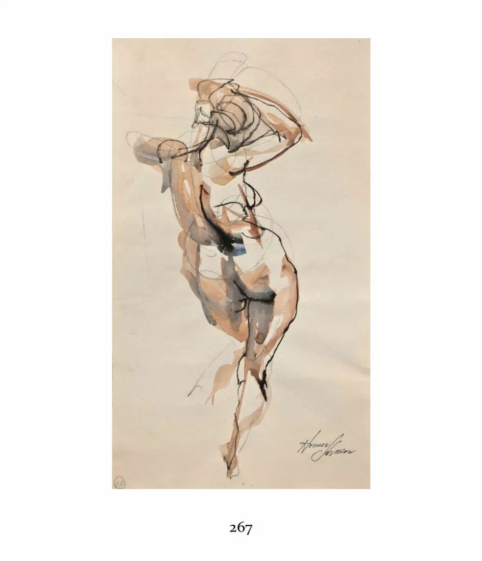
267

Homer Johnson; Vickie Posing; 1980s; pencil, brown and black ink,pen, and brush on cream paper; 14 × 7 inches (35.56 × 17.78 cm).Collection of the author.
A swift, continuous, and curvilinear movement of a pencil captures thebasic gesture of the figure. Ink washes in black and brown describe thebig areas of shading on the figure. Johnson finished the drawing with aline made with a sharpened bamboo pen dipped in black ink.
268

269

Martin Campos; Nude Figure; 2000; pencil, charcoal, brush, whitegouache, and watercolor wash on white paper; 22 × 18 inches (55.88× 45.72 cm). Collection of the author.
This drawing is lightly laid out with pencil and charcoal. Large gouachewashes describe the shadow masses. Campos finishes the drawing withline accents made with a pointed brush dipped in black ink.
Jerome Witkin, The Beauty Contest (Noose/Tag on Neck), 1996,charcoal on paper, 23¼ × 18½ inches (59.02 × 46.99 cm). Courtesy ofJack Rutberg Fine Arts (Los Angeles, CA).
This preparatory sketch for a finished painting shows a mysteriousinterior. A great variety of marks describe the general shapes and thecomposition. Some blending provides richer tonality in this essentiallyclosed form drawing.
270

TYPES OF LINEDrawing with line and line-like marks is probably the mostancient, immediate, and economical of all drawing forms.There are three basic forms of line: flat outline, often referredto as contour line; classic line, which shows great variety inthe ebb and flow, density, and clarity of the mark; andbroken line, which is created by disconnected marks thatappear continuous from a distance.
271

Flat outline, classic line, and broken line are the three major types ofline.
272

Henri Matisse, study for The Dance mural, 1931–32, gouache andgraphite on wove paper, 12½ × 22 inches (31.8 × 55.9 cm). The BarnesFoundation (Philadelphia, PA). BF1091.
In this study for a mural, Matisse uses simple contour lines combinedwith intense patches of color to define and enhance the outlinedforms.
Flat OutlineFlat outline, also referred to as contour line, is the oldest,simplest, most graphic form of line drawing. FromPaleolithic cave drawings to children’s drawings, comics, andmaps, simple outline easily and directly communicates a
273

concept, idea, or image. Flat can be angular, curvilinear,short or long, expressive or controlled, but the commondenominator is its bent-wire-like consistency and itstendency to enwrap the whole circumference of an imagewith an unbroken, even outline.
Because of its practicality, flat outline shows up constantlyin many fine art forms, commercial arts, and technical andscientific illustration. Flat outline can also be mixed withother forms of line, as well as with shading, color, and othermediums. Although it describes shapes well, however, flatoutline does not easily communicate the volume or three-dimensionality of objects. That said, flat lines can also beused in the interior of the overall shape to describe detailsand variations in the subject.
Many modern artists adopted flat line or flat contourdrawing to create two-dimensional, shape-oriented abstractimages. The French painter Henri Matisse was a master ofcontour, or flat line, drawing.
Blind contour drawing is an exercise that many are familiarwith from beginning drawing classes. Art teachers often askstudents to draw an object or setup, such as a still life, usingone continuous line and without ever looking at the page.The exercise is meant to enhance hand-eye coordination. Theresulting drawing has the characteristics of a flat contour linedrawing but—especially when done by a beginner—may not
274

look very much like the object drawn!
275

K Kewley, Compositional Sketch, 2012, ballpoint pen on paper, 2¾× 2¾ inches (6.98 × 6.98 cm). Courtesy of the artist.
Kewley’s deep interest in the abstract shapes and designs inherent innature is articulated through the flat consistency of the ballpoint lineshere.
Cross-contour drawings use flat lines to create atopographical description of a form. Lines undulate over andacross the form as well as around it to show the form’s high,intermediate, and low points, describing the object’s volumein a diagrammatic way. Cross-contour line drawings are usedfor teaching abstract concepts of volume and have a scientificapplication in the making of topographical maps.
Classic LineClassic line is organic, not static and flat. It creates a sense ofdepth and three-dimensionality by varying the thickness,clarity, and darkness of the line as it follows the contours andshapes of the subject. Elegant, clean, and pure, classic line isassociated with the aesthetics of classicism.
Classic line causes forms to appear to swell forward or torecede, following the basic optical model that sharper,darker, clearer comes forward; softer, grayer, fuzzier recedes.As a general principle, as a form swells and moves forward oroutward, the line becomes thicker and darker. As a formdiminishes or recedes, the line lightens and softens. This is
276

especially useful in drawing organic forms like the humanbody, but it also works extremely well in line drawings of astill life, landscape, or other subject.
Developed by the ancient Greeks and brought to a highdegree of sophistication by Renaissance artists, classic line, ina variety of forms, can quickly bring a sense of volume to anyobject. Classic line does not depend on light or shade for itssolidity (see the section on open and closed form), thoughvarious techniques for introducing light and shade are oftenused in classic line drawings.
Approaches to classic line vary according to the aestheticsof the artist. Jean-Auguste-Dominique Ingres relied heavilyon continuous organic line alone to create form in hisdrawings, even though light and shade effects are alsopresent. Other artists, like Peter Paul Rubens, haveintegrated classic line with atmosphere and tonality toachieve a mixed, balanced effect.
Subtle line touches in the interior of the object can adddetail and complete the form. For example, rich classic linecan describe the contours of the torso of a life model, whilemore subtle, light, or discontinuous line touches candescribe the torso’s interior anatomy.
277

278

Al Gury, Figure Study, 2000, white pastel and charcoal on brownlaid charcoal paper, 24 × 18 inches (60.96 × 45.72 cm).
In Figure Study, I used a broader and softer interpretation of linequality than in Nude Study to the right. The line has almost no clearedges. I also utilized the strong texture of the laid paper for variety. I“brushed on” the white highlights using the side of the white chalk.
279

280

Al Gury, Nude Study, 2012, charcoal and white pastel on laid creamcharcoal paper, 30 × 24 inches (76.2 × 60.96 cm).
In Nude Study, I described the form of the figure with an organic,changing line, which varies from sharp to soft. Even though I addedtones and white chalk to suggest shadows and lights in the figure’sform, it is the organic line quality that really creates and finishes it.
Broken LineBroken line is the most variable of the line types. Unlikeclassic line, it is not continuous and shows a great range ofvariation. Broken line can also exhibit the greatest amount ofindividual personality. Energetic and creative, it is associatedwith more expressive and tonal forms of drawing. Forexample, the eighteenth-century French painter AntoineWatteau (1684–1721) used lines that could be described as“sketchy.” When viewed up close, you can see their stop-and-start quality, applied according to the texture of the subject.However when viewed from a distance, Watteau’s linesappear even. The twentieth-century Expressionist painterWillem de Kooning (1904–1997) used broken, variable linesin an aggressive way to create drawings that have both flatand spatial elements.
281

Al Gury, Sketch for a Landscape, 2016, pencil and Sharpie pen onpaper, 5 × 8 inches (12.7 × 20.32 cm).
The lines in this drawing are a mixture of short broken or fragmentedmarks and dots. No line is continuous. The whole piece suggeststexture, atmosphere, and depth.
282

Edgar Degas, Diego Martelli, 1879, charcoal and white chalk, 178/25
× 128/25 inches (44.0 × 31.3 cm). The Cleveland Museum of Art(Cleveland, OH). John L. Severance Fund. 1952.268.
This sensitive but energetic portrait was created with short, broken,discontinuous line touches of varying weight and density. Unliketouches with a more classic line quality, these line touches aregenerally very rough and greatly varied n length and texture.
283

Various strengths of broken line can be used in the interiorof the form to describe its complexity, as well as around thesubject to create a sense of energy and atmosphere.
HATCHING AND OTHER DESCRIPTIVEMARKSTo describe form, depth, texture, and other visual elementsin easily readable ways, artists have invented a great varietyof marks. Along with the different types of line discussedprior and open- and closed-form drawing (see this page), thevisual language of marks can be very broad. There are somebasic ones, however, that are foundational, practical, andperennial in drawing. These include hatching, scumbling,graining, and stippling.
HatchingHatching, sometimes called cross-hatching, is a technique ofdescribing volume by building up small lines over each otherto describe form, contour, and light and shade. Hatchingtechniques are common in figure and portrait drawing, stilllife, and landscape drawing, where descriptions of form arerequired. The use of hatching can be observed in drawingsand paintings from as early as the ancient Greco-Roman era,
284

and examples of classic hatching are seen in fifteenth- andsixteenth-century Italian Renaissance masters like Raphael(1483–1520) and Michelangelo Buonarroti (1474–1564).
Classic hatching techniques are economical, never random,and usually very controlled and consistent. The term cross-hatching has led to some misunderstanding of the process.Usually, hatching does not resemble random tic-tac-toe or Xmarks. Hatching that is confused or random or that makesthe subject look hairy damages the sense of form that ishatching’s purpose. On the other hand, the tic-tac-toe or Xkinds of hatching marks can be very useful for filling in largeflat areas of tone.
In the most basic, classical type of hatching, there istypically a long hatch, which describes the direction of thelight and the shadow mass, followed by specific contourhatches, which describe the turning of smaller, more specificforms in both the light and shadow masses and which marktransitions and direction changes between forms. Thesesmaller contour hatches are the source of the name cross-hatching because they do, in fact, cross the contours andother hatch lines.
The line weight of hatching marks varies, following therule sharper, darker, clearer comes forward; softer, grayer,less clear recedes. Nearer forms will have stronger and darkerhatch marks, while diminishing or receding forms will have
285

lighter hatching lines.Renaissance and Baroque masters developed their own
interpretations and touches in hatching, and there are anumber of hatching variations. Still, at no time does hatchingbecome random, messy, or superficial unless the artist ischoosing to do so to serve a personal aesthetic or create aspecific expressive effect. Good examples of hatching forstudy range from those used by sixteenth-century Italianssuch as Annibale Carracci (1560–1609) to the hatchingemployed by nineteenth- and twentieth-century masterssuch as John Singer Sargent (1856–1925) and Paul Cadmus(1904–1999). As hatching forms evolved, inventiveness andaesthetic necessity created unique practices: Sargent gave alooser, more expressive feeling to his hatching; Cadmusbrought clarity and finesse to the ancient craft of classic-stylehatching.
286

Paul Cadmus, Male Nude (#179), 1983, crayon and olive greenacrylic on gray paper, sheet: 24⅝ × 17⅝ inches (62.6 × 44.9 cm).Smithsonian American Art Museum (Washington, D.C.). Gift ofthe Sara Roby Foundation, 1986.6.12. Photo credit: SmithsonianArt Museum/Art Resource, NY; © VAGA.
Cadmus almost sculpts his figures with energetic, concise hatch linesfollowing the surface directions of the form.
287

288

Pierre-Paul Prud’hon, Bust of Female Figure, c. 1814, chalk on bluewove paper, sheet 11 × 8⅝ inches (27.9 × 21.9 cm). PhiladelphiaMuseum of Art (Philadelphia, PA). The Henry P. McIlhennyCollection in memory of Frances P. McIlhenny, 1986.
Prud’hon builds his figures by starting with a rough outline in blackchalk. He next lays in the light and shade masses and forms withequally rough hatch lines. He then blends the whole piece. To finish,he refines the surface with delicate, clean hatch lines to model the finalform and create subtlety of tonality and modulation.
ScumblingOften used for dry-brush effects in oil painting, scumblinghas a similar use and appearance in drawing. Althoughscumbling is similar to graining (see below), it is rougher anddoes not necessarily require a sharpened drawing tool. Arough dragging of the drawing tool, such as a charcoal stick,over the drawing surface can create quick and broadatmospheric effects and create a layer for other touches andmodulations. Scumbling is especially useful in moreexpressive drawings.
GrainingGraining is the process of building tone slowly, delicately,and evenly with a sharpened drawing tool over the grain ofthe paper. The grain, or weave, of the paper is crucial to thisapproach, as is the sensitivity of the hand and tool to the
289

surface of the paper. Graining was a popular shadingapproach in nineteenth-century academic drawing. Inacademic life drawing, graining was used both to createshadow masses and variations in anatomy in the figure andto develop a sense of tone and depth around the figure.
Graining is often combined with both classic hatching andbroken line to create beautiful and rich atmospheric effects.It can be a good choice when making a drawing that requiressubtlety and delicacy in its tones and overall development.
StipplingThe term stippling refers to a buildup of small dots to createvarieties of tone and densities of form. Stippling creates astrongly open-form effect, though from a distance a stippledimage can seem very solid. Often associated with thePointillist approach of French painters like Georges Seurat, itis also favored by some illustrators because stippled effectsreproduce so well.
SHAPEAll visible things have shape, whether they are solid formslike a pear or amorphous atmospheric structures like acloud. Shape describes structure and is characteristic of both
290

two- and three-dimensional forms: a flat snowflake has ashape and so does a volumetric crystal.
Shape can be thought of in two ways. The first is thesimple geometry of any object (for example, circle, oval,square, rectangle, triangle). Most objects can be simplified toone of these shapes. For example, a flower can be simplifiedto a round or oval shape that gives basic character to theblossom regardless of the details of its petals. The basicshape gives the object cohesiveness and organization, andcreating basic shape descriptions is often the first stage inlaying out a drawing.
291

Simple descriptions of the shape of an object organize the experienceof its form and mass. Most solid objects can be defined by a simpleshape to start the drawing process.
The second way of thinking about shape is to attend to themore complex, complete shape or contour of a specificobject. The shape of a specific flower includes all the ins andouts of its details—a complete silhouette. When drawing,this more complicated shape can be added to or built on topof the basic geometric layout. The layers of shape provide amap for the addition of details, the further development of
292

form, and the creation of aesthetic effects. Using bothaspects of shape creates a drawing that is solid geometricallyand confident in its details.
Paying attention to shapes is critically important whendesigning a composition. The shapes’ relationships to oneanother within the rectangular field of the compositioncreate balance, movement, and different types of visualstatements. To go back to that flower shape: In a still life, itmight be connected to the shape of a vase, a table shape, theshape of a window behind the table, and the shapes ofarchitectural elements in the room. All these shapes togetherprovide the composition’s layout.
Shapes are essential to composition whether the image isrealistic or abstract. In a painting by the Italian master Titian(c. 1488–1576), shapes are an important underlying part ofthe composition, setting the arrangement of figures, trees,and other objects within the picture’s rectangle. In themature work of the twentieth-century Dutch painter PietMondrian (1872–1944), shapes and colors are the dominantcompositional elements.
293

Al Gury, Compositional sketch of shapes, 2001, pen and brownwatercolor wash on watercolor paper, 8 × 5 inches (20.32 × 12.7 cm).
In this compositional sketch, I defined the essential shapes of thecharacters in clear and simple terms. No details were added to confusethe strength of the shapes.
294
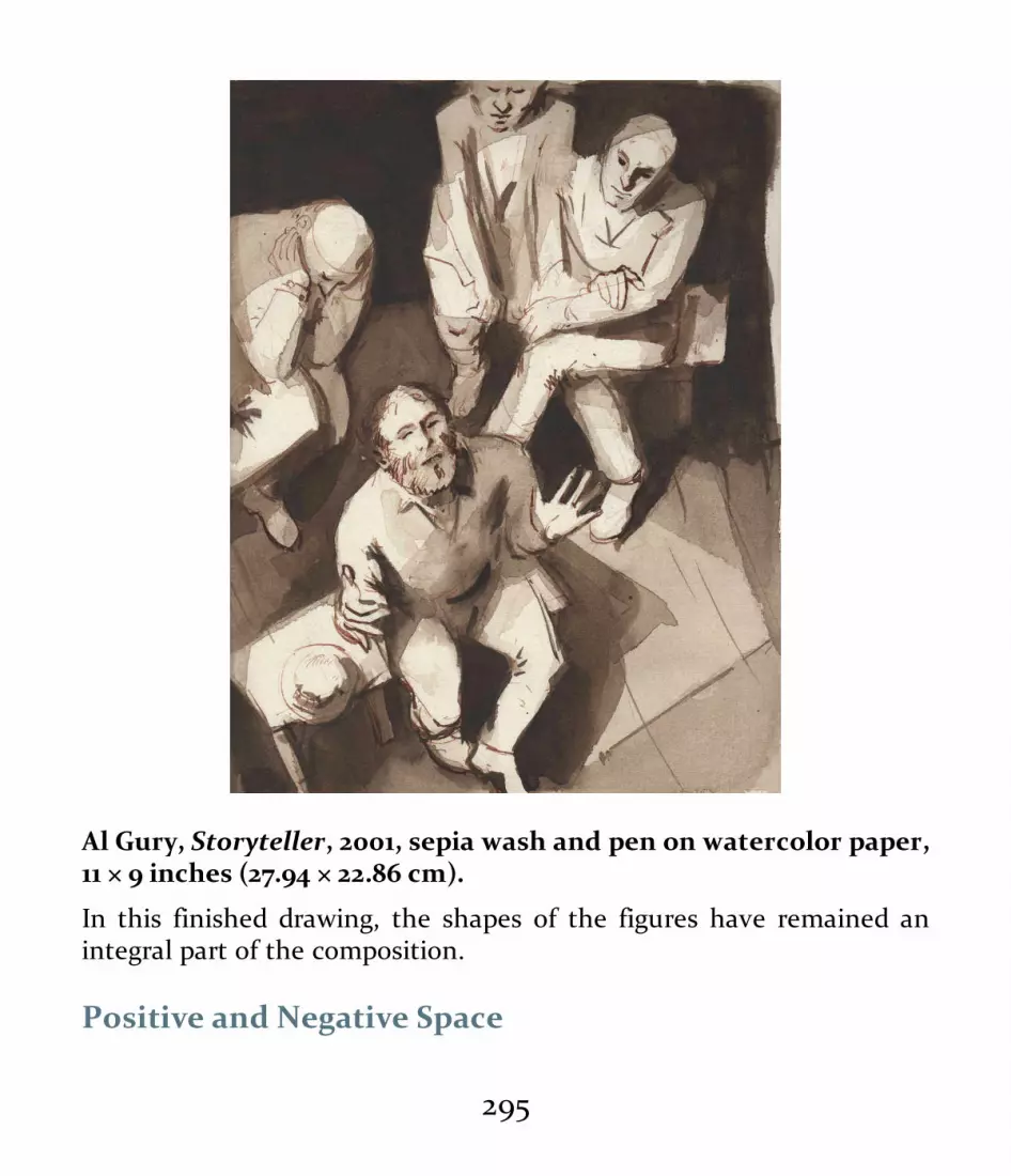
Al Gury, Storyteller, 2001, sepia wash and pen on watercolor paper,11 × 9 inches (27.94 × 22.86 cm).
In this finished drawing, the shapes of the figures have remained anintegral part of the composition.
Positive and Negative Space
295

Positive space generally refers to the solid objects or shapesin a composition, while negative space commonly denotesthe areas around or between the objects. Positive andnegative spaces in a drawing can be flat or suggest spatialdepth. For example, in a drawing of a vase on a table, theshapes of the vase and the table will constitute the positivespace; the background around the vase and table will be thenegative space. By this definition, all the solid objects in acomposition can be thought of as the positive space and allthe non-solid shapes around and between the objects are thenegative space. In a landscape drawing, for example, thepositive space would be the land and trees while the negativespace would be the sky and air around and between them.
In an abstract drawing in which depth is not a factor, thepositive space is defined by the active, dominant shapeswhile the negative space is marked out by the passive,nondominant shapes. In some cases, they might have equalintensity. Balance between positive and negative space iscrucial to the success of a composition and the aestheticstatement of an artwork. In works by the twentieth-centuryAmerican abstract artist Robert Motherwell (1915–1991),positive and negative spaces have equal strength.
296

In this sketch, the positive elements are the objects and table. Thenegative spaces are the background and opening of the handle.
297

298

Joan Becker, Le Dejeuner sur L’Herbe, 2013, watercolor on paper,40 × 30 inches (101.6 × 76.2 cm). Courtesy of the artist and GrossMcLeaf Gallery (Philadelphia, PA).
Becker focuses on the flat shapes, as well as the positive and negativequalities of all the elements: plants, the woman, the bird, the Manetimage, and so on. Illusions of depth are secondary or nonexistent. Thisallows her to create a strong sense of graphic design within therectangle.
The interplay between positive and negative space is fairlyclear when the scene or composition is simple. The morecomplex the composition or scene, the more difficult itbecomes to identify positive versus negative spaces.
Patterns and TessellationsPattern refers to repeated shapes within a composition. Theshapes can be interlocking or separate, but pattern dependson repetition. Patterns can be evenly repeated, as in a plaidfabric, or they can be organic and variable, as in a leopard’sspots. The main point is that they create a visual connectivityand balance among themselves and the composition as awhole.
299

This “log cabin” quilt provides a perfect example of tessellations, orrepeated patterns.
Patterns are especially important in the works of modernartists like Georges Braque and Henri Matisse. For manymodern artists, the use of patterns in the artwork of ancientand non-European cultures was a great stimulus and sourceof invention and creativity.
Tessellations are repeated, interlocking groups or blocks ofpatterns. The patterns of checkerboards and other gameboards are tessellated, and fabric designs, such as quiltpatterns, often depend on repeated blocks of shapes.
300

Tessellations and patterns are useful in teaching the conceptsof positive and negative space and balance in a composition—a topic furthered explored in the section on composition(this page).
DEPTH AND PERSPECTIVETwo types of perspective are most common in drawing:geometric perspective and aerial perspective (also calledatmospheric perspective). Both utilize the concepts offoreground (nearest the viewer), middle ground (midwaybetween the viewer and the farthest distance), and farground (farthest from the viewer and the foreground). Bothattempt to believably simulate how the human eye and mindperceive depth.
Geometric PerspectiveGeometric perspective—also called linear perspective ormathematical perspective—uses horizon lines and vanishingpoints to construct a rational, architectural illusion of depth.Ancient Greek architects used geometric perspective andother optical tricks to create visual balance and harmony intheir temples. Renaissance artists were fascinated by thegeometric perspective they saw in ancient Greek and Roman
301

buildings and artworks and developed systems of geometricperspective used to this day.
A fine example of Renaissance geometric perspective isseen in the Italian painter Pietro Perugino’s (c. 1446/52–1523)Sistine Chapel fresco Christ Giving the Keys to Saint Peter. Inthis famous picture, the figures, buildings, and illusion ofdepth are organized around geometric recessions of one- andtwo-point perspective. The twentieth-century Dutch artistM. C. Escher (1898–1972) is a good example of a modernartist who used linear or geometric perspective. Escher’scomplex illusions result partly from tricks he played withperspective.
Aerial PerspectiveAerial or atmospheric perspective creates illusions of depththrough size relationships, distances, edge differences, lightand shade, color, and other elements. The illusion ofatmospheric perspective can be created through themanipulation of many combinations of tones, textures, lines,and so on, but the common denominator is that theforeground of a space and its objects are sharper, clearer,larger, or darker relative to the recessive areas, which aresofter, less clear, smaller, and less dark.
During the Renaissance, this form of perspective was oftenused in conjunction with geometric perspective. For
302

example, in Perugino’s painting Christ Giving the Keys toSaint Peter, mentioned previously, atmospheric illusions ofdepth are added to the geometric perspective. Theforeground figures are larger, clearer, and have more tonalcontrast as compared to the distance, which is softer, smallerin scale, and less defined than the foreground. Thenineteenth-century French Romantic painter Jean-Baptiste-Camille Corot (1796–1875) used atmospheric perspectiveextensively, creating illusions of soft, hazy atmosphericdepth through relationships among colors, tones, andtextures. The depth is “felt” through these relationshipsrather than “reasoned” through geometric perspective. Aerialperspective was also a preferred technique of many Romanticartists, such as Eugène Delacroix, and of FrenchImpressionists and Postimpressionists who followed,including artists such as Pierre-Auguste Renoir and Vincentvan Gogh.
303

David Wiesner, illustration for Tuesday (New York: Clarion Books,1991), 1991, watercolor on Arches 140 lb. cold-pressed watercolorpaper, 11 × 22 inches (27.95 × 55.88 cm). Courtesy of the artist.
Classic aerial perspective is used in this beautiful illustration. Thelarger, clearer forms appear to come forward while the smaller, lessclear ones diminish. In addition, the positions of the frogs followdiminishing geometric lines.
304
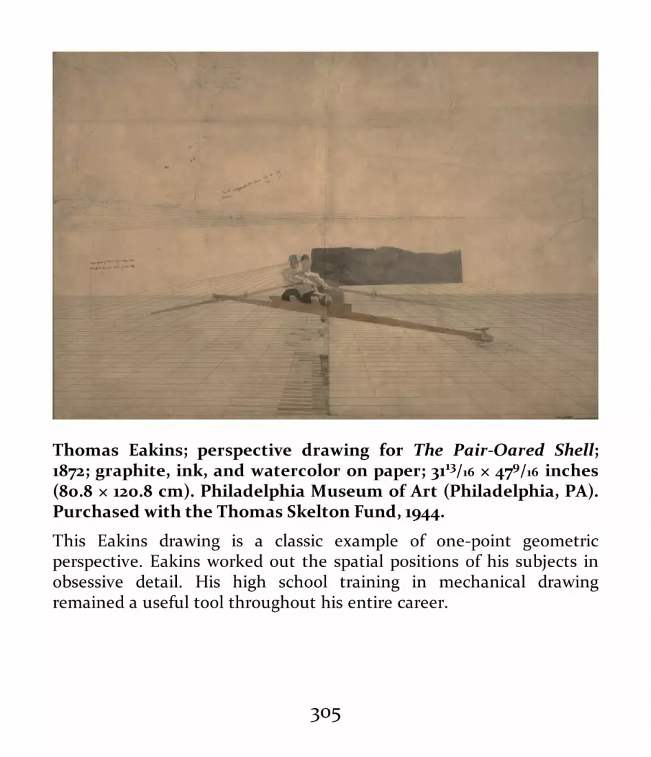
Thomas Eakins; perspective drawing for The Pair-Oared Shell;1872; graphite, ink, and watercolor on paper; 3113/16 × 479/16 inches(80.8 × 120.8 cm). Philadelphia Museum of Art (Philadelphia, PA).Purchased with the Thomas Skelton Fund, 1944.
This Eakins drawing is a classic example of one-point geometricperspective. Eakins worked out the spatial positions of his subjects inobsessive detail. His high school training in mechanical drawingremained a useful tool throughout his entire career.
305

Vincent van Gogh; Haystacks; 1888; reed pen, quill, and ink overgraphite on wove paper; 9½ × 12½ inches (21.1 × 31.8 cm).Philadelphia Museum of Art (Philadelphia, PA). The Samuel S.White 3rd and Vera White Collection, 1962.
In this sketch, Van Gogh creates an even field of interpretive texturalmarks over the picture plane of the rectangle, then establishes theforeground with darker lines and dots.
306

Larger, sharper, darker, clearer comes forward, while grayer, less clear,and smaller recedes in this classic diagram of aerial perspective.
ForeshorteningForeshortening conveys perceptual perspective bymodulating forms so that they appear to be moving forwardor receding backward in space. In drawing, foreshortening isoften used to describe the projections of forms such as thelimbs of a life model and to show the overlapping of organicforms. Some general rules apply in foreshortening:
• Forward-moving forms appear larger than recedingforms.
• Forward-moving forms are sharper and clearer in
307

definition relative to receding forms, which are lessclearly defined.
• Overlaps of forms are defined by their contours.• Measurements of forms shorten radically in
foreshortening.For successful foreshortening, you must carefully measure
the height and width of the forms as they appear from yourpoint of view. You must clearly identify the angles ofrecession, assess the overlapping contours of all parts of theforms, and adjust the clarity, sharpness, and contrast offorward-moving forms relative to receding forms.
There are two basic types of foreshortening: normative andextreme. Normative foreshortening occurs as contoursoverlap, especially in organic forms. A drawing of a lifemodel, for example, might show the contours of one musclein an arm hanging in a relaxed manner at the model’s side.The way in which one muscle crosses over another on adiagonal is the normal overlapping of forms in the body. Thisis the most common or “normal” form of foreshortening.Normative foreshortening can be used in drawing manyorganic and inorganic forms such as plants, animals, andstill-life objects. Line quality and weight are important inthese visual descriptions.
Extreme foreshortening occurs when a form or group of
308

forms—for example, a model’s arm—is extended toward theviewer. The forward-moving form obscures the recedingforms. The foremost form, perhaps the hand, will seemmuch larger than the rest of the arm. By combiningmeasurement with heightened line, tone, and edge clarity,the artist can make the hand seem to zoom forward as therest of the arm recedes or disappears behind it.
Many people who are just beginning to draw are dismayedby foreshortening. Learning the rules and carefully planningthe relationships can make this form of perspective not onlyan accurate tool but also a welcome choice in a composition.
309

310

Diane Edison, Nude Self Portrait, 1995, pastel on black paper, 44½× 30 inches (112.40 × 76.2 cm). Courtesy of the PennsylvaniaAcademy of the Fine Arts (Philadelphia, PA). Art by WomenCollection, gift of Linda Lee Alter. Acc. No: 2011.1.57.
Edison uses normative foreshortening in most areas of this powerfuldrawing, while moving toward more extreme foreshortening seen inthe overlaps of the head position and features. This image is a fineexample of pastel and contemporary self-portraiture.
CLOSED VERSUS OPEN FORMDrawings can be characterized as either closed form or openform. Closed form is created by contour or classic line aloneand does not depend on other elements such as shading. If aclosed-form drawing does have shading, the shading couldbe removed and the drawing would retain its basic form viathe line. Closed-form drawing is integral to many schools ofaesthetics and to methods from classicism to simplediagrammatic illustration. Good examples of closed form areprovided by the works of the German Renaissance artistsAlbrecht Dürer (1471–1528) and Hans Holbein the Younger(1497–1543). Even though both beautifully elaborated theirdrawings with shading and interior detail, the key element inboth artists’ work is the enwrapping, organic, classic line ofthe contours.
311

Closed-form drawing includes flat-outline drawing. HenriMatisse utilized enwrapping flat outlines in his drawings todescribe shapes and patterns. The much-loved drawings ofthe American artist and writer known as Dr. Seuss (TheodoreSeuss Geisel, 1904–1991) also utilize flat line to strength thedescription of his characters.
Open-form drawings, by contrast, exhibit a combination oflight and shade, broken-line suggestions, and variation in lineweight. Open-form drawings can range from being almostclosed in appearance, like those of Rembrandt, to an extremein which there are no lines of any kind, as in Seurat’sPointillist works. Although Rembrandt’s drawingsincorporate powerful line elements, those are complementedby a wide variety of tonal effects and other suggestions ofatmosphere and depth, making his drawings especially richand emotionally evocative. Seurat, in many of his drawings,dispenses with line marks altogether, simply dragging hischarcoal over the texture of the paper to create tone andatmosphere. The drawings of Rembrandt and Seurat wouldbegin to lose their coherence if the tone and atmospherewere deleted.
312

Student cast drawing, early twentieth century, charcoal on creamlaid paper, 20 × 18 inches (50.8 × 45.72 cm). School Collection,Pennsylvania Academy of the Fine Arts (Philadelphia, PA).
This extremely open-form drawing is made up of short strokes ofcharcoal using its flat side. The result is almost mosaic-like.
313

314

Jean-Auguste-Dominique Ingres, study for the mural The GoldenAge, 1838–1848, graphite on wove paper, 10⅞ × 8¾ inches (27.9 × 21.9cm). Philadelphia Museum of Art (Philadelphia, PA). The Henry P.McIlhenny Collection in memory of Frances P. McIlhenny, 1986.
Ingres is considered the master of closed-form line. His enwrapping,organic lines evoke a sense of atmosphere and form using line alone.
315

316

Michael Grimaldi, Bridesmaid, 2011, mixed media on paper, 40 × 20inches (101.6 × 50.8 cm). Courtesy of the artist.
Grimaldi uses a great range of edge touches but his work is essentiallyopen form in nature. The edges vary in clarity and weight in and out ofthe atmosphere to create a sense of solidity without using any trueline.
317

318

The sphere at the top is created by organic closed-form line and doesnot depend on shading or light. The open-form sphere at the bottomhas no existence without the loose marks and tonalities of its light andshade.
Not all drawings are clearly either open or closed form.Some artists skillfully combine both approaches in abalanced, harmonious way. A drawing can depend equally online, shading, and other marks. The balance would suffer ifany of the elements were deleted.
PLANESPlanes are used in drawing three-dimensional forms toemphasize the sculptural solidity of objects. You can create aplane wherever a curved line or surface changes directionand end it where it changes direction again. Even a circle or athree-dimensional ball can be planed. This faceting isespecially important in figure drawing, where turning thesoft contours of a body into a set of planes gives the form asense of solidity. Michelangelo often emphasized andenhanced the planes of his figures to add strength andenergy to their forms.
A good exercise is to take a drawing of a human figure and
319

plane out its forms as an analytical diagram. Planes can beintermixed with curving contours to create an overall senseof fluidity and variety.
Tom LaPine, Cast Drawing, year unknown, pencil on white paper,12 × 8 inches (30.48 × 20.32 cm). Courtesy of the artist.
The turns in the form of this figure are described as facets, whetherthrough changing hatch lines or with clean exterior rectilinear lines.
320

TONALITY, LIGHT, AND SHADESince the Classical Greek period, Western artists have usedtonality, light, and shade to reveal form and depth in objects.Artists also use these elements to create mood and a sense ofdrama or emotion in artworks. In a refined, line-orienteddrawing, small amounts of shading can enhance the formcreated by the changes in line quality. In a more dramaticwork—one created with a broken line or intended to have astrong sense of atmosphere and depth—light and shadebecome the primary elements in the design and execution ofa drawing. Open-form, or atmospheric, drawings depend onlight and shade for their existence. Meanwhile, you cancreate closed-form, line-oriented drawings with minimalamounts of light and shade.
321

Student cast drawing of the Laocoön, 1980s, white pastel on darkgray charcoal paper, 24 × 18 inches (60.96 × 45.72 cm). SchoolCollection, Pennsylvania Academy of the Fine Arts (Philadelphia,PA).
Done as a class project, this study of the Laocoön was created on dark-toned paper with broken lines and scumbles of white chalk. The paperprovides the deepest darks, while gradations of white chalk developmiddle tones and highlights, creating form. Charcoal was added in onlythe most minimal touches to enhance a clear edge here or there.
Chiaroscuro
322

Chiaroscuro is an Italian Renaissance term referring to astrong and dramatic sense of light and shade. The term canbe used to describe light and shade contrasts in any drawing,in open or closed forms, as well as in artworks in which astrong contrast between light and dark is an important partof the narrative of the image. Primarily though, the termchiaroscuro is used in the context of drawings in which thereis a strong and dramatic use of light and shade.
SfumatoAnother Italian Renaissance term, sfumato refers to a visualsense of a hazy or smoky atmosphere. A sfumato effect isachieved with edges that seem to dissolve into thesurrounding atmosphere. Leonardo da Vinci famously usedsfumato effects in his drawing and painting.
323

Julia Hall, Study of light and atmosphere, pencil on paper, 2014, 7 ×5 inches (17.78 × 12.7 cm). Courtesy of the artist.
This sketchbook image combines broad hatching, erasing and blending,and line to create an atmospheric effect of light and shade. Thesimplicity of the shapes and lack of detail add to the open-form qualityof the drawing, and to a dominant sense of atmosphere, or sfumato.Hall uses a minimal line to enhance shape delineation.
Value or ToneThe term value refers to an area’s lightness or darkness and issynonymous with tone or tonality. A simple value or tone
324

scale shows gradations from absolute white to absolute blackwith a number of steps, or middle tones, in between. This isalso sometimes referred to as a grayscale. Grayscale chartsusually show ten steps, or gradations of value, in which lightvalues are numbered from 1 to 4 (where 4 marks a transitionto midtones), midtones from 4 to 7 (where 7 marks atransition to dark values), and dark values from 7 to 10. Agrayscale chart can help artists identify values in what theyobserve and match them to their drawings.
A typical grayscale. Having an image of the grayscale in your mindwhen drawing can make it easier to gauge values.
Light and ShadeLight and shade in nature, and thus in a drawing, can beclear or unclear, specific or generalized. When there is aspecific light source, such as a lamp or light from a window,we say that there is directional light present in the scene. Inan environment where there is only generalized ambientlight, such as on an overcast day outdoors or from overheadfluorescent light in a room, we can say that there is nospecific light direction. The light can also be mixed, with a
325

variety of light sources or directional light in the midst of alot of ambient light.
Analyzing the light on or around a subject is crucial todescribing the volume of the object in a drawing. Forexample, a vase on the sill of a small window will exhibit astrong sense of light and shade, especially if the only light inthe scene is coming from the window. If there are otherlights on in the room, the light and shade on the vase will beaffected, reducing the effect of the backlighting. If the vase isplaced on a table in a room lit by overhead fluorescent lights,the ambient light that fills the room will destroy any sense ofstrong directional light and shade on the vase.
We thus have three lighting setups: The first creates formby strong opposition of light and shade. The second createsform with a mixture of light, middle, and dark values. Thethird description of form depends on line quality, rather thanlight. Lighting must be set up thoughtfully to achieve thedesired effect in a drawing. A good exercise is to set up threetypes of lighting situations and do drawings of each.
Light mass refers to all the light areas in the object,including subtle variations within the light mass. Shadowmass is all the shadow on the object, including variations inthe shadow mass and reflected lights. The concept of lightmass/shadow mass assumes that there is a distinguishablelight direction on the subject that creates clear distinctions
326

between light and shade on the object. If the subject weresurrounded by light, there would be no clear light or shadowmasses.
Transition refers to the area where the light meets theshade. Depending on the intensity of the light source,transitions can be more or less dramatic. The passage wherethe light transitions into the shadow is usually the darkestpassage because it receives the least reflected light and isfarthest away from both the direct light and the reflectedlights.
Reflected lights are of two general types. In the first,ambient light in the atmospheric space around the objectfilters into the shadow to slightly illuminate what mightotherwise be an absolutely black shadow. The more ambientlight in the room, the greater the amount of reflected light.Also, the shinier or more reflective the surface of the objectbeing drawn, the sharper the reflected lights will be. Forexample, a vase made of shiny glass or metal may have sharpreflected lights. A vase made of a dull or rough material mayhave only faint reflected lights.
327

328

Daniel Murano, Study of a Male Nude, 2014, graphite on whitepaper, 20 × 16 inches (50.8 × 40.64 cm). Courtesy of the artist.
Study of a Male Nude exhibits a broad range of tonalities and use of thefull grayscale. The darker tones (7–9), which are more defined and areaggressively described and have clearer edges, within the figure’sshadows cause his forms to swell forward optically. Lighter midtones(4–7), which in this drawing are softer with less clearly defined edges,create optical recessions. Highlights (1–2) and dark accents (8–10)complete the sense of form.
329

330

Eric Jensen, nude study, 1990s, sanguine and white chalk on graycharcoal paper, 12 × 7 inches (30.48 × 17.78 cm). Collection of theauthor.
Jensen’s drawing exhibits a variety of marks, lines, and tones. Thisdrawing depends on both line and tonal effects and mixes closed andopen forms.
In the second type of reflected light, light from the lightsource or from the ambient light reflects off an object ontoothers nearby. Light bouncing onto an object from anotherobject enters the shadow to make a rather clear line ofillumination. A classic example happens when you place awhite vase near a dark vase. Light bounces from the whitevase into the dark shadow of the dark vase. Sharp, palereflected lights result. Also, the color of one object maybounce into the shadow of another. In drawings of the nudehuman figure, a common effect is reflected light from a torsobouncing into the shadow of an arm. The result is both aglow of light and a glow of color.
Although subtle reflected lights are common in shadowmasses, they should not be overemphasized. Overdoingthem may result in the weakening of the overall light anddark masses of an object or a scene. Beginners often overdoreflected lights in their effort to carefully render what theysee, but it is important to remember that the whole ensemblematters more than the details.
331

Like drawing techniques in general, methods of describinglight and shade can be described as additive, subtractive, ormixed. In additive approaches, descriptions of light andshade are constructed through a buildup of lines or tonesadded to the shapes, usually on pale or white paper. Thelight paper provides the basis for the light mass, while thedark tones are added and built. Overworking shadows makesthem flat and black, so to give a sense of luminosity,especially in the darks, the light paper should slightly showthrough all the tones.
Additive approaches can also be used on middle-tonedpapers, which establish the middle tone while dark and lightare added to create a complete sense of tonality and form.The middle-toned paper can be completely covered by thedrawing medium, such as Conté or charcoal, or the paperitself can provide a sense of unity in the darks. Light can becreated by adding light or white chalks or pastels. In eithercase, it remains important to utilize the grain and luminosityof the paper to keep the darks and lights from going flat anddull.
Subtractive approaches include the wipe-out methoddiscussed earlier (see this page). Wipe-out methods rely on aground of charcoal, graphite, or other chalks rubbed onto thesurface of pale or white paper. The areas of the light massand related tone variations are then erased from the ground
332

to create an illusion of masses of light and dark. Furthererasing can create modulations and reflected lights. Theground is usually a middle tone or darker. The lighter theground, the more the darks may have to be modulated. Thedarker the ground, the less modulation may be needed in thedark mass.
In both additive and subtractive methods, lines or othermarks may be added for clarity, definition, and expression.Wipe-out drawings can also be done on middle-tone andcolored papers with the addition of light touches in the lightmass.
In mixed effects, a variety of marks can be used to build adrawing in which value is a factor. The German artist KätheKollwitz used a mixed effect of lines, erasures, white chalksadded for highlights, and so on to build up a rich effect oflight and shadow on both pale and toned papers.
TEXTURETo create texture in a drawing, you must observe thedifferences in the surfaces of the object you are drawing andthen decide what kinds of drawing tools to use and whatkinds of marks to make to simulate those textures. Forexample, a sharpened graphite pencil, as opposed to a
333

sharpened charcoal pencil, might provide just the right sizeof mark, or vice versa.
The relationships of textures to one another must becarefully assessed and planned. Lack of textural variety cancreate a bland evenness or flatness in a drawing.
Too often, beginners tend to make all the surfaces in adrawing look the same. Over-blending is a commonproblem, as is doing the drawing in detailed pieces withoutevaluating the overall composition and its texturalrelationships.
334

Roger Peterson; Adventures; 1998; pen, graphite, and ink wash onpaper; 12 × 5 inches (30.48 × 12.7 cm). Collection of the author.
Peterson created the great variety of textures in this drawing bychanging the direction and shape of the lines used to describe eachobject.
335

COMPOSITION AND THECOMPOSITIONAL FRAMEComposition refers to the arrangement of visual elementsinto a pictorial structure. This structure is most oftenenclosed within compositional margins such as the edges ofthe paper, or a crop line around the margins of thecomposition. This enclosure focuses both the artist’s and theviewer’s eye on the important elements of the artwork. Thismargin simply represents the outside parameters of theimage. Just like composition in other creative disciplinessuch as music and literature, composition in visual art givesorganization to the work and directs the audience to theexperiences the artist wants them to have.
Composition may consist of nothing more thanpositioning a sketch on the page or it may involve a complexarrangement of many elements in an image. A compositioncan be rationally planned or explored in a subjective manner.In any case, it requires thought and planning to besuccessful. Compositional difficulties arise when the sense oforganization is awkward, incomplete, or unbalanced.
336

Jerome Witkin; What Remains of the Death of Children; c. 2011,graphite; Conté crayon, Prismacolor crayon, and collage on paper;46⅜ × 34¾ inches (117.80 × 88.26 cm). Courtesy of Jack Rutberg FineArts (Los Angeles, CA).
Witkin creates a stage set of emotional and visual experiences in thiscomposition. The elements relate to one another from side to side, andthe composition possesses a sense of wholeness while providinginteresting stops and side tours for the eye.
A viewfinder (this page) can be extremely useful whenplanning a composition. The hole in the viewfinder, whichcan be a rectangle, square, circle, or other shape, encloses thecomposition, allowing you to orchestrate the elements of theimage you want to create in a focused manner. Preparatory
337

thumbnail sketches made with the use of a viewfinder willhelp you visualize the composition possibilities.
Thumbnail Sketches and Storyboards
When planning a composition, it may be advisable to do somepreparatory sketches. The thumbnail, or compositional sketch,allows the artist to quickly work out the basic formal andinformal elements of the drawing on a small scale. Trying out avariety of arrangements in the rectangle of the compositionalframe gives you a good idea of what the finished drawing willlook like.
One of the pleasures of looking at artists’ sketchbooks isseeing their ideas change and evolve through many smallcompositional sketches. One thumbnailing strategy is just tosketch the elements of the image freely and then to draw arectangle around a portion of the sketch to establish thecompositional frame. Another is to first draw a number ofrectangles and then to sketch the elements of the compositionwithin these frames.
Storyboards are another form of compositional planning, oneused frequently by painters, illustrators, animators, and makersof live-action films and videos. A storyboard consists of a seriesof compositional frames laid out sequentially. Each importantscene or image in the story is drawn, in sequence, in therectangles. Storyboards are usually sketchy, intending only toshow the main elements of a shot or scene. The whole
338

narrative can then be edited and adjusted for content, flow,and unity.
Dummy books are also sketched out sequentially. A dummybook is a series of sketches of the pages of a visually-drivenbook. Children’s book illustrators routinely create dummybooks to present to publishers. These, along with samples offinished illustrations, present the whole character and contentof the book for consideration by the publisher.
Sophie Courtland, sketchbook page for a composition,2014, pencil on white paper, 7 × 5 inches (17.78 × 12.7 cm).Courtesy of the artist.
In this sketchbook drawing, Courtland has worked out theelements of a complex narrative scene within thecompositional shape and margin. Loose crop lines mark themargins of the composition. Notes on the page suggest artistsCourtland was thinking about as influences for creating the
339

image.
Robert Byrd, sketch and page layout for Smiling Lady(illustration for Byrd’s Leonardo: Beautiful Dreamer [NewYork: Dutton Children’s Books, 2003]), 2003, HB and 2Bpencil on tracing paper, 8 × 18 inches (20.32 × 45.72 cm).Courtesy of the artist.
In this preparatory compositional sketch, Byrd has worked outall elements, not only in the primary image, but also in thepage layout. The large illustration has a compositional designthat balances and repeats the arrangement of text andsecondary images on this two-page book spread.
340

Zane L’Erario, storyboards for film stills, 2012, pencil andblack marker on white paper, 11½ × 8 inches (29.21 × 20.32
341

cm). Courtesy of the director and Front House Pictures.
Compositional decisions are extremely important to thecreation of scene shots in a film. Here, the director has madecompositional storyboard decisions about each frame usingscale, positive and negative shapes, and the compositionalmargin.
Page PositionConsideration of the position of the image on the page is thesimplest form of compositional planning. First, think aboutthe desired size of the drawing. Mark the parameters of thefigure or object with a few simple points on the page. Thenbuild the drawing within these parameters. Consideration ofeffective page position, especially for single objects like a lifefigure or a lone still-life object, will develop your instinct forcomposition and design.
Visual Point of ViewThe artist’s point of view in relation to the objects beingdrawn is likewise an important consideration. For example, ifthe viewer is standing slightly above a still life, the objects onthe tabletop will seem to recede away from one another. Theobjects that are closer to the viewer will be placed lower onthe page relative to objects that are farther away, and vice
342

versa.The arrangement of the objects’ bases describes where they
are spatially in the composition. One error beginners oftenmake is to align all the bases of the objects too closely alongthe same base line. This can be corrected through measuringwith a drawing tool, such as a pencil, to gauge the alignmentof the bases and correct their positions, moving them up ordown on the page.
343

In this view from slightly above, the artist can utilize traditionalRenaissance perspective and optical rules easily.
This view from above flattens the scene and emphasizes shapes ratherthan forms.
Picture PlaneThe picture plane is the flat, “up-front” surface of the picture
344

within the compositional frame. Sometimes the term denotesthe theoretical flat surface of an image, but it can also meanthe flat material (paper or canvas, for example) on which thepicture is created. Both flat and spatial pictures have apicture plane. When discussing nonrepresentationaldrawings and paintings, or flat abstract images, the pictureplane refers to the overall surface and the elementscomposing the image. Everything is up front—visually andphysically—on the surface of the paper. In spatial,perspective-oriented images, such as landscapes, depthbeyond the picture plane is revealed via receding perspectivelines or relationships of sizes and tones (aerial perspective).The picture plane is figuratively a window through which theimage is seen. It is not uncommon for students analyzing adepth-oriented image to reduce it to a flat-picture-planedrawing of the shapes that make up the composition.Abstract or other flat images preserve the picture plane,while three-dimensional images break through it. Pictureplane has been a common part of the discussionssurrounding flat, modernist painting in the twentiethcentury. The picture plane was a less important topic of adiscussion in earlier eras, when images were considered to bewindows revealing spatial depth and forms.
For example, in a Rembrandt painting, we seem to belooking at the image through a transparent window. The flat
345

picture plane is “dissolved” by the illusion of depth andperspective in the painting. In an artwork lacking in spatialdepth, such as an abstract work by the Dutch painterMondrian, the painted surface of the canvas and the contentof the painting are one and the same. The flatness of thepicture plane is reaffirmed by the abstract elements’ lack ofdepth.
Compositional OrganizationA number of reliable compositional formats have been in usefor thousands of years. The ancient Egyptians favoredrectilinear formats. The ancient Greeks took theircompositional cues from the classical concepts of balance,order, harmony, and restraint. Seventeenth-century Dutchand Flemish painters favored curvilinear arrangements thatemphasized energy and strength. Being aware of the basictypes provides a good platform from which to explorecompositional arrangements. Development of a personalsense of composition comes from both knowledge andexperimentation.
Common Compositional Problems
The most common compositional difficulties are these:
346

• An image or idea drawn without consideration of thecompositional frame or its position on the page, thuscreating a sense that the image is “floating” randomly onthe page. This can greatly weaken an image.
• Confusion regarding the relation between the subjectmatter and the shape and proportions of the compositionalframe, creating lack of clarity as to which shapes or formsare more important and which are less so.
• The size or scale of the elements (that is, of forms andshapes) within the compositional frame, and whether theelements are running off or extending outside of thecompositional frame or staying within it. If the extenstionof forms or shapes outside the compositional frame isaccidental and not intended, this must be considered acompositional error and a redesign is recommended.
• Lopsided, unstable images placed too far to one side of thecomposition, thus creating a sense of visual imbalance inthe composition. In this error, balancing elements are notpresent and must be created. Asymmetry is a choice ofbalances. Lopsided imbalanced images are considered to bein error.
• Too much empty space around the primary subject,creating a lack of focus, thus diminishing the importance ofthe subject. The more space around an object the lessimportant it is. For example, an image of a room thatfocuses the compositional frame closely around a table andchair creates a sense of the table and chair being thesubject. The more space added around the table and chair,the more the room itself becomes the subject. Additional
347

balance and compositional choices must be considered forthe good of the whole image.
• Lack of clarity in the composition regarding what thesubject or focus of the image is through lack of consideredfocus of the elements of size, shape relationships, lines ofmovement, light, shade, and so on. This approach cancreate a scattered, unbalanced, and confusing composition.
• Lines of movement that direct the viewer’s eye out of thecomposition and weaken the focus of the primary theme,thus drawing the viewer away from the subject. This canweaken the strength and importance of the subject,especially in a narrative image.
• Too much light tone or color at the periphery of acomposition, directing the viewer’s eye out of thecomposition and weakening the focus of the image.
• Inconsistent use of marks, line weight, tonality, andtextures that confuses spatial relationships, perspective,focus, and object solidity in a composition.
Solving these problems requires planning and considerationof the compositional frame, the subject, the arrangement andsizes of the shapes, movements within the composition,perspective and depth, and the kinds of marks and drawingtechniques to be used. Taking the time to inventory theessential elements to be used in a drawing is extremelyimportant, and doing thumbnail sketches of variouscompositional alternatives can help you avoid most of thesedifficulties.
348

349

Scott Noel, David and Lisa, 1997, pastel on paper, 30 × 22 inches(76.2 × 55.88 cm). Courtesy of the artist.
This image presents an even balance between the two figures. In manyways, they are mirror images of each other.
Symmetrical CompositionsMost compositions utilize symmetry, asymmetry, or acombination of the two for their basic organization. Let’slook at symmetry first.
In a symmetrical composition, the primary object is placedin the center of the rectangle or compositional frame. Itsdetails and contours may not necessarily be even, but itsposition and focus are central. Other objects may accompanythe central object, but their positions must be more or lessevenly balanced on either side of the central object.
Symmetrical compositions convey a sense of stability,focus, and order. For example, in Raphael’s painting AlbaMadonna, the Madonna and Child occupy the centralposition in the composition, although there are a variety ofshapes and movements within the composition. To createeven more stability, the objects are grouped in a pyramidalshape, the most stable of all shapes. Symmetricalcompositions also featured in the works of modern Italianpainter Giorgio Morandi (1890–1964). In his still-lifepaintings, the sizes and shapes of the objects vary, but they
350

are always grouped together in the center, providing a centralvisual focus. The environment around them, though it variessomewhat, is also evenly balanced relative to the objects.
When symmetry is taken to the extreme—with both sidesof a composition mirroring each other, it is calledmathematical symmetry. An architectural example ofmathematical symmetry is the façade of the ancient Greektemple the Parthenon. If the Parthenon’s façade were dividedevenly by a central vertical line, each side would perfectlymirror the other.
351

Ken Kewley, West Ward Easton, Houses, 2011, ballpoint pen onpaper, 2⅝ × 2⅝ inches (6.98 × 6.98 cm). Courtesy of the artist.
Kewley’s interlocking shapes create a perfect sense of balance.
352

Symmetrical and asymmetrical balances.
Symmetrical compositions can be elegant, stable, andpeaceful, but there is the danger that they can seem staticand dull unless enriched by the other formal and informaldrawing elements. To enliven the symmetrical image, youmay add other elements to the image such as color choices,textures, line tone variety, and so on.
Asymmetrical CompositionsAsymmetrical compositions are arranged within the
353

compositional frame as a series of balances that offset oneanother, usually with a major form or shape to one side ofthe arrangement and a variety of small forms or shapes, in avariety of sizes, balancing it. Multiple balances, or offsets, canoccur in an asymmetrical image, but the whole conveys asense of balance and integration.
For example, in the Degas painting Women Ironing, thefigures of the women, mainly in the upper left portion of theimage, are balanced by the large diagonal shape of theironing board. The equivalent visual weight of each of theseelements creates a sense of balance in the whole painting.Weight is a term describing the visual importance of a shapeor form in a composition. A large shape or form may havethe greatest visual weight, balanced by shapes or forms oflighter visual weights. If the visual weight is out of balance,the whole arrangement may be visually awkward.
354

Brian Baugh, Still Life with Skull, 2005, graphite on paper, 22 × 24inches (55.88 × 60.96 cm). Courtesy of the artist.
In this complex arrangement, the skull and the small boxes form apyramid, which is balanced by the large simple triangular space on theleft.
355
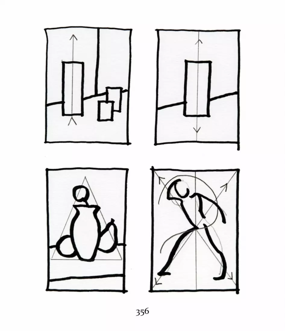
356

Asymmetrical, symmetrical, diagonal, and pyramidal compositions.
Other Compositional ArrangementsBesides those just described, a number of other commoncompositional formats have recurred historically. These haveentered the language of compositional choice by virtue oftheir reliability and their ability to express the aesthetics ofthe periods when they appeared and the artists who devisedthem. For example, the pyramid-in-a-circle composition ofRaphael’s Alba Madonna reflected the goals and aesthetics ofthe early Renaissance: balance and stability. The curvilinearor “figure eight” format, often used by Rubens, createsmovement in a composition but also reflects the energy ofthe Baroque era in Europe.
The following compositional types can incorporate bothsymmetry and asymmetry, and the different formats can beused individually or mixed together. The choice of which touse, alone or in combination, should be based on what youwant to convey to the viewer. In the end, your own aestheticsense is needed to create good compositions regardless ofcompositional devices.
PYRAMIDAL357

PYRAMIDAL
Pyramidal compositions are the most stable and quiet of all, as opposedto curvilinear compositions, which are highly active.
Pyramidal compositions are characterized by large stableforms weighted at the bottom, typically appearing astriangles. A good example is Raphael’s Alba Madonna.
358
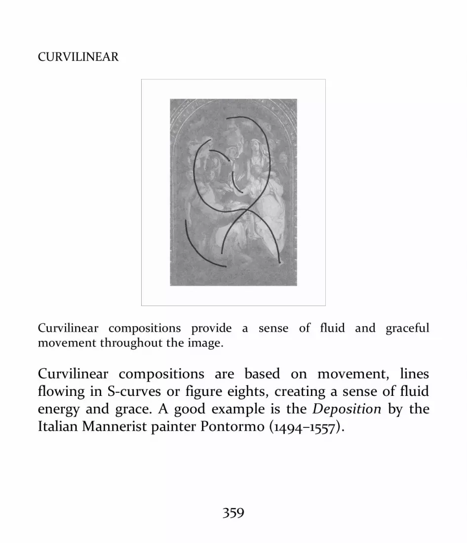
CURVILINEAR
Curvilinear compositions provide a sense of fluid and gracefulmovement throughout the image.
Curvilinear compositions are based on movement, linesflowing in S-curves or figure eights, creating a sense of fluidenergy and grace. A good example is the Deposition by theItalian Mannerist painter Pontormo (1494–1557).
DIAGONAL359

DIAGONAL
The diagonal composition on the left creates a sense of vertigo andmovement.
Characterized by strong diagonal movements across therectangle, diagonal compositions evoke feelings of anxietyand drama. A good example is Rubens’s Prometheus Bound.
HORIZONTAL360

HORIZONTAL
Horizontal lines create a visual sense of restfulness and expansiveness.
Characterized by horizontal movement across the pictureplane, horizontal composition is employed in manylandscapes. Good examples are those by the seventeenth-century Dutch landscape painter Philip de Koninck (1619–1688).
361

VERTICAL
Vertical lines of movement create a visual sense of height andnarrowness.
Dominated by strong upward movement, verticalcompositions feature in works such as the American painterGeorgia O’Keeffe’s Radiator Building, Night, New York.
ANGULAR362

ANGULAR
The use of diagonals and angles creates an interwoven design of strongbalance within the compositional frame and on the picture plane.
Characterized by interlocking angular lines of movement,angular compositions can have a stable, gridlike structure orcan create a sense of nervous movement, as in NudeDescending a Staircase by the French-American artist MarcelDuchamp (1887–1968).
CIRCULAR363

CIRCULAR
Circular compositions create a visual sense of lightness and of slow,repeated movements.
Circular compositions are dominated by circular shapes,sometimes repeated. The French artist Robert Delaunay(1885–1941) used repeated circles to develop his energetic,colorist compositions.
CUBIC364

CUBIC
Cubic compositions create a visual sense of locked and unwaveringstability on the picture plane.
Cubic compositions depend on organized, interlockingrectilinear geometry and shapes. A good example is theDutch artist Piet Mondrian’s painting Broadway BoogieWoogie.
OVERALL365

OVERALL
Although composed of individual movements and shapes, this type ofcomposition must be taken in as a whole.
Characterized by an even distribution of all elements ormarks, “overall” compositions can seem random or chaotic atfirst glance. Overall compositions can be figurative orabstract. The work of the American Abstract Expressionistpainter Jackson Pollock (1912–1956) displays a broad overalldistribution of marks or paint spatters without a particularfocus within the compositional frame. (See the illustration onthis page.)
366

Brian Chippendale, page from the graphic novel Puke Force(Montreal: Drawn and Quarterly, 2016), 2014, pen and marker onwhite paper, 16 × 20 inches (40.64 × 50.8 cm). Courtesy of the artist.
With a style reminiscent of the “overall” compositions of the painterJackson Pollack, Chippendale creates a busy and complex cinematiceffect in Puke Force. A sense of anxiety results by no one image or areahaving visual precedence within the compositional frame. The viewer’seye is pulled back and forth, up and down, and across the arrangement.
367

When Is a Drawing Finished?
Knowing when a drawing is finished depends on the goals ofthe drawing, which you should decide on before beginning thework. Getting clear on your goals takes time and lots ofpractice, of course, but, basically, a drawing is finished when allthe relationships within it have been harmoniously visualized.Make sure, for example, that the classic line qualitythroughout the drawing has been adjusted to produce abelievable spatial effect and that the tonalities create a strongsense of form and depth. Finishing means gauging these andother elements relative to one another.
In an overworked drawing the line quality, shading, details,and so on seem out of balance within the whole. The drawingfeels fractured. Beginners often give equal emphasis to all partsof a drawing, thus flattening and weakening it. It is essential tocritique all the relationships and aesthetic effects in a drawingbefore deciding whether it is finished or needs adjustments andcorrections. Never assume a drawing is really finished withoutthis thorough critique.
Tonal CompositionsIn tonal compositions, the viewer’s eye is directed andfocused by strong tonal masses of light and shade. Typically,there is a major focus where the eye enters the picture, often
368

via a mass of light or a light shape. For example, inRembrandt’s drawings and etchings, the viewer’s eye firstenters the composition where light focuses on a major figureor group. From there, the eye is led through the compositionto secondary and tertiary masses of light and to middle anddark tones. The whole is bound together and balanced in thecompositional frame by the dark areas of the composition.
369

Marina Fridman, Untitled, 2014, charcoal and pastel on paper, 18 ×24 inches (45.72 × 60.96 cm). Courtesy of the artist.
In terms of composition and value, the window in the right centerfocuses and organizes all the other pictorial elements. Using a fullvalue scale range in an extremely open-form approach, Fridman directsthe viewer slowly and quietly through this highly balanced tonalcomposition. The appearing/disappearing figure of a woman addsmystery and is a beautiful use of tonality.
The Golden SectionThe Golden Section is a system of geometric measurementused to create pleasing and harmonious proportions incompositions. Descending from ancient Greek mathematicalexplorations of nature, the Golden Section has been used tocreate balanced designs in buildings, paintings, sculptures,and on book pages since it first captured the imagination ofearly Renaissance artists and designers. Also referred to asthe Golden Ratio, Golden Proportion, Golden Mean, and theDivine Proportion, the Golden Section was thought by bothancient and Renaissance thinkers to contain divinelymandated proportions found throughout nature. The Goldensection has been found to exist naturally in the proportionsof some organic structures such as shells, plants, and even inhuman anatomy. Artists have also imposed the Golden Meanon their works, believing it will make the design of a piecemore pleasing. Whether or not this is true, the Golden Mean
370

is also simply another tool that you can use in thecomposition of drawings.
Simply place a rectangle, the longer side of which is 1.618times the shorter side, over the piece in question. Thediagrams following illustrate the basics of the visual design ofthe Golden Section.
The basic design of the Golden Section: the long side of the rectangle is1.618 times the length of the vertical side on the far left. The imageincludes a golden spiral.
371

The layout for the Golden Section.
This golden rectangle shows the increments of the golden section andof pi.
CroppingCropping determines the relation of the objects in acomposition to the compositional frame. Cropping iscommon in two-dimensional artworks, and, in a generalsense, all compositions are cropped. In a typical portrait, forexample, the background and much of the sitter’s body arecropped out to frame the sitter’s face.
The key to successful cropping is to make sure it servesthe artist’s aesthetic and pictorial goals. There are a fewimportant points to consider:
• If cropping will cut out part of an object, removing itfrom the pictorial frame, will this hurt or help the
372

image?• Will cropping through a major form or detail of an
object make it appear truncated or cutoff?• If an object’s outer edge touches the compositional
frame, creating flatness and lack of depth, is thisdesirable? It may be in an abstract work, but it couldbe very awkward in figurative work meant to lookthree-dimensional.
• When drawing a human figure, never crop through amajor landmark such as a joint, which will make thelimb seem cutoff or truncated. If you crop just aboveor below the joint, however, the viewer will sense thatthe limb continues beyond the frame of the image.Typically, figures are cropped in the following ways: toshow the head and neck, the head and shoulders, orthe torso to the waist and then to a full figure length.
373

The pot has an even and minimal amount of space around it, making itthe focus or subject of the image.
374

Cropping the side of the pot creates a sense of visual flatness andstrong asymmetry.
375

If the image of the pot fills the compositional frame, touching its sides,and even running out of the frame, the image will become a flat shapewithin the frame rather than a dimensional form. Depth is replaced byflatness and even a sense of abstraction.
376

The large amount of space around the pot creates a composition inwhich the space is as important as the object.
Drawing from Photographs
If used properly, photographs can be excellent drawing aids,providing exact visual information and helping you plan acomposition. But artists drawing from photographs mustgrapple with a number of potential problems.
A photograph is monocular—the camera produces an imageseen with only one “eye,” so to speak. That means that,however detailed its imagery, a photo conveys a sense offlatness. It cannot provide the perceptual sense of depth thatbinocular vision can. Not only do photographs not usuallydocument the subtle recessions of space, edges, andatmosphere that we see in nature, but they capture only amoment of light. When you walk into a dark room from brightoutdoor light, the room will seem almost black. Then, as lightslowly filters into your eye, you see more luminosity, even in adark room. But a camera, capturing just one brief moment ofexposure, cannot usually reveal that luminosity. For thisreason, many photographs show shadows as black and burned-out and light areas as whited-out and flat.
If you draw only what the photograph presents, you may becopying the very elements that will make your drawing seemflat—that, in effect, will make it look like a photograph. Sotaking time to become aware of what photographs can and
377

cannot do is essential when using them as a references. To theinformation provided by the photograph, you need to add theeffects and experiences you’ve learned from observationaldrawing, using all you know about creating depth, form,texture, light and shade, and so on.
Artists like Ingres, Eakins, Degas, and many others haveused photographs as references. The key to their drawings’success is that they interpreted the photographic informationthrough the lens of their experience of drawing fromobservation. You should do the same. For example, whendrawing a figure from a photograph, you’ll need to modify itscontours and planes with additional line quality and variety.Otherwise, the figure’s contours may appear flat andcontinuous, like a cutout. And because subtle anatomicalmodulations in the figure may not be clear in a photograph,you’ll need to interpret the photograph using your knowledgeof anatomy. Textural differences that might appear bland in aphoto also need to be interpreted and enhanced.
Some recommendations when working from photographs:If possible, photograph the subject with a variety of
exposures to provide maximum light and shade information.Photoshop may be of great help in adjusting the referencephotographs.
Evaluate the range of enhancements that must be added,such as line variations, textural diversity, and spatialdescriptions.
Do thumbnail sketches before starting the finished drawingto get through all the difficulties of working from yourreference photographs.
378

This photograph of a still life is a good starting point for adrawing. However, notice how the camera lens has created asubtle arc from side to side that distorts the actual alignmentof the perspective and angles of the table and objects. Theartist will have to visually organize the whole ensemble of thestill life by adding and adjusting perspective, tonality, edgedifferences, atmospheric effects, and so on to produce abelievable drawing.
379

380

381

ESSENTIALAESTHETICS IN DRAWING
The term aesthetics has been used to refer to the study ofbeauty, perceptions of beauty, the study of perception, stylesin art, underlying principles in art, and so on. In the modernworld, though, aesthetics mostly refers to the study anddiscussion of the many elements of style and the underlyingprinciples of art movements.
382

383

384

Arthur DeCosta, Figure Study, 1970s, pastel on gray charcoalpaper, 14 × 8 inches (35.56 × 20.32 cm). School Collection,Pennsylvania Academy of the Fine Arts (Philadelphia, PA).
Arthur DeCosta found his aesthetic compass in the works of thesixteenth-century Italian masters Titian and Paolo Veronese as well aseighteenth-century British painters such as Henry Raeburn andThomas Gainsborough. The results, seen in this lyrical drawing, trulyrepresent DeCosta’s aesthetic heart.
385

For example, abstraction possesses certain visualcharacteristics, such as the simplification of shapes in nature,and this quality can be thought of as one of the identifyingaesthetic principles of abstraction. Further, a discussion ofabstraction’s aesthetics might include considerations of thevarious stylistic and procedural elements of abstraction.Discussions of hard versus soft edge, of geometric versusorganic abstraction, and of the ways these effects areaccomplished all help constitute aesthetics of abstraction.Rather than focusing on ideals of beauty, aesthetics nowcovers the body of visual characteristics, physical processes,and critical ideas that identify a particular artistic style orapproach to art-making.
Aesthetic definitions and interpretations have long been atthe core of artistic development in the West. Thephilosophical ideals of the Greek Classical period (fifth andfourth centuries BC)—balance, order, and harmony—wieldedgreat influence over Western culture for centuries. Images ofideal beauty, as embodied, for example, in statues of thegoddess Aphrodite, are common even today, especially in theadvertising of beauty products. Classical Greek temples haveperennially influenced architectural forms in Europe andAmerica; their visual qualities of solidity, symmetry, andbalance served as emblems of culture in the Renaissance andin the early American republic.
386

Very different from the Classical ideal is the aesthetic ofExpressionism, which encourages the expression of personalfeelings and ideas through materials and imagery. Adominant form of art-making in America and Europe fromthe 1920s on, Expressionism evolved in the 1950s into theAbstract Expressionist movement, which combined energeticexpression with the abstraction of shapes from nature. In themodern world, where many aesthetic forms and styles existside by side, this kind of synthesis is common—as aredebates, sometimes ferocious, over the nature and merit ofartistic styles.
Several major aesthetic/stylistic traditions are perennialguideposts for the art of drawing, forming the foundation forwhat we do today. Classicism, Realism, Abstraction, andExpressionism all provide guidance regarding formal andinformal elements such as line, shape, form, content,symbol, narration, mood, and even political and social pointsof view. These four foundational forms—classicism, realism,abstractionism, and expressionism—are inclusive of manystylistic variations and personal and technical approaches butcan be seen as important organizing trends and points ofdeparture for artistic exploration. The four aestheticsinterweave and inform one another regardless of the finallook or style of a work: There are expressive qualities inRoman fresco painting, abstract qualities in realistic
387

drawings, classical elements in surrealistic drawings, realisticelements in Fauve drawings, and so forth.
Martha Mayer Erlebacher, Torso X, 1990, pencil on charcoal paper,15½ × 20¾ inches (39.37 × 50.70 cm). Courtesy of the artist.
Balance, order, refinement, and harmony are hallmarks of Erlebacher’swork.
388

Drawing materials and techniques allow artists to visualizetheir aesthetic approaches. For example, a sanguine pencilcan be used to define the fine, fluid line quality of aclassically drawn nude. Large lumps of charcoal may capturejust the right feeling in an Abstract Expressionist drawing.Each aesthetic approach has its list of most commonly usedmaterials, and it’s important when studying drawings inbooks or museum exhibitions to take note of which materialswere used to create the work’s look and feel. Gaining a basicsense of these core aesthetic traditions and their associatedmediums will help you make better choices when developingyour practice of drawing.
389

Bruce Samuelson, Untitled, 2009, pastel and charcoal on ragboard,
390

22 × 21 inches (55.88 × 53.34 cm). Private collection.
As a contemporary painter who integrates modernism and tradition,Samuelson has chosen the Classical Greek statue the Nike ofSamothrace as the subject of this mixed media drawing. The graceful S-curved movements and balances seen in the original sculpture arereinterpreted through the lens of abstracted and restructured shapes.
CLASSICISMClassicism is characterized by visual balance, harmony, andgrace. In classicism, nature is perfected, not copied. Classicalart does not reflect the world of nature as it is but depicts itas it could be. For example, Classical Greek statues portraybodies that are ideal, and these perfected bodies reflect aperfect intellect and soul. Periodically reemerging, the Greekclassical ideals have influenced Roman art, medieval iconpainting, Renaissance art, nineteenth-century Frenchacademic art, and the art of other periods. Governments,revolutions, and individual artists have officially canonizedthe classical ideals as the hallmarks of their missions andgoals, and Greek classicism remains a well from whichcontemporary artists draw inspiration and identity. Not onlydo classically oriented artists incorporate the elements ofbalance, grace, and harmony into their work but they mayalso choose subjects that ultimately derive from Classical
391

Greek imagery.
REALISMToday, the term realism is a catchall for forms of art thatlook “real” or seem to have been done from observation.Realism covers a wide variety of aesthetic choices, rangingfrom very carefully rendered, closed-form images to looselydescribed, atmospheric, open-form ones. The termrepresentational is more or less interchangeable with realist,and it, too, covers a huge diversity of styles and aesthetics.
Originally, realism was associated with work of the Frenchpainter Gustave Courbet, whose philosophy was that theartist’s own experience should be the basis for art. Courbetexplored contemporary political and social themes in hiswork during a time when the French art world wasdominated by classicism and Romanticism. For Courbet,drawing and painting from observation were imperative, aswas the direct and honest use of paint and other materials inart-making. Realist artists took nature as they found it ratherthan improving or perfecting it, and Courbet’s subjects camefrom the world around him: friends, workers, and so on.
Photography was another powerful influence in thedevelopment of realism. Controversy over its appropriate use
392

by artists began almost as soon as photography was inventedin the 1820s by Nicéphore Niépce (1765–1833), and the debateabout drawing and painting from photographs continuestoday.
A realist artist is one who has found a place and a languagein the broad gamut of representational aesthetics. The keyfactor is that the artist is using representational imagery—aportrait, a figure, a landscape—as the artwork’s primaryorganizing subject. An attitude of being true to nature iscommon in realist art, even though the individual artist maybring many personal elements to the artwork. Realist worktoday is often influenced, sometimes subtly, by elementsderived from classicism, Expressionism, modernism, and, ofcourse, photography, which led to the development of thehyperrealistic artistic style known as photo-realism.
393

394

Njideka Akunyili, Sean, 2005, charcoal on white paper, 30 × 24inches (76.2 × 60.96 cm). Courtesy of the artist
Here is a moment in time lovingly described through the observeddetails of a body, the movement of fabric, and the relationship of themodel to the unique space he is in. Rhythmic movements of the bodyare balanced in the composition by the geometry of the architecture.
Linda Gist, Cleome, 2000s, watercolor on paper, 26 × 21 inches(66.04 × 53.34 cm). Courtesy of the artist.
Gist’s lovely botanical drawing exhibits a realism that is almost—butnot quite—photographic.
395

ABSTRACTIONThe term abstraction is also very general, involving theidentification and simplification of essential underlyingformal visual elements in nature, a scene, an object, or avisual idea. These elements can include shapes, lines ofmovement, patterns, colors, textures, and forms, amongothers. Abstraction is often associated with modernism, amovement in Western art that in the late nineteenth andearly twentieth centuries turned away from classicalacademic and realist art. The idea of abstraction as anaesthetic movement, however, overlooks the fact that all artmay incorporate formal, underlying abstract design orcompositional elements. Abstract drawing in the modernistsense depends on a flat picture plane and the simplificationof shapes, forms, and colors; the whole visual idea isembodied in these flat, often patterned elements. Butrealistic or representational drawings also depend onunderlying abstract concepts for structure, strength, andorganization. Classical Greek sculptures, for example, have avery strong sense of abstract geometry in their forms. Thedifference is that, in representational art, the abstractelements are part of a larger set of visual ideas, such as thespecific details of an object or scene and the depth andreality of the subject.
396

Eleanor Arnett, Abstraction—Gloucester, 1960s, pastel on charcoalpaper, 11 × 14 inches (27.94 × 35.56 cm). Collection of the author.
Arnett, who was a student of the German abstract painter HansHofman (1880–1966), took nature as a point of departure in exploringits underlying abstract shapes and forms. Here, she creates stronggeometry and rich color while preserving the character of rockyoutcrops in the Gloucester, Massachusetts, harbor.
397

As an aesthetic form, abstraction can vary greatly. Someabstract works have no recognizable images; others simplifyfrom nature. Because abstract artists identify what isessential in an image or visual idea, there is great room inabstraction for interpretation, invention, and recombinationof many objective and expressive elements.
398

399

Willem de Kooning, Seated Woman, 1943, graphite on wove paper,13¼ × 10¼ inches (33.7 × 26 cm). Philadelphia Museum of Art(Philadelphia, PA). Bequest of Elizabeth M. Petrie, 2003. Photocredit: © The Willem de Kooning Foundation/Artists RightsSociety (ARS), New York.
De Kooning’s portrait is representational insofar as it containsrecognizable imagery, but it is also abstract in its simplification ofobserved forms.
400

Jan Baltzell, #8-D1, 2008, charcoal and pastel on blue paper, 32 × 40inches (81.28 × 101.6 cm). Courtesy of the artist.
Baltzell abstracts, or simplifies, lines, marks, colors, and textures fromnature. Her response to these abstracted elements is presentedthrough a quick, nervously energetic and emotionally vigorous style.The combination integrates abstraction and expressionism.
401

EXPRESSIONISMExpressionist art describes personal, individual, intuitivefeelings. Some say Expressionism grew out the work ofnineteenth-century Romantics such as Eugène Delacroix andwas filtered through the physicality and semi-abstraction ofthe group of French painters called the Fauves in the firstdecade of the twentieth century. There are many forms andpermutations of Expressionist art. It can be semi-realistic,like that of the German Expressionists who emerged betweenthe end of World War I and the 1930s. The German/Danishpainter Emil Nolde (1867–1956) used harsh, emotionaldescriptions to create powerful portraits. Surrealists like theGerman painter Max Ernst (1891–1976) incorporated stronglyexpressionistic elements into their work. But Expressionismcan also be completely abstract, as in the work of theAbstract Expressionists of the 1950s and 1960s, including theAmerican painter Jackson Pollock. Pollock wasexpressionistic in his choice of technique and materials(dripped and spattered paint) and in his energy.
402

403

Charles E. Burchfield, Orion in December, 1959, watercolor andpencil on paper, 39⅞ × 32⅞ inches (101.2 × 83.4 cm). SmithsonianAmerican Art Museum (Washington, D.C.). Photo credit:Smithsonian Art Museum/Art Resource, NY.
Works by American watercolorist Charles Burchfield, though based onnature, powerfully express a vision that is highly personal.
404

405

Bruce Samuelson; Torso; 1990s; graphite, charcoal, and wash onwhite paper; 18 × 16 inches (45.72 × 40.64 cm). Collection of theauthor.
The emotional charge of this drawing makes it expressionistic, whilethe figure clearly incorporates classical elements.
Theoretically, Expressionism could incorporate elementsof all the major aesthetics described prior. The commondenominator is that there is a strong presence of physical oremotional expression in the work. Typically, Expressionistartists begin with the feelings they wish to express and thenchoose the right mediums and aesthetic forms for theirwork.
406

407

ESSENTIALDRAWINGDEMONSTRATIONS
The following demonstrations are considered essential toboth foundational training in drawing and portfolio-making.All of the essential concepts, methods, materials, aesthetics,and history described in earlier sections of Foundations ofDrawing bear fruit in this chapter.
408

409

410

Arthur DeCosta, Figure studies, c. 1970s, pen and black ink oncream paper, 8 × 6 inches (20.32 × 15.24 cm). Courtesy of the SchoolCollection, Pennsylvania Academy of the Fine Arts (Philadelphia,PA).
DeCosta’s vibrant sketches of the figures on this sketchbook page are aresult of his repeated practice to master the anatomy and movement ofthe human body from memory, knowledge, and imagination.
411

John Lee, Still Life Drawing, 2012, graphite on paper, 18 × 24 inches(45.92 × 60.96 cm). Courtesy of the artist.
Lee captures the overall relationships and atmosphere in this quicklydone graphite drawing.
412

For example, perspective and measuring, foreshortening,size relationships, point of view, line and tone, and so on, areall used in every demonstration and must be understood andemployed to complete drawings of the subjects in thischapter. In a sense, “Essential Demonstrations” pullstogether all the elements of Foundations of Drawing. Thestrategies used in learning to effectively draw the subjects inthis section provide ways of thinking and organizing anytopic or subject. For example, learning to organize thestructures of a still life is very similar to the organizingprocesses of designing a building. Understanding andorganizing the complex and beautifully subtle elements of afigure drawing or portrait is similar to the thought process ofdesigning a digital drawing. The elements, practices, andprocesses presented here hone and develop the visual/mentalprocesses used in a great variety of artistic and practicalpursuits.
413

414

Nicholas Zimbro, Still Life, 2005, charcoal and graphite on paper, 4× 2 feet (121.92 × 60.96 cm). Courtesy of the artist.
All relationships, sizes, shapes, and angles and perspective in thisdrawing were carefully detailed in a graphite underdrawing. Value andatmospheric effects are added and developed from near to far.
DRAWING STILL LIFESStill life is at the core of most drawing curricula. From still-life drawing we learn the basics of shape, form,measurement, perspective, line quality, and other drawingelements and we begin to experiment with drawing tools andmaterials. The lessons learned in still-life drawing inform allthe other drawing genres.
While still life was historically considered to be a lessexalted subject than the figure, it was and remains wheremost students begin to learn to draw in a formal way. Thefirst steps in a practical foundational drawing curriculuminvolve sketching the simple shapes of humble objects liketin cans and pieces of fruit. From these basic beginnings,students of drawing can be gradually introduced to morecomplex drawing problems, materials, and aesthetics.
A History of Still-Life DrawingPictures of objects and plants are among the most ancient in
415

art. Depictions of flowers, fruit, ritual and everyday objects,weapons, and so on adorned ancient Cretan and Egyptianfrescoes as well as the walls of Roman villas. The ancientGreeks and Romans loved to include small still lifes in theirmosaics. Usually decorative, these still lifes ranged from thevery detailed and realistic to the suggestive and expressive.Some of the most beautiful are in the frescoes found in theburied Roman cities of Pompeii and Herculaneum. Theydepict baskets of fruit, flowers, and other details of domesticlife.
Still life had a strong presence in medieval European art.Depictions of liturgical objects, flowers symbolizing moralvirtues and vices, and the object symbols, or “attributes,” ofsaints were common. For example, a white lily was a symbolof purity, a red rose was a symbol of faith, and so on. Imagesof keys, vases of flowers, reliquaries, swords, fruit, and otherobjects composed a symbolic visual language that told Biblestories and stories of the lives of the saints. Some of the mostbeautiful medieval still lifes are seen in the decorativeborders and the details of elaborate capital letters inilluminated manuscripts.
Artists of the Renaissance inherited these still-lifetraditions, but they also transformed still lifes into analysesof three-dimensional form. For example, the artist PaoloUccello (1397–1475) created a drawing of an elegant chalice
416

that ranks as one of the most magnificent perspectivedrawings of the age. Continuing the long tradition ofimbuing still-life objects with symbolic content, Renaissance-and Baroque-era artists developed the genre of still life to ahigh degree. For these artists, still life was a thing of beautyin itself, but was also a vehicle for studying perspective,geometric structures, and even symbolism.
417

418

Paolo Uccello, Chalice, Perspective Drawing, circa 1460, pen andink on paper, 327/50 × 916/25 inches (9 × 24.5 cm). Gabinetto deiDisegni e delle Stampe, Uffizi Gallery (Florence). Photo credit:Scala/Art Resource, NY.
Like many early Renaissance artists, Paolo Uccello explored hisfascination with the underlying structures and geometry of volumesand spaces. In this elegant drawing, he analyzes the direction changesof curves in perspective and breaks them down into planes or facets,creating a stronger sense of sculptural form in the object.
Flemish and Dutch artists of the seventeenth centuryexcelled at still-life painting and drawing. Dutch homesprominently displayed elaborate still lifes of food and flowers—symbols of prosperity. Watercolors and hand-colored bookillustrations depicting varieties of tulips and other gardenflowers became popular collector’s items. But alongside thistradition of extravagantly displaying wealth arose the genrecalled the vanitas. The Belgian-born painter Pieter Claesz(1597–1660) presented the underlying grimness of life and theinevitability of death in his many vanitas paintings, whichshowed magnificent bouquets of flowers being nibbled awayby caterpillars or depicted human skulls carefully placedwithin the composition. The message was that nature anddeath triumph over extravagance and vanity.
419

Anonymous, Horse Skull (student drawing), 2012, charcoal on graylaid charcoal paper, 18 × 24 inches (45.72 × 60.96 cm). SchoolCollection, Pennsylvania Academy of the Fine Arts (Philadelphia,PA).
The eighteenth-century painter of still lifes and interiorsJean-Baptiste-Siméon Chardin (1699–1779) made the intimatedomestic still life popular. His work is unencumbered by themoralizing of the vanitas painters. Reminiscent of the workof Johannes Vermeer, Chardin’s depictions of humble items
420

like a loaf of bread and a pitcher of milk laid the groundworkfor the everyday still lifes of the French Impressionists.Impressionist painters such as Édouard Manet (1832–1883)looked to these lovely, simple, familiar images forinspiration.
421

Piet Mondrian, Chrysanthemum, 1908–09, charcoal on paper, 10 ×11¼ inches (25.4 × 28.7 cm). Solomon R. Guggenheim Museum (NewYork, NY).
Mondrian became known in art history after World War I as anabstract painter, the master of flat rectangles and squares in red,
422

yellow, blue, black, and white. Part of his evolution prior to that washis love of drawing individual flower blossoms in pencil or watercolor.
The modern era continued the love affair with still life,though often as a point of departure for studies in form,color, and pattern. The French painters Paul Cézanne (1839–1906) and Henri Matisse and the American Arthur BeecherCarles (1882–1952) used still life for their signature aestheticexplorations. In the hands of these artists, still-lifecompositions lent themselves to explorations of the formalelements of art, shape, color, geometry, line, expression, andabstraction. Today, still life remains a popular genre forartists of all kinds.
423

424

Georges Braque, Still Life, 1912, charcoal, crayon, cut preparedpaper, and traces of graphite on laid paper mounted oncardboard, sheet (sight): 24½ × 18¼ inches (62.2 × 46.4 cm)Philadelphia Museum of Art (Philadelphia, PA). The Louise andWalter Arensberg Collection, 1950. Photo credit: © Artists RightsSociety (ARS), New York/ADAGP, Paris.
Braque, like Picasso and others of the Cubist movement, explored theunderlying purity of flat shapes and patterns. The shapes in this lyricalstill-life drawing all exist right on the picture plane.
425
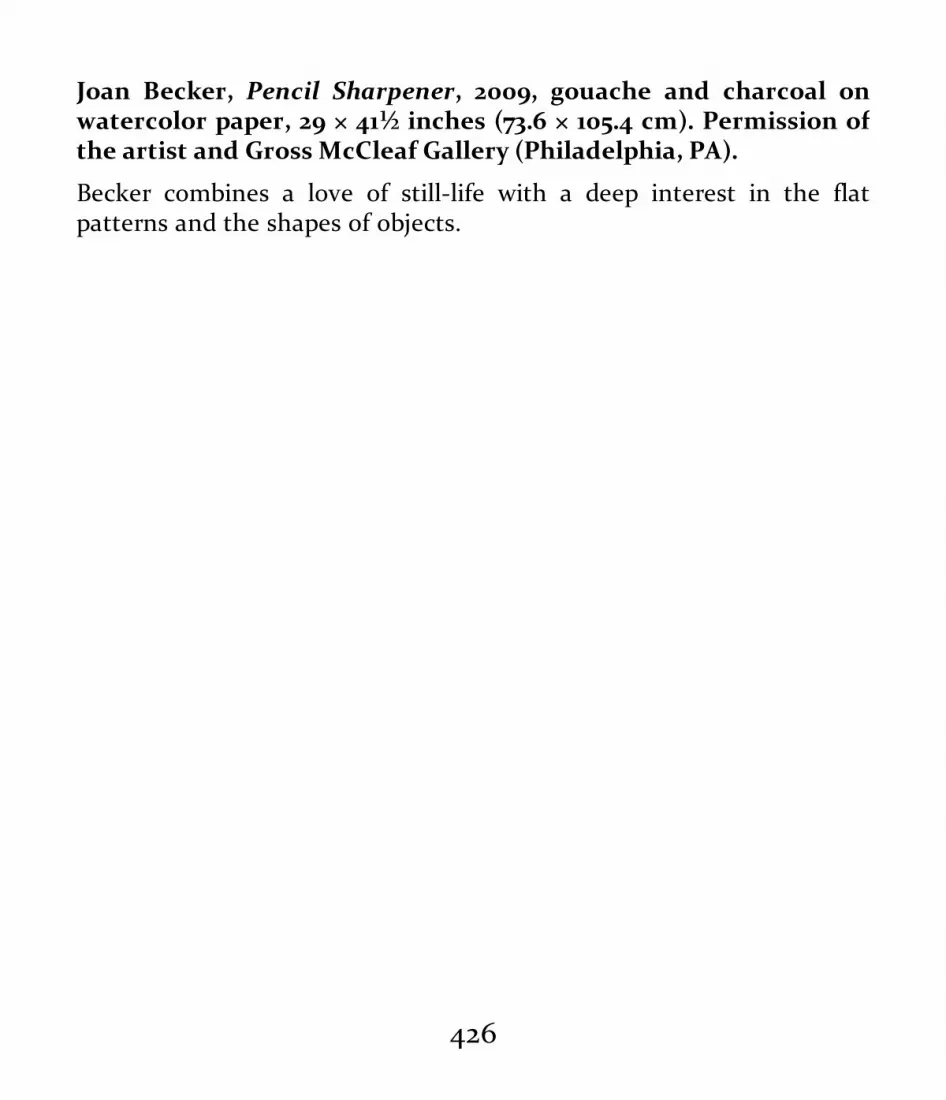
Joan Becker, Pencil Sharpener, 2009, gouache and charcoal onwatercolor paper, 29 × 41½ inches (73.6 × 105.4 cm). Permission ofthe artist and Gross McCleaf Gallery (Philadelphia, PA).
Becker combines a love of still-life with a deep interest in the flatpatterns and the shapes of objects.
426

427

Student still-life drawing, charcoal on paper, 2005, 30 × 24 inches(76.2 × 60.96 cm). School Collection, Pennsylvania Academy of theFine Arts (Philadelphia, PA).
Aerial perspective, a full tonal spectrum, and great variety in edges,accents, and textures organize this masterful drawing.
Demonstration: Drawing a Still LifeDrawing a still life requires planning, development, andfinishing. It’s best to start with a group of simple objects orforms. Choosing objects that are too complex or that havetoo many textures and details can be frustrating for abeginner.
You must consider your goals for the drawing: Are youdoing it for practice in understanding the structure of simpleobjects or for the purpose of visualizing a complexcomposition? Point of view, page position, size, materials,and so on should all be considered, but lighting is anespecially important factor. If the drawing is more aboutclosed-form line, ambient light or the flat light of fluorescentoverhead lighting is acceptable. If your goals includeemphasizing light and shade, however, you should establisha directional light source; you might set up a spotlight or usethe directional light from a window. And finally, as with anydrawing, you must decide on the drawing medium and thetype of paper you wish to use.
428

After setting up the still life and lighting it appropriately,make thumbnail sketches, using a viewfinder if you wish, tobecome familiar with the subject and to help plan thecomposition. Then lay out the basic lines of the major shapesand angles. Adjust them through sighting and measuringuntil you’ve achieved a correct overall feel within therectangle of the page.
At this point the whole map of the still life should bevisualized, including the light and shadow masses, if they areto be an important part of the drawing. Check and correcteverything to make sure the proportions, measures, pageposition, point of view, and lighting direction are correct.
More specific structures such as individual planes and theshapes of details can now be described. Remember, though,that your drawing is still very much in the layout phase andthat your lines should still be lightly drawn and focused onstructure.
Now the drawing can be finished to achieve the desiredvisual effect. Enhance the line quality, tonal relationships,spatial relationships, and depth and clarity. For a classic linedrawing, adjust the line edges relative to one anotherfollowing the visual rule sharper, darker, clearer comesforward and softer, grayer, less clear recedes. For a tonaldrawing, adjust all the values, cast shadows, and reflectedlights to produce an overall sense of light and depth in the
429

drawing. Finishing brings together all the desired effects in aharmonious whole based on your aesthetic choices.
Before beginning to draw, choose a point of view. Here, the point ofview is from slightly above the grouping.
430

Also, plan the amount of space around and between the objects.
431

Making thumbnail sketches of different compositional choices can helpyou determine your drawing’s layout.
432
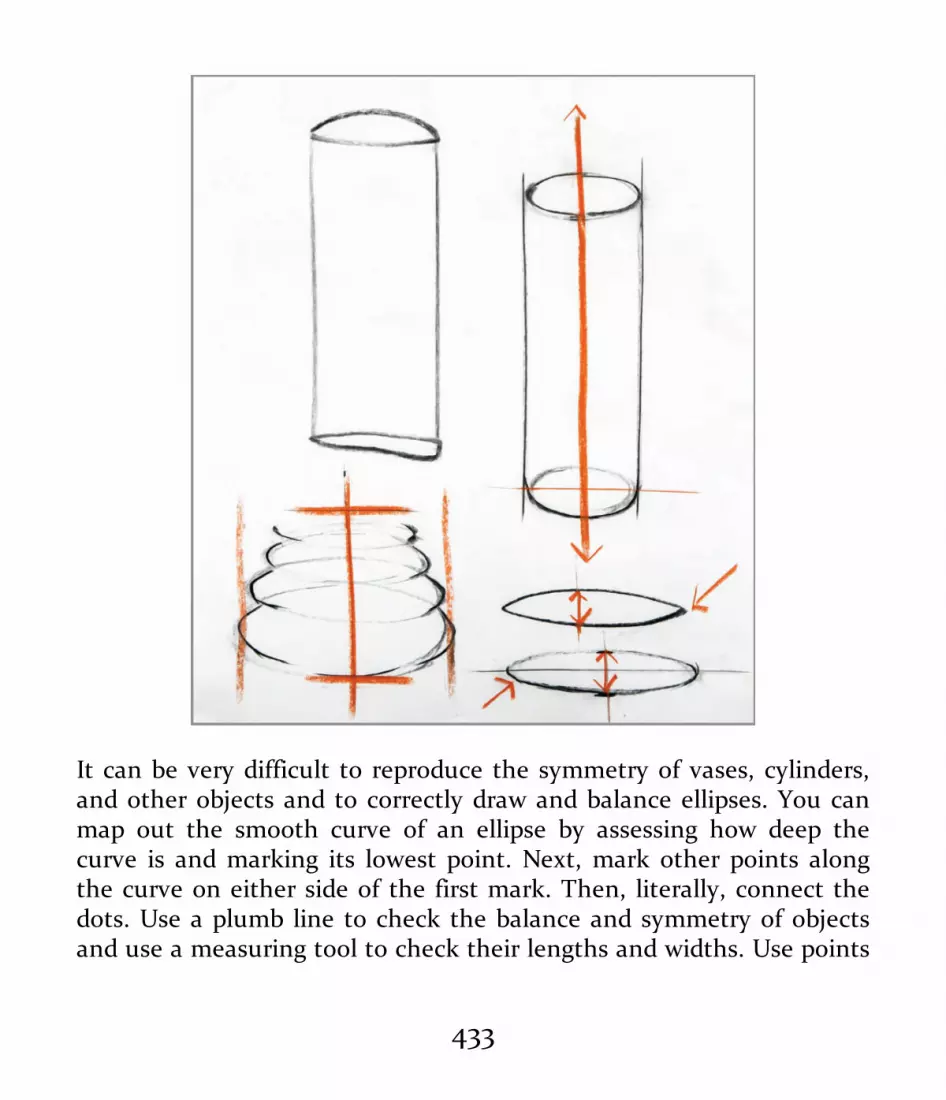
It can be very difficult to reproduce the symmetry of vases, cylinders,and other objects and to correctly draw and balance ellipses. You canmap out the smooth curve of an ellipse by assessing how deep thecurve is and marking its lowest point. Next, mark other points alongthe curve on either side of the first mark. Then, literally, connect thedots. Use a plumb line to check the balance and symmetry of objectsand use a measuring tool to check their lengths and widths. Use points
433

or dots to indicate the correct angles, parallels, symmetries,measurements, ellipses, and the correct placement of objects. Aviewfinder aids in the positioning of the objects inside thecompositional frame and in determining the amount of space aroundthem.
434

Still-Life Drawing, Step by Step
1 | When beginning still-life drawing, it’s better to choose asimple arrangement of simple objects.
2 | A viewfinder can help you determine the compositionalframe.
435
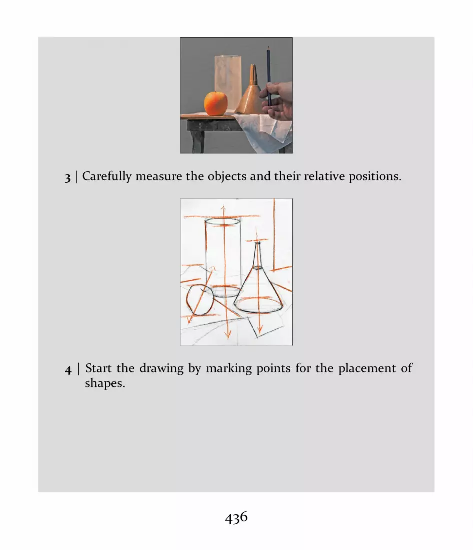
3 | Carefully measure the objects and their relative positions.
4 | Start the drawing by marking points for the placement ofshapes.
436

5 | Establish the objects’ measurements and relationships onthe page.
6 | Lay out the drawing and correct it using a light, loosebroken line.
437

7 | Next, modulate the line quality.
8 | Map out the shadow masses.
438

9 | Then add and modulate the shading. Finally, add andcorrect the details and add the last line modulations.
DRAWING INTERIORS ANDARCHITECTUREDrawing interiors and architectural structures is excellent forfoundational drawing study, practice, and portfolios. Thelessons you’ll learn while drawing interiors and architecturalspaces will equip you with skills in measuring visualrelationships, organizing illusions of both linear and aerialperspective, and designing compositions. The ability to drawinteriors and architecture will also provide the artist with
439

effective solutions for creating environments for figural orstill life compositions in which the space the objects andforms occupy is important. Architectural and interiordrawing skills address both open-form and closed-formdrawing strategies and aesthetics by providing the artist withoptions and room for artistic and personal growth andchoice. Finally, architectural and interior drawing has anumber of practical applications in art and designprofessions such as architecture, interior design, and publicspace planning.
440

Giovanni Galliari, Egyptian Stage Design, c. 1800, pen and brownink with brown wash over graphite on laid paper, mount: 9¾ × 13¾inches (24.7 × 35 cm), image: 7¾ × 9⅜ inches (19.7 × 23.8 cm).National Gallery of Art (Washington, D.C.). Joseph F. McCrindleCollection, 2009.70.124. Photo credit: Open Access, NGA Images.
Galliari uses aerial perspective to describe this fictional stage set.
441

Tonality and scale create a sense of mass to the antique structures aswell as a sense of visual recession in space. It was very common forartists of the eighteenth and nineteenth centuries to keep travelsketchbooks of antiquities for later use in studio-created artwork.
A History of Interior and Architectural DrawingThe tradition of drawing and painting interiors andarchitectural structures goes back to the ancient Greeks.Greek mosaics contained lovely trompe l’oeil (“fool the eye”)architectural elements. The walls of Roman villas weredecorated with both architecturally correct and fantasyinteriors, buildings, and painted landscapes. Tromp l’oeilarchitectural details and interiors were especially popular—and beautifully done. Paintings excavated at Pompeii andHerculaneum give us insight into Roman painting anddrawing methods.
From the fifteenth through the eighteenth centuries inEurope, interior and architectural drawing became highlydeveloped. Italian Renaissance masters such as Leon BattistaAlberti (1404–1472) and Filippo Brunelleschi (1377–1446)reinvigorated the study of architecture and brought it to newheights. The work of the ancient Roman author Vitruvius (c.80–15 BC) and his thoughts on architecture inspired bothmen. Alberti is credited with a new understanding of theclassical orders of architecture and the proportions requiredfor a classical building. His work De Pictura is a treatise on
442

the nature of Renaissance painting, perspective, composition,and color. Brunelleschi is credited with the development ofthe system of linear perspective that we use today. Drawingwas the chief method for exploring perspective, whether forarchitectural plans, small paintings, or large frescos.
Using both linear and aerial perspective, the Dutch andFlemish painters of the seventeenth century brought thepainting and drawing of the intimate household interior to ahigh art. The Dutch painters Johannes Vermeer (1632–1675)and Pieter de Hooch (c. 1629–1684) produced some of thefinest examples. Both masters combined accuracy inarchitectural lines, measurements, and perspective with arich sense of light and shade, illusions of atmosphere, color,and detail.
In the nineteenth century, the great academies of artmaintained and taught the traditions of drawing and paintingclassical Greco-Roman architecture and interiors. An interestin Middle Eastern and Asian interiors complemented theseclassical subjects, and making sketchbook watercolorrenderings of buildings and interiors became a favoriteexercise of European artists traveling in Asia and the MiddleEast.
Informal interior scenes were among the most importantsubjects of the French Impressionists. Gustave Caillebotte(1848–1894) brought an almost photographic quality to his
443

paintings of interiors; his painting The Floor Scrapers (1875)brings together the exact architectural perspective of a roomwith a poetic fall of light on the reflective floor. Interiorscontinued to be an important subject for thePostimpressionists and early modern artists. In his paintingBedroom in Arles, Vincent van Gogh (1853–1890) combinesimagination, expression, and believability into a harmoniouswhole.
444
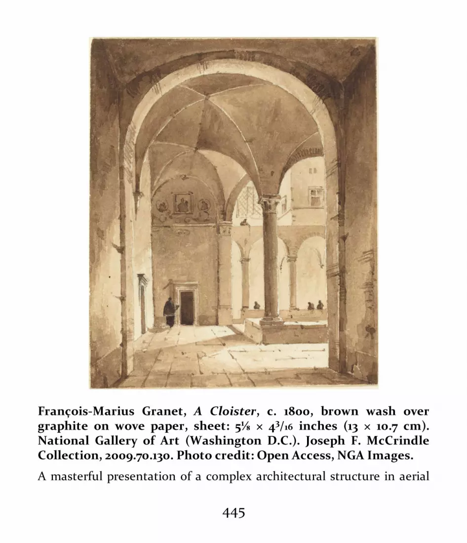
François-Marius Granet, A Cloister, c. 1800, brown wash overgraphite on wove paper, sheet: 5⅛ × 43/16 inches (13 × 10.7 cm).National Gallery of Art (Washington D.C.). Joseph F. McCrindleCollection, 2009.70.130. Photo credit: Open Access, NGA Images.
A masterful presentation of a complex architectural structure in aerial
445

and one-point perspective, as well as fine use of brush and brownwash.
Artists such as Edgar Degas and the Danish painterVilhelm Hammershøi (1864–1916) created believable andaccurate descriptions of interiors as settings for intimatedramas, while the French painter Pierre Bonnard (1867–1947)focused on the feelings and moods of his interiors. TheAmerican Abstract Expressionist painter Richard Diebenkorn(1922–1993) created a series of monumental paintings andrelated drawings, prints, and other works called the OceanPark series. These abstract and semi-abstract works recall thearchitectural forms of the small California town whereDiebenkorn lived and worked for a short period of time. TheOcean Park series combines a geometric architecturalformalism with expression of the location’s light and color.
446

Rackstraw Downes, Queensborough Bridge with Roosevelt IslandTramway, 2007, pencil on paper, 26 × 26⅞ inches (66.04 × 68.26 cm).Courtesy of Betty Cunningham Gallery (New York, NY).
447

Downes captures the almost surreal complexity of the urbanenvironment.
In recent decades, contemporary American artists such asRackstraw Downes, Gillian Pederson-Kragg, John Moore, andMichael Grimaldi have carried on the great tradition ofarchitectural and interior drawing and painting. Industrialparks, train yards, abandoned buildings, and crampedmodern office spaces have joined ancient Roman ruins andseventeenth-century Dutch interiors as suitable subjects.
448

John Moore, Tree and Ventilators, 2009, charcoal on paper, 30¼ ×
449

22½ inches (76.83 × 57.15 cm). Courtesy of Locks Gallery(Philadelphia, PA). Photo credit: Will Brown.
The buildings and industrial structures of the background are seen as adreamlike image through the menacing intense darks of the tree.Aerial perspective and tonality are the organizing visual factors.
450
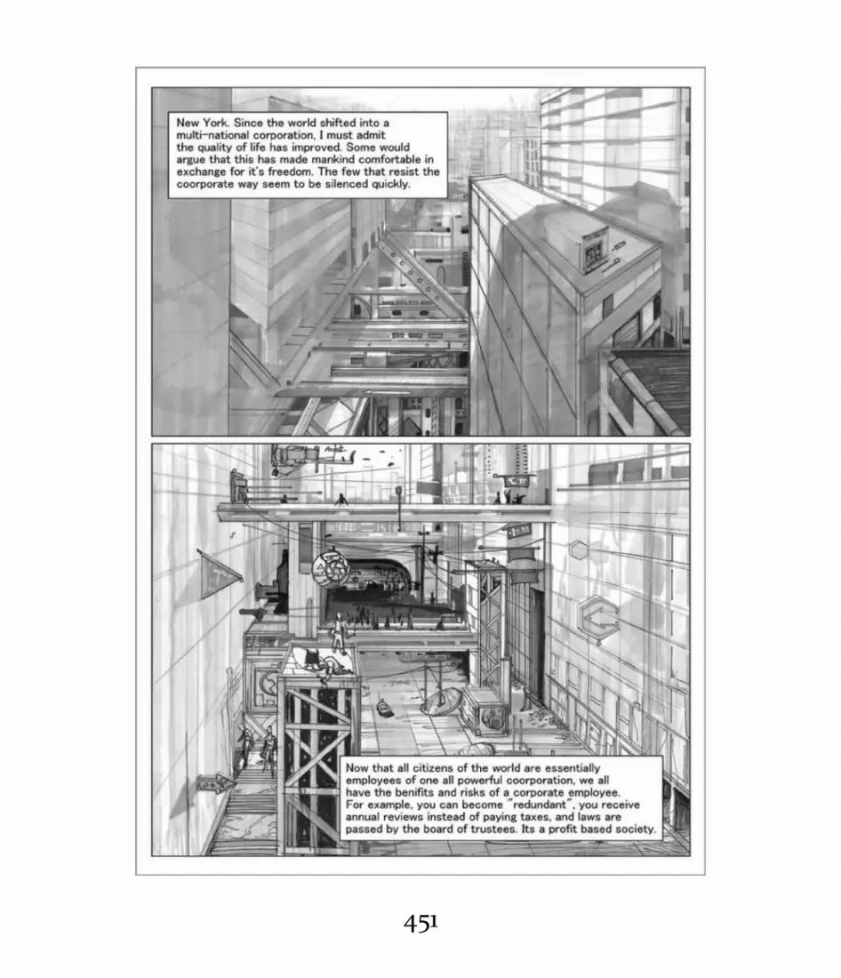
451

Reza Ghanad, Dystopian Society/Graphic Novel, 2014, watercolor,pen and brush over a graphite layout, 15 × 8 inches (38.1 × 20.32 cm).Courtesy of the artist.
Ghanad presents a complex futuristic world of architectural geometryin this beautiful drawing done in traditional pen and wash.
Compositional choices for interior drawings are similar to those for stilllifes and other subjects: symmetry, asymmetry, and other possibilities.
Demonstration: Drawing an InteriorBegin drawing interiors by picking a simple subject such as a
452
room in your home or another familiar space. A viewfinder isa good tool for helping you see possible compositionalframes and align verticals and horizontals. The viewfinderwill familiarize you with the lay of the land, so to speak, andincrease your comfort level with the process.
Do loose thumbnail sketches of the subject using a varietyof compositional choices. Graphite pencil is excellent forthumbnail sketches and can also be used for a larger finisheddrawing. Charcoal is not as good for small sketches butcreates a powerful effect when used for a large tonal interiordrawing.
An important decision is whether your drawing will beprimarily a closed-form line drawing, an open-form tonaldrawing, or a drawing with mixed effects. To be believable,closed-form line drawings require an accurate assessment ofthe scene’s linear perspective. A broken-line drawing will giveyou a little more latitude in expression but will still require aclose analysis of the linear perspective. Open-form tonaldrawings allow for the most freedom of interpretation.
When you’ve chosen a view, lay out the major elements ofthe space with a few lines. The line weight of the marks,regardless of the medium, should be light to allow foradjustments and easy erasing.
You can now establish an anchor line, or baseline, which
453

will be your main reference for measuring and centering.This should be a dominant line in the composition—the edgeof a major wall, the angle of the floor, or the side of awindow. (Alternatively, you can draw a simple grid over thepicture plane’s rectangle to use as a guide for measuring.)
To ensure the correctness of the drawing’s basicunderlying structure, measure the lengths, angles, andrelationships of all the other architectural elements inrelation to the baseline. Lay them out lightly with yourdrawing tool, working within the rectangle. You maydiscover at this point that the drawing has not been laid outproperly—that nothing fits properly and that some elementseven run outside the rectangle. If any elements or lines areincorrect, erase and move them to the correct positions orrelationships. Making corrections is a lesson in itself.
Once the basic guidelines and measurements of the largearchitectural elements have been established, add smallerelements, shapes, and perspective lines. These might includeangles of door frames, floorboards, window frames, and anyfurniture shapes. At this stage, you should carefully checkthe whole layout for accuracy and revise it if necessary.
Once the layout and all the relationships are correct, youcan finish the drawing with varied line quality, tonalmodulations, and any important details and textures.Finishing the drawing also involves making aesthetic choices:
454
for example, you might dissolve the line layout with theaddition of strong light and shade or finish the drawing as aclosed-form line rendering. When finishing, remember thesimple visual rule, sharper, darker, clearer comes forward;softer, grayer, less clear recedes.
455

The drawing process begins with the selection of an appropriate spacefor the exercise. This example is based on a photograph of a section of
456

the Cast Hall at the Pennsylvania Academy of the Fine Arts.
457

458

Al Gury, Thumbnail sketches for a drawing of the cast hall, 2016,black Micron pen on white paper, 7 × 6 inches (17.78 × 15.25 cm).
Preliminary thumbnail sketches will familiarize the artist with thespace and its proportions.
459

Interior Drawing, Step by Step
1 | Begin the layout by placing basic measurement points andlines within the rectangle. A correct layout is critical to thesuccess of the drawing. Central vertical and horizontallines provide anchoring points for the whole rectangle.
460

2 | Now add the basic structural shapes and perspective lines,positioning them by measuring and sighting the angles oflines and edges.
461

3 | The layout is now ready for the additions of tonalities, linemodulation, aerial perspective, and details.
DRAWING PORTRAITSPortraits and self-portraits provide another opportunity toinvestigate all the elements described previously: proportion,tonality, balance, shape, line. Portraits and self-portraitsshow the artist’s attention to and analysis of structure andvisual organization.
462

The real adventure in portrait and self-portrait drawingcomes in learning how to get a likeness, express personalityand feeling, and create characterizations that can tell ahuman story. Self-portraits in particular are a wonderful wayto explore both the analytical and emotional aspects of theface. Self-portraits document the moods and daily reality ofthe artist as well as their evolution over time.
463

464

Peter Paul Rubens, Portrait of Isabella Brant, c. 1621, coloredchalks with pale brown wash and white heightening, 15 × 1157/100
inches (38.1 × 29.4 cm). The British Museum (London). PD 1893,0731.21. Photo credit: © The Trustees of the British Museum/ArtResource, NY.
Personality and craft come together beautifully in this drawing. Rubenshas captured the character of an intelligent and humorous womanthrough the nuances of arched brows, tilted eyes, and the upturnedcorners of the mouth. The use of black, sanguine, and white on tonedpaper provides a complete description of color, temperature, andstructure for a drawing to be used as a preparatory study for a finishedportrait.
465

466

Dirk Helmbreker, Self-Portrait, c. 1600s, sanguine on off-whitepaper, 121/16 × 8 inches (30.7 × 20.3 cm). Ailsa Mellon Bruce Fund,National Gallery of Art (Washington, D.C.). 1982.38.1. Photo credit:Open Access NGA Images.
This introspective self-portrait combines unflinching self-analysis withthe precision of seventeenth-century drawing methods. Hatching,plane changes, line weight, textural differences, and composition makeup this image of a serious young artist.
Formal and Informal Portraits—A HistoryPortraits are some of the most important documents ofhuman life and history. In Western culture, two basic typesof portraiture have developed: formal and informal.Portraiture from Greece’s Classical period (fifth and fourthcenturies bc) and from Rome’s Republican era (509–27 BC)exemplify these two basic variants. The first—formal andbased on Greek classicism—is intellectual and elevated,embodying ideals of beauty and perfection. The second—more personal, factual, and naturalistic—presents veryparticular likenesses and the personalities of the peopledepicted.
Formal portraits present people at their best. While suchportraits may capture a fairly close likeness, the image isimproved and dignified. Besides the classical portraits of theGreco-Roman era, examples of formal portraits in Westernhistory include the elegantly elongated depictions of
467

Byzantine emperors and saints, the refined likenesses of theleaders of Renaissance and Baroque society, and the rich andpowerful of the nineteenth century. Formal portraits tell usvery little about the inner life of the people depicted but a lotabout their class, position in society, and so on. The artistswho create them often “edit” the person’s actual appearanceso that he or she fits the expectations of fashion andconvention—removing a mole, adding more hair, improvinga complexion, or enlarging or trimming a bust are allcommon practices.
Formal portraits serve as documents for nations as well asfamilies. For example, portraits of George Washington tell usabout the strength and leadership abilities of America’s firstpresident but very little about his inner life or even what hereally truly looked like.
Formal portraiture is alive and well today. The halls ofhospitals, schools, and corporations are lined with formalportraits of founders and board members. Familiescommission formal portraits of living and deceased relativesin oil, watercolor, pastel, and charcoal. Formal portraits ofchildren are very common. Society portrait painters arealmost as acclaimed today as they were in the nineteenthcentury.
By the fifteenth century, in Italy, Holland, and France,artists’ studios commonly produced formal portrait drawings
468

and studies. A careful drawing of the portrait’s subject wasthe first step; the drawing would then be used for developingthe portrait in oils either by transferring the drawing to apanel or canvas or using it as a guide. Drawings done byPeter Paul Rubens were often handed over to his workshopassistants, who completed the portrait. By the eighteenthcentury, formal portrait drawings in pastel had becomefashionable. The French artist Maurice Quentin de la Tour(1704–1788) was one of thousands of artists working in thearea of pastel portraiture.
In continental Europe and the United States in thenineteenth century, formal portraits and the drawings andpreparatory studies they were based on were being bought byconnoisseurs and collected by museums. (Today, most majormuseums hold collections of portrait drawings, which can bestudied online or in person in drawing archives.)
Informal portraits present their subjects as they reallyseem to be. The pose is often relaxed and seemingly“unposed.” Republican-era Roman portraits, usually done forfunerary or family memorial purposes, tell us what thesubjects really looked like and often a fair amount about theirpersonalities. Romans of the Republican era respected thisform of honesty. Some interesting examples of informalportraiture come from medieval Europe, including likenessesof builders and masons interwoven in decorative carvings on
469

the façades of cathedrals. And naturalistic self-portraits ofartists sometimes appear at the sides of otherwise formalRenaissance paintings. For instance, in Adoration of the Magi,by the Italian painter Sandro Botticelli (c. 1445–1510), theartist looks out critically at us from the painting’s right-handmargin.
The seventeenth-century Dutch master Rembrandt didformal portraits of wealthy citizens but also more personaland informal portraits that appeal to modern eyes.Rembrandt’s late self-portraits and many of his smallportraits of Christ are marvels of the depiction of the humansoul and the reality of the human individual.
Still, informal portraits were fairly rare before thenineteenth century, when they became a favorite subject ofthe French Impressionists and other artists. AmericanThomas Eakins, the painter of many great portraits, wascriticized for the naturalism of his portrait subjects—theywere too real and informal for Victorian taste. Mary Cassatt,the American painter who became an important associate ofthe French Impressionists, did many touching and personalportraits in pastel, oil, and printmaking mediums of herfamily and friends. Édouard Manet’s great painting LeDejeuner sur L’Herbe depicts a casual group of people—clothed men and nude women lounging in a park—whosefaces are very specific and individual. In part because the
470

people were all recognizable individuals in Paris, the paintingcaused a great scandal.
Informal, naturalistic portraiture has remained important.Good examples of informal portraits can be found in thework of the twentieth-century British painters Lucian Freud(1922–2011) and Euan Uglow (1932–2000), and Gwen John(1876–1939).
471

472

Scott Noel, Portrait of Vivien, 2008, pastel on paper, 44 × 30 inches(111.76 × 76.2 cm). Courtesy of the artist.
Noel explores both the casual nature of friends and models in thestudio as well as the formal aspects of shape and composition throughhis pastel drawings.
473

474

Milton Avery, Untitled (Seated Woman), 1930s, graphite on off-white paper, 11⅛ × 8½ inches (27.9 × 21.6 cm). Philadelphia Museumof Art (Philadelphia, PA). Gift of Harvey S. Shipley Miller inmemory of Mrs. H. Gates Lloyd, 1986. Photo credit: © Milton AveryTrust/Artist Rights Society (ARS), New York.
Completely subjective response to the sitter characterizes this Averydrawing. The correctness of size relationships and anatomy aresubordinated to a quick description of lines of movement and poeticfeeling.
475

Daniel Miller, Ernst Barlach, 2012, India ink on wood applied withsable brush), 20 × 11¼ inches (50.8 × 28.57 cm). Courtesy of theartist.
An extremely responsive and subjective use of pen and ink line andwash captures a heavy, slightly decayed and downtrodden feeling andcharacter.
476

Steven Assael, Venus with Leopard Corset, 2002, graphite onpaper, 17½ × 11⅜ inches (44.45 × 27.94 cm). Courtesy of ForumGallery (New York, NY).
Assael combines a precise, incisive and analytical use of fine line andcarefully graded tonality to create this powerful, iconlike image.
477

Drawing Portraits from Photographs
For reasons of convenience and necessity, you may sometimeshave to do a portrait from a photograph or several photoreferences. The important thing to remember is that aphotograph presents a monocular view of the sitter and maynot clearly show edges, spatial differences, and details, whichyou will have to add based on your experience drawing fromlife. Other elements, such as planes, tonal variations, andtextures, may not be clear from the photograph, so yourexperience and knowledge of drawing processes and even ofanatomy are truly important. Copying a photograph literallyproduces a portrait that looks like a photograph.
Nevertheless, successful portraits can be done wholly or inpart from photographs. Here are some guidelines:• Choose the best possible photo reference. This can be a
formal portrait photograph or a casual photo that showsthe person’s facial structure and character clearly.
• Consider having some formal photographs showing thesitter in a variety of lighting environments and in differentexposures before starting the drawing process. Althoughcolor photographs can give cues as to the subject’scomplexion, do an in-person color analysis if possible toidentify values and nuances of color. If the sitter is notavailable or is deceased, you will have to create or interpretcolor based on the available information.
478

Capturing LikenessesThe best way to practice capturing likenesses is to do many,many small sketchbook drawings of people wherever youfind them. Use a pencil, a ballpoint pen, or any otherconvenient drawing tool. The goal is to capture the basicqualities of each subject’s head and features in as few lines aspossible. Focus on the essential qualities of each head: itsshape, its angles, the features, and the person’s expression.Likenesses capture these essential qualities first, and detailsare not necessary.
When doing more studied drawings, you have theopportunity to add to the basic character drawing. Forexample, in a quick sketchbook drawing, you might draw aperson’s eyebrows as two quick lines tilted at different anglesto capture the basic expression. In a more studied drawing,you can modify the eyebrows to show their real subtlety andcomplexity. You’ll also have the chance to add tonality andvarieties of line quality.
Finally, it’s important for you to get into the habit oflooking at other artists’ portrait drawings. Monographs aboutartists usually include drawings, and museums frequentlymount exhibitions of drawings by historical andcontemporary artists.
479

This sketch may just look like a group of caricatures, but likenesses arecaptured by this simple and direct process of simplification andcharacterization. Filling sketchbooks with small character sketches is agood way to learn how to get a basic likeness.
Self-PortraitsSelf-portraits are among the most important documents inthe history of art. Whether the face of a medieval masoncarved among the decorations of a cathedral door, an ItalianRenaissance painter including himself in a scene of theNativity, or a German Expressionist painter looking criticallyout at the world, self-portraits tell us about the individuals
480

who have created art history. These works say, I was hereand this is who I am. The self-portrait can be a regular or anoccasional practice, depending on the artist’s inclinations.Some artists, like the twentieth-century British painterStanley Spencer (1891–1959) have done self-portraitsfrequently; Spencer’s tell us of his advancing age andchanging appearance.
Doing self-portraits is an excellent way for you to practiceportrait drawing. An old joke is that your first attempt at aself-portrait will be a mess; your second will present you as adistraught and grim stranger; and your third will look like aclose relative. But don’t give up. With enough practice,patience, and wasted paper, you’ll finally produce an accuratelikeness. Here are some recommendations:
• Choose a mirror large enough for you to view your face,neck, and shoulders.
• Place your easel and drawing pad back far enough thatyou can view in one glance the whole image you wantto draw.
• Set your easel and drawing pad at a slight diagonal tothe mirror so that you can look as directly as possibleback and forth from the paper to the mirror.
• If you use a window as a light source, set up the easeland mirror so that the fall of the light over the features
481

suits your study. Make sure that enough light falls onyour pad to enable you to work comfortably.
• If you use artificial light, you may need a spotlight tolight your face at the angle chosen for the portrait.Again, make sure sufficient light falls on the drawingpaper. Some people use one light source; others set uptwo. Overhead fluorescent light will produce an even,flattening effect, while a diagonal spotlight will creategood contrast between light and shade.
• Keep your head still while drawing, allowing only youreyes to move. This is difficult at first, but it gets easierover time.
482

Peter Van Dyke, Self- Portrait, 2009, charcoal on unknown, 24 × 18inches (60.96 × 45.72 cm). Courtesy of the artist.
In the tradition of self-portraits from the seventeenth throughnineteenth centuries, Van Dyke creates a quiet, reflective, and formalthree-quarter view of himself. This very open-form image combines
483

line and tone effectively.
Njideka Akunyili Crosby, Self-Portrait, 2000s, charcoal on whitepaper, 30 × 24 inches (76.2 × 60.96 cm). School Collection,Pennsylvania Academy of the Fine Arts (Philadelphia, PA).
484

The artist looks out at the world in a direct, uncompromising, andhonest manner. Self-portraits can take many forms in addressing theviewer: confrontational, angry, reflective, shy, and so on.
This photo shows the subject of the portrait drawn in the step-by-stepthat follows.
Demonstration: Drawing a PortraitWhen doing a portrait, choose a person whose face interestsyou. Some people are easier to draw and others harderdepending on the clarity or subtlety of their facial structure.
485

Older people whose faces have more character can be easierto draw than younger ones, and drawing children presentsspecial challenges.
As when drawing other subjects, it’s helpful to dothumbnail and compositional studies first. The next step isto draw the most important facial shapes and angles—the tiltof the head, forehead, cheek projections, chin, and so on—onthe paper broadly and quickly to establish the position of thehead and the basic likeness. At this point, don’t get involvedin any details. Getting a good likeness depends on setting upthe general relationships of angles, curves, and projections.These give you a map of the likeness.
Now you can map out light and shadow masses. Wait untilthe finishing stage before adding the details of values andreflected lights, however.
Then begin placing smaller structures and their angles,tilts, and shapes in relation to each other. The relationshipsare what matter when capturing a unique likeness. Forexample, the curves of the eyes, the movement of the line ofthe mouth, or the character and set of the ears createindividuality.
At this point, check all the relationships. The basic likenessshould now be evident. Make necessary corrections: aneyebrow may need to be tilted at a sharper angle or the nose
486

may be a bit too long or the chin too short. Editing thedrawing is crucial to getting a strong likeness. If all thestructures seem solid, proceed to the delineation ofparticular small forms like the edges of the eyelid line or theplanes of the nose.
When finishing the portrait, again check the overallstructure for accuracy, and then shave, trim, and tweak smalltilts, angles, shapes, and lines. You might find, for example,that the angle of one side of the mouth or the hairline isslightly off. Getting a perfect likeness depends on theseminutiae and takes time, close observation, and patience.
The final step in finishing a portrait drawing involvesadjusting line quality, textures, and shading. Add the darkestaccents last. These may occur in the darks of the nostrils,pupils, along the eyelash lines, and so forth. These darktouches are all relative to the whole face and must beadjusted in their value and clarity accordingly. If you’reworking in pastel or on toned paper, also add the highlightslast. For example, a sharp white highlight may describe thetouch of light on an oily nose, while a softer highlight may siton the forehead.
487

Portrait Drawing, Step by Step
1 | Lay out basic shapes and planes to secure a primarylikeness.
488

2 | Add a second layer of relationships and correct to create acloser likeness.
489

3 | Now add details and small modulations to individualfeatures—for example, the planes of the underside of thenose or the arc of one eyelid relative to that of the other.
490

4 | Complete the drawing by adding shading anddistinguishing differences in edges and textures. Projectingforms like the nose have clearer, sharper edges and linemodulation. Softer areas, such as the underside of the jaw,have blurred and less clear edges. These modulationscomplete the form and keep the drawing from being flat orstiff.
DRAWING THE HUMAN FIGUREThe human body, especially the nude figure, has been a
491

central, unifying image in Western art for thousands of years.The history of the human figure in European and Americanart exhibits a wide range of approaches, from classical idealsto symbolic iconography to raw physical realism.
Throughout this long history, two major approaches havedominated: Greek classicism and observational reality. Theclassicist tradition focuses on ideals of beauty and form andmodifies the human body to reflect those standards.Observational reality takes the body as it is with all itsimperfections and uses the unperfected human image to tellthe story of human experience.
The traditions may intertwine, informing each other.Classical canons and structures can be used to give structureand order to a drawing of an otherwise very ordinary humanbody, while observation of natural human bodies can imbuea classical drawing with greater believability. Education in thetwo traditions provides a strong, flexible foundation forstudy and studio practice of figure drawing.
492

Michelangelo Buonarroti, Study for the Nude Youth over theProphet Daniel, 1510–11, red chalk over black chalk on paper, 13½ ×9½ inches (34.3 × 24.3 cm). The Cleveland Museum of Art(Cleveland, OH). Gift in memory of Henry G. Dalton by hisnephews George S. Kendrick and Harry D. Kendrick, 1940.465.
Rooted in classicism but energized by the experience of the soul,Michelangelo’s figures exhibit dynamic energy and poetry.
A History of Figure DrawingGreek classicism, developing in the fifth and fourth centuries
493

BC, presented the nude figure as a pure and balancedpersonification of ideal beauty. Famous Greek statues like theVenus de Milo and the Apollo Belvedere continue torepresent the best of the Classical Greek ideals of beauty.Where, though, did these ideals come from?
For the Greeks, this code of perfection represented thebeauty and power of the gods as well as the ideals of anintelligent and well-balanced citizen. Physical beauty andperfection represented goodness, intelligence, and power,which is why the anatomy of figures in Classical Greeksculptures and paintings exhibit idealized descriptions of allforms, from faces to genitalia. Evidence of humanimperfection is removed and replaced by beautiful formsappealing and acceptable to both gods and men.
The Classical Greek canons of beauty and proportion havebeen perennial norms and reference points for artists overthe past twenty-five hundred years. These standards arebased on geometric structures that the ancient Greeks feltcreated a sense of perfect organization and rhythm in thebody. Regularizing the geometric concepts into strict rulesallowed the ancient Greeks to create decidedly clear andstrong images of ideal form, and the canons fostered anapproach to figure construction based on precise sets ofrepeated shapes, forms, balances, lines of movement, andphysical types. Following the classical canons produces
494

highly abstracted, perfected versions of actual humananatomy—for example, the classic Greek aquiline nose,standard in classical portraits.
Arthur DeCosta, Male Nude, 1970s, sanguine and white chalk, sepiapen line, and wash on prepared paper, 14 × 8 inches (35.56 × 20.32
495

cm). School Collection, Pennsylvania Academy of the Fine Arts(Philadelphia, PA).
A modern artist utilizing eighteenth-century methods, DeCosta washessepia over white paper to provide a tonal ground. The figure was placedin sanguine chalk with outside contour lines in sepia ink and pen.Internal forms and light are modulated with white pastel pencil.
496

Jacopo da Pontormo, Standing Male Nude Seen from the Back, andTwo Seated Nudes, c. 1517–21, red chalk on paper, 1515/16 × 8¾ inches(40.5 × 22.4 cm). The Pierpont Morgan Library (New York, NY).1954.4. Purchased as the gift of the Fellows with the specialassistance of Mrs. Carl Stern and Mr. Janoz Scholz. Photo credit:The Pierpont Morgan Library/Art Resource, NY.
The figure is laid in with a light sanguine line. The contours and detailsof the figure are delineated with a pen point dipped in sepia ink. Sepiawash is added to darken the background and white chalk is used tobuild the light mass.
Contrapposto, the counterbalance of forms in the body, islikewise a hallmark of Greek classicism, creating a dynamicset of rhythms and balances throughout the idealized figure.The late Greek, or Hellenistic, period of the third throughfirst centuries BC combined classical structures with thedynamic energy of heightened contrapposto and emotion.The famous statue Laocoön and His Sons, in the Vatican’scollection, is a fine example of later Greek interpretations ofthe classical ideal.
While aesthetic fashions ebbed and flowed, the classicalideal was the driving force in the depiction of the humanfigure for many centuries. The Romans used it to createidealized depictions of the emperors. Medieval artistsincorporated classical forms into otherwise flat icons ofsaints. And then the Italian Renaissance engaged in a broad
497

revitalization of Classical Greek ideals in everything from artand architecture to literature and education.
Vitruvian Man
Leonardo da Vinci’s drawing Vitruvian Man depicts an idealcanon of human proportions based on the classical idealsdescribed by the ancient Roman architect Vitruvius. In bookthree of his treatise De Architectura, Vitruvius correlated idealhuman proportions with geometry, describing the figure as theprincipal source of proportion for the Classical orders ofarchitecture. Vitruvius determined that the ideal body shouldbe eight heads high.
Others during the Renaissance interpreted andexperimented with the Vitruvian ideals. For instance, Jacopo daPontormo elongated classical forms to emphasize the poetryand spirituality of his figures. At the beginning of his career,the master sculptor and painter Michelangelo hewed closely tothe classical traditions, but his late sculptures exhibit anelongation and naturalism that speak of his spiritual and poeticconcerns.
Vitruvian proportions can be summarized as follows:• The length of the outspread arms is equal to a man’s
height.• The distance from just below the chin to the top of the
head is one-eighth of the height.
498

• The distance from the hairline to the bottom of the chin isone-tenth of the height.
• The distance from just above the chest to the top of thehead is one-sixth of the height.
• The distance from just above the chest to the hairline isone-seventh of the height.
• The maximum width of the shoulders is a quarter of theheight.
• The distance from the breasts to the top of the head is aquarter of the height.
• The distance from the elbow to the tip of the hand is aquarter of the height.
• The distance from the elbow to the armpit is one-eighth ofthe height.
• The length of the hand is one-tenth of the height.• The root of the penis is at half the height.• The length of the foot is one-seventh of the height.• The distance from below the foot to below the knee is a
quarter of the height.• The distance from below the knee to the root of the penis is
a quarter of the height.• The distances from below the chin to the base of the nose,
from the base of the nose to the eyebrows, and from theeyebrows to the hairline divides the skull into thirds.
499

Arthur DeCosta, Drawing of the Vitruvian Man, 1970s,ballpoint pen on sketchbook page, 11 × 8 inches (27.94 ×20.32 cm). School collection, Pennsylvania Academy of theFine Arts (Philadelphia, PA).
DeCosta’s sketch is a copy of a famous drawing by Leonardo daVinci that is traditionally named after the ancient Romanarchitect Vitruvius.
500

John Singer Sargent, Nude Male Standing (Thomas E. McKeller), c.1917–20, charcoal on off-white laid paper, 24¾ × 191/16 inches (62.9 ×48.4 cm). Philadelphia Museum of Art. (Philadelphia, PA). Gift ofMiss Emily Sargent and Mrs. Francis Ormond, 1929.
Sargent did many studies of the nude figure in charcoal as both
501

practice and as preparatory studies for his paintings. Here, strongcontrapposto and an S-curving gesture line are enhanced by lightlyroughed-in values and exterior contour lines.
Al Gury, Female Figure, 2014, charcoal and white chalk on tan laid
502

paper, 24 × 18 inches (60.96 × 45.72 cm).
The rounded masses and fluid touch of values and broken contour lineaccents are unified by the toned brown paper and an underlyinggeometry of blocks and axial tilts.
By the end of the nineteenth century, art-school drawingsof life models had begun to look less like Classical Greekstatues and more like nude portraits of individual people.Observational reality had become a strong factor. TheRomantic, Impressionist, and Realist movements, togetherwith a conceptual change placing greater value on theindividual, all contributed to this greater naturalism in art,especially drawing. Depicting the raw reality of the humanbody and the unique qualities of each person became a goalfor many artists, and the body types artists were nowchoosing to portray corresponded more to their personalpreferences and individual aesthetics than to the dictates ofthe art academies.
By the end of World War I, interpretations of the humanimage were as diverse as the artists themselves. The observedfigure, filtered through the imagination and taste of theindividual artist, began to dominate figurative art. Forexample, the Austrian artist Egon Schiele (1890–1918)developed an extremely honest and emotional style ofdescribing the human body. His fascination with the body’s
503

angularity, imperfections, and sexuality made him a rolemodel for artists pursuing expressive drawing of the figure.
Clarity Haynes, Female Nude, 1990s, pastel on white paper, 5 × 3½feet (1.524 × 1.066 m). Dean’s Collection, Pennsylvania Academy ofthe Fine Arts (Philadelphia, PA).
From a distance, this very large pastel drawing looks finely renderedand modulated. The closer one gets to the drawing, or the more theimage is enlarged, an almost painterly surface made up of scumbles,small strokes, and drags of the pastel on the paper is revealed.
504

Antonio López García; Study for Backs (Man and Woman); 1963;charcoal and graphite with stumping on beige wove paper,squared in red chalk; 10½ × 7½ inches (26.7 × 19.1 cm). Museum ofFine Arts (Boston, MA). Melvin Blake and Frank PurnellCollection, 2003.13.
One of a pair of studies for a diptych, the forms of the male figure areexplored and clarified gradually through a mixture of tonal massing,loose finding lines, hatching, and erasing. The drawing is gridded up fortransferal to a painting surface.
Later, the British painter Lucien Freud focused on theindividual characteristics of each of his diverse and quirky
505

models. Modern depictions of the figure share thecharacteristics of being very personal, individual, natural,even awkward, presenting the body as it is rather than as it“should” be. In the contemporary art world, all the majoraesthetic approaches to drawing the figure are in use.Classicism, realism, expressionism, abstraction, and a host ofpermutations of these styles inform the education andartistic choices of modern artists.
The remainder of this chapter presents a practical guide tothe construction of a basic, sound life drawing. My point ofview is that combining knowledge of structure gained fromobservation with learned concepts provides a strong basis forartistic growth and security in drawing the figure.Anatomical structure as well as the essential elements ofgesture, balance, proportion, shapes and forms,contrapposto, and foreshortening are explained.
GestureGesture describes the movements and rhythms of the body.It can describe the whole set of rhythms through the bodyfrom top to bottom or the small, individual movements of abody part. Gesture drawings are usually thought of as quickstudies done as a model moves through a series of poses, butany good figure drawing possesses a clear, strong sense ofgesture to create believability, energy, and anatomical
506

correctness.The most common actions of the human body follow an S
curve, as do the shapes of individual bones and muscles inboth human bodies and those of other mammals—a designthat facilitates smooth and economical movement.Describing these S movements in drawings conveys theenergy of the body in dynamic and subtle ways. Lack ofgesture can make the image seem stiff and unnatural.
There are two basic senses of gesture that are useful in alife drawing. The first—the simplest but in many ways themore important—describes the whole sweep and movementof the model’s pose. Description of this large gestural qualitycan be done very broadly, expressively, and using a greatvariety of drawing tools and stylistic approaches. Theassessment of the character of the gesture is essential tolaying out the figure, whether for a quick gesture sketch, orcroquis, or for what will become a highly finished anddeveloped drawing.
The second sense of gesture relates to individual lines ofmovement in the body. A pose has a large, overall gesture,but the body is also a series of interconnecting visualrhythms. This type of gesture describes smaller relationshipswithin the body—for example, a line of tilt between theshoulders or the line of the muscles’ movement from oneend of an arm to the other. This smaller gesture is a curved
507

line moving from point to point along the muscles, bones, orbody contours.
An axial tilt is a line between two points on a body. Forexample, in a seated pose, an axial tilt line can describe therelative positions of the knees. Curving gesture lines andaxial tilt lines describe every relationship, from the largest tothe smallest, throughout the body. The importance of thesesmaller gesture lines can be underestimated, resulting in astiff or awkward drawing that inaccurately describes therelationships between points on the body.
Gestural and axial tilt lines are important when laying outa more highly developed drawing. Typically, these lines ofmovement and relationship are placed very lightly with thedrawing tool to guide the later layers of development.
508

509

Egon Schiele, Schiele’s Wife with Her Little Nephew, 1915, charcoaland opaque and transparent watercolor on paper, 19 × 12½ inches(48.26 × 31.75 cm). Museum of Fine Arts (Boston, MA). Edwin E. JackFund 65.1322.
In this touching and personal drawing, the shapes and anatomy of thefigures are transformed into strong patterns and abstract forms.Curving gesture lines and contours hold together and unify the figuresas a structural whole.
Broad sweep of gesture from top to bottom.
510

Lines of movement.
511

Gesture drawings in charcoal.
512

Lines and blocks of movement.
BalanceBalance refers to the distribution of weight in the figure.Visually, a sense of distributed balance is observed in the waythe large masses of the figure change direction relative to oneanother and the way those relationships are aligned withinthe whole. For example, when a person stands straight andupright, the viewer sees the head, torso, legs, and feet allgenerally aligned one above the other. When the person
513

shifts weight, the body must compensate by redistributingthe masses and angles of the body forms to keep from losingbalance and falling over.
In drawing, balance is described by gauging the alignmentof shapes and lines of movement in the body and layingthem out accordingly. You can accomplish this most easilyby using a tool like a pencil, rod, or plumb line, dropping itfrom a central point on the head to the bottom of the feetand looking at the relative distribution of forms along thisline. Observe how far the model’s contours project to the leftand right of the line, and lay out the drawing of the figure toreflect this distribution. Sometimes, multiple lines must bedropped across the figure and checked from side to side toget everything correct. This process can be used for standing,seated, reclining, and foreshortened poses.
If the figure is not balanced properly, it may look like it isgoing to fall over. This can be corrected in the layout stage byrechecking the lines of balance and the relative position ofthe body parts and then making necessary adjustments.
514

515

Weight in the body is aligned evenly through a centerline of balance.
516

517

Throw the balance off and the body compensates with balancingmovements.
ProportionProportion refers to relations of size between and within theparts of the figure. In adult humans, proportions arerelatively consistent, although there are variations fromindividual to individual. Throughout the history of Westernart, the proportions of the figure have been a focus of debatesover beauty, expression, and content in art.
The Classical Greeks devised a system of ideal proportionsthat accounted for normal anatomy while maximizingelegance and beauty. These proportion rules were utilizedconsistently in Greek sculpture and painting, embodying theClassical desire to elevate human beings above our animalnature through ideal characteristics of fitness and beauty. Forexample, human adults tend to range from as little as six upto seven and a half heads in height; bodies that are eightheads tall are very rare. But a slightly smaller head size inrelation to body length can create a sense of elegance andgrace in the figure. The Classical system of proportiontherefore may describe an eight head figure.
518

519

Martin Campos, Nude Figure, 2014, pastel and charcoal oncharcoal paper, 24 × 18 inches (60.96 × 45.72 cm). Courtesy of theartist.
Balance of masses and lines of movement around a perfectly placedplumb line integrate this eerily beautiful figure drawing.
The visual position of the halfway mark will vary from person to personand according to the nature of the pelvic tilt. A highly tilted pelvismight have a visual halfway mark at the top of the pubic line, while aforward tilting pelvis might have the mark at the bottom of the pubictriangle.
520

Generally, the body can be divided into upper and lower halvesthrough the pubic area.
Preferred proportions changed over time as aestheticrequirements and artistic styles changed. While the ClassicalGreeks utilized relatively natural proportions, Byzantine andmedieval European artists often elongated their figures tocreate a spiritual, otherworldly feeling.
Practical means for understanding proportion in drawingare readily available and easy to learn. Measuring the lengthof the head and comparing it to the whole length of the body
521

is the starting point. The second important measuringstrategy is to compare upper and lower halves of the body.On the front of the figure, the visual halfway point is at thepubic structure. On the side, the halfway point is at thegreater trochanter of the femur. The visual halfway point onthe back of the figure is the more difficult to visualizebecause of the variable and fleshy nature of the glutealstructure, but generally the halfway point occurs somewherefrom just below the point of the coccyx to halfway down thegluteal furrow.
When working from observation, it is very important to beaware that sizes and positions of body forms vary fromperson to person. The halfway landmark on one person maybe across the top of the pubic triangle, while on another itmay be just below it due to the tilt of the pelvis or a variationin the length of the torso. Slight variations from thenormative proportions of the head, limbs, hands, and feetand the head also occur. For example, while the hand usuallyextends to mid-thigh in standing position, the way peoplestand or carry their shoulders can alter this. So can a person’sbone structure; low-set shoulder blades, for example, maycause the hands to extend farther down the body. So whileyou should be aware of the common standard proportionsfound in anatomy texts, you should always compare them tothe actual person you are drawing.
522

Drawing Animals
Drawings of animals are among the oldest images in arthistory. As far back as forty thousand years ago, early humansdecorated caves in Europe with drawings of animals. AncientEgyptian, Greek, and Roman art is filled with exquisite imagesof all kinds of animals, some serving religious purposes (e.g., aspersonifications of gods) and some merely decorative. Inmedieval European book illuminations, drawings of animalscommonly appear as decorative elements and as symbols ofreligious figures and virtues and vices. For example, the lamb isa symbol of Christ; the lizard is a symbol of both wisdom andsin.
From the Renaissance to the present, artists have continuedto use animals as subjects. Comparative anatomy—looking atthe similarities and differences between animal and humanbodies—was an important topic of study in the Renaissance.Great artists from Rembrandt to Delacroix to Picasso wereserious students of animal drawing and often used animals aselements in their art. And artists as diverse as the Frenchpainter Rosa Bonheur (1822–1899) and the French-bornAmerican illustrator John James Audubon (1785–1851) havemade animals the primary subject of their art. Today, animalsremain a powerful focus in art, particularly in light of concernfor the preservation of animal species.
There are several simple and direct ways to make animaldrawing accessible and enjoyable. Use a sketchbook to
523

document animals’ gestures and forms, starting with your ownpets and moving on to the animals at your local zoo. Try usinga variety of mediums to explore both the facts of animalanatomy and the expressive nature of their gestures. Copyinganimal drawings from art books and drawing from animalsculptures, paintings, and illustrations are good ways todevelop your skill in animal drawing. The images reproducedhere were done by contemporary students in the PennsylvaniaAcademy of the Fine Arts’ animal drawing class, which wasbegun by Thomas Eakins in the 1880s and thrives in theschool’s curriculum today.
Student drawing of an elephant, pastel on black paper, 10 ×10 inches (25.4 × 25.4 cm). School Collection, PennsylvaniaAcademy of the Fine Arts (Philadelphia, PA).
524

Patricia Traub; Amur Leopard; 2005; ballpoint pen,charcoal, and Conte on paper; 6⅜ × 9¼ inches (16.20 × 23.49cm). Courtesy of the artist.
The traditions and practice of drawing animals is as old asdrawing itself. The challenges of drawing animals, equal thoseof drawing the human figure. These sensual and gracefuldrawings were an opportunity for the artists to exploreaesthetics, materials, anatomy, and personal expression.
525

Student drawing of birds, pencil and white chalk on blue charcoalpaper, 12 × 8 inches (30.48 × 20.32 cm). School Collection,Pennsylvania Academy of the Fine Arts (Philadelphia, PA).
526

Student drawing of a deer, Conté on paper, 11 × 8 inches (27.94 ×20.32 cm). School Collection, Pennsylvania Academy of the FineArts (Philadelphia, PA).
A quick and definite shorthand is used to describe the primary shades,lines, and tones of this handsome animal.
Structural Shapes and FormsStructural shapes are the contours of the individual bodyparts and their geometry. These shapes can generally bedescribed as rectangles, ovals, triangles, and other simple
527

shapes. For example, putting aside individual variability, thegeneral shape of an upper arm from shoulder to elbow or athigh from hip to knee is a tapered rectangle. Regardless ofthe size or muscular development of the part, the corestructure is still very much the same—wide at the top andnarrowing at the bottom. The secondary details—amountand definition of muscle, fat deposits, and so on—are whatvary.
Understanding and practicing these shapes allow you tocorrectly visualize the figure’s basic anatomical structures.Classical canons of figure drawing and anatomy definerelatively consistent shape descriptions; observationalapproaches account for the many interesting variations. Anaccurate rendition is a synthesis of the two because there isboth consistency and variation.
Structural forms are the three-dimensional masses andvolumes of the structural shapes. Artists visualize thesevolumes using a variety of simple three-dimensional forms:cubes, eggs, cylinders, and so on. The small woodenmannequins for sale in art supply stores can help you withthis kind of visualization. In his compositional sketches, thesixteenth-century Italian artist Luca Cambiaso (1527–1585)blocked out the figures as if they were small mannequins.These sketches provided him with a simple, clearvisualization of the figures’ anatomical forms moving in
528

space. He would then redraw the figures with actual fleshyanatomy before moving on to the painting.
A figure drawing in which structure is the focus begins with the lines ofmovement from top to bottom and side to side.
529

Lines suggest the large central forms of head, rib cage, and pelvis.
530

Identifying high and low points and contrapposto between forms iscritical to avoiding stiffness in the drawing.
531

Here, structural shapes and foreshortening are combined to createbelievable anatomy in the arm and hand.
532

Lines of movement created by the bones are balanced by the high andlow points of the muscles.
These basic form descriptions are practical devices forcreating a figure’s solidity. Different artists use differentgeometric forms—for instance, the French Rococo painterJean-Honoré Fragonard (1732–1806) tended to use ovals andegg forms—but the underlying principle is one of reliabilityand truth to basic anatomy.
The human figure has three large central forms: the head,the rib cage, and the pelvis. Secondary forms are those of the
533

limbs, hands, and feet. Tertiary forms comprise the greatvariety of smaller geometric volumes, such as those of thenose, ears, knees, and so on. All of the body’s forms areconvex—anatomically, the body has no concave or straightlines. An artist may choose to describe the forms usingstraight lines or concavities, but this is an artistic choice, notan anatomically correct one. For example, the connectionbetween the rib mass and the pelvic form is actually a seriesof convex volumes overlapping one another. An artist maydraw the waist as a concave curve, but in reality it is notconcave.
534

535

Luca Cambiaso, Study of Cubic Figures, c. mid-1500s, pen and sepiawash on paper, approx. 17 × 12 inches (43.18 × 30.48 cm). Gabinettodei Disegni e della Stampe, Uffizi Gallery (Florence). Photo credit:Scala/Art Resource, NY.
Cambiaso invents figures using a block system. The robot-like figuresare used to work out compositions and scenes of action for hispaintings. This concept is excellent for thinking through structure,structural forms, and gesture.
One common error beginners make when drawing figuresis to underdescribe the large central masses (head, rib cage,and pelvis) and secondary forms. When the separations ofthe forms are not clear enough and the forms are indistinct,the figure can look rubbery or flat.
ContrappostoContrapposto, an Italian Renaissance term meaning“counter-pose,” refers to the opposition of forms andmovements in the body.
Contrapposto occurs naturally in human anatomy in thecurves of the spine and the oppositional curves of joints. Thelarge central forms of the rib cage, pelvis, and head areplaced in opposition to one another by the movements of thespine, and the secondary forms respond to the centralmasses by creating further oppositional movements. Thebones and joint sockets create natural contrapposto, enabling
536

balance and effective motion, and the muscles assist incontrapposto through their diagonal movements fromattachment to attachment, joint to joint. The whole systemof contrapposto throughout the body creates a visual senseof gesture, balance, and proportion in a figure drawing.
The Classical Greeks are credited with introducingcontrapposto into figurative art. The Early Classical statue ofa young man called Kritios Boy is the earliest survivingexample of an artwork incorporating contrapposto andnatural movement.
Whether it takes the form of block-like masses moving inopposition through the body, as in the work of Michelangelo,or of fluid S-curved oval forms, as in the figures of theFrench painter François Boucher (1703–1770), contrapposto isan essential element in describing the functional anatomy ofthe body and creating an artistic sense of movement in thepose. Successfully conveying contrapposto in a drawing relieson an understanding of shapes and forms, gestural lines ofmovement, axial tilts, and planes.
537

Raphael Lamar West, A Seated Male Nude with His Hands Crossedover His Head, c. 1800, black chalk on blue laid paper, 211/16 × 1511/16
inches (53.5 × 39.8 cm). National Gallery of Art (Washington, D.C.).Joseph F. McCrindle Collection, 2009.70.249. Photo credit: OpenAccess, NGA Images.
West describes strong contrapposto in this figure via the twist of themodel’s large block-like chest in a diagonal direction away from thepelvis. Additionally, the model’s right leg is a good example offoreshortening.
538

Martin Campos, Nude Figure, 2014, pastel on charcoal paper, 18 ×24 inches (45.72 × 60.96 cm). Courtesy of the artist.
In this expressive pastel, the opposition of form between the rib cageand the pelvis defines contrapposto. In addition, the upper and lowerarms are moving in contrapposto relative to each other.
539

The rib cage and pelvis are in slight opposition to each other in thisdrawing. The lines of movement of muscles and creases between formsare also in contrapposto.
ForeshorteningForeshortening describes the moving forward or backward inspace—relative to the viewer—of the forms of the body.There are two basic types of foreshortening: normative andextreme.
540

Al Gury, Male Nude, 2014, charcoal and white chalk on laid tanpaper, 24 × 18 inches (60.98 × 45.72 cm).
The interconnections and internal movements of muscles connectingto each other in this drawing provide an example of normativeforeshortening. The side view and position of this figure keep anyextreme foreshortening from occurring. If the figure were turnedtoward the viewer with arms and legs raised, extreme foreshorteningwould be a major feature of this drawing.
541

Al Gury, Foreshortened Forms, 2014, charcoal and white chalk onlaid tan paper, 30 × 24 inches (76.2 × 60.96 cm).
Extreme foreshortening characterizes the drawing of the hand andarm, the bent arm, and the raised leg. Anatomical and structuralshapes are shortened and overlap each other at quick intervals tocreate extreme foreshortening. In addition, darker lines and tonesvisually bring the upended forms toward the viewer, while softer linesand tones help them recede.
542

Steven Assael, Erica Reclining, 2004, acrylic wash over chalk andink on paper, 11⅜ × 13¼ inches (28.90 × 33.65 cm). Courtesy ofForum Gallery (New York, NY).
In this lovely drawing, subtle edge lines fade from outside contourstoward the inside of the form, creating a gentle description ofnormative foreshortening. Of special interest are the contour lines atthe points where one thigh overlaps the other.
543

Normative foreshortening occurs where muscles overlap.
544

The leg’s structural shapes overlap each other in a seated pose.
545

This drawing shows foreshortening of the knee block.
546

Here you see the foreshortened foot from several angles. The line fromheel to toe provides the correct perspective for the foot on the ground.
547

In extreme foreshortening, the overlapping shapes are closely packed.
Normative foreshortening refers to the natural way allforms in the body connect and overlap. As one muscle orfleshy form connects with the next, it crosses over theneighboring form. The line contour of one form that passesover and into another form can transition from appearing asa relatively clear edge to a faded wisp. The diagonalmovement of forms, one over another, creates aninterconnected gestural rhythm throughout the body.
Extreme foreshortening occurs when a limb is extended
548

forward or backward at an acute angle to the viewer. Thenormative overlaps and their curving lines become moredramatic, and the typical shapes of structural forms change,often shortening or compacting. The visual arrangement ofthe structural forms—their proportions, measures, andrelationships—is radically changed. It can even reach thepoint where the structural forms in the front (from theviewer’s perspective) mostly or totally obscure the onesbehind them.
To understand extreme foreshortening in a pose, you needto assess the original forms and overlaps and see how theyhave changed. For example, the normal structural shapes of aleg in a standing a position are tapered rectangles. When theleg bends in a foreshortened pose, as in a seated figure, thestructural shapes and overlaps change: The thigh appears toshorten and widen. The knee block becomes much morepronounced. The whole leg appears shorter than it does in astanding pose, and its position relative to the rest of the bodyis greatly altered as well.
549

550

Martin Campos, Female Nude, 2014, pastel on greenish charcoalpaper, 24 × 18 inches (45.72 × 60.96 cm). Courtesy of the artist.
In this pastel, extreme foreshortening is conveyed not only by theoverlapping of the shapes of the body, but also through the compactoverall shape of the whole figure. The model could easily be containedwithin a cube.
Foreshortening is believably conveyed in a drawing byadjusting the line and tone. The general rule sharper, darker,clearer comes forward and softer, grayer, less clear recedes iscritical. The edges and tones of an extended knee, which iscloser to the viewer, must be sharper, darker, and clearercompared to the lines showing the leg’s attachment to thepelvis. You should carefully analyze and lay out suchforeshortened relationships before beginning to finish adrawing.
When learning how to describe foreshortening in thefigure, it is advisable to study the normative shapes, forms,and foreshortening first. For this reason, it is a good idea tostart by drawing only standing poses and then graduallymove on to seated poses and finally to extremelyforeshortened poses.
Demonstration: Drawing a FigureDoing a figure drawing that is strong, both structurally andaesthetically, requires a number of considerations. The
551

gesture must truly evoke the energy and lines of movementof the figure’s pose. The proportions and underlyingstructural geometry must be strongly and clearly designed.Finally, the development process, which uses line, tone, ormixed effects to complete the drawing, must suit theaesthetic goals of the piece. Planning, analysis, andthoughtful critique of the outcome will result in a strong andeffective figure drawing.
552

Figure Drawing, Step by Step
1 | The first step always is to look at the subject and do avisual analysis of the overall figure. Focusing on detailsshould be avoided. It is the relationships of gesture, bigproportions, and lines of movement and balance thatshould first be observed and considered before starting thedrawing.
553

2 | In the next step, the large relationships of gesture,proportion, and balance are laid out with light lines. Thisis literally the armature of the drawing. The elementsmust be generally correct from the start, though they canbe edited and refined later.
554

3 | In this step or phase of the drawing, the large structuralforms of the torso as well as those of the limbs, hands,feet, and head have been laid in. Focusing on structure,rounded forms have been described with planes toenhance form and mass. Tilts of joints, such as the kneeblock, and arcs, such as that of the pelvis are described,but still with a light touch. Getting too heavy and dark atthis point will impede correcting errors.
555

4 | To achieve a basic finish, modulate the line quality and thetonal changes around forms. The figure drawing can nowbe checked for errors. Correct those and then consider theamount of line or tone or both that the figure will receive;this is a stylistic or aesthetic choice.
Copying Master Drawings
556

Students have been doing copies of works by recognizedmasters for as long as art training has existed. The Romansstudied and copied famous Greek works; medieval mastersemulated the works of the Greco-Roman world; Renaissancestudents copied Classical works and the art of their workshopmasters; and the academies of the eighteenth and nineteenthcenturies included copying the masters as a regular part oftheir curricula. In the nineteenth century, it was common foraccomplished academy-trained students to augment theirincomes by selling their copies of masterworks.
Copying drawings to learn the techniques used by a masterartist or as a point of departure for creativity remainsrecommended practice today. Copying drawings is especiallyhelpful in building beginners’ basic skills and confidence.
There are two kinds of copies: sketch copies, which can bedone casually for simple practice, and exact copies, whichrequire close observation and planning to produce faithfulreplicas. You can do either from a good reproduction in a bookor a good-quality printout or photocopy. For a sketch copy,choose a master drawing that contains the elements you wantto learn—for example, a Michelangelo figure drawing forpractice in contrapposto or blocking of forms. Using thedrawing as if it were a model posing, sketch the figure’sessential structural elements—gesture, masses, planes,structural shapes, and so on. The resulting sketches will look alot like the croquis drawings you might do when working froma life model. Sketch copies can also be interpretive andexpressive, but the primary goal is to learn about the formaland informal qualities of the original.
Drawing an exact copy requires more effort. Choose a
557

masterwork and carefully research the materials used in thedrawing, its technical aspects and style, and the period when itwas made. The purpose of doing an exact copy is to understandas well as you can the process the artist went through increating the work and to replicate that process as closely aspossible. If you’re working from a book or photocopy, youmight first trace the work to get a feel for the originalstructure. Then lay out, develop, and complete your copy,trying to reproduce the line quality, hatching marks, tonaldevelopment, and other elements of the original.
Al Gury, Copy of an unknown seventeenth century Italianmaster, 1975, sanguine and white chalk on gray paper, 12 ×933/100 inches (30.48 × 23.69 cm).
Copying master works, whether drawings or paintings, indrawing mediums is an immediate and productive way tounderstand the medium, structure, and process of an artist.This copy added study of emotional expression in a face.
558

559

ACKNOWLEDGMENTSMy sincere thanks to my friends for their constant supportand patience in listening to me sound out ideas.
My gratitude to my students for inspiring me to do better.
Thanks to Samee Kirk for her excellent proofing skills.
My deepest gratitude to the Pennsylvania Academy of theFine Arts for its mandate of providing the highest quality ofdrawing education.
560

INDEX
Numbers in italics indicate images.
Abstract Expressionist movement, 2.1, 3.1, 4.1, 4.2, 4.3, 5.1abstraction, 4.1, 4.2, 4.3Abstraction—Gloucester (Arnett), 4.1, 4.2Academic Study of a Male Head (Girodet de Roussy-Trioson)Accademia e Compagnia delle Arti del DisegnoacrylicsAdoration of the Magi (Botticelli)Adventures (Peterson)aerial perspective, 3.1, 3.2aesthetics, itr.1, 4.1Akunyili, NjidekaAlba Madonna (Raphael), 3.1, 3.2, 3.3Alberti, Leon BattistaAmur Leopard (Traub), 5.1, 5.2
561

animals, drawingApollo, 1.1, 1.2Apple Still Life Graphite Process (Tocchet)architectural drawingsArnett, EleanorAshcan SchoolAssael, Steven, 5.1, 5.2atmospheric perspectiveAudubon, John JamesAveryaxial tilt
balance, 5.1, 5.2Baltzell, JanBarbizon SchoolBargue, CharlesBass, LyndallBaugh, Brian, 2.1, 3.1Bauhaus SchoolThe Beauty Contest (Witkin)Becker, Joan, 3.1, 5.1Bedroom in Arles (van Gogh)
562

Biché, GregBlake, Williamblending, 2.1, 3.1blind contour drawingBohne, RobertBonheur, RosaBonnard, PierreBotticelli, SandroBoucher, FrançoisBraque, Georges, 1.1, 3.1, 5.1Brenneman, SophieBridesmaid (Grimaldi), 3.1, 3.2Bridgman, GeorgeBrigham, Holly TrostleBroadway Boogie Woogie (Mondrian)Brunelleschi, FilippobrushesBurchfield, Charles, 2.1, 4.1Bust of Female Figure (Prud’hon), 3.1, 3.2Butades, 1.1, 1.2Byrd, Robert, 1.1, 3.1
563
Cadmus, Paul, 3.1, 3.2Caillebotte, GustavecalipersCambiaso, Luca, 5.1, 5.2Campos, Martin, 2.1, 3.1, 5.1, 5.2, 5.3Carles, Arthur BeecherCarracci, AnnibaleCarriera, RosalbaCaryatid (Modigliani), 2.1, 2.2Cassatt, Mary, 1.1, 1.2, 1.3, 5.1Cast Drawing (LaPine), 3.1Cat and Snow (Bohne), 2.1Cézanne, PaulChalice, Perspective Drawing (Uccello), 5.1, 5.2chalk pastels, 2.1, 2.2charcoal, 2.1, 2.2, 2.3, 3.1, 3.2Chardin, Jean-Baptiste-Siméon, 1.1, 5.1chiaroscurochina markersChippendale, BrianChrist Giving the Keys to Saint Peter (Perugino)Chrysanthemum (Mondrian), 5.1, 5.2
564

Circle of Change (Rupinski), 2.1Claesz, Pieterclassicism, 1.1, 1.2, 1.3, 1.4, 4.1, 4.2Cleome (Gist)clipsA Cloister (Granet)closed vs. open form, 1.1, 1.2, 3.1, 3.2colored pencilscomposition
asymmetricalcropping anddefinition offormats, 3.1, 3.2Golden Section andplanningproblems with, 3.1, 3.2symmetricaltonal
Compositional Sketch (Kewley)Compositional Sketch of Shapes (Gury)conservationConstable, John
565

Contécontrapposto, 5.1, 5.2copying, 5.1, 5.2Corot, Jean-Baptiste-Camille, 1.1, 3.1Courbet, Gustave, 1.1, 4.1Courtland, Sophie, 2.1, 3.1crayonscroppingCrosby, Njideka Akunyilicross-contour drawingscross-hatchingcutting tools
The Dance (Matisse)David (Verrocchio)David, Jacques-Louis, 1.1, 1.2, 1.3, 1.4David and Lisa (Noel)da Vinci, Leonardo, 1.1, 1.2, 1.3, 1.4, 3.1, 5.1DDT (Thuman)The Death of the Virgin (unknown)DeCosta, Arthur, 2.1, 2.2, 4.1, 5.1, 5.2Degas, Edgar, 1.1, 1.2, 2.1, 2.2, 2.3, 3.1, 3.2, 3.3, 5.1
566

de Hooch, PieterLe Dejeuner sur L’Herbe (Becker), 3.1, 3.2Le Dejeuner sur L’Herbe (Manet)de Koninck, Philipde Kooning, Willem, 3.1, 4.1Delacroix, Eugène, 1.1, 3.1, 4.1, 5.1Delaunay, RobertDeposition (Pontormo)depthDerain, AndréDiebenkorn, Richard, 1.1, 5.1Diego Martelli (Degas)digital drawingDionysius, 1.1, 1.2Downes, Rackstrawdrawing
aesthetics in, itr.1, 4.1definition ofhistory ofimportance of, itr.1, 1.1learninglighting for
567

location formethods ofpaper for, 2.1, 2.2from photographs, 3.1, 5.1skills, importance ofstudio furniture and equipmentSee also drawing mediums; drawing tools
drawing boardsDrawing Course (Gérôme and Bargue)drawing mediums
acrylicschalk pastels, 2.1, 2.2charcoal, 2.1, 2.2children’s crayonscolored pencilsContégouachegraphite pencils and powder, 2.1, 2.2grease pencilsinkslithographic crayonsmarkers
568

metal pointmixed media, 2.1, 3.1oil paintoil pastelsoil stickspowdered pigmentssanguine, 2.1, 2.2scratchboardsgraffitowatercolor
Drawing of the Vitruvian Man (DeCosta), 5.1, 5.2drawings
conservation ofcopying, 5.1, 5.2finishedpresentation ofstorage oftransferring
drawing toolsblending stumpsbrushesdigital
569

erasersholdersholdingpens
Duchamp, Marceldummy booksDürer, Albrecht, prf.1, 3.1Dystopian Society (Ghanad)
Eakins, Thomas, 1.1, 1.2, 3.1, 3.2, 5.1Early Morning (Palmer)easelsÉcole nationale supérieure des beaux-arts (Paris), 1.1, 1.2École nationale supérieure des beaux-arts de LyonEgyptian Stage Design (Galliari)erasing, 2.1, 3.1Erica Reclining (Assael)Erlebacher, Martha MayerErnst, MaxErnst Barlach (Miller)Escher, M. C.estompes
570

Evening Class (Van Dyke)Expressionism, 1.1, 4.1, 4.2
Fauvism, 1.1, 1.2, 4.1Female Figure (Gury)Female Nude (Campos)Female Nude (Haynes)figure drawing
balance and, 5.1, 5.2contrapposto and, 5.1, 5.2demonstration offoreshortening andgesture andhistory of, 5.1, 5.2proportion and, 5.1, 5.2, 5.3structural shapes and forms in
Figure Studies (DeCosta), bod5.1, 5.1Figure Study (DeCosta), 2.1, bod4.1, 4.1Figure Study (Gury), 2.1, 3.1fixativesThe Floor Scrapers (Caillebotte)Florence Academy
571

Foreshortened Forms (Gury)foreshortening, 3.1, 5.1form, open vs. closed, 1.1, 1.2, 3.1, 3.2Foulks, RenéeFragonard, Jean-HonoréframingFreud, Lucian, 5.1, 5.2Fridman, Marina
Gainsborough, ThomasGallagher, ElizabethGalliari, Giovannigeometric perspective, 3.1, 3.2Géricault, ThéodoreGérôme, Jean-Léon, 1.1, 1.2gestureGhanad, RezaGirodet de Roussy-Trioson, Anne-LouisGist, LindaGlackens, WilliamThe Golden Age (Ingres), 3.1, 3.2Golden Section
572

Goodman, Sidney, 1.1, 2.1, 2.2Goodyear, Frank H.gouachegraining, 2.1, 3.1Grand Central AcademyGranet, François-Mariusgraphite pencils and powder, 2.1, 2.2grayscalegrease pencilsgrids, 2.1, 3.1, 3.2Grimaldi, Michael, 3.1, 5.1Groesbeck, PeterGury, Al, itr.1, 2.1, 2.2, 2.3, 2.4, 3.1, 3.2, 3.3, 3.4, 5.1, 5.2, 5.3, 5.4
Hafif, Marcia, 1.1, 1.2Hall, JuliaHammershøi, VilhelmhatchingHaynes, ClarityHaystacks (van Gogh)Helmbreker, DirkHenri, Robert, 1.1, 1.2
573

Hofman, HansHolbein, Hans, the YoungerHorn Player (Lin), 2.1, 2.2horsesHorse Skull (anonymous)
Impressionism, 1.1, 5.1, 5.2, 5.3Ingres, Jean-Auguste-Dominique, 1.1, 3.1, 3.2, 3.3inksinteriors, drawingIn the Garden (Foulks), bod3.1, 3.1The Invention of Drawing (Suvée)
Jensen, Eric, 2.1, 3.1John, GwenJohnson, Homer, 3.1, 5.1Judith and Flora (Brigham)
Kewley, Ken, 3.1, 3.2Klee, PaulKollwitz, Käthe, 1.1, 3.1Kritios Boy
574

Laocoön and His Sons, itr.1, 3.1, 5.1LaPine, Tom, 2.1, 3.1la Tour, Maurice Quentin delearning to seeLee, JohnLeonardo: Beautiful Dreamer (Byrd), 1.1, 3.1Leslie (Osborne)Lewis, E. B.Liberty Leading the People (Delacroix)light and shade, 3.1, 3.2lighting, in studio environmentlight massLin, Zhilines
straight, difficulty oftypes of
lithographic crayonsLópez García, AntonioLorrain, Claude
Male Nude (DeCosta)Male Nude (Gury)
575

Male Nude (#179) (Cadmus)Manet, Édouard, 3.1, 5.1, 5.2markersmaster drawings, copying, 5.1, 5.2Matisse, Henri, 1.1, 1.2, 3.1, 3.2, 3.3, 5.1mattingMcEneaney, SarahMcShane, Davidmeasuringmechanical pencilsmetal pointMichelangelo, prf.1, 1.1, 3.1, 5.1, 5.2, 5.3, 5.4Miller, DanielMillet, Jean-Françoismixed media, 2.1, 3.1modernismModigliani, AmedeoMona Lisa (da Vinci)Mondrian, Piet, 3.1, 3.2, 3.3, 5.1Monet, ClaudeMoore, John, 5.1, 5.2Morandi, Giorgio
576

Motherwell, RobertMurano, DanielMy Father Departed (Groesbeck)
negative space, 3.1, 3.2New Mexico (Gury)Niépce, NicéphoreNight Vision (Goodman)Nike of SamothraceNoel, Scott, 3.1, 5.1Nolde, EmilNovember 12, 2009 (Hafif)November 15, 2007 (Hafif)Nude (Gury), 2.1, 3.1Nude Descending a Staircase (Duchamp)Nude Figure (Campos), 3.1, 5.1, 5.2, 5.3Nude Figure (Jensen)nude figures, 1.1, 5.1. See also figure drawingNude Male Standing (Thomas E. McKeller) (Sargent)Nudes Dancing (Campos)Nudes in a Forest (Picasso)Nude Study (Gury)
577

#8-D1 (Baltzell)
oil paintoil pastelsoil sticksO’Keeffe, Georgia, 1.1, 3.1open vs. closed form, 1.1, 1.2, 3.1, 3.2Orion in December (Burchfield)Osborne, Elizabeth
page positionThe Pair-Oared Shell (Eakins)Palmer, Samuelpaper, 2.1, 2.2Parthenonpastels, 1.1, 2.1, 2.2, 2.3pattern bookspatternsPederson-Kragg, Gillianpeinture à l’éssencePencil Sharpener (Becker)Pennsylvania Academy of the Fine Arts (PAFA), prf.1, prf.2,
itr.1, itr.2, 1.1, 1.2, 1.3, 5.1, 5.2, 5.3
578

pensperspectivePerugino, PietroPeterson, Rogerphotographs, drawing from, 3.1, 4.1, 5.1Picasso, Pablo, 1.1, 1.2, 3.1, 5.1, 5.2picture planepigments, powderedpinsplanesPlant Study (DeCosta)Pliny the Elder, 1.1, 1.2plumbspoint of view, visualPollock, Jackson, 3.1, 3.2, 4.1Pontormo, Jacopo da, prf.1, 3.1, 5.1, 5.2Portrait of a Boy (unknown)Portrait of an Anonymous Young Man (McShane)Portrait of Isabella Brant (Rubens), 5.1, 5.2Portrait of Vivien (Noel)portraits
drawing, 5.1, 5.2, 5.3
579

history ofself-
positive space, 3.1, 3.2PostimpressionismPoussin, NicolasPre-Raphaelite movementpresentationPrometheus Bound (Rubens)Prud’hon, Pierre-Paul, 3.1, 3.2, 3.3Puke Force (Chippendale)
Queensborough Bridge with Roosevelt Island Tramway(Downes)
Radiator Building, Night, New York (O’Keeffe)Raeburn, HenryRaphael, 1.1, 3.1, 3.2, 3.3, 3.4realism, 1.1, 1.2, 4.1, 4.2, 5.1Redon, OdilonRembrandt, 1.1, 1.2, 2.1, 3.1, 3.2, 3.3, 5.1, 5.2Renoir, Pierre-Auguste, 1.1, 3.1Richter, GerhardRomanticism, 1.1, 1.2, 5.1
580

Rossetti, Dante GabrielRoyal College of ArtRubens, Peter Paul, 1.1, 1.2, 1.3, 3.1, 3.2, 3.3, 5.1rulersRupinski, Jill A.
Samuelson, Bruce, 4.1, 4.2sanguine, 2.1, 2.2Sargent, John Singer, 3.1, 5.1Schiele, Egon, 5.1, 5.2Schiele’s Wife with Her Little Nephew (Schiele), 5.1, 5.2scratchboardscumblingSean (Akunyili)Seated Figure (da Vinci)A Seated Male Nude with His Hands Crossed over His Head
(West)A Seated Nude (unknown)A Seated Nude Twisting Around (Michelangelo)Seated Woman (de Kooning), 4.1, 4.2self-portraits
Crosby
581

Degas, 1.1, 1.2drawingHelmbreker, 5.1, 5.2IngresKollwitzRembrandtVan Dyke
Seurat, Georges, 1.1, 3.1, 3.2Seuss, Dr.sfumato, 1.1, 3.1sgraffitoshade, 3.1, 3.2shadow mass, 3.1, 3.2shape, 3.1, 3.2, 3.3sight-sizingsilverpoint, 2.1, 2.2sketchbooksSketches (Toner)Sketch for a Landscape (Gury)Sloan, JohnSmiling Lady (Byrd), 1.1, 3.1Spencer, Stanley
582

Standing Male Nude (Prud’hon)Standing Male Nude Seen from the Back, and Two Seated
Nudes (Pontormo)The Star (Degas)Stieglitz, AlfredStill Life (Braque)Still Life (Zimbro)Still Life Drawing (Lee)still lifes
drawing, 5.1, 5.2, 5.3history of
Still Life with Clay Head (Thuman)Still Life with Skull (Baugh), 2.1, 2.2, 3.1, 3.2stipplingstoolsstoragestoryboards, 3.1, 3.2Storyteller (Gury)structural shapes and formsStudio (Wilson), 2.1, 2.2studio furniture and equipmentStudy for Backs (Man and Woman) (López García)
583

Study for the Nude Youth over the Prophet Daniel(Michelangelo)
Study in Harmony (LaPine)Study of a Hanging Man (Goodman)Study of a Male Nude (Murano), 3.1, 3.2Study of a Seated Nude Woman Wearing a Mask (Eakins)Study of Cubic Figures (Cambiaso)Study of Light and Atmosphere (Hall)stumpsSunshine (Tocchet)SurrealismSuvée, Joseph-BenoîtSymbolism
tablestapetessellationstextureThuman, Samuel, 2.1, 2.2thumbnail sketches, 3.1, 3.2The Tiber from Monte Mario (Lorrain)Titian, 1.1, 3.1, 4.1
584

Tocchet, Mark, 2.1, 2.2tonal compositionstonalityToner, ThomasTorso (Samuelson), 4.1, 4.2Torso X (Erlebacher)tortillonstransitionTraub, Patricia, 2.1, 5.1Tree and Ventilators (Moore)trois colours drawing methodTrombonist (Seurat), 1.1, 1.2trompe l’oeilTuesday (Wiesner)
Uccello, PaoloUglow, Euan
valueVan Dyke, Peter, 2.1, 5.1van Gogh, Vincent, 3.1, 3.2, 5.1Vasari, Giorgio
585

Vauxcelles, LouisVenus with Leopard Corset (Assael)Vermeer, Johannes, 5.1, 5.2Veronese, PaoloVerrocchio, Andrea delVickie (Johnson)Vickie Posing (Johnson)viewfinders, 2.1, 3.1, 5.1, 5.2Vigée Le Brun, Louise ÉlisabethThe Virgin and Child with Saint Anne and Saint John the
Baptist (da Vinci), bod1.1, 1.1Vitruvian Man (da Vinci)Vitruvius, 5.1, 5.2, 5.3
Waiting for Spring (Lewis)Washington, GeorgewatercolorWatteau, AntoineWe Made Our Own Lascaux (Brenneman), 1.1, 1.2West, Raphael LamarWhat Remains of the Death of Children (Witkin)Whippet (Traub)
586

Why Can’t I Draw a Straight Line? (Gury)Wiesner, DavidWilson, DavidWitkin, Jerome, 3.1, 3.2Woman Arranging Her Veil (Cassatt), 1.1, 1.2Woman Having Her Hair Combed (Degas)Women Ironing (Degas)
Young Man Seated, Self-Portrait at an Easel (Courbet), 1.1, 1.2Young Woman Sleeping (Rembrandt)
Zimbro, Nicholas
587