akara the quest for perfect form
TRANSCRIPT
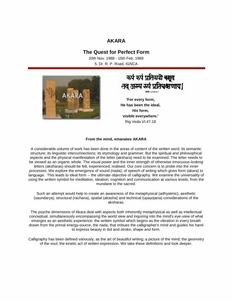
AKARA
The Quest for Perfect Form
20th Nov. 1988 - 15th Feb. 1989
5, Dr. R. P. Road, IGNCA
'For every form,
He has been the ideal,
His form,
visible everywhere.'
Rig Veda VI.47.18
From the mind, emanates AKARA
A considerable volume of work has been done in the areas of content of the written word: its semantic structure; its linguistic interconnections; its etymology and grammer. But the spiritual and philosophical aspects and the physical manifestation of the letter (akshara) need to be examined. The letter needs to be viewed as an organic whole. The visual power and the inner strength of otherwise innocuous-looking
letters (aksharas) should be felt, experienced, realised. Our core concern is to probe into the inner processes. We explore the emergence of sound (nada); of speech of writing which gives form (akara) to language. This leads to ideal form -- the ultimate objective of calligraphy. We examine the universality of using the written symbol for meditation, ideation, cognition and communication at various levels, from the
mundane to the sacred.
Such an attempt would help to create an awareness of the metaphysical (adhyatmic), aesthetic (saundarya), structural (rachana), spatial (akasha) and technical (upayojana) considerations of the
aksharas.
The psyche dimensions of Akara deal with aspects both inherently metaphysical as well as intellectual conceptual, simultaneously encompassing the world view and inquiring into the mind's eye-view of what emerges as an aesthetic experience: the written symbol which begins as the vibration in every breath
drawn from the primal energy-source, the nada, that imbues the calligrapher's mind and guides his hand to express beauty in dot and stroke, shape and form.
Calligraphy has been defined variously, as the art of beautiful writing; a picture of the mind; the geometry of the soul; the kinetic act of written expression. We take these definitions and look deeper.
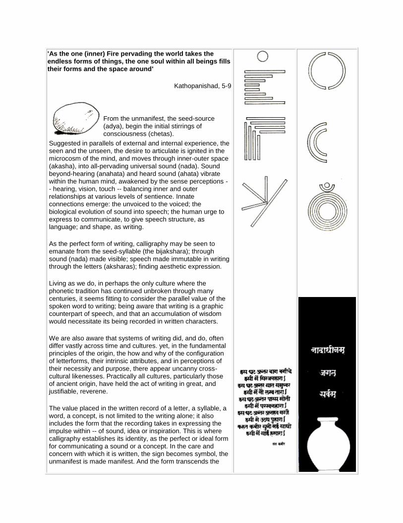
'As the one (inner) Fire pervading the world takes the endless forms of things, the one soul within all beings fills their forms and the space around'
Kathopanishad, 5-9
From the unmanifest, the seed-source (adya), begin the initial stirrings of consciousness (chetas).
Suggested in parallels of external and internal experience, the seen and the unseen, the desire to articulate is ignited in the microcosm of the mind, and moves through inner-outer space (akasha), into all-pervading universal sound (nada). Sound beyond-hearing (anahata) and heard sound (ahata) vibrate within the human mind, awakened by the sense perceptions -- hearing, vision, touch -- balancing inner and outer relationships at various levels of sentience. Innate connections emerge: the unvoiced to the voiced; the biological evolution of sound into speech; the human urge to express to communicate, to give speech structure, as language; and shape, as writing.
As the perfect form of writing, calligraphy may be seen to emanate from the seed-syllable (the bijakshara); through sound (nada) made visible; speech made immutable in writing through the letters (aksharas); finding aesthetic expression.
Living as we do, in perhaps the only culture where the phonetic tradition has continued unbroken through many centuries, it seems fitting to consider the parallel value of the spoken word to writing; being aware that writing is a graphic counterpart of speech, and that an accumulation of wisdom would necessitate its being recorded in written characters.
We are also aware that systems of writing did, and do, often differ vastly across time and cultures. yet, in the fundamental principles of the origin, the how and why of the configuration of letterforms, their intrinsic attributes, and in perceptions of their necessity and purpose, there appear uncanny cross-cultural likenesses. Practically all cultures, particularly those of ancient origin, have held the act of writing in great, and justifiable, reverene.
The value placed in the written record of a letter, a syllable, a word, a concept, is not limited to the writing alone; it also includes the form that the recording takes in expressing the impulse within -- of sound, idea or inspiration. This is where calligraphy establishes its identity, as the perfect or ideal form for communicating a sound or a concept. In the care and concern with which it is written, the sign becomes symbol, the unmanifest is made manifest. And the form transcends the
act of writing to become an act of spiritual dedication: Calligraphy.
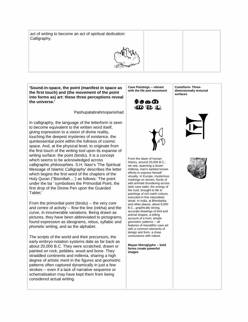
'Sound-in-space, the point (manifest in space as the first touch) and (the movement of the point into forms as) art: these three perceptions reveal the universe.'
Pashupatabrahmopanishad
In calligraphy, the language of the letterform is seen to become equivalent to the written word itself, giving expression to a vision of divine reality, touching the deepest mysteries of existence, the quintessential point within the fullness of cosmic space. And, at the physical level, to originate from the first touch of the writing tool upon its expanse of writing surface: the point (bindu). It is a concept which seems to be acknowledged across calligraphic philosophies. S.H. Nasr's 'The Spiritual Message of Islamic Calligraphy' describes the letter which begins the first word of the chapters of the Holy Quran ("Bismillah....') as follows: 'The point under the ba ' symbolises the Primordial Point, the first drop of the Divine Pen upon the Guarded Tablet.'
From the primordial point (bindu) -- the very core and centre of activity -- flow the line (rekha) and the curve, in innumerable variations. Being drawn as pictures, they have been abbreviated to pictograms, found expression as ideograms, rebus, syllabic and phonetic writing, and as the alphabet.
The scripts of the world and their precursors, the early embryo-notation systems date as far back as about 20,000 B.C. They were scratched, drawn or painted on rock, pebbles, wood and bone. They straddled continents and millenia, sharing a high degree of artistic merit in the figures and geometric patterns often captured dynamically in just a few strokes -- even if a lack of narrative sequence or schematisation may have kept them from being considered actual writing.
Cave Paintings -- vibrant with the life and movement
From the dawn of human history, around 20,000 B.C., we see, spanning a dozen millenia, man's earliest known efforts to express himself visually. In Europe, mysterious markings on stones; herds of wild animals thundering across dark cave walls, the energy of the hunt, brought to life in paintings of rich earth colours, executed in fine naturalistic detail. In India, at Bhimbetka and other places, about 8,000 B.C., graphically strong, accurate drawings of bird and animal shapes, a telling account of a hunt, simple geometric patterns -- all features of mesolithic cave art with a common elements of design and form, a close consonance with nature.
Mayan Hieroglyphs -- bold forms create powerful images
Cuneiform- Three-dimensionally textured surfaces
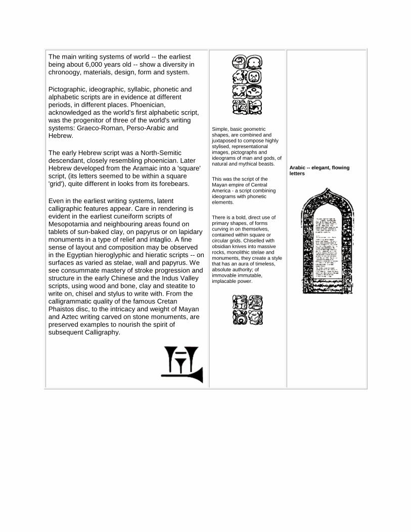
The main writing systems of world -- the earliest being about 6,000 years old -- show a diversity in chronoogy, materials, design, form and system.
Pictographic, ideographic, syllabic, phonetic and alphabetic scripts are in evidence at different periods, in different places. Phoenician, acknowledged as the world's first alphabetic script, was the progenitor of three of the world's writing systems: Graeco-Roman, Perso-Arabic and Hebrew.
The early Hebrew script was a North-Semitic descendant, closely resembling phoenician. Later Hebrew developed from the Aramaic into a 'square' script, (its letters seemed to be within a square 'grid'), quite different in looks from its forebears.
Even in the earliest writing systems, latent calligraphic features appear. Care in rendering is evident in the earliest cuneiform scripts of Mesopotamia and neighbouring areas found on tablets of sun-baked clay, on papyrus or on lapidary monuments in a type of relief and intaglio. A fine sense of layout and composition may be observed in the Egyptian hieroglyphic and hieratic scripts -- on surfaces as varied as stelae, wall and papyrus. We see consummate mastery of stroke progression and structure in the early Chinese and the Indus Valley scripts, using wood and bone, clay and steatite to write on, chisel and stylus to write with. From the calligrammatic quality of the famous Cretan Phaistos disc, to the intricacy and weight of Mayan and Aztec writing carved on stone monuments, are preserved examples to nourish the spirit of subsequent Calligraphy.
Simple, basic geometric shapes, are combined and juxtaposed to compose highly stylised, representational images, pictographs and ideograms of man and gods, of natural and mythical beasts.
This was the script of the Mayan empire of Central America - a script combining ideograms with phonetic elements.
There is a bold, direct use of primary shapes, of forms curving in on themselves, contained within square or circular grids. Chiselled with obsidian knives into massive rocks, monolithic stelae and monuments, they create a style that has an aura of timeless, absolute authority; of immovable immutable, implacable power.
Arabic -- elegant, flowing letters
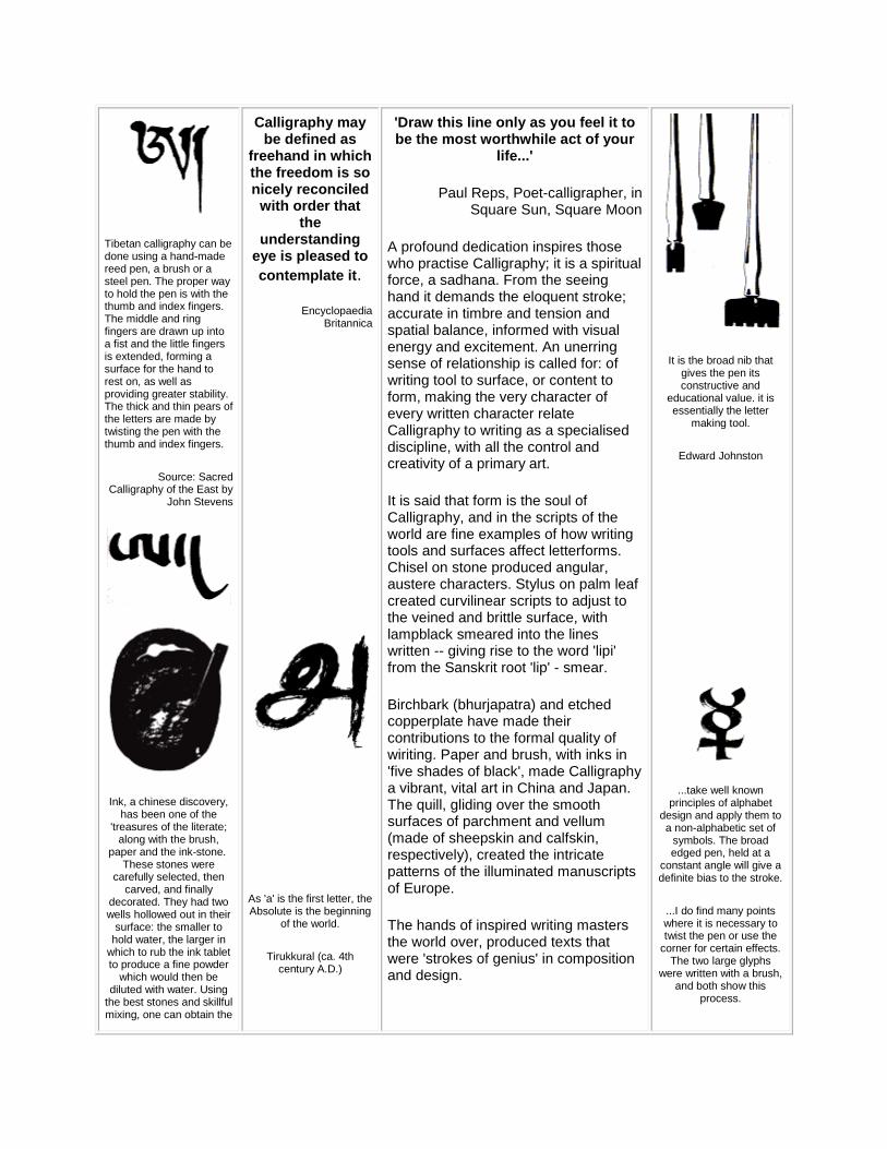
Tibetan calligraphy can be done using a hand-made reed pen, a brush or a steel pen. The proper way to hold the pen is with the thumb and index fingers. The middle and ring fingers are drawn up into a fist and the little fingers is extended, forming a surface for the hand to rest on, as well as providing greater stability. The thick and thin pears of the letters are made by twisting the pen with the thumb and index fingers.
Source: Sacred Calligraphy of the East by
John Stevens
Ink, a chinese discovery, has been one of the
'treasures of the literate; along with the brush,
paper and the ink-stone. These stones were
carefully selected, then carved, and finally
decorated. They had two wells hollowed out in their
surface: the smaller to hold water, the larger in
which to rub the ink tablet to produce a fine powder
which would then be diluted with water. Using
the best stones and skillful mixing, one can obtain the
Calligraphy may be defined as
freehand in which the freedom is so nicely reconciled
with order that the
understanding eye is pleased to
contemplate it.
Encyclopaedia Britannica
As 'a' is the first letter, the Absolute is the beginning
of the world.
Tirukkural (ca. 4th century A.D.)
'Draw this line only as you feel it to be the most worthwhile act of your
life...'
Paul Reps, Poet-calligrapher, in Square Sun, Square Moon
A profound dedication inspires those who practise Calligraphy; it is a spiritual force, a sadhana. From the seeing hand it demands the eloquent stroke; accurate in timbre and tension and spatial balance, informed with visual energy and excitement. An unerring sense of relationship is called for: of writing tool to surface, or content to form, making the very character of every written character relate Calligraphy to writing as a specialised discipline, with all the control and creativity of a primary art.
It is said that form is the soul of Calligraphy, and in the scripts of the world are fine examples of how writing tools and surfaces affect letterforms. Chisel on stone produced angular, austere characters. Stylus on palm leaf created curvilinear scripts to adjust to the veined and brittle surface, with lampblack smeared into the lines written -- giving rise to the word 'lipi' from the Sanskrit root 'lip' - smear.
Birchbark (bhurjapatra) and etched copperplate have made their contributions to the formal quality of wiriting. Paper and brush, with inks in 'five shades of black', made Calligraphy a vibrant, vital art in China and Japan. The quill, gliding over the smooth surfaces of parchment and vellum (made of sheepskin and calfskin, respectively), created the intricate patterns of the illuminated manuscripts of Europe.
The hands of inspired writing masters the world over, produced texts that were 'strokes of genius' in composition and design.
It is the broad nib that gives the pen its constructive and
educational value. it is essentially the letter
making tool.
Edward Johnston
...take well known principles of alphabet
design and apply them to a non-alphabetic set of
symbols. The broad edged pen, held at a
constant angle will give a definite bias to the stroke.
...I do find many points where it is necessary to twist the pen or use the
corner for certain effects. The two large glyphs
were written with a brush, and both show this
process.
'five shades of black'.
Source: Chinese Calligraphy by Edoardo
Fazzioli
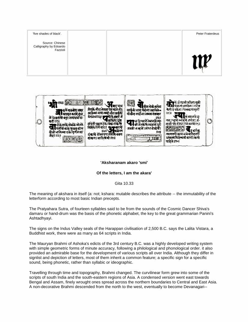
Peter Fraterdeus
'Aksharanam akaro 'smi'
Of the letters, I am the akara'
Gita 10.33
The meaning of akshara in itself (a: not; kshara: mutable describes the attribute -- the immutability of the letterform according to most basic Indian precepts.
The Pratyahara Sutra, of fourteen syllables said to be from the sounds of the Cosmic Dancer Shiva's damaru or hand-drum was the basis of the phonetic alphabet, the key to the great grammarian Panini's Ashtadhyayi.
The signs on the Indus Valley seals of the Harappan civilisation of 2,500 B.C. says the Lalita Vistara, a Buddhist work, there were as many as 64 scripts in India.
The Mauryan Brahmi of Ashoka's edicts of the 3rd century B.C. was a highly developed writing system with simple geometric forms of minute accuracy, following a philological and phonological order. it also provided an admirable base for the development of various scripts all over India. Although they differ in signlist and depiction of letters, most of them inherit a common feature; a specific sign for a specific sound, being phonetic, rather than syllabic or ideographic.
Travelling through time and topography, Brahmi changed. The curvilinear form grew into some of the scripts of south India and the south-eastern regions of Asia. A condensed version went east towards Bengal and Assam, finely wrought ones spread across the northern boundaries to Central and East Asia. A non-decorative Brahmi descended from the north to the west, eventually to become Devanagari--
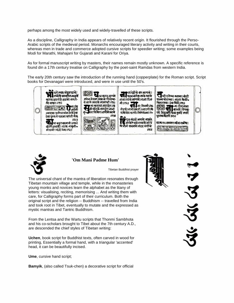
perhaps among the most widely used and widely-travelled of these scripts.
As a discipline, Calligraphy in India appears of relatively recent origin. It flourished through the Perso-Arabic scripts of the medieval period. Monarchs encouraged literary activity and writing in their courts, whereas men in trade and commerce adopted cursive scripts for speedier writing; some examples being Modi for Marathi, Mahajani for Gujarati and Karani for Oriya.
As for formal manuscript writing by masters, their names remain mostly unknown. A specific reference is found din a 17th century treatise on Calligraphy by the poet-saint Ramdas from western India.
The early 20th century saw the introduction of the running hand (copperplate) for the Roman script. Script books for Devanagari were introduced, and were in use until the 50's.
'Om Mani Padme Hum'
Tibetan Buddhist prayer
The universal chant of the mantra of liberation resonates through Tibetan mountain village and temple, while in the monasteries young monks and novices learn the alphabet as the litany of letters: visualising, reciting, memorising ... And writing them with care, for Calligraphy forms part of their curriculum. Both the original script and the religion -- Buddhism -- travelled from India and took root in Tibet, eventually to mutate and the expressed as mystic mantras and Tantric Buddhism.
From the Lentsa and the Wartu scripts that Thonmi Sambhota and his co-scholars brought to Tibet about the 7th century A.D., are descended the chief styles of Tibetan writing:
Uchen, book script for Buddhist texts, often carved in wood for printing, Essentially a formal hand, with a triangular 'accented' head, it can be beautifully incised.
Ume, cursive hand script;
Bamyik, (also called Tsuk-chen) a decorative script for official
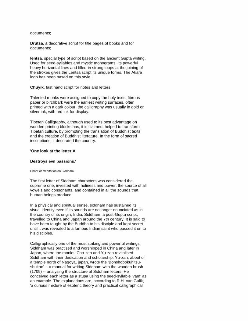
documents;
Drutsa, a decorative script for title pages of books and for documents;
lentsa, special type of script based on the ancient Gupta writing. Used for seed-syllables and mystic monograms, its powerful heavy horizontal lines and filled-in strong loops at the joining of the strokes gives the Lentsa script its unique forms. The Akara logo has been based on this style.
Chuyik, fast hand script for notes and letters.
Talented monks were assigned to copy the holy texts: fibrous paper or birchbark were the earliest writing surfaces, often primed with a dark colour; the calligraphy was usually in gold or silver ink, with red ink for display.
Tibetan Calligraphy, although used to its best advantage on wooden printing blocks has, it is claimed, helped to transform Tibetan culture, by promoting the translation of Buddhist texts and the creation of Buddhist literature. In the form of sacred inscriptions, it decorated the country.
'One look at the letter A
Destroys evil passions.'
Chant of meditation on Siddham
The first letter of Siddham characters was considered the supreme one, invested with holiness and power: the source of all vowels and consonants, and contained in all the sounds that human beings produce.
In a physical and spiritual sense, siddham has sustained its visual identity even if its sounds are no longer enunciated as in the country of its origin, India. Siddham, a post-Gupta script, travelled to China and Japan around the 7th century. It is said to have been taught by the Buddha to his disciple and kept secret until it was revealed to a famous Indian saint who passed it on to his disciples.
Calligraphically one of the most striking and powerful writings, Siddham was practised and worshipped in China and later in Japan, where the monks, Cho-zen and Yu-zan revitalised Siddham with their dedication and scholarship. Yu-zan, abbot of a temple north of Nagoya, japan, wrote the 'Bonshobokuhitsu-shukan' -- a manual for writing Siddham with the wooden brush (1709) -- analysing the structure of Siddham letters. He conceived each letter as a stupa using the seed-syllable 'vam' as an example. The explanations are, according to R.H. van Gulik, 'a curious mixture of esoteric theory and practical calligraphical
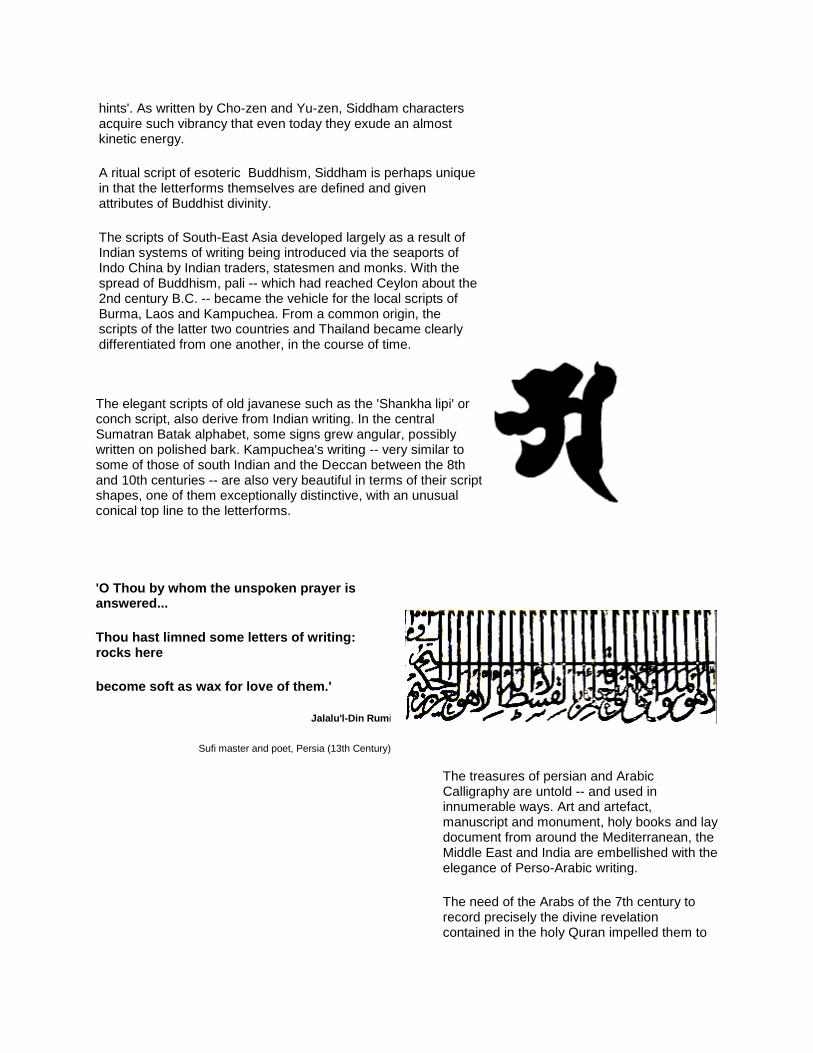
hints'. As written by Cho-zen and Yu-zen, Siddham characters acquire such vibrancy that even today they exude an almost kinetic energy.
A ritual script of esoteric Buddhism, Siddham is perhaps unique in that the letterforms themselves are defined and given attributes of Buddhist divinity.
The scripts of South-East Asia developed largely as a result of Indian systems of writing being introduced via the seaports of Indo China by Indian traders, statesmen and monks. With the spread of Buddhism, pali -- which had reached Ceylon about the 2nd century B.C. -- became the vehicle for the local scripts of Burma, Laos and Kampuchea. From a common origin, the scripts of the latter two countries and Thailand became clearly differentiated from one another, in the course of time.
The elegant scripts of old javanese such as the 'Shankha lipi' or conch script, also derive from Indian writing. In the central Sumatran Batak alphabet, some signs grew angular, possibly written on polished bark. Kampuchea's writing -- very similar to some of those of south Indian and the Deccan between the 8th and 10th centuries -- are also very beautiful in terms of their script shapes, one of them exceptionally distinctive, with an unusual conical top line to the letterforms.
'O Thou by whom the unspoken prayer is answered...
Thou hast limned some letters of writing: rocks here
become soft as wax for love of them.'
Jalalu'l-Din Rumi
Sufi master and poet, Persia (13th Century)
The treasures of persian and Arabic Calligraphy are untold -- and used in innumerable ways. Art and artefact, manuscript and monument, holy books and lay document from around the Mediterranean, the Middle East and India are embellished with the elegance of Perso-Arabic writing.
The need of the Arabs of the 7th century to record precisely the divine revelation contained in the holy Quran impelled them to
perfect the art of writing and the production and decoration of manuscripts. Secular works began to be embellished after the 12th century. Figurative art was proscribed; consequently visual and aesthetic energies went into emphasis on and elaboration of the form of words, especially the divine name of God: Allah. Calligraphy and calligraphers were much in demand.
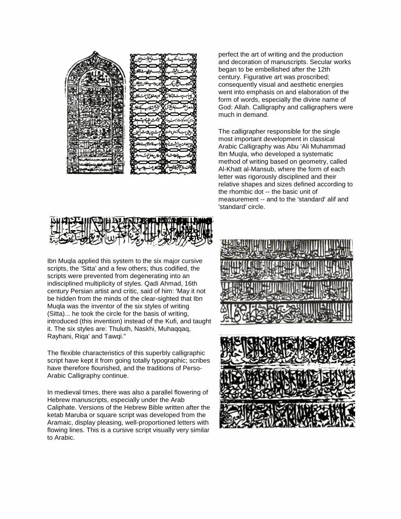
The calligrapher responsible for the single most important development in classical Arabic Calligraphy was Abu 'Ali Muhammad Ibn Muqla, who developed a systematic method of writing based on geometry, called Al-Khatt al-Mansub, where the form of each letter was rigorously disciplined and their relative shapes and sizes defined according to the rhombic dot -- the basic unit of measurement -- and to the 'standard' alif and 'standard' circle.
Ibn Muqla applied this system to the six major cursive scripts, the 'Sitta' and a few others; thus codified, the scripts were prevented from degenerating into an indisciplined multiplicity of styles. Qadi Ahmad, 16th century Persian artist and critic, said of him: 'May it not be hidden from the minds of the clear-sighted that Ibn Muqla was the inventor of the six styles of writing (Sitta)... he took the circle for the basis of writing, introduced (this invention) instead of the Kufi, and taught it. The six styles are: Thuluth, Naskhi, Muhaqqaq, Rayhani, Riqa' and Tawqi.''
The flexible characteristics of this superbly calligraphic script have kept it from going totally typographic; scribes have therefore flourished, and the traditions of Perso-Arabic Calligraphy continue.
In medieval times, there was also a parallel flowering of Hebrew manuscripts, especially under the Arab Caliphate. Versions of the Hebrew Bible written after the ketab Maruba or square script was developed from the Aramaic, display pleasing, well-proportioned letters with flowing lines. This is a cursive script visually very similar to Arabic.
'First a seeker of way must know himself.'
Jiun
Zen calligrapher (1718-1804)
Calligraphy in China emerges as a manifestation of culture and character and is venerated as a primary art.
With the ideogram as master and king, calligraphers have served a long, hard apprenticeship to the essential characters of every character, remaining sensitive to the touch of brush-tip on paper.
Writing masters have left their indelible mark: Wang Xizhi, whose 4th century works have been writing models for over a millenium and a half; Zhao Meng Fu, the 'limpid beauty' of whose Calligraphy was greatly admired and copied right from medieval times; Wang Chong, one of the three Great Masters of the Ming dynasty; and many others including He Shaoji of the 19th century Qing dynasty.
Along with Buddhist thought, the Chinese system of writing is believed to have crossed over to Japan around the 5th century A.D., through the Korean mainland.
The Japanese writing system is full of peculiar exquisiteness. It may be called a compound system which is unique in the world. Kanji, the developed form of the original Chinese pictograms, is used in conjunction with the phonetic Kana, a simplified and 'Japonised' form of Kanji.
In Japan, as in China, Calligraphy intertwines with poetry, is honoured as a fine art, a universal cultural value revealing the writer's skill and creativity, and embodying his inner character.
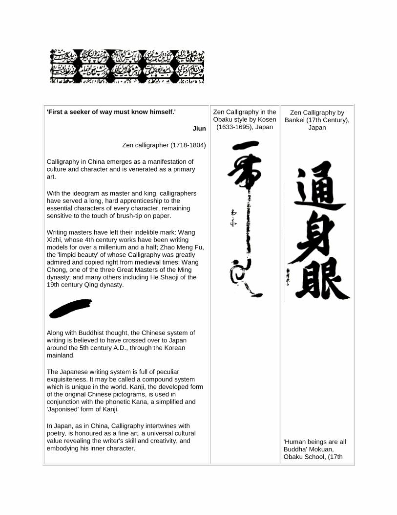
Zen Calligraphy in the Obaku style by Kosen (1633-1695), Japan
Zen Calligraphy by Bankei (17th Century),
Japan
'Human beings are all Buddha' Mokuan, Obaku School, (17th
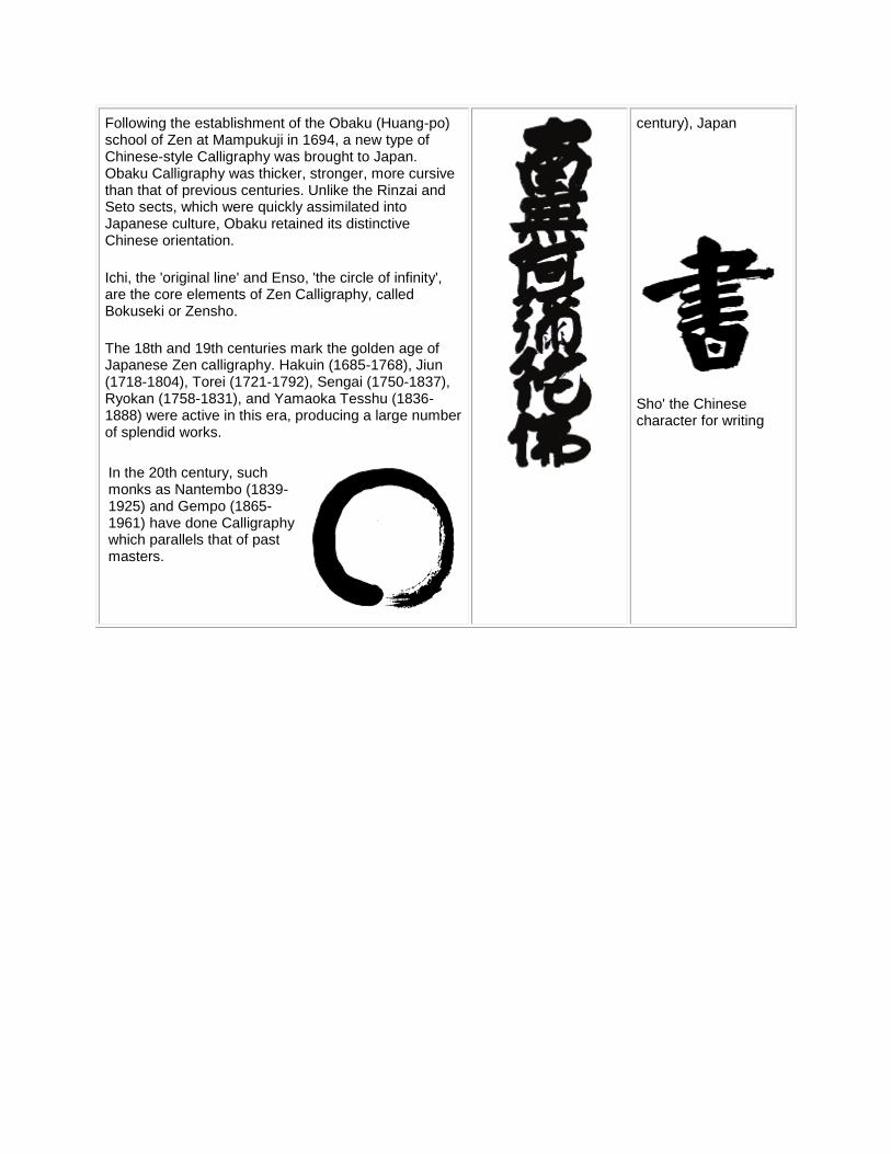
Following the establishment of the Obaku (Huang-po) school of Zen at Mampukuji in 1694, a new type of Chinese-style Calligraphy was brought to Japan. Obaku Calligraphy was thicker, stronger, more cursive than that of previous centuries. Unlike the Rinzai and Seto sects, which were quickly assimilated into Japanese culture, Obaku retained its distinctive Chinese orientation.
Ichi, the 'original line' and Enso, 'the circle of infinity', are the core elements of Zen Calligraphy, called Bokuseki or Zensho.
The 18th and 19th centuries mark the golden age of Japanese Zen calligraphy. Hakuin (1685-1768), Jiun (1718-1804), Torei (1721-1792), Sengai (1750-1837), Ryokan (1758-1831), and Yamaoka Tesshu (1836-1888) were active in this era, producing a large number of splendid works.
In the 20th century, such monks as Nantembo (1839-1925) and Gempo (1865-1961) have done Calligraphy which parallels that of past masters.
century), Japan
Sho' the Chinese character for writing
'The origin of Penmanship, or first invention of Letters, has been much controverted; but next to God, the Author and Giver of all Science, it seems rational to think it was derived from Adam.'
Joseph Champion
in 'The Parallel or Comparative Penmanship Exemplified' (1750)
...The above statement sums up, in a sense, the ethos of the Graeco-Roman alphabet. This alphabet traces its ancestry to the North-Semitic and Phoenician scripts - borrowed, added to, and mutated by the Greeks in about the 8th century B.C. It then passed on through the Etruscans to the Romans, who perfected the letterforms to ideal proportions. The Trajan column, with square capital letters gave way to the freer, more economical, rustic capitals and uncials. These were called book-hands of the Roman Empire, and used for valued works.
The uncial, seen in the oldest copies of the Bible, was the literary hand from the 5th to the 8th centuries. It is, says Alfred Fairbank, '...truly a penman's letter and owes its form to the quill and to vellum -- the best pen and the best writing material for a book-script.'
From these capitals or majuscules, developed cursive or informal hands, written more quickly, which ultimately evolved into the miniscule -- small or lower case letters, as distinct from capitals.
In the 6th and 7th centuries, half-uncials, derived from uncials, spread to Ireland along with Christianity. It is the style used in the incomparable Book of Kells. Irish monks took their culture to England where an insular half-uncial became the national book-hand.
On the Continent, various other regional and mixed hands emerged: the Visigothic (Spain), Beneventan (South Italy), Merovingian (France). The Caroline Miniscule was named after Charlemagne who, though himself unlettered, valued the written word and brought the English abbot Alcuin of York to his kingdom. The Gothic scripts of the Middle Ages, having evolved from the Caroline, reflected the spirit of the times as did the architecture of that
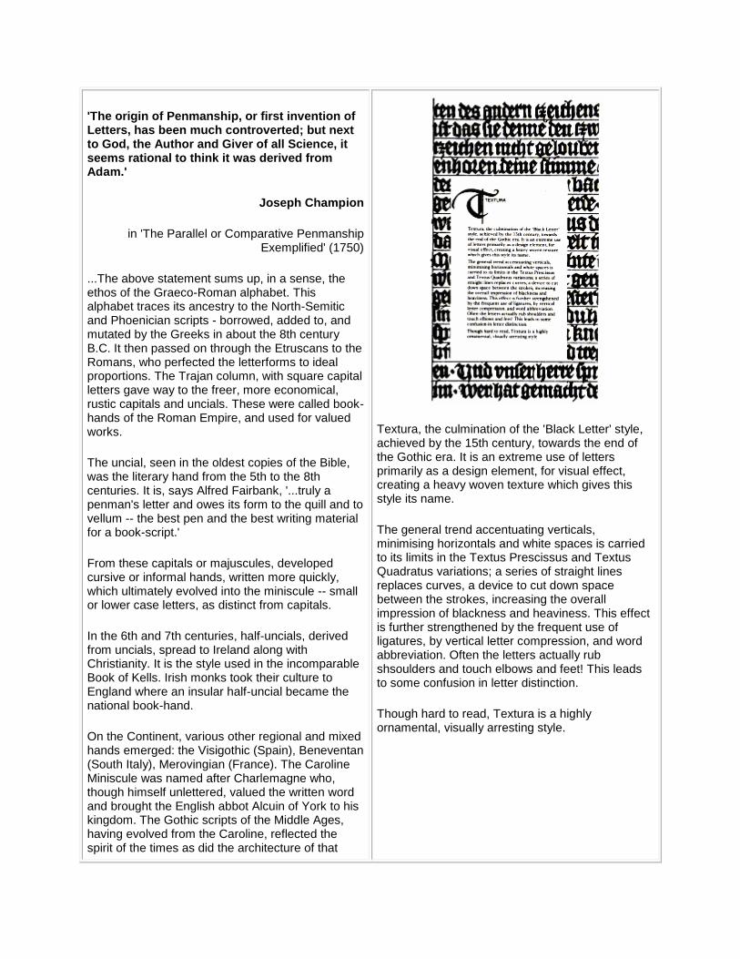
Textura, the culmination of the 'Black Letter' style, achieved by the 15th century, towards the end of the Gothic era. It is an extreme use of letters primarily as a design element, for visual effect, creating a heavy woven texture which gives this style its name.
The general trend accentuating verticals, minimising horizontals and white spaces is carried to its limits in the Textus Prescissus and Textus Quadratus variations; a series of straight lines replaces curves, a device to cut down space between the strokes, increasing the overall impression of blackness and heaviness. This effect is further strengthened by the frequent use of ligatures, by vertical letter compression, and word abbreviation. Often the letters actually rub shsoulders and touch elbows and feet! This leads to some confusion in letter distinction.
Though hard to read, Textura is a highly ornamental, visually arresting style.
age: angular, precise, compressed, narrow, black. There are several versions of the Gothic letter.
With the Italian Renaissance, the humanists searched for and revived earlier Caroline hands: these were called 'humanistic'.
The invention of the printing press and movable type in the late 15th century led to the use and proliferation of all these lettering styles, copied and further developed. Venice, in particular, and Italy in general, were the important centres of activity. Great names in writing stand out: Ludovici Arrighi who produced the first writing manual in 1522; Tagliente who wrote a similar, very popular book; Palatino who published a veritable treasury of scripts.
Other countries such as Spain and France and England followed suit with books about, and variations of, the established hand.
With the change in techniques from engraved woodblock to engraved copperplates, scripts came closer to handwriting, free of excessive angularity. Ultimately, this led to the use of the pen and the copy book, and the development of flowing writing, which we, in India, saw as the 'Copperplate' or English 'running hand'.
The great revival of Graeco-Roman Calligraphy was initiated in the 19th century by William Morris, poet, artist-craftsman, who produced illuminated manuscripts in the medieval manner. The study of handwriting as a fine art began during this time.
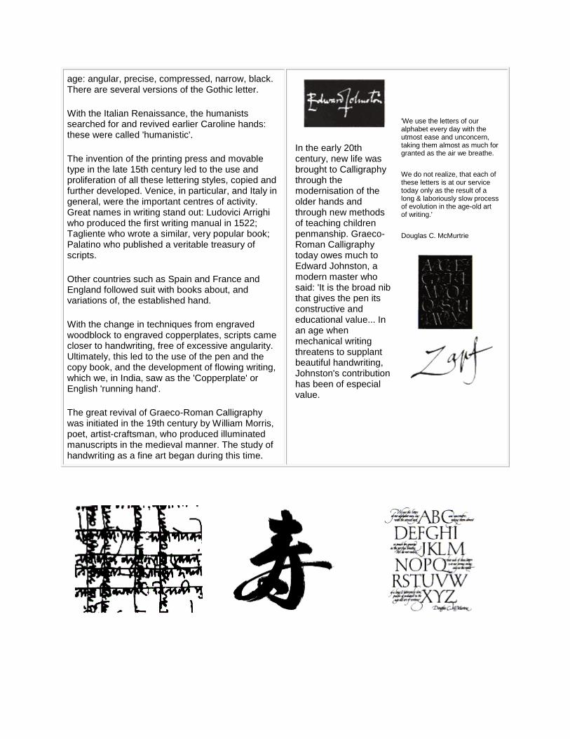
In the early 20th century, new life was brought to Calligraphy through the modernisation of the older hands and through new methods of teaching children penmanship. Graeco-Roman Calligraphy today owes much to Edward Johnston, a modern master who said: 'It is the broad nib that gives the pen its constructive and educational value... In an age when mechanical writing threatens to supplant beautiful handwriting, Johnston's contribution has been of especial value.
'We use the letters of our alphabet every day with the utmost ease and unconcern, taking them almost as much for granted as the air we breathe.
We do not realize, that each of these letters is at our service today only as the result of a long & laboriously slow process of evolution in the age-old art of writing.'
Douglas C. McMurtrie
Calligrpahy: the contemporary scene
In today's world of interlink, where even seemingly tenuous connections can turn out to be significant, we explore the applications of Calligraphy in various technologies and art forms. The advent of printing with movable type meant the development of different type styles, most of which drew their inspiration from calligraphic traditions. Thus Calligraphy has influenced type design and typographic activities throughout the world.
There are several other interconnections:
Calligraphy and cartography:
The plotting and drawing of maps, where the lettering has to be clear but unobtrusive, well placed and easily readable, brings Calligraphy to the fore. Albrecht Durer's woodcuts include some of the most remarkable examples of cartography. Mercator's maps reflect the finesse of his calligraphic ingenuity. In India, the lettering of the 17th century maps of the western region makes use of informal Calligraphy while charting sea routes.
Calligraphy and musical notation:
The cadences of music and the arabesques of line have a similarity which lovers of music and Calligraphy can immediately connect. 'The dance of the pan', as Alfred Fairbank called it, makes for an imaginative language of musical notation.
Calligraphy and visual poetry:
We see this worldwide phenomenon in many -- and continuing -- forms: the medieval Chitrakavya and Aksharabandhas of India where verses were contained within graphic shapes; the labyrinth or grid-poem which flourished in the Renaissance and the Baroque in the West; the hui-wen genre within Chinese literature; and the many modern examples of concrete poetry in the West as well as in India, where a multiplicity of scripts offers a further exciting dimension.
Calligraphy and computers:
Computer technology bids fair to revitalise printing for India's complex, non-linear scripts whose composite characters and conjuncts vary in size and form. Specially designed software will now be able to produce a variety of calligraphic styles as typefont designs in Indian scripts. Such fonts will facilitate the publication of Indian scripts in various formats and styles.
Because of the structural differences between the Graeco-Roman and the Indian scripts, designing for Indian languages is no small exercise. But a beginning has been made; it advances, with notable promise.
A confluence of tradition and technology
A look at the state of the art in Calligraphy indicates the activities presently under way, and the possibilities for the future. While Indian epigraphy, papaeography and linguistic enquiry of various kinds
engage researcher and academic, the study of Indian Calligraphy by comparison, has yet to receive
adequate attention.
Attempts in this direction have already started. Some of these are: manuscript studies in a few Indian languages; structural analysis of letterforms; the adaptation of old writing styles for contemporary use, e.g. for typeface design; legibility studies. Efforts at organised calligraphic education have also been initiated, such as the introduction of Calligraphy at higher levels of art education, and workshops and
seminars with international interaction.
With the objectives of preservation and promotion of the arts and culture, the Indira Gandhi National Centre for the Arts has undertaken an exciting task. The broad aims are: to serve as a national resource centre for the arts; to undertake research and publication programmes for information related to the Arts
and Humanities, and to provide a forum for creative and critical dialogues. By using the new disciplines of information technology, an enormous and diversified range of the artistic and cultural heritage is being
collected. Calligraphy falls naturally within this ambit, which includes textual and verbal materials, books and manuscripts as well as oral and auditory resources, records of visual kinetics (from dance to fairs and
festivals and life styles), and the documentation of art objects ranging from sculpture to painting to architectural monuments to artefacts. Here Calligraphy also contributes, with specially designed lettering for the listing of data and transcription of texts, making its presence relevant wherever the written word
carries weight.
'I dive down into the ocean of forms,
hoping to gain the perfect pearl of the formless.'
Rabindranath Tagore