77 dances : japanese calligraphy by poets, monks ... - terebess
TRANSCRIPT
(Canada $85.00 ;
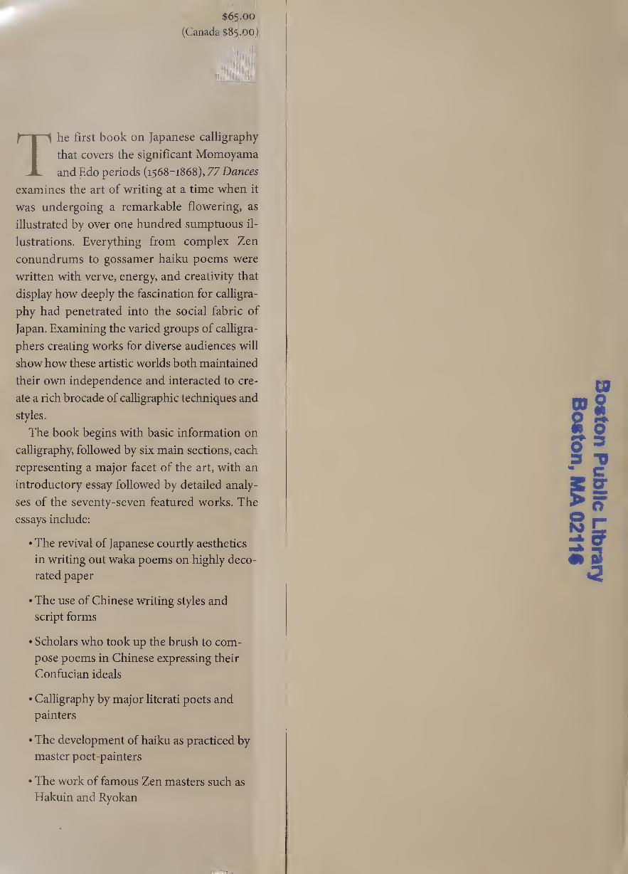
The first book on Japanese calligraphy
that covers the significant Momoyama
and Edo periods (1568-1868), 77 Dances
examines the art of writing at a time when it
was undergoing a remarkable flowering, as
illustrated by over one hundred sumptuous il¬
lustrations. Everything from complex Zen
conundrums to gossamer haiku poems were
written with verve, energy, and creativity that
display how deeply the fascination for calligra¬
phy had penetrated into the social fabric of
Japan. Examining the varied groups of calligra¬
phers creating works for diverse audiences will
show how these artistic worlds both maintained
their own independence and interacted to cre¬
ate a rich brocade of calligraphic techniques and
styles.
The book begins with basic information on
calligraphy, followed by six main sections, each
representing a major facet of the art, with an
introductory essay followed by detailed analy¬
ses of the seventy-seven featured works. The
essays include:
• The revival of Japanese courtly aesthetics
in writing out waka poems on highly deco¬
rated paper
• The use of Chinese writing styles and
script forms
• Scholars who took up the brush to com¬
pose poems in Chinese expressing their
Confucian ideals
• Calligraphy by major literati poets and
painters
• The development of haiku as practiced by
master poet-painters
• The work of famous Zen masters such as
Hakuin and Ryokan
,
PmWfj
Bo
ston P
ublic Library
Bosto
n, M
A 021 It
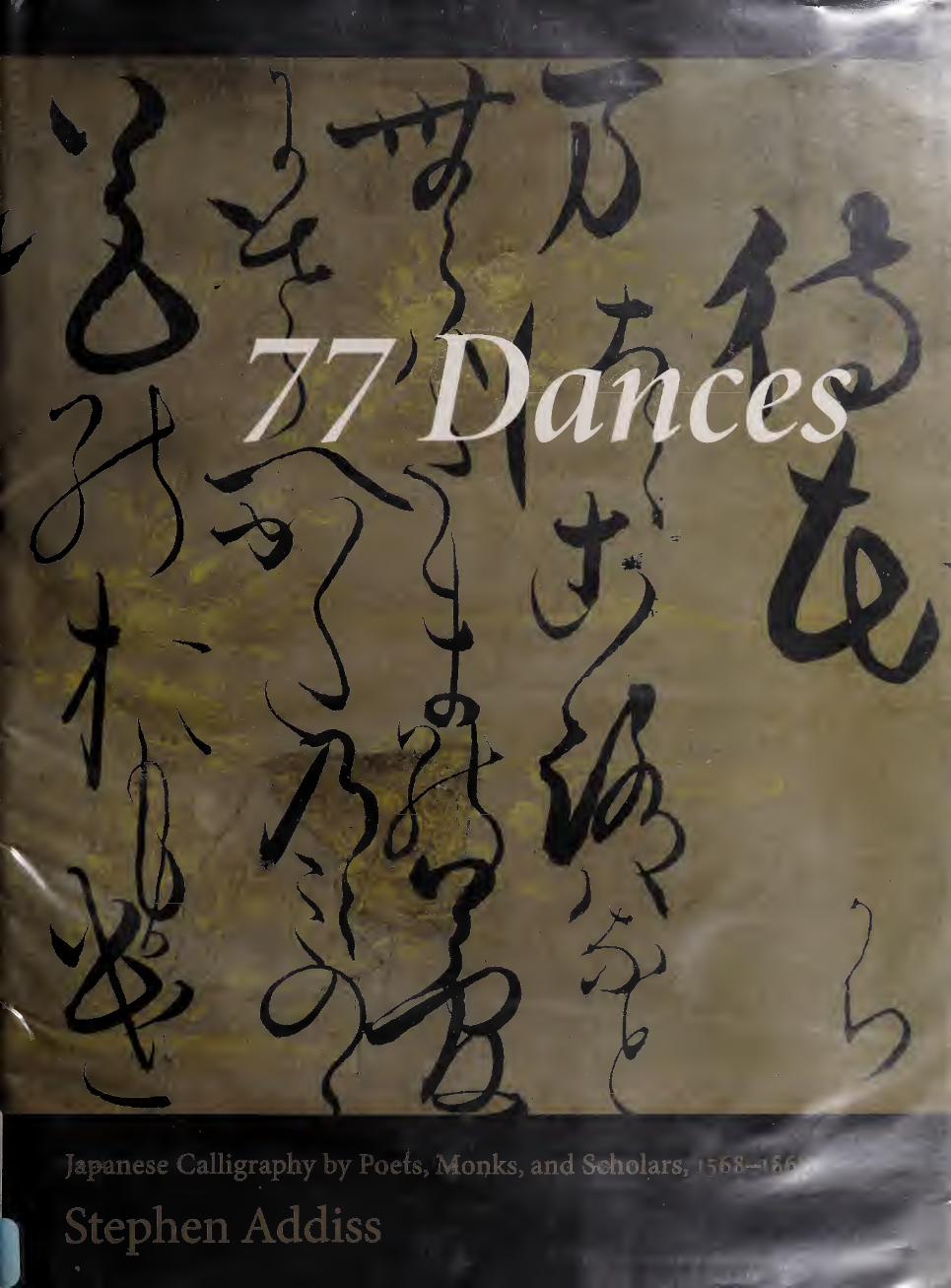
77 DANCES
77 DANCES Japanese Calligraphy by
Poets, Monks, and Scholars,
1568-1868
STEPHEN ADDISS
Foreword by Richard Waller
\ Weatherhill Boston &c London
zoo6
Weatherhill
An imprint ofShambhala Publications, Inc.
Horticultural Hall
300 Massachusetts Avenue
Boston, Massachusetts 01115
www.shambhala.com
©2.006 by Stephen Addiss
All rights reserved. No part of this book may be reproduced in any form
or by any means, electronic or mechanical, including photocopying,
recording, or by any information storage and retrieval system, without
permission in writing from the publisher.
Frontispiece: Detail of #59, Kogetsu Sogan, Kimi (“You”).
987654321
First Edition
Printed in Singapore
©This edition is printed on acid-free paper that meets the American
National Standards Institute Z39.48 Standard.
Distributed in the United States by Random House, Inc.,
and in Canada by Random House of Canada Ltd
Designed by Margery Cantor
Library of Congress Cataloging-in-Publication Data
Addiss, Stephen, 1935-
77 dances: Japanese calligraphy by poets, monks, and scholars,
1568-1868 / Stephen Addiss; foreword by Richard Waller.—1st ed.
p. cm.
ISBN-13: 978-0-8348-0571-1 (hardcover: alk. paper)
ISBN-10: 0-8348-0571-5
1. Calligraphy, Japanese—To 1600. 2. Calligraphy, Japanese—Edo
period, 1600-1868. 3. Calligraphy, Chinese. I. Title. II. Title:
Seventy-seven dances.
NK3637.A2A33 2006
745.6'i9956—den
1006041062
To Audrey Yoshiko Seo

Digitized by the Internet Archive in 2018 with funding from Kahle/Austin Foundation
https://archive.org/details/77dancesjapanese0000addi
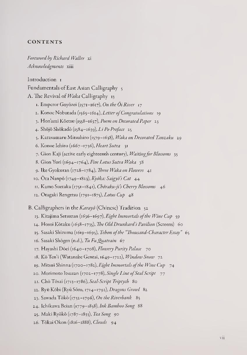
CONTENTS
Foreword by Richard Waller xi
Acknowledgments xiii
Introduction i
Fundamentals of East Asian Calligraphy 5
A. The Revival of Waka Calligraphy 13
1. Emperor Goyozei (1571-1617), On the Oi River 17
2. Konoe Nobutada (1565-1614), Letter of Congratulations 19
3. Hon’ami Koetsu (1558-1637), Poem on Decorated Paper 13
4. Shojo Shokado (1584-1639), Li Po Preface 25
5. Karasumaru Mitsuhiro (1579-1638), Waka on Decorated Tanzaku 19
6. Konoe Iehiro (1667-1736), Heart Sutra 31
7. Gion Kaji (active early eighteenth century), Waiting for Blossoms 35
8. Gion Yuri (1694-1764), Five Lotus Sutra Waka 38
9. Ike Gyokuran (1728-1784), Three Waka on Flowers 41
10. Ota Nanpo (1749-1823), Kyoka: Saigyos Cat 44
11. Kamo Suetaka (1751-1841), Choraku-ji’s Cherry Blossoms 46
12. Otagaki Rengetsu (1791-1875), Lotus Cup 48
B. Calligraphers in the Karayo (Chinese) Tradition 52
13. Kitajima Setsuzan (1636-1697), Eight Immortals of the Wine Cup 59
14. Hosoi Kotaku (1658-1735), The Old Drunkard’s Pavilion (Screens) 60
15. Sasaki Shizuma (1619-1695), Fehon of the “Thousand-Character Essay” 65
16. Sasaki Shogen (n.d.), Tu Fujfuatrain 67
17. Hayashi Doei (1640-1708), Flowery Purity Palace 70
18. Ko Ten’i (Watanabe Gentai, 1649-1722), Window Snow 72
19. Mitsui Shinna (1700-1782), Eight Immortals of the Wine Cup 74
20. Morimoto Itsuzan (1702-1778), Single Line of Seal Script 77
21. Cho Tosai (1713-1786), Seal-Script Triptych 80
22. Ryu Kobi (Ryu Soro, 1714-1792), Dragons Growl 82
23. SawadaToko (1732-1796), On the Riverbank 85
24. Ichikawa Beian (1779-1858), Ink Bamboo Song 88
25. Maki Ryoko (1787-1833), Tea Song 90
26. Tokai Okon (1816—1888), Clouds 94
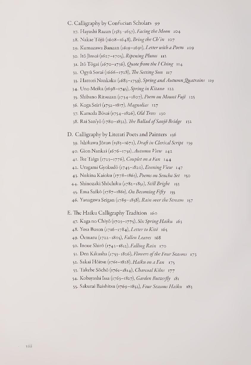
C. Calligraphy by Confucian Scholars 99
27. Hayashi Razan (1583-1657), Facing the Moon 104
28. Nakae Toju (1608-1648), Bring the Cb’in 107
29. Kumazawa Banzan (1619-1691), Letter with a Poem 109
30. ltd ]insa.i (1617-170^), Ripening Plums 112
31. Ito Togai (1670-1736), Quotefrom the I Ching 114
32. Ogyu Sorai (1666-1728), The Setting Sun 117
33. Hattori Nankaku (1683-1759), Spring and Autumn Quatrains
34. Uno Meika (1698-1745), Spring in Kitano 122
35. Shibano Ritsuzan (1734-1807), Poem on Mount Fuji 125
36. Koga Seiri (1752-1817), Magnolias 127
37. Kameda Bosai (1754-1826), Old Trees 130
38. Rai Sanyo (1780-1832), The Ballad ofSanjo Bridge 132
D. Calligraphy by Literati Poets and Painters 136
39. Ishikawajozan (1583-1672), Draft in Clerical Script 139
40. Gion Nankai (1676-1751), Autumn View 142
41. Ike Taiga (1723-1776), Couplet on a Fan 144
42. Uragami Gyokudo (1745-1820), Evening View 147
43. Nukina Kaioku (1778-1863), Poems on Sencha Set 150
44. Shinozaki Shochiku (1782-1851), Still Bright 153
45. Ema Saiko (1787-1861), On Becoming Fifty 155
46. Yanagawa Seigan (1789-1858), Rain over the Stream 157
E. The Haiku Calligraphy Tradition 160
47. Kaga no Chiyo (1703-1775), Six Spring Haiku 163
48. Yosa Buson (1716-1784), Letter to Kito 165
49. Oemaru (1722-1805), Fallen Leaves 168
50. Inoue Shiro (1742-1812), Falling Rain 170
51. Den Kikusha (1753-1826), Flowers of the Four Seasons 173
52. Sakai Hoitsu (1761-1828), Haiku on a Fan 175
53. Takebe Socho (1761-1814), Charcoal Kilns 177
54. Kobayashi Issa (1763-1827), Garden Butterfly 181
55. Sakurai Baishitsu (1769-1852), Four Seasons Haiku 183
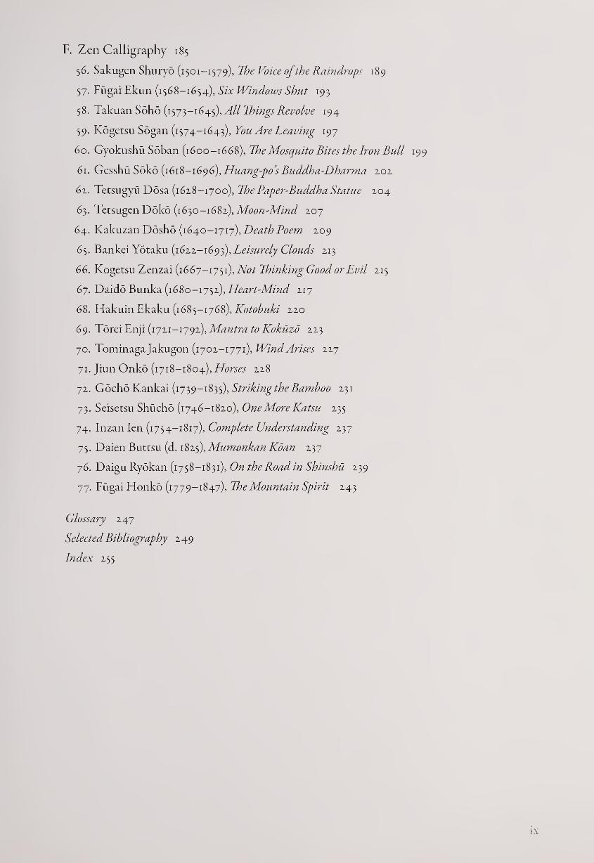
F. Zen Calligraphy 185
56. Sakugen Shuryo (1501-1579), The Voice of the Raindrops 189
57. Fugai Ekun (1568-1654), Six Windows Shut 193
58. Takuan Soho (1573—1645), Things Revolve 194
59. Kogetsu Sogan (1574-1643), You Are Leaving 197
60. Gyokushu Soban (1600-1668), The Mosquito Bites the Iron Bull 199
61. Gesshu Soko (1618-1696), Huang-po’s Buddha-Dharma 202
61. Tetsugyu Dosa (1628-1700), ThePaper-Buddha Statue 204
63. Tetsugen Doko (1630-1682), Moon-Mind 207
64. Kakuzan Dosho (1640-1717), Death Poem 209
65. Bankei Yotaku (1622-1693), Leisurely Clouds 213
66. Kogetsu Zenzai (1667-1751), Not Thinking Good or Evil 215
67. Daido Bunka (1680-1752), Heart-Mind 217
68. Hakuin Ekaku (1685-1768), Kotobuki 220
69. Torei Enji (1721-1792), Mantra to Kokuzo 223
70. Tominaga Jakugon (1702-1771), Wind Arises 227
71. Jiun Onko (1718-1804), Horses 228
72. Gdcho Kankai (1739-1835), Striking the Bamboo 231
73. Seisetsu Shucho (1746-1820), One More Katsu 235
74. Inzan Ien (1754-1817), Complete Understanding 237
75. Daien Buttsu (d. 1825\Mumonkan Kdan 237
76. Daigu Ryokan (1758-1831), On the Road in Shinshu 239
77. Fugai Honko (1779-1847), The Mountain Spirit 243
Glossary 247
Selected Bibliography 249
Index 255

FOREWORD
The University of Richmond Museums is pleased to be instrumental in the
organization and national tour of this important and stunningly beautiful
exhibition of Japanese calligraphy, 77 Dances: Japanese Calligraphy by Poets,
Monks, and Scholars, is68-iS6S, which presents seventy-seven objects that
let us explore the remarkably creative flowering of the art of writing during
Japan’s early modern period. On loan from several public and private collec¬
tions in the United States, the objects were selected not only because the
artists are historically important but also because the works exemplify the
varieties of scripts and brushwork so beautifully employed in the calligraphy
of the period. The traditional belief that the freedom of the brush inherently
reveals one’s inner character encourages us to consider each of these works
as a unique expression of the artist’s personality as well as collectively giving
us a glimpse into the culture that held calligraphy in such high esteem.
Opening at the Joel and Lila Harnett Museum of Art of the University
Museums, the exhibition will go on national tour to several other museums,
including the Birmingham Museum of Art, Alabama; the Herbert F. John¬
son Museum of Art, Cornell University, Ithaca, New York; and the Mori-
kami Museum and Japanese Gardens, Delray Beach, Florida.
The Momoyama and Edo periods (1568-1868), when Japan was ruled by
powerful shoguns, were a time of great variety in the arts, including a re¬
newed interest in calligraphy. In this “early modern” period, peace and rela¬
tive prosperity replaced the civil warfare of the previous century, and artistic
production and patronage spread through the population more than ever
before. Calligraphy was practiced by classical-style poets, poets in Chinese
style, Confucian scholars, literati artists, haiku poets, and Zen Masters, as
represented in this exhibition. Furthermore, they wrote their texts on a
number of media including screens, hanging scrolls, hand scrolls, albums,
fans, and ceramics, all of which can be seen here. For the first time, the full
range of early modern Japanese calligraphy is available for Western audi¬
ences, and we hope this will stimulate further scholarship and exhibitions.
To the author, our colleague Stephen Addiss, we are indebted for intro¬
ducing us to this intriguing area of Japanese culture and for curating this
exquisite exhibition. In addition to his unexcelled knowledge of Japanese
art, he brings both enthusiasm and a refreshing originality of thought to the
exhibition and its catalogue essay. As part of the faculty of the University of
Richmond as the Tucker-Boatwright Professor in the Humanities-Art and
Professor of Art History, he continues to enrich the study of art and art his¬
tory for our students as well as enriching the entire university community
with his intellectual curiosity and energetic pursuance of scholarship. This
current project is the latest addition to the fascinating exhibitions Dr. Ad¬
diss has curated for our museum.
At the University of Richmond, our special appreciation goes to Dr.
William E. Cooper, President; Dr. June R. Aprille, Provost and Vice President
for Academic Affairs; and Dr. Andrew F. Newcomb, Dean of the School of
Arts and Sciences, for their continuing guidance and support of the Univer¬
sity Museums, comprising the Joel and Lila Harnett Museum of Art, the
Joel and Lila Harnett Print Study Center, and the Lora Robins Gallery of
Design from Nature. As always, we acknowledge our deep appreciation to
the staff of the University Museums.
We would like to thank the staff of Shambhala Publications for their
faith in this book and their professionalism in realizing it. The exhibition, at
the Joel and Lila Harnett Museum of Art of the University Museums, and
this accompanying publication are made possible in part with the gener¬
ous support of the Blakemore Foundation, with additional funding from
the University’s Cultural Affairs Committee and the Louis S. Booth Arts
Fund. We also wish to acknowledge the generous support of the Metropoli¬
tan Center for Far Eastern Art Studies in making this publication possible.
Finally, we are grateful to all the lenders of the calligraphy included in this
exhibition.
The experience of the exhibition’s seventy-seven dances is a rare oppor¬
tunity to revel in the art of beautiful writing of Japan’s early modern period.
Enjoy the dances!
RICHARD WALLER
Executive Director
University of Richmond Museums
ACKNOWLEDGMENTS
To begin on a personal note, I have been studying calligraphy both histori¬
cally and in actual practice for thirty-five years. The practice came about, I
suspect, because as a child I was sent to schools that emphasized that the best
way to learn something was to do it yourself. I’m tempted to say that this has
caused me nothing but trouble, but for better or for worse it became a way
of life. My initial interest in Zen and literati calligraphy and painting during
the 1960s therefore led me to take brushwork lessons, at first from East Asian
teachers in New York City, and later from masters in Japan and Taiwan.
I don’t think anyone could begin more awkwardly or with less talent
than I did in those first few years, but I persevered, convinced that practice
would help me to appreciate more fully the work of the masters: in short, to
see better. As time went by, I found that I did gain increasing insights; and
as a bonus, after some years I reached the point of achieving mediocrity in
my own calligraphy and brush painting; it was a relief not to despise what I
was creating. As more years passed, people began to take an interest in my
work, and in the past decade I have had a number of exhibitions in various
countries, but I still believe the greatest advantage of practice has been that I
can see more completely when I view a work by a Chinese, Korean, or Japa¬
nese master. Does this mean that only someone who practices calligraphy
can understand this form of art? Certainly not. But even a brief attempt
at wielding the brush can teach both how difficult it is to control and how
great a range of personal expression it allows.
I would like, therefore, to begin by thanking Wang Chi-yuan, Ishikawa
Kako, Mitani Chizan, and ChiangChao-shen for their direct instruction in
calligraphy many years ago; their skill was exceeded only by their patience.
Next, I am grateful to longtime friends Jonathan Chaves, Kwan-shut Wang,
Wan Qing-li, Joseph Chang, and Fukushima Keido Roshi for generously
sharing their ideas, comments, criticisms, and encouragement, as well as
their depth of knowledge about East Asian calligraphy. Professor Chaves,
who is one of the greatest living translators of Chinese poetry, has also
graced this book with a number of his superb English renditions of Japanese
Chinese-style poems. I must also thank Timothy R. Bradstock and Judith
Rabinovitch for their assistance and their fine translation of a long poem by
Rai Sanyo.
My burgeoning interest in the art of calligraphy was vastly encouraged by
the late John M. Crawford, who often showed and discussed with me his
magnificent collection of Chinese masterworks. In 1981,1 had the good for¬
tune to assist in an exhibition and catalogue of his Sung- and Yuan-dynasty
calligraphy. This Crawford collection, now housed in the Metropolitan
Museum of Art in New York City, continues to amaze and delight with its
quality, variety, and artistic importance.
In my studies of Japanese calligraphic history I am indebted particularly
to the several important works of John M. Rosenfield, as listed in the bibli¬
ography. In this field, as in so many areas of Japanese art, he has led the way
with a broad range of artistic analysis and historical interpretation, always
presented so directly and unpretentiously that his research is inspiring rather
than intimidating.
In Japan I have been encouraged in my studies of painting and calligra¬
phy by Professors Tsuji Nobuo, Sasaki Johei, Kono Motoaki, and the cal¬
ligraphy expert Shimono Kenji, as well as by scholars, collectors, and dealers
including Harry Packard, Sugimura Eiji, Norman Waddell, Janet Ikeda,
Yabumoto Shoshiro, Yabumoto Shun’ichi, Tanaka Daizaburo, Mizutani
Ishinosuke, Mizutani Shoichiro, Kobayashi Katsuhiro, Maezawa Seiichi,
Yanagi Hiroshi, Yanagi Harumi, Yanagi Shigehiko, and Yanagi Takashi.
In America I must thank many people for sharing their stimulating and
generous ideas about Japanese art and culture. These include first my teach¬
ers at the University of Michigan, Calvin French and Richard Edwards, as
well as my talented graduate student colleagues there, and later J. Thomas
Rimer, Fumiko and Akira Yamamoto, Howard and Mary Ann Rogers, Paul
Berry, John Stevens, Belinda Sweet, and all of my students at the University
of Kansas and the University of Richmond, many of whom have made their
own impressive contributions to the field ofjapanese art history.
I am very grateful for research support provided by the Asian Cultural
Council and the University of Richmond Faculty Research Fund. I would
like to offer particular thanks to Sylvan Barnet and William Burto for their
careful reading of the manuscript and many helpful suggestions.
My sincere thanks go to all the public and private lenders to the exhibi¬
tion, and I also would like to offer my appreciation to Richard Waller and
the entire staff of the Harnett Museum at the University of Richmond for
their excellent work in preparing the exhibition. For the handsome publica¬
tion of this book, I would also like to express my thanks to Peter Turner,
Jonathan Green, Steve Dyer, and Kendra Crossen Burroughs at Shambhala
Publications; to the designer, Margery Cantor; and to the freelance copy-
editor, Jacob Morris.
Above all I am grateful to Audrey Yoshiko Seo, whose incisive mind
has kept me from many an error or false path, and whose support and
encouragement have enabled me to complete the work that has interested
and challenged me for so long. It is my greatest hope that this book will
encourage others to study the richness of East Asian calligraphy, and to go
far beyond my own efforts in research and analysis in order to share the joys
of this magnificent and highly personal art with the broader public.
77 DANCES

INTRODUCTION
Ezra Pound wrote in ABC of Reading that “poetry begins to atrophy when it
gets too far from music” and “music begins to atrophy when it gets too far
from dance.” This book is an attempt to investigate, explicate, and ultimately
celebrate seventy-seven works of Japanese calligraphy; their scripts and styles
will be discussed in historical and cultural contexts, but the primary focus
is upon the works as individual dances of line and form in space.
To most Westerners, East Asian calligraphy does not mean but is. If we
cannot read the words, it becomes pure visual experience. And yet, unlike
abstract gestural art, we know that it has another meaning, that the written
words must signify something to someone. Is this mystery solved by know¬
ing the translation, or will we still miss some of the magic of the characters,
in most cases complete words unto themselves? How much would it help to
know the stroke order, so we can re-create the calligraphy in our minds? Is
it vital to know the Chinese and Japanese historical and stylistic precedents
for a work of calligraphy?
If we allow ourselves to be discouraged by such questions, we might never
attempt to understand this art. However, the deeper mystery is how directly
and strongly calligraphy can reach us when we give it our focused attention.
Responding to it as linear movement through space, we may be able to ap¬
preciate the art more completely than someone sidetracked into puzzling out
the text. Knowing that there is structure and meaning behind the free flow
of brush strokes, we can yet see the work as pure visual expression.
In East Asia, calligraphy has been considered the highest of all forms of
art for more than fifteen centuries. This appreciation has been in part due
to the lofty position held by the scholar-artist, and in part due to the expres¬
sive potential of more than fifty thousand Chinese characters that can be
written in six different forms of script with a seemingly infinite number of
graphic variations. Created with ink on paper or silk by the flexible animal-
hair brush that responds to every impulse of the artist, calligraphy remains
a highly respected form of artistic expression in East Asia today. In Japan,
where a vastly different language had to accommodate the use of Chinese
characters (kanji), two syllabaries with less complex structural and visual
forms (kana) were developed to supplement these graphic shapes. Never¬
theless, accomplished Japanese calligraphers continue to write in Chinese,
largely because of the opportunities for creative artistry.
In the Western world, calligraphy using only ten numbers and an alpha¬
bet with twenty-six letters has had a much more modest position in the arts,
but interest in East Asian calligraphy has grown tremendously in recent
years. This is true both in scholarly and artistic circles, with several major
exhibitions, and in popular culture, where Chinese character tattoos have
become popular with young people and with professional musicians and
athletes. A deeper understanding of calligraphy still eludes us, however, and
77 Dances is an attempt to make a step in this direction.
This study examines the remarkably creative flowering of the art of writ¬
ing duringjapan’s early modern period. In 1568, a new opulent age called the
Momoyama period began with the move toward reunitingjapan after many
decades of civil wars. The subsequent Edo period (beginning in 1600 or
1615, depending on the historian) consolidated the government in the hands
of the Tokugawa Shoguns, who ruled until 1868, when Japan opened to the
West. During this “early modern” period of three centuries, the arts—in¬
cluding calligraphy—flourished with a great variety of styles and patronage.
Texts ranging from thorny Zen conundrums to gossamer haiku poems were
written with verve, energy, and creativity, displaying how deeply calligraphy
had penetrated into the social fabric of Japan.
During the three hundred years of relative peace and prosperity, many
groups of calligraphers created works for increasingly diverse audiences. A
woodblock print by Utagawa Kunisada (1786-1864, fig. 1.1) shows that cal¬
ligraphy was so popular in the mid-nineteenth century that a mother holds
the brush in her mouth so as not to disturb her sleeping baby.
Other practitioners included professional calligraphers, Chinese-style
poets, Confucian scholars, painters, Buddhist monks, devotees of courtly
waka poetry, and haiku masters. Examining the varied threads of the cul¬
tural fabric reveals that these artistic worlds maintained their own indepen¬
dence while interacting to create a rich brocade of calligraphic techniques
and styles.
Calligraphy is sometimes considered to be a difficult art to understand.
Until now, most Chinese and Japanese studies, and the few books in Western
languages, have been primarily concerned with providing the historical back¬
ground and artistic lineage of calligraphers: with whom did they study, by
whom were they influenced, and what ancient masters’ styles did they follow?
While these questions are certainly important, a combination of contextual
and purely visual approaches may be more usef ul. We are past the point where
viewers need feel that they must read the calligraphy to enjoy it. In fact, even
experts sometimes disagree on which words have been written, especially in
cursive script, and one well-known Chinese connoisseur sometimes first views
a calligraphy upside down so he can examine and appreciate it purely as art
before becoming engrossed in deciphering the text.
This is not to say that the meanings of the words in calligraphy are unim¬
portant, and one of the questions pursued in this book is the controversial
issue of how much the text influences the style. Perhaps surprisingly, some
experts believe that there is little direct relationship between the two, while
others suspect that there are many interconnections to be explored. This
issue has to be considered case by case, and readers can have the pleasure of
coming to their own conclusions; but we must remember that a mediocre
text written beautifully is fine calligraphy, while a superb poem written
poorly is not. By avoiding stress upon reading the characters, Westerners
may be able to experience the purely artistic values of calligraphy-—the cho¬
reography of line and form in space—more immediately than many East
Asians. It is this sense of movement, ultimately of dance, that gives life to
calligraphy, and therefore in this book a good deal of visual analysis will be
added to historical and cultural considerations.
This study begins with basic information on calligraphy for those not
conversant with the art. This fundamental information enables viewers to
2
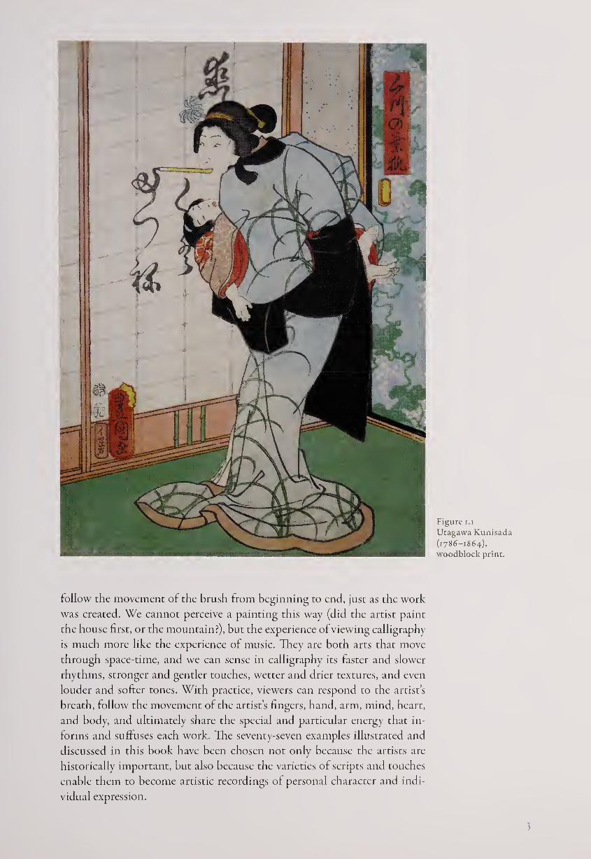
Figure i.i
Utagawa Kunisada
(1786-1864),
woodblock print.
follow the movement of the brush from beginning to end, just as the work
was created. We cannot perceive a painting this way (did the artist paint
the house first, or the mountain?), but the experience of viewing calligraphy
is much more like the experience of music. They are both arts that move
through space-time, and we can sense in calligraphy its faster and slower
rhythms, stronger and gentler touches, wetter and drier textures, and even
louder and softer tones. With practice, viewers can respond to the artist’s
breath, follow the movement of the artist’s fingers, hand, arm, mind, heart,
and body, anci ultimately share the special and particular energy that in¬
forms and suffuses each work. The seventy-seven examples illustrated and
discussed in this book have been chosen not only because the artists are
historically important, but also because the varieties of scripts and touches
enable them to become artistic recordings of personal character and indi¬
vidual expression.
3

FUNDAMENTALS OF EAST ASIAN CALLIGRAPHY
Calligraphy, like dance, is an interaction of movement and pause, energy
and stillness. When we see a completed work, we may assume it is fixed in
time, permanent, unchanging, and therefore quiet and still. But as soon as
we examine it more closely we can see it is full of motion, with freely brushed
lines starting, continuing, and stopping only for another line to begin that
relates to the previous ones even as it moves out in new directions.
Like a dancer, calligraphy breathes, but this life-breath, in all its gestural
movement and pause, depends upon several factors. Some of these are char¬
acteristic to the type of script, while others are personal to the artist and the
moment in which he or she worked. Examining some of the fundamentals
of calligraphy can help in distinguishing between its formal aspects and the
individual character of each artist.
First, East Asian calligraphy is normally written from top to bottom
in columns from right to left. Thus we begin at the top right, move down
the column, and then return up to the top of the second column. Some
Japanese calligraphers, however, have played with this expectation by us¬
ing other forms of composition, particularly when writing Japanese po¬
ems; but even in these cases the movement is primarily vertical. Quite
different from the horizontal path of Western writing, this verticality is
usually enhanced by the placement of one seal of the artist at the begin¬
ning of the work (top right) and two more at the end (bottom left) after
the signature.
Second, each character is composed of a specific number of strokes made
in a specified order; knowledge of this process can be important in one’s ap¬
preciation of the art. In general, individual characters are written from the
left side to the right, and from top to bottom, in special rhythmic patterns
developed for the various script forms. For example, the standard script
stroke order for the word “hermit-sage,” (fill) is made up of the graph for
“person” (A) on the left and “mountain” (|1|) on the right. The brush starts
on the left, the upper stroke first, and then completes the word on the right.
Verticals and diagonals are brushed from top to bottom, and horizontals
from left to right.
Third, there are basically six forms of script used in Japanese calligraphy.
The first five came from China, in which each character indicates an entire
word, while the sixth is specifically Japanese as a syllabary. In other words,
each syllable in Japanese, such as ya (A>) or ma (sk), has a specific symbol.
Together, yama means mountain, so the word may be written either in a
Chinese character (| 11) or in Japanese syllables (A5 if).
If the Chinese character is used, it can be written in five different scripts
and a wide variety of styles. This multiplicity of forms may seem intimidat¬
ing for Western viewers, but in fact we have many varieties of scripts and
styles ourselves. We usually take for granted that we have both capital and
small forms of letters (A or a), but we have several scripts, ranging from the
historical (JDI&C ^£*0 45!]0PPC” style to different forms and fonts of printed
script, to quicker and less formal writing (which is what we usually practice
ourselves for everyday use), to fully cursive script (when we are in a hurry
and continue from letter to letter without lifting the pen or pencil from the
paper). The latter can be difficult at times to read, even with only twenty-six
letter possibilities, so we can imagine how difficult East Asian cursive writ¬
ing can be to decipher, with more than fifty thousand possible characters.
The five Chinese scripts can be described as follows:
Seal script (tensho) developed from the first forms of Chinese writings
carved on oracle bones used for divination and also engraved upon bronzes.
It emphasizes even-width—often curved—lines, somewhat pictorial shapes
and maintains a balanced and formal quality that allows it still to be chosen
today for the seals (or “chops”) that are stamped in red on both artistic
works and everyday receipts. See numbers 19, zo, and zi for examples of seal
script by Japanese artists.
Clerical script (reisho) is said to have been developed by government
clerks as a quicker form of writing than seal script. The characters are more
squared off than in seal script, sometimes in a slightly short and squat for¬
mat, and the lines are even in width and usually straight. The only exception
is the “na” stroke often at a diagonal and usually the last stroke of a
character, which thickens and then thins elegantly to a point in a somewhat
triangular form. Tike seal script, clerical script has been primarily used for
formal purposes in China and Japan for more than a thousand years, giving
a flavor of the antique; see numbers Z4, Z5, and 39.
Standard (regular, printed) script (kaisho). As in the Western world,
standard script is used in printing books, newspapers, and other documents
for utmost clarity; it has also been used for Buddhist writings (sutras) for
the same reason. It resembles clerical script in maintaining squared-off
forms, and each stroke is clear and distinct from the others, although now
they all may show thickening and thinning of the brush; see numbers 15, Z7,
34, and 76.
Running script (gydsho). This is the most commonly used form of Chinese
script both in general use and for calligraphy, since it combines the structure
of regular script with some of the ease and fluency of cursive script. In run¬
ning script, individual strokes may be joined by the brush, but the forms
are still recognizable. This script may be compared with the handwriting of
most Westerners—not as formal as printed script, but with a general clarity
ofline and shape. Most Chinese-style works of calligraphy in this book use
running script, such as numbers 44 and 45.
Cursive (grass) script (sosho). The most rapidly written of the scripts and
the most difficult to read, cursive script tends to break free of most of the
norms of the other scripts. For example, characters are often quite different
in size; they may be extremely tall or broad; and the structures of the graphs
may not seem to relate to those in other scripts. Where running script gener¬
ally keeps the standard order of strokes but frequently joins them together,
cursive script seems to have its own (and frequently mysterious) rules. For
examples of this script, see numbers 14,17, zz, 3Z, 35, 64, and 74.
Each of the five Chinese scripts has its own rhythm, whether it’s the
formal minuet of seal script or the wild jitterbug of cursive writing. They
exhibit different kinds of beauty, ranging from that of balance and structure
6
to more overt expressions of emotion, and from serenity to dynamic activ¬
ity. It is important to realize the different potentials of each script, within
which there are abundant opportunities for varied personal styles. For
example, seal script can be either thickly architectonic or slenderly graceful,
while cursive script can be angular, creating a good deal of visual tension, or
rounded, leading to an effect of gentle flow.
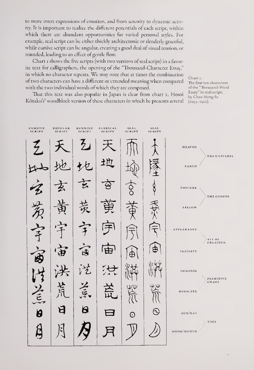
Chart i shows the five scripts (with two versions of seal script) in a favor¬
ite text for calligraphers, the opening of the “Thousand-Character Essay,”
in which no character repeats. We may note that at times the combination
of two characters can have a different or extended meaning when compared
with the two individual words of which they are composed.
That this text was also popular in Japan is clear from chart i, Hosoi
Kotaku’s1 woodblock version of these characters in which he presents several
Chart i.
The first ten characters
of the “Thousand-Word
Essay” in seal script,
by Chao Meng-fu
(1254-1322).
CURSIVE REGULAR RUNNING CLERICAL SEAL SEAL
SCRIPT SCRIPT SCRIPT SCRIPT SCRIPT SCRIPT
£ 2L 1/ i 1
ir t
% * f
1r 4
* 'iff Is f$l \ i.ii.
id / -* v- s ft
A. V*. Wj uw ft ft
19 is 0 0 ©
§ n 3 d>
HEAVEN
EARTH
THE UNIVERSE
OBSCURE
YELLOW
THE COSMOS
APPEARANCE
>ALL OF
CREATION
INFINITY
IMMENSE
DESOLATE
PRIMITIVE
CHAOS
sun/day
moon/month
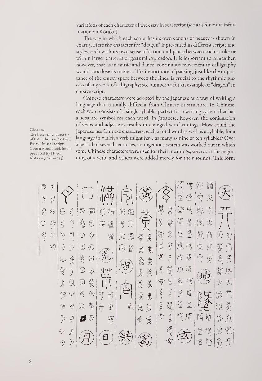
Chart 2.
The first ten characters
of the “Thousand-Word
Essay” in seal script,
from a woodblock book
prepared by Hosoi
Kotaku (1658-1735).
variations of each character of the essay in seal script (see #14 for more infor¬
mation on Kotaku).
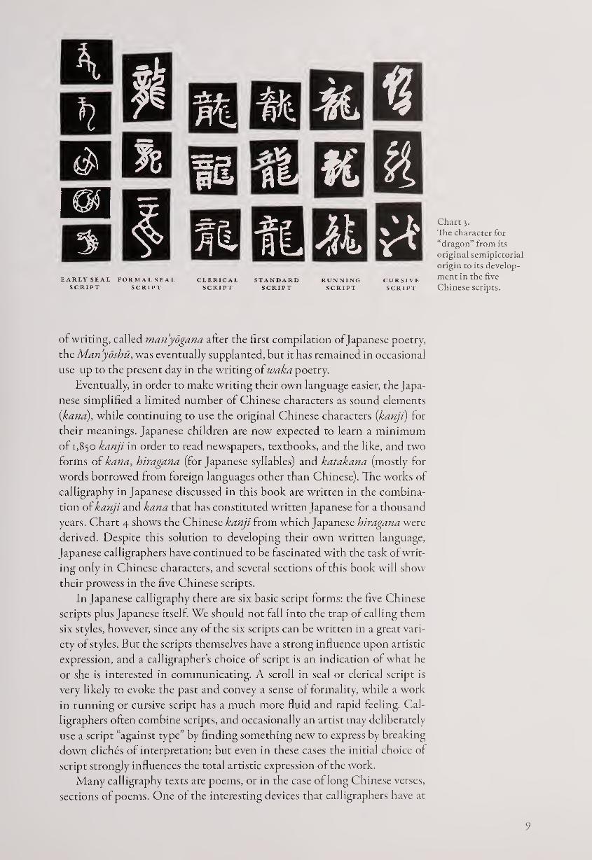
The way in which each script has its own canons of beauty is shown in
chart 3. Here the character for “dragon” is presented in different scripts and
styles, each with its own sense of action and pause between each stroke or
within larger patterns of gestural expression. It is important to remember,
however, that as in music and dance, continuous movement in calligraphy
would soon lose its interest. The importance of pausing, just like the impor¬
tance of the empty space between the lines, is crucial to the rhythmic suc¬
cess of any work of calligraphy; see number zz for an example of “dragon” in
cursive script.
Chinese characters were adopted by the Japanese as a way of writing a
language that is totally different from Chinese in structure. In Chinese,
each word consists of a single syllable, perfect for a writing system that has
a separate symbol for each word; in Japanese, however, the conjugation
of verbs and adjectives results in changed word endings. How could the
Japanese use Chinese characters, each a total word as well as a syllable, for a
language in which a verb might have as many as nine or ten syllables? Over
a period of several centuries, an ingenious system was worked out in which
some Chinese characters were used for their meanings, such as at the begin¬
ning of a verb, and others were added merely for their sounds. This form
8
EARLY SEAL FORMAL SEAL
SCRIPT SCRIPT
Chart 3.
The character for
“dragon” from its
original semipictorial
origin to its develop¬
ment in the five
Chinese scripts.
of writing, called manyogana after the first compilation of Japanese poetry,
the Manydshu, was eventually supplanted, but it has remained in occasional
use up to the present day in the writing of waka poetry.
Eventually, in order to make writing their own language easier, the Japa¬
nese simplified a limited number of Chinese characters as sound elements
(ykana), while continuing to use the original Chinese characters {kanji) for
their meanings. Japanese children are now expected to learn a minimum
of 1,850 kanji in order to read newspapers, textbooks, and the like, and two
forms of kana, hiragana (for Japanese syllables) and katakana (mostly for
words borrowed from foreign languages other than Chinese). The works of
calligraphy in Japanese discussed in this book are written in the combina¬
tion of kanji and kana that has constituted written Japanese for a thousand
years. Chart 4 shows the Chinese kanji from which Japanese hiragana were
derived. Despite this solution to developing their own written language,
Japanese calligraphers have continued to be fascinated with the task of writ¬
ing only in Chinese characters, and several sections of this book will show
their prowess in the five Chinese scripts.
In Japanese calligraphy there are six basic script forms: the five Chinese
scripts plus Japanese itself. We should not fall into the trap of calling them
six styles, however, since any of the six scripts can be written in a great vari¬
ety of styles. But the scripts themselves have a strong influence upon artistic
expression, and a calligrapher’s choice of script is an indication of what he
or she is interested in communicating. A scroll in seal or clerical script is
very likely to evoke the past and convey a sense of formality, while a work
in running or cursive script has a much more fluid and rapid feeling. Cal¬
ligraphers often combine scripts, and occasionally an artist may deliberately
use a script “against type” by finding something new to express by breaking
down cliches of interpretation; but even in these cases the initial choice of
script strongly influences the total artistic expression of the work.
Many calligraphy texts are poems, or in the case of long Chinese verses,
sections of poems. One of the interesting devices that calligraphers have at
9
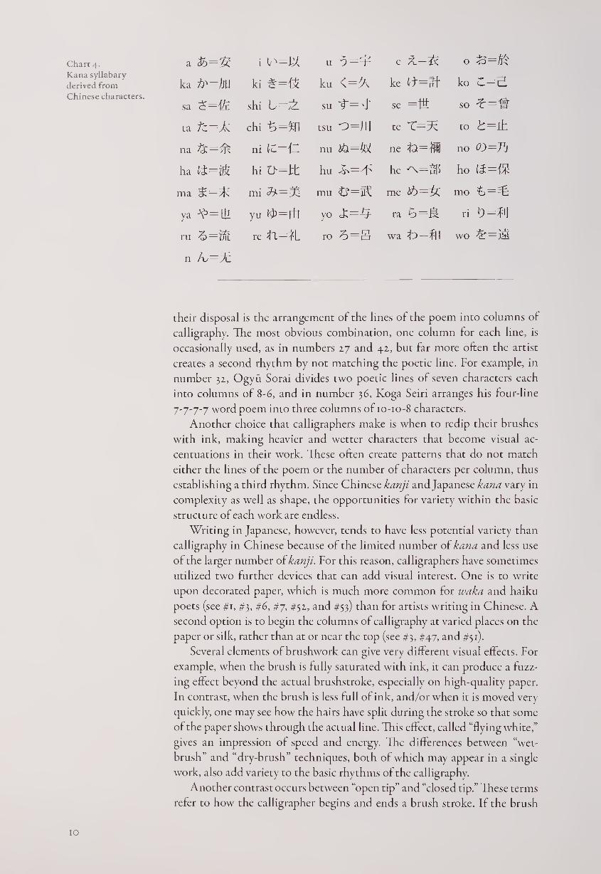
Chart 4. a = S i u e c 0 Jo—^ Kana syllabary
derived from ka ki # = ku ke ft=lf ko Chinese characters.
sa shi L=^L su se =m so *=-£
ta Tz=± chi = £ ft tsu ~o=Jl\ te to t=±
na ni (C=lT nu ne no
ha hi t>=Jt hu he ho
ma mi T* — mu me mo
ya yu fT—Efl yo ra ri D=f'J
ru re Tl=^L ro 3=g wa t> = %I wo
n A,—3c
their disposal is the arrangement of the lines of the poem into columns of
calligraphy. The most obvious combination, one column for each line, is
occasionally used, as in numbers 27 and 42, but far more often the artist
creates a second rhythm by not matching the poetic line. For example, in
number 32, Ogyu Sorai divides two poetic lines of seven characters each
into columns of 8-6, and in number 36, Koga Seiri arranges his four-line
7-7-7-7 word poem into three columns of 10-10-8 characters.
Another choice that calligraphers make is when to redip their brushes
with ink, making heavier and wetter characters that become visual ac¬
centuations in their work. These often create patterns that do not match
either the lines of the poem or the number of characters per column, thus
establishing a third rhythm. Since Chinese kanji and Japanese kana vary in
complexity as well as shape, the opportunities for variety within the basic
structure of each work are endless.
Writing in Japanese, however, tends to have less potential variety than
calligraphy in Chinese because of the limited number of kana and less use
of the larger number of kanji. For this reason, calligraphers have sometimes
utilized two further devices that can add visual interest. One is to write
upon decorated paper, which is much more common for waka and haiku
poets (see #1, #3, #6, #7, #52, and #53) than for artists writing in Chinese. A
second option is to begin the columns of calligraphy at varied places on the
paper or silk, rather than at or near the top (see #3, #47, and #51).
Several elements of brushwork can give very different visual effects. For
example, when the brush is fully saturated with ink, it can produce a fuzz¬
ing effect beyond the actual brushstroke, especially on high-quality paper.
In contrast, when the brush is less full of ink, and/or when it is moved very
quickly, one may see how the hairs have split during the stroke so that some
of the paper shows through the actual line. This effect, called “flying white,”
gives an impression of speed and energy. The differences between “wet¬
brush” and “dry-brush” techniques, both of which may appear in a single
work, also add variety to the basic rhythms of the calligraphy.
Another contrast occurs between “open tip” and “closed tip.” These terms
refer to how the calligrapher begins and ends a brush stroke. If the brush
10
comes directly down on the surface, this action reveals itself on the paper
or silk as “open tip” and creates an impression of spontaneity. However, the
calligrapher may also circle the tip of the brush at the beginning and ending
of a stroke, rounding out the form in a technique called “closed tip.” These
effects relate both to the speed of the brushwork and the formality of the
visual expression; for instance, seal script is usuallv done with “closed tip”
and cursive script with “open tip.”
Finally, calligraphers may choose between black ink, which was almost
always used in Chinese works, and tones of gray. As might be expected,
these give different visual weights to the calligraphy, and some Japanese
masters deliberately used gray ink to add touches of subtlety or modesty to
their work (see #30 and #73). In the single-character calligraphy by the Zen
Master Hakuin (#68), the varying tones of ink are especially resonant.
All of these possibilities offer calligraphers an amazing range of artistic
choices. Combined with the gestural action of the writing itself, created
with a flexible brush that responds to the artist’s every pulse of breath and
movement, the result is an art that has been long admired in East Asia and
is now coming to the West. 77 Dances represents the calligraphy of Japanese
monks, poets, and scholars over a period of three hundred years, demon¬
strating the full potential for personal expression within a traditional art.
NOTES
1. Following Japanese practice, family names are given first, followed by the best-known art
name. In the case of Zen monks, both names are Buddhist names, the first of which is how the
monk is usually known.

The Revival of Waka Calli graphy
At the start of the early modern period, in 1568, the Japanese were reunited
after almost a century of civil wars and political upheaval. Brimming with
energy and confidence, they were ripe for new artistic accomplishments and
eager for reminders of great eras of the past, such as the glories of the courtly
Heian period (794-1185). The subdued Zen-influenced arts of the Muro-
machi era (1392-1568) no longer remained dominant, and patronage from
both the court and newly wealthy merchants encouraged a return to earlier
Japanese aesthetics.
One of the most notable revivals was of Japanese-style waka calligraphy,
at first primarily using famous poetry of past epochs as texts but eventually
featuring newly composed verses as well. This classical form of poetry, also
called tanka and uta, consists of five sections of yj-yj-i syllables. Its golden
age was the Heian period, when it was written by emperors and princes,
courtiers and court ladies, and even high-ranking monks.
Waka are usually based upon an image from nature that evokes a human
emotion, frequently love or longing. Skill in this art, along with skill in cal¬
ligraphy, was a prerequisite for prestige in the imperial court. As warriors as¬
cended to power in succeeding centuries, waka poetry lost some of its luster,
but it never completely died out. As the early modern era began, the tradition
was continued by Emperor Goyozei (1571-1617, #1) and dramatically revital¬
ized by the “Three Brushes of Kan’ei”—Konoe Nobutada (1565-1614, #2),
Hon’ami Koetsu (1558-1637, #3), and Shojo Shokado (1584-1639, #4).
The epithet “Three Brushes of Kan’ei” is actually a misnomer, since
Nobutada died ten years before the Kan’ei era began in 1624. Furthermore,
another master deserves to be included in this group: the courtier Kara-
sumaru Mitsuhiro (1579-1638, #5). These four men, the finest calligraphers
in Japanese script of their time, created bold new variations of early tradi¬
tions, often on decorated paper, that have not since been equaled for resplen¬
dent vitality.
Konoe Nobutada was a member of one of the leading families in Japan;
the Konoe were descended from the noble Fujiwara clan and traditionally
served the court in high-ranking posts. Nobutada created not only his own
style of calligraphy but also Zen paintings in a strong minimalist style. In
contrast, Hon’ami Koetsu came from the artisan class; his father was a con¬
noisseur of swords, and Koetsu became a practitioner of many arts, including
Noh drama, ceramics, lacquer, swords, and the tea ceremony; in collabora¬
tion with the artist Sotatsu (died 1640), he created painting-calligraphy
works of great beauty.
Shojo Shokado was also a member of the Kyoto cultural elite, although
he lived most of his mature years as a monk of the esoteric Shingon sect at a
subtemple south of Kyoto on Mount Otoko. Shokado participated in many
cultural activities, including painting, poetry, flower arranging, and garden
design; he was also noted as a master of the tea ceremony. Karasumaru
Mitsuhiro is sometimes called the “fourth brush.” Like the Konoe family,
the Karasumaru were hereditary courtiers of high rank, and Mitsuhiro held
several distinguished posts at court despite being involved in a scandal in his
younger years. He also studied Zen, which remained a cultural force, but his
own calligraphy shows a highly personal and dramatic style, well suited to
decorated paper backgrounds.
The fact that the four men did not all come from the same social class
demonstrates how waka calligraphy was gaining new strength by being
practiced both by courtiers, who had dominated it in the past, and by others
who carried this tradition into a broader context. The widening range of
waka poet-calligraphers was to become an increasingly important feature of
calligraphy in Japanese during the following centuries. While later masters
may not have equaled the sumptuous style of the “four brushes,” many poet-
artists created calligraphy of interest and beauty. Among these was Konoe
Iehiro (1667-1736, #6), the leading later Konoe master, who had a successful
career at court; in 1709 he became the youngest man ever appointed regent.
Unlike his ancestor Nobutada, Iehiro did not develop a highly personal
style; instead, he became a master of many scripts and styles, always exhibit¬
ing an elegant and refined sensibility.
As the early modern period advanced, the shogunal support of neo-
Confucianism greatly increased interest in Chinese literati culture, including
calligraphy in Chinese. However, during the eighteenth century a reaction
against this strong Chinese cultural and artistic influence took place, and a
number of scholars and poets found their sources in early Japanese tradi¬
tions. Interest in both the Shinto religion and Heian-period Japanese litera¬
ture revived, leading to the kokugaku (National Learning) scholarly move¬
ment. This trend encouraged both poets and calligraphers to write in Japanese,
an interest that circulated to classes of people who previously would not
have participated in waka poetry.
Among the commoners who excelled in waka and calligraphy were the
“Three Women of Gion,” who for three generations ran a tea shop in Kyoto’s
Gion Park. Tire three poets were Kaji (n.d., #7), her adopted daughter Yuri
(1694-1764, #8), and Yuri’s daughter Gyokuran (1728-1784, #9). Each had
a different poetic persona, from the passionate Kaji to the renunciatory Yuri
to the painterly Gyokuran, and all three contributed to the artistic and cul¬
tural world of their time. Although the legal and social position of women
was at a low point during Japan’s early modern era, the “Three Women of
Gion were able to add individual voices to the age-old waka poetry and
calligraphy tradition.
Another development in poetry took the form of comic waka called
kyoka (mad poems), satiric verses that became very popular in the late eigh¬
teenth and early nineteenth centuries; the greatest master was the literatus
Ota Nanpo (1749-1823, #10), who called himself Shokusanjin. Kydka were
not usually written out as elegantly as waka, but they contributed to the
H
liveliness of calligraphy in Japanese at a time when much writing was still
done in Chinese scripts.
During the nineteenth century, the emergence of nonaristocratic waka
poets continued with such masters as the Shinto priest Kamo Suetaka
(1751-1841, #11) and, a generation later, the Buddhist nun Otagaki Rengetsu
(1791-1875, #iz). Twice widowed in her youth before taking Buddhist ordi¬
nation, Rengetsu created some of the most appealing poetry, calligraphy,
and pottery of her age, with a graceful touch that is supported by internal
tensile strength. Her artistry demonstrates the continued vitality of the
waka tradition, which had begun in courtly circles and, by the end of the
early modern period, had become thoroughly integrated into every level of
Japanese society.
15
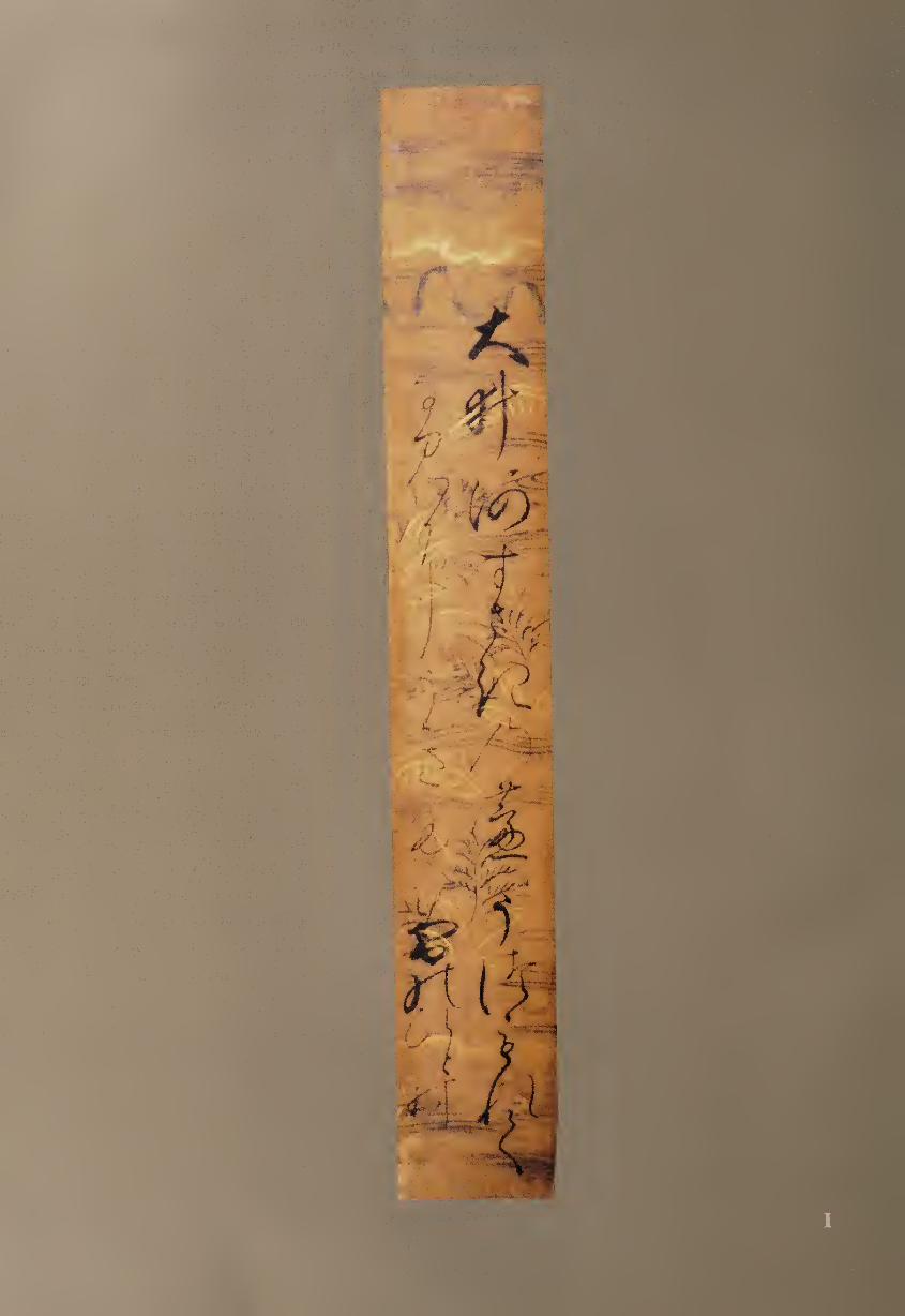
I EMPEROR GOYOZEI (1571—16^17)
On the Oi River Tanzaku, ink on decorated paper, 36.8 x 5.5 cm.
The Ruth and Sherman Lee Institute for
Japanese Art at the Clark Center, Calif.
Goyozei’s father was the prince Yoko-in, and his mother came from
the noble Konoe family. He reigned as the 107th emperor of Japan
from 1586, at the age of fifteen,1 until 1611, when he retired at the
age of forty; he died six years later. Despite his exalted position, his political
power was extremely limited. To his distress, he was twice countermanded
by the Tokugawa government—first in 1609 when he wanted to execute
five of his consorts and seven courtiers who had secretly become lovers, and
again in the following year when he wanted to abdicate.1
Instead of ruling, even within their own domain, emperors and other
aristocrats were mandated by the shogunate to focus their attention on cul¬
tural attainments. Goyozei studied both the Chinese classics (particularly
the “Four Books” of Confucianism) and Japanese masterpieces such as The
Tales of Ise and The Tale of Genji. He was a noted waka poet; and in an ef¬
fort to foster education, he commissioned woodblock editions of important
early texts so they could be more widely read and taught.
Goyozei seems to have enjoyed both calligraphy and painting, and he
wrote in both Chinese and Japanese scripts in a variety of styles. For ex¬
ample, he occasionally practiced calligraphy in the Zen tradition of large,
bold Chinese characters, and he also wrote out Buddhist sutras in small
regular script on dark blue paper.3 Most often, however, he brushed five-line
waka poems on various formats, including tall, thin tanzaku poem cards.
This typically Japanese medium had proven ideal for short poems, serving
as a small but elegant format for brushwork on an intimate scale.
Here his poem is written in the traditional s-7-5-7-7 syllables:4
Oigawa
suzaki no ashi wa
uzumorete
nami ni ukitaru
yuki no hitomura
On the Oi River
a drifting net of reeds
is completely covered
as it floats down the waves
by a single clump of snow
Goyozei has written some of the Japanese syllables with Chinese
characters instead of kana (a form of writing called manydgana, after the
first Japanese poetry anthology), giving more physical structure and visual
weight to the calligraphy and also allowing possible double meanings to
become more explicit. For example, the word mura (clump or patch) at
the end of the poem is written with the character that also means “village”
(f'l), perhaps suggesting the encroachment of human settlement on nature.
The final line can therefore be translated as “[like] a single village in snow.”
This interpretation provides a secondary reading, a characteristic of much
Japanese poetry. The idea of reeds or a village being covered—possibly even
smothered—by snow may also be an indirect reference to repression of the
court by the Tokugawa government.
17
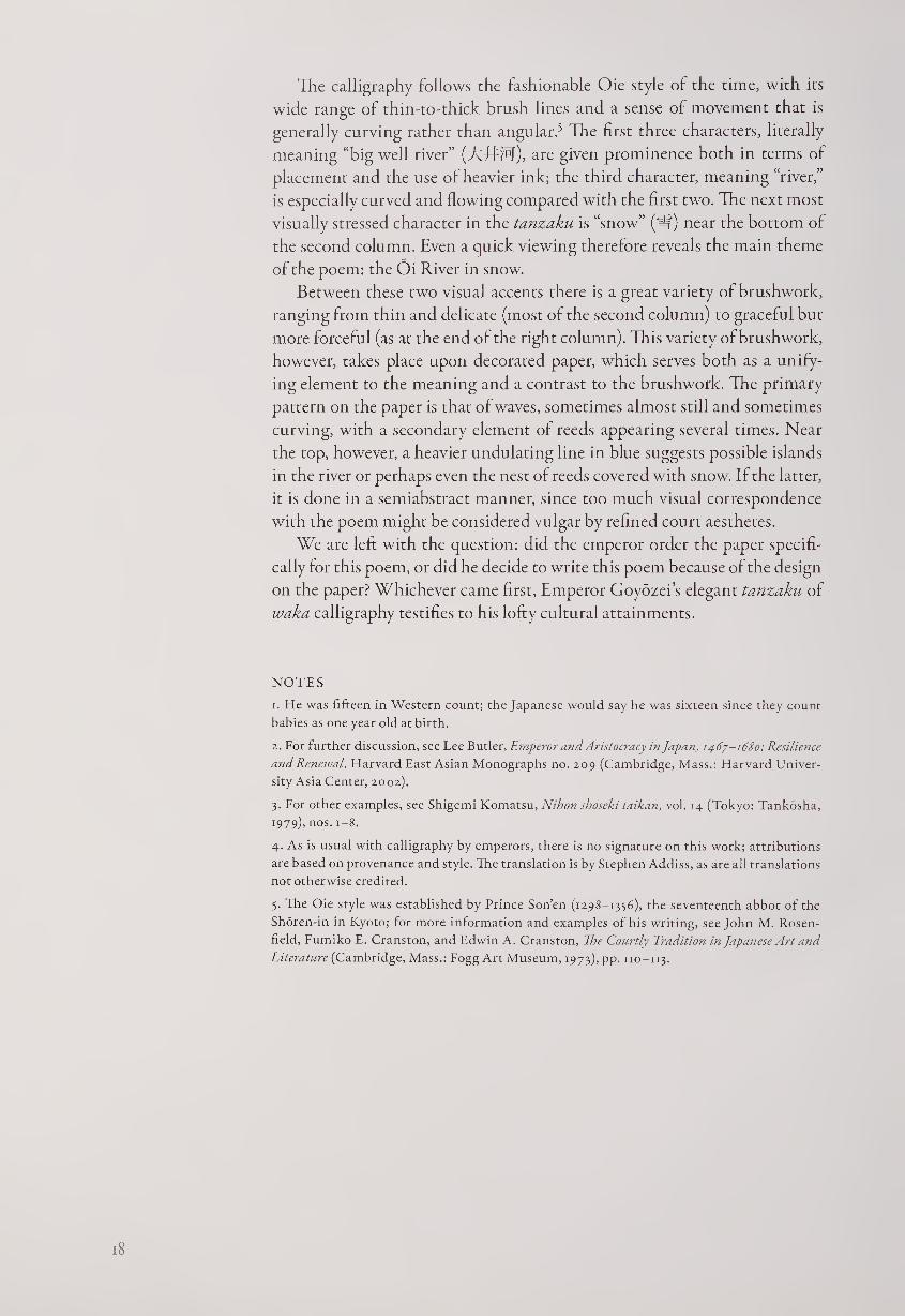
The calligraphy follows the fashionable Oie style of the time, with its
wide range of thin-to-thick brush lines and a sense of movement that is
generally curving rather than angular.5 The first three characters, literally
meaning “big well river” (ATl:M)> are given prominence both in terms of
placement and the use of heavier ink; the third character, meaning “river,”
is especially curved and flowing compared with the first two. The next most
visually stressed character in the tanzaku is “snow” (If) near the bottom of
the second column. Even a quick viewing therefore reveals the main theme
of the poem: the Oi River in snow.
Between these two visual accents there is a great variety of brushwork,
ranging from thin and delicate (most of the second column) to graceful but
more forceful (as at the end of the right column). This variety of brushwork,
however, takes place upon decorated paper, which serves both as a unify¬
ing element to the meaning and a contrast to the brushwork. The primary
pattern on the paper is that of waves, sometimes almost still and sometimes
curving, with a secondary element of reeds appearing several times. Near
the top, however, a heavier undulating line in blue suggests possible islands
in the river or perhaps even the nest of reeds covered with snow. If the latter,
it is done in a semiabstract manner, since too much visual correspondence
with the poem might be considered vulgar by refined court aesthetes.
We are left with the question: did the emperor order the paper specifi¬
cally for this poem, or did he decide to write this poem because of the design
on the paper? Whichever came first, Emperor Goyozei’s elegant tanzaku of
waka calligraphy testifies to his lofty cultural attainments.
NOTES
1. He was fifteen in Western count; the Japanese would say he was sixteen since they count
babies as one year old at birth.
2. For further discussion, see Lee Butler, Emperor and Aristocracy in Japan, 1467-1680: Resilience
and Renewal. Harvard East Asian Monographs no. 209 (Cambridge, Mass.: Harvard Univer¬
sity Asia Center, 2002).
3. For other examples, see Shigemi Komatsu, Nihon shoseki taikan, vol. 14 (Tokyo: Tankosha,
1979), nos. 1-8.
4. As is usual with calligraphy by emperors, there is no signature on this work; attributions
are based on provenance and style. The translation is by Stephen Addiss, as are all translations
not otherwise credited.
3. The Oie style was established by Prince Son’en (1298-1356), the seventeenth abbot of the
Shoren-in in Kyoto; for more information and examples of his writing, see John M. Rosen-
field, Fumiko E. Cranston, and Edwin A. Cranston, The Courtly Tradition in Japanese Art and
Literature (Cambridge, Mass.: Fogg Art Museum, 1973), pp. 110-113.
l8
1 KONOE NOBUTADA (1565-1614)
Letter of Congratulations Hanging scroll, ink on paper, 17 x 65.6 cm.
Konoe Nobutada is one of the most interesting and paradoxical
figures in Japanese cultural history. Born into the most elegant of
noble families, he wished to be a warrior; rising to the highest
court position, he created deliberately rough and simplified Zen-style
paintings; a student of Heian-period calligraphy, he pioneered new brush-
work styles; often writing on highly decorated sbikishi and tanzaku poem
cards, he also sometimes chose worn or recycled paper. We may well ask,
who was this man?
It is a tenet of East Asian artistic belief that one’s true self always ap¬
pears in calligraphy. Even when copying another style or work, individual
character will emerge. To see calligraphy is to see the person; the style is
the man. This is one reason why calligraphy by well-known poets, monks,
and scholars has been so highly appreciated in Japan through the ages. In
addition to whatever beauty such a work may hold, it is also the record of an
extraordinary individual human being. Furthermore, of all calligraphy, it is
often thought that a letter can reveal the personality most clearly, because
the informal nature of a letter allows the character of the writer to come
forth with little or no attempt at creating “a work of art.” A biography of
Nobutada can teach us a great deal about his life in the context of his times,
but a sense of the man himself may come through more clearly in a letter he
wrote to a friend.
Nobutada was born into one of the highest-ranking noble families in
Japan, descending from the ancient Fujiwara clan, which dominated many
aspects of court life in the Heian period (794-1185). Nobutada’s sister be¬
came the concubine of one emperor and the mother of another, so he trav¬
eled in the highest circles of a distinguished court, albeit one that was losing
whatever remnants of political power it once possessed. His father, a major
collector of earlier calligraphy, amassed more than ten thousand examples
of writing in both Chinese and Japanese. Following the custom of the
times, he separated pages of albums and cut apart sections of hand scrolls to
create composite albums (tekagami) that would cover much of the history
of Japanese calligraphy. These commonly begin with sutra sections, such as
by the Emperor Shomu (reigned 724-749), and continue with masters of
kana such as Ki no Tsurayuki (868?—945?). Access to his father’s collection
enabled Nobutada to study the work of early Chinese and Japanese mas¬
ters thoroughly. Not neglecting his courtly education, he received his first
position at the age of thirteen and at twenty-one was appointed saidaijin
(Minister of the Left), a high ceremonial position.
Many men might have been satisfied with the life of a leading courtier;
Nobutada was not. He studied Zen at the leading Kyoto temple Daitoku-ji,
and among his teachers was the monk Takuan (see #58). When Japan invaded
Korea in 1592, Nobutada asked the emperor for permission to join the army.
When his request was refused, he traveled to Nagoya to ask the army com¬
mander to let him enlist. For this display of independence he received an
imperial censure and was banished in 1594 to the southernmost tip of Japan:
l9
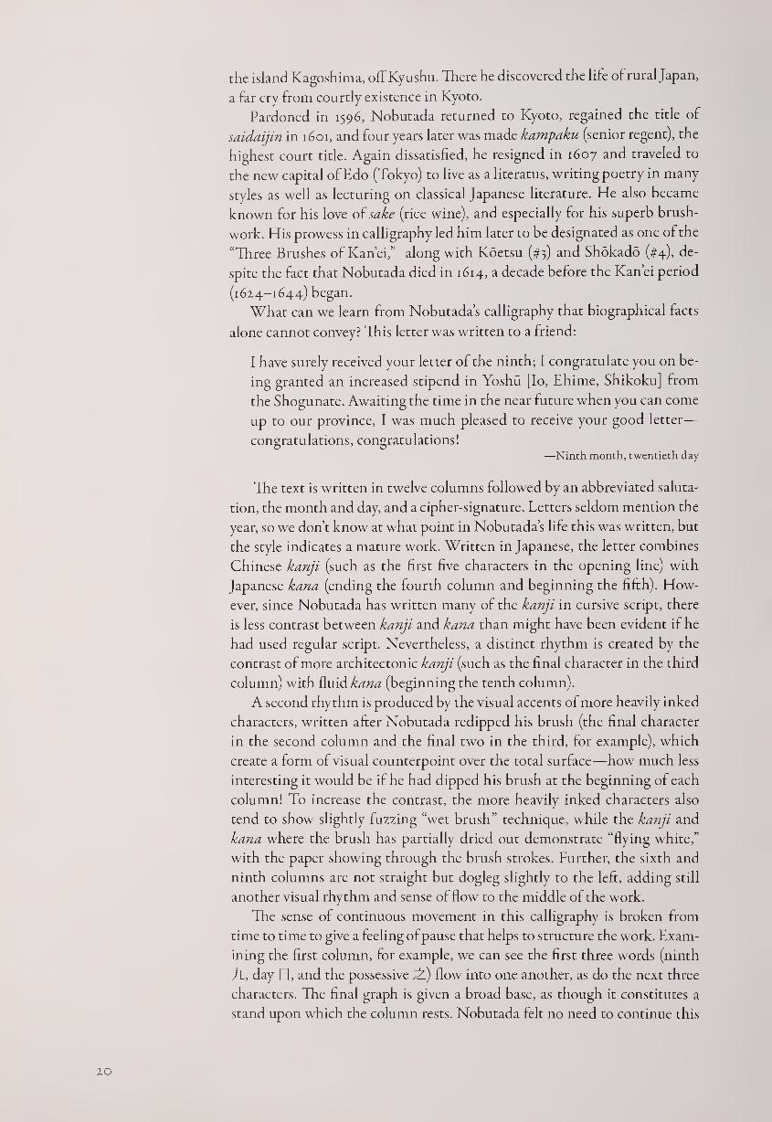
the island Kagoshima, off Kyushu. There he discovered the life of rural Japan,
a far cry from courtly existence in Kyoto.
Pardoned in 1596, Nobutada returned to Kyoto, regained the title of
saidaijin in 1601, and four years later was made kampaku (senior regent), the
highest court title. Again dissatisfied, he resigned in 1607 and traveled to
the new capital of Edo (Tokyo) to live as a literatus, writing poetry in many
styles as well as lecturing on classical Japanese literature. He also became
known for his love of sake (rice wine), and especially for his superb brush-
work. His prowess in calligraphy led him later to be designated as one of the
“Three Brushes of Kan’ei,” along with Koetsu (#3) and Shokado (#4), de¬
spite the fact that Nobutada died in 1614, a decade before the Kan’ei period
(1624-1644) began.
What can we learn from Nobutada’s calligraphy that biographical facts
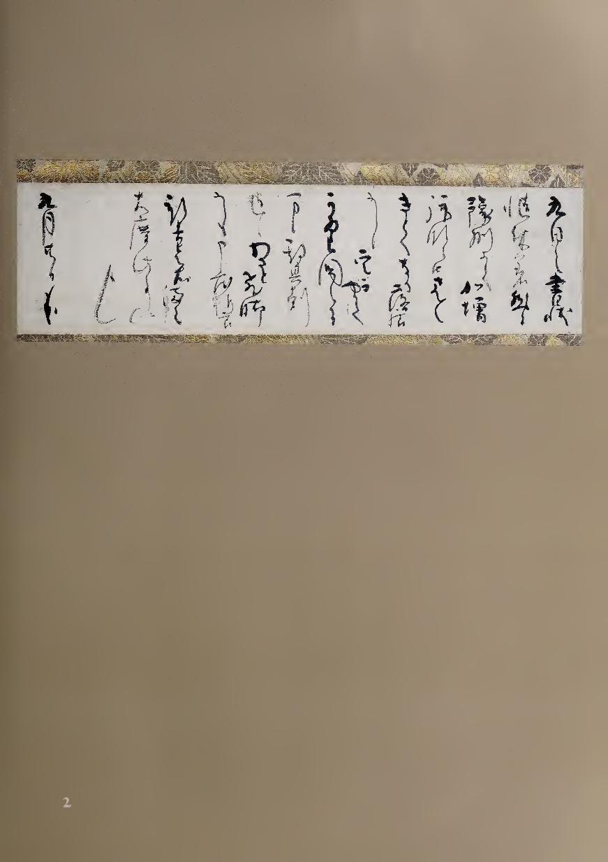
alone cannot convey? This letter was written to a friend:
I have surely received your letter of the ninth; I congratulate you on be¬
ing granted an increased stipend in Yoshu [Io, Ehime, Shikoku] from
the Shogunate. Awaiting the time in the near future when you can come
up to our province, I was much pleased to receive your good letter—
congratulations, congratulations! —Ninth month, twentieth day
The text is written in twelve columns followed by an abbreviated saluta¬
tion, the month and day, and a cipher-signature. Letters seldom mention the
year, so we don’t know at what point in Nobutada’s life this was written, but
the style indicates a mature work. Written in Japanese, the letter combines
Chinese kanji (such as the first five characters in the opening line) with
Japanese kana (ending the fourth column and beginning the fifth). How¬
ever, since Nobutada has written many of the kanji in cursive script, there
is less contrast between kanji and kana than might have been evident if he
had used regular script. Nevertheless, a distinct rhythm is created by the
contrast of more architectonic kanji (such as the final character in the third
column) with fluid kana (beginning the tenth column).
A second rhythm is produced by the visual accents of more heavily inked
characters, written after Nobutada redipped his brush (the final character
in the second column and the final two in the third, for example), which
create a form of visual counterpoint over the total surface—how much less
interesting it would be if he had dipped his brush at the beginning of each
column! To increase the contrast, the more heavily inked characters also
tend to show slightly fuzzing “wet brush” technique, while the kanji and
kana where the brush has partially dried out demonstrate “flying white,”
with the paper showing through the brush strokes. Further, the sixth and
ninth columns are not straight but dogleg slightly to the left, adding still
another visual rhythm and sense of flow to the middle of the work.
The sense of continuous movement in this calligraphy is broken from
time to time to give a feeling of pause that helps to structure the work. Exam¬
ining the first column, for example, we can see the first three words (ninth
tl, day 0, and the possessive dL) flow into one another, as do the next three
characters. The final graph is given a broad base, as though it constitutes a
stand upon which the column rests. Nobutada felt no need to continue this
20
H
mm
aC’\
. ' 'r .. '
compositional effect in the other columns, and in fact he frequently gives
more weight to the right-side bottom of the column-ending characters, bal¬
anced at the end by the hooklike salutation that curves back left to right. A
sense of balance is also suggested by the strong opening to the seventh col¬
umn, creating a central point of focus to the work when seen as a whole.
This letter reveals several characteristics of Nobutada's brushwork beyond
the varied rhythms that he creates. The brush line itself tends to be more
thick than slender; and although there are graceful curving lines, a sense of
structural “bone” is created by the more compressed characters. These are
enhanced by an occasional dry angularity seen particularly at the end of the
tenth column. The total ambience is not overly delicate or the least bit effete,
qualities evident in some courtier calligraphy, but rather exhibits a sense of
muscle and slightly rough energy. These elements match what we know of
Nobutada's life; refusing to be satisfied with courtly refinement, he actively
sought a more complex, active, and adventurous life.
What about that most controversial of calligraphy topics, the relation¬
ship between the meaning of the text and the style? We can compare
Nobutada’s letter to another calligraphy of his, one featuring two tanzaku
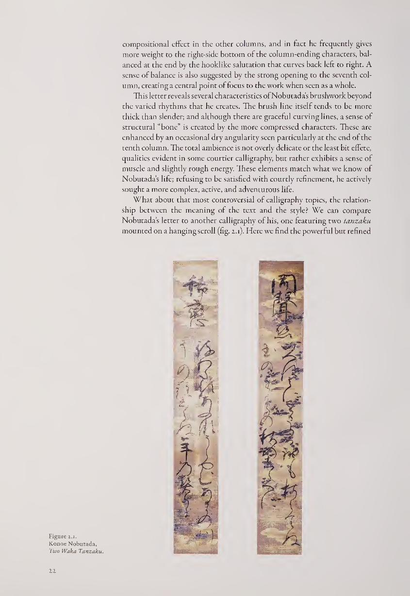
mounted on a hanging scroll (fig. z.i). Here we find the powerful but refined
Figure 2.1.
Konoe Nobutada,
Two Waka Tanzaku.
22
calligraphy fulfilling its new context, as the more even flow of the strongly
brushed waka poems occupy the total space effectively over the highly deco¬
rated paper. Nobutada’s forceful personality is clear in both works, but in
the letter his relatively even spacing of columns, his bold use of ink accents,
and the overall sense of confidence may convey Nobutada’s pleasure at his
friend’s good fortune and perhaps a visual hint of the congratulations that
he was expressing in his words.
3 HON AMI KOETSU (1558-1637)
Poem on Decorated Paper Ink on decorated paper, 28.9 x 40.5 cm.
Barnet and Burto Collection, Cambridge, Mass.
Perhaps the most famous calligrapher in later Japanese history, Koetsu
was a man of many skills, as well as a fervent Nichiren Buddhist. His
father was an expert appraiser of swords, and Koetsu continued this
work while gaining renown in calligraphy; he was also talented in several
other disciplines, including the designs for lacquer and metal objects and the
making of raku tea bowls. Loyal to traditional Japanese aesthetics, Koetsu
was distrustful of neo-Confucianism, writing in one of his letters that “evil
men become more evil through scholarship, fools only become glib; men
who make the essence of learning their own and use it in the affairs of the
day are rare indeed.”1
Koetsu was given land by the Tokugawa government to establish an
art colony at Takagamine, northwest of Kyoto, where religious conviction
helped to unite artists and artisans. His most famous works of calligraphy
were done in collaboration with the painter Tawaraya Sotatsu (died 1640);
the scrolls and shikishi (square poem cards) that they created together are
justly celebrated for their bold and sumptuous beauty.
On this separated section of a hand scroll, Sotatsu’s design of large butter¬
flies was printed with mica so that depending on the light source and angle,
it can be seen clearly or almost disappear.
Partly to the side of and partly over the stamped design, Koetsu wrote
out a poem by Fujiwara Norinaga (1109-c. 1180) from the Senzai wakashu
(One Thousand Years of Waka Poems, a collection originally compiled in
1188) and then stamped his seal “Koetsu” in black.
Aki no uchi wa
aware shiraseshi
kaze no oto no
hageshisa souru
fuyu wa kinikeri
The autumn having
brought a soft melancholy—
the sound of wind
now blowing violently
tells us that winter is coming
The poem seems not to match the design, at least as far as the season is
concerned, so are we to assume that Koetsu did not care what image was
to be paired with what poem? He certainly was aware of the visual aspect
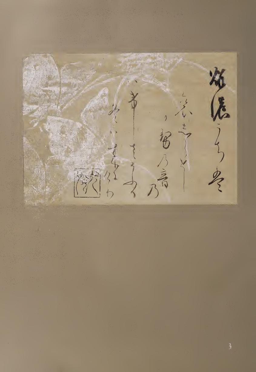
mm-,.
aMPiN
of writing over the image, since he kept most of the calligraphy to the right
of the design, and only slightly overlapped the butterflies in the final two
columns. Indeed, the placement of the final column, matching the final line
of the poem, creates a barrier for the lower butterfly, just as the coming of
winter, the final words of the poem, would be a barrier to the life of the
beautiful insect. Perhaps, after all, there is more interaction between text
and writing than we might at first imagine.
Aside from his fluency of style, the outstanding characteristic of Koetsu’s
formal calligraphy is the even spacing of columns in which he provides a
strong contrast between thick and thin strokes, lighter and heavier graphs,
and stronger and weaker rhythms. For example, the opening two bold
Chinese characters contrast remarkably with the thread-thin kana that end
the second column.
To balance these contrasts, Koetsu writes the five lines of the poem in
five columns of calligraphy. This means that aside from the uneven begin¬
ning points of each column, which is typical of waka calligraphy, the visual
counterpoint is entirely contained in the brushwork as it plays against the
design on the paper. Koetsu puts his artistic focus on the harmony between
the appearing and disappearing butterflies and his own thickening and thin¬
ning strokes. In its contrasts—both of image to text and of brushwork—this
hand scroll section well demonstrates Koetsu’s bold design and fluent grace,
which are now celebrated not only in Japan but also in the Western world.1
NOTES
1. Quoted in Shuichi Sato, A History of Japanese Literature: The Years of Isolation, trans. Don
Sanderson (Tokyo and New York: Kodansha International, 1983), p. 37.
2. For further information and excellent illustrations of his work, see Felice Fischer, The Arts of
Hon’ami Koetsu (Philadelphia Museum of Art, 2000).
4 SHOJO SHOKADO (1584-1639)
Li Po Preface Hand scroll, ink on silk, 23 x 364 cm.
AShingon-sect Buddhist monk who served at a Shinto shrine,
Shokado became a leader in many aspects of the cultural life of
his day, including painting, calligraphy, and the tea ceremony. As a
youth he entered the Hachiman Shrine in Otokoyama, northwest of Kyoto,
which combined Shinto and esoteric Buddhism; he was given the Buddhist
name Shojo. Thereupon he served the princely Konoe family, especially
Nobutada (#2) and his father Sakihisa (1536-1612), from whom he doubtless
developed his interests and skills in calligraphy. At this time he also became
acquainted with the Zen monks of Daitoku-ji, who had developed their
own style of brushwork (see #58, #59, and #60). Starting in 1627, Shokado
2-5
presided over Takimoto-bo, a small shrine in the mountains near Kyoto. A
decade later, he retired to a modest hut he called the Pine Flower Flail
(Shokado fL3Pdi’), by which name he is known today.
Considered the third of the “three brushes of Kan’ei,” Shokado studied
the styles of his own day as well as major artists of the past, and soon became
expert both in Japanese and Chinese scripts. For the latter, he sometimes
utilized the Daishi-ryu (Daishi school, named after the founder of Shingon
Buddhism, Kobo Daishi, also known as Kukai, 774-835), with its exagger¬
ated flourishes, particularly in the final stroke of a character. The Daishi
tradition at its peak can be seen in Shokado’s hand scroll of an evocative
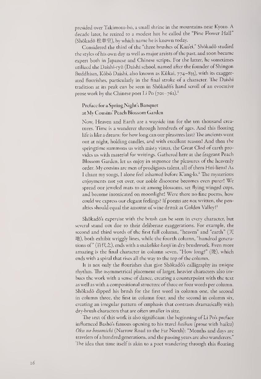
prose work by the Chinese poet Li Po (701-762).1
Preface tor a Spring Night’s Banquet
at My Cousins’ Peach Blossom Garden
Now, Heaven and Earth are a wayside inn for the ten thousand crea¬
tures. Time is a wanderer through hundreds of ages. And this floating
life is like a dream: for how long can our pleasures last? The ancients went
out at night, holding candles, and with excellent reason! And then the
springtime summons us with misty vistas, the Great Clod of earth pro¬
vides us with material for writings. Gathered here at the fragrant Peach
Blossom Garden, let us enjoy in sequence the pleasures of the heavenly
order. My cousins are men of prodigious talent, all of them Hui-liens! As
I chant my songs, I alone feel ashamed before K’ang-lo.1 The mysterious
enjoyments not yet over, our noble discourse becomes even purer! We
spread our jeweled mats to sit among blossoms, set flying winged cups,
and become intoxicated on moonlight! Were there no fine poems, how
could we express our elegant feelings? If poems are not written, the pen¬
alties should equal the amount of wine drunk at Golden Valley!3
Shokado’s expertise with the brush can be seen in every character, but
several stand out due to their deliberate exaggerations. For example, the
second and third words of the first full column, “heaven” and “earth” (A:
fill), both exhibit wriggly lines, while the fourth column, "hundred genera¬
tions of ” (IfifLTl), ends with a snakelike kanji in dry brushwork. Even more
amazing is the final character in column seven, “How long?” (HI), which
ends with a spiral that rises all the way to the top of the column.
It is not only the flourishes that give Shokado’s calligraphy its unique
rhythm. The asymmetrical placement of larger, heavier characters also im¬
bues the work with a sense of dance, creating a counterpoint with the text
as well as with a compositional structure of three or four words per column.
Shokado dipped his brush for the first word in column one, the second
in column three, the first in column four, and the second in column six,
creating an irregular pattern of emphasis that contrasts dramatically with
dry-brush characters that are often smaller in size.
The text of this work is also significant; the beginning of Li Po’s preface
influenced Basho’s famous opening to his travel haibun (prose with haiku)
Oku no hosomichi (Narrow Road to the Far North): “Months and days are
travelers of a hundred generations, and the passing years are also wanderers.”
The idea that time itself is akin to a poet wandering through this floating
z 6
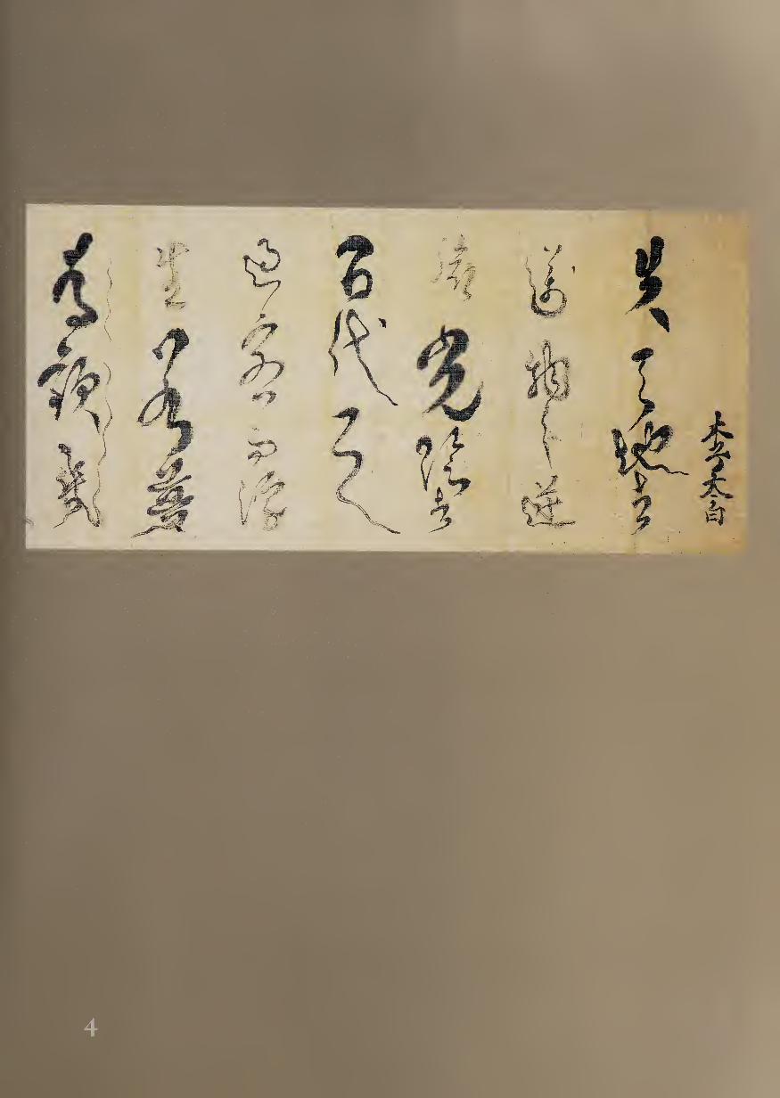
Figure 4.1.
Shojo Shokado,
Calligraphy Screen
(detail).
world became very influential in early modern Japan, combining Buddhist
ideas of impermanence with the literati enjoyment of traveling through
nature for inspiration. The expression of one’s feelings, as the end of Li Po’s
text suggests, was one way to defeat or at least to ignore the ravages of time.
The great variety and liveliness of this cultural expression is a testament to
the poets and artists who sought out the best of both Chinese and Japanese
traditions and then transformed them to suit their own historical eras and
individual personalities.
An exemplar of early seventeenth-century culture, Shokado did not
limit himself to Chinese texts or the Daishi style of calligraphy; he was
perhaps even more celebrated for his brushwork of traditional waka. Figure
4.1 shows a section of a screen on which Shokado wrote both Chinese and
Japanese poetry over a gold-leaf background. For this waka he made use
of another form of calligraphic rhythm, that of gracefully spaced, uneven
columns flowing downward. His more delicate touch with kana syllables
is balanced by the strong four-word title in kanji, all of which express his
refined aesthetic as well as exhibiting his skill in brushwork. Because he
used a variety of techniques, his individual style is not as immediately rec¬
ognizable as that of Nobutada or Koetsu, but the sense of personal rhythm
that informs Shokado’s work is the hallmark of his calligraphy in all forms
and formats.
NOTES
1. Translation byjonathan Chaves.
2. Hui-lien; K’ang-lo: Hsieh Hui-lien (397-433) was the younger cousin of Hsieh Ling-yiin
(K’ang-lo, 385-433). Both were outstanding poets, with Hsieh Ling-yiin being one of the chief
architects of Chinese nature poetry in its earlier stages. He was Li Po’s favorite poet.
3. Golden Valley was the extravagant garden estate of the rich and famous Shih Chung
(249-300). In the Preface for the Poems Written at Golden Valley, itself a fine example of early
nature prose in Chinese literature, Shih states, “So we each wrote a poem, to set forth our in¬
ner feelings; those who could not were fined three gallons of wine.” This is in accordance with
the favorite practice of penalizing losers in various games by forcing them to get inebriated
and make fools of themselves.
5 KARASUMARU M1TSUHIRO (1579-1638)
Waka on Decorated Tanzaku Tanzaku mounted on a hanging scroll, ink on decorated paper, 36.7 x 6 cm.
One of the outstanding court nobles of his day, Mitsuhiro led an
adventurous life. His father had served the court in an exalted
position, and Mitsuhiro was brought up to excel in the arts of
the nobility, particularly waka poetry and calligraphy. He composed verses
in both Chinese and Japanese at a public gathering at the age of ten, and
only seven years later he was appointed private secretary to the shogun. He
studied classical poetry with Hosokawa Yusai (1534-1610), learning much
about Heian-period traditions, and married Yusai’s daughter in 1606. The
following year, however, he was arrested with several friends for sexual
indiscretions with mature court ladies, and he was exiled until 1611. Soon
back in favor, he made eleven trips between Edo and Kyoto as a liaison
between the shogunate in Edo and the court in Kyoto; he was, however,
unable to avert the wholesale shift of political power to the shogun that took
place during this time. At the center of artistic activities of his day, he was a
friend and colleague of many leading poet-calligrapher-painters, including
the courtier Nobutada (#2), the Shinto-Buddhist monk Shokado (#4), and
the Zen Master Takuan (#58).
Mitsuhiro’s own calligraphy is somewhat bolder anci freer than that
of most waka poets, testifying to his great confidence and independent
spirit. His works include several hand scroll records of his journeys to Edo,
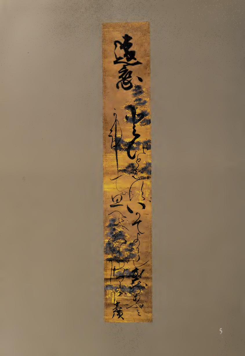
inscriptions on paintings and screens, shikishi (square poem-sheets), and
tanzaku (narrow poem-sheets). His style is well suited to decorated paper
backgrounds, which he utilized brilliantly for works such as this poem:
Enren
Toi towazu
ika de yokaramu
Musashi abumi
kanete omoeba
ware mo wari nashi
Longing from Afar
Should I ask or not ask,
would it be useful like
stirrups from Musashi?
I have thought for a long time
but I am still at a loss...
Mitsuhiro’s two-character title is brushed with powerful curves at
the top of the scroll, and the opening of the poem also begins with thick
lines that change almost instantly to gossamer brush strokes. This sudden
contrast is typical of Mitsuhiro; the second and third lines of the poem, all
contained in the right column, also begin with heavier strokes and change
to thinner swirls of the brush.
The fourth poetic line, beginning the left column, is different; the first
three syllables extend downward in medium-weight lines, contrasting with
the thicker brush strokes on the right. The left column continues with the
kana “shi”(L) extended on the left; the work then concludes with the signa¬
ture “Mitsuhiro” in kanji at the bottom.
Rhythmically, the calligraphy exhibits unusually strong and rapid con¬
trasts of size, speed, and weight, adding visual drama to the poem. In parti¬
cular, the constricted space at the bottom of the columns creates tensions
that visually reflect the uncertainty of the poem, while the variations of
heavy and light forms give the work movement and energy. This individu¬
alistic brushwork, carried out with both skill and verve, is characteristic of
Mitsuhiro’s bravura style. Set against the decorated paper of the tanzaku,
his exuberant flow of line and form demonstrates that the revival of classical
poetry styles was not just an antiquarian undertaking, but the expression of
new artistic vitality.
6 KONOE IEHIRO (1667-1736)
Heart Sutra (1715) Hand scroll, ink on sutra paper, 31.3 x 197.2 cm.
Form is emptiness, emptiness is form.” Iff is famous statement, which
applies to all phenomena, including calligraphy, comes from the
Heart Sutra, the shortest and most powerful of Buddhist sacred
writings. Frequently chanted and written out with the brush, the Heart
Sutra is considered a summary of the Daihannya-kyd (Perfection of Wisdom
Sutra), which has six hundred chapters.
31
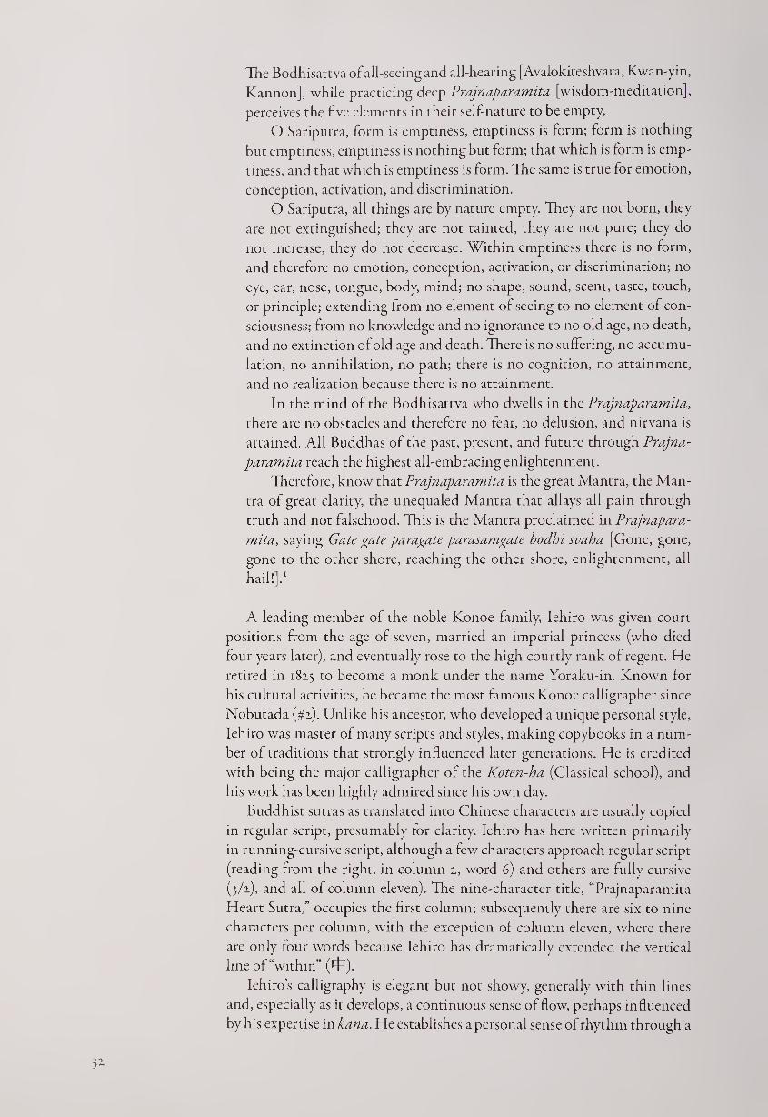
The Bodhisattva of all-seeing and all-hearing [Avalokiteshvara, Kwan-yin,
Kannon], while practicing deep Prajnaparamita [wisdom-meditation],
perceives the five elements in their sell-nature to be empty.
O Sariputra, form is emptiness, emptiness is form; form is nothing
but emptiness, emptiness is nothing but form; that which is form is emp¬
tiness, and that which is emptiness is form. The same is true for emotion,
conception, activation, and discrimination.
O Sariputra, all things are by nature empty. They are not born, they
are not extinguished; they are not tainted, they are not pure; they do
not increase, they do not decrease. Within emptiness there is no form,
and therefore no emotion, conception, activation, or discrimination; no
eye, ear, nose, tongue, body, mind; no shape, sound, scent, taste, touch,
or principle; extending from no element of seeing to no element of con¬
sciousness; from no knowledge and no ignorance to no old age, no death,
and no extinction of old age and death. There is no suffering, no accumu¬
lation, no annihilation, no path; there is no cognition, no attainment,
and no realization because there is no attainment.
In the mind of the Bodhisattva who dwells in the Prajnaparamita,
there are no obstacles and therefore no fear, no delusion, and nirvana is
attained. All Buddhas of the past, present, and future through Prajna¬
paramita reach the highest all-embracing enlightenment.
Therefore, know that Prajnaparamita is the great Mantra, the Man¬
tra of great clarity, the unequaled Mantra that allays all pain through
truth and not falsehood. This is the Mantra proclaimed in Prajnapara¬
mita, saying Gate gate paragate parasamgate bodhi svaha [Gone, gone,
gone to the other shore, reaching the other shore, enlightenment, all
hail!].1
A leading member of the noble Konoe family, Iehiro was given court
positions from the age of seven, married an imperial princess (who died
four years later), and eventually rose to the high courtly rank of regent. He
retired in 1825 to become a monk under the name Yoraku-in. Known for
his cultural activities, he became the most famous Konoe calligrapher since
Nobutada (#2). Unlike his ancestor, who developed a unique personal style,
Iehiro was master of many scripts and styles, making copybooks in a num¬
ber of traditions that strongly influenced later generations. He is credited
with being the major calligrapher of the Koten-ha (Classical school), and
his work has been highly admired since his own day.
Buddhist sutras as translated into Chinese characters are usually copied
in regular script, presumably for clarity. Iehiro has here written primarily
in running-cursive script, although a few characters approach regular script
(reading from the right, in column 2, word 6) and others are fully cursive
(3/2), and all of column eleven). The nine-character title, “Prajnaparamita
Heart Sutra,” occupies the first column; subsequently there are six to nine
characters per column, with the exception of column eleven, where there
are only four words because Iehiro has dramatically extended the vertical
line of “within” (P^).
Iehiro’s calligraphy is elegant but not showy, generally with thin lines
and, especially as it develops, a continuous sense of How, perhaps influenced
by his expertise in kana. He establishes a personal sense of rhythm through a
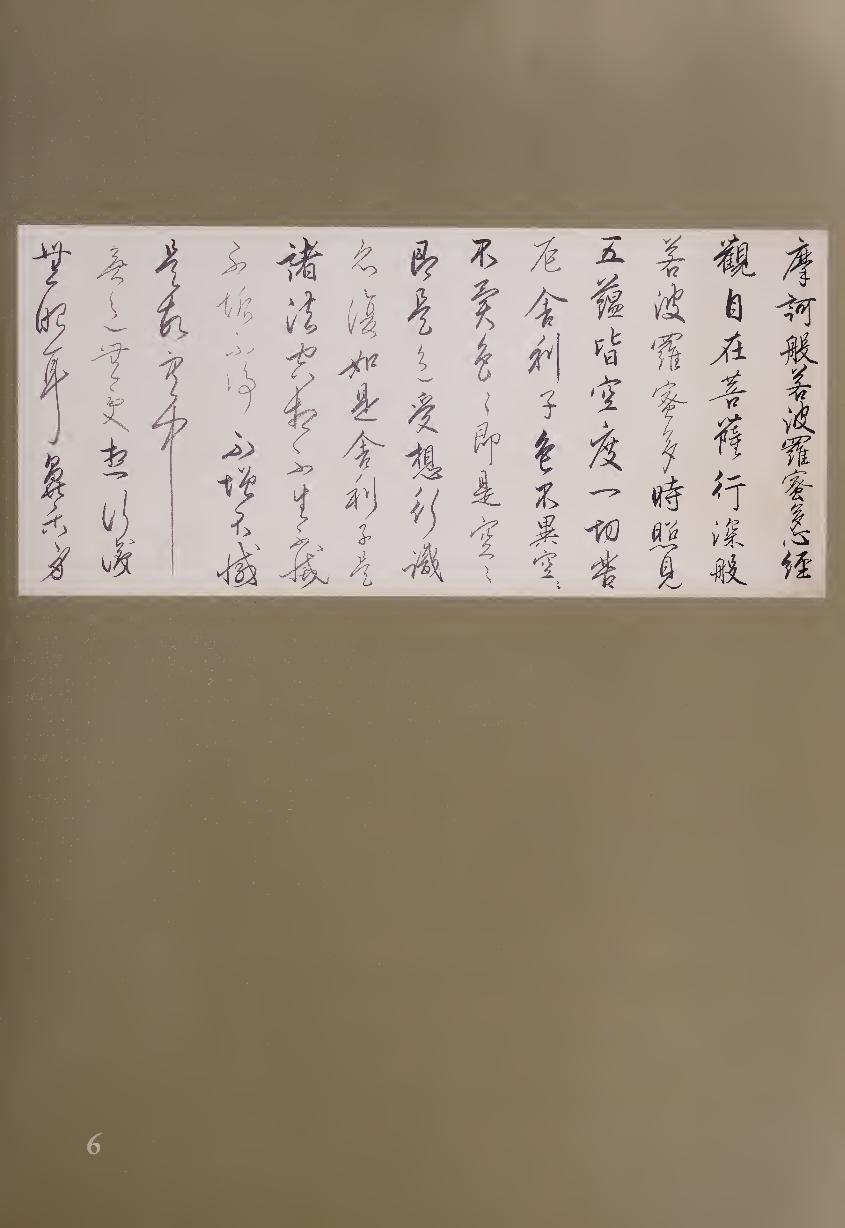
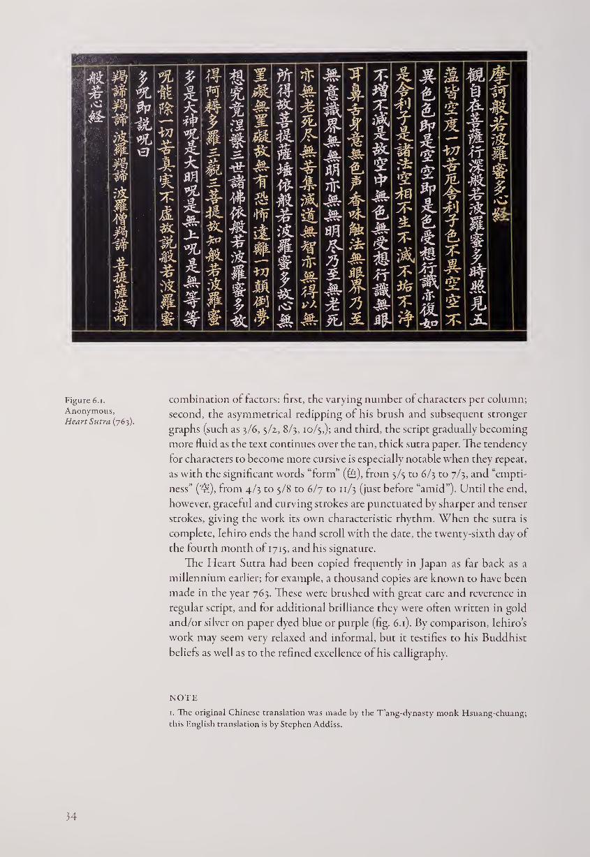
Figure 6.i.
Anonymous,
Heart Sutra (763).
combination of factors: first, the varying number of characters per column;
second, the asymmetrical redipping of his brush and subsequent stronger
graphs (such as 3/6, 5/2, 8/3,10/5,); and third, the script gradually becoming
more fluid as the text continues over the tan, thick sutra paper. The tendency
for characters to become more cursive is especially notable when they repeat,
as with the significant words “form” (fe), from 3/5 to 6/3 to 7/3, and “empti¬
ness” (zc.), from 4/3 to 5/8 to 6/7 to 11/3 (just before “amid”). Until the end,
however, graceful and curving strokes are punctuated by sharper and tenser
strokes, giving the work its own characteristic rhythm. When the sutra is
complete, Iehiro ends the hand scroll with the date, the twenty-sixth day of
the fourth month of 1715, and his signature.
The Heart Sutra had been copied frequently in Japan as far back as a
millennium earlier; for example, a thousand copies are known to have been
made in the year 763. These were brushed with great care and reverence in
regular script, and for additional brilliance they were often written in gold
and/or silver on paper dyed blue or purple (fig. 6.1). By comparison, Iehiro’s
work may seem very relaxed and informal, but it testifies to his Buddhist
beliefs as well as to the refined excellence of his calligraphy.
NOTE
1. The original Chinese translation was made by the T’ang-dynasty monk Hsuang-chuang;
this English translation is by Stephen Addiss.
34
7 GION K AJ l (active early eighteenth century)
Waitingfor Blossoms Sbikishi mounted as a hanging scroll, ink on decorated paper, 17.2 x 15.8 cm.
Although classical waka poetry had long been a courtly tradition,
during the early modern period everyday people took it up to an
extent never seen before. For example, one of the leading waka
poets of the early eighteenth century was a woman named Kaji who started
a tea shop in Kyoto’s Gion Park, where she sold cups of steeped tea to
passersby for the modest price of one sen. After she gained fame as a poet,1
her customers would sometimes request a waka from her, which she would
usually write in the format of a tanzaku (thin poem card) or a shikishi
(square poem card).
Compared with most courtly writing of waka, Kaji’s calligraphy is ex¬
tremely bold and free, corresponding to her character as seen through both
her independent life and her often passionate poetry. At the age of thirteen,
for example, she wrote the following waka:
Koi koite
mata ichitose mo
kurenikeri
namida no kohori
asu ya tokenamu
I loved and yearned
but again another year
draws to a close
and all my frozen tears
are sure to melt tomorrow
Not many of Kaji’s works survive, perhaps because they were treated as
ephemera; this example, mounted as hanging scroll, bears the title “Waiting
for Blossoms”:
Matsukoro wa
nado mubatama no
yume ni sae
Katano no Mino no
hana mo omokage
Even as I wait
in the darkness
of my dreams—
the visage of blossoms
of Katano no Mino
The word hana literally means flowers and almost always indicates
cherry blossoms. Here, since the use of the final word omokage (visage) usu¬
ally refers to a person, we may also imagine that Kaji is dreaming of a lover,
as represented by her “waiting for blossoms” or “waiting for blossoming.”
This calligraphy might be considered the Japanese equivalent of Chinese
“wild cursive” script because the characters vary greatly in size and seem to
run into each other, if not overlap; brush lines vary from thick to extremely
thin, and the total rhythm of the work seems almost chaotic. On closer
examination, however, an underlying structure can be discerned. The boldly
brushed two-character title “Waiting for Blossoms” is set distinctly apart on
the right, with the small “Kaji” signature in the simplest of kana placed well
below it. Her five-line poem is then written in four columns that seem to
rub up against each other, with the final column corresponding to the final
line of the poem.
The strongest two characters in the calligraphy are the two different cur¬
sive versions of the word hana (ffi, blossoms): the second word of the title on
35
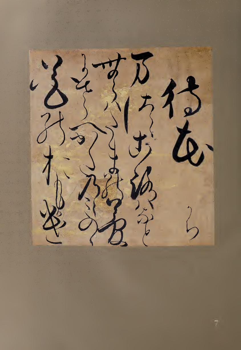
the right and the first word of the final column. In the title, hana curls around
upon itself and ends with a single dot, while later it is more expansive with
dots flying out to either side, one even touching the next column to the right.
Another kanji that is used for both sound and meaning—yume (W,
dream)—ends the second column of the poem (the third column overall).
Instead of using simplified kana for all the Japanese syllables, Kaji often
chooses more complex kanji forms used merely for sound, such as mu (te,
which as kanji would mean “no” or “nothingness”) at the start of the poem’s
second column. More complex than kana and requiring more space, these
forms lend rhythmic variety to the work; this can be seen at the end of the
first poetic column where three simplified kana, wa nado follow a
more strongly brushed kanji used for the sound ro (i)?§).
Even when using kana, Kaji changes size and shape continuously so that
some forms are large and bold with thick lines while others are written with
thinner lines in much smaller size. For example, the penultimate column of
calligraphy (the fourth line of the poem) ends with four of its five syllables
pronounced “no,” which could be a challenge to a calligrapher. Might Kaji
write the same kana four times? Certainly not; she uses two forms of kana
plus two repeat marks, the second abbreviated, to create visual variety. She
begins with a kana no (7k) that resembles the letter R, then adds a squiggle
repeat mark on the right; next she writes a kana on the left that consists of
three horizontal dashes and represents mi (T); completing the column are a
circular kana form ((D) that also signifies no and a final squiggle that is again
a repeat mark; thus her no no mi no no becomes a constantly changing flow.
While Kaji’s use of decorated paper harkens back to the aesthetics of
courtly elegance, her combination of boldness of brushwork and occasional
compression of forms gives this shikishi drama, energy, and passion that is
often lacking in later waka calligraphy. This work shows how nonaristocratic
poets, both in their verse and in their calligraphy, helped to keep the classi¬
cal poetry tradition vital during an age when the arts were patronized and
practiced by everyday people rather than merely the elite. While courtiers
were mostly repeating the styles of the past without adding significant new
elements, poets like Kaji breathed new life into waka verse and calligraphy.
NOTE
i. A book of 120 of Kaji’s waka, Kaji no ha (Mulberry Paper [Kaji] Leaves) was published in
1707 in Kyoto with illustrations by Miyazaki Yuzen (died 1758), who is also credited with
originating or perfecting the form of resist dying that bears his name.
37
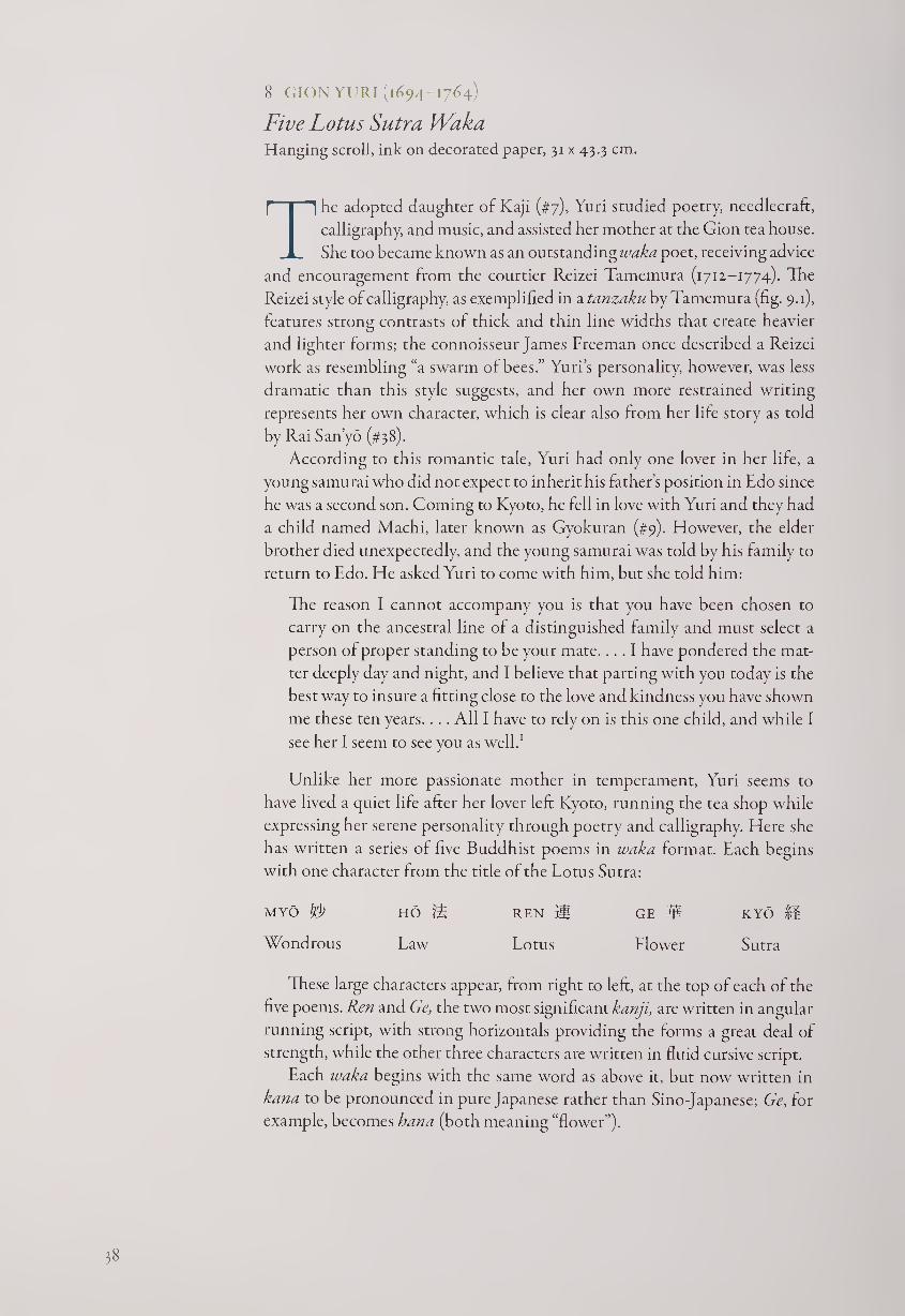
8 GION YURI (1694-1764)
Five Lotus Sutra Waka Hanging scroll, ink on decorated paper, 31 x 43.3 cm.
The adopted daughter of Kaji (#7), Yuri studied poetry, needlecraft,
calligraphy, and music, and assisted her mother at the Gion tea house.
She too became known as an outstanding waka poet, receiving advice
and encouragement from the courtier Reizei Tamemura (1712-1774). The
Reizei style of calligraphy, as exemplified in a tanzaku by Tamemura (fig. 9.1),
features strong contrasts of thick and thin line widths that create heavier
and lighter forms; the connoisseur James Freeman once described a Reizei
work as resembling “a swarm of bees.” Yuri’s personality, however, was less
dramatic than this style suggests, and her own more restrained writing
represents her own character, which is clear also from her life story as told
by Rai Sanyo (#38).
According to this romantic tale, Yuri had only one lover in her life, a
young samurai who did not expect to inherit his father’s position in Edo since
he was a second son. Coming to Kyoto, he fell in love with Yuri and they had
a child named Machi, later known as Gyokuran (#9). However, the elder
brother died unexpectedly, and the young samurai was told by his family to
return to Edo. He asked Yuri to come with him, but she told him:
The reason I cannot accompany you is that you have been chosen to
carry on the ancestral line of a distinguished family and must select a
person of proper standing to be your mate.... I have pondered the mat¬
ter deeply day and night, and I believe that parting with you today is the
best way to insure a fitting close to the love and kindness you have shown
me these ten years.... All I have to rely on is this one child, and while I
see her I seem to see you as well.1
Unlike her more passionate mother in temperament, Yuri seems to
have lived a quiet life after her lover left Kyoto, running the tea shop while
expressing her serene personality through poetry and calligraphy. Here she
has written a series of five Buddhist poems in waka format. Each begins
with one character from the title of the Lotus Sutra:
MYO f/P HO m REN }§ GE M KYO M
Wondrous Law Lotus Flower Sutra
These large characters appear, from right to left, at the top of each of the
five poems. Ren and Ge, the two most significant kanji, are written in angular
running script, with strong horizontals providing the forms a great deal of
strength, while the other three characters are written in fluid cursive script.
Each waka begins with the same word as above it, but now written in
kana to be pronounced in pure Japanese rather than Sino-Japanese; Ge, for
example, becomes hana (both meaning “flower”).
18
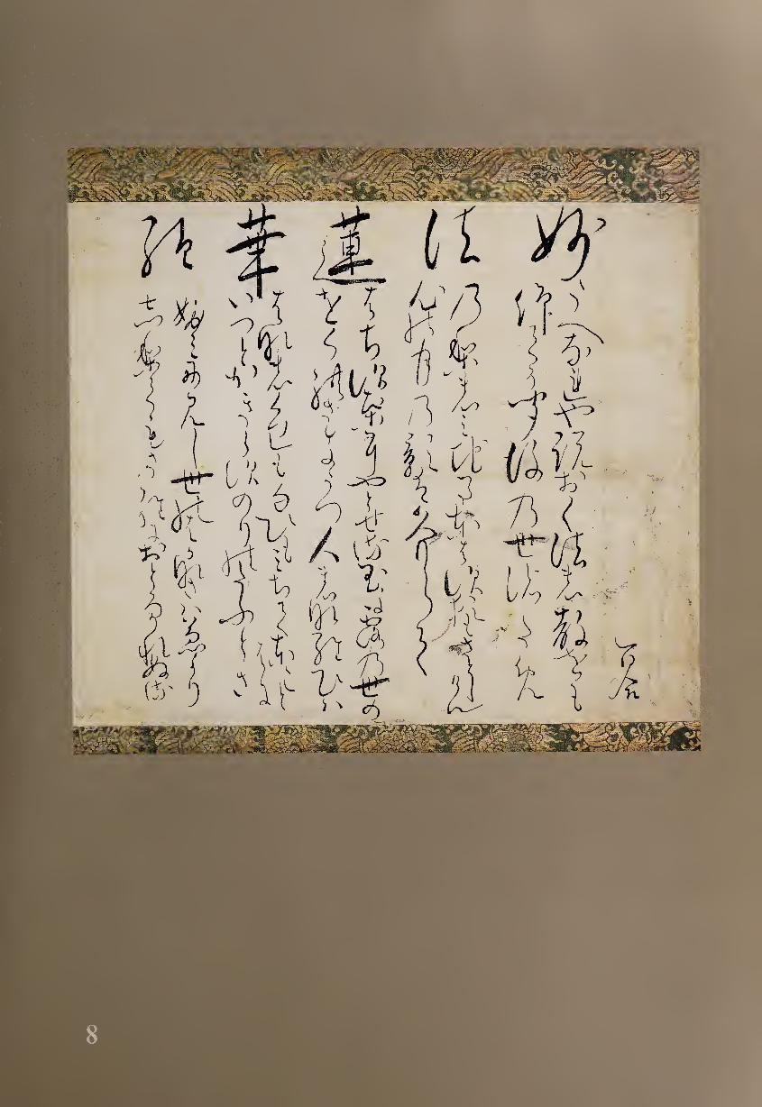
Hr
^ ty -7 r-k
k I !%l i * * V f M
MHE3I
W A Y U)
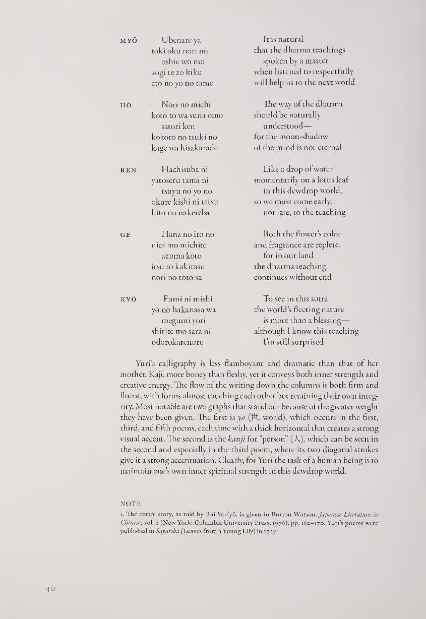
MYO Ubenareya
told oku non no
oshie wo mo
aogi te zo kiku
ato no yo no tame
HO Nori no michi
koto to wa suna omo
satori ken
kokoro no tsuki no
kage wa hisakarade
ren Hachisubani
yatoseru tama ni
tsuyu no yo no
okure kishi ni tatsu
hito no nakereba
GE Hana no iro no
nioi mo michite
azuma koto
itsu to kakirasu
nori no toto sa
KYO Fumi ni mishi
yo no hakanasa wa
megumi yori
shirite mo sara ni
odorokarenuru
It is natural
that the dharma teachings
spoken by a master
when listened to respectfully
will help us to the next world
The way of the dharma
should be naturally
understood—
for the moon-shadow
of the mind is not eternal
Like a drop of water
momentarily on a lotus leaf
in this dewdrop world,
so we must come early,
not late, to the teaching
Both the flower’s color
and fragrance are replete,
for in our land
the dharma teaching
continues without end
To see in this sutra
the world’s fleeting nature
is more than a blessing—
although I know this teaching
I’m still surprised
Yuri’s calligraphy is less flamboyant and dramatic than that of her
mother, Kaji, more boney than fleshy, yet it conveys both inner strength and
creative energy. The flow of the writing down the columns is both firm and
fluent, with forms almost touching each other but retaining their own integ¬
rity. Most notable are two graphs that stand out because of the greater weight
they have been given. The first is yo (tfi, world), which occurs in the first,
third, and fifth poems, each time with a thick horizontal that creates a strong
visual accent. The second is the kanji for “person” (A), which can be seen in
the second and especially in the third poem, where its two diagonal strokes
give it a strong accentuation. Clearly, for Yuri the task of a human being is to
maintain one’s own inner spiritual strength in this dewdrop world.
NOTE
i. The entire story, as told by Rai Sanyo, is given in Burton Watson, Japanese Literature in
Chinese, vol. 2 (New York: Columbia University Press, 1976), pp. 162-170. Yuri’s poems were
published in Sayuriba (Leaves from a Young Lily) in 1727.
40
9 IKE GYOKURAN (1728-1784)
Three Waka on Flowers Hand scroll section, ink on paper, 15 x 32 cm.
The granddaughter of Kaji (#7) and daughter of Yuri (#8), Gyokuran
followed their tradition by running the family tea shop in Gion
Park while composing classical waka, but she also became a pupil of
the Chinese-style literati painters Yanagisawa Kien and Ike Taiga (#41). She
eventually married Taiga and lived in Makuzugahara (“arrowroot cottage”)
next to Gion Park, which she inherited from Yuri in 1761.1 Artistically a
pioneer, Gyokuran brought the waka poetry tradition to Japanese literati
painting not only in her own works but also by having some of her paintings
inscribed by her mother.1
Gyokuran’s own waka were published in a book entitled Shirofuyo
(White Mallow), but it contains only nineteen verses, in comparison with
the books by Kaji and Yuri, with 120 and 159 poems, respectively. But
Gyokuran was nonetheless accomplished in poetry as well as calligraphy
and painting, and it is instructive to compare her works with those of her
grandmother and mother. While Kaji’s poems tend to be passionate and
Yuri’s more renunciatory, Gyokuran’s are more likely to focus upon their
visual images, expressing more of nature and less of her own emotions. Her
calligraphy is also more orderly than Kaji’s and more consciously artistic
than Yuri’s. For example, while Kaji varied her characters in size so that they
crowd against each other, Yuri preserved her column structure more clearly,
with only occasional accents of larger or heavier forms. In contrast to both
of them, Gyokuran maintains clearly separated columns with rhythmically
balanced accents, as can be seen in a set of three of her poems about cherry
blossoms in spring.
Hana wo Maneku Inviting Flowers
Miebamuru
hana no sugata wa
yama no ha ni
tsuki no oshiho no
sayo fukete koso
If I could only see
the shapes of the blossoms
at the edge of the mountain
lit by gleaming moonbeams
in the depths of night!
Tsukikage mo
sayaka ni miete
fukuru yo no
hana no iro ka no
nao ya shinoban
By the moonglow
brightly visible
in deepening night,
the color and scent of flowers
that I still remember ...
Hana kaze wo ito
Matsugae ni
kaze koso tomare
yamazakura
sakari hisashiku
nao miha ya sen
Flowers Detesting the Wind
In pine branches
may the wind stop;
the mountain cherries
are now at their height—
I’d like to see them linger
4i
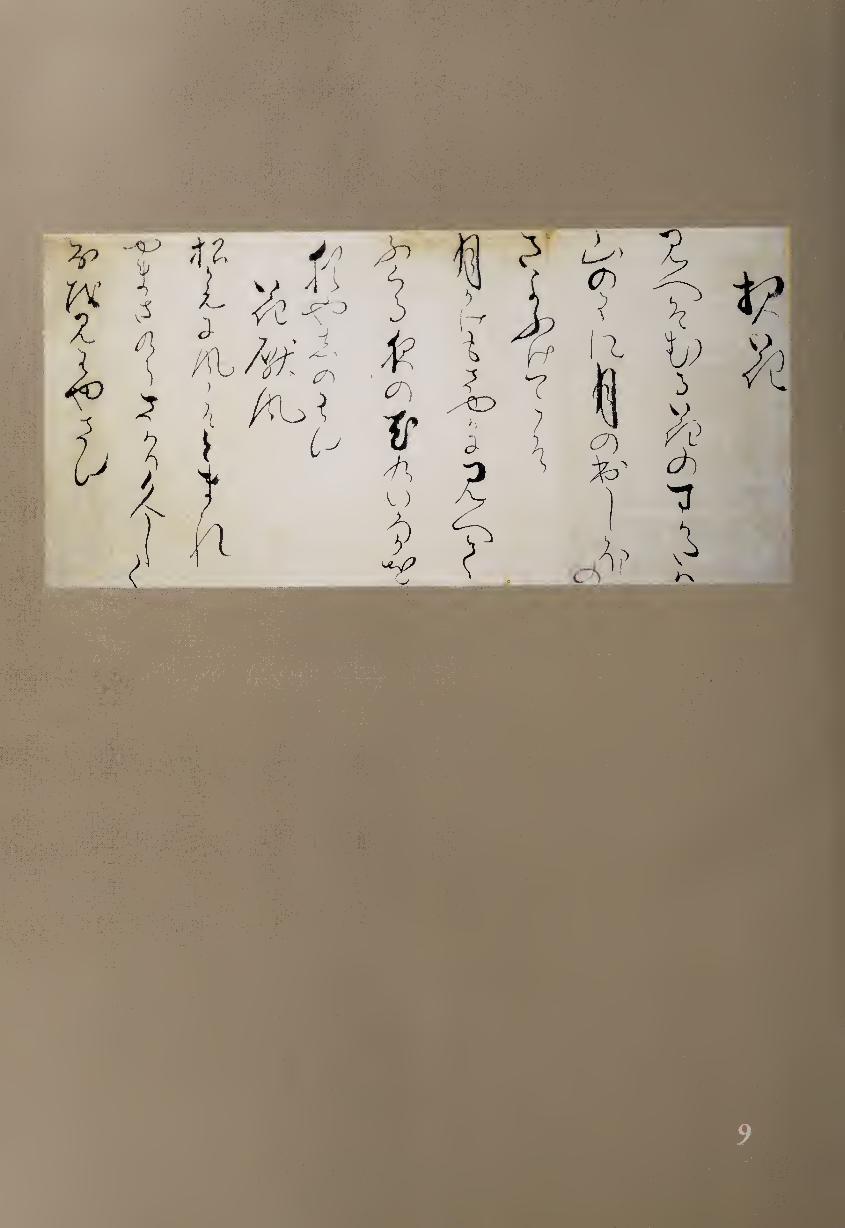
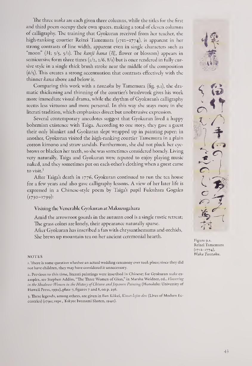
The three ivaka are each given three columns, while the titles for the first
and third poem occupy their own spaces, making a total of eleven columns
of calligraphy. The training that Gyokuran received from her teacher, the
high-ranking courtier Reizei Tamemura (1711-1774), is apparent in her
strong contrasts of line width, apparent even in single characters such as
“moon” (RJ; 3/5, 5/1). The kanji hana (f£, flower or blossom) appears in
semicursive form three times (i/z, z/6, 8/1) but is once rendered in fully cur¬
sive style in a single thick brush stroke near the middle of the composition
(6/3). This creates a strong accentuation that contrasts effectively with the
thinner kana above and below it.
Comparing this work with a tanzaku by Tamemura (fig. 9.1), the dra¬
matic thickening and thinning of the courtier’s brushwork gives his work
more immediate visual drama, while the rhythm of Gyokuran’s calligraphy
seems less virtuoso and more personal. In this way she stays more in the
literati tradition, which emphasizes direct but unobtrusive expression.
Several contemporary anecdotes suggest that Gyokuran lived a happy
bohemian existence with Taiga. According to one story, they gave a guest
their only blanket and Gyokuran slept wrapped up in painting paper; in
another, Gyokuran visited the high-ranking courtier Tamemura in a plain
cotton kimono and straw sandals. Furthermore, she did not pluck her eye¬
brows or blacken her teeth, so she was sometimes considered homely. Living
very naturally. Taiga and Gyokuran were reputed to enjoy playing music
naked, and they sometimes put on each other’s clothing when a guest came
to visit.3
After Taiga’s death in 1776, Gyokuran continued to run the tea house
for a few years and also gave calligraphy lessons. A view of her later life is
expressed in a Chinese-style poem by Taiga’s pupil Fukuhara Gogaku
(1730-1799):
Visiting the Venerable Gyokuran at Makuzugahara
Amid the arrowroot gourds in the autumn cool is a single rustic retreat;
The grass colors are lonely, their appearance naturally sparse.
After Gyokuran has inscribed a fan with chrysanthemums and orchids,
She brews up mountain tea on her ancient ceremonial hearth.
NOTES
1. There is some question whether an actual wedding ceremony ever took place; since they did
not have children, they may have considered it unnecessary.
2. Previous to this time, literati paintings were inscribed in Chinese; for Gyokuran ivaka ex¬
amples, see Stephen Addiss, “The Three Women of Gion,” in Marsha Weidner, ed„ Flowering
in the Shadows: Women in the History of Chinese and Japanese Painting (Honolulu: University of
Hawaii Press, 1990), plate 7, figures 7 and 8, on p. 256.
3. These legends, among others, are given in Ban Kokei, Kinsei kijin-den (Lives of Modern Ec¬
centrics) (1790; repr., Tokyo: Iwanami Shoten, 1940).
Figure 9.1.
Reizei Tamemura
(1712-1774),
Waka Tanzaku.
43
io OTA NANPO (1749-1823)
Kyoka: Saigyo s Cat Framed scroll, ink on silk, 96.8 x 30 cm.
Harnett Museum, University of Richmond, Va.
Humor can occur in calligraphy as well as in verse. Born to a modest
samurai family in Edo, Ota Nanpo received a Confucian educa¬
tion, and by his middle teens he had not only succeeded to his
hereditary position as castle guard but also published a study of Ming-
dynasty poetic terms. He continued his studies in Chinese literature all his
life but became more famous for gesaku (writing for fun) under the name
“Shokusanjin.” He especially enjoyed the humorous five-section kyoka (mad
poem), which has the same $-7-$-7~7 syllable structure as waka but is satiric
in content. Although Nanpo gave up this form for a time when the govern¬
ment forbade samurai to attend kyoka parties, he remained the quintessential
master of this genre, which required both wit and erudition.
The text of this “mad poem” refers to a famous story in Japanese history
in which the wandering monk-poet Saigyo (also known as En’i, 1118-1190),
when summoned to meet the shogun Yoritomo in Kamakura, is asked
about poetry and archery. Saigyo claims to know nothing special about
poetry and to have forgotten everything he once knew about archery, but
nevertheless he is presented with a silver cat by the shogun. Caring nothing
for worldly riches, Saigyo gives the cat to some children as he leaves the gate
of Yoritomo’s mansion.
Human Concerns Are All Saigyo s Cat
kono neko wa
nan monme hodo
aro to wa
kakete mo iwanu
En’i shonin
That cat—
just how much
it weighed
he’d never tell,
the Buddhist saint En’i!1
The introduction is a pun on the familiar Japanese saying, “Human con¬
cerns are all like Said’s horse.” According to a Chinese legend, old man Said’s
horse ran away, but he did not despair, and the horse returned leading a fine
stallion. Said did not rejoice, and before long his son broke his leg riding
the new horse. Said again did not grieve, and soon all the young men in the
village were conscripted into the army to serve at a distant post— except his
son. Said, accepting all things with equanimity, and Saigyo, caring nothing
for expensive objects, must have been grist to the mill of Nanpo’s satiric
spirit. Here he beings the two stories together to lampoon the ambitious
and avaricious society of his own time.2
Nanpos calligraphy is modest, relaxed, and somewhat eccentric. Kyoka
are usually about people’s foibles rather than the interaction of nature and
humans, as in most waka, and here the first and largest word is, appropri¬
ately, “person/people” (K). The same word appears at the end of the poem
and again at the end of the signature, each time further deconstructed.
What is most notable about Nanpo’s writing is his use of space. The
composition is divided vertically into four sections: the title on the right,
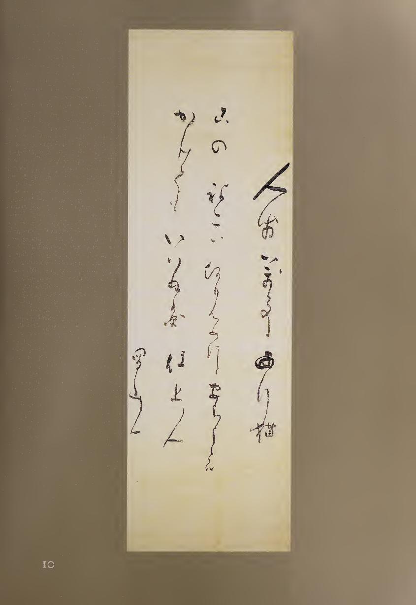
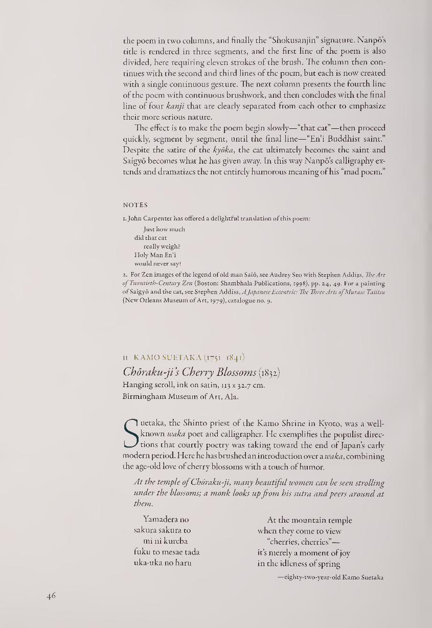
the poem in two columns, and finally the “Shokusanjin” signature. Nanpo’s
title is rendered in three segments, and the first line of the poem is also
divided, here requiring eleven strokes of the brush. The column then con¬
tinues with the second and third lines of the poem, but each is now created
with a single continuous gesture. The next column presents the fourth line
of the poem with continuous brushwork, and then concludes with the final
line of four kanji that are clearly separated from each other to emphasize
their more serious nature.
The effect is to make the poem begin slowly—“that cat”—then proceed
quickly, segment by segment, until the final line—“En’i Buddhist saint.”
Despite the satire of the kyoka, the cat ultimately becomes the saint and
Saigyo becomes what he has given away. In this way Nanpo’s calligraphy ex¬
tends and dramatizes the not entirely humorous meaning of his “mad poem.”
NOTES
1. John Carpenter has offered a delightful translation of this poem:
Just how much
did that cat
really weigh?
Holy Man En’i
would never say!
2. For Zen images of the legend of old man Saio, see Audrey Seo with Stephen Addiss, The Art
of Twentieth-Century Zen (Boston: Shambhala Publications, 1998), pp. 24, 49. For a painting
of Saigyo and the cat, see Stephen Addiss, A Japanese Eccentric: Vte Three Arts ofMurase Taiitsu
(New Orleans Museum of Art, 1979), catalogue no. 9.
II KAMO SUETAKA (1751-1841)
Choraku-ji’s Cherry Blossoms (1832)
Hanging scroll, ink on satin, 113 x 32.7 cm.
Birmingham Museum of Art, Ala.
Suetaka, the Shinto priest of the Kamo Shrine in Kyoto, was a well-
known waka poet and calligrapher. He exemplifies the populist direc¬
tions that courtly poetry was taking toward the end of Japan’s early
modern period. Here he has brushed an introduction over a waka, combining
the age-old love of cherry blossoms with a touch of humor.
At the temple oj Chdraku-ji, many beautiful women can be seen strolling
under the blossoms; a monk looks up from his sutra and peers around at
them.
Yamadera no
sakura sakura to
mi ni kureba
fuku to mesae tada
uka-uka no haru
At the mountain temple
when they come to view
“cherries, cherries”—
it’s merely a moment of joy
in the idleness of spring
—eighty-two-year-old Kamo Suetaka
4 6
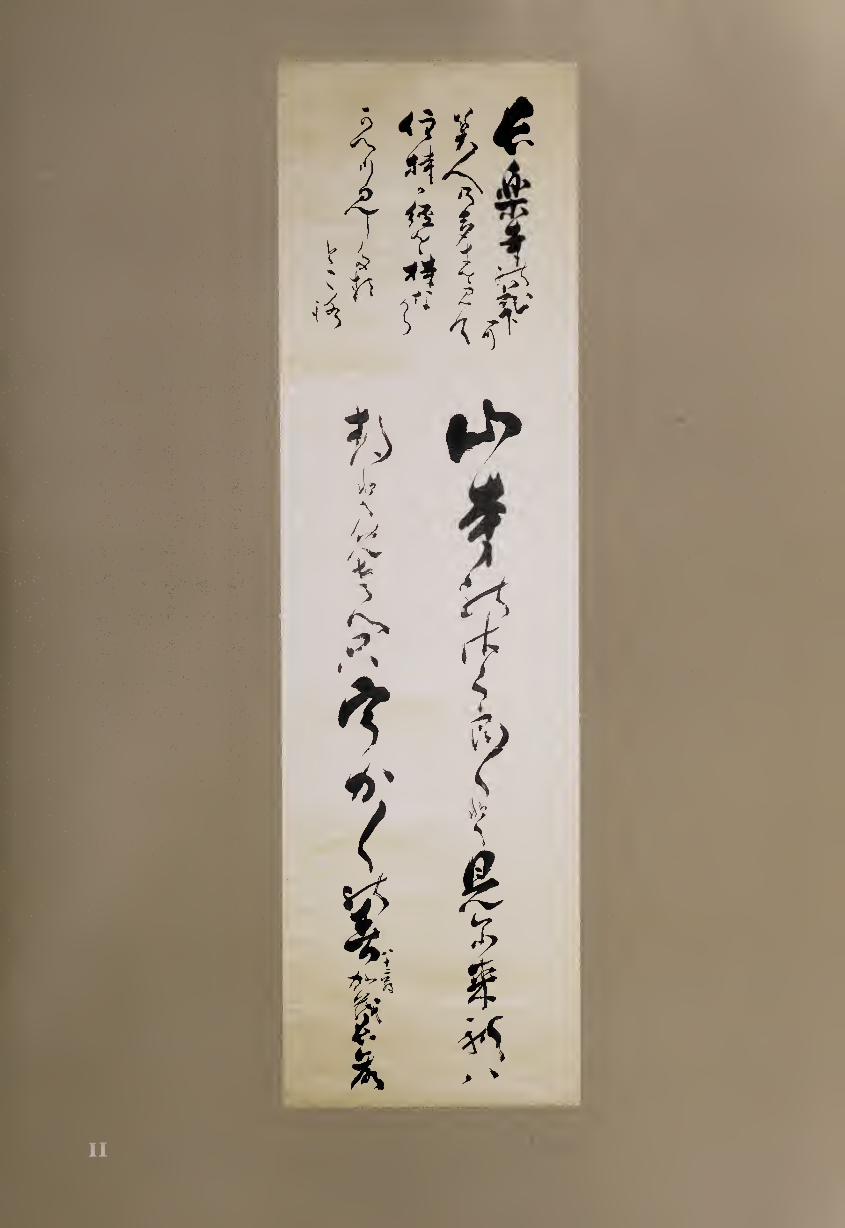
The medium of satin takes the ink differently from paper or silk. Because
it has several threads in one direction before being crossed from the other,
it reflects light in a “satin sheen” that also allows ink to seep out from the
brush stroke when very wet. This effect is particularly evident in Suetaka’s
strokes just after he dipped the brush, such as the first and third columns of
the introduction, but it is even more visually notable in the poem itself.
Suetaka has dipped his brush for the first character, “mountain” (fU),
and farther down the first column for the first word of the third line of the
poem, “view” (M). He does not redip at the top of the second column but
waits for the beginning of the final poetic line, about halfway down. Here
he writes the first vowel of uka by using the kanji u (^), literally meaning
“eaves”; this use of mariydgana remains a feature of much traditional waka
calligraphy. Suetaka then concludes with his signature, writing “82 [years]
old” just to its right in small script.
In essence, Suetaka has arranged a five-line poem into two calligraphic
columns with three dips of the brush, creating a counterpoint of visual
rhythms. Up to this time, waka were usually written on horizontal scrolls,
square shikishi poem cards, or narrow tanzaku. The larger space of a vertical
scroll, the use of satin, and the bold brushwork allow Suetaka to make a
more dramatic presentation. Compared to earlier waka calligraphy, it seems
rough and sometimes inelegant, but exhibits a great deal of freedom as it
moves from fluent to angular and from viscous to scratchy. Part of this style
might be attributed to his age, but his earlier works are also decidedly loose
and spontaneous.
By this time in Japanese cultural history, waka had lost much of its
association with the court; refinement was no longer its major aesthetic
criterion. Instead, energy and creativity were paramount; while some crit¬
ics decried the loss of elegance, the poetic form as well as its calligraphic
expression might have atrophied without the fresh vitality of poets such as
Suetaka. Just as the love of cherry blossoms has been renewed each genera¬
tion, this poem on satin demonstrates how a Japanese Shinto priest was able
to give vigorous new life to an old tradition.
12 OTAGAKI RENGETSU (1791-1875)
Lotus Cup Inscribed stoneware, 9.2 cm. tall
One of the most notable women in the world of nineteenth-century
Japanese art, Rengetsu lived through tragedy to become a major
poet-calligrapher as well as a potter and painter. She married
young, her husband died, she married again, her second husband and child
died, and she then became a Buddhist nun. Supporting herself by making
handcrafted pottery and by her calligraphy, she created some of the most
personal works of her time.1 She sometimes combined her skills when she
48
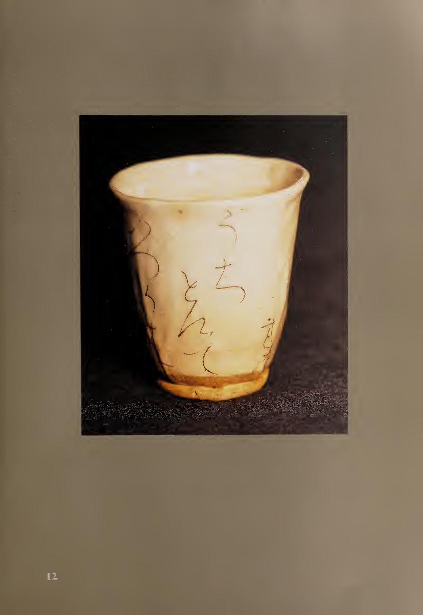
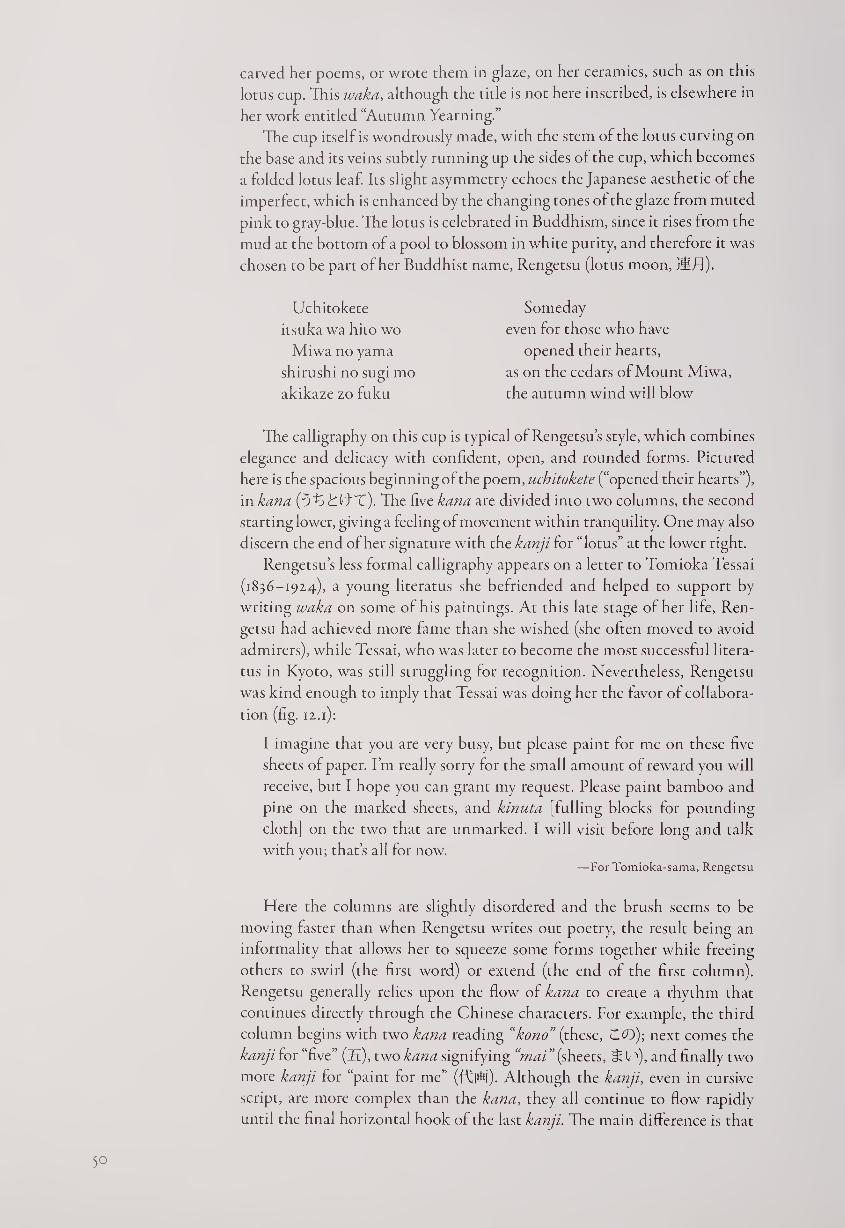
carved her poems, or wrote them in glaze, on her ceramics, such as on this
lotus cup. This waka, although the title is not here inscribed, is elsewhere in
her work entitled “Autumn Yearning.”
The cup itself is wondrously made, with the stem of the lotus curving on
the base and its veins subtly running up the sides of the cup, which becomes
a folded lotus leaf. Its slight asymmetry echoes the Japanese aesthetic of the
imperfect, which is enhanced by the changing tones of the glaze from muted
pink to gray-blue. The lotus is celebrated in Buddhism, since it rises from the
mud at the bottom of a pool to blossom in white purity, and therefore it was
chosen to be part of her Buddhist name, Rengetsu (lotus moon, tHTJ).
Uchitokete
itsuka wa hito wo
Miwa no yama
shirushi no sugi mo
akikaze zo fuku
Someday
even for those who have
opened their hearts,
as on the cedars of Mount Miwa,
the autumn wind will blow
The calligraphy on this cup is typical of Rengetsu’s style, which combines
elegance and delicacy with confident, open, and rounded forms. Pictured
here is the spacious beginning of the poem, uchitokete (“opened their hearts”),
in kana (ThjfCtT). The five kana are divided into two columns, the second
starting lower, giving a feeling of movement within tranquility. One may also
discern the end of her signature with the kanji for “lotus” at the lower right.
Rengetsu’s less formal calligraphy appears on a letter to Tomioka Tessai
(1836-19x4), a young literatus she befriended and helped to support by
writing waka on some of his paintings. At this late stage of her life, Ren¬
getsu had achieved more fame than she wished (she often moved to avoid
admirers), while Tessai, who was later to become the most successful litera¬
tus in Kyoto, was still struggling for recognition. Nevertheless, Rengetsu
was kind enough to imply that Tessai was doing her the favor of collabora¬
tion (fig. ix.1):
I imagine that you are very busy, but please paint for me on these five
sheets of paper. I’m really sorry for the small amount of reward you will
receive, but I hope you can grant my request. Please paint bamboo and
pine on the marked sheets, and kinuta [fulling blocks for pounding
cloth] on the two that are unmarked. I will visit before long and talk
with you; that’s all for now. —For Tomioka-sama, Rengetsu
Here the columns are slightly disordered and the brush seems to be
moving faster than when Rengetsu writes out poetry, the result being an
informality that allows her to squeeze some forms together while freeing
others to swirl (the first word) or extend (the end of the first column).
Rengetsu generally relies upon the flow of kana to create a rhythm that
continues directly through the Chinese characters. For example, the third
column begins with two kana reading “kono” (these, CO); next comes the
kanji for “five” (£.), two kana signifying “mai”(sheets, ^ l '*), and finally two
more kanji for “paint for me” (fCPU). Although the kanji, even in cursive
script, are more complex than the kana, they all continue to flow rapidly
until the final horizontal hook of the last kanji. The main difference is that
50
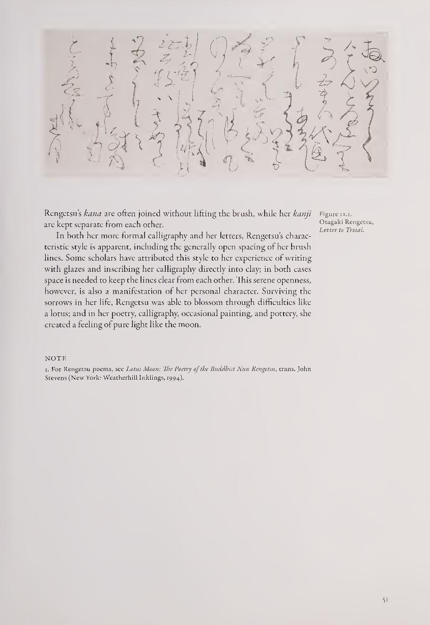
r <
\
Rengetsu’s kana are often joined without lifting the brush, while her kanji Figure 12.1.
are kept separate from each other. Otagaki Rengetsu, ... . , Letter to Tessai.
In both her more formal calligraphy and her letters, Rengetsu s charac¬
teristic style is apparent, including the generally open spacing of her brush
lines. Some scholars have attributed this style to her experience of writing
with glazes and inscribing her calligraphy directly into clay; in both cases
space is needed to keep the lines clear from each other. This serene openness,
however, is also a manifestation of her personal character. Surviving the
sorrows in her life, Rengetsu was able to blossom through difficulties like
a lotus; and in her poetry, calligraphy, occasional painting, and pottery, she
created a feeling of pure light like the moon.
NOTE
i. For Rengetsu poems, see Lotus Moon: The Poetry of the Buddhist Nun Rengetsu, trans. John
Stevens (New York: Weatherhill Inklings, 1994).
51
Calligraphers in the
Karayo (Chinese) Tradition
In contrast to the poet-artists who revived and transformed the Japanese
waka tradition in the early seventeenth century, many calligraphers worked
to extend the Chinese tradition that had begun more than a millennium
earlier. This form of writing had been kept alive duringjapan’s Middle Ages
(1185-1568) primarily by Zen monks, who used it for their own poems as
well as Zen texts. In the early modern era, however, the tradition became
more broadly popular, and was known as karayo (Chinese style). Its re¬
newed success was due in part to the Tokugawa government’s support of
Confucian studies, which helped lead to great advances in literacy through¬
out the population. Also significant was the influx of Chinese Obaku Zen
monks in the second half of the seventeenth century, a time when Japan was
otherwise closed off from the rest of the world.
One of these immigrants, the noted literatus Tu-li (Japanese: Dokuryu,
1596-1671), excelled in poetry, seal-carving, and medicine as well as calligra¬
phy.1 He had first mastered the regular script of Yen Chen-ch’ing (709-785)
and the “wild cursive” of the monk Huai-su (715-789), then studied the
more individualistic styles of the Sung-, Yuan-, and Ming-dynasty artists.
Tu-li wrote in all five Chinese scripts, sometimes moving from one to an¬
other within a single hand scroll (fig. B.i).
Tu-li criticized the Japanese calligraphers of his day for not knowing the
fundamental etymology of Chinese characters, as well as for not holding
the brush in the correct vertical position with the tips of the fingers. He
noted that Japanese calligraphers often held the paper up with one hand
while writing with the other, which could not produce properly controlled
brush strokes. Tu-li did not become an Obaku monk until after he came
to Japan, and his influence was probably greater on calligraphy than upon
religion. His major Japanese pupil, Ko Ten'i (Watanabe Gentai, 1649-1722,
#18), helped to spread his influence to Japanese calligraphers, who were
increasingly eager to explore the realms both of older and more recent
Chinese styles. Above all, it was the artistic potentials of a graphic tradition
encompassing more than fifty thousand characters in five possible scripts
that appealed to calligraphers and to their audiences.
Perhaps the leading Japanese pioneer in the karayo style was Kitajima
Setsuzan (1636-1697, #13), who studied with Tu-li, among others. The son
of a doctor who served the Kumamoto clan, Setsuzan became fascinated in
his youth with Chinese scholarship and calligraphy. Since Nagasaki was the
V-
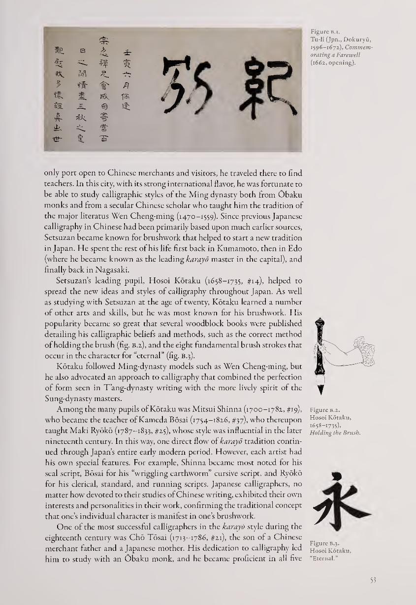
only port open to Chinese merchants and visitors, he traveled there to find
teachers. In this city, with its strong international flavor, he was fortunate to
be able to study calligraphic styles of the Ming dynasty both from Obaku
monks and from a secular Chinese scholar who taught him the tradition of
the major literatus Wen Cheng-ming (1470-1559). Since previous Japanese
calligraphy in Chinese had been primarily based upon much earlier sources,
Setsuzan became known for brushwork that helped to start a new tradition
in Japan. He spent the rest of his life first back in Kumamoto, then in Edo
(where he became known as the leading karayd master in the capital), and
finally back in Nagasaki.
Setsuzan’s leading pupil, Hosoi Kotaku (1658-1735, #14), helped to
spread the new ideas and styles of calligraphy throughout Japan. As well
as studying with Setsuzan at the age of twenty, Kotaku learned a number
of other arts and skills, but he was most known for his brushwork. His
popularity became so great that several woodblock books were published
detailing his calligraphic beliefs and methods, such as the correct method
of holding the brush (fig. B.z), and the eight fundamental brush strokes that
occur in the character for “eternal” (fig. B.3).
Kotaku followed Ming-dynasty models such as Wen Cheng-ming, but
he also advocated an approach to calligraphy that combined the perfection
of form seen in T’ang-dynasty writing with the more lively spirit of the
Sung-dynasty masters.
Among the many pupils of Kotaku was Mitsui Shinna (1700-1782, #19),
who became the teacher of Kameda Bosai (1754-1826, #37), who thereupon
taught Maki Ryoko (1787-1833, #25), whose style was influential in the later
nineteenth century. In this way, one direct flow of karayd tradition contin¬
ued through Japan’s entire early modern period. However, each artist had
his own special features. For example, Shinna became most noted for his
seal script, Bosai for his “wriggling earthworm” cursive script, and Ryoko
for his clerical, standard, and running scripts. Japanese calligraphers, no
matter how devoted to their studies of Chinese writing, exhibited their own
interests and personalities in their work, confirming the traditional concept
that one’s individual character is manifest in one’s brushwork.
One of the most successful calligraphers in the karayd style during the
eighteenth century was Cho Tosai (1713-1786, #21), the son of a Chinese
merchant father and a Japanese mother. His dedication to calligraphy led
him to study with an Obaku monk, and he became proficient in all five
Figure b.i.
Tu-li (Jpn., Dokuryu,
1596-1672), Commem¬
orating a Farewell
(1662, opening).
▼ Figure B.2.
Fiosoi Kotaku,
1658-1735),
Holding the Brush.
Figure B.3.
Hosoi Kotaku,
“Eternal.”
53
Chinese scripts. Making his living in part by selling Chinese medicines,
Tosai exemplified the Chinese-style scholar-artist and influenced several
later Japanese painter-calligraphers. His style was based upon the work of
Sung and Ming artists, so he became one of the leaders in popularizing the
“reformist” style of karayd.
Another successful Chinese-style calligrapher during the eighteenth
century was Sawada Toko (1732-1796, #23), who had studied with the son
of Tu-li’s pupil Ko Ten’i. Although Toko had learned a Ming-dynasty style,
he turned away from this tradition in favor of following much earlier Chi¬
nese masters such as Wang Hsi-chih (303-379), whose graceful tradition of
running and cursive script Toko mastered and taught. As the early modern
period progressed, debates between the reformist Sung-Ming faction and
the classical Chin-T’ang devotees became one of the creative tensions that
stimulated the development of Chinese-style calligraphy.
In addition to these reformist and classical traditions of Chinese callig¬
raphy, another style gained prominence that referred back to the Japanese
monk Kobo Daishi (774-835). Also known as Kukai, he has been most
celebrated for bringing from China a form of esoteric Buddhism that has
endured in Japan as the Shingon sect. According to legend, it was Kukai
who developed the kana system in Japan, and his prowess in calligraphy
became famous. Believing that art was important for Buddhist teaching,
Kukai inscribed portraits of Chinese esoteric Buddhist patriarchs with a
script that emphasized decorative flourishes, such as extending a final diago¬
nal brush stroke and wriggling it upward. Curiously enough, the Daishi-ryu
(Daishi school) did not begin until the seventeenth century, when revivals
of various earlier forms of art were taking place.
Several calligraphers followed the Daishi school in at least some of their
works, including masters who worked primarily in Chinese, as well as oth¬
ers who also often wrote in Japanese. Among the latter were Fujiki Atsunao
(1580-1648), who initiated the school, and Shojo Shokado (1584-1639, #4).
Among the calligraphers working in Chinese who were also adherents of
the Daishi school was Sasaki Shizuma (1619-1695, #15), who followed tra¬
dition in teaching through the use of tebon, calligraphy model books that
were to be copied by his students. Shizuma’s daughter Sasaki Shogen (n.d.,
#16) was able to use the Daishi tradition in a creatively personal and power¬
ful manner that demonstrates how significantly women were able to add to
calligraphic traditions despite their low legal status in society at that time.
What kinds of texts did these calligraphers write? In some cases it was
their own Chinese verses of five or seven characters per line, but more often
the professional calligraphers chose well-known Chinese texts. Examples
included here are Shogen’s use of a quatrain by the Tang master Tu Fu and
the inclusion by her father, Shizuma, of the famous “Thousand-Character
Essay” in his tehon album.
In viewing the different styles of the time, it may be helpful to compare
different renditions of the same text, in this case the poem “Eight Immortals
of the Wine Cup,” attributed to Tu Fu. The enjoyment of wine, familiar in
the Chinese literati world, also became celebrated by members of the new
Sinophile movement in Japan, which included scholars, calligraphers, poets,
and painters. In this poem, masters of different aspects of life and culture
are praised with a hint of mockery.
54
Ho Chih-chang rides his horse as though he were on a swaying ship;
It bleary-eyed he should tumble down a well, he would lie at
the bottom fast asleep.
Prince Ju-yang drinks three measures before going to court;
If he passes a brewer’s cart along the way, his mouth waters—
He regrets only that he is not the Prince of Wine Springs.
The Minister of the Left spends ten thousand coins daily,
And drinks like a whale, imbibing one hundred rivers;
Holding his wine cup, he insists, “I drink as a sage and avoid virtue.”
Ts’ui Tsung-chih, a handsome youth, is exceedingly refined;
Turning his gaze to the heavens and grasping his beloved cup,
He stands like a tree of jade, swaying lightly in the breeze.
The ascetic Su Chin meditates before an embroidered image
of the Buddha,
But he enjoys his lapses when he goes off on a spree.
As for Li Po, one measure will inspire a hundred poems;
He sleeps in the wine-shops of the capital, Ch’ang-An.
When summoned by the Emperor, he will not board the
Imperial barge;
He calls himself “The official who is the god of wine.”
Give three cupfuls to the calligrapher Chang Hsu and his writing
becomes inspired—
He throws off his cap before the officials and his brush produces
clouds and mist.
After five measures Chiao Sui is so eloquent, he startles everyone in
the feasting hall.
For his hanging scroll version of this text, Kitajima Setsuzan writes in
flavorful, almost quirky, style that moves freely among regular, running,
and cursive scripts (#13). He also shows a range between thicker and thinner
brush strokes, producing darker and lighter characters. Setsuzan’s linear
compositions are rather sharp and angular tor some graphs and much more
rounded for others, giving his calligraphy of this lengthy text an abundant
variety that adds asymmetrical rhythms down the scroll.
The same text written by Setsuzan’s contemporary Terai Yosetsu (1640-
1711), however, is very different in spirit partly because of the format (fig. B.4).
Instead of writing on a hanging scroll with long columns of characters,
Yosetsu chose the hand scroll format, where he would brush four, three, or
more rarely two characters per column. In addition, he used cursive script
throughout, rather than a mixture of scripts, giving more sense of flow to
the calligraphy. There is still variety, but here it is created primarily by differ¬
ent character sizes. For example, the first and third columns of the scroll are
made up of three medium-size characters each, the second has four smaller
ones, and the fourth and fifth contain two larger graphs each. In the fourth
column, however, the first character (jf, well) is much larger than the sec¬
ond, so character sizes may vary even within a column. That same large
55
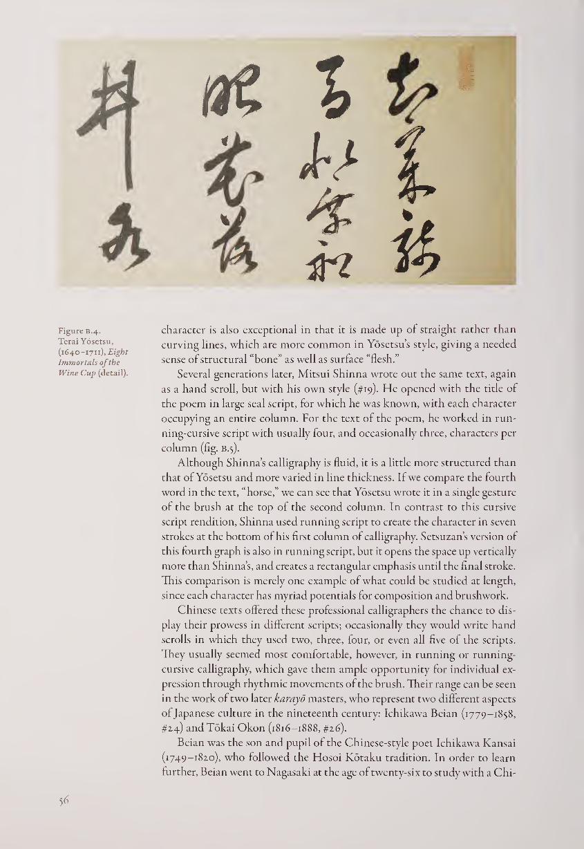
Figure B.4.
Terai Yosetsu,
(1640-1711), Eight
Immortals of the
Wine Cup (detail).
character is also exceptional in that it is made up of straight rather than
curving lines, which are more common in Yosetsu’s style, giving a needed
sense of structural “bone” as well as surface “flesh.”
Several generations later, Mitsui Shinna wrote out the same text, again
as a hand scroll, but with his own style (#19). He opened with the title of
the poem in large seal script, for which he was known, with each character
occupying an entire column. For the text of the poem, he worked in run¬
ning-cursive script with usually four, and occasionally three, characters per
column (fig. B.5).
Although Shinna’s calligraphy is fluid, it is a little more structured than
that of Yosetsu and more varied in line thickness. If we compare the fourth
word in the text, “horse,” we can see that Yosetsu wrote it in a single gesture
of the brush at the top of the second column. In contrast to this cursive
script rendition, Shinna used running script to create the character in seven
strokes at the bottom of his first column of calligraphy. Setsuzan’s version of
this fourth graph is also in running script, but it opens the space up vertically
more than Shinna’s, and creates a rectangular emphasis until the final stroke.
This comparison is merely one example of what could be studied at length,
since each character has myriad potentials for composition and brushwork.
Chinese texts offered these professional calligraphers the chance to dis¬
play their prowess in different scripts; occasionally they would write hand
scrolls in which they used two, three, four, or even all five of the scripts.
They usually seemed most comfortable, however, in running or running-
cursive calligraphy, which gave them ample opportunity for individual ex¬
pression through rhythmic movements of the brush. Their range can be seen
in the work of two later karayo masters, who represent two different aspects
of Japanese culture in the nineteenth century: Ichikawa Beian (1779-1858,
#14) and Tokai Okon (1816-1888, #26).
Beian was the son and pupil of the Chinese-style poet Ichikawa Kansai
(1749-1820), who followed the Hosoi Kotaku tradition. In order to learn
further, Beian went to Nagasaki at the age of twenty-six to study with a Chi-
56
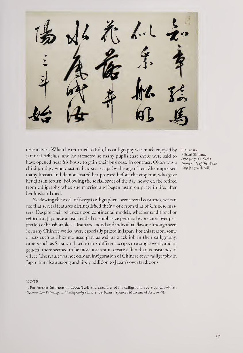
nese master. When he returned to Edo, his calligraphy was much enjoyed by
samurai-officials, and he attracted so many pupils that shops were said to
have opened near his house to gain their business. In contrast, Okon was a
child prodigy who mastered cursive script by the age of ten. She impressed
many literati and demonstrated her prowess before the emperor, who gave
her gifts in return. Following the social order of the day, however, she retired
from calligraphy when she married and began again only late in life, after
her husband died.
Reviewing the work of karayo calligraphers over several centuries, we can
see that several features distinguished their work from that of Chinese mas¬
ters. Despite their reliance upon continental models, whether traditional or
reformist, Japanese artists tended to emphasize personal expression over per¬
fection of brush strokes. Dramatic mood and individual flavor, although seen
in many Chinese works, were especially prized in Japan. For this reason, some
artists such as Shizuma used gray as well as black ink in their calligraphy,
others such as Setsuzan liked to mix different scripts in a single work, and in
general there seemed to be more interest in creative flux than consistency of
effect. The result was not only an invigoration of Chinese-style calligraphy in
Japan but also a strong and lively addition to Japan’s own traditions.
Figure B.5.
Mitsui Shinna,
(1703-1782), Eight
Immortals of the Wine
Cup (1770, detail).
NOTE
1. For further information about Tu-li and examples of his calligraphy, see Stephen Addiss,
Obaku: Zen Painting and Calligraphy (Lawrence, Kans.: Spencer Museum of Art, 1978).
5
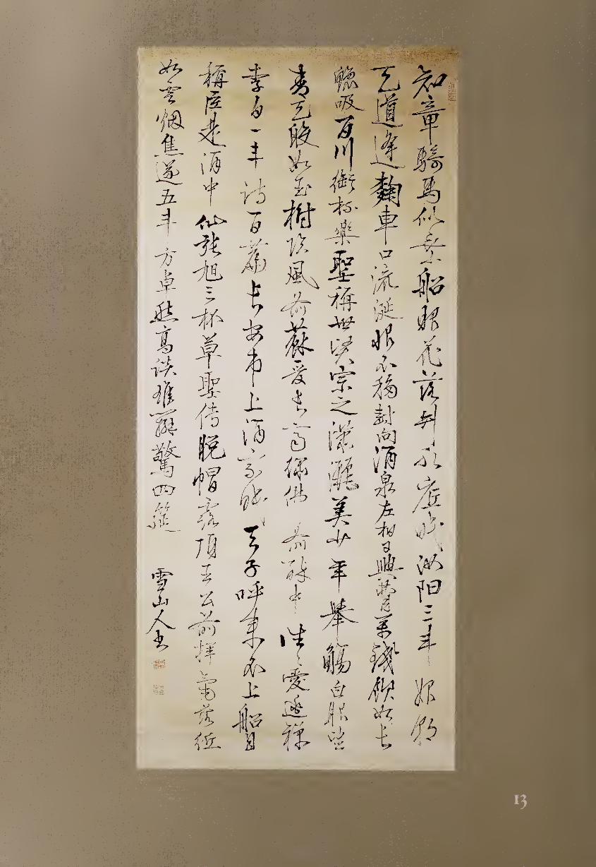
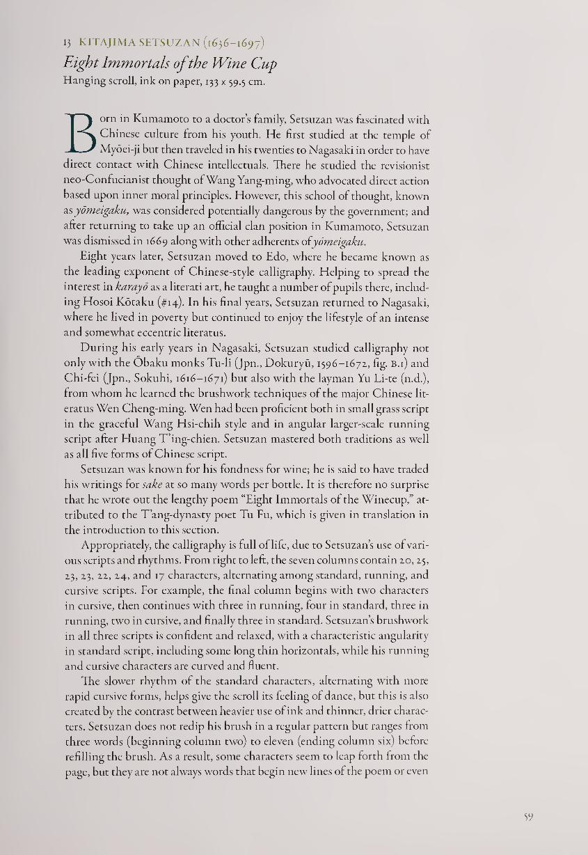
13 KITAJIMA SETSUZAN (1636-1697)
Eight Immortals of the Wine Cup Hanging scroll, ink on paper, 133 x 59.5 cm.
Born in Kumamoto to a doctor’s family, Setsuzan was fascinated with
Chinese culture from his youth. He first studied at the temple of
Myoei-ji but then traveled in his twenties to Nagasaki in order to have
direct contact with Chinese intellectuals. There he studied the revisionist
neo-Confucianist thought of Wang Yang-ming, who advocated direct action
based upon inner moral principles. However, this school of thought, known
as yomeigaku, was considered potentially dangerous by the government; and
after returning to take up an official clan position in Kumamoto, Setsuzan
was dismisseci in 1669 along with other adherents oiyomeigaku.
Eight years later, Setsuzan moved to Edo, where he became known as
the leading exponent of Chinese-style calligraphy. Helping to spread the
interest in karayd as a literati art, he taught a number of pupils there, includ¬
ing Hosoi Kotaku (#14). In his final years, Setsuzan returned to Nagasaki,
where he lived in poverty but continued to enjoy the lifestyle of an intense
and somewhat eccentric literatus.
During his early years in Nagasaki, Setsuzan studied calligraphy not
only with the Obaku monks Tu-li (Jpn., Dokuryu, 1596-1671, fig. B.i) and
Chi-fei (Jpn., Sokuhi, 1616-1671) but also with the layman Yu Li-te (n.d.),
from whom he learned the brushwork techniques of the major Chinese lit¬
eratus Wen Cheng-ming. Wen had been proficient both in small grass script
in the graceful Wang Hsi-chih style and in angular larger-scale running
script after Huang T’ing-chien. Setsuzan mastered both traditions as well
as all five forms of Chinese script.
Setsuzan was known for his fondness for wine; he is said to have traded
his writings for sake at so many words per bottle. It is therefore no surprise
that he wrote out the lengthy poem “Eight Immortals of the Winecup,” at¬
tributed to the T’ang-dynasty poet Tu Fu, which is given in translation in
the introduction to this section.
Appropriately, the calligraphy is full of life, due to Setsuzan’s use of vari¬
ous scripts and rhythms. From right to left, the seven columns contain 20, 25,
23, 23, 22, 24, and 17 characters, alternating among standard, running, and
cursive scripts. For example, the final column begins with two characters
in cursive, then continues with three in running, four in standard, three in
running, two in cursive, and finally three in standard. Setsuzan’s brushwork
in all three scripts is confident and relaxed, with a characteristic angularity
in standard script, including some long thin horizontals, while his running
and cursive characters are curved and fluent.
The slower rhythm of the standard characters, alternating with more
rapid cursive forms, helps give the scroll its feeling of dance, but this is also
created by the contrast between heavier use of ink and thinner, drier charac¬
ters. Setsuzan does not redip his brush in a regular pattern but ranges from
three words (beginning column two) to eleven (ending column six) before
refilling the brush. As a result, some characters seem to leap forth from the
page, but they are not always words that begin new lines of the poem or even
59
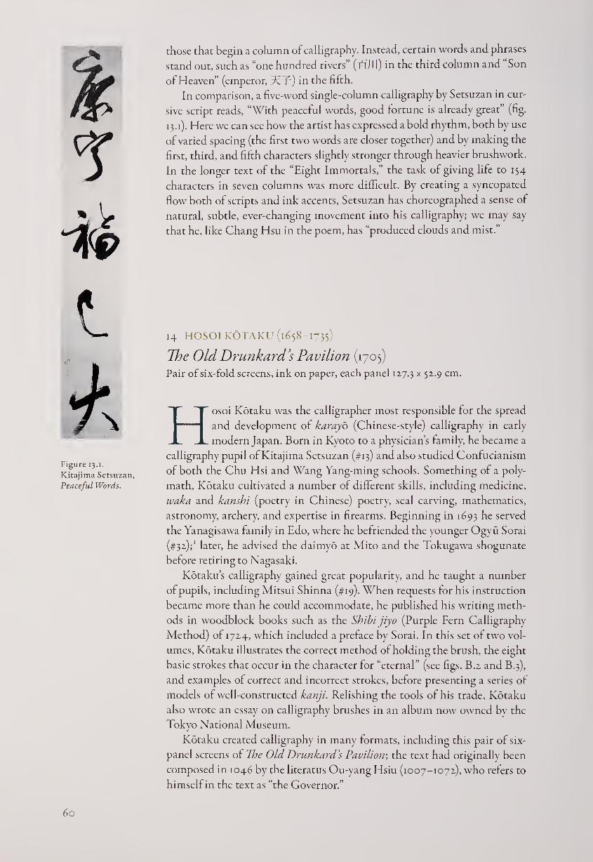
& l
Figure 13.i.
Kitajima Setsuzan,
Peaceful Words.
chose that begin a column of calligraphy. Instead, certain words and phrases
stand out, such as “one hundred rivers” (15111) in the third column and Son
of Heaven” (emperor, Tf?) in the fifth.
In comparison, a five-word single-column calligraphy by Setsuzan in cur¬
sive script reads, “With peaceful words, good fortune is already great” (fig.
13.1). Here we can see how the artist has expressed a bold rhythm, both by use
of varied spacing (the first two words are closer together) and by making the
first, third, and fifth characters slightly stronger through heavier brushwork.
In the longer text of the “Eight Immortals,” the task of giving life to 154
characters in seven columns was more difficult. By creating a syncopated
flow both of scripts and ink accents, Setsuzan has choreographed a sense of
natural, subtle, ever-changing movement into his calligraphy; we may say
that he, like Chang Hsu in the poem, has “produced clouds and mist.”
14 HOSOI KOTAKU (1658-1735)
The Old Drunkard’s Pavilion (1705)
Pair of six-fold screens, ink on paper, each panel 127.3 x 52-9 cm-
Hosoi Kotaku was the calligrapher most responsible for the spread
and development of karayo (Chinese-style) calligraphy in early
modern Japan. Born in Kyoto to a physician’s family, he became a
calligraphy pupil of Kitajima Setsuzan (#13) and also studied Confucianism
of both the Chu Hsi and Wang Yang-ming schools. Something of a poly¬
math, Kotaku cultivated a number of different skills, including medicine,
waka and kanshi (poetry in Chinese) poetry, seal carving, mathematics,
astronomy, archery, and expertise in firearms. Beginning in 1693 he served
the Yanagisawa family in Edo, where he befriended the younger Ogvu Sorai
(#32)7 later, he advised the daimyo at Mito and the Tokugawa shogunate
before retiring to Nagasaki.
Kotaku’s calligraphy gained great popularity, and he taught a number
of pupils, including Mitsui Shinna (#19). When requests for his instruction
became more than he could accommodate, he published his writing meth¬
ods in woodblock books such as the Shibi jiyo (Purple Fern Calligraphy
Method) of 1724, which included a preface by Sorai. In this set of two vol¬
umes, Kotaku illustrates the correct method of holding the brush, the eight
basic strokes that occur in the character for “eternal” (see figs. B.2 and B.3),
and examples of correct and incorrect strokes, before presenting a series of
models of well-constructed kanji. Relishing the tools of his trade, Kotaku
also wrote an essay on calligraphy brushes in an album now owned by the
Tokyo National Museum.
Kotaku created calligraphy in many formats, including this pair of six-
panel screens of The Old Drunkard’s Pavilion; the text had originally been
composed in 1046 by the literatus Ou-yang Hsiu (1007-1072), who refers to
himself in the text as “the Governor.”
60
Ch’u has mountains all around it, but the forests and valleys in the south¬
western range are particularly attractive. There is one that even from a
distance appears to be the most lush and elegant; that is Lang-yeh Moun¬
tain. If you walk a few miles into its hills, you gradually become aware of
the sound of gurgling water flowing out from between two peaks; this is
Wine-Brewing Brook. The road winds past veering heights, and soon you
come to a pavilion that spreads out beside the spring: this is Old Drunk¬
ard’s Pavilion. Who was it that built this pavilion? A monk of the moun¬
tains, Chih-hsien. Who named it? The Governor, who named it after
himself. The Governor and his friends go there often to drink. The Gov¬
ernor gets drunk on even a small amount of wine, and he is also the oldest
in the group; that is why he calls himself the Old Drunkard. However,
the Old Drunkard’s real interest is not the wine but the mountains and
streams. Having caught the joys of the mountains and streams in his
heart, he lodges them in wine.
When the sun rises, the forest mists vanish; these alternations of
light and darkness mark the mountains’ dawns and dusks. As the wild
flowers blossom they send forth subtle fragrance, as tall trees bloom they
yield deep shade; then the winds and frost are lofty and pure, the rivers
dry up and their stones are exposed; these are the four seasons in the
mountains. If one spends the day walking in the mountains, one finds
that the scenery changes with each season, and the pleasure it provides
likewise has no end.
Men carrying heavy loads sing in the valleys, travelers rest under
the trees, those in front call out, and those behind yell back. From old
men with crooked backs to children led by the hand—people pass back
and forth continuously; those are the natives of Ch’u moving along the
paths. One may find fish in the brook, which is deep and filled with
meaty fish, or one may brew wine from the brook, whose water is fra¬
grant and whose wine is clear. To have, in addition, mountain fruits and
wild herbs arrayed before one; this is the Governor’s feast.
The pleasures of the feast are not those of strings and flutes. One man
shoots and hits the target while another wins at a game of chess. Goblets
and tallies are strewn about in the chattering hubbub of men, some sit¬
ting and others standing; these are the enjoyments of the guests. Then
there is one man with a wrinkled face and white hair who sprawls on
the ground; this is the drunken Governor. Later, the setting sun touches
the mountains and men’s shadows overlap; this signals the Governor’s
departure, with the guests close behind. Then the forest lies in darkness,
with no sound but the chirping of birds; the revelers have left and the
birds now are joyous.
But although the birds know the joys of the mountain forest, they
do not know the joy of the guests. And although the guests know the joy
of accompanying the Governor, they do not know the Governor’s joy in
their joy. While drunk he shares in their joy, and when he sobers up he
records it all in writing; this is the Governor. Who is the Governor? Ou-
yang Hsiu of Lu-ling.2
Kotaku’s calligraphy fills the pair of screens with dramatic force. The
first two panels present the title—literally, “Drunk / old man / pavilion /
61
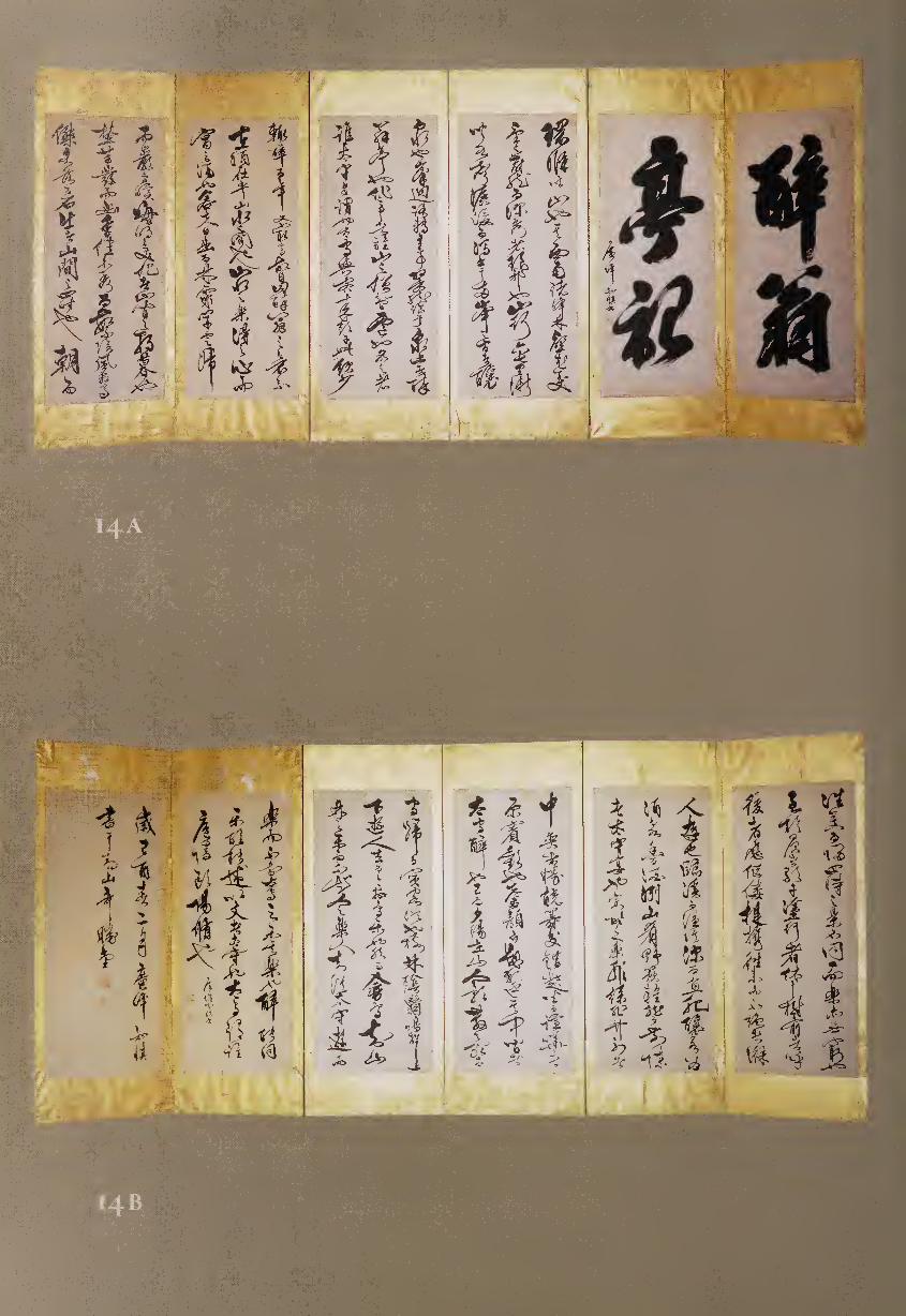
record”—in four large characters. The following nine panels complete the
essay text, while the final panel is an extended signature, including the date,
the second month of 1705. What is most notable about Kotaku’s style is its
bold confidence. The long Chinese essay is written with great freedom, and
no signs of hesitation interrupt the rhythm of the flowing cursive script.
There is generous spacing between the columns, but little vertically, so the
characters, squeezed together in rows of thirteen to seventeen per column,
seem to burst from their confinement, especially when broad horizontals
occasionally punctuate the work.
The first four large characters are especially thick, rough, and fuzzing-
wet, although there is occasional “flying white” where the brush moved
more quickly. These massive characters are saved from seeming overly heavy
or stolid by the angles that they present, primarily upward to the right, anci
by the final strokes of the upper words, a vertical and a hook down to the
left, which help to lead the eye to the graphs below them.
In the main text of the essay, Kotaku shows the potential of cursive script
for powerful expression. The forms are full of tensile energy, like springs ready
to uncoil and fly into the air. Certain pictographic words repeat through
the text, but Kotaku has written them slightly differently each time, tend¬
ing toward further simplification and cursiveness. For example, “mountain”
(liI, originally picturing a central peak and two lower peaks) occurs in panel
three, column one, character four, and again in 3/2/12, 4/2/8, 5/2/5, 5/2/9,
6/3/8, 8/2/6, 9/3/10, and 10/2/end. This graph, structurally horizontal, adds
to the rhythm of the totality while continuing its sense of movement. The
character for “pleasure” (^, which also can mean “music” and was formed
as a picture of an instrument with a wooden base) also recurs, especially
toward the end of the essay. It can be seen, gradually deconstructing in form
from 4/1/14 to 5/2/12, 7/1/12, 8/3/19,10/3/9, ii/i/i, and finally ii/i/io.
Kotaku mastered not only the structural paradigms of T’ang-dynasty
calligraphy but also the more individualistic trends of Ming-dynasty brush-
work. These screens demonstrate both his expertise and his artistic person¬
ality, but was he also influenced by the words he was writing? Like the poem
“Eight Immortals of the Wine Cup,” this essay praises inebriation, and we
may speculate whether the topic influenced Kotaku’s choice of script and
style. The continuous and vigorous flow of the cursive brushwork brings
forth the lively spirit of the famous Chinese essay, while the compositional
strength of the calligraphy supports the inner structure and meanings of
the text in which the deeper shared joys of friendship underlie the more im¬
mediate pleasures of alcohol. Just as Ou-yang Hsiu shared his pavilion with
his fellow poets, Kotaku shares his calligraphy, both through woodblock
books and here in the large-scale format of screens, with all those who can
appreciate his dance of line, shape, gesture, and space.
NOTES
1. Kotaku made the arrangements for Sorai’s entry into the Yanagisawa household, as well as
for his first marriage.
2. From Ronald D. Egan, The Literary Works of Ou-yang Hsiu (1007-1072) (Cambridge, U. K.:
Cambridge University Press, 1984), pp. 215-217.
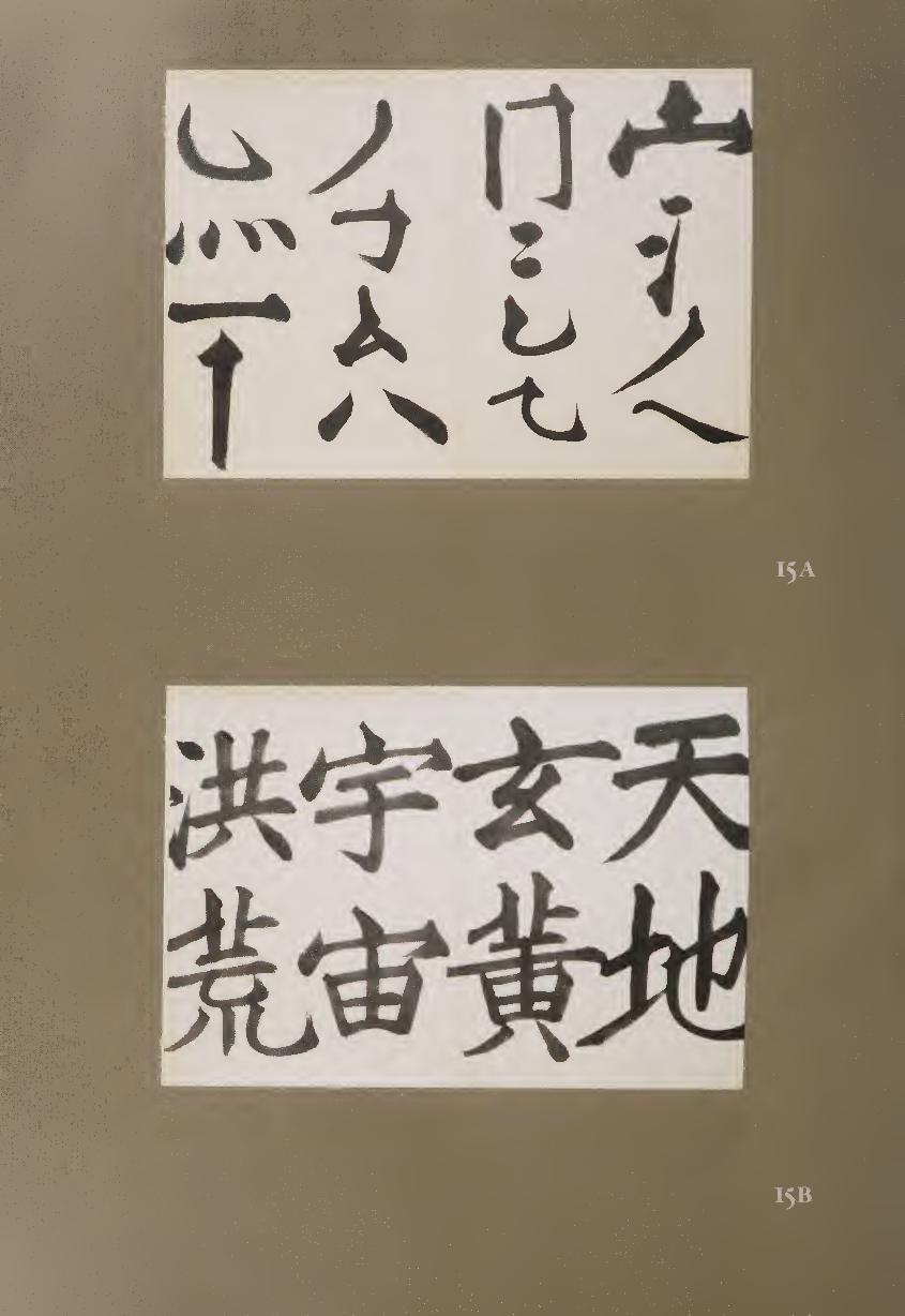
mm
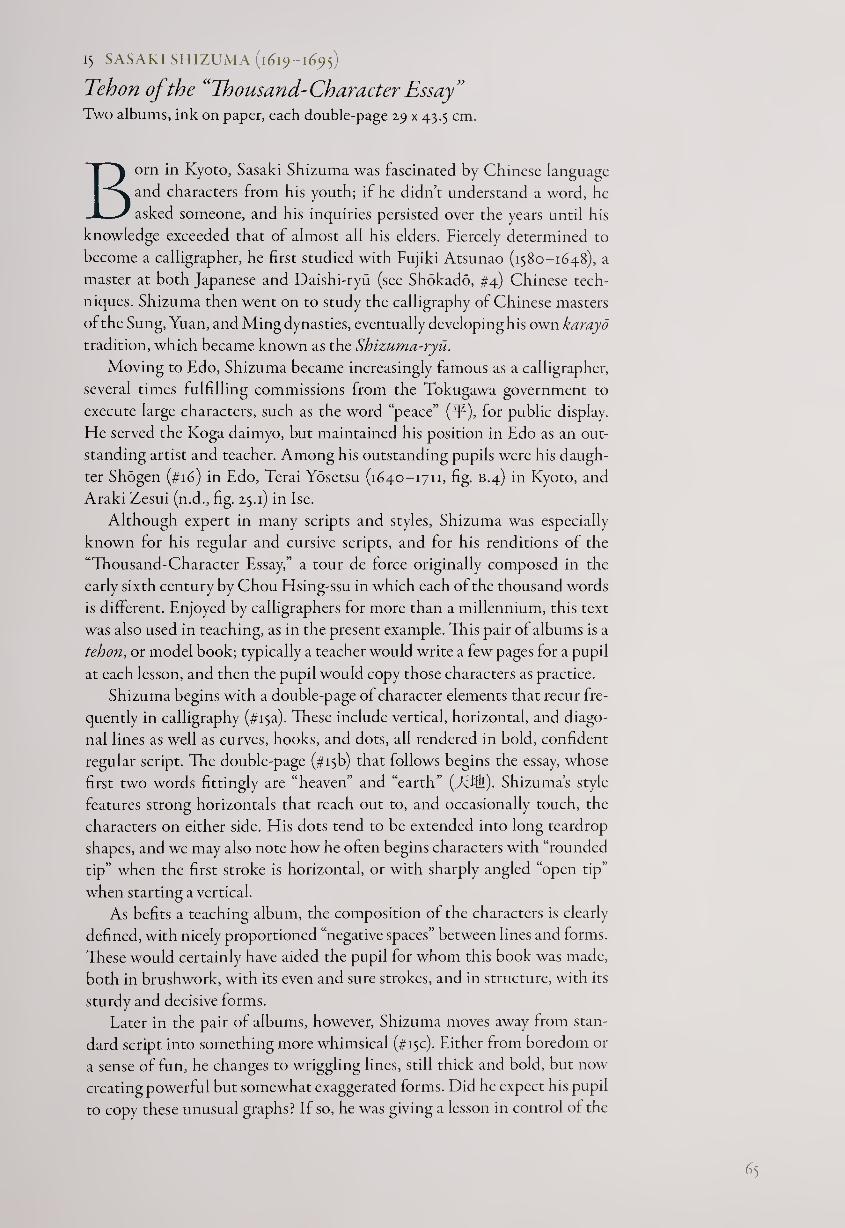
15 SASAKI SHIZUMA (1619-1695)
Teh on of the “Thousand-Character Essay” Two albums, ink on paper, each double-page 29 x 43.5 cm.
Born in Kyoto, Sasaki Shizuma was fascinated by Chinese language
and characters from his youth; if he didn’t understand a word, he
asked someone, and his inquiries persisted over the years until his
knowledge exceeded that of almost all his elders. Fiercely determined to
become a calligrapher, he first studied with Fujiki Atsunao (1580-1648), a
master at both Japanese and Daishi-ryu (see Shokado, #4) Chinese tech¬
niques. Shizuma then went on to study the calligraphy of Chinese masters
of the Sung, Yuan, and Ming dynasties, eventually developing his own karayo
tradition, which became known as the Shizuma-ryu.
Moving to Edo, Shizuma became increasingly famous as a calligrapher,
several times fulfilling commissions from the Tokugawa government to
execute large characters, such as the word “peace” (^E), for public display.
He served the Koga daimyo, but maintained his position in Edo as an out¬
standing artist and teacher. Among his outstanding pupils were his daugh¬
ter Shogen (#16) in Edo, Terai Yosetsu (1640-1711, fig. B.4) in Kyoto, and
Araki Zesui (n.d., fig. 25.1) in Ise.
Although expert in many scripts and styles, Shizuma was especially
known for his regular and cursive scripts, and for his renditions of the
“Thousand-Character Essay,” a tour de force originally composed in the
early sixth century by Chou Hsing-ssu in which each of the thousand words
is different. Enjoyed by calligraphers for more than a millennium, this text
was also used in teaching, as in the present example. This pair of albums is a
tehon, or model book; typically a teacher would write a few pages for a pupil
at each lesson, and then the pupil would copy those characters as practice.
Shizuma begins with a double-page of character elements that recur fre¬
quently in calligraphy (#isa). These include vertical, horizontal, and diago¬
nal lines as well as curves, hooks, and dots, all rendered in bold, confident
regular script. The double-page (#isb) that follows begins the essay, whose
first two words fittingly are “heaven” and “earth” (TTill). Shizuma’s style
features strong horizontals that reach out to, and occasionally touch, the
characters on either side. His dots tend to be extended into long tearcirop
shapes, and we may also note how he often begins characters with “rounded
tip” when the first stroke is horizontal, or with sharply angled “open tip”
when starting a vertical.
As befits a teaching album, the composition of the characters is clearly
defined, with nicely proportioned “negative spaces” between lines and forms.
These would certainly have aided the pupil for whom this book was made,
both in brushwork, with its even and sure strokes, and in structure, with its
sturdy and decisive forms.
Later in the pair of albums, however, Shizuma moves away from stan¬
dard script into something more whimsical (#isc). Either from boredom or
a sense of fun, he changes to wriggling lines, still thick and bold, but now
creating powerful but somewhat exaggerated forms. Did he expect his pupil
to copy these unusual graphs? If so, he was giving a lesson in control of the
65
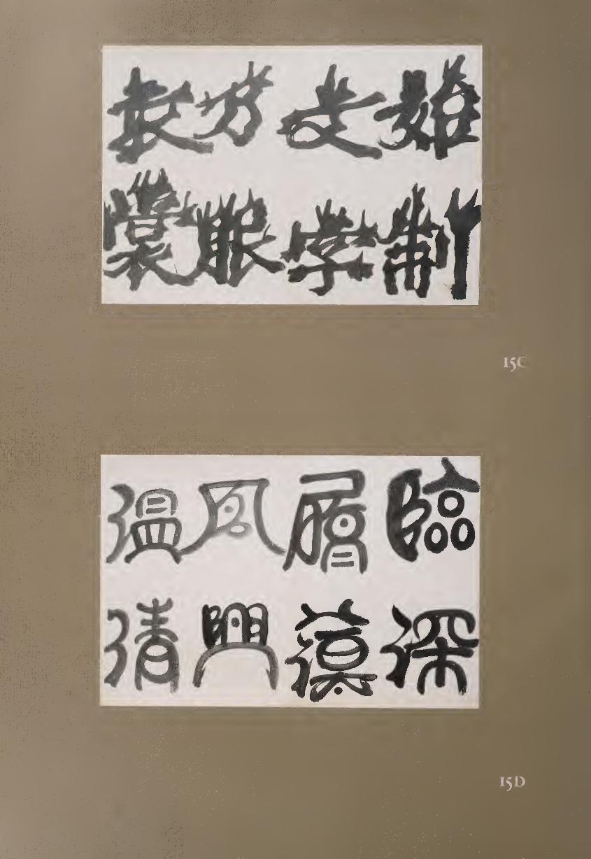

brush, since despite their odd appearance, the characters are well formed in
the Daishi-ryu of elaborated brush strokes.
Still further in the albums, Shizuma temporarily moves to seal script
(#isd). Here the strokes are generally rounded and formally balanced.
Nevertheless, there is a relaxation to some of the brush strokes that suggests
Shizuma was enjoying this foray into an ancient script rather than being
merely pedagogical. In all the scripts, his own rather chubby personal style
emerges, showing a continuity that goes beyond either text or script. It is
apparent that even when providing a model book for one of his followers,
Shizuma was too creative to stay within the bounds of most tehon. Instead,
he moved into a free and playful world of line, form, and space—a dance
with the brush designed to inspire his student toward art as well as to skill.
16 SASAKI SHOGEN (N.D.)
Tu Fu Quatrain Hanging scroll, ink on paper, 130.6 x 57 cm.
Since it has long been believed in East Asia that artists reveal their inner
nature in brushwork, some people have thought that gender differences
must also appear. Calligraphy by women has often been expected to be
delicate, graceful, and modest, virtues that manyjapanese males attribute to
females. Furthermore, since the Heian period, learning Chinese was con¬
sidered a male prerogative, and traditionally there was considered a difference
between “men’s hand” and “women’s hand.” One of the (doubtless unin¬
tended) results was to have women lead the way in vernacular literature,
including the world’s first novel, The Tale of Genji.
These expectations in calligraphy have often acted as a self-fulfilling
prophecy, and many women have explored the multiple facets of Japanese
kana scripts in smaller formats, often with great skill and creativity (see,
for example, #7, #8, #9, and #iz). But there are many exceptions, notably
including Sasaki Shogen, who in this large Chinese-style work confounds
any possible prejudice regarding the ability of women to equal the dramatic
power of male calligraphers.
Little is known about Shogen, not even her birth and death dates. She
was the daughter and pupil of Sasaki Shizuma (1619-1695), from whose
tehon (model book, #15) she may well have learned, and she also followed
the broad and confident style of Yen Chen-ch’ing (709-785). None of
Shizuma’s or Yen’s published works seems to be as rough, bold, and dynamic
as this scroll, however, so we can imagine that Shogen’s personal character
was very forceful. She married a retainer of the Takakura family, but her
husband died young, after which she became a nun. She thereupon taught
calligraphy—her pupils included an imperial princess—and several wood¬
block books were published with her calligraphy, probably to be used as
models by her pupils.1
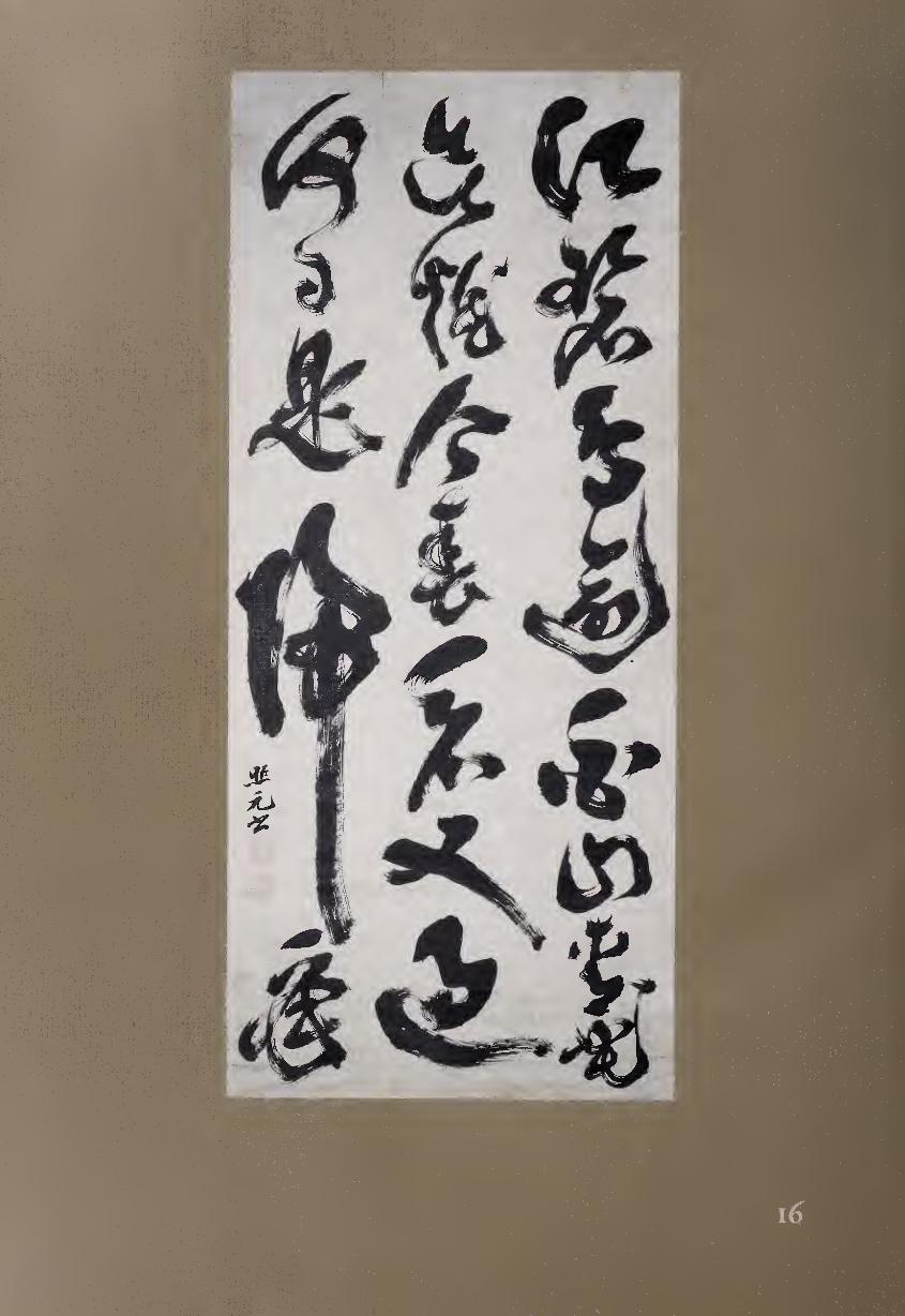
This dramatic work presents a quatrain of five-word lines by the great
T’ang-dynasty poet Tu Fu (712-770). It was re-created as calligraphy by
Shogen, almost a millennium later, in columns of 8-7-5.
Over the blue river, birds exceedingly white;
On the green mountains, flowers about to blaze.
This spring we view is also passing by,
When will the time come for me to return?
Chinese literati usually served the government, and they were often
posted to remote locales. The wish to return to the capital or to one’s home,
a frequent theme in poetry, is expressed here by Tu Fu with a melancholy
sense of the transience of nature’s beauty and the passing of time. The most
important word is the penultimate “return” ('!§), and Shogen has written it
so large as to take the place of three characters; it also leaves room for, and
seems to protect, her signature and closing seals.
Regarding the debate as to how much the text influences a calligrapher,
Westerners might assume that the style itself, as well as the emphasis upon
certain characters, would follow the meaning of the words being written. In
many cases this correspondence cannot be easily detected, as though the
text and the calligraphy are separate forms of art that do not directly reflect
each other. Here, however, the large scale of “return” makes it clear that
Shogen was emphasizing the emotional heart of the poem, and the long
vertical stroke that ends the character might be seen as a pathway, a drawn-
out sigh, or both.
Although writing characters in differing sizes is one of the features of
much cursive script, Shogen confounds other expectations. For example,
this script is usually written in more fluid strokes in thinner lines, and the
movement tends to flow down the paper smoothly and rapidly. One may
see some trace of this flow in the first two kanji of the left column, “what
day” (ME1), which are written with a single stroke and gesture. In general,
however, Shogen’s calligraphy seems to stop and start rhythmically with
very forceful and often blunt strokes of the brush.
One may also see traces of the Daishi-ryu style in the elaboration of
some strokes, such as the fourth character of the first line, “exceed” (M),
which ends with the brush twisting upward. That Shogen’s teacher Shizuma
had been a pupil of Fujiki Atsunao (1580-1648), the founder of the Daishi-
ryu, attests to the fact that Shogen had roots in the past; but these did not
prevent her, against cultural expectations, from forming her own dramatic
style of cursive script.
NOTE
1. For an example of Shogen’s writing in four Chinese scripts and in Japanese kana, see Patricia
Fister, Japanese Women Artists, 1600-igoo (Lawrence, Kans.: Spencer Museum of Art, 1988), pp.
44-45-
69
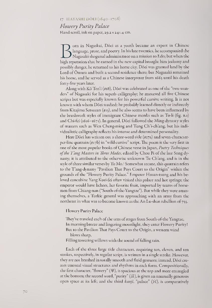
17 HAYASHI DOEI (1640-1708)
Flowery Purity Palace Hand scroll, ink on paper, 29.2 x 241.4 cm.
Born in Nagaskai, Doei as a youth became an expert in Chinese
language, prose, and poetry. In his late twenties, he accompanied the
Nagasaki shogunal administrator on a mission to Edo; but when the
high reputation that he earned in the new capital brought him jealousy and
possibly danger, he returned to his home city. Doei was granted land by the
Lord of Omura and built a second residence there; but Nagasaki remained
his home, and he served as a Chinese interpreter from 1663 until his death
forty-five years later.
Along with Ko Ten’i (#18), Doei was celebrated as one of the “two won¬
ders” of Nagasaki for his superb calligraphy; he mastered all five Chinese
scripts but was especially known for his powerful cursive writing. It is not
known with whom Doei studied; he probably learned directly or indirectly
from Kitajima Setsuzan (#13), and he also seems to have been influenced by
the brushwork styles of immigrant Chinese monks such as Tu-li (fig. B.i)
and Chi-fei (1616-1671). In general, Doei followed the Ming-dynasty styles
of masters such as Wen Cheng-ming and Tung Ch’i-ch’ang, but his indi¬
vidualistic calligraphy reflects his intense and determined personality.
Here Doei has written out a three-word title (#i7a) and seven-character-
per-line quatrain (#i7b) in “wild cursive” script. The poem is the very first in
one of the most popular books of Chinese verse in Japan, Poetry Techniques
of the T’ang Masters in Three Modes, edited by Chou Pi of the late Sung dy¬
nasty; it is attributed to the otherwise unknown Tu Ch’ang, and is in the
style of three similar verses by Tu Mu.1 Somewhat arcane, this quatrain refers
to the T’ang-dynasty “Pavilion That Pays Court to the Origin” within the
grounds of the “Flowery Purity Palace.” Emperor Hsuan-tsung and his be¬
loved concubine Yang Kuei-fei often visited this palace and hot springs; the
emperor would have lichees, her favorite fruit, imported by teams of horse¬
men from Chiang-nan (“South-of-the-Yangtze”). But while they were amus¬
ing themselves, a Turkic general was approaching with an army from the
northeast in what was to become known as the An Lu-shan rebellion of 755.
Flowery Purity Palace
They’ve traveled each of the tens of stages from South-of-the Yangtze,
In morning breeze and lingering moonlight, they enter Flowery Purity!
But to the Pavilion That Pays Court to the Origin, a western wind
blows sharp,
Filling towering willows with the sound of falling rain.
Each of the three large title characters, requiring ten, eleven, and ten
strokes, respectively, in regular script, is written in a single stroke. However,
they are not brushed in totally smooth and fluid gestures; instead, Doei cre¬
ates unusual visual structures and rhythms in each form. Compositionally,
the first character, “flowery” (y$), is spacious at the top and more entangled
at the bottom; the second word, “purity” ('?#), is given an unusually generous
open space at its left; and the third kanji, “palace” (Hf), is comparatively
70
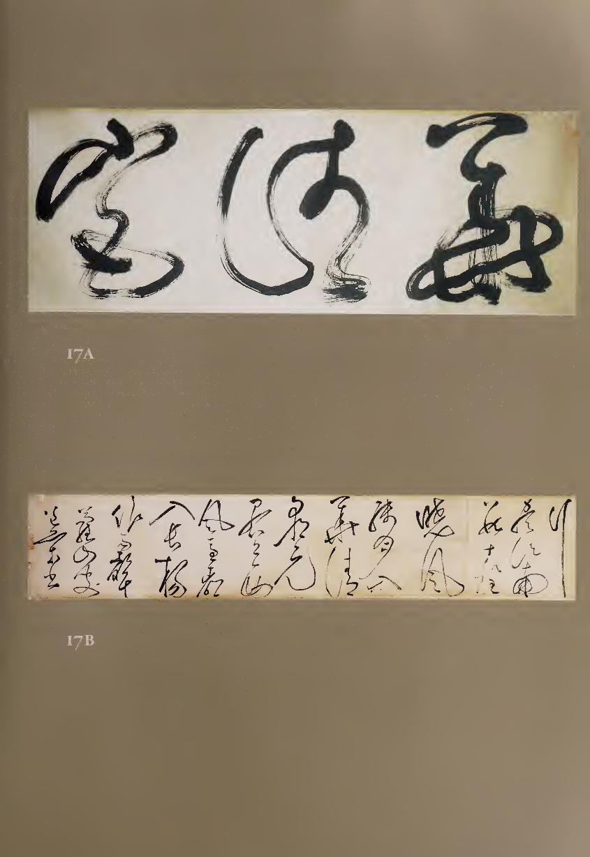
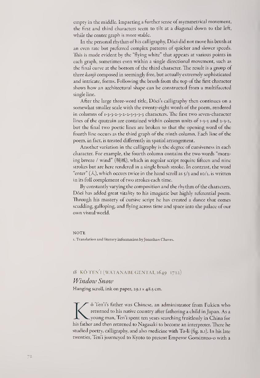
empty in the middle. Imparting a further sense of asymmetrical movement,
the first and third characters seem to tilt at a diagonal down to the left,
while the center graph is more stable.
In the personal rhythm of his calligraphy, Doei did not move his brush at
an even rate but preferred complex patterns of quicker and slower speeds.
This is made evident by the “flying white” that appears at various points in
each graph, sometimes even within a single directional movement, such as
the final curve at the bottom of the third character. The result is a group of
three kanji composed in seemingly free, but actually extremely sophisticated
and intricate, forms. Following the brush from the top of the first character
shows how an architectural shape can be constructed from a multifaceted
single line.
After the large three-word title, Doei’s calligraphy then continues on a
somewhat smaller scale with the twenty-eight words of the poem, rendered
in columns of 1-3-3-2-3-2-2-3-3-3-3 characters. The first two seven-character
lines of the quatrain are contained within column units of 1-3-3 and 2.'3'2->
but the final two poetic lines are broken so that the opening word of the
fourth line occurs as the third graph of the ninth column. Each line of the
poem, in fact, is treated differently in spatial arrangement.
Another variation in the calligraphy is the degree of cursiveness in each
character. For example, the fourth column contains the two words “morn¬
ing breeze / wind” (5S®), which in regular script require fifteen and nine
strokes but are here rendered in a single brush stroke. In contrast, the word
“enter” (A), which occurs twice in the hand scroll as 3/3 and 10/1, is written
in its full complement of two strokes each time.
By constantly varying the composition and the rhythm of the characters,
Doei has added great vitality to his imagistic but highly referential poem.
Through his mastery of cursive script he has created a dance that comes
scudding, galloping, and flying across time and space into the palace of our
own visual world.
NOTE
1. Translation and literary information by Jonathan Chaves.
18 KO TENI (WATANABE GENTAI, 1649-1721)
Window Snow Hanging scroll, ink on paper, 29.1 x 48.5 cm.
Ko Ten’i’s father was Chinese, an administrator from Fukien who
returned to his native country after fathering a child in Japan. As a
young man, Ten’i spent ten years searching fruitlessly in China for
his father and then returned to Nagasaki to become an interpreter. There he
studied poetry, calligraphy, and also medicine with Tu-li (fig. B.i). In his late
twenties, Ten’i journeyed to Kyoto to present Emperor Gomizuno-o with a
72
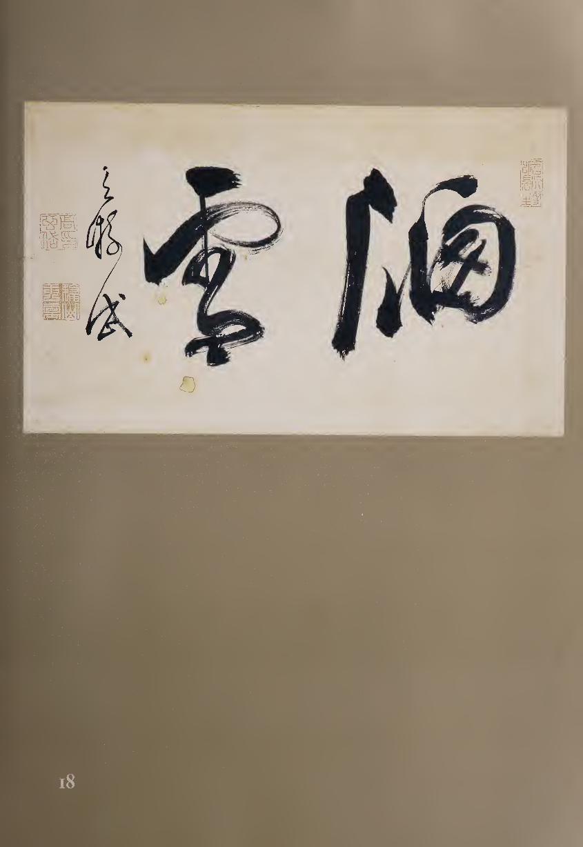
manuscript on health care. He then served the daimyo of Satsuma as a health
expert but retired in his thirties and moved back to Nagasaki, where he
became known for his calligraphy and was called one of the “two wonders of
Nagasaki,” along with Hayashi Doei (#17). In 1709, Ten’i was summoned to
Edo to serve the shogunate; he retired in 1721 and died the following year.
Although the calligraphy of Ten’i shows the influence of Tu-li, it also
exhibits a rough vitality all his own. He was especially known for his cursive
script, which exhibits some of the broad curving forms of Obaku style while
adding a greater sense of visual tension. Here the calligraphy Window Snow
demonstrates Ten’i’s personal touch with the brush, all the more apparent
because (apart from the signature) there are only two large characters to ex¬
amine. Appropriately, the scroll format itself represents a window of white
paper framed by the silk mounting, through which we can see the snow.
The two large kanji offer strong contrasts. Ko Ten’i’s variant of the graph
for “window” (Wi) on the right is constructed primarily of straight and rectan¬
gular lines and shapes, suggesting a man-made structure built by a carpenter,
while “snow” (If) on the left curves and flows like the forms of nature.
“Window” is so broadly constructed and powerfully brushed that the verti¬
cally oriented “snow” might seem too small in comparison were it not but¬
tressed by the signature “Ten’i” to its left.
The character for “snow” requires eleven strokes in standard script but is
here rendered in four: first a short dash, next a sweepingly curving horizon¬
tal, then a thin vertical that leads directly to a squished “3” shape, and finally
a triangular dot at the bottom. The sweeping horizontal displays a great deal
of “flying white,” certainly appropriate for the word “snow,” and suggesting
flakes blown by the wind.
Part of the bristling energy in this scroll comes from the use of “open
tip,” where the action of the brush is visible striking the paper and then
pulling oft at the end of the stroke. Even more dramatic is Ten’i’s willing¬
ness to create forms that are not simply fluent and graceful but that in
their seeming awkwardness add forceful impetus to his brushwork. Born
to a Chinese father and Japanese mother, Ten’i displays in his calligraphy
both his thorough training in Chinese traditions and his Japanese sense of
personal visual drama.
19 MITSUI SHINNA (1700-1782)
Eight Immortals of the Wine Cup (1770)
Hand scroll, ink on paper, 42.2 x 673.7 cm.
Born in Nagano, Mitsui Shinna became a leader in Edo of the karayo
style developed by his teacher Hosoi Kotaku (#14). Settling in
Fukagawa, he was known as “Fukagawa Shinna,” and his calligraphy
soon became extremely popular.1 Because he was frequently asked by temples
and shrines to create calligraphy for their plaques and festival banners, his
writing was visible all over Edo. An illustration from a woodblock book
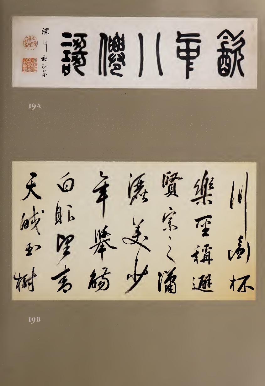
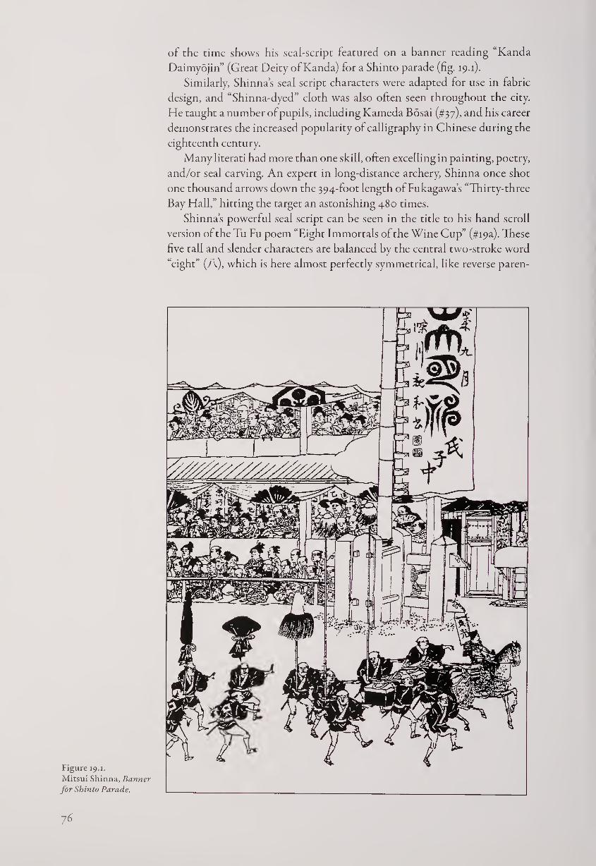
of the time shows his seal-script featured on a banner reading “Kanda
Daimyojin” (Great Deity of Kanda) for a Shinto parade (fig. 19.1).
Similarly, Shinna’s seal script characters were adapted for use in fabric
design, and “Shinna-dyed” cloth was also often seen throughout the city.
He taught a number of pupils, including Kameda Bosai (#37), and his career
demonstrates the increased popularity of calligraphy in Chinese during the
eighteenth century.
Many literati had more than one skill, often excelling in painting, poetry,
and/or seal carving. An expert in long-distance archery, Shinna once shot
one thousand arrows down the 394-foot length of Fukagawa’s “Thirty-three
Bay Hall,” hitting the target an astonishing 480 times.
Shinna’s powerful seal script can be seen in the title to his hand scroll
version of the Tu Fu poem “Eight Immortals of the Wine Cup” (#i9a). These
five tall and slender characters are balanced by the central two-stroke word
“eight” (A), which is here almost perfectly symmetrical, like reverse paren-
Figure 19.1.
Mitsui Shinna, Banner
for Shinto Parade.
76
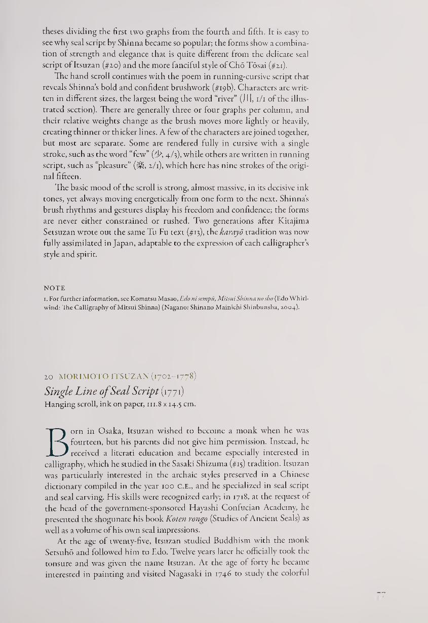
theses dividing the first two graphs from the fourth and fifth. It is easy to
see why seal script by Shinna became so popular; the forms show a combina¬
tion of strength and elegance that is quite different from the delicate seal
script of Itsuzan (#20) and the more fanciful style of Cho Tosai (#21).
The hand scroll continues with the poem in running-cursive script that
reveals Shinna’s bold and confident brushwork (#i9b). Characters are writ¬
ten in different sizes, the largest being the word “river” (j I [, 1/1 of the illus¬
trated section). There are generally three or four graphs per column, and
their relative weights change as the brush moves more lightly or heavily,
creating thinner or thicker lines. A few of the characters are joined together,
but most are separate. Some are rendered fully in cursive with a single
stroke, such as the word “few” (T\ 4/3), while others are written in running
script, such as “pleasure” (^, 2/1), which here has nine strokes of the origi¬
nal fifteen.
The basic mood of the scroll is strong, almost massive, in its decisive ink
tones, yet always moving energetically from one form to the next. Shinna's
brush rhythms and gestures display his freedom and confidence; the forms
are never either constrained or rushed. Two generations after Kitajima
Setsuzan wrote out the same Tu Fu text (#13), the karayo tradition was now
fully assimilated in Japan, adaptable to the expression of each calligrapher’s
style and spirit.
NOTE
1. For further information, see Komatsu Masao, Edo ni sempu, Mitsui Shinna nosho (Edo Whirl¬
wind: The Calligraphy of Mitsui Shinna) (Nagano: Shinano Mainichi Shinbunsha, 2004).
20 MORIMOTO ITSUZAN (1702-1778)
Single Line of Seal Script (1771) Hanging scroll, ink on paper, in.8 x 14.5 cm.
Born in Osaka, Itsuzan wished to become a monk when he was
fourteen, but his parents did not give him permission. Instead, he
received a literati education and became especially interested in
calligraphy, which he studied in the Sasaki Shizuma (#13) tradition. Itsuzan
was particularly interested in the archaic styles preserved in a Chinese
dictionary compiled in the year 100 C.E., and he specialized in seal script
and seal carving. His skills were recognized early; in 1718, at the request of
the head of the government-sponsored Hayashi Confucian Academy, he
presented the shogunate his book Koten rongo (Studies of Ancient Seals) as
well as a volume of his own seal impressions.
At the age of twenty-five, Itsuzan studied Buddhism with the monk
Setsuho and followed him to Edo. Twelve years later he officially took the
tonsure and was given the name Itsuzan. At the age of forty he became
interested in painting and visited Nagasaki in 1746 to study the colorful
bird-and-flower style ofSh’en Nan-p’in (Shen Ch’uan, 17x5-1780).1 Itsuzan
thereupon settled in Kyoto at the temple Seigan-ji, where he responded to
myriad requests for his painting, calligraphy, and seal carving.
Itsuzan seems to have moved to Ise at one point, but he died in Kyoto and
is buried at Horin-ji. In addition to Koten rongo, he wrote Senjibon idokai
(New Variations on the Thousand-Character Classic) and a number of seal
books. Among his art names are Mokuin (“silent and retired”), Josoku
Dojin (“always sufficient man of the way”), Ro-o (“rare old man”), Genchu
(“amid the wondrous”), and Kocho-an (“hermitage of ancient melodies”).
This single column of eight characters has a Confucian moral:
Implement benevolent and righteous actions;
Expand them afar, so the standard is corrected.
—seventy-year-old Ro-o Josoku Dojin
The second phrase refers to Mencius, Book 7B: “The gentleman strives
only to reinstate the standard. When the standard is corrected, the common
folk are stimulated [to virtue].”1
Itsuzan’s seal script is extremely refined and elegant. Its beauty comes
from the character shapes, almost twice as tall as they are wide, and the even,
slender lines, created with “hidden tip” so that the beginnings and ends of
strokes are gently rounded. Still more important to the total effect may be
the generous and consistent negative spaces within the graphs, typically
almost double the width of the lines surrounding them.
The calligraphy opens with a symmetrical graph literally meaning “to
go” (Tf) and continues with formally balanced seal script that has just a hint
of extra movement, as in the slightly bending vertical and leaning lower
horizontals of the fourth word, “thing” (Ijf). Itsuzan also allows a subtle
flavor of “flying white” at times, letting the brush lines breathe, but the
overwhelming impression is of controlled and graceful sophistication.
During Japan’s early modern period, seal script was mastered by a num¬
ber of different calligraphers, each with a different touch. The broad dyna¬
mism of Nakae Toju (#28), the architectonic power of Mitsui Shinna (#19),
and the more gestural brushwork of Cho Tosai (#21) all express different
cultural and artistic sensibilities. Of them all, however, the seal script of It¬
suzan has the greatest sense of unworldly refinement, attesting to his per¬
sonal combination of antiquarian literati interests and Buddhist vocation.
NOTES
1. See Stephen Addiss, edJapanese Quest for a New Vision (Lawrence, Kans.: Spencer Museum
of Art, 1986), pp. 45-50, for a discussion of Sh’en Nan-p’in’s influence in Japan.
2. Translation and literary information by Jonathan Chaves.
78
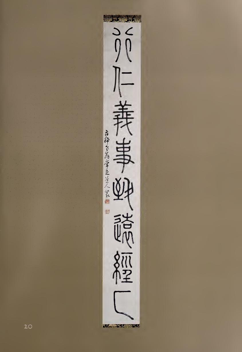
21 CHO TOSAI (1713-1786)
Seal-Script Triptych
Set of three hanging scrolls, ink on paper, each 115.2 x 47.7 cm.
Seal script is the most formal of calligraphic dances, and here Cho
Tosai has created gestural expressions of the brush with the poise and
balance of an eighteenth-century minuet. Tosai was born in Nagasaki,
and his interest in Chinese culture was prompted by the fact that he was
the son of a Chinese merchant father, Chao (Jpn.,: Cho), and a Japanese
mother. Japan was now closed to all foreigners except for Chinese merchants
and a few Dutch traders in Nagasaki, the only international city in Japan.
It was here that Chinese Zen monks came at the fall of the Ming dynasty,
founding the Obaku sect, which soon spread through much of Japan.
As a boy, Tosai was adopted as a Buddhist novice by the immigrant monk
Chu-an (Jpn.,: Jikuan, 1699-1756) at Kofuku-ji in Nagasaki; and when his
teacher was made the thirteenth patriarch and abbot of Mampuku-ji in 1727,
Tosai accompanied him there. The Obaku monks were considered to be bas¬
tions of Chinese culture at this time, bringing with them Ming-dynasty
styles and values, and the young Tosai undoubtedly gained much from his
close connections with the immigrant monks. After Chu-an retired in 1739,
Tosai returned to secular life as a literatus. He traveled throughout Japan,
eventually settling in Edo for more than a decade, then living in Osaka and
Sakai, and finally traveling again. The interest of the Japanese in Chinese
medicine allowed Tosai to make a living selling stomach nostrums while
continuing to pursue his literary interests. Known for his landscape painting
and seal carving, he was also celebrated for his love of wine, a trait that he
shared with many poets before him. His calligraphy was especially admired,
and his influence spread to many pupils and followers throughout Japan.
These three seal-script scrolls contain five-character phrases emphasiz¬
ing the interconnections between man and nature; and while the English
language can’t be quite as succinct as Chinese, the characters literally read,
from the top right:
RIVER WINDS SEEK MY CHANTING
The MOUNTAIN MOON INVITES ME to a FEAST
HEAVEN and EARTH BECOME my QUILT and PILLOW
In this seal script, the beauty comes from the even width of the lines,
which allows for balanced spacing, and especially the small and subtle varia¬
tions in the negative spaces within the characters. For example, on the left
side of the fifth character in the central scroll, every element is in complete
equilibrium with all the others. Throughout this set of three scrolls, the
characters are somewhat extended vertically, but the lines and spaces are
nonetheless fleshed out to the sides as well as from top to bottom.
This particular manner of writing seal script, with tall and elegant char¬
acter formation, harkens back to the mid-eighth-century Chinese master Li
Yang-ping, whose style lasted a thousand years and still offered the creative
potential that is realized here by Tosai. His own contribution to this tradi¬
tion comes in part from the use of “flying white” where the paper shows
80
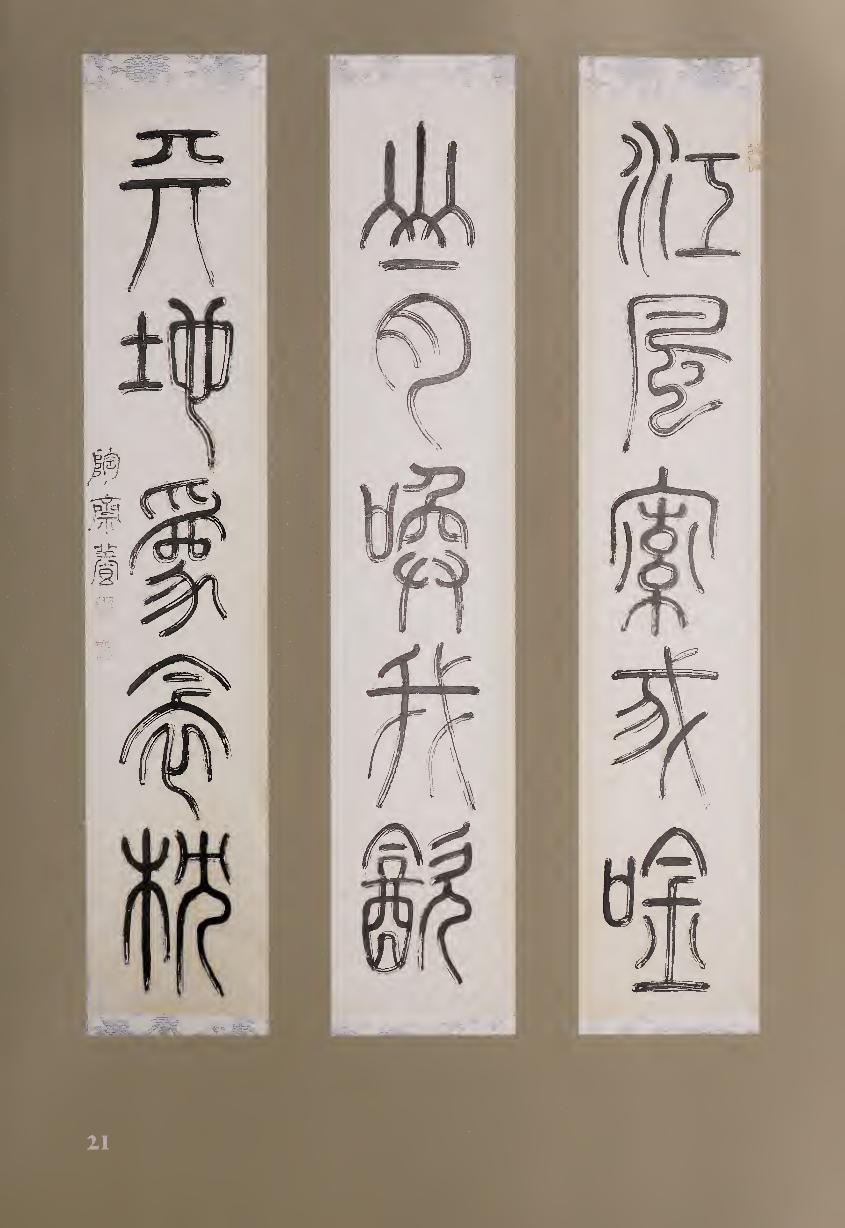
21
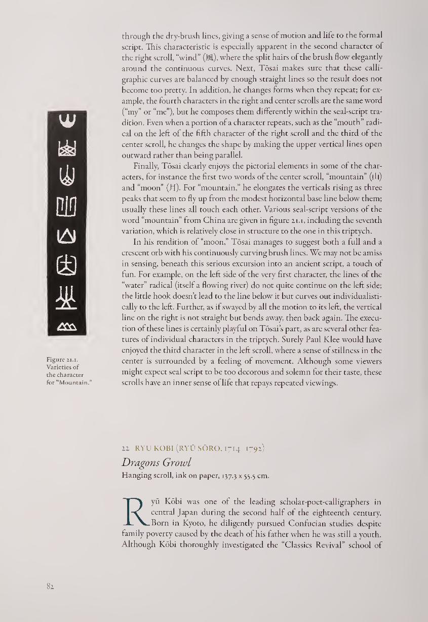
Figure 21.i.
Varieties of
the character
for “Mountain.”
through the dry-brush lines, giving a sense ot motion and life to the formal
script. This characteristic is especially apparent in the second character of
the right scroll, “wind” (Ml), where the split hairs of the brush flow elegantly
around the continuous curves. Next, Tosai makes sure that these calli¬
graphic curves are balanced by enough straight lines so the result does not
become too pretty. In addition, he changes forms when they repeat; for ex¬
ample, the fourth characters in the right and center scrolls are the same word
(“my” or “me”), but he composes them differently within the seal-script tra¬
dition. Even when a portion of a character repeats, such as the “mouth” radi¬
cal on the left of the fifth character of the right scroll and the third of the
center scroll, he changes the shape by making the upper vertical lines open
outward rather than being parallel.
Finally, Tosai clearly enjoys the pictorial elements in some of the char¬
acters, for instance the first two words of the center scroll, “mountain” (flj)
and “moon” (El). For “mountain,” he elongates the verticals rising as three
peaks that seem to fly up from the modest horizontal base line below them;
usually these lines all touch each other. Various seal-script versions of the
word “mountain” from China are given in figure zi.i, including the seventh
variation, which is relatively close in structure to the one in this triptych.
In his rendition of “moon,” Tosai manages to suggest both a full and a
crescent orb with his continuously curving brush lines. We may not be amiss
in sensing, beneath this serious excursion into an ancient script, a touch of
fun. For example, on the left side of the very first character, the lines of the
“water” radical (itself a flowing river) do not quite continue on the left side;
the little hook doesn’t lead to the line below it but curves out individualisti-
cally to the left. Further, as if swayed by all the motion to its left, the vertical
line on the right is not straight but bends away, then back again. The execu¬
tion of these lines is certainly playful on Tosai’s part, as are several other fea¬
tures of individual characters in the triptych. Surely Paul Klee would have
enjoyed the third character in the left scroll, where a sense of stillness in the
center is surrounded by a feeling of movement. Although some viewers
might expect seal script to be too decorous and solemn for their taste, these
scrolls have an inner sense of life that repays repeated viewings.
22 RYU KOBI (RYU SORO, 1714-1792)
Dragons Growl Hanging scroll, ink on paper, 137.3 x 35.5 cm.
Ryu Kobi was one of the leading scholar-poet-calligraphers in
central Japan during the second half of the eighteenth century.
Born in Kyoto, he diligently pursued Confucian studies despite
family poverty caused by the death of his father when he was still a youth.
Although Kobi thoroughly investigated the “Classics Revival” school of
82
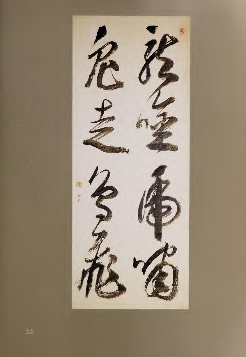
Ogyu Sorai (#32), he also studied the more standard Chu Hsi form of neo-
Confucianism with Uno Meika (#34)- When his training was complete,
Kobi served the daimyo of Hikone as a scholar. He then spent the rest of his
life in Kyoto, where he lived near the Kamo River and associated with many
literati, including painters whose works he occasionally inscribed. Kobi also
showed a pictorial sense of humor by stamping a seal with the image of a
dragon (ryu) on many of his works, including this one.
Kobi was a master of several scripts, imbuing each with a special flavor of
his own, as this work reveals.
Dragons Growl
Tigers Roar
Fish Dash
Birds Soar
The eight characters, written here in bold cursive script, are full of the
animistic energy of the creatures described, as a study of each character
reveals. “Dragons” (tl) is appropriately sinuous, the brush constantly chang¬
ing force and direction as it moves. However, the calligraphy is not merely
serpentine; there is plenty of structural “bone” in this character as the brush
pauses, moves abruptly, and adds weight to the lines, particularly near the
end of the word. Next, “growl” (^) begins with a small, square “mouth”
radical (fj) on the left, here written as two connected dots, and then ends
with the same kind of forceful zigzags that ended the previous word, con¬
necting the two visually.
The next pair of characters is both similar and somewhat contrasting.
The word “tigers” (fig) curls around and in upon itself, bolstered by the final
strong vertical line that firmly centers the form. The “roar” (HU) below it
at first seems much more compositionally dispersed. The "mouth" radical
now leads forcefully to the right side of the word, which again has a verti¬
cal stroke, here somewhat less emphasized, and a form that ends by curling
inward in an evocative variation upon the previous brushwork.
The second column begins with the word for “fish” (ffi), which is ac¬
tually written cursively but looks more like regular script since the lines
are distinctly set off from each other. This composition creates a clearly
defined shape that features nicely balanced negative spaces. “Dash” (7k), in contrast, is built up of four primarily horizontal lines that get thicker
and stronger as the character progresses toward the bottom. Here the
zigzag lines, unlike those to the right in “growl,” strongly emphasize the
horizontals as the brush more lightly moves back toward these left-to-right
gestures.
As befits its subject, the character for “birds” (J§) is written more gently
and in slightly smaller size than any other word in the scroll; the brush never
leaves the paper as the form is completed in a series of curved movements.
Unlike “tigers” to its right, this character never settles or centers, but glides
and swoops over the paper surface. “Soars” (ffl) is quite different; its form is
architectonic, and Kobi uses dry-brush “flying white” boldly here, suggest¬
ing birds flying through the air.
This scroll tells us something new about the script it uses. Cursive writ¬
ing can often be delicate and light, but here it is thick, strong, heavy, and
84
blunt. The first two and final two characters lead into one another but do
so without the sense of airy fluidity of most calligraphy in this script. Each
of the three major dots in the scroll is dramatic, and each is different from
the others. The first, which begins “dragons,” seems to fly across the paper;
the second, at the top of “tigers,” sits poised on top of the strong vertical; the
third, beginning “fish,” cuts decisively down to the beginning of the next
stroke. Even more significant, the ink within the brush strokes is uneven,
spotted with tiny circles and pustules of darker black.1 Whether this effect
was caused by ink that was not freshly ground or by uneven sizing of the
paper (or both) is not known, but the effect is nervous and vibrant rather
than continuous and fluent. In this calligraphy, Kobi has totally eschewed
the more usual graceful, charming, and rapid freedom of spirit that can be
seen in other cursive-script works (such as #6, #23, and #36). Instead, he has
created a scroll that growls, roars, dashes, and soars directly and powerfully
into the viewer’s consciousness.
NOTE
1. Other examples of this kind of spotted ink include a scroll of bamboo by Tang Yin from
the John Crawford Collection, now at the Metropolitan Museum of Art in New York City,
and the famous Mu single-character calligraphy by Hakuin Ekaku, held in a private collec¬
tion in Japan.
23 SAWADA TOKO (1731-1796)
On the River bank (1781) Hand scroll, ink on paper, 36.8 x 268 cm.
Herbert F. Johnson Museum, Cornell University, N.Y.
Born in Edo to a family of many generations of merchants, Toko
showed great talent for scholarship in his youth and was sent to
the academy of Hayashi Hoko for Confucian studies. He also took
lessons in calligraphy from Ko Shinsai, whose style he followed initially
in his work. However, Toko’s great interest in Chinese calligraphy led his
stylistic interests backward through time: he studied the works of the Ming-
dynasty literatus Wen Cheng-ming, then the more orthodox models of the
T’ang masters, and finally the surviving traces of the “two Wangs,” Wang
Hsi-chih (307-365) and his son Wang Hsien-chih (344-386).
Over time, Toko was able to develop a fluent and well-balanced style of
calligraphy that influenced many Japanese literati of his own and later eras.
Toko was also known for his literary excellence, and among the books he
published were not only several treatises on calligraphy but also a volume
of his own Chinese-style poems. Here he has written a twenty-line verse of
five words per line in a hand scroll format; the tone is elegiac, with several
specific allusions to major Chinese poets of the past.
85
I’ve built my hut by the river,1
The voice of the stream floats by day and night.
Hunched over, I grieve over those who have passed away,
Why are the days and months so boundless?
Wearing a simple robe, I wander where I like,
Drinking heavily, I can forget my sorrows briefly.
Quietly chanting, I aspire beyond the sky,
Singing long, I yearn for a good friend.
As I go out at dawn, the shallows are lit by the sun,
Strolling in the evening, I become accustomed to the gulls.2
Katsura trees are increasingly gloomy over the paths,
Orchids and indigo plants send fragrance over the sandbars.
Looking up, I yearn for the ancient sages,
Flapping my clothes, I imagine floating through the air—
But I have wasted my life, and the land of the immortals
Is far too distant for me to search.
Fluttering, a multitude of birds fly past,
Broadly, shoals of fishes swim by.
In my rambling there is the feeling of truth,3
And I return to meditate on the riverbank.
The twenty lines of the poem are written in twenty-five columns of three
to five characters each, followed by the signature and date.4 Toko’s study of
the two Wangs is apparent in the fluency of his brushwork; but instead of
purely graceful writing, there is also some tension and release, testifying to
his mastery of later Chinese styles.
The calligraphy is composed almost entirely in cursive script, but there
are occasional characters in running script, such as “sun/day” (IT, 3/1); in
contrast, a fully cursive rendition of this character begins column five. Toko
achieves a personal sense of rhythm not only by the number of characters he
writes in each column, which contrasts with the five-word poetic lines, but
also by the varying size of the different graphs. One of the largest, the word
“voice” (m), fills the entire lower half of the second column.
Even more significant for the total rhythm is Toko’s use of continuous,
as opposed to interrupted, brush strokes. For example, the first three char¬
acters in the first column are written in four strokes, but these strokes do
not always begin and end exactly with the characters. The first stroke forms
the left side of the first word and then moves to the right; the second stroke
finishes this form and continues to the dot that begins the second word;
the third stroke begins with a strong horizontal and ends midway through
this character; and the fourth finishes this graph but does not end until the
following word is complete.
This sense of variety continues throughout the scroll. For example, the
pictograph “moon” (LI), the second word in the fifth column, is written in
three (almost four) strokes, while the following word, “why?” (fnj), is com¬
posed of a single stroke that continues on to complete the next word. In
this way Toko gives his long hand scroll a continuously flowing and chang¬
ing sense of rhythm, much like the river that he describes in his poem. In
86
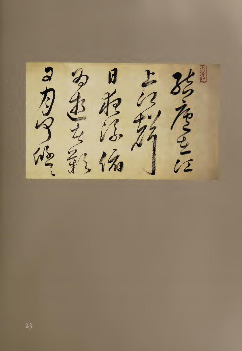
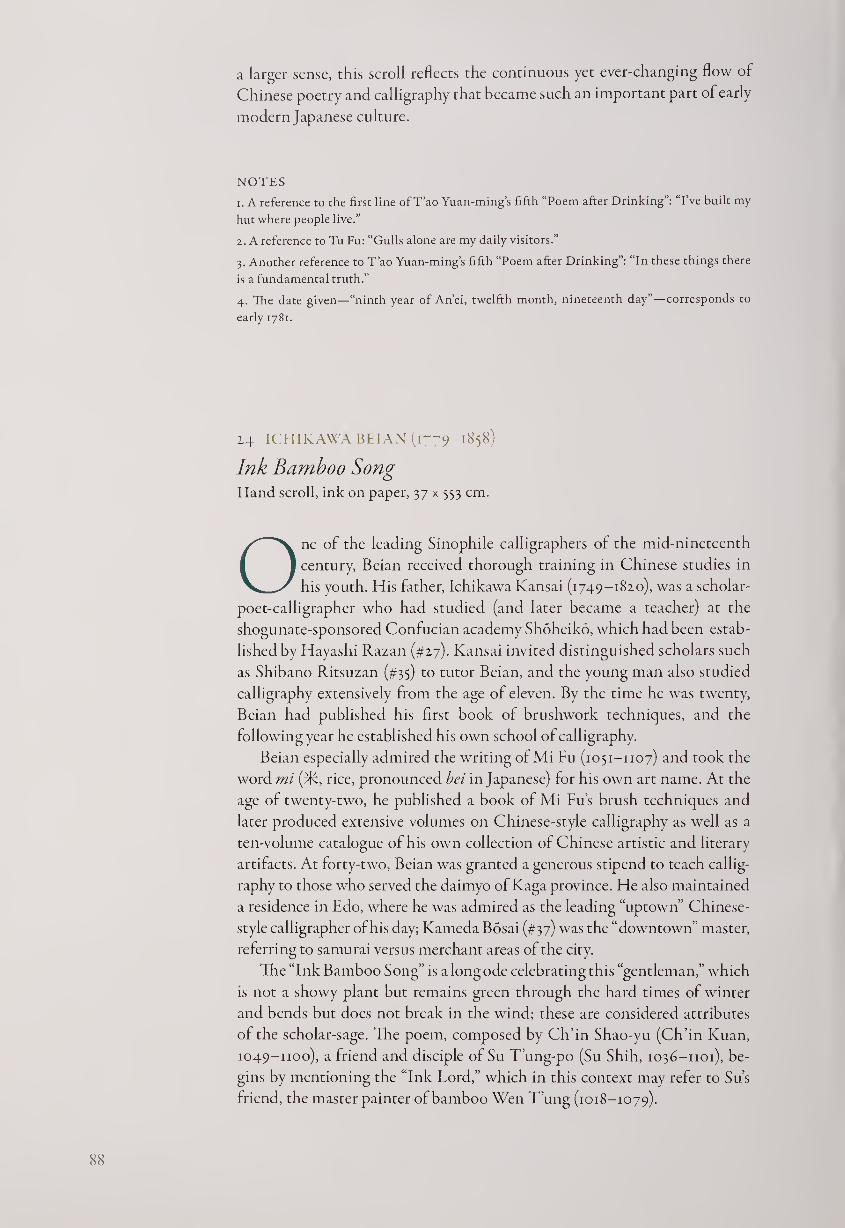
a larger sense, this scroll reflects the continuous yet ever-changing flow of
Chinese poetry and calligraphy that became such an important part of early
modern Japanese culture.
NOTES
1. A reference to the first line of T’ao Yuan-ming’s fifth “Poem after Drinking”: “I’ve built my
hut where people live.”
2. A reference to Tu Fu: “Gulls alone are my daily visitors.”
3. Another reference to T’ao Yuan-ming’s fifth “Poem after Drinking”: “In these things there
is a fundamental truth.”
4. The date given—“ninth year of An’ei, twelfth month, nineteenth day”—corresponds to
early 1781.
14 ICHIKAWA BEIAN (1779-1858)
Ink Bamboo Song Hand scroll, ink on paper, 37 x 553 cm.
One of the leading Sinophile calligraphers of the mid-nineteenth
century, Beian received thorough training in Chinese studies in
his youth. His lather, Ichikawa Kansai (1749-1820), was a scholar-
poet-calligrapher who had studied (and later became a teacher) at the
shogunate-sponsored Confucian academy Shoheiko, which had been estab¬
lished by Hayashi Razan (#27). Kansai invited distinguished scholars such
as Shibano Ritsuzan (#35) to tutor Beian, and the young man also studied
calligraphy extensively from the age of eleven. By the time he was twenty,
Beian had published his first book of brushwork techniques, and the
following year he established his own school of calligraphy.
Beian especially admired the writing of Mi Fu (1051-1107) and took the
word mi (3R, rice, pronounced bei in Japanese) for his own art name. At the
age of twenty-two, he published a book of Mi Fu’s brush techniques and
later produced extensive volumes on Chinese-style calligraphy as well as a
ten-volume catalogue of his own collection of Chinese artistic and literary
artifacts. At forty-two, Beian was granted a generous stipend to teach callig¬
raphy to those who served the daimyo of Kaga province. He also maintained
a residence in Edo, where he was admired as the leading “uptown” Chinese-
style calligrapher of his day; Kameda Bosai (#37) was the “downtown” master,
referring to samurai versus merchant areas of the city.
The “Ink Bamboo Song” is a long ode celebrating this “gentleman,” which
is not a showy plant but remains green through the hard times of winter
and bends but does not break in the wind; these are considered attributes
of the scholar-sage. The poem, composed by Ch’in Shao-yu (Ch’in Kuan,
1049-1100), a friend and disciple of Su T’ung-po (Su Shih, 1036-1101), be¬
gins by mentioning the “Ink Lord,” which in this context may refer to Su’s
friend, the master painter of bamboo Wen T’ung (1018-1079).
88
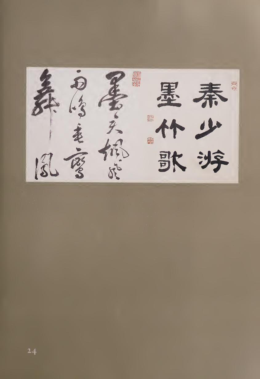
In China, titles of hand scrolls were often rendered in seal or clerical
characters; here Beian has given his six-word title “Chin Shao-yu Ink Bam¬
boo Song” in clerical script, followed by the poem in cursive writing. Al¬
though the work is generally rendered in wet-brush, slightly fuzzing ink
upon the absorbent paper, the differences between the scripts are clearly es¬
tablished. The six title characters are square, evenly spaced, balanced, and
(where possible) symmetrical, and they maintain their positions within the
two columns; each brush stroke is separate, and the total impression is one
of discipline and control. In contrast, the cursive-script characters in the
subsequent forty-two columns of two to four characters vary in size and
show “flying white” where the brush moved rapidly. In typical cursive style,
the strokes are usually joined together within the words, although in this
case one character does not usually continue directly into the next.
We can compare the same character in the two scripts. The second
column of the title begins with the word “ink” (31). Beian has created it
with fourteen strokes of the brush in a squared-off symmetrical shape; and
although the following character, “bamboo” (tJ), is simpler in composition,
the two graphs are given equal weight and space. The first word of the poem
is also “ink,” but now it is rendered in two strokes in a vertical form that
leads directly down toward the simpler graph of “heaven/lord” (Tc), which
is much lighter and smaller.
Each script is given its due, and each serves a purpose. Clerical script not
only provides the formality and deliberate spacing for the title but also im¬
parts a flavor of antiquity, appropriate for a poem composed approximately
750 years before Beian's calligraphy. His cursive script, on the other hand,
brings a faster pace to the ode. The dance has become much faster, and in¬
stead of formal balance we now have spontaneous energy. As this hand scroll
demonstrates, Beian was able to impart new life to a Chinese tradition that
had now become thoroughly assimilated into the Japanese literati world.
25 MAKI RYOKO (1787-1833)
Tea Song Hanging scroll, ink on silk, 37.5 x 51.3 cm.
A pupil of Kameda Bosai (#37), Ryoko took his names from his
hometown, Maki, and the water chestnuts (ryd) that grew in a
nearby lake {kd). An assiduous student of calligraphy, he made an
extensive study of all five Chinese scripts; and upon his teacher’s death in
1826, he took Bosai’s place as the leading “downtown” Edo calligrapher while
Ichikawa Beian (#24) remained the favorite of the “uptown” samurai.
In order to learn the sources of calligraphic traditions, Ryoko particularly
studied rubbings of early Chinese masterpieces, which were being printed in
woodblock book form in Japan. Later, however, he wrote that he could not
match these reproductions with actual brushwork until he was allowed to
see the tenth-century grass-script “Canon of Filial Piety” by Ho Chih-ch’ang
po
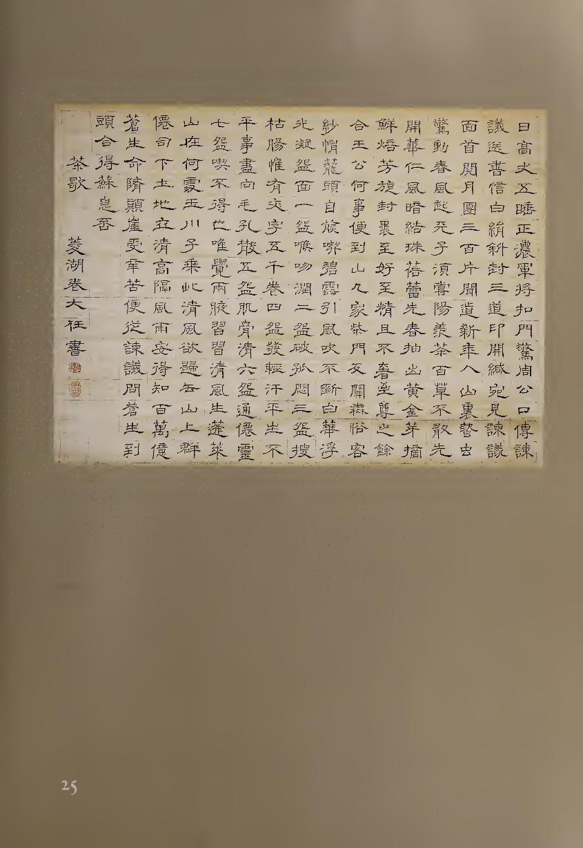
w, t-mm- - ><
^VM „1
lift!
r ts
•# :
i mmI
-+,+■ j: e?
^—7 ^ »4 i
ILL
life
■ '■*
Uvi bp i i
1111 ■ v."
,;
m m
A^t
m JeL
1 iisst EE3
I i w;L "v
L,; i
m WM-
m
In w& 'f.S
1
gii mm
sagsS
tfe 1% pL>
T~ 'f^r r^1'
&iT C^/v iSi
JM- ;n
XL x[
*ir 7+t_ 'TS'~ P® ll’C-
ISl fC
XT JL
#L 4X - ET J/3, j-r
/°T
* vAj
Ar- ^ 4
/I#
- 71V
38^ r tr:> 'i -4~
r^7
ft
XT ^ /(L.
w sr i'1
^ ,
‘B
j?g- ll
’i>’
x.^
XL. "T~
ySZ- VTT /
3£ ’ff
*#> 5S
^e>
j Lp— •+4-
!T ML
J 0f- »f $ -If? fe^rr- I^L ^pZ. 'I'l3
XI ^
1 WT 0
fe #;
m ML n 1W XL
m ?=~
7]F Xr
^ ^ ^ > g 1
/[JL V& xb
Lf J? EL
0
's ?Jr JX
^n2«-
5!
J1L
>L? -&#- ^
7^" Xt
^nz_ 71
XL.
Xv
ML /LI
XK -ft
^ M~
n M zl j- &
WV fa
f •5H_ ;Lfc.
£€
%% &-
m-jfc
&- %
|W_ ^pr
4J- #7
&L 'W
e vf>t4-
/Y
^ j#i
j 4>
^ 0t
1^-%f ill
imSW-
'cj Sir ^->p M.
SiL • ^
?£EE_ teU -4jt ^ JL
-77
7||p _7|n^ iK -‘7 ft ^ *
JL ^
t/i i#-'
r'i|7
^-V-
■ ■ ■■•■■■■■■
. •>%&>•••
in the Konoe family collection, after which he claimed to thoroughly under¬
stand both the structure and the brushwork of the Chin-T’ang dynasty mas¬
ters. While Ryoko did not turn against the styles of later masters such as
Chau Meng-fu and Tung Ch’i-ch’ang, he preferred the more classical work
of earlier artists.
The combination of scholarship and creativity that Ryoko exhibited in
his work greatly influenced later generations. He published a number of
woodblock books of his calligraphy; these became standard texts for cal¬
ligraphy students in the second half of the nineteenth century.1 In his later
years Ryoko developed a form of palsy that gave a “sawtooth ” pattern to his
writing, which nonetheless remained highly admired.
Here Ryoko has written out a famous text on tea composed a thousand
years earlier by the poet Lu T’ung (died 835), who in his writing called
himself the “Duke of Chou” and “Master of the Jade Stream.” Ryoko’s use
of clerical script gives this work a sense of tradition and antiquity; an analo¬
gous example would be the Gothic script used for a sign such as “^Jt (!!M6C
SJcfl Jljoppc.” We should note that during the T’ang dynasty tea was pressed
into small bricks (see line six of the poem) to be boiled. Whisked tea in
powdered form came later and became the basis of cha-no-yu, the Japanese
Tea Ceremony; steeped tea arrived in Japan last, and this style, called sencha,
was taken up by the literati. Lu’s poem, describing the drinking of tea as
both a pleasure and a form of medicine, ends with a Buddhist question.1
Thanking Imperial Advisor Meng for the Fresh Tea He Has Sent Me
The sun seemed fifteen feet above me, and I had fallen asleep
When an army officer knocked at the door, waking this Duke of Chou.
He tells me the Advisor has sent me a letter
On white silk with slanting folds and three official seals.
I open the missive—it is as if the Advisor and I are face to face—
And inspect by hand the Moon Brick tea, three hundred pieces of it.
I have heard that early in the year, if one goes up in the mountains,
Hibernating creatures are beginning to move and spring winds are
starting to blow.
The Son of Heaven, desiring men to taste fine Yang-hsien tea,
All other plants would never dare to blossom first.
A gentle breeze secretly forms buds like pearls;
Before spring actually arrives, they put forth sprouts of yellow gold.
The fresh plants are gathered, the fragrant tea is fire-dried and
pressed into bricks,
The very best, the most exquisite—no empty luxury.
Aside from the Most Honored, it is suitable for princes and dukes;
So how is it that now it has arrived at the home of a mountain man?
My bramble gate closed tight against vulgar visitors,
Wearing a cap of gauze, by myself I boil and taste the tea.
Tie blue smoke cloud, drawn by the wind, remains unbroken;
A white froth—floating luster—congeals in the bowl.
With bowl number one, my throat and lips are moistened;
With bowl number two, my lonely sadness is dispelled.
Bowl number three cleans out my withered bowels,
92.
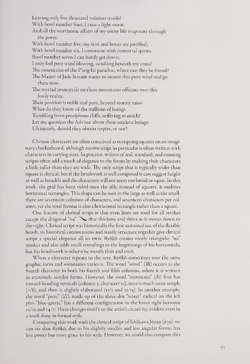
Leaving only five thousand volumes inside!
With bowl number lour, I raise a light sweat
And all the worrisome affairs of my entire life evaporate through
the pores.
With bowl number five, my skin and bones are purified;
With bowl number six, I commune with immortal spirits.
Bowl number seven I can barely get down;
I only feel pure wind blowing, swishing beneath my arms!
The mountains of the P’eng-lai paradise, where can they be found?
The Master of Jade Stream wants to mount this pure wind and go
there now.
The myriad immortals on these mountains officiate over this
lowly realm;
Their position is noble and pure, beyond stormy rains.
What do they know of the millions of beings
Tumbling from precipitous cliffs, suffering so much!
Let me question the Advisor about these sentient beings:
Ultimately, should they obtain respite, or not?
Chinese characters are often conceived as occupying squares on an imagi¬
nary checkerboard, although cursive script in particular is often written with
characters in varying sizes. In practice, writers of seal, standard, and running
scripts often add a touch of elegance to the forms by making their characters
a little taller than they are wide. The only script that is typically wider than
square is clerical, but if the brushwork is well composed it can suggest height
as well as breadth and the characters will not seem too broad or squat. In this
work, the grid has been ruled onto the silk; instead of squares, it outlines
horizontal rectangles. This shape can be seen in the large as well as the small:
there are seventeen columns of characters, and seventeen characters per col¬
umn, yet the total format is also a horizontal rectangle rather than a square.
One feature of clerical script is that even lines are used for all strokes
except the diagonal “na” that thickens and thins as it moves down to
the right. Clerical script was historically the first sustained use of the flexible
brush; its historical connotations and stately structure together give clerical
script a special elegance all its own. Ryoko creates nicely triangular “na”
strokes and also adds small roundings to the beginnings of his horizontals,
but his brushwork is otherwise mostly thin and even.
When a character repeats in the text, Ryoko sometimes uses the same
graphic form and sometimes varies it. The word “wind” (M) occurs as the
fourth character in both his fourth and fifth columns, where it is written
in extremely similar forms. However, the word “mountain” (|L|) first has
inward-bending verticals (column 3, character 13), next is much more simple
(7/8), and then is slightly elaborated (13/1 and 13/13). In another example,
the word “pure” ('/if), made up of the three-dot “water” radical on the left
plus “blue-green,” has a different configuration in the lower right between
11/13 and 14/7- These changes testify to the artist’s creativity, evident even in
a work done in formal style.
Comparing this work with the clerical script oflshikawa Jozan (#39), we
can see that Ryoko, due to his slightly smaller and less angular forms, has
less power but more grace in his style. However, we could also compare this
Figure 25.1.
Araki Zesui (n.d.),
Tea Song {opening).
work with a cursive-script hand scroll of the same text by Araki Zesui (n.d.),
a pupil of Mitsui Shinna, written in broad, wet, running-cursive script (fig.
25.1). Here the words are expansive rather than contained, and the mood
is indulgent rather than refined. Also, Zesui begins with the title, whereas
Ryoko omits it.
Zesui seems to take an entirely different attitude toward the text than
did Ryoko. Since there is no attempt to suggest the antiquity of the poem
by using an old-fashioned script and the brushwork is free and idiosyncratic,
we might speculate that Zesui’s purpose was to make the text seem fresh and
up-to-date, while Ryoko sought to evoke its classical nature. Yet through
his individual use of clerical script, he does not merely repeat the past but
demonstrates that a master calligrapher can take a seemingly archaic script
and create new variations.
NOTES
1. Among Ryoko’s many woodblock books published during and after his lifetime are Hoo-
cho (Phoenix Album) in large clerical, seal, and running scripts; Toshi dainin-cho (Tang
Poetry Album) in large running script; Shusei-fu (Autumn Voices Ode) in large standard
script, Togen-ko (Journey to Peach-Blossom Spring, 1841) in running-cursive script; and Yontai
senjibon (Thousand-Character Essay in Four Scripts, with Murata Kaiseki, 1877).
2. Translation byjonathan Chaves.
16 TOKAI OKON (i8ifi-i888)
Clouds Hanging scroll, ink on paper, 111.7 x 57 cm.
Given when and where the life of Okon began, the odds were strongly
against her learning to read and write beyond a rudimentary level,
if at all. But despite being born in a small, culturally backward
mountain village in Niigata at a time in Japanese history when young women
were not expected to receive much education, she became a celebrated callig¬
rapher at an early age.
94
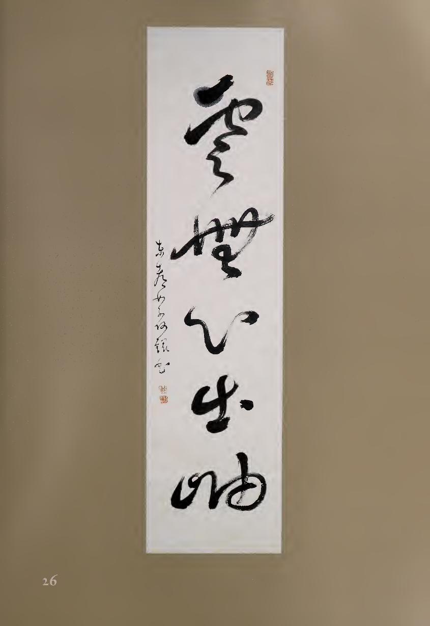
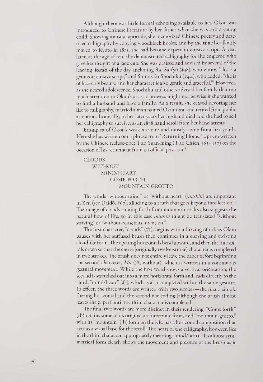
Although there was little formal schooling available to her, Okon was
introduced to Chinese literature by her father when she was still a young
child. Showing unusual aptitude, she memorized Chinese poetry and prac¬
ticed calligraphy by copying woodblock books; and by the time her family
moved to Kyoto in 1825, she had become expert in cursive script. A year
later, at the age of ten, she demonstrated calligraphy for the emperor, who
gave her the gift of a jade cup. She was praised and advised by several of the
leading literati of the day, including Rai Sanyo (#38), who wrote, “she is a
genius at cursive script,” and Shinozaki Shochiku (#44), who added, “she is
of heavenly beauty, and her character is also gentle and graceful.”1 However,
as she neared adolescence, Shochiku and others advised her family that too
much attention to Okon’s artistic prowess might not be wise if she wanted
to find a husband and have a family. As a result, she ceased devoting her
life to calligraphy, married a man named Okumura, and retired from public
attention. Ironically, in her later years her husband died and she had to sell
her calligraphy to survive, as an 1878 hand scroll from her hand attests.2
Examples of Okon’s work are rare and mostly come from her youth.
Here she has written out a phrase from “Returning Home,” a poem written
by the Chinese recluse-poet T’ao Yuan-ming (T’ao Chien, 365-427) on the
occasion of his retirement from an official position.3
CLOUDS
WITHOUT
MIND/HEART
COME-FORTH
MOUNTAIN-GROTTO
The words “without mind” or “without heart” (mush in) are important
in Zen (see Daido, #67), alluding to a truth that goes beyond intellection.4
The image of clouds coming forth from mountain peaks also suggests the
natural flow of life, so in this case mushin might be translated “without
striving” or “without conscious intention.”
The first character, “clouds” (18), begins with a fuzzing of ink as Okon
pauses with her suffused brush then continues in a curving and twisting
cloudlike form. The opening horizontals bend upward, and then the line spi¬
rals down so that the entire (originally twelve-stroke) character is completed
in two strokes. The brush does not entirely leave the paper before beginning
the second character, Mu (M, without), which is written in a continuous
gestural movement. While the first word shows a vertical orientation, the
second is stretched out into a more horizontal form and leads directly to the
third, “mind/heart” (T), which is also completed within the same gesture.
In effect, the three words are written with two strokes—the first a simple
fuzzing horizontal and the second not ending (although the brush almost
leaves the paper) until the third character is completed.
The final two words are more distinct in their rendering. “Come forth”
(tB) retains some of its original architectonic form, and “mountain-grotto,”
with its “mountain” (|Tj) form on the left, has a horizontal composition that
acts as a visual base for the scroll. Tie heart of the calligraphy, however, lies
in the third character, appropriately meaning “mind/heart.” Its almost sym¬
metrical form clearly shows the movement and pressure of the brush as it
96
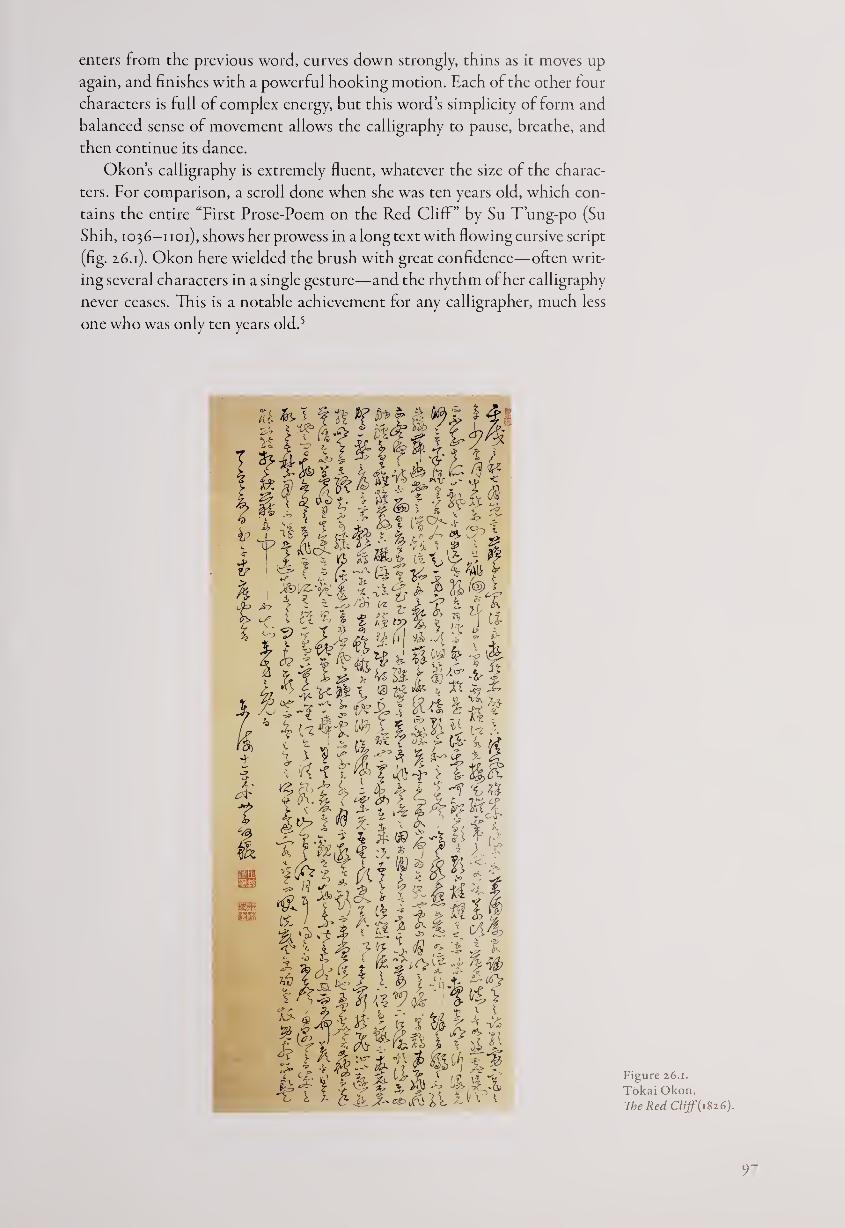
enters from the previous word, curves down strongly, thins as it moves up
again, and finishes with a powerful hooking motion. Each of the other four
characters is full of complex energy, but this word’s simplicity of form and
balanced sense of movement allows the calligraphy to pause, breathe, and
then continue its dance.
Okon’s calligraphy is extremely fluent, whatever the size of the charac¬
ters. For comparison, a scroll done when she was ten years old, which con¬
tains the entire “First Prose-Poem on the Red Cliff” by Su T’ung-po (Su
Shih, 1036-1101), shows her prowess in a long text with flowing cursive script
(fig. 2.6.1). Okon here wielded the brush with great confidence—often writ¬
ing several characters in a single gesture—and the rhythm of her calligraphy
never ceases. This is a notable achievement for any calligrapher, much less
one who was only ten years old.5
Figure 26.1.
Tokai Okon,
The Red Cliff (1826).
97
In comparison, the “Clouds” scroll, probably written a little later, shows
more sophistication but an equal sense of energy as the brush twists and
turns. The five large words are more individualistically rendered than the
smaller characters in “Red Cliff,” thereby displaying Okon’s full talent as
a calligrapher.
NOTES
1. These phrases were written on scrolls presented to Okon in 1826 and 1827, respectively, which
are now at the Spencer Museum of Art at the University of Kansas. For more information, see
Pat Fister, “Tokai Okon” in Calligraphy Idea Exchange 3, no. 4 (Summer 1986): 26-33.
2. This scroll as well is owned by the Spencer Museum of Art.
3. For a full translation of the poem, see James Robert Hightower, The Poetry ofT’ao Chien
(Oxford: Clarendon Press, 1970), pp. 268-270.
4. This phrase appears twice, with one character added, in a collection of Zen sayings called
Zemin kushu, with two different second phrases. The first comes directly from T’ao Yuan-
ming: “Clouds without mind come forth from mountain peaks; birds weary of flight also
know to return.” The second adds a different second line: “Clouds without mind come forth
from mountain peaks; water past full tide also flows.” For the Chinese characters and slightly
different translations, see A Zen Forest, trans. Soiku Shigematsu (New York and Tokyo:
Weatherhill, 1989), pp. 41,128.
5. Okon signs the work as age eleven, but as noted elsewhere, this corresponds to ten by West¬
ern count.
Calli graphy by Confucian Scholars
Another stream of karayo calligraphy that began in the later seventeenth
century was created by Confucian scholars. This category is closely tied to
the previous group of artists, since several of those mentioned earlier, such
as Setsuzan (#13) and Kotaku (#14), were also Confucians. Nevertheless,
we can divide those for whom calligraphy was the major force in their lives
from those who were primarily teachers and scholars. This latter group also
produced a significant amount of brushwork, indicating that they took cal¬
ligraphy seriously, but their primary commitment was to Confucianism.
Chinese ethical philosophy was not new to Japan. Texts including sec¬
tions of the Confucian Analects were introduced at the beginning of the
fifth century, if not earlier, by Korean scholars, and Chinese Confucians
were teaching in Japan by the year 513.1 In the seventh century, Prince
Shotoku’s “Seventeen Articles,” often considered Japan’s first constitution,
shows a strong influence from Confucianism,2 and soon thereafter a “Bu¬
reau of Higher Learning” was established, with Confucian tenets forming
a major part of its teachings. Although Buddhism predominated as a cul¬
tural force in the following centuries, Confucianism was not neglected;
during Japan’s Middle Ages (1185-1568), Zen monks continued to study
and teach the Chinese classics, generally following the interpretations of
Sung-dynasty scholars such as Chu Hsi (1130-izoo). Nevertheless, Confu¬
cianism did not reach the height of its influence in Japan until the early
modern period.
The Tokugawa government, as mentioned earlier, differed from its pre¬
decessors in gradually switching from Zen monks to Confucians as their
advisers and as teachers for the highest class of samurai-officials. The samurai
headed a four-tiered social system, with farmers ranking second since they
produced the necessary food; farmers were especially important because
government salaries for some time were based on yearly rice allotments.
Third came artisans and craftsmen, who also contributed to society through
their work, while merchants were ranked at the bottom, since it was believed
that they merely moved goods without producing them. But as Japan’s
economy became increasingly mercantile, the position of farmers gradually
sank while merchants gained in wealth and status. Nevertheless, the shogun-
ate tried to maintain this theoretical four-part division of society until the
opening of Japan to the West in 1868.
Not surprisingly, the government showed greatest favor to scholars who
taught the neo-Confucianism of Chu Hsi, which emphasized loyalty to
the state as well as rational examination of the world. The scholar whom
99
the regime chose to open its own academy in Edo was Hayashi Razan
(1583-1657),3 who followed Chu Hsi as well as his own teacher Fujiwara
Seika (1561-1619) in stressing the primacy of ri (Chin, li, fi, principle). Ra¬
zan wrote, “The principle that is ever present, before the emergence of
Heaven and Earth as well as after, is called the Supreme Ultimate. . . . The
principle which is attached to the human form and resides in the human
heart is called Nature Ordained by Heaven. This nature is just another name
for principle.”4
Razan believed that although this principle does not contain evil, it can
be obscured in people by their selfish desires.
Human nature is like water. If it is poured into a clean container, it re¬
mains pure; if it is poured into a dirty container, it becomes dirty.... If a
person cleanses his heart each day, his selfish desires will disappear. This
is called renovation. This does not mean that something which was not
originally present has been produced. It means that someone who was
unaware of illustrious virtue until then has been made aware of it.”5
Razan also allied Confucianism to Shinto. His teacher Seika had written,
“In China, the Way is called Confucianism; in Japan, it is Shinto. The name
is different, but the spirit is the same.” Razan echoed this view, writing, “They
are one in principle. They only differ in effect.”6 This attempted union of
the two belief systems, which were quite different in their origin and scope,
tried to counter the criticism that Japan was adopting a model entirely from
China, and helped reconcile those who were more nationalist.
In China, governmental administrative and teaching posts were earned
through competitive examinations. With the Japanese penchant for heredi¬
tary positions, however, the Hayashi family continued to run the shogunal
school for many generations.8 Based upon such ideas as Razan’s assertion
that “if the instruction from above is good, soon the customs of the age will
also become good,”9 many other schools in Edo and in the feudal ban were
also established to be run by Confucian scholars. As a result, there soon
became a widespread need for teachers adept in Chinese philosophy and
ethics. In studying continental thought, however, the Japanese were aware
that the world of the literati included an emphasis upon calligraphy, poetry,
and prose, as well as refined styles of painting and the subtle music of the
ch’in, a seven-string zither.10 In fact, one could not pass the civil service ex¬
aminations in China with poor calligraphy and no skills in poetry. Japanese
scholars also sought artistic outlets; all the major Confucians took up the
brush to express themselves, usually in their own Chinese-style verse, and
many developed idiosyncratic calligraphic styles all their own.
“When there is a Way there is culture; when there is no Way there is no
culture,” according to Razan. “Culture and the Way share the same principle
(ri), and only differ in manifestation.”11 He himself wrote poetry, often qua¬
trains in Chinese in unassuming regular-running script in small formats
(#27). In contrast, the scholar Nakae Toju (1608-1648) taught a very differ¬
ent form of Confucianism, and his calligraphy was also quite different (#28).
Toju was a follower of the Ming-dynasty philosopher Wang Yang-ming
(1492-1529), who absorbed Taoist and Zen Buddhist influences and devel¬
oped a philosophy that advocated introspection and independent action.11
Instead of following the Chu Hsi school’s focus on ri, Toju gave precedence
100
to shin (kokoro, D, mind/heart), which he believed could lead through study
and self-discipline to “illustrious virtue”:
This is called “the greatest treasure in the world.” It is found in every
human being, high or low, old or young, male or female, in the inex¬
haustible treasure-house of the Mind, but not knowing how to seek it,
people in their pitiful ignorance go out searching for treasure in external
things, only to sink into a sea of suffering. . . . There is no distinction
between men, be they sages or ordinary persons, so far as their Heaven-
bestowed nature is concerned. They are all gifted with the divine light
that tells good from bad. All men hate injustice and are ashamed of evil
because they are born with this intuitive knowledge. It is only from the
self-watchfulness of the one and the self-deceit of the other that the vast
distinction arises between the superior man and the inferior man.13
The government was understandably less than fond of this more indi¬
vidualistic philosophy, but Toju’s way of thought remained influential well
into the twentieth century. His direct pupil Kumazawa Banzan (1619-1691,
#29) followed his lead, teaching Wang Yang-ming ideals in Okayama. Tike
Toju, he retired early from his position with a feudal lord, supposedly after
being slandered.
A third major form of Confucianism in early modern Japan was the
Ancient Learnings (kogaku) school, which advocated going back to the origi¬
nal Confucian classics rather than relying upon Sung- and Ming-dynasty in¬
terpretations. The leaders of this school were ltd Jinsai (1627-1705, #30) and
his son Ito Togai (1670-1736, #31). Jinsai wrote: “The Sung Confucianists
thought that they could explain all worldly things as principle [ri]. Rhetori¬
cally, their argument sounds reasonable, but when applied to reality it can¬
not explain many things.... Benevolence [jin, fC] is the basis of the kingly
way. When even one person is discontented, or when an object is out of
place, benevolence is absent.”14
Jinsai valued the literati arts, believing that scholars who do not partake
in them would be unable to fully apply their talents or to understand people.
In particular, he favored poetry as the expression of personal character and
feelings but warned that “when it is overly polished and grand, it grinds
down the inborn emotions and completely strips away one’s true energies.”15
Jinsai’s poetry tends to be modest and restrained; his rather austere calligra¬
phy, often in regular script, follows classical models. Togai, on the other
hand, was more free and bold in his writing, often utilizing running and
cursive scripts in larger formats. The finest calligrapher of the Confucian¬
ists, however, was probably Ogyu Sorai (1666-1728, #32), who established
his own school of Ancient Learnings. A prodigious scholar and philologist,
Sorai was also a master with the brush. Despite his interest in early philoso¬
phy and literature, he followed the reformist calligraphy tradition of Sung,
Yuan, and Ming masters to create an individual style of writing with dra¬
matic patterns of tension and release. Sorai’s pupil Hattori Nankaku (1683—
1759, #33) was even more interested in the arts, and his calligraphy is also
very lively and personal in expression.
Most of the texts that Confucian teachers chose to render in calligraphy
were their own Chinese-style poems. These often referred to favorite literati
themes from nature such as plum blossoms (Jinsai, #30), the setting sun (Sorai,
101
#32.), and autumn colors (Nankaku, #33), although the work by Ito Togai
(#31) has aphrase from an ancient book of divination, the/Ching. It is notable
that these scholars, despite the daunting difficulties of studying and inter¬
preting centuries-old Chinese texts, were equally conversant with other
aspects of Chinese civilization, including the importance of the arts. A Con-
fucian teacher who had no cultural interests and accomplishments would be
considered narrow and one-sided; it was understood that self-cultivation
benefits from artistic expression and time spent in nature as well as from
academic study.
The later eighteenth and early nineteenth centuries saw a continuation of
all three Confucian traditions. Among the notable calligraphers were two
scholars of the Chu Hsi school of neo-Confucianism who were chosen to
work for the shogunate. The first was Shibano Ritsuzan (1734-1807), whose
large-scale poem on Mount Fuji (#35) represents the immense admiration
that this national symbol of majesty and power received in early modern
Japan; Hokusai’s famous prints would come a few decades later. Ritsuzan’s
calligraphy is idiosyncratic in its wet-ink, slightly blurring strokes of the
brush, but the structure of his work is sure and architectonic.
In comparison, the calligraphy of Koga Seiri (1752-1817, #36) is leaner,
with more space between the characters, giving it a cool and refined feel¬
ing. Seiri had originally studied the Wang Yang-ming tradition but then
switched to the Chu Hsi school; for the work shown here he chose a poem
by a ninth-century Chinese master rather than his own verse, again perhaps
an indication of his restrained but elegant personality.
The later Edo period saw a new eclectic school arise in which students
were encouraged to draw the best from differing points of view. One of the
leading scholars of this eclectic tradition was Kameda Bosai (1734-1826,
#37), who came from a merchant family but was able to attend a Confucian
school in Edo due to his precocious intelligence. Bosai later set up his own
academy, which was extremely successful until the Tokugawa regime issued
an edict in 1790 against “alien teachings” that effectively ended his career as
a teacher. Becoming a freelance literatus, Bosai developed his love for callig¬
raphy, which he had first studied with Mitsui Shinna (#19). For Bosai, cal¬
ligraphy became a convivial form of personal expression, and he shared his
work with fellow artists and poets during his travels as well as in his home
city of Edo. While the calligraphy of Ichikawa Beian (#24) was most appre¬
ciated by the samurai-official class in “uptown” Edo, Bosai’s work was par¬
ticularly enjoyed “downtown” by cultivated members of the merchant and
artisan classes.
The literatus who had the greatest impact in early nineteenth-century
Kyoto was Rai Sanyo (1780-1832, #38). His father, Rai Shunsui (1746-1816),
had studied calligraphy with Cho Tosai (#21) and operated a respected
Confucian academy in Hiroshima. Sanyo, however, rebelled against an
arranged marriage, ran away from his domain at the age of twenty, was re¬
turned and placed under house arrest, and was disinherited by his father in
1804. Living the rest of his life in Kyoto, Sanyo became famous for his
book Nihon gaishi (Unofficial History of Japan), as well as for his poetry,
calligraphy, and (to a lesser extent) literati painting. His calligraphy, like
that of his father, is in the reformist tradition, and he developed a personal
style featuring sweeping curves that is highly admired to this day. Sanyo’s
102
forty-line poem on the Sanjo bridge in Kyoto, written on subtly decorated
paper, praises the shoguns who unified Japan before the Tokugawa era, dis¬
playing his interest in history and politics as well as his skill in literati arts.
Whatever their Confucian orientation, scholars in early modern Japan
all seem to have taken to the brush for personal expression. Less apt than
their professional calligrapher counterparts to show oft their techniques by
writing in several different scripts, they tended to create individual styles
that displayed their personalities. By writing out their own poems, they
added substantially to the kanshi (Chinese verse) tradition in Japan as well
as that of karayo brushwork. Like the haiku poets and Zen monks to be
discussed later, they were amateurs in the best sense, creating calligraphy
for love of the art, for self-cultivation, for the expression of their inner feel¬
ings, and for the pleasure of continuing an artistic tradition that had been
practiced for centuries in China, Korea, and Japan.
NOTES
1. See Felicia G. Bock, Classical Learning and Taoist Practices in Early Japan (Arizona State Uni¬
versity: Center for Asian Studies, 1985), p. 1.
2. For a translation, see Tsunoda Ryusaku, W. Theodore de Bary, and Donald Keene, eds.,
Sources of the Japanese Tradition (New York: Columbia University Press, 1958).
3. Razan served the Tokugawa government in various roles, including scribe, librarian, adviser
on ritual, and companion to the shogun.
4. Quoted in Masao Maruyama, Studies in the Intellectual History of Tokugawa Japan (Tokyo:
University of Tokyo Press, 1974), p. 35.
5. Ibid., pp. 35-36.
6. Ibid., p. 151.
7. An opposing school of “National Learning” did arise in the next century, however, led by
Kamo Mabuchi (1697-1769) and Motoori Norinaga (1730-1801). These scholars, while op¬
posed to Confucianism, adopted several of its methodologies, such as close examination of
early texts. However, they insisted that the pursuit of learning was not sufficient for under¬
standing the Shinto gods. Norinaga wrote, “Even the wisest man’s intellect is restricted. . . .
The Sages used their private intellects to formulate all kinds of theories . . . but these are all
fabrications based on blind guesses.” Ibid., p. 158.
8. The shogunate officially adopted Chu Hsi neo-Confucianism as its own orthodoxy when
it issued a degree against “alien teachings” in 1790, and seven years later it reorganized the
Hayashi school into its official academy, called the Shoheiko.
9. Maruyama, Studies in the Intellectual History of Tokugawa Japan, p. 36.
10. See Stephen Addiss, The Resonance of the Qin in East Asian Art (New York: China Society,
1999)-
11. From the Razan Hayashi sensei bunshu (Literary Writings of Hayashi Razan), 1662, as
quoted in Lawrence E. Marceau, “Ninjo and the Affective Value of Literature at the Kogido
Academy,” Sino-JapaneseStudies 9, no. 1 (1996): 47.
12. See Wing-tsit Chan, trans., Instructions for Practical Living by Wang Yang-ming (New York:
Columbia University Press, 1963).
13. From Tofu sensei zenshu, quoted in Tsunoda Ryusaku, W. Theodore de Bary, and Donald
Keene, eds., Sources of the Japanese Tradition (New York: Columbia University Press, 1958), pp.
380, 382.
14. Quoted in Tetsuo Najita and Irwin Scheiner, edsJapanese Thought in the Tokugawa Period
1600-1868 (Chicago: University of Chicago Press, 1978), pp. 189,191.
15. From Jinsai’s afterword to the Hakushi monju (Collection Works of Po Chu-i), quoted in
Marceau, “Ninjo and the Affective Value of Literature at the Kogido Academy,” Sino-Japanese
Studies 9, no. 1 (1996): 49.
103
27 HAYASHI RAZAN (1583-1657)
Facing the Moon Hanging scroll, ink on paper, 30 x 41.4 cm.
Born in Kyoto to a merchant of samurai ancestry, Razan entered the
Zen temple Kennin-ji as a novice at the age of eleven but resisted
formal ordination, and two years later he returned home. After
readingthe Confucian classics in an edition by the Sung-dynastyphilosopher
Chu Hsi, he decided to become a scholar and teacher. In the new capital of
Edo, Razan was supported by the shogun Tokugawa Ieyasu (1543-1616),
who insisted that he take the tonsure (probably because monks had been
the primary advisers to the government in earlier periods); Razan was given
the Buddhist name of Doshun. Later scholars who worked for the regime
were spared this ordination procedure, evidence that the shogunate’s
transition from relying upon Zen advisers to Confucians was gradual rather
than abrupt.
Beginning his service for the government in 1607, Razan participated
in drafting important documents such as laws for both military clans and
the shogun s vassals. Strongly believing that education was a means toward
securing peace, he advocated the printing and distribution of books and
opened a Confucian school. In 1630 he was given land and funds by the
shogunate to build a Confucian academy; called Shoheiko, the academy
was to be led by the Hayashi family for many generations, and it became the
official shogunal college in 1797.
Although Razan tried to suppress the more individualistic Wang Yang-
ming school of Confucianism and criticized Buddhism and Christianity,
he was not completely orthodox as a Confucian. For example, he believed
that Shinto was in harmony with neo-Confucian values, equating the Shinto
deity Ame-no-minaka-nushi-no-mikoto with the neo-Confucian “Supreme
Principle.” Nevertheless, Razan began a history of Japan (completed by his
son) that offered rational rather than mythical explanations of the past and
supported the power of the samurai class. Among his many other books are
commentaries on Conf ucian classics and, in simpler Japanese, explanations
of Chu Hsi’s basic concepts of a moral and stable society.
On a more personal level, Razan also found time to write poetry in
Chinese; he must have been highly skilled since he was able to play a kind
of literary game in which a rhyme word is chosen by lottery from a Chinese
poem. This character becomes the final word of the new verse and deter¬
mines the category of the other rhyme words. Here the Chinese character
that Razan was given was hsu (eM, “empty”), with which Razan ended his
poem and rhymed in Chinese with his final words for the second and third
columns, chu (EU, “house”) and ssu (ffj, “similar”). Only the first two of these
words rhyme in Japanese.
104
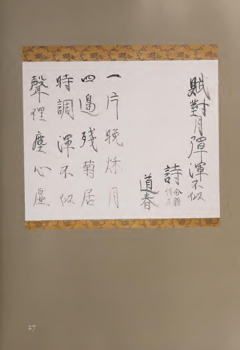
Composed Facing the Moon and Playing a Different Tune
One sliver of autumn evening moon,
The house surrounded by chrysanthemums—
Totally different from the melodies of today,
An inner voice empties my heart of dust.
Despite Razan’s neo-Confucianism, the concept of emptying dust from
the heart has Buddhist overtones, while other themes in the poem have Chi¬
nese literati antecedents. The “different melody” suggests the seven-string
ch’in, a form of zither beloved by scholars for its quiet, subtle, and introspec¬
tive music. It was believed that playing the ch’in could bring serenity and
even enlightenment, and its soft sounds had long been contrasted in China
with more popular forms of music that were played on distinctly louder
instruments. The chrysanthemums in Razan’s poem also suggest the poet
T’ao Yuan-ming (T’ao Chien, 365-4x7), who represents the joys of retiring
from official life, and whose most famous poem includes the lines, “Picking
chrysanthemums below the eastern hedge, I watch the distant southern
hills.” Because it blooms at the end of autumn, the chrysanthemum espe¬
cially represents the joys of old age.
Razan is very orderly as a calligrapher. He divides the compositional space
equally between title on the right and poem on the left; his columns strictly
follow the five-character-per-line form of the poem; and when characters re¬
peat (the final three in the title are the final three in the penultimate column)
he writes them with no change of script, composition, or style. But as we ex¬
amine the work more closely, an individual personality begins to emerge.
Signed with his Buddhist name Doshun (iltlC “Tao-spring”), Razan's
poem is written primarily in regular script, but there are exceptions. Within
several characters, brush strokes have been joined together in running
script, and the second word (m, “inner”) in the final (left) column combines
cursive script on the left side with regular script on the right. Furthermore,
Razan writes in gray ink rather than the black ink that was almost universal
in Chinese calligraphy, and his style of brushwork is soft and relaxed rather
than hard; both of these features are well suited to this poem. A sense of
individual rhythm results from Razan’s choice to make certain characters
darker—the first of each column of the quatrain, as well as the second
character in column two and the third characters in columns two, three,
and four.
Most notable, however, is the way Razan creates his horizontals. Instead
of beginning and ending the stroke strongly and slightly raising this line
upward to the right, as is common, he.prefers a curved line that is widest in
the center. This “eyebrow” shape can be seen most clearly in the first word of
the poem (—*, “one”), but it also appears later, such as in all of the final eight
characters. For beginners, this would be considered a mistake, but it allows
Razan to present a personal style within the modest format, understated
ink tones, and unassuming calligraphic presentation of his poem.
106
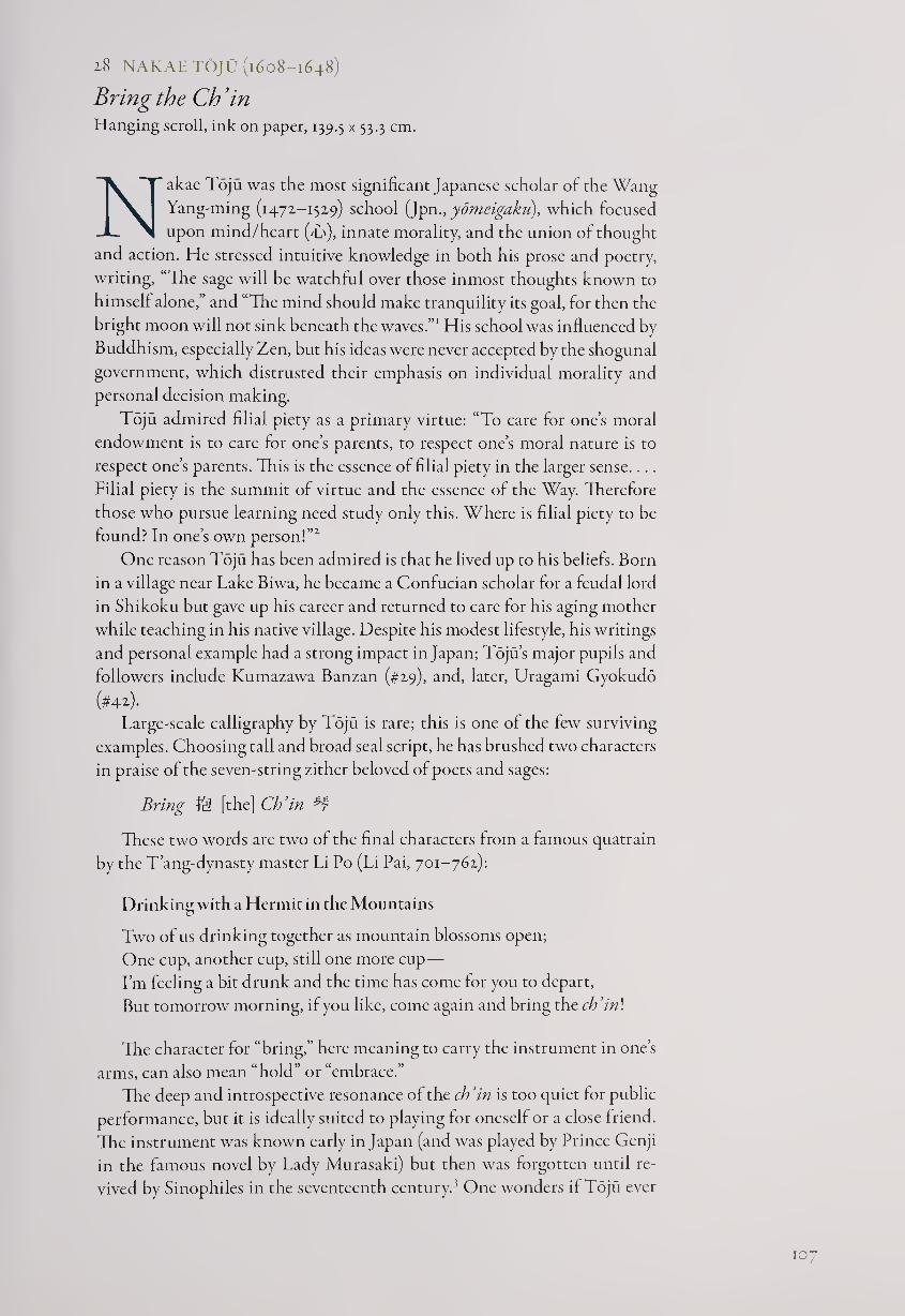
2.8 NAKAETOJU (1608-1648)
Bring the Ch’in Hanging scroll, ink on paper, 139.5 x 53-3 cm.
Nakae Toju was the most significant Japanese scholar of the Wang
Yang-ming (1471-1529) school (Jpnydmeigaku), which focused
upon mind/heart (T\), innate morality, and the union of thought
and action. He stressed intuitive knowledge in both his prose and poetry,
writing, “The sage will be watchful over those inmost thoughts known to
himself alone,” and “The mind should make tranquility its goal, for then the
bright moon will not sink beneath the waves.”1 His school was influenced by
Buddhism, especially Zen, but his ideas were never accepted by the shogunal
government, which distrusted their emphasis on individual morality and
personal decision making.
Toju admired filial piety as a primary virtue: “To care for one’s moral
endowment is to care for one’s parents, to respect one’s moral nature is to
respect one’s parents. This is the essence of filial piety in the larger sense....
Filial piety is the summit of virtue and the essence of the Way. Therefore
those who pursue learning need study only this. Where is filial piety to be
found? In one’s own person!’”
One reason Toju has been admired is that he lived up to his beliefs. Born
in a village near Take Biwa, he became a Confucian scholar for a feudal lord
in Shikoku but gave up his career and returned to care for his aging mother
while teaching in his native village. Despite his modest lifestyle, his writings
and personal example had a strong impact in Japan; Toju’s major pupils and
followers include Kumazawa Banzan (#29), and, later, Uragami Gyokudo
(#42.) • Large-scale calligraphy by Toju is rare; this is one of the few surviving
examples. Choosing tall and broad seal script, he has brushed two characters
in praise of the seven-string zither beloved of poets and sages:
Bring ft3 [the] Ch’in #
These two words are two of the final characters from a famous quatrain
by the T’ang-dynasty master Li Po (Li Pai, 701-762):
Drinking with a Hermit in the Mountains
Two of us drinking together as mountain blossoms open;
One cup, another cup, still one more cup—
I’m feeling a bit drunk and the time has come for you to depart,
But tomorrow morning, if you like, come again and bring the ch’in\
The character for “bring,” here meaning to carry the instrument in one’s
arms, can also mean “hold” or “embrace.”
The deep and introspective resonance of the ch’in is too quiet for public
performance, but it is ideally suited to playing for oneself or a close friend.
The instrument was known early in Japan (and was played by Prince Genji
in the famous novel by Lady Murasaki) but then was forgotten until re¬
vived by Sinophiles in the seventeenth century.3 One wonders if Toju ever
10
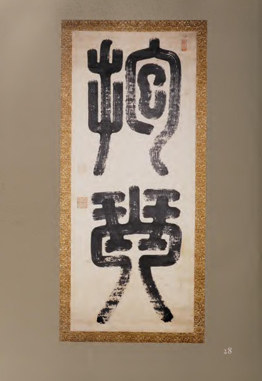
1 ✓ . *
mm
■ m&> W-Bmi ^ ^ V J
■■'
msmmm.
■ ■■:-.■
heard the instrument in person or simply imagined its sound based upon
Chinese poetry. In any case, he has honored an important symbol of the
literati cultural world.
Perhaps to evoke the flavor of antiquity carried by this musical instru¬
ment, Toju writes in seal script, although some features are quite unusual in
his brushwork. He maintains two of the most important characteristics of
the script—even line widths throughout the characters and a formal sense
of balance in the character compositions—but the brushwork shows a great
deal ol “flying white,” which is rare in seal script; also unusual is that all of
the strokes begin, and some end, with “open tip.” Most calligraphers using
seal script preferred to circle the brush and round off the beginnings and
ends of their strokes, and Toju does finish some horizontals, such as those
near the top of the second character, with partial “closed tip.” However, the
ragged extremities of most strokes, along with the flying white, give more
personal expression to his calligraphy than the elegant aesthetic that seal
script usually conveys.
In the massive architecture of his forms, Tojti’s expertise with the brush
is everywhere apparent, especially in the thick and even lines that create
well-coordinated and balanced “negative spaces” within his characters. Yet
the open tip brushwork, with extensive use of flying white, allows the work
to breathe.
The power and visual energy with which Toju has imbued this scroll
serve to proclaim the strength and depth of the new Japanese commitment
to the poetry, music, and calligraphy of the Confucian tradition.
NOTES
1. From Inoue Tetsujiro, Nihon yomei gakuha no tetsugaku (Philosophy of Japanese Scholars
in the Wang Yang-ming Tradition) (Tokyo: Fuzambo, 1932), p. 81. Translation based upon
Tsunoda, de Bary, and Keene, eds., Sources of the Japanese Tradition (New York: Columbia
University Press, 1958), p. 381.
2. Translation by Timothy R. Bradstock and Judith N. Rabinovitch, An Anthology ofKanshi
(Chinese Verse) by Japanese Poets of the Edo Period (1603-1868) (Fewiston, N.Y.: Edwin Mellen
Press, 1997), p. 74.
3. From Toju sensei zenshii, vol. 1, pp. 217, quoted in Sources of Japanese Tradition, p. 384.
KUMAZAWA BANZAN (1619-1691)
Letter with a Poem Hand scroll, ink on paper, 14.7 x 51.5 cm.
Letters are the most personal form of calligraphy, capable of expressing
the inner spirit of the writer more simply and directly than larger-
scale works done for artistic purposes. While a standard biography
of Banzan can give the facts, this letter is perhaps more indicative of his life
and character.
109
Banzan was born in Kyoto to a samurai family without a specific alle¬
giance to any feudal lord. In his youth he studied military arts while serving
the daimyo of Bizen (Okayama) and then studied the Confucianism of
Wang Yang-ming with Nakae Toju (#28) in Omi (Shiga). Especially ad¬
miring Wang Yang-ming’s Studies of the Heart, Banzan wrote that when
Confucianism is “mostly concerned with the refutation of error, it is called
neo-Confucianism; when it is mainly concerned with controlling the heart
we call it ‘the laws of the heart.’. . . Once error has been refuted we return
to the feelings of the heart.... What is visible from the outside is behavior;
what we perceive inside is the heart and feelings. Heaven and the gods bless
those whose hearts are good, even though their behavior may not always
be perfect.”1
Returning to Bizen in 1645, Banzan became chief minister and launched
a successful reform program. His increasing fame bred resentment, however,
and he was attacked by conservatives who eventually forced him to resign in
1656. He then taught and wrote; although his Confucianism was not radical,
his pragmatic approach to societal problems continued to make some officials
nervous, and his suggestions for national reform were generally ignored.
This letter, written to a friend named Iwami on the eleventh day of an
unknown month and year, expresses Banzan’s intimate feelings about his
life. It begins in Japanese with three columns of greetings including an
inquiry about Iwami’s health, and then Banzan writes a quatrain in Chi¬
nese of seven words per line that occupies columns four through seven. For
a Confucian scholar, the text is remarkably Buddhist, the final two lines
being explicitly Zen in spirit:
Man’s life is just like a dream within a dream,
Meeting together in this world of dust, who is who?
Before my father and mother were born, who am I?
One breath not yet taken, I am ... who?
In his second line Banzan refers to the basic Buddhist concept of tran¬
sience, the “world of dust,” while in the third line he rephrases a Zen koan:
“what was your face before your parents were born?”1
Returning to Japanese for the rest of the letter, Banzan relates that he
has given up his official position to become a farmer and that now in the se¬
rene spring evenings he no longer hears an inner voice calling for duty to the
government. However, he regrets that his heart is still not completely clear
of ambition, even though he knows this is nothing but an empty dream.
The word for heart/mind, kokoro (jL>), appears four times in this part of the
letter, emphasizing how personal a statement Banzan is offering.
Banzan’s calligraphy is confident but never showy. The Japanese sections
are unhurried, fluid, and relaxed until the end, where the calligraphy tends
to lose its clear division into columns, indicating more tension or more speed.
Banzan also creates a deliberate visual contrast between the free-flowing
Japanese sections and the more orderly Chinese characters. The four lines of
the verse are written in four matching columns, and the words are evenly
inked, indicating that Banzan did not want to draw attention to this callig¬
raphy with visual accents but rather to allow his friend to focus on the
meaning of the poem.
no
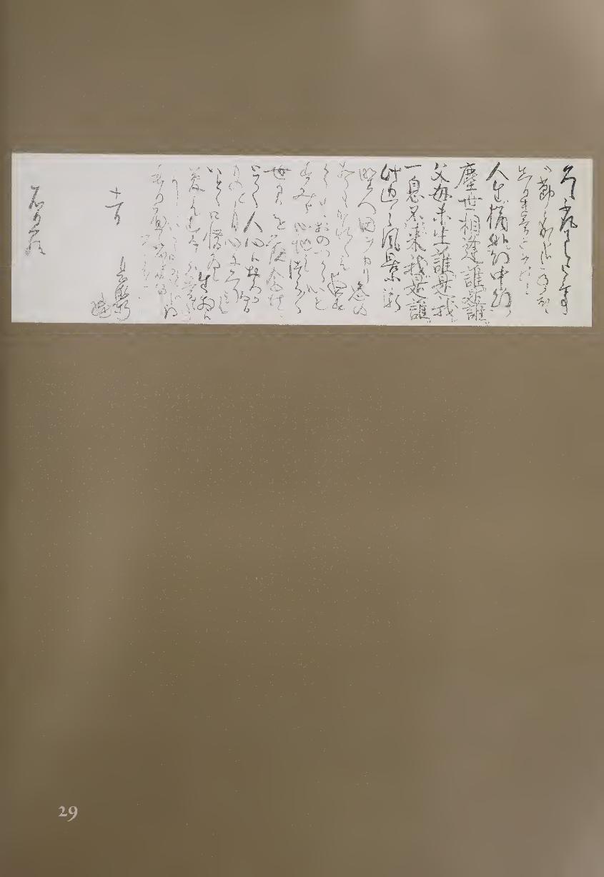
For the first line of the quatrain, Banzan starts by strongly delineating the
opening word, “man” (A), and then uses running-to-cursive script for the
rest of the column. For the following three columns, however, he moves to
standard script and adds Japanese syllables and grammatical marks in small
size next to the characters to make the reading of his quatrain easier. In addi¬
tion, while he leaves very little space between words of the poem, he keeps the
columns clearly separated. The result of the script choices, additional marks,
and spacing is that the poem stands out distinctly within the letter, express¬
ing Banzan’s deepest internal questions as he contemplates his life.
NOTES
1. From Shuichi Sato, A History of Japanese Literature: The Years of Isolation, trans. Don Sander¬
son (Tokyo & New York: Kodansha International, 1983), pp. 52-53.
2. See #66, Kogetsu Zenzai, for further explanation.
30 ITO JINSAI (1617—1705)
Ripening Plums Hanging scroll, ink on tinted paper, 15 x 29 cm.
Born in Kyoto, the son of a lumber merchant, Jinsai showed his bril¬
liance as a young child and was advised to become a doctor. More
interested in philosophy, he first studied Chu Hsi neo-Confucianism,
then moved to the teachings of Wang Yang-ming, and finally initiated
his own school of thought, kogigaku (Study of Ancient Meaning), which
emphasized going back to the original Confucian texts. Fie believed that
the fundamental Confucian value was jin (Chin.,jen, {A, benevolence or
compassion) and agreed with Wang Yang-ming that it was not sufficient
merely to have principles—one must put them into action. He stressed
loyalty and truthfulness in both words and deeds, which he believed would
lead to love and benevolence.
Unlike most Confucians of his time, Jinsai had no interest in serving
a feudal lord or the shogunate; instead, he opened a private academy—the
Kogido (Hall of Ancient Meaning)—that eventually attracted more than
a thousand pupils. Jinsai was assisted by his son, Ito Togai (#31), who also
published his father’s writings after his death. The major Confucian philoso¬
pher Ogyu Sorai (#32) was just one of many scholars influenced by Jinsai’s
thought, which became the basis for the broader tradition of the Ancient
Learnings school.
Jinsai believed that literature was a device for bringing forth the Way
(tao, M). Poetry is important in that it depicts human emotions; rather than
advocating morality or simply depicting nature, it expresses genuine feel¬
ings. Jinsai’s own poetry, as modest and restrained as his character, proceeds
directly from experience. In this small scroll, he does not tell the reader what
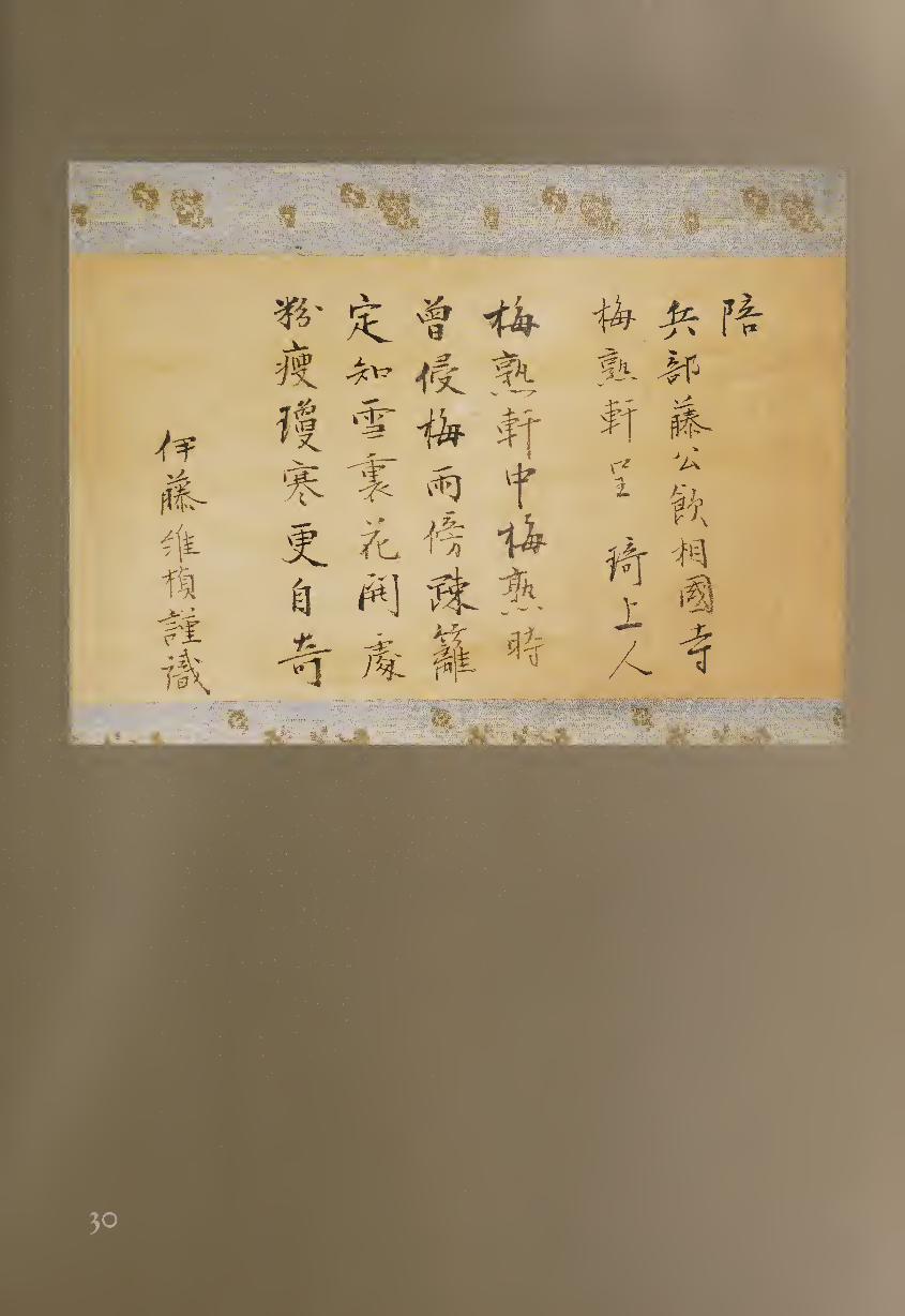
r '7TT • t -' l. v.'v fl
wJmm
t/Wf/i
m®
"iV!
to feel; rather, he introduces and describes a scene of springtime rebirth in a
way that allows the reader to share his perception.
Drinking at Sokoku-ji with Lord Fuji [warn], of the military department,
and presenting this poem to the monk Ki Shonin, as plum trees blossom at
the eaves of the temple.
At the Pavilion of Ripening Plums, the plums are ripening,
Already beset by plum rains at the bamboo hedge;
I already know that the buds, concealed in snow, are opening,
But as the powder thins, a cool redness mysteriously appears.
Jinsai’s poem is a quatrain with seven words in each line, arranged in
four columns. It is usually considered a mistake in this form of Chinese
regulated verse to repeat a character; but here the words “plums” and “ripen¬
ing” occur twice in the first line, and “plum” occurs again in the second line
as part of the phrase “plum rains” (gentle late spring drizzles). But because
the characters are used differently each time, first as a pavilion name, second
as themselves, and finally as a form of rain, Jinsai turns a seeming defect into
a point of interest.
Written on orange-red tinted paper with faint horizontal laid-lines,
Jinsai’s calligraphy in regular-to-running script is unassuming but expresses
a gentle flavor. The repeated words “plum” and “ripening” are written simi¬
larly each time but with slight variations; for example, the opening word
of the poem, “plum” (!§), begins with a stronger brush stroke than when it
reappears four and nine characters later. Since the lines of the quatrain are
rendered in four matching columns, there is no immediate visual counter¬
point; but by emphasizing certain words with heavier ink, Jinsai creates his
own sense of rhythm. Specifically, the fourth and fifth characters in column
one, the sixth in columns two and three, and the final three in column four
stand out with their thicker and darker lines, helping to express Jinsai’s
character and to give the work its own modest appeal. A calligraphy such
as this can easily be passed by; but like the red of the plum blossoms just
emerging from the snow, it repays close attention.
31 ITO TOGAI (1670-1736)
Quotefrom the I Ching Hanging scroll, ink on paper, 115.6 x 25.6 cm.
I to Togai followed his father Jinsai as a major Confucian scholar and
teacher in the Ancient Learnings school. He wrote, “Quietly and sur¬
reptitiously the teaching has been altered or done away with throughout
ten centuries or more, with the result that present-day teaching is no longer
identical with early Confucianism.”1
Also like his father, Togai was greatly interested in the I Ching, attempt¬
ing to interpret this classic not merely as a book of divination, which it had
largely become, but as a major early philosophical and ethical text. He wrote
114
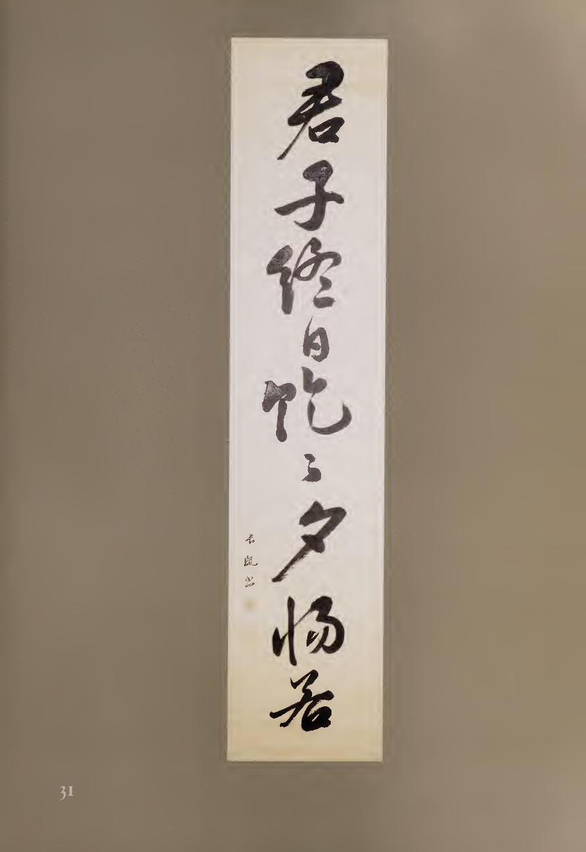
several books on this theme, including Tokueki shiki (Records of My Read¬
ing of the I Ching) in 1703, in which he argued that the accompanying
commentaries were not composed by Confucius, and Shueki keiyoku tsukai
(A Comprehensive Explanation of the Text and Ten Wings of the I Ching)
in 1728, where he explicated the entire text including commentaries.2
The I Ching is constructed of sixty-four hexagrams, combining every
possible variation of the nine trigrams, which are composed of three lines
that may be either solid or broken. For example, three solid lines signify
“heaven,” while three broken lines indicate “earth.” Putting two “heaven”
trigrams together creates the first of the sixty-four hexagrams, which can
mean both “heaven” and “creative power.”
Here Jinsai has written out a line from the primary text on this first
hexagram, in which the third of the six lines, reading from the bottom, is
given the interpretation:
All day long the superior man is creatively active;
At nightfall his mind is still beset with cares.3
Other translations of this nine-character phrase are possible; for ex¬
ample, the words “creatively active” can also be rendered as “respectfully
attentive.” In either case, we may ask why Togai chose to write out this text.
It might be imagined that Togai, or the recipient of this calligraphy, had
found this line through divination. More important, however, he very likely
found the phrase meaningful in his own life. As a scholar-teacher in charge
of the school initiated by his father, he was surely busy during the day; but
even at night his duties and responsibilities did not end.
What does the calligraphy itself tell us? The nine characters (the sixth is a
repeat mark like our ditto symbol) are written in running-to-cursive script,
with the first stroke of each word emphasized through a thicker and heavier
line. In the final word, however, the emphasis upon the final strokes at the
bottom of the character brings a sense of completion and balance to the work.
We can also see that a few of the characters tilt, such as the first and seventh
to the right, and the fifth and eighth to the left, giving the scroll a feeling of
relaxation and movement. Tie I Ching is often considered a Conlucian text,
but it also has ties to Taoist thought, and here the mood is not that of Con-
fucian rectitude, but rather a Taoist sense of freedom and natural flow.
Finally, the artist’s unusually small and modest signature on the left sug¬
gests that Togai was much more interested in bringing forth the text than
in promoting his own artistic interpretation. The entire basis of the Ancient
Fearnings school was to emphasize the original texts, and here that is just
what Togai has done.
NOTES
1. From Togai’s Kokon gakuhen (Changes in Confucian Teaching), quoted in Tsunoda, de
Bary, and Keene, eds., Sources of Japanese Tradition (New York: Columbia University Press,
1958), p.412.
2. For further information, see Wai-ming Ng, “Study and Uses of the I Ching in Tokugawa
Japan,” Sino-Japanese Studies 9, no. 2 (April 1997): 35.
3. The I Ching, translated by Richard Wilhelm and rendered into English by Cary F. Baynes
(Princeton, N.J.: Princeton University Press, 1930), p. 8.
ii 6
32 OGYU SORAI (1666-1728)
The Setting Sun Hanging scroll, ink on paper, 127.9 x 29 cm
Born in Edo to a samurai-class family of physicians, Ogyu Sorai was
a child prodigy, able to write in Chinese by the age of seven. He
began his official studies at the age of nine, at which time he also
composed his first poems. His father was exiled to Kazusa (Chiba) in 1679,
however, and Sorai lived among and observed the world of farmers; he was
later to write that the exodus of rural people into cities was the source of
many social problems. Returning to Edo in 1690, Sorai began his career as a
scholar by giving outdoor lectures near the temple Zozo-ji. His career rapidly
advanced, and he was soon appointed to the staff of Yanigisawa Yoshiyasu
(1658-1714), the chief counselor of the shogun. In 1717, Sorai established his
own school, which was very influential both in his own time and beyond.
Perhaps Japan’s great philologist, Sorai agreed with Ito Jinsai that Con¬
fucianism should be studied from its sources, rather than from later inter¬
pretations. He criticized Jinsai, however, writing that this “scholar of great
stature . . . has openly divided the Way of early kings and Confucius into
two ways, and put the six classics [The Books of History, Odes, Changes,
Rites, Music (since lost), and the Spring and Summer Annals] aside in favor
of the Analects alone.”1 Sorai’s exceptional abilities in the study of ancient
Chinese allowed him to investigate all the early Confucian texts thoroughly,
and apply them to matters of his own time.
Although Sorai did not follow the official Chu Hsi neo-Confucianism,
he was supported by the shogunate, in part because he advocated a strong
system of laws. Remembering his experience in the countryside, he recom¬
mended that all families should be registered so they would have fixed places
of residence, and that the distinctions among samurai, farmers, artisans, and
merchants should be maintained. Nevertheless, he insisted that the govern¬
ment itself should be administered by those with the most ability, whatever
their social background. Convinced that wisdom develops only through
hardship, he wrote that “through the study of history also we may see, as
clearly as in a mirror, that men of intelligence and talent have all come from
below; rarely have they come from hereditarily privileged families.”1
Sorai also stressed personal cultivation in the (Chinese) arts; he amassed
a fine library, took an interest in literati painting as well as music (about
which he wrote four books), and was himself an exceptional poet and cal¬
ligrapher. Here, in a couplet in bold cursive script, he celebrates the arrival
of a poem from a friend; presumably this calligraphy, in true literati fashion,
would have been sent back as a return gift.
Setting sunlight on lingering snow illuminates the studio:
Suddenly, humbly I receive your new poem, each word full of skill."
The opening character, “setting/slanting” (§4), is strongly accentuated,
with a notable slant to its vertical final stroke. Subtle visual echoes of the
first two characters appear in the second and third words of the second col¬
umn, which is organized in a zigzag interaction with the first. There is also
a similarity of form between characters 1/4 and 2/5, indicating that Sorai is
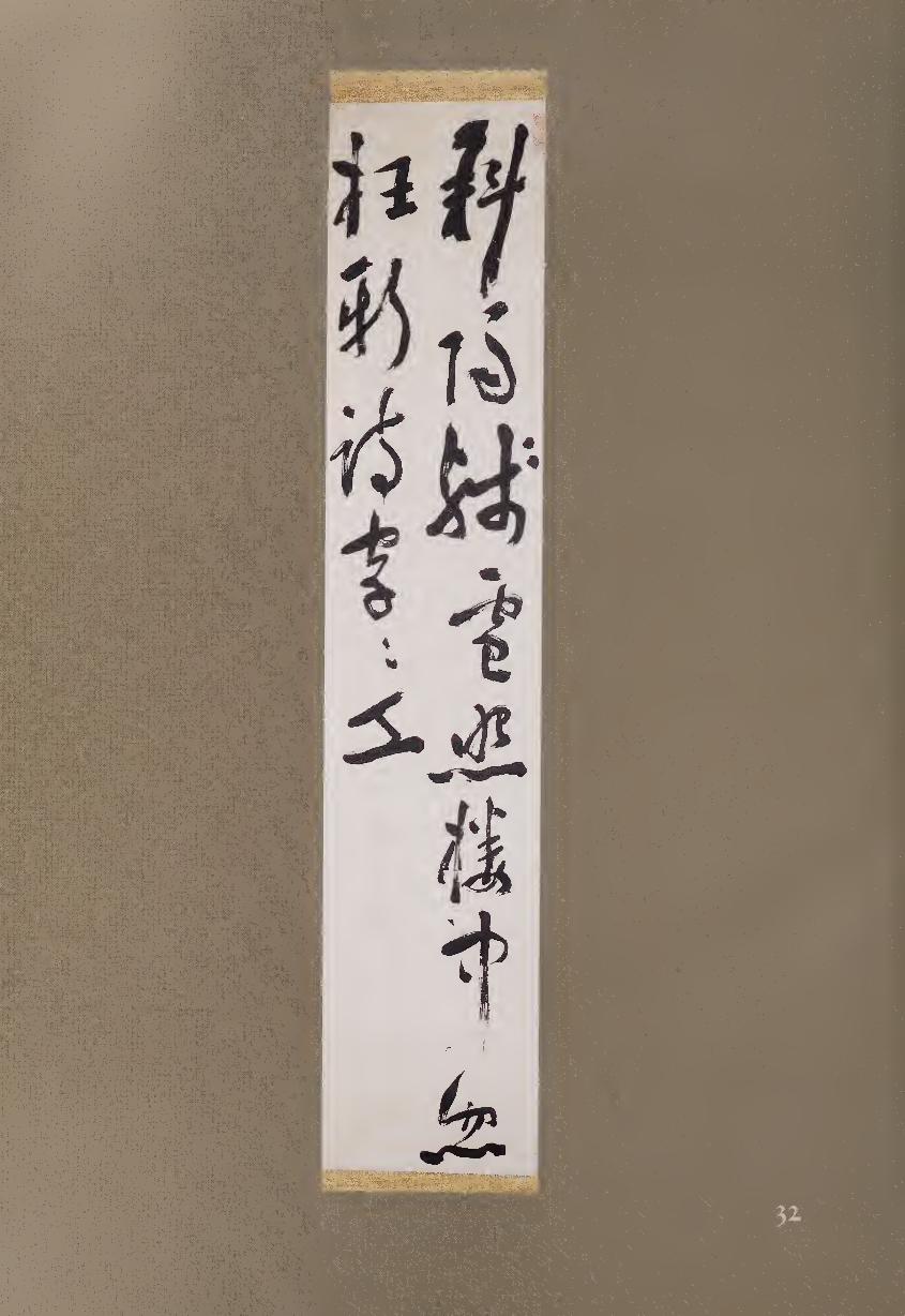
aware of the visual interplay that his calligraphy would create. Although his
style at first seems rough and spontaneous, it is never hasty; his alternation
of tension and release can be seen in the strokes that bend and twist at dif¬
ferent speeds in the second character, “sunlight” (PH). Another example of
his personal style comes in the three horizontal strokes on the right side of
2/1, “humbly receive” (fl). Each of these short, dashlike strokes begins dif¬
ferently, from a point to a triangle to a thick slab, and each relates to strokes
to its left and right. Sorai's continuously varying brushwork rhythms well
express his couplet about winter snow reflecting the setting sun.
Although the two poetic lines are seven characters each, Sorai has
written them in columns of eight and six, so that the word “suddenly’ ’ m
appears at the end of the first column. Following a long and fading vertical
stroke, this character has extra impact both because of the space above it
and because of its brushwork, opening with a “bamboo-leaf” diagonal and
concluding with a rhythmically pulsating horizontal. A similar vibrating
stroke ends the fifth character, “shine/illuminate” (M), while an even more
strongly articulated horizontal anchors the entire calligraphy just to its left.
Although the couplet is written in cursive script, the three strokes of this
final word are clearly delineated in diagonally faceted regular script that
balances the opposing diagonals of the first character and helps to mark an
ending. Despite its apparent freedom, the entire scroll, when examined
closely, is rhythmically accented and structured throughout its two-column
composition. Sorai’s poetic couplet emerges as individualistic calligraphy,
each word full of skill.
NOTES
1. From Sorai's Distortion of the Way through Ignorance of the Past, quoted in Tsunoda, de Bary,
and Keene, eds., Sources of the Japanese Tradition (New York: Columbia University Press, 1958),
p. 28.
2. From Sorai’s For a Merit System in Government, ibid., pp. 432-433.
3. Translated by Jonathan Chaves.
33 HATTORI NANKAKU (1683-1759)
Spring and Autumn Quatrains Pair of hanging scrolls, ink on paper, each 186.3 x 52-7 cm.
Nankaku was born in Kyoto, the second son of a merchant. Gifted
from his youth, he moved at fourteen to Edo, where his poems
attracted the attention of the senior counselor to the shogun,
Yanagisawa Yoshiyasu (1658-1714). Nankaku soon joined his staff and
became a pupil of Ogyu Sorai (#32), who was also serving Yoshiyasu at the
time. In 1718, four years after Yoshiyasu’s death, Nankaku left to found his
own Confucian academy; he remained close friends with Sorai, and after the
master’s death he catalogued Sorai’s works. More interested in the arts than
in philosophy, however, Nankaku became a leading poet and calligrapher in
119
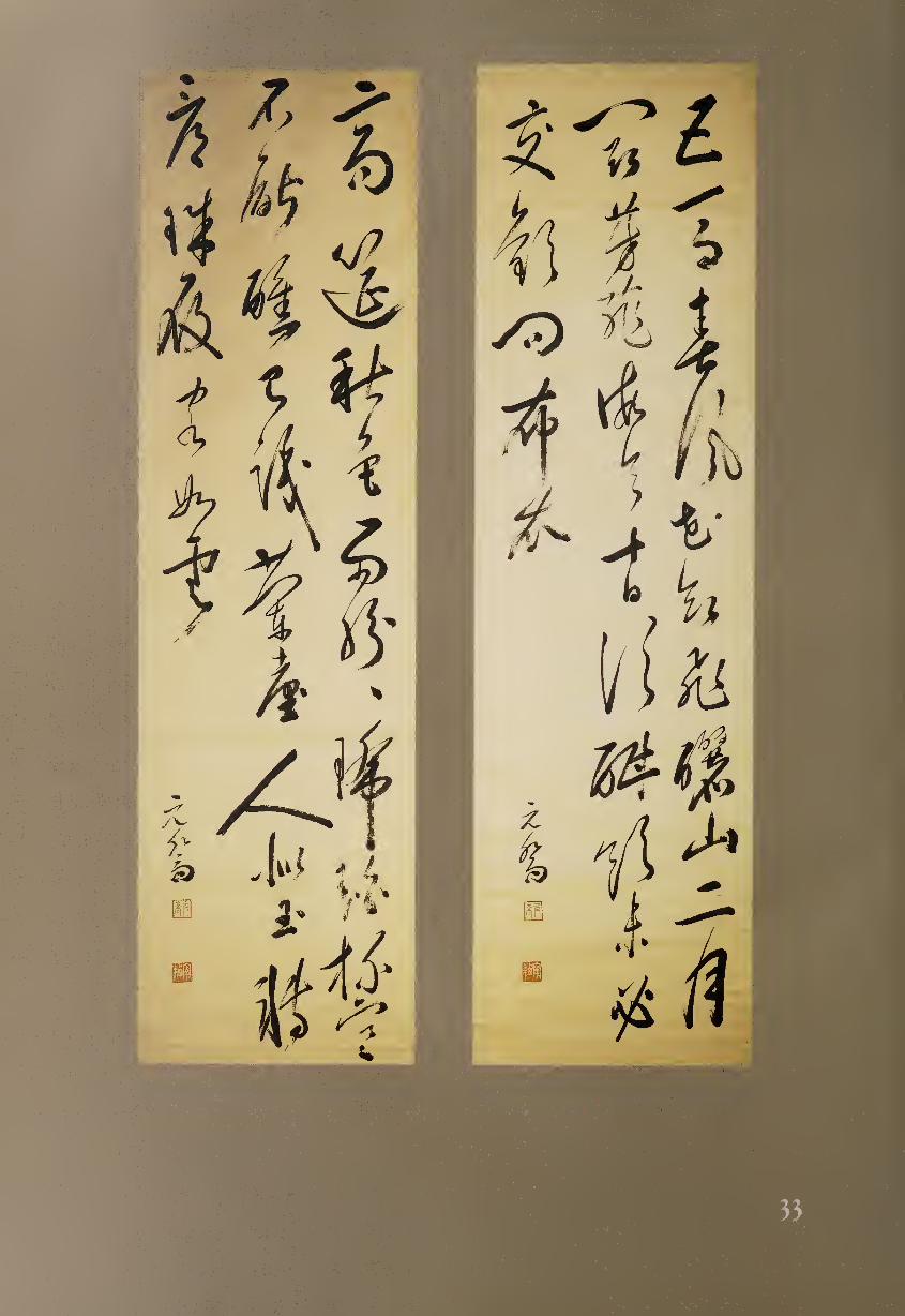
the Chinese style; he led a gathering of literati in Edo called the Fukyosha.
In addition to publishing several books, including an influential anthology
ol T’ang-dynasty poetry and a volume of his own literary works, he became
one of the pioneer painters in the Japanese nanga (literati) tradition, along
with Gion Nankai (#40) and Yoshiyasu’s nephew Yanagisawa Kien (1706-
1758). Nankaku even painted the walls of his house so that he could lie back
and let his imagination wander among his creations.
The poems on this pair of scrolls represent festivities during spring and
autumn; and as translator Jonathan Chaves has noted, they use a number of
allusions to conjure up an atmosphere of courtly feasting: “Five-Horse Pre¬
fect” refers to a high official allowed to use a team of five; “Mount Li” is the
locale of the magnificent tomb of China’s first emperor; “Orchid Terrace”
refers to another venue of courtly pleasures in China; and “pearl-studded
slippers” were worn by retainers of a feudal lord known for his magnificence.
The Five-Horse Prefect rides the spring wind, flowers seem to fly,
Mount Li in the Second Month, vying in perfumed fragrance!
If he should spend the next ten days getting really drunk,
No need to ask for friendship from men of cotton clothes!
A noble feast among autumn colors, rain densely falling;
Amber cups so frozen we simply can’t get drunk.
In days of old, we’ve heard of Orchid Terrace ladies, lovely as jade,
And now we turn to view pearl slippers, guests numerous as clouds!
Lor these high-spirited poems, Nankaku has filled two tall scrolls with
the lively and dynamic cursive script for which he was especially known.
The “spring” (right side) scroll begins with the words “five” and “horse(s)”
(TlJ§), each written in two strokes, although in regular script they would
require four and ten, respectively. The next two characters, “spring wind”
(#®), move in equally free-flowing cursive script, with “wind” completed
in the same stroke that ends “spring.” The brush also runs dry for “wind,”
giving this character an appropriately blown-about feeling. The next word,
“flower” (Ft), is much smaller than the first four but has its own visual
intensity, achieved by its use of thick black ink and by the compressed com¬
position in which the left side is balanced by a single dot.
In total, we may note five forms of rhythm in this pair of scrolls. The first
is the poetic lineation of 7-7-7-7 and 7-7-7-7. The second is the contrasting
structure of the columns, consisting of 11-12-5 and 11-11-6 characters, so that
only the first word in each scroll begins a poetic line. Third is the irregular
pattern of heavier and lighter characters, the latter created by either thinner
lines or dry-brush technique. Fourth is the occasional use of running rather
than cursive script, such as the three words “mountain second month” (| Lj 1
jfi), which end the first column of the “spring” poem. Fifth is the varying
size of the characters, a feature of much cursive script. This is especially no¬
table in the sixth and seventh words of the second “spring” column, “ten
days” (ffiB), which are much smaller than the character below them but
perhaps even more forceful because of their angular intensity. One might
guess that they are smaller because of their relative simplicity, being usually
composed of two and four brush strokes, here reduced to a single gesture.
The character that combines the greatest force with the largest size, however,
m
is a two-stroke word usually translated as “man but more accurately as
“person/people” (A), here referring to women, in the lower middle of the
“autumn” poem. The first of the two bold diagonal strokes points to Nan-
kaku’s signature to the left, while the second angles to the right and forms a
roof for the final three words in this column.
Among the many other energetic forms is the character for “ask” (ful), the
third word in the third column of “spring.” This character is made up of a
pictograph of a gate (PI) under which there is a mouth (□). The entire “gate”
form, usually requiring eight strokes, is here done in one subtly nuanced
curved line, while two dots below form the “mouth,” usually a square three-
stroke form. Appropriately, the pair of poems ends with the word “cloud(s)”
(St), which here begins with strong angular strokes and then fades away
into space.
34 UNO MEIKA (1698-1745)
Spring in Kitano Hanging scroll, ink on paper, 23 x 23 cm.
Although born into a merchant-class shipping family in Kyoto,
Uno Meika became a well-known Confucian scholar, as did his
brilliant younger brother Uno Shiro (1700-1731). Meika at first
followed the orthodox Chu Hsi tradition and later was influenced by the
ideas of Ogyu Sorai (#32). Before the end of his relatively short life, however,
Meika became a leader in a new eclectic school of Confucianism that en¬
couraged students to select the best from various traditions for themselves.
His unassuming but firm personal character is fully shown by this small,
modest calligraphy in masterful regular script.
Small-scale standard script, the basis for much calligraphy, is often ne¬
glected by viewers since it exhibits neither the bold movement of running
and cursive scripts nor the antique elegance of seal and clerical scripts. Fur¬
thermore, regular script is surprisingly difficult to write with true distinc¬
tion, perhaps because—as the usual form of printed script—it may at first
seem uncreative. Yet well-written regular script can be an art that provides a
special pleasure to viewers when they tire of the more flamboyant scripts. At
its best, it expresses a pure and subtle flavor that connoisseurs highly value.
The standards for regular script were set in the T’ang dynasty, and most
later calligraphers studied the style of at least one of the three greatest mas¬
ters: Ou-yang Hsun (537-645), esteemed for his structural compositions;
Ch’u Sui-liang (596-658), admired for his lighter and more elegant touch;
and Yen Chen-ch’ing (709-785), appreciated for his bolder brushwork and
more informal style.
The calligraphy here has been written on a square piece of paper in shikishi
(poem-card) size. Although extraordinarily delicate, the writing exhibits a
firmness of structure that makes each character balance perfectly while still
seeming to float weightlessly in space. In accordance with the Ch’u Sui-liang
122
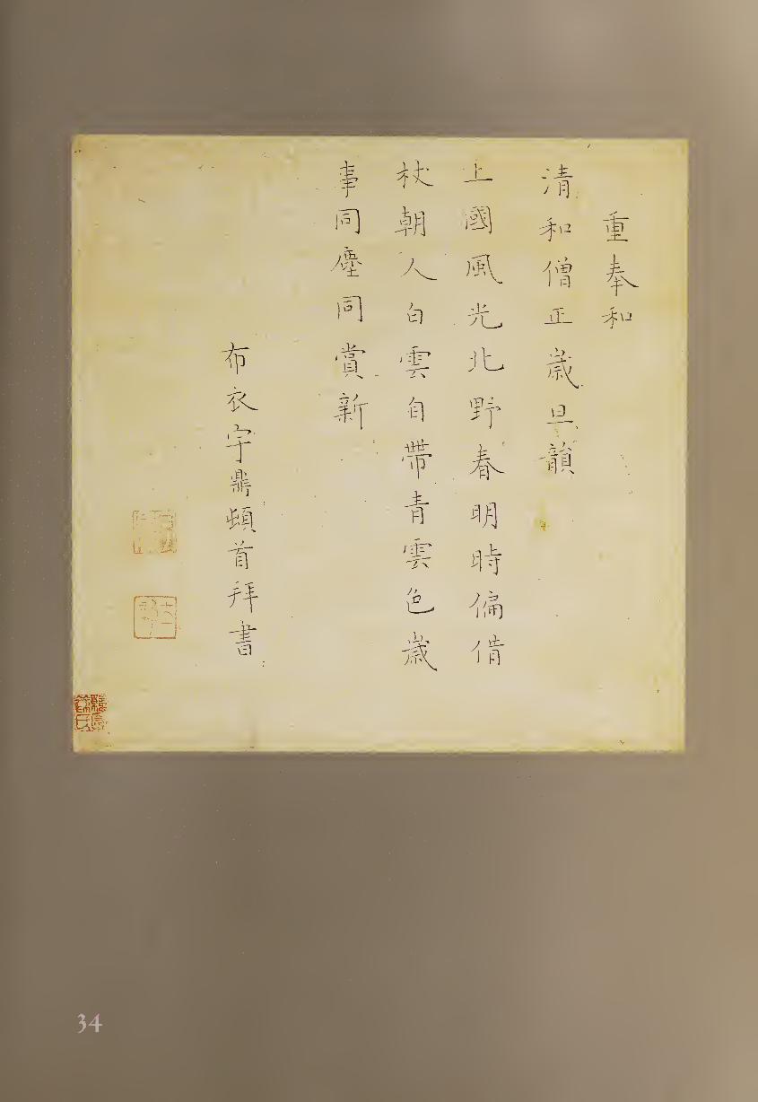
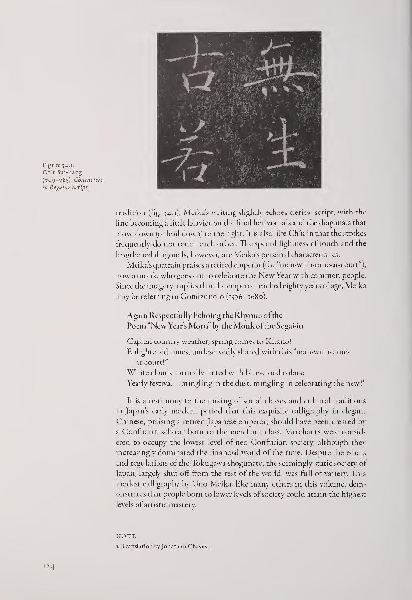
Figure 34.1.
Ch’u Sui-liang
(709-785), Characters
in Regular Script.
tradition (fig. 34.1), Meika’s writing slightly echoes clerical script, with the
line becoming a little heavier on the final horizontals and the diagonals that
move down (or lead down) to the right. It is also like Ch’u in that the strokes
frequently do not touch each other. The special lightness of touch and the
lengthened diagonals, however, are Meika’s personal characteristics.
Meika’s quatrain praises a retired emperor (the “man-with-cane-at-court”),
now a monk, who goes out to celebrate the New Year with common people.
Since the imagery implies that the emperor reached eighty years of age, Meika
maybe referring to Gomizuno-o (1596-1680).
Again Respectfully Echoing the Rhymes ol the
Poem “New Year’s Morn by the Monk of the Segai-in
Capital country weather, spring comes to Kitano!
Enlightened times, undeservedly shared with this “man-with-cane-
at-court!”
White clouds naturally tinted with blue-cloud colors:
Yearly festival—mingling in the dust, mingling in celebrating the new!1
It is a testimony to the mixing of social classes and cultural traditions
in Japan’s early modern period that this exquisite calligraphy in elegant
Chinese, praising a retired Japanese emperor, should have been created by
a Confucian scholar born to the merchant class. Merchants were consid¬
ered to occupy the lowest level of neo-Confucian society, although they
increasingly dominated the financial world of the time. Despite the edicts
and regulations of the Tokugawa shogunate, the seemingly static society of
Japan, largely shut off from the rest of the world, was full of variety. This
modest calligraphy by Uno Meika, like many others in this volume, dem¬
onstrates that people born to lower levels of society could attain the highest
levels of artistic mastery.
12.4
NOTE
1. Translation byjonathan Chaves.
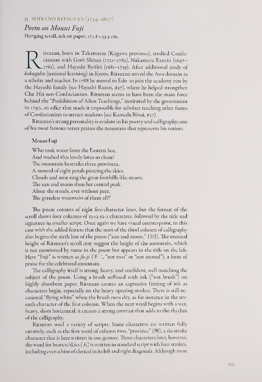
35 SHIBANO RITSUZAN (1734-1807)
Poem on Mount Fuji Hanging scroll, ink on paper, 171.8 x 53.3 cm.
Ritsuzan, born in Takamatsu (Kagawa province), studied Confu¬
cianism with Goto Shizan (1721-1782.), Nakamura Ranrin (1697-
1761), and Hayashi Ryuko (1681-1759). After additional study of
kokugaku (national learning) in Kyoto, Ritsuzan served the Awa domain as
a scholar and teacher. In 1788 he moved to Edo to join the academy run by
the Hayashi family (see Hayashi Razan, #27), where he helped strengthen
Chu Hsi neo-Confucianism. Ritsuzan seems to have been the main force
behind the “Prohibition of Alien Teachings,” instituted by the government
in 1790, an edict that made it impossible for scholars teaching other forms
of Confucianism to attract students (see Kameda Bosai, #37).
Ritsuzan’s strong personality is evident in his poetry and calligraphy; one
of his most famous verses praises the mountain that represents his nation:
Mount Fuji
Who took water from the Eastern Sea,
And washed this lovely lotus so clean?
The mountain bestrides three provinces,
A mound of eight petals piercing the skies.
Clouds and mist ring the great foothills like steam;
The sun and moon shun her central peak.
Alone she stands, ever without peer,
The grandest mountain of them all!1
The poem consists of eight five-character lines, but the format of the
scroll shows four columns of 13-12-12-3 characters, followed by the title and
signature in smaller script. Once again we have visual counterpoint, in this
case with the added feature that the start of the third column of calligraphy
also begins the sixth line of the poem (“sun and moon,” BE1). The unusual
height of Ritsuzan's scroll may suggest the height of the mountain, which
is not mentioned by name in the poem but appears in the title on the left.
Here “Fuji” is written as fu-ji (TTl, “not two” or “not second”), a form of
praise for the celebrated mountain.
The calligraphy itself is strong, heavy, and confident, well matching the
subject of the poem. Using a brush suffused with ink (“wet brush”) on
highly absorbent paper, Ritsuzan creates an expressive fuzzing of ink as
characters begin, especially on the heavy opening strokes. There is still oc¬
casional “flying white” when the brush runs dry, as for instance in the sev¬
enth character of the first column. When the next word begins with a wet,
heavy, short horizontal, it creates a strong contrast that adds to the rhythm
of the calligraphy.
Ritsuzan used a variety of scripts. Some characters are written fully
cursively, such as the first word of column two, “province” (flf), a six-stroke
character that is here written in one gesture. Three characters later, however,
the word for heaven/skies (F) is written in standard script with four strokes,
including even a hint of clerical in its left and right diagonals. Although most
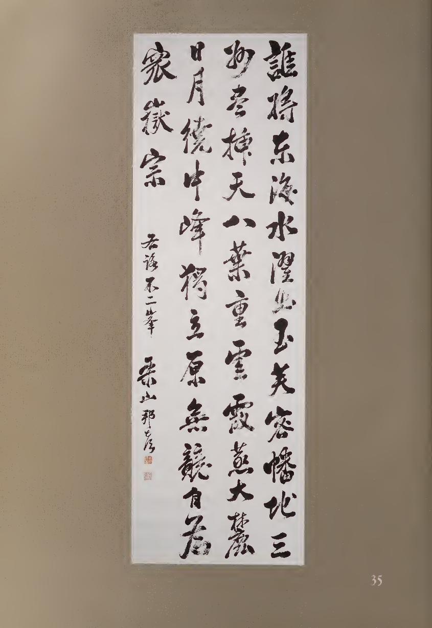
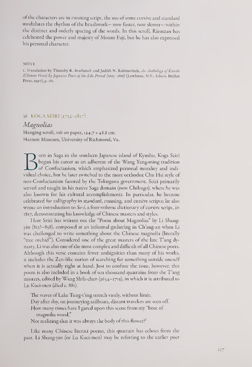
of the characters are in running script, the use of some cursive and standard
modulates the rhythm of the brushwork—now faster, now slower—within
the distinct and orderly spacing of the words. In this scroll, Ritsuzan has
celebrated the power and majesty of Mount Fuji, but he has also expressed
his personal character.
NOTE
i. Translation by Timothy R. Bradstock and Judith N. Rabinovitch, An Anthology of Kanshi
(Chinese Verse) by Japanese Poets of the Edo Period (1603-1868) (Lewiston, N.Y.: Edwin Mellen
Press, 1997), p. 181.
36 KOGASEIRI (1752-1817)
Magnolias Hanging scroll, ink on paper, 124.7 x 48-8 cm.
Harnett Museum, University of Richmond, Va.
Born in Saga in the southern Japanese island of Kyushu, Koga Seiri
began his career as an adherent of the Wang Yang-ming tradition
of Confucianism, which emphasized personal morality and indi¬
vidual choice, but he later switched to the more orthodox Chu Hsi style of
neo-Confucianism favored by the Tokugawa government. Seiri primarily
served and taught in his native Saga domain (now Chikugo), where he was
also known for his cultural accomplishments. In particular, he became
celebrated for calligraphy in standard, running, and cursive scripts; he also
wrote an introduction to So-i, a four-volume dictionary of cursive script, in
1817, demonstrating his knowledge of Chinese masters and styles.
Here Seiri has written out the “Poem about Magnolias” by Li Shang-
yin (813?—858), composed at an informal gathering in Ch’ang-an when Li
was challenged to write something about the Chinese magnolia (literally
“tree orchid”). Considered one of the great masters of the late Tang dy¬
nasty, Li was also one of the most complex and difficult of all Chinese poets.
Although this verse contains fewer ambiguities than many of his works,
it includes the Zen-like notion of searching for something outside oneself
when it is actually right at hand. Just to confuse the issue, however, this
poem is also included in a book of ten thousand quatrains from the T’ang
masters, edited by Wang Shih-chen (1634-1711), in which it is attributed to
Lu Kuei-men (died c. 881).
The waves of Lake Tung-t’ing stretch vastly, without limit;
Day after day, on journeying sailboats, distant travelers are seen off.
How many times have I gazed upon this scene from my “boat of
magnolia wood,”
Not realizing that it was always the body of this flower?1
Like many Chinese literati poems, this quatrain has echoes from the
past. Li Shang-yin (or Lu Kuei-men) may be referring to the earlier poet
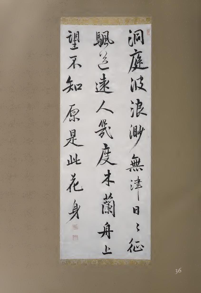
Ch u Yuan, who wrote about flowers with magical symbolic qualities in his
Ch’u tz’u (Songs of the South). If it is indeed by Li, he was writing this qua¬
train in Ch’ang-an, far to the northwest of Lake Tung-t’ing (which is part of
the idyllic locale of the Ch’u. tz’u), so he might have considered himself one
of the “distant travelers.”
This scroll may have originally been one of a pair, accompanied by a
painting of magnolias. In any case, perhaps to compensate for the poem’s
referential meanings, the calligraphy is straightforward in style and spirit.
Although the scroll is now somewhat rubbed and worn, the characters ap¬
pear in a clear, orderly fashion, with regular spacing from one word to the
next. With controlled brushwork, Seiri here organizes the poem in firm col¬
umns with a generous span between them. For the sake of variety, however,
he moves from regular to running script and, in a few cases, to cursive. One
cursive example is the second word in the middle column, meaning “to see
off” (JM), which is contrasted by the firm and blunt regular-script rendition
of “distant” (iH) below it. The following word is “person” (A); these three
characters are significant because they may describe the poet, as well as those
people he sees at a distance, as a searcher or wanderer (fig. 36.1). Indeed, the
lightly brushed and vastly simplified “see off” in cursive script almost seems
lost in comparison with the other characters. There is one moment of erudite
playfulness in Seiri’s calligraphy; at the beginning of the middle column, he
substitutes an archaic character combining the graphs for “horse” (Ji) and
“wind” (®) for the more modern character for “sail” (#i).
The total organization of the calligraphy is also appropriate to the text.
The three columns have a different rhythm than the 7-7-7-7 quatrain,
containing 10-10-8 characters, with the eight-word line ending with two
seals. Since the final two characters of the poem are the interesting and am¬
biguous “flower body” (/£#), which might also be translated “flower self”
or “flower itself,” the viewer has space, and therefore time, to contemplate
their meanings.
A long cultural lineage extends from Ch’u Yuan to Li or Lu, and then to
Koga Seiri, who is even farther from Lake Tung-t’ing—except in his poetic
imagination. This calligraphy therefore stands as evidence of how thor¬
oughly and deeply the literati world spread its net of imagery, emotion, and
beauty for more than a millennium, first from China to Japan, and now to
the Western world.
NOTE
1. Translation byjonathan Chaves.
1 A A
Figure 36.1.
12.9
37 K AM EDA BOS AI (1754-1816)
Old Trees
Hanging scroll, ink on paper, 132.4 x 47.3 cm.
Kameda Bosai began his career as a Confucian scholar and teacher,
and ended it as a free-spirited literatus adept at poetry, calligraphy,
and painting.1 In many ways his life mirrored the changes taking
place in Japan during the eighteenth and early nineteenth centuries. For
example, his ancestors had been farmers, but his lather moved to Edo and
managed a shop specializing in tortoise-shell products such as combs (the
name Kameda means “tortoise fields”). This move reflects the gradual urban¬
ization of Japan, particularly the growth of the new capital city.
Although education past a primary level was generally restricted to chil¬
dren of the samurai-official class, the gifted young Bosai studied the Confu¬
cian classics with Inoue Kinga (1732-1784) and calligraphy with Mitsui
Shinna (#19). In or around 1774, Bosai opened his own Confucian academy,
and over the next two decades he is reputed to have attracted more than one
thousand students. However, his form of eclectic Confucianism, stressing
individual choice and responsibility, was not popular with the shogunate,
which preferred the loyalist doctrines of the Chu Hsi school. Bosai’s pro¬
posals in 1781 for governmental improvements were ignored, and in 1790
the regime issued a “Prohibition of Alien Teachings” that severely criticized
the eclectic school. Bosai kept lecturing for seven years, but he gradually lost
his pupils because they could not secure official positions without the proper
pedigree. He finally closed his academy in 1797.
For the final three decades of his life, Bosai wrote scholarly works, com¬
posed poems, traveled, painted, and above all became celebrated for his cal¬
ligraphy. An extended journey to the northwestern Niigata region of Japan
in 1809-1810 allowed him to meet and befriend the Zen monk-poet Ryokan
(#76), whose free cursive script had an influence on Bosai; indeed, Ryokan
might have been the reclusive monk who forms the subject of the quatrain
in this scroll:
Old trees are imbued with the face of spring;
Cold waterfalls arouse mysterious reverberations.
I am thinking of a mountain hermit
Who can appreciate the wind and dew without restraint.
The poem, in four lines of five characters each, is written in columns of
8-7-5, with the signature “Bosai” and seals completing the final column.
Although cursive script is sometimes thought of as rapid and relatively un¬
structured, this calligraphy shows a great deal of structural “bone” as well as
surface “flesh”; the movement of the brush is sometimes quick, sometimes
slow, with curved strokes alternating with straighter and blunter lines. If we
compare the first words in each column, for example, we see a freely struc¬
tured “old” (3^) at the top right spiraling down to the next word, “trees” (HI),
contrasting with an architectonic “mysterious” (Hfj) in the center column and
a flowing “wind” (®) on the top left.
The most significant three words in the calligraphy, however, are those
that end the central column, “mountain amid person” (mountain hermit, (JL|
130
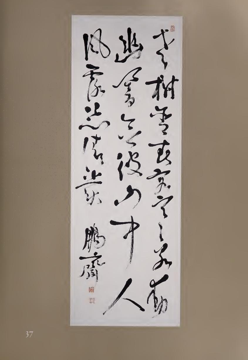
Figure 37.1.
Forgery of Kameda
Bosai’s signature.
if A). These characters were originally pictograms: “mountain” is composed
of a central peak with a smaller peak on either side, “amid” is a rectangle cut
in half with a vertical stroke, and “person” represents a basic stick figure
with two legs. In this scroll, the “mountain” seems to bounce upward, the
“amid” curls around and sweeps down, and the “person” creates a strong
base. Although all three kanji are simple rather than complex (taking only
three, four, and two strokes in regular script), Bosai gives them extra space
so the movement of the calligraphy can broaden out at this crucial struc¬
tural point, the lower part of the middle column.
The signature of the artist is usually much smaller in size than the other
characters, but here the two kanji are almost as large as all but the pair to
their right. Bo (II) is the graph for “phoenix,” made up of three vertical
divisions: “moon’ on the left, another “moon” in the center, and “bird”
(J§) on the right. Bosai here joined the three as though they were leaning
upon each other, while the sai (hall, m) beneath them has a strong “roof”
radical at the top but then begins to deconstruct below. Both are complex
characters, requiring nineteen and fourteen strokes in standard script; but
as often happens in signatures, they are here presented with considerable
idiosyncratic verve. If we examine a signature from a forgery of Bosai’s cal¬
ligraphy (fig. 37.1), we can see by comparison that Bosai’s genuine cursive
script does not merely bend and twist like limp spaghetti but maintains a
lively balance between fluency and architectural strength.
NOTE
1. For more information on Bosai’s life and reproductions of his painting and calligraphy, see
Stephen Addiss, The World of Kameda Bosai (New Orleans Museum of Art, 1984).
38 RAI SANYO (1780-1831)
The Ballad of Sanjd Bridge Hand scroll, ink on decorated paper, 15.6 x 43.8 cm.
One of Japan’s major literati artists of the early nineteenth century,
Rai Sanyo came from a noted Confucian family. His father Rai
Shunsui (1746-1816) and his uncle Rai Kyohei (1736-1834) were
both well-known teachers, but as a youth Sanyo was rebellious. After
studying for a year at the Hayashi Confucian academy in Edo, he returned
to his family home in Aki, Hiroshima, where he led a dissipated life. An
arranged marriage to a young bride failed, and in 1800 he left Aki without
official permission, a serious offense at the time. Caught in Kyoto, he was
returned for three years of house arrest in Aki. During this time he began
his unofficial history of Japan, Nihon gaishi, which he finally completed in
1817. His emphasis on emperors rather than shoguns became popular with
literati, but not with the Tokugawa government. Sanyo’s son Mikisaburo
continued the anti-shogunal movement and was beheaded in 1859.
131
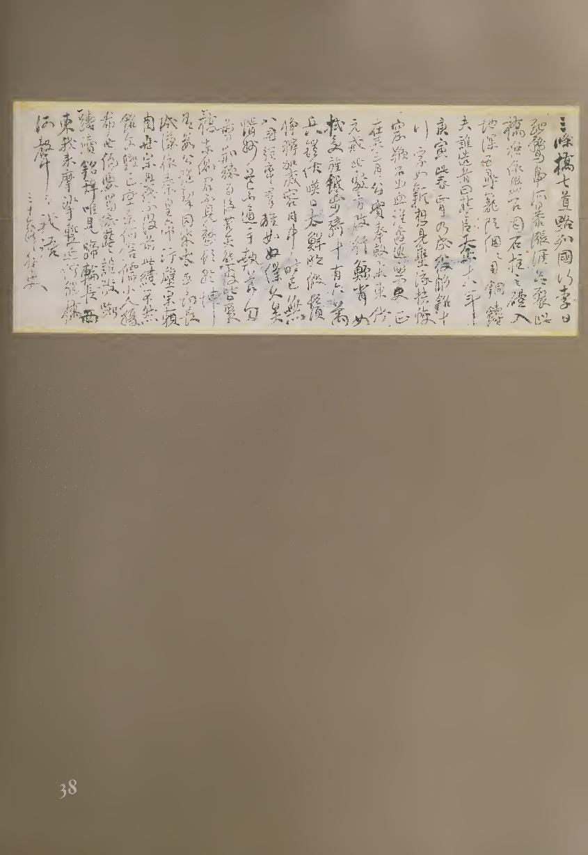
Beginning in 1811, most of Sanyo’s career was spent as an independent
scholar-artist in Kyoto, where he was extremely active in practicing and pro¬
moting Chinese-style poetry, calligraphy, and painting. Traveling exten¬
sively and meeting with like-minded scholars and artists, he became the close
friend of Shinozaki Shochiku (#44) and the teacher and would-be husband
of Ema Saiko (#45).
Because Kyoto’s Sanjo Bridge leads in and out of the ancient capital, it
is a symbol of many historical moments in Japanese history. In this long
poem, Sanyo praises the two pre-Tokugawa shoguns who reunited Japan,
Oda Nobunaga (1534-1582) and Toyotomi Hideyoshi (1536-1598), especially
noting Hideyoshi’s construction of Sanjo Bridge and his subduing of the far
north in 1590. By praising these two shoguns, Sanyo was directly criticizing
those who had neglected or derided them; in an indirect way he was perhaps
also criticizing the Tokugawa government of his own day.
The Ballad ol Sanjo Bridge
Sanjo Bridge—ah! The road to the Seven Circuits.
Folk who live in the sixty provinces flock here like ducks.
The Kamo River suddenly rises, banks about to burst.
But this bridge stands proud and tall, its rock foundations firm.
Look at the stone plinths all along the bridge—
They go into the ground to a depth of fivzjin.
Those carved dragons never decaying, cast of the finest copper.
Who was it who constructed this? Lord Toyo[-tomi] was his name.
’Twas in the eighteenth year of Tensho [1590], the ko-in cyclical year.
In the springtime, the first month, the project was completed.
Inscribed words, ten lines long, the characters still fresh.
Damming the flow, they dug out the flood-dragons and water-lizards
from their holes.
They flogged the stone, extracting its blood—who among them shrank?
According to the historical records, it was the third month of the year
That our sterling lord received an edict to join the Eastern Expedition.
At that time, the chariots of war had just begun to move.
The pennants and halberds that he took up were as vast as the back of
a whale.
The cavalry and foot-soldiers numbered 150,000 men.
Armor and lances shone in the sunlight—oh, so very bright.
One can visualize their false whiskers, which lent them martial
splendor.
The panorama!—they packed the bridge, spilling out onto Kujo-dori
[Ninth Avenue]!
In their eyes, the Eight Provinces simply did not exist;
To the armies who chased down the enemy, those troops were but slaves
and lackeys.
The road to the “maggot states” had for ages been impassable;
[But] with his hand holding the ceremonial sword, he cut his way
through the brambles.
Afterwards, with their bearskins and their arrows made from reeds,
They all assembled on the east side of the Sanjo Bridge.
T4
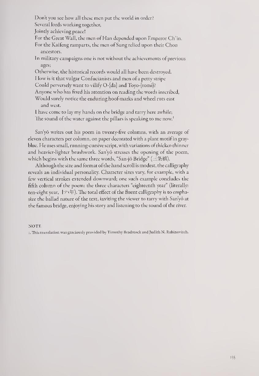
Done you see how all these men put the world in order?
Several lords working together,
Jointly achieving peace!
For the Great Wall, the men of Han depended upon Emperor Ch’in.
For the Kaifeng ramparts, the men of Sung relied upon their Chou
ancestors.
In military campaigns one is not without the achievements of previous
ages;
Otherwise, the historical records would all have been destroyed.
How is it that vulgar Confucianists and men of a petty stripe
Could perversely want to vilify 0-[da] and Toyo-[tomi] ?
Anyone who has fixed his attention on reading the words inscribed,
Would surely notice the enduring hoof-marks and wheel ruts east
and west.
I have come to lay my hands on the bridge and tarry here awhile;
The sound of the water against the pillars is speaking to me now.1
Sanyo writes out his poem in twenty-five columns, with an average of
eleven characters per column, on paper decorated with a plant motif in gray-
blue. He uses small, running-cursive script, with variations of thicker-thinner
and heavier-lighter brushwork. Sanyo stresses the opening of the poem,
which begins with the same three words, “San-jo Bridge”
Although the size and format of the hand scroll is modest, the calligraphy
reveals an individual personality. Character sizes vary, for example, with a
few vertical strokes extended downward; one such example concludes the
fifth column of the poem: the three characters “eighteenth year” (literally:
ten-eight year, T'/NflE). The total effect of the fluent calligraphy is to empha¬
size the ballad nature of the text, inviting the viewer to tarry with San yo at
the famous bridge, enjoying his story and listening to the sound of the river.
NOTE
i. This translation was graciously provided by Timothy Bradstock and Judith N. Rabinovitch.
•35
Calligraphy by Literati Poets and Painters
The support of the Tokugawa government spawned an ever-increasing num¬
ber of Confucian scholars and followers. However, many of these turned
their primary attention away from Chinese philosophy and ethics to devote
themselves to the study and practice of poetry, calligraphy, and painting in
the Chinese style. The latter was called nanga (southern painting) or bun-
jinga (literati painting), and its practitioners (bunjin) were often equally
skilled in calligraphy and poetry. In some ways it is surprising that Japanese
literati painting did not take hold earlier, since it was well established in
China by the twelfth century; but after a small proto-literati movement in
the fourteenth century,1 it was not until the early modern era that the cul¬
tural climate was ripe for Japanese painters to emulate their Chinese poet-
painter colleagues.
The way into the literati world was led by Ishikawa Jozan (1583-1672,
#39), a warrior-scholar who retired early to a villa and garden of his own de¬
sign, where he could admire Chinese poets of the past and create distinctive
verse and calligraphy of his own. Jozan particularly excelled at clerical script,
which had been little practiced in Japan before his time but perfectly suited
his reverence for the Chinese past as well as his personal sense of elegance.
Chinese-style poetry and calligraphy were seriously practiced for some
decades before painting was taken up by the new Japanese literati. It was
not until the end of the seventeenth century that Sinophile scholar-artists
began to depict subjects such as landscapes and the “four gentlemen” plants:
bamboo, orchid, plum, and chrysanthemum. Each of these was considered
symbolic of some sagelike behavior or characteristic.1 The leading pioneer
of Japanese literati painting was Gion Nankai (1676-1751, #40), but he was
more celebrated for being an outstanding calligrapher and the finest Chi¬
nese-style poet of his era. Because painting subjects such as bamboo required
brushwork much like that of calligraphy, Nankai was able to move fluidly
from one art to the other; however, his paintings are far outnumbered by his
calligraphies, which are usually of his own poems but occasionally utilize a
Chinese verse.
The next generation of Japanese literati artists included Yosa Buson (#48),
who was also a major haiku poet, and Ike Taiga (1723-1776, #41), a child
prodigy who became one of the most inventive painter-calligraphers in Japa¬
nese history. As a youth Taiga was taken to meet the Obaku monks at
Mampuku-ji, whom he impressed with his lively spirit and great skill with
the brush. These visits also gave the precocious artist an opportunity to
observe the Chinese customs and artifacts at the temple, which was a bas-
136
tion of Chinese culture during an age when foreigners generally were not
allowed out of Nagasaki. Occasional visits of Korean embassies were another
exception to this rule, and Taiga followed Nankai’s lead by interacting with
members of the Korean literati who traveled with these missions. Unable to
speak each other’s languages, their primary contact was through written
Chinese, which of course means calligraphy. Throughout his life, Taiga was
interested in many brushwork traditions and styles; when he sold fans as a
young man, he is said to have kept his account books in seal script.
A generation later, the confluence of literati arts reached another high
point with Uragami Gyokudo (1745-1820, #42). Born into the samurai-
official class, he studied the seven-string zither (ch’in), an instrument loveci
by sages and poets, and became one of the few Japanese to compose his own
music for this instrument. He also published two volumes of kanshi (poetry
in Chinese) and developed a style of calligraphy all his own, featuring cre¬
ative variations of running and clerical scripts. Giving up his official position
after his wife died, he traveled through Japan with his ch’in and gradually
turned more and more to landscape painting in a style that is highly appreci¬
ated today, though it was too individualistic for most people of his own
time. Subtle but unmistakable features connect his music, poetry, calligra¬
phy, and painting—constantly shifting patterns, tones, and touches, all
within the refined aesthetic of the ch’in.
By the mid-nineteenth century, hunjin painting and calligraphy had
become established forms of art, especially in the old capital of Kyoto, where
Gyokudo lived his final years, and the new capital of Edo, where Kameda
Bosai (#37) wrote and painted. Another form of art associated with the
literati was sencha, a Chinese-derived style of tea presentation. The small
pots and cups for this form of steeped tea were occasionally inscribed with
kanshi, such as one porcelain set enhanced by verses in red glaze by the lead¬
ing Kyoto calligrapher, Nukina Kaioku (1778-1863, #43). We can imagine a
small group of convivial hunjin gathering together, sipping tea, and discuss¬
ing poetry and calligraphy.
Literati artists added calligraphic inscriptions to paintings, whether their
own or the works of friends, and calligraphy was also occasionally written to
accompany a previously painted work. One example is a poem by the Kyoto
literatus Shinozaki Shochiku (1782-1851, #44) that was composed to form
a pair with a landscape painting by the nanga artist Sugai Baikan.Unfortu-
nately, the painting is lost; but the calligraphy survives to testify to the lively
interaction between arts during this period and to reveal Shochiku’s skills
in poetry and brushwork.
More personal uses of calligraphy were also frequent, especially since
one literati ideal was to create art as the natural outpouring of one’s spirit.
Rai Sanyo’s pupil and close friend Ema Saiko (1787-1861) became a noted
painter-poet-calligrapher, and as she reached the age of fifty, she wrote
a poem about her life on subtly decorated paper (#45). Her poignant and
slightly rueful feelings are expressed both in words and in the calligraphy,
which conveys her own personality and breath rhythm.
Another leading member of the Kyoto literati in the mid-nineteenth
century was Yanagawa Seigan (1789-1858, #46). Like Sanyo, he supported
the cause of the emperor over the shogunate, and at the time of his death he
was about to be arrested for his political outspokenness. Seigan’s calligraphy
shows the forceful temperament that got him in trouble with the authorities,
although his brushwork seems more bold and dynamic than subversive.
Examining these works from the early seventeenth to the later nineteenth
centuries, one sees many common features in literati calligraphy, including
an interest in different scripts and styles. For example, Jozan and Gyokudo
both worked often in clerical script, although running script seems to have
been the most popular among poet-artists. What is consistently notable is
the emphasis upon personal expression more than adherence to rules. Some
works by literati are especially hard to read, in fact, because of unusual char¬
acter forms and stroke order; however, Japanese poet-artists for the most
part adhered to Chinese tracfitions.
Admiration for Chinese masters and styles by Japanese calligraphers was
genuine, as is attested by the many woodblock books of Chinese works they
edited and published. Nevertheless, the literati of the island nation never
hesitated to transform their continental models into vehicles for individual
artistic expression. This combination of appreciation and transformation
makes calligraphy by poet-painters among the most creative of Japanese arts
from the early modern era.
NOTES
1. For example, aside from Zen themes, there was a brief interest in depicting the literati sub¬
jects of bamboo and orchid by such monk-artists as Gyokuen Bompo (c. 1348-c. 1420), but
the interest soon shifted to a semiprofessional style of landscape painting that culminated in
the work of Sesshu (1420-1306).
2. Bamboo bends but does not easily break; plum trees blossom during the cold of late winter;
(Chinese) orchids are modest plants that send their scent out to the world; and chrysanthe¬
mums continue to flower in late autumn when other plants have shriveled up.
138
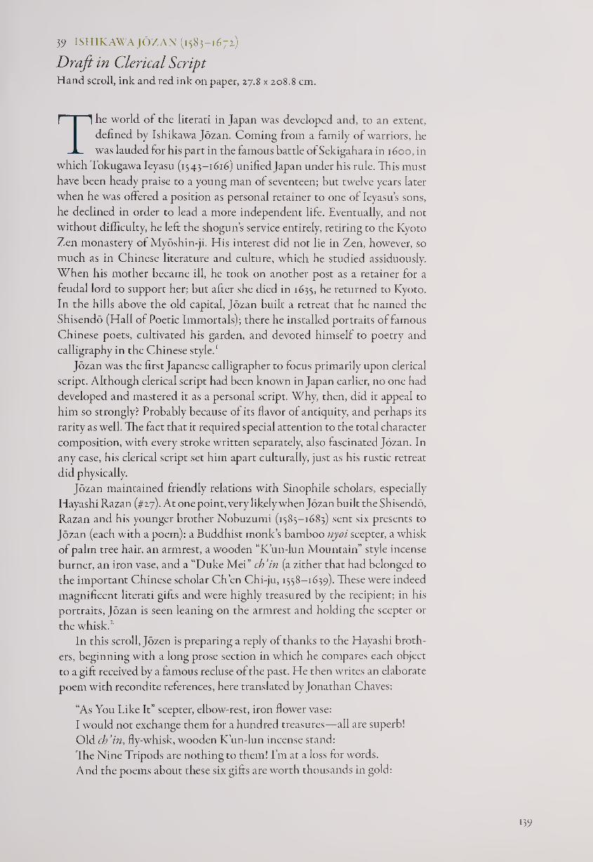
3? ISHIKAWA JOZAN (1583-1671)
Draft in Clerical Script Hand scroll, ink and red ink on paper, 27.8 x 208.8 cm.
The world of the literati in Japan was developed and, to an extent,
defined by Ishikawa Jozan. Coming from a family of warriors, he
was lauded for his part in the famous battle of Sekigahara in 1600, in
which Tokugawa Ieyasu (1543-1616) unified Japan under his rule. This must
have been heady praise to a young man of seventeen; but twelve years later
when he was offered a position as personal retainer to one of Ieyasu’s sons,
he declined in order to lead a more independent life. Eventually, and not
without difficulty, he left the shogun’s service entirely, retiring to the Kyoto
Zen monastery of Myoshin-ji. His interest did not lie in Zen, however, so
much as in Chinese literature and culture, which he studied assiduously.
When his mother became ill, he took on another post as a retainer for a
feudal lord to support her; but after she died in 1635, he returned to Kyoto.
In the hills above the old capital, Jozan built a retreat that he named the
Shisendo (Hall of Poetic Immortals); there he installed portraits of famous
Chinese poets, cultivated his garden, and devoted himself to poetry and
calligraphy in the Chinese style.1
Jozan was the first Japanese calligrapher to focus primarily upon clerical
script. Although clerical script had been known in Japan earlier, no one had
developed and mastered it as a personal script. Why, then, did it appeal to
him so strongly? Probably because of its flavor of antiquity, and perhaps its
rarity as well. The fact that it required special attention to the total character
composition, with every stroke written separately, also fascinated Jozan. In
any case, his clerical script set him apart culturally, just as his rustic retreat
did physically.
Jozan maintained friendly relations with Sinophile scholars, especially
Hayashi Razan (#27). At one point, very likely when Jozan built the Shisendo,
Razan and his younger brother Nobuzumi (1585-1683) sent six presents to
Jozan (each with a poem): a Buddhist monk’s bamboo nyoi scepter, a whisk
of palm tree hair, an armrest, a wooden “K’un-lun Mountain” style incense
burner, an iron vase, and a “Duke Mei” ch’in (a zither that had belonged to
the important Chinese scholar Ch’en Chi-ju, 1558-1639). These were indeed
magnificent literati gifts and were highly treasured by the recipient; in his
portraits, Jozan is seen leaning on the armrest and holding the scepter or
the whisk.1
In this scroll, Jozen is preparing a reply of thanks to the Hayashi broth¬
ers, beginning with a long prose section in which he compares each object
to a gift received by a famous recluse of the past. He then writes an elaborate
poem with recondite references, here translated by Jonathan Chaves:
“As You Like It” scepter, elbow-rest, iron flower vase:
I would not exchange them for a hundred treasures—all are superb!
Old ch’in, fly-whisk, wooden K’un-lun incense stand:
The Nine Tripods are nothing to them! I’m at a loss for words.
And the poems about these six gifts are worth thousands in gold:
159
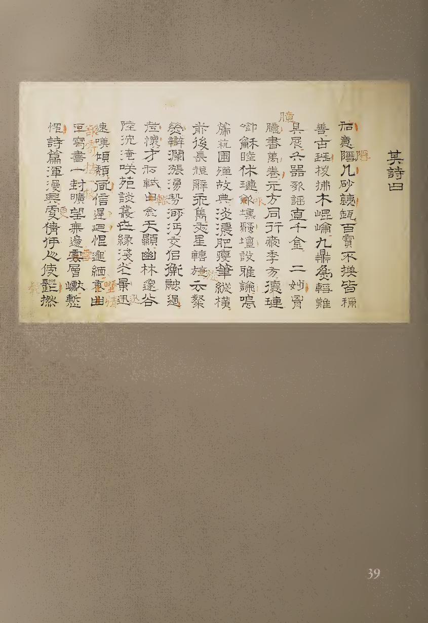
You two wonders within your hearts hold ten thousand volumes
of books!
Yuan-fang and his brother—cherishing Chi-fang!
Te-lien full of harmony—close to Hsiu-lien!
Playing the hsun-ocarina, on the altar of poetry establishing elegant
discourse!
You set singing the ck’ih-ftute, in the garden of arts fulfilling the classics!
Pale or dark, full or sparse, your brushes freely move;
Former and latter, longer, shorter, your phrases always outstanding.
The Star of Letters moves through your work, praised as scintillating;
The richness of argument overflows, so vast in power!
This friendship, like that of Ni Heng and K’ungjung—
communicating oldest feelings;
Talent like that of Su Shih and Su Ch’e—it must be Heaven sent.
In hidden forests, concealed valleys, utterly buried away;
In the gardens of humor, the copses of banter, your worldly ties are few.
But time flies by, and I lament that I am fading:
News from you has been slow to come; alas, you are so far!
Feelings of the countryside—I would send a sprig of plum blossom,
But as I gaze out at the vastness, limitless are the snow-covered peaks!
I feel ashamed that this, my poem, is so slapdash in feeling:
But who could I get to twist his poet’s beard, and write it for
me instead?3
The poem is, of course, anything but slapdash in feeling, and the callig¬
raphy demonstrates Jozan’s meticulous clerical script. What makes it espe¬
cially interesting is that it includes his corrections, written in red. Usually
these are changes of words or additions to the text; but in a few cases he also
corrects the composition of the characters, fully demonstrating the care he
took in making his calligraphy as handsome and elegant as possible.
The hand scroll is extremely well organized, with thirteen words per col¬
umn, each character being given equal space. As is typical for clerical script,
the na stroke is the most notable form, made either horizontally or di¬
agonally down to the right. When the brush increases and decreases pressure
near the end of this stroke, the line thickens and then thins evenly to a point,
creating a triangular form; Jozan handles this firmly but does not exaggerate
the effect. This scroll testifies both to his love of the Chinese literati tradition
and to his determination to create a place for himself within it. In many ways
Jozan became Japan’s first complete Chinese-style literatus.
NOTES
1. For a full discussion, see J. Thomas Rimer et al., Shisendo: Hall of the Poetry Immortals (New
York: Weatherhill, 1991).
2. Ibid., pp. 181,195; the ch’in is shown on p. 185.
3. This poem is full of allusions to famous brothers and auspicious ancient music. Yuan-fang
and Chi-fang (Chen Chi and Ch’en Shen) were siblings famous for rivaling each other in liter¬
ary talent during the late first and early second centuries. Te-lien and Hsiu-lien (Yin Tang and
Ying Ch’u) were also famous literary brothers, living and writing in the third century. The hsun
and ch’ih were archaic musical instruments representing the beauty of antiquity, while Ni
Heng, of the second century, was a celebrated and eccentric drummer. Su Shih (Su T’ung-po,
1037-1101) and Su Che (1039-1112) were the most brilliant literati brothers in Chinese history.
141
40 GION NANKAI (1676-1751)
Autumn View Hanging scroll, ink on paper, 126 x 41.4 cm.
An Autumn View from a Boat on the Ki River
The waves enfold their pure white silk, the wild geese come down
in pairs,
Here in the boat of Li and Kuo, wine now fills our jars.
Gulls and egrets already have forgotten the seaside visitors;
As for perch, what need to go to River Wu?
Through evening bell and drizzling rain, the travelers strive to cross;
Red smartweed and white duckweed fill autumn stepping-stones.
Fishermen’s flutes waft on the wind—the tunes play without cease;
On view of sandbanks and new-risen moon, we open cabin windows!
If Jozan was the first full-fledged Japanese literatus in Chinese style,
Nankai was the pioneer poet-calligrapher-painter who brought these
“three treasures” to a high level. While others had mastered poetry and
calligraphy, Nankai added the painting of literati subjects such as landscapes
and “four gentlemen” (bamboo, orchid, plum, and chrysanthemum) themes,
which required brushwork much like that of calligraphy.
Nankai was the son of a doctor who served the daimyo of Kishu
(Wakayama); his father had been friends with Obaku Zen monks and re¬
ceived the seal of enlightenment from Tetsugyu (#62). As a young man,
Nankai studied Confucianism in Edo with Kinoshita Jun’an (1621-1698)
and quickly became known for his Chinese-style poetry; but when he re¬
turned to serve his Kishu domain he got into trouble for “dissipated con¬
duct,” and in 1700 he was banished to a fishing village. A decade later, his
skill in poetry and calligraphy would help to restore his standing: the visit
of a delegation of Korean officials to Japan was approaching, and one of the
few ways to communicate with them was through Chinese literati arts.
Nankai was officially pardoned in 1710 in time for the delegation’s arrival in
1711, and the following year he returned as a retainer to the Kishu daimyo.'
The rest of his life was more peaceful; he developed his brushwork in callig¬
raphy and painting while continuing to write poetry, usually choosing “reg¬
ulated verse” of five or seven words per line.
Composed in fluent running-cursive script, this calligraphy pauses near
the end of the first column for the two words, “boat within” (ftfE), that set
the main theme of the poem; these two words also appear at the end of the
title, on the far left just over the signature. The eight lines of seven kanji are
divided into columns of 12,14, 15, 14, and 1; the final character of the poem
is followed by the eight-word title and three-word signature, giving the final
column a total of twelve characters. This arrangement creates an arch shape
(12-14-15-14-12) that is saved from too much consistency by the differing spa¬
tial breaks in the opening and closing columns. The counterpoint of seven-
word poetic lines against this structure is strengthened by Nankai dipping
his brush for the first character of each poetic line, though he does so other
places as well, such as for the word “autumn” (#() near the end of the central
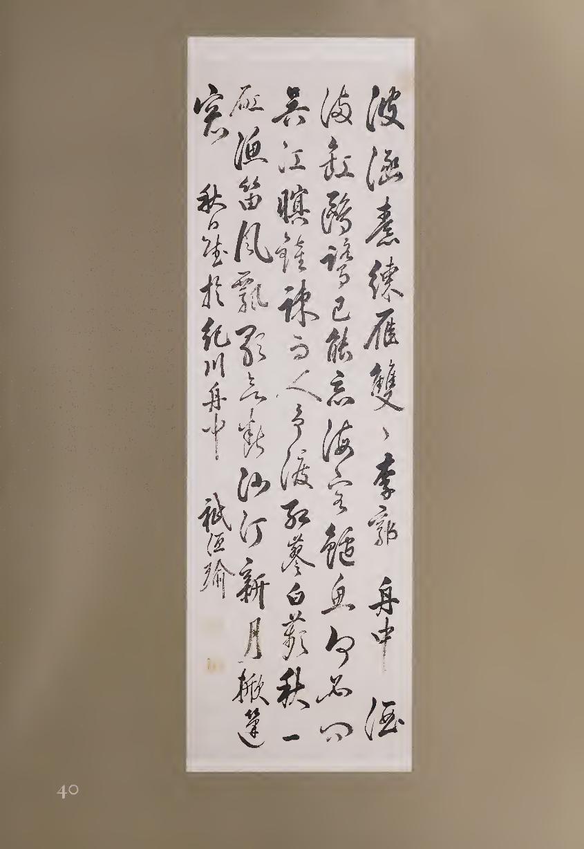
column. “Autumn” is followed by the single-stroke character “one” (^), here
relatively small but exhibiting great strength in its cell of empty space.
Nankai’s expressive brushwork is entirely natural, showing a great deal
of individual flavor without striving for effect. Some of the more interest¬
ing individual characters are the third and fourth words of the fourth col¬
umn, the firmly structured “flute” (ffi) followed by the flowing “wind” (HI). These individual graphs, however, are fully integrated into the total rhythm
of the scroll, in which a sense of continuity is created by not allowing much
space between words or columns. The calligraphy therefore becomes a
shifting mosaic in which the forms flow like waves, enfolded on white paper
rather than the silk of sails. Nankai is today best known as the first major
nanga (literati) painter, but his poetry and calligraphy form the inner core
of his art.
NOTE
i. For more information, see Stephen Addiss, “Shadows of Emotion: the Calligraphy, Paint¬
ing, and Poetry of Gion Nankai,” KaikodoJournal, Autumn 1998, pp. 9-29.
41 IKE TAIGA (1723-1776)
Couplet on a Fan Fan, ink on mica paper, 17.6 x 48.9 cm.
Perhaps the most naturally talented and central figure in nanga (literati
painting), and equally gifted in calligraphy, Taiga lived a free artistic
life in Kyoto with his wife, Gyokuran (#9). Known as eccentrics, they
seem to have cared little for worldly things; many anecdotes report that the
couple devoted themselves to nature and the arts rather than pursuing
money, reputation, or acclaim.1
Taiga was a prodigy in brushwork; as a child he was taken to demon¬
strate calligraphy for the Chinese and Japanese Obaku Zen monks at the
monastery of Mampuku-ji. As a mature artist, he combined equal parts of
imagination and creativity, mastering many kinds of brushwork (as well as
painting with his fingernails) and becoming expert in all five Chinese scripts
as well as Japanese. His visit to the elder literatus Gion Nankai (#40) greatly
encouraged Taiga, who went on to become friends with many of the leading
literati of his day. Taiga also composed some underrated kanshi and ivaka,
but for his calligraphy he usually chose well-known verses from the past.
Both Taiga and Gyokuran excelled at painting and writing on fans,
particularly enjoying the effects of slow-drying or merging ink when using a
mica surface. In this case, Taiga has written out a couplet by Sung Chih-wen
(6s6?-7ix) of 7-7 words in nine columns across the curving surface.
Layered peaks: from of old, here grow trees, thousands of feet tall;
Distant ravines: from the origin, here fly waterfalls, hundreds of
fathoms high.1
144
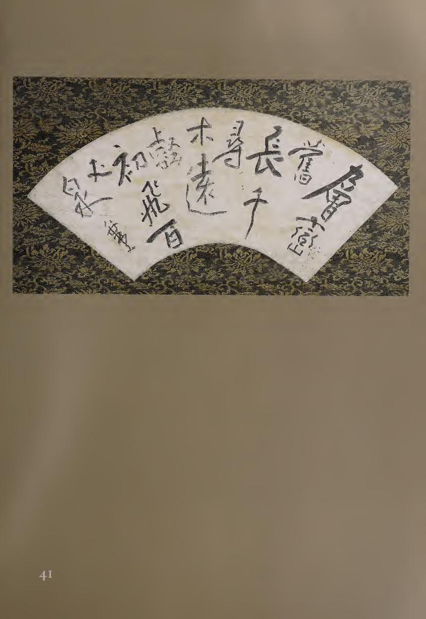
This couplet comes from a long poem entitled “Dragon Gate: Composed
in Response to Imperial Command,” in which Sung Chih-wen responded
to Empress Wu Tse-tien during an excursion to the great Buddhist site of
Lung-men (Dragon Gate). The empress, having commissioned an immense
Vairochana Buddha sculpture for the largest cave at this site, commanded
her courtiers to compose a poem, offering the prize of an embroidered robe
for the poet who finished first. Tung-fan Ch’iu won this honor and recited
his verse, but before he had time to sit down, Sung Chih-wen presented his
poem. Since it was clearly superior, the robe was whisked off Tung-fan’s back
and placed on Sung’s shoulders.
Choosing regular script with occasional traces of running script, Taiga
has divided the two lines into irregular columns of 2-1-2-1-2-1-3-1-1, creating
a visual counterpoint with the 7-7 word poem. Taiga enhanced this rhyth¬
mic diversity by dipping his brush for the first and tenth words, rather than
at the beginning of each poetic line. Lest the poetic parallels be lost, how¬
ever, these first words are the largest—’’layered” (IB) as column one, word
one, and “distant” (U§) as 5/2. Appropriately, “layered” is constructed as a
series of vertically stacked forms, while “distant,” in gray ink tones, appears
farther away.
Taiga’s brushwork at first seems more plain and rustic than elegant. A
few strokes stand out, however, such as the long diagonal descending to the
left on the first word and the wriggling vertical that completes “thousand”
(T, 3/2). Taiga’s characteristic sense of invention is equally visible in the
composition of other characters. “Long/length” (f|, 3/1), for example, has a
jaunty opening hook, the strokes seldom touch, and the entire graph seems
to be in profile facing to the right. “Hundred” (Tf, 7/3), on the other hand,
opens with a powerful horizontal, under which the rest of the form huddles
on the right. This should make the character unbalanced, but the way it
supports the two words above it, while following the curving shape of the
fan, allows the horizontal stroke to act more as a catapult than a seesaw. The
final word, “waterfall” (fif, 9/1), made up of “white” (H) over “water” (tJ<),
completes the composition with a curving diagonal to the right (opposite
to that of the first word), under which Taiga adds his ironic signature, “no¬
name” (MTi), in smaller running script.
This is exactly the kind of calligraphy that literati have most enjoyed cre¬
ating and viewing. Beneath its straightforward, almost naive facade, there is
a great deal of inventiveness, skill, and visual drama. The calligraphy dances
boldly to Taiga’s own quirky but confident rhythm; and his combination of
childlike playfulness and technical mastery makes his brushwork unique.
NOTES
1. For biographical information on Taiga, see Mori Senzo, Mori Senzo chosaku-shu (Collected
Works of Mori Senzo), vol. 3 (Tokyo: Chuo Koron, 1971), pp. 5-156, and Melinda Takeuchi, “Ike
Taiga: A Biographical Study,” HarvardJournal of Asiatic Studies 43, no. 1 (June 1983): 141-186.
2. Translation byjonathan Chaves.
146
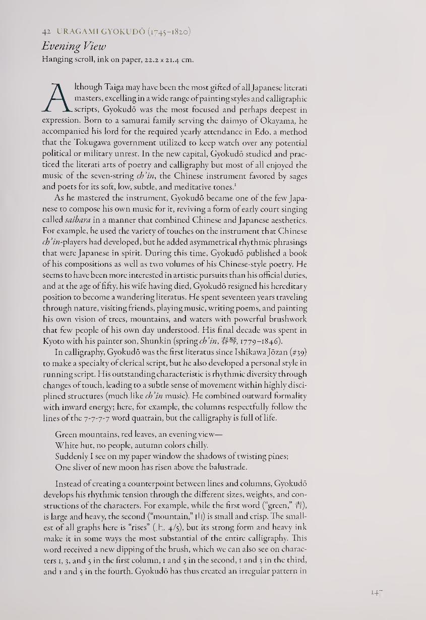
41 URAGAMI GYOKUDO (1745-1820)
Evening View Hanging scroll, ink on paper, 22.2 x 21.4 cm.
Although Taiga may have been the most gifted of all Japanese literati
masters, excelling in a wide range of painting styles and calligraphic
scripts, Gyokudo was the most focused and perhaps deepest in
expression. Born to a samurai family serving the daimyo of Okayama, he
accompanied his lord for the required yearly attendance in Edo, a method
that the Tokugawa government utilized to keep watch over any potential
political or military unrest. In the new capital, Gyokudo studied and prac¬
ticed the literati arts of poetry and calligraphy but most of all enjoyed the
music of the seven-string ch’in, the Chinese instrument favored by sages
and poets for its soft, low, subtle, and meditative tones.1
As he mastered the instrument, Gyokudo became one of the few Japa¬
nese to compose his own music for it, reviving a form of early court singing
called saibara in a manner that combined Chinese and Japanese aesthetics.
For example, he used the variety of touches on the instrument that Chinese
ch’in-players had developed, but he added asymmetrical rhythmic phrasings
that were Japanese in spirit. During this time, Gyokudo published a book
of his compositions as well as two volumes of his Chinese-style poetry. He
seems to have been more interested in artistic pursuits than his official duties,
and at the age of fifty, his wife having died, Gyokudo resigned his hereditary
position to become a wandering literatus. He spent seventeen years traveling
through nature, visiting friends, playing music, writing poems, and painting
his own vision of trees, mountains, and waters with powerful brushwork
that few people of his own day understood. His final decade was spent in
Kyoto with his painter son, Shunkin (springch’in, ##, 1779-1846).
In calligraphy, Gyokudo was the first literatus since Ishikawajozan (#39)
to make a specialty of clerical script, but he also developed a personal style in
running script. His outstanding characteristic is rhythmic diversity through
changes of touch, leading to a subtle sense of movement within highly disci¬
plined structures (much like ch’in music). He combined outward formality
with inward energy; here, for example, the columns respectfully follow the
lines of the 7-7-7-7 word quatrain, but the calligraphy is full of life.
Green mountains, red leaves, an evening view—
White hut, no people, autumn colors chilly.
Suddenly I see on my paper window the shadows of twisting pines;
One sliver of new moon has risen above the balustrade.
Instead of creating a counterpoint between lines and columns, Gyokudo
develops his rhythmic tension through the different sizes, weights, and con¬
structions of the characters. For example, while the first word (“green,” W),
is large and heavy, the second (“mountain,” | L|) is small and crisp. The small¬
est of all graphs here is “rises” (_h, 4/5), but its strong form and heavy ink
make it in some ways the most substantial of the entire calligraphy. This
word received a new dipping of the brush, which we can also see on charac¬
ters 1, 3, and 5 in the first column, 1 and 5 in the second, 1 and 3 in the third,
and 1 and 5 in the fourth. Gyokudo has thus created an irregular pattern in
H7
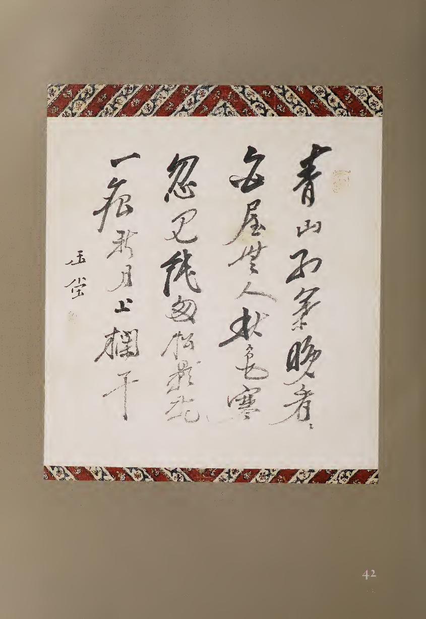
which, reading horizontally, the top row of words are all emphasized but the
stronger characters below them give a sense of movement that ebbs and
flows across the surface of the poem.
In addition to these rhythmic changes, Gyokudo has used different scripts
and varying forms of brushwork in this calligraphy. Some words are fully
cursive, such as “red” ($1, 1/3), while others are written in regular-running
script, for example, “chilly” ($, 2/7). Even more apparent is how some strokes
are emphasized, including long swirling diagonals to the left in words such
as “view” (§, 1/6), “hut” (M, 2/2), and “moon” (El, 4/4), as well as “chilly.”
The left diagonal in “autumn” (ff, 2/3) is balanced by the opposing diagonal
above it in “person/people” (A, 2/4), but in general the calligraphy has a
strong slant up to the right and down to the left.
Another feature of this calligraphy is its occasional use of “hidden tip,”
where the brush circles around both ends of a stroke. Gyokudo then con¬
trasts this style of brushwork with “open tip,” where one may clearly see the
entrance and exit of the brush. This appears in many characters, including
“person/people” and the consecutive characters “new” (Iff, 4/3) and “moon.”
“Hidden tip” tends to add a formal sense of pause to a work, while “open
tip” conveys a feeling of spontaneity and movement.
When writing in clerical script, Gyokudo follows an even stricter sense of
structure but continues his subtleties of brushwork (fig. 42.1). For example,
the triangular “na” stroke endings are all different from each other,
variously longer, shorter, thicker, thinner, straighter, more curved, more
diagonal, or more horizontal in composition.
In addition, the same kinds of rhythmic asymmetry displayed in the
running script poem can be seen here in the heavier and lighter characters
dancing across the square format. These varied touches with the brush give
Gyokudo’s writing a distinctive and personal sense of movement. His early
training in music is apparent; like his calligraphy, the sounds of the ch ’in are
restrained and subdued, yet constantly changing in tone and touch.
Figure 42.1.
Uragami Gyokudo,
Searching for Blossoms.
H9
Placed to the right of the signature, beneath the final word of the poem,
is the poem’s title, “Searching for Blossoms.”
The cock crows, I rise and leave the house early,
In every direction the mountain village is lost in mist;
And yet someone is already out in this spring dawn—
A donkey’s hooves have stamped fresh flowers on the painted bridge.
—Gyokudo the ch’in-player
In these two works of calligraphy, it is clear that whether plucking silk
strings or wielding a brush, Gyokudo creates a musical rhythm all his own.
NOTE
i. For more information on Gyokudo’s life and arts, see Stephen Addiss, Tall Mountains and
Flowing Waters: TbeArtsofUragami Gyokudo (Honolulu: University of Hawaii Press, 1987).
43 NUKINA KAIOKU (1778-1863)
Poems on Sencha Set{ 1859)
Red glaze inscriptions on teapot, 7.6 x 13.7 cm., and on five cups, 3.6 x 8.1 cm.
Porcelain by the fifth-generation Waki Kitei (1808-1871)
Although the tea ceremony, cha-no-yu, has become well known in
the West, another form of tea was also practiced in Japan’s early
modern period. Sencha, steeped tea to be served in tiny cups rather
than powdered tea whisked in tea bowls, represented Chinese literati culture
to Japanese poets and artists.1 Stimulated by the arrival of Obaku monks
from China in the mid-seventeenth century, sencha has maintained a place
in Japanese culture to the present day. Although there are more than one
hundred schools of sencha with different traditions, in general their rituals
are less formal than those of cha-no-yu. Nevertheless, the appurtenances of
sencha are highly valued, and both Chinese and Japanese ceramics have been
used for the gatherings of cultivated Sinophiles. In terms of its place in
society, to some extent sencha might be compared with kanji calligraphy as
opposed to writing in Japanese kana.
Nukina Kaioku, born to a samurai family in Shikoku, was given a thor¬
ough Confucian and artistic education. As a young man he also served at
the Shingon sanctuary on Mount Koya, where he received Buddhist train¬
ing and investigated the calligraphy of Kobo Daishi (Kukai, 774-835). An
ardent traveler, Kaioku first taught in Osaka but then settled in Kyoto; his
many journeys included one in 1836 to Nagasaki, where he studied briefly
with a Chinese calligrapher. During his life he attended many sencha gather¬
ings and assembled an extensive collection of sencha objects as well as more
than eleven thousand scrolls of literati painting and calligraphy. By the time
of his death, Kaioku was considered one of the major literati poet painters
and the leading Chinese-style calligrapher in Kyoto.
150
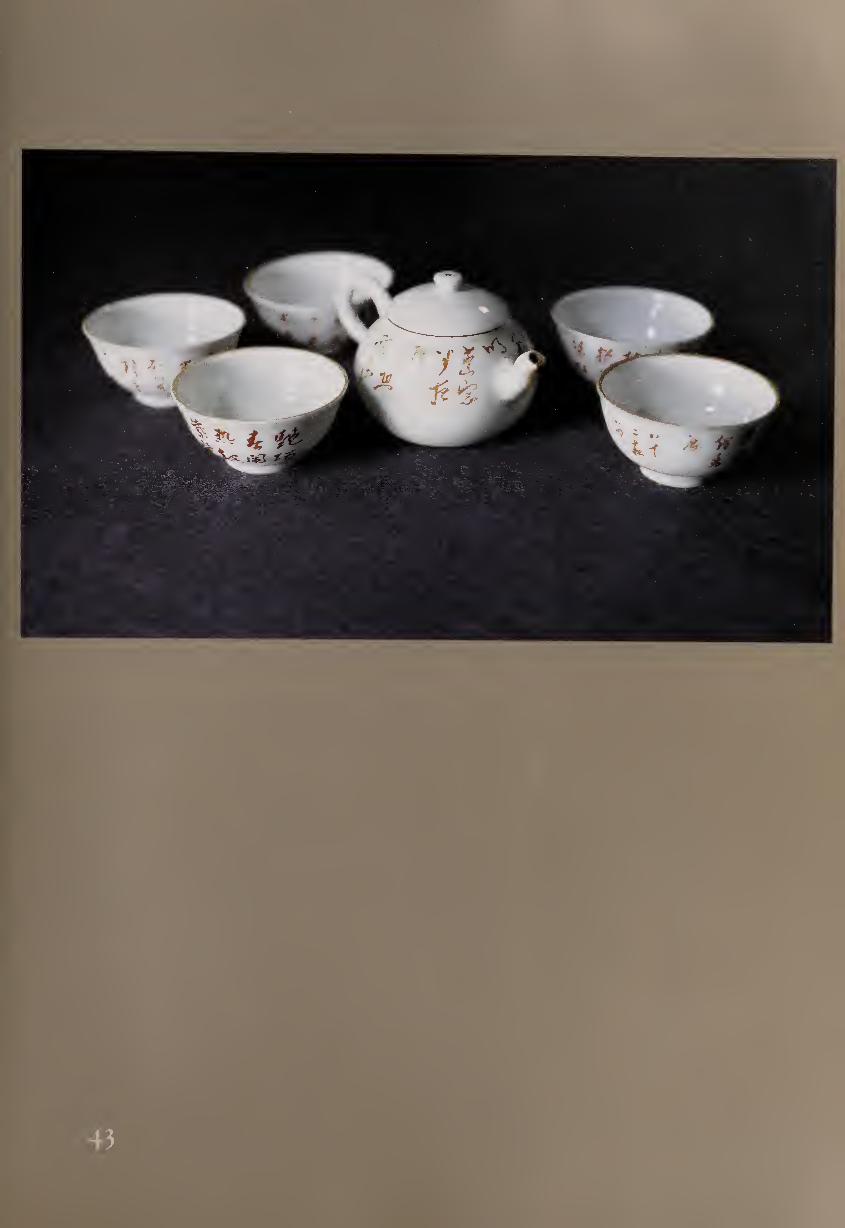
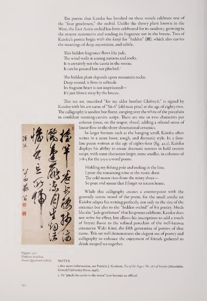
The poems that Kaioku has brushed on these vessels celebrate one of
the “four gentlemen,” the orchid. Unlike the showy plant known in the
West, the East Asian orchid has been celebrated for its modesty, growing in
the remote mountains and sending its fragrance out in the breeze. Two of
Kaioku’s poems begin with the kanji for “hidden” (W), which also carries
the meanings of deep, mysterious, and subtle.
This hidden fragrance flows like jade,
The wind wafts it among streams and rocks.
It is certainly not the cassia in the moon;
It can be poured but not plucked.1 2
The hidden plant depends upon mountain rocks;
Deep-rooted, it lives in solitude.
Its fragrant heart is not imprisoned—
It’s just blown away by the breeze.
This tea set, inscribed “for my elder brother Chikuyu,” is signed by
Kaioku with his art name of“Su-o” (old man pine) at the age of eighty-two.
The calligraphy is modest but fluent, ranging over the white of the porcelain
in confident running-cursive script. There are one or two characters per
column (once, on the teapot, three), adding a relaxed sense of
linear flow to the three-dimensional ceramics.
In larger formats such as the hanging scroll, Kaioku often
writes in a more loose, rough, and dramatic style. In a four-
line poem written at the age of eighty-four (fig. 43.1), Kaioku
displays his ability to create dramatic tension in bold cursive
script, with some characters larger, some smaller, in columns of
7-8-5 for the 5-5-5-5-word poem:
Holding my fishing pole and reeling in the line,
I pour the remaining wine at the rustic door.
The cold moon rises from the misty shore—
So pure and serene that I forget to return home.
While this calligraphy creates a counterpoint with the
generally serene mood of the poem, for the small sencha set
Kaioku adapts his writing perfectly, not only to the size of the
ceramics but also to the “hidden orchid” of his poetry. Much
like the “jade gentleman” that his poems celebrate, Kaioku does
not strive for effect, but allows his inscriptions to add a touch
of literati flavor to the refined porcelain of the well-known
ceramicist Waki Kitei, the fifth generation of potters of that
name. This set well demonstrates the elegant use of poetry and
calligraphy to enhance the enjoyment of friends gathered to
drink steeped tea together.
1. For more information, see Patricia J. Graham, Tea of the Sages: The Art of Sencha (Honolulu:
Hawaii University Press, 1998).
2. To “pluck the cassia in the moon” is to become an official.
Figure 43.1.
Nukina Kaioku,
Poetic Quatrain (1861). NOTES
44 SHINOZAKI SHOCHIKU (1782-1851)
Still Bright (1851)
Hanging scroll, ink on paper, 143.5 x 47-6 cm.
Helen Foresman Spencer Museum, University of Kansas
One of the leading poet-calligraphers in Kyoto during the first half of
the nineteenth century, Shochiku was extremely active in the world
of the arts. The closest friend of the scholar-poet-calligrapher-
painter Rai Sanyo (#38), he also interacted with many other leading literati
of the day. Here, at the request of a friend or patron, Shochiku has written
out a calligraphic poem to complement a landscape painted by Sugai Baikan
(1784-1844) in the nanga (Chinese-style) tradition. Shochiku’s poem follows
the four-line, “regulated-verse” style, with seven characters to each line.
In the shade of dense trees I enjoy reading books;
When I get tired, the book-covers make a pillow for an afternoon nap.
Waking from a dream, I don’t doubt that the sky will soon darken,
But the setting sun is still bright on the mountains beyond the trees.
The inscription in smaller characters tells us that the poet has seen a
“Summer Scene” by Baikan and that Shochiku, at the request of the owner,
has written this poem to make a pair of scrolls. He then adds the date, a
summer day in 1851, and his signature, “Old Man Shochiku.” Unfortunately,
the landscape that inspired this work has become separated or lost, and only
the calligraphy remains. We therefore cannot know the relation of painting
and poem, but we can still examine the work as calligraphy.
Artists writing a quatrain of twenty-eight characters often used the for¬
mat of three columns. This established a contrapuntal rhythm, with the 7-7-
7-7 pattern of the poem set against the visual structure of twenty-eight words
in three columns. Here the characters are divided 12-12-4, and the final col¬
umn is completed by the smaller double-column inscription and signature.
There is also a third rhythm, consisting of the particular movement of
the artist’s brush in this work, which is worth examining. For this poem
Shochiku chose running script, with an occasional hint of cursive when he
joins two characters together by not completely lifting his brush between
words. Just where this linkage happens is significant: in the first poetic line
between characters 1+2,3+4, and 6+7; in the second between 1+2 and 3+4;
in the third between 1+2,3+4, and 6+7; and in the fourth between 5+6+7,
the final words of the poem. Since in seven-character lines there is usually an
implied small break after the fourth character, we can see how Shochiku has
emphasized the structure of the poem in his calligraphic joining of words,
even if it is sometimes so visually subtle that it requires close observation
and can be invisible in a photograph.
Another form of rhythm in this work is created by slightly emphasized
characters, such as “heaven/sky” (3k, 2/7) in the middle of the work, which
seems to dance toward the left, only to be anchored by a strong final diagonal
line to the lower right. This contrapposto might be compared with a dancer
leaning in one direction but balancing by stretching out one leg the other
way. Several other strong diagonal strokes echo this sense of movement,
such as in characters 1/7 and 1/9, and equally significant are the powerful
153
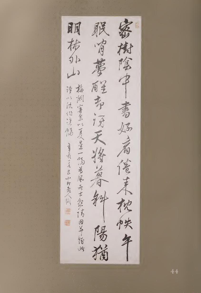
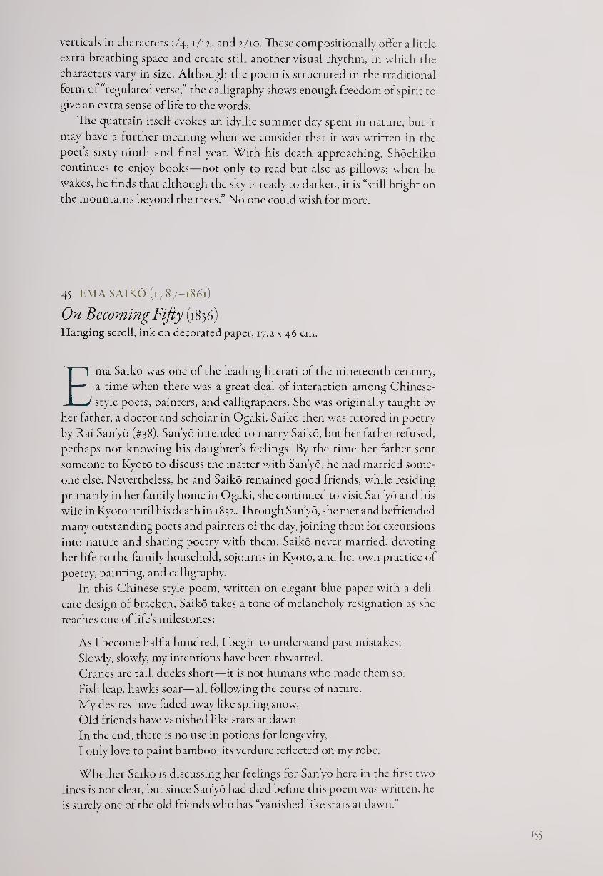
verticals in characters 1/4, i/iz, and 1/10. These compositionally offer a little
extra breathing space and create still another visual rhythm, in which the
characters vary in size. Although the poem is structured in the traditional
form of “regulated verse,” the calligraphy shows enough freedom of spirit to
give an extra sense of life to the words.
The quatrain itself evokes an idyllic summer day spent in nature, but it
may have a further meaning when we consider that it was written in the
poet’s sixty-ninth and final year. With his death approaching, Shochiku
continues to enjoy books—not only to read but also as pillows; when he
wakes, he finds that although the sky is ready to darken, it is “still bright on
the mountains beyond the trees.” No one could wish for more.
45 EM A SAIKO (1787-1861)
On Becoming Fifty (1836) Hanging scroll, ink on decorated paper, 17.2 x 46 cm.
Ema Saiko was one of the leading literati of the nineteenth century,
a time when there was a great deal of interaction among Chinese-
style poets, painters, and calligraphers. She was originally taught by
her father, a doctor and scholar in Ogaki. Saiko then was tutored in poetry
by Rai Sanyo (#38). Sanyo intended to marry Saiko, but her father refused,
perhaps not knowing his daughter’s feelings. By the time her father sent
someone to Kyoto to discuss the matter with Sanyo, he had married some¬
one else. Nevertheless, he and Saiko remained good friends; while residing
primarily in her family home in Ogaki, she continued to visit Sanyo and his
wife in Kyoto until his death in 1832. Through Sanyo, she met and befriended
many outstanding poets and painters of the day, joining them for excursions
into nature and sharing poetry with them. Saiko never married, devoting
her life to the family household, sojourns in Kyoto, and her own practice of
poetry, painting, and calligraphy.
In this Chinese-style poem, written on elegant blue paper with a deli¬
cate design of bracken, Saiko takes a tone of melancholy resignation as she
reaches one of life’s milestones:
As I become half a hundred, I begin to understand past mistakes;
Slowly, slowly, my intentions have been thwarted.
Cranes are tall, ducks short—it is not humans who made them so.
Fish leap, hawks soar—all following the course of nature.
My desires have faded away like spring snow,
Old friends have vanished like stars at dawn.
In the end, there is no use in potions for longevity,
I only love to paint bamboo, its verdure reflected on my robe.
Whether Saiko is discussing her feelings for Sanyo here in the first two
lines is not clear, but since Sanyo had died before this poem was written, he
is surely one of the old friends who has “vanished like stars at dawn.”
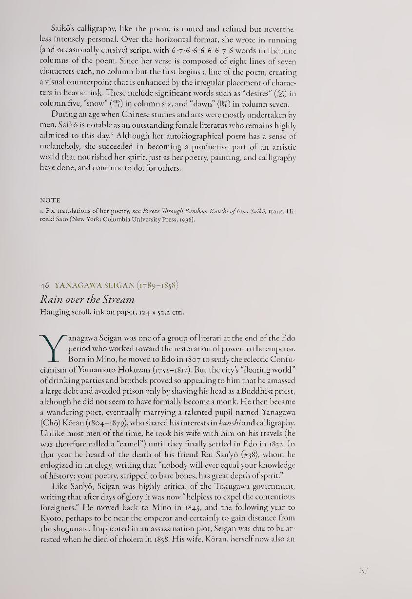
Saiko’s calligraphy, like the poem, is muted and refined but neverthe¬
less intensely personal. Over the horizontal format, she wrote in running
(and occasionally cursive) script, with 6-y-6-6-6-6-6-j-6 words in the nine
columns of the poem. Since her verse is composed of eight lines of seven
characters each, no column but the first begins a line of the poem, creating
a visual counterpoint that is enhanced by the irregular placement of charac¬
ters in heavier ink. These include significant words such as “desires” (^) in
column five, “snow” (If) in column six, and “dawn” (Bj^) in column seven.
During an age when Chinese studies and arts were mostly undertaken by
men, Saiko is notable as an outstanding female literatus who remains highly
admired to this day.1 Although her autobiographical poem has a sense of
melancholy, she succeeded in becoming a productive part of an artistic
world that nourished her spirit, just as her poetry, painting, and calligraphy
have done, and continue to do, for others.
NOTE
i. For translations other poetry, see Breeze Through Bamboo: Kanshi ofEma Saiko, trans. Hi-
roaki Sato (New York: Columbia University Press, 1998).
46 YANAGAWA SEIGAN (1789-1858)
Rain over the Stream Hanging scroll, ink on paper, 124 x 52.2 cm.
Yanagawa Seigan was one of a group of literati at the end of the Edo
period who worked toward the restoration of power to the emperor.
Born in Mino, he moved to Edo in 1807 to study the eclectic Confu¬
cianism of Yamamoto Hokuzan (1752-1812). But the city’s “floating world ”
of drinking parties and brothels proved so appealing to him that he amassed
a large debt and avoided prison only by shaving his head as a Buddhist priest,
although he did not seem to have formally become a monk. He then became
a wandering poet, eventually marrying a talented pupil named Yanagawa
(Cho) Koran (1804-1879), who shared his interests in kanshi and calligraphy.
Unlike most men of the time, he took his wife with him on his travels (he
was therefore called a “camel”) until they finally settled in Edo in 1832. In
that year he heard of the death of his friend Rai Sanyo (#38), whom he
eulogized in an elegy, writing that “nobody will ever equal your knowledge
of history; your poetry, stripped to bare bones, has great depth of spirit.”
Like Sanyo, Seigan was highly critical of the Tokugawa government,
writing that after days of glory it was now “helpless to expel the contentious
foreigners.” He moved back to Mino in 1845, and the following year to
Kyoto, perhaps to be near the emperor and certainly to gain distance from
the shogunate. Implicated in an assassination plot, Seigan was due to be ar¬
rested when he died of cholera in 1858. His wife, Koran, herself now also an
B7
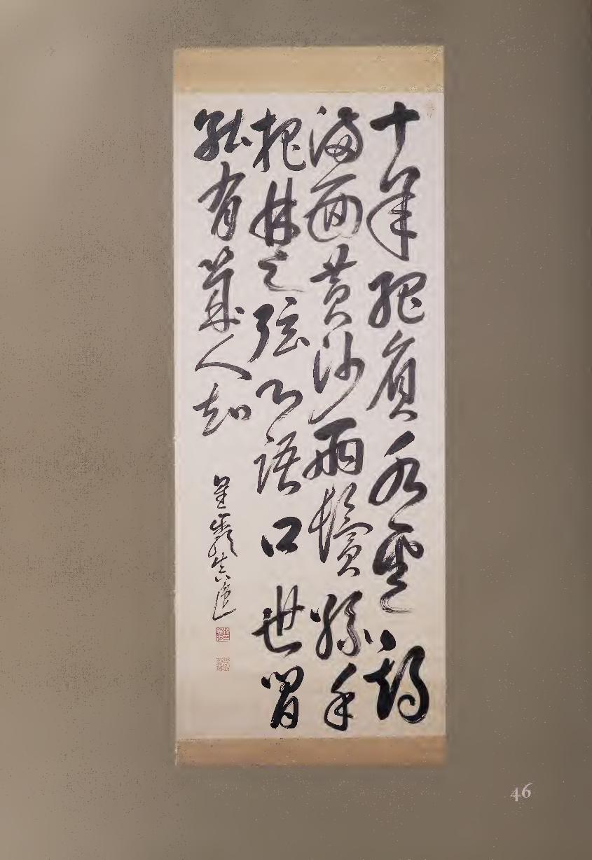
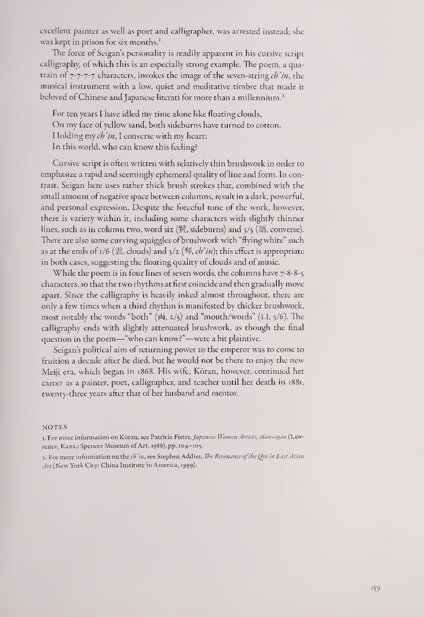
excellent painter as well as poet and calligrapher, was arrested instead; she
was kept in prison for six months.1
The force of Seigan’s personality is readily apparent in his cursive script
calligraphy, of which this is an especially strong example. The poem, a qua¬
train of 7-7-7-7 characters, invokes the image of the seven-string cb’in, the
musical instrument with a low, quiet and meditative timbre that made it
beloved of Chinese and Japanese literati for more than a millennium.2
For ten years I have idled my time alone like floating clouds,
On my face of yellow sand, both sideburns have turned to cotton.
Holding my ch’in, I converse with my heart:
In this world, who can know this feeling?
Cursive script is often written with relatively thin brushwork in order to
emphasize a rapid and seemingly ephemeral quality of line and form. In con¬
trast, Seigan here uses rather thick brush strokes that, combined with the
small amount of negative space between columns, result in a dark, powerful,
and personal expression. Despite the forceful tone of the work, however,
there is variety within it, including some characters with slightly thinner
lines, such as in column two, word six (fH, sideburns) and 3/5 (f§, converse).
There are also some curving squiggles of brushwork with “flying white” such
as at the ends of 1/6 (ft, clouds) and 3/2. (#, ch’in)-, this effect is appropriate
in both cases, suggesting the floating quality of clouds and of music.
While the poem is in four lines of seven words, the columns have 7-8-8-5
characters, so that the two rhythms at first coincide and then gradually move
apart. Since the calligraphy is heavily inked almost throughout, there are
only a few times when a third rhythm is manifested by thicker brushwork,
most notably the words “both” (jS], 2/5) and “mouth/words” (P, 3/6). The
calligraphy ends with slightly attenuated brushwork, as though the final
question in the poem—“who can know?”—were a bit plaintive.
Seigan’s political aim of returning power to the emperor was to come to
fruition a decade after he died, but he would not be there to enjoy the new
Meiji era, which began in 1868. His wife, Koran, however, continued her
career as a painter, poet, calligrapher, and teacher until her death in 1881,
twenty-three years after that of her husband and mentor.
NOTES
1. For more information on Koran, see Patricia Fister, Japanese Women Artists, 1600-1900 (Law¬
rence, Kans.: Spencer Museum of Art, 1988), pp. 104-105.
2. For more information on the ch’in, see Stephen Addiss, The Resonance oj the Qin in East Asian
Art (New York City: China Institute in America, 1999).
■59
The Haiku Calligraphy Tradition
The calligraphy of haiku masters is usually modest, like their poetry, but
full of subtle and individual flavor. Frequently one major feature of interest
is how the calligrapher arranges the composition in the available space. In¬
dividual poems were often written on shikishi (squarish poem-cards, about
ii by yVi inches) and tanzaku (tall thin poem-slips, approximately 14 by i!4 inches), while groups of poems were usually written on horizontal or verti¬
cal scrolls. Each format influenced the composition of the calligraphy; poets
often enjoyed setting up visual patterns and then deviating from them in
various ways, resulting in the creation of asymmetrical forms.
When writing in their own language, Japanese poet-calligraphers some¬
times used a technique of beginning verses at the top of the paper or silk,
then continuing with columns starting lower, creating a stepped effect like a
linear waterfall. In a complex style called chirashi-gaki (scattered writing),
this technique often involves, one poem beginning over the end of a previ¬
ous one. But even in its simpler form, this kind of irregular structure is very
different from the even columns of most calligraphy in Chinese, which
seems to proceed stylistically from the balanced (4, 8,16, 32, and so on) lines
of regulated Chinese verse.
Why did Japanese calligraphy develop this unique form of compositional
structure? There may be several reasons, the first being the Japanese prefer¬
ence for asymmetry, as seen in five-line waka and three-line haiku. This
preference takes many forms: foreign visitors are often surprised that sets of
plates are sold in groups of five in Japan. Tie usual explanation given is that
the words for “four” and “death” have the same pronunciation ishi), but this
is by no means enough to explain the taste for asymmetry. Another example
of this Japanese predilection occurred when waka were divided during group
poetry sessions: the 3-7-5 grouping developed into the celebrated haiku form,
while the remaining 7-7 couplet languished.
Second, waka and haiku have syllable counts of S~7~S~7~7 and 5-7-5, in¬
stead of the balanced Chinese quatrain of or 7-7-7-7. Irregular spatial
endings therefore result with the Japanese forms if the poet wishes for each
column of calligraphy to correspond to a line of verse. And if the columns
are to be irregular, why not have them start at different levels on the paper
rather than merely ending unevenly?
Third, the use of kana syllables in Japanese poetry has meant that callig¬
raphers are not constantly choosing among more than fifty thousand char¬
acters in five different scripts, as they did with Chinese poetry. When there
is less variety of calligraphic forms, more changes in their spacing can become
160
artistically appealing; this also may explain the greater use of decorated pa¬
pers than in Chinese calligraphy.
Finally, and more broadly, there has been a taste for suggestion rather
than direct statement in Japanese poetry, particularly in haiku, that seems
to invite the empty areas that uneven spacings create. Whether writing one
poem or several, it is through exploiting the use of space, as well as devel¬
oping personal styles of brushwork, that haiku masters have created their
distinctive forms of calligraphy.
Like the poetic form itself, haiku calligraphy developed out of renga
(linked verse), in which poets shared the composition of waka by compos¬
ing alternate 5-7-5 and 7-7 syllable sections that would be added together
to create long series of poems. The first of the great haiku masters, Matsuo
Basho (1644-1694), brought the 5-7-5 form into full prominence as a poetic
genre capable of deep expression. He had studied calligraphy with Kitamuki
Unchiku (1632-1703), who was a master of the dramatic Daishi-ryu style,
which features bold and fluid flourishes of the brush (see #4). Basho, how¬
ever, confined his writing to small-scale calligraphy that echoes his modest
and unassuming personality; he was devoted more to the poetry itself than
to its dramatic visual expression (fig. E.i).
Several of Basho’s pupils and followers developed personal calligraphic
styles, although generally within the influence of his small-scale brushwork.
Kaga no Chiyo (1703-1775, #47), a leading women poet of her day, stayed
in this tradition but added flavorful accents of her own. Her work features
an asymmetrical balance of heavier and lighter characters interspersed with
kana, creating a strong personal style that belies the myth of her delicate
“feminine” sensibility.
The second of the greatest three haiku masters, Yosa Buson (1716-1784)
was equally expert as a painter in the literati style. His command of both
Chinese and Japanese brushwork gives his calligraphy a range of expression
that can be seen in his letters, a format that is highly admired in Japan for its
Figure e.i.
Matsuo Basho, Poems.
l6l
naturalness and lack of artistic intentionality. Introducing haiku into these
letters gave Buson a chance to vary the spacing with visual accentuations
that mirror the differences between poetry and prose (#48).
Several poets of the following generation developed individual styles in
calligraphy, often in conjunction with painting. For example, the Nagoya
doctor-poet Inoue Shiro (1742-1811, #50) wrote in a larger-scale and freer
manner than most of his predecessors, in part to complement his evocative
ink paintings. Den Kikusha (1753-1826) also had an exuberant personality,
judging from her life and art; her calligraphy makes an interesting compari¬
son with that of Chiyo, whom she greatly admired. While Kikusha’s writ¬
ing is bolder, both poets used wet and dry, thickening and thinning lines to
create heavier and lighter characters in distinctive rhythms (#51).
Sakai Hoitsu (1761-1828) and Takebe Socho (1761-1814) were poet-
painter friends who lived in the new capital of Edo. While Hoitsu, the son
of a feudal lord, became a major artist in the rimpa (decorative) tradition,
Socho was known for his haiga (poem-paintings), and both developed dis¬
tinctive styles of calligraphy that accorded well with their paintings. Hoitsu
displays a sharp, clear, elegant style of calligraphy (#52), while the bolder and
slightly rougher style of Socho was appropriate for his tanzaku (#53) and
informal, often humorous paintings.
The third of the greatest haiku masters was Kobayashi Issa (1763-1827),
whose empathy extended to all living creatures, including fleas and lice. De¬
spite his difficult and sometimes tragic life, he conveyed the gentle warmth
of his personality in his calligraphy, which perfectly suited his poems. For
example, on a haiga about a butterfly, his calligraphy also seems to twist and
flutter through space (#54). His absolute lack of pretension is also apparent
in his writing, which shows no apparent skill but upon repeated viewings
offers something more important—Issa’s personal spirit.
Other haiku poets also conveyed their individual character through cal¬
ligraphy, whether on the small scale of tanzaku, such as the autumn haiku
of Oemaru (1722-1805), or the larger scale of the vertical hanging scroll,
here represented by the four seasonal haiku of Sakurai Baishitsu (1769-1852).
Both show the use of space to enhance their poems. Oemaru does so by di¬
viding his three-section poem into two columns, giving a contrapuntal
rhythm to his work (#49). Baishitsu also writes each poem in two columns
but places two haiku over the other two for a more complex visual composi¬
tion (#55).
The apparent simplicity of the poetic form of 5-7-5 syllables is matched by
the informal simplicity of haiku calligraphy, but in both cases unexpected
depths can be discovered. The fact that haiku can suggest so much while
saying so little is one of the reasons that many poets have explored, and con¬
tinue to explore, this genre all their lives; haiku is now the best-known and
perhaps most-practiced poetic form in the world. The calligraphy of early
modern Japanese poets also conveys more than its modest surface effects.
Much of this nonverbal content is due to the varied compositional use of
each format; but as in all calligraphy, personally expressive brushwork is a
means to convey more through line, form, and rhythm than just the words.
Through their effective visualizations of seventeen syllables, haiku poets
have added their own modest, informal, and flavorful chapter to the history
of Japanese calligraphy.
162
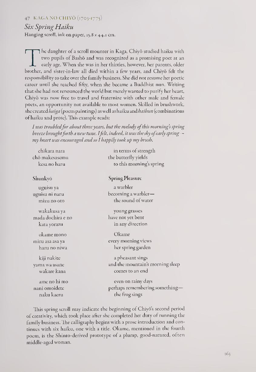
47 KAGA NO CHIYO (1703-1775)
Six Spring Haiku Hanging scroll, ink on paper, 15.8 x 44.1 cm.
The daughter of a scroll mounter in Kaga, Chiyo studied haiku with
two pupils of Basho and was recognized as a promising poet at an
early age. When she was in her thirties, however, her parents, older
brother, and sister-in-law all died within a few years, and Chiyo felt the
responsibility to take over the family business. She did not resume her poetic
career until she reached fifty, when she became a Buddhist nun. Writing
that she had not renounced the world but merely wanted to purify her heart,
Chiyo was now free to travel and fraternize with other male and female
poets, an opportunity not available to most women. Skilled in brushwork,
she created haiga (poem paintings) as well as haiku and haibun (combinations
of haiku and prose). This example reads:
I was troubled for about three years, but the melody ofthis mornings spring
breeze broughtforth anew tune. I felt, indeed, it was the sky ofearly spring—
my heart was encouraged and so I happily took up my brush.
chikara nara
cho makesasemu
kesa no haru
in terms of strength
the butterfly yields
to this morning’s spring
Shunkyo
uguisu ya
uguisu ni naru
mizu no oto
Spring Pleasure
a warbler
becoming a warbler—
the sound of water
wakakusa ya
mada dochira e no
kata yorazu
okame mono
miru asa asa ya
haru no niwa
young grasses
have not yet bent
in any direction
Okame
every morning views
her spring garden
kiji nakite
yama wa asane
wakare kana
a pheasant sings
and the mountain’s morning sleep
comes to an end
a me no hi mo
nani omoidete
naku kaeru
even on rainy days
perhaps remembering something—
the frog sings
This spring scroll may indicate the beginning of Chiyo’s second period
of creativity, which took place after she completed her duty of running the
family business. The calligraphy begins with a prose introduction and con¬
tinues with six haiku, one with a title. Okame, mentioned in the fourth
poem, is the Shinto-derived prototype of a plump, good-natured, often
middle-aged woman.
163
Chiyo’s calligraphy is somewhat compressed and gnarled, with a sense
of the poet’s intensity brought forth by the heavier and lighter forms, the
former created when the brush has been redipped in ink. Because this re¬
dipping does not always occur at the beginning of a column, asymmetrical
variations enhance the total visual expression.
The nine-stroke word haru (#, spring), composed of a sun (0) coming
up through trees (Tt), appears five times in the work, most notably as the
first character of the two-word title in the middle of the scroll. After its
initial, three-stroke appearance at the top of the second tall column, haru is
rendered in cursive script with a single brush stroke, usually heavily inked,
helping to give the work a certain amount of visual and textual unity.
In order to create a sense of structure, each haiku begins a new tall col¬
umn, and the poems usually conclude with two more partial columns. This
pattern is not totally consistent, as the six haiku have yz-yyy^ columns,
respectively; and although these columns generally coincide with the 5-7-5
syllabic poetic structure, even here there is some variation. For example,
the second poem, just after the two-word title, is written in a single column
except for the final word, oto (lH, sound). The result ol the artist’s creating
patterns but not consistently following them is that the calligraphy takes
on a feeling of life’s own irregular repetition and change. Her joy restored
by the melody of the spring breeze, Chiyo is composing both haiku and cal¬
ligraphy in her own personal rhythm.
48 YOSA BUSON (1716-1784)
Letter to Kitd (1774)
Hanging scroll, ink on paper, 16 x 22 cm.
The Ruth and Sherman Lee Institute
for Japanese Art at the Clark Center, Calif.
Although many East Asian literati were accomplished in more than
one art, Yosa Buson is unique in that he is considered to be among
the three greatest masters of all time in both haiku (with Basho
and Issa), and in nanga painting (with Taiga and Gyokudo). This letter was
written to one of his most significant haiku pupils, Kito, who seems to have
sent his New Year’s Poem Sheet for 1775 to Buson for approval.
Buson’s letter is composed in four parts. In the first two-and-a-half col¬
umns on the right, he politely congratulates Kito. Then come six columns,
indented as though Buson were speaking in a more hushed voice, in which
he criticizes a haiku by Kito that must have originally read:
Wild mouse
scratching its face
under a plum tree
Next Buson writes seven columns of more general news, in which he
speaks of the infirmities of his age (he was then fifty-eight and lived another
ten years). After dating and signing the letter, Buson concludes with a two-
column postscript. The entire text is as follows:
I have received and read your New Year’s poem sheet, which is very inter¬
esting; I have no more to say than to offer you my congratulations.
The poem about the wild mouse, however, loses some meaning in
the beginning because of emphasizing “scratching its face.” This is not
like a pheasant scratching its face, and so it is disappointing. The haiku
could have been a fine one, but you have tried for too much and thus the
feeling is lost.
This winter I have been suffering from old-age sickness. It is difficult
to come up with ideas for poems, and I have not written even one haiku;
however I am not so ill as to think about death. As I receive your letter I
am sick in bed; while rubbing my eyes that are dim with age, I hurriedly
answer you since you have asked for my immediate response. I’ll talk to
you more when I see you.
—on the seventeenth day, Yahan
P.S. My foolish poem on the Kitano printed sheet looks quite appropri¬
ate; the woodblock copy has come out in an interesting way. In fact it is
quite unique.
Although the letter, as usual, does not specify the year, it can be confi¬
dently dated to the seventeenth day of the twelfth month of 1774 because
Kito seems to have heeded his teacher’s criticism; and for his New Year’s
Poem Sheet of 1775, Kito changed the poem to:
Wild mouse
not coming out for a long time
from under a plum tree
Tater that year Kito published the poem in his Kito Kuko, this time
changed again:
Wild mouse
staying a long time
in the shade of a plum tree
Why did Buson reject Kito’s original idea? Perhaps because he thought
that the image had been done better earlier; when he referred to a pheasant
scratching his face, he may have been thinking of a haiku by Basho’s pupil
Kikaku:
scratching
its beautiful face—
the spurs of the pheasant
Buson’s letter was not written to be admired as calligraphy, and yet for
some viewers its lack of conscious artistry makes it even more admirable.
With no thought of art, Buson has simply allowed his brush to move over
the paper in a perfectly natural manner, letting the columns meander down
to the left and making some characters or kana larger than others, just as his
thoughts moved him. He redipped his brush when it ran dry; but we may
166
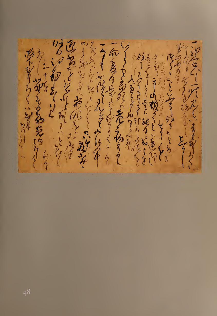
note, as for example in the seven-column section, that the words written
after the redipping are significant: first, in the middle of the first column in
this section, “old-age sickness”; second, at the top of the third column, not
even one haiku”; third, in the middle of the fifth column, “old eyes”; and
finally, at the top of the sixth column, “hasten to reply.”
The natural emphasis that these words receive by being darker and thicker
in brushwork helps to accentuate the meanings in Buson’s letter, even if he
was not consciously choosing where to dip his brush. We can simply feel the
natural rhythm of his ideas as they were being written, and sense the inner
nature of the master poet-painter as he writes to a favorite pupil.
4P OEMARU (1712-1805)
Fallen Leaves Tanzaku, ink on decorated paper, 36.2 x 5.7 cm.
Helen Foresman Spencer Museum, University of Kansas
Haiku poets in Japan practiced a number of different occupations.
Oemaru ran a courier agency in Osaka, and in the course of his
work he met many haiku masters, including Buson. He wrote,
however, that his most significant moment came at the age of thirteen when
he carried a letter to the poet Tantan. That was enough to engage Oemaru’s
serious interest, and he became a master of haiku. His works were often
written with a touch of humor and sometimes accompanied by his own
paintings.
Here Oemaru has written out one of his verses on a tanzaku decorated
with horizontal bands suggesting clouds; as we shall see, the calligraphy
enhances and adds levels of meaning to the haiku.
kumo wo kanu Gathered into clouds
takane mo miete like mountain peaks—
ochiba kana fallen leaves
The final line, succinct in this translation, is even more so in Japanese
since the final word, kana, is merely a sound giving a hint of emphasis to
what has come before. Although it might sound self-consciously poetic, the
final line might translated as “fallen leaves, ah!”
Both Oemaru’s poem and the calligraphy at first seem to be rather
simple, but they both contain subtleties. The strongest visual elements are
the kumo (St, cloud), written in the single kanji that begins the haiku, and
ochi (JofS, fallen), written in two kana at the top of the second column.
Therefore a structural reading of the poem could simply be “clouds fallen”
since the accentuations suggest “CLOUDS of gathered leaves like mountain
peaks have FALLEN.”
In the English-speaking world, haiku are usually considered to be poems
in three lines; but some scholars insist that in Japan they are one-line poems
that should be translated as such in English. They are indeed usually printed
H8
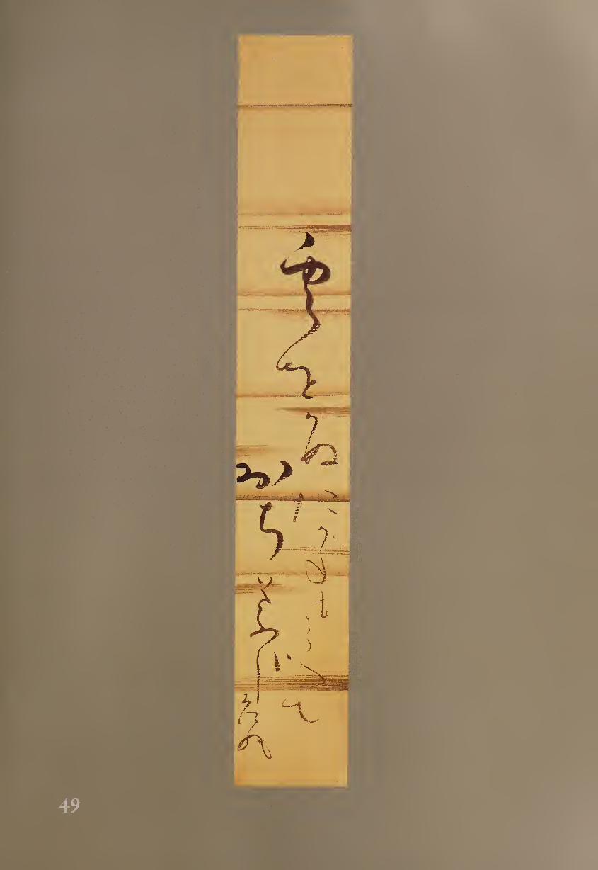
' 11 'V Vt'r ''
*n ' E ''■ '» .' 1 \ r-N' » < fei >
1
I -
- I i
A
in a single line in Japan. But to complicate the matter, Japanese poets have
written their haiku as calligraphy variously in one, two, or four columns.
Here Oemaru has visually divided his poem into two parts, leaving the final
line of the poem and his signature for the second column; the poem visually
can be read as:
Gathered into clouds like mountain peaks
fallen leaves Oemaru
Adding even more emphasis to the division of the poem into two parts is
the use of ink, heavy at the start of each column and becoming more thin and
dry as the brush moves down the tanzaku surface. We can see this in the cal¬
ligraphy of takane mo miete, which begins about halfway down the first col¬
umn with the kana for ta (ft). This seven-syllable phrase is written in rather
wispy lines that seem to mock the meaning of “[looking] like mountain
peaks.” In effect, Oemaru has deliberately de-emphasized the image by letting
the calligraphy fall in gentle curves toward the bottom of the tanzaku.
Does the two-part calligraphic presentation mean that Oemaru has
composed a two-line poem? Perhaps not. The two-column visual expression
reinforces the most important division in the poem, but the haiku is still
written as 5-7-5 syllables. This work can therefore be understood as another
case of visual counterpoint, here of two against three, adding rhythmic com¬
plexity to the work.
Traditional haiku often have a similar two-part structure underlying
their three-part division, and sometimes the final line can be seen as the an¬
swer to a riddle posed by the first two lines. Examples of this style include:
“running across the altar / and stealing a chrysanthemum / the temple rat”
(Takamasa); “exhausted by / the cries of children / a sparrow7” (Issa); and
“favored by both / the waning moon and the sun / poppies” (Oemaru).
In this case, the first two lines of Oemaru’s poem, expressed through a
single column of calligraphy, might lead us to expect something very grand
for the final line. But there seems to be an anticlimax: these gathered clouds
and mountain peaks are, after all, only leaves in a pile. And yet for Japanese
readers, the leaves themselves serve as the expression of autumn melancholy.
Clouds pass, leaves fall—the year, like an individual human life, is coming
to an end.
50 INOUE SHIRO (1742-1812)
Falling Rain Fan, ink on mica paper, 16 x 41.5 cm.
By profession a doctor in Nagoya specializing in gynecology, Shiro
studied haiku with Shirao (1735-1792) and early Japanese literature
with Motoori Norinaga (1730-1801). Skilled at combining his verse
with simple and flavorful painting, Shiro became one of the leading haiku
and haiga artists of the early nineteenth century. Within his large poetic
output, there are a number of verses about the moon, perhaps even more than
170
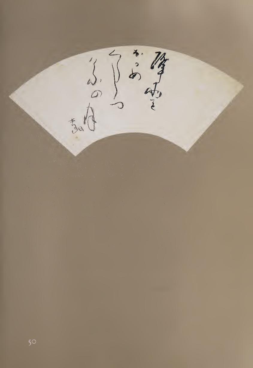
other haiku masters, several of which end with the line, “tonights moon.
One example accompanies a single-stroke painting of a mountain:1
Yorozu-yo ya Through the ages
yama no ue yori rising above the mountains
kyo no tsuki tonight’s moon
In this case, the character for “moon” (hi), originally a pictograph of
the crescent moon, becomes both a word and a picture. Shiro’s sense of the
everlasting nature of the moon is given another expression in the haiku on
this fan:
Furu ame o Falling rain
nagame kurashitsu watching all day
kyo no tsuki tonight’s moon
Although there is no direct pictorial content in this work, the final
character “moon” is separated a little from the column in which it appears
and placed at a slight angle, as though floating in the sky. Another character
that originated as a pictograph is the Chinese character for “rain” (ffl), the
second graph in the first column. In regular script, this word includes four
dots, presumably the rain itself; in Shiro’s cursive script there are only two
dots, one of them almost hidden by the movement of the brush creating the
form that surrounds it.
Shiro emphasizes the fan shape by seeming to deny it. Until the final
“moon,” the columns are all generally squared against the curving fan shape.
There is only a slight bend to the first column; later, the “moon” curves
against the movement of the fan; and finally there is the bending signature
at the lower left. Other poet-calligraphers might have angled the calligraphic
columns to conform to the curved format, as was common in Chinese cal¬
ligraphy on fans. Instead, Shiro has created a visual counterpoint that once
again emphasizes the Japanese predilection for creative tension.
This visual effect is reinforced by Shiro’s other use of calligraphic con¬
trasts. For example, the second line of the poem is rendered in two columns,
one short and compressed and the other long and expansive. Yet there is a
unity to the calligraphy that comes from its continuous sense of movement;
it is clear that the entire poem was written in a single dipping of the brush.
The haiku therefore flows naturally from the dark ink of “falling rain” to
the lighter and more transparent ink of “moon”; the meaning of the text
and the expression of the calligraphy join as one.
NOTE
i. See Stephen Addiss, Haiga: Takebe Socho and the Haiku-Painting Tradition (Richmond, Va.:
Marsh Art Gallery, in association with the University of Hawaii Press, 1995), pp. 102-103.
I7Z
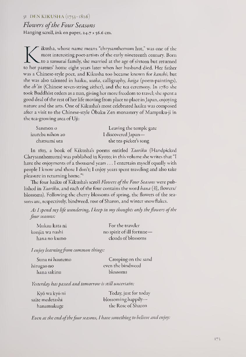
51 DEN KIKUSHA (1753-1826)
Flowers of the Four Seasons Hanging scroll, ink on paper, 24.7 x 56.6 cm.
Kikusha, whose name means “chrysanthemum hut,” was one of the
most interesting poet-artists of the early nineteenth century. Born
to a samurai family, she married at the age of sixteen but returned
to her parents’ home eight years later when her husband died. Her father
was a Chinese-style poet, and Kikusha too became known for kanshv, but
she was also talented in haiku, waka, calligraphy, haiga (poem-paintings),
the ch’in (Chinese seven-string zither), and the tea ceremony. In 1780 she
took Buddhist orders as a nun, giving her more freedom to travel; she spent a
good deal of the rest of her life moving from place to place in Japan, enjoying
nature and the arts. One of Kikusha’s most celebrated haiku was composed
after a visit to the Chinese-style Obaku Zen monastery of Mampuku-ji in
the tea-growing area of Uji:
Sanmon o Leaving the temple gate
izureba nihon zo I discovered Japan—
chatsumi uta the tea-picker’s song
In 1813, a book of Kikusha’s poems entitled Taoriku (Handpicked
Chrysanthemums) was published in Kyoto; in this volume she writes that “I
have the enjoyments of a thousand years ... I entertain myself equally with
people I know and those I don’t; I enjoy years spent traveling and also take
pleasure in returning home.”1
The four haiku of Kikusha’s scroll Flowers of the Four Seasons were pub¬
lished in Faoriku, and each of the four contains the word hana (TE, flowers/
blossoms). Following the cherry blossoms of spring, the flowers of the sea¬
sons are, respectively, bindweed, rose of Sharon, and winter snowflakes.
As I spend my life wandering, I keep in my thoughts only the flowers of the
four seasons:
Mukau kata ni For the traveler
konjin wa nashi no spirit of ill fortune—
hananokumo clouds of blossoms
I enjoy learningfrom common things:
Suna ni hautemo Creeping on the sand
hirugao no even the bindweed
hana sakinu blossoms
Yesterday has passed and tomorrow is still uncertain:
Kyo wa kyo ni
saite medetashi
hanamukuge
Today, just for today
blossoming happily—
the Rose of Sharon
Even at the end of the four seasons, I have something to believe and enjoy:
173
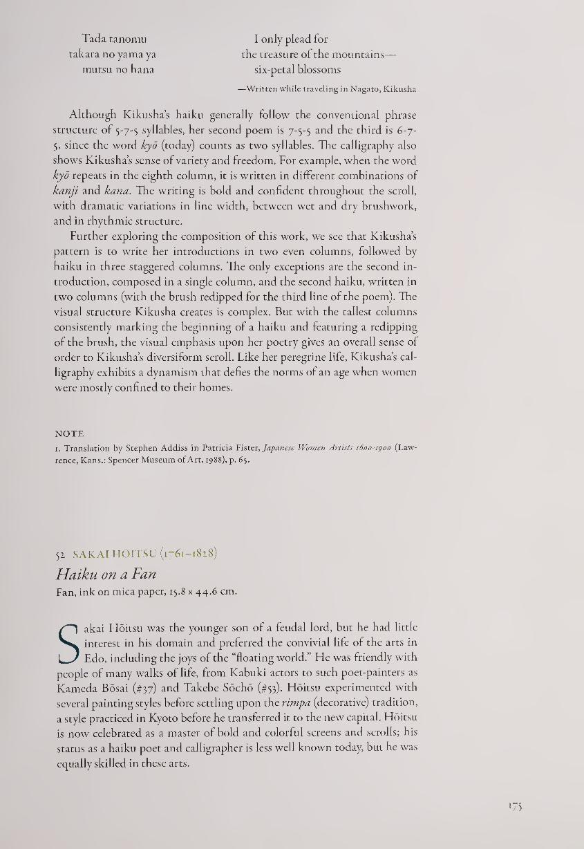
Tada tanomu
takara no yama ya
mutsu no hana
I only plead for
the treasure of the mountains—
six-petal blossoms
—Written while traveling in Nagato, Kikusha
Although Kikusha’s haiku generally follow the conventional phrase
structure of 5-7-5 syllables, her second poem is 7-5-5 and the third is 6-7-
5, since the word kyd (today) counts as two syllables. The calligraphy also
shows Kikusha’s sense of variety and freedom. For example, when the word
kyd repeats in the eighth column, it is written in different combinations of
kanji and kana. The writing is bold and confident throughout the scroll,
with dramatic variations in line width, between wet and dry brushwork,
and in rhythmic structure.
Further exploring the composition of this work, we see that Kikusha’s
pattern is to write her introductions in two even columns, followed by
haiku in three staggered columns. The only exceptions are the second in¬
troduction, composed in a single column, and the second haiku, written in
two columns (with the brush redipped for the third line of the poem). The
visual structure Kikusha creates is complex. But with the tallest columns
consistently marking the beginning of a haiku and featuring a redipping
of the brush, the visual emphasis upon her poetry gives an overall sense of
order to Kikusha’s diversiform scroll. Like her peregrine life, Kikusha’s cal¬
ligraphy exhibits a dynamism that defies the norms of an age when women
were mostly confined to their homes.
NOTE
1. Translation by Stephen Addiss in Patricia Fister, Japanese Women Artists 1600-1900 (Law¬
rence, Kans.: Spencer Museum of Art, 1988), p. 65.
52 SAKAI HOITSU (1761-1828)
Haiku on a Fan Fan, ink on mica paper, 15.8 x 44.6 cm.
Sakai Hoitsu was the younger son of a feudal lord, but he had little
interest in his domain and preferred the convivial life of the arts in
Edo, including the joys of the “floating world.” He was friendly with
people of many walks of life, from Kabuki actors to such poet-painters as
Kameda Bosai (#37) and Takebe Socho (#53). Hoitsu experimented with
several painting styles before settling upon the rimpa (decorative) tradition,
a style practiced in Kyoto before he transferred it to the new capital. Hoitsu
is now celebrated as a master of bold and colorful screens and scrolls; his
status as a haiku poet and calligrapher is less well known today, but he was
equally skilled in these arts.
175
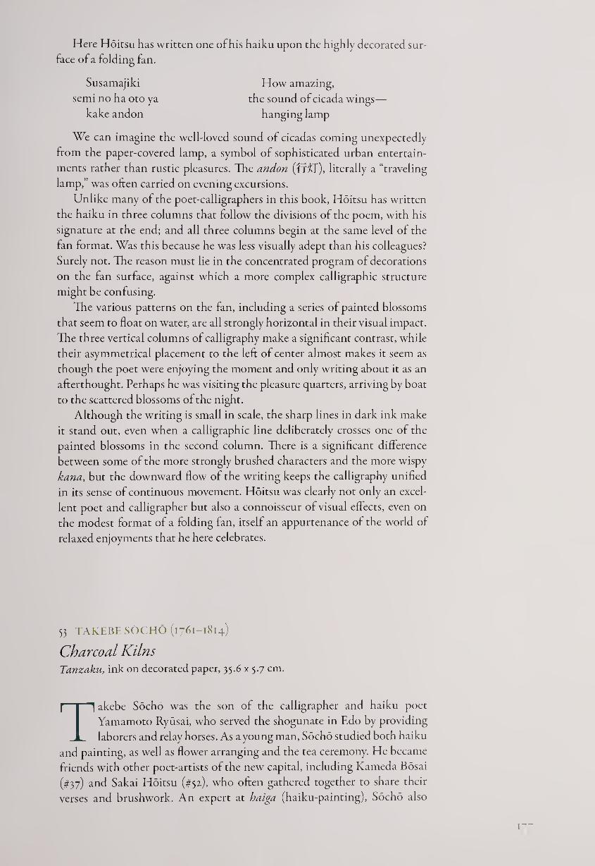
Here Hoitsu has written one of his haiku upon the highly decorated sur¬
face of a folding fan.
Susamajiki How amazing,
semi no ha oto ya the sound of cicada wings—
kake andon hanging lamp
We can imagine the well-loved sound of cicadas coming unexpectedly
from the paper-covered lamp, a symbol of sophisticated urban entertain¬
ments rather than rustic pleasures. The andon (ff'f j), literally a “traveling
lamp,” was often carried on evening excursions.
Unlike many of the poet-calligraphers in this book, Hoitsu has written
the haiku in three columns that follow the divisions of the poem, with his
signature at the end; and all three columns begin at the same level of the
fan format. Was this because he was less visually adept than his colleagues?
Surely not. The reason must lie in the concentrated program of decorations
on the fan surface, against which a more complex calligraphic structure
might be confusing.
The various patterns on the fan, including a series of painted blossoms
that seem to float on water, are all strongly horizontal in their visual impact.
The three vertical columns of calligraphy make a significant contrast, while
their asymmetrical placement to the left of center almost makes it seem as
though the poet were enjoying the moment and only writing about it as an
afterthought. Perhaps he was visiting the pleasure quarters, arriving by boat
to the scattered blossoms of the night.
Although the writing is small in scale, the sharp lines in dark ink make
it stand out, even when a calligraphic line deliberately crosses one of the
painted blossoms in the second column. There is a significant difference
between some of the more strongly brushed characters and the more wispy
kana, but the downward flow of the writing keeps the calligraphy unified
in its sense of continuous movement. Hoitsu was clearly not only an excel¬
lent poet and calligrapher but also a connoisseur of visual effects, even on
the modest format of a folding fan, itself an appurtenance of the world of
relaxed enjoyments that he here celebrates.
53 TAKEBE SOCHO (1761-1814)
Charcoal Kilns Tanzaku, ink on decorated paper, 35.6 x 5.7 cm.
Takebe Socho was the son of the calligrapher and haiku poet
Yamamoto Ryusai, who served the shogunate in Edo by providing
laborers and relay horses. As a young man, Socho studied both haiku
and painting, as well as flower arranging and the tea ceremony. He became
friends with other poet-artists of the new capital, including Kameda Bosai
(#37) and Sakai Hoitsu (#5z), who often gathered together to share their
verses and brushwork. An expert at haiga (haiku-painting), Socho also
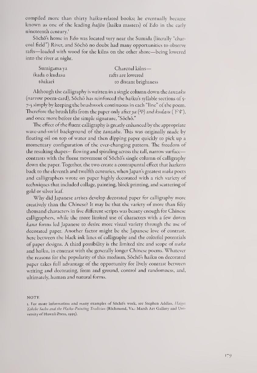
compiled more than thirty haiku-related books; he eventually became
known as one of the leading haijin (haiku masters) of Edo in the early
nineteenth century.1
Socho’s home in Edo was located very near the Sumida (literally “char¬
coal field”) River, and Socho no doubt had many opportunities to observe
rafts—loaded with wood lor the kilns on the other shore—being lowered
into the river at night.
Sumigama ya Charcoal kilns—
ikada o kudasu rafts are lowered
toakari to distant brightness
Although the calligraphy is written in a single column down the tanzaku
(narrow poem-card), Socho has reinforced the haiku’s syllable sections of 5-
7-5 simply by keeping the brushwork continuous in each “line” of the poem.
Therefore the brush lifts from the paper only after j)W (A5) and kudasu (T'T),
and once more before the simple signature, "Socho.”
The effect of the fluent calligraphy is greatly enhanced by the appropriate
wave-and-swirl background of the tanzaku. This was originally made by
floating oil on top of water and then dipping paper quickly to pick up a
momentary configuration of the ever-changing pattern. The freedom of
the resulting shapes—flowing and spiraling across the tall, narrow surface—
contrasts with the fluent movement of Socho’s single column of calligraphy
down the paper. Together, the two create a contrapuntal effect that harkens
back to the eleventh and twelfth centuries, when Japan’s greatest waka poets
and calligraphers wrote on paper highly decorated with a rich variety of
techniques that included collage, painting, block printing, and scattering of
gold or silver leaf.
Why did Japanese artists develop decorated paper for calligraphy more
creatively than the Chinese? It may be that the variety of more than fifty
thousand characters in five different scripts was beauty enough for Chinese
calligraphers, while the more limited use of characters with a few dozen
kana forms led Japanese to desire more visual variety through the use of
decorated paper. Another factor might be the Japanese love of contrast,
here between the black ink lines of calligraphy and the colorful potentials
of paper designs. A third possibility is the limited size and scope of waka
and haiku, in contrast with the generally longer Chinese poems. Whatever
the reasons for the popularity of this medium, Socho’s haiku on decorateci
paper takes full advantage of the opportunity for lively contrast between
writing and decorating, form and ground, control and randomness, and,
ultimately, human and natural forms.
NOTE
1. For more information and many examples of Socho’s work, see Stephen Addiss, Haiga:
Takebe Socho and the Haiku-Painting Tradition (Richmond, Va.: Marsh Art Gallery and Uni¬
versity of Hawaii Press, 1995).
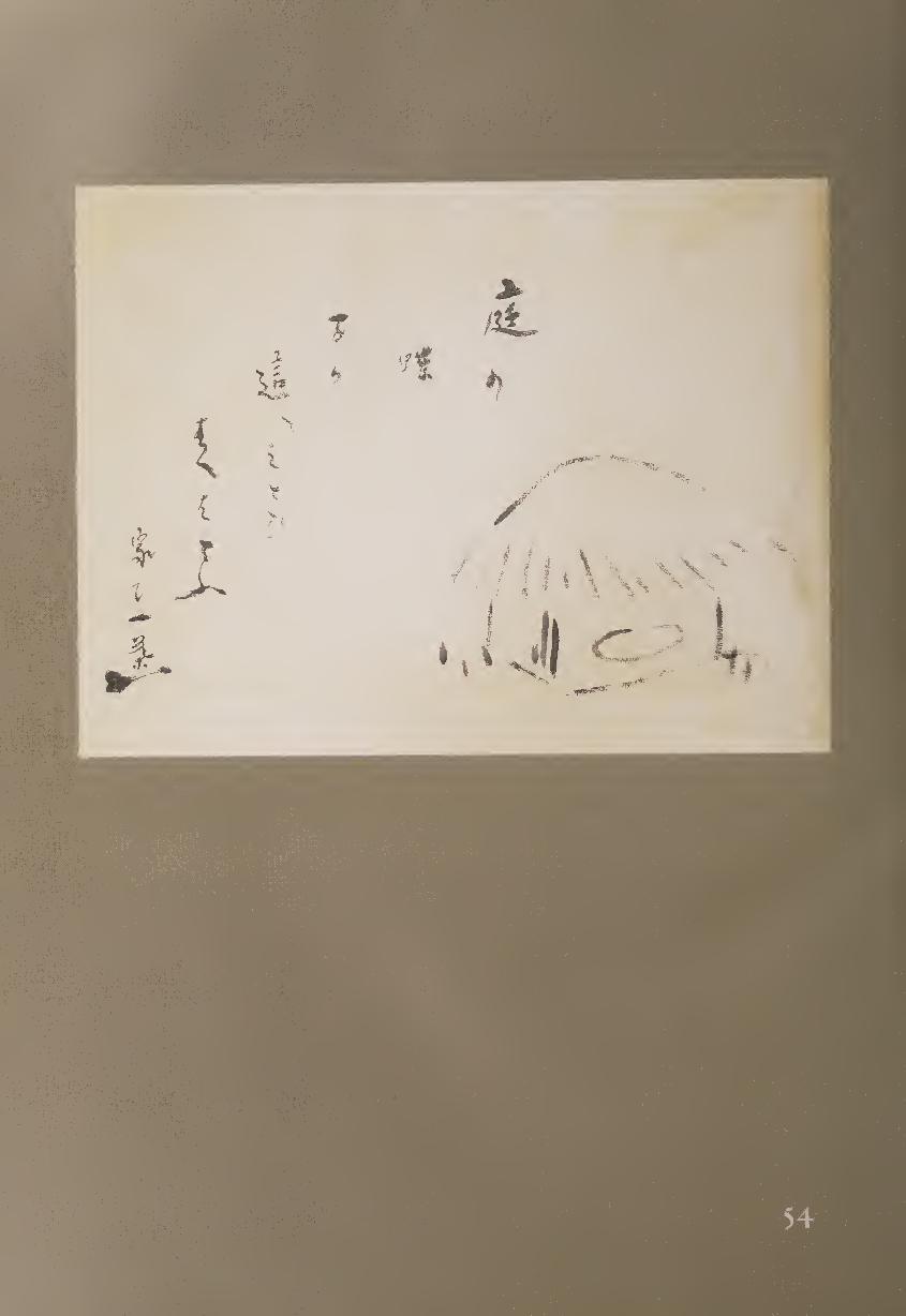
> hL. b
/
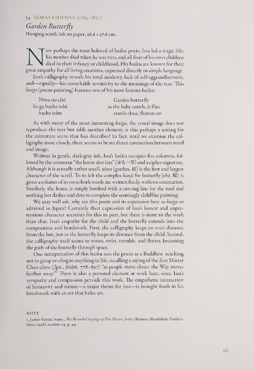
54 KOBAYASHI ISSA (1763-1827)
Garden Butterfly Hanging scroll, ink on paper, 28.6 x 37.6 cm.
Now perhaps the most beloved of haiku poets, Issa led a tragic life;
his mother died when he was two, and all four of his own children
died in their infancy or childhood. His haiku are known for their
great empathy for all living creatures, expressed directly in simple language.
Issa’s calligraphy reveals his total modesty, lack of self-aggrandizement,
and—equally—his remarkable sensitivity to the meanings of the text. This
haiga (poem-painting) features one of his most famous haiku:
Niwa no cho Garden butterfly
ko ga haeba tobi as the baby crawls, it flies
haeba tobu crawls close, flutters on
As with many of the most interesting haiga, the visual image does not
reproduce the text but adds another element; is this perhaps a setting for
the miniature scene that Issa describes? In fact, until we examine the cal¬
ligraphy more closely, there seems to be no direct connection between word
and image.
Written in gentle, dark-gray ink, Issa’s haiku occupies five columns, fol¬
lowed by the comment “the house also Issa” and a cipher-signature.
Although it is actually rather small, niwa (garden, !M) is the first and largest
character of the scroll. To its left the complex kanji for butterfly {cho, lb®) is
given a column of its own; both words are written freely, without ostentation.
Similarly, the house is simply brushed with a curving line for the roof and
nothing but dashes and dots to complete the seemingly childlike painting.
We may well ask, why are this poem and its expression here as haiga so
admired in Japan? Certainly their expression of Issa’s honest and unpre¬
tentious character accounts for this in part, but there is more to the work
than that. Issa’s empathy for the child and the butterfly extends into the
composition and brushwork. First, the calligraphy keeps an even distance
from the hut, just as the butterfly keeps its distance from the child. Second,
the calligraphy itself seems to waver, twist, tremble, and flutter, becoming
the path of the butterfly through space.
One interpretation of this haiku sees the poem as a Buddhist teaching
not to grasp or cling to anything in life, recalling a saying of the Zen Master
Chao-chou (Jpn., Joshu, 778-897) “as people move closer, the Way moves
farther away.”1 There is also a personal element at work here, since Issa’s
sympathy and compassion pervade this work. The empathetic interaction
of humanity and nature—a major theme for Issa—is brought forth in his
brushwork with an art that hides art.
NOTE
1. James Green, trans., Vie Recorded Sayings of Zen Master Joshu (Boston: Shambhala Publica¬
tions, 1998), section 119, p. 49.
l8l
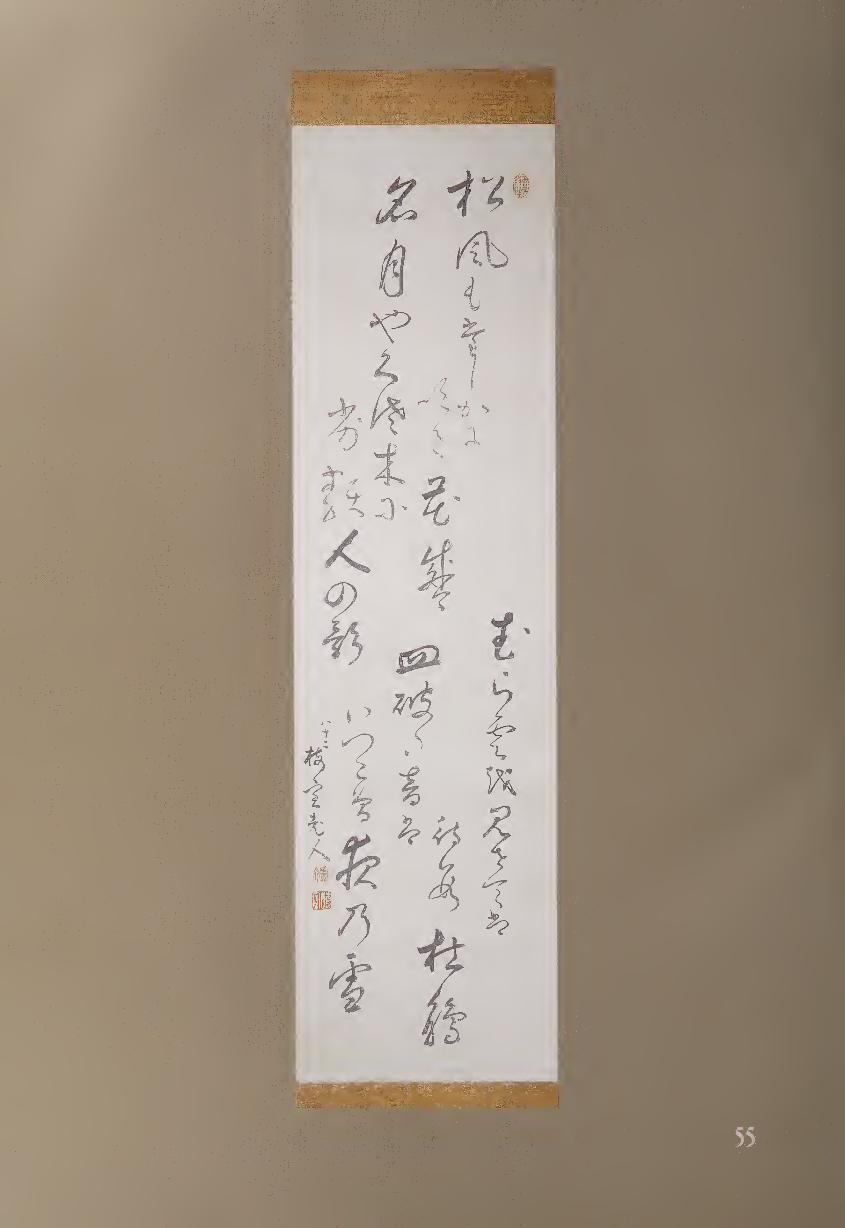
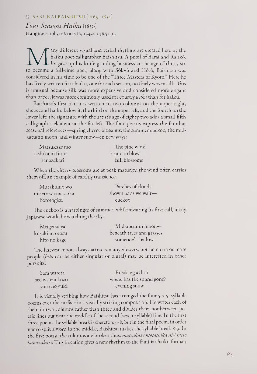
55 SAKURAI BAISHITSU (1769-1852)
Four Seasons Haiku (1850)
Hanging scroll, ink on silk, 124.4 x 36.5 cm.
Many different visual and verbal rhythms are created here by the
haiku poet-calligrapher Baishitsu. A pupil of Barai and Ranko,
he gave up his knife-grinding business at the age of thirty-six
to become a full-time poet; along with Sokyu and Horo, Baishitsu was
considered in his time to be one of the “Three Masters of Kyoto.” Here he
has freely written four haiku, one for each season, on finely woven silk. This
is unusual because silk was more expensive and considered more elegant
than paper; it was more commonly used for courtly waka than for haiku.
Baishitsu’s first haiku is written in two columns on the upper right,
the second haiku below it, the third on the upper left, and the fourth on the
lower left; the signature with the artist’s age of eighty-two adds a small fifth
calligraphic element at the far left. The four poems express the familiar
seasonal references—spring cherry blossoms, the summer cuckoo, the mid¬
autumn moon, and winter snow—in new ways:
Matsukaze mo
tashika ni futte
hanazakari
The pine wind
is sure to blow—
full blossoms
When the cherry blossoms are at peak maturity, the wind often carries
them off, an example of earthly transience.
Patches of clouds
shown us as we wait—
cuckoo
Murakumo wo
misete wa matsuka
hototogisu
The cuckoo is a harbinger of summer; while awaiting its first call, many
Japanese would be watching the sky.
Meigetsu ya
kusaki ni otoru
hito no kage
Mid-autumn moon—
beneath trees and grasses
someone’s shadow
Sara wareta
oto wa izu kozo
yoru no yuki
The harvest moon always attracts many viewers, but here one or more
people (hito can be either singular or plural) may be interested in other
pursuits.
Breaking a dish
where has the sound gone?
evening snow
It is visually striking how Baishitsu has arranged the four 5-7-5-syllable
poems over the surface in a visually striking composition. He writes each of
them in two columns rather than three and divides them not between po¬
etic lines but near the middle of the second (seven-syllable) line. In the first
three poems the syllable break is therefore 9-8; but in the final poem, in order
not to split a word in the middle, Baishitsu makes the syllable break 8-9. In
the first poem, the columns are broken thus: matsukaze motashika ni/futte
hanazakari. This lineation gives a new rhythm to the familiar haiku format;
183
but to make sure we don’t read these as two-line poems, Baishitsu always dips
the brush before the third poetic line, emphasizing the final image of each
haiku: full blossoms, the cuckoo, someone’s shadow, and evening snow.
Baishitsu uses several other calligraphic devices for visual effect. For
example, in the two upper haiku (the first and third of the sequence) the
second characters are the words for “wind” (Ml) on the right and “moon”
(S) on the left. “Wind” swings outward with three dots in the center, while
“moon” curves back inward with two dots. Originally an image of a crescent
moon, this character became less pictorial over the centuries, although here
its slight angle suggests floating in space. Baishitsu’s “wind” also becomes
pictographic, with its breezy expansiveness made stronger by the narrowly
composed kana syllable mo (t>) below it.
Finally, we may suspect that Baishitsu has given us a visual pun at the
start of the fourth poem. The first word is written in a way that closely re¬
sembles the word for “four” (ffl), but it is in fact the character for “plate”
(UIl). Occurring just below the center of the total composition, this character
presents a horizontal accent that helps the viewer keep the poems distin¬
guished from one another while suggesting the haiku virtue of multiple
meanings. The word “four” in Japanese has the same sound (shi) as “death,”
and therefore groups of four are not usually well liked; but since there are
unavoidably four seasons, Baishitsu has found a way to “break” this “four”
as well as the dish. And, to carry this little fantasy into the realm of the
Zen koan, if the “four” haiku are broken, then where is the sound? This
may take us back to the splash made by Basho’s famous jumping frog and
remind us once again that the sense of play has long been a vital element in
Japanese culture.
184
Zen Calligraphy
As the Tokugawa government consolidated power over Japan in the seven¬
teenth century, Buddhism came to a crossroads. On one hand, it became
partially controlled by the shogunate, which insisted upon regulating matters
such as the appointment of abbots at important monasteries. In addition,
the regime demanded that every citizen register at a temple, creating a kind
of census bureau; an underlying purpose was to ensure that the populace
remained settled in place and that travel could be restricted. In addition,
the shoguns shifted their support from Zen monks to Confucian scholars
as advisers and teachers, thus reducing the power of clerics to participate in
larger political and social issues. In effect, the Tokugawas used Buddhism
as part of their governing strategy without welcoming the kind of influence
and advice that earlier shoguns had sought from cultivated Zen monks such
as Sakugen Shuryo (1501-1579, #56).
Buddhist prelates found three ways of responding to the new situation.
One was to attempt to continue their interactions with the elite, which
could still be done through the tea ceremony and occasional invitations to
visit government leaders. This choice was made by several Zen monks from
Kyoto’s Daitoku-ji, which retained an important connection to the court as
well as hot-and-cold relations with the regime in Edo, depending upon who
was shogun at the time. Among the most significant of these monks was
Takuan Soho (1573-1645, #58), who at one point was exiled for protesting
the government’s regulations of monks, and then was not only pardoned but
also befriended by a later shogun.
Another response was to abjure the powerful and retreat to the country¬
side. Fugai Ekun (1568-1654, #57), for example, left his country temple to
live for some years in a cave in the mountains. Perhaps he was emulating
the first Zen patriarch, Bodhidharma (Jpn., Daruma), who was said to have
meditated in front of a wall for nine years, and the monk Hotei, who
preferred wandering through the countryside to living in a temple. Fugai
painted many images of Daruma and Hotei, but he also brushed calligraphy
with a very individualistic spirit.
The most important of the three choices made by Zen Masters, however,
was to reach out more than ever before to ordinary people. They did this by
setting up large public meetings and talks, publishing woodblock books of
Zen essays, biographies, poems, and anecdotes, and creating painting and
calligraphy. Before this opening up to the public took place to any large
degree, however, there came the influx of Obaku monks from China, as
mentioned in earlier essays.
.85
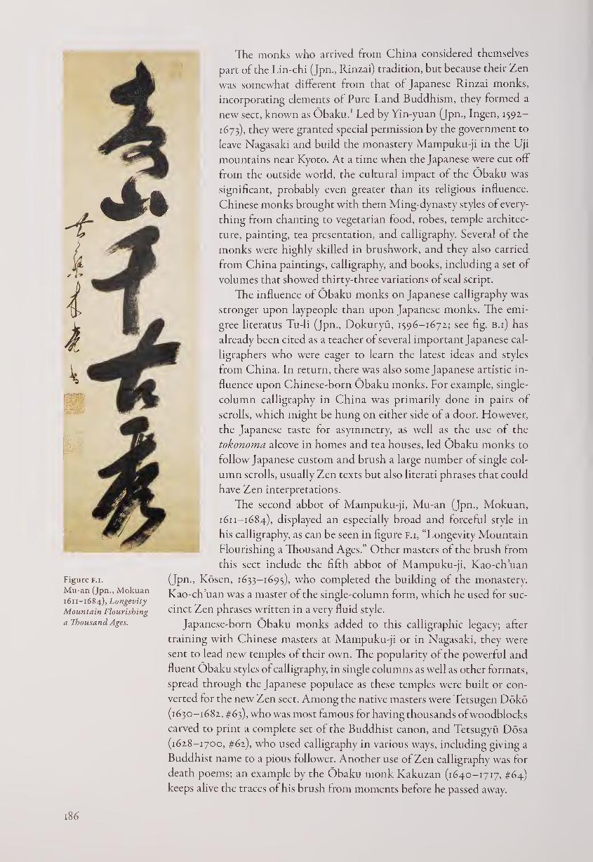
Figure f.i.
Mu-an (Jpn., Mokuan
1611-1684), Longevity
Mountain Flourishing
a Thousand Ages.
The monks who arrived from China considered themselves
part of the Lin-chi (Jpn., Rinzai) tradition, but because their Zen
was somewhat different from that of Japanese Rinzai monks,
incorporating elements of Pure Land Buddhism, they formed a
new sect, known as Obaku.1 Led by Yin-yuan (Jpn., Ingen, 1592-
1673), they were granted special permission by the government to
leave Nagasaki and build the monastery Mampuku-ji in the Uji
mountains near Kyoto. At a time when the Japanese were cut off
from the outside world, the cultural impact of the Obaku was
significant, probably even greater than its religious influence.
Chinese monks brought with them Ming-dynasty styles of every¬
thing from chanting to vegetarian food, robes, temple architec¬
ture, painting, tea presentation, and calligraphy. Several of the
monks were highly skilled in brushwork, and they also carried
from China paintings, calligraphy, and books, including a set of
volumes that showed thirty-three variations of seal script.
The influence of Obaku monks on Japanese calligraphy was
stronger upon laypeople than upon Japanese monks. The emi-
gree literatus Tu-li (Jpn., Dokuryu, 1596—1672.; see fig. b.i) has
already been cited as a teacher of several important Japanese cal¬
ligraphers who were eager to learn the latest ideas and styles
from China. In return, there was also some Japanese artistic in¬
fluence upon Chinese-born Obaku monks. For example, single¬
column calligraphy in China was primarily done in pairs of
scrolls, which might be hung on either side of a door. However,
the Japanese taste for asymmetry, as well as the use of the
tokonoma alcove in homes and tea houses, led Obaku monks to
follow Japanese custom and brush a large number of single col¬
umn scrolls, usually Zen texts but also literati phrases that could
have Zen interpretations.
The second abbot of Mampuku-ji, Mu-an (Jpn., Mokuan,
1611-1684), displayed an especially broad and forceful style in
his calligraphy, as can be seen in figure F.i, “Longevity Mountain
Flourishing a Thousand Ages.” Other masters of the brush from
this sect include the fifth abbot of Mampuku-ji, Kao-ch’uan
(Jpn- Kosen, 1633-1695), who completed the building of the monastery.
Kao-ch’uan was a master of the single-column form, which he used for suc¬
cinct Zen phrases written in a very fluid style.
Japanese-born Obaku monks added to this calligraphic legacy; after
training with Chinese masters at Mampuku-ji or in Nagasaki, they were
sent to lead new temples of their own. The popularity of the powerful and
fluent Obaku styles of calligraphy, in single columns as well as other formats,
spread through the Japanese populace as these temples were built or con¬
verted for the new Zen sect. Among the native masters were Tetsugen Doko
(1630-1682, #63), who was most famous for having thousands of woodblocks
carved to print a complete set of the Buddhist canon, and Tetsugyu Dosa
(1628-1700, #62), who used calligraphy in various ways, including giving a
Buddhist name to a pious follower. Another use of Zen calligraphy was for
death poems; an example by the Obaku monk Kakuzan (1640-1717, #64)
keeps alive the traces of his brush from moments before he passed away.
Despite the energy and interest gained through the new Obaku sect,
Japanese Zen began to decline as society became increasingly mercantile in
the seventeenth and eighteenth centuries. Three major masters appeared,
however, who were able to revitalize the Soto and Rinzai traditions. The
first was Gesshu Soko (1618-1696, #61), who brought back the teachings of
Dogen (1200-1253), the founder of Soto in Japan. Next came the Rinzai
monk Bankei Yotaku (1622-1693, #65), who studied with both Japanese and
Chinese masters, and then reached out to the public through large meetings
where he taught his concept of “the unborn.”
Most important of all was Hakuin Ekaku (1685-1768, #68), who thor¬
oughly revived the Rinzai sect through his strict training methods for monk
pupils and his ability to express Zen to people at every level of society in
Japan. He taught in part by creating hundreds of paintings and works of
calligraphy to be given to farmers, artisans, merchants, and samurai-officials,
as well as to monks. In addition to writing famous Zen aphorisms, Hakuin
composed many poems and sayings of his own, just as he supplemented his
paintings of Zen paragons such as Daruma and Hotei with the invention of
an astonishing range of new Zen painting subjects.2 He was able to add
humor to many of his works, but by his later years he had also mastered a
brushwork style of unprecedented depth and strength.
Hakuin’s pupils and followers continued his lead in using painting and
calligraphy as a Zen activity that could communicate to the broader public,
although no one was quite as wide-ranging in imagination or scope. Never¬
theless, monks such as Torei Enji (1721-1792, #69) and Inzan Ien (1754-1817,
#74) brushed works that well display their own personalities as well as their
“Zen mind,” which the current Chief Abbot of Tofuku-ji, Keido Fukushima
(born 1933), describes as pervading the brushwork of Zen Masters.
Buddhist calligraphy was not restricted to Zen, however. Not only was
copying sutras a continuing practice for both monastics and laypeople, but
monks of other sects also brushed works in larger scale for their followers.
Three of the major masters of calligraphy in the early modern period were
members of esoteric Buddhist sects. The first, Tominaga Jakugon (1720-
1771, #70), followed literati traditions and became known as an excellent
karayo poet. The second, Jiun Onko (1718-1804, #71), was Japan’s greatest
master of Sanskrit as well as a leading Shingon-sect monk who also studied
Zen. His calligraphy has been highly admired for its dramatic boldness and
use of “flying white,” where the paper can be seen through the rough brush
strokes. The third, Gocho Kankai (1739-1835) was a Tendai-sect monk who
also practiced Zen meditation. His brushwork, like that of Jiun, is included
in most considerations of zenga (Zen brushwork after 1600) because of its
dynamic style and frequent use of Zen themes.
Zen calligraphy is usually written on paper (more rarely on silk) in
hanging scroll, hand scroll, fan, or album format. However, other media
have also been utilized. Gocho not only wrote calligraphy on ceramics but
created his own; a tea bowl he made in the shino tradition shows his handi¬
work in both the vessel and the calligraphy upon it (#72).
One of the most beloved of all Zen poet-monks of the early modern
period was Daigu (Taigu) Ryokan (1758-1831, #76). In the “Snow Country”
near Niigata, Ryokan was content to live in a small mountainside hut rather
than a temple and was more likely to stop and play with local children than
to give lectures on Buddhism. Unlike most Zen monks, Ryokan wrote in a
gentle, modest style, expressing his unassuming personality. Although he
was highly skilled in both Chinese- and Japanese-style calligraphy, he hid
his expertise while writing in seemingly childlike kana, as well as regular,
running, and cursive scripts, usually working within small formats. He
once commented that one of the things he did not like was “calligraphy by
a calligrapher,” and his own work has a direct appeal that shows no trace of
professional techniques. Although his life seems quite different from that of
Hakuin, they both found ways to reach everyday people through personal
brushwork that expressed their Zen spirit.
The purposes of creating Zen calligraphy were vital to the development
of its styles. When the early modern period began in the later sixteenth
century, major Zen monasteries often housed ateliers that provided Zen
paintings and calligraphy for temples, palaces, mansions, and even for trade
with China. But after neo-Confucianism gradually replaced Zen as the
major cultural and educational force supported by the government, mon¬
asteries no longer needed to produce works of art for the elite. Semi-
professional artist-monks such as Sesshu soon disappeared; Zen brushwork
in the new era was created by the major Zen Masters themselves to be given
to their followers.
The result was a change of emphasis in both subject and style from com¬
plex to simpler, from professional to more personal, and from high culture
to full culture in scope. This change is especially visible in Zen painting,
which in some ways anticipated minimalism and conceptual art by elimi¬
nating everything but the most crucial brush strokes and by featuring a bold
use of empty space. Many monks, however, remained comfortable with
traditional styles of calligraphy, which they had practiced since childhood,
when they had learned how to read and write. The audience of followers
who wanted traces of a master’s Zen mind led to an outpouring of works
that emphasized direct communication rather than expertise. As a result,
Buddhist calligraphy both continued and somewhat diverged from the ar¬
tistic heritage of previous centuries. In the hands of outstanding Zen Mas¬
ters such as Takuan, Bankei, and Hakuin, it blossomed as a vital new artistic
force in early modern Japan.
NOTES
1. For a discussion of Obaku art, see Stephen Addiss, Obaku: Zen Painting and Calligraphy
(Lawrence, Kans.: Spencer Museum of Art, 1978).
2. See Naoji Takeuchi, Hakuin (Tokyo: Chikuma Shoten, 1964) for more than eight hundred
examples of Hakuin’s brushwork. For English-language sources, see Kazuaki Tanahashi,
Penetrating Laughter (Woodstock, N.Y.: Overlook Press, 1984), and Stephen Addiss, The Art of
Zen (New York: Harry N. Abrams, 1989).
I<S8
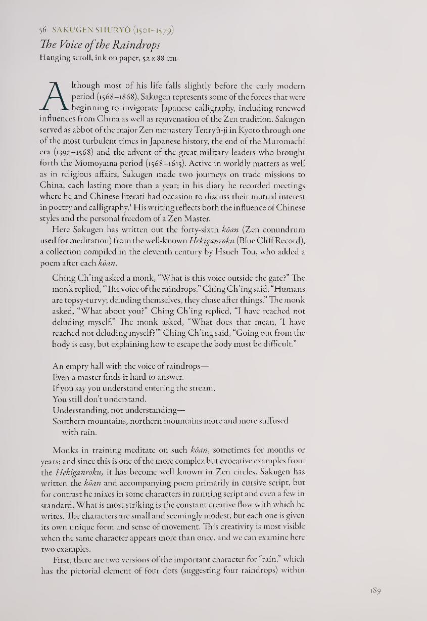
56 SAKUGEN SHURYO (1501-1579)
The Voice of the Raindrops Hanging scroll, ink on paper, 52 x 88 cm.
Although most of his life falls slightly before the early modern
period (1568-1868), Sakugen represents some of the forces that were
beginning to invigorate Japanese calligraphy, including renewed
influences from China as well as rejuvenation of the Zen tradition. Sakugen
served as abbot of the major Zen monastery Tenryu-ji in Kyoto through one
of the most turbulent times in Japanese history, the end of the Muromachi
era (1392-1568) and the advent of the great military leaders who brought
forth the Momoyama period (1568-1615). Active in worldly matters as well
as in religious affairs, Sakugen made two journeys on trade missions to
China, each lasting more than a year; in his diary he recorded meetings
where he and Chinese literati had occasion to discuss their mutual interest
in poetry and calligraphy.1 His writing reflects both the influence of Chinese
styles and the personal freedom of a Zen Master.
Here Sakugen has written out the forty-sixth koan (Zen conundrum
used for meditation) from the well-known Hekiganroku (Blue Cliff Record),
a collection compiled in the eleventh century by Hsueh Tou, who added a
poem after each koan.
Ching Ch’ing asked a monk, “What is this voice outside the gate?” The
monk replied, “The voice of the raindrops.” Ching Ch’ing said, “Humans
are topsy-turvy; deluding themselves, they chase after things.” The monk
asked, “What about you?” Ching Ch’ing replied, “I have reached not
deluding myself.” The monk asked, “What does that mean, ‘I have
reached not deluding myself?”’ Ching Ch’ing said, “Going out from the
body is easy, but explaining how to escape the body must be difficult.”
An empty hall with the voice of raindrops—
Even a master finds it hard to answer.
If you say you understand entering the stream,
You still don’t understand.
Understanding, not understanding—
Southern mountains, northern mountains more and more suffused
with rain.
Monks in training meditate on such koan, sometimes for months or
years; and since this is one of the more complex but evocative examples from
the Hekiganroku, it has become well known in Zen circles. Sakugen has
written the koan and accompanying poem primarily in cursive script, but
for contrast he mixes in some characters in running script and even a few in
standard. What is most striking is the constant creative flow with which he
writes. The characters are small and seemingly modest, but each one is given
its own unique form and sense of movement. This creativity is most visible
when the same character appears more than once, and we can examine here
two examples.
First, there are two versions of the important character for “rain,” which
has the pictorial element of four dots (suggesting four raindrops) within
189
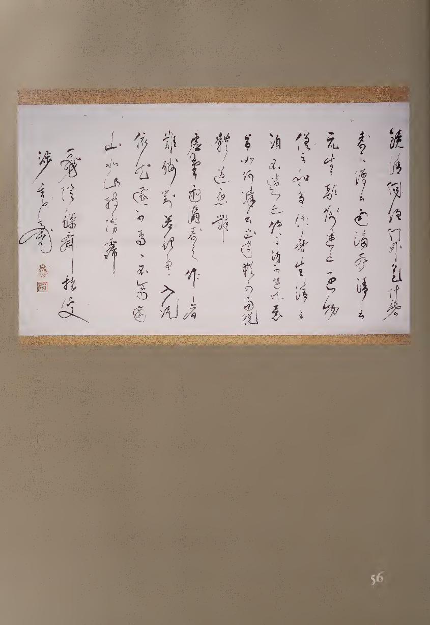
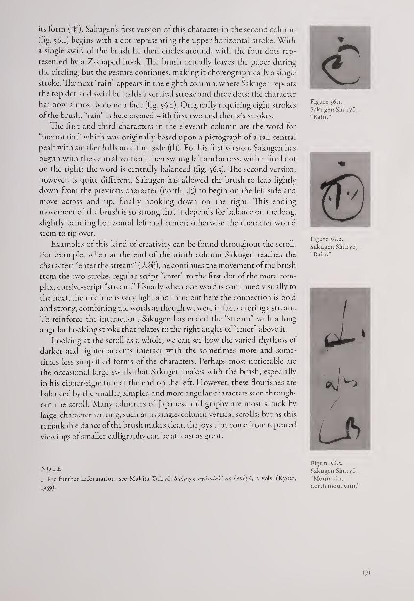
its form (do). Sakugen’s first version of this character in the second column
(fig. 56.1) begins with a dot representing the upper horizontal stroke. With
a single swirl of the brush he then circles around, with the four dots rep¬
resented by a Z-shaped hook. The brush actually leaves the paper during
the circling, but the gesture continues, making it choreographically a single
stroke. The next “rain” appears in the eighth column, where Sakugen repeats
the top dot and swirl but adds a vertical stroke and three dots; the character
has now almost become a face (fig. 56.2). Originally requiring eight strokes
of the brush, “rain” is here created with first two and then six strokes.
The first and third characters in the eleventh column are the word for
“mountain,” which was originally based upon a pictograph of a tall central
peak with smaller hills on either side (|1|). For his first version, Sakugen has
begun with the central vertical, then swung left: and across, with a final dot
on the right; the word is centrally balanced (fig. 56.3). The second version,
however, is quite different. Sakugen has allowed the brush to leap lightly
down from the previous character (north, it) to begin on the left side and
move across and up, finally hooking down on the right. This ending
movement of the brush is so strong that it depends for balance on the long,
slightly bending horizontal left and center; otherwise the character would
seem to tip over.
Examples of this kind of creativity can be found throughout the scroll.
For example, when at the end of the ninth column Sakugen reaches the
characters “enter the stream” (A'/;*), he continues the movement of the brush
from the two-stroke, regular-script “enter” to the first dot of the more com¬
plex, cursive-script “stream.” Usually when one word is continued visually to
the next, the ink line is very light and thin; but here the connection is bold
and strong, combining the words as though we were in fact entering a stream.
To reinforce the interaction, Sakugen has ended the “stream” with a long
angular hooking stroke that relates to the right angles of “enter” above it.
Looking at the scroll as a whole, we can see how the varied rhythms of
darker and lighter accents interact with the sometimes more and some¬
times less simplified forms of the characters. Perhaps most noticeable are
the occasional large swirls that Sakugen makes with the brush, especially
in his cipher-signature at the end on the left. However, these flourishes are
balanced by the smaller, simpler, and more angular characters seen through¬
out the scroll. Many admirers of Japanese calligraphy are most struck by
large-character writing, such as in single-column vertical scrolls; but as this
remarkable dance of the brush makes clear, the joys that come from repeated
viewings of smaller calligraphy can be at least as great.
NOTE
x. For further information, see Makita Tairyo, Sakugen nyuminki no kenkyu, 2 vols. (Kyoto,
1959)-
<£ Figure 56.1.
Sakugen Shuryo,
“Rain.”
Figure 56.2.
Sakugen Shuryo,
“Rain.”
I
oj
Figure 56.3.
Sakugen Shuryo,
“Mountain,
north mountain.”
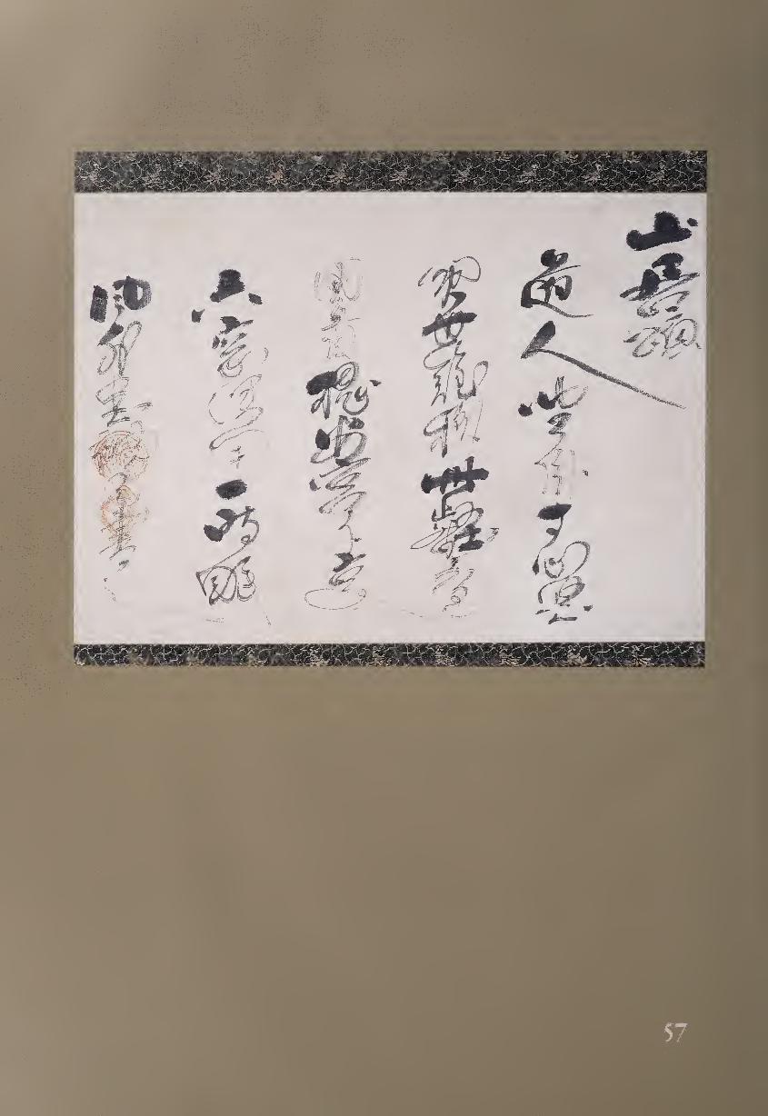
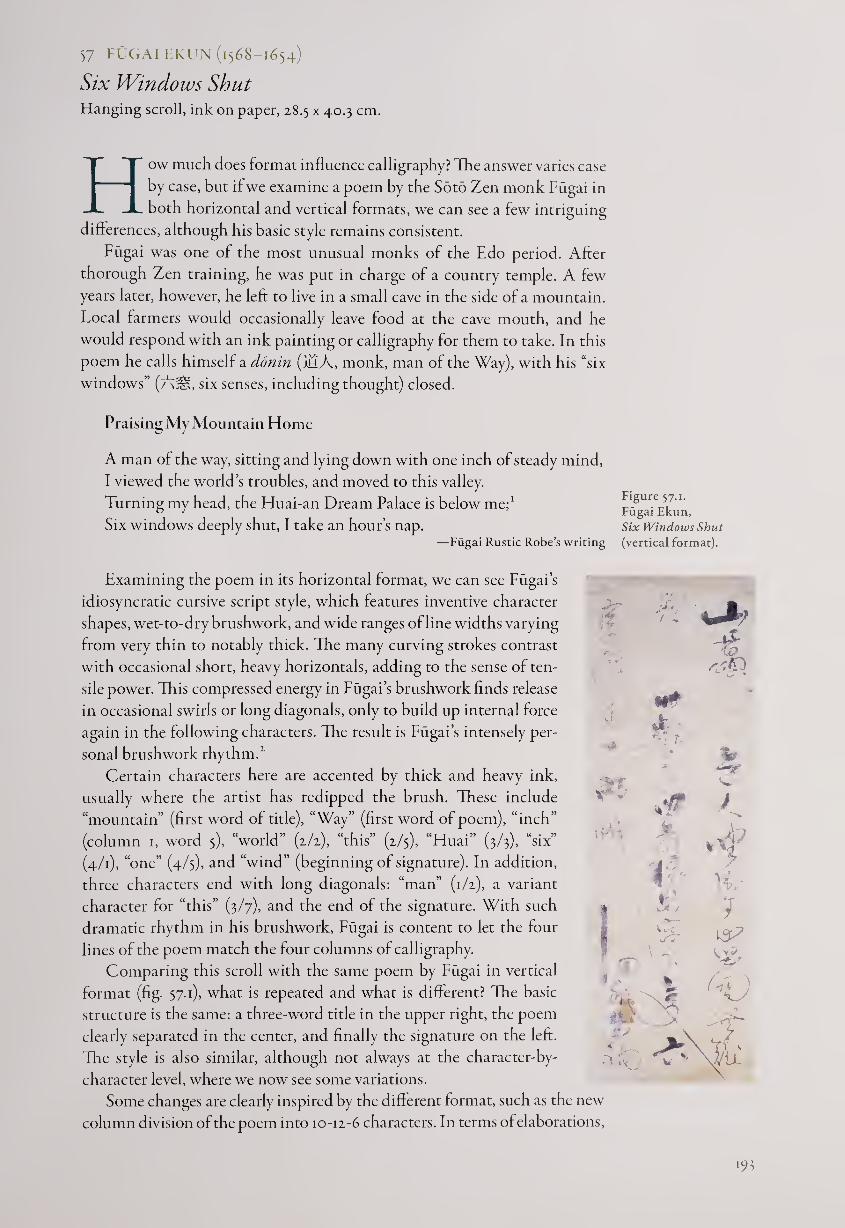
57 FUGAI EKUN (1568-1654)
Six Windows Shut Hanging scroll, ink on paper, 28.5 x 40.3 cm.
How much does format influence calligraphy? The answer varies case
by case, but if we examine a poem by the Soto Zen monk Fugai in
both horizontal and vertical formats, we can see a few intriguing
differences, although his basic style remains consistent.
Fugai was one of the most unusual monks of the Edo period. After
thorough Zen training, he was put in charge of a country temple. A few
years later, however, he left to live in a small cave in the side of a mountain.
Local farmers would occasionally leave food at the cave mouth, and he
would respond with an ink painting or calligraphy for them to take. In this
poem he calls himself a ddnin (iMA, monk, man of the Way), with his “six
windows” (AjS, six senses, including thought) closed.
Praising My Mountain Home
A man of the way, sitting and lying down with one inch of steady mind,
I viewed the world’s troubles, and moved to this valley.
Turning my head, the Huai-an Dream Palace is below me;1
Six windows deeply shut, I take an hour’s nap. —Fugai Rustic Robe’s writing
Examining the poem in its horizontal format, we can see Fugai’s
idiosyncratic cursive script style, which features inventive character
shapes, wet-to-dry brushwork, and wide ranges of line widths varying
from very thin to notably thick. The many curving strokes contrast
with occasional short, heavy horizontals, adding to the sense of ten¬
sile power. This compressed energy in Fugai’s brushwork finds release
in occasional swirls or long diagonals, only to build up internal force
again in the following characters. The result is Fugai’s intensely per¬
sonal brushwork rhythm.1
Certain characters here are accented by thick and heavy ink,
usually where the artist has redipped the brush. These include
“mountain” (first word of title), “Way” (first word of poem), “inch”
(column 1, word 5), “world” (2/2), “this” (2/5), “Huai” (3/3), “six”
(4/1), “one” (4/5), and “wind” (beginning of signature). In addition,
three characters end with long diagonals: “man” (1/2), a variant
character for “this” (3/7), and the end of the signature. With such
dramatic rhythm in his brushwork, Fugai is content to let the four
lines of the poem match the four columns of calligraphy.
Comparing this scroll with the same poem by Fugai in vertical
format (fig. 57.1), what is repeated and what is different? The basic
structure is the same: a three-word title in the upper right, the poem
clearly separated in the center, and finally the signature on the left.
The style is also similar, although not always at the character-by-
character level, where we now see some variations.
Some changes are clearly inspired by the different format, such as the new
column division of the poem into 10-12-6 characters. In terms of elaborations,
■MB
•4 ‘
7 ,
-
*•-• t
V
-t rxtD
A f V*V
„ X 4.
4
lie*.
N£ m.
7 is7
Ug,
f4V . >
Figure 57.1.
Fugai Ekun,
Six Windows Shut
(vertical format).
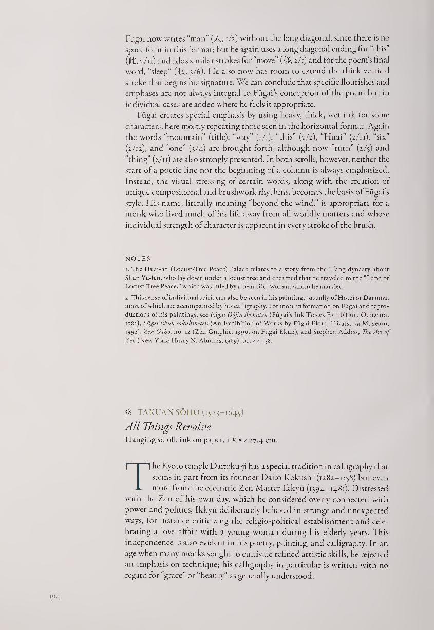
Fugai now writes “man” (A, 1/2) without the long diagonal, since there is no
space for it in this format; but he again uses a long diagonal ending for “this”
(lit, 2/11) and adds similar strokes for “move” (fl, 2/1) and for the poem’s final
word, “sleep” (US, 3/6). He also now has room to extend the thick vertical
stroke that begins his signature. We can conclude that specific flourishes and
emphases are not always integral to Fugai s conception of the poem but in
individual cases are added where he feels it appropriate.
Fugai creates special emphasis by using heavy, thick, wet ink for some
characters, here mostly repeating those seen in the horizontal format. Again
the words “mountain” (title), “way” (1/1), “this” (2/2), “Huai” (2/11), “six”
(2/12), and “one” (3/4) are brought forth, although now “turn” (2/5) and
“thing” (2/11) are also strongly presented. In both scrolls, however, neither the
start ol a poetic line nor the beginning of a column is always emphasized.
Instead, the visual stressing of certain words, along with the creation of
unique compositional and brushwork rhythms, becomes the basis of Fugai’s
style. His name, literally meaning “beyond the wind,” is appropriate for a
monk who lived much of his life away from all worldly matters and whose
individual strength of character is apparent in every stroke of the brush.
NOTES
1. The Huai-an (Locust-Tree Peace) Palace relates to a story from the T’ang dynasty about
Shun Yu-fen, who lay down under a locust tree and dreamed that he traveled to the “Land of
Locust-Tree Peace,” which was ruled by a beautiful woman whom he married.
2. This sense of individual spirit can also be seen in his paintings, usually of Hotei or Daruma,
most of which are accompanied by his calligraphy. Lor more information on Fugai and repro¬
ductions of his paintings, see Fugai Dojin ibokuten (Fugai’s Ink Traces Exhibition, Odawara,
1982), Fiigai Ekun sakuhin-ten (An Exhibition of Works by Fugai Ekun, Hiratsuka Museum,
1992), Zen Gaho, no. 12 (Zen Graphic, 1990, on Fugai Ekun), and Stephen Addiss, The Art of
Zen (New York: Harry N. Abrams, 1989), pp. 44-58.
58 TAKUAN SOHO (1573-1645)
All Things Revolve Hanging scroll, ink on paper, 118.8 x 27.4 cm.
The Kyoto temple Daitoku-ji has a special tradition in calligraphy that
stems in part from its founder Daito Kokushi (1282-1338) but even
more from the eccentric Zen Master Ikkyu (1394-1481). Distressed
with the Zen of his own day, which he considered overly connected with
power and politics, Ikkyu deliberately behaved in strange and unexpected
ways, for instance criticizing the religio-political establishment and cele¬
brating a love affair with a young woman during his elderly years. This
independence is also evident in his poetry, painting, and calligraphy. In an
age when many monks sought to cultivate refined artistic skills, he rejected
an emphasis on technique; his calligraphy in particular is written with no
regard for “grace” or “beauty” as generally understood.
194
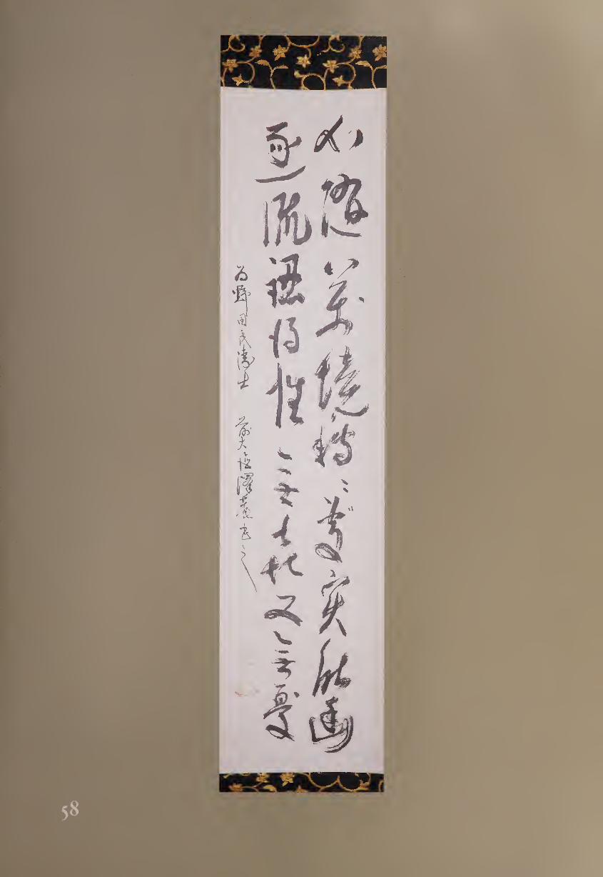
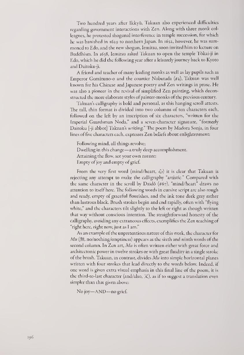
Two hundred years after Ikkyu, Takuan also experienced difficulties
regarding government interactions with Zen. Along with three monk col¬
leagues, he protested shogunal interference in temple succession, for which
he was banished in 1629 to northern Japan. In 1632, however, he was sum¬
moned to Edo, and the new shogun, Iemitsu, soon invited him to lecture on
Buddhism. In 1638, Iemitsu asked Takuan to open the temple Tokai-ji in
Edo, which he did the following year after a leisurely journey back to Kyoto
and Daitoku-ji.
A friend and teacher of many leading monks as well as lay pupils such as
Emperor Gomizuno-o and the courtier Nobutada (#2), Takuan was well
known for his Chinese and Japanese poetry and Zen writings in prose. He
was also a pioneer in the revival of simplified Zen painting, which decon¬
structed the more elaborate styles of painter-monks of the previous century.
Takuan’s calligraphy is bold and personal, as this hanging scroll attests.
The tall, thin format is divided into two columns of ten characters each,
followed on the left by an inscription of six characters, “written for the
Imperial Guardsman Noda,” and a seven-character signature, “formerly
Daitoku [-ji abbot] Takuan’s writing.” The poem by Madora Sonja, in four
lines of five characters each, expresses Zen beliefs about enlightenment:
Following mind, all things revolve;
Dwelling in this change—a truly deep accomplishment.
Attaining the flow, see your own nature:
Empty of joy and empty of grief.
From the very first word (mind/heart, T') it is clear that Takuan is
rejecting any attempt to make the calligraphy “artistic.” Compared with
the same character in the scroll by Daido (#67), “mind/heart” draws no
attention to itself here. The following words in cursive script are also rough
and ready, empty of graceful flourishes, and the ink tone dark gray rather
than lustrous black. Brush strokes begin and end rapidly, often with “flying
white,” and the characters tilt slightly to the left or right as though written
that way without conscious intention. The straightforward honesty of the
calligraphy, avoiding any extraneous effects, exemplifies the Zen teaching of
“right here, right now, just as I am.”
As an example of the unpretentious nature of this work, the character for
Mu (M, no/nothing/emptiness) appears as the sixth and ninth words of the
second column. In Zen art, Mu is often written either with great force and
architectonic power in twelve strokes or with great fluidity in a single stroke
of the brush. Takuan, in contrast, divides Mu into simple horizontal planes
written with four strokes that lead directly to the words below. Indeed, if
one word is given extra visual emphasis in this final line of the poem, it is
the third-to-last character (and/also, X), as if to suggest a translation even
simpler than that given above:
No joy—AND—no grief.
196
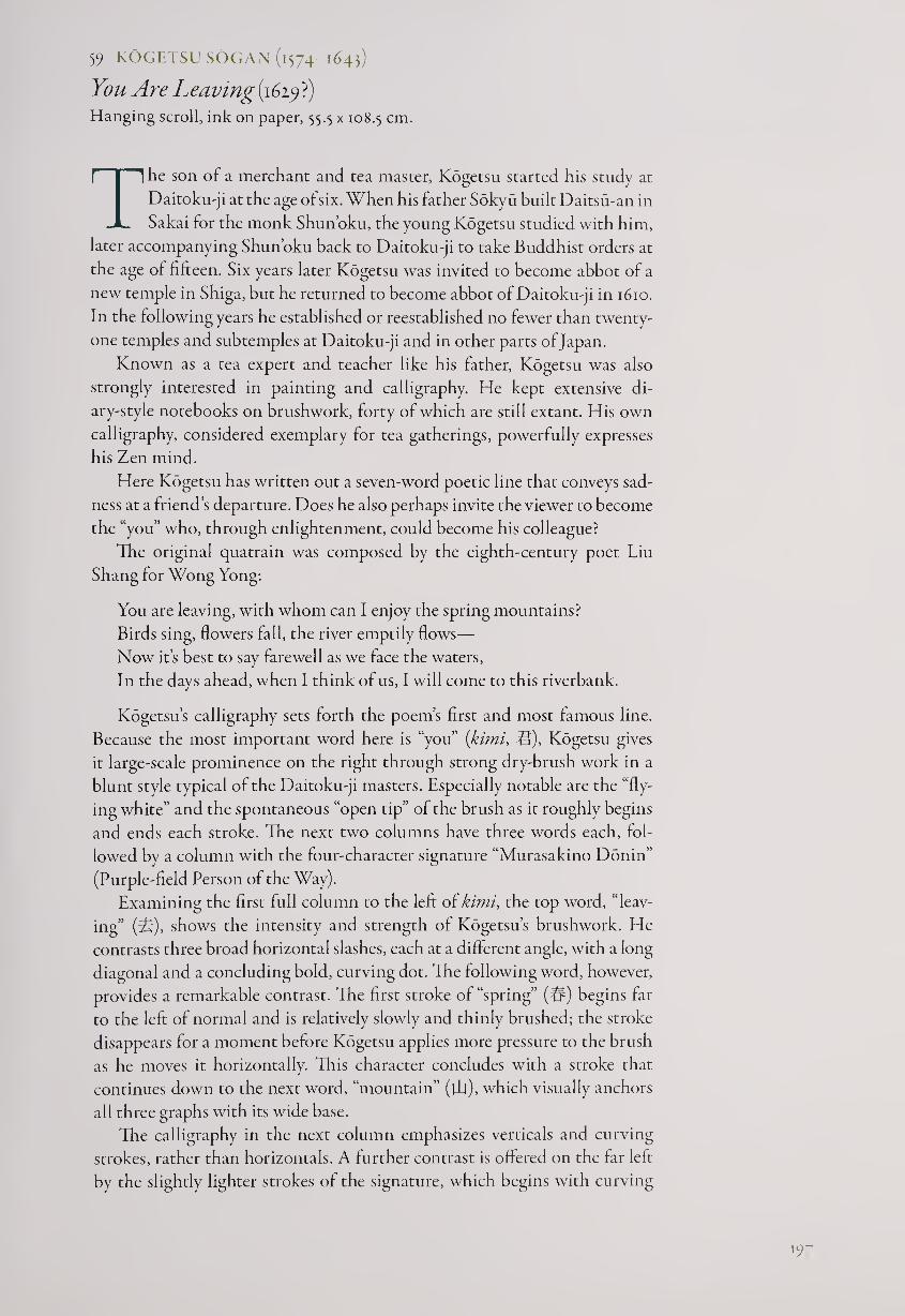
5? KOGETSU SOGAN (1574-1643)
You Are Leaving (1629?) Hanging scroll, ink on paper, 55.5 x 108.5 cm.
The son of a merchant and tea master, Kogetsu started his study at
Daitoku-ji at the age of six. When his father Sokyu built Daitsu-an in
Sakai for the monk Shun’oku, the young Kogetsu studied with him,
later accompanying Shun’oku back to Daitoku-ji to take Buddhist orders at
the age of fifteen. Six years later Kogetsu was invited to become abbot of a
new temple in Shiga, but he returned to become abbot of Daitoku-ji in 1610.
In the following years he established or reestablished no fewer than twenty-
one temples and subtemples at Daitoku-ji and in other parts of Japan.
Known as a tea expert and teacher like his father, Kogetsu was also
strongly interested in painting and calligraphy. He kept extensive di¬
ary-style notebooks on brushwork, forty of which are still extant. His own
calligraphy, considered exemplary for tea gatherings, powerfully expresses
his Zen mind.
Here Kogetsu has written out a seven-word poetic line that conveys sad¬
ness at a friend’s departure. Does he also perhaps invite the viewer to become
the “you” who, through enlightenment, could become his colleague?
The original quatrain was composed by the eighth-century poet Liu
Shang for Wong Yong:
You are leaving, with whom can I enjoy the spring mountains?
Birds sing, flowers fall, the river emptily flows—
Now it’s best to say farewell as we face the waters,
In the days ahead, when I think of us, I will come to this riverbank.
Kogetsu’s calligraphy sets forth the poem’s first and most famous line.
Because the most important word here is “you” {kimi, U), Kogetsu gives
it large-scale prominence on the right through strong dry-brush work in a
blunt style typical of the Daitoku-ji masters. Especially notable are the “fly¬
ing white” and the spontaneous “open tip” of the brush as it roughly begins
and ends each stroke. The next two columns have three words each, fol¬
lowed by a column with the four-character signature “Murasakino Donin”
(Purple-field Person of the Way).
Examining the first full column to the left of kimi, the top word, “leav¬
ing” (it), shows the intensity and strength of Kogetsu’s brushwork. He
contrasts three broad horizontal slashes, each at a different angle, with a long
diagonal and a concluding bold, curving dot. The following word, however,
provides a remarkable contrast. The first stroke of “spring” (#) begins far
to the left of normal and is relatively slowly and thinly brushed; the stroke
disappears for a moment before Kogetsu applies more pressure to the brush
as he moves it horizontally. This character concludes with a stroke that
continues down to the next word, “mountain” (ill), which visually anchors
all three graphs with its wide base.
The calligraphy in the next column emphasizes verticals and curving
strokes, rather than horizontals. A further contrast is offered on the far left
by the slightly lighter strokes of the signature, which begins with curving
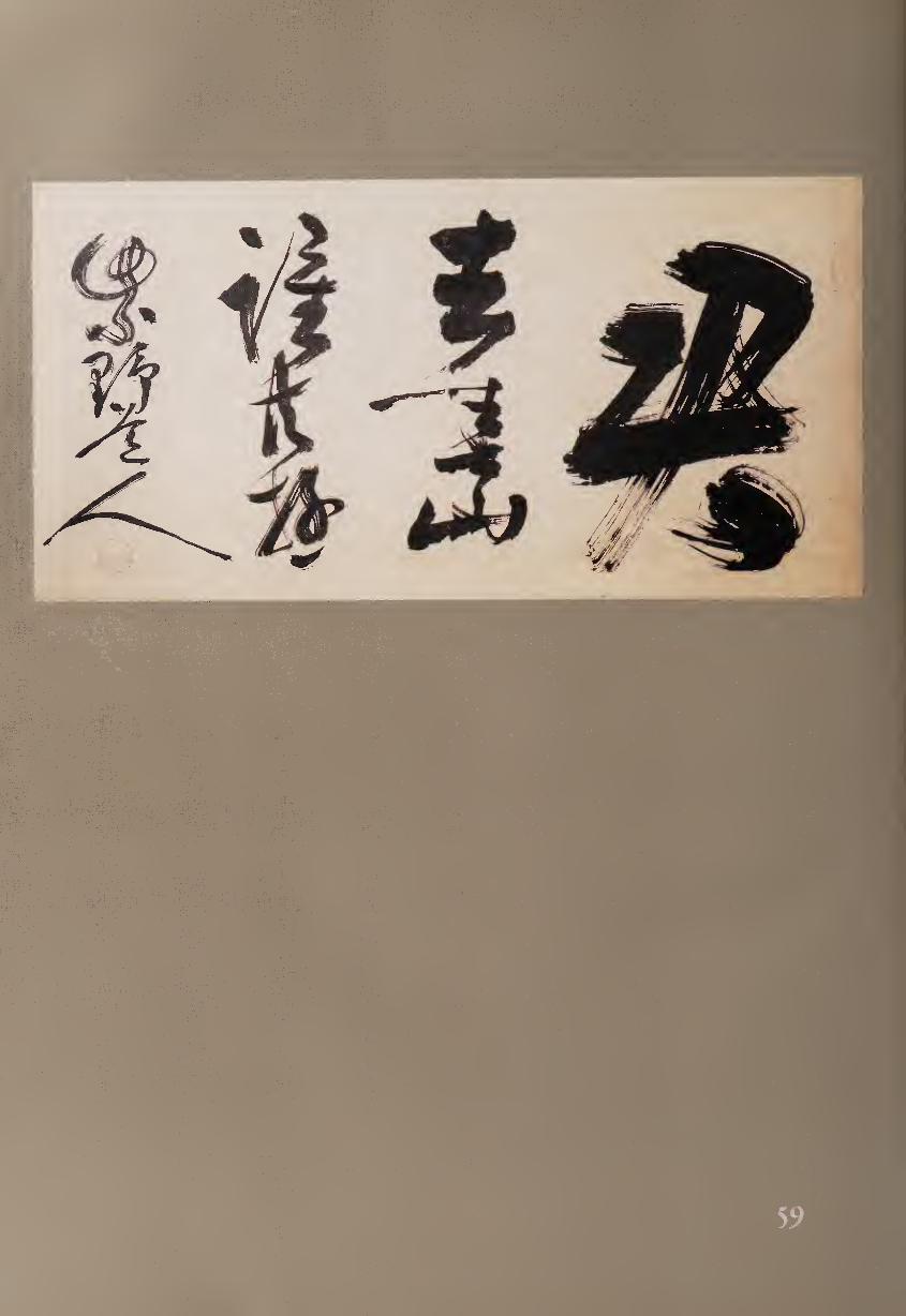
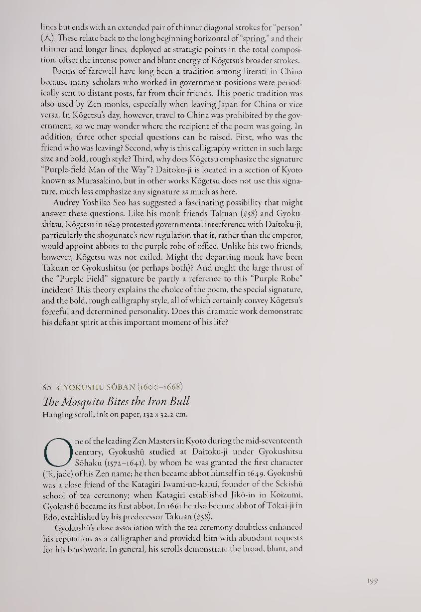
lines but ends with an extended pair of thinner diagonal strokes for “person”
(A). These relate back to the long beginning horizontal of “spring,” and their
thinner and longer lines, deployed at strategic points in the total composi¬
tion, offset the intense power and blunt energy of Kogetsu’s broader strokes.
Poems of farewell have long been a tradition among literati in China
because many scholars who worked in government positions were period¬
ically sent to distant posts, far from their friends. This poetic tradition was
also used by Zen monks, especially when leaving Japan for China or vice
versa. In Kogetsu’s day, however, travel to China was prohibited by the gov¬
ernment, so we may wonder where the recipient of the poem was going. In
addition, three other special questions can be raised. First, who was the
friend who was leaving? Second, why is this calligraphy written in such large
size and bold, rough style? Third, why does Kogetsu emphasize the signature
“Purple-field Man of the Way”? Daitoku-ji is located in a section of Kyoto
known as Murasakino, but in other works Kogetsu does not use this signa¬
ture, much less emphasize any signature as much as here.
Audrey Yoshiko Seo has suggested a fascinating possibility that might
answer these questions. Like his monk friends Takuan (#58) and Gyoku-
shitsu, Kogetsu in 1629 protested governmental interference with Daitoku-ji,
particularly the shogunate’s new regulation that it, rather than the emperor,
would appoint abbots to the purple robe of office. Unlike his two friends,
however, Kogetsu was not exiled. Might the departing monk have been
Takuan or Gyokushitsu (or perhaps both)? And might the large thrust of
the “Purple Field” signature be partly a reference to this “Purple Robe”
incident? This theory explains the choice of the poem, the special signature,
and the bold, rough calligraphy style, all of which certainly convey Kogetsu’s
forceful and determined personality. Does this dramatic work demonstrate
his defiant spirit at this important moment of his life?
60 GYOKUSHU SOBAN (1600-1668)
The Mosquito Bites the Iron Bull Hanging scroll, ink on paper, 132 x 32.2 cm.
One of the leading Zen Masters in Kyoto during the mid-seventeenth
century, Gyokushu studied at Daitoku-ji under Gyokushitsu
Sohaku (1372-1641), by whom he was granted the first character
(3f, jade) of his Zen name; he then became abbot himself in 1649. Gyokushu
was a close friend of the Katagiri Iwami-no-kami, founder of the Sekishu
school of tea ceremony; when Katagiri established Jiko-in in Koizumi,
Gyokushu became its first abbot. In 1661 he also became abbot of Tokai-ji in
Edo, established by his predecessor Takuan (#58).
Gyokushu’s close association with the tea ceremony doubtless enhanced
his reputation as a calligrapher and provided him with abundant requests
for his brushwork. In general, his scrolls demonstrate the broad, blunt, and
199
dynamic style that is associated with Daitoku-ji masters, although some
features are distinctly his own.
The phrase Gyokushu has written here is used in several Zen discourses
to suggest the difficulty of achieving enlightenment. For example, Bassui
Tokusho (1317-1387) told a questioner that “trying to perceive the great
dharma from one’s narrow viewpoint is like a mosquito trying to bite an
iron bull.”1 We encounter the phrase again in a story quoted by the Japanese
master Dogen Kigen (1100-1153): upon reaching enlightenment under the
auspices of his teacher Daji, Yaoshan exclaims, “When I was studying with
Shitou, it was like a mosquito trying to bite an iron bull.”1
The five characters of the phrase represent “mosquito” (Kffi), “bite’ ■m,
“iron” (§£), and “bull” (ffi). Three of the five graphs are constructed of two
parts: a radical on the left and another form on the right. In these kanji,
Gyokushu narrows the left side and extends the right; this characteristic is
especially notable in the words “bite,” with its “mouth” radical (P) squeezed
to the left, and “iron,” where the complex left “metal” radical (#) is reduced
to a leaning vertical on which a series of short strokes cluster.
Gyokushus brushwork in regular script only occasionally softens into
running script, in which strokes continue and join rather than being entirely
separate. In a single case, two words join each other; appropriately these
are “bite” and “iron.” Gyokushu generally moves the brush in a decisive if
slightly truncated manner, using “open tip,” in which the hairs of the brush
are visible as they enter and leave the paper; however, the very first stroke of
the scroll demonstrates the rounded forms of “hidden tip.” The entire work
ends with the final stroke of “bull” deconstructing into “flying white.” This
vertically extended character creates the sensation of a pole holding up the
entire calligraphy, or a tree trunk supporting all the foliage above it.
Despite the subtleties of character composition in this work, perhaps
the dominant impression given by Gyokushus scroll is one of powerful
simplicity. The lack of elaboration, the blunt brushwork, the pithy text, and
the straightforward strength of the characters all combine to create a scroll
that would be equally appropriate in a temple or at a tea gathering. Inviting
viewers both to empathize with the mosquito’s seemingly impossible task
and to consider the iron bull’s imperviousness to the vicissitudes of daily
life, Gyokushus scroll serves as a direct expression of Zen teaching.
NOTES
1. Adapted from Bassui Tokusho, Mud and Water, trans. Arthur Braverman (San Francisco:
North Point Press, 1989), p. 30.
2. From Moon in a Dewdrop: Writings of the Zen Master Dogen, ed. Kazuaki Tanahashi (New
York: North Point Press, 1985), p. 81.
61 (.ESSHU SOKO (1618-1696)
Huang-po’s Buddha-Dharma Hanging scroll, ink on paper, 127 x 26.4 cm.
Although Soto is numerically the largest Japanese Zen sect, its monks
have been less prolific than Rinzai monks in creating paintings
and calligraphy. The differences between the two sects are largely
historical, although Soto promotes meditation as a form of gradual enlight¬
enment more than Rinzai, which stresses koan study as a means toward
sudden enlightenment.
Gesshu, one of the leading Soto masters of the later seventeenth cen¬
tury, had his first experience oisatori while meditating on mushin (literally,
“without mind”) and encountering a great doubt:
Sitting in an outhouse, I concentrated on this doubt; as time passed by I
forgot to leave. Suddenly a violent wind came, first blowing the outhouse
door open and then shut again with a loud crash. My spirit instantly ad¬
vanced and ripped apart my previous doubt, like awakening abruptly
from a dream or remembering something forgotten. I began to dance in
a way I had never learned, and there are no words to convey my great joy.1
After a subsequent, deeper enlightenment experience—reached through
sustained meditation on Mu—Gesshu became abbot of several important
Soto temples. He revived the strict teaching methods of the sect’s Japanese
founders, Dogen (1200-1253) and Keizan (1268-1325), and republished their
Buddhist writings; these efforts earned him the epithet Restorer of the Soto
Sect. Gesshu had several significant pupils, including Tekisui and Manzan,
to whom he emphasized that everyone is born with a visionary eye, although
it can become lost in the cloud of desires.
Gesshu s powerful and idiosyncratic calligraphy combines boldness and
finesse. Here he has brushed seven words that form part of a story about
Huang-po (Jpn., Obaku, died c. 850) and Lin-chi (Jpn., Rinzai, died 866).1
Curiously, although there were five main Zen “houses” in China, in Japan
there are only three: Soto, Rinzai, and Obaku (itself originally a branch of
Rinzai). That a Soto monk used this Rinzai phrase for his calligraphy attests
to the unity underlying the various Zen traditions.
The story relates that Lin-chi went to study with Huang-po and after
three years was encouraged to ask the master, “What is the essence of the
Buddha-dharma?” However, before Lin-chi completed the question, Huang-
po hit him; and the same thing happened two more times when he ap¬
proached the master. Discouraged, Lin-chi left and traveled onward to see
the monk Ta-yu (Jpn., Daigu), to whom he told this story. Ta-yu assured
him that he had been treated with the kindness of a grandmother, and Lin-
chi suddenly reached enlightenment. “After all,” he said:
Huang-po’s Buddha-dharma is not all that special!
Gesshu writes the seven characters in groups of 2-2-1-2. The first two
words, “Huang-po,” are joined in swirling cursive script, while the next two,
“Buddha-dharma,” are integrated spatially, although the word “Buddha”
(f'ftj) is less cursive and more architectural. The fifth word, Mu (4®), given the
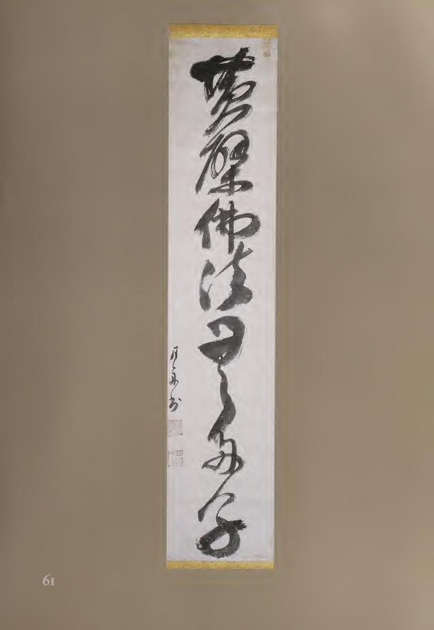
space of two characters, is visually the most significant; it spirals down in
cursive script toward the final two words—literally, “many children”—which
are connected with thinner brushwork until the final broad hooking stroke.
Although there is little room between words, the negative spaces inside
the characters are full of energy, such as the ovals bending in different direc¬
tions within the first, second, third, and final two graphs. Perhaps most no¬
table is the negative space in the beginning of Mu, which can be seen as two
overlapping ovals, a blunt arrow, or even the head of an animal.
Another feature that adds flavor to this calligraphy is the asymmetrical
balance among the few powerful upward-leaning horizontals (such as the
first strokes of the first and fifth characters), the less stressed verticals, and
the primarily curved strokes that complete the single column of graphic
shapes. We can also note the varied thickness of line and use of “flying
white”—or should we desist from analysis, follow the rhythm of the brush
strokes, and just say, “Gesshu’s calligraphy is not all that special!”
NOTES
1. From Sogen Tekisui, Gesshu Oshdiroku (Records of the Monk Gesshu), 1704, pp. 18-19.
2. For more information on the two masters, see John Blofeld, The Zen Teaching of Huang Po:
On the Transmission of Mind (New York: Grove Press, 1958), and Burton Watson, trans., The
Zen Teachings of Master Lin-chi (Boston: Shambhala Publications, 1993). For a more extensive
biography of Gesshu and photographs of his work, see Stephen Addiss, The Art of Zen (New
York: Harry N. Abrams, 1989), pp. 64-69.
62 TETSUGYU DOSA (16x8-1700)
The Paper-Buddha Statue (1693)
Ink on silk, 93.7 x 34.8 cm.
Tetsugyu was born in Nagato and became a monk at the age of ten,
studying first with the Rinzai Zen monk Teishu and then with
Ryukei Shoen (1602-1670), abbot of Myoshin-ji in Kyoto. When
Ryukei heard that the Chinese Zen Master Yin-yuan (Jpn., Ingen, 1592-
1673) had come to Nagasaki, he and Tetsugyu went to meet him; Tetsugyu
remained as a pupil of Yin-yuan and of his succesor Mu-an (Jpn., Mokuan,
1611-1684, see fig. F.i). When his training was complete, Tetsugyu established
no fewer than seven Zen Obaku-sect temples. He was admired for his help
to farming families as well as for his powerful and lively calligraphy.
Here Tetsugyu, at the age of sixty-four, has written a document at the
request of a Buddhist layman of the Pure Land sect. The use of silk rather
than paper demonstrates the formal nature of the work, which celebrates an
unusual form of Buddhist sculpture:
Mr. Kaiho Shinji, whose Buddhist name is Tonbo Joen, was born in Kyo¬
to. He traveled to Edo, and over time he and his family have prospered.
His nature is serious and benevolent, and he is a devout Buddhist, deeply
204
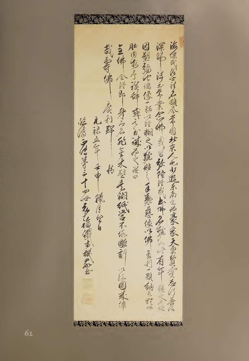
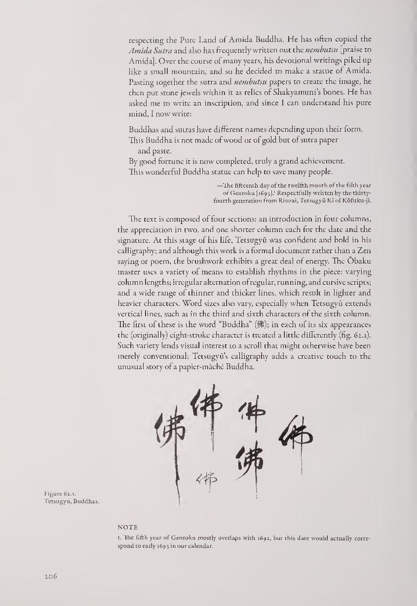
respecting the Pure Land of Amida Buddha. He has often copied the
Amida Sutra and also has frequently written out the nembutsu [praise to
Amida]. Over the course of many years, his devotional writings piled up
like a small mountain, and so he decided to make a statue of Amida.
Pasting together the sutra and nembutsu papers to create the image, he
then put stone jewels within it as relics of Shakyamuni’s bones. He has
asked me to write an inscription, and since I can understand his pure
mind, I now write:
Buddhas and sutras have different names depending upon their form.
This Buddha is not made of wood or of gold but of sutra paper
and paste.
By good fortune it is now completed, truly a grand achievement.
This wonderful Buddha statue can help to save many people.
—The fifteenth day of the twelfth month of the fifth year
of Genroku [1693].1 Respectfully written by the thirty-
fourth generation from Rinzai, Tetsugyu Ki of Kofuku-ji.
The text is composed of four sections: an introduction in four columns,
the appreciation in two, and one shorter column each for the date and the
signature. At this stage of his life, Tetsugyu was confident and bold in his
calligraphy; and although this work is a formal document rather than a Zen
saying or poem, the brushwork exhibits a great deal of energy. The Obaku
master uses a variety of means to establish rhythms in the piece: varying
column lengths; irregular alternation of regular, running, and cursive scripts;
and a wide range of thinner and thicker lines, which result in lighter and
heavier characters. Word sizes also vary, especially when Tetsugyu extends
vertical lines, such as in the third and sixth characters of the sixth column.
The first of these is the word “Buddha” (j*$); in each of its six appearances
the (originally) eight-stroke character is treated a little differently (fig. 62.1).
Such variety lends visual interest to a scroll that might otherwise have been
merely conventional; Tetsugyus calligraphy adds a creative touch to the
unusual story of a papier-mache Buddha.
Figure 62.1.
Tetsugyu, Buddhas.
NOTE
1. The fifth year of Genroku mostly overlaps with 1692, but this date would actually corre¬
spond to early 1693 in our calendar.
20b
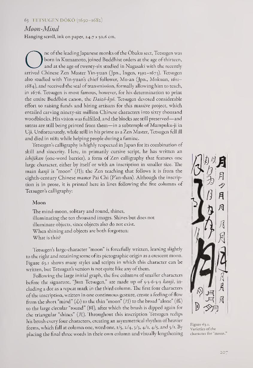
63 TETSUGEN DOKO (1630-1681)
Moon-Mind Hanging scroll, ink on paper, 24.7 x 50.6 cm.
One of the leadingjapanese monks of the Obaku sect, Tetsugen was
born in Kumamoto, joined Buddhist orders at the age of thirteen,
and at the age of twenty-six studied in Nagasaki with the recently
arrived Chinese Zen Master Yin-yuan (Jpn., Ingen, 1392-1673). Tetsugen
also studied with Yin-yuan’s chief follower, Mu-an (Jpn., Mokuan, 1611-
1684), and received the seal of transmission, formally allowing him to teach,
in 1676. Tetsugen is most famous, however, for his determination to print
the entire Buddhist canon, the Daizd-kyo. Tetsugen devoted considerable
effort to raising funds and hiring artisans for this massive project, which
entailed carving ninety-six million Chinese characters into sixty thousand
woodblocks. His vision was fulfilled, and the blocks are still preserved—and
sutras are still being printed from them—in a subtemple of Mampuku-ji in
Uji. Unfortunately, while still in his prime as a Zen Master, Tetsugen fell ill
and died in 1682 while helping people during a famine.
Tetsugen’s calligraphy is highly respected in Japan for its combination of
skill and sincerity. Here, in primarily cursive script, he has written an
ichijikan (one-word barrier), a form of Zen calligraphy that features one
large character, either by itself or with an inscription in smaller size. Tie
main kanji is “moon” (Tl); the Zen teaching that follows it is from the
eighth-century Chinese master Pai Chi (P’an-shan). Although the inscrip¬
tion is in prose, it is printed here in lines following the five columns of
Tetsugen’s calligraphy:
Moon
The mind-moon, solitary and round, shines,
illuminating the ten thousand images. Shines but does not
illuminate objects, since objects also do not exist.
When shining and objects are both forgotten:
What is this?
Tetsugen’s large-character “moon” is forcefully written, leaning slightly
to the right and retaining some of its pictographic origin as a crescent moon.
Figure 63.1 shows many styles and scripts in which this character can be
written, but Tetsugan’s version is not quite like any of them.
Following the large initial graph, the five columns of smaller characters
before the signature, “Jiun Tetsugen,” are made up of 5'5-6-5-3 kanji, in¬
cluding a dot as a repeat mark in the third column. The first four characters
of the inscription, written in one continuous gesture, create a feeling of flow
from the short “mind” (T) to the thin “moon” (JT) to the broad “alone” (5k)
to the large circular “round” (IB), after which the brush is dipped again for
the triangular “shines” (ft). Throughout this inscription Tetsugen redips
his brush every four characters, creating an asymmetrical rhythm of heavier
forms, which fall at column one, word one, 1/5, 2/4, 3/3, 4/1, 4/3, and 3/1. By
placing the final three words in their own column and visually lengthening
Figure 63.1.
Varieties of the
character for “moon.”
207
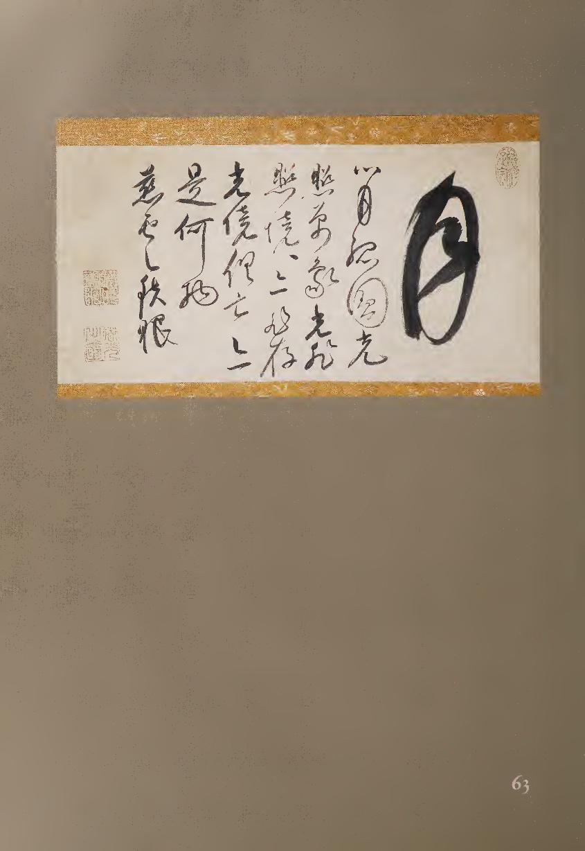
g 5
■
the middle word of the three, Tetsugen makes this text into a koan (Zen
meditation question), literally writing, “this WHAT thing?”
The straightforward nature of Tetsugen’s calligraphy is illustrated by
the fact that—unlike some calligraphers who alter the styles of repeating
characters to emphasize their skill—he does not hesitate to repeat forms
without changing them. For example, the word “shines” (Tf) looks much the
same in the first, second, and fourth columns, with only the ending of the
final stroke changing—from a hook (1/5) to a blunt end (2/4) to a movement
down to the next character (4/1). Similarly, the kanji for “objects” (fit) can
be seen side by side in 3/2 and 4/2 in the same formation, while the character
for “and/also” (Tfl) appears simplified into an L shape over a horizontal line
in both 3/3 and 4/3.
Pai Chi’s text comes from a longer sermon, much of which is preserved
in Yuan Wu’s commentaries on case thirty-seven of the Hekiganroku (Blue
Cliff Record), the important twelfth-century compendium of one hundred
koan texts. The sermon continues: “Ch’an worthies, it is like hurling a sword
into the sky; do not speak of reaching or not reaching: then the wheel of the
void is without a trace, the sword’s blade is without a flaw. If you can be like
this, mind and mental conditions are without knowledge. The whole mind
is identical to Buddha; the whole Buddha is identical to man. When mind
and Buddha are not different, then this is the Way.”1
NOTE
1. Translation by Thomas Cleary and J. C. Cleary, The Blue Cliff Record (Boston: Shambhala
Publications, 1992), p. 606.
64 KAKUZAN DOSHO (1640-1717)
Death Poem (1717) Hanging scroll, ink on paper, 27.2 x 91.8 cm.
One special form of Zen calligraphy is the yuige (death poem),
written by certain monks and nuns just before dying.1 Although
the style of most yuige is necessarily rough, often with weakened
lines and erratic structure, the viewer’s knowledge that this calligraphy
represents the final words, the final teaching, of a master is enough to make
each such work especially respected.
The date of this work is indeed the day of Kakuzan’s death, and the text
is his own final statement, including the Zen shout “TOTSU” (&&):
Seventy-eight years—
a single dream!
TOTSU
The sun, at dead of night,
rises over the eastern peak
209
—written on the eleventh month, eighth day
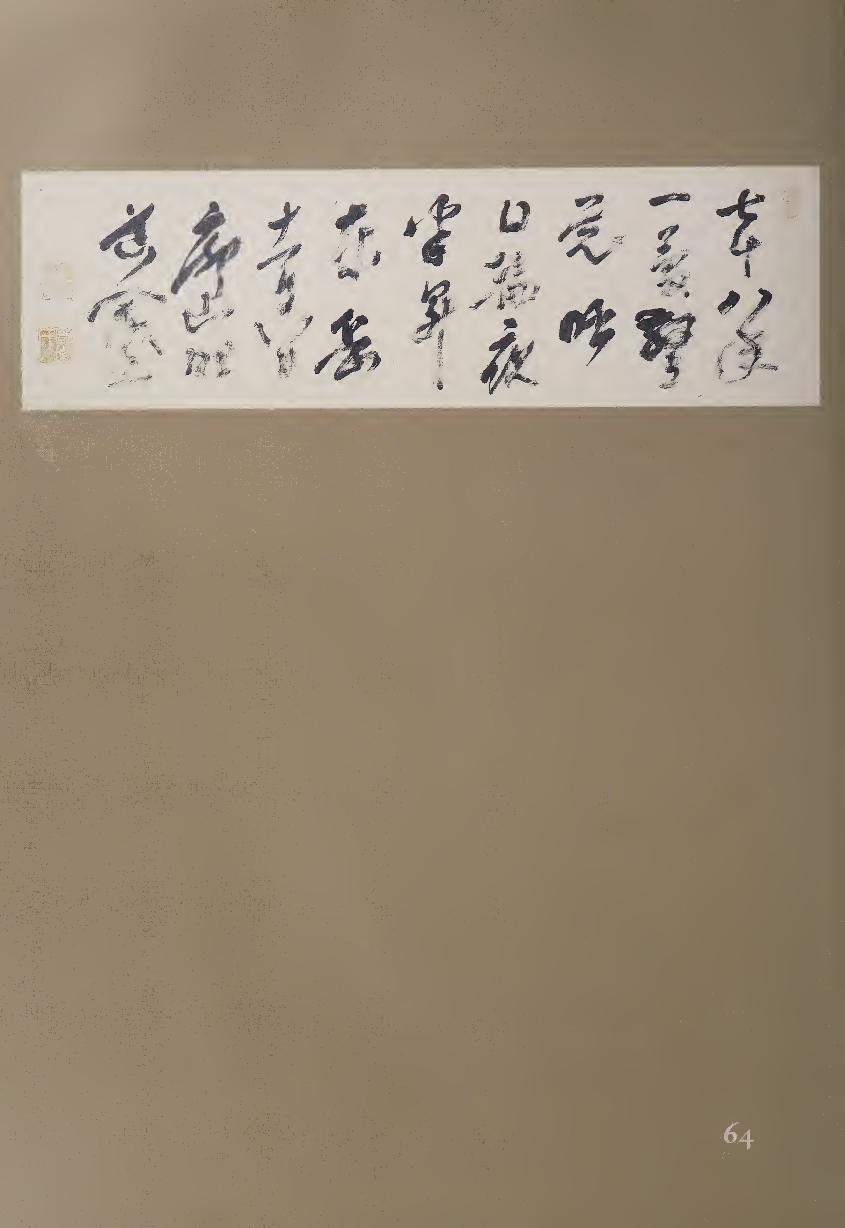
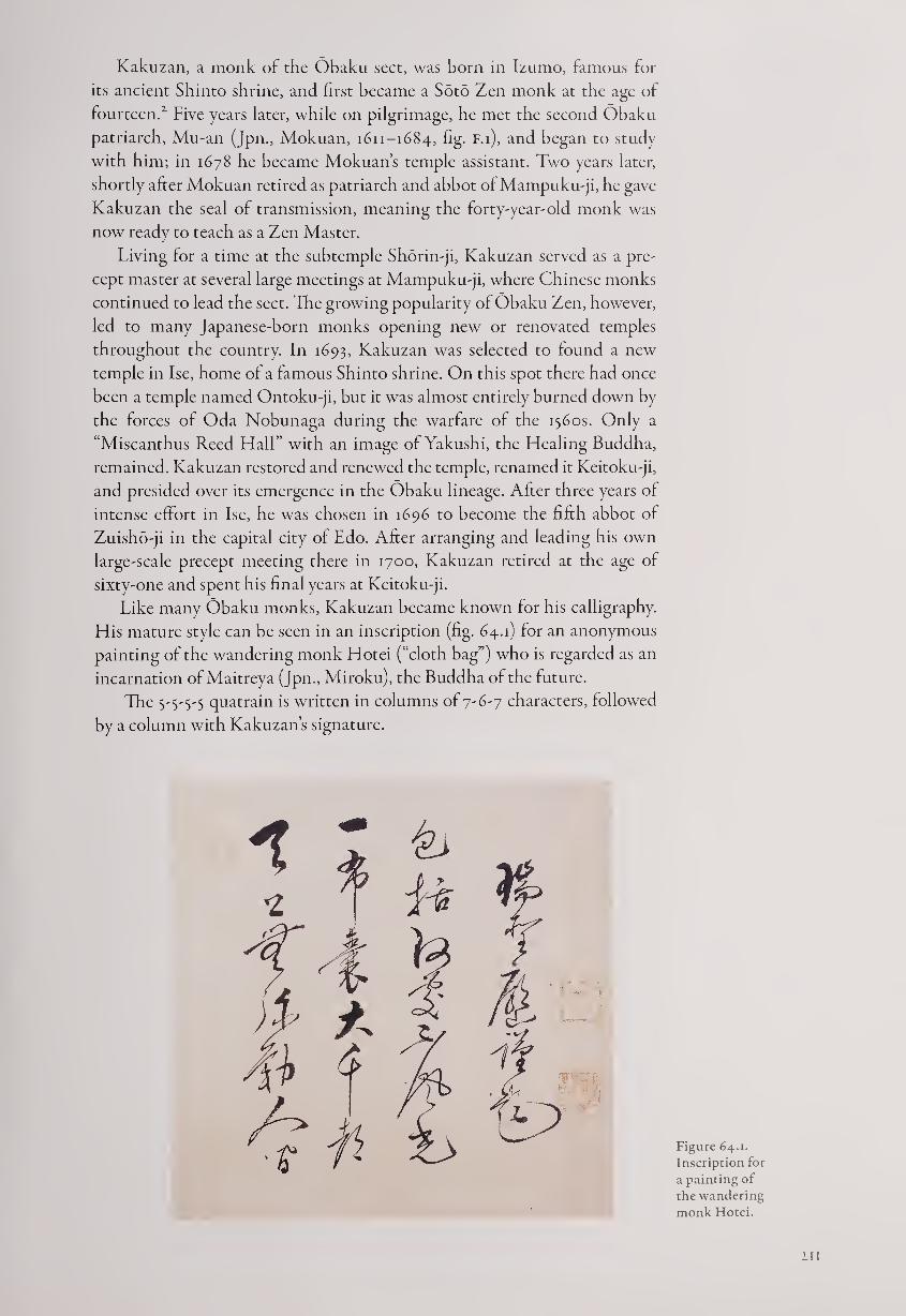
Kakuzan, a monk of the Obaku sect, was born in Izumo, famous for
its ancient Shinto shrine, and first became a Soto Zen monk at the age of
fourteen.2 Five years later, while on pilgrimage, he met the second Obaku
patriarch, Mu-an (Jpn., Mokuan, 1611-1684, fig- F.i), and began to study
with him; in 1678 he became Mokuan’s temple assistant. Two years later,
shortly after Mokuan retired as patriarch and abbot of Mampuku-ji, he gave
Kakuzan the seal of transmission, meaning the forty-year-old monk was
now ready to teach as a Zen Master.
Living for a time at the subtemple Shorin-ji, Kakuzan served as a pre¬
cept master at several large meetings at Mampuku-ji, where Chinese monks
continued to lead the sect. The growing popularity of Obaku Zen, however,
led to many Japanese-born monks opening new or renovated temples
throughout the country. In 1693, Kakuzan was selected to found a new
temple in Ise, home of a famous Shinto shrine. On this spot there had once
been a temple named Ontoku-ji, but it was almost entirely burned down by
the forces of Oda Nobunaga during the warfare of the 1560s. Only a
“Miscanthus Reed Hall” with an image of Yakushi, the Healing Buddha,
remained. Kakuzan restored and renewed the temple, renamed it Keitoku-ji,
and presided over its emergence in the Obaku lineage. After three years of
intense effort in Ise, he was chosen in 1696 to become the fifth abbot of
Zuisho-ji in the capital city of Edo. After arranging and leading his own
large-scale precept meeting there in 1700, Kakuzan retired at the age of
sixty-one and spent his final years at Keitoku-ji.
Like many Obaku monks, Kakuzan became known for his calligraphy.
His mature style can be seen in an inscription (fig. 64.1) for an anonymous
painting of the wandering monk Hotei (“cloth bag”) who is regarded as an
incarnation of Maitreya (Jpn., Miroku), the Buddha of the future.
The S'S'S'S quatrain is written in columns of 7-6-7 characters, followed
by a column with Kakuzan’s signature.
Figure 64.1.
Inscription for
a painting of
the wandering
monk Hotei.
Ill
No Miroku in heaven,
One cloth bag on earth.
With the vast universe in his bag.
Is there any place not marvelous? —Respectfully inscribed by Zuisho Kakuzan
Since Hotei in the painting faces to the left, the inscription also begins
on the left. The characters, smaller than those of the yuige, are written in
fluent cursive script that varies between broader lines in characters such as
“heaven” (Tft i/x) and “one” (—, 2/1), and thinner lines for others, such as Mu
(to, 1/3). Often joined together with continuous brushwork, the graphs are
of different sizes, and the brush lines are generally rounded with occasional
strong diagonals for emphasis. Because the calligraphy was written while
Kakuzan was at Zuisho-ji, it can be dated between 1696 and 1700, perhaps
twenty years before the death poem.
In contrast, Kakuzan’s yuige is compositionally expansive, with thicker
lines and less fluently rounded brushwork. In this horizontal format, he uti¬
lizes the first six columns of calligraphy for his sixteen-word poem and three
more columns for the date and signature, creating a sense of space and breath.
The nine columns are constructed of 4.-yz-yz-z-yyi characters, and this
compositional freedom is also seen in the inking: Kakuzan redipped his
brush at irregular word intervals (6, z, 3, 1, 3) in the poem and then twice
more for the month, day, and signature.
After, the first word “seven” (K, 1/1), Kakuzan adds visual emphasis to
the redipped kanji “realize” (M, 3/1), “TOTSU” (Hffi, 3/2), “night” (Be, 4/3),
“half” (Tft 5/1, together with 4/3 means midnight or dead of night), and
“peak” (fg, 6/2), all significant words in his poem. In addition, the character
for' ‘sun” or “day” (Id) is written twice (4/1 and 7/3) with the center stroke
either missing or pushed down to join the lower horizontal, suggesting the
open square of the word “mouth” (p).
The individual character of Kakuzan’s final calligraphy comes in large
part from the personal rhythms that he creates through his asymmetrical
composition and wet-to-dry brushwork. Although his writing is fully
cursive, only a few kanji in the poem are joined to the following graphs,
notably “seven-tens” ('fcT') and “eight-years” (TAT) in the first column. The
following characters of the poem, through which his paradoxical meaning is
expressed, are all given their own space, especially the Zen shout “TOTSU,”
until the date and signature at the end, where the characters are again
partially joined. The fluency of his earlier calligraphy has now become more
measured, with greater spatial eloquence. It is as though Kakuzan, at the
precipice of death, is making his final Zen message both fully personal and
abundantly clear.
NOTES
1. For further examples, see Yoel Hoffmann, Japanese Death Poems (Rutland & Tokyo: Charles
E. Tuttle, 1986).
2. Kakuzan’s biography is given in Otsuki Mikio, Kato Shoshun, and Hayashi Yukimitsu,
Obaku bunkajinmeijiten (Biographical Dictionary of Obaku Personages) (Tokyo: Shibunkaku,
1988), pp. 57-58.
Ill
65 BANKEI YOTAKU (1621-1693)
Leisurely Clouds Framed panel, ink on paper, 32.5 x 63.2 cm.
Born to a samurai-level family in Hamada, Bankei did not confine
himself to interacting with those of his own social class; he became
one of the first Zen Masters to take his teachings frequently to the
broader public, accomplishing this through constant travel and large-scale
open meetings. He was famous for not taking any beliefs for granted, but
investigating everything for himself. His father, a Confucian doctor, had
died when Bankei was only ten years old, and perhaps as a result he was
unruly as a child and remained an individualist all his life.
Bankei’s early lessons in Confucianism did not satisfy him, so he studied
Buddhism and focused on Zen, moving from teacher to teacher before going
off on his own to practice. Fourteen years of intensive meditation almost
wrecked Bankei’s health, but he finally experienced enlightenment. He then
practiced for a time with the visiting Chinese monk Tao Che-yuan (Jpn.,
Doshagen, 1399-1662) in Nagasaki; they communicated through written
Chinese, since neither spoke the other’s language. In 1679, Bankei began
what was to become his tradition of giving Zen talks and training sessions
that were open to the general public, which he continued until his death.
Bankei’s Zen was rooted in the concept of “the unborn.” He taught,
“What I call the unborn is the Buddha-mind . . . [which] deals freely and
spontaneously with anything that presents itself to it. . . . Not a single one
of you people at this meeting is unenlightened. Right now, you’re all sitting
before me as Buddhas_This inherited Buddha-mind is beyond any doubt
unborn.”1
Bankei also tried to explain how suffering comes from illusions: “Despite
the fact that you arrived in this world with nothing but an unborn Buddha-
mind, your partiality for yourselves makes you want to have things move in
your own way. .. . Your self-partiality is at the root of all your illusions. ...
When you have no attachment to self, there are no illusions.”2
Although Bankei had rejected calligraphy lessons when he was eleven, he
later took up the brush to express his Zen vision, creating works notable for
their power. His writing reflects the broad fluency of the Ming-dynasty style
brought to Japan by Obaku monks, but it also expresses his own forceful
personality. In this work he writes only the two words “leisurely clouds” and
omits his ignature and seals.”3 Clouds are often a metaphor in Zen poetry for
the life of nonattachment, and here Bankei is expressing visually the freedom
that he describes in one of his sermons: “You have to realize that your
thoughts are ephemeral and, without either clutching at them or rejecting
them, just let them come and go of themselves. ... If the Buddha-mind is
realized, that’s enough. You need do nothing else.... You’ll be free ... [the
unborn] is simply being as you are.”4
These two characters in regular script have twelve and eleven strokes, but
Bankei writes them each in three. The first stroke of “leisurely” (HU) swings
around in a graceful loop to the bottom, where it is supported by two
diagonal dots—one moving up and one down. This kanji is well balanced,
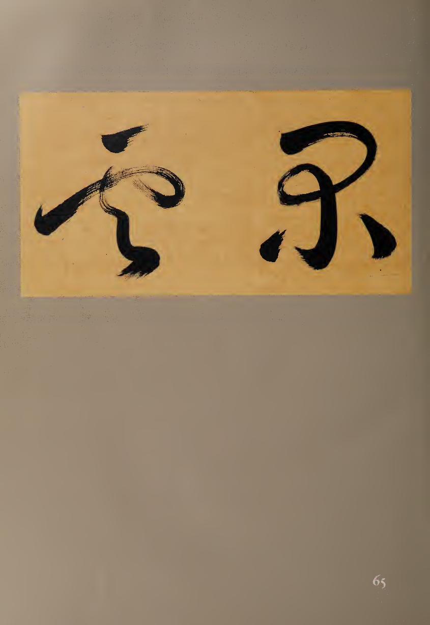
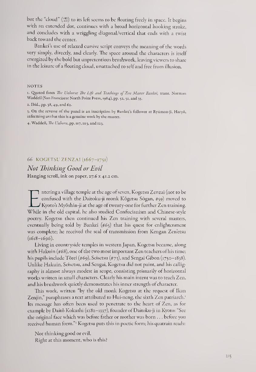
but the “cloud” (ft) to its left seems to be floating freely in space. It begins
with an extended dot, continues with a broad horizontal hooking stroke,
and concludes with a wriggling diagonal/vertical that ends with a twist
back toward the center.
Bankei’s use of relaxed cursive script conveys the meaning of the words
very simply, directly, and clearly. The space around the characters is itself
energized by the bold but unpretentious brushwork, leaving viewers to share
in the leisure of a floating cloud, unattached to self and free from illusion.
NOTES
!• Quoted from The Unborn: 77t<? Life and Teachings of Zen Master Bankei, trans. Norman
Waddell (San Francisco: North Point Press, 1984), pp. 52, 51, and 35.
2. Ibid., pp. 38, 49, and 62.
3. On the reverse of the panel is an inscription by Bankei’s follower at Ryumon-ji, Haryo,
informing us that this is a genuine work by the master.
4. Waddell, The Unborn, pp. 117,103, and 123.
66 KOGETSU ZENZAI (1667-1751)
Not Thinking Good or Evil Elanging scroll, ink on paper, 27.6 x 41.2 cm.
Entering a village temple at the age of seven, Kogetsu Zenzai (not to be
confused with the Daitoku-ji monk Kogetsu Sogan, #59) moved to
Kyoto’s Myoshin-ji at the age of twenty-one for further Zen training.
While in the old capital, he also studied Confucianism and Chinese-style
poetry. Kogetsu then continued his Zen training with several masters,
eventually being told by Bankei (#65) that his quest for enlightenment
was complete; he received the seal of transmission from Kengan Zen’etsu
(1618-1696).
Living in countryside temples in western Japan, Kogetsu became, along
with Hakuin (#68), one of the two most important Zen teachers of his time;
his pupils include Torei (#69), Seisetsu (#73), and Sengai Gibon (1750-1838).
Unlike Hakuin, Seisetsu, and Sengai, Kogetsu did not paint, and his callig¬
raphy is almost always modest in scope, consisting primarily of horizontal
works written in small characters. Clearly his main intent was to teach Zen,
and his brushwork quietly demonstrates his inner strength of character.
This work, written “by the old monk Kogetsu at the request of Ikan
Zenjin,” paraphrases a text attributed to Hui-neng, the sixth Zen patriarch.1
Its message has often been used to penetrate to the heart of Zen, as for
example by Daito Kokushi (1282-1337), founder of Daitoku-ji in Kyoto: “See
the original face which was before father or mother was born .. . before you
received human form.”1 Kogetsu puts this in poetic form; his quatrain reads:
Not thinking good or evil,
Right at this moment, who is this?
2-15
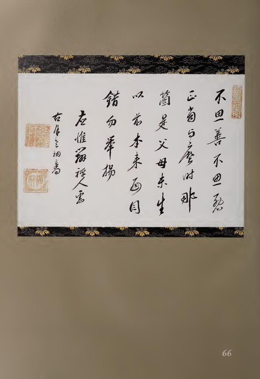
A
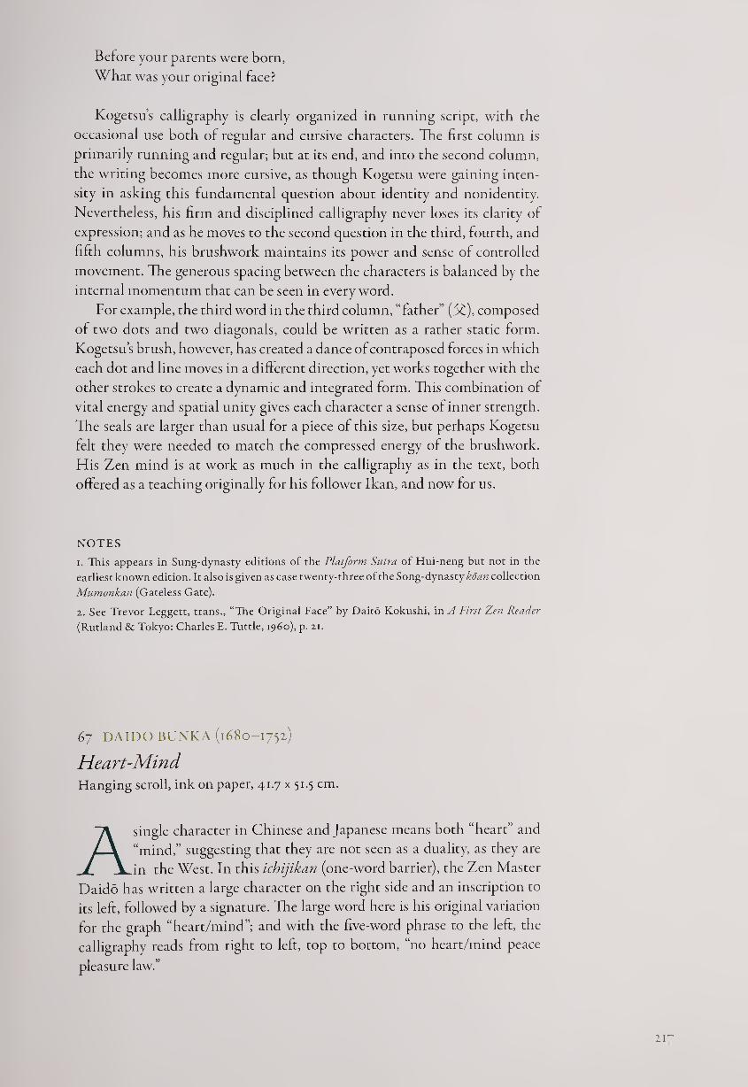
Before your parents were born,
What was your original face?
Kogetsu’s calligraphy is clearly organized in running script, with the
occasional use both of regular and cursive characters. The first column is
primarily running and regular; but at its end, and into the second column,
the writing becomes more cursive, as though Kogetsu were gaining inten¬
sity in asking this fundamental question about identity and nonidentity.
Nevertheless, his firm and disciplined calligraphy never loses its clarity of
expression; and as he moves to the second question in the third, fourth, and
fifth columns, his brushwork maintains its power and sense of controlled
movement. The generous spacing between the characters is balanced by the
internal momentum that can be seen in every word.
For example, the third word in the third column, “father” ($£), composed
of two dots and two diagonals, could be written as a rather static form.
Kogetsu’s brush, however, has created a dance of contraposed forces in which
each dot and line moves in a different direction, yet works together with the
other strokes to create a dynamic and integrated form. This combination of
vital energy and spatial unity gives each character a sense of inner strength.
The seals are larger than usual for a piece of this size, but perhaps Kogetsu
felt they were needed to match the compressed energy of the brushwork.
His Zen mind is at work as much in the calligraphy as in the text, both
offered as a teaching originally for his follower Ikan, and now for us.
NOTES
1. This appears in Sung-dynasty editions of the Platform Sutra of Hui-neng but not in the
earliest known edition. It also is given as case twenty-three of the Song-dynasty koan collection
Mumonkan (Gateless Gate).
2. See Trevor Leggett, trans., “The Original Face” by Daito Kokushi, in A First Zen Reader
(Rutland & Tokyo: Charles E. Tuttle, i960), p. 21.
67 DAIDO BUNKA (1680-1752)
Heart-Mind Hanging scroll, ink on paper, 41.7 x 51.5 cm.
A single character in Chinese and Japanese means both “heart” and
“mind,” suggesting that they are not seen as a duality, as they are
in the West. In this ichijikan (one-word barrier), the Zen Master
Daido has written a large character on the right side and an inscription to
its left, followed by a signature. The large word here is his original variation
for the graph “heart/mind”; and with the five-word phrase to the left, the
calligraphy reads from right to left, top to bottom, “no heart/mind peace
pleasure law.”
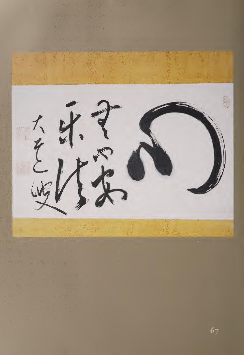
D HEART/MIND ^ pleasure no
law D heart/mind
ff2 peace
Before translating this phrase, however, we should note that the first
two characters, pronounced in Japanese mushin, represent an important
Zen principle. Sometimes rendered in English as “no-mind,” mushin has a
resonance that goes far beyond any single translation; its implications range
from “beyond intention” to “without clinging” to “eliminating conscious
thought.”
Further, the third and fourth characters together mean “peaceful” or
“serene,” so we might now translate this calligraphy as:
HEART/MIND: mushin is the way to inner peace
Leaving further Zen interpretations to the viewer, here is a brief
biography of the monk-artist and an examination of the actual work. At
the age of fifteen, Daido was prompted by the death of his father to study
Buddhism; he formally became a monk four years later. He then studied
with followers of both the recently imported Chinese Obaku sect and of the
influential Japanese monk Bankei (#65), finally becoming a dharma heir of
Kengan Zen’etsu (1618-1696). Settling down in the temple Jojo-ji in Tamba,
not far from Kyoto, Daido became distinguished as a leading teacher of Zen
monks; he was known as “Oni Daido” (Demon Daido) for the strength of
his character and the severity of his training methods.
Here the large character for “heart/mind” is written with great verve
and energy. Instead of beginning as usual with a dot on the left, continuing
with a hooking stroke to the right and a high middle dot, and finishing with
a final right dot (D), Daido starts with two dots, the second representing
the hooking stroke, and then continues with a circular stroke representing
the final two dots; the brush never leaves the paper during this bold gesture.
Initially, the brush was fully loaded with ink, so on both the initial dots and
the beginning of the rounded stroke, one can see the ink fuzzing where
brush met paper and paused. However, the rapid movement of the rounded
stroke leads to the effect of “flying white,” where the paper shows through
the brush hairs. Thus in a single character we can see both wet and dry styles
of brushwork. The use of space in this large character is especially notable,
as though the emptiness, the Mu within the heart, were ready for everything
that the two moist dots can create; they seem to pulse with energy within
the space created by the half-circle.
This evocative “heart/mind” takes up half the horizontal format, with
the following five characters and signature filling the left side of the scroll.
When Daido repeats the word “heart/mind” as the second word of the in¬
scription, however, it is now the smallest character, although still composed
of two dots and a curving stroke, the latter much reduced in gestural energy
as well as size.
Investigating the five smaller characters further, we note that the first
three, constituting a column, all lean toward the right, as though attracted
by the energy of the large character. In contrast, the final two characters of
219
the inscription, which form the next column, are more securely anchored in
space. The signature dances freely, continuing a diagonal sense of movement
that seems to pull downward to the left over the entire scroll, with the final
stroke being a contrasting diagonal to the lower right. Central to the work,
however, are the opening dots; from this fecund beginning, everything else
springs forth. We may well ask, was this calligraphy created with the mind,
with the heart, or with mushirii
d8 HAKUIN EKAKU (1685-1768)
Kotobuki Ink on paper, 120.2 x 56.8 cm.
Hakuin is considered the most important Zen Master of the past five
hundred years. Through his teachings, he revitalized the Rinzai
tradition in Japan; today monks of both Rinzai and Obaku sects
are trained in methods that he developed. He also invented the famous koan
“What is the sound of one hand?”
Born in the village of Hara, Hakuin as a child resolved to become a
monk after hearing a frightening sermon about the pains of hell. Seeking
the strictest Zen teachers, he practiced with great intensity, finally achieving
a series of enlightenment experiences, which he later described in his writings.1
Returning to his home village, he spent the rest of his life at Shorin-ji rather
than moving to a large metropolitan monastery.
As well as teaching a large number of pupils, Hakuin reached out to the
public with many writings, ranging from letters, folk songs, and poems to
learned treatises on Zen.1 Although he had abandoned as egoistic his youth¬
ful ideas of becoming a well-known calligrapher, in his fifties and sixties he
took up the brush again, realizing that brushwork was another way to spread
Zen teachings. Despite having an increasing number of Zen pupils to train,
he found time to create several thousand works of painting and calligraphy;
in the process, he reinvented the visual language of Zen to reach people of
all classes, ages, genders, and occupations. Hakuin’s brushwork style gradu¬
ally shifted over the years from lighter and more playful to remarkably bold
and forceful; this work, which consists of one large character, kotobuki (^f,
long life), comes from his final years and shows the immense power of his
late brushwork, which stemmed directly from his character.3
By comparison, Hakuin’s “Inscription on Anger,” from perhaps twenty
years earlier, has a more specific Buddhist message: anger is one of the six
passions that obstruct the path to enlightenment (fig. 68.1). Appropriate for
the time, the teaching here is couched in Confucian terms; but in typical
Hakuin Zen style, it ultimately points to examining one’s own self.
When a man is enlightened about Principle, then no anger arises in him;
when he is confused about Principle, then anger does arise in him. In
general, anger arises from opposition, and dies out in acquiescence. All
cases under the sky are like this. Now, if a man opposes me, it must be
220
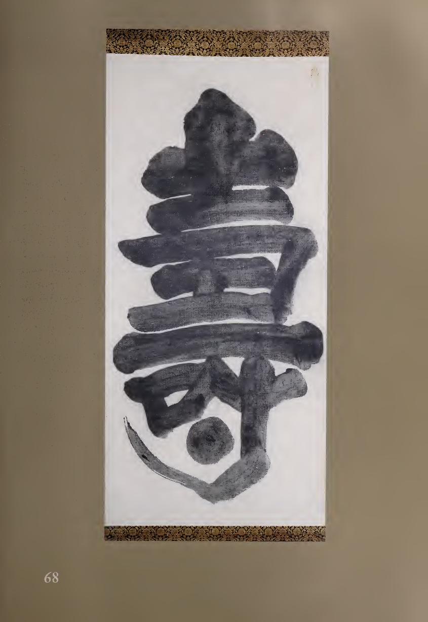
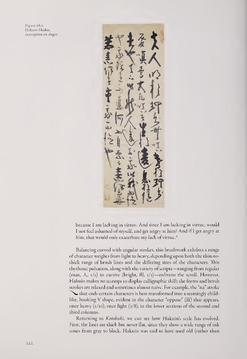
Figure 68.1.
Hakuin Ekaku,
Inscription on Anger.
because I am lacking in virtue. And since I am lacking in virtue, would
I not feel ashamed of myself and get angry at him? And it I get angry at
him, that would only exacerbate my lack of virtue.4
Balancing curved with angular strokes, this brushwork exhibits a range
of character weights from light to heavy, depending upon both the thin-to-
thick range of brush lines and the differing sizes of the characters. This
rhythmic pulsation, along with the variety of scripts—ranging from regular
(man, A, 1/2) to cursive (bright, Bfj, 1/3)—enlivens the scroll. However,
Hakuin makes no attempt to display calligraphic skill; the forms and brush
strokes are relaxed and sometimes almost naive. For example, the “na” stroke
^^.that ends certain characters is here transformed into a seemingly child¬
like, hooking V shape, evident in the character “oppose” (ill) that appears,
once heavy (2/10), once light (3/8), in the lower sections of the second and
third columns.
Returning to Kotobuki, we can see how Hakuin’s style has evolved.
First, the lines are thick but never flat, since they show a wide range of ink
tones from gray to black. Hakuin was said to have used old (rather than
ill
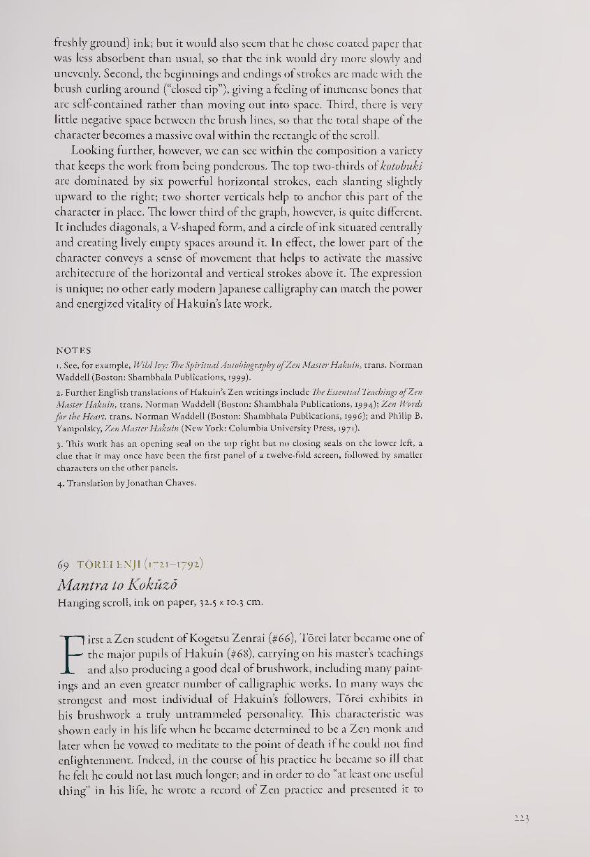
freshly ground) ink; but it would also seem that he chose coated paper that
was less absorbent than usual, so that the ink would dry more slowly and
unevenly. Second, the beginnings and endings of strokes are made with the
brush curling around (“closed tip”), giving a feeling of immense bones that
are self-contained rather than moving out into space. Third, there is very
little negative space between the brush lines, so that the total shape of the
character becomes a massive oval within the rectangle of the scroll.
Looking further, however, we can see within the composition a variety
that keeps the work from being ponderous. The top two-thirds of kotobuki
are dominated by six powerful horizontal strokes, each slanting slightly
upward to the right; two shorter verticals help to anchor this part of the
character in place. The lower third of the graph, however, is quite different.
It includes diagonals, a V-shaped form, and a circle of ink situated centrally
and creating lively empty spaces around it. In effect, the lower part of the
character conveys a sense of movement that helps to activate the massive
architecture of the horizontal and vertical strokes above it. The expression
is unique; no other early modern Japanese calligraphy can match the power
and energized vitality of Hakuin’s late work.
NOTES
1. See, for example, Wildlvy: Use Spiritual Autobiography of Zen Master Hakuin, trans. Norman
Waddell (Boston: Shambhala Publications, 1999).
2. Further English translations of Hakuin’s Zen writings include The Essential Teachings of Zen
Master Hakuin, trans. Norman Waddell (Boston: Shambhala Publications, 1994); Zen Words
for the Heart, trans. Norman Waddell (Boston: Shambhala Publications, 1996); and Philip B.
Yampolsky, Zen Master Hakuin (New York: Columbia University Press, 1971).
3. This work has an opening seal on the top right but no closing seals on the lower left, a
clue that it may once have been the first panel of a twelve-fold screen, followed by smaller
characters on the other panels.
4. Translation by Jonathan Chaves.
69 TOREI ENJI (1711-1792)
Mantra to Kokuzo Hanging scroll, ink on paper, 32.5 x 10.3 cm.
First a Zen student of Kogetsu Zenrai (#66), Torei later became one of
the major pupils of Hakuin (#68), carrying on his master’s teachings
and also producing a good deal of brushwork, i ncluding many paint¬
ings and an even greater number of calligraphic works. In many ways the
strongest and most individual of Hakuin’s followers, Torei exhibits in
his brushwork a truly untrammeled personality. This characteristic was
shown early in his life when he became determined to be a Zen monk and
later when he vowed to meditate to the point ol death if he could not find
enlightenment. Indeed, in the course ol his practice he became so ill that
he felt he could not last much longer; and in order to do “at least one useful
thing” in his life, he wrote a record of Zen practice and presented it to
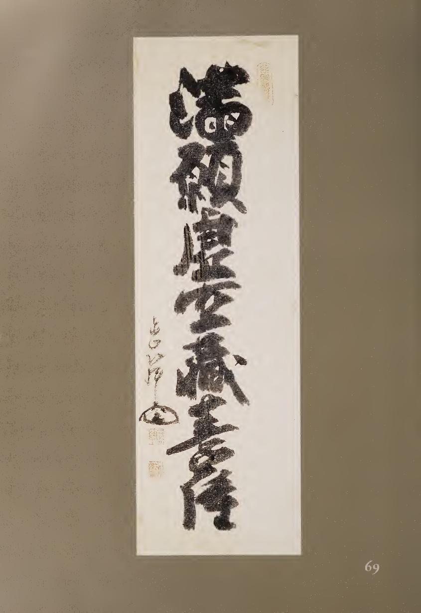
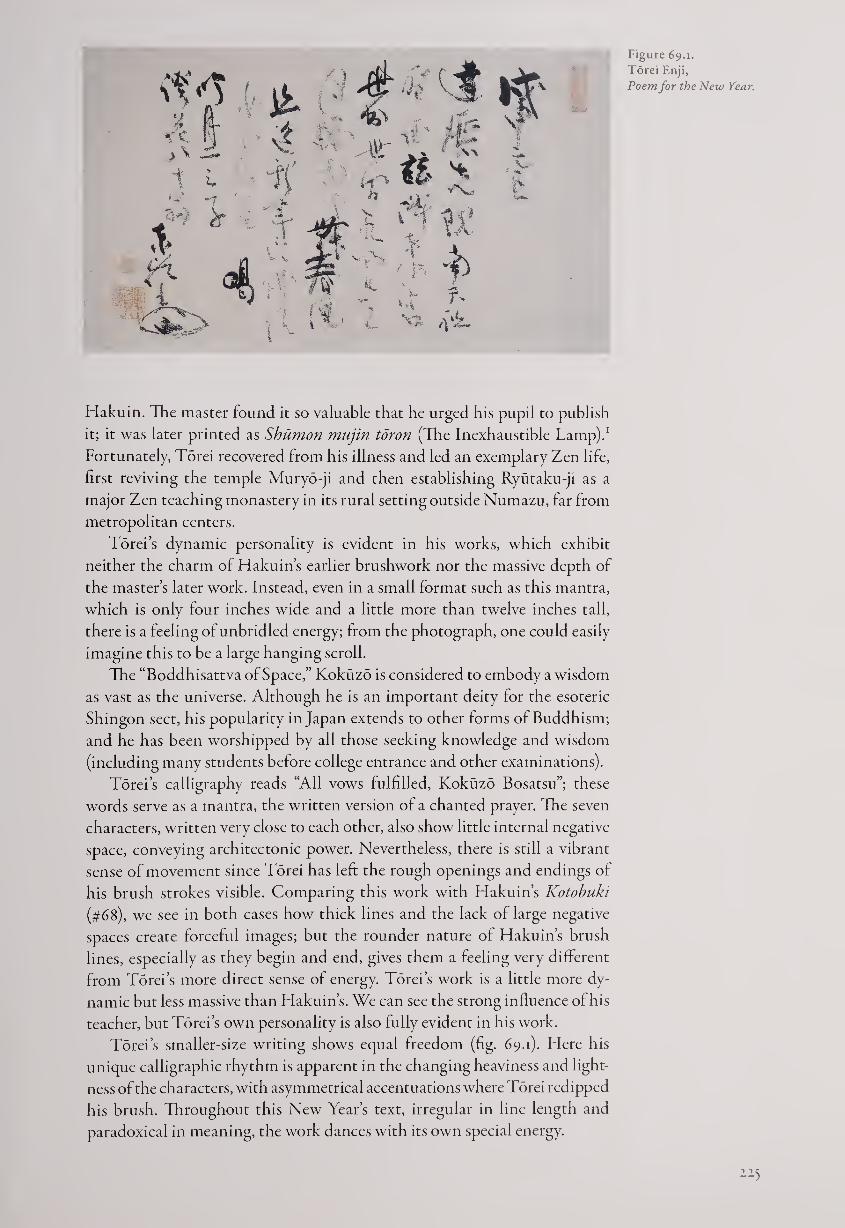
Figure 69.1.
Torei Enji,
Poem for the New Year.
Hakuin. The master found it so valuable that he urged his pupil to publish
it; it was later printed as Shumon mujin tdron (The Inexhaustible Tamp).1
Fortunately, Torei recovered from his illness and led an exemplary Zen life,
first reviving the temple Muryo-ji and then establishing Ryutaku-ji as a
major Zen teaching monastery in its rural setting outside Numazu, far from
metropolitan centers.
Torei’s dynamic personality is evident in his works, which exhibit
neither the charm of Hakuin’s earlier brushwork nor the massive depth of
the master’s later work. Instead, even in a small format such as this mantra,
which is only four inches wide and a little more than twelve inches tall,
there is a feeling of unbridled energy; from the photograph, one could easily
imagine this to be a large hanging scroll.
The “Boddhisattva of Space,” Kokuzo is considered to embody a wisdom
as vast as the universe. Although he is an important deity for the esoteric
Shingon sect, his popularity in Japan extends to other forms of Buddhism;
and he has been worshipped by all those seeking knowledge and wisdom
(including many students before college entrance and other examinations).
Torei’s calligraphy reads “All vows fulfilled, Kokuzo Bosatsu”; these
words serve as a mantra, the written version of a chanted prayer. The seven
characters, written very close to each other, also show little internal negative
space, conveying architectonic power. Nevertheless, there is still a vibrant
sense of movement since Torei has left the rough openings and endings of
his brush strokes visible. Comparing this work with Hakuin’s Kotobuki
(#68), we see in both cases how thick lines and the lack of large negative
spaces create forceful images; but the rounder nature of Hakuin’s brush
lines, especially as they begin and end, gives them a feeling very different
from Torei’s more direct sense of energy. Torei’s work is a little more dy¬
namic but less massive than Hakuin’s. We can see the strong influence of his
teacher, but Torei’s own personality is also fully evident in his work.
Torei’s smaller-size writing shows equal freedom (fig. 69.1). Here his
unique calligraphic rhythm is apparent in the changing heaviness and light¬
ness of the characters, with asymmetrical accentuations where Torei redipped
his brush. Throughout this New Year’s text, irregular in line length and
paradoxical in meaning, the work dances with its own special energy.
2-2-5
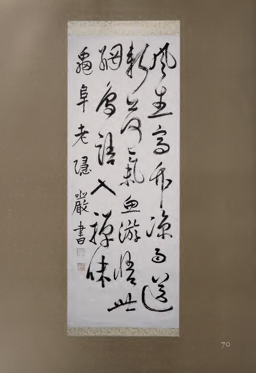
Daruma comes from India, Prince Shotoku is Japanese;
Within and without this world, ultimately it is the same.
In noontime moonlight, nothingness blooms in the spring wind.
How is the Buddhist Law spread in the New Year?
KATSU!
Young people enjoy the moon,
Elders enjoy flowers, even at age eighty!
Examining both works, would we be far off the mark if we also sense
animism in Torei’s calligraphy? His mother was a fervent believer in Shinto,
which teaches that deities can be found in many aspects of nature; and Torei
himself was famous for combining Buddhism and Shinto in some of his
teachings. In his Mantra to Kokuzo, the dots in the first and second characters,
each a different shape and angle, have a powerful sense of life, almost as
though they could be eyes looking out at us. In contrast, the single dot on the
right side of the fifth character, zd (He), seems to fly off and also reach back to
the character, as well as pointing toward the end of the signature.
Torei ends both works with his unique cipher-signature, which many
observers describe as a clam, although its exact meaning is not known. One
may even imagine a small figure seated in profile inside the clam, possibly
Torei himself, although this may be stretching imagination too far. What
these speculations demonstrate, however, is that there is a strong sense of
animistic life in Torei’s calligraphy, as if the forceful spirit of the master
could hardly be kept within the ink and paper of his calligraphy.
NOTE
i. For an English translation of this text, see The Discourse on the Inexhaustible Lamp of the Zen
School, trans. Yoko Okuda (Boston, Rutland & Tokyo: Charles E. Tuttle, 1996).
70 TOMINAGA JAKUGON (1702-1771)
Wind Arises Hanging scroll, ink on paper, 129.3 * 5°-5 cm.
Born in Okayama, Jakugon left home at the age of nine to train assid¬
uously in many aspects of esoteric Buddhism, ultimately concentrating
upon Sanskrit texts. He is also said to have studied calligraphy with
the Kyoto master Kuwahara Kudo (1673-1744). As a monk, Jakugon served
at Hoto-ji in Okayama; he retired in 1767 to Gyokusen-ji in Kurashiki.
Famous in his own day as a Sanskrit scholar as well as a Chinese-style cal¬
ligrapher and poet, Jakugon became known as one of the “Four Monks” of
his era, along with Ryokan (#76), Jiun (#71), and Meigetsu (1727-1797).
In this quatrain of five characters per line, Jakugon blends his two worlds
as monk (“my meditation”) and literatus, since this is essentially a Chinese-
style nature poem:
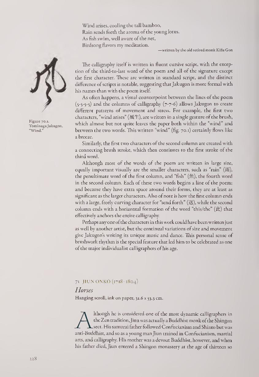
Wind arises, cooling the tall bamboo,
Rain sends forth the aroma of the young lotus.
As fish swim, well aware of the net,
Birdsong flavors my meditation. —written by the old retired monk Kifu Gon
Figure 70.1.
TominagaJakugon,
“Wind.”
The calligraphy itself is written in fluent cursive script, with the excep¬
tion of the third-to-last word of the poem and all of the signature except
the first character. These are written in standard script, and the distinct
difference of scripts is notable, suggesting that Jakugon is more formal with
his names than with the poem itself.
As often happens, a visual counterpoint between the lines of the poem
(S'S'S'S) and the columns of calligraphy (7-7-6) allows Jakugon to create
different patterns of movement and stress. For example, the first two
characters, “wind arises” (®fh), are written in a single gesture of the brush,
which almost but not quite leaves the paper both within the “wind” and
between the two words. This written “wind” (fig. 70.1) certainly flows like
a breeze.
Similarly, the first two characters of the second column are created with
a connecting brush stroke, which then continues to the first stroke of the
third word.
Although most of the words of the poem are written in large size,
equally important visually are the smaller characters, such as “rain” (ffl),
the penultimate word of the first column, and “fish” (M), the fourth word
in the second column. Each of these two words begins a line of the poem;
and because they have extra space around their forms, they are at least as
significant as the larger characters. Also of note is how the first column ends
with a large, freely curving character for “send forth” (Elt), while the second
column ends with a horizontal formation of the word “this/the” (iff) that
effectively anchors the entire calligraphy.
Perhaps any one of the characters in this work could have been written just
as well by another artist, but the continual variations of size and movement
give Jakugon’s writing its unique music and dance. This personal sense of
brushwork rhythm is the special feature that led him to be celebrated as one
of the major individualist calligraphers of his age.
71 JIUN ONKO (1718-1804)
Horses Hanging scroll, ink on paper, 31.6 x 53.3 cm.
Although he is considered one of the most dynamic calligraphers in
the Zen tradition, Jiun was actually a Buddhist monk of the Shingon
sect. His samurai father followed Confucianism and Shinto but was
anti-Buddhist, and so as a young man Jiun trained in Confucianism, martial
arts, and calligraphy. His mother was a devout Buddhist, however, and when
his father died, Jiun entered a Shingon monastery at the age of thirteen so
zz8
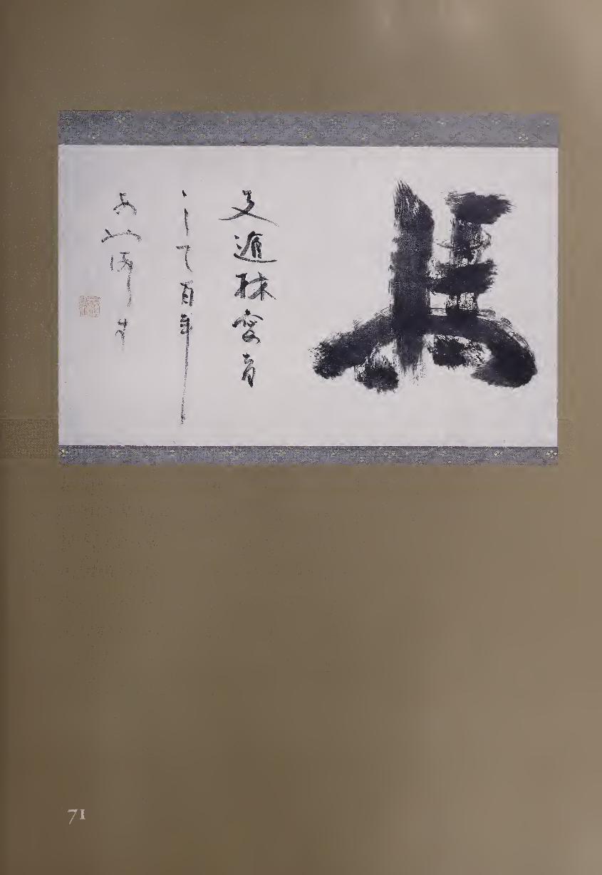
she would not have to support him. At first he merely went through the
motions during Buddhist rites, but by the age of fifteen he became fervent in
his beliefs; and in order to examine original Buddhist texts, he began a
lifelong study of Siddham, a written form of Sanskrit.
Jiun did not give up Confucianism, however, and at the suggestion of his
Buddhist teacher he studied with Ito Togai (#31). The focus in the ltd school
upon mastering original texts encouraged Jiun in his Siddham studies. He
eventually became the greatest East Asian master of Sanskrit, writing a thou¬
sand-volume study, Bongaku shiryo (Guide to Sanskrit Studies).1 He also
published a popular text on morality entitled Jiizen hogo (The Ten Buddhist
Precepts), which reached out to everyday people and was often reprinted.
As if this were not enough, Jiun also entered into full-time Zen practice
at the age of twenty-four under the Soto monk Hosen Daibai (1682-1757)
and achieved an enlightenment experience the following year. For the rest
of his life Jiun stressed the importance of combining vinaya, adherence to
Buddhist regulations for monks, with the cultivation of intuitive wisdom
through the practice of meditation. Jiun believed in the original teachings
of Shakyamuni Buddha—much as the Ito school stressed the authentic
teachings of Confucius—and he eventually organized his own esoteric
sect, Shobo Ritsu, to harmonize current doctrines with original Buddhist
principles; late in his life he attempted to merge these with Shinto beliefs as
native manifestations of Buddhist truths.
Jiun’s distinctive calligraphy has been highly appreciated from his day to
ours. He wrote in Siddham as well as kanji and kana, always with force and
confidence, and his style has influenced many later calligraphers.2 Here he
has chosen the horizontal format of ichijikan (one-word barrier), which has
been especially popular in Zen calligraphy since it offers a dramatic image
for contemplation and meditation.
Horses
Chih Tao-lin nourished them
One hundred years without error
Jiun is here referring to anecdote sixty-three from A New Account of
Tales of the World by Liu I-ch’ing (403-444). It tells of Chih Tun (Chih
Tao-lin, 314-366), the founder of Chi-se (Emptiness of Matter), one of the
“Six Schools” of Chinese Buddhism; Chih numbered among his pupils the
great calligrapher Wang Hsi-chih.
The monk Chih Tao-lin always kept several horses. Someone remarked,
“A holy man and raising horses don’t go together.” Chih replied, “This
humble monk values them for their divine swiftness.”3
Jiun’s characteristic broad, dry brushwork can be seen in the word for
“horses” (J§). He has reinvented the character subtly, changing the four
bottom dots (originally representing legs) into two dots and two extended
endings of other strokes, one horizontal and one vertical. The sense of move¬
ment at the bottom of the character balances the architectonic strokes above,
as though the strong body of the horse were ready to move at any moment.
The three lines of smaller calligraphy on the left, brushed with a single
dipping of the brush, contain a sequence of five kanji, two kana, two kanji,
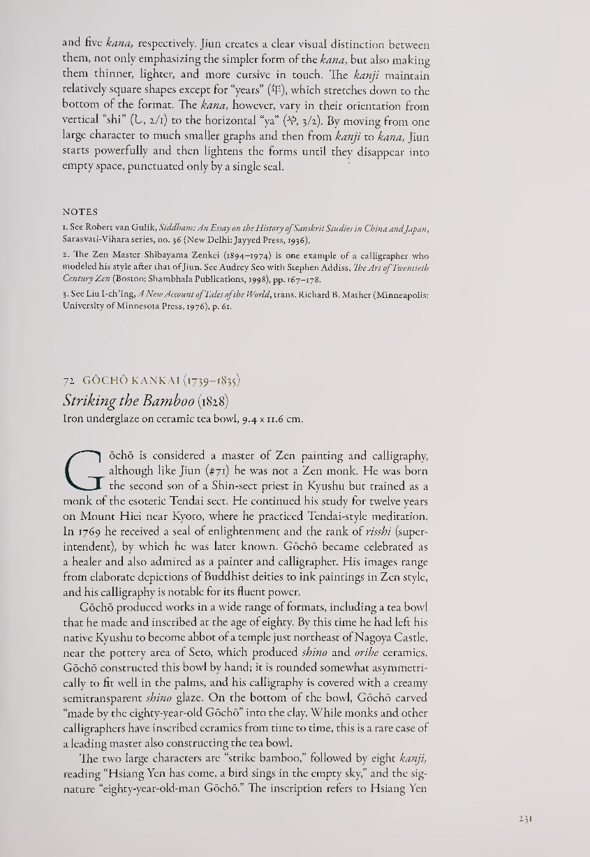
and five kana, respectively. Jiun creates a clear visual distinction between
them, not only emphasizing the simpler form of the kana, but also making
them thinner, lighter, and more cursive in touch. The kanji maintain
relatively square shapes except for “years” (fiT), which stretches down to the
bottom of the format. The kana, however, vary in their orientation from
vertical shi (L, 2/1) to the horizontal “ya” (-Y1, 3/2). By moving from one
large character to much smaller graphs and then from kanji to kana, Jiun
starts powerfully and then lightens the forms until they disappear into
empty space, punctuated only by a single seal.
NOTES
1. See Robert van Gulik, Siddham: An Essay on the History of Sanskrit Studies in China andJapan,
Sarasvati-Vihara series, no. 36 (New Delhi: Jayyed Press, 1936).
2. The Zen Master Shibayama Zenkei (1894-1974) is one example of a calligrapher who
modeled his style after that of Jiun. See Audrey Seo with Stephen Addiss, The Art of Twentieth
Century Z,en (Boston: Shambhala Publications, 1998), pp. 167-178.
3. See Liu I-ch’ ing, A Neiu Account of Tales of the World, trans. Richard B. Mather (Minneapolis:
University of Minnesota Press, 1976), p. 61.
72 GOCHO KANKAI (1739-1835)
Striking the Bamboo (1828) Iron underglaze on ceramic tea bowl, 9.4 x 11.6 cm.
Gocho is considered a master of Zen painting and calligraphy,
although like Jiun (#71) he was not a Zen monk. He was born
the second son of a Shin-sect priest in Kyushu but trained as a
monk of the esoteric Tendai sect. He continued his study for twelve years
on Mount Hiei near Kyoto, where he practiced Tendai-style meditation.
In 1769 he received a seal of enlightenment and the rank of risshi (super¬
intendent), by which he was later known. Gocho became celebrated as
a healer and also admired as a painter and calligrapher. His images range
from elaborate depictions of Buddhist deities to ink paintings in Zen style,
and his calligraphy is notable for its fluent power.
Gocho produced works in a wide range of formats, including a tea bowl
that he made and inscribed at the age of eighty. By this time he had left his
native Kyushu to become abbot of a temple just northeast of Nagoya Castle,
near the pottery area of Seto, which produced shino and oribe ceramics.
Gocho constructed this bowl by hand; it is rounded somewhat asymmetri¬
cally to fit well in the palms, and his calligraphy is covered with a creamy
semitransparent shino glaze. On the bottom of the bowl, Gocho carved
“made by the eighty-year-old Gocho” into the clay. While monks and other
calligraphers have inscribed ceramics from time to time, this is a rare case of
a leading master also constructing the tea bowl.
The two large characters are “strike bamboo,” followed by eight kanji,
reading “Hsiang Yen has come, a bird sings in the empty sky,” and the sig¬
nature “eighty-year-old-man Gocho.” The inscription refers to Hsiang Yen
231
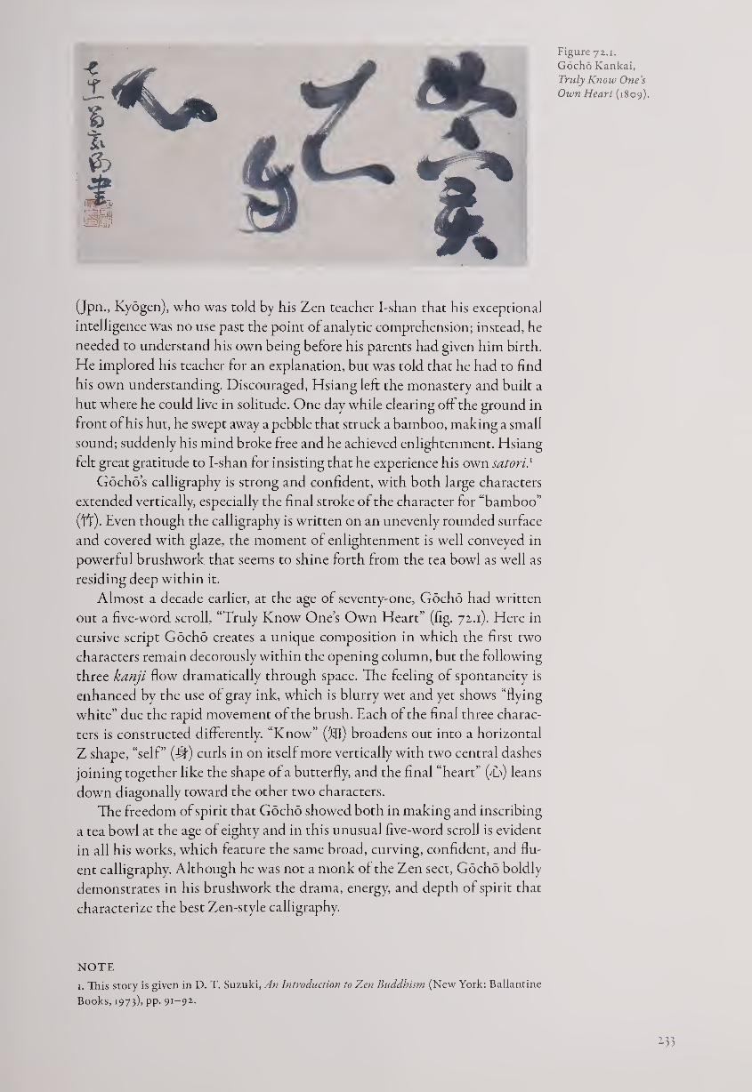
Figure 72.1.
Gocho Kankai,
Truly Know One’s
Own Heart (1809).
(Jpn., Kyogen), who was told by his Zen teacher I-shan that his exceptional
intelligence was no use past the point of analytic comprehension; instead, he
needed to understand his own being before his parents had given him birth.
He implored his teacher for an explanation, but was told that he had to find
his own understanding. Discouraged, Hsiang left the monastery and built a
hut where he could live in solitude. One day while clearing off the ground in
front of his hut, he swept away a pebble that struck a bamboo, making a small
sound; suddenly his mind broke free and he achieved enlightenment. Hsiang
felt great gratitude to I-shan for insisting that he experience his own satori.1
Gocho’s calligraphy is strong and confident, with both large characters
extended vertically, especially the final stroke of the character for “bamboo”
(tt). Even though the calligraphy is written on an unevenly rounded surface
and covered with glaze, the moment of enlightenment is well conveyed in
powerful brushwork that seems to shine forth from the tea bowl as well as
residing deep within it.
Almost a decade earlier, at the age of seventy-one, Gocho had written
out a five-word scroll, “Truly Know One’s Own Heart” (fig. 72.1). Here in
cursive script Gocho creates a unique composition in which the first two
characters remain decorously within the opening column, but the following
three kanji flow dramatically through space. The feeling of spontaneity is
enhanced by the use of gray ink, which is blurry wet and yet shows “flying
white” due the rapid movement of the brush. Each of the final three charac¬
ters is constructed differently. “Know” (5®) broadens out into a horizontal
Z shape, “self” (#) curls in on itself more vertically with two central dashes
joining together like the shape of a butterfly, and the final “heart” (T\) leans
down diagonally toward the other two characters.
The freedom of spirit that Gocho showed both in making and inscribing
a tea bowl at the age of eighty and in this unusual five-word scroll is evident
in all his works, which feature the same broad, curving, confident, and flu¬
ent calligraphy. Although he was not a monk of the Zen sect, Gocho boldly
demonstrates in his brushwork the drama, energy, and depth of spirit that
characterize the best Zen-style calligraphy.
NOTE
1. This story is given in D. T. Suzuki, An Introduction to Zen Buddhism (New York: Ballantine
Books, 1973), pp- 9I~92-
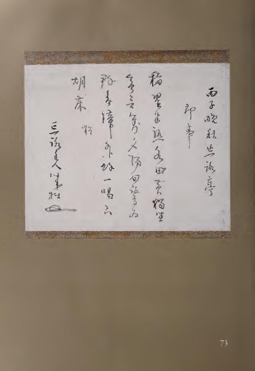
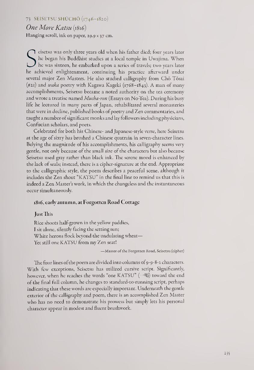
73 SEISETSU SHUCHO (1746-1820)
One More Katsu (i8ifi) Hanging scroll, ink on paper, 29.9 x 37 cm.
Seisetsu was only three years old when his father died; four years later
he began his Buddhist studies at a local temple in Uwajima. When
he was sixteen, he embarked upon a series of travels; two years later
he achieved enlightenment, continuing his practice afterward under
several major Zen Masters. He also studied calligraphy from Cho Tosai
(#21) and waka poetry with Kagawa Kageki (1768-1843). A man of many
accomplishments, Seisetsu became a noted authority on the tea ceremony
and wrote a treatise named Mucha-ron (Essays on No-Tea). During his busy
life he lectured in many parts of Japan, rehabilitated several monasteries
that were in decline, published books of poetry and Zen commentaries, and
taught a number of significant monks and lay followers including physicians,
Confucian scholars, and poets.
Celebrated for both his Chinese- and Japanese-style verse, here Seisetsu
at the age of sixty has brushed a Chinese quatrain in seven-character lines.
Belying the magnitude of his accomplishments, his calligraphy seems very
gentle, not only because of the small size of the characters but also because
Seisetsu used gray rather than black ink. The serene mood is enhanced by
the lack of seals; instead, there is a cipher-signature at the end. Appropriate
to the calligraphic style, the poem describes a peaceful scene, although it
includes the Zen shout “KATSU” in the final line to remind us that this is
indeed a Zen Master’s work, in which the changeless and the instantaneous
occur simultaneously.
1816, early autumn, at Forgotten Road Cottage
Just Tli is
Rice shoots half-grown in the yellow paddies,
I sit alone, silently facing the setting sun;
White herons flock beyond the undulating wheat—
Yet still one KATSU from my Zen seat!
—Master of the Forgotten Road, Seisetsu (cipher)
The four lines of the poem are divided into columns of 9-9-8-! characters.
With few exceptions, Seisetsu has utilized cursive script. Significantly,
however, when he reaches the words “one KATSU” (—Hi) toward the end
of the final full column, he changes to standard-to-running script, perhaps
indicating that these words are especially important. Underneath the gentle
exterior of the calligraphy and poem, there is an accomplished Zen Master
who has no need to demonstrate his prowess but simply lets his personal
character appear in modest and fluent brushwork.
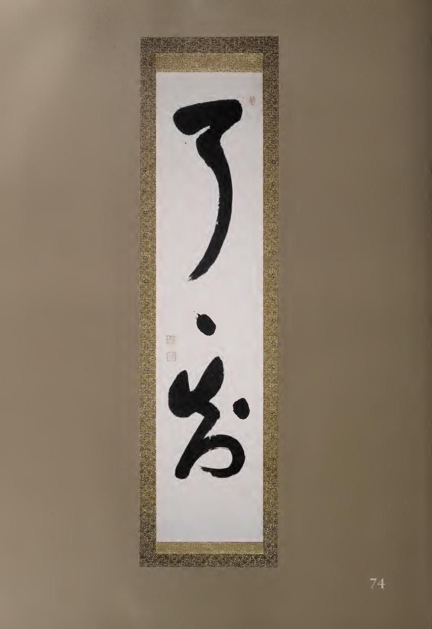
:.
mm mk iiiwMiimi
mm
\ '.!\ ,ov ' 'fvvJ. awIs ®S ;*-< \v
i' -v , ." . j -'• vx'v'i'-
isisMI %'v'' S %
tSHBII sMSSaMgsaatos
4 J-
. ■ //W'^P;- Bllli
74 INZAN IEN (1754-1817)
Complete Understanding Hanging scroll, ink on paper, 129 x 29.3 cm.
Inzan was one of the most important teaching Zen Masters in the Hakuin
tradition, and today all Rinzai monks trace their lineage through either
Inzan or his contemporary Takuju Kosen (1760-1833). Inzan did not
study with Hakuin directly but rather through his pupil Gasan; previously
he had studied with two other major masters, Bankei Yotaku (#65) and
Gessen Zenne (1701-1781). Inzan therefore represents several of the strongest
currents of Zen thought and training in early modern Japan.
Here Inzan has written three characters RYO 7 RYO 7 CHI Jil with
the middle character represented by a dot that acts as a repeat mark like a
ditto. Ryd can mean “complete” and also “finally;” chi means “knowing” or
“understanding;” thus, another possible translation of the three characters
might be: “finally, finally, understanding.”
The calligraphy is masterful in its creative spatial proportions. Specifi¬
cally, the opening ryd balances its strong, fuzzing horizontal at the top with a
long, curving stroke downward, ending with a touch of “flying white.” This
character, occupying almost half the scroll, seems to give birth to the single
dot below it, which shows a trace of how the brush began it from the upper
left. The dot evenly divides the first from the third character, and yet it also
relates to the lower dot, giving a sense of continuity. The lower dot, however,
has a slightly different and more stable shape and nicely divides the spaces
around it. Chi is also a marvel of balance, swinging from upper left up again
to the right, moving down with an angular zigzag to the lower left, and finally
curving around and back to the right. It is so secure in space that one might
imagine a floor below it, but there is nothing but empty paper; Inzan does
not complicate matters with a signature but merely adds three seals. Is this
work a dance, or imaginary architecture? Certainly both, and much more.
75 DA1EN BUTTSU (d. 1815)
Mumonkan Koan (1808) Hanging scroll, ink on paper, 30.4 x 55.9 cm.
Most of the Japanese monk-artists who are famous today were
from the Rinzai sect, which had many major monasteries in
large cities; but the Soto sect is actually larger in Japan, although
generally concentrated away from population centers. Two of the best-
known Soto monk-artists were named Fugai (#57 and #77); several other
monastics of this sect were very talented in calligraphy, including Daien
Buttsu. In the countryside temples where he lived all his life, Daien became
especially known as a fierce teacher, earning the nickname “Tora Buttsu ’
(Tiger Buttsu). His birth date is unknown, but he died in 1825 on the
^37
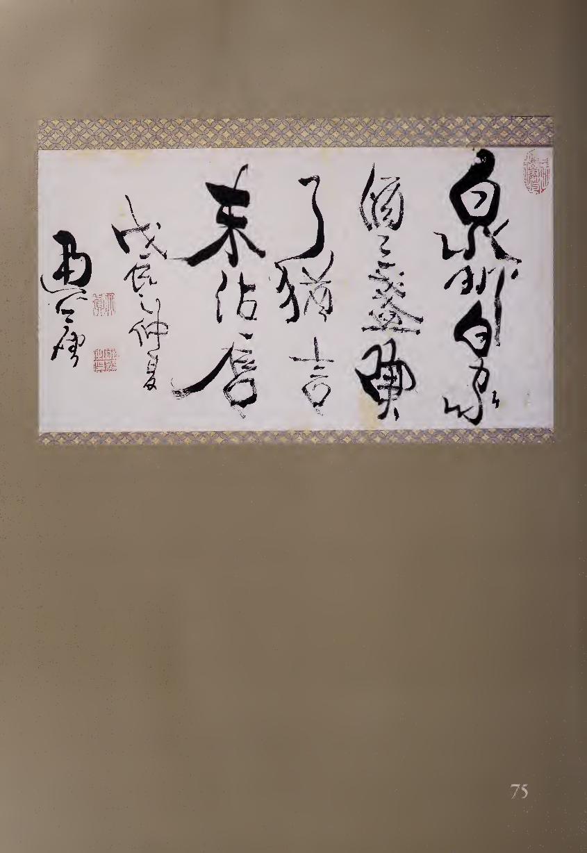
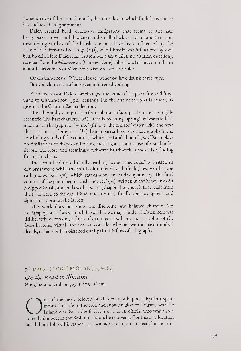
sixteenth day of the second month, the same day on which Buddha is said to
have achieved enlightenment.
Daien created bold, expressive calligraphy that seems to alternate
freely between wet and dry, large and small, thick and thin, and firm and
meandering strokes of the brush. He may have been influenced by the
style of the literatus Ike Taiga (#41), who himself was influenced by Zen
brushwork. Here Daien has written out a koan (Zen meditation question),
case ten from thc Mumonkan (Gateless Gate) collection. In this conundrum
a monk has come to a Master for wisdom, but he is told:
Of Ch’uan-chou’s “White House” wine you have drunk three cups,
But you claim not to have even moistened your lips.
For some reason Daien has changed the name of the place from Ch’ing-
yuan to Ch’uan-chou (Jpn., Senshu), but the rest of the text is exactly as
given in the Chinese Zen collection.
The calligraphy, composed in four columns of 4-4-3-3 characters, is highly
eccentric. The first character (l^), literally meaning “spring” or “waterfall,” is
made up of the graph for “white” (0) over the one for “water” (tK); the next
character means “province” (fl'l). Daien partially echoes these graphs in the
concluding words of the column, “white” (£fl) and “house” (si?). Daien plays
on similarities of shapes and forms, creating a certain sense of visual order
despite the loose and seemingly awkward brushwork, almost like finding
fractals in chaos.
The second column, literally reading “wine three cups,” is written in
dry brushwork, while the third column ends with the lightest word in the
calligraphy, “say” (If), which stands alone in its dry symmetry. The final
column of the poem begins with “not-yet” (d?), written in the heavy ink of a
redipped brush, and ends with a strong diagonal to the left that leads from
the final word to the date (1808, midsummer); finally, the closing seals and
signature appear at the far left.
This work does not show the discipline and balance of most Zen
calligraphy, but it has so much flavor that we may wonder if Daien here was
deliberately expressing a form of drunkenness. If so, the metaphor of the
koan becomes visual, and we can consider whether we too have imbibed
deeply, or have only moistened our lips in this flow of calligraphy.
76 DAIGU (TAIGU) RYOKAN (1758-1831)
On the Road in Shinshu Hanging scroll, ink on paper, 27.3 x 18 cm.
One of the most beloved of all Zen monk-poets, Ryokan spent
most of his life in the cold and snowy region of Niigata, near the
Inland Sea. Born the first son of a town official who was also a
noted haiku poet in the Basho tradition, he received a Confucian education
but did not follow his father as a local administrator. Instead, he chose in
15?
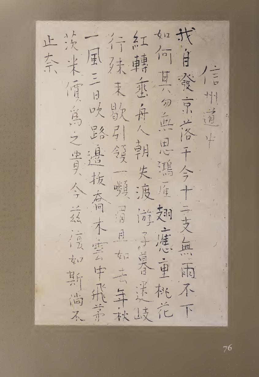
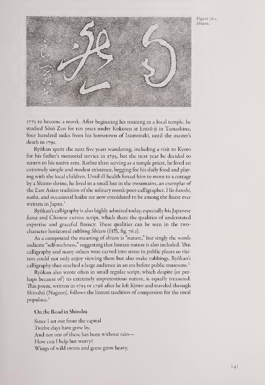
Figure 76.1.
Shizen.
1775 to become a monk. After beginning his training in a local temple, he
studied Soto Zen for ten years under Kokusen at Entsu-ji in Tamashina,
four hundred miles from his hometown of Izumozaki, until the master’s
death in 1791.
Ryokan spent the next five years wandering, including a visit to Kyoto
for his father’s memorial service in 1795, but the next year he decided to
return to his native area. Rather than serving as a temple priest, he lived an
extremely simple and modest existence, begging for his daily food and play¬
ing with the local children. Until ill health forced him to move to a cottage
by a Shinto shrine, he lived in a small hut in the mountains, an exemplar of
the East Asian tradition of the solitary monk-poet-calligrapher. His kanshi,
waka, and occasional haiku are now considered to be among the finest ever
written in Japan.1
Ryokan’s calligraphy is also highly admired today, especially his Japanese
kana and Chinese cursive script, which share the qualities of understated
expertise and graceful fluency. These qualities can be seen in the two-
character horizontal rubbing Shizen (f=fM, fig. 76.1).
As a compound the meaning of shizen is “nature,” but singly the words
indicate “self-suchness,” suggesting that human nature is also included. This
calligraphy and many others were carved into stone in public places so visi¬
tors could not only enjoy viewing them but also make rubbings. Ryokan’s
calligraphy thus reached a large audience in an era before public museums.2
Ryokan also wrote often in small regular script, which despite (or per¬
haps because of) its extremely unpretentious nature, is equally treasured.
This poem, written in 1795 or 1796 after he left Kyoto and traveled through
Shinshu (Nagano), follows the literati tradition of compassion for the rural
populace.’
On the Road in Shinshu
Since I set out from the capital
Twelve days have gone by,
And not one of these has been without rain—
How can I help but worry?
Wings of wild swans and geese grow heavy,
2.41
Peach blossoms droop lower and lower;
Boatmen can’t ply their morning ferries,
Travelers at evening lose their way.
It’s impossible to halt my journey,
I crane my neck and knit my brows.
Will it be like autumn last year,
When the wind blew three days on end,
Huge trees were uprooted by the roadside,
And thatch from rooftops flew into the clouds?
Because of that the price of rice soared—
Will it be the same this year?
If these rains don’t let up,
What?4
The poem is unusual in breaking its Chinese five-word line format at
the end, where the single character “what?” (^) constitutes the entire final
line. Also, while Chinese regulated verse is composed in regular multiples
of four, eight, sixteen, or thirty-two lines, this poem has eighteen. These
changes demonstrate Ryokan’s freedom of expression, even when following
Chinese poetic traditions in both theme and structure.
The calligraphy could not be more light and modest. Ryokan has mastered
the style of T’ang-dynasty exemplars in terms of balanced character composi¬
tion, but he makes no effort to use such calligraphic techniques as thickening
and thinning the strokes. After the four-word title, Ryokan maintains col¬
umns of thirteen or fourteen words each until the end, and he only slightly
alters the visual rhythm by subtle redippings of the brush.5 Although Ryokan’s
writing is different in many ways, it has the same intensely personal quality
as that of the haiku poet Issa (#54), who also shunned any overt aesthetic
effects. Ryokan once stated that he didn’t like cooking from chefs, poetry by
poets, or calligraphy by calligraphers, and his own work shows the simplicity,
akin to “beginner’s mind,” that he preferred.6
What makes this writing of Ryokan anything more than unadorned,
childlike regular script? First of all, there is no need for it to be anything
more. A simple style is actually very difficult to achieve, requiring control of
the brush and a lack of either internal tension or artistic ambition. But there
is more: the openness of the forms, gentleness of touch, and subtle freedom
of character compositions are all special features of Ryokan’s calligraphy,
surely because they were also hallmarks of his own Zen spirit.
NOTES
1. Ryokan’s poetry has proved popular in English as well. Books of translations include: Bur¬
ton Watson, Ryokan: Zen Monk-Poet of Japan (New York: Columbia University Press, 1977);
John Stevens, Dewdrops on a Lotus Leaf (Boston: Shambhala Publications, 1993); John Stevens,
One Robe, One Bowl (New York: Weatherhill, 1977); Ryuichi Abe and Peter Haskel, Great Fool:
Zen Master Ryokan (Honolulu: University of Hawaii Press, 1996); and Nobuyuki Yuasa, The
Zen Poems of Ryokan (Princeton, N.J.: Princeton University Press, 1981).
2. This work is at the temple Shonen-ji in Mishima; for this and sixty-seven other examples, in¬
cluding maps to their locations, see Watababe Hideei, ed., Ishibumi Ryokan (Stone Monuments
of Ryokan) (Niigata: Rokodo, 1972), pp. 166-167.
3- The tradition of sympathy for farmers was a feature of much Chinese verse, including that
of Po Chu-i (772-846), whose works were consistently popular in Japan.
4. The translation is based upon one made by Burton Watson for a slightly different version
of the poem. As Kera Yoshishige (1810-1859) wrote in Ryokan zenji kiwa (Curious Accounts of
the Zen Master Ryokan), “The Master would write his poems from memory, and that is why
there were sometimes missing characters and some small variations in wording.” See Abe and
Haskel, Great Fool, p. 97. For another version of the poem, also in small regular script, see
Yoshida Saigen, ed., Ryokan (Tokyo: Chikuma Shobo, 1975), p. 161.
5. A few words, such as “wings” (3/9) and “years” (5/13), were inked more heavily, but this
seems to have happened naturally rather than deliberately.
6. See Watson, Ryokan, p. 116. In one of Ryokan’s Chinese-style verses, he wrote, “My poems
are not poems at all.” Ibid., p. 11.
77 FUGAI HONKO (1779-1847)
The Mountain Spirit (1839) Hanging scroll, ink on paper, 106.2 x 42 cm.
Fugai Honko, like the earlier Fugai Ekun (#57),' was a Soto sect Zen
monk, but his artistic inspiration seems to have come as much from
the works of literati artists as from Zen brushwork traditions.
Born in Ise, Fugai became a Buddhist novice at the age of eight; his
artistic interests were encouraged when at the age of fourteen he obtained
a scroll by the monk-artist Tanke Gessen (1721-1809), who painted in the
literati manner. Fugai then studied Zen for eleven years with Genro Oryu
(1720-1813), known as “Wolf Genro” for his strict teaching, eventually
receiving Genro’s Zen transmission.
During these years Fugai maintained his interest in art. On a visit to
Kyushu in 1802, he studied the paintings of the young literatus Tanomura
Chikuden (1777-1833) and also examined works by Taiga (#41) in the Kat-
sube Collection, On a later visit to Kyushu, in 1829, he again studied paint¬
ings by Chikuden. Meanwhile, in 1818 Fugai had become abbot of Osaka’s
Entsu-in, and in 1834 he was appointed abbot of Koshaku-ji in Mikawa;
he retired in 1842 and spent his final years in Osaka. Fugai wrote several
books, including a commentary on the Chinese koan collection Hekiganroku
(Blue Cliff Record), and he also became known for his poetry, calligraphy,
and painting.
Here Fugai has written out a quatrain that mostly conforms to the
seven-character regulated verse style but has three extra words added to the
last line, creating the form of 7-7-7-10.1
Anxiously having summoned the god to give him “upper-pond” water
to drink,
Pien Ch’ueh has come again to cure me of my illness!
Do not wonder that in midwinter here in this hidden valley
The Mountain Spirit conjures in profusion the songs of orioles!
243
—Summer 1839, to cure the pain of my boils
|g
Pien Ch’ueh was the most famous physician of Chinese antiquity; ac¬
cording to the Shih chi of Ssu-ma Ch’ien (second century B.C.E.), Pan was
instructed in medicine by an immortal who gave him “upper-pond” (heav¬
enly) water of magical powers. This poem therefore testifies to Fugai’s sino¬
logical scholarship as well as his somewhat unfortunate state of health. The
major impact of the calligraphy, however, comes from Fugai’s use of varying
tones of ink as well as the loose and relaxed flow of his running-cursive
script; he seems to have been willing to sacrifice some sense of structure in
order to express his freedom of spirit.
It is unusual to see calligraphy with so much deliberate and continuous
changing of ink tones, although Taiga sometimes used this device in
painting and the Zen Master Sengai Gibon (1750-1837) occasionally did so
in both painting and calligraphy. We can easily follow the darker-and-lighter
rhythm of Fugai’s brush as it dips into ink on the first and fifth character of
each poetic line, creating a syncopated pattern of 4-3, 4-3, 4-3 until the end,
when it becomes 4-6. This visual accentuation creates a counterpoint to the
other two rhythms in the scroll, the four lines of the poem and the columns
of 9-8-8-6 characters. While the ink tones generally follow the rhythm of
the poetic lines, they create dynamic accents irregularly in the total compo¬
sition, with the darkest characters occurring at 1/1,1/5, and 1/8; 2/3 and 2/6;
3/2 and 3/5; and 4/1.
One of the most notable characters is “mountain” (|Tj), the fifth word
of the third column. In standard script it is composed of three strokes,
suggesting the picture of a central peak with small peaks on each side; but
here Fugai has joined two semicircles left and right with a central hooking
stroke, fashioning a dramatic rounded form that continues down to the
character below it. Also important is the negative space in the fourth col¬
umn between the seven final characters of poem and the signature of the
artist, which is the scroll’s only concession to a pause for breathing space.
Finally, to the left Fugai has added his inscription, written in slightly smaller
brushwork even more cursive than the poem.
With his emphasis on curved lines and changing tones of ink, as well as
the reduced amount of empty space between either the characters or the
columns, Fugai has created a unique style of calligraphy that seems to alter¬
nate continuously between floating and undulating. Indeed, it seems to
exist in a world that echoes the literal meaning of the name Fugai: beyond
the wind.
NOTES
1. Fugai Ekun is sometimes called “Cave Fugai” because he spent some years living in a cave,
while Fugai Honko is known as “Octopus Fugai” since his signature is thought to resemble
the shape of an octopus.
2. Translation by Jonathan Chaves.
2-45

GLOSSARY
BONE The structural quality of a brush stroke, often straight or angular, as op¬
posed to its surface “flesh.”
CLOSED TIP Visual effect created by the circling of the brush around the begin¬
ning or ending of a stroke so that the tip is not apparent, as opposed to “open tip.”
DAIMYO Feudal lord.
FLESH The surface effect of the brushwork, including fuzzing ink and flourishes
that are not intrinsic to the character, as opposed to “bone.”
FOUR GENTLEMEN The four plants that represent Chinese and Japanese literati
values: bamboo, orchid, plum, and chrysanthemum.
HAIGA Haiku-paintings, usually done with minimal brushwork.
HAN The territory of a daimyo (feudal lord).
ICHIJIKAN Literally, “one-word barrier,” a form of Zen calligraphy where a single
character is written in large size, followed by an inscription in smaller characters.
kana The hiragana and katakana syllabaries developed from Chinese characters
that are used, along with kanji, for writing in Japanese.
KANJI Chinese characters.
KOKUGAKU The “National Learning” school, in part a reaction against Chinese-
style Confucianism.
LITERATUS A scholar-sage-poet-calligrapher, known in Japan as a bunjin; the
plural and adjectival form of the word is literati.
MAN YOGANA The use of Chinese characters merely for their sound, as written
in early versions of the Man’ydshu.
MAN’YOSHU The earliest collection ofjapanese poetry.
NANGA The Chinese-influenced paintings of the literati.
OPEN TIP Visual effect that results from the brush entering or leaving the surface
directly so the action of the tip of the brush is visible, as opposed to “closed tip.”
SHIKISHI A poem-card, approximately 17 x 16 cm., often chosen for writing Jap¬
anese waka.
TANZAKU A tall, narrow poem-card, approximately 36 x 6 cm. used primarily
for Japanese waka and haiku.
WAKA The classical poem of Japan, also called tanka and uta, composed of five
lines with 5-7-5-?-7 syllables.

SELECTED BIBLIOGRAPHY
Addiss, Stephen. The Art of Chinese Calligraphy. Philadelphia: Running Press, 2005.
-. The Art of Zen. New York: Harry N. Abrams, 1989.
-. Haiga: Takebe Sochd and the Haiku-Painting Tradition. Richmond, Va.:
Marsh Art Gallery, in association with the University of Hawaii Press, 1995.
-. Obaku: Zen Painting and Calligraphy. Lawrence, Kans.: Spencer Museum of Art, 1978.
-. The Resonance of the Qin in East Asian Art. New York: China Society, 1999.
-. Tall Mountains and Flowing Waters. TheArtsofUragamiGyokudd. Hono¬
lulu: University ol Hawaii Press, 1987.
-. The World ofKameda Bosai. New Orleans Museum of Art, 1984.
-. “Hakuin, Torei, and Jiun: Calligraphy as Mantra.” In Calligraphy of Chi¬
na and Japan: The Grand Tradition. Ann Arbor, Mich.: University of Michi¬
gan Museum of Art, 1975.
-. “Shadows of Emotion: The Calligraphy, Painting, and Poetry of Gion Nankai.” Kaikodo Journal, Autumn 1998.
-. “The Three Women of Gion.” In Marsha Weidner, ed., Flowering in the
Shadows: Women in the History of Chinese and Japanese Painting. Honolulu:
University of Hawaii Press, 1990.
Bankei Zenshi ihd (Remaining Works of Zen Master Bankei). Kyoto: Bunkazai
Kenkujo, 1992.
Ban Kokei. Kinsei kijin-den (Tives of Modern Eccentrics). Kyoto, 1790. Repr., To¬
kyo: Iwanami Shoten, 1940.
Blofeld, John, trans. The Zen Teaching of HuangPo. New York: Grove Press, 1958.
Blythe, R. H. A History of Haiku. 2 vols. Tokyo: Hokuseido Press, 1964.
Bokubi (Ink Beauty), on Ryokan. Nos. 2 (1951); 14 (1952); 85, 88, 89 (1959); 99
(i960); 141, 143 (1964); 163 (1966); 167, 174 (1967); 189-91 (1969); 206, 208,
210-11, 213, 216 (1971); 218, 220-21 (1972).
Bokubi, on Bosai. No. 148 (1964).
Bokubi, on calligraphy of the Edo period. No. 181 (1968).
Bokubi, on death poems. No. 233 (1973).
Bokubi, on Fugai Ekun. Nos. 101,104 (1961).
Bokubi,on Gocho. No. 95 (i960).
Bokubi, on haiku tanzaku. No. 224 (1972).
Bokubi, on Hakuin. Nos. 9 (1951); 77~79 (1958); 9° (I959)-
Bokubi, on Jiun. Nos. 25 (1953); 5° (1955); I27 (1963); 2.2,8 (1973); 259. 261, 264-65,
267 (1976); 271, 273 (1977); 281, (1978); 287 (1979).
Bokubi, on Kaioku. No. 115 (1962).
Bokubi, on Koetsu. Nos. 227, 228, 229 (1973); 274-75 (i977)-
Bokubi, on Mitsuhiro. No. 185 (1968).
Bokubi, on Ogyu Sorai. No. 284 (1978).
Bokubi, on Rengetsu. No. 103 (1961).
249
Bokubi, on Setsuzan. Nos. 118 (1962); 272 (1977).
Bokubi, on Setsuzan, Gyokuzan, and Gocho. No. 168 (1967).
Bokubi, on Taiga. Nos. 86 (1959); 154 (1965); 204-205 (1970).
Boudonnat, Louise, and Harumi Kushizaki. Traces of the Brush: The Art of Japa¬
nese Calligraphy, trans. Charles Penwarden. San Francisco: Chronicle Books,
2003.
Bradstock, Timothy R., and Judith N. Rabinovitch. An Anthology oJKanshi (Chi¬
nese Verse) by Japanese Poets of the Edo Period (1603-1868). Lewiston, N.Y.: Ed¬
win Mellon Press, 1997.
Brasch, Kurt, and Takayashi Senzoku. Die kalligraphische Kunst Japans. Tokyo:
Japanisch-Deutsche Gesellschaft, 1963.
Bruschke-Johnson, Lee. “The Calligrapher Konoe Nobutada.” Ph.D. diss., Leiden
University, 2002.
Bunjin Ishaikawa Jozan no sekai (The World of the Literatus Ishikawa Jozan).
Aichi: Yasunari-shi Rekishi Hakubutsukan, 1992.
Bunjin shofu (Calligraphy Records): no. 1, on Koetsu; no. 2, Jozan; no. 3, Ikkyu;
no. 4, Jiun; no. 5, Takuan; no. 6, Ryokan; no. 7, Taiga; no. 8, Sengai; no. 9,
Hakuin; no. 10, Basho; no. n, Rengetsu; no. 12, Tessai. Tokyo: Tankosha, 1979.
Chan, Wing-tsit, trans. Instructionsfor Practical Living by Wang Yang-ming. New
York: Columbia University Press, 1963.
Cha-no-yu to kakemono II; Daitoku-ji no bokuseki wo chushin ni (The Tea Cer¬
emony and Scrolls; vol. 2, Focusing on Ink Traces from Daitoku-ji). Kyoto:
1982.
Chaseki bokuho (Tea Ceremony Ink Treasures). Tokyo: Nezu Bijutsukan, 1992.
Chinese andJapanese Calligraphy Spanning Two Tleousand Years: The Heinz Goetze
Collection. Munich: Prestel, 1989.
Daitoku-ji bokuseki zenshu (Collection oi Daitoku-ji Monk Ink Traces), vol. 3. To¬
kyo: Mainichi Shinbunsha, 1986.
Daitoku-ji kinsei bokusekiten (Exhibition of Ink Traces by Early Modern Daitoku-
ji Monks). Kyoto: Daitoku-ji, 1983.
Daitoku-ji meihoshu (Collection of Famous Treasures from Daitoku-ji). Kyoto:
Benrido, 1933.
Daitoku-ji no meihd (Famous Treasures from Daitoku-ji). Kyoto National Museum,
1985.
Daitoku-ji rekidai bokuseki seisui (Collection of Historical Ink Traces from Dai¬ toku-ji). Tokyo: Yomiuri Shinbunsha, 1977.
Donegan, Patricia, and Yoshie Ishoibashi. Chiyo-ni: Woman Haiku Master. Tokyo,
Boston & Singapore: Charles E. Tuttle, 1998.
Edo jidai no shoseki (Calligraphy of the Edo Period). Chiba: Naritasan Calligra¬
phy Museum, 1993.
Edo no meiso: Takuan (The Famous Edo Period Monk Takuan). Tokyo: Shinagawa
Rekishikan, 1939.
Edo no shilkyo bijutsu (Edo Period Buddhist Calligraphy). Nihon bijutsu zenshu,
vol. 23. Tokyo: Gakken, 1979.
Fischer, Felice. The Arts of Hon ami Koetsu. Philadelphia Museum of Art, 2000.
Fister, Patricia .Japanese Women Artists, 1600-1900. Lawrence, Kans.: Spencer Mu¬
seum of Art, 1988.
-. “Tokai Okon.’ Calligraphy Idea Exchange 3, no. 4 (Summer 1986).
Fugai Dojin ibokuten (Fugai’s Ink Traces Exhibition). Odawara, 1982.
Fugai Ekun sakuhin-ten (An Exhibition of Works by Fugai Ekun). Hiratsuka
Museum, 1992.
250
Fu Shen, Glenn D. Lowry, and Anne Yonemura. From Concept to Context: Ap¬
proaches to Asian and Islamic Calligraphy. Washington, D.C.: Freer Gallery of
Art, 1986.
Gdchd. Kumamoto: Kenritsu Bijutsukan, 1981.
Gdchd. Kyushu Bukku Center, 1971.
Gdchd Risshi ibokushu (Remaining Works from the Reverend Gocho). Tokyo: Ka-
bushiki Kaisha, 1982.
Graham, Patricia J. Tea of the Sages: FloeArtofSencha. Honolulu: Hawaii Univer¬
sity Press, 1998.
Haijin no shoga hijutsu (Calligraphy and Paintings by Haiku Poets). 12. vols. Tokyo:
Shueisha, 1979.
Haikai jinmei jiten (Dictionary of Haiku Poets). Tokyo: Gannando Shoten, 1987.
Haiku jiten: Kindai (Haiku Dictionary: Early Modern Period). Tokyo: Ofusha, 1977.
Hakuin iseki (Remaining Ink Traces of Hakuin). Bokubi, nos. 77, 78, 79, and 90
bound together. Kyoto: Bokubisha, 1977.
Hakuin Osho ibokushu (Remaining Works of the Monk Hakuin). Tokyo: Minyu-
sha, 1914.
Haruna Yoshie. Kan’ei no sanpitsu (The Three Brushes of the Kan’ei Period). Tokyo:
Tankosha, 1971.
Hatano Yukihiko. Honmono nisemono chakai no sho (Genuine and Fake Tea Cer¬
emony Calligraphy). Tokyo: Shufu no Yusha, 1987.
Hito to sho (People and Calligraphy). Tokyo: Century Museum, 1989.
Inoue Tetsujiro. Nihon Yomeigakuha no tetsugaku (Philosophy of Japanese Schol¬
ars in the Wang Yang-ming Tradition). Tokyo: Fuzambo, 1932.
Ishikawa Kyuyo. Sho de toku Nihon bunka (Japanese Culture Explained through
Calligraphy). Tokyo: Mainichi Shinbunsha, 2004.
Iwasaki Haruo. “The World of ‘Gesaku’: Playful Writers of Late Eighteenth-
Centuryjapan.” Ph.D. diss., Harvard University, 1984.
Jakugon Jiun ten (Exhibition ofjakugon and Jiun). Kyoto: Shibunkaku, 1979.
Jiun Sonja bokuseki shusei (Collection of Ink Traces of Jiun Sonja). 3 vols. Tokyo:
Shibunkaku, 1989.
Jiun Sonja iho (Remaining Treasures of Jiun Sonja). 2 vols. Tokyo: Nichibo Shup-
pansha, 1980.
Kaji. Kaji no ha (Mulberry Paper [Kaji] Leaves). Kyoto: 1707.
Kana no bi (Art of Kana-Letters). Kyoto National Museum, 1992.
Kan’ei meihitsu-ten (Exhibition of Major Kan’ei Period Calligraphers). Nara:
Yamato Bunkakan, 1973.
Karayo (Chinese-Style). Nihon no sho, vol. 12. Tokyo: Chuo Koronsha, 1983.
Karayo no sho (Chinese-Style Calligraphy). Tokyo National Museum, 1996.
Keene, Donald. World within Walls: Japanese Literature of the Pre-modern Era,
1600-1867. New York: Holt, Rinehart & Winston, 1976.
Kinami Takeuchi. ltd Jinsai: shiseki, jimbutsu, shiso (Ito Jinsai: Calligraphy, Life,
and Thought). Teichozan University Bulletin, no. 22 (February 1981).
Kinseijoryu shodo meika-shi (Famous Early Modern Women Calligraphers). Tokyo:
Tokyodo, 1935.
Kinseikoso ibokushu (Remaining Treasures of Early Modern Zen Monks). Kyoto:
Art-sha Shuppan, 1976.
Kinsei Zenrin bokuseki (Early Modern Zen Ink Traces). 3 vols. Kyoto: Shibunkaku,
1974.
Kogetsu Zenshi (Zen Master Kogetsu). Miyazaki: Hyuga Bunka Hanko-kai, 1952.
Kojima Masayoshi. Ryokan no sbo no sekai (The World of Ryokans Calligraphy).
Tokyo: Kobunsha, 1987.
Kokoro no sho: Jiun Sonja (Calligraphy from the Heart: Jiun Sonja). Osaka: Osaka
Shiritsu Bijutsukan, 1004.
Komatsu Masao. Edo ni sempu, Mitsui Shinna no sho (Edo Whirlwind: The Cal¬
ligraphy of Mitsui Shinna). Nagano: Shinano Mainichi Shinbunsha, 2004.
Komatsu Shigemi. Nihon shoryu zenshi (Complete Collection of Japanese Callig¬
raphy Schools). Tokyo: Kodansha, 1970.
-. Nihon shoseki taikan (Survey of Japanese Calligraphy), vols. 14-25. Tokyo:
Tankosha, 1979.
Korezawa, K., ed. Edo jidai no sho (Edo Period Calligraphy). Nihon no bijutsu, no.
184. Tokyo: Shibundo, 1981.
Koso ibokushu (Remaining Ink Traces by Leading Monks). 12 vols. Tokyo:
Hakurinsha, 1930.
Lishka, Dennis E. “Buddhist Wisdom and Its Expression as Art.” Ph.D. diss. on
Takuan. Ann Arbor, Mich.: University Microfilms, 1977.
Marceau, Lawrence E. “Ninjo and the Affective Value of Literature at the Kogido
Academy.” Sino-Japanese Studies 9, no. 1 (1996).
Maruyama Masao. Studies in the Intellectual History of Tokugawa Japan. Tokyo:
University of Tokyo Press, 1974.
Masuda Takashi. Chajin no sho (Calligraphy by Tea Masters). Tokyo: Bunnan
Deppan, 1985.
-——. Nihon kinsei seiritsushi no kenkyu (Studies in Early Modern Japanese Cal¬
ligraphy). Tokyo: Bunken Shuppan, 1996.
Miura Yasuhiro. Jiun Sonja ihd ten (Exhibition of Remaining Treasures of Jiun
Sonja). Tokyo: Junior Arts Dealers Association, 1987.
Mori Senzo. Mori Senzo chosaku-shu (Collected Works of Mori Senzo), vol. 3. To¬
kyo: Chuo Koronsha, 1971.
Murase Miyeko, ed. The Written Image: Japanese Calligraphy and Painting from
the Sylvan Barnet and William Burto Collection. New York: Metropolitan
Museum of Art, 2002.
Najita Tetsuo and Irwin Scheiner, eds. Japanese Thought in the Tokugawa Period
1600-1S68. Chicago: University of Chicago Press, 1978.
Nakata Yujiro. The Art of Japanese Calligraphy. New York: Weatherhill/Heibonsha,
1973-
Nihon koso iboku (Ink Traces of Famous Japanese Monks), vol. 3. Tokyo: Mainichi
Shinbunsha, 1971.
Nihon no bijutsu. No. 82, Tegami (Letters). Tokyo: Shibundo, 1966.
Nihon no bijutsu. No. 83, Momoyama jidai no sho (Momoyama Era Calligraphy).
Tokyo: Shibundo, 1981.
Nihon no bijutsu. No. 130, Kana. Tokyo: Shibundo, 1977.
Nihon no bijutsu, No. 184, Edo jidai no sho (Edo Period Calligraphy). Tokyo:
Shibundo, 1981.
Nihon no sho (Japanese Calligraphy). Tokyo National Museum: 1978.
Nihon shodd taikei (Outline of Japanese Calligraphy), vol. 7. Tokyo: Kodansha,
1972.
Nihon shoron shusei (Japanese Calligraphy Studies Collection). Tokyo: Kuko
Shoin, 1978.
Obaku bunka (Obaku Culture). Kyoto: Bokubi-sha, 1970.
252
Ohki Sadako. Ike Taiga’s Karayo Calligraphy, z vols. Ann Arbor, Mich.: Univer¬
sity Microfilms, 1984.
Old Zen New Hat: Sermons ofTetsugen. Himeji: Art Press Publications, 1977.
Otagaki Rengetsu. Tokyo: Kodansha, 1982.
Otsuki Mikio, Kato Shoshun, and Hayashi Yukimitsu. Obaku bunka jinmeijiten
(Biographical Dictionary ol Obaku Personages). Tokyo: Shibunkaku, 1988.
Rengetsu. Tokyo: Kodansha, 1971.
Rengetsu-ni zenshu (Complete Works ol Rengetsu). Kyoto: Shibunkaku, 1980.
Rimer, J. Thomas, et al. Shisendo: Hall of the Poetry Immortals. New York: Weather-
hill, 1991.
Rosenfield, John M. Extraordinary Persons. Cambridge, Mass.: Harvard Univer¬
sity Art Museums, 1999.
Rosenfield, John M., Fumiko E. Cranston, and Edwin A. Cranston. The Courtly
Tradition in Japanese Art and Literature. Cambridge, Mass.: Fogg Art Museum,
1973-
Rydkan-san. Tokyo: Nihon Keizai Shinbun, 2000.
Ryuichi Abe and Peter Haskel, trans. Great Fool: Zen Master Ryokan. Honolulu:
University oi Hawaii Press, 1996.
Sato Hiroaki, trans. Breeze Through Bamboo: Kanshi ofEma Saiko. New York:
Columbia University Press, 1998.
Sato Shuichi. A History of Japanese Literature: Tfje Years of Isolation, trans. Don
Sanderson. Tokyo & New York: Kodansha International, 1983.
Seisetsu Osho ibokushii (Collection of Remaining Works by the Monk Seisetsu).
Tokyo: Zenshu Shiryo Chosakai, 1920.
Shimizu Yoshiaki and John M. Rosenfield. Masters oj Japanese Calligraphy,
Eighth-Nineteenth Century. New York: Japan Society and Asia Society Gal¬
leries, 1984.
Shoddzenshu (Complete Calligraphy Collection), vols. 22 and 23. Tokyo: Heibon-
sha, 1966.
Shokin Furuta. Kogetsu Osho iboku (Remaining Ink Works of Kogetsu). Tokyo:
Benrido, 1950.
Sho no bi (The Beauty of Calligraphy). Tokyo: Idemitsu Bijutsukan, 1985.
Sho no Nihonshi (Japanese Calligraphy History), vols. 5-7. Tokyo: Heibonsha, 1975.
Sho: Pinselschrifi und Malerei in Japan vom 7-19. Jahrhundert. Cologne: Museen
der Stadt Koln, 1975.
Sho to jimbutsu (Calligraphy and People). 7 vols. Tokyo: Mainichi Shinbunsha,
1978.
Sogen Omori and Terayama Katsujo. Zen and the Art of Calligraphy. London:
Routledge & Kegan Paul, 1983.
Sogen Tekisui, Gesshu Osho iroku (Records of the Monk Gesshu). 1704.
Soto-shu jinmei jiten (Biographical Dictionary of Soto Sect Monks). Tokyo:
Kokusho Kanko-kai, 1977.
Stevens, John. Sacred Calligraphy of the East. Boulder: Shambhala Publications,
1981.
Sumi, no. 4. Tegami no sho (Calligraphy in Letters). Tokyo: Geijutsu Shinbunsha,
1975-
Taiga no sho (Calligraphy by Taiga). Tokyo: Chuo Koronsha, 1970.
Taiyo, no. 16 (1976). Special issue on haiku.
Takamatsu Matsudaira-ka no shoseki (Ink Traces from the Komatsu Matsudaira
Family). Kagawa: Kagawa History Museum, 1999.
753
Takeuchi Naoji. Hakuin. Tokyo: Chikuma Shoten, 1964.
-. Kinsei no Zemin bijutsu (Early Modern Zen Art). Nihon no bijutsu, no.
47. Tokyo: Shibundo, 1972.
Takuan. Niigata: BSN Museum, 1974.
Takuan, Kogetsu to sonojidai (Takuan, Kogetsu, and Their Era). Sakai: Sakai-shi
Hakubutsukan, 1983.
Takuju Zenshi ihd (Remaining Treasures of Zen Master Takuju). Nagoya: Tokugen-
ji Sodo, Eibunsha, 1982.
Tanahashi Kazuaki. Penetrating Laughter. Woodstock, N.Y.: Overlook Press,
1984.
Teika-yd (Teika Style). Tokyo: Gotoh Museum, 1987.
Tetsugen Zenshi (Zen Master Tetsugen). Osaka: Borinsha, 1923.
Tetsugyu. Chiba: Tadaya Shiten, 1913.
Torei Enji. Otsu: Shigaken Biwako Bijutsukan, 1972.
ToreiEnji no shogai (The Life of Torei Enji). Kyoto: Sankyusha, 1790.
Torei no Zen no sho (The Zen Calligraphy ol Torei). Otsu: Shiga Kenritsu Bunka-
kan, 1993.
Torei Osho nenpu (Yearly Record ofTorei). Kyoto: Shibunkaku, 1982.
Torei Zenshi ten (Exhibition of Torei Zenshi). Mishima: Mishima Insatsujo,
1986.
Tsuchida, N. Gakusha (Scholars) Sho no jimbutsu, vol. 5. Tokyo: Mainichi Shin-
bunsha, 1978.
Tsunoda, Ryusaku, W. Theodore de Bary, and Donald Keene, eds. Sources of the
Japanese Tradition. New York: Columbia University Press, 1958.
Waddell, Norman, trans. The Essential Teachings of Zen Master Hakuin. Boston:
Shambhala Publications, 1994.
-. The Unborn: The Life and Teachings of Zen Master Bankei. San Francisco:
North Point Press, 1984.
-. Wild Ivy: The Spiritual Biography of Zen Master Hakuin. Boston: Shamb¬
hala Publications, 1999.
-.Zen Words for the Heart. Boston: Shambhala Publications, 1996.
Watson, Burton .Japanese Literature in Chinese, vol. 2. New York: Columbia Uni¬
versity Press, 1976.
-, trans. Ryokan: Zen Monk-Poet of Japan. New York: Columbia University
Press, 1977.
-, trans. The Zen Teachings of Master Lin-chi. Boston: Shambhala Publica¬
tions, 1993.
Watt, Paul B.Jiun Sonja: Life and Thought. Ann Arbor, Mich.: University Micro¬
films, 1982.
Yamanouchi, C. Kinseijusha no sho (Calligraphy of Early Modern Scholars). Tokyo:
Gurafikkusha, 1980.
Yampolsky, Philip B., trans. Zen Master Hakuin. New York: Columbia University
Press, 1971.
Yoneda Yataro. Kinsei Nihon shoddshi ronko (A Study of Early Modern Japanese
Calligraphic History). Tokyo: Yanagihara Shoten, 1991.
Yoshida Saigen, ed. Ryokan. Tokyo: Chikuma Shobo, 1975.
Yoshikawa Kojiro.Jinsai SoraiNorinaga. Tokyo: Toho Gakkai, 1983.
Zen Bunka, nos. 1-200. Kyoto: Zenbunka Kenkyusho (Institute for Zen Studies),
I955-Present.
Zen Gaho, no.12, on Fugai Ekun. Zen Graphic, 1990.
254
INDEX
Japanese names in the index are given under the best-known art names or, in
the case of Zen Masters, by their best-known Zen name.
Ame-no-minaka-nushi-no-mikoto, 104
Amida Sutra, 206
archery, 60, 76
astronomy, 60
Atsunao, Fujiki, 54, 65, 69
Balkan, Sugai, 137,153
Baishitsu, Sakurai, 162,183-84
Bankei Yotaku, 187-88, 213-15, 219, 237
Banzan, Kumazawa, 101,107,109-12
Barai, 183
Basho, Matsuo, 26,161,163,165-66,
184, 239
Bassui Tokusho, 201
Beian, Ichikawa, 56, 88-90,102
Bodhidharma. See Daruma.
Bosai, Kameda, 53, 76, 88, 90,102,125,
130-32,137,175
bunjin, 136-37
bunjinga, 136
Buson, Yosa, 136,161-62,165-68
cha-no-yu, 92,150
Chao Meng-fu, 7
Chao-chou (Joshu), 181
Ch’en Chi-ju, 139
Chi-fei (Sokuhi), 59, 70
Chih-hsien, 61
Chih Tun (Chih Tao-lin), 230
Chikuden, Tanomura, 243
Chikuyu, 152
ch’in, 100,106-8,137-139.147.149-50,
i59,173
Ch’in Shao-yu (Ch’in Kuan), 88
ChingCh’ing, 189
Chirashi-gaki, 160
Chiyo, Kaga no, 161-65
Choraku-ji, 46
Chou Hsing-ssu, 65
Chou Pi, 70, io3n8
Chu Hsi, 60, 99-100,102,106,112,117,
122,125,127,130
Ch’u Sui-liang, 122,124
Cb’u tz’u, 129
Ch’u Yuan, 129
clerical script (reisho), 6-7, 9, 93-94,122,
125,136-39,141,147,149
closed tip, io-ii, 109,149
Confucius, 116
cursive (grass) script (sosho), 6-7, 9,11,55,
57, 60, 69-70, 72, 77, 84-86, 93, 96-
97,101,117,119,121-22,125,127,130,
159,188-89, :93’ 196,2.04, 207, 215,
222, 228, 233, 241
Daido Bunka, 96,196, 217-20
Daien Buttsu, 237-39
Daihannya-kyd, 31
Daishi-ryu, 26, 28,54, 65, 67, 69,161
Daito Kokushi, 194, 215, 217112
Daitoku-ji, 19, 25,185,194,199, 201, 215
Daitsu-an, 197
Daizd-kyd, 207
Daji, 201
Daruma, 185,187
divination, 116
Doei, Hayashi, 70-72, 74
Dogen Kigen, 201
Dokuryu. See Tu-li.
Doshagen. See Tao Che-yuan.
Doshun. See Razan, Hayashi.
Entsu-in, 243
Entsu-ji, 241
flying white, 10,109,187,196-97, 204, 219
forgery, 132
Fugai Ekun, 185,192-94, 237, 245m
Fugai Honko, 193-94, 237, 243-45
Fukyosha, 121
Gasan, 237
Genji, Prince, 107
Genro Oryu, 243
Gentai. See Ten’, Ko.
gesaku, 44
Gessen, Tanke, 243
Gessen Zenne, 237
Gesshii Soko, 187, 202-4
Gocho Kankai, 187, 231-33
Gogaku, Fukuhara, 43
Gomizuno-o, Emperor, 72,124,
196
Goyozei, Emperor, 13,17-18
grass script. See cursive script.
Gyokudo, Uragami, 107,137-38,147-50,
165
Gyokuen Bompo, 138m
Gyokuran, Ike, 14,38, 41-42,144
Gyokusen-ji, 227
Gyokushitsu Sohaku, 199
Gyokushu Soban, 199-201
Hachiman Shrine, 25
haibun, 26,163
haiga, 162-63,17°> 173. 177. 181, 247
Hakuin Ekaku, 11, 85m, 187, 215, 220-23,
2.15.2-37
Hekiganroku, 189, 209, 243
Hideyoshi, Toyotomi, 134-35
hiragana, 9
Ho Chih-ch’ang, 90
Hosen Daibai, 230
Hoitsu, Sakai, 162,175-77
Hoko, Hayashi, 85
Hokusai, Katsushika, 102
Hokuzan, Yamamoto, 157
Horin-ji, 78
Horo, 183
Hotei, 185,187, 211-12
Hoto-ji, 227
Hsiang Yen (Kyogen), 231-32
Hsieh Hui-Iien, 29m
Hsieh Ling-yiin (K’ang-lo), 29n2
Hsuang-chuang, 34m
Hsuan-tsung, Emperor, 70
Hsueh Tou, 189
Huai-su, 52
HuangT’ing-chien, 59
Huang-po (Obaku), 202
Hui-neng, 215, 216m
I Cbing, 102,114-16
ichijikan, 207, 217, 230, 247
Iehiro, Konoe, 14,31-34
leyasu, Tokugawa, 104,139,196
Ikan Zenjin, 215
Ikkyu, 194,196
Ingen. See Yin-yuan.
Inzan Ien, 187, 236-37
I-shan, 233
Issa, Kobayashi, 162,165,170,180-81, 242
Itsuzan, Morimoto, 77-79
Jakugon, Tominaga, 187, 226-28
Jiko-in, 199
Jinsai, Ito, 101,112-14,117
Jiun Onko, 187, 227-31
Jojo-ji, 2.19
Joshu. See Chao-chou.
Jozan, Ishikawa, 93,136,139-42,147
Jun’an, Kinoshita, 142
Kabuki, 175
Kageki, Kagawa, 235
Kaioku, Nukina, 137,150-52
Kaji, Gion, 14,35-38, 41
Kaji no ha, 37m
Kakuzan Dosho, 186, 209-12
Kamo Shrine, 46
kampaku, 20
Kansai, Ichikawa, 56, 88
Kao-ch’uan (Kosen), 186
karayo, 52-54,57,59-60, 65, 74, 77,
99.103
Katagiri Iwami-no-kami, 199
katakana, 9
Keido Fukushima, 187
Keitoku-ji, 211
Keizan, 202
Kengan Zen’etsu, 215, 219
Kennin-ji, 104
Ki no Tsurayuki, 19
Ki Shonin, 114
Kien, Yanagisawa, 41,121
Kikaku,166
Kikusha, Den, 162,173-75
Kinga, Inoue, 130
Kinsei kijin-den, 43n3
kinuta, 50
Kitei, Waki, 152
Kito, 165-66
256
Kito Kuko, 166
Klee, Paul, 82
koan, iio, 184,189,102, 209, 217m, 220,
237, 239, 243
Kobi, Ryu (Ryu Soro), 82-85
Kobo Daishi (Kukai), 26,54,150
Koetsu, Hon’ami, 11, 20, 23-25, 29
Koluku-ji, 80, 206
kogaku,101
Kogetsu Sogan, 197-99, ZI5
Kogetsu Zenrai, 215-17, 223
Kogido, 103ml, 112
kogigaku, 112
Kokai, Ban, 43n3
kokugaku,14, 247
Kokusen, 241
Kokuzo, 223, 225, 227
Koran, Cho (Yanagawa), 157,159
Kosen. See Kao-ch’uan.
Koshaku-ji, 243
Kotaku, Hosoi, 7-8,53, 56,59, 60-63,
74. 99
Koten rongo, 77-78
Koten-ba, 32
Kudo, Kuwahara, 227
Kukai. See Kobo Daishi.
Kunisada, Utagawa, 2-3
Kyogen. See Hsiang Yen.
Kyohei, Rai, 132
kyoka, 14, 44, 46
Li Po (Li Pai), 25-26, 28,107
Li Shang-yin, 127,129
Li Yang-ping, 80
Lin-chi (Rinzai), 186, 202, 206
Liu I-ch’ing, 230
Liu Shang, 197
Lotus Sutra, 38
Lu Kuei-men, 127
Lu T’ung, 92
Mabuchi, Kamo, io3n7
Madora Sonja, 196
Maitreya. See Miroku.
Makuzugahara, 41, 43
Mampuku-ji, 80,136,144,173,186, 207
man’ydgana, 9,17, 48, 247
Manydshu, 9, 247
Manzan, 202
Meigetsu, 227
Meika, Uno, 84,122-24
Mencius, 78
MiFu, 88
Mikisaburo, Rai, 132
Miroku, 211-12
Mitsuhiro, Karasumaru, 11,14, 29-31
Mokuan. See Mu-an.
Mu-an (Mokuan), 186, 204, 207, 211
Mumonkan, 217m, 237, 239
Murasaki, Lady, 107
Muryo-ji, 225
Myoei-ji, 59
Myoshin-ji, 139, 204, 215
nanga, 121,136-37,144,153,165, 247
Nankai, Gion, 121,136-37,142-44
Nankaku, Hattori, 101-2,119-22
Nanpo, Ota, (Shokusanjin), 14, 44-46
nembutsu, 206
Nichiren, 23
Nihon gaishi, 102,132
Nobunaga, Oda, 134-35, 211
Nobutada, Konoe, 11,14,19-23, 25, 29,
32,196
Nobuzumi, Hayashi, 139
Norinaga, Fujiwara, 23
Norinaga, Motoori, 103^, 170
Obaku, 52-53,59, 74, 80,136,142,144,
150,173,185,187, 202, 204, 206, 211,
213, 220
Oemaru, 162,168-70
Oie style, 18
Okame, 163
Okon, Tokai, 56-57, 94-97
Oku no hosomichi, 26
open tip, io-ii, 149,197
oracle bones, 6
oribe, 231
Ou-yang, Hsiu, 60-62
Ou-yang Hsun, 122
Pai Chi (P’an-shan), 207, 209
Pien Ch’ueh, 243, 245
Platform Sutra, 217m
Po Chu-i, 103015, 24303
Pound, Ezra, 1
raku, 23
Ranko, 183
Ranrin, Nakamura, 125
Razan, Hayashi (Doshun), 88,100,10303,
104-6,125,139
regular script. See standard script,
regular-running script, 149
Reizei Tamemura, 38, 43
renga, 161
Rengetsu, Otagaki, 15, 48-51
rimpa, 162,175
Rinzai, 196, 202, 204, 220, 237
risshi, 231
Ritsuzan, Shibano, 88,102,125-27
running script (gyosho), 6-7, 9, 77, 86,
93,101,122,127,138,146-47. H9.
188-89, Z01
running-cursive script, 56, 77,112,116,135,
142,152, 245
Ryokan, Daigu, 130,187-88, 227, 239-43
Ryoko, Maki, 53, 90-94
Ryukei Shoen, 204
Ryuko, Hayashi, 125
Ryumon-ji, 21503
Ryutaku-ji, 225
saibara, 147
saidaijin, 19-20
Saigyo Eni, 44, 46
Saiko, Ema, 134,137,155-57
Said, 44, 4602
Sakihisa, Konoe, 25
Sakugen Shuryo, 185,189-91
Sanskrit, 187, 227, 230
Sanyo, Rai, 40m, 96,102-3,132-35,137,
153.155
satori, 202, 233
Sayuriba, 40m
seal script (tensho), 6-9,11, 76-77, 80, 82,
93,109,122,137
Segai-in, 124
Seigan, Yanagawa, 137,157-59
Seika, Fujiwara, 100
Seiri, Koga, 10,102,127-29
Seisetsu Shucho, 215, 235-37
Sekishu, 199
sencha, 92,137,150,152
Sengai Gibon, 215, 245
Senjibon idokai, 78
Senzai wakashu, 23
Sesshu, 138111,188
Setsuho, 77
Setsuzan, Kitajima, 52,55,57-60, 70,
77. 99
Shakyamuni, 206, 230
Shen Nan-p’in (Shen Ch’uan), 78
Shibayama Zenkei, 23102
Shibijiyo, 60
Shih Ch’ung, 2903
Shih chi, 245
shikishi, 19, 23, 30, 35,37, 48,122,160, 247
Shin sect, 231
Shingon, 14, 25-26,150,187, 225, 228
Shinna, Mitsui, 53,56, 60, 74-78,102,130
shino, 187, 231
Shinsai, Ko, 85
Shinto, 14-15, 25, 29, 46, 48, 76,100,
10307,104,163, 211, 227-28, 230, 241
Shirao, 170
Shiro, Inoue, 162,170-72
Shiro, Uno, 122
Shirofuyd, 41
Shisendo, 139
Shitou, 201
Shizan, Goto, 125
Shizuma, Sasaki, 57, 65-67, 69, 77
Shobo Ritsu, 230
Shochiku, Shinozaki, 96,134,137,153-55
Shogen, Sasaki, 54, 65, 67-69
Shoheiko, 88,10308,104
Shokado, Shojo, 11,14, 20, 25-29, 65
Shokusanjin. See Nanpo.
Shomu, Emperor, 189
Shonen-ji, 24202
Shoren-in, i8n5
Shorin-ji, 211, 220
Shotoku, Prince, 99, 227
Shunkin, Uragami, 147
Shun’oku, 197
Shunsui, Rai, 102,132
Siddham, 230
Socho, Takebe, 162,177-79
Sokoku-ji, 114
Sokuhi. See Shi-fei.
Sokyu, 183,197
Son’en, Prince, 18115
Sorai, Ogyu, 10, 60, 63, 84,101,112,117-
19,122
Sotatsu, Tawaraya, 11, 23
Soto, 187,193, 202, 2ii, 230, 237, 241, 243
58
Ssu-ma Ch’ien, 245
standard (regular) script (kaisho), 5-7, 9,
72, 93,101,112,121-22,125,127,146,
188-89, 201, 222, 241
standard-to-running script, 235
Su T’ung-po (Su ShiH), 88, 97,141
Suetaka, Kamo, 15, 46-48
Sung Chih-wen, 144,146
sutra, 6,17, 31, 34, 38, 40, 46, 206-7
Taiga, Ike, 41, 43,136-37,144-47.165,
2-43.2-45
Taiitsu, Murase, 4603
Takamasa, 170
Takimoto-bo, 26
Takuan Soho, 19, 29,185,188,194-96,199
Takuju Kosen, 237
Tale of Genji, The, 17, 67
Tales of he, The, 17
Tang Yin, 85m
Tantan,168
tanzaku, 17-19, 22, 29, 31, 35, 43, 48,160,
162,168,170,179, 247
Tao Che-yuan (Doshagen), 213
T’ao Yuan-ming (T’ao Chien), 88m, 96,
9804,106
Taoriku, 173
Ta-yu (Daigu), 202
tehon, 54, 65, 67
Teishu, 203
tekagami, 19
Tekisui, 202
Tendai, 187, 204-6, 231
Ten’i, Ko (Watanabe Gentai), 52,54, 70,
72-74
Tenryu-ji, 189
Tessai, Tomioka, 50, 52
Tetsugen Doko, 186, 204-6, 207-9
Tetsugyu Dosa, 142,186, 204-6
Thousand-Character Essay, 7,54, 65-67
Tofuku-ji, 187
Togai, Ito, 101-2,112,114-16, 230
Toju, Nakae, 78,100-1,107-10
Tokai-ji, 196,199
Toko, Sawada, 54, 85-88
Torei Enji, 187, 215, 223-27
Tosai, Cho, 53-54, 77-78, 80-82,102, 235
Tu Ch’ang, 70
Tu Fu, 54,59, 69, 76-77, 88n2
Tu Mu, 70
Tu-li (Dokuryu), 52,57,59, 70, 72, 74,186
Tung Ch’i-ch’ang, 70, 91
Tung-fan Ch’iu, 146
Unchiku, Kitamuki, 161
vinaya, 230
Wang Hsi-chih, 54, 59, 85, 230
Wang Hsien-chih, 85
Wang Shih-chen, 127
Wang Yang-ming, 59-60,100-102,104,
107, IIO-II
Wen Cheng-ming, 53,59, 70, 85
Wen Tung, 88
Wong Yong, 197
Wu Tse-tien, Empress, 146
Yakushi, 211
Yang Kuei-fei, 70
Yaoshan, 201
Yen Chen-ch’ing, 52, 67,122
Yin-yuan (Ingen), 186, 204, 207
Yoko-in, Prince, 17
ydmeigaku, 59,107
Yoraku-in, 32
Yoritomo, 44
Yosetsu, Terai, 55-56, 65
Yoshiyasu, Yanagisawa, 117,119
Yu Li-te, 59
Yuan Wu, 209
yuige, 209, 212
Yuri, Gion, 14,38-41
Yusai, Hosokawa, 29
Yuzen, Miyazaki, 37m
zenga,187
Zesui, Araki, 65, 94
Zozo-ji, 117
Zuisho-ji, 211


BOSTON PUBLIC LIBRARY
L 3 9999 05020 859 2
No longer /of the O0St0^ y
Sale of this materia* tfieUbiaiy.
Stephen Addiss, Ph.D., is Tucker-Boatwright
Professor in the Humanities: Art at the Uni-
vesity of Richmond, Virginia, as well as a
world-renowned calligrapher. He is the author
of some thirty-five books, including How to
Look at Japanese Art, The Art of Zen, and The
Art of Chinese Calligraphy.
Weatherhill
An imprint of Shambhala Publications, Inc.
Horticultural Hall
300 Massachusetts Avenue
Boston, Massachusetts 02115
WWW.SHAMBHALA.COM
Front jacket: Plate 7, Gion Kaji, Waiting for Blossoms.
Back jacket: Plate 65, Bankei Yotaku, Leisurely Clouds.
©2006 Shambhala Publications, Inc.
Printed in Singapore (10/06)
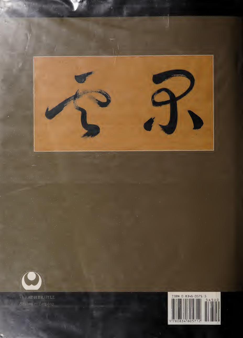
ISBN □-fi34fl-0S71-S 5 6 5 0 0
9 780834 805712
ATHERHILL