district costs for teacher health insurance: an...
TRANSCRIPT

District Costs for Teacher Health Insurance:
An Examination of the Data from the BLS and Wisconsin Robert M. Costrell, University of Arkansas and George W. Bush Institute
Jeffery Dean, University of Arkansas
September 5, 2012, revised December 24, 2012
Abstract Rising health insurance costs have been a source of fiscal distress for school districts. In this
paper, we closely examine data from the National Compensation Survey (NCS) of the Bureau of
Labor Statistics (BLS) to address a few basic questions:
Are district costs for teachers' health insurance higher, on average, than employer costs
for private-sector professionals?
If so, how much of this represents greater access to and participation in employer plans?
How does the difference in employer cost break out between the policies' total premiums
and the employer's share?
What is the impact of collective bargaining on total premiums, employer cost and
employee contributions?
To address the first question, we convert BLS' published estimates of employers' hourly cost to
annual cost, since a shorter work year for teachers inflates the hourly cost of year-round benefits.
Using unpublished BLS data on annual hours worked, we find average annual employer
insurance costs for teachers to be 26 percent higher than for private-sector professionals.
Adjusting for participation rates, the cost is 16 percent higher. Direct estimates of employer
medical premiums present a mixed picture: higher employer premiums for teachers with single
coverage, but not family coverage. In both cases, total medical premiums are higher for teachers
than for private-sector professionals, but for family coverage the teachers cover the extra
premiums themselves. Employees incur out-of-pocket costs, in addition to premiums. One
reason teachers' insurance plans are more expensive is that plan design features (such as
generally lower deductibles) reduce their out-of-pocket costs.
The BLS data show that unionization is associated with higher total premiums, higher employer
costs, and lower employee contributions in both the public and private sectors. This suggests
that the high unionization rate among teachers plays a significant role in districts' higher average
cost. Varying strength of teachers unions across states also helps explain the wide variation in
district costs. In some nonunion states, teacher health insurance benefits are not particularly
generous, due to high out-of-pocket costs (e.g. high deductibles) or high teacher shares of
premiums (as in Arkansas). In other states, with strong unions, district insurance costs can be
very expensive. It is in those states that the opportunities for district cost reduction are most
promising. We examine newly available data from Wisconsin to quantify the impact of that
state's recent change in collective bargaining law. We find a sharp reduction in district costs, 13
to 19 percent, from lower-cost policies and higher teacher contributions.

This paper is a chapter in a forthcoming George W. Bush Institute publication.
1
District Costs for Teacher Health Insurance:
An Examination of the Data from the BLS and Wisconsin Robert M. Costrell, University of Arkansas and George W. Bush Institute
Jeffery Dean, University of Arkansas
September 5, 2012, revised December 24, 2012
Introduction and Summary
Rising health insurance costs1 have been a matter of national concern for some time now
and are increasingly the subject of vigorous public policy debate. The impact on K-12
education has been a harbinger of the broader national debate, as school budgets have been hit
hard by rising health costs for many years, and the recent fiscal strain has brought this into
greater focus. The high-profile battle over Wisconsin's restriction of collective bargaining on
public-sector benefits (Act 10), as well as lower-profile battles in Ohio and Massachusetts, was
to a great extent about health insurance costs for teachers.2
Data from the Bureau of Labor Statistics (BLS) show that the employer cost for teachers'
insurance has risen at an annual rate of 6.6 percent from March 2004 to March 2012, while the
CPI grew at 2.6 percent.3 As a result of this rapid growth, the fringe benefit rate for teachers'
insurance rose from 11.4 percent of earnings in March 2004 to 15.5 percent in March 2012.4
We estimate that teachers' insurance costs currently represent $560 per pupil. This
national average covers a wide range, from states with relatively low employer costs to states
1 Properly speaking, the subject of this paper is "expenditures," not "costs," since the economic meaning of the term
"cost" is the minimum expenditure required for any given output of a specified quality, a concept that embeds the
notion of efficiency. The data examined in this paper cover "expenditures," regardless of their efficiency. We bow
to common usage of the term "cost" (e.g. the BLS ECEC series refers to Employer Cost for Employee
Compensation), since the term "expenditure" becomes cumbersome upon repetition. 2 See Robert M. Costrell, "Oh To Be a Teacher in Wisconsin," Wall Street Journal, February 25, 2011, and
"Collective Bargaining Weakens Cities," Wall Street Journal, November 23, 2011. 3 The CPI for medical care grew at 3.7 percent, the CPI for medical services grew at 4.0 percent, and the GDP
deflator for health care services grew at 2.7 percent. These indexes attempt, to varying degrees, to adjust the raw
figures for improvement in quality, unlike the employer cost figures cited in the text. 4 These data are derived from the BLS ECEC series. The numerator, "insurance," is discussed below. The
denominator is the sum of "Wages and Salaries," "Paid Leave," and "Supplemental Pay," i.e. the dollar payments
recorded in a W-2 statement.
This paper is a chapter in a forthcoming George W. Bush Institute publication.
2
with high ones. Among the latter, we estimate that Wisconsin districts averaged between $850
and $1,000 per pupil in 2011, prior to the reduction in employer costs that followed that state's
change in collective bargaining law.5 These figures do not include insurance costs for other
school employees or retiree health care, which tend to move in tandem with teachers' insurance.
Neither of these costs is considered in this paper, but they can be quite substantial. For
Milwaukee Public Schools employee health insurance (teachers and non-teachers) cost $1,860
per pupil in 2011. Adding in retiree health insurance brought the total to $2,837.6 While these
figures are not representative of the nation as a whole, neither is Milwaukee an isolated example:
many districts in various states are struggling with high health care costs.
Plan of the Paper and Summary
In this paper, we closely examine data from the National Compensation Survey (NCS) of
the BLS to compare district costs for teacher health insurance with employer costs for private-
sector professionals. We specifically address a few basic questions:
Are district costs for teachers' health insurance higher, on average, than employer costs
for private-sector professionals?
If so, how much of this represents greater access to and participation in employer plans?
How does the difference in employer cost break out between the policies' total premiums
and the employer's share?
What is the impact of collective bargaining on total premiums, employer cost, and
employee contributions?
5 These estimates, discussed below, are based on district costs for single and family coverage. We are unable to
provide a single estimate for Wisconsin because we do not know the mix between these two types of coverage. 6 These figures are derived from MPS budget documents. Since 2011, MPS has been able to take measures under
Act 10 to reduce current health care costs and to slow the future growth of retiree health care costs.

This paper is a chapter in a forthcoming George W. Bush Institute publication.
3
To address the first question, we convert BLS' published estimates of employers' hourly
cost to annual cost, since a shorter work year for teachers inflates the hourly cost of year-round
benefits. Using unpublished BLS data on annual hours worked, we find average annual
employer insurance costs for teachers to be 26 percent higher than for private-sector
professionals. Adjusting for participation rates, the cost is 16 percent higher.
Direct estimates of employer medical premiums present a mixed picture: higher
employer premiums for teachers with single coverage, but not family coverage. In both cases,
total medical premiums are higher for teachers than for private-sector professionals. In addition,
teachers contribute less than others for single coverage. For family coverage, teachers contribute
more, thereby covering the higher plan cost themselves. Employees incur out-of-pocket costs,
in addition to premiums. One reason teachers' insurance plans are more expensive is that plan
design features (such as generally lower deductibles) reduce their out-of-pocket costs.
The BLS data show that unionization is associated with higher total premiums, higher
employer costs, and lower employee contributions in both the public and private sectors. This
suggests that the high unionization rate among teachers plays a significant role in districts' higher
average cost. Varying strength of teachers unions across states also helps explain the wide
variation in district costs. In some nonunion states, teacher health insurance benefits are not
particularly generous, due to high out-of-pocket costs (e.g. high deductibles) or high teacher
shares of premiums (as in Arkansas). In other states, with strong unions, district insurance costs
can become very expensive. It is in those states that the opportunities for district cost reduction
are most promising. We examine newly available data from Wisconsin to quantify the impact of
that state's recent change in collective bargaining law. We find a sharp reduction in district costs,
13 to 19 percent, from lower-cost policies and higher teacher contributions.

This paper is a chapter in a forthcoming George W. Bush Institute publication.
4
Employer Health Care Costs: Teachers vs. Private-Sector Professionals
We begin with a basic, top-level question: how do employer health care costs for
teachers compare with other relevant groups such as private-sector professionals? The answers
to this question are harder to come by than one might expect. The most comprehensive national
data published on employer costs, from the Bureau of Labor Statistics, provides estimates of
hourly costs, which is not conceptually ideal, but with the help of unpublished data on annual
hours worked, and some attention to detail (such as part-time vs. full-time weights), one can
arrive at more useful estimates. The conclusion we reach is that annual employer health care
costs for teachers are significantly higher − 26 to 31 percent − than those for private-sector
professionals (controlling for the mix of part-time and full-time). In subsequent sections, we will
drill down below this top level, to analyze the role of access and participation rates,
employee/employer split of premiums, and unionization.
BLS National Compensation Survey: Employer Costs for Employee Compensation
The standard source of data on employee compensation is the BLS National
Compensation Survey (NCS). Specifically, the NCS publishes quarterly estimates of the
Employer Costs for Employee Compensation (ECEC), covering wages and benefits, presented
on a "per hour worked" basis. The item of interest here − employer insurance cost − is published
for 180 groups of employees, at various levels of aggregation, broken down by occupational
groups, industries, ownership (private industry or state and local government), and other
characteristics. One of these groups is "primary, secondary, and special education teachers"
employed by state and local governments (henceforth, "K-12 teachers"), a breakout that has been
reported since 2004, so their insurance cost can be compared with other reported occupational

This paper is a chapter in a forthcoming George W. Bush Institute publication.
5
groups. In addition to the ECEC, NCS publishes other reports that provide valuable
information, as discussed below, but the primary data source for this section is the ECEC.7
These data are the best available for basic comparisons of employer costs, but there are
some issues to consider. One minor issue is the detail of benefit categories. The cost of "health
insurance" (medical, dental, vision, and prescription drugs) is reported for broad occupational
groups in the ECEC. For teachers, however, only the larger category of "insurance" is reported.
This includes life and disability insurance. These other components are small, approximately 5
percent of the total "insurance" category on average, so there is no great loss of precision by
comparing "insurance" costs in lieu of "health insurance."
More specifically, the non-health component of "insurance" for the occupational group
"management, professional and related" is 3.5 percent among state and local government
employees (including teachers) and 7.3 percent for the private sector. This suggests that our
estimates of employer "insurance" cost for private-sector professionals as a ratio of that for
teachers may overstate the true ratio for employer "health insurance" costs by approximately 4
percent. For example, our estimate below that annual "insurance" costs for private-sector
workers in "professional and related" occupations are 79 percent of those for teachers may
correspond to a ratio of 76 percent for "health insurance."
A more significant issue, which has occasioned considerable controversy in debates over
teacher compensation, is that the ECEC data are presented in the form of hourly compensation.
Since the BLS data for annual hours of teachers are much lower than for other full-time workers,
comparisons of hourly compensation have been contentious. For basic salary, the argument is
between those who claim that comparisons of annual pay understate teacher compensation (since
7 The NCS homepage is http://www.bls.gov/ncs/ and the ECEC reports can be found at http://www.bls.gov/ncs/ect/.
This paper is a chapter in a forthcoming George W. Bush Institute publication.
6
teachers have summers off), and those who claim that comparisons of hourly pay overstate
teacher compensation (by implicitly valuing summer vacation at the same hourly rate).
For the purpose of comparing employer insurance costs, the hourly data provide a
striking result: the cost for public K-12 teachers is the highest of all 180 groups reported by the
ECEC. However, unlike the controversy over the salary data, there might be greater agreement
in this instance that the relevant measure is annual cost, rather than hourly cost. A teacher's
insurance covers the full year, since it is impractical to obtain separate coverage for the summer.8
Thus, comparisons of hourly insurance cost − the only ones published by the ECEC − are
arguably misleading, since the annual insurance costs for teachers are spread over fewer hours.
The ECEC computes annual benefit costs, for the numerator of the hourly cost
calculation, but does not publish those estimates, nor the "annual hours worked" that enter the
denominator of the ECEC calculation.9 Annual costs can, however, be estimated using
unpublished data on annual hours worked.10
The BLS has kindly provided the authors with a
special tabulation of annual hours worked for selected occupational groups at our request. These
tabulations estimate annual hours worked for K-12 teachers at 1,297 in March 2012 vs. 1,850 for
private-sector full-time "professional and related" occupations, so the comparisons of annual
benefit costs will be quite a bit less tilted toward teachers than those of hourly costs.
8 For retirement costs, one of us has previously argued that it is useful to compare percent of earnings – a measure
that is independent of whether benefit and earnings are measured in annual or hourly terms. This measure is
informative because both defined contribution and defined benefit retirement plans are typically specified in terms
of percent of salary, either in contributions or in benefits (see Robert M. Costrell and Michael Podgursky, "Teacher
Retirement Benefits," Education Next, Spring 2009). Thus, retirement costs move proportionally with salary. As
noted there, this is unlike health benefits, where the annual dollar cost is fixed. 9 See Richard Schumann, "Work Schedules in the National Compensation Survey," July 28, 2008.
10 See Jason L. Ford, "The New Health Participation and Access Data from the National Compensation Survey,"
October 26, 2009, Tables 4 and 6 for an example. This method does not exactly reproduce the underlying ECEC
figures, because the sequence of aggregation differs. The ECEC calculates annual cost at a small cell level, and
divides by annual hours worked to determine hourly cost at that level, before aggregating to reported levels using
employee weights; the unpublished estimates of annual hours worked are calculated at the reported levels and
applied to the hourly costs at that level to estimate annual costs.

This paper is a chapter in a forthcoming George W. Bush Institute publication.
7
Before examining these estimates of annual costs, it is important to dispense with one
non-issue, the relative accuracy of the "hours worked" estimates for teachers and other
professionals. The debate over BLS hourly salary figures for teachers often turns on how many
work hours are unrecorded for teachers (lesson preparation, grading, etc.) as compared to others.
However, this is not relevant to our estimate of annual costs. If the "hours worked" figure is too
low, then the hourly cost estimate will be too high, but the annual cost that is backed out will be
accurate, since it is recovered by using the low estimate of hours worked.
The final issue to consider is that for some occupational groups the data pool part-time
and full-time employees. K-12 teachers comprise one such group, but in fact 97 percent of this
group is full-time, according to an unpublished BLS tabulation. Thus, our estimate of the annual
cost for K-12 teachers is very close to the full-time cost, and can be usefully compared with full-
time private-sector professionals (for whom this breakout is provided in the ECEC data).
Alternatively, we can construct a composite of private-sector professionals that mimics the 97
percent full-time composition of the K-12 teachers group.
Annual Employer Insurance Costs of Teachers vs. Other Occupations
The ECEC data for March 2012 report hourly employer insurance costs of $6.60 for
"primary, secondary, and special education school teachers" employed by state and local
governments. To convert this to an annual figure, we use the unpublished BLS estimate of
1,297 annual hours worked. This results in an annual employer cost of $8,559.
There are two points about this figure (and corresponding ones below) to be aware of,
which will be discussed in subsequent sections. First, these estimates do not include employee

This paper is a chapter in a forthcoming George W. Bush Institute publication.
8
costs. Second, they are averages that include those employees who do not incur any employer
health care costs because they are not covered by or do not participate in an employer plan.
Bearing these points in mind, we compare the annual employer cost for K-12 teachers
with other occupational groups (see Table 1). The occupational group private "professional and
related" provides a potentially informative comparison group for public school teachers, since
teachers are categorized under "professional and related" occupations.11
The ECEC provides
hourly costs of full-time and part-time private-sector workers in this occupational group, as well
as for the pooled group, which is 83 percent full-time.12
Thus, of the three reported groups –
full-time, part-time, and pooled – the full-time is closest in composition to teachers, with 97
percent full-time. For that group, hourly employer insurance cost ($3.80) is only 58 percent of
that for teachers, but their annual employer cost ($7,030) is 82 percent, because the annual hours
worked (1,850) is quite a bit higher.13
We can refine this estimate by constructing a composite
that is 97 percent full-time, to match the composition of K-12 teachers. (We have bolded this
row in Table 1, along with K-12 teachers, as our preferred comparison.) For this composite, we
calculate hourly insurance cost ($3.74) and annual hours worked (1,821), for an annual insurance
cost ($6,803) that is 79 percent of that for teachers. Considering the bias from measuring
"insurance" rather than "health insurance," the ratio may be closer to 76 percent, as discussed
above. Thus, we conclude that the annual employer cost for teachers' health insurance is 26 to
31 percent higher than for private professionals. Nearly identical results hold for the broader
11
The occupational groups in this category are: computer and mathematical science; architecture and engineering;
life, physical, and social science; community and social services; legal; education, training, and library; arts, design,
entertainment, sports, and media; and health care practitioner and technical (this includes nurses, but does not
include health care support occupations, such as health aides). 12
This unpublished figure was provided by the BLS, and can also be inferred from the published compensation
figures for the full-time, part-time, and pooled groups. 13
For "annual hours worked," the BLS provided the 11 estimates for the pooled and full-time groups in Table 1. We
calculated the 3 estimates for part-time groups, using the pooled and full-time estimates and the full-time share of
the pooled group (unpublished). We also calculated the 3 estimates for the 97 percent composites.
This paper is a chapter in a forthcoming George W. Bush Institute publication.
9
occupational category, private "management, professional and related," calibrated in the same
way to 97 percent full-time.14
A much wider gap exists between K-12 teachers and "all" private
sector workers (also calibrated to 97 percent full-time), as Table 1 indicates.
We turn now to comparisons of employer insurance costs for K-12 teachers with groups
of state and local government workers. The top panel of Table 1 presents data for "professional
and related," "management, professional and related," and "all" state and local government
workers. The ECEC does not provide a full-time breakout of these data for these workers, only
the pooled data, briefly considered here. The annual employer insurance costs for these groups
are 86 to 89 percent of those for K-12 teachers, but these figures reflect two opposing biases. On
the one hand, these ratios are tilted toward 100 percent because K-12 teachers comprise a
significant portion of these groups (41, 35, and 19 percent, respectively). Using these weights,
we can back out K-12 teachers from these groups. As a result, we estimate that annual employer
insurance costs for the non-teaching employees in these groups, as a percent of K-12 teachers,
are 76, 83, and 81 percent, respectively. On the other hand, these groups include only 84 to 87
percent full-time employees, fewer than the K-12 figure of 97 percent.15
Since part-time
employees are less likely to be offered employer health insurance, this reduces the average cost
of the pooled groups, so caution is advised for these comparisons with K-12 teachers.
In addition to the broad occupational groups, we also consider registered nurses, often
considered comparable to K-12 teachers. Like teachers, nurses are categorized under
"professional and related," and that is the only other professional occupation for which ECEC
reports insurance costs. The available data, for "civilian" nurses,16
cover both private and state
14
The full-time component is 88 percent for this group and 74 percent for all private employees. 15
The 84 to 87 percent figures are unpublished and pertain to the published groups that include K-12 teachers. 16
The ECEC also reports hourly insurance costs for private registered nurses in the "health care and social
assistance" industry, and in hospitals. However, corresponding data for annual hours worked were not available.

This paper is a chapter in a forthcoming George W. Bush Institute publication.
10
and local employees. For this group, we estimate annual employer insurance costs are 71
percent of those for teachers, but again, caution is advised, since it is only 67 percent full-time.
Figure 1 presents our estimates of annual employer insurance costs from 2004 (the first
year of available K-12 teacher data) to the present.17
What this adds to the snapshot from Table
1 is a picture of widening gaps between K-12 teachers (the thick red line) and private-sector
professionals (the thick blue line, representing the 97 percent full-time composite), as well as
other groups. Annual employer insurance costs for K-12 teachers rose 67 percent over this
period, compared to 49 percent for private professionals (and similarly for other groups).18,19
As
a result, the gap between annual employer insurance costs for teachers and private-sector
professionals rose from 12 percent in 2004 to 26 percent in 2012.20
The latter part of this period,
however, saw some narrowing of the gap, from 30 percent in 2008 and 33 percent in 2010.
Employer Health Care Costs for Participating Employees
As mentioned above, the ECEC estimates for employer insurance costs are averages over
those employees who are covered by an employer's plan and those who are not. Employees may
not be covered either because no plan is offered (particularly at issue for part-time employees) or
because the employee chooses not to participate (e.g., due to coverage by the employer of one's
17
The unpublished data on annual hours worked, provided by BLS, go back to 2007, so those estimates are used for
2004-2006. This is unlikely to introduce significant error because the estimates are essentially unchanged for the
private groups over 2007-2012, and increased by 3.1 percent for K-12 teachers. If we were to extrapolate backwards
for 2004-2006 instead of using the 2007 annual hours, we would find slightly narrower gaps in 2004, and, hence,
greater widening of the gaps since then. 18
These growth rates do not net out inflation, but that does not affect the comparisons. 19
Figure 1 also depicts K-12 teacher costs rising faster than for state and local groups. However, there appears to be
a break in the data for the state and local groups, flagged by the downward blip in 2007 Q4. This was the quarter
that NCS replaced its state and local government establishment panel in its entirety for the first time in 10 years
(BLS, Handbook of Methods, Chapter 8, "National Compensation Measures," p. 3). It seems reasonable to suppose
that this had a measurable impact on the state and local estimates, but not on the K-12 teacher component, since
there is no blip in that series. Thus, we view the blip as spurious, and we do not fully credit the difference in 2004-
2012 growth rates between teachers and other state and local workers. 20
Civilian nurses (not depicted in Figure 1) are an exception to this pattern; their employer costs rose a bit faster
than K-12 teachers and the gap narrowed from 45 percent to 41 percent.

This paper is a chapter in a forthcoming George W. Bush Institute publication.
11
spouse). The NCS Employee Benefits Survey (EBS) provides annual estimates of coverage rates
for health care benefits that illustrate these points.
Table 2 presents the available estimates for groups previously depicted, as well as some
constructed estimates, discussed below. EBS publishes the "Access Rate" – the percentage
offered insurance by employers; the "Take-up Rate" – the percentage of employees offered
insurance who sign up; and the "Participation Rate" – the percentage of employees participating
in an employer benefit, the product of the Access Rate and Take-up Rate. The coverage rates for
"health care" are defined by the EBS as coverage for any of the sub-categories: medical, dental,
vision, and outpatient prescription drugs. Table 2 also presents the Participation Rate for
"medical care" benefits, the most expensive component of "health care."21
Almost all K-12 teachers (98 percent, first column) have access to employer-provided
health insurance. However, the Take-up Rate (second column) is only 89 percent, so the
Participation Rate (third column) is 87 percent. Coverage is very similar to that of "all" full-time
employees in the state and local sector.22
It exceeds that of the pooled set of all state and local
employees (which is, in turn, quite similar to those of the pooled state and local professional
groups), reflecting the higher access rate for full-time than part-time employees.
We would like to compare the K-12 participation rate with that of private-sector full-time
professionals, or, better yet, the 97 percent composite that we focused on in Table 1. Unlike the
ECEC, however, the EBS does not provide the full-time breakout for this group. We can,
however, construct a reasonable approximation of what the full-time participation rate must be, if
we are willing to assume a value for the part-time participation rate. That assumed value can be
21
In general, the access rates are virtually identical for "medical care" and "health care", since it is rare for an
employer to offer dental, vision, or drug, without also offering medical. However, the take-up rates are often
significantly higher for "health care" than for "medical," since employees may choose to be covered by one's
spouse's medical plan, and then add separately one of the other benefits from one's own employer. 22
The full-time breakout for compensation of these workers is not reported in the ECEC data, considered above.

This paper is a chapter in a forthcoming George W. Bush Institute publication.
12
used with the known weight for full-time (83 percent) and the known combined participation rate
(71 percent) to infer the full-time participation rate. Specifically, we see from Table 2 that the
part-time participation rate for all private employees is 14 percent, and for all state and local
employees it is 20 percent. It seems reasonable to guess that the part-time participation rate for
private professionals is in the 14 to 20 percent range. If so, the full-time participation rate can be
inferred to lie between 81 and 83 percent. Fortunately, this rate is not very sensitive to the
assumed part-time participation rate.23
Thus, we shall not go far wrong if we take a middling
assumption of 17 percent part-time participation rate, which implies a full-time rate of 82
percent. Finally, we can use these estimates to construct the participation rate for our 97 percent
composite: 80 percent. This is somewhat lower than the 87 percent rate for K-12 teachers.
These participation rates can help shed light on the employer health insurance cost for K-
12 teachers and other groups presented in Table 1. Since non-participating employees incur no
cost for employers, we can divide the average cost from Table 1 by the participation rate to
estimate the cost for participating employees, a calculation suggested by the BLS.24
Thus, for K-
12 teachers, dividing the average annual employer cost of $8,559 by their 87 percent
participation rate yields a cost of $9,838 for participating teachers. To be precise, this represents
average "insurance" cost per participant in "health insurance." That is, it includes life and
disability insurance, but as we have seen above, this adds little to the estimate.
A potentially more important caveat is that some of the "health care" participants only
use employer non-medical benefits (dental, vision, or outpatient prescription drugs). As the last
two columns of Table 2 indicate, this group comprises 8 - 10 percent of "health care"
participants. Our calculation produces a weighted average of non-medical benefits, for that
23
The inferred full-time rate varies with the assumed part-time rate by the ratio of the weights: 0.17/0.83. 24
See, for example, Jason L. Ford, "The New Health Participation and Access Data from the National
Compensation Survey," October 26, 2009.

This paper is a chapter in a forthcoming George W. Bush Institute publication.
13
group, and, for medical care participants, the medical benefits plus any non-medical benefits they
may choose. Consequently, these estimates cannot be directly compared with the medical
premiums presented in the next section.
Our estimates are presented in Table 3. For the state and local groups Table 1's estimates
of annual insurance costs were 86 to 89 percent of those for teachers. Using our estimates for
participating employees, this rises to 94 to 97 percent. Backing out K-12 teachers from these
groups, we found ratios of 76 to 83 percent above, and for participating employees, this rises to
83 to 90 percent.25
Again, these estimates do not control for their lower full-time percentage.
For private-sector "professional and related" workers – our main comparison group – we
are able to take our 97 percent full-time composite estimates for average employer insurance cost
($6,803, Table 1) and the corresponding participation rate (80 percent, Table 2) to estimate the
annual cost for participating employees ($8,492, Table 3). This is 86 percent of that for teachers.
Before factoring out non-participants, we found a ratio of 79 percent (Table 1), so the
participation rate explains less than half of the gap. Adjusting for the "health insurance" vs.
"insurance" bias, the employer cost of participating private professionals may be as low as 83
percent of that for teachers. Equivalently, the annual employer health insurance cost for
participating teachers is 16 to 21 percent higher than for private-sector professionals.
Employer Costs for Medical Insurance Premiums
The EBS collects data on premiums for employer-provided medical care benefits. These
data pertain to covered workers, so no adjustment for participation rates is required. As
25
Some states (Massachusetts, Wisconsin, and Ohio) have found the employers' insurance cost for teachers to
materially exceed those for state employees, and this has driven reform efforts (see Costrell, "Collective Bargaining
Weakens Cities," WSJ, November 2011).

This paper is a chapter in a forthcoming George W. Bush Institute publication.
14
discussed above, these data are not directly comparable to our estimates for health care costs.26
The medical premiums are broken out by single and family coverage; a composite average is not
reported, but these data allow us to compare the cost of comparable policies. In addition, they
provide information on employee contributions, examined below.
Table 4 provides the most recent data on employer premiums, for March 2012 (converted
from monthly to annual dollar amounts). Although the data for most of these groups pool part-
time and full-time, they are likely very close to the full-time data, as indicated by the premiums
for "all" and "all, full-time" for the private sector and state and local government.
Employer costs for single coverage of private-sector professional employees are 82
percent of those for teachers, but for family coverage, they are 104 percent – slightly higher.
This is a notable shift in the last few years, as can be seen from Figure 2, which depicts the dollar
amounts of the gap between employer costs for teachers and private-sector professionals. As
recently as 2009, the employer premium for single coverage was $1,361 higher for teachers than
for private-sector professionals, compared to $998 today and for family coverage it was $29
higher instead of $388 lower. This suggests that under prolonged fiscal distress some districts
have begun to adjust their policies toward private sector norms. Although not directly
comparable with our estimates of insurance costs in Figure 1, there, too, we found some
narrowing of the gap over the last few years, as mentioned above.
To summarize, neither set of NCS data − those presented in Table 3 or 4 − provides the
full picture comparing employer costs for participating teachers and private-sector professionals,
but together they add to our understanding. The data in Table 3 were based on the ECEC data,
26
In addition to the difference between "health care" and "medical care," there are some differences in data
collection. The BLS, Handbook of Methods, Chapter 8, "National Compensation Measures" (p. 20), states that for
estimates of employer and employee medical premiums, "The calculations are based, not on actual decisions
regarding medical coverage made by employees within the occupations, but rather on the assumption that all
employees in the occupation have identical coverage."

This paper is a chapter in a forthcoming George W. Bush Institute publication.
15
collected specifically to measure employer costs. They do not tell us how much of the gap
between teachers and private-sector professionals is due to a different mix of family and single
coverage (or, for that matter, in which direction the difference tilts). From the viewpoint of
district finances, however, this may be irrelevant. Indeed, in some states, district contributions
are identical for single and family coverage, with employees picking up the difference. Financial
considerations may be leading other states to move in that direction.27
Conversely, the EBS data
on premiums offer useful detail not available in the ECEC data, to be explored further below.
Total Medical Premium and Employee/Employer Shares
According to the EBS data on medical premiums, employer costs are higher for teachers
than private-sector professionals with single coverage, but not for family coverage. One factor
in determining employer costs is the share of total premiums paid by the employee. That is,
employer costs can be high due to higher-priced policies or lower employee shares.
Tables 5 and 6 examine total medical premiums and the employer/employee split using
March 2012 data from the EBS. 28
Table 5 considers single coverage. The employer share of the
single coverage premium is higher for teachers (and other state and local employees) than for
private professionals, 87 percent vs. 81 percent. This is part of the story for teachers’ higher
employer cost, but not the major part. The middle panel depicts the implied total premium for
single coverage, calculated by dividing the employer premium (reproduced here from Table 4)
by the employer share. For example, dividing the employer premium for teachers, $5,494, by the
87 percent employer share implies $6,315 total premium, of which $821 is contributed by the
27
We have also seen instances of this for retiree health insurance. 28
A distinction to bear in mind is between medical "cost" (i.e. “expenditures,” see note 1) and "premiums." For the
employer these are the same, but for employees the cost includes out-of-pocket costs (deductibles, etc.) as well as
premiums. Thus, when referring to employer expenditures, we use cost and premium interchangeably, but not for
employees. For the two together, "total premiums" more accurately describes the data than "total costs."

This paper is a chapter in a forthcoming George W. Bush Institute publication.
16
employee.29
Compared to private sector professionals, we find that three-quarters of the higher
employer cost for teachers is due to more expensive policies ($764 of $998), and one-quarter
($234) is due to the lower employee contribution, as shown in the right panel of Table 5.
Table 6 considers family coverage. The employer share for teachers' family premiums is
lower than for private-sector professionals, 66 percent vs. 71 percent. The total premium for
teachers' policies is somewhat higher ($598), but the employee contribution is higher yet ($986),
so the employer cost is lower ($388). That is, family policies for teachers are more expensive
than for private-sector professionals, but the teachers more than cover the difference.
Figure 3 summarizes the 2012 premiums of teachers and private-sector professionals for
single and family coverage, and Figure 4 provides the same information for 2008. For both
single and family plans, total premiums have been higher for teachers than for private-sector
professionals throughout this period. In addition, for single coverage, teachers have paid less
than private-sector professionals. For family coverage, teachers have paid more, covering or
more than covering the higher cost of their policies. For both single and family coverage, the
gap in employer costs shifted away from teachers, as depicted also in Figure 2.
Plan Provisions
There are many reasons that insurance plans can differ in total premiums, but some of the
main ones are those provisions that govern out-of-pocket expenditures by the employee, over and
29
Another estimate of total premiums can also be derived from published EBS data. EBS reports employee
contributions to those plans that require one (i.e. contributory plans), and also the percent of participating employees
in such plans. From these data, one can calculate the overall average employee contribution and add that to the
average employer premium to derive the total premium. For example, 64 percent of participating teachers are in
contributory plans and they pay an average of $1,395 per year. The average employee contribution over both
contributory and non-contributory plans is 64 percent of $1,395, or $893, for a total premium of $6,386. This differs
by about 1 percent from the estimate for teachers in Table 5. All of the single coverage estimates are within about 1
percent, as one would expect since they are based on the same underlying data. The same holds for the family
coverage estimates below.
This paper is a chapter in a forthcoming George W. Bush Institute publication.
17
above the employee premium. These features include deductibles, co-payments, co-insurance,
and out-of-pocket maximums. The NCS publications on Health Plan Provisions provide some of
these details, including deductibles and out-of-pocket maximums.
Figure 5 depicts the most recent data (2011) on deductibles for K-12 teachers and private-
sector professionals. These data are for fee-for-service plans, which cover the large majority of
participating employees (76 percent for K-12 teachers and 75 percent for private-sector
professionals). NCS reports the deductibles for the percentiles displayed, 10th, 25th, 50th
(median), 75th, and 90th. The family deductibles are represented by the solid lines and
individual deductibles by the dashed lines – blue for private-sector professionals and red for K-
12 teachers. A few data points are missing; they are filled by substituting "management,
professional, and related" for "professional and related" and "teachers" for "K-12 teachers."
The family and individual deductibles are higher for private-sector professionals than K-
12 teachers, at every percentile, except the median individual deductible is the same ($500).
NCS does not report mean values, but we can calculate a rough approximation from these data
by ascribing the value at any given percentile to the neighboring range. For example, we take
the deductible at the 25th percentile and assume that it holds from the 17.5 percentile to the 37.5
percentile (the midpoints of the two adjacent intervals). By this method, we estimate that the
mean family deductible for teachers is $1,378 vs. $2,238 for private-sector professionals, a
difference of $860. For the mean individual deductible, we estimate $664 for teachers vs. $896
for private-sector professionals, a difference of $233.
For other measures, such as out-of-pocket maximums, the pattern is more mixed.
Overall, however, the data suggest that some portion of the higher total premiums for K-12
teachers, depicted in Figure 3, is due to lower out-of-pocket costs for teachers. This does not

This paper is a chapter in a forthcoming George W. Bush Institute publication.
18
affect our comparisons of district cost, but it does mean that the comparison of employee
premiums is not the full story on teacher costs. While it is accurate to state, as we did above, that
teachers pay more to get more in the way of family coverage, it is more precise to state that they
pay more up front in premiums and then pay less out-of-pocket. Whether they get more in the
way of health services (higher quantity or quality) is impossible to tell from the available data.
Union vs. Nonunion Employees in the Public and Private Sectors
The NCS data allow us to compare medical insurance coverage and premiums for union
vs. nonunion workers in the public and private sectors.30
These breakouts are not available for
K-12 teachers or private-sector professionals, but they are available for the state and local
government sector and the private sector. Since we have found that teacher health care costs
track the state and local sector to some extent, this level of aggregation can still be informative.
Table 7 shows the medical care access, take-up and participation rates for union and
nonunion workers in the state and local sector and private industry. Union workers have almost
universal access (about 95 percent) to employer-provided insurance in both sectors, and their
participation rate is essentially the same in both sectors (about 79 percent). Nonunion workers
are less likely to participate in an employer-provided plan, in large part because their employer is
less likely to offer one. The difference from union workers, however, is smaller in the state and
local government sector, where the nonunion participation rate is 68 percent, compared to 48
percent in the private sector.31
Thus, in accounting for the higher coverage rates in the state and
30
The NCS defines union status by whether the employee belongs to a collective bargaining unit. 31
Time series data for 2007-2012 show no trend in the participation rates of any of the four groups. There has been
a rise in the private sector union access rate, from 88 percent to 94 percent, but this has been offset by a decline in
that group's take-up rate, from 88 percent to 83 percent.

This paper is a chapter in a forthcoming George W. Bush Institute publication.
19
local sector vs. private industry, we find that this is associated with the higher unionization rate
in the public sector, but also reflects that sector's higher coverage for nonunion workers.
We now turn to employer and employee premiums for union and nonunion employees in
the two sectors. The data are presented in Figure 6, for single and family coverage. These data
show that in each sector, for each type of coverage, the employer cost is higher for union
workers. They also show that the total premium is higher for union workers (albeit barely so for
family coverage in the private sector). Finally, they show lower employee contributions for
union workers, except for single coverage in the state and local sector.
The state and local sector as a whole exhibits the same patterns in comparison to the
private sector as the union sector does to the nonunion sector: higher employer costs, higher
total premiums, and lower employee contributions, for both types of coverage (see Tables 5 and
6, rows labeled "all"). In part, this reflects the higher unionization rate for the state and local
sector: 50 percent vs. 14 percent in this dataset.32
Using a standard shift-share analysis, that
higher unionization rate can be shown to be associated with some portion of each of these
patterns, i.e. the higher employer costs, higher total premiums, and lower employee contributions
in the state and local sector, for both types of coverage.
As we have seen, however, these are not entirely the patterns we observed between K-12
teachers and private-sector professionals: they hold for single coverage, but not family coverage.
Clearly, whatever impact unionization may have, there are other confounding factors at play in
explaining the national averages for teachers vs. private professionals.
32
These estimates are for employees in the NCS Employee Benefits Survey participating in employer medical
insurance. They will differ from other estimates. It should also be borne in mind that the sectoral averages may
understate the difference between teachers and private-sector professionals. Terry Moe reports that 64 percent of
teachers are covered by collective bargaining, based on data from the NCES Schools and Staffing Survey (Special
Interest: Teachers Unions and America's Public Schools, Brookings Institution, 2011, p. 55).

This paper is a chapter in a forthcoming George W. Bush Institute publication.
20
There is one state, however, in which we have an arguably natural experiment in
changing teacher union strength: Wisconsin. If union strength results in higher employer costs,
higher total premiums, and lower employee contributions (as illustrated in Figure 6), then the
removal of teacher health benefits from collective bargaining in Wisconsin might be expected to
have the opposite effect: reducing employer costs, reducing total premiums, and raising
employee contributions. As we will show, this is exactly what happened.
Wisconsin: Before and After Act 10
Wisconsin was the first state in the nation with public sector collective bargaining, and
has long had one of the nation's strongest teachers unions.33
It has also long been a state with
very expensive teacher medical insurance. As the data below will show, average district costs in
2011 were $8,311 and $19,356 for single and family coverage. These premiums are about 50
percent and 80 percent higher than the 2011 national averages, $5,500 and $10,723. Wisconsin
is in a region with higher than average costs (East North Central), but the NCS data on employer
premiums for state and local employees in 2011 indicate that the geographic factor only raised
single coverage rates by 10 percent above the national average and family coverage by 29
percent. Other factors have played a greater role in Wisconsin's high district costs for teachers'
insurance, and the state's collective bargaining environment was an important contributor.
Prior to Act 10, Wisconsin's highly contested 2011 measure that restricted public sector
collective bargaining privileges, teachers' insurance was subject to local collective bargaining.
An important feature of the districts' collective bargaining landscape was the WEA Trust,34
a
vehicle to provide medical insurance to Wisconsin public schools that was created in 1970 by the
33
Wisconsin's unionization rate is 99 percent, with 98 percent covered by collective bargaining (Moe, 2011, p. 54). 34
For useful background information, see James Miller, Scott Niederjohn, and Chad Cotti, "Health Insurance for
Wisconsin Public Schools: The Case for Competitive Bidding," Wisconsin Policy Research Institute, January 2005.

This paper is a chapter in a forthcoming George W. Bush Institute publication.
21
Wisconsin Education Association Council (the state teachers' union, an affiliate of the NEA)35
and that is still closely associated with WEAC.36
Quite frequently, this meant that local
collective bargaining agreements restricted districts to purchasing insurance from the WEA
Trust, thereby limiting districts’ ability to shop for lower-cost alternatives. This feature was long
a matter of concern in Wisconsin and even prior to Act 10 there was significant movement away
from WEA Trust plans, from almost 80 percent of the teachers' market in 2004 to about 60
percent in 2010.37
However, such moves were often difficult,38
and on the eve of Act 10, most
districts still purchased their insurance from WEA Trust, even though these plans (and
Wisconsin teacher plans more generally), were often more expensive than other plans.39
In addition, teacher contributions to their medical premiums were generally low. In the
last school year before Act 10 (2010-11) teachers made no contribution at all for single coverage
in 43 percent of the state's districts, nor for family coverage in 31 percent.40
By comparison, the
2011 non-contributory rates among teachers in the national data discussed above were 39 percent
and 16 percent respectively. Among private-sector professional employees nationally the 2011
non-contributory rates for single and family plans were 17 percent and 9 percent. The average
contribution rates among Wisconsin teachers were also quite low, as shown below.
35
See the WEA Trust website: http://www.weatrust.com/AboutWEATrust/CompanyProfile.aspx . 36
http://www.politifact.com/wisconsin/article/2012/may/21/behind-rhetoric-wea-trust-and-school-health-care-c/ 37
Christian D'Andrea, "Health Care Trends in Wisconsin's School Districts: A Look at the Expanding Market of
Teacher Health Insurance," MacIver Institute, January 2011. This report tabulates the movement from 2004 to 2010
and estimates the cost savings. Barry Forbes of the Wisconsin Association of School Boards places WEA Trust's
2010-11 market share at about two-thirds: http://www.politifact.com/wisconsin/article/2012/may/21/behind-
rhetoric-wea-trust-and-school-health-care-c/. Education Action Group Foundation, "A crucial challenge for
Wisconsin schools: Escaping the financial shackles of WEA Trust insurance," Fall 2010, p. 4, estimates 64 percent. 38
See the WPRI and EAG reports above for specific accounts of the difficulties in switching out of WEA Trust,
prior to Act 10. Even when collective bargaining agreements allowed districts to search for competitive bids, there
were many documented cases where the WEA Trust failed to produce the claims data necessary for districts to
provide to prospective competitors to prepare bids, and penalized districts that sought such information. 39
In addition to the reports cited above, see HC Trends, "How Teacher Health Plans Compare with Plans Offered by
Milwaukee-Area Employers," April, 2011. 40
These percentages had gradually drifted downward from 59 percent and 44 percent, respectively, in 2002-03.
These data are from the WASB survey discussed below.

This paper is a chapter in a forthcoming George W. Bush Institute publication.
22
In 2010, both candidates for governor (Republican Scott Walker and Democrat Tom
Barrett), as well as the Wisconsin Association of School Boards (WASB) advocated measures to
help localities move into less expensive plans without requiring agreement from local unions
(although Barrett's plan exempted teachers). The state employees' plan received particular
attention. State law already allowed localities to place employees in that plan, but under
collective bargaining such moves required local union agreement.41
Thus, both parties, to
differing degrees, supported changes to collective bargaining law covering benefits – a point that
was lost in the subsequent turmoil.
Act 10, proposed by Governor Walker and enacted by the Legislature in 2011, removed
benefits from local collective bargaining, thereby giving districts greater freedom to shop for less
expensive plans and negotiate premiums. This has resulted in a significant loss of business for
WEA Trust and in negotiated reductions in premiums for business that it retained.42
The law
also allowed districts to establish higher employee contributions. Act 10 mandated a maximum
employer share for those districts that purchase insurance from the state's group insurance board:
employer contributions are capped at 88 percent of the board's lowest cost plans in the service
area.43
This provision does not directly bind the vast majority of districts, which buy insurance
from other entities (including WEA Trust), but it does seem to have established a benchmark that
is being widely followed, of setting employee contributions in the vicinity of 12 percent.44
These changes were intended to achieve savings on district benefit costs, from adopting
plans with lower premiums and increasing teacher contributions. Since the passage of Act 10,
41
See the WPRI report for information on and analysis of this long-standing issue. 42
http://www.politifact.com/wisconsin/article/2012/may/21/behind-rhetoric-wea-trust-and-school-health-care-c/ 43
In addition to the legislative language of Act 10 (Section 77), see the guidance issued by WASB and also the
clarifying rule set by the Department of Employee Trust Funds, which administers the state plan. 44
Prior to Act 10, teacher contributions were under 10 percent in the vast majority of districts: 84 percent for single
coverage and 74 percent for family.

This paper is a chapter in a forthcoming George W. Bush Institute publication.
23
evidence has accumulated of individual districts saving money,45
and, more recently, data have
become available to evaluate savings statewide.46
Data on Medical Premiums in Wisconsin Districts
The Wisconsin Association of School Boards (WASB) has published annual data on
medical premiums paid by districts and teachers since 2002-03.47
These data are reported for
single and family coverage. The 2011-12 rates (hereafter, 2012) are the first to be affected by
Act 10. These rates may not reflect the Act's total impact, because some districts have yet to
renegotiate their insurance. Some are under insurance contracts predating Act 10, including those
with pre-Act 10 collective bargaining agreements that have not yet expired. Others that have
been free to shop around may have chosen to keep the same insurer and similar plan designs.
One weakness of the WASB data is that, in each year, a number of districts do not
respond to the survey. While every district appears in at least one year (Wisconsin currently has
425 districts), the number reported has varied from 277 to 426, for the years 2003 to 2011. The
2012 data available to date (updated by WASB on October 8, 2012) cover 184 districts.
Since variable rates of missing data may introduce bias into our estimates of annual
changes in premiums, we construct a chained estimate of yearly changes using only districts that
appear in consecutive years. This is analogous to estimates of house prices that link a sales price
to the same house's price on its previous sale. In our case, each year's estimate of annual change
45 MacIver Institute, "Wisconsin School Districts are Switching Health Care Providers/Plans to Create Savings in
2011." 46
See also Wisconsin Taxpayers Alliance, "After the Storm: School Funding in 2012," The Wisconsin Taxpayer,
October 2012, pp. 1-7. 47
Wisconsin Association of School Boards, "Teacher Health Insurance Cost and Contribution Comparisons." The
data appear to exclude dental and vision, so, following BLS usage, we refer to "medical" instead of "health."

This paper is a chapter in a forthcoming George W. Bush Institute publication.
24
is based on the set of districts that also appears in the prior year's data. Of the 184 districts
reporting in 2012, 130 also reported in 2011.
Another database that we examine is from the Wisconsin Department of Public
Instruction (DPI). DPI compiles individual compensation data, including fringe benefits. This
data set has the advantage of completeness, covering virtually all districts. It has the additional
advantage of going back more years. The disadvantage is that this data set does not break out
health or medical benefits from the overall fringe benefit cost.48
However, using what we know
about the impact of Act 10 on district pension costs, the change in trajectory of total fringe costs
reaffirms our findings on medical insurance costs from the WASB data.
Trends in District Medical Insurance Premiums: WASB Data
Figure 7 presents average district premiums for medical insurance in Wisconsin, for
single and family coverage. The main takeaway, which we will closely dissect, is the dramatic
drop in district costs following Act 10, after years of steady growth.
Figure 7 presents weighted and unweighted averages across all reporting districts in any
given year. The unweighted averages replicate the estimates reported by WASB.49
The
weighted averages use teacher FTE data from Wisconsin's Department of Public Instruction. Up
through 2010 the differences between the weighted and unweighted averages were minor. In
2011, however, the weighted averages grew noticeably more slowly than the unweighted
averages, particularly for family coverage: $220 vs. $892 (as can be calculated from the data in
Figure 7). One reason is that a number of large districts that had previously reported their data to
48
The recent study by the Wisconsin Taxpayers Alliance, cited above, draws on DPI data for total school budgets,
which does break out health insurance costs, but does not break out teachers from non-teaching personnel. 49
Estimates are converted from monthly to annual by a factor of 12, consistent with guidance received from WASB,
as well as spot checks of individual district data on the web.
This paper is a chapter in a forthcoming George W. Bush Institute publication.
25
WASB stopped doing so in 2011, most notably Milwaukee (far and away the largest district in
the state). Up until then, the larger districts had generally included both high-cost and low-cost
plans, as indicated by how close the two curves had been. Milwaukee, however, was among the
highest-cost districts in the state in 2010, so its exclusion from the data in 2011 had a detectable
negative impact on the weighted average, slowing its rate of growth. This example illustrates the
general point that although weighted averages are usually more informative for examining cost
levels, the changes in weighted averages can be more sensitive to missing data that vary by year.
The weakness in the estimates of annual change from these averages is that the districts
compared in any pair of years will not always match. The chained estimates are constructed to
avoid this problem. For example, our chained estimates for the 2010-11 change are based on the
265 districts for which we have data on both years, whereas our averages of the raw data for
2010 and 2011 are drawn from 390 and 277 districts, respectively. The weighted and
unweighted chained estimates for the 2010-11 change ($629 and $703, respectively, for family
coverage) are much closer to each other than are the changes in the weighted and unweighted
averages ($220 and $892 as discussed above). Thus, the chained methodology reduces spurious
differences between weighted and unweighted estimates of growth.
That said, real differences do remain between weighted and unweighted estimates, even
with chaining. For example, the weighted and unweighted chained estimates of the 2011-12
change in district cost of family coverage are -$2,010 and -$2,803, respectively, while the
corresponding estimates from raw averages are -$2,165 and -$2,763. Thus, the difference
between weighted and unweighted estimates for 2011-12 is not an artifact of the change in
missing data. Rather, there appear to have been systematically larger reductions in employer

This paper is a chapter in a forthcoming George W. Bush Institute publication.
26
premiums in the small districts than the large ones after Act 10, at least in those districts that
were common to both the 2011 and 2012 datasets.
The complete set of chained estimates is used to construct Figure 8. What is relevant in
this figure is the year-to-year change in each curve, more so than the level. The level of the
curves is fixed by choosing a base year, to which the chained estimates of annual change are
applied. The base year chosen for Figure 10 is 2010, a year in which a very complete set of
districts (390) reported to WASB, so the weighted and unweighted averages for that year (also
depicted in Figure 7) are likely quite accurate. In our judgment, the estimated changes depicted
in Figure 8 (particularly for 2011 and 2012) are more reliable than those depicted in Figure 7.
The magnitude of the 2012 drop in district premiums is striking. As we have seen, for
family coverage, chained district premiums fell an estimated $2,803 (unweighted) and $2,010
(weighted), and for single coverage, district premiums fell $1,386 (unweighted) and $1,042
(weighted). These are underestimates of district savings attributable to Act 10, since premiums
were steadily rising prior to Act 10 and were expected to continue doing so. To be sure, the rise
had slowed since 2007, so in extrapolating trends from 2011 to 2012, we use the average growth
from 2007 to 2011. We estimate the district cost reduction in 2012, relative to trend, for family
coverage to be $3,487 (unweighted) and $2,614 (weighted), while for single coverage the figures
are $1,678 (unweighted) and $1,304 (weighted). These estimates, dissected further below,
represent savings of 13-19 percent from the projected district premiums for 2012.
Decomposition of District Savings
Districts saved on their premiums for teacher medical insurance in 2012 for two reasons:
reductions in total premiums and increases in the share paid by teachers. As discussed above,
This paper is a chapter in a forthcoming George W. Bush Institute publication.
27
Act 10 did not directly raise teachers' contributions, but the 12 percent standard it set for state
employees provides an example for districts which they are now free to follow, with the end of
collective bargaining over benefits. Figure 9 illustrates the general pattern of teacher
contributions.50
Between 2003 and 2011, average contributions hovered in the 3-4 percent range
for single coverage and 4-5 percent for family coverage. In 2012, following Act 10, average
contributions jumped to over 10 percent for both types of coverage. This now places Wisconsin
in the vicinity of the national average for contributions by teachers with single coverage (13
percent), but still far below the average for family coverage (34 percent).
In dollar terms, teacher contributions for family coverage rose by $988 in 2012, or $939
relative to the previous trend (weighted chained estimate). At the same time, total premiums
declined by $1,023, or $1,674 relative to trend, as districts have been able to shop for less
expensive plans and negotiate better terms. Thus, the rise in teacher contributions accounts for
about one-third of the $2,614 district savings from Act 10 and two-thirds are from the reduction
in total premiums. Similar results obtain for single coverage.
Figures 10 and 11 graphically depict the total premium, district premium, and the
difference between the two, paid by the teachers, using our unweighted and weighted chained
estimates. The story these figures show is that after Act 10, total premiums went down and
teacher contributions went up, both contributing to the decline in district costs for single and
family coverage. This is exactly the pattern we observed in the BLS data comparing union and
nonunion workers on total premiums, employee contributions and employer costs.
Table 8 brings together our detailed estimates of the impact of Wisconsin's Act 10 on
district costs. Consider the weighted chained estimates for family coverage, tabulated in the last
column. Row (1) gives the 2012 decline in total premiums, $1,023 (depicted by the top curve in
50
The general pattern described here obtains under all four estimates: weighted and unweighted, raw and chained.

This paper is a chapter in a forthcoming George W. Bush Institute publication.
28
Figure 11). Row (2) gives the 2012 rise in teacher contributions, $988 (the widening gap
between the top two curves in Figure 11). Taking these together, row (3) shows the $2,010 drop
in district premiums in 2012 (depicted by the 2nd curve in Figure 11). Row (4) gives the trend
growth in total premiums, $652 per year (the average growth in the top curve of Figure 11, from
the kink point at 2007 to 2011), of which growing teacher contributions accounted for $48 (row
(5)). Thus, the trend growth in district premiums was $603 (row (6)). Row (7) gives our
estimate of Act 10's total impact on district premiums, $2,614; it is the 2012 decline of $2,010
minus trend growth of $603. This can be decomposed into the impact on total premiums (row
(8)) and on teacher contributions (row (9)). These comprise about two-thirds and one-third,
respectively, of Act 10's total impact on district premiums (rows (10) and (11)). Finally, row
(12) reports the estimated impact of Act 10 on district premiums as a percent of the projected
premium, ranging from 13 percent to 19 percent, depending on coverage and weighting.
Two caveats are worth reiterating. First, our data on employee costs only measure
employee premiums; they do not measure the level or changes in employee payments out-of-
pocket for medical coverage (co-payments, deductibles, and coinsurance). It is certainly the case
that some (maybe most) of the reduction in total premiums is due to a rise in employee out-of-
pocket payments (referred to as "cost-sharing" in the industry). For example, there is some
evidence of districts shifting toward higher deductibles.51
This does not affect our estimates of
the impact on district cost, but it does mean that some portion of what is counted here as impact
on "total premiums" actually represents the impact on employee out-of-pocket costs. That is, the
share of district cost reduction due to higher employee costs (premiums plus out-of-pocket) is
underestimated because the data are restricted to premiums.
51
Erica Breunlin, "Teachers moving to pricier health plans," Milwaukee Journal Sentinel, April 21, 2012.

This paper is a chapter in a forthcoming George W. Bush Institute publication.
29
Second, as previously discussed, these data do not tell us anything about the quantity and
quality of medical care provided. We have some theoretical reason to believe that efficiency
may be enhanced as employees (consumers of medical care) pay more of the cost52
and as
employers become free to shop around. But we have no hard data on this.
District Cost of Fringe Benefits in Wisconsin
As a check on the WASB data, we examined data from the Wisconsin Department of
Public Instruction (DPI) on districts' fringe benefit costs for teachers.53
These data, unlike the
WASB data, have no problem with missing districts. However, the DPI's publicly available
dataset does not separate out health benefits from other fringe benefits, including retirement
contributions, Social Security, and life insurance. 54
The impact of Act 10 captured by these
data will therefore include not only the impact on health insurance, but also the shift of about
one-half of retirement contributions from employer to employee, mandated by the Act.
Figure 12 depicts the district fringe benefit costs for teachers in Wisconsin, from 1998 to
2012. The steady rise in dollar terms from 1998 to 2011 is also reflected in the remarkable rise
of the fringe benefit rate (i.e. percent of salary), from 34 percent (referring here to the weighted
averages) to 51 percent. After Act 10, the average fringe rate dropped 8 percentage points to 43
percent – still high by comparison with the private sector, but markedly reduced.
Much of that drop reflects the shift in retirement contributions. Act 10 barred employers
from picking up the employee share of contributions to the Wisconsin Retirement System (which
covers all teachers). That share was 5.8 percent of payroll. This probably did not translate into
52
In a possibly related development, some employers are inducing employees to participate in preventive health care
programs, generating potential efficiency gains. See Breunlin, cited in the note above. 53
http://lbstat.dpi.wi.gov/lbstat_newasr . The dataset is restricted to teachers with 95 to 149 percent FTE. 54
These breakouts are available for benefits of all employees, teaching and non-teaching together, and are analyzed
in the Wisconsin Taxpayers Alliance report cited above.

This paper is a chapter in a forthcoming George W. Bush Institute publication.
30
a full 5.8 point drop in the fringe rate, because some districts' pickup continued through 2012 due
to unexpired contracts.55
That said, it seems likely that at least half and perhaps two-thirds of
the 8 point drop in district fringe rates represents the shift in retirement contributions.
Virtually all of the remainder represents the 2012 drop in district health benefit costs.
Thus, of the total dollar drop in fringe benefit costs ($4,470 weighted), these data suggest a drop
of $1,500 - $2,200 in district health costs (weighted, and a bit more unweighted). These
estimates are broadly consistent with our estimates based on the WASB data, presented in the top
panel of Table 8 (i.e. ignoring trend), for plausible splits between single and family coverage.
Looking Ahead in Wisconsin
The WASB and DPI data show striking evidence of a large first-year impact of Act 10 on
district costs for teacher health insurance, but we can only speculate on what the future effect
will be. As mentioned above, some districts have not yet been able to use their new powers
under Act 10, due to unexpired collective bargaining contracts or insurance contracts, so there
are more savings to be had. Many of the underlying drivers of rising health-care care costs are
independent of Act 10, and over the long term these will push Wisconsin employer costs back
up, but from a significantly lower starting point. Moreover, as districts gain more experience
shopping for cost-effective plans in the open health care market, unfettered by collective
bargaining, it is possible that they will be able to lower the rate of growth.
It is important to note that even with the dramatic savings from Act 10, district costs and
total premiums in Wisconsin are still well above the national average for teachers. Indeed, by
some estimates, prior to Act 10, a number of Wisconsin districts had insurance plans that were
set to trigger the Federal tax on "Cadillac plans," slated for 2018, under the Affordable Care Act
55
Also, not every district picked up 100 percent of the employee contribution prior to Act 10, but it was quite close.

This paper is a chapter in a forthcoming George W. Bush Institute publication.
31
of 2010.56
This may still be true. Thus, there will be continuing pressure to reduce plan costs
toward the national average, especially if and when the luxury tax is implemented.
Conclusion
We have closely examined the BLS data from the National Compensation Survey to
compare district costs for teacher insurance with employer costs for professional employees in
the private sector. In so doing, we converted hourly costs to annual costs, using unpublished
data on annual hours worked, to avoid overstating the higher costs for teachers. We found that
annual employer insurance costs are 26 percent higher for teachers than for private-sector
professionals. Adjusting for higher participation rates among teachers reduces the difference to
16 percent. Direct estimates of employer medical premiums present a mixed picture: higher
employer premiums for teachers with single coverage, but not family coverage. In both cases,
total medical premiums are higher for teachers than for private-sector professionals, but for
family coverage the teachers cover the extra premiums themselves. Some of the higher
premiums pay for lower out-of-pocket expenditures for teachers.
The NCS data show that unionization is associated with higher total premiums, higher
employer costs and lower employee contributions in both the public and private sectors. This
suggests that the high unionization rate among teachers plays an important role in districts'
higher average cost. Equally important, varying strength of teachers unions across states helps
explain the wide variation in district costs and employee contributions, variation that is masked
by the averages. For example, NCS data on the distribution of employee premiums for family
coverage (in contributory plans) show that teachers in the 90th percentile contribute $11,540 vs.
56
See the HC Trends report, cited above.
This paper is a chapter in a forthcoming George W. Bush Institute publication.
32
$1,323 at the 10th percentile.57
In some nonunion states, teacher health insurance benefits are
not particularly generous, due to high out-of-pocket costs (e.g. high deductibles) or high teacher
shares of premiums. In Arkansas,58
teachers typically pay 65 or 70 percent of the premiums for
family coverage (the national average is 34 percent − see Table 6).59
In other states, with strong
unions, district insurance costs can be very expensive. It is in those states that the opportunities
for district cost reduction are most promising, as the data from Wisconsin so clearly show.60
The methods of district cost reduction would ideally include measures that enhance
efficiency, such as greater competition for health insurance. Wisconsin's example comes to
mind, where the WEA Trust's insulation from competition was weakened by Act 10. However,
there should be no illusions that such efficiencies will come easily. In all likelihood, a great deal
of any district cost reduction will take the form of higher teacher payments toward their health
care through higher contributions and out-of-pocket expenses. This raises the question of the
role of teacher health benefits in the total compensation package. The overall size of the package
will continue to be the subject of debate, increasingly framed by the fiscal exigencies that
districts now face. However, it is worth commenting on the structure of the package.
There are three reasons that efficiency might be enhanced by reallocating some of the
compensation package from employer-paid health benefits to salary.61
First, as discussed briefly
57
There is some evidence that the variation among teacher plans is wider than other occupations. For private sector
professionals, the figures are, respectively, $9,504 and $1,846. This is a spread of $7,658, or about 5 to 1, which is
narrower than the corresponding figures for teachers, a spread of $10,217, or about 9 to 1. 58
Arkansas' unionization rate is 36 percent, with 17 percent covered by collective bargaining (Moe, 2011, p. 55). 59
Of the remainder, the school district typically pays less than half, due to contributions by the state, although
districts have latitude to pay more than the state-mandated minimum. Total premiums are in the range of $13,262-
$14,535, for the state's standardized Gold and Silver coverage (the Bronze package offers minimal benefits and is
not comparable). See http://portal.arbenefits.org/Documents/School/rates_PSE_Active_2012_07252011-02.pdf. 60
See also the data from Massachusetts' reforms. Massachusetts Taxpayers Foundation, "One Year Later,
Municipal Health Insurance Law a Smashing Success," July 11, 2012. 61
The tax treatment of health expenditures has historically favored employer-provided insurance, and continues to
be a consideration in the structure of the compensation package. Employee premiums are often configured to be tax
exempt. Out-of-pocket payments can also be made tax exempt through health savings accounts, but are currently
more cumbersome, due to non-carryover provisions. Finally, as mentioned in the text, another tax consideration to
This paper is a chapter in a forthcoming George W. Bush Institute publication.
33
above (and quite extensively in the health care literature), efficiency in health care expenditures
is more likely enhanced when the consumer is incentivized by some price signals (e.g. to
participate in wellness programs). Second, there is growing bipartisan interest in various forms
of differential pay. To the extent that compensation is shifted back to salary (in the aggregate),
there is greater opportunity for districts to use salary differentials to retain and recruit higher
quality teachers. Finally, as a matter of consumer choice, not all employees may want their
employers to devote, say, $20,000 out of a $70,000 compensation package to medical insurance.
The fact that take-up rates are well under 100 percent (Table 2) is evidence that many teachers
ascribe less value to the medical benefits offered than they cost. Thus, both efficiency (in
attracting recruits) and equity (toward non-participants) might be enhanced by such a shift.
Employers can offer greater choice among medical plans of varying cost, with lower subsidies,
fixed in size, and higher salaries that allow employees to choose how much they want to spend
on higher-cost plans. As districts under fiscal distress increasingly turn to cost-cutting
measures, such potential efficiency enhancements will become all the more important.
be faced in the coming years is the "Cadillac tax" on high-cost employer-provided insurance, under the Affordable
Care Act of 2010.

This paper is a chapter in a forthcoming George W. Bush Institute publication.
34
Employer Cost
per Hour Worked
for Employee
Insurance, 2012
Annual Hours
Worked, 2012
Estimated Annual
Employer Cost
for Employee
Insurance, 2012
Percent of
Annual
Cost for
Teachers
STATE AND LOCAL GOVERNMENT WORKERS
Primary, Secondary, and Special Education Teachers (97% Full-Time) $6.60 1,297 $8,559 100%
Professional and Related (86% Full-Time) $5.48 1,353 $7,413 87%
Management, Professional and Related (87% Full-Time) $5.49 1,393 $7,645 89%
All (84% Full-Time) $4.94 1,487 $7,343 86%
PRIVATE INDUSTRY WORKERS
Professional and Related (83% Full-Time) $3.43 1,687 $5,788 68%
Professional and Related, Full-Time $3.80 1,850 $7,030 82%
Professional and Related, Part-Time $1.64 896 $1,469 17%
Professional and Related @ 97% Full-Time $3.74 1,821 $6,803 79%
Management, Professional and Related (88% Full-Time) $3.58 1,738 $6,223 73%
Management, Professional and Related, Full-Time $3.85 1,852 $7,132 83%
Management, Professional and Related, Part-Time $1.60 907 $1,452 17%
Management, Professional and Related @ 97% Full-Time $3.78 1,824 $6,900 81%
All (74% Full-Time) $2.34 1,697 $3,972 46%
All, Full-Time $2.89 1,932 $5,584 65%
All, Part-Time $0.75 1,022 $767 9%
All @ 97% Full-Time $2.83 1,905 $5,383 63%
Civilian Registered Nurses (67% Full-Time) $3.93 1,543 $6,065 71%
Sources: BLS National Compensation Survey, Employer Costs for Employee Compensation; unpublished BLS tabulations; authors' calculations.
Table 1: Hourly and Annual Estimates of Employer Cost for Employee Insurance, March 2012
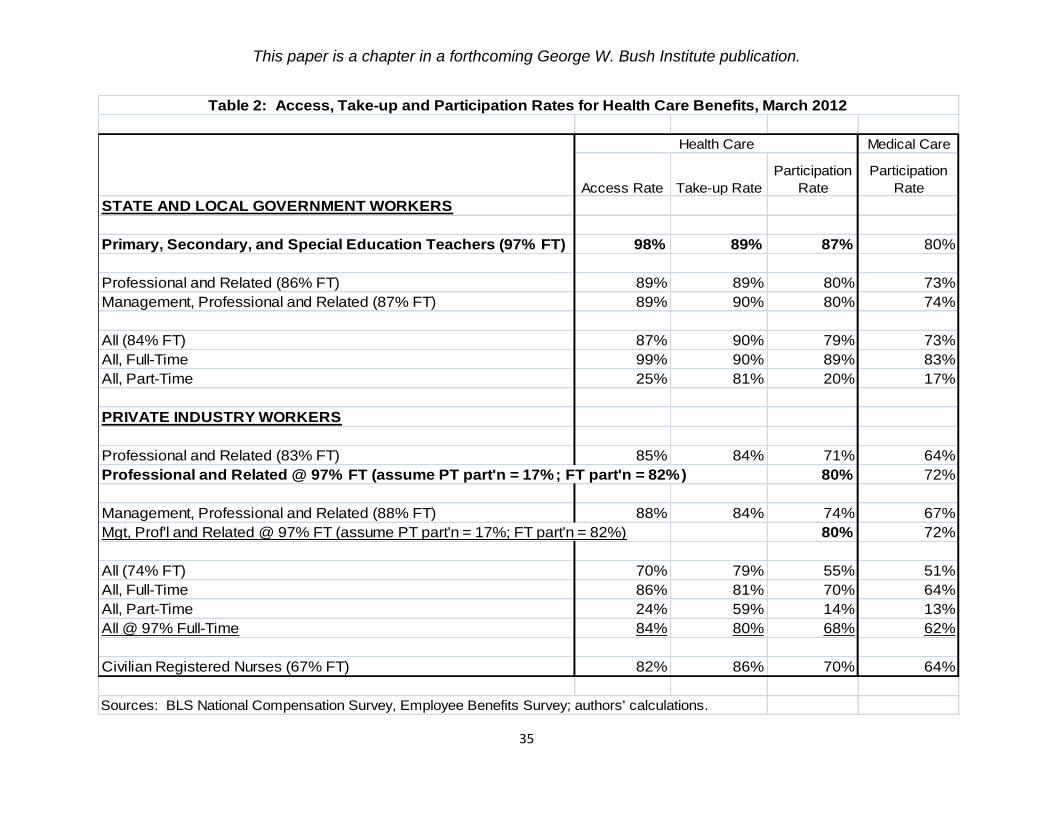
This paper is a chapter in a forthcoming George W. Bush Institute publication.
35
Medical Care
Access Rate Take-up Rate
Participation
Rate
Participation
Rate
STATE AND LOCAL GOVERNMENT WORKERS
Primary, Secondary, and Special Education Teachers (97% FT) 98% 89% 87% 80%
Professional and Related (86% FT) 89% 89% 80% 73%
Management, Professional and Related (87% FT) 89% 90% 80% 74%
All (84% FT) 87% 90% 79% 73%
All, Full-Time 99% 90% 89% 83%
All, Part-Time 25% 81% 20% 17%
PRIVATE INDUSTRY WORKERS
Professional and Related (83% FT) 85% 84% 71% 64%
Professional and Related @ 97% FT (assume PT part'n = 17%; FT part'n = 82%) 80% 72%
Management, Professional and Related (88% FT) 88% 84% 74% 67%
Mgt, Prof'l and Related @ 97% FT (assume PT part'n = 17%; FT part'n = 82%) 80% 72%
All (74% FT) 70% 79% 55% 51%
All, Full-Time 86% 81% 70% 64%
All, Part-Time 24% 59% 14% 13%
All @ 97% Full-Time 84% 80% 68% 62%
Civilian Registered Nurses (67% FT) 82% 86% 70% 64%
Sources: BLS National Compensation Survey, Employee Benefits Survey; authors' calculations.
Health Care
Table 2: Access, Take-up and Participation Rates for Health Care Benefits, March 2012

This paper is a chapter in a forthcoming George W. Bush Institute publication.
36
Estimated
Employer Cost
for Employee
Insurance
Participation
Rate for
Health Care
Estimated
Employer Cost
for Participating
Employees
Estimated
Percent of
Annual Cost
for Teachers
STATE AND LOCAL GOVERNMENT WORKERS
Primary, Secondary, and Special Education Teachers (97% FT) $8,559 87% $9,838 100%
Professional and Related (86% FT) $7,413 80% $9,267 94%
Management, Professional and Related (87% FT) $7,645 80% $9,557 97%
All (84% FT) $7,343 79% $9,295 94%
PRIVATE INDUSTRY WORKERS
Professional and Related @ 97% FT $6,803 80% $8,492 86%
Management, Professional and Related @ 97% FT $6,900 80% $8,635 88%
All @ 97% FT $5,383 68% $7,879 80%
Civilian Registered Nurses (67% FT) $6,065 70% $8,664 88%
Sources: Tables 1 and 2.
Table 3: Estimates of Annual Employer Health Care Cost for Participating Employees, March 2012

This paper is a chapter in a forthcoming George W. Bush Institute publication.
37
Employer
Premium:
Single
Percent of
Annual Cost
for
Teachers
Employer
Premium:
Family
Percent of
Annual Cost
for
Teachers
STATE AND LOCAL GOVERNMENT WORKERS
Primary, Secondary, and Special Education Teachers $5,494 100% $10,728 100%
Professional and Related $5,421 99% $10,993 102%
Management, Professional and Related $5,450 99% $11,121 104%
All $5,424 99% $11,292 105%
All, Full-Time $5,430 99% $11,279 105%
PRIVATE INDUSTRY WORKERS
Professional and Related $4,496 82% $11,116 104%
Management, Professional and Related $4,448 81% $11,005 103%
All $4,276 78% $10,292 96%
All, Full-Time $4,305 78% $10,388 97%
Civilian Registered Nurses $4,707 86% $11,587 108%
Sources: BLS National Compensation Survey, Employee Benefits Survey.
Table 4: Annual Employer Cost for Medical Care Benefits, March 2012
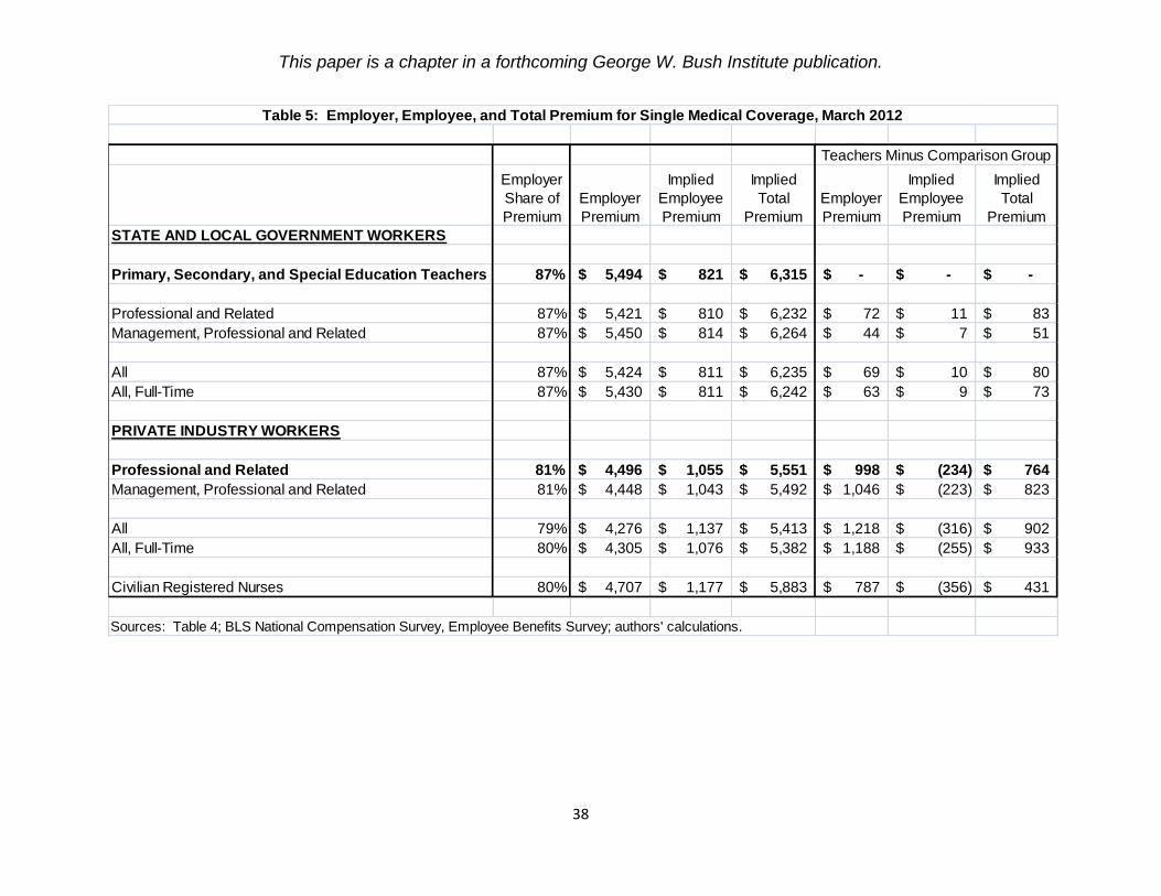
This paper is a chapter in a forthcoming George W. Bush Institute publication.
38
Employer
Share of
Premium
Employer
Premium
Implied
Employee
Premium
Implied
Total
Premium
Employer
Premium
Implied
Employee
Premium
Implied
Total
Premium
STATE AND LOCAL GOVERNMENT WORKERS
Primary, Secondary, and Special Education Teachers 87% 5,494$ 821$ 6,315$ -$ -$ -$
Professional and Related 87% 5,421$ 810$ 6,232$ 72$ 11$ 83$
Management, Professional and Related 87% 5,450$ 814$ 6,264$ 44$ 7$ 51$
All 87% 5,424$ 811$ 6,235$ 69$ 10$ 80$
All, Full-Time 87% 5,430$ 811$ 6,242$ 63$ 9$ 73$
PRIVATE INDUSTRY WORKERS
Professional and Related 81% 4,496$ 1,055$ 5,551$ 998$ (234)$ 764$
Management, Professional and Related 81% 4,448$ 1,043$ 5,492$ 1,046$ (223)$ 823$
All 79% 4,276$ 1,137$ 5,413$ 1,218$ (316)$ 902$
All, Full-Time 80% 4,305$ 1,076$ 5,382$ 1,188$ (255)$ 933$
Civilian Registered Nurses 80% 4,707$ 1,177$ 5,883$ 787$ (356)$ 431$
Sources: Table 4; BLS National Compensation Survey, Employee Benefits Survey; authors' calculations.
Table 5: Employer, Employee, and Total Premium for Single Medical Coverage, March 2012
Teachers Minus Comparison Group

This paper is a chapter in a forthcoming George W. Bush Institute publication.
39
Employer
Share of
Premium
Employer
Premium
Implied
Employee
Premium
Implied
Total
Premium
Employer
Premium
Implied
Employee
Premium
Implied
Total
Premium
STATE AND LOCAL GOVERNMENT WORKERS
Primary, Secondary, and Special Education Teachers 66% 10,728$ 5,527$ 16,255$ -$ -$ -$
Professional and Related 68% 10,993$ 5,173$ 16,166$ (265)$ 353$ 88$
Management, Professional and Related 69% 11,121$ 4,996$ 16,118$ (393)$ 530$ 137$
All 71% 11,292$ 4,612$ 15,905$ (564)$ 914$ 350$
All, Full-Time 71% 11,279$ 4,607$ 15,886$ (551)$ 920$ 368$
PRIVATE INDUSTRY WORKERS
Professional and Related 71% 11,116$ 4,541$ 15,657$ (388)$ 986$ 598$
Management, Professional and Related 70% 11,005$ 4,716$ 15,721$ (277)$ 810$ 533$
All 68% 10,292$ 4,843$ 15,135$ 436$ 683$ 1,120$
All, Full-Time 69% 10,388$ 4,667$ 15,055$ 340$ 860$ 1,200$
Civilian Registered Nurses 71% 11,587$ 4,733$ 16,320$ (859)$ 794$ (66)$
Sources: Table 4; BLS National Compensation Survey, Employee Benefits Survey; authors' calculations.
Table 6: Employer, Employee, and Total Premium for Family Medical Coverage, March 2012
Teachers Minus Comparison Group
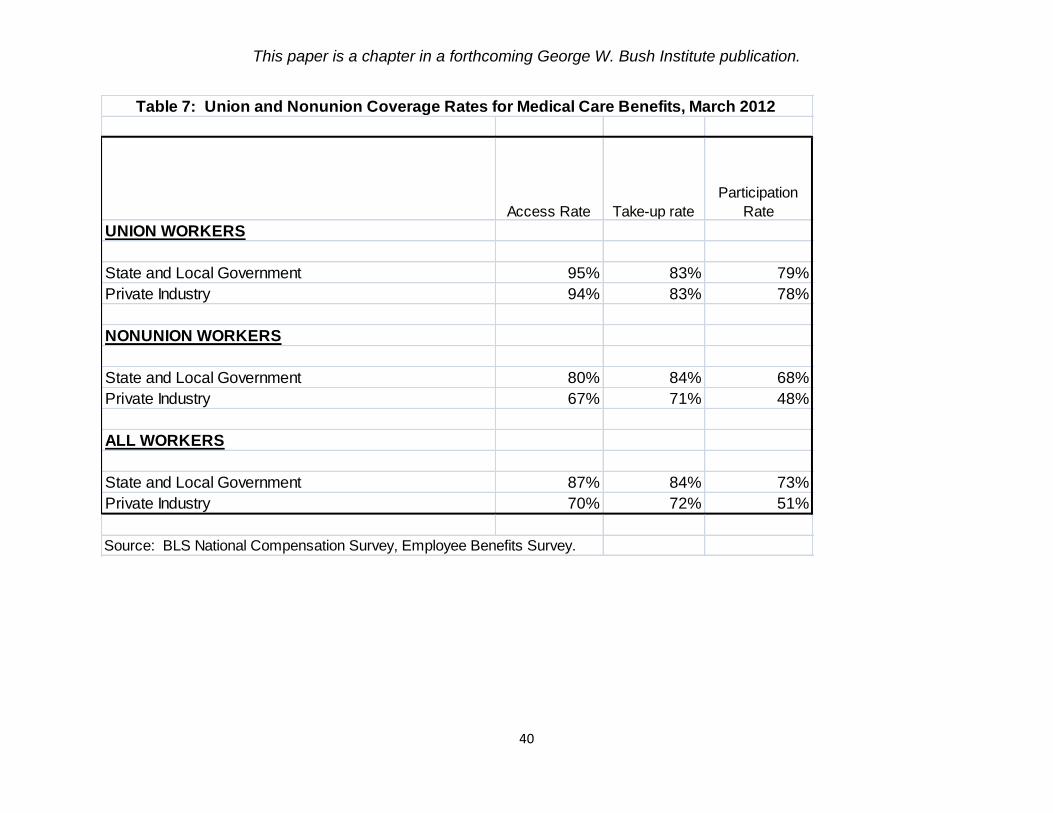
This paper is a chapter in a forthcoming George W. Bush Institute publication.
40
Access Rate Take-up rate
Participation
Rate
UNION WORKERS
State and Local Government 95% 83% 79%
Private Industry 94% 83% 78%
NONUNION WORKERS
State and Local Government 80% 84% 68%
Private Industry 67% 71% 48%
ALL WORKERS
State and Local Government 87% 84% 73%
Private Industry 70% 72% 51%
Source: BLS National Compensation Survey, Employee Benefits Survey.
Table 7: Union and Nonunion Coverage Rates for Medical Care Benefits, March 2012

This paper is a chapter in a forthcoming George W. Bush Institute publication.
41
Single
Coverage
Family
Coverage
Single
Coverage
Family
Coverage
(1) 2012 Change in Total Premium -$898 -$1,857 -$515 -$1,023
(2) 2012 Change in Employee Premium $487 $946 $528 $988
(3) 2012 Change in District Premium: (1) - (2) -$1,386 -$2,803 -$1,042 -$2,010
(4) 2007-2011 Trend in Total Premium $312 $743 $276 $652
(5) 2007-2011 Trend in Employee Premium $20 $58 $14 $48
(6) 2007-2011 Trend in District Premium: (4) - (5) $293 $685 $262 $603
TOTAL IMPACT OF ACT 10 ON DISTRICT PREMIUM:
(7) 2012 CHANGE IN DISTRICT PREMIUM MINUS TREND: (3) - (6) -$1,678 -$3,487 -$1,304 -$2,614
(8) impact on total premium, relative to trend: (1) - (4) -$1,211 -$2,599 -$790 -$1,674
(9) minus impact on employee premium, relative to trend: -[(2) - (5)] -$468 -$888 -$514 -$939
(10) percent from total premium reduction: (8)/(7) 72% 75% 61% 64%
(11) percent from higher employee premium: (9)/(7) 28% 25% 39% 36%
(12) PERCENT IMPACT OF ACT 10: (7)/projected 2012 district premium -19% -17% -15% -13%
Estimates tie to Figures 10 and 11. Totals may not be exact due to rounding.
Wisconsin Department of Public Instruction for FTE weights; authors' calculations.
unweighted weighted
Table 8: Estimated Impact of Wisconsin's Act 10 on District Medical Premiums
Chained estimates
Sources: Wisconsin Association of School Boards, "Teacher Health Insurance Cost and Contribution Comparisons";
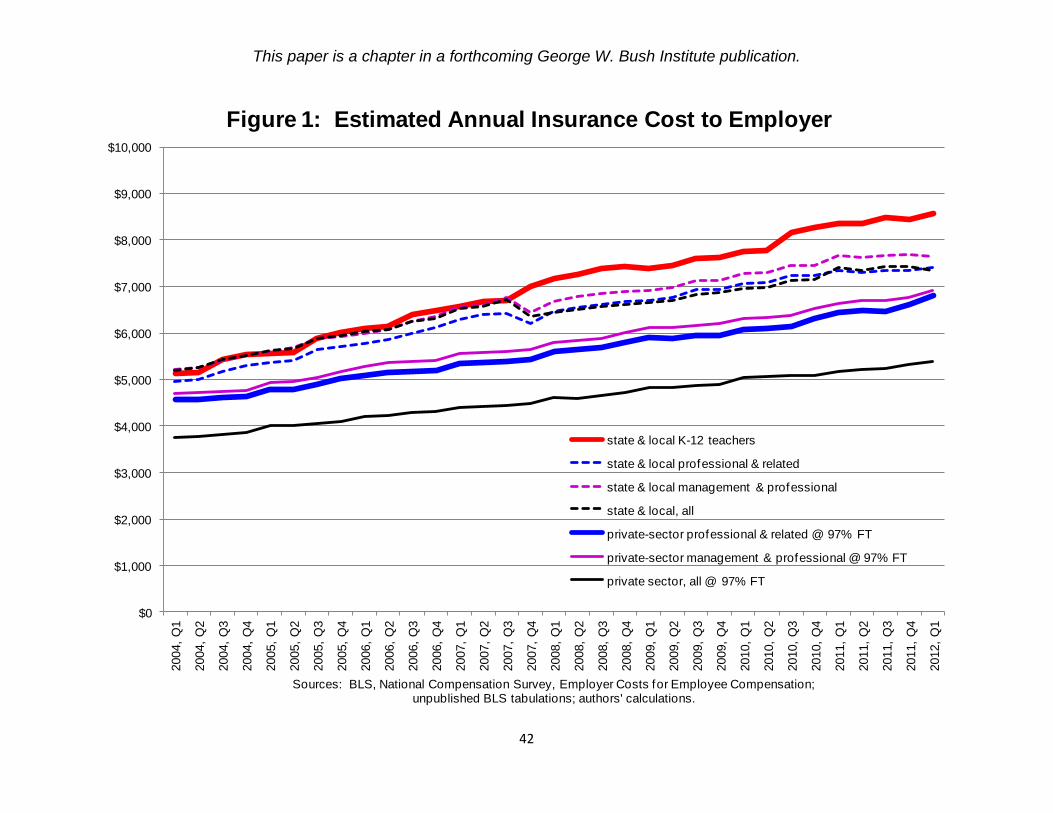
This paper is a chapter in a forthcoming George W. Bush Institute publication.
42
$0
$1,000
$2,000
$3,000
$4,000
$5,000
$6,000
$7,000
$8,000
$9,000
$10,000
2004,
Q1
2004,
Q2
2004,
Q3
2004,
Q4
2005,
Q1
2005,
Q2
2005,
Q3
2005,
Q4
2006,
Q1
2006,
Q2
2006,
Q3
2006,
Q4
2007,
Q1
2007,
Q2
2007,
Q3
2007,
Q4
2008,
Q1
2008,
Q2
2008,
Q3
2008,
Q4
2009,
Q1
2009,
Q2
2009,
Q3
2009,
Q4
2010,
Q1
2010,
Q2
2010,
Q3
2010,
Q4
2011,
Q1
2011,
Q2
2011,
Q3
2011,
Q4
2012,
Q1
Sources: BLS, National Compensation Survey, Employer Costs for Employee Compensation; unpublished BLS tabulations; authors' calculations.
Figure 1: Estimated Annual Insurance Cost to Employer
state & local K-12 teachers
state & local professional & related
state & local management & professional
state & local, all
private-sector professional & related @ 97% FT
private-sector management & professional @ 97% FT
private sector, all @ 97% FT

This paper is a chapter in a forthcoming George W. Bush Institute publication.
43
$(600)
$(400)
$(200)
$-
$200
$400
$600
$800
$1,000
$1,200
$1,400
$1,600
2008 2009 2010 2011 2012
Source: BLS National Compensation Survey, Employee Benef its Survey
Figure 2: Gap in Employer Medical Care Premiums, 2008-2012K-12 Teachers Minus Private-Sector Professionals
Single Coverage
Family Coverage
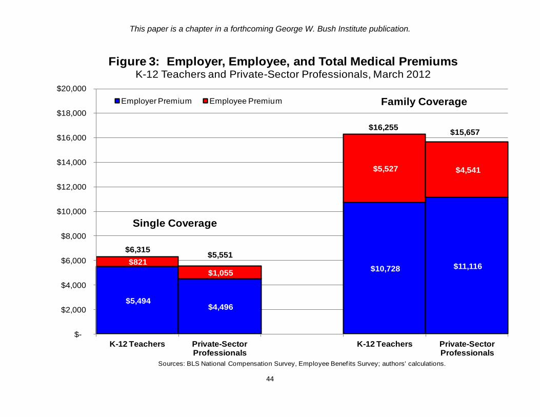
This paper is a chapter in a forthcoming George W. Bush Institute publication.
44
$5,494 $4,496
$10,728 $11,116 $821
$1,055
$5,527 $4,541
$-
$2,000
$4,000
$6,000
$8,000
$10,000
$12,000
$14,000
$16,000
$18,000
$20,000
K-12 Teachers Private-Sector Professionals
K-12 Teachers Private-Sector Professionals
Sources: BLS National Compensation Survey, Employee Benef its Survey; authors' calculations.
Figure 3: Employer, Employee, and Total Medical Premiums K-12 Teachers and Private-Sector Professionals, March 2012
Employer Premium Employee Premium
Single Coverage
Family Coverage
$6,315$5,551
$16,255$15,657

This paper is a chapter in a forthcoming George W. Bush Institute publication.
45
$5,141 $3,804
$9,278 $9,273
$571
$835
$4,366 $3,606
$-
$2,000
$4,000
$6,000
$8,000
$10,000
$12,000
$14,000
$16,000
$18,000
$20,000
K-12 Teachers Private-Sector Professionals
K-12 Teachers Private-Sector Professionals
Sources: BLS National Compensation Survey, Employee Benef its Survey; authors' calculations.
Figure 4: Employer, Employee, and Total Medical Premiums K-12 Teachers and Private-Sector Professionals, March 2008
Employer Premium Employee Premium
Single Coverage
Family Coverage
$5,712
$4,639
$13,645
$12,880

This paper is a chapter in a forthcoming George W. Bush Institute publication.
46
$0
$500
$1,000
$1,500
$2,000
$2,500
$3,000
$3,500
$4,000
$4,500
$5,000
10th percentile 25th percentile Median 75th percentile 90th percentile
Source: BLS National Compensation Survey, Health Plan ProvisionsNote: for missing data, "mgt, prof 'l & related" subsituted for "prof'l & related" and "teachers" substituted for "K -12 teachers"
Figure 5: Annual Deductible, Fee-for-Service Plans, 2011
Private-sector Professionals, Family K-12 Teachers, Family
Private-sector Professionals, Individual K-12 Teachers, Individual

This paper is a chapter in a forthcoming George W. Bush Institute publication.
47
$5,943 $4,916 $5,444
$4,080
$13,032
$9,582
$12,540
$9,918
$810
$735 $742
$1,151
$3,676
$5,627
$2,568
$5,109
$-
$2,000
$4,000
$6,000
$8,000
$10,000
$12,000
$14,000
$16,000
$18,000
$20,000
Union Nonunion Union Nonunion Union Nonunion Union Nonunion
Source: BLS, National Compensation Survey, Employee Benef its Survey
Figure 6: Medical Care Premiums, by Union StatusState & Local and Private Sector, March 2012
Employer Premium Employee Premium
Single Coverage
Family Coverage
State and Local State and LocalPrivate Private
$6,753
$5,650$6,186
$5,231
$16,708
$15,209 $15,109 $15,028

This paper is a chapter in a forthcoming George W. Bush Institute publication.
48
$19,176
$20,068
$17,305 $18,727 $18,947
$16,782
$8,411 $8,771
$7,359
$8,058 $8,059
$6,992
$-
$2,000
$4,000
$6,000
$8,000
$10,000
$12,000
$14,000
$16,000
$18,000
$20,000
$22,000
2003 2004 2005 2006 2007 2008 2009 2010 2011 2012
Sources: Wisconsin Association of School Boards, "Teacher Health Insurance Cost and Contribution Comparisons"; Wisconsin Department of Public Instruction for FTE weights; authors' calculations.
Figure 7: Average District Medical Premium, Wisconsin
Family, unweighted Family, weighted
Single, unweighted Single, weighted

This paper is a chapter in a forthcoming George W. Bush Institute publication.
49
$19,176
$19,879
$17,077
$18,727 $19,356
$17,345
$8,411 $8,706
$7,320 $8,058 $8,311
$7,269
$-
$2,000
$4,000
$6,000
$8,000
$10,000
$12,000
$14,000
$16,000
$18,000
$20,000
$22,000
2003 2004 2005 2006 2007 2008 2009 2010 2011 2012
Sources: Wisconsin Association of School Boards, "Teacher Health Insurance Cost and Contribution Comparisons"; Wisconsin Department of Public Instruction for FTE weights; authors' calculations.
Figure 8: Chained District Medical Premiums, Wisconsin
Family, unweighted Family, weighted
Single, unweighted Single, weighted
Note: 2010 base
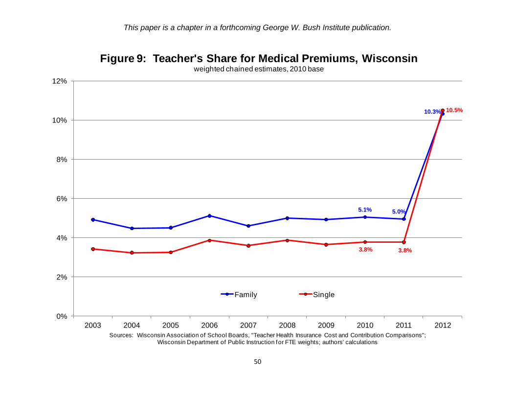
This paper is a chapter in a forthcoming George W. Bush Institute publication.
50
5.1% 5.0%
10.3%
3.8% 3.8%
10.5%
0%
2%
4%
6%
8%
10%
12%
2003 2004 2005 2006 2007 2008 2009 2010 2011 2012
Sources: Wisconsin Association of School Boards, "Teacher Health Insurance Cost and Contribution Comparisons"; Wisconsin Department of Public Instruction for FTE weights; authors' calculations
Figure 9: Teacher's Share for Medical Premiums, Wisconsinweighted chained estimates, 2010 base
Family Single

This paper is a chapter in a forthcoming George W. Bush Institute publication.
51
$20,219 $21,008
$19,152 $19,176
$19,879
$17,077
$8,735 $9,068
$8,170
$8,411 $8,706
$7,320
$-
$2,000
$4,000
$6,000
$8,000
$10,000
$12,000
$14,000
$16,000
$18,000
$20,000
$22,000
2003 2004 2005 2006 2007 2008 2009 2010 2011 2012
Sources: Wisconsin Association of School Boards, "Teacher Health Insurance Cost and Contribution Comparisons";authors' calculations
Figure 10: Total and District Premium, Wisconsin, Unweightedchained estimates, 2010 base
Total Premium: Family District Premium: Family
Total Premium: Single District Premium: Single
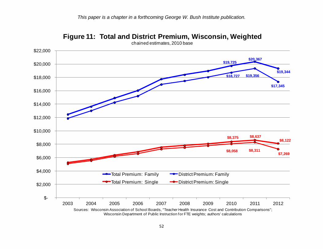
This paper is a chapter in a forthcoming George W. Bush Institute publication.
52
$19,725 $20,367
$19,344 $18,727 $19,356
$17,345
$8,375 $8,637 $8,122
$8,058 $8,311 $7,269
$-
$2,000
$4,000
$6,000
$8,000
$10,000
$12,000
$14,000
$16,000
$18,000
$20,000
$22,000
2003 2004 2005 2006 2007 2008 2009 2010 2011 2012
Sources: Wisconsin Association of School Boards, "Teacher Health Insurance Cost and Contribution Comparisons"; Wisconsin Department of Public Instruction for FTE weights; authors' calculations
Figure 11: Total and District Premium, Wisconsin, Weightedchained estimates, 2010 base
Total Premium: Family District Premium: Family
Total Premium: Single District Premium: Single

This paper is a chapter in a forthcoming George W. Bush Institute publication.
53
$13,412(35.4%)
$27,053(53.4%)
$22,269(44.5%)
$13,638(34.2%)
$27,673 (51.3%)
$23,203(43.2%)
$-
$5,000
$10,000
$15,000
$20,000
$25,000
$30,000
1998 1999 2000 2001 2002 2003 2004 2005 2006 2007 2008 2009 2010 2011 2012
Sources: Wisconsin Department of Public Instruction; authors' calculations
Figure 12: Fringe Benefit Costs for Teachers, Wisconsin(with percent of salary)
unweighted weighted