direct response portfolio
DESCRIPTION
Critique, Creation, ImprovementTRANSCRIPT

PORTFOLIO
Madison Wallace
SID: 13220273
CRITIQUE .Pandora Club EDM.
Myer Beauty Sale flyer.
Pandora ED.
Bellabronzetan buckslip.
Myer Beauty Sale EDM.
Neon Hair & Beauty
Facebook post.
CREATION .
Direct Response
Improvement .

CRITIQUE #1 MERITS
Imagery
Colors & Copy
The imagery is clean, simple, and shows off the Pandora products. It also pictures a humanpresence demonstrating the product, in a context the visitors can resonate with, like assemblingan outfit or out for coffee. The email features images of multiple frames including close-ups tothe jewellery, medium and long angled shots of pieces collaborated with outfits, creating a story.
This layout of images particularly draws me in, as I’m a very visual person and love to see howproduct can be worn or used in various ways, making me want to wear my Pandora pieces andcheck out other designs I can add to my collection. Femininity is brought to the forefrontthrough this imagery, ideally to fit their target audience. The women featured are glowing asthey wear Pandora and high-fashion pieces, which symbolizes the quality and value in thebrand.
The color scheme is very inviting with light blue and pink, caramel, and green as the featuredcolors. These colors compliment the jewellery on display and follow a consistent patternthroughout the EDM. The jewellery pieces themselves also tie into this color scheme,accentuating a cool, carefree style Pandora clearly wants to represent as the brand. Femininity iscarried through again with vibrant and lively colors in the pictures, while a modern and classycolor design of greys are applied to the page links.
The copy is clear and concise, using classy, feminine print to align with the Pandora image. Theprimary copy applied is simple and easy to read, drawing no focus away from the images. This iscomplimented with a secondary, cursive copy to give a touch of elegance throughout the EDM.There is an appropriate use of capitals included to highlight the campaign and the collaborationwith two renowned bloggers. The text is broken up in sections to reduce the feeling of clutter andoverall an effective approach to entice viewers to read further.
Promotion
The promotion is interactive and is appealing consumers to get involved with the brand in aneffect to win something special. I love any idea that encourages personal expression, and asfor Pandora’s #sayitwithPANDORA campaign this interactive element is executed perfectly.
As well as this, Pandora has collaborated with fashion and lifestyle bloggers – CarmenHamilton from The Chronicles of Her and Connie from, K is for Kani, both with a large shareof followers. This is an effective use of word-of-mouth that will capture new readers, whominterests align with fashion, lifestyle and the elements Pandora promotes.
Applying the hashtag #sayitwithPANDORA is encouraging viewers to move to a differentplatform. This allows the use of Facebook or Instagram to receive new prospects via theparticipant’s social media lists.

CRITIQUE #1 FAILINGS
Better Subject line -
Jewellery is personal, why not the email
The Pandora email invites consumers to tell their personal style story, however failing to framethe email as a personalized invitation. I would feel more engaged in giving a personal story if theemail was addressed to me, rather than just promoting the email content. As for a brand thatseeks to promote their “individualized Jewellery” image, this is a huge miss. By not personalizingan email to a client that has been a regular customer for years, it has diminished the appeal thatPandora Jewellery has a better personal touch over their competitors. I would suggestsomething more eye catching and intriguing like, “We are calling for you, MADISON |#sayitwithPANDORA & WIN.” This is an attractive subject line that provides a personal touch asan invitation, while promoting an incentive to say it with Pandora and win.
Consumers want to be treated as individuals with information tailored to their needs throughtheir preferred channels of communication, and they want a consistent experience duringinteractions. Pandora has a huge client base, so personalizing their emails would create apersonal link from the brand to consumer and reduce that unappealing corporate image.
Personalisation is almost always a good idea, if the message matches the recipitant. In thiscampaign, Pandora has targeted the correct segment as my mother and I both loyalcustomers, received the email. I have been subscribed to Pandora mailing since April thisyear and received 17 emails, a well-managed amount to keep me informed with newinformation and promotions. Still, as a key element that aligns with jewellery, personalizationis missing in them all. This improvement will distinguish Pandora email from the clutter, butonly if these marketing efforts are in sync. Consistency leads to a pleasant customerexperience, and that in itself is a win.
I go into depth critiquing the importance of personalization as for a jewellery brand I feel likethis element is the foundation for Pandora, as they offer unique charms that can personallyresonate with each customer. When I purchase Jewellery, I am really committing myself totheir brand and want to feel like I’m not just another shopper and that they truly value myloyalty.

CRITIQUE #1 FAILINGS
No reminder email -
People forget
No clear call-to-action -
Whats the next step?
There were no other emails received regarding the campaign “Tell your stylestory,” letting that lingering ‘maybe’ idea be a missed ‘yes’ opportunity. Thecampaign was featured at the bottom of the email and would have beendisregarded by a large portion of the audience. Unfortunately, without a secondencouragement email to take part in the “Tell your style story,” Pandora has lostinteraction with a huge client base.
I love the idea of this campaign to get consumers involved and interact withPandora. People are very passionate about their style stories and now havingforums to express these with the benefits of winning is a great incentive to createpositive word of mouth and improve brand value.
I would suggest creating an email detailing the “Tell your style story” campaignwith examples and pictures on-page rather hyperlinks. This design is convenientand captures the audience’s attention of the campaign reminder and simplicity toenter and win.
Although there is a hyperlink placed on the page, there is no clear direction forviewers to take the next step. The Pandora EDM is missing a call-to-actionbutton, which would negatively impact visitor traffic to the campaign site and moreimportantly the website.
The purpose of the page is to drive consumers to the website with the intentto participate in the #sayitwithPANDORA campaign, though will not achieve asignificant impact if their is no sense of urgency or direction.The CTA should be easy to find but not so large that it distracts from thepromotion and in a color that catches the eye.
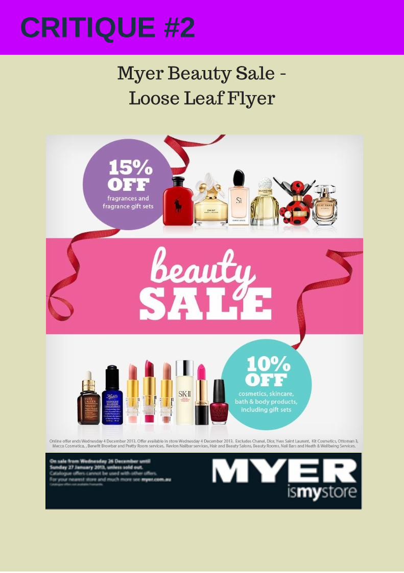
CRITIQUE #2
Myer Beauty Sale -
Loose Leaf Flyer

CRITIQUE #2
Layout I would describe Myers as a renowned and lavish superstore, branding their products withelegance and prestige. However, this flyer fails to showcase these elements with minimaleffort in design to capture shopper’s interests. Although the layout is clear, there is noconsistency with the brand and its other promotional activities. More brand presence in theflyer is expected for Myers and in such a competitive industry the flyer does not strike me asthe leading beauty retailer.
Call to actionThis beauty flyer has failed to present a call to action or directing action to 'Come in Store'. Bynot including this important aspect of direct response, the flyer fails to directly inviteconsumers to visit the store and offers. Shoppers are constantly bombarded with sale flyerscausing an inattentive reaction to these advertisements. Pieces that do not capture theirattention and entice them to take action get lost in the clutter.
Color, Copy & Imagery The color scheme is practical but something I would expect for a Chemist beauty sale. Thepink is bold and inviting, though does not have that ‘pop’ against a pale background andbordering bright colors, like the blue and purple. The array of colors and unappealing copymarkets the flyer as cheap and diminishing the ‘value’ image that Myers represents. The copyis lifeless and is a misrepresentation of cosmetics. This should be a more exciting andfeminine design, to promote this sale as a fun experience. The flyer lacks engagement with nohuman presence demonstrating the products or appealing to the market. Beauty imagesshould be featured to encourage women to feel feminine and desire the same products.
MERITS
FAILINGS
Measurability of offer Feature deals constitute an important element of retailer promotion activities and Myers hasexcelled at the measurability by separating the promotions into two separate entities. Byoffering two different valued discounts makes the offer more appealing, rather than having 1overall discount. Multiple discounts give consumer the feeling that it’s worth their time andthere is more on offer with better savings.
Timely nature of the offer The offer is a one-day promotion that attaches a negative consequence of missing out if thereis delay. By setting a short time limit, consumer adds value to the promotion, as it will not last.This encourages shoppers to really think of items they want while the sale is happening,lessening the idea that they can get it another time because the products will be full priced.

CREATION #1
Follow-up Pandora EDM

CREATION #1
Follow-up Pandora EDM
EXPLANATION
After critiquing Pandora’s #sayitwithPANDORA EDM, It was suggested to send out afollow-up email as a reminder for the ‘tell your style story’ promotion, which wasineffectively only featured on the bottom-half of the page. To intrigue viewers and drive agreater share to the page, a second EDM was designed to include improved elements anddetail the promotion. The previously suggested subject line, “MADISON #sayitwithPANDORA & WIN” wasapplied as it is personal and aligns with the ideals that Pandora is customized jewellery.The ‘Winning’ element has remained to immediately entice and detail what the EDMcontains.
On the email, the page is titled with the signature ‘PANDORA Club’ with the headingshyperlinked to the website. The previous promotion details is featured, clearly explainingthe promotion with 2 appealing images displaying jewellery pieces. The personalizedinvitation is followed, directly asking viewers to celebrate Pandora’s campaign launch fora chance to win 1 of 3 bangles. A second request invites consumers to tell of theirfavorite style insights with the call-to-action button clearly and bolding placed beneath.
The CTA button is promptly placed in the middle of the page to emphasize direction andurgency, while featured in the feminine and appealing color purple to catch their eye.Keeping to the consistency of ‘say it and win,’ the CTA is customerised to be ‘SAY IT.’ Aquirky little touch to again highlight the promotion.
An example of Kate Foley’s style story is provided to give viewers an idea of how easythe process is, including an appealing image of her wearing Pandora pieces. Audiencesare more intrigued by incentives that are achieved through simple steps with minimal tono underlying conditions. I’ve designed an EDM that comprises the goal of the page, theintent of the visitor and the complexity of what is offered in an elegant and simple layout.
The final EDM elements include hyperlinks to the website pages, highlighting the socialmedia presence with icons and a clear unsubscribe link.

CREATION #2
Bellabronzetan Buckslip - in Cosmopolitan Summer read

CREATION #2
Bellabronzetan Buckslip -EXPLANATION
Bellabronzetan is a newly launched beauty salon that offers custom facial and tanningtreatments. This buckslip creation has been designed to tastefully represent the brandand appeal to the target audience with color, imagery and an exciting offer. The buckslipis to be placed in the magazine, Cosmopolitan Summer reads, as the content featuresbeauty treats and tricks, ideally reaching Bellabronzetans potential clientele.
There is a human presence, showcasing her summer glow, courtesy of bellabronzetans.Avisual understanding has a greater impact on consumers, rather relying on copy to paintapicture. The image influences viewers to imagine themselves on the beach after usingtheproduct.
The color scheme applied throughout the buckslip is consistent with the light blue andbrown shade in the logo. The hot pink was selected as it really popped on the page andwill certainly catch the reader’s eye. The $15 off was displayed for this reason withdetailsfollowed. ‘For a limited time so get in quick,’ is a closer that flips the offer around, andessentially attaches a negative consequence to any delay or hesitation. The copy is clearand concise to resemble the short and sweat deals everybody loves. The text ‘Hey,Pretty!’suites the audience medium of young women reading Cosmopolitan, using this quirkyintroduction to draw the audience into the offer. The ‘Get ready for swim season’ is printedin bold as a reminder that summer is one its way and a bellabronzetan is a must have.
The ‘follow us’ and social media icons have been strategically placed clear and tidy at thebottom center of the page. Customer’s eyes will be attracted to the social media buttonsasthey have been formatted with no surrounding distractions. This will drive traffic to thesemediums that offer greater interaction and information regarding bellabronzetan and theirservices. Regular updates of pictures and promotions are implemented throughFacebookand Instagram, making it a central effort to get readers to follower these channels.

IMPROVEMENT #1
Myer Beauty Sale EDM
IMPROVEMENT #1
Myer Beauty Sale EDM -
EXPLANATION
This Myer Beauty Sale piece is an improvement from their loose leaf flyerpreviously critiqued, and designed as an EDM to more effectively reach and informthe target market of the sale. This medium was chosen over the flyer as themessage would be more receptive by the audience and influence a greater traffic tothe social media forums and website with the call-to-action hyperlink elementadded.
The overall layout was revamped to characterise Myers elegant and prestigebranding. A modern black and grey backdrop was used to show class and draw allfocus to the message and images. Human presence was added to demonstrate theuse of products and create the appeal of beauty (glowing skin & flawless makeup).A second image is of a celebrity that endorses Myers, drawing the audience in witha well-known Myer icon. A variety of cosmetic products are also on display tohighlight some of the goodies on offer.
By keeping the two valued discounts frames the offers as more appealing, printedin clear and concise copy on a dark shade to create that 'pop off the page' effect.The heading 'beauty' is in a feminine cursive copy with 'sale,' capitalised and bold toemphasise the email material.
The Myer brand has presence throughout the EDM, with the easily-followed andhyperlinked website selection bar at the top and the un-subscribe, terms andconditions placed on the bottom. The social media icons are displayed visibly in aformat the invites readers to follow.
Most importantly, the improvement of a call-to-action button placed evidently under'sale' to instantly direct customer to the next step. The 'SHOP NOW' button temptsthe audience to simply check out the sale, which will be a website page dedicatedto the promotion with appealing imagery and copy to keep them shopping.

IMPROVEMENT #2
BEFORE.

IMPROVEMENT #2
After.

IMPROVEMENT #2
Facebook Post
EXPLANATIONI designed this Facebook post as a improvement piece for Neon Hair and Beautyevent night. The original was exploding with various copies in different bolding,italics and shades, making it over cluttered and difficult to read. I have aFacebook page filled with posts that simply have too much wording, to which icontinue scrolling. There was no appealing images to promote Neon Hair andBeauty services or excitement for the event night, which was definitely part of theimprovement.
The improvement piece transforms a Facebook post that could be mistaken asspam into a an attractive invitation for a fashion, factory and market night. Thebeauty images of flawless eye and lip makeup catches my attention, now curiousof the posts message. The invitation element is what catches my eye next, inboldprint directing the message to me. Followed by the hot pink, cursive and playful'fashion, factory, market night', complimented by the market light backdropshowing what the night might entail.
The 2 copies applied are flirtatious and consistent throughout the piece.Ive kept the format simple but engaging, intriguing the audience to read more.This is exemplified with the Neon logo, clearly identifying the event hosts and thevisibly date, location and boldly printed time.
The call-to-action to repost a #hashtag is a step central for Neon to get the wordout, therefore the enticement is centred, in a box and visible to theconsumers. Placed on the bottom images are boxes detailing the gifts andshows offered on the night, keeping to the clean format to reduce the feel ofclutter. The names of the talent and business showcased on the night arecreatively featured at the very bottom like a music festival line-up, which appealsto this audience.