digital graphics evaluation pro forma
TRANSCRIPT

Graphic Narrative Evaluation

Use this template to help you evaluate your project.
You should give specific details about your work.
You should provide both written and visual examples to explain your project.
You should find areas to praise in your work. Be specific about why you think they are good or why you are proud of them.
You should also find areas that could be improved. Look for areas that you could make better if you went back to them. Be specific about what you would improve.
Add additional slides as you need to. Don’t be restricted by what is here.
Any blank slides should be deleted before submission.

Does your final product reflect your original intentions?
My final product mostly reflects the original intentions that I had and my product was similar to the planning documents , flat plans , storyboards which I had created. The story boards that I made were very similar to the finished product that I had produced but there were some changes. Some of these changes included changing the view or perspective of a scene because I thought that It looked better and was easier for the audience to understand the scene and the story. Similarly , my flat plans that I had made were very similar to what I had produced but I did make some changes. Some of these changes included putting the text in a different position because it worked better and so that I could add more detail in certain areas. Another change that I had made which was different from the flat plans to the finished product was that I had to remove some scenes from the story because there were deemed irrelevant and did not really change the story majorly in any way. The planning documents that I had made show that I planned out the story and the planning was similar to what my final product was. For example , I mostly stuck to my schedule and did everything when I had planned to but some things took less or more time than I had originally planned and I had to adapt to this and change my schedule so that I could incorporate the time changes. One benefit of changing things around was that it allowed me to explore new techniques and improve the story in different ways then I had originally planned. One problem of changing things about was that I could of wasted time and resources on looking into new techniques and skills when I could of produced the pages in the way that I had planned and be on time.

On the left I have put an early version of a storyboard showing the first six scenes which displays what scenes that I wanted to produce and the order that they would be in. At the bottom on the left , I have put my first six story pages to compare. On the whole , the story pages are very similar to the storyboard but I have changed a lot of the perspectives about and removed some scenes so that I could add more detail story later on. The concepts and principles are the same but the story has been changed so that it removed scenes that weren't necessary and didn’t make any change to the story.
How well have you constructed your images?
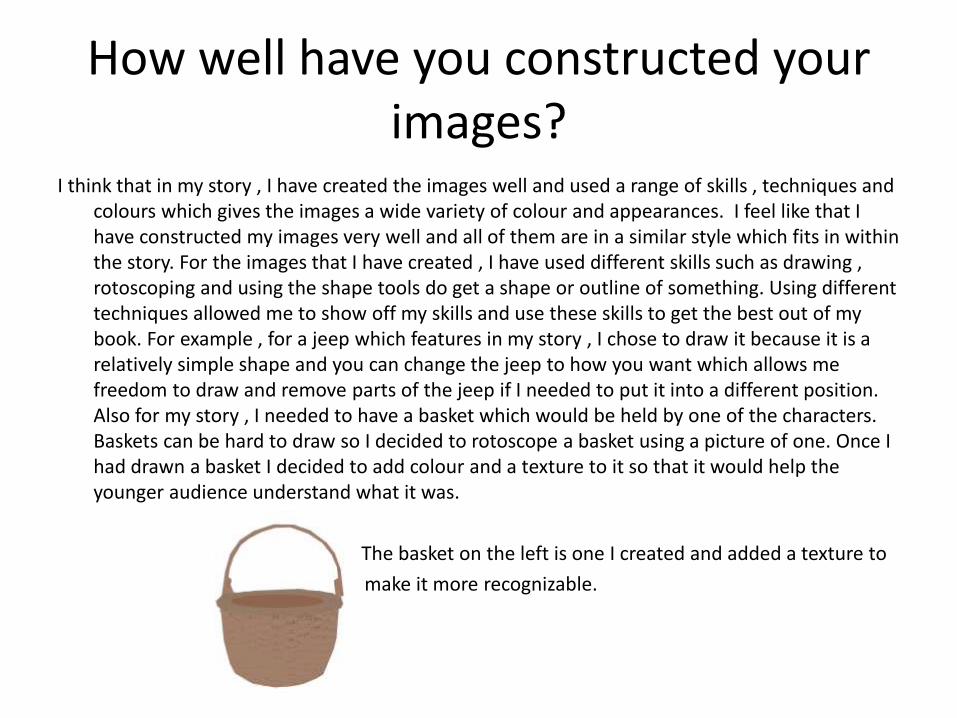
I think that in my story , I have created the images well and used a range of skills , techniques and colours which gives the images a wide variety of colour and appearances. I feel like that I have constructed my images very well and all of them are in a similar style which fits in within the story. For the images that I have created , I have used different skills such as drawing , rotoscoping and using the shape tools do get a shape or outline of something. Using different techniques allowed me to show off my skills and use these skills to get the best out of my book. For example , for a jeep which features in my story , I chose to draw it because it is a relatively simple shape and you can change the jeep to how you want which allows me freedom to draw and remove parts of the jeep if I needed to put it into a different position. Also for my story , I needed to have a basket which would be held by one of the characters. Baskets can be hard to draw so I decided to rotoscope a basket using a picture of one. Once I had drawn a basket I decided to add colour and a texture to it so that it would help the younger audience understand what it was.
The basket on the left is one I created and added a texture to
df make it more recognizable.
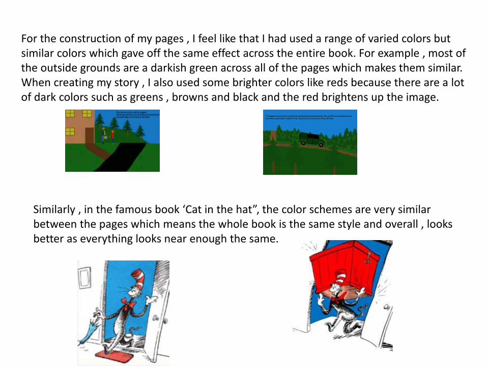
For the construction of my pages , I feel like that I had used a range of varied colors but similar colors which gave off the same effect across the entire book. For example , most of the outside grounds are a darkish green across all of the pages which makes them similar. When creating my story , I also used some brighter colors like reds because there are a lot of dark colors such as greens , browns and black and the red brightens up the image.
Similarly , in the famous book ‘Cat in the hat”, the color schemes are very similar between the pages which means the whole book is the same style and overall , looks better as everything looks near enough the same.
How well have you used text to anchor your images
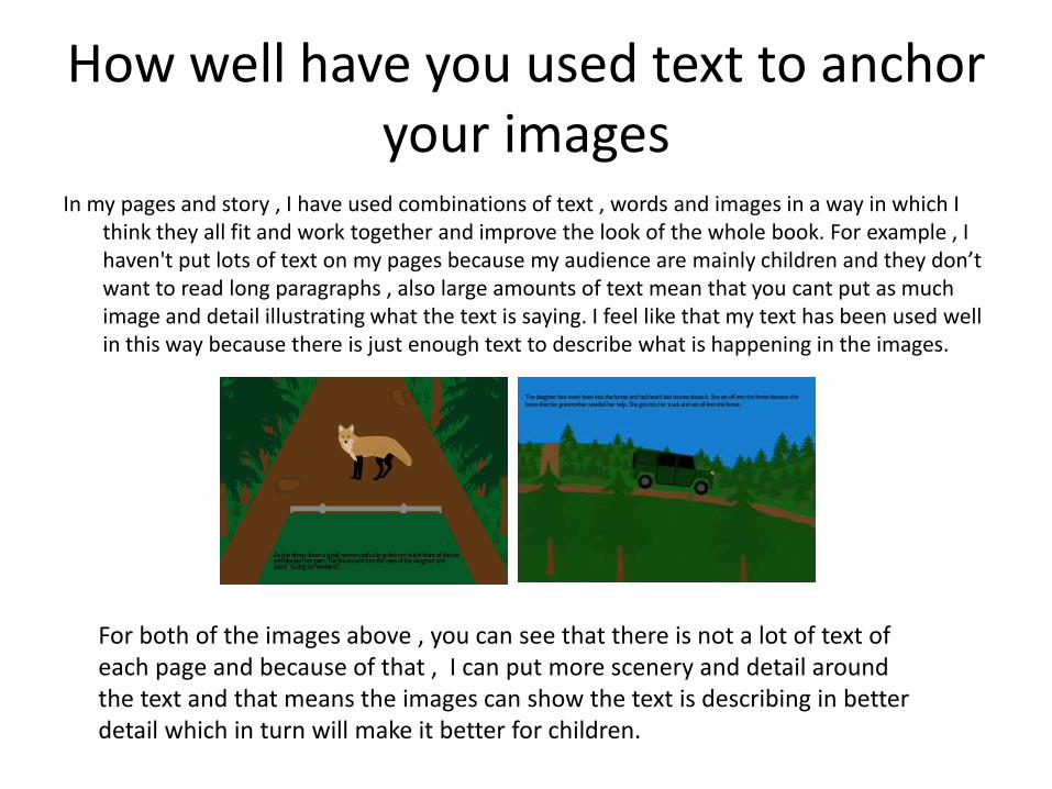
In my pages and story , I have used combinations of text , words and images in a way in which I think they all fit and work together and improve the look of the whole book. For example , I haven't put lots of text on my pages because my audience are mainly children and they don’t want to read long paragraphs , also large amounts of text mean that you cant put as much image and detail illustrating what the text is saying. I feel like that my text has been used well in this way because there is just enough text to describe what is happening in the images.
For both of the images above , you can see that there is not a lot of text of each page and because of that , I can put more scenery and detail around the text and that means the images can show the text is describing in better detail which in turn will make it better for children.

Is your product suitable for your audience?
I feel like that my product is very suitable for my audience because of a number of reasons. One reason why I think that my product is suitable for my audience is that the story that I have made doesn’t contain any content which is unsuitable and shouldn’t be seen by children because the main target audience of my book is children and there should not be anything which might be unsuitable for them. Another reason why I think that my product is suitable for my audience is that it doesn’t contain lots of text because in my proposal I have stated that my book is aimed for people aged “5-7” and children of this age group will not want to to read large paragraphs of text as they will get bored easily.
The image on the right is a screenshot from a page in
my story. There is not a lot of text on the page which
means children will understand the story more and
wont get bored as easily because there isn’t as much
To read.

In other famous books such as the Hungary caterpillar and the Cat in the hat , there is no content of any type which is unsuitable for children and which is too extreme to show. Also , the Cat in the hat and The very Hungary caterpillar don’t show any large amounts of text which means the stories are suitable for the age range that they were aimed at.
From the image of a page in the very Hungary caterpillar above , we can see that there is not a lot of text and the words and language are not too complicated for children.

What do you like/dislike about the techniques you have used?
For creating my images , I used a range of different techniques to produce the pages. I liked and disliked some of the techniques that I had used to create my pages but I used the skills and techniques that I thought would enable me to create pages in the best possible way. One technique that I found was quite useful was rotoscoping. Rotoscoping allowed me to create and produce things that are very hard to draw and allowed me to produce these things in great detail. Another technique/tool that I liked was the colour range tool. The colour range tool allowed me to create and add textures onto something to add detail. For example , the effect of a woven basket , the fur of a animal etc.. You can get these effects by using the colour range tool.
The fox on the right is one that I have rotoscoped and used color range on. I used the rotoscope technique to get the main features and outline of the fox and I then used the colour range tool to get the fur effects on the body and on the neck.

One technique that I didn’t like was the perspective tool. Although I found this tool very useful , I also found it hard to use at first and it would make my whole page look wrong. Even though the tool took some getting use to , when it worked the effect that I could make with this tool worked very well and improved the look of the images by a lot in my opinion.
The image on the right shows the perspective tool being used to make it look like the road is going off into the distance. I liked this effect and thought it improved the overall look of the page because it showed off more skill and displayed a technique.

What do you like/dislike about how your final product looks?
One thing that I liked about my final product was that there was a similar style across all of the pages that I had created and that made the book flow better and also improved the look of it because it was all similar. Another thing that I liked about my book was that I thought I had put a good twist on a original fairy tale. My book was primarily based on little red riding hood and I decided to produce a modern day version of it with the same basic storyline but with a few twists. One twist in my book is that instead of Little Red Riding hood walking through the forest to get to her grandmother , Red Riding hood drives through the forest. Another twist which I have put in my story is that instead of having a wolf , there is a fox. There are some other changes with the story aswell which makes mine differ from the original. I feel like my modern day version is good because it still holds lots of the values of the original but there is a slight twist on it. There are some other popular modern day versions of original fairy tales such as new versions of Cinderella.
A scene from my book with the daughter driving through the forest instead of walking.

One thing that I did not like about my how my final product looks is that some of the characters/assets aren't as detailed as I might want them to be. Although in a children's book , lots of detail is not needed but I think that my characters would benefit from extra detail because it would improve the overall look of the book. Another thing that I didn’t like about my book was that there was not a lot of 3D characters in my story. Although in my storyboard and plans I did not specifically draw 3D characters , it would make a change to my story from the mostly 2D characters and would show other skills and techniques. I did however , draw some small 3D pieces such as cupboards and tables so that they would fit with the scene.

Why did you include the content you used?
I chose to include the Images, fonts, effects, colours etc so that I could make the book look as good as I could make it to be. I chose certain colours , fonts , effects so that I would have a large range of colours and style but still kept the story simple enough for young children to read and understand. I Included my content for a number of reasons such as audience , look , performance etc.. For example , when referring to my font and what type to choose , I chose a easily looking font which would make the text easier to read and understand for children. When also referring to colours , I chose a small palette of colours because I wanted all the pages to have a similar colour scheme because the look would look better that way and it might more confusing for the audience if the colours are changed around each page. Similarly , when referring to effects and filters I need to make them all the same so that pages didn’t look different from any other pages.
Like my book , Roald Dahl’s books didn’t contain lots of colors and the colors were simple to help children to understand.

What signs, symbols or codes have your used in your work?
In my book there were lots of choices about the style , colours ,locations in order to make the book look as good as possible and for the book to have meaning. For example , I mainly chose colours such as greens and browns because of the location which is majority based in the countryside and the grounds and backgrounds are mainly based green or brown. This colour style is similar across all pages. The characters in my story can subconsciously be represented due to their colours. For example , the main character in my story is mainly wearing red and red can represent passion , sensitively and love. These factors are factors which the daughter has because she is loving because she takes food to her sick grandmother. When referring to the locations and the colours of them ,green is directly related to nature and that is what the background is. This colours can make people see things that would not normally be described in the story and these colours can help describe the characters before the story describes them. This helps the audience understand the book. The colours in the book are there to represent different emotions and feelings , these colours can be chosen specifically to give off these emotions or subconsciously without knowing. Certain colours and shapes can make children feel safer or more scared.

Color representation is very popular and can be found in various other films, stories and media. One very famous TV programme which has adapted the ways of showing emotion using colours is “Breaking Bad”. In Breaking Bad , the different colours worn by different characters show different feelings and emotions and represent different things.
For example , the color black is worn by characters when in the presence of death , darkness , evil , power etc.. For example , Walter wears nearly all black when he goes into drug lord “Tuco’s” lair and uses a explosive disguised as crystal meth to kill some of the guards.
Another example of when colours are used for emotion in Breaking Bad is when grey is used to represent Depression , illness , guilt , morning etc.. For example , two hitmen know as “the cousins" wear grey when they are planning to kill a main character.
Two characters wearing grey while planning to kill a main character.

What representations can be found in your work?
In my story , I have included both men and woman. Both the men and the women , are represented equally in my opinion and I have shown them on equal grounds. My book features characters of all ages from young and old and I feel like that I haven't got a bad presentation on any of those characters and I haven't been sexist by linking a gender to a particularly role. Having a wide range of characters allows the audience to be more open and because the audience is manly young , it allows them to learn more. One thing that my book doesn’t include and which I feel like I might have needed to include is characters and people of different races and social groups. I feel like including people of these types would help reduce any representations that I might have created by not putting anyone of these groups into my story. I didn’t put any people of different races and social groups in my story subconsciously and didn’t choose to put certain groups of people in and certain people not in. Due to this , I feel like that I might have caused offence to some people by not including characters of some certain groups of people. When referring to featuring religious people in my story , I chose to not put any in because my story and the original story isn't based or featured around religion and religion did not need to be included in my story.

In lots of the original fairy tales and stories there is sometimes a lack of representation. In most folk and fairy tales there aren't people of different ethnic groups or religions. One reason why this might be is that at the time of writing , mostly in the 1800’s there wasn’t a lot of cultural diversity in countries and lots of people didn’t know certain ethic groups or religions which means that the authors would not put any people of these religions or groups into their story because the authors didn’t know about them. Another reason why there wasn’t a lot of characters from other social groups and religions was that when the original fairy tales were written , People from certain ethnicities and religions were looked down upon and used as slaves. Due to the views of the majority of people at the time , the author will have consciously not put any characters of these groups in the story or if the author did , the characters would be very low down the social ladder.
However , in lots of the original fairy tales there are lots of different genders and ages. This is because the authors are a lot more open to these factors and know them a lot more.
For example , in snow white and the seven dwarfs there are people of different ages and genders but nobody of different ethnicities.

What style have you employed in your products?
There were a few influences/existing products which made me do the work in that way that I did. These influences were from other stories and books to film and TV programmes. One major influence of my work was Little Red riding hood. I decided to base my story off little Red Riding and get the main story and concept from that but change it so that it would be different. I changed it in a number of ways including moving the whole story from the past into modern day and adding and changing some characters about. These changes meant that there was still the original principles of Little Red Riding hood but there were some changes and tweaks to it so that it was different. Although the main story is based of Little Red Riding hood , I have taken some other ideas from various other children's books and stories. The visual look of my finished product I think looks good because it is similar across all the pages and the story fits because of this. The visual style of my work is not particularly based or influenced by anything majorly and I have chosen the style that worked for me the best and suited my style of working. This style of working also helped me work quicker because if I tried to learn a style of work which I liked then it would take time to learn it and make it quick but my own style allowed me to do the work quicker because I knew it better.

The three pictures on the right , are three different styles of Little Red Riding hood. There are lots of different styles and versions of the fairy tale from almost very realistic drawings to very comical drawings. These styles vary in the shading , effects and detail that they have and that affects the overall look of them. The picture on the left is a picture from my book and that I think is different to most styles which are normally done which makes it unique and moves it apart from the rest. Styles can also very important because a child may like and by very loyal to a style and buy all books in that style but may hate another one which shows that style is important because of brand loyalty. The style that I have chosen do to is consistent across all of the pages that I have done which means it will overall , look better.

What were the strengths and weaknesses of the pre-production and planning
The planning and research helped me a lot in creating my story because it allowed me to focus two or three ideas down into one and then expand that idea into a full story. Planning also helped me to get ideas about which font, text , colours to use etc.. This is one major strength of pre-production and planning because it allows you to think and brainstorm ideas before you make the story and produce them allowing you think about what can go wrong before you actually do it in production and that may then waste time. One weakness of pre-production and planning is that you can waste time while doing it because you may be undecided on what idea to do and you may also waste time choosing what idea to pursue in the fear that if you pick the wrong one it will go wrong and you will waste time doing it. I felt like that I managed my time very well when doing the Pre-production and planning because I did the tasks on time and I thought that the tasks were up to standard. For the most part , the tasks I did were given in and done on time but occasionally they weren’t. When the tasks were not done on time , I had to utilise time from another project and speed up my work so that I was back on track for the other tasks. An example of when I had to speed up when losing time was when I was producing a Test page for my book. While making the test page, I found out that it was taking longer than I expected and because of that I had to speed up and cut into the time allocated for the next task. I made up the lost time in my own time so that I was back on track.

Historical and cultural context
My work can compare to a lot of different things which exist now and existed in the past. The main thing which my work compares to is Little Red Riding hood. Little Red Riding hood was the main inspiration for the story and is what I based the my story off. Due to using the story as my base , its makes me story and the original similar in some aspects. My story was changed from the original because I changed the setting from the medieval age to the modern day. This means that I changed how the characters looked ,what the setting and background looks like and some aspects of the story such as instead of Little Red Riding hood walking through the forest , I changed it so that she was driving. For my rendition , I also added and changed some characters so that mine differed from the original and so that it had a twist on the story. I made a story which was mainly based on Little Red Riding hood but had a different twist on it , similarly there have been many other renditions and other versions of Little Red Riding hood done by other authors. An example of this similar product is the version of Little Red Riding hood done by Philip Pullman. Philip Pullman tries to update the stories by clearing them of the “heavy early-19th century story telling” so that they are easier to read for a modern day audience. Philip Pullman had also added some plot improvements and lots of other small changes which make the book a very good twist on the original.
Both my story and Philip Pullman’s are based on the original Little Red Riding hood but have different twists and plots so that there is a clear change from the original.

Philip Pullman's updated and changed version of the story “Little Red Riding hood” which has some changed features but the main story and plot element is the same.

Peer Feedback
• Summarise peer feedback and discuss
– Responses you agree with
– Responses you disagree with
