digipak- rock indie
TRANSCRIPT
7/31/2019 digipak- rock indie
http://slidepdf.com/reader/full/digipak-rock-indie 1/2
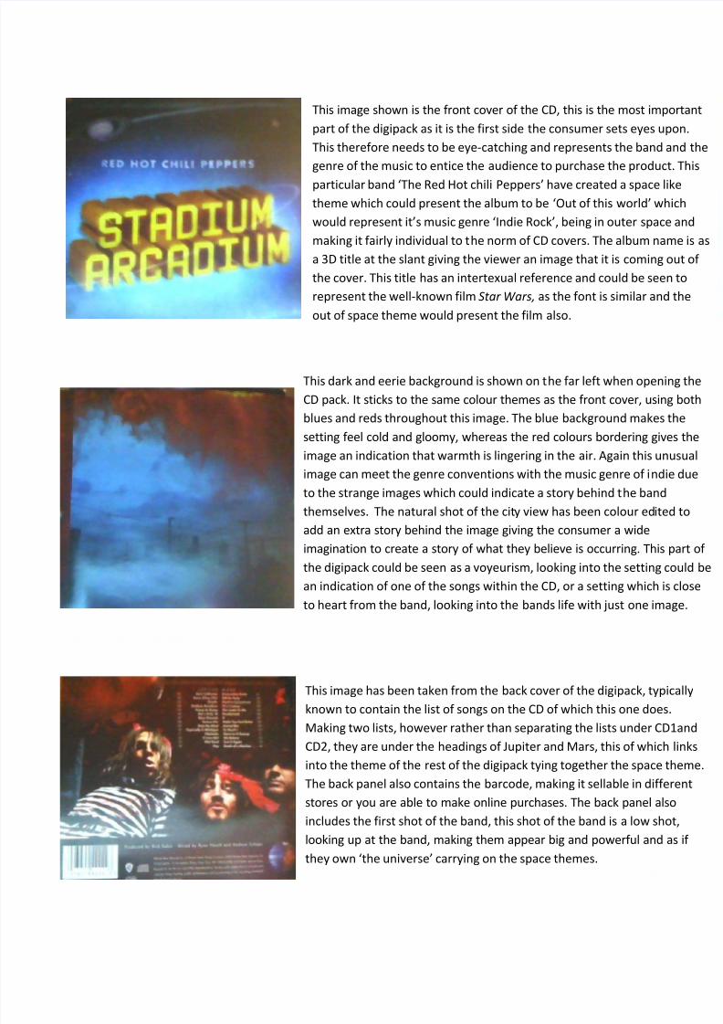
This image shown is the front cover of the CD, this is the most important
part of the digipack as it is the first side the consumer sets eyes upon.
This therefore needs to be eye-catching and represents the band and the
genre of the music to entice the audience to purchase the product. This
particular band ‘The Red Hot chili Peppers’ have created a space like
theme which could present the album to be ‘Out of this world’ which
would represent it’s music genre ‘Indie Rock’, being in outer space and
making it fairly individual to the norm of CD covers. The album name is as
a 3D title at the slant giving the viewer an image that it is coming out of
the cover. This title has an intertexual reference and could be seen to
represent the well-known film Star Wars, as the font is similar and the
out of space theme would present the film also.
This dark and eerie background is shown on the far left when opening the
CD pack. It sticks to the same colour themes as the front cover, using both
blues and reds throughout this image. The blue background makes the
setting feel cold and gloomy, whereas the red colours bordering gives the
image an indication that warmth is lingering in the air. Again this unusual
image can meet the genre conventions with the music genre of indie due
to the strange images which could indicate a story behind the band
themselves. The natural shot of the city view has been colour edited to
add an extra story behind the image giving the consumer a wide
imagination to create a story of what they believe is occurring. This part of
the digipack could be seen as a voyeurism, looking into the setting could be
an indication of one of the songs within the CD, or a setting which is close
to heart from the band, looking into the bands life with just one image.
This image has been taken from the back cover of the digipack, typically
known to contain the list of songs on the CD of which this one does.
Making two lists, however rather than separating the lists under CD1and
CD2, they are under the headings of Jupiter and Mars, this of which links
into the theme of the rest of the digipack tying together the space theme.
The back panel also contains the barcode, making it sellable in different
stores or you are able to make online purchases. The back panel also
includes the first shot of the band, this shot of the band is a low shot,
looking up at the band, making them appear big and powerful and as if
they own ‘the universe’ carrying on the space themes.
7/31/2019 digipak- rock indie
http://slidepdf.com/reader/full/digipak-rock-indie 2/2
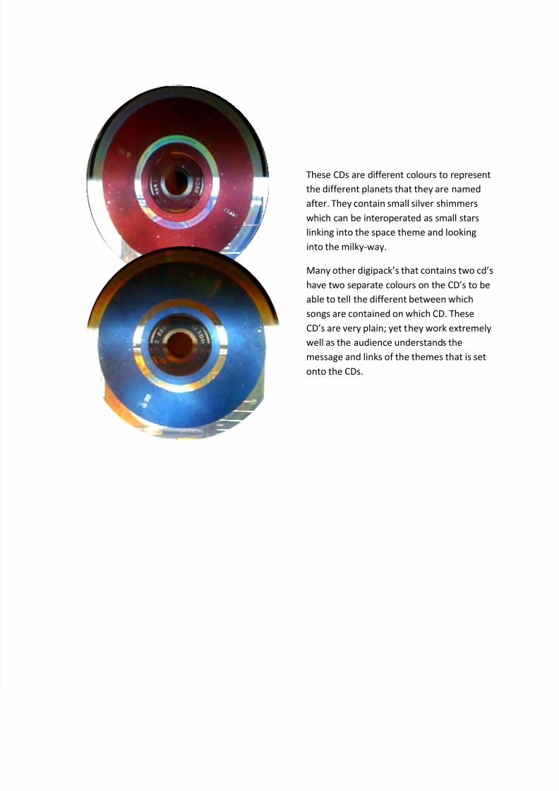
These CDs are different colours to represent
the different planets that they are named
after. They contain small silver shimmers
which can be interoperated as small stars
linking into the space theme and looking
into the milky-way.
Many other digipack’s that contains two cd’s
have two separate colours on the CD’s to be
able to tell the different between which
songs are contained on which CD. These
CD’s are very plain; yet they work extremely
well as the audience understands the
message and links of the themes that is set
onto the CDs.