dickens ryne presentation
TRANSCRIPT

Website Design for Mobile DevicesRyne Dickens
Sunday, March 30, 14

Do you want your website to stand out on mobile devices, but aren’t sure if it is the
right move?
Sunday, March 30, 14

Do you think mobile or tablet usage isn’t important for your website or business?
Sunday, March 30, 14

Here is why you should update your site, or make it better for mobile device access, aside from it being the fastest growing segment of the web. I will be showing you a series of slides, with information and visualson comparing desktop and mobile sites. You will >ind that the process has somewhat >lipped over the past few years and you may be falling behind.
Pic: cnet.comSunday, March 30, 14

(http://mashable.com/2011/08/05/mobile-‐design-‐priority/)
The game has changed, simple as that. Companies these days need to focus on mobile >irst instead of mobile friendly. Desktop or laptop users typically are multitasking during work. Smartphone users are transaction-‐oriented. They do not want to be overloaded with content while they are trying to achieve a goal. Typically they have an objective and leave once it is completed. In designing the site for mobile users, you will want to use the “less is more” approach. Simple, and quick page loads are essential. Pic: ohmythatsawesome.com
Sunday, March 30, 14

Here are some quick and easy tips that can get your site on the right track.
1. Style for mobile – Stick to relative units. Maintain visual consistency with the desktop site. Minimize scrolling and page transitions.
(http://www.sitepoint.com/7-‐tips-‐to-‐make-‐your-‐web-‐site-‐mobile-‐friendly/)
2. Resize your images – small screens call for small images. A good strategy is to resize them on the web server so they take 90% less time to load.
Sunday, March 30, 14

3. Automatically detect mobile devices using servers and databases to detect what device has accessed the site.
(http://www.sitepoint.com/7-‐tips-‐to-‐make-‐your-‐web-‐site-‐mobile-‐friendly/)
If we use these tips and you will be well on your way.
5. Provide a clear path to your full site and don’t break any links.
4. Rethink your navigation to mobile priority content.
Sunday, March 30, 14
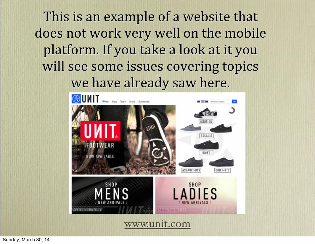
This is an example of a website that does not work very well on the mobile platform. If you take a look at it you will see some issues covering topics
we have already saw here.
www.unit.comSunday, March 30, 14

This is a website that works extraordinarily well with the mobile platform. I would
recommend using this site as a guide or at least a reference to anyone looking to make the step
into the mobile design world.
www.southwest.com
(http://www.creativebloq.com/mobile/mobile-‐>irst-‐3117071)Sunday, March 30, 14
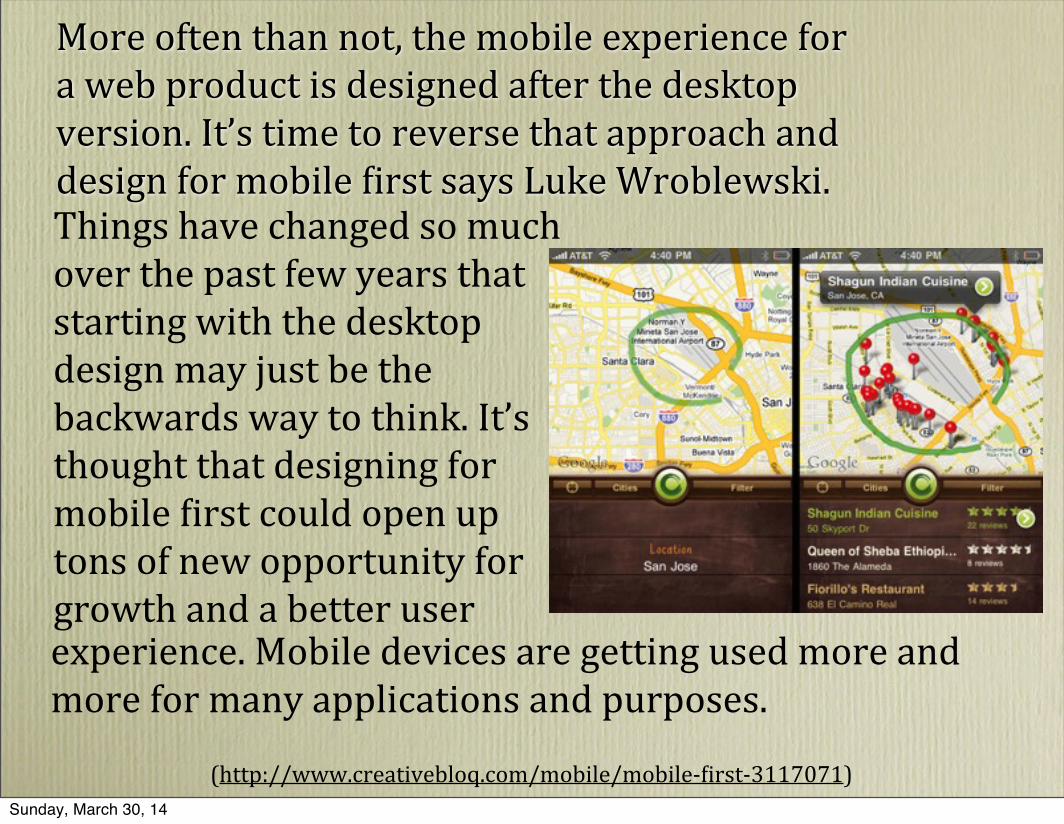
More often than not, the mobile experience for a web product is designed after the desktop version. It’s time to reverse that approach and design for mobile >irst says Luke Wroblewski. Things have changed so much over the past few years that starting with the desktop design may just be the backwards way to think. It’s thought that designing for mobile >irst could open up tons of new opportunity for growth and a better userexperience. Mobile devices are getting used more and more for many applications and purposes.
(http://www.creativebloq.com/mobile/mobile-‐>irst-‐3117071)Sunday, March 30, 14
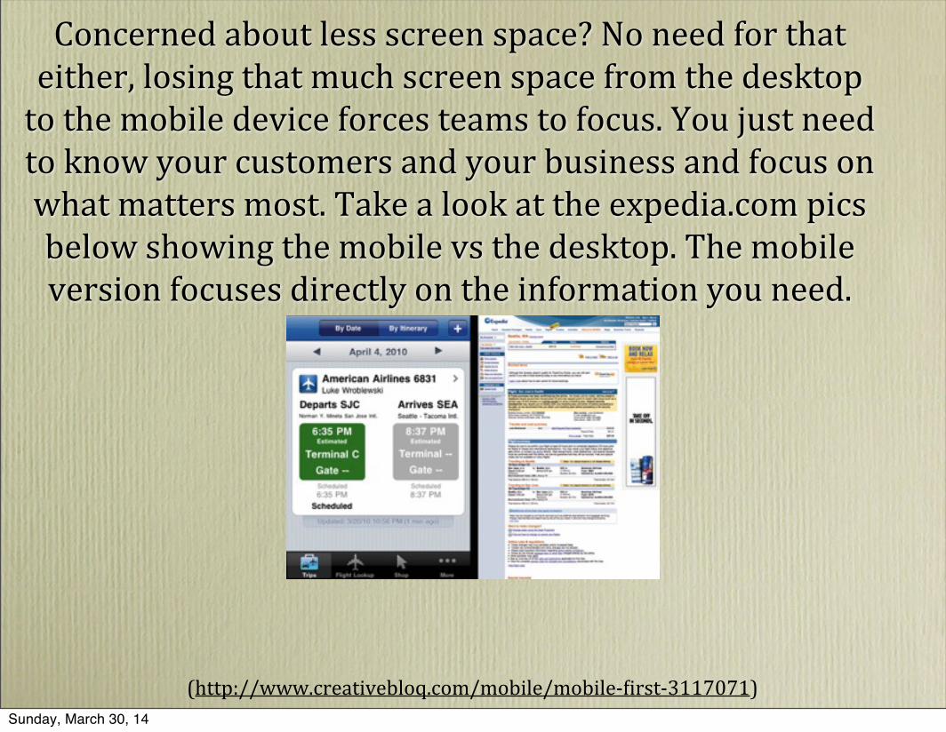
Concerned about less screen space? No need for that either, losing that much screen space from the desktop to the mobile device forces teams to focus. You just need to know your customers and your business and focus on what matters most. Take a look at the expedia.com pics below showing the mobile vs the desktop. The mobile version focuses directly on the information you need.
(http://www.creativebloq.com/mobile/mobile-‐>irst-‐3117071)Sunday, March 30, 14
I hope you will consider making an effort to switch your site to mobile friendly and
operable. I touched on a few advantages here, but there is so much more to show and learn about this technology. Mobile design is the future and is only going to continue to
progress. It has changed drastically over the past few years as I stated at the beginning and in a few more years, who knows where it will be. Will you be up-‐to-‐date or will you be left
behind?
Sunday, March 30, 14