detecting trends over time -...
TRANSCRIPT

Chapter 15
Detecting trends over time
Contents15.1 Introduction . . . . . . . . . . . . . . . . . . . . . . . . . . . . . . . . . . . . . . 95715.2 Simple Linear Regression . . . . . . . . . . . . . . . . . . . . . . . . . . . . . . . 962
15.2.1 Populations and samples . . . . . . . . . . . . . . . . . . . . . . . . . . . . 96315.2.2 Assumptions . . . . . . . . . . . . . . . . . . . . . . . . . . . . . . . . . . 96415.2.3 Obtaining Estimates . . . . . . . . . . . . . . . . . . . . . . . . . . . . . . . 96515.2.4 Obtaining Predictions . . . . . . . . . . . . . . . . . . . . . . . . . . . . . . 96615.2.5 Inverse predictions . . . . . . . . . . . . . . . . . . . . . . . . . . . . . . . 96715.2.6 Residual Plots . . . . . . . . . . . . . . . . . . . . . . . . . . . . . . . . . . 96815.2.7 Example: The Grass is Greener (for longer) . . . . . . . . . . . . . . . . . . 96815.2.8 Example: Place your bet on the breakup of the Yukon River. . . . . . . . . . . 978
15.3 Transformations . . . . . . . . . . . . . . . . . . . . . . . . . . . . . . . . . . . . 98915.3.1 Example: Monitoring Dioxins - transformation . . . . . . . . . . . . . . . . . 990
15.4 Pseudo-replication . . . . . . . . . . . . . . . . . . . . . . . . . . . . . . . . . . . 100215.5 Introduction . . . . . . . . . . . . . . . . . . . . . . . . . . . . . . . . . . . . . . 1002
15.5.1 Example: Changes in stream biomass over time . . . . . . . . . . . . . . . . 100615.6 Power/Sample Size . . . . . . . . . . . . . . . . . . . . . . . . . . . . . . . . . . . 1012
15.6.1 Introduction . . . . . . . . . . . . . . . . . . . . . . . . . . . . . . . . . . . 101215.6.2 Getting the necessary information . . . . . . . . . . . . . . . . . . . . . . . . 101515.6.3 Determining Power . . . . . . . . . . . . . . . . . . . . . . . . . . . . . . . 1022
15.7 Power/sample size examples . . . . . . . . . . . . . . . . . . . . . . . . . . . . . . 102315.7.1 Example 1: No process error present . . . . . . . . . . . . . . . . . . . . . . 102415.7.2 Example 2: Incorporating process and sampling error . . . . . . . . . . . . . 102815.7.3 WARNING about using testing for temporal trends . . . . . . . . . . . . . . . 1036
15.8 Testing for common trend - ANCOVA . . . . . . . . . . . . . . . . . . . . . . . . 103715.8.1 Assumptions . . . . . . . . . . . . . . . . . . . . . . . . . . . . . . . . . . 103915.8.2 Statistical model . . . . . . . . . . . . . . . . . . . . . . . . . . . . . . . . . 1040
15.9 Example: Degradation of dioxin - multiple locations . . . . . . . . . . . . . . . . . 104215.9.1 Prologue . . . . . . . . . . . . . . . . . . . . . . . . . . . . . . . . . . . . . 1052
15.10Example: Change in yearly average temperature with regime shifts . . . . . . . . 105315.11Dealing with Autocorrelation . . . . . . . . . . . . . . . . . . . . . . . . . . . . . 1060
15.11.1 Example: Mink pelts from Saskatchewan . . . . . . . . . . . . . . . . . . . . 106815.11.2 Example: Median run timing of Atlantic Salmon . . . . . . . . . . . . . . . . 1076
15.12Dealing with seasonality . . . . . . . . . . . . . . . . . . . . . . . . . . . . . . . . 1083
956

CHAPTER 15. DETECTING TRENDS OVER TIME
15.12.1 Empirical adjustment for seasonality . . . . . . . . . . . . . . . . . . . . . . 108315.12.2 Using the ANCOVA approach . . . . . . . . . . . . . . . . . . . . . . . . . 108915.12.3 Fitting cyclical patterns . . . . . . . . . . . . . . . . . . . . . . . . . . . . . 109215.12.4 Further comments . . . . . . . . . . . . . . . . . . . . . . . . . . . . . . . . 1103
15.13Seasonality and Autocorrelation . . . . . . . . . . . . . . . . . . . . . . . . . . . . 110415.14Non-parametric detection of trend . . . . . . . . . . . . . . . . . . . . . . . . . . 1106
15.14.1 Cox and Stuart test for trend . . . . . . . . . . . . . . . . . . . . . . . . . . 110615.14.2 Non-parametric regression - Spearman, Kendall, Theil, Sen estimates . . . . . 110915.14.3 Dealing with seasonality - Seasonal Kendall’s τ . . . . . . . . . . . . . . . . 111515.14.4 Seasonality with Autocorrelation . . . . . . . . . . . . . . . . . . . . . . . . 1118
15.15Summary . . . . . . . . . . . . . . . . . . . . . . . . . . . . . . . . . . . . . . . . 1118
The suggested citation for this chapter of notes is:
Schwarz, C. J. (2019). Detecting trends over time.In Course Notes for Beginning and Intermediate Statistics.Available at http://www.stat.sfu.ca/~cschwarz/CourseNotes. Retrieved2019-11-04.
15.1 Introduction
As the following graphs shows, tests for trend are one of the most common statistical tools used.1
1 The astute reader may note the discrepancy between the headline and the apparent trend in the graph. Why?
c©2019 Carl James Schwarz 957 2019-11-04

CHAPTER 15. DETECTING TRENDS OVER TIME
Trend analysis is often used as the endpoint for many monitoring designs, i.e. is the monitoredvariable increasing or decreasing. Some nice references for planning monitoring studies are:
c©2019 Carl James Schwarz 958 2019-11-04
CHAPTER 15. DETECTING TRENDS OVER TIME
• USGS Patuxent Wildlife Research Centre’s Manager’s Monitoring Manual available at http://www.pwrc.usgs.gov/monmanual/.
• US National Parks Service Guidelines on designing a monitoring study available at http://science.nature.nps.gov/im/monitor/index.htm.
• Elzinga, C.L. et al. (2001). Monitoring Plant and Animal Populations Blackwell Science, Inc.
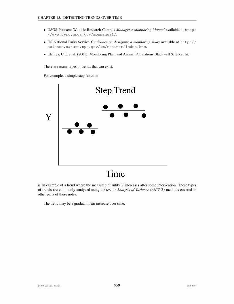
There are many types of trends that can exist.
For example, a simple step function
is an example of a trend where the measured quantity Y increases after some intervention. These typesof trends are commonly analyzed using a t-test or Analysis of Variance (ANOVA) methods covered inother parts of these notes.
The trend may be a gradual linear increase over time:
c©2019 Carl James Schwarz 959 2019-11-04

CHAPTER 15. DETECTING TRENDS OVER TIME
For example, as the amount of trees cleared increases over time, the turbidity of water in a stream mayincrease. In many cases, a regression analysis is used to test for trends in time. In these cases, the Xvariable is time and the Y variable is some response variable of interest. This is the main focus of thischapter.
In some cases the trend is monotonic but non-linear:
In the case of non-linear trends, a transformation is often used to try and linearize the trend (e.g. a logtransform). This is often successful, in which case methods for linear regression can be used, but in some
c©2019 Carl James Schwarz 960 2019-11-04

CHAPTER 15. DETECTING TRENDS OVER TIME
cases there is no-obvious transformation. The trend can modeled by an arbitrary function of arbitraryshape. A very general methodology called Generalized Additive Models can be used to fit very generalfunctions. These are beyond the scope of this course.
Sometimes the linear trend changes at some point (called the break point):
If the break point is known in advance, this is easily fit using multiple regression methods, but is beyondthe scope of these notes. If the breakpoint is unknown, this is a difficult statistical problem, but refer toToms and Lesperance (2003)2 for help.
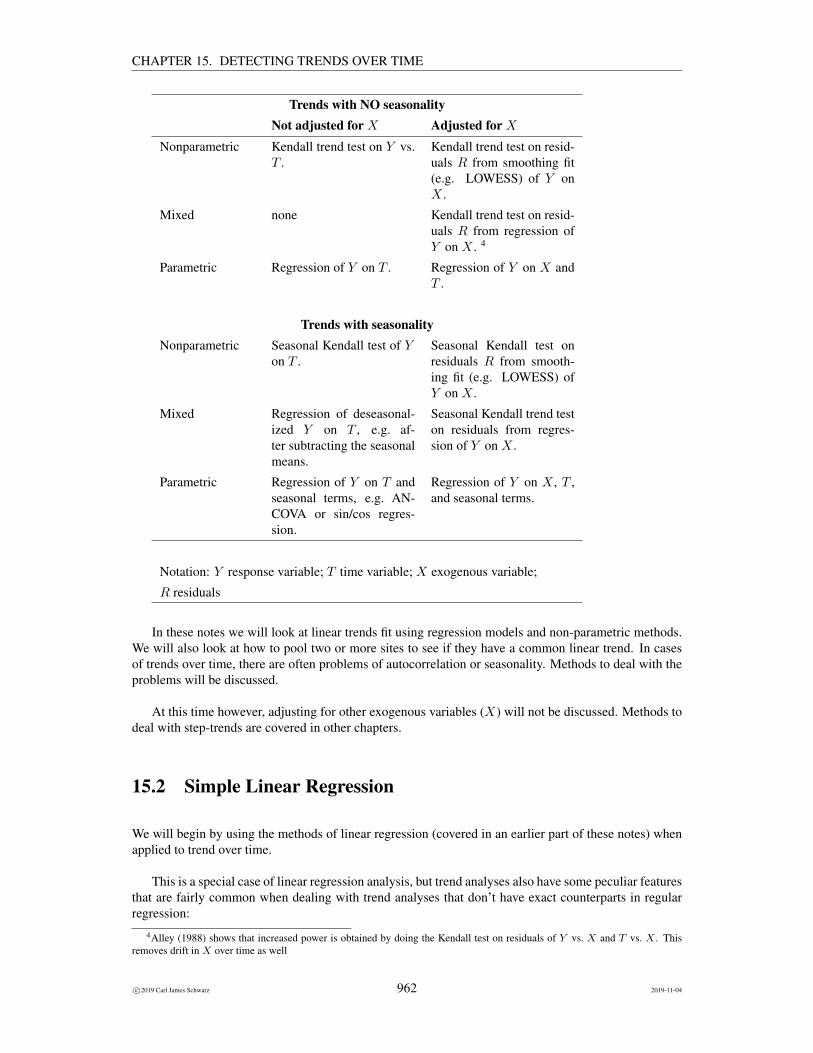
Helsel and Hirsch (2002)3 have a number summary of methods used to detect trends. The followingtable is adopted from their manual:
2 Toms J.D. and Lesperance M.L. (2003) Piecewise regression A tool for identifying ecological thresholds. Ecology, 84,2034-2041.
3 Helsel, D.R. and Hirsch, R.M. (2002). Statistical methods in water resources. Chapter 12. Available at http://pubs.usgs.gov/twri/twri4a3/
c©2019 Carl James Schwarz 961 2019-11-04
CHAPTER 15. DETECTING TRENDS OVER TIME
Trends with NO seasonalityNot adjusted for X Adjusted for X
Nonparametric Kendall trend test on Y vs.T .
Kendall trend test on resid-uals R from smoothing fit(e.g. LOWESS) of Y onX .
Mixed none Kendall trend test on resid-uals R from regression ofY on X . 4
Parametric Regression of Y on T . Regression of Y on X andT .
Trends with seasonalityNonparametric Seasonal Kendall test of Y
on T .Seasonal Kendall test onresiduals R from smooth-ing fit (e.g. LOWESS) ofY on X .
Mixed Regression of deseasonal-ized Y on T , e.g. af-ter subtracting the seasonalmeans.
Seasonal Kendall trend teston residuals from regres-sion of Y on X .
Parametric Regression of Y on T andseasonal terms, e.g. AN-COVA or sin/cos regres-sion.
Regression of Y on X , T ,and seasonal terms.
Notation: Y response variable; T time variable; X exogenous variable;
R residuals
In these notes we will look at linear trends fit using regression models and non-parametric methods.We will also look at how to pool two or more sites to see if they have a common linear trend. In casesof trends over time, there are often problems of autocorrelation or seasonality. Methods to deal with theproblems will be discussed.
At this time however, adjusting for other exogenous variables (X) will not be discussed. Methods todeal with step-trends are covered in other chapters.
15.2 Simple Linear Regression
We will begin by using the methods of linear regression (covered in an earlier part of these notes) whenapplied to trend over time.
This is a special case of linear regression analysis, but trend analyses also have some peculiar featuresthat are fairly common when dealing with trend analyses that don’t have exact counterparts in regularregression:
4Alley (1988) shows that increased power is obtained by doing the Kendall test on residuals of Y vs. X and T vs. X . Thisremoves drift in X over time as well
c©2019 Carl James Schwarz 962 2019-11-04

CHAPTER 15. DETECTING TRENDS OVER TIME
• Testing for a common trend (a special case of ANCOVA)
• Dealing with process vs. sampling variation
• Dealing with autocorrelation of residuals
For most of this chapter, we will assume that the time variable T is measured in years (e.g. calendaryear).
The same sampling model, assumptions, estimation, and hypothesis testing methods are used as inthe regular regression case with appropriate modifications to deal with T as time. These will be reviewedagain below.
15.2.1 Populations and samples
The population of interest is the set of Y variables as measured over time (T ). In most cases in trendanalysis, random sampling from some larger population of time points really doesn’t make sense. Ratherthe time values (the T values) are pre-specified. For example, measurements could be taken every year,or every two years, etc.
We wish to summarize the relationship between Y and time (T ), and furthermore wish to makepredictions of the Y value for future time (T ) values that may be observed from this population. We mayalso wish to do inverse regression, i.e. predict at what time Y will reach a certain value.
If this were physics, we may conceive of a physical law between Y and time (e.g. distance =velocity × time). However, in ecology, the relationship between Y and time is much more tenuous.If you could draw a scatter plot of Y against time the points would NOT fall exactly on a straight line.Rather, the value of Y would fluctuate above or below a straight line at any given time value.
We denote this relationship asY = β0 + β1T + ε
where T is time rather than some other predictor variable. Now β0, β1 are the POPULATION interceptand slope respectively. We say that
E[Y ] = β0 + β1T
is the expected or average value of Y at T .5
The term ε represent random variation of individual units in the population above and below theexpected value. It is assumed to have constant standard deviation over the entire regression line (i.e. thespread of data points is constant over time).
Of course, we can never measure all units of the population. So a sample must be taken in order toestimate the population slope, population intercept, and standard deviation. In most trend analyses, thevalues of T are chosen to be equally spaced in time, e.g. measurements taken every year.
Once the data points are selected, the estimation process can proceed, but not before assessing theassumptions!
5 In ANOVA, we let each treatment group have its own mean; here in regression we assume that the means must fit on a straightline. In some cases, even in the absence of sampling error, the value of Y does NOT lies on the straight time. This is known asprocess variation, and will be discussed later.
c©2019 Carl James Schwarz 963 2019-11-04

CHAPTER 15. DETECTING TRENDS OVER TIME
15.2.2 Assumptions
The assumptions for a trend analysis are virtually the same as for a standard regression analysis. This isnot surprising as trend analysis is really a special case of regression analyses.
Linearity
Regression analysis assume that the relationship between Y and T is linear, i.e. a constant decline overtime. This can be assessed quite simply by plotting Y vs. time. Perhaps a transformation is required(e.g. log(Y ) vs. log(T )). Some caution is required when transformations are done, as the error structureon the transformed scale is most important. As well, you need to be a little careful about the back-transformation after doing regression on transformed values.
You should also plot residuals vs. the T (time) values. If the scatter is not random around 0 but showssome pattern (e.g. quadratic curve), this usually indicates that the relationship between Y and T (time) isnot linear. Alternatively, you can fit a model that includes T and T 2 and test if the coefficient associatedwith T 2 is zero. Unfortunately, this test could fail to detect a higher order relationship. Third, if there aremultiple readings at some T -values, then a test of goodness-of-fit can be performed where the variationof the responses at the same T value is compared to the variation around the regression line.
Scale of Y and T
As T is time, it has an interval or ratio scale. It is further assumed that Y has an interval or ratio scale aswell. This can be violated in a number of ways. For example, a numerical value is often to represent acategory and this numerical value in used in a regression. This is not valid. Suppose that you code haircolor as (1 = red, 2 = brown, and 3 = black). Then using these values as the response variable (Y ) isnot sensible.
Correct sampling scheme
The Y must be a random sample from the population of Y values at every time point.
No outliers or influential points
All the points must belong to the relationship – there should be no unusual points. The scatter plot of Yvs. T should be examined. If in doubt, fit the model with the outlying points in and out of the model andsee if this makes a difference in the fit.
Outliers can have a dramatic effect on the fitted line as you saw in a previous chapter.
Equal variation along the line
The variability about the regression line is similar for all values of T , i.e. the scatter of the points aboveand below the fitted line should be roughly constant over time. This is assessed by looking at the plots of
c©2019 Carl James Schwarz 964 2019-11-04

CHAPTER 15. DETECTING TRENDS OVER TIME
the residuals against T to see if the scatter is roughly uniformly scattered around zero with no increaseand no decrease in spread over the entire line.
Independence
Each value of Y is independent of any other value of Y . This is a common failing in trend analysis wherethe measurement in a particular year influences the measurement in subsequent years.
This assumption can be assessed by again looking at residual plots against time or other variables.
Normality of errors
The difference between the value of Y and the expected value of Y is assumed to be normally dis-tributed. This is one of the most misunderstood assumptions. Many people erroneously assume that thedistribution of Y over all T values must be normally distributed, i.e they look simply at the distributionof the Y ’s ignoring the T s. The assumption only states that the residuals, the difference between thevalue of Y and the point on the line must be normally distributed.
This can be assessed by looking at normal probability plots of the residuals. As in ANOVA, for smallsample sizes, you have little power of detecting non-normality and for large sample sizes it is not thatimportant.
T measured without error
This is a new assumption for regression as compared to ANOVA. In ANOVA, the group membershipwas always “exact”, i.e. the treatment applied to an experimental unit was known without ambiguity.However, in regression, it can turn out that that the T value may not be known exactly.
This may seem a bit puzzling in a trend analysis – after all, how can the calendar year not be knownexactly. An example of the problem is when Y is a estimate of the population size which is measuredover time. This is often obtained from a mark-recapture study when animals are marked in one month,and recaptured in the next month. In this case, does the population size refer to the population size at thestart of the study, in the middle of the study, or the end of the study. If the same protocol was performedin all years, then it really doesn’t matter, but the start and end of sampling likely varies over years (e.g. insome years starts in March, in other years starts in April) so that the interval between sampling occasionsis not constant.
This general problem is called the “error in variables” problem and has a long history in statistics.More details are available in the chapter on regression analysis.
15.2.3 Obtaining Estimates
As before, we distinguish between population parameters and sample estimates. We denote the sampleintercept by b0 and the sample slope by b1. The equation of a particular sample of points is expressedYi = b0 +b1Ti where b0 is the estimated intercept, and b1 is the estimated slope. The symbol Y indicatesthat we are referring to the estimated line and not to population line.
c©2019 Carl James Schwarz 965 2019-11-04
CHAPTER 15. DETECTING TRENDS OVER TIME
As in regression analysis, the best fitting line is typically found using least squares. However,in more complex situation (e.g. when accounting for autocorrelation over time), maximum likelihoodmethods can also be used. The least-squares line is the line that makes the sum of the squares of thedeviations of the data points from the line in the vertical direction as small as possible.
The estimated intercept (b0) is the estimated value of Y when X = 0, i.e. at time = 0. In manycases of trend analysis, it is meaningless to talk about values of Y when T = 0 because T = 0 is oftennonsensical. For example, in a plot of income vs. year, it seems kind of silly to investigate income inyear 0. In these cases, there is no clear interpretation of the intercept, and it merely serves as a placeholder for the line.
The estimated slope (b1) is the estimated change in Y per unit change in T . In many cases T ismeasured in years, so this would be the change in Y per year.
As with all estimates, a measure of precision can be obtained. As before, this is the standard error ofeach of the estimates. Confidence intervals for the population slope and intercept can also be found.
Formal tests of hypotheses can also be done. Usually, these are only done on the slope parameteras this is typically of most interest. The null hypothesis is that population slope is 0, i.e. there is norelationship between Y and T , i.e. no trend over time. More formally the null hypothesis is:
H : β1 = 0
Again notice that the null hypothesis is ALWAYS in terms of a population parameter and not in terms ofa sample statistic.
The alternate hypothesis is typically chosen as:
A : β1 6= 0
although one-sided tests looking for either a positive or negative trend are possible.
The p-value is interpreted in exactly the same way as in ANOVA, i.e. is measures the probability ofobserving this data if the hypothesis of no relationship were true.
As before, the p-value does not tell the whole story, i.e. statistical vs. biological (non)significancemust be determined and assessed.
15.2.4 Obtaining Predictions
Once the best fitting line is found it can be used to make predictions for new values of T , e.g. what is thepredicted value of Y for new time points.
There are two types of predictions that are commonly made. It is important to distinguish betweenthem as these two intervals are the source of much confusion in regression problems.
First, the experimenter may be interested in predicting a SINGLE future individual value for a par-ticular T . Second the experimenter may be interested in predicting the AVERAGE of ALL futureresponses at a particular T .6 The prediction interval for an individual response is sometimes called aconfidence interval for an individual response but this is an unfortunate (and incorrect) use of the termconfidence interval. Strictly speaking confidence intervals are computed for fixed unknown parametervalues; predication intervals are computed for future random variables.
6 There is actually a third interval, the mean of the next m individuals values but this is rarely encountered in practice.
c©2019 Carl James Schwarz 966 2019-11-04

CHAPTER 15. DETECTING TRENDS OVER TIME
Both of the above intervals should be distinguished from the confidence interval for the slope.
In both cases, the estimate is found in the same manner – substitute the new value of T into the equa-tion and compute the predicted value Y . In most computer packages this is accomplished by inserting anew “dummy” observation in the dataset with the value of Y missing, but the value of T present. Themissing Y value prevents this new observation from being used in the fitting process, but the T valueallows the package to compute an estimate for this observation.
What differs between the two predictions are the estimates of uncertainty.
In the first case, where predictions for INDIVIDUALs are wanted, there are two sources of uncer-tainty involved in the prediction. First, there is the uncertainty caused by the fact that this estimated lineis based upon a sample. Then there is the additional uncertainty that the value could be above or belowthe predicted line. This interval is often called a prediction interval at a new T .
In the second case, where predictions for the mean response are wanted, only the uncertainty causedby estimating the line based on a sample is relevant. This interval is often called a confidence intervalfor the mean at a new T .
The prediction interval for an individual response is typically MUCH wider than the confidenceinterval for the mean of all future responses because it must account for the uncertainty from the fittedline plus individual variation around the fitted line.
Many textbooks have the formulae for the se for the two types of predictions, but again, there islittle to be gained by examining them. What is important is that you read the documentation carefully toensure that you understand exactly what interval is being given to you.
15.2.5 Inverse predictions
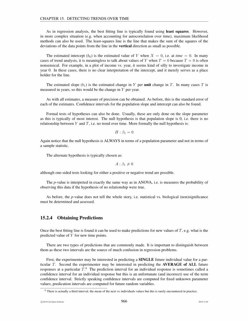
A related question is “how long before the E[Y ] reaches a certain point”. These are obtained by drawinga line across from the Y axis until it reaches the fitted line, and then following the line down until itreaches the T (time) axis. Confidence intervals for the inverse prediction are found by following thesame procedure but now following the line horizontally across until it reaches one of the confidenceintervals (either for the mean response or the individual response).7
7 It is possible that the confidence intervals are one-sided (i.e. one side is either plus or minus infinity), or even that theconfidence interval comes in two sections. Please consult a reference such as Draper and Smith for details.
c©2019 Carl James Schwarz 967 2019-11-04
CHAPTER 15. DETECTING TRENDS OVER TIME
15.2.6 Residual Plots
After the curve is fit, it is important to examine if the fitted curve is reasonable. This is done usingresiduals. The residual for a point is the difference between the observed value and the predicted value,i.e., the residual from fitting a straight line is found as: residuali = Yi − (b0 + b1Ti) = (Yi − Yi).
There are several standard residual plots:
• plot of residuals vs. predicted (Y );
• plot of residuals vs. T;
In all cases, the residual plots should show random scatter around zero with no obvious pattern.Don’t plot residual vs. Y - this will lead to odd looking plots which are an artifact of the plot and don’tmean anything.
Residual plots are also useful for assessing autocorrelation where the points are not longer indepen-dent over time (i.e. the value of Y at T + 1 is related to the value of Y at T ). This will be discussedalter.
15.2.7 Example: The Grass is Greener (for longer)
D. G. Grisenthwaite, a pensioner who has spent 20 years keeping detailed records of how often he cutshis grass has been included in a climate change study. David Grisenthwhaite, 77, and a self-confessed“creature of habit”, has kept a note of cutting grass in his Kirkcaldy garden since 1984. The grandfather’sdata was so valuable it was used by the Royal Meteorological Society in a paper on global warming.
c©2019 Carl James Schwarz 968 2019-11-04

CHAPTER 15. DETECTING TRENDS OVER TIME
The retired paper-maker, who moved to Scotland from Cockermouth in West Cumbria in 1960, saidhe began making a note of the time and date of every occasion he cut the grass simply “for the fun of it”.
The data are presented in:
Sparks, T.H., Croxton, J.P.J., Collinson, N., and Grisenthwaite, D.A. (2005) The Grass isGreener (for longer). Weather 60, 121-123.
from which the data on the duration of the cutting season was extracted:
Year Duration
(days)
1984 200
1985 215
1986 195
1987 212
1988 225
1989 240
1990 203
1991 208
1992 203
1993 202
1994 210
1995 225
1996 204
1997 245
1998 238
1999 226
2000 227
2001 236
2002 215
2003 242
The question of interest is if there is evidence that the lawn cutting season has increased over time?
The data is available in the grass.csv file in the Sample Program Library at http://www.stat.sfu.ca/~cschwarz/Stat-Ecology-Datasets. The data are imported into R in the usual fash-ion:
grass <- read.csv("grass.csv", header=TRUE,as.is=TRUE, strip.white=TRUE,na.string=".")
head(grass)str(grass)
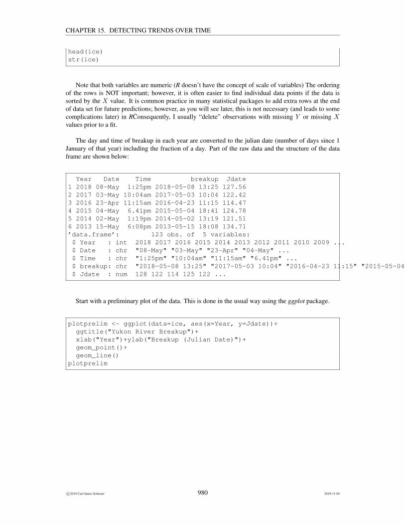
Note that both variables are numeric (R doesn’t have the concept of scale of variables) The ordering
c©2019 Carl James Schwarz 969 2019-11-04

CHAPTER 15. DETECTING TRENDS OVER TIME
of the rows is NOT important; however, it is often easier to find individual data points if the data issorted by the X value. It is common practice in many statistical packages to add extra rows at the endof data set for future predictions; however, as you will see later, this is not necessary (and leads to somecomplications later) in RConsequently, I usually “delete” observations with missing Y or missing Xvalues prior to a fit.
Part of the raw data and the structure of the data frame are shown below:
year days1 1984 2002 1985 2153 1986 1954 1987 2125 1988 2256 1989 240’data.frame’: 23 obs. of 2 variables:$ year: int 1984 1985 1986 1987 1988 1989 1990 1991 1992 1993 ...$ days: int 200 215 195 212 225 240 203 208 203 202 ...
Start with a preliminary plot of the data. This is done in the usual way using the ggplot package.
plotprelim <- ggplot(data=grass, aes(x=year, y=days))+ggtitle("Cutting duration over time")+xlab("Year")+ylab("Cutting duration (days)")+geom_point()
plotprelim
c©2019 Carl James Schwarz 970 2019-11-04

CHAPTER 15. DETECTING TRENDS OVER TIME
The plot shows some evidence that the duration of the cutting season has increased over time.
We can check some of the assumptions:
• the Y and X variable are both the proper scale.
• the relationship appears to be approximately linear.
• there are no obvious outliers.
• the variance (scatter) of points around the line appears to be approximately equal. We will checkthis again from the residual plot.
• they may be some evidence of autocorrelation as the line joining the raw data points seems to dipabove and below the line for several years in a row. This could correspond to slowly changingeffects such as a multi-year dry or wet spell. However, with only 20 data points, it is difficult totell. We will check more formally for non-independence by looking at the residual plot and theDurbin-Watson test statistic later.
We now fit a simple regression line to the data: We use the lm() function to fit the regression model:
grass.fit <- lm( days ~ year, data=grass)summary(grass.fit)
The formula in the lm() function is what tells R that the response variable is days because it appearsto the left of the tilde sign, and that the predictor variable is year because it appears to the right of thetilde sign.
The summary() function produces the table that contains the estimates of the regression coefficientsand their standard errors and various other statistics
Call:lm(formula = days ~ year, data = grass)
Residuals:Min 1Q Median 3Q Max
-18.2135 -10.9556 -0.8425 9.0617 28.0444
Coefficients:Estimate Std. Error t value Pr(>|t|)
(Intercept) -2702.7519 1045.9054 -2.584 0.0187 *year 1.4654 0.5247 2.793 0.0120 *---Signif. codes: 0 ’***’ 0.001 ’**’ 0.01 ’*’ 0.05 ’.’ 0.1 ’ ’ 1
Residual standard error: 13.53 on 18 degrees of freedom(3 observations deleted due to missingness)
Multiple R-squared: 0.3024, Adjusted R-squared: 0.2636F-statistic: 7.801 on 1 and 18 DF, p-value: 0.01201
c©2019 Carl James Schwarz 971 2019-11-04

CHAPTER 15. DETECTING TRENDS OVER TIME
The estimated intercept (-2702) would represent the estimated duration of the growing season inyear 0 – clearly a nonsensical result. It really doesn’t matter, as the intercept is just a place holder for theequation of the line. What really is of interest, is the estimated slope.
The estimated slope is 1.46 (se 0.52) days/year. This means that the duration of the growing seasonis estimated to have increased by 1.46 days per year over the span of this study. The 95% confidenceinterval for the slope(0.36 to 2.56) does not include the value of 0, so there is evidence against theunderlying slope being 0 (i.e. there is evidence of a change over the years in the mean cutting duration).
Finally, the p-value for testing if there trend is 0.012 which again provides evidence against thehypothesis of no change in mean duration over the span of the experiment.
The estimated value of RMSE is 13.52 days which is the estimated standard deviation of the datapoints around the regression line.
It is possible to extract all of the individual pieces using the standard methods (specialized functionsto be applied to the results of a model fitting):
# Extract the individual parts of the fit using the# standard methodsanova(grass.fit)coef(grass.fit)sqrt(diag(vcov(grass.fit))) # gives the SEconfint(grass.fit)names(summary(grass.fit))summary(grass.fit)$r.squaredsummary(grass.fit)$sigma
As expected these match the previous outputs:
Analysis of Variance Table
Response: daysDf Sum Sq Mean Sq F value Pr(>F)
year 1 1428.0 1428.05 7.8014 0.01201 *Residuals 18 3294.9 183.05---Signif. codes: 0 ’***’ 0.001 ’**’ 0.01 ’*’ 0.05 ’.’ 0.1 ’ ’ 1(Intercept) year-2702.751880 1.465414(Intercept) year1045.9053827 0.5246556
2.5 % 97.5 %(Intercept) -4900.1175503 -505.386209year 0.3631529 2.567674[1] "call" "terms" "residuals" "coefficients"[5] "aliased" "sigma" "df" "r.squared"[9] "adj.r.squared" "fstatistic" "cov.unscaled" "na.action"[1] 0.302363[1] 13.52961
c©2019 Carl James Schwarz 972 2019-11-04

CHAPTER 15. DETECTING TRENDS OVER TIME
You should ALWAYS look at the residual and other diagnostic plots. These are the standard residualand normal probability plots. Leverage plots are less important in the simple regression case as they canusually by spotted directly from the preliminary plot.
# look at diagnostic plotplotdiag <- autoplot(grass.fit)plotdiag
This gives:
Because the data are collected over time, you should pay close attention to the plot of the residualplots vs. time to see if there is evidence of serial (auto) correlation (see later in these notes).
If the data values are equally spaced in time (with few missing values), this can be formally examinedusing the the Durbin-Watson statistic for testing the presence of autocorrelation.
The Durbin-Watson test is available in the lmtest and car package.
# check for autocorrelation using Durbin-Watson test# You can use the durbinWatsontest in the car package or the# dwtest in the lmtest package# For small sample sizes both are fine; for larger sample sizes use the lmtest package# Note the difference in the default direction of the alternative hypothesis
durbinWatsonTest(grass.fit) # from the car packagedwtest(grass.fit) # from the lmtest package
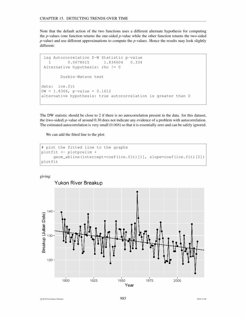
Note that the default action of the two functions uses a different alternate hypothesis for computing
c©2019 Carl James Schwarz 973 2019-11-04

CHAPTER 15. DETECTING TRENDS OVER TIME
the p-values (one function returns the one-sided p-value while the other function returns the two-sidedp-value) and use different approximations to compute the p-values. Hence the results may look slightlydifferent:
lag Autocorrelation D-W Statistic p-value1 -0.003659421 1.973261 0.762
Alternative hypothesis: rho != 0
Durbin-Watson test
data: grass.fitDW = 1.9733, p-value = 0.3748alternative hypothesis: true autocorrelation is greater than 0
The DW statistic should be close to 2 if there is no autocorrelation present in the data. for this dataset, the(two-sided) p-value of around 0.75 does not indicate any evidence of a problem with autocorrelation. Theestimated autocorrelation is very small (−.004) so that it is essentially zero and can be safely ignored.
We can add the fitted line to the plot:
# plot the fitted line to the graphsplotfit <- plotprelim +
geom_abline(intercept=coef(grass.fit)[1], slope=coef(grass.fit)[2])plotfit
giving:
c©2019 Carl James Schwarz 974 2019-11-04

CHAPTER 15. DETECTING TRENDS OVER TIME
This line can be used to make predictions about the cutting duration at various points along theobserved year and for a short time into the future. As always, it is very dangerous to extrapolate too faroutside the range of the observed data.
Of course, it is better to let the computer package to make the predictions for you. As noted in earlierchapters, there are two forms of predictions that can be made. You can find an estimate of the responseat a new value of X along with a confidence interval for the MEAN response, or a prediction interval fora SINGLE FUTURE response at a particular X .
To make predictions, we first create a data frame showing the new values of X for which we wantpredictions:
# make predictions# First set up the points where you want predictionsnewyears <- data.frame(year=seq(min(grass$year,na.rm=TRUE),max(grass$year,na.rm=TRUE),1))newyears[1:5,]str(newyears)
giving:
[1] 1984 1985 1986 1987 1988’data.frame’: 31 obs. of 1 variable:$ year: num 1984 1985 1986 1987 1988 ...
The predict() function is used to estimate the response and a confidence interval for the mean response atthe values created above. Notice the value of the interval= argument in the predict() function to specifythat the confidence interval for the mean response is wanted.
# Predict the AVERAGE duration of cuting at each year# You need to specify help(predict.lm) tp see the documentationpredict.avg <- predict(grass.fit, newdata=newyears,
se.fit=TRUE,interval="confidence")# This creates a list that you need to restructure to make it look nicepredict.avg.df <- cbind(newyears, predict.avg$fit, se=predict.avg$se.fit)tail(predict.avg.df)
# Add the confidence intervals to the plotplotfit.avgci <- plotfit +
geom_ribbon(data=predict.avg.df, aes(x=year,y=NULL, ymin=lwr, ymax=upr),alpha=0.2)plotfit.avgci
giving:
year fit lwr upr se26 2009 241.2639 223.0349 259.4929 8.67666927 2010 242.7293 223.4634 261.9952 9.17022428 2011 244.1947 223.8850 264.5045 9.66705629 2012 245.6602 224.3007 267.0196 10.166684
c©2019 Carl James Schwarz 975 2019-11-04

CHAPTER 15. DETECTING TRENDS OVER TIME
30 2013 247.1256 224.7114 269.5397 10.66871531 2014 248.5910 225.1177 272.0642 11.172825
Similarly, the predict() function is used to estimate the response and a prediction interval for the indi-vidual response at the values created above. Notice the value of the interval= argument in the predict()function to specify that the prediction interval for the mean response is wanted. Also notice that the formof the returned object differs slight from that previously requiring a slight change in programming toextract the values and make a nice table.
# Predict the INDIVIDUAL duration of cuting at each year# R does not product the se for individual predictionspredict.indiv <- predict(grass.fit, newdata=newyears,
interval="prediction")# This creates a list that you need to restructure to make it look nicepredict.indiv.df <- cbind(newyears, predict.indiv)tail(predict.indiv.df)
# Add the prediction intervals to the plotplotfit.indivci <- plotfit.avgci +
geom_ribbon(data=predict.indiv.df, aes(x=year,y=NULL, ymin=lwr, ymax=upr),alpha=0.1)plotfit.indivci
giving:
year fit lwr upr26 2009 241.2639 207.4962 275.031627 2010 242.7293 208.3908 277.067928 2011 244.1947 209.2599 279.1296
c©2019 Carl James Schwarz 976 2019-11-04

CHAPTER 15. DETECTING TRENDS OVER TIME
29 2012 245.6602 210.1048 281.215530 2013 247.1256 210.9267 283.324431 2014 248.5910 211.7270 285.4550
Notice the difference in width for the confidence interval for the mean response and the prediction inter-val for the individual response. These two intervals are often confused and it is important to keep theirtwo uses in mind as discussed in previous chapters on regression analysis.
Inverse predictions, i.e. starting at a a cutting duration and working backwards to the year of interest,are performed conceptually by plotting the confidence and prediction intervals, and then work ’back-ward’ from the target Y value to see where it hits the confidence limits and then drop down to the X
c©2019 Carl James Schwarz 977 2019-11-04

CHAPTER 15. DETECTING TRENDS OVER TIME
axis:
Rather surprisingly, R does NOT have a function for inverse regression. A few people have written“one-off” functions, but the code needs to checked carefully. Contact me for details.
The analysis above assumed a particular form of the relationship between Y and T .
Postscript
A more formal analysis of the data presented in the article looked at the date of first cutting, the date oflast cutting, and the number of cuts as well. The authors conclude:
Despite having a relatively short span of 20 years, the data from Kirkcaldy provide biologicalevidence of an increase in the length of the growing season and some suggestions of whatmeteorological factors affect lawn growth. Strictly, we are dealing with the cutting seasonwhich is likely to underestimate the growing season.
This was quite an interesting analysis of an unusual data set!
15.2.8 Example: Place your bet on the breakup of the Yukon River.
As reported by CBC (http://www.cbc.ca/news/canada/north/yukon-ice-breakup-betting-could-help-climate-researchers-1.622521):
Climate change researchers should scour the110-year-old Dawson City Ice Pool contestrecords for evidence of global warming, an Alaskan scientist says.
Since 1896, people in the Klondike capital have placed bets on when the ice on the YukonRiver will start to move out.
c©2019 Carl James Schwarz 978 2019-11-04

CHAPTER 15. DETECTING TRENDS OVER TIME
By examining the winning bets, researchers could find out valuable information about theterritory’s changing climate, said Martin Jeffries, who works at the Geophysical Institute inFairbanks, Alaska.
“[In a] gambling competition for ice breakup, there is clearly something, there is scientifically-useful information,” Jeffries said in a telephone interview Monday.
“I think it would be very interesting to look at the Dawson records. I think somebody shouldgo ahead and do it.”
An analysis of results from an ice breakup-guessing contest on a tributary of the YukonRiver, the Tanana, produced clear evidence of a changing climate, he said.
Although the timing of the Tanana breakup didn’t change much between 1917 and 1960,since then the records show the ice started disappearing sooner, he said.
“Breakup has become progressively earlier,” he said. “All I can say is you are probably safeto bet earlier rather than late.”
The Dawson City Ice Pool is organized by the Imperial Order of the Daughters of the Em-pire.
Details about the break-up on the Yukon River are available at http://www.yukonriverbreakup.com. As the focus of a vigorous betting tradition, the exact time and date of breakup has been recordedannually since 1896. These breakup times note the moment when the ice moves the tripod on the YukonRiver at Dawson.
A tripod is set up on which is connected by cable to the Danoja Zho Cultural Centre. When theice starts moving, it takes the tripod with it and stops the clock, thereby recording the official breakup time. Here is a picture of the tripod taken from the official site: includegraphics[]../../Stat-Ecology-Datasets/Reg/YukonBreakup/YukonRiverTripod.jpg
The data in this example has been extracted and a portion appears below:
Year Date Time
2013 May 15 6:08pm
2012 May 1 9:42am
2011 May 7 4:21pm
2010 April 30 3:12am
2009 May 3 12:17pm
. . .
1898 May 8 8:15pm
1897 May 17 4:30pm
1896 May 19 2:35pm
Is there evidence that breakup occurs, on average, earlier over time?
The data is available in the yukon.csv file in the Sample Program Library at http://www.stat.sfu.ca/~cschwarz/Stat-Ecology-Datasets. The data are imported into R in the usual fash-ion:
ice <- read.csv("yukon.csv", header=TRUE,as.is=TRUE, strip.white=TRUE,na.string="NA")
c©2019 Carl James Schwarz 979 2019-11-04
CHAPTER 15. DETECTING TRENDS OVER TIME
head(ice)str(ice)
Note that both variables are numeric (R doesn’t have the concept of scale of variables) The orderingof the rows is NOT important; however, it is often easier to find individual data points if the data issorted by the X value. It is common practice in many statistical packages to add extra rows at the endof data set for future predictions; however, as you will see later, this is not necessary (and leads to somecomplications later) in RConsequently, I usually “delete” observations with missing Y or missing Xvalues prior to a fit.
The day and time of breakup in each year are converted to the julian date (number of days since 1January of that year) including the fraction of a day. Part of the raw data and the structure of the dataframe are shown below:
Year Date Time breakup Jdate1 2018 08-May 1:25pm 2018-05-08 13:25 127.562 2017 03-May 10:04am 2017-05-03 10:04 122.423 2016 23-Apr 11:15am 2016-04-23 11:15 114.474 2015 04-May 6.41pm 2015-05-04 18:41 124.785 2014 02-May 1:19pm 2014-05-02 13:19 121.516 2013 15-May 6:08pm 2013-05-15 18:08 134.71’data.frame’: 123 obs. of 5 variables:$ Year : int 2018 2017 2016 2015 2014 2013 2012 2011 2010 2009 ...$ Date : chr "08-May" "03-May" "23-Apr" "04-May" ...$ Time : chr "1:25pm" "10:04am" "11:15am" "6.41pm" ...$ breakup: chr "2018-05-08 13:25" "2017-05-03 10:04" "2016-04-23 11:15" "2015-05-04 18:41" ...$ Jdate : num 128 122 114 125 122 ...
Start with a preliminary plot of the data. This is done in the usual way using the ggplot package.
plotprelim <- ggplot(data=ice, aes(x=Year, y=Jdate))+ggtitle("Yukon River Breakup")+xlab("Year")+ylab("Breakup (Julian Date)")+geom_point()+geom_line()
plotprelim
c©2019 Carl James Schwarz 980 2019-11-04

CHAPTER 15. DETECTING TRENDS OVER TIME
The plot shows some evidence that the time of the breakup has declined over time.
We can check some of the assumptions:
• the Y and X variable are both the proper scale.
• the relationship appears to be approximately linear.
• there are no obvious outliers except for a point around 1955 but this point does not have a greatimpact on the results and has been retained.
• the variance (scatter) of points around the line appears to be approximately equal. We will checkthis again from the residual plot.
• they may be some evidence of autocorrelation as the line joining the raw data points seems to dipabove and below the trend line for several years in a row. This could correspond to slowly changingeffects such as a multi-year dry or wet spell. We will check more formally for non-independenceby looking at the residual plot and the Durbin-Watson test statistic later.
We now fit a simple regression line to the data: We use the lm() function to fit the regression model:
ice.fit <- lm( Jdate ~ Year, data=ice)summary(ice.fit)
The formula in the lm() function is what tells R that the response variable is Jdate because it appearsto the left of the tilde sign, and that the predictor variable is year because it appears to the right of thetilde sign.
The summary() function produces the table that contains the estimates of the regression coefficientsand their standard errors and various other statistics
c©2019 Carl James Schwarz 981 2019-11-04

CHAPTER 15. DETECTING TRENDS OVER TIME
Call:lm(formula = Jdate ~ Year, data = ice)
Residuals:Min 1Q Median 3Q Max
-10.4238 -3.1558 -0.0946 2.9174 20.3929
Coefficients:Estimate Std. Error t value Pr(>|t|)
(Intercept) 244.32954 24.16199 10.112 < 2e-16 ***Year -0.05945 0.01235 -4.815 4.49e-06 ***---Signif. codes: 0 ’***’ 0.001 ’**’ 0.01 ’*’ 0.05 ’.’ 0.1 ’ ’ 1
Residual standard error: 4.803 on 116 degrees of freedom(5 observations deleted due to missingness)
Multiple R-squared: 0.1665, Adjusted R-squared: 0.1594F-statistic: 23.18 on 1 and 116 DF, p-value: 4.491e-06
The estimated intercept (244.3) would represent the estimated time of breakup in year 0 – clearly anonsensical result. It really doesn’t matter, as the intercept is just a place holder for the equation of theline. What really is of interest, is the estimated slope.
The estimated slope is −0.059 (se 0.12) days/year. This means that the time of breakup is estimatedto have declined by 0.059 days per year over the span of this study. The 95% confidence interval for theslope(−0.08 to −0.03) does not include the value of 0, so there is evidence against the trend slope being0 (i.e. no change over the years).
Finally, the p-value for testing if the slope is zero is very small (< 0.0001) which again providesevidence against the hypothesis of no change in mean time of breakup over the span of the experiment.
The estimated value of RMSE is 4.80 days which is the estimated standard deviation of the datapoints around the regression line.
It is possible to extract all of the individual pieces using the standard methods (specialized functionsto be applied to the results of a model fitting):
# Extract the individual parts of the fit using the# standard methodsanova(ice.fit)coef(ice.fit)sqrt(diag(vcov(ice.fit))) # gives the SEconfint(ice.fit)names(summary(ice.fit))summary(ice.fit)$r.squaredsummary(ice.fit)$sigma
As expected these match the previous outputs:
c©2019 Carl James Schwarz 982 2019-11-04

CHAPTER 15. DETECTING TRENDS OVER TIME
Analysis of Variance Table
Response: JdateDf Sum Sq Mean Sq F value Pr(>F)
Year 1 534.66 534.66 23.18 4.491e-06 ***Residuals 116 2675.66 23.07---Signif. codes: 0 ’***’ 0.001 ’**’ 0.01 ’*’ 0.05 ’.’ 0.1 ’ ’ 1(Intercept) Year244.32953986 -0.05944625(Intercept) Year24.16198915 0.01234726
2.5 % 97.5 %(Intercept) 196.47367588 292.18540385Year -0.08390157 -0.03499094[1] "call" "terms" "residuals" "coefficients"[5] "aliased" "sigma" "df" "r.squared"[9] "adj.r.squared" "fstatistic" "cov.unscaled" "na.action"[1] 0.166545[1] 4.802709
You should ALWAYS look at the residual and other diagnostic plots. These are the standard residualand normal probability plots. Leverage plots are less important in the simple regression case as they canusually by spotted directly from the preliminary plot.
# look at diagnostic plotplotdiag <- autoplot(ice.fit)plotdiag
This gives:
c©2019 Carl James Schwarz 983 2019-11-04

CHAPTER 15. DETECTING TRENDS OVER TIME
Because the data are collected over time, you should pay close attention to the plot of the residualplots vs. time to see if there is evidence of serial (auto) correlation (see later in these notes).
If the data values are equally spaced in time (with few missing values), this can be formally examinedusing the the Durbin-Watson statistic for testing the presence of autocorrelation.
The Durbin-Watson test is available in the lmtest and car package.
# check for autocorrelation using Durbin-Watson test# You can use the durbinWatsontest in the car package or the# dwtest in the lmtest package# For small sample sizes both are fine; for larger sample sizes use the lmtest package# Note the difference in the default direction of the alternative hypothesis
durbinWatsonTest(ice.fit) # from the car packagedwtest(ice.fit) # from the lmtest package
c©2019 Carl James Schwarz 984 2019-11-04
CHAPTER 15. DETECTING TRENDS OVER TIME
Note that the default action of the two functions uses a different alternate hypothesis for computingthe p-values (one function returns the one-sided p-value while the other function returns the two-sidedp-value) and use different approximations to compute the p-values. Hence the results may look slightlydifferent:
lag Autocorrelation D-W Statistic p-value1 0.0678615 1.836604 0.334
Alternative hypothesis: rho != 0
Durbin-Watson test
data: ice.fitDW = 1.8366, p-value = 0.1612alternative hypothesis: true autocorrelation is greater than 0
The DW statistic should be close to 2 if there is no autocorrelation present in the data. for this dataset,the (two-sided) p-value of around 0.30 does not indicate any evidence of a problem with autocorrelation.The estimated autocorrelation is very small (0.068) so that it is essentially zero and can be safely ignored.
We can add the fitted line to the plot:
# plot the fitted line to the graphsplotfit <- plotprelim +
geom_abline(intercept=coef(ice.fit)[1], slope=coef(ice.fit)[2])plotfit
giving:
c©2019 Carl James Schwarz 985 2019-11-04

CHAPTER 15. DETECTING TRENDS OVER TIME
This line can be used to make predictions about the time of breakup at various year along the observedstudy and for a short time into the future. As always, it is very dangerous to extrapolate too far outsidethe range of the observed data.
Of course, it is better to let the computer package to make the predictions for you. As noted in earlierchapters, there are two forms of predictions that can be made. You can find an estimate of the responseat a new value of X along with a confidence interval for the MEAN response, or a prediction interval fora SINGLE FUTURE response at a particular X .
To make predictions, we first create a data frame showing the new values of X for which we wantpredictions:
# make predictions# First set up the points where you want predictionsnewYears <- data.frame(Year=seq(min(ice$Year,na.rm=TRUE),3+max(ice$Year,na.rm=TRUE),1))newYears[1:5,]str(newYears)
giving:
[1] 1896 1897 1898 1899 1900’data.frame’: 126 obs. of 1 variable:$ Year: num 1896 1897 1898 1899 1900 ...
The predict() function is used to estimate the response and a confidence interval for the mean response atthe values created above. Notice the value of the interval= argument in the predict() function to specifythat the confidence interval for the mean response is wanted.
# Predict the AVERAGE time of breakup for each Year# You need to specify help(predict.lm) tp see the documentationpredict.avg <- predict(ice.fit, newdata=newYears,
se.fit=TRUE,interval="confidence")# This creates a list that you need to restructure to make it look nicepredict.avg.df <- cbind(newYears, predict.avg$fit, se=predict.avg$se.fit)tail(predict.avg.df)
# Add the confidence intervals to the plotplotfit.avgci <- plotfit +
geom_ribbon(data=predict.avg.df, aes(x=Year,y=NULL, ymin=lwr, ymax=upr),alpha=0.2)plotfit.avgci
giving:
Year fit lwr upr se121 2016 124.4859 122.7885 126.1833 0.8569917122 2017 124.4264 122.7081 126.1448 0.8675923123 2018 124.3670 122.6275 126.1065 0.8782386124 2019 124.3076 122.5469 126.0682 0.8889288
c©2019 Carl James Schwarz 986 2019-11-04

CHAPTER 15. DETECTING TRENDS OVER TIME
125 2020 124.2481 122.4662 126.0300 0.8996615126 2021 124.1887 122.3854 125.9919 0.9104352
Similarly, the predict() function is used to estimate the response and a prediction interval for the indi-vidual response at the values created above. Notice the value of the interval= argument in the predict()function to specify that the prediction interval for the mean response is wanted. Also notice that the formof the returned object differs slight from that previously requiring a slight change in programming toextract the values and make a nice table.
# Predict the INDIVIDUAL time of breakup at each Year# R does not product the se for individual predictionspredict.indiv <- predict(ice.fit, newdata=newYears,
interval="prediction")# This creates a list that you need to restructure to make it look nicepredict.indiv.df <- cbind(newYears, predict.indiv)tail(predict.indiv.df)
# Add the prediction intervals to the plotplotfit.indivci <- plotfit.avgci +
geom_ribbon(data=predict.indiv.df, aes(x=Year,y=NULL, ymin=lwr, ymax=upr),alpha=0.1)plotfit.indivci
giving:
Year fit lwr upr121 2016 124.4859 114.8233 134.1485122 2017 124.4264 114.7601 134.0928123 2018 124.3670 114.6969 134.0371
c©2019 Carl James Schwarz 987 2019-11-04

CHAPTER 15. DETECTING TRENDS OVER TIME
124 2019 124.3076 114.6336 133.9815125 2020 124.2481 114.5703 133.9259126 2021 124.1887 114.5069 133.8704
Notice the difference in width for the confidence interval for the mean response and the prediction inter-val for the individual response. These two intervals are often confused and it is important to keep theirtwo uses in mind as discussed in previous chapters on regression analysis.
Inverse predictions, i.e. starting at a time of breakup and working backwards to the year of interest,are performed conceptually by plotting the confidence and prediction intervals, and then work ’back-ward’ from the target Y value to see where it hits the confidence limits and then drop down to the X
c©2019 Carl James Schwarz 988 2019-11-04

CHAPTER 15. DETECTING TRENDS OVER TIME
axis:
Rather surprisingly, R does NOT have a function for inverse regression. A few people have written“one-off” functions, but the code needs to checked carefully. Contact me for details.
So, yes, there is evidence of a decline in the time of breakup of the Yukon River over time, just asfound in the analysis of the Nenanna River Classic found in a different chapter of my notes.
15.3 Transformations
In some cases, the plot of Y vs.X is obviously non-linear and a transformation ofX or Y may be used toestablish linearity. For example, many dose-response curves are linear in log(X). Or the equation maybe intrinsically non-linear, e.g. a weight-length relationship is of the form weight = β0length
β1 . Or,some variables may be recorded in an arbitrary scale, e.g. should the fuel efficiency of a car be measuredin L/100 km or km/L? You are already with some variables measured on the log-scale - pH is a commonexample.
Often a visual inspection of a plot may identify the appropriate transformation.
There is no theoretical difficulty in fitting a linear regression using transformed variables other thanan understanding of the implicit assumption of the error structure. The model for a fit on transformeddata is of the form
trans(Y ) = β0 + β1 × trans(X) + error
Note that the error is assumed to act additively on the transformed scale. All of the assumptions of linearregression are assumed to act on the transformed scale – in particular that the standard deviation aroundthe regression line is constant on the transformed scale.
The most common transformation is the logarithmic transform. It doesn’t matter if the natural log-arithm (often called the ln function) or the common logarithm transformation (often called the log10
transformation) is used. There is a 1-1 relationship between the two transformations, and linearity on
c©2019 Carl James Schwarz 989 2019-11-04

CHAPTER 15. DETECTING TRENDS OVER TIME
one transform is preserved on the other transform. The only change is that values on the ln scale are2.302 = ln(10) times that on the log10 scale which implies that the estimated slope and intercept bothdiffer by a factor of 2.302. There is some confusion in scientific papers about the meaning of log - somepapers use this to refer to the ln transformation, while others use this to refer to the log10 transformation.
After the regression model is fit, remember to interpret the estimates of slope and intercept on thetransformed scale. For example, suppose that a ln(Y ) transformation is used. Then we have
ln(Yt+1) = b0 + b1 × (t+ 1)
ln(Yt) = b0 + b1 × tand
ln(Yt+1)− ln(Yt) = ln(Yt+1
Yt) = b1 × (t+ 1− t) = b1
.exp(ln(
Yt+1
Yt)) =
Yt+1
Yt= exp(b1) = eb1
Hence a one unit increase in X cause Y to be MULTIPLED by eb1 . As an example, suppose that onthe log-scale, that the estimated slope was −.07. Then every unit change in X causes Y to change by amultiplicative factor or e−.07 = .93, i.e. roughly a 7% decline per year.8
Predictions on the transformed scale, must be back-transformed to the untransformed scale.
In some problems, scientists search for the ‘best’ transform. This is not an easy task and using simplestatistics such as R2 to search for the best transformation should be avoided. Seek help if you need tofind the best transformation for a particular dataset.
A very common misconception is that the raw data (both Y and X must be normally distributed.There are NO assumptions about the scale of the X variables, so unless a transformation is neededto linearize a relationship, there is seldom need to transform the X variable. The assumption aboutnormality on the Y scale applies to the RESIDUALs, the difference between the data value and the fittedline and not the actual Y values. Consequently a skewed distribution for Y does not necessarily implythat a transformation is needed – you need to look at the residual plots to see if the distribution of theresiduals has an approximate normal distribution.
15.3.1 Example: Monitoring Dioxins - transformation
An unfortunate byproduct of pulp-and-paper production used to be dioxins - a very hazardous material.This material was discharged into waterways with the pulp-and-paper effluent where it bioaccumulatedin living organisms such a crabs. Newer processes have eliminated this by product, but the dioxins in theorganisms takes a long time to degrade.
Government environmental protection agencies take samples of crabs from affected areas each yearand measure the amount of dioxins in the tissue. The following example is based on a real study.
Each year, four crabs are captured from a monitoring station. The liver is excised and the livers fromall four crabs are composited together into a single sample.9 The dioxins levels in this composite sample
8 It can be shown that smallish values of the slope when the Y is on the log() scale, the percentage change per year is almostthe same on the untransformed scale, i.e. if the slope is −0.07 on the log() scale, this gives roughly a 7% decline per year onthe back-transformed scale; similarly, a slope of 0.07 on the log() scale, gives rise to roughly a 7% increase per year on theback-transformed scale.
9 Compositing is a common analytical tool. There is little loss of useful information induced by the compositing process - theonly loss of information is the among individual-sample variability which can be used to determine the optimal allocation betweensamples within years and the number of years to monitor.
c©2019 Carl James Schwarz 990 2019-11-04

CHAPTER 15. DETECTING TRENDS OVER TIME
is measured. As there are many different forms of dioxins with different toxicities, a summary measure,called the Total Equivalent Dose (TEQ) is computed from the sample.
Here is the raw data.
Site Year TEQ
a 1990 179.05
a 1991 82.39
a 1992 130.18
a 1993 97.06
a 1994 49.34
a 1995 57.05
a 1996 57.41
a 1997 29.94
a 1998 48.48
a 1999 49.67
a 2000 34.25
a 2001 59.28
a 2002 34.92
a 2003 28.16
The data is available in the dioxinTEQ.csv file in the Sample Program Library at http://www.stat.sfu.ca/~cschwarz/Stat-Ecology-Datasets. The data are imported into R usingthe read.csv() function:
crabs <- read.csv("dioxinTEQ.csv", header=TRUE,as.is=TRUE, strip.white=TRUE,na.string=".")
head(crabs)str(crabs)
Note that both variables are numeric (R doesn’t have the concept of scale of variables) The ordering ofthe rows is NOT important; however, it is often easier to find individual data points if the data is sorted bytheX value. It is common practice in many statistical packages to add extra rows at the end of data set forfuture predictions; however, as you will see later, this is not necessary (and leads to some complicationslater) in RConsequently, I usually “delete” observations with missing Y or missing X values prior to afit.
Part of the raw data and the structure of the data frame are shown below:
site year WHO.TEQ1 a 1990 179.052 a 1991 82.393 a 1992 130.184 a 1993 97.065 a 1994 49.346 a 1995 57.05’data.frame’: 15 obs. of 3 variables:
c©2019 Carl James Schwarz 991 2019-11-04

CHAPTER 15. DETECTING TRENDS OVER TIME
$ site : chr "a" "a" "a" "a" ...$ year : int 1990 1991 1992 1993 1994 1995 1996 1997 1998 1999 ...$ WHO.TEQ: num 179.1 82.4 130.2 97.1 49.3 ...
As with all analyses, start with a preliminary plot of the data. This is done in the usual way using theggplot package.
plotprelim <- ggplot(data=crabs, aes(x=year, y=WHO.TEQ))+ggtitle("Dioxin levels over time")+xlab("Year")+ylab("Dioxin levels (WHO.TEQ)")+geom_point()
plotprelim
The preliminary plot of the data shows a decline in levels over time, but it is clearly non-linear. Whyis this so? In many cases, a fixed fraction of dioxins degrades per year, e.g. a 10% decline per year. Thiscan be expressed in a non-linear relationship:
TEQ = Crt
where C is the initial concentration, r is the rate reduction per year, and t is the elapsed time. If this isplotted over time, this leads to the non-linear pattern seen above.
If logarithms are taken, this leads to the relationship:
log(TEQ) = log(C) + t× log(r)
which can be expressed as:log(TEQ) = β0 + β1 × t
c©2019 Carl James Schwarz 992 2019-11-04

CHAPTER 15. DETECTING TRENDS OVER TIME
which is the equation of a straight line with β0 = log(C) and β1 = log(r).
We add a new variable to the data frame. Note that the log() function is the natural logarithmic (basee) function.
crabs$logTEQ <- log(crabs$WHO.TEQ)head(crabs)
giving:
site year WHO.TEQ logTEQ1 a 1990 179.05 5.1876652 a 1991 82.39 4.4114643 a 1992 130.18 4.8689184 a 1993 97.06 4.5753295 a 1994 49.34 3.8987356 a 1995 57.05 4.043928
A plot of log(TEQ) vs. year gives the following:
The relationship look approximately linear; there don’t appear to be any outlier or influential points;the scatter appears to be roughly equal across the entire regression line. Residual plots will be used laterto check these assumptions in more detail.
We use the lm() function to fit the regression model:
c©2019 Carl James Schwarz 993 2019-11-04
CHAPTER 15. DETECTING TRENDS OVER TIME
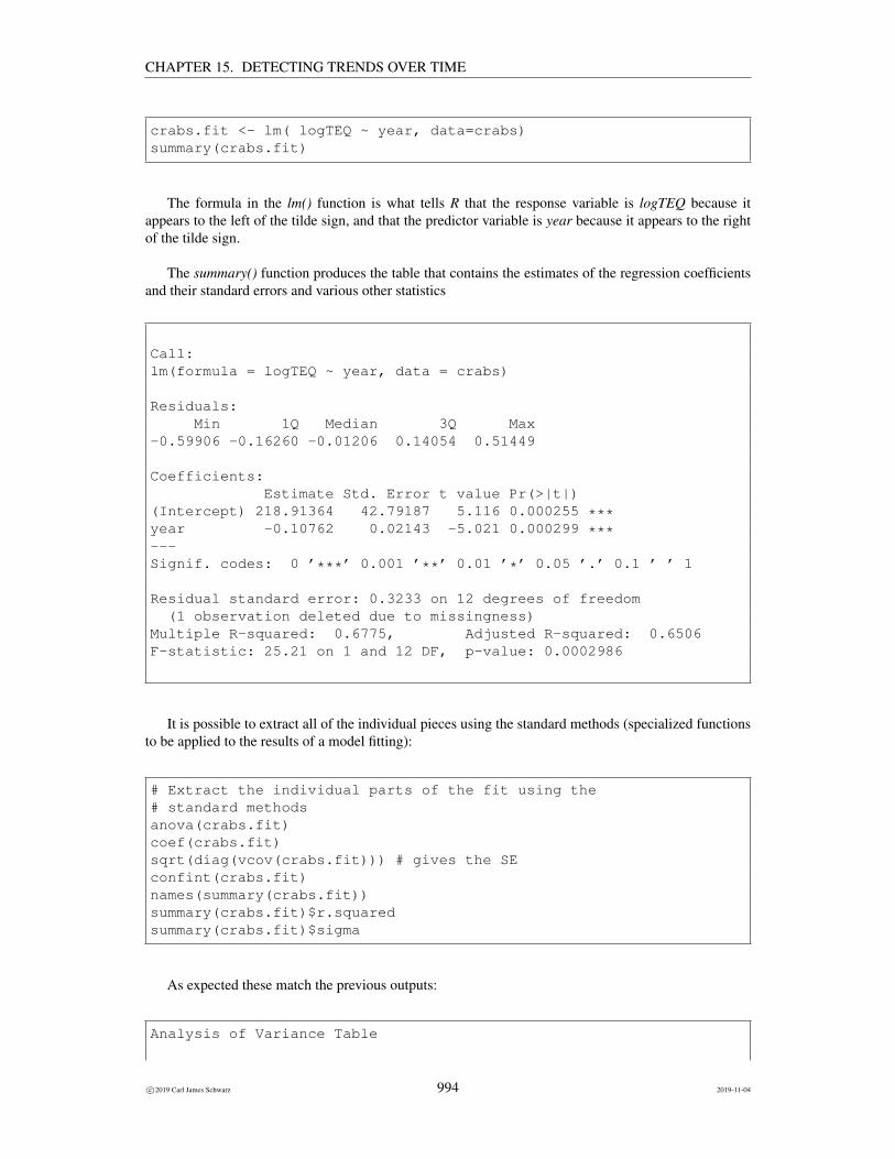
crabs.fit <- lm( logTEQ ~ year, data=crabs)summary(crabs.fit)
The formula in the lm() function is what tells R that the response variable is logTEQ because itappears to the left of the tilde sign, and that the predictor variable is year because it appears to the rightof the tilde sign.
The summary() function produces the table that contains the estimates of the regression coefficientsand their standard errors and various other statistics
Call:lm(formula = logTEQ ~ year, data = crabs)
Residuals:Min 1Q Median 3Q Max
-0.59906 -0.16260 -0.01206 0.14054 0.51449
Coefficients:Estimate Std. Error t value Pr(>|t|)
(Intercept) 218.91364 42.79187 5.116 0.000255 ***year -0.10762 0.02143 -5.021 0.000299 ***---Signif. codes: 0 ’***’ 0.001 ’**’ 0.01 ’*’ 0.05 ’.’ 0.1 ’ ’ 1
Residual standard error: 0.3233 on 12 degrees of freedom(1 observation deleted due to missingness)
Multiple R-squared: 0.6775, Adjusted R-squared: 0.6506F-statistic: 25.21 on 1 and 12 DF, p-value: 0.0002986
It is possible to extract all of the individual pieces using the standard methods (specialized functionsto be applied to the results of a model fitting):
# Extract the individual parts of the fit using the# standard methodsanova(crabs.fit)coef(crabs.fit)sqrt(diag(vcov(crabs.fit))) # gives the SEconfint(crabs.fit)names(summary(crabs.fit))summary(crabs.fit)$r.squaredsummary(crabs.fit)$sigma
As expected these match the previous outputs:
Analysis of Variance Table
c©2019 Carl James Schwarz 994 2019-11-04

CHAPTER 15. DETECTING TRENDS OVER TIME
Response: logTEQDf Sum Sq Mean Sq F value Pr(>F)
year 1 2.6349 2.63488 25.211 0.0002986 ***Residuals 12 1.2541 0.10451---Signif. codes: 0 ’***’ 0.001 ’**’ 0.01 ’*’ 0.05 ’.’ 0.1 ’ ’ 1(Intercept) year218.9136363 -0.1076191(Intercept) year42.7918714 0.0214334
2.5 % 97.5 %(Intercept) 125.6781579 312.14911470year -0.1543185 -0.06091975[1] "call" "terms" "residuals" "coefficients"[5] "aliased" "sigma" "df" "r.squared"[9] "adj.r.squared" "fstatistic" "cov.unscaled" "na.action"[1] 0.677518[1] 0.3232822
The fitted line is:log(TEQ) = 218.9− .11(year)
.
The intercept (218.9) would be the log(TEQ) in the year 0 which is clearly nonsensical. The slope(−.11) is the estimated log(ratio) from one year to the next. For example, exp(−.11) = .898 wouldmean that the TEQ in one year is only 89.8% of the TEQ in the previous year or roughly an 11% declineper year.10
The standard error of the estimated slope is .02. If you want to find the standard error of the anti-logof the estimated slope, you DO NOT take exp(0.02). Rather, the standard error of the ant-logged valueis found as seantilog = selog exp(slope) = 0.02× .898 = .01796.11
We find the confidence intervals using the confint() function applied to the fitted objects as seenabove.:
The 95% confidence interval for the slope (on the log-scale) is (−.154 to −.061). If you take theanti-logs of the endpoints, this gives a 95% confidence interval for the fraction of TEQ that remains fromyear to year, i.e. between (0.86 to 0.94) of the TEQ in one year, remains to the next year.
As always, the model diagnostics should be inspected early on in the process: These are the standardresidual and normal probability plots. Leverage plots are less important in the simple regression case asthey can usually by spotted directly from the preliminary plot
# look at diagnostic plotplotdiag <- autoplot(crabs.fit)plotdiag
10 It can be shown that in regressions using a log(Y ) vs. time, that the estimated slope on the logarithmic scale is the approximatefraction decline per time interval. For example, in the above, the estimated slope of −.11 corresponds to an approximate 11%decline per year. This approximation only works well when the slopes are small, i.e. close to zero.
11 This is computed using a method called the delta-method.
c©2019 Carl James Schwarz 995 2019-11-04

CHAPTER 15. DETECTING TRENDS OVER TIME
This gives:
The residual plot looks fine with no apparent problems but the dip in the middle years could requirefurther exploration if this pattern was apparent in other sites as well. This type of pattern may be evidenceof autocorrelation.
The Durbin-Watson test is available in the lmtest and car package.
# check for autocorrelation using Durbin-Watson test# You can use the durbinWatsontest in the car package or the# dwtest in the lmtest package# For small sample sizes both are fine; for larger sample sizes use the lmtest package# Note the difference in the default direction of the alternative hypothesis
durbinWatsonTest(crabs.fit) # from the car packagedwtest(crabs.fit) # from the lmtest package
Note that the default action of the two functions uses a different alternate hypothesis for computing
c©2019 Carl James Schwarz 996 2019-11-04

CHAPTER 15. DETECTING TRENDS OVER TIME
the p-values (one function returns the one-sided p-value while the other function returns the two-sidedp-value) and use different approximations to compute the p-values. Hence the results may look slightlydifferent:
lag Autocorrelation D-W Statistic p-value1 -0.09311213 2.034426 0.794
Alternative hypothesis: rho != 0
Durbin-Watson test
data: crabs.fitDW = 2.0344, p-value = 0.3974alternative hypothesis: true autocorrelation is greater than 0
Here there is no evidence of auto-correlation so we can proceed without worries.
We can add the fitted line to the plot:
# plot the fitted line to the graphsplotfit <- plotprelimlog +
geom_abline(intercept=coef(crabs.fit)[1], slope=coef(crabs.fit)[2])plotfit
giving:
It is possible to plot the data on the original scale by doing a back-transform of the fitted values – see theR code for details.
c©2019 Carl James Schwarz 997 2019-11-04

CHAPTER 15. DETECTING TRENDS OVER TIME
Several types of predictions can be made. For example, what would be the estimated mean logTEQin 2010? What is the range of logTEQ’s in 2010? Again, refer back to previous chapters about thedifferences in predicting a mean response and predicting an individual response.
To make predictions, we first create a data frame showing the new values of X for which we wantpredictions:
# make predictions# First set up the points where you want predictionsnewyears <- data.frame(year=seq(min(crabs$year,na.rm=TRUE),2030,1))newyears[1:5,]str(newyears)
giving:
[1] 1990 1991 1992 1993 1994’data.frame’: 41 obs. of 1 variable:$ year: num 1990 1991 1992 1993 1994 ...
The predict() function is used to estimate the response and a confidence interval for the mean re-sponse at the values created above. Notice the value of the interval= argument in the predict() functionto specify that the confidence interval for the mean response is wanted.
# Predict the AVERAGE dioxin level at each year# You need to specify help(predict.lm) tp see the documentationpredict.avg <- predict(crabs.fit, newdata=newyears,
se.fit=TRUE,interval="confidence")# This creates a list that you need to restructure to make it look nicepredict.avg.df <- cbind(newyears, predict.avg$fit, se=predict.avg$se.fit)head(predict.avg.df)predict.avg.df[predict.avg.df$year==2010,]exp(predict.avg.df[predict.avg.df$year==2010,])# Add the confidence intervals to the plotplotfit.avgci <- plotfit +
geom_ribbon(data=predict.avg.df, aes(x=year,y=NULL, ymin=lwr, ymax=upr),alpha=0.2)+xlim(c(1990,2010))
plotfit.avgci
giving:
year fit lwr upr se1 1990 4.751590 4.394409 5.108772 0.163933992 1991 4.643971 4.325524 4.962419 0.146156313 1992 4.536352 4.254217 4.818488 0.129490384 1993 4.428733 4.179427 4.678040 0.114423055 1994 4.321114 4.099599 4.542629 0.101667556 1995 4.213495 4.012633 4.414356 0.09218854
year fit lwr upr se
c©2019 Carl James Schwarz 998 2019-11-04

CHAPTER 15. DETECTING TRENDS OVER TIME
21 2010 2.599208 1.941261 3.257156 0.3019752year fit lwr upr se
21 Inf 13.45308 6.967529 25.97555 1.352528
Similarly, the predict() function is used to estimate the response and a prediction interval for the in-dividual response at the values created above. Notice the value of the interval= argument in the predict()function to specify that the prediction interval for the mean response is wanted. Also notice that the formof the returned object differs slight from that previously requiring a slight change in programming toextract the values and make a nice table.
# Predict the INDIVIDUAL dioxin levels n each year# This is a bit strange because the data points are the dioxin level in a composite# sample and not individual crabs. So these prediction intervals# refer to the range of composite values and not the# levels in individual crabs.# R does not product the se for individual predictionspredict.indiv <- predict(crabs.fit, newdata=newyears,
interval="prediction")# This creates a list that you need to restructure to make it look nicepredict.indiv.df <- cbind(newyears, predict.indiv)head(predict.indiv.df)predict.indiv.df [predict.indiv.df$year==2010,]exp(predict.indiv.df[predict.indiv.df$year==2010,])
# Add the prediction intervals to the plotplotfit.indivci <- plotfit.avgci +
geom_ribbon(data=predict.indiv.df, aes(x=year,y=NULL, ymin=lwr, ymax=upr),alpha=0.1)plotfit.indivci
c©2019 Carl James Schwarz 999 2019-11-04

CHAPTER 15. DETECTING TRENDS OVER TIME
giving:
year fit lwr upr1 1990 4.751590 3.961833 5.5413482 1991 4.643971 3.870959 5.4169833 1992 4.536352 3.777577 5.2951274 1993 4.428733 3.681543 5.1759235 1994 4.321114 3.582732 5.0594966 1995 4.213495 3.481044 4.945946
year fit lwr upr21 2010 2.599208 1.635344 3.563072
year fit lwr upr21 Inf 13.45308 5.131223 35.27139
The estimated mean log(TEQ) in 2010 is 2.60 (corresponding to an estimated MEDIAN TEQ ofexp(2.60) = 13.46). A 95% confidence interval for the mean log(TEQ) is (1.94 to 3.26) correspondingto a 95% confidence interval for the actual MEDIAN TEQ of between (6.96 and 26.05).12 Note that theconfidence interval after taking anti-logs is no longer symmetrical.
Why does a mean of a logarithm transform back to the median on the untransformed scale? Basically,because the transformation is non-linear, properties such mean and standard errors cannot be simplyanti-transformed without introducing some bias. However, measures of location, (such as a median) areunaffected. On the transformed scale, it is assumed that the sampling distribution about the estimate issymmetrical which makes the mean and median take the same value. So what really is happening is thatthe median on the transformed scale is back-transformed to the median on the untransformed scale.
Similarly, a 95% prediction interval for the log(TEQ) for an INDIVIDUAL composite sample can
12 A minor correction can be applied to estimate the mean if required.
c©2019 Carl James Schwarz 1000 2019-11-04
CHAPTER 15. DETECTING TRENDS OVER TIME
be found. Be sure to understand the difference between the two intervals.
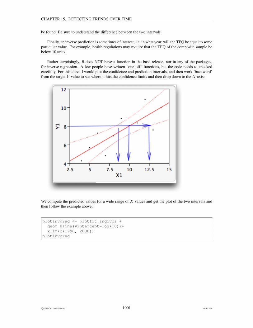
Finally, an inverse prediction is sometimes of interest, i.e. in what year, will the TEQ be equal to someparticular value. For example, health regulations may require that the TEQ of the composite sample bebelow 10 units.
Rather surprisingly, R does NOT have a function in the base release, nor in any of the packages,for inverse regression. A few people have written “one-off” functions, but the code needs to checkedcarefully. For this class, I would plot the confidence and prediction intervals, and then work ’backward’from the target Y value to see where it hits the confidence limits and then drop down to the X axis:
We compute the predicted values for a wide range of X values and get the plot of the two intervals andthen follow the example above:
plotinvpred <- plotfit.indivci +geom_hline(yintercept=log(10))+xlim(c(1990, 2030))
plotinvpred
c©2019 Carl James Schwarz 1001 2019-11-04

CHAPTER 15. DETECTING TRENDS OVER TIME
The predicted year is found by solving
2.302 = 218.9− .11(year)
and gives and estimated year of 2012.7. A confidence interval for the time when the mean log(TEQ) isequal to log(10) is somewhere between 2007 and 2026!
The application of regression to non-linear problems is fairly straightforward after the transformationis made. The most error-prone step of the process is the interpretation of the estimates on the TRANS-FORMED scale and how these relate to the untransformed scale.
15.4 Pseudo-replication
15.5 Introduction
A key assumption of regression analyzes is that the individual data values are independent of each otherand that the variation about the regression line has a mean 0 and a constant variance σ2 which can bediagrammed as:
c©2019 Carl James Schwarz 1002 2019-11-04

CHAPTER 15. DETECTING TRENDS OVER TIME
The independence assumption implies that knowledge that a particular data point is above the regres-sion line provides no information if another data point is also above the regression line.
In some cases, these assumptions are not true. In many cases, this occurs because the observations(the Y values) are taken on a different sized unit (the observational unit) than the experimental unit. Thisis generally known as pseudo-replication.
For example, you may be interested in investigating the the relationship between the concentrationof a chemical in the water and the concentration of the chemical (Selenium, Se) in the muscles of fishliving in that lake. Different lakes are sampled and the chemical concentration in the water is measured.Within each lake, several fish are sampled and the Se concentration in the flesh of the fish are measured.This gives rise to a graph of the following form:
c©2019 Carl James Schwarz 1003 2019-11-04

CHAPTER 15. DETECTING TRENDS OVER TIME
Notice that there are three fish measured in each lake, but the concentrations of Se in the fish tissue areNOT centered about the regression line. What does this occur? There are two sources of variation inthis experiment. First, two lakes with identical water concentrations of Se will NOT have exactly thesame average concentration of Se in the fish. This is due to some local ecological features of the lakethat has not been taken into account (e.g. other competing chemicals, age of the fish, differences in themechanism of uptake, etc.). Then within each lake, not all fish have the same concentration in their fleshbecause of fish-specific factors such as age, differences in feeding patterns, etc.
These two sources of error are generally referred to as Process and Sampling error. Notice that asthe number of fish sampled in each lake increases, the uncertainty of the average concentration in fishdecreases, but the average does NOT converge to the regression line. Process error is unaffected bysampling intensity. When testing for a relationship between the concentration of the chemical in the fishand in the lake, the two sources of variation must be accounted for.
A similar phenomena occurs when sampling the same lake over time to test for trend as was discussedin the chapter on Trend analysis.
c©2019 Carl James Schwarz 1004 2019-11-04

CHAPTER 15. DETECTING TRENDS OVER TIME
Again the process error refers to variation of the mean about the regression line due to some year-specificfactor (e.g. weather). Sampling error refers to variation within a year across different observational units.When testing for a trend over time, the two sources of variation must again be accounted for.
The statistical model for experiments with pseudo-replication is:
Yij = β0 + β1Xi + δi + εij
where Yij is the response in observational unit j of the experimental unit i, Xi is the covariate for theexperiment unit i, δi is the process error for experimental unit i, and εij is the sampling error of unit jwithin experimental unit i.
A naive analysis would simply fit a regression analysis to the individual data points. While theestimates of the slope and intercept will remain unbiased, the reported estimated uncertainty will beunderestimated (i.e. the reported standard errors will be too small) and the p-values will be too small (i.e.too many false positive results will occur).
A simple way to deal with pseudo-replication is, as in a previous chapter, to take the average overthe pseudo-replicates and do a regression analysis on the averages. This will give approximately correctstandard errors, p-values and prediction intervals, but loses information on the two sources of variationwhich is useful for power analyzes.
The proper way to analyze this type of data is to introduce an explicit random effect for the exper-imental unit. This will require the data table to have a column with each experimental unit having adistinct value (e.g. in the lake example, it would be the lake name). Because there are two sources ofvariation, ordinary least squares should not be used, and a program that fits linear mixed models shouldbe used.
The linear mixed model platform usually uses a method called REML (Restricted Maximum Like-lihood) which is a variant of maximum likelihood analyzes. The output from the model fit will be theusual estimates of the slope and intercept (along with properly computed standard errors), and estimates
c©2019 Carl James Schwarz 1005 2019-11-04

CHAPTER 15. DETECTING TRENDS OVER TIME
of the two variance components. Some care needs to be taken when obtaining predictions. Do you wantpredictions for a specific lake, for the average in the “average” lake, for an individual fish in a specificlake, etc. Please contact me for more details on this.
15.5.1 Example: Changes in stream biomass over time
This example presents fictitious (but realistic) data for measurements of biomass at a stream downstreamfrom a large industrial project. In each year, three grab samples were taken of the stream bottom, and thebiomass (mg) of invertebrates was measured.
The data is available in the stream-biomass.csv file in the Sample Program Library at http://www.stat.sfu.ca/~cschwarz/Stat-Ecology-Datasets.
The data are imported into R in the usual fashion:
biomass <- read.csv("stream-biomass.csv", header=TRUE,as.is=TRUE, strip.white=TRUE,na.string=".")
biomass$YearF <- factor(biomass$Year) # make a copy of the Year variable as a factorhead(biomass)str(biomass)
Part of the raw data and the structure of the data frame are shown below:
Year Sample Biomass YearF1 1 1 96 12 1 2 97 13 1 3 97 14 2 1 75 25 2 2 79 26 2 3 81 2’data.frame’: 30 obs. of 4 variables:$ Year : int 1 1 1 2 2 2 3 3 3 4 ...$ Sample : int 1 2 3 1 2 3 1 2 3 1 ...$ Biomass: int 96 97 97 75 79 81 82 81 85 88 ...$ YearF : Factor w/ 10 levels "1","2","3","4",..: 1 1 1 2 2 2 3 3 3 4 ...
A plot of the raw data shows evidence of process and sampling error:
c©2019 Carl James Schwarz 1006 2019-11-04

CHAPTER 15. DETECTING TRENDS OVER TIME
A naive (but wrong) analysis would use the individual data points to fit a regression and this (wrong)analysis strong evidence of a decline in biomass over time. The lm() function can be used:
biomass.pseudo.fit <- lm( Biomass ~ Year, data=biomass)summary(biomass.pseudo.fit)
Call:lm(formula = Biomass ~ Year, data = biomass)
Residuals:Min 1Q Median 3Q Max
-13.826 -5.753 2.497 4.762 10.968
Coefficients:Estimate Std. Error t value Pr(>|t|)
(Intercept) 93.3556 2.5335 36.848 < 2e-16 ***Year -2.2646 0.4083 -5.546 6.24e-06 ***---Signif. codes: 0 ’***’ 0.001 ’**’ 0.01 ’*’ 0.05 ’.’ 0.1 ’ ’ 1
Residual standard error: 6.424 on 28 degrees of freedomMultiple R-squared: 0.5235, Adjusted R-squared: 0.5065F-statistic: 30.76 on 1 and 28 DF, p-value: 6.245e-06
The estimate of the slope is unbiased, but the reported estimated standard errors are too small in this
c©2019 Carl James Schwarz 1007 2019-11-04

CHAPTER 15. DETECTING TRENDS OVER TIME
naive analysis which could lead to too many false positive results. The reported pvalue for testing thehypothesis that the population slope is zero is also incorrect (typically too small).
An approximate analysis could first compute the average biomass in each year. We can use thesplit-apply-combine paradigm of the plyr package to find the averages for each year:
# Because of the pseudo-replication, an approximate way to analyze# the data is to first average over the pseudo-replicates and then# fit a regression line to the averages.# Using the averages in this way will be exact if the number of replicates# at each time point is the same.biomass.avg <- ddply(biomass, "Year", plyr::summarize,
# Compute the average biomass for each YearsBiomass.avg = mean(Biomass, na.rm=TRUE)
)biomass.avg
giving:
Year Biomass.avg1 1 96.666672 2 78.333333 3 82.666674 4 88.666675 5 90.333336 6 73.666677 7 79.333338 8 80.000009 9 75.6666710 10 63.66667
and a regression can be fit to the average values:
c©2019 Carl James Schwarz 1008 2019-11-04

CHAPTER 15. DETECTING TRENDS OVER TIME
We again use the lm() function but now on the average values:
biomass.avg.fit <- lm( Biomass.avg ~ Year, data=biomass.avg)summary(biomass.avg.fit)
Call:lm(formula = Biomass.avg ~ Year, data = biomass.avg)
Residuals:Min 1Q Median 3Q Max
-10.493 -5.550 2.262 4.664 8.301
Coefficients:Estimate Std. Error t value Pr(>|t|)
(Intercept) 93.3556 4.6108 20.247 3.7e-08 ***Year -2.2646 0.7431 -3.048 0.0159 *---Signif. codes: 0 ’***’ 0.001 ’**’ 0.01 ’*’ 0.05 ’.’ 0.1 ’ ’ 1
Residual standard error: 6.75 on 8 degrees of freedomMultiple R-squared: 0.5372, Adjusted R-squared: 0.4794F-statistic: 9.288 on 1 and 8 DF, p-value: 0.01588
c©2019 Carl James Schwarz 1009 2019-11-04

CHAPTER 15. DETECTING TRENDS OVER TIME
Notice that the estimate of the slope is the same as in the (wrong) analysis on the individual points, butthe se is much larger. The evidence of decline over time is not a strong as the p-value has been increasessubstantially.
The usual diagnostic plots and the Durbin-Watson test for autocorrelation can be done using the fiton the averages in the usual way (but not shown here). This fit on the averages can be then be used toobtain predictions and confidence intervals for the average response. You have to be careful if you obtainpredictions for individual responses as an “individual” response is now a yearly average.
This fit on the averages is usually good enough for practical purposes and will match the moreexact analysis (below) on the individual points if the number of pseudo-replicates is exactly the same ineach year. If there is wide variation in the number of pseudo-replicates in each year, then this is onlyan “approximate” analysis as it violates the assumption that all points have equal variation about theregression line – averages based on larger number of points will have a smaller variation than averagesbased on few points. However, in my experience this is rarely a problem.
The “exact” analysis can be done using a linear mixed model. First you must create a copy of theyear variable because it is used in two different ways – as a continuous variable in the regression fit andas a categorical variable for dealing with the pseudo-replication.
In R be sure to declare the copy of the year variable as a factor.
# You can use the individual data point, by fitting a mixed linear model# You will need to create a new variable that is a copy of the time variable# and then declared as a factor. This was the YearF variable defined when the data# was read in.str(biomass)
Next a linear mixed model is fit with the “copy” of the year declared as a random effect. Thisensures that the individual points within the same year are treated as pseudo-replicates: We use thelmer() function in the lmerTest package to fit the linear mixed-effect regression model:
biomass.indiv.fit <- lmerTest::lmer(Biomass ~ Year + (1|YearF), data=biomass)summary(biomass.indiv.fit)anova(biomass.indiv.fit, ddfm=’Kenward-Roger’)
The formula in the lmer() function is what tells R that the response variable is stream-biomass be-cause it appears to the left of the tilde sign, and that the predictor variable is year because it appears tothe right of the tilde sign. The (1|year-cat) identifies the random effect of years.
The summary() function produces the table that contains the estimates of the regression coefficientsand their standard errors and various other statistics
This gives the estimates of the intercept and slope
Linear mixed model fit by REML. t-tests use Satterthwaite’s method [lmerModLmerTest]Formula: Biomass ~ Year + (1 | YearF)
Data: biomass
c©2019 Carl James Schwarz 1010 2019-11-04

CHAPTER 15. DETECTING TRENDS OVER TIME
REML criterion at convergence: 150.3
Scaled residuals:Min 1Q Median 3Q Max
-2.02838 -0.40220 0.07997 0.26115 1.62150
Random effects:Groups Name Variance Std.Dev.YearF (Intercept) 44.52 6.673Residual 3.10 1.761Number of obs: 30, groups: YearF, 10
Fixed effects:Estimate Std. Error df t value Pr(>|t|)
(Intercept) 93.3556 4.6108 8.0000 20.247 3.7e-08 ***Year -2.2646 0.7431 8.0000 -3.048 0.0159 *---Signif. codes: 0 ’***’ 0.001 ’**’ 0.01 ’*’ 0.05 ’.’ 0.1 ’ ’ 1
Correlation of Fixed Effects:(Intr)
Year -0.886Type III Analysis of Variance Table with Satterthwaite’s method
Sum Sq Mean Sq NumDF DenDF F value Pr(>F)Year 28.791 28.791 1 8 9.2875 0.01588 *---Signif. codes: 0 ’***’ 0.001 ’**’ 0.01 ’*’ 0.05 ’.’ 0.1 ’ ’ 1
Notice that because there were exactly 3 measurements in each year, the estimates form the mixed modeland from analyzing the averages were exactly the same. This will not be true if the number of samplesin each year differ.
Estimates of the variance components are also available:
# extract the random effect variance componentsVarCorr(biomass.indiv.fit)
Groups Name Std.Dev.YearF (Intercept) 6.6726Residual 1.7607
Once again the variance components show that year-to-year variation (44.5 = 6.672) is much larger(more than 10 times larger) than within-year (among samples) variation (3.1 = 1762). The implicationsof this is that detecting the trend really depends on the number of years measured rather than the amountof sampling within a year. You will NOT be able to increase power very much by taking a large numberof samples within each year.
Predictions are done in the usual fashion but now there is the choice of predicting for an “average”year or for a specific year (that includes the year specific effects).
c©2019 Carl James Schwarz 1011 2019-11-04

CHAPTER 15. DETECTING TRENDS OVER TIME
Because this is a regression over time, you should also check for auto-correlation using the Durbin-Watson test. This is easiest done in most packages by looking at the regression fit based on the averages.It is quite difficult to test for autocorrelation in the linear mixed-effect model because of the randomeffects. With only 10 data values, the power to detect auto-correlation is quite small unless the auto-correlation is large.
The Durbin-Watson test is available in the lmtest and car package.
# check for autocorrelation using Durbin-Watson test# You can use the durbinWatsontest in the car package or the# dwtest in the lmtest package# For small sample sizes both are fine; for larger sample sizes use the lmtest package# Note the difference in the default direction of the alternative hypothesis
durbinWatsonTest(crabs.fit) # from the car packagedwtest(crabs.fit) # from the lmtest package
Note that the default action of the two functions uses a different alternate hypothesis for computingthe p-values (one function returns the one-sided p-value while the other function returns the two-sidedp-value) and use different approximations to compute the p-values. Hence the results may look slightlydifferent:
lag Autocorrelation D-W Statistic p-value1 -0.1581032 2.094822 0.838
Alternative hypothesis: rho != 0
Durbin-Watson test
data: biomass.avg.fitDW = 2.0948, p-value = 0.398alternative hypothesis: true autocorrelation is greater than 0
In this case, there is little evidence of auto-correlation and so these more complicated models are notneeded.
15.6 Power/Sample Size
15.6.1 Introduction
A common goal in ecological research is to determine if some quantity (e.g. abundance, water quality) istending to increase or decrease over time. A linear regression of this quantity against time is commonlyused to evaluate such a trend. The methods presented earlier can be used in these situations withoutmuch difficulty except for problems of autocorrelation over time (for example if the same monitoringplots were measured repeatedly over time), and making sure that the experimental and observational
c©2019 Carl James Schwarz 1012 2019-11-04

CHAPTER 15. DETECTING TRENDS OVER TIME
unit are not confused (this is similar to the problem of sub-sampling and/or pseudo-replication discussedearlier).13
When designing programs to detect trends, several related questions arise. For how many years doesthe study have to run? How many measurements are needed within each year to deal with pseudo-replication effects? What is the influence of the precision of the individual yearly measurements have onthe length of the monitoring study? What is the power to detect a certain sized trend given a proposedstudy design?
As in ANOVA, these questions are answered through a power analysis. The information needed toconduct a power analysis for linear regression is similar to that required for a power analyses in ANOVA- however, the computations are more complex. Perhaps the most common aspect of a power analysisfor linear regression is the planning of a monitoring study to detect trends over time. This considerablesimplifies the computations of the power as usually the time points are equally spaced with the samenumber of measurements taken at each time point.
A very nice series of papers on detecting trends in ecological studies is available:
• Gerrodette, T. 1987. A power analysis for detecting trends. Ecology 68: 1364-1372. http://dx.doi.org/10.2307/1939220.
• Link, W. A. and Hatfield, J. S. 1990. Power calculations and model selection for trend analysis: acomment. Ecology 71: 1217-1220. http://dx.doi.org/10.2307/1937393.
• Gerrodette, T. 1991. Models for power of detecting trends - a reply to Link and Hatfield. Ecology72: 1889-1892. http://dx.doi.org/10.2307/1940986.
• Gerrodette, T. 1993. Trends: software for a power analysis of linear regression. Wildlife SocietyBulletin 21: 515-516.
JMP does not include a power computation module for regression analysis. SAS V.9+ includes apower analysis module (GLMPOWER) for the power analysis of regression models. R does not havebase function for a power analysis of a regression model, but I have constructed a suitable functionavailable on the Sample Program Library.
There are also several specially build software packages to help plan such studies.
The first, TRENDS, available at http://swfsc.noaa.gov/textblock.aspx?Division=PRD&ParentMenuId=228&id=4740 is a Windoze based program that does the computations asoutlined in the above papers. This program is rather limited in the types of designs it can deal with.Some care must be taken when using TRENDS to ensure that both process and sampling error are ac-counted for.
Because of concerns raised by Link and Hatfield, a second program, MONITOR, was developed thatdoes power computations based on simulation rather than simple formulae.14
13 An example of such confusion would be an investigation of the fecundity of a bird over time. Several sites covering the rangeof the bird are measured and many nests within each site are also measured. This study continues for a number of years. Theaverage fecundity (over all sites and nests) is the response variable, i.e. one single number per year rather than the individual nestmeasurements. The reason for this is that factors that operate on the yearly scale (e.g. environmental variables) affect all nestssimultaneously rather than operating on a single nest at a time independently of other nests. For example, a poor summer willdepress fecundity for all nests simultaneously and is an example of a process effect and process error.
14Gibbs, J. P., and Eduard Ene. 2010.Program MONITOR: Estimating the statistical power of ecological monitoring programs. Version 11.0.0.http://www.esf.edu/efb/gibbs/monitor/ This program also has additional flexibility to handle situation where themonitoring points are not equally spaced in time, or there are multiple measurements taken at each time point. Again, some care
c©2019 Carl James Schwarz 1013 2019-11-04
CHAPTER 15. DETECTING TRENDS OVER TIME
CAUTION Power analysis for trend can be very complex. The authors of Program Monitor havesome sage advice that is applicable to both TRENDS and MONITOR:
Users should be aware (and wary) of the complexity of power analysis in general, and alsoacknowledge some specific limitations of Program Monitor for many real-world applica-tions. Our chief, immediate concern is that many users of Program MONITOR may beunaware of these limitations and may be using the program inappropriately. Below are com-ments from one of our statisticians on some of the aspects of Program MONITOR that usersshould be cognizant of: “There are numerous issues with how Program Monitor calculatesstatistical power and sample size. One issue concerns the default option whereby the userassumes independence of plots or sites from one time period to the next. If you are randomlysampling new sites or plots each time period, then it is correct to assume independence (as-suming that finite population correction factor is not an issue, which depends on how manyplots or sites you are sampling, relative to the total population size of potential plots or sites).If you are sampling the same plots or sites repeatedly over time, however, then the defaultoption in Program Monitor is unlikely to give a correct calculation of statistical power orsample size. If plots or sites are positively autocorrelated over time, as is usually the casein biological surveys, then Program Monitor will underestimate sample size, or conversely,it will overestimate the statistical power. The correct sample size estimate is likely to begreater, and depending upon the amount of autocorrelation, the correct sample size couldbe vastly greater to achieve a stated power objective. A more fundamental issue concernsthe null model one chooses for the trend in population growth. Program Monitor assumes arelatively simple linear trend in population growth, but this is a controversial issue, becausethere are potentially an infinite number of models one could use. If pilot data are available,then it may be possible to estimate autocorrelation and try to make some choices concerningthe type of model to use as the null model for a power calculation, but regardless of how youdecide to proceed, it would be a good idea to consult a statistician to determine an approachthat fits your needs and data. No matter what additional flexibility is built into the mod-eling, however, it will always be possible to posit the existence of further structure whichif overlooked will produce misleading results. For a pertinent discussion of some of theseissues, please see Elzinga et al. (1998). Although this reference deals specifically with plantpopulations, the fundamental statistical issues are similar whether you are sampling plant oranimal populations. Literature Citation: Elzinga, C.L., D.W. Salzer, and J.W. Willoughby.1998. Measuring and monitoring plant populations. BLM Technical Reference 1730-1,Denver, CO. 477 pages.”
Some care must also be taken to distinguish between sampling variation and process variation asoutlined earlier in this chapter. Sampling variation is the size of the standard error when estimatesare made at each sampling occasion. Sampling variation can be reduced by increasing sampling effort(e.g. more measurements per occasion). Process variation refers to the variation around the perfectlinear regression even if there was no uncertainty in each individual observation. Process variationcannot be reduced by increasing sampling effort. For example, suppose you are monitoring the densityof fry in a hydro project over time. Five minnow traps are used to sample the fry each year. Theestimated of average density from the five traps is uncertain and has a standard error. This is samplingerror. As you increase effort (more traps), the standard error will decrease. Conceptually, if you caughtevery single fry in the river, you would have the exact density without sampling error. However, thenumber of fry produced depends on many other factors from year to year, e.g. precipitation and watertemperature. Even if you could capture every fry in the river each year, the densities would still not lieon a perfect line – this year-to-year variation in the perfect measurements is process error. In actual fact,
must be taken when using MONITOR to ensure that both process and sampling error are accounted for. The program has beencited in numerous peer-reviewed publications since it first became available in 1995. CAUTION: Version 11.0 of MONITORappears to have some “features” that result in incorrect power computations in certain cases. Please contact me in advanceof using the results from MONITOR in a critical planning situation to ensure that you have not stumbled on some of the“features”.
c©2019 Carl James Schwarz 1014 2019-11-04

CHAPTER 15. DETECTING TRENDS OVER TIME
your measurement of fry contains both process (year effects) and sampling (based on 5 minnow traps)errors.
Program MONITOR allows you separate process and sampling error when doing the power analysis,as does my bespoke code in R and SAS. There are a number of web pages that discuss this issue in moredetail - do a simple search using a search engine.
15.6.2 Getting the necessary information
As noted earlier, the information required to do a power analysis is similar to that for ANOVA. We willconcentrate on relevant quantities for a trend analysis over time rather than a general regression situation.I will use population size as my response variable, but any other ecological quantity could be used.
α level. As in power analyses for ANOVA, this is traditionally set to α = 0.05.
Effect size. In trend analysis, this is traditionally specified as the rate of change per unit time anddenoted by r. For example, a value of r = .02 = 2% corresponds to an (increasing) change of 2%per year. Both TRENDS and MONITOR allow for both linear and exponential trends. In linear trends,the population size changes by the same fixed percentage of the initial population each year. So ifthe initial population was 1000 animals, a 2% decline per year would correspond to a fixed change of.02× 1000 = 20 animals per year, i.e. 1000, 980, 960, 940, 920, 900, . . ..
In exponential trends, the change is multiplicative each year. So if the initial population was 1000animals, a 2% (multiplicative) decline corresponds to 1000 × .98 = 980 animals in the next year,980× .98 = 1000× .982 = 960.4 in the next year, followed by 941.2, 922.4, 904, 885 etc in subsequentyears.
If the rate is small, then both an exponential and linear trend will be very similar for short time trends- they can be quite different if the rate is large and/or the time series is very long.
Individuals monitoring populations often think of long-term trends in populations, such as, how manyplots do I need to monitor to detect a 10% reduction in this population over a 10 year period? This overallchange must be converted to a rate per unit time. The MONITOR home page has a trend converter, butthe computations are relatively simple.
For linear trends, the rate is found as:
r =R
n− 1where R is the overall fractional change in abundance over the n years. For example, a 10% reductionover 10 years has R = −.1 and n = 10 leading to:
r =−.1
10− 1= −.011
or just over a 1% reduction per year. Notice we divide by n − 1 rather than n, because a 10 year studystarts with the first year to establish the baseline and then has an additional 9 years of study to detect thetrend.
For exponential trends, the rate is found as:
f = (R+ 1)1/(n−1) − 1
where R is the overall fractional change in abundance over the n years. For example, a 10% reductionover 10 years has R = −.1 and n = 10 leading to:
r = (.9)1/9 − 1 = −.0116
c©2019 Carl James Schwarz 1015 2019-11-04

CHAPTER 15. DETECTING TRENDS OVER TIME
or just over a 1% reduction per year. Again note that for small reductions and a small number of years,both a linear and exponential trend have similar rates.
Less often, the trend is given as an absolute value, e.g. a reduction of 10 animals/year. Here the slopeto detect is−10. This must be converted to a value of r based on the original population size when usingTRENDS or MONITOR.
Sample size. For many monitoring designs, observations are taken on a yearly basis, so the questionreduces to the number of years of monitoring required. TRENDS required fixed sampling intervals whileMONITOR has allows for some flexibility in the timing of the monitoring.
It is NOT necessary to sample every year to detect trends. For example, a program may sample everysecond year or even have an irregular sampling program to detect trends.
In cases of process and sampling variation, there is an additional question of how many samples(effort) should be taken each year. Notice that in many cases, process variation is much larger thansample variation and so there is limited utility in selecting more samples to be measured in each year.
Standard deviation. As in ANOVA, the power will depend upon the variation of the individualpoints around the regression line.
This standard deviation must be divided into process and sampling error as shown in the examplesbelow. This is readily done when existing data is available with at least 3 years of data.
Sampling standard deviationIn many cases, the standard deviation is not directly available given, but rather the variability of theestimates of the individual observations is reported as the relative standard error (cv = stddev
mean ). Thiscv usually refers directly to the sampling error part of the model and gives little information about theprocess error.
TRENDS uses the sampling cv while MONITOR uses the actual sampling standard deviation.
Suppose that no previous data is available. Gibbs (2000)15 summarizes typical SAMPLING cv′s formeasuring a number of types of populations. Again note, that these suggested sampling cv’s only provideinformation about sampling error – a proper trend power analysis must account for both sampling andprocess variation (see examples below).
15 Gibbs, J. P. (2000). Monitoring Populations. Pages 213-252 in Research Techniques in Animal Ecology, Boitani, L. andFuller, T. K.eds, Columbia University Press
c©2019 Carl James Schwarz 1016 2019-11-04

CHAPTER 15. DETECTING TRENDS OVER TIME
Group cv
Large mammals 15%
Grasses and sedges 20%
Herbs, compositae 20%
Herbs, non-compositae 20%
Turtles 35%
Salamanders 35%
Large bodied birds 35%
Lizards 40%
Fishes, salmonids 50%
Caddis flies 50%
Snakes 55%
Dragonflies 55%
Small bodied birds 55%
Beetles 60%
Small mammals 60%
Spiders 65%
Medium sized mammals 65%
Fishes, non-salmonids 70%
Salamander (aquatic) 85%
Moths 90%
Frogs and toads 95%
Bats 95%
Butterflies 110%
Flies 130%
If necessary, these can be converted to sampling standard deviations if the initial density is approx-imately known by multiplying the cv by the initial density. For example, if the initial density is 25mice/hectare, then the approximate sampling standard deviation (for small mammals) would be found as25 mice/hectare × 60% or 15 mice/hectare.
The sampling variation often changes with the change in abundance over time. Gerrodette (1987)examines three cases:
• the cv is constant over time.
• the cv is proportional to√abundance
• the cv is proportional to 1/√abundance.
Many sampling methods give cvs that are proportional to 1/√abundance. The TRENDS program
allows you to select an appropriate relationship. Again, for small time scales, there isn’t much of adifference in results among the different relationships of cv and abundance.
The sampling cv (and sampling error) may be reduced if multiple, independent samples are taken
c©2019 Carl James Schwarz 1017 2019-11-04
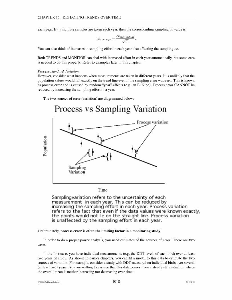
CHAPTER 15. DETECTING TRENDS OVER TIME
each year. If m multiple samples are taken each year, then the corresponding sampling cv value is:
cvaverage =cvindividual√
m.
You can also think of increases in sampling effort in each year also affecting the sampling cv.
Both TRENDS and MONITOR can deal with increased effort in each year automatically, but some careis needed to do this properly. Refer to examples later in this chapter.
Process standard deviationHowever, consider what happens when measurements are taken in different years. It is unlikely that thepopulation values would fall exactly on the trend line even if the sampling error was zero. This is knownas process error and is caused by random “year” effects (e.g. an El Nino). Process error CANNOT bereduced by increasing the sampling effort in a year.
The two sources of error (variation) are diagrammed below:
Unfortunately, process error is often the limiting factor in a monitoring study!
In order to do a proper power analysis, you need estimates of the sources of error. There are twocases.
In the first case, you have individual measurements (e.g. the DDT levels of each bird) over at leasttwo years of study. As shown in earlier chapters, you can fit a model to this data to estimate the twosources of variation. For example, consider a study with DDT measured on individual birds over several(at least two) years. You are willing to assume that this data comes from a steady state situation wherethe overall mean is neither increasing nor decreasing over time.
c©2019 Carl James Schwarz 1018 2019-11-04

CHAPTER 15. DETECTING TRENDS OVER TIME
Consider a simple example (with simulated data). Sample of birds were sampled in 5 years and DDTmeasured. A plot of the data
shows both variation within each year (sampling error), but there are some year effects that change theoverall mean from year to year (process error).
The two sources of variation are separated by fitting the model
ddt = year(R)
Here the (implicit) intercept measures the overall year; the year(R) is the effect of the individual year onthe overall mean and the (implicit) residual term measures the sampling error (within year variation). Astandard fit (in this case using R and treating year as a factor (categorical variable) rather than a contin-uous variable) gives estimates of the two sources of variation:
Groups Name Std.Dev.yearF (Intercept) 8.4018Residual 4.3578
Here the estimated process standard deviation is 8.4 and the estimated sampling standard deviationis 4.4.
If the preliminary data already has a trend, this needs to be accounted for in the analysis. Refer tothe examples of pseudo-replication in regression (Selenium concentration in lakes; Stream Biomass overtime) for an illustration of how to do this.
In the second case, you don’t have the individual data values (or they are not amenable) to theprevious analysis. Rather, for each year of the preliminary study you have an estimated value and ameasure of precision (the standard ERROR) of the estimate. Again, you will need at least two yearsof data. The Program MONITOR website has a spreadsheet tool to help you in the decomposition ofprocess and sampling error and the description follows here.
c©2019 Carl James Schwarz 1019 2019-11-04

CHAPTER 15. DETECTING TRENDS OVER TIME
For example, consider a study to monitor the density of white-tailed deer obtained by distance sam-pling on Fire Island National Seabird (Underwood et al, 1998), presented as the example on the spread-sheet to separate process and sampling variation.
The estimated density (and se) are:Year Density SE
1995 79.6 23.47
1996 90.1 11.67
1997 107.1 12.09
1998 74.1 10.45
1999 64.2 13.90
2000 40.8 12.38
2001 41.2 7.40
Consider the plot of density over time (with approximate 95% confidence intervals):
c©2019 Carl James Schwarz 1020 2019-11-04

CHAPTER 15. DETECTING TRENDS OVER TIME
Assuming that the deer density is in steady state over the five years of the study, you can see that thereis considerable process error as many of the 95% confidence intervals for the deer density do not coverthe mean density over the five years. So even if the sampling error (the se) was driven to zero by addingmore effort, the data points would not all lie exactly on the mean line over time.
Start by examining a plot of the estimated se versus the density estimates:
In many cases, there is often a relationship between the se and the estimate with larger estimates tendingto have a higher se than smaller estimates. The previous plots shows that except for one year, the se isrelatively constant. If the se had a positive relationship to the estimate, a weighted procedure could beused (this is the procedure used in Underwood’s spreadsheet).
We being by finding the mean density and the total variation from the mean. [If the preliminary studyhad an obvious trend, you could fit the trend line and then find the total variation from the trend line in asimilar fashion.]
We start by finding the total variation in the density estimates over time:
V arTotal = var(79.6, 90.1, . . . , 41.2) = 599.6
c©2019 Carl James Schwarz 1021 2019-11-04

CHAPTER 15. DETECTING TRENDS OVER TIME
The total variation is equal to the process + sampling variation. An estimate of the average samplingvariation is found by averaging the se2:
V arSampling =23.42 + 11.672 + . . .+ 7.402
7= 191.9
The sampling SD is found as√
191.9 = 13.85.
Finally, the process variance is found by subtraction:
V arProcess = V arTotal − V arSampling = 599.6− 191.9 = 407.7
and the process standard deviation is process.SD =√
407.7 = 20.2.
Combining the two sources of variationOnce process and sampling error are available, they need to be combined to a single measurement ofstandard deviation about the regression line to use the TRENDS or MONITOR program. The bespoke Rcode is more flexible.
The process and sampling standard deviation are combined by:
SDoverall =√SD2
process + SD2sampling
For example if the process standard deviation was 20 and the sampling standard deviation was 29, thecombined standard deviation is found as:
SDoverall =√SD2
process + SD2sampling =
√202 + 292 = 35
and the value of 35 would be used in the power analysis. This could also be converted to an overall cvas needed.
There is a sample Excel spreadsheet available at the Program MONITOR web page that can help inthe computations.
15.6.3 Determining Power
Gerrodette (1987) looked at the effect of various factors upon the number of years of monitoring required.Figure 3 of his report:
c©2019 Carl James Schwarz 1022 2019-11-04

CHAPTER 15. DETECTING TRENDS OVER TIME
shows the effect of different amount of variation upon trend detection for a 10 year study with variousvalues of r and OVERALL cv. As expected, trend is easier to detect with lower amount of variation(smaller cvs).
Gerrodette (1987) also gives a quick-and-dirty approximation that will help guide power determina-tion for trend detection. For α = .05 and power = 80%, the following is an approximate rule as thenumber of years required to detect trends :
r2n3 ≥ 94(cv)2
where r is the percentage trend/year (as a decimal number) and cv is the OVERALL (i.e. including bothprocess and sampling error) coefficient of variation.
For example, to detect a 5% decline/year in a population whose OVERALL cv (process and sam-pling) is 20% and constant over time would require:
(−.05)2n3 ≥ 94(.2)2
or n ≥ 11 years of monitoring.16
15.7 Power/sample size examples
As noted previously, a power analysis for Trends must be undertaken with caution - particularly if processerror is present. In this section we will demonstrate how to do a trend detection using R and SAS. It is nolonger recommended that Program MONITOR.17 be used. JMP does not have a simple way to estimate
16 If you try this actual power computation using TRENDS, you find that actually 9 years may be sufficient. This formula isONLY an approximation!
17Gibbs, J. P., and Eduard Ene. 2010.Program MONITOR: Estimating the statistical power of ecological monitoring programs. Version 11.0.0.http://www.esf.edu/efb/gibbs/monitor/
c©2019 Carl James Schwarz 1023 2019-11-04

CHAPTER 15. DETECTING TRENDS OVER TIME
power for trend analyses. Lenth also has a nice selection of java applets to compute power availableat http://homepage.stat.uiowa.edu/~rlenth/Power/. This can also be used for poweranalysis of trends with some effort.
Before using any program for power analysis, you will need to gather some basic information aboutthe proposed study.
• What is the initial value of your population. This could be the initial population size, the initialdensity, etc.
• How precisely can you measure the population at a given sampling occasion? This can be givenas the standard error you expect to see at any occasion, or the relative standard error (standarderror/estimate), etc.
• What is the process variation? Do you really expect that the measurements would fall precisely onthe trend line in the absence of measurement error?
• What is the significance level and target power? Traditional values are α = 0.05 with a power of80% or α = 0.10 with a target power of 90%.
15.7.1 Example 1: No process error present
Let us first demonstrate the mechanics of a power determination for a trend analysis before looking atsome real examples of how to use it for monitoring designs.
Suppose we wish to investigate the power of a monitoring design that will run for 5 years. Ateach survey occasion (i.e. every year), we have 1 monitoring station, and we make 2 estimates of thepopulation size at the monitoring station in each year. The population is expected to start with 1000animals, and we expect that the measurement error (standard error) in each estimate is about 200, i.e. thecoefficient of variation of each measurement is about 20% and is constant over time. We are interestedin detecting increasing or decreasing trends and to start, a 5% decline per year will be of interest. Wewill assume an UNREALISTIC process error of zero so that the sampling error is equal to the totalvariation in measurements over time.
A process error of 0 across time is most unrealistic as noted in the cautions earlier in this chapter.Process error is usually caused by external factors (e.g. climate) that affect the process in a randomfashion each year. Note that even if sampling error was zero, i.e. the response (such as abundance) wasmeasured exactly without any uncertainty), the value would still not fall exactly on the trend line. Thisis the key test for thinking if process error is important – in the absence of sampling error would theresponse tend to lie exactly on the regression line. In most cases, this is decided not true.
The results of this section can still be used if sampling error is much larger than process error, or ifthere is only a single measurement taken per year, in which case the sampling error and process errorcan be (but not always) completely confounded together.
Notice that the net change over the five year period with a 5% decline/year is only a −18.5% totaldecline over the five year period. This is obtained as:
c©2019 Carl James Schwarz 1024 2019-11-04

CHAPTER 15. DETECTING TRENDS OVER TIME
Mean % Total
Year Abundance Decline
0 1000 0.0%
1 950.0 = 1000(.95) −5.0%
2 902.5 = 1000(.95)2 −9.7%
3 857.4 = 1000(.95)3 −14.3%
4 814.5 = 1000(.95)4 −18.5%
Using JMP, R, or SAS
We can use the power analysis routines for simple linear regression available in the Sample ProgramLibrary. A copy of the code for this example is also available there.
The key difference often seen for trend analysis is that the trends are expressed as percentagechange/year rather than an absolute change per year. To accommodate this, we need to transform thedata to the logarithmic scale - fortunately, this is fairly straightforward.
We will use the Stroup-method (an analytical method) to estimate the power.
The initial value of the population (on the log-scale) is found as the log(1000)18. A nice property ofworking on the log-scale is that the standard deviation of measurements (after transformation) is simplythe coefficient of variation (cv) on the original scale. So if the original measurements has a standarddeviation of 200, the standard deviation on the log scale is simply the cv or 20/100 = .20.
Similarly, for small trends, a percentage trend on the original scale, is very closely approximated bya constant change (as a fraction) on the log-scale, i.e. a −5% decline/year on the original scale, is veryclosely approximated by a −0.05 change on the log-scale.
Finally, for two samples per year, we define the X values to have replicated measurements for eachof the 4 years of sampling.
The R code is:
Xvalues <- c(0, 0, 1, 1, 2, 2, 3, 3, 4, 4) # two measurements/years x 5 yearsSampling.SD <- .20 # 20% cv at each yearTrend <- -.05 # 5% decline/year
cat("Power for X values: ", Xvalues, "\n")slr.power.stroup(Trend=Trend, Xvalues=Xvalues,
Process.SD=0, Sampling.SD=Sampling.SD, alpha=0.05)
This computes the power as:
Power for X values: 0 0 1 1 2 2 3 3 4 4alpha Trend Process.SD Sampling.SD Beta0 Beta1
1 0.05 -0.05 0 0.2 1.179612e-16 -0.05
18Recall that log() is the natural logarithm.
c©2019 Carl James Schwarz 1025 2019-11-04

CHAPTER 15. DETECTING TRENDS OVER TIME
dfdenom ncp Fcrit power.2s Tcrit power.1s.a1 8 1.25 5.317655 0.1671701 1.859548 0.2674652
power.1s.b1 0.003725358
The power is computed to be between 15% and 20%, hardly large enough to make the monitoringprogram worthwhile.
It is possible to compute the power for a range of slopes.
powerslope.stroup <- ddply(data.frame(Trend=seq(-.10,.10,.02)), "Trend",function(x, Xvalues, Process.SD, Sampling.SD, alpha=0.05){# run the simulationsmyres <- slr.power.stroup(Trend=x$Trend, Xvalues=Xvalues,
Process.SD=Process.SD, Sampling.SD=Sampling.SD, alpha=alpha)
return(myres)}, Xvalues=Xvalues, Process.SD=0, Sampling.SD=Sampling.SD, alpha=0.05)
powerslope.stroup[,c("Trend","power.2s")]
giving
Trend power.2s1 -0.10 0.502488132 -0.08 0.350788113 -0.06 0.219899534 -0.04 0.124225435 -0.02 0.068166726 0.00 0.050000007 0.02 0.068166728 0.04 0.124225439 0.06 0.2198995310 0.08 0.3507881111 0.10 0.50248813
Even a 10% change/year cannot be reliably detected.
How many years would be needed to detect this trend with a 80% power? Try modifying the numberof sampling years until you get the approximate power needed.
poweryears.stroup <- ddply(data.frame(Nyears=4:10), "Nyears",function(x, Trend, Process.SD, Sampling.SD, alpha=0.05){# run the simulationsmyres <- slr.power.stroup(Trend=Trend, Xvalues=rep(0:x$Nyears,2),
Process.SD=Process.SD, Sampling.SD=Sampling.SD, alpha=alpha)
return(myres)
c©2019 Carl James Schwarz 1026 2019-11-04

CHAPTER 15. DETECTING TRENDS OVER TIME
}, Trend=Trend, Process.SD=0, Sampling.SD=Sampling.SD, alpha=0.05)
poweryears.stroup[,c("Nyears","power.2s")]
giving
Nyears power.2s1 4 0.16717012 5 0.26780753 6 0.40580704 7 0.56861565 8 0.72957946 9 0.85903867 10 0.9411970
About 10 years of monitoring (years 0 to 9) are needed to detect a 5% decline/year!
Using Lenth’s Power applets
Lenth has a nice selection of java applets to compute power available at http://homepage.stat.uiowa.edu/~rlenth/Power/. This can also be used for this simple example.
Lenth uses the population standard deviation of the X values as the measure the distribution of thesampling times. The population standard deviation uses the n as the divisor, rather than the usual n− 1used for sample standard deviations, i.e.
SDLenth =
√∑(Xi −X)2
n= SDsample ×
√n− 1√n
In this case, the SDLenth = 1.414214.
We compute the Lenth applet window as shown in a previous chapter:
c©2019 Carl James Schwarz 1027 2019-11-04

CHAPTER 15. DETECTING TRENDS OVER TIME
Be careful to specify the correct sample size (total number of X values). As expected, the result matchesthe earlier results with a power of 0.17.
Lenth’s program is bit tedious to use to determine the number of years of sampling needed as the SDmust be recomputed for each possible sampling plan – also don’t forget to change the sample size on theapplet.
15.7.2 Example 2: Incorporating process and sampling error
Estimating process and sampling error
Studies with both process and sampling error are, by far, the more common cases.
Sampling error occurs because it is impossible to measure the population parameter exactly in anyone year. For example, if we are measuring the mean DDT level in birds, we must take a sample (say of10 birds), sacrifice them, and find the mean DDT in those 10 birds. If a different sample of 10 birds wereto be selected, then the sample mean DDT would vary in the second sample. This is called samplingerror (or the standard error) and can be estimated from the data taken in a single year. Or, the parameterof interest may be the number of smolts leaving a stream and this is estimated using capture-recapturemethods. Again we would have a measure of uncertainty (the standard error) for each measurement ineach year. Sampling error (the standard error) can be reduced by increasing the effort in each year.
However, consider what happens when measurements are taken in different years. It is unlikely thatthe population values would fall exactly on the trend line even if the sampling error was zero. This isknown as process error and is caused by random “year” effects (e.g. an El Nino). Process error CANNOTbe reduced by increasing the sampling effort in a year.
The two sources of error (variation) are diagrammed below:
c©2019 Carl James Schwarz 1028 2019-11-04

CHAPTER 15. DETECTING TRENDS OVER TIME
Unfortunately, process error is often the limiting factor in a monitoring study!
In order to do a proper power analysis, you need estimates of the sources of error. There are twocases.
In the first case, you have individual measurements (e.g. the DDT levels of each bird) over at leasttwo years of study. As shown in earlier chapters, you can fit a model to this data to estimate the twosources of variation. For example, consider a study with DDT measured on individual birds over several(at least two) years. You are willing to assume that this data comes from a steady state situation wherethe overall mean is neither increasing nor decreasing over time.
Consider a simple example (with simulated data). Sample of birds were sampled in 5 years and DDTmeasured. A plot of the data
c©2019 Carl James Schwarz 1029 2019-11-04

CHAPTER 15. DETECTING TRENDS OVER TIME
shows both variation within each year (sampling error), but there are some year effects that change theoverall mean from year to year (process error).
The two sources of variation are separated by fitting the model
ddt = year(R)
Here the (implicit) intercept measures the overall year; the year(R) is the effect of the individual year onthe overall mean and the (implicit) residual term measures the sampling error (within year variation). Astandard fit (in this case using R and treating year as a factor (categorical variable) rather than a contin-uous variable) gives estimates of the two sources of variation:
Groups Name Std.Dev.yearF (Intercept) 8.4018Residual 4.3578
Here the estimated process standard deviation is 8.4 and the estimated sampling standard deviationis 4.4.
If the preliminary data already has a trend, this needs to be accounted for in the analysis. Refer to theexample of pseudo-replication in regression (Selenium concentration in lakes) for an illustration of howto do this.
In the second case, you don’t have the individual data values (or they are not amenable) to theprevious analysis. Rather, for each year of the preliminary study you have an estimated value and ameasure of precision (the standard ERROR) of the estimate. Again, you will need at least two yearsof data. The Program MONITOR website has a spreadsheet tool to help you in the decomposition ofprocess and sampling error and the description follows here.
c©2019 Carl James Schwarz 1030 2019-11-04

CHAPTER 15. DETECTING TRENDS OVER TIME
For example, consider a study to monitor the density of white-tailed deer obtained by distance sam-pling on Fire Island National Seabird (Underwood et al, 1998), presented as the example on the spread-sheet to separate process and sampling variation.
The estimated density (and se) are:Year Density SE
1995 79.6 23.47
1996 90.1 11.67
1997 107.1 12.09
1998 74.1 10.45
1999 64.2 13.90
2000 40.8 12.38
2001 41.2 7.40
Consider the plot of density over time (with approximate 95% confidence intervals):
c©2019 Carl James Schwarz 1031 2019-11-04

CHAPTER 15. DETECTING TRENDS OVER TIME
Assuming that the deer density is in steady state over the five years of the study, you can see that thereis considerable process error as many of the 95% confidence intervals for the deer density do not coverthe mean density over the five years. So even if the sampling error (the se) was driven to zero by addingmore effort, the data points would not all lie exactly on the mean line over time.
Start by examining a plot of the estimated se versus the density estimates:
In many cases, there is often a relationship between the se and the estimate with larger estimates tendingto have a higher se than smaller estimates. The previous plots shows that except for one year, the se isrelatively constant. If the se had a positive relationship to the estimate, a weighted procedure could beused (this is the procedure used in Underwood’s spreadsheet).
We being by finding the mean density and the total variation from the mean. [If the preliminary studyhad an obvious trend, you could fit the trend line and then find the total variation from the trend line in asimilar fashion.]
We start by finding the total variation in the density estimates over time:
V arTotal = var(79.6, 90.1, . . . , 41.2) = 599.6
c©2019 Carl James Schwarz 1032 2019-11-04

CHAPTER 15. DETECTING TRENDS OVER TIME
The total variation is equal to the process + sampling variation. An estimate of the average samplingvariation is found by averaging the se2:
V arSampling =23.42 + 11.672 + . . .+ 7.402
7= 191.9
The sampling SD is found as√
191.9 = 13.85.
Finally, the process variance is found by subtraction:
V arProcess = V arTotal − V arSampling = 599.6− 191.9 = 407.7
and the process standard deviation is process.SD =√
407.7 = 20.2.
Once the two source of variation are determined, you can now use these to estimate the power of adesign to detect trend.
Determining power of a design
We are interested in looking at the power of a monitoring study that lasts 10 years (i.e. an initial yearplus 9 more years) to detect rends of about a 5% decline/year starting at an initial density of around 70.
After loading the modules for the power analysis (see the R code), we specify the design and requesta power computation. Initially, we intend to use the same effort and will get a single estimate of densityeach year.
As in the previous example, we do the analysis on the log-scale and we need to convert the two stan-dard deviations into cv’s. Here the process.SD (on the log scale) is 20.2/70 = 0.29 and the sampling.SD(on the log scale) is 13.85/70 = 0.20.
Xvalues <- 0:9 # years in the studySampling.SD <- .20 # 20% cv at each yearProcess.SD <- .29Trend <- -.05 # 5% decline/year
cat("Power for X values: ", Xvalues, "\n")slr.power.stroup(Trend=Trend, Xvalues=Xvalues,
Process.SD=Process.SD, Sampling.SD=Sampling.SD, alpha=0.05)
giving
Power for X values: 0 1 2 3 4 5 6 7 8 9alpha Trend Process.SD Sampling.SD Beta0 Beta1
1 0.05 -0.05 0.29 0.2 -1.110223e-16 -0.05dfdenom ncp Fcrit power.2s Tcrit power.1s.a
1 8 1.661966 5.317655 0.2066802 1.859548 0.3212166power.1s.b
1 0.002295395
c©2019 Carl James Schwarz 1033 2019-11-04

CHAPTER 15. DETECTING TRENDS OVER TIME
The power is only about 20% - rather poor.
If the analysis is repeated for a range of trends:
Trend power.2s1 -0.10 0.619212912 -0.08 0.442503273 -0.06 0.276265454 -0.04 0.149334865 -0.02 0.074221796 0.00 0.050000007 0.02 0.074221798 0.04 0.149334869 0.06 0.2762654510 0.08 0.4425032711 0.10 0.61921291
it is not very good to detect even a 10% change/year.
In fact, it isn’t until about 15 or 16 years
Nyears power.2s1 10 0.30678202 11 0.38830493 12 0.47911704 13 0.57477765 14 0.66952486 15 0.75723657 16 0.83267158 17 0.89257669 18 0.936235610 19 0.965259211 20 0.9827516
that sufficient power is obtainable.
Determining the power of a design - using Lenth’s Java applet
Lenth’s JAVA applets can be used – once again, you need to compute the appropriate overall standarddeviation that includes both process and sampling standard deviations. Contact me for more details.
Improving the design
There are two aspects of the design that influence power. First the length of the study can be extendedand the power for a longer study is easily determined.
Second, the effort in each year can be increased. As a rule of thumb, if the effort is doubled, thesampling.SD declines by a factor of
√2, so it will take roughly 4× the effort in each year to reduce the
c©2019 Carl James Schwarz 1034 2019-11-04

CHAPTER 15. DETECTING TRENDS OVER TIME
sampling SD by a factor of 2. Note that additional sampling has NO effect on the process error andthis is often why it is the limiting factor.
We can see what happens if the sampling SD is reduced by a factor of 2 (requiring roughly 4× theeffort in each year). This will reduce the sampling.SD by a factor of 2 (
√increase in effort) and we run
the same code but modify the sampling.SD.
Xvalues <- 0:9 # years in the studySampling.SD <- .20Process.SD <- .29Trend <- -.05 # 5% decline/year
cat("Power for X values: ", Xvalues, "\n")slr.power.stroup(Trend=Trend, Xvalues=Xvalues,
Process.SD=Process.SD, Sampling.SD=Sampling.SD/2, alpha=0.05)
giving
Power for X values: 0 1 2 3 4 5 6 7 8 9alpha Trend Process.SD Sampling.SD Beta0 Beta1
1 0.05 -0.05 0.29 0.1 -2.220446e-16 -0.05dfdenom ncp Fcrit power.2s Tcrit power.1s.a
1 8 2.191817 5.317655 0.2572353 1.859548 0.3859528power.1s.b
1 0.001298903
The power has increase only a little to about 25% – because the process error is so large, additionalsampling within a year brings little benefit.
Alternatively, we could leave the estimates of the sampling and process error as is, and simply changethe X values by replicating them 4 times, and you get the same power. The advantage of changing theX values is that unbalanced designs can be explored which are not possible in the previous method,i.e. in some years do more replicates (especially at the start and end of the survey). This is easilydone in R using the power programs introduced earlier and changing the definition of the X values toXvalues < −rep(0 : 9, 4).
Xvalues <- rep(0:9,4) # years in the studySampling.SD <- .20Process.SD <- .29Trend <- -.05 # 5% decline/year
cat("Power for X values: ", Xvalues, "\n")slr.power.stroup(Trend=Trend, Xvalues=Xvalues,
Process.SD=Process.SD, Sampling.SD=Sampling.SD, alpha=0.05)
giving
Power for X values: 0 1 2 3 4 5 6 7 8 9 0 1 2 3 4 5 6 7 8 9 0 1 2 3 4 5 6 7 8 9 0 1 2 3 4 5 6 7 8 9alpha Trend Process.SD Sampling.SD Beta0 Beta1
c©2019 Carl James Schwarz 1035 2019-11-04

CHAPTER 15. DETECTING TRENDS OVER TIME
1 0.05 -0.05 0.29 0.2 1.283695e-16 -0.05dfdenom ncp Fcrit power.2s Tcrit power.1s.a
1 8 2.191817 5.317655 0.2572353 1.859548 0.3859528power.1s.b
1 0.001298903
Note that the power is identical under both approaches.
Increasing the effort by a factor of 4 in each year, barely increases the power above 25%. In fact (notshown) even if the sampling SD is reduced to 0 (so only process error is operating), the power is onlyincreased to 28%!
In this way different combinations of experiment effort can be investigated, i.e. different number ofyears, or pattern of years sampled, and effort within a year. As noted earlier, if the process.SD is large,there is little gain in doing more sampling within a year, and more years (or a longer period) must besampled.
15.7.3 WARNING about using testing for temporal trends
The Patuxent Wildlife Research Center has some sage advice about power analysis for temporal trends.While their remarks are directed to using Program MONITOR, they are also applicable to the simpleanalyses in R, SAS, or JMP.
Users should be aware (and wary) of the complexity of power analysis in general, and alsoacknowledge some specific limitations of MONITOR for many real-world applications. Ourchief, immediate concern is that many users of MONITOR may be unaware of these limita-tions and may be using the program inappropriately. Below are comments from one of ourstatisticians on some of the aspects of MONITOR that users should be cognizant of:
There are numerous issues with how Program Monitor calculates statistical power and sam-ple size. One issue concerns the default option whereby the user assumes independence ofplots or sites from one time period to the next. If you are randomly sampling new sites orplots each time period, then it is correct to assume independence (assuming that finite pop-ulation correction factor is not an issue, which depends on how many plots or sites you aresampling, relative to the total population size of potential plots or sites). If you are samplingthe same plots or sites repeatedly over time, however, then the default option in ProgramMonitor is unlikely to give a correct calculation of statistical power or sample size. If plotsor sites are positively autocorrelated over time, as is usually the case in biological surveys,then Program Monitor will underestimate sample size, or conversely, it will overestimatethe statistical power. The correct sample size estimate is likely to be greater, and depend-ing upon the amount of autocorrelation, the correct sample size could be vastly greater toachieve a stated power objective.
We deal with some of these issues when we discuss the design and analysis of BACI surveys later inthis course.
c©2019 Carl James Schwarz 1036 2019-11-04

CHAPTER 15. DETECTING TRENDS OVER TIME
15.8 Testing for common trend - ANCOVA
In some cases, it is of interest to test if the same trend is occurring in a number of locations. Or, the datafrom a single site is so poor that trends cannot be detected, but by pooling the sites, a common trend oversites can be detected because of the increased sample size. This technique can also be used for adjustingfor seasonality as will be seen later.
The Analysis of Covariance (ANCOVA) does both. Groups of data (e.g. from the same location) areidentified by a nominal or ordinal scale variable and time is also measured for both groups.
Typically, ANCOVA is used to check if the regression line for the groups are parallel. If there isevidence that the individual regression lines are not parallel, then a separate regression line (trend line)must be fit for each group for prediction purposes. If there is no evidence of non-parallelism, then thenext task is to see if the lines are co-incident, i.e. have both the same intercept and the same slope. Ifthere is evidence that the lines are not coincident, then a series of parallel lines are fit to the data. All ofthe data are used to estimate the common slope. If there is no evidence that the lines are not coincident,then all of the data can be simply pooled together and a single regression line fit for all of the data.
The three possibilities are shown below for the case of two groups - the extension to many groups isobvious:
c©2019 Carl James Schwarz 1037 2019-11-04

CHAPTER 15. DETECTING TRENDS OVER TIME
c©2019 Carl James Schwarz 1038 2019-11-04

CHAPTER 15. DETECTING TRENDS OVER TIME
15.8.1 Assumptions
As before, it is important before the analysis is started to verify the assumptions underlying the analysis.As ANCOVA is a combination of ANOVA and Regression, the assumptions are similar.
• The response variable Y is continuous (interval or ratio scaled).
• The Y are a random sample from the various time points measured.
• There must be no outliers. Plot Y vs. X for each group separately to see if there are any pointsthat don’t appear to follow the straight line.
• The relationship between Y and X must be linear for each group.19 Check this assumption bylooking at the individual plots of Y vs. X for each group.
• The variance must be equal for both groups around their respective regression lines. Check thatthe spread of the points is equal around the range of X and that the spread is comparable betweenthe two groups. This can be formally checked by looking at the MSE from a separate regressionline for each group as MSE estimates the variance of the data around the regression line.
• The residuals must be normally distributed around the regression line for each group. This as-sumption can be check by examining the residual plots from the fitted model for evidence of
19 It is possible to relax this assumption as well, but is again, beyond the scope of this course.
c©2019 Carl James Schwarz 1039 2019-11-04

CHAPTER 15. DETECTING TRENDS OVER TIME
non-normality. For large samples, this is not too crucial; for small sample sizes, you will likelyhave inadequate power to detect anything but gross departures.
15.8.2 Statistical model
You saw in earlier chapters, that a statistical model is a powerful shorthand to describe what analysis isfit to a set of data. The model must describe the treatment structure, the experimental unit structure, andthe randomization structure. Let Y be the response variable; X be the continuous predictor variable, andGroup be the group factor.
As ANCOVA is a combination of ANOVA and regression, it will not be surprising that the modelswill have terms corresponding to both Group and X . Again, there are three cases:
If the lines for each group are not parallel:
the appropriate model isY 1 = Group X Group ∗X
The terms can be in any order. This is read as variation in Y can be explained a common intercept(never specified) followed by group effects (different intercepts), a common slope (trend) on X , and an“interaction” between Group and X which is interpreted as different slopes (different trends) for eachgroup. This model is almost equivalent to fitting a separate regression line for each group. The onlyadvantage to using this joint model for all groups is similar to that enjoyed by using ANOVA - all of thegroups contribute to a better estimate of residual error. If the number of data points per group is small,
c©2019 Carl James Schwarz 1040 2019-11-04

CHAPTER 15. DETECTING TRENDS OVER TIME
this can lead to improvements in precision compared to fitting each group individually and an improvedpower to detect trends.
If the lines are parallel across groups, but not coincident:
the appropriate model isY 2 = Group X
The terms can be in any order. The only difference between this and the previous model is that thissimpler model lacks the Group*X “interaction” term. It would not be surprising then that a statisticaltest to see if this simpler model is tenable would correspond to examining the p-value of the test onthe Group*X term from the complex model. This is exactly analogous to testing for interaction effectsbetween factors in a two-factor ANOVA.
Lastly, if the lines are co-incident:
c©2019 Carl James Schwarz 1041 2019-11-04
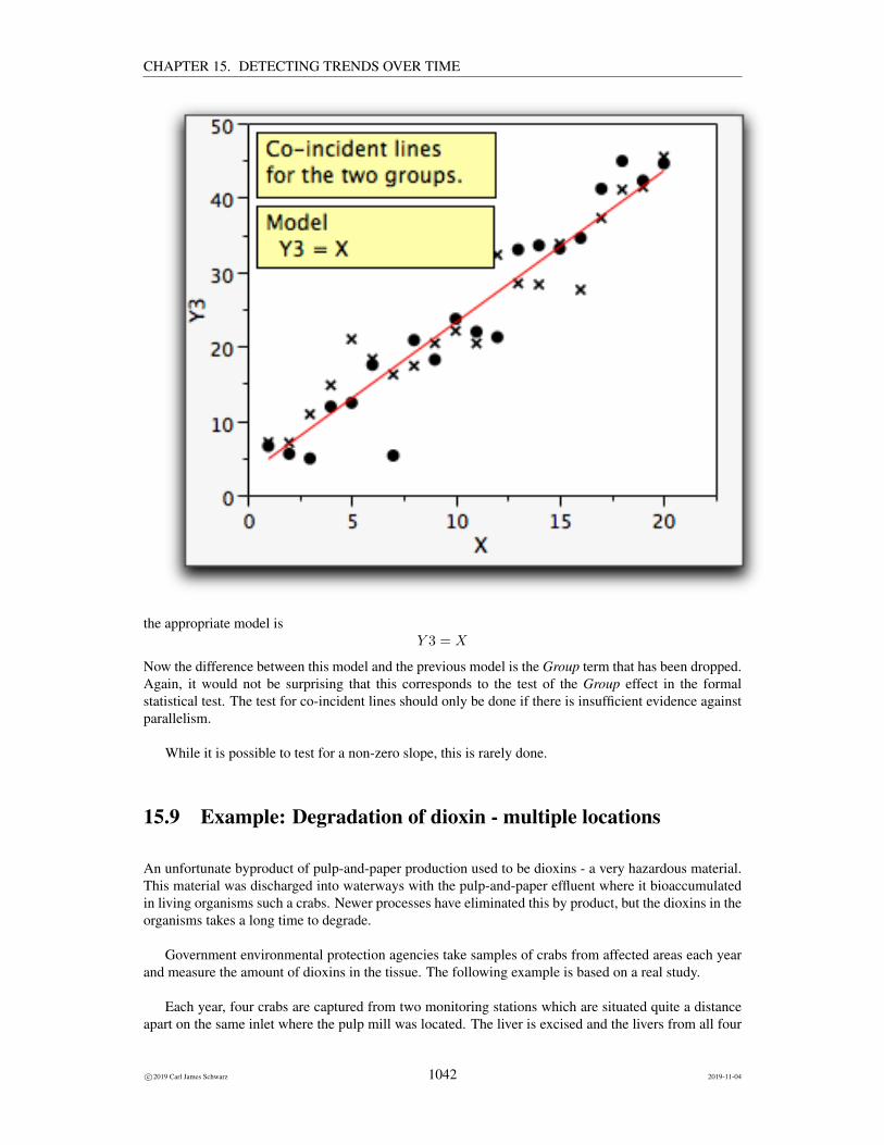
CHAPTER 15. DETECTING TRENDS OVER TIME
the appropriate model isY 3 = X
Now the difference between this model and the previous model is the Group term that has been dropped.Again, it would not be surprising that this corresponds to the test of the Group effect in the formalstatistical test. The test for co-incident lines should only be done if there is insufficient evidence againstparallelism.
While it is possible to test for a non-zero slope, this is rarely done.
15.9 Example: Degradation of dioxin - multiple locations
An unfortunate byproduct of pulp-and-paper production used to be dioxins - a very hazardous material.This material was discharged into waterways with the pulp-and-paper effluent where it bioaccumulatedin living organisms such a crabs. Newer processes have eliminated this by product, but the dioxins in theorganisms takes a long time to degrade.
Government environmental protection agencies take samples of crabs from affected areas each yearand measure the amount of dioxins in the tissue. The following example is based on a real study.
Each year, four crabs are captured from two monitoring stations which are situated quite a distanceapart on the same inlet where the pulp mill was located. The liver is excised and the livers from all four
c©2019 Carl James Schwarz 1042 2019-11-04

CHAPTER 15. DETECTING TRENDS OVER TIME
crabs are composited together into a single sample.20 The dioxins levels in this composite sample ismeasured. As there are many different forms of dioxins with different toxicities, a summary measure,called the Total Equivalent Dose (TEQ) is computed from the sample.
As seen earlier, the appropriate response variable is log(TEQ).
Is the rate of decline the same for both sites? What is the estimated difference or ratio in concentra-tions between the two sites?
Here are the raw data:
Site Year TEQ log(TEQ)
a 1990 179.05 5.19
a 1991 82.39 4.41
a 1992 130.18 4.87
a 1993 97.06 4.58
a 1994 49.34 3.90
a 1995 57.05 4.04
a 1996 57.41 4.05
a 1997 29.94 3.40
a 1998 48.48 3.88
a 1999 49.67 3.91
a 2000 34.25 3.53
a 2001 59.28 4.08
a 2002 34.92 3.55
a 2003 28.16 3.34
b 1990 93.07 4.53
b 1991 105.23 4.66
b 1992 188.13 5.24
b 1993 133.81 4.90
b 1994 69.17 4.24
b 1995 150.52 5.01
b 1996 95.47 4.56
b 1997 146.80 4.99
b 1998 85.83 4.45
b 1999 67.72 4.22
b 2000 42.44 3.75
b 2001 53.88 3.99
b 2002 81.11 4.40
b 2003 70.88 4.26
The data is available in the dioxin2.csv file in the Sample Program Library at http://www.stat.sfu.ca/~cschwarz/Stat-Ecology-Datasets.
20 Compositing is a common analytical tool. There is little loss of useful information induced by the compositing process - theonly loss of information is the among individual-sample variability which can be used to determine the optimal allocation betweensamples within years and the number of years to monitor.
c©2019 Carl James Schwarz 1043 2019-11-04

CHAPTER 15. DETECTING TRENDS OVER TIME
The data are imported into R in the usual fashion:
crabs <- read.csv("dioxin2.csv", header=TRUE,as.is=TRUE, strip.white=TRUE,na.string=".")
crabs$Site <- factor(crabs$Site)crabs$logTEQ <- NULL # drop this and recompute laterhead(crabs)str(crabs)
Note that both Year and WHO.TEQ are numeric (R doesn’t have the concept of scale of variables).However, we must declare the Site variable to be a FACTOR, i.e. a categorical variable. In general, itis recommended that alphanumeric codes be used for categorical variables, i.e. don’t code the sites as 1and 2 because then there is the possibility that R will treat the sites as a continuous variable if you forgetto declare the variable as a factor. With alphanumeric codes, R will either figure it out, or issue and errormessage if you forget to declare the variable as a factor.
Part of the raw data and the structure of the data frame are shown below:
Site Year WHO.TEQ1 a 1990 179.052 a 1991 82.393 a 1992 130.184 a 1993 97.065 a 1994 49.346 a 1995 57.05’data.frame’: 28 obs. of 3 variables:$ Site : Factor w/ 2 levels "a","b": 1 1 1 1 1 1 1 1 1 1 ...$ Year : int 1990 1991 1992 1993 1994 1995 1996 1997 1998 1999 ...$ WHO.TEQ: num 179.1 82.4 130.2 97.1 49.3 ...
I recommend to recompute derived variables (e.g. the log() of the TEQ) on the fly, rather than readingthem in. This way I avoid any errors where the derived variables are not in sync with the rest of the data.The ordering of the rows is NOT important; however, it is often easier to find individual data points if thedata is sorted by theX value. This is particularly true if you want to do a Durbin-Watson test where mostpackages assume that the data has been temporally ordered. It is common practice in many statisticalpackages to add extra rows at the end of data set for future predictions.
As usual, start with an initial plot of the data. We already know that we will be plotting on thelog-scale so we will skip the first plot on the anti-log scale. In cases with multiple groups, it is oftenhelpful to use a different plotting symbol for each group. This is done in the usual way using the ggplot2package. Notice how the aes() function can specify the different plotting symbols and colors should beused for the different sites and how the ggplot() function creates the legend.
plotprelimlog <- ggplot(data=crabs, aes(x=Year, y=logTEQ, shape=Site, color=Site))+ggtitle("log(Dioxin) levels over time")+xlab("Year")+ylab("log(Dioxin) levels (WHO.TEQ)")+geom_point(size=4)
plotprelimlog
c©2019 Carl James Schwarz 1044 2019-11-04

CHAPTER 15. DETECTING TRENDS OVER TIME
Before fitting the various models, begin with an exploratory examination of the data looking foroutliers and checking the assumptions.
The initial scatter plot doesn’t show any obvious outliers.
Each year’s data is independent of other year’s data as a different set of crabs was selected. Similarly,the data from one site are independent from the other site. This is an observational study, so the questionarises of how exactly were the crabs were selected? In this study, crab pots were placed on the floor ofthe sea to capture the available crabs in the area.
When ever multiple sets of data are collected over time, there is always the worry about commonyear effects (also known as process error). For example, if the response variable was body mass of smallfish, then poor growing conditions in a single year could depress the growth of fish in all locations. Thiswould then violate the assumption of independence as the residual in one site in a year would be relatedto the residual in another site in the sam year. You would then tend to see the residuals “paired” withnegative residuals from the fitted line at one site matched (by year) with negative residuals at the othersite. In this example, this is unlikely to have occurred. Degradation of dioxin is relatively independentof external environmental factors and the variation that we see about the two regression lines is relatedsolely to sampling error based on the particular set of crabs that that were sampled. It seems unlikelythat the residuals are related.21
Start by fitting a simple regression to EACH site to see if make sense to pool the data into a singlemodel.
Start by fitting a line to each group separately, i.e. two separate fits, one for each Site. We use the lm()function to fit the regression model to each site. This is accomplished within a d_ply() function which isthe modern way in R to do by-group processing.
21 If you actually try and fit a process error term to this model, you find that the estimated process error is zero.
c©2019 Carl James Schwarz 1045 2019-11-04

CHAPTER 15. DETECTING TRENDS OVER TIME
# Fit a separate line for each yearplyr::d_ply(crabs, "Site", function(x){
# fit a separate line for each sitecat("\n\n***Separate fit for site :", as.character(x$Site[1]),"\n")fit <- lm( logTEQ ~ Year, data=x)print(summary(fit))print(confint(fit)) # confidence interval on slope
})
The formula in the lm() function is what tells R that the response variable is logTEQ because itappears to the left of the tilde sign, and that the predictor variable is Year because it appears to the rightof the tilde sign.
The summary() function produces the table that contains the estimates of the regression coefficientsand their standard errors and various other statistics
***Separate fit for site : a
Call:lm(formula = logTEQ ~ Year, data = x)
Residuals:Min 1Q Median 3Q Max
-0.59906 -0.16260 -0.01206 0.14054 0.51449
Coefficients:Estimate Std. Error t value Pr(>|t|)
(Intercept) 218.91364 42.79187 5.116 0.000255 ***Year -0.10762 0.02143 -5.021 0.000299 ***---Signif. codes: 0 ’***’ 0.001 ’**’ 0.01 ’*’ 0.05 ’.’ 0.1 ’ ’ 1
Residual standard error: 0.3233 on 12 degrees of freedomMultiple R-squared: 0.6775, Adjusted R-squared: 0.6506F-statistic: 25.21 on 1 and 12 DF, p-value: 0.0002986
2.5 % 97.5 %(Intercept) 125.6781579 312.14911470Year -0.1543185 -0.06091975
***Separate fit for site : b
Call:lm(formula = logTEQ ~ Year, data = x)
Residuals:Min 1Q Median 3Q Max
-0.5567 -0.2399 0.0224 0.2013 0.5059
c©2019 Carl James Schwarz 1046 2019-11-04

CHAPTER 15. DETECTING TRENDS OVER TIME
Coefficients:Estimate Std. Error t value Pr(>|t|)
(Intercept) 123.23673 46.41606 2.655 0.0210 *Year -0.05947 0.02325 -2.558 0.0251 *---Signif. codes: 0 ’***’ 0.001 ’**’ 0.01 ’*’ 0.05 ’.’ 0.1 ’ ’ 1
Residual standard error: 0.3507 on 12 degrees of freedomMultiple R-squared: 0.3528, Adjusted R-squared: 0.2989F-statistic: 6.542 on 1 and 12 DF, p-value: 0.0251
2.5 % 97.5 %(Intercept) 22.1048113 224.368641271Year -0.1101205 -0.008811465
The estimated slope for the a site is−0.107 (se 0.02) while the estimated slope for the b site is−0.06(se 0.02). The 95% confidence intervals overlap considerably so the population slopes could be the samefor the two groups.
The MSE from site a is 0.10 and the MSE from site b is 0.12. This corresponds to standard deviations(RMSE) about the regression line of
√0.10 = 0.32 and
√0.12 = 0.35 which are very similar so that
assumption of equal standard deviations about the regression line for the two sites seems reasonable.
The residual plots (not shown) also look reasonable.
The assumptions appear to be satisfied, so let us now fit the various models.
First, fit the model allowing for separate lines for each group, i.e. the non-parallel slope model. Weuse the lm() function to fit the regression model with non-parallel slopes:
# Fit the regression line with non-parallel slopes and look at the ANOVA table.# Because lm() produces type I (increment tests), you should specify the# contrast in the fit and use the Anova() function from the car packagecrabs.fit.np <- lm( logTEQ ~ Site + Year + Year:Site, data=crabs,
contrast=list(Site=’contr.sum’))car::Anova(crabs.fit.np, type="III")
Note that because R computes Type I (incremental) tests of hypotheses, you must specify the interac-tion term last in the model. Or, as a better solution, specify that the contrast matrix for the factors is thesum-to-zero form and use the Anova() function from the car package to obtain the Type III (marginal)tests.
The Anova() function produces the table that contains the test for the hypothesis of parallel slopes.
Anova Table (Type III tests)
Response: logTEQSum Sq Df F value Pr(>F)
(Intercept) 3.3408 1 29.3725 1.442e-05 ***Site 0.2612 1 2.2968 0.1427Year 3.1756 1 27.9205 2.028e-05 ***
c©2019 Carl James Schwarz 1047 2019-11-04

CHAPTER 15. DETECTING TRENDS OVER TIME
Site:Year 0.2638 1 2.3190 0.1409Residuals 2.7297 24---Signif. codes: 0 ’***’ 0.001 ’**’ 0.01 ’*’ 0.05 ’.’ 0.1 ’ ’ 1
The p-value is 0.14 indicating very little evidence against the hypothesis of parallel slopes.
You can also estimate the individual slopes. The estimates from the non-parallel slope model shouldbe very similar to those seen earlier when the data were split by Site. We use the lstrends() function fromthe (emmeans package to fit the regression model with non-parallel slopes:
# estimate the individual slopes and compare themcrabs.fit.np.emmo <- emmeans::emtrends(crabs.fit.np, ~Site, var="Year")summary(crabs.fit.np.emmo, infer=TRUE)summary(pairs(crabs.fit.np.emmo), infer=TRUE)
which gives:
Site Year.trend SE df lower.CL upper.CL t.ratio p.valuea -0.1076 0.0224 24 -0.154 -0.0615 -4.813 0.0001b -0.0595 0.0224 24 -0.106 -0.0133 -2.660 0.0137
Confidence level used: 0.95contrast estimate SE df lower.CL upper.CL t.ratio p.valuea - b -0.0482 0.0316 24 -0.113 0.0171 -1.523 0.1409
Confidence level used: 0.95
We see that the both sites have negative trends and that the difference in the slopes is very small, .048 (se.03), and there is no evidence of a difference in the slopes between the two sites. The p-value from thiscomparison matches the p-value from the test for no interaction, as it must. DO NOT USE the valuesfrom the summary() function as they depend on the underlying contrast matrix used.
Consequently, we can refit the model, dropping the interaction term:Again, because R does incremental tests, specify the Site term last in the model:
# Fit the regression line with parallel slopes.# Because lm() produces type I (increment tests), you should specify the# contrast in the fit and use the Anova() function from the car packagecrabs.fit.p <- lm( logTEQ ~ Year + Site, data=crabs,
contrast=list(Site=’contr.sum’))car::Anova(crabs.fit.p, type=’III’)
The anova() table output is:
Anova Table (Type III tests)
c©2019 Carl James Schwarz 1048 2019-11-04

CHAPTER 15. DETECTING TRENDS OVER TIME
Response: logTEQSum Sq Df F value Pr(>F)
(Intercept) 3.3408 1 27.901 1.799e-05 ***Year 3.1756 1 26.521 2.530e-05 ***Site 1.4868 1 12.417 0.001663 **Residuals 2.9935 25---Signif. codes: 0 ’***’ 0.001 ’**’ 0.01 ’*’ 0.05 ’.’ 0.1 ’ ’ 1
We now have a small p-value (0.0017) for the Site effect indicating that there is evidence that two linesare not coincident, i.e. they are parallel with different intercepts. This would mean that the rate of decayof the dioxin appears to be equal in both sites, but the initial concentration appears to be different.
It is possible to extract all of the individual pieces using the standard methods (specialized functionsto be applied to the results of a model fitting):
# Extract the individual parts of the fit using the# standard methods. Note that because Site is a factor# DO NOT USE THE ESTIMATES from the summary() to estimate# the site effect because these estimates depend on the# internal parameterization used. Use the emmeans() function insteadsummary(crabs.fit.p)coef(crabs.fit.p)sqrt(diag(vcov(crabs.fit.p))) # gives the SEconfint(crabs.fit.p)names(summary(crabs.fit.p))summary(crabs.fit.p)$r.squaredsummary(crabs.fit.p)$sigma
These results are suitable for any continuous variable (e.g. Year), but be VERY CAUTIOUS aboutinterpreting the estimates for the categorical variable Site as these values depend on the internal param-eterization used by R.
Call:lm(formula = logTEQ ~ Year + Site, data = crabs, contrasts = list(Site = "contr.sum"))
Residuals:Min 1Q Median 3Q Max
-0.61110 -0.18485 -0.04157 0.30391 0.59257
Coefficients:Estimate Std. Error t value Pr(>|t|)
(Intercept) 171.07518 32.38777 5.282 1.80e-05 ***Year -0.08354 0.01622 -5.150 2.53e-05 ***Site1 -0.23043 0.06539 -3.524 0.00166 **---Signif. codes: 0 ’***’ 0.001 ’**’ 0.01 ’*’ 0.05 ’.’ 0.1 ’ ’ 1
Residual standard error: 0.346 on 25 degrees of freedomMultiple R-squared: 0.609, Adjusted R-squared: 0.5777
c©2019 Carl James Schwarz 1049 2019-11-04
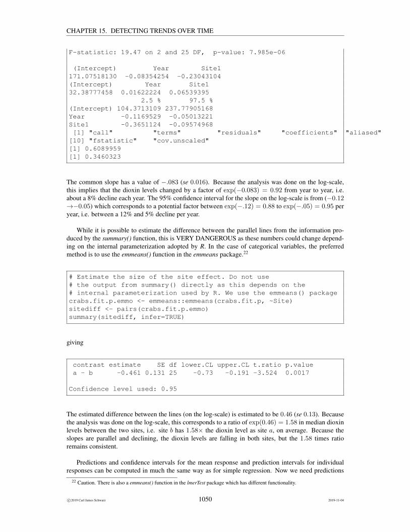
CHAPTER 15. DETECTING TRENDS OVER TIME
F-statistic: 19.47 on 2 and 25 DF, p-value: 7.985e-06
(Intercept) Year Site1171.07518130 -0.08354254 -0.23043104(Intercept) Year Site132.38777458 0.01622224 0.06539395
2.5 % 97.5 %(Intercept) 104.3713109 237.77905168Year -0.1169529 -0.05013221Site1 -0.3651124 -0.09574968[1] "call" "terms" "residuals" "coefficients" "aliased" "sigma" "df" "r.squared" "adj.r.squared"[10] "fstatistic" "cov.unscaled"[1] 0.6089959[1] 0.3460323
The common slope has a value of −.083 (se 0.016). Because the analysis was done on the log-scale,this implies that the dioxin levels changed by a factor of exp(−0.083) = 0.92 from year to year, i.e.about a 8% decline each year. The 95% confidence interval for the slope on the log-scale is from (−0.12→−0.05) which corresponds to a potential factor between exp(−.12) = 0.88 to exp(−.05) = 0.95 peryear, i.e. between a 12% and 5% decline per year.
While it is possible to estimate the difference between the parallel lines from the information pro-duced by the summary() function, this is VERY DANGEROUS as these numbers could change depend-ing on the internal parameterization adopted by R. In the case of categorical variables, the preferredmethod is to use the emmeans() function in the emmeans package.22
# Estimate the size of the site effect. Do not use# the output from summary() directly as this depends on the# internal parameterization used by R. We use the emmeans() packagecrabs.fit.p.emmo <- emmeans::emmeans(crabs.fit.p, ~Site)sitediff <- pairs(crabs.fit.p.emmo)summary(sitediff, infer=TRUE)
giving
contrast estimate SE df lower.CL upper.CL t.ratio p.valuea - b -0.461 0.131 25 -0.73 -0.191 -3.524 0.0017
Confidence level used: 0.95
The estimated difference between the lines (on the log-scale) is estimated to be 0.46 (se 0.13). Becausethe analysis was done on the log-scale, this corresponds to a ratio of exp(0.46) = 1.58 in median dioxinlevels between the two sites, i.e. site b has 1.58× the dioxin level as site a, on average. Because theslopes are parallel and declining, the dioxin levels are falling in both sites, but the 1.58 times ratioremains consistent.
Predictions and confidence intervals for the mean response and prediction intervals for individualresponses can be computed in much the same way as for simple regression. Now we need predictions
22 Caution. There is also a emmeans() function in the lmerTest package which has different functionality.
c©2019 Carl James Schwarz 1050 2019-11-04

CHAPTER 15. DETECTING TRENDS OVER TIME
for EACH site at each year.
The shaded region is the confidence interval for the mean response, and the bounds are the predictionintervals for single responses.Computation of confidence intervals for individual responses must be interpreted carefully because theindividual samples are composites and not the reading in individual crabs.
It always important to examine the model diagnostics. The R diagnostic plot:
c©2019 Carl James Schwarz 1051 2019-11-04

CHAPTER 15. DETECTING TRENDS OVER TIME
fails to show any evidence of a problem in the fit.
As usual you should examine the residual and other diagnostic plots to ensure that the model isappropriate. Because this is time-series data, you should also check for autocorrelation over time. Checkthe computer code for details.
15.9.1 Prologue
It turns out that the above analysis committed the cardinal sin of PSEUDO-REPLICATION (Hurlbert,1984). Pseudo-replicaiton is quite common in studies over time because of the failure to recognizethe potential for year-specific effects, i.e. in certain years, both site readings tend to be above theircorresponding regression line and in other years, both readings tend to be below their correspondingtrend lines.
The proper analysis of this data set requires the use of the Mixed Linear Model where a randomeffect for the effect of year is added to the model:
log(TEQ) = Y ear + Y earC(R) + Site+ Site : Y ear
c©2019 Carl James Schwarz 1052 2019-11-04

CHAPTER 15. DETECTING TRENDS OVER TIME
Here Y ear is the term corresponding to the trendline, while Y earC(R) is the random effect of thecategorical levels of year.
Please see me for details and consult the R code for the models used.
15.10 Example: Change in yearly average temperature with regimeshifts
The ANCOVA technique can also be used for trends when there are KNOWN regime shifts in the series.The case when the timing of the shift is unknown is more difficult and not covered in this course.
For example, consider a time series of annual average temperatures measured at Tuscaloosa, Alabamafrom 1901 to 2001. It is well known that shifts in temperature can occur whenever the instrument or loca-tion or observer or other characteristics of the station change. The data is available in the tuscaloosa.csvfile in the Sample Program Library at http://www.stat.sfu.ca/~cschwarz/Stat-Ecology-Datasets.
The data are imported into R in the usual fashion:
tusctemp <- read.csv("tuscaloosa.csv", header=TRUE,as.is=TRUE, strip.white=TRUE,na.string="") # here missing values are blanks or null cells
tusctemp <- tusctemp[complete.cases(tusctemp[,c("Year","Epoch","Avg.Temp..C.")]),] # drop the missing valuestusctemp$Epoch <- factor(tusctemp$Epoch)head(tusctemp)str(tusctemp)
The Epoch variable is declared as a factor and years where the average temperature is a mixture ofreading a two different sites are removed. Part of the raw data and the structure of the data frame areshown below:
Year Avg.Temp..C. Epoch Notes1 1901 16.00 e1 <NA>2 1902 17.56 e1 <NA>3 1903 16.64 e1 <NA>4 1904 17.21 e1 <NA>5 1905 16.96 e1 <NA>6 1906 17.45 e1 <NA>’data.frame’: 97 obs. of 4 variables:$ Year : int 1901 1902 1903 1904 1905 1906 1907 1908 1909 1910 ...$ Avg.Temp..C.: num 16 17.6 16.6 17.2 17 ...$ Epoch : Factor w/ 4 levels "e1","e2","e3",..: 1 1 1 1 1 1 1 1 1 1 ...$ Notes : chr NA NA NA NA ...
A time series plot of the data is constructed in the usual way using the ggplot2 package.
plotprelim <- ggplot(data=tusctemp, aes(x=Year, y=Avg.Temp..C.,shape=Epoch, color=Epoch))+
c©2019 Carl James Schwarz 1053 2019-11-04

CHAPTER 15. DETECTING TRENDS OVER TIME
ggtitle("Tuscaloosa Avg Temp (C) over time")+xlab("Year")+ylab("Tuscaloosa Avg Temp (C)")+geom_point(size=4)
plotprelim
The plot clearly shows a shift in the readings in 1939 (thermometer changed), 1957 (station moved), andpossibly in 1987 (location and thermometer changed). There is an obvious outlier around 1940 – thisreading needs to be investigated further and the analysis should be repeated with this point removed tosee if the results are dramatically different.
It turns out that cases where the number of epochs tends to increase with the number of data pointshas some serious technical issues with the properties of the estimators. See
Lu, Q. and Lund, R.B. (2007).Simple linear regression with multiple level shifts.Canadian Journal of Statistics, 35, 447-458
for details. Basically, if the number of parameters tends to increase with sample size, this violates oneof the assumptions for maximum likelihood estimation. This would lead to estimates which may noteven be consistent! For example, suppose that the recording changed every two years. Then the two datapoints should still be able to estimate the common slope, but this corresponds to the well known problemwith case-control studies where the number of pairs increases with total sample size. Fortunately, Lu andLund (2007) showed that this violation is not serious.
The analysis proceeds as in the dioxin example with two sites, except that now the series is brokeninto different epochs corresponding to the sets of years when conditions remained stable at the recordingsite. In this case, this corresponds to the years 1901-1938 (inclusive); 1940-1956 (inclusive); 1958-1986(inclusive), and 1989-2000 (inclusive). Note that the years 1939, 1957, and 1987 are NOT used because
c©2019 Carl James Schwarz 1054 2019-11-04

CHAPTER 15. DETECTING TRENDS OVER TIME
the average temperature in these two years is an amalgam of two different recording conditions23.
For example, the data file (around the first regime change) may look like:
Year Avg.Temp..C. Epoch Notes36 1936 18.15 e1 <NA>37 1937 17.87 e1 <NA>38 1938 18.95 e1 <NA>40 1940 16.09 e2 <NA>41 1941 17.81 e2 <NA>42 1942 17.54 e2 <NA>43 1943 17.77 e2 <NA>44 1944 18.05 e2 <NA>45 1945 17.84 e2 <NA>
Notice that we have deleted these odd years data.
Note that Year and Avg Temp and both set to have continuous scale; but Epoch should have a nominalor ordinal scale (in JMP parlance), a FACTOR (in R parlance), or declared as a class (categorical) variablein SAS parlance.
Model filling proceeds as before by first the model:
AvgTemp = Y ear Epoch Y ear ∗ Epoch
to see if the change in AvgTemp per tear is consistent among Epochs and then fitting the model:
AvgTemp = Y ear Epoch
to estimate the common trend (after adjusting for shifts among the Epochs).
We first run a separate regression line for each epoch (not shown) to check for outliers, to check thatthe slopes are similar; and to check that the MSE are comparable among epochs. Then we start with thenon-parallel slope model to check for evidence against parallelism.
The non-parallel slope model is fit:
# Fit the regression line with non-parallel slopes and look at the ANOVA table# Because lm() produces type I (increment tests), you need to specify the contrast type and# use the Anova() function from the car package# Be sure that Epoch has been declared as a factor.tusctemp.fit.np <- lm( Avg.Temp..C. ~ Epoch + Year + Year:Epoch, data=tusctemp,
contrasts=list(Epoch="contr.sum"))Anova(tusctemp.fit.np,type="III")
giving
Anova Table (Type III tests)
23If the exact day of the change were known, it is possible to weight the two epochs in these years and include the data points.
c©2019 Carl James Schwarz 1055 2019-11-04
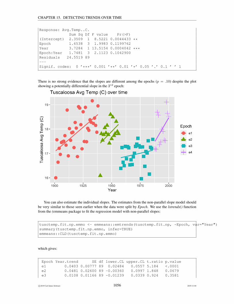
CHAPTER 15. DETECTING TRENDS OVER TIME
Response: Avg.Temp..C.Sum Sq Df F value Pr(>F)
(Intercept) 2.3509 1 8.5221 0.0044433 **Epoch 1.6538 3 1.9983 0.1199762Year 3.7284 1 13.5154 0.0004042 ***Epoch:Year 1.7481 3 2.1123 0.1042900Residuals 24.5519 89---Signif. codes: 0 ’***’ 0.001 ’**’ 0.01 ’*’ 0.05 ’.’ 0.1 ’ ’ 1
There is no strong evidence that the slopes are different among the epochs (p = .10) despite the plotshowing a potentially differential slope in the 3rd epoch:
You can also estimate the individual slopes. The estimates from the non-parallel slope model shouldbe very similar to those seen earlier when the data were split by Epoch. We use the lstrends() functionfrom the (emmeans package to fit the regression model with non-parallel slopes:
tusctemp.fit.np.emmo <- emmeans::emtrends(tusctemp.fit.np, ~Epoch, var="Year")summary(tusctemp.fit.np.emmo, infer=TRUE)emmeans::CLD(tusctemp.fit.np.emmo)
which gives:
Epoch Year.trend SE df lower.CL upper.CL t.ratio p.valuee1 0.0403 0.00777 89 0.02484 0.0557 5.184 <.0001e2 0.0481 0.02600 89 -0.00360 0.0997 1.848 0.0679e3 0.0108 0.01166 89 -0.01239 0.0339 0.924 0.3581
c©2019 Carl James Schwarz 1056 2019-11-04
CHAPTER 15. DETECTING TRENDS OVER TIME
e4 0.0805 0.03893 89 0.00319 0.1579 2.069 0.0415
Confidence level used: 0.95Epoch Year.trend SE df lower.CL upper.CL .groupe3 0.0108 0.01166 89 -0.01239 0.0339 1e1 0.0403 0.00777 89 0.02484 0.0557 1e2 0.0481 0.02600 89 -0.00360 0.0997 1e4 0.0805 0.03893 89 0.00319 0.1579 1
Confidence level used: 0.95P value adjustment: tukey method for comparing a family of 4 estimatessignificance level used: alpha = 0.05
We see that the all epochs have positive trends, but for some epoch’s, there was no evidence that theslope was different from zero. The compact letter display does not find evidence of a difference amongthe slopes – this is not surprising given that the p-value for the test of no interaction was large. Theconfidence interval for the slope in the third epoch is so large that the slope during this epoch couldmatch the other slopes.
DO NOT USE the values from the summary() function as they depend on the underlying contrastmatrix used.
The simpler model with common slopes is then fit.
# Fit the regression line with parallel slopes.# Because lm() produces type I (increment tests), you need to specify the contrast type and# use the Anova() function from the car package# Be sure that Epoch has been declared as a factor.tusctemp.fit.p <- lm( Avg.Temp..C. ~ Year + Epoch, data=tusctemp,
contrasts=list(Epoch="contr.sum"))Anova(tusctemp.fit.p, type=’III’)
Anova Table (Type III tests)
Response: Avg.Temp..C.Sum Sq Df F value Pr(>F)
(Intercept) 4.2774 1 14.963 0.0002045 ***Year 8.0230 1 28.065 7.971e-07 ***Epoch 23.5990 3 27.517 8.621e-13 ***Residuals 26.3000 92---Signif. codes: 0 ’***’ 0.001 ’**’ 0.01 ’*’ 0.05 ’.’ 0.1 ’ ’ 1
with fitted (common slope) lines:
c©2019 Carl James Schwarz 1057 2019-11-04

CHAPTER 15. DETECTING TRENDS OVER TIME
The estimated change in average temperature is .033 (SE .006) per year. The 95% confidence intervaldoes not cover 0.
No further model simplification is possible and there is good evidence that the common slope is dif-ferent from zero:
The residual/diagnostic plots (against predicted and the order in which the data were collected):
c©2019 Carl James Schwarz 1058 2019-11-04

CHAPTER 15. DETECTING TRENDS OVER TIME
shows no obvious problems.
Whenever time series data are used, autocorrelation should be investigated. The Durbin-Watson testis applied to the residuals.The Durbin-Watson test is available in the lmtest and car package.
# check for autocorrelation using Durbin-Watson test.# You can use the durbinWatsontest in the car package or the# dwtest in the lmtest package# For small sample sizes both are fine; for larger sample sizes use the lmtest package# Note the difference in the default direction of the alternative hypothesis
durbinWatsonTest(tusctemp.fit.p) # from the car packagedwtest(tusctemp.fit.p) # from the lmtest package
Note that the default action of the two functions uses a different alternate hypothesis for computingthe p-values (one function returns the one-sided p-value while the other function returns the two-sided
c©2019 Carl James Schwarz 1059 2019-11-04

CHAPTER 15. DETECTING TRENDS OVER TIME
p-value) and use different approximations to compute the p-values. Hence the results may look slightlydifferent:
lag Autocorrelation D-W Statistic p-value1 -0.1808638 2.299493 0.284
Alternative hypothesis: rho != 0
Durbin-Watson test
data: tusctemp.fit.pDW = 2.2995, p-value = 0.861alternative hypothesis: true autocorrelation is greater than 0
with no obvious problems detected.
The leverage plots (against year) and other diagnostic plots
also reveal nothing amiss.
15.11 Dealing with Autocorrelation
Short time series (10-50 observations) are common in environmental and ecological studies. It is wellknown that when data are collected over time, that the usual assumption of errors (deviations above andbelow the regression line) being independent may not be true.
This is a key assumption of regression analysis. What it implies is that if the data point for a particular
c©2019 Carl James Schwarz 1060 2019-11-04

CHAPTER 15. DETECTING TRENDS OVER TIME
year happens to be above the line, it has no influence on if the data point for the next year is also above theline. In many cases this is not true, because of long-term trends that affect data points for several yearsin a row. For example, precipitation patterns often follow several year patterns where a drought year ismore often followed by another drought year than a return to normal rainfall. If the level of precipitationaffects the response, you may see an induced autocorrelation (also known as serial correlation). Theuncritical application of regression to these type of data without accounting for the autocorrelation overtime is known as pseudo-replication over time (Hurlbert, 1984).
This problem and how to deal with it are well known in economics and related disciplines, but lesswell known in ecology.
Some articles that discuss the problem and solutions are:
• Bence, J. R. (1995). Analysis of short time series: Correction for autocorrelation. Ecology 76,628-639. A nice non-technical review of the subject and how to deal with in for ecology.
• Roy A., Falk B. and Fuller W.A. (2004) Testing for Trend in the Presence of Autoregressive Error.Journal of the American Statistical Association, 99, 1082-1091. This article is VERY technical,but the reference list provides a nice summary of relevant papers about this problem.
In some previous examples, we looked at the Durbin-Watson statistic to examine if there was ev-idence of autocorrelation. What is the Durbin-Watson test? What is autocorrelation? Why is this aproblem? How do we fit models accounting for autocorrelation?
In order to understand autocorrelation, we need to step back and look at the model for regressionanalysis in a little more detail. Recall, that we often used a shorthand notation to represent a linearregression problem:
Y = Time
where Y is the response variable, and Time is the effect of time. Mathematically, the model is writtenas:
Yi = β0 + β1ti + εi
where β0 is the intercept, β1 is the slope, and εi is the deviation of the ith data point from the actualunderlying line.
The usual assumption made in regression analysis is that the εi are independent of each other. Inautocorrelated models, this is not true. Mathematically, the simplest autocorrelation process (known asan AR(1) process) has:
εi+1 = ρεi + ai
where the ai are now independent and ρ is the autocorrelation coefficient.
In the same way that regular correlation between two variables ranges from -1 to +1, so to doesautocorrelation. An autocorrelation of 0 would indicate no correlation between successive deviationsabout the regression line as the εi would have no effect on εi+1; an autocorrelation close to 1 wouldindicate very high correlation between successive deviations; an autocorrelation close to -1 (very rarein ecological studies) would indicate a negative influence, i.e. high deviations in one year are typicallyfollowed by high but negative deviations in subsequent years.24
The following plots are some examples of autocorrelated data about the same underlying linear trendwith the associated residual plots:
24 A way that negative autocorrelations can be induced if there is a cost to breeding so that a successful season of breeding isfollowed by a year of not breeding etc
c©2019 Carl James Schwarz 1061 2019-11-04
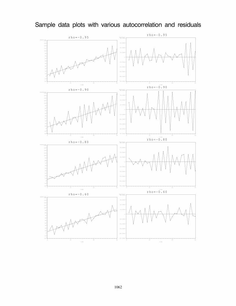
r h o = - 0 . 9 5b a s e l i n e
- 2 0
- 1 0
0
1 0
2 0
3 0
4 0
5 0
6 0
7 0
8 0
9 0
1 0 0
1 1 0
1 2 0
1 3 0
1 4 0
t i m e
0 1 0 2 0 3 0
r h o = - 0 . 9 5R e s i d u a l
- 5 0 . 0 0 0 0
- 4 0 . 0 0 0 0
- 3 0 . 0 0 0 0
- 2 0 . 0 0 0 0
- 1 0 . 0 0 0 0
0
1 0 . 0 0 0 0
2 0 . 0 0 0 0
3 0 . 0 0 0 0
4 0 . 0 0 0 0
t i m e
0 1 0 2 0 3 0
r h o = - 0 . 9 0b a s e l i n e
- 2 0
- 1 0
0
1 0
2 0
3 0
4 0
5 0
6 0
7 0
8 0
9 0
1 0 0
1 1 0
1 2 0
1 3 0
1 4 0
t i m e
0 1 0 2 0 3 0
r h o = - 0 . 9 0R e s i d u a l
- 5 0 . 0 0 0 0
- 4 0 . 0 0 0 0
- 3 0 . 0 0 0 0
- 2 0 . 0 0 0 0
- 1 0 . 0 0 0 0
0
1 0 . 0 0 0 0
2 0 . 0 0 0 0
3 0 . 0 0 0 0
4 0 . 0 0 0 0
t i m e
0 1 0 2 0 3 0
r h o = - 0 . 8 0b a s e l i n e
- 2 0
- 1 0
0
1 0
2 0
3 0
4 0
5 0
6 0
7 0
8 0
9 0
1 0 0
1 1 0
1 2 0
1 3 0
1 4 0
t i m e
0 1 0 2 0 3 0
r h o = - 0 . 8 0R e s i d u a l
- 5 0 . 0 0 0 0
- 4 0 . 0 0 0 0
- 3 0 . 0 0 0 0
- 2 0 . 0 0 0 0
- 1 0 . 0 0 0 0
0
1 0 . 0 0 0 0
2 0 . 0 0 0 0
3 0 . 0 0 0 0
4 0 . 0 0 0 0
t i m e
0 1 0 2 0 3 0
r h o = - 0 . 6 0b a s e l i n e
- 2 0
- 1 0
0
1 0
2 0
3 0
4 0
5 0
6 0
7 0
8 0
9 0
1 0 0
1 1 0
1 2 0
1 3 0
1 4 0
t i m e
0 1 0 2 0 3 0
r h o = - 0 . 6 0R e s i d u a l
- 5 0 . 0 0 0 0
- 4 0 . 0 0 0 0
- 3 0 . 0 0 0 0
- 2 0 . 0 0 0 0
- 1 0 . 0 0 0 0
0
1 0 . 0 0 0 0
2 0 . 0 0 0 0
3 0 . 0 0 0 0
4 0 . 0 0 0 0
t i m e
0 1 0 2 0 3 0
1062

r h o = - 0 . 4 0b a s e l i n e
- 2 0
- 1 0
0
1 0
2 0
3 0
4 0
5 0
6 0
7 0
8 0
9 0
1 0 0
1 1 0
1 2 0
1 3 0
1 4 0
t i m e
0 1 0 2 0 3 0
r h o = - 0 . 4 0R e s i d u a l
- 5 0 . 0 0 0 0
- 4 0 . 0 0 0 0
- 3 0 . 0 0 0 0
- 2 0 . 0 0 0 0
- 1 0 . 0 0 0 0
0
1 0 . 0 0 0 0
2 0 . 0 0 0 0
3 0 . 0 0 0 0
4 0 . 0 0 0 0
t i m e
0 1 0 2 0 3 0
r h o = - 0 . 2 0b a s e l i n e
- 2 0
- 1 0
0
1 0
2 0
3 0
4 0
5 0
6 0
7 0
8 0
9 0
1 0 0
1 1 0
1 2 0
1 3 0
1 4 0
t i m e
0 1 0 2 0 3 0
r h o = - 0 . 2 0R e s i d u a l
- 5 0 . 0 0 0 0
- 4 0 . 0 0 0 0
- 3 0 . 0 0 0 0
- 2 0 . 0 0 0 0
- 1 0 . 0 0 0 0
0
1 0 . 0 0 0 0
2 0 . 0 0 0 0
3 0 . 0 0 0 0
4 0 . 0 0 0 0
t i m e
0 1 0 2 0 3 0
r h o = - 0 . 0 0b a s e l i n e
- 2 0
- 1 0
0
1 0
2 0
3 0
4 0
5 0
6 0
7 0
8 0
9 0
1 0 0
1 1 0
1 2 0
1 3 0
1 4 0
t i m e
0 1 0 2 0 3 0
r h o = - 0 . 0 0R e s i d u a l
- 5 0 . 0 0 0 0
- 4 0 . 0 0 0 0
- 3 0 . 0 0 0 0
- 2 0 . 0 0 0 0
- 1 0 . 0 0 0 0
0
1 0 . 0 0 0 0
2 0 . 0 0 0 0
3 0 . 0 0 0 0
4 0 . 0 0 0 0
t i m e
0 1 0 2 0 3 0
r h o = 0 . 2 0b a s e l i n e
- 2 0
- 1 0
0
1 0
2 0
3 0
4 0
5 0
6 0
7 0
8 0
9 0
1 0 0
1 1 0
1 2 0
1 3 0
1 4 0
t i m e
0 1 0 2 0 3 0
r h o = 0 . 2 0R e s i d u a l
- 5 0 . 0 0 0 0
- 4 0 . 0 0 0 0
- 3 0 . 0 0 0 0
- 2 0 . 0 0 0 0
- 1 0 . 0 0 0 0
0
1 0 . 0 0 0 0
2 0 . 0 0 0 0
3 0 . 0 0 0 0
4 0 . 0 0 0 0
t i m e
0 1 0 2 0 3 0
1063

r h o = 0 . 4 0b a s e l i n e
- 2 0
- 1 0
0
1 0
2 0
3 0
4 0
5 0
6 0
7 0
8 0
9 0
1 0 0
1 1 0
1 2 0
1 3 0
1 4 0
t i m e
0 1 0 2 0 3 0
r h o = 0 . 4 0R e s i d u a l
- 5 0 . 0 0 0 0
- 4 0 . 0 0 0 0
- 3 0 . 0 0 0 0
- 2 0 . 0 0 0 0
- 1 0 . 0 0 0 0
0
1 0 . 0 0 0 0
2 0 . 0 0 0 0
3 0 . 0 0 0 0
4 0 . 0 0 0 0
t i m e
0 1 0 2 0 3 0
r h o = 0 . 6 0b a s e l i n e
- 2 0
- 1 0
0
1 0
2 0
3 0
4 0
5 0
6 0
7 0
8 0
9 0
1 0 0
1 1 0
1 2 0
1 3 0
1 4 0
t i m e
0 1 0 2 0 3 0
r h o = 0 . 6 0R e s i d u a l
- 5 0 . 0 0 0 0
- 4 0 . 0 0 0 0
- 3 0 . 0 0 0 0
- 2 0 . 0 0 0 0
- 1 0 . 0 0 0 0
0
1 0 . 0 0 0 0
2 0 . 0 0 0 0
3 0 . 0 0 0 0
4 0 . 0 0 0 0
t i m e
0 1 0 2 0 3 0
r h o = 0 . 8 0b a s e l i n e
- 2 0
- 1 0
0
1 0
2 0
3 0
4 0
5 0
6 0
7 0
8 0
9 0
1 0 0
1 1 0
1 2 0
1 3 0
1 4 0
t i m e
0 1 0 2 0 3 0
r h o = 0 . 8 0R e s i d u a l
- 5 0 . 0 0 0 0
- 4 0 . 0 0 0 0
- 3 0 . 0 0 0 0
- 2 0 . 0 0 0 0
- 1 0 . 0 0 0 0
0
1 0 . 0 0 0 0
2 0 . 0 0 0 0
3 0 . 0 0 0 0
4 0 . 0 0 0 0
t i m e
0 1 0 2 0 3 0
r h o = 0 . 9 0b a s e l i n e
- 2 0
- 1 0
0
1 0
2 0
3 0
4 0
5 0
6 0
7 0
8 0
9 0
1 0 0
1 1 0
1 2 0
1 3 0
1 4 0
t i m e
0 1 0 2 0 3 0
r h o = 0 . 9 0R e s i d u a l
- 5 0 . 0 0 0 0
- 4 0 . 0 0 0 0
- 3 0 . 0 0 0 0
- 2 0 . 0 0 0 0
- 1 0 . 0 0 0 0
0
1 0 . 0 0 0 0
2 0 . 0 0 0 0
3 0 . 0 0 0 0
4 0 . 0 0 0 0
t i m e
0 1 0 2 0 3 0
1064

r h o = 0 . 9 5b a s e l i n e
- 2 0
- 1 0
0
1 0
2 0
3 0
4 0
5 0
6 0
7 0
8 0
9 0
1 0 0
1 1 0
1 2 0
1 3 0
1 4 0
t i m e
0 1 0 2 0 3 0
r h o = 0 . 9 5R e s i d u a l
- 5 0 . 0 0 0 0
- 4 0 . 0 0 0 0
- 3 0 . 0 0 0 0
- 2 0 . 0 0 0 0
- 1 0 . 0 0 0 0
0
1 0 . 0 0 0 0
2 0 . 0 0 0 0
3 0 . 0 0 0 0
4 0 . 0 0 0 0
t i m e
0 1 0 2 0 3 0
1065

CHAPTER 15. DETECTING TRENDS OVER TIME
If the autocorrelation is close to -1, then points above the underlying trend are usually followedimmediately by points below the underlying. The fitted line will be close to the underlying trend. Theresidual plot will show the same pattern.
If the autocorrelation is close to 1, then you will see long runs of points above the underlying trendline and long runs of points below the underlying line. DANGER! In cases of very high autocorre-lation with short time series, you can be drastically misled by the data! If you examine the plots above,you see that in the case of high positive autocorrelation, the points tended to stay above or below theunderlying trend line for long periods of time. If the time series is short, you may never see the actualline dipping below the real trend line and the fitted line (shown in the above plots) may be completelymisleading and there is no way to detect this! Ironically, with short time series (e.g. fewer than 30 datapoints), it will be very difficult to detect high positive autocorrelation and this is exactly the time when itcan cause the most damage when the data give misleading results!
If the autocorrelation is close to 0, the points will be randomly scattered about the underlying trendline, the fitted line will be close to the underlying trend line, and the residuals should appear to be randomscattered about 0.
In many cases, if you have fewer than 30 data points, it will be very difficult to observe or detect anyautocorrelation unless extreme!
What are the effects of autocorrelation? In most cases in ecology the autocorrelation tends to bepositive. This has the following effects:
• Estimates of the slope and intercept are still unbiased, but they are less efficient (i.e. the correctstandard error is larger) than estimates of the same process in the absence of autocorrelation.This may seem to be contradicted by my statement above that in the presence of high positiveautocorrelation and short time series, that the data may be very misleading, but this is an artifactthat you have a very short time series. With a long time-series you will see that the data run overand under the trend line in long waves and the fitted line will once again be close to the actualunderlying trend.
• The reported variance around the regression line (MSE) may seriously underestimate the correctvariance.
• Unfortunately, while the estimates of the slope and intercept are usually not affected greatly, thereported standard errors can be misleading. In the case of positive or negative autocorrelation, thereported standard errors obtained when a line is fit assuming not autocorrelation, are typically toosmall, i.e. the estimates look more precise than they really are.
• Reported confidence intervals ignoring autocorrelation tend to be too narrow.
• The p-values from hypothesis testing tend to be too small, i.e. you tend to detect differences thatare not real too often.
The autocorrelation can be estimated from the data in many ways. In one method, a regression lineis fit to the data, the residuals are found, and then the autocorrelation is estimated as:
ρ =
T∑i=2
eiei−1
T−1∑i=2
e2i
where ei is the residual for the ith observation. Bence (1995) points out that this often underestimatesthe autocorrelation and provides some corrected estimates. More modern methods estimate the autocor-
c©2019 Carl James Schwarz 1066 2019-11-04

CHAPTER 15. DETECTING TRENDS OVER TIME
relation using a technique called maximum likelihood and these often perform well than these two-stepmethods.
As a rule of thumb, the reported standard errors obtained from fitting a regression ignoring autocorre-
lation should be inflated by a factor of√
(1+ρ)(1−ρ) . For example, if the actual autocorrelation is 0.6, then the
standard errors (from an analysis ignoring autocorrelation) should be inflated by a factor of√
(1+.6)(1−.6) = 2,
i.e. multiply the reported standard errors ignoring autocorrelation by a factor of 2. Consequently, unlessthe autocorrelation is very close to 1 or -1, the inflation factor is usually pretty small.25
A slightly simpler formula that also seems to work well in practice is that the effective sample sizein the presence of autocorrelation is found as:
neffective = 1 + (n− 1)(1− ρ)
This is based on the observation that the first observation counts as a data point, but each additional datapoint only counts as (1 − ρ) of a data point. Then use the fact that for most statistical problems, thestandard errors decrease by a factor of
√n to estimate the effect upon the precision of the estimates. For
example, if nneffective
= 2 then the reported standard errors (computed ignoring autocorrelation) should be
inflated by a factor of about√
2.
The Durbin-Watson test statistic is a popular measure of autocorrelation. It is computed as:
d =
N∑i=2
(ei − ei−1)2
N∑i=1
e2i
≈2N∑i=1
e2i − 2
N∑i=2
eiei−1
N∑i=1
e2i
≈ 2 (1− ρ)
Consequently, if the autocorrelation is close to 0, the Durbin-Watson statistic should be close to 2. Thep-value for the statistics is found from tables, but most modern software can compute it automatically.
Remedial measures If there is strong evidence for autocorrelation, there a number of remedial mea-sures that can be taken:
• Use ordinary regression and inflate the reported standard errors by the inflation factor mentionedabove. This is a very approximate solution and is not often used now that modern software isavailable.
• A major cause of autocorrelation is the omission of an important explanatory variable. The exam-ple of precipitation that tends to occur in cycles was noted earlier. In this case, a more complexregression model (multiple regression) that looks at the simultaneous effect of more than two vari-ables would be appropriate. Unfortunately this is beyond the scope of these notes.
• Transform the variables before using simple regression methods that ignore autocorrelation. Thereare two popular transformations, the Cochrane-Orcutt and Hildreth-Lu procedures. Both proce-dures start by estimating the autocorrelation ρ by fitting the ordinary regression line, obtaining theresiduals, and then using the residuals to estimate the autocorrelation. Then the data are trans-formed by subtracting the estimated portion due to autocorrelation. Finally, the transformed dataare refit using ordinary regression (again ignoring autocorrelation). These approaches are fallingout of favor because of the availability of integrated procedures below.
25 As Bence (1995) points out, the correction factor assumes that you know the value of ρ. Often this is difficult to estimate andtypically estimates are too close to 0 resulting in a correction factor that is too small as well. He provides a bias adjusted correctionfactor.
c©2019 Carl James Schwarz 1067 2019-11-04

CHAPTER 15. DETECTING TRENDS OVER TIME
• Use a more sophisticated fitting procedure that explicitly estimates the autocorrelation and ac-counts for it. This can be done using maximum likelihood or extensions of the previous methods,e.g. the Yule-Walker methods which fit generalized least squares. Many statistical packages offersuch procedures, e.g. SAS’s PROC AUTOREG is specially designed to deal with autocorrelationuses the Yule-Walker methods; SAS’s Proc MIXED uses maximum likelihood methods.
15.11.1 Example: Mink pelts from Saskatchewan
L.B. Keith (1963) collected information on the number of mink-pelts from Saskatchewan, Canada overa 30 year period. This is data series 3707 in the NERC Centre for Population Biology, Imperial College(1999) The Global Population Dynamics Database available at http://www.sw.ic.ac.uk/cpb/cpb/gpdd.html.
We are interested to see if there is a linear trend in the series.
Here is the raw data:
c©2019 Carl James Schwarz 1068 2019-11-04

CHAPTER 15. DETECTING TRENDS OVER TIME
Year Pelts
1914 15585
1915 9696
1916 6757
1917 6443
1918 6744
1919 10637
1920 11206
1921 8937
1922 13977
1923 11430
1924 13955
1925 6635
1926 7855
1927 5485
1928 5605
1929 5016
1930 6028
1931 6287
1932 11978
1933 15730
1934 14850
1935 9766
1936 6577
1937 3871
1938 4659
1939 6749
1940 12469
1941 8579
1942 6839
1943 9990
1944 6561
1945 5831
1946 8088
1947 9579
1948 10672
1949 16195
1950 12596
1951 12833
1952 18853
1953 11493
1954 14613
1955 18514c©2019 Carl James Schwarz 1069 2019-11-04

CHAPTER 15. DETECTING TRENDS OVER TIME
The data is available in the mink.csv file in the Sample Program Library at http://www.stat.sfu.ca/~cschwarz/Stat-Ecology-Datasets.
The data are imported into R in the usual fashion:
mink <- read.csv("mink.csv", header=TRUE,as.is=TRUE, strip.white=TRUE,na.string=".")
mink$logPelts <- log(mink$Pelts)head(mink)str(mink)
The log() of the number of pelts is also computed. Part of the raw data and the structure of the dataframe are shown below:
Year Pelts logPelts1 1914 15585 9.6540642 1915 9696 9.1794693 1916 6757 8.8183344 1917 6443 8.7707505 1918 6744 8.8164086 1919 10637 9.272094’data.frame’: 42 obs. of 3 variables:$ Year : int 1914 1915 1916 1917 1918 1919 1920 1921 1922 1923 ...$ Pelts : int 15585 9696 6757 6443 6744 10637 11206 8937 13977 11430 ...$ logPelts: num 9.65 9.18 8.82 8.77 8.82 ...
It is common when dealing with population trends, to analyze the data on the log-scale. The reasonfor this is that many processes operate multiplicatively on the original scale, and this is translated into alinear line on the log-scale. For example, if the number of pelts harvested increased by x% per year, theforecasted number of pelts harvested would be fit by the equations:
Pelts = B(1 + x)Years from baseline
whereB is the baseline number of pelts. When this is transformed to the log-scale, the resulting equationis:
log(Pelts) = log(B) + (Years from baseline) log(1 + x)
orY ′ = β0 + β1(Years from baseline)
This equation can be further modified by using the raw year as the X variable (rather than years-from-baseline). All that happens is that the value of the baseline refers back to year 0 (which is pretty mean-ingless), but the value of the slope is still OK.
It is recommended that you take natural logarithms (base e) rather than common logarithms (base10) because then the estimated slope has a nice interpretation. For small slopes on the natural log scale,a value of β1 corresponds closely to the same percentage increase per year. For example if β1 = .04,then the population in increasing at a rate of
exp(β1)− 1 = exp(.04)− 1 = 1.041− 1 = .041 ≈ β1 = .04
c©2019 Carl James Schwarz 1070 2019-11-04

CHAPTER 15. DETECTING TRENDS OVER TIME
or 4% per year.
Start by a simple time-plot of the logged values. This is done in the usual way using the ggplotpackage.
plotprelim <- ggplot(data=mink, aes(x=Year, y=logPelts))+ggtitle("Mink Pelts over time")+xlab("Year")+ylab("log(Mink Pelts)")+geom_point(size=4)+geom_line()
plotprelim
There appears to be a generally increasing trend, but the the points seem to show an irregular cyclicaltype of pattern where several years of high takes of pelts is followed by several years of low takes ofpelts. This is often a sign of autocorrelated residuals. Indeed the a plot of the residuals against timeshows this pattern: Autocorrelation can often be informally detected by looking at a time-plot of theresiduals and a lag-plot of the residuals.
# Look at residual plot over timeresid <- data.frame(resid=resid(mink.naive.fit),Year=mink$Year)resid$lagresid <- c(NA, resid$resid[1:(length(resid$resid)-1)])residtimeplot <- ggplot(data=resid, aes(x=Year, y=resid))+
ggtitle("Time plot of residuals from a simple linear fit")+geom_point()+geom_line()+geom_hline(yintercept=0)
residtimeplotresidlagplot <- ggplot(data=resid, aes(x=lagresid, y=resid))+
ggtitle("Lag plot of residuals")+
c©2019 Carl James Schwarz 1071 2019-11-04

CHAPTER 15. DETECTING TRENDS OVER TIME
geom_point()residlagplot
The time plot (below) shows a consistent pattern of runs of residuals above the 0 line and then belowthe zero line.
The lag-plot above plots the residuals at time i vs the residual at time i − 1. You can see a strong rela-tionship between the two residuals indicating autocorrelation over time.
Many packages have the Durbin-Watson test for autocorrelation: The Durbin-Watson test is availablein the lmtest and car package.
# check for autocorrelation using Durbin-Watson test.# You can use the durbinWatsontest in the car package or the# dwtest in the lmtest package# For small sample sizes both are fine; for larger sample sizes use the lmtest package# Note the difference in the default direction of the alternative hypothesis
DW1 <- durbinWatsonTest(mink.naive.fit) # from the car packageDW1
DW2 <-dwtest(mink.naive.fit) # from the lmtest packageDW2
Note that the default action of the two functions uses a different alternate hypothesis for computingthe p-values (one function returns the one-sided p-value while the other function returns the two-sidedp-value) and use different approximations to compute the p-values. Hence the results may look slightlydifferent:
lag Autocorrelation D-W Statistic p-value1 0.566525 0.7448338 0
Alternative hypothesis: rho != 0
Durbin-Watson test
data: mink.naive.fitDW = 0.74483, p-value = 7.66e-07alternative hypothesis: true autocorrelation is greater than 0
c©2019 Carl James Schwarz 1072 2019-11-04

CHAPTER 15. DETECTING TRENDS OVER TIME
The Durbin-Watson statistics indicates that there is strong evidence of autocorrelation with an esti-mated autocorrelation of approximately 0.56.
The estimated intercept and slope (without adjusting for autocorrelation) are estimated in the usualfashion.
We use the lm() function to fit the regression model:
# Fit the regression line to the log(Pelts)mink.naive.fit <- lm( logPelts ~ Year, data=mink)summary(mink.naive.fit)
Call:lm(formula = logPelts ~ Year, data = mink)
Residuals:Min 1Q Median 3Q Max
-0.88130 -0.34277 0.03127 0.30469 0.69688
Coefficients:Estimate Std. Error t value Pr(>|t|)
(Intercept) -6.470697 9.814412 -0.659 0.513Year 0.008061 0.005073 1.589 0.120
Residual standard error: 0.3985 on 40 degrees of freedomMultiple R-squared: 0.05936, Adjusted R-squared: 0.03585F-statistic: 2.524 on 1 and 40 DF, p-value: 0.12
The number of pelts is estimated to increase at about 0.8% per year. As noted before, the estimatesare still unbiased, but the reported standard errors are too small. Using the rule-of-thumb, the inflationfactor for the standard errors is approximately:
InfFactor =
√1 + ρ
1− ρ=
√1 + .56
1− .56= 1.9
Hence a more realistic standard error would be 1.9 × 0.005 = 0.009. The se is the same order ofmagnitude as the estimate and so there is no evidence of an increasing trend.
A more formal analysis would proceed as follows. A more formal analysis is obtained using general-ized least squares in the gls() function or a more formal time-series approach using the arima() function.Here the additional argument specifies the type of covariance structure (an AR(1) structure here) thatshould represent the residuals.
# Fit a model that allows for autocorrelation using glsmink.fit.ar1 <- gls(logPelts ~ Year, data=mink,
correlation=corAR1(form=~1))summary(mink.fit.ar1)
c©2019 Carl James Schwarz 1073 2019-11-04

CHAPTER 15. DETECTING TRENDS OVER TIME
anova(mink.fit.ar1)
sink("mink-R-fitpieces.txt", split=TRUE)##***partfitpiecesb;# Extract the individual parts of the fit using the# standard methods. Note that because Epoch is a factor# DO NOT USE THE ESTIMATES from the summary() to estimate# the Epoch effect because these estimates depend on the# internal parameterization used. Use the emmeans() function insteadsummary(mink.fit.ar1)coef(mink.fit.ar1)sqrt(diag(vcov(mink.fit.ar1))) # gives the SEconfint(mink.fit.ar1)names(summary(mink.fit.ar1))summary(mink.fit.ar1)$r.squaredsummary(mink.fit.ar1)$sigma##***partfitpiecese;sink()
# predictions are now much more complex because# of the autocorrelation. The general problem is that# the autocorrelation structure implies that predictions at# a particular year must incorporate the residuals from# the previous years. Of course, this influence will diminish# once you get further and further past the end of the series.## Contact me for details
# Fit a model that allows for autocorrelation using ARIMAmink.fit.arima <- with(mink, arima(logPelts, xreg=Year, order=c(1,0,0)))mink.fit.arima
The two functions estimate the autocorrelation in slightly different ways which explains some of thedifferences in the output.
Generalized least squares fit by REMLModel: logPelts ~ YearData: mink
AIC BIC logLik38.39906 45.15458 -15.19953
Correlation Structure: AR(1)Formula: ~1Parameter estimate(s):
Phi0.7356084
Coefficients:Value Std.Error t-value p-value
c©2019 Carl James Schwarz 1074 2019-11-04

CHAPTER 15. DETECTING TRENDS OVER TIME
(Intercept) -4.084873 24.64579 -0.1657433 0.8692Year 0.006865 0.01274 0.5388303 0.5930
Correlation:(Intr)
Year -1
Standardized residuals:Min Q1 Med Q3 Max
-2.02185384 -0.87704787 -0.05921877 0.47752601 1.27638355
Residual standard error: 0.4701547Degrees of freedom: 42 total; 40 residualDenom. DF: 40
numDF F-value p-value(Intercept) 1 2771.2256 <.0001Year 1 0.2903 0.593Generalized least squares fit by REML
Model: logPelts ~ YearData: mink
AIC BIC logLik38.39906 45.15458 -15.19953
Correlation Structure: AR(1)Formula: ~1Parameter estimate(s):
Phi0.7356084
Coefficients:Value Std.Error t-value p-value
(Intercept) -4.084873 24.64579 -0.1657433 0.8692Year 0.006865 0.01274 0.5388303 0.5930
Correlation:(Intr)
Year -1
Standardized residuals:Min Q1 Med Q3 Max
-2.02185384 -0.87704787 -0.05921877 0.47752601 1.27638355
Residual standard error: 0.4701547Degrees of freedom: 42 total; 40 residual(Intercept) Year-4.084873432 0.006864598(Intercept) Year24.64578973 0.01273981
2.5 % 97.5 %(Intercept) -52.38973367 44.21998680Year -0.01810498 0.03183417[1] "modelStruct" "dims" "contrasts" "coefficients" "varBeta"[6] "sigma" "apVar" "logLik" "numIter" "groups"[11] "call" "method" "fitted" "residuals" "parAssign"
c©2019 Carl James Schwarz 1075 2019-11-04

CHAPTER 15. DETECTING TRENDS OVER TIME
[16] "na.action" "corBeta" "tTable" "BIC" "AIC"NULL[1] 0.4701547
Call:arima(x = logPelts, order = c(1, 0, 0), xreg = Year)
Coefficients:ar1 intercept Year
0.6309 -4.8660 0.0073s.e. 0.1298 18.3751 0.0095
sigma^2 estimated as 0.09565: log likelihood = -10.56, aic = 29.12
Predictions from these types of models are much more difficult to obtain because you need to thinkcarefully on how to incorporate the AR(1) structure into any prediction. Please contact me for furtherdetails.
It is interesting to note that there is no evidence of further autocorrelation in the residuals after thefirst differences were taken. If you hadn’t examined the autocorrelation plots you would not have knownthis. It is quite common that a first difference will remove much autocorrelation in the data and this isoften a good first step.
15.11.2 Example: Median run timing of Atlantic Salmon
This example is based on:
Dempson, J.B., Bradbury, I.R., Robertson, M.J., Veinott, G., Poole, R., and Colbourne, E.(2016).Spatial and temporal variation in run timing of adult Atlantic salmon (Salmo salar)
Evidence mounts for the influence of climate variability on temporal trends in the phenology of var-ious organisms including various species of fish. Accordingly variation in adult Atlantic salmon Salmosalar run timing was examined in Newfoundland and Labrador rivers where returns were monitored atfishways or fish counting fences.
The median date of the run (r50) was measured. This is the julian day in a year at which time half ofthe fish have arrived at the fishway or counting fence.
Here is the raw data:
c©2019 Carl James Schwarz 1076 2019-11-04

CHAPTER 15. DETECTING TRENDS OVER TIME
River Size Year r50
WAB small 1972 210
WAB small 1973 198
WAB small 1974 206
WAB small 1975 209
WAB small 1976 216
WAB small 1977 199
WAB small 1978 200
WAB small 1979 209
WAB small 1980 212
WAB small 1981 216
WAB small 1982 214
WAB small 1983 206
WAB small 1984 197
WAB small 1985 226
WAB small 1986 228
WAB small 1987 225
WAB small 1988 211.5
WAB small 1989 229
WAB small 1990 219
WAB small 1991 218
WAB small 1992 216
WAB small 1993 198
WAB small 1994 200
WAB small 1995 202
WAB small 1996 190
WAB small 1997 196
WAB small 1998 186
WAB small 1999 190
WAB small 2000 191
WAB small 2001 198
WAB small 2002 195
WAB small 2003 198.5
WAB small 2004 194
WAB small 2005 208
WAB small 2006 192
WAB small 2007 202
WAB small 2008 191
WAB small 2009 189
WAB small 2010 190
WAB small 2011 194
WAB small 2012 204
c©2019 Carl James Schwarz 1077 2019-11-04

CHAPTER 15. DETECTING TRENDS OVER TIME
The data is available in the runtiming.csv file in the Sample Program Library at http://www.stat.sfu.ca/~cschwarz/Stat-Ecology-Datasets.
The data are imported into R in the usual fashion:
runtiming <- read.csv("runtiming.csv", header=TRUE,as.is=TRUE, strip.white=TRUE,na.string=".")
head(runtiming)
River Size Year r501 WAB small 1972 2102 WAB small 1973 1983 WAB small 1974 2064 WAB small 1975 2095 WAB small 1976 2166 WAB small 1977 199
Start by a simple time-plot of the values. This is done in the usual way using the ggplot package.
plotprelim <- ggplot(data=runtiming, aes(x=Year, y=r50))+ggtitle("Median run timing")+xlab("Year")+ylab("Median run timing")+geom_point()+geom_smooth(method="lm", se=FALSE)
plotprelim
c©2019 Carl James Schwarz 1078 2019-11-04

CHAPTER 15. DETECTING TRENDS OVER TIME
There appears to be a generally decreasing trend. but the the points seem to show an irregular cyclicaltype of pattern where several years of high values of the median run timing is followed by several yearsof low values of the median run timing. This is often a sign of autocorrelated residuals.
A naive fit (not accounting for the impact of autocorrelation) is found in the usual way:
We use the lm() function to fit the regression model:
naive.fit <- lm( r50 ~ Year, data=runtiming)summary(naive.fit)$coefficients
Estimate Std. Error t value Pr(>|t|)(Intercept) 1209.4160279 268.3326185 4.507152 5.847636e-05Year -0.5046167 0.1347028 -3.746150 5.801941e-04
The median run timing is estimated to be declining at about 0.50 day/year (se 0.13; p-value =.0006).
c©2019 Carl James Schwarz 1079 2019-11-04

CHAPTER 15. DETECTING TRENDS OVER TIME
As noted previously, the estimates are still unbiased in the presence of autocorrelation but the reportedstandard errors are too small and the reported p-value is too small leading you to believe that an effectwas detected, when in fact there is no evidence of an effect.
The usual diagnostic plots (not shown) fail to show any evidence of a lack-of-fit. Autocorrelationcan often be informally detected by looking at a time-plot of the residuals and a lag-plot of the residuals.
A plot of the residuals by time
resid <- data.frame(resid=resid(naive.fit),Year=runtiming$Year)resid$lagresid <- c(NA, resid$resid[1:(length(resid$resid)-1)])residtimeplot <- ggplot(data=resid, aes(x=Year, y=resid))+
ggtitle("Time plot of residuals from a simple linear fit")+geom_point()+geom_line()+geom_hline(yintercept=0)
residtimeplot
shows a consistent pattern of runs of residuals above the 0 line and then below the zero line.
The lag-residual plot above plots the residuals at time i vs the residual at time i − 1. If there is astrong relationship between the two residuals, it indicates that autocorrelation may be present.
# Do a lag(1) plotresidlagplot <- ggplot(data=resid, aes(x=lagresid, y=resid))+
ggtitle("Lag plot of residuals")+geom_point()
residlagplot
c©2019 Carl James Schwarz 1080 2019-11-04

CHAPTER 15. DETECTING TRENDS OVER TIME
This lag-residual plot show clear evidence of autocorrelation:
Many packages have the Durbin-Watson test for autocorrelation: The Durbin-Watson test is availablein the lmtest and car package.
# check for autocorrelation using Durbin-Watson test# You can use the durbinWatsontest in the car package or the# dwtest in the lmtest package# For small sample sizes both are fine; for larger sample sizes use the lmtest package# Note the difference in the default direction of the alternative hypothesis
durbinWatsonTest(naive.fit) # from the car packagedwtest(naive.fit) # from the lmtest package
Note that the default action of the two functions uses a different alternate hypothesis for computingthe p-values (one function returns the one-sided p-value while the other function returns the two-sidedp-value) and use different approximations to compute the p-values. Hence the results may look slightlydifferent:
lag Autocorrelation D-W Statistic p-value1 0.5208901 0.9296458 0
Alternative hypothesis: rho != 0
c©2019 Carl James Schwarz 1081 2019-11-04
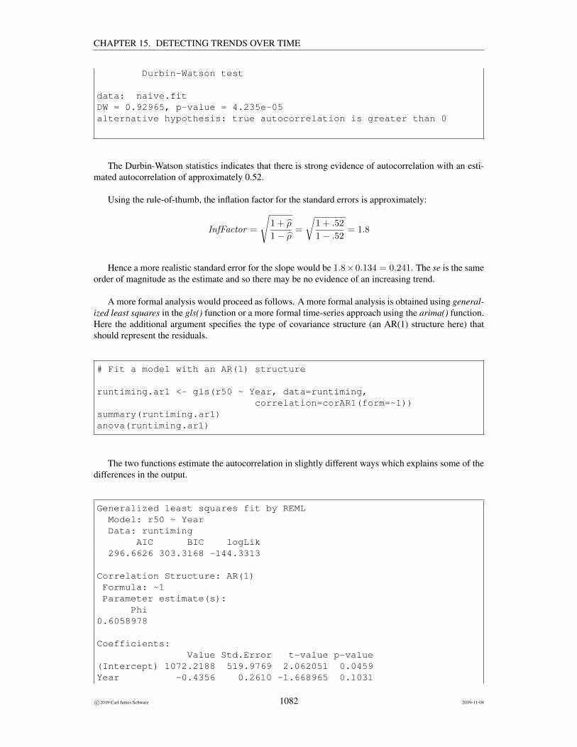
CHAPTER 15. DETECTING TRENDS OVER TIME
Durbin-Watson test
data: naive.fitDW = 0.92965, p-value = 4.235e-05alternative hypothesis: true autocorrelation is greater than 0
The Durbin-Watson statistics indicates that there is strong evidence of autocorrelation with an esti-mated autocorrelation of approximately 0.52.
Using the rule-of-thumb, the inflation factor for the standard errors is approximately:
InfFactor =
√1 + ρ
1− ρ=
√1 + .52
1− .52= 1.8
Hence a more realistic standard error for the slope would be 1.8×0.134 = 0.241. The se is the sameorder of magnitude as the estimate and so there may be no evidence of an increasing trend.
A more formal analysis would proceed as follows. A more formal analysis is obtained using general-ized least squares in the gls() function or a more formal time-series approach using the arima() function.Here the additional argument specifies the type of covariance structure (an AR(1) structure here) thatshould represent the residuals.
# Fit a model with an AR(1) structure
runtiming.ar1 <- gls(r50 ~ Year, data=runtiming,correlation=corAR1(form=~1))
summary(runtiming.ar1)anova(runtiming.ar1)
The two functions estimate the autocorrelation in slightly different ways which explains some of thedifferences in the output.
Generalized least squares fit by REMLModel: r50 ~ YearData: runtiming
AIC BIC logLik296.6626 303.3168 -144.3313
Correlation Structure: AR(1)Formula: ~1Parameter estimate(s):
Phi0.6058978
Coefficients:Value Std.Error t-value p-value
(Intercept) 1072.2188 519.9769 2.062051 0.0459Year -0.4356 0.2610 -1.668965 0.1031
c©2019 Carl James Schwarz 1082 2019-11-04

CHAPTER 15. DETECTING TRENDS OVER TIME
Correlation:(Intr)
Year -1
Standardized residuals:Min Q1 Med Q3 Max
-1.4474154 -0.5902635 -0.2283566 0.4895616 2.1326601
Residual standard error: 10.91575Degrees of freedom: 41 total; 39 residualDenom. DF: 39
numDF F-value p-value(Intercept) 1 3793.097 <.0001Year 1 2.785 0.1031
We see that the revised standard errors were well predicted by the rough rule of thumb. More im-portantly, the corrected p-value is now on the order of 0.10 and so there is NO evidence of a change inmedian run timing over time.
Predictions from these types of models are much more difficult to obtain because you need to thinkcarefully on how to incorporate the AR(1) structure into any prediction. Please contact me for furtherdetails.
15.12 Dealing with seasonality
In many cases, the “cause” of autocorrelation over time is some sort of seasonality. For example, streamflow may follow a cyclical pattern with high flows in the winter months (at least in Vancouver) and lowflows in the summer months. A way to deal with this type of autocorrelation is to either first adjust thedata for seasonal effects, and then use the usual regression methods on this adjusted data, or to fit a cyclicpattern over and above the simple trend line.
15.12.1 Empirical adjustment for seasonality
General idea
The intuitive idea behind this method is quite simple. Arrange the data into seasonal groups (e.g. months)and subtract the seasonal group mean or median26 from every point in the seasonal series. This willsubtract the cyclic pattern and leave adjusted data that is “free” of seasonal effects.
The adjustment process can either be done within the computer package, or in many cases, is easilydone on a spreadsheet.
This adjustment is a bit ad hoc, but seems to work well in practice. The reported standard errors fromthe regression line are a bit too small as they have not accounted for the adjustment process.
26 The median would be preferred to avoid contamination of the mean by outliers
c©2019 Carl James Schwarz 1083 2019-11-04

CHAPTER 15. DETECTING TRENDS OVER TIME
Example: Total phosphorus from Klamath River
Consider, for example, values of total phosphorus taken from the Klamath River near Klamath, Californiaas analyzed by Hirsch et al (1982).A27
Total phosphorus (mg/L) in Klamath River near Klamath, CA
Month Year
1972 1973 1974 1975 1976 1977 1978 1979
1 0.07 0.33 0.70 0.08 0.04 0.05 0.14 0.08
2 0.11 0.24 0.17 . . . 0.11 0.04
3 0.60 0.12 0.16 . 0.14 0.03 0.02 0.02
4 0.10 0.08 1.20 0.11 0.05 0.04 0.06 0.01
5 0.04 0.03 0.12 0.09 0.02 0.04 0.03 0.03
6 0.05 <0.01 0.05 0.05 . . 0.03 .
7 0.04 0.04 0.03 0.02 . 0.06 0.02 0.04
8 0.05 0.06 0.03 0.05 0.07 0.08 0.06 0.02
9 0.10 0.09 0.06 0.10 . 0.08 0.05 .
10 0.13 0.13 0.12 . 0.13 0.09 0.10 0.33
11 0.14 0.42 . 0.13 . 0.47 0.14 .
12 0.13 0.15 0.09 0.05 . 0.30 0.07 .
The data is available in the klamath.csv file in the Sample Program Library at http://www.stat.sfu.ca/~cschwarz/Stat-Ecology-Datasets.
The data are imported into R in the WIDE format and then converted to the LONG format:
# Read in the data and restructure it into the long formattemp <- read.csv("klamath.csv", header=TRUE, as.is=TRUE,
strip.white=TRUE, na.string=".")#temptemp$X <- NULLplevel <- melt(temp, id.var="month",
measure.vars=names(temp)[grep(’X’,names(temp))],variable.name="XYear",value.name="phos")
plevel$Year <- as.numeric(substr(as.character(plevel$XYear),2,5))plevel$XYear <- NULLplevel$YearMonth <- plevel$Year + (plevel$month+.5)/12str(plevel)head(plevel)
Part of the raw data and the structure of the resulting data frame are shown below:
’data.frame’: 96 obs. of 4 variables:
27 This was monitoring station 11530500 from the NASQAN network in the US. Data are available from http://waterdata.usgs.gov/nwis/qwdata/?site_no=11530500. The data was analyzed by Hirsch, R.M., Slack, J.R., andSmith, R.A. (1982). Techniques of trend analysis for monthly water quality data. Water Resources Research 18, 107-121.
c©2019 Carl James Schwarz 1084 2019-11-04

CHAPTER 15. DETECTING TRENDS OVER TIME
$ month : int 1 2 3 4 5 6 7 8 9 10 ...$ phos : num 0.07 0.11 0.6 0.1 0.04 0.05 0.04 0.05 0.1 0.13 ...$ Year : num 1972 1972 1972 1972 1972 ...$ YearMonth: num 1972 1972 1972 1972 1972 ...month phos Year YearMonth
1 1 0.07 1972 1972.1252 2 0.11 1972 1972.2083 3 0.60 1972 1972.2924 4 0.10 1972 1972.3755 5 0.04 1972 1972.4586 6 0.05 1972 1972.542
A preliminary plot of the phosphorus levels:
shows a obvious seasonality to the data with peak levels occurring in the winter months. There are alsosome missing values as seen in the raw data table. Finally, notice the presence of several very largevalues (above 0.20 mg/L) that would normally be classified as outliers.
There are several values greater than 0.20 mg/L which appear to be outliers. Consequently, we willuse the median from each month for the adjustment. The sorted values for the January readings are:
.04, .05, .07, .08, .08, .14, .33, .70
The median value for January readings is the average of the 4th and 5th observations28 or
medianJanuary =.08 + .08
2= .08.
28 If the number of observations is odd as for February, the median is the middle value
c©2019 Carl James Schwarz 1085 2019-11-04

CHAPTER 15. DETECTING TRENDS OVER TIME
The value of .08 is subtracted from each of the January readings to give
−.01, .25, .62, .00,−.04,−.03, .06, .00
This process is repeated for each month. These computations are illustrated in the Klamath tab in theALLofDATA.xls workbook available in the Sample Program Library available at http://www.stat.sfu.ca/~cschwarz/Stat-Ecology-Datasets. The seasonal adjustment is done by findingthe median for each month, merging this back to the imported dataset, and then subtracting the monthlymedians.
# Seasonal adjustment by subtracting the MEDIAN of each month# from the observed datamedians <- ddply(plevel,"month", function(x){
# return the median of each monthmedian <- median(x$phos, na.rm=TRUE)names(median) <- "monthly.median"median
})medians
# Merge back with the original data and sort the valuesplevel <- merge(plevel, medians)plevel$seas.phos <- plevel$phos - plevel$monthly.medianplevel <- plevel[order(plevel$YearMonth),]head(plevel)
The seasonally adjusted values are:Seasonally Adjusted Total phosphorus (mg/L)
in Klamath River near Klamath, CA
Month Year
Month 1972 1973 1974 1975 1976 1977 1978 1979
1 -0.01 0.25 0.62 0.00 -0.04 -0.03 0.06 0.00
2 0.00 0.13 0.06 . . . 0.00 -0.07
3 0.48 0.00 0.04 . 0.02 -0.09 -0.10 -0.10
4 0.03 0.01 1.13 0.04 -0.02 -0.03 -0.01 -0.06
5 0.01 -0.01 0.09 0.06 -0.02 0.01 -0.01 -0.01
6 0.00 -0.04 0.00 0.00 . . -0.02 .
7 0.00 0.00 -0.01 -0.02 . 0.02 -0.02 0.00
8 -0.01 0.01 -0.03 -0.01 0.02 0.03 0.01 -0.04
9 0.02 0.01 -0.03 0.02 . 0.00 -0.04 .
10 0.00 0.00 -0.01 . 0.00 -0.04 -0.03 0.20
11 0.00 0.28 . -0.01 . 0.33 0.00 .
12 0.01 0.03 -0.01 -0.08 . 0.18 -0.06 .
A new variable year-month was as (year + month−0.512 ) to represent time. A plot of the seasonally
adjust values over time was produced in the usual fashion:
c©2019 Carl James Schwarz 1086 2019-11-04

CHAPTER 15. DETECTING TRENDS OVER TIME
The lm() function was used to fit a regression line to the seasonally adjusted values with the followingresults:
Model Dependent Variable DFParameterEstimate
StandardError
tValue
Pr>|t|
Lower95%CLParameter
Upper95%CLParameter
MODEL1 sa_phosphorus Intercept 1 28.03871 15.42802 1.82 0.0730 -2.67613 58.75355
MODEL1 sa_phosphorus year_month 1 -0.01417 0.00781 -1.81 0.0734 -0.02972 0.00137
The plot shows that most of the seasonal effects have been removed, but there may still evidence ofautocorrelation. There are certainly still some outliers.
It is a bit worrisome that the outliers seems to be all in early years and may have affected the regres-sion line. All seasonally adjusted values greater than 0.2 were excluded from the analysis.
The line was refit to the data values after the outliers were removed.
# regression analysis on the seasonally adjusted values# after removing outliersphos.sa.fit2 <- lm(seas.phos ~ YearMonth, data=plevel,
subset=plevel$seas.phos <= 0.2)summary(phos.sa.fit2)
Call:lm(formula = seas.phos ~ YearMonth, data = plevel, subset = plevel$seas.phos <=
c©2019 Carl James Schwarz 1087 2019-11-04

CHAPTER 15. DETECTING TRENDS OVER TIME
0.2)
Residuals:Min 1Q Median 3Q Max
-0.09253 -0.02016 -0.00630 0.01005 0.21250
Coefficients:Estimate Std. Error t value Pr(>|t|)
(Intercept) 6.273694 4.709379 1.332 0.187YearMonth -0.003175 0.002383 -1.332 0.187
Residual standard error: 0.04814 on 72 degrees of freedom(16 observations deleted due to missingness)
Multiple R-squared: 0.02406, Adjusted R-squared: 0.0105F-statistic: 1.775 on 1 and 72 DF, p-value: 0.187
There appears to be evidence of a trend of −.0032 mg/L/year. The p-value and se of the slope arelikely too small by some small factor because the seasonally adjustment was not taken into account. Theresidual plot seems to show some evidence of remaining autocorrelation.
The Durbin-Watson test was applied to the residuals. The Durbin-Watson test is available in thelmtest and car package.
# check for autocorrelation using Durbin-Watson test.# You can use the durbinWatsontest in the car package or the# dwtest in the lmtest package# For small sample sizes both are fine; for larger sample sizes use the lmtest package# Note the difference in the default direction of the alternative hypothesis
durbinWatsonTest(phos.sa.fit2) # from the car packagedwtest(phos.sa.fit2) # from the lmtest package
Note that the default action of the two functions uses a different alternate hypothesis for computingthe p-values (one function returns the one-sided p-value while the other function returns the two-sidedp-value) and use different approximations to compute the p-values. Hence the results may look slightlydifferent:
lag Autocorrelation D-W Statistic p-value1 0.1496373 1.427216 0.012
Alternative hypothesis: rho != 0
Durbin-Watson test
data: phos.sa.fit2DW = 1.4272, p-value = 0.004033alternative hypothesis: true autocorrelation is greater than 0
c©2019 Carl James Schwarz 1088 2019-11-04

CHAPTER 15. DETECTING TRENDS OVER TIME
This test indicates a (very) low amount of residual autocorrelation (estimated value of .04) but thereis evidence of autocorrelation because a large sample size allows you detect very small autocorrelation.
The trend line is small and there is no evidence of an trend over time. The residual plot (not shown) seemto show some evidence of remaining autocorrelation.
Further comments It is a bit worrisome that all of the outliers appear to happen early in the time seriesand once these are removed, that there is no evidence of a trend. However, one could argue that thatdisappearance of the outliers is, in fact, the most interesting point of this dataset and that the fact that theoutliers disappeared indicates evidence of a downward trend.
It also turns out that the results are VERY sensitive to which outliers are removed. For example, inlate 1977 there is seasonally adjusted value of .17, and in late 1979 there was a seasonally adjusted valueof 0.20 that were not excluded. If these points are also removed, the there is no evidence that the finalregression line is different from zero with an estimated trend of −.0063 mg/L/year.
As you will see later, a non-parametric analysis that includes these outliers point did detect a down-ward trend with an estimated slope of about −.006 mg/L/year! The moral of the story is that statisticsmust be used carefully!
15.12.2 Using the ANCOVA approach
General idea
Rather than relying on a ad hoc approach to doing a seasonal adjustment, the ANCOVA method can alsobe used. The advantage of the ANCOVA method over the ad hoc approach is that not only can you fit anoverall trend line, but you can also test if the trend is the same for all seasons as well. Outliers will haveto be removed in the usual fashion.
The general model will start with the non-parallel slope model of the form:
Y = Season T ime Season ∗ Time
Then examine if the Season*Time interaction term indicates if the slopes may not be parallel over sea-sons. If there is insufficient evidence against the hypothesis of parallelism, then fit the final model witha common slope over the seasons, but difference among the seasons.
Y = Season T ime
Example: Total phosphorus levels on the Klamath River - revisited
An alternative approach is to use ANCOVA with the different months representing the different groupsin the data. The analysis is very similar to that seen in earlier examples.
The data is available in the klamath.csv file in the Sample Program Library at http://www.stat.sfu.ca/~cschwarz/Stat-Ecology-Datasets and was imported and converted from WIDEto LONG format as shown earlier.
An earlier plot shows that there are some outliers. All data points with phosphorus levels greater than0.20 mg/L were removed from the dataset prior to the ANCOVA approach. A preliminary plot where aseparate line was fit to each month’s data gives:
c©2019 Carl James Schwarz 1089 2019-11-04

CHAPTER 15. DETECTING TRENDS OVER TIME
It appears that a parallel slope model may be suitable for all months except two.
The lm() function was used to fit the non-parallel slope model in the usual fashion:
# Fit the regression line with non-parallel slopes and look at the ANOVA table# Because lm() produces type I (increment tests), you need to specify the# interaction term last in the model sequence.# Be sure that month has been declared as a factor.plevel.fit.np <- lm( phos ~ month + Year + Year:month, data=plevel)anova(plevel.fit.np)
and the effect test for non-parallel slopes:
Analysis of Variance Table
Response: phosDf Sum Sq Mean Sq F value Pr(>F)
month 11 0.057970 0.0052700 6.5019 1.958e-06 ***Year 1 0.011706 0.0117062 14.4425 0.000415 ***month:Year 11 0.018383 0.0016712 2.0618 0.042885 *Residuals 47 0.038095 0.0008105---Signif. codes: 0 ’***’ 0.001 ’**’ 0.01 ’*’ 0.05 ’.’ 0.1 ’ ’ 1
also shows some evidence of non-parallel slopes. However, we will fit the parallel slope model to
c©2019 Carl James Schwarz 1090 2019-11-04
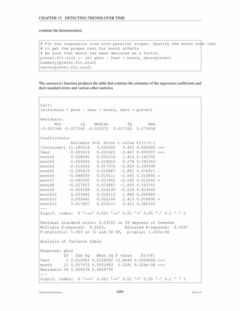
CHAPTER 15. DETECTING TRENDS OVER TIME
continue the demonstration.
# Fit the regression line with parallel slopes. Specify the month term last# to get the proper test for month effects# Be sure that month has been declared as a factor.plevel.fit.sin2 <- lm( phos ~ Year + month, data=plevel)summary(plevel.fit.sin2)anova(plevel.fit.sin2)
The summary() function produces the table that contains the estimates of the regression coefficients andtheir standard errors and various other statistics
Call:lm(formula = phos ~ Year + month, data = plevel)
Residuals:Min 1Q Median 3Q Max
-0.051366 -0.017592 -0.001572 0.017162 0.073634
Coefficients:Estimate Std. Error t value Pr(>|t|)
(Intercept) 11.180319 3.202493 3.491 0.000926 ***Year -0.005619 0.001621 -3.467 0.000997 ***month2 0.028492 0.020154 1.414 0.162792month3 0.005000 0.018016 0.278 0.782363month4 -0.014923 0.017376 -0.859 0.393990month5 -0.030413 0.016887 -1.801 0.076917 .month6 -0.048593 0.019111 -2.543 0.013693 *month7 -0.045100 0.017402 -2.592 0.012066 *month8 -0.027913 0.016887 -1.653 0.103761month9 -0.004158 0.018145 -0.229 0.819543month10 0.033445 0.018115 1.846 0.069965 .month11 0.053445 0.022146 2.413 0.018990 *month12 0.017407 0.019111 0.911 0.366165---Signif. codes: 0 ’***’ 0.001 ’**’ 0.01 ’*’ 0.05 ’.’ 0.1 ’ ’ 1
Residual standard error: 0.03121 on 58 degrees of freedomMultiple R-squared: 0.5523, Adjusted R-squared: 0.4597F-statistic: 5.963 on 12 and 58 DF, p-value: 1.243e-06
Analysis of Variance Table
Response: phosDf Sum Sq Mean Sq F value Pr(>F)
Year 1 0.012605 0.0126050 12.9446 0.0006646 ***month 11 0.057072 0.0051883 5.3281 9.204e-06 ***Residuals 58 0.056478 0.0009738---Signif. codes: 0 ’***’ 0.001 ’**’ 0.01 ’*’ 0.05 ’.’ 0.1 ’ ’ 1
c©2019 Carl James Schwarz 1091 2019-11-04

CHAPTER 15. DETECTING TRENDS OVER TIME
The fitted lines and the model fit graph appear to be acceptable:
The effect tests show a strong effect of year (p = .0010).
The estimated trend is −0.0056 (se 0.0016) mg/L/year which is comparable to the previous estimates.Note that the estimates for the month effects are not directly interpretable from this output - the emmeanstable should be consulted - seek help on this point.
The residual plots (not shown) don’t indicate any major problems.
The Durbin-Watson test (not shown) for autocorrelation detects a small autocorrelation, but with thislarge sample size is not important.
15.12.3 Fitting cyclical patterns
General approach
In some cases, the seasonal pattern is quite regular with regular peaks during part of the year and regularlows during another part of the year. Another approach is to try and account for this cyclical pattern, andthen see if there is still evidence of a decline over time.
The basic building block for the seasonality are the use of sine and cosine functions to represent theseasonal patterns. The general model will take the form:
Yi = β0 + β1 × ti + β2 cos(2πtiν
) + β3 sin(2πtiν
) + εi
Here the coefficients β0 and β1 represent the intercept and linear change over time. The coefficients β2
and β3 represent the seasonal components.
The term ν represents the period of the cycle. It is assumed to be known in advance. For example,if the cycles are one year in duration and the time axis is measured in years, then ν = 1. If the cyclesare one year in duration, but the time axis is measured in months, then ν = 12. This is often codedincorrectly, so be very careful when coding this!
The reason there are both a sine and cosine function is that these two functions have the same periodbut different amplitudes at different parts of the cycle. For example, the cosine function has a maximumat the start of each cycle and a minimum half-way through each cycle, while the sine function has aminimum at the 3/4 point of a cycle and a maximum at the 1/4 point of the cycle.
The analysis starts by creating two new variables in the data table corresponding to the sine andcosine functions. Then multiple regression is used to fit a model incorporating all three explanatoryvariables. In the short hand notation for models, the model fit is:
Y = Time Cos Sin
After the model is fit, the coefficient of the Time variable represents the overall trend. The usual testsof hypothesis for no trend, and confidence intervals for the slope can be found. The slope is interested asthe change in Y per unit change in X = TIME after adjusting for seasonality. The coefficients forthe sine and cosine functions are usually not of interest.
c©2019 Carl James Schwarz 1092 2019-11-04

CHAPTER 15. DETECTING TRENDS OVER TIME
The computation should NOT be attempted by hand or in spreadsheet program. Most statisticalpackages have facilities for creating the relevant variables and fitting these models.
The usual assumptions still hold, so they should be checked via residual plots, estimation of theautocorrelation that remains, etc.
Example: Total phosphorus from Klamath River - revisited again
As shown earlier, the data must be converted from WIDE to LONG format and a variable created year-month to represent the time variable, year-month = year+ month−0.5
12 . As the time variable is measuredin years and the preliminary plot shows a yearly cycle, ν = 1, so the the cosine and sine variables arecreated as new variables in the dataframe:
# Create the sin/cosine termsplevel$cos <- cos(2*pi*plevel$YearMonth/1)plevel$sin <- sin(2*pi*plevel$YearMonth/1)head(plevel)
respectively. This gives the final data table looking somewhat like:
month phos Year YearMonth cos sin1 1 0.07 1972 1972.125 0.7071068 0.70710682 2 0.11 1972 1972.208 0.2588190 0.96592583 3 0.60 1972 1972.292 -0.2588190 0.96592584 4 0.10 1972 1972.375 -0.7071068 0.70710685 5 0.04 1972 1972.458 -0.9659258 0.25881906 6 0.05 1972 1972.542 -0.9659258 -0.2588190
There are no problems with the fact that some of the phosphorus data is missing as the packages willsimply ignore any row that is not complete.
We use the lm() function to fit the regression model:
# Fit the regression line with the sin/cos term# Because lm() produces type I (increment tests), you need to specify the# year term last in the model.# Be sure that month has been declared as a factor.plevel.fit.sin <- lm( phos ~ sin + cos + Year , data=plevel)drop1(plevel.fit.sin, test="F")
The drop1() function produces the marginal (Type III) analysis of variance table for the regression coef-ficients.
Single term deletions
Model:
c©2019 Carl James Schwarz 1093 2019-11-04

CHAPTER 15. DETECTING TRENDS OVER TIME
phos ~ sin + cos + YearDf Sum of Sq RSS AIC F value Pr(>F)
<none> 2.0554 -284.93sin 1 0.107255 2.1626 -282.86 3.9659 0.05002 .cos 1 0.121454 2.1768 -282.33 4.4909 0.03734 *Year 1 0.081971 2.1374 -283.80 3.0310 0.08574 .---Signif. codes: 0 ’***’ 0.001 ’**’ 0.01 ’*’ 0.05 ’.’ 0.1 ’ ’ 1
The output is voluminous and a full discussion is beyond the scope of these notes.29 30 The key thingsto look at are the estimated coefficients, the residual plots, and model fit plots:
These all indicate the presence of several outliers.
29 See Freund, R., Little, R. and Creighton, L. (2003). Regression using JMP. Wiley. for more details on the output from thisplatform.
30 Refer to Freund, R.J. and Little, R.C. (2000). SAS System for Regression. SAS. for more details on the output from thisprocedure.
c©2019 Carl James Schwarz 1094 2019-11-04

CHAPTER 15. DETECTING TRENDS OVER TIME
The model was refit omitting these outliers with phosphorus values greater than 0.20.
# Remove all outlier more than 0.20plevel <- plevel[ plevel$phos < 0.20,]
The residual and model fit plots are much better:
but the residual plot still shows something strange happening about 1/2 way through the time series. Itappears that the cycles are shifting so you get this long wave of residuals.
The estimated coefficients are:
Call:lm(formula = phos ~ sin + cos + YearMonth, data = plevel)
Residuals:
c©2019 Carl James Schwarz 1095 2019-11-04

CHAPTER 15. DETECTING TRENDS OVER TIME
Min 1Q Median 3Q Max-0.067355 -0.024375 0.001173 0.020294 0.074696
Coefficients:Estimate Std. Error t value Pr(>|t|)
(Intercept) 11.082981 3.279232 3.380 0.00121 **sin 0.008462 0.005346 1.583 0.11815cos 0.035668 0.005594 6.376 1.95e-08 ***YearMonth -0.005570 0.001660 -3.356 0.00131 **---Signif. codes: 0 ’***’ 0.001 ’**’ 0.01 ’*’ 0.05 ’.’ 0.1 ’ ’ 1
Residual standard error: 0.03235 on 67 degrees of freedom(16 observations deleted due to missingness)
Multiple R-squared: 0.4441, Adjusted R-squared: 0.4193F-statistic: 17.85 on 3 and 67 DF, p-value: 1.28e-08
There is evidence that the coefficients for both the cosine and sine terms are different from zero but notof much interest. The estimated trend is −.0056 mg/L/year (se .0017) with a p-value for the trend lineof .0013. There is strong evidence of a long-term trend.
The Durbin-Watson test for autocorrelation shows some remaining residual serial correlation:
lag Autocorrelation D-W Statistic p-value1 0.275254 1.393745 0.006
Alternative hypothesis: rho != 0
Durbin-Watson test
data: plevel.fit.sin2DW = 1.3937, p-value = 0.001797alternative hypothesis: true autocorrelation is greater than 0
which likely reflects the behaviour in the tail end of the series.
Example: Comparing air quality measurements using two different methods
The air that we breath often has many contaminants. One contaminant of interest is Particulate Matter(PM). Particulate matter is the general term used for a mixture of solid particles and liquid droplets in theair. It includes aerosols, smoke, fumes, dust, ash and pollen. The composition of particulate matter varieswith place, season and weather conditions. Particulate matter is characterized according to size - mainlybecause of the different health effects associated with particles of different diameters. Fine particulatematter is particulate matter that is 2.5 microns in diameter and less. [A human hair is approximately 30times larger than these particles!] The smaller particles are so small that several thousand of them couldfit on the period at the end of this sentence. It is also known as PM2.5 or respirable particles because itpenetrates the respiratory system further than larger particles.
c©2019 Carl James Schwarz 1096 2019-11-04

CHAPTER 15. DETECTING TRENDS OVER TIME
PM2.5 material is primarily formed from chemical reactions in the atmosphere and through fuelcombustion (e.g., motor vehicles, power generation, industrial facilities residential fire places, woodstoves and agricultural burning). Significant amounts of PM2.5 are carried into Ontario from the U.S.During periods of widespread elevated levels of fine particulate matter, it is estimated that more than 50per cent of Ontario’s PM2.5 comes from the U.S.
Adverse health effects from breathing air with a high PM 2.5 concentration include: premature death,increased respiratory symptoms and disease, chronic bronchitis, and decreased lung function particularlyfor individuals with asthma.
Further information about fine particulates is available at many websites as http://www.health.state.ny.us/nysdoh/indoor/pmq_a.htm and http://www.airqualityontario.com/science/pollutants/particulates.cfm, and http://www.epa.gov/pmdesignations/faq.htm.
The PM2.5 concentrations in air can be measured in many ways. A well known method is a is a filterbased method whereby one 24 hour sample is collected every third day. The sampler draws air througha pre-weighed filter for a specified period (usually 24 hours) at a known flowrate. The filter is thenremoved and sent to a laboratory to determine the gain in filter mass due to particle collection. AmbientPM concentration is calculated on the basis of the gain in filter mass, divided by the product of samplingperiod and sampling flowrate. Additional analysis can also be performed on the filter to determine thechemical composition of the sample.
In recent years, a program of continuous sampling using automatic samplers has been introduced.An instrument widely adopted for this use is the Tapered Element Oscillating Microbalance (TEOM).The TEOM operates under the following principles. Ambient air is drawn in through a heated inlet. Itis then drawn through a filtered cartridge on the end of a hollow, tapered tube. The tube is clamped atone end and oscillates freely like a tuning fork. As particulate matter gathers on the filter cartridge, thenatural frequency of oscillation of the tube decreases. The mass accumulation of particulate matter isthen determined from the corresponding change in frequency.
Because of the different ways in which these instruments work, a calibration experiment was per-formed. The hourly TEOM readings were accumulated to a daily value and compared to those obtainedfrom an air filter method. Here are the data:
Date TEOM Ref2003.06.05 8.1 10.62003.06.08 6.5 9.02003.06.11 3.2 4.62003.06.14 2.2 3.72003.06.17 5.8 7.92003.06.20 1.4 4.42003.06.23 1.8 2.82003.06.26 4.5 6.52003.06.29 4.6 5.82003.07.02 3.3 3.62003.07.05 1.6 3.72003.07.08 7.1 7.22003.07.11 7.7 8.62003.07.14 4.3 4.42003.07.17 4.6 6.42003.07.20 7.2 8.52003.07.23 8.8 10.5
2003.07.26 8.1 9.02003.07.29 11.2 10.42003.08.01 19.4 21.02003.08.07 5.9 5.22003.08.10 11.9 12.62003.08.13 7.2 8.42003.08.16 48.2 46.22003.08.19 49.3 51.22003.08.22 53.3 54.52003.08.25 56.8 57.22003.08.28 4.5 7.42003.08.31 27.8 26.12003.09.03 34.3 33.02003.09.06 41.5 42.12003.09.24 5.8 9.52003.09.27 5.7 8.02003.09.30 9.1 9.82003.10.03 10.5 13.92003.10.06 10.9 15.6
2003.10.09 3.5 5.62003.10.12 4.1 6.32003.10.15 5.7 10.12003.10.18 15.5 20.22003.10.21 5.4 8.92003.10.24 11.7 19.02003.10.27 14.9 23.32003.10.30 3.9 7.52003.11.02 12.9 21.22003.11.05 18.9 33.42003.11.08 23.6 35.92003.11.11 19.0 30.22003.11.14 18.5 28.22003.11.17 11.1 18.42003.11.20 11.6 20.12003.11.23 9.4 17.92003.11.26 25.6 42.82003.11.29 6.9 11.22003.12.02 13.2 25.6
c©2019 Carl James Schwarz 1097 2019-11-04

CHAPTER 15. DETECTING TRENDS OVER TIME
2003.12.05 10.2 19.92003.12.08 17.6 31.62003.12.11 6.7 14.12003.12.14 16.2 26.52003.12.17 8.3 13.52004.01.13 6.8 13.82004.01.16 9.2 17.32004.01.19 16.5 32.62004.01.22 4.3 11.62004.01.25 6.1 10.02004.01.28 10.1 14.42004.01.31 14.0 28.12004.02.06 19.4 35.02004.02.09 15.1 25.22004.02.12 16.8 32.92004.02.15 15.9 28.52004.02.18 9.8 18.52004.02.21 9.1 17.22004.02.24 17.1 31.92004.02.27 12.1 21.72004.03.01 8.8 14.12004.03.07 3.2 5.62004.03.10 10.9 15.32004.03.13 7.1 10.82004.03.16 7.4 13.82004.03.19 10.4 14.02004.03.22 10.6 16.12004.03.25 5.0 8.42004.03.28 6.4 10.32004.03.31 5.3 6.62004.04.03 6.5 9.72004.04.09 6.4 9.72004.04.12 7.0 8.82004.04.15 2.3 4.62004.04.18 4.2 5.72004.04.21 4.7 5.72004.04.24 3.7 4.12004.04.27 4.1 5.02004.04.30 7.3 7.32004.05.03 3.5 5.02004.05.06 2.5 2.82004.05.09 2.3 2.72004.07.02 6.0 4.32004.07.05 3.3 2.42004.07.08 1.6 2.02004.07.11 1.2 5.72004.07.14 5.4 8.32004.07.17 8.8 3.5
2004.07.20 2.2 10.02004.07.23 8.3 12.52004.07.26 10.5 17.02004.08.01 25.3 24.72004.08.04 14.7 10.52004.08.07 2.7 3.12004.08.10 6.5 7.22004.08.19 20.1 13.62004.08.25 4.1 4.22004.08.28 2.5 1.52004.08.31 4.7 6.32004.09.03 3.2 4.02004.09.15 1.8 2.62004.09.18 2.6 4.72004.09.21 4.7 6.22004.09.24 5.6 8.02004.09.27 7.1 10.02004.09.30 4.8 7.72004.10.03 9.5 13.32004.10.06 10.1 13.02004.10.09 3.8 5.02004.10.12 5.0 7.32004.10.15 2.3 5.42004.10.18 7.5 10.12004.10.21 8.1 11.02004.10.24 6.6 13.62004.10.27 14.0 18.22004.10.30 15.9 24.82004.11.02 8.4 14.12004.11.08 10.8 17.62004.11.11 1.4 4.72004.11.14 6.5 10.02004.11.17 11.0 18.82004.11.20 7.7 14.42004.11.26 15.4 23.42004.11.29 8.9 17.12004.12.02 18.3 30.82004.12.05 6.2 13.52004.12.08 8.3 16.52004.12.11 9.6 15.92004.12.14 9.8 17.62004.12.17 11.5 21.52004.12.20 14.0 26.12004.12.23 9.8 20.02004.12.26 4.9 9.42004.12.29 3.7 7.62005.01.01 10.2 18.52005.01.04 18.6 38.3
2005.01.22 11.1 24.72005.01.25 11.8 22.72005.01.28 13.1 20.92005.01.31 5.1 10.92005.02.03 6.2 11.12005.02.06 6.5 10.02005.02.09 10.6 20.82005.02.12 11.4 23.32005.02.15 12.9 18.82005.02.18 14.0 23.42005.02.21 21.9 31.72005.02.24 17.1 26.42005.02.26 8.3 16.32005.02.27 11.8 20.12005.03.02 16.7 28.92005.03.05 12.0 18.92005.03.08 5.3 9.82005.03.11 10.9 18.82005.03.14 11.3 18.12005.03.17 8.5 11.02005.04.04 12.0 10.92005.04.07 7.8 7.12005.04.16 2.3 4.82005.04.19 5.5 3.92005.04.22 8.0 6.72005.04.25 7.3 10.02005.04.28 3.5 9.02005.05.01 4.5 4.52005.05.04 5.1 1.82005.05.07 2.5 5.42005.05.28 6.1 6.72005.05.31 9.7 12.02005.06.03 5.2 5.02005.06.06 0.9 2.12005.06.09 4.4 6.22005.06.12 2.3 2.72005.06.15 2.3 2.22005.06.18 1.7 2.62005.06.21 6.7 6.92005.06.24 3.4 3.82005.06.27 4.2 4.62005.06.30 4.3 5.52005.07.03 2.7 5.22005.07.06 3.6 4.22005.07.09 1.3 1.92005.07.12 2.8 6.3
Do both meters give similar readings over time?
It is quite common when comparing two instruments to do the comparison on the log-ratio scale,i.e. either log(TEOM/reference) or log(reference/TEOM). There are two reasons why this is
c©2019 Carl James Schwarz 1098 2019-11-04

CHAPTER 15. DETECTING TRENDS OVER TIME
commonly done. First, the logarithmic scale makes ratios more than 1 and less than 1 symmetric. Forexample, the ratio 1/2 and 2 on the regular scale are not symmetric about the value of 1, but log(1/2) =−.693 and log(2) = .693 are symmetric about zero. Second, it is often the case that the variation tendsto increase with the base size of the reading. The use of logarithms makes the variances more similarover the spread of the data values.
The data is available in the TEOM.csv file in the Sample Program Library at http://www.stat.sfu.ca/~cschwarz/Stat-Ecology-Datasets.
The data are imported into R in the usual fashion:
# Read in the data and deal with the date variablesteom <- read.csv("teom.csv", header=TRUE, as.is=TRUE,
strip.white=TRUE, na.string=".")teom$Date <- as.Date(teom$Date, "%Y.%m.%d")teom$Year <- as.numeric((teom$Date-as.Date("2003-01-01"))/365.25)teom$logRatio <- log(teom$TEOM/teom$Reference)teom$cos <- cos(2*pi*teom$Year/1)teom$sin <- sin(2*pi*teom$Year/1)str(teom)head(teom)
Two variables need to be created in the data table. First, the log(TEOM/reference) variable asnoted above. This was created in the code block that read in the data above.
Second, a variable representing the decimal year is required so that plotting and regression happenon the year scale rather than the internal date and time format in the statistical package. Many packagessave date-time data internally as the number of seconds since a reference date. Consequently, to convertto dates, you need to divide by 86,400 second/day to convert to days, and then by 365 to convert toyears. [This ignores the effect of leap years and leap seconds.] Some statistical packages deal with theconversion nicer than others. R stores dates as the number of days since the origin. We subtract anarbitrary date and convert to fraction of a year as noted above.
Here are the first few lines of data, including the derived variables:
’data.frame’: 197 obs. of 7 variables:$ Date : Date, format: "2003-06-05" "2003-06-08" ...$ TEOM : num 8.1 6.5 3.2 2.2 5.8 1.4 1.8 4.5 4.6 3.3 ...$ Reference: num 10.6 9 4.6 3.7 7.9 4.4 2.8 6.5 5.8 3.6 ...$ Year : num 0.424 0.433 0.441 0.449 0.457 ...$ logRatio : num -0.269 -0.325 -0.363 -0.52 -0.309 ...$ cos : num -0.889 -0.912 -0.932 -0.949 -0.964 ...$ sin : num 0.458 0.411 0.363 0.315 0.266 ...
Date TEOM Reference Year logRatio cos sin1 2003-06-05 8.1 10.6 0.4243669 -0.2689899 -0.8891935 0.45753142 2003-06-08 6.5 9.0 0.4325804 -0.3254224 -0.9116111 0.41105383 2003-06-11 3.2 4.6 0.4407940 -0.3629055 -0.9316014 0.36348164 2003-06-14 2.2 3.7 0.4490075 -0.5198755 -0.9491110 0.31494165 2003-06-17 5.8 7.9 0.4572211 -0.3090048 -0.9640935 0.26556306 2003-06-20 1.4 4.4 0.4654346 -1.1451323 -0.9765088 0.2154773
c©2019 Carl James Schwarz 1099 2019-11-04

CHAPTER 15. DETECTING TRENDS OVER TIME
We start with a plot of the log(TEOM/reference) by the year variable:
This shows a clear cyclical pattern. The peaks of the cycles are almost exactly one year apart. Con-sequently, we then create two new variables to represent the sine and cosine terms for a cyclical fit.Because the time units are in years, the period is also in years and is equal to ν = 1. The cos and sinevariables were created in the data frame as shown earlier.
We now fit a multiple-regression using the year, it sine, and cosine variables:
We use the lm() function to fit the regression model:
# Fit the regression line with the sin/cos term# Because lm() produces type I (increment tests), you need to specify the# year term last in the model.# Be sure that month has been declared as a factor.teom.fit.sin <- lm( logRatio ~ sin + cos + Year , data=teom)drop1(teom.fit.sin, test="F")summary(teom.fit.sin)
The summary() function produces the table that contains the estimates of the regression coefficientsand their standard errors and various other statistics
Single term deletions
Model:logRatio ~ sin + cos + Year
Df Sum of Sq RSS AIC F value Pr(>F)<none> 17.175 -472.63sin 1 0.0299 17.205 -474.29 0.3361 0.5628
c©2019 Carl James Schwarz 1100 2019-11-04

CHAPTER 15. DETECTING TRENDS OVER TIME
cos 1 5.0667 22.241 -423.71 56.9365 1.731e-12 ***Year 1 0.0064 17.181 -474.56 0.0721 0.7886---Signif. codes: 0 ’***’ 0.001 ’**’ 0.01 ’*’ 0.05 ’.’ 0.1 ’ ’ 1
Call:lm(formula = logRatio ~ sin + cos + Year, data = teom)
Residuals:Min 1Q Median 3Q Max
-1.39826 -0.09451 0.00538 0.12307 1.31650
Coefficients:Estimate Std. Error t value Pr(>|t|)
(Intercept) -0.40037 0.05580 -7.175 1.51e-11 ***sin -0.01838 0.03170 -0.580 0.563cos -0.22594 0.02994 -7.546 1.73e-12 ***Year 0.00947 0.03526 0.269 0.789---Signif. codes: 0 ’***’ 0.001 ’**’ 0.01 ’*’ 0.05 ’.’ 0.1 ’ ’ 1
Residual standard error: 0.2983 on 193 degrees of freedomMultiple R-squared: 0.2298, Adjusted R-squared: 0.2178F-statistic: 19.19 on 3 and 193 DF, p-value: 6.19e-11
The effects testindicate the presence of a cyclical pattern (not unexpectedly), but no evidence of a year effect. Thediagnostic plots:
c©2019 Carl James Schwarz 1101 2019-11-04

CHAPTER 15. DETECTING TRENDS OVER TIME
shows no severe lack of fit. There are several outliers that appear and perhaps something unusual ishappening in mid-2003. An overlay plot of the actual and predicted values:
shows a generally good fit, with some outlier points and again further investigation required in aboutmid-2003.31
The log(TEOM/reference) hardly goes above the value of 0 (which is the reference line indicatingno difference between the two instruments). In order to estimate the average log-ratio, we refit the modelDROPPING the year term (why?) and examine the parameter estimates of this simpler model:
# Fit the regression line with the sin/cos term but dropping the year termteom.fit.sin2 <- lm( logRatio ~ sin + cos , data=teom)drop1(teom.fit.sin2, test="F")summary(teom.fit.sin2)
31 It turns out that these points were collected when a large amount of smoke from a nearby forest fire was present.
c©2019 Carl James Schwarz 1102 2019-11-04

CHAPTER 15. DETECTING TRENDS OVER TIME
Single term deletions
Model:logRatio ~ sin + cos
Df Sum of Sq RSS AIC F value Pr(>F)<none> 17.181 -474.56sin 1 0.0245 17.206 -476.28 0.2767 0.5995cos 1 5.0789 22.260 -425.54 57.3476 1.45e-12 ***---Signif. codes: 0 ’***’ 0.001 ’**’ 0.01 ’*’ 0.05 ’.’ 0.1 ’ ’ 1
Call:lm(formula = logRatio ~ sin + cos, data = teom)
Residuals:Min 1Q Median 3Q Max
-1.39652 -0.09745 0.00212 0.12708 1.32312
Coefficients:Estimate Std. Error t value Pr(>|t|)
(Intercept) -0.38651 0.02123 -18.204 < 2e-16 ***sin -0.01594 0.03030 -0.526 0.599cos -0.22517 0.02973 -7.573 1.45e-12 ***---Signif. codes: 0 ’***’ 0.001 ’**’ 0.01 ’*’ 0.05 ’.’ 0.1 ’ ’ 1
Residual standard error: 0.2976 on 194 degrees of freedomMultiple R-squared: 0.2295, Adjusted R-squared: 0.2216F-statistic: 28.89 on 2 and 194 DF, p-value: 1.038e-11
The average log-ratio is−0.39 (se 0.02). This corresponds to a ratio of exp(−0.039) = 0.68 on the anti-log scale, i.e. the TEOM meter is reading, on average across the entire year, only 68% of the referencemeter.
15.12.4 Further comments
An implicit assumption of this method is that the amplitude of the seasonal trend is constant in time,i.e. the β terms associated with the sin and cos terms do not depend on time. It could happen that theamplitude is also decreasing in time, In this case, you may consider a log-transform of the Y variable sothat the relative ratio between the top and bottom of the cycle may be fixed. Alternatively, more complexnon-linear regression models where the amplitude also depends upon time may be fit. This beyond thescope of these notes.
The key feature of this method for it to work well is the regularity of the seasonal effects and thatthe shape of the seasonal effects must be that of a sine or cosine curve. Consequently, a pattern that isrelatively flat with a single sharp peak in a consistent month cannot be well fit by these models. In thiscase, you could create indicator variables for the peak time and then fit a multiple regression model asabove – this is again beyond the scope of these notes.
c©2019 Carl James Schwarz 1103 2019-11-04

CHAPTER 15. DETECTING TRENDS OVER TIME
15.13 Seasonality and Autocorrelation
Whew! This is a tough issue to deal with! Fortunately, there have been great advances in software and insome packages (e.g. SAS and R) this is fairly easy to deal with. Unfortunately, this is currently beyondsimple packages such as JMP (but I understand JMP v.11 will have this capability).
This section will be brief with very little explanation of the underlying statistical concepts and refer-ence to output from R. Please contact me for further help if you are dealing with this type of data as afair amount of care is needed in dealing with the model diagnostics and obtaining predictions.
Again, refer back to the Klamath River data. It may turn out that even after adjusting for seasonality,there is residual autocorrelation within a year. For example, a particular year may have generally lowphosphorus levels for some reason and so observations in months close together are more highly relatedthan observations in months far apart.
A common model for dealing with this type of autocorrelation is the familiar AR(1) process with asingle autocorrelation parameter. In general, the covariance of two observations is modeled as:
cov(Yt1 , Yt2) = σ2ρ∆t
where ∆t is the difference in time between the two observations. For example, observations that are 1time unit apart will have covariance σ2ρ1; observations that are two time units apart will have covarianceσ2ρ2; etc.
We had an illustration of fitting a simple AR(1) structure earlier when there were no missing valueand the data were evenly spaced apart. Then the “temporal distance” (∆t) is simply the difference in theobservation number.
Let us revisit the Klamath phosphorus data. In this example, there are many missing values (formonths where the data were not available and for months that were deemed to be outliers). Consequently,the “temporal distance” is not a simple function of the observation numbers.
The advantage of using this power autocorrelation structure is that missing values are easily accom-modated – it is not necessary to have every observation in time so interpolation to ‘fill in’ missing valuesare not necessary. We do need to create a new variable to represent the number of months from the startof the study so that the “temporal distance” can be computed.
The “temporal distance is easily computed as shown below and the first few records shown so youcan verify that the MonthsFromStart are valid.
# Compute the "distance" from start of the experimentplevel$MonthFromStart <- plevel$Year*12 + as.numeric(as.character(plevel$month)) -
(min(plevel$Year,na.rm=TRUE)*12 + 1)plevel[1:15,]
month phos Year YearMonth MonthFromStart1 1 0.07 1972 1972.125 02 2 0.11 1972 1972.208 14 4 0.10 1972 1972.375 35 5 0.04 1972 1972.458 46 6 0.05 1972 1972.542 57 7 0.04 1972 1972.625 6
c©2019 Carl James Schwarz 1104 2019-11-04

CHAPTER 15. DETECTING TRENDS OVER TIME
8 8 0.05 1972 1972.708 79 9 0.10 1972 1972.792 810 10 0.13 1972 1972.875 911 11 0.14 1972 1972.958 1012 12 0.13 1972 1973.042 1115 3 0.12 1973 1973.292 1416 4 0.08 1973 1973.375 1517 5 0.03 1973 1973.458 1618 6 0.01 1973 1973.542 17
We start by fitting a model with common slope across the seasons (months) and NO autocorrelation
phos = month Y ear
Don’t forget that month must be declared as a categorical variable (as a FACTOR).
The estimated common trend (ignoring autocorrelation) is:
Value Std.Error t-value p-value-0.0056187834 0.0016205455 -3.4672173773 0.0009972703
Then a model that allows for seasonal variation (by months) and autocorrelation can be fit using thegls() function with the correlation= argument. The corCAR1 is a continuous AR(1) structure with theform given above:
# Continuous AR(1) process with intial value of .5 for the correlation 1 month apartcar1.fit <- gls(phos~ month + Year , data=plevel,
correlation=corCAR1(.5, ~MonthFromStart))
The estimated variance components from the model are:
Phi0.4747038Est sigma is : 0.001019818
This implies that the variance of the residual is .0010 or a standard deviation of approximately√.0010 = .032 mg/L. The estimated autocorrelation for points 1 month away is 0.47 which is quite
large.
The estimated common slope from this model (mg/L/year) that incorporates correction for autocor-relation is:
Value Std.Error t-value p-value-0.005781659 0.002515466 -2.298444483 0.025159768
c©2019 Carl James Schwarz 1105 2019-11-04

CHAPTER 15. DETECTING TRENDS OVER TIME
As expected the estimated slopes are similar, but the reported se from the model ignoring autocorrelation
was too small by a factor of about√
(1+ρ)1−ρ =
√1.5.5 =
√3 = 1.7.
Because of the many missing values, the Durbin-Watson test cannot be directly applied. It too as-sumes that every observation is side-by-side so that two observations adjacent are assumed to be 1 unitof time apart.
Instead, we need to adopt a model testing approach using AIC or likelihood ratio tests. The AICcriteria is used to compare these different models. The two AIC (corrected for small sample sizes) are:
Model df AIC BIC logLik Test L.Ratio p-valuebase.fit 1 14 -182.7578 -153.9116 105.3789car1.fit 2 15 -190.3937 -159.4870 110.1968 1 vs 2 9.635908 0.0019
A usual rule of thumb is that differences of more than 2 among the AIC indicate that there is evidencefor the model with the smaller AIC. In this case, the AIC for the spatial power model is almost 8 unitssmaller than the independence model. There is strong evidence for residual autocorrelation.
15.14 Non-parametric detection of trend
The methods so far in this chapter all rely on several assumptions that may not be satisfied in all context.For example, all the methods (including the methods for autocorrelation) assume that deviations fromthe regression line are normally distributed with equal variance. In practice, they are fairly robust tonon-normality and heterogeneous variances if the sample sizes are fairly large.
But, how is it possible to deal with truncated or censored observations? For example, it is quitecommon for measurement tools to have upper and lower limits of detectability and you often get mea-surements that are below or above detection limits. How can a monotonic, but not linear relationship beexamined?32 For example, cases of asthma seem to increase with the concentration of particulates in theatmosphere, but the relationship is not linear.
A nice review of the basic methods applicable to many situations is given by:
Berryman, D., B. Bobee, D. Cluis, and J. Haemmerli (1988). Non-parametric approachesfor trend detection in water quality time series. Water Resources Bulletin 24(3):545-556.
15.14.1 Cox and Stuart test for trend
This is a very simple test to perform and can be used in many different situations as illustrated in Conover(1999, Section 3.5)33 The idea behind the test is to divide first the dataset into two parts. Match the firstobservation in the first part with the first observation in the second part; match the second observation inthe first part with the second observation in the second part; etc. Then for each pair of values, determineif the value from the second part is greater that than the matched value from the first part. If there is agenerally upwards trend in the data, then you see should see many of pairs where the data value for the
32 If a transformation will linearize the line, then an ordinary regression can be used on the transformed data.33 Conover, W.J. (1999). Applied non-parametric statistics, 2nd edition. Wiley
c©2019 Carl James Schwarz 1106 2019-11-04

CHAPTER 15. DETECTING TRENDS OVER TIME
second part is larger than that of the first part. The number of pairs where the data from the second partexceeds its counterpart in the first part has a binomial distribution with p = .5 and this can be used todetermine the p-value of the test. This will be illustrated with an example.
In an earlier section, we examined the records of the grass cutting season over time. We will applythe Cox and Stuart procedure to this data as well.
Here is the raw data again:
Year Duration
(days)
1984 200
1985 215
1986 195
1987 212
1988 225
1989 240
1990 203
1991 208
1992 203
1993 202
1994 210
1995 225
1996 204
1997 245
1998 238
1999 226
2000 227
2001 236
2002 215
2003 242
There are exactly 20 observations, so the data is divided into two parts corresponding to the first 10years and the last 10 years.34 This gives the pairing:
34 If the number of observations is odd, then the middle observation is discarded
c©2019 Carl James Schwarz 1107 2019-11-04

CHAPTER 15. DETECTING TRENDS OVER TIME
Part I Part II
Year Duration Year Duration Part II >Part I
1984 200 1994 210 1
1985 215 1995 225 1
1986 195 1996 204 1
1987 212 1997 245 1
1988 225 1998 238 1
1989 240 1999 226 0
1990 203 2000 227 1
1991 208 2001 236 1
1992 203 2002 215 1
1993 202 2003 242 1
If there are any ties in the pairs, these are also discarded. In this case, there were no ties, and the datafrom the second part was greater than the corresponding data from the first part in 9 of the 10 years.
A two-sided p-value (allowing for either and increasing or decreasing trend) is found by finding theprobability
P (X ≥ 9) + P (X ≤ 1)
when X comes from a Binomial distribution with n = 10 and p = 0.5.
This can be computed or found from tables such as at http://www.stat.sfu.ca/~cschwarz/Stat-650/Notes/PDF/Tables.pdf. A portion of the Binomial table with n = 10 is presentedbelow:
Individual binomial probabilities for n=10 and selected values of pn x 0.1 0.2 0.3 0.4 0.5
------------------------------------------10 0 0.3487 0.1074 0.0282 0.0060 0.001010 1 0.3874 0.2684 0.1211 0.0403 0.009810 2 0.1937 0.3020 0.2335 0.1209 0.043910 3 0.0574 0.2013 0.2668 0.2150 0.117210 4 0.0112 0.0881 0.2001 0.2508 0.205110 5 0.0015 0.0264 0.1029 0.2007 0.246110 6 0.0001 0.0055 0.0368 0.1115 0.205110 7 0.0000 0.0008 0.0090 0.0425 0.117210 8 0.0000 0.0001 0.0014 0.0106 0.043910 9 0.0000 0.0000 0.0001 0.0016 0.009810 10 0.0000 0.0000 0.0000 0.0001 0.0010
From the table above we find that the p-value is
p-value = .0010 + .0098 + .0098 + .0010 = .0216
which is comparable to the p-value for the slope of 0.012 found from a direct application of linearregression.
This can be programmed directly in R; alternatively, the cox.stuart.test() in the randtests package canbe used. The data must be sorted in temporal order and all of the missing values need to be removed inadvance.
c©2019 Carl James Schwarz 1108 2019-11-04

CHAPTER 15. DETECTING TRENDS OVER TIME
grass <- grass[order(grass$year),]days.no.missing <- grass$days[!is.na(grass$days)]cox.stuart.test(days.no.missing)
This gives:
Cox Stuart test
data: days.no.missingstatistic = 9, n = 10, p-value = 0.02148alternative hypothesis: non randomness
Unfortunately, it is not possible to estimate the slope or any confidence interval using this method.The test is available in some computer packages, but because of its simplicity, is often easiest to do byhand.
Surprisingly, this very simple test does not perform badly when compared to a real regression. Forexample, the asymptotic relative efficiency of this test compared to a normal regression situation whenall assumptions are satisfied is almost 80%. This implies that you would get the same power to detect atrend as a regular regression with 1
.80 = 1.25 times the sample size and using the Cox and Stuart test.
However, if the data are straightforward, as in this case, there are better non-parametric methods aswill be illustrated in later sections.
15.14.2 Non-parametric regression - Spearman, Kendall, Theil, Sen estimates
Non-parametric does NOT mean no assumptions
While the Cox and Stuart test may indicate that there is evidence of a trend, it cannot provide estimatesof the slope etc. Consequently, non-parametric methods have been developed for these situations.
CAUTION: Non-parametric does not mean NO assumptions! Manypeople view non-parametric methods as a panacea that solves all ills. On the contrary, non-parametrictests also make assumptions about the data that need to be carefully verified in order that the results aresensible. In the context of non-parametric regression, the following assumptions are usually made andnon-parametric tests may relax some of them:
• Linearity. Parametric regression analysis assume that the relationship between Y and X is linear.Non-parametric regression analysis looks for a generally increasing or decreasing trend betweenY and X .
• Scale of Y and X . Parametric regression analysis assumes that X is time, so that it has an intervalor ratio scale. It is further assumed that Y has an interval or ratio scale as well. Non-parametricregression analysis makes the same assumption except that some methods allow the Y variable to
c©2019 Carl James Schwarz 1109 2019-11-04

CHAPTER 15. DETECTING TRENDS OVER TIME
be ordinal. This allows non-parametric methods to be used when values are above detection limitsas they can still often be ordered sensibly.
• Correct sampling scheme. Parametric regression analysis assumes that the Y must be a randomsample from the population of Y values at every time point. Non-parametric regression analysismakes the same assumption.
• No outliers or influential points. Parametric regression analysis assumes that all the points mustbelong to the relationship – there should be no unusual points. Non-parametric regression analysisis more robust to failures of this assumption as the actual distances between the observed pointand the fitted line are not used directly. However, many outliers can mask the true relationship.A very nice feature of non-parametric methods is that they are invariant to transforms thatpreserve order. For example, you will get the same p-value answers if you use non-parametricanalyses on Y vs. X or log(Y ) vs. X . But, the estimated slope may be different as it is measuredon a different scale.
• Equal variation along the line on some scale. Parametric regression analysis assumes that the vari-ability about the regression line is similar for all values of X , i.e. the scatter of the points aboveand below the fitted line should be roughly constant over time. Surprisingly to many people, non-parametric regression analysis assumes that the distribution of Y at each X is the same on somemeasuring scale and therefore must also have the same variation. However, because the assump-tion is about equal variance on some scale, and because non-parametric methods are invariant tosimple transformations, this is often satisfied. For example, if a log-transform would stabilize thevariance, then it is not necessary to transform before doing the Kendall test. This is one advantageof the non-parametric tests over parametric tests which require a homogeneous variation about theregression line.
• Independence. Parametric regression assumes that each value of Y is independent of any othervalue of Y . Non-parametric regression analysis also makes this assumptions. Consequently, non-parametric regression analysis does not deal with autocorrelation.
• Normality of errors. Parametric regression assumes that the difference between the value of Y andthe expected value of Y is assumed to be normally distributed. Non-parametric regression analysisassumes that the distribution of Y at each value of X is the same, but does not require that it benormally distributed. Consequently heavy tailed distributions such a log-normal distributions canbe handled with non-parametric regression.
• X measured without error. Parametric regression analysis assumes that the error in measure-ment of X is small or non-existent relative to the error variation about the regression line. Non-parametric regression makes the same assumption.
As you can see, data to be used in non-parametric analysis cannot be just arbitrarily collected -thought must be given as to assessing the appropriateness of the regression model.
Surprising to many, least-square regression is actually a non-parametric method! The principle ofchoosing the regression line to minimize the sum of squared deviations from the regression line makesno distributional assumptions of Y at each X . The assumption of normality comes into play whenyou compute F or t-tests to test if the slope is zero, and construct confidence intervals for the slope orprediction intervals for individual means or predictions.
A simple non-parametric test for zero-slope is Spearman’s ρ which is simply a correlation coefficientcomputed on the RANKS of the data.35 The standard Pearson correlation coefficient (discussed in earlier
35 For each variable, find the smallest value and replace by the value of 1. Find the second smallest value and replace it by thevalue of 2, etc. If there are tied values, replace the tied ranks by the average of the ranks. This is easily done in Excel by repeatedsorting the (X,Y ) pairs first by X and then by Y .
c©2019 Carl James Schwarz 1110 2019-11-04

CHAPTER 15. DETECTING TRENDS OVER TIME
sections) is then applied to the ranked data, and the p-value is found by referring to tables or from largesample formula. Fortunately, most computer packages compute Spearman’s ρ and provide p-values.
Kendall’s tau is another popular non-parametric procedure as explained below.
Example: The Grass is Greener (for longer) revisited
As always, the programs and data are available in the Sample Program Library available at http://www.stat.sfu.ca/~cschwarz/Stat-Ecology-Datasets.
The data on the duration of the cutting season is first ranked as follows:
Year Duration Year Duration
(days) Rank Rank
1984 200 1 2.0
1985 215 2 10.5
1986 195 3 1.0
1987 212 4 9.0
1988 225 5 12.5
1989 240 6 18.0
1990 203 7 4.5
1991 208 8 7.0
1992 203 9 4.5
1993 202 10 3.0
1994 210 11 8.0
1995 225 12 12.5
1996 204 13 6.0
1997 245 14 20.0
1998 238 15 17.0
1999 226 16 14.0
2000 227 17 15.0
2001 236 18 16.0
2002 215 19 10.5
2003 242 20 19.0
Then the ordinary correlation coefficient can be computed between the two ranks. Of course, soft-ware makes this easy.
# Because there is no distiction between the response and predictor variables,# the formula is specified with both variables to the right# of the tildecor.test( ~days + year, data=grass, method="spearman")
This gives:
c©2019 Carl James Schwarz 1111 2019-11-04

CHAPTER 15. DETECTING TRENDS OVER TIME
Spearman’s rank correlation rho
data: days and yearS = 563.13, p-value = 0.007785alternative hypothesis: true rho is not equal to 0sample estimates:
rho0.5765905
The Spearman ρ is found to be .5766 with a (two-sided) p-value of .0078. This compares to the p-valuefrom the parametric regression of .012.
Unfortunately, Spearman’s ρ does not provide an easy was to estimate the slope or find confidenceintervals for the slope etc.36
Because Spearman’s ρ does not provide a convenient way to estimate the slope or to find confidenceintervals for the slope, variants on Kendall’s τ are often used instead. This estimator of the slope hasmany names: Sen’s (1968) estimator37 ; Theil’s (1950) estimators38; or Kendall’s τ 39 estimator are allcommon names. The idea behind these estimators is to look and concordant and discordant pairs of datapoints. A pair of data points (X1, Y1) and (X2, Y2) is called concordant if Y2−Y1
X2−X1is greater than zero,
discordant if the ratio is less than zero, and both if the ratio is 0. For example, in the grass cutting durationdata, the pair of data point (1985, 215) is concordant with the data point (1988, 225), but discordant withthe data point (1986, 195). As you can imagine, it is far easier to let the computer do the computations!
The test for non-zero slope using Kendall’s tau can be computed by finding ALL possible pairs ofdata points (!) and using the rule:
• if Yj−YiXj−Xi > 0 then add 1 to Nc (concordant);
• if Yj−YiXj−Xi < 0 then add 1 to Nd (discordant);
• if Yj−YiXj−Xi = 0 then add 1
2 to both Nc and Nd;
• if Xi = Xj , no comparison is made
Kendall’s τ is found as:τ =
Nc −NdNc +Nd
The p-value is found from tables or by the computer.
The computation of τ is simplified by sorting the pairs of (X,Y ) by the value of X and creating aspreadsheet to help with the computations. Each value of Y needs only to be compared to those “below”
36 However, refer to Conover (1995), Section 5.5 for details on using Spearman’s ρ to estimate a confidence interval for theslope.
37 Sen, P.K. (1968). Estimates of the regression coefficient based on Kendall’s τ . Journal of the American Statistical Association63,1379-1389.
38 Theil, H.A. (1950). A rank-invariant method of linear and polynomial regression analysis 1, 2, and 3. Neder. Acad. Wetersch.Proc. 53,386-392, 521-525, and 1397-1412.
39 Kendall, M.G. (1970). Rank Correlation Methods. Charles Griffin and Co., London. Fourth Edition.
c©2019 Carl James Schwarz 1112 2019-11-04

CHAPTER 15. DETECTING TRENDS OVER TIME
Estimation of the slope and confidence intervals for the slope are found by computing all the pairs ofslopes:
Sij =Yj − YiXj −Xi
The estimate of the slope is simply the median of these values.
A confidence interval for the slope is found by using tables to find the lower and upper quantities touse as the bounds of the interval. A close approximation to the values to use is found using this followingprocedure:
• Let n be the number of pairs of points, and N be the number of paired slopes from above.
• Compute w = z√
n(n−1)(2n+5)18 where z is the appropriate quantile from a standard normal dis-
tribution. For example, for a 95% confidence interval, z = 1.96.
• Compute r = .5(N − w).
• Use the rth and (N − r)th values of the paired slopes as the bounds of the confidence interval.
Alternatively, a bootstrap estimator can be used:
• Choose n data pairs (X and Y ) WITH REPLACEMENT.
• Compute the Sen-Theil slope estimator.
• Repeat the above 2 steps many time (usually about 1000 times).
• Find the 2.5th and 97.5th percentiles of the bootstrap sampling distribution from the previous step.
For the mowing duration data, n = 20 and there are N = 190 possible slopes! The estimated slopeis the median value. The approximate value of w = 60, so the 65th and 135th sorted values of the pairedslopes are the lower and upper bounds of the 95% confidence interval. This gives an estimated slope of1.389 with a 95% confidence interval of (0.20→ 2.8). This can be compared to the estimated slope of1.46 and confidence interval for the slope from the ordinary regression analysis of (.4→ 2.6).
This is rarely found in most computer packages, but the computation of the possible slopes can beprogrammed (sometimes clumsily) and can actually be done in a spreadsheet.
Kendall’s tau is computed in the Kendall package from the CRAN website or using the cor.test()function seen earlier. Both give the same results except when there are ties in the data – the two methodsuse a different approximation to compute the p-value in the presence of ties.
tau.test <- Kendall(grass$days, grass$year)summary(tau.test)tau.test2 <-cor.test( ~days + year, data=grass, method="kendall")tau.test2
This gives:
c©2019 Carl James Schwarz 1113 2019-11-04

CHAPTER 15. DETECTING TRENDS OVER TIME
Score = 77 , Var(Score) = 947denominator = 188.494tau = 0.409, 2-sided pvalue =0.013524
Kendall’s rank correlation tau
data: days and yearz = 2.5022, p-value = 0.01234alternative hypothesis: true tau is not equal to 0sample estimates:
tau0.408501
The p-value is .0123 very similar to that from the ordinary regression.
The Sen estimator for the slope can be found using the zyp package:
# Now to estimate the slope using the Sen estimatorlibrary(trend)# data must be sorted by predictor variable and contain no missing valuestemp <- grass[ order(grass$year),]temp <- temp[ complete.cases(temp),
]sen.slope <- sens.slope(temp$days)sen.slope
This gives:
Sen’s slope
data: temp$daysz = 2.4697, n = 20, p-value = 0.01352alternative hypothesis: true z is not equal to 095 percent confidence interval:0.25 2.80sample estimates:Sen’s slope
1.388889
This gives an estimated slope of 1.389 with a 95% confidence interval of (0.20 → 2.8). This canbe compared to the estimated slope of 1.46 and confidence interval for the slope from the ordinaryregression analysis of (0.4→ 2.6).
Berryman (1998) recommend that Kendall’s τ or Spearman’s ρ be used for a non-parametric testingfor trend as these have the greatest efficiency relative to ordinary parametric regression. They also
c©2019 Carl James Schwarz 1114 2019-11-04

CHAPTER 15. DETECTING TRENDS OVER TIME
recommend (their Table 4) that a minimum of 9-11 observations be collected before testing for trendusing these methods.
It turns out that the asymptotic relative efficiency of both Kendall’s τ and Spearman’s ρ are veryhigh (90%+) so that the planning tools for ordinary regression can be used to estimate the sample sizesrequired under various scenarios with a fair amount of confidence.
15.14.3 Dealing with seasonality - Seasonal Kendall’s τ
Basic principles
In some cases, series of data have an obvious periodicity or seasonal effects.
Consider, for example, values of total phosphorus taken from the Klamath River near Klamath, Cal-ifornia as analyzed by Hirsch et al (1982).40
Total phosphorus (mg/L) in Klamath River near Klamath, CA
Year
Month 1972 1973 1974 1975 1976 1977 1978 1979
1 0.07 0.33 0.70 0.08 0.04 0.05 0.14 0.08
2 0.11 0.24 0.17 . . . 0.11 0.04
3 0.60 0.12 0.16 . 0.14 0.03 0.02 0.02
4 0.10 0.08 1.20 0.11 0.05 0.04 0.06 0.01
5 0.04 0.03 0.12 0.09 0.02 0.04 0.03 0.03
6 0.05 <0.01 0.05 0.05 . . 0.03 .
7 0.04 0.04 0.03 0.02 . 0.06 0.02 0.04
8 0.05 0.06 0.03 0.05 0.07 0.08 0.06 0.02
9 0.10 0.09 0.06 0.10 . 0.08 0.05 .
10 0.13 0.13 0.12 . 0.13 0.09 0.10 0.33
11 0.14 0.42 . 0.13 . 0.47 0.14 .
12 0.13 0.15 0.09 0.05 . 0.30 0.07 .
A preliminary plot of the phosphorus levels:
40 This was monitoring station 11530500 from the NASQAN network in the US. Data are available from http://waterdata.usgs.gov/nwis/qwdata/?site_no=11530500. The data was analyzed by Hirsch, R.M., Slack, J.R., andSmith, R.A. (1982). Techniques of trend analysis for monthly water quality data. Water Resources Research 18, 107-121.
c©2019 Carl James Schwarz 1115 2019-11-04

CHAPTER 15. DETECTING TRENDS OVER TIME
shows a obvious seasonality to the data with peak levels occurring in the winter months. There are alsosome missing values as seen in the raw data table. Finally, notice the presence of several very largevalues (above 0.20 mg/L) that would normally be classified as outliers.
How can a test for trend be fit in the presence of this seasonality?
Hirsch et al. (1982) modified Kendall’s τ to deal with seasonality. The method is very simple todescribe, but is difficult to implement.
The basic principle is divide the series into (in this case) 12 separate series, one for each month.These month-based series range from 8 years of data down to 5 years of data. For each month-basedseries, compute Kendall’s τ . Combine the 12 estimates of τ into a single omnibus test to compute theoverall p-value. The estimated slopes is found from all the pairwise comparisons within each month-based series that are pooled and then the overall median of these pooled sets is used. Unfortunately,there are no simple procedures available to compute confidence intervals for the slope.
Example: Total phosphorus on the Klamath River revisited
The data and program are available as usual in the Sample Program Library available at http://www.stat.sfu.ca/~cschwarz/Stat-Ecology-Datasets.
The Kendall package has a function to compute (an approximate) Seasonal Mann Kendall test. How-ever, this function assumes that the data are structures as an R time-series object. This requires someadditional programming – see the full R code for details.
c©2019 Carl James Schwarz 1116 2019-11-04

CHAPTER 15. DETECTING TRENDS OVER TIME
This gives:
SMK <- SeasonalMannKendall(plevel.ts)summary(SMK)
This gives:
Score = -62 , Var(Score) = 477.3333denominator = 224.0621tau = -0.277, 2-sided pvalue =0.0045427
This can be compared to the paper by Hirsch et al. (1982) who obtained an overall z-value of −2.69with a p-value of 0.0072.
The estimated “average” slope is found by finding all the possible pairs of slopes for each sub-series,pooling these over all sub-series, and finding the overall median. The SAS program shows some of thecode to do this and reports a slope estimate of −0.0050 mg/L/year which matches Hirsch et al. (1982).In comparison, the ordinary regression slope using all of the data gives a value of −.014 mg/L/year. Forskewed data, such as above, such findings that the Kendall slope is closer to zero than the regressionslope is quite common because of the influence of the extreme data points on the fitted line.
There is no easy way to find a confidence interval for the slope.
Final notes
As pointed out earlier, non-parametric analyses are not assumption free - they merely have differentassumptions than parametric analyses. In this method, the key assumptions of independence are stillimportant. Because the data are broken into monthly-based series, this is likely true - it seems reasonablethat the value in January 1971 has no influence on the value in January 1972. However, it is likely nottrue that January 1971 is independent of February 1971 which would likely invalidate a simple use ofKendall’s method on the entire series.
As Hirsch et al. (1982) point out, it is possible that some sub-series exhibit strong evidence of upwardtrend, some sub-series exhibit strong evidence of downward trend, but the overall omnibus test fails todetect evidence of a trend. This is not unexpected, and if one is interested in the individual sub-series,then these should be examined individually.
In the original paper by Hirsch et al. (1982), they did not allow for multiple observations in each timeperiod. This actually poses no problem with computer implementations which handle ties appropriately.
Lastly, you may have noticed in the original data, some values that were marked as below detectionlimit. These censored observations pose no problem to most non-parametric tests. Clearly a value that isbelow detection limit (e.g. < .01) is also less than 0.05. The only problem arise in making sure that ifthere are multiple, different, detection limits, that comparisons are handled appropriately. Usually, thisimplies using the largest detection limit in place of any lower detection limits.
Hirsch et al. (1982) did several simulation studies of the seasonal Kendall, and found that it had highpower to detect changes.
c©2019 Carl James Schwarz 1117 2019-11-04

CHAPTER 15. DETECTING TRENDS OVER TIME
The Seasonal Kendall estimator has been implemented in many packages specially designed forenvironmental studies. Unfortunately, there are no packages that I am aware of that report confidenceintervals for the slope.
Berryman (1988) recommends that at least 60 observation spanning at least 5 cycles be obtainedbefore using the Seasonal Kendall method.
15.14.4 Seasonality with Autocorrelation
General ideas
As noted earlier, the Seasonal Kendall method still assumes that observations in different series areindependent, i.e. that the January 1972 reading is not related to the February 1972 reading. In somecases this is untrue; for example, in a wet year, the steam flow may be higher than average for all monthsleading to positive correlation across series.
Hirsch and Slack (1984)41 considered this problem. As in the Seasonal Kendall test the data are firstdivided into sub-series, e.g. monthly series across several years. The Kendall statistic for trend acrossyears is computed for each sub-series, e.g. for each month. These sub-series statistics are added togetherto give an omnibus test statistic. The Seasonal Kendall method could simply sum the variances of eachtest statistic to give the omnibus variance from which a z-score could be computed and a p-value ob-tained. However, because the sub-series are autocorrelated, the new test must also add together estimatesof the covariances among the test statistics from the individual sub-series to get the omnibus varianceprior to computing a z=score and p-value .
Unfortunately, this is procedure is implemented in only a handful of specialized software packagesfor the analysis of water quality and hydrologic data. These packages can be located with a quick searchon the WWW. As far as I know, there is no readily available software for this case. Consequently, thismethod will not be discussed further in these notes – interested readers are referred to Hirsch and Slack(1982).
Note that because parametric methods are now readily available – refer to earlier chapters of thesenotes, there is less need for these no-parametric procedures.
Berryman (1988) and Hirsch and Slack (1982) recommends that at least 120 observations spanningat least 10 cycles be obtained before using the Seasonal Kendall method adjusted for autocorrelation.
15.15 Summary
This chapter is concerned mainly with detecting monotonic trends over time, i.e. a gradual increase ordecrease over time. Some methods were introduced to deal with seasonal effects, but these effects arenuisance effects and should be eliminated prior to analysis.
It is possible for these trends over time to be masked by exogenous variables, i.e. variables other thanY and X . For example, many ground water variables are influenced by flow, over and above seasonaleffects. It was beyond the scope of these notes, but the effects of these exogenous variables should be
41 Hirsch, R.M. and Slack, J.R. (1984). A non-parametric trend test for seasonal data with serial dependence. Water ResourcesResearch 20, 727-732.
c©2019 Carl James Schwarz 1118 2019-11-04

CHAPTER 15. DETECTING TRENDS OVER TIME
first removed before the trend analysis is done. This can be done using multiple regression or other curvefitting techniques such as LOWESS.
Measurements taken in close proximity over time are likely to be related to each other. This is knownas serial or autocorrelation. This is often induced by some environmental variable that is slowly changingover time and also affects the monitored variable. Again, these exogenous effects should be removedfirst. Some residual autocorrelation may still be present. The most common test statistic to detectautocorrelation is the Durbin-Watson statistic where values near 2 indicate the lack of autocorrelation.
Trend analyses can either be done using parametric or non-parametric methods. BOTH types ofanalyses make certain assumptions about the data – non-parametric methods are NOT assumption-free!It turns out that modern non-parametric methods are relatively powerful to detect trends even if all theassumptions are used. Hence there is little loss in power in using these methods. In addition, becausethey use the relative ranking of observations, they are relatively insensitive to outliers, moderate levelsof non-detected values and missing values.
If so, why not always use non-parametric methods? The basic impediment to the use of non-parametric methods are a lack of suitable computer software, the difficulty in computing point estimatesand confidence intervals for the trend line, and the difficulty in making predictions for future observa-tions. However, non-parametric tests are often ideally suited for mass screening. These procedures canbe automated and it is not necessary to examine the possibly hundreds of individual datasets to see whichneed to be transformed before parametric procedures can be used.
Finally, what to do about outliers? Blindly including outliers using non-parametric methods withoutinvestigating their cause can be very dangerous. Trends may be detected that are not real. An outlier, bydefinition, is a point that doesn’t appear to fit the same pattern as the other data values. An assumption ofmost non-parametric tests is that the distribution of Y values at eachX is the same (it may not be normal)– this would also require you to exclude outliers. Even parametric methods can deal with outliers nicely- a whole area of statistics deals with robust regression methods where outliers are iteratively reweightedand given a low weight if they appear to be anomalous. For example, SAS provides Proc RobustReg todo robust regression.
A summary table of the various methods considered in this section of the notes appears below:42
42 This table is based on Trend Analysis of Food Processor Land Application Sites in the LUBGWMA available at: http://www.deq.state.or.us/wq/groundwa/LUBGroundwater/LUBGTrendAnalysisApp1.pdf
c©2019 Carl James Schwarz 1119 2019-11-04

CH
APT
ER
15.D
ET
EC
TIN
GT
RE
ND
SO
VE
RT
IME
c©2019
CarlJam
esSchw
arz1120
2019-11-04

CH
APT
ER
15.D
ET
EC
TIN
GT
RE
ND
SO
VE
RT
IME
Type of Parame-ter
Type of Ex-perimentalDesign orSurvey
Number of levels Name of Analysis Example
Trend AnalysisMethod
Parametricor Non-Parametric
Account for Sea-sonality
Advantages Disadvantages Rec.samplesizes
Simple LinearRegression
Parametric No · Most powerful if assumptionshold, especially normality,non-seasonal, and indepen-dent.
· Familiar technique to manyscientists.
· Simple to compute best fitline.
· Available in most computerpackages.
· Environmental data rarelyconforms to test assump-tions.· Sensitive to outliers.· Difficult to handle non-detect
values.· Serial correlation gives unbi-
ased estimates, but they arenot efficient. Consider meth-ods to account for autocorre-lation.· Does not account for season-
ality.
10 Goodpowerpro-gramsareavailable
Kendall’s τ Non-parametric
No · Non-detect, outliers are easilyhandled.
· Same p-value regardless oftransform used on Y .
· Does not account for season-ality.· Not robust against autocorre-
lation.· Difficult to make predictions.
10
Seasonal Regres-sion
Parametric Yes Subtractmonthly meanor median overyears from originaldata. Then usethe residuals toregress over timeor use ANCOVAmethods.
· Accounts for seasonality.· Produces a description of the
seasonality pattern.
· Assumes normality of ad-justed values about regres-sion line.· Not robust against serial cor-
relation.· Requires near complete
records for each set ofmonthly data. If the pattersof missing years variesamong the months, themonthly mean used to adjustfor seasonal effects may bemiss leading.· Reported se are too small be-
cause adjustment for season-ality not incorporated unlessANCOVA method used.
30 withat least 5cycles
Sine/CosineRegression
Parametric Yes Deseasonal-ized values areobtained by fitting asine curve throughthe data. The devi-ations from the lineare then regressedagainst time.
· Accounts for seasonality. · With few exceptions, there islittle reason to believe thatthe form of the seasonalityresembles a pure sine curve.· Assumes normality of desea-
sonalized values.· Not robust against serial cor-
relation.
30 withat least 5cycles
c©2019
CarlJam
esSchw
arz1121
2019-11-04

CH
APT
ER
15.D
ET
EC
TIN
GT
RE
ND
SO
VE
RT
IME
Type of Parame-ter
Type of Ex-perimentalDesign orSurvey
Number of levels Name of Analysis Example
Regressionadjusted forautocorrelation
Parametric No · Accounts for autocorrelationin the data.
· Can be also adjusted for sea-sonality.
· Requires sophisticated soft-ware.· Extremely high autocorrela-
tion may be invisible.
20
Seasonal Kendallwithout correc-tion for serialcorrelation
Non-parametric
Yes But only bycomparing the datafrom the same sea-son (e.g. months)
· Accounts for seasonality.· Robust against non-detects
and outliers.
· When applied to data that isnot seasonal, has a slight lossof power.· Not robust against serial cor-
relation.· Difficult to estimate confi-
dence intervals.· Not all computer packages
have this method. May re-quire further programming.
60 withat least 5cycles
Seasonal Kendalladjusted for auto-correlation
Non-parametric
Yes (as above) · Accounts for seasonality.· Robust against non-detects
and outliers.· Robust against serial correla-
tion.
· Significant loss of power whenapplied to data that is notseasonal or lacks autocorre-lation.· Specialized software required.
120with atleast 10cycles
c©2019
CarlJam
esSchw
arz1122
2019-11-04