designing effective web navigation - gdoss.com · designing effective web navigation i....
TRANSCRIPT

1
Designing Effective Web Navigation Glen Doss Towson University, Center for Applied Information Technology April 2002

2
Designing Effective Web Navigation I. Introduction Effective navigation is perhaps the most important aspect of ensuring a Web site’s usability. Consistent and informative navigation helps to ensure that users are able to identify where they are, where the content they need is, and what the easiest way to get to that content is. This paper is designed to give Web developers, designers, and Web content publishers an in-depth look into creating successful Web site navigation. It will examine the important aspects of designing an effective navigational scheme. Global, local, contextual, and supplemental navigation methods will be examined. II. Poor Web Site Navigation: The Number One Problem on the Web Slow download speed was once considered the most severe usability problem on the Web. However, recent studies and experts have identified that not being able to navigate and find site information as the worst usability issue on the Web. Georgia Tech’s 10th GVU survey (http://www.gvu.gatech.edu/user_surveys/) found that “the most dissatisfying Web experiences were a) not being able to find specific information, b) using Web sites that are confusing, and c) Web sites with slow download time, respectively.” Even Web usability guru Jakob Nielsen has acknowledged the lessened severity of slow download speeds as compared to Web site navigation problems. He states that increased bandwidth has helped to lessen the download speed problem. Broadband connections, although far from achieving widespread use, have continued to increase rapidly. Average connection speeds have also increased significantly from the earlier days of the Web, based on the adoption of higher speed dial up modems. Also the enlightenment of Web professionals, through the preaching of usability experts such as Nielsen, has lead them to begin designing lighter (in terms of page size) sites. However, as the Web continues to grow so do the usability problems associated with inefficient site navigation. Large robust Web sites continue to offer more and more content. With that additional content comes an increased need for consistent and informative navigational schemes. A site’s navigation should be built around the target user population and their goals. III. Defining a Site’s Mission and Audience Before any thought of how a site’s navigation should be structured, a sites audience and mission must be thoroughly examined, and defined. The intricacies of defining a site’s audience and mission are beyond the scope of this paper. However, the process should involve developing a firm understanding of the organization and its goals and objectives. The targeted user population should also be studied in order to develop a series of user profiles and site tasks that the users will want to complete. A combination of interviews, focus groups, surveys, observation, and competitor analysis help to gain insight into a

3
Web site’s mission and target audience. IV. Defining a Site’s Content In addition to defining a site’s mission and audience, specific content to be included on the site must be defined. Much of this information will come forth as the organizations members and target audiences are studied. Obviously the amount of content to be offered on a site is dependent upon the size of the client organization, and the site’s mission. It is often tempting for organizations to want to throw as much information as possible onto their site. However, content should not be arbitrarily included on a site without first giving thorough thought into the purpose of the content. Each piece of content should in some way support the site’s mission and/or user’s goals. A site with huge amounts of information is not necessarily a good site. Extraneous information can easily deter the user from effectively interacting with the site, and finding the content they desire. V. Organizing a Site’s Content Once the site’s mission, audience, and content have been defined, the next step is determining how the content will be structured. This is where designers, developers, information architects, and project managers begin to consider the site’s navigational scheme. Information architects (IA’s) are experts in organizing information and designing the most effective and efficient methods for presenting that information on the Web. Most Web site projects won’t have a professional IA on staff, but all Web professionals can adopt the methods and practices followed by IA’s. There is a wide range of techniques used by information architects to organize the content of a Web site. The initial phase involves the grouping of the site’s content. This can be done through group meetings, interviews, card sorting, and various other methods. Card sorting involves writing the names of particular categories of content on an index card or small piece of paper. These content pieces are then grouped according to their relationship to the other pieces of content. This grouping goes on until a series of well-defined groups have been defined. These content groups will make up the major sections and subsections of the Web site. This process can also be performed using another medium, such as a white board. The process of examining user scenarios helps to further determine what content should be on the site and how the content is structured. Using the site’s defined mission and audience, likely user tasks are examined to determine the effectiveness of the proposed content structure. An example of a scenario follows.
• Web site: A university’s Web site • User: Parent of prospective student • Task/Goal: The parent’s child is interested in visiting the campus. The parent
wants to visit the University’s site and find out the exact location of the campus so that they can look it up on the map.

4
By analyzing this scenario, an information architect would recognize the following things. Users will be interested in finding out the location, and exact address of the university. This information represents a quick task, in which the user wants to get in, get the information, and get out, and therefore should be easily accessible from the homepage. The scenario also indicates the need for additional content that may not have already been considered. A map of the campus and its surrounding region and roads could be included on the site in order to save the user from using a traditional map, or visiting MapQuest to lookup the address. VI. Content Labeling Informative labeling is important to the success of a Web site’s navigational scheme. Major content sections and subsections should be given descriptive and intuitive titles. These titles will be used as labels for the various elements of the navigation. It is important that these labels are created with the user in mind. The language used for navigational elements should be consistent with the sophistication level of the users. Obviously Tech Web (www.techWeb.com), a site catered to technology professionals, may choose to use language or labels that wouldn’t be appropriate to use on CNN.com, a site catered to all. Labels should not contain internal verbiage that is understood within the organization, but would not be intuitive to someone outside of the company. This is a frequent mistake of Web developers looking to force their organization’s branding upon the site’s users. Therefore, inundating the users with unnecessary confusion. For example, Disney refers to its employees as “cast members”, however someone outside of the company should not be expected to recognize this. Therefore, on Disney’s Web site (www.disney.com) a link to employment information shouldn’t be titled “Join Our Cast”, in an effort to spread Disney’s culture to unsuspecting users. Disney.com recognizes this and therefore titles the link “Careers”. Site developers can’t expect users to play “guess what’s behind door #1” by clicking on labels when they don’t know what content lies behind the label. Effective labeling allows a user to enter a site and easily decipher what they major content sections are, and therefore decide where the content they desire is located. VII. Paper Prototyping Paper prototyping is an excellent method for gaining valuable user and client feedback early in the design process. It also allows you to save a lot of time, money, frustration, and redesign later in the development process. The goal is to receive a maximum amount of feedback for a minimum amount of effort. This type of prototyping involves roughly sketching out a site’s overall layout and navigational scheme. These can be drawn by hand, or developed in programs such as Word, Excel, or Photoshop. It all depends on the project and amount of time you have. These rough sketches are often referred to as “wireframes” or “mock-ups”.

5
Paper prototypes can be used to test and receive feedback on various granularities of the site. The home page and several 2nd and 3rd level pages can be used to test the site’s navigation. A helpful test is to identify a piece of content that the target user would be interested in finding, and see if the user can intuitively choose which link to follow. The content pieces should be based on the user tasks which have already been identified, such as “finding the schools address” in the example above. For the University Web site example the content piece would be the school’s address. The user would simply point to the site section or link that they feel would lead them to the content they desire. If multiple users have trouble locating important content, then the navigation and site structure needs to be rethought. Once the user has chosen a link or site section the next paper prototype can be used to illustrate what would happen after that link was chosen. Smaller pieces of paper can be manipulated to display dynamic items such as rollover or dropdown menus. A sub section or series of site pages can be used to test the placement of specific content blocks. Paper prototyping shouldn’t show actual page body content, such as finalized paragraphs or images. However, it can be used to receive feedback on the arrangement and layout of certain content groups and categories. The user may be able to supply information about how they feel the page’s content should be displayed. Paper prototyping is also a valuable tool to help ensure that the design team and client/project sponsor are on the same page. Seeing a tangible, albeit rough, design may help the client to recognize additional content they desire for the site. It may also help them to identify content or features that are displayed in a way that differs from what they had envisioned. Some Web designers and developers worry that using paper prototyping will make them appear unorganized or unprofessional to the client. Some of their peers and competitors may deliver highly functional prototypes and professional looking site diagrams to their clients. However, by educating the client about the benefits of paper prototyping, the Web development team will be able to win the client’s trust and commitment. The client should be informed that “quick and easy” usability testing methods such as paper prototyping help to save time and effort, and in turn the clients money. Something every client will be glad to hear. Most clients would rather see a paper prototype, than pay for several weeks of development on a functional design that will likely be reworked. In addition some Web designers may be reluctant to rework a design that they have already spent considerable time on. Paper prototyping helps to avoid this hesitancy, by reducing the amount of work that goes into the prototype. Paper prototyping will likely consist of multiple iterations of user testing and client feedback. The prototyping method used will partially determine the turnaround time between iterations. Hand drawn prototypes may be developed at the client’s site, as usability issues are encountered during a testing session. This type of development can greatly expedite the design process.

6
VIII. Global Navigation A Web site’s overall navigational scheme may be broken down into a series of complimentary navigational pieces. These pieces are the global, local (sub), supplemental, and contextual navigation. A Web site’s global navigation serves as the major roadmap and compass for users accessing the site. Much as a site’s mission and audience define the content of a site, the site’s content and audience define the navigational scheme. The amount and complexity of the site’s content greatly influence the style of the global navigation. A large site, with loads of content, would require a more robust navigational system, than that of a site with little content. The characteristics of the target audience will also help to determine what navigational style to use. The use of heavy Java Script or Flash navigation might be dependent upon the technological skill level of the site’s users. Although Flash has achieved almost a 99% penetration rate for all Internet users (Macromedia 2002), its use for navigational systems should be used sparingly. Unless your site has a very well defined user base in which all are accessing the site via platforms with Flash player installed, Flash should not be used for global navigation schemes. Flash currently comes preinstalled on Windows 98, Me, XP, MAC OS 8 and up, Internet Explorer 4.0 and up, and Netscape 4.06 and up. However, developers should avoid saving Flash movies as the latest version. Although most people currently have the Flash player installed, it takes a long time for users to catch up with the most current release of the software. As of April 2002 the latest version is Flash 6, therefore developers should try to publish their work as Flash 4 or 5 movies. Another issue to consider is that users who set their browser security level to “high” in Internet Explorer won’t be able to see any Java Script navigational elements. However, “high” is not a default setting, and a user who has intentionally reset the Internet security setting should understand the ramifications of their action. The use of any dynamic menu systems should be thought through thoroughly. Many users, particularly senior citizens, young children, and anyone with motor skill problems, may have trouble navigating these systems. One such navigational system is present on MSNBC’s Web site (www.msnbc.com). The site requires the user to manipulate up to four different levels of dynamic menus [see figure 1]. A task that can prove troublesome for even the most experienced Internet user. Another issue that needs to be considered when designing a navigational system is accessibility for disabled users. Most sites currently fall short of being accessible to disabled users. Many sites feel that disabled users will make up only a tiny portion of their target population, and therefore neglect to build their sites with the disabled in mind. Governmental agencies on the other hand, are required to meet a set of criteria that ensures the accessibility of all users. Sites that are required to meet the criteria include federal, state, and local governmental agencies, as well as government contractors. Section 508 of the rehabilitation act is the legislation that sets the guidelines for Web accessibility. An in depth discussion of section 508 is beyond the scope of this paper, but more information can be found at (www.section508.gov). Another set of standards has been established by the World Wide Web Consortium’s (W3C) Web Accessibility Initiative (WAI). The details of this

7
initiative can be found at (www.w3.org/wai). The WAI is designed to give all Web developers a set of guidelines to follow in order to make their sites accessible. As a rule of thumb, all sites should at least conform to the Priority 1 guidelines that are specified. Figure 1
The following screen shots exhibit some of the widely used navigational systems on the Web. For most sites, it’s important to use what people already understand. The World Wide Web offers very little formal standards in terms of design. However, when certain styles are used frequently across the Web, they begin to become default standards. Designers shouldn’t try something different just for the sake of being different. This isn’t to say that designers and developers can’t get creative with their navigational schemes, just that it should support the sites mission and audience. If a site is catered to Web professionals or graphic designers, then the site can take more liberty in the design it uses.

8
Figure 2
Strong (www.strong.com) uses “tabs” to represent its global navigational elements. Figure 2 shows how the tabs indicate that the user is currently on the home page. Users find this scheme rather intuitive, because it mimics a traditional paper based file system.

9
Figure 3
Gartner (www.gartner.com) adds a variation to the global “tab” style by utilizing dynamic drop down menus that appear as the user rolls over global navigation. The dynamic menus that appear reveal the sub navigation [See figure 3]. Using these dynamic menus makes it easy for users to access other content sections from all areas of the site.

10
Figure 4
The New York Times (www.nyt.com) chooses to display their global navigation as a left hand menu [See figure 4]. This particular site displays both global and sub navigation in the left hand navigational menu. Many sites utilize a dynamic left hand navigational scheme, in which global elements expand to reveal the sub navigation when the user clicks on them. Keeping all of the navigational elements in one general location provides consistency for the user. Fox News (www.foxnews.com) adds to the concept of a left hand navigational menu by displaying dynamic menus upon rollover [See figure 5]. This particular style provides a

11
consistent navigational location, while at the same time allowing for easy access to other sections of the site. Figure 5
IX. Local (Sub) Navigation Local, or sub as it’s often referred to; navigation helps the user to navigate within a major section of the site. In figure 6 the second row of “tabs” represents the sub navigation of the “Funds & Brokerage” section. Gartner’s right hand navigational menu in figure 3 is used as the sub navigation of the “Consulting” section. A. Position Indicators

12
Position indication is imperative to a successful navigational system. Position indicators help users identify their location within a sites navigational structure. A user that enters a lower level page on a site, via a link from an external Web site, needs some way to ascertain where they are within the site. Position indicators allow them to recognize where they are. There are many variations of how these indicators can be applied. They can be applied at all levels of navigation. Figure 6 indicates the users position based on the coloring of the navigational tabs. These position indicators tell the user that the page they are on is within the “Bond Funds” section, which is its self a subsection of the “Funds & Brokerage” section of the Strong Funds Web site. Gartner also uses coloring to indicate a users position within the site. Figure 3 shows that the sub navigation color of the “Consulting” section matches the color of the “Consulting” tab. Additionally the coloring of the right hand sub navigation menu shows the position within the consulting subsection. Figure 6
13
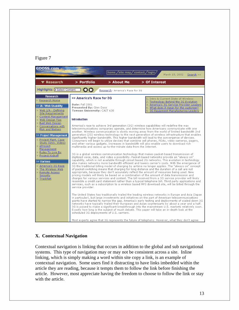
Figure 7
X. Contextual Navigation Contextual navigation is linking that occurs in addition to the global and sub navigational systems. This type of navigation may or may not be consistent across a site. Inline linking, which is simply making a word within site copy a link, is an example of contextual navigation. Some users find it distracting to have links imbedded within the article they are reading, because it tempts them to follow the link before finishing the article. However, most appreciate having the freedom to choose to follow the link or stay with the article.
14
Another example would be additional navigational schemes that are used to show related topics and articles. Notice how Gdoss.com (www.gdoss.com) utilizes a right hand navigational box [See figure 7]. This type of use could be considered a hybrid of contextual and sub navigation. XI. Supplemental Navigation Supplemental navigation is used in conjunction with the other standard navigational systems. The three most frequently used supplemental navigation methods are site maps, search engines, and breadcrumb trails. A. Site Maps The purpose of a site map is to give the user an encompassing view of what content the site has to offer. It can be an extremely valuable method of giving the user insight into the structure and content of a site. However, less than half of Web sites have them (Nielsen 2002). It’s important to label the site map what it is, a “site map”, rather than “site index”, “table of contents”, etc. 63% of sites offering a site map label it “site map” (Nielsen 2002). So it makes sense to stick with what people already know. The number one rule to designing an effective site map is to keep it simple. Many developers try to be too creative by developing interactive or dynamic site maps. Some sites offer site maps in which the user must click on an icon to reveal what content lies behind it. Other sites employ dynamic dropdown or rollover menus to display site content. These methods defeat the purpose of the site map. Users usually visit a site map for only one reason, and that is they can’t find the content they are looking for. The user should not have to navigate or interact with the site map. Other designers try to emulate a physical map or some other type of creative presentation for the site map. However, the most effective way of displaying site map information is to clearly and logically list the content under the site’s relevant sections and subsections. Sapient (www.sapient.com) does a nice job of logically and concisely listing their site’s content. [See figure 8]

15
Figure 8
B. Search Engines Users usually turn to a site’s search engine after they have failed to locate the information they are looking for using the global and local navigation. However, some users also use the search engine as their first means of navigation on a complex site that they are unfamiliar with. Unfortunately sites offering an efficient yet thorough search mechanism are few and far between. Developing a robust search engine for a large site is no small task. Companies with in house Web development teams may build their own site search engine using programming languages such as CGI, PERL, and XML. There are also

16
many third party vendors, such as Inktomi (www.inktomi.com), who offer search engine software that can be integrated into an existing Web site. For complex sites, search boxes should be placed directly on the home page. Users shouldn’t have to link to another page before they can use a site’s search feature. ZDNET (www.zdnet.com) offers an excellent search engine powered by CNET’s Search.com (www.search.com). The search results are displayed by category [See figure 9]. This is extremely helpful in clarifying the search results for the user. Many sites simply return a list of all results containing the search criteria, and are indifferent to the content’s context or category. Figure 9
C. Breadcrumb Trails A Breadcrumb Trail, sometimes referred to as a path analysis, is an effective way to

17
communicate to a user where they are within a sites hierarchy. Breadcrumbs provide a way for users to orient themselves by acting as a position indicator. They also provide a way for users to backtrack their movement within a site without having to rely on the browser’s “Back” button. Gdoss.com (figure 7) displays a breadcrumb trail that informs the user that they are located at “America’s Race for 3G” within the “Research” section, displayed as “Research: America’s Race for 3G”. Gartner (figure 3) also utilizes a breadcrumb trail, displayed as “Consulting > Architecture/Technology” XII. Iterative User Testing In addition to early usability testing using methods such paper prototyping, developers should seek user feedback at various stages throughout the development process. It is important to let users interact with the functional navigation in order to ensure sufficient usability. This will help to identify any problems associated with physically manipulating the navigation. XIII. Scalability & Maintenance When designing and developing a site’s navigational system, developers must keep in mind what happens after the initial site has been built. How will the navigation be maintained? How will navigational elements be modified, added, or deleted? In many cases sites have a tendency to outgrow their navigation, necessitating that additional content sections and links be added. Who will maintain the site after its initial launch will affect what type of navigational scheme is implemented. If the site will be maintained within the client organization, by non-developers, then the navigation must be designed to accommodate this. This situation would require some type of dynamic include file that can be easily updated. Two classes can be used to describe how the pages of a Web site interact with one another, static or dynamic. Static sites are a series of individual pages that don’t utilize common elements. A change on one page would not affect any other pages. For example, if a navigational element needed to be changed, it would need to be changed on each page individually. A static format may be sufficient for small sites, but it’s easy to see why a large static site would be difficult and inefficient to maintain. Dynamic sites are able to utilize common elements across a site. Such elements would include headers, footers, global and local navigation, and any other content that will be used in multiple locations. There are various ways in which a dynamic site can be maintained. Two common approaches are to use templates and includes. Templates are pre built page schematics that can be applied to any individual page. For example, a particular subsection of a Web site would have its own template. The template would contain common elements such as sub navigation, header, footer, etc., while also offering blank sections for individual page content such as, body text and page title. This will allow the site administrator to make one change to the template and have it affect all

18
pages using that template. Web design software packages, such as Dreamweaver, offer templating capabilities. Templating is also offered by high-end content management systems, such as Interwoven and Vignette that are designed for the maintenance of large Web sites. The use of includes is another way to more efficiently maintain a large site. An include file is a file that is pulled into another file to display the include’s content. A Web page may consist of a .html file that pulls (or calls) several include files. Although this Web page consists of several files, to the user it appears as one continuous file. On a 2,000 page site utilizing a navigational include file, a change to the navigation would only need to be made to that one file. A footer is another common example of how a dynamic include could be utilized. Many sites have a standard footer that is included on every page. This footer would likely be maintained as an include file. XIV. Conclusion Designing a successful navigational scheme starts with defining a site’s mission and audience. These factors then help to produce the content to be offered. The content then must be structured and labeled in a manner that will be intuitive to the user. A site should use a combination of global, local, contextual, and supplemental navigational methods. These different navigational schemes should interact in a manner that enables the user to recognize where they are, where the content they desire is, and what the best way to get there is. Although there are no formal standards on how Web navigation should be structured, it is good practice to implement navigational schemes that are widely used and understood. A site’s content is it’s most important feature, however, without an effective navigational scheme the user will never find it. Effective Web site navigation does not happen by chance. Web professionals must develop a firm understanding of the issues discussed in this paper, and act accordingly.

19
References Research Paper Fox, C. and Instone, K. (2001). Analyzing The Analysts: An Information Architecture Analysis of Top Business Analysts’ Web Sites. Vodvorka, J. (2000). Information Architecture, Designing the User Experience Web Resources Bernard, M. (2002). Criteria for Optimal Web Design (Deigning for Usability) http://psychology.witchita.edu/optimalweb/print.htm Downloaded on February 21, 2002. Lynch, P. and Horton, S. (1997). Yale Web Style Guide. http://info.med.yale.edu/caim/manual/contents.html Downloaded on February 19, 2002. Snyder, C. (2001). Paper Prototyping. http://www-106.ibm.com/developerworks/library/us-paper/?dwzone=usability Downloaded on December 14, 2001. Garrett, J.J. (2001). A Visual Vocabulary for Describing Information Architecture and Interaction Design. http://www.jjg.net/ia/visvocab Downloaded on February 21, 2002. Boleyn, L. and Jetton, S. (2001). Concrete aspects of Information Architecture Tools and Approaches. http://www.acm.org/chapters/chifoo/programs/1001.html Downloaded on February 22, 2002. Rhodes, J (2002). Information Architecture for the Rest of Us. http://www.webword.com/moving/restofus.html Downloaded on March 15, 2002. Kalbach, J. (2002). The Myth of “Seven, Plus or Minus Two” http://www.webreview.com/2002/01-14/strategists/index01.shtml Downloaded on January 7, 2002.

20
Georgia Tech (1998). The Graphic, Visualization & Usability (GVU) Center’s 10th WWW User Survey. http://www.gvu.gatech.edu/user-surveys/survey-1998-10/ Downloaded on March 22, 2002. Nielsen, J. (2002). Deep Linking is Good Linking http://www.useit.com/alertbox/20020303.html Downloaded on March 24, 2002. Nielsen, J. (2000). Is Navigation Useful? http://www.useit.com/alertbox/20000109.html Downloaded on March 24, 2002. Nielsen, J. (2002). Site Map Usability. http://www.useit.com/alertbox/20020106.html Downloaded on February 5, 2002. Nielsen, J. (2001). Search: Visible and Simple. http://www.useit.com/alertbox/20010513.html Downloaded on September 1, 2001. Macromedia (2002). Macromedia Flash: Player Penetration http://www.macromedia.com/software/flash/survey/ Nielsen, J. (2002). Site Map Usability http://www.useit.com/alertbox/20020106.html Downloaded on April 1, 2002