design and brand guidelines - paul smith's … brand guidelines 2 // 20 paul smith's...
TRANSCRIPT

PAUL SMITH'S COLLEGE
DESIGN ANDBRAND GUIDELINES
CONTACT
Address
Paul Smith’s College7833 NYS Route 30Paul Smiths, NY 12970
Phone/Email
Phone: 518.327.6000Toll Free: 888.873.6570Email: [email protected]
Office of Communications & Marketing
Phelps Smith Administration BuildingBob Bennett, Communication Coordinator518.327.6049 | [email protected]
www.paulsmiths.edu
Design + Brand Guidelines2 // 20
PAUL SMITH'S COLLEGE:INTRODUCTION
Like its students, Paul Smith’s College prides itself in its ability to stand out from the crowd. These guidelines help ensure Paul Smith’s is presenting a consistent, unified brand identity across all platforms — whether the message is being developed by the College or an outside entity.
The following pages will address proper usage of the Paul Smith’s College name, logo and other elements such as color, type and graphics. Adhering closely to these guidelines protects the college from unauthorized or incorrect use of Paul Smith’s brand assets and reflects our commitment to quality and consistency.
THE DESIGN + BRAND GUIDELINES

SECTION 1 | THE LOGO
SECTION 2 | TYPOGRAPHY
SECTION 3 | COLOR SYSTEM
SECTION 4 | BRAND PILLARS
TABLE OF CONTENTS
PAUL SMITH'S COLLEGE
Our logo is the primary visual element that identifies us. The current mark is the result of a brand refresh in 2016 and takes into consideration the college’s past and future. The mark is a combination of iconography and typography — they have a fixed relationship that shouldn't be altered or manipulated.
THE LOGO
IntroductionLogo Variations and Approved GraphicsLogo Sizing Logo Construction & ClearspaceIncorrect Logo Applications
01

1 2
Design + Brand Guidelines5 // 20
THE LOGO
THE PARENT MARK
The Paul Smith’s College parent mark comprises two elements, the logo symbol (1) and logo type (2). The leaning pine tree in the mark is evocative of both the college’s location in the forests of the Adirondacks and the institution’s history; paying homage to the leaning pine that once stood near the site of the Phelps Smith Administration Building and was a campus trademark.
The colors — consisting of spring greens, neutral blues and an earthy brown — reflect Paul Smith's naturalistic setting while improving overall impact and legibility. The color system is explained in full on pages 15-16.
The Grant Avenue typeface used for the logo type was chosen for the boldness of its letterforms and clear legibility as well as its timeless take on a traditional font. Brand typography is covered in-depth on pages 12–15.
Recommended formats are:.eps | .ai | .png | .jpg | .tiff
Note:Please refrain from any stylized, animated, hand drawn or other versions of the Paul Smith’s logo. Consult with logo creator, Trampoline, if you have any questions or need further help. Trampoline’s contact information can be found on page 19.

Design + Brand Guidelines6 // 20
PSC BADGE
LOGO VARIATIONS & APPROVED GRAPHICS
The badge is an iconic, scalable graphic that can be used in cases when the Paul Smith’s College name isn't required to be spelled out.
The stacked logo was created for instances when center alignment is preferred for visual balance. It may be used interchangeably with the parent mark.
STACKED MARK
Created for horizontal applications where vertical space is limited (i.e. signage, letterhead and business cards). This mark may be used interchangeably with the parent mark.
HORIZONTAL MARK
HERITAGE SHIELD
The heritage shield is a legacy mark that may be used as a graphic asset to support the parent logo and other brand assets.

Design + Brand Guidelines7 // 20
THE LOGO: COLOR BREAKDOWN
The Paul Smith's College parent, stacked and horizontal marks are comprised of five colors carefully selected for their contrast and aesthetic qualities. Please use approved logo files provided by the College and refer to the Pantone®, CMYK and RBG color values here when reproducing the Paul Smith's College logo for print, web, merchandise, or other applications. Color System is covered further on page 17.
PINE
RGB R :17 G: 71 B: 52 Web #114734
CMYK C: 93 M: 24 Y: 85 K: 68Pantone 3435 C
MOSS
RGB R: 100 G: 140 B: 59 Web #648clc
CMYK C: 62 M: 1 Y: 100 K: 25Pantone 370 C
GRASS
RGB R: 106 G: 164 B: 59 Web #6aa43b
CMYK C: 60 M: 0 Y: 98 K: 7Pantone 7737 C
SLATE
RGB R: 154 G: 189 B: 171 Web #9abdab
CMYK C: 36 M: 3 Y: 28 K: 4Pantone 558 C
SLATE (40% TINT)
BARK
RGB R: 215 G: 228 B: 220 Web #d7e4dc
RGB R: 143 G: 90 B: 40 Web #8f5a28
CMYK C: 15 M: 4 Y: 13 K: 0Pantone 558C (40% Tint)
CMYK C: 11 M: 53 Y: 94 K: 53Pantone 464 C

1.5 in
2.5 in 1.5 in2 in
1 in .75 in
1 in
.75
in
.5 in
Design + Brand Guidelines8 // 20
MINIMUM LOGO SIZES
LOGO SIZING
Full, StackedMinimum Size: .75 in x .3586 in
Full, HorizontalMinimum Size: 1.5 in x .4164 in
ShieldMinimum Size: .75 in x .4825 in
BadgeMinimum Size: .5 in x .253 in
1 in
1.25
in
.75
in

xx
1/2 x1/2 x
1/2 x1/2 x
x
1/4 x
1/4 x 1/4 x
1/4 x
Spacing of symbol:logo type = width of stem in the letter “P”
Design + Brand Guidelines9 // 20
It is important to keep the parent mark clear of any other graphic elements to protect its visibility and impact. To ensure this, an exclusion zone has been established indicating the closest any other graphic element or message can be positioned in relation to the mark.
LOGO CONSTRUCTION & CLEARSPACE
CLEARSPACE: PARENT, STACKED & HORIZONTAL LOGOTo determine the clearspace, take the height of the logo and divide it in half. (Clearspace = Height / 2).
To determine the clearspace, take the height of the logo and divide it by 4. (Clearspace = Height / 4).
CLEARSPACE: SHIELD & BADGE

Design + Brand Guidelines10 // 20
INCORRECT LOGO USAGE
Do not change fonts
Do not outline Do not tilt or cut off Do not swap colors
Do not shearDo not eliminate artwork
Do not compromise proportion
Do not use at low-resolution
C O L L E G E
Design + Brand Guidelines11 // 20
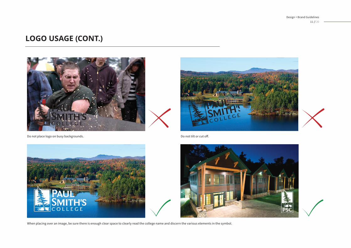
Do not place logo on busy backgrounds. Do not tilt or cut off.
When placing over an image, be sure there is enough clear space to clearly read the college name and discern the various elements in the symbol.
LOGO USAGE (CONT.)

Typographic hierarchy is another visual element that helps to differentiate Paul Smith’s College. Our brand typography includes primary and secondary fonts. In this section, we’ll take a look at how these fonts can be used to deliver messages with the greatest clarity and impact.
TYPOGRAPHY
Primary FontsSubstitute Fonts
02

Design + Brand Guidelines13 // 20
THE PRIMARY FONT FAMILIES
THE FONT
Andes is the recommended body sans-serif font for Paul Smith's College and can be used for subheads, body copy, and captions. For consistency, it should be used
whenever possible. Andes has many styles, including several weights and oblique options. The legibility and versatility make it useful in a number of applications. Andes includes several cases, including small caps.
PRIMARY FONT:ANDES
Andes is an Open Type Font that is compatible on both Mac and PCs. It can be purchased at: https://www.myfonts.com/fonts/latinotype/andes/
Regular
A B C D E F G H I J K L M N O P Q R S T U V W X Y Za b c d e f g h i j k l m n o p q r s t u v w x y z
A B C D E F G H I J K L M N O P Q R S T U V W X Y Z
a b c d e f g h i j k l m n o p q r s t u v w x y z
TYPE EXAMPLES:ANDES 0 1 2 3 4 5 6 7 8 9 0Figures

Design + Brand Guidelines14 // 20
THE PRIMARY FONT FAMILIES
THE FONT
Sucrose is another strong, legible font within the Paul Smith's primary brand system. It has many variations in weights —bold and regular — and styles — from clean to
distressed. Because Sucrose is limited to all-caps, it is a good option for headlines and subheads, but not recommended for use in body copy and captions.
PRIMARY FONT:SUCROSE
Sucrose is an Open Type Font that is compatible on both Mac and PCs. It can be purchased at: https://www.youworkforthem.com/font/T5967/sucrose-
Sucrose (bold two)
A B C D E F G H I J K L M N O P Q R S T U V W X Y Z
A B C D E F G H I J K L M N O P Q R S T U V W X Y ZTYPE EXAMPLES:SUCROSE

Design + Brand Guidelines15 // 20
SECONDARY FONT:SOURCE SANS PRO
Source Sans Pro is a free, Open Type Font by Adobe and is available for download at: https://www.fontsquirrel.com/fonts/source-sans-pro
Source Sans ProBold
Regular
A B C D E F G H I J K L M N O P Q R S T U V W X Y Za b c d e f g h i j k l m n o p q r s t u v w x y z
A B C D E F G H I J K L M N O P Q R S T U V W X Y Za b c d e f g h i j k l m n o p q r s t u v w x y z
TYPE EXAMPLESSOURCE SANS PRO 0 1 2 3 4 5 6 7 8 9 0
Special Characters
Figures
! “ § $ % & / ( ) = ? ` ; : ¡ “ ¶ ¢ [ ] | { } ≠ ¿ ‘« ∑ € ® † Ω ¨ ⁄ ø π • ± ‘ æ œ @ ∆ º ª © ƒ ∂ ‚ å ¥ ≈ ç
SUBSTITUTE FONT FAMILIES
THE FONT
In instances when Andes or Sucrose are not available, Source Sans Pro by Adobe is a suitable substitute that has many weights and cases within its font family. It is
an Open Type Font compatible on Mac and PCs. Because of its range of weights, this font can be used as a headline and body copy font in print and digital applications.

Color plays an important role in Paul Smith's College's identity. The color palette presented here is intended to reflect the college's natural setting and is a combination of rich and neutral tones that form a harmonious color scheme. We advise that the following colors be used for all college-branded materials,
including print and digital mediums. Consistent use of these colors will contribute to the cohesive look of the College across all relevant media. Adhere to the following color charts or consult your designer or printer when using the brand colors so that they will always be consistent.
COLOR SYSTEM
THE PRIMARY COLOR SYSTEM AND COLOR CODES
03
Design + Brand Guidelines17 // 20
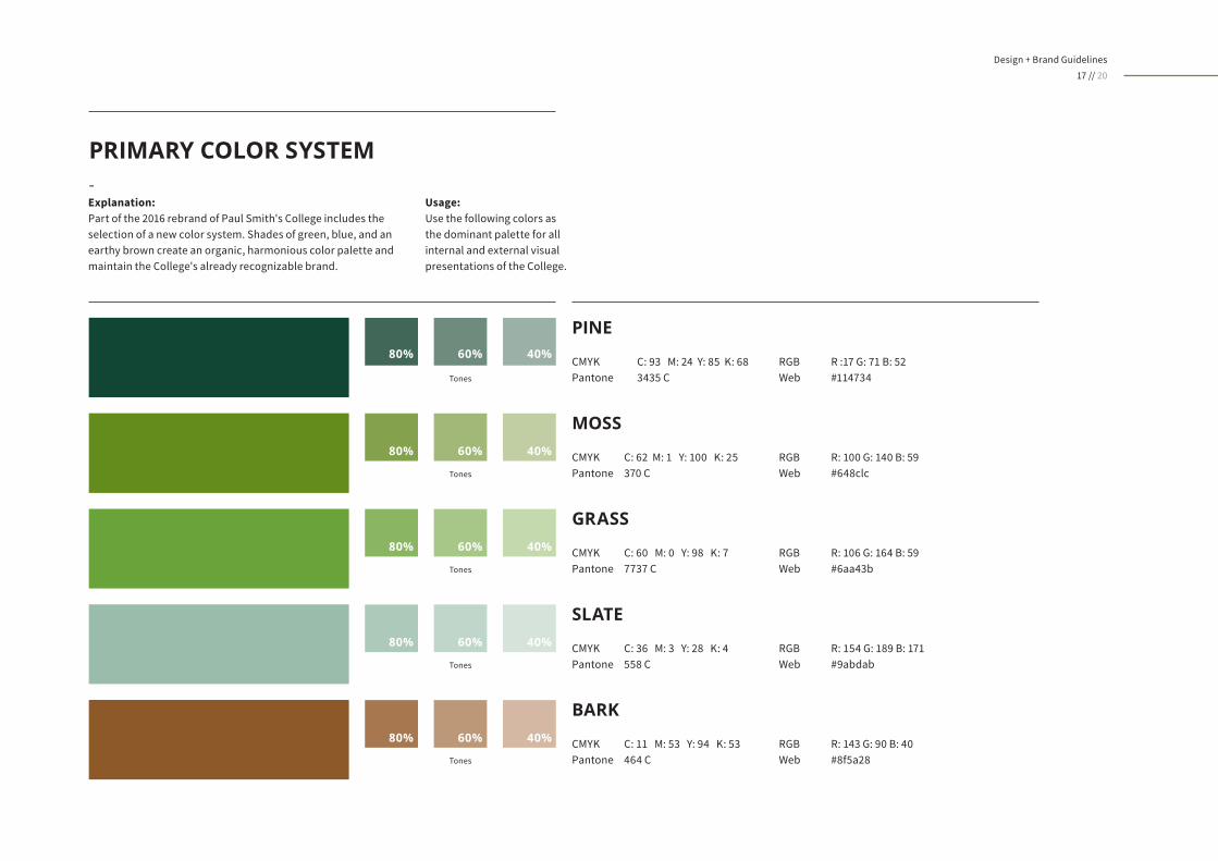
PRIMARY COLOR SYSTEM-
Usage:Use the following colors as the dominant palette for all internal and external visual presentations of the College.
Explanation: Part of the 2016 rebrand of Paul Smith's College includes the selection of a new color system. Shades of green, blue, and an earthy brown create an organic, harmonious color palette and maintain the College's already recognizable brand.
PINE
RGB R :17 G: 71 B: 52 Web #114734
CMYK C: 93 M: 24 Y: 85 K: 68Pantone 3435 C
MOSS
RGB R: 100 G: 140 B: 59 Web #648clc
CMYK C: 62 M: 1 Y: 100 K: 25Pantone 370 C
GRASS
RGB R: 106 G: 164 B: 59 Web #6aa43b
CMYK C: 60 M: 0 Y: 98 K: 7Pantone 7737 C
SLATE
RGB R: 154 G: 189 B: 171 Web #9abdab
CMYK C: 36 M: 3 Y: 28 K: 4Pantone 558 C
BARK
RGB R: 143 G: 90 B: 40 Web #8f5a28
CMYK C: 11 M: 53 Y: 94 K: 53Pantone 464 C
Tones
Tones
Tones
Tones
Tones
Design + Brand Guidelines18 // 20
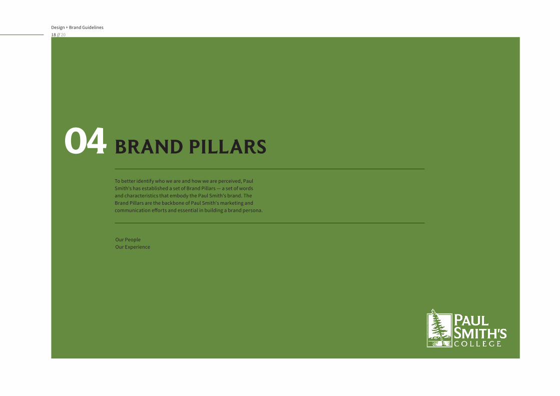
To better identify who we are and how we are perceived, Paul Smith's has established a set of Brand Pillars — a set of words and characteristics that embody the Paul Smith's brand. The Brand Pillars are the backbone of Paul Smith's marketing and communication efforts and essential in building a brand persona.
BRAND PILLARS04
Our PeopleOur Experience

Design + Brand Guidelines19 // 20
BRAND PILLARS
OUR EXPERIENCEOUR PEOPLE
• Intuitive• Innovative• Capable• Smart• Self-reliant
• Driven• Industrious• Entrepreneurial• Hard-working• Talented
• Able• Industry-aware• Skilled• Networked• Experienced
You'll find us climbing the corporate ladder and the tallest of hemlocks. We're Smitties. Here are a few of the characteristics that make us who we are:
Located on the shores of Lower St. Regis Lake, Paul Smith's College's modern architecture blends harmoniously with its wild surroundings — providing a unique, immersive learning environment. Here are some of the words used to describe the Paul Smith's experience:
• Bold• Energetic• Intrepid• Rugged• Active
• Guided by ecological conscience• Appreciative of heritage• Interested in sustainability• Enthusiastic for surroundings
• Team-oriented• Community-minded• Unassuming• Generous • Helpful

Design + Brand Guidelines20 // 20
A NOTE FROM THE CREATORS
With its rich history, stunning facilities, dedicated faculty, and prideful student body, it's easy to see why Paul Smith's College wants to protect its iconic brand. Please help them in doing so by adhering to these brand standards whenever possible.
If you have questions about the materials presented here, please feel free to contact us — we're happy to provide guidance and/or Paul Smith's assets to ensure that Paul Smith's brand identity is being presented correctly across all marketing and communications platforms and applications.
trampolinedesign.com11 South St. Suite 201Glens Falls, NY 12801