data visualization in public health dc tug march 17 2015
TRANSCRIPT

Data Visualization in Public Health
Washington D.C. Tableau User Group Meet Up. March 17, 2015
RAMON MARTINEZ
@HlthAnalysis
Specialist in Health Metrics
Pan American Health Organization (PAHO)

Content
• What is Public Health?
• Population Health Analysis
• Population Health Analytic Process
• Visual Analytic Process
• Some Example of Data Visualization in Public Health
Data Visualization in Public Health1

What is Public Health?
"the science and art of preventing disease, prolonging life and promoting health through organized efforts and informed choices of society, organizations, public and private, communities and individuals.“
Charles-Edward Amory Winslow, 1920
Public Health is concerned with threats to healthbased on population health analysis
Data Visualization in Public Health2

The Main Public Health Functions
1. The assessment and monitoring of the health of communities and populations at risk to identify health problems and priorities.
2. The formulation of public policies designed to solve identified local and national health problems and priorities.
3. To assure that all populations have access to appropriate and cost-effective care, including health promotion and disease prevention services.
Data Visualization in Public Health3

Population Health Analysis
Public Health
uses the methods from
Epidemiology and Biostatistics
for
assessing , monitoring , evaluating and analyzing population health
Data Visualization in Public Health4

Population Health Analytic Process
1. Question – public health issue
2. Identification of data sources
3. Selection and application of analytic methods
o Main dimensions: time, place and person
4. Analysis & interpretation of results – Key Findings
5. Presentation and sharing of results and findings
6. Interventions – actions for improving health
Data Visualization in Public Health5

Population Health Analytic Process
1. Typical Type of Questions
o Which population is affected?
o How cases or deaths are distributed by population demographics -sex and age?
o What is the level or magnitude of the problem?
• How many cases or deaths
• What is the rate (cases or deaths per total population)
o What is the trends over time
o How are cases geographically distributed? Which are the locations with higher risks
Data Visualization in Public Health6

Analytic Process
Data Visualization in Public Health7
Databases &
Local data in Excel
CSV, Text, Access
Analysis tool
Tableau Desktop
Points to Data
Create interactive
Visualizations and
Dashboards
Publish to Tableau
Server & embed
in the website
Diagram adapted from How Data Visualization Enhances the News , Ben Jones

Visual Analytic Cycle
Data Visualization in Public Health8

Examples of
Data Visualization in
Public Health
Data Visualization in Public Health9
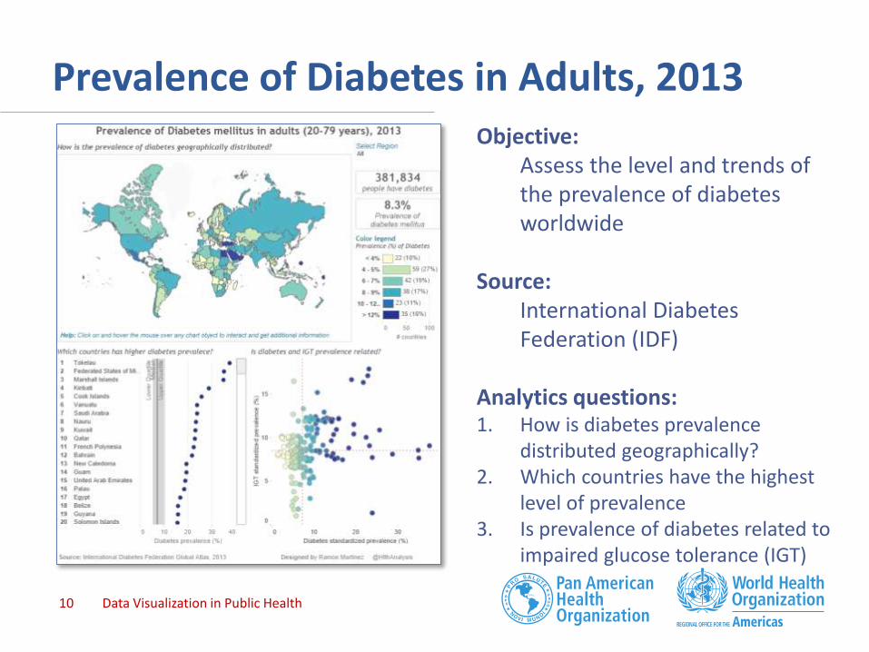
Prevalence of Diabetes in Adults, 2013
Data Visualization in Public Health10
Objective: Assess the level and trends of the prevalence of diabetes worldwide
Source: International Diabetes Federation (IDF)
Analytics questions:1. How is diabetes prevalence
distributed geographically? 2. Which countries have the highest
level of prevalence3. Is prevalence of diabetes related to
impaired glucose tolerance (IGT)

Prevalence of Diabetes in Adults, 2013
Data Visualization in Public Health11
Best practices:
1. Explicit questions as heading of charts
2. Stat Callout showing summary measures
3. Informative Interval Map Legend, including quantity and percent (out of total) of countries
4. Dot plot to identify countries with higher prevalence and provide

Prevalence of HIV, ages 15-49 years, 1990-2012
Data Visualization in Public Health12
ObjectiveAnalyze the magnitude and distribution of HIV in the World
Source: World Development Indicators, The World Bank
Questions1. Which regions and countries
exhibits the higher prevalence of HIV?
2. How is HIV geographically distributed?
3. How is the distribution of HIV by regions and income groups?

Prevalence of HIV, ages 15-49 years, 1990-2012
Data Visualization in Public Health13
Best Practices1. Explicit questions on the viz2. Use of Info Icon to provide
additional information about the visualization
3. Histogram to show the rank of countries by HIV prevalence
4. Map legend using box plot giving additional information about prevalence heterogeneity
5. Box plot to show distribution within and across population groups

Gender Gap in Human Development, 2013
Data Visualization in Public Health14
ObjectiveAnalyze the gender inequality in Human Development
Source: HDI, 2013. UNDP
Questions1. Which countries have the
highest absolute gender inequality?
2. Is there any relation between the HDI and gender inequality

Gender Gap in Human Development, 2013
Data Visualization in Public Health15
Best Practices1. Use of Gantt chart to show
absolute differences of the human development by gender across countries
2. Scatter Plots to provide additional information about relationship between HDI and measures of inequality
3. Additional Tab to show and share the data source
4. Additional Tab to provide additional information about the Visualization
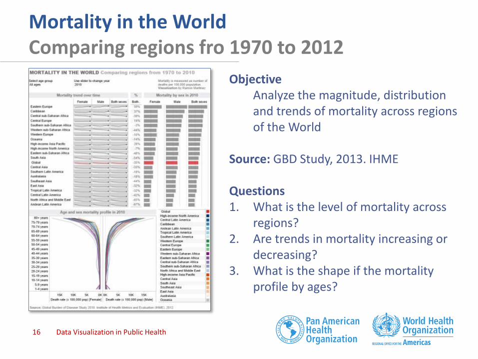
Mortality in the World Comparing regions fro 1970 to 2012
Data Visualization in Public Health16
ObjectiveAnalyze the magnitude, distribution and trends of mortality across regions of the World
Source: GBD Study, 2013. IHME
Questions1. What is the level of mortality across
regions? 2. Are trends in mortality increasing or
decreasing? 3. What is the shape if the mortality
profile by ages?

Mortality in the WorldComparing regions fro 1970 to 2012
Data Visualization in Public Health17
Best Practices
1. Use of small multiples to provide information by regional and sexes.
2. Use of Sparkline to show trends and distribution bands as context.
3. Dual axis to show selected year on Sparkline
4. Highlighting the mortality at global level (red color) to facilitate comparison
5. Filters by age group and year to facilitate data exploration

Conclusions
• Data visualization is an effective tool for Public Health
• Data visualization allows sharing and communicating information on population health to a wide audience (decision-maker, policy-maker, health professional and the general public).
• Visual analytics play a key role for assessing and monitoring the population health.
• Applying best practice allows us to create engaging and actionable data and information products
Data Visualization in Public Health18

Thanks
Questions?
For more examples of Data Visualization in Public Health visit Health
Intelligence:
http://healthintelligence.drupalgardens.com
Keep the conversation on Twitter @HlthAnalysis and use #HealthDataViz
Data Visualization in Public Health19