data mining in the automotive industry for predictive
TRANSCRIPT

Politecnico di Torino
Department of Control and Computer Engineering
Master’s degree in Computer Engineering
Data Mining in the AutomotiveIndustry for Predictive Maintenance
Analysis of the Oxygen Sensor Clogging Phenomenon
Supervisor
Elena Baralis
Co-supervisor
Tania Cerquitelli
Flavio Giobergia
Academic Year 2016-2017

2

Summary
The work presented in this thesis is focused on the topic of predictive mainte-
nance, or prognostics, approached with a data-driven perspective. Models that
use a data-driven approach to prognostics learn models directly from the data,
rather than using a hand-build model based on human expertise [1]. The topic
of prognostics has become particularly interesting in recent years: the arrival of
Internet-enabled everyday devices (the so-called Internet of Things) allows for the
automatic collection of data large amounts of data which can in turn be processed
and used for inferring the health conditions of the object being monitored.
This monitoring process suits particularly well the automotive industry: nowa-
days, vehicles are being loaded with sensors monitored with smarter, connected
Engine Control Units and, in a not-so-distant future, these vehicles will become
smarter still, with self-driving capabilities and even greater data-collection func-
tionalities. All this data being collected represents a precious resource that can
be used to extract insightful information and, as such, it should not go unused.
Predicting a vehicle’s malfunctionings is of vital importance for both the health of
the vehicle itself and for the safety of the passengers.
Given these premises, it follows naturally that all this data being collected
should be put to use in order to improve the maintenance operations on the vehi-
cle, in order to minimize possible risks. This is precisely the ambitious goal that
has been set for this work of thesis. The goal gets even more ambitious when con-
sidering that the problem is being approached with no expertise in the automotive
domain. This proved to be an advantage in that it did not introduce any kind of
bias in the elaboration of the results: these, though, have been evaluated by the
domain experts that collaborated on this project, helping consolidate or discard
conclusions.
The study started from some previously collected test bench data provided
by an automobile manufacturer, and with a problem the company was interested
in tackling using a data-driven approach. This problem concerns the oxygen (or
lambda) sensor which, if malfunctioning, degrades the performance of the vehicle,
with the excessive pollution and fuel consumption problems that come with it.
The data available has been studied using different data mining techniques in
3

order to gain insightful information from it and, from this, different predictive
models have been built. Their performance have been evaluated in different situa-
tions using different criteria to better understand the limitations and the potential
available.
A process comprised of three essential parts has been identified: these parts are
the labelling, the data preprocessing and the training of the classification models.
Each of these high-level parts contains different steps, based on the operations
required by the dataset. The data available is in the form of cycles, with each
one of them lasting approximately 1 hour and containing a collection of variables
measured on-board. Of particular interest is the fact that the labelling and the
data preprocessing operations are done on different datasets, given the structure
of the data available.
The training and the classification operations make use of different machine
learning models with complementary advantages and disadvantages. The results
have been measured in terms of accuracy, precision, recall and, in particular, of
F1 score, allowing for an estimation of the potential performance of the models
trained. The results are satisfactory, with high values in terms of the different
metrics used.
On top of this experiment, many others have been built. Many consist in the
redefinition of some components of the presented process in order to better un-
derstand which parts could be improved and which are the most robust. Other
experiments change the definition of the labels used for the dataset: the initial def-
inition provided has been discussed and changed: this helped better understanding
the rationale behind the decisions taken by the classifiers.
Finally, additional explorations of the dataset have been carried out: although
not strictly relevant to the goals of the project, these analyses uncovered inter-
esting information regarding the dataset and some problems contained within.
These problems consisted in the apparently unjustified existence of clusters of val-
ues within the dataset. This exploration first highlighted the existence of these
clusters, then tried to provide a description of them and, finally, it attempted to
provide a domain-agnostic explanation for their existence.
This work tackled a prognostics problem that has not been found to be covered
elsewhere in the literature, using a novel process tailored to the kind of data
available, but easily adaptable to different scenarios. Some of the limitations of
the datasets (e.g. the homogeneity of the tracks used) only allowed for limited
testing of the proposed solution: additional experimentations would be required
using real-world data instead of data collected from a test bench. This is scheduled
be done in the upcoming future.
This pilot project helped getting a better understanding of the potentials and
4

the limitations of data mining applied in an automotive context. It should be
mentioned that, for this work of thesis, only a “small” amount of data has been
used. As such, this work cannot be classified as a “big data” one. Despite that,
the scaling up of this work to handle the real-time data collected from millions of
vehicles undoubtedly requires a big data approach, with the benefits and problems
that come with it.
5

6

Acknowledgements
Almost exactly a year ago I started working on this thesis. Much has happened
since then, many doors opened and many others closed. Now the time has come
for me to close the “thesis” door as well, and what a door it is: to say that this
thesis has taught me a lot would be an understatement and, for that, I certainly
have to thank a lot of people. So, here comes.
First and foremost, my biggest thanks goes to professor Elena Baralis. She has
proven to be an excellent supervisor (not that I had doubts about it), extremely
pleasurable to work with, particularly insightful and always ready to help out when
I found myself in a tight spot (which occurred more times than I’m proud to admit).
An equally important acknowledgement goes to professor Tania Cerquitelli, who
first introduced me to the beauties of the DataBase and Data Mining Group and
saw to this project all the way to the end when others would have probably opted
for a more relaxing alternative in her stead (congratulations on the arrival of
Lorenzo, by the way!). Additional acknowledgements should go to professor Marco
Mellia for his involvement in the project (and I’d like to wish him the best of luck
for the ambitious endeavors he is currently working on) and to professor Letizia
Tanca for her kind availability as external supervisor for this thesis. I should also
immensely thank the people from the automotive company who took part in this
project: I could not have asked for a better group with whom to collaborate.
While this work of thesis took a good chunk of my time during this last year, I
would be remiss if I did not thank the people who surrounded me in my day-to-day
life. A huge, huge thanks goes to my parents, who had to put up with me not
only this past year, but the previous twenty-something ones as well, as did my
sister, who probably is the one person who got more stressed out than I did for
this thesis: an enormous thanks to her is definitely well deserved.
And last, I would like to thank all my friends and those who have been close
to me during this past year and the years before this. Many and more names
come to mind; writing them all here would significantly increase the length of
these Acknowledgements, which is already considerable. Despite that, I cannot
help but thank the one person who I felt closer than anybody else this past year,
who inspired me and helped me stay motivated, whose presence was enough to
7

motivate me to always strive for excellence.
The list of people could go on, but I guess this is a good moment to cut it
short. All the people I mentioned have changed my life for the better and I hope
that they are and will be, even slightly, proud of me. I know I am.
8

Contents
1 Introduction 17
1.1 Clogging of the oxygen sensor . . . . . . . . . . . . . . . . . . . . . 17
1.2 Prognostics . . . . . . . . . . . . . . . . . . . . . . . . . . . . . . . 17
1.3 Objectives . . . . . . . . . . . . . . . . . . . . . . . . . . . . . . . . 18
1.4 Contents overview . . . . . . . . . . . . . . . . . . . . . . . . . . . . 19
2 Literature review 21
3 Dataset overview 25
3.1 Dataset overview . . . . . . . . . . . . . . . . . . . . . . . . . . . . 25
3.1.1 Test bench cycles . . . . . . . . . . . . . . . . . . . . . . . . 25
3.1.2 Dual recording approach . . . . . . . . . . . . . . . . . . . . 26
3.1.3 Variables overview . . . . . . . . . . . . . . . . . . . . . . . 29
3.1.4 Other considerations . . . . . . . . . . . . . . . . . . . . . . 30
4 Process identification 31
4.1 Domain knowledge available . . . . . . . . . . . . . . . . . . . . . . 31
4.2 Data mining process . . . . . . . . . . . . . . . . . . . . . . . . . . 32
4.3 High-level process . . . . . . . . . . . . . . . . . . . . . . . . . . . . 33
5 Label assignment 35
5.1 Response time measurement . . . . . . . . . . . . . . . . . . . . . . 35
5.2 Labelling . . . . . . . . . . . . . . . . . . . . . . . . . . . . . . . . . 39
5.2.1 Definition of the number of classes . . . . . . . . . . . . . . 39
5.2.2 Definition of the threshold values . . . . . . . . . . . . . . . 39
5.2.3 Smoothing of the response times . . . . . . . . . . . . . . . . 41
6 Data preprocessing 45
6.1 Feature selection . . . . . . . . . . . . . . . . . . . . . . . . . . . . 45
6.1.1 Correlation-based feature selection . . . . . . . . . . . . . . 46
6.1.2 Tuning of the rmin parameter . . . . . . . . . . . . . . . . . 49
6.1.3 Selection outcomes . . . . . . . . . . . . . . . . . . . . . . . 50
9

6.2 Data transformation . . . . . . . . . . . . . . . . . . . . . . . . . . 51
6.2.1 Summarization of the signals . . . . . . . . . . . . . . . . . . 52
6.2.2 Summary statistics definition . . . . . . . . . . . . . . . . . 52
6.2.3 Introduction of the derivatives . . . . . . . . . . . . . . . . . 53
6.3 Mapping ProgramA to ProgramB . . . . . . . . . . . . . . . . . . . 53
6.3.1 ProgramA timestamping . . . . . . . . . . . . . . . . . . . . 54
6.3.2 ProgramB timestamping . . . . . . . . . . . . . . . . . . . . 54
6.3.3 Overlapping ProgramA and ProgramB . . . . . . . . . . . . 54
7 Classification 55
7.1 Classification . . . . . . . . . . . . . . . . . . . . . . . . . . . . . . 55
7.1.1 Classifiers used . . . . . . . . . . . . . . . . . . . . . . . . . 55
7.1.2 Validation . . . . . . . . . . . . . . . . . . . . . . . . . . . . 59
7.1.3 Performance evaluation . . . . . . . . . . . . . . . . . . . . . 59
7.1.4 Results . . . . . . . . . . . . . . . . . . . . . . . . . . . . . . 61
8 Process explorations 65
8.1 Feature selection process . . . . . . . . . . . . . . . . . . . . . . . . 65
8.1.1 Category-ful feature selection . . . . . . . . . . . . . . . . . 65
8.1.2 Feature selection in ProgramB . . . . . . . . . . . . . . . . . 66
8.2 Response time measurement . . . . . . . . . . . . . . . . . . . . . . 68
8.3 Exclusion of the smoothing process . . . . . . . . . . . . . . . . . . 71
8.4 Downsampling of the signals . . . . . . . . . . . . . . . . . . . . . . 74
8.5 Exclusion of strong predictors . . . . . . . . . . . . . . . . . . . . . 75
8.5.1 Derivatives . . . . . . . . . . . . . . . . . . . . . . . . . . . 77
8.5.2 Oxygen variable . . . . . . . . . . . . . . . . . . . . . . . . . 77
8.6 Processing the Model2 dataset . . . . . . . . . . . . . . . . . . . . . 80
8.7 Precision-based tuning of the parameters . . . . . . . . . . . . . . . 81
9 Labelling explorations 83
9.1 Red and green binary classifier . . . . . . . . . . . . . . . . . . . . . 83
9.2 Yellow cycles classification by binary classifier . . . . . . . . . . . . 84
9.3 Re-labelling of yellow cycles . . . . . . . . . . . . . . . . . . . . . . 86
9.3.1 Yellow cycles as green . . . . . . . . . . . . . . . . . . . . . 87
9.3.2 Yellow cycles as red . . . . . . . . . . . . . . . . . . . . . . . 89
10 Clusters analysis 91
10.1 Anomalous variables grouping . . . . . . . . . . . . . . . . . . . . . 91
10.2 Consistency throughout the features . . . . . . . . . . . . . . . . . . 92
10.2.1 Definition of the clusters . . . . . . . . . . . . . . . . . . . . 93
10

10.2.2 Inter-feature analysis . . . . . . . . . . . . . . . . . . . . . . 94
10.2.3 Clusters definition through time . . . . . . . . . . . . . . . . 95
10.3 Description of the clusters . . . . . . . . . . . . . . . . . . . . . . . 96
10.3.1 Generation of buckets of values . . . . . . . . . . . . . . . . 96
10.3.2 FP growth and frequent itemsets . . . . . . . . . . . . . . . 98
10.4 Possible causes . . . . . . . . . . . . . . . . . . . . . . . . . . . . . 104
11 Implementation details 107
11.1 Hardware . . . . . . . . . . . . . . . . . . . . . . . . . . . . . . . . 107
11.2 Software . . . . . . . . . . . . . . . . . . . . . . . . . . . . . . . . . 107
12 Findings 109
12.1 Classification results . . . . . . . . . . . . . . . . . . . . . . . . . . 109
12.1.1 Misclassifications . . . . . . . . . . . . . . . . . . . . . . . . 109
12.1.2 Classifiers’ rationale . . . . . . . . . . . . . . . . . . . . . . 110
12.2 Process manipulation outcomes . . . . . . . . . . . . . . . . . . . . 112
12.2.1 Removal of the smoothing process . . . . . . . . . . . . . . . 112
12.2.2 Effects of downsampling . . . . . . . . . . . . . . . . . . . . 113
12.2.3 Exclusion of strong predictors . . . . . . . . . . . . . . . . . 114
12.2.4 Application of the process to the Model2 dataset . . . . . . 115
12.3 Labelling experiments discussion . . . . . . . . . . . . . . . . . . . . 115
12.3.1 Binary classifier . . . . . . . . . . . . . . . . . . . . . . . . . 116
12.3.2 Labelling of yellow cycles with the binary classifiers . . . . . 117
12.3.3 Yellow cycles as green/red . . . . . . . . . . . . . . . . . . . 117
12.4 Dataset clustering comments . . . . . . . . . . . . . . . . . . . . . . 118
13 Conclusions 121
13.1 Novelty of the study . . . . . . . . . . . . . . . . . . . . . . . . . . 122
13.2 Limitations . . . . . . . . . . . . . . . . . . . . . . . . . . . . . . . 123
13.3 Future work . . . . . . . . . . . . . . . . . . . . . . . . . . . . . . . 124
Bibliography 125
11

12

List of Figures
2.1 Trend for data-driven vs model-based prognostics in Google Scholar 22
3.1 Acceleration pedal signal, recorded with ProgramA (entire cycle) . . 27
3.2 Acceleration pedal signal, recorded with ProgramB (final 300 seconds) 28
3.3 Acceleration pedal signal, recorded with both ProgramA (in blue)
and ProgramB (in green) . . . . . . . . . . . . . . . . . . . . . . . . 29
4.1 A visual representation of the typical data mining process . . . . . 32
4.2 Block diagram for the identified process . . . . . . . . . . . . . . . . 33
4.3 Block diagram for the classification of unseen data . . . . . . . . . . 34
5.1 Oxygen level, as measured in ProgramB . . . . . . . . . . . . . . . 36
5.2 Response time measurement process . . . . . . . . . . . . . . . . . . 36
5.3 Cut-off oxygen ramp, with sliding standard deviation . . . . . . . . 37
5.4 Response time trend throughout the experiment . . . . . . . . . . . 38
5.5 Distribution of response times: the colors represent the assigned
classes based on the defined thresholds . . . . . . . . . . . . . . . . 40
5.6 Response time trend throughout the experiment. The horizontal
lines show the positions of the thresholds . . . . . . . . . . . . . . . 42
5.7 Number of label switches occurring as k increases . . . . . . . . . . 42
5.8 Response time trend smoothed with different k values . . . . . . . . 43
6.1 Heatmap for the correlation matrix for a given cycle. The variable
names have been replaced with numbers for visualization’s sake . . 47
6.2 Number of features selected as rmin increases . . . . . . . . . . . . . 50
7.1 Explanation of the k-fold validation procedure . . . . . . . . . . . . 60
7.2 Decision tree built using the available dataset . . . . . . . . . . . . 63
7.3 Confusion matrices for the three classifiers . . . . . . . . . . . . . . 64
7.4 Prediction bars for the three available classifiers. The topmost bar
represents the correct values, the following bars are gray if the pre-
diction made was correct, or green/yellow/red depending on the
(erroneous) prediction the classifier made . . . . . . . . . . . . . . . 64
13

8.1 Original ramp approximated with 4 segments (represented using
different colors) . . . . . . . . . . . . . . . . . . . . . . . . . . . . . 70
8.2 Identification of the four segments . . . . . . . . . . . . . . . . . . . 71
8.3 Comparison of the response times as measured using the two pro-
posed methods . . . . . . . . . . . . . . . . . . . . . . . . . . . . . 72
8.4 Prediction bars for the classifier using labels assigned without the
smoothing process . . . . . . . . . . . . . . . . . . . . . . . . . . . . 73
8.5 F1 score for the classifiers evolution as the sampling frequency de-
creases . . . . . . . . . . . . . . . . . . . . . . . . . . . . . . . . . . 74
8.6 Jensen-Shannon divergence between the original and the downsam-
pled distributions . . . . . . . . . . . . . . . . . . . . . . . . . . . . 76
8.7 F1 score for the classifiers evolution as the sampling frequency de-
creases . . . . . . . . . . . . . . . . . . . . . . . . . . . . . . . . . . 79
9.1 Decision tree built for the binary classifier . . . . . . . . . . . . . . 85
9.2 90th percentile of the derivative of the oxygen, by label. The vertical
line indicates the split chosen by the decision tree. The vertical jitter
has been introduced for visualization purposes . . . . . . . . . . . . 85
9.3 Precision bars for the binary classifier . . . . . . . . . . . . . . . . . 86
9.4 Prediction bars for yellow cycles, as classified by the binary predictor 87
9.5 Prediction bars for the “yellow as green” binary classification problem 88
9.6 Prediction bars for the “yellow as red” binary classification problem 90
10.1 Scatter plot of mean and standard deviation of the cycles for the
variable variable temperature exh gas 1 . . . . . . . . . . . . . . . . 92
10.2 Scatter plot of mean and standard deviation for 2 variables . . . . . 92
10.3 Assignment of the clusters based on the mean and standard devia-
tion for the variable temperature exh gas 1 variable . . . . . . . . . 93
10.4 Scatter plot of mean and standard deviation for 2 variables, colored
based on the clusters of Figure 10.3 . . . . . . . . . . . . . . . . . . 94
10.5 Scatter plot of mean and standard deviation for the oxygen variable
and its derivative, colored based on the clusters of Figure 10.3 . . . 94
10.6 Distribution of the labels (top bar) and clusters (bottom bar) through-
out the cycles . . . . . . . . . . . . . . . . . . . . . . . . . . . . . . 95
10.7 Bucketing of two of the variables using 1D k-means . . . . . . . . . 98
10.8 Number of maximal frequent itemsets found for each cluster de-
pending on the minsup threshold . . . . . . . . . . . . . . . . . . . 99
10.9 Mean and standard deviation trend of the gas pedal signal through-
out the cycles . . . . . . . . . . . . . . . . . . . . . . . . . . . . . . 105
14

List of Tables
3.1 Differences between ProgramA and ProgramB . . . . . . . . . . . . 26
5.1 Ranges defined for the three classes . . . . . . . . . . . . . . . . . . 41
5.2 Cardinalities for the three identified classes . . . . . . . . . . . . . . 43
6.1 Features selected from ProgramA . . . . . . . . . . . . . . . . . . . 51
7.1 Results for the classification problem . . . . . . . . . . . . . . . . . 62
8.1 Features selected using a category-ful feature selection, by category 66
8.2 Features selected from ProgramB . . . . . . . . . . . . . . . . . . . 67
8.3 Matching of features selected in ProgramA with those selected in
ProgramB . . . . . . . . . . . . . . . . . . . . . . . . . . . . . . . . 69
8.4 Performance results for the classifiers trained with the dataset la-
belled without applying the smoothing process . . . . . . . . . . . . 73
8.5 Results for the classifier trained without the derivatives as inputs . 78
8.6 Results for the classifier trained without the oxygen variable as input 78
8.7 Cardinalities for the three identified classes . . . . . . . . . . . . . . 80
8.8 Performance results for the classifiers trained on the Model2 dataset 81
8.9 Performance results for the classifier optimized using precision as
the evaluation metric . . . . . . . . . . . . . . . . . . . . . . . . . . 82
9.1 Results for the binary classification problem . . . . . . . . . . . . . 84
9.2 Results for the “yellow as green” binary classification problem . . . 88
9.3 Results for the “yellow as red” binary classification problem . . . . 89
10.1 Description for cluster A . . . . . . . . . . . . . . . . . . . . . . . . 100
10.2 Description for cluster B . . . . . . . . . . . . . . . . . . . . . . . . 101
10.3 Description for cluster C . . . . . . . . . . . . . . . . . . . . . . . . 102
10.4 Description for cluster D (outliers) . . . . . . . . . . . . . . . . . . 103
11.1 Server specifications . . . . . . . . . . . . . . . . . . . . . . . . . . 107
15

16

Chapter 1
Introduction
1.1 Clogging of the oxygen sensor
In an automotive setting, the oxygen (or lambda) sensor is a device used to measure
the proportion of oxygen in the exhaust gas of an internal combustion engine. This
information is used to regulate the fuel injection so as to achieve optimal efficiency
and to determine whether the catalytic converter is performing properly.
This oxygen sensor is subject to clogging due to the accumulation of soot
contained in the exhaust gas the sensor is constantly exposed to. The clogging of
this sensor results in a slower measurement of the oxygen level.
In turn, this slower response implies a suboptimal behavior in terms of ef-
ficiency: the engine control unit (ECU) cannot determine the right combustion
mixture, resulting in an increase in the vehicle’s fuel consumption. Additionally,
given the sensor’s relevance for the catalytic converter, more harmful emissions are
released in the environment.
The situation is exacerbated by the fact that slower readings for the oxygen
sensor cannot be easily detected by the ECU: this implies that the clogging of the
lambda sensor is usually only detected when it is already too late, i.e. when (and
if, in many cases) the driver notices a significant increase in fuel consumption. This
happens because the slower response time cannot be noticed in a straightforward
manner by the ECU.
1.2 Prognostics
The typical way problems are detected is through diagnostics, whereby failures and
malfunctions are detected after they occur, possibly through the support of the
ECU itself (on-board diagnostics). Given the hard-to-notice nature of the lambda
sensor clogging, a different approach to the problem is in order.
17

The activity of prognostics consists in using the available information on a
system to make predictions on the problems that might occur in the near future.
This discipline is usually declined in either of two approaches:
• Model-based: this type of prognostics uses the available domain knowledge
to produce a physical model of the system of interest. The model can be
developed on different levels of detail, depending on the desired trade-off
between accuracy and simplicity
• Data-driven: this type of prognostics uses pattern recognition and machine
learning techniques to build agnostic predictive models
It is unlikely for a purely data-driven model to exist since, expertise in the domain
is required to some extent for both preparation of the data and interpretation of
the results. Even for model-based approaches, a data-driven component may exist.
The right term for these approaches would be “hybrid” but, since either of the two
is typically predominant, a distinction can be made between the two.
1.3 Objectives
This thesis will approach the oxygen sensor clogging problem with a data-driven
approach to prognostics, exploring the decisions made throughout the process
definition and implementation, as well as highlighting strengths and weaknesses
of this methodology. Finally, the results of the predictive model will be discussed
and conclusions about the overall work will be drawn.
The identified process will be presented in its final form after multiple revisions
and improvements. Alternative process choices, along with additional data explo-
rations will be presented in Chapters 8 through 10. Some of these explorations
are preparatory for a future extension of the project to a real-life scenario: while
this study focused on test bench datasets, the final goal of the project is that
of deploying the solution to millions of vehicles. This scaling up requires further
research that has only partly been covered by this study: despite that, this study
provides the foundations for further, more relevant experiments.
The decision of using a data-driven approach, rather than the traditional
model-based one, comes from the ever-increasing quantity of data available nowa-
days. ECUs collect data from hundreds of sensors dislocated all around the vehicle,
with extremely high sampling frequencies. If this amount of data is collected for
all the hundreds of millions of vehicles around the world, a big data opportunity
ensues. On top of that, there is an ever-increasing interest in autonomous vehicles:
this new technology would come with an even larger amount of data from all the
additional sensors that these vehicles require.
18

Getting ready for all of this is a cumbersome and daunting task, but the sooner
the first step in this direction is taken, the better. Working on a prognostics project
centered around the oxygen sensor is one of the ways a company can get exposure
to this new, data-driven world.
1.4 Contents overview
Chapter 1 provided an overview of the problem that will be faced in this work
of thesis, explaining the topic at hand and stating the objectives set. Chapter 2
offers a review of the literature found that is relevant to the topic of predictive
maintenance: this defines the state of the art and, by the end, an attempt to
highlight the main novel points of this work is made. Chapter 4 presents the
domain knowledge available and the standard data mining process: based on these
and on the initial objectives, an overview of the high-level process identified is
provided. Chapter 3 introduces the dataset available, highlighting the way this was
collected and the way it is structured: these considerations will be used throughout
the rest of the thesis to make considerations.
Chapter 5 offers an in-depth analysis of the first part of the identified process:
in particular, it covers the labelling process and the components it is comprised of
(response time measurement, smoothing, class definition and assignment). Chap-
ter 6 covers the data preprocessing operations, dividing them into feature selection
and data transformation. Chapter 7 presents the machine learning models used for
the classification of the dataset based on the clogginess and the evaluation metrics
and techniques used.
Chapter 8 shows how many of the assumptions made a priori based on some
rationale can and have been modified to support alternative approaches: when
available, the a posteriori results will be presented so as to compare the presented
solution with possible alternatives. Chapter 9 offers additional experiments, this
time based on the change in decisions made when defining the classes of values:
this highlights how changing these classes influences the performance of the mod-
els, with the interesting conclusions that come with it. Chapter 10 covers an
initially unscheduled further data exploration, aimed at uncovering an unexpected
behavior that led to the formation of well-defined clusters of data: these clusters
are analyzed, described and a possible cause for their existence is then proposed.
Chapter 11 provides a quick overview of the implementation details, specifying
the hardware and software tools and libraries used for this project. Chapter 12
shows the findings of this work of thesis, with comments concerning the most
interesting of the results achieved. Finally, Chapter 13 contains the conclusions of
this work, highlighting the most interesting takeaways, explaining the main points
19

of novelty and the major limitations, with final considerations on the possible
future outcomes for the project.
20

Chapter 2
Literature review
As everyday objects get smarter, the potential for early fault detection increases:
rather than waiting for a component to break down, an early detection might allow
for immediate intervention. This results in lower costs, less time wasted and more
satisfied customers. It is not surprising, then, that the interest in prognostics (at
times referred to as predictive maintenance) has grown significantly in the last
few years. The most common types of prognostics are the model-based and the
data-driven ones, along with hybrid approaches that leverage the advantages of
both. Figure 2.1 shows both how the topic of predictive maintenance has been
trending in recent years and how model-based prognostics is more recurring, when
compared to the more recently introduced data-driven one. The presented graph
is not intended to be exhaustive (additional keywords should have been used), but
it provides a clear idea of the increasing interest in the subject.
The topic of prognostics is often paired with that of health management, so
much so that the Prognostics and Health Management (PHM) is a recurring theme
in articles and conferences. The IEEE organizes every year the International Con-
ference on Prognostics and Health Management, while the PHM Society is an
organization solely dedicated to the promotion of the topic. Many of the publi-
cations that have been analyzed are from these two sources. Additionally, given
the current trend that has been observed in the prognostics-related publications,
these two sources are expected to provide insightful material for the years to come
and, as such, are worth keeping an eye on.
The topic of prognostics is too widespread and heterogeneous to be thoroughly
explored for understanding what the current state of the art in the automotive
industry is: many of the applications of PHM are found in fields that are only
weakly – if at all – related to the automotive field and can be safely left out in
order to narrow the research down to a more manageable number. The literature
review has been based on Scopus, a database of peer-reviewed research literature.
The initial research was based on the title, the abstract and the keywords,
21

1990 1995 2000 2005 2010 2015year
0
1000
2000
3000
4000
5000
6000
Goo
gle
Sch
olar
res
ults
modelbased prognosticsdatadriven prognostics
Figure 2.1: Trend for data-driven vs model-based prognostics in Google Scholar1
using the words “prognostics” and “automotive”: this yielded 135 results. Of
these results, 16 have been excluded because of conflicting keywords that implied
scarce relevance to the topic of interest. The remaining 119 have been further
filtered, iteratively removing irrelevant material based on the contents of the ti-
tle, the abstract and finally the document itself. Most of the discarded contents
where either too general in nature (with the automotive setting being only briefly
mentioned), or too detailed (many of the prognostics documents discarded where
focusing on particularly narrow applications that were not significantly relevant,
such as the study of solder joints longevity). The final number of articles and
conference papers kept is of 30.
Of these documents, 5 are overviews covering different possible approaches to
prognostics: some of these approaches are model-based, while others are data-
driven. In some cases, these overviews briefly cover the “prognostics” topic as a
whole, providing possible algorithms for tackling the problems: this is the case
with “A review of recent trends in machine diagnosis and prognosis algorithms”,
where different approaches (among the others, Artificial Neural Networks and Ge-
netic Algorithms) are proposed, along with references to successful case studies for
each candidate. Other documents provide overviews of more specific systems and
analyze possible faults that might occur: this occurs, for example, in “Diagnostics
1Data from Google Scholar trends collected from https://csullender.com/scholar/
22

and prognostics needs and requirements for electrified vehicles powertrains”, where
Electric Vehicle (EV) powertrains are introduced, along with a series of possible
faults that might occur in it (in rotors, bearings, inverters and so on). This type of
documents provides interesting high-level insights of the prognostics field, either
concerning possible approaches, or presenting possible problems to tackle.
The rest of the articles are PHM case studies, similar in nature to the one that
is approached in this thesis. The parts (or subsystems) that have been studied
in these publications are many, although two intertwined targets appear to be of
major interest: batteries (6 documents) and electric vehicles (7 documents) are the
most recurring themes. These papers are mostly concerned with estimating the
State of Health (SoH) and the State of Charge (SoC) of batteries: for example, the
conference paper “A machine learning approach to predict future power demand
in real-time for a battery operated car” proposes a data-driven approach to the
estimation of the SoC in EVs that overcomes some of the problems that are part
of the limitations of the model-based solution.
Other problems that are tackled in literature concern the engine oil quality
[5], injector cylinders misfiring [6] and many others. Of these documents, only 4
expressly state that the predictive maintenance aspect can be carried out on-board,
that is without requiring the dismounting of the component or running specific
tests. Of the others, it is not trivial – given the lack of specific domain knowledge –
to understand whether an on-board implementation would be feasible, since many
of the publications either use simulators (such as “Estimation of damage behaviour
for model-based prognostic”, which simulates the suspensions of a vehicle) or, as
is the case with the already mentioned “A machine learning approach to predict
future power demand in real-time for a battery operated car”, miniaturized cars
are used instead of real ones. Despite the uncertainty due to the lack of domain
expertise, the clear takeaway from these considerations is that there is only a
limited number of works that are backed by real data and that can be easily run
on-board, thus providing a major strength for this work of thesis.
As far as algorithms are concerned, the most recurring one used (with 4 of the
30 papers analyzed using it) is the Kalman filter [8]. This filter is used to make
estimates of variables that cannot be measured directly, or variables that can be
measured using multiple, inaccurate (e.g. due to noise) sensors. In the study
proposed in “Remaining useful life prediction based on noisy condition monitor-
ing signals using constrained Kalman filter”, the authors use Kalman filtering to
estimate the remaining useful life (RUL) of lead-acid batteries: the problem that
the Kalman filter helped solving was the presence of noise affecting the signals
examined.
This chapter presented a portion of the literature available regarding prog-
23

nostics applied to the automotive industry. Some of the trends and approaches
have been shown, with some of the limitations identified. The research project
presented in this thesis will attempt to contribute to the existing literature by ap-
plying a data-driven approach to the oxygen sensor clogging problem: the dataset
used has been collected from a real engine (with all the advantages and drawbacks
of the case) and the model will be developed, if possible, so as to be online-ready
for actual vehicles (and not limited to simulators or mock-ups). The goal for the
model construction is that of making it as interpretable as possible, in order to
allow the domain experts to understand the reasoning behind the choices made.
The oxygen sensor has not been found to be in the available literature. Despite the
decision of approaching a single problem, but the study will attempt to identify a
methodology that can be adapted to different situations.
24

Chapter 3
Dataset overview
The study has been carried out in collaboration with an automobile manufacturer.
This company provided a large collection of previously collected test bench data,
along with the domain expertise required to validate intermediate and final results,
and the provision of feedback and support as needed.
3.1 Dataset overview
The dataset provided was collected in 2016 for other unrelated activities and was
repurposed for this study. The decision of using an already available dataset
resulted in a series of advantages: the collection of new data would have resulted
in significant additional costs and a delay in the start of the activity. On the other
hand, the collection activity was designed with a different purpose in mind and by
different engineers from the ones involved in this project: this complicated parts
of the study and affected some of the results. Considering that this was a pilot
project, these nuisances have been deemed more than acceptable.
3.1.1 Test bench cycles
The data available has been recorded in a controlled environment within the com-
pany. This controlled environment, called test bench, consists in a dedicated room
containing an engine continuously running: the ECU reads data from the sensors
and dedicated software collects it and stores it for later use. Other external sen-
sors (only available in this ad-hoc environment, but not “on the road”) are also
measured and stored.
The engines are controlled using a predefined track for the gas pedal (or acceler-
ator): this track simulates different driving conditions, depending on the purposes
of the test in place. The track used for this dataset was approximately 1 hour (3750
seconds) long. Each of these 1-hour runs is called a cycle. Cycles are executed one
25

after the other throughout the day.
Different contiguous groups of cycles for the same engine (which will be referred
to as “experiments”) were provided as part of the initial dataset. Of these experi-
ments, only a subset was deemed useful by the domain experts for this study: the
others, either because of underlying technicalities in the measurements, or because
of the scarce evidence of the clogging problem, have been set aside.
The remaining datasets contained the recordings for the engines of two different
vehicles, which will be referred to as Model1 and Model2. Other technical names
used for the data collection activities are not relevant to this study and have been
ignored: as such they will not be reported in this work.
For each cycle, different signals have been recorded: each of these signal (also
referred to, throughout the document, as variables) are either the output of sensors
dislocated throughout the engine, or are computed from other existing variables
using internal models.
3.1.2 Dual recording approach
The Model1 and Model2 datasets have been recorded using two different software,
ProgramA and ProgramB. These two tools have different characteristics and have
been used for similar – yet complementary – purposes. The main differences be-
tween ProgramA and ProgramB are reported in Table 3.1. The two tools worked
in parallel, collecting data on the same exact cycles, but while ProgramA covered
its entirety, ProgramB only focused on the final part. This final part, as it will
be explained in more detail in Section 5.1, will be used to understand whether a
cycle should be considered as clogged or not.
ProgramA ProgramBDuration (s) 3750 300Sampling frequency (Hz) 1 320Number of variables1 50 440Number of Model1 cycles 400 390Number of Model2 cycles 186 184
Table 3.1: Differences between ProgramA and ProgramB
Although ProgramA and ProgramB theoretically recorded the same exact cy-
cles, the actual number of available cycles differs between the two: possible mal-
functionings of the tools might have resulted in some of the recordings being lost or
not stored at all (although this is little more than speculation, having the datasets
been recorded by people not involved in this project).
1This is the most common number of variables recorded by each tool. Some cycles containeda different number variables, depending on decisions and events that occurred at recording time
26

The following are in depth explanation of the two tools based on the information
reported in Table 3.1.
ProgramA
ProgramA records the entire 3750 seconds cycle, using a 1 Hz sampling frequency.
This results in approximately2 3750 samples for each of the 50 variables recorded.
Figure 3.1 shows the accelerator signal used as the track for each cycle. The
figure shows how the engine is stressed with an high frequency accelerator signal,
which is not usually found in normal driving conditions. Given that all datasets
available followed the same predefined track, the results obtained from this study
are not directly scalable to an “on-the-road” scenario, but it would require some
adjustments.
0 500 1000 1500 2000 2500 3000 3500Time (s)
0
5
10
15
20
25
30
35
varia
ble_
acc_
pos
(%)
Figure 3.1: Acceleration pedal signal, recorded with ProgramA (entire cycle)
The theoretical track used is supposedly (see Chapter 10) the same for all cycles,
but slight variations between cycles exist due to the fallibility of measurements.
While this statement may be obvious, this fact should be kept into account when
working with some of the signals.
2The actual duration of the cycle varies slightly between cycles
27

ProgramB
ProgramB is the second software tool used to collect engine data. It samples 440
signals3 with a sampling frequency of 320 Hz. Of the entire cycle, ProgramB only
records the final 300 seconds: this is the part where the cut-off occurs. The cut-off
is the moment when the gas pedal is released after a particularly intense and steady
acceleration. This part of the cycle is of particular interest as the cut-off will be
used to understand whether the cycles are clogged (i.e. the sensor is clogged) or
not.
0 50 100 150 200 250 300Time (s)
0
5
10
15
20
25
30
varia
ble_
acc_
pos
(%)
Figure 3.2: Acceleration pedal signal, recorded with ProgramB (final 300 seconds)
Figure 3.2 shows the accelerator behavior for the final 300 seconds of a given
cycle. The cut-off is clearly highlighted by the step that occurs around the 250th
second. To get a better sense of what portion of the cycle ProgramB records,
Figure 3.3 displays both the ProgramA and ProgramB recordings for the same
cycle.
As already mention (and as it will be explained in further detail in Subsection
5.1), the cut-off phase is used understand to what degree the clogging problem is
occurring: as such, having a more frequently sampled signal is necessary. On the
other hand, sampling the entire cycle with a 320 Hz sampling frequency would
have resulted in significantly larger datasets, without particularly benefiting the
3As mentioned, some of the signals may actually be derived from others using existing models:440 is the total number of signals returned by ProgramB
28

0 500 1000 1500 2000 2500 3000 3500Time (s)
0
5
10
15
20
25
30
35
varia
ble_
acc_
pos
(%)
Program1Program2
Figure 3.3: Acceleration pedal signal, recorded with both ProgramA (in blue) andProgramB (in green)
overall study (it would have actually gone the opposite direction, since the future
steps require lowering the sampling frequency, as explained in Section 8.4).
3.1.3 Variables overview
ProgramA and ProgramB collect a significant amount of signals, with some of these
signals being exclusive to either tool. These signals (also referred to as variables)
can be divided in two main categories:
• ECU variables: these variables are measured by the Engine Control Unit
and are therefore available on any vehicle with that ECU
• Test bench variables: these variables are measured using external sensors
only available during the test bench and are not available outside of it (e.g.
during on-road tests, or in real-life scenarios)
The final purpose of this study is that of applying the prognostics system to off-
the-shelf vehicles: as such, using signals originating from additional sensors added
in the test bench is not particularly useful and, on the contrary, it might result in
hard-to-scale results (given the lack of those sensors in the subsequent steps).
The ECU variables, on the other hand, are readily available on all vehicles.
These variables are grouped in different categories based on the type of value
29

monitored. Each of these categories is identified by a 3-letters string.
Given the lack of automotive expertise, these variables and categories have
been treated with an unbiased approach. The support provided by the company’s
domain experts helped understanding the results obtained and whether these were
meaningful and relevant.
3.1.4 Other considerations
Table 3.1 highlighted how the number of cycles available for Model1 is significantly
larger (more than twice in size) than that of Model2. Given the data-driven
approach of the study, a larger amount of data is preferred: for this reason, the
entirety of the study has been carried out using Model1. Model2 has been later
introduced to test the process on a brand new dataset (see Section 8.6).
Finally, to get a sense of the overall size of the dataset (for further consider-
ations on the tools used for the study), the average size for a single ProgramA
cycle was roughly of 1.6 MB, while the average ProgramB file was 43.7 MB large.
Given the cardinalities for the two Model1 datasets, the overall size was roughly
1.6 MB · 400 + 43.7 MB · 390 ≈ 17.3 GB. This kind of data can be handled
using a large enough main memory and certainly on a single machine: as such, big
data techniques will not be used. Despite that, the final goal requires processing
data from millions of vehicles: when scaling up to that size, the big data paradigm
will be necessary.
30

Chapter 4
Process identification
Given the dataset and given the company’s requirements, a process going from
raw data to clogging identification needs to be established. This process needs to
consider the domain knowledge already available as a starting point and integrate
it into the data mining process.
4.1 Domain knowledge available
The domain knowledge available for the clogging problem allows for the correct
identification of clogged situations in the available cycles. As already mentioned in
the introduction, a clogged lambda sensor results in a slower response. The cut-off
operation that occurs at the end of each cycle is a good moment for measuring
the response time: given that roughly all cycles go through the same cut-off,
the response times measured are comparable between one another. This should
give an idea of how clogged each cycle is when compared to the others. The
other important notion learned was that the soot was expected to cumulate in the
lambda sensor: as a consequence, the clogging was expected to increase as the
cycles went on.
Given the importance of what happens during the cut-off, it makes sense that
a higher sampling frequency (on ProgramB) was used during this phase, while the
entirety of the cycle is recorded, with ProgramA, at a lower rate. Since ProgramB
only contains a few minutes’ worth of data out of each hour, the ProgramA in-
formation should be used as input to model in order to provide it with recordings
that span the entire period of time available.
31

4.2 Data mining process
The problem at hand can be identified as a “classification” one: given a cycle, the
goal is that of classifying it as either clogged or not (and possibly “almost clogged”,
since the clogging of the sensor happens gradually). For the cycles available, the
information on the clogging status can be extracted from the ProgramB dataset,
while the data required to make the classification is provided by ProgramA. The
typical mining process shown in Figure 4.1, often referred to as Knowledge Dis-
covery in Databases [10], goes through the phases of data selection, preprocessing,
transformation, mining and evaluation/interpretation: these are the phases will
be applied to the case at hand.
Data
Target data
Preprocesseddata
Patterns/Models
Transformeddata
Knowledge
Figure 4.1: A visual representation of the typical data mining process
• Data selection: in this phase, only the necessary data is kept. For this
study, only the data about Model1 has been kept. Some additional cycles
have been discarded during the mapping phase
• Data preprocessing: in this phase, operations such as feature selection and
labeling are carried out. In particular, only a subset of the available signals
will be kept and the ProgramB cycles will be analyzed so as to measure the
response time
• Data transformation: in this phase, the variables available are trans-
formed so as to become more suitable inputs for the classifier
• Data mining: this is the phase where different machine learning algorithms
are used to extract information from the available datasets. More precisely,
32

this kind of problem requires the classification of the cycles (as either clogged
or not clogged)
• Evaluation/interpretation: this is the phase where the results of the clas-
sifiers are analyzed (when meaningful) and the models are evaluated based
on their performance
While the above list describes how the different phases identified during the study
fit the typical data mining process, the peculiarities of the scenario available cannot
be highlighted properly. Since these peculiar aspects required a tailored process
to be developed, the next part will provide a high-level description of it.
4.3 High-level process
Figure 4.2 contains a block diagram of the high-level model identified for the
process. For each block, a brief description is provided in the following list and
will be described in more detail in the following chapters. The diagram clearly
highlights how the dual dataset is approached by first working on the separate files
to extract the required information, with the results only being merged afterwards.
ProgramB
Response time measurement
Labelling
ProgramA
Featureselection
Datatransformation
Mapping
Classifier model
Training
Dataset
Figure 4.2: Block diagram for the identified process
• Response time measurement: in order to understand whether a cycle
is clogged or not, the response time after the cut-off needs to be measured,
using the definition provided by the domain experts on the ProgramB dataset
• Labelling: based on the response time, cycles are labelled as either clogged
or not (or, to predict future clogging situations, as “almost clogged”)
• Feature selection: in order to reduce the number of ProgramA variables
used, any existing redundancies have been removed through a feature selec-
tion process
33

• Data transformation: given the large number of possible inputs (i.e.
nvariables · nsamples, with nsamples = 3750) compared to the low number of
cycles (≈ 390), some kind of transformation is required for the classifier to
properly handle the problem
• Mapping: the unlabelled dataset resulting from the data transformation
step receives the labels computed at the labelling step, producing the final
dataset
• Training: the final dataset is used to train a model for later use on unseen
data
A trained classifier is the output of this process. This classifier can then be
used on previously unseen data, as shown in Figure 4.3. In this case only the
simil-ProgramA data is available (since transmitting the more frequently sampled
ProgramB data to a central server would pose problems in terms of bandwidth
required): after the extraction of the relevant variables and their transformation,
the existing model is applied to make a prediction on the state of the lambda
sensor.
Unseendataset
Featureextraction
Datatransformation
Prediction
Classification
Classifier model
Figure 4.3: Block diagram for the classification of unseen data
34

Chapter 5
Label assignment
This section provides a detailed description for the steps of the process that com-
prise the labelling operation. These are the steps performed on the ProgramB
dataset, and consist in response time measurement, smoothing and assignment
of the class label. As shown in Figure 4.2, the initial steps taken for the Pro-
gramA and ProgramB datasets can be executed in parallel: the order proposed for
the presentation, therefore, does not reflect an order in the execution of the two
sub-processes.
5.1 Response time measurement
During the final part of each cycle, the gas pedal is first kept at a steady level for
a set period of time, then it is released: this releasing of the accelerator is referred
to as cut-off. The oxygen level measured in the exhaust gas is directly influenced
by the acceleration pedal state (i.e. the oxygen level depends on the engine load).
After the pedal is released, the oxygen level will start rising until it reaches the
final 21% value. The time it takes for the oxygen level to reach this value (as
measured by the lambda sensor) is referred to as response time.
Figure 5.1a shows the oxygen level as reported throughout the final 300 seconds
by ProgramB. It has been observed that the ramp following the cut-off is always
contained between the seconds 245 and 260 of the ProgramB recording: thus, in
order to simplify the process, only this range will be considered while discussing
the measurement operation. The zoomed version of the ramp is represented in
Figure 5.1b
Defining when the ramp reaches the 21% value is not trivial, as the value
might be overshot, or never actually reached. For this reason, the domain experts’
definition of response time is slightly different from the previously provided one and
is defined as the time it takes for the oxygen level to reach 63% of the transitory
35

0 50 100 150 200 250 300Time (s)
6
8
10
12
14
16
18
20va
riabl
e_pe
rcen
t_ox
ygen
(%
)
(a) 0s÷ 300s
246 248 250 252 254 256 258 260Time (s)
10
12
14
16
18
20
varia
ble_
perc
ent_
oxyg
en (
%)
(b) 245s÷ 260s
Figure 5.1: Oxygen level, as measured in ProgramB
from the initial value to 21%, as explained in Equation 5.1
tr = t(O2 = 0.63 · (O2end −O2start))− t(O2 = O2start) (5.1)
With O2end = 21% being the expected O2 concentration found in the atmosphere.
Figure 5.2 provides a visual interpretation of what the response time represents.
Since O2end is already known, O2start is needed to compute the response time for
a given cycle. The start time (i.e. t(O2 = O2start)) can be intuitively identified in
Responsetime
O2start
O2end= 21%
O2start+ 0.63 ∙ (O2end
– O2start)
Figure 5.2: Response time measurement process
Figure 5.1a as the moment when the ramp starts rising after the “flat” part. When
36

using an algorithm, though, the identification of this moment is not trivial due to
the noise present. In order to solve this problem, a sliding window starting in the
flat part on the left-hand side of the signal and spanning 20 samples is used and the
standard deviation of the values in the window is computed. When this standard
deviation exceeds a threshold value, it means that the ramp has started, as the
rightmost values in the window significantly differ from the leftmost ones. Figure
5.3 shows both the oxygen level, and the sliding standard deviation computed
using a sliding window of 20 samples. The threshold value has been defined so
as to match the start of the ramp and not previous noise. Both oxygen level and
sliding standard deviation have been normalized to the 0 ÷ 1 range for graphical
reasons.
246 248 250 252 254 256 258 260Time (s)
0.0
0.2
0.4
0.6
0.8
1.0 Sliding std (normalized)Oxygen level (normalized)Threshold
Figure 5.3: Cut-off oxygen ramp, with sliding standard deviation
A similar approach is that of computing the moving average of the oxygen level
values and select as starting point the first one exceeding a different threshold: both
approaches avoid false triggering due to noisy points by “smoothing” the curve
(i.e. by introducing operations on a window of values, rather than basing the
considerations on a single one). Of these two approaches, the standard-deviation-
based one has been selected as the threshold defined did not depend on the average
oxygen level, which might differ between cycles.
After applying the aforementioned process to all ProgramB cycles, a measure-
ment of the response time is available for each cycle. Since the timestamp of each
37

cycle was known, a graph representing the response time trend from the beginning
to the end of the experiments could be plotted and is shown in Figure 5.4a. This
plot highlights different interesting aspects, that will be illustrated below.
20160806 20160813 20160820 20160827 20160903Time (YYYYMMDD)
0.8
1.0
1.2
1.4
1.6
1.8
2.0
Res
pons
e tim
e (s
)
(a) Dates on x axis
0 50 100 150 200 250 300 350 400Cycle number
0.8
1.0
1.2
1.4
1.6
1.8
2.0
Res
pons
e tim
e (s
)
(b) Cycle number on x axis
Figure 5.4: Response time trend throughout the experiment
First, some small plateaus, and a larger one, can be immediately noticed. These
represent the moments where the experiment was not being carried out and, be-
cause of that, no cycles were available: the plotting tool interpolates that part by
connecting the leftmost and rightmost points available by the gap. Since the engine
is not altered during these pauses, its state should remain unchanged between the
last cycle preceding a pause and the first one following it. Given this assumption,
the pauses can be removed (this is easily achieved by changing the time dimension
to represent the cycle number instead of a date and time), resulting in the graph
shown in Figure 5.4b.
Second, and most importantly, the response time trend is not monotonic, as
one would expect given the nature of the clogging (i.e. due to the accumulation of
soot within the sensor). Instead, the general trend is that of an increasing response
time, followed by a rather abrupt “reset” where the response time plummets, only
to start raising up once again. This behavior has been interpreted by the domain
experts as the soot “crystallizing” only to be shaken off the sensor upon turning the
engine on. Based on the data and the domain knowledge available, this explanation
could neither be corroborated nor contradicted but, since it did not affect the rest
of the study, this notion was not considered any further.
Additionally, some spikes are easily noticeable in the plot. These spikes may
either be due to problems with the measuring technique, or be the result of cycles
with particularly different cut-offs. These cycles could be removed, but instead
they have been kept, since no rationale has been provided as to what makes a
measurement “out of range”. Subsection 12.1.1 explains how these spikes affect
the results of the classifiers: in light of these considerations, a different approach
38

that discards these cycles could be introduced.
A final consideration concerns the values of the response times, which range
anywhere between 1 and 2 seconds. Measuring these responses using the 1 Hz
sampling frequency provided by ProgramA would have yielded useless results:
this justifies the utilization of the ProgramB dataset for this operation.
An independent method of measuring the response time has been tested to
validate the results derived from the domain experts’ measurement process. The
method and the results are discussed in Section 8.2.
5.2 Labelling
Given the response time for each cycle, the next step is that of inferring whether
the given cycle is clogged or not. The clogging condition results in the response
time being slower, but no formal thresholds defining the meaning of “clogged”
were available. Thus, this section will explore the process used for the definition
of these values and the problems and solutions found during this process.
5.2.1 Definition of the number of classes
A seemingly trivial decision is that of the number of different classes to be used to
divide the dataset. This decision, though, will heavily influence the performance
of the classifiers, as these models need the dataset to be partitioned so that classes
are internally cohese and well separated from one another.
The understanding of the clogging problem available, though, did not allow
for a definite separation in classes. The first decision that has been pursued (and
that will be adopted throughout the definition of the process) is that of defining
three classes of “clogginess” referred to as ‘green’ (for unclogged cycles), ‘yellow’
(for cycles that are starting to clog) and ‘red’ (for clogged cycles).
This number of classes has been agreed upon with the domain experts and
allows for a tangible understanding of the results of the classifier (by contrast,
defining a large number of classes would have introduced confusion as to what
each class is representative of). This decision of adopting three classes will be
changed in some of the further explorations presented in Chapter 9.
5.2.2 Definition of the threshold values
The following step is that of defining the threshold values for each of the defined
classes. Given the physical constraints of the response time, it is reasonable to
assume the lower bound of the green class to be 0 and the upper bound of the red
class to be +∞. This leaves the definition of two additional thresholds (i.e. the
39

ones defining the yellow class bounds, thereby defining the missing bounds for the
red and green ones).
As it happened with the definition of the number of classes, this decision was
not significantly aided by the domain knowledge available, resulting in the neces-
sity of making a decision based only on the information available. The piece of
information that drove the definition of the thresholds was the fact that the red
class (i.e. clogged situations) was expected to be a minority when compared to
the other situations.
For the green and yellow classes, on the other hand, there is not much that
can be said, particularly in light of the reset events that sometimes occur and that
do not strongly correlate the cardinalities of the yellow and red classes. Without
any additional information, these two classes may be divided so as to have similar
cardinalities.
A final driver for this decision could be qualitative analysis of the distribution
of response time values. The distribution is presented in Figure 5.5, which already
represents the final decisions made for the response time values.
0.8 1.0 1.2 1.4 1.6 1.8 2.0Response time (s)
0
5
10
15
20
25
30
35
40
Fre
quen
cy
Figure 5.5: Distribution of response times: the colors represent the assigned classesbased on the defined thresholds
The response time ranges chosen for the three classes are reported in Table 5.1.
As already explained, the labels assigned to the cycles have a significant influence
on the performance of the classifiers. Since both the number of classes and the
thresholds defined have been assigned based on heuristics that might change as the
40

Label Range (s)Green [0, 1.3)Yellow [1.3, 1.66)
Red [1.66, +∞)
Table 5.1: Ranges defined for the three classes
domain knowledge on the matter increases, these decisions have been introduced
in the process as parameters to be tuned at a later time and, indeed, Chapter 9
explores possible alternatives in the definition of the classes.
5.2.3 Smoothing of the response times
The logical step following the definition of the classes would be that of labeling
each cycle based on the class the response time belongs to: there is a problem,
though, with this straightforward reasoning. Figure 5.6 illustrates the (already
presented) response time evolution throughout the cycles of the experiment. The
horizontal lines represent the upper and lower bounds for the yellow class. The
problem is with the jagged profile of the curve: if labels were to be assigned based
on the simple comparison against the defined thresholds, sequences of subsequent
cycles that are crossing the thresholds would be alternatively assigned different
labels. This behavior is counterintuitive and undesired, as the accumulation of
soot is expected to occur gradually.
The approach used to lessen the entity of this problem is based on the as-
sumption that subsequent cycles should have similar response times, based on the
earlier considerations. Thus, in order to smooth the curve, values have been re-
placed using a moving average. For the ith value, a moving window is centered in
that value and encompasses the surrounding k right and k left elements, resulting
in a window of 2k + 1 total elements. k is a parameter that needs to be config-
ured based on the desired result. Intuitively, low values of k result in a limited
smoothing effect (at its extreme, k = 0 leaves the curve unaltered); instead large
values of k lead to an exceedingly smoothed curve, with a loss in local significance
(k = ncycles transforms the curve into a constant function).
An acceptable trade-off has been found using both quantitative and qualitative
approaches. Since the problem that is being solved is that too many changes in
label occur, a plot of the number of total changes of label as k increases (Figure
5.7) has been analyzed. The knee of the curve is located around k = 2 (i.e. a
window size of 5 elements).
Although the identified value for k is intuitively small, a visual inspection of
the profile of the smoothed curve with this value helps understand whether the
resulting alteration in values is acceptable or not. Figure 5.8 shows the results for
41

0 50 100 150 200 250 300 350 400Cycle number
0.8
1.0
1.2
1.4
1.6
1.8
2.0
Res
pons
e tim
e (s
)
Figure 5.6: Response time trend throughout the experiment. The horizontal linesshow the positions of the thresholds
0 2 4 6 8 10 12 14k
10
20
30
40
50
Num
ber
of la
bel s
witc
hes
Figure 5.7: Number of label switches occurring as k increases
42

4 different values of k (0 through 3): the vertical bands are colored based on the
assigned label for each cycle. In general, the profile of the curve for k = 2 has been
deemed acceptable from this perspective as well.
0 50 100 150 200 250 300 350 400Cycle number
0.8
1.0
1.2
1.4
1.6
1.8
2.0
Res
pons
e tim
e (s
)
(a) k = 0
0 50 100 150 200 250 300 350 400Cycle number
1.0
1.2
1.4
1.6
1.8
2.0
Res
pons
e tim
e (s
)
(b) k = 1
0 50 100 150 200 250 300 350 400Cycle number
1.2
1.4
1.6
1.8
Res
pons
e tim
e (s
)
(c) k = 2
0 50 100 150 200 250 300 350 400Cycle number
1.1
1.2
1.3
1.4
1.5
1.6
1.7
1.8
1.9
Res
pons
e tim
e (s
)
(d) k = 3
Figure 5.8: Response time trend smoothed with different k values
From the smoothed values, the labels can be assigned to each ProgramB cycle:
the cardinalities for the three classes are reported in Table 5.2. The ones pro-
posed are the values derived from those ProgramB values that have a ProgramA
counterpart: as explained in Section 6.3, some ProgramB cycles are missing the
ProgramA counterpart (or vice versa), thus reducing the total number of data
points available.
Class CardinalityGreen 164Yellow 163
Red 61
Table 5.2: Cardinalities for the three identified classes
43

44

Chapter 6
Data preprocessing
The data that will be processed by the classifiers is the one coming from ProgramA.
This data, though, is not in a shape that can be easily digested and used by the
classifiers. This chapter will explain why, along with the decisions made in order
to improve the situation.
6.1 Feature selection
The feature selection process is required in order to remove redundancy from the
description of the system (i.e. the cycle) available. Some of the advantages that
come with a reduction in the number of variables are:
• More concise representation of each cycle: this makes the entire problem
easier for the classifiers to handle, particularly in light of the limited number
of cycles available
• Easier understandability of the classifier: some of the classification models
tested are interpretable. If a lower number of variables is provided, the
generated output will consequently be more concise and understandable
• Better collection of data on the field: considering the long-term applications
of this process, collecting a lower number of signals would result in a re-
duction in terms of both costs required for the sensors used and bandwidth
needed for the transmission of the signals to a centralized server
Some of the common approaches used for dimensionality reduction that consist in
combining available features to produce new ones (e.g. the Principal Component
Analysis [11]) are not suitable for this kind of problem; since the available insights
provided by the domain experts would be difficult to translate to the new set of
combined variables. As a result, the feature selection applied needs to preserve
45

the existing features and discard the redundant ones: because of that, the desired
output of this operation is a subset of the original variables.
6.1.1 Correlation-based feature selection
The first step in this direction is that of defining a method for determining the
similarity between any two signals in a given cycle. The most straightforward ap-
proach is that of using the Pearson correlation coefficient, defined (for two datasets
x = {x1, ..., xn} and y = {y1, ..., yn} by Equation 6.1.
r =
n∑i=1
(xi − x)(yi − y)√n∑
i=1
(xi − x)2√
n∑i=1
(yi − y)2(6.1)
The main advantages of this coefficient is that it represents the similarity using
a scalar number and, additionally, this number is bounded between -1 and +1.
Values close to -1 indicate strong negative correlations, while positive correlations
have coefficient values approaching +1. Values close to 0, instead, represent no
linear correlation.
In order to understand whether actual redundancy exists within the variables
available, the correlation coefficient between each pair of variables has been com-
puted for a cycle, using a subset of variables: the resulting correlation matrix has
then been plotted as a heatmap. Figure 6.1 represents the correlation matrix for
one of the cycles available. At a glance, the correlations between variables are
evident.
Before the definition of the feature selection process, some variables can be
discarded a priori. The first significant pruning occurs when removing all the test
bench variables: these, as explained, are not available on vehicles and, as such,
should not be considered (as requested by the company). The second elimination
regards discrete variables: these have been set aside as they are hardly comparable
with continuous signals. Dropping these variables also discards constant signals,
which contain no information expected to be relevant and complicates the compu-
tation of the correlation coefficients (introducing Not a Number – or NaN – values).
An entire category of variables (the one containing information on the fault status
of the system) has been ignored upon instructions. The number of variables that
made it this far varies from 31 to 37. The final pruning occurs because ProgramA
cycles contain a variable number of signals: the reasons for this are unknown, but
the result is that only a subset of all signals is shared among all cycles. The feature
selection process should only be applied to this subset of variables since, if any of
these non-ubiquitous features were to be selected, the following steps would have
46

0 2 4 6 8 10 12 14 16 18 20 22 24 26 28 30
30
28
26
24
22
20
18
16
14
12
10
8
6
4
2
0
0.8
0.4
0.0
0.4
0.8
Figure 6.1: Heatmap for the correlation matrix for a given cycle. The variablenames have been replaced with numbers for visualization’s sake
to deal with missing values, adding complexity instead of reducing it. The total
number of features kept, therefore, is of 31.
The selection algorithm has been designed so as to iteratively extract the most
representative variables from the initial pool of available signals, so as to finally
have a list of independent (where “independent” can be defined in terms of cor-
relation) variables ordered by descending degree of representativeness of the other
signals. The following are the steps of the algorithms.
1. For each cycle k, the correlation coefficient between each pair of variables i
and j is computed and stored as rk,ij = rk,ji.
2. For each pair of variables i and j, the overall correlation coefficient rij = rji
is computed as the average correlation coefficient for that pair of variables
over all the cycles: rij = 1n
n∑k=1
rk,ij
3. The list of “remaining variables” L is initialized with all the variables avail-
able
4. For each variable i in L, the sum of squared correlation coefficients si is
computed: si =∑j∈L
r2ij
47

5. The variable
b = argmaxi∈L
si
is extracted from L as the most representative of the variables left
6. All variables v ∈ L such that rvb > rmin are extracted from L in that they
are well represented by b
7. If L is empty, the algorithm terminates, otherwise it continues with Step 4
Algorithm 1 contains the pseudocode that implements these steps.
Algorithm 1 Correlation-based feature selection
1: function FeatureSelection(C, V )
2: Rk ← {}3: R← {}4: for k ← C do
5: Rk[c]← {}6: for i← V do
7: for j ← V do
8: Rk[k][i][j]← corr(get(k, i), get(k, j))
9: end for
10: end for
11: end for
12: for v ← V do
13: for w ← V do
14: R[v][w]← 0
15: for k ← C do
16: R[v][w]← R[v][w] + Rk[k][v][w]
17: end for
18: R[v][w]← R[v][w]/|C|19: end for
20: end for
21: L← V
22: B ← {}23: while |L| > 0 do
24: b← null
25: sb ← 0
26: for v ← V do
27: s← 0
28: for w ← V do
48

29: s← s + R[v][w]2
30: end for
31: if s > sb then
32: s← sb
33: b← v
34: end if
35: end for
36: append(B, b)
37: for v ← V do
38: if |R[v][b]| > rmin then
39: drop(L, v)
40: end if
41: end for
42: end while
43: return B
44: end function
6.1.2 Tuning of the rmin parameter
The correlation-based feature selection algorithm presented requires a single pa-
rameter rmin to be selected. This parameter represents the minimum correlation
coefficient below which two signals are considered as not strongly correlated: the
selected features will all be correlated with a coefficient smaller than rmin. Redun-
dant features that are dropped by the algorithm, on the other hand, are correlated
with only one of the “representative” features with a coefficient larger than or
equal to rmin.
The selection of this value requires making a trade-off between the number
of selected features and their ability to well represent the discarded variables.
The value can be selected either by setting an a priori constraint on the desired
representativeness of the selected features, or by studying the evolution of the
number of selected features as the coefficient changes.
Since the algorithm takes the absolute value of each correlation coefficient
(because negative correlations are correlations nonetheless), it makes sense to only
analyze values for rmin ∈ [0, 1]. Intuitively, rmin = 0 implies that the lowest
number of variables is selected (possibly only 1), given that each selected feature
“covers” all others that are not completely independent from it (i.e. correlation
coefficient not 0). By contrast, setting rmin = 1 results in the largest number of
features selected, as each selected feature only covers for the completely correlated
ones.
49

0.0 0.2 0.4 0.6 0.8 1.0rmin
0
5
10
15
20
25
30
Num
ber
of fe
atur
es s
elec
ted
Figure 6.2: Number of features selected as rmin increases
Figure 6.2 illustrates how the number of features selected grows as rmin in-
creases. The elbow of the curve occurs slightly below the 0.8 value: in order to
“play it safe”, 0.8 has been chosen for rmin. Using this large correlation thresh-
old guarantees that all discarded signals have a very strong correlation with the
selected ones, keeping the amount of discarded information to a minimum.
6.1.3 Selection outcomes
The described feature selection algorithm was applied to the available ProgramA
cycles, in order to reduce the overall number of features to be further processed.
The algorithm selected the 14 features shown in Table 6.1.
The feature selection algorithm presented is the result of an iterative refine-
ment process, with intermediate results that provide interesting insights on the
dataset. Furthermore, even though the selection process is only required to lower
the number of features used, the results yield useful information (e.g. which fea-
tures are being monitored redundantly): because of this, and in order to validate
the results of the ProgramA feature selection, the algorithm has been tested on
the ProgramB cycles as well. Since this chapter is dedicated to the description of
the identified process, these additional experiments do not belong here: as such,
they will be presented in Subsection 12.1.1.
50

Variable namevariable concentration NOx B
variable pressure railvariable angle fuel AD
variable quantity fuel Cvariable temp engine
variable quantity reductantvariable percent oxygen Avariable quantity fuel Avariable quantity fuel Bvariable valve position A
variable temperature exh gas 1variable temperature exh gas 3variable temperature manifoldvariable NOxCatalist Storage
Table 6.1: Features selected from ProgramA
6.2 Data transformation
The feature selection process narrowed the number of ProgramA variables from 50
down to 14. Since ProgramA collects approximately 3750 samples for each variable
for each cycle, the number of potential inputs for the classifier is 14 ·3750 = 52500.
While this number of features is not, by itself, unapproachable, it is when backed by
a limited number of instances (i.e. cycles). Even the most generous of estimates for
the adequate features/instances ratio is far from considering 390 cycles as enough
to handle 52500 features.
As a consequence, the number of features needs to be somehow lowered to a
more manageable number. The most intuitive approach would be that of sampling
the signals with an adequate sampling frequency. After analyzing the spectra of
the variables, this option has been discarded, as a sampling frequency lower than
the one already adopted would result in a significant loss of data. Furthermore, in
order to get the number of features down to a manageable number (approximately
1000, a similar order of magnitude to that of the instances), the sampling frequency
required would have had to be that of Equation 6.2, where nfeatures is the number of
desired features (1000), nvars is the number of variables available after the feature
selection process (14), and Tcycle is the duration of the cycle, in seconds (3750).
fs =nfeatures
nvars · Tcycle
(6.2)
The resulting sampling frequency is approximately 0.02 Hz, equivalent to a pe-
riod of 50 seconds, an unacceptable value. As a consequence, a different approach
is needed.
51

6.2.1 Summarization of the signals
An alternative to sampling is that of summarizing each signal using a limited
number of statistics: since this number is independent of the number of samples,
the total number of features used can be tuned based on the necessities. Defining
the right statistics to use is not trivial, and can be done by iteratively evaluating
subsets of statistics in terms of performance of the resulting classifier. As will
be shown, the initial choice for the statistics results in a satisfying classifier and
is stable in certain situations of interest. Because of that, and because of the
significantly time-consuming operations that would be required in re-training and
re-tuning the classifiers, the initial decision for the summary statistics has been
kept, knowing that possible alternatives can be explored and evaluated quantita-
tively.
6.2.2 Summary statistics definition
Given the significant consumption of time that comes with testing each group of
summary statistics, an attempt at defining meaningful ones was made. The fol-
lowing considerations stem from previous experience and from the understanding
of the problem at hand.
Mean and standard deviation
The first two summary statistics introduced are the mean and the standard devi-
ation for each of the sampled signals. These two values allow to identify behaviors
where the signal is offset by a positive or negative amount (mean) and the entity
of the oscillations around the mean, summarizing the entity of the amplitude of
the signals (standard deviation).
Percentiles
The mean and the standard deviation are enough to describe a gaussian distribu-
tion, but this assumption of normality does not hold for the distribution of samples
for the signals. As such, additional information is required. One such piece of in-
formation chosen are the percentiles: a percentile indicates the value below which
a given percentage of samples fall.
Given the potentially infinite number of percentiles available (though the lim-
ited number of samples is an upper bound), a meaningful subset of these needs
to be identified. A first visual approach was that of plotting the cumulative dis-
tribution functions for each variable of a subset of green and red cycles1, and
1Note that this requires already having defined the label for each ProgramA cycle. This will
52

draw conclusions on the most meaningful percentiles based on where the curves
differed the most (the CDF maps values in the distribution to their percentile).
This approach has been attempted, but a visual inspection only took into account
a limited number of cycles and did not yield overall meaningful results.
The second approach has been that of sampling the 0 ÷ 100 interval evenly,
drawing a posteriori conclusions on whether this sampling needs to be changed.
The initial percentiles used are from 10 to 90 with increments of 10, for a total of
9 percentiles.
6.2.3 Introduction of the derivatives
For each of the 14 variables, 9 + 2 = 11 statistics are used, for a total of 154
features. This number is significantly lower than the initial 52500. The price
paid for this reduction is that the time component is no longer represented: the
statistics summarize the distribution of values, not their evolution over time.
In order to partially reintroduce this lost components, the 11 summary statistics
have been computed for the “derivatives” of each signal, thus doubling the overall
number of features, but still keeping it down to a manageable number.
The “derivative” of a signal is computed as the difference between subsequent
samples: as such, a more accurate definition would be that of difference quotient.
For practical reasons, the terms will be used interchangeably throughout the text.
The introduction of the distribution of the derivatives’ values partially models
the time component: slower signals will have a distribution of derivatives shifted
towards lower absolute values and vice versa.
Since the difference quotient can be easily computed from the available data
and does not impact too greatly the total number of features, all derivatives have
been kept throughout the definition of the process. Adding the derivatives, though,
doubles the number of features, from 154 to 308: this might affect the performance
of the classifier. Because of this, additional experiments where the derivatives have
been discarded are available in Subsection 8.5.1.
6.3 Mapping ProgramA to ProgramB
The pairing of ProgramA and ProgramB cycles is required in order to assign the
right labels to the ProgramA cycles available. The two systems have different
approaches to recording the date and time. While seemingly trivial, some imple-
mentation details are noteworthy.
be explained in Section 6.3, but the information required for the operation makes it feasible atthis point in the process
53

6.3.1 ProgramA timestamping
The naming convention adopted for the recording of the ProgramA files required
the final part to be YYYYMMDD hhmmss (Year, Month, Day, hour, minutes, seconds).
This represents the date and time the recording was started. The master variable
represented the time (in seconds) throughout the cycle, starting from 0. With the
information available, the Unix timestamp (i.e. the number of seconds elapsed
from the midnight of January 1st, 1970) for the beginning and the end of each
ProgramA cycle can be computed (the end timestamp is the initial timestamp
plus the final value for master).
6.3.2 ProgramB timestamping
For ProgramB, the situation is more straightforward: one of the variables available
as part of each ProgramB file is called TASTimeStamp and, as the name suggests,
it contains the Unix timestamp, in microseconds, for each sample. The minimum
and the maximum values for this variable provide the initial and final timestamps
for the final part of the cycle.
6.3.3 Overlapping ProgramA and ProgramB
Despite the intuition that the ProgramB recording is the final portion of the Pro-
gramA cycle, pairing ProgramA and ProgramB files based on the latter’s times-
tamps being included in the former does not successfully match all cycles. This
happens because, in many cases, the ProgramB recording was stopped after the
ProgramA one. Additionally, the fact that the number of ProgramA and Pro-
gramB cycles available is not the same implies that there may be ProgramA files
without an ProgramB counterpart, and possibly vice versa. Because of this sec-
ond consideration, both initial and final timestamps need to be considered when
matching the cycles.
The approach used is that of allowing some “slack” time after the ProgramA
cycle ends: in other words, the final ProgramA timestamp is increased of a small
number of seconds ts (10 seconds has been found to be enough) before finding the
match. The match between the ProgramA cycle with start and end timestamps
Ts,c, Te,c and the ProgramB cycle with Ts,i, Te,i occurs if Ts,c < Ts,i < Te,i < Te,c+ts.
After the introduction of the slack time, 388 out of the 390 ProgramA cycles
available were matched with their ProgramB counterpart. The result is signifi-
cantly better than an earlier attempt that did not factor in this detail: while not
significantly important from the theoretical point of view, it is still an detail that
should be kept into account when replicating the study.
54

Chapter 7
Classification
7.1 Classification
The data available is now labelled and partially transformed. Some additional
transformation (to normalize the dataset) will be used for the classifiers that are
sensible to this kind of operation. This section will be concerned with the ex-
ploration of different classification models, selected based on their strengths and
weaknesses. Each classifier will be tuned and evaluated based on specific perfor-
mance metrics. Finally, the best results achieved will be presented.
7.1.1 Classifiers used
In literature, a myriad of classifiers have been presented, each with its strengths
and weaknesses: there is no classifier that is overall preferable to others. In order
to get the best results, different classifiers with different pros and cons have been
tested. The study has been carried out with two purposes in mind: the first one
is that of learning what is that actually drives the problem, the second is that of
building a performant classifying algorithm. Because of this, the chosen algorithms
leverage either of these two aspects. The models used are proposed below.
Decision tree
Decision trees are a classification model based on a tree structure [12]: the training
phase builds the tree, while the classification phase requires, for each input, to
traverse the tree from the root to one of the leaves. Each leaf contains a label
that is assigned to the input being processed upon landing on the given leaf. Each
node of the tree contains a test on one of the features of the input: based on the
outcome of the test, one of the branches is followed and new tests are performed,
until a leaf is reached.
55

Many advantages of the decision trees have made them a successful classifica-
tion model. Upon these, their interpretability is one of the most important ones.
Unlike most classifiers that act like black boxes, decision trees provide clear ex-
planations for the choices made, since each decision is in the form of a test on
the input features. This does not happen with other classifiers such as neural
network or Support Vector Machines: precisely for this reason, and because the
company was interested in understanding the reasoning behind the classifications
made, decision trees have been introduced as part of the proposed classifiers.
Another advantage of decision trees is the rapid training time. This is allowed
by the greedy approach used for the construction of the tree structure. At each
node, the split introduced is chosen basing the decision only on local optimality,
measured in terms of homogeneity (or purity) of the splits (using indicators such
as the Gini index [13]). The classification is even faster, since assigning a label is
a matter of traversing the tree.
Each root-to-leaf path in the decision tree can be rewritten as a rule to be
followed to label new data: in short, the label of the leaf is assigned if the logical
AND of the tests of the nodes on the root-to-leaf path is verified.
On the other hand, decision trees have some limitations that render them
inadequate for complex problem. Some problems are intrinsic in the nature of the
model, while others can be partially overcome.
One such problem is the tendency of decision trees to overfit the dataset: the
generation process keeps expanding the tree until all the training points are per-
fectly labelled: when small groups of points need to be split, the criteria used for
the split may not be significant at all, and only be relevant to the points being
used. Because of this, the model naturally tends to overfit the training set, yield-
ing unsatisfactory results for new predictions. This problem can be mitigated by
introducing an early stop in the expansion of the tree: when a set depth is reached
(or the split has reached a set purity), the splitting process is halted and the label
assigned to the leaf is that of the majority class present. A classification model
that stems from decision trees and overcome this problem is the random forest:
a number of decision trees are created using different subsets of the training set
and decisions are made based on the predictions of the totality of the trees. This
approach has not been pursued for this project because of the low number of data
points available.
Another harder-to-overcome problem is that due to the type of separation made
by the algorithm. The tests made by decision trees only use one variable at a time:
considering the input space, decision trees can only split points using hyperplanes
that are orthogonal to the dimensions available. As such, simple problems (such as
that of splitting points on a 2D plane using the y = x function) cannot be solved
56

efficiently.
The interpretability of decision trees has been valued beyond these limitations
and, as it will be later discussed, the overall results of this classifier have been sat-
isfying. As part of the proposed results, Figure 7.2 shows one of the decision trees
built using the available dataset: in this case, the hyperparameters optimization
made it so that trees deeper than a certain value are truncated, thus reducing the
effect of overfitting (if this is not the case and the tree is expanded until all leaf
nodes are pure, the leaves are very fragmented, with one or two samples each and
with test nodes that base their decisions on “noise” contained in the dataset).
Neural networks
Neural networks are one of the most popular machine learning algorithm, with
many applications in the most diverse fields. Of the different types of neural
networks available (each with different applications, implementations, advantages
and limitations), the one used for this classification problem has been the Multi-
Layer Perceptrons (MLP) one [14].
An MLP uses a base unit called a perceptron: this perceptron has a list of
inputs and a single output. The inputs are taken into account for the decision
of the output based on weights learned during the training phase: a weighted
sum of the inputs is then passed through a so-called activation function to get
the output. This activation function is typically non-linear: the non-linearity is
what makes the perceptron interesting when combined in layers (as it is the case
with MLP). A single perceptron can handle problems where the input space can
be separated using a single hyperplane. For more complex problems, multiple
perceptrons organized in multiple layers can be used.
The training phase requires iterating multiple times through the inputs avail-
able, so as to tune the weights according to the desired outputs. At each iteration,
the weights of each neuron are adjusted based on how well the network behaved
(when compared to the expected result) using algorithms such as the backpropa-
gation one. After a fixed number of iterations, or when the weights are no longer
updated (because a local optimum has been reached) the training stops, and the
network is ready to be used. The fact that the training iterates multiple times over
the inputs available makes the model robust against noise, but the process is par-
ticularly time consuming (particularly when the number of neurons to be trained
is large). Additionally, neural networks are characterized by a large number of
hyperparameters that need to be tuned: as explained in Subsection 7.1.2, the tun-
ing of these values require generating and evaluating a large number of classifiers:
given the long time required for training each neural network, the overall training
time may at times be prohibitive. Trade-offs between the size of the network or the
57

number of hyperparameters tuned and the time required often need to be made.
Neural networks can tackle complex problems, but they are not free from some
limitations that prevent them from being a universal solution (as they are some-
times portrayed to be). One of these limitations is that of the time-consuming
training: despite that, the training is done sporadically and pre-trained models
can be exported to low-performance devices. Once trained, new predictions re-
quire little time and computing power.
Neural networks, differently from decision trees, are a non-interpretable model:
matrices of weights are all that can be analyzed. While some inferences can be
made based on the weights of some networks, this model is generally referred to
as being a black box. While this is not a problem when getting a prediction,
some scenarios may require valid reasons to support the decisions taken by an
algorithm: neural network do not provide this kind of explanation. Because of
this, and because – as already stated – the company requested some insights on
the functioning of the models, neural networks could not be selected as the only
model proposed.
Support Vector Machine
A third model used is the Support Vector Machine (SVM) [15]. Unlike other
models (such as neural networks) that try to find one possible hyperplane (or
more complex functions), an SVM finds a plane so as to maximize the distance
between the clusters of points for each class and the plane. This is a convex
optimization problem and, as such, the solution found is guaranteed to be a global
optimum, rather than a local one: this represents one of the best features of SVM.
Another advantage is that SVM can separate both linearly separable and non-
linearly separable classes, depending on how the classifier if configured.
SVM share the same significant disadvantage neural networks have: they are
not interpretable and, additionally, they do not even provide the confidence of
the prediction, which may in some cases be considered desirable. This negative
aspect has been mitigated, as already mentioned, by introducing decision trees as
an additional classifier.
Classification rules
Classification rules (and, in particular, RIPPER [16]) have been tested as an al-
ternative to decision trees. Like decision trees, this classification model is inter-
pretable, with the additional advantage of reducing the complexity of the extracted
rules when possible: decision trees, due to their root-to-leaf path, do not have this
property (in some cases, some of the tests may be redundant but cannot be omit-
58
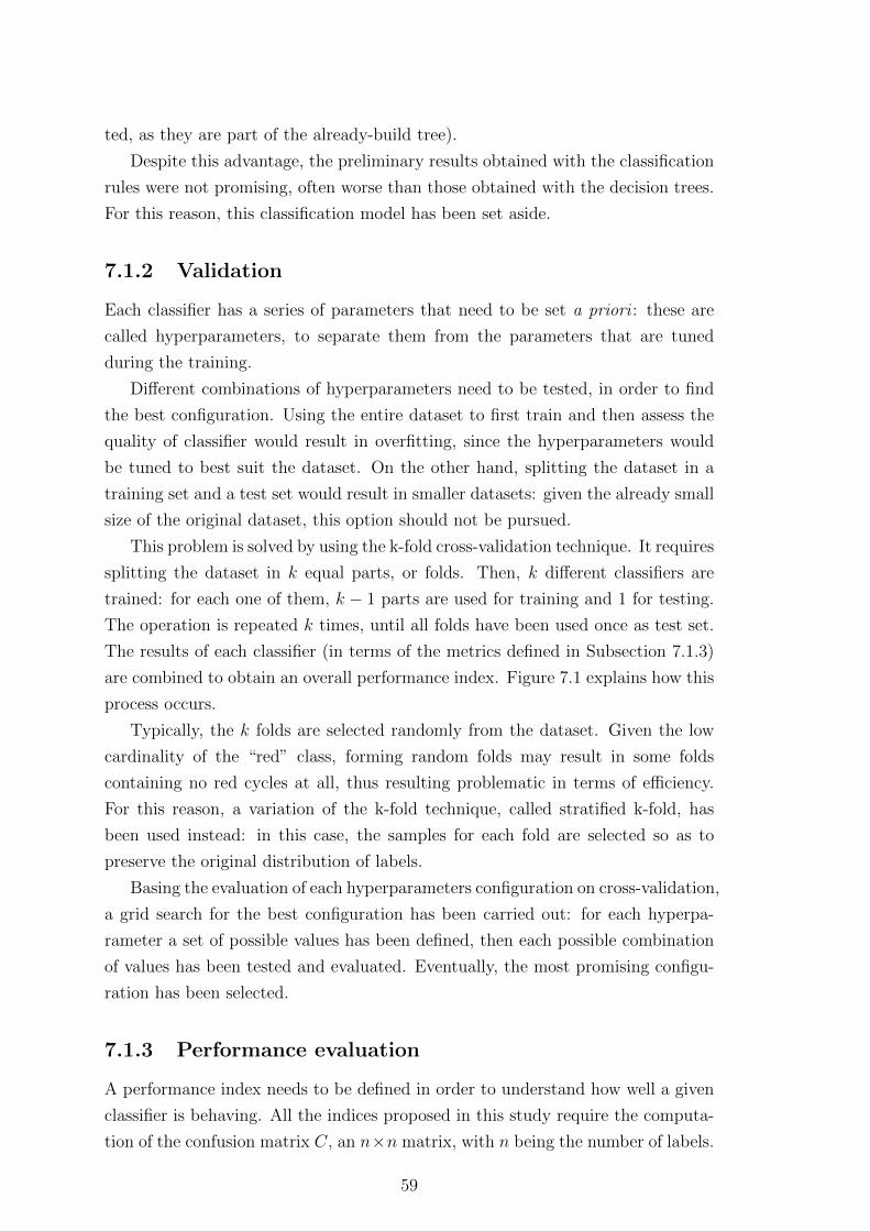
ted, as they are part of the already-build tree).
Despite this advantage, the preliminary results obtained with the classification
rules were not promising, often worse than those obtained with the decision trees.
For this reason, this classification model has been set aside.
7.1.2 Validation
Each classifier has a series of parameters that need to be set a priori : these are
called hyperparameters, to separate them from the parameters that are tuned
during the training.
Different combinations of hyperparameters need to be tested, in order to find
the best configuration. Using the entire dataset to first train and then assess the
quality of classifier would result in overfitting, since the hyperparameters would
be tuned to best suit the dataset. On the other hand, splitting the dataset in a
training set and a test set would result in smaller datasets: given the already small
size of the original dataset, this option should not be pursued.
This problem is solved by using the k-fold cross-validation technique. It requires
splitting the dataset in k equal parts, or folds. Then, k different classifiers are
trained: for each one of them, k − 1 parts are used for training and 1 for testing.
The operation is repeated k times, until all folds have been used once as test set.
The results of each classifier (in terms of the metrics defined in Subsection 7.1.3)
are combined to obtain an overall performance index. Figure 7.1 explains how this
process occurs.
Typically, the k folds are selected randomly from the dataset. Given the low
cardinality of the “red” class, forming random folds may result in some folds
containing no red cycles at all, thus resulting problematic in terms of efficiency.
For this reason, a variation of the k-fold technique, called stratified k-fold, has
been used instead: in this case, the samples for each fold are selected so as to
preserve the original distribution of labels.
Basing the evaluation of each hyperparameters configuration on cross-validation,
a grid search for the best configuration has been carried out: for each hyperpa-
rameter a set of possible values has been defined, then each possible combination
of values has been tested and evaluated. Eventually, the most promising configu-
ration has been selected.
7.1.3 Performance evaluation
A performance index needs to be defined in order to understand how well a given
classifier is behaving. All the indices proposed in this study require the computa-
tion of the confusion matrix C, an n×n matrix, with n being the number of labels.
59

The cell at the ith row and jth column Cij contains the number of elements that
belong to the ith class and have been assigned, by the classifier, to the jth one.
As such, the elements on the main diagonal are those that have been correctly
assigned, the others are not.
Original dataset, k = 5 folds
Trai
nin
g se
tTe
st s
et
Classifier 1 Classifier 2 Classifier 3 Classifier 4 Classifier 5
Performance 1 Performance 2 Performance 3 Performance 4 Performance 5
Overall performance
Figure 7.1: Explanation of the k-fold validation procedure
The first metric used is the accuracy: this is defined as the fraction of elements
that have been assigned correctly to their class. Equation 7.1 defines the accuracy
in terms of confusion matrix values.
accuracy =
n∑i=1
Cii
n∑i=1
n∑j=1
Cij
(7.1)
While accuracy is a useful metric in some cases, it presents a significant flaw
that makes it unreliable in particular scenarios such as the one at hand. When the
classes are unbalanced (i.e. there are minorities and majorities), a classifier that
predicts all elements as belonging to the majority classes will get large accuracy
scores, given the small impact that the minority classes have on this metric.
Unfortunately, the minority classes are most often the ones that are of most
interest, as it happens with the clogging problem: the ultimate goal of the project
is that of detecting the presence of soot. Consequently, the classifier needs to be
good at recognizing minority elements.
For this reason, other metrics, called precision and recall, have been introduced.
These metrics are defined for a class k according to Equations 7.2 and 7.3. For
a given class, the precision represents the fraction of correctly assigned samples
60

among all the samples assigned to that class, while recall represents the fraction
of correctly assigned samples among all the samples that are known to belong to
that class. Precision and recall, for this classification problem, have been defined
for all classes, but the focus was on the red one, being this the one considered as
the most interesting.
precision =Ckkn∑
i=1
Cik
(7.2)
recall =Ckkn∑
i=1
Cki
(7.3)
These two metrics are in “conflict” between one another: maximizing the pre-
cision implies only classifying those elements that are certainly part of the red
class, thus missing out on the “dubious” ones, resulting in a low recall, and vice
versa. Because of this, the harmonic mean of the two metrics, called the F1 score,
has been taken instead. Equation 7.4 defines the F1 score in terms of precision
and recall.
F1 score = 2 · precision · recallprecision + recall
(7.4)
The F1 score for the red class has been used as the main criteria for evaluating
the classifiers in order to assess how balanced they are. From the collaboration
with the manufacturer, though, it was pointed out that, since having the oxygen
sensor checked is a hassle for the car owner, precision should be preferred over
recall: in this way, the number of false positives is reduced to a minimum. Section
8.7 will consider this alternative option.
7.1.4 Results
The results are proposed in terms of accuracy, precision, recall and F1 score for
the green, yellow and red classes. Although all these metrics are reported in the
presented tables, the ones of most interest are those concerning the red class: as
explained, this is the minority – yet most interesting – class.
Table 7.1a contains the results for the decision tree classifier, Table 7.1b the
ones for the neural network and Table 7.1c the ones for the SVM.
The overall scores are satisfactory, significant of the fact that the classifiers can
actually handle the red class well, despite the low cardinality. The decision tree, as
expected, performed slightly worse than the alternatives. This underperformance
is compensated by the interpretability of the model. Indeed, the tree is the only
61

Green Yellow RedPrecision 0.8365 0.7529 0.8475
Recall 0.8110 0.7853 0.8197F1 score 0.8235 0.7688 0.8333Accuracy 0.8015
(a) Decision tree results
Green Yellow RedPrecision 0.8869 0.8679 0.9016
Recall 0.9085 0.8466 0.9016F1 score 0.8976 0.8571 0.9016Accuracy 0.8814
(b) Neural network results
Green Yellow RedPrecision 0.9026 0.8303 0.8261
Recall 0.8476 0.8405 0.9344F1 score 0.8742 0.8354 0.8769Accuracy 0.8582
(c) SVM results
Table 7.1: Results for the classification problem
model for which the internal representation can be meaningful: Figure 7.2 shows
the decision tree build using the available cycles.
An already mentioned different way of visualizing the performance for each of
the classes is that of the confusion matrices. These matrices are reported in Figure
7.3 for each of the three classifiers. The main diagonals of the matrices contain
the large bulk of cycles: this means that most green, yellow and red cycles have
been classified correctly by the three models, in accordance with the large values
of precision, recall and F1 score obtained.
On top of the already presented tables, the results have been processed so as
to provide a visual representation of which cycles are predicted wrong by each
classifier. These prediction bars are presented in Figure 7.4. For any of the bars,
each vertical line represents the label for a single cycle. The topmost bar shows
the correct labels (referred to as truth), as defined by Figure 5.8c. The lines of the
following bars, one for each classifier, are gray when the prediction made is correct,
and either green, yellow or red depending on the erroneous prediction made.
Additional considerations regarding the results achieved, and how they com-
pare to those obtained during additional experiments, will be made in Chapter
12.
62

der
iv v
aria
ble
_per
cent_
oxygen
_A
10%
<=
-0.8
763
gin
i =
0.6
201
sam
ple
s =
388
val
ue
= [
164, 163, 61]
der
iv v
aria
ble
_te
mper
ature
_m
anif
old
10%
<=
-0.9
929
gin
i =
0.2
558
sam
ple
s =
174
val
ue
= [
148, 25, 1]
Tru
e
der
iv v
aria
ble
_per
cent_
oxygen
_A
90%
<=
0.7
222
gin
i =
0.5
sam
ple
s =
214
val
ue
= [
16, 138, 60]
Fal
se
der
iv v
aria
ble
_val
ve_
posi
tion_A
90%
<=
3.2
533
gin
i =
0.1
056
sam
ple
s =
143
val
ue
= [
135, 8, 0]
der
iv v
aria
ble
_per
cent_
oxygen
_A
60%
<=
0.0
979
gin
i =
0.5
224
sam
ple
s =
31
val
ue
= [
13, 17, 1]
gin
i =
0.3
75
sam
ple
s =
4v
alu
e =
[1
, 3
, 0
]
gin
i =
0.0
694
sam
ple
s =
139
val
ue
= [
134, 5, 0]
der
iv v
aria
ble
_quan
tity
_re
duct
ant
90%
<=
4.8
717
gin
i =
0.1
975
sam
ple
s =
9v
alu
e =
[8
, 1
, 0
]
der
iv v
aria
ble
_an
gle
_fu
el_A
D 5
0%
<=
0.0
025
gin
i =
0.4
174
sam
ple
s =
22
val
ue
= [
5,
16
, 1
]
gin
i =
0.0
sam
ple
s =
8v
alu
e =
[8
, 0
, 0
]
gin
i =
0.0
sam
ple
s =
1v
alu
e =
[0
, 1
, 0
]
var
iable
_N
OxC
atal
ist_
Sto
rage
20%
<=
0.4
521
gin
i =
0.2
145
sam
ple
s =
17
val
ue
= [
1,
15
, 1
]
der
iv v
aria
ble
_quan
tity
_fu
el_A
30%
<=
-0.0
121
gin
i =
0.3
2sa
mple
s =
5v
alu
e =
[4
, 1
, 0
]
gin
i =
0.5
sam
ple
s =
2v
alu
e =
[1
, 0
, 1
]
gin
i =
0.0
sam
ple
s =
15
val
ue
= [
0,
15
, 0
]
gin
i =
0.0
sam
ple
s =
1v
alu
e =
[0
, 1
, 0
]
gin
i =
0.0
sam
ple
s =
4v
alu
e =
[4
, 0
, 0
]
der
iv v
aria
ble
_per
cent_
oxygen
_A
10%
<=
-0.7
847
gin
i =
0.1
62
sam
ple
s =
45
val
ue
= [
0,
4,
41
]
der
iv v
aria
ble
_per
cent_
oxygen
_A
50%
<=
0.0
476
gin
i =
0.3
497
sam
ple
s =
169
val
ue
= [
16, 134, 19]
der
iv v
aria
ble
_te
mper
ature
_m
anif
old
60%
<=
0.0
629
gin
i =
0.4
898
sam
ple
s =
7v
alu
e =
[0
, 4
, 3
]
gin
i =
0.0
sam
ple
s =
38
val
ue
= [
0,
0,
38
]
gin
i =
0.0
sam
ple
s =
4v
alu
e =
[0
, 4
, 0
]
gin
i =
0.0
sam
ple
s =
3v
alu
e =
[0
, 0
, 3
]
var
iable
_co
nce
ntr
atio
n_N
Ox_B
90%
<=
2.1
895
gin
i =
0.2
337
sam
ple
s =
144
val
ue
= [
16, 125, 3]
der
iv v
aria
ble
_N
OxC
atal
ist_
Sto
rage
20%
<=
-0.0
008
gin
i =
0.4
608
sam
ple
s =
25
val
ue
= [
0,
9,
16
]
gin
i =
0.0
sam
ple
s =
4v
alu
e =
[4
, 0
, 0
]
var
iable
_te
mper
ature
_ex
h_gas
_1 1
0%
<=
169.0
887
gin
i =
0.1
95
sam
ple
s =
140
val
ue
= [
12, 125, 3]
gin
i =
0.0
sam
ple
s =
3v
alu
e =
[3
, 0
, 0
]
gin
i =
0.1
627
sam
ple
s =
137
val
ue
= [
9, 125, 3]
var
iable
_te
mper
ature
_ex
h_gas
_1 7
0%
<=
226.2
584
gin
i =
0.1
975
sam
ple
s =
18
val
ue
= [
0,
2,
16
]
gin
i =
0.0
sam
ple
s =
7v
alu
e =
[0
, 7
, 0
]
gin
i =
0.0
sam
ple
s =
2v
alu
e =
[0
, 2
, 0
]
gin
i =
0.0
sam
ple
s =
16
val
ue
= [
0,
0,
16
]
Fig
ure
7.2:
Dec
isio
ntr
eebuilt
usi
ng
the
avai
lable
dat
aset
63

Green Yellow Red
Green 133 31 0
Yellow 26 128 9
Red 0 11 50
Predicted
Actual
(a) Decision tree
Green Yellow Red
Green 149 15 0
Yellow 19 138 6
Red 0 6 55
Predicted
Actual
(b) Neural network
Green Yellow Red
Green 139 24 1
Yellow 15 137 11
Red 0 4 57
Predicted
Actual
(c) SVM
Figure 7.3: Confusion matrices for the three classifiers
SVM
NNTree
Truth
Figure 7.4: Prediction bars for the three available classifiers. The topmost barrepresents the correct values, the following bars are gray if the prediction made wascorrect, or green/yellow/red depending on the (erroneous) prediction the classifiermade
64

Chapter 8
Process explorations
The process presented in Chapters 5 through 7 is the polished result of a more
complex exploration of the data available and the possible experiments that can
be derived from it. Many of these explorations have yielded interesting results:
this chapter is a collection of these, along with the motivations for each one and
results achieved.
8.1 Feature selection process
Multiple options have been explored for the feature selection process, both in terms
of algorithm used and data processed with it. The result proposed in Subsection
6.1.1 is the one considered to be the most suitable for the process. Some alternative
options will be proposed in this section.
8.1.1 Category-ful feature selection
The variables available belong to a number of different categories, depending on
their role in the functioning of the engine. While these categories have been con-
sidered as opaque, since the domain knowledge available was limited, the variables
belonging to each category are expected to be correlated, given the commonalities
shared.
As a consequence, an alternative to the feature selection process proposed is
the one where, instead of applying it to the entirety of the variables available, the
algorithm is applied separately to each set of features belonging to each category.
The expected result is that a larger number of features is kept as significant, since
inter-classes correlations (expected to exist) are not considered by the selection
algorithm, thus introducing some redundancy in the filtered features.
This algorithm was discarded because it does not guarantee the independency
(below a set threshold) of the selected features. It has been implemented, and will
65

be proposed in this section, because it highlights the existing correlations between
signals belonging to the same categories, thus providing useful insights on which
sensors are actually needed and which are not. This is useful because, as it happens
for the original feature selection, it provides insights about which features should
be recorded when additional costs occur for each additional recorded variable (as
is the case when deploying this solution on a larger scale).
The features selected using this revised version of the algorithm are available
in Table 8.1. The overall number of features is at least the same as the number of
categories.
Category Variablepress sensors variable press sens
oxygen sensors variable percent oxygen Atemp sensors man variable temperature manifold
acc variable acc posmanifold sens variable engair flowflowFilt
eng s variable eng speed
exh temp sensorsvariable temperature exh gas 2variable temperature exh gas 3
eng temp variable temp engineDTC variable DTC AEGR variable valve position ANOX variable concentration NOx B
Fuel Inj
variable fuel quan 1variable quantity fuel Cvariable quantity fuel Bvariable angle fuel AD
variable quantity fuel AFuel rail variable pressure rail
air variable pres boost
Catalvariable NOxCatalist Storagevariable quantity reductant
Table 8.1: Features selected using a category-ful feature selection, by category
8.1.2 Feature selection in ProgramB
The entire feature selections done so far has only been applied to the ProgramA
cycles available, with no consideration for ProgramB. This makes sense from a
process-centric perspective, since the features that need to be processed by the
classifiers are those of the ProgramA cycles.
Despite that, the feature selection algorithm can provide useful information
about the features available in ProgramB: on the one hand, it provides the same
kind of insights it did for ProgramA; on the other, if the features selected are
66

consistent with the ones selected by ProgramA, it gives validation for the features
selected during the process.
Since the number of features in ProgramB is significantly larger than that of
ProgramA (440 versus 50) and since the ProgramA features are a subset of the
ProgramB ones, a larger number of features is intuitively expected to be extracted
from the ProgramB selection with respect to that in ProgramA. These selected
features may not be the same as those of ProgramA, since the larger number of
features also provides a larger selection pool but, despite that, the features selected
by ProgramA should all be represented by those selected in ProgramB.
Table 8.2 shows the list of features extracted in ProgramB, using the feature
selection algorithm and the parameters described in Subsection 6.1.1.
Variablevariable Torque
variable NOxCatalist Storagevariable AirFlow
variable time fuel Avariable percent oxygen B
variable Temp coolantvariable battery
variable air intakevariable angle fuel CD
variable DTC Bvariable temperature manifold
variable Vflow DPFvariable temp Induct
variable concentration NOx Avariable concentration NOx B
variable percent oxygen Cvariable valve position B
variable press oilvariable press amb
variable time fuel corr3variable Mflow DPF
variable DTC Avariable percent oxygen D
variable temperature exh gas 2variable afr A
variable quantity reductantvariable ResFlowvariable model
variable valve position C
Table 8.2: Features selected from ProgramB
Since the ProgramA variables are a subset of those in ProgramB, as mentioned,
67

it is expected that all the variables selected in ProgramA are well represented by
those selected in ProgramB. This, though, is not the case. Table 8.3 shows the
matching between the variables from the two datasets. Some of the variables,
such as variable concentration NOx B, are selected for both cases as most repre-
sentative. In other cases, such as with variable pressure rail, a different variable is
selected in ProgramB (variable air intake), but the correlation between the two is
still strong: since ProgramB has a larger number of variables available, it makes
sense that different variables are selected. In still other cases (the ones highlighted
in italic), the variables did not even make it through the “correlation matrix gener-
ation” phase: this is because these variables were not present in all the ProgramB
cycles and have thus been discarded. Since, in these cases, the aggregate correla-
tion coefficients were not available, a different approach has been used to figure out
whether the variables were represented by others among the selected ones: a single
ProgramB cycle has been selected and the correlation matrix has been computed
between the variables of this cycle. Then, the correlation between the ProgramA
variable and any of the ones selected in ProgramB is checked. Since this approach
only considers single cycles, the results are not as global in nature as the previous
one: the result is that, with the threshold of 0.8 for the minimum correlation, none
of the three “not found” variables is covered but, by the decreasing this threshold
to 0.75, there is a match for all of them. In two of the cases, multiple variables are
found to be representative: this can only happen because the feature selection on
ProgramB was carried out with a larger minimum threshold (0.8).
8.2 Response time measurement
The initial definition of response time provided was that of the time needed to
reach the final 21% oxygen level after the cut-off. This definition is ambiguous
since, in many of the available cycles, the 21% level is reached asymptotically,
yielding meaningless measurements. On top of this, the high frequency noise on
the signals make it hard to detect the exact start of the cut-off.
Because of these reasons, an independent approach to the measurement of
the response time has been introduced, as a form of validation of the method
proposed by the company’s domain experts (reported in Subsection 5.1). This
made it possible to verify whether the techniques used yield similar results and,
if not, further investigations could be made to figure out what was causing the
problem, and which approached behaved the best.
The oxygen level behavior when the cut-off occurs has already been presented
in Figure 5.1b. The behavior is approximately that of a ramp. The proposed
approach to measuring the response time is that of approximating this ramp with
68

Pro
gra
mA
vari
able
Pro
gra
mB
vari
able
(s)
vari
able
conce
ntr
atio
nN
Ox
Bva
riab
leco
nce
ntr
atio
nN
Ox
Bva
riab
lepre
ssure
rail
vari
able
air
inta
keva
riab
lequan
tity
fuel
Ava
riab
leT
orque
vari
able
quan
tity
fuel
Cva
riab
leT
orqu
eva
riab
lete
mp
engi
ne
vari
able
Tem
pco
olan
tva
riab
lequan
tity
reduct
ant
vari
able
quan
tity
reduct
ant
vari
able
per
cent
oxyge
nA
vari
able
Tor
que
vari
able
tem
per
ature
man
ifol
dva
riab
lete
mp
erat
ure
man
ifol
d
vari
able
quan
tity
fuel
Bva
riab
lepr
ess
oil
vari
able
quan
tity
redu
ctan
t
vari
able
valv
epo
siti
onA
vari
able
con
cen
trat
ion
NO
xA
vari
able
con
cen
trat
ion
NO
xB
vari
able
tem
per
ature
exh
gas
1va
riab
leai
rin
take
vari
able
tem
per
ature
exh
gas
3va
riab
leV
flow
DP
Fva
riab
lean
gle
fuel
AD
vari
able
angl
efu
elC
Dva
riab
leN
OxC
atal
ist
Sto
rage
vari
able
NO
xC
atal
ist
Sto
rage
Tab
le8.
3:M
atch
ing
offe
ature
sse
lect
edin
Pro
gram
Aw
ith
thos
ese
lect
edin
Pro
gram
B
69

four segments and measuring the response time on the approximated signal. Two
of the segments used are constants, approximating the initial and final oxygen
level. The other two segments are used to approximate the rising of the ramp.
248 249 250 251 252 253 254 255 256Time (s)
10
12
14
16
18
20
varia
ble_
perc
ent_
oxyg
en (
%)
Figure 8.1: Original ramp approximated with 4 segments (represented using dif-ferent colors)
Figure 8.1 shows the original ramp (in blue) and the four segments using dif-
ferent colors. The identification of these four segments is done following these
steps:
1. The bounds where the ramp is contained are identified, as already explained
in Subsection 5.1: the ramps for all cycles are required to be in this 245÷260
seconds time slot
2. The initial and final constant values are computed as the average the initial
and final N samples (with N selected so as not to be too large and include
parts of the ramp, nor too small and only represent a local subset of samples)
3. Given the initial and final constant values, a step signal is built, and it is
made slide over the ramp signal. The similarity (measured as the Sum of
Squared Errors) between the two signals is computed for each shift. The
shift that yields the smallest SSE is selected (Figure 8.2a)
4. The point where the constant value of the step changes is selected as the
center of the ramp: this will be referred to as the ith value for the signal
70

5. The definition of the second (green) segment occurs by iteratively building
a line that connects the ith point to the (i− j)th one, with j starting from 1
and increasing until the red (first) segment exists no more. For each different
segment, the SSE is computed
6. The first and second segments selected are those that result as having the
lowest SSE (Figure 8.2b)
7. Steps 5 and 6 are repeated for the definition of the third and fourth segments,
connecting the ith point to the (i + j)th one (Figure 8.2c)
248 249 250 251 252 253 254 255 256Time (s)
10
12
14
16
18
20
varia
ble_
perc
ent_
oxyg
en (
%)
(a) Centering the step function
248 249 250 251 252 253 254 255 256Time (s)
10
12
14
16
18
20
varia
ble_
perc
ent_
oxyg
en (
%)
(b) Second segment
248 249 250 251 252 253 254 255 256Time (s)
10
12
14
16
18
20
varia
ble_
perc
ent_
oxyg
en (
%)
(c) Third segment
Figure 8.2: Identification of the four segments
Applying this process to all the cycles available then returns a new response
time as measured on the approximated signal. This response time, when com-
pared to the original one measured in Subsection 5.1, is expected to be higher:
this method measures the entire rise, while the other one stops when 63% of the
transition is reached. Figure 8.3 compares the response times measured using the
two different approaches. Intuitively, the results are consistent and, by measuring
the correlation between the two series of numbers, the resulting coefficient is 0.82:
this implies a strong correlation between the two methods.
Only one method is required during the process, and since the company ex-
pressed its preference in using the “63%” one, the method described in this sub-
section has been set aside and only used as a validation of the results obtained.
The additional advantage of the original method over this segment-based one is in
the reduced entity of the noise introduced: since the original process only focuses
on the initial part of the rise (more uniform throughout the cycles), the resulting
response times are less subject to uncertain measurements.
8.3 Exclusion of the smoothing process
The smoothing process described in Subsection 5.2.3 transforms the response times
measured so as to render them more consistent between adjacent cycles. This
71
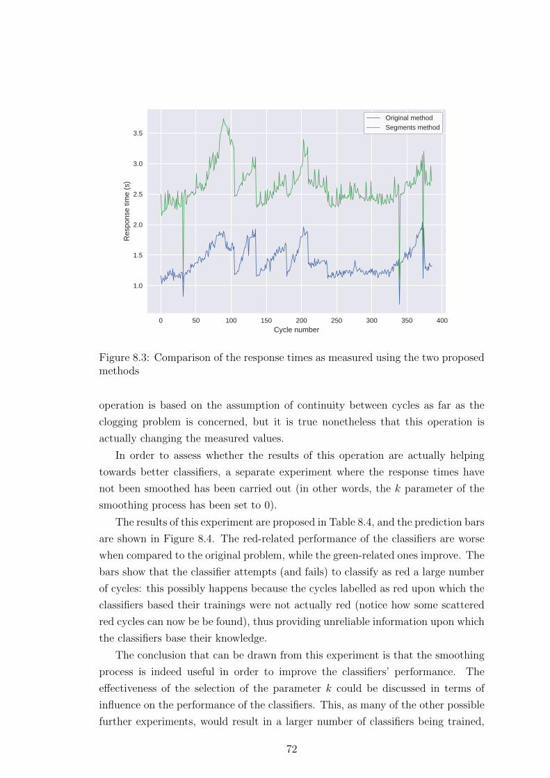
0 50 100 150 200 250 300 350 400Cycle number
1.0
1.5
2.0
2.5
3.0
3.5R
espo
nse
time
(s)
Original methodSegments method
Figure 8.3: Comparison of the response times as measured using the two proposedmethods
operation is based on the assumption of continuity between cycles as far as the
clogging problem is concerned, but it is true nonetheless that this operation is
actually changing the measured values.
In order to assess whether the results of this operation are actually helping
towards better classifiers, a separate experiment where the response times have
not been smoothed has been carried out (in other words, the k parameter of the
smoothing process has been set to 0).
The results of this experiment are proposed in Table 8.4, and the prediction bars
are shown in Figure 8.4. The red-related performance of the classifiers are worse
when compared to the original problem, while the green-related ones improve. The
bars show that the classifier attempts (and fails) to classify as red a large number
of cycles: this possibly happens because the cycles labelled as red upon which the
classifiers based their trainings were not actually red (notice how some scattered
red cycles can now be be found), thus providing unreliable information upon which
the classifiers base their knowledge.
The conclusion that can be drawn from this experiment is that the smoothing
process is indeed useful in order to improve the classifiers’ performance. The
effectiveness of the selection of the parameter k could be discussed in terms of
influence on the performance of the classifiers. This, as many of the other possible
further experiments, would result in a larger number of classifiers being trained,
72

Green Yellow RedPrecision 0.8855 0.7744 0.7586
Recall 0.8750 0.7987 0.7213F1 score 0.8802 0.7864 0.7395Accuracy 0.8196
(a) Decision tree results
Green Yellow RedPrecision 0.9226 0.8354 0.7581
Recall 0.9226 0.8302 0.7705F1 score 0.9226 0.8328 0.7642Accuracy 0.8608
(b) Neural network results
Green Yellow RedPrecision 0.9250 0.8239 0.7681
Recall 0.8810 0.8239 0.8689F1 score 0.9024 0.8239 0.8154Accuracy 0.8557
(c) SVM results
Table 8.4: Performance results for the classifiers trained with the dataset labelledwithout applying the smoothing process
SVM
NNTree
Truth
Figure 8.4: Prediction bars for the classifier using labels assigned without thesmoothing process
73

with significant time being consumed for the purpose. Because of this, many of
the possible further explorations will not be pursued unless deemed of particular
relevance (many additional experiments that did not yield useful results have not
been reported).
8.4 Downsampling of the signals
The ProgramA cycles available have been sampled with a frequency of 1 Hz: while
this is an acceptable value for a local (and possibly test bench) measurement, it
gets unfeasible when this information needs to be sent on the cloud for remote
processing: this is the idea behind the scaling up and, in order to even consider
having the ECU send the data to a server, the sampling frequency needs to be
lowered.
This downsampling is expected to degrade the quality of the signals acquired
and, as a natural consequence, this should degrade the performance of the classifier.
Starting from this assumption, the F1 score for each classifier has been computed
as the sampling frequency decreases. The result is shown in Figure 8.5, and it is
evident that the results are not compatible with the expected degradation.
0 5 10 15 20 25 30Sampling period (s)
0.0
0.2
0.4
0.6
0.8
1.0
F1
scor
e
SVMNeural networkDecision tree
Figure 8.5: F1 score for the classifiers evolution as the sampling frequency decreases
This may be counterintuitive, but the decision of transforming the input space
from a time-based one to one of summary statistics rendered the classifiers robust
74

to this process of downsampling. The reason for this robustness is easily explained:
when the distribution of values is taken into account, the time component is no
longer relevant and neither is the total number of samples used. If sampling the
signal results in a downsampled signal with approximately the same distribution
of values as the original one, the overall distribution that is being considered when
extracting the summary statistics does not change significantly, and nor do the
summary statistics.
The assumption that the distributions of variables do not significantly change
when downsampling should be tested. In order to do this, the original distribution
of values has been compared with the distribution of values for the downsampled
signals. This comparison has been carried out using the Jensen-Shannon diver-
gence, a symmetric statistical measure based on the Kullback-Leibler divergence.
The Jensen-Shanno divergence, defined for two discrete distributions of probabili-
ties p and q by Equation 8.1, is 0 for identical distributions and saturates to ln 2
for completely different ones.
JSdiv(p, q) =1
2
∑i
[pi ln
(2 pi
pi + qi
)+ qi ln
(2 qi
pi + qi
)](8.1)
For each of the 14 selected variables, Figure 8.6a shows how the Jensen-Shannon
divergence evolves as the sampling period increases. Given the boundaries of
this coefficient, the distributions do not diverge significantly from the original
one. This comparison can be extended all the way to significantly larger sampling
periods (e.g. 1000 seconds, with the resulting signals being comprised of three or
so samples). Figure 8.6b shows precisely this (the curve has been smoothed using
a LOWESS – locally weighted scatterplot smoothing – regression [17], in order to
reduce the entity of the oscillations). In this case, as expected, the degradation
is much more noticeable. This graph allows, after defining the maximum allowed
degradation of the distributions, to decide a suitable sampling frequency.
8.5 Exclusion of strong predictors
So far, all variables available have been used as inputs for the classifiers. This,
as shown in some experiments (see Subsection 9.1) introduces variables that are
strong predictors, i.e. variables that easily separate the classes. While this is an
excellent way of building reliable classifiers, the three problems listed below arise.
The first one is that, since one of the goals of this project is that of under-
standing the reasoning behind the classifications made (i.e. figuring out which are
the variables that are mostly connected to the problem), having a strong predictor
may conceal other weaker – yet important variables.
75

0 5 10 15 20 25 30Period (s)
0.0
0.1
0.2
0.3
0.4
0.5
0.6
0.7
Jens
enS
hann
on d
iver
genc
e
(a) Sampling period range: 1÷ 31 seconds
0 200 400 600 800 1000Period (s)
0.0
0.1
0.2
0.3
0.4
0.5
0.6
0.7
Jens
enS
hann
on d
iver
genc
e
(b) Sampling period range: 1÷ 1001 seconds
Figure 8.6: Jensen-Shannon divergence between the original and the downsampleddistributions
76
The second problem is that building a classifier that bases its decisions upon
a low number of variables (as shown, even just one) may be problematic if the
given variable is not available for some reason (also known as the “single point of
failure” problem).
The third problem, which concerns the introduction of the derivatives as part
of the inputs to the classifier is that, when deployed on a larger scale on actual
vehicles, the sampling frequency will be significantly lower (problem described in
Subsection 8.4) and, as such, the computation of the discrete derivatives cannot
be done1 with the data available. Since programming ECUs to perform custom
tasks (such as the computation of the derivative of the signal locally) is not a
guaranteed option, the assumption that derivatives will be available may not hold
in the future.
Because of the above, the original three-classes experiment has been carried out
excluding first all the derivatives, and then the oxygen variable from the features
used as input. These operations are expected to degrade the classifiers in terms of
performance; the entity of these degradations will be presented next.
8.5.1 Derivatives
The exclusion of the derivatives from the pool of features available halves the total
number of features used to train the classifier. This, on the one hand, reduces the
entity of the original “large number of variables” problem but, as shown, derivatives
heavily help during the classification process. The latter factor is significantly more
influent on the overall results, as is shown by the degradation in performance of
the classifiers trained without the derivatives in Table 8.5.
While lower than the original scores, the performance of the classifiers can still
be considered acceptable overall, meaning that even the case where the derivatives
cannot be computed could be handled satisfactorily.
8.5.2 Oxygen variable
The scenario where the oxygen variable is removed from the inputs is possibly
the worst one, since the strongest of predictors is being taken away and the input
dimensionality does not decrease significantly (from 208 down to 206 – since the
oxygen and its derivative are no longer available). The results are those of Table 8.6
and, as expected, the values are significantly lower than the previously proposed
cases. This is representative of the lack of existence of other strong predictors:
weaker ones may still exist (given the better-than-random performance achieved),
1While it could, the results would yield no significance given the high frequency of most allsignals
77

Green Yellow RedPrecision 0.8537 0.7562 0.6563
Recall 0.8537 0.7423 0.6885F1 score 0.8537 0.7492 0.672Accuracy 0.7809
(a) Decision tree results
Green Yellow RedPrecision 0.8647 0.8239 0.8305
Recall 0.8963 0.8037 0.8033F1 score 0.8802 0.8137 0.8167Accuracy 0.8428
(b) Neural network results
Green Yellow RedPrecision 0.8302 0.648 0.697
Recall 0.8049 0.7791 0.377F1 score 0.8173 0.7075 0.4894Accuracy 0.7268
(c) SVM results
Table 8.5: Results for the classifier trained without the derivatives as inputs
but a combination of them needs to be considered. The decision tree generated,
shown in Figure 8.7, shows the predictors identified other than the oxygen level.
Green Yellow RedPrecision 0.7949 0.6089 0.4906
Recall 0.7561 0.6687 0.4262F1 score 0.775 0.6374 0.4561Accuracy 0.6675
(a) Decision tree results
Green Yellow RedPrecision 0.8485 0.7673 0.6563
Recall 0.8537 0.7485 0.6885F1 score 0.8511 0.7578 0.672Accuracy 0.7835
(b) Neural network results
Green Yellow RedPrecision 0.898 0.6699 0.6875
Recall 0.8049 0.8589 0.3607F1 score 0.8489 0.7527 0.4731Accuracy 0.7577
(c) SVM results
Table 8.6: Results for the classifier trained without the oxygen variable as input
78

der
iv v
aria
ble
_te
mper
ature
_m
anif
old
90%
<=
0.8
769
gin
i =
0.6
201
sam
ple
s =
38
8val
ue
= [
164, 163, 61]
der
iv v
aria
ble
_val
ve_
posi
tion_A
30%
<=
-0.6
843
gin
i =
0.5
682
sam
ple
s =
22
5val
ue
= [
39, 132, 54]
Tru
e
der
iv v
aria
ble
_N
OxC
atal
ist_
Sto
rage
60%
<=
0.0
002
gin
i =
0.3
739
sam
ple
s =
16
3val
ue
= [
125, 31, 7]
Fal
se
var
iable
_co
nce
ntr
atio
n_N
Ox_B
30%
<=
181.3
361
gin
i =
0.5
339
sam
ple
s =
35
val
ue
= [
21, 11, 3]
der
iv v
aria
ble
_N
OxC
atal
ist_
Sto
rage
40%
<=
-0.0
006
gin
i =
0.5
134
sam
ple
s =
19
0val
ue
= [
18, 121, 51]
der
iv v
aria
ble
_pre
ssure
_ra
il 2
0%
<=
-1.8
379
gin
i =
0.3
55
sam
ple
s =
26
val
ue
= [
20
, 6
, 0
]
var
iable
_quan
tity
_fu
el_A
70%
<=
1.4
775
gin
i =
0.5
679
sam
ple
s =
9v
alu
e =
[1
, 5
, 3
]
gin
i =
0.0
sam
ple
s =
2v
alu
e =
[0
, 2
, 0
]
der
iv v
aria
ble
_te
mp_en
gin
e m
ean <
= -
0.0
019
gin
i =
0.2
778
sam
ple
s =
24
val
ue
= [
20
, 4
, 0
]
gin
i =
0.0
sam
ple
s =
2v
alu
e =
[0
, 2
, 0
]
gin
i =
0.1
653
sam
ple
s =
22
val
ue
= [
20
, 2
, 0
]
gin
i =
0.0
sam
ple
s =
5v
alu
e =
[0
, 5
, 0
]
gin
i =
0.3
75
sam
ple
s =
4v
alu
e =
[1
, 0
, 3
]
var
iable
_te
mp_en
gin
e 20%
<=
88.9
483
gin
i =
0.3
922
sam
ple
s =
11
3val
ue
= [
14, 86, 13]
var
iable
_val
ve_
posi
tion_A
40%
<=
30.7
299
gin
i =
0.5
471
sam
ple
s =
77
val
ue
= [
4, 35, 38]
der
iv v
aria
ble
_te
mper
ature
_ex
h_gas
_1 6
0%
<=
0.0
231
gin
i =
0.3
445
sam
ple
s =
10
8val
ue
= [
9, 86, 13]
gin
i =
0.0
sam
ple
s =
5v
alu
e =
[5
, 0
, 0
]
gin
i =
0.2
176
sam
ple
s =
92
val
ue
= [
6,
81
, 5
]
gin
i =
0.6
172
sam
ple
s =
16
val
ue
= [
3,
5,
8]
der
iv v
aria
ble
_te
mper
ature
_ex
h_gas
_1 7
0%
<=
0.4
744
gin
i =
0.4
519
sam
ple
s =
52
val
ue
= [
1, 16, 35]
var
iable
_te
mper
ature
_m
anif
old
20%
<=
51.1
255
gin
i =
0.3
936
sam
ple
s =
25
val
ue
= [
3,
19
, 3
]
gin
i =
0.1
975
sam
ple
s =
9v
alu
e =
[0
, 8
, 1
]
gin
i =
0.3
396
sam
ple
s =
43
val
ue
= [
1,
8,
34
]
gin
i =
0.6
122
sam
ple
s =
7v
alu
e =
[3
, 1
, 3
]
gin
i =
0.0
sam
ple
s =
18
val
ue
= [
0,
18
, 0
]
der
iv v
aria
ble
_te
mper
ature
_ex
h_gas
_1 m
ean <
= -
0.0
61
gin
i =
0.2
832
sam
ple
s =
14
7val
ue
= [
123, 18, 6]
der
iv v
aria
ble
_te
mper
ature
_ex
h_gas
_1 9
0%
<=
2.2
134
gin
i =
0.3
203
sam
ple
s =
16
val
ue
= [
2,
13
, 1
]
der
iv v
aria
ble
_te
mper
ature
_ex
h_gas
_1 9
0%
<=
2.2
54
gin
i =
0.2
16
sam
ple
s =
13
8val
ue
= [
121, 17, 0]
der
iv v
aria
ble
_co
nce
ntr
atio
n_N
Ox_B
80%
<=
10.8
87
gin
i =
0.4
938
sam
ple
s =
9v
alu
e =
[2
, 1
, 6
]
gin
i =
0.0
612
sam
ple
s =
95
val
ue
= [
92
, 3
, 0
]
der
iv v
aria
ble
_co
nce
ntr
atio
n_N
Ox_B
30%
<=
-3.6
347
gin
i =
0.4
392
sam
ple
s =
43
val
ue
= [
29, 14, 0]
gin
i =
0.1
748
sam
ple
s =
31
val
ue
= [
28
, 3
, 0
]
gin
i =
0.1
528
sam
ple
s =
12
val
ue
= [
1,
11
, 0
]
der
iv v
aria
ble
_te
mp_en
gin
e 40%
<=
-0.0
023
gin
i =
0.2
449
sam
ple
s =
7v
alu
e =
[0
, 1
, 6
]
gin
i =
0.0
sam
ple
s =
2v
alu
e =
[2
, 0
, 0
]
gin
i =
0.0
sam
ple
s =
6v
alu
e =
[0
, 0
, 6
]
gin
i =
0.0
sam
ple
s =
1v
alu
e =
[0
, 1
, 0
]
gin
i =
0.4
444
sam
ple
s =
3v
alu
e =
[2
, 0
, 1
]
gin
i =
0.0
sam
ple
s =
13
val
ue
= [
0,
13
, 0
]
Fig
ure
8.7:
F1
scor
efo
rth
ecl
assi
fier
sev
oluti
onas
the
sam
pling
freq
uen
cydec
reas
es
79

8.6 Processing the Model2 dataset
The entirety of the experiments and considerations made so far have been using
the Model1 dataset because of the reasons explained in Subsection 3.1.4. The
Model2 dataset is intrinsically similar to the Model1 one and, as such, it poses as
the perfect candidate for the validation of the entire process.
Despite the similarities between the two datasets, the Model2 one has a lower
number of records and, when keeping the same thresholds defined for Model1,
the number of red cycles is only of 15. Changing the thresholds allows having a
slightly larger cardinality for the red class: thresholds at 1.1 and 1.35 seconds have
been set. This has significantly changed the proportions of the classes: Table 8.7
contains the number of cycles available for each of the three classes, as defined by
the new thresholds.
Class CardinalityGreen 31Yellow 79
Red 74
Table 8.7: Cardinalities for the three identified classes
Given the large number of red cycles available (compared to the green and yel-
low ones) the performance of the classifier are expected to be acceptable, despite
the lower number of overall cycles. The intermediate results (such as those pre-
sented while describing the process in the previous chapters) will not be reported
for the Model2 dataset in order to avoid redundancy. Instead, only the results
achieved are presented in Table 8.8.
As already mentioned for the previous experiments, the hyperparameters used
are those already defined for the original classifiers: as such, the reported metrics
could be slightly improved: despite that, given the low fcardinalities at play, the
results are already satisfactory.
There are two important takeaways from this experiment: the first is that
the defined process can be replicated on new data without any major change
(with further considerations on the replicability and its limitations pointed out
in Subsection 12.2.2). The second key point is that, as already stated multiple
times, the definition of the classes is crucial: when keeping the original thresholds
set for Model1, the cardinality of the red class was so low that it did not allow
the classifiers to learn anything useful about the clogging problem, with the low
performance that came with it.
80
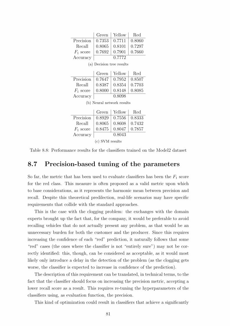
Green Yellow RedPrecision 0.7353 0.7711 0.8060
Recall 0.8065 0.8101 0.7297F1 score 0.7692 0.7901 0.7660Accuracy 0.7772
(a) Decision tree results
Green Yellow RedPrecision 0.7647 0.7952 0.8507
Recall 0.8387 0.8354 0.7703F1 score 0.8000 0.8148 0.8085Accuracy 0.8098
(b) Neural network results
Green Yellow RedPrecision 0.8929 0.7556 0.8333
Recall 0.8065 0.8608 0.7432F1 score 0.8475 0.8047 0.7857Accuracy 0.8043
(c) SVM results
Table 8.8: Performance results for the classifiers trained on the Model2 dataset
8.7 Precision-based tuning of the parameters
So far, the metric that has been used to evaluate classifiers has been the F1 score
for the red class. This measure is often proposed as a valid metric upon which
to base considerations, as it represents the harmonic mean between precision and
recall. Despite this theoretical predilection, real-life scenarios may have specific
requirements that collide with the standard approaches.
This is the case with the clogging problem: the exchanges with the domain
experts brought up the fact that, for the company, it would be preferable to avoid
recalling vehicles that do not actually present any problem, as that would be an
unnecessary burden for both the customer and the producer. Since this requires
increasing the confidence of each “red” prediction, it naturally follows that some
“red” cases (the ones where the classifier is not “entirely sure”) may not be cor-
rectly identified: this, though, can be considered as acceptable, as it would most
likely only introduce a delay in the detection of the problem (as the clogging gets
worse, the classifier is expected to increase in confidence of the prediction).
The description of this requirement can be translated, in technical terms, to the
fact that the classifier should focus on increasing the precision metric, accepting a
lower recall score as a result. This requires re-tuning the hyperparameters of the
classifiers using, as evaluation function, the precision.
This kind of optimization could result in classifiers that achieve a significantly
81

high precision but unacceptably low recall scores (e.g. by only predicting as “red”
an incredibly small fraction of the actual red cycles, for which the classifier is
certain about the outcome): as a consequence, the recall should be treated with
an eye of regard despite the initial statement about the lower importance of this
metric.
After re-tuning the hyperparameters, the results of the cross-validation are
those shown in Table 8.9. The precision is, as expected, higher when compared to
the original values. This comes, for the decision tree, with a significant decrease
in recall score: this should be kept into account when deciding whether this is the
option to with. For the other classifiers the recall has not decreased drastically.
Green Yellow RedPrecision 0.843 0.7572 0.8605
Recall 0.8841 0.8037 0.6066F1 score 0.8631 0.7798 0.7115Accuracy 0.8067
(a) Decision tree results
Green Yellow RedPrecision 0.903 0.8659 0.9153
Recall 0.9085 0.8712 0.8852F1 score 0.9058 0.8685 0.9Accuracy 0.8892
(b) Neural network results
Green Yellow RedPrecision 0.8704 0.8059 0.875
Recall 0.8598 0.8405 0.8033F1 score 0.865 0.8228 0.8376Accuracy 0.8428
(c) SVM results
Table 8.9: Performance results for the classifier optimized using precision as theevaluation metric
82

Chapter 9
Labelling explorations
The thresholds for the green/yellow/red classes have been defined in Subsection
5.2.2 mostly based on the distribution of response time values, without accounting
for any domain knowledge. This implies that the decisions made may not be the
best for this problem: changing thresholds and labels would generate different clas-
sifiers, which in turn perform differently. An exhaustive exploration of the entire
space of possible classes is not feasible, since the response time domain is continu-
ous. Instead, experiments where the already defined classes have been manipulated
have been carried out. These experiments show how important the definition of the
classes is and how setting different goals result in different classifiers. Re-tuning
the hyperparameters for all classifiers is an excessively time-consuming operation,
as such the configurations already found for the original classifiers of Chapter 7
will be used instead.
9.1 Red and green binary classifier
A first, “radical” experiment is that of discarding the cycles belonging to the
yellow class. This means discarding 163 cycles and training the classifiers using
the remaining 225 ones. This substantially impacts the dataset size, but since
yellow cycles are the ones that render the problem ill-defined, this experiment
has been carried out anyway. The red and green classes are expected to be well
separated, since they represent completely clogged cycles and completely unclogged
ones, whereas yellow cycles are an intermediate stage that may be difficult for the
classifier to label.
Given this uncertainty for the yellow subset, the performance for this experi-
ment are expected to be higher than the ones already achieved in the original one.
Indeed, Table 9.1 shows how the three classifiers achieve almost perfect scores.
Understanding why the results are this good is straightforward, since one of
the models adopted (namely, the decision tree) is highly interpretable. Figure 9.1
83

Green RedPrecision 0.9939 1.0000
Recall 1.0000 0.9836F1 score 0.9970 0.9917Accuracy 0.9956
(a) Decision tree results
Green RedPrecision 0.9939 1.0000
Recall 1.0000 0.9836F1 score 0.9970 0.9917Accuracy 0.9956
(b) Neural network results
Green RedPrecision 0.9879 0.9833
Recall 0.9939 0.9672F1 score 0.9909 0.9752Accuracy 0.9867
(c) SVM results
Table 9.1: Results for the binary classification problem
shows the tree built for this simplified problem. The first split, based on the 90th
percentile of the derivative of variable percent oxygen A, already partitions the
dataset excellently, thus implying that the other models, being capable of even
more complex separations, can handle the problem equally well. Figure 9.2 shows
the values for the 90th percentile of the derivative of the oxygen for the cycles in
each class, with the threshold value identified marked by the vertical line. The red
and green classes are indeed well separated by this threshold, as detected by the
decision tree.
The already introduced prediction bars showing the position in time of the
mispredicted cycles are proposed for this experiment in Figure 9.3.
The meaningfulness of the results of this and of the rest of the experiments
will be further discussed in Section 12.3, where overall conclusions will be drawn
considering the problem at hand, the results achieved and the methodology that
has been laid out.
9.2 Yellow cycles classification by binary classi-
fier
Given the binary classifiers of Subsection 9.1, the yellow, never-before-seen cycles
can be classified to the already trained models. Based on Figure 9.2, the intuition is
84

deriv variable_percent_oxygen_A 90% <= 0.8018gini = 0.3952samples = 225
value = [164, 61]
gini = 0.0samples = 60
value = [0, 60]
True
gini = 0.012samples = 165
value = [164, 1]
False
Figure 9.1: Decision tree built for the binary classifier
0.6 0.7 0.8 0.9 1.0 1.1deriv variable_percent_oxygen 90% (%/s)
Green
Yellow
Red
Labe
l
Figure 9.2: 90th percentile of the derivative of the oxygen, by label. The verticalline indicates the split chosen by the decision tree. The vertical jitter has beenintroduced for visualization purposes
85

SVM
NNTree
Truth
Figure 9.3: Precision bars for the binary classifier
that yellow cycles are classified based on their position with respect to the already
identified threshold. In fact, this is precisely what happens for the decision tree,
while the other models use more complex functions. Figure 9.4 illustrates the
prediction bars for the re-labelled yellow cycles: since the “true” (yellow) label
is not known (more precisely, it cannot be known to the classifiers, since they
have been trained only using two classes), no mispredictions are shown (and do
not exist). Despite that, the prediction bars show how neural networks and SVM
roughly make the same predictions as the decision tree, meaning that these more
sophisticated models are likely to be basing their decisions on a similar split as
that identified by the tree.
9.3 Re-labelling of yellow cycles
The fact that no “true” labels exist for the yellow cycles for the previous experiment
can be resolved by introducing a label that is either red or green for each cycle. This
new label assignment could be made with the aid of the classifiers of Subsection
9.1 and in particular based on Figure 9.2, but the resulting classifiers would be,
by construction, perfect predictors. Instead, the same label could be assigned to
all the yellow cycles, with the performance of the trained classifiers as a measure
86

SVM
NN
Tree
Truth
Figure 9.4: Prediction bars for yellow cycles, as classified by the binary predictor
of how good the change in label was. Since these cycles could be assigned either a
red or a green label, both approaches have been tested.
9.3.1 Yellow cycles as green
Labelling all yellow cycles as green implies lowering the fraction of red cycles
even further, rendering the problem a binary classification one with the red class
significantly smaller that the dominant, green one. This makes it easier for the
classifier to improve the green-related performance, while building a narrower,
possibly better defined description of the red cycles. The red-related performance
metrics (as reported by Table 9.2) are particularly promising and so are the green-
related ones.
The prediction bars are illustrated in Figure 9.5. The number of mispredicted
cycles is low (as expected, given the high values of accuracy reported) and, as it
often occurs, the points of highest uncertainty are those transitioning from green
to red and vice versa. This highlights, once again, how crucial the definition of
the thresholds is.
87

Green RedPrecision 0.9602 0.7869
Recall 0.9602 0.7869F1 score 0.9602 0.7869Accuracy 0.9330
(a) Decision tree results
Green RedPrecision 0.9785 0.8571
Recall 0.9725 0.8852F1 score 0.9755 0.8710Accuracy 0.9588
(b) Neural network results
Green RedPrecision 0.9844 0.8358
Recall 0.9664 0.9180F1 score 0.9753 0.8750Accuracy 0.9588
(c) SVM results
Table 9.2: Results for the “yellow as green” binary classification problem
SVM
NNTr
eeNe
w tru
thTr
uth
Figure 9.5: Prediction bars for the “yellow as green” binary classification problem
88
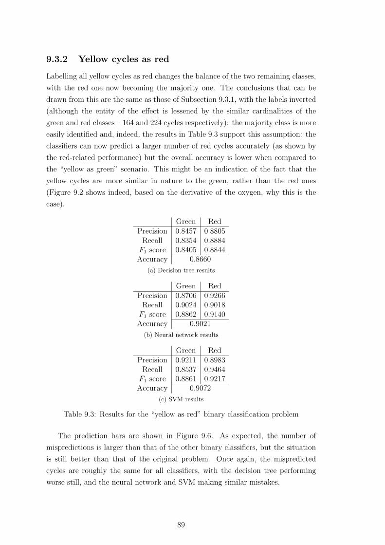
9.3.2 Yellow cycles as red
Labelling all yellow cycles as red changes the balance of the two remaining classes,
with the red one now becoming the majority one. The conclusions that can be
drawn from this are the same as those of Subsection 9.3.1, with the labels inverted
(although the entity of the effect is lessened by the similar cardinalities of the
green and red classes – 164 and 224 cycles respectively): the majority class is more
easily identified and, indeed, the results in Table 9.3 support this assumption: the
classifiers can now predict a larger number of red cycles accurately (as shown by
the red-related performance) but the overall accuracy is lower when compared to
the “yellow as green” scenario. This might be an indication of the fact that the
yellow cycles are more similar in nature to the green, rather than the red ones
(Figure 9.2 shows indeed, based on the derivative of the oxygen, why this is the
case).
Green RedPrecision 0.8457 0.8805
Recall 0.8354 0.8884F1 score 0.8405 0.8844Accuracy 0.8660
(a) Decision tree results
Green RedPrecision 0.8706 0.9266
Recall 0.9024 0.9018F1 score 0.8862 0.9140Accuracy 0.9021
(b) Neural network results
Green RedPrecision 0.9211 0.8983
Recall 0.8537 0.9464F1 score 0.8861 0.9217Accuracy 0.9072
(c) SVM results
Table 9.3: Results for the “yellow as red” binary classification problem
The prediction bars are shown in Figure 9.6. As expected, the number of
mispredictions is larger than that of the other binary classifiers, but the situation
is still better than that of the original problem. Once again, the mispredicted
cycles are roughly the same for all classifiers, with the decision tree performing
worse still, and the neural network and SVM making similar mistakes.
89

SVM
NNTr
eeNe
w tru
thTr
uth
Figure 9.6: Prediction bars for the “yellow as red” binary classification problem
90

Chapter 10
Clusters analysis
The data exploration required by this project (and some additional ones) have
been presented as part of the previous chapters. This chapter will cover some final
analyses that have been carried out following the discovery of peculiar behaviors
in the available cycles. The results and the conclusions that can be drawn from
this section are not relevant to the project per se, but are of interest nonetheless
and, as such, will be included as part of this thesis.
10.1 Anomalous variables grouping
As already mentioned, only those explorations that have yielded meaningful results
have been reported as part of this thesis, with many others (those leading to dead
ends or that have been carried out to answer side questions) have been omitted.
One such analysis, initially intended to shed light on a problem concerning some
faulty readings of a specific sensor, brought up the existence of well-defined clusters
within the available Model1 dataset.
This analysis consisted in plotting, for all the available signals (as selected by
the correlation-based feature selection algorithm defined in Subsection 6.1.1), mean
and standard deviation on a 2D plane. The result is that clusters of similar signals
(as represented by the signal’s summary statistics used) can be visually identified.
Figure 10.1 represents one of these plots for the variable temperature exh gas 1
variable. While some weak clustering might have been expected based on different
conditions, the clusters that show up are actually highly cohese, indicating that
some cycles are strongly similar to some others, but further away from the rest.
This same behavior shows up for other variables as well, as shown by the
plots in Figure 10.2. Different hypotheses can be made regarding the origin of
these clusters but, without the required domain expertise and, most importantly,
without any direct interaction with the engineers that carried out the experiments,
these hypotheses cannot be easily tested. Despite that, Section 10.4 will attempt
91

200 220 240 260 280 300Mean
30
40
50
60
70
80
90
100S
tand
ard
devi
atio
n
variable_temperature_exh_gas_1
Figure 10.1: Scatter plot of mean and standard deviation of the cycles for thevariable variable temperature exh gas 1
to find a plausible explanation.
1.30 1.35 1.40 1.45 1.50 1.55 1.60 1.65Mean
0.55
0.60
0.65
0.70
0.75
0.80
Sta
ndar
d de
viat
ion
variable_quantity_fuel_C
(a)
4.0 3.5 3.0 2.5 2.0 1.5 1.0Mean
2.0
2.5
3.0
3.5
4.0
Sta
ndar
d de
viat
ion
variable_angle_fuel_AD
(b)
Figure 10.2: Scatter plot of mean and standard deviation for 2 variables
10.2 Consistency throughout the features
As shown in Figure 10.2, some clusters show up for different variables and, by
trying the same approach on different summary statistics available (e.g. plotting
the same 2D plot but using percentiles), clusters keep showing up. Before trying to
92

find possible explanations for their existence, it is first useful to figure out whether
the clusters that keep showing up are comprised of the same cycles as the variables
change: this section will precisely test this.
10.2.1 Definition of the clusters
A possible approach to deciding whether the clusters are consistent is that of
running a clustering algorithm on the available dataset, and draw conclusions
based on how cohese the resulting clusters are. This approach, though, presents
some problems and does not directly answer the question of whether the initial
2D clusters are consistently the same (the clusters identified would then have to
be compared to the initial ones, not really solving the initial problem).
A different solution is that of hand-assigning a label to each of the cycles based
on the cluster they visually belong to for a given variable and, after that, visualizing
how these cycles are spread for other variables. Since the variable shown in Figure
10.1 already presents well separated clusters, this very plot will be used to define
the clusters. Figure 10.3 shows the lines that have been used for their definition.
The clusters have been color-coded to make them easier to identify. The top-most,
blue “cluster” contains those cycles that might be defined as outliers, as they do
not belong to any of the identified clusters.
Figure 10.3: Assignment of the clusters based on the mean and standard deviationfor the variable temperature exh gas 1 variable
93

10.2.2 Inter-feature analysis
Figure 10.4 shows the scattering of the cycles for some of the variables. It over-
all appears that the clusters do show up throughout the different variables con-
sistently. The least clustered variable is variable temp engine, shown in Figure
10.4b. The rest of the variables all visually appear to be consistent, with some sin-
gle points (or cycles) behaving as exceptions: this might be due to the rudimentary
label assignment process.
26 28 30 32 34 36 38Mean
8
10
12
14
16
18
20
Sta
ndar
d de
viat
ion
variable_valve_position_A
(a)
88.8 88.9 89.0 89.1 89.2 89.3 89.4Mean
0.20
0.25
0.30
0.35
0.40
0.45
0.50
0.55
0.60
Sta
ndar
d de
viat
ion
variable_temp_engine
(b)
Figure 10.4: Scatter plot of mean and standard deviation for 2 variables, coloredbased on the clusters of Figure 10.3
9.5 10.0 10.5 11.0 11.5 12.0 12.5Mean
3.0
3.5
4.0
4.5
5.0
5.5
Sta
ndar
d de
viat
ion
variable_percent_oxygen
(a)
0.05 0.04 0.03 0.02 0.01Mean
0.7
0.8
0.9
1.0
1.1
1.2
1.3
1.4
Sta
ndar
d de
viat
ion
deriv variable_percent_oxygen
(b)
Figure 10.5: Scatter plot of mean and standard deviation for the oxygen variableand its derivative, colored based on the clusters of Figure 10.3
This is significant of the fact that, regardless of the reason behind this behavior,
the overall system is influenced. Figure 10.5 show the scatter of the oxygen level
and its derivative, with the color representing the predefined clusters. The oxygen
variable appears to be well clustered. As for the derivative, other than the outliers
(and, partially, the fuchsia cycles), the rest of the clusters present limited clustering
and actually significantly overlap (even more so when only considering the mean).
94

This serves to show that the derivatives of the signals are not as affected by the
clusters as the signal themselves: a possible explanation for this reason is given as
part of the discussion of the results, in Section 12.4.
Other than this, the existence of these clusters and the consistency throughout
the variables allows for the definition of a unique label for each cycle, allowing
for further considerations to be drawn. One such consideration, covered in the
following section, is about the distribution of the labels through time.
10.2.3 Clusters definition through time
Each cycle, as explained, can be assigned a unique label depending on the cluster it
belongs to. Cycles, additionally, can be sorted based on the moment in time they
were recorded (remember that each cycle lasts an hour and that all cycles were
recorded in a 2-months period). The already introduced “prediction bars” can be
repurposed in this context to display the distribution in time for the clusters. Fig-
ure 10.6 shows precisely this. The distribution of the original (red/yellow/green)
labels has also been included in order to allow for additional considerations.
Clusters
Labe
ls
Figure 10.6: Distribution of the labels (top bar) and clusters (bottom bar) through-out the cycles
This figure is of particular interest, highlighting the importance of the time
component in the characterization of the type of cycle (as represented by the cluster
assigned). Cycles belonging to the same cluster were recorded during similar time
95

periods, with the exception of the “outliers” (blue) cluster, whose cycles mostly
occur at regular intervals.
When compared to the distribution of the original, clogging-related labels, no
particular correlations can be inferred. This helps excluding clogging as the cause
of this clustering phenomenon. Since no plausible explanation for this behavior
has been found by the domain experts based on the already presented work, the
following section will focus on providing a better description of the profile of the
clusters and the characterizing aspects of the cycles comprising them.
10.3 Description of the clusters
A possible approach to describing the various groups is that of identifying the
list of most recurrent characteristics for the cycles belonging to each cluster. The
typical way of doing this is by finding the so-called frequent itemsets of a dataset.
This allows for the extraction of the sets of values that co-occur the most often.
The values available for each cycle can be, for example, the features extracted
(i.e. the summary statistics – using only the signals and not their derivatives: the
behavior has already be shown to be perfectly described by the signals themselves,
with no need to introduce the derivatives, which are not as well clustered as the
original signals, and would double the number of variables to be analyzed).
The problem with the features extracted is that they are continuous in nature,
while the frequent itemsets extraction algorithms work on discrete sets (since the
items are expected to be present multiple times within the dataset, which is hardly
the case with continuous values).
The values available can be discretized by bucketing them: the continuous
domain is divided into ranges and, based on the range a value belongs to, a discrete
bucket is assigned. This introduces some problems, which will be addressed in the
following subsection. After having described each cycle with discrete values, the
frequent itemset extraction algorithm (called FP growth) is applied, and the results
will be proposed as part of Subsection 10.3.2.
10.3.1 Generation of buckets of values
While the discretization of a continuous range of values may, at a first glance,
appear to be a trivial task, the decision of how the ranges should be defined requires
some careful considerations. Dividing the range into n sub-ranges of equal width,
or so as to have same-cardinality buckets is problematic in that the divisions do
not account for possible clusters existing within the range, thus possibly separating
cycles that were meant to be clustered together. A possible alternative is that of
96

using a clustering algorithm on each of the features, so as to correctly group points
that are supposed to be clustered together.
Of the many clustering algorithms available, k-means [18] has been chosen
because of its simplicity and suitability for this problem: this algorithm clusters
the dataset into k clusters by initially randomly assigning k centroids, and then
having the centroids move until they reach the center of a cluster. Other algorithms
may better suit this 1D clustering problem [19], but since k-means has proven to
yield satisfactory results, it has been kept as the method of choice. K-means
requires the a priori definition of the number k of clusters to be identified, and
this is not immediate: although the overall number of clusters identified has been
of 4 (3 plus the outliers), not all variables are well grouped using this number of
clusters. Since the number of buckets each variable is divided into is not required
to be the same, a different number of buckets has been introduced for each variable,
depending on the suitable number identified.
This suitable number of clusters is decided based upon the silhouette coefficient
[20], a score that ranges between -1 and +1 that indicates, for each sample, how
similar it is to the ones in its own cluster, and how far from the others. The
silhouette can be computed for each sample but, as an overall coefficient, the
average silhouette for all samples can be computed, in order to assess how good
an overall configuration is. With this method of evaluating how good a clustering
configuration is, each variable is clustered using k-means with a value for k ranging
from 2 to 5. For each result the silhouette score is then evaluated.
The most intuitive approach to selecting the best number of clusters is that of
selecting the number k that produced the largest silhouette score. This, though,
has been observed to favour a small number of buckets, even when the result is
visually not the desired one (one of the advantages of clustering on a low number
of dimensions is that the results can be visually inspected). Because of this, a
heuristic that favors a larger number of buckets has been introduced: instead of
selecting the clustering k with the largest silhouette, the highest value for k for
which the clustering exceeds the 0.8 silhouette score1 is selected instead. If the 0.8
threshold value is not exceeded by any k, the largest silhouette achieved is chosen.
Figure 10.7 shows the clustering of some of the features, based on the algorithms
and heuristics described in this subsection.
1The value has been selected considering the available clustering outcomes. A silhouette meanvalue of 0.8 is, in most cases, exceedingly high but it is often achieved in this scenario becauseof the low dimensionality of the problem
97

55.0 57.5 60.0 62.5 65.0 67.5 70.0 72.5value
variable_pressure_rail 90%
01234
(a)
26 28 30 32 34 36 38value
variable_valve_position_A mean
012
(b)
Figure 10.7: Bucketing of two of the variables using 1D k-means
10.3.2 FP growth and frequent itemsets
With the bucketization, each cycle can be described in terms of a small number of
discrete items (one for each feature). For each cluster of cycles available, the list
of frequent itemsets (i.e. the sets of items that occur frequently, where frequently
is defined by a minimum number of occurrences) can be extracted using the FP
growth algorithm [21]. The algorithm builds the so-called FP tree and, from this,
it extracts all itemsets that show up with a frequency above a threshold one.
The itemsets identified by the FP growth algorithm are all those that occur
in a given fraction of the entries available (this fraction is referred to as minimum
support, or minsup for short). This means that, if a given itemset of length N is
found, all 2N−1 combinations of the items of the original itemset will be extracted
as well. This is not ideal: smaller itemsets do not bring any additional information
that is not contained in the larger one and, since the number of itemsets found
grows exponentially with the length of the largest itemset found, the problem
grows quickly. Because of these reasons, only the maximal frequent itemsets are
kept. The maximal frequent itemsets are all those itemsets that are identified as
frequent and that are not a subset of another frequent itemset.
The only parameter that needs to be defined is the minsup. This can be
defined based on different considerations. The domain may at times offer a good
definition of what “frequent” means. Alas, this is not the case. Another approach
is that of deciding what a meaningful number of itemsets is, and adjust the minsup
accordingly.
Figure 10.8 shows how the number of maximal frequent itemsets identified
changes as the minsup varies between the values of 0.7 and 1.0. While intuition
dictates that the number of itemsets found should decrease as minsup increases,
this is not the case: in fact, even though a given itemset might not be considered
frequent above a certain minsup, some subsets of it might still be, thus “generat-
98

ing” multiple frequent itemsets from a single one.
0.70 0.75 0.80 0.85 0.90 0.95 1.00minsup
1
2
3
4
5
6
7
Max
imal
freq
uent
item
sets
ext
ract
ed
ACBD
Figure 10.8: Number of maximal frequent itemsets found for each cluster depend-ing on the minsup threshold
In order to provide less confusing results, each cluster should be described by
a single itemset: this occurs around the value 0.85: consequently, this will be
selected as minimum support. With this value defined, the single most frequent
itemset can be extracted for each of the clusters: Tables 10.1, 10.2, 10.3 and 10.4
represent the maximal frequent itemsets for the fuchsia, orange, azure and blue
clusters.
The three main clusters (fuchsia, orange, azure) are all represented by long
(approximately 20 items) itemsets, meaning that, despite the large minsup, the
discretized values often occur simultaneously. The outliers have a significantly
smaller shared description: this is because, due to their heterogeneity, there are
not many characteristics in common. In italic are the entries that are shared
among clusters (with the exception of the outliers): these can be considered as
values that are not as relevant when searching for unique characteristics in the
clusters.
The contents of the itemsets are not of particular interest when maintaining
the domain-unaware approach kept so far. On the other hand, the length of the
itemsets themselves is significant once again of the strong similarities between
clusters, and the low number of items shared across clusters indicates that these
are well separated from one another. While these conclusions could already be
99

Featu
reR
ange
(buck
et)
variabletem
pen
gine
std[0.24;
0.5]variab
lequan
tityfu
elB
mean
[1.09;1.31]
variable
quan
tityfu
elB
std[1.72;
1.84]variab
lequan
tityfu
elA
mean
[1.29;1.3]
variable
quan
tityfu
elA
std[0.26;
0.29]variab
lean
glefu
elA
Dm
ean[-4.13;
-3.07]variab
lean
glefu
elA
Dstd
[3;3.24]
variable
valvep
ositionA
mean
[24.7;30.26]
variable
valvep
ositionA
std[12.61;
19.44]variab
letem
peratu
reex
hgas
1m
ean[199.28;
201.49]variable
temperatu
reexh
gas1
std[31.7;
57.25]variab
letem
peratu
reex
hgas
3m
ean[175.11;
218.1]variab
letem
peratu
reex
hgas
3std
[36.23;61.19]
variable
temp
erature
man
ifoldm
ean[47.42;
52.08]variab
letem
peratu
rem
anifold
std[5.08;
5.86]variab
lepressu
rerail
mean
[35.9;36.66]
variable
pressu
rerail
std[13.29;
13.78]variab
lecon
centration
NO
xB
mean
[231.86;239.9]
variable
concen
trationN
Ox
Bstd
[102.59;107.97]
variablepercen
toxygen
Am
ean[11.37;
12.69]variable
percent
oxygenA
std[2.86;
3.99]variab
lequan
tityred
uctan
tm
ean[2.22;
5.46]
Tab
le10.1:
Descrip
tionfor
cluster
A
100

Featu
reR
ange
(buck
et)
vari
able
tem
pen
gin
est
d[0
.24;
0.5]
vari
able
quan
tity
fuel
Bm
ean
[1.3
6;1.
6]va
riab
lequan
tity
fuel
Bst
d[1
.72;
1.84
]va
riab
lequan
tity
fuel
Am
ean
[1.3
1;1.
32]
vari
able
quan
tity
fuel
Ast
d[0
.26;
0.29
]va
riab
lean
gle
fuel
AD
mea
n[-
2.96
;-2
.27]
vari
able
angl
efu
elA
Dst
d[1
.92;
2.37
]va
riab
leva
lve
pos
itio
nA
mea
n[3
0.97
;35
.08]
vari
able
valv
ep
osit
ion
Ast
d[8
.17;
10.7
9]va
riab
lete
mp
erat
ure
exh
gas
1m
ean
[210
.61;
235.
75]
vari
able
tem
pera
ture
exh
gas
1st
d[3
1.7;
57.2
5]va
riab
lete
mp
erat
ure
exh
gas
3m
ean
[175
.11;
218.
1]va
riab
lete
mp
erat
ure
exh
gas
3st
d[2
7.22
;32
.03]
vari
able
tem
per
ature
man
ifol
dst
d[3
.3;
3.99
]va
riab
lepre
ssure
rail
mea
n[3
6.81
;37
.9]
vari
able
pre
ssure
rail
std
[15.
24;
15.8
7]va
riab
lepe
rcen
tox
ygen
Am
ean
[11.
37;
12.6
9]va
riab
lepe
rcen
tox
ygen
Ast
d[2
.86;
3.99
]va
riab
lequan
tity
reduct
ant
mea
n[2
.22;
5.46
]va
riab
lequan
tity
reduct
ant
std
[6.1
3;7.
04]
vari
able
NO
xC
atal
ist
Sto
rage
mea
n[1
.88;
2.02
]va
riab
leN
OxC
atal
ist
Sto
rage
std
[0.2
3;0.
28]
Tab
le10
.2:
Des
crip
tion
for
clust
erB
101

Featu
reR
ange
(buck
et)
variabletem
pen
gine
std[0.24;
0.5]variab
lequan
tityfu
elB
std[1.59;
1.71]variab
lequan
tityfu
elA
mean
[1.32;1.34]
variable
quan
tityfu
elA
std[0.24;
0.26]variab
lean
glefu
elA
Dstd
[2.51;2.97]
variable
valvep
ositionA
mean
[35.49;37.56]
variable
valvep
ositionA
std[8.17;
10.79]variab
letem
peratu
reex
hgas
1m
ean[246.41;
260.8]variable
temperatu
reexh
gas1
std[31.7;
57.25]variab
letem
peratu
reex
hgas
3m
ean[227.55;
261.17]variab
letem
peratu
reex
hgas
3std
[20.56;22.56]
variable
temp
erature
man
ifoldm
ean[56.52;
60.02]variab
letem
peratu
rem
anifold
std[4.17;
5.01]variab
lepressu
rerail
std[15.97;
16.83]variable
percent
oxygenA
mean
[11.37;12.69]
variablepercen
toxygen
Astd
[2.86;3.99]
variable
quan
tityred
uctan
tm
ean[5.58;
9.29]variab
lequan
tityred
uctan
tstd
[5.08;6.09]
variable
NO
xC
atalistStorage
mean
[2.18;2.23]
variable
NO
xC
atalistStorage
std[0.06;
0.16]
Tab
le10.3:
Descrip
tionfor
cluster
C
102

Featu
reR
ange
(buck
et)
vari
able
tem
pen
gine
std
[0.2
4;0.
5]va
riab
leva
lve
pos
itio
nA
std
[12.
61;
19.4
4]va
riab
lete
mp
erat
ure
exh
gas
1st
d[6
4.89
;10
0.86
]va
riab
lepre
ssure
rail
std
[17.
09;
18.2
5]va
riab
lep
erce
nt
oxyge
nA
mea
n[9
.37;
11.3
1]va
riab
lep
erce
nt
oxyge
nA
std
[4.0
4;5.
45]
vari
able
NO
xC
atal
ist
Sto
rage
std
[0.6
5;0.
84]
Tab
le10
.4:
Des
crip
tion
for
clust
erD
(outl
iers
)
103

drawn for the single variable, the extraction of the itemsets allowed to infer a
more general correlation between variables, while providing a succinct description
of the clusters. Building on the information gathered so far, the next section will
attempt to find an explanation for the existence of these clusters.
10.4 Possible causes
All the analyses carried out so far seem to indicate that the cycles belonging to the
same cluster have all been affected in a similar way. The driver of this influence,
though, has yet to be discovered. It should be noted that, when performing the
same kind of analysis on different datasets (e.g. the Model2 one), these clusters
were not present.
A possible approach to discovering this driver is that of starting from the
independent variables (i.e. those variables that are controlled by the engineers
recording and piloting the cycle) and figuring out whether these already present
the observed behavior. If so, the reason for this clustering is that whoever ran the
experiments (note that these people did not, at any time, work on this project,
so asking them was not an option) deliberately decided to run them in different
ways, although such a behavior has been deemed unlikely by those experts that
did work on this project. Otherwise, those variables that are directly influenced
by the independent variables should be analyzed next, thus exploring the graph
of dependencies until all variables are extracted: when the first clustered variable
appears, the cause behind the clusters can be pinpointed to it.
This would theoretically work, but without the required domain expertise,
building the graph of dependencies is not feasible. As a consequence, only the
variable that is already known to be independent will be analyzed. This indepen-
dent variable is the status of the accelerator pedal: a predefined track (shown in
Figure 3.1) is used to pilot each cycle and, since this variable is fed as input, it
can be considered as being the driver of the entire cycle.
The assumption that has been made a priori is that all tracks used in the
available cycles are identical. Because of this, if the mean and the standard devi-
ation of the accelerator pedal signal are extracted for each cycle, the expectation
is that no particular difference should be found among them. The mean and the
standard deviation have been chosen because they well represent the behavior of
the signal: the mean indicates the “offset” the signal has, while the standard devi-
ation provides an indication of the amplitude of the peaks of the signal throughout
the cycle (a larger standard deviation indicates that the pedal has diverged more
significantly from the mean). Figure 10.9 shows the results for the two statistics
measured for all the cycles. It is clear that some anomaly is already present in the
104

accelerator signal and, when overlapping this result with the identified clusters (as
shown by the background colors), the match is perfect.
0 50 100 150 200 250 300 350 400Cycle number
6.0
6.5
7.0
7.5
8.0
8.5
9.0
9.5
varia
ble_
acc_
pos
MeanStd
Figure 10.9: Mean and standard deviation trend of the gas pedal signal throughoutthe cycles
In conclusion, the cause of this clustering can be found in the driver of the
cycles. The implications that this finding has on the already presented results will
be discussed as part of the findings in Section 12.4, along with some additional
conclusions that can be drawn from this side exploration that has been carried out
to get to the bottom of this situation.
105

106

Chapter 11
Implementation details
Given the information available on the dataset, the objectives of the study and
the constraints in place, the hardware and software required for the study can be
defined.
11.1 Hardware
A machine is required in order to process the dataset. Given the constraints
introduced by the automobile manufacturer, the data needed to be stored on a
dedicated server: as a consequence, a machine provided by the DBDMG (DataBase
and Data Mining Group) has been used for the purpose. The specifications for
the machine are listed in Table 11.1. While the specifications would allow for the
entire dataset to be loaded onto the main memory (based on the considerations of
Subsection 3.1.4), this operation has been avoided throughout the work, in order
to allow for the solution to scale to larger datasets (though the leap to big data
techniques will still be necessary at some point).
Main memory 32 GBStorage 5 × 3 TBNumber of cores 12Clock frequency 2.67 GHzOperating System Ubuntu 16.04
Table 11.1: Server specifications
11.2 Software
The programming language selected for this project was Python. This language
is interpreted, thus allowing for rapid prototyping, which is essential given the
exploratory nature of the study. Python offers an incredibly rich ecosystem of
107

libraries and modules available, particularly in the data science field. The following
is a list of the libraries and packages used most extensively (all of them are widely
used in the scientific community):
• Matplotlib [22]: a 2D plotting library which produces publication quality
figures in a variety of hardcopy formats and interactive environments
• seaborn [23]: a visualization library based on matplotlib, which provides a
high-level interface for drawing statistical graphics
• NumPy [24]: the fundamental package for scientific computing
• pandas [25]: a library providing high-performance, easy-to-use data struc-
tures and data analysis tools
• scikit-learn [26]: a simple and efficient tool for data mining and data anal-
ysis
108

Chapter 12
Findings
This chapter will focus on the discussion of the outcomes of the experiments,
highlighting the most interesting aspects of the study and the most important
takeaways. These considerations regard both the original and the additional ex-
periments carried out (Chapters 7, 8 and 9), plus some comments regarding the
clusters identified in Chapter 10.
12.1 Classification results
The original process, as defined in Chapters 5, 6 and 7, achieved satisfactory
results in terms of precision, recall and accuracy. The numeric values can be
found in Table 7.1. Other than this general observation, other considerations can
be made when comparing the different classifiers and metrics.
As expected, the decision tree performs generally worse than neural networks
and SVM: this was expected, given the limitations that come with the simplicity
and interpretability of the model. Despite that, the difference is not abyssal, with
many of the metrics being less than 10% lower than those of the other classifiers.
The precision, recall and F1 score for the three classes are comparable for the
three models meaning that, although the hyperparameters were tuned so as to
maximize the red-related performance, the other classes did not suffer particularly.
The accuracy metric shows how the three classifiers correctly assign the labels for
80 to 90% of the cycles available.
12.1.1 Misclassifications
The way these labels are assigned is shown in Figure 7.4. This kind of visualization
has been introduced to provide better insights on how the classifiers behave and
where the classifiers are most often mistaken. Most notably, the three classifiers
all get wrong a group of 5-6 cycles on the left-hand side of the bars (around cycle
109

340, based on Figure 5.8c and 5.6), with all the classifiers making the same mistake
(predicting green cycles instead of yellow). This can either be because all three
classifiers learned the wrong patterns or, possibly, because the labelling used is
incorrect and those cycles should actually be green. The labelling procedure used
introduces uncertainty: first because it is based on the measurement of a signal
(with the problems that come with it, as already discussed in Sections 5.1 and
8.2 and, second, because the classes introduced to label the cycles are not perfect
and could be improved (as attempted in the labelling experiments of Chapter 9).
This uncertainty means that not all the mistakes made by the classifiers should
actually be considered as mistakes, but instead they could provide insights on
how to tune the classes: this, though, would result in a classifier biased by the
dataset: without any separate test set to verify the classifiers’ true performance,
this operation could lead to overfitting. Since the number of cycles available is
low, this kind of experiment has not been carried out.
Another interesting group of 2 cycles mispredicted by the three classifiers is
the one around 270, where two yellow cycles exist in the middle of a long sequence
of green cycles. These two cycles are predicted as green by all the classifiers:
upon inspection of Figure 5.6, the reason can be found: the response time of a
single value spiked and, when introducing the smoothing, the neighboring cycles
got affected as well, becoming yellow. This is one of the negative aspects that led
to the decision of running an experiment without applying the smoothing process.
The results will be discussed in Section 12.2.1.
A final note of interest concerning the mistakes made by the classifiers regards
the types of mistakes made: in almost no circumstance (except for one case, for the
SVM) have the classifiers predicted a green cycle as a red one, or vice versa. This
can be deduced from the bars and it is clearer still when checking the confusion
matrices of Figure 7.3. This means that the classifiers actually managed to infer
an order among classes, with the green being the furthest away from the red one,
and the yellow one in between: if this was not the case, and the classifiers were
assigning labels “randomly” (or using other unrelated criteria), cycles would be
misclassified in each of the other classes with similar frequencies.
12.1.2 Classifiers’ rationale
The decision tree offers insights on the rationale behind the labels assigned. It
has been mentioned that the decision tree is a simple classification model but, as
already shown, it fares so well that its results are comparable with those of more
complex models. Because of this, the variables considered as relevant by the tree
can be expected to be approximately the same used by the black box models.
110

The most relevant variables are typically the ones used near the root of the
tree: these represent the variables that best split the initial dataset. As the path
gets deeper, the splits made by the tree concern a smaller number of cycles, thus
not being quite as insightful (and possibly leading to overfitting – hence the early
pruning often introduced). The most interesting variable that is being used by
the root and some of the highest nodes in the decision tree of Figure 7.2 is the
derivative of variable percent oxygen A (with various percentiles being taken into
account).
Since the proposed decision tree grows rather large. A simpler – yet leading to
the same conclusions – case is that of the binary decision tree classifier represented
in Figure 9.1. In this case, the decision tree only uses a single test. This test once
again uses the derivative of the oxygen variable (more precisely, the 90th percentile):
if this quantity is below the identified value of 0.8018 the cycle is labelled as red,
otherwise green. The meaning of this simple test is the following: if the majority
of the values of the derivative of the oxygen is “low” (with low defined by that
threshold), the cycle is red. This means that those cycles where the oxygen level
changes slowly are identified as red: as shown in Figure 9.2, the variable identified
by the binary model splits red and green cycles well, with the yellow ones being
in between. The fact that this variable (or set of variables, when considering the
other statistics of that derivative) is a strong predictor might appear trivial, but
it is actually significant.
The clogging problem, as already mentioned, slows the oxygen level read by the
sensor: in order to understand how clogged each cycle is, a cut-off that occurred
in approximately the same conditions for all cycles has been used to measure the
response time. The longer the response time, the slower the reading of the oxygen
sensor and the stronger the clogging problem. Therefore, it might seem trivial
that the classifier identifies the clogged cycles as the ones having a generally slower
signal. The reason why this is not trivial at all and, actually, it provides interesting
information is that the response time has been measured using a sampling rate of
320 Hz, while the inputs provided were sampled at the much lower frequency of 1
Hz. This lower sampling frequency did not allow for a significant measurement of
the response time, but the classifiers still managed to infer useful information from
it. This decouples the identification of clogged cycles from the particular cut-off
maneuver and from the high sampling frequency.
This decoupling is particularly relevant when considering that this project
serves as a feasibility study for a larger version where data is collected from mil-
lions of vehicles and processed in real time: high sampling frequencies are unfea-
sible (even 1 Hz is too high, hence the downsampling study) and the drivers will
not be required to perform any particular maneuver. By collecting enough data
111

from a fleet of vehicles, new distributions can be computed for the derivative of
the oxygen variable in normal conditions (perhaps only collecting data in partic-
ular conditions, so as to reduce the variability of the signals). Once this data is
collected, along with the actual conditions of the lambda sensor, new models can
be built to better adapt to real driving conditions (as opposed to the conditions
used for the cycles).
Additional considerations regarding the scalability of this project will be made,
as part of the conclusions, in Section 13.2.
12.2 Process manipulation outcomes
The original process presented different opportunities for alternative choices. These
choices have been taken while devising the process based on considerations that
resulted in some decisions being taken rather than others. On top of that, the fea-
sibility analysis of the scaling-up project imposed additional constraints (namely
on the sampling frequency used for the signals): this required additional experi-
ments in order to assess the degradation of the results. This section will cover the
main results regarding some of these matters. In some cases, the conclusions to be
drawn have already been presented as part of the presentation of the work: when
that is the case, no additional considerations will be added here.
12.2.1 Removal of the smoothing process
The smoothing process has been assumed to be introducing some mislabellings (see
Subsection 12.1.1). It is only natural, therefore, to wonder whether the decision
of using this labels manipulation led to any improvement at all. In order to
answer this question, the entire process has been run with no smoothing (note
that, because of the nature of the parameter k, this is equivalent to running the
experiment setting k = 0). The results are presented in Table 8.4.
The results in terms of accuracy are comparable, if not better, to those of the
original experiment. The same goes for the green-related performance, while the
red-related ones actually degrade noticeably. While a brief comment regarding
this behavior has already been included when presenting the experiment, further
coverage may be needed in order to explain this behavior.
Figure 5.8 shows how the response times change as the size of the sliding window
of the smoothing process gets larger. Of particular interest are the red “bands”:
these bands are shrinking, thus effectively reducing the number of red cycles as k
gets larger. It might seem counterintuitive that the performance metrics for the
minority class improve as the cardinality of the class gets smaller. But, as the
112

class gets smaller, only the “most clogged” cycles (i.e. those cycles that still have
a slow response time despite the smoothing) get assigned to the red class: this
increases the purity of the red class, excluding those cycles that can be considered
as borderline yellow. This helps providing a better definition of “red”, with the
improvement in performance that comes with it.
When comparing the prediction bars of Figure 8.4 with those of the original
experiment (Figure 7.4), some interesting considerations can be made. Two of the
situations that were highlighted in Subsection 12.1.1 are those around cycles 270
and 340. The yellow cycles in the middle of the green cluster are still mispredicted
by this new classifier. This means that the smoothing process only marginally
influenced the labels here: those cycles are actually considered by the classifiers as
being green and the problem here might be with the way the labels were assigned
in the first place.
The situation around cycle 340, instead, improved for the neural network and
the SVM, while still being partially problematic for the decision tree. This might
be part of the reason why the green-related performance improved.
12.2.2 Effects of downsampling
The deployment of this project on a larger scale imposes some constraints due
to the limited network capabilities. The data exchanged between the vehicles’
ECU and the central server should be reduced to a minimum: on the one hand,
the feature selection applied managed to narrow the number of variables used
(and that therefore should be sent over to the server) down to 14; on the other,
the sampling frequency should be reduced even further. This renders the 320 Hz
sampling frequency used for ProgramB completely useless, and even the 1 Hz rate
of ProgramA is still much to high. The experts reckon that a more feasible rate
would be in the order of the minutes, thus reducing the sampling rate by a couple
of orders of magnitude.
Section 8.4 analyzed how much the downsampling influences both the classi-
fiers’ performance (in terms of F1 score) and in terms of degradation of the inputs.
The main result was that the classifiers were not significantly affected by a mod-
est downsampling: the reason for this can be found in the degradation of the
distributions of values. These distributions of values remain approximately the
same (as indicated by the Janson-Shannon divergence) for modest reductions in
the sampling frequency. Since the classifiers receive as input a series of summary
statistics that can be extracted from the distribution of values of each signal, the
low degradation implies a low alteration of the inputs, with the resulting stability
that comes in terms of classifiers’ performance.
113

Thus, the decision of using summary statistics instead of the single values as
inputs helped both in terms of reduction on the number of inputs (necessary given
the low number of cycles available) and in terms of robustness to downsampling.
Additionally, building a classifier that uses the original signal samples as inputs
could have resulted in models that cannot be deployed in the real world, where
the vehicles are not subject to a pre-established gas pedal track.
Additionally, Figures 8.6a and 8.6b provide a way of deciding different sampling
rates for the different signals, based on the maximum degradation acceptable. This
could help with an even further reduction of the data exchanged between vehicle
and server: signals that do not degrade significantly when downsampled can be
recorded using lower frequencies. Since the inputs of the classifiers are based on
the distribution of values, the process allows for signals to be sampled at different
rates.
A final consideration is that downsampling might not even be needed under
certain assumptions. If the ECU can be programmed as desired, the signals could
be sampled locally and then stored for a given amount of time. Then, the ECU
could compute the summary statistics required on the densely sampled signals,
thus sending the server only a low number of already-computed features. This as-
sumption on the ECU availability for programming, though, has not been verified:
making sure that the system can handle downsampled signals is still extremely
useful.
12.2.3 Exclusion of strong predictors
The comments regarding the classifiers trained without using those variables that
can be considered as strong predictors are heavily related to the observations made
in Subsection 12.1.2. In other words, the classifiers all heavily rely on the deriva-
tive of the oxygen level signal: removing this significantly affects the classifiers.
Removing the derivatives affects the results the least, since the classifier still has
access to the oxygen variable, managing to extract useful information from it. In-
stead, when the oxygen variable is removed, its derivative is not available either,
thus significantly lowering the classifiers’ performance.
The conclusion that can be drawn from this experiment is that no other signif-
icant variables other than the oxygen level have been found to be correlated to the
clogging problem. While these variables might be there, the classifiers used were
not able to identify and exploit them to improve in performance. Those variables
that actually where used might be weakly correlated to the clogginess of the sensor
but, given the poor performance of the classifiers, they should not be relied upon
(other than when presenting the results to the domain experts, thus offering some
114

of the data-driven, domain-unaware insights).
The (discrete) derivatives used have been computed starting from the signals
sampled at a 1 Hz rate. A possible concern, when scaling up to real-world cases,
is that lowering the sampling frequency (so as to meet the constraints imposed by
the communication with a remote server) might lead to meaningless derivatives,
as they are computed as the difference quotient between subsequent values and
lowering the sampling rate implies increasing the denominator of the quotient.
This, though, might not be the case: the ECUs already require reprogramming in
order to transmit the necessary data; the update could introduce the “sampling”
of the derivative of the signals (e.g. by sampling the signal twice in a short period
of time and computing the difference quotient on it). The measurement of a
meaningful derivative should not be a problem, thus the degradations imposed by
the lack of this kind input should not be of any significant concern.
12.2.4 Application of the process to the Model2 dataset
The application of the process to the Model2 dataset does not present any partic-
ularly significant surprise and, as such, it will not be commented in depth. Despite
that, there are two important takeaways that come with it.
The first one is that the devised process can be applied to new datasets easily
and without significant adjustments. This was one of the aims of the project and
it can be considered as achieved. The second one is that the low number of cycles
affects the results of the models: the more inputs are available, the better the
classifier can learn.
12.3 Labelling experiments discussion
The labelling process presented is comprised of three parts: the measurement of the
response times, their smoothing and the assignment of a label based on predefined
classes. The first two steps have already been analyzed and commented, with
some alternatives presented to show if and how different approaches could yield
better results. The response time measurement is expected to introduce some
uncertainty in the labelling process, since a wrong reading of the time influences
the label assigned. When smoothing is introduced, this uncertainty propagates to
the neighboring cycles.
The third and final step, that of the definition of classes and the assignment of
the labels, introduces even further uncertainty: no quantitative definition of the
clogginess of a cycle was available in terms of response time ranges, so an educated
guess was needed in order to continue with the process. The definition of these
115

ranges has been accepted as plausible by the domain experts that worked on this
project but with the catch that, since this sensor was not their particular field of
expertise, the classes could require some refinements and were not guaranteed to
be accurate. Because of this, the entire process – and its implementation – have
been designed so as to accommodate for future changes in classes’ ranges (and all
of the parameters discussed in this thesis).
The lower and upper bounds for the response time are respectively 0 and +∞,
thus effectively requiring two parameters in order to define three ranges (namely
the thresholds between green and yellow, and the one between yellow and red).
Exploring the resulting bidimensional space (so as to find the optimal range values)
has been deemed to be unfeasible (when exploring the range 0 ÷ 2 seconds with
increments of 0.01 seconds would result in approximately 12· (2s−0s
0.01s)2 = 20, 000
possible values (the number of options has been halved since the second threshold
is required to be lower than the first one). Exploring this many possibilities is not
currently feasible and, as such, this option has been discarded.
Despite that, some alternative experiments have been devised: for these ex-
periments, the labels assigned to the cycles have been changed based on some
considerations. These experiments have been presented as part of Chapter 9. This
section will comment some of the most interesting results.
12.3.1 Binary classifier
The introduction of the binary classifiers (i.e. classifiers that does not consider
the yellow cycles) comes from the decision of trying to simplify the problem and
observe how the models behave for this different, easier problem.
The binary classifiers are the best performing models produced as part of this
study. The reason behind this excellent performance has already been covered in
detail and can be summarized by saying that red and green cycles are significantly
different when it comes to the distribution of the derivative of the oxygen signal.
All three classification algorithms can separate these two categories of cycles well,
thus explaining the performance measured.
Introducing the yellow cycles complicates the situation (as shown in Figure
9.2), making it harder to separate green from red cycles. Since any real-world
application naturally presents yellow conditions, this binary classifier might seem
like a simplification that does not lead to any meaningful results. Despite that,
this experiment (along with the decision of using an interpretable model) helped
identifying the best predictor available. In order to understand how the yellow
condition would be handled, all the yellow cycles available (that had been taken
away when building the classifiers) have been fed to the models, in order to be
116

assigned a binary label.
12.3.2 Labelling of yellow cycles with the binary classifiers
This experiment introduces a third class in a binary classifier: since this classifier
does not know about the existence of this third class, it will attempt to assign
each of these never-before-seen cycles to either of the two known classes. Since
the yellow cycles are neither red nor green, it does not make sense to talk about
performance of the classifiers. What makes sense, instead, is showing how each
cycle is labelled. This is shown in the prediction bars of Figure 9.4.
Interestingly, the three classifiers mostly agree on the decisions taken and, since
the rationale of the decision tree is known, it is reasonable to assume that the other
two classifiers heavily rely on the same information. Based on the decision tree,
the information used is shown in Figure 9.2: those cycles on the left-hand side of
the threshold are labelled as red, the others green.
Since the majority of the yellow cycles are on the right-hand side of the thresh-
old, most of them are labelled as green. The yellow cycles that are labelled as red
are mostly those that, in the prediction bars, are surrounding the cycles that are
known to be red. This, when paired with the knowledge that the soot cumulates
(thus resulting in continuous cycles having similar clogginess), is reassuring of the
fact that the rationale used by these classifiers (and, by extension, by the others)
is consistent: if it was not, red and green cycles would be scattered randomly, with
no relation to the position of the established green and red ones.
12.3.3 Yellow cycles as green/red
Relabelling the yellow cycles as either red or green transforms the original problem
in a new binary one, where all the cycles are considered during the training. The
results of the two experiments have already been presented in Tables 9.2 and 9.3
and Figures 9.5 and 9.6. Comments regarding the results have already been made
when presenting them.
This particular one can be seen as a different way of approaching the “playing it
safe” approach that has been deemed to be the best one when making a prediction
about the sensor’s conditions: in other words, the experts asserted that, in their
opinion, it would be best to only alert the car owner about the problem when
it is sure that the problem exists or, using yet a different phrasing, the model
should try to minimize the false positives. This is because offering this prognostics
service is an extra, non-vital (yet) feature: if not alerted, the owner will be none
the wiser and will keep using the vehicle as they would have, had this system not
been in place; but, if the owner is asked to bring the car in for a problem that
117

does not really exist, this could be seen as a waste of time and resources. The
already presented solution proposed to solve this problem is that of optimizing the
classifiers using the precision as the performance evaluation metric, instead of the
F1 score. This approach led to more precise models, but with a lower recall.
Another approach to this problem is given by these two proposed experiments.
When the yellow cycles are labelled as green, what is really happening is that
those “borderline” cases are demoted to “alright” while, when considering them as
red, they are promoted to “clogged”1. This represents the two possible approaches
to the alerting of the customer: the first case is the one where the owner is only
alerted when the system is particularly sure about the existence of the problem;
the second case is the one where the owner is immediately alerted about anything
that remotely resembles a clogged sensor.
Based on the “playing it safe” policy, the “yellow as green” scenario is the
one that best suits the requirements. The advantages and disadvantages of this
experiment over the “yellow as red” one have already been presented as part of
Subsections 9.3.1 and 9.3.2: in short, the “yellow as green” experiment achieves
better accuracy and green-related performance (being the green class the majority
one), while the “yellow as red” experiment produced better red-related scores
(being this the new majority class).
12.4 Dataset clustering comments
The discovery of three well-defined clusters in the dataset required revising all of
the considerations made thus far, in order to account for the existence of these
clusters. The main conclusion is that these clusters have not significantly af-
fected the results of the classification: there is no clear correlation between the
green/yellow/red labels and the identified clusters and, given the good results
achieved by the classifiers, the logical conclusion is that they managed to discard
the information that differentiates the clusters and, instead, focused on the one
that helped figuring out the existence of a clogging situation.
This conclusion can be corroborated by two pieces of evidence. The first is
given by Figure 9.2, which clearly shown how the 90th percentile of the oxygen
derivative is well distributed between the three classes: if this was not the case,
and the clusters actually influenced the oxygen derivative, the three clogging classes
would not be as well distributed. The second piece of evidence is that, as shown
by Figure 10.5, the derivatives seem to be less affected by the clusters than are
the original variables. This holds true, as shown, for the oxygen. In particular,
1The terms “demoting” and “promoting” are of course used loosely in this situation
118

the “mean” derivative values seem to be affected the least as far as the azure and
orange cycles go, and these include the vast majority of the dataset.
This lower influence of the clusters on the derivatives can be explained basing
the considerations on Figure 10.9. Here, mean and standard deviation of the gas
pedal are shown to change consistently with the clusters and, since the rest of the
variables are affected by the gas pedal, similar graphs can be expected for these as
well. In particular, the mean has been explained to be somewhat representative
of the (constant) offset each variable has: since adding a constant to a function
does not alter its derivative, this offset does not influence it significantly. The
same considerations cannot be made for the standard deviation, but the overall
conclusion is that derivatives are not heavily affected by the clusters.
This is fortunate, because the classifiers significantly rely on the derivatives.
Fortune, though, should not have any role in a research project. Having a dataset
with such a bias could have affected the entire work and, had the existence of these
clusters not been discovered, the results would have been completely inaccurate
and nobody could have figured it out. Since the domain experts that worked on
this project were not aware of the existence of this problem and did not work on the
collection of the data, two important lessons can be learned. The first one is that
the data provided should not be assumed to be fine without thoroughly exploring
it first (in this case, a classification problem proved to require clustering as well).
The second one is that communication with the experts that actually gathered
the data is fundamental: other reasons that back this assertion have already been
provided but, even in this case, an explanation might have been available for the
existence of these clusters. These are two (of the many) valuable lessons learned
from this pilot project and that will prove useful for the projects to come.
Additional comments can be made about the identified clusters. The first one is
that, for some variables, smaller “sub-clusters” could be identified. These smaller
clusters, though, could not be easily spotted for all the variables and, because
of that, only the three (plus outliers) main clusters have been reported. Figure
10.9, though, shows how these subclusters can be once again explained in terms of
different gas pedal tracks used: the mean of the cycles 100 through 170 and 230
through 260 are slightly higher than the surrounding ones, although the standard
deviation is not. This explains why these smaller clusters were not as well defined
as the others.
A final comment regarding the reason for the existence of the clusters can and
should be made. Chapter 10 identified the different gas pedal tracks used as the
cause for the existence of the clusters, as shown in Figure 10.9. It is not known,
though, whether this behavior was intentional or not, since different considerations
seem to point in different directions. The Model2 dataset did not present any of
119

these clusters, making it hard to believe that the people who collected the data
decided to fiddle with one engine and not the other, but the similarity of the cycles
belonging to each cluster make it hard to believe that the result was due to chance.
Unfortunately, no definite answer can be provided in this thesis.
120

Chapter 13
Conclusions
This work of thesis started with the goal of finding a data-driven approach to
the predictive maintenance of the oxygen sensor. An already recorded test bench
dataset has been made available by the collaborating company along with the
availability of different domain experts, who provided the necessary feedback and
support throughout the work. Starting from the high-level data mining process,
an ad-hoc procedure has been devised so as to account for the peculiarities that
came with the dataset available. This process has been implemented and tested,
achieving satisfactory results. Many of the choices made during the definition of
the process were supported by a priori considerations and assumptions. A part
of the presented work consisted in verifying whether these assumptions held a
posteriori, i.e. when the classifiers’ results were available. This kind of validation
provided better insights on the dataset and on the rationale used by the classifiers
in order to make decisions.
The most interesting result regards the usage by the classifiers of the derivative
of the oxygen level signal. This signal was not, at the beginning, thought to be
accurate enough (in terms of samples available) in order to draw meaningful con-
clusions on the clogginess state of the sensor (so much so that a separate dataset,
sampled at 320 times the original frequency was used to assign the labels).
Other interesting experiments provided information that can be used when
scaling up this project to a larger scale, where the conditions are not as pristine
as the ones currently available.
Finally, an extensive exploration of the dataset showed the existence of anoma-
lous clusters of cycles that were not expected to be found: the final part of this
work consisted in analyzing this phenomenon, trying to characterize the clusters
and aiming to find an explanation that could justify such a behavior. These anal-
yses traced the origin of the problem back to gas pedal track used to drive the test
bench: whether the decision of changing the cycles’ track was made by the experts
who ran the experiments or if some external factor influenced the track, it cannot
121

be known.
This chapter wraps up the work by covering the novelty aspects of this study
first, then focusing on the limitations that this work has encountered and, finally,
an overview of the work that lies ahead of this pilot project will be presented.
13.1 Novelty of the study
When compared to the relevant literature found, this work of thesis presented
different aspects covered seldom, if at all. The first important difference is that
this study is based on real data collected from real test bench engines: most studies
available either provide overviews on possible techniques that can be adopted, or
are based on synthetic data generated from simulations or the likes of it. The
availability of real data allowed to better assess the feasibility of the project and
of its future developments, while providing an early validation of the models that
is not available for “synthetic data”-based models until deployed in real scenarios
(if that is even an option).
The effort of keeping the process as interpretable as possible led to meaning-
ful contributions. For starters, the correlation-based feature selection algorithm
proposed helps with the reduction of the number of input variables using intuitive
criteria and without transforming the original features (operation that most always
renders the features meaningless at the eyes of the experts).
Other than this feature selection algorithm, even the rest of the devised process
shows elements of novelty. This is necessary, given the characteristics of the data
used: having to work with two different datasets, one for the labelling and one for
the training is not a typical scenario. This duality requires splitting the typical
data mining process in two. Another element of interest is the duality of the
time component. This component is, in fact, present on two different levels: the
time within a cycle and, on a larger scale, the ordered sequence of cycles, which
were recorded continuously (except for those pauses shown in Figure 5.4a). This
required making considerations on two levels of time.
On top of the novelties introduced by the process, even the problem approached
is new: in literature, no other oxygen sensor-related predictive maintenance case
study (neither data-driven, nor model-based) has been found. In fact, the liter-
ature has been shown to be particularly wanting of articles other than electric
vehicles/battery-related case studies.
Finally, in addition to the already mentioned novel aspects, this project was
a pilot one and will be followed by other collaborations aimed at strengthening
the data-driven approach to the automotive industry in the company. This means
that all the lessons learned will be used for devising new experiments, changing
122

the relationship between domain and data experts and more. As for this particular
project, in the near future, it will be scaled and tested on a larger fleet of vehicles.
In conclusion, this work of thesis paved the way for a number of different projects
potentially capable of pushing the boundaries of prognostics further and further
still.
13.2 Limitations
Despite the satisfactory results achieved by this work, it has not been without
difficulties that hindered the potential achievements. The major problem found
was with the dataset available: the size of it was small, limiting the potential
of the algorithms used and preventing the usage of others1. The other problem
with the dataset was the presence of anomalous clusters: this might have yielded
unreliable results. Another problem encountered was the difficulty in defining the
classes for the clogginess of the sensor: as shown, this decision is crucial and needs
to be taken with care.
These problems are obviously nobody’s fault and are to be expected when
taking up a pilot project: the fact that some meaningful results were achieved
should by itself be a success. These limitations due to the dataset should be
overcome when new data is acquired for the upcoming projects. In these cases,
the data is being collected for the specific data mining projects and none of the
encountered problems should present anymore (and, if they do, they will most
definitely be of lesser entity).
Other than these technical limitations, other more significant ones exist and
might prove to be difficult to overcome. All of these limitations might be prob-
lematic when scaling up to vehicles driven in the real world. The main one is
the assumption that, over large amounts of data, the distribution of values for any
given variable for a single vehicle is consistent with the overall data available. This
was the case for the cycles used thus far because each cycle approximately followed
the same track (although not entirely, as explained in Chapter 10), but it might
not be in other situations, where different drivers might have different styles and
be in different settings (e.g. weather conditions, road type). If the distributions
cannot be generalized over large amounts of data, the situation might be problem-
atic and the process might require additional steps. These steps would be targeted
at identifying the “context” the car is in and, based on that, build macro clusters.
Then, for each of these clusters, different models are built and, when new data
needs to be labelled, the system first selects the best-matching cluster and then
1A random forest, for example, might have been an excellent choice, were it not for the smallnumber of samples available
123

applies the respective model.
Another significant limitation is the fact that the classifiers rely on the deriva-
tive of a signal: this requires being able to measure it (as a difference quotient)
by the ECU on board of the vehicle. This is not a computationally expensive task
to perform, but the constraint might be on the degrees of freedom allowed by the
ECU. If it only supports limited additional functionalities, the derivative might
not be computed and the classification results would degrade as shown in one of
the experiments. This, though, is a less worrying problem since ECUs, as many
other intelligent devices, can often be programmed easily.
Another (less significant) problem is the large number of parameters that needs
to be configured in order to get the process to work: valid default values have
already been provided, along with the rationale behind the decisions, so as to
allow for future adjustments. Manipulating these parameters, though, requires
some knowledge of the underlying process and the steps it is comprised of. Given
the documentation and the modular implementation provided, along with the
intense participation of the domain experts throughout the entire project, this
should not be a significant problem.
A final problem involves the collection of data for the training of the classifiers.
This can be done through an actual vehicle (and possibly a fleet of them), but
the main concern regards the accurate identification of the clogging situation. For
this project, sampling the signals using a high sampling rate was an option, but
it might not be in the future. This, though, is a limitation that is not dependent
on the proposed approach: on the contrary, the defined process is design so as to
accept labels from a source other than the original dataset. Given the modularity
of the process, changing the labelling blocks with the new ones (depending on
the approach found to measure the clogginess) is enough. It is up to the domain
experts to find a suitable alternative to label the new data to be used for the
training.
13.3 Future work
The project covered in this thesis will continue beyond the presented work, with
the goal of deploying a working version offered to those customers whose vehicles
are Internet-enabled or will be in the years to come. The road to this final goal
is long and has several milestones to be reached before the final one. A first one
is that of collecting the data from a fleet of vehicles. Depending on the quantity
of data collected, one or more servers should be deployed to store and process
the data (depending on the volume and velocity, a big data approach might be in
order). Then, the data is processed using the proposed process (or a variation of it,
124

based on the needs and constraints in place), thus producing a working classifier.
This classifier is then evaluated based on the metrics of interest: if it is not deemed
acceptable, the introduction of “contexts” (as proposed in Section 13.2) might be
in order. Once the classifiers are working well enough, data from new vehicles
can be processed and labelled, thus effectively providing the customers with a
prognostics service.
This project was only the first one of a possibly longer series of data mining
applications in this automotive context. Additional projects are being defined
given the interest of the company in pursuing the topic of prognostics even further.
These new projects will build on top of the work already presented, using similar
methodologies, approaches and tools. In this sense, this work of thesis is only the
beginning of an hopefully strong involvement of the company in what is becoming
a more data-driven future of the automotive industry.
125

126

Bibliography
[1] Mark Schwabacher. “A survey of data-driven prognostics”. In: Proceedings
of the AIAA Infotech at Aerospace Conference. 2005, pp. 1–5.
[2] Annamalai Pandian and Ahad Ali. “A review of recent trends in machine
diagnosis and prognosis algorithms”. In: Nature & Biologically Inspired Com-
puting, 2009. NaBIC 2009. World Congress on. IEEE. 2009, pp. 1731–1736.
[3] Andrea Cordoba-Arenas, Jiyu Zhang, and Giorgio Rizzoni. “Diagnostics and
prognostics needs and requirements for electrified vehicles powertrains”. In:
IFAC Proceedings Volumes 46.21 (2013), pp. 524–529.
[4] Somnath Pradhan and Joydeb Roychaudhury. “A machine learning approach
to predict future power demand in real-time for a battery operated car”. In:
IMpact of E-Technology on US (IMPETUS), 2014 International Conference
on the. IEEE. 2014, pp. 49–56.
[5] S Jagannathan and GVS Raju. “Remaining useful life prediction of automo-
tive engine oils using MEMS technologies”. In: American Control Confer-
ence, 2000. Proceedings of the 2000. Vol. 5. IEEE. 2000, pp. 3511–3512.
[6] Mitchell Lebold et al. Detecting injector deactivation failure modes in diesel
engines using time and order domain approaches. Tech. rep. PENNSYLVA-
NIA STATE UNIV STATE COLLEGE, 2012.
[7] David Gucik-Derigny, Rachid Outbib, and Mustapha Ouladsine. “Estima-
tion of damage behaviour for model-based prognostic”. In: IFAC Proceedings
Volumes 42.8 (2009), pp. 1444–1449.
[8] Rudolph Emil Kalman et al. “A new approach to linear filtering and predic-
tion problems”. In: Journal of basic Engineering 82.1 (1960), pp. 35–45.
[9] Junbo Son et al. “Remaining useful life prediction based on noisy condition
monitoring signals using constrained Kalman filter”. In: Reliability Engineer-
ing & System Safety 152 (2016), pp. 38–50.
[10] Gregory Piateski and William Frawley. Knowledge discovery in databases.
MIT press, 1991.
127

[11] Harold Hotelling. “Analysis of a complex of statistical variables into principal
components.” In: Journal of educational psychology 24.6 (1933), p. 417.
[12] Leo Breiman et al. “Classification and decision trees”. In: Wadsworth, Bel-
mont 378 (1984).
[13] Corrado Gini. “Variabilita e mutabilita”. In: Reprinted in Memorie di metodolog-
ica statistica (Ed. Pizetti E, Salvemini, T). Rome: Libreria Eredi Virgilio
Veschi (1912).
[14] Sankar K Pal and Sushmita Mitra. “Multilayer perceptron, fuzzy sets, and
classification”. In: IEEE Transactions on neural networks 3.5 (1992), pp. 683–
697.
[15] Corinna Cortes and Vladimir Vapnik. “Support vector machine”. In: Ma-
chine learning 20.3 (1995), pp. 273–297.
[16] William W Cohen. “Fast effective rule induction”. In: Proceedings of the
twelfth international conference on machine learning. 1995, pp. 115–123.
[17] William S Cleveland. “LOWESS: A program for smoothing scatterplots
by robust locally weighted regression”. In: The American Statistician 35.1
(1981), pp. 54–54.
[18] John A Hartigan and Manchek A Wong. “Algorithm AS 136: A k-means
clustering algorithm”. In: Journal of the Royal Statistical Society. Series C
(Applied Statistics) 28.1 (1979), pp. 100–108.
[19] Haizhou Wang and Mingzhou Song. “Ckmeans. 1d. dp: optimal k-means
clustering in one dimension by dynamic programming”. In: The R journal
3.2 (2011), p. 29.
[20] Peter J Rousseeuw. “Silhouettes: a graphical aid to the interpretation and
validation of cluster analysis”. In: Journal of computational and applied
mathematics 20 (1987), pp. 53–65.
[21] Jiawei Han, Jian Pei, and Yiwen Yin. “Mining frequent patterns without
candidate generation”. In: ACM sigmod record. Vol. 29. 2. ACM. 2000, pp. 1–
12.
[22] J. D. Hunter. “Matplotlib: A 2D graphics environment”. In: Computing In
Science & Engineering 9.3 (2007), pp. 90–95. doi: 10.1109/MCSE.2007.55.
[23] Michael Waskom et al. seaborn: v0.7.1 (June 2016). June 2016. doi: 10.
5281/zenodo.54844. url: https://doi.org/10.5281/zenodo.54844.
[24] NumPy. Online. 2017. url: http://www.numpy.org/.
[25] pandas: Python Data Analysis Library. Online. 2012. url: http://pandas.
pydata.org/.
128

[26] F. Pedregosa et al. “Scikit-learn: Machine Learning in Python”. In: Journal
of Machine Learning Research 12 (2011), pp. 2825–2830.
129