custom cartography of frank lloyd wright sites for ... · web viewcustom cartography of frank lloyd...
TRANSCRIPT

Custom Cartography of Frank Lloyd Wright Sites for UNESCO World Heritage Nomination
Bill Pongpichaya Limpisathian*, Cynthia A. Brewer*, Scott W. Perkins**
* Department of Geography, The Pennsylvania State University** Fallingwater, the Western Pennsylvania Conservancy
Abstract. We prepared a series of maps to support the applica-tion for a collection of Frank Lloyd Wright buildings across the United States as UNESCO World Heritage Sites through the Na-tional Park Service. The project was a challenge because sites were geographically dispersed and varied in size. Base data re-quired for large scale mapping varied widely in availability and detail. Sites in dense urban areas had parcel data available and others did not. For sites in rural areas, general zoning data serve the role of parcels. Open source and hand-compiled data were used to support missing or incomplete content. National Map data were used for smaller scale mapping. We merged data from numerous sources that varied in compilation scale and complete-ness to produce coherence across the map series. Since the maps fit into a longer report, a color palette and design guidelines were provided by the client’s dossier designer. We worked to fol-low this guide while maintaining contrast and color relationships through scale among inset maps and among elements such as roads, boundaries, open spaces, building categories, and water features. Using GIS for map design was important since person-nel at many sites worked through deciding the extent of buffers around the historic locations as they saw the draft maps. Thus, we repeatedly revised latitude/longitude annotations and recalcu-lated property and buffer areas. These maps were completed amongst the press of coursework for the students, meeting rapid-edit requests and communicating clearly with client groups at regional non-profit and federal agency levels.
Keywords: Cartography, Cultural, UNESCO, Map Design, Frank Lloyd Wright

1. IntroductionWe were originally approached to construct a range of carto-graphic products by the director of preservation at Fallingwater, Scott W. Perkins, for a project to nominate ten U.S. buildings de-signed by the famed architect Frank Lloyd Wright for World Her-itage Site status as part of the international preservation pro-gram by the United Nations Educational, Scientific and Cultural Organization (UNESCO). The project was a collaboration be-tween the Frank Lloyd Wright Building Conservancy (the client) and the Peter R. Gould Center for Geography Education and Out-reach of the Department of Geography at The Pennsylvania State University. The project was originally executed by two under-graduate research cartographers, Bill Pongpichaya Limpisathian and Hilary Clauss, as part of an internship with the Gould Center and was under the direct supervision of Dr. Cynthia Brewer. The project lasted for approximately a year and went through more than forty rounds of internal and external edits and revision. These revisions resulted in more than 150 draft maps being pro-duced. The project underwent critiques and evaluations that in-volved representatives from the ten properties as well as the United States National Park Service (NPS), which oversaw the nomination process. This paper will examine the timeline, the process for developing the map products, and the issues and con-straining factors faced during the execution of the project.
2. Background and ObjectiveThe purpose of the project was to create high-quality cartogra-phy for ten Frank Lloyd Wright buildings that are scattered across seven states. These cartographic products were intended for Key Works of Modern Architecture by Frank Lloyd Wright, the nomination dossier presented to the UNESCO World Her-itage Committee in January 2015. Table 1 lists these sites and their locations within the United States. These sites are situated in a wide range of geo-cultural locations, with distinct and vary-ing physical settings and characteristics. Given this variation, the set of cartographic products followed an overarching design specification and color scheme from the project’s dossier de-signer and followed good cartographic practices to represent the distinct geographic features of each site. Originally, the project required us to create a large-scale site map and a medium-scale

regional locator map for each nominated site. Additionally, a small-scale national locator map of the contiguous United States showing all ten sites was requested. Before our involvement, the project relied on edited screen captures from online mapping services as placeholder maps. Additionally example maps pro-duced for previous UNESCO World Heritage nomination project were provided. Subsequently the maps for this project were built upon these general specifications using ArcGIS 10.1.
Site Name City State SettingUnity Temple Oak Park Illinois SuburbanFrederick C. Robie House Chicago Illinois UrbanTaliesin Spring Green Wisconsin RuralHollyhock House Los Angeles California UrbanFallingwater Mill Run Pennsylvania RuralHerbert and Katherine Jacobs House Madison Wisconsin SuburbanTaliesin West Scottsdale Arizona SuburbanSolomon R. Guggenheim Museum New York New York UrbanPrice Tower Bartlesville Oklahoma UrbanMarin County Civic Center San Rafael California Urban
Table 1. Locations of nominated Frank Lloyd Wright sites.
3. Process and ExecutionThe clients were not fully certain of the exact product that they sought because World Heritage standards covered content re-quirements, but not design guidelines. We were initially given considerable design freedom with initial general guidelines from UNESCO and color specifications from the dossier designer. This meant that initial phases of the project often was a trial-and-error process where specific design elements would be tested, fielded and revised until an accepted style could be agreed upon. It was established that we would initially produce test maps for the client using one of the ten sites selected at random. Production times were estimated using the Marin County Civic Center test draft (Figure 2). Once the test maps were approved by the client, they were used as the basis for the construction of map sets for all sites. The project is broken down into four main phases from data collection to the construction of different map types.
3.1. Data CollectionBased on the provided guidelines, we determined that the major-ity of the maps would have a cadastral base with additional ancil-lary maps customized to the specific nature of each site. The GIS data that was needed for each project site includes: footprints of buildings in and around the project sites; cadastral parcels; lakes, rivers and other hydrographic features; road centerlines with CFCC road-type classification codes and name attributes; road curb lines; park boundaries or land use polygons; and county boundaries. In addition, GIS data for ancillary maps in-cludes state and national boundaries, continental extent, and leaf-off orthoimages and digital elevation models (DEMs) for the topographic maps. All of the obtained data needed to be compati-ble for processing and manipulation in ArcGIS 10.1, the principal software used in map production for this project.
Figure 2. The early draft using approved design style, layout and marginalia for the Marin County Civic Center site shown at approxi-mately half the size of the original.

For the Marin County Civic Center test site, data collection was relatively straightforward. The city hosted GIS data that was freely available for use by the public. Consequently, it was ini-tially assumed that data collection for the other urban sites would be comparably straightforward. However, we soon real-ized that this assumption was flawed. Subsequently, our team conducted an extensive data collection process aimed at obtain-ing the data that was readily available while identifying what data would need to purchased or obtained for us by the client for six sites that were missing some of the required GIS data. The majority of the site level data was obtained from each site’s re-spective county and city governments as well as from some uni-versities that hosted data for some sites. National and regional level locators relied on data obtained from the US Census Bu-reau, USGS, and Natural Earth. Individual sites greatly varied both in how fast the data could be obtained and the general availability of data. For urban sites such as the Hollyhock House in Los Angeles and the Guggenheim Museum in New York City, data was easily obtained and pro-cessed for use. However, more rural sites such as Taliesin in Spring Green and Fallingwater in Mill Run proved to be more difficult. In the end, most of the requested data were provided and obtained for the project, with some exceptions. Conse-quently, we manually digitized some data for incomplete sites. We also substituted similar data such as using high-resolution land zoning data in place of parcel data for Taliesin West. Re-gardless, because of the wide range of data needed for the project and the myriad data sources, considerable data process-ing was required to ensure that all of the collected and obtained data was compatible and could produce similar maps for all sites.
3.2. Site Map ConstructionThe general design and theme of site maps highlighted the nomi-nated properties relative to their surrounding areas. The initial work was based on the accepted design developed during the test draft phase. The specific styling for site maps emphasized hierarchical relations between the nominated property itself, the buffer area around the property, and the surrounding areas. As shown in Figure 3 nominated buildings were highlighted using a distinctive red fill (CMYK 10, 100, 100, 0) with a 57 percent gray 0.4-point outline weight, non-nominated buildings that relate to the property area were styled using 30 percent gray fills with 57

percent gray 0.4 weight outlines and surrounding buildings are styled using 20 percent gray fills without outlines. For these large-scale maps, instead of using symbolized road line features to depict road extent, a combination of gaps between parcels and road edge features were meant to be used to repre-sent roads as areas on the map. However, due to limited avail-ability of road edge feature data, its use was later shelved by the team. With the exception of some highway features, road fea-tures on site maps were primarily represented using parcel gaps. While custom symbolized road features were used for gap-less land parcels. Road name labels were, likewise, derived from the roadline features but were individually edited for appropriate-ness. Geographic coordinates for each site were generated from within the GIS. Similarly, area calculations for the property and buffer zone were done using the GIS. This was done despite our concern that the data used was not of survey grade precision and would yield only approximate results. Nonetheless, the client stated that the produced maps would only be used as an over-view for each site and would not constitute legally binding survey products.

Figure 3. The finalized site map draft of the Marin County Civic Center shown at approximately half scale.
Property proximity lines and buffer zones were manually digi-tized based on supplied custom images. For most sites, these lines follow and overlap with existing parcel boundaries and zon-ing extents. In contrast, rural and more isolated sites relied on a combination of the overlapping parcel lines and manual rectifica-tion to match property and buffer extent based on supplied aerial photography. Moreover, negotiations regarding property and buffer extent between individual properties and their respective local authorities were ongoing. As a result of this, buffer zones and property lines for these sites were constantly redefined based on those negotiations. Figure 4 illustrates the uncertain nature of boundaries for one of the sites. As shown in Figure 5, these changes were often supplied as hand-drawn markings on photocopies of previously produced maps and on low-resolution aerial images. This uncertainty combined with the need for man-ual digitization and updates increased the workload and complex-ity for the team considerably.

Figure 4. Changes and adjustments made to the buffer zone (blue) in descending chronological order, relative to the nominated property line (red) for the Unity Temple site in Oak Park.
Another constraining factor relates to the client’s color specifica-tion and how ArcGIS renders CYMK color within the work inter-face. The design color requirements requested by the client’s dossier designer limited us to variations on a limited set of cus-tom CMYK colors. However, because ArcMap 10.1 internally ren-ders colors using RGB, CMYK colors are inaccurately repre-sented within the GIS interface. Consequently, color choices and hierarchical color contrasts were observable only on exported drafts, slowing down the color development process. As shown in Figure 2 and 3, the overall design and color choice in the final drafts differs from the original design developed dur-ing the initial test phase. Through the critique and revision process, refinements and alteration were made in response to the recommendations of the entities involved, resulting in site maps that adequately balanced the needs and requirements for each site with good cartographic practice.

Figure 5. Hand-drawn property line and buffer zone change request for the site map of Unity Temple in Oak Park. Clipped and zoomed to the extent of the markings (Frank Lloyd Wright Building Conservancy).
3.3. Regional Locator ConstructionThe purpose of the regional locators was to accentuate the geo-graphic location of each site through multiple geographic scales. It was realized early on by the team that the limited color palette provided by the dossier designer would constrain our attempt to create a hierarchical flow and relationship between maps at dif-ferent scales using colors. Accordingly, we advocated for the ad-dition of an orange-based color scheme to their existing green and red color palette that would provide us with a middle color range, which could be used in the regional and national locators to relate the three geographic scales. Figure 6 illustrates the pro-posed use of shades of orange to relate geographic extents be-tween the national level inset, the state level inset, and the re-gional level map. Furthermore, the color scheme used in the na-tional level inset would correspond to and relate with a national locator map that displays all ten sites and their corresponding states.Ultimately, despite the team’s advocation, the addition and use of orange elements was rejected by the client’s dossier designer. We developed a green-scale color scheme that provided contrast between individual map elements while ensuring hierarchical

color relationship across scales. After testing multiple green-scale color schemes, we settled on a scheme that adequately pro-vides contrast between features within each map frame while retaining the color scale relationships across all three map frames. The chosen color scheme uses a dark and light green color scheme that is semi-specific to each map frame, resulting in four shades of green being used in the regional locator maps. Additionally, three shades of blue were used for waterbodies among map frames to subtley reinforce the hierarchical scale relationship. In the course of determining an appropriate green-scale color scheme, the overlaid inset layout used in the original design introduced counterintuitive visual association between the three map frames. We found that when using a single-hue color scheme, this visual association disrupts the intended color con-trasts and relationships between features and across scales. Ac-cordingly, the layout of the regional locators was modified to re-place the overlapping inset layout for a more traditional layout where introduced whitespace would break any unintended visual merging between map frames.
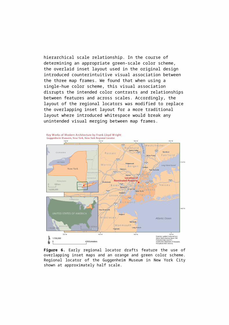
Figure 6. Early regional locator drafts feature the use of overlapping inset maps and an orange and green color scheme. Regional locator of the Guggenheim Museum in New York City shown at approximately half scale.
As shown in Figure 7, the final layout of the regional locator uses a traditional side-by-side layout for the inset maps and a dual dark-light green color scheme. For the national level inset map a dark green fill (CMYK 43, 0, 77, 34) was used to symbolize the extent of the US; a custom light green fill (CMYK 8, 0, 30, 5) with a dark red (CMYK 5, 84, 100, 26) 1.0 weight outline to symbolize the site’s state; a light blue fill (CMYK 25, 0, 7, 10) to symbolize waterbodies. For the state level inset map the same custom light green fill (CMYK 8, 0, 30, 5) with a dark red (CMYK 5, 84, 100, 26) 1.0 weight outline was used to symbolize the site’s state; a custom middle green fill (CMYK 17, 0, 30, 6) was used to symbol-ize surrounding states and a custom middle blue fill (CMYK 25, 0, 7, 10) was used to symbolize the waterbodies. For the main map frame the same custom middle green fill (CMYK 17, 0, 30, 6) was used to symbolize surrounding counties; a second lighter shade of light green fill (CMYK 8, 0, 30, 0) was used to symbolize the site’s city and a dark blue fill (CMYK 30, 0, 10, 20) was used for the waterbodies. Area lightness was set to maintain contrast with white roads and darker gray boundaries and land/water distinc-tions.

Figure 7. Final regional locator design style and layout feature the use of hierarchical color relationship between scales. Regional locator of the Guggenheim Museum in New York City shown at approximately half scale.
In general, there is a dark to light hierarchical flow between map elements and features that intuitively underscore the geographic relationships for each nominated site through different scales. At the same time, background elements utilized a reversed light to dark contrasting hierarchical flow to help balance out the bold and high contrast locator that was requested by the dossier de-signer.
3.4. Ancillary Maps ConstructionAncillary maps for the project include the national locator and other maps that were constructed to supplement the common cartographic products. These supplemental maps include the to-pographic maps for rural sites, the city locators, and district maps for urban sites.

During later stages of the project, it was recommended by the NPS representatives that topographic maps should be addition-ally generated for Fallingwater, Taliesin, and Taliesin West be-cause of their generally rural surroundings. Accordingly, addi-tional GIS data that included leaf-off orthoimages and DEMs for each site were obtained from the USGS National Map Viewer platform. The DEM for each site was used to generate contours, curvature and hillshades for each site. The hillshade and curva-ture layers were overlaid on top of the orthoimages at 85 percent and 80 percent transparencies respectively. Contours were classed using a 20-meter interval, with index contours every 100 meters. The lines were symbolized using the same light green (CMYK 8, 0, 30, 0) hue that was used to symbolized the city ex-tents in the main map frame of the regional locators. As illus-trated in Figure 8, this combination produces visually pleasing topographic maps for each site that provide subtle terrain form to the orthoimages in addition to the labeled contours.Similarly, it was determined during critiques by the NPS that in-termediate level city locators would be beneficial for the Guggen-heim Museum, Hollyhock House, and Robie House given their urban settings. These city locators were between the site maps and the regional locators at an intermediate scale. The design of these city locators was based on the design used for the site maps. The process of constructing these locators involved taking the respective site map and stripping it of the building footprints, property lines, buffer zones, and geo-coordinate markers. The maps were then rescaled to an intermediate level that would yield recognizable maps that could be used to identify a site loca-tion within a particular part of the city and its proximity to other local features and markers. Figure 9 illustrates the final design of the city locator; notice its relation and similarity to the site (Fig-ure 3) and district (Figure 11) maps.
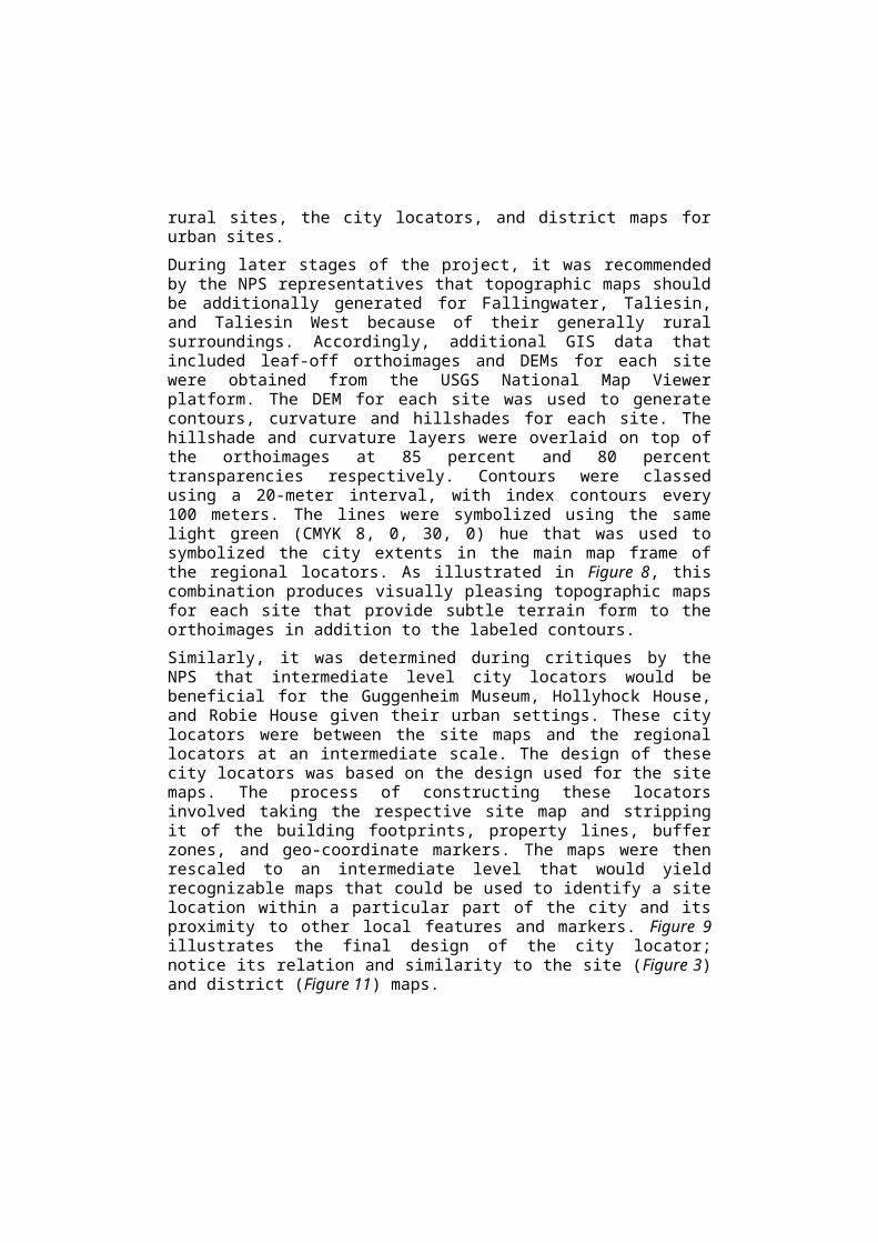
Figure 8. Final design and layout of the topographic map of Taliesin, Spring Green with orthoimagery, transparent terrain form and classed contours shown at approximately half scale.
The need for zoning and district maps for the Guggenheim Mu-seum, Robie House, and Unity Temple was identified near the end stages of the project by the NPS as a means of showing added layers of protection for these properties. These district maps were meant to demonstrate each site’s location relative to surrounding zoning, planned development, and historical dis-tricts. Zoning and district information were provided by the client as graphics from planning and development documents. Thus, each layer was manually drawn with GIS tools. Figure 10 shows a clipped image of the Hyde Park – Kenwood Historical District that encompasses Robie House, taken from a scanned NPS document dated November 10, 1977, which was provided by the client as the basis for the historical district for this site. As shown in the supplied map in Figure 10 and the district lines in Figure 11, boundaries and extents for individual districts were intricate, with multiple voids and irregular vectors within each district. Consequently, the process of digitizing each district re-

quired significant effort, partly due to misalignment between his-torical and present parcel and city plan data.
Figure 9. Final design and layout of the city locator of the Frederick C. Robie House, Chicago shown at approximately half scale.

Figure 10. Supplied map of the Hyde Park – Kenwood Historical Dis-trict, clipped to the extent of the Frederick C. Robie House in Chicago dated November 10, 1977 (Frank Lloyd Wright Building Conservancy).
Each district map shows some combination of developmental, historical, and residential zoning districts that surround or en-compass each site. Additionally, each map features the building footprint of the nominated site, the property line, and the site’s buffer zone. Similar to the city locators, the district maps are based on previously constructed site maps. As illustrated in Fig-ure 11, district maps share the same general design style used in site maps and city locators, with the exception of the style used for added districts lines and extent. Three new custom colors were chosen to represent each of the new district categories with the intent of maintaining the existing contrast between elements within each map. Historical districts were symbolized using green (CMYK 78, 34, 100, 0), development districts were symbol-ized using purple (CMYK 34, 100, 10, 0) and residential districts were symbolized using a yellow-orange (CMYK 0, 33, 100, 0) with a light hash overlay.

Figure 11. Final design and layout of the district map of the Frederick C. Robie House, Chicago with residential, historic, and developmental districts shown in relation to the nominated site shown at approxi-mately half scale.
Additionally, as shown in Figure 12, a national locator with site locations and corresponding states highlighted was constructed during the regional locator construction phase of the project. The national locator uses the same color scheme and design style as the national inset in the regional locator maps. The reason for this was to maintain the developed hierarchical color relationship across multiple map and scales.The ancillary maps collectively help provide essential supplemen-tal context for the other constructed maps.
Figure 12. Final design and layout of the national locator with each nominated site and their corresponding state shown at approximately half scale.

4. ChallengesEach set of drafts underwent multiple rounds of review and cri-tique. First, a set was reviewed internally by the supervising pro-fessor and once these drafts are approved, they were forwarded to the client for review. Early sets of drafts were additionally re-viewed by the dossier designer to ensure design and layout con-formity. Furthermore, each complete set was reviewed by the supervising NPS representatives. Consequently, a challenge of the project involved short timeframes that often followed consec-utive rounds of critiques. Additionally, conflicting revisions were requested, where the team was told to edit a feature in a certain matter, and later informed that those edits have been reversed or are further modified. An example of this rapid turnaround win-dow can be observed in Figure 4, where an edit was requested for the buffer zone on November 10, those changes were incorpo-rated into a draft dated November 11, only to be reverted back to the original extent on November 12. Additionally, due to rounds of critiques being held consecutively, where the drafts are re-viewed by the client on one day and forwarded to the NPS the next with subsequent back-to-back reviews by relevant entities, we often were given short notice and limited windows to conduct edits. Some edits were required to be applied across a range of maps. This is a common cartographer experience.
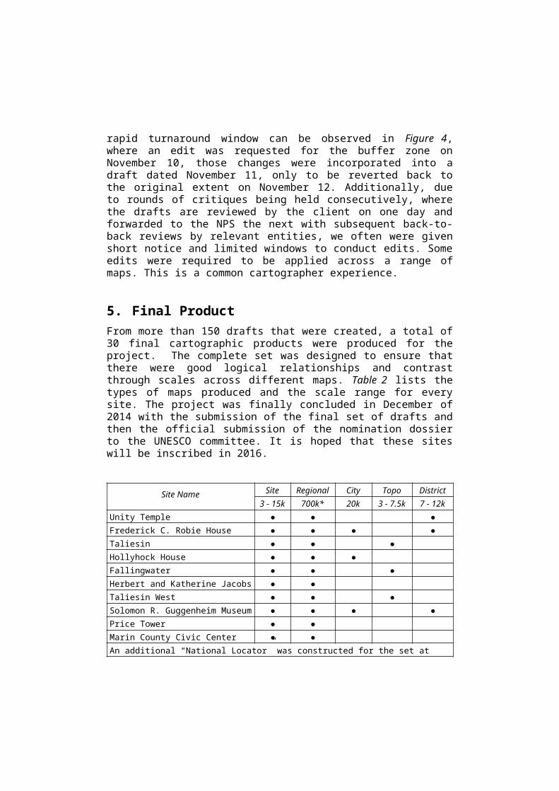
5. Final ProductFrom more than 150 drafts that were created, a total of 30 final cartographic products were produced for the project. The com-plete set was designed to ensure that there were good logical relationships and contrast through scales across different maps. Table 2 lists the types of maps produced and the scale range for every site. The project was finally concluded in December of 2014 with the submission of the final set of drafts and then the official submission of the nomination dossier to the UNESCO committee. It is hoped that these sites will be inscribed in 2016.
Site Name Site Regional City Topo District3 - 15k 700k* 20k 3 - 7.5k 7 - 12k
Unity Temple ● ● ●Frederick C. Robie House ● ● ● ●

Taliesin ● ● ●Hollyhock House ● ● ●Fallingwater ● ● ●Herbert and Katherine Jacobs House ● ●Taliesin West ● ● ●Solomon R. Guggenheim Museum ● ● ● ●Price Tower ● ● Marin County Civic Center ● ●An additional “National Locator” was constructed for the set at 1:21 million scale*Scale of main map frame
Table 2. Map types produced for each nominated site.
6. ConclusionThrough the process of creating the cartographic products about Frank Lloyd Wright sites for the UNESCO World Heritage Nomi-nation, we produced a set of 30 custom maps in 5 different styles that balances the requirements and needs of the client with good cartographic practices and theories. The resulting maps will be used as an integral part of an ongoing proceeding to ensure that modern works of American architecture by Frank Lloyd Wright are protected and recognized. The project started out small with general goals, but over approximately one-year it grew consider-ably both in project extent and the complexity of execution. What seemed a simple GIS data compilation task based on our first maps, required ingenuity to match the look and function with data from varied sources by site. Although, our team faced con-siderable challenges during the execution phase, creative and innovative cartographic principals were applied to ensure that the final products were of the highest quality and suitable for the purpose of ensuring the protection of these ten modern American architectural treasures.
ReferencesFrank Lloyd Wright Building Conservancy. (2015). Nomination to the
World Heritage List by the United States of American 2015 - Key Works of Modern Architecture by Frank Lloyd Wright. Chicago, Illinois: Frank Lloyd Wright Building Conservancy. Accessible from https://savewright.wordpress.com/
Lockhart, S. (Ed.) (2010). The Conservancy and the Making of a Wright World Heritage Nomination. Save Wright - The magazine of the Frank Lloyd Wright Building Conservancy, 2-24.