cs305: hci in sw development readings: id-book textbook ch. 6, through page 240 for exam 2 website...
TRANSCRIPT

CS305: HCI in SW Development
Readings:• ID-Book Textbook
• Ch. 6, through page 240 for Exam 2
• Website on “Duck Book”• http://designinginterfaces.com/

Where Are We?• We know about…
– Learning about users and tasks– Conceptual models, mental models, metaphors,
interaction styles/modes– Lo-fidelity prototyping
• You can now use this to:– Part 2 of project
• Next we want to get more detailed…– Plan, prototype and evaluate more of the high-level
features of a new system– Closer to finished product– Part 3 of project

Outline
• Outline:– Designing overall UI flow– Windows– Widgets / Controls

Overall UI Flow
• Major UI elements are probably windows or screens (on handhelds)– What are they? How are they organized?– Do they “match” users’ mental models of how
they want to achieve tasks?
– Compare to SW architecture design• Major components and their roles• How they’re related• Save detailed design (inside modules) for later

Goal of Modeling UI Flow
• Identify major UI components (windows)– High-level description of their role
• Interactions between these– Conditions?
• Two levels possible– At conceptual design (more abstract)– At physical design (what will be windows)

UIDE book’s Content Diagrams
• Content diagram is:– lo-fi prototype that shows organization and
structure of the UI– from the designer’s perspective (?)
• In physical design, can be transformed into GUI or website or…– May not be a one-to-one match between this
level of abstraction and final physical design

Creating a Content Diagram
• Need to know:– Primary tasks, objects, etc. for this UI– Probably want to have use-cases, scenarios,
etc.
• Then,– Identify containers and “task objects”– Decide which tasks go into each container– Define links that show navigation flow

Content Diagrams: Containers
• Container– an abstract representation of some part of a
user’s work activity– includes functions required to do that activity
• Various levels within the diagram– Main container should record
• Vital tasks and Frequent tasks
– “Lower-level” containers

Content Diagrams: Links
• Links– how the user will navigate in the UI between these
functional areas
• Single link: next container becomes primary focus
• Double link: second container requires context of first container– Example: spell checking window in a word-processor
• Links may have labels to indicate conditions on them

Representing Containers
UIDE book’s template Note: Objects are Task Objects

Example Container

Example Content Diagram

Another Approach: UI Flow Diagrams
• We can do less than this and still benefit• Prototype often called a UI Flow Diagram or
Navigation Diagram in the Unified Process methodology– Post-its or boxes represent major UI elements (e.g.
Windows)– Each has a title (or short description) and often an ID
• ID used to refer to a more detailed diagram (perhaps done later)
• Goals:– Get high-level overview– Trace through use-cases or scenarios

Example: UI Flow Diagram
• From: http://www.agilemodeling.com/artifacts/uiFlowDiagram.htm

At the End: Menu Trees
• Menu trees often used as a form of user documentation– You can see how the earlier design
representations lead to these
• Forms of menu trees may indicate problems (see next slide)

Forms of Menu Trees
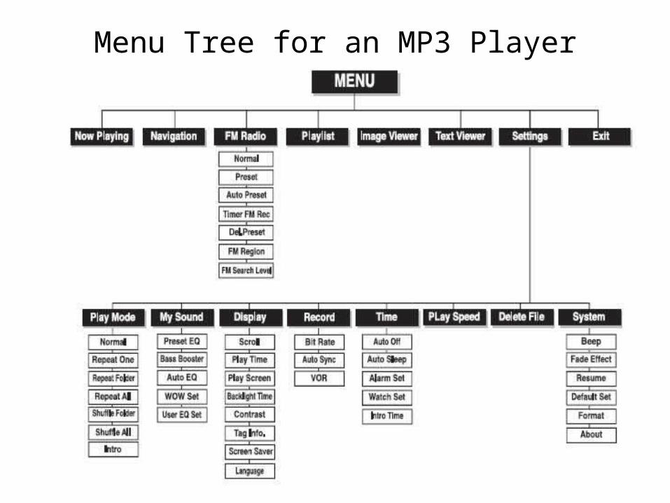
Menu Tree for an MP3 Player

Summary on UI Flow
• Plan overall structure of your major UI elements– Windows or screens– Menus (problably later)
• Some lo-fi methods are quick and potentially useful– If you base these or evaluate these using your
scenarios or use-cases

UI Patterns

Book: Patterns for Effective Interface Design• Interesting recent book!
– Publisher’s site: http://www.oreilly.com/catalog/designinterfaces/index.html
– Author’s page: http://designinginterfaces.com/• Samples!
• Book’s goal: document a collection of interface patterns– from large-scale idioms to small-scale
controls

Sample Chapter Titles
• Information Architecture and Application Structure
• Navigation, Signposts and Wayfinding
• Layout of Page Elements
• Actions and Commands
• Showing Complex Data
• etc.

Example: Organizing Content
• What might the following be?– Two-panel selector– Center-Stage– Extras on demand– One-window drill-down
• Examples?

Interaction Styles
• Earlier we talked about interaction models (high-level, abstract)– These lead to specific interaction styles or modes
• Command-line• Menu selection• Form fill-in• Direct Manipulation
• Right now, can you discuss…?– When appropriate, when not– Pros and cons

Command Line
• Advantages/pros– Efficient, small commands, one task– Easy to extend– Maps well to command-oriented tasks– Small window, fewer GUI resources
• Disadvantages/cons– High memory load (lot to learn, bad for novices, hard
to learn)• Commands aren’t visible
– Harder to have good/obvious feedback• hard to show status
– Safety: errors due to mistyping

Command Line
• Advantages– versatile, flexible– appeals to experts– supports power users (macros, short cuts)
• Disadvantages– requires training, memorization

Menu Selection
• Advantages/Pros– See options, organization, structured– Structured interaction to do a task
• Object/action structure
– Reduced memory load– Easy to learn/remember
• Disadvantages/Cons– May be hard to do repetitive tasks
• May need to repeat navigation through tree
– Deep trees, complex– Misleading structure (mismatch)– Feedback– Hard to extend

Menu Selection
• Advantages– Easy to learn– Fewer keystrokes than command line– Structures commands, decision making– Good for infrequent users
• Disadvantages– Perhaps too many menus, too complex– May slow frequent users– Consumes screen space

Form Fill-In
• Advantages/Pros– Safety! can’t leave out, wrong format– Good for standardized input, so good feedback, good
for repetition/efficiency– Easy to learn if closest to real-world
• Disadvantages/Cons– Very inflexible– If chaging an object, maybe less feedback (limited
input of data, not manipulation)– Maybe hard to generalize for different nationalities,
situations– Takes up a lot of screen

Form Fill-In
• Advantages– Simplifies data entry– May require some training– Assist users and prevents errors
• Disadvantages– Consumes screen space

Direct Manipulation
• Adv./Pros:– Great where program objects have a natural viz.– Easy to learn/remember
• May follow a metaphor• Small memory load: Commands/objects/possibilities are visible
– Good feedback– Safety: recover, prevent
• Disadv./Cons– Lots of resources, screen space– Maybe bad for repetition, experts (see Menu)– Breaks down (eventually)
• Can be mixed with others

Direct Manipulation
• Advantages– Users see task concepts visually– Easy to learn, remember– Avoids errors and provides recovery– Encourages exploration
• Disadvantages– Requires graphic displays and continuous input
devices– Icons and metaphors may have different meanings

Can these be blended?
• Of course (duh)!
• Examples and rationale?

Windows
• We know a lot about these already, eh?
• Primary Windows
• Secondary Windows– modal vs. modeless– dialog boxes– configuration, tabs
• Mouse focus

Organizing a Windowing Interface
A window is a container that designers use to organize the information that users see in an application
– Window interface actions include• Open action• Close action • Resize action • Move action • Bring forward or activation

Multiple Windows Design
– Advantages• Windows optimize the use of limited display space:
– More information can be accessible
• Users can use multiple sources on screen simultaneously to complete a task:
– They give the user freedom to multitask
• Windowing Systems allow standardization of interfaces across many applications
– The user moves easily between applications and quickly learns to use new applications.
• Automatic facilities for organizing window working sets:– save time and make large collections of windows easier to
manage
• They lend themselves to direct manipulation

Multiple Windows Design
– Disadvantages:• Users perform some tasks slower
– Due to the need to switch windows– Due to getting lost
• Display screen size and resolution are limitations• Time can be lost in rearranging windows• User can be confused by user switches context

Window/Screen designTwo aspects:
•How to split things across screens •moving around within and between screens•how much interaction per screen?•serial or workbench style?
•Individual screen design• white space: balance between enough information/interaction and clarity• grouping items together: separation with boxes? lines? colors?

Screen design: splitting functions across screens
•Task analysis as a starting point
•Each screen contains a single simple step?
•Frustration if too many simple screens
•Keep information available: multiple screens open at once

Screen design: individual screen design
•Draw user attention to salient point, e.g. colour, motion, boxing•Animation is very powerful but can be distracting•Good organization helps: grouping, physical proximity•Trade off between sparse population and overcrowding

Information display
•Relevant information available at all times
•Different types of information imply different kinds of display
•Consistency between paper display and screen data entry


Types of Windows
– Primary window: • is a window in which
the user's main interaction with the data or document takes place
• An application can use any number of primary windows, which can be opened, closed, minimized, or resized independently

Types of Windows
– Secondary window:• is a supportive window that is dependent on
– a primary window or– another secondary window

Types of Secondary Windows
• Message boxes– Often modal: must exit or OK before
continuing
• Dialog boxes– Enter additional information– Sometimes modal, sometimes modeless
• Comments?

Types of Windows
– Utility window:• is a window whose contents affect an active primary window • Unlike secondary windows, utility windows remain open when primary
windows are closed or minimized. • e.g. tool palette that is used to select a graphic tool.

Types of Windows– Plain window:
• is a window with no title bar or window controls• typically used for splash screens

Tabs in Windows
• Why use tabs?
• Irritations?
• Alternatives?
• (See text or reflect on the discussion we had in class)

Wizards
• A wizard is really a sequence of dialog boxes to achieve a certain goal– Install, configure, etc.
• An example of the conversational interaction mode
• Issues to consider:– Modal or modeless?– Navigation: just next and back, or– allow users to see the complete set and jump directly
to a screen

Some Examples
• Following screen shots discussed in class
• Some of these deal with configuration– Interesting problem: large number of choices,
infrequently used, important for novice and expert
– Note variety of approaches
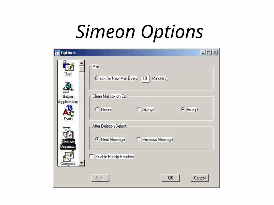
Simeon Options

Netscape Preferences

Tabbed Menus

IBM Thinkpad Config

Multiple Rows of Tabs

Visual C++ Settings

Outlook

Windows Media Player

Windows Media Player

General guidelines for arranging windows
– Ensure window arrangement is only changed by the user
– Keep secondary windows to only one level and limit their number
• Secondary windows can be:– Windows within windows
– Separate windows that depend on a primary window
– Make the use of secondary windows optional– As alternatives use multiple primary windows or
menus

General guidelines for arranging windows
– Allow the user to save the arrangement of windows from run to run of a program
– Allow a choice of what to do when opening new windows:
• Automatically position• Cascaded is best
– Respond to window events in real time• Dragging, resizing, bringing to front, closing,
iconizing

Window Focus• Which window gets events like key-presses?• Two approaches have been used:
– “Mouse focus” vs. “click-to-focus”
• Mouse focus– Typical of original UNIX X-windows windows
managers– Input goes wherever the mouse is pointing
• Windows doesn’t have to be on top
– Input can go into a partly obscured window
• Comments?

Mouse Focus: pros/cons
• Disadvantages– Harder for novices
– Not-consistent with other platforms
• Advantages:– Allows easier interaction with multiple
windows without rearranging
– Faster interaction in many cases

Click-to-Focus
• Click to focus– Default in MS-Windows and Macintosh– A window must be brought to the front before
it will accept input– Input goes to that window regardless of where
the mouse is pointing– Advantage:
• Input cannot accidentally input to the wrong window

Focus within Applications
• Many apps have multiple panes or panels• Case study: Netscape/Mozilla email client
– message-list pane and message-pane– change of focus for key-input after one of the two
scroll-bars has been used– Demo’d in class, but some screen captures next
• What are the issues is usability terms?– Your answers are:– Visibility: Can I easily see which pane has focus?– Consistency: Clicking message-list scroll-bar assigns
key-focus to message list, but not the other way

Two panes, Two scroll-bars
Select message first. What does PageUp change? The message-list.

Two panes, Two scroll-bars
Select text in message, then hit PageUp. What changes? The message.

Two panes, Two scroll-bars
Move message scroll-bar, then hit PageUp. What changes?Surprise! The message-list!

Widgets within Windows
• Terminology:– widgets, controls (.NET), components (Java)– Here I mean: “smaller” GUI objects in a
window that the user directly interacts with• Input, output, display, control,…
• menus, toolbars, buttons• option buttons, check-boxes, list-boxes,
text-boxes, combo-boxes• Others too

Commands
• Menus and menu-structure
• Buttons
• Toolbars

Buttons
• Maybe the simplest widget?
• But– What labels? Too often defaults to OK,
Continue, Accept, etc. when that is ambigious in the context
– Where positioned? Consistency, prominent position
– Size and shape: pretty vs. visible

From In-class Exercise, Windows

From In-class Exercise, Mac OS


Toolbars
• Alternatives to menu hierarchies– Why have them? Your answers are:
• Location: tool bar at top of window, or secondary window (floating)
• Key issue: the icons– Problems, issues?

Desirable Icon Properties
• Easily distinguished• Easily recognized and understood• Visually simple• Easy to perceive
– Use of color, detail, not to complex• Informative
– Good example: text-justification icons• Should represent concrete objects
– Home, printer
• From Horton, 1991 (no relation)

More on Icons
• See ID-book, pp. 235-239
• Note icon design for handheld devices– Digital cameras– Phones
Menus
• Types– Permanent (menu bar, in a form, toolbar)– Pull-down– Pop-up– Roll-up– Modal: Each menu is a complete screen or Web page
• Note: there are equivalents to menus on web-pages, hand-held devices– Many principles that follow apply to these too!

Roll-up Menu Example

Menus
• Meaningful organization demonstrated to reduce error rates, think time– Organize based on task-related objects
and actions– Repetition of items in menus? (Creates a
acyclic network.)• Confusing to some. See this on the Web.• Why?
– Harder mental model with no “level”.

Menu Dimensions
• How to measure “size” or “complexity”?
• Menu items, nested menu items, nested menu items…– Many forms of this:
Pull-down, screens, tabs, etc.– All are just different organizations of a multi-
dimensional structure
• How to cope? Are there rules?

Menu Depth vs. Breadth
• Depth: number of levelsBreadth: number of items per level
• Empirical studies show: Prefer menu breadth over depth.– Limit menu trees to three levels– User-stress has been tested in one study

Menu Content Organization
• Item Presentation Sequence– The order of items in the menu is important, and
should take natural sequence into account when possible:
• Time • Numeric ordering • Physical properties
– When cases have no task-related orderings, the designer must choose from such possibilities as:
• Alphabetic sequence of terms • Grouping of related items • Most frequently used items first • Most important items first.
Menu Organization and Frequency of Use
• Question: What do you think about Windows technique of hiding infrequently used items?– These are known as adaptive menus
• What’s the goal here?– Improve efficiency
• At what cost?– Consistency
• Users vary in their preference!– Possible to allow users to customize menu order– Or, mix frequency with standard order (e.g. fonts)

Content Organization and Freq.

Menu guidelines to assist users
• Keep menus self-explanatory– Give items meaningful labels– Be consistent in grammar and pattern in sets
of menu labels• e.g. the following set of labels is bad!• ‘up’, ‘go down’, ‘forward’, ‘reverse’
– Ensure all items correspond to the name of the menu
• i.e. menu items should be meaningfully organized• e.g. on an ‘insert’ menu, all items should be
things to insert

Menu guidelines to assist users
• When standards or conventions exist, follow them
• e.g. ‘file’, ‘edit’ and ‘window’ menus
• Ensure items only correspond to the name of this menu (not any other)– i.e. make sure the each item can only logically be in
one place– rename the item or the menus if necessary– Prevent users from searching the wrong menu

Menu guidelines to assist users
– Use checkmarks to show state of toggles– Use a triangle to show when there is a submenu– Use an ellipsis to show when the action cannot be
completed without further input• e.g. ‘save as...’• Means a modal dialog box must be filled in• But don’t use an ellipsis when just opening a new non-
modal window
– Group related menu items• Separate groups by horizontal lines• This allows users to focus attention• An ISO rule: g = √n (Fig. 6.3, p. 235 in ID-Book)• Good grouping can allow the total number of items to be
increased to 15-20

Menu guidelines to assist users
– Disable items that are not valid in the current context
• ‘Grey them out’• Do not remove them unless the user persistently
works in a context where a set of items is never valid (e.g. beginner mode)
• Provide tool tip help even on disabled items

Menu guidelines to assist users
– Provide a facility to back up to the previous level in multi-level modal menus
• E.g. to go to the home page or parent page– Provide visible feedback so users know where
they are in a menu hierarchy• e.g. when displaying a lower-level web page
– Allow the user to pick from higher levels directly• For screens displayed as a result of menu choices,
display the menu item that led to the screen• The above always ensures the user keeps a mental
model of where they are– Provide a menu map, equivalent of a site map on
a Web site

Menu guidelines to assist users
– Use modal menus only for systems that are used for searching through categories of information
• E.g. directories on the web• Design most applications so users have access to
all commands at all times
– Consider providing ‘beginner’ menus with fewer choices

Menu guidelines to assist users
– Provide a way of accessing help on each menu and item
• This facilitates exploring and building the user’s mental model
• Dynamic tool-tip/balloon help when cursor pauses over the item
• One-key access to context-sensitive help about whatever the cursor is pointing to

Menu guidelines to assist users
– Allow direct picking of items from menus• ... as opposed to ‘choose the number’ of the menu
item• On a character-based display, use cursor keys to
select.• This only works if the number of items is few• Where there are too many items to allow cursor
movement, preferably use mnemonic alphabetic choices
• as well as cursor movement

Menu guidelines to assist users
• Help the user perform frequent and repetitive actions– Place the most used menu items near the top
• If frequencies are equal, order by natural sequence or sequence performed in the task
• If still equal, order alphabetically• But never sacrifice good grouping
– Provide keyboard shortcuts and display them on the menu
• Allow tailoring of shortcuts

Menu guidelines to assist users
• Provide pop-up menus for key actions• Especially if context sensitive• i.e. action depends on what is selected• But in general, permanent menus are better
• Consider providing history tracking:• When a menu is displayed, place the cursor on the
most recent item chosen from this menu• Palm OS does this

Summary of What We Covered
• Planning Overall Flow, Design– Patterns– Interaction Styles
• What goes into screens, menus?
• Types of Windows
• Commands– Buttons, Toolbars (icons)– Menus