cs-e4840 information visualization lecture 1: introduction
TRANSCRIPT
CS-E4840 Information Visualization
Lecture 1: Introduction and graphical excellence
Tassu Takala <[email protected]>1 March 2021
1

Data visualization gives…• Quick overview
• Summaries and trends
• Details in context (e.g. on the map)
• Relations between items
• etc.
2
Helsingin Sanomat 24 Feb 2020

Why visualization matters• In data analysis we try to understand and find interesting patterns from complex data
• Visualizing data properly is important for
• understanding the data
• properly communicating discovered results
• The course goal is to teach how to
• design good plots
• recognize bad and manipulative plots (and they are everywhere!)
• Necessary for research and data science
• But also, a general methods course.
3

Anscombe's quartet1 2 3 4
x y x y x y x y
10.0 8.04 10.0 9.14 10.0 7.46 8.0 6.58
8.0 6.95 8.0 8.14 8.0 6.77 8.0 5.76
13.0 7.58 13.0 8.74 13.0 12.74 8.0 7.71
9.0 8.81 9.0 8.77 9.0 7.11 8.0 8.84
11.0 8.33 11.0 9.26 11.0 7.81 8.0 8.47
14.0 9.96 14.0 8.10 14.0 8.84 8.0 7.04
6.0 7.24 6.0 6.13 6.0 6.08 8.0 5.25
4.0 4.26 4.0 3.10 4.0 5.39 19.0 12.50
12.0 10.84 12.0 9.13 12.0 8.15 8.0 5.56
7.0 4.82 7.0 7.26 7.0 6.42 8.0 7.91
5.0 5.68 5.0 4.74 5.0 5.73 8.0 6.89
All of the four Anscombe's datasets 1-4 have the same linear statistics.
4
y ⇡ y = x/2 + 3
x = 9 y = 7.5
�2x = 11 �2
y = 4.127
cor(x, y) = 0.816
What is the difference?

Anscombe's quartet
5
●
●
●
●
●
●
●
●
●
●
●
●
●
●
●
●
●
●
●
●
●
●
●
●
●●
●
●
●
●
●
●
●
●
●
●
●
●
●
●
●
●
●
●
3 4
1 2
5 10 15 5 10 15
5.0
7.5
10.0
12.5
5.0
7.5
10.0
12.5
x
y
1 2 3 4
x y x y x y x y
10.0 8.04 10.0 9.14 10.0 7.46 8.0 6.58
8.0 6.95 8.0 8.14 8.0 6.77 8.0 5.76
13.0 7.58 13.0 8.74 13.0 12.74 8.0 7.71
9.0 8.81 9.0 8.77 9.0 7.11 8.0 8.84
11.0 8.33 11.0 9.26 11.0 7.81 8.0 8.47
14.0 9.96 14.0 8.10 14.0 8.84 8.0 7.04
6.0 7.24 6.0 6.13 6.0 6.08 8.0 5.25
4.0 4.26 4.0 3.10 4.0 5.39 19.0 12.50
12.0 10.84 12.0 9.13 12.0 8.15 8.0 5.56
7.0 4.82 7.0 7.26 7.0 6.42 8.0 7.91
5.0 5.68 5.0 4.74 5.0 5.73 8.0 6.89

Course topics
1. General principles, with basics of data graphics and definitions of good information visualisations
2. Basics of human visual system, with respect to the problem of designing and developing good visualizations
3. Visualisation methods for complex data and interaction.
6

Course topics
Part 3. how to select the right data?
Part 2. how we see it?
Part 1. how to design a presentation?
BIG DATA

Part 0: Practicalitieswhat to do and how to pass the course
8
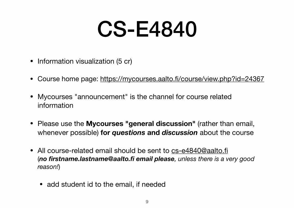
CS-E4840• Information visualization (5 cr)
• Course home page: https://mycourses.aalto.fi/course/view.php?id=24367
• Mycourses "announcement" is the channel for course related information
• Please use the Mycourses "general discussion" (rather than email, whenever possible) for questions and discussion about the course
• All course-related email should be sent to [email protected] (no [email protected] email please, unless there is a very good reason!)
• add student id to the email, if needed
9

CS-E4840• Spring term (Period IV) 2021
• 11 lectures on Mondays 16:15-18 and Thursdays 10:15-12
• First lecture on 1 March and last on 8 April
• 3 assignments at your own time (no exercise sessions)
• Exam on 16 April at 13-16. Next one in September
• Check Oodi for up-to-date information on the exam schedule!
10

Staff• Lecturer and responsible teacher
• Tassu Takala http://www.cs.hut.fi/~tta/
• Assistants
• Felix Epp
• Omer Khan
• Jehan Khattak
• Manila Kodali
• NN
11

Language• English
• lectures
• slides
• assignments
• exam
• You can answer the exam in English, Finnish, or Swedish
• questions will only be available in English
12

Participating
• To participate to this course, you need to be registered as a student at the Aalto University
• You also need a student number and a valid registration in Oodi
• In exceptional cases, we may send you emails (e.g., lecture cancellations) using your addresses in Oodi
13

Course structure and goals
• Information visualization is a diverse topic
• The goal of this course is to discuss information from different points of view
• Thematically, course is divided in 3 parts:
1. Basic elements and core guidelines of visualization (four lectures)
2. Human perception and its relation to visualization (three lectures)
3. Algorithms for visualizing complex (such as high-dimensional) data, and interactive visualization (four lectures)
14

Prerequisites• BSc degree or equivalent knowledge (math etc.)
• e.g. optimization techniques such as gradient descent, as well as linear algebra (Part 3)
• Basic programming skills for plotting
• Get familiar with R, Matlab, or some similar software(Excel is not enough)
• Knowing the prerequisites is up to you
15

Grading• The course grade is determined by the exam and 3
assignments:
• Exam:
• 5 questions, 6 points each = 30 points, maximum
• Assignments:
• 3 assignments (more about them later)
• total of 45 points, maximum
16
Total points and passing the course
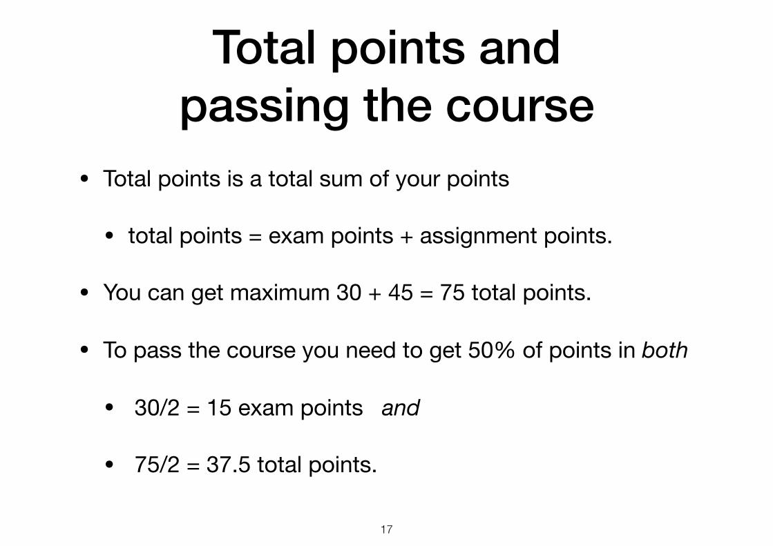
• Total points is a total sum of your points
• total points = exam points + assignment points.
• You can get maximum 30 + 45 = 75 total points.
• To pass the course you need to get 50% of points in both
• 30/2 = 15 exam points and
• 75/2 = 37.5 total points.
17

Total points and the grade• The grade is computed by
• With this formula, the grade thresholds are
• total points 37.5: grade 1
• total points 45: grade 2
• total points 52.5: grade 3
• total points 60: grade 4
• total points 67.5: grade 5
grade = min
✓5, 1 + b total points� 37.5
7.5c◆
18

Exam
• You need to pass one exam
• the date for the first exam is 16 April
• the 2nd exam will take place during autumn 2021
• you need to pass only one of these exams
• you can do multiple exams, the highest points will stand
19

Assignments• 3 assignments
• tentative deadlines: 21 March, 6 April, and 25 April.
• submit your answers using Mycourses
• late submission policy: automatic –3 points per day
• you should do the assignments by yourself ( plagiarism not allowed! )
• submission format: PDF
• feedback on the answers will be posted on Mycourses
20
Assignments
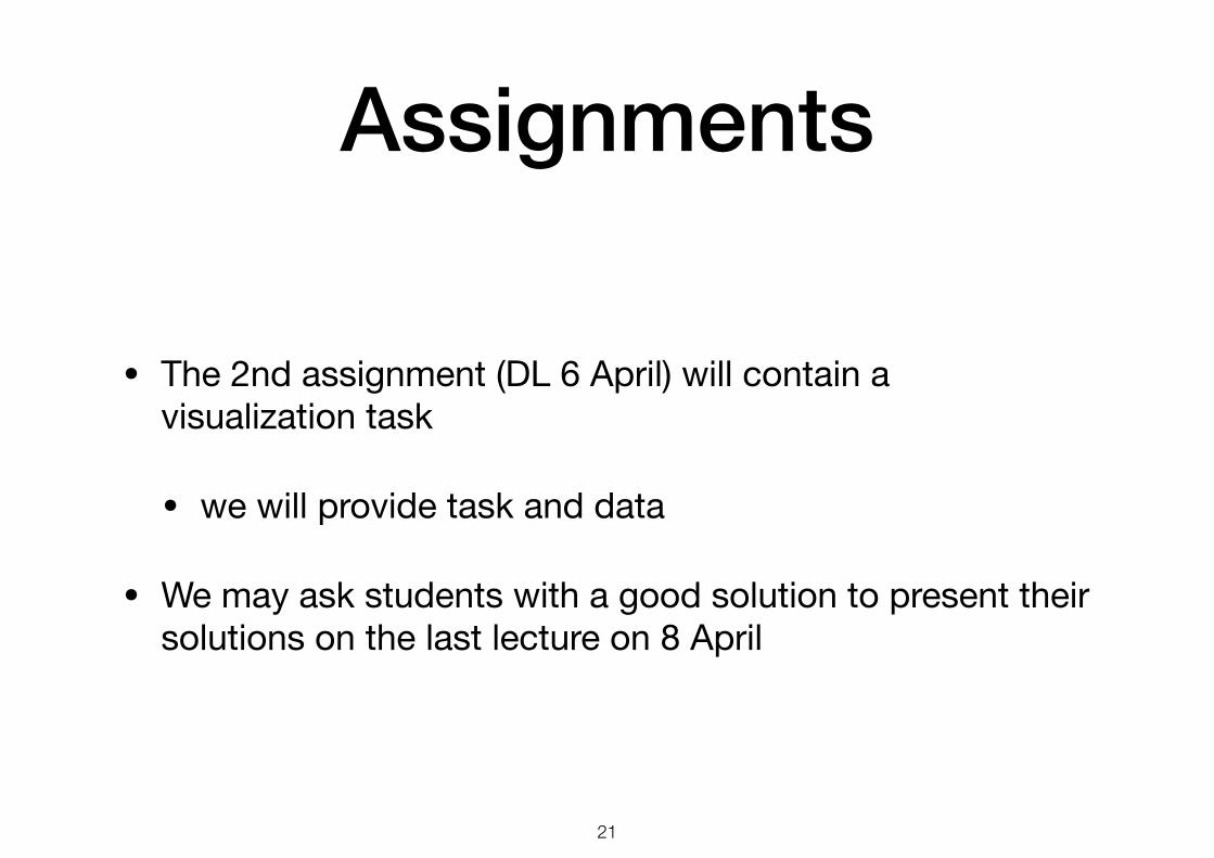
• The 2nd assignment (DL 6 April) will contain a visualization task
• we will provide task and data
• We may ask students with a good solution to present their solutions on the last lecture on 8 April
21

Assignments
• the majority of points will come from assignments
• passing the course is significantly easier, if you do your assignments well
• take the assignments seriously
• start early, some of the assignments may take a lot of time
22

Validity period
• Exam results and assignments will be valid only until end of 2021
• Grading criteria and the contents of the Spring 2022 course may be different!
23

Course material• Lecture slides
• available online, at MyCourses, before the corresponding lecture
• mostly based on previous years’ slides by Kai Puolamäki, Antti Ukkonen, Pekka Marttinen, Francesco Corona, Amaury Lendasse, Luana Micallef, and Nikolaj Tatti.
• The purpose of lecture slides is to support presentation, not to act as self-contained reading material (use books instead, or attend the lectures!)
• Books
• Software
24

Recording lectures
• The lectures will be recorded
• Video recordings are made available in MyCourses
• access restricted to registered students only
• If you don't want to appear in recordings, keep your video camera shut
25

Main course books• Edward R. Tufte, The visual display of
quantitative information, 2nd Ed., Graphics Press (2001). A classic work on good graphical practice
• Colin Ware, Information Visualization: Perception for Design, 3rd Ed., Morgan Kaufmann (2012). A good summary on human perception in relation to visualization [ebook available]
• Stephen Few, Now You See It: Simple Visualization Techniques for Quantitative Analysis, Analytics Press (2009)
26

Other useful books• Alan Izenman. Modern Multivariate Statistical Techniques: Regression, Classification,
and Manifold Learning. Springer (2008).
• Tamara Munzner, Visualization Analysis and Design, CRC Press (2014).
• Jacques Bertin, Semiology of graphics. The University of Wisconsin Press (1983).
• William S. Cleveland, The Elements of Graphing Data, Revised Edition, Hobart Press (1994).
• John A. Lee and Michel Verleysen, Nonlinear dimensionality reduction, Springer (2007).
• Manuel Lima, Visual complexity: Mapping patterns of information, Princeton Architectural Press (2011).
• Other books by Tufte: Envisioning information, Visual explanations, and Beautiful evidence .
27

Also in Finnish• Juuso Koponen, Jonatan Hildén, Tapio Vapaasalo,
Tieto näkyväksi: informaatiomuotoilun perusteet, Aalto Arts Books (2016).
• Good coverage of graphical design,practical techniques and appications.
28

Software• Useful software for your exercises/assignment (not all is needed and there is no "official" course software, but
you will need some programming skills)
• R (www.r-project.org) - recommended
• R Shiny (shiny.rstudio.com) - recommended for interactive data visualisation
• RStudio (www.rstudio.com) - R and R Shiny in a nice package, with a website with links to tutorials etc.
• Matlab (installed in Aalto computers) or Octave
• Python and matplotlib
• Prefuse and Flare: prefuse.org and flare.prefuse.org
• Processing: processing.org
• D3.js: d3js.org
• Open office or MS Excel
• ...or any other software you are comfortable with
29

Part 1: Graphical excellence
what is a well-designed presentation
30

Edward Tufte• Edward Tufte (1942-), American statistician and Yale University
emeritus professor of political science, computer science, and statistics. www.edwardtufte.com
• The visual display of quantitive information (1983 and 2009) is a classic on data graphics, charts and tables
• A landmark book, a wonderful book. Frederick Mosteller, Harvard
• A tour de force. John Tukey, Bell Labs & Princeton
• The century’s best book on statistical graphics. Computing Reviews
• One of the best books you will ever see.Datamation
• Best 100 non-fiction books of the 20th century. Amazon.com
• Reading it is a must to understand how you are being lied to by politicians. djinni111@thepiratebay
31

Graphical excellence• Graphical excellence is all about the well-designed presentation of interesting
data
• you need to have good data
• your (statistical) analysis needs to be solid
• the plot needs to be well-designed
• complex ideas communicated with clarity, precision, and efficiency
• Graphical excellence gives to the viewer the greatest number of ideas in the shortest time with the least ink in the smallest space
• nearly always multivariate, complex data
• tells the truth about the data
32

Goals of visualization• Presentation (4,000 years)
• starting point: facts to be presented
• goal: visualization which makes the facts apparent
• “You do not really understand something unless you can explain it to your grandmother.” (Albert Einstein ?)
• Confirmative analysis (200 years)
• starting point: hypothesis about the data
• goal: confirmation or rejection of the hypothesis
• Explorative analysis (≈ 20 years)
• starting point: no hypothesis about the data
• goal: hypothesis about the data
33

Information visualization• Data graphics display measured quantities using and combining
• points and lines, a coordinate system, numbers, words, shading, and colour
• Showing numbers with abstract pictures, without direct connection to the physical world, is a surprisingly recent invention,
• perhaps due to the diversity of skills required: visual-artistic, empirical-statistical, and mathematical
• Statistical graphics were invented around 1750–1800, long after Cartesian coordinates, logarithms, the calculus, and the basics of probability theory
34

History of data graphics• History of graphics
• maps, time series, narratives of space and time, abstract graphics
• These illustrations serve multiple purposes
• providing a set of high-quality graphics
• helping to demonstrate the terminology
• telling about the history of graphical development
• seeing how good statistical graphics can be
• understanding that visual designs that we take for granted sometimes took even thousands of years (!) to be perfected
35

Cave paintings
http://colophon.com/gallery/minsky/caves.htm 36

Data maps• Data map is a graphic showing data
on a map
• In the 17th century the combination of cartography and statistical skills required to construct a data map came together
• 5000 years after the first geographic maps were drawn on clay tablets
• Many highly sophisticated geographic maps were produced centuries before the first map containing any statistical material was drawn
37

Cartography in China• The map of the tracks of Yü the
Great , detailed map engraved during the 11th century.
• Joseph Needham in Science and civilization of China (1959) described this as "...the most remarkable cartographic work of its age, in any culture".
• Full grid (100 li scale), a relatively firm coastline, an extraordinary precision of the network of rivers
• There is nothing like it in Europe till about 1550
38

Approaching data maps• By that time, European
cartography had come close to achieving statistical graphicacy, even approaching scatterplots but
• no one had made the quantitative abstraction of placing a measured quantity on the map’s surface
• let alone the more difficult abstraction of replacing latitude and longitude with some other dimensions
39

Data maps (wind maps)
• One of the first data maps is a world chart showing trade winds and monsoons (1689)
• Edmond Halley (1656-1742), English astronomer, geophysicist, mathematician, meteorologist, and physicist (best known for computing the orbit of a comet)
40
See other visualizations at https://en.wikipedia.org/wiki/Trade_winds

Modern data maps
2dF Galaxy Redshift Survey
41

Modern data maps
http://paulbutler.org/archives/visualizing-facebook-friends/42

Data maps (cholera deaths)• An early and worthy use of a map to
chart non-geographical patterns
• Cholera broke out in Broad Street area in London on 31 August 1854, with over 500 deaths
• John Snow, M.D., obtained a list of deaths and by persistent case-by-case detective work he discovered the probable cause for the epidemics: a water pump at the Broad Street
• The pump handle was removed on 7 September and the epidemics ended.
• Previously it was thought that cholera spread via impure air etc.
43
Kai P
uola
mäk
i at B
road
Stre
et

Data maps (cholera deaths)
Cholera deaths are marked with dots
11 water pumps are marked with crosses
44

Why was Dr. Snow taken seriously?
• Data was placed in an appropriate context to make the relation between cause and effect apparent. Time series, for instance, would not have been useful for finding the cause in this case.
• Quantitative comparisons were made. For example, Snow found that the employees of the adjacent brewery were saved because they didn’t drink the water from the polluted well. They were saved by the beer(!).
• Alternative explanations were considered. Snow also analysed deaths that occurred far away from the Broad Street.
• Snow made a honest estimation of errors reported in his map. Snow’s map does not for example show the population density.
45

EpilogueE. R. Tufte, 1998 [VE 36].
Did Dr. Snow's action end the epidemics or would it have
ended by itself...?
Mark Monmonier, 1991 [VE 35].
John W. Tukey, Science, 1977 [VE 37].
46
How not to do it:

Time series• Time series plot is one of the oldest and most frequent graphic design
• Part of the text for monastery schools, 900–1100 [T 28].
47

Time series• Johann Heinrich Lambert (1727–1777)
• Swiss mathematician, physicists, astronomer, ...
• hyperbolic geometry and properties of map projections
• the law of light absorption (Beer-Lambert Law)
• William Playfair (1759–1823)
• Scottish engineer and a political economist
• founder of graphical methods of statistics
• pioneer of information graphics
48

Time series (Lambert)• This drawing of Johann
Lambert (1779) shows the periodic variation in soil temperature in relation to the depth under the surface
• the greater the depth, the greater the time lag in temperature responsiveness
• modern time series graphics differ little from those of Lambert
49

Time series (Playfair)
• Playfair was the first to plot economic time series in his book Commercial and political atlas (London, 1786).
50

Time series (Playfair)
51

Time series (train schedule)
E. J. Marey, 1885 [T 31].52

Complex time series• Time series are best used for data sets that include rich,
variable and complex statistical material. Smaller and simpler data sets are described better with a few numbers and a table.
New York Times, 11 January 1981 [T 30].53

Narratives of space and time (= map + time series)
• Adding spatial dimensions can enhance greatly the explanatory power of time series displays
• the data are moving over space (2–3 dimensions) as well as over time
• space-time story graphics can illustrate how multivariate complexity can be subtly integrated into graphical architecture
• the integration can be gentle and unobtrusive that viewers (or users) are hardly aware that they are looking to a world of four or more dimensions
54

Jovian moons• On 10 January 1610
Galileo Galilei was able to separate the motion of the Jovian satellites from that of the planet.
• It took 300 years to move from dots to continuous curves, with muted horizontal lines, that report every position of the moons.
Sky & Telescope, 1988 [EI 100].55

Sunspots
E. W. Maunder, 1904 [EI 22].Christopher Schneier, 1630 [EI 21].
56

Carte Figurative by Minard
• Charles Joseph Minard (1781-1870)
• French civil engineer
• designed graphic of the terrible faith of Napoleon’s army in the Russian campaign (1869)
• Several variables are plotted
• the size of the army
• its location on a two-dimensional surface
• the direction of the army’s movement
• the temperature at various dates during the retreat
• Tufte: ”It may well be the best statistical graphic ever drawn”
57

Discuss with your neighbour and find 1-3 reasons why this is good (or bad?)
58

Space-time narratives
(from the United States Holocaust Memorial Museum)
59

Space-time narratives
un.org60

Relational graphics
• The invention of data graphics required replacing the coordinates of the map with more abstracts measures, not based on geographical analogy
• moving from maps and time series to fully abstract statistical graphics was a big step
• thousands of years passed before this step was taken
• Lambert, Playfair, and others in the 18th century
61

From overlapping time series...
J. H. Lambert, Essai d’hygrométrie ou sur la mesure de l’humidité, Mémoiresde l’Académie Royale des Science et Belles-Lettres, 1769.
62

...to relational graphics
X = temperature
Y = measured rate
63

Graphical excellence• In summary, graphical excellence is the well-designed presentation of
interesting data
• it is a matter of substance, of statistics, and of design
• Graphical excellence consists of complex ideas communicated with clarity, precision and efficiency or, it should give to the viewer
• the greatest number of ideas
• in the shortest time
• with the least ink
• in the smallest space
64

Next lectures• Graphical practice (cont.)
• Theory of data graphics
• Something to watch meanwhile
• Martin Krzywinski’s lecture(s) https://youtu.be/M-rTAr3pj5g
• Hans Roesling's TED talks https://youtu.be/hVimVzgtD6w
65