core concepts in data analysis: summarization, correlation
TRANSCRIPT
September 30, 2010
Core Concepts in Data Analysis: Summarization, Correlation, Visualization
Boris Mirkin
Department of Computer Science and Information Systems, Birkbeck, University of London, Malet Street, London WC1E 7HX UK
Department of Data Analysis and Machine Intelligence, Higher School of Economics, 11 Pokrovski Boulevard, Moscow RF
Abstract
This book presents an in-depth description of main data analysis methods: 1D summarization, 2D analysis, popular classifiers such as naïve Bayes and linear discriminant analysis, regression and neuron nets, Principal component analysis and its derivates, K-Means clustering and its extensions, hierarchical clustering, and network clustering including additive and spectral methods. These are sys-tematized based on the idea that data analysis is to help enhance concepts and rela-tions between them in the knowledge of the domain. Modern approaches of evolu-tionary optimization and computational validation are utilized. Various relations between criteria and methods are formulated as those underlain by data-driven least-squares frameworks invoked for most of them. The description is organized in three interrelated streams: presentation, formulation and computation, so that the presentation part can be read and studied by students with little mathematical background. A number of self-study tools – worked examples, case studies, pro-jects and questions – are provided to help the reader in mastering the material.

ii
Acknowledgments Too many people contributed to the material of the book to list all their names. First of all, my gratitude goes to Springer’s editors who were instrumental in bringing forth the very idea of writing such a book and in channeling my efforts by providing good critical reviews. Then, of course, I thank the students at my classes in MS programs in Computer Sci-ence at Birkbeck and, more recently, in BS and MS programs in Applied Mathematics and In-formatics at HSE. Here is a list of people who directly contributed to this book with advice, and sometimes with computation: I. Muchnik (Rutgers University), M. Levin (Higher School of Economics Moscow), T. Fenner (Birkbeck University of London), S. Nascimento (New Univer-sity of Lisbon), T. Krauze (Hofstra University), I. Mandel (Telmar Inc), V. Sulimova (Tula Technical University), and V. Topinsky (Higher School of Economics Moscow).

iii
Preface This is a textbook in data analysis. Its contents are heavily influenced by the
idea that data analysis should help in enhancing and augmenting knowledge of the domain as represented by the concepts and statements of relation between them. According to this view, two main pathways for data analysis are summarization, for developing and augmenting concepts, and correlation, for enhancing and estab-lishing relations. Visualization, in this context, is a way of presenting results in a cognitively comfortable way. The term summarization is understood quite broadly here to embrace not only simple summaries like totals and means, but also more complex summaries such as the principal components of a set of features or clus-ter structures in a set of entities.
The material presented in this perspective makes a unique mix of subjects from
the fields of statistical data analysis, data mining, and computational intelligence, which follow different systems of presentation.
Another feature of the text is that its main thrust is to give an in-depth under-
standing of a few basic techniques rather than to cover a broad spectrum of ap-proaches developed so far. Most of the described methods fall under the same least-squares paradigm for mapping an “idealized” structure to the data. This al-lows me to bring forward a number of relations between methods that are usually overlooked. Just one example: a relation between the choice of a scoring function for classification trees and normalization options for dummies representing the target categories.
Although the in-depth study approach involves a great deal of technical details,
these are encapsulated in specific fragments of the text termed “formulation” parts. The main, “presentation”, part is written in a very different style. The pres-entation involves no mathematical formulas and explains a method by actually ap-plying it to a small real-world dataset – this part can be read and studied with no concern for the formulation at all. There is one more part, “computation”, targeted at a computer-oriented reader. This part describes the computational implementa-tion of the methods, illustrated using the MatLab computing environment. I have arrived at this three-way narrative style as a result of my experiences in teaching data analysis and computational intelligence to students in Computer Science. Some students might be mainly interested in just one of the parts, whereas others might try to get to grips with two or even all three of them.
One more device to stimulate the reader’s interest is a multi-layer system of
pro-active learning materials for class- and self-study: - Worked examples provided to show how specific methods apply to par-
ticular datasets;

iv
- More complex problems solved, case studies, possibly involving a rule for data generation, rather than a pre-specified dataset, or an informal way of analyzing results;
- Even more complex problems, projects, possibly involving uncharted terrain and a small-scale investigation;
- A number of computational or theoretical problems, questions, formu-lated as self-study exercises; answers are provided for most of them.
The text is based on my courses for full-time and part-time students in the MS
program in Computer Science at Birkbeck, University of London (2003-2010), in the BS and MS programs in Applied Mathematics and Informatics at Higher School of Economics, Moscow (2008-2010), and post-graduate School of Data Analysis at Yandex, a popular Russian search engine, Moscow (2009-2010). The material covers lectures and labs for about 35-40 lecture hours in advanced BS programs or MS programs in Computer Science or Engineering. It can also be used in application-oriented courses such as Bioinformatics or Methods in Market-ing Research.
No prerequisite beyond a conventional school background for reading through
the presentation part is required, yet some training in reading academic material is expected. The reader interested in studying the formulation part should have some background in: (a) basic calculus including the concepts of function, derivative and the first-order optimality conditions, (b) basic linear algebra including vectors, inner products, Euclidean distances and matrices (these are reviewed in the Ap-pendix), and (c) basic set theory notation such as the symbols for inclusion and membership. The computation part is oriented towards those interested in coding for computer implementation, specifically focusing on working with MatLab as a user-friendly environment.

v
Table of contents
Acknowledgments ii Preface iii Table of contents v 0 Introduction: What is Core 1 0.1 Summarization and correlation – two main goals of Data Analysis 2 0.2 Case study problems 11 0.3 An account of data visualization 0.3.1 General 25 0.3.2 Highlighting 25 0.3.3 Integrating different aspects 29 0.3.4 Narrating a story 32
0.4 Summary 33 References 33
1 1D analysis: Summarization and Visualization of a Single Feature37 1.1 Quantitative feature: Distribution and histogram 38 P1.1 Presentation 38 F1.1 Formulation 40 C1.1 Computation 42 1.2 Further summarization: centers and spreads 43 P1.2 Centers and spreads: Presentation 43 F1.2 Centers and spreads: Formulation 46 F1.2.1 Data analysis perspective 46
F1.2.2 Probabilistic statistics perspective 49 C1.2 Centers and spreads: Computation 51 1.3 Binary and categorical features 52 P1.3 Presentation 52 F1.3 Formulation 55 C1.3 Computation 58 1.4 Modeling uncertainty: Intervals and fuzzy sets 59
1.4.1 Individual membership functions 59 1.4.2 Central fuzzy set 61
Project 1.1. Computing Minkowski metric’s center 62 Project 1.2 Analysis of a multimodal distribution 65 Project 1.3 Computational validation of the mean
by bootstrapping 67 Project 1.4 K-fold cross-validation 71 1.5 Summary 75 References 76
2 2D analysis: Correlation and Visualization of Two Features 77 2.0 General 78

vi
2.1. Two quantitative features case 79 P2.1.1. Scatter-plot, linear regression 79 and correlation coefficient P2.1.2 Validity of the regression 82 F2.1 Linear regression: Formulation 85 F2.1.1 Fitting linear regression 85 F2.1.2. Correlation coefficient and its properties 87
F2.1.3 Linearization of non-linear regression 88 C2.1 Linear regression: Computation. 89
Project 2.1. 2D analysis, linear regression and bootstrapping 90 Project 2.2 Non-linear and linearized regression: a nature-inspired approach 96 2.2 Mixed scale case: Nominal feature versus a quantitative one 102 P2.2.1 Box plot, tabular regression and correlation ratio 102 F2.2.1. Tabular regression: Formulation 106 2.2.2. Nominal target 108
2.2.2.1. Nearest neighbor classifier 108 2.2.2.2. Interval predicate classifier 110
2.3 Two nominal features case 112 P2.3 Analysis of contingency tables: Presentation 112 P2.3.1. Deriving conceptual relations from statistics 113 P2.3.2. Capturing relationship with Quetélet indexes 115 P2.3.3 Chi-squared contingency coefficient as a summary correlation index 118 F2.3 Analysis of contingency tables: Formulation 121
2.4 Summary 125 References 126 3 Learning Multivariate Correlations in Data 127
3.1 General: Decision rules, fitting criteria, and learning protocols 128 3.2 Naïve Bayes approach 133 3.2.1 Bayes decision rule 133 3.2.2 Naïve Bayes classifier 136 3.2.3 Metrics of accuracy 140 3.3 Linear regression 144 P3.3 Linear regression: Presentation 144 F3.3 Linear regression: Formulation 148 3.4 Linear discrimination and SVM 150 P3.4 Linear discrimination and SVM: Presentation 150 F3.4 Linear discrimination and SVM: Formulation 154
F3.4.1 Linear discrimination 154 F3.4.2 Support vector machine (SVM) criterion 156
vii
F3.4.3 Kernels 158 3.5 Decision trees 159
P3.5.1 General: Presentation 159 F3.5.1 General: Formulation 161 3.5.2 Measuring correlation for classification trees 163 P3.5.2 Three approaches to scoring the split-to-target correlation 163 F3.5.2 Scoring functions for classification trees: Formulation 165 F3.5.2.1 Conventional definitions and Quetelet coefficients 165 F3.5.2.2 Confusion measures as contributions to data scatter 167 C3.5.2 Computing scoring functions with MatLab 169 3.5.3 Building classification trees 171 Project 3.1. Prediction of learning outcome at Student data 173 C3.5.3 Building classification trees: Computation 177 3.6. Learning correlation with neuron networks 179 3.6.1 General 179
P3.6.1 Artificial neuron and neuron network: Presentation 179 F3.6.1 Activation functions and network function: Formulation 182 3.6.2. Learning a multi-layer network 184 F3.6.2 Fitting neuron networks and gradient optimization: Formulation 186 C3.6.2 Error back propagation: Computation 190
3.7. Summary 193 References 193 4 Principal Component Analysis and SVD 197
4.1 Decoder based data summarization 198 4.1.1 Structure of a summarization problem with decoder 198
4.1.2 Data recovery criterion 199 4.1.3 Data standardization 202
Project 4.1. Standardization of mixed scale data and its effect 208 4.2 Principal component analysis: model, method, usage 214 P4.2 SVD based PCA and its usage: Presentation 214 P4.2.1 Scoring a hidden factor 215
P4.2.2 Data visualization 221 P4.2.3 Feature space reduction: criteria of contribution and interpretatbility 223
F4.2 Mathematical model of PCA-SVD and its properties:

viii
Formulation 225 F4.2.1 A multiplicative decoder 225 F4.2.2 Extension to many hidden factors 227 F4.2.3 Conventional formulation using covariance matrix 229 F4.2.4 Geometric interpretation of principal components 231
C4.2 Computing principal components 233 4.3 Application: Latent semantic analysis 235
P4.3 Latent semantic analysis: Presentation 235 F4.3 Latent semantic analysis: Formulation 238 C4.3 Latent semantic analysis: Computation 239 4.4 Application: Correspondence analysis 241 4.5 Summary 247 References 247 5 K-Means and Related Clustering Methods 249 5.0 General 250 5.1 K-Means clustering 251 P5.1.1 Batch K-Means partitioning 251 F5.1.1 Batch K-Means and its criterion: Formulation 260 F5.1.1.1 Batch K-Means as alternating minimization 260 F5.1.1.2 Various formulations of
K-Means criterion 261 C5.1.1 A pseudo-code for Batch K-Means: Computation 265
5.1.2 Incremental K-Means 268 5.1.3 Nature inspired algorithms for K-Means 271
P5.1.3 Nature inspired algorithms: Presentation 271 C5.1.3.1 Genetic algorithm for K-Means 273 C5.1.3.2 Evolutionary K-Means 274 C5.1.3.3 Particle swarm optimization for K-Means 276 5.1.4 Partition around medoids PAM 277 5.1.5 Initialization of K-Means 278 5.1.6 Anomalous pattern and Intelligent K-Means 287 Project 5.1. Using contributions for choosing the number of clusters 289 Project 5.2. Does PCA clean the data structure indeed: K-Means after PCA 291
5.2 Cluster interpretation aids 293 P5.2 Cluster interpretation aids: Presentation 293 F5.2 Cluster interpretation aids: Formulation 301

ix
5.3. Extensions of K-Means to different cluster structures 304 5.3.1 Fuzzy clustering 305
5.3.2. Mixture of distributions and Expectation- Maximization EM algorithm 309 5.3.3 Kohonen’s self-organizing maps SOM 312 5.4. Summary 314 References 315 6 Hierarchical Clustering 317
6.1 General 318 6.2 Agglomerative clustering and Ward’s criterion 320 P6.2 Agglomerative clustering: Presentation 320 F6.2 Square error clustering and Ward distance: Formulation 324 C6.2 Agglomerative clustering: Computation 326 6.3 Divisive and conceptual clustering 328 P6.3 Divisive clustering: Presentation 328 F6.3 Divisive and conceptual clustering: Formulation 335 C6.3 Divisive and conceptual clustering: Computation 337 6.4 Single linkage clustering, connected components and Maximum Spanning Tree 339 P6.4 Maximum Spanning Tree and clusters: Presentation 339 F6.4 MST, connected components and single link Clustering: Formulation 346 F6.4.1 MST and connected components 346 F6.4.2 MST and single link clustering 348 C6.4 Building a Maximum Spanning Tree: Computation 349 6.5 Summary 350 References 350
7 Approximate and Spectral Clustering for Network and Affinity Data 353 7.1 One cluster summary similarity with background subtracted 354
P7.1 Summary similarity and two types of background: Presentation 354 F7.1 One cluster summary criterion and its properties: Formulation 362 C7.1 Local algorithm for one cluster similarity criterion: Computation 365 7.2 Two cluster case: cut, normalized cut and spectral clustering 366
7.2.1 Minimum cut and spectral clustering 366 P7.2.1 Minimum cut and spectral clustering:
Presentation 366 F7.2.1 Minimum cut and spectral clustering:

x
Formulation 370 C7.2.1 Spectral clustering for the minimum cut problem: Computation 371 7.2.2 Normalized cut and Laplace transformation 372. P7.2.2 Normalized cut: Presentation 372 F7.2.2 Partition criteria and spectral clustering: Formulation 376 C7.2.2 Pseudo-inverse Laplacian: Computation 379 7.3 Additive clusters 379 P7.3 Decomposing a similarity matrix over clusters: Presentation 379 Project 7.1 Analysis of structure of amino acid substitution rates 383 F7.3 Additive clusters one-by-one: Formulation 387 C7.3 Finding (sub)optimal additive clusters: Computation 392 7.4. Summary 394 References 394 Appendix 397: A1 Basic linear algebra 398 A2 Basic optimization 403 A3 Basic MatLab 406 A3.1 Introduction 406 A3.2 Loading and storing files 406 A3.3 Using subsets of entities and features 410 A4 MatLab program codes 411
A4.1 Minkowski’s center: Evolutionary algorithm 411 A4.2 Fitting power law: non-linear evolutionary and linearization 413 A4.3 Training neuron network with one hidden layer 420 A4.4 Building classification trees 422 A5 Random samples 425

0 Introduction: What Is Core
Boris Mirkin
Department of Computer Science and Information Systems, Birkbeck, University of London, Malet Street, London WC1E 7HX UK
Department of Data Analysis and Machine Intelligence, Higher School of Economics, 11 Pokrovski Boulevard, Moscow RF
Abstract
This is an introductory chapter in which
(i) Goals of data analysis as a tool helping to enhance and augment knowledge of the domain are outlined. Since knowledge is represented by the concepts and statements of relation between them, two main pathways for data analysis are summarization, for developing and augmenting concepts, and correlation, for enhancing and establishing relations.
(ii) A set of seven cases involving small datasets and related data analysis problems is presented. The datasets are taken from various fields such as monitoring market towns, computer security protocols, bioinfor-matics, cognitive psychology.
(iii) An overview of data visualization, its goals and some techniques is given.
2
0.1 Summarization and correlation: two main goals of Data Analysis
The term Data Analysis has been used for quite a while, even before the advent of computer era, as an extension of mathematical statistics, starting from develop-ments in cluster analysis and other multivariate techniques before WWII and eventually bringing forth the concepts of “exploratory” data analysis and “confir-matory” data analysis in statistics (see, for example, Tukey 1977). The former was supposed to cover a set of techniques for finding patterns in data, and the latter to cover more conventional mathematical statistics approaches for hypotheses test-ing. “A possible definition of data analysis is the process of computing various summaries and derived values from the given collection of data” and, moreover, the process may become more intelligent if attempts are made to automate some of the reasoning of skilled data analysts and/or to utilize approaches developed in the Artificial Intelligence areas (Berthold and Hand 2003, p. 3). Overall, the term Data Analysis usually applies as an umbrella to cover all the various activities mentioned above, with an emphasis on mathematical statistics and its extensions.
The situation can be looked at as follows. The classical statistics takes the view
of the data as a vehicle to fit and test mathematical models of the phenomena the data refer to. The data mining and knowledge discovery discipline uses data to add new knowledge in any format. It should be sensible then to look at those methods that relate to an intermediate level and contribute to the theoretical – rather than any – knowledge of the phenomenon. These would focus on ways of augmenting or enhancing theoretical knowledge of the specific domain which the data being analyzed refer to. The term “knowledge” encompasses many a diverse layer or form of information, starting from individual facts to those of literary characters to major scientific laws. But when focusing on a particular domain the dataset in question comes from, its “theoretical” knowledge structure can be considered as comprised of just two types of elements: (i) concepts and (ii) statements relating them. Concepts are aggregations of similar entities, such as apples or plums, or similar categories such as fruit comprising both apples and plums, among others. When created over data objects or features, these are referred to, in data analysis, as clusters or factors, respectively. Statements of relation between concepts ex-press regularities relating different categories. Two features are said to correlate when a co-occurrence of specific patterns in their values is observed as, for in-stance, when a feature’s value tends to be the square of the other feature. The ob-servance of a correlation pattern can lead sometimes to investigation of a broader structure behind the pattern, which may further lead to finding or developing a theoretical framework for the phenomenon in question from which the correlation follows. It is useful to distinguish between quantitative correlations such as func-tional dependencies between features and categorical ones expressed conceptually,
3
for example, as logical production rules or more complex structures such as deci-sion trees. Correlations may be used for both understanding and prediction. In ap-plications, the latter is by far more important. Moreover, the prediction problem is much easier to make sense of operationally so that the sciences so far have paid much attention to this.
What is said above suggests that there are two main pathways for augmenting
knowledge: (i) developing new concepts by “summarizing” data and (ii) deriving new relations between concepts by analyzing “correlation” between various as-pects of the data. The quotation marks are used here to point out that each of the terms, summarization and correlation, much extends its conventional meaning. In-deed, while everybody would agree that the average mark does summarize the marking scores on test papers, it would be more daring to see in the same light derivation of students’ hidden talent scores by approximating their test marks on various subjects or finding a cluster of similarly performing students. Still, the mathematical structures behind each of these three activities – calculating the av-erage, finding a hidden factor, and designing a cluster structure – are analogous, which suggests that classing them all under the “summarization” umbrella may be reasonable. Similarly, term “correlation” which is conventionally utilized in statis-tics to only express the extent of linear relationship between two or more vari-ables, is understood here in its generic sense, as a supposed affinity between two or more aspects of the same data that can be variously expressed, not necessarily by a linear equation or by a quantitative expression at all.
It would be useful to spell out that view of the data as a subject of computa-
tional data analysis that is adhered to here. Typically, in sciences and in statistics, a problem comes first, and then the investigator turns to data that might be useful in advancing towards a solution. In computational data analysis, it may also be the case sometimes. Yet sometimes the situation is reversed. Typical questions then would be: Take a look at this data set - what sense can be made out of it? – Is there any structure in the data set? Can these features help in predicting those? This is more reminiscent to a traveler’s view of the world rather than that of a scientist. The scientist sits at his desk, gets reproducible signals from the universe and tries to accommodate them into the great model of the universe that the science has been developing. The traveler deals with what comes on their way. Helping the traveler in making sense of data is the task of data analysis. It should be pointed out that this view much differs of the conventional scientific method in which the main goal is to identify a pre-specified model of the world, and data is but a vehi-cle in achieving this goal. It is that view that underlies the development of data mining, though the aspect of data being available as a database, quite important in data mining, is rather tangential to data analysis.
Any data set comprises two parts, data and metadata entries. Data are the set of
measurements taken, whereas metadata is a most straightforward relation between

4
knowledge and measurements. Metadata usually involves names for the entities and features as well as indications of the measurement scales for the latter. De-pending on the data domain, entities may be alternatively but synonymously re-ferred to as individuals, objects, cases, instances, patterns, or observations. Data features may be synonymously referred to as variables, attributes, states, or char-acters. Depending on the way they are assigned to entities, the features can be of elementary structure [e.g., age, sex, or income of individuals] or complex structure [e.g., an image, or a statement, or a cardiogram]. Metadata may involve relations between entities and other relevant information.
The two-fold goal clearly delineates the place of the data analysis core within
the set of approaches involving various data analysis tasks. Here is a list of some popular approaches:
• Classification – this term applies to denote either a meta-scientific area of organizing the knowledge of a phenomenon into a set of separate classes to structure the phenomenon and relate different aspects of it to each other, or a discipline of supervised classification, that is, developing rules for assigning class labels to a set of entities under consideration. Data analysis can be utilized as a tool for designing the former, whereas the latter can be thought of as a problem in data analysis.
• Cluster analysis – is a discipline for obtaining (sets of ) separate subsets of similar entities or features or both from the data, one of the most ge-neric activities in data analysis.
• Computational intelligence – a discipline utilizing fuzzy sets, nature-inspired algorithms, neural nets and the like to computationally imitate human intelligence, which does overlap other areas of data analysis.
• Data mining – a discipline for finding interesting patterns in data stored in databases, which is considered part of the process of knowledge dis-covery. This has a significant overlap with computational data analysis, though structured somewhat differently by putting more emphasis on fast computations in large data bases and finding “interesting” associations and patterns.
• Document retrieval – a discipline developing algorithms and criteria for query-based retrieval of as many relevant documents as possible, from a document base, which is similar to establishing a classification rule in data analysis. This area has become most popular with the development of search engines over the internet.
• Factor analysis – a discipline emerged in psychology for modeling and finding hidden factors in data, which can be considered part of quantita-tive summarization in data analysis.
• Genetic algorithms – an approach to globally search through the solu-tion space in complex optimization problems by representing solutions as a population of “genomes” that evolves in iterations by mimicking micro-evolutionary events such as “cross-over” and “mutation”. This can play a role in solving optimization problems in data analysis.

5
• Knowledge discovery – a set of techniques for deriving quantitative formulas and categorical productions to associate different features and feature sets, which hugely overlaps with the corresponding parts of data analysis.
• Mathematical statistics – a discipline of data analysis based on the as-sumption of a probabilistic model underlying the data generation and/or decision making so that data or decision results are used for fitting or testing the models. This obviously has a lot to do with data analysis, in-cluding the idea that an adequate mathematical model is a finest knowl-edge format.
• Machine learning – a discipline in data analysis oriented at producing classification rules for predicting unknown class labels at entities usually arriving in a random sequence.
• Neural networks – a technique for modeling relations between (sets of) features utilizing structures of interconnected artificial neurons; the pa-rameters of a neural network are learned from the data.
• Nature-inspired algorithms – a set of contemporary techniques for op-timization of complex functions such as the squared error of a data fitting model, using a population of admissible solutions evolving in iterations mimicking a natural process such as genetic recombination and ant col-ony or particle swarm search for foods.
• Optimization – a discipline for analyzing and solving problems in find-ing optima of a function such as the difference between observed values and those produced by a model whose parameters are being fitted (error).
• Pattern recognition – a discipline for deriving classification rules (su-pervised learning) and clusters (unsupervised learning) from observed data.
• Social statistics – a discipline for measuring social and economic in-dexes using observation or sampling techniques.
• Text analysis – a set of techniques and approaches for the analysis of un-structured text documents such as establishing similarity between texts, text categorization, deriving synopses and abstracts, etc.
The text describes methods for enhancing knowledge by finding in data either
(a) Correlation among features (Cor) or (b) Summarization of entities or features (Sum),
in either of two ways, quantitative (Q) or categorical (C). Combining these two bases makes four major groups of methods: CorQ, CorC, SumQ, and SumC that form the core of data analysis. It should be pointed out that currently different categorizations of tasks related to data analysis prevail, one coming from the clas-sical mathematical statistics with its bias towards mathematically treatable models (see, for example, Hair et al. 2010), and the other from machine learning and data mining – that expressed by the popular account by Duda and Hart (2001) – a sys-tem concentrating on the problem of learning categories of objects, thus leaving outside such important problems as quantitative summarization.

6
A correlation or summarization problem typically involves the following five in-gredients:
• Stock of mathematical structures sought in data • Computational model relating the data and the mathematical structure • Criterion to score the match between the data and structure (fitting crite-
rion) • Method for optimizing the criterion • Visualization of the results.
Here is a brief outline of those described in this text:
Mathematical structures:
- linear combination of features; - neural network mapping a set of input features into a set of target features; - decision tree built over a set of features; - cluster of entities; - partition of the entity set into a number of non-overlapping clusters.
When the type of mathematical structure to be used has been chosen, its parame-ters are to be learnt from the data.
A fitting method relies on a computational model involving a function scoring the adequacy of the mathematical structure underlying the rule – a criterion, and, usually, visualization aids. The data visualization is a way to represent the found structure to human eye. In this capacity, it is an indispensible part of the data analysis, which explains why this term is raised into the title. We briefly outline some aspects of visualization within the data analysis approach in section 0.3.
The criterion measures either the deviation from the target (to be minimized) or goodness of fit to the target (to be maximized).
Currently available computational methods to optimize the criterion encompass three major groups:
- global optimization, that is, finding the best possible solution, computation-ally feasible sometimes for linear quantitative and simple discrete structures;
- local improvement using such general approaches as: • gradient ascent and descent • alternating optimization • greedy neighborhood search (hill climbing)
- nature-inspired approaches involving a population of admissible solutions and its iterative evolution, an approach involving relatively recent advancements in computing capabilities, of which the following will be used in some problems:
• genetic algorithms
7
• evolutionary algorithms • particle swarm optimization
It should be pointed out that currently there is no systematic description of all pos-sible combinations of problems, data types, mathematical structures, criteria, and fitting methods available. Here we rather focus on the generic and better explored problems in each of the four data analysis groups that can be safely claimed as be-ing prototypical within the groups:
Quant Principal component analysis
Sum Categ Cluster analysis Quant Regression analysis
Cor Categ Supervised classification
The four approaches on the right have emerged in different frameworks and usu-ally are considered as unrelated. However, they are related in the context of data analysis. Moreover, they can be unified by the so-called data-driven modeling to-gether with the least-squares criterion that will be adopted for all main methods described in this text. In fact, the criterion is part of a unifying data-recovery per-spective that has been developed in mathematical statistics for fitting probabilistic models and then was extended to data analysis. In data analysis, this perspective is useful not only for supplying a nice fitting criterion but also because it involves the decomposition of the data scatter into “explained” and “unexplained” parts in all four methods. The data recovery approach takes in a type of mathematical structure to model the data and proceeds in three stages:
(1) fitting a model representing the structure to the data (this can be referred to as “coding”),
(2) deriving data from the model in the format of the data used to build the model (this can be referred to as “decoding”), and
(3) looking at the discrepancies between the observed data and those recovered from the model. The smaller are the discrepancies, the better the fit – this is a principle underlying the data-driven modeling approach.
Using the data recovery approach provided me with tools to develop and de-
scribe a number of innovative relations bringing together popular concepts con-ventionally considered as being worlds apart (Mirkin 1996, 2005). Among them:
(a) Reinterpretation and visualization of Pearson chi-square contingency coef-ficient as a summary association index rather than a statistical independence crite-rion;
8
(b) Use of anomalous patterns, an extension of principal component analysis to clustering, for both initializing K-Means and setting the number of clusters;
(c) A multitude of different reformulations of the square-error clustering crite-rion potentially leading to different clustering strategies;
(d) Interrelation between association measures utilized for building decision trees and normalization of dummies representing categorical data, and
(e) A unified framework for network clustering including: (i) a number of combinatorial clustering criteria, (ii) spectral clustering, a recent very popular approach, (iii) additive clustering, a less popular yet powerful paradigm.
There can be distinguished at least three different levels of studying a computa-
tional data analysis method. A reader can be interested in learning of the approach on the level of concepts only – what a concept is for, why it should be applied at all, etc. A somewhat more practically oriented tackle would be of an information system/tool that can be utilized without any knowledge beyond the structure of its input and output. A more technically oriented way would be studying the method involved and its properties. Comparable advantages (pro) and disadvantages (con-tra) of these three levels can be stated as follows.
Pro Con Concepts Awareness Superficial Systems Usable now Short-term Simple Stupid Techniques Workable Technical Extendable Boring
Many in Computer Sciences rely on the Systems approach assuming that good
methods have been developed and put in there already. Although it is largely true for well defined mathematical problems, the situation is by far different in data analysis because there are no well posed problems here – basic formulations are intuitive and rarely supported by sound theoretical results. This is why, in many aspects, intelligence of currently popular “intelligent methods” may be rather su-perficial potentially leading to wrong results and decisions.
Consider, for instance, a very popular concept, the power law – many say that in uncon-strained social processes, such as those on the Web networks, this law, expressed with for-mula y=ax-b where x and y are some features and a and b are constant coefficients, domi-nates. Here are a few examples: the decay in the numbers of people who read a news story on the web over time time; the distribution of page requests on a web-site according to their

9
popularity; the distribution of website connections, etc. According to a very popular recipe, to fit a power law (that is, to estimate a and b from the data), one needs to fit the logarithm of the power-law equation, that is, log(y)=c-b*log(x) where c=log(a), which is much easier to fit because it is linear. Therefore, this recipe advises: take logarithms of the x and y first and then use any popular linear regression program to find the constants. The recipe works well when the regularity is observed with no noise, which cannot be in real world social processes. With the real-world noise, this recipe may lead to big errors. For example, if x is generated between 0-10 and y is related to x by the power law y=2*x1.07, which can be in-terpreted as the growth with the rate of approximately 7% per time unit, with an added Gaussian noise N(0,2) of the zero mean and the standard deviation equal to 2, the recipe can lead to disastrous results. With the parameters above the linear transformation led to es-timates of a=3.08 and b=0.8 to suggest that the process does not grow with x but rather de-cays. In contrast, when an evolutionary optimization method was applied to the original non-linear problem, the estimates were realistic: a=2.03 and b=1.076.
This is a relatively simple data analysis example, at which a correct procedure
can be used. However, in more complex situations of clustering or categorization, the very idea of a correct method seems rather debatable; at least, methods in the existing systems can be of a rather poor quality.
One may compare the usage of an unsound data analysis method with that of
getting services of an untrained medical doctor or car driver – the results can be as devastating. This is why it is important to study not only How’s but What’s and Why’s, which are addressed in this course by focusing on Concepts and Tech-niques rather than Systems. Another, perhaps even more important, reason for studying concepts and techniques is the constant emergence of new data types (see, for example, recent books by Gama 2010, Mitsa 2010, Zhang and Zhang 2009), such as related to internet networks or medecine, that cannot be tackled by existing systems, yet the concepts and methods are readily extensible to cover them.
This text is oriented towards a student in Computer Sciences or related disci-
plines and reflects my experiences in teaching students of this type. Most of them prefer a hands-on rather than mathematical style of presentation. This is why al-most all of the narrative is divided in three streams: presentation, formulation, and computation. The presentation states the problem and approach taken to tackle it, and it illustrates the solution at some data. The formulation provides a mathemati-cal description of the problem as well as a method or two to solve it. The compu-tation shows how to do that computationally with basic MatLab. Each of the streams can be read independently. In this way, the reader can choose the way of using the book and adjust it to their individual style.
This three-way narrative corresponds to the three typical roles in a successful
work team in engineering. One role is of general grasp of things, a visionary. An-
10
other role is of a designer who translates the general picture into a technically sound project. Yet one more role is needed to implement the project into a prod-uct. The reader can choose either role or combine two or all three of them, even if having preferences for a specific type of narrative.
To help the reader to study the material actively, the text is interlaced with
problems along with their solutions. Many of the problems are put as “worked ex-amples” to show how a specific method applies to a specific dataset. More com-plex problems, “case studies”, may involve a rule for data generation rather than a pre-specified data set or an informed way for looking at the results. Yet more complex problems may involve uncharted terrain and an investigation, however small, – these are referred to as “projects”.
There is a bias in the volumes of material devoted to correlation and summari-
zation subjects – the latter prevails rather considerably. This can be explained by both personal and objective reasons. The personal reason is that my main research area lies in clustering, that is, summarization. The objective reason is that the cor-relation problems, and their theoretical underpinnings, have been already subjects of a multitude of monographs and texts in statistics, data analysis, machine learn-ing, data mining, and computational intelligence. In contrast, neither clustering nor principal component analysis – the main constituents of summarization efforts – has received a proper theoretical foundation; in the available books both are treated as heuristics, however useful. This text presents these two as based on a model of data, which raises a number of issues that are addressed here, including that of the theoretical structure of a summarization problem. The concept of coder-decoder is borrowed from the data processing area to draw a theoretical frame-work in which summarization is considered as a pair of coding/decoding activities so that the quality of the coding part is evaluated by the quality of decoding. Luck-ily, the theory of singular value decomposition of matrices (SVD) can be safely utilized as a framework for explaining the principal component analysis, and ex-tension of the SVD equations to binary scoring vectors provides a base for K-Means clustering and the like. This raises an important question of mathematical proficiency the reader should have as a prerequisite. There is no prerequisite for reading through the presentation and computation parts. Yet an assumed back-ground of the reader interested in studying formulation parts should include: (a) basics of calculus including the concepts of function, derivative and the first-order optimality condition; (b) basic linear algebra including vectors, inner prod-ucts, Euclidean distances and matrices (these are reviewed in the Appendix), and (c) basic set theory notation such as symbols for relations of inclusion and mem-bership.

11
0.2. Case study problems
To be more specific, the presentation is illustrated using a number of small datasets – the sizes allow the reader to see the data by a naked eye, which is al-ways a good idea to do before engaging into the analysis. The datasets and prob-lems are selected in such a way that methods further described could be immedi-ately illustrated by using a relevant dataset from the collection.
Case 0.2.1: Company
Table 0.1. Company: A set of eight companies characterized by mixed scale features. The division of the table and company names reflects the fact not present in the data – product affinities: first three companies mostly adhere to product gro p A, the next three to product group B, and the last two to product group C. u
Company
name Income,
$mln SharP $ NSup EC Sector
Aversi Antyos
19.0 29.4 23.9
43.7 36.0 38.0
2 3 3
No No
Utility Utility
Astonite No Industrial Bayermart Breaktops
18.4 25.7 12.1
27.9 22.3 16.9
2 3 2
Yes Yes
Utility Industrial
Bumchist Yes Industrial Civok 23.9
27.2 30.2 58.0
4 5
Yes Retail Cyberdam Yes Retail
There are eight companies and five features in Table 0.1.:
1) Income, $ Mln; 2) SharP - share price, $; 3) NSup – the number of principal suppliers; 4) ECommerce - Yes or No depending on the usage of e-commerce in the com-
pany; 5) Sector - which sector of the economy: (a) Retail, (b) Utility, and (c) Indus-
trial.
Examples of computational data analysis problems related to this data set: - How to map companies to the screen with their similarity reflected in dis-
tances on the plane? (Summarization) - Would clustering of companies reflect the product? What features would be
involved then? (Summarization)

12
- Can rules be derived to make an attribution of the product for another com-pany, coming outside of the table? (Correlation)
- Is there any relation between the structural features, such as NSup, and market related features, such as Income? (Correlation)
Q0.1. Is the following statement is true? “There is no information on the com-
pany products within the table”. A. Yes: no “Product” feature is present in the ta-ble; the separating lines are not part of the data.
An issue related to Table 0.1 is that not all of its entries are quantitative. Spe-
cifically, there are three conventional types of features in it: - Quantitative, that is, such that the averaging of its values is considered
meaningful. In the Table 0.1, these are: Income, SharePrice and NSup; - Binary, that is, admitting one of two answers, Yes or No: this is EC; - Nominal, that is, with a few disjoint not ordered categories, such as Sec-
tor in Table 0.1. Most models and methods presented in this text relate to quantitative data for-
mats only – which does not mean that categorical data are left on their own, just the opposite. The two non-quantitative feature types, binary and nominal, can be pre-processed into a quantitative format too – which is the subject treated at length in sections 1.3, 3.5 and 6.3, among others.
A binary feature can be recoded into 1/0 format by substituting 1 for “Yes” and
0 for “No”. In the author’s, rather unconventional, view the recoded feature can be considered quantitative, because its averaging is meaningful: the average value is equal to the proportion of unities, that is, the frequency of “Yes” in the original feature.
A nominal feature is first enveloped into a set of binary “Yes”/”No” features
corresponding to individual categories. In Table 0.1, binary features yielded by categories of feature “Sector” are:
Is it Retail? Is it Utility? Is it Industrial? They are put as questions to make “Yes” or “No” as answers to them. These
binary features now can be converted to the quantitative format advised above, by recoding 1 for “Yes” and 0 for “No”. The 1/0 version is frequently referred to as a dummy.
Table 0.2 Company data from Table 0.1 converted to the quantitative format.

13
Code Income SharP NSup EC Util Indu Retail
1 2
19.0 29.4 23.9
43.736.038.0
2 3 3
0 0 0
1 1 0
0 0 1
0 0 0
3 4
5 18.4 25.7 12.1
27.922.316.9
2 3 2
1 1 1
1 0 0
0 1 1
0 0 0
6 7 23.9
27.2 30.258.0
4 5
1 1
0 0
0 0
1 1 8
0.2.2. Case 2: Iris
Sepal
Petal
Figure 0.1. Sepal and petal in an Iris flower. This popular dataset collected by a botanist E. Anderson and presented by R. Fisher in his founding paper on discriminant analysis (1936) describes 150 Iris specimens, representing three taxa of Iris flowers, I Iris setosa (diploid), II Iris versicolor (tetraploid) and III Iris virginica (hexaploid), 50 specimens from each. Each specimen is measured on four morphological variables: sepal length (w1), sepal width (w2), petal length (w3), and petal width (w4) (see Figure 0.1). Table 0.3. Iris data: 150 Iris specimens measured over four features each.

14
The taxa are defined by the genotype whereas the features are of the appearance (phenotype). The question arises whether the taxa can be described, and indeed
I Iris setosa II Iris versicolor III Iris virginica # w1 w2 w3 w4 w1 w2 w3 w4 w1 w2 w3 w4
5.1 3.5 1.4 0.3 4.4 3.2 1.3 0.2 4.4 3.0 1.3 0.2 5.0 3.5 1.6 0.6 5.1 3.8 1.6 0.2 4.9 3.1 1.5 0.2 5.0 3.2 1.2 0.2 4.6 3.2 1.4 0.2 5.0 3.3 1.4 0.2 4.8 3.4 1.9 0.2 4.8 3.0 1.4 0.1 5.0 3.5 1.3 0.3 5.1 3.3 1.7 0.5 5.0 3.4 1.5 0.2 5.1 3.8 1.9 0.4 4.9 3.0 1.4 0.2 5.3 3.7 1.5 0.2 4.3 3.0 1.1 0.1 5.5 3.5 1.3 0.2 4.8 3.4 1.6 0.2 5.2 3.4 1.4 0.2 4.8 3.1 1.6 0.2 4.9 3.6 1.4 0.1 4.6 3.1 1.5 0.2 5.7 4.4 1.5 0.4 5.7 3.8 1.7 0.3 4.8 3.0 1.4 0.3 5.2 4.1 1.5 0.1 4.7 3.2 1.6 0.2 4.5 2.3 1.3 0.3 5.4 3.4 1.7 0.2 5.0 3.0 1.6 0.2 4.6 3.4 1.4 0.3 5.4 3.9 1.3 0.4 5.0 3.6 1.4 0.2 5.4 3.9 1.7 0.4 4.6 3.6 1.0 0.2 5.1 3.8 1.5 0.3 5.8 4.0 1.2 0.2 5.4 3.7 1.5 0.2 5.0 3.4 1.6 0.4 5.4 3.4 1.5 0.4 5.1 3.7 1.5 0.4 4.4 2.9 1.4 0.2 5.5 4.2 1.4 0.2 5.1 3.4 1.5 0.2 4.7 3.2 1.3 0.2 4.9 3.1 1.5 0.1 5.2 3.5 1.5 0.2
1 2 3 4 5 6 7 8 9 10 11 12 13 14 15 16 17 18 19 20 21 22 23 24 25 26 27 28 29 30 31 32 33 34 35 36 37 38 39 40 41 42 43 44 45 46 47 48 49 50 5.1 3.5 1.4 0.2
6.4 3.2 4.5 1.5 5.5 2.4 3.8 1.1 5.7 2.9 4.2 1.3 5.7 3.0 4.2 1.2 5.6 2.9 3.6 1.3 7.0 3.2 4.7 1.4 6.8 2.8 4.8 1.4 6.1 2.8 4.7 1.2 4.9 2.4 3.3 1.0 5.8 2.7 3.9 1.2 5.8 2.6 4.0 1.2 5.5 2.4 3.7 1.0 6.7 3.0 5.0 1.7 5.7 2.8 4.1 1.3 6.7 3.1 4.4 1.4 5.5 2.3 4.0 1.3 5.1 2.5 3.0 1.1 6.6 2.9 4.6 1.3 5.0 2.3 3.3 1.0 6.9 3.1 4.9 1.5 5.0 2.0 3.5 1.0 5.6 3.0 4.5 1.5 5.6 3.0 4.1 1.3 5.8 2.7 4.1 1.0 6.3 2.3 4.4 1.3 6.1 3.0 4.6 1.4 5.9 3.0 4.2 1.5 6.0 2.7 5.1 1.6 5.6 2.5 3.9 1.1 6.7 3.1 4.7 1.5 6.2 2.2 4.5 1.5 5.9 3.2 4.8 1.8 6.3 2.5 4.9 1.5 6.0 2.9 4.5 1.5 5.6 2.7 4.2 1.3 6.2 2.9 4.3 1.3 6.0 3.4 4.5 1.6 6.5 2.8 4.6 1.5 5.7 2.8 4.5 1.3 6.1 2.9 4.7 1.4 5.5 2.5 4.0 1.3 5.5 2.6 4.4 1.2 5.4 3.0 4.5 1.5 6.3 3.3 4.7 1.6 5.2 2.7 3.9 1.4 6.4 2.9 4.3 1.3 6.6 3.0 4.4 1.4 5.7 2.6 3.5 1.0 6.1 2.8 4.0 1.3 6.0 2.2 4.0 1.0
6.3 3.3 6.0 2.5 6.7 3.3 5.7 2.1 7.2 3.6 6.1 2.5 7.7 3.8 6.7 2.2 7.2 3.0 5.8 1.6 7.4 2.8 6.1 1.9 7.6 3.0 6.6 2.1 7.7 2.8 6.7 2.0 6.2 3.4 5.4 2.3 7.7 3.0 6.1 2.3 6.8 3.0 5.5 2.1 6.4 2.7 5.3 1.9 5.7 2.5 5.0 2.0 6.9 3.1 5.1 2.3 5.9 3.0 5.1 1.8 6.3 3.4 5.6 2.4 5.8 2.7 5.1 1.9 6.3 2.7 4.9 1.8 6.0 3.0 4.8 1.8 7.2 3.2 6.0 1.8 6.2 2.8 4.8 1.8 6.9 3.1 5.4 2.1 6.7 3.1 5.6 2.4 6.4 3.1 5.5 1.8 5.8 2.7 5.1 1.9 6.1 3.0 4.9 1.8 6.0 2.2 5.0 1.5 6.4 3.2 5.3 2.3 5.8 2.8 5.1 2.4 6.9 3.2 5.7 2.3 6.7 3.0 5.2 2.3 7.7 2.6 6.9 2.3 6.3 2.8 5.1 1.5 6.5 3.0 5.2 2.0 7.9 3.8 6.4 2.0 6.1 2.6 5.6 1.4 6.4 2.8 5.6 2.1 6.3 2.5 5.0 1.9 4.9 2.5 4.5 1.7 6.8 3.2 5.9 2.3 7.1 3.0 5.9 2.1 6.7 3.3 5.7 2.5 6.3 2.9 5.6 1.8 6.5 3.0 5.5 1.8 6.5 3.0 5.8 2.2 7.3 2.9 6.3 1.8 6.7 2.5 5.8 1.8 5.6 2.8 4.9 2.0 6.4 2.8 5.6 2.2 6.5 3.2 5.1 2.0

15
predicted, in terms of the features or not. It is well known from previous studies that taxa II and III are not well separated in the variable space. Some non-linear machine learning techniques such as Neural Nets (Haykin 1999 and section 3.6 further on) can tackle the problem and produce a decent decision rule involving non-linear transformation of the features. Unfortunately, rules derived with Neu-ral Nets are typically not comprehensible to the human. The human mind needs a somewhat less artificial logic that is capable of reproducing and extending bota-nists' observations such as that the petal area, roughly expressed by the product of w3 and w4, provides for much better resolution than the original linear sizes. Other problems that are of interest: (a) visualize the data; (b) build a predictor of sepal sizes from the petal sizes.
Case 0.3. Market towns
In Table 0.4 a set of Market towns in West Country, England is presented along with features characterizing population and social infrastructure according to cen-sus 1991. For the purposes of social planning, it would be good to monitor a smaller number of towns, each representing a cluster of similar towns. In the table, the towns are sorted according to their population size. One can see that 21 towns have less than 4,000 residents. The value 4000 is taken as a divider since it is round and, more importantly, there is a gap of more than thirteen hundred resi-dents between Kingskerswell (3672 inhabitants) and next in the list Looe (5022 inhabitants). Next big gap occurs after Liskeard (7044 inhabitants) separating the nine middle sized towns from two larger town groups containing six and nine towns respectively. The divider between the latter groups is taken between Tavis-tock (10222) and Bodmin (12553). In this way, we get three or four groups of towns for the purposes of social monitoring. Is this enough, regarding the other features available? Are the groups, defined in terms of population size only, ho-mogeneous enough for the purposes of monitoring? As further computations will show, the numbers of services on average do follow the town sizes, but this set (as well as the complete set of about thirteen hundred England Market towns) is much better represented with seven somewhat different clusters: large towns of about 17-20,000 inhabitants, two clusters of medium sized towns (8-10,000 inhabitants), three clusters of small towns (about 5,000 inhabi-tants), and a cluster of very small settlements with about 2,500 inhabitants. Each of the three small town clusters is characterized by the presence of a facility, which is absent in two others: a Farm market, a Hospital and a Swimming pool, respectively.
Table 0.4. Data of West Country England Market Towns 1991.

16
Town Pop PS D Hos Ba Sst Pet DIY Swi Po CAB FM
Mullion So Brent St Just St Columb Nanpean Gunnislake Mevagissey Ipplepen Be Alston Lostwithiel St Columb Padstow Perranporth Bugle Buckfastle St Agnes Porthleven Callington Horrabridge Ashburton Kingskers Looe Kingsbridge Wadebridge Dartmouth Launceston Totnes Penryn Hayle Liskeard Torpoint Helston St Blazey Ivybridge St Ives Tavistock Bodmin Saltash Brixham Newquay Truro Penzance Falmouth St Austell Newton Abb
2040 2087 2092 2119 2230 2236 2272 2275 2362 2452 2458 2460 2611 2695 2786 2899 3123 3511 3609 3660 3672 5022 5258 5291 5676 6466 6929 7027 7034 7044 8238 8505 8837 9179 10092 10222 12553 14139 15865 17390 18966 19709 20297 21622 23801
1 1 1 1 2 2 1 1 1 2 1 1 1 2 2 1 1 1 1 1 1 1 2 1 2 4 2 3 4 2 2 3 5 5 4 5 5 4 7 4 9 10 6 7 13
0 1 0 0 1 1 1 1 0 1 0 0 1 0 1 1 0 1 1 0 0 1 1 1 0 1 1 1 0 2 3 1 2 1 3 3 2 2 3 4 3 4 4 4 4
0 0 0 0 0 0 0 0 0 0 0 0 0 0 0 0 0 0 0 1 0 0 1 0 0 0 1 0 1 2 0 1 0 0 0 1 1 1 1 1 1 1 1 2 1
2 1 2 2 0 1 1 0 1 2 0 3 1 0 1 2 1 3 2 2 0 2 7 5 4 8 7 2 2 6 3 7 1 3 7 7 6 4 5 121912111413
0 1 1 1 0 0 0 0 1 0 1 0 1 0 2 1 1 1 1 1 1 1 1 3 4 4 2 4 2 2 2 2 1 1 2 3 3 2 5 5 4 7 3 6 4
1 0 1 1 0 1 0 1 0 1 3 0 2 1 2 1 0 1 1 2 2 1 2 1 1 4 1 1 2 3 1 3 4 4 2 3 5 3 3 4 5 5 2 4 7
0 0 0 0 0 0 0 0 0 0 0 0 0 0 0 0 0 0 0 0 0 0 0 0 0 0 0 0 0 0 0 0 0 0 0 1 1 1 0 0 2 1 0 3 1
0 0 0 0 0 0 0 0 0 0 0 0 0 0 1 0 0 1 0 1 0 1 0 1 0 1 1 0 0 1 0 1 0 0 0 2 1 1 2 1 2 1 1 1 1
1 1 1 1 2 3 1 1 1 1 2 1 2 2 1 2 1 1 2 1 1 3 1 1 2 3 4 3 2 2 2 1 4 1 4 3 2 3 5 5 7 7 9 8 7
0 0 0 1 0 0 0 0 0 0 0 1 0 0 1 0 0 0 0 1 0 1 1 1 1 1 0 1 1 2 1 1 0 1 1 1 1 1 1 1 1 2 1 1 2
0 0 0 0 0 0 0 0 0 1 0 0 0 0 1 0 0 0 0 0 0 0 1 0 1 0 1 0 0 0 0 1 0 0 0 1 0 0 0 0 1 0 0 1 0
One may suggest that the only difference between these seven clusters and the
grouping over the town resident numbers would be just difference in the dividing points, but both are expressed in terms of the population size only. However, one should not forget that the number of residents for the seven clusters is a posterior selection – because of our knowledge of the clusters not prior to that.

17
The data in Table 0.4 involve the counts of the following 12 features surveyed in the census 1991:
Pop - Population resident Pet - Petrol stations PS - Primary schools DIY - Do It Yourself shops D - General Practitioners Swi - Swimming pools Hos - Hospitals Po - Post offices Ba - Banks CAB - Citizen Advice Bureaus Sst - Superstores FM - Farmer markets
Case 0.4. Student In Table 0.5, a fictitious dataset is presented as imitating a typical set up for a
group of Birkbeck University of London part-time students pursuing Master’s de-gree in Computer Sciences.
This dataset refers to a hundred students along with six features, three of which
are personal characteristics (1. Occupation (Oc): either Information technology (IT) or Business Administration (BA) or anything else (AN); 2. Age, in years; 3. Number of children (Ch)) and three are their marks over courses in 4. Software and Programming (SE), 5. Object-Oriented Programming (OO), and 6. Computa-tional Intelligence (CI).
Related questions are: - Whether the students’ marks are affected by the personal features; - Are there any patterns in marks, especially in relation to occupation?
Case 0.5. Intrusion
With the growing range and scope of computer networks, their security be-comes an issue of urgency. An attack on a network results in its malfunctioning, the simplest of which is the denial of service. The denial of service is caused by an intruder who makes some resource – in computing or memory – too busy or too full to handle legitimate requests. Also, it can deny access to a machine. Two of the denial-of-service attacks are known as appache2 and smurf. An appache2 in-trusion attacks a very popular service free software/open source web server APPACHE2 and results in denying services to a client that sends a request with many http headers. The smurf acts by echoing a victim's mail, via an intermediary that may be the victim itself. The attacking machine may send a single spoofed packet to the broadcast address of some network Table 0.5. Student data in two columns.

18
Oc Age Ch SE OO CI Oc Age Ch SE OO CI
IT IT IT IT IT IT IT IT IT IT IT IT IT IT IT IT IT IT IT IT IT IT IT IT IT IT IT IT IT IT IT IT IT IT IT BA BA BA BA BA BA BA BA BA BA BA BA BA
73 43 39 58 74 36 70 36 56 43 64 45 72 40 56 71 73 48 52 50 33 38 45 41 61 43 56 69 50 68 63 67 35 62 66 36 35 61 59 56 60 57 65 41 47 39 31 33 64
51 44 49 27 30 47 38 49 45 44 36 31 31 32 38 48 39 47 39 23 34 33 31 25 40 41 42 34 37 24 34 41 47 28 28 46 27 44 47 27 27 21 22 39 26 45 25 25 50
66 56 72 73 52 83 86 65 64 85 89 98 74 94 73 90 91 59 70 76 85 78 73 72 55 72 69 66 92 87 97 78 52 80 90 54 72 44 69 61 71 55 75 50 56 42 55 52 61
28 35 25 29 39 34 24 37 33 23 24 32 33 27 32 29 21 21 26 20 28 34 22 21 32 32 20 20 24 32 21 27 33 34 34 36 35 36 37 42 30 28 38 49 50 34 31 49 33
57 60 62 62 70 36 47 66 47 72 62 38 38 35 44 56 53 63 58 41 25 51 35 53 22 44 58 32 56 24 23 29 57 23 31 60 28 40 32 47 58 51 47 25 24 21 32 53
33
2 3 3 2 1 0 2 1 0 2 3 2 3 3 0 1 2 1 2 0 0 0 0 0 0 0 0 0 0 0 0 0 1 0 0 0 0 0 0 0 0 0 0 0 0 1 0 0 1 0
90 60 79 72 88 80 60 69 58 90 65 53 81 87 62 61 88 56 89 79 85 59 69 54 85 73 64 66 86 66 54 59 53 74 56 68 60 57 45 68 46 65 61 44 59 59 61 42 60
0 0 0 1 0 0 0 1 1 1 1 0 0 1 1 0 0 0 1 1 1 1 0 1 1 0 1 1 1 0 1 1 0 1 0 2 2 1 1 2 3 1 1 2 2 2 2 3 1
75 53 86 93 75 46 86 76 80 50 66 64 53 87 87 68 93 52 88 54 46 51 59 51 41 44 40 47 45 47 50 37 43 50 39 51 41 50 48 47 49 59 44 45 43 45 42 45
BA BA BA BA
41 57 61 69 63 62 53 59 64 43 68 67 58 48 66 55 62 53 69 42 57 49 66 50 60 42 51 55 53 57 58 43 67 63 64 86 79 55 59 76 72 48 49 59 65 69 90 75 61
BA
BA BA BA BA BA BA BA BA BA BA BA BA BA BA AN AN AN AN AN AN AN AN AN AN AN AN AN AN AN AN AN AN AN AN AN AN AN AN AN AN AN AN AN AN
48
53 BA
AN 69 44 62 43 42 0 BA 59 21
so that every machine on that network would respond by sending a packet to the

19
Table 0.6. Intrusion data. Pr BySD SH SS SE RE A Pr ByS SH SS Se RE A tcp 62344 16 16 0 0.94 ap tcp 287 14 14 0 0 no Tcp 60884 17 17 0.06 0.88 ap tcp 308 1 1 0 0 no Tcp 59424 18 18 0.06 0.89 ap tcp 284 5 5 0 0 no Tcp 59424 19 19 0.05 0.89 ap udp 105 2 2 0 0 no Tcp 59424 20 20 0.05 0.9 ap udp 105 2 2 0 0 no Tcp 75484 21 21 0.05 0.9 ap udp 105 2 2 0 0 no Tcp 76944 22 22 0.05 0.91 ap udp 105 2 2 0 0 no Tcp 59424 23 23 0.04 0.91 ap udp 105 2 2 0 0 no Tcp 57964 24 24 0.04 0.92 ap udp 44 3 8 0 0 no Tcp 59424 25 25 0.04 0.92 ap udp 44 6 11 0 0 no Tcp 0 40 40 1 0 ap udp 42 5 8 0 0 no Tcp 0 41 41 1 0 ap udp 105 2 2 0 0 no Tcp 0 42 42 1 0 ap udp 105 2 2 0 0 no Tcp 0 43 43 1 0 ap udp 42 2 3 0 0 no Tcp 0 44 44 1 0 ap udp 105 1 1 0 0 no Tcp 0 45 45 1 0 ap udp 105 1 1 0 0 no Tcp 0 46 46 1 0 ap udp 44 2 4 0 0 no Tcp 0 47 47 1 0 ap udp 105 1 1 0 0 no Tcp 0 48 48 1 0 ap udp 105 1 1 0 0 no Tcp 0 49 49 1 0 ap udp 44 3 14 0 0 no Tcp 0 40 40 0.62 0.35 ap udp 105 1 1 0 0 no Tcp 0 41 41 0.63 0.34 ap udp 105 1 1 0 0 no Tcp 0 42 42 0.64 0.33 ap udp 45 3 6 0 0 no Tcp 258 5 5 0 0 no udp 45 3 6 0 0 no Tcp 316 13 14 0 0 no udp 105 1 1 0 0 no Tcp 287 7 7 0 0 no udp 34 5 9 0 0 no Tcp 380 3 3 0 0 no udp 105 1 1 0 0 no Tcp 298 2 2 0 0 no udp 105 1 1 0 0 no Tcp 285 10 10 0 0 no udp 105 1 1 0 0 no Tcp 284 20 20 0 0 no tcp 0 482 1 0.05 .95 sa Tcp 314 8 8 0 0 no tcp 0 482 1 0.05 .95 sa Tcp 303 18 18 0 0 no tcp 0 482 1 0.05 .95 sa Tcp 325 28 28 0 0 no tcp 0 482 1 0.05 .95 sa Tcp 232 1 1 0 0 no tcp 0 482 1 0.05 .95 sa Tcp 295 4 4 0 0 no tcp 0 482 1 0.05 .95 sa Tcp 293 13 14 0 0 no tcp 0 482 1 0.06 .94 sa Tcp 305 1 8 0 0 no tcp 0 482 1 0.06 .94 sa Tcp 348 4 4 0 0 no tcp 0 482 1 0.06 .94 sa Tcp 309 6 6 0 0 no tcp 0 483 1 0.06 .94 sa Tcp 293 8 8 0 0 no tcp 0 510 1 0.04 .96 sa

20
Tcp 277 1 8 0 0 no icmp 1032 509 509 0 0 sm Tcp 296 13 14 0 0 no icmp 1032 510 510 0 0 sm Tcp 286 3 6 0 0 no icmp 1032 510 510 0 0 sm Tcp 311 5 5 0 0 no icmp 1032 511 511 0 0 sm Tcp 305 9 15 0 0 no icmp 1032 511 511 0 0 sm Tcp 295 11 25 0 0 no icmp 1032 494 494 0 0 sm Tcp 511 1 4 0 0 no icmp 1032 509 509 0 0 sm Tcp 239 12 14 0 0 no icmp 1032 509 509 0 0 sm Tcp 5 1 1 0 0 no icmp 1032 510 510 0 0 sm Tcp 288 4 4 0 0 no icmp 1032 511 511 0 0 sm victim machine. In fact, the attacker sends a stream of icmp 'ECHO' requests to the broadcast address of many subnets; this results in a stream of 'ECHO' replies that flood the victim. Other types of attack include user-to-root attacks and re-mote-to-local attacks. Some internet protocols are liable to specific types of attack, as just described above for imcp (Internet Control Message Protocol) which re-lates to network functioning; other protocols such as tcp (Transcription Control Protocol) or udp (User Diagram Protocol) supplement conventional ip (Internet Protocol) and may be subject to many other types of intrusion attacks. A probe in-trusion looking for flaws in the networking might precede an attack. A powerful probe software is SAINT - the Security Administrator's Integrated Network Tool that uses a thorough deterministic protocol to scan various network services. The intrusion detection systems collect information of anomalies and other patterns of communication such as compromised user accounts and unusual login behavior.
The data set Intrusion consists of a hundred communication packages along
with some of their features sampled from a set of artificially created data publicly available on webpage of MIT Lincoln Laboratory (http://www.ll.mit.edu/mission/ communications/ist/corpora/ideval/data/intex.html). Although the value of the data as a source to analyze the attacks is debatable, it does reflect the structure of the problem. The features reflect the packet as well as activities of its source:
1 – Pr, the protocol-type, which can be either tcp or icmp or udp (nominal fea-ture),
2 - BySD, the number of data bytes from source to destination, 3 - SH, the number of connections to the same host as the current one in the
past two seconds, 4 - SS, the number of connections to the same service as the current one in the
past two seconds, 5 - SE, the rate of connections (per cent in SHCo) that have SYN errors, 6 - RE, the rate of connections (per cent in SHCo) that have REJ errors, 7 – A, the type of attack (ap - apache, sa - saint, sm - smurf as explained above,
and no attack (no - norm)).

21
Of the hundred entities in the set, the first 23 have been attacked by apache2, the consecutive 24 to 69 packets are normal, eleven entities 80 to 90 bear data on a saint's probe, and the last ten, 91 to 100, reflect the attack smurf.
These are examples of problems arising in relation to the Intrusion data: - identify features to judge whether the system functions normally or is it under
attack (Correlation); - is there any relation between the protocol and type of attack (Correlation); - how to visualize the data reflecting similarity of the patterns (Summarization).
Case 0.6 Confusion
Table 0.7 presents results of an experiment on errors in human judgement, spe-cifically, on confusion of human operators between segmented numerals (drawn on Figure 0.2). In the experiment, a digit flashes for a short time on screen before an individual (stimulus) who is to report then what digit they have seen (re-sponse): (i,j)-the entry in Table 0.7 is the proportion of response j to stimulus i (Keren and Baggen 1981). The confusion matrix is understandably not symmetric, whereas its diagonal entries contain by far the larger proportions of observations, which is typical for confusion data as well as switch data.
Figure 0.2. Simplified digit numerals over a rectangle with a line in the middle.
The problem: are there any patterns of confusion, especially if represented by clusters? If yes, can be any numeral shape features be found to describe the confu-sion clusters more or less exclusively?

22
Table 0.7. Confusion data: the entries characterize the numbers of those of the participants of a psychological experiment who mistook the stimulus (row digit) for the response (column digit).
St
Response 1 2 3 4 5 6 7 8 9 0
1 877 7 7 22 4 15 60 0 4 4 2 14 782 47 4 36 47 14 29 7 18 3 29 29 681 7 18 0 40 29 152 15 4 149 22 4 732 4 11 30 7 41 0 5 14 26 43 14 669 79 7 7 126 14 6 25 14 7 11 97 633 4 155 11 43 7 269 4 21 21 7 0 667 0 4 7 8 11 28 28 18 18 70 11 577 67 172 9 25 29 111 46 82 11 21 82 550 43 0 18 4 7 11 7 18 25 71 21 818
Case 07 Amino acid substitution rates
Table 0.8 is a symmetric table of the so-called amino acid substitution scores that are used mainly as weight coefficients at various schemes for alignment of protein amino acid sequences. A protein amino acid sequence represents the protein prime structure that may change during the process of evolution. The main assumption for studying the evolution is that each two organisms share a common ancestry. The more similar their protein sequences are the more recent was their common ancestor. The likelihood of the event of amino acid i substituted by amino acid j is estimated by using blocks of evolutionarily related protein sequences from various databases. These allow estimation of probabilities p(i), p(j) and p(ij) of i, j and mutual substitution of i and j. Given these probabilities, the substitution scores are defined as integers proportional to logarithms of odd-ratios, log[p(ij)/(p(i)p(j))]. Elements of matrix in Table 0.8 were derived by Henikoff and Henikoff (1992) using such protein sequences from database BLOCK for which pair-wise align-ments involve not more than 62% of identity, which explains the name of the ma-trix.
This matrix leads to more reasonable results than other scoring matrices; prac-
titioners of protein alignment have selected this matrix as a standard. We consider BLOSUM62 as a similarity matrix and are interested in finding clusters of amino acids that tend to replace each other and looking at physic and chemical properties explaining the groupings.

23
Table 0.8. Amino acid substitution rates: BLOSUM62 matrix of substitution scores between amino acids presented using 1-letter code (see Table 0.9 for de-coding).
Aa A B C D E F G H I K L M N P Q R S T V W X Y Z
A B C D E F G H I K L M N P Q R S T V W X Y Z
4 -2 0 -2 -1 -2 0 -2 -1 -1 -1 -1 -2 -1 -1 -1 1 0 0 -3 -1 -2 -1 -2 6 -3 6 2 -3 -1 -1 -3 -1 -4 -3 1 -1 0 -2 0 -1 -3 -4 -1 -3 2
0 -3 9 -3 -4 -2 -3 -3 -1 -3 -1 -1 -3 -3 -3 -3 -1 -1 -1 -2 -1 -2 -4 -2 6 -3 6 2 -3 -1 -1 -3 -1 -4 -3 1 -1 0 -2 0 -1 -3 -4 -1 -3 2 -1 2 -4 2 5 -3 -2 0 -3 1 -3 -2 0 -1 2 0 0 -1 -2 -3 -1 -2 5 -2 -3 -2 -3 -3 6 -3 -1 0 -3 0 0 -3 -4 -3 -3 -2 -2 -1 1 -1 3 -3
0 -1 -3 -1 -2 -3 6 -2 -4 -2 -4 -3 0 -2 -2 -2 0 -2 -3 -2 -1 -3 -2 -2 -1 -3 -1 0 -1 -2 8 -3 -1 -3 -2 1 -2 0 0 -1 -2 -3 -2 -1 2 0 -1 -3 -1 -3 -3 0 -4 -3 4 -3 2 1 -3 -3 -3 -3 -2 -1 3 -3 -1 -1 -3 -1 -1 -3 -1 1 -3 -2 -1 -3 5 -2 -1 0 -1 1 2 0 -1 -2 -3 -1 -2 1 -1 -4 -1 -4 -3 0 -4 -3 2 -2 4 2 -3 -3 -2 -2 -2 -1 1 -2 -1 -1 -3 -1 -3 -1 -3 -2 0 -3 -2 1 -1 2 5 -2 -2 0 -1 -1 -1 1 -1 -1 -1 -2 -2 1 -3 1 0 -3 0 1 -3 0 -3 -2 6 -2 0 0 1 0 -3 -4 -1 -2 0 -1 -1 -3 -1 -1 -4 -2 -2 -3 -1 -3 -2 -2 7 -1 -2 -1 -1 -2 -4 -1 -3 -1 -1 0 -3 0 2 -3 -2 0 -3 1 -2 0 0 -1 5 1 0 -1 -2 -2 -1 -1 2 -1 -2 -3 -2 0 -3 -2 0 -3 2 -2 -1 0 -2 1 5 -1 -1 -3 -3 -1 -2 0
1 0 -1 0 0 -2 0 -1 -2 0 -2 -1 1 -1 0 -1 4 1 -2 -3 -1 -2 0 0 -1 -1 -1 -1 -2 -2 -2 -1 -1 -1 -1 0 -1 -1 -1 1 5 0 -2 -1 -2 -1 0 -3 -1 -3 -2 -1 -3 -3 3 -2 1 1 -3 -2 -2 -3 -2 0 4 -3 -1 -1 -2
-3 -4 -2 -4 -3 1 -2 -2 -3 -3 -2 -1 -4 -4 -2 -3 -3 -2 -3 11 -1 2 -3 -1 -1 -1 -1 -1 -1 -1 -1 -1 -1 -1 -1 -1 -1 -1 -1 -1 -1 -1 -1 -1 -1 -1 -2 -3 -2 -3 -2 3 -3 2 -1 -2 -1 -1 -2 -3 -1 -2 -2 -2 -1 2 -1 7 -2 -1 2 -4 2 5 -3 -2 0 -3 1 -3 -2 0 -1 2 0 0 -1 -2 -3 -1 -2 5
Table 0.9. Amino acids and their encoding as 3-letter and 1-letter symbolics from web-site http://icb.med.cornell.edu/education/courses/introtobio (accessed 8 December 2009).
1-letter3-
letterProtein Residue Codons
A Ala Alanine GCT, GCC, GCA, GCG
B Asp, AsnAspartic acid/ Asparagi-ne
GAT, GAC, AAT, AAC
C Cys Cysteine TGT, TGC

24
D Asp Aspartic acid (Aspartate) GAT, GAC
E GluGlutamic acid/ Gluta-mate
GAA, GAG
F Phe Phenylalanine TTT, TTC
G Gly Glycine GGT, GGC, GGA, GGG
H His Histidine CAT, CAC
I Ile Isoleucine ATT, ATC, ATA
K Lys Lysine AAA, AAG
L Leu Leucine TTG, TTA, CTT, CTC, CTA, CTG
M Met Methionine ATG
N Asn Asparagine AAT, AAC
P Pro Proline CCT, CCC, CCA, CCG
Q Gln Glutamine CAA, CAG
R Arg ArginineCGT, CGC, CGA, CGG, AGA, AGG
S Ser Serine TCT, TCC, TCA, TCG, AGT, AGC
T Thr Threonine ACT, ACC, ACA, ACG
V Val Valine GTT, GTC, GTA, GTG
W Trp Tryptophan TGG
X Xaa Any amino acid Any
Y Tyr Tyrosine TAT, TAC
Z Glu, GlnGlutamic acid–Glutamine
GAA, GAG, CAA, CAG
* STOP Terminator TAA, TAG, TGA
25
0.3 An account of data visualization
0.3.1 General
Visualization can be a by-product of the model and/or method, or it can be utilized by itself. The concept of visualization usually relates to the human cogni-tive abilities, which are not yet well understood. Computationally meaningful studies of structures of visual image streams such as in a movie or video began only recently. A most update account of the developments in information visuali-zation can be found in Mazza (2009).
We are going to be concerned with presenting data as maps or diagrams or
digital screen objects in such a way that relations between data entities or features or both are reflected in distances or links, or other visual relations, between their images. Among more or less distinct visualization goals, beyond sheer presenta-tion that appeals to the cognitive domination of visual over other senses, we can distinguish between:
A. Highlighting B. Integrating different aspects C. Narrating D. Manipulating Of these, manipulating visual images of entities, such as in computer games,
seems an interesting area yet to be developed in the framework of data analysis. There can be mentioned, though, operations of mild manipulation readily available at various sites already such as scrolling, representing an overview with possibili-ties of getting further details of individual fragments by zooming or windowing, and an overview that allows focusing on specific fragments by enlarging them on the same screen (Mazza, 2009). The other three will be briefly discussed and illus-trated in the remainder of this section.
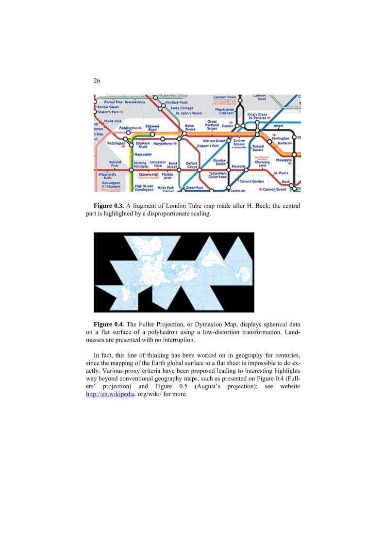
0.3.2 Highlighting
To visually highlight a feature of an image one may distort the original dimen-sions. A good example is the London tube scheme by H. Beck (1906) which greatly enlarges relative sizes of the Centre of London part to make them better seen. Such a gross distortion, for a long while being totally rejected by the authori-ties, is now a standard for metro maps worldwide (see Figure 0.3).
26
Figure 0.3. A fragment of London Tube map made after H. Beck; the central
part is highlighted by a disproportionate scaling.
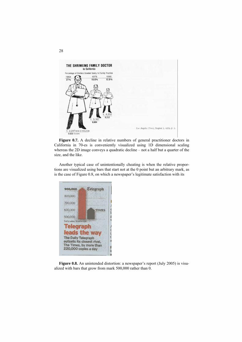
Figure 0.4. The Fuller Projection, or Dymaxion Map, displays spherical data
on a flat surface of a polyhedron using a low-distortion transformation. Land-masses are presented with no interruption.
In fact, this line of thinking has been worked on in geography for centuries,
since the mapping of the Earth global surface to a flat sheet is impossible to do ex-actly. Various proxy criteria have been proposed leading to interesting highlights way beyond conventional geography maps, such as presented on Figure 0.4 (Full-ers’ projection) and Figure 0.5 (August’s projection); see website http://en.wikipedia. org/wiki/ for more.

27
anyFigure 0.5. A conformal map: the angle between two lines on the sphere is the same between their projected counterparts on the map; in par-ticular, each parallel crosses meridians at right angles; and also, the sizes at
allany point are the same in directions. More recently this idea was applied by Rao and Card (1994) to table data (see
Figure 0.6); more on this can be found in Card, Mackinlay and Shneiderman (1999) and Mazza (2009).
Figure 0.6. The Table Lens machine: highlighting a fragment by dispropor-
tionally enlarging it. It should be noted that the disproportionate highlighting may lead to visual ef-
fects bordering with cheating (or being just that). This is especially apparent when relative proportions are visualized through proportions between areas, as in Figure 0.7. An unintended effect of the picture is that the decline by half in one dimen-sion is presented visually by the area of the doctor’s body, which is just not half but one fourth of the initial size. This grossly biases the message.
28
Figure 0.7. A decline in relative numbers of general practitioner doctors in
California in 70-es is conveniently visualized using 1D dimensional scaling whereas the 2D image conveys a quadratic decline – not a half but a quarter of the size, and the like.
Another typical case of unintentionally cheating is when the relative propor-
tions are visualized using bars that start not at the 0 point but an arbitrary mark, as is the case of Figure 0.8, on which a newspaper’s legitimate satisfaction with its
Figure 0.8. An unintended distortion: a newspaper’s report (July 2005) is visu-
alized with bars that grow from mark 500,000 rather than 0.

29
success is visualized using bars that begin at 500,000 mark rather than 0. Another mistake is that the difference between the bars’ heights on the picture is much greater than the reported 220,000. Altogether, the rival’s circulation bar is more than twice shorter while the real circulation is less by mere 25%.
0.3.3. Integrating different aspects
Combining different features of a phenomenon into the same image can make life easier indeed. Figure 0.9 represents an image that an energy company utilizes
Figure 0.9. An image of Con Edison company’s power grid on a PC screen ac-
cording to website http://www.avs.com/software/soft_b/openviz/conedison.html as accessed in September 2008.
for real time managing, control and repair of its energy network stretching over the island of Manhattan (New York, USA). Operators can view the application on their desktop PCs, monitor the grid and repair problems on the fly by rerouting power or sending a crew out to repair a device on site. This makes “manipulation and utilization of data in ways that were previously not possible,” according to the company’s website (see reference in the caption).
30
Figure 0.10. A scheme of a fragment of Dr. Snow’s map demonstrating that
indeed most deaths (labeled by circles) have occurred near the water pump he was dealing with.
Bringing features together can be useful for less immediate insights too. A
popular story of Dr. John Snow’s fight against an outbreak of cholera in Soho, London, 1857, by using visual data mining goes like this. Two weeks into the out-break, Dr. Snow went over all houses in the vicinity and made as many tics at their locations on his map as many deaths of cholera have occurred there (Figure 0.10 illustrates a fragment of Dr. Snow’s map). The ticks were densest around a water pump, which made Dr. Snow convinced that the pump was the cholera source. (In fact, he had served in India to become disposed to the idea of the role of water flows in the transmission of the disease.) He discussed his findings with the priest of local parish, who removed then the handle of the pump, after which deaths stopped. This all is true. But there is more to this story. The death did stop - but because too few remained in the district, not because of the removal: the handle was ordered back on the very next day after it had been removed. Moreover, the borough council refused to accept Dr. Snow’s “water pump theory” because it contradicted the theory of the time that cholera progressed through stench in the air rather than water flow. More people died in Soho of the next cholera outbreak in a decade. The water pump theory was not accepted until much later, when the science of microbes had become developed. The story is instructive in both the power of visual insight and the fact that data analysis results are not conclusive: a data based conclusion needs a reasonable explanation to get accepted.
The diagram on Figure 0.11 visualizes relations between features in Company
data (Table 0.1.) as a decision tree to conceptually characterize their products. For example, the left hand branch distinctly describes Product A by combining “Not
31
Not Retail (Ind./Util.) Retail No Yes
Sector
ECom Product C
Product BProduct A Figure 0.11. Product decision tree for the Company data in Table 0.1.
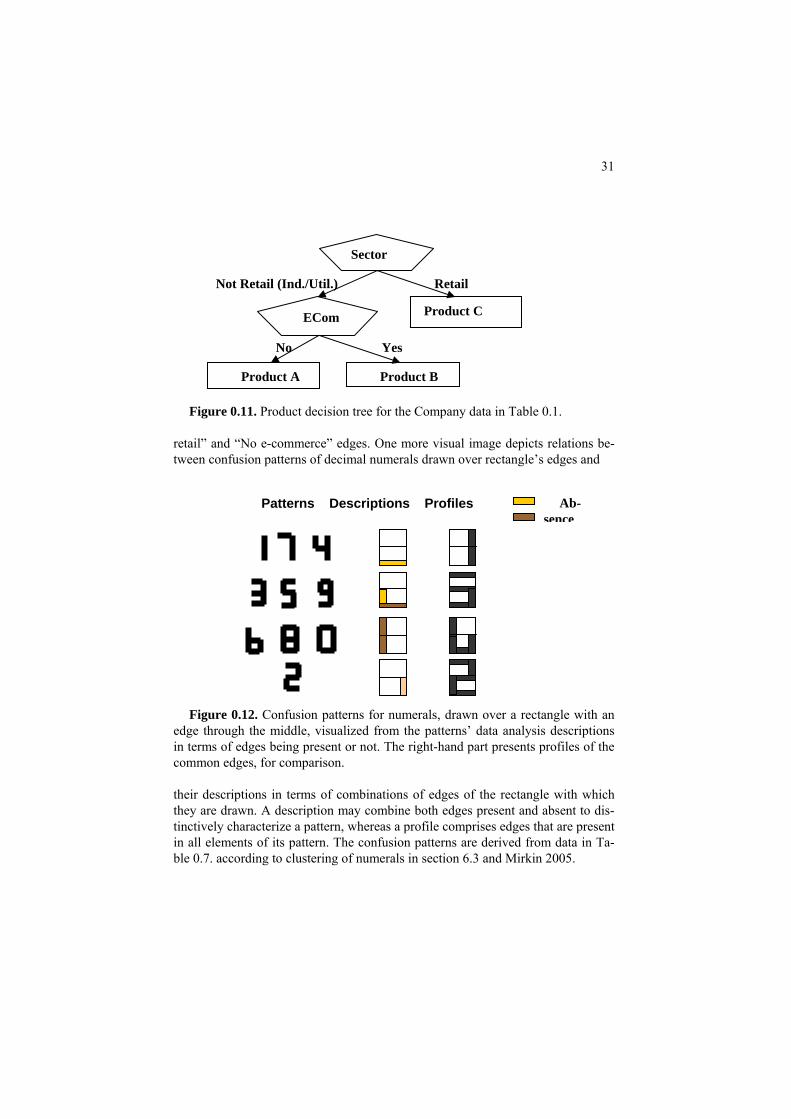
retail” and “No e-commerce” edges. One more visual image depicts relations be-tween confusion patterns of decimal numerals drawn over rectangle’s edges and
Ab- Patterns Descriptions Profiles sence
Figure 0.12. Confusion patterns for numerals, drawn over a rectangle with an
edge through the middle, visualized from the patterns’ data analysis descriptions in terms of edges being present or not. The right-hand part presents profiles of the common edges, for comparison.
their descriptions in terms of combinations of edges of the rectangle with which they are drawn. A description may combine both edges present and absent to dis-tinctively characterize a pattern, whereas a profile comprises edges that are present in all elements of its pattern. The confusion patterns are derived from data in Ta-ble 0.7. according to clustering of numerals in section 6.3 and Mirkin 2005.

32
0.2.3 Narrating a story
In a situation in which data features involve a temporal and/or spatial aspects, integrating them in one image may lead to a visual narrative of a story, with its starting and ending dates, all on the same screen. Such a narrative of a military company from the rich history of Europe (Napoleon’s French
Figure 0.13. The white band represents the trajectory of Napoleon’s army
moving to the East and the black band shows it moving to the West, the line width being proportional to the army’s strength.
army invading Russia 1812) is presented in Figure 0.2.11. It shows a map of Rus-sia, with Napoleon’s army trajectory drawn forth, in white, and back, in black, so that the time is enveloping in this static image via the trajectory. The directions are shown with arrows. The trajectory’s width shows the army’s strength steadily de-clining in time on a dramatic scale, in the absence of major fighting.
All the images presented can be considered illustrations of a principle accepted
further on. According to this principle, to visualize data, one needs to specify first a “ground” image, such as a map or grid or coordinate plane, which is supposed to be well known to the user. Visualization, as a computational device, can be de-fined as mapping data to the ground image in such a way that the analyzed proper-ties of the data are reflected in properties of the image. Of the goals considered, integration of data will be of a priority since no temporal aspect is considered in this text.

33
0.4 Summary
This chapter introduces four problems in data analysis as related to either summarization or correlation, in either quantitative or categorical way. The former two reflect the structure of theoretical knowledge as comprised, first of all, of con-cepts and statements of relation among them. Each of these four will be given a specific attention in the text further on. After covering summarization and correla-tion in 1D and 2D situations (Chapters 1 and 2), we will move on to problems of correlation in Chapter 3, both quantitative, that is, regression (sections 3.3 and 3.6), and categorical, that is, classifiers (section 3.2, 3.4 and 3.5). Chapter 4 is de-voted to Principal component analysis and applications, and Chapters 5, 6, and 7 describe clustering: K-means, hierarchical and networks.
Next part of the Chapter introduces seven small real-world data sets and related
data analysis problems. The final part of the Chapter discusses main goals and some specifics for data
visualization. Integrating visualization into the methods discussed further on in a sound way remains a challenge for the future.
References
H. Abdi, D. Valentin, B. Edelman (1999) Neural Networks, Series: Quantitative Applications in the Social Sciences, 124, Sage Publications, London, ISBN 0 -7619-1440-4.
M. Berthold, D. Hand (2003), Intelligent Data Analysis, Springer-Verlag.
L. Breiman, J.H. Friedman, R.A. Olshen and C.J. Stone (1984) Classification and Regression Trees, Belmont, Ca: Wadswarth.
S.K.Card, J.D. Mackinlay, B. Shneiderman (1999) Readings in Information Visualization: Using Vision to Think, Morgan Kaufmann Publishers, San Fran-cisco, Ca, ISBN 1-55860-533-9.
R.O. Duda, P.E. Hart, D.G. Stork (2001) Pattern Classification, Wiley-Interscience, ISBN 0-471-05669-3
A.P. Engelbrecht (2002) Computational Intelligence, John Wiley & Sons, ISBN 0-470-84870-7.

34
J. Gama (2010) Knowledge Discovery from Data Streams, Chapman & Hall/CRC.
S.B. Green, N.J. Salkind (2003) Using SPSS for the Windows and Mackintosh: Analyzing and Understanding Data, Prentice Hall.
P.D. Grünwald (2007) The Minimum Description Length Principle, MIT Press.
J.F. Hair, W.C. Black, B.J. Babin, R.E. Anderson (2010) Multivariate Data Analysis, 7th Edition, Prentice Hall, ISBN-10: 0-13-813263-1.
J. Han, M. Kamber (2010) Data Mining: Concepts and Techniques, 3d Edition, Morgan Kaufmann Publishers.
J.A. Hartigan (1975) Clustering Algorithms, Wiley and Sons.
S. S. Haykin (1999), Neural Networks (2nd ed), Prentice Hall, ISBN 0132733501.
M.G. Kendall, A. Stewart (1973) Advanced Statistics: Inference and Relation-ship (3d edition), Griffin: London, ISBN: 0852642156.
L. Lebart, A. Morineau, M. Piron (1995) Statistique Exploratoire Multidimen-sionelle, Dunod, Paris, ISBN 2-10-002886-3.
H. Lohninger (1999) Teach Me Data Analysis, Springer-Verlag, Berlin-New York-Tokyo, 1999. ISBN 3-540-14743-8.
C.D. Manning, P. Raghavan, H. Schütze (2008) Introduction to Information Re-trieval, Cambridge University Press.
R. Mazza (2009) Introduction to Information Visualization, Springer, ISBN: 978-1-84800-218-0.
B. Mirkin (1985) Methods for Grouping in SocioEconomic Research, Finansy I Statistika Publishers, Moscow (in Russian).
B. Mirkin (1996) Mathematical Classification and Clustering, Kluwer Academic Press.
B. Mirkin (2005) Clustering for Data Mining: A Data Recovery Approach, Chapman & Hall/CRC, ISBN 1-58488-534-3.
T.M. Mitchell (2005) Machine Learning, McGraw Hill.

35
T. Mitsa (2010) Temporal Data Mining, Chapman & Hall/CRC.
F. Murtagh (1985) Multidimensional Clustering Algorithms, Physica-Verlag, Vi-enna.
B. Polyak (1987) Introduction to Optimization, Optimization Software, Los An-geles, ISBN: 0911575146.
B. Schölkopf, A.J. Smola (2005) Learning with Kernels, The MIT Press.
R. Spence (2001) Information Visualization, ACM Press, ISBN 0-201-59626-1.
T. Soukup, I. Davidson (2002) Visual Data Mining, Wiley and Son, ISBN 0-471-14999-3 J.W. Tukey (1977) Exploratory Data Analysis, Addison-Wesley, Reading MA. V. Vapnik (2006) Estimation of Dependences Based on Empirical Data, Springer Science + Business Media Inc., 2d edition.
A. Webb (2002) Statistical Pattern Recognition, Wiley and Son, ISBN-0-470-84514-7.
S.M. Weiss, N. Indurkhya, T. Zhang, F.J. Damerau (2005) Text Mining: Pre-dictive Methods for Analyzing Unstructured Information, Springer Sci-ence+Business Media. ISBN 0-387-95433-3.
Z. Zhang, R. Zhang (2009) Multimedia Data Mining, Chapman & Hall/CRC.
Articles
M.J. Betts, R.B. Russell. Amino acid properties and consequences of subsitutions. In Bioinformatics for Geneticists, M.R. Barnes, I.C. Gray eds, Wiley, 2003.
R. Fisher (1936) The use of multiple measurements in taxonomic problems, An-nals of Eugenics, 7, 179-188.
G. W. Furnas (1981) The FISHEYE View: A new look at structured files, A tech-nical report, in In S.K.Card, J.D. Mackinlay, B. Shneiderman (1999) Readings in Information Visualization: Using Vision to Think, Morgan Kaufmann Publish-ers, San Francisco, Ca, 350-367. Henikoff and Henikoff (1992) Amino acid substitution matrices from protein blocks, PNAS USA, 89(22), 10915-10919.

36
Y.K. Leung and M.D. Apperley (1994) A review and taxonomy of distortion-oriented presentation techniques, In S.K.Card, J.D. Mackinlay, B. Shneiderman (1999) Readings in Information Visualization: Using Vision to Think, Morgan Kaufmann Publishers, San Francisco, Ca, 350-367.
V. S. Mathura and D. Kolippakkam (2005) APDbase: Amino acid physico-chemical properties database, Bioinformation, 1(1): 2-4.

37
1 1D analysis: Summarization and Visualization of a Single Feature
Boris Mirkin
Department of Computer Science and Information Systems, Birkbeck, University of London, Malet Street, London WC1E 7HX UK
Department of Data Analysis and Machine Intelligence, Higher School of Economics, 11 Pokrovski Boulevard, Moscow RF
Abstract
Before addressing the issue of summarization and visualization at multidimen-sional data, this Chapter looks at these problems on the simplest level possible: just one feature. This also provides us with a stock of useful concepts for further material.
The concepts of histogram, central point and spread are presented. Two per-spectives on the summaries are outlined: one is the classical probabilistic and the other of approximation, naturally extending into the data recovery approach to supply a decomposition of the data scatter in the explained and unexplained parts.
A difference between categorical and quantitative features is defined through
the operation of averaging. The quantitative features admit averaging whereas the categorical ones not not. This difference is somewhat blurred at the binary features representing individual categories. They can be represented by the so-called dummy variables that can be considered quantitative too.
Contemporary approaches, nature inspired optimization and bootstrap valida-
tion, are explained on individual cases.

38
1.1 Quantitative feature: Distribution and histogram
1D data is a set of entities represented by one feature, categorical or quantita-tive. There is no simple criterion to tell a quantitative feature or categorical one. For practical purposes a good criterion is this: a feature is quantitative if averaging it makes sense. Let us first consider the quantitative case.
P.1.1 Presentation
A most comprehensive, and quite impressive for the eye, way of summarization is the distribution. On the plane, one draws an x axis and the feature range bounda-ries, that is, its minimum and maximum. The range interval is divided then into a number of non-overlapping equal-sized sub-intervals, bins. Then the number of entities that fall in each bin is counted, and the counts are reflected in the heights of the bars over the bins, forming a histogram. Histograms of Population resident in Market town dataset and Petal width in Iris dataset are presented on Figure 1.1.
Q1.1. Why the bins are not to overlap? A. Each entity falls in only one bin if
bins do not overlap, and the total of all bin counts equals the total number of enti-ties in this case. If bins do overlap, the principle “one entity – one vote” will be broken.
10000 230000
10
20
30Market town population: 5 bins
10000 230000
10
20
30Market town population: 10 bins
2 2.5 3 3.5 4 4.50
20
40
60
80Iris sepal width: 5 bins
2 2.5 3 3.5 4 4.50
20
40
60
80Iris sepal width: 10 bins
Figure 1.1. Histograms of quantitative features in Iris and Market town data:
the feature represented on x-axis and the counts on y-axis. The histogram shapes depend on the number of bins.

39
Q1.2. Why the bar heights on the left are greater than those on the right in Fig-ure 1.1? A. Because bins on the right are as twice shorter than those on the left; therefore, the numbers of entities falling within them must be smaller.
Q1.3. Is it true that when there are only two bins, the divider between them
must be the midrange point? A. Yes, because the bin sizes are equal to each other (see Figure 1.2).
0 a (a+b)/2 b
Figure 1.2. With just two bins on the range, the divider is mid-range.
On Figures 1.3 and 1.4, two most popular types of histograms are presented. The former corresponds to the so-called power law, sometimes referred to as Pareto distribution. This type is frequent in social systems. According to numerous empirical studies, such features as wealth, group size, productivity and the like are all distributed according to a power law so that very few individuals or entities have huge amounts of wealth or members, whereas very many individuals are left ith virtually nothing. However, they all are important parts of the same system with the have-nots creating the environment in which the lucky few can strive.
Count 88
0
0 0
0 0
Frequency 36.7 % 26.7% 20.0% 10.8% 5.8%
6448 2614
Figure 1.3. A power type distribution. Another type, which is frequent at physical systems, is presented on Figure 1.4.
This type of histograms approximates the so-called normal, or Gaussian, law. Dis-tributions of measurement errors and, in general, features being results of small random effects are thought to be Gaussian, which can be formally proven within a mathematical framework of the probability theory.
Count 700 550 500 350 300
Frequency 29.2 % 22.9% 20.8% 14.6% 12.5%
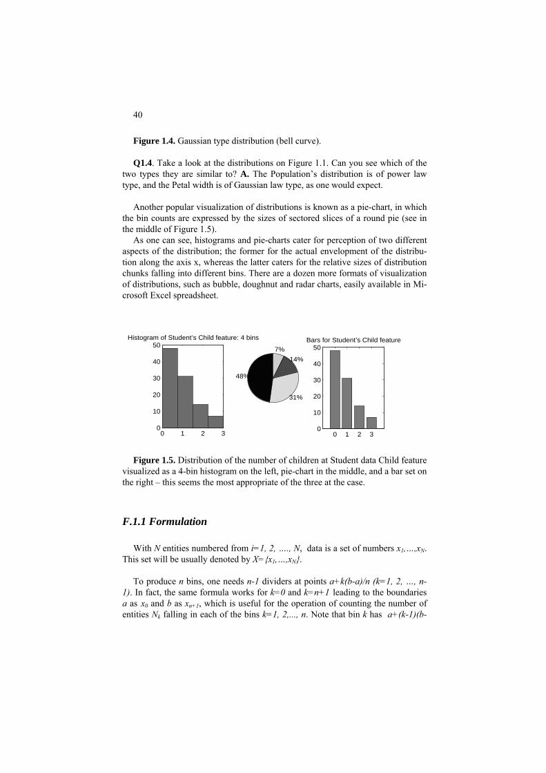
40
Figure 1.4. Gaussian type distribution (bell curve). Q1.4. Take a look at the distributions on Figure 1.1. Can you see which of the
two types they are similar to? A. The Population’s distribution is of power law type, and the Petal width is of Gaussian law type, as one would expect.
Another popular visualization of distributions is known as a pie-chart, in which
the bin counts are expressed by the sizes of sectored slices of a round pie (see in the middle of Figure 1.5).
As one can see, histograms and pie-charts cater for perception of two different aspects of the distribution; the former for the actual envelopment of the distribu-tion along the axis x, whereas the latter caters for the relative sizes of distribution chunks falling into different bins. There are a dozen more formats of visualization of distributions, such as bubble, doughnut and radar charts, easily available in Mi-crosoft Excel spreadsheet.
0 1 2 30
10
20
30
40
50Histogram of Student’s Child feature: 4 bins
48%
31%
14%
7%
0 1 2 30
10
20
30
40
50Bars for Student’s Child feature
Figure 1.5. Distribution of the number of children at Student data Child feature visualized as a 4-bin histogram on the left, pie-chart in the middle, and a bar set on the right – this seems the most appropriate of the three at the case.
F.1.1 Formulation
With N entities numbered from i=1, 2, …., N, data is a set of numbers x1,…,xN. This set will be usually denoted by X={x1,…,xN}.
To produce n bins, one needs n-1 dividers at points a+k(b-a)/n (k=1, 2, …, n-
1). In fact, the same formula works for k=0 and k=n+1 leading to the boundaries a as x0 and b as xn+1, which is useful for the operation of counting the number of entities N falling in each of the bins k=1, 2,..., n. Note that bin k has a+(k-1)(b-k

41
a)/n and a+k(b-a)/n as, respectively, its left and right boundary. One of them should be excluded from the bin so that the bins are not overlapping even on boundaries. These counts, Nk, k=1, 2,..., n, constitute the distribution of the fea-ture. A histogram is a visual representation of the distribution by drawing a bar of the height Nk over each bin k, k=1, 2,..., n (see Figures 1.1 and 1.3 to 1.5). Note that the distribution is subject to the choice of the number of bins.
The histograms can be thought of as empirical expressions of theoretical prob-
ability distributions, the so-called density functions. A density function p(x) ex-presses the concept of probability, not straightforwardly with p(x) values, but in terms of their integrals, that is, the areas between the p(x) curve and x-axis, over intervals [a,b]: such an integral equals the probability that a random variable, dis-tributed according to p(x), falls within [a,b]. This implies that the total area be-tween the curve an x-axis must be equal to 1, which is achieved with the corre-sponding scaling the curve with a constant factor.
The power law density function is p(x) ≈ a/xλ.where λ reflects the steepness of
the frequency’s fall. Such a law expresses what is called the Matthew’s effect re-ferring to the saying “He who has much, will get more; and he who has nothing, will lose even that little that he has,” according to Matthew’s gospel. The Mat-tew’s effect is expressed, for example, in “the mechanism of preferential attach-ment”: the probability that a new web surfer hits a web-site is proportional to the site’s popularity, according to this mechanism.
The normal, or Gaussian, law is p(x) ≈ exp[-(x-a)2/2σ2], which is sometimes
denoted as N(a,σ). Distributions of measurement errors and, in general, features being results of small random effects are thought to be Gaussian, which can be formally proven within a mathematical framework of the probability theory.
0 20 40 600
0.5
1
1.5
2
−2 0 2 4 60
0.1
0.2
0.3
0.4
0.5
0.6
Figure 1.6. Density functions of the power law with λ= −0.8, on the left, and
normal distribution N(2,1), on the right.
The parameters of this distribution, a and σ, have natural meaning: a expresses the expectation, or mean, and σ2 – the variance, which naturally translates in data

42
terms in section 1.2. It should be pointed out that the probability of a value x fal-ling in the interval a ± σ according to the normal distribution is about 88%, and falling in the interval a ± 3σ about 99.7%, virtually unity, so that at modest sample sizes it is highly unlikely that a value x can fall out of this interval, which is re-ferred sometimes as “three sigma rule”. The Gaussian distribution can be rescaled to the standard N(0,1) form, with 0 expectation and 1 the variance, by shifting the variable x to the mean, a, and normalizing it afterwards by the square root of σ2. This transformation, sometimes referred to as z-scoring, is expressed with formula y=(x-a)/σ, where y is the transformed feature.
−8 −6 −4 −2 0 2 4 6 8 10 120
0.02
0.04
0.06
0.08
0.1
0.12
0.14
0.16
0.18
Figure 1.7. A density function p(x), which is a mixture of two normal distribu-
tions, N(2,1) weighted 0.4, and N(8,2) weighted 0.6. The area between the two dashed lines is the probability for value x to fall in the interval between 0 and 2 – not too high at this p(x)!
One more popular distribution is the uniform distribution, over a range [l,r]. Its
density is a constant function equal to p(x)=1/(r-l), so that the probability of an in-terval (a, b) within the range is just p=(b-a)/(r-l), proportional to the length of the interval.
C.1.1 Computation
To compute the distributions on Figure 1.1, one should first load the Iris and Market town data sets with a MatLab command such as
>> st=load(‘Data\town.dat’); % the Market data is stored at subfolder “Data” under the name “town.dat” after which the Population feature can be put in a different variable >> pop=st(:,1); % meaning all the rows of column 1 corresponding to the Population feature. Then command

43
>> h=hist(pop,5); will produce a 5×1 array h containing counts of entities within each of 5 bins, and command
>> hist(pop, 5); will produce a figure of the histogram.
To create a figure with four windows such as on Figure 1.1, one should use
subplot commands, along with corresponding rearrangements of the axes: >> subplot(2,2,1);hist(sw,5);axis([2 4.5 0 80]); >> subplot(2,2,2);hist(sw,10);axis([2 4.5 0 80]); % assuming sw denotes Sepal width, column 2 of the Iris data set >> subplot(2,2,3);hist(pop,5);axis([2000 24000 0 30]); >> subplot(2,2,4);hist(pop,10);axis([2000 24000 0 30]); The command axis([a b c d]) puts the image coordinate box so that its x-axis is
in the interval [a,b] and y-axis in the interval [c,d]. Bar- and pie-charts are produced with pie and bar commands, respec-
tively.
1.2 Further summarization: centers and spreads
P1.2 Centers and spreads: Presentation
Further summarization of the data leads to presenting a feature with just two numbers, one expressing the distribution’s location, its “central” or other impor-tant point, and the other representing the distribution’s dispersion, the spread. We review some most popular characteristics for both, the center, Table 1.1, and the spread, Table 1.2.
Worked example 1.1. Mean
For set X={1,1,5,3,4,1,2}, mean is c=(1+1+5+3+4+1+2)/7=17/7=2.42857…, or rounded up to two decimals, c=2.43.
This is as close an approximation to the numbers as one can get, which is good. A less
satisfactory property is that the mean is not stable against outliers. For example, if X in Worked example 1.1 is supplemented with value 23, the mean becomes c=(17+23)/8=5, a

44
much greater number. This is why it is a good idea to remove some observations on both extremes of the data range, both the minimum and maximum, before computing the mean, which is utilized in the concept of trimmed mean in statistics.
Table 1.1. A review of location or central point concepts
# Name Explanation Comments 1 Mean The feature’s arithmetic
average 0. Minimizes the summary error
squared 1. Estimates the distribution’s
expected value 2. Sensitive to outliers and dis-
tribution’s shape 2 Median The middle of the sorted
list of feature values 1. Minimizes the summary absolute error 2. Estimates the distribution’s ex-pected value 3. Not-sensitive to outliers 4. Sensitive to distribution’s shape
3 Mid-range Middle of the range 1. Minimizes the maximum abso-lute error 2. Estimates the distribution’s ex-pected value 3. Very sensitive to outliers 4. Not sensitive to distribution’s shape
4 P-quantile A value dividing the en-tire entity set in propor-tion P/(1-P) of feature values so that those with higher values constitute P proportion (upper P-quantile) or 1-P propor-tion (bottom P-quantile)
1. Not-sensitive to outliers 2. Sensitive to distribution’s shape
5 Mode A maximum of the histo-gram
1. Depends on the bin size 2. Can be multiple
Worked example 1.2. Median To compute the median of the set from the previous example, X={1, 1, 5, 3, 4, 1, 2}, it
must be sorted first: 1, 1, 1, 2, 3, 4, 5. The median is defined as the element in the middle, which is 2. This is rather far away from the mean, 2.43, which evidences that the distribu-tion is biased towards the left end, the smaller entities. With the outlier 23 added, the sorted set becomes 1, 1, 1, 2, 3, 4, 5, 23, thus leading to two elements in the middle, 2 and 3. The median in this case is the average of the two, (2+3)/2=2.5, which is by far lesser change than the mean of the extended set, 5.
45
The more symmetric a distribution, the closer its mean and median to each other. Sepal width of Iris data set (Table 0.3) has mean=3.05 and median=3, quite close values. In contrast, in Market town data (Table 0.4), Population resident’s median, 5258, is predictably much less than the mean, 7351.4. The mean of a power law distribution is always biased towards the great values achieved by the few outliers; this is why it is a good idea to use the median as its central value. The median is very stable against outliers: the values on the extremes just do not affect the middle of the sorted set if added uniformly to both sides.
The midrange corresponds to the mean of a flat distribution, in which all bins
are equally likely. In contrast to the mean and median, the midrange depends only on the range, not on the distribution. It is obviously highly sensitive to outliers, that is, changes of the maximum and/or minimum values of the sample.
The concept of p-quantile is an extension of the concept of median, which is a
50% quantile. Worked example 1.3. P-quantile (percentile) Take p=10% and determine the upper 10% quantile of Population resident feature. This
should be 5th value in its descending order, that is, 18966. Why is the 5th value? Because 10% of the total number of entities, 45, is 4.5; therefore, the 5-th value leaves out p=10% of the largest towns in the sample. Similarly, the lower 10% quantile of the feature is 5th value in its ascending order, 2230.
Worked example 1.4. Mode According to the histograms in the bottom of Figure 1.1, it is the very first bin which is
modal in the Population resident distribution. In the 5-bin setting, it takes one fifth of the feature range, 23801-2040=21761, that is, 4352. In the 10-bin setting, it is one tenth of the feature range, that is, 2176. In the latter case, the modal bin is interval [2040, 4216], and the modal bin is as twice wider, [2040, 6392], in the former case.
Each of the characteristics of spread In Table 1.2 parallels, to an extent, a loca-
tion characteristic under the same number. These measures intend to give an estimate of the extent of error in the corre-
sponding centrality index. The standard deviation is the average quadratic error of the mean. Its use is related to the least-squares approach that currently prevails in data analysis and can be justified by good properties of the solutions, within the data analysis perspective, and properties of the normal distribution, within the probabilistic perspective. These paradigms are explained later in section 1.2.F.
Table 1.2. A review of spread concepts.

46
# Name Explanation Comments 1 Standard
deviation The quadratic average de-viation from the mean
1. Minimized by the mean 2. Estimates the square root of the variance
2 Absolute deviation
The average absolute de-viation from the median
Minimized by the median
3 Half-range The maximum deviation from the midrange
Minimized by the mid-range
The absolute deviation expresses the average absolute deviation from the me-
dian. Usually, it is calculated regarding the mean, as the average error in repre-senting the feature values by the mean. However, it is more related to the median, because it is the median that minimizes it.
The half-range expresses the maximum deviation from the mid-range; so they
should be used on par, as it is done customarily by the research community in-volved in building classifying rules.
F1.2 Centers and spreads: Formulation
There are two perspectives on data summarization and correlation that very much differ from each other. One, of the classical mathematical statistics, views the data as generated by a probabilistic mechanism and uses the data to recover the mechanism or, at least, some properties of it. The other, of data analysis, does not much care of the mechanism and tries to look for patterns in the data instead.
F1.2.1 Data analysis perspective
Given a series X={x1,…,xN}, one defines the centre of X as a minimizing the average distance
D(X,a)=[d(x1,a)+d(x2,a)+…+d(xN,a)]/N (1.1) Depending on the definition of the distance, the optimal a can be expressed as
follows. Consider first the least-squares formulation. According to this approach the dis-
tance is measured as the squared difference, d(x,a)=|x-a|2. The minimum distance (1.1) then is reached at a equal to the mean c defined by expression
47
1/
N
ii
c x=
= ∑ N
N
p as
(1.2)
and distance D(X,c) itself is equal to the variance s2 defined by expression
2 2
1( ) /
N
ii
s x c=
= −∑
(1.3)
At the more traditional distance measure d(x,a)=|x-a| in (1.1), the optimal a (cen-ter) is but the median, m , and D(X,a) the absolute deviation from the median,
1| | /
N
ii
ms x m N=
= −∑ (1.4)
To be more precise, the optimal a in this problem is median, that is the value
x(N+1)/2 in the sorted order of X, when N is odd. When N is even, any value between x and xN/2 N/2+1 in the sorted order of X is a solution, including the median.
If D(X,a) is defined not by the sum, but by the maximum of the distances,
D(X,a)= max (d(x1,a), d(x2,a), …, d(xN, a)), then the midrange mr is the solution, for d(x,a) specified as both |x-a|2 and |x-a|.
These statements explain the parallels between the centers and corresponding
spread evaluations reflected in Tables 1.1 and 1.2, with each of the centers mini-mizing its corresponding measure of spread.
The distance minimization problem can be reformulated in the data recovery
perspective. In the data recovery perspective, the observed values are assumed to be but noisy realizations of an unknown value a. This is reflected in the form of an equation expressing xi through a:
xi = a + ei, for all i=1,2,…, N, (1.5)
in which ei are additive errors, or residuals, that are to be minimized.
One cannot minimize all the residuals in (1.5) simultaneously. An integral
criterion is needed to embrace them all. A general family of such criteria is known as Minkowski’s criterion or Lp norm. It is specified by using a positive number
p p p Lp=(|e1| +|e2| +…+ |eN| )1/p

48
At a given p, minimizing Lp or, equivalently, its p-th power Lpp, would lead to a
specific solution. Most popular are values p=1, 2, and ∞ (infinity) leading to: (1) Least-squares criterion L2
2=e12+ e2
2 +…+ eN2 at p=2.
Its minimization over unknown a is equivalent to the task of minimizing the average squared distance, thus leading to the mean as the optimal a.
(2) Least-modules criterion L1=|e1|+|e2|+…+ |eN| at p=1. Its minimization over unknown a is equivalent to the task of minimizing the
average absolute deviation, thus leading to the median, optimal a=m. (3) Least-maximum criterion L∞= max(|e1|, |e2|, … |eN|) at p= ∞. Minimization
of L∞ with respect to a is equivalent to the task of minimizing the maximum deviation leading to the midrange, optimal a=mr.
…+ xN2 .
6).
The Minkowski’s criteria (1)-(3) may look just as trivial reformulations of the
distance approximation criterion (1.1). This, however, is not exactly so. The equa-tion (1.5) adds to the solution one more equation. It allows for a decomposition of the data scatter involving the corresponding data recovery criterion.
This is rather straightforward for the least-squares criterion L2 whose minimal
value, at a equal to the mean c (1.1) is L22= (x1-c)2+ (x2-c)2 +…+ (xN-c)2. With
little algebra, this becomes L22 = x1
2+ x22 +…+ xN
2 - 2c(x1+x2+… +xN) + Nc2 = x1
2+ x22 +…+ xN
2 - Nc2 =T(X) - Nc2.where T(X) is the quadratic data scatter defined as T(X)= x1
2+ x22 +
This leads to equation T(X) = Nc2 + L2 decomposing the data scatter in two
parts: that explained by the model (1.5), Nc2, and that unexplained, L22. Since the
data scatter is constant, minimizing L22 is equivalent to maximizing Nc2. The
decomposition of the data scatter allows measuring the adequacy of model (1.5) not by just the averaged square criterion, the variance, by the relative value of the explained part L2
2/T(X). A similar decomposition can be derived for the least modules L1 (see Mirkin 199
Q1.5. Consider a multiplicative model for the error, xi = a(1+ei), assuming that
errors are proportional to the values. What center a would fit the data with the least-squares criterion? A. According to the least squares approach, the fit should minimize the summary errors squared. Every error can be expressed, from the model, as ei= xi/a -1= (xi-a)/a. Thus the criterion can be expressed as L2
2 = ei2 +
ei2 +… ei
2= (x1/a -1) 2 + (x2/a -1) 2 +…. (xN/a -1) 2. Applying the first order opti-mality condition, let us take the derivative of L2
2 over a and equate it to zero. The derivative is L2
2′= -(2/a3)Σi(xi-a)xi. Assuming the optimal value of a is not zero, the first order condition can be expressed as Σi(xi- a)xi =0, so that a =Σi xi
2/ Σi xi = (Σi xi
2/N)/(Σi xi/N). The denominator here is but the mean, c, whereas the numera-

49
tor can be expressed through the variance s2 because of equation s2 = Σi xi2/N - Σi
xi/N which is not difficult to prove. With little algebraic manipulation, the least-squares fit can be expressed as a = s2/c +1. The variance to mean ratio s2/c, equal to a -1 according to the model, emerges also in statistics as a good relative esti-mate of the spread.
It seems rather natural that both, the standard deviation and absolute deviation,
are not greater than half the range, which can be proven mathematically (see sec-tion F1.3).
Q1.6. Prove that Minkowski’s center is not sensitive with respect to changing
the scale factor. Q1.7. Prove that Minkovski’s center grows whenever power p grows. Q1.8. For the Population resident feature in Market town data compute Min-
kowski center at p= 0.5, 1, 2, 3, 4, 5. A. See solutions found using the cm.m code developed in Project 1.1 (and confirmed, at p>1, with the anti-gradient AG-MC method) in Table 1.3.
Table 1.3. Minkowski’s metric centers of the Population resident in Market
town dataset for different power values p.
p Minkowski’s center Data scatter unexplained
0.5 1 2 3 4 5
2611.0 5258.0 (median) 7351.4 (mean) 8894.9 9758.8 10294.5
0.7143 0.6173 0.4097 0.2318 0.1186 0.0584
F1.2.2. Probabilistic statistics perspective
In classical mathematical statistics, a set of numbers X= {x1, x2,…, xN} is usu-ally considered a random sample from a population defined by probabilistic distri-bution with density f(x), in which each element xi is sampled independently from the others. This involves an assumption that each observation xi is modeled by the distribution f(xi) so that the mean’s model is the average of distributions f(xi). The population analogues to the mean and variance are defined over function f(x) so that the mean, median and the midrange are unbiased estimates of the population mean. Moreover, the variance of the mean is N times less than the population vari-ance, so that the standard deviation tends to decrease by √N when N grows.

50
Let us further assume that the population’s probabilistic distribution is Gaus-
sian N(μ, σ) with density function
f(u)= Cexp{-(u - μ)2 / 2σ2}, (1.6)
where C stands for a constant term equal to C=(2πσ2) -½ . Then c in (1.2) is an es-timate of μ and s in (1.3), of σ in (1.6). These parameters amount to the popula-tion analogues of the mean and variance defined, for any density function f(u), as μ = ∫uf(u)du and σ2 = ∫(u-μ)2f(u)du where the integral is taken over the entire u axis.
Consider now that the set X is a random independent sample from a population
with a Gaussian, for the sake of simplicity, probabilistic density function f(x)= Cexp{-(x - μ)2 / 2σ2}.where μ and σ2 are unknown parameters and C=(2πσ2) -
½. The likelihood of randomly obtaining xi then will be Cexp{-(xi - μ)2 / 2σ2}. The likelihood of the entire sample X will be the product of these values, because of the independence assumption. Therefore, the likelihood of the sample is L(X)=Πi∈ICexp{-(xi - μ)2 / 2σ2} = CNexp{-∑ i∈I (xi - μ)2 / 2σ2}. One may even go further and express L(X) as L(X) = exp{Nln(C)-∑ i∈I (xi - μ)2 / 2σ2}.where ln is the natural logarithm (over base e). A well established approach in mathematical sta-tistics, the principle of maximum likelihood, claims that the values of μ and σ2 best fitting the data X are those at which the likelihood L(X) or, equivalently its logarithm, ln(L(X)), reaches its maximum. The maximum of ln(L)= Nln(C)-∑ i∈I (xi - μ)2/2σ2 is reached at μ minimizing the expression in the exponent, E= ∑i∈I(xi - μ)2, which is in fact the summary quadratic distance (1.1), that is, the least- squares criterion, which thus can be derived from the assumption that the sample is randomly drawn from a Gaussian population. This, however, does not mean that the least-squares criterion is only meaningful under the normality as-sumption: the least-squares has a meaning of its own within the data analysis paradigm.
Likewise, the optimal σ2 minimizes part of ln(L) depending on it, g(σ2)= -
Nln(σ2)/2 - ∑ i∈I (xi - μ)2 / 2σ2. It is not difficult to find the optimal σ2 from the first-order optimality condition for g(σ2). Let us take the derivative of the function over σ2 and equate it to 0: dg/d(σ2)= - N/(2σ2) + ∑ i∈I (xi - μ)2 / 2(σ2)2 =0. This equation leads to σ2 = ∑ i∈I (xi - μ)2 /N, which means that the variance s2 is the maximum likelihood estimate of the parameter in the Gaussian distribution.
However, when μ is not known beforehand but rather found from the sample
according to formula (1.2) for the mean, s2 in (1.3) is a slightly biased estimate of σ2 and must be corrected by taking the denominator equal to N-1 rather than N which is the case in many statistical packages. The intuition behind the correction

51
is that equation (1.2) is a relation imposed by us on the N observed values, which effectively decreases the “degree of freedom” in the observations from N to N-1.
In situations in which the data entities can be plausibly assumed to have been
randomly and independently drawn from a Gaussian distribution, the derivation above justifies the use of the mean and variance as the only theoretically valid es-timates of the data center and spread. The Gaussian distribution has been proven to approximate well situations in which there are many small independent random effects adding to each other. However, in many cases the assumption of normality is highly unrealistic, which does not necessarily lead to rejection of the concepts of the mean and variance – they still may be utilized within the general data analy-sis perspective.
In some real life situations, the assumption that X is an independent random
sample from the same distribution seems rather adequate. However, in most real-world databases and multivariate samplings this assumption is far from being real-istic.
C1.2 Centers and spreads: Computation
In MatLab, there are commands to compute mean(X) and median(X), which can be done over X being a matrix, not just a vector. The result will be a row of within-column means or medians, respectively. To compute the row of mid-ranges, one can use a combined command mr=(max(X)+min(X))/2. To compute an upper p-quantile of a feature vector x, one should first sort it, in descending or-der, with command sx=sort(x, ‘descent’), after which the quantile is determined as sx(k) where k=ceil(p*length(x)).
The standard deviation is computed with command std(x), with N-1 in the de-
nominator of (1.3), or std(x,1), with N in the denominator. A stable version of the range that can be used at large N values or when outliers
are expected, can be defined by utilizing the concept of quantile. Initially, a value of the proportion p, say 1% or 2% is specified. The upper (lower) p-quantile is a value xp of X such that the proportion of entities with larger (smaller) than xp val-ues is p. The 2p-quantile range is defined as the interval between these p-quantiles, stretched up according to the proportion of entities taken out, (xp – px)/(1-2p), where xp and px are the upper and lower p-quantiles, respectively. For example, at p= 0.05% and N=100,000, xp cuts off 50 largest and px, 50 smallest, values of X.

52
1.3 Binary and categorical features
P1.3 Binary and categorical features: Presentation
A categorical feature differs from a quantitative one not just because its values are strings, not numbers - they are coded by numbers anyway to be processed. The average of a quantitative feature is always meaningful, whereas the averaging of categories, such as Occupations – BA, IT or AN – in Student data or Sector of Economy – Retail, Utility or Industry – in Company data, makes no sense even af-ter they are coded by numbers. The applicability of the operation of averaging is indeed a defining property of being quantitative. For example, one may claim that a feature like the number of children in Student data (see Figure 1.5) is not quanti-tative because its values can only be whole numbers. Still, a statement like “the average number of children per woman is 1.85” does make sense because it can be easily made legitimate by moving to counting by hundreds: there are 185 children per every hundred women.
A feature admitting only two, either “Yes” or “No”, values is conventionally
considered Boolean in Computer Sciences, thus relating it to Boolean algebra with its “True” and “False” statement evaluations. We do not adhere to this strict logic approach but rather engage the numbers and arithmetic. The values not only can be coded by numerals 1, for “Yes”, and 0, for “No”, but also arithmetic operations on them can be meaningful too. Two-valued features will be referred to as binary ones.
The mean of a 1/0 coded binary feature is the proportion of its “Yes” values,
which is rather meaningful. The other above defined central values bear much less information. The median is 1 only if the proportion of ones is 0.5 or greater; oth-erwise, it is 0. In a rare event when the number of entities is even and the propor-tion of ones is exactly one half, the median is one half too. The mode is ether 1 or 0 , the same as the median.
For categorical features, there is no need to define bins: the categories them-
selves play the role of bins. However, their histograms typically are visualized with bars or stems, like on Figure 1.8 that represents the distribution of categories IT, BA and AN of Occupation feature in Student data.

53
IT BA AN0
5
10
15
20
25
30
35
IT BA AN0
5
10
15
20
25
30
35
Figure 1.8. The distribution of categories IT, BA and AN of Occupation fea-
ture in Student data shown with bars on the left and stems on the right. . The distribution of the feature can be expressed in absolute numbers of entities
falling in each of the categories, that is, D=(35, 34, 31), or on the relative scale, by using proportions found by dividing frequencies over their total, 35+34+31=100, which leads to the relative frequency distribution d=(0.35, 0.34, 0.31).
This distribution is close to the uniform one in which all frequencies are equal
to each other. In real life, many distributions are far from that. For example the distribution by race of the 878,153 stop-and-search cases performed by police in England and Wales was widely discussed in the media (see Table 1.4. and BBC’s website http://news.bbc.co.uk/1/hi/uk/7069791.stm of 29/10/07.) This is far from uniform indeed: the proportion of W category is thrice greater than of the other two taken together. Yet it was a claim of racial bias because the proportion of W category in the population is even higher than that (for further analysis, see section 2.3).
Table 1.4. Race distribution of stop-and-search cases in England and Wales in
2005/6.
Race Number of “stop-and-searches” Relative frequency, % Black (B) 131723 15 Asian (A) 70250 8 White (W) 676180 77 Total 878153 100
Q. 1.9. What is the modal category in the distribution of Table 1.4? in Occupa-
tion on Student data? A. These are most likely categories, W in Table 1.4 and IT in Student data.
54
A number of coefficients have been proposed to evaluate how much a distribu-tion differs from the uniform distribution. The most popular are the entropy and Gini index. The latter also is referred to as the categorical variance.
The entropy measures the amount of information in signals being transferred over a communication channel. Intuitively, a rare signal bears more information than a more frequent one. Additionally, the levels of information in independent signals are to be summed up to estimate the total information. These two require-ments lead to the choice of logarithm of 1/p, that is, -log(p), for scoring the level of information in a signal which appears with the probability (frequency) p. The logarithm’s base is taken to be 2, because all the digital coding uses the binary number system. The entropy is defined as the averaged level of information in categories of a categorical feature. The unit of entropy has been chosen to be the bit, which is the entropy of a uniformly distributed binary feature, also referred to as a binary digit with two equally likely states. Intuitively, one bit is the level of information given in an answer to a Yes-or-No question in which no prior knowl-edge of the possible answer is assumed. The maximum entropy of a feature with m categories, H=log(m), is reached when their distribution is uniform. The maxi-mum Gini index, (m-1)/m is reached at the uniform distribution too. Gini index measures the average level of error of the method of proportional classifier. Given a sequence of entities with unknown values of a categorical feature, the propor-tional classifier assigns entities with values chosen randomly, each with a prob-ability proportional to its frequency. The average error of a category whose fre-quency is p is equal to p(1-p)=p-p2. If, for example, p=20%, then the average error is 0.2 - 0.2*0.2=16%.
Worked example 1.5. Entropy and Gini index of a distribution Table 1. 5 presents all the steps to compute the value of entropy, the summary –plog(p)
value, and Gini index, the summary p(1-p) value where p are probabilities (relative fre-quencies) of categories .
Table 1.5. Entropy and Gini index for race distribution in Table 1.4.
Distribution Entropy Qualitative variance
Category Relative frequency p
Information –log(p)
Weighted –plog(p)
Error 1-p
Variance p(1-p)
B 0.15 1.90 0.41 0.85 0.128 A 0.08 2.53 0.29 0.92 0.074 W 0.77 0.26 0.29 0.23 0.177
Total 1.00 0.99 0.378 Entropy is the averaged amount of information in the three categories, H= − p1log(p1) −
p2log(p2) − p3log(p3). The entropy in Table 1.5 relative to the maximum is 0.99/1.585 = 0.625 because at m=3 the maximum entropy is H=log(3)=1.585. Gini index is defined as the average error of the proportional prediction. The proportional prediction mechanism is

55
defined over a stream of entities of which nothing is known beforehand except for the dis-tribution of categories {p }. This mechanism predicts category l at an entity in pl l proportion of all instances. In our case, G= p1(1−p )+ p (1−p1 2 2)+ p (1−p3 3)=0.378. The maximum Gini index value, (m-1)/m, is reached at the uniform distribution, that is, G=2/3. The relative Gini index, thus, is 0.378/(2/3)=0.567, which is not that different from the relative entropy.
F1.3 Formulation
A categorical feature such as Occupation in Students data or Protocol in Intru-sion data, partitions the entity set in such a way that each entity falls in one and only one category. Categorical features of this type are referred to as nominal ones.
If a nominal feature has L categories l=1,…,L, its distribution is characterized
by amounts N1 , N2 , …, NL of entities that fall in each of the categories. Because of the partitioning property these numbers sum up to the total number of entities, N1 + N2 …. NL =N. The relative frequencies, defined as p = N1 l/N, sum up to the unity (l=1, 2, …., L).
Since categories of a nominal feature are not ordered, their distributions are
better visualized by pie-charts than by histograms. The concepts of centrality, except for the mode, are not applicable to categori-
cal feature distributions. Spread here is also not quite applicable. However, the variation – or diversity - of the distribution (p1, p2, …, pL) can be measured. There are two rather popular indexes that evaluate dispersion of the distribution, Gini in-dex, or qualitative variance, and entropy.
Gini index G is the average error of the proportional prediction rule. According
to the proportional prediction rule, each category l, l=1,2, …, L, is predicted ran-domly with the distribution (pl), so that l is predicted at Npl cases out of N. The average error of predictions of l in this case is equal to 1- pl, which makes the av-erage arror to be equal to:
∑=
−=∑=
−=L
llp
L
llplpG
11
1)1( 2
Entropy averages the quantity of information in category l as measured by
log(1/p )=-log(p ) over all l. The entropy is defined as l l
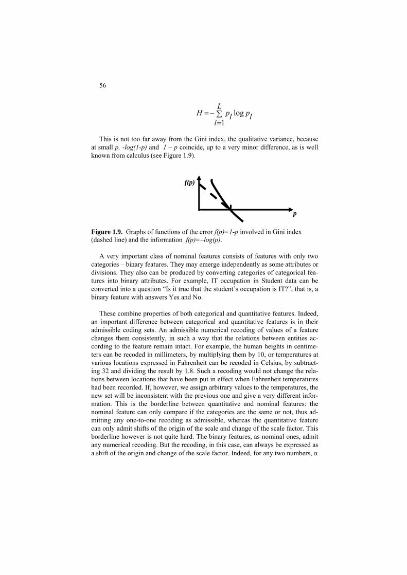
56
This is not too far away from the Gini index, the qualitative variance, because
at small p, -log(1-p) and 1 – p coincide, up to a very minor difference, as is well known from calculus (see Figure 1.9).
Figure 1.9. Graphs of functions of the error f(p)=1-p involved in Gini index (dashed line) and the information f(p)=–log(p).
A very important class of nominal features consists of features with only two
categories – binary features. They may emerge independently as some attributes or divisions. They also can be produced by converting categories of categorical fea-tures into binary attributes. For example, IT occupation in Student data can be converted into a question “Is it true that the student’s occupation is IT?”, that is, a binary feature with answers Yes and No.
These combine properties of both categorical and quantitative features. Indeed,
an important difference between categorical and quantitative features is in their admissible coding sets. An admissible numerical recoding of values of a feature changes them consistently, in such a way that the relations between entities ac-cording to the feature remain intact. For example, the human heights in centime-ters can be recoded in millimeters, by multiplying them by 10, or temperatures at various locations expressed in Fahrenheit can be recoded in Celsius, by subtract-ing 32 and dividing the result by 1.8. Such a recoding would not change the rela-tions between locations that have been put in effect when Fahrenheit temperatures had been recorded. If, however, we assign arbitrary values to the temperatures, the new set will be inconsistent with the previous one and give a very different infor-mation. This is the borderline between quantitative and nominal features: the nominal feature can only compare if the categories are the same or not, thus ad-mitting any one-to-one recoding as admissible, whereas the quantitative feature can only admit shifts of the origin of the scale and change of the scale factor. This borderline however is not quite hard. The binary features, as nominal ones, admit any numerical recoding. But the recoding, in this case, can always be expressed as a shift of the origin and change of the scale factor. Indeed, for any two numbers, α
∑L
−=l=
lplpH1
log
p
f(p)

57
and β, a conversion of the feature values from 0 to α and from 1 to β can be achieved in a conventional quantitative fashion by using two rescaling parameters: the shift of the origin (α) and scaling factor (β - α).
or No. Thus coded, a binary feature sometimes is referred to as a dummy variable.
cordingly, the
Thus, a binary feature can be always considered as coded into a quantitative 1/0
format, 1 for Yes and 0 f
To compute the variance of a binary feature, whose mean c=p, sum up Np
items (1-p)2 2 2 and N(1-p) items p , which altogether leads to s = p(1-p)=1-p2. Ac- standard deviation is the square root of the variance,
(1 )s p p= − . Obviously, this is maximum when p=0.5, that is, both binary val-ues are equally likely. The range is always 1. The absolute deviation, in the case when p<0.5 so that median m=0, comprises Np items that are 1 and N(1-p) items that are 0, so that sm=p. When p>0.5, m=1 and the number of unity distances is N(1-p) leading to sm=1-p. That means that, in general, sm=min(p,1-p), which is less than or equal to the standard deviation. Indeed, if p≤0.5, then p≤1-p and, thus, p2≤ p(1-p), so that ms≤ s. Analogously, if p>0.5 then p>1-p and, thus, p(1-p)>(1-p)2 so that again sm<s, which proves the statement.
ariables is equal to the Gini index, or qualitative variance, of the original feature.
ar models can be considered for nominal features with mo wo categories.
, When a categorical feature is converted into a set of binary features corre-
sponding to its categories, the total variance of the L binary v
There are some probabilistic underpinnings to binary features. Two models are
popular, one by Bernoulli and another by Poisson. Given p, 0 ≤ p ≤ 1, Bernoulli model assumes that every xi is either 1, with probability p, or 0, with probability 1-p. Poisson model suggests that, among the N binary numerals, random pN are uni-ties, and (1-p)N zeros. Both models yield the same mathematical expectation, p. However, their variances differ: the Bernoulli distribution’s variance is p(1-p), whereas the Poisson distribution’s variance is p, which is obviously greater for all positive p, because the factor at Bernoulli standard deviation, 1-p, is less than 1 under this condition. Simil
re than t There is a rather natural, though somewhat less recognized, relation between
quantitative and binary features: the variance of a quantitative feature is always smaller than that of the corresponding binary feature. To explicate this according to Mirkin (2005), assume the interval [0,1] to be the range of data X={x1,…,xN}. Assume that the mean c divides the interval in such a way that a proportion p of the data is greater than or equal to c, whereas proportion of those smaller than c is 1-p. The question then is this: given p, at what distribution of X the variance is maximized. To address the question, assume that X be any given distribution

58
within interval [0,1] with its mean at some interior point c. According to the as-sumption, there are Np observations between 0 and c. Obviously, the variance can only increase if we move each of these points to the boundary, 0. Similarly, the variance will only increase if we push each of N(1-p) points between c and 1, into the opposite boundary 1. That means that the variance p(1-p) of a binary variable with Np zero and N(1-p) unity values is the maximum, at any p. The following is proven. A binary variable, whose distribution is (p, 1-p), has the maximum vari-ance, and the standard deviation, among all quantitative variables of the same ran e and p entries below its average.
efore, the standard de
deviation among the variables of the same range, which can be proven similarly.
C1.3 Computation
the distribution of a feature is in vector df, then a command like
n the histogram and the border in the draw-e (see Figure 1.8).
ini index for the distribution presented in vector
opy > df=df/sum(df); g=-sum(df .*(1-df)); % h is Gini
s and variances Compare the variances with Gini index for the original features.
g This implies that no variable over the range [0,1] has its variance greater than
the maximum ¼ reached by a binary variable at p=0.5. The standard deviation of this binary variable is ½, which is just half of the range. Ther
viation of any variable cannot be greater than its half-range. The binary variables also have the maximum absolute
If >> bar(df, .4);h=axis;axis(1.1*h); will produce its bar drawing. The parameters here are: 0.4 the width of bars, 1.1 the rescaling to allow some air betweeing fram Computation of the entropy and Gdf can be done with commands: >> df=df/sum(df); h=-sum(df .*log2(df)); % h is entr> Q.1.10 Take nominal features from the Intrusion data set and generate category-based binary features, after which compute their individual mean

59
1.4 Modeling uncertainty: Intervals and fuzzy sets
1.4.1 Individual membership functions
In those cases when the probability distributions are unknown or inapplicable, intervals and fuzzy sets are used to reflect uncertainty in data. When dealing with complex systems, feature values cannot be determined precisely, even for such a relatively stable and homogeneous dimension as the population resident in a coun-try. The so-called “linguistic variables” (Zadeh 1970) express imprecise categories and concepts in terms of appropriate quantitative measures, such as the concept of “normal temperature” of an individual – a body temperature from about 36.0 to 36.9 Celsius or “normal weight” – the Body Mass Index BMI (the ratio of the weight, in kg, to the height, in meters, squared) somewhat between 20 and 25. (Those with BMI > 25 are considered overweight or even obese if BMI>30; and those with BMI < 20, underweight). In these examples, the natural boundaries of a category are expressed as an interval.
A more flexible description can be achieved using the concept of fuzzy set A expressed by the membership function μA(x) defined, on the example of Figure 1.10, as:
(x)=
⎪⎪⎩
⎪⎪⎨
⎧
≤≤+−≤≤
≤≤−≥≤
272493/24221
22185.425.027180
xifxxif
xifxxorxif
μA
This function says that the normal weight does not occur outside of the BMI inter-val [18, 27]. Moreover, the concept applies in full, with the membership 1, only within BMI interval [22, 24]. There are “grey” areas expressed with the slopes on the left and the right so that, say, a person with BMI=20 will have the membership value μA(20) = 0.25*20 – 4.5 = 0.5 and the membership of that with BMI = 26.1, will be μ (26.1) = -26.1/3 + 9 = -8.7+9 = 0.3. A
18 22 24 27 x
1

60
Figure 1.10. A trapezoidal membership function expressing the concept of normal body mass index; a positive degree of membership is assigned to each point within interval [18, 27] and, moreover, those between 22 and 24 cer-tainly belong to the set. In fact, a membership function may have any shape; the only requirement
perhaps that there should exist at least one point or sub-interval at which the func-tion reaches the maximum value 1. A fuzzy set formed with straight lines, such as those on Figure 1.11, is referred to as a trapezoidal fuzzy set. Such a set can be represented by four points on the axis x: (a,b,c,d) such that μA(x) =0 outside the outer interval [a,d] and μA(x) = 1 inside the inner interval [b,c] (with the straight lines connecting points (a,0) and (b,1) as well as (c,1) and (d,0) (see Figure 1.10).
18 22 27 x
μ(x)
Figure 1.11. A triangular fuzzy set for the normal weight BMI.
Both the precise and interval values can be considered special cases of trapezoidal fuzzy sets. An interval (a, b) can be equivalently represented by a trapezoidal fuzzy set (a, a, b, b) in which all points of (a, b) have their membership value equal to 1, and a point a can be represented by trapezoidal fuzzy set (a,a,a,a). The so-called triangular fuzzy sets are also popular. A triangular fuzzy set A is represented by an ordered triplet (a,b,c) so that μA(x) =0 outside the interval [a,c] and μ (x) = 1 only at x=b, with values of μA A(x) in between are represented by the straight lines between points (a,0) and (b,1) and between (c,0) and (b,1) on the Cartesian plane, see Figure 1.11.
Fuzzy sets presented on Figures 1.10 and 1.11 are not equal to each other: only those fuzzy sets A and B are equal at which μ (x) = μA B(x) for every x, not just out-side of the base interval. A fuzzy set should not be confused with a probabilistic distribution such as a his-togram: there may be no probabilistic mechanism nor frequencies behind a mem-bership function, just an expression of the extent at which a concept is applicable. A conventional, crisp set S, can be specified as a fuzzy set whose membership

61
function μ admits only values 0 or 1 and never those between; thus, μ(x)=1 if x∈S and μ(x)=0, otherwise. Q.1.11. Prove that triangular fuzzy sets are but a special case of trapezoidal fuzzy sets. A. Indeed a triangular fuzzy set (a,b,c) can be represented by a trapezoidal fuzzy ste (a,b,b,c). There are a number of specific operations with fuzzy sets imitating those with the “crisp” sets, first of all, the set-theoretic complement, union and intersection. The complement of a fuzzy set A is fuzzy set B such that μB(x)=1- μA(x). The un-ion of two fuzzy sets, A and B, is a fuzzy set denoted by A∪B whose membership function is defined as μA∪B(x) = max (μA(x), μB(x)). Similarly, the intersection of two fuzzy sets, A and B, is a fuzzy set denoted by A∩B whose membership func-tion is defined as μA∩B(x) = min(μA(x), μB(x)). It is easy to prove that these operations indeed are equivalent to the corresponding set theoretic operations when performed over crisp membership functions. It should be noted, though, that of all these operations only the union is always cor-rect; the others can bring forward a fuzzy set whose minimum is less than 1.
Q.1.12. Draw the membership function of fuzzy set A on Figure 1.10. Q.1.13. What is the union of the fuzzy sets presented in Figures 1.10 and 1.11. Q.1.14. What is the intersection of the fuzzy sets presented in Figures 1.10 and 1.11. Q.1.15. Draw the membership function of the union of two triangular fuzzy sets represented by triplets (2,4,6), for A, and (3,5,7), for B. What is the membership function of their intersection? Q.1.16. What type of a function is the membership function of the intersection of two triangular fuzzy sets? Of two trapezoidal fuzzy sets? Does it always represent a fuzzy set?
1.4.2 Central fuzzy set
The conventional center and spread concepts can be extended to intervals and fuzzy sets. Let us consider an extension of the concept of average to the triangular fuzzy sets using the least-squares data recovery approach.
Given a set of triangular fuzzy sets A1, A2, …, AN, the central triangular set A can be defined by such a triplet (a, b, c) that approximates the triplets (ai, bi, ci), i = 1, 2, …, N. The central triplet can be defined by the condition that the average differ-ence squared,

62
L(a,b,c) = (Σi (ai-a)2 +Σi (bi-b)2 +Σi (ci-c)2 )/(3N)
is minimized by it. Since the criterion L is additive over the triplet’s elements, the optimal solution is analogous to that obtained in the conventional case: the optimal a is the mean of a1, a2,…,aN; and the optimal b and c are the means of bi and ci, re-spectively.
Q.1.17. Prove that the average ai indeed minimizes L. A. Let us take the derivative of L over a: ∂L/∂a = - 2Σi(ai-a)/N. The first-order optimality condition, ∂L/∂a=0, has the average as its solution described.
Q.1.18. Explore the concepts of central trapezoidal fuzzy set and central interval in an analogous way.
Project 1.1. Computing Minkowski metric’s center
Consider a series xi, i=1,2,…, N, and given a positive p>0, compute such an a that minimizes the summary Minkowski criterion, p-th power of the distance,
Lp = |x1 -a|p + |x2 -a|p +… |xN -a|p (1.7)
When p≠2, no generally applicable analytic expression can be derived for the
minimizer. One way to proceed would be using the mechanisms of hill-climbing, a strategy of iteratively approaching a (local) minimum point by moving step-by-step in the anti-gradient direction. Another way is to use a nature-inspired strategy by letting a population of admissible solutions to interatively evolve and keeping track of the “best” points visited.
We take on both approaches to minimization of Lp:
(i) anti-gradient iterations, and (ii) nature inspired iterations.
(i) Steepest descent computation MC_AG
Before we proceed to computations, let us explore the criterion Lp in (1.7). For
the sake of simplicity, assume p≥1. Consider that the N values in X are sorted in the ascending order so that x1 ≤ x2 ≤ … ≤ xN. Then it is easy to prove, first, that the criterion is a convex function shaped like that presented on Figure 1.12, and, sec-ond, the optimal a-value is indeed between the minimum, x1, and the maximum, xN.
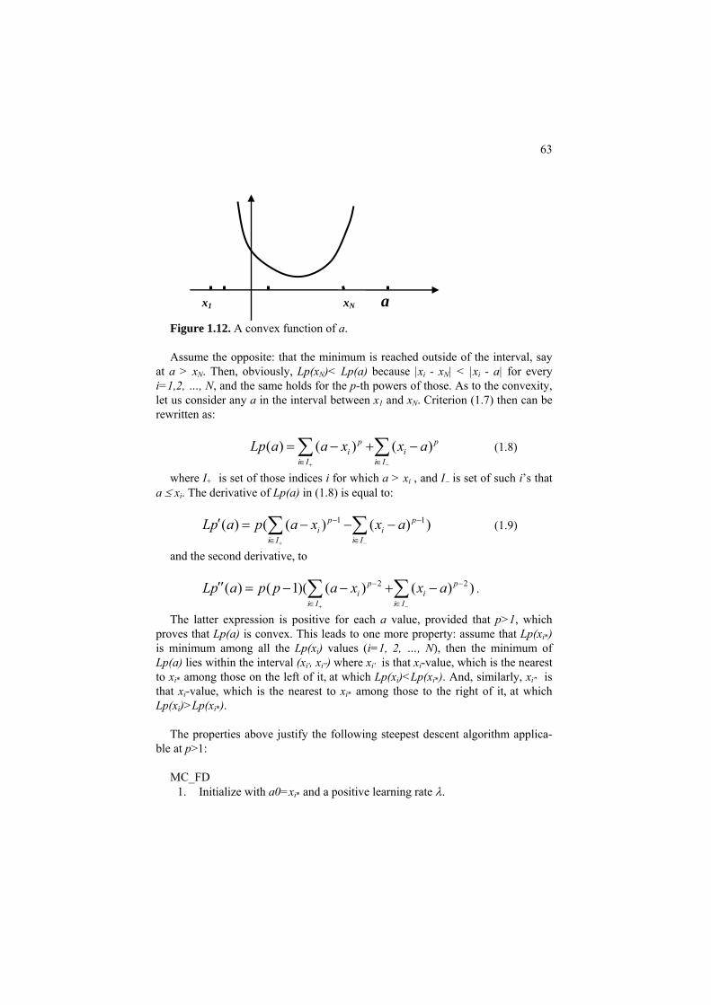
63
Figure 1.12. A convex function of a.
x1 xN a
Assume the opposite: that the minimum is reached outside of the interval, say
at a > xN. Then, obviously, Lp(x )< Lp(a) because |xN i - xN| < |xi - a| for every i=1,2, …, N, and the same holds for the p-th powers of those. As to the convexity, let us consider any a in the interval between x1 and xN. Criterion (1.7) then can be rewritten as:
( ) ( ) ( )p
i ii I i I
Lp a a x x a+ −∈ ∈
= − + − p∑ ∑ (1.8)
where I is set of those indices i for which a > x+ i , and I− is set of such i’s that a ≤ xi. The derivative of Lp(a) in (1.8) is equal to:
1( ) ( ( ) ( ) )p
i ii I i I
Lp a p a x x a+ −
1p− −
∈ ∈
′ = − − −∑ ∑ (1.9)
and the second derivative, to
2 2( ) ( 1)( ( ) ( )p pi i
i I i ILp a p p a x x a
+ −
− −
∈ ∈
′′ = − − + − )∑ ∑ .
The latter expression is positive for each a value, provided that p>1, which proves that Lp(a) is convex. This leads to one more property: assume that Lp(xi*) is minimum among all the Lp(xi) values (i=1, 2, …, N), then the minimum of Lp(a) lies within the interval (x , x ) where x is that xi′ i′′ i′ i-value, which is the nearest to x at which Lp(x )<Lp(x ). And, similarly, xi* among those on the left of it, i i* i′′ is that xi-value, which is the nearest to xi* among those to the right of it, at which Lp(x )>Lp(x ). i i*
The properties above justify the following steepest descent algorithm applica-
ble at p>1: MC_FD
1. Initialize with a0=xi* and a positive learning rate λ.

64
2. Compute a0 – λLp′(a0) according to formula (1.9) and take it as a1 if it falls within the interval (xi′, xi′′). Otherwise, decrease λ a bit and repeat the step.
3. Test whether a1 and a0 coincide, up to a pre-specified precision thresh-old. If yes, halt the process and output a1 as the optimal value for a. If not, move on.
4. Test whether Lp(a1) ≤ Lp(a0). If yes, set a0=a1 and Lp(a0)=Lp(a1), and go to (2). If not, decrease λ a bit and go to 2 (without changing a0).
(ii) Nature-inspired computation MC_NI
According to the nature-inspired approach, a population of possible solutions
rather than a single solution is maintained. In contrast to the classical approaches, the improvements here are a matter of a random evolution of the population from one generation to another, which is organized in such a way that improvements are likely to be acquired. Since this is a 1D search, it is likely that any random moves would approximate the optimal point soon enough. The simple algorithm MC_NI presented below works quite well in experiments: 1. Determining the area of admissible solutions. Determine an area A of admis-sible solutions – a set of points which should contain the optimum point(s). This is quite easy in this case: as proven above, the optimum lies between the minimum lb and maximum rb of the series xi, i=1,2,…, N. Thus, the area is inter-val (lb,rb). 2. Population setting. Specify the size pe of the population to evolve, say, pe=15, and randomly put points s1, s2, …, spe in the admissible area (lb,rb). 3. Elite initialization. Evaluate values of the criterion, frequently referred to as the “fitting function”, for each member of the population and store information of the best (elite), that is, the minimum, as the only record se to output when needed. 4. Next generation. Modify the population by, first, adding random Gaussian noise r:
s′k = sk +λr and, second, by moving all those of the resulting values that went out of the area of admissible solutions A back to the area.
5. Elite maintenance. Evaluate values of the criterion at the new generation, pick the best and worst of them, say sb and sw, and compare with the elite se. If sb is better than se, change the elite for sb. Else, that is, if sb and, more so, sw are worse than se, improve the current population by changing sw in that for the record se. 6. Stop condition. If the number of iterations has not reached a pre-specified value, go to (4). Otherwise, output the elite solution.

65
A Matlab code, cm.m, implementing this procedure can be found in the Ap-
pendix. Experiments show that the gradient based procedure of the steepest de-scent is faster than the nature-inspired one. But the latter works at any p, whereas the former only at p>1.
Project 1.2. Analysis of a multimodal distribution
Let us take a look at the distributions of OOP and CI marks at the Student data. Assuming that the data file of Table 0.4 is stored as Data\stud.dat, the correspond-ing MatLab commands can be as follows: >> a=load(‘Data\stud.dat’); >> oop=a(:,7); % column of OOP mark >> coi=a(:,8); % column of CI mark >> subplot(1,2,1); hist(oop); >> subplot(1,2,2); hist(coi); With ten bins used in MatLab by default, the histograms are on Figure 1.13.
20 40 60 80 1000
5
10
15
20
25
30
20 40 60 80 1000
5
10
15
20
25
30
Figure 1.13. Histograms of the distributions of marks for OOP (on the left) and CI (on he right) from Students data. The histogram on the left seems to have three humps, that is, three-modal. Typi-cally, a homogeneous sample should have a unimodal distribution, to allow inter-pretation of the feature as its modal value with random deviations from it. The three modes on the OOP mark histogram require an explanation. For example, one may hypothesize that the modes can be explained by the presence of three differ-ent groups of students represented by their occupations so that IT group should have higher marks than BA group whose marks should still be higher than those at AN group.

66
To test this hypothesis, one needs to compare distributions of OOP marks at each of the occupations. To make the distributions comparable, we need to specify an array with boundaries between 10 bins that can be used for each of the samples. This array, b, can be computed as follows: >> r=max(oop)-min(oop);for i=1:11;b(i)=min(oop)+(i-1)*r/10;end; Now we are ready to produce comparable distributions for each of the occupations with MatLab command histc: >> for ii=1:3;li=find(a(:,ii)==1);hp(:,ii)=histc(oop(li),b);end; This generates a list, li, of student indices corresponding to each of the three occu-pations presented by the three binary columns. Matrix hp stores the three distribu-tions in its three columns. Obviously, the total distribution of OOP, presented on the left of Figure 1.13 is the sum of these three columns. To visualize the distribu-tions, one may use “bar” command in MatLab: >> bar(hp); which produces bar histograms for each of the three occupations (see Figure 1.14). One can see that the histograms differ indeed and concur with the hypothesis, so that IT concentrates in top seven bins and, moreover, it shares the top three bins with no other occupation. The other two occupations overlap more, though AN takes over on the leftmost, worst marks, positions indeed. Q.1.19. What would happen if array b is not specified once for all but the histo-gram is drawn by default for each of the sub-samples? A. The 10 default bins de-pend on the data range, which may be different at different sub-samples; if so, the histograms will be incomparable.
1 2 3 4 5 6 7 8 9 10 110
2
4
6
8
10
IT
BA
AN
Figure 1.14. Histograms of OOP marks for each of three occupations, IT, BA and AN, each presented with bars filled in according to the legend.
67
There can be other hypotheses as well, such as that the modes come from different age groups. To test that, one should define the age group boundaries first.
Project 1.3. Computational validation of the mean by bootstrapping
The data file short.dat in Appendix A.5 is a 50x 3 array whose columns are sam-ples of three data types described in Table 1.6. Table 1.6. Aggregate characteristics of columns for short.dat array
Data type Normal Two-modal Power law Mean 10.27 16.92 289.74
Real value 1.76 4.97 914.50 Standard deviation 0.25 0.70 129.33 NRelated to
The normal data is in fact a sample from a Gaussian N(10,2), that has 10 as its mean and 2 as its standard deviation. The other two are Two-modal and Power law samples. Their 30-bin histograms are on the left-hand sides of Figures 1.15, 1.16, and 1.17. Even with the aggregate data in Table 1.6 one can see that the av-erage of Power law does not make much sense, because its standard deviation is more than three times greater than the average. Many statisticians would argue the validity of characteristics in Table 1.5 not be-cause of the distribution shapes – which would be a justifiable source of concern for at least two of the three distributions – but because of small sizes of the sam-ples. Is the 50 entities available a good representation of the entire population in-deed? To address these concerns, the Mathematical Statistics have worked out principles based on the assumption that the sampled entities come randomly and independently from a – possibly unknown but stationary – probabilistic distribu-tion. The mathematical thinking would allow then, in reasonably well-defined situations, to arrive at a theoretical distribution of an aggregate index such as the mean, so that the distribution may lead to some confidence boundaries for the in-dex. Typically, one would obtain the boundaries of an interval at which 95% of the population falls, according to the derived distribution. For instance, when the distribution is normal, the 95% confidence interval is defined by its mean plus/minus 1.96 times the standard deviation related to the square root of the num-ber observations, which is 7.07 at N=50. Thus, for the first column data, the theo-retically derived 95% confidence interval will be 10 ±1.96*2/7.07 =10±0.55, that is, (9.45, 10.55) (if the true parameters of the distribution are known) or 10.27±1.96*1.76/7.07 = 10.27±0.49, that is, (9.78,10.76) (at the observed parame-ters in Table 1.1). The difference is rather minor, especially if one takes into ac-

68
count that the 95% confidence is a rather arbitrary notion. In probabilistic statis-tics, the so-called Student’s distribution is used to make up for the fact that the sample-estimated standard deviation value is used instead of the exact one, but that distribution differs little from the Gaussian distribution when there are more than several hundred entities. In many real life applications the shape of the underlying distribution is unknown and, moreover, the distribution is not necessarily stationary. The theoretically de-fined confidence boundaries are of little value then. This is why a question arises whether any confidence boundaries can be derived computationally by re-sampling the data at hand rather than by imposing some debatable assumptions. There have been developed several approaches to computational validation of sample based results. One of the most popular is bootstrapping which will be used here in its two basic, “pivotal” and “non-pivotal”, formats as defined in Carpenter and Bithell (2000). Bootstrapping is based on a pre-specified number, say 1000, of random trials. A trial involves randomly drawn N entities, with replacement, from the entity set. Note that N is the size of the entity set. Since the sampling goes with replacement, some entities may be drawn two or more times so that some others are bound to be left behind. Recalling that e=2.7182818… is the natural logarithm base, it is not difficult to see that, on average, only approximately (e-1)/e=63.2% entities get se-lected into a trial sample. Indeed, at each random drawing from a set of N, the probability of an entity being not drawn is 1-1/N, so that the approximate propor-tion of entities never selected in N draws is (1-1/N)N ≈ 1/e =1/2.71828≈ 36.8% of the total number of entities. For instance, in a bootstrap trial of 15 entities, the fol-lowing numbers have been drawn: 8, 11, 7, 5, 3, 3, 11, 5, 9, 3, 11, 6, 13, 13, 9 so that seven entities have been left out of the trial while several multiple copies have got in.
5 10 150
1
2
3
4
5
6
7
8
9
10−bin histogram of 50 strong sample drawn from (10,2) Gaussian.
9 10 11 120
20
40
60
80
100
30−bin histogram of means for 1000 bootstrap trials

69
Figure 1.15. The histograms of a 50 strong sample from a Gaussian distribution (on the left) and its mean’s bootstrap values (on the right): all falling between 9.7 and 10.1. A trial set of a thousand randomly drawn entity indices (some of them, as ex-plained, would coincide) is assigned with the corresponding row data values from the original data table so that coinciding entities get identical rows. Then a method under consideration, currently "computing the mean", applies to this trial data to produce the trial result. After a number of trials, the user gets enough results to represent them with a histogram and derive confidence boundaries from that. Table 1.7. Aggregate characteristics of the results of 1000 bootstrap trials over short.dat array.
Data type Normal Two-mode Power law Mean 10.27 16.94 287.54
The bootstrap distributions for each of the three types of data generation mecha-nism, after 1000 trials, are presented in Figures 1.15, 1.16 and 1.17 on the right hand side. The pivotal validation method is based on the assumption that the bootstrap distri-bution of means is Gaussian, so that having estimated its average mb and standard deviation sb, the 95% confidence interval is estimated as usual, with formula mb±1.96*sb =10.24±1.96*0.24=10.24±0.47, which is the interval between 9.77 and 10.71 – which is very similar to that obtained under the hypothesis of Gaus-sian distribution – this is no wonder here because the hypothesis is true. The non-pivotal method makes no assumption of the distribution of bootstrap means and uses the empirical bootstrap found distribution to cut it at its 2.5% up-per and bottom quantiles. To do this, we can sort values of the vector of bootstrap means and find the values at its 26th and 975th components, that cut out exactly 2.5% of the set each. This action produces interval between 9.78 and 10.70, which is very close to the previously found boundaries for the 95% confidence interval for the mean value of the first sample..
Original sample 0.25 0.70 129.33 Bootsrap value 0.25 0.69 124.38
Standard deviation
Mean, % 2.46 4.05 43.26

70
5 10 15 20 250
2
4
6
8
10
12
14
1610−bin histogram: Two−mode case
14 16 18 200
20
40
60
80
100
30−bin histogram of means in 1000 bootstrap trials
Figure 1.16. The histograms of a 50 strong sample from a Two-mode distribution (on the left) and its mean’s bootstrap values (on the right). There is theoretical evidence, presented by E. Bradley (1993), to support the view that the bootstrap can produce somewhat tighter estimate of the marks deviation than the estimate based on the original sample. In our case, we can see in Table 1.7 that indeed, with the means almost unchanged, the standard deviations have been slightly reduced.
Unfortunately, the bootstrap results are not that helpful in analyzing the other
two distributions: as can be seen in our example, both of the means, the Two-modal and Power law ones, are assigned rather decent boundaries while, in most applications, the mean of either of these two distributions may be considered meaningless. It is a matter of applying other data analysis methods such as cluster-ing to produce more homogeneous sub-samples whose distributions would be more similar to that of a Gaussian.

71
0 2000 4000 6000 80000
10
20
30
40
50
50−strong 10−bin histogram: Power law case
0 500 10000
20
40
60
80
100
30−bin histogram of means in 1000 bootstrap trials
Figure 1.17. The histograms of a 1000 strong sample from a Power law distribu-tion (on the left) and its mean’s bootstrap values (on the right): all falling between 260 and 560.
The reader is requested to provide pivotal and not-pivotal estimates of 95%
confidence interval for the other two samples in short.dat dataset (Two-modal and Power law).
Project 1.4. K-fold cross validation
Another set of validation techniques utilizes randomly splitting the entity set in two parts of pre-specified sizes, the so-called train and test sets, so that the method’s results obtained for the train set are compared with the data on the test set. To guarantee that each of the entities gets into a train/test set the same number of times, the so-called cross-validation methods have been developed.
The so-called K-fold cross validation works as follows. Randomly split entity
set in K parts Q(k), k=1,…,K, of equal sizes1. Typically, K is taken as 2 or 5 or 10. In a loop over k, each part Q(k) is taken as test set while the rest forms the train set. A data analysis method under consideration is run over the train set (“training phase”) with its result applied to the test set. The average score of all the test sets constitutes a K-fold cross-validation estimate of the method’s quality.
1To do this, one may start from all sets Q(k) being empty and repeatedly run a
loop over k=1:K in such a way that at each step, a random entity is drawn from the entity set (with no replacement!) and put into the current Q(k); the process halts when no entities remain out of Q(k).
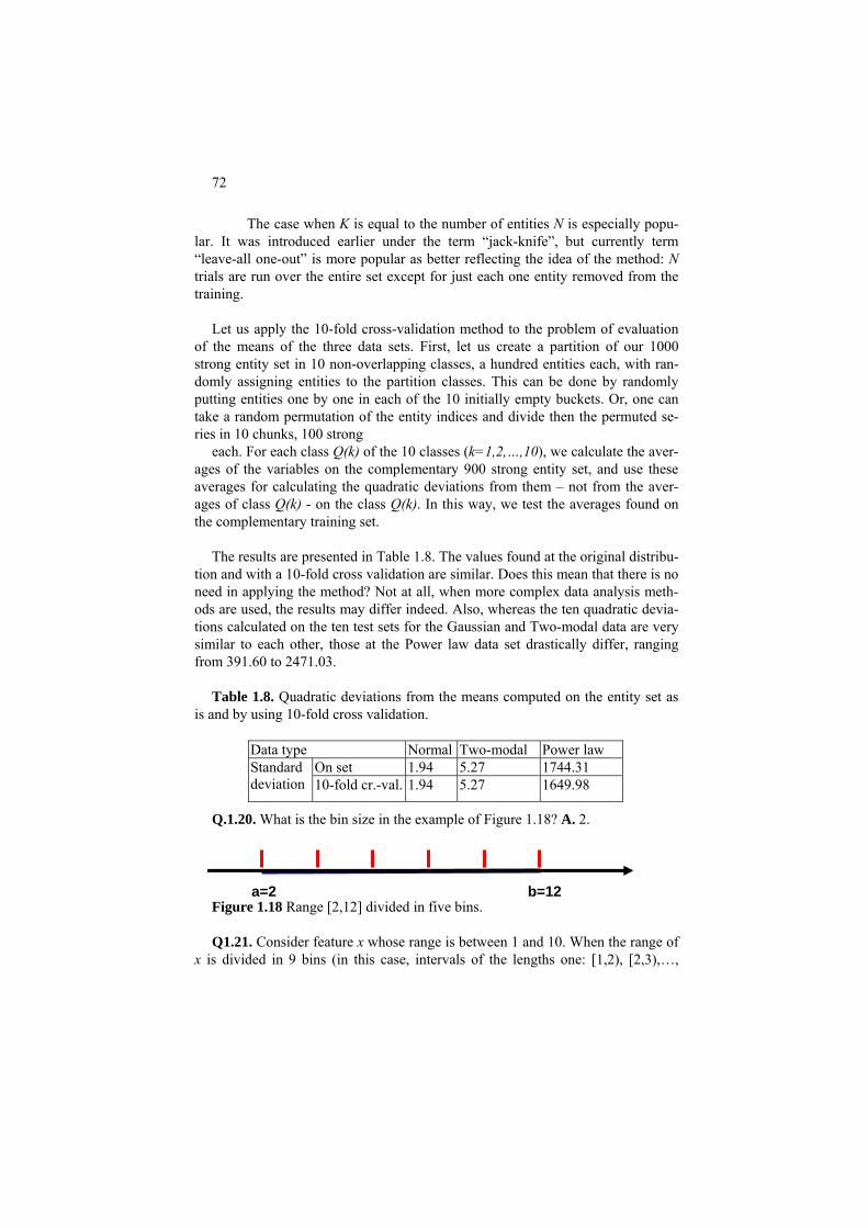
72
The case when K is equal to the number of entities N is especially popu-lar. It was introduced earlier under the term “jack-knife”, but currently term “leave-all one-out” is more popular as better reflecting the idea of the method: N trials are run over the entire set except for just each one entity removed from the training.
Let us apply the 10-fold cross-validation method to the problem of evaluation
of the means of the three data sets. First, let us create a partition of our 1000 strong entity set in 10 non-overlapping classes, a hundred entities each, with ran-domly assigning entities to the partition classes. This can be done by randomly putting entities one by one in each of the 10 initially empty buckets. Or, one can take a random permutation of the entity indices and divide then the permuted se-ries in 10 chunks, 100 strong
each. For each class Q(k) of the 10 classes (k=1,2,…,10), we calculate the aver-ages of the variables on the complementary 900 strong entity set, and use these averages for calculating the quadratic deviations from them – not from the aver-ages of class Q(k) - on the class Q(k). In this way, we test the averages found on the complementary training set.
The results are presented in Table 1.8. The values found at the original distribu-
tion and with a 10-fold cross validation are similar. Does this mean that there is no need in applying the method? Not at all, when more complex data analysis meth-ods are used, the results may differ indeed. Also, whereas the ten quadratic devia-tions calculated on the ten test sets for the Gaussian and Two-modal data are very similar to each other, those at the Power law data set drastically differ, ranging from 391.60 to 2471.03.
Table 1.8. Quadratic deviations from the means computed on the entity set as
is and by using 10-fold cross validation. Data type Normal Two-modal Power law Q.1.20. What is the bin size in the example of Figure 1.18? A. 2. Figure 1.18 Range [2,12] divided in five bins. Q1.21. Consider feature x whose range is between 1 and 10. When the range of
x is divided in 9 bins (in this case, intervals of the lengths one: [1,2), [2,3),…,
On set 1.94 5.27 1744.31 Standard deviation 10-fold cr.-val. 1.94 5.27 1649.98
a=2 b=12

73
[9,10]), the x frequencies in the corresponding bins are: 10, 20, 10, 20, 30, 20, 40, 20, 30. Please answer these questions:
(i) How many observations of x are available? (ii) What can be said about the value of the median of x? (iii) Provide the minimum and maximum estimates of the average of
x. (iv) What can be said of 20% quantiles of x? (v) What is the distribution of x when the number of bins is 3? What
is the qualitative variance (Gini coefficient) for this distribution? A.
(i) There are 200 observations. (ii) The median lies between 100-th and 101-th values in a sorted order, that
is, in the 6-th bin, that is, between 6 and 7. (iii) The minimum estimate of the mean is computed with the minimal values
in bins: (1*10+2*20+3*10+4*20+5*30+6*20+7*40+8*20+9*30)/200=5.7
The maximum estimate is calculated using the same formula with all bin values increased by 1, which should lead to 5.7+1=6.7. (iv) 20% of 200 is 40. That means that the 20% quantile on the left end of x is
4, while that on the right end must be in the 8-th bin, that is, between 8 and 9.
(v) The three-bin distribution will be 40, 70, 90 or, in the relative frequen-cies, 0.2, 0.35, .45, which leads to the Gini index equal to 1-0.22-0.352-0.452=0.635.
Q.1.22. Occurrence/co-occurrence. Of 100 Christmas shoppers, 50 spent £60 each, 20 spent £100 each, and 30 spent £150 each. What are the (i) average, (ii) median and (iii) modal spending? Tip: How one can take into account in the cal-culation that there are, effectively, only three different types of customers? A. Average: First, let us see that the proportions of shoppers who spent £60, £100 and £150 each are, respectively, 0.5, 0.2 and 0.3. The average can be calculated by weighting the expen-ditures by the proportions so that Average=60*0.5 + 100*0.2 + 150*0.3 = 30.0 + 20.0 + 45.0 = 95.
Median: According to definition, the median of 100 numbers is the mid value between 50th and 51st entries in their sorted order, which are 60 and 100 in this case. Thus the median spending is £80.
Mode: The modal value is the most likely one, that is, 60. Q.1.23. Consider two geological formations that are represented by 7 and 5 ore
specimens, respectively. The mineral contents in formation A is described by vec-tor a= (7.6, 11.1, 6.8, 9.8, 4.9, 6.1, 15.1), and in formation B, by vector b=(4.7, 6.4, 4.1, 3.7, 3.9). The average content in A is 8.77 and in B, 4.56. Test the hy-pothesis that the mineral contents in A is richer than in B (with 95% confidence) by using bootstrap. A. Because the sets are quite small, the number of trials should be taken rather moderate, not greater than 200. At 200 trials, 95% confidence in-
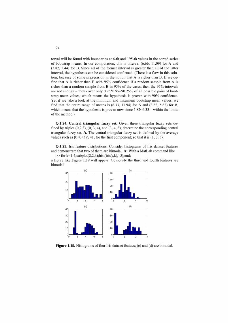
74
terval will be found with boundaries at 6-th and 195-th values in the sorted series of bootstrap means. In our computation, this is interval (6.66, 11.09) for A and (3.82, 5.44) for B. Since all of the former interval is greater than all of the latter interval, the hypothesis can be considered confirmed. (There is a flaw in this solu-tion, because of some imprecision in the notion that A is richer than B. If we de-fine that A is richer than B with 95% confidence if a random sample from A is richer than a random sample from B in 95% of the cases, then the 95%-intervals are not enough – they cover only 0.95*0.95=90.25% of all possible pairs of boot-strap mean values, which means the hypothesis is proven with 90% confidence. Yet if we take a look at the minimum and maximum bootstrap mean values, we find that the entire range of means is (6.33, 11.94) for A and (3.82, 5.82) for B, which means that the hypothesis is proven now since 5.82<6.33 – within the limits of the method.)
Q.1.24. Central triangular fuzzy set. Given three triangular fuzzy sets de-
fined by triples (0,2,3), (0, 3, 4), and (3, 4, 8), determine the corresponding central triangular fuzzy set. A. The central triangular fuzzy set is defined by the average values such as (0+0+3)/3=1, for the first component; so that it is (1, 3, 5).
Q.1.25. Iris feature distributions. Consider histograms of Iris dataset features
and demonstrate that two of them are bimodal. A: With a MatLab command like >> for k=1:4;subplot(2,2,k);hist(iris(:,k),15);end;
a figure like Figure 1.19 will appear. Obviously the third and fourth features are bimodal.
4 5 6 7 80
10
20
30(a)
2 3 4 50
10
20
30
40(b)
0 2 4 6 80
10
20
30
40(c)
0 1 2 30
10
20
30
40(d)
Figure 1.19. Histograms of four Iris dataset featues; (c) and (d) are bimodal.

75
Q.1.26. To run a computational experiment, a student is to randomly generate distributions of relative frequencies for a three-category nominal variable. The student decides first generate random numbers in interval (0,1) and then make them sum up to unity by relating them to thir sum. Thus, for example, random numbers 0.7116, 0.1295, 0.6598 are first generated, and then divided by their sum 1.5009 to produce values 0.4741, 0.0863, 0.4396 totaling to 1. Is it a right way to go? A. Not exactly. A bias towards equal frequencies will be created. For exam-ple, take a look at Figure 1.20(a) presenting the distribution of the first element of a pair of frequencies found by the described method: generate a pair of random numbers and then divide them by the sum. This distribution is far from that of a uniformly random value presented on Figure 1.20 (b). (Can you explain the differ-ence?) An appropriate way for generating uniformly random frequency triplets would be this. First, generate just two random numbers, then sort them in ascend-ing order and add 0 and 1 into the series: r0=0<r1<r2<r3=1. Then define the fre-quencies as differences of neighboring values in the series, p =r -rk k k-1 (k=1,2,3). For example, if 0.8775, 0.5658 were first generated, then the frequencies would be defined as p1 =0.5658, p2 =0.8775 - 0.5658=0.3117, and p3 =1- 0.8775= 0.1225. This method is easily extendable to any number of categories.
0 0.5 10
500
1000
1500
2000a
0 0.5 10
500
1000
1500
b
Figure 1.20. Histograms of a 100000 strong random sample of (a) the first
element of a random pair after division by the pair summary value, and (b) just a random number.
1.5 Summary
This chapter presents summaries of one-dimensional data, first of all, histo-grams, central points and spread evaluations. Two perspectives are outlined: one is the classical probabilistic and the other of approximation, naturally extending into the data recovery approach to supply a decomposition of the data scatter in the ex-plained and unexplained parts.

76
A difference between categorical and quantitative features is pointed out: the
latter admit averaging whereas the former not. This difference is somewhat blurred at binary features especially the so-called dummies, 1/0 variables repre-senting individual categories – they can be considered quantitative too.
Some attention is given to modeling uncertainty by using intervals and fuzzy
sets, but not much pursued. In fact, most of further methods can be extended to these more complex data types.
Several projects are presented to show how questions can arise and get compu-
tational answers. Computational intelligence and cross validation approaches are involved.
References
B. Efron and R. Tibshirani (1993) An Introduction to Bootstrap, Chapman & Hall. A.P. Engelbrecht (2002) Computational Intelligence, John Wiley & Sons.
H. Lohninger (1999) Teach Me Data Analysis, Springer-Verlag, Berlin-New York-Tokyo.
B. Polyak (1987) Introduction to Optimization, Optimization Software, Los An-geles, ISBN: 0911575146.
Articles
J. Carpenter, J. Bithell (2000) Bootstrap confidence intervals: when, which, what? A practical guide for medical statisticians, Statistics in Medicine, 19, 1141-1164.
L.A. Zadeh (1975) The concept of a linguistic variable and its application to ap-proximate reasoning I-II, Information Sciences, 8, 199-249, 301-375.

77
2 2D analysis: Correlation and Visualization of Two Features
Boris Mirkin
Department of Computer Science and Information Systems, Birkbeck, University of London, Malet Street, London WC1E 7HX UK
Department of Data Analysis and Machine Intelligence, Higher School of Economics, 11 Pokrovski Boulevard, Moscow RF
Abstract
The Chapter outlines several important characteristics of summarization and correlation between two features, and displays some of the properties of those. They are:
- linear regression and correlation coefficient for two quantitative vari-ables;
- tabular regression, correlation ratio, decomposition of the quantitative feature scatter, and nearest neighbor classifier for the mixed scale case; and
- contingency table, Quetelet index, statistical independence, and Pearson’s chi-squared for two nominal variables; the latter is treated as a summary correlation measure, in contrast to the conventional view of it as a crite-rion of statistical independence.
They all are applicable in the case of multidimensional data as well.

78
2.0 General
Analysis of two features on the same entity set can be of interest assuming that the features are related in such a way that certain changes in one of them tend to co-occur with changes in the other. Then the relation – if observed indeed – can be used in various ways, of which two types of application are typically discernible: those oriented at
(i) prediction of values of one variable from those of the other; (ii) addition of the relation to the knowledge of the domain by interpret-
ing and explaining it in terms of the existing knowledge. Goal (ii) is a subject in the discipline of knowledge bases as part of the so-
called inferential approach, in which all relations are assumed to have been ex-pressed as logical predicates and treated within a formal logic system – this ap-proach will not be described here. We concentrate on another approach, referred to as the inductive one and related to the analysis of what type of information the data can provide with respect to the goals (i) and (ii). Typically, the feature whose values are to be predicted is referred to as the target variable and the other as the input variable. Examples of goal (i) are: prediction of an intrusion attack of a cer-tain type (Intrusion data) or prediction of exam mark (Student data) or prediction of the number of Primary schools in a town whose population is known (Market town data). One may ask: why bother – all numbers are already in the file! Indeed, they are. But in the prediction problem, the data at hand are just a sample from a large population so that it is used as a training ground for devising a decision rule for prediction of the target feature at other, yet unobserved, entities. Typically, the input feature is readily available while the target feature is not. As to the goal (ii), the data usually are just idle empirical facts not necessarily noticeable unless they are generalized into a decision rule.
The mathematical structure and the visual portrayal of the problem differ de-pending on the type of feature scales involved, which leads us to considering all possible cases:
(1) both features are quantitative, (2) one feature is quantitative, the other categorical, and (3) both features are quantitative.
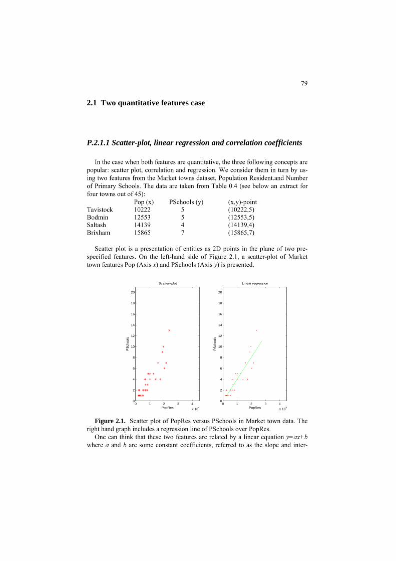
79
2.1 Two quantitative features case
P.2.1.1 Scatter-plot, linear regression and correlation coefficients
In the case when both features are quantitative, the three following concepts are popular: scatter plot, correlation and regression. We consider them in turn by us-ing two features from the Market towns dataset, Population Resident.and Number of Primary Schools. The data are taken from Table 0.4 (see below an extract for four towns out of 45):
Pop (x) PSchools (y) (x,y)-point Tavistock 10222 5 (10222,5) Bodmin 12553 5 (12553,5) Saltash 14139 4 (14139,4) Brixham 15865 7 (15865,7)
Scatter plot is a presentation of entities as 2D points in the plane of two pre-
specified features. On the left-hand side of Figure 2.1, a scatter-plot of Market town features Pop (Axis x) and PSchools (Axis y) is presented.
0 1 2 3 4
x 104
0
2
4
6
8
10
12
14
16
18
20
PopRes
PS
choo
ls
Scatter−plot
0 1 2 3 4
x 104
0
2
4
6
8
10
12
14
16
18
20
PopRes
PS
choo
ls
Linear regression
Figure 2.1. Scatter plot of PopRes versus PSchools in Market town data. The
right hand graph includes a regression line of PSchools over PopRes. One can think that these two features are related by a linear equation y=ax+b
where a and b are some constant coefficients, referred to as the slope and inter-

80
cept, respectively, because the number of schools should be related to the number of children which is related to the number of residents. This equation is referred to as the linear regression of y over x. Obviously, most relations are not necessarily that simple because they also depend on other factors such as school sizes, popula-tion’s age, etc. It would be a miracle if one equation fitted well all 45 towns. The possible inconsistencies in the equation can be modeled as additive errors, or re-siduals. The slope a and intercept b are taken in such a way that the inconsisten-cies of the equation on the 45 towns are minimized.
When a linear regression equation is fitted, its validity should be checked. A
valid equation can be used for both (i) prediction and (ii) description. The Galton-Pearson theory of linear regression involves a useful and very
popular parameter, the correlation coefficient that shows the extent of linearity in the relation between the two features. Its square, referred to as the determination coefficient, can be used for a quick check of the validity of the regression: it shows the proportion of the variance of y that is taken into account by the regres-sion. The correlation coefficient between the two features, Pop and PSchools, is 0.909. The correlation coefficient, in general, ranges between -1 and 1, and a value close to 1 or –1 indicates a high extent of the linear dependence between the fea-tures. In physics or chemistry, a high value of the correlation coefficient is rather usual; in social sciences, rather not – that is, the current features are highly related indeed.
Most other features in Market town data – such as the numbers of Post offices or Doctors – are also highly related to Pop feature, but not the number of Farmers markets. This latter feature appears to be binary here: a town either has a farmers market or not. The low value of the correlation coefficient, just below 0.15, shows that the size of the town does not much matter in this part of the world: a farmers market is as likely in a small town as it is in a larger town.
A low or even zero value of the correlation coefficient does not necessarily mean “no relation at all”, but rather just “no linear relation”. A zero correlation coefficient may hide a different type of functional relation, as shown on Figure 2.2, which presents three different cases of the zero correlation. Only one of these, that on the left, case is genuine – there is no relation between x and y according to the picture indeed. Each of the other two cases relates to a rather high association between x and y. Specifically, the figure in the middle refers to a quadratic de-pendence and the figure on the right, to a split between two subsamples of highly linear but inverse relations.

81
1 2 3−2
−1.5
−1
−0.5
0
0.5
1
1.5
2
1 2 35
5.2
5.4
5.6
5.8
6
1 2 3−3
−2.5
−2
−1.5
−1
−0.5
0
0.5
1
Figure 2.2. Three scatter-plots corresponding to zero or almost zero correlation
coefficient ρ; the case on the left: no relation between x and y; the case in the middle: a non-random quadratic relation y=(x-2)2+5; the case on the right: two symmetric linear relations, y=2x-5 and y=-2x+3, each holding at a half of the enti-ties.
−4 −2 0 2 40
2
4
6
8
10
12
14
16
18
−4 −2 0 2 40
2
4
6
8
10
12
14
16
18
Figure 2.3. Histograms of the residuals, the differences between values of
PSchool as observed and those computed from Pop by using equation (2.1), with 5 bins (on the left) and 10 bins (on the right). The dents in the finer histogram can be attributed to the fact that the sample of 45 instances is too small to have 10 bins.
Then the regression equation, estimated according to formulas (2.4-2.6) in sec-
tion F2.1.2, is this: PSchool=0.401*Pop+0.072 (2.1)
where Population resident (Pop) is expressed in thousands to make the slope the thousand times greater than it would be if population is expressed in the absolute

82
numbers. The slope expresses how much target changes when the input changes by 1. Because the target’s values are integers, the value of slope can be rephrased as follows: the growth of population in a town by 2.5 thousand would lead, on av-erage, to building one more primary school.
P.2.1.2 Validity of the regression
A regression function built over a data set should be validated. Three types of validity checks can be considered:
(a) The proportion of the variance of target variable taken into account by the regression, the determination coefficient: the greater the determination the better the fit.
(b) The confidence intervals of regression parameters – their ranges can give an idea of how stable the regression is.
(c) The direct testing of the accuracy of prediction both on data used for build-ing the regression and data not used for that.
Worked example 2.1. Determination coefficient Consider feature PSchools as target versus Pop as input, in Market Data (Figure 2.1).
Th termination coefficient, in the e correlation coefficient between them is 0.909. The decase of linear regression, is its square, that is, 0.9092= 0.826, which shows that the linear dependence on Pop decreases the variance of PSchools by 82.6%, a rather high value.
If the determination coefficient is not that high, still the hypothesis of linear re-
lat n may hold – depending on the distribution of residuals, that is, differences iobetween the observed values of PSchool and those computed from Pop according to equation (2.1). This distribution should be Gaussian or approximately Gaussian, so that the principle of maximum likelihood and formulas derived from it are ap-propriate. The distribution for the case under consideration is presented on Figure 2.3. It is similar to a Gaussian distribution indeed, at the 5 bin histogram. The his-togram with 10 bins is less so because it is somewhat dented – probably the sam-ple is too small for this level of granularity: on average, only 4-5 entities fall in each of the bins.
A more straightforward validity test can be performed without any statistic the-
ory all – by purely computational means using the so-called boostrapping which atis a procedure for obtaining a multitude of random estimates of the parameters of interest by using random samples from the dataset as illustrated in worked exam-ple 2.2.
Worked example 2.2. Bootstrap validity testing
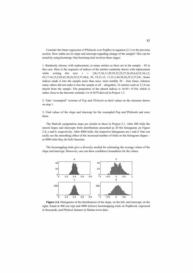
83
Consider the linear regression of PSchools over PopRes in equation (2.1) in the previous section. How stable are its slope and intercept regarding change of the sample? This can be tested by using bootstrap. One bootstrap trial involves three stages: 1. Randomly choose, with replacement, as many entities as there are in the sample – 45 in this case. Here is the sequence of indices of the entities randomly drawn with replacement while writing this text: r = {26,17,36,11,29,39,32,25,27,26,29,4,4,33,10,1,5, 45,17,16,13,5,42,43,28,26,35,2,37,44,6, 39, 33,21,15, 11,33,1,44,30,26,25,5,37,24}. Some indices made it into the sample more than once, most notably 26 – four times, whereas many others did not make it into the sample at all – altogether, 16 entities such as 3,7,8 are absent from the sample. The proportion of the absent indices is 16/45= 0.356, which is rather close to the theoretic estimate 1/e=0.3679 derived in Project 1.3. 2. Take “resampled” versions of Pop and PSchools as their values on the elements drawn on step 1. 3. Find values of the slope and intercept for the resampled Pop and PSchools and store them.
The MatLab computation steps are similar to those in Project 2.1. After 400 trials the
stored slopes and intercepts form distributions presented as 20 bin histograms on Figure 2.4, a and b, respectively. After 4000 trials, the respective histograms are c and d. One can easily see the smoothing effect of the increased number of trials on the histogram shapes – at 4000 trials they do look Gaussian.
The boostrapping trials give a diversity needed for estimating the average values of the
slope and intercept. Moreover, one can draw confidence boundaries for the values.
0 0.2 0.4 0.6 0.80
500
c
−1 −0.5 0 0.5 10
500
d
0 0.2 0.4 0.6 0.80
20
40
a b
−1 −0.5 0 0.5 10
20
40
Figure 2.4. Histograms of the distributions of the slope, on the left, and intercept, on the
right, found at 400 (on top) and 4000 (below) bootstrapping trials on PopResid, expressed in thousands, and PSchool features in Market town data.

84
Table 2.1. Parameters of the linear regression of PoPResid over PSChool found on the original set, as well as on 400 and 4000 trials. The latter involves the average values as well as the lower and upper 2.5% quantiles.
40Regression Set 0 trials 4000 trials M % M %
.401 pt
Parameters ean 2.5% 97.5 ean 2.5% 97.5Slope 0 0.399 0.296 0.486 0.398 0.303 0.488 Interce 0.072 0.089 -0.34 0.623 0.092 -0.40 0.594
How can one obtain, say, 95% confidence boundaries? According to the non-pivotal
method, lower and upper 2.5% quintiles are cut out from the distribution in a symmetric way: 95% of the observations fall between the quantiles. For the case of 400 trials, 2.5% equals 10, so that the lower quantile corresponds to 11th and the upper quantile to 390th elements in the sorted set of values. For the case of 4000 trials, 2.5% equals 100: these quantiles correspond to 101st and 3900th elements of the sorted sets. They are shown in Ta-ble 2.1 at both of the cases, 400 and 4000 trials. One can see that these provide consistent and rather tight boundaries for the slope: it is between 0.303 and 0.488 in 95% of all trials, according to 4000-trial data, and more or less the same at 400-trial data. The values of in-tercept are distributed with a greater dispersion and provide for a worsened accuracy. Symmetric 95% confidence intervals for the intercept are [-0.343,0.623] at 400 trials and [-0.400,0.594] at 4000 trials.
Q2.1. How a pivotal bootstrapping rule can be applied here? This would pro-
vide more stable evaluations than empirical distributions. The standard deviations of the slope and intercept are 0.0493 and 0.2606, respectively, at 400 boostrapping trials; they are somewhat smaller, 0.0477 and 0.2529, at the 4000 trials. Can one derive from this a symmetric 95% confidence interval for the slope or intercept? Tip: in a Gaussian distribution, 95% of all values fall within interval mean ± 1.96∗std. This is the so-called pivotal bootstrapping method.
Q.2.2. Can you give an estimate of the level of variance of the differences be-
tween PSchool observed and computed values? A final validity test of the regression equation is probably the toughest one – by
the prediction error (see worked example 2.3). Worked example 2.3. Prediction error of the regression equation Compare the observed values of PSchool with those computed through Pop according to
equation (2.1). Table 2.2 presents a few examples taken from both ends of the sorted Pop feature.
Table 2.2. Observed numbers of Primary schools versus those predicted from the Popu-lat
e. PS comp. Pop
ion resident data on some Market towns. PS obs. PS comp. Pop PS obs1 0.89 2040 2 2.35 5676

85
2 0.97 2230 2 1.06 2452 2 1.19 2786 1 1.54 3660
2 2.90 7044 4 4.12 10092 7 6.44 15865 4 7.05 17390
On average, the predictions are close, but, in some cases, are less so. One can easily es-
timate the relative error, which is (1-0.89)/1=11% at the first case, (2-0.97)/2=51.5% at the second case, etc. The average relative error of equation (2.1) is equal to 30.7%. Can it be made smaller? On the first glance, no, it cannot, because equation (2.1) minimizes the error. But, the error minimized by equation (2.1) is the average quadratic error, not the relative er-ror under consideration. The two errors do differ, and equation (2.1) is not necessarily op-timal with regard to the relative error.
The classical optimization theory has virtually nothing to propose for the
minimization of the relative error – this criterion is neither linear, nor quadratic, nor convex. Yet the evolutionary optimization approach can be applied to the task. This approach uses a population of solutions randomly evolving, iteration after it-eration, in the search for better solutions as explained in Project 2.2. Applying the algorithm from that project to minimize the criterion of relative error, one can find a different solution, in fact, a set of solutions each leading to the average relative error of 26.4%, a reduction of 4.3 points, one seventh of the relative error of equa-tion (2.1). The new solution is PSchool= 0.28*PopRes + 0.33 expressing a smaller rate of increase in school numbers at the growth of population.
F2.1 Linear regression: Formulation
F.2.1.1 Fitting linear regression
Let us derive parameters of linear regression. Given target feature y and predic-tor x at N entities (x1,y1), (x2, y2),…, (xN, yN), we are interested at finding a linear equation relating them so that
y=ax + b (2.2)
The exact fit can ine on occur only if all pairs (xi,yi) belong to the same straight l(x,y)-plane, which is rather unlikely on real-world data. Therefore, equation (2.2) will have an error at each pair (xi,yi) so that the equation should be rewritten as
i i iy =ax + b + e (i=1,2,…,N) (2.2)
86
where e are referred to as errors or residuals. The problem is of determining the itwo parameters, a and b, in such a way that the residuals are least-squares mini-mized, that is, the average square error
L( = Σi ei = Σi (yi - axi - b)2/N , (2.3) a,b) 2
reaches its minimum ver all possible a and b, given x and y (i=1, 2, …,N). This o i iminimization problem is easy to solve with the elementary calculus tools. Indeed L(a,b) is a “bottom down” parabolic function of a and b, so that its mini-mum corresponds to the point at which both partial derivatives of L(a,b) are zero (the first-order optimality condition):
∂L/∂a = 0 and ∂L/∂b = 0
Leaving the task of actually finding the derivatives to the reader as an exercise, let us focus on the unique solution to the first-order optimality equations defined by formulas (2.4), for a, and (2.6), for b:
a = ρ σ(y) /σ(x) (2.4)
where
ρ = [Σi (xi – mx)(yi-my)] ⁄[Nσ(x)σ(y)] (2.5)
is the so-called correlation coefficient and mx, my are means of xi, yi, respectively;
b = my –amx (2.6)
By putting these opti al a and b into (2.3), one can express the minimum criterion mvalue as
Lm(a,b) = σ2(y)(1- ρ2) (2.7)
The equation (2.2) is referred to as the linear regression of y over x, index ρ in
(2.4) and (2.5) as the correlation coefficient, its square ρ2 in (2.7) as the determi-nation coefficient, and the minimum criterion value Lm in (2.7) is referred to as the unexplained variance.

87
F2.1.2 Correlation coefficient and its properties
The meaning of the coefficients of correlation and determination, in the data recovery framework of data analysis, is provided by equations (2.3)-(2.7). Here are some formulations.
Property 1. Determination coefficient ρ2 shows the rate of decrease of the
variance of y after its linear relation to x has been taken into account by the regres-sion (follows from (2.7)).
Property 2. Correlation coefficient ρ ranges between -1 and 1, because ρ2 is
between 0 and 1, as follows from the fact that value Lm in (2.7) cannot be negative because the items in its expression (2.3) are all squares. The closer ρ to either 1 or -1, the smaller are the residuals in the regression equation. For example, ρ=0.9 implies that y’s unexplained variance Lm is 1-ρ2 = 19% of the original value.
Property 3. The slope a is proportional to ρ according to (2.4); a is positive or
negative depending on the sign of ρ. If ρ=0, the slope is 0: in this case, y and x are referred to as not correlated.
Property 4. The correlation coefficient ρ does not change under shifting and
rescaling of x and/or y, which can be seen from equation (2.5). Its formula (2.5) becomes especially simple if the so-called z-scoring has been applied to standard-ize both x and y.
To perform z-scoring over a feature, its mean m is subtracted from all the val-
ues and the results are divided by the standard deviation σ: x′i= (xi – mx)/σ(x) and y′ i = (yi – my)/σ(y), i=1,2,…, N
Using the z-score standardization, formula (2.5) can be rewritten as
ρ = Σi x′i y′i ⁄N =<x’,y’>/N (2.5’)
where < x′, y′ > denotes the inner product of vectors x′ =( x′i) and y′=( y′i).
The next property refers to one of the fundamental discoveries by K. Pearson, an interpretation of the correlation coefficient in terms of the bivariate Gaussian distribution. A generic formula for the density function of this distribution, in the case in which the features have been pre-processed by using z-score standardiza-tion described above, is
f(u, ∑)= Cexp{-uT∑-1u/2} (2.8)

88
where u =(x, y) is a two-dimensional vector of the two variables x and y under consideration and ∑ is the so-called correlation matrix
⎟⎟⎠
⎞⎜⎜⎝
⎛=Σ
11ρ
ρ
In formula (2.8), ρ is a parameter with a very clear geometric meaning. Con-sider a set of points u = (x,y) on (x,y)–plane making function f(u, ∑) in (2.8) equal to a pre-specified constant. Such a set makes the values of uT∑-1u constant too. That means that a constant density set of points u=(x, y) must satisfy equation x2-2ρxy+y2=const. This equation is known to define a well-known quadratic curve, the ellipsis. At ρ=0 the equation becomes an equation of a circle, x2+ y2=const, and the greater the difference between ρ and 0, the more skewed is the ellipsis, so that at ρ =± 1 the ellipsis becomes a bisector line y = ± x + b because the left part of the equation makes a full square, in this case, x2± 2xy+y2=const, that is, (y ± x)2 = const. The size of the ellipsis is proportional to the constant: the greater the constant the greater the size.
Property 5. The correlation coefficient (2.5) is a sample based estimate of the
parameter ρ in the Gaussian density function (2.8) under the conventional assump-tion that the sample points (yi,xi) are drawn from a Gaussian population randomly and independently.
This striking fact is behind a long standing controversy. Some say that the us-
age of the correlation coefficient is justified only when the sample is taken from a Gaussian distribution, because the coefficient has a clear-cut meaning only in this model. This logic seems somewhat overly restrictive. True, the usage of the coef-ficient for estimating the density function is justified only when the function is Gaussian. However, when trying to linearly represent one variable through the other, the coefficient has a very different meaning in the approximation context, which has nothing to do with the Gaussian distribution, as expressed above with equations (2.4)-(2.7).
F2.1.3 Linearization of non-linear regression
Non-linear dependencies also can be fit by using the same criterion of minimiz-ing the square error. Consider a popular case of exponential regression, that is, representing correlation between target y and predictor x as y=aebx where a and b are unknown constants and e the base of natural logarithm. Given some a and b, the average square error is calculated as
2 2 2E=([y1-aexp(bx )] +… +[y1 N-aexp(bx )] )/N = ΣN i [yi-aexp(bxi)] /N (2.9)

89
There is no method that would straightforwardly lead to a globally optimal solu-tion of the problem of minimization of E in (2.9) because it is too complex func-tion of the unknown values. This is why conventionally the exponential regression is fit by what should be referred to as its linearization: transforming the original problem to that of linear regression. Indeed, let us take the logarithm of both parts of the equation that we want to fit, y=aebx. The resulting equation is ln(y)=ln(a)+bx. This equation has the format of linear equation, z=αx+β, where z=ln(y), α=b and β=ln(a). This leads to the following idea. Let us take the target be z=ln(y) with its values zi=ln(yi). By fitting the linear regression equation with data xi and zi, one finds optimal α and β, so that the original exponential parame-ters are found as a=exp(β) and b=α. These values do not necessarily minimize (2.9), but the hope is that they are close to the optimum anyway. Unfortunately, this may be very wrong sometimes as the material in Project 2.2. clearly demon-strates.
Q.2.3. Find the derivatives of L over a and b and solve the first-order optimality conditions.
Q.2.4. Derive the optimal value of L in (2.7) for the optimal a and b.
Q.2.5. Prove or find a proof in the literature that any linear equation y=ax+b cor-responds to a straight line on Cartesian xy plane for which a is the slope and b in-tercept.
Q. 2.6. Find the inverse matrix Σ-1 for . A. ⎟⎟⎠
⎞⎜⎜⎝
⎛=Σ
11ρ
ρ
1 21(1 ).
1ρ
Σ ρρ
− −⎛ ⎞= −⎜ ⎟−⎝ ⎠
C2.1 Linear regression: Computation
Regression is a technique for representing the correlation between x and y as a linear function (that is, a straight line on the plot), y = slope*x + intercept where slope and intercept are constants, the former expressing the change in y when x is added by 1 and the latter the level of y at x=0. The best possible values of slope and intercept (that is, those minimizing the average square difference between real y's and those found as slope*x+intercept) are expressed in MatLab, accord-ing to formulas (2.4)-(2.6), as follows:

90
>> rho=corrcoef(x,y); %2×2 matrix whose off-diagonal entry is correlation coefficient >> slope = rho(1,2)*std(y)/std(x); >> intercept = mean(y) - slope*mean(x); Here rho(1,2) is the Pearson correlation coefficient between x and y (2.5) that can be determined with MatLab operation "corrcoef" which leads to an estimate of the matrix Σ above.
Project 2.1. 2D analysis, linear regression and bootstrapping
Let us take the Students data table as a 100 x 8 array a in MatLab, pick any two features of interest and plot entities as points on the Cartesian plane formed by the features. For instance, take Age as x and Computational Intelligence mark as y: >> x=a(:,4); % Age is 4-th column of array "a" >> y=a(:,8); % CI score is in 8-th column of "a" Then student 1 (first row) will be presented by point with coordinates x=28 and y=90 corresponding to the student’s age and CI mark, respectively. To plot them all, use command: >> plot(x,y,'k.') % k refers to black colour, “.” dot graphics; 'mp' stands for magenta pentagram; % see others by using "help plot" Unfortunately, this gives a very tight presentation: some points are on the borders of the drawing. To make the borders stretched out, one needs to change the axis, for example, as follows: >> d=axis; axis(1.2*d-10); This transformation is presented on the right part of Figure 2.5. To make both plots presented on the same figure, use "subplot" command of MatLab: >> subplot(1,2,1) >> plot(x,y,'k.'); >> subplot(1,2,2) >> plot(x,y,'k.'); >> d=axis; axis(1.2*d-10);

91
20 30 40 50 6020
30
40
50
60
70
80
90
20 30 40 50 60
20
30
40
50
60
70
80
90
Figure 2.5: Scatter plot of features “Age” and “CI score”; the display on the right is a rescaled version of that on the left. Whichever presentation is taken, no regularity can be seen on Figure 2.5 at all. Let's try then whether anything better can be seen for different occupations. To do this, one needs to handle entity sets for each occupation separately: >> o1=find(a(:,1)==1); % set of indices for IT >> o2=find(a(:,2)==1); % set of indices for BA >> o3=find(a(:,3)==1); % set of indices for AN >> x1=x(o1);y1=y(o1); % the features x and y at IT students >> x2=x(o2);y2=y(o2); % the features at BA students >> x3=x(o3);y3=y(o3); % the features at AN students Now we are in a position to put, first, all the three together, and then each of these three separately (again with the command "subplot", but this time with four win-dows organized in a two-by-two format, see Figure 2.6). >> subplot(2,2,1); plot(x1,y1, '*b',x2,y2,'pm',x3,y3,'.k');% all three >> d=axis; axis(1.2*d-10); >> subplot(2,2,2); plot(x1,y1, '*b'); % IT plotted with blue stars >> d=axis; axis(1.2*d-10); >> subplot(2,2,3); plot(x2,y2,'pm'); % BA plotted with magenta penta-grams >> d=axis; axis(1.2*d-10); >> subplot(2,2,4); plot(x3,y3,'.k'); % AN plotted with black dots >> d=axis; axis(1.2*d-10);
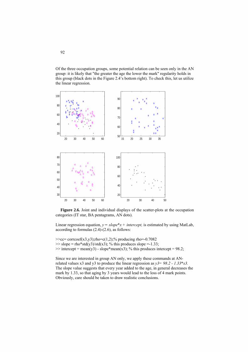
92
Of the three occupation groups, some potential relation can be seen only in the AN group: it is likely that "the greater the age the lower the mark" regularity holds in this group (black dots in the Figure 2.4’s bottom right). To check this, let us utilize the linear regression.
20 30 40 50 60
20
40
60
80
100
15 20 25 30 3550
60
70
80
90
20 30 40 50 60
30
40
50
60
70
80
20 30 40 50
20
40
60
80
100
Figure 2.6. Joint and individual displays of the scatter-plots at the occupation
categories (IT star, BA pentagrams, AN dots).
Linear regression equation, y = slope*x + intercept, is estimated by using MatLab, according to formulas (2.4)-(2.6), as follows: >>cc= corrcoef(x3,y3);rho=c(1,2);% producing rho=-0.7082 >> slope = rho*std(y3)/std(x3); % this produces slope =-1.33; >> intercept = mean(y3) - slope*mean(x3); % this produces intercept = 98.2; Since we are interested in group AN only, we apply these commands at AN-related values x3 and y3 to produce the linear regression as y3= 98.2 - 1.33*x3. The slope value suggests that every year added to the age, in general decreases the mark by 1.33, so that aging by 3 years would lead to the loss of 4 mark points. Obviously, care should be taken to draw realistic conclusions.

93
Altogether, the regression equation explains rho^2=0.50=50% of the total vari-ance of y3 – not too much, as is usual in social and human sciences. Let us take a look at the reliability of the regression equation with bootstrapping, the popular computational experiment technique for validating data analysis re-sults that was introduced in Project 1.3. Bootstrapping is based on a pre-specified number of random trials, for instance, 5000. Each trial consists of the following steps: (i) randomly selecting an entity N times, with replacement, so that the same entity can be selected several times whereas some other entities may be never selected in a trial. (As shown above in Project 1.3, on average only 62% entities get selected into the sample.) A sample consists of N entities because this is the number of en-tities in the set under consideration. In our case, N=31. One can use the following MatLab command: >> N=31;ra=ceil(N*rand(N,1)); % rand(N,1) produces a column of N random real numbers, between 0 and 1 each. % Multiplying this by N stretches them to (0,N) interval; ceil rounds the numbers up to integers. (ii) the sample ra is assigned with their data values according to the original data table: >>xt=xx(ra);yt=yy(ra); % here xx and yy represent the predictor and target, respectively; % they are x3 and y3, respectively, which can be taken into account with assign-ments % xx=x3; and yy=y3. so that coinciding entities get identical feature values. (iii) a data analysis method under consideration, currently "linear regression", that basically computes the rho, the slope and the intercept, applies to this data sample to produce the trial result. To do a number (5000, in this case) of trials, one should run (i)-(iii) in a loop: >> for k=1:5000; ra=ceil(N*rand(N,1)); xt=xx(ra);yt=yy(ra); cc=corrcoef(xt,yt); rh(k)=cc(1,2); sl(k)=rh(k)*std(yt)/std(xt); inte(k)=mean(yt)-sl(k)*mean(xt); end
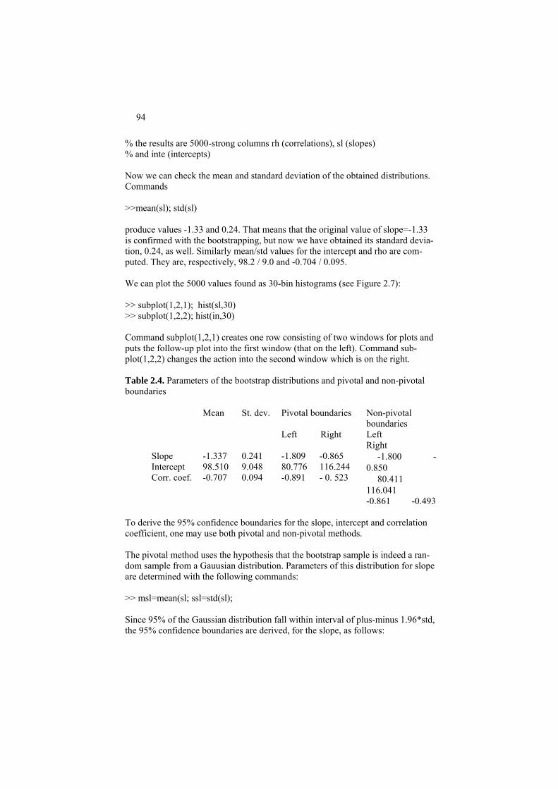
94
% the results are 5000-strong columns rh (correlations), sl (slopes) % and inte (intercepts) Now we can check the mean and standard deviation of the obtained distributions. Commands >>mean(sl); std(sl) produce values -1.33 and 0.24. That means that the original value of slope=-1.33 is confirmed with the bootstrapping, but now we have obtained its standard devia-tion, 0.24, as well. Similarly mean/std values for the intercept and rho are com-puted. They are, respectively, 98.2 / 9.0 and -0.704 / 0.095. We can plot the 5000 values found as 30-bin histograms (see Figure 2.7): >> subplot(1,2,1); hist(sl,30) >> subplot(1,2,2); hist(in,30) Command subplot(1,2,1) creates one row consisting of two windows for plots and puts the follow-up plot into the first window (that on the left). Command sub-plot(1,2,2) changes the action into the second window which is on the right. Table 2.4. Parameters of the bootstrap distributions and pivotal and non-pivotal boundaries
Pivotal boundaries Non-pivotal boundaries
Mean St. dev.
Left Right Left Right
Slope Intercept Corr. coef.
-1.337 98.510 -0.707
0.241 9.048 0.094
-1.809 80.776 -0.891
-0.865 116.244 - 0. 523
-1.800 -0.850
80.411 116.041 -0.861 -0.493
To derive the 95% confidence boundaries for the slope, intercept and correlation coefficient, one may use both pivotal and non-pivotal methods. The pivotal method uses the hypothesis that the bootstrap sample is indeed a ran-dom sample from a Gauusian distribution. Parameters of this distribution for slope are determined with the following commands: >> msl=mean(sl; ssl=std(sl); Since 95% of the Gaussian distribution fall within interval of plus-minus 1.96*std, the 95% confidence boundaries are derived, for the slope, as follows:

95
>> lbsl=msl – 1.96*ssl; rbsl=msl + 1.96*ssl The non-pivotal estimates require no such a hypothesis and are based on the boot-strap distribution as is. One just sorts all the values and takes 2.5% quantiles on both extremes of the range: >> ssl=sort(sl); lbn=ssl(126);rbn=ssl(4875); Indeed, we need to cut out 5% items from the sample, to make a 95% confidence interval. Since 5% of 5000 is 250, conventionally divided in two halves, this re-quires cutting off first 125 observations as well as the last 125 observations of the presorted list of the bootstrap values, which brings us to ssl(126) and ssl(4875) as the non-pivotal boundaries for the slope value.
−2.5 −2 −1.5 −1 −0.5 00
50
100
150
200
250
300
350
400
450
500
60 80 100 120 1400
50
100
150
200
250
300
350
400
450
500
Figure 2.7. 30-bin histograms of the slope (left) and intercept (right) after 5000 bootstrapping trials. All these estimates are presented in Table 2.4. The pivotal and non-pivotal esti-mates do not fall too far apart. Either can be taken as parameters of the boundary regressions. This all can be visualized by, first, defining the three regression lines, the regular one and two corresponding to the lower and upper estimate boundaries, respec-tively, with >> y3reg=slope*x3+intercept; >> y3regleft=lbsl*x3+lbintercept; >> y3regright=rbsl*x3+rbintercept;

96
and then plotting the four sets onto the same figure Figure 2.8.: >> plot(x3,y3,'*k',x3,y3reg,'k',x3,y3regleft,'r',x3,y3regright,'r') % x3,y3,'*k' presents student data as black stars; x3,y3reg,'k' presents the % real regression line in black % x3,y3regleft,'g' and x3,y3regright,'g' for boundary regressions in green The red lines on Figure 2.8 show the boundaries of the regression line for 95% of trials.
20 25 30 35 40 45 50−20
0
20
40
60
80
100
Figure 2.8. Regression of CI score over Age (black line) within occupation cate-gory AN with boundaries covering 95% of potential biases due to sample fluctua-tions.
Project 2.2. Non-linear and linearized regression: a nature-inspired algorithm
In many domains the correlation between features is not necessarily linear. For example, in economics, processes related to the inflation over time are modeled by using the exponential function. A similar way of thinking applies to the processes of growth in biology. Variables describing climatic conditions obviously have a cyclic character; etc. The power law in social systems is nonlinear too.
Consider, for example, a power law function y=axb where x is predictor and y
predicted variables whereas a and b are unknown constant coefficients. Given the values of x and y on a number of observed entities i= 1,…, N, the power law re-i igression problem can be formulated as the problem of minimizing the summary squared or absolute error over all possible pairs of coefficients a and b. There is no method that would straightforwardly lead to a globally optimal solution of the problem because minimizing a sum of many exponents is a complex problem. This is why conventionally the power law regression is fit by transforming it into a

97
linear regression problem. Indeed, the equation of the power law regression, taken with no errors, is equivalent to the equation of linear regression with log(x) being predictor and log(y) target: log(y)=blog(x)+log(a).This gives rise to the very popular strategy of linearization of the problem. First, transform xi and yi to vi=log(xi) and zi=log(yi) and fit the linear regression equation for given vi and zi; then convert the found coefficients into those of the original exponential function. This strategy seems especially suitable since the logarithm of a variable typically is much smoother so that the linear fit is better under the logarithm transformation.
There is one caveat, however: the fact that found coefficients are optimal in the
linear regression problem does not necessarily imply that the converted exponents are necessarily optimal in the original problem. This we are going to explore in this project.
Nature-inspired optimization is a computational intelligence approach to mini-mize a non-linear function. Rather than look and polish a single solution to the op-timization problem under consideration, this approach utilizes a population of so-lutions iteratively evolving from generation to generation, according to rules imitating a real-world evolutionary process. The rules typically include: (a) ran-dom changes from generation to generation such as “mutations” and “crossovers” in earlier, genetic, algorithms, and (b) policies for selecting and maintaining the best found solutions, the “elite”. After a pre-specified number of iterations, the best solution among those observed is reported as the outcome.
To start the evolution, one should first define a restricted area of admissible solu-tions so that no member of the population may leave the area. This warrants that the population will not explode by moving solutions to the infinity. Under the hy-pothesis of a power law relation y=abx, for any two entities i and j, the following equations should hold: zi=b∗vi+c and zj=b∗vj+c where c=log(a), zi=log (yi) and vi=log(xi). From these, b and c can be expressed as follows: b=(zi-zj)/(vi-vj), c=(vi∗zj – vj∗zi)/(vi-vj), which may lead to different values of b and c at different i and j. Denote bm and bM the minimum and the maximum of (zi-zj)/(vi-vj), and cm and cM the minimum and maximum of (vi∗zj – vj∗zi)/(vi-vj) over those i and j for which vi-vj≠0. One would expect that the admissible b and c should be within these boundaries, which means that the area of admissible solutions should be de-fined by the inequalities (bm,cm) ≤ (b,c) ≤ (bM,cM). Since the optimal values of (b,c) should be around the averages of the ratios above, that is, lie deep inside the area between their maxima and minima, it helps to speed up the computation if one takes only those pairs (i,j) at which the values of vi, vj and zi, zj are not too close to 0 so that their logarithms are not that far away, and, similarly, the differ-ences between them should not be not that small nor that high. This approach is implemented in MatLab code ddr.m in Appendix A4.

98
For the step of producing the next generation, let us denote the population’s p×2 array by f, at the current iteration, and by f′, at the next iteration. The transition from f to f′ is done in three steps. First, take the row of mean values within the columns of f and repeat it p times in a p×2 array mf. Then make a Gaussian ran-dom move: fn=f + randn(p,2).*mf/20 Here randn(p,2) is a p×2 array of (pseudo) random numbers generated according to Gaussian distribution N(0,1) with 0 expectation and 1 variance. The symbol .* denotes the operation of multiplication of corresponding elements in matrices, so that (aij).*(bij) is a matrix whose (i,j)-th elements are products aij*bij. This ran-dom matrix is scaled down by mf/20 so that the move accounts for about 5% (one twentieth) of the average f values. Since the move is to be restricted within the admissibility area, any a-element (first column of fn) which is greater than aM, is to be changed for aM, and any a-element smaller than am is to be changed for am. Similar trimming applies to b-elements. Denote result by fr. At the next step, take a p×2 array el whose rows are the same stored elite solution and arrive at the next generation f′ by using the following “elite mix”:
f′= 0.7fr+0.3el The elite mix moves all population members in the direction of the best solution found so far by 30%, which has been found work well in the examples of our in-terest. This procedure is implemented in MatLab code nlr.m that relies on ddr.m at step 1 and a subroutine, delta, for evaluating the fitness (see A4 in Appendix).
Consider now this experiment. Generate predictor x as a 50-long vector of ran-dom positive entries between 0 and 10, x=10*rand(1,50), and define y =2*x1.07 with the normal additive noise 2*N(0,1) where 0 is the mean and 1 the variance, which is suppressed when overly negative, according to the Matlab code line
>>for ii=1:50;yy=2*x(ii)^1.07 +2*randn;y(ii)=max(yy,1.01);end; When using the conventional linearized regression model by linearly mapping
log(x) to log(y), to extract b and a (as the exponent of the found c) from this, the program llr.m implementing this approach produces a = 3.0843 and b = 0.8011 leading to the averaged squared error y-axb equal to 4.41, so that the standard error is 2.10, about 20% of the mean y value, 10.1168. It is not only that the error is high, but also a wrong law is identified. The generated function y stretches x out (b>1), whereas the found function stretches x in (b<1).
When minimizing the averaged squared error y-axb of the original model di-
rectly by using the code nlr.m implementing the nature-inspired algorithm, the
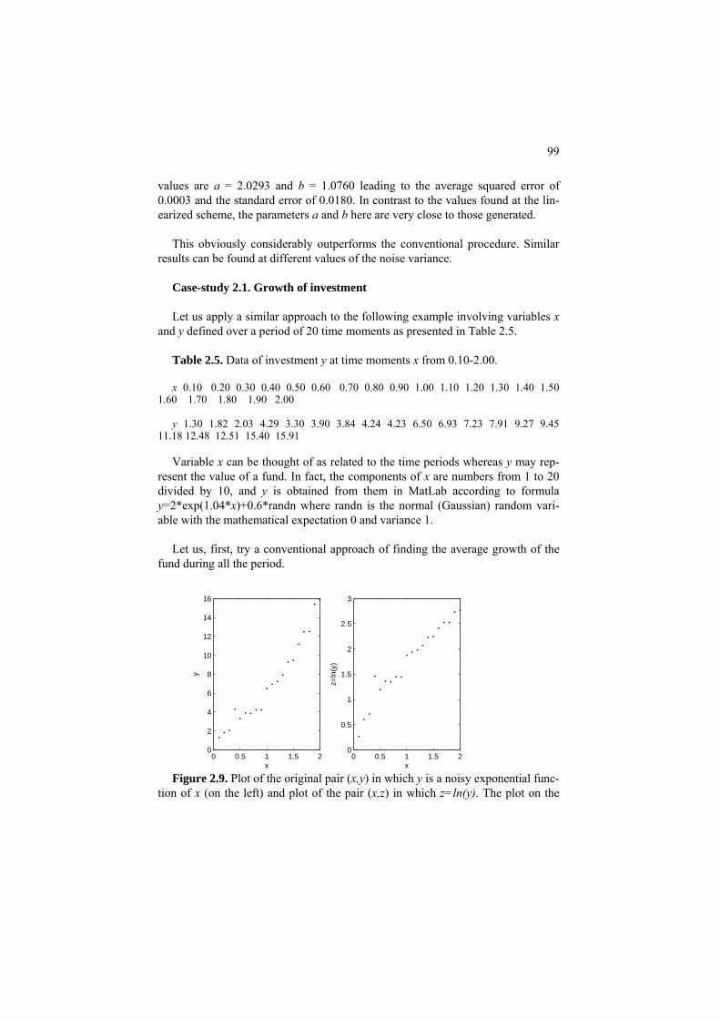
99
values are a = 2.0293 and b = 1.0760 leading to the average squared error of 0.0003 and the standard error of 0.0180. In contrast to the values found at the lin-earized scheme, the parameters a and b here are very close to those generated.
This obviously considerably outperforms the conventional procedure. Similar
results can be found at different values of the noise variance. Case-study 2.1. Growth of investment Let us apply a similar approach to the following example involving variables x
and y defined over a period of 20 time moments as presented in Table 2.5. Table 2.5. Data of investment y at time moments x from 0.10-2.00. x 0.10 0.20 0.30 0.40 0.50 0.60 0.70 0.80 0.90 1.00 1.10 1.20 1.30 1.40 1.50
1.60 1.70 1.80 1.90 2.00
y 1.30 1.82 2.03 4.29 3.30 3.90 3.84 4.24 4.23 6.50 6.93 7.23 7.91 9.27 9.45 11.18 12.48 12.51 15.40 15.91
Variable x can be thought of as related to the time periods whereas y may rep-
resent the value of a fund. In fact, the components of x are numbers from 1 to 20 divided by 10, and y is obtained from them in MatLab according to formula y=2*exp(1.04*x)+0.6*randn where randn is the normal (Gaussian) random vari-able with the mathematical expectation 0 and variance 1.
Let us, first, try a conventional approach of finding the average growth of the
fund during all the period.
0 0.5 1 1.5 20
2
4
6
8
10
12
14
16
x
y
0 0.5 1 1.5 20
0.5
1
1.5
2
2.5
3
x
z=ln
(y)
Figure 2.9. Plot of the original pair (x,y) in which y is a noisy exponential func-
tion of x (on the left) and plot of the pair (x,z) in which z=ln(y). The plot on the
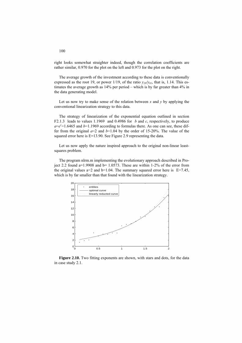
100
right looks somewhat straighter indeed, though the correlation coefficients are rather similar, 0.970 for the plot on the left and 0.973 for the plot on the right.
The average growth of the investment according to these data is conventionally
expressed as the root 19, or power 1/19, of the ratio y /y20 01, that is, 1.14. This es-timates the average growth as 14% per period – which is by far greater than 4% in the data generating model.
Let us now try to make sense of the relation between x and y by applying the
conventional linearization strategy to this data. The strategy of linearization of the exponential equation outlined in section
F2.1.3 leads to values 1.1969 and 0.4986 for b and c, respectively, to produce a=ec=1.6465 and b=1.1969 according to formulas there. As one can see, these dif-fer from the original a=2 and b=1.04 by the order of 15-20%. The value of the squared error here is E=13.90. See Figure 2.9 representing the data.
Let us now apply the nature inspired approach to the original non-linear least-
squares problem. The program nlrm.m implementing the evolutionary approach described in Pro-
ject 2.2 found a=1.9908 and b= 1.0573. These are within 1-2% of the error from the original values a=2 and b=1.04. The summary squared error here is E=7.45, which is by far smaller than that found with the linearization strategy.
0 0.5 1 1.5 20
2
4
6
8
10
12
14
16
18
20
entitiesoptimal curvelinearly reducted curve
Figure 2.10. Two fitting exponents are shown, with stars and dots, for the data
in case study 2.1.

101
The two found solutions can be represented on the scatter-plot graph, see Fig-ure 2.10. One can see that the linearized version has a much steeper exponent, which becomes visible at later periods.
Q.2.7. Consider a binary feature defined on seven entities so that it is category A on the first three of them, and category B on the next four. Let us draw two dummy 1/0 variables, xA and xB, corresponding to each so that xA=1 on the first three entities and xA=0 on the rest, whereas xB=0 on the first three entities and xB=1 on the rest. What can be said of the correlation coefficient between xA and xB? A. The correlation coefficient between xA and xB is -1 because xA+xB=1 for all entities so that xA= - xB+1.
Q. 2.8. Extend the nature inspired approach to the problem of fitting a linear re-gression with a nonconventional criterion such as the average relative error de-
||11
∑=
N
iii yeNfined by formula .
Case-study 2.2. Correlation between Iris sepal length and width
Take x and y from the Iris set in Table 0.3 as the Sepal’s length and width, re-spectively.
A scatter plot of x and y is presented on the left part of Figure 2.11. This is a loose cloud of points which looks similar to that on the left part of Figure 2.2, of no correlation. Indeed the correlation coefficient value here is not only very small, −0.12, but also negative, which is somewhat odd, because intuitively the features should be positively correlated as reflecting the size of the same flower.
4 5 6 7 82
2.5
3
3.5
4
4.5
4 5 6 7 82
2.5
3
3.5
4
4.5
Figure 2.11. Scatter plot of Sepal length and Sepal width from Iris data set (Table 0.3), as a whole on the left and taxon-wise on the right. Taxon 1 is presented by circles, taxon 2 by triangles, and taxon 3 by dots.
To see a particular reason for the low, and negative, correlation, one should take into account that the sample is not homogeneous: the Iris set consists of 50

102
specimens of each of three different taxa. When the taxa are separated (see Figure 2.11 on the right), the positive correlation is restored. The correlation coefficients are 0.74, 0.53 and 0.46 for taxon one, two and three, respectively. Here is a nice example of the negative effect of the non-homogeneity of the sample on the data analysis results.
2.2 Mixed scale case: Nominal feature versus a quantitative one
P2.2.1 Box-plot, tabular regression and correlation ratio
Consider x a categorical feature on the same entities as a quantitative feature y, such as Occupation and Age at Students data set. The within-category distribu-tions of y can be used to investigate the correlation between x and y. The distribu-tions can be visualized by using just ranges as follows: present categories with equal-size bins on x axis, draw two lines parallel to x axis to present the minimum and maximum values of y (in the entire data set), and then present the within cate-gory ranges of y as shown on Figure 2.12.
IT BA AN Occupation
Age 51 20
Figure 2.12. Graphic presentation of within category ranges of Age at Student
data. The correlation between x and y is higher when the within-category spreads are
tighter because the tighter the spread within an x-category, the more precise is prediction of y at it. Figure 2.13 illustrates an ideal case of a perfect correlation – all within-category y-values are the same leading to an exact prediction of Age when Occupation is known.
Figure 2.14 presents another extreme, when knowledge of an Occupation cate-
gory does not lead to a better prediction of Age than when the Occupation is un-known.

103
A simple statistical model extending that for the mean will be referred to as
tabular regression. The tabular regression of quantitative y over categorical x is a table comprising three columns corresponding to:
(1) Category of x (2) Within category mean of y (3) Within category standard deviation of y
Figure 2.13. In a situation of ideal correlation, with zero within-category vari-
ances, knowledge of the Occupation category would provide an exact prediction of the Age within it.
IT BA AN Occupation
Age 51
20
The number of rows in the tabular regression thus corresponds to the number of
x-categories; there should be a marginal row as well, with the mean and standard deviation of y on the entire entity set.
IT BA AN Occupation
Age 51 20
Figure 2.14. Wide within-category distributions: the case of full variance
within categories in which the knowledge of Occupation would give no informa-tion of Age.
Worked example 2.4. Tabular regression of Age (quantitative target) over
Occupation (categorical predictor) in Students data Let us draw a tabular regression of Age over Occupation in Table 2.6. The table sug-
gests that if we know the Occupation category, say IT, then we can safely predict the Age as being 28.2 within the margin of plus/minus 5.6 years. With no knowledge of the Occupa-
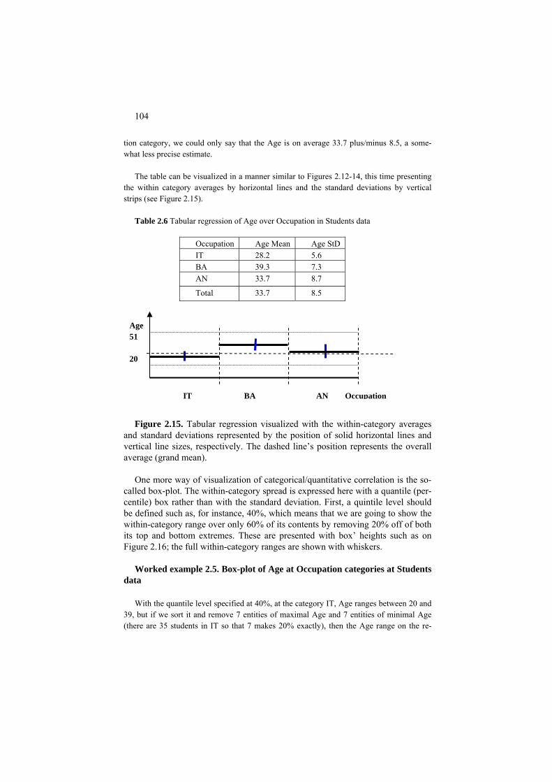
104
tion category, we could only say that the Age is on average 33.7 plus/minus 8.5, a some-what less precise estimate.
The table can be visualized in a manner similar to Figures 2.12-14, this time presenting
the within category averages by horizontal lines and the standard deviations by vertical strips (see Figure 2.15).
Table 2.6 Tabular regression of Age over Occupation in Students data
Occupation Age Mean Age StD IT 28.2 5.6 BA 39.3 7.3 AN 33.7 8.7
Total 33.7 8.5
IT BA AN Occupation
Age 51 20
Figure 2.15. Tabular regression visualized with the within-category averages
and standard deviations represented by the position of solid horizontal lines and vertical line sizes, respectively. The dashed line’s position represents the overall average (grand mean).
One more way of visualization of categorical/quantitative correlation is the so-
called box-plot. The within-category spread is expressed here with a quantile (per-centile) box rather than with the standard deviation. First, a quintile level should be defined such as, for instance, 40%, which means that we are going to show the within-category range over only 60% of its contents by removing 20% off of both its top and bottom extremes. These are presented with box’ heights such as on Figure 2.16; the full within-category ranges are shown with whiskers.
Worked example 2.5. Box-plot of Age at Occupation categories at Students
data With the quantile level specified at 40%, at the category IT, Age ranges between 20 and
39, but if we sort it and remove 7 entities of maximal Age and 7 entities of minimal Age (there are 35 students in IT so that 7 makes 20% exactly), then the Age range on the re-

105
maining 60% is from 22 to 33. Similarly, Age 60% range is from 32 to 47 on BA, and from 25 to 44 on AN (see box heights on Figure 2.16). The whiskers reflect 100% within cate-gory ranges, which are intervals [20,39], [27, 51] and [21, 50], respectively.
IT BA AN Occupation
Age 51 20
Figure 2.16. Box-plot of the relationship between Occupation and Age with 20% quan-
tiles; the box heights reflect the Age within-category 60% ranges, whiskers show the total ranges. Within-box horizontal lines show the within category averages.
The box-plot proved useful in studies of quantitative features too: one of the
features is partitioned into a number of bins that are treated then as categories. Consider now one more tabular regression, this time of the OOProgramming
mark over Occupation (Table 2. 7) Table 2.7. Tabular regression OOProg/Occupation
Occupation OOP Mean OOP StD IT 76.1 12.9 BA 56.7 12.3 AN 50.7 12.4 Total 61.6 16.5
A natural question emerges: In which of the tables the correlation is greater, 2.6
or 2.7? This can be addressed with an integral characteristic of the tabular regression,
the correlation ratio. This coefficient scores the extent at which the within group variance is smaller on average than the variance of the feature on the set before the split – a determination coefficient for the tabular regression.
Worked example 2.6. Correlation ratio
106
Let us address the question above: Is the correlation in Table 2.6 is greater than in Table 2.7?
Correlation ratios for the tables computed by using formulas (2.14) and (2.12) are: Occupation/Age 28.1% Occupation/OOProg 42.3%
The drop in variance is greater at the second table, that is, the correlation between Occupa-tion and OOProgramming is greater than that between the former and Age. Q.2.9 In Table 2.7, there is a positive relation between the Occupation and the OOP mark, with the largest mark, 76.1, going to IT and the smallest mark, 50.7, to AN. There is no such a relation in Table 2.6 in which AN’s Age is in the middle between that at the other two groups. Is it that feature of Table 2.7 that leads to a higher correlation ratio? A. No; the order of means is irrelevant at the tabular regression. The correlation ratio is higher at Table 2.7 than at Table 2.6 because of the tighter boundaries on the quantitative feature within the groups in Table 2.7.
F2.2.1 Tabular regression: Formulation
Given a quantitative feature y, with no further information, its aver-age, / | |i
i I
y y∈
= ∑ I , would represent a proper summarization of the data. If,
however, a set of categories of another variable, x, is additionally present, a more detailed summarization can be provided: the within category averages. Let Sk de-note the set of entities falling in k category of x, then the within-category averages are / | |
k
k ii S
y y S∈
= ∑ k.
This can be considered the least-squares solution to the model of tabular re-gression which extends the data recovery model for the average on page … as fol-lows. Find a set of ck values such that the summary square error L= ∑ i∈I ei
2 is minimized, where ei=yi - c according to equations k
yi= c +ek i for all i∈Sk (2.11)
The equations underlie the tabular regression and are referred to sometimes as
the piece-wise regression. It is not difficult to prove that the optimal ck in (2.11) is the within category average ky , which implies that the minimum value of L is
equal to 2
1(
k
K
m ik i S
L y= ∈
= −∑∑ )ky . By dividing and multiplying the interior sum by
the number of elements in Sk, |Sk|, we can see that in fact Lm=Nσ2w where σ2
w is the average within category variance defined as

107
σ2
w= ∑k pkσ2k (2.12)
where pk = |S |/N is the proportion of category k and σ2
k k the variance of y within S . k
To further analyze this, consider equation
2 2 2( ) 2i k i k iy y y y y y− = + − k and sum it up over all i∈Sk. This would lead to the summary right-hand item
being similar to that in the middle, thus producing 22 2( ) | |
k k
i k i k ki S i S
y y y S y∈ ∈
− = −∑ ∑ . Summing up these equations over k and moving
the right-hand item to the other side of the equation, would lead to the following decomposition:
2 2
1 1| | ( )
k
K K
i k k ii I k k i S
y S y y y∈ = = ∈
= + −∑ ∑ ∑∑ 2k
(2.13)
Note that the right-hand item in (2.13) is the summary least-squares criterion of model in (2.11) Lm. This allows us to interpret the equation (2.13) as a decomposi-tion of the scatter of variable y, the item on the left, in two parts on the right: the explained part, in the middle, and the unexplained part L . m
2| |k kS yThe explained part sums up contributions of individual categories k, . The value of the contribution is proportional to both the category frequency and the squared value – the greater the better.
Another expression of decomposition (2.13) can be obtained under the assump-
tion that variable y is centered, so that its mean is 0, by relating it to N:
2 2
1 1
K K
k k k kk k
p y p 2σ σ= =
= +∑ ∑ (2.14)
where σ2 is the variance of y, the item on the right the minimum value Lm/N from (2.12), and the item in the middle, the weighted summary squared distance be-tween the grand mean y ky=0 and within-category means .
Equation (2.14) is very popular in statistics as the decomposition of the vari-
ance into the within-group variance, the item on the right, and the between-group variance, the item in the middle, as the base of a popular method for comparison of within-category means which is referred to as ANOVA (ANalysis Of VAri-ance). In the context of the tabular regression model (2.11) viewed as a data re-covery model, the original decomposition (2.13) of the quantitative feature scatter into part explained by the nominal feature and part remaining unexplained is more appropriate, as will be seen later in sections 3.4 and 5.2. Viewed in this light, de-

108
composition (2.14) shows that the category k contribution to the total variance of y is proportional to its frequency and the squared difference between within-category mean yky and grand mean =0.
The correlation ratio shows the relative drop in the variance of y when it is pre-
dicted according to model (2.11) or, in other words, the relative proportion of the explained part of the variance. Correlation ratio is usually denoted by η2 and can be defined by the following formula:
η2 = 1 – σ2
w/σ2 (2.15) The definition implies the following properties: - The range of η2 is between 0 and 1. - Correlation ratio η2 = 1 when all within-category variances σ2
k are zero (that is, when y is constant within each group S ). k
- Correlation ratio η2 = 0 when all σ2k are of the order of σ2 . k
Q.2.10. Consider two quantitative features x and y. Divide the range of x in five equal-sized bins to produce a categorical variable xc. Is there any relation between the correlation coefficient between x and y and the correlation ratio coefficient be-tween xc and y? A. None, the former can be greater than the latter in some cases, and smaller in some others.
2.2.2 Nominal target
In the case when it is the quantitative variable that is predictor while the categori-cal variable is the target, one can use all the wealth of methods developed for pat-tern recognition or machine learning. The problem may be stated variously de-pending on the learning task. A machine learning task typically assumes a training dataset for deriving a rule that can be applied to entities from a testing dataset, un-der the assumption that structures of the training and testing datasets are similar – see a discussion in Chapter 3. All features under consideration are assumed known on both of the sets, except that the categories are not known on the testing dataset. A most popular problem to address would be like this: given a value of the quanti-tative predictor on an entity, tell the category of the target feature on the entity. We present two approaches on this. 2.2.2.1 Nearest Neighbor classifier One of the most popular is the so-called Nearest-Neighbor classifier. It is applica-ble at any data admitting distances or (dis)similarities between entities. The NN classifier works as this: find, in the training dataset, an entity which is the nearest

109
to that under consideration and extrapolate its category to the entity in question. One can take a look at the results of application of the NN classification rule to two feature pairs, one from Intrusion data set, and the other from Student dataset, in the follow up examples. The results are very different – the former, in Table 2.8, is very successful whereas the other, in Table 2.10, not. An explanation to this is the difference in the strength of correlation between the two variables – very strong in one case and rather weak in the other (see Tables 2.9 and 2.11). The NN classifier can be easily extended to the so-called k-NN classifier; the lat-ter usually supplies the category supported by a majority of the k nearest neighbors of the entity in question. This classifier may also lead to the so-called “reject option” – giving no answer when there is no clear-cut majority. Worked example 2.7. Nearest neighbor classifier Consider two features from the dataset Intrusion: the type of attack Att, the target, and the number of connections to the same host as the current one in the past two seconds, SH. To make the method work fast, first, sort entities in the ascending order of SH. Take a random 10-element subset (upper row in Table 2.8) along with their Att categories (the second row) and SHCo values (the third row). Now take the entities whose SH values are nearest neighbors of those in the third row: these SH values are in the fourth row, and look at their Att categories (the bottom row). A striking success: all ten are predicted correctly! Table 2.8. Applying NN classifier SH⇒Attack to a random subsample of the Intrusion dataset.
Random sample 9 29 37 51 63 70 72 80 86 89 True target category apa nor nor nor nor nor nor sai sai sai Predictor’s value PV 24 10 1 14 2 3 1 482 482 483 Nearest Neighbor’s PV 23 11 1 13 2 3 1 482 482 482 NN predicted category apa nor nor nor nor nor nor sai sai sai
Q.2.11. Build a tabular regression of the SHCo over Attack categories and find the correla-tion ratio.A. See Table 2.9.
Table 2.9. Tabular regression of SHCo over Attacks in Intrusion data: comparatively
small within-category standard deviations.
Attack Number Mean Standard deviation
23 33.61 12.13 Apache 11 484.64 8.42 Saint 10 508.40 5.13 Smurf 56 5.13 5.59 Normal
Total 100 114.75 198.09 Correlation ratio 0.988

110
Q.2.12. Apply NN classifier to predict Occupation from CI Mark over Student dataset. A. See Table 2.10.
Table 2.10. Applying NN classifier CI⇒Occupation to a random subsample of the Student dataset; wrong category assignments are highlighted in bold
Random sample 4 11 24 42 44 61 87 89 94 100 True target category IT IT IT BA BA BA AN AN AN AN Predictor’s value PV 72 65 54 65 44 62 72 48 34 45 Nearest Neighbor’s PV 72 65 54* 65 44 62** 72 47 35* 45*
BA AN IT AN BA BA BA BA AN AN NN predicted category * - of two other entities having different categories that with the matching one has been selected; ** - of several entities, the most frequent category has been selected.
Q.2.13. Build tabular regression of the CI mark over Occupation in Student data and find the correlation ratio. A. See Table 2.11.
Table 2.11. Tabular regression of CI mark over Occupation in Student data:
comparatively high within-category standard deviations Occupation Number Mean Standard deviation IT 35 70.57 12.73 BA 34 54.79 10.60 AN 31 53.35 16.29 Total 100 59.87 15.37 Correlation ratio 0.250
2.2.2.2 Interval predicate classifier Another, more human friendly, classifier can be built in terms of quantitative
feature x intervals. To predict a target feature category k, such a classifier would rely on an interval predicate x(a(k),b(k)) which is true if and only if the value of x is between a(k) and b(k). Then an interval predicate rule would be a production x(a(k),b(k)) ⇒k. Consider, for example, “Saint” Attack in Intrusion data: there are 11 cases of this type and all, except one, have SHCo values 482 or 483. Thus, the interval predicate rule SHCo(482,483)⇒ Saint would make only 9% of errors.
How one can infer which of the categories are more likely to be well covered
by an interval predicate rule? One of the proposals is to rely on category contribu-tions to the variance of x in (2.13), 2(k k )p x x− , in the denotations of this section,
where p kxx is proportion of entities in category k, is grand mean and k is within category k mean. The mechanism making sense of this proposal is illustrated on Figure 2.17 (top): the further away the within-category mean is, the more plausible

111
that the entire category is further away. Yet, in many cases, many entities in a category fall apart from their averages thus leading to errors in the interval based prediction (Figure 2.17, bottom).
Figure 2.17. A group of white circles falls apart from the rest, on the top, and
much intermixes with the rest, on the bottom. Worked example 2.8. Category contributions for interval predicate pro-
ductions Consider the same features Att and SHCo from Intrusion dataset as those considered in
Worked example 2.7 and determine the Att category contributions according to formula
(2.13), 2(k kp x x− ) (see Table 2.12).
Table 2.12. Category contributions according to formula (2.13)
Attack Proportion Mean Contribution 0.23 33.61 1514.3 Apache 0.11 484.64 15049.8 Saint 0.10 508.40 15496.0 Smurf 0.56 5.13 6729.9 Normal
Total 1.00 114.75 38790.0 With respect to the data in Table 2.12, one can try to build interval predicate based pro-
ductions for the largest contributing Saint and Smurf categories. We already observed that SH(482,483)⇒ Saint makes 9% error, which is a false negative. This is caused by a SH value of 510 corresponding to Saint at 90-th row of the Intrusion data table – this does not satisfy the production’s subject. Now one can see that rule SH(490,512) ⇒ Smurf would fail only once too, on the same observation – but this time this would be a false positive, satisfying the subject but being not Smurf. The next contributing category, lagging far be-hind, is “Normal” corresponding to the range of x values from 1 to 28 which overlaps the range (16, 42) of x values corresponding to Apache category. Yet the rule SH(1,15)⇒

112
Normal is true for 53 of 56 cases, the three false negative errors making about 5% only. The rule SHCo(16,42)⇒ Apache has the same three cases as false positives.
Q.2.14. Build a category contribution table like Table 2.12 for CI mark and
Occupation features in Students dataset. A. See Table 2.13. Table 2.13. Occupation category contributions to CI Mark.
Occupation Proportion Mean Squared diff. Contribution IT BA AN
0.35 70.574 4980.327 1743.114 0.34 54.794 3002.395 1020.814 0.31 38.774 1503.438 466.066
Total 1.00 55.350 A rather successful usage of interval based productions in Worked example 2.8
is due to the tight correlation between SH and Attack. In a less comfortable situa-tion, such as that of pair CI mark – Occupation at Student dataset, the interval based descriptions make no sense at all. Consider the most contributing category IT – its CI mark range is from 53 to 90. If one takes the entire range to make it into rule CI(53,90)⇒ IT, this would make no false negatives at all. Yet there are 22 entities of BA category and 15 of AN category whose CI mark falls within (53, 90) interval too, totaling to 37 false positive errors! One can try to somewhat re-duce the interval predicate range, to lessen the false positive errors, with the price of admitting some false negatives. Consider, for example, CI(62,90)⇒ IT rule to admit 12 false negative errors as well as 10 BA and 11 AN false positives, a drop to 33 errors altogether – quite a high error rate! Yet the interval based rules follow human way of thinking, which may lead to overall acceptance of such a rule, pos-sibly amended by another feature interval added to the subject, even with the price of a high error rate.
2.3 Two nominal features case
P2.3 Analysis of contingency tables: Presentation

113
P.2.3.1 Deriving conceptual relations from statistics
To analyze interrelations between two nominal features, they are cross-classified in the so-called contingency table. A contingency table has its rows cor-responding to categories of one feature and columns to categories of the other fea-ture, with the entries reflecting the counts of entities falling in the overlap of the corresponding row and column categories.
Worked example 2.9. Contingency table on Market towns data To cross-classify features Banks and Farmer’s Market on Market towns data, we first
need to categorize the quantitative feature Banks. Consider, for example, the four-category partition of the range of Banks feature at Market towns set presented in Table 2.13.
Table 2.13. Definition of Ba categories on the Market town dataset. Category Definition Notation 10+ Ba ≥10 1 4+ 10>Ba≥4 2 2+ 4>Ba≥2 3 1- Ba=0 or 1 4 These categories are cross-classified with FM “yes” and “no” categories in Table 2.14.
Besides the cross-classification counts, the table also contains summary within category counts, the totals, on the margins of the table, the last row and last column – this is why they are referred to as marginal frequencies. The total count balances the sheet in the bot-tom-right corner.
Table 2.14 Cross classification of the Ba categories with FM categories.
Bank/Building Society categories FarmMarket 10+ 4+ 2+ 1- Total Yes 2 5 1 1 9 No 4 7 13 12 36 Total 6 12 14 13 45
The same contingency data converted to relative frequencies by relating them to the to-
tal number of entities are presented in Table 2.15. Table 2.15. BA/FM cross-classification relative frequencies, per cent. FM | Ba 10+ 4+ 2+ 1- Total
Yes 4.44 11.11 2.22 2.22 20

114
No 8.89 15.56 28.89 26.67 80 Total 13.33 26.67 31.11 28.89 100
Q.2.15. Build a contingency table for features “Protocol-type” and “Attack type” in Intrusion data. A. See Table 2.16.
Table 2.16. Protocol/Attack contingency table for Intrusion data
Category Apache Saint Smurf Norm Total Tcp 23 11 0 30 64 Udp 0 0 0 26 26 Icmp 0 0 10 0 10 Total 23 11 10 56 100
A contingency table can be used for assessment of correlation between two sets
of categories. The highest level of correlation is that of a conceptual association. A conceptual association may exist if a row, k, has all its entries, not marginal of course, except just one, say l, equal to 0, which would mean that all of the extent of category k belongs to the column category l. The data, thus, indicate that cate-gory k implies category l.
Worked example 2.10. Equivalence and implication from a contingency
table Such are rows “Udp” and “Icmp” in Table 2.16. There is a perfect match in this table: a
row category k= “Icmp” and a column category l= “surf”, that contains the only non-zero count. No other combination (k, l′) or (k′, l) is possible according to the table. In such a situation, one may claim that, subject to the sampling error, category l may occur if and only if k does, that is, k and l are equivalent.
A somewhat weaker, but still very much valuable is the case of “Udp” row in Table
2.16. It appears, Udp protocol implies “Norm” column category – a no-attack situation, though there is no equivalence here because the “Norm” column contains another positive count, in row “Tcp” .
Case study 2.3. Trimming contingency data: a bad option Unfortunately, there are no zeros in Table 2.14: thus, no conceptual relation between the
number of Banks and the presence of a Farmer’s market. But some of the entries are really close to 0, which may make us tempted to trim the data a bit. Imagine, for example, that in row “Yes” of Table 2.14, two last entries are 0, not 1s. This would imply that a Farmers Market may occur only in a town with 4 or more Banks. A logical implication, that is, a production rule, “If BA is 4 or more, then a Farmer’s market must be present”, could be de-rived then from thus modified table. One may try taking this path and cleaning the data of smaller entries, by removing corresponding entities from the table of course, to not obscure
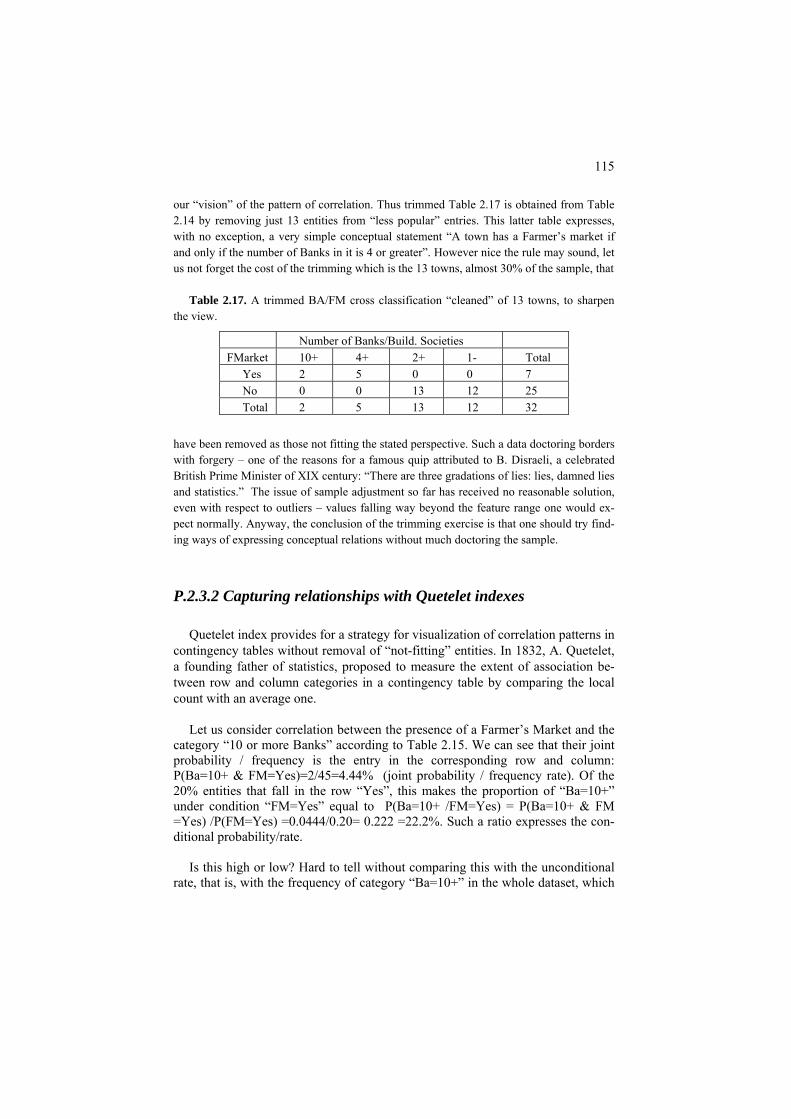
115
our “vision” of the pattern of correlation. Thus trimmed Table 2.17 is obtained from Table 2.14 by removing just 13 entities from “less popular” entries. This latter table expresses, with no exception, a very simple conceptual statement “A town has a Farmer’s market if and only if the number of Banks in it is 4 or greater”. However nice the rule may sound, let us not forget the cost of the trimming which is the 13 towns, almost 30% of the sample, that
Table 2.17. A trimmed BA/FM cross classification “cleaned” of 13 towns, to sharpen
the view.
Number of Banks/Build. Societies FMarket 10+ 4+ 2+ 1- Total
Yes 2 5 0 0 7 No 0 0 13 12 25 Total 2 5 13 12 32
have been removed as those not fitting the stated perspective. Such a data doctoring borders with forgery – one of the reasons for a famous quip attributed to B. Disraeli, a celebrated British Prime Minister of XIX century: “There are three gradations of lies: lies, damned lies and statistics.” The issue of sample adjustment so far has received no reasonable solution, even with respect to outliers – values falling way beyond the feature range one would ex-pect normally. Anyway, the conclusion of the trimming exercise is that one should try find-ing ways of expressing conceptual relations without much doctoring the sample.
P.2.3.2 Capturing relationships with Quetelet indexes
Quetelet index provides for a strategy for visualization of correlation patterns in contingency tables without removal of “not-fitting” entities. In 1832, A. Quetelet, a founding father of statistics, proposed to measure the extent of association be-tween row and column categories in a contingency table by comparing the local count with an average one.
Let us consider correlation between the presence of a Farmer’s Market and the
category “10 or more Banks” according to Table 2.15. We can see that their joint probability / frequency is the entry in the corresponding row and column: P(Ba=10+ & FM=Yes)=2/45=4.44% (joint probability / frequency rate). Of the 20% entities that fall in the row “Yes”, this makes the proportion of “Ba=10+” under condition “FM=Yes” equal to P(Ba=10+ /FM=Yes) = P(Ba=10+ & FM =Yes) /P(FM=Yes) =0.0444/0.20= 0.222 =22.2%. Such a ratio expresses the con-ditional probability/rate.
Is this high or low? Hard to tell without comparing this with the unconditional
rate, that is, with the frequency of category “Ba=10+” in the whole dataset, which

116
is P(Ba=10+)=13.33%. Let us compute the (relative) difference between the two, which is referred to as Quetelet index q:
q(Ba=10+/FM=Yes)= [P(Ba=10+/FM=Yes)−P(Ba=10+)]/P(Ba=10+) = [0.2222
– 0.1333] / 0.1333 = 0.6667 = 66.7%. That means that condition “FM=Yes” raises the frequency of the Bank category by 66.7%. This logic concurs with our everyday intuition. Consider, for example, the risk of getting a serious illness, say tuberculosis, which may be, say, about 0.1%, one in a thousand, in a given region. Take a condition such as “Bad hous-ing” and count the rate of tuberculosis under this condition, amounting to, say 0.5% - which is very small by itself, yet a five-fold increase over the average tu-berculosis rate. This is exactly what Quetelet index measures: q(l/k)=(0.5-0.1)/0.1=400% to show that the change of the average rate is 4 times.
Worked example 2.11. Quetelet index in a contingency table Let us apply the general Quetelet index formula (2.16) to entries in Table 2.14. This
leads to Quetelet index values presented in Table 2.18. By highlighting positive values in the table, we obtain the same pattern as on the “purified” data as in Case-study 2.3, but this
Table 2.18. BA/FM Cross classification Quetelet coefficients, % (positive entries high-lighted)
FMarket 10+ 4+ 2+ 1- Yes -64.29 -61.54 66.67 108.33 No -16.67 -27.08 16.07 15.38
time in a somewhat more realistic manner, keeping the sample intact. Specifically, one can see that “Yes” FM category provides for a strong increase in the probabilities, whereas “No” category leads to much weaker changes.
Q.2.16. Compute Quetelet coefficients for Table 2.16. A. See Table 2.19 in which positive entries are highlighted in bold.
Table 2.19. Quetelet indices for the Protocol/Attack contingency Table 2.16, per cent
Category Apache Saint Surf Norm
56.25 56.25 Tcp -100.00 -16.29 Udp -100.00 -100.00 -100.00 78.57 Icmp -100.00 -100.00 900.00 -100.00
Case-study 2.4. Has there been a bias in S’nS’ policy?

117
Take on the case of Stop-and-Search policy in England and Wales 2005 represented ac-
cording to race (B - black, A - asian and W - white), by numbers in Table 1.4 in section 1.3 – these are overwhelmingly in category W. The criticism of this policy came out of com-parison of this distribution with the distribution of the entire
Table 2.20. Distribution of Stop-and-Search policy cross-classified with race.
S’n’S Not S’n’S Total S’n’S-to-Total
Black 131723 1377493 1509216 0.0873 Asian 70252 2948179 3018431 0.0233 White 676178 46838091 47514269 0.0142 Total 878153 51163763 52041916 0.0169
population. Such a distribution, according to the latest pre-2005 census 2001, can be easily found on web. By subtracting from that the numbers of Stop-and-Search occurrences, under the assumption that nobody has been subjected to this more than once, Table 2.20 has been drawn. Its last column gives the numbers that were used for the claim of a racial bias: in-deed category B members have been subjects of the policy six times more frequently than category W members. A similar picture emerges when Quetelet coefficients are used (see Table 2.21). Category B is subject to Stop-and-Search policy 400% more frequently than on average, whereas category W is 15% less.
Table 2.21. Relative Quetelet coefficients for cross-classification in Table 2.20, per cent
S’n’S Not S’n’S Black 417.2 -7.2 Asian 37.9 -0.6 White -15.7 0.3
Yet some would consider drawing a table like Table 2.20, and of course the derived Table 2.21, as something nonsensical, because it is based on an implicit assumption that the Stop-and-Search policy applies to the population randomly. They would argue that police apply the policy only when they deem it necessary, so that the comparison should involve not all of the total population but only those criminal. Indeed, the distribution of subjects to Stop-and-Search policy by race has been almost identical to that of the imprisoned population of the same year. Therefore, the claim of a racial bias should be declared incorrect.

118
P2.3.3 Chi-square contingency coefficient as a summary correlation index
A somewhat more refined visualization of the contingency table comes from the Quetelet indexes weighted by the probabilities of corresponding entries, as ex-plained in section F2.3. These sum up to a most popular concept in the analysis of contingency tables, the celebrated chi-square contingency coefficient. This coeffi-cient was introduced by K. Pearson (1901) to express the deviation of the ob-served bivariate distribution, represented by the relative frequencies in a contin-gency table, from the situation of statistical independence between the features.
Worked example 2.12. Visualization of contingency table using weighted Quetelet coefficients
Let us multiply Quetelet coefficients in Table 2.18 by the frequencies of the correspond-
ing entries in Table 2.14. Quetelet coefficients in Table 2.18 are taken relative to unity, not per cent. This leads us to Table 2.22 whose entries sum up to the value of Pearson’s chi-square coefficient for Table 2.14, 6.86. Note that entries in Table 2.20 can be both positive and negative; those with absolute value greater than 6.86/4=1.72 are highlighted in bold – they show the entries of an extraordinary deviation from the average. Of them, column 4+ supplies the highest positive impact and the highest negative impact.
Table 2.22. BA/FM chi-squared (NQ = 6.86) and its decomposition according to (2.19)
FMarket 10+ 4+ 2+ 1- Total Yes 1.33 5.41 -.64 -.62 5.48 No -.67 -1.90 2.09 1.85 1.37 Total 0.67 3.51 1.45 1.23 6.86
A pair of categories, one from one nominal feature and the other from another
nominal feature, are said to be statistically independent if the probability of their co-occurrence is equal to the product of probabilities of these categories. Take, for example, category “Yes” of FM and “4+” of Banks in Table 2.15: the probability of their co-occurrence is 0.111. On the other hand, the probability of FM=”Yes” is 0.2 and that of Banks=4+ is 0.267, according to the table. If these two categories were independent they would have co-occurred at the level of 0.2×0.267=0.053, about twice as less than in reality, which means that the pair highly deviates from the statistical independence. Two features are said to be statistically independent if all pairs of their mutual categories are statistically independent. K. Pearson was concerned with the situation at which two features are independent in the popula-tion at large but this may not necessarily be reflected in the sample under consid-eration because of the randomness of sampling. Thus he proposed to take the squared differences between observed frequencies and those that would occur un-

119
der the independence assumption and relate them to the “theoretical” probabilities that should be true in the population. The summary index is referred to as the Pearson chi-square coefficient, see (2.18) later. The distribution of the summary chi-square index, under conventional assumptions of independence in sampling, converges to the so-called chi-square distribution, which allows for statistical test-ing of the hypothesis of independence between the features. This suggests that the coefficient should be used only for testing the hypothesis, but not as a measure of correlation. The claim would be – and often has been – that the index can only dis-tinguish between two cases, statistical independence or not, and thus cannot be used for comparison of the extent of the dependence. Yet practitioners are always tempted to ignore this commandment and do compare the extent of dependence at different pairs of categorical features. Indeed, as formula (2.19) shows there is nothing wrong in using chi-square contingency coefficient as an index of correla-tion – it is indeed the summary Quetelet index, thus showing the average degree of relationship between two features.
Worked example 2.13. A conventional decomposition of chi-square coeffi-
cient Table 2.23. Square roots of the items in Pearson chi-squared (X2 = 6.86); the items
themselves are in parentheses.
FMarket 10+ 4+ 2+ 1- Total Yes 0.73(0.53) 1.68(2.82) -1.08 (1.16) -0.99 (0.98) (5.49) No -0.36 (0.13) -0.84 (.70) 0.54 (0.29) 0.50 (0.25) (1.37) Total (0.67) (3.52) (1.45) (1.23) (6.86)
Let us consider a conventional way of visualization of contingency tables, by putting
Pearson indexes, the square roots x(k,l) of the chi-square coefficient items in (2.21) as the table’s elements. These are in Table 2.23. The table does show a similar pattern of positive and negative associations. However, it is not the entries of the table that sum up to the chi-square coefficient but rather the squares of the entries. The fact that the summary values on the margins in Tables 2.22 and 2.23 are the same is not by chance: it exemplifies a mathe-matical property (see equation (2.19)).
Q. 2.17. In Table 2.22, all marginal values, the sums of rows and columns, are positive, in spite of the fact that many within-table entries are negative. Is this just due to specifics of the distribution in Table 2.14 or a general property? A: A gen-eral property: the within-row or within-column sums of the elements, Nlk q(l/k), must be positive, see (2.19).
Q. 2.18. Find a similar decomposition of chi-squared for OOPmarks/Occupation in Student data. Hint: First, categorize quantitative feature OOPmarks somehow:

120
you may use equal bins, or conventional boundary age points such as 35, 65 and 75, or any other considerations.
Q. 2.19. Can any logical production rules come from the columns of Table 2.16? A. Yes, both Apache and Saint attacks may occur at the tcp protocol only.
Q.2.20. Among the shoppers in Q.1.21, those who spent £60 each are males only and those who spent £100 each are females only, whereas among the rest 30 indi-viduals half are men and half are women. Build a contingency table for the two features, gender and spending. Find and interpret the value of Quetelet coefficient for females who spent £100 each. A. The contingency table (of co-occurrence counts):
Spending, £ Gender 60 100 150 Total Female 0 20 15 35 Male 50 0 15 65 Total 50 20 30 100
This table of absolute co-occurrence counts coincides with that of proportions ex-pressed per cent because the number of shoppers is just 100.
Quetelet coefficient for (Female/£100) entry is
Q=100*20/(20*35) – 1=2.86 –1= 1.86 This means that being female in this category of spending is more likely than the average, by 186%.
Q.2.21. Consider a data table for 8 students and 2 features, as follows:
Student Mark Occupation 1 50 IT 2 80 IT 3 80 IT 4 60 AN 5 60 AN 6 40 AN 7 40 AN 8 50 AN (i) Build a regression table for prediction Mark by Occupation. (ii) Predict the mark for a new student whose occupation is IT.
(iii) Find the correlation ratio for the table. A. (i) Regression table of Mark over Occupation contains Occupation category
frequencies as well as Mark within-category averages and variances is this: Mark

121
Frequency Average Variance IT 3 70 14.1 AN 5 50 8.9 (ii) For an IT student the likely mark will be 70±14.1. (iii) The correlation ratio is determined by the weighted within-category
variance, which is (3*14.1+5*8.9)/8 = (42.3+44.5)/8 = 10.85, and the total vari-ance, which is calculated on all the data set with the mean=57.5, and equal to 14.79. Then correlation ratio is η2=1-10.85/14.79=0.266. This means that the table regression explains only 26.6% of the variance of Mark.
F2.3 Analysis of contingency tables: Formulation
Consider two sets of disjoint categories on an entity set I: l=1,…, L (for exam-ple, occupation of individuals constituting I) and k=1,…,K (say, family or hous-ing type). Each makes a partition of the entity set I; they are crossed to see if there is any correlation between them. Combine a pair of categories (k,l)∈K×L and count the number of entities that fall in both. The (k,l) co-occurrence count is de-noted by Nkl. Obviously, these counts sum up to N because the categories are not overlapping and cover the entire dataset. A table housing these counts, Nkl , or their relative values, frequencies pkl =Nkl /N, is referred to as a contingency table or just cross-classification. The totals, that is, within-row sums N =Σk+ l Nkl and within-column sums N+l =Σ Nk kl (as well as their relative frequency counterparts) are referred to as marginals (because they are located on margins of the contin-gency table).
The (empirical) probability that category l occurs under condition of k can be
expressed as P(l/k)= pkl/p = Nk+ kl /Nk+. The probability P(l) of the category l with no condition is just p+l = N+l/N. Similar notation is used when l and k are swapped. The relative difference between the two probabilities is referred to as (relative) Quetelet index (Mirkin 2001):
( / ) ( )( / )
( )P l k P lq l k
P l−
= (2.16)
where P(l)= N+l/N, P(k)= Nk+/N, P(l/k)=N /Nkl k+. That is, Quetelet index expresses correlation between categories k and l as the relative change in the probability of l when k is taken into account.
With little algebra, one can derive a simpler expression

122
1kl
k l
pp p+ +
−q(l/k) = [Nkl /Nk+ - N+l/N]/(N+l/ N) = Nkl N/(N Nk+ +l )–1 = (2.16′)
Highlighting high positive and negative values in a Quetelet index table, such
as Table 2.18 and Table 2.21, visualizes the pattern of correlation between the two sets of categories.
This visualization can be extended to a more theoretically sound presentation.
Let us define the summary Quetelet correlation index Q as the sum of pair-wise Quetelet indexes weighted by their frequencies/probabilities:
2
1 1 1 1 1 1( , ) ( 1) 1
K L K L K Lkl kl
kl klk l k l k lk l k l
pQ p q l k pp p p p= = = = = =+ + + +
= = − =∑∑ ∑∑ ∑∑ p− (2.17)
The right-hand expression for Q in (2.17) is very popular in statistical analysis of contingency data. In fact, this is equal to chi-squared correlation coefficient pro-posed by K. Pearson (1901) in a very different context – as a measure of deviation of the contingency table entries from the statistical independence.
To explain this in more detail, let us first introduce the concept of statistical in-
dependence. The sets of k and l categories are said to be statistically independent if pkl = p pk+ +l for all k and l. Obviously, such a condition is hard to fulfill in real-ity. K. Pearson suggested using relative squared errors to measure the deviations of observed frequencies from the statistical independence. Specifically, he intro-duced the following coefficient usually referred to as Pearson’s chi-squared asso-ciation coefficient:
2 22
1 1 1 1
( ) (K L K L
kl k l kl
k l k lk l k l
p p p pN Np p p p
Χ + +
= = = =+ + + +
−= =∑∑ ∑∑ 1)− (2.18)
The equation on the right can be proven with little algebra. Consider, for example, this part of the expression on the left in (2.18):
2 2
1 1
( ) 2 (L Lkl k l kl kl k l k l
l lk l k l
p p p p p p p p pp p p p
+ + + + + +
= =+ + + +
− − += =∑ ∑
2)
2 2
1 1 1 12
L L L Lkl kl
kl k l kl l l lk l k l
p pp p p pp p p p+ + +
= = = =+ + + +
= − + = −∑ ∑ ∑ ∑
pThe expression on the right is derived by using equations Σl kl = p p and Σk+ l +l =1. Summing up these equations over k will produce (2.18). On the other hand, the expression on the right is obviously equal to Σl pklq(l/k) so that
123
2
1 1
( ) ( / )L L
kl k lkl
l lk l
p p p p q l kp p
+ +
= =+ +
−=∑ ∑ (2.19)
By comparing the right-hand parts of (2.17) and (2.18), it is easy to see that
X2=NQ. The same follows from summing up equations (2.19) over k. The popularity of X2 index in statistics and related fields rests on the theorem
proven by K. Pearson: if the contingency table is based on a sample of entities in-dependently drawn from a population in which the statistical independence holds (so that all deviations are due to just randomness in the sampling), then the prob-abilistic distribution of X2 converges to the chi-squared distribution (when N tends to infinity) introduced by Pearson earlier for similar analyses. The probabilistic chi-squared distribution is defined as the distribution of the sum of several stan-dard Gaussian distributions squared.
This theorem is not always of interest to a computational data analyst, because
they draw on data that are not necessarily random or not necessarily independently sampled. However, Pearson’s chi-squared coefficient is frequently used just for scoring correlation in contingency tables, and the equation X2=NQ gives a credible support to it. According to this equation, X2 also is not necessarily a measure of deviation from the statistical independence. It also has a different meaning of a measure of interrelation between categories: that of the averaged Quetelet coeffi-cient.
To make the underlying correlation concept more clear, let us take a look at the
extreme values that X2 can take and situations at which the extreme values are reached (Mirkin 2001). It appears that at K ≤ L, that is, the number of columns is not greater than that of rows, X2 ranges between 0 and K –1. It reaches 0 if there is a statistical independence at all (k,l) entries so that all qkl=0, and it reaches K – 1 if each column l contains only one non-zero entry pk(l)l, which is thus equal to p+l. The latter can be interpreted as the logical implication k → l(k).
Representation of chi-squared through Quetelet coefficients,
2
1 1( / )
K L
klk l
X Np q l k= =
= ∑∑ (2.20)
amounts to decomposition of X2 into the sum of Nkl q(l/k) items and allows for visualization of the items within the contingency table format, such as that pre-sented in Table 2.22.

124
In fact not only the total sum of these items coincide with that of the original chi-squared items N(pkl - pk+p+l )2/ p pk+ +l, but also the within-column and within-row sums coincide too, as (2.19) clearly demonstrates for the latter case .
However all the original chi-squared items in (2.18) are positive and cannot
show whether the contribution of an individual entry is positive or negative. To overcome this shortcoming, another visualization of X2 is in use. That visualiza-tion involves the square roots of the chi-squared items
( , ) kl k l
k l
p p pr k lp p
+ +
+ +
−= (2.21)
that are convenient to refer to as Pearson indexes. Obviously, X2= NΣk,l r(k,l)2. Pearson indexes indeed have the same signs as q(l/k), and in fact are closely re-lated: q(l/k)=r(k,l)√(p pk+ +l). It is less clear what interpretation of its own r(k,l) may have, although they are useful in Correspondence analysis of contingency ta-bles (section 4.4, see also normalized Laplacian in section 7.2).
Q.2.22. Take two binary features presented as 1/0 variables and build their con-tingency table, sometimes referred to as a four-fold table (Table 2.24) when sym-bols a, b, c, d are used to denote the co-occurrence numbers.
Table 2.24 Four-fold contingency table between binary features.
Feature Y Total Yes No a b a+b Feature
X Yes Not c d c+d
a+c b+d N=a+b+c+d Total
Prove that Quetelet coefficient q(Yes/Yes) expressing the relative difference be-tween a/(a+c) and (a+b)/N is equal to
( / )( )(
ad bcq Yes Yesa c a b)
−=
+ + ,
and the summary Quetelet coefficient Q, or Pearson’s X2/N, is equal to
2( )
( )( )( )(ad bcQ
a c b d a b c d−
= )+ + + +
.
Q.2.23. Prove that the correlation coefficient between two 1/0 binary features can be expressed in terms of the four-fold table as ρ=√Q, that is,

125
.( )( )( )( )
ad bca c b d a b c d
ρ −=
+ + + +
Q.2.24. Given a K×L contingency table P and a pair of categories, k∈K and l∈L, consider an absolute Quetelet index a(l/k)=P(l/k)-P(l) – the change from the fre-quency of l∈L on the whole entity set I to the frequency of l on entities falling in category k∈K. In terms of P, P(l)=p+l and P(l/k)=pkl/p+l. Prove that the summary Quetelet index A= Σk,l pkla(l/k)= Σk,lpkl
2/pk+ - Σl p+l2 is equal to the following ex-
pression, an asymmetric analogue to Pearson chi-squared: 2
1 1
( )K Lkl k l
k l k
p p pAp
+ +
= = +
−= ∑∑ (2.22)
which also is the numerator of the so called Goodman-Kruskal “tau-b” index (Kendall and Stewart, 1973). A. Indeed, by taking the square of the denominator, expression in (2.22) becomes equal to Σk,l (pkl
2 2-2pklpk+p+l +pk+ p+l 2)/pk+, which is
Σk,lpkl2/pk+ - 2Σk,lpklp+l +Σk,l pk+p+l
2= Σk,lpkl2/pk+ - 2Σk,l p+l
2 +Σl p+l2 because
Σkpkl=p+l and Σkpk+=1 .This is obviolsly Σk,lpkl2/pk+ - Σl p+l
2= Σk,l pkla(l/k)=A which proves the statement.
2.4 Summary
The Chapter outlines several important characteristics of summarization and correlation between two features, and displays some of the properties of those. They are:
- linear regression and correlation coefficient for two quantitative vari-ables;
- tabular regression, correlation ratio, decomposition of the quantitative feature scatter, and nearest neighbor classifier for the mixed scale case; and
- contingency table, Quetelet index, statistical independence, and Pearson’s chi-squared for two nominal variables.
They all are applicable in the case of multidimensional data as well.
Some of the characteristics are rather unconventional. For example, the concepts of tabular regression and correlation ratio are not terribly popular in data mining. The Quetelet indexes are recognized by neither community, the more so the idea that Pearson chi-squared is a summary correlation measure, not necessarily a crite-rion of statistical independence. Some examples of non-linear regression and nature-inspired approaches for fitting that are outlined. Computational bootstrap based validation is considered.

126
References
M. Berthold, D. Hand (1999), Intelligent Data Analysis, Springer-Verlag, ISBN 3540658084.
A.C. Davison, D.V. Hinkley (2005) Bootstrap Methods and Their Application, Cambridge University Press (7th printing).
R.O. Duda, P.E. Hart, D.G. Stork (2001) Pattern Classification, Wiley-Interscience, ISBN 0-471-05669-3
M.G. Kendall, A. Stewart (1973) Advanced Statistics: Inference and Relation-ship (3d edition), Griffin: London, ISBN: 0852642156.
H.Lohninger (1999) Teach Me Data Analysis, Springer-Verlag, Berlin-New York-Tokyo, 1999. ISBN 3-540-14743-8.
B. Mirkin (2005) Clustering for Data Mining: A Data Recovery Approach, Chapman & Hall/CRC, ISBN 1-58488-534-3.
T. Soukup, I. Davidson (2002) Visual Data Mining, Wiley and Son, ISBN 0-471-14999-3
Articles
J. Carpenter, J. Bithell (2000) Bootstrap confidence intervals: when, which, what? A practical guide for medical statisticians, Statistics in Medicine, 19, 1141-1164.
B. Mirkin (2001) Eleven ways to look at the chi-squared coefficient for contin-gency tables, The American Statistician, 55, no. 2, 111-120.
K. Pearson (1900) On a criterion that a given systrm of deviations from the prob-able in the case of a correlated system of variables is such that it can be reasonably supposed to have arisen in random sampling, Philosophivcal Magazine, 50, 157-175..

127
3 Learning multivariate correlations in data
Boris Mirkin
Department of Computer Science and Information Systems, Birkbeck, University of London, Malet Street, London WC1E 7HX UK
Department of Data Analysis and Machine Intelligence, Higher School of Economics, 11 Pokrovski Boulevard, Moscow RF
Abstract
After a short introduction of the general concept of decision rule to relate input and target features, this chapter describes most popular method for decision rule building. Two of them pertain to quantitative targets (linear regression, neural networks), and four to categorical ones (linear discrimination, support vector ma-chine, naïve Bayes classifiers and classification trees).
Of these, classification trees are treated in a most detailed way including a number of important theoretical results that are not well known. These establish firm relations between popular scoring functions and, first, bivariate measures de-scribed in Chapter 2, Quetelet indexes in contingency tables, first of all, and, sec-ond, normalization options for dummy variables representing target categories.
Some related concepts such as Bayes decision rule, bag-of-word model in text analysis, VC-complexity and kernel in non-linear classification are introduced too.

128
3.1 General: Decision rules, fitting criteria, and learning protocols
To specify a problem of learning correlation in a data table, one has to distin-guish between two parts in the feature set: predictor, or input, features and target, or output, features. Typically, the number of target features is small, and in ge-neric tasks, there is just one target feature. Target features are usually difficult to measure or impossible to know beforehand. This is why one would want to derive a decision rule relating predictors and targets so that prediction of targets can be made after measuring predictors only. Examples of learning problems include:
(a) chemical compounds: input features are of the molecular structure, whereas target features are activities such as toxicity or healing effects;
(b) types of grain in agriculture: input features are those of the seeds, ground and weather, and target features are of productivity and protein contents,
(c) industrial enterprises: input features refer to technology, investment and la-bor policies, whereas target features are of sales and profits;
(d) postcode districts in marketing research: input features refer to demo-graphic, social and economic characteristics of the district residents, target fea-tures – to their purchasing behavior;
(e) bank loan customers: input features characterize demographic and income, whereas output features are of (potentially) bad debt;
(f) gene expression data: input features relate to levels of expression of DNA materials in the earlier stages of an illness, and output features to those at later stages.
A decision rule predicts values of target features from values of input features.
A rule is referred to as a classifier if the target is categorical and as a regression if the target is quantitative. A generic categorical target problem is defined by speci-fying just a subset of entities labeled as belonging to the class of interest – the correlation problem in this case would be of building such a decision rule that would recognize, for each of the entities, whether it belongs to the labeled class or not. A generic regression problem – the bivariate linear regression – has been con-sidered in section 2.1; its extension to the multivariate case will be described later in section 3.3.
A decision rule is learnt over a dataset in which values of the targets are avail-able. These data are frequently referred to as the training data. The idea underlying the process of learning is to look at the difference between predicted and observed target feature values on the training data set and to minimize them over a class of admissible rules. The structure of such a process is presented on the upper part of Figure 3.1.
The notion that it ought to be a class of admissible rules pre-specified emerges
because the training data is finite and, therefore, can be fit exactly by using a suf-

129
Input data Rule Predicted
data
Target data Difference
Input data Rule Predicted data
Target data Difference
Figure 3.1. Structure of a training/testing problem: In training, on the top, the
decision rule is fitted to minimize the difference between the predicted and ob-served target data. In testing, the bottom part, the rule is used to calculate the dif-ference so that no feedback to the rule is utilized. ficient number of parameters. However, this would be valid on the training set only, because the fit would capture all the errors and noise inevitable in data col-lecting processes. Take a look, for example, at the 2D regression problem on Fig-ure 3.2 depicting seven points on (x,u)-plane corresponding to observed combina-tions of input feature x and target feature u.
u x Figure 3.2. Possible graphs of interrelation between x and u according to ob-
served data points (black circles).
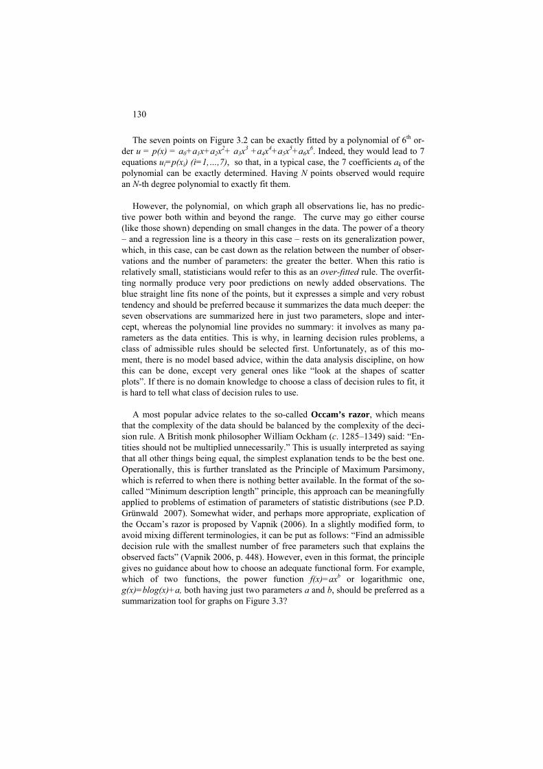
130
The seven points on Figure 3.2 can be exactly fitted by a polynomial of 6th or-der u = p(x) = a0+a1x+a2x2+ a3x3 +a4x4+a5x5+a6x6. Indeed, they would lead to 7 equations ui=p(xi) (i=1,…,7), so that, in a typical case, the 7 coefficients ak of the polynomial can be exactly determined. Having N points observed would require an N-th degree polynomial to exactly fit them.
However, the polynomial, on which graph all observations lie, has no predic-
tive power both within and beyond the range. The curve may go either course (like those shown) depending on small changes in the data. The power of a theory – and a regression line is a theory in this case – rests on its generalization power, which, in this case, can be cast down as the relation between the number of obser-vations and the number of parameters: the greater the better. When this ratio is relatively small, statisticians would refer to this as an over-fitted rule. The overfit-ting normally produce very poor predictions on newly added observations. The blue straight line fits none of the points, but it expresses a simple and very robust tendency and should be preferred because it summarizes the data much deeper: the seven observations are summarized here in just two parameters, slope and inter-cept, whereas the polynomial line provides no summary: it involves as many pa-rameters as the data entities. This is why, in learning decision rules problems, a class of admissible rules should be selected first. Unfortunately, as of this mo-ment, there is no model based advice, within the data analysis discipline, on how this can be done, except very general ones like “look at the shapes of scatter plots”. If there is no domain knowledge to choose a class of decision rules to fit, it is hard to tell what class of decision rules to use.
A most popular advice relates to the so-called Occam’s razor, which means
that the complexity of the data should be balanced by the complexity of the deci-sion rule. A British monk philosopher William Ockham (c. 1285–1349) said: “En-tities should not be multiplied unnecessarily.” This is usually interpreted as saying that all other things being equal, the simplest explanation tends to be the best one. Operationally, this is further translated as the Principle of Maximum Parsimony, which is referred to when there is nothing better available. In the format of the so-called “Minimum description length” principle, this approach can be meaningfully applied to problems of estimation of parameters of statistic distributions (see P.D. Grünwald 2007). Somewhat wider, and perhaps more appropriate, explication of the Occam’s razor is proposed by Vapnik (2006). In a slightly modified form, to avoid mixing different terminologies, it can be put as follows: “Find an admissible decision rule with the smallest number of free parameters such that explains the observed facts” (Vapnik 2006, p. 448). However, even in this format, the principle gives no guidance about how to choose an adequate functional form. For example, which of two functions, the power function f(x)=axb or logarithmic one, g(x)=blog(x)+a, both having just two parameters a and b, should be preferred as a summarization tool for graphs on Figure 3.3?

131
0 50 10050
100
150
200
250
300
0 50 10050
100
150
200
250
300
Figure 3.3. Graph of one two functions, f(x)=65x0.3 and g(x)=50log(x)+30,
both with an added normal noise N(0,15), is presented on each plot. Can the reader give an educated guess of which is which? (Answer: f(x) is on the right and g(x) on the left.)
Another set of advices, not incompatible with those above, relates to the so-
called falsifability principle by K. Popper (1902-1994), which can be expressed as follows: “Explain the facts by using such an admissible decision rule which is easiest to falsify” (Vapnik 2006, p. 451). In principle, to falsify a theory one needs to give an example contradicting to it. Falsifability of a decision rule can be for-mulated in terms of the so-called VC-complexity, a measure of complexity of classes of decision rules: the smaller VC-complexity the greater the falsifability.
Figure 3.4. Any two-part split of three points (not on one line) can be made by a linear function, but the presented case on four points cannot be solved by a line.
Let us explain the concept of VC-complexity for the case of a categorical tar-
get, so that a decision rule to be would be a classifier. However many categorical target features are specified, different combinations of target categories can be as-signed different labels, so that a classifier is bound to predict a label. A set of clas-sifiers Φ is said to shatter the training sample if for any possible assignment of the labels, a classifier exactly reproducing the labels can be found in Φ. Given a set of admissible classifiers Φ, the VC-complexity of a classifying problem is the maxi-mum number of entities that can be shattered by classifiers from Φ. For example, 2D points have VC complexity 3 in the class of linear decision rules. Indeed, any three points, not lying on a line, can be shattered by a line; yet not all four-point

132
sets can be shattered by lines, as shown on Figure 3.4, the left and right parts, re-spectively. The VC complexity is an important characteristic of a correlation problem espe-cially within the probabilistic machine learning paradigm. Under conventional conditions of the independent random sampling of the data, an reliable classifier “with probability a% will be b% accurate, where b depends not only on a, but also on the sample size and VC-complexity” (Vapnik 2006).
The problem of learning correlation in a data table can be stated, in general terms, as follows. Given N pairs (xi, ui),i =1, …, N, in which xi are predictor/input p-dimensional vectors xi=(xi1,…,xip) and ui = (ui1,…,uiq) are target/output q-dimensional vectors (usually q=1), build a decision rule
û = F(x) (3.1) such that the difference between computed û and observed u is minimal over a pre-specified class Φ of admissible rules F.
To specify a correlation learning problem one should specify assumptions regard-ing a number of constituents including:
(i) Type of target
Two types of target features are considered usually: quantitative and categorical. In the former case, equation (3.1) is usually referred to as regression; in the latter case, decision rule, and the learning prob-lem is referred to as that of “classification” or “pattern recognition”.
(ii) Type of rule A rule involves a postulated mathematical structure whose pa-
rameters are to be learnt from the data. The mathematical structures considered further on are:
- linear combination of features - neuron network mapping a set of input features into a set of target features
- decision tree built over a set of features - partition of the entity set into a number of non-overlapping clusters (iii) Criterion
Criterion of the quality of fitting depends on the framework in which the learning task is formulated. Most popular criteria are: maximum likelihood (in a probabilistic model of data generation), least-squares (data recovery approach) and relative errors. According to the least-squares criterion, the difference between u and û is measured with the average squared error,
E=<u- û, u- û>/N=<u-F(x),u-F(x)>/N (3.2)

133
which is to be minimized over all admissible F.
(iv) Training protocol The rule F is learnt from a training dataset. The way the data be-comes available can be referred to as the learning protocol. Three popular training protocols are: batch, random and on-line. The batch mode is the case when all training set is available and used at once, the other two refer to cases when data entities come one by one so that the learning goes incrementally. In the random protocol, the data are available at once, yet the learning process is organized incremen-tally by picking up entities randomly one-by-one, possibly many times each. In contrast, in an on-line protocol each entity comes from an external source and can be seen only once.
3.2 Naïve Bayes Approach
3.2.1 Bayes decision rule
Consider a situation in which there is only one target, a binary feature labeling two states of the world corresponding to “positive” and “negative” classes of enti-ties. According to Bayes (1702-1761), all relevant knowledge of the world should be shaped by the decision maker in the form of probability distributions. Then, whatever new data may be observed, they may lead to changing the probabilities – hence the difference between prior probabilities and posterior, data-updated, prob-abilities. Specifically, assume that, P(1)= p1 and P(2)=p2 are prior probabilities of the two states so that p1 and p2 are positive and sum up to unity. Assume further-more that there are two probability density functions, f1(x1, x2, …, xp) and f2(x1, x2, …, xp), defining the generation of observed entity points x=(x1, x2, …, xp) for each of the classes. That gives us, for any point x=(x1, x2, …, xp) to occur, two probabilities, P(x/1)= p1f1(x) and P(x/2)= p2f2(x), of x being generated from either class. If an x=(x1, x2, …, xp) is actually observed, it leads to a change in probabili-ties of the classes, from the prior probabilities P(1)=p1 and P(2)=p2 to posterior probabilities P(1/x) and P(2/x), respectively. These can be computed according to the well-known Bayes theorem from the elementary probability theory, so that the posterior probabilities of the classes are
P(1| x)=p1f1(x)/f(x) and P(2|x)=p2f2(x)/f(x) (3.3)
where f(x)=p1f1(x)+ p2f2(x).

134
The decision of which class the entity x belongs to depends on what value,
P(1/x) or P(2/x) is greater. The class is assumed to be positive if P(1/x) > P(2/x) or, equivalently,
f1(x)/f2(x) >p2/p1 (3.4)
or, negative, if the reverse inequality holds. This rule is referred to as Bayes deci-sion rule. Another expression of the Bayes rule can be drawn by using the differ-ence B(x)=P(1/x)-P(2/x): x is taken to belong to the positive class if B(x)>0, and the negative class if B(x)<0. Equation B(x)=0 defines the so-called separating sur-face between the two classes. The proportion of errors admitted by Bayes rule is 1-P(1/x) when 1 is predicted and 1-P(2/x) when 2 is predicted. These are the minimum error rates achievable when both within-class distributions f1(x) and f2(x) and priors p1 and p2 are known. Unfortunately, the distributions f1(x) and f2(x) are typically not known. Then some simplifying assumptions are to be made so that the distributions could be es-timated from the observed data. Among most popular assumptions are: (i) Gaus-sian probability and (ii) Local independence. Let us consider them in turn:
(i) Gaussian probability The class probability distributions f1(x) and f2(x) are assumed to be Gaussian,
so that each can be expressed as
fk(x)=exp[-(x-μk)TΣ k -1(x-μk)/2]/[(2π)p|Σ k|]1/2 (3.5)
where μk is the central point, Σ k the p×p covariance matrix and |Σ k| its determinant (k=1, 2).
The Gaussian distribution is very popular. There are at least two reasons for
that. First, it is treatable theoretically and, in fact, may lead to the least squares cri-terion within the probabilistic approach. Second, some real-world stochastic proc-esses, especially in physics, can be thought of as having the Gaussian distribution. Typical shapes of a 2D Gaussian density function are illustrated on Figure 3.5: that with zero correlation on the left and 0.8 correlation on the right.
135
−2
0
2
−2
0
20
0.05
0.1
0.15
0.2
−2
0
2
−2−1
01
2
0
0.1
0.2
0.3
0.4
Figure 3.5. Gaussian bivariate density functions over the origin as the expecta-
tion point – with zero correlation on the left and 0.8 correlation on the right. In the case at which the within-class covariance matrices are equal to each
other, the Bayes decision function B(x) is linear so that the separating surface B(x)=0 is a hyperplane as explained later in section 3.4.
(ii) Local independence (Naïve Bayes)
The assumption of local independence states that all variables are independent within each class so that the within-cluster distribution is a product of one-dimensional distributions: fk(x1, x2, …, xp)= f (x )fk1 1 k2(x )…f2 kp(x ) (3.5) p This postulate much simplifies the matters because usually it is not difficult to produce rather reliable estimates of the one-dimensional density functions fkv(xv) from the training data. Especially simple such a task is when features x1, x2, …, xp are binary themselves. In this case Bayes rule is referred to as naïve Bayes rule because in most cases the assumption of independence (3.5) is obviously wrong. Take, for example, the cases of text categorization or genomic analyses – constitu-ents of a text or a protein serving as the features are necessarily interrelated ac-cording to the syntactic and semantic structures, in the former, and biochemical reactions, in the latter. Yet the decision rules based on the wrong assumptions and distributions appear surprisingly good (see discussion in Manning et al. 2008). Combining the assumptions of local independence and Gaussian distributions in the case of binary variables, one can arrive at equations expressing the conditional probabilities through exponents of linear functions of the variables (as described in Mitchell 2010) so that:

136
0 1 1
1(1/ )1 exp( ... )p p
P xc c x c x
=+ + + +
,
0 1 1
0 1 1
exp( ... )(2 / )
1 exp( ... )p p
p p
c c x c xP x
c c x c x+ + +
=+ + + +
. (3.6)
Equations (3.6) express what is referred to as logistic regression. Logistic regres-sion is a popular decision rule that can be applied to any data on its own right as a model for the conditional probability, and not necessarily derived from the restric-tive independence and normality assumptions.
3.2.2 Naïve Bayes classifier
Consider a learning problem related to data in Table 3.1: there is a set of entities, which are newspaper articles, divided into a number of categories – there are three categories in Table 3.1 according to the three subjects: Feminism, Entertainment and Household. Each article is characterized by its set of keywords presented in the corresponding line. The entries are either 0 – no occurrence of the keyword, or 1 – one occurrence, or 2 – two or more occurrences of the keyword. The problem is to form a rule according to which any article, including those out-side of the collection in Table 3.1, can be assigned to one of these categories using its profile – the data on occurrences of the keywords in the corresponding line of Table 3.1.
Table 3.1. An illustrative database of 12 newspaper articles along with 10
keywords. The articles are labeled according to their main subjects – F for femi-nism, E for entertainment, and H for household.
Keyword Article
drink equal fuel play popular price relief talent tax woman F1 1 2 0 1 2 0 0 0 0 2 F2 0 0 0 1 0 1 0 2 0 2 F3 0 2 0 0 0 0 0 1 0 2 F4 2 1 0 0 0 2 0 2 0 1 E1 2 0 1 2 2 0 0 1 0 0 E2 0 1 0 3 2 1 2 0 0 0 E3 1 0 2 0 1 1 0 3 1 1 E4 0 1 0 1 1 0 1 1 0 0
H1 0 0 2 0 1 2 0 0 2 0 H2 1 0 2 2 0 2 2 0 0 0 H3 0 0 1 1 2 1 1 0 2 0 H4
0 0 1 0 0 2 2 0 2 0

137
Consider the Naïve Bayes decision rule. It assigns each category k with its condi-tional probability P(k/x) depending on the profile x of an article in question which is similar to equations in (3.3): ( / ) ( ) ( )k kP k x p f x f x= where ( ) ( )l l
lf x p f= ∑ x .According to the Bayes rule, the category k, at which
P(k/x) is maximum, is selected. Obviously, the denominator does not depend on k and can be removed: that category k is selected, at which is maximum. ( )k kp f x
According to the Naïve Bayes approach, fk(x) is assumed to be the product of the probabilities of occurrences of the keywords in category k. How one can estimate such a probability? This is not that simple as it sounds. For example, what is the probability of term “drink” in H category? Probably, it can be taken as 1/4 – since the term is present in only one of four members of H. But what’s about term “play” in H – it occurs thrice but in two documents only; thus its probability cannot be taken ¾; yet 2/4 does not seem right either. A popu-lar convention accepts the “bag-of-words” model for the categories. According to this model, all occurrences of all terms in a category are summed up, to produce 31 for category H in Table 3.1. Then each term’s probability in category k would be its summary occurrence in k divided by the bag’s total. This would lead to a fairly small probability of the “drink” in H, just 1/31. This bias is not that impor-tant, however, because what matters indeed in the Naïve Bayes rule is the feature relative contributions, not the absolute ones. And the relative contributions are all right with “drink”, “fuel” and “play” contributing 1/31, 6/31 and 3/31, respec-tively, to H. Moreover, taking the total account of all keyword occurrences in a category serves well for balancing the differences between categories according to their sizes. Yet there is one more issue to take care of: zero entries in the training data. Term “equal” does not appear at all in H leading thus to its zero probability in the cate-gory. This means that any article with an occurrence of “equal” cannot be classed into H category, however heavy evidence from other keywords may be. One would make a point of course that term “equal” has not been observed in H just because the sample of four articles in Table 3.1 is too small, which is a strong ar-gument indeed. To make up for these, another, a “uniform prior” assumption is widely accepted. According to this assumption each term is present once at any category before the count is started. For the case of Table 3.1, this adds 1 to each numerator and 10 to each denominator, which means that the probability of “drink”, “equal”, “fuel” and “play” in category H will be (1+1)/(31+10)=2/41, (0+1)/(31+10)=1/41, (6+1)/(31+10)=7/41 and (3+1)/(31+10)=4/41, respectively. To summarize, the “bag-of-words” model represents a category as a bag contain-ing all occurrences of all keywords in the documents of the category plus one oc-currence of each keyword, to be added to every count in the data table.

138
Table 3.2. Prior probabilities for Naïve Bayes rule for the data in Table 3.1 ac-cording to the bag-of-word conventions. There are three lines for each of the cate-gories representing, from top to bottom, the term counts from Table 3.1, their probabilities multiplied by 1000 and rounded to an integer, and the natural loga-rithms of the probabilities.
Cate-gory
Prior probability Total Term counts Its logarithm count Term probabilities (in thousands)
Logarithms of the probabilities F 1/3 27 3 5 0 2 2 3 0 5 0 7
108 162 27 81 81 108 27 162 27 216 -1.099 4.6 5.1 3.3 4.4 4.4 4.7 3.3 5.1 3.3 5.4
E 1/3 32 3 2 3 6 6 2 3 5 1 1 95 71 95 167 167 71 95 143 48 48 -1.099 4.6 4.3 4.6 5.1 5.1 4.3 4.6 5.0 3.9 3.9
H 1/3 31 1 0 6 3 3 7 5 0 6 0 49 24 171 98 98 195 146 24 171 24 -1.099 3.9 3.2 5.1 4.6 4.6 5.3 5.0 3.2 5.1 3.2
Table 3.2 contains the prior probabilities of categories, that are taken to be just proportions of categories in the collection, 4 of each in the collection of 12, as well as within-category probabilities of terms (the presence of binary features) computed as described above. Logarithms of these are given too. Table 3.3. Computation of category scores for entity E1 (first line) from Table 3.1 according to the logarithms of within-class feature probabilities. There are two lines for each of the categories: that on top replicates the logarithms from Table 3.2 and that on the bottom computes the inner product.
Entity E1
2 0 1 2 2 0 0 1 0 0
Now we can apply Naïve Bayes classifier to any entity presented in the format of Table 3.1 including those in Table 3.1 itself (the training set). Because the prob-abilities in Table 3.2 are expressed in thousands, we may use sums of their loga-rithms rather than the probability products; this seems an intuitively appealing op-eration. Indeed, after such a transformation the score of a category is just the inner product of the row representing the tested entity and the feature scores correspond-ing to the category. Table 3.3 presents the logarithm scores of article E1 for each of the categories.
Category Log(pk) Feature weights (probability logarithms) Score Inner product
F -1.099 4.6 5.1 3.3 4.4 4.4 4.7 3.3 5.1 3.3 5.4 2*4.6+0+ 1*3.3 +2*4.4+2*4.4 +0+ 0+ 1*5.1 +0 + 0 34.2
E -1.099 4.6 4.3 4.6 5.1 5.1 4.3 4.6 5.0 3.9 3.9 2*4.6+0+ 1*4.6 +2*5.1+2*5.1 +0+ 0+ 1*5.0 +0 + 0 38.0
H -1.099 3.9 3.2 5.1 4.6 4.6 5.3 5.0 3.2 5.1 3.2 2*3.9+0+ 1*5.1 +2*4.6+2*4.6 +0+ 0+ 1*3.2 +0 + 0 33.3

139
Table 3.4. Naïve Bayes category scores for the items in Table 3.1. Articles Category scores F E H
F1 37.7006 35.0696 29.3069 F2 28.9097 25.9362 21.5322 F3 24.9197 20.1271 14.8723 F4 38.2760 34.6072 30.0000 E1 34.2349 37.9964 33.3322 E2 37.2440 42.1315 40.2435
E3 43.1957 44.5672 40.8398 E4 21.1663 22.9203 19.4367 H1 25.8505 29.3940 34.5895 H2 34.9290 40.4527 42.7490
H3 29.9582 35.3573 38.3227 H4 24.7518 28.8344 34.8408
It should be mentioned that the Naïve Bayes computations here, as applied to the text categorization problem, follow the so-called multinomial model in which only terms present in the entities are considered – as many times as they occur. Another popular model is the so-called Bernoulli model, in which terms are assumed to be generated independently as binomial variables. The Bernoulli model based com-putations differ from these on two counts: first, the features are binary indeed so that only binary information, yes or no, of term occurrence is taken, and, second, for each term the event of its absence, along with its probability, is counted too (for more detail, see Manning et al. 2008, Mitchell 2010). Q.3.1. Apply Naïve Bayes classifier in Table 3.2 to article X =(2 2 0 0 0 0 2 2 0 0) which involves items “drink”, “equal”, “relief” and “talent” frequently. A. The category scores are: s(F/X)=35.2, s(E/X)=35.6, and S(H/X)=29.4 pointing to En-tertainment or, somewhat less likely, Feminism. Q.3.2. Compute Naïve Bayes category scores for all entities in Table 3.1 and prove that the classifier correctly attributes them to their categories. A. See Table 3.4.

140
3.2.3 Metrics of accuracy
P3.2.3 Accuracy and related measures: Presentation
Consider a generic problem of learning a binary target feature, so that all enti-
ties belong to either class 1 or class 2. A decision rule, applied to an entity, gener-ates a “prediction” which of these two classes the entity belongs to. The classifier may return some decisions correct and some erroneous. Let us pick one of the classes as that of our interest, say 1, then there can be two types of errors: false positives (FP) – the classifier says that an entity belongs to class 1 while it does not, and false negatives (FN)– the classifier says that an entity does not belong to class 1 while it does.
Let it be, for example, a lung screening device for testing against a lung cancer.
Whilst established in a hospital cancer ward, on a selected sample of 200 patients sent by local surgeries for investigation, it may produce results that are presented in Table 3.5. Its rows correspond to the diagnosis by the screening device and the columns to the results of further, more elaborate and definitive, tests. This is a cross-classification contingency table, and it is frequently referred to as a confu-sion table.
Table 3.5. Confusion table of patients’ lung screening test results.
True lung cancer Yes No
Total
Yes 94 7 Device’s diagnosis Not 1 98
101 99
Total 95 105 200
There are 94 true positives TP and 98 true negatives TN in the table so that the to-tal accuracy of the device can be rated as (94+98)/200=0.96=96%. Respectively, the numbers of false positives FP=7, and false negatives FN=1 sum up to 8 lead-ing to 4% error rate. Yet there are significant differences between these two show-ing that the device is in fact better than the totals show. Indeed, the 7 FP are not that important, because patients with the suspected cancer will be investigated fur-ther in depth anyway so that their No-status will be restored, with the cost of fur-ther testing. In contrast, 1 FN may go out of the medical system and get their can-cer untreated with the potential loss of life because of the error. This is an example of different costs associated with FP and FN errors. The device made just one se-
141
rious error: of 95 true cancer cases, one error. The TP rate, the proportion of cor-rectly identified true cases, frequently referred to as recall or sensitivity, 94/95=98.9%, is impressive indeed. On the other hand, the precision, that is, the proportion of the 94 TP cases related to all cancer predicted cases, 101, is some-what smaller, just 93% to reflect that FP rate is 7%. The difference between preci-sion and sensitivity is somewhat averaged in the value of accuracy rate, 96% in this case, so that the accuracy rate works reasonably well here as a single charac-teristic of the quality of the testing device.
Yet in a situation in which there is a great disparity in the sizes of Yes and No
classes, the accuracy rate fails to reflect the results properly. Consider, for exam-ple, results of the same device at a random sample of 200 individuals who have not been sent for the screening by doctors but rather volunteered to be screened from public at large (Table 3.6).
Table 3.6. Contingency table of volunteers’ lung screening test results.
True lung cancer Yes No
Total
Yes 2 2 Device’s diagnosis Not 1 195
4 196
Total 3 197 200 The accuracy rate at Table 3.6 is even greater than at Table 3.5,
(2+195)/200=98.5%. Yet both sensitivity, 2/3=66.7%, and precision, 2/4=50%, are quite mediocre. The high accuracy rate is caused by the very high specificity, the proportion of correctly identified No cases, 195/197=98.9%, and by the fact that there are very few Yes cases.
As to a single measure adequately reflecting sensitivity and precision, the one
most popular is their harmonic mean, the F-measure, which is equal to F=2/(1/(2/3)+1/(2/4))=2/(3/2+4/2)=4/7=57.1%.
Case study 3.1. Prevalence and Quetelet coefficients If one looks at the record of the screening device according to Table 3.6, 4 true
cases of 4 diagnosed as such, and compares that with the prevalence of the cancer at the sample, 3 cases of 200 – the difference is impressive indeed. This difference is exactly what is caught up in the concept of Quetelet coefficient q(l/k) (see sec-tion 2.3.3) at row k=1 and column l=1. This takes the relative difference between the conditional probability P(1/1)=2/4 and the average probability P(l=1)=3/200 which is referred to sometimes as the prevalence: q(1/1)=(2/4-3/200)/(3/200)= 2*200/(3*4)-1=32.33=3233%, quite a change. This high value probably explains the difference in sensitivity and specificity between Tables 3.6 and 3.5.

142
Indeed, a similar Quetelet coefficient at Table 3.5 is q(1/1)=94*200/(101*95) –
1 =0.96=96%, a less than a 100% increase, which may convey the idea that Table 3.5 is much more balanced than Table 3.6. The accuracy measure works well at balanced tables and it does not at those that are not.
F3.2.3 Accuracy and related measures: Formulation
In general, the situation can be described by a confusion, or contingency, table between two sets of categories related to the class being predicted (1 or not) and the true class (1 or not), see Table 3.5. Of course, if one changes the class of inter-est, the errors will remain errors, but their labels will change: false positives re-garding class 1 are false negatives when the focus is on class 2, and vice versa.
Among popular indexes scoring the error or accuracy rates are the following:
FP rate = FP/(FP+TN) – the proportion of false positives among those not in 1; 1-FP rate is referred to sometimes as specificity – it shows the proportion of correct predictions among other, not class 1, entities.
TP rate = TP/(TP+FN) – the proportion of true positives in class 1; in information retrieval, this frequently is referred to as recall or sensitivity.
Table 3.7. A statistical representation of the match between the true class and
predicted class. The entries are counts of the numbers of co-occurrences.
True class 1 Not Total
TP+FP Predicted 1 True False Class Positives Positives
FN+TN Not False True Negatives Negatives
Total TP+FN FP+TN N
Precision = TP/(TP+FP) – the proportion of true positives in the predicted class 1. These reflect each of the possible errors separately. There are indexes that try
to combine all the errors, too. Among them the most popular are:
Accuracy = (TP+TN)/N – the total proportion of accurate predictions. Obviously, 1-Accuracy is the total proportion of errors.

143
F-measure= 2/(1/Precision + 1/Recall) – the harmonic average of Recall and Pre-cision.
The latter measure is getting more popularity than the former because the Ac-
curacy counts both types of errors equally, which may be at odds with the com-mon sense in those frequent situations at which errors of one type are “more ex-pensive” than the others. Recall, for example, the case of medical diagnostics in Tables 3.5 – 3.6: a tumor wrongly diagnosed as malignant would cost much less than the other way around when a deadly tumor is diagnosed as benign. F-measure, to some extent, is more conservative because it, first, combines rates rather than counts, and, second, utilizes the harmonic mean which tends to be close to the minimum of the two, as can be seen from the statements in Q.33 and Q.3.4.
Q.3.3. Consider two positive reals, a and b, and assume, say that a <b. Prove
that the harmonic mean, h=2/(1/a+1/b) stays within the interval between a and 2a however large the difference b-a is. A. Take b be b=ka at some k>1. Then h=2/(1/a+1/(ka))=2ka/(1+k). The coefficient at a, 2k/(1+k), is less than 2, which proves the statement.
Q.3.4. Consider two positive real values, a and b, and prove that their mean,
m=(a+b)/2, and harmonic mean, h=2/(1/a+1/b), satisfy equation mh=ab. A. Take the product mh=[(a+b)/2][2/(1/a+1/b)] and perform elementary algebraic opera-tions.
1
0 0.2 0.4 0.6 0.8 10
0.1
0.2
0.3
0.4
0.5
0.6
0.7
0.8
0.9 a b
FP rate
TP
rat
e
Figure 3.6. ROC curves for two classifiers; that of a is superior to that of b. More elaborate representation of errors of the two types can be achieved with
the so-called receiver operating characteristics (ROC) graphs analysis (see, for ex-ample, Fawcett 2006). ROC graphs are especially suitable in the cases of classifi-ers that have a continuous output such as Bayes classifiers. ROC graph is a 2D

144
Cartesian plane plotting TP rate against FP rate so that the latter is shown on x-axis and the former, on y-axis (see Figure 3.6)
To be specific, let us take a Bayes classifier’s rule in (3.4) and change the ratio
p2/p1 for an arbitrary threshold d>0. Take now d=d1 for a specific d1, so that the rule now predicts class 1 if f1(x)/f2(x) > d1. Count the proportions of true and false positives, tp1 and fp1, at this threshold and put the point (fp1, tp1) onto a ROC graph. Then change d to d2 and count the rates, tp2 and fp2, at this threshold. If, say, d2> d1, then the TP rate can only decrease, because the number of positive predictions can only decrease. The FP rate, in a regular case, should increase at d2>d1 so that point (fp2, ft2) would go to the right and above the former point on ROC plot. In this way, by step-by-step changing the threshold d, one can obtain a ROC curve such as curves “a” and “b” on plot Figure 3.6. Such a curve can be utilized as a characteristic of the classifier under consideration that can be uzed, for instance, for selection of suitable levels of TP and FP rates. In the case shown on Figure 3.6, one can safely claim that classifier “a” is superior to that of “b”, be-cause at each FP rate level, TP rate of “a” is greater than that of “b”.
3.3 Linear regression
P3.3 Linear regression: Presentation
Let us extend the notion of linear regression from the bivariate case considered in section 2.1. to multivariate case, when several features can be used as predictors for a target feature.
Case study 3.2. Linear regression for Market town data Consider feature Post expressing the number of post offices in Market towns (Table 0.4
on p. 16-17) and try to relate it to other features in the table. It obviously relates to the population. For example, towns with population of 15,000 and greater are those and only those where the number of post offices is 5 or greater. This correlation, however, is not as good as to give us more guidance in predicting Post from the Population. For example, at the seven towns whose population is from 8,000 to 10,000 any number of post offices from 1 to 4 may occur, according to the table. This could be attributed to effects of services such as a bank or hospital present at the towns. Let us specify a set of features in Table 0.4 that can be thought of as affecting the feature Post, to include in addition to Population some other features – PS-Primary schools, Do - General Practitioners, Hos- Hospitals, Ba- Banks, Sst - Superstores, and Pet– Petrol Stations; seven features altogether, taken as the set of input variables (predictors).

145
What we want is to establish a linear relation between the set and target feature Post. A
linear relation is an equation representing Post as a weighted sum of input features plus a constant intercept; the weights can be any reals, not necessarily positive. If the relation is supported by the data, it can be used for various purposes such as analysis, prediction and planning.
Table 3.6. Weight coefficients of input features at Post Office as target variable for
Market towns data.
Feature Weight 0.0002 Pop_Res 0.1982 PSchools 0.2623 Doctors -0.2659 Hospitals 0.0770 Banks 0.0028 Superstores -0.3894 Petrol 0.5784 Intercept
In the example of seven Market town features used for linearly relating them to Post Of-
fice feature, the least-squares optimal weight coefficients are presented in Table 3.6. Each weight coefficient shows how much the target variable would change on average if the cor-responding feature is increased by a unity, while the others do not change. One can see that increasing population by a thousand would give a similar effect as adding a primary school, about 0.2, which may seem absurd in the example as Post Office variable can have only in-teger values. Moreover, the linear function format should not trick the decision maker into thinking that increasing different input features can be done independently: the features are obviously not independent so that increase of, say, the population will lead to respectively adding new schools for the additional children. Still, the weights show relative effects of the features – according to Table 3.6, adding a doctor’s surgery in a town would lead to maximally possible increase in post offices. The maximum value is assigned to the inter-cept in this case. What this may mean? Is it the number of post offices in an empty town with no population, hospitals or petrol stations? Certainly not. The intercept expresses that part of the target variable which is relatively independent of the features taken into account. It should be also pointed out that the weight values are relative not to just feature concepts but specific scales in which features measured. Change of a feature scale, say 10-fold, would result in a corresponding, inverse, change of its weight (due to the linearity of the re-gression equation). This is why in statistics, the relative weights are considered for the scales expressed in units of the standard deviation. To find them, one should multiply the weight for the current scale by the feature’s standard deviation (see Table 3.7).
The standardized weights are well justified when input features are mutually
uncorrelated – indeed, they show the pair-wise correlation with the target feature.

146
Yet in a situation of correlated features, like this, they seem to have much less definite interpretation, except for showing the changes of the target in units of the
Table 3.7. Standardized weight coefficients of input features at Post Office as target
variable for Market towns. Weights with partial Determination Feature Weights in
standard deviations, although some claim that they also reflect feature’s correla-tion with the target or even importance for predicting the target. An argument against their usage as a correlation measure is that, in fact, a regression coefficient multiplied by the standard deviation loses its “purity” as a measure of correlation to the target at constant levels of the other features because the standard deviation does not pertain to constant features. An argument against their usage as measures of importance for prediction is that the standardized coefficient has nothing to do with the change of the determination coefficient when the corresponding feature is removed from the equation of regression.
J. Bring (1994) proposes to kill two birds with one stone: to clean up the stan-
dard deviations from the non-constancy of the other features, which are claimed to reflect the changes in the determination coefficients. Specifically, take the vari-ance of a feature and take off the proportion of it unexplained by the linear regres-sion of it through the other features. The square root of the result represents the partial standard deviation, which is proportional to the so-called “t-value”, and, in the original squared form, to the change of the determination coefficient inflicted by the removal of the feature from the list of the explanatory variables (Bring 1994). Unfortunately, this is not that simple, as the next case study 3.3 shows.
Case study 3.3. Using feature weights standardized. Table 3.8 presents the feature weights standardized with both the original and partial
standard deviations as well as the absolute reductions of the original determination coeffi-cient 0.8295 after removal of the corresponding variables. There is a general agreement be-tween the absolute values of the first column and those in the third column, but the second column has little in common with either of them. A general analysis of a simpler problem
standard deviation scales
standard deviations coefficient reduction
0.0247 1602.00 1.3889 Pop_Res 0.0077 1.02 0.5419 PSchools 0.0055 0.64 0.3414 Doctors 0.0023 0.41 -0.1542 Hospitals 0.0059 2.27 0.3376 Banks 0 1.07 0.0048 Superstores 0.0251 0.96 -0.6375 Petrol

147
of relation between the regression coefficients and correlation coefficients between the tar-get and input features can be found in Waller and Jones (2010).
Amazingly, the convenient standardization involves negative weights, specifically at
features Petrols and Hospitals. This can be an artifact of the method, related to the effect of “replication” of features. One can
Table 3.8. Different indexes to express the idea of importance of a feature in the Post
regression problem.
Feature Weights in Standard Weights in standardized natural scales, w deviations, s scales, w∗s
1.3889 6193.2 0.0002 Pop_Res 0.5419 2.7344 0.1982 PSchools 0.3414 1.3019 0.2623 Doctors -0.1542 0.5800 -0.2659 Hospitals 0.3376 4.3840 0.0770 Banks 0.0048 1.7242 0.0028 Superstores -0.6375 1.6370 -0.3894 Petrol
think of Hospitals being a double for Doctors, and Petrol, for Superstores. Thus, before jumping to conclusions, one should check whether the minus disappears if the “replicas” are removed from the set of features. As Table 3.9 shows, not in this case: the negative weights remain, though they slightly change, as well as other weights. This illustrates that the interpretation of linear regression coefficients as weights should be cautious and re-strained.
In our example, determination coefficient ρ2= 0.83, that is, the seven features explain
83% of the variance of Post Office feature, and the multiple correlation is ρ=0.91. Curi-ously, the reduced set of five features (see Table 3.2) contributes almost the same, 82.4% of the variance of the target variable. This may make one wonder whether just one Population feature could suffice for doing the regression. This can be tested with the 2D method de-scribed in section 2.1 or with the nD method of this section.
Table 3.9. Weight coefficients for reduced set of features at Post Office as target variable for Market towns data.
Feature Weight 0.0003 POP_RES 0.1823 PSchools -0.3167 Hospitals 0.0818 Banks -0.4072 Petrol 0.5898 Intercept
148
According to the formulation of the nD method further on, the estimated parameters
must be feature weight coefficients – no room for an intercept in the formula. To accom-modate the intercept, a fictitious feature whose all values are unities is introduced. That is, an input data matrix X with two columns is to be used: one for the Population feature, the other for the fictitious variable of all ones. According to (3.6), this leads to the slope 0.0003 and intercept 0.4015, though with somewhat reduced determination coefficient, which is ρ2= 0.78 in this case. From the prediction point of view this may be all right, but the re-duced feature set looses on interpretation.
F3.3 Linear regression: Formulation
The problem of linear regression can be formulated as a particular case of the correlation learning problem with just one quantitative target variable u and linear admissible rules so that
u = w1x1+w2x2+…+wpxp+w0
where w0, w1,…, wp are unknown weights, parameters of the model.
For any entity i =1, 2, …, N, the rule-computed value of u ûi = w1xi1+w2xi2+…+wpxip+w0
differs from the observed one by di = |ûi – ui|, which may be zero – when the pre-diction is exact. To find w1, w2, …, wp, w0, one can minimize the summary square error
D2 = ∑idi
2 = ∑i (ui –w1*xi1-w2*xi2-…-wp*xip-w0)2 (3.7)
over all possible parameter vectors w = (w0, w1,…,wp). To make the problem treatable in terms of linear operations, a fictitious feature
x0 is introduced such that all its values are 1: xi0 =1 for all i = 1, 2, …, N. Then cri-terion D2 can be expressed as D2 = ∑i (ui -<wi,xi>)2 using the inner products <w,xi> where w=(w0, w1,…,wp) and xi=(xi0, xi1 , …, xip) are (p+1)-dimensional vectors of which all xi are known whereas w is not. From now on, the unity feature x0 is assumed to be part of data matrix X in all correlation learning problems.
The criterion D2 in (3.7) is but the squared Euclidean distance between the N-
dimensional target feature column u=(ui) and vector û=Xw whose components are ûii= <w,xi>. Here X is N×(p+1) matrix whose rows are xi (augmented with the component xi0=1, thus being (p+1)-dimensional) so that Xw is the matrix product

149
of X and w. Vectors defined as Xw for all possible w’s form (p+1)-dimensional vector space, referred to as X-span.
Thus the problem of minimization of (3.7) can be reformulated as follows:
given target vector u, find its projection û in the X-span space. The global solution to this problem is well-known: it is provided by a matrix PX applied to u:
û = PXu (3.8)
where PX is the so-called orthogonal projection operator, an N×N matrix, defined as:
PX = X (XTX)-1XT (3.9)
so that
û = X (XTX)-1XTu and w=(XTX)-1XTu. (3.10) Matrix PX projects every N-dimensional vector u to its nearest match in the
(p+1)-dimensional X-span space. The inverse (XTX)-1 does not exist if the rank of X, as it may happen, is less than the number of columns in X, p+1, that is, if ma-trix XTX is singular or, equivalently, the dimension of X-span is less than p+1. In this case, the so-called pseudo-inverse matrix (XTX)+ can be used as well. This is not a big deal computationally: for example, in MatLab one just puts pinv(XTX) instead of inv(XTX).
The quality of approximation is evaluated by the minimum value D2 in (3.7)
averaged over the number of entities and related to the variance of the target vari-able. Its complement to 1, the determination coefficient, is defined by the equation
ρ2 = 1- D2/(Nσ2(u)) (3.11)
The determination coefficient shows the proportion of the variance of u ex-
plained by the linear regression. Its square root, ρ, is referred to as the coefficient of multiple correlation between u and X = {x0, x1, x2, …, xp}.

150
3.4 Linear discrimination and SVM
P3.4 Linear discrimination and SVM: Presentation
Discrimination is an approach to address the problem of drawing a rule to dis-tinguish between two classes of entity points in the feature space, a “yes” class and “no” class, such as for instance a set of banking customers in which a, typi-cally very small, subset of fraudsters constitutes the “yes” class and that of the others the “no” class. On Figure 3.7, entities of “yes” class are presented by circles and of “no” class by squares.
The problem is to find a function u=f(x) that would separate the two classes in
such a way that f(x) is positive for all entities in the “yes” class and negative for all the entities in the “no” class. When the discriminant function f(x) is assumed to be linear, the problem is of linear discrimination. It differs from that of the linear re-gression in that aspect that the target values here are binary, either “yes” or “no”, so that this is a classification rather than regression, problem.
The classes on Figure 3.7 can be discriminated by a straight – dashed – line in-
deed. The dotted vector w, orthogonal to the “dashed line” hyperplane, represents a set of coefficients at the linear classifier represented by the dashed line. Vector w also shows the direction at which function f(x)=<w,x>− b grows. Specifically,
+ side
x1
x2
+ side
x
x2
(a) (b)
Figure 3.7. A geometric illustration of a separating hyper-plane between
classes of circles and squares. The dotted vector w on (a) is orthogonal to the hy-per-plane: its elements are hyper-plane coefficients, so that it is represented by equation <w,x> − b = 0. Vector w also points at the direction: at all points above the dashed line, the circles included, function f(x)= <w,x> − b is positive. The dotted lines on (b) show the margin, and the squares and circle on them are sup-port vectors.
f(x) is 0 on the separating hyperplane, and it is positive above and negative be-neath that. With no loss of generality, w can be assumed to have its length equal

151
to unity. Then, for any x, the inner product <w,x> expresses the length of vector x along the direction of w.
To find an appropriate w, even in the case when “yes” and “no” classes are
linearly separable, various criteria can be utilized. A most straightforward classi-fier is defined as follows: put 1 for “yes” and −1 for “no” and apply the least-squares criterion of linear regression. This produces a theoretically sound solution approximating the best possible – Bayesian – solution in a conventional statistics model. Yet, in spite of its good theoretical properties, least-squares solution may be not necessarily the best at some data configurations. In fact, it may even fail to separate the positives from negatives when they are linearly separable. Consider the following example.
Worked example 3.1. A failure of Fisher discrimination criterion Let there be 14 2D points presented in Table 3.10 (first line) and displayed in Figure 3.8
(a). Points 1,2,3,4,6 belong to the positive class (dots on Figure 3.8), and the others to the negative class (stars on Figure 3.8). Another set, obtained by adding to each of the compo-nents a random number, according to the normal distribution with zero mean and 0.2 the standard deviation; is presented in the bottom line of Table 3.10 and Figure 3.8 (b). The class assignment for the disturbed points remains the same.
Table 3.10. X-y coordinates of 14 points as given originally and perturbed with a white
noise of standard deviation 0.2, that is, generated from the Gaussian distribution N(0,0.2).
Entity # 1 2 3 4 5 6 7 8 9 10 11 12 13 14 Original data x
y 3.00 3.00 3.50 3.50 4.00 1.50 2.00 2.00 2.00 1.50 2.00 2.00 2.00 1.50 0.00 1.00 1.00 0.00 1.00 4.00 4.00 5.00 4.50 5.00 4.00 5.00 4.50 5.00
Perturbed data x y
2.93 2.83 3.60 3.80 3.89 1.33 1.95 2.13 1.83 1.26 1.98 1.99 2.10 1.38 -0.03 0.91 0.98 0.31 0.88 3.73 4.09 4.82 4.51 4.87 4.11 5.11 4.46 4.59
The optimal vectors w according to formula (3.7) are presented in Table 3.11 as well as that for the separating, dotted, line in Figure 3.8 (d).
Table 3.11. Coefficients of straight lines on Figure 3.8.
Coefficients at x y Intercept
LSE at Original data -1.2422 -0.8270 5.2857 LSE at Perturbed data -0.8124 -0.7020 3.8023 Dotted at Perturbed data -0.8497 -0.7020 3.7846
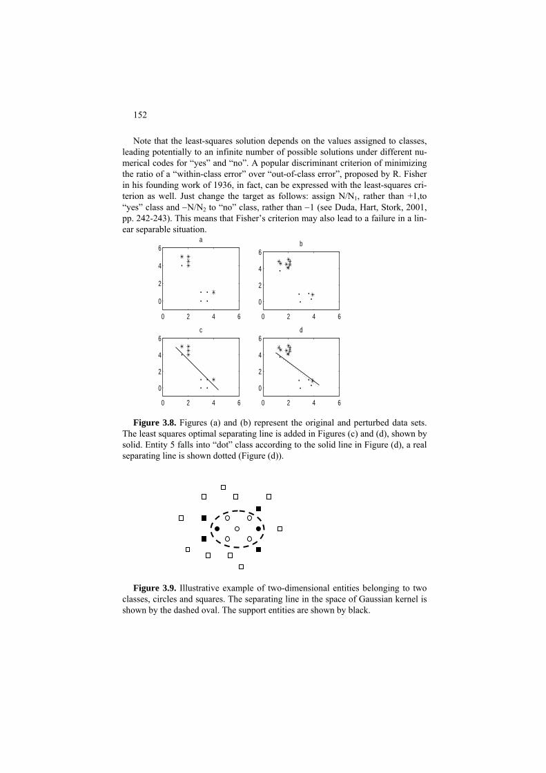
152
Note that the least-squares solution depends on the values assigned to classes, leading potentially to an infinite number of possible solutions under different nu-merical codes for “yes” and “no”. A popular discriminant criterion of minimizing the ratio of a “within-class error” over “out-of-class error”, proposed by R. Fisher in his founding work of 1936, in fact, can be expressed with the least-squares cri-terion as well. Just change the target as follows: assign N/N1, rather than +1,to “yes” class and −N/N2 to “no” class, rather than −1 (see Duda, Hart, Stork, 2001, pp. 242-243). This means that Fisher’s criterion may also lead to a failure in a lin-ear separable situation.
0 2 4 6
0
2
4
6a
0 2 4 6
0
2
4
6b
0 2 4 6
0
2
4
6c
0 2 4 6
0
2
4
6d
Figure 3.8. Figures (a) and (b) represent the original and perturbed data sets.
The least squares optimal separating line is added in Figures (c) and (d), shown by solid. Entity 5 falls into “dot” class according to the solid line in Figure (d), a real separating line is shown dotted (Figure (d)).
Figure 3.9. Illustrative example of two-dimensional entities belonging to two
classes, circles and squares. The separating line in the space of Gaussian kernel is shown by the dashed oval. The support entities are shown by black.

153
By far the most popular set of techniques, Support Vector Machine (SVM),
utilize a different criterion – that of maximum margin. The margin of a point x, with respect to a hyperplane, is the distance from x to the hyperplane along its perpendicular vector w (Figure 3.8 (a)), which is measured by the absolute value of inner product <w,x>. The margin of a class is defined by the minimum value of the margins of its members. Thus the criterion requires, like L∞, finding such a hyperplane that maximizes the minimum of class margins, that is, crosses the middle of line between the nearest entities of two classes. Those entities that fall on the margins, shown by dotted lines on Figure 3.8 (b), are referred to as support vectors; this explains the method’s title.
It should be noted that the classes are not necessarily linearly separable; more-
over in most cases they are not. Therefore, the SVM technique is accompanied with a non-linear transformation of the data into a high-dimensional space which is more likely to make the classes linear-separable. Such a non-linear transforma-tion is provided by the so-called kernel function. The kernel function imitates the inner product in the high-dimensional space and is represented by a between-entity similarity function such as that defined by formula (3.7).
The intuition behind the SVM approach is this: if the population data – those not present in the training sample – concentrate around training data, then having a wide margin would keep classes separated even after other data points are added (see Figure 3.9). One more consideration comes from the Minimum De-scription Length principle: the wider the margin, the more robust the separating hyperplane is and the less information of it needs to be stored. A criticism of the SVM approach is that the support vector machine hyperplane is based on the bor-derline objects – support vectors – only, whereas the least-squares hyperplanes take into account all the entities so that the further away an entity is the more it may affect the solution, because of the quadratic nature of the least-squares crite-rion. Some may argue that both borderline and far away entities can be rather ran-domly represented in the sample under investigation so that neither should be taken into account in distinguishing between classes: it is some “core” entities of the patterns that should be separated – however, there has been no such an ap-proach taken in the literature so far.
Worked example 3.2. SVM for Iris dataset Consider Iris dataset standardized by subtracting, from each feature column, its mid-
range and dividing the result by the half-range. Apply the SVM approach to this data, with-out applying any specific kernel function, that is, using the inner products of the row-vectors as they are, which is referred to sometimes as the case of linear kernel function.
Take Gaussian kernel in (3.15) to find a support vector machine surface separating Iris
class 3 from the rest.

154
Table 3.12. List of support entities in the problem of separation of taxon 3 (entities 101 to 150) in Iris data set from the rest (thanks to V.V. Sulimova for computation).
N Entity Alpha N Entity Alpha 1 18 0.203 2 28 0.178 3 37 0.202 4 39 0.672 5 58 13.630 6 63 209.614 7 71 7.137 8 78 500 9 81 18.192 10 82 296.039 11 83 200.312
12 105 2.492 13 106 15.185 14 115 52.096 15 118 15.724 16 119 449.201 17 127 163.651 18 133 500 19 135 5.221 20 139 16.111 21 150 26.498
The resulting solution embraces 21 supporting entities (see Table 3.12), along with their
“alpha” prices reaching into hundreds and even, on two occasions, to the maximum bound-ary 500 embedded in the algorithm.
There is only one error with this solution, entity 78 wrongly recognized as belonging to
taxon 3. The errors increase when we apply a cross-validation techniques, though. For ex-ample, “leave-all-one-out” cross-validation leads to nine errors: entities 63, 71, 78, 82 and 83 wrongly classified as belonging to taxon 3 (false positives), while entities 127, 133, 135 and 139 are classified as being out of taxon 3 (false negatives).
Q.3.5. Why only 10, not 14, points are drawn on Figure 3.9 (b)? A. Because each of the points 11-14 doubles a point 7-10.
Q.3.6. What would change if the last four points are removed so that only points 1-10 remain? A. The least-squares solution will be separating again.
F3.4 Linear discrimination and SVM: Formulation
F3.4.1 Linear discrimination
The problem of linear discrimination can be stated as follows. Let a set of N en-tities in the feature space, xi=(xi0, xi1, xi2, …, xip), i=1,2,…,N, is partitioned in two classes, sometime referred to as patterns, a “yes” class and a “no” class, such as for instance a set of banking customers in which a, typically very small, subset of

155
fraudsters constitutes the “yes” class and that of the others the “no” class. The problem is to find a function u=f(x0, x1, x2, …, xp) that would discriminate the two classes in such a way that u is positive for all entities in the “yes” class and nega-tive for all entities in the “no” class. When the discriminant function is assumed to be linear so that u = w1x1+w2x2+…+wpxp+w0 at constant w0, w1, …, wp, the prob-lem is of linear discrimination. It differs from that of the linear regression in only that aspect that the target values ui here are binary, either “yes” or “no”, so that this is a classification rather than regression, problem.
To make it quantitative, define ui=1 if i belongs to the “yes” class and ui= -1 if
i belongs to the “no” class. The intercept w0 is referred to, in the context of the dis-crimination / classification problem, as bias.
A linear classifier is defined by a vector w so that if ûi= <w,xi> >0, predict
ůi=1; if ûi = <w,xi> < 0, then predict ůi= -1; that is, ůi = sign(<w,xi>) . (Here the sign function is utilized as defined by the condition that sign(a)=1 when a>0, =-1 when a<0, and =0 when a=0.)
To find an appropriate w, even in the case when “yes” and “no” classes are
linearly separable, various criteria can be utilized. A most straightforward classi-fier is defined by the least-squares criterion of minimizing (3.3). This produces
w=(XTX)-1XTu (3.12)
Note that formula (3.12) leads to an infinite number of possible solutions be-
cause of the arbitrariness in assigning different u-labels to different classes. A slightly different criterion of minimizing the ratio of the “within-class error” over “out-of-class error” was proposed by R. Fisher (1936). Fisher’s criterion, in fact, can be expressed with the least-squares criterion if the output vector u is changed for uf as follows: put N/N1 for the components of the first class, instead of +1, and put –N/N2 for the entities of the second class, instead of –1. Then the optimal w (3.12) at u=uf minimizes the Fisher’s discriminant criterion (see Duda, Hart, Stork, 2001, pp. 242-243).
Solution (3.12) has two properties related to the Bayes decision rule. It appears
the squared summary difference between the least-square error linear decision rule function <w,x> and Bayes function B(x) is minimum over all possible w (Duda, Hart, Stork, p. 243-245). Moreover, the least-squares linear decision rule is the Bayes function B(x) if the class probability distributions f1(x) and f2(x) are Gaus-sian with coinciding covariance matrices, so that they can be expressed with for-mula:
fi(x)=exp[-(x-μ i)TΣ-1(x-μ i)/2]/[(2π)p|Σ|]1/2
(3.13)

156
where μi is the central point and Σ the pxp covariance matrix of the Gaussian
distribution. In fact, in this case the optimal w=Σ-1(μ1 -μ 2) (see Duda, Hart, Stork, p. 36-40).
F3.4.2 Support vector machine (SVM) criterion
Another criterion would put the separating hyperplane just in the middle of an interval drawn through closest points of the different patterns. This criterion produces what is referred to as the support vector machine since it heavily relies on the points involved in the drawing of the separating hyperplane (as shown on the right of Figure 3.9). These points are referred to as support vectors. A natural formulation would be like this: find a hyperplane H: <w,x>=b with a normed w to maximize the minimum of absolute values of distances |<w,xi> - b| to H from points xi belonging to each of the classes. This, however, is rather difficult to associate with a conventional formulation of an optimization problem because of the following irregularities:
ts
(i) an absolute value to maximize, (ii) the minimum over points from each of the classes, and (iii) w being of the length 1, that is, normed. However, these all can be successfully tackled. The issue (i) is easy to handle,
because there are only two classes, on the different sides of H. Specifically, the distance is <w,xi>−b for “yes” class and −<w,xi>+b for “no” class – this removes the absolute values. The issue (ii) can be taken care of by uniformly using inequality constrain
<w,xi>−b ≥ λ for xi in “yes” class and − <w,xi> + b ≥ λ for xi in “no” class
and maximizing the margin λ with respect to these constraints. The issue (iii) can be addressed by dividing the constraints by λ so that the norm of the weight vector becomes 1/λ, thus inversely proportional to the margin λ. Moreover, one can change the criterion now because the norm of the ratio w/λ is minimized when λ is maximized. Denote the “yes” class by ui=1 and “no” class by ui=−1. Then the problem of deriving a hyperplane with a maximum margin can be reformulated, without the irregularities, as follows: find b and w such that the norm of w or its square, <w,w>, is minimum with respect to constraints
ui (<w,xi>−b )≥ 1 (i=1,2,…,N)
This is a problem of quadratic programming with linear constraints, which is easier to analyze in the format of its dual optimization problem. The dual problem
157
can be formulated by using the so-called Lagrangian, a common concept in opti-mization, that is, the original criterion penalized by the constraints weighted by the so-called Lagrangian multipliers that are but penalty rates. Denote the penalty rate for the violation of i-th constraint by αi. Then the Lagrangian can be expressed as
L(w,b,α)= <w,w>/2 – Σi αi (ui (<w,xi>- b)-1) ,
where <w,w> has been divided by 2 with no loss of generality, just for the sake of convenience. The optimum solution minimizes L over w and b, and maximizes L over non-negative α. The first order optimality conditions require that all partial derivatives of L are zero at the optimum, which leads to equations Σiαiui=0 and w=Σiαiuixi. Multiplying the latter expression by itself leads to equation <w,w>=Σijαiαjuiuj<xi,xj>. The second item in Lagrangian L becomes equal to Σiαiui<w,xi> − Σiαiuib −Σiαi= <w,w> − 0 − Σiαi. This leads us to the following, dual, problem of optimization regarding the Lagrangian multipliers, which is equivalent to the original problem: Maximize criterion
Σiαi − Σijαiαjuiuj<xi,xj>/2 (3.14)
subject to Σiαiui=0 and αi ≥0.
Support vectors are defined as those xi for which penalty rates are positive,
αi>0, in the optimal solution – only they contribute to the optimal vector w=Σiαiuixi; the others have zero coefficients and disappear.
It should be noted that the margin constraints can be violated, which is not
difficult to take into account – by using non-negative values ηi expressing the sizes of violations:
as
ui(<w,xi>−b )≥ 1-ηi (i=1,2,…,N)
in such a way that they are minimized in a combined criterion <w,w>/2+ CΣiηi where C is a large “reconciling” coefficient that is a user-defined parameter. The dual problem for the combined criterion remains almost the same as above, in spite of the fact that an additional set of dual variables, βi, needs to be introduced as corresponding to the constraints ηi≥0. Indeed, the Lagrangian for the new problem can be expressed
L(w,b,α,β)= <w,w>/2 – Σi αi (ui (<w,xi>– b) –1) –Σiηi(αi +βi – C),
which differs from the previous expression by just the right-side item. This im-plies that the same first-order optimality equations hold, Σiαiui=0 and w=Σiαiuixi, plus additionally αi +βi = C. These latter equations imply that C≥αi≥0 because βi are non-negative.

158
Since the additional dual variables are expressed through the original ones, βi =
C – αi, the dual problem can be shown to remain unchanged and it can be solved by using quadratic programming algorithms (see Vapnik 2001 and Schölkopf and Smola 2005). Recently, approaches have appeared for solving the original problem as well (see Groenen 2008).
F3.4.3 Kernels
Situations at which patterns are linearly separable are very rare; in real data, classes are typically well intermingled with each other. To attack these typical situations with linear approaches, the following trick can be applied. The data are nonlinearly transformed into a much higher dimensional space in which, because of both nonlinearity and higher dimension, the classes may be linearly separable. The transformation can be performed only virtually because of specifics of the dual problem: dual criterion (3.11) depends not on individual entities but rather just inner products between them. This property obviously translates to the transformed space, that is, to transformed entities. The inner products in the transformed space can be computed with the so-called kernel functions K(x,y) so that in criterion (3.11) inner products <xi,xj> are substituted by the kernel values K(xi,xj). Moreover, by substituting the expression w=Σiαiuixi into the original discrimination function f(x)=<w,x>−b we obtain its different expression f(x)= Σiαiui<x,xi>−b, also involving inner products only, which can be used as a kernel-based decision rule in the transformed space: x belongs to “yes” class if ΣiαiuiK(x,xi) − b>0.
It is convenient to define a kernel function over vectors x=(xv) and y=(yv)
through the squared Euclidean distance d2 (x,y)= (x1-y1)2+…+(xV-yi)2 because matrix (K(xi,xj)) in this case is positive definite – a defining property of matrices of inner products. Arguably, the most popular is the Gaussian kernel defined by:
K(x,y)=exp(-d2(x,y)) (3.15)
Q.3.7. Consider a full set BB
3: n of 2 binary 1/0 vectors of length n like those
presented by columns below for n=
n
1 0 0 0 0 1 1 1 1 2 0 0 1 1 0 0 1 1 3 0 1 0 1 0 1 0 1

159
These columns can be considered as integers coded in the binary number sys-tem; moreover, they are ordered from 0 to 7. Prove that this set shutters any subset of n (or less) points.
A. Indeed, let S be a set of elements i1, i2,…, in in BBn that are one-to-one labeled by numbers from 1 to n. Consider any partition of S in two classes, S1 and S2. Assign 0 to each element of S1 and 1 to each element of S2.The partition follows that vector of Bn that corresponds to the assignment.
Q.3.8. Consider set BBn defined above. Prove that its rank is n, that is, there are n columns in matrix BnB
ace.
that form a base of the space of n-dimensional vectors. A. Take, for example, n columns ep that contain unity at p-th position whereas
other n-1 elements are zero (p=1, 2, …n). These obviously are mutually orthogonal and any vector x=(x1,…,xn) can be expressed as a linear combination x=Σp xpep, which proves that vectors ep form a base of the n-dimensional sp
Q.3.9. What is VC-dimension of the linear discrimination problem at an arbitrary dimension p≥2?
A. p+1, because each subset of p points can be separated from the others by a hyperplane, but there can be such (p+1)-point configurations that cannot be shat-tered using liner separators.
3.5 Decision Trees
P3.5.1 General: Presentation
Decision tree is a structure used for learning and predicting quantitative or nomi-nal target features. In the former case it is referred to as a regression tree, in the latter, classification tree. This structure can be considered a multivariate extension of contingency tables in such a way that only meaningful combinations of feature categories are involved. As illustrated on Figure 3.10, a decision tree recursively partitions the entity set into smaller clusters by splitting a parental cluster over a single feature. The root of a decision tree corresponds to the entire entity set. Each node corresponds to a subset of entities, cluster, and its children are the cluster’s parts defined by values of a single predictor feature x. Note that the trees on Figure 3.10 are binary: each interior node is split in two parts. This is a most convenient format, currently used in most popular programs. Only binary trees are considered in this section.
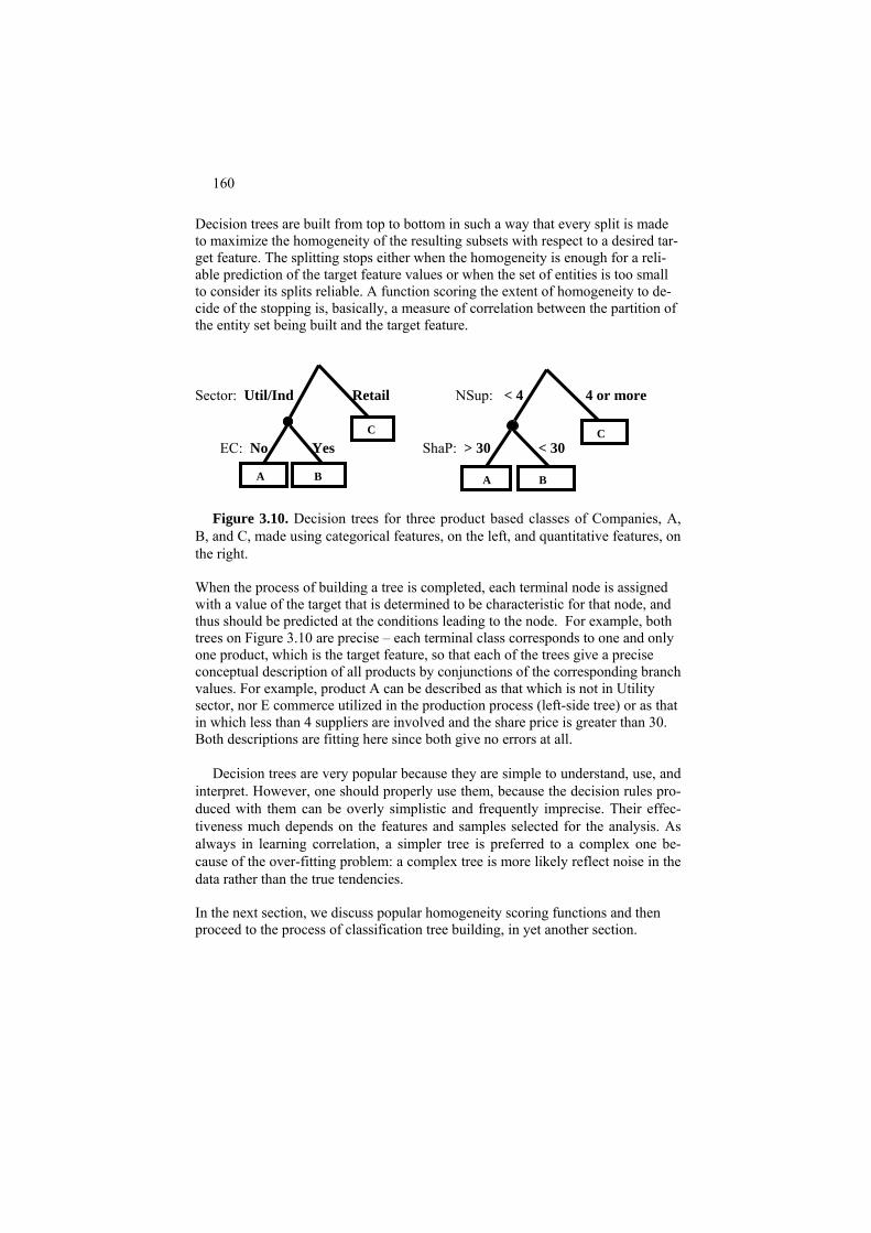
160
Decision trees are built from top to bottom in such a way that every split is made to maximize the homogeneity of the resulting subsets with respect to a desired tar-get feature. The splitting stops either when the homogeneity is enough for a reli-able prediction of the target feature values or when the set of entities is too small to consider its splits reliable. A function scoring the extent of homogeneity to de-cide of the stopping is, basically, a measure of correlation between the partition of the entity set being built and the target feature.
Sector: Util/Ind Retail NSup: < 4 4 or more EC: No Yes ShaP: > 30 < 30
A B
C
A B
C
Figure 3.10. Decision trees for three product based classes of Companies, A, B, and C, made using categorical features, on the left, and quantitative features, on the right. When the process of building a tree is completed, each terminal node is assigned with a value of the target that is determined to be characteristic for that node, and thus should be predicted at the conditions leading to the node. For example, both trees on Figure 3.10 are precise – each terminal class corresponds to one and only one product, which is the target feature, so that each of the trees give a precise conceptual description of all products by conjunctions of the corresponding branch values. For example, product A can be described as that which is not in Utility sector, nor E commerce utilized in the production process (left-side tree) or as that in which less than 4 suppliers are involved and the share price is greater than 30. Both descriptions are fitting here since both give no errors at all.
Decision trees are very popular because they are simple to understand, use, and interpret. However, one should properly use them, because the decision rules pro-duced with them can be overly simplistic and frequently imprecise. Their effec-tiveness much depends on the features and samples selected for the analysis. As always in learning correlation, a simpler tree is preferred to a complex one be-cause of the over-fitting problem: a complex tree is more likely reflect noise in the data rather than the true tendencies. In the next section, we discuss popular homogeneity scoring functions and then proceed to the process of classification tree building, in yet another section.
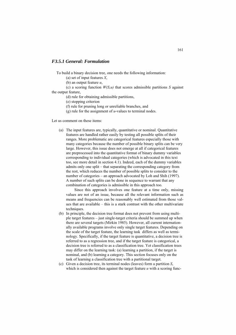
161
F3.5.1 General: Formulation
To build a binary decision tree, one needs the following information: (a) set of input features X, (b) an output feature u, (c) a scoring function W(S,u) that scores admissible partitions S against
the output feature, (d) rule for obtaining admissible partitions, (e) stopping criterion (f) rule for pruning long or unreliable branches, and (g) rule for the assignment of u-values to terminal nodes.
Let us comment on these items:
(a) The input features are, typically, quantitative or nominal. Quantitative
features are handled rather easily by testing all possible splits of their ranges. More problematic are categorical features especially those with many categories because the number of possible binary splits can be very large. However, this issue does not emerge at all if categorical features are preprocessed into the quantitative format of binary dummy variables corresponding to individual categories (which is advocated in this text too, see more detail in section 4.1). Indeed, each of the dummy variables admits only one split – that separating the corresponding category from the rest, which reduces the number of possible splits to consider to the number of categories – an approach advocated by Loh and Shih (1997). A number of such splits can be done in sequence to warrant that any combination of categories is admissible in this approach too.
Since this approach involves one feature at a time only, missing values are not of an issue, because all the relevant information such as means and frequencies can be reasonably well estimated from those val-ues that are available – this is a stark contrast with the other multivariate techniques.
(b) In principle, the decision tree format does not prevent from using multi-ple target features – just single-target criteria should be summed up when there are several targets (Mirkin 1985). However, all current internation-ally available programs involve only single target features. Depending on the scale of the target feature, the learning task differs as well as termi-nology. Specifically, if the target feature is quantitative, a decision tree is referred to as a regression tree, and if the target feature is categorical, a decision tree is referred to as a classification tree. Yet classification trees may differ on the learning task: (a) learning a partition, if the target is nominal, and (b) learning a category. This section focuses only on the task of learning a classification tree with a partitional target.
(c) Given a decision tree, its terminal nodes (leaves) form a partition S, which is considered then against the target feature u with a scoring func-
162
tion measuring the overall correlation W(S,u). This suggests a context of the analysis of correlation between two features, see sections 2.2 and 2.3. If the target u is quantitative, then a tabular regression of u over S should be analyzed and scored. Unfortunately, in the data mining literature, this natural approach is not appreciated; thus, the most natural scoring func-tion, the correlation ratio, is not popular. In contrast, at a categorical tar-get, two most popular scoring functions, Gini index and Pearson chi-squared, fit perfectly in the framework of contingency tables and Quetelet indexes described in section 2.3, as will be shown in this section further on. Moreover, it will be mathematically proven that these two can be considered as implementations of the same approach of maximiz-ing the contribution to the data scatter of the target categories – the only difference being the way the dummy variables representing the categories are normalized: (i) no normalization to make it Gini index or (ii) nor-malization by Poissonian standard deviations so that less frequent catego-ries get more important, to make it Pearson chi-squared. This sheds a fresh light on the criteria and suggests the user a way for choosing be-tween the two.
(d) Admissible partitions conventionally are obtained by splitting the entity set corresponding to one of the current terminal nodes over one of the features. To make it less arbitrary, most modern programs do only binary splits. That means that any node may be split only in two parts: (i) that corresponding to a category and the rest for a categorical feature or (ii) given an a, those “less than a” and those “greater than a”, for a quantita-tive feature. This text attends to this approach as well. All possible splits are tested and that producing the largest value of the criterion is actually made, after which the process is reiterated.
(e) Stopping rule typically assumes a degree of homogeneity of sets of enti-ties, that is, clusters, corresponding to terminal nodes and, of course, their sizes: too small clusters are not stable and should be excluded.
(f) Pruning: In some programs, the size of a cluster is unconstrained so that in the process of splitting nodes over features, some split parts may be-come very small and, thus, unreliable as terminal nodes. This makes it useful to prune the tree after it is computed, usually by merging the small subset nodes into greater agglomerations. This is typically done not ac-cording to the splitting criterion W(S,u) but according to more local con-siderations such as testing whether proportions of the target categories in a cluster are similar to those used at the assignment of u values to termi-nal nodes or by removing nodes with small chi-squared values (see, for a review, Esposito et al. 1997).
(g) Assigning a terminal node with a u category conventionally is done by just averaging its values over the node entities if u is quantitative or ac-cording to the maximum probability of an u category. Then the quality of quantitative prediction is accessed, as usual, by computing the differ-ences between observed and predicted values of u, and their variance of course. In the nominal target case, this leads to an obvious estimate of the

163
probability of the error: unity minus the maximum probability; these then are averaged over the terminal nodes of the decision tree. To make the er-ror’s estimate more robust, cross-validation techniques are used. Con-sider, say, a ten fold cross validation. The entity set is randomly divided into ten equal-sized subsets. Each of them is used as a testing ground for a decision tree built over the rest: these errors are averaged and given as the error’s estimate to the tree built over the entire entity set. These tech-niques are beyond the scope of the current text.
It should be mentioned that the assignment of a category to a terminal
cluster in the tree can be of an issue in some situations: (i) if no obvious winning category occurs in the cluster, (ii) if the category of interest is quite rare, that is, when u’s distribution is highly skewed. In this latter case using Quetelet coefficients relating the node proportions with those in the entire set may help by revealing some great improvements in the proportions, thus leading to interesting tendencies discovered.
3.5.2 Measuring correlation for classification trees
P3.5.2 Three approaches to scoring the split-to-target correlation: Presentation
The process of building a classification tree is, basically, a process of splitting clusters into smaller parts driven by a measure of correlation between the partition S being built and the target feature u. Since our focus here is the case of nominal u’s only, the target feature is represented by a partition T which is known to us on the training set.
How to define a function w(S,T) to score correlation between the target parti-
tion T and partition S being built? Three possible approaches are:
1. A popular idea is to use a measure of uncertainty, or impurity, of a par- tition and score the goodness of split S by the reduction of uncertainty achieved when the split is made. If it is Gini index, or nominal variance, which is taken as the measure of uncertainty, the reduction of uncertainty is the popular impurity function utilized in a popular decision tree build-ing program CART (Breiman et al. 2004). If it is entropy, which is taken as the measure of uncertainty, the reduction of uncertainty is the popular Information gain function utilized in another popular decision tree build-ing program C4.5 (Quinlan 1993).

164
2. Another idea would be to use a popular correlation measure defined over
the contingency table between partitions S and T such as Pearson chi-squared. Indeed Pearson chi-squared is used for building decision trees in one more popular program, SPSS (Green, Salkind 2003), as a criterion of statistical independence criterion, though, rather than a measure of asso-ciation. Yet because Pearson chi-squared is equal to the summary relative Quetelet index (see section 2.3), it is a measure association, and it is in this capacity that Pearson chi-squared is used in this text. Moreover, both the impurity function and Information gain mentioned above also are cor-relation measures defined over the contingency table as shown in the formulation part of this section. Indeed, the Information gain is just the mutual information between S and T, a symmetric function, and the im-purity function, the summary absolute Qutelet index.
3. One more idea comes from the discipline of analysis of variance in statistic
(see section 2.2): the correlation can be measured by the proportion of the target feature variance taken into account by the partition S. How come? The variance is a property of a quantitative feature, and we are talking of a target partition here. The trick is that each class of the target partition is represented by the corresponding dummy feature, which is equal to 1 at en-tities belonging to the class and 0 at the rest. Each of them can be treated as quantitative, as explained in section 1.3, so that the summary explained proportion would make a measure of correlation between S and T. What is nice in this approach, that it is uniform across different types of feature scales: both categorical and quantitative features can be treated the same, which is not the case with other approaches. Although this approach has been advocated by the author for a couple of decades (see, for example, Mirkin 1996 and 2005), no computational program has come out of it so far. There is a good news though: both the impurity function and Pearson chi-squared can be expressed as the summary explained proportion of the target variance, under different normalizations of the dummy variables course. To get the impurity function (Gini index), no normalization is needed at all, and Pearson chi-squared emerges if each of the dummies is normalized by the square root of its frequency. That means that Pearson chi-squared is underlied by the idea that more frequent classes are less con-tributing. This might suggest the user to choose Pearson chi-squared if they attend to this idea, or, in contrast, the impurity function if they think that the frequencies of target categories are irrelevant to their case.
There have been developed a number of myths about classification tree build-
ing programs and correlation scoring functions involved in them. The following comments are purported to shed light on some of them.

165
Comment 3.1. There is an opinion lurking in some comments on the web that of two popular programs CART (Breiman et al. 1984) and CHAID (Green and Salkind 2007), the former is more oriented at prediction whereas the latter, at de-scription. The reason for this perhaps can be traced to the fact that CART involves the impurity function that is defined as the reduction in uncertainty whereas CHAID involves Pearson chi-squared as a measure of the deviation from statisti-cal independence. Yet this opinion is completely undermined by bthe fact that they have very similar predictive powers shaped as the summary Quetelet indexes, the only difference being that one of them uses relative indexes, and the other abosolute ones (see Statements 3.5.2.1 (b) and 3.5.2.2 (b)). Comment 3.2. The difference between impurity function and Pearson chi-squared amounts to just different scaling options for the dummy variables representing classes of the target partition T (see items (c) in Statements 3.5.2.1 and 3.5.2.2). The smaller T classes get rescaled to larger values, thus contributing more, when using Pearson chi-squared. Comment 3.3. Pearson chi-squared introduced to measure the deviation of a bivariate distribution from the statistical independence appears also to signify a purely geometric concept, the contribution to the data scatter (see (a) and (c) in Statement 3.5.2.2 on p. …). This leads to a different advice regarding the zeros in a contingency table. According to classical statistics, the presence of zeros in a contingency table contradicts the hypothesis of statistical independence. How-ever, in the context of data scatter decompositions, the chi-squared is just a contri-bution with no statistical independence involved so that the presence of zeros is of no issue in this context.
F3.5.2 Scoring functions for classification trees: Formulation.
F.3.5.2.1 Conventional definitions and Quetelet coefficients
Consider an entity set I with a pre-specified partition T={Tl} – which can be set according to categories l of a nominal feature – that is to be learnt by producing a classification tree. At each step of the tree building process, a subset J⊆ I is to be split into a partition S={Sk} in such a way that S is as close as possible to T(J) which is the overalp of T and J. The question is: how the similarity between S and T(J) is to be measured? When S=T(J), there is no confusion between the two. Otherwise, it is the contingency table (see section 2.3) between S and T(J), P=(pkl) where pkl is the proportion of J- entities in Sk∩Tl, that expresses the confusion, which is why it is frequently referred to as a confusion table in this context.
166
One idea for assessing the extent of similarity is to use a correlation measure over the contingency table such as averaged Quetelet coefficients, Q and A, or chi-squared X2, as discussed in section 2.3.
Seemingly another idea is to score the extent of reduction of uncertainty over
T(J) obtained when S becomes available. This idea works like this: take a measure of uncertainty of a feature, in this case partition T(J), υ(T(J)), and evaluate it at each of S-classes, υ(T(Sk)), k=1,…, K. Then the average uncertainty on these classes will be , where p
1( ( ))K
kkp T Sυ+=∑ k
k
k+ are proportions of entities in classes
S , so that the reduction of uncertainty is equal to k
1( ( ) / ) ( ( )) ( ( ))K
kkT J S T J p T Sυ υ υ+=
= −∑ (3.16)
Of course a function like (3.16) can be considered a measure of correlation
over the contingency table P as well, but a nice feature of this approach is that it can be extended from nominal features to quantitative ones – just with an uncer-tainty index over quantitative T-features (see Q.3.11)
Two very popular measures defined according to (3.16) are so-called impurity
function (Breiman at al. 1984) and information gain (Quinlan 1993). The impurity function builds on Gini coefficient as a measure of uncertainty
(see section 1.3). Let us recall that Gini index for partition T is
where p
21
( ) 1 Lll
G T p=
= − ∑l is the proportion of entities in Tl. If J is partitioned in clusters Sk, k=1,…,
K, partitions T and S form a contingency table of relative frequencies P=(pkl). Then the reduction (3.16) of the value of Gini coefficient due to partition S is equal to ( ( ), ) ( ( )) ( ( ))kk
T J S G T J p G T SΔ = − k∑ . This index Δ(T(J),S) is referred
to as impurity of S over partition T. The greater the impurity, the better the split S. It is not difficult to prove that Δ(l,S) relates to Quetelet indexes from section
2.2. Indeed, Δ(T,S)= A(T,S) where A(T,S) is the summary absolute Quetelet index defined by equation (2.22) in Q.2.24. Indeed,
where p2( , ) ( ) ( ( ) 1 ( / ),k k l k kl kk l k lT S G T p G T S p p p pΔ + += − = − − −∑ ∑ ∑ ∑ 2
+
2l +
+l is
the proportion of l-th category (class) in set J. This implies indeed that 2( , ) / ,kl k ll
T S p p pΔ += −∑ ∑ which proves the statement.
The information gain function builds on entropy as a measure of uncertainty
(see section 1.3). Let us recall that entropy of partition T is where p
1( ) log( )L
llH T p p
== −∑ l is the proportion of entities in Tll . If J is parti-
tioned in clusters Sk, k=1,…, K, partitions T and S form a contingency table of
167
relative frequencies P=(pkl). Then the reduction (3.16) of the value of entropy due to partition S is equal to ( ( ), ) ( ( )) ( ( ))kk kI T J S H T J p H T S= − ∑ . This index
I(T(J),S) is referred to as the information gain due to S. In fact, it is equal to a popular characteristic of the cross-classification of T and S, the mutual information defined as I(T,S)=H(T)+H(S) – H(ST) where H(ST) is entropy of the bivariate dis-tribution represented by contingency table P. (The J argument is omitted here as irrelevant to the statement.)
Please note that the mutual information is symmetric with regard to S and T, in contrast to the impurity function. To prove the statement let us just put forward the definition of the information gain and use the property of logarithm that log(a/b)=log(a)-log(b):
( , ) ( ) ( ( ) ( ) ( log( / )k k k kl kl kk k l
I T S H T p H T S H T p p p p+ += − = +∑ ∑ ∑ =
,( ) log( ) log( ) ( ) ( ) ( ),k k kl klk k l
H T p p p p H T H S H S+ += − + = + −∑ ∑ T
e.
which completes the proof. The reduction of uncertainty measures are absolute differences that much de-
pend on the measurement scale and, also, on values of υ(T) and υ(S). This is why it can be of advantage to use relative versions of the reduction of uncertainty measures normalized by υ(T) or υ(S) or both. For example, popular program C4.5 (Quinlan 1993) uses the information gain normalized by H(S) and referred to as the information gain ratio.
F3.5.2.2 Confusion measures as contributions to the data scatter
Once again we consider a nominal feature over an entity set I of cardinality N (in fact, I and N can be changed for any other symbols – these are just notations in this section), represented by partition T={Tl}, and a clustering partition S={Sk} designed from available features to approximate T. This time, though, we are not going to use their contingency table P=(pkl), to see the co-occurrence frequencies pkl emerging from a different perspectiv
Specifically, assign each target class (category) Tl with a binary variable xl, a
dummy, which is just a 1/0 N-dimensional vector whose elements xil =1 if i∈ Tl and xil =0, otherwise (l=1,…, L). Use these dummies as quantitative features to build a tabular regression of each over the partition S. Consider, first, the average of xl within cluster S : the number of unities among xk il with i∈S is obviously Nk kl, the size of the intersection Sk∩Tl because xil =1 only if i∈Sk. That means that the within S average of xk l is equal to ckl=Nkl/N where N stands for the size of Sk+ k+ k, or, pkl/p in terms of the relative contingency table P. k+

168
Let us now standardize each feature xl by a scale shift al and rescaling factor 1/bl, according to the conventional formula yl =(xl –al)/bl. This will correspondingly change the averages, so that within-cluster averages of standardized features yl are equal to ckl =(pkl/p - ak+ l)/bl. In mathematical statistics, the issue of standardization is just a routine transforming the probabilistic density function to a standardized format. Things are different in data analysis, since no density function is assigned to data usually. The scale shift is considered as positioning the data against a backdrop of the “norm”, whereas the act of rescaling is to balance feature “weights” (see section 4.1 for discussion). Therefore, choosing the feature means as the ‘norms” should be reasonable. The mean of feature xl is obviously the proportion of unities in it, which is p+l in notations related to contingency table P. In fact, the remainder of this section can be considered as another reason for using al =p+l.The choice of rescaling factors is somewhat less certain, though using all bl =1 should seem reasonable too because all the dummies are just 1/0 variables measured in the same scale. Incidentally, 1 is the range of xl. Some other values related to xl′s dispersion could be used as well. With the scale shift value specified, the within cluster average can be expressed as
.kl k lkl
p
k l
p pcp b
+ +−= (3.17)
2K
+
Let us refer to formula (2.13) in which the feature scatter is presented as the sum of two parts, one explained by partition S and the other unexplained. Using
section, the explained part of xsymbolic of this l′s scatter can be expressed as
1l k kl
kB N c= ∑ . This is the sum of contributions of individual clusters. By using
(3.17) each of the individual contributions is equal to
+=
2 2( ) ( )kv k l kv k lp p p p p pB N N+ + + +− −
= = (3.18)
total scatter of the set of standard
2 2 2kl kk l k lp b p b+
+ +
Accordingly, the total contribution of partition S to the ized dummies representing partition T is equal to
2
21 1 1 1
klk l k l k lp b= = = = +
The total contribution (3.19) reminds us of both the averaged relative Quetelet coefficient (2.19) and the averaged absolute Quetelet coefficient (2.22). The latter, up to the constant N of course, e at all rescaling factors b
( )( / )K L K L
kv k lp p pB T S B N + +−= =∑∑ ∑∑ (3.19)
merges l=1. The former emerges when rescaling factors l lb p= . The square root of the frequency has an
appropriate meaning – this is a good estimate of the standard deviation in Poisson model of the variable: according to this model, N+l unities are thrown randomly
169
into the fragment of memory assigned for the storage of vector xl. In fact, at this scaling system, B(T/S)=X2, Pearson chi-squared!
Let us summarize the proven facts.
Statement 3.4.2.1. The impurity function can be equivalently expressed as (a) The reduction of Gini uncertainty index of partition T when partition S is
taken into account; ( / ) /kl k la l k p p p+ += −(b) The averaged absolute Quetelet index of the same
effect; (c) The total contribution of partition S to the summary data scatter of the set of
dummy 1/0 features corresponding to classes of T and standardized by subtracting the mean with no rescaling.
Statement 3.4.2.2. The Pearson chi-square function can be equivalently expressed as
(a) A measure of statistical independence between partitions T and S; ( / ) ( / ) /kl k l lq l k p p p p+ +(b) The averaged relative Quetelet index += − be-
tween partitions T and S; (c) The total contribution of partition S to the summary data scatter of the set of
dummy 1/0 features xl corresponding to classes Tl and standardized by subtracting the mean and dividing the result by l lb p= .
Statement 3.4.2.3. The information gain can be equivalently expressed as
(a) The reduction of entropy of partition T when partition S is taken into ac-count;
(b) The mutual information H(T)+H(S) - H(TS) between T and S; The claims of equivalence in statements 3.4.2.1 and 3.4.2.2, although having been published (see, for example Mirkin 1996) are virtually unknown, probably be-cause they have been never formulated in the context of classification trees.
C.3.5.2 Computing scoring functions with MatLab: Computation
Three functions discussed above, Gini index, Pearson chi-squared, and Infor-mation gain can be coded as presented in columns of the box below where input p is a contingency matrix. Due to a holistic nature of MatLab computation, it is pos-sible to organize the computation without looping through the matrix elements. The subroutines gini, chi and ing in the box can be considered pseudocodes of the functions for coding in any other language as well.
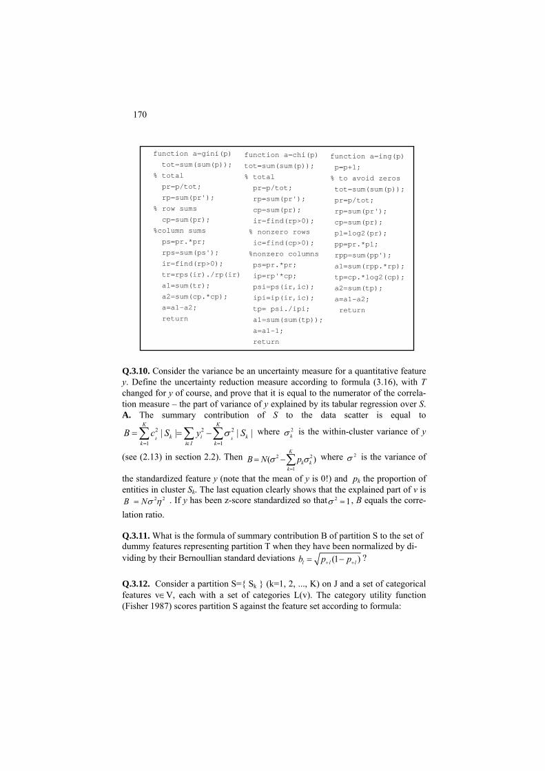
170
function a=gini(p) function a=chi(p) function a=ing(p) tot=sum(sum(p)); tot=sum(sum(p)); p=p+1;
% total % total % to avoid zeros pr=p/tot; pr=p/tot; tot=sum(sum(p)); rp=sum(pr'); rp=sum(pr'); pr=p/tot; % row sums cp=sum(pr); rp=sum(pr'); cp=sum(pr); ir=find(rp>0); cp=sum(pr); %column sums % nonzero rows pl=log2(pr); ps=pr.*pr; ic=find(cp>0); pp=pr.*pl; rps=sum(ps'); %nonzero columns rpp=sum(pp'); ir=find(rp>0);
Q.3.10. Consider the variance be an uncertainty measure for a quantitative feature y. Define the uncertainty reduction measure according to formula (3.16), with T changed for y of course, and prove that it is equal to the numerator of the correla-tion measure – the part of variance of y explained by its tabular regression over S. A. The summary contribution of S to the data scatter is equal to
where 2 2 2
1 1| | | |
k k
K K
k ik i I k
B c S y Sσ= ∈ =
= = −∑ ∑ ∑ k2kσ is the within-cluster variance of y
(see (2.13) in section 2.2). Then B N 2
1( )
K
k kk
2pσ σ=
= −∑ where 2σ is the variance of
the standardized feature y (note that the mean of y is 0!) and pk the proportion of entities in cluster Sk. The last equation clearly shows that the explained part of v is
2 2B Nσ η= . If y has been z-score standardized so that 2 1σ = , B equals the corre-lation ratio. Q.3.11. What is the formula of summary contribution B of partition S to the set of dummy features representing partition T when they have been normalized by di-viding by their Bernoullian standard deviations (1 )l l lp+ += −b p ? Q.3.12. Consider a partition S={ Sk } (k=1, 2, ..., K) on J and a set of categorical features v∈V, each with a set of categories L(v). The category utility function (Fisher 1987) scores partition S against the feature set according to formula:
tr=rps(ir)./rp(ir) ps=pr.*pr; a1=sum(rpp.*rp); ip=rp'*cp; tp=cp.*log2(cp);
a1=sum(tr); psi=ps(ir,ic); a2=sum(tp); a2=sum(cp.*cp); ipi=ip(ir,ic); a=a1-a2; a=a1-a2; tp= psi./ipi; return return a1=sum(sum(tp)); a=a1-1;
return

171
2 2
1 ( ) ( )
1( ) [ ( / ) ( ) ]K
k kk v V l L v v V l L v
u S p p v l S p v lK = ∈ ∈ ∈ ∈
= = −∑ ∑ ∑ ∑ ∑ =
The term in the square brackets is the increase in the expected number of attribute values that can be predicted given a class, Sk, over the expected number of attrib-ute values that could be predicted without using the class. The assumed prediction strategy follows a probability-matching approach. According to this approach, en-tities arrive one-by-one in a random order, and the category l is predicted for them with the frequency reflecting its probability, P(l/k) if the class Sk is known, or pk = Nk /N if information of the class Sk is not provided. Factors pk weigh classes Sk ac-cording to their sizes, and the division by K takes into account the differences in the numbers of clusters: the smaller the better. Prove that the category utility func-tion u(S) is the sum of impurity functions Δ(l,S) over all features l∈L related to the number of clusters, that is, u(S)= ( , ) / .
l Ll S KΔ
∈∑
3.5.3 Building classification trees
Building of a classification tree is a recursive process: starting from the entire data set, partition a cluster into a number of parts according to one of the features. To make the partitions less arbitrary, only binary splits are involved in most of the update programs. That means that any node may be split only in two parts: (i) that corresponding to a category and the rest, for a categorical feature, or (ii) given a threshold a, those “less than or equal to a” and those “greater than a”, for a quanti-tative feature. This approach naturally comes when the data are preprocessed by “enveloping” categories into the corresponding “quantitative” dummy features, that assign a unity to every object falling into the category, and a zero to all the rest. Indeed, at a=0, such a dummy feature would split the set in two parts – that for the corresponding category and the rest. Given a cluster, the choice of feature and threshold a for doing the split is driven by a correlation scoring function, be it Information gain, Pearson chi-squared, Gini index or anything else.
A cluster is not to be split anymore if it is smaller than a user defined threshold
TS (TS=10 is set further on) or is homogeneous enough. We use two different homogeneity tests: (a) large enough proportion of a target category in the cluster, say, above 80%, and (b) small enough value of the scoring function which is set to be 0.03 for Gini index, 0.08 for Pearson chi-squared, and 0.15 for Information gain. These levels of magnitude reflect the functions’ ranges: Gini index is very close to 0 hardly reaching 0.5 at all, Pearson chi-squared, related to N, changes be-tween 0 and 1 because it cannot be greater than the number of split parts minus 1, and Information gain can have larger values when the number of target categories is 3 or more. This sets the stopping conditions.

172
Worked example 3.3. Classification tree for Iris dataset. At Iris dataset with its three taxa, Iris setosa and Iris versicolor and Iris virginica, taken as target categories, all the three scoring functions – Impurity (Gini) function, Pearson chi-squared and Information gain – lead to the same classification tree, presented on Fig. 3.11. The tree was found with program clatree.m. It comprises three leaf clusters: A, consisting of all all 50 Iris setosa specimens; B, containing 54 entities of which 49 are of Iris versi-color and 5 of Iris virginica; C, containing 46 entities of which 45 are of Iris virginica and 1 of Iris versicolor. Altogether, this misplaces 6 entities leading to the accuracy of 96%. Of course, the accuracy would somewhat diminish if a cross-classification scheme is applied (see Loh and Shih, 1997, who draw a slightly different tree for Iris dataset).
Ve Vir
S
Petal width: >0.6 ≤0.6 P
etal width: ≤1.7 >1.7
Figure 3.11. Classification tree for the three-taxa partition at Iris dataset found by using
Gini, Pearson chi-squared and Information gain scoring functions. Table 3.13. Values of Gini index at the best split of each feature on Iris dataset clusters in Figure 3.11.
First split Second split Feature Value Gini Value Gini w1 5.4 0.228 6.1 0.107 w2 3.3 0.127 2.4 0.036 w3 1.9 0.333 4.7 0.374 w4 0.6 0.333 1.7 0.390
Let us take a look at the action of each variable at each of the two splits in Table 3.13. Each time features w3 and w4 appear to be most contributing, so that at the first split, at which w3 and w4 give the same impurity value, w4 made it through just because it is the last maximum which is remembered by the program. The tree involves just one feature, w4: Petal width, split twice, first at 0.6 value and then at 1.7 value. The Pearson chi-squared value (related to N of course) is 1 at the first split and 0.78 at the second. The Impurity function grows by 0.33 at the first split and 0.39 at the second. The fact that the second value is greater than the first one may seem to be some-what controversial. Indeed, the first split is supposed to be the best, so that it is the first value that ought to be maximum. Nevertheless, this opinion is wrong: if the first split was at w4=1.7 that would generate just 0.28 of impurity value, less than the optimal 0.33 at

173
w4=0.6. Why? Because the first taxon has not been extracted yet and grossly contributes to a higher confusion (see the top part in Table.3.14). Table 3.14. Confusion tables between a split and target partition on Iris dataset.
Target partition classes Iris setosa Iris versi-color
Iris vir-ginica
Total Full set
w4≤1.7 50 49 5 104 0 1 45 w4>1.7 46
Total 50 50 50 150 First cluster removed w4≤1.7
0 49 5 54 0 1 45 46 w4>1.7
Total 0 50 50 100
Project 3.1. Prediction of learning outcome at Student data
Consider the Student dataset and ask whether students’ learning successes can be predicted from other features available (Occupation, Age, Number of children)? By looking at Table 0.5, it is hardly can be expected that marks can be predicted in this way. Therefore, let us divide students in three groups: I – not so good performers (average mark is less than 50), II – good performers (average mark between 50 and 70 inclusive), and III – excellent per-formers (average mark higher than 70). To do this, we compute the average mark over the three subjects (SE, OOP, and CI) and create a partition of students T as described; the dis-tribution of T appears to be I-25, II-58, III-17. We have a 100×5 matrix X to explore the correlation between X and T, the three columns, 1,2,3, being dummy variables for Occupation categories (IT, BA, AN), column 4 for Age, and column 5 for Number of children. The two conventional stopping criteria, the cluster’s size and prevalence of a target class, are not sufficient at this data, because after one or two splits, the program just chips away small fragments of clusters without much improving them. This corresponds to the situations at which the scoring function does not show much improvements either. Therefore, we utilize one more criterion – the minimum value of the scoring function below which there is no splitting. Since the three scoring functions we use have different ranges, the thresholds must be different too. At this study, the threshold is set at 0.03 for Gini index, 0.08 for Pearson chi-squared, and 0.15 for Information gain. The minimum cluster size is taken at 10, and the prevalence of a target class at 80%. The classification tree found with Gini index is presented on Figure 3.12. The distributions of target categories in clusters on Figure 3.12 are presented in Table 3.15. Bold font high-lights four terminal clusters as well as high or low proportions of target classes in clusters. High proportions here are those greater than 70% and low proportions are those smaller than 5%. Tree on Figure 3.12 is driven by two features: AN Occupation, that structures the set rather well – one split part, those of AN occupation, get more than 70% of category I, and none of

174
category III, and the other of category II. All further divisions are over feature Age; the 12 students in cluster 8 are rather specific – these are of AN occupation aged between 22 and
1: AN
6: 13
2: Age
7: 18
3: Age
4: 44 5: 25
8: 12
No Yes
≤35 >35 ≤28 >28
>21
Figure 3.12. Classification tree on students data targeting partition T of students in three categories found using Gini index. The legend Number: A presents, at a split cluster, A as the split variable or, at an unsplit cluster, A as the size (the number of students in it). Table 3.15. Distributions of target classes in clusters of tree on Figure 3.12, per cent
Target categories Clusters in tree on Figure 3.12 1 2 3 4 5 6 7 8 25.0 2.9 74.2 2.3 4.0 69.2 77.8 75.0 I 58.0 72.5 25.8 61.4 92.0 30.8 22.2 25.0 II 17.0 24.6 0 36.4 4.0 0 0 0 III
Gini index at split 0.168 0.046 0.035 0.048 Cluster size 100 69 31 44 25 13 18 12
28 leading to 75% of them in category I, an improvement over parental cluster 6. Cluster 4 of younger not-AN students seems an attempt at drawing a cluster to predict category III – it has a highest jump in its proportion, to 36.4% from 17% in the entire set (cluster 1). The 25 older people among not-AN students are overwhelmingly, 92%, in category II. More splits would have followed if we had decreased the minimum acceptable value of Gini in-dex, say from 0.03 to 0.01. How well this tree would fare at prediction? To address this question properly, one should either conduct a cross-classification test as explained in section 3.5.1 or set aside a random testing set before using the rest for building a tree, after which see the levels of errors on the testing set. Yet for the illustrative purposes, let us calculate the prediction error by using tree on Figure 3.12. This is done by using the terminal clusters 4, 5, 7, 8 comprising 44, 25, 18, 12 ele-ments, respectively. They total to 99, not 100, because of chipping off an element from cluster 6 to make it into cluster 7. That means: for students in AN category aged 21 or less, no prediction of their learning success level will be made; the classifier takes what is re-ferred to as reject option (comprising approximately 1% of future cases if our sample is rep-

175
resentative). According to the data in Table 3.15, the optimal prediction rule would predict then category II at cluster Cluster 4 (with error 100 – 61.4 = 38.6%), category II at cluster 5 (with error 100 – 92 = 8%), and category I at clusters 7 and 8 (with errors 22.2% and 25.0%, respectively). The average error is the sum of the individual cluster errors weighted by their relative sizes, (38.6*44+8*25+22.2*18+25*12)/99 = 26.2%. What happens, if we use the parental cluster 6 instead of the chipped cluster 8? First thing – no reject option is involved then. Second, the error somewhat increases as should be ex-pected: (38.6*44 + 8*25 + 22.2*18 + 30.8*13)/100= 27.0 %.
1: AN
2: 69 3: 31
1: AN (a) (b)
2: Age 3: 31
Figure 3.13. Classification trees on Student dataset targeting partition T of students in three categories found using Pearson chi-squared (a) and Information gain (b). The legends are of format Number: A where A, at a split cluster, is the split variable or, at an unsplit cluster, the cluster’s size. Figure 3.13 presents trees found by using Pearson chi-squared (a) and Information gain (b). In contrast to Gini index, decreasing the increment threshold does not much help at Infor-mation gain: chipping here and there rather than splits will be added. The change of split-ting Age value to 30 at cluster 2 on tree (a) does lead to some improvements: the 45 older students are 82.2% in category II. Yet among the 24 younger students, 45.8% belong to category III (leaving 54.2% in category II and 0 in category I). With this example, one can see that the 90-100% precision is not easy to achieve. That is, a terminal node may have rather modest proportions of target categories, like cluster 5 on Figure 3.13 (a): about 54% of II category and 46% of III category. Conventional thinking would label the node as an II category predictor because the share of II is greater than half. Yet, one should note that, in fact, the proportion 54% is smaller than that, 58%, in the entire set, which means that in fact these conditions, Not_AN and younger age, less than 31, wash out some of II category. It is a case when the style of Quetelet’s thinking may produce a better description. This thinking goes beyond proportions in the terminal node and requires comparing the category shares at the node with that in the whole sample. In contrast to a reduction of II category, this cluster boasts a dramatic increase of III category – from 17% in the entire set to 46% in the cluster, 29%. This difference would be picked up by the abso-lute Quetelet coefficient which is equal to Gini index. Even more dramatic is the relative increase, (45.8-17)/17=170%. It is this increase that has been picked up by Pearson chi-squared scoring function, because it is driven by the relative Quetelet coefficient.
Q.3.13. Drawing a lift chart in marketing research. Consider a marketing cam-paign advertising a product. There is a 1000 strong sample from the set of targeted customers whose purchasing behavior is known because of prior campaigns. The
4: 24 5: 45
No Yes
30 >30
No Yes
≤

176
sample is composed of clusters of a classification tree with different response (that is, purchasing) rates (see Table 3.16). To plan an effective campaign, marketing researchers use what is called a lift chart – a visual representation of the response rate.
Table 3.16. Proportions of four clusters in a sample of 1000 customers and
their purchasing behavior (response rate)
Cluster share, %
10 40 25 25
Response rate, %
30 10 4 0
The x-axis of a lift chart shows the percentiles of the sample, say, from 10% to
100%. On y-axis, the so-called lifts are presented. Given a group of customers, the lift is defined as the ratio of the group’s response rate to the baseline response rate, which is the response rate for the entire sample. On the lift chart, the percentiles of the sample are taken in the descending order of the lift. Both baseline and percen-tile lifts are presented on the chart. Build a lift chart for the sample. A. First, we calculate the baseline rate which is the average of the response rates in Table 3.16 weighted by the cluster proportions: r=0.1*30+0.4*10+0.25*4+0.25*0=8%. Now we take the most responsive 10% of the customers and calculate their lift value: 30/8=3.75. Next, we take the most responsive 20% of
10 20 30 40 50 60 70 80 90 1000
0.5
1
1.5
2
2.5
3
3.5
4
4.5
5
Percent of customers to contact
Lift
valu
e
Lift chart
Figure 3.14. Lift chart for data in Table 3.16.
the sample, that is the first cluster plus a hundred customers from the second clus-ter and see their response rate – there should be 30 customers from the first cluster plus 10 from the second who have purchased the product, which gives

177
40/200=20% response rate leading to the lift value of 20/8=2.5. Next percentile, 30% of the sample is composed of the first cluster plus 200 customers from the second cluster leading to 50/300=17.7% response rate and lift 2.2. In this way, chart presented on Figure 3.14 is computed.
C. 3.5.3 Building classification trees: Computation
Consider an entity set I along with a nominal target feature represented by partition T of I as well as a set of quantitative input features X (some or all of X-features may be binary dummy variables corresponding to categories). At each step of the process of building a classification tree a cluster J⊆I is to be split according to a feature xv from X in two clusters, S1 and S2 so that S1 ={i|i∈J and xiv ≤y} and S2 ={i|i∈J and xiv >y} where y is a value of xv. The choice of xv and y is guided by a scoring function W(S,T) defined over the contingency table P cross-classifying T by S. That implies that a cluster, as an element of the hierarchical structure being built, should maintain at least the following data: (i) its entity set, (ii) its parental cluster, (iii) feature xv over which it has been split, (iv) splitting value y, (v) the inequality, ≤ or >, in the cluster defining predicate. The process starts at the universal cluster consisting of the entire set I. The process stops if either of two conditions holds: (a) |J|<n, where n is a pre-specified threshold on the minimum number of entities in a cluster, and (b) if the frequency of a T-cluster is greater than a pre-specified threshold α. To make testing of (b) easier, each cluster should bear one more feature – (vi) the distribution of T in it. One more useful piece of data supplied with a cluster would be (vii) a signal of whether it may or may not be split again.
The recursive nature of the process, as well as the presence of a set of data to
accompany each cluster, would make it a fitting subject of an object oriented code. Yet since the object oriented part of MatLab is not quite native in it, a procedural construction will be described in this section. This construction involves two parts, provided that computing scoring function W(T,S) over contingency table P,has been implemented: (A) finding the best split over a feature, and (B) building a hi-erarchy of the best splits.
C.3.5.1 Finding the best split over a feature: Computation
A pseudocode, or MatLab, function, msplit.m, takes in a column-feature x, par-tition of the set of its indices, t, as a cell array of t-classes, and a string with the name of a scoring method. It produces partition s, the feature splitting value y, and the value of scoring function ma. The stages of computation are annotated within the code.

178
function [g,ma,y]=msplit(x,t,method) n=length(x); %-------preparing the set of split value candidates xv=union(x,x);%set of x values sorted ll=length(xv); rl=length(t); if ll==1 %feature x is constant g{1}=[1:n]; ma=0; y=max(x); else for k=1:(ll-1) %loop over splitting values f{1}=find(x<=xv(k)); %first split set f{2}=setdiff([1:n],f{1}); % the rest for ik=1:2; for il=1:rl p(ik,il)=length(intersect(f{ik},t{il})); end end % contingency table p switch method case 'gini' res=gini(p); case 'chi' res=chi(p); case 'ing' res=ing(p); otherwise disp('The method is wrong '); pause(10); end %----------looking for the best split if res>ma ma=res; g=f; y=xv(k); end end end
C3.5.2 Organizing a recursive split computation and storage
The computation is organized in code clatree.m printed in the appendix. Here are just a few comments on its structure. Consider a set of ss clusters stored in a

179
cell structure indexed from 1 to ss; in the beginning, the structure stores just the universal cluster I and its features at ss=1. Of these clusters, those in the end, start-ing from index tt≥ss are eligible for splitting. The newly split clusters are indexed by index bb starting from bb=ss+1. (Note that with this system of indexing, there is no need to assign clusters with a label informing that they should not be split anymore: the clusters to split can only be fresh ones!) After split parts are put in the structure, the indices are updated.
There can be a number of stopping criteria that are to be set in the very begin-
ning of the program: it stops when no clusters eligible for splitting remain. In the current version of program clatree.m, three types of stopping criteria are em-ployed. First is the number of entities, TS: a cluster with a smaller number of enti-ties cannot make it into the tree and of course cannot be split further. Second, the dominant proportion of the target classes, ee: a cluster is not split anymore if this has been reached. And the third stopping criterion is tin, a threshold on the scoring function value: if it is less then tin at a split, the cluster is not split.
3.6 Learning correlation with neuron networks
3.6.1 General
P3.6.1 Artificial neuron and neuron network: Presentation
Neuron network is one of the most popular structures used for predictions of target features. It is a network of artificial neurons modeling the neuron cell in a living organism. A neuron cell fires an output when its summary input becomes higher than a threshold. Dendrites bring signal in, axons pass it out, and the firing occurs via synapse, a gap between neurons, that makes the threshold (see Figure 3.15).
This is modeled in an artificial neuron as follows (see Figure 3.16). A neuron
model is drawn as a set of input elements connected to an output. The connections are assigned with wiring weights.
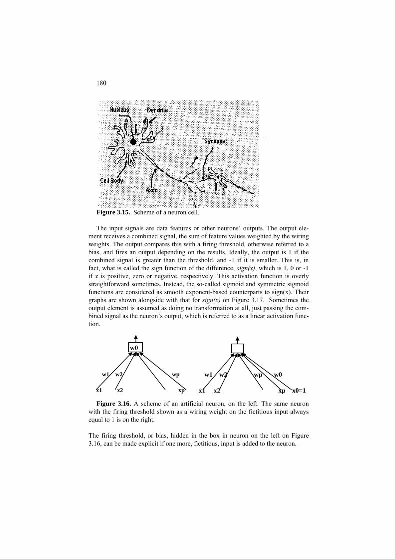
180
Figure 3.15. Scheme of a neuron cell. The input signals are data features or other neurons’ outputs. The output ele-
ment receives a combined signal, the sum of feature values weighted by the wiring weights. The output compares this with a firing threshold, otherwise referred to a bias, and fires an output depending on the results. Ideally, the output is 1 if the combined signal is greater than the threshold, and -1 if it is smaller. This is, in fact, what is called the sign function of the difference, sign(x), which is 1, 0 or -1 if x is positive, zero or negative, respectively. This activation function is overly straightforward sometimes. Instead, the so-called sigmoid and symmetric sigmoid functions are considered as smooth exponent-based counterparts to sign(x). Their graphs are shown alongside with that for sign(x) on Figure 3.17. Sometimes the output element is assumed as doing no transformation at all, just passing the com-bined signal as the neuron’s output, which is referred to as a linear activation func-tion.
w1 w2 wp x1 x2 xp
w0
w1 w2 wp w0 x1 x2 xp x0=1
Figure 3.16. A scheme of an artificial neuron, on the left. The same neuron with the firing threshold shown as a wiring weight on the fictitious input always equal to 1 is on the right.
The firing threshold, or bias, hidden in the box in neuron on the left on Figure 3.16, can be made explicit if one more, fictitious, input is added to the neuron.

181
Figure 3.17. Graphs of sign (a), sigmoid (b) and symmetric sigmoid (c) func-
tions.
(a) (b) (c)
This input is always equal to 1 so that its wiring weight is always added to the combined input to the neuron. It is assumed to be equal to minus the bias so that the total sum is the difference between the combined signal and the bias. In the remainder, we assume that the bias, with the minus sign, is always explicitly pre-sent among the wiring weights in this way (see Figure 3.16 on the right).
Artificial neurons can be variously combined in neural networks. There have
been defined many specific types of neuron network structures, referred to as ar-chitectures, of which the most generic is a three-layer structure with no feedback connections, such as presented on Figure 3.18 in the next section. There are two outbound layers, the input and output ones, and one intermediate layer which is re-ferred to as a hidden layer. This is why such a structure is referred to as a one hid-den-layer neuron network (NN).
Network on Figure 3.18 is designed as a one-hidden-layer NN for predicting
petal sizes of Iris features from their sepal sizes. Recall that in Iris data set, each of 150 specimens is presented with four features which are the length and width of petals (features w3 and w4) and sepals (features w1 and w2). It is likely that the sepal sizes and petal sizes are related.
In fact, the further material can be used for building an NN for modeling correla-tion between any inputs and outputs – the only possible difference, in numbers of input and/or output units, plays no role in the organization of computations.
This neural network consists of the following layers:
(a) Input layer that accepts three inputs: a bias input x0=1 as explained above (see Figure 3.16 on the right) as well as sepal length and width; these are combined to be inputs to each of the neurons at the hidden layer.
(b) Output layer producing an estimate for petal length and width with a linear activation function. Its input is the output signals from the hidden layer. No fictitious input x0=1 is assumed here because the activation function here just passes the combined signal through without a threshold.
(c) Hidden layer consisting of three neurons. Each of them takes a com-bined input from the first layer and applies to it its sigmoid activation function. The output signals of these three neurons constitute inputs to

182
the output layer. The architecture allows for any number of hidden neurons with no changes in the computations.
The one-hidden-layer structure is generic in NN theory. It has been proven, for in-stance, that such a structure can exactly learn any subset of the set of entities. Moreover, any pre-specified mapping of inputs to outputs can be approximated up to a pre-specified precision with such a one-hidden-layer network, if the num-ber of hidden neurons is large enough (Tsybenko 1989).
F3.6.1 Activation functions and network function: Formulation
Two popular activation functions, besides the sign function ůi =sign(ûi), are the linear activation function, ůi = ûi and sigmoid activation function ůi =s(ûi) where
s(x) = (1+ e-x)-1 (3.16)
is a smooth analogue to the sign function, except for the fact that its output is be-tween 0 and 1 rather than -1 and 1 (see Figure 3.17 (b)). To imitate the perceptron with its sign(x) output, between -1 and 1, we first double the output interval and then subtract 1 to obtain what is referred to as a symmetric sigmoid or hyperbolic tangent:
th(x) =2s(x)-1= 2(1+ e-x)-1 - 1 (3.16’)
This function, illustrated on Figure 3.17 (c), in contrast to sigmoid s(x), is sym-metric: th(-x) = - th(x), like sign(x), which can be useful in some contexts.
The sigmoid activation functions have nice mathematical properties; they are
not only smooth, but their derivatives can be expressed through the functions themselves, see Q.3.14 and (3.24).
Let us express now the function of the one-hidden-layer neural network
presented on Figure 3.18. Its wiring weights between the input and hidden layer form a matrix W=(wih), where i denotes an input, and h a hidden neuron, h=1,2,..., H where H is the number of hidden neurons. The wiring weights between the hidden and output layers form matrix V=(vhk), where h denotes a hidden neuron and k an output.
Layers I and III are assumed to be linear giving no transformation to their in-
puts; all of the hidden layer neurons will be assumed to have a symmetric sigmoid as their activation function.
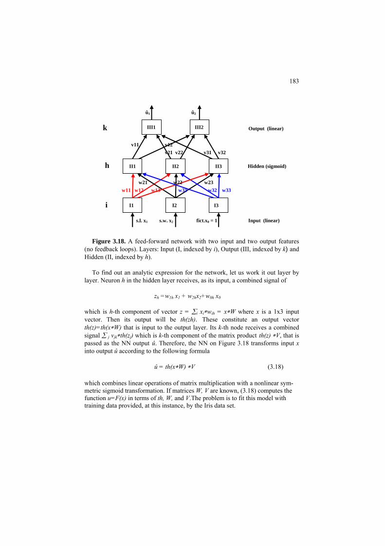
183
û1 û2
k Output (linear)
v11 v12 v21 v22 v31 v32
s.l. x1 s.w. x2 fict.x0 = 1 Input (linear)
III1 III2
II1 II2 II3
I1 I2 I3
h Hidden (sig w21 w22 w23
moid)
w31 w32 w33
i
w11 w12 w13
Figure 3.18. A feed-forward network with two input and two output features
(no feedback loops). Layers: Input (I, indexed by i), Output (III, indexed by k) and Hidden (II, indexed by h).
To find out an analytic expression for the network, let us work it out layer by
layer. Neuron h in the hidden layer receives, as its input, a combined signal of
zh =w1h x1 + w2hx2+w x0h 0
which is h-th component of vector z = ∑i xi∗wih = x∗W where x is a 1x3 input vector. Then its output will be th(zh). These constitute an output vector th(z)=th(x∗W) that is input to the output layer. Its k-th node receives a combined signal ∑ j vjk∗th(zj) which is k-th component of the matrix product th(z) ∗V, that is passed as the NN output û. Therefore, the NN on Figure 3.18 transforms input x into output û according to the following formula
û = th(x∗W) ∗V (3.18)
which combines linear operations of matrix multiplication with a nonlinear sym-metric sigmoid transformation. If matrices W, V are known, (3.18) computes the function u=F(x) in terms of th, W, and V.The problem is to fit this model with training data provided, at this instance, by the Iris data set.

184
3.6.2 Learning a multi-layer network
Given all the wiring weights W, between the input and hidden layers, and wiring weights V, between the hidden and output layers, as well as pre-specified hidden layer activation functions, the NN on Figure 3.18 takes an input of the sepal length and width and transforms it into estimates of the corresponding petal length and width.
The quality of the estimates can be measured by the average squared error. The
better adapted weights W and V are, the smaller the error. Where the weights come from? They are learnt from the training data.
Thus the problem is to estimate weight matrices W and V at the training data in
such a way that the average squared error is minimized. The machine learning paradigm is based on the assumption that a learning de-
vice adapts itself incrementally by facing entities one by one. This means that the full sample is assumed to be never known to the device so that global solutions, such as the orthogonal projection used in linear discrimination, are not applicable. In such a situation an optimization algorithm that processes entities one by one should be applied. Such is the gradient method, also referred to as the steepest de-scent.
This method relies on the so-called gradient of the function to be optimized.
The gradient is a vector that can be derived or estimated at any admissible solu-tion, that is, matrices W and V. This vector shows the direction of the steepest as-cent over the optimized function considered as a surface. Its elements are the so-called partial derivatives of the optimized function that can be derived according to rules of calculus. The gradient is useful for maximizing a criterion, but how one can do minimization with the steepest ascent? Easily, by moving in the opposite direction, that is, minus gradient.
Assume, we have some estimates of matrices W and V as well as their gradi-
ents, that is, matrices gW and gV, whose components express the steepest ascent direction of changes in W and V. Then, according to the method of steepest de-scent, the matrices V and W should be moved in the direction of –gW and –gV with the control of the length of the step by a factor referred to as the learning rate. The equations expressing the move from the old state to the new one are as fol-lows:
V(new)=V(old) –μ∗gV, W(new)=W(old) –μ∗gW (3.19)
where μ is the learning rate (step size). The importance of properly choosing the step size is illustrated on Figure 3.19.

185
old new W
Figure 3.19. The importance of properly choosing the step in the direction of the steepest descent: too big a leap, and the new state is hardly better than the old one.
The gradient of the criterion of squared error is defined by: (a) matrices W and
V, (b) error value itself, and (c) input feature values. This is why it is convenient to apply this approach when entities come in a sequence so that each individual en-tity gives an estimate of the gradient and, accordingly, the move to a new state of matrices W and V according to equations (3.19). The sequence of entities is natural when the learning is done on the fly by processing entities in the order of their ar-rival. In the situations when all the entities have been already collected in a data set, as the Iris data set, the sequence is organized artificially in a random order. Moreover, as the number of entities is typically rather small (as it is in the case of just 150 Iris specimens) and the gradient process is rather slow, it is usually not enough to process all the entities just once. The processing of all the entities in a random order constitutes an epoch. A number of epochs need to be executed until the matrices V and W are stabilized.
Worked example 3.4. Learning Iris petal sizes Consider, at any Iris specimen, its two sepal sizes as the input and its two petal sizes as
the output. We are going to find a decision rule relating them in the format of a one-hidden-layer NN.
Table 3.17. Relative error values in the predicted petal dimensions with full Iris data af-
ter 5,000 epochs.
Relative error, per cent Number of hidden neurons
Petal length Petal width
3 5.36 8.84 6 4.99 8.40 10 4.98 8.15

186
At the Iris data, the architecture presented on Figure 3.18 and program nnn.m imple-menting the error back propagation algorithm leads to the average errors at each of the out-put variables presented in Table 3.17 at different numbers of hidden neurons h. Note that the errors are given relative to feature ranges.
The number of elements in matrices V and W here are five-fold of the number of hidden
neurons, thus ranging from 15 at the current setting of three hidden neurons to 50 when this grows to 10. One can see that the increase in the numbers of hidden neurons does bring some improvement, but not that great – probably not worth doing.
Here are a few suggestions for further work on this example: 1. Find values of E for the errors reported in Table above. 2. Take a look at what happens if the data are not normalized.
3. Take a look at what happens if the learning rate is increased, or de-creased, ten times.
4. Extend the table above for different numbers of hidden neurons. 5. Try petal sizes as input with sepal sizes as output. 6. Try predicting only one size over all input variables.
Worked example 3.5. Predicting marks at Student dataset Let us embark on an ambitious task of predicting students mark at the Students data –
we partially dealt with this in section 3.4. The nnn.m program leads to the average errors in predicting student marks over three subjects, as presented Table 3.18 at different numbers of hidden neurons h. Surprisingly, the prediction works rather well: the errors are on the level of 3 points only, more or less independently on the number of hidden neurons utilized.
Table 3.18. Average absolute error values in the predicted student marks over all three
subjects, with full Student data after 5,000 epochs.
H |e1| |e2| |e3| # param.
3 2.65 3.16 3.17 27 6 2.29 3.03 2.75 54 10 2.17 3.00 2.64 90
F3.6.2 Fitting neuron networks and gradient optimization: Formulation
F3.6.2.1 Steepest descent for the square error criterion with linear rules

187
In machine learning, the assumption is that the decision rule is learnt incremen-tally by using entities one by one. That is, the global solutions involving the entire sample are not applicable. In such a situation an optimization algorithm that proc-esses entities one by one should be applied. The most popular is the gradient method, also referred to as the steepest descent.
This method relies on the gradient of the function to be optimized. If we are to
minimize function f(x) over x spanning a subspace D of the n-dimensional vector space Rn, we can utilize its gradient gf for this purpose. The gradient gf at x∈D is a vector consisting of the f’s partial derivatives over all components of x, under the assumption that a full derivative, geometrically corresponding to the tangential hyperplane, does exist. This vector shows the direction of the steepest ascent of f(x), so that its opposite vector –gf shows the opposite direction which is considered as that of the steepest descent of f(x). The method of steepest descent produces a sequence of points x(0), x(1), x(2), … starting from an arbitrary x(0) by using recursive equation
X(t+1)=x(t) –μt∗gf(x(t)) (3.19)
where parameter μt denotes the length of the step to go from x(t) in the direction of the steepest descent, referred to as the learning rate in machine learning. The sequence x(t) is guaranteed to converge to the minimum point at a constant μt = μ
if f(x) is strictly convex, so that there is a sphere of a finite radius such that f(x) is always greater than its lower part, as shown on the right of Figure 3.20 (see B. Polyak 1987).
Figure 3.20. A convex function, on the left and strictly convex function, on the
right. The process always converges for f(x) being a convex function if μt converges to 0 when t grows to infinity, but not too fast so that the sum of the series Σtμt is infinity. This guarantees that the moves from x(t) to x(t+1) are small enough to not over-jump the point of minimum but not that small to stop the sequence short of reaching the optimum by themselves.
x1 x2 x3 x4 x

188
Figure 3.21. Points x1 to x4 are points of local minimum for the function
whose graph is drawn with the line. The global minimum is only one of them, x4. In many cases, however, the only guarantee is that the sequence reaches a local
optimum depending on the starting point x(0) (see Figure 3.21). Luckily, the square error in the problem of linear discriminant analysis is strictly convex so that the steepest descent sequence converges to the optimum from any initial point. This gives rise to the following algorithm.
F3.6.2.2 Learning wiring weights with error back propagation
The problem of learning a neural network is to find weight matrices W and V minimizing the squared difference between u observed and û computed according to (3.20):
E=d(u,û) = <u - th(x*W)*V, u - th(x*W)*V >/2, (3.20)
over the training entity set. The division by 2 is made to avoid factor 2 in the de-rivatives of E that has been already encountered in section 3.6.1.
Specifically, with just two outputs on Figure 3.18, the error function is E = [(u1 – û1)2 + (u2 – û2)2 ]/2 (3.20’)
where e1 = u1 – û1 and e2 = u2 – û2 are differences between the actual and predicted values of the two outputs.
Steepest descent equations (3.19) for learning V and W can be written compo-
nent-wise:
vhk(t+1)=vhk(t) - μ∗∂E/∂vhk, wih(t+1)=wih(t) - μ∗∂E/∂wih (i∈I, h∈II, k∈III) (3.21) To make these computable, let us express the derivatives explicitly; first those at the output, over vhk:
∂E/∂vhk = - (uk – ûk) ∗∂ûk /∂vhk. To advance, notice that ∂ûk /∂vhk=th(zh), since ûk = ∑j th(zh) ∗vhk. Putting
this into equation above makes

189
∂E/∂vhk = - (uk – ûk) ∗th(zh). (3.22) Regarding the second layer, of W, let us find the derivative ∂E/∂wih which re-
quires more chain based derivations. Specifically, ∂E/∂wij = ∑k[-(uk – ûk) ∗∂ûk /∂wij]. Since ûk = ∑j th(∑i xi∗wij) ∗vjk, this can be expressed as ∂ûk /∂wij = vjk∗ th′(∑i xi∗wij) ∗xi. The derivative th′(z) can be expressed through th(z) as explained in Q.3.14
later, which leads to the following final expression for the partial derivatives: ∂E/∂wij=-∑k[(uk – ûk) ∗ vjk]∗(1+th(zj))(1-th(zj)) ∗xi/2 (3.23) Equations (3.19), (3.22) and (3.23) lead to the following rule for processing an
entity, or instance, in the back-propagation algorithm as applied to neural network on Figure 3.18.
1 Forward computation (of the output û and error). Given matrices V
and W, upon receiving an instance (x,u), the estimate û of vector u is computed according to the neural network as formalized in equation (3.18), and the error e = u – û is calculated.
2 Error back-propagation (for estimation of the gradient elements).
Each neuron receives the relevant error estimate, which is -ek = -(uk – ûk), for (3.22) for output neurons k (k=III1, III2) or -∑k[(uk – ûk) ∗ vhk], for (3.23) for hidden neurons h (j=II1, II2,
II3) [the latter can be seen as the sum of errors arriving from the output neurons according to the corresponding synapse weights]. These are used to adjust the derivatives (3.22) and (3.23) by multiplying them with local data depending on the input signal, which is th(zh), for neuron k’s source h in (3.22), and th′(zh)xi for neuron h’s source i in (3.23).
3 Weights update. Matrices V and W are updated according to formula
(3.19). What is nice in this procedure is that the computation can be done locally, so
that every neuron processes only the data that are available to this neuron, first from the input layer, then backwards, from the output layer. In particular, the algo-rithm does not change if the number of hidden neurons is changed from h=3 on Figure 3.18, to any other integer h=1, 2, … nor it changes if the number of inputs and/or outputs changed.

190
C3.6.2 Error back propagation: Computation
For a data set available as a whole, “offline”, due to the specifics of the binary target variables and activation functions, such as th(x) and sign(x), which have -1 and 1 as their boundaries, the data in the NN context are frequently pre-processed to make every feature’s range to lie between -1 and 1 and the midrange to be 0. This can be done by using the conventional shifting and rescaling formula for each feature v, yiv=(xiv-av)/bv, at which bv is equal to the half-range, bv=(Mv-mv)/2, and shift coefficient av, to the mid-range, av=(Mv+mv)/2. Here Mv denotes the maximum and mv the minimum of feature v.
The practice of digital computation, with a limited number of digits used for
representation of reals, shows that it is a good idea to further expand the ranges into a [-10,10] interval by multiplying afterwards all the entries by 10: in this range, digital numbers stored in computer arguably lead to smaller computation errors than in the range [-1,1] if they are closer to 0.
The implementation of the method of gradient descent for learning neural
networks cannot be straightforward because the minimized squared error depends both on the wiring weight matrices V and W and input/output pairs (x,u), yet there is no way to freely change the latter – the process is bound by the set of observations. This is why the observed pairs (xi,ui), the instances, are used as triggers to the steepest descent changes in matrices V and W. Specifically, given V and W, the instances are put one by one, in a random order, to see what are the discrepancies between the observed u and computed û. When all of the instances have been entered, their order is randomly changed and they are ready to be put all over again – this is referred to as a new “epoch”. The matrices V and W are changed either at each (xi,ui) instance, using the errors û–u locally, or after an epoch, using the accumulated errors.
The error back propagation algorithm, with the local changes of matrices V and
W, can be formulated as follows.
A. Initialize weight matrices W=(wih) and V=(vhk) by using random normal distribution N(0,1) with the mean at 0 and the variance 1.
B. Standardize data to [-10,10] ranges and 0 averages as described above. C. Formulate halting criterion as explained below and run a loop over ep-
ochs. D. Randomize the order of entities within an epoch and run a loop of the er-
ror back-propagation instance processing procedure, below, in that order. E. If Halt-criterion is met, end the computation and output results: W, V, û,
e, and E. Otherwise, execute D again.

191
The best halting criterion, according to the nature of the steepest descent process should be at
(i) Matrices V and W stabilized. Unfortunately, in real world computa-tions this criterion requires by far too many iterations, so that in practice the matrices fail to converge. Thus, other stopping criteria are used.
(ii) The difference between the average values (over iterations within an epoch) of the error function becomes smaller than a pre-specified threshold, such as 0.0001.
(iii) The number of epochs performed reaches a pre-specified threshold such as 5,000.
Instance Processing Procedure Specifics of the NN structure and function provide for simple and effective
rules for processing individual entities in the procedure of the steepest descent. Before updating the wiring weights according to equations (3.19), two following steps are executed:
1. Forward computation of the estimated output and its error. Upon re-ceiving a training instance input feature values, they are processed by the neu-ron network to produce an estimate of the output, after which the error is computed as the difference between real and estimated output values. 2. Error back-propagation for estimation of the gradient. The computed error of the output is back-propagated through the network. Each neuron of the output layer corresponds to a specific output feature and, thus, receives the error in this feature. Each neuron of the hidden layer receives a combined error signal from all output neurons weighted by the corresponding wiring weights. These are used to adjust the gradient elements by using the hidden neuron activation function as described in section F3.6.2.
In the Appendix A4, a Matlab code nnn.m is presented for learning NN weights
with the error back propagation algorithm according to the NN of Figure 3.18. Two parameters of the algorithm, the number of neurons in the hidden layer and the learning rate, are its input parameters. The output is the minimum level of er-ror achieved and the corresponding weight matrices V and W.
The code includes the following steps:
1. Loading data. It is assumed that all data are in subfolder Data. According to
the task, this can be either iris.dat or stud.dat or any other dataset.

192
2. Normalizing data. This is done by shifting each column to its midrange with the follow-up dividing it by the half-range, after which all data set is multi-plied by 10, to have them in [-10,10] scale as described above.
3. Preparing input and output training sub-matrices. This is done after the
decision has been made of what features fall in the former and what features fall in the latter categories. In the case of Iris data, for example, the target is petal data (features w3 and w4) and input is sepal measurements (features w1 and w2) as de-scribed. In the case of Students data, the target can be students’ marks on all three subjects (CI, SP and OOP), whereas the other variables (occupation categories, age and number of children), input.
4. Initializing the network. This is done by: (a) specifying the number of hid-
den neurons H, (b) filling in matrices W and V with random (0,1) normally distrib-uted values, and (c) setting a loop over epochs with the counter initialized at zero.
5. Organizing a loop over the entities. For setting a random order of entities
to be processed, the Matlab command randperm(n) for making a random permuta-tion of integers 1, 2,…, n can be used.
6. Forward pass. Given an entity, the output is calculated, as well as the error,
using the current V, W and activation functions. The program uses the symmetric sigmoid (3.16′) as the activation function of hidden neurons.
7. Error back-propagation. Gradient matrices for V and W according to for-
mulas (3.22) and (3.23) are computed. 8. Weights V and W update. Having the gradients computed and learning
rate accepted as the input, updated W and V are computed according to (3.19). 9. Halt-condition. This includes both the level of precision, say 0.01, and a
threshold to the number of epochs, say, 5,000. If either is reached, the program halts.
Q.3.14. Prove that the derivatives of sigmoid (3.16) or hyperbolic tangent (3.16′) functions appear to be simple polynomials of themselves. Specifically,
s′(x)= ((1+ e-x)-1)′=(-1)(1+ e-x)-2(-1)e-x =s(x)(1-s(x)), (3.24)
th′(x)= [2∗s(x)-1]′=2∗s(x)′=2∗s(x)∗(1-s(x))=(1+th(x))∗(1-th(x))/2 (3.24’)
Q.3.15. Find a way to improve the convergence of the process, for instance, with adaptive changes in the step size values.

193
Q.3.16. Use k-fold cross validation to provide estimates of variation of the results regarding the data change. Q.3.17. Develop a criterion for learning a category by using the contribution of the partition to be built to the category.
3.7 Summary
The goal of this chapter is to present a significant variety of techniques for learning correlation from data. Most popular concepts – Bayes classifiers, decision trees, neuron networks and support vector machine – are presented along with more generic linear regression and discrimination. Some of these are accompanied with concepts that are interesting on their own such as the bag-of-words model or kernel. The description, though, is rather fragmentary, except perhaps the classifi-cation trees for which a number of theoretical results is invoked to show their firm relations to bivariate analysis, first, summary Quetelet indexes in contingency ta-bles and, second, normalization options for dummy variables representing target categories.
Overall, the chapter contents reflect the current state of the art on the subject of
learning correlations from data. Perhaps the subject is too big and major advances are a matter of future rather than the past.
References
H. Abdi, D. Valentin, B. Edelman (1999) Neural Networks, Series: Quantitative Applications in the Social Sciences, 124, Sage Publications, London, ISBN 0 -7619-1440-4.
M. Berthold, D. Hand (2003), Intelligent Data Analysis, Springer-Verlag.
L. Breiman, J.H. Friedman, R.A. Olshen and C.J. Stone (1984) Classification and Regression Trees, Belmont, Ca: Wadswarth.
A.C. Davison, D.V. Hinkley (2005) Bootstrap Methods and Their Application, Cambridge University Press (7th printing).
R.O. Duda, P.E. Hart, D.G. Stork (2001) Pattern Classification, Wiley-Interscience, ISBN 0-471-05669-3

194
S.B. Green, N.J. Salkind (2003) Using SPSS for the Windows and Mackintosh: Analyzing and Understanding Data, Prentice Hall.
P.D. Grünwald (2007) The Minimum Description Length Principle, MIT Press. J.F. Hair, W.C. Black, B.J. Babin, R.E. Anderson (2010) Multivariate Data Analysis, 7th Edition, Prentice Hall, ISBN-10: 0-13-813263-1.
J. Han, M. Kamber (2010) Data Mining: Concepts and Techniques, 3d Edition, Morgan Kaufmann Publishers.
S. S. Haykin (1999), Neural Networks (2nd ed), Prentice Hall, ISBN 0132733501.
M.G. Kendall, A. Stewart (1973) Advanced Statistics: Inference and Relation-ship (3d edition), Griffin: London, ISBN: 0852642156.
L. Lebart, A. Morineau, M. Piron (1995) Statistique Exploratoire Multidimen-sionelle, Dunod, Paris, ISBN 2-10-002886-3.
H. Lohninger (1999) Teach Me Data Analysis, Springer-Verlag, Berlin-New York-Tokyo, 1999. ISBN 3-540-14743-8.
C.D. Manning, P. Raghavan, H. Schütze (2008) Introduction to Information Re-trieval, Cambridge University Press.
B. Mirkin (2005) Clustering for Data Mining: A Data Recovery Approach, Chapman & Hall/CRC, ISBN 1-58488-534-3.
T.M. Mitchell (2010) Machine Learning, McGraw Hill.
B. Polyak (1987) Introduction to Optimization, Optimization Software, Los An-geles, ISBN: 0911575146.
J.R. Quinlan (1993) C4.5: Programs for Machine Learning, San Mateo: Morgan Kaufmann.
B. Schölkopf, A.J. Smola (2005) Learning with Kernels, The MIT Press.
V. Vapnik (2006) Estimation of Dependences Based on Empirical Data, Springer Science + Business Media Inc., 2d edition.
A. Webb (2002) Statistical Pattern Recognition, Wiley and Son, ISBN-0-470-84514-7.

195
Articles
J. Bring (1994) How to standardize regression coefficients, The American Statisti-cian, 48 (3), 209-213.
J. Carpenter, J. Bithell (2000) Bootstrap confidence intervals: when, which, what? A practical guide for medical statisticians, Statistics in Medicine, 19, 1141-1164.
F. Esposito, D. Malerba, G. Semeraro (1997) A comparative analysis of methods for pruning decision trees, IEEE Transactions on Pattern Analysis and Machine Intelligence, 19 (5), 476-491.
T. Fawcett (2006) An introduction to ROC analysis, Pattern Recognition Letters, 27, 861-874.
D. H. Fisher (1987) Knowledge acquisition via incremental conceptual clustering, Machine Learning, 2, 139–172.
P.J.F. Groenen, G. Nalbantov and J.C. Bioch (2008) SVM-Maj: a majorization approach to linear support vector machines with different hinge errors, Advances in Data Analysis and Classification, 2, n.1, 17-44.
B. Mirkin (2001) Eleven ways to look at the chi-squared coefficient for contin-gency tables, The American Statistician, 55, no. 2, 111-120.
J.N. Morgan, J.A. Sonquist (1963) Problems in the analysis of survey data, and a proposal, Journal of the American Statistical Association, 58, 415-435.
N.G. Waller and J. A. Jones (2010) Correlation weights in multiple regression, Psychometrika, 75 (1), 58-69.

196

197
4 Principal Component Analysis and SVD
Boris Mirkin
Department of Computer Science and Information Systems, Birkbeck, University of London, Malet Street, London WC1E 7HX UK
Department of Data Analysis and Machine Intelligence, Higher School of Economics, 11 Pokrovski Boulevard, Moscow RF
Abstract
This Chapter describes the method of principal components (PCA) within a framework for data-driven data summarization modeling. The model underlying the method proposes that the data entries, up to the errors, are products of hidden factor scores and feature loadings. This appears to be equivalent to finding what is known in mathematics as the singular value decomposition (SVD) for rectangular matrices. The method applies to three goals: (1) scoring hidden aggregate factors, (2) visualization of the data, and (3) feature space reduction. Unlike the conven-tional formulation of PCA, our presentation derives the property that the principal components are linear combinations of features rather than postulates it.
Two more distant applications of PCA, Latent semantic analysis (for disam-biguation in document retrieval) and Correspondence analysis (for visualization of contingency tables), are explained too.
A special attention is given to the issue of data standardization in data summa-rization problems.

198
4.1 Decoder based data summarization
4.1.1 Structure of a summarization problem with decoder
Summarization as a concept covers many activities from data compression to la-beling a dataset with a phrase like “Archeology finds indicate no King David Pal-ace at the time of King David”. Principal component analysis lies somewhere be-tween these two to summarize the observed features in somewhat sharper structures. In contrast to a correlation problem, the features are not divided here into those belonging to input or output of the phenomenon under consideration. It is a different situation. One may think of this as that all features available are tar-get features so that those to be constructed as a summary are in fact “hidden input features”.
Input data Rule Predicted data
Target data (b) Difference
(a) Data
Difference Summary Decoder Decoded
data
Data Summary (c)
Figure 4.1. A diagram for coder/decoder data summarization (a) versus learning input-target correlation (b) or summarization with no decoder (c). Rectangles are for observed data, ovals for computational constructions, hexagons for feedback comparisons. In this way, the structure of a summarization problem may be likened to that of a correlation problem if a rule is provided to predict all the “target” – that is, origi-

199
nal – features from the summary. If such is the case, then there are two rules in-volved in a summarization problem: one for building the summary, the other to
rovide a feedback from the summary to the observed data.
sing
s just deriving a sum-ary from data without any feedback (see Figure 4.1 (c)).
on
iza-
be expressed in terms of decoder based criteria as presented on Figure 4.1 (a).
P4.1.2 Data recovery criterion: Presentation
p Unlike in the correlation problem, though, here the feedback rule must be pre-specified so that the focus is on building a summarization rule rather than on uthe summary for prediction; this is why we refer to the feedback rule as a “de-coder” rather than a “predictor”. In the machine learning literature, the issue of data summarization has not been given yet that attention it deserves; this is why the problem is usually considered somewhat simplistically am A proper consideration of the structure of a summarization problem should rely the existence of a decoder to provide the feedback from a summary back to the data and make the summarization process more or less similar to that of the corre-lation process (see Figure 4.1 (a) versus 4.1 (b)). More exactly, a decoder is a de-vice that translates the summary representation encoded in the chosen summartion rule back into the original data format. This allows us to utilize the same criterion of minimization of the difference between the original data and those output by the decoder: the less the difference, the better. This text is largely con-cerned with methods that can
The data recovery approach in data summarization is based on the assumption that there is a regular structure in the phenomenon of which the observed dataset informs. This regular structure A is the summary to be found. When A is deter-mined, this can feed back to the observed data Y in the format of the decoded data F(A) that should coincide with Y up to residuals, that are due to possible flaws in any or al ts: l of the following three aspec
(a) bias in entity sampling, (b) selecting and measuring features, and (c) adequacy of the set of admissible A structures to the phenomenon in
qu ion. est Each of these three can drastically affect results. However, so far only the sim-
plest of the aspects, (a) sampling bias, has been addressed scientifically, in statis-tics, – as a random bias, due to the probabilistic nature of the data. The other two are subjects of much effort in specific domains but not in the general computa-tional data analysis framework as yet. Rather than focusing on accounting for the causes of errors, let us consider the underlying equation in which the errors are looked at as a whole:

200
Observed_Data Y = Model_Data F(A) + Residuals E (4.1)
Figure 4.2. Geometric relation between the observed data (pentagram), the fitted model data (black rectangle), and the residuals (connecting line).
This equation brings in an inherent data recovery criterion for the assessment of
the quality of the model A in recovering data Y - according to the level of residuals E: the smaller the residuals, the better the model. Since a data model typically in-volves unknown parameters, this naturally leads to the idea of fitting these pa-ram ters to the data in such a way that the residuals become as small as possible. e
In many cases this principle can be rather easily implemented as the least
squares principle because of an extension of the Pythagoras theorem relating the square lengths of the hypotenuse and two other sides in a right-angle triangle con-necting “points” Y, F(A) and 0 (see Figure 4.2). The least squares criterion re-quires fitting the model A by minimizing the sum of the squared residuals. Geo-metrically, it often means an orthogonal projection of the data set considered as a multidimensional point onto the space of all possible models represented by the x axis on Figure 4.2. In such a case the dataset (pentagram), its projection (rectan-gle) and the origin (0) form a right-angle triangle for which a multidimensional extension of the Pythagoras’ theorem holds. The theorem states that the squared length of the hypotenuse is equal to the sum of squares of two other sides. The squared hypotenuse translates into the data scatter, that is, the sum of all the data entries squared, being decomposed in two parts, the part explained by the sum-mary model A, that is, the contribution of the line between 0 and rectangle, and the part left unexplained by A. The latter part is the contribution of the residuals E ex-pressed as the sum of squared residuals, which is exactly the least squares crite-rion. This very decomposition was employed in the problems of linear and non-linear regression in sections 2.1 and 3.3, classification trees in section 3.5, and it will be used again in further described methods: Principal component analysis and K-Means clustering, as well as additive clustering.
When the data can be considered as a random sample from a multivariate
Gaussian distribution, the least squares principle can be derived, under some sim-plifying assumptions, from a major statistical principle, that of maximum likeli-hood. In the data analysis framework, the data do not necessarily come from a probabilistic population. Still, the least squares framework frequently provides for
Data Y Residuals E Model Data F(A) 0

201
solutions that are both practically relevant and theoretically sound. The least squares will be the only criterion utilized in this text.
F4.1.2 Data recovery criterion: Formulation
A decoder based summarization problem can be stated as follows. Given N vectors forming a matrix Y= {( y )} with rows yi i =(yi1,…,yiV) of V features observed at entities i =1, 2, …, N and a set of admissible summary structures A with decoder D: A ⇒ Rp, build a summary
A = F(Y), A ∈ A
such that the error, which is the difference between the decoded data D(A ) and observed data Y, is minimal over the class of admissible rules F. More explicitly, one assumes that
Y = D(A)+ E (4.2) where E is matrix of residual values, or errors: the smaller the errors, the better the summarization A. According to the least-squares approach, the errors are mini-mized by minimizing the summary, or average, squared error:
E2=<Y- D(A), Y- D(A)>=<Y-D(F(Y)), Y-D(F(Y))> (4.3)
with respect to all admissible summarization rules F.
Expression (4.3) can be further decomposed into
E2=<Y, Y>− 2<Y, D(A)>+< D(A), D(A)> In many data summarization methods, such as the Principal component analysis
and K-Means clustering described later in sections 4.2 and 5.1, the set of all possi-ble decodings D(F(Y)) forms a linear subspace. In this case, the data matrices Y and D(A), considered as multidimensional points, form a “right-angle triangle” around the origin 0, as presented on Figure 4.2 above. In such a case <Y, D(A)>=< D(A), D(A)> and the square error (4.3) becomes part of a multivariate analogue to the Pythagorean equation relating the squares of the “hypotenuse”, Y, and the “sides”, D(A) and E:
<Y, Y>=< D(A), D(A)>+ E2 , (4.4)
or on the level of matrix entries,
222iv
VvIiiv
VvIiiv
VvIiedy ∑∑∑∑∑∑
∈∈∈∈∈∈
+= (4.4′)

202
The data is an N x V matrix Y=(yiv) that can be considered as either set of rows/entities y (i=1,…, N) or set of columns/features yi v (v=1,…, V) or both. The item on the left in (4.4′) is usually referred to as the data scatter and denoted by T(Y),
2)( ivVvIi
yYT ∑∑∈∈
= (4.5)
Why is this termed “scatter”? Indeed, T(Y) is the sum of Euclidean squared distances from 0 to all entities, thus a measure of scattering them around 0. In fact, T(Y) has a dual interpretation. On the one hand, T(Y) is the sum of row-based entity contributions, the squared distances d(yi,0) (i=1,…,N). On the other hand, T(Y) is the sum of column-based feature contributions tv=Σi∈I yiv
2. In the case when the average cv has been subtracted from all values of the column v, the summary contribution tv is N times the variance, 2tv =Nσv .
arization.
Q.4.1. Prove that the summary contribution tv is N times the variance, tv =Nσ 2
v if feature v is centered. A. Indeed, tv=Σi∈I yiv
2 2=Σi∈I (yiv -c ) = N[Σv i∈I (yiv -c )v 2/N]= Nσv
2, where cv is the mean of feature v.
4.1.3 Data standardization
The least-squares solutions highly depend on the feature scales and may be highly affected by the scale changes, as decomposition (4.4′) on clearly demonstrates. This is not exactly the case in correlation problems, at least in those with only one target feature, because the least squares there are, in fact, just that feature’s errors, thus all expressed in the same scale. The data standardization problem, which is rather marginal at learning correlations, is of a great importance in data summarization. The problem of data standardization can be reformulated as the issue of defining the relative relevance, or importance, among the features. The greater the range of v, the greater the contribution tv, thus the greater the relevance of v. There can be no universal answer to the issue of feature importance, because the answer always depends on the goal of summ
The assumption of equal importance of features currently underlies all the ef-
forts and makes the entire edifice of data analysis somewhat crippled – but there is nothing new in this. As the history of science clearly demonstrates, any break-through in the sciences starts with a rather shaky data base.
To balance contributions of features to the data scatter, one conventionally ap-
plies the operation of data standardization comprising two transformations, shift of the origin and rescaling.

203
We already encountered standardization while studying multivariate classifiers, decision trees and neural networks. In neural networks as well as in Support vector machine, the standardization involves the scale shift to the midrange and rescaling by normalizing the feature values by the half-range. These parameters are distribu-tion independent.
(a) (b)Figure 4.3. One-modal distribution shape on (a) versus a two-modal distribu-
tion shape on (b): the standard deviation of the latter is greater, thus making it less significant under the z-scoring standardization.
Another, much more popular, choice is the feature’s mean for the scale shift
and normalizing by the standard deviation for rescaling. This standardization is a cornerstone in mathematical statistics and it works very well if observations come from a Gaussian distribution, because the distribution becomes parameter-free if standardized by subtracting the mean followed by dividing over the standard de-viation. In statistics, this transformation is frequently referred to as z-scoring. In the context of data analysis, though, distributions are rarely Gaussian and rarely of any popular family at all; moreover, observations are not necessarily random or independent. In these circumstances, the choice of shifting and rescaling needs a rethink.
First of all, the two operations should be separated: shifting the origin has noth-
ing to do with balancing feature weights. The goal of the shifting is to position the data against a backdrop of a “norm” which is put to the origin by the shift. In this way, the analysis involves the differences of the data and the norm. The experi-mental evidence accumulated in the ever growing body of data analysis research suggests that it is much easier to find meaningful structures in the differences than when they are mixed with the norm. According to the least squares criterion, it is the mean that approximates the overall “norm” the best. Since this criterion under-lies all the methods considered in this text, the mean – sometimes referred to as grand mean, to point out its position over the entire entity set – will be the choice for the origin.
The normalization seems to be better if done by half-range or, equivalently, the
range, indeed. On the first glance, there is no advantage in normalization by the range. Z-scoring seems a better choice, especially since z-scoring satisfies the in-tuitively appealing equality principle – all features contribute to the data scatter equally after dividing them by the standard deviations.

204
This view is, however, overly simplistic. In fact, the feature’s contribution to the data scatter is affected by two unrelated factors: (a) the feature scale range and (b) the distribution shape. While reducing the effect of the former, normalization should not suppress the effect of the latter because the distribution shape is an im-portant indicator of the data structure. But the standard deviation involves both and thus mixes them up. Take a look, for example, at distributions of two features presented on Figure 4.5. One of them has one mode only (a), whereas the other has two modes (b). Since the features have the same range, the standard deviation is greater for the distribution (b), which means that its relative contribution to the data scatter decreases under z-scoring standardization. This means that its clear cut discrimination between two parts of the distribution will be stretched in while the unimodal structure, which is hiding the two-part structure, will be stretched out. This is not exactly what we want of data standardization. Data standardization should help in revealing the data structure rather than concealing it. Thus, nor-malization by the range helps in bringing forward multimodal features by assign-ing them relatively larger weights proportional to their variances.
Therefore, in contrast to conventional wisdom, z-scoring standardization
should be avoided unless there is a strong indication that the data come from a Gaussian distribution indeed. Any index related to the scale range can be used for normalization. In this text, the range is universally accepted. If, however, there is a strong indication that the range may be subject to outlier effects and, thus, unsta-ble and random, more stable indexes could be used for normalization such as, for example, the distance between upper and lower 1% quintiles.
Worked example 4.1. Standardizing Iris dataset
Consider Iris dataset in Table 0.3. Its grand mean and midrange are presented in Table 4.1, along with its range and standard deviations.
Table 4.1. Characteristics of Iris dataset
Characteristics Features w1 w2 w3 w4
Mean m 5.84 3.06 3.76 1.20 Midrange mr 6.10 3.20 3.95 1.30 Standard deviation s 0.83 0.44 1.77 0.76 Range ra 3.60 2.40 5.90 2.40
These have been found by using the following MatLab commands:
>> iris=load(′Data\iris.dat′); >> m=mean(iris); % grand mean >> ma=max(iris);% maximum >> ma=min(iris);% minimum

205
>> mr=(ma+mi)/2; % midrange >> s=std(iris);% standard deviation >> ra=ma-mi;% range Midrange more or less follows the grand mean, but there are some discrepancies be-
tween the range and standard deviation. For example, ranges of v2 and v4 are the same, whereas standard deviations differ by almost 100%.
Let us take three different standardizations: A – range related, y⇐(x-mr)/ra; B – mean/range standardization, y⇐(x-m)/ra; C – z-scoring, y⇐(x-m)/s; and evaluate feature contributions to the data scatter after each of them (Table 4.2): Table 4.2. Iris feature contributions to data scatter after different standardizations, per
cent to the data scatter value.
Standardization Features w1 w2 w3 w4 54.76 15.00 27.07 3.17 No standardization 20.16 12.70 31.48 35.66 A: midrange/range 19.15 11.94 32.40 36.51 B: mean/range 25.00 25.00 25.00 25.00 C: mean/std
Feature contributions under A and B are similar, because both involve division by the
range. According to these standardizations features w3 and w4 contribute most, because they are bimodal (see Q.1.24 and Figure 1.19) and, thus play important role in further summarization methods, both Principal component analysis and cluster analysis. This con-curs with the botanists’ view that it is these sizes that determine the belongingness of an Iris specimen to a specific taxon (see references in Mirkin 2005). Moreover, at building a clas-sification tree over Iris dataset, it was feature w4 that was involved in the splits according to three goodness criteria (see Figure 3.11 in section 3.4). In contrast, the first line assigns contributions according to feature values so that the lengths w1 and w3 get much larger contributions than the widths w2 and w4. And z-scoring (standardization C) makes all fea-tures contribute similarly, even in spite of the fact that two of them are bimodal.
. The problem of standardization can be addressed by the user if they know the
type of the distribution behind the observed data – the parameters of the distribu-tion typically lead to a reasonable standardization. For example, the data should be standardized by z-scoring if the data is generated by independent one-dimensional Gaussian distributions. According to the formula for Gaussian density, a z-scored feature column would then fit the conventional N(0,1) distribution making all fea-tures comparable to each other A similar strategy applies if the data is generated

206
from a multivariate Gaussian density, just the data first needs to be transformed into mutually orthogonal singular vectors or, equivalently, principal components. Then z-standardization applies.
If no reasonable distribution can be assumed in the data, then there is no uni-
versal advice on standardization. However, with the summarization problems that we are going to address, the principal component analysis and clustering, some advice can be given in terms of the data scatter.
The data transformation effected by the standardization can be expressed as
yiv = (xiv –av)/bv (4.6)
where X=(xiv) stands for the original and Y=(yiv) for standardized data, whereas i∈I denotes an entity and v∈V a feature. Parameter av stands for the shift of the origin and bv for normalizing factor at each feature v∈V. In other words, one may say that the transformation (4.6), first, shifts the data origin into the point a=(av), after which each feature v is rescaled separately by dividing its values over bv.
The position of the space’s origin, zero point 0=(0,0,…,.0), at the standardized
data Y is unique because any linear transformation of the data, that is, any matrix product CY can be expressed as a set of rotations of the coordinate axes around the origin, so that the origin itself is invariant. The principal component analysis can be expressed mathematically as a set of linear transformations of the data features as becomes clear in section 4.2, which means that all the action in this method occurs around the origin. Metaphorically, the origin can be likened to the eye through which data points are looked at by the methods below. Therefore, for the purposes of data analysis, the origin should be put somewhere in the center of the data set, for which the gravity center, the point of all within-feature averages, is a best candidate. What is nice about it is that the feature contributions to the scatter of the center-of-gravity standardized data (4.5) above are equal to tv=Σi∈I yiv
2
(v∈V), which means that they are proportional to the feature variances. Indeed, after the average cv has been subtracted from all values of the column v, the summary contribution satisfies equation tv =Nσv
2 so that tv is N times the variance. Even nicer properties of the gravity center as the origin have been derived in the framework of the simultaneous analysis of the categorical and quantitative data, see in sections 3.5 and 5.2.
e 4.5.
As to the normalizing coefficients, bv, their choice is underlied by the idea of
balancing the features weights. A most straightforward expression of the principle of feature equal importance is the use of the standard deviations as the normalizing coefficients, bv =σv. This standardization makes the variances of all the variables v∈V equal to 1 so that all the feature contributions become equal to tv = N, which is seen at Tabl

207
A very popular way to take into account the relative importance of different
features is by using weight coefficients of features in computing the distances. This, in fact, is equivalent to and can be achieved with a proper standardization. Take, for instance, the weighted squared Euclidean distance between arbitrary entities x=(x1, x2 ,xM) and y=(y1, y2 , yM) which is defined as
Dw(x,y)= w1(x1-y1)2+ w2(x2 - y2)2+…+ wM(xM - yM)2 (4.6 ) where wv are a pre-specified weights of features v∈V. Let us define (additional)
normalizing parameters bv= 1/√wv (v∈V) to transform x and y into x′v = xv/bv and y′v = yv/bv. It is rather obvious that
Dw(x,y)=d(x′,y′)
where d is the unweighted Euclidean squared distance. That is, the following fact holds: for the Euclidean squared distance, the feature
weighting is equivalent to an appropriate normalization as described above. Q.4.2. Is it true that the sum of feature values standardized by subtracting the
mean is zero?A. Yes, because the sum is proportional to the mean which is zero after centering.
Q.4.3. Consider a reversal of the operations in standardizing data: the scaling to
be followed by the scale shift. Is it that different from the conventional standardi-zation? A. Denote the scale shift and rescaling factor by a and b. Then the conven-tional standardization produces y=(x-a)/b=x/b – a/b from x, whereas that sug-gested gives z=x/b – a. These differ at a≠0. To make them equal, the scale shift in the latter case must be a/b.
C4.1 Data standardization: Computation For the N×V data set X, its V-dimensional arrays of averages, standard devia-
tions and ranges can be found in MatLab with respective operations >> av=mean(X); >> st=std(X,1); % here 1 indicates that divisor at sigmas is N rather than N-1 >> ra=max(X)-min(X); To properly standardize X, these V-dimensional rows must be converted to the
format of N×V matrices, which can be done with the operation repmat(x,m,n) that expands a p×q array x into an mp×nq array by replicating it n times horizontally and m times vertically as follows:

208
>>avm=repmat(av, N,1); >>stm=repmat(st, N,1); >>ram=repmat(ra, N,1); These are N×V arrays, with the same lines in each of them – feature averages
in avm, standard deviations in stm, and ranges in ram. To range-standardize the data, one can use a non-conventional MatLab opera-
tion of the entry-wise division of arrays: >>Y=(X-avm)./ram;
Project 4.1. Standardization of mixed scale data and its effect
Pr4.1.A Data table and its quantization Consider the Company dataset in Table 4.3. The table contains two categorical variables, EC, with categories Yes/No, and
Sector, with categories Utility, Industrial and Retail. The former feature, EC, in fact represents just one category, “Using E-Commerce” and can be recoded as such by substituting 1 for Yes and 0 for No. The other feature, Sector, has three categories. To be able to treat them in a quantitative way, one should substitute each by a dummy variable. Specifically, the three category features are:
Table 4.3. Data of eight companies producing goods A, B, or C, depending on
the intial symbol of company’s name. Company Income SharP NSup EC Sector Aversi Antyos Astonite
19.0 29.4 23.9
43.7 36.0 38.0
2 3 3
No No No
Utility Utility Industrial
Bayermart Breaktops Bumchist
18.4 25.7 12.1
27.9 22.3 16.9
2 3 2
Yes Yes Yes
Utility Industrial Industrial
Civok Cyberdam
23.9 27.2
30.2 58.0
4 5
Yes Yes
Retail Retail
(i) Is it Utility sector? (ii) Is it Industrial sector? (iii) Is it Retail sector? –
each admitting Yes or No values, respectively substituted by 1 and 0. In this way, the original heterogeneous table will be transformed into a quantitative matrix in Table 4.4.

209
Table 4.4. Quantitatively recoded Company data table, along with summary
characteristics
Company Income SharP NSup EC Util Indu Reta Aversi 19.0 43.7 2 0 1 0 0 Antyos 29.4 36.0 3 0 1 0 0 Astonite 23.9 38.0 3 0 0 1 0 Bayermart 18.4 27.9 2 1 1 0 0 Breaktops 25.7 22.3 3 1 0 1 0 Bumchist 12.1 16.9 2 1 0 1 0 Civok 23.9 30.2 4 1 0 0 1 Cyberdam 27.2 58.0 5 1 0 0 1 Average 22.45 34.12 3.0 5/8 3/8 3/8 ¼ St deviation 5.26 12.10 1.0 0.48 0.48 0.48 0.43 Midrange 20.75 37.45 3.5 0.5 0.5 0.5 0.5 Range 17.3 41.1 3.0 1.0 1.0 1.0 1.0
The first two features, Income and SharP, dominate the data table in Table 4.2,
especially with regard to the data scatter, that is, the sum of all the data entries squared, equal to 14833. As shown in Table 4.5, the two of them contribute more than 99% to the data scatter. To balance the contributions, features should be re-scaled. Another important transformation of the data is the shift of the origin, be-cause it affects the value of the data scatter and the decomposition of it in the ex-plained and unexplained parts, as can be seen on Figure 4.3.
Table 4.5. Within-column sums of the entries squared in Table 4.4. Contribution Income SharP NSup EC Util Ind Retail Data scatter Absolute 4253 10487 80 5 3 3 2 14833
Per cent 28.67 70.70 0.54 0.03 0.02 0.02 0.01 100.00
Pr4.1.B Visualizing the data unnormalized
One can take a look at the effects of different standardization options. Table 4.6 contains data of Table 4.4 standardized by the scale shifting only: in each column, the within-column average has been subtracted from the column entries. Such standardization is referred to as centering.
The relative configuration of the 7-dimensional row-vectors in Table 4.6 can be
captured by projecting them onto a plane, which is a two-dimensional, in an opti-mal way; this is provided by the two first singular values and corresponding singu-
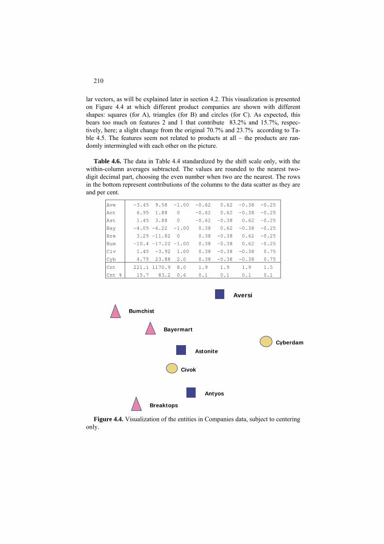
210
lar vectors, as will be explained later in section 4.2. This visualization is presented on Figure 4.4 at which different product companies are shown with different shapes: squares (for A), triangles (for B) and circles (for C). As expected, this bears too much on features 2 and 1 that contribute 83.2% and 15.7%, respec-tively, here; a slight change from the original 70.7% and 23.7% according to Ta-ble 4.5. The features seem not related to products at all – the products are ran-domly intermingled with each other on the picture.
Table 4.6. The data in Table 4.4 standardized by the shift scale only, with the
within-column averages subtracted. The values are rounded to the nearest two-digit decimal part, choosing the even number when two are the nearest. The rows in the bottom represent contributions of the columns to the data scatter as they are and per cent.
Ave -3.45 9.58 -1.00 -0.62 0.62 -0.38 -0.25 Ant 6.95 1.88 0 -0.62 0.62 -0.38 -0.25 Ast 1.45 3.88 0 -0.62 -0.38 0.62 -0.25 Bay -4.05 -6.22 -1.00 0.38 0.62 -0.38 -0.25
3.25 -11.82 0 0.38 -0.38 0.62 -0.25 Bre -10.4 -17.22 -1.00 0.38 -0.38 0.62 -0.25 Bum 1.45 -3.92 1.00 0.38 -0.38 -0.38 0.75 Civ 4.75 23.88 2.0 0.38 -0.38 -0.38 0.75 Cyb
Cnt 221.1 1170.9 8.0 1.9 1.9 1.9 1.5 Cnt % 15.7 83.2 0.6 0.1 0.1 0.1 0.1
Bayermart
Breaktops
Bumchist
Civok
Cyberdam
Aversi
Antyos
Astonite
Figure 4.4. Visualization of the entities in Companies data, subject to centering
only.

211
Pr4.1.C Standardization by z-scoring
Consider now a more balanced standardization involving not only feature cen-tering but also feature normalization over the standard deviations – z-scoring, as presented in Table 4.7.
An interesting property of this standardization is that contributions of all fea-
tures to the data scatter are equal to each other, and moreover, to the number of entities, 8! This is not a coincidence but a property of z-scoring standardization.
The data in Table 4.7 projected on to the plane of two first singular vectors bet-
ter reflect the products – on Figure 4.5, C companies are clear-cut separated from the others; yet A and B are still intertwined.
Table 4.7. The data in Table 4.4 standardized by z-scoring. The values are
rounded to the nearest two-digit decimal part, choosing the even number when two are the nearest. The rows in the bottom represent contributions of the columns to the data scatter as they are and per cent.
-0.66 0.79 -1.00 -1.29 1.29 -0.77 -0.58 Ave 1.32 0.15 0 -1.29 1.29 -0.77 -0.58 Ant 0.28 0.32 0 -1.29 -0.77 1.29 -0.58 Ast -0.77 -0.51 -1.00 0.77 1.29 -0.77 -0.58 Bay 0.62 -0.98 0 0.77 -0.77 1.29 -0.58 Bre -1.97 -1.42 -1.00 0.77 -0.77 1.29 -0.58 Bum 0.28 -0.32 1.00 0.77 -0.77 -0.77 1.73 Civ 0.90 1.97 2.00 0.77 -0.77 -0.77 1.73 Cyb 8 8 8 8 8 8 8 Cnt 14.3 14.3 14.3 14.3 14.3 14.3 14.3 Cnt, %
Table 4.7 presents the “mix” standardization involving (a) shifting the scales to the averages, as in z-scoring, but (b) dividing the results not by the feature’s stan-dard deviations but rather their ranges.
Pr4.1.D Range normalization and rescaling of dummy features
Characteristics of the range normalized data are presented in Table 4.8. However, when using both categorical and quantitative features, there is a catch here: each of the categories represented by dummy binary variables will have a greater vari-ance than any of the quantitative counterparts after dividing by the ranges. Table

212
Bayermart
Breaktops
Bumchist
Civok
Cyberdam
Aversi Antyos
Astonite
Figure 4.5. Visualization of the entities in Companies data after z-scoring (Ta-
ble 4.7).
4.8 represents contributions of the range-standardized columns of Table 4.4. Bi-nary variables contribute much greater than the quantitative variables according to this standardization. The total contribution of the three categories of the original variable Sector looks especially odd – it is more than 55% of the data scatter, by far more than should be assigned to just one of the five original variables. This is partly because that one variable in the original table has been enveloped, accord-ing to the number of its categories, into three variables, thus blowing out the con-tribution accordingly. To make up for this, the summary contribution of the three
Bayer
Break-
Bum-
Civok
Cy-
Aversi
An-
Aston-
Figure 4.6. Visualization of data in Table 4.7 – standardized by dividing over
the ranges with further subdividing the binary category features by the square roots of the number of them.
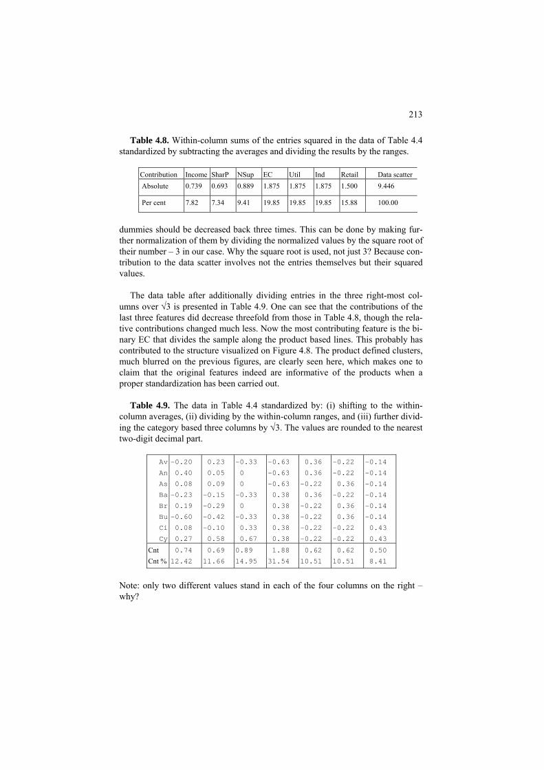
213
Table 4.8. Within-column sums of the entries squared in the data of Table 4.4 standardized by subtracting the averages and dividing the results by the ranges.
Contribution Income SharP NSup EC Util Ind Retail Data scatter Absolute 0.739 0.693 0.889 1.875 1.875 1.875 1.500 9.446
Per cent 7.82 7.34 9.41 19.85 19.85 19.85 15.88 100.00
dummies should be decreased back three times. This can be done by making fur-ther normalization of them by dividing the normalized values by the square root of their number – 3 in our case. Why the square root is used, not just 3? Because con-tribution to the data scatter involves not the entries themselves but their squared values.
The data table after additionally dividing entries in the three right-most col-
umns over √3 is presented in Table 4.9. One can see that the contributions of the last three features did decrease threefold from those in Table 4.8, though the rela-tive contributions changed much less. Now the most contributing feature is the bi-nary EC that divides the sample along the product based lines. This probably has contributed to the structure visualized on Figure 4.8. The product defined clusters, much blurred on the previous figures, are clearly seen here, which makes one to claim that the original features indeed are informative of the products when a proper standardization has been carried out.
Table 4.9. The data in Table 4.4 standardized by: (i) shifting to the within-
column averages, (ii) dividing by the within-column ranges, and (iii) further divid-ing the category based three columns by √3. The values are rounded to the nearest two-digit decimal part.
Av
An
As
Ba
Br
Bu
Ci
Cy
-0.20
0.40
0.08
-0.23
0.19
-0.60
0.08
0.27
0.23
0.05
0.09
-0.15
-0.29
-0.42
-0.10
0.58
-0.33
0
0
-0.33
0
-0.33
0.33
0.67
-0.63
-0.63
-0.63
0.38
0.38
0.38
0.38
0.38
0.36
0.36
-0.22
0.36
-0.22
-0.22
-0.22
-0.22
-0.22
-0.22
0.36
-0.22
0.36
0.36
-0.22
-0.22
-0.14
-0.14
-0.14
-0.14
-0.14
-0.14
0.43
0.43
Cnt Cnt %
0.74
12.42
0.69
11.66
0.89
14.95
1.88
31.54
0.62
10.51
0.62
10.51
0.50
8.41
Note: only two different values stand in each of the four columns on the right – why?
214
The entries within every column sum up to 0 (as stated in Q.4.2). Q.4.4. How to do a z-scoring in MatLab? A. Take [n,v]=size(X) where X is the
data matrix. Then define Y=(X-repmat(mean(X,n,1))./ repmat(std(X,n,1). Q.4.5. What are the feature contributions after z-scoring? A. They all are equal
to the same value, the data scatter related to V, the number of features. Q.4.6. How distances are affected if a different set of scale shifts is applied? A.
As can be seen from equation (4.6) for the squared Euclidean distance in this case, the scale shifts cancel each other and are not part of the distances. That means the distances are not affected at all.
Q.4.7. How to do a distribution-free standardization by shifting to mid-range
and normalizing by half-ranges? A. See Worked example 4.1.
4.2 Principal component analysis: model, method, usage
P4.2 SVD based PCA and its usage: Presentation
The method of principal component analysis (PCA) has emerged in the research of “inherited talent” undertaken on the verge of 19th and 20th centuries by F. Galton and K. Pearson, first of all to measure talent. For the time being, it has become one of the most popular methods for data summarization and visualization. The mathematical structure and properties of the method are based on the so-called singular value decomposition of data matrices (SVD); this is why in some publications terms PCA and SVD are used as synonymous. In the UK and USA, though, the term PCA frequently refers only to a technique for the analysis of inter-feature covariance or correlation matrix by extracting most contributing linear combinations of features, which utilizes no specific data models and is considered as purely heuristic. However, this method can be related to a genuine decoder based data summarization model that is underlied by the SVD equations – in the case when the data matrix has been centered beforehand. But the centering can hardly make a big difference to the method as such; this is why I refer to the method, even when the data matrix is not centered, as PCA.
There are many motivations for this method, of which we consider the following: - 1. Scoring a hidden factor

215
- 2. Data visualization - 3. Feature space reduction
P4.2.1 Scoring a hidden factor
A. Hidden factor with a multiplicative decoder Consider the following problem. Given student’s marks at different subjects,
can we derive from this their score at a hidden factor of talent that is supposedly reflected in the marks? Take a look, for example, at the first six students’ marks over the three subjects in Table 4.10 extracted from Students data, Table 0.5:
Table 4.10 Marks at three subjects for six students from Students data Table 0.5.
# SEn OOP CI Average 1 2 3 4 5 6
41 66 90 57 56 60 61 72 79 69 73 72 63 52 88 62 83 80
65.7 57. 7 70. 7 71.3 67. 7 75.0
To judge of the relative strength of a student, the average mark is used in prac-
tice. This ignores the relative work load that different subjects may impose on a student – can you see that CI marks are always greater than SEn marks? – and in fact, is purely empiric and does not allow much theoretical speculation. Let us as-sume that there is a hidden factor, not measurable straightforwardly, the talent, that is manifested in the marks. Suppose that another factor manifested in the marks is subject load, and, most importantly, assume that these factors multiply to make a mark, so that a student’s mark over a subject is the product of the subject’s loading and the student’s talent:
Mark(Student, Subject)=Talent_Score(Student)∗Loading(Subject)
One may point out two issues related to this model – one internal, the other exter-nal.
The external issue is that the mark, as observed, depends on many other factors differently affecting different students – the weather, a sleepless night or malady, level of interest in the subject, etc., which make the model as is overly simplistic and prone to errors. Well, a proponent would say, sure the model is simplistic – it takes on only most important factors. The others will cause errors indeed, but these can be tackled by minimizing them: the idea is that the hidden talent and

216
loading factors can be found by minimizing the differences between the real marks and those derived from the model. The PCA method is based on the least-squares approach so that it is the sum of squared differences between the observed and computed marks that is minimized in PCA.
The internal issue is that the model as is admits no unique solution because it is
the product of mark by loading that matters, not their individual values – if one multiples all the talent scores by a number, say Talent_Score(Student) ∗5, and si-multaneously divides all the subject loadings by the same number, Load-ing(Subject)/5, the product will not change. How one is supposed to compute something which admits no definite representation? To make a solution unique, conventionally, a constant norm of one or both of the items is assumed so that one more item into the product is admitted – that expressing the product’s magnitude. Then, as stated in the formulation part of this section, there is a unique solution indeed, with the magnitude expressed by the so-called maximum singular value of the data matrix with the score and load factors being its corresponding normed singular vectors.
Specifically, the maximum singular value of matrix in Table 4.10 is 291.4, and
the corresponding normed singular vectors are z=(0.40, 0.34, 0.42, 0.42, 0.41, 0.45), for the talent score, and c=(0.50, 0.57, 0.66), for the loadings. That means that every mark in the matrix is product of three items. For example, to compute the model SEn value for student 6, one takes 291.4*0.45*0.50= 65.6, which is not that far from the observed mark of 62. Yet the model involves the product of two items only. To get back to our model, we need to distribute the singular value be-tween the vectors. There is only one way to do it complying with the singular value equations (4.12) – by multiplying each of the vectors by the same value, the square root of the singular value which is 17.1. Thus, the denormalized talent score and subject loading vectors will be z′=(6.85, 5.83, 7.21, 7.20, 6.95, 7.64) and c′=(8.45, 9.67, 11.25). According to the model, the score of student 3 over subject SEn is the product of the talent score, 7.21, and the loading, 8.45, which is 60.9, quite close to the observed mark 61. Similarly, product 5.83*9.67=56.4 is close to 56, student 2’s mark over OOP. The differences can be greater though: product 5.83*8.45 is 49.3, which is rather far away from the observed mark 57 for student 2 over SEn.
In matrix terms, the model can be represented by the following equation * = (4.7)
6.85 57.88 66.29 77.07 5.83 49.22 56.37 65.53 7.21 60.88 69.72 81.05 8.45 9.67 11.257.20 60.83 69.67 81.00 6.95 58.69 67.22 78.15 7.64 64.53 73.91 85.92
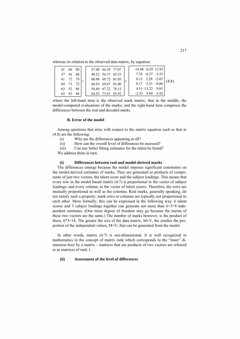
217
whereas its relation to the observed data matrix, by equation = + + (4.8)
-16.88 -0.29 12.9357.88 66.29 77.07 41 66 90 7.78 -0.37 -5.5349.22 56.37 65.53 57 56 60 0.12 2.28 -2.05 60.88 69.72 81.05 61 72 79 8.17 3.33 -9.00 60.83 69.67 81.00 69 73 72 4.31 -15.22 9.85 58.69 67.22 78.15 63 52 88 -2.53 9.09 -5.9264.53 73.91 85.92 62 83 80
where the left-hand item is the observed mark matrix; that in the middle, the model-computed evaluations of the marks; and the right-hand item comprises the differences between the real and decoded marks.
B. Error of the model
Among questions that arise with respect to the matrix equation such as that in
(4.8) are the following: (i) Why are the differences appearing at all? (ii) How can the overall level of differences be assessed? (iii) Can any better fitting estimates for the talent be found?
We address them in turn.
(i) Differences between real and model-derived marks The differences emerge because the model imposes significant constraints on
the model-derived estimates of marks. They are generated as products of compo-nents of just two vectors, the talent score and the subject loadings. This means that every row in the model-based matrix (4.7) is proportional to the vector of subject loadings, and every column, to the vector of talent scores. Therefore, the rows are mutually proportional as well as the columns. Real marks, generally speaking, do not satisfy such a property: mark rows or columns are typically not proportional to each other. More formally, this can be expressed in the following way: 6 talent scores and 3 subject loadings together can generate not more than 6+3=9 inde-pendent estimates. (One more degree of freedom may go because the norms of these two vectors are the same.) The number of marks however, is the product of these, 6*3=18. The greater the size of the data matrix, M×V, the smaller the pro-portion of the independent values, M+V, that can be generated from the model.
In other words, matrix (4.7) is one-dimensional. It is well recognized in
mathematics in the concept of matrix rank which corresponds to the “inner” di-mension bore by a matrix – matrices that are products of two vectors are referred to as matrices of rank 1.
(ii) Assessment of the level of differences

218
A conventional measure of the level of error of the model is the ratio of the scatters of the model derived matrix and the observed data matrix in (4.8). The scatter of matrix A, T(A), is the sum of the squares of all of A-entries or, which is the same, the sum of the diagonal entries in matrix A*AT, the trace(A*AT).
Worked example 4.2. Explained proportion of data scatter in equation (4.8)
Table 4.11. Scatters of matrices in equation (4.8)
Scatter of Data matrix Model matrix Residual matrix
Absolute Proportion
86092 84908.8 1183.2 100 98.63 1.37
Consider scatters of three matrices in (4.8) in Table 4.11. The residual data scatter is
rather small and accounts for only ε2=1183.2/86092=0.0137, that is, 1.37%, of the original data scatter. Its complement to unity, 98.63%, is the proportion of the data scatter explained by the multiplicative model. This also can be straightforwardly derived from the singular value, 291.4: its square shows the part of the data scatter explained by the model, 291.42/86092 = 0.9863.
Q.4. 8. In spite of the fact that some errors in (4.8) are rather high, the overall squared error is quite small, just about one per cent of the data scatter. Why is that? A. Because the data values are faraway from 0 – see Q.4.20 explaining the effect mathematically.
(iii) The singular vector estimates are the best
The squared error is the criterion optimized by the estimates of talent scores
and subject loadings. No other estimates can give a smaller value to the error for data matrix in Table 4.10 than ε2=1.37%.
C. Formulaic expression of the hidden factor through the data
The relations between singular vectors (see equations (4.12) in section F4.2.1
provide us with a conventional expression of the talent score as a weighted aver-age of marks at different subjects. The weights are proportional to the subject loadings c′ =(8.45, 9.67, 11.25): weight vector w is the result of dividing of all en-tries in c′ by the singular value, w=c′/291.4=(0.029, 0.033, 0.039). For example, the talent score for student 1 is the w weighted average of their marks, 0.029*41+0.033*66+0.039*90 = 6.85.
The model-derived averaging allows one also to score the talent of other stu-
dents, those not belonging to the sample being analyzed. If marks of a student over

219
the three subjects are (50,50,70), their talent score will be the w-weighted average: 0.029*50+0.033*50+0.039*70=5.81.
A final touch to the hidden factor scoring can be given by rescaling it in a way
conforming to the application domain. Specifically, one may wish to express the talent scores in a 0-100 scale resembling that of the original mark scales. That means that the score vector z′ has to be transformed into z′′= α*z′+β, where α and β are the scaling factor and shift coefficients, that can be found from two natural conditions: (a) z′′ is 0 when all the marks are 0 and (b) z′′ is 100 when all the marks are 100. Condition (a) means that β=0, and condition (b) calls for calcula-tion of the talent score of a student with all top marks. Summing up three 100 marks with weights from w leads to the value zM= 0.029*100 +0.033*100 +0.039*100 = 10.08 which implies that the rescaling coefficient α must be
Table 4.12 Marks and talent scores for six students.
# SEn OOP CI Average Talent 1 2 3 4 5 6
41 66 90 57 56 60 61 72 79 69 73 72 63 52 88 62 83 80
65.7 57. 7 70. 7 71.3 67. 7 75.0
68.0 57.8 71.5 71. 5 69.0 75.8
100/zM=9.92 or, equivalently, weights must be rescaled as w′=9.92*w=(0.29, 0.33, 0.38). Talent scores found with these weights are presented in the right col-umn of Table 4.12 – hardly a great difference from the average scores, except that the talent scores are slightly higher, due to a greater weight assigned to mark-earning CI subject.
In spite of the fact that the original model does not assume any averaging of the
marks, the optimal scoring is a form of averaging indeed. However, one should note that it is the model that provides us with both the weights, which are the op-timal subject loadings, and the error – these are entirely out of the picture at the empirical averaging.
This line of thinking can be applied to any other hidden performance measures
such as quality of life in different cities using scorings over its different aspects (housing, transportation, catering, pollution, etc.) or performance of different management sections in a big company or government.
D. Sensitivity of the hidden factor to data standardization

220
One big issue related to the multiplicative hidden factor model is its instability with respect to data standardization that has been clearly seen at different data normalization options in Project 4.1. Here is another example.
Worked example 4.3. Principal components after feature centering Consider now the data set in Table 4.10 analyzed above. Take the means of marks over
different disciplines in this table, 58.8 for SEn, 67.0 for OOP, and 78.2 for CI, and sub-tract them from the marks, to shift the data to the mean point (see Table 4.13). This would not much change the average scores presented in Tables 4.10, 4.11 – just shifting them back by the average of the means, (58.8 + 67.0 + 78.2)/3 =68.
Table 4.13 Centered marks for six students and corresponding talent scores, first, as
found as explained in A.1, and, second, that rescaled to produce extreme values 0 and 100 if all subject marks are 0 or 100, respectively.
# SEn OOP CI Average Talent score
Talent rescaled
1 -17.8 -1.0 11.8 -2.3 -3.71 13.69 2 -1.8 -11.0 -18.2 -10.3 1.48 17.60 3 2.2 5.0 0.8 2.7 0.49 16.85 4 10.2 6.0 -6.2 3.3 2.42 18.31 5 4.2 -15.0 9.8 -0.3 -1.94 15.02 6 3.2 16.0 1.8 7.0 1.25 17.42
Everything changes, though, in the multiplicative model, starting from the data scatter,
which is now 1729.7 – a 50 times reduction from the case of uncentered data. The maxi-mum singular value of the feature centered matrix in Table 4.13, is 27.37 so that the
= + + (4.9)
-6.33 6.24 -2.00 -11.51 -7.24 13.83 -17.8 -1.0 11.8 -6.44 -13.90 -12.63 4.60 2.90 -5.53 -1.8 -11.0 -18.2 0.65 4.05 2.66 1.52 0.96 -1.82 2.2 5.0 0.8 2.65 1.27 2.87 7.52 4.73 -9.04 10.2 6.0 -6.2 10.18 -11.21 2.60 -6.02 -3.79 7.23 4.2 -15.0 9.8 -0.72 13.56 6.50 3.88 2.44 -4.67 3.2 16.0 1.8
multiplicative model now accounts for only 27.372/1729.7 = 0.433=43.3% of the data scatter. This goes in line with the idea that much of the data structure can be seen from the “grand” mean (see Figure 4.11 illustrating the point), however, this also greatly increases the error. In fact, the relative order of errors does not change that much, as can be seen in formula (4.10) decomposing the centered data (in the box on the left) in the model-based item, the first on the right, and the residual errors in the right-hand item. What changes is the denominator. The model-based estimates have been calculated in the same way as those in formula (4.7) – by multiplying every entry of the new talent score vector z*=(-3.71, 1.48, 0.49, 2.42, -1.94, 1.25) over every entry of the new subject loading vector c*=(3.10, 1.95, -3.73).

221
Worked example 4.4. Rescaling the talent score from Worked example 4.3 Let us determine rescaling parameters α and β that should be applied to z*, or to the
weights c*, in Worked example 4.3 so that at 0 marks over all three subjects the talent score will be 0 and at all 100 marks the talent score will be 100.
As in the previous section, we first determine what scores correspond to these situations
in the current setting. All-zero marks, after centering, become minus the average marks, -58.8 for SEn, -67.0 for OOP, and -78.2 for CI. Averaged according to the loadings c from Worked example 4.3, they produce 3.10*(-58.8) + 1.95*(-67) - 3.73*(-78.2)= -21.24. Analogously, all-hundred marks, after centering, become 41.2 for SEn, 33.0 for OOP, and 21.8 for CI to produce the score 3.10*(41.2) + 1.95*(33) - 3.73*(21.8)= 110.8. The differ-ence between these, 110.8-(-21.2)=132.0 divides 100 to produce the rescaling coefficient a=100/132=0.75, after which shift value is determined from the all-0 score as b=-a*(-21.24)=16.48. Thus rescaled talent scores are in the last column of Table 4.13. These are much less related to the average scoring than it was the case at the original data. One can see some drastic changes such as, for instance, the formerly worst student 2 becoming sec-ond best, since their deficiency over CI has been converted to an advantage because of the negative loading at CI.
For a student with marks (50,50,70) that became (-8.8, -17.0, -8.2) after centering, the
rescaled talent score comes from the adjusted weighting vector w=a*c=0.75*(3.10, 1.95, -3.73)=(2.34, 1.47, -2.81) as the weighted average 2.34*(-8.8)+1.47*(-17)- 2.81*(-8.2)=-22.73 plus the shift value b=16.48 so that the result is, paradoxically, -6.25 – less than at all zeros! This is again a result of the negative loading at CI.
This example illustrates not only the idea of a great sensitivity of the multiplicative
model, but, also, that there should be no mark centering when evaluating performances.
P4.2.2 Data visualization
For the purposes of visualization of the data entities on a 2D plane, the data set is usually first centered to put it against the backdrop of the center – we mentioned already that more structure in the dataset can be seen when looking at it from the center of gravity, that is, the grand mean location. What has been disastrous for the purposes of scoring in Worked example 4.4 is beneficial for the purposes of structuring. Solutions to the multiple factor model, that is, the hidden factor scor-ing vectors which are singular vectors of the data matrix, in this case, are referred to as principal components (PCs). Two principal components corresponding to the maximal singular values are needed for a 2D representation.

222
What is warranted in this arrangement is that the PC plane approximates the data, as well as the between-feature covariances and between-entity similarities, in the best possible way. The coordinates provided by the singular vectors/ principal components are not unique, though, and can be changed by rotating the axes, but they do hold a unique property that each of the components maximally contributes to the data scatter. Worked example 4.5. Visualization of a fragment of Students dataset Consider four features in the Students dataset – the Age and marks for SEn, OOP and CI subjects. Let us center it by subtracting the mean vector a=(33.68, 58.39, 61.65, 55.35) from all the rows, and normalize the features by their ranges r=(31, 56, 67, 69). The latter operation seems a necessity because the Age, expressed in years, and subject marks, per cent, are not exactly comparable. Characteristics of all the four singular vectors of these data for feature loadings are presented in Table 4.14. Table 4.14. Components of the normed loading parts of principal components for the stan-dardized part of Student data set; corresponding singular values, along with their squares expressed both per cent to their total, the data scatter, and in real.
Singular value
Singular value squared
Contribution, Singular vector compo-nents per cent Age SEn OOP CI
3.33 11.12 42.34 -0.59 0.03 0.59 0.55 2.80 7.82 29.77 0.53 0.73 0.10 0.42 2.03 4.11 15.67 -0.51 0.68 -0.08 -0.51 1.79 3.21 12.22 -0.32 0.05 -0.80 0.51
The summary contribution of the two first principal components (PCs) to the data scatter is 42.34 + 29.77 = 72.11%, which is not that bad for educational data and warrants a close
−0.4 −0.2 0 0.2 0.4 0.6−0.4
−0.2
0
0.2
0.4
−0.4 −0.2 0 0.2 0.4 0.6−0.4
−0.2
0
0.2
0.4
Figure 4.9. Scatter plot of the student 4D data (Age, SP marks, OO marks, CI marks) row points on the plane of two first principal components, after they have been centered and re-scaled. Curiously, students of occupations AN (circled) and IT (triangled) occupy contigu-ous regions of the plane on the right-hand picture. Pentagrams represent the mean points of the occupation categories AN and IT. representation of the entities on the principal components plane. The two principal compo-nents are found by multiplication of each of the corresponding left singular vectors z1 and z2

223
by the square root of the corresponding singular value. Each entity i = 1, 2, …, N is represented on the PC plane by the pair of the first and second PC values (z1i*, z2i*). The data scatter in the PC plane is represented on Figure 4.9. The left part is just the data with no labels. On the right part, two occupational categories are visualized using triangles (IT) and circles (AN); remaining dots relate to category BA. In spite of the fact that the occupation has not been involved in building the PC space, its categories appear to occupdifferent parts of the plane, which will be explained later, in Worked exam
y ple 4.6.
P4.2.3 Feature space reduction: criteria of contribution and interpretability
The principal components provide for the best possible least-squares approxima-tion of the data in a low dimension space. The quality of such a data compression is usually judged over (i) the proportion of the data scatter taken into account by the reduced dimension space and (ii) interpretability of the factors supplied by the PCs. Contribution of the PCA model to the data scatter is reflected in the sum of squared singular values corresponding to the principal components in the reduced data. This sum should be related to the data scatter or, equivalently, to the total of all singular values squared, to see the impact. For example, the 2D representation of 4D student data on Figure 4.13 contributes 72.11% to the data scatter, as found in Worked example 4.5. In the example of marks for six students in Worked ex-amples 4.2 and 4.4, the talent scoring factor contributed 98.6% to the data scatter at the original data and 43.3% after centering the data. Does that mean that marks should not be centered at all, to get a better approximation? Not necessarily. When all data entries are not negative, the large contribution of a principal component is an artifact of the very remoteness of the data set from the origin – the farther away you move the data from the origin, for example, by adding a positive number to all the entries, the greater the contribution. This phenomenon follows a known prop-erty of positive fractions: if 0<a/b<1, then adding a positive c to both the numera-tor and denominator may only increase it; the greater the c, the greater the in-crease, so that (a+c)/(b+c) converges to 1 when c tends to infinity (see Q. 4.20). The analogy becomes clear if we consider b the data scatter and a, the principal component’s contribution. This example shows that the contribution, in spite of its firm mathematical foot-ing, can be rather shaky an argument when data is not centered. One more crite-rion, of interpretability, gives a different perspective. To interpret PCA results one should use the feature loadings according to the sin-gular vectors related to features. These straightforwardly show how much a prin-cipal component is affected by a feature: the larger the value the greater the corre-

224
lation. Features with relatively high positive or negative coefficients are used to interpret the component, as illustrated in the worked example below. Worked example 4.6. Interpretation of principal components at the standard-ized Student data Take a look at the first singular vector in Table 4.14 corresponding to the maximum singu-lar value 3.33 at the standardized Students data. (Please note this 100×4 data differs from the 6×3 data of six students analyzed in the beginning.) One can see that the first compo-nent positively relates to marks over all subjects, perhaps except SEn at which the loading is almost zero, and negatively to the Age. That means that on average, the first factor is greater when a student gets better marks and is younger. Thus, the first component can be interpreted as the “Age-related Computer Science proficiency”. The second component (the second line in Table 4.14) is positively related to all of the features, especially SEn marks, which can be interpreted as “Age defying inclination towards software engineering”.Then the triangle and circle patterns on the right of Figure 8 show that AN laborers are on the minimum side of the age-related CS proficiency, whereas IT occupations are high on that – all of which seem rather reasonable. Both are rather low on the second component, though, in contrast to students represented by dots, thus belonging to BA occupation category, that get the maximum values on it. In the early days of the development of factor analysis, yet within the psychology commu-nity, researchers were trying to explore the possibility of achieving a more interpretable so-lution by rotating the axes of the PC space. The goal was to find a simple structure of the loadings, in which most of the loading elements are zero with a few non-zero values that should be as close to either 1 or -1 as possible. This goal, however, is subject to too much of arbitrariness and remains an open issue. Keeping singular vectors as they are, not rotated, has the advantage that each of them contributes to the data scatter as much as possible. This relates to frequently occurring real world situations in which factors underlying the phe-nomenon of interest contribute to it differently. The PCA factors express such a structure formally: that most contributing is followed by the second best contributing, then by the third best contributing, etc.
Q.4.9. Prove that the condition of statistical independence for a contingency data table can be equivalently reformulated as the contingency table being of rank 1. A. Indeed an N×V matrix of rank 1 is a matrix whose elements are products of components of two vectors, N- and V-dimensional ones. In the case of a relative contingency table, P=(pkl), the statistical independence condition, pkl = pk+ p+l for all rows k and columns l, shows exactly that: all elements of matrix P are products of components of two vectors, (pk+) and (p+l), which proves the statement. Q.4.10. What could be a purpose to aggregate the features in the Market towns’ data? A. Since all the features related to the extent of development of a town, the aggregate feature perhaps would express the extent of the town’s development.
225
F4.2 Mathematical model of PCA-SVD and its properties: Formulation
F4.2.1 A multiplicative decoder
Let us consider a data matrix X with entries xiv and standardize it into Y=(yiv) (i=1,2,…, N; v=1,2, …,V). The PCA model assumes hidden factor scores zi* and feature loadings cv* such that their product zi* cv* is the decoder for yiv, which can be explicated, by using additive residuals eiv, as
yiv = cv*zi*+ e (4.10) iv
where the residuals are to be minimized using the least squares criterion
The decoder in (4.10), as a mathematical model for deriving zi* and cv* , has a
flaw from the technical point of view: its solution cannot be defined uniquely! Indeed, assume that we have got the talent score zi* for student i and the loading cv* at subject v, to produce zi*cv* as the estimate for the student’s mark at the subject. However, the same estimate will be produced if we halve the talent score and simultaneously double the loading: zi*cv* = (zi*/2)(2cv*). Any other real taken as the divisor / multiplier would, obviously, do the same.
2iv
22 *)z*c- ( ivVvIi
ivVvIi
yeL ∑∑∑∑∈∈∈∈
==
(4.11)
A conventional remedy to this is following: specify the norms of vectors z* and
c* to be equal to 1, and treat the multiplicative effect of the two of them as a real μ ≥ 0. Then put the product μ z ci v in (4.10) and (4.11) instead of z *ci v* where z and c are normed versions of z* and c*, and μ is their multiplicative effect. The (Euclidean) norm ||x|| of vector x=(x1,…, xN) is defined as its length, that is, the square root of ||x||2 = xTx = x1
2+x22+…+xN
2. Thus a vector is referred to as normed if its length is 1, ||x||=1. After μ, z and c minimizing (4.11) are determined, return to the talent score vector z* and loading vector c* with formulas: z*= μ1/2z, c* =μ1/2c. It should be pointed out that a different norming condition such as say |x1|+|x2|+…+|xN |=1 would lead to a different than the singular triplet solution – it seems no one ever explored such an opportunity.
The first-order optimality conditions to a triplet (μ, z, c) be the least-squares
solution to (4.10) imply that μ = Tz Y c is maximum value satisfying equationsTz=μc and Yc=μz (4.12) Y

226
These equations for the optimal scores give the transformation of the data leading to the summaries z* and c*. The transformation, denoted by F(Y) in (4.1), appears to be linear, and combines optimal c and z so that each determines the other. It appears, this type of summarization is well known in linear algebra.
A triplet (μ, z, c) consisting of a non-negative μ and two vectors, c (size M×1)
and z (size N×1) is referred to as to a singular triplet for Y if it satisfies (4.12); μ is referred to as a singular value and z, c the corresponding singular vectors. What can be proven immediately is the following:
Property 1. Any pair of singular vectors (z,c) satisfying (4.12) for a non-zero μ must have the same norm.
Indeed, by multiplying the left-side equation in (4.12) by cT, and the right-side
equation by zT, both from the left, one arrives at equations cTYTz=μcTc and zTYc=μzTz . Since cTYTz=(zTYc)T and both are just real numbers, the equation cTc=zTz holds because μ≠0. Typically, the norms of c and z are taken to be unities. However, at the Principal components (4.7), they are equal to the square root of the singular value μ, which proves the statement.
Any matrix Y can have only a finite number of singular values which is equal to
the rank of Y. Singular vectors z corresponding to different singular values are necessarily mutually orthogonal, as well as singular vectors c. When two or more singular values coincide, their singular vectors form a linear subspace and can be chosen to be orthogonal, which is the case in computational packages such as MatLab.
Therefore, z*= μ½z and c* =μ½c is a solution to the model (4.10) minimizing
(4.11) defined by the maximum singular value of matrix Y and the corresponding normed singular vectors. Vectors z* and c* obviously also satisfy (4.12). This leads to other nice mathematical properties.
Property 2. The score vector z* is a linear combination of columns of Y weighted by c*’s components: c*’s components are feature weights in the score z*
Equations (4.12) allow to map additional features or entities onto the other part
of the hidden factor model. Consider, for example an additional N-dimemsional feature vector y standardized same way as Y. Its loading c*(y) is determined as c*(y)=<z*,y>/μ for the talent score z*. Similarly, an additional standardized V-dimensional entity point h has its hidden factor score defined according to the other part of (4.12), z*(h)=<c*,h>/μ.

227
Property 3. Pythagorean decomposition of the data scatter T(Y) relating the least squares criterion (4.11) and the singular value holds as follows:
T(Y)= μ2 + L2 (4.13) This implies that the squared singular value μ2 expresses the proportion of the
data scatter explained by the principal component z*.
F4.2.2 Extension of the PC decoder to the case of many factors
It is well known by now that there is not just one talent behind the human ef-forts but a range of them. Assume a relatively small number K of different hidden factors z*k and corresponding feature loading vectors c*k (k=1,2,…,K; K < V), with students and subjects differently scored over them so that the observed marks, after standardization, are sums of those over the different talents:
,**1
ivikkv
K
kiv ezcy += ∑
=(4.14)
This is again a decoder that can be used for deriving a summary from the stan-dardized marks matrix Y=(yiv) so that the hidden score and loading vectors z*k and c*k are found by minimizing residuals, eiv. To eliminate the mathematical ambigu-ity, we again assume that z*k = μ½zk and c*k =μ½ck, where zk and ck are normed vectors.
Assume that the rank of Y is r and K<r. Assume that the singular values of Y
are sorted so that μ1 ≥ μ2 ≥ … ≥μr. It can be proven that the least-squares solution to (4.14) is provided by the maximal singular values μk and corresponding normed singular zvectors k and ck (k=1, 2, …, K).
The underlying mathematical property is that any matrix Y can be decomposed
over its singular values and vectors,
,1
ikkvk
r
kiv zcy μ∑
=
= (4.15)
which is referred to as the singular value decomposition (SVD). In matrix terms, SVD can be expressed as
Tk
Tk
r
kk ZMCczY == ∑
=1μ (4.15)

228
where the right-hand item Z is N×r matrix with columns zk and C is M×r matrix with columns ck and M is an r×r diagonal matrix with entries μk on the diagonal and all other entries zero.
Equation (4.15′) implies, because the singular vectors are mutually orthogonal,
that the scatter of matrix Y is decomposed into the sum of the squared singular values:
T(Y) = μ1
2 +μ2 2 +…+μr
2
2:
tity.
(4.16)
This implies that the least-squares fitting of the PCA model in equation (4.14) decomposes the data scatter into the sum of contribution of individual singular vectors and the least-squares criterion L2= ∑i, v eiv
T(Y) = μ1
2 +μ2 2 +…+μK
2 + L2 (4.17)
This provides for the evaluation of the relative contribution of the model (4.14) to the data scatter as (μ1
2 +μ2 2 +…+μK
2)/T(Y). In particular, this part of decomposition (4.15) is used for 2D visualization:
yiv* ≈ zii*c1v* + zi2*c2v* where the elements on the right come from the two first principal components; the equation holds not 100% but 100*(μ1
2 +μ2 2)/T(Y) percent. Every entity i∈ I is
represented on a 2D Cartesian plane by pair (zii*, zi2*). Moreover, because of the symmetry, every feature v can be represented, on the same plane by pair (c1v*, c2v*). Such a simultaneous representation of both entities and features is referred to as a joint display or a biplot. As a matter of fact, features are presented on a biplot by not just the corresponding points, but by lines joining them to 0. This reflects the fact, that projections of points, representing the entities (entity markers), to these lines are meaningful. For a variable v, the length and direction of the projection of an entity marker to the corresponding line reflects the value of v on the en
F4.2.3 Conventional formulation using covariance matrix
In the English-written literature, PCA is conventionally introduced in a differ-ent way: not via the decoder based model (4.10) or (4.14), but rather as a heuristic technique to build up most contributing linear combinations of features with the help of the data covariance matrix.

229
TThe covariance matrix is defined as V×V matrix C=Y Y/N, where Y is a cen-tered version of the data matrix X, so that all its columns are centered. The (v′,v′′)-entry in the covariance matrix is the covariance coefficient between features v′ and v′′; and the diagonal elements are variances of the corresponding features. The covariance matrix is referred to as the correlation matrix if Y has been z-score standardized, that is, after shifting each column to its mean, it was further normalized by dividing by its standard deviation. In this case, elements of C are correlation coefficients between corresponding variables. (Note how a bivariate concept is carried through to multivariate data by using matrix mu lication.)
are normed, that is, satisfy condition cTc=1, is equivalent to unconditionally maximizing the ratio
ltip The conventional PCA problem formulation goes like this. Given a centered
N×V data matrix Y, find a normed V-dimensional vector c=(cv) such that the sum of Y columns weighted by c, f=Yc, has the largest variance possible. This vector is the principal component, termed so because it shows the direction of the maximum variance in data. Vector f is centered for any c, since Y is centered. Therefore, its variance is s2=<f,f>/N=fTf/N. The last equation comes under the convention that a V-dimensional vector is a V×1 matrix, that is, a column. By substituting Yc for f, this leads to equation s2=cT TY Yc/N. Maximizing this with respect to all vectors c that
( )T T
T
c Y Ycq c =c c
(4.18)
or matrix C, corresponding to its ma imum eigenvalue (latent value) q(c) (4.18).
igenvectors corresponding to different eigenvalues are orthogonal to each other.
over all V-dimensional vectors c. Expression (4.18) is well known in linear algebra as the Rayleigh quotient for matrix NC= YTY which is proportional to the covariance matrix of course. The maximum of Rayleigh quotient is reached at c being an eigen-vector, also termed latent vector, f
x Vector a is referred to as an eigenvector for a square matrix B if Ba=λa for
some, possibly complex, number λ which is referred to as the eigenvalue corre-sponding to a. In the case of a covariance matrix all eigenvalues are not only real but non-negative as well. The number of eigenvalues of B is equal to the rank of B, and e
Therefore, the first principal component, in the conventional definition, is vec-
tor f=Yc defined by the eigenvector of the covariance matrix A corresponding to its maximum eigenvalue. The second principal component is conventionally de-fined as another linear combination of columns of Y, which maximizes its variance under the condition that it is orthogonal to the first principal component. It is de-fined, of course, by the second eigenvalue and corresponding eigenvector. Other

230
principal components are defined similarly, in a recursive manner, under the con-dition that they are orthogonal to all preceding principal components; which im-plies that they correspond to other eigenvalues, in the descending order, and the corresponding eigenvectors.
at μ2 and c, defined by the multiplicative de-coder m l, satisfy equation
YTYc = μ2c, (4.19)
sim le relation between the eigen values λ of C and singular values μ of Y: λ =μ2.
mptions on a linear or no ear relation between features and hidden factors.
This construction seems rather remote from how the principal components are
introduced above. However, it is not difficult to prove that the two definitions are computationally equivalent. Indeed, take equation Yc=μz from (4.12), express z from this as z=Yc/μ, and substitute this z into the other equation (4.12): YTz= μc, so that YTYc/μ = μc. This implies th
ode
that is, c is an eigenvector of square matrix YTY, corresponding to its maximum eigenvalue λ = μ2 T. Matrix Y Y, in the case when Y is centred, is the covariance matrix C up to the constant factor 1/N. Therefore, c in (4.19) is an egenvector of C corresponding to its maximum eigenvalue. This proves that the two definitions are equivalent when the data matrix Y is centered. The given proof also establishes a
p In spite of the computational equivalence, there are some conceptual differ-
ences between the two definitions. In contrast to the definition in F4.2.1 based on the multiplicative decoder, the conventional definition is purely heuristic, assum-ing no underlying model whatsoever. It makes sense only for centered data be-cause of its reliance on the concept of covariance. Moreover, the fact that the prin-cipal components are linear combinations of features is postulated in the conventional definition, whereas this is a derived property of the optimal solution to the multiplicative decoder model which involves no assu
nlin
αc at α>1 c xM αc at 0<α<1 x1
αc at α<0
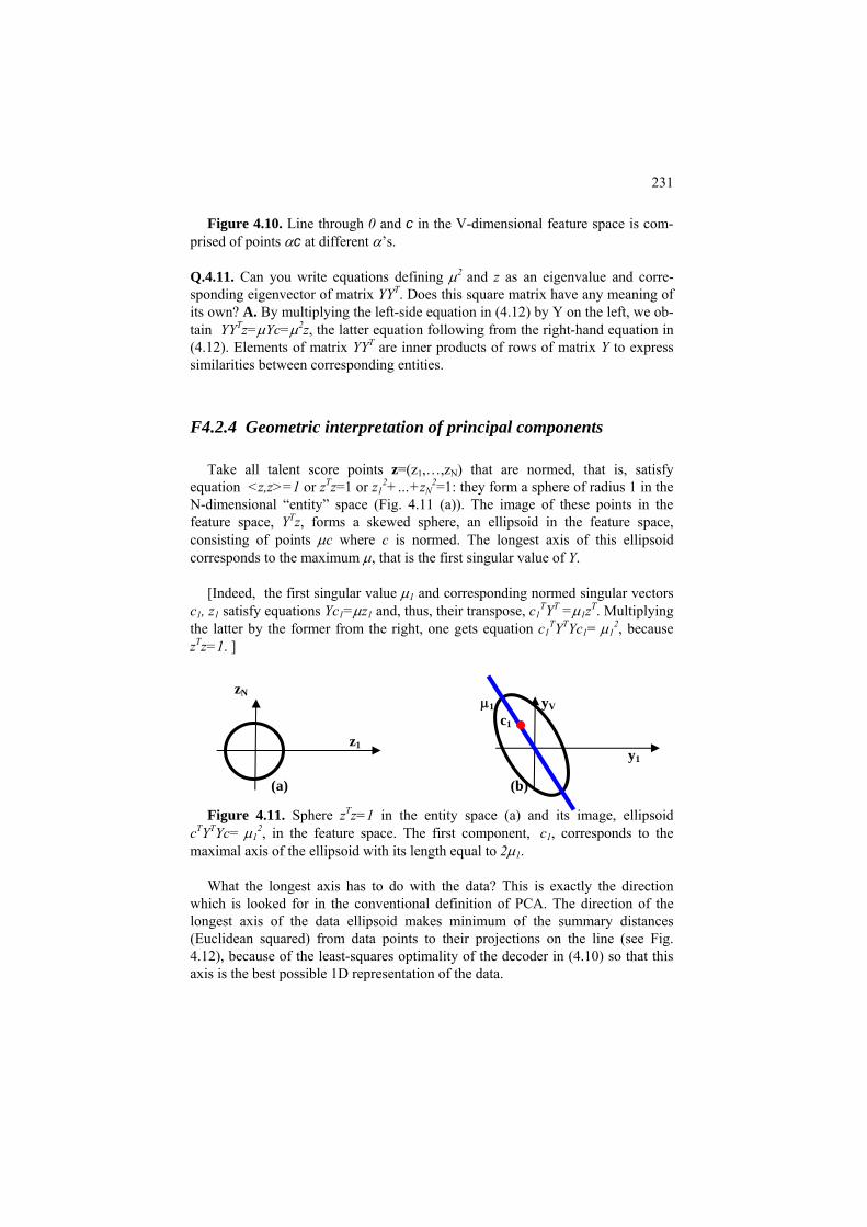
231
Figure 4.10. Line through 0 and c in the V-dimensional feature space is com-
wing from the right-hand equation in (4.12). Elements of matrix YYT are inner products of rows of matrix Y to express similarities between corresponding entities.
F4
ellipsoid in the feature space, co isting of points μc where c is normed. The longest axis of this ellipsoid co
sfy equations Yc =μz and, thus, their transpose, c Y =μ1z . Multiplying T T μ 2
zTz
nd its image, ellipsoid c Y Yc= μ , in the feature space. The first component, c , corresponds to the ma
ions on the line (see Fig. 4.1 ), because of the least-squares optimality of the decoder in (4.10) so that this axis is the best possible 1D representation of the data.
zN
prised of points αc at different α’s.
Q.4.11. Can you write equations defining μ2 and z as an eigenvalue and corre-sponding eigenvector of matrix YYT. Does this square matrix have any meaning of its own? A. By multiplying the left-side equation in (4.12) by Y on the left, we ob-tain YYTz=μYc=μ2z, the latter equation follo
.2.4 Geometric interpretation of principal components
Take all talent score points z=(z1,…,zN) that are normed, that is, satisfy equation <z,z>=1 or zTz=1 or z1
2+…+zN2=1: they form a sphere of radius 1 in the
N-dimensional “entity” space (Fig. 4.11 (a)). The image of these points in the feature space, YTz, forms a skewed sphere, an
nsrresponds to the maximum μ, that is the first singular value of Y. [Indeed, the first singular value μ1 and corresponding normed singular vectors
c1, z1 sati T T T1 1 1
the latter by the former from the right, one gets equation c1 Y Yc1= 1 , because =1. ]
Figure 4.11. Sphere zTz=1 in the entity space (a) a
T 2T1 1
ximal axis of the ellipsoid with its length equal to 2μ1. What the longest axis has to do with the data? This is exactly the direction
which is looked for in the conventional definition of PCA. The direction of the longest axis of the data ellipsoid makes minimum of the summary distances (Euclidean squared) from data points to their project
2
z1
μ1 yV
c1
y1
(a) (b)
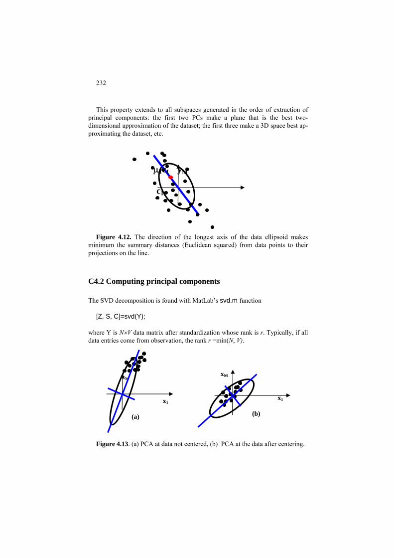
232
This property extends to all subspaces generated in the order of extraction of
principal components: the first two PCs make a plane that is the best two-dimensional approximation of the dataset; the first three make a 3D space best ap-proximating the dataset, etc.
distances (Euclidean squared) from data points to their projections on the line.
C4.2 Computing principal components
The SV omposition is found with MatLab’s svd.m function
[Z, S, C]=svd(Y);
k is r. Typically, if all da
igure 4.13. (a) PCA at data not centered, (b) PCA at the data after centering.
μ1c1 yM
c1
Figure 4.12. The direction of the longest axis of the data ellipsoid makes
minimum the summary
D dec
where Y is N×V data matrix after standardization whose ran
ta entries come from observation, the rank r =min(N, V).
x
F
xM x1
(b)
M
x1
(a)

233
The utput consists of three matrices:
matrix of which only r columns are meaningful, r factor score normed co
orresponding feature loading columns (normed) of which onl
the descending order on the top left, the part below and to the right is all zeros.
orked example 4.7. SVD for Six Students dataset.
Fo tered 6×3 matrix in table 4.13 the SVD matrices are as follows:
= 0.7111 0.4006 0.5778 0 0 17.26
orked example 4.8. Standardized Student data visualized
with 100×4 Student data matrix Y, the following
>> plot( z2*,'k.', z1*(1:35),z2*(1:35),'k^',…z1*(70:100),z2*(70:100),'ko',ad1,ad2,’kp’);
In th t com
(ii) these are triangles to represent entities 1 to 35 –
(iii) these are circles to represent entities 70 to
(iv) f
within-category averages of z2*. These are represented by pentagrams.
o
Z – N×Nlumns; C – V×V matrix of cy r are meaningful; M – N×V matrix with r×r diagonal submatrix of corresponding singular values
sorted in
W
r the cen
-0.7086 0.1783 0.4534 0.4659 0.1888 0.0888 0.2836 -0.6934 0.4706 0.0552 0.2786 0.3697 0.0935 0.1841 -0.0486-0.1870 0.9048 -0.3184 Z= 0.4629 0.0931 -0.1916 0.8513 0.0604 -0.1092
-0.3705 -0.3374 -0.7293 0.1083 0.2279 0.3916 0.2391 0.5753 0.0455-0.0922 0.1116 0.7673 -0.6566 0.0846 0.7495 27.37 0 0 C -0.2514 0.9123 -0.3232 M 0 26.13 0 =
W To produce the scatter-plot of Figure 4.9MatLab commands can be used: >> subplot(1,2,1); plot(z1*,z2*,'k.'); %Fig. 4.12, picture on the left >> subplot(1,2,2);
z1*,
e las mand, there are several items to be shown on the same plot: z1*, z2*, 'k.' – these (i) are black dot markers for all 100 entities exactly as on the plot on the left; z1*(1:35), z2*(1:35),'k^' – those in category IT; z1*(70:100), z2*(70:100),'ko' –100 – those in category AN; ad1, ad2, ’kp’ – ad1 is a 2×1 vector of the averages of z1* over entities 1 to35 (category IT) and 70 to 100 (category AN), and ad2 a similar vector o
Q.4.12. Assume that a category covers subset S of entities and y(S) represents the feature mean vector over S. Prove that the supplementary introduction of y(S)

234
onto the plain of singular vectors z via equation z*=√μz=Y*y(S)/ √μ from (4.12) onto the 2D PCA display is equivalent to representing the category by the aver-ages of the 2D points z1i* and z2i* over i∈S. A. Indeed, the operation of averaging involves but addition and dividing by a number, which are not affected by a linear operation of matrix multiplication.
aluation of the quality of visualization of the stan-ardized Student data
multiply matrix mu by itself and
re size 4x4
ibutions of each PC of the 2 first components
rints to the screen:
12.2191
72.1145
he proportion of the data scatter taken into account by the 2D visualization on Figure 4.9.
4.3 Application: Latent semantic analysis
Worked example 4.9. Evd To evaluate how well the data are approximated by the PC plane, according to equation (4.17), one needs to assess the summary contribution of the first two singular values squared in the total data scatter. To get the squares one canthen see the proportion of the first two values in the total: >> mu=m(1:4,:); %no need in 4x100 matrix output, have a squa>> la=diag(mu*mu);% make squares and put them as a vector >> lar=la*100/sum(sum(la)) % vector of the relative contr>> lar(1)+lar(2) % contribution This plar = 42.3426 29.7719 15.6664 ans = The latter is the sum of two first elements of the former – t
The number of papers applying PCA to various problems – image analysis, in-formation retrieval, gene expression interpretation, complex data storage, etc. – makes many hundreds published annually. Still there are several applications that are well established techniques on their own. We present two such techniques: La-tent semantic indexing (analysis) in this section and Correspondence analysis, in the next section.

235
P 4.3 Latent semantic analysis: Presentation
Latent semantic analysis is an application of PCA to document analysis – in-formation retrieval, first of all, using document-to-keyword data.
Information retrieval is an application that no computational data analysis may
skip: given a set of records or documents stored, find out those related to a specific query expressed by a set of keywords. Initially, at the dawn of computer era, when all the documents were stored in the same database, the problem was treated in a hard manner – only documents containing the query words were to be given to the user. Currently, this is a much softer problem that is being constantly and effi-ciently solved by various search engines such as Google, for millions of World Wide Web users.
In its generic format, the problem can be illustrated with data in Table 4.15, al-
ready utilized as Table 3.1 in section 3.2. It refers to a number of newspaper arti-cles related to subjects such as entertainment, feminism and households, conven-iently coded with letters E, F and H, respectively. Columns correspond to keywords, or terms, listed in the first line of the table, and entries refer to term frequency in the articles, according to a conventional coding scheme:
0 – no occurrence, 1 – occurs once, 2 – occurs twice or more.
Table 4.15. Database of 12 newspaper articles along with 10 terms and the
conventional coding of term frequencies. The articles are labeled F for Feminism, E for Entertainment and H for Household. One line holds document frequencies of terms (df) and the other, inverse document frequency weights (idf).
Keyword Article
drink equal fuel play popular price relief talent tax woman F1 1 2 0 1 2 0 0 0 0 2 F2 0 0 0 1 0 1 0 2 0 2 F3 0 2 0 0 0 0 0 1 0 2 F4 2 1 0 0 0 2 0 2 0 1 E1 2 0 1 2 2 0 0 1 0 0 E2 0 1 0 3 2 1 2 0 0 0 E3 1 0 2 0 1 1 0 3 1 1 E4 0 1 0 1 1 0 1 1 0 0 H1 0 0 2 0 1 2 0 0 2 0 H2 1 0 2 2 0 2 2 0 0 0 H3 0 0 1 1 2 1 1 0 2 0 H4
0 0 1 0 0 2 2 0 2 0

236
The user may wish to retrieve all the articles on the subject of households, but they are subjected to inquire by using the listed keywords only. For example, query “fuel” will retrieve all four of the household related articles, and, in fact more than that – E1 and E3 will show up too; query “tax” will get four items, three - H1, H3, and H4 – on the subjects of household and one – E3 – on the sub-ject of entertainment. No combination of these two can improve the result.
This is very much a class description problem; just the decision rules, the que-
ries, must be combinations of keywords. The error of such a query is characterized by two characteristics, precision and recall. For example, “fuel” query’s precision is 4/6=2/3 since only four of six are relevant and recall is 1 because all of the rele-vant documents have been returned. Similarly, “tax” query both precision and re-call are ¾ (see section 3.2.3 for definitions).
The rigidity of the query format does not fit well into the polysemy of natural
language – such words as “fuel” or “play” have more than one meanings – thus leading to impossibility of exact information retrieval in many cases.
The method of latent semantic indexing (LSI) utilizes the SVD decomposition
of the document-to-term data to soften and thus improve the query system by em-bedding both documents and terms into a subspace of singular vectors of the data matrix.
Before proceeding to SVD, the data table sometimes is pre-processed, typi-
cally, with what is referred to Term-Frequency-Inverse-Document-Frequency (tf-idf) normalization. This procedure gives a different weight to any keyword ac-cording to the number of documents it occurs at (document frequency df). The in-tuition is that the greater the document frequency, the more common and thus less informative is the word. The idf weighting assigns each keyword with a weight inversely proportional to the logarithm of its document frequency. The tf value is that of the corresponding entry referring to the frequency of the occurrence of the column word in the row document. For Table 4.15, these weights are in its last line.
After the SVD of the data matrix is obtained, the documents are considered
points of the subspace of a few first singular vectors. The dimension of the space is not very important here, though it still should be much smaller than the original dimension. Good practical results have been reported at the dimension of about 100-200 when the number of documents in tens and hundred thousands and the number of keywords in thousands. A query is also represented as a point in the same space. The principal components, in general, are considered as “orthogonal” concepts underlying the meaning of terms. This however, should not be taken too literally as the singular vectors can be quite difficult to interpret. Also, the repre-
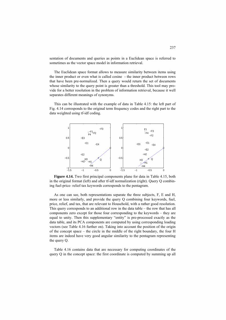
237
sentation of documents and queries as points in a Euclidean space is referred to sometimes as the vector space model in information retrieval.
The Euclidean space format allows to measure similarity between items using
the inner product or even what is called cosine - the inner product between rows that have been pre-normalized. Then a query would return the set of documents whose similarity to the query point is greater than a threshold. This tool may pro-vide for a better resolution in the problem of information retrieval, because it well separates different meanings of synonyms.
This can be illustrated with the example of data in Table 4.15: the left part of
Fig. 4.14 corresponds to the original term frequency codes and the right part to the data weighted using tf-idf coding.
−1.5 −1 −0.5 0−1
−0.5
0
0.5
1
F1 F2
F3
F4
E1
E2
E3
E4
H1 H2 H3
H4
Q
−1.5 −1 −0.5 0−1
−0.5
0
0.5
1 F1
F2
F3 F4
E1
E2
E3 E4
H1
H2
H3
H4
Q
Figure 4.14. Two first principal components plane for data in Table 4.15, both
in the original format (left) and after tf-idf normalization (right). Query Q combin-ing fuel-price- relief-tax keywords corresponds to the pentagram.
As one can see, both representations separate the three subjects, F, E and H,
more or less similarly, and provide the query Q combining four keywords, fuel, price, relief, and tax, that are relevant to Household, with a rather good resolution. This query corresponds to an additional row in the data table – the row that has all components zero except for those four corresponding to the keywords – they are equal to unity. Then this supplementary “entity” is pre-processed exactly as the data table, and its PCA components are computed by using corresponding loading vectors (see Table 4.16 further on). Taking into account the position of the origin of the concept space – the circle in the middle of the right boundary, the four H items are indeed have very good angular similarity to the pentagram representing the query Q.
Table 4.16 contains data that are necessary for computing coordinates of the
query Q in the concept space: the first coordinate is computed by summing up all
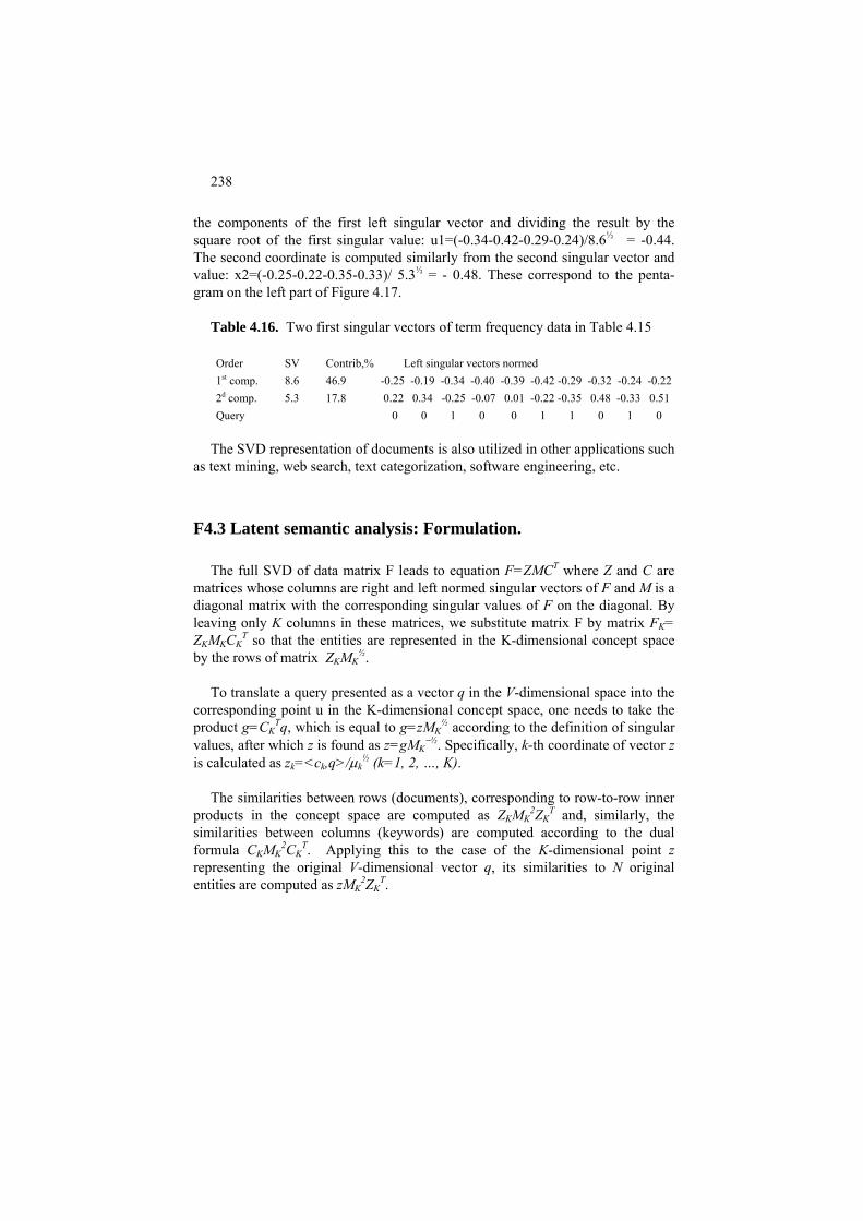
238
the components of the first left singular vector and dividing the result by the square root of the first singular value: u1=(-0.34-0.42-0.29-0.24)/8.6½ = -0.44. The second coordinate is computed similarly from the second singular vector and value: x2=(-0.25-0.22-0.35-0.33)/ 5.3½ = - 0.48. These correspond to the penta-gram on the left part of Figure 4.17.
Table 4.16. Two first singular vectors of term frequency data in Table 4.15 Order SV Contrib,% Left singular vectors normed 1st comp. 8.6 46.9 -0.25 -0.19 -0.34 -0.40 -0.39 -0.42 -0.29 -0.32 -0.24 -0.22 2d comp. 5.3 17.8 0.22 0.34 -0.25 -0.07 0.01 -0.22 -0.35 0.48 -0.33 0.51 Query 0 0 1 0 0 1 1 0 1 0
The SVD representation of documents is also utilized in other applications such
as text mining, web search, text categorization, software engineering, etc.
F4.3 Latent semantic analysis: Formulation.
The full SVD of data matrix F leads to equation F=ZMCT where Z and C are matrices whose columns are right and left normed singular vectors of F and M is a diagonal matrix with the corresponding singular values of F on the diagonal. By leaving only K columns in these matrices, we substitute matrix F by matrix FK= ZKMKCK
T so that the entities are represented in the K-dimensional concept space by the rows of matrix ZKMK
½. To translate a query presented as a vector q in the V-dimensional space into the
corresponding point u in the K-dimensional concept space, one needs to take the product g=CK
Tq, which is equal to g=zMK½ according to the definition of singular
values, after which z is found as z=gMK−½. Specifically, k-th coordinate of vector z
is calculated as zk=<ck,q>/μk½ (k=1, 2, …, K).
The similarities between rows (documents), corresponding to row-to-row inner
products in the concept space are computed as ZKMK2ZK
T and, similarly, the similarities between columns (keywords) are computed according to the dual formula CKMK
2CKT. Applying this to the case of the K-dimensional point z
representing the original V-dimensional vector q, its similarities to N original entities are co 2 Tmputed as zMK ZK .
239
C4.3 Latent semantic analysis: Computation
Let X be N×V array representing the original frequency data. To convert that to the conventional coding, in which all the entries larger than 1 are coded by 2, one can use this operation:
>> Y=min(X,2*ones(N,V)); Computing vector df of document frequencies over matrix Y can be done with
this line: >>df=zeros(1,V); for k=1:V;df(k)=length(find(Y(:,k)>0));end; and converting df to the inverse-document-frequency weights, with this: >> idf=log(N./df); After that, it-idf normalization can be made by using command >>YI=Y.*repmat(idf, N,1); Given term frequency matrix Y, its K-dimensional concept space is created with
commands: >> [z,m,c]=svd(Y); >>zK=z(:, [1:K]); cK=c(:, [1:K]); mK=m([1:K], [1:K]); Worked example 4.10. Drawing Figure 4.17 Consider that z is the matrix of normed paper score singular vectors, c the matrix of
normed keyword loading vectors, and m the matrix of singular values of the data in Table 4.15 as they are.
To draw the left part of Figure 4.17, one can define the coordinates with vectors z1 and
z2: >> z1=z(:,1)*sqrt(m(1,1)); %first coordinates of N entities in the concept space >> z2=z(:,2)*sqrt(m(2,2)); %second coordinates of N entities in the concept space Then prepare the query vector and its translation to the concept space: >> q=[0 0 1 0 0 1 1 0 1 0]; % “fuel, price, relief, tax” query vector >> d1=q*c(:,1)/sqrt(m(1,1)); %first coordinate of query q in the concept space >> d2=q*c(:,2)/sqrt(m(2,2)); %second coordinate of query q in the concept space After this, an auxiliary text data should be put according to MatLab requirements:

240
>> tt={‘E1’,’E2’, …, ‘H4’}; % cell of names of the items in data matrix >>ll=[0:.04:1.5]; zd1=d1*ll;zd2=d2*ll; % pair zd1, zd2 will draw a line through origin and point (d1,d2) Now we are ready for plotting the left drawing in Figure 4.17: >> subplot(1,2,1); >> plot(u1,u2,'k.',d1,d2,'kp',0,0,’ko’,ud1,ud2);text(u1,u2,tt); >> text(d1,d2,' Q'); >> axis([-1.5 0 -1 1.2]); The arguments of plot command here are: u1,u2,'k.' – black dots corresponding to the original entities; d1,d2,'kp' – black pentagram corresponding to query q; 0,0,’ko’ – black circle corresponding to the space origin; ud1,ud2 – line through the query and the origin. Command text provides for string labels at corresponding points. Command axis speci-
fies the boundaries of the Cartesian plane box on the figure, which can be used for making different plot boxes uniform.
The plot on the right of Figure 4.17 is coded similarly by using SVD of tf-idf matrix YI
rather than Y.
4.4 Application: Correspondence analysis
P4.4 Correspondence analysis: Presentation
Correspondence Analysis is an extension of PCA to contingency tables taking into account the specifics of co-occurrence data: they are not only comparable across the table but also can be meaningfully summed up across the table. This leads to a unique way of standardization of such data – by using the Quetelet coef-ficients rather than the original frequencies, which is an advantage over the com-mon situations in which the data standardization is rather arbitrary.
Correspondence Analysis (CA) is a method for visually displaying both row
and column categories of a contingency table P=(pij), i∈I, j∈J, in such a way that distances between the presenting points reflect the patterns of co-occurrences in P. This method is usually introduced as a set of dual heuristics applied simultane-ously to rows and columns of the contingency table (see, for example, Lebart,

241
Morineau and Piron 1995). Yet there is a way for introducing CA as a decoder based data recovery technique similar to that used for introducing PCA above. According to this perspective (Mirkin 1996), CA is a version of PCA differing from PCA, due to the specifics of contingency data, in the following aspects:
(i) CA decoder applies to the relative Quetelet coefficients rather than to the
original frequencies; (ii) Both rows and columns are assigned with weights equal to the marginal
frequencies – these weights are used in the least-squares criterion as well as the or-thogonality conditions;
(iii) Both rows and columns are visualized on the same display in such a way
that the geometric distances between the representing them points reflect the so-called chi-square distances between row and column conditional frequency pro-files (see (4.23) in the formulation part later);
(iv) The data scatter is measured by the Pearson chi-square association coeffi-
cient rather than just the sum of squares of Quetelet coefficients. Worked example 4.11. Correspondence analysis of Protocol/Attack contin-
gency table Consider Table 4.17, a copy of Table 2.6 representing the distribution of protocol types
and attack types according to Intrusion data: totals on its margins show summary distribu-tions of protocols and attacks separately.
Table 4.17. Protocol/Attack contingency table for Intrusion data.
Category Apache Saint Smurf Norm Total Tcp 23 11 0 30 64 Udp 0 0 0 26 26 Icmp 0 0 10 0 10 Total 23 11 10 56 100
To apply the method to data in Table 4.17, we first standardize it into Quetelet coeffi-
cients (see Table 4.18). Table 4.18. Quetelet indices, per cent, for the Protocol/Attack contingency Table 4.17.
Category Apache Saint Smurf Norm Tcp -100.00 -16.29 56.25 56.25 Udp -100.00 -100.00 -100.00 78.57
Icmp -100.00 -100.00 -100.00 900.00
242
This standardization does make the data structure somewhat sharper, as has been ex-plained in section 2.3. One can see, for example, that q=9 (=900%) for the equivalent pair (Icmp, surf). But the transformation p⇒q does not work alone in CA; it is coupled with the weighting of each row and column by its corresponding marginal probability so that the squared errors in the criterion are weighted by products of the marginal probabilities. Moreover, the vector norm is weighted by them too.
Figure 4.15 represents a CA visualization of Table 4.17 derived as described in section
C4.4, which shows indeed that the equivalent Smurf and Icmp fall in the same place; Norm is much associated to Udp, and Apache and Saint are between Tcp and Icmp protocols. The Norm category slightly falls out: all points representing columns should be within the con-vex closure of the three protocol points.
F4.4 Correspondence Analysis: Formulation
Correspondence Analysis (CA) is a method for visually displaying both row and column categories of a contingency table P=(p ), i∈I, j∈J, in such a way that ijdistances between the presenting points reflect the pattern of co-occurrences in P. To be specific, let us take on the issue of visualization of P on a 2D plane so that we are looking for just two approximating factors, u1=(v1, w ) where v1 1=(v1(i)) and w1=(w1(j)) and u2=(v2, w ) where v2 2=(v2 (i)) and w2=(w2(j)), with I∪J as their domain, such that each row i∈I is displayed as point u(i)=(v1(i), v (i)) and each 2
column j∈J as point u(j)=(w (j), w1 2(j)) on the plane as shown in Figure 4.15. The |I|-dimensional vectors vt and |J|-dimensional vectors wt constituting ut
(t=1, 2) are calculated to approximate the relative Quetelet coefficients qij=pij/(pi+p ) – 1 rather than the co-occurences p+j ij themselves, according to equa-tions:
qij =μ1v1(i)w1(j)+ μ2v2(i)w2(j) + eij (4.20)
where μ1 and μ2 are positive reals, by minimizing the weighted least-squares crite-rion
E2=Σi∈IΣj∈J pi+p+jeij
2 (4.21)
with regard to μt, vt, wt, subject to conditions of weighted orthonormality:
Σi∈I pi+vt(i)vt’(i) = Σj∈J p+jwt(j)wt’(j) ={ (4.22) 1, if t=t′ 0, other-
where t, t′ =1, 2.
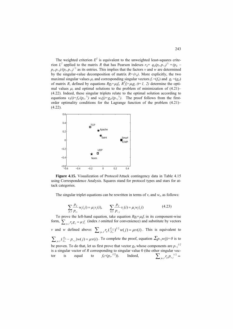
243
The weighted criterion E2 is equivalent to the unweighted least-squares crite-rion L2 applied to the matrix R that has Pearson indexes rij= qij(pi+p )½ =(p+j ij − pi+p+j)/(pi+p ) ½ as its entries. This implies that the factors v and w are determined +jby the singular-value decomposition of matrix R=(r ). More explicitly, the two ij
maximal singular values μt and corresponding singular vectors ft =(fit) and gt =(gjt) of matrix R, defined by equations Rgt=μtft, RTft=μtgt (t=1, 2) determine the opti-mal values μt and optimal solutions to the problem of minimization of (4.21)–(4.22). Indeed, these singular triplets relate to the optimal solution according to equations vt(i)=fit/(pi+
½ ½) and wt(j)=gjt/(p ). The proof follows from the first-+jorder optimality conditions for the Lagrange function of the problem (4.21)–(4.22).
−0.6 −0.4 −0.2 0 0.2 0.4−0.6
−0.4
−0.2
0
0.2
0.4
0.6
TCP
UDP
ICMP
Apache
Saint Smurf
Norm
Figure 4.15. Visualization of Protocol/Attack contingency data in Table 4.15
using Correspondence Analysis. Squares stand for protocol types and stars for at-tack categories.
The singular triplet equations can be rewritten in terms of vt and wt, as follows:
( ) ( ), ( ) ( )ij ijt t t t t t
j J i Ii j
p pw j v i v i w j
p pμ
∈ ∈+ +
=∑ ∑ μ= (4.23)
To prove the left-hand equation, take equation Rgt=μtf in its component-wise t
ij j ij Jr g fμ
∈=∑ (index t omitted for convenience) and substitute by vectors form,
1/2( ) ( ) ( )j
i
pij pj J
r w j vμ+
+∈=∑ iv and w defined above: . This is equivalent to
( ) ( ) ( )ij
i
pjpj J
p w j v iμ+ +∈
− =∑ . To complete the proof, equation Σjp w(j)=0 is to +j
1/2be proven. To do that, let us first prove that vector g0 whose components are p +jis a singular vector of R corresponding to singular value 0 (the other singular vec-tor is equal to f0=(pi+
1/2)). Indeed, 1/2ij jj J
r p+∈=∑

244
1/2 1/2(1/ ) ( ) (1/ )( ) 0.i ij i j i i ij Jp p p p p p p+ + + + +∈
− = − =∑ + Then the equation
Σjp w(j)=0 follows from the fact that all the singular vectors are mutually or-+j
thogonal so that singular vector g corresponding to w is orthogonal to g0, which proves the statement. The right-hand equation can be proven in a similar way, from equation RTft=μtgt.
Equations (4.23) are referred to as transition equations and considered to justify
the joint display of rows and columns because the row-points vt(i) appear to be av-eraged column-points wt(j) and, vice versa, the column-points appear to be aver-aged versions of the row-points, up to the singular value of μt course.
The mutual location of the row-points is considered as justified by the fact that
between-row-point squared Euclidean distances d2(u(i), u(i')) approximate the chi-square distances between corresponding rows of the contingency table. Specifi-cally, chi-square distance is defined as
χ2(i,i')= Σj∈J p+j(qij-qi’j)2 = Σj∈J(pij/pi+ - pi’j /p )2/p . (4.24) i′+ +j
Here u(i)=(v (i), v1 2(i)) for v1 and v2 rescaled in such a way that their norms are
equal to μ and μ1 2, respectively. A similar property holds for columns j, j′. In fact, it is the right-hand item in (4.24) which is used to define the chi-squared distance (Lebart et al. 1995), but the definition in terms of Quetelet coefficients in the mid-dle of (4.24) (Mirkin 1996) looks more natural. The distance is dubbed chi-square distance because of its links to the chi-square coefficient for table P. First of all if we take the weighted chi-square summary distance to 0, Σi∈I pi+χ2(i,0) where 0 is put instead of qi’j in (4.24), it is easy to see that this is the Pearson chi-squared co-efficient, without the factor N of course, which is simultaneously the expression for the data scatter according to criterion E2 in (4.21):
Σi∈I pi+χ2(i,0)= Σi∈IΣj∈J pi+p+jeij
2 =X2/N (4.25) The weighted data scatter is equal to the scatter of R, the sum of its squared en-
tries T(R), which can be easily calculated from the definition of R. Indeed, T(R)= Σi∈IΣj∈J(pij - pi+p+j) 2 2/(pi+p ) = X /N.+j This implies that
X2/N=μ1
2 +μ 2 + E2 (4.26) 2
which can be seen as a decomposition of the contingency data scatter, expressed by X2, into contributions of the individual factors, μ1
2 and μ22, and unexplained re-
siduals, E2. (Only two factors are considered here, but the number of factors to be found can be raised up to the rank of matrix R with no change).

245
In a common situation, the first two singular values account for a major part of X2, thus justifying the use of the plane of the first two factors for visualization of the interrelations between I and J.
C4.4 Correspondence Analysis: Computation
Given a contingency table P, the computation of correspondence analysis fac-tors can go in three steps: (a) computing Pearson index matrix R, (b) finding the singular decomposition of R and the two first correspondence analysis factors, and (c) visualization of the joint display of rows and columns of P. Here are MatLab commands for these.
(a) Computing Pearson index matrix R >> Pc=sum(P); Pr=sum(P'); total=sum(Pc); >> P=P/total; %relative frequencies >> Pc=Pc/total; %column relative frequencies >> Pr=Pr/total; %row relative frequencies >> Prod=Pr'*Pc; % matrix of products >> rProd=Prod.^(0.5); % square roots of products >> r=(P-Prod)./rProd; % Pearson index matrix (b) Finding the correspondence analysis factors: >> [a,mu,b]=svd(r); >> % finding first factor >> x1=(a(:,1).*sqrt(Pr'))*sqrt(mu(1,1)); >> y1=(b(:,1).*sqrt(Pc'))*sqrt(mu(1,1)); >> % finding second factor >> x2=(a(:,2).*sqrt(Pr'))*sqrt(mu(2,2)); >> y2=(b(:,2).*sqrt(Pc'))*sqrt(mu(2,2)); As a bonus, one can estimate the proportion of data scatter, the chi-squared,
taken into account by the factors, and display it on the screen: >> yy=r.*r; chi=sum(sum(yy))% data scatter >> ccn=(mu(1,1)^2+mu(2,2)^2)*100/chi; %contribution of the first two >> disp('Contribution of the solution:'); ccn (c) Visualization of the joint display of rows and columns of P. The plot is
easy to do with command

246
>> plot(x1,x2,'ks', y1,y2,'kp'); Yet to make the points annotated with row and column names, which are to be
available in a string cell termed say ‘names’, the joint set of rows and columns should get their x-coordinate and y-coordinate vectors, z1 and z2 below:
>> z1=[x1' y1']; z2=[x2' y2']; text(z1,z2,names); >> v=axis; axis(1.5*v); The last line is to make the picture to look tighter by extending its boundaries.
Q.4.13. Why is (a) the first singular vector all positive and (b) the second singular vector half negative? A. (a) All features are positively correlated; (b) the second must be orthogonal to the first.
Q. 4.14. For the data in Table 4.10, as well as many others, svd function in Mat-lab produces first singular vectors z and c negative, which contradicts the meaning of them as talent scores and subject loadings. Can anything be done about that? A. Yes, they can be changed to –z and –c without compromising their singular vector status.
Q. 4.15. Is matrix
1 2 2 1
of rank 1 or not? A. The rows are not proportional to each other, thus not. Q.4.16. Prove that if matrix Y is symmetric then its eigenvalues and vectors
(λ,z) are simultaneously its singular triplets (λ, z, z). Q.4.17. Find a matrix of rank 1 that is the nearest to matrix in Q.4.15 according
to the least-squares criterion. A. The solution is given by the first singular value and corresponding singular vectors which are the same as the first eigenvalue and and corresponding eigen-vector, λ=3 and z=(1/√2, 1/√2), thus leading to matrix
3/2 3/2 3/2 3/2
as the solution. Q.4.18. For positive a and b, inequality a<b can be equivalently expressed as
a/b<1. The difference between a and b does not change if c>0 is added to both of them, but the ratio does. Prove that for any c>0, (a+c)/(b+c)>a/b – this would il-lustrate that the further away the positive data are from zero, the greater the con-tribution of the first principal component. Q.4.19. There is another representation of a singular value problem as an eigen-value problem. Given a square N×V matrix Y, consider a (N+V)×(N+V) matrix Y*
247
that consists of four blocks, two of which, the diagonal N×N and V×V blocks, are all zeros:
. * 00T
YY
Y⎛ ⎞
= ⎜ ⎟⎝ ⎠
Prove that a triplet (μ, z, c) is singular for Y if and only if μ is eigenvalue for Y* corresponding to eigenvector y=(z,c) in which first N components are taken by z and the remaining V components, by c. A. Consider an arbitrary eigenvalue μ and corresponding eigenvector y of matrix Y* and denote the vector of its first N com-ponent by z, and the rest by c so that y=(z,c). The product Y*y will have its first N components equal to 0z+Yc=Yc and the next V components equal to YTz+0c=YTz. Since Y*y=μy, that means that Yc=μz and YTz=μc, which proves the statement.
Q.4.20. Prove that if an eigenvector y=(z,c) of Y* is normed, then its components z and c both have norms of 0.51/2 2. A. Indeed, ||y|| = ||z||2 2 +||c|| because these are just sums of the squared components. On the other hand, as proven in Q.4.20, z and c are singular vectors of Y so that they must have equal norms because of Property 1 in section F4.2. This leads to equation ||z||2 2=||c|| =1/2, which proves the statement.
Q.4.21. Prove that if μ is an eigenvalue of Y* corresponding to its eigenvector y=(z,c) then so is its negation -μ corresponding to eigenvector y=(-z,c). A. Indeed, equations Yc=μz and YTz=μc hold if and only if Yc=(-μ)(-z) and Y(-z)=(-μ)c.
4.5 Summary
This Chapter introduces the concept of data summarization as a coder-decoder pair and describes the method of principal components (PCA) as a data-driven model in this framework. Luckily, this model is underlied with a well developed mathematical theory of singular value decomposition (SVD) for rectangular ma-trices. Unlike the conventional formulation of PCA, this model does not require to postulate that the principal components are to be linear combinations of features. This property is derived from the model. Yet the PCA model itself is rather sim-plistic and suggests that further thinking on better data summarization models should be undertaken.
Three applications of PCA – scoring hidden factors, data visualization, and fea-
ture space reduction are illustrated with further instructions and worked examples. Two more distant applications, Latent semantic analysis (for disambiguation in document retrieval) and Correspondence analysis (for visualization of contingency tables), are explained in full, too.

248
References
J.F. Hair, W.C. Black, B.J. Babin, R.E. Anderson (2010) Multivariate Data Analysis, 7th Edition, Prentice Hall, ISBN-10: 0-13-813263-1.
M.G. Kendall, A. Stewart (1973) Advanced Statistics: Inference and Relation-ship (3d edition), Griffin: London, ISBN: 0852642156.
L.Lebart, A. Morineau, M. Piron (1995) Statistique Exploratoire Multidimen-sionelle, Dunod, Paris, ISBN 2-10-002886-3.
C.D. Manning, P. Raghavan, H. Schütze (2008) Introduction to Information Re-trieval, Cambridge University Press.
B. Mirkin (1996) Mathematical Classification and Clustering, Kluwer Academic Press.
B. Mirkin (2005) Clustering for Data Mining: A Data Recovery Approach, Chapman & Hall/CRC, ISBN 1-58488-534-3.
Articles
R. Cangelosi, A. Goriely (2007) Component retention in principal component analysis with application to cDNA microarray data, Biology Direct, 2:2, http://www.biolgy-direct.com/con-tent/2/1/2.
S. Deerwester, S. Dumais, G. W. Furnas, T. K. Landauer, R. Harshman (1990) In-dexing by Latent Semantic Analysis, Journal of the American Society for Informa-tion Science 41 (6), 391-407.

249
5 K-Means and Related Clustering Methods
Boris Mirkin
Department of Computer Science and Information Systems, Birkbeck, University of London, Malet Street, London WC1E 7HX UK
Department of Data Analysis and Machine Intelligence, Higher School of Economics, 11 Pokrovski Boulevard, Moscow RF
Abstract
K-Means is arguably the most popular data analysis method. The method out-puts a partition of the entity set into clusters and centroids representing them. It is very intuitive and usually requires just a few pages to get presented. This text in-cludes a number of less popular subjects that are important when using K-Means for real-world data analysis:
• Data standardization, especially, at mixed scales • Innate tools for interpretation of clusters • Analysis of examples of K-Means working and failures • Initialization – the choice of the number of clusters and location of cen-
troids
Versions of K-Means such as incremental K-Means, nature inspired K-Means, and entity-centroid “medoid” methods are presented. Three modifications of K-Means onto different cluster structures are given:. Fuzzy K-Means for finding fuzzy clus-ters, Expectation-Maximization (EM) for finding probabilistic clusters, and Koho-nen self-organizing maps (SOM) that tie up the sought clusters to a visually com-fortable two-dimensional grid.
Equivalent reformulations of K-Means criterion are described – they can yield dif-ferent algorithms for K-Means. One of these is explained at length: K-Means ex-tends Principal component analysis to the case of binary scoring factors, which yields the so-called Anomalous cluster method, a key to an intelligent version of K-Means with automated choice of the number of clusters and their initialization.
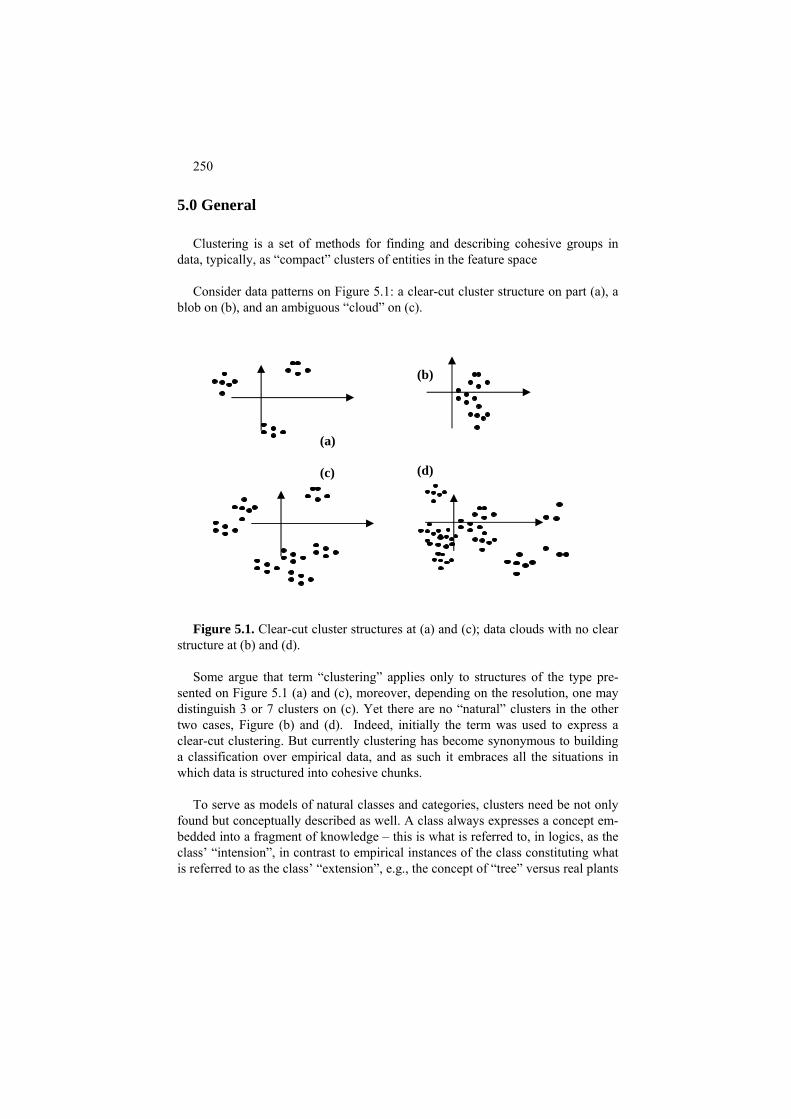
250
5.0 General
Clustering is a set of methods for finding and describing cohesive groups in data, typically, as “compact” clusters of entities in the feature space
Consider data patterns on Figure 5.1: a clear-cut cluster structure on part (a), a
blob on (b), and an ambiguous “cloud” on (c).
(b) (a) (d) (c)
Figure 5.1. Clear-cut cluster structures at (a) and (c); data clouds with no clear
structure at (b) and (d). Some argue that term “clustering” applies only to structures of the type pre-
sented on Figure 5.1 (a) and (c), moreover, depending on the resolution, one may distinguish 3 or 7 clusters on (c). Yet there are no “natural” clusters in the other two cases, Figure (b) and (d). Indeed, initially the term was used to express a clear-cut clustering. But currently clustering has become synonymous to building a classification over empirical data, and as such it embraces all the situations in which data is structured into cohesive chunks.
To serve as models of natural classes and categories, clusters need be not only
found but conceptually described as well. A class always expresses a concept em-bedded into a fragment of knowledge – this is what is referred to, in logics, as the class’ “intension”, in contrast to empirical instances of the class constituting what is referred to as the class’ “extension”, e.g., the concept of “tree” versus real plants
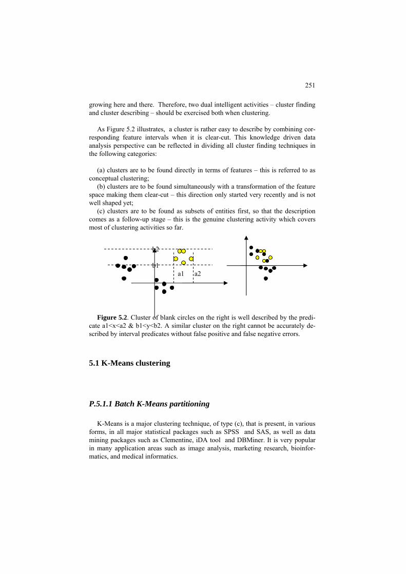
251
growing here and there. Therefore, two dual intelligent activities – cluster finding and cluster describing – should be exercised both when clustering.
As Figure 5.2 illustrates, a cluster is rather easy to describe by combining cor-
responding feature intervals when it is clear-cut. This knowledge driven data analysis perspective can be reflected in dividing all cluster finding techniques in the following categories:
(a) clusters are to be found directly in terms of features – this is referred to as
conceptual clustering; (b) clusters are to be found simultaneously with a transformation of the feature
space making them clear-cut – this direction only started very recently and is not well shaped yet;
(c) clusters are to be found as subsets of entities first, so that the description comes as a follow-up stage – this is the genuine clustering activity which covers most of clustering activities so far.
Figure 5.2. Cluster of blank circles on the right is well described by the predi-
cate a1<x<a2 & b1<y<b2. A similar cluster on the right cannot be accurately de-scribed by interval predicates without false positive and false negative errors.
5.1 K-Means clustering
P.5.1.1 Batch K-Means partitioning
K-Means is a major clustering technique, of type (c), that is present, in various forms, in all major statistical packages such as SPSS and SAS, as well as data mining packages such as Clementine, iDA tool and DBMiner. It is very popular in many application areas such as image analysis, marketing research, bioinfor-matics, and medical informatics.
b2 b1 a1 a2

252
In general, the cluster finding process according to K-Means starts from K ten-
tative centroids and repeatedly applies two steps: (a) collecting clusters around centroids, (b) updating centroids as within cluster means, – until convergence. This makes much sense – whichever centroids are suggested first, as hypotheti-
cal cluster tendencies, they are checked then against real data and moved to the ar-eas of higher density.
(a) (b) Figure 5.3. Main steps of Batch K-Means: (a) initialization of centroids, (b)
cluster updare using Minimum distance rule (the pointed lines show distances from an entity to all centroids), (c) cluster update completed, (d) centroid update completed.
In its generic, so-called Batch mode, K-Means can be formulated as comprising
the following steps 0-3 illustrated on Figure 5.3 for K=3: 0. Initialization: the user chooses the number K of clusters and puts K hypo-
thetic cluster centroids among the entity points, see Figure 5.3 (a); 1. Cluster update: Given K centroids ck, each of the entities i∈I is assigned to
one of the centroids according to Minimum distance rule: distances between i and each ck are calculated, and i is assigned to the nearest ck, see Figure 5.3 (b). For each centroid ck, those entities assigned to it, form cluster Sk (k=1, 2, …, K) , see Figure 5.3 (c).
2. Centroid update: Given K clusters Sk, its gravity center is computed and set
as the new centroid ck′ (k=1, 2, …, K) , see Figure 5.3 (d).
(c) (d)
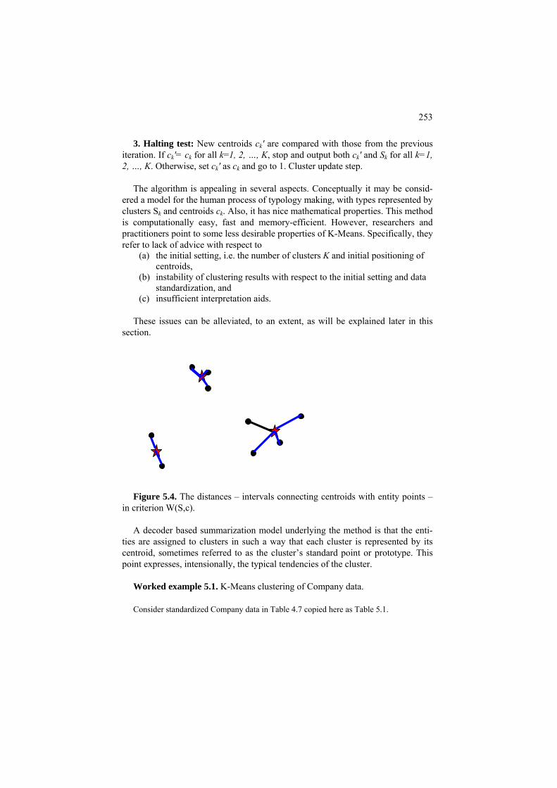
253
3. Halting test: New centroids ck′ are compared with those from the previous iteration. If ck′= ck for all k=1, 2, …, K, stop and output both ck′ and Sk for all k=1, 2, …, K. Otherwise, set ck′ as ck and go to 1. Cluster update step.
The algorithm is appealing in several aspects. Conceptually it may be consid-
ered a model for the human process of typology making, with types represented by clusters Sk and centroids ck. Also, it has nice mathematical properties. This method is computationally easy, fast and memory-efficient. However, researchers and practitioners point to some less desirable properties of K-Means. Specifically, they refer to lack of advice with respect to
(a) the initial setting, i.e. the number of clusters K and initial positioning of centroids,
(b) instability of clustering results with respect to the initial setting and data standardization, and
(c) insufficient interpretation aids. These issues can be alleviated, to an extent, as will be explained later in this
section.
Figure 5.4. The distances – intervals connecting centroids with entity points –
in criterion W(S,c). A decoder based summarization model underlying the method is that the enti-
ties are assigned to clusters in such a way that each cluster is represented by its centroid, sometimes referred to as the cluster’s standard point or prototype. This point expresses, intensionally, the typical tendencies of the cluster.
Worked example 5.1. K-Means clustering of Company data. Consider standardized Company data in Table 4.7 copied here as Table 5.1.
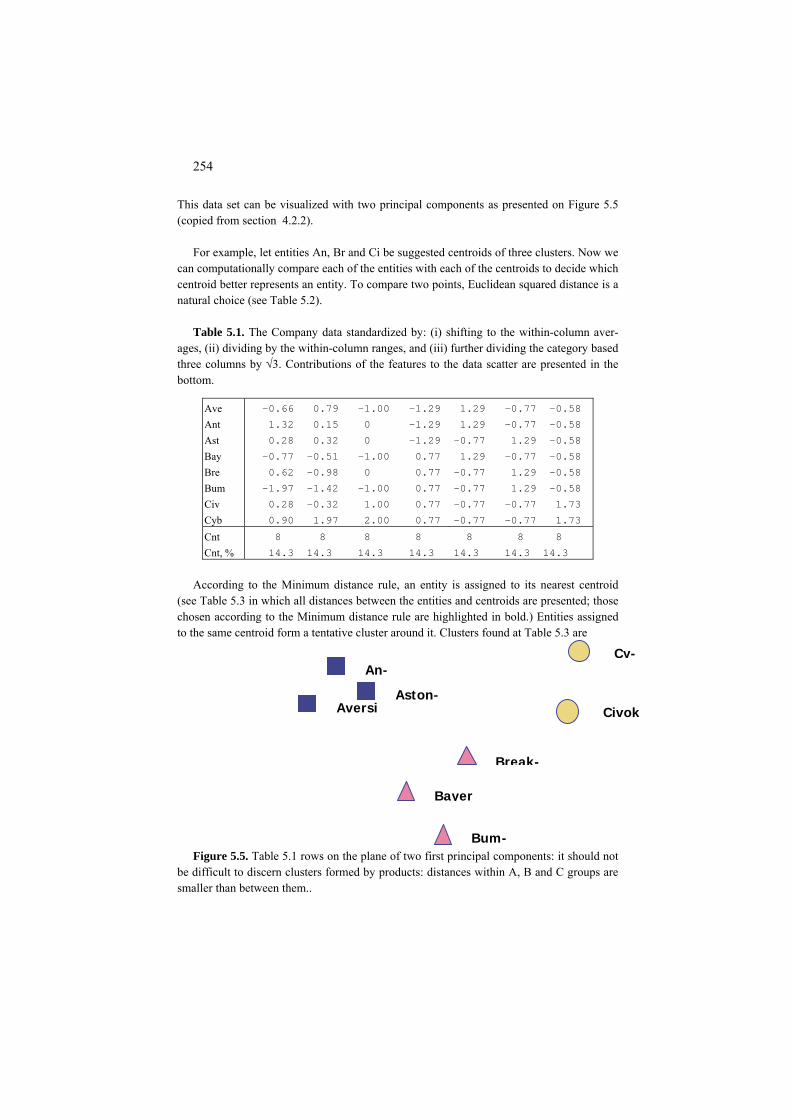
254
This data set can be visualized with two principal components as presented on Figure 5.5 (copied from section 4.2.2).
For example, let entities An, Br and Ci be suggested centroids of three clusters. Now we
can computationally compare each of the entities with each of the centroids to decide which centroid better represents an entity. To compare two points, Euclidean squared distance is a natural choice (see Table 5.2).
Table 5.1. The Company data standardized by: (i) shifting to the within-column aver-
ages, (ii) dividing by the within-column ranges, and (iii) further dividing the category based three columns by √3. Contributions of the features to the data scatter are presented in the bottom.
-0.66 0.79 -1.00 -1.29 1.29 -0.77 -0.58 Ave 1.32 0.15 0 -1.29 1.29 -0.77 -0.58 Ant 0.28 0.32 0 -1.29 -0.77 1.29 -0.58 Ast -0.77 -0.51 -1.00 0.77 1.29 -0.77 -0.58 Bay 0.62 -0.98 0 0.77 -0.77 1.29 -0.58 Bre -1.97 -1.42 -1.00 0.77 -0.77 1.29 -0.58 Bum 0.28 -0.32 1.00 0.77 -0.77 -0.77 1.73 Civ 0.90 1.97 2.00 0.77 -0.77 -0.77 1.73 Cyb 8 8 8 8 8 8 8 Cnt 14.3 14.3 14.3 14.3 14.3 14.3 14.3 Cnt, %
According to the Minimum distance rule, an entity is assigned to its nearest centroid
(see Table 5.3 in which all distances between the entities and centroids are presented; those chosen according to the Minimum distance rule are highlighted in bold.) Entities assigned to the same centroid form a tentative cluster around it. Clusters found at Table 5.3 are
Bayer
Break-
Bum-
Civok
Cy-
Aversi
An-
Aston-
Figure 5.5. Table 5.1 rows on the plane of two first principal components: it should not
be difficult to discern clusters formed by products: distances within A, B and C groups are smaller than between them..
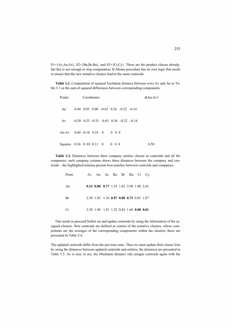
255
S1={Av,An,As}, S2={Ba,Br,Bu}, and S3={Ci,Cy}. These are the product classes already, but this is not enough to stop computation. K-Means procedure has its own logic that needs to ensure that the new tentative clusters lead to the same centroids.
Table 5.2. Computation of squared Euclidean distance between rows Av and An in Ta-
ble 5.1 as the sum of squared differences between corresponding components.
Points Coordinates d(An,Av)
An 0.40 0.05 0.00 -0.63 0.36 -0.22 -0.14
Av -0.20 0.23 -0.33 -0.63 0.36 -0.22 -0.14
An-Av 0.60 -0.18 0.33 0 0 0 0
Squares 0.36 0. 03 0.11 0 0 0 0 0.50
Table 5.3. Distances between three company entities chosen as centroids and all the
companies; each company column shows three distances between the company and cen-troids – the highlighted minima present best matches between centroids and companies.
Point Av An As Ba Br Bu Ci Cy
An 0.51 0.00 0.77 1.55 1.82 2.99 1.90 2.41
Br 2.20 1.82 1.16 0.97 0.00 0.75 0.83 1.87
Ci 2.30 1.90 1.81 1.22 0.83 1.68 0.00 0.61
One needs to proceed further on and update centroids by using the information of the as-
signed clusters. New centroids are defined as centers of the tentative clusters, whose com-ponents are the averages of the corresponding components within the clusters; these are presented in Table 5.4.
The updated centroids differ from the previous ones. Thus we must update their cluster lists by using the distances between updated centroids and entities; the distances are presented in Table 5.5. As is easy to see, the Minimum distance rule assigns centroids again with the

256
same entity lists. Therefore, the process has stabilized – if we repeat it all over again, noth-ing new would ever come – the same centroids and the same assignments. The process
Table 5.4. Tentative clusters from Table 5.3 and their centroids.
-0.14 -0.22 0.36-0.63-0.33 0.23 -0.20 Av -0.14 -0.22 0.36-0.63 0 0.05 0.40 An -0.14 0.36-0.22-0.63 0 0.09 0.08 As
Centroid1 0.10 0.12 -0.11 -0.63 0.17 -0.02 -0.14
-0.14 -0.22 0.36 0.38-0.33 -0.15 -0.23 Ba -0.14 0.36-0.22 0.38 0 -0.29 0.19 Br -0.14 0.36-0.22 0.38-0.33 -0.42 -0.60 Bu
Centroid2 -0.21 -0.29 -0.22 0.38 -0.02 0.17 -0.14
Ci 0.08 -0.10 0.33 0.38 -0.22 -0.22 0.43 Cy 0.27 0.58 0.67 0.38 -0.22 -0.22 0.43
Centroid3 0.18 0.24 0.50 0.38 -0.22 -0.22 0.43
stops at this point, and the found clusters along with their centroids are returned (see them, in the standardized format, in Table 5.4).
Table 5.5. Distances between the three updated centroids and all the companies; the
highlighted column minima present best matches between centroids and companies.
Point Av An As Ba Br Bu Ci Cy 0.22 0.19 0.31 1.31 1.49 2.12 1.76 2.36 Centroid1 1.58 1.84 1.36 0.33 0.29 0.25 0.95 2.30 Centroid2 2.50 2.00 1.95 1.69 1.20 2.40 0.15 0.15 Centroid3
The result obviously depends on the standardization of the data performed beforehand, as the method heavily relies on the squared Euclidean distance and, thus, on the relative weighting of the features, just like PCA.
Case study 5.1. Dependence of K-Means on initialization: a drawback and advantage
The bad news is that the K-Means result depends on initialization – the choice of the ini-
tial tentative centroids, even if we know, or have guessed correctly, the number of clusters K. Indeed, if we start from wrong entities as the tentative centroids, the result can be rather disappointing.
In some packages, such as SPSS, K first entities are taken as the initial centroids. Why
not start from rows for Av, An and As then? Taking these three as the initial tentative cen-

257
troids will stabilize the process at wrong clusters S1={Av, Ba}, S2={An}, and S3={As, Br, Bu, Ci, Cy} (See Q.5.5). But what else can be expected if all centroids are taken from the same cluster?
However, even if centroids are taken from right clusters, this would not necessarily
guarantee good results either. Start, for example, from Av, Ba and Ci (note, these produce different products!); the final result still will be rather disappointing – S1={Av,An,As}, S2={Ba, Bu}, and S3={Br, Ci, Cy} (see Q.5.6).
Figure 5.6 illustrates the fact that such instability is not because of a specially designed
example but rather an ordinary phenomenon. There are two clear-cut clusters on Figure 5.6, that can be thought of as uniformly distributed sets of points, and two different initializa-tions, symmetric one on the (a) part and not symmetric one on (b) part. The Minimum dis-tance rule at K=2 amounts to drawing a hyperplane that orthogonally cuts through the mid-dle of line between the two centroids; the hyperplane is shown on Figure 5.6 as the line separating the centroids. In Figure 5.6, the case (a) presents initial centroids that are more or less symmetric so that the line through the middle separates the clusters indeed. In the case (b), initial centroids are highly asymmetric so that the separating line cuts through one of the clusters, thus distorting the position of the further centroids; the final separation still cuts through one of the clusters and, therefore, is utterly wrong.
Initial Final
(a) Right
(b) Wrong
Figure 5.6. Case of two clear-cut clusters and two different initializations: (a) and (b). Case (a) results in a correct separation of the clusters, case (b) not.
There is one more property of K-Means clusters illustrated by Figure 5.6: they are con-
vex. Indeed, the Minimum Distance rule assigns each centroid with the intersection of half-spaces formed by the orthogonal cutting hyperplanes.
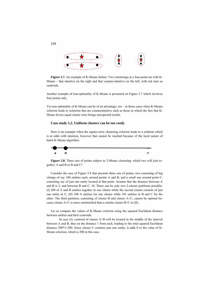
258
Figure 5.7. An example of K-Means failure: Two clusterings at a four-point-set with K-
Means – that intuitive on the right and that counter-intuitive on the left, with red stars as centroids.
Another example of non-optimality of K-Means is presented on Figure 5.7 which involves four points only.
Yet non-optimality of K-Means can be of an advantage, too – in those cases when K-Means criterion leads to solutions that are counterintuitive such as those in which the fact that K-Means favors equal cluster sizes brings unexpected results.
Case study 5.2. Uniform clusters can be too costly Here is an example when the square-error clustering criterion leads to a solution which
is at odds with intuition, however that cannot be reached because of the local nature of batch K-Means algorithm.
A B C
Figure 5.8. Three sets of points subject to 2-Means clustering: which two will join to-gether, A and B or B and C?
Consider the case of Figure 5.8 that presents three sets of points, two consisting of big
clumps of say 100 entities each, around points A and B, and a small one around point C, consisting say of just one entity located at that point. Assume that the distance between A and B is 2, and between B and C, 10. There can be only two 2-cluster partitions possible: (I) 200 of A and B entities together in one cluster while the second cluster consists of just one entity in C; (II) 100 A entities for one cluster while 101 entities in B and C for the other. The third partition, consisting of cluster B and cluster A+C, cannot be optimal be-cause cluster A+C is more outstretched than a similar cluster B+C in (II).
Let us compare the values of K-Means criterion using the squared Euclidean distance
between entities and their centroids. In case (I), centroid of cluster A+B will be located in the middle of the interval
between A and B, thus on the distance 1 from each, leading to the total squared Euclidean distance 200*1=200. Since cluster C contains just one entity, it adds 0 to the value of K-Means criterion, which is 200 in this case.
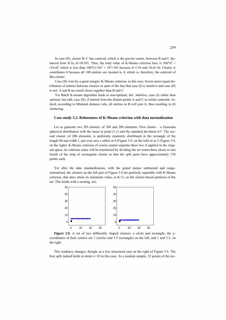
259
In case (II), cluster B+C has centroid, which is the gravity center, between B and C dis-tanced from B by d=10/101. Thus, the total value of K-Means criterion here is 100*d2 + (10-d)2 2.which is less than 100*(1/10) + 102=101 because d<1/10 and 10-d<10. Cluster A contributes 0 because all 100 entities are located in A which is, therefore, the centroid of this cluster.
Case (II) wins by a great margin: K-Means criterion, in this case, favors more equal dis-tribution of entities between clusters in spite of the fact that case (I) is intuitive and case (II) is not: A and B are much closer together than B and C.
Yet Batch K-means algorithm leads to non-optimal, but intuitive, case (I) rather than optimal, but odd, case (II), if started from the distant points A and C as initial centroids. In-deed, according to Minimal distance rule, all entities in B will join A, thus resulting in (I) clustering.
Case study 5.3. Robustness of K-Means criterion with data normalization Let us generate two 2D clusters, of 100 and 200 elements. First cluster – a Gaussian
spherical distribution with the mean in point (1,1) and the standard deviation 0.5. The sec-ond cluster, of 200 elements, is uniformly randomly distributed in the rectangle of the length 40 and width 1, put over axis x either at 4 (Figure 5.9, on the left) or at 2 (Figure 5.9, on the right). K-Means criterion of course cannot separate these two if applied in the origi-nal space; its criterion value will be minimized by dividing the set somewhere closer to one fourth of the strip of rectangular cluster so that the split parts have approximately 150 points each.
Yet after the data standardization, with the grand means subtracted and range-
normalized, the clusters on the left part of Figure 5.9 are perfectly separable with K-Means criterion, that does attain its minimum value, at K=2, on the cluster-based partition of the set. This holds with z-scoring, too.
0 20 40 60
0
10
20
30
40
50
0 20 40 60
0
10
20
30
40
50
Figure 5.9. A set of two differently shaped clusters, a circle and rectangle; the y-
coordinates of their centers are 1 (circle) and 5.5 (rectangle) on the left, and 1 and 3.5, on the right.
This tendency changes, though, at a less structured case on the right of Figure 5.9. The
best split indeed holds at about x=10 in this case. At a random sample, 32 points of the rec-

260
tangular cluster join circular cluster in the optimal split. Curiously, the z-scoring standardi-zation, in this case, works towards a better recovery of the structure so that the optimal 2-cluster partition, at the same data sample, merges only 5 rectangular cluster elements into the circular cluster, thus splitting the rectangular cluster over a mark x=5.
These results do not much change when we go to Gaussian similarities (affinity data)
defined by formula 2
( , )2( , )
d x yG x y e σ
−
= where d(x,y) is the squared Euclidean dis-
tance between x and y if x≠y. and σ2 is equal to 10 at the original data and 0.5 at the stan-dardized data, in the manner of spectral clustering (see section 7.2) and apply algorithm ADDI-S from section 7.3.
F5.1.1 Batch K-Means and its criterion: Formulation
F5.1.1.1 Batch K-Means as alternating minimization
The cluster structure in K-Means is specified by a partition S of the entity set in K non-overlapping clusters, S={S1, S2, …, SK} represented by lists of entities Sk, and cluster centroids ck=(ck1, ck2, …, c ), k=1,2,…, K. kV
There is a model that can be thought of as that driving K-Means algorithm. Ac-
cording to this model, each entity, represented by the corresponding row of Y ma-trix as yi=(yi1, yi2, …, y ), belongs to a cluster, say SiV k, and is equal, up to small re-siduals, or errors, to the cluster’s centroid:
yiv = ckv + e for all i∈Siv k and all v=1, 2, …, V (5.1)
Equations (5.1) define as simple a decoder as possible: whatever entity belongs
to cluster Sk, its data point in the feature space is decoded as centroid ck. The problem is to find such a partition S={S1, S2, …, SK} and cluster centroids
ck=(ck1, ck2, …, ckV), k=1,2,…, K, that minimize the square error of decoding
2kv
1
22 )c- ( ivVv
K
k Siiv
VvIiyeL
k
∑∑∑∑∑∈= ∈∈∈
== (5.2)
Criterion (5.2) can be equivalently reformulated in terms of the squared Euclid-
ean distances as the summary distance between entities and their cluster centroids (see (5.3)).
(5.3)

261
)c,(),( k1
2i
Si
K
kydcSWL
k
∑∑∈=
==
This is because the distance referred to as squared Euclidean distance is defined, for any V-dimensional x=(xv) and y=(yv) as d(x,y)=(x1-y1) 2+(x2-y2) 2+ ...+ (xV-y ) 2
Vso that the rightmost summation symbol in (5.2) leads to d(yi,ck) indeed.
This criterion depends on two groups of variables, S and c, and thus can be
minimized by the alternating minimization method which proceeds by repetitively applying the same minimization step: Given one group of variables, optimize cri-terion over the other group, and so forth, until convergence. Specifically, given centroids c=(c1, c2, …, cK), find a partition S minimizing the summary distance (5.3). Obviously, to choose a partition S, one should choose, for each entity i∈I, one of K distances d(yi,c ), d(y1 i,c2), …, d(yi,cK). The choice to minimize (5.3) is according to the Minimum distance rule: for each i∈I, choose the minimum of d(yi,ck), k=1,…, V, that is, assign any entity to its nearest centroid. When there are several nearest centroids, the assignment is taken among them ar-bitrarily. In general, some centroids may be assigned no entity at all with this rule.
The other step in the alternating minimization would be minimizing (5.3) over c at a given S. The solution to this problem comes from the additive format of criterion (5.2) that provides for the independence of cluster centroid components from each other. As was indicated in section 1.2, it is the mean that minimizes the square er-ror, and thus the within-cluster mean vectors minimize (5.3) over c at given S.
Thus, starting from an initial set of centroids, c=(c1, c2, …, cK), the alternating
minimization method for criterion (5.3) will consist of a series of repeated applica-tions of two steps: (a) clusters update – find clusters S according to the Minimum distance rule, (b) centroids update – make centroids equal to within cluster mean vectors. The computation stops when new clusters coincide with those on the pre-vious step. This is exactly the K-Means in its Batch mode.
The convergence of the method follows from two facts: (i) at each step, crite-
rion (5.3) can only decrease, and (ii) the number of different partitions S is finite.
F5.1.1.2 Various formulations of K-Means criterion
Let us consider any Sk and define ck being within-cluster means (k=1,2,…, K) so that ckv=Σi∈Sk ykv /N where Nk k is the number of entities in Sk. Multiply then each equation in (5.1’) by itself and sum up the resulting equations. The result will be the following equation:
(5.4)
262
2
1
2
1
2kv
Vv
K
k Sikkv
Vv
K
kiv
VvIieNcy
k
∑∑∑∑∑∑∑∈= ∈∈=∈∈
+=
Three items in (5.4) come from multiplying the elements in (5.1’) by themselves. The remaining sum 2ΣvΣk c ekvΣi∈Sk kv is zero because Σi∈Sk e (y - ckv =Σi∈Sk iv kv)= ckvNk - ckvNk =0. This proves (5.4). Note that the item on the left in (5.4) is just the data scatter T(Y), whereas the right-hand item is the least-squares criterion of K-Means (5.2). Therefore, equation (5.4) can be reformulated as
T(Y)=B(S,c)+W(S,c) (5.5)
where T(Y) is data scatter, W(S,c) the least-squares clustering criterion expressed as the summary within cluster distance (5.3) and B(S,c) is clustering’s contribution to the data scatter:
(5.6) kkvVv
K
kNccSB 2
1),( ∑∑
∈=
=
Pythagorean equation (5.5) decomposes data scatter T(Y) in two parts: that one explained by the cluster structure (S,c), which is B(S,c), and the unexplained part which is W(S,c). The larger the explained part, the smaller the unexplained part, and the better the match between clustering (S,c) and data. Equation (5.5) is well known in the analysis of variance in statistics; items B(S,c) and W(S,c) are referred to in that other context as between-group and within-group variance.
Criteria W(S,c) and B(S,c) admit different equivalent reformulations that could lead to different systems of neighborhoods and local algorithms for minimization of W(S,c) which may have been never attempted yet. Take, for example, the crite-rion of maximization of clustering’s contribution to the data scatter (5.6). Since the sum of ckv
2 over v is but the squared Euclidean distance between 0 and ck , one has
(5.7) 2
1 1( , ) (0, )
K K
kv k k kk v V k
B S c c N N d c= ∈ =
= =∑ ∑ ∑
The criterion on the right in formula (5.7) was first mentioned, under the name of “criterion of distant centers”, by Mirkin (1996, p. 292). To maximize the criterion on the right in formula (5.7), the clusters should be as far away from 0 as possible. This idea may lead to a “parallel” version of the Anomalous Pattern method de-scribed later in section 5.1.5.
Another expression of the cluster-explained part of the data scatter is

263
><= ∑∑∈=
kiSi
K
k
cycSBk
,),(1
(5.8)
which can be derived from (5.6) by taking into account that the internal sum Σv ckv
2 in (5.6) is in fact the inner square <ck,ck> and substituting instead of one its expression as within cluster average <ck,ck> = <ck, Σ yi∈Sk kv/Nk>=Σ <ci∈Sk k,ck>/Nk. This expression shows that the K-Means criterion of minimizing within-cluster distances to centroids is equivalent to criterion of maximizing within-cluster inner products with centroids – they sum up to the data scatter which does not depend on the clustering. Note that the distance based criterion makes sense at any set of centroids whereas the inner product based criterion makes sense only when cen-troids are within-cluster averages. As is well known, the distance does not depend on the location of the space origin whereas the inner product heavily depends on that – only special arrangements are suitable for the latter. In this regard, it deserves to be mentioned that W(S,c) can be reformulated in terms of entity-to-entity distances or similarities only – without any reference to centroids at all. One can prove that minimization of K-Means criterion is equiva-lent to minimization of D(S) or maximization of C(S) defined by
kjSji i
K
k
NyydSDk
/),()(,
1∑∑ ∈
=
= (5.9)
(5.10) kSji ij
K
k
NaSCk
/)(,
1∑∑ ∈
=
=
where d(yi,yj) is the squared Euclidean distance between i and j’s rows and aij=<yi,yj> is the inner product of them. Both follow from the expression d(yi,yj)=<yi –yj, yi –yj>=<yi,yi> + <yj,yj> – 2<yi,yj> and the definition of the cen-troid of S yk as Σi∈Sk i/Nk. These formulations suggest algorithms for optimization based on exchanges and mergers between clusters. A most unusual reformulation can be stated as a criterion of consensus among the features. Consider a measure of association ζ(S,v) between a partition S of the en-tity set I and a feature v, v=1, 2, …, V. Consider, for the sake of simplicity, that all features are quantitative and have been standardized by z-scoring, then ζ(S,v) is the correlation ratio η2 defined by formula (2.10). Then maximizing the summary association ζ(S) =Σv∈V η2(S,v) (5.11) is equivalent to minimization of the K-Means least squares criterion W(S,c) in-volving the squared Euclidean distances. A very similar equivalent consensus cri-terion can be formulated for the case when feature set consists of categorical or even mixed scale features. For the case of all features being categorical so that the categories are represented by dummy variables the total contribution to the data scatter in (5.4) can be formulated as
264
ϕ(S) =Σv∈V ϕ(S,v) (5.11′) where ϕ(S,v) can be an association measure such as Pearson chi-squared or Gini index – see more detail in section 3.5.2.
Since clusters are not overlapping, model in (5.1) can be rewritten differently in such a way that no explicit references are made over individual clusters. To do that, let us introduce N-dimensional membership vectors zk=(zik) such that zik =1 if i∈Sk and =0, otherwise. Using this denotation allows us use the following refor-mulation of the model. For any data entry, the following equation holds:
,1
ivikkv
K
kiv ezcy += ∑
=
(5.12)
Indeed, since any entity i∈I belongs to one and only one cluster Sk, only one of zi1, zi2,…, ziK can be non-zero, that is, equal to 1, at any given i, which makes (5.12) equivalent to (5.1).
Yet (5.12) makes the clustering model similar to that of PCA in (4.14) except that zik in PCA are arbitrary values to score hidden factors, whereas in (5.12) zik are to be 1/0 binary values: it is clusters, not factors, that are of concern here. That is, clusters in model (5.12) correspond to factors in model (4.14).
The decomposition (5.4) of data scatter into explained and unexplained parts is
similar to that in (4.17) making the contributions of individual clusters
akin to contributions μ 2kkv
VvNc 2∑
∈
k of individual principal components. More
precisely, μk2 T in (4.17) are eigen-values of YY , that can be expressed thus with the
analogous formula, μk
2 = zkT TYY zk/zk
Tzk =Σv ckv2|Sk| (5.13)
in which the latter equation is due to the fact that vector zk here consists of binary 1/0 entries.
Q.5.1. How many distances are summed up in W(S, c)? (A: This is equal to the number of entities N.) Does this number depend on the number of clusters K? (A: No.) Does the latter imply: the greater the K, the less the W(S, c)? (A: Yes.) Why?
Q.5.2.What is the difference between PCA model (4.14) and clustering model (5.12)?

265
Q.5.3. Why is convergence guaranteed for K-Means? A. Because K-Means is al-ternating minimization process at which criterion W(S,c) may only decrease at each step. Convergence follows from the fact that there are only a finite number of different partitions on I.
Q.5.4. Assume that d(yi, ck) in W(S, c) is city-block distance rather than Euclidean squared. Could K-Means be adjusted to make it alternating minimization algo-rithm for the modified W(S,c)? A: Yes, just use the city-block distance through, as well as within cluster median points rather than gravity centers.) Would this make any difference? (Yes, it will; especially at skewed distributions of the variables.)
Q.5.5. Demonstrate that, at Companies data, value W(S,c) at product-based parti-tion {1-2-3, 4-5-6, 7-8} is lower than at partition {1-4-6, 2, 3-5-7-8} found at seeds 1, 2 and 3. A. Indeed the sums of within-cluster distances to cluster cen-troids in the product based clusters are 0.7193, 0.8701, 0.3070, respectively, total-ing to 1.8964, whereas the sums ot the second partition are 1.4411, 0, 2.1789 and sum up to 3.62.
Q.5.6. Demonstrate that, at Companies data, value W(S,c) at product-based parti-tion {1-2-3, 4-5-6, 7-8} is lower than at partition {1-2-3, 4-6, 5-7-8} found at seeds 1, 4 and 7. A. Indeed the sums of within-cluster distances to cluster cen-troids in the product based clusters are 0.7193, 0.8701, 0.3070, respectively, total-ing to 1.8964, whereas the sums ot the second partition are 0.7193, 0.4413, 1.1020 that total to 2.2626.
Q.5.7. Can example of Figure 5.6 or its modification lead to a similar effect for the case of least-modules criterion related to the city-block distance and median rather than average centroids? Can it be further extended to PAM method which uses city-block distance and median entities rather than coordinates?
Q.5.8. Formulate a version of K-Means to alternatingly maximize criterion (5.8) rather than to minimize (5.3) as the generic version.
Q.5.9. Formulate a version of K-Means to alternatingly maximize criterion (5.7) rather than to minimize (5.3) as the generic version (a “parallel” version of the Anomalous Pattern method). Take care of starting from a most distant set of cen-troids.
C5.1.1 A pseudo-code for Batch K-Means: Computation
To summarize, an application of K-Means clustering involves the following steps:

266
0. Select a data set. 1. Standardize the data. 2. Choose number of clusters K. 3. Define K hypothetical centroids (seeds). 4. Clusters update: Assign entities to the centroids according to Minimum dis-
tance rule. 5. Centroids update: define centroids as the gravity centers of thus obtained
clusters. 6. Iterate 4. and 5. until convergence. MatLab codes for the items 4 and 5 can be written as follows. 4. Clusters update: Assign points to the centroids according to Minimum dis-
tance rule: Given data matrix X and a KxV array of centroids cent, produce an N-
dimensional array of cluster labels for the entities and the summary within cluster distance to centroids, wc:
function [labelc,wc]=clusterupdate(X,cent) [K,m]=size(cent); [N,m]=size(X); for k=1:K cc=cent(k,:); %centroid of cluster k Ck=repmat(cc,N,1); dif=X-Ck; ddif=dif.*dif; %Nxm matrix of squares dist(k,:)=sum(ddif'); %distances from entities to cluster centroid end [aa,bb]=min(dist); %Minimum distance rule wc=sum(aa); labelc=bb; return 5.Centroids update: Put centroids in gravity centres of clusters defined by the
array of cluster labels labelc according to data in matrix X, to produce KxV array centres of the centroids:
function centres=ceupdate(X,labelc) K=max(labelc); for k=1:K clk=find(labelc==k); elemk=X(clk,:); centres(k,:)=mean(elemk);
267
end return Batch K-Means with MatLab, therefore, is to embrace steps 3-6 above and out-
put a clustering in cell array termed, say, Clusters, along with the proportion of unexplained data scatter found by using preliminarily standardized matrix X and set of initial centroids, cent, as input. This can be put like this:
function [Clusters,uds]=k_means(X,cent) [N,m]=size(X); [K,m1]=size(cent); flag=0; %-- stop-condition membership=zeros(N,1); dd=sum(sum(X.*X)); %-- data scatter %--- clusters and centroids updates while flag==0 [labelc,wc]=clusterupdate(Y,cent); if isequal(labelc,membership) %--stop-condition’s working flag=1; centre=cent; w=wc; else cent=ceupdate(Y,labelc); membership=labelc; end end
%-----preparing the output -------------- uds=w*100/dd; Clusters{1}=membership; Clusters{2}=centre; return
Q.5.10. Check the values of criterion (5.3) at each initial settingconsidered for Company data above. Find out which is the best among them.
Q.5.11. Prove that the square-error criterion (5.2) can be reformulated as the sum of within cluster variances σkv
2 = Σ 2(yi∈Sk iv-c ) /Nkv k weighted by the cluster cardi-nalities Nk:
Q.5.12. Prove that reformulation (5.9) of criterion (5.3) in terms of the squared
2kv
1),( σ∑∑
∈=
=Vv
K
kkNcSW

268
Euclidean distances is correct.
Table 5.6. Cross classification of the original Iris taxa and 3-cluster clustering found starting from entities 1, 51 and 101 as initial seeds. The clustering does separate Iris Setosa but misplaces 14+3=17 specimens between two other taxa.
Cluster Setosa Versicolor Virginica Total
S1 50 0 0 50 S2 0 47 14 61
S3 0 3 36 39
Total 50 50 50 150
Q.5.13. Prove that if Batch K-Means is applied to Iris data mean-range normal-ized with K=3 and specimens 1, 51, and 101 taken as the initial centroids, the re-sulting clustering cross-classified with the prior three classes forms contingency table presented in Table 5.6.
In the following two sections we describe two approaches at reaching deeper
minima of K-Means criterion (5.3): (a) an incremental version and (b) nature in-spired versions.
5.1.2 Incremental K-Means
P5.1.2 Incremental K-Means: Presentation
An incremental version of K-Means uses the Minimum distance rule not for all of the entities but for one of them only. There can be two different reasons for do-ing so:
(Ri) The user is not able to operate over the entire data set and takes entities in
one by one, because of the data protocol, so that entities are to be clustered on the fly as, for instance, in an on-line application process.

269
(Rii) The user operates with the entire data set, but wants to smooth the action of the algorithm so that no drastic changes in the cluster contents may occur. To do this, the user may specify an order of the entities and run entities one-by-one in this order for a number of epochs like it is done in a neural network learning proc-ess.
The result of such a one-by-one entity processing may differ from that of Batch
K-Means because each version finds a locally optimal solution on a different structure of locality neighborhoods.
Q.5.14. What is the difference in neighborhoods between Batch and incremental versions of K-Means?
Q.5.15. Consider a run of incremental K-Means at situation Rii on the Companies data, at which the order of entities follows the order of their distances to nearest centroids. Let K=3 and entities Av, Ba and Ci initial centroids. A. Sequential steps of the incremental computation are presented in Table 5.7. In this table, cluster updates are provided as well as their centroids after each single update. The col-umn on the right presents squared Euclidean distances between centroids and enti-ties yet unclustered, with the minima highlighted in bold. The minimum distance determines, in this version, which of the entities joins the clustering next. One can see that on iteration 2 company Br switches to centroid Ba after centroid Ci of the third cluster had been updated to the mean of Ci and Cy – because its distance to the new centroid increased from the minimum 0.83 to 1.20. This leads to correct, product-based, clusters.
Q.5.16. Prove that the same initialization leads to wrong, that is, non-product based, clusters with Batch K-Means. Table 5.7. Iterations of incremental K-means on standardized Company data starting with centroids Av, Ba and Ci
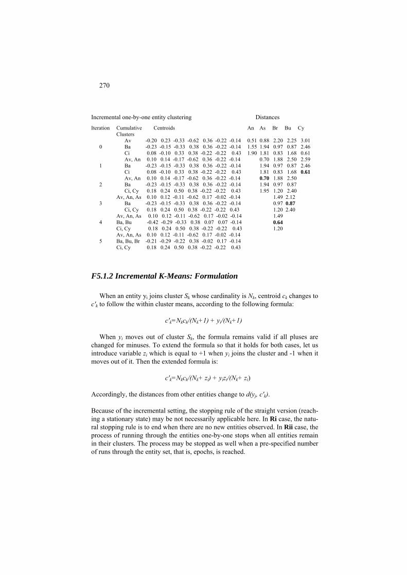
270
Incremental one-by-one entity clustering Distances
Iteration Cumulative Centroids An As Br Bu Cy Clusters
Av -0.20 0.23 -0.33 -0.62 0.36 -0.22 -0.14 0.51 0.88 2.20 2.25 3.01 0 Ba -0.23 -0.15 -0.33 0.38 0.36 -0.22 -0.14 1.55 1.94 0.97 0.87 2.46
1.90 1.81 0.83 1.68 0.61 Ci 0.08 -0.10 0.33 0.38 -0.22 -0.22 0.43 Av, An 0.10 0.14 -0.17 -0.62 0.36 -0.22 -0.14 0.70 1.88 2.50 2.59 1 Ba -0.23 -0.15 -0.33 0.38 0.36 -0.22 -0.14 1.94 0.97 0.87 2.46
1.81 0.83 1.68 0.61 Ci 0.08 -0.10 0.33 0.38 -0.22 -0.22 0.43 0.70 1.88 2.50 Av, An 0.10 0.14 -0.17 -0.62 0.36 -0.22 -0.14
2 Ba -0.23 -0.15 -0.33 0.38 0.36 -0.22 -0.14 1.94 0.97 0.87 Ci, Cy 0.18 0.24 0.50 0.38 -0.22 -0.22 0.43 1.95 1.20 2.40
Av, An, As 0.10 0.12 -0.11 -0.62 0.17 -0.02 -0.14 1.49 2.12 0.97 0.87 3 Ba -0.23 -0.15 -0.33 0.38 0.36 -0.22 -0.14
Ci, Cy 0.18 0.24 0.50 0.38 -0.22 -0.22 0.43 1.20 2.40 Av, An, As 0.10 0.12 -0.11 -0.62 0.17 -0.02 -0.14 1.49 4 Ba, Bu -0.42 -0.29 -0.33 0.38 0.07 0.07 -0.14 0.64
1.20 Ci, Cy 0.18 0.24 0.50 0.38 -0.22 -0.22 0.43 Av, An, As 0.10 0.12 -0.11 -0.62 0.17 -0.02 -0.14 5 Ba, Bu, Br -0.21 -0.29 -0.22 0.38 -0.02 0.17 -0.14
Ci, Cy 0.18 0.24 0.50 0.38 -0.22 -0.22 0.43
F5.1.2 Incremental K-Means: Formulation
When an entity yi joins cluster Sk whose cardinality is Nk, centroid ck changes to c'k to follow the within cluster means, according to the following formula:
c'k=Nkck/(Nk+1) + yi/(Nk+1)
When yi moves out of cluster Sk, the formula remains valid if all pluses are
changed for minuses. To extend the formula so that it holds for both cases, let us introduce variable zi which is equal to +1 when yi joins the cluster and -1 when it moves out of it. Then the extended formula is:
c'k=Nkck/(Nk+ zi) + yizi/(Nk+ zi)
Accordingly, the distances from other entities change to d(yj, c' ). k
Because of the incremental setting, the stopping rule of the straight version (reach-ing a stationary state) may be not necessarily applicable here. In Ri case, the natu-ral stopping rule is to end when there are no new entities observed. In Rii case, the process of running through the entities one-by-one stops when all entities remain in their clusters. The process may be stopped as well when a pre-specified number of runs through the entity set, that is, epochs, is reached.

271
5.1.3 Nature inspired algorithms for K-Means
P5.1.3 Nature inspired algorithms: Presentation
In real-world applications, K-Means typically does not move far away from the initial setting of centroids. Considered in the perspective of minimization of crite-rion (5.3), this leads to the strategy of multiple runs of K-Means starting from ran-domly generated sets of centroids to reach as deep a minimum of (5.3) as possible. This strategy works well on illustrative small data sets but it may fail when the data set is large because in this case random settings cannot cover the space of so-lutions in a reasonable time. Nature inspired approach provides a well-defined framework for using random centroids in parallel, rather than in sequence, to channel them to deeper minima as an evolving population of admissible solutions. The main difference of the nature inspired optimization from the classical optimi-zation is that the latter reaches for a single solution, provably optimal, whereas the former runs a population of solutions and does not much care for the provability.
A nature inspired algorithm mimics some natural process to set rules for the
population behavior and/or evolution. Among the nature inspired approaches, the following are especially popular:
A. Genetic B. Evolutionary C. Particle swarm optimization
A K-Means method according to each of these will be described in this section.
A nature inspired algorithm proceeds as a sequence of steps of evolution for a population of possible solutions, that is, clusterings represented by specific data structures. A K-Means clustering comprises two items: a partition S of the entity set I in K clusters and a set of clusters’ K centroids c={c1, c2,…, cK}. Typically, only one of them is carried out in a nature-inspired algorithm. The other is easily recovered according to K-Means rules. Given a partition S, centroids ck are found as vectors of within cluster means. Given a set of centroids, each cluster Sk is de- fined as the set of points nearest to its centroid ck, according to the Minimum dis-tance rule (k=1, 2, …, K). Respectively, the following two representations are most popular in nature inspired algorithms:

272
(i) Partition as a string, and
(ii) Centroids as a string.
Consider them in turn.
(i) Partition as a string Having pre-specified an order of entities, a partition S can be represented as a string of cluster labels k=1,2,…, K of the entities thus ordered. If, for instance, there are eight entities ordered as e1, e2, e3, e4, e5, e6, e7, e8, then the string 12333112 represents partition S with three classes according to the labels, S1={e1, e6, e7}, S2={e2, e8}, and S3={e3, e4, e5}, which can be easily seen from the dia-gram relating the entities and labels:
e1 e2 e3 e4 e5 e6 e7 e8 1 2 3 3 3 1 1 2 A string of N integers from 1 to K is considered not admissible, if some integer
between 1 and K is absent from it (so that the corresponding cluster is empty). Such a not admissible string for the entity set above would be 11333111, because it lacks label 2 and, therefore, makes class S2 empty.
Table 5.8. Centroids of clusters S1={e1, e6, e7}, S2={e2, e8}, and S3={e3, e4,
e5} according to data in Table 5.1.
Av Bu Ci
-0.20 0.23 -0.33 -0.63 0.36 -0.22 -0.14 -0.60 -0.42 -0.33 0.38 -0.22 0.36 -0.14 0.08 -0.10 0.33 0.38 -0.22 -0.22 0.43
Centroid1 -0.24 -0.09 -0.11 0.04 -0.02 -0.02 0.05
An Cy
0.40 0.05 0 -0.62 0.36 -0.22 -0.14 0.27 0.58 0.67 0.38 -0.22 -0.22 0.43
Centroid2 0.34 0.31 0.33 -0.12 0.07 -0.22 0.14
As Ba Br
0.08 0.09 0.00 -0.62 -0.22 0.36 -0.14 -0.23 -0.15 -0.33 0.38 0.36 -0.22 -0.14 0.10 -0.29 0.00 0.38 -0.22 0.36 -0.14
Centroid3 0.01 -0.12 -0.11 0.04 -0.02 0.17 -0.14
(ii) Centroids as a string Consider the same partition on the set of eight objects that will be assumed the companies in Company data Table 5.1 in their order. Clusters S1={e1, e6, e7}, S2={e2, e8}, and S3={e3, e4, e5}, as well as their centroids, are presented in Ta-ble 5.8. The three centroids form a sequence of 7×3=21 numbers c=(-0.24, -0.09, -
273
0.11, 0.04, -0.02, -0.02, 0.05, 0.34, 0.31, 0.33, -0.12, 0.07, -0.22, 0.14, 0.01, -0.12, -0.11, 0.04, -0.02, 0.17, -0.14), which suffices for representing the cluster-ing: the sequence can be easily converted back in three 7-dimensional centroid vectors to recover then clusters with the Minimum distance rule. It should be pointed out that the original clusters may be somewhat weird and not recoverable in this way. For example, entity e4, which is Ba, appears to be nearer to centroid 1 rather than to centroid 3 so that the Minimum distance rule would produce clusters S1={e1, e4, e6, e7}, S2={e2, e8}, and S3={e3, e5} rather than those original ones, but such a loss makes no difference, because K-Means clusters necessarily satisfy the Minimum distance rule so that all the entities are nearest to their cluster’s cen-troids.
What is important is that any 21-dimensional sequence of real values can be treated as the clustering code for its centroids.
C5.1.3.1 GA for K-Means clustering: Computation
Genetic algorithms work over a population of strings, each representing an ad-missible solution and referred to as a chromosome. The optimized function is re-ferred to as the fitness function. Let us use partition as a string represenatation for partitions S = {S1, … , SK} of the entity set. The minimized fitness function is the summary within-cluster distance to centroids, the function W(S,c) in (5.3):
0. Initial setting. Specify an even integer P for the population size (no rules
exist for this), and randomly generate P chromosomes, that is, strings s1,..,sP of K integers 1 ,…, K in such a way that all K integers 1, 2, …, K are present within each chromosome.. For each of the strings, define cor-responding clusters, calculate their centroids as gravity centres and the value of criterion, W(s1), …, W(sP), according to formula (5.3).
1. Mating selection. Choose P/2 pairs of strings to mate and produce two “children” strings. The mating pairs usually are selected randomly (with replacement, so that the same string may appear in several pairs and, moreover, can form both parents in a pair). To mimic Darwin’s “survival of the fittest” law, the probability of selection of string st (t=1,…,P) should reflect its fitness value W(st). Since the fitness is greater for the smaller W value, some make the probability inversely proportional to W(st) (see Murthy, Chowdhury, 1996) and some to the difference be-tween a rather large number and W(st) (see Yi Lu et al. 2004). This latter approach can be taken further with the probability proportional to the ex-plained part of the data scatter – in this case “ the rather large number” is the data scatter rather than an arbitrary value..
2. Cross-over. For each of the mating pairs, generate a random number r between 0 and 1. If r is smaller than a pre-specified probability p (typi-cally, p is taken about 0.7-0.8), then perform a crossover; otherwise the mates themselves are considered the result. A (single-point) crossover of

274
string chromosomes a=a1a2…aN and b=b1b2…bN is performed as follows. A random number n between 1 and N-1 is selected and the strings are crossed over to produce children a1a2…anbn+1…bN and b1b2…bnan+1…aN. If a child is not admissible (like, for instance, strings a=11133222 and b=32123311 crossed over at n=4 would produce a′=11133311 and b′=32123222 so that a′ is inadmissible because of absent 2), then various policies can be applied. Some authors suggest the crossover operation to be repeated until an admissible pair is produced. Some say inadmissible chromosomes are ok, just they must be assigned with a smaller probabil-ity of selection.
3. Mutation. Mutation is a random alteration of a character in a chromo-some. This provides a mechanism for jumping to different “ravines” of the minimized fitness function. Every character in every string is subject to the mutation process, with a low probability q which can be constant or inversely proportional to the distance between the corresponding entity and corresponding centroid.
4. Elitist survival. This strategy suggests keeping the best fitting chromo-some(s) stored separately. After the crossover and mutations have been completed, find fitness values for the new generation of chromosomes. Check whether the worst of them is better than the record or not. If not, put the record chromosome instead of the worst one into the population. Then find the record for thus obtained population.
5. Halt condition. Check the stop condition (typically, a limit on the num-ber of iterations). If this doesn’t hold, go to 1; otherwise, halt.
Y. Lu et al. (2004) note that such a GA works much faster if after step 3. Mutation the labels are changed according to the Minimum distance rule. They apply this instead of the elitist survival.
Thus, a GA algorithm operates with a population of chromosomes representing admissible solutions. To update the population, mates are selected, undergone a cross-over process generating offspring which then is subjected to mutation proc-ess. Elite maintenance completes the update. In the end, the elite is output as the best solution.
A computational shortcoming of the GA algorithm is that the length of the chromosomes is the size of the entity set N, which may run in millions in contem-porary applications. Can this be overcome? Sure, by using centroid not partition strings to represent a clustering. Centroid string sizes depend on the number of features and number of clusters, not the number of entities. Another advantage of centroid strings is in the mutation process. Rather than an abrupt swap between literals, they can be changed softly, in a quantitative manner by adding or subtract-ing a small change. This is utilized in evolutionary and particle swarm algorithms.
C5.1.3.2 Evolutionary K-Means: Computation

275
The chromosome is represented by a set of K centroids c=(c1, c2, … cK) which can be considered a string of KV real (“float”) numbers. In contrast to the partition-as-string representation, the length of the string here does not depend on the number of entities that can be of advantage when the number of entities is massive. Each centroid in the string is analogous to a gene in the chromosome.
The crossover of two centroid strings c and c′, each of the length KV, is performed at a randomly selected place n, 1≤ n < KV, exactly as it is in the genetic algorithm above. Chromosomes c and c′ exchange the portions lying to the right of n-th component to produce two offspring. This means that, a number of centroids in c is substituted by corresponding centroids in c′. Moreover, if n cuts across a cen-troid, its components change in each of the offspring chromosomes.
The process of mutation, according to Bandyopadhyay and Maulik (2002), can be organized as follows. Given the fitness W values of all the chromosomes, let minW and maxW denote their minimum and maximum respectively. For each chromo-some, its radius R is defined as a proportion of maxW reached at it: R=(W-minW)/(maxW-minW). When the denominator is 0, that is, if minW = maxW, de-fine R=1 in all chromosomes. Here, W is the fitness value of the chromosome un-der consideration. Then the mutation intensity δ is generated randomly in the in-terval between –R and +R. Let minv and maxv denote the minimum and maximum values in the data set along feature v (v=1,…, V). Then every v-th component xv of each centroid ck in the chromosome changes to
xv+δ∗(maxv – xv) if δ≥0 (increase), or xv+δ∗(xv - minv), otherwise (decrease).
The perturbation leaves chromosomes within the hyper-rectangle defined by boundaries minv and maxv. Please note that the best chromosome, at which W=minW, does not change in this process because its R=0.
Elitism is maintained in the process as well.
The algorithm follows the scheme outlined for the genetic algorithm. Based on little experimentation, this algorithm is said to outperform the previous one, GA, many times in terms of the speed of convergence. The evolutionary approach can be further modified such as, for example, the so-called Differential evolution (see Paterlini and Krink 2006 who claim that this method outperforms the others in K-Means). In Differential evolution, the cross-over, mutation and elite maintenance are merged together by removing the mating stage and changing those for the following. An offspring chromosome is created for every chromosome t in the population (t=1, …, P) as follows. Three other chromosomes, k, l and m, are taken randomly from the population. Then, for every component (gene) x.t of the chromosome t, a uniformly random value r between 0

276
and 1 is drawn. This value is compared to the pre-specified probability p (some-what between 0.5 and 0.8). If r > p then the component goes to the offspring un-changed. Otherwise, this component is substituted by the linear combination of the same component in the three other chromosomes: x.m + α∗(x.k-x.l) where α is a small scaling parameter. After the offspring’s fitness is evaluated, it substitutes chromosome t if it is better; otherwise, t remains as is and the process applies to the next chromosome.
C5.1.3.3 Particle swarm optimization for K-Means: Computation
Particle swarm mimics a drift of a bee population so that the population members here are not crossbred, nor they mutate. They just move randomly by drifting in random directions having an eye on the best places visited so far, individually and socially. This can be done because they are vectors of real numbers. Because of the change, the genetic metaphor is abandoned here, and the elements are referred to as particles rather than chromosomes, and the set of them as a swarm rather than a population.
Each particle comprises:
- a position vector x that is an admissible solution to the problem in ques-tion (such as the KV centroid vector in K-Means),
- the evaluation of its fitness f(x) (such as the summary distance W in (5.3)),
- a velocity vector z of the same dimension as x, and - the record of the best position b reached by the particle so far.
The swarm best position bg is determined as the best among all the individual best positions b.
At iteration t (t=0,1,…) the next iteration’s position is defined as the current posi-tion shifted by the velocity vector:
x(t+1) = x(t) + z(t+1) where z(t+1) is computed as a change in the direction of personal and population’s best positions:
z(t+1) = z(t) + α (b-x(t)) + β (bg – x(t))
where - α and β are uniformly distributed random numbers (typically, within the
interval between 0 and 2, so that they are around unity), - item α(b-x(t)) is referred to as the cognitive component and - item β(bg – x(t)) as the social component of the process.
Initial values x(0) and z(0) are generated randomly within the manifold of admis-sible values.

277
In some implementations, the group best position bg is changed for that of local best position bl that is defined by the particle’s neighbors only so that some pre-defined neighborhood topology makes its effect. There is a report that the local best position works especially well, in terms of the depth of the minimum reached, when it is based on just two Euclidean neighbors.
Q.5.17. Formulate a particle swarm optimization algorithm for K-Means cluster-ing.
5.1.4 Partition around medoids PAM
K-Means centroids are average points rather than individual entities, which may be considered artificial in contexts in which the user may wish to involve but only genuinely occurring real world entities rather the “synthetic” averages. Estates or art objects or countries are examples of entities for which this makes sense. To implement the idea, let us change the concept of cluster prototype from centroid to medoid (Kaufman and Rousseeuw 1990). An entity in a cluster S, i*∈S, is re-ferred to as its medoid if it is the nearest in S to all other elements of S, that is, if i* minimizes the sum of distances D(i)=Σj∈Sd(i,j) over all i∈S. The symbol d(i,j) is used here to denote any dissimilarity function, which may or may not be squared Euclidean distance, between observed entities i ,j∈I. The method of partitioning around medoids PAM (Kaufman and Rousseeuw 1990) works exactly as Batch K-Means with the only difference that medoids, not centroids, are used as cluster prototypes. It starts, as usual, with choosing the number of clusters K and initial medoids c=(c1, c2, …, cK) that are not just M-dimensional points but individual entities. Given medoids c, clusters Sk are col-lected according to the Minimum distance rule – as sets of entities that are nearest to entity ck for all k=1, 2,…, K. Given clusters Sk, medoids are updated according to the definition. This process reiterates again and again, and halts when no change of the clustering occurs. It obviously will never leave a cluster Sk empty. If the size of the data set is not large, all computations can be done over the entity-to-entity distance matrix without ever changing it. Worked example 5.2. PAM applied to Company data Let us apply PAM to the Company data displayed in Table 5.1 with K=3 and entities Ave, Bre and Cyb as initial medoids. We can operate over the distance matrix, presented in Table 5.9, because there are only eight entities. With these seeds, the Minimum distance rule would obviously produce the product-based clusters A, B, and C. At the next iteration, clusters' medoids are computed: they are obvi-ously Ant in A cluster, Bum in B cluster and either of the two entities in C cluster – leave it thus at the less controversial Cyb. With the set of medoids changed to Ant, Bum and Cyb,

278
we apply the Minimum distance rule again, leading us to the product-based clusters again. This halts the process. Table 5.9. Distances between standardized Company entities. For the sake of convenience, those smaller than 1, are highlighted in bold.
Entities Ave Ant Ast Bay Bre Bum Civ Cyb 0.00 0.51 0.88 1.15 2.20 2.25 2.30 3.01 Ave 0.51 0.00 0.77 1.55 1.82 2.99 1.90 2.41 Ant 0.88 0.77 0.00 1.94 1.16 1.84 1.81 2.38 Ast 1.15 1.55 1.94 0.00 0.97 0.87 1.22 2.46 Bay 2.20 1.82 1.16 0.97 0.00 0.75 0.83 1.87 Bre 2.25 2.99 1.84 0.87 0.75 0.00 1.68 3.43 Bum 2.30 1.90 1.81 1.22 0.83 1.68 0.00 0.61 Civ 3.01 2.41 2.38 2.46 1.87 3.43 0.61 0.00 Cyb
Note that PAM can lead to instability in results because the assignment depends on dis-tances to just a single entity. Q. 5.18. Why Cyb is less controversial than Civ in table 5.9? A. Because Cyb unequivo-cally relates to Civ only, whereas Civ is close to Bre as well. Q. 5.19. Assume that the distance d(Bre,Bum) in Table 5.9 is 0.85 rather than 0.75. Show that then if one chooses Civ to be medoid of C cluster, then the Minimum distance rule would assign to Civ not only Cyb but also Bre, because its distance to Civ, 0.83, would be less than its distance to Bum, 0.85. Show that this cluster, {Civ, Cyb, Bre} will remain stable over successive iterations.
5.1.5 Initialization of K-Means
To initialize K-Means, one needs to specify: (i) the number of clusters, K, and (ii) initial centroids, c=(c1, c2, …, c ). K
Each of these can be of an issue in practical computations. Both depend on the user's expectations related to the level of granularity and typological attitudes, which remain beyond the scope of the theory of K-Means. This is why some sug-gest relying on the user’s view of the substantive domain to specify the number and positions of initial centroids as hypothetical prototypes. There have been how-ever a number of approaches for specifying the number and location of the initial centroids by exploring the structure of the data, of which we describe the follow-ing three:
(a) multiple runs of K-Means; (b) distant representatives;

279
(c) anomalous patterns.
(a) Multiple runs of K-Means
According to this approach, at a given K, a number of K-Means’ runs R is pre-specified; each run starting with K randomly selected entities as the initial seeds (randomly generated points within the feature ranges have proven to give inferior results in experiments reported by several authors). Then the best result in terms of the square-error criterion W(S,c) (5.3) is output. This can be further extended to choosing the “right” number of clusters K. Let us denote by WK the minimum value of W(S,c) found after R runs of K-Means over random initializations. Then the series WK found at different K, from a pre-specified range say between 2 and 20, is usually taken to see which K would lead to the best WK over the range. Un-fortunately, the best WK is not necessarily minimum WK, because the minimum value of the square-error criterion cannot increase when K grows, which should be reflected in the empirically found WK’s. In the literature, a number of stop criteria utilizing WK have been suggested based on some simplified data models and intui-tion such as “gap” or “jump” statistics. Unfortunately, they all may fail even in the relatively simple situations of controlled computation experiments (see Chiang and Mirkin 2010 for a review).
A relatively simple heuristic rule is based on the intuition that when there are
K* well separated clusters, then for K<K* a (K+1)-cluster partition should be the K-cluster partition with one of its clusters split in two, which would drastically de-crease WK+1 from WK. On the other hand, at K>K*, both K- and (K+1)-cluster par-titions are to be the “right” K*-cluster partition with some of the “right” clusters split randomly, so that WK and WK+1 are not that different. Therefore, as “a crude rule of thumb”, Hartigan (1975, p. 91) proposed calculating index
HK=(WK/WK+1 −1)(N−K−1),
where N is the number of entities, while increasing K, so that the very first K at which HK becomes smaller than 10 is to be taken as the estimate of K*. It should be noted that, in the experiments by Chiang and Mirkin (2010), this rule came as the best of a set of nine different criteria and, moreover, the threshold 10 in the rule appears to be not very sensitive to 10-20% changes.
Case study 5.4. Hartigan’s index for choosing the number of clusters
Consider values of HK for Iris and Town datasets computed after the results of 100 runs of Batch K-Means using the mean/range standardization starting from random K entities taken as seeds (Table 5.10). Each of the computations has been repeated twice (see 1st and 2d sets in Table 5.10) to illustrate typical variations of HK values due to the fact that empirical val-ues of WK may be not optimal. In particular, at the 2d set of K-Means over Town data we can see a break of the rule that HK is positive because of the monotonic relation between K

280
and the optimal WK that are to decrease when K grows. The monotonic relation here is bro-ken because the values of WK after 100 runs are not necessarily minimal indeed.
Table 5.10. Values of Hartigan’s HK index for two data sets at K ranging from 2-11 as
based on two different sets of 100 clusterings from random K entities as initial centroids.
Dataset K= 2 3 4 5 6 7 8 9 10 11 Iris 1st set
2d set 108.3 38.8 29.6 24.1 18.6 15.0 16.1 15.4 15.4 9.4 108.3 38.8 29.6 24.1 18.7 15.4 15.6 15.7 16.0 7.2
Town 1st set 2d set
13.2 10.5 9.3 5.0 4.7 3.1 3.0 3.2 3.2 1.6 13.2 10.5 9.3 5.8 4.1 2.5 3.0 7.2 -0.2 1.8
The “natural” number of clusters in Iris data, according to Hartigan’s criterion is not 3 as claimed because of substantive considerations but much greater, 11! In Town data set, the criterion would indicate 4 naturally occurring clusters. However, one should argue that the exact value of 10 in Hartigan’s rule does not bear much credibility – it should be accompa-nied by a significant drop in HK value. We can see such a drop at K=5, which should be taken, thus, as the “natural” number of clusters in Town data. Similarly, a substantial drop of HK on Iris data occurs at K=3, which is the number of natural clusters, taxa, in this set.
Altogether, making multiple runs of K-Means seems a sensible strategy, espe-
cially when the number of entities is not that high. With the number of entities growing into thousands, the number of tries needed to reach a representative value of WK may become prohibitively large. Deeper minima can be sought by using the evolutionary schemes described above. On the other hand, the criterion W(S,c) has some intrinsic flaws and should be used only along some domain-knowledge or data-structure based strategy.
Two data-driven approaches, (b) and (c) above, to defining initial centroids are
described in the next two sections. They both employ the idea that clusters should represent some anomalous yet typical tendencies.
(b) “Build” algorithm for a pre-specified K (Kaufmann and Rouseeuv 1990) This process involves only actual entities. It starts with choosing the medoid of set I, that is, the entity whose summary distance to the others is minimum, and takes it as the first medoid c1. Assume that a subset of m initial seeds have been selected already (K>m≥1) and proceed to selecting cm+1. Denote the set of already selected seeds by c and consider all remaining entities i∈I-c. Define distance d(i,c) as the minimum of the distances d(i, ck) (k=1,…, m) and form an auxiliary cluster Ai con-sisting of such j that are closer to i than to c so that Eij=d(j,c)-dij >0. The summary value Ei = Σj∈Ai Eij reflects both the number of points in Ai and their remoteness from c. That i∈I-c for which Ei is maximum is taken as the next seed cm+1. Worked example 5.3. Selection of initial medoids in Company data

281
Let us apply Build algorithm to the matrix of entity-to-entity distances for Company data displayed in Table 5.9, at K=3. First, we calculate the summary distances from all the enti-ties to the others, see Table 5.11, and notice that Bre is the medoid of the entire set I, be-cause its total distance to the others, 9.60, is the minimum of total distances in Table 5.11. Thus, we set Bre as the first initial seed. Table 5.11. Summary distances for entities according to Table 5.9.
Entity Ave Ant Ast Bay Bre Bum Civ Cyb Distance to others 12.30 11.95 10.78 10.16 9.60 13.81 10.35 16.17
Now we build auxiliary clusters Ai around all other entities. To form AAve , we take the dis-tance between Ave and Bre, 2.20, and see, in Table 5.10, that distances from Ave to entities Ant, Ast, and Bay are smaller than that, which makes them Ave's auxiliary cluster with EAve =4.06. Similarly, AAnt is set to consist of the same entities, but it is less remote than Ave be-cause E = 2.98 is less than EAnt Ave. Auxiliary cluster AAst consists of Ave and Ant with even smaller EAst =0.67. Auxiliary clusters for Bay, Civ and Cyb consist of one entity each (Bum, Cyb and Civ, respectively) and have much smaller the levels of remoteness; cluster ABum is empty because Bre is its nearest. This makes the most remote entity Ave the next selected seed. Now, we can start building auxiliary clusters on the remaining six entities again. Of them, clusters A and AAnt Bum are empty and the others are singletons, of which A
consisting of Civ is the remotest, with ECyb Cyb=1.87-0.61=1.26. This completes the set of initial seeds: Bre, Ave, and Cyb. Note, these are companies producing different products. It is this set that was used to illustrate PAM in section 5.1.4.
(c) Anomalous patterns (Mirkin 2005)
This method involves remote clusters, as Build does, too, but it does not dis-
card them after finding, which allows for obtaining the number of clusters K as well. Besides, it is less computationally intensive. The method employs the con-cept of reference point. A reference point is chosen to exemplify an “average” or “normal” entity, not necessarily among the dataset. For example, when analyzing student marks over different subjects, one might choose a ``normal student'' point which would indicate levels of marks in tests and work in projects that are consid-ered normal for the contingent of students under consideration, and then see what patterns of observed behavior deviate from this. Or, a bank manager may set as his reference point, a customer having specific assets and backgrounds, to see what patterns of customers deviate from this. In engineering, a moving robotic device should be able to segment the environment into homogeneous chunks according to the robot's location as its reference point, with objects that are nearer to it having finer resolution than objects that are farther away. In many cases the gravity center of the entire entity set, its “grand mean”, can be taken as a reference point of choice.
Using the chosen reference point allows for the comparison of entities with it,
not with each other, which drastically reduces computations: instead of mulling

282
over all the pair-wise distances, one may focus on entity-to-reference-point dis-tances only – a reduction to the order of N from the order of N2.
Reference point Reference point
Initial cluster center
1/2
1/2
Final cluster center
The farthest entity
Figure 5.10. Extracting an Anomalous pattern cluster with the reference point
in the gravity center: the first iteration is on the left and the final one on the right. An anomalous pattern is found by building a cluster which is most distant from
the reference point. To do this, the cluster’s seed is defined as the entity farthest away from the reference point. Now a version of K-Means at K=2 is applied with two seeds: the reference point which is never changed in the process and the clus-ter's seed, which is updated according to the standard procedure. In fact, only the anomalous cluster is of interest here. Given a centroid, the cluster is defined as the set of entities that are closer to it than to the reference point. Given a cluster, its centroid is found as the gravity center, by averaging all the cluster entities. The procedure is reiterated until convergence (see Figure 5.10).
Obviously, the Anomalous pattern method is a version of K-Means in which:
(i) the number of clusters K is 2;
(ii) centroid of one of the clusters is 0, which is forcibly kept there through all the iterations;
(iii) the initial centroid of the anomalous cluster is taken as an entity far thest away from 0.
Property (iii) mitigates the issue of determining appropriate initial seeds. This pro-vides for using Anomalous pattern algorithm iteratively to obtain an initial setting for K-Means.
There is a certain similarity between selecting initial centroids in iK-Means and initial medoids with Build. But there are certain differences as well: - K must be pre-specified in Build and not necessarily in iK-Means;

283
- The central point of the entire set I is taken as an initial seed in Build and is not in iK-Means; - Addition of a new seed is based on different criteria in the two methods.
A clustering algorithm should present the user with a comfortable set of op-
tions. The iK-Means or PAM with Build/AP can be easily extended so that some entities can be removed from the data set because they are either (i) “deviant” or (ii) “intermediate” or (iii) “trivial”. These can be defined as the contents of small AP or Build clusters, for the case (i), or entities that are far away from their cen-troids/medoids, for the case (ii), or entities that are close to the grand mean, the center of gravity of the entire data set, for the case (iii).
Worked example 5.4. Anomalous pattern in Market towns
Let us apply the Anomalous pattern method to Town data assuming the grand mean as
the reference point and scaling by range. That means that after mean-range standardization the reference point is 0.
The point farthest from 0 to taken as the initial “anomalous” centroid, appears to be en-
tity 35 (St Austell) whose distance from zero (remember – after standardization!) is 4.33, the maximum. There are only three entities, 26, 29 and 44 (Newton Abbot, Penzance and Truro) that are closer to the seed than to 0, thus forming the cluster along with the original seed, at this stage. After one more iteration, the anomalous pattern cluster stabilizes with 8 entities 4, 9, 25, 26, 29, 35, 41, 44. Its centroid is displayed in Table 5.12.
Table 5.12. Centroid of the anomalous pattern cluster of Town data in real and stan-
dardized forms. As follows from the fact that all the standardized centroids are positive and mostly fall
within the range of 0.3 – 0.5, the anomalous cluster, according to Table 5.12, consists of better off towns – all the centroid values are larger than the grand mean by 30 to 50 per cent of the feature ranges. This probably relates to the fact that they comprise eight out of the eleven towns that have a resident population greater than 10,000. The other three largest towns have not made it into the cluster because of their deficiencies in services such as Hospitals and Farmers' Markets. The fact that the scale of population is by far the largest in
the original table doesn't much affect the computation here as it runs with the range stan-dardized scales at which the total contribution of this feature is not high, just about 8.5% only. It is rather the concerted action of all the features associated with a greater population which makes the cluster.
Centroid P PS Do Ho Ba Sm Pe DIY Sp Po CAB FM Real 18484 7.6 3.6 1.1 11.6 4.6 4.1 1.0 1.4 6.4 1.2 4.0 Std’zed .51 .38 .56 .36 .38 .38 .30 .26 .44 .47 .30 .18
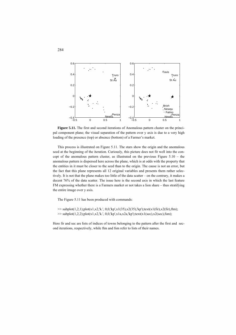
284
−0.5 0 0.5 1−0.4
−0.2
0
0.2
0.4
0.6
NewtoPenza
St Au
Truro
−0.5 0 0.5 1−0.4
−0.2
0
0.2
0.4
0.6
NewtoPenza
St Au
Truro
Brixh
FalmoNewqu
Tavis
Figure 5.11. The first and second iterations of Anomalous pattern cluster on the princi-
pal component plane; the visual separation of the pattern over y axis is due to a very high loading of the presence (top) or absence (bottom) of a Farmer’s market.
This process is illustrated on Figure 5.11. The stars show the origin and the anomalous
seed at the beginning of the iteration. Curiously, this picture does not fit well into the con-cept of the anomalous pattern cluster, as illustrated on the previous Figure 5.10 – the anomalous pattern is dispersed here across the plane, which is at odds with the property that the entities in it must be closer to the seed than to the origin. The cause is not an error, but the fact that this plane represents all 12 original variables and presents them rather selec-tively. It is not that the plane makes too little of the data scatter – on the contrary, it makes a decent 76% of the data scatter. The issue here is the second axis in which the last feature FM expressing whether there is a Farmers market or not takes a lion share – thus stratifying the entire image over y axis.
The Figure 5.11 has been produced with commands: >> subplot(1,2,1);plot(x1,x2,'k.', 0,0,'kp',x1(35),x2(35),'kp');text(x1(fir),x2(fir),ftm); >> subplot(1,2,2);plot(x1,x2,'k.', 0,0,'kp',x1a,x2a,'kp');text(x1(sec),x2(sec),fsm);
Here fir and sec are lists of indices of towns belonging to the pattern after the first and sec-ond iterations, respectively, while ftm and fsm refer to lists of their names.

285
5.1.6 Anomalous pattern and Intelligent K-Means
P5.1.6 Anomalous pattern and iK-Means: Presentation
The Anomalous pattern method can be used as a procedure to automatically de-termine both the number of clusters and initial seeds for K-Means. Preceded by this option, K-Means is referred to as intelligent K-Means, iK-Means for brevity, because it relieves the user from the task of specifying the initial setting.
In iK-Means method, the user is required to specify an integer, t, the threshold
of resolution, to be used to discard all the Anomalous patterns consisting of t or less entities. When t=0, nothing is discarded. At t=1 – the default option, singleton anomalous patterns are considered a nuisance and put back to the data set. If t=10, all patterns with 10 or less entities are discarded as too small to deserve any atten-tion at all – the level of resolution which may be justified at larger datasets and coarser details needed.
In our experiments, the entities comprising singleton Anomalous pattern clus-
ters are frequently erroneous, that is, errors are in some of their features such as, for instance, the human age of 5000 years. That means, that Anomalous pattern clustering can be used as a device for checking against huge errors in data entries.
The iK-Means method is flexible with regard to outliers and the ``swamp'' of
inexpressive – normal or ordinary – entities around the grand mean. For example, at its step 4, K-Means can be applied to either the entire dataset or to the set from which the smaller APs have been removed. This may depend on the domain: in some problems, such as structuring of a set of settlements for better planning or monitoring or analysis of climate changes, no entity should be dropped out of the consideration, whereas in other problems, such as developing synoptic descrip-tions for text corpora, some “deviant” texts could be left out of the coverage at all.
In a series of experiments with overlapping Gaussian clusters described by
Chiang and Mirkin (2010), iK-Means has performed rather well and appeared su-perior to many other options for choosing K. These options included approaches based on post-processing of results of multiple runs of K-Means and then treating them according to either of the following:
(a) Variance based approach: using intuitive or model based functions of cri-terion (5.3) which should get extreme or “elbow” values at a correct K such as Hatigan’s rule above;

286
(b) Structural approach: comparing within-cluster cohesion versus between-cluster separation at different K; (c) Consensus distribution approach: choosing K according to the distribu-tion of the consensus matrix for sets of K-Means clusterings at different K.
Some other approaches rely on different ideas for choosing K such as (d) using results of a divisive or agglomerative clustering procedure or (e) according to the similarity of K-Means clustering results on randomly per-
turbed or sampled data. Worked example 5.5. Iterated Anomalous patterns in Market towns
Applied to the range-standardized Market town data, AP algorithm iterated until no un-
clustered entities remained, has produced 12 clusters of which 5 are singletons. These sin-gletons have strange patterns of facilities indeed. For example, entity 19 (Liskeard, 7044 residents) has an unusually large number of Hospitals (6) and CABs (2), which makes it a singleton cluster. Lists of seven non-singleton clusters are in Table 5.13, in the order of their extraction in the iterated AP.
Table 5.13. Iterated AP Market town non-singleton clusters Cluster # Size Contents Contribution, %
1 8 4, 9, 25, 26, 29, 35, 41, 44 35.1 3 6 5, 8 , 12, 16, 21, 43 10.0 4 18 2, 6, 7, 10,13, 14, 17, 22, 23, 24,27, 30,
31, 33, 34, 37, 38, 40 18.6
5 2 3 , 32 2.4 6 2 1,11 1.6 8 2 39, 42 1.7 11 2 20,45 1.2
This cluster structure doesn't much change when, according to the iK-Means algorithm, Batch K-Means is applied to the seven centroids (with the five singletons put back into the data). Moreover, similar results have been observed with clustering of the original all-England list of about thirteen hundred Market towns described by a wider list of eighteen characteristics of their development: the number of non-singleton clusters was the same, with very similar descriptions.
Q.5.20. Why is the contribution of AP 4, 18.6%, greater than that of the preceding AP3, 10.0%? A. Because of much larger number of entities, 18 against 6 in AP 3. Even if the centroid of AP 3 is further away from 0 than centroid of AP 4, which is the cause that AP 3 is extracted first, the contribution takes into account the number of entities as well!

287
FC5.1.6 Anomalous pattern and iK-Means: Formulation and computation
Before substantiating AP algorithm, let us give it a more explicit formulation. Anomalous pattern (AP) algorithm
1. Pre-processing. Specify a reference point a=(a1,..., aV) (when in doubt, take a to be the data grand mean) and standardize the original data table by shifting the origin to a=(a1,..., a ). V
2. Initial setting. Put a tentative centroid, c, as the entity farthest away from the origin, 0.
3. Cluster update. Determine cluster list S around c against the only other ``cen-troid'' 0, so that entity yi is assigned to S if d(yi,c) < d(yi,0).
4. Centroid update. Calculate the within S mean c' and check whether it differs from the previous centroid c. If c' and c do differ, update the centroid by assigning c ⇐ c' and go to Step 3. Otherwise, go to 5.
5. Output. Output list S and centroid c, with accompanying interpretation aids (as advised in the next section), as the anomalous pattern.
It is not difficult to prove that, like K-Means itself, the Anomalous pattern al-
ternately minimizes a specific version of K-Means general criterion W(S,c) (5.3),
),0()c,(),( iSi
iSi
ydydcSW ∑∑∉∈
+= (5.14)
where S is a subset of I rather than partition and c its centroid. Yet AP differs from 2-Means in the following aspect: there is only one centroid, c, which is up-dated in AP; the other centroid, 0, never changes and serves only to attract not-anomalous entities. This is why 2-Means produces two clusters whereas AP – only one, that is farthest away from the reference point, 0.
In fact, criterion (5.14) can be equivalently rephrased using equations (5.6) and
(5.7) representing the complimentary criterion B(S,c). When (5.7) applies to the situation of two clusters, one with centroid in c, the other in 0, it becomes of find-ing a cluster S maximizing its contribution to the data scatter T(Y):
μ2 = zT T TYY z/z z = cv
2|S| =d(0,c)|S| (5.15)

288
This means that AP algorithm straightforwardly follows the Principal Component Analysis one-by-one extraction strategy extended to binary scoring vectors. That is, the model behind AP is a version of the PCA equation (4.10) in which the scor-ing values z*i are but zeros or ones:
,
0 ,v v
ivv
c e i Sy
e i S+ ∈⎧
= ⎨ + ∉⎩ (5.16)
where S is the cluster list of the anomalous pattern to be found. In spite of the rather simplistic assumption presented in (5.16), AP clusters fare
well with real data. They can be extracted one-by-one, along with their contribu-tions to the data scatter (5.15) showing cluster saliencies. These saliencies can be used to halt the process when the contribution of the next cluster drops decisively, thus leading to an incomplete clustering when needed.
Here are steps of iK-Means(t) where t is the cluster discharge threshold – the
minimum number of entities in a pattern that can be considered a cluster on its own. In most applications dealing with moderately sized data (up to a few hundred entities) t can be put to be equal to 1.
iK-Means(t) algorithm
0. Setting. Preprocess and standardize the data set. Take t as the threshold of reso-lution. Put k=1 and Ik=I, the original entity set.
1. Anomalous pattern. Apply AP to Ik to find k-th anomalous pattern Sk and its centroid ck.
2. Test. If Stop-condition (see below) does not hold, remove Sk from Ik to make k⇐k+1 and Ik ⇐ Ik–Sk, after which step 1 is executed again. If it does, go to 3.
3. Discarding small clusters. Remove all of the found clusters containing t enti-ties or less. Denote the number of remaining clusters by K and re-label them so that their centroids are c1, c2, . . ., cK.
4. K-Means. Do Batch K-Means using c1, c2, . . ., cK as initial seeds.
The Stop-condition in this method can be any or all of the following:
(a) All of I has been clustered, Sk=Ik, so that there are no unclustered entities left. (b) Large cumulative contribution. The total contribution of the first k clusters to the data scatter has reached a pre-specified threshold such as 50 %.

289
(c) Small cluster contribution. Contribution of Sk is too small; for example, it is comparable with the average contribution of a single entity, T/N, where T is the data scatter. (d) Number of clusters, k, has reached its pre-specified value K.
Condition (a) is reasonable if there are ``natural'' clusters that indeed differ in
their contributions to the data scatter. Conditions (b) and (c) can be considered as related to the degrees of granulation at which the user looks at the data. Unlike (d), they appeal to the structure of the data set rather than prior considerations.
Case study 5.5. iK-Means clustering of a normally distributed 1D dataset Let us generate a one dimensional set X of 280 points generated according to Gaussian
N(0,10) distribution (see Figure 5.12). This data set is attached in the appendix as Table A5.2. Many would say that this sample constitutes a single, Gaussian, cluster. Yet the idea of applying a clustering algorithm seems attractive as a litmus paper to capture the pattern of clustering implemented in iK-Means algorithm.
In spite of the symmetry in the generating model, the sample is slightly biased to the
negative side; its mean is -0.89 rather than 0, and its median is about -1.27. Thus the maxi-mum distance from the mean is at the maximum of 32.02 rather than at the minimum of -30.27.
The Anomalous pattern starting from the furthest away value of maximum comprises 83
entities between the maximum and 5.28. Such a stripping goes along real-world conven-tional procedures. For example, consider the heights of a sample of young males to be drafted for a military action whose histogram is known to be bell shaped like Gaussian. Those on the either side of the bell shaped height histogram are not quite fitting for action: those too short cannot accomplish many a specific task whereas those too tall may have problems in closed spaces such as submarines or aircraft.
−30.3 −7.5 −3.1 1.1 5.3 320
5
10
15
20
25
30
35
40Histogram of a sample of 280 points generated according to N(0,10) distribution.
Figure 5.12. Histogram of the sample of 280 values generated by Matlab’s randn com-
mand from the Gaussian distribution N(0,10).

290
The iterative Anomalous pattern clustering would sequentially strip the remaining mar-
gins off too. The set of fragments of the sorted sequence in Table 5.14 that have been found by the Anomalous pattern clustering algorithm in the order of their forming, including the cluster means and contributions to the data scatter.
The last extracted clusters are all around the mean and, predictably, small in size. One
also can see that the contribution of a following cluster can be greater than that of the pre-ceding cluster thus reflecting the local nature of the Anomalous pattern algorithm which in-tends to find the maximally contributing cluster each time. The total contribution of the nine clusters is about 86% to which the last five clusters contribute next to nothing.
Table 5.14. A summary of the iterative Anomalous pattern clustering results for the sample of Gaussian distribution in Table A5.2. Clusters are shown in the extraction order, along with their sizes, left and right boundary entity indices, means and contributions to the data scatter.
Order of extraction
Size Left Right Mean Contrib, % index index 1 83 198 280 11.35 34.28 2 70 1 70 -14.32 46.03
3 47 71 117 -5.40 4.39 4 41 157 197 2.90 1.11 5 18 118 135 -2.54 0.38 6 10 147 156 0.27 0.002 7 6 136 141 -1.42 0.039
8 2 145 146 -0.49 0.002 9 3 142 144 -0.77 0.006
Project 5.1 Using contributions to determine the number of clusters
The question of determining the stopping rule can be addressed with the model (5.16) it-self, applied to the cluster contribution values as the raw data. Assume the contributions are sorted in the descending order and denoted by hk so that h1≥ h2 ≥ … (k=1, 2, …).
If one assumes that the first K values are all approximately equal to each other, whereas
the rest approximate zero, then the optimal K can be derived as follows. Denote the average of the first K contributions as h(K). Then criterion (5.16) to maxi-
mize is the product Kh2 2(K). The optimal K obviously satisfies inequality Kh (K)> (K+1)h2(K+1). Since the average h(K+1) can be expressed as h(K+1)=

291
(K*h(K)+h )/(K+1), the inequality can be easily transformed to h2(K) -2h(K)hK+1 K+1 + hK+1
2/K>0 which can be further presented as (h(K) − hK+1)2 > hK+12 (1−1/K). Since h(K)≥
hK+1, this inequality can be further simplified to h(K)−hK+1 > hK+1√(1−1/K), that is,
1( ) (1 1 1/ )Kh K h K+> + − (5.17)
which is, roughly, hK+1 < h(K)/2. This has an advantage that the threshold is not pre-specified but rather determined according to the structure of gaps between the numbers hk in their sorted order. The value of K at which (5.17) holds can be considered as a candidate for the right number of clusters or components or, in fact, anything evaluated by contributions.
Similar inequalities can be derived at different models for the chosen contribution val-
ues. One may try, for example, the power law assumption that h(k)=ak-b for k=1,… , K and h(k)=0 for k>K.
Method iK-Means utilizes a slightly different strategy for choosing the right K. This
strategy involves (i) all the anomalous patterns rather than those most contributing, thus in-volving the patterns close to the reference points too, and (2) a different scoring device – the intuitively clear number of entities rather than a purely geometric contribution whose intuitive value is unclear.
Project 5.2. Does PCA clean the data structure indeed: K-Means after PCA
There is a wide-spread opinion that in a situation of many features, the data structure can come less noisy if the features are first “cleaned off” by applying PCA and using a few principal components instead of the original features. Although strongly debated by special-ists (see, for example, Kettenring 2006), the opinion is wide-spread among the practitio-ners. One of recent attacks against this opinion was undertaken by late A. Kryshtanowski (2008) who provided an example of data structure that “becomes less pronounced in the space of principal components”.
The example refers to data of two Gaussian clusters, each containing five hundred of 15-
dimensional entities. The first cluster can be generated by the following MatLab com-mands:
>>b(1:500,1)=10*randn(500,1); >>b(1:500,2:15)=repmat(b(1:500,1),1,14)+20*randn(500, 14);
The first variable in the cluster is Gaussian with the mean 0 and standard deviation 10, whereas the other fourteen variables add to that another Gaussian variable whose mean and standard deviation are 0 and 20, respectively. That is, this set is a sample from a 15-dimensional Gaussian with a diagonal covariance matrix, whose center is in or near the ori-gin of the space, with the standard deviations of all features at 22.36, the square root of 102+202, except for the first one that has the standard deviation of 10.

292
The entities in the second cluster are generated as the next 500 rows in the same matrix in a similar manner: >>b(501:1000,1)=20+10*randn(500,1); >>b(501:1000,2:15)=repmat(b(501:1000,1),1,14)+20*randn(500,14)+10;
The first variable now is centered at 20, and the other variables, at 30. The standard devia-tions follow the pattern of the first cluster.
−5 0 5−4
−3
−2
−1
0
1
2
3
4
−5 0 5−4
−3
−2
−1
0
1
2
3
4
Figure 5.13: Data of two clusters generated as described above, after centering, are rep-
resented by points on the plane of the two first principal components (on the left); the sec-ond cluster is represented by circles on the right.
Since the standard deviations by far exceed the distance between centroids, these clus-
ters are not easy to distinguish: see Figure 5.13 illustrating the data cloud, after centering, on the plane of the first principal components.
When applying iK-Means to this data, preliminarily centered and normalized by the
range, the algorithm finds in them indeed much more,13, clusters at the discarding thresh-old t=1. However, when the discarding threshold is set to t=200, to remove any less popu-lated anomalous patterns, the method arrives at just two clusters that differ from those gen-erated by 96 entities (see the very first resulting column in Table 5.15 presenting the results of the computation) constituting the total error of 9.6%. The same method applied to the data z-score standardized, that is, centered and normalized by the standard deviations, ar-rives at 99 errors; a rather modest increase, probably due to specifics of the data generation.
Since Kryshtanowsky (2008) operated with the four most contributing principal compo-
nents, we also take the first four principal components, after centering by the means and normalizing data by the range:
>>n=1000; br=(b-repmat(mean(b),n,1))./ repmat(max(b)-min(b),n,1); >>[zr,mr,cr] =svd(br); >> zr4=zr(:,1:4);

293
These four first components bear 66% of the data scatter. We also derived four principal components from the data non-normalized (yet centered) and from the data normalized by the standard deviations (z-score standardized). The latter is especially important in this con-text, because Kryshtanowsky (2008) used the conventional form of PCA based on the cor-relation matrix between the variables, which is equivalent to the model-based PCA applied to the data after z-score standardization. The iK-Means method applied to each of these data sets at the discarding threshold of 200, has shown rather consistent results (see Table 5.15).
Table 5.15. Errors of iK-Means clustering at different data transformations: over the
original data differently normalized and over four principal components derived at different data normalizations.
Data Original 15 features Four principal components Normalized by Range St. deviation No Range Standard
normalization deviation Cluster 1 44 43 37 51 47 Cluster 2 52 56 47 47 45 Total 96 99 84 98 92
Overall, these results seem to support the idea of better structuring under principal com-
ponents rather than to refute it. The negative results of using principal components by Kryshtanowsky (2008) probably could be attributed to his indiscriminate usage of Batch K-Means method with random initializations that failed to find a “right” pair of initial cen-troids, in contrast to iK-Means.
5.2 Cluster interpretation aids
P5.2 Cluster interpretation aids: Presentation
Results of K-Means clustering, as well as any other method resulting in the list of clusters S={S1, S2, . . ., SK} and their centroids, c={c1, c2, . . ., cK}, can be inter-preted by using
(a) cluster centroids versus grand means (feature averages on the entire data set)
(b) cluster representatives (c) cluster-feature contributions to the data scatter (d) conceptual descriptions of clusters

294
One should not forget that, under the zero-one coding system for categories, cluster-to-category cross-classification frequencies are, in fact, cluster centroids – therefore, (a) includes looking at cross-classifications between S and categorical features although this is conventionally considered a separate interpretation de-vice.
Consider these in turn.
(a) Cluster centroids versus grand means
These should be utilized in both, original and standardized, formats. To express a standardized centroid value ckv of feature v in cluster Sk resulting from a K-Means run, in the original scale of feature v, one needs to invert the scale transformation by multiplying over rescaling factor bv with the follow up adding the shift value av, so that this becomes Ckv =bvckv +av.
Worked example 5.6. Centroids of Market town clusters Let us take a look at centroids of the seven clusters of Market towns data both in real
and range standardized scales in Table 5.16. Table 5.16. Patterns of Market towns in the cluster structure found with iK-Means (see
Table 5.13). For each of the clusters, real values are on the top line and the standardized values are in the bottom.
# Pop PS Do Ho Ba Su Pe DIY SP PO CAB FM 1 18484 7.63 3.63 1.13 11.63 4.63 4.13 1.00 1.38 6.38 1.25 0.38
0.51 0.38 0.56 0.36 0.38 0.38 0.30 0.26 0.44 0.47 0.30 0.17 2 5268 2.17 0.83 0.50 4.67 1.83 1.67 0.00 0.50 1.67 0.67 1.00
-0.10 -0.07 -0.14 0.05 0.02 -0.01 -0.05 -0.07 0.01 -0.12 0.01 0.80 3 2597 1.17 0.50 0.00 1.22 0.61 0.89 0.00 0.06 1.44 0.11 0.00
-0.22 -0.15 -0.22 -0.20 -0.16 -0.19 -0.17 -0.07 -0.22 -0.15 -0.27 -0.20 4 11245 3.67 2.00 1.33 5.33 2.33 3.67 0.67 1.00 2.33 1.33 0.00
0.18 0.05 0.16 0.47 0.05 0.06 0.23 0.15 0.26 -0.04 0.34 -0.20 5 5347 2.50 0.00 1.00 2.00 1.50 2.00 0.00 0.50 1.50 1.00 0.00
-0.09 -0.04 -0.34 0.30 -0.12 -0.06 -0.01 -0.07 0.01 -0.14 0.18 -0.20 6 8675 3.80 2.00 0.00 3.20 2.00 2.40 0.00 0.00 2.80 0.80 0.00
0.06 0.06 0.16 -0.20 -0.06 0.01 0.05 -0.07 -0.24 0.02 0.08 -0.20 7 5593 2.00 1.00 0.00 5.00 2.67 2.00 0.00 1.00 2.33 1.00 0.00
-0.08 -0.09 -0.09 -0.20 0.04 0.10 -0.01 -0.07 0.26 -0.04 0.18 -0.20 GM 7351.4 3.02 1.38 0.40 4.31 1.93 2.04 0.22 0.49 2.62 0.64 0.20
These show some tendencies rather clearly. For instance, the first cluster appears to be a set of larger towns that score 30 to 50% higher than the average on almost all of the 12 fea-tures. Similarly, cluster 3 obviously relates to smaller than average towns. However, in
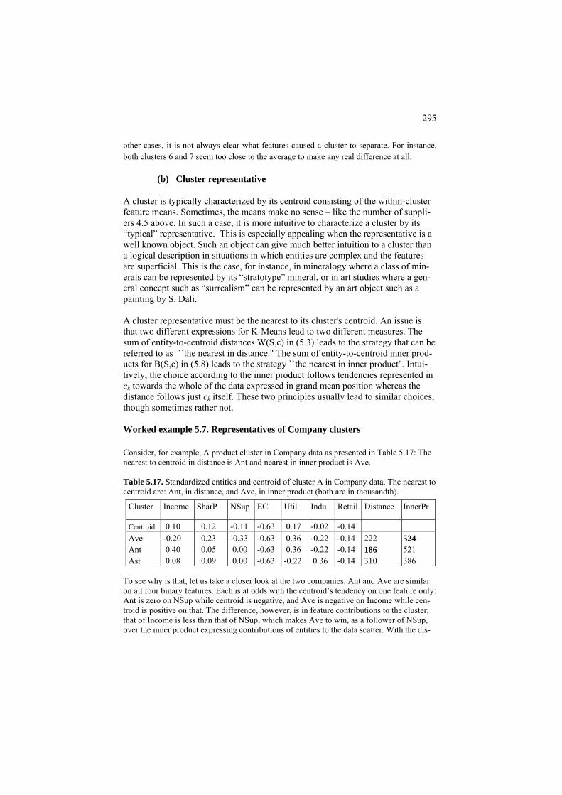
295
other cases, it is not always clear what features caused a cluster to separate. For instance, both clusters 6 and 7 seem too close to the average to make any real difference at all.
(b) Cluster representative
A cluster is typically characterized by its centroid consisting of the within-cluster feature means. Sometimes, the means make no sense – like the number of suppli-ers 4.5 above. In such a case, it is more intuitive to characterize a cluster by its “typical” representative. This is especially appealing when the representative is a well known object. Such an object can give much better intuition to a cluster than a logical description in situations in which entities are complex and the features are superficial. This is the case, for instance, in mineralogy where a class of min-erals can be represented by its “stratotype” mineral, or in art studies where a gen-eral concept such as “surrealism” can be represented by an art object such as a painting by S. Dali. A cluster representative must be the nearest to its cluster's centroid. An issue is that two different expressions for K-Means lead to two different measures. The sum of entity-to-centroid distances W(S,c) in (5.3) leads to the strategy that can be referred to as ``the nearest in distance.'' The sum of entity-to-centroid inner prod-ucts for B(S,c) in (5.8) leads to the strategy ``the nearest in inner product''. Intui-tively, the choice according to the inner product follows tendencies represented in ck towards the whole of the data expressed in grand mean position whereas the distance follows just ck itself. These two principles usually lead to similar choices, though sometimes rather not. Worked example 5.7. Representatives of Company clusters Consider, for example, A product cluster in Company data as presented in Table 5.17: The nearest to centroid in distance is Ant and nearest in inner product is Ave. Table 5.17. Standardized entities and centroid of cluster A in Company data. The nearest to centroid are: Ant, in distance, and Ave, in inner product (both are in thousandth).
Cluster Income SharP NSup EC Util Indu Retail Distance InnerPr
0.10 0.12 -0.11 -0.63 0.17 -0.02 -0.14 Centroid 222 -0.14 -0.22 0.36 -0.63 -0.33 0.23 -0.20 Ave 524
521 -0.14 -0.22 0.36 -0.63 0.00 0.05 0.40 Ant 186 386 310 -0.14 0.36 -0.22 -0.63 0.00 0.09 0.08 Ast
To see why is that, let us take a closer look at the two companies. Ant and Ave are similar on all four binary features. Each is at odds with the centroid’s tendency on one feature only: Ant is zero on NSup while centroid is negative, and Ave is negative on Income while cen-troid is positive on that. The difference, however, is in feature contributions to the cluster; that of Income is less than that of NSup, which makes Ave to win, as a follower of NSup, over the inner product expressing contributions of entities to the data scatter. With the dis-
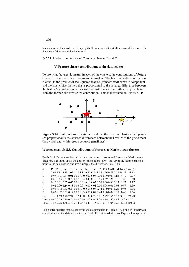
296
tance measure, the cluster tendency by itself does not matter at all because it is expressed in the signs of the standardized centroid. Q.5.21. Find representatives of Company clusters B and C.
(c) Feature-cluster contributions to the data scatter To see what features do matter in each of the clusters, the contributions of feature-cluster pairs to the data scatter are to be invoked. The feature-cluster contribution is equal to the product of the squared feature (standardized) centroid component and the cluster size. In fact, this is proportional to the squared difference between the feature’s grand mean and its within-cluster mean: the further away the latter from the former, the greater the contribution! This is illustrated on Figure 5.14:
x
y
Figure 5.14 Contributions of features x and y in the group of blank-circled points are proportional to the squared differences between their values at the grand mean (large star) and within-group centroid (small star). Worked example 5.8. Contributions of features to Market town clusters Table 5.18. Decomposition of the data scatter over clusters and features at Market town data; row Exp sums up all the cluster contributions, row Total gives the feature contribu-tions to the data scatter, and row Unexp is the difference, Total-Exp.
# P PS Do Ho Ba Su Pe DIY SP PO CAB FM Total Total,%
2.09 1.18 2.53 1.05 1.19 1.18 0.71 0.54 1.57 1.76 0.73 0.24 14.77 35.13 1 0.06 0.03 0.11 0.01 0.00 0.00 0.02 0.03 0.00 0.09 0.00 3.84 4.19 9.97 2 0.86 0.43 0.87 0.72 0.48 0.64 0.49 0.10 0.85 0.39 1.28 0.72 7.82 18.60 3 0.10 0.01 0.07 0.65 0.01 0.01 0.16 0.07 0.20 0.00 0.36 0.12 1.75 4.17 4 0.02 0.00 0.24 0.18 0.03 0.01 0.00 0.01 0.00 0.04 0.06 0.08 0.67 1.59 5 0.02 0.02 0.12 0.20 0.02 0.00 0.01 0.03 0.30 0.00 0.03 0.20 0.95 2.26 6 0.02 0.02 0.03 0.12 0.00 0.03 0.00 0.02 0.20 0.00 0.09 0.12 0.66 1.56 7
Exp 3.16 1.69 3.96 2.94 1.72 1.88 1.39 0.79 3.11 2.29 2.56 5.33 30.81 73.28 Unexp 0.40 0.59 0.70 0.76 0.62 0.79 1.02 0.96 1.20 0.79 1.52 1.88 11.23 26.72 Total 3.56 2.28 4.66 3.70 2.34 2.67 2.41 1.75 4.31 3.07 4.08 7.20 42.04 100.00 The cluster-specific feature contributions are presented in Table 5.18, along with their total contributions to the data scatter in row Total. The intermediate rows Exp and Unexp show

297
the explained and unexplained parts of the totals, with Exp being the sum of all cluster-feature contributions and Unexp the difference between the Total and Exp rows. The columns on the right show the total contributions of clusters to the data scatter, both as is and per cent. The cluster structure in total accounts for 73.3% of the data scatter, a rather high proportion. Of the total contributions, three first clusters have the largest ones totaling to 26.78, or 87% of the explained part of the data scatter, 30.81. Among the variables, FM gives the maximum contribution to the data scatter, 5.33. This can be attributed to the fact that FM is a binary variable on the data set – binary variables, in general, have the largest total contributions because they are bimodal. Indeed, FM’s total contribution to the data scatter is 7.20 so that its explained part amounts to 5.33/7.20=0.74 which is not as much as that of, say, the Population resident feature, 3.16/3.56=0.89, which means that overall Population resident better explains the clusters than FM.
Worked example 5.9. Contributions and relative contributions of features at Company clusters
Consider the clustering of Companies data according to their main product, A or B or C,
to find out what features can be associated with each of the clusters. The cluster centroids as well as feature-cluster contributions are presented in Table 5.19. The summary contribu-tions over clusters are presented in the last column of Table 5.19, and over features, in the first line of third row of Table 5.19 termed “Explain”. The feature contributions to the data scatter, that is, the sums of squares of the feature’s column entries, are in the second line of the third row – these allow us to express the explained feature contributions per cent, in the third line.
Table 5.19. Centroids and feature-to-cluster contributions for product clusters in Company data.
Item Income SharP NSup EC Util Indu Retail Total
Cluster centroids standardized
A B C
0.10 -0.21 0.18
0.12 -0.29 0.24
-0.11 -0.22 0.50
-0.63 0.38 0.38
0.17 -0.02 -0.22
-0.02 0.17 -0.22
-0.14 -0.14 0.43
Cluster contributions
A B C
0.03 0.14 0.06
0.05 0.25 0.12
0.04 0.15 0.50
1.17 0.42 0.28
0.09 0.00 0.09
0.00 0.09 0.09
0.06 0.06 0.38
1.43 1.10 1.53
Total contributions
Ex Data Ex%
0.23 0.74 31.1
0.41 0.69 59.4
0.69 0.89 77.5
1.88 1.88 100.0
0.18 0.63 28.6
0.18 0.63 28.6
0.50 0.50 100.0
4.06 5.95 68.3
Relative contribution indexes, %
A B C
16.7 101.2 31.7
29.5 191.1 67.0
18.5 90.2 219.5
258.1 120.2 58.5
59.9 0.0 56.7
0.0 77.7 56.7
49.5 64.2 297.0
Cluster centroids real
24.1 18.73 25.55
39.23 22.37 44.10
2.67 2.33 4.50
0.00 1.00 1.00
0.67 0.33 0.00
0.33 0.67 0.00
0.00 0.00 1.00

298
Now we can take a look at the most contributing feature-to-cluster pairs. This can be done by considering relative contributions within individual lines (clusters) or within indi-vidual columns (features). For example, in the third row of Table 5.19, each contribution that covers half or more of the explained contribution by the feature is highlighted in bold. Obviously, the within-line maxima do not necessarily match those within columns. The relative contribution indexes in the fourth row of Table 5.19 combine these two perspec-tives: they are ratios of two relative contributions: the relative explained feature contribu-tion within a cluster to the relative feature contribution to the data scatter. For example, relative contribution index of feature ShareP to cluster B, 1.911, is found by relating its relative explained contribution 0.25/1.10 to its relative contribution to the data scatter, 0.69/5.95. Those of the relative contribution indexes that are greater than 150%, so that the feature contribution to the cluster structure is at least 50% greater than its contribution to the data scatter, are highlighted. The most contributing features are those that make the clusters different. To see this, Table 5.19 is supplemented with the real values of the within-cluster feature means, in its last row. The values corresponding to the outstanding contributions are highlighted in bold. Cluster A differs by feature EC – A-listed companies do not use e-commerce; cluster B dif-fers by the relatively low Share Prices; and cluster C differs by either the fact that it all falls within Retail sector or the fact that its companies have relatively high numbers of suppliers, 4 or 5. It is easy to see that each of these statements not only points to a tendency but dis-tinctively describes the cluster as a whole.
Case-study 5.6. 2D analysis of most contributing features Consider 2D analysis of the relationship between the Company data partition in three prod-uct classes, A, B, and C, and the most contributing of the quantitative features in Table 5.19 – the Number of suppliers (77.5%) as illustrated in Table 5.20. To calculate the correlation ratio of the NSup feature according to formula ( ), let us first calculate the average within-class variance 2
uσ =(3*0.22+3*.022+2*0.25)/8=0.23; the cor-
relation ratio then will be equal to η 2 2( ) /u2σ σ σ−2 = =(1.00-0.23)/1.00=0.77. According
to (5.13), this, multiplied by N=8 and σ2=1, must be equal to the total explained contribu-tion of feature NSup to the data scatter in Table 5.21, 0.69 – which is clearly not! Why? Because the correlation ratio in (5.13) refers to the standardized, not original feature, and to make up for this, one needs to divide the result by the squared scaling parameter, the range which is 3 in this case. Now we get things right: η2*N/r2=0.77*8/9=0.69 indeed! Table 5.20. Tabular regression of NSup feature over the product-based classes in the Com-pany dataset in Table 4.2.
Classes # NSup mean NSup variance A 3 2.67 0.22 B 3 2.33 0.22 C 2 4.50 0.25
Total 8 3.00 1.00

299
The case of a nominal feature can be analyzed similarly. Consider contingency table be-tween the product based partition S and feature Sector in Company data (Table 5.19). Table 5.21. Contingency table between the product-based classes and nominal feature Sec-tor in the Company dataset according to Table 4.1. Category Utility Industrial Retail Total Class A 2 1 0 3 B 1 2 0 3 C 0 0 2 2 Total 3 3 2 8 In contrast to the classical statistics perspective, the small and even zero values are not of an issue here. Table 5.22 presents, on the left, the same data in the relative format; the other two parts present absolute and relative Quetelet indexes as described in section 2.3. Table 5.22. Relative frequencies together with absolute and relative Quetélet indexes for contingency table 5.21.
Cat. Utility Indust. Retail Total Utility Indust Retail Utility Indust Retail Class Relative frequencies Absolute Quetélet ind. Relative Quetélet ind. A 0.25 0.12 0.00 0.37 0.29 -0.04 -0.25 0.78 -0.11 -1.00 B 0.12 0.25 0.00 0.37 -0.04 0.29 -0.25 -0.11 0.78 -1.00 C 0.00 0.00 0.25 0.25 -0.38 -0.38 0.75 -1.00 -1.00 3.00 Total 0.37 0.37 0.25 1.00
These indexes have something to do with the cluster-feature contributions in Table 5.19. Given that the categories have been normalized by unities as well as the other features, the absolute Quetélet indexes are Table 5.23. Absolute Quetélet indexes from Table 5.22 and their squares factored accord-ing to formula (5.14).
Cat. Size Utility Industrial Retail Utility Industrial Retail Total Class Absolute Quetélet indexes Contributions
0.085 0.002 0.062 0.149 A 3 0.29 -0.04 -0.25 0.002 0.085 0.062 0.149 B 3 -0.04 0.29 -0.25 0.094 0.094 0.375 0.563 C 2 -0.38 -0.38 0.75
Total 8 0.181 0.181 0.500 0.862 involved. [To use the relative Quetélet indexes, the categories have to be normalized by the square roots of their frequencies, as explained in the Formalization part.] Their squares

300
multiplied by the cluster cardinalities and additionally divided by the squared rescaling pa-rameter, 3 in this case, are the contributions, according to formula (5.14), as presented in the following Table 5.23. Obviously, all entries in the right part of Table 5.23 are items in the total Proportional pre-diction index (5.16) divided by 3 – because of the specifics of the data normalization with the additional normalization by the square root of the number of categories.
(d) Conceptual description of clusters
If a contribution is high, then, as can be seen on Figure 5.14, it is likely that the corresponding feature can be utilized for conceptual description of the correspond-ing class. Worked example 5.10. Describing Market town clusters conceptually Consider, for example, Table 5.18 of contributions of the clusters found at Market towns data. Several entries in Table 5.18 are highlighted in bold as those most contributing to the data scatter parts explained by clusters, the columns on the right. Take a look at them, clus-ter-wise. Cluster 1 is indeed characterized by its two most contributing features, Population resident (P, contribution 2.09) and the number of doctor surgeries (Do, contribution 2.53). It can be described as a “set of towns with the population resident P not less than 10200 and number of doctor surgeries Do not less than 3” – this description perfectly fits the cluster with no errors, be it false positive or false negative. Cluster 2 is blessed with an unusually high rela-tive contribution of FM, 3.84 of the total 4.19; this may be seen as the driving force of the cluster’s separation: it comprises all the towns with a Farmers market that have not been in-cluded in cluster 1! Other clusters can be described similarly. Let us note the difference be-tween clusters 6 and 7, underlined by the high contributions of swimming pools (SW) to both, though by different reasons: every town in cluster 7 has a swimming pool whereas any town in cluster 6 has none. Worked example 5.11. Describing Company clusters conceptually Conceptual descriptions can be drawn for the product clusters in Company data according to Table 5.19. This Table shows that feature EC is the most contributing to the Product A cluster, feature ShaP to the Product B cluster, and features SupN and Retail to the Product C cluster. The relatively high contribution of ShaP to B cluster is not that obvious because that of EC, 0.42, is even higher. It becomes clear only on the level of relative contributions when the contributions are related to their respective Total counterparts, 0.25/0.69 and 0.42/1.88 – the former prevails indeed. Clusters A, B, and C can be distinctively described by the statements “EC==0”, “ShaP < 28”, and “SupN >3” (or “Sector is Retail”), respec-tively. Unfortunately, high feature contributions not always lead to clear-cut conceptual descrip-tions. The former are based on the averages whereas the latter on clear-cut divisions, and division boundaries can be at odds with the averages.

301
F5.2 Cluster interpretation aids: Formulation
2According to (5.4) and (5.5), clustering (S,c) decomposes the scatter T(Y)=Σ i,v yiv of data matrix Y in the explained and unexplained parts, B(S,c) and W(S,c), respec-tively. The latter is the square-error K-Means criterion, whereas the explained part B(S,c) is clustering’s contribution to the data scatter, which is equal, according to (5.6), to
kkv
Vv
K
k
NccSB 2
1
),( ∑∑∈=
= This is the sum of additive items B B
v
kv=Nkckv2, each accounting for the contribution
of feature-cluster pair, v∈V and Sk (k=1, 2, . . ., K).
2v i
i IT y
∈
= ∑Since the total contribution of feature v to the data scatter is , its un-
explained part can be expressed as W Tv v vB+= − kv1
K
vk
B B+=
= ∑ where is feature’s v
explained part, the total contribution of v to the cluster structure. This can be dis-played as a Scatter Decomposition (ScaD) table whose rows correspond to clus-ters, columns to variables and entries to the contributions BBkv (see Table 5.24). Table 5.24. ScaD: Data scatter decomposed over clusters and features using nota-tion introduced above
f f The summary rows, Explained, Unexplained and Total, as well as column Total can be expressed as percentages of the data scatter T(Y). The contributions high-light relative roles of features both at individual clusters and in total. The explained part B(S,c) is, according to (5.6), the sum of contributions of indi-vidual feature-to-cluster pairs B Bkv= ckv
2Nk which can be used for interpretation of
Feature Cluster
1 2 f Total M
BS1S2 SK
11 B12 B BB1M B1+ B21 B22 B BB2M B2+
B B B BK1 K2 BKM BK+ BExplained
Unexplained Total
+1 B+2 B B(S,c) B+MW(S,c) W+1 W+2 W+MT(Y) T1 T2 TM

302
the clustering results. The sums of BkvB ’s over features or clusters express total con-tributions of individual clusters or features into the explanations of clusters.
As has been shown in section 3.4.2, summary contributions of individual data fea-tures to clustering (S,c) have something to do with statistical measures of associa-tion in bivariate data, such as correlation ratio η2 (2.10) in section 2.2 and chi-squared X2 (2.13) in section 2.3 (Mirkin 2005). In fact, the analysis in section F.3.4.2 applies in full to the case when target features are those used for building clustering S. Specifically, for a quantitative feature v represented by the standardized column yv, its summary contribution BB
v
+v to the data scatter is equal to
2 2v vB Nσ η+ = (5.18)
Note that the correlation ratio in (5.18) has been computed over the normalized feature yv. The correlation ratio of the original non-standardized feature xv differs from that by factor equal to the squared rescaling parameter b2
v . Consider now a nominal feature v represented by a set of binary columns, dum-mies, corresponding to individual categories l∈v. The grand mean of binary col-umn for v∈F is obviously the proportion of this category in the set, p+v. To stan-dardize the column, one needs to subtract the mean, p+v, from all its entries and divide them by the scaling parameter, bv. After the standardization, the centroid of cluster Sk can be expressed through co-occurrence proportions too as expressed in formula (3.17):
( )kvkv v v
k
p / bp += −c p
where pkv is the proportion of entities falling in both category v and cluster Sk; the other symbols: p is the frequency of v, p the proportion of entities in S+v k k, and bv the normalizing scale parameter. According to equations (3.18) and (3.19), the summary contribution of all pairs category-cluster (l,k) is equal to
2
21
(( / )K
kl k l
l v k k l
p p pB v S Np b
+
∈ =
−= ∑∑ ) (5.19)
This is akin to several contingency table association measures considered in the literature including Pearson chi-squared X2 in (2.13) and Gini impurity function, or summary absolute Quetelet index, in (2.22) . To make B(v/S) equal to the chi-squared coefficient, the scaling of binary features must be done by using
lb = lp , which is the standard deviation of the so-called Poisson probabilistic

303
distribution that randomly throws plN unities into an N-dimensional binary vector. To make B(v/S) equal to Gini impurity function, no normalization of the dummies is to be done, or rather the recommended option of normalization by ranges ap-plies since the range of a dummy is 1.
One should not forget the additional normalization of the binary columns by the square root of the number of categories in a nominal feature v, | |v leading to both the individual contributions BBkv in (5.18) and the total contribution B(v/S) in (5.19) divided by the number of categories |v|. When applied to Pearson chi-squared, the division by |v| can be considered as another normalization of the coef-ficient. As mentioned in section 2.3, the maximum of Pearson chi-squared (related to N) is min(|v|,K)-1. Therefore, when |v|≤K, the division would lead to a normal-ized index whose values are between 0 and 1-1/|v|. If, however, the number of categories is larger so that K<|v|, then the normalized index could be very near 0 indeed. In this regard, it should be of interest to mention that in the literature some other normalizations have been considered. Specifically, Pearson chi-squared is referred to as Cramer coefficient if related to min(|v|,K)-1, and as Tchouproff co-efficient if related to (| | 1)( 1)v K− − (Kendall and Stewart 1973).
Q.5.22. Prove that, for any cluster k in K-Means clustering,
2 2| | (k
iv k kv kvi S
y S c 2 )σ∈
= +∑ .
Q.5.23. How one should interpret the normalization of a category by the vp ?
What category gets a greater contribution: that more frequent or that less frequent?
Comment 5.1. When the chi-squared contingency coefficient or related indexes are applied in the traditional statistics context, the presence of zeros in a contingency table becomes an issue because it contradicts the hypothesis of statistical independence. In the context of data recovery clustering, zeros are treated as any other numbers and create no problems at all because the coefficients are measures of contributions and bear no other statistical meaning in this context. Comment 5.2.
K-Means advantages: The method
i Models typology building activity ii Computationally effective both in memory and time iii Can be utilized incrementally, ``on-line''
iv Straightforwardly associates feature salience weights with feature scales v Applicable to both quantitative and categorical data and mixed data provided that care has been taken of the relative feature scaling

304
vi Provides a number of interpretation aids including cluster prototypes and features and entities most contributing to cluster specificity. K-Means issues:
vii Simple convex spherical shape of clusters. viii Choosing the number of clusters and initial seeds. ix Instability of results with respect to initial seeds.
Although conventionally considered as shortcomings, issues vii-ix can be benefi-cial too. To cope with issue vii, the feature set should be chosen carefully. Then the simple shape of a cluster will provide for a simpler conceptual description of it. To cope with issue viii, the initial seeds should be selected not randomly but rather based on preliminary analysis of the substantive domain or using anomalous approaches Build or AP. Another side of issue ix is that solutions are close to pre-specified centroids, which is good when the centroids have been chosen carefully.
Q.5.24. Find SCAD decomposition for the product clusters in Company data. A. This is in Table 5.25. Table 5.25 shows feature EC as the one most contributing to the Product A cluster, feature ShaP to the Product B cluster, and features SupN and Retail to the Product C cluster. The relatively high contribution of ShaP to B cluster is not that obvious because that of EC, 0.42, is higher. It becomes clear only on the level of relative contributions relating the absolute values to their re-spective Exp counterparts, 0.25/0.41 and 0.42/1.88 – the former prevails indeed. Clusters A, B, and C can be distinctively described by statements “EC==0”, “ShaP < 28”, and “SupN >3” (or “Sector is Retail”), respectively.
Table 5.25. Decomposition of the data scatter over product clusters in Company data; notations are similar to those in Table 5.18.
Product Income ShaP SupN EC Util Indu Retail Total Total % A B C
0.03 0.05 0.04 1.17 0.00 0.09 0.06 1.43 24.08 0.14 0.25 0.15 0.42 0.09 0.00 0.06 1.10 18.56 0.06 0.12 0.50 0.28 0.09 0.09 0.38 1.53 25.66
Exp Unexp Total
0.23 0.41 0.69 1.88 0.18 0.18 0.50 4.06 68.30 0.51 0.28 0.20 0.00 0.44 0.44 0.00 1.88 31.70 0.74 0.69 0.89 1.88 0.63 0.63 0.50 5.95 100.00
5.3 Extension of K-Means to different cluster structures
So far the clustering was to encode a data set with a number of clusters forming a partition. Yet there can be differing partition-like clustering structures of which, arguably, the most popular are:
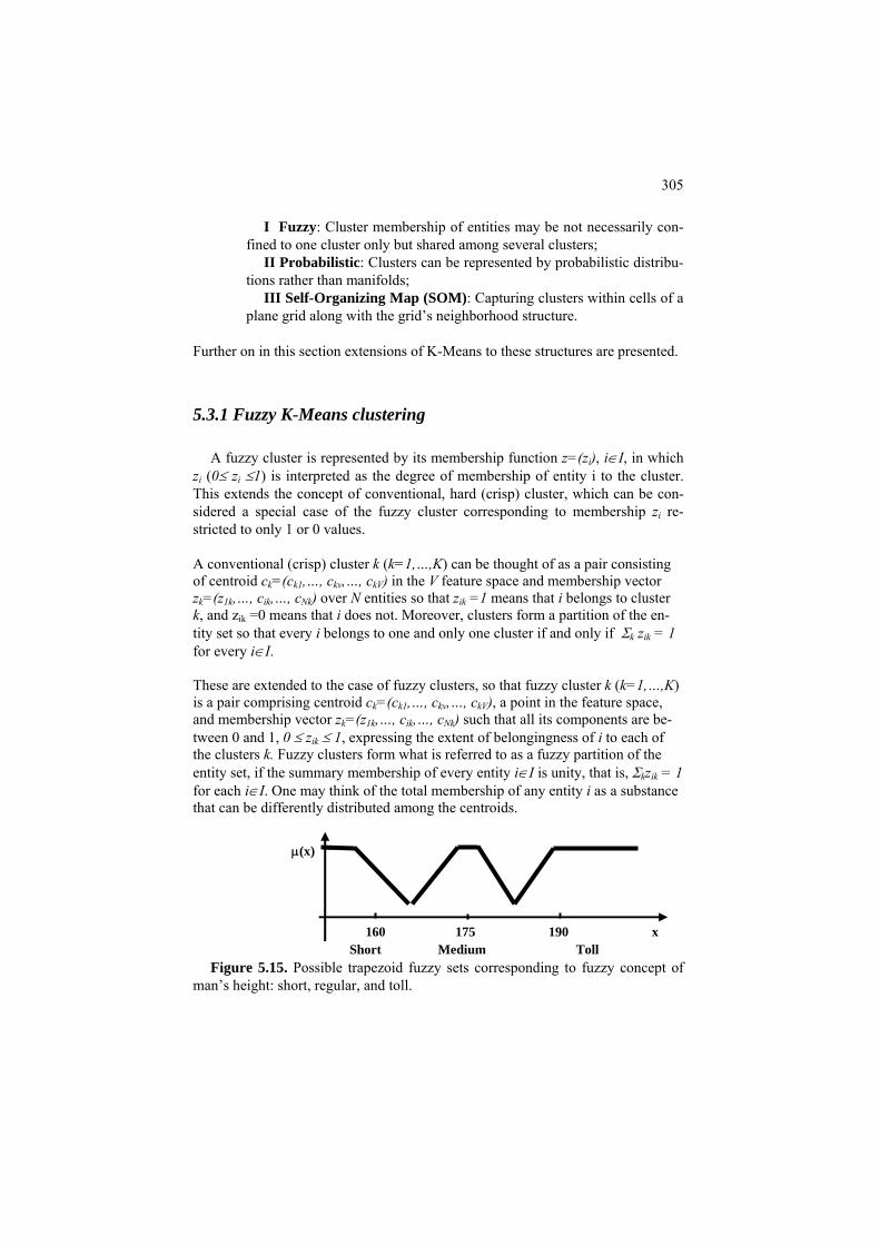
305
I Fuzzy: Cluster membership of entities may be not necessarily con-fined to one cluster only but shared among several clusters;
II Probabilistic: Clusters can be represented by probabilistic distribu-tions rather than manifolds;
III Self-Organizing Map (SOM): Capturing clusters within cells of a plane grid along with the grid’s neighborhood structure.
Further on in this section extensions of K-Means to these structures are presented.
5.3.1 Fuzzy K-Means clustering
A fuzzy cluster is represented by its membership function z=(zi), i∈I, in which zi (0≤ zi ≤1) is interpreted as the degree of membership of entity i to the cluster. This extends the concept of conventional, hard (crisp) cluster, which can be con-sidered a special case of the fuzzy cluster corresponding to membership zi re-stricted to only 1 or 0 values.
A conventional (crisp) cluster k (k=1,…,K) can be thought of as a pair consisting of centroid ck=(ck1,…, ckv,…, ckV) in the V feature space and membership vector zk=(z ,…, c1k ik,…, c ) over N entities so that zNk ik =1 means that i belongs to cluster k, and zik =0 means that i does not. Moreover, clusters form a partition of the en-tity set so that every i belongs to one and only one cluster if and only if Σk zik = 1 for every i∈I.
These are extended to the case of fuzzy clusters, so that fuzzy cluster k (k=1,…,K) is a pair comprising centroid ck=(ck1,…, ckv,…, ckV), a point in the feature space, and membership vector zk=(z ,…, c1k ik,…, cNk) such that all its components are be-tween 0 and 1, 0 ≤ zik ≤ 1, expressing the extent of belongingness of i to each of the clusters k. Fuzzy clusters form what is referred to as a fuzzy partition of the entity set, if the summary membership of every entity i∈I is unity, that is, Σkzik = 1 for each i∈I. One may think of the total membership of any entity i as a substance that can be differently distributed among the centroids.
Figure 5.15. Possible trapezoid fuzzy sets corresponding to fuzzy concept of
man’s height: short, regular, and toll.
μ(x)
160 175 190 x Short Medium Toll
306
These concepts are especially easy to grasp if membership zik is considered as the probability of belongingness. However, in many cases fuzzy partitions have nothing to do with probabilities. For instance, dividing all people by their height may involve fuzzy categories ``short,'' ``medium'' and ``tall'' with fuzzy meanings such as those shown in Figure 5.15.
Fuzzy clustering can be of interest in applications related with natural fuzziness
of cluster boundaries such as image analysis, robot planning, geography, etc. If fuzzy cluster memberships are put into the bilinear PCA model, as K-Means crisp memberships have been (see formula (5.12) in section F5.1.1), they make a rather weird structure in which centroids are not average but rather extreme points in their clusters, which can be relaxed in a certain way and make clusters appeal-ing, if somewhat unusual (Nascimento 2005). An empirically convenient criterion (5.20) below differently extends that of (5.3) where d( , ) is Euclidean squared distance, by factoring in an exponent of the membership, zα. The value α affects the fuzziness of the optimal solution: at α=1,
the optimal memberships are proven to be crisp,
),(}),({11
ki
N
iik
K
kkk cydzzcF ∑∑
==
= α (5.20)
the larger the α the ‘smoother’ e membership. Usually α is taken to be α=2.
i-
-
he partial derivatives of the criterion over the optimized variables to be set 0.
Membershi
entroids update formula:
th Globally minimizing criterion (5.20) is a difficult task. Yet the alternating minimzation of it appears rather easy. As usual, this works in iterations starting, fromsomehow initialized centroids. Each iteration proceeds in two steps: (1) given cluster centroids, cluster memberships are updated; (2) given memberships, centroids are updated – after which everything is ready for the next iteration. The process stops when the updated centroids are close enough to the previous ones. Updating formulas are derived from the first-order optimality conditions. They re-quire tto
ps update formula:
11
'1'
)],(/),([/1 −
=∑= α
kiki
K
kik cydcydz
== ii 1'1
(5.21)
(5.22)
C
∑∑=N
ki
N
iikkv zyzc '/ αα

307
Since equations (5.21) and (5.22) are the first-order optimality conditions for crite-rion (5.20) leading to unique solutions, convergence of the method, usually re-ferred to as fuzzy K-Means (c-means, too, assuming c is the number of clusters, see Bezdek et al. 1999), is guaranteed.
Yet the meaning of criterion (5.20) has not been paid much attention to until recently. It appears, criterion F in (5.20) can be presented as F=Σi F(i), the sum of weighted distances F(i) between points i∈I and cluster centroids, so that F(i) is equal to the harmonic average of the individual memberships at α=2 (see Stan-forth, Mirkin, Kolossov, 2007, where this fact is used for the analysis of domain of applicability for predicting toxicity of chemical compounds). Figure 5.16 presents the indifference contours of the averaged F values versus those of the nearest cen-troids. The former look much smoother.
The Anomalous pattern method is applicable as a tool for initializing Fuzzy K-Means as well as crisp K-Means, leading to reasonable results as reported by Stan-forth, Mirkin, Kolossov, 2007. Nascimento and Franco (2009) applied this method for segmentation of sea surface temperature maps; found fuzzy clusters closely follow the expert-identified regions of the so-called coastal upwelling, that are relatively cold, and nutrient rich, water masses. In contrast, the conventional fuzzy K-Means, with user defined K, under- or over-segments the images. Figure 5.16. Maps of the indifference levels for the membership function F(i) at about 14000 chemical compounds clustered with iK-Means in 41 clusters (a); (b) scores membership using only the nearest cluster’s centroid.
Q.5.25. Regression-wise clustering. In general, centroids ck can be defined in a space which is different from that of the entity points yi (i∈I). Such is the case of regression-wise clustering. Recall that a regression function xV=f(x1, x2, ..., xV-1) may relate a target feature, xV, to (some of the) other features x1, x2, ..., xV-1 as, for example, the price of a product to its consumer value and production cost attrib-utes. In regression-wise clustering, entities are grouped together according to the degree of their correspondence to a regression function rather than according to

308
their closeness to the gravity center. That means that regression functions play the role of centroids in regression-wise clustering (see Figure 5.17).
Figure 5.17. Two regression-wise clusters with their regression lines as centroids.
Consider a version of Straight K-Means for regression-wise clustering to involve linear regression functions relating standardized variable yV to other standardized variables, y1, y2, ..., yV-1, in each cluster. Such a function is defined by the equation yV=a1y1+a2y2+...+ aV-1yV-1 + a0 for some coefficients a0, a1,..., aV-1. These coeffi-cients form a vector, a=(a0, a1,...,aV-1), which can be referred to as a regression-wise centroid.
When a regression-wise centroid is given, its distance to an entity point yi=(yi1,..., yiV) is defined as r(i,a)= (yiV – a1yi1 – a2yi2 - ... – aV-1yi,V-1 – a0)2, the squared differ-ence between the observed value of yV and that calculated from the regression equation. To determine the regression-wise centroid a(S), given a cluster list S⊆I, the standard technique of multivariate linear regression analysis is applied, which is but minimizing the within cluster summary residual Σi∈S r(i,a) over all possible a.
Formulate a version of the Straight K-Means for this situation.
Hint: Same as Batch K-Means, except that:
(1) centroids must be regression-wise centroids and (2) the entity-to-centroid distance must be r(i,a).

309
5.3.2 Mixture of distributions and EM algorithm
Data of financial transactions or astronomic observations can be considered as a random sample from a (potentially) infinite population. In such cases, the data structure can be analyzed with probabilistic approaches of which arguably the most radical is the mixture of distributions approach.
According to this approach, each of the yet unknown clusters k is modeled by a
density function f(x, αk) which represents a family of density functions over x de-fined up to a parameter vector αk. Consider a one-dimensional density function f(x), that, for any x and very small change dx, assigns its probability f(x)dx to the interval between x and x+dx, so that the probability of any interval (a,b) is integral
, which is the area between x-axis and f(x) within (a,b) as illustrated on
Figure 5.18 for interval (5,8). Multidimensional density functions have a similar nterpretation.
∫b
a
dxxf )(
−2 0 2 4 6 80
0.1
0.2
0.3
0.4
0.5
0.6
0.7
0.8
0.9
1
Figure 5.18. Two Gaussian clusters represented by their density functions
drawn with a thin and bold lines, respectively. The probability of interval (5,8) in the bold line cluster is shown by the area with diagonal filling. The interval (A,B) is the only place in which the thin line cluster is more likely than the bold line cluster.
A B
Usually, the cluster density f(x, αk) is considered uni-modal with the mode cor-
responding to the cluster standard point. Such is the normal, or Gaussian, density function defined by αk consisting of its mean vector mk and covariance matrix Σk:

310
kV
kkT
kkk mxmxmxf ΣπΣΣ )2()2/)()(exp(),,( 1 −−−= − (5.23)
The shape of Gaussian clusters is ellipsoidal because any surface at which f(x,
αk) is constant satisfies equation (x-mk)TΣk-1(x-mk)=c, where c is any constant, that
defines an ellipsoid. This is why the PCA representation is highly compatible with the assumption of the underlying distribution being Gaussian. The mean vector mk specifies the k-th cluster's location.
The mixture of distributions clustering model can be set as follows. The row
points y1, y2, ..., yN are considered a random sample of |V|-dimensional observa-tions from a population with density function f(x) which is a mixture of individual
cluster density functions f(x, αk) (k=1,2, ..., K) so that ,
where p
∑=
=K
kkk xfpxf
1),()( α
1
K
kk
p=
∑k ≥0 are the mixture probabilities such that =1.
To estimate the individual cluster parameters, the principle of maximum likeli-hood, one of the main approaches in mathematical statistics, applies. The approach is based on the postulate that the events that have really occurred are those that are most likely. In general, this is not correct – everybody can recall a situation in which a less likely event has occurred. But the principle, applied for parameter es-timation, is as much effective as a similarly wrong principle of the maximum par-simony, and even more. In its simplest version, the approach requires to find the mixture probabilities pk and cluster parameters αk, k=1, 2, ..., K, by maximizing the likelihood of the observed data under the assumption that the observations come independently from a mixture of distributions. It is not difficult to show, un-der the assumption that the observations come independenly of each other, that the
likelihood is the product of the density values, . To
computationally handle the maximization problem for P with respect to the un-known parameter values, its logarithm, L=log(P), is maximized in the form of the following expression:
∏∑= =
=N
i
K
kkik ayfpP
1 1),(
, (5.24) )]log(),(log()[log(11
ikki
K
kkik
N
i
gyfpgL −+= ∑∑==
α
where gik is the posterior density of cluster k defined as gik= pk f(yi, α )/Σk k pkf(yi, α ). k
Criterion L can be considered a function of two groups of variables:
(1) the mixture probabilities pk and cluster parameters αk, and (2) posterior densities gik,

311
to apply the method of alternating optimization. The alternating maximization al-gorithm for this criterion is referred to as EM-algorithm since computations are performed as a sequence of Expectation (E) and Maximization (M) steps. As usual, to start the process, the variables must be initialized. Then E-step is exe-cuted: Given pk and αk, optimal gik are found. Given gik, M-step finds the optimal pk and αk. This brings the process to an E-step again to follow by an M-step. And so forth. The computation stops when the current parameter values approximately coincide with the previous ones. This algorithm has been developed, in various versions, for Gaussian density functions as well as for some other parametric families of probability distributions. It should be noted that developing a fitting algorithm is not that simple, and not only because there are too many parameters here to estimate. One should take into consideration that there is a tradeoff be-tween the complexity of the probabilistic model and the number of clusters: a more complex model may fit to a smaller number of clusters. To select a better model one can utilize the likelihood criterion penalized for the complexity of the model. A popular penalized log-likelihood criterion is referred to as Bayesian In-formation Criterion (BIC) and is defined, in this case, as
BIC= 2 log p(X/ pk, αk) – λlog(N), (5.25)
where X is the observed data matrix, λ the number of parameters to be fitted, and N the number of observations, that is, rows in X. The greater the value, the better. BIC analysis has been shown to be useful, for example, in assessing the number of clusters K for the mixture of Gaussians model.
The goal of EM algorithm is determining the density functions rather than as-
signing entities to clusters. If the user needs to see the “actual clusters”, the poste-rior probabilities gik can be utilized: i is assigned to that k for which gik is the maximum. Since this “optimal assignment” rule deviates from the distribution of gik, the proportions of entities in clusters obtained in this way will deviate from the mixture probabilities pk. This is why it is advisable to consider the relative values of gik as fuzzy membership values.
The situation, in which all Gaussian clusters have their covariance matrices
constant diagonal and equal to each other, so that Σk =σ2E, where E is identity ma-trix and σ2 the variance, is of a theoretical interest. In this case, all clusters have uniformly spherical distributions of the same radius. The maximum likelihood cri-terion P in this case is equivalent to the criterion of K-Means and, moreover, there is a certain homology between the EM and Batch K-Means algorithms in this case.
To see what is going on here, consider feature vectors corresponding to entities
xi, i∈I, as randomly and independently sampled from the population, with an un-known assignment of the entities to clusters Sk. The likelihood of this sample is determined by the following equation:

312
2
1
exp{ ( ) ( ) / 2k
KV T
i k i kk i S
P C x m x mσ σ− −
= ∈
= − − −∏∏ },
because in this case the determinant in (5.23) is equal to |Σk|=σ2V. and the inverse covariance matrix is σ -2E. The logarithm of the likelihood is proportional to
2
12 log( ) ( ) ( ) /
k
KT
i k i kk i S
L V x m x mσ σ= ∈
= − − − −∑ ∑ .
It is not difficult to see from the first-order optimality conditions for L that, given partition S={S , S1 2,…, SK}, the optimal values of mk and σ are determined accord-ing to the usual formulas for the mean and the standard deviation. Moreover, given m and σ, the partition S={Sk 1, S2,…, S K} maximizing L will simultaneously minimize the double sum in the right part of its expression above, which is exactly the summary squared Euclidean distance from all entities to their centroids, that is, criterion W(S,m) for K-Means in (5.3) except for a denotation: the cluster gravity centers are denoted here by mk rather than by ck, which is not a big deal after all. .
Thus the mixture model leads to the conventional K-Means method as a
method for fitting the model, under the condition that all clusters have spherical Gaussian distribution of the same variance. This leads some authors to conclude that K-Means is applicable only under the assumption of such a model. However, this conclusion is wrong because it involves a logic trap: it is well known that the fact that A implies B does not necessarily mean that B implies A – there are plenty of examples to the opposite. Note however that the K-Means data recovery model, also leading to K-Means, assumes no restricting hypotheses on the mechanism of data generation. It also implies, through the data scatter decomposition, that useful data standardization options should involve dividing by range or similar range-related indexes rather than by the standard deviation, associated with the spherical Gaussian model. In general, the situation here is similar to that of the linear re-gression, which is a good method to apply when there is a Gaussian distribution of all variables involved, but it can and should be applied under any other distribu-tion of observations if they tend to lie around a straight line.
5.3.3 Kohonen’s self-organizing maps SOM
Kohonen’s Self-Organizing Map is an approach to visualize the data cluster structure by explicitly mapping it onto a plane grid. Typically, the grid is rectan-gular and its size is determined by the user-specified numbers of its rows and col-umns, r and c, respectively, so that there are r×c nodes on the grid. Each of the grid nodes, gk (k=1, 2, ..., rc), is one-to-one associated with the so-called model, or reference, vector mk which is of the same dimension as the entity points yi, i∈I.
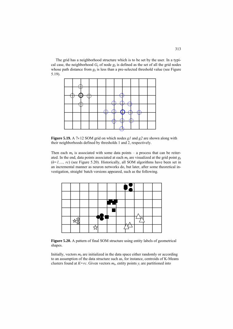
313
The grid has a neighborhood structure which is to be set by the user. In a typi-cal case, the neighborhood Gk of node gk is defined as the set of all the grid nodes whose path distance from gk is less than a pre-selected threshold value (see Figure 5.19). Figure 5.19. A 7×12 SOM grid on which nodes g1 and g2 are shown along with their neighborhoods defined by thresholds 1 and 2, respectively. Then each mk is associated with some data points – a process that can be reiter-ated. In the end, data points associated at each mk are visualized at the grid point gk (k=1,…, rc) (see Figure 5.20). Historically, all SOM algorithms have been set in an incremental manner as neuron networks do, but later, after some theoretical in-vestigation, straight/ batch versions appeared, such as the following. Figure 5.20. A pattern of final SOM structure using entity labels of geometrical shapes. Initially, vectors mk are initialized in the data space either randomly or according to an assumption of the data structure such as, for instance, centroids of K-Means clusters found at K=rc. Given vectors mk, entity points yi are partitioned into

314
“neighborhood” sets Ik. For each k=1, 2,…, rc, the neighborhood set Ik is defined as consisting of those yi that are assigned to mk according to the Minimum distance rule. Given sets Ik, model vectors mk are updated as centers of gravity of all entities yi assigned to grid nodes in the neighborhood of gk, that is, such yi that i∈It for some gt∈Gk. Then a new iteration of building Ik with the follow-up updating mk’s, is run. The computation stops when new mk are close enough to the previous ones or after a pre-specified number of iterations. As one can see, SOM in this version is much similar to Straight/Batch K-Means except for the following:
(a) number K=rc of model vectors is large and has nothing to do with the number of final clusters – this comes visually as the number of grid clusters;
(b) data points are averaged over the grid neighbourhood, not the feature space neighborhood;
(c) there are no interpretation rules except according to positioning of points on the grid .
Item (a) results in the fact that many of final Ik’s are empty, so that relatively very few of grid nodes are populated, which may create a powerful image of a cluster structure that may go to a deeper – or more interesting – minimum than K-Means, because of (b).
5.4 Summary
This Chapter is devoted to K-Means, arguably the most popular clustering method. The method partitions the entity set into clusters along with centroids rep-resenting them. It is very intuitive and usually does not require that much space to get presented, except of course its various versions such as incremental or nature inspired or medoid based algorithms. This text also includes less popular subjects that are important when using K-Means for real-world data analysis:
• Presentation and analysis of examples of its failures • Innate tools for interpretation of clusters • Reformulations of the criterion that could yield different algorithms for
K-Means • Initialization – the choice of K and location of centroids
Three modifications of K-Means onto different cluster structures are presented
as well. These are: Fuzzy K-Means for finding fuzzy clusters, Expectation-Maximization (EM) for finding probabilistic clusters as items of a mixture of dis-tributions, and Kohonen self-organizing maps (SOM) that tie up the sought clus-ters to a visually comfortable two-dimensional grid.

315
References
M. Berthold, D. Hand (2003), Intelligent Data Analysis, Springer-Verlag. J. Bezdek, J. Keller, R. Krisnapuram, M. Pal (1999) Fuzzy Models and Algorithms for Pattern Recognition and Image Processing, Kluwer Academic Publishers.
S.B. Green, N.J. Salkind (2003) Using SPSS for the Windows and Mackintosh: Analyzing and Understanding Data, Prentice Hall.
J.A. Hartigan (1975) Clustering Algorithms, Wiley and Sons.
A.K. Jain and R.C. Dubes (1988) Algorithms for Clustering Data, Prentice Hall.
L. Kaufman and P. Rousseeuw (1990) Finding Groups in Data: An Introduction to Cluster Analysis, Wiley and Sons.
M.G. Kendall, A. Stewart (1973) Advanced Statistics: Inference and Relation-ship (3d edition), Griffin: London, ISBN: 0852642156. T. Kohonen (1995) Self-Organizing Maps, Springer-Verlag, Berlin.
A. Kryshtanowski (2008) Analysis of Sociology Data with SPSS, Higher School of Economics Publishers, Moscow (in Russian).
H.Lohninger (1999) Teach Me Data Analysis, Springer-Verlag, Berlin-New York-Tokyo, 1999. ISBN 3-540-14743-8.
B. Mirkin (1996) Mathematical Classification and Clustering, Kluwer Academic Press.
B. Mirkin (2005) Clustering for Data Mining: A Data Recovery Approach, Chapman & Hall/CRC, ISBN 1-58488-534-3.
S. Nascimento (2005) Proportional Memberships in Fuzzy Clustering, ISO Press.
B. Polyak (1987) Introduction to Optimization, Optimization Software, Los An-geles, ISBN: 0911575146.
Articles

316
S. Bandyopadhyay, U. Maulik (2002) An evolutionary technique based on K-means algorithm for optimal clustering in RN, Information Sciences, 146, 221-237.
R. Cangelosi, A. Goriely (2007) Component retention in principal component analysis with application to cDNA microarray data, Biology Direct, 2:2, http://www.biolgy-direct.com/con-tent/2/1/2.
J. Kettenring (2006) The practice of cluster analysis, Journal of Classification, 23, 3-30.
Y. Lu, S. Lu, F. Fotouhi, Y. Deng, S.Brown (2004) Incremental genetic algorithm and its application in gene expression data analysis, BMC Bioinformatics, 5,172. M. Ming-Tso Chiang, B. Mirkin (2010) Intelligent choice of the number of clus-ters in K-Means clustering: an experimental study with different cluster spreads, Journal of Classification, 27(1), 3-40.
S. Nascimento, P. Franco (2009), Unsupervised Fuzzy Clustering for the Segmen-tation and Annotation of Upwelling Regions in Sea Surface Temperature Images, in: J. Gama (Ed.), Discovery Science, LNCS 5808, Springer-Verlag, 212-226. S. Paterlini, T. Krink (2006) Differential evolution and PSO in partitional cluster-ing, Computational Statistics and Data Analysis, 50, 1220-1247.
R. Stanforth, B. Mirkin, E. Kolossov (2007) A measure of domain of applicability for QSAR modelling based on Intelligent K-Means clustering, QSAR & Combina-torial Science, 26(7), 837-844.

317
6 Hierarchical Clustering
Boris Mirkin
Department of Computer Science and Information Systems, Birkbeck, University of London, Malet Street, London WC1E 7HX UK
Department of Data Analysis and Machine Intelligence, Higher School of Economics, 11 Pokrovski Boulevard, Moscow RF
Abstract
Hierarchical clustering builds a binary hierarchy on the entity set. The Chapter’s material explains an algorithm for agglomerative clustering and
two different algorithms for divisive clustering, all three based on the same square error criterion as K-Means partitioning method. Agglomerative clustering starts from a trivial set of singletons and merges two clusters at a time. Divisive cluster-ing splits clusters in parts and should be a more interesting approach computation-ally because it can utilize fast splitting algorithms and, also, stop splitting when-ever it seems right. One divisive algorithm proceeds with the conventional K-Means at K=2 utilized for splitting a cluster. The other maximizes summary asso-ciation coefficient to make splits conceptually, that is, using one feature at a time. The last section is devoted to the Single Link clustering, a popular method for ex-traction of elongated structures from the data. Relations between single link clus-tering and two popular graph-theoretic structures, the Minimum Spanning Tree (MST) and connected components, are explained.
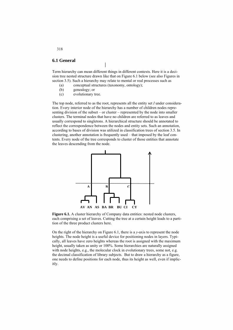
318
6.1 General
Term hierarchy can mean different things in different contexts. Here it is a deci-sion tree nested structure drawn like that on Figure 6.1 below (see also Figures in section 3.5). Such a hierarchy may relate to mental or real processes such as
(a) conceptual structures (taxonomy, ontology); (b) genealogy; or (c) evolutionary tree.
The top node, referred to as the root, represents all the entity set I under considera-tion. Every interior node of the hierarchy has a number of children nodes repre-senting division of the subset – or cluster – represented by the node into smaller clusters. The terminal nodes that have no children are referred to as leaves and usually correspond to singletons. A hierarchical structure should be annotated to reflect the correspondence between the nodes and entity sets. Such an annotation, according to bases of division was utilized in classification trees of section 3.5. In clustering, another annotation is frequently used – that imposed by the leaf con-tents. Every node of the tree corresponds to cluster of those entities that annotate the leaves descending from the node.
AV AN AS BA BR BU CI CY
A B C
Figure 6.1. A cluster hierarchy of Company data entities: nested node clusters, each comprising a set of leaves. Cutting the tree at a certain height leads to a parti-tion of the three product clusters here. On the right of the hierarchy on Figure 6.1, there is a y-axis to represent the node heights. The node height is a useful device for positioning nodes in layers. Typi-cally, all leaves have zero heights whereas the root is assigned with the maximum height, usually taken as unity or 100%. Some hierarchies are naturally assigned with node heights, e.g., the molecular clock in evolutionary trees, some not, e.g. the decimal classification of library subjects. But to draw a hierarchy as a figure, one needs to define positions for each node, thus its height as well, even if implic-itly.

319
Nodes may be linked by using what is called edges. Only one edge ascends from each node – this is a defining property of nested hierarchies that each node, except for the root, has one and only one parent. Each hierarchy node, or its parental edge, represents cluster of all leaves descending from the node; such are the edges labeled by product names A, B, and C on Figure 6.1 – they represent the corre-sponding clusters. These clusters have a very special pattern of overlapping: for any two clusters of a hierarchy, their intersection is either empty or coincides with one of them – this is one more characteristic property of a nested hierarchy. The tree on Figure 6.1 has one more specific property – it is binary: each interior node in the tree has exactly two children, that is, split in two parts. Most clustering algorithms, including those presented below, do produce binary trees, along with node heights. Q.6.1. Given a binary hierarchy H with leaf set I, prove that the number of edges in the hierarchy is 2(|I|-1). Q.6.2. Consider a binary hierarchy H with node set J and height function h(j), j∈J, such that h(j)=0 at each leaf j. Assume that h(j) is monotone, that is, the closer the node to the root the greater the value of h(j). Define the distance u(i1,i2) between each pair of leaves i1,i2∈I as the height of the least cluster node j(i1,i2) such that both i1 and i2 are among its descendants, u(i1,i2)=h(j(i1,i2)). Prove that the dis-tance u is an ultrametric, that is, it is not only symmetric, u(i1,i2)=u(i2,i1), and re-flexive, u(i1,i1)=0, but also satisfies ultrametric inequality u(i1,i2) ≤ max [u(i1,i3), u(i2,i3)] (6.1) for every triplet of leaves i1,i2, and i3. Q.6.3. Prove that if distance u is ultrametric then, for each three entities, the three distances between them satisfy the following property: those two larger ones are equal to each other. This can be rephrased as follows: under an ultrametric, every triangle is isosceles. Q.6.4. Define Baire distance b(x,y) between non-coinciding real numbers x and y, both located in interval [0,1], as follows. Consider their decimal digits, x=0.x1x2… and y=0.y1y2…, and set b(x,y)=2-n where n is the very first digit at which xn≠yn. If, for example x=0.125, y=0.128 and z=0.250, then b(x,y)=2-3 and b(x,z)=2-1 (Murtagh et al. 2008). Prove that Baire distance is ultrametric and, moreover, every finite ultrametric can be represented as Baire metric. Methods for hierarchic clustering are divided in two classes: - Divisive methods: they build a cluster hierarchy by proceeding top-to-bottom, starting from the entire data set and recursively splitting clusters into parts; and

320
- Agglomerative methods: they build a cluster hierarchy by proceeding bottom-up, starting from the least clusters available, usually singletons, and merging those nearest to each other at each step.
6.2 Agglomerative clustering and Ward’s criterion
P6.2 Agglomerative clustering: Presentation
At each step of an agglomerative clustering algorithm a set of already formed clusters is considered along with the matrix of distances between maximal clusters S1, S2, …, SK. These maximal clusters form a partition of the entity set I. At the step, two nearest maximal clusters are merged and the newly formed cluster is supplied with its height and distances to other clusters. The process ends, typi-cally, when all clusters have been merged into the universal root cluster consisting of the entire entity set. Worked example 6.1. Agglomerative clustering of Company dataset Consider the Company dataset. The starting point of the algorithm is the set of singletons – eight clusters consisting of one entity each. Squared Euclidean distances between the corre-sponding rows of the standardized data matrix are presented in Table 5.9 in section 5.1.4), which is reproduced here as Table 6.1. Table 6.1. Distances between standardized Company entities from Table 5.9. For the sake of convenience, row-wise non-diagonal minima are highlighted in bold.
Entities Ave Ant Ast Bay Bre Bum Civ Cyb 0.00 0.51 0.88 1.15 2.20 2.25 2.30 3.01 Ave 0.51 0.00 0.77 1.55 1.82 2.99 1.90 2.41 Ant 0.88 0.77 0.00 1.94 1.16 1.84 1.81 2.38 Ast 1.15 1.55 1.94 0.00 0.97 0.87 1.22 2.46 Bay 2.20 1.82 1.16 0.97 0.00 0.75 0.83 1.87 Bre 2.25 2.99 1.84 0.87 0.75 0.00 1.68 3.43 Bum 2.30 1.90 1.81 1.22 0.83 1.68 0.00 0.61 Civ 3.01 2.41 2.38 2.46 1.87 3.43 0.61 0.00 Cyb
In each of these, the height of the merged cluster can be accepted to be equal to the distance between the clusters being merged, h=0.51. Since other distances cannot be less than that, the rule guarantees the monotonicity of the height over further mergers. The minimum distance is d(Ave, Ant)=0.51, which leads us to merging these singletons into a doubleton {Ave, Ant}. Now we have 7 clusters of which only one, that merged, is

321
new. To do further agglomeration steps, we need to define distances between the merged cluster and the others. This can be done in many ways Table 6.2 Distances between the merged cluster and the others according to different rules.
Initial clusters Ave Ant Ast Bay Bre Bum Civ Cyb {Ave} 0.00 0.51 0.88 1.15 2.20 2.25 2.30 3.01 {Ant} 0.51 0.00 0.77 1.55 1.82 2.99 1.90 2.41
Merged Method
NN * * 0.77 1.15 1.82 2.25 1.90 2.41 {Ave, Ant} FN * * 0.88 1.55 2.20 2.90 2.30 3.01 AN * * 0.82 1.35 2.01 2.68 2.10 2.71
including those based only on the distances in Table 5.9, such as the Nearest Neighbor (NN), also termed Single Linkage, or Farthest Neighbor (FN), also termed Complete Link-age, or the Average neighbor (AN), also termed Average Linkage. These utilize the mini-mum distance or maximum distance or the average distance, respectively (see Table 6.2).
Q.6.5. Complete the process of building cluster hierarchies according to the Near-est Neighbor rule, Farthest Neighbor rule, and Average Neighbor rule (Table 6.2).
Ward’s criterion Consider a partition S={S1, S2, …, SK} arrived at on an agglomeration step. Ac-
cording to Ward’s rule the distance between two clusters, Sk, Sl, is defined as the increase in the value of K-Means criterion W(S,c) at the partition obtained from S by merging them into Sk∪Sl. As shown in equations (6.2) and (6.3) further on, the increase can be computed as the so-called Ward distance between centroids of the two clusters: the usual squared Euclidean distance scaled by a factor whose nu-merator is the product of cardinalities of the clusters and denominator is the sum of them. Note that Ward distance between singletons is just half the squared Euclidean distance between the corresponding entities.
Ward’s agglomeration starts with singletons whose variance is zero and pro-ceeds by merging those clusters that effect as small increase in the square-error criterion as possible, at each agglomeration step. This justifies the use of Ward agglomeration results to get a reasonable initial setting for K-Means when K is preset. The two methods, K-Means and Ward, supplement each other in that clus-ters are carefully built with Ward agglomeration, whereas K-Means allows over-coming the inflexibility of the agglomeration process over individual entities by reshuffling them. There is an issue with this strategy though: Ward agglomeration, unlike K-Means, is a computationally intensive method, not applicable to large sets of entities.
Worked example 6.2. Ward algorithm with distances only
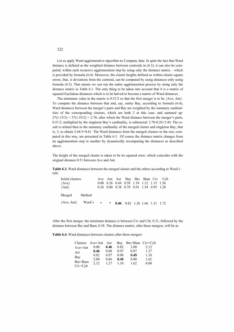
322
Let us apply Ward agglomerative algorithm to Company data. In spite the fact that Ward distance is defined as the weighted distance between centroids in (6.3), it can also be com-puted, within each recursive agglomeration step by using only the distance matrix – which is provided by formula (6.4). Moreover, the cluster heights defined as within-cluster square errors, that, is deviations from the centroid, can be computed by using distances only using formula (6.5). That means we can run the entire agglomeration process by using only the distance matrix in Table 6.1. The only thing to be taken into account that it is a matrix of squared Euclidean distances which is to be halved to become a matrix of Ward distances.
The minimum value in the matrix is 0.51/2 so that the first merger is to be {Ave, Ant}. To compute the distance between that and, say, entity Bay, according to formula (6.4), Ward distances between the merger’s parts and Bay are weighted by the summary cardinal-ities of the corresponding clusters, which are both 2 in this case, and summed up: 2*(1.15/2) + 2*(1.55/2) = 2.70, after which the Ward distance between the merger’s parts, 0.51/2, multiplied by the singleton Bay’s cardinality, is subtracted: 2.70-0.26=2.44. The re-sult is related then to the summary cardinality of the merged cluster and singleton Bay, that is, 3, to obtain 2.44/3=0.81. The Ward distances from the merged clusters to the rest, com-puted in this way, are presented in Table 6.3. Of course the distance matrix changes from an agglomeration step to another by dynamically recomputing the distances as described above. The height of the merged cluster is taken to be its squared error, which coincides with the original distance 0.51 between Ave and Ant.
Table 6.3. Ward distances between the merged cluster and the others according to Ward’s rule.
Initial clusters Ave Ant Ast Bay Bre Bum Civ Cyb {Ave} 0.00 0.26 0.44 0.58 1.10 1.12 1.15 1.56 {Ant} 0.26 0.00 0.38 0.78 0.91 1.54 0.95 1.20
Merged Method
{Ave, Ant} Ward’s * * 0.46 0.82 1.26 1.66 1.31 1.72
After the first merger, the minimum distance is between Civ and Cib, 0.31, followed by the distance between Bre and Bum, 0.38. The distance matrix, after these mergers, will be as
Table 6.4. Ward distances between clusters after three mergers Clusters Ave+Ant Ast Bay Bre+Bum Civ+Cyb 0.00 0.46 0.82 2.00 2.12 Ave+Ant 0.46 0.00 0.97 0.87 1.27 Ast 0.82 0.97 0.00 0.49 1.10 Bay 2.00 0.86 0.49 0.00 1.62
Bre+Bum 2.12 1.27 1.10 1.62 0.00 Civ+Cyb
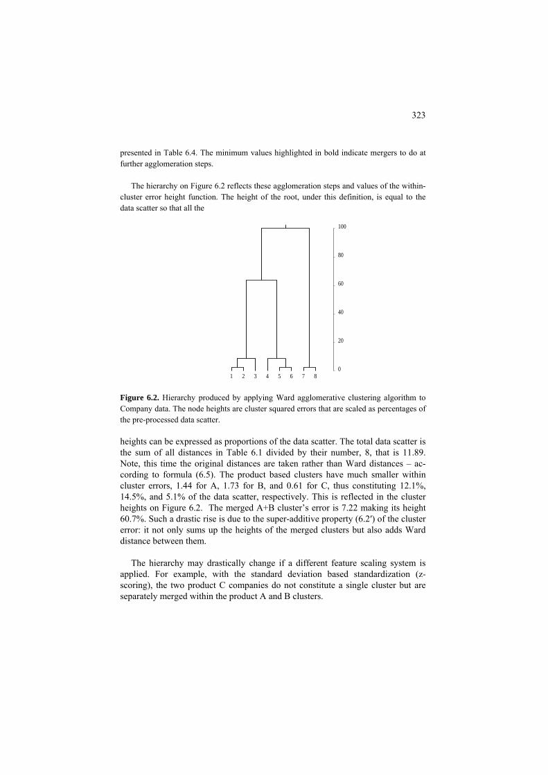
323
presented in Table 6.4. The minimum values highlighted in bold indicate mergers to do at further agglomeration steps.
The hierarchy on Figure 6.2 reflects these agglomeration steps and values of the within-
cluster error height function. The height of the root, under this definition, is equal to the data scatter so that all the
1 2 3 4 5 6 7 80
20
40
60
80
100
Figure 6.2. Hierarchy produced by applying Ward agglomerative clustering algorithm to Company data. The node heights are cluster squared errors that are scaled as percentages of the pre-processed data scatter. heights can be expressed as proportions of the data scatter. The total data scatter is the sum of all distances in Table 6.1 divided by their number, 8, that is 11.89. Note, this time the original distances are taken rather than Ward distances – ac-cording to formula (6.5). The product based clusters have much smaller within cluster errors, 1.44 for A, 1.73 for B, and 0.61 for C, thus constituting 12.1%, 14.5%, and 5.1% of the data scatter, respectively. This is reflected in the cluster heights on Figure 6.2. The merged A+B cluster’s error is 7.22 making its height 60.7%. Such a drastic rise is due to the super-additive property (6.2′) of the cluster error: it not only sums up the heights of the merged clusters but also adds Ward distance between them.
The hierarchy may drastically change if a different feature scaling system is
applied. For example, with the standard deviation based standardization (z-scoring), the two product C companies do not constitute a single cluster but are separately merged within the product A and B clusters.

324
Q.6.6. Complete agglomeration steps according to Ward distance matrix in Table 6.4.
F6.2 Square-error criterion and Ward distance: Formulation
Consider a partition S={S1, S2,…, SK} on set I, together with centroids c={c1, c2,…,
cK}, and the square error criterion W(S,c}= of K-Means. Let two
of the clusters, S1
( , )k
K
kk i S
d i c= ∈
∑∑f, Sg, be merged so that the resulting partition is S(f,g) coinciding
with S except for the merged cluster Sf∪Sg; the new centroid obviously being cf∪g= (Nfcf + Ngcg )/(Nf+N ), where Ng f and Ng are cardinalities of clusters Sf and Sg, respectively. As proven previously – and rather evident indeed (see Figure 6.3) – the value of square error criterion on partition S(f,g) is greater then W(S,c). But how much greater? The answer is
2( , ) ( , ) ( ) ( ,f g f g )f g f g fv gv f gv Vf g f g
N N N NW S , (6.2) c W S c c c d c c
N N N N∪ ∪∈
− = − =+ +∑
2)iv f g v iv fv iv gvi S S v V i S v V i S v V
y c y c y c∪∈ ∪ ∈ ∈ ∈ ∈ ∈
− − − − − =∑ ∑ ∑ ∑ ∑∑
the squared Euclidean distance between centroids of the merged clusters Sf and Sg weighted by a factor proportional to the product of cardinalities of the merged clusters (Ward, 1963).
Figure 6.3. The distances in criterion W(S,c) before (solid lines) and after the
merger (dashed lines) of two clusters on the upper right. The numbers of dashed and solid lines are the same, but the dashed-line distances are longer overall.
To prove this, let us follow the definition and do some elementary transforma-
tions. First, we notice that the distances within unchanged clusters do not change in the partition S(f,g) so that the difference between the values of criterion W is 2 2
,( ) ( ) (f g f g
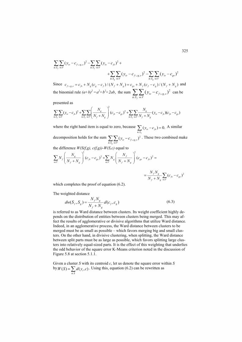
325
2,( ) (iv f g v iv
i S v V i S v Vy c y∪
∈ ∈ ∈ ∈
− −∑ ∑ ∑ ∑ 2)fvcf f
− +
)g
iv f g v iv gvi S v V
y c y c∪∈ ∈
+ − − − gi S v V∈ ∈
2 2,( ) (∑∑ ∑∑
Since ), ( ) / ( ) ( ) / (g v fv g g f f g gv f f g f gN c c N∪ + − +
ule (a+b)2 =a2+b2+2ab, the sumfc c N c c N N c N= + − + = and
the binomial r 2,( )
f
iv f g vi S v V
y c ∪∈ ∈
−∑ ∑ can be
presented as 2
2 2( ) ( ) ( )( )g giv fv
f g
N N
f f f
iv fv fv gv fv gvi S v V i S v V i S v Vf g
y c c c y c c cN N
⎛ ⎞− + − + − −
+∑∑ ∑∑
to zero, because
i S∈
N N∈ ∈ ∈ ∈ ∈ ∈⎜ ⎟⎜ ⎟+⎝ ⎠
where the right hand item is equal ( ) 0.iv fvy c
∑∑
− =f
∑ A similar
decomposition holds for the sum ( ivy c− 2, )
g
f g vi S v V
∪∈ ∈∑∑ . These two combined make
the difference W(S(f,g), c(f,g))-W(S,c) equal to 2 2
2 2( ) ( )g ff fv gv g gv fv
N NN c c N c c
⎛ ⎞ ⎛ ⎞− + − =⎜ ⎟ ⎜ ⎟
v V v Vf g f gN N N N∈ ∈⎜ ⎟ ⎜ ⎟+ +⎝ ⎠ ⎝ ⎠
∑ ∑
2( )f gfv gv
v Vf g
N Nc c
N N ∈
= −+ ∑
which completes the proof of equation (6.2).
ighted distance The we
( , ) ( , )f gf g f g
f g
N Ndw S S d c c
N N=
+ (6.3)
is referred to as Ward distance between clusters. Its weight coefficient highly de-pends on the distribution of entities between clusters being merged. This may af-fect the results of agglomerative or divisive algorithms that utilize Ward distanceIndeed, in an agglomerative process, the Ward distance between clusters to be merged must be as small as possible – which favors merging big and small clus-ters. On the other hand, in divisive clustering, when splitting, the Ward distance between split parts must be as large as possible, which favors splitting large clus-ters into relatively equal-siz
.
ed parts. It is the effect of this weighting that underlies on of
Given a cluster S with its centroid c, let us denote the square error within S S d y c
∈
=
the odd behavior of the square error K-Means criterion noted in the discussiFigure 5.8 at section 5.1.1.
by ( )W ( , )ii S∑ . Using this, equation (6.2) can be rewritten as

326
( ) ( ) ( ) ( , )f g f g f gW S S W S W S dw S S∪ = + + . (6.2′) This explains the additive properties of the square error W(S) when used as the height index in drawing the clustering tree. According to this equation, the heightof the parent is equal to the sum of heights of its children plus Ward distance be-ween them. This warrants a speci
fic heights distribution over the tree: the closer
lculated from ist din t followin
d(Sf∪g, k)= [(Nf k)wd f, Sk) + kwd(S g)]/(Nf Nk). (6.4)
k
tto the root, the longer the edges!
. 6.7. Prove that Ward distance after a merger can be recursively caQthe d ances before the merger accor g o the g formula:
Sw
+N (S (Ng+N )wd(Sk g, S )− N f,S +Nk g +
Q.6.8. Prove that the square error of cluster (Sk, ck), ( ) ( , )
k
k ii S
W S d y c∈
= ∑ , can be
pressed in terms of within cluster d
and Nk is the number of entities in Sk. Hi
ntroids neither for calculating Ward dis-tances nor for the cluster’s square errors.
C6.2 Agglomerative clustering: Computation
imities – then a similarity maximum should be taken rather than a mi
between them and form a list of maximal clusters including all the sin-
ex istances only:
, ki j S
wh re d is the squared Euclidean distance
( ) ( , ) / .k i j kW S d y y N∈
= ∑ (6.5)
ent: Use equation (5.9) in section 5.1.1. Equations (6.4) and (6.5) allow carrying Ward’s agglomeration process by us-
ing only the distances, using the cluster ce
All agglomerative clustering algorithms follow the same scheme. They trans-form the original matrix of dissimilarity indexes between them into a binary clus-ter hierarchy. The dissimilarities can be virtual, that is, computed on the fly from other data such as entity-to-feature data. Also, they can be expressed as similari-ties or prox
nimum. Agglomerative clustering
1. Initial setting. Make all entities k∈I to form singleton clusters Sk={k}, with their cardinalities set to unity and heights to zero; form a matrix of dissimilarities D=(d(k,l))gletons.

327
2. Finding minimum. Find the minimum d(f,g) in D.
3. Clusters update. Two maximal clusters, Sf and Sg, that are closest to each other, are merged together to form their parent, a new maximal cluster Sf∪g=Sk∪Sk. The new cluster’s cardinality is defined as Nf∪g = Nf + Ng, with the height com-puted accordingly. (Usually, the height is taken to be equal to d(f,g). In Ward clus-ter , h ∪ = h + h + wd(f,g).) Clusters S , S are removed from the list of maxi-
date. Remove rows and columns f and g from D; put in a new row and column of distances between new cluster S and the remaining maximal
2.
6.
e merged cluster and the other maximal clusters is defined. A very general for overing many a method has been proposed by Lance and Williams (1967):
ing f g f g f gmal clusters.
4. Distance up
f∪gclusters.
5.Stop condition. If the number of maximal clusters is larger than 1, go to step
Output: the set of all clusters along with their heights. Draw a cluster tree. This algorithm remains a scheme unless a method for computing distances be-
tween thmula c
( , ) ( , ) ( , ) ( , ) | ( , ) ( , ) | .f gd k f g d k f d k g d f g d k f d k gα α β γ∪ = + + + − (6.6)
Values of coefficients for some popular methods are presented in Table 6.5. One of the methods, popular in bioinformatics, is referred to as UPGMA (Unweighted Pair Group Method with Arithmetic Means): the dissimilarity between two clus-ter
able 6.5. Lance-Williams coefficients for some popular agglomerative clus-tering
linkage
A
Ward
(N +N )/(N + N +N ) (N +N )/(N + N +N )
s is defined as the average distance between all entities of the two. T
methods.
Method Single linkage
αf α g β γ ½ ½ 0 -½
½ ½ 0 ½ Complete
N /(N +N ) N /(N + N ) 0
UPGM f f g g f g 0
f k f g k f k f g k
(N +Nf k)/(N + Nf g+Nk) 0
From the computational point of view, there are two weak points in the algorithm. One of them concerns the operation of finding the minimum on Step 2, which is

328
computationally intensive. This, however, can be softened a bit by some prior computations such as finding the nearest neighbor for each entity or when the dis-similarity measure satisfies some conditions that allow to limit the search span or by imposing some neighborhood structure so that the search is constrained within the neighborhoods only (Murtagh 1985). The other point concerns the storage room for dissimilarity matrix D. Its size is quadratic on the number of entities so that a thousand strong sample would relate to half a million dissimilarities and a ten thousand strong set would require memory for fifty million dissimilarities. One of the approaches to tackle the problem would be keeping the data in the original format, such as entity-to-feature table, and computing dissimilarities on the fly, only when needed. This could be at odds with the need to find the minimum dis-similarities by comparing them. Another tackle, using a part of the data only with a f extending the results is in a very early stage of experimental develop-
Q.6.9. Formulate a version of agglomerative clustering for Ward criterion using the definition of Ward distance with centroids.
6.3 Divisive and conceptual clustering
P6
ponding to split parts. The splitting pro es on so that each time, a leaf cluster is split which is reflected in an-oth
T the following:
ecides to stop the splitting. Let r some options that can be recommended based on some theoretical and/or ex this sequence.
ollow-upments.
.3 Divisive clustering: Presentation
A divisive method works in a top-down manner, starting from the entire data set and splitting each cluster in two, which is reflected in drawing the split cluster as a parental node with two children corres
cess goer node with two children sprung from it.
o specify a method of divisive clustering, one should define(i) splitting criterion – how one decides which split is better; (ii) splitting method – how the splitting is actually done; (iii) choice of cluster – which of the current leaf clusters is to be split; (iv) stopping criterion – at what point one d
us coveperimental evidence, in
(i) Splitting criterion

329
The only splitting criterion that is considered here is K-Means criterion of the summary square error which is implemented as Ward-like criterion, that is the maximum possible reduction in the total squared error caused by the split: the gre
nty” in the distribution of possible feature values that is captured by the concepts like Gini index, entropy, variance, etc. (see detail in
clu tering criterion at the conventional zero-one coding of categories along with different ata, as explained in section 3.5.2 and section 6.2.
For War
A. to
e
ard distance between split parts, the divisive algo-rithm utilizing Two-splitting is referred to as Ward-like divisive al-
B.
hi-
a corresponding normalization option (see section 3.5). In this as-
ater the better. When applied to categorical features represented by their categories enveloped
into the corresponding binary features, this criterion can be reinterpreted in terms of what is referred to a goodness-of-split criterion, which usually measures the improvements in the predictability of the categories, from the split partition. The “predictability” can be measured differently, most frequently by involving the general concept of “uncertai
sections 1.2, 1.3, 3.5, 6.2).
Three popular goodness-of-split criteria that are compatible with the least-squares data recovery framework are: (a) impurity function (Breiman et al. 1984), (b) category utility function (Fisher 1987), and (c) the summary Pearson chi-squared coefficient. The category utility function, in fact, is the sum of impurity functions over all categories in the data, related to the number of clusters in the partition be-ing built. All the three can be expressed in terms of the cluster-category contribu-tions to the data scatter and, thus, amount to be special cases of the square-error
s normalizations of the d
(ii) Splitting method
d’s criterion, we consider two splitting approaches:
K-means at K=2, or Two-splitting – this is a popular option, fre-quently referred to as Bisecting K-Means; this leads, typically, good results if care is taken to find good initial centroids. Since thcriterion of bisecting K-Means is equivalent to the criterion of maximizing W
gorithm here.
Conceptual clustering – in this, just one of the features is involved in each of the splits, which leads to a straightforward conceptual inter-pretation of all the clusters. Conceptual clustering builds a cluster hi-erarchy by sequentially splitting clusters, as all divisive algorithms do, yet here each of the splits uses a single attribute in contrast to the classic clustering that utilizes distances involving all of them. The criteria such as summary impurity function or summary Pearson csquared are part of the Ward-like divisive clustering algorithm under

330
pect, conceptual clustering should be equated to building classifica-tion trees over a multiple target feature set – the only difference is that the very same target features are simultaneously input features!
ii) Choice of cluster to split
e unexplained part, that clu se square-error is maximum is to be split first.
v) Stopping criterion
ts projections to the first principal component has no min-im inside the range.
ase study 6.1. Divisive clustering of Companies with two-splitting
o 8 than to 6 as easily seen in Table 6.1. This partition is at odds with the product clusters.
ompany dataset in this Chapter, let us use Build algorithm which relies on distances only.
(i
The order of splitting conventionally is not considered important: if the set is di-vided all the way down to singletons, then the order does not much matter indeed. If, however, the goal is to produce a partition by finishing after just a few splits, then Ward’s criterion gives the following guiding principle: after each split, all leaf clusters Sk are supplied with their square errors W(Sk). The square-error is the contribution to the unexplained data scatter, that is, the sum of Euclidean squared distances between cluster’s entities and its centroid, which is proportional to the cluster summary variance weighted by its size. To minimize th
ster who (i
Conventionally, the divisions stop when there remains nothing that can be split, that is, when all the leaves are singletons. Yet for the Ward’s criterion one can specify a threshold on the value of the square-error at a cluster, the level of “noise” reached by W(Sk) at which a cluster is considered next to noise and not split anymore because of that. This threshold can be set as a proportion of the data scatter, say 5%. Another criterion of course can be just the cluster size – say, clus-ters whose cardinality is less than 1% of the original data size are not to be split anymore. Tasoulis et al. (2010) propose a cluster to stop splitting when the den-sity of the cluster poin
a C Consider the Ward-like divisive clustering method for the Company data, range stan-
dardized with the follow-up rescaling the dummy variables corresponding to the three Sec-tor categories in Table 5.1. Using Two-splitting algorithm may produce a rather poorly re-solved picture if the most distant entities, 6 and 8 according to the distance matrix in Table 6.1, are taken as the initial seeds. Then step 2 would produce tentative clusters {1,3,4,5, 6} and {2,7,8} because 2 is nearer t
Unfortunately, no further iterations can change that. This shows that the choice of the
initial seeds at the two farthest entities can be not that good an option that it may seem to be. Usage of Build or Anomalous pattern algorithms, explained in section 5.1.5, could lead to better results. Because of our reluctance in using the original C

331
According to distance data in Table 6.1, entity 5 is medoid there since the sum of its dis-tances to the rest, 9.6, is the minimum. Now we form a cluster around each entity to consist of those that are nearer to the entity than to medoid 5: these will be 2 and 3 around 1, 1 and 3 around 2, 1 and 2 around 3, 7 and 8 around each other, and clusters for entities 4,5,6 are singleton themselves. This would give an edge to entity 1 as the next seed, because it is fur-ther away from 5 and surrounded by two. Indeed the summary E value for 1, 2.20+(1.82-0.51)+(1.16-0.88)=3.79 is by far the greatest. Using the entities 5 and 1 as seeds, indeed brings the bisecting K-Means to a desired split {1, 2, 3} versus {4,5,6,7,8}. The hierarchy on Figure 6.2 then will be found with further splits. The node heights are the same – within clu squared errors that are scaled as percentages of the pre-processed data scatter.
nomalous cluster versus two-split cluster
ster Case study 6.2. A
60
−40 −30 −20 B 0 A 10 20 30 40 0
10
20
30
40
50
Figure 6.4. Histogram of the one dimensional sample of 280 entities from N(0,10) distribu-tion. Points A and B denote the boundaries of the right and left anomalous fragments found with the Anomalous pattern algorithm.
rt of the table shows results found with an incremental ver-
Consider 280 values generated according to the one dimensional Gaussian distribution
N(0,10) with zero mean and standard deviation equal to 10 (see Table A5.2), presented on Figure 6.4 and try divide it in two clusters. When it is done with a splitting criterion, the di-vision goes just over the middle, cutting the bell-shaped curve in two equal halves. When one takes Anomalous clusters, though, the divisions are much different: first goes a quarter of the entities on the right (to the right of point A on Figure 6.4), because the right end in this individual sample is a bit farther from the mean than the left one; then a similar chunk to the left of point B, etc. (see case study 5.4 in section 5.1.6). Yet if one uses the anoma-lous clusters in iK-Means, just as an initial centers generator, things differ. With the dis-carding threshold of 60, only two major Anomalous patterns found in the beginning remain. Further 2-Means iterations bring a rather symmetric solution reflected in the leftmost part of Table 6.6. The right hand pasion of Two-splitting method.

332
This leads to a slightly different partition, with three entities swapping their membership, which is slightly better, achieving 65.4% of the explained scatter versus 64.8% at iK-Means. This once again demonstrates that the incremental taking into account entities is a mo
able 6.6. Two-class partitions found using different strategies. A better result by the incre wo-sp uted to its one edure.
, is presented in it by one col-umn only while having two categories – “Yes” and “No”. These two are represented in the
s “EC+” and “EC−”, respectively.
Table 6.7. Digit dataset
igure 0.2 and turn the figure into a dataset by considering each of the seven rectangle edges a feature with two categories, “P ent” and “Absent” (see Figure 6.5 an ble 6.7).
Cluster d,%
g d, %
1 139 7.63 32.6 136 7.82 26.8 144 -9.12 38.6
0 1 1 1 0 1 1 1
re precise option than the all-as-one switching in iK-Means. T
mental T litting should be attrib -by-one entity moving proc
iK-Means with t=60 Incremental Two-splittinSize Mean Explaine Size Mean Explaine
2 141 -9.30 32.1 Let us now turn to conceptual clustering.
Case study 6.3. Conceptual clustering of Digit data as related to Ward clus-tering As shown in section 3.5.2, divisions over individual features – the essence of conceptual clustering procedures – are governed by the square error criterion if conventional measures for scoring association between dataset features and the partition – impurity index or Pear-son chi-squared – are applied. Yet these theoretical derivations assume all of the categories represented by corresponding dummies, which makes us slightly modify the Company dataset, because one of the features, “Electronic commerce”
data Table 6.7 by column
v1 v2 v3 v4 v5 v6 v7 0 0 1 0 0 1 0 1 1 0 1 1 1 0 1 2 1 0 1 1 0 1 1 3 0 1 1 1 0 1 0 4 1 1 0 1 0 1 1 5 1 1 0 1 1 1 1 6 1 0 1 0 0 1 0 7 1 1 1 1 1 1 1 8 1 1 1 1 0 1 1 9 Let us take the set of 10 styled digits presented on F
Total 8 6 8 7 4 9 7
res d Ta

333
Figure 6.5. Digit rectangle edges as features. To produce a classification tree leading to a partition S, we use summary Gini index
(impurity function) G(v1/S)+G(v2/s)+….+ G(v7/S) as the criterion to maximize. Start by trying each of the features as the split base to select the best of them. Consider, for exam-ple, partition S={S1,S2}of the Digit set according to attribute v2 which is present at S1={4,5, 6, 8, 9, 0} and is absent at S2={1,2,3,7}. Cross-classification of S and v7 (see Table 6.8) yie
Table 6.8. Cross-classification of igit dataset.
v7=0
1 2 3
(because the scaling coefficients must be all unity to make Ward’s criterion equivalent to the ta in Table 6.9 is not
Table 6.9. Digit dataset pre rocesse
9 .2 .4 .2 .3 -.4 .1 .3
v2 3
v5 v4 v6
v7
v1
v
lds G(v7/S)=0.053.
S=v2 and v7 on D
S1 S2 Total 5 2 7 v7=1
Total 6 4 10
To see what this has to do with the setting in which Ward’s criterion applies, let us pre-process the Digit data matrix by subtracting the column averages without rescaling them
summary Gini index, see sections 3.5.2 an 5.1.5). However, the da
-p d by centering its columns.
v1 v2 v3 v4 v5 v6 v7-.8 -.6 .2 -.7 -.4 .1 -.7 1
2 .2 -.6 .2 .3 .6 -.9 .3 3 .2 -.6 .2 .3 -.4 .1 .3 4 -.8 .4 .2 .3 -.4 .1 -.7 5 .2 .4 -.8 .3 -.4 .1 .3 6 .2 .4 -.8 .3 .6 .1 .3 7 .2 -.6 .2 -.7 -.4 .1 -.7 8 .2 .4 .2 .3 .6 .1 .3
0 .2 .4 .2 -.7 .6 .1 .3 exactly the data matrix Y considered theoretically in section 5.1.5. Indeed, the theoretical data matrix in 5.1.5 and equation (5.4) comprises columns corresponding to all of the cate-
334
gories, whereas the data matrices in Tables 6.7 and 6.9 reflect only half of the categories – those of the presence of edges v1 – v7, never an absence. Indeed, a column corresponding
is formed by squares of the entries which are the same. That means that this lac t can be taken into account by just doubling the contributions accounted for with Ta
ance times N=10, which is 13.1. However, to get the data scatter in the left hand side of (5.4), this must be do
tions Bkv = Nkv ckv2 summed up over clusters S1 and S2.
This is done in Table 6.10, the last line of which contains contributions of all features to the exp
Table 6.10. Fe ure c
v2=0 0.010 1.440 0.160 0.160 0.090 0.090 0.160
to thesent in Table 6.8. After the contribution 0.267 is properly doubled, the quantities do coin
Table 6.11. Pair ise
to an “Absent” category is a mirror of the column corresponding to the “Presence” cate-gory, with all ones made zero and, vice versa, all zeros made ones. After the centering, the lacking half of the data table would be the Table 6.9 negated, that is, multiplied by –1. The data scatter
king parble 6.9. The data scatter of matrix in Table 6.9 is the summary column vari
ubled to 26.2 to reflect the ``missing half'' of the virtual data matrix Y. Let us now calculate the within class averages ckv of each of the variables, v=v1,..., v7,
in clusters k=1,2 and take contribu
lained part of the data scatter.
at ontributions to Digit clusters according to v2.
v1 v2 v3 v4 v5 v6 v7 v2=1
Total 0.017 2.400 0.267 0.267 0.150 0.150 0.267 The last item, 0.267, is the contribution of e7. Has it anything to do with the reported
value of impurity function G(e7/S)=0.053? Yes, it does. There are two reasons to make these two quantities different. First, to get to the contribution from G(v7/S), it must be mul-tiplied by N=10, which would make it 0.533. Second, the 0.267 value is the contribution
0.007 0.960 0.107 0.107 0.060 0.060 0.107
data scatter of matrix Y obtained after enveloping of all 14 categories – not just 7 pre-
w Gini indexes for all 7 features in Digit dataset.
v1 v2 v3 v4 v5 v6 v7 v1 v2 v3 v4 v5 v6 v7 Total
0.245 0.053 0.045 0.115 0.120 0.020 0.420 0.695 0.703 0.520 0.658 0.720 0.398 0.963
0.320 0.003 0.020 0.015 0.053 0.009 0.187 0.005 0.480 0.080 0.061 0.030 0.080 0.061 0.020 0.053 0.320 0.034 0.003 0.009 0.034 0.020 0.053 0.045 0.420 0.003 0.020 0.115 0.080 0.030 0.005 0.004 0.480 0.080 0.137 0.005 0.030 0.005 0.009 0.030 0.180 0.009
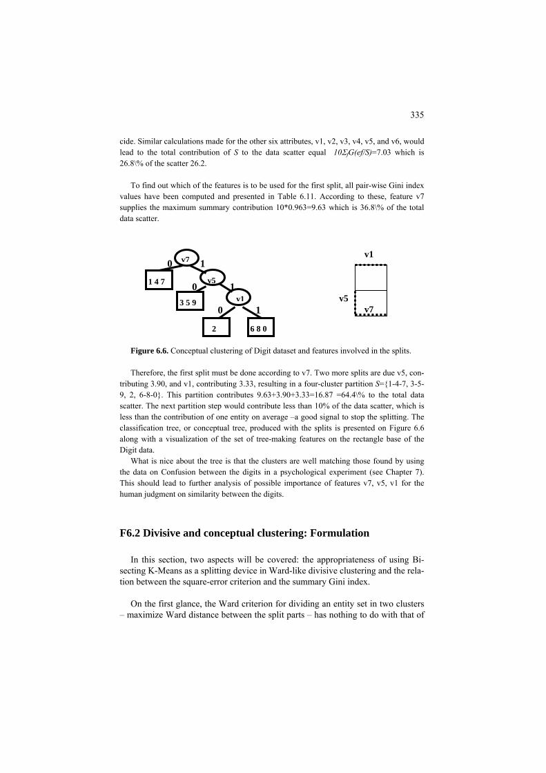
335
cid
o find out which of the features is to be used for the first split, all pair-wise Gini index values have been computed and presented in Table 6.11. According to these, feature v7
0*0.963=9.63 wh of the total dat ter.
next partition step would contribute less than 10% of the data scatter, which is les
What is nice about the tree is that the clusters are well matching those found by using the data on Confusion between the digits in a psychological experiment (see Chapter 7).
v5, v1 for the
v5
e. Similar calculations made for the other six attributes, v1, v2, v3, v4, v5, and v6, would lead to the total contribution of S to the data scatter equal 10ΣfG(ef/S)=7.03 which is 26.8\% of the scatter 26.2.
T
ich is 36.8\%supplies the maximum summary contribution 1a scat v1 v7 Figure 6.6. Conceptual clustering of Digit dataset and features involved in the splits. Therefore, the first split must be done according to v7. Two more splits are due v5, con-
tributing 3.90, and v1, contributing 3.33, resulting in a four-cluster partition S={1-4-7, 3-5-9, 2, 6-8-0}. This partition contributes 9.63+3.90+3.33=16.87 =64.4\% to the total data scatter. The
s than the contribution of one entity on average –a good signal to stop the splitting. The classification tree, or conceptual tree, produced with the splits is presented on Figure 6.6 along with a visualization of the set of tree-making features on the rectangle base of the Digit data.
This should lead to further analysis of possible importance of features v7,human judgment on similarity between the digits.
F6.2 Divisive and conceptual clustering: Formulation
In this section, two aspects will be covered: the appropriateness of using Bi-secting K-Means as a splitting device in Ward-like divisive clustering and the rela-tion between the square-error criterion and the summary Gini index.
On the first glance, the Ward criterion for dividing an entity set in two clusters
– maximize Ward distance between the split parts – has nothing to do with that of
v7
v5
v1
6 8 0
1 4 7
3 5 9
2
0 1
0 1 0 1

336
K-Means. The K-Means criterion, in this case, given a parental cluster J⊆I, is to minimize
1 21 2
c1 mentary part of the data scatter forms another criterion presented in equa-
tioNters.
( , ) ( , ) ( , )i S i S
W S c d i c d i c∈ ∈
= +∑ ∑ where S1 and S2 are the split parts
of J, entroids and d squared Euclidean distance. Thecomple
and c2 their respective c
n (5.6). This complementary criterion is to maximize B(S,c)= , ,c c N c c< > + < > where N1 and N21 1 1 2 2 2
are respective cardinalities of the clus-
Let us prove that that Ward distance between the two clusters,
1 21 2 1 2
1 2
( , ) ( , )dw S S d c cN N
=+
, we need two equations. The
squared Euclidean distance through inner products, 1 2 1 1 1 2 2 2 1 2( , ) ( , , ) ( , , )d c c c c c c c c c c= < > − < > + < > − < > . The second is relation be-
tween the cluster centroid
N N , is just that. To proceed
first just expresses the
ntal cluster centroid c: d in dw(S1,S2) and, in fact, is ir-
−(N1/N2)c1. This can be put into
s and the pare1 1 2 2 1 2( )N c N c N N c . Since c is not involve
relevant to it, we may take it to be c=0. Then the latter equation implies that c+ = +
2=
1 1 1 2 1 1 1 2 1 1, , , ,c c c c c c N N c c< > − < >=< > + < >= .
1 2 2 1 1( ) ,N N N c c= + < > . Similarly, equation 1 1 2 2 1 2 1 2 2, , ( ) ,c c c c N N N c c< > −< >= + < >
is obtained. Substituting these through the first equation in Ward distance, we find 1 2 1 2
1 2 1 21 2 1 2
( , ) ( , )N N N Ndw S S d c cN N N
= = + < > + + < >+ +
=1 2 2 1 1 1 2 1 2 2(( ) , ( ) , )N N N c c N N N c c
NB(
clS,c), which proves the statement. That means that Ward-like divisive ustering is adequately served with Two-
splitting, or Bisecting K-Means. Now we will show that, in the situation in which all the features are categorical,
maximizing the summary Gini index ( / )v V
G v S∈∑ is as adequate. Assume that
data matrix Y in this case is drawn by putting a dummy variable for each of the categories with a follow up centering it with the mean which is the category fre-quency. Then, according to Statement 3.4.2.1(c) in section 3.5.2, Gini index G(v/S), multiplied by the number of entities, is the contribution of the partition S to the summary scatter of the dummies corresponding to categories of feature v – this, in fact, easily follows from equations (2.13) and (3.19). This implies that the summary Gini index, multiplied by the number of entities, is the contribution of S to the summary scatter of all the dummy variables, that is, the data scatter of ma-
ared by using
trix Y. That means that maximum of the summary Gini index is reached at a parti-tion minimizing the total unexplained contribution which is exactly the square er-ror criterion. The statement is proved.
Q.6.10. What data standardization should be applied if one wants to build a con-ceptual clustering tree maximizing the summary Pearson chi-squ

337
Ward distance maximization? A. Each category is to be represented by a dummy variable which then should be centered by subtracting its frequency and normal-ize
ation tre erion. It is correlation to a target variable in the lat lation with all the features forming the cluster-
, in the former case, even if it is expressed as maximizing Ward distance
-like divisive clustering
and draw tree root as a node corresponding to I at the height of W(I)
o parts, S1 and S2, to maximize Ward distance wd(S1, S2).
two children nodes corresponding to S1 and S2 at the parent o J, their heights being their square errors.
t cluster hierar-ch
Ch s, halt and output the hie ep 2.
ve clustering can be an iss
specify initial seeds of its split parts, c1 and c2.
d by the square root of the frequency (see Statement 3.4.2.2(c)).
C6.2 Divisive and conceptual clustering: Computation
he process of divisive clustering is much like that of building a classificTe – the only difference is the crit
r case and it is summary correteing spacebetween split parts. The equivalence between K-Means criterion at K=2 and the criterion of maximization of Ward distance justifies the following algorithm.
Ward
1. Start Put J ⇐ Iwhich is the data scatter, by itself or 100 per cent.
2. Split Split J in tw
3. Draw In he drawing, addtnode corresponding t
4. Update Find the cluster of maximum height among the leaves of the curren
y and make it J.
5. Stop-Condition eck the stopping condition as described below. If it holdarchy and possible interpretation aids; otherwise, go to Str
Developing a good splitting algorithm at Step 2 in divisie. Here are two versions: Two-splitting and C-splitting. u
Two-splitting (2-Means splitting, Bisecting K-Means)
1. Initialization Given J,

338
2. Batch 2-Means. Apply Bisecting K-Means with initial seeds specified at step 1 and the squared
Euclidea
3. Output
ids c1 and c2; nd h(S2);
To lied: (1a) random selection;
wo centroids derived with algorithm Build in section 5.1.5.
nable solution for any sizeable dataset. Maximally distant entities not necessarily reflect the structure
e case study 6.1). Therefore, two latter options should be pre-fer
Conceptual clustering with binary splits)
two parts. If v is quantitative or ordinal, J-splits are defined by splits of its range in two intervals: one part consists of entities at
s less than or equal to yiv and the other of those at which v is greater than ylv
ries and the same yil=0 value at each of them.
3. v, ylv) which received the highest score and perform the
bin ry split of J, thus generating two its offspring nodes S1 and S2.
n distance.
Output: (a) final split parts S1 and S2; (b) their centro
(c) their heights, h(S1) a (d) contribution of the split which is Ward distance dw(S1 , S2). specify two initial seeds in Two-splitting, either option can be app
(1b) maximally distant entities; (1c) centroids of two Anomalous pattern clusters derived on J as described in section 5.1.5.
(1d) t
Random selection must be repeated many times to get a reaso
of a good split (sered. C-splitting (
1. Initial setting Set J to consist of the universal cluster, the entire entity set I.
2. Evaluation In a loop over all leaf clusters J and variables v∈V, for each J and v, consider
all possible splits ylv of J over v in
which v i. If v is nominal, J is split over each of v’s categories l in “yes” or “no” parts.
This amounts to using quantitative dummy variables for the catego
Split Select that triplet (J, a
4. Output This is the same as in the previous versions plus the variables v and split values
yiv for each of the splits.

339
Comment 6.1. Some may argue that the framework of divisive clustering is de-liberately set as a greedy optimization procedure: at each local splitting step the best solution is taken which is not necessarily the best if one considers summary results of several sequential steps. The greedy-wise nature of the setting is true. Yet it is not easy to formulate a holistic optimization problem for divisive cluster-ing. If for example, the process of splitting goes all the way down to singleton clusters, then perhaps the greedy-wise setting is most natural (Mirkin 1996). When there is a stopping condition such as a pre-specified number K of terminal clusters, then the problem becomes of globally minimizing K-Means square-error criterion. One should remember that the K-Means criterion has some innate drawbacks re-lated to its rigidity in putting the goal of getting split parts as uniform as possible
ing the ata analy-
6.4 Single linkage clustering, connected components and
d clusters: Presentation
onsider a similarity, rather than dissimilarity, matrix, for a change. All the co ents of this section applies to dissimilarity data as well with the only change – of t king maximum for taking minimum.
able 6.12. A symmetric version of Confusion data in Table 0.7.
(see, for example, case study 5.2 in section 5.1.1). This means that achievglobal minimum is not necessarily beneficial from the point of view of dsis.
Maxmum Spanning Tree MST
P6 4 Maximum Spanning Tree an.
Cnta T Stimulus Response 1 2 3 4 5 6 7 8 9 0 877 11 18 86 9 20 165 6 15 11 1 11 782 38 13 31 31 9 29 18 11 2 18 38 681 6 31 4 31 29 132 11 3 86 13 6 732 9 11 26 13 44 6 4 9 31 31 9 669 88 7 13 104 11 5
20 31 4 11 88 633 2 113 11 31 6 165 9 31 26 7 2 667 6 13 16 7 6 29 29 13 13 113 6 577 75 122 8 15 18 132 44 104 11 13 75 550 32 9 11 11 11 6 11 31 16 122 32 818 0
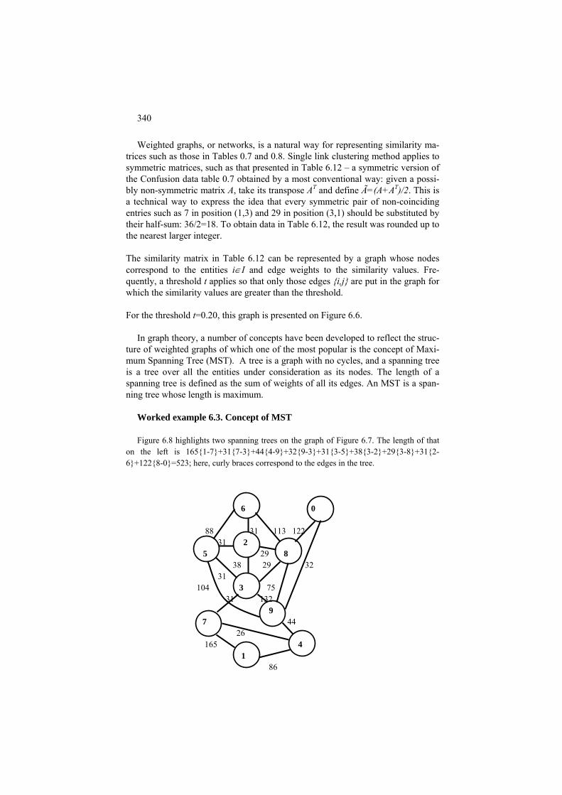
340
Weighted graphs, or networks, is a natural way for representing similarity ma-trices such as those in Tables 0.7 and 0.8. Single link clustering method applies to symmetric matrices, such as that presented in Table 6.12 – a symmetric version of the Confusion data table 0.7 obtained by a most conventional way: given a possi-bly non-symmetric matrix A, take its transpose AT and define Ã=(A+AT)/2. This is a technical way to express the idea that every symmetric pair of non-coinciding entries such as 7 in position (1,3) and 29 in position (3,1) should be substituted by their half-sum: 36/2=18. To obtain data in Table 6.12, the result was rounded up to the nearest larger integer.
The similarity matrix in Table 6.12 can be represented by a graph whose nodes correspond to the entities i∈I and edge weights to the similarity values. Fre-quently, a threshold t applies so that only those edges {i,j} are put in the graph for which the similarity values are greater than the threshold.
For the threshold t=0.20, this graph is presented on Figure 6.6.
In graph theory, a number of concepts have been developed to reflect the struc-
ture of weighted graphs of which one of the most popular is the concept of Maxi-mum Spanning Tree (MST). A tree is a graph with no cycles, and a spanning tree is a tree over all the entities under consideration as its nodes. The length of a spanning tree is defined as the sum of weights of all its edges. An MST is a span-ning tree whose length is maximum.
Worked example 6.3. Concept of MST Figure 6.8 highlights two spanning trees on the graph of Figure 6.7. The length of that
on the left is 165{1-7}+31{7-3}+44{4-9}+32{9-3}+31{3-5}+38{3-2}+29{3-8}+31{2-6}+122{8-0}=523; here, curly braces correspond to the edges in the tree.
6 0
88 31 113 122 31 2 5 29 8 38 29 32 31 104 3 75
31 132 9
7
44
26 4
1 86
165
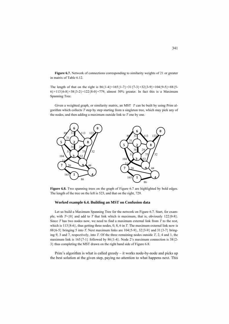
341
Figure 6.7. Network of connections corresponding to similarity weights of 21 or greater
in matrix of Table 6.12.
The length of that on the right is 86{1-4}+165{1-7}+31{7-3}+32{3-9}+104{9-5}+88{5-6}+113{6-8}+38{3-2}+122{8-0}=779, almost 50% greater. In fact this is a Maximum Spanning Tree.
Given a weighted graph, or similarity matrix, an MST T can be built by using Prim al-
gorithm which collects T step by step starting from a singleton tree, which may pick any of the nodes, and then adding a maximum outside link to T one by one.
6 0 88 31 113 122
31 5 2 8 38 29 31 75 32 104 3 132 31
7 26 9 44
165 1 4 86
6 0 88 31 113 122
31 5 2 8 38 29 31 75 32 104 3 132 31
7 26 9 44
165 1 4 86
Figure 6.8. Two spanning trees on the graph of Figure 6.7 are highlighted by bold edges. The length of the tree on the left is 523, and that on the right, 729.
Worked example 6.4. Building an MST on Confusion data Let us build a Maximum Spanning Tree for the network on Figure 6.7. Start, for exam-
ple, with T={0} and add to T that link which is maximum, that is, obviously 122{0-8}. Since T has two nodes now, we need to find a maximum external link from T to the rest, which is 113{8-6}, thus getting three nodes, 0, 8, 6 in T. The maximum external link now is 88{6-5} bringing 5 into T. Next maximum links are 104{5-9}, 32{3-9} and 31{3-7} bring-ing 9, 3 and 7, respectively, into T. Of the three remaining nodes outside T, 2, 4 and 1, the maximum link is 165{7-1} followed by 86{1-4}. Node 2’s maximum connection is 38{2-3} thus completing the MST drawn on the right hand side of Figure 6.8.
Prim’s algorithm is what is called greedy – it works node-by-node and picks up
the best solution at the given step, paying no attention to what happens next. This
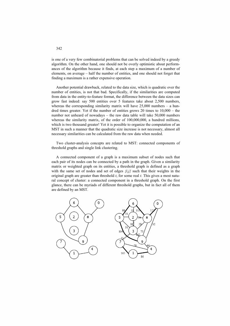
342
is one of a very few combinatorial problems that can be solved indeed by a greedy algorithm. On the other hand, one should not be overly optimistic about perform-ances of the algorithm because it finds, at each step a maximum of a number of elements, on average – half the number of entities, and one should not forget that finding a maximum is a rather expensive operation.
Another potential drawback, related to the data size, which is quadratic over the
number of entities, is not that bad. Specifically, if the similarities are computed from data in the entity-to-feature format, the difference between the data sizes can grow fast indeed: say 500 entities over 5 features take about 2,500 numbers, whereas the corresponding similarity matrix will have 25,000 numbers – a hun-dred times greater. Yet if the number of entities grows 20 times to 10,000 – the number not unheard of nowadays – the raw data table will take 50,000 numbers whereas the similarity matrix, of the order of 100,000,000, a hundred millions, which is two thousand greater! Yet it is possible to organize the computation of an MST in such a manner that the quadratic size increase is not necessary, almost all necessary similarities can be calculated from the raw data when needed.
Two cluster-analysis concepts are related to MST: connected components of
threshold graphs and single link clustering. A connected component of a graph is a maximum subset of nodes such that
each pair of its nodes can be connected by a path in the graph. Given a similarity matrix or weighted graph on its entities, a threshold graph is defined as a graph with the same set of nodes and set of edges {i,j} such that their weights in the original graph are greater than threshold t, for some real t. This gives a most natu-ral concept of cluster: a connected component in a threshold graph. On the first glance, there can be myriads of different threshold graphs, but in fact all of them are defined by an MST.

343
Figure 6.9. Threshold graph at t=50 for the graph of Figure 6.6 is on the left, and MST with 3 weakest links shown using dashed lines is on the right.
The components of a threshold graph are fragments of any MST found by cut-
ting its weakest edges – those at which weights are less than the threshold. It should be clear from the definition that all connections within the MST fragments are weaker than the threshold.
Worked example 6.5. MST and connected components Let us sort all the edges in MST found at the graph on Figure 6.8 in the ascending order:
31{3-7}, 32{9-3}, 38{3-2}, 86{1-4}, 88{5-6}, 104{9-5}, 113{6-8}, 122{8-0}, 165{1-7}. Given a threshold t, say t=50, cut all the 3 edges in the tree that are less than the threshold, 3-2, 3-7 and 3-9 – the tree will be partitioned in 3+1=4 fragments corresponding to con-nected components of the corresponding threshold graph.
Figure 6.9 presents, on the left, a threshold graph at t=50, along with clearly seen com-
ponents consisting of subsets {1,4,7}, {2}, {3}, and {5,6,8,9,0}. The same subsets are seen on the right where the three weakest links are cut out of the MST. The fact that the thresh-old graph components are MST fragments is not a coincidence but rather a mathematically proven property of the MSTs.
The single linkage clustering is a hierarchical clustering approach, either ag-
glomerative or divisive, that is based on the following definition of similarity be-tween clusters: given a similarity matrix A=(aij) between entities i,j∈ I, the simi-larity between subsets S1 and S2 in I is defined by the maximum similarity between their elements, . This is why this approach sometimes is ijSjSi aSSa
21,max),( 21 ∈∈=
30 80 110 120 165 0 8 6 5 9 2 3 7 1 4
Figure 6.10. A binary tree of the single link clustering for the MST of Figure 6.8; the heights of the branches reflect the similarities between corresponding nodes.

344
referred to as the Nearest Neighbor approach. It appears, single linkage clusters are but fragments of any MST built according to the similarity matrix.
Specifically, given an MST, the entire hierarchy of single link clustering can be
recovered by one-by-one cutting the weakest links (divisive clustering) or, starting from the trivial singletons, one by one merging the strongest links. The similarity values over the MST can be used as the height function for drawing over the proc-ess of mergers/divisions.
Worked example 6.6. Single link hierarchy corresponding to an MST Let us build a binary classification tree according to the MST on Figure 6.9. This tree is
presented on Figure 6.10. Note that in contrast to the heights defined in section 6.2 over dissimilarities, the direction of the height axis goes down here to reflect the principle that the smaller the similarity the further away are the clusters. Specifically, 7 and 1 merge to-gether first because of the maximum similarity, 165; then 0 and 8 merge (similarity 122) af-ter which 6 is joining in (similarity 113). Then 5 and 9 merge together (similarity 104) after which they merge with cluster {0,6,8} (similarity 88). Then 4 joins in cluster {1,7} (simi-larity 88). At last, 2 and 3 merge at similarity 38. The process is complete when the three remaining clusters merge almost simultaneously, at similarities 32 and 31.
Case-study 6.4. Difference between K-Means and Single Link clustering Consider a set of 2D points presented on Figure 6.11. Those on the left have been clus-
tered by using the single link approach, whereas those on the right, by using the square er-ror criterion of K-Means.
(a) (b)
Figure 6.11. A 2D point set: clustered with the single link method (a) and K-Means (b).
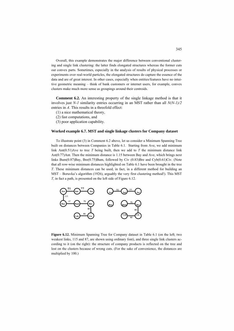
345
Overall, this example demonstrates the major difference between conventional cluster-ing and single link clustering: the latter finds elongated structures whereas the former cuts out convex parts. Sometimes, especially in the analysis of results of physical processes or experiments over real-world particles, the elongated structures do capture the essence of the data and are of great interest. In other cases, especially when entities/features have no intui-tive geometric meaning – think of bank customers or internet users, for example, convex clusters make much more sense as groupings around their centroids.
Comment 6.2. An interesting property of the single linkage method is that it
involves just N-1 similarity entries occurring in an MST rather than all N(N-1)/2 entries in A. This results in a threefold effect:
(1) a nice mathematical theory, (2) fast computations, and (3) poor application capability.
Worked example 6.7. MST and single linkage clusters for Company dataset To illustrate point (3) in Comment 6.2 above, let us consider a Minimum Spanning Tree
built on distances between Companies in Table 6.1. Starting from Ave, we add minimum link Ant(0.51)Ave to tree T being built, then we add to T the minimum distance link Ast(0.77)Ant. Then the minimum distance is 1.15 between Bay and Ave, which brings next links Bum(0.87)Bay, Bre(0.75)Bum, followed by Civ (0.83)Bre and Cyb(0.61)Civ. (Note that all row-wise minimum distances highlighted on Table 6.1 have been brought in the tree T. These minimum distances can be used, in fact, in a different method for building an MST – Boruvka’s algorithm (1926), arguably the very first clustering method!). This MST T, in fact a path, is presented on the left side of Figure 6.12.
51 77
Ave Ant Ast 75
Bay Bum Bre 83 Cyb Civ 61
51 77 Ave Ant Ast 115 87 75 Bay Bum Bre
83 61 Cyb Civ
Figure 6.12. Minimum Spanning Tree for Company dataset in Table 6.1 (on the left; two weakest links, 115 and 87, are shown using ordinary font), and three single link clusters ac-cording to it (on the right): the structure of company products is reflected on the tree and lost on the clusters because of wrong cuts. (For the sake of convenience, the distances are multiplied by 100.)

346
This path goes along the product clusters so that B companies are all between A and C companies. Yet the single link clusters shown on the right side of Figure 6.12 do not reflect the structure of the set but separate a distant company Bay and mix together products B and C – all this just because the right-to-remove link Bre-Civ (0.83) appears a wee smaller than wrong-to-remove link Bay-Bum (0.87).
Q.6.11. Explain the sequence of splits in a divisive algorithm according to tree of Figure 6.10.
Q.6.12. How many edges in an MST are to be cut if the user wants to find 5 clus-ters?
Q.6.13. Prove that the number of edges in an MST is always the number of enti-ties short one.
Q.6.14. Apply Prim’s algorithm to Amino acid similarity data in Table 0.8.
F6.4 MST, connected components and single link clustering: Formulation
Here we present some mathematical properties relating the concepts of Maxi-mum Spanning Tree, connected component of a graph and Nearest Neighbor clus-tering.
F.6.4.1. MST and connected components
Let us first recall some definitions from graph theory. A weighted (similarity) graph Г=(I,G,A) is defined as a triplet of: (i) an N-
element set of nodes I; (ii) set of edges, that is, two-element subsets of I, G; and (iii) edge weight function represented by a symmetric matrix A=(aij) so that aij =0 if {i,j}∉G. A graph is referred to as an ordinary graph if its nonzero weights are all unities.
A path between nodes i and j in Г is a sequence of nodes i1, i2,…, in such that
{im, im+1}∈G for each m=1,2,…,n-1 and i1=i , in =j. A path is referred to as a cycle if i1=in. A subset of nodes S is referred to as a connected component if there is a path within S between each pair of nodes in S, and S is maximal in this sense so that addition of any supplementary node to S breaks the property. Graph Г is called connected if it consists of just one connected component.

347
Given a connected weighted graph Г=(I,G,A), a connected weighted graph
T=(J,H,B), with no cycles, is referred to as its spanning tree if J=I, H⊂G, and B is A restricted to H, so that bij=aij for {i,j}∈ H and bij=0 for {i,j}∉ H. A characteristic property of a spanning tree T is that it has exactly N-1 edges: if there are more edges than that, T must contain a cycle, and if there are less edges than that, T cannot span the entire set I and, therefore, it would consist of several connected components.
The weight of a spanning tree T=(I,H,B) is defined as the total weight of its edges, that is, the sum of all elements of weight matrix B. A spanning tree of maximum weight is referred to as a Maximum Spanning Tree, MST.
Given a weighted graph Г=(I,G,A) and a real t, ordinary graph Гt=(I,Gt,At) is
referred to as a threshold graph if Gt={{i,j}: aij > t}. Given a spanning tree T and a threshold t, its threshold graph can be found by cutting out those edges whose weights are smaller than or equal to t. It appears T bears a lot of structural infor-mation of the corresponding graph Г=(I,G,A).
In particular, connected components of an MST found by cutting those links
from MST that are less than t one-to-one correspond to connected components of the threshold graph Гt.
Indeed, consider a component S of MST T obtained by cutting all edges of the
T whose weights are less than t. We need to prove that for each pair i,j∈S there is a path between i and j such that it all belongs to S and the weight of each edge in the path is greater than t, and for all i,k such that i∈S and k∉S, if {i,k}∈G, then aik ≤ t. But the former obviously follows from the fact that S is a connected compo-nent of T in which all weights are greater than t since all the others have been cut out. The latter is not difficult to prove either: assumption that aik>t for some i∈S and k∉S such that {i,k}∈G would contradict the assumption that T is an MST, that is, that the weight of T is maximal, because by substituting the edge connecting S and the component containing k by edge {i,k}, one would obtain a spanning tree of a greater weight. Assume now that an S is a connected component of the thresh-old graph (at threshold t), and prove that S is a component of the threshold graph, at the same threshold t, for any MST. Indeed, if S overlaps two components, S1 and S2, of the threshold graph of some MST T, then there must be a pair i,j in S such that i∈S1 and j∈S2 and aij >t , which again contradicts the fact that S1 and S2 are not connected in the threshold graph of T. This completes the proof.

348
F6.4.2 MST and single link clustering
Single link clustering is, primarily, an agglomerative clustering method in which the similarity between two clusters, S1 and S2, is defined according to near-est neighbor rule as the maximum similarity between elements of these clusters,
– the fact that the between-cluster similarity is defined
by just one link underlies the name of the method. ijSjSi aSSa
21,max),( 21 ∈∈=
There is no need to revise all the maximum similarities after every merger step.
New similarities can be revised dynamically in the agglomeration process accord-ing to the following rule:
a(S, S1∪S ) =max[a(S,S2 1), a(S, S )], 2
where S1∪S2 is the result of the agglomeration step.
Thus, the only intensive computation is finding the maximum in the newly formed column a(S, S1∪S ) of the similarity matrix over all current clusters S. 2
Yet there is another way to proceed – by building an MST first. All the merger
steps can be made according to the MST topology. First, the N-1 edges of the tree are to be sorted in the descending order. Then the following recursive steps apply. On the first step, take any maximum similarity edge {i,j}, combine its nodes into a cluster and merge i and j by removing the edge. On the general step, take any re-maining similarity edge {i,j} of the maximum similarity value (among those left) and combine clusters containing i and j nodes into a merged cluster. Halt, when no edges remain in the sorted order.
This operation is legitimate because the following property holds: clusters
found in the process of mergers according to the sorted list of MST edges are clus-ters obtained in the agglomerative single link clustering procedure.
There is no straightforward divisive version of the Single Link method as
originally defined. However, it is rather easy to do if an MST is built first. Then cutting the tree over any of its weakest – minimum – links produces the first single link division. Each of the split parts is divided in the same way – by cutting out one of the weakest links.
Q.6.15. Let us refer to a similarity matrix A as ultrametric if it satisfies the follow-ing property: for any triplet i,j,k∈I, aij ≥ min (aik, akj), that is, two of the values aij, aik, akj are equal, whereas the third one may be greater than that. Given an MST T, define a new similarity measure between any nodes i and j by using the unique path T(i,j) connecting them in T: at(i,j)=min k,l∈T(i,j) akl. Prove that:

349
(i) Similarity at(i,j) coincides with that defined by the agglomerative hierarchy built according to the Single Link algorithm;
(ii) Similarity at(i,j) is an ultrametric; (iii) Similarity at(i,j) is the maximum ultrametric satisfying condition at(i,j)≤
aij for all i,j∈I.
C6.4 Building a Maximum Spanning Tree: Computation
To find an MST, several “greedy” approaches can be undertaken. One of them, by J. Kruskal (1956), finds an MST by picking up edges; the other, by R.C. Prim (1957), picks up nodes. Prim’s algorithm builds an MST T from an arbitrary node by finding the weakest link to the tree from outside and adding it to tree at each step. An exact formulation is this.
Prim’s algorithm
1. Initialization. Start with tree T consisting of an arbitary node i∈I with no edges.
2. Tree update. Find j∈ I-T maxiimizing aij over all i∈T and j∈I-T. Add j and edge {i,j} with
the maximal aij to T.
3. Stop-condition. If I-T=∅, halt and output tree T. Otherwise, go to 2.
To build a computationally effective procedure for the algorithm may be a cum-bersome issue, depending on how maxima are found, to which a lot of work has been devoted. A simple pre-processing step can be quite useful: in the beginning, find a nearest neighbor for each of the entities; only they may go to MST. At each step, update the neighbors of all elements in I-T so that they lead to elements of T (Murtagh 1985). The fact that the algorithm builds an MST indeed can be proven using inductive statement that T at each step is part of an MST.
Q.6.17. Prove that the MST would not change if the similarities are transformed with a monotone transformation, that is, a function ϕ(x) such that ϕ(x1)> ϕ(x2) if x1>x2. Hint: Because the sequence of events in Prim’s algorithm does not change.
Q.6.18. Prove that an agglomerative version of the single linkage method can work recursively by modifying the similarities, after every merger S1∪S2, accord-ing to formula
a(S, S1∪S2) =max [a(S,S1), a(S, S2)],

350
and each time merging the nearest neighbors in the similarity matrix.
6.5 Summary
Hierarchical clustering builds a binary hierarchy. Up to date, this is usually taken as a prerequisite to partitioning the entity set rather than anything else. Yet with the surge of research on hierarchic ontologies as practical tools for knowl-edge handling started recently, it should not take long to see hierarchical cluster-ing as serving, and of course modified by, those.
The Chapter’s material explains the algorithm for agglomerative clustering and
two different algorithms for divisive clustering. Divisive clustering splits clusters in parts and should be a more interesting approach computationally because it can utilize fast splitting algorithms and stop splitting whenever it seems right. Much of the material relates to the so-called Ward distance – an implementation of K-Means clustering criterion, the summary square error. In particular, both presented divisive clustering algorithms use this criterion, rearranged in an appropriate for-mat. One algorithm proceeds with conventional K-Means at K=2, utilized for splitting a cluster. The other maximizes summary Gini coefficient to make splits conceptual, that is based on one feature at a time. The last section explains relation between the single link clustering, a popular method to extract elongated struc-tures from the data, and graph-theoretic structures in data: the Minimum Spanning Tree (MST) and connected components.
References
R.O. Duda, P.E. Hart, D.G. Stork (2001) Pattern Classification, Wiley-Interscience, ISBN 0-471-05669-3 J.A. Hartigan (1975) Clustering Algorithms, Wiley and Sons.
A.K. Jain and R.C. Dubes (1988) Algorithms for Clustering Data, Prentice Hall. R. Johnsonbaugh, M. Schaefer (2004) Algorithms, Pearson Prentice Hall. L. Kaufman and P. Rousseeuw (1990) Finding Groups in Data: An Introduction to Cluster Analysis, Wiley and Sons.
L.Lebart, A. Morineau, M. Piron (1995) Statistique Exploratoire Multidimen-sionelle, Dunod, Paris, ISBN 2-10-002886-3.

351
H.Lohninger (1999) Teach Me Data Analysis, Springer-Verlag, Berlin-New York-Tokyo, 1999. ISBN 3-540-14743-8.
B. Mirkin (1985) Methods for Grouping in SocioEconomic Research, Finansy I Statistika Publishers, Moscow (in Russian).
B. Mirkin (1996) Mathematical Classification and Clustering, Kluwer Academic Press.
B. Mirkin (2005) Clustering for Data Mining: A Data Recovery Approach, Chapman & Hall/CRC, ISBN 1-58488-534-3.
F. Murtagh (1985) Multidimensional Clustering Algorithms, Physica-Verlag, Vi-enna.
Articles
O. Boruvka (1926). Příspěvek k řešení otázky ekonomické stavby elektrovodních sítí (Contribution to the solution of a problem of economical construction of elec-trical networks)" (in Czech), Elektronický Obzor, 15, 153–154.
D. H. Fisher (1987) Knowledge acquisition via incremental conceptual clustering, Machine Learning, 2, 139–172.
G.N. Lance and W.T. Williams (1967) A general theory of classificatory sorting strategies: 1. Hierarchical Systems, The Computer Journal, 9, 373-380.
B. Mirkin (2001) Eleven ways to look at the chi-squared coefficient for contin-gency tables, The American Statistician, 55, no. 2, 111-120.
J.N. Morgan, J.A. Sonquist (1963) Problems in the analysis of survey data, and a proposal, Journal of the American Statistical Association, 58, 415-435.
F. Murtagh, G. Downs and P. Contreras (2008) Hierarchical clustering of massive, high dimensional data sets by exploiting ultrametric embedding, SIAM Journal on Scientific Computing, 30, 707-730.
R. C. Prim (1957) Shortest connection networks and some generalizations, Bell System Technical Journal, 36, 1389–1401.

352
S.K. Tasoulis, D.K. Tasoulis and V.P. Plagianakos (2010) Enhancing principal di-rection divisive clustering, Pattern Recognition, 43, 3391-3411.
J.H. Ward, Jr (1963) Hierarchical grouping to optimize an objective function, Journal of the American Statistical Association, 58, 236-244.

353
7 Approximate and Spectral Clustering for Network and Affinity data
Boris Mirkin
Department of Computer Science and Information Systems, Birkbeck, University of London, Malet Street, London WC1E 7HX UK
Department of Data Analysis and Machine Intelligence, Higher School of Economics, 11 Pokrovski Boulevard, Moscow RF
Abstract
This Chapter is devoted to clustering similarity, graph and network data – these are represented by square matrices rather than rectangular ones. This chapter de-scribes methods for finding a cluster or two-cluster split combining three types of approaches from both old and recent developments:
(a) combinatorial approach that is oriented at clustering as optimization of some reasonable measure of cluster homogeneity,
(b) additive clustering approach that is based on a data recovery model at which the data is decoded from a cluster structure to be found by minimizing the discrep-ancy between them and observed similarities, and
(c) spectral clustering approach exploiting the machinery of matrix eigenvalues and eigenvectors as a relaxation of combinatorial problems for similarity cluster-ing.
These methods are extended to partitioning or hierarchical clustering.
When combining different approaches for the first time, as is the case, one or two combinations can be rather unusual but not necessarily unsound. Such is, for example, a combination of the one-cluster approach from Mirkin (1987, 1996) and modularity transformation from Newman and Girvan (2004, 2006) which is de-scribed in section 7.1. In addition to the partitioning or hierarchical clustering ap-proaches discussed in Chapters 5 and 6, respectively, this chapter involves a somewhat more conservative approach of finding one cluster at a time. This ap-proach allows for leaving some entities unclustered, thus making tighter clusters on the rest, which is quite convenient at the network data type.
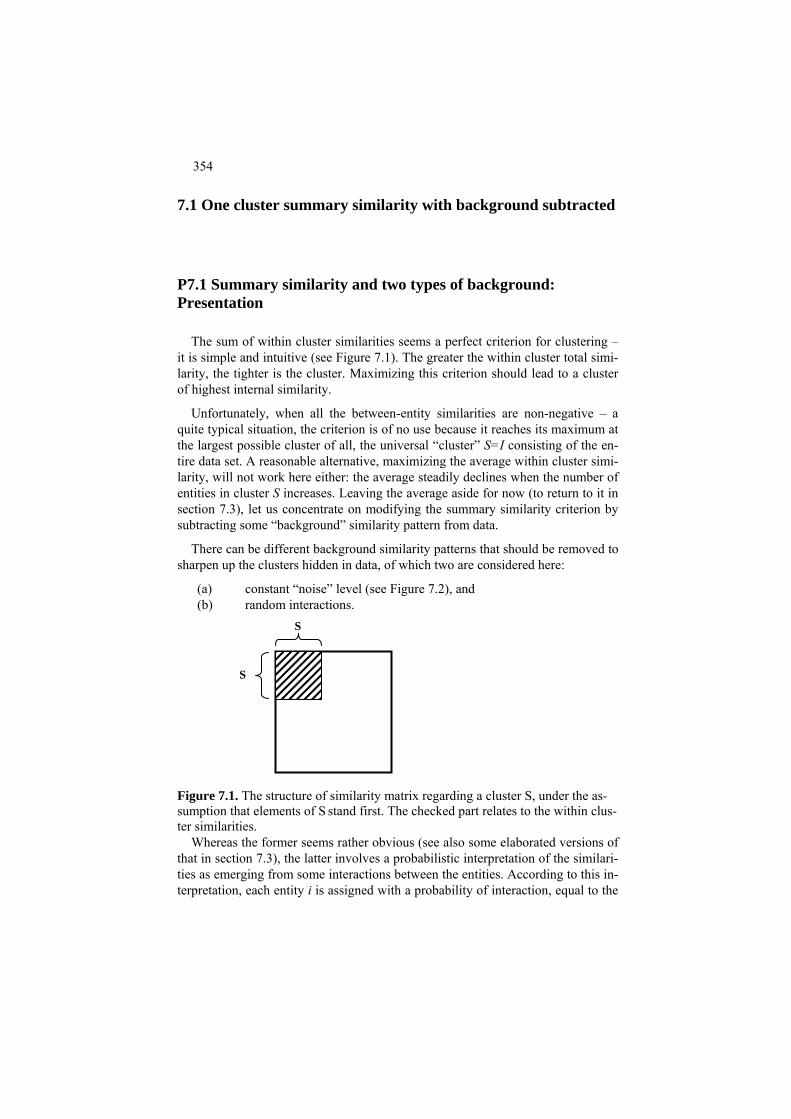
354
7.1 One cluster summary similarity with background subtracted
P7.1 Summary similarity and two types of background: Presentation
The sum of within cluster similarities seems a perfect criterion for clustering – it is simple and intuitive (see Figure 7.1). The greater the within cluster total simi-larity, the tighter is the cluster. Maximizing this criterion should lead to a cluster of highest internal similarity.
Unfortunately, when all the between-entity similarities are non-negative – a quite typical situation, the criterion is of no use because it reaches its maximum at the largest possible cluster of all, the universal “cluster” S=I consisting of the en-tire data set. A reasonable alternative, maximizing the average within cluster simi-larity, will not work here either: the average steadily declines when the number of entities in cluster S increases. Leaving the average aside for now (to return to it in section 7.3), let us concentrate on modifying the summary similarity criterion by subtracting some “background” similarity pattern from data.
There can be different background similarity patterns that should be removed to sharpen up the clusters hidden in data, of which two are considered here:
(a) constant “noise” level (see Figure 7.2), and (b) random interactions.
S
S
Figure 7.1. The structure of similarity matrix regarding a cluster S, under the as-sumption that elements of S stand first. The checked part relates to the within clus-ter similarities.
Whereas the former seems rather obvious (see also some elaborated versions of that in section 7.3), the latter involves a probabilistic interpretation of the similari-ties as emerging from some interactions between the entities. According to this in-terpretation, each entity i is assigned with a probability of interaction, equal to the

355
proportion of the summary similarity in i-th row in the whole summary volume of the similarities. Then random interactions between two entities will occur with the probability equal to the product of their respective probabilities, which therefore should be subtracted from the similarity coefficients to clear up the nonrandom part of the similarity.
Figure 7.2. Illustration of the effect of subtraction of a constant background “noise” from the similarity values. The graph shows similarity values (axis y) against some ordering of entity pairs (i,j) over x-axis. At zero noise level, the area of positive similarity values is much larger than that above the dashed line at which the area narrows down to two small high similarity islands.
aij
a
ij
The summary criterion with the uniform noise subtracted is referred to as uni-form clustering criterion (Mirkin 1996), and that with the random interaction noise subtracted is referred to as modularity function (Newman 2006). In this section, examples of similarity data are given in three different formats:
(i) genuine similarity, (ii) networks or graphs, (iii) affinity data derived from distances according to an entity-to-feature
table. Each of these formats has its specifics: unpredictable quirks in similarities as raw data (format i), many zeros and flat positive similarity values (format ii), and geometric nature of affinities (format iii).
Yet when presented as an entity-to-entity similarity matrix and subjected to a standardization step by subtracting background similarities, method AddRem de-scribed later in the section can be applied to maximize the total within cluster similarity. AddRem works its way by sequentially adding or removing one entity at a time. The method stops at a cluster when no change of one entity state can in-crease the criterion. The resulting cluster is provably tight (see section F7.1).
Let us consider now application of this method, under each of the two back-ground removal options – modularity and uniform, to instances of the three data types.
Worked example 7.1. Summary similarity clusters at a genuine similarity data
Consider a similarity data set such as Confusion between numerals in Table 0.7, already analyzed in section 6.4.

356
A symmetric version of the Confusion data is presented in Table 7.1: the sum of A+AT without further dividing it by 2, for the sake of wholeness of the entries. In this table, care has been taken of the main diagonal. The diagonal entries are by far the largest and considerably differ among themselves, which may highly affect further computations. Since we are interested in patterns of confusion between dif-ferent numerals, this would be an unwanted effect so that the diagonal entries should be made to bear no effect on the clustering process. They are changed for zeros in Table 7.1.
Table 7.1 Confusion data from Table 0.7 summed up with the transpose after the diagonal elements removed.
1 2 3 4 5 6 7 8 9 0
1 2 3 4 5 6 7 8 9 0
0 21 36 171 18 40 329 11 29 22 21 0 76 26 62 61 18 57 36 22 36 76 0 11 61 7 61 57 263 22 171 26 11 0 18 22 51 25 87 11 18 62 61 18 0 176 14 25 208 21 40 61 7 22 176 0 4 225 22 61 329 18 61 51 14 4 0 11 25 32 11 57 57 25 25 225 11 0 149 243 29 36 263 87 208 22 25 149 0 64 22 22 22 11 21 61 32 243 64 0
Total 677 379 594 422 603 618 545 803 883 498 This matrix contains a lot of information that seems unnecessary to the human
eye. Usually a symmetric similarity matrix with no main diagonal is represented by its upper triangle – that part which is over the main diagonal (see Table 7.2). One can notice that the last row, as well as first column, are absent from Table 7.2.
Table 7.2 Symmetric confusion data from Table 7.1 in the upper triangle format. 2 3 4 5 6 7 8 9 0
1 2 3 4 5 6 7 8 9
21 36 171 18 40 329 11 29 22 76 26 62 61 18 57 36 22 11 61 7 61 57 263 22 18 22 51 25 87 11 176 14 25 208 21 4 225 22 61 11 25 32 149 243 64
The results of the clustering algorithm AddRem(i) applied, at each i, in the two
different settings – modularity and uniform – are presented in Table 7.3. The arbi-trariness of choosing an entity to start has no effect in this case. Not too many clusters have been found anyway. The modularity criterion is capable of separat-ing the cluster {1,4,7} from the rest, albeit with a somewhat lesser criterion value,

357
but the rest also appears to be a cluster, in fact a tighter one. The uniform criterion at the threshold subtracted at the average level of 66.91 with no diagonal entries taken into account, achieves a similar fit, though it loses digit 2 from the “rest” cluster – which is good because this digit keeps a company of its own being very rarely confused for anything else. Yet at a larger threshold value of a=100, the uniform criterion leads to four high density clusters – exactly those produced in section 6.3 by the conceptual clustering applied to the styled numerals’ images. This would be a success story provided that the user knew beforehand the right threshold value, which is a rather bold hypothesis.
Table 7.3. One-cluster structures found with the summary criterion at symmet-ric Confusion data in Table 7.1.
Modularity Uniform, π=Mean=66.91 Uniform, π=100
Cluster Criterion Cluster Criterion Cluster Criterion 2 3 5 6 8 910 1137.2 3 5 6 8 910 1200.7 1 4 7 502 1 4 7 808.2 1 4 7 700.5 3 5 9 464
6 8 10 458 2
Results reported in Table 7.3 lead to the following question. Would the struc-
ture be revealed in a more uniform way if clusters are taken sequentially, so that once clustered entities are removed from the set, compiling a new random interac-tion or average similarity data on the remaining set and applying AddRem again and again. There may be a problem with this approach, which can be clearly seen in Table 7.3: the cluster to remove is a set of seven numerals rather than the re-mainder consisting of three numerals, 1, 4 and 7. To tackle the issue, each part, both the remainder and cluster, should be clustered again (see case study 7.1).
Case study 7.1. Repeated one-cluster clustering with repeated removal of background
Let us, after each clustering step, consider the unclustered part as a fresh data set, a ground set, to perform the background similarity removal again. The results of this approach are presented in Table 7.4 in such a way that each cluster that has appeared on the right, in its column, has been clustered again. All the three modu-larity clusters have produced themselves as their modularity subclusters. On the contrary, at the uniform criterion, each of the three-element clusters has produced a proper subcluster as shown in the further rows of the right-hand part of the table.
Table 7.4. Partitions found at the symmetric Confusion data by sequentially ex-tracting clusters one by one, recomputing the background similarities at each sub-set to be analyzed.

358
Modularity, set adjusted Uniform, mean set adjusted Ground set Cluster Ground set Cluster
0-9 1 4 7 0-9 1 4 7 0 2 3 5 6 8 9 3 5 9 0 2 3 5 6 8 9 2 3 5 9 0 2 6 8 0 6 8 0 6 8 0 6 8 1 4 7 1 7 3 5 9 3 9 0 6 8 0 8
To explain this phenomenon, let us take a closer look, say, at cluster {1,4,7}. Table 7.5 pre-sents the original within cluster similarities as well as those found by subtracting the aver-age similarity, for the uniform clustering, or the random interactions, for the modularity clustering.
Table 7.5. Similarities between numerals 1, 4 and 7 according to Table 7.2 and, also, after subtraction of the background according to each, uniform and modular-ity, criterion.
Raw similarities Mean subtracted Random interactions similarities subtracted similarities
4 7 4 7 4 7 1 171 329 -12.7 145.3 70.3 156.6 4 51 -132.7 - 25.6
The total sum of similarities in set {1,4,7}, the volume, according to the left
part of table 7.5 is 1102=2*551 (factor 2 applies to make up for the absent lower triangle of the similarity matrix), of which entity 1 takes 45.4%, entity 4, 20.1%, and entity 7, 34.5%. The volume of entity 4, 20.1%, is by far the smallest of the three, which straightforwardly translates to the level of its random interactions: they are smaller than those of the others so that the subtracted part of entity 4’s similarities is relatively small. This is why the summary similarity of 4 in the right-hand part of the table is positive, c41+c47 = 70.3-25.6= 44.7 > 0, making 4 a welcome member of the cluster according to the modularity criterion. This is not so according to the uniform criterion: the summary similarity of 4 with two others is negative, b41+b47=-12.7 -132.7 = - 145.4<0, setting 4 apart from the rest. A similar effect is at work with entity 2: 2 is rather remote from anything else so that its similarities become negative when the average similarity is subtracted, which is not the case with the random interactions because the latter are by far smaller at 2 than those at other entities.
The analysis reported in case study 7.1 shows that the two criteria – or, better to say, the same criterion at the two different data pre-processing formulas – should be applied in different contexts: the uniform criterion is better when the meaning of similarity is uniform across the table, whereas the modularity criterion works better when the similarities should be scaled depending on the individual entities.
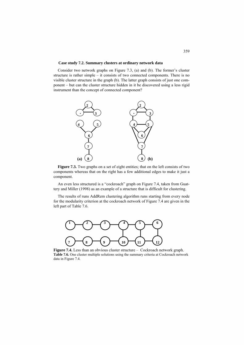
359
Case study 7.2. Summary clusters at ordinary network data
Consider two network graphs on Figure 7.3, (a) and (b). The former’s cluster structure is rather simple – it consists of two connected components. There is no visible cluster structure in the graph (b). The latter graph consists of just one com-ponent – but can the cluster structure hidden in it be discovered using a less rigid instrument than the concept of connected component?
Figure 7.3. Two graphs on a set of eight entities; that on the left consists of two
components whereas that on the right has a few additional edges to make it just a component.
An even less structured is a “cockroach” graph on Figure 7.4, taken from Guat-tery and Miller (1998) as an example of a structure that is difficult for clustering.
The results of runs AddRem clustering algorithm runs starting from every node for the modularity criterion at the cockroach network of Figure 7.4 are given in the left part of Table 7.6.
Figure 7.4. Less than an obvious cluster structure – Cockroach network graph. Table 7.6. One cluster multiple solutions using the summary criteria at Cockroach network data in Figure 7.4.
1 3
5 4
6
7
8
2
1
2
3
4 5
6
7
8 (a) (b)
1 2 3 4 5 6 7 8 9 10 11 12

360
Modularity as is and sequentially adjusted Uniform with mean subtracted once
Cluster Criterion Ground set Cluster Cluster Criterion Ground set Cluster 1-12 4 5 6 10 11 12 4 5 6 10 11 12 8.09 1-12 5 6 11 12 5 6 11 12 5.15 1-3 7-9 1 2 3 2 3 4 5 10 11 6.09 1-4 7-10 1 2 3 4 10 1 2 3 4 5 6 4.69 7 8 9 7 8 9 4 5 8 9 10 11 6.09 7 8 9 7 8 9 3 4 7 8 9 10 4.69
3 4 5 9 10 11 6.09 1 2 3 4 5 6 4.09
There are three highly overlapping clusters, two of them reflecting the topology
of the graph with the winning cluster embracing four nodes in the right-hand side of graph in Figure 7.4. The second column reflects an attempt at finding a parti-tion using one-by-one clustering: after first cluster is found, its entities are re-moved, and the method is applied to the remaining part of the data matrix, with the random interactions readjusted to the topology of the ground set to be ana-lyzed.
Similar attempts, but with the uniform criterion with the noise threshold set at the average similarity value, are presented in the right part of the table. The clus-ters demonstrate five patterns of which the lead, 4-5-6-10-11-12, embracing the right-hand half of the graph, concurs with the human view of the topology (see Luxburg 2007). After removal of this cluster, the algorithm finds remaining con-nected components – see the clusters presented in the right-hand column of Table 7.4. In contrast to the modularity criterion, the value of threshold subtracted from the data is kept the same through all the iterations because of both flat values of similarities and the thrust of the uniform criterion towards to a unified scale across the entire network.
Good clustering results found here with the uniform criterion are not easy to match with other clustering methods, which supports the view that the ordinary graphs, that is, flat networks, could be a natural niche at which the uniform crite-rion, with a flat value subtracted, can produce good results.
Affinity data are similarities between entities in an entity-to-feature table. They are usually defined by a kernel function depending on entity-to-entity distances
such as a Gaussian kernel function 2( , )
2( , )d x y
G x y e σ−
= where d(x,y) is the squared Euclidean distance between x and y if x≠y. The denominator 2σ2 may greatly affect results and is subject to the user’s choice. In our experiences, consis-tent results are obtained with 2σ2=1/2 corresponding to σ=1/2 after each feature has been normalized by its range.
One more parameter at defining the affinity data is the distance threshold, R, such that the similarity between entities is defined as 0 if the distance between them is greater than R. The usage of this parameter appears highly successful in such areas as image analysis (Shi and Malik 2000).
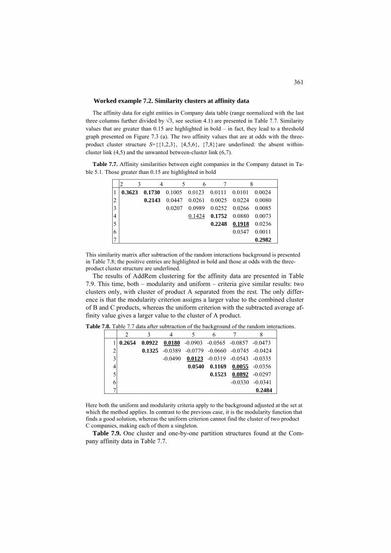
361
Worked example 7.2. Similarity clusters at affinity data
The affinity data for eight entities in Company data table (range normalized with the last three columns further divided by √3, see section 4.1) are presented in Table 7.7. Similarity values that are greater than 0.15 are highlighted in bold – in fact, they lead to a threshold graph presented on Figure 7.3 (a). The two affinity values that are at odds with the three-product cluster structure S={{1,2,3}, {4,5,6}, {7,8}}are underlined: the absent within-cluster link (4,5) and the unwanted between-cluster link (6,7).
Table 7.7. Affinity similarities between eight companies in the Company dataset in Ta-ble 5.1. Those greater than 0.15 are highlighted in bold
2 3 4 5 6 7 8 1234567
0.3623 0.1730 0.1005 0.0123 0.0111 0.0101 0.0024 0.2143 0.0447 0.0261 0.0025 0.0224 0.0080 0.0207 0.0989 0.0252 0.0266 0.0085 0.1424 0.1752 0.0880 0.0073 0.2248 0.1918 0.0236 0.0347 0.0011 0.2982
This similarity matrix after subtraction of the random interactions background is presented in Table 7.8; the positive entries are highlighted in bold and those at odds with the three-product cluster structure are underlined.
The results of AddRem clustering for the affinity data are presented in Table 7.9. This time, both – modularity and uniform – criteria give similar results: two clusters only, with cluster of product A separated from the rest. The only differ-ence is that the modularity criterion assigns a larger value to the combined cluster of B and C products, whereas the uniform criterion with the subtracted average af-finity value gives a larger value to the cluster of A product. Table 7.8. Table 7.7 data after subtraction of the background of the random interactions.
2 3 4 5 6 7 8 1234567
0.2654 0.0922 0.0180 -0.0903 -0.0565 -0.0857 -0.0473 0.1325 -0.0389 -0.0779 -0.0660 -0.0745 -0.0424 -0.0490 0.0123 -0.0319 -0.0543 -0.0335 0.0540 0.1169 0.0055 -0.0356 0.1523 0.0892 -0.0297 -0.0330 -0.0341 0.2484
Here both the uniform and modularity criteria apply to the background adjusted at the set at which the method applies. In contrast to the previous case, it is the modularity function that finds a good solution, whereas the uniform criterion cannot find the cluster of two product C companies, making each of them a singleton.
Table 7.9. One cluster and one-by-one partition structures found at the Com-pany affinity data in Table 7.7.
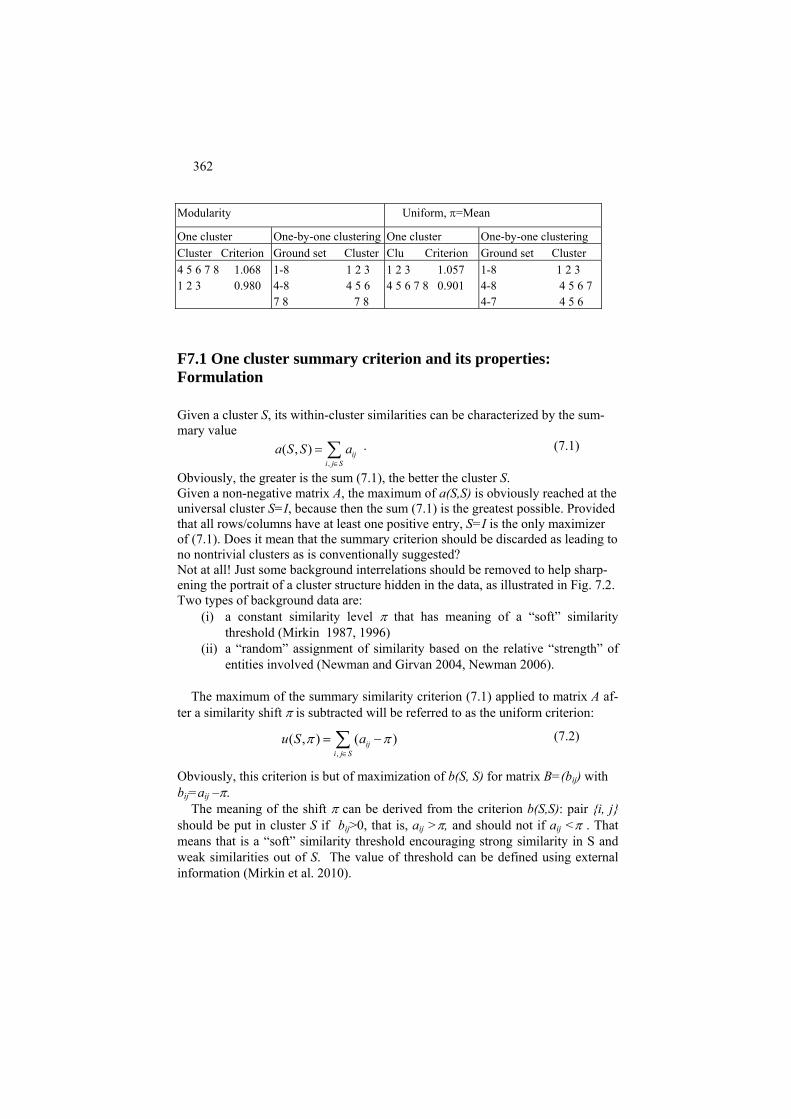
362
Modularity Uniform, π=Mean
One cluster One-by-one clustering One cluster One-by-one clustering Cluster Criterion Ground set Cluster Clu Criterion Ground set Cluster
1 2 3 1.057 1-8 1 2 3 4 5 6 7 8 1.068 1-8 1 2 3 4 5 6 7 8 0.901 4-8 4 5 6 7 1 2 3 0.980 4-8 4 5 6
4-7 4 5 6 7 8 7 8
F7.1 One cluster summary criterion and its properties: Formulation
Given a cluster S, its within-cluster similarities can be characterized by the sum-mary value
,( , ) ij
i j Sa S S a
∈
= ∑ . (7.1)
Obviously, the greater is the sum (7.1), the better the cluster S. Given a non-negative matrix A, the maximum of a(S,S) is obviously reached at the universal cluster S=I, because then the sum (7.1) is the greatest possible. Provided that all rows/columns have at least one positive entry, S=I is the only maximizer of (7.1). Does it mean that the summary criterion should be discarded as leading to no nontrivial clusters as is conventionally suggested? Not at all! Just some background interrelations should be removed to help sharp-ening the portrait of a cluster structure hidden in the data, as illustrated in Fig. 7.2. Two types of background data are:
(i) a constant similarity level π that has meaning of a “soft” similarity threshold (Mirkin 1987, 1996)
(ii) a “random” assignment of similarity based on the relative “strength” of entities involved (Newman and Girvan 2004, Newman 2006).
The maximum of the summary similarity criterion (7.1) applied to matrix A af-
ter a similarity shift π is subtracted will be referred to as the uniform criterion:
,( , ) ( )ij
i j Su S aπ π
∈
= −∑ (7.2)
Obviously, this criterion is but of maximization of b(S, S) for matrix B=(bij) with bij=aij –π.
The meaning of the shift π can be derived from the criterion b(S,S): pair {i, j} should be put in cluster S if bij>0, that is, aij >π, and should not if aij <π . That means that is a “soft” similarity threshold encouraging strong similarity in S and weak similarities out of S. The value of threshold can be defined using external information (Mirkin et al. 2010).
363
The background similarity in the case (ii) needs no external information. In this approach, matrix A is treated as a contingency table (section 1.3). Consider the summary values ai+=Σj∈I aij, and a++=Σ ai,j∈I ij. Under the assumption that there is random interaction between entities i and j, which is proportional to these sum-mary values, the background similarity is defined as the product k = aij i+aj+/a++; the denominator is added to return the product to the original scaling of similari-ties in A. The within-cluster summary similarity criterion (7.1) applied to matrix A after the “background” similarity is subtracted is referred to as the modularity cri-terion:
, ,( ) ( ) ( / )ij ij ij i j
i j S i j Sm S a k a a a a+ + ++
∈ ∈
= − = −∑ ∑ (7.3)
Obviously, this criterion is but of maximization of c(S, S) for matrix C=(cij) where cij=aij – ai+aj+/a++. Let us briefly analyze some properties of these versions of the summary criterion. For the case of u(S, π) in (7.2), let us focus on the case when the diagonal entries are not considered so that i≠j in (7.1): (7.4)
, ,( , ) | | (| | 1)ij ij
i j S i j Si j i j
u S a a S Sπ π π∈ ∈
≠ ≠
= − = − −∑ ∑
where |S| denotes the number of elements in S. When the diagonal elements are present, the right-hand item in (7.4) would be π|S|2 rather than π|S|(|S|-1). An irregular structure of similarities may prevent the threshold π to be a separator between all within-cluster and out-of-cluster similarities, but it certainly is on av-erage. Indeed, let us denote the average similarity of an i∈I and S⊆I by a(i,S) - this may be referred to as the uniform attraction of i to S. Obviously, a(i,S)=Σ j∈Saij/(|S|-1) if i∈S, and a(i,S)=Σ j∈Saij/|S| if i∉S, because of the assumption that the diagonal similarities aii are not considered. Let us refer to a cluster S as uniformly π-tight if, for any entity i∈ I, its uniform at-traction to S is greater than or equal to π if i∈S and it is less than π, otherwise. Then the following statement, in support of the claim that an optimal cluster S should be tight, holds. If S maximizes criterion u(S, π) in (7.4) then S as uniformly π-tight, that is, a(i,S)≥ π for all i∈S, and a(i,S)≤ π for all i∉S. To prove it, let us change the state of an entity i* with respect to cluster S, that is, add i* to S if it does not belong to S or remove it from S if it does. Now take the difference between u(S, π) and the result of the state change, that is, u(S−i*,π) if i*∈S, or u(S+i*, π) if i*∉S where S−i* and S+i* denote S with i* removed or added, respectively:
u(S,π) − u(S−i*, π) = 2(Σj∈Sa − π(|S|-1)), i*j
u(S,π) − u(S+i*, π) = = 2(−Σj∈Sa +π|S|) (7.5) i*j Equations (7.5) are quite obvious if one consults Figure 7.5: all the differences be-tween u(S, π) and its value after the change of state of i* come from the boxed
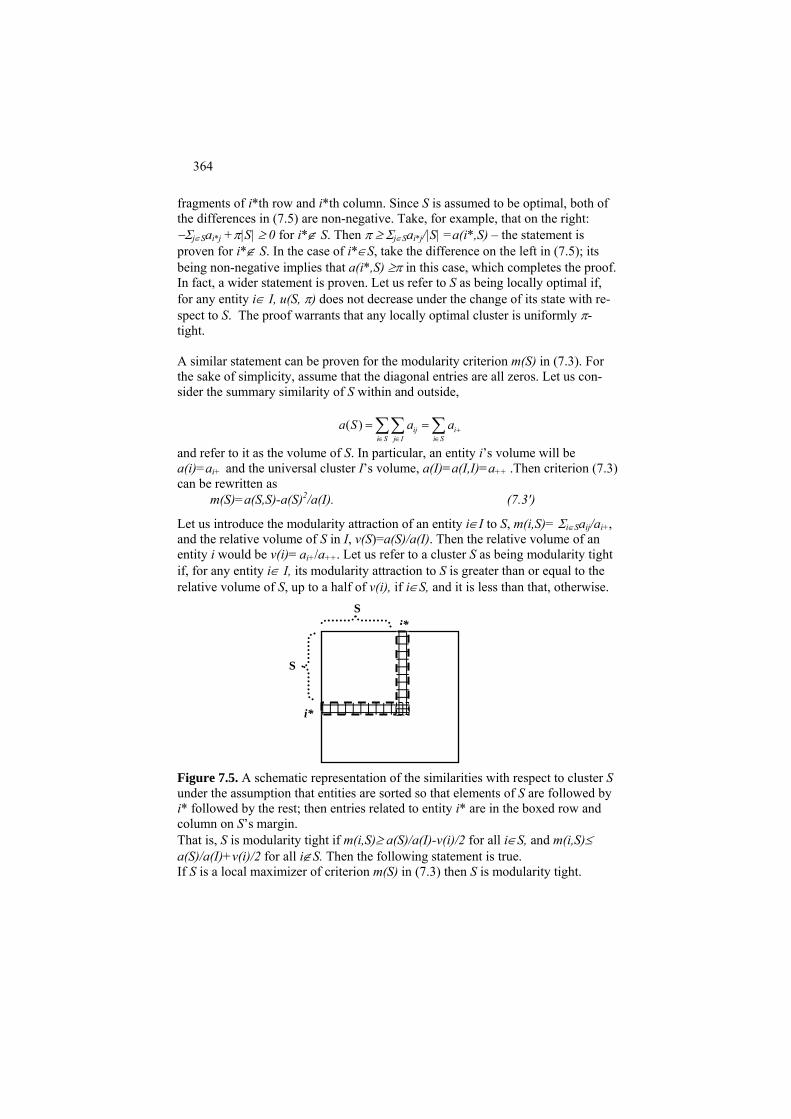
364
fragments of i*th row and i*th column. Since S is assumed to be optimal, both of the differences in (7.5) are non-negative. Take, for example, that on the right: −Σj∈Sa +π|S| ≥ 0 for i*∉ S. Then π ≥ Σi*j j∈Sai*j/|S| =a(i*,S) – the statement is proven for i*∉ S. In the case of i*∈S, take the difference on the left in (7.5); its being non-negative implies that a(i*,S) ≥π in this case, which completes the proof. In fact, a wider statement is proven. Let us refer to S as being locally optimal if, for any entity i∈ I, u(S, π) does not decrease under the change of its state with re-spect to S. The proof warrants that any locally optimal cluster is uniformly π-tight. A similar statement can be proven for the modularity criterion m(S) in (7.3). For the sake of simplicity, assume that the diagonal entries are all zeros. Let us con-sider the summary similarity of S within and outside,
( ) ij i
i S j I i Sa S a a +
∈ ∈ ∈
= =∑∑ ∑
and refer to it as the volume of S. In particular, an entity i’s volume will be a(i)=a and the universal cluster I’s volume, a(I)=a(I,I)=ai+ ++ .Then criterion (7.3) can be rewritten as
m(S)=a(S,S)-a(S)2/a(I). (7.3′)
Let us introduce the modularity attraction of an entity i∈I to S, m(i,S)= Σi∈Saij/ai+, and the relative volume of S in I, v(S)=a(S)/a(I). Then the relative volume of an entity i would be v(i)= ai+/a++. Let us refer to a cluster S as being modularity tight if, for any entity i∈ I, its modularity attraction to S is greater than or equal to the relative volume of S, up to a half of v(i), if i∈S, and it is less than that, otherwise.
S i*
S i*
Figure 7.5. A schematic representation of the similarities with respect to cluster S under the assumption that entities are sorted so that elements of S are followed by i* followed by the rest; then entries related to entity i* are in the boxed row and column on S’s margin. That is, S is modularity tight if m(i,S)≥ a(S)/a(I)-v(i)/2 for all i∈S, and m(i,S)≤ a(S)/a(I)+v(i)/2 for all i∉S. Then the following statement is true. If S is a local maximizer of criterion m(S) in (7.3) then S is modularity tight.

365
To prove the statement, let us take i* and change its state with respect to S. Then the increment of criterion m(S) expressed in terms of cij=aij – ai+aj+/a++ will be equal to
* * * * * * *( *) ( ) 2 2 ( ( ) / ( )) / 2 ( )).i j i i i i j i ij S j S
m S i m S c c a a a a S a I a a I+ + +∈ ∈
± − = ± + = ± −∑ ∑ ∓
(7.6)
That is,
*( *) ( ) 2 ( ( *, ) ( ) ( *) / 2).im S i m S a m i S v S v i+± − = ± − ∓ The proof follows from the fact that the increment must be non-positive at a lo-cally optimal S.
C7.1 Local algorithms for one cluster summary criterion: Computation
At a preprocessed, by subtracting background similarities, similarity matrix A=(aij) the summary criterion is rather easy to (locally) optimize by adding enti-ties one-by-one starting, say, a most linked couple i and j, and at each step adding just one entity i* - that one which is most similar to S. The computation stops when the summary similarity stops increasing, which will be the case if many of A entries are negative. There are two issues about this algorithm:
• Starting configuration – the pair of entities of the maximum similarity. This may not work in some cases such as the case of an ordinary graph matrix in which all nonzero entries are the same. Also, this choice is not flexible and may lead to a clearly suboptimal cluster and missing larger subsets whose elements are well connected but with similarity levels slightly smaller than the maximum.
• Addition with no removals. This can be of an issue because at a later stage of collecting a cluster some entities, picked up in the very begin-ning, can be far away from the later arrivals and should be removed at later stages.
The following algorithm AddRem tackles both of these as follows. To not get stuck in a wrong place, it runs as many times as there are entities, each time start-ing from another singleton S. To have an opportunity to remove a wrong element, at each step the algorithm considers the increment of the criterion caused by the change of state of every entity with respect to the current cluster. To do so, N-dimensional 1/-1 vector z=(z ) is maintained such that zi i=1 if i belongs to the cur-rent cluster and zi=-1 if not. Then the change of state of i∈I with respect to the cluster is equivalent to changing the sign of zi. The change of the criterion value because of this can be expressed as follows. Denote by z the vector at current clus-ter S and by z(i) the result of change of sign of zi in it, so that S(i)=S-i if zi =1 and S(i)=S+i if zi =-1. This makes the operations of addition or removal of an entity to

366
or from the current cluster computationally similar. The increment of the summary criterion after the change is equal to
( ) 2 i ijj S
i z aΔ∈
= − +∑ iiaδ (7.7) where δ=1 if the diago-
nal entries are taken into account and δ=0, otherwise.
AddRem(i) algorithm
Input: matrix A=(aij); output: cluster S related to entity i and value of the summary criterion. 1.Initialization. Set N-dimensional z to have all its entries equal to -1 except for zi =1, the summary similarity equal to δaii. 2.General step. For each entity i∈I, compute the value Δ(i) according to (7.7) and find i* maximizing it. 3.Test. If Δ(i*)>0, change the sign of zi* in vector z, zi*⇐−zi*, after which recalcu-late the sum by adding Δ(i) to it. (In the case of large data, computing the sum-mary values in (7.7) can be costly. Therefore, a vector of these values should be maintained and dynamically changed after each addition/removal step.), and go to 2. Otherwise, go to 4. 4.Output S and the summary criterion value. A tightness property of the resulting cluster S depending on the pre-processing step, at any starting i∈I, holds as established in section F7.1 because S is locally optimal. Algorithm AddRem(i) utilizes no ad hoc parameters, except for the i of course, so the cluster sizes are determined by the process of clustering itself. Multiple runs of AddRem(i) at different starting points i allow to (a) find a better cluster S maxi-mizing the summary similarity criterion over the runs, and (b) explore the cluster structure of the dataset by analyzing both differing and overlapping clusters.
7. 2 Two cluster case: cut, normalized cut and spectral clustering
7.2.1 Minimum cut and spectral clustering
P7.2.1 Minimum cut and spectral clustering: Presentation
In this section, we turn to the issue of dividing an entity set supplied with a similarity matrix in two most isolated, or minimally connected, parts. The connec-

367
tion, if measured by the sum of similarities between the parts, is referred to as the cut. An illustration of such a partition is presented on Figure 7.6 that displays the division of the similarity matrix in four blocks caused by partition of the entity set in two parts, clusters S1 and S2. The diagonally lined blocks pertain to the within cluster similarities and those lined vertically and horizontally to the between clus-ter similarities. Since the total sum of similarities is constant, the minimum cut corresponds to the maximum sum of within-cluster similarities. This means that the minimum cut problem is akin to the problem of maximization of the within cluster summary similarity considered in the previous section. The difference is that now we are looking at splitting the set into most separated parts rather than finding just one tightly related one. A similar difference is between the concepts of a tight Anomalous Pattern cluster in section 5.1.5 and the maximum split clusters in divisive clustering, section 6.3.
S1
S2
S1 S2
Figure 7.6. The structure of the similarity matrix regarding partition {S1, S2} of
the entity set, which is assumed sorted so that elements of S1 stand first. The blocks out of the main diagonal show similarities between S1 and S2, whereas those on the main diagonal refer to similarities that are within the parts.
If a similarity matrix A is conventionally non-negative, the criterion of mini-mum cut does not work: the optimum cut will always produce a most unbalanced partition: a singleton, that one which is least summarily related to the others, and the rest. Yet the criterion is workable if a background “noise” has been subtracted from the similarities, which brings us back to the uniform and modularity criteria. These criteria maximize the summary within cluster similarities. The former ap-plies when a constant, typically the average similarity, is subtracted from all the similarities. The latter applies after the random interactions proportional to the products of the entity volumes, have been subtracted.
Although we could apply the same AddRem algorithm, the only difference be-ing that this time the criterion is the sum of within cluster similarities for both clusters, in this section we turn to the eigenvector, or spectral, perspective that is implied by a reformulation of the problem in terms of the Rayleigh quotient. As proven in section F7.2.1 below, the minimum cut problem is equivalent to finding such (1,-1) vector z that maximizes the quotient λ=zT TAz/z z. When relaxed to arbi-

368
trary z’s, the problem is known to be of finding the maximum eigenvalue λ and corresponding eigenvector z of matrix A; this eigenvector will be referred to as the first eigenvector. Therefore, it is only natural to cluster entities according to the signs of the eigenvector: those i’s with positive components go to S1 while i’s with negative components go to S2. Although not necessarily an optimal partition, this is a practical and, in most cases, good solution.
Worked example 7.3. Spectral clusters for Confusion dataset
Table 7.10 presents results of sequential cuts according to the first eigenvectors on the sets resulting from the previous cuts. As before, the modularity transforma-tion leads to three discernible clusters of numerals, {1, 4, 7}, {6, 8, 0} and {2, 3, 5, 9}, whereas the uniform data transformation, by subtracting the mean of the similarities on the current set, convincingly separates 2 from cluster {2, 3, 5, 9} – the remaining set {3,5,9} cannot be further divided because the maximum eigen-value at that is negative, thus no positive value of the criterion at the division. Table 7.10. First eigenvectors according to the modularity and uniform data preprocessing options.
Modularity Uniform, current mean subtracted Set 0 – 9 2 3 5 6
8 9 0 2 3 5 9 0 – 9 2 3 5 6
8 9 0 2 3 5 9 3 5 9
1 2 3 4 5 6 7 8 9 0
-0.57 0.08 0.07 -0.27 0.21 0.26 -0.53 0.34 0.19 0.21
0.06 0.51
0.22 -0.36
-0.43 0.43 -0.43
0.5 0.5
0.5
0.5
0.52 -0.08 -0.12 0.25 -0.24 -0.29 0.49 -0.38 -0.25 -0.23
0.07 0.50
0.22 -0.36
-0.44 0.43 -0.44
0.46 -0.50
-0.29
-0.68
0.74
-0.58
0.35
λ 703.7 189.6 0.0 358.7 189.6 83.8 -46.4
Worked example 7.4. Spectral clusters for Cockroach network
Table 7.11 presents results of the first two cuts according to the spectral clusters derived at the modularity and uniform data transformations. They differ on nodes 4 and 10 at which they are ether merged with the thicker end of the network, at the uniform clustering, or not, – at the modularity clustering. At the second cut, they go to different parts, according to the network topology on Figure 7.4.
Table 7.11. First eigenvectors according to the modularity and uniform data preprocess-ing options at Cockroach network: two cuts.
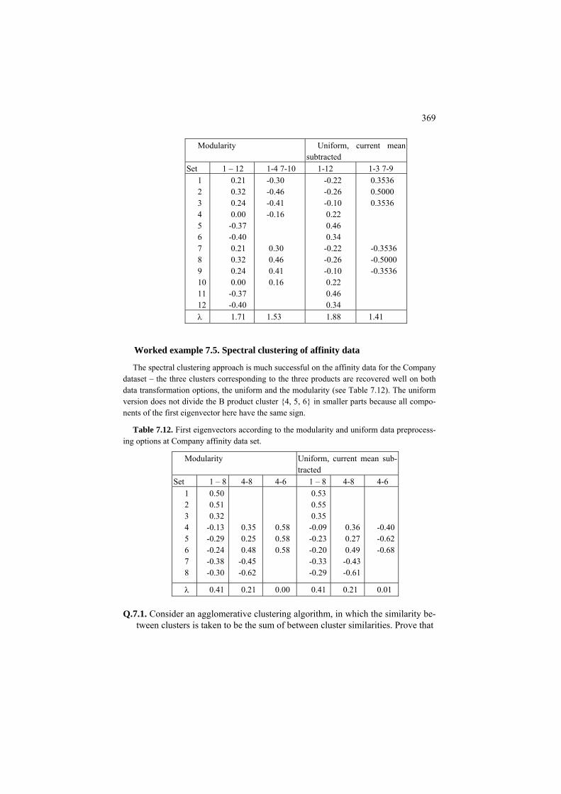
369
Modularity Uniform, current mean subtracted
Set 1 – 12 1-4 7-10 1-12 1-3 7-9 1 2 3 4 5 6 7 8 9 10 11 12
0.21 0.32 0.24 0.00 -0.37 -0.40 0.21 0.32 0.24 0.00 -0.37 -0.40
-0.30 -0.46 -0.41 -0.16 0.30 0.46 0.41 0.16
-0.22 -0.26 -0.10 0.22 0.46 0.34 -0.22 -0.26 -0.10 0.22 0.46 0.34
0.3536 0.5000 0.3536 -0.3536 -0.5000 -0.3536
λ 1.71 1.53 1.88 1.41
Worked example 7.5. Spectral clustering of affinity data
The spectral clustering approach is much successful on the affinity data for the Company dataset – the three clusters corresponding to the three products are recovered well on both data transformation options, the uniform and the modularity (see Table 7.12). The uniform version does not divide the B product cluster {4, 5, 6} in smaller parts because all compo-nents of the first eigenvector here have the same sign.
Table 7.12. First eigenvectors according to the modularity and uniform data preprocess-ing options at Company affinity data set.
Modularity Uniform, current mean sub-tracted
Set 1 – 8 4-8 4-6 1 – 8 4-8 4-6 1 2 3 4 5 6 7 8
0.50 0.51 0.32
-0.13 -0.29 -0.24 -0.38 -0.30
0.35 0.25 0.48
-0.45 -0.62
0.58 0.58 0.58
0.53 0.55 0.35 -0.09-0.23-0.20-0.33-0.29
0.36 0.27 0.49 -0.43-0.61
-0.40-0.62-0.68
λ 0.41 0.21 0.00 0.41 0.21 0.01
Q.7.1. Consider an agglomerative clustering algorithm, in which the similarity be-tween clusters is taken to be the sum of between cluster similarities. Prove that

370
(a) this algorithm maximizes the summary within cluster similarity criterion;
(b) the algorithm stops when all between cluster summary similarities are nega-tive (which will happen if the similarity matrix has been preprocessed with either modularity or uniform transformation).
F7.2.1 Minimum cut and spectral clustering: Formulation
Given a symmetric similarity matrix A=(aij) on set I, consider the issue of di-viding I in two parts, S1 and S2, in such a way that the similarity between S1 and S2 is minimum while it is maximum within them. This requirement can be explicated most naturally by using the summary similarity criterion. Using indices f, g=1,2, let us denote the summary similarity “between” Sf and S by a(Sg f, S ) so that a(Sg f, S ) = .
f g
iji S j S
a∈ ∈∑ ∑g
Then, obviously, a(S1, S1) is the summary similarity within S1 and a(S1, S2) = a(S2, S ) is the summary similarity between S1 1 and S2; the equation follows from the symmetry of A.. Moreover, the sum a(S1, S )+ a(S1 2, S2)+ a(S1, S )+ a(S2 2, S1) is equal to the constant sum a(I) of all the similarities, as Figure 7.6 clearly demon-strates. The common value a(S1, S2) of the between cluster similarity is referred to as a cut. Then a natural clustering criterion, the minimum cut, corresponds to the maximum of the summary within cluster similarity
aw(S1,S )= a(S2 1, S )+ a(S1 2, S ), (7.7) 2
because aw(S1,S )=a(I) – 2a(S2 1,S2), which shows that the minimum between-cluster summary similarity simultaneously provides for the maximum within clus-ter summary similarity. Yet the criterion of minimum cut usually is not considered appropriate for clustering because, at a nonnegative A, it obviously reaches the minimum when the out-of-diagonal blocks are reduced to just mere one line and column, independently of the structure of the similarities, leading thus to a most unbalanced partition: a singleton and the rest, which is not what should be consid-ered a proper aggregation. Yet with pre-processing of the similarities by subtract-ing either a constant threshold or the random interactions as described in section 7.1, the structure of the similarity matrix becomes identifiable with the minimum cut criterion. Unfortunately, when A-entries can be both positive and negative, the problem of minimum cut becomes computationally intensive, referred to as NP-complete in the theory of combinatorial optimization ( see, for example, Johnson-baugh and Schaefer 2004). This implies that local or approximate algorithms are a welcome development for the problem.
One of such algorithms is AddRem from section 7.1 because collecting a clus-ter is equivalent to splitting the set in two parts, the cluster and the rest, if the cri-terion of maximum summary within cluster similarity is extended to cover both

371
clusters. Of course, the operation of addition-removal loses its one-cluster asym-metry and becomes just operation of exchange between the two clusters.
Another approach comes from the spectral theory on matrices, which is devoted to the analysis and computation of eigenvalues and corresponding eigenvectors for square matrices. Indeed, define N-dimensional vector z=(z ) such that zi i =1 if i∈S1 and zi = -1 if i∈S2. Obviously, zi
2=1 for any i∈I so that zTz=N which is constant at any given entity set I. On the other hand, zTAz= a(S1, S1)+ a(S2, S2) –2 a(S1, S2)= 2(a(S1, S1)+ a(S2, S2)) – a(I), which means that criterion (7.7) is maximized when zTAz is maximized, that is, the problem of finding a minimum cut is equivalent to the problem of maximization of Rayleigh quotient
( )T
T
z Wzg zz z
= (7.8)
with respect to the unknown N-dimensional z whose components are either 1 or −1. Matrix W is A pre-processed into either B, with subtraction of a threshold, or C, with subtraction of the random interactions (see section 7.1 for more detail) or using a different transformation.
As is well known, the maximum of (7.8) with respect to arbitrary z is equal to the maximum eigenvalue of W and it is reached at the corresponding eigenvector referred to as the first eigenvector. This brings forth the idea that is referred to as spectral clustering: Find the first eigenvector as the best solution and then ap-proximate it with a (1, -1)-vector by putting 1 for positive components and -1 for non-positive components – then produce S1 as the set of entities corresponding to 1, and S2, corresponding to -1.
C7.2.1 Spectral clustering for the minimum cut problem: Computation
To find the maximum eigenvalue and corresponding eigenvector for a symmet-ric similarity matrix W, MatLab command [Z,L]=eig(W) should be executed. Re-sulting L is a diagonal matrix with eigenvalues located on the diagonal in the as-cending order, so that the last one is the maximum eigenvalue. Accordingly, the last column is the corresponding, “first”, normed eigenvector. Its positive compo-nents correspond to one cluster, and the non-positive components to the other. Here is a sequence of commands to determine the split parts S1 and S2:
>> [Z,L]=eig(W); >>(n,n)=size(L); >>z=Z(:,n); >>S{1}=find(z>0); S{2}=find(z<=0);

372
If W is non-negative then the first eigenvector is proven to be not negative ei-ther – no partition of I can emerge in such a situation.
7.2.2 Normalized cut and Laplace transformation
P7.2.2 Normalized cut: Presentation
The concept of normalized cut is a relatively recent development started by Shi and Malik 2000. It belongs to a series of graph cutting criteria that balance the cluster sizes by normalizing the sums of within cluster similarities by the size-dependent values. Given a similarity matrix A, let us take the volume of S⊆I, the summary similarity in rows i∈S, a(S)= Σ ai∈S i+. Then the normalized cut over a partition {S1, S2}is defined as a(S1, S2)/a(S )+a(S1 1, S )/a(S2 2). This is to be mini-mized over all splits {S1, S2} of set I. An equivalent criterion would maximize the sum of normalized within cluster similarities, a(S1, S )/a(S )+a(S1 1 2, S2)/a(S2) – the two criteria sum up to 2.
Yet the normalized cut brought forward a less intuitive type of data preprocess-ing, the Laplace transformation of a similarity matrix, W, which may be in its original format A or with a constant threshold subtracted, B, or with the random interaction subtracted, C, into its Laplacian, L. In its normalized form, this trans-formation normalizes every similarity wij by dividing it by the square root of the product of i and j volumes, /ij i iw w w+ +
, and then subtracts the resulting matrix
from the identity matrix which has all its entries zero except for unities on the di-agonal (see the lower triangle matrix in Table 7.13). With this transformation we are into the realm of spectral clustering again. The Laplacian matrix is proven to have all the eigenvalues non-negative. Besides, L has a specific minimum eigen-value – the zero. Yet the next minimum eigenvalue and the corresponding eigen-vector provide for a relaxation of the minimum of normalized cut problem refor-mulated in terms of the Rayleigh quotient for the Laplacian matrix (see in part F of this section). Then split {S , S1 2} can be found by using this second minimum ei-genvector in the same way as in the previous section: S1 is defined by indices of all positive components and S2 of all negative components.
Worked example 7.6. Normalized cut for Company data To show how this works, consider the affinity data for Company data set in Table 7.13.
Table 7.13. Affinity similarities between eight companies in the Company data in Table 5.1 (upper triangle) and the result of the normalized Laplace transformation (lower triangle)

373
1 2 3 4 5 6 7 8 1 2 3 4 5 6 7 8
1 0.3623 0.1730 0.1005 0.0123 0.0111 0.0101 0.0024 -0.5360 1 0.2143 0.0447 0.0261 0.0025 0.0224 0.0080 -0.2803 -0.3450 1 0.0207 0.0989 0.0252 0.0266 0.0085 -0.1611 -0.0712 -0.0361 1 0.1424 0.1752 0.0880 0.0073 -0.0177 -0.0372 -0.1548 -0.2207 1 0.2248 0.1918 0.0236 -0.0196 -0.0044 -0.0486 -0.3343 -0.3845 1 0.0347 0.0011 -0.0150 -0.0332 -0.0431 -0.1411 -0.2759 -0.0614 1 0.2982 0.0050 -0.0164 -0.0191 -0.0162 -0.0471 -0.0026 -0.6158 1
and the eigenvector corresponding to the second minimum eigenvalue 0.32, as ex-pected, well separates the first three entities, A-product companies.
Yet the Laplacian matrix by itself, unlike the original affinity matrix, gives no useful indications on the cluster structure underlying its entries. One more trans-formation takes care of that. The Laplacian Pseudo Inverse (Lapin, for short) transformation takes the spectral decomposition of the Laplacian, inverses the non-zero eigenvalues λ into 1/λ, and returns a pseudo-inverse Laplacian presented in the lower triangle of Table 7.1.4.
Table 7.14. Affinity similarities between eight companies as in Table 7.13 (up-per triangle; entries larger than 0.15 are highlighted in bold; those not fitting in the structure underlined) and the result of Lapin transformation (lower triangle, posi-tive entries highlighted in bold, that not fitting underlined)
1 2 3 4 5 6 7 8 1 2 3 4 5 6 7 8
0.3623 0.1730 0.1005 0.0123 0.0111 0.0101 0.0024 0.4734 0.2143 0.0447 0.0261 0.0025 0.0224 0.0080 0.2221 0.2677 0.0207 0.0989 0.0252 0.0266 0.0085 -0.2073 -0.2719 -0.2405 0.1424 0.1752 0.0880 0.0073 -0.4281 -0.4314 -0.2577 0.0190 0.2248 0.1918 0.0236 -0.3534 -0.3839 -0.2638 0.1563 0.1984 0.0347 0.0011 -0.5430 -0.5337 -0.4076 -0.1213 0.0457 -0.1020 0.2982 -0.4440 -0.4316 -0.3385 -0.1650 -0.0504 -0.1478 0.6003
One can easily see that the cluster structure is more pronounced in the Lapin matrix than it is in the original affinity matrix. First, there is no need for guessing a right threshold value to subtract: it is 0 here. Second, there is only one not-fitting entry here, (5,7), but it would not make any difference anyway because it is rather small in comparison with the other negative entries (6,7) and (4,7) linking item 7 to B-product cluster, or entry (5,8) linking item 5 to C-product cluster.
One more result of the Lapin transformation is that the eigenvalue to look for is the maximum one, and it is much better separated from the rest because of the inversion (see Table 7.16). The corresponding eigenvector does not change.
Indeed the three product based clusters, { 1, 2, 3}, {4,5,6}, {7,8}, are found with both the summary clustering criterion and spectral approach applied to the Lapin transformed Company affinity data.

374
Table 7.16. Reciprocal non-zero eigenvalues of the Laplacian and Lapin matri-ces corresponding to the same eigenvectors.
Eigenvalue labels I II III IV V VI VII Normalized Laplacian 0.32 0.59 1.11 1.35 1.40 1.55 1.67 Lapin 3.08 1.70 0.90 0.74 0.71 0.65 0.60
Worked example 7.8. Failure of spectral clustering at Cockroach network
Lapin matrix for Cockroach network Figure 7.4 is presented in Table 7.16. It manifests a rather clear cut cluster structure embracing three clusters, {1,2,3,4}, {7, 8, 9, 10}, {5,6, 11, 12}. Indeed, the positive entries are those within the clusters, except for two positive – but rather small – entries, at (4,5) and (10,11). Yet the first eigenvector reflects none of that; it cuts through by separating six nodes {1,2,3,4,5,6} (negative components) from the rest (positive components). This is an example of a situation in which the spectral approach fails: the normalized cut criterion at the partition separating the first 6 nodes from the other 6 nodes is equal to 0.46, whereas its value at cluster {5, 6, 11, 12} cut from the rest is 0.32. The same value of the criterion, 0.32, is attained at cluster {4,5,6,10,11,12} cut from the rest. These two cuts are optimal according to the criterion, and the spectral cut is not.
Table 7,16. Lapin similarity data between nodes of the cockroach network in Figure 7.3; the positive entries are highlighted in bold.
2 3 4 5 6 7 8 9 10 11 12 2.43 1.18 0.05 -0.52 -0.58 -0.69 -0.92 -0.75 -0.59 -0.69 -0.63 1 1.75 0.16 -0.64 -0.74 -0.92 -1.22 -0.99 -0.74 -0.88 -0.81 2
0.44 -0.36 -0.51 -0.75 -0.99 -0.76 -0.46 -0.60 -0.58 3 0.14 -0.15 -0.59 -0.74 -0.46 0.02 -0.16 -0.24 4 0.68 -0.69 -0.88 -0.60 -0.16 0.46 0.44 5 -0.63 -0.81 -0.58 -0.24 0.44 0.94 6 2.43 1.18 0.05 -0.52 -0.58 7 1.75 0.16 -0.64 -0.74 8 0.44 -0.36 -0.51 9 0.14 -0.15 10
11 0.68
Case study 7.3. Circular cluster exposed by Lapin transformation
To further demonstrate the formidable ability of the Lapin transformation in manifesting clusters according to human intuition, let us consider the 2D set presented on Figure 7.7.
This set has been generated as follows. Three 100x2 data matrices, a1, a2 and a3, were generated from Gaussian distribution N(0,1). Then matrix a2 was normed row-wise into b, so that each row in b is a 2D normed vector, after which matrix c has been defined as c=0.5∗a3+8∗b. Its rows form a ring-wise shape on the while rows of a1 fall into a heap in

375
the circle’s center as presented on Figure 7.7. Then a1 and c are merged into a 200x2 ma-trix X, in which a1 takes the first 100 rows and b the next 100 rows.
The conventional data standardization methods would not change the picture, and con-ventional clustering procedures like K-Means clustering would not be able to separate the ring as a whole. The single link clustering will be able to separate these two clusters, which would once again reminds as of a rift between the data approximation clustering and graph theoretic approaches. Yet the Laplace transformation allows us to put this dataset into the data approximation context too.
−10 −5 0 5 10
−10
−8
−6
−4
−2
0
2
4
6
8
10
Figure 7.7. Two intuitively obvious clusters that are difficult for conventional ap-
proaches: stars in the heap and dots in the ring.
The data is first transformed into a 200×200 affinity similarity matrix, which is then Lapin transformed into a final similarity matrix. This final matrix shows a clear-cut pattern: all similarities between the first hundred and the second hundred of points are negative whereas all the Lapin similarities within these sets are positive. Such a structure clearly separates the two clusters with any reasonable algorithm, the summary criterion based Ad-dRem and the spectral approach included.
Take a look, for example, at a randomly selected 5x2 fragment from matrix X concern-ing 2 rows from a1 and 3 rows from b in the left-hand part of Table 7.17. It is not easy to cluster points 3, 4, 5 together because of the great distances between them.
Table 7.17. Five points from Figure 7.6, on the left, the affinity similarities between them, in the middle, and Lapin similarities, on the right.
x-axis y-axis 2 3 4 5 2 3 4 5
0.04 -0.12 -0.14 -0.10 0.63 0.00 0.02 0.01 -1.1465 0.3274 1 -0.12 -0.15 -0.11 0.00 0.00 0.00 0.8956 0.5529 2 0.16 0.40 0.00 0.03 0.3086 7.9059 3 0.46 0.01 -7.1827 0.0625 4
-5.0025 5.8504 5

376
This is reflected in the Gaussian affinity matrix A between 200 rows of the data matrix too, which is defined as described in section 7.1 according to formula
where exp( ( , ) / )ij i ja d x x= − s 2( , ) ( )v vv V
d x y x y∈
= −∑ is the squared Euclidean
distance between vectors x and y. The value of s relates to the denominator of exponent 2σ2 in the definition of the Gaussian density so that if one takes σ to be half of the range, then s should be about the same, which leads to s=9 in this case. The part of affinity matrix A re-lated to the set of five points is presented in the middle of Table 7.17. One can see indeed a high affinity value between the first two entities, which belong to the heap in the middle of Figure 7.7 and are close to each other indeed, while the other similarities are close to zero – no visible structure. A similar pattern can be seen on the Laplacian except that all non-diagonal entries are negative there because of the definition. After the Lapin transforma-tion, however, the similarity structure, once again, becomes clear-cut, as shown on the right part of Table 7.17 for the 5-point subset, and in fact is true for the entire dataset.
This ability of Lapin transformation in transforming elongated structures into convex clusters has been a subject of mathematical scrutiny. An analogy with electricity circuits has been found. Roughly speaking, if wij measures the conduc-tivity of the wire between nodes i and j in a “linear electricity network”, then the corresponding element of a Lapin matrix expresses the “effective resistance” be-tween i and j in the circuit (Klein and Randic 1993). Yet there can be cases of elongated structures, as shown in Worked example 7.8, at which Lapin transfor-mation does not work at all.
F7.2.2 Partition criteria and spectral clustering: Formulation
Given a symmetric similarity matrix A=(aij) on set I, consider the issue of di-viding I in two parts, S1 and S2, in such a way that the similarity between S1 and S2 is minimum while it is maximum within the parts. Denote by a(Sf, Sg) the sum-mary similarity “between” S
f g
iji S j S
a∈ ∈∑ ∑f and Sg so that a(Sf, Sg) = .
The normalized cut utilizes the summary similarities ai+=a(i,I). Denote
( )
k
k ii S
a S a +∈
= ∑
)=a(SObviously, a(S1 1, S )+a(S1 1, S2); a similar equation holds for a(S2). The nor-malized cut is defined as
1 2 2 1
1 2
( , ) ( , )( )( ) ( )
a S S a S Snc Sa S a S
= + (7.9)
to be minimized.

377
It should be noted that minimized cut (7.9), in fact, includes the requirement of maximization of the within-cluster similarities. Indeed consider the normalized within-cluster similarity
1 1 2 2
1 2
( , ) ( , )( )( ) ( )
a S S a S Snt Sa S a S
= + , (7.10)
scoring the tightness of clusters. These two measures are highly related: nc(S)+nt(S)=2 (see Q.7.2). This latter equation warrants that minimizing the nor-malized cut simultaneously maximizes the normalized tightness.
It appears, the criterion of minimizing nc(S) can be expressed in terms of a cor-responding Rayleigh quotient – for the so-called Laplacian. Given a (pre-processed) similarity matrix W=(w ), let us denote its row sums, as usual, by wij i+ = (i∈I) and introduce diagonal matrix D in which all entries are zero except
for diagonal elements (i,i) that hold w
ijj I
w∈∑
i+ for each i∈I. The so-called (normalized)
Laplacian is defined as L=1
21
2E D WD− −−1
2D− where E is identity matrix and is a diagonal matrix with (i,i)-th entry equal to 1/ iw + . That means that L’s (i,j)-
th entry is ij ij i jw w wδ + +− where δij is 1 if i=j and 0, otherwise. It is not difficult
to prove that Lf0=0 where f0=(iw +
)=D1/21 where 1N N is N-dimensional vector
whose all entries are unity. That means that 0 is an eigenvalue of L with f0 being the corresponding eigenvector.
Moreover, it is possible to prove that for any N-dimensional f, the following equation holds:
2
,
1 (2
jT iij
i j I i j
fff Lf ww w∈ + +
= −∑ ) (7.11)
This equation proves that matrix L is semipositive definite, which means that all its eigenvalues are non-negative and 0 is the minimum eigenvalue.
Given a partition S={S1, S2} of I, let us define vector s by condition
2( ) ( )i i 1s w w S w S+= for i∈S1 and 1( ) ( )i i 2s w w S w S+= − for i∈S2. Obvi-
ously, the squared norm of this vector is constant, ||s||2 = =w(S2
ii I
s∈∑ )+w(S )=w2 1 ++. Moreover, s is orthogonal to the trivial eigenvector
f0=D1/21 of L. Indeed, the product of i-th components of these vectors has wN i+ as its factor multiplied by a value which is constant within clusters. Then summation of these components over S will produce 1 2 1 1( ) ( ) ( ) ( ) ( )w S w S w S w S w S=1 2
and over S 2 1 2 1( ) ( ) ( ) ( ) ( )w S w S w S w S w S− = −2, 2 . These two sum up to 0,
which proves the statement.

378
It remains to prove that minimization of (7.9) is equivalent to minimization of sT TLs/s s for thus defined s. Indeed, at f=s, the squared item in (7.11) is equal to 0 for i,j from the same set S1 or S2. When i and j belong to different classes of S, the squared item is equal to w(S )/w(S )+ w(S )/a(S )+2 = [w1 2 2 1 ++-w(S2)]/w(S )+ [w2 ++ - w(S T)]/w(S1 1)+2= w++/w(S )+ w2 ++/w(S ). That means that s Ls= w1 ++nc(S), that is, nc(S)=sT TLs/s s indeed.
We have proven that the normalized cut minimizes the Rayleigh quotient for Laplacian matrix L over specially defined vectors s that are orthogonal to the ei-genvector f0 =(wi+
1/2) corresponding to the minimum eigenvalue 0 of L.
Therefore, one may consider the problem of finding the minimum non-zero ei-genvalue for L along with the corresponding eigenvector as a proper relaxation of the normalized cut problem. That means that the spectral clustering approach in this case would be to grab that eigenvector and approximate it with an s-like bi-nary vector. The simplest way to do that would be by putting all plus components to S and all negative to S1 2.
To define the Lapin transformation of a symmetric matrix W, it remains to de-fine the pseudo-inverse Laplacian. Consider all non-zero eigenvalues λ1, λ2, …, λr of matrix L and corresponding eigenvectors f1, f2, …, fr. The following spectral de-composition equation holds:
1 1 1 2 2 2 ...T Tr r r
TL f f f f f fλ λ λ= + + + (7.12)
The pseudo-inverse is defined by leaving the same eigenvectors but reversing the eigenvalues, which causes no problems since they are all non-zero:
1 1 2 21 2
1 1 1...T Tr r
r
L f f f f fλ λ λ
+ = + + + Tf (7.13)
Q.7.2. Prove that nc(S)+nt(S)=2 where the constituents are defined by equations (7.9) and (7.10).
Q.7.3. Prove that a one cluster extension of the normalized cut criterion, maxi-mize ng(S)=a(S,S)/a(S), does not work at nonnegative similarity data: the maximum is always reached at the universal cluster S=I. A. Indeed, ng(I)=1 whereas ng(S)<1 at all other S unless there are all zeros outside of A(S,S).
Q.7.4. What’s wrong with the idea of expressing the summary similarity criterion
as a Rayleigh quotient?

379
C7.2.2 Pseudo-inverse Laplacian: Computation
Given a non-negative matrix W with none of its rows summing up to 0, its Laplacian can be found with these MatLab commands:
>> W=(W+W′)/2; % to warrant the symmetry >> wr=sum(W); >> D=diag(wr); >> D=sqrt(D); >> Di=inv(D); >> L=eye(size(W)) – Di*W*Di; Then the pseudo-inverse transformation can work like this.
>> L=(L+L′)/2; >>[Z,M]=eig(L); >>ee=diag(M); >>ind=find(ee~=0); % indices of non-zero eigenvalues; >>Zn=Z(ind,ind); >>Mn=M(ind.in); >>Mi=inv(Mn); >>Lapin=Zn*Mi*Zn’;
7.3 Additive clusters
P.7.3 Decomposing a similarity matrix over clusters: Presentation
The idea behind additive clustering is this. Since the raw data are similarities measuring relations between entities, let us decode a cluster in the same relational format. That is, let us make a cluster S to assign every two entities, i and j, a simi-larity value: say unity if they belong to the cluster or 0 if at least one of them does not. This cluster similarity matrix plays the role of a dummy variable – in the for-mat of a similarity matrix. For example, consider set I={1,2,3,4,5,6} and subset S={1,3,4}, then corresponding matrices s, 2s, and 2s-1 are as presented in Table 7.18.
Therefore, it is reasonable to think that a similarity matrix may reflect a number of attribute-based similarity matrices possibly taken with different weights. Consider, for example, the matrix of similarities between first five amino acids in Table 0.8

380
(B is omitted from the list because it is synonymous to D, see Table 0.9) as pre-sented in Table 7.19; that on the right is obtained by subtracting the minimum, -4, from all entries to make it non-negative.
Table 7.18. Matrices for cluster S={1,3,4} in a 6-element set.
Matrix s Matrix 2s Matrix 2s –1 1 2 3 4 5 6 1 2 3 4 5 6 1 2 3 4 5 6 1 1 0 1 1 0 0 2 0 2 2 0 0 1 -1 1 1 -1 -1 2 0 1 0 0 0 0 0 2 0 0 0 0 -1 1 -1 -1 -1 -1 3 1 0 1 1 0 0 2 0 2 2 0 0 1 -1 1 1 -1 -1 4 1 0 1 1 0 0 2 0 2 2 0 0 1 -1 1 1 -1 -1 5 0 0 0 0 1 0 0 0 0 0 2 0 -1 -1 -1 -1 1 -1 6 0 0 0 0 0 1 0 0 0 0 0 2 -1 -1 -1 -1 -1 1
Table 7.19. Part of matrix Table 0.8 related to amino acids A, C, D, E, F: Original on the left, rearranged into the upper triangle in the middle, and added 4 to all en-tries on the right.
A C D E F C D E F C D E F
4 2 3 2 0 -2 -1 -2 4 0 -2 -1 -2 A 1 0 2 -3 -4 -2 0 9 -3 -4 -2 C
6 1 2 -3 -2 -3 6 2 -3 D 1 -3 -1 -4 2 5 -3 E
-2 -2 -3 -3 6 F
Table 7.20 presents similarity matrices between these amino-acids according to attributes from Table 7.22. The attributes reflect popular molecular properties of amino acids related to their size (Small or not), electricity charge (Polar or not) and the propensity to keep inside of the molecules (Hydrophobic or not). That on the right represents a weighted sum of the three with an added intercept to mimic the matrix of similarities from BLOSUM62 (Table 7.19).
Table 7.20. Similarity matrices between five amino acids according to attrib-utes Small, Polar and Hydrophobic from Table 7.22.
Sm Po Hy Sm: Po: Hy: 2Sm+6Po+2Hy+1 C D E F C D E F C D E F
A + 1 1 0 0 0 0 0 0 0 0 0 0 3 3 1 1 C + +
+ + 1 0 0 0 0 0 0 0 1 3 1 2
D 0 0 1 0 0 0 6 1 E + 0 0 0 1 F +
The two similarity matrices are compared in Table 7.21. Overall, the result does
not look too bad: there are only two significant differences, in similarities between amino acids A and E, and C and D, that probably require taking into account more

381
attributes. If we go for regression of the observed similarity over attribute-based similarity we could get slightly better results. This idea is pursued in Project 7.1 on the whole set of amino acids.
Table 7.21. Comparison of the two similarity matrices between five amino ac-ids, one taken from observations in Table 7.19 and the other additively composed using attribute clusters in Table 7.20.
BLOSUM62 C D E F
2Sm+6Po+2Hy+1 C D E F
Difference C D E F
A C D E
4 2 3 2 1 0 2 6 1 1
3 3 1 1 3 1 2 6 1 1
1 -1 2 0 -2 -1 0 0 0 0
There are situations, though, in which the user prefers to find clusters underly-
ing the observed similarities, according to the additive model, by the matrix itself, without much bothering of trying to obtain related attributes. This is the realm of additive clustering model analyzed further in section F7.3. This model can be con-sidered as an extension of the spectral decomposition of similarity matrices to the case when the vectors to be found are constrained to be 1/0 binary. Assuming the conventional least-squares criterion for this specification of the summarization problem, a natural idea coming to mind is to mimic the one-by-one approach of the Principal component analysis. The other idea, just working on all clusters in parallel, is not considered in this text.
Yet even at the restricted, one cluster, model, there can be a number of different approaches to minimizing the least-squares criterion or, equivalently, maximizing the Rayleigh quotient. Those two, tried at the maximum tightness criteria in sec-tions 7.1 and 7.2, should be considered first:
(i) Spectrum of similarity matrix Let us drop the constraint of vectors being binary and find the optimal solution
among arbitrary vectors, that is, the maximum eigenvalue and corresponding ei-genvector, and then adjust somehow its components to the zero-one setting. It seems reasonable that the larger components of the eigenvector are to be changed for unity while those smaller ones are changed for zero. If true, this would drasti-cally reduce computation.
(ii) Hill-climb clustering The strategy of finding a cluster by adding/removing entities in a best possible
way implemented, for the summary similarity criterion, in section 7.1 can be ap-plied here too. At least, it leads to provably tight clusters. This is the strategy pur-sued further in this text with versions of AddRem algorithm explained in section C7.3.

382
The one-cluster model assumes, rather boldly, that all observed similarities can be explained by a summary action of just two constant-level causes and noise:
(i) general associations between all entities at a constant level;
(ii) specific associations between members of a hidden cluster, also on a constant level, though not necessarily the same as the general one.
This is a much simplified model, but it brings in a nice clustering criterion to implement the least-squares approach: the underlying cluster S must maximize the product of the average within-cluster similarity a(S) and the number of elements in S, |S|: g(S)=|S|a(S). The greater the within-cluster similarity, the better, and the larger the cluster, the better too. These two criteria do not necessarily go along. In fact, they are at odds in most cases: the greater the number of elements in in a cluster, the smaller within-cluster similarities are. That is, criterion g(S) is a com-promise between the two. When S is small, an increase in its size would dominate the unavoidable fall in similarities. But later in the addition process, when S be-comes larger, the relative size change diminishes and cannot dominate the fall in within-cluster similarities – the process of generating S stops. This can been put, in terms of the attraction function, as follows: the cluster S found using algorithm AddRemA has all its elements positively attractive, whereas each entity outside S is negatively attracted to S. The attraction of entity i to S is defined as its average similarity to S minus half the within cluster average, a(S)/2.
The pre-specified level of between-entity associations (i) is captured by using the concept of similarity shift illustrated on Figure 7.2 above.
Worked example 7.9. Additive clusters at Confusion dataset Consider the symmetrised Confusion data set in Table 7.2 using algorithm AddRemA at
different levels of similarity shift starting at different entities. The table presents each approximate cluster with all three characteristics implied by the
additive clustering model:
(1) The cluster list S of its entities; (2) The cluster-specific intensity λ=a(S), the average within cluster similarity; (3) The cluster contribution to the data scatter, g2(S)=λ2|S|2.
One can see that indeed the clusters become smaller when the similarity threshold
grows, as illustrated on Figure 7.2. The corresponding changes in the intensity values re-flect the fact that ever increasing shift values have been subtracted from the similarities. The table also shows that there is no point in making the similarity shift values greater than the average similarity value. In fact, setting the similarity shift value equal to the average can be seen as a step of the one-by-one cluster extracting strategy: subtracting the average from all the similarities is equivalent to extracting the universal cluster with its optimal in-tensity value – provided the cluster is considered on its own, without the presence of other

383
Table 7.22. Non-singleton clusters at symmetrised, no diagonal, Confusion matrix found at different similarity shift values; the average out-of-diagonal similarity value is Av=33.46.
Similarity shift Cluster lists Intensity Contribution 0 (i) 2 3 5 8 10
(ii) 1 4 7 45.67 91.83
37.14 21.46
Av/2=16.72 (i) 1 4 7 (ii) 3 5 9 (iii) 6 8 0
75.11 71.94 71.44
21.11 19.37 19.10
Av=33.46 (i) 1 7 (ii) 3 5 9 (iii) 6 8 0
131.04 55.21 54.71
25.42 13.54 13.29
3Av/2=50.18 (i) 1 7 (ii) 3 9 (iii) 6 8 0
114.32 81.32 37.98
16.31 8.25 5.40
2Av=66.91 (i) 1 7 (ii) 3 9 (iii) 8 0 (iv) 6 8
97.59 64.59 54.59 45.59
8.08 3.54 2.53 1.76
clusters. At the similarity shift equal to the average, cluster {1,4,7} loses digit 4 because of its weak connections. Overall, the results best matching those of Figure 6.5 in case study 6.3 are found at the similarity shift equal to Av/2.
Project 7.1. Analysis of structure of amino acid substitution rates
Let us consider the data of substitution between amino acids in Table 0.8 and try explaining them in terms of properties of amino acids. An amino acid molecule can be considered as consisting of three groups of atoms: (i) an amine group, (ii) a carboxylic acid group, and (iii) a side chain. The side chain varies between differ-ent amino acids, thus affecting their biochemical properties. Among important fea-tures of side chains are the size and polarity, the latter affecting the interaction of proteins with solutions in which the life processes act: the polar amino acids tend to be on protein surfaces, i.e., hydrophilic, whereas other amino acids hide within membranes (hydrophobicity). There are also so-called aromatic amino acids, containing a stable ring, and aliphatic amino acids whose side chains contain only hydrogen or carbon atoms. These are presented in Table 7.23. As can be easily seen, these five attributes cover all amino acids but only once or twice.
A natural idea would be to check what relation these features have to the substi-tutions between amino acids. To explore the idea one needs to represent the fea-tures in the format of the matrix of substitutions, that is, in the similarity matrix format. Such a format is readily available as the adjacency matrix format. That is,
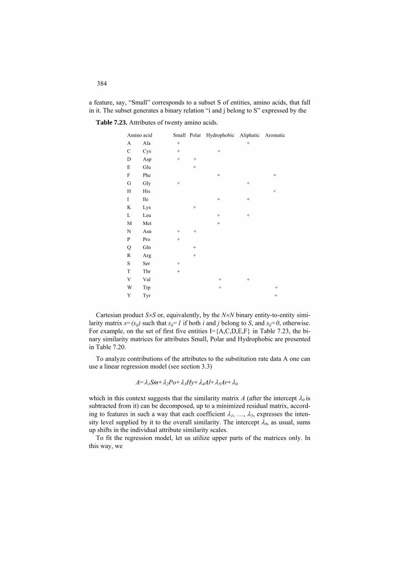
384
a feature, say, “Small” corresponds to a subset S of entities, amino acids, that fall in it. The subset generates a binary relation “i and j belong to S” expressed by the
Table 7.23. Attributes of twenty amino acids.
Amino acid Small Polar Hydrophobic Aliphatic Aromatic A Ala C Cys D Asp E Glu F Phe G Gly H His I Ile K Lys L Leu M Met N Asn P Pro Q Gln R Arg S Ser T Thr V Val W Trp Y Tyr
+ + + + + + + + + + + + + + + + + + + + + + + + + + + + + +
Cartesian product S×S or, equivalently, by the N×N binary entity-to-entity simi-larity matrix s=(sij) such that sij=1 if both i and j belong to S, and sij=0, otherwise. For example, on the set of first five entities I={A,C,D,E,F} in Table 7.23, the bi-nary similarity matrices for attributes Small, Polar and Hydrophobic are presented in Table 7.20.
To analyze contributions of the attributes to the substitution rate data A one can use a linear regression model (see section 3.3)
A=λ1Sm+λ2Po+λ3Hy+λ4Al+λ5Ar+λ0 which in this context suggests that the similarity matrix A (after the intercept λ0 is subtracted from it) can be decomposed, up to a minimized residual matrix, accord-ing to features in such a way that each coefficient λ1, …, λ5, expresses the inten-sity level supplied by it to the overall similarity. The intercept λ0, as usual, sums up shifts in the individual attribute similarity scales.
To fit the regression model, let us utilize upper parts of the matrices only. In this way, we
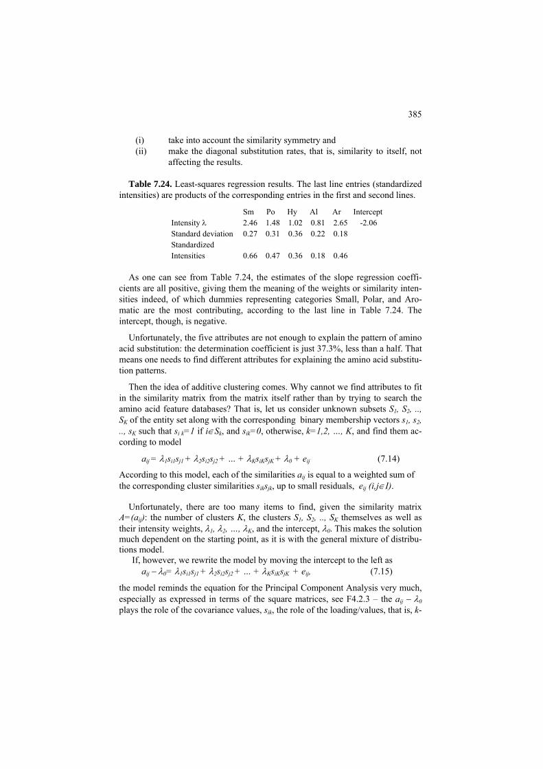
385
(i) take into account the similarity symmetry and (ii) make the diagonal substitution rates, that is, similarity to itself, not
affecting the results. Table 7.24. Least-squares regression results. The last line entries (standardized
intensities) are products of the corresponding entries in the first and second lines.
Sm Po Hy Al Ar Intercept Intensity λ Standard deviationStandardized Intensities
2.46 1.48 1.02 0.81 2.65 -2.06 0.27 0.31 0.36 0.22 0.18 0.66 0.47 0.36 0.18 0.46
As one can see from Table 7.24, the estimates of the slope regression coeffi-
cients are all positive, giving them the meaning of the weights or similarity inten-sities indeed, of which dummies representing categories Small, Polar, and Aro-matic are the most contributing, according to the last line in Table 7.24. The intercept, though, is negative.
Unfortunately, the five attributes are not enough to explain the pattern of amino acid substitution: the determination coefficient is just 37.3%, less than a half. That means one needs to find different attributes for explaining the amino acid substitu-tion patterns.
Then the idea of additive clustering comes. Why cannot we find attributes to fit in the similarity matrix from the matrix itself rather than by trying to search the amino acid feature databases? That is, let us consider unknown subsets S1, S2, .., SK of the entity set along with the corresponding binary membership vectors s1, s2, .., sK such that si k=1 if i∈Sk, and sik=0, otherwise, k=1,2, …, K, and find them ac-cording to model
aij = λ1si1sj1 + λ2si2sj2 + … + λKsiKsjK + λ0 + eij (7.14)
According to this model, each of the similarities aij is equal to a weighted sum of the corresponding cluster similarities siksjk, up to small residuals, eij (i,j∈I).
Unfortunately, there are too many items to find, given the similarity matrix
A=(aij): the number of clusters K, the clusters S1, S2, .., SK themselves as well as their intensity weights, λ1, λ2, …, λK, and the intercept, λ0. This makes the solution much dependent on the starting point, as it is with the general mixture of distribu-tions model.
If, however, we rewrite the model by moving the intercept to the left as aij − λ0= λ1si1sj1 + λ2si2sj2 + … + λKsiKsjK + eij, (7.15)
the model reminds the equation for the Principal Component Analysis very much, especially as expressed in terms of the square matrices, see F4.2.3 – the aij − λ0 plays the role of the covariance values, sik, the role of the loading/values, that is, k-
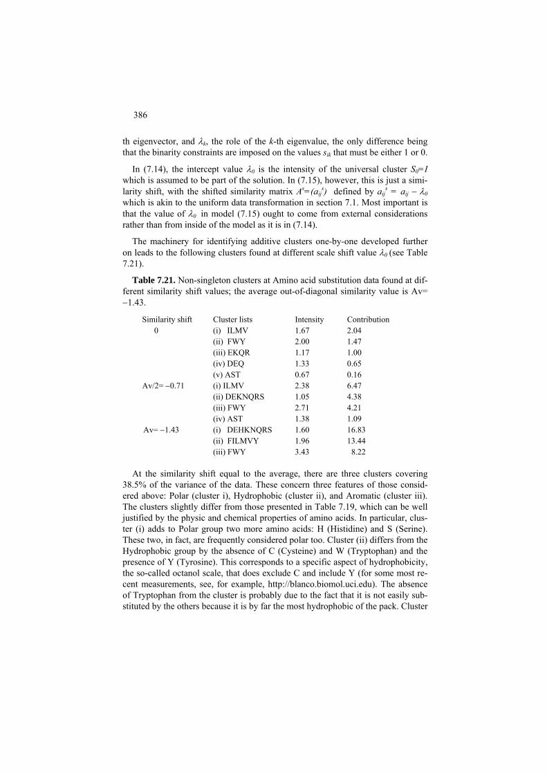
386
th eigenvector, and λk, the role of the k-th eigenvalue, the only difference being that the binarity constraints are imposed on the values sik that must be either 1 or 0.
In (7.14), the intercept value λ0 is the intensity of the universal cluster S0=I which is assumed to be part of the solution. In (7.15), however, this is just a simi-larity shift, with the shifted similarity matrix As=(aij
s) defined by aijs = aij − λ0
which is akin to the uniform data transformation in section 7.1. Most important is that the value of λ0 in model (7.15) ought to come from external considerations rather than from inside of the model as it is in (7.14).
The machinery for identifying additive clusters one-by-one developed further on leads to the following clusters found at different scale shift value λ0 (see Table 7.21).
Table 7.21. Non-singleton clusters at Amino acid substitution data found at dif-ferent similarity shift values; the average out-of-diagonal similarity value is Av= −1.43.
Similarity shift Cluster lists Intensity Contribution 0 (i) ILMV
(ii) FWY (iii) EKQR (iv) DEQ (v) AST
1.67 2.00 1.17 1.33 0.67
2.04 1.47 1.00 0.65 0.16
Av/2= −0.71 (i) ILMV (ii) DEKNQRS (iii) FWY (iv) AST
2.38 1.05 2.71 1.38
6.47 4.38 4.21 1.09
Av= −1.43 (i) DEHKNQRS (ii) FILMVY (iii) FWY
1.60 1.96 3.43
16.83 13.44 8.22
At the similarity shift equal to the average, there are three clusters covering
38.5% of the variance of the data. These concern three features of those consid-ered above: Polar (cluster i), Hydrophobic (cluster ii), and Aromatic (cluster iii). The clusters slightly differ from those presented in Table 7.19, which can be well justified by the physic and chemical properties of amino acids. In particular, clus-ter (i) adds to Polar group two more amino acids: H (Histidine) and S (Serine). These two, in fact, are frequently considered polar too. Cluster (ii) differs from the Hydrophobic group by the absence of C (Cysteine) and W (Tryptophan) and the presence of Y (Tyrosine). This corresponds to a specific aspect of hydrophobicity, the so-called octanol scale, that does exclude C and include Y (for some most re-cent measurements, see, for example, http://blanco.biomol.uci.edu). The absence of Tryptophan from the cluster is probably due to the fact that it is not easily sub-stituted by the others because it is by far the most hydrophobic of the pack. Cluster
387
(iii) consists of hydrophobic aromatic amino acids which excludes F (Phenyla-lanine) because it is not hydrophobic.
F7.3 Additive clusters one-by-one: Formulation
Let I be a set of entities under consideration and A=(aij) a symmetric similarity matrix i,j∈I. The additive clustering model assumes that the similarities in A are generated by a set of additive clusters Sk ⊆ I together with their intensities λk (k=0, 1, ..., K) in such a way that each aij is approximated by the sum of the intensities of those clusters that contain both i and j:
aij = λ1si1sj1 + λ2si2sj2 + … + λKsiKsjK + λ0 + eij (7.14)
where sk=(sik) are the membership vectors of unknown clusters Sk, and λk are their positive intensity values, k=1, 2, ..., K. Residuals eij are to be minimized. The zero’s cluster S0 is assumed to coincide with the entire set I so that its inten-sity λ0 is the intercept in (7.14). On the other hand, λ0 has a meaning of the simi-larity shift, with the shifted similarity matrix A’=(a’ij) defined by a’ij=aij-λ0. Equation (7.14) for the shifted model can be rewritten as
a’ij = λ1si1sj1 + λ2si2sj2 + … + λKsiKsjK + eij, (7.15)
so the shifted similarity matrix a’ij=aij-λ0 is the sum of cluster binary matrices weighted by their intensities. The role of the intercept λ0 in (7.15) as a “soft” simi-larity threshold is of a special interest when λ0 is user specified, because the shifted similarity matrix a’ij may lead to different clusters at different λ0 values, as Figure 7.2 and Table 7.21 clearly demonstrate. Model (7.15) can be considered under two different assumptions of the underlying cluster structure:
A. Overlapping additive clusters B. Non-overlapping clusters
In the latter case, the summation in model (7.14) - (7.15) hides the fact that no summation of intensities goes on. Every similarity a’ij is assumed to be approxi-mately equal to the intensity value of that cluster that contains both i and j, or 0 if no cluster contains both of the entities.
The equations in (7.15) coincide with those in (7.12) up to the condition that vectors s’s in (7.15) are bound to be 1/0 binary, whereas no constraint is imposed on f’s in (7.12). That means that the additive clustering model is an extension of the spectral decomposition onto the case when vectors are binary. This type of de-composition, with additional constraints such as say non-negativity of the ele-ments of the solution is becoming increasingly popular in data analysis. Assuming the conventional least-squares criterion for this specification of the summarization problem, a natural idea coming to mind is to imitate the one-by-one approach of

388
the Principal component analysis. The other idea, just working on all clusters in parallel, is not considered in this text.
Therefore, we turn to a simplest version of (7.14)-(7.15) model which is a single cluster model:
wij = λsis + ej ij, (7.16)
where wij are not necessarily the original similarities but rather any similarities in-cluding the shifted a’ij, and s=(si) is an N-dimensional zero-one vector of the memberships to cluster S to be found and λ its intensity. To fit the model (7.16), we minimize the square error criterion
(7.17) 2 2
,( , ) ( )ij i j
i j IL s w s sλ
∈
= −∑ λ
We first note that, with no loss of generality, the similarity matrix W can always be considered symmetric, because otherwise W can be equivalently changed for a symmetric matrix Ŵ= (W+WT)/2.
Indeed, the part of criterion (7.17) related to a particular pair i,j∈I is (wij − λsisj )2 + (wji − λsjsi )2 which is equal to wij
2 +wji2 - 2λ(wij+wji)sis + 2λ2sj isj. The sisj on
right are not squared because they are 0 or 1, thus do not change under this opera-tion. The same part at matrix Ŵ=(ŵij) reads as (wij
2 +wji2 +2wijw )/2− 2λ(wji ij+ wji)
sis + 2λ2sj isj so that the only parts affected are constant while those depending on the cluster to be found are identical, which proves the statement. Thus, the as-sumption that the similarity matrix is symmetric does not change a thing: it can always be transformed to a symmetric form Ŵ= (W+WT)/2.
For the sake of simplicity we assume that the matrix W comes with no diagonal entries, or that the diagonal entries wii are all zero.
Let us take a look at criterion (7.17) under each of two assumptions (Mirkin et al. 2010):
(a) Cluster intensity λ is pre-specified by the user (b) Cluster intensity λ is to be found according to the criterion.
We first analyze the case of λ pre-specified. Let us slightly rewrite criterion (7.17):
2 2 2
, , ,( , ) ( ) 2 ( )
2ij i j ij ij i ji j I i j I i j I
L s w s s w w s sλλ λ λ∈ ∈ ∈
= − = − −∑ ∑ ∑ (7.17′)
Assume that λ is positive. Then minimizing (7.17) is equivalent to maximizing the sum on the right, which is just the summary uniform criterion (7.2) at π=λ/2 that has been described and utilized in section 7.1. Indeed, the equation

389
, ,( / 2) ( /ij i j iji j I i j Sw s s wλ
∈ ∈− = −∑ ∑ 2)λ
e
easily follows from the fact that si=1
if and only if i∈S. That means that the algorithm AddRem from C7.1 is applicablhere to produce λ/2-tight clusters. The case (b), when intensity λ in (7.17) is to be adjusted to further minimize the criterion, it is easy to prove that, given an S, the optimal λ is just the average of within cluster similarities, λ=λ(S), where
,
, ,( ) /
| | (| | 1)
iji j Si j
ij i j i ji j I i j Ii j i j
w
S w s s s sS S
λ∈
≠
∈ ∈≠ ≠
= =−
∑∑ ∑ (7.18)
as it is always the case for the least-squares approximation of a series of numbers by a central value (see section 1.2).
That means that, again, the criterion is equivalent to the summary uniform crite-rion (7.2), but this time with a variable value of the threshold π=λ(S)/2 that de-pends on S. In particular, a locally optimal cluster is λ(S)/2-tight: the average simi-larities of entities i∈I to S are greater than λ(S)/2 for those i in S and smaller than λ(S)/2 for i’s out of S.
If one puts the optimal λ=λ(S) in (7.17), the least squares criterion is decomposed as follows
2 2 2 2 2
, , ,( ( ), ) ( ( ) ) ( ) ( ) | | (| | 1)ij i j ij i j
i j I i j I i j Ii j
L S s w S s s w S s s T S S Sλ λ λ λ∈ ∈ ∈
≠
= − = − = − −∑ ∑ ∑
where T is the data scatter, the sum of all the similarities squared, so that a Py-thagorean decomposition of the data scatter holds: (7.19) 2 2
,( ) | | (| | 1)ij
i j IT w S S Sλ
∈
= = − +∑ 2L
2L+
where L2 is the unexplained minimized part (7.17) whereas the item in the middle is the explained part of the data scatter.
The decomposition (7.19) looks more elegant when the diagonal similarities wii are admitted. In this case, the sum Σi,j∈I sisj is equal to |S|2 and λ(S)=sT TWs/(s s)2 so that
2 2 2
,( ) | |ij
i j Iw S Sλ
∈
=∑ (7.19′)
The explained part in (7.19′), which is to be maximized to minimize L2 because the scatter T is constant, is
22 2( ) [ ( ) | |]
T
T
s Wsg S S Ss s
λ⎡ ⎤
= = ⎢ ⎥⎣ ⎦
(7.20)
390
which is but the square of the Rayleigh quotient
( ) ( ) | |T
T
s Wsg S S Ss s
λ= = (7.21)
Since it is assumed that at least some of the similarities in A are positive, the maximum of (7.11) over all binary s’s is positive as well. Indeed, take a positive wij and a vector s with all components equal to zero except for just i-th and j-th components that are unities. Obviously (7.21) is positive on that, the more so the maximum. If, however, all the similarities between entities are negative, then no non singleton cluster can make (7.21) positive – that is, no non trivial cluster can come up with the criterion.
That means that a version of AddRem(i) algorithm with a variant threshold π, Ad-dRemA(i) in section C7.3, in fact (locally) optimizes the Rayleigh quotient (7.21).
Now we can return to the case of the original model with multiple clusters. The situation will slightly differ depending on whether clusters are assumed non-overlapping or possibly overlapping.
Consider, first, the case of model (7.15) with the restriction that clusters to be found must not overlap. The fact that clusters Sf and Sg do not overlap can be equivalently stated in terms of their binary membership vectors sf and sg: these must be orthogonal so that <sf,sg>=0. This implies that the shifted data scatter admits the following decomposition:
2
1, [ ] ,
KT Tk k k k
kA A s As s s E
=
′ ′ E= + < >∑< > (7.22)
which extends equation (7.19) to the multiple cluster case. In (7.22), the inner products <A’,A’> and <E,E> denote the sums of the squared elements of the cor-responding matrices. To derive (7.22), one can take the inner product of equation (7.15) by itself, considering all matrices as N×N vectors, and taking into account the fact that matrices sksk
T and slslT are orthogonal as N×N vectors at k≠l, because
the corresponding vectors sk and sl are orthogonal. Equation (7.22) means that each of the optimal non-overlapping clusters indeed contributes the squared Rayleigh quotient (7.20) to the shifted data scatter, and, moreover, the optimal intensity value λk of cluster Sk is, in fact, the within cluster average λk =λ(Sk). The sum in the middle represents the part of the data scatter <A’,A’> “explained” by the model, whereas <E,E> relates to the “unexplained” part. Both can be expressed in percentages of the data scatter. Obviously, the greater the explained part the better the fit. Assuming that the cluster contributions differ significantly, one can apply the one- by-one principal component analysis strategy to the cluster case as well – though, in this case, the process does not necessarily lead to an optimal solution. This
391
strategy can be put as follows. First, a cluster S is found at the entire data set to maximize the Rayleigh quotient (7.21). It is denoted by S1 along with its intensity value λ1 =λ(S1) and the contribution g2(S1) in (7.20) and removed from the entity set I. The next cluster S2 is found in the same way over the remaining entity set, and removed as well. The process iterates until no positive entries in A’ over the remaining entities can be found. This would mean the remaining entities are all to remain singletons. In general, the process yields suboptimal, not necessarily opti-mal, clusters. Let us turn now to the case of overlapping clusters. To fit the model (7.15), the one-by-one cluster extracting strategy will require minimizing, at each step k=1, 2, ..., K the criterion (7.17) applied to a correspond-ing residual similarity matrix Ak (Mirkin 1987, 1996). Specifically, A1 is taken to coincide with the shifted similarity matrix, A1=A’. At k-th step, a (locally) optimal cluster maximizing (7.20) over W=Ak is found to be set as Sk along with its inten-sity value λk, equal to the average of the residual similarities within Sk. Its contri-bution to the data scatter is equal to the optimized criterion (7.20). The residual similarities are updated after each step k by subtracting the found λksiksjk:
aij,k+1 = aij,k − λksiksjk. (7.23)
In spite of the fact that thus found clusters may and frequently do overlap, this one-by-one strategy leads to a decomposition of the data scatter into the contribu-tions of the extracted clusters (Sk, λk) and the minimized residual square error, which is analogous to (7.22):
2
1, [ ] ,
KT Tk k k k k
kA A s A s s s E
=
′ ′< >= + <∑ E > (7.24)
except that it is residual similarity matrix Ak.stands in the middle rather than the original matrix A′.
To prove (7.24), one needs just the equation (7.19′) applied to W=Ak,
22 2
,,
Tk k k
Tij k kk ki j I
s A sa Ls s∈
⎛ ⎞= +⎜ ⎟⎝ ⎠
∑ (7.25)
2, 1
,k ij k
i j IL a +
∈
= 2∑Since , (7.24) can be obtained by summing up the equations
(7.25) over all k=1, 2, ...,K.
Q.7.5. What happens if λ<0 in criterion (7.17)? A. According to formula (7.17′), that would mean that the summary uniform similarity
,( /iji j Sw λ
∈− 2)∑ must be
minimized rather than maximized. An optimal set S would consist of most dis-similar entities. Such a set sometimes is referred to as an anti-cluster.

392
Q.7.6. Can you think of a real world problem that would amount to the goal of finding anti-clusters rather than clusters?
Q.7.7. Consider the uniform summary criterion u(S, π) and two values of threshold, π1 < π2. Prove that the size of optimal cluster at π2 cannot be greater than that at π1, thus supporting the intuition illustrated on Figure 7.2.
C7.3 Finding (sub)optimal additive clusters: Computation
Before starting computation of additive clusters, the similarity matrix should be made symmetric, by averaging it with its transpose, and shifted by a scale shift value λ0 which is to be user defined. A default value for λ0 can be the average value of the similarity matrix if similarity values vary across the matrix or λ0=1/2 if the similarity matrix is the flat zero-one matrix of an ordinary graph.
We consider here only one cluster based additive clustering algorithms.
Given a matrix W=(wij), consider an additive clustering analogue to Ad-dRem(i) algorithm from C7.1. Again vector z=2s-1is used to hold the information of cluster S being built. Its components are: zi=1 if i∈S and zi=−1, otherwise. This allows for the same action of changing the sign of zi to express both addition of i into S if i∉S and removal of i out of S if i∈S.
AddRemAdd(j) algorithm Input: matrix W=(wij); Output: cluster S containing j, its intensity λ and contribu-tion g2 to the original A′ matrix scatter.
1. Initialization. Set N-dimensional z to have all its entries equal to -1 except for zj =1, the number of elements n=1, intensity λ=0, and contribution g2=0. For each entity i∈I, compute its average similarity to S, w(i,S)= wij.
2. Selection. Find i* maximizing w(i,S). 3. Test.
a. If w(i*,S)>λ/2 i. Change the sign of zi* in vector z, zi*⇐−zi*
ii. Update: n⇐n+ zi* (the number of elements in S), λ⇐(n-2)[λ+ zi*2w(i*,S)/(n-2)]/n (the average similarity within S), w(i,S)⇐[(n-1)a(i,S)+ zi*wii*]/n (the average similarities of all entities to S), and g2=λ2n2 (the contri-bution), and go to 2.
b. Else i. Output S, λ and g2.
c. End

393
The general step is justified by the fact that indeed equations (7.5) imply that maximizing w(i,S) over all i∈I does maximize the increment of g(S) among all sets that can be obtained from S by either adding an entity to S or removing an en-tity from S. Updating formulas can be derived from the definitions of the concepts involved. The algorithm AddRemAdd(j) utilizes no ad hoc parameters, except for the simi-larity shift value, so the cluster sizes are determined by the process of clustering itself. Yet, changing the similarity shift λ0 may affect the clustering results indeed, which can be of an advantage when one needs to contrast within- and between- cluster similarities. To use AddRemAdd algorithm for the case of non-overlapping clusters, one needs to perform a set of repetitive steps in the algorithm ADN (ADditive clusters Non-overlapping) as follows.
ADN algorithm Input: matrix A′=(a′ij); Output: a set of non-overlapping clusters S1, S2, …, SK where
(i) number of clusters K is not pre-specified and (ii) they do not necessarily cover all the entity set,
together with their intensities λk and contributions gk2 to the A′ matrix scatter.
0. Initialization. Set k=1, Ik=I and Ak= A′. 1. Stopping test. Check whether Ik contains more than one entity and
whether Ak contains positive values. If either is not true, the computation stops and those clusters found so far are output.
2. Cluster. Apply AddRemAdd(j) for every j∈Ik. Select that of the results maximizing the contribution and put is as Sk along with the correspond-ing intensity λk and contribution gk
2. 3. Update. Set Ik = Ik − Sk , k=k+1, and Ak the part of matrix A′ related to
elements of Ik only.
The number of clusters is not pre-specified by the user with ADN nor the subset of entities remaining unclustered. Yet both are predetermined by the choice of the scale shift parameter λ0 leading to matrix A′. This choice, in fact, defines the granularity of clustering as illustrated on Figure 7.2.
A similar algorithm, ADO (ADditive clusters Overlapping) can be drawn for the case when clusters are not necessarily non-overlapping.
ADO algorithm Input: matrix A′=(a′ij) and parameters for halting the computation: (i) threshold of contribution of individual clusters ς, say ς=5%, (ii) threshold of explained contri-bution η, say η=50% ; Output: a set of possibly overlapping clusters S1, S2, …, SK where (i) number of clusters K is not pre-specified,

394
(ii) they do not necessarily cover all the entity set, and (iii) they may overlap, together with their intensities λk and contributions gk
2 to the A′ matrix scatter. 0. Initialization. Compute the data scatter D=< A′, A′>. Set k=1 and Ak= A′. 1. Cluster. Apply AddRemAdd(j) to Ak for every j∈I. Select of the results
that maximizing the contribution and put is as Sk along with the corre-sponding intensity λk and contribution gk
2. 2. Stopping test. Check whether gk
2/D >ς and Σf≤k gk2/D≤ η. If either is not
true, the computation stops and only clusters found at the previous itera-tions are output.
3. Update. Set Ak = Ak - λk skskT, k=k+1.
4. Similarity positivity test. Check whether Ak contains positive values. If yes, go to 1. If not, the computation stops and all clusters found so far are output.
Algorithm ADO extracts clusters from the similarity matrix one by one so that the residual elements are getting smaller at each step overall (Mirkin 1996). A drawback of ADO is that any cluster, once extracted, is never updated, so that a version of the algorithm should be developed with an inbuilt mechanism for up-dating the extracted clusters. This can follow an additive clustering algorithm for rectangular data in Depril, Van Mechelen and Mirkin (2008).
7.4 Summary
This chapter is an attempt to make a unified teaching material from diverse ap-proaches to finding clusters in networks. The unifying theme is the summary within-cluster similarity criterion that, first, embraces the uniform and modularity approaches to confront the data with background noise, and then runs in the spec-tral clustering approach and the additive clustering approach. These two latter ap-proaches represent two different pathways in attempts to extend the theory of spectral matrix decomposition to clustering tasks. The spectral clustering does it by finding such combinatorial clustering criteria and such data transformations at which the spectral problem becomes an unconstrained relaxation of the combina-torial task. The additive clustering does just the opposite: it formulates a clustering problem as an extension of the spectral decomposition and tries to solve it using combinatorial methods. What is nice, that both of the approaches are effective; they do find good clusters, although there are specifics such as, for example, that the uniform criterion is better fitting to flat ordinary graph structures while the modularity criterion is better fitting at the data reflecting the diversity of individ-ual entities. It is clear however that this part of data analysis technology is quickly moving forward to further developments.

395
References J.A. Hartigan (1975) Clustering Algorithms, Wiley and Sons. A.K. Jain and R.C. Dubes (1988) Algorithms for Clustering Data, Prentice Hall. R. Johnsonbaugh, M. Schaefer (2004) Algorithms, Pearson Prentice Hall, ISBN 0-13-122853-6.
B. Mirkin (1996) Mathematical Classification and Clustering, Kluwer Academic Press. D. Depril, I. Van Mechelen, B. Mirkin (2008) Algorithms for additive clustering of rectangular data tables, Computational Statistics and Data Analysis, 52, 4923-4938. S. Guattery and G. Miller (1998) On the quality of spectral separators, SIAM Journal of Matrix Analysis and Applications, 19, n. 3, 701-719. C.Klein and M. Randic (1993) Resistance distance, Journal of Mathematical Chemistry, 12, 81-95. U. Luxburg (2007) A tutorial on spectral clustering, Statistics and Computing, 17, 395-416. B. Mirkin (1987) Additive clustering and qualitative factor analysis methods for similarity matrices, Journal of Classification, 4, 7-31; Erratum (1989), 6, 271-272. B. Mirkin, R. Camargo, T. Fenner, G. Loizou, P. Kellam (2010) Similarity cluster-ing of proteins using substantive knowledge and reconstruction of evolutionary gene histories in herpesvirus, Theoretical Chemistry Accounts: Theory, Computa-tion, and Modeling 125, No 3-6, 569-582. M.E.J. Newman (2006) Modularity and community structure in networks, PNAS, 103(23), 8577-8582. M. Newman and M. Girvan (2004) Finding and evaluating community structure in networks, Physical Review E, 69, 026113. R.N. Shepard and P. Arabie (1979) Additive clustering: Representation of simi-larities as combinations of discrete overlapping properties, Psychological Review, 86, 87-123. J. Shi and J. Malik (2000) Normalized cuts and image segmentation, IEEE Trans-actions on Pattern Analysis and Machine Intelligence, 22(8), 888-905.

396

397
Appendix
Boris Mirkin
Department of Computer Science and Information Systems, Birkbeck, University of London, Malet Street, London WC1E 7HX UK
Department of Data Analysis and Machine Intelligence, Higher School of Economics, 11 Pokrovski Boulevard, Moscow RF
Abstract
This material consists of five sections. Three sections are to help in getting ac-quainted with::
A1. Basic linear algebra A2. Basic optimization A3. Basic MatLab
Section A4 lists MatLab codes for some of the methods. These are: cm.m – Evolutionary method for finding Minkowski’s center of a series plan.m – A set of modules for fitting power law regression by using both
evolutionary method and linearization; includes a module for saving re-sults in an ascii file (can be used as a template for saving results)
nnn.m – Learning a neuron network with one hidden layer clatree.m – Building binary classification trees using Gini or Pearson chi-
squared or Information gain criterion.
Last section, A5, supplies two randomly generated samples: three samples differ-ent distributions 50 strong each, short.dat, and a 280 strong sample from N(0,10).
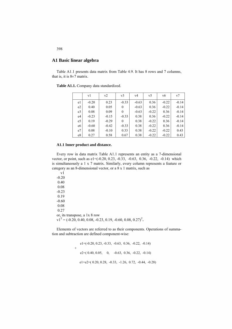
398
A1 Basic linear algebra
Table A1.1 presents data matrix from Table 4.9. It has 8 rows and 7 columns, that is, it is 8×7 matrix.
Table A1.1. Company data standardized.
v1 v2 v3 v4 v5 v6 v7
e1 e2 e3 e4 e5 e6 e7 e8
-0.20 0.40 0.08 -0.23 0.19 -0.60 0.08 0.27
0.23 0.05 0.09 -0.15 -0.29 -0.42 -0.10 0.58
-0.33 0 0 -0.33 0 -0.33 0.33 0.67
-0.63-0.63-0.63 0.38 0.38 0.38 0.38 0.38
0.36 0.36-0.22 0.36-0.22-0.22-0.22-0.22
-0.22 -0.22 0.36 -0.22 0.36 0.36 -0.22 -0.22
-0.14 -0.14 -0.14 -0.14 -0.14 -0.14 0.43 0.43
A1.1 Inner product and distance. Every row in data matrix Table A1.1 represents an entity as a 7-dimensional
vector, or point, such as e1=(-0.20, 0.23, -0.33, -0.63, 0.36, -0.22, -0.14) which is simultaneously a 1 x 7 matrix. Similarly, every column represents a feature or category as an 8-dimensional vector, or a 8 x 1 matrix, such as
v1 -0.20 0.40 0.08 -0.23 0.19 -0.60 0.08 0.27 or, its transpose, a 1x 8 row v1T = (-0.20, 0.40, 0.08, -0.23, 0.19, -0.60, 0.08, 0.27)T. Elements of vectors are referred to as their components. Operations of summa-
tion and subtraction are defined component-wise:
e1=(-0.20, 0.23, -0.33, -0.63, 0.36, -0.22, -0.14) +
e2=( 0.40, 0.05, 0, -0.63, 0.36, -0.22, -0.14) e1+e2=( 0.20, 0.28, -0.33, -1.26, 0.72, -0.44, -0.28)

399
and
e1=(-0.20, 0.23, -0.33, -0.63, 0.36, -0.22, -0.14) −
e2=( 0.40, 0.05, 0, -0.63, 0.36, -0.22, -0.14) e1−e2=(- 0.60, 0.18, -0.33, 0, 0, 0, 0 ) The second important operation is multiplication of a vector by a real defined
as multiplication of all components simultaneously:
3∗e1 = (-0.60, 0.69, -0.99, -1.89, 1.08, -0.66, -0.42),
10∗e1=(-2.00, 2.30, -3.30, -6.30, 3.60, -2.20, -1.40) To get some intuition, let us consider Cartesian plane representation of 2D vec-
tors obtained by cutting off all components of the rows except for the first two (Figure A1(a)).
−0.4 −0.2 0 0.2 0.4 0.6
−0.4
−0.2
0
0.2
0.4
0.6
e1e2
e1+e21.5*e1
a
−1 −0.5 0 0.5 1−1
−0.5
0
0.5
1b
Figure A1.1. Plane geometry representation of 2D vectors on (a) and eigenvec-
tor lines for symmetric matrix A (b). Figure A1.1 illustrates two geometric facts: (a) the sum of two vectors sits in
the fourth node of the parallelogram formed by connecting 0 and the vectors; (b) given vector x, all vectors ax at a the constant a taking any value form the line through the origin 0 and x.
The third important operation over vectors is inner product. The inner, or
scalar, product is defined for every pair of vectors x and y of the same dimension and it is equal to – not a vector – but just a number equal to the sum of the products of the corresponding components and denoted by <x.y>. For example, for 2D parts of vectors e1=(-0.20, 0.23) and e2=(0.40, 0.05), the inner product is <e1,e2>= −0.20*0.40 + 0.23*0.05 =-0.08+0.01=-0.07. A full computation <e1,e2>:= sum(e1.* e2) is below:

400
e1= (-0.20, 0.23, -0.33, -0.63, 0.36, -0.22, -0.14) e2= ( 0.40, 0.05, 0, -0.63, 0.36, -0.22, -0.14) e1*e2= (-0.08, 0.01, 0, 0.39, 0.13, 0.05, 0.02) <e1,e2>=sum(e1*e2)= -0.08+ 0.01+ 0+ 0.39+ 0.13+ 0.05+ 0.02=0.52 The inner product is a linear operation so that, for example, <e1,2*e1+3*e2> =
2*<e1,e1> + 3*<e1,e2>, which can be proven in this case straightforwardly by computation.
x1=(x11,x12) a c x2=(x21,x22) b 0=(0,0) x11 x21
x12
x22
Figure A1.2. Pythagoras’ theorem: the squared Euclidean distance between x1
and x2 is d(x1,x2)= (x 211-x21) + (x12-x22)2.
The inner square, that is, the product of a vector by itself, like <e1,e1>=-
0.20*(-0.20)+0.23*0.23 = 0.040+0.053=0.093, is the sum of squares of its components, which is the square length of the line connecting the origin 0 and the point on Cartesian plane such as Figure A1(a). This follows from the Pythagoras theorem illustrated on Figure A1.2. The theorem states that the square of hypothenuse’s length in any right-angled triangle is equal to the sum of squares of the sides’ lengths, c2 = a2 + b2. By extending this property to multidimensional points and vectors, the square root of the inner square <x,x> is referred to as the norm of x and denoted ||x||.
This allows us to introduce Euclidean distance between any two vectors/points
x and y as the norm of their difference, r(x,y)=||x – y||. In MatLab, this can be expressed as r(x,y)= sqrt(sum((x-y).*(x-y)). For example, the distance between e1 and e2 as rows of Table A1 can be computed as follows:
e1−e2= (- 0.60, 0.18, -0.33, 0, 0, 0, 0 )
(e1−e2).*(e1−e2)= ( 0.36, 0.03, 0.11, 0, 0, 0, 0 ) d(e1,e2)=sum((e1-e2).*(e1-e2))= 0.36 +0.03+0.11+ 0+0+0+0=.50 r(e1,e2)=sqrt(d(e1,e2))=sqrt(.50)= 0.71
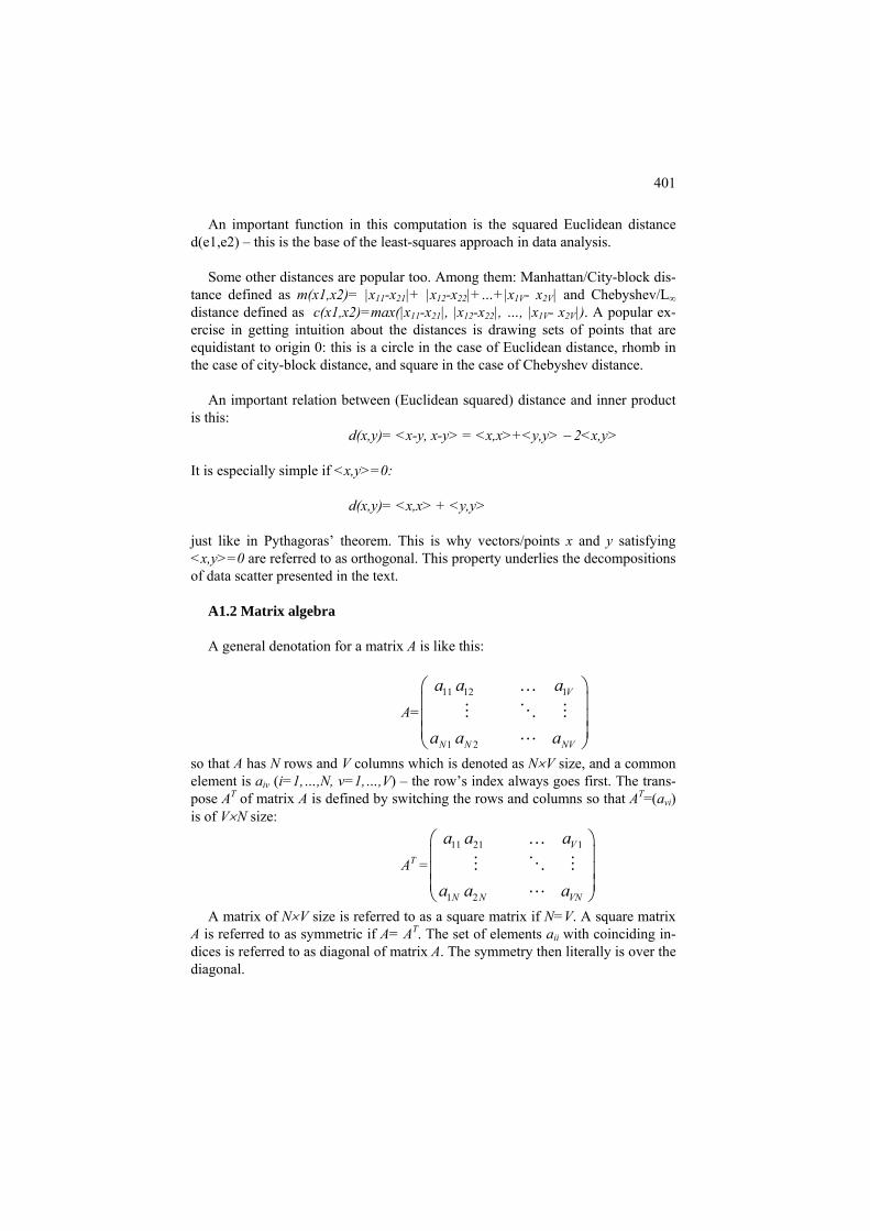
401
An important function in this computation is the squared Euclidean distance d(e1,e2) – this is the base of the least-squares approach in data analysis.
Some other distances are popular too. Among them: Manhattan/City-block dis-
tance defined as m(x1,x2)= |x11-x21|+ |x12-x22|+…+|x1V- x2V| and Chebyshev/L∞ distance defined as c(x1,x2)=max(|x11-x21|, |x12-x22|, …, |x1V- x2V|). A popular ex-ercise in getting intuition about the distances is drawing sets of points that are equidistant to origin 0: this is a circle in the case of Euclidean distance, rhomb in the case of city-block distance, and square in the case of Chebyshev distance.
An important relation between (Euclidean squared) distance and inner product
is this: d(x,y)= <x-y, x-y> = <x,x>+<y,y> − 2<x,y>
It is especially simple if <x,y>=0:
d(x,y)= <x,x> + <y,y>
just like in Pythagoras’ theorem. This is why vectors/points x and y satisfying <x,y>=0 are referred to as orthogonal. This property underlies the decompositions of data scatter presented in the text.
A1.2 Matrix algebra A general denotation for a matrix A is like this:
A= 11 12 1
1 2
V
N N NV
a a a
a a a
⎛ ⎞⎜ ⎟⎜ ⎟⎜ ⎟⎝ ⎠
…
so that A has N rows and V columns which is denoted as N×V size, and a common element is aiv (i=1,…,N, v=1,…,V) – the row’s index always goes first. The trans-pose AT of matrix A is defined by switching the rows and columns so that AT=(avi) is of V×N size:
AT = 11 21 1
1 2
V
N N VN
a a a
a a a
⎛ ⎞⎜ ⎟⎜ ⎟⎜ ⎟⎝ ⎠
…
A matrix of N×V size is referred to as a square matrix if N=V. A square matrix A is referred to as symmetric if A= AT. The set of elements aii with coinciding in-dices is referred to as diagonal of matrix A. The symmetry then literally is over the diagonal.

402
Operations of summation, subtraction and multiplication by a number are de-
fined for matrices component-wise exactly as it is for vectors. Matrices of differ-ent sizes cannot be summed with or subtracted from each other. Here is an exam-ple
+ 2 =
onding components of b (hence is the rule of the size of b). Here is an example:
-0.143 1.30
3 20.42
⎛ ⎞ ⎛ ⎞ ⎛ ⎞ ⎛ ⎞⎜ ⎟ ⎜ ⎟ ⎜ ⎟⎛ ⎞⎜ ⎟ ⎜ ⎟ ⎜ ⎟ ⎜ ⎟= + =⎜ ⎟⎜ ⎟ ⎜ ⎟ ⎜ ⎟ ⎜ ⎟⎝ ⎠
⎜ ⎟ ⎜ ⎟ ⎜ ⎟ ⎜ ⎟
he inner product of the corresponding row of A and b. Using the same example,
: An N×V matrix A can be multiplied by a column vector b of the size V×1 to
produce an N×1 vector c=Ab– note that the number of components in b must be equal to the number of columns in A. This is just the sum of A columns weighted by the corresp
-0.20 0.23 0.19 -0.29 - 0.18 -0.35 -
0.31 1.01
-0.40 0.05 0.60 -0.42 0.80 -0.79 0.08 0.09 0.08 -0.10 0.24 -0.11 -0.23 -0.15 0.27 0.58
-0.20 0.23 -0.20 0.23 0.40 0.05 0.40 0.050.08 0.09 2 0.08 0.09
⎜ ⎟
-0.23 -0.15 -0.23 -0.15 -0.99⎝ ⎠ ⎝ ⎠ ⎝ ⎠ ⎝ ⎠This definition can be reformulated using the inner product: in fact, each com-
ponent of Ab is t
-0.20 0.23 <(-0.20 0.23), (3 2)> 0.40 0.05 <(0.40 0.05), (3 2)>0.08 0.09 2 <(0.08 0.09), (3 2)>
-0.23 -0.15 <(-0.23 -0.15), (3 2)>
-0.143 1.30
0.42-0.99
⎛ ⎞ ⎛ ⎞ ⎛⎜ ⎟ ⎜ ⎟⎛ ⎞⎜ ⎟ ⎜ ⎟= =⎜ ⎟⎜ ⎟ ⎜ ⎟⎝ ⎠⎜ ⎟ ⎜ ⎟⎝ ⎠ ⎝ ⎠
⎞⎜ ⎟⎜ ⎟⎜ ⎟⎜ ⎟⎝ ⎠
Based on this, matrix product AB is defined for matrices A of size N×V and B of
size V×M as a matrix of size N×M whose columns are products of A and corre-sp ing columns of B. Let us extend our example to this case:
⎛ ⎞⎜ ⎟⎛ ⎞⎜ ⎟ ⎜ ⎟=⎜ ⎟⎜ ⎟ ⎜ ⎟⎝ ⎠
⎜ ⎟ ⎜ ⎟⎝ ⎠ ⎝ ⎠
ond
-0.20 0.23 0.40 0.050.08 0.09 2 0
-0.23 -0.15
-0.14 -0.203 1 1.30 0.40
0.42 0.08-0.99 -0.23
⎛ ⎞⎜ ⎟
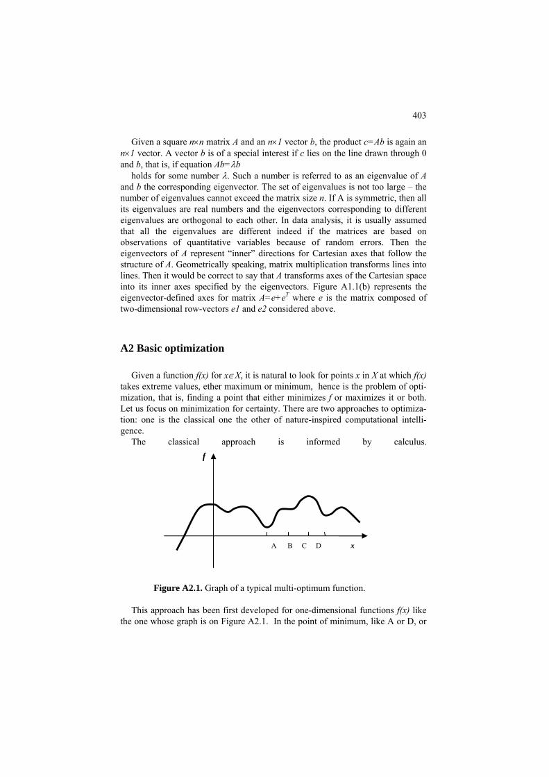
403
Given a square n×n matrix A and an n×1 vector b, the product c=Ab is again an n×1 vector. A vector b is of a special interest if c lies on the line drawn through 0 and b, that is, if equation Ab=λb
holds for some number λ. Such a number is referred to as an eigenvalue of A and b the corresponding eigenvector. The set of eigenvalues is not too large – the number of eigenvalues cannot exceed the matrix size n. If A is symmetric, then all its eigenvalues are real numbers and the eigenvectors corresponding to different eigenvalues are orthogonal to each other. In data analysis, it is usually assumed that all the eigenvalues are different indeed if the matrices are based on observations of quantitative variables because of random errors. Then the eigenvectors of A represent “inner” directions for Cartesian axes that follow the structure of A. Geometrically speaking, matrix multiplication transforms lines into lines. Then it would be correct to say that A transforms axes of the Cartesian space into its inner axes specified by the eigenvectors. Figure A1.1(b) represents the eigenvector-defined axes for matrix A=e+eT where e is the matrix composed of
e1 and e2 considered above.
, that is, finding a point that either minimizes f or maximizes it or both. Let cus izati ainty here proaches to
nal intelli-
calculus.
two-dimensional row-vectors
A2 Basic optimization
Given a function f(x) for x∈X, it is natural to look for points x in X at which f(x) takes extreme values, ether maximum or minimum, hence is the problem of opti-mization
us fo on minim on for cert . T are two ap optimiza-tion: one is the classical one the other of nature-inspired computatiogence.
The classical approach is informed by
Figure A2.1. Graph of a typical multi-optimum function.
This approach has been first developed for one-dimensional functions f(x) like the one whose graph is on Figure A2.1. In the point of minimum, like A or D, or
f
A B C D x

404
maximum, like C, or change in the orientation of convexity, like B, the first de-rivative f′(x) which expresses the tangent of the curve f(x) in the point is 0 – this is what is referred to as the first-order necessary condition of minimum. It is possible to separate the minima from the rest by using the second order derivatives, but there is no way to tell one local minimum from the other unless reaching each of them, and to add to the misery, there is not much usually known of how to find them all or just the global minimum either. Sometimes the calculus is not of much help – a case in hand is the curve on Figure A2.1: its global minimum is at the ve
- μ f′(x), where μ is the step factor. The closer the point to the minimum, the smaller is the value of the de-
mi
on tthe derivative. For a function of n-dimensional vectors, f(x1,x2,…,xn), the gradient
ry left point of the graph, and the first-order condition cannot help because it is valid only in interior points of the admissible set X.
Yet to reach a local minimum satisfying the first-order minimum condition, a most universal method is of steepest descent. This method relies on the derivative of the function in any given point. This shows the direction of the steepest ascent over the optimized function, so that the opposite direction makes it steepest de-scent. Given an x and values f(x) and f′(x), this method finds another point xnew by subtracting the derivative scaled by a step factor, xnew =x
rivative, thus the smaller the change. Of course, the method can converge to animum point, not necessarily the global minimum.
A2.2. New point is taken in the direction opposite to the tangent. The situation when x is multidimensional is even more complex. The mathe-
matics have made a good progress on the theory of optimization when only one minimum can exist – such is the case of so called convex or linear programming when both, function f(x) and set of admissible points X, are convex or linear. In the more general situation, though, the steepest descent frequently remains the only tool available, even in spite of the fact it finds a local minimum with no estimates
he global one. Here, however, the concept of gradient is involved rather that of
is an n-dimensional vector grad(f(x)) whose k-th component is partial derivative
old new x
k
yx
∂∂
(k=1,…,n). The different term is used because there are examples of functions
that have no derivatives at some points but still have gradients in those points. The
405
gradient, in n-dimensional space, shows direction of the steepest ascent. So, by taking the opposite direction, the process is supposed to go in the direction of steepest descent. That makes the method of steepest descent to work iterations. Ea oint in the direc-
on opposite to gradient:
wh
ere is a bound on them from below, this would warrant that the sequence converges to a local mini-mu
s – is used as an improvement device. The presence of the probabilistic component is considered an important device to warrant that the population does not stuck in a local optimum but rather covers the entire area of admissible solu-tions.
ch iteration takes in a point x=(x1,x2,…,xn) and outputs a new pti
x(new)=x(old) –μ∗grad(f(x(old)))
ere μ is the step size. This new point is taken then by the next iteration. By
changing the step-size from iteration to iteration, one may achieve a better rate of convergence.
In the case when the set of arguments can be naturally partitioned in two or more parts such that the function is easy to minimize over each part taken sepa-rately, an iterative process applies to involve steps optimizing each part at pre-specified values of the other parts. This process is referred to as alternating mini-mization. Consider that x=(y,z) so that f(x)=f(y,z) and, at any given y* and z*, the minimum of f(y*,z) with respect to z can be found easily, as well as minimum f(y,z*) over y. Then, starting from some y0 the alternating minimization process would produce a sequence y0, z1, y1, z2, z2,… in which zt is a minimizer of f(yt-1,z) and yt a minimizer of f(y,zt) at each t=1, 2,…. This sequence would provide for an ever decreasing sequence of values f(yt,zt). In a situation when th
m. If either y or z can have only a finite number of values, the process of alter-nating minimization would converge in a finite number of steps.
Q.A.1. What is gradient of function: (i) f(x1,x2)=x12+x2
2, (ii) f(x1,x2)=(x1-1)2+3*(x2-4)2, (iii) f(z1,z2) = 3*z1
2 + (1-z2)4? A: (i) (2x1, 2x2), (ii) [2*(x1-1),3*(x2-4)], (iii) (6*z1, -4*(1-z2)3).
In contrast to classical approaches, a nature inspired optimization approach does not try to reach a minimum by improving and updating a single solution point. Just the opposite. According to this approach, a population of admissible so-lutions is thrown in randomly and all the attention is given not to an individual so-lution but the population as a whole. Probabilistic rules are defined to generate the next generation of the population, usually in the same numbers, so that a process of evolution of the population from generation to generation is defined and exe-cuted computationally. Because of its probabilistic rules, each instance of the process may differ from the others. To warrant that the population improves in the process of evolution, a special “elite maintenance” policy is defined so that the elite – which is the best solution or a set of best solutions reached so far in the proces

406
A3 Basic MatLab
A.3.1 Introduction
The working place within a processor’s memory is up to the user. A recommended option: - a folder with user-made MatLab codes, termed say Code and two or more sub-folders, Data and Result, in which data and results, respectively, are to be stored. MatLab’s icon then is clicked on, after which MatLab opens as a three-part win-dow, of which that on the right is working area referred to as Command Window, and the two parts on the left are auxiliary. MatLab can be brought in to the work-ing folder/directory with traditional MSDOS or UNIX based commands such as: cd <Path_To_Working_Directory> in its Command Window. MatLab remembers then this path; and it is available to the user in a tiny window on top of the Com-mand Window. MatLab is organized as a set of packages, each in its own directory, consisting of program files with extension .m each. Character ‘%’ symbolizes a comment for humans till the end of the line. Help can be invoked Windows-wise or within the working area. In the latter, "help" command allows seeing names of the packages as well as of individual program files; the latter are operations that can be executed within MatLab. Ex-ample: Command “help” shows a bunch of packages, “matlab\datafun” among them; command “help datafun” displays a number of operations such as “max – largest component”; command “help max” explains the operation in detail.
A3.2 Loading and storing files
A numeric data file should be organized as an entity-to-feature data table: rows correspond to entities, columns to features (see studn.dat and studn.var). Such a data structure, with all entries numerical, is referred to as a 2D array, correspond-ing to a matrix in mathematics; 1d arrays correspond to solitary entities or col-umns (features) or rows (entity records). Array is a most important MatLab data format to hold numeric data. It works on the principle of a chess-board: its (i,k)-th entry arr(i,k) is the element in i-th row and k-th column. An Excel file has a simi-lar structure but it is interlaced with strings. A 2D array's defining feature is that every row has the same number of digits.

407
To load such a file one may use a command from package "iofun". A simple one is "load" to load a numeric array, organized as described, into the current MatLab processor memory: >> arr=load('Data\stud.dat'); % symbol "%" is used for comments: % MatLab interpreter doesn’t read lines beginning with “%”. % "arr" is a place in computer’s memory to put the data (variable); % semicolon ";" should stand at the end of an instruction; % if it does not, then the result will be printed to the screen, % which can be very useful for the user for checking the process of computation % studn.dat is a 100x8 file of 100 part-time students with 8 features: % 3 binary for Occupation; then Age, NumberChildren, % and scores over three disciplines. % All feature names are in file studn.var stored in Data folder. An 1D array can be put into the workspace with a command like >> a=[3 4 7 0]; which is a 4×1 array, which can be transposed into a 1×4 array with a “transpose” command >> b=a′ Since no semicolon is put in the end, b will be displayed on screen as
3 4 7 0
To get its 2d entry, a command >> c=b(2) can be utilized. Similarly, command >> d=arr(7,8) puts the value in arr’s 7th row and 8th column into workspace as variable d. If a numeric array in working memory is to be stored, one may use MatLab com-mand “save” which admits a number of storage formats including internal .mat format (see more with “help save”). To store array X into file Result\good.res in

408
ASCII format (which is a text format covering characters in a standard keypad set), one may use command >> save Result\good.res X –ascii If you need to check, before saving, what files and variables are currently in the workspace, you may use the upper-left part of the MatLab window or command >> whos that produces the list on the screen. Names are handled as strings, with ' ' symbol. The entity/feature name sizes may vary, thus cannot be handled in the array format. To do this, another data format is used: the cell. Cells involve curly braces rather than round brackets (parentheses) utilized for arrays. See the difference: arr(i) is 1D array arr’s i-th element, whereas brr{i} is cell brr’s i-th element, which can be not only a number or character, as in arrays, but also a string, an array, or even an-other cell. There are other data structures as well in MatLab (video, audio, internet) which are not covered here. MatLab supports several data formats, including Excel which is popular among scientists and practitioners alike (see more in help iofun). An Excel file with ex-tension .xls can be dealt with in MatLab by using commands xlsread ans xlswrite. Straightforward as they are, the user should not expect a comfortable switch be-tween Excel and MatLab with these commands. Take a look, for example, onto Excel data file of several students in the table below. Table A3.1. An Excel spreadsheet with data of five students over four features (Age in years, Number of Children, Occupation [Information Technology IT or Business Admini-stration BA or Other AN], and Mark over a range of 0-100%). Feature Age #Children Occup CI_Mark
Student John 35 0 IT 94
Peggy 28 2 BA 67 Fred 27 1 BA 85 Chris 28 0 OT 48
Liz 25 0 IT 87

409
The xlsread command produces three data structures from an xls file: one for nu-meric part, the other for text part, and the third for all data in the file. Specifically, if the table above is stored in Data subfolder as student.xls file, this works as fol-lows: >> [nn,tt,rr]=xlsread(‘Data\student.xls’); % nn is array of numeric values, tt – is cell of text, % and rr is cell covering all the data in file to produce a numeric 5×4 array nn:
35 0 NaN 94 28 2 NaN 67
nn = 27 1 NaN 85 28 0 NaN 48 25 0 NaN 87 and a text 8×5 cell tt: 'Feature' 'Age' '#Children' 'Occup' 'ML_Mark' 'Student' '' '' '' '' '' '' '' '' '' tt = 'John' '' '' 'IT' '' 'Peggy' '' '' 'BA' '' 'Fred' '' '' 'BA' '' 'Chris' '' '' 'OT' '' 'Liz' '' '' 'IT' '' The full dataset is in 8×5 cell rr: 'Feature' 'Age' '#Children' 'Occup' 'CI_Mark' 'Student' [NaN] [ NaN] [ NaN] [ NaN] [ NaN] [NaN] [ NaN] [ NaN] [ NaN] rr = 'John' [ 35] [ 0] 'IT' [ 94] 'Peggy' [ 28] [ 2] 'BA' [ 67] 'Fred' [ 27] [ 1] 'BA' [ 85] 'Chris' [ 28] [ 0] 'OT' [ 48] 'Liz' [ 25] [ 0] 'IT' [ 87] The NaN symbol applies in MatLab to undefined numeric values such as emerge from division by zero and the like. As one can see these are not exactly clean-cut structures to work with. The nu-merical array nn contains an incomprehensible column of NaN values, and the text file tt mixes up names of students and features.

410
A3.3 Using subsets of entities and features
If one wants working with only three of the six features, say "Age", "Children" and “OOProgramming_Score", one must put together their indices into a named 1D array: >> ii=[4 5 7] % no semicolon in the end to display ii on screen as a row; Then commands to reduce the dataset and the set of feature names over ii columns can be like these: >> newa=arr(:,ii); %new data array >> newb=b(ii); % newb is new feature set: to set it, one uses round braces rather than curly ones, % in spite of the fact that cells are involved here, not arrays A similar command makes it to a subset of entities. If, for instance, we want to limit our attention to only those students who received 60 or more at "OOPro-gramming", we first find their indices with command "find": >> jj=find(arr(:,7)>=60); % jj is the set of the students defined in find() % arr(:,7) is the seventh column of arr Now we can apply "arr" to "jj": >> al=arr(jj,:); % partial data of better off students The size of the data file al can be found with command >>size(al) % note: no semicolon to see the size on the screen to produce a screen output: ans =
55 8 meaning that al consists of 55 rows and 8 columns. If one needs to maintain these in the workspace, use command >>[n,m]=size(al) that will put 55 into n and 8 into m.

411
Now we are ready to discern meaningful data from numerical array nn and text cell tt in workspace for Table 1 obtained on p. 3. As shown on that page, array nn’s meaningless column is 3. Thus we can remove it like this: >> [rnn,cnn]=size(nn); % thus, the number of columns is cnn >> vv=setdiff([1:cnn],3); % operation setdiff(x,y) removes from x all elements of array y occurring in x % [1:cnn] is an array of all integers from 1 to cnn inclusive, e.g., [1:4] is [1 2 3 4] % thus, vv consists of all indices but 3 >> nnr=nn(:,vv); % this puts all nn, except for column 3, into nnr: 35 0 94 28 2 67 nnr = 27 1 85 28 0 48 25 0 87 To create a cell containing the corresponding feature set, we need first to have a cell with all features. These constitute the final fragment of the first row of cell tt, without the very first string, “Feature”, as can be seen from the tt contents shown above. Thus command >> fe=tt(1,2:5); % only first row in tt concerning its four columns, 2 to 5, goes to cell fe leads to cell fe of size 1×4 containing of four features. To remove feature 3, we apply the array vv produced above: >>fer=fe(vv); Cell fer contains strings 'Age' , '#Children', 'ML_Mark' indexed by 1, 2 and 3 and corresponding, in respect, to columns of array nnr.
A4 MatLab program codes
A4.1. Minkowski’s center: evolutionary algorithm %cm.m, computing Minkowski p-distance central point c of a series x %along with the average distance and its proportion in the sum function [c,d,pe]=cm(x,p)

412
n=length(x); lb=min(x); rb=max(x); %-----------------lb, rb are boundaries of the area (i)--- de=0; for ik=1:n de=de+(abs(x(ik)))^p; end de=de/n;%---------------------------average p-th power of the data %-------------population setting (ii), setting the limit, iter, to iterations pp=15; %population size feas=(rb-lb)*rand(pp,1)+lb; % generated population of p c values within the range flag=1; count=0; iter=5000; %---------- evaluation of the initially generated population (iii) ---- funp=0; for ii=1:pp vv(ii)=mink(p,x,feas(ii)); end [funi, ini]=min(vv); soli=feas(ini) %initial best c value funi %initial error si=1;%0.5; %step of change %-------------evolution of the population (iv) ----------------- while flag==1 count=count+1; feas=feas+si*randn(pp,1); % Gaussian mutation added with step si for ii=1:pp feas(ii)=max(lb, feas(ii)); feas(ii,:)=min(rb,feas(ii));% keeping the population within the range vec(ii)=mink(p,x,feas(ii)); %evaluation end %-------------- elite maintenance (v) ---------------- [fun, in]=min(vec); %best distance value sol=feas(in,:);%corresponding c value [wf,wi]=max(vec); wun=feas(wi); %worst c if wf>funi feas(wi)=soli; vec(wi)=funi; % changing the worst for the elite end if fun < funi

413
soli=sol; funi=fun; end if (count>=iter) flag=0; end pe=funi/de; %------------ screen the results of every 1000th iteration if rem(count,1000)==0 %funp=funi; disp([soli pe]); end end c=soli; d=funi; pe=d/de; return %--------computing the quality of ce, the average deviation in p-th power function dis=mink(p,x,ce) nn=length(x); dis=0; for ik=1:nn dis=dis+(abs(x(ik)-ce))^p; end dis=dis/nn; return
A4.2 Fitting power law: non-linear evolutionary and linearization
% plan.m, power law analysis assuming the predictor x and target y are % available as variables in matlab % the power law is a function: y=ax^b (1) % its linearized form: log(y)=log(a)+b*log(x) (2) function plan(x,y) %-----linear analysis of log(x) and log(y) for ii=1:length(x);xc(ii)=max(.05,x(ii));yc(ii)=max(0.05,y(ii));end;

414
%0.05 instead of 0 to make logarithms possible xll=log(xc); yll=log(yc); [all,bll,cll, rvll]=lr(xll,yll); %all the slope, bll the intercept of the linear regression %cll the correlation coefficient, rvll the residual variance of the linear regression yle=all*xll+bll;% linear-regression estimated yll cd=cll^2;%determination coefficient, it should be cd=1-rvll cd rvll %figure(1);plot(xll,yll,'k.',xll,yle,'rp'); %-----linearized: fitting equation (1) by first fitting equation(2) [al,bl, rl]=llr(x,y); % al the estimate of a, bl the estimate of b and % rl the proportion of the residual variance in the variance of y % ylr - the linearized rule estimate for the power law for ii=1:length(x);ylr(ii)=al*x(ii)^bl;end; %-------as is: fitting equation (1) by straightforwardly minimizing the %-------residual variance with an evolutionary algorithm [an,bn,f, rn]=nlr(x,y); % an the estimate of a, bn the estimate of b and % rn the proportion of the residual variance in the variance of y for ii=1:length(x);yn(ii)=an*x(ii)^bn;end; %estimated power law %-----------output: two-plot figure, real on the left, log on the right %figure(2); subplot(1,2,1); plot(x,y,'k.',x,ylr,'b.',x,yn,'r.');%data scatter with two estimated power laws, % blue-linearized, red- as is subplot(1,2,2);plot(xll,yll,'k.',xll,yle,'rp'); %-----------output: text file of the results saveplan('rep', cll, al, bl, rl, an, bn, rn,cd); return % llr.m, fitting a nonlinear regression function y=ax^b % using linearization

415
% x is predictor, y is target, a,b -regression parameters to be fitted function [a,b, residvar]=llr(xt,yt); % regression is power law y=a*x^b as reflected in the procedure % residvar is the average square error's proportion to the variance of y; % xt, yt are predictor and target %-----an elementary check of length compatibility-------- ll=length(xt); if ll~=length(yt) disp('Something wrong is with the data'); pause; end %--------- calculating a and b using the linearization for ii=1:ll;xc(ii)=max(.05,xt(ii));yc(ii)=max(0.05,yt(ii));end; %putting 0.05 instead of zero to make possible logarithms of the data xl=log(xc); %taking log of x and y yl=log(yc); [al,bl,dl]=lr(xl,yl); b=al; a=exp(bl); ab=[a b]; residvar=delta(ab,xt,yt)/var(yt,1); return %-------- computing the quality of the approximation y=a*(x^b) %which is the residual variance function esq=delta(tt,x,y)%tt=[a, b]; x predictor, y target a=tt(1); b=tt(2); esq=0; for ii=1:length(x) yp(ii)=a*(x(ii)^b); %this power law function can be changed esq=esq+(y(ii)-yp(ii))^2; end esq=esq/length(x); return; % nlr.m, evolutionary fitting of a nonlinear regression function y=f(x,a,b) % x is predictor, y is target, a,b -regression prameters to be fitted

416
function [a,b, funi,residvar]=nlr(xt,yt); % in this version the regression equation is power law y=a*x^b which is % reflected only in the subroutine 'delta' in the bottom for computing the % value of the average error squared; % funi is the average square error's best value; % residvar is its proportion to the variance of y; % xt, yt are predictor and target %-----an elementary check of length compatibility-------- ll=length(xt); if ll~=length(yt) disp('Something is wrong with the data'); pause; end %--------------- determine rectangle at which (a,b)-populations fluctuate [ab,bb]=ddr(xt,yt); lb=[ab(1) bb(1)]; rb=[ab(2) bb(2)]; lb rb disp('Hit ENTER if you wish to proceed. '); pause; %-------------organisation of the iterations, iter the limit to their number p=15; %population size for ii=1:p;feas(ii,:)=(rb-lb).*rand(1,2)+lb;end; % generated population of p pairs coeffi-
cients within the range flag=1; count=0; iter=10000;%5000; %---------- evaluation of the initially generated population funp=0; for ii=1:p vv(ii)=delta(feas(ii,:),xt,yt); end [funi, ini]=min(vv); soli=feas(ini,:) %initial coeffts funi %initial error si=1;%0.5; %step of change %-------------evolution of the population while flag==1 count=count+1;

417
feas=feas+si*randn(p,2); %mutation added with step si for ii=1:p feas(ii,:)=max([lb;feas(ii,:)]); feas(ii,:)=min([rb;feas(ii,:)]);% keeping the population within the range vec(ii)=delta(feas(ii,:),xt,yt); %evaluation end [fun, in]=min(vec); %best approximation value sol=feas(in,:);%corresponding parameters [wf,wi]=max(vec); wun=feas(wi,:); %worst case if wf>funi feas(wi,:)=soli; vec(wi)=funi; %changing the worst for the best of the previous generation end if fun < funi soli=sol; funi=fun; end if (count>=iter) flag=0; end residvar=funi/var(yt,1); %------------ screen the results of every 500th iteration if rem(count,500)==0 %funp=funi; disp([soli residvar]); end end a=soli(1); b=soli(2); return %-------- computing the quality of the approximation y==a*(x^b) function esq=delta(tt,x,y)%tt=[a, b]; x predictor, y target a=tt(1); b=tt(2); esq=0; for ii=1:length(x) yp(ii)=a*(x(ii)^b); %this is a power law function esq=esq+(y(ii)-yp(ii))^2; end esq=esq/length(x); %the average difference squared

418
return; % ddr.m, determination of the domain for power law y=a*x^b with b % restricted function [ab,bb]=ddr(x,y) n=length(x); bm=(log(y(1))-log(y(2)))/(log(x(1))-log(x(2))); am=y(1)/(x(1)^bm); ab=[am am]; bb=[bm bm]; %-------------finding extreme values for a and b using pairwise equations bs=0;as=0; bsq=0;asq=0; count=0; for ii=1:(n-1); if min(x(ii),y(ii))>.25 for jj=(ii+1):n if min(x(jj),y(jj))>.25 if (x(ii)/x(jj)<0.75)|(x(ii)/x(jj)>1.25) count=count+1; bt=(log(y(ii))-log(y(jj)))/(log(x(ii))-log(x(jj))); aij=y(ii)/(x(ii)^bt); aij=min(aij,100);%restriction %if (aij>100) % disp([ii jj]); aij %end; bs=bs+bt; bsq=bsq+bt*bt; as=as+aij; asq=asq+aij*aij; if bt>bb(2) bb(2)=bt; end; if bt<bb(1) bb(1)=bt; end; if aij>ab(2) ab(2)=aij; end; if aij<ab(1) ab(1)=aij; end; end; end;

419
end; end; end; as=as/count asq=asq/count; sas=sqrt(asq-as^2) bs=bs/count bsq=bsq/count; sbs=sqrt(bsq-bs^2) ab(1)=as-4*sas;ab(2)=as+4*sas; bb(1)=bs-4*sbs;bb(2)=bs+4*sbs; count return % saveplan.m, saving results of the power-law analysis in plan.m function saveplan(file, cc, al, bl, rl, an, bn, rn,cd); ct =num2str(cc); first=['Results of the power-law analysis y=ax^b' ]; alla=[ 'On the level of logarithms, the correlation is ' num2str(cc)]; alex=['Explained proportion of log(y)-variance is ' num2str(100*cd) '%']; nt=[ ]; lt1=['Linearized estimate parameter values are a= ' num2str(al) ', b= ' num2str(bl)]; lt2=['Explained proportion of y-variance is r= ' num2str(100*(1-rl)) '%' ]; nt1=['"As is" estimate parameter values are a= ' num2str(an) ', b= ' num2str(bn)]; nt2=['Explained proportion of y-variance is r= ' num2str(100*(1-rn)) '%']; alltext=strvcat(alla, lt1,lt2,nt1,nt2); oul=[' These are visualized on the Figure produced:'] our=[' The power-law estimates on the left, the logarithms, on the right']; alltt=strvcat(alltext, oul, our); alltt Filename=[ file '.out']; fid= fopen(Filename, 'at'); if fid~=-1 fprintf(fid, '%s\n', first); fprintf(fid, '%s\n', ' '); fprintf(fid, '%s\n', alla); fprintf(fid, '%s\n', alex); fprintf(fid, '%s\n', ' '); fprintf(fid, '%s\n', lt1); fprintf(fid, '%s\n', lt2); fprintf(fid, '%s\n', ' ');

420
fprintf(fid, '%s\n', nt1); fprintf(fid, '%s\n', nt2); fprintf(fid, '%s\n', ' '); fprintf(fid, '%s\n', oul); fprintf(fid, '%s\n', our); fprintf(fid, '%s\n', ' '); fprintf(fid, '%s\n', ' '); fclose(fid); end; return A4.3 Training neuron network with one hidden layer % nnn.m for learning a set of features from a data set % with a neural net with a single hidden layer % with the symmetric sigmoid (hyperbolic tangent) in the hidden layer % and data normalisation to [-10,10] interval function [V,W, mede]=nnn(hiddenn,muin) % hiddenn - number of neurons in the hidden layer % muin - the learning rate, should be of order of 0.0001 or less % V, W - wiring coefficients learnt % mede - vector of absolute values of errors in output features %--------------1.loading data ---------------------- da=load('Data\studn.dat'); %this is where the data file is put!!! % da=load('Data\iris.dat'); %this will be for iris data [n,m]=size(da); %-------2.normalizing to [-10,10] scale---------------------- mr=max(da); ml=min(da); ra=mr-ml; ba=mr+ml; tda=2*da-ones(n,1)*ba; dan=tda./(ones(n,1)*ra); dan=10*dan; %-------------3. preparing input and output target)-------- ip=[1:5]; % here is list of indexes of input features!!! %ip=[1:2];%only two input features in the case of iris ic=length(ip); op=[6:8]; % here is list of indexes of output features!!! %op=[3:4];% output iris features

421
oc=length(op); output=dan(:,op); %target features file input=dan(:,ip); %input features file input(:,ic+1)=10; %bias component %-----------------4.initialising the network --------------------- h=hiddenn; %the number of hidden neurons!!! W=randn(ic+1,h); %initialising w weights V=randn(h,oc); %initialising v weights W0=W; V0=V; count=0; %counter of epochs stopp=0; %stop-condition to change %pause(3); while(stopp==0) mede=zeros(1,oc); % mean errors after an epoch %----------------5. cycling over entities in a random order ror=randperm(n); for ii=1:n x=input(ror(ii),:); %current instance's input u=output(ror(ii),:);% current instance's output %---------------6. forward pass (to calculate response ru)------ ow=x*W; o1=1+exp(-ow); oow=ones(1,h)./o1; oow=2*oow-1;% symmetric sigmoid output of the hidden layer ov=oow*V; %output of the output layer err=u-ov; %the error mede=mede+abs(err)/n; %------------ 7. error back-propagation-------------------------- gV=-oow'*err; % gradient vector for matrix V t1=V*err'; % error propagated to the hidden layer t2=(1-oow).*(1+oow)/2; %the derivative t3=t2.*t1';% error multiplied by the th's derivative gW=-x'*t3; % gradient vector for matrix W %----------------8. weights update----------------------- mu=muin; %the learning rate from the input!!! V=V-mu*gV; W=W-mu*gW; end; %------------------. stop-condition -------------------------- count=count+1; ss=mean(mede); if ss<0.01|count>=10000

422
stopp=1; end; mede; if rem(count,500)==0 count mede end end;
A4.4 Building classification trees
% clatree.m a program for building a decision tree over quantitative data, % according to a method, 'gini', 'chi' or 'ing' in 3.5 % and specified stopping conditions: (a) number of entities, % (b) prevailing feature; Inputs: data matrix X, partition as cell s, method % variables untouched function Clusters=clatree(X, s, method) [n,mm]=size(X) TS=10; %cluster size threshold ee=0.8;%threshold to an s-class contents in a cluster tin=0; %threshold on the scoring function to be set switch method case 'gini' tin=0.03; case 'chi' tin=0.08; case 'ing' tin=0.15; otherwise disp('The method is wrong '); pause(10); end for ik=1:length(s); ds(ik)=length(s{ik}); end ds=ds/sum(ds); %distribution of s ss=1; %cluster counter bb=ss; %the last cluster's index Clusters{ss,1}=[1:n];%entity set to cluster %Clusters{ss,2}=[1:m];%features to be used if max(ds)<ee

423
Clusters{ss,2}=1; %should be split further else Clusters{ss,2}=0; %should not be split further end Clusters{ss,3}=[0]; %parent's index Clusters{ss,4}=[]; %characteristics Clusters{ss,5}=ds;%distribution of s tt=0;%counter of clusters to split taking into account added clusters while ~(tt==ss), for uu=(tt+1):ss uu realnum=Clusters{uu,1}; %cluster to be split flag=Clusters{uu,2}; if (flag==1) ma=-1;%starting gain value vv=0;%starting feature yy=-1000;%starting value for v0=1:mm xs=X(realnum,v0); %variable to be used [g,res,y]=msplit(xs,s,method);%producing split disp(['var ' num2str(v0) ' val ' num2str(y) ' ' num2str(res)]) % this line is to see action of each feature at each cluster if res>=ma ma=res; yy=y; vv=v0; end; end if ma>tin xt=X(realnum,vv); g{1}=realnum(find(xt<=yy)); g{2}=realnum(find(xt>yy)); l1=length(g{1}); l2=length(g{2}); if (l1*l2)==0 Clusters{uu,2}=0; else if (l1>TS & l2>TS) cc=clfil(g{1},s,ee,vv,uu,-1,yy,ma); for il=1:5 Clusters{bb+1,il}=cc{il}; end cc=clfil(g{2},s,ee,vv,uu,1,yy,ma); for il=1:5

424
Clusters{bb+2,il}=cc{il}; end bb=bb+2; elseif l1>TS cc=clfil(g{1},s,ee,vv,uu,-1,yy,ma); for il=1:5 Clusters{bb+1,il}=cc{il}; end bb=bb+1; elseif l2>TS cc=clfil(g{2},s,ee,vv,uu,1,yy,ma); for il=1:5 Clusters{bb+1,il}=cc{il}; end bb=bb+1; end; Clusters{uu,2}=0; end end; end; end; tt=ss; ss=bb; end; %savrdnew(file,Clusters,CC,B,yent); return %-------------- assigning a cluster object function cc=clfil(gg,s,ee,vv,uu,t,y,ma) %t=-1 for 1-split, 1 for 2-split cc{1}=gg; for ik=1:length(s) ds(ik)=length(intersect(s{ik},gg)); end; ds=ds/sum(ds);%distribution of s in gg if (max(ds)>ee) cc{2}=0; else cc{2}=1; end cc{3}=uu; %parent cc{4}=[vv t y ma]; % variable, less/more than, split y, gain cc{5}=ds; return

425
A5 Random samples
A5.1 Short.dat is a dataset of random samples from three different distributions in Table A5.1.
Table A5.1 8 20 1512 12 21 50 11 23 48 10 21 206 9 9 12 7 20 199 10 22 51 12 18 50 9 20 198 13 21 843 9 5 12 13 13 8 10 10 7 11 14 9 9 18 39 9 13 12 7 21 51 11 20 46 11 21 50 9 18 54 8 20 1391 10 19 49 10 19 41 13 24 35 12 23 45 10 13 11 12 9 9 10 21 49 7 10 10 8 17 52 12 8 8 11 20 48 12 17 199 8 11 9 8 11 13 9 20 978 12 17 51 9 20 6233 13 19 23 10 21 47 11 11 8 11 20 973 11 7 43 13 20 201 9 18 200 10 19 49 9 10 7 14 20 36 9 10 8 11 21 203
426
A5.2 A sample of 280 N(0,10) values, sorted
-30.29 -12.48 -7.01 -2.99 1.76 5.58 10.35 -25.57 -12.29 -6.94 -2.91 1.98 5.59 10.50 -25.34 -12.27 -6.83 -2.83 1.98 5.63 10.94 -23.79 -11.89 -6.79 -2.78 2.07 5.65 10.98 -23.34 -11.61 -6.65 -2.75 2.08 5.65 11.08 -22.38 -11.50 -6.64 -2.66 2.14 5.74 11.13 -22.37 -11.33 -6.11 -2.66 2.14 5.74 11.64 -21.78 -11.10 -6.02 -2.58 2.18 5.81 12.28 -21.05 -10.78 -5.98 -2.52 2.21 5.82 12.33 -20.89 -10.57 -5.87 -2.23 2.27 5.89 12.59 -20.65 -10.52 -5.53 -2.07 2.28 6.13 12.79 -19.10 -10.44 -5.35 -2.06 2.29 6.26 12.93 -18.16 -10.13 -5.33 -1.91 2.36 6.29 13.15 -17.95 -10.09 -5.22 -1.90 2.37 6.51 13.24 -17.79 -10.08 -5.17 -1.74 2.56 6.55 13.42 -17.58 -10.06 -4.91 -1.60 2.71 6.59 13.44 -16.47 -9.79 -4.82 -1.51 2.79 6.59 13.48 -16.43 -9.11 -4.62 -1.44 2.85 6.65 13.56 -16.31 -9.08 -4.58 -1.42 2.91 7.00 13.99 -16.19 -9.01 -4.53 -1.28 2.94 7.09 14.27 -16.15 -8.95 -4.43 -1.26 2.98 7.16 14.69 -16.14 -8.93 -4.26 -0.80 3.16 7.30 14.95 -15.90 -8.71 -4.18 -0.79 3.21 7.58 15.35 -15.89 -8.53 -4.17 -0.73 3.27 7.99 15.74 -15.67 -8.49 -4.08 -0.50 3.27 8.34 15.82 -15.56 -8.01 -4.01 -0.49 3.46 8.57 15.84 -15.50 -7.98 -3.98 -0.23 3.66 8.58 15.99 -15.04 -7.97 -3.95 -0.21 3.74 8.70 16.03 -15.00 -7.75 -3.84 -0.08 3.80 8.85 16.84 -14.91 -7.67 -3.78 -0.02 4.29 8.87 16.87 -14.16 -7.48 -3.74 0.03 4.39 8.97 17.29 -14.14 -7.46 -3.65 0.33 4.41 9.02 17.62 -14.04 -7.44 -3.61 0.65 4.42 9.08 18.43 -13.88 -7.37 -3.59 0.70 4.48 9.12 19.57 -13.84 -7.37 -3.47 0.78 4.60 9.39 19.58 -13.72 -7.35 -3.46 0.80 4.78 9.57 20.80 -13.58 -7.27 -3.39 1.10 4.94 9.83 22.38 -13.33 -7.24 -3.14 1.20 5.28 10.02 22.66 -12.98 -7.20 -3.02 1.38 5.41 10.08 29.50 -12.68 -7.03 -3.01 1.58 5.54 10.09 32.03