continuous quality improvement techniques2958
TRANSCRIPT
Introduction to
CONTINUOUS QUALITY
IMPROVEMENT TECHNIQUES
for Healthcare Process Improvement
STATIT QUALITY CONTROL FIRST AID KIT
iii
Preface 1
Quality Control and Healthcare Today 1 New Demands On Healthcare Systems Require Action 1 Continous Quality Improvement (CQI) In Healthcare – A Natural Fit 1
Socratic CQI -- Overview Q&A 2
Steps Involved In Using CQI 7
Specific CQI Tools And Procedures 8
Identification and Data gathering 8 Prioritizing 8 Pareto Charts 8 Analysis Of Selected Problem 10 Cause-and-Effect or Fishbone Diagram 10 Flowcharting 11 Scatter Plots 12 Data Gathering And Initial Charting 13 Check Sheets 13 Histograms 13 Probability Plot 14
Control Charts 15
Fundamental Concepts And Key Terms 15 Rules Testing 16 Zones In Control Charts 16 Control Limits 17 Subgroups 18 Phases 18 Using Process Control Charts 19 Data Definitions For Proper Chart Selection 19
2007 Statit Software, Inc., 1128 NE 2nd Street, Ste 108, Corvallis, Oregon 97330

STATIT QUALITY CONTROL FIRST AID KIT
iv
Types Of Charts Available For The Data Gathered 21
Variable Data Charts – Individual, Average And Range Charts 21 Individual Charts – I chart 21 Average Charts – X-bar Chart 22 Range Chart – R-Chart 23 Moving Range Chart – MR Chart 24 Combination Charts 25 Individual And Range Charts – IR Charts 25 Average & Range Charts – X-Bar And R Charts 26 X-Bar Standard Deviation Charts – X-Bar And S Charts 27 Process Capability Chart – cp Chart 28
Attribute Data Charts 29
Attribute Charts – Defects and Rejects Charts 30 Defects Charts 30 c Chart – Constant Subgroup Size 30 u Chart – Varying Subgroup Size 31 Rejects Charts 32 np Chart – Number of Rejects Chart for Constant Subgroup Size 32 p Chart – Percentage Chart for Varying Subgroup Size 33
Conclusion – Time to put it all together… 34
Appendix 1: AT&T’s Statistical Quality Control Standards 35
Glossary 37
Bibliography 44
URLs 44

Preface
Quality Control and Healthcare Today
As we enter the new millennium, healthcare organizations are facing new challenges and must continually improve their services to provide the highest quality at the best cost. Pressures to increase the quality and lower the cost of healthcare are coming from accreditation boards, the media, and comparisons with other facilities, HMOs and government agencies.
New Demands on Healthcare Systems Require Action
Accountability with hard data, not fuzzy opinions, is being demanded. Existing processes must be examined and new ones discovered. The good news is that improved quality inherently lowers costs as it provides better service. CQI provides accountability and is an essential ingredient in this quality effort.
CQI is not an abstract theoretical exercise for mathematicians. It is a hands-on endeavor by people who care about their work and strive to improve themselves and their productivity every day. CQI charts are a tool to assist in the management of this endeavor. The decisions about what needs to be improved, the possible methods to improve it, and the steps to take after getting results from the charts are all made by humans and based on wisdom and experience. Everyone should be involved in this effort!
CQI In Healthcare – A Natural Fit
CQI has been used in the manufacturing world more extensively than in the healthcare field. However, the underlying foundation of medicine is in fact quite closely tied to the principles of CQI. This includes the observation of a phenomenon, isolating variables and changing the process, observing the results and taking action. If the results are beneficial, continue with the change and look for the next area to improve. If the results are adverse, discard them and try something else. Continue to observe the results until a pattern of foreseeable results emerges from performing certain actions.
CQI is easy for healthcare professionals to learn since it is based on this basic scientific model of discovery. As healthcare professionals learn the concepts and strategies behind CQI, they will infuse their scientific background and experience into the program. Innovative measures and positive results follow quickly. These results include higher quality of service delivered, happier patients and customers, and lower costs. Quality Control has proven time and again to cut costs dramatically.
Leaders in every field constantly strive for improvement, working toward the highest quality possible. In no field can the rewards of this effort be greater than in healthcare. Improved quality not only can improve the quality of life, it can actually give life, extend life and permit life! In no other domain can the benefits of quality improvement prove so beneficial and the lack thereof is so costly.
STATIT QUALITY CONTROL FIRST AID KIT
2
Socratic CQI -- Overview Q&A
So what is CQI?
CQI is an analytical decision making tool which allows you to see when a process is working predictably and when it is not. Variation is present in any process, deciding when the variation is natural and when it needs correction is the key to quality control.
Where did this idea originate? The foundation for CQI was laid by Dr. Walter Shewart working in the Bell Telephone Laboratories in the 1920s conducting research on methods to improve quality and lower costs. He developed the concept of control with regard to variation, and came up with CQI Charts which provide a simple way to determine if the process is in control or not. Dr. W. Edwards Deming built upon Shewart’s work and took the concepts to Japan following WWII. There, Japanese industry adopted the concepts whole-heartedly. The resulting high quality of Japanese products is world renowned. Dr. Deming is famous throughout Japan as a "God of quality". Today, CQI is used in manufacturing facilities around the world. CQI is rapidly becoming required in Healthcare and other service industries as well.
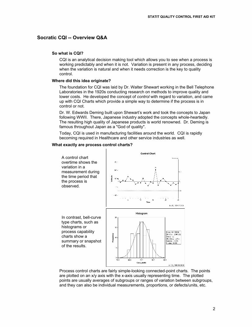
What exactly are process control charts? A control chart overtime shows the variation in a measurement during the time period that the process is observed.
In contrast, bell-curve type charts, such as histograms or process capability charts show a summary or snapshot of the results.
Process control charts are fairly simple-looking connected-point charts. The points are plotted on an x/y axis with the x-axis usually representing time. The plotted points are usually averages of subgroups or ranges of variation between subgroups, and they can also be individual measurements, proportions, or defects/units, etc.

STATIT QUALITY CONTROL FIRST AID KIT
3
Some additional horizontal lines representing the average measurement and control limits are drawn across the chart. Notes about the data points and any limit violations can also be displayed on the chart.
What is the purpose of control charts? Control charts are an essential tool of continuous quality control. Control charts monitor processes to show how the process is performing and how the process and capabilities are affected by changes to the process. This information is then used to make quality improvements. Control charts are also used to determine the capability of the process. They can help identify special or assignable causes for factors that impede peak performance.
How do they work? Control charts show if a process is in control or out of control. Shewhart [1931, p.6] defined control by saying:
…a phenomenon will be said to be controlled when, through the use of past experience, we can predict, at least within limits, how the phenomenon may be expected to vary in the future. Here it is understood that prediction within limits means that we can state, at least approximately, the probability that the observed phenomenon will fall within the given limits.
Control charts show the variance of the output of a process over time, such as the time it takes for a patient to see a doctor in the immediate care facility. Control charts compare this variance against upper and lower control limits to see if it fits within the expected, specific, predictable and normal variation levels. If so, the process is considered in control and the variance between measurements is considered normal random variation that is inherent in the process. If, however, the variance falls outside the limits, or has a run of non-natural points, the process is considered out of control.
What’s this relationship between variation and assignable causes? Variation is the key to CQI charts. The extent of variation in a process indicates whether a process is working predictably. When the variation between the points is large enough for the process to be out of control, the variation is determined to be due to non-natural or assignable (special) causes.
So how are these normal-predictable variance levels determined? One of the beauties of control charts is that the process itself determines the control limits. The process itself shows what can and can not be expected. The control limits are automatically calculated from the data produced by the process. These calculations are done painlessly by Statit’s software, no need to calculate them by hand. By definition control limits cannot be pre-assigned, they are a result of the process or the “voice of the process". Control limits are NOT specifications, corporate goals, or the “voice of the customer". These two concepts must never be confused. “Get real” might be a nice way of putting the concept of control limits vs. specification limits.
What about these rules violations for determining if a series of points within the control limits is unnatural? The work done by Shewart and his colleagues gave them a base of empirical knowledge on which to base Rules Violations. For example, six points in a row steadily increasing or decreasing. These have been codified and are contained in the AT&T Statistical Quality Control Handbook. Statit Software uses these time-tested and industry proven standards to automatically check for rules violations. Full

STATIT QUALITY CONTROL FIRST AID KIT
4
details of these rules are provided in Appendix 1: AT&T’s Statistical Quality Control Standards on page 35. They can also be found in the on-line help in Statit.
In control? Out of control? What’s the point? If a process is in control, the outcomes of the process can be accurately predicted. In an out of control process, there is no way of predicting whether the results will meet the target. An out of control process is like driving a bus in which the brakes may or may not work and you have no way of knowing! If a process is out of control, the next step is to look for the assignable causes for the process output, to look for the out-of-controlness. If this out-of-controlness is considered negative, such as patients waiting hours to see a doctor, the reasons for it are investigated and attempts are made to eliminate it. The process is continuously analyzed to see if the changes work to get the process back in control. On the other hand, sometimes the out-of-control outcomes are positive, such as patient wait time in the immediate care facility is abnormally short – immediate service! Then the assignable cause is sought and attempts are made to implement it at all times. If successful, the average wait time is lowered and a new phase of the process is begun. A new set of capabilities and control limits is then calculated for this phase.
What’s this about capabilities? A control chart shows the capabilities of a process that is in control. The outcomes of the process can be accurately predicted; you know what to expect from the process. Sometimes an organization’s requirements, specifications or goals are beyond what the process is actually capable of producing. In this case, either the process must be changed to bring the specifications within the control limits for individuals, or the specifications must be changed to match the capabilities of the process. Other activities are a waste of time, effort and money. For example, buying a lot of signs which say “Patient wait time is our top priority” or putting employees on probation for providing slow service serves no good.
Can any type of process data be judged using Control Charts? Processes that produce measurement data that exhibits natural or common-cause variation will form a distribution that looks like a bell-curve. For these types of processes, control charts should provide useful information. Measurement data may not be normally distributed due to the existence of special-cause variation. If the measurement data is not normally distributed, does not form a bell-curve, the process is already out of control so it is not predictable. In this case we must look for ways to bring the process into control. For example, the data may be too broad, using measurements from different work shifts that have different process outcomes. Every process, by definition, should display some regularity. Organizing the data collection into rational subgroups, each of which could be in control, is the first step to using control charts. However, process data may not be normally distributed due to its nature; a transformation must first be made before a control chart applies.

STATIT QUALITY CONTROL FIRST AID KIT
5
OK, I’m getting the idea these control charts are key to quality improvement. What specifically do they look like, what are their key features and how are they created?
There are a handful of control charts which are commonly used. They vary slightly depending on their data, but all have the same general fundamentals.
Control charts have four key features: 1) Measurement data points are either averages of subgroup measurements or
individual measurements plotted on the x/y axis and joined by a line. Time may be on the x-axis. However, sometimes control charts are used for “rational subgroups”, i.e. for profiling or comparing data from different sources.
2) The Average or Center Line is the average or mean of the data points and is drawn across the middle section of the graph, usually as a heavy or solid line.
3) The Upper Control Limit (UCL) is drawn above the center line and often annotated as "UCL". This is often called the “+ 3 sigma” line. This is explained in more detail in Control Limits on page 17.
4) The Lower Control Limit (LCL) is drawn below the center line and often annotated as "LCL". This is called the “- 3 sigma” line.
The x and y axes should be labeled and a title specified for the chart. OK, sounds good. How do I go about making these control charts?
In the past, creating control charts was a difficult process requiring statisticians and mathematicians to remember the formulas and actually calculate the various data points and control limits. Today, using Statit’s software and computers, the complicated part of the task is done quickly and accurately. We can concentrate instead on the problems, solutions and increasing levels of quality, rather than poring over formulas. The time saved allows us to get immediate feedback on a process and take corrective actions when necessary. Our march toward Continuous Quality Improvement has never been less complicated. Assuming measurements have been made and the data gathered, the next step is to open the data file, select the appropriate type of chart from the Statit menus, click the mouse and the chart is ready for inspection. Any out-of-control points have a letter over them. Click on the rule violation letter and a box is displayed describing the violation.
All right! When is the best time to start? NOW! The key to CQI is action! Rather than trying to discover the perfect methodology or data set, it is best to get started, to begin to truly effect quality

STATIT QUALITY CONTROL FIRST AID KIT
6
immediately! Adjustments will be needed as you go along; this is a big part of the cycle of quality. The cost of poor quality and non-conformance is great, in service industries it is estimated at 35%+ of gross revenue. Time, of course, is invaluable. Today, with the Statit Quality Control Healthcare Kit, you can begin working immediately on quality improvement.

STATIT QUALITY CONTROL FIRST AID KIT
7
Steps Involved In Using CQI Proper CQI starts with planning and data collection. Statistical analysis on the wrong or incorrect data is rubbish, the analysis must be appropriate for the data collected.
Be sure to PLAN, and then constantly re-evaluate your situation to make sure the plan is correct.
The key to any process improvement program is the PDSA cycle described by Walter Shewart.
Plan Collect data and establish a baseline – what is the current process doing now? Identify the problem and the possible causes. The QC tools described in this manual can help organizations identify problems and possible causes, and to prioritize corrective actions.
Do Make changes designed to correct or improve the situation.
Study Study the effect of these changes on the situation. Collect data on the new process and compare to the baseline. This is where control charts are used – they show the effects of changes on a process over time. Evaluate the results and then replicate the change or abandon it and try something different.
Act If the result is successful, standardize the changes and then work on further improvements or the next prioritized problem. If the outcome is not yet successful, look for other ways to change the process or identify different causes for the problem.
Control charting is one of a number of steps involved in CQI. The steps include discovery, analysis, prioritization, clarification, and then charting. Before using the Statit software, appropriate data must be collected for analysis. Then, you need to begin again and do it over and over and over. Remember, quality is a CYCLE of continuous improvement.
STATIT QUALITY CONTROL FIRST AID KIT
8
Specific CQI Tools and Procedures The preparatory phases of CQI involve several steps using a number of different tools. These tools are described below and most are available in Statit.
Eight quality tools are available to help organizations to better understand and improve their processes. The essential tools for the discovery process are:
Check Sheet
Cause-and-Effect Diagram
Flow Chart
Pareto Chart
Scatter Diagram
Probability Plot
Histogram
Control Charts
Brainstorming
Identification and Data gathering
When you set out to improve quality, the first thing to do is identify the processes that need improvement. This can be done using a number of methods such as surveys, focus groups or simply asking clients about their experiences. For example, perhaps patients at a clinic have been complaining to management about the allegedly increased times they are having to wait in the immediate care ward.
Once the problem areas are identified, a brainstorming session should occur with a variety of people who are involved with the processes. The target problems are decided upon and a list of possible causes is identified.
Prioritizing
After a number of possible problems are noted, the next step is to prioritize. The problems that are having the greatest effect are the highest priority items.
It has been “discovered” time and again that a great percentage of the trouble in nearly all processes is caused by a small percentage of the total factors involved. Service departments routinely find that 5% of the problems are taking over 80% of their time. Therefore, in order to maximize effectiveness, identify the key opportunities for improvement, those items that will provide the most benefit to your organization.
Pareto Charts
The Pareto chart can be used to display categories of problems graphically so they can be properly prioritized. The Pareto chart is named by Juran for a 19th century Italian economist who postulated that a small minority (20%) of the people owned a great proportion (80%) of the wealth in the land.
There are often many different aspects of a process or system that can be improved, such as the number of defective products, time allocation or cost savings. Each aspect usually contains many smaller problems, making it difficult to determine how to approach the issue. A Pareto chart or diagram indicates which problem to tackle first by showing

STATIT QUALITY CONTROL FIRST AID KIT
9
the proportion of the total problem that each of the smaller problems comprise. This is based on the Pareto principle: 20% of the sources cause 80% of the problem.
The Statit Count Pareto chart is a vertical bar graph displaying rank in descending rder of importance for the categories of problems, defects or opportunities. Generally, you gain more by working on the problem identified by the tallest bar than trying to deal with the smaller bars. However, you should ask yourself what item on the chart has the greatest impact on the goals of your business, because sometimes the most frequent problem as shown by the Pareto chart is not always the most important. CQI is a tool to be used by people with experience and common sense as their guide.
This is a Pareto chart of patient complaints from a customer satisfaction survey.
To create a Pareto chart:
• In Statit Express QC, click the Pareto chart button on the menu bar. • In Statit Custom QC, use the menu selection:
QC Attribute Charts Pareto Chart The dialogs lead you through the creation of the chart.
If you have any difficulties, open the Help file using the Help button on the Pareto Chart dialog, or select Help Contents and find “Pareto Chart” in the Index.

STATIT QUALITY CONTROL FIRST AID KIT
10
Analysis Of Selected Problem
Once a major problem has been selected, it needs to be analyzed for possible causes. Cause-and-effect diagrams scatter plots and flow charts can be used in this part of the process.
Cause-and-Effect or Fishbone Diagram
One analysis tool is the Cause-and-Effect or Fishbone diagram. These are also called Ishikawa diagrams because Kaoru Ishikawa developed them in 1943. They are called fishbone diagrams since they resemble one with the long spine and various connecting branches.
The fishbone diagram organizes and displays the relationships between different causes for the effect that is being examined. This chart helps organize the brainstorming process. The major categories of causes are put on major branches connecting to the backbone, and various sub-causes are attached to the branches. A tree-like structure results, showing the many facets of the problem.
The method for using this chart is to put the problem to be solved at the head, then fill in the major branches. People, procedures, equipment and materials are commonly identified causes.
This is another tool that can be used in focused brainstorming sessions to determine possible reasons for the target problem. The brainstorming team should be diverse and have experience in the problem area. A lot of good information can be discovered and displayed using this tool.
To create a Fishbone diagram: • In Statit Custom QC, use the menu selection:
QC Fishbone Diagram The dialogs lead you through the creation of the chart.
If you have any difficulties, open the Help file using the Help button on the Fishbone Diagram dialog, or select Help Contents and find “Fishbone Diagram” in the Index.

STATIT QUALITY CONTROL FIRST AID KIT
11
Flowcharting
After a process has been identified for improvement and given high priority, it should then be broken down into specific steps and put on paper in a flowchart. This procedure alone can uncover some of the reasons a process is not working correctly. Other problems and hidden traps are often uncovered when working through this process.
Flowcharting also breaks the process down into its many sub-processes. Analyzing each of these separately minimizes the number of factors that contribute to the variation in the process.
After creating the flowchart, you may want to take another look at the fishbone diagram and see if any other factors have been uncovered. If so, you may need to do another Pareto diagram as well. Quality Control is a continual process, in which factors and causes are constantly reviewed and changes made as required.
Flowcharts use a set of standard symbols to represent different actions: Circle / Oval
Beginning or end Square
A process, something being done
Diamond Yes / No decision

STATIT QUALITY CONTROL FIRST AID KIT
12
Scatter Plots
The Scatter plot is another problem analysis tool. Scatter plots are also called correlation charts.
A Scatter plot is used to uncover possible cause-and-effect relationships. It is constructed by plotting two variables against one another on a pair of axes. A Scatter plot cannot prove that one variable causes another, but it does show how a pair of variables is related and the strength of that relationship. Statistical tests quantify the degree of correlation between the variables.
In this example, there appears to be a relationship between height and weight. As the student gets taller, generally speaking they get heavier.
To create a Scatter plot: • In Statit Express QC, use the menu selection:
Graphs Scatter • In Statit Custom QC, use the menu selection:
Graphics Relationship Plots Scatterplot Matrix The dialogs lead you through the creation of the chart.
If you have any difficulties, open the Help file using the Help button on the Scatter Plot dialog, or select Help Contents and find “Scatter Plot” in the Index.

STATIT QUALITY CONTROL FIRST AID KIT
13
Data Gathering and Initial Charting
This is the time to begin gathering data related to the problem. The following tools will help with this task.
Check Sheets
Check sheets are simply charts for gathering data. When check sheets are designed clearly and cleanly, they assist in gathering accurate and pertinent data, and allow the data to be easily read and used. The design should make use of input from those who will actually be using the check sheets. This input can help make sure accurate data is collected and invites positive involvement from those who will be recording the data.
Check sheets can be kept electronically, simplifying the eventual input of the data into Statit. Statit can use data from all major spreadsheets, including Excel and Lotus 123, all major database programs and some other CQI software programs. Since most people have a spreadsheet program on their desktop PC, it might be easiest to design a check sheet in a spreadsheet format.
Check sheets should be easy to understand. The requirements for getting the data into an electronic format from paper should be clear and easy to implement.
Histograms
Now you can put the data from the check sheets into a histogram. A histogram is a snapshot of the variation of a product or the results of a process. It often forms the bell-shaped curve which is characteristic of a normal process.
The histogram helps you analyze what is going on in the process and helps show the capability of a process, whether the data is falling inside the bell-shaped curve and within specifications. See Process Capability Chart – cp on page 28 for more information.
A histogram displays a frequency distribution of the occurrence of the various measurements. The variable being measured is along the horizontal x-axis, and is grouped into a range of measurements. The frequency of occurrence of each measurement is charted along the vertical y-axis.
Histograms depict the central tendency or mean of the data, and its variation or spread. A histogram also shows the range of measurements, which aids in the process capability. A histogram can show characteristics of the process being measured, such as: • Do the results show a normal distribution, a bell curve? If not, why not? • Does the range of the data indicate that the process is capable of producing what is
required by the customer or the specifications? • How much improvement is necessary to meet specifications? Is this level of
improvement possible in the current process?

STATIT QUALITY CONTROL FIRST AID KIT
14
To create a Histogram: • In Statit Express QC, use the menu selection:
Graphs Histogram • In Statit Custom QC, use the menu selection:
Graphics Frequency Charts Histogram… The dialogs lead you through the creation of the chart.
If you have any difficulties, open the Help file using the Help button on the Histogram dialog, or select Help Contents and find “Histogram” in the Index.
Probability Plot
In order to use Control Charts, the data needs to approximate a normal distribution, to generally form the familiar bell-shaped curve.
The probability plot is a graph of the cumulative relative frequencies of the data, plotted on a normal probability scale. If the data is normal it forms a line that is fairly straight. The purpose of this plot is to show whether the data approximates a normal distribution. This can be an important assumption in many statistical analyses.

STATIT QUALITY CONTROL FIRST AID KIT
15
Although a probability plot is useful in analyzing data for normality (and it does a better job at this than does a histogram), it is particularly useful for determining how capable a process is when the data is not normally distributed. That is, we are interested in finding the limits within which most of the data fall.
Since the probability plot shows the percent of the data that falls below a given value, we can sketch the curve that best fits the data. We can then read the value that corresponds to 0.001 (0.1%) of the data. This is generally considered the lower natural limit. The value corresponding to 0.999 (99.9%) is generally considered the upper natural limit.
Note: To be more consistent with the natural limits for a normal distribution, some people choose 0.00135 and 0.99865 for the natural limits.
To create a Probability plot: • In Statit Express QC, use the menu selection:
Graphs Probability • In Statit Custom QC, use the menu selection:
Graphics Distribution Plots Probability… The dialogs lead you through the creation of the chart.
If you have any difficulties, open the Help file using the Help button on the Probability Plot dialog, or select Help Contents and find “Probability Plot” in the Index.
The next section discusses control charts, which are considered the heart and soul of CQI, and the main reason to use Statit. The different types of control charts are explained in the next section, along with a discussion of control chart fundamentals.
Control Charts
Fundamental Concepts and Key Terms
Whether making mom’s recipe for spaghetti sauce or admitting patients to the emergency room, the outcome of a process is never exactly the same every time. Fluctuation or variability is an inevitable component of all systems and is expected, arising naturally from the effects of miscellaneous chance events. However, variation outside a stable pattern may be an indication that the process is not acting in a consistent manner. Events which fall beyond expected variability or events forming a pattern that is not random, indicate that the process is out of control.
From a quality control perspective, an out-of-control service or production system is trouble! There is no way of predicting if it will or can meet customer specifications or achieve business goals.
There are two general ways of detecting that a process is out of control. The first test for an out-of-control process asks, "Is any point falling above or below the control limits on its control chart?" This particular test is very easy to perform by viewing the control chart. The second form of rule violations is based upon patterns of points on the control chart and can be difficult to detect.
For example, 4 of 5 successive points in zone B or above or 8 points on both sides of center with none in Zone C (see Zones in Control Charts on following page). Statit quickly and accurately performs these out-of-control tests, using predefined standard rule sets from AT&T’s Statistical Quality Control Handbook, the definitive source for rule violation standards. See Appendix 1: AT&T’s Statistical Quality Control Standards on page 35.

STATIT QUALITY CONTROL FIRST AID KIT
16
CQI charts graphically represent the variability in a process over time. When used to monitor the process, control charts can uncover inconsistencies and unnatural fluctuations. Consequently, CQI charts are used in many industries to improve quality and reduce costs.
Control charts typically display the limits that statistical variability can explain as normal, not normally distributed necessarily. If your process is performing within these limits, it is said to be in control; if not, it is out of control.
It is important to remember what you can conclude about a system that is in control: Control does not necessarily mean that a product or service is meeting your needs, it only means that the process is behaving consistently.
Rules Testing
How do you judge when a process is out of control? By plotting a control chart of the output of a process, it is possible to spot special or unnatural causes of variability and indications that the process is drifting. Drifting is defined by the mean or range of the variation changing as the process is running. The most common indication of change is a point falling outside of the control limits, but other tests for process instability are also valuable.
The rules used by Statit for control charts are based on rules described in AT&T's Statistical Quality Control Handbook and by Lloyd Nelson. Different rules are appropriate for variable data and attribute data. Consequently, the default rules used by Statit vary with the type of chart being produced. These rules can be found in Appendix 1: AT&T’s Statistical Quality Control Standards on page 35, as well as in Statit’s on-line help.
Zones in Control Charts
Many of the standard rules examine points based on Zones. The area between each control limit and the center line is divided into thirds. The third closest to the center line is referred to as Zone A, the next third is Zone B, and the third closest to the control limits is Zone C. Note that there are two of each of the Zones, one upper and one lower. See Control Limits on page 17 for more information.
Zone A is also referred to as the "3-sigma zone", Zone B is the "2-sigma zone", and Zone C is the "1-sigma zone". These sigma zone terms are appropriate only when 3-sigma is used for the control limits, as it is in Statit Express QC.
Sigma is the Greek letter for s and is used in this context to denote the spread of data.

STATIT QUALITY CONTROL FIRST AID KIT
17
Standard control limits are located 3 sigma away from the average or center line of the chart. These are called 3 sigma limits. The distance from the center line to the control limits can be divided into 3 equal parts of one sigma each.
Statistics tell us that in normal data dispersion, we can expect the following percentages of data to be included within the sigmas:
1 sigma – 68.3%
2 sigma – 95.5%
3 sigma – 99.7%
We can expect 99.7% of the process outcomes to be within the 3-sigma control limits if the data are normally distributed.
Control Limits
Control limits are calculated statistically from your data. They are referred to as the Lower Control Limit (LCL) and the Upper Control Limit (UCL) on a control chart. These are set at 3-sigma by default since this is the most commonly used limit.
Control limits define the zone where the observed data for a stable and consistent process occurs virtually all of the time (99.7%). Any fluctuations within these limits come from common causes inherent to the system, such as choice of equipment, scheduled maintenance or the precision of the operation that results from the design. These normal fluctuations are attributed to statistical variability.
An outcome beyond the control limits results from a special cause. Special causes are events external to the ordinary operation of a production or service. Special causes indicate that there have been one or more fundamental changes to the process and the process is out of control. Special causes need to be investigated and eliminated if they are detrimental before a control chart can be used as a quality-monitoring tool.
The automatic control limits for Express QC have been set at 3-sigma limits. Warning limits are set at 2-sigma by default, and they can also be displayed.

STATIT QUALITY CONTROL FIRST AID KIT
18
Subgroups
An important factor in preparing for CQI charting is determining if you will measure every product of the process, such as timing every patient’s wait time, or if you will use subgroups. Subgroups are a sample of data from the total possible data. Subgroups are used when it is impractical or too expensive to collect data on every single product or service in the process. Decisions to use subgroups or not needs to be carefully thought out to ensure they accurately represent the data.
Subgroups need to be homogenous within them so that special causes can be recognized, so problem areas stand out from the normal variation in the subgroup. For example, if you are in charge of analyzing processes in a number of affiliated hospitals, a separate group should represent each hospital, since each hospital has different processes for doing the same tasks. Each hospital subgroup should probably be broken down even further, for example by work shifts.
Subgroups in Variable Control Charts
All data in a subgroup has something in common, such as a common time of collection, all data for a particular date, a single shift, or a time of day.
Subgroup data can have other factors in common, such as data associated with a physician, or data associated with a particular volume of liquid. In Express QC, this is referred to as a Grouped subgroup and there is a categorical variable that holds the grouping category, for example, Physician_ID or Volume.
Subgroups in Attribute Control Charts
A subgroup is the group of units that were inspected to obtain the number of defects or the number of rejects. The number of defects is displayed using c charts and u charts. The number of rejects, also called defective items, is displayed using p charts and np charts.
Phases
In Express QC, phases can be used in a variable control chart to display how a process behaves in response to a change in a particular characteristic of the system. For example, outside factors can cause disruptions in the normal process, such as a construction project in a hospital that could cause additional in-patient falls.
Phase analysis can be helpful in identifying special causes of variation or trends. It is also useful when studying the impact of changes you make to your process, changes which you hope will be improvements.
Here is an example of a phase chart showing the changes that came about after new guidelines were established for shortening patient wait time. You can see how the horizontal lines representing the upper control limit, center line and lower control limit change with the new guidelines.

STATIT QUALITY CONTROL FIRST AID KIT
19
Sample Size
This is the number of cases making up the sample. The sample is a collection of observations used to analyze a system. In CQI applications, “Sample” is a synonym for “Subgroup”.
Rejects - Nonconforming Items Data Nonconforming items are rejects. A reject is tallied when an entire unit fails to meet acceptance standards, regardless of the number of defects in the unit. This includes defective products or unacceptable outcomes.
Defects - Nonconformities Data Nonconformities are defects. A non-conformity is any characteristic which should not be present but is, or a characteristic which needs to be present but is not. A defective item can have multiple non-conformities, for example, errors on insurance forms, errors in a medication, or service complaints.
Using Process Control Charts
OK, enough talk. Let's do some actual control charting. First you need to determine what data you have and select the correct chart for that data. Then make the chart and analyze it to see if the process is in control.
Data Definitions for Proper Chart Selection
Choosing the correct chart for a given a situation is the first step in every analysis. There are actually just a few charts to choose from, and determining the appropriate one requires following some fairly simple rules based on the underlying data. These rules are described in the flowchart below:

STATIT QUALITY CONTROL FIRST AID KIT
20
Control charts are divided into two groups: Variable Data
Variable charts are based on variable data that can be measured on a continuous scale. For example, weight, volume, temperature or length of stay. These can be measured to as many decimal places as necessary. Individual, average and range charts are used for variable data.
Attribute Data Attribute charts are based on data that can be grouped and counted as present or not. Attribute charts are also called count charts and attribute data is also known as discrete data. Attribute data is measured only with whole numbers. Examples include:
Acceptable vs. non-acceptable
Forms completed with errors vs. without errors
Number of prescriptions with errors vs. without
When constructing attribute control charts, a subgroup is the group of units that were inspected to obtain the number of defects or the number of defective items. Defect and reject charts are used for attribute data.

STATIT QUALITY CONTROL FIRST AID KIT
21
Types of Charts Available For The Data Gathered
Variable Data Charts – Individual, Average and Range Charts
Variable data requires the use of variable charts. Variable charts are easy to understand and use.
Individual Charts – I chart
The I chart is also referred to as an individual, item, i, or X chart. The X refers to a variable X.
Individual charts plot the process results varying over time. Individual observations are plotted on the I chart, averages are not plotted on this type of chart. Individual charts are used to plot variable data collected chronologically from a process, such as a patient’s temperature over time.

STATIT QUALITY CONTROL FIRST AID KIT
22
These charts are especially useful for identifying shifts in the process average. When monitoring a system, it is expected that equal numbers of points will fall above and below the average that is represented by the center line. Shifts or trends can indicate a change that needs to be investigated.
The individual control chart is reserved for situations in which only one measurement is performed each time the data is collected, where it is impractical or impossible to collect a sample of observations. When there are not enough data points to calculate valid control limits, an individual chart functions as a simple run chart.
To create an Individual chart: • In Statit Express QC, click on the “I” button on the menu bar. • In Statit Custom QC, use the menu selection:
QC Variable charts Individual Chart The dialogs lead you through the creation of the chart.
If you have any difficulties, open the Help file using the Help button on the Individual Chart dialog, or select Help Contents and find “Individual Chart” in the Index.
Average Charts – X-bar Chart
Average charts are made by simply taking the averages of a number of subgroups and plotting the averages on the chart. The average chart is called the X-bar chart because in statistical notation, a bar or line over the variable (X) symbolizes the average of X. “X-bar” is a shorthand way of saying “the average of X”.
An X-bar chart is a variable control chart that displays the changes in the average output of a process. The chart reflects either changes over time or changes associated with a categorical data variable. The chart shows how consistent and predictable a process is at achieving the mean.
X-bar charts measure variation between subgroups. They are often paired with either Standard Deviation (S) or Range (R) charts, which measure variation within subgroups. Definition: Variable Data Subgroups
All data in a subgroup has something in common, such as a common time of collection. For example, all data for a particular date, a single shift, or a time of day. Subgroup data can have other factors in common, such as data associated with a physician, or data associated with a particular volume of liquid. In Express QC, this is referred to as a Grouped subgroup and there is a categorical variable that holds the grouping category. For example, Physician_ID or Volume.

STATIT QUALITY CONTROL FIRST AID KIT
23
To create an X-bar chart: • In Statit Express QC, click on the “X-bar” (a bar over the X) button on the menu bar. • n Statit Custom QC, use the menu selection:
QC Variable charts X-bar Chart The dialogs lead you through the creation of the chart.
If you have any difficulties, open the Help file using the Help button on the X-bar Chart dialog, or select Help Contents and find “X-bar Chart” in the Index.
Range Chart – R-Chart
The Range chart can be combined with I and X-bar charts. The chart names combine the corresponding chart initials.
Range charts measure the variation in the data. An example is the weather report in the newspaper that gives the high and low temperatures each day. The difference between the high and the low is the range for that day.
To create a Moving Range chart: • In Statit Express QC, this is always combined with the X-bar or I chart. • In Statit Custom QC:
Select: QC Variable charts R Chart The dialogs lead you through the creation of the charts.

STATIT QUALITY CONTROL FIRST AID KIT
24
If you have any difficulties, open the Help file using the Help button on the R Chart dialog, or select Help Contents and find "R Chart" in the Index.
Moving Range Chart – MR Chart
This type of chart displays the moving range of successive observations. A moving range chart can be used when it is impossible or impractical to collect more than a single data point for each subgroup.
This chart can be paired with an individual chart, which is then called an Individual Moving Range (IR) chart. An individual chart is used to highlight the changes in a variable from a central value, the mean. The moving range chart displays variability among measurements based on the difference between one data point and the next.
To create a Moving Range chart: • In Statit Express QC, click on the “MR” button on the menu bar. • In Statit Custom QC, use the menu selection:
QC Variable charts Moving Range Chart The dialogs lead you through the creation of the chart.
If you have any difficulties, open the Help file using the Help button on the Moving Range Chart dialog, or select Help Contents and find “Moving Range Chart” in the Index.

STATIT QUALITY CONTROL FIRST AID KIT
25
Combination Charts
Individual and Moving Range Charts – IR Charts
This pair of variable control charts is often offered together for quality control analysis. The Individual chart, the upper chart in the figure below, displays changes the process output over time in relation to the center line which represents the mean. The Moving Range chart, the lower chart in the figure below, analyzes the variation between consecutive observations, which is a measure of process variability.
To create an Individual/Moving Range chart: • In Statit Express QC click on the “IR” button on the menu bar. • In Statit Custom QC:
Select: QC Variable charts Individual Chart In the Multiple Charts sub dialog, select Top of a double chart Select: QC Variable charts Moving Range Chart In the Multiple Charts sub dialog, select Bottom of a double chart The dialogs lead you through the creation of the charts.
If you have any difficulties, open the Help file using the Help button on the Individual Chart or Moving Range Chart dialog, or select Help Contents and find “Individual Chart” or "Moving Range Chart" in the Index.

STATIT QUALITY CONTROL FIRST AID KIT
26
Average & Range Charts – X-Bar and R Charts
Variable and Range control charts are often displayed together for quality control analysis. The X-bar chart, the upper chart in the figure below, is a graphic representation of the variation among the subgroup averages, the R chart, the lower chart in the figure below, looks at variability within these subgroups.
The variation within subgroups is represented by the range (R). The range of values for each subgroup is plotted on the Y-axis of the R chart. The center line is the average or mean of the range.
To create an X-bar/Range chart: • In Statit Express QC click on the “X-bar R” button on the menu bar. • In Statit Custom QC:
Select: QC Variable charts X-bar Chart In the Multiple Charts sub dialog, select Top of a double chart Select: QC Variable charts R Chart In the Multiple Charts sub dialog, select Bottom of a double chart The dialogs lead you through the creation of the charts.
If you have any difficulties, open the Help file using the Help button on the X-bar Chart or R Chart dialog, or select Help Contents and find “X-bar Chart” or "R Chart" in the Index.

STATIT QUALITY CONTROL FIRST AID KIT
27
X-Bar Standard Deviation Charts – X-Bar and S Charts
This pair of variable control charts is often displayed together for quality control analysis. The X-bar chart, the upper chart in the figure below, displays the variation in the means between the subgroups. The s chart, the lower chart in the figure below, looks at variability within these subgroups.
In this pair of charts, the variation within subgroups is represented by the standard deviation. The standard deviation is plotted on the y-axis, and is a measure of the spread of values for each subgroup. The center line is the average or mean of these sub-group standard deviations.
To create an X-bar/s chart: • In Statit Express QC click on the “X-bar S” button on the menu bar. • In Statit Custom QC:
Select: QC Variable charts X-bar Chart (Be sure you select “based on std. Dev” under the Control Limits sub dialog box) In the Multiple Charts sub dialog, select Top of a double chart Select: QC Variable charts s Chart In the Multiple Charts sub dialog, select Bottom of a double chart The dialogs lead you through the creation of the charts.
If you have any difficulties, open the Help file using the Help button on the X-bar Chart or s Chart dialog, or select Help Contents and find “X-bar Chart” or "s Chart" in the Index.
Range vs. Standard Deviation
In Statit you can choose to use a standard deviation chart, the s-chart, instead of the Range chart. The Range chart is often used because the standard deviation is a more accurate and a more difficult measurement. Now that computers are automatically calculating the standard deviation, the s-chart can be used in all situations. This is called the X-bar S chart.
A standard deviation formula is used to calculate the differences in the data. This calculation can be used in cases where the sub-group sample size is large and sampling methods support the modeling of the data as normal distribution.

STATIT QUALITY CONTROL FIRST AID KIT
28
Process Capability Chart – cp Chart
Process capability analysis is used to adjust the process until virtually all of the product output meets the specifications. Once the process is operating in control, capability analysis attempts to answer the question: Is the output meeting specifications, or is the process capable? If it is not, can the process be adjusted to make it capable?
The process capability chart contains a normal curve superimposed over a histogram of the data, followed by several statistics. A process is said to be capable if its output falls within the specifications virtually 100% of the time.
Note: Specification Limits are the boundaries, or tolerances, set by management, engineers or customers which are based on product requirements or service objectives. Specification Limits are NOT established by the process itself, and may not even be possible within the given process.
One goal of CQI is to determine if specifications are in fact possible in the current process. If the following statements are true, a process capability chart can be an appropriate tool for measuring the inherent reproducibility of the process and monitoring the degree to which it can meet specifications: • The process is stable and in control. • The data are normally distributed. • Specification limits fall on either side of the center line. • You are investigating whether your process is capable of meeting specifications.
To create a Process Capability chart:
• In Statit Express QC click on the Process Capability (cp) button on the menu bar.
• In Statit Custom QC: Select: QC Variable charts Process Capability Chart The dialogs lead you through the creation of the charts.
If you have any difficulties, open the Help file using the Help button on the Process Capability Chart dialog, or select Help Contents and find “Process Capability Chart” in the Index.
STATIT QUALITY CONTROL FIRST AID KIT
29
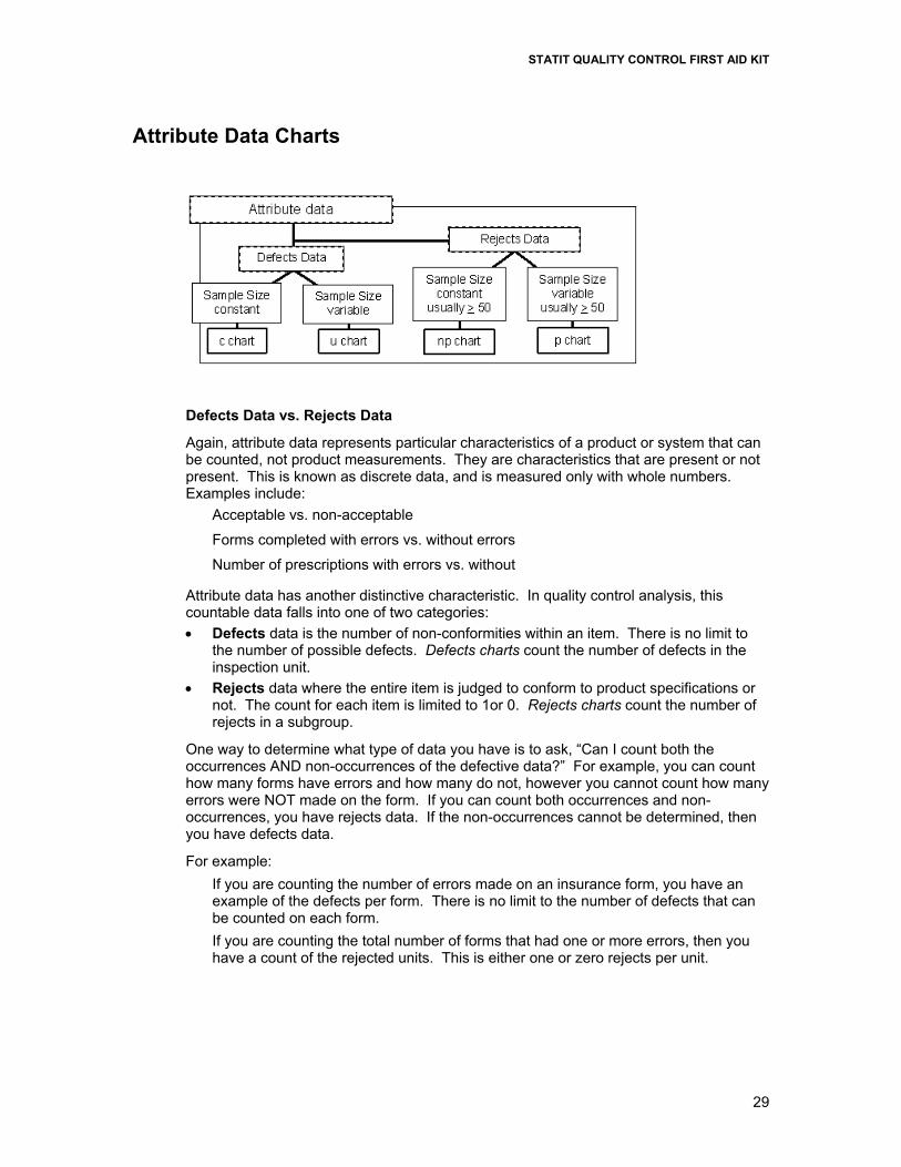
Attribute Data Charts
Defects Data vs. Rejects Data Again, attribute data represents particular characteristics of a product or system that can be counted, not product measurements. They are characteristics that are present or not present. This is known as discrete data, and is measured only with whole numbers. Examples include:
Acceptable vs. non-acceptable
Forms completed with errors vs. without errors
Number of prescriptions with errors vs. without
Attribute data has another distinctive characteristic. In quality control analysis, this countable data falls into one of two categories: • Defects data is the number of non-conformities within an item. There is no limit to
the number of possible defects. Defects charts count the number of defects in the inspection unit.
• Rejects data where the entire item is judged to conform to product specifications or not. The count for each item is limited to 1or 0. Rejects charts count the number of rejects in a subgroup.
One way to determine what type of data you have is to ask, “Can I count both the occurrences AND non-occurrences of the defective data?” For example, you can count how many forms have errors and how many do not, however you cannot count how many errors were NOT made on the form. If you can count both occurrences and non-occurrences, you have rejects data. If the non-occurrences cannot be determined, then you have defects data.
For example: If you are counting the number of errors made on an insurance form, you have an example of the defects per form. There is no limit to the number of defects that can be counted on each form. If you are counting the total number of forms that had one or more errors, then you have a count of the rejected units. This is either one or zero rejects per unit.

STATIT QUALITY CONTROL FIRST AID KIT
30
Summary of Defects Vs. Rejects Data Defects charts
Attribute charts for cases in which the possible occurrences are infinite or cannot be counted. They count the number of non-conformities within an item.
Rejects charts Attribute Data charts for the cases in which rejected whole units are counted. These figures can be described as proportions instead of just counts.
Subgroup Size – Constant or Changing?
Subgroup size is another important data characteristic to consider in selecting the right type of chart. When constructing attribute control charts, a subgroup is the group of units that were inspected to obtain the number of defects or the number of rejects.
To choose the correct chart, you need to determine if the subgroup size is constant or not. If constant, for example 300 forms are processed every day, then you can look at a straight count of the defective occurrences. If the subgroup size changes, you need to look at the proportion or fraction of defective occurrences.
For example: A hospital may have a day in which 500 insurance forms are processed and 50 have errors vs. another day in which only 150 are processed and 20 have errors. If we only look at the count of errors, 50 vs. 20, we would assume the 50 error day was worse. But when considering the total size of the subgroup, 500 vs. 150, we determine that on the first day 10% had errors while the other day 13.3% had errors.
Now that we understand the different types of attribute data, let’s move on to the specific charts for analyzing them.
Attribute Charts – Defects and Rejects Charts
There are four different types of attribute charts. For each type of attribute data, defects and rejects, there is a chart for subgroups of constant size and one for subgroups of varying size.
Remember: Defects Charts count the number of defects within the inspection unit.
Rejects Charts count the number of rejected units in a subgroup.
Defects Charts
The two defects charts are the c chart and the u chart. The c refers to count of defects in a subgroup of constant size. The u is a per unit count within a variable size subgroup.
A mnemonic to help you remember that the c chart represents Defects data is to think back to your school days and the C grade you got in a class when the number of defects or errors within one test exceeded the threshold. Another way to remember which subgroup type goes with which chart is that c is for “constant” and u is for “un-constant”.
c Chart – Constant Subgroup Size
A c chart, or Count chart, is an attribute control chart that displays how the number of defects, or nonconformities, for a process or system is changing over time. The number

STATIT QUALITY CONTROL FIRST AID KIT
31
of defects is collected for the same area of opportunity in each subgroup. The area of opportunity can be either a group of units or just one individual unit on which defect counts are performed. The c chart is an indicator of the consistency and predictability of the level of defects in the process.
When constructing a c chart, it is important that the area of opportunity for a defect be constant from subgroup to subgroup since the chart shows the total number of defects. When the number of items tested within a subgroup changes, then a u chart should be used, since it shows the number of defects per unit rather than total defects.
To create a C chart: • In Statit Express QC click on the “c” button on the menu bar. • In Statit Custom QC:
Select: QC Attribute charts C Chart The dialogs lead you through the creation of the charts.
If you have any difficulties, open the Help file using the Help button on the C Chart dialog, or select Help Contents and find “C Chart” in the Index.
u Chart – Varying Subgroup Size
A u chart (u is for Unit) is an attribute control chart that displays how the frequency of defects, or nonconformities, is changing over time for a process or system. The number of defects is collected for the area of opportunity in each subgroup. The area of opportunity can be either a group of items or just one individual item on which defect counts are performed. The u chart is an indicator of the consistency and predictability of the level of defects in the process.
A u chart is appropriate when the area of opportunity for a defect varies from subgroup to subgroup. This can be seen in the shifting UCL and LCL lines that depend on the size of the subgroup. This chart shows the number of defects per unit. When the number of items tested remains the same among all the subgroups, then a c chart could be used since a c chart analyzes total defects rather than the number of defects per unit.

STATIT QUALITY CONTROL FIRST AID KIT
32
To create a U chart: • In Statit Express QC click on the “u” button on the menu bar. • In Statit Custom QC:
Select: QC Attribute charts U Chart The dialogs lead you through the creation of the charts.
If you have any difficulties, open the Help file using the Help button on the U Chart dialog, or select Help Contents and find “U Chart” in the Index.
Rejects Charts
The two types of Rejects charts are the p chart and the np chart. The name of the p chart stands for the Percentage or Proportion of rejects in a subgroup. The name of the np chart stands for the Number of rejects within a p-type chart. You can also remember it as “not percentage” or “not proportional”.
A mnemonic to remember that the p chart and its partner the np chart represents Rejects data is to think of P as a “pea” and a canning plant which is rejecting cans of peas if they are not 100% acceptable. As p and np are a team, you should be able to recall this with the same story.
np Chart – Number of Rejects Chart for Constant Subgroup Size
An np chart is an attribute control chart that displays changes in the number of defective products, rejects or unacceptable outcomes. It is an indicator of the consistency and predictability of the level of defects in the process.
The np chart is only valid as long as your data are collected in subgroups that are the same size. When you have a variable subgroup size, a p chart should be used.

STATIT QUALITY CONTROL FIRST AID KIT
33
To create an NP chart: • In Statit Express QC click on the “np” button on the menu bar. • In Statit Custom QC:
Select: QC Attribute charts NP Chart The dialogs lead you through the creation of the charts.
If you have any difficulties, open the Help file using the Help button on the NP Chart dialog, or select Help Contents and find “NP Chart” in the Index.
p Chart – Percentage Chart for Varying Subgroup Size
A p chart is an attribute control chart that displays changes in the percentage or proportion of defective products, rejects or unacceptable outcomes. It is an indicator of the consistency and predictability of the level of defects in the process.
Since a p chart is used when the subgroup size varies, the chart plots the proportion or fraction of items rejected, rather than the number rejected. This is indicated by the shifting UCL and LCL lines that depend on the size of the subgroup. For each subgroup, the proportion rejected is calculated as the number of rejects divided by the number of items inspected. When you have a constant subgroup size, use an np chart instead.

STATIT QUALITY CONTROL FIRST AID KIT
34
To create a P chart: • In Statit Express QC click on the “p” button on the menu bar. • In Statit Custom QC:
Select: QC Attribute charts P Chart The dialogs lead you through the creation of the charts.
If you have any difficulties, open the Help file using the Help button on the P Chart dialog, or select Help Contents and find “P Chart” in the Index.
Conclusion – Time to put it all together… You now have the basic fundamentals of CQI. You should understand that it measures variability in a process, and is used to determine if a process is in control. You should understand the different steps necessary in performing CQI, including problem identification, data gathering, prioritization and analysis. You should understand the key concepts and vocabulary for using CQI charts. Finally you should understand the different types of data and be able to select which control chart to use, depending on the data you have gathered.

STATIT QUALITY CONTROL FIRST AID KIT
35
Appendix 1: AT&T’s Statistical Quality Control Standards The rules for:
X-bar charts
Individual charts
Median charts
R charts when the minimum subgroup size is at least 4
a) 1 point above Upper Spec
b) 1 point below Lower Spec
A) 1 point above Zone A
B) 1 point below Zone A
C) 2 of 3 successive points in upper Zone A or beyond
D) 2 of 3 successive points in lower Zone A or beyond
E) 4 of 5 successive points in upper Zone B or beyond
F) 4 of 5 successive points in lower Zone B or beyond
G) 8 points in a row above center line
H) 8 points in a row below center line
I) 15 points in a row in Zone C (above and below center)
J) 8 points on both sides of center with 0 in Zone C
K) 14 points in a row alternating up and down
L) 6 points in a row steadily increasing or decreasing
The rules for: R charts when the minimum subgroup size is less than 4
a) 1 point above Upper Spec
b) 1 point below Lower Spec
A) 1 point above Zone A
B) 2 successive points in or above upper Zone A
C) 3 successive points in or above upper Zone B
D) 7 successive points in or above upper Zone C
E) 10 successive points in or below lower Zone C
F) 6 successive points in or below lower Zone B
G) 4 successive points in lower Zone A

STATIT QUALITY CONTROL FIRST AID KIT
36
The rules for: s charts
Moving Average charts
Moving Range charts
a) 1 point above Upper Spec
b) 1 point below Lower Spec
A) 1 point above Zone A
B) 1 point below Zone A
The rules for: p charts
np charts
c charts
u charts
a) 1 point above Upper Spec
b) 1 point below Lower Spec
A) 1 point above Zone A
B) 1 point below Zone A
C) 9 points in a row above center line
D) 9 points in a row below center line
E) 6 points in a row steadily increasing or decreasing
F) 14 points in a row alternating up and down

STATIT QUALITY CONTROL FIRST AID KIT
37
Glossary Accuracy Accuracy of measurements refers to the closeness of
agreement between observed values and a known reference standard. Any offset from the known standard is called bias.
Attribute data Qualitative data that can be counted for recording and analysis. Examples include: number of defects, number of errors in a document; number of rejected items in a sample, presence of paint flaws. Attributes data are analyzed using the p-, np-, c- and u-charts.
Average See mean. Average Run Length (ARL)
The average or expected number of points that must be plotted on a control chart before the chart signals an out-of-control condition.
Bias The offset of a measured value from the true population value.
Binomial Distribution
A discrete probability distribution used for counting the number of successes and failures, or conforming and nonconforming units. This distribution underlies the p-chart and the np-chart.
Box and Whisker Plot
A graphical display of data that shows the median and upper and lower quartiles, along with extreme points and any outliers.
Capability The amount of variation inherent in a stable process. Capability can be determined using data from control charts and histograms and is often quantified using the Cp and Cpk indices.
Cause-and-Effect Diagram
A quality control tool used to analyze potential causes of problems in a product or process. It is also called a fishbone diagram or an Ishikawa diagram after its developer.
c-Chart A control chart based on counting the number of defects per constant size subgroup. Also known as a Count of Nonconformities chart. The c-chart is based on the Poisson distribution.
Center Line (CL) The line on the control chart that represents the long-run expected or average value of the quality characteristic.
Central Limit Theorem
An important statistical theorem that states that subgroup averages tend to be normally distributed even if the output as a whole is not. This allows control charts to be widely used for process control, even if the underlying process is not normally distributed.
Common Causes Problems with the system itself that are always present, influencing all of the production until found and removed. These are “common” to all manufacturing or production output. Also called chance causes, system causes or chronic problems. Common causes contrast to special causes.
Continuous Improvement
The ongoing improvement of products, services, or processes through incremental and breakthrough improvements.

STATIT QUALITY CONTROL FIRST AID KIT
38
Control Chart A graphical mechanism for deciding whether the underlying
process has changed based on sample data from the process. Control charts help determine which causes are “special” and thus should be investigated for possible correction. Control charts contain the plotted values of some statistical measure for a series of samples or subgroups, along with the upper and lower control limits for the process.
Control Limits Statistically calculated control chart lines which indicate how the process is behaving and whether the process is in control. There is typically an upper control limit (UCL) and a lower control limit (LCL). If the process is in control and only common causes are present, nearly all of the sample points fall within the control limits.
Correlation A measure of the linear relation between two variables. If both variables grow larger (or smaller) together, it is called positive correlation. If one variable becomes smaller as the other grows larger, it is called negative correlation.
Count Data See attribute data. Cp
A measure of the capability of a process to produce output within the specifications. The measurement is made without regard to the centering of the process.
USL LSL
6p
C−
=σ
Where σ is estimated from a within-subgroup estimate. Cpk A measure of the capability of the process to produce
output within the specifications. The centering of the process is taken into consideration by looking at the minimum of the upper specification limit capability ( puC (USL ) 3x= − σ ) and the lower specification limit
capability ( plC ( LSL) 3x= − σ ); Cpk = min(Cpu, Cpl). Where σ is estimated from a within-subgroup estimate.
CUSUM A control chart designed to detect small process shifts by looking at the CUmulative SUMs of the deviations of successive samples from a target value.
Design of Experiments
A branch of applied statistics dealing with planning, conducting, analyzing, and interpreting controlled tests which are used to identify and evaluate the factors that control a value of a parameter of interest.
Distribution A mathematical model that relates the value of a variable with the probability of the occurrence of that value in the population.
EWMA charts An Exponentially Weighted Moving Average control chart that uses current and historical data to detect small changes in the process. Typically, the most recent data is given the most weight, and progressively smaller weights are given to older data.
Histogram A graph of the observed frequencies versus each value or range of values for a set of data. A histogram provides a graphical summary of the variation in the data.

STATIT QUALITY CONTROL FIRST AID KIT
39
Hypothesis Testing A procedure that is used on a sample from a population to investigate the applicability of an assertion (inference) to the entire population. Hypothesis testing can also be used to test assertions about multiple populations using multiple samples.
In-Control Process A process in which the quality characteristic being evaluated is in a state of statistical control. This means that the variation among the observed samples can all be attributed to common causes, and that no special causes are influencing the process.
Individual A single unit or a single measurement of a quality characteristic, usually denoted as X. This measurement is analyzed using an individuals chart, CUSUM or EWMA chart.
Individuals Chart A control chart for processes in which individual measurements of the process are plotted for analysis. Also called an I-chart or X-chart.
Mean A measure of the location or center of data. Also called the average. The mean is calculated by summing all of the observations and dividing by the number of observations.
1 1 2Sample mean
n
i
i n
xx x x
xn n
=+ + +
= = =∑ L
Median The “middle” value of a group of observations, or the average of the two middle values. The median is denoted by x tilde ( X%).
Mixing A generally improper sampling technique that arises in practice when the output from several processes is first thoroughly mixed and then random samples are drawn from the mixture. This may increase the sample variability and make the control chart less sensitive to process changes. This action violates the fundamental rule of rational sampling.
Mode The observation that occurs most frequently in a sample. The data can have no mode, be unimodal, bimodal, etc.
Moving Range A measure used to help calculate the variance of a population based on differences in consecutive data. Two consecutive individual data values are compared and the absolute value of their difference is recorded on the moving range chart. The moving range chart is typically used with an Individuals (X) chart for single measurements.
Nonconforming Unit
A unit with one or more nonconformities or defects. Also called a reject.
Nonconformity A specified requirement that is not fulfilled, such as a blemish, defect or imperfection.
Normal Distribution A continuous, symmetrical, bell-shaped frequency distribution for variables data that is the basis for control charts for variables, such as x-bar and individuals charts. For normally distributed values, 99.73% of the population lies within ± 3 standard deviations of the mean. According to the Central Limit Theorem, subgroup averages tend to be normally distributed even if the output as a whole is not.
STATIT QUALITY CONTROL FIRST AID KIT
40
np-Chart A control chart based on counting the number of defective units in each constant size subgroup. The np-chart is based on the binomial distribution.
Outliers Unusually large or small observations relative to the rest of the data.
Overcontrol An element often introduced into a process by a well-meaning operator or controller who considers any appreciable deviation from the target value as a special cause. In this case, the operator is wrongly viewing common-cause variation as a fault in the process. Overcontrol of a process can actually increase the variability of the process and is viewed as a form of tampering.
Pareto Chart A problem-solving tool that involves ranking all potential problem areas or sources of variation according to their contribution to cost or total variation. Typically, 80% of the effects come from 20% of the possible causes, so efforts are best spent on these “vital few” causes, temporarily ignoring the “trivial many” causes.
p-Chart A control chart based on the proportion of nonconforming units per subgroup. The p-chart is based on the binomial distribution.
PDCA The Plan-Do-Check-Act cycle is a four-step process for quality improvement. Plan: A plan for improvement is developed. Do: Experiments are initiated to test the feasibility of the
plan, or the plan is carried out. Check (or Study): The effects of the plan are observed. Act: The results are studied to see what was learned and
what can be predicted. If the result of the experiment was an increase in quality, it is made standard operating procedure. If quality decreased
The cycle continues until the desired improvement is realized.
Percentiles Percentiles divide the ordered data into 100 equal groups. The kth percentile pk is a value such that at least k% of the observations are at or below this value and (100-k)% of the observations are at or above this value.
Poisson Distribution
A probability distribution used to count the number of occurrences of relatively rare events. The Poisson distribution is used in constructing the c-chart and the u-chart.
Precision Precision of measurements refers to their long-run variation (s2). It is a measure of the closeness between several individual readings.
Process Capability A measure of the ability of a process to produce output that meets the process specifications.
Quartile Quartiles divide the ordered data into 4 equal groups. The second quartile (Q2) is the median of the data.
Random Sampling A subset of the population chosen such that each member of the population has an equal probability of being included in the sample.
Range A measure of the spread of the data, calculated as highest value minus lowest value. Range = R = xmax – xmin

STATIT QUALITY CONTROL FIRST AID KIT
41
Rational Subgroups
A principle of sampling which states that the variation between subgroups or samples should be solely attributable to the common causes in the system rather than the sampling method. Rational subgroups are usually chosen so that the variation represented within each subgroup is as small as feasible for the process, so that any changes in the process, or special causes, appear as differences between subgroups. Rational subgroups are typically made up of consecutive pieces, although random samples are sometimes used.
R-Chart A control chart based on the range (R) of a subgroup, typically used in conjunction with an x-bar chart.
Run A consecutive number of points consistently increasing or decreasing, or above or below the center line. A run can be evidence of the existence of special causes of variation that should be investigated.
Runs Chart A simple graphic representation of a characteristic of a process which shows plotted values of some statistic gathered from the process. The graphic can be analyzed for trends or other unusual patterns.
S-Chart A control chart based on the standard deviation, s, of a subgroup. The s-chart is typically used in conjunction with an x-bar chart.
Sample A subset of data from a population that can be analyzed to make inferences about the entire population.
Sampling Distribution
The probability distribution of a statistic. Common sampling distributions include t, chi-square (χ2) and F.
Scatter Plots A graphical technique used to visually analyze the relationship between two variables. Two sets of data are plotted on a graph, with the y-axis being used for the variable to be predicted and the x-axis being used for the variable to make the prediction.
Sensitizing Rules Control chart interpretation rules that are designed to increase the responsiveness of a control chart to out-of-control conditions by looking for patterns of points that would rarely happen if the process has not changed.
Short-run Techniques
Adaptations made to control charts to help determine meaningful control limits in situations when only a limited number of parts are produced or when a limited number of services are performed. Short-run techniques usually look at the deviation of a quality characteristic from a target value.
Six Sigma A high-performance, data-driven approach to analyzing the root causes of business problems and solving them. Six-sigma techniques were championed by Motorola.
Skewness The tendency of the data distribution to be non-symmetrical. Negative skewness denotes more small observations, while positive skewness denotes more large observations. Skewed data may affect the validity of control charts and other statistical tests based on the normal distribution.

STATIT QUALITY CONTROL FIRST AID KIT
42
Special Causes Causes of variation which arise periodically in a somewhat unpredictable fashion. Also called assignable causes, local faults, or sporadic problems. Contrast to common causes. The presence of special causes indicates an out-of-control process.
Specification The written or engineering requirements for judging the acceptability of the output of a process.
Spread The amount of variability in a sample or population. Stability A process is considered stable if it is free from the
influences of special causes. A stable process is said to be in control.
Standard Deviation A measure of the spread of a set of data from its mean, abbreviated:
σ for a population
s for a sample The standard deviation is the square root of the variance.
Statistic A value calculated from or based on sample data which is used to make inferences about the population from which the sample came. Sample mean, median, range, variance and standard deviation are commonly calculated statistics.
Statistical Control The condition describing a process from which all special causes of variation have been removed and only common causes remain.
Continuous Quality Improvement (CQI)
A collection of problem solving tools useful in achieving process stability and improving capability through the reduction of variability. CQI includes using control charts to analyze a process to identify appropriate actions that can be taken to achieve and maintain a state of statistical control and to improve the capability of the process.
Statistical Quality Control (SQC)
Another name commonly used to describe CQI techniques or acceptance sampling.
Stratified Sampling Stratification arises in practice when samples are collected by drawing from each of several processes, for example machines, filling heads or spindles. Stratified sampling can increase the variability of the sample data and make the resulting control chart less sensitive to changes in the process.
Subgroup Another name for a sample from the population. Tampering An action taken to compensate for variation within the
control limits of a stable system. Tampering increases rather than decreases variation, as in the case of over control.
Type I Error Occurs when a true hypothesis about the population is incorrectly rejected. Also called false alarm. The probability of a Type I error occurring is designated by α.
Type II Error Occurs when a false hypothesis about the population is incorrectly accepted. Also called lack of alarm. The probability of a Type II error occurring is designated by β.
u-Chart A control chart based on counting the number of nonconformities or defects per inspection unit. The u-chart is based on the Poisson distribution.

STATIT QUALITY CONTROL FIRST AID KIT
43
Variables Data Data values which are measurements of some quality or characteristic of the process. The data values are used to construct the control charts. This qualitative data is used for the x-bar, R-, s- and individuals charts, as well as the CUSUM and moving range charts.
Variance A measure of the spread of a set of data from its mean, abbreviated:
σ2 for a population
s2 for a sample 2
22 1
2 1 1
( )Sample Variance =
1 1
n
in ni
i ii i
xx x x
nsn n
=
= =
− −
= =− −
∑
∑ ∑
Variation The differences among individual results or output of a
machine or process. Variation is classified in two ways: variation due to common causes and variation due to special causes.
X-Chart A control chart used for process in which individual measurements of the process are plotted for analysis. Also called an individuals chart or I-chart.
X-bar ( X ) Chart A control chart used for processes in which the averages of subgroups of process data are plotted for analysis.

STATIT QUALITY CONTROL FIRST AID KIT
44
Bibliography
Nelson, Lloyd S. (1985), "Interpreting Shewhart X Control Charts", Journal of Quality Technology, 17:114-16.
Shewart, Walter A. (1931), “Economic Control of Quality of Manufactured Product”, Princeton, NJ: Van Nostrand Reinhold Co. (Republished in 1981 by the American Society for Quality Control, Milwaukee, WI).
Steel, R. G. D. and J. H. Torrie (1980), Principles and Procedures of Statistics. New York: McGraw-Hill.
Western Electric Company (1956), Statistical Quality Control Handbook, available from ATT Technologies, Commercial Sales Clerk, Select Code 700-444, P.O. Box 19901, Indianapolis, IN 46219, 1-800-432-6600.
URLs Statit Software
www.statit.com