consumer choice of health plan decision support rules for
TRANSCRIPT

Consumer Choice of Health Plan
Decision Support Rules for Health Exchanges
Installments I, II and III
A PBGH publication in an ongoing series focused on improving value via health exchanges

221 MAIN STREET, SUITE 1500SAN FRANCISCO, CA 94105PBGH.ORG
OFFICE 415.281.8660FACSIMILE 415.520.0927
November 30, 2012
Dear Colleague,
With the arrival of the insurance exchanges, an estimated 22 million people will have the opportunity to choose their coverage through an exchange. Many of these consumers could make the “wrong” plan choice, selecting a plan that doesn’t meet their health care needs or is not a good value for them. Exchange leaders have a critical role to play in supporting consumers in their search for high quality, affordable options that best meet their individual needs.
Through the Helping Vulnerable Consumers in the Exchange Project, the Pacific Business Group on Health (PBGH) has created plan choice decision support rules that exchanges can use to build their consumer choice software rules. These rules are largely based on plan choice research performed at PBGH with support from researchers at Columbia, Penn, and Stanford Universities.
This document contains all three installments of consumer plan choice business rules. This report is designed for staff at the exchanges who are responsible for the plan choice technical requirements and, more broadly, for those who are helping to shape consumers’ choice experiences.
For additional details about the information required of health plans to support consumers in making plan choices please download a companion excel document located at www.pbgh.org.
If you would like additional information, please don’t hesitate to contact Ted von Glahn, Senior Director, at [email protected].
Sincerely,
Ted von Glahn Senior Director Pacific Business Group on Health

1November 30, 2012 | Pacific Business Group on Health
INTRODUCTION
To overcome barriers for consumers choosing a health plan via the Health Insurance
Exchanges, our project team has developed consumer choice decision support rules to
be incorporated into health plan choice software logic.
These consumer choice of health plan rules are based on a mix of evidence from our
plan choice research and from the rich consumer choice architecture research literature.
This document includes all of our decision support rules and accompanying research
evidence. The third and final installment of the decision support rules are joined to the
earlier decision support guidance per installment 1 and installment 2 that were released
earlier in 2012.
These rules have been prepared by the Pacific Business Group on Health. The rules are
informed by research and guidance from research teams at Columbia University, the
University of Pennsylvania, and Stanford University.
Decision Rules Installments I 1. Hierarchy of Plan Choice Dimensions . . . . . . . . 2
2. Number of Plan Options to Display . . . . . . . . . 3
3. Plan Costs . . . . . . . . . . . . . . . . . . . . . . 4
4. Cost at Time of Care Calculator . . . . . . . . . . . 5
5. Doctor Choice . . . . . . . . . . . . . . . . . . . . 8
6. Quality Ratings and Other Performance Markers . . . 11
II 1. Defaults for Consumer Preferences. . . . . . . . . . 14
2. Cost at Time of Care Defaults . . . . . . . . . . . . 18
3. Covered Services Content and Display . . . . . . . . 19
4. Top Hierarchy of Plan Choice Dimensions . . . . . . 22
5. Order of Plan Dimensions . . . . . . . . . . . . . . 23
6. Content of Filters for Users to Limit the Number . . . 23 of Plans in a Comparison
Appendix: Participant Demographics . . . . . . . . . . 24
III 1. QuickChoice: Providing a Shortcut to Plan Choice . . 26
2. Important Dimensions of Plan Choice . . . . . . . . 31
3. Formatting Plan Comparison Display . . . . . . . . 33
4. Organizing Plans Using Filters and Sorts. . . . . . . 36
5. Encouraging Eligible Consumers to Consider . . . . 42 Cost Sharing Reduction Plans
6. Communicating Difficult Concepts. . . . . . . . . . 43
7. Evaluating and Improving Plan Choice . . . . . . . 48
8. Limitations of Our Approach. . . . . . . . . . . . . 49
Appendix: Participant Demographics . . . . . . . . . . 50

26 Decision Support Rules: Installment III | November 30, 2012
Preface
Unless noted otherwise, these Installment 3 recom-mendations are based on a series of experiments conducted by the PBGH team in Summer and Fall 2012. In this series of experiments, participants were screened to ensure that they roughly matched the demographic profile of prospective Exchange users eligible for subsidies. Specifically, participants were primarily low income and low education. See the Appendix for more details about the screening criteria and participant demographics. All results are signifi-cant at p < .05, unless noted otherwise.
1. QuickChoice: Providing a Shortcut to Plan Choice
QuickChoice: Offer a shortcut to plan choice.Allow consumers flexibility to spend more or less time and effort on plan choice. Consumers choosing a streamlined “QuickChoice” path enter only key health plan needs in the User Preferences section and view only the top plan dimensions in the Plan Comparison section. Consumers choosing a standard “See Details and Choose” path can enter more plan preferences in addition to key health plan needs in the User Preferences section and view a greater number of plan dimensions in the Plan Comparison section.
A streamlined choice experience is a balancing act between keeping plan choice brief and providing sufficient information for consumers to select high value health plans. In the User Preferences section, it is important to distinguish key information that always should be queried from preferences that are optional. As a rule, questions assessing consumers’ health care and plan needs should be included, whereas questions assessing consumers’ plan preferences are optional.
We recommend asking consumers about coverage level, zip code, and expected health care needs (e.g., expected use of medication and medical services) as this information will influence the available plans and their associated costs. As discussed in Installment 2, expected health care needs are important inputs for a
cost at time of care calculator. Because of the impact of expected health care needs on plan cost at time of care (and therefore total cost), an incorrect assumption or an ill-fitting default retained by a user may alter relative plan costs and may lead to a poor plan selection. Questions about expected health care needs should be required and no response options should be defaulted.
Questions about preferences, such as interest in doctor in plan, rules to see a doctor, quality ratings, covered services, and wellness services, can be optional. In addition to giving consumers a choice upfront about which type of choice experience they would prefer, this can be implemented by asking consumers, after they have completed the required information in the User Preferences section, if they would like to skip directly to the Plan Comparison section or if they would like to continue on to share more preferences.
“QuickChoice”-style experiences may help consum-ers identify high value health plans, but they are not a panacea. A streamlined choice experience means fewer opportunities to educate consumers about all of the dimensions of plan choice. However, given that the alternative may be high levels of drop-off (e.g., frustrated or exhausted consumers abandoning plan choice before selecting a plan), this may be an accept-able trade-off. Additionally, “QuickChoice” can be customized to draw attention to a few dimensions (e.g., dimensions aligned with policy and program objectives) for which consumer education is crucial.
RATIONALE: QuickChoice
Meet user preferences: Consumers may differ in the amount of time and effort they prefer to spend on plan choice. Some consumers, satisficers, want to find a “good enough” plan without spending too much time and effort (Simon, 1957). Satisficers prefer a streamlined decision process that requires them to make fewer decisions, consider fewer plans, and review fewer plan details to find a suitable plan. Other consumers, optimizers, want to spend as much time and effort as needed to identify the best possible plan (Simon, 1957). Optimizers prefer a more detailed decision process that allows them to express more
INSTALLMENT III

27November 30, 2012 | Pacific Business Group on Health
preferences, consider more plans along more dimen-sions, and review more plan details to find their ideal plan. Plan choice decision support tools can better meet consumers’ preferences by allowing consumers to spend more or less time and effort in selecting a plan.
Reduce decision complexity: Offering consumers a choice between a streamlined choice experience and the standard choice experience eases decision making by reducing the number of decisions people must make, while preserving their freedom of choice. Consumers can skip making decisions about plan preferences and viewing a large number of plan dimensions, or, if they wish, they can choose to make more decisions and view more plan dimensions.
Exchange research evidence per Summer/Fall 2012 experiments:Our results support offering consumers a choice between choice experiences. The streamlined “Quick-Choice” experience was popular with participants and decreased the amount of time spent on plan choice. Participants choosing the “QuickChoice” choice experi-ence chose higher value health plans than participants choosing the “See Details and Choose” choice experience. Importantly, the gains in choice efficacy were not accompanied by any significant decreases in plan comprehension for the dimensions displayed.i
In this study, participants were asked to choose between two choice experiences: “QuickChoice” was
described as a simpler way to choose a plan, whereas
“See Details and Choose” was described as a way to see
more information to help choose a plan. These choice
experiences differed in important ways in the User
Preferences and Plan Comparison sections (Table 1).
Preferred choice experience: “QuickChoice” proved
to be popular among participants: the majority of
participants (69%) chose the “QuickChoice” choice
experience (Chart 1). Participants were able to
switch experiences at any point. However, only 10%
of participants opted to switch. Of these, two-
thirds switched from “See Details and Choose” to
i Plan comprehension was lower for deductibles and doctor visit cost-share as this information was not displayed in the top tier of the Plan Comparison in this version of “QuickChoice.”
TABLE 1. Key differences between the “See Details and Choose” and the “QuickChoice” choice experiences.
“See Details and Choose” “QuickChoice”
USER PREFERENCES SECTION
How many health plan needs and preferences are reported All Subset†
PLAN COMPARISON SECTION
How many plan dimensions are displayed All Subset‡
How plans are sorted Alphabetically By fit to user§
How best-fitting plan is flagged Not flagged ”Your Best Plan” decal
† Participants were only asked to report their self/family coverage level and zip code.‡ Plan name, metals tier, total cost and components (premium, premium tax credit, and cost at time of care), doctor in plan, rules to see a doctor, doctor quality
ratings, and plan quality ratings were displayed. Covered services and wellness services were not displayed.§ In this study, plans were organized based on a combination of relative cost, quality, doctor in plan, rules to see a doctor, and coverage. The plan display was not
personalized for each participant. For all participants in “QuickChoice,” plans were displayed in the same order with the same plan flagged as “Your Best Plan.”
CHART 1. Percent of participants choosing each choice experience.
CHOICE EXPERIENCE SELECTED BY USER
“See Detailsand Choose”
31%
“QuickChoice”69%

28 Decision Support Rules: Installment III | November 30, 2012
“QuickChoice.” Thus, over the course of plan choice, “QuickChoice” saw a small gain in participant share, whereas “See Details and Choose” saw a small loss in participant share. Not only was “QuickChoice” popular, it appeared to meet participants’ needs as few participants opted out. Although the percent of participants who opted to switch experiences was small, it is important to allow consumers to switch in all sections of the decision support tool so that their information needs and plan preferences can be met.
Time on site: “QuickChoice” was a shortcut to plan choice. Participants choosing “QuickChoice” spent significantly less time on plan choice than participants choosing “See Details and Choose” (Table 2). This difference was driven by the amount of time spent on the User Preferences section, which was truncated for “QuickChoice” but full-length for “See Details and Choose”. Importantly, “QuickChoice” participants and “See Details and Choose” participants spent the same amount of time on the Plan
Comparison section, indicating that the two groups took the plan choice decision equally seriously.
Choice efficacy: We used two metrics to assess the effect of choice experience on plan choice efficacy. First, we looked at objective measures of choice efficacy using criteria such as the relative cost and
CHART 2. Percent of participants choosing the best plan on each dimension, by choice experience.iii
CHART 3. Mean percent of user-identified criteria met by the selected plan, by choice experience.†
†Error bars indicate standard error.
ii Because of its skewed distribution, time spent was natural-logarithm-transformed for analyses. To report average time spent (and standard deviation of time spent) in minutes and seconds, descriptive statistics were inverse-transformed.
iii Because of differences between studies (e.g., how post-choice questions were asked, number of plans), measures such as choice efficacy and plan comprehension should be compared only within a study, and not between studies.
TABLE 2. Average time spent on plan choice, by choice experience.ii
“See Details and Choose” “QuickChoice”
User Preferences Section* 3:08 (0:01) 0:27 (0:02)
Plan Comparison Section 1:30 (0:02) 1:18 (0:02)
Decision Support Tool (Total)* 5:27 (0:01) 2:26 (0:02)
*Significant difference.
Mea
n Pe
rcen
t of P
refe
renc
esM
et B
y Se
lect
ed P
lan
CHOICE EFFICACY: MEETING USER PREFERENCES
100%
80%
60%
40%
20%
0%“See Details and Choose” “QuickChoice”
68%
51%
Perc
ent o
f Par
ticip
ants
CHOICE EFFICACY: MEETING OBJECTIVE CRITERIA
100%
80%
60%
40%
20%
0%
“See Details and Choose”
“QuickCoice”
Lowest total cost*
23%
Doctor in plan
81%89%
No referralrequirement
Selected plan has …
68%
86%
Highest doctorquality
23%
37%
Highest planquality
45%48%
40%
*Significant difference

29November 30, 2012 | Pacific Business Group on Health
quality of participants’ selected plan. Participants using “QuickChoice” were significantly more likely to choose better plans on a number of dimensions (Chart 2). Specifically, participants using “QuickChoice” were almost twice as likely to select the plan with the lowest total cost. They also were more likely to select a plan which did not require a referral to see a specialist and/or had doctors and hospitals with
higher quality ratings.Second, we looked at subjective measures of plan
choice efficacy. In the post choice questionnaire, we asked participants to rank their top three most important plan dimensions. We then assessed how well their selected plan met those preferences. Participants using “QuickChoice” chose plans that met significantly more of their own criteria (Chart 3).
CHART 4. Percent of participants answering plan comprehension questions correctly, by choice experience. a) Persistent dimensions were always displayed in the Plan Comparison. b) Optional dimensions were displayed in Plan Comparison only if requested in User Preferences section. c) Hidden dimensions were not displayed in the “QuickChoice” Plan Comparison, but were displayed in the “See Details & Choose” Plan Comparison if requested in User Preferences section.iv
iv The pattern of results is the same whether looking at all participants or only those participants who requested the relevant information.
*Significant difference
100%
80%
60%
40%
20%
0%
61%
44%48%
9%
Perc
ent o
f Par
ticip
ants
Ans
wer
ing
Corr
ectly
USER COMPREHENSION OF PLAN FEATURES
100%
80%
60%
40%
20%
0%
“See Details and Choose”
“QuickCoice”
60% 56% 53%
71%
48%43%
Hidden Dimensions
Persistent Dimensions
Optional Dimensions100%
80%
60%
40%
20%
0%
51%43% 44%
54%
68%
39%49%
65%
When I visit a doctor in the plan, I pay: A. A copay, a flat fee (like $20);
B. Coinsurance, a percentage of the cost (like 10%); C. Nothing; or, D. I don't know.*
I have to pay a deductible, a set dollar amount, before the
plan starts to pay part of the cost for my medical services.*
My doctor is in this plan. The doctors in this plan are highly rated(3 or 4 stars).
I have to choose a primary care doctor for my routine care.
I can go to any plan doctoror hospital without gettingpermission or a referral.*
The plan I selected has the lowest total cost (premium + cost at time of care) of
all the plans listed.
The plan I selected has the lowest cost at time of service
of all the plans listed.
The plan I selected has the lowest premium cost of
all the plans listed.

30 Decision Support Rules: Installment III | November 30, 2012
Plan comprehension: To assess plan comprehension, we asked participants a series of factual questions about the plan they selected, such as its relative total cost, relative provider quality, and whether their doctor was in the plan. We then scored their answers based on the actual features of their selected plan. In general, there were no significant differences in how well participants understood the features of their selected plan between choice experiences (Chart 4). Notable exceptions are: 1) “QuickChoice” participants had a better understanding of rules to see a doctor. This may have been because there was less other information competing for participants’ attention in the “Quick-Choice” experience. 2)”QuickChoice” participants had a worse understanding of plan deductibles and doctor visit cost-share. This information was not shown in the “QuickChoice” Plan Comparison so this is not surpris-ing. (For a general discussion of comprehension, see Section 6 on communicating difficult concepts.)
Limitations: For our first test of a “QuickChoice”-style experience, we emphasized simplicity and brevity. The truncated User Preferences section only asked participants their self/family coverage level and zip code. Because of this, we did not customize the organization of plans based on fit to each participant’s specific needs and preferences; instead, we organized plans based on a more general definition of plan value (i.e., a combination of relative cost, quality, doctor in plan, rules to see a doctor, and coverage). Thus, for all participants in “QuickChoice”, plans were displayed in the same order with the same plan flagged as “Your Best Plan”. This heavily streamlined choice experience served as a conservative test of participants’ interest in a “QuickChoice”-style choice experience and of the ability of such a choice experience to help participants choose high-value health plans (i.e., health plans that score well on objective and/or user-identified criteria). Further studies should address variations of “Quick-Choice” that improve its ability to identify each consumer’s best-fitting plan while still offering a streamlined choice experience.
The higher choice efficacy demonstrated by participants who chose “QuickChoice” is likely due to a number of factors. The “Your Best Plan” decal seemed to have a moderate effect on plan choice:
Participants were significantly more likely to choose this plan in “QuickChoice” (when it was flagged by a “Your Best Plan” decal) than in “See Details and Choose” (when it was not flagged). However, in both conditions this plan was chosen by less than half of participants (37% and 23% of participants, respec-tively). In fact, “QuickChoice” participants were fairly evenly split between the “best fit” plan (37% of participants) and the plan that offered the lowest total cost for participants with low expected medical services use (40% of participants), with the remainder of participants distributed across the other four plans). In contrast, “See Details and Choose” partici-pants were more evenly distributed across all six plans. Labeling a plan with the “Your Best Plan” decal encouraged participants to consider this plan while maintaining their freedom to choose another plan if they felt it was a better fit. The sorting of plans by “fit” (as defined above) seemed to have a larger effect on plan choice: approximately three-quarters of “QuickChoice” participants (77%) chose one of the first two plans in the display ordered by “fit.” In contrast, only one-third of “See Details and Choose” participants chose one of the first two plans in the display (ordered reverse-alphabetically). This indicates that “QuickChoice” participants did not select the first-displayed plans indiscriminately.
Another factor contributing to the greater choice efficacy shown by “QuickChoice” participants may have been the streamlined nature of “QuickChoice”. Includ-ing only a few key dimensions in the Plan Comparison section may have allowed participants to focus on this information and use it to identify a high value health plan. It is also possible that the differences are due to population differences: Participants were not randomly assigned to a choice experience, rather they were asked to choose a choice experience. It may be the case that the participants who chose “QuickChoice” were naturally better at identifying high value health plans. Although participants who chose “QuickChoice” were significantly more numerate, they did not differ on health insurance literacy, insurance status, or health. Further, we do not see a correlation between numeracy and choice efficacy in this study. Importantly, participants who chose “QuickChoice” and participants

31November 30, 2012 | Pacific Business Group on Health
who chose “See Details and Choose” did not differ in the plan dimensions they considered important. Still, different populations may prefer different choice experiences and this may affect choice efficacy.
Because participants were paid a flat rate to make a hypothetical decision, their incentives and behaviors may differ from those of Exchange subscribers. Specifically, participants may be more likely to prefer a QuickChoice plan choice experience than Exchange subscribers. For a fuller discussion of this and other general limitations of our approach, see Section 8. Although this research is preliminary, the results support offering a flexible choice experience that can accommodate consumers’ preferences to spend more or less time and effort on plan choice.
2. Important Dimensions of Plan Choice
Important dimensions of plan choice. In both the User Preferences and the Plan Comparison sections, emphasize dimensions rated important by many consumers. Because preferences vary between consum-ers and can change as consumers consider their decision, build flexibility into decision support tools.
Certain plan dimensions appeal to a large number of consumers:
1. Cost2. Covered services3. Rules to a see a doctor4. Doctor in plan
Exchanges should take these popular preferences into account when designing decision support tools. Popular dimensions can be defaulted in the User Preferences section. They can be organized to appear in the top layer of information, and even highlighted, in the Plan Comparison. They can also be used as criteria for filtering and/or sorting plans in the Plan Comparison, as discussed in Section 4.
Importantly, consumers’ dimension importance ratings can change after seeing the features of the available plans. Plan choice decision support tools can accommodate consumers’ changing preferences by using flexible Plan Comparison displays where consumers can easily show/hide information and filter
and sort plans along different criteria. Across plan choice, we advocate a flexible approach to design so that consumers can undo any of their decisions leading up to plan choice (e.g., choice of experience, plan dimensions displayed, amount of information displayed, and filters and sorts applied).
RATIONALE: Important Dimensions of Plan Choice
Meet user preferences: Design informed by popular preferences will by definition match many consumers’ preferences. Emphasizing popular dimensions of plan choice may make it easier for consumers to identify plans that meet their needs and preferences.
Help vulnerable populations: Our research indicates that some consumers begin the plan selection process without a clear idea of which features they are looking for in a health plan. Because an emphasis on popular dimensions conveys norms (i.e., indicates popular preferences), it may help undecided consumers identify their needs and preferences and understand the trade-offs between available plans. This assistance may be especially helpful for consumers with low health insurance literacy or with no previous insurance experience.
Accommodate varied and changing preferences: Building flexibility into the design of decision support tools is important for a number of reasons. First, it allows consumers to adapt decision support tools to their needs and preferences when these are not met by the default design. Second, it allows consumers to spend more or less time on plan choice, including allowing interested consumers to explore without penalty (e.g., letting them do and undo actions such as show/hide and applying filters and sorts). Third, it accommodates changing preferences, which is important given our results indicating that many consumers’ preferences change after seeing the features of the available plans.
Exchange research evidence per Summer/Fall 2012 experiments:Our research indicates that dimensions were weighted differently by different participants. However, there was agreement around a few dimensions, which were rated as important by material segments of

32 Decision Support Rules: Installment III | November 30, 2012
participants. The stability of participants’ dimension importance ratings varied by dimension.
Important dimensions: After selecting a plan, participants were shown a list of plan dimensions and asked to rank their top three most important dimensions. Dimensions varied in their importance to participants (Chart 5). Total cost was significantly more popular than any other dimension. Covered services was significantly more popular than the remaining dimensions. Rules to see a doctor and doctor in plan were significantly more popular than doctor quality ratings and metals tier.
Malleability of dimension importance ratings: Participants were asked to report their top plan dimension in the User Preferences section (pre-
choice) as well as in the exit questionnaire (post-choice). Many participants (20%) reported not having a predefined most important dimension before viewing the Plan Comparison. This was particularly true of those who had never been insured: 36% of those who have never been insured reported no preference, compared to only 18% of those who were currently or previously insured.
For participants who did report a most important dimension in the User Preferences section, their dimension importance ratings often changed after viewing the Plan Comparison and choosing a plan. Only 22% of participants reported the same top dimension pre- and post-choice; and only 48% of participants ranked their pre-choice top dimension in their post-choice top three dimensions. However, this varied greatly by dimension (Chart 6). Specifically, almost all participants (98%) who rated cost as important pre-choice continued to rate cost as important post-choice. Roughly three-quarters of participants who rated rules to see a doctor or doctor in plan as important pre-choice continued to rate them as important post-choice. Only one-third or fewer participants rated the remaining dimensions as important both pre- and post-choice.
Limitations: Consumers’ ratings of the relative importance of different dimensions and the malleabil-ity of these ratings likely depend on several factors. First, the amount of variation between plans on a given dimension may affect importance ratings. For example, before viewing the available plans, a user may rate having his doctor in his plan as the most
CHART 5. Percent of participants ranking each plan dimension as their most important dimension.
USER’S MOST IMPORTANT DIMENSION
The total cost I would probably
pay in a year.40%
I can go to any plan, doctor
or hospital.16%
The type of plan(bronze, silver, or gold).
3%
The doctors in the plan are highly rated.
1%
My doctor is in the plan.
16%
The plan covers medical services
I care about.25%
Chart 6. Malleability of participants’ dimension importance ratings from pre-choice to post-choice.
Perc
ent o
f Par
ticip
ants
MALLEABILITY OF USER RATINGS OF DIMENSION IMPORTANCE
100%
80%
60%
40%
20%
0%
Same top dimension pre- and post-choice
Pre-choice top dimension is in post-choice top 3
Cost
60%
My Doctor in Plan
47%
76%
Rules to Seea Doctor
38%
75%
Quality Ratings
3%
32%
Plan Type(Gold, Silver, Bronze)
0%
24%
98%

33November 30, 2012 | Pacific Business Group on Health
important dimension of plan choice. If, however, all of the available plans include his doctor, this will no longer be a deciding factor and the user may decrease the importance of this dimension in a post-choice rating. Second, consumers may make trade-offs between dimensions when selecting a plan and this may affect their dimension importance rating. Using the example above, suppose instead that the only available plan that includes the user’s doctor is also the most expensive and lowest quality plan. The user may choose a plan that does not include his doctor and change his dimension importance ratings to reflect the trade-offs he made. Third, user characteris-tics can influence both importance ratings and their malleability. Consumers with differing amounts of familiarity with plan choice, levels of health insurance literacy, and health statuses may have different preferences and may be more or less set in their preferences. Again using the example above, someone with a chronic condition may be less likely to make a trade-off that concedes doctor in plan and continue to rate that dimension as important. Additionally, someone without a firm understanding of plan choice may initially think one dimension is important, but then later decide that it is less important than other dimensions. Finally, how dimension importance is queried may affect consumers’ importance ratings. Preferences are well-known to be influenced both by how a question is asked and by the set of response
options provided (Levin & Gaeth, 1988; Lichtenstein & Slovic, 2006; Tversky & Kahneman, 1981). Questions should be designed carefully to have neutral wording, include all dimensions, and represent all dimensions equally. A limitation of this study is that the dimen-sion importance questions and response options pre- and post-choice differed because they were designed for different purposes. Additionally, the response options were not exhaustive.
For a general discussion of the limitations of our approach, see Section 8. Although this research is preliminary, the results suggest that there are a few plan dimensions that are important to material segments of the population. Additionally, our results indicate that consumers’ preferences may be malleable.
3. Formatting Plan Comparison Display
Formatting plans: Display plans in a column format.In the Plan Comparison section, organize plans in columns (with plan dimensions in rows) rather than in rows (with plan dimensions in columns).
RATIONALE: Formatting Plan Comparison Display
Reduced text clutter: Compared to a plans-as-rows format (Figure 1a), a plans-as-columns format (Figure 1b) has less text clutter. Moving descriptions to a left-hand legend reduces the density of text within each cell as well as the amount of repetition from cell
FIGURE 1a. Plans-as-rows format. FIGURE 1b. Plans-as-columns format.

34 Decision Support Rules: Installment III | November 30, 2012
to cell. This creates a cleaner look and feel; it also reduces the amount of reading required, which may be especially helpful for low-literacy populations. Finally, the reduced amount of text per cell may make it easier to compare plans along different dimensions by visually scanning left-to-right, mimicking familiar online retail shopping experiences.
Hierarchy of plan dimensions: Presenting dimensions as rows ensures that key dimensions are visible without scrolling. Key dimensions, such as plan name and expected cost, can be positioned in the first rows, ensuring that they will appear above the fold regardless of user-side variables (e.g., computer screen size or browser). Other dimensions, such as value-added plan services, can be viewed by scrolling down the page.
Intuitive cost display: Presenting dimensions as rows allows cost components to be displayed like a vertically-arranged equation (similar to a grade-school math problem). This arrangement may make it easier for consumers to understand how their total cost is calculated (e.g., premium minus tax credit plus cost at time of care equals total cost). This may be especially helpful for low-numeracy populations who struggle with numbers.
Flexible covered services display: As discussed in Installment 2, presenting dimensions as rows allows more flexibility in the display of covered services. Each service can appear as a row displaying the cost-sharing amount for the different plans. The rows of
services can then be organized into topic clusters that can be shown or hidden based on consumer preferences or policy objectives. The services can be organized in one of several ways:
• “Key services” the user flagged as important in the User Preferences section
• Essential Health Benefits (EHB) categories• A combination of “key services” and EHB clusters
(similar to Figure 1b)
Exchange research evidence per Summer/Fall 2012 experiments:Our results support formatting the Plan Comparison display so that plans are arranged in columns (with plan dimensions arranged in rows) rather than rows (with plan dimensions arranged in columns): participants chose higher value health plans in a plans-as-columns format than a plans-as-rows format.
In this study, participants’ preferences were queried in the User Preferences section. They were then randomly assigned to view a Plan Comparison section with a plans-as-rows format (Figure 1a) or a plans-as-columns format (Figure 1b). Changing the format of the display in the Plan Comparison section created several important differences (Table 3).
Choice efficacy: We used two metrics to assess the effect of Plan Comparison display format on choice efficacy. First, we looked at objective measures of choice efficacy using criteria such as the relative cost and quality of participants’ selected plan. Compared to participants viewing a plans-as-rows format,
TABLE 3. Key differences between the plans-as-rows and plans-as-columns formats.
Plans as Rows Plans as Columns
Number of plans visible simultaneously 1 - 4† All 6‡
Number of plan dimensions visible simultaneously All 6§ 1 - 4†
Legend explaining plan dimensions None Left-side
Text density in each cell High Low
Cost arranged like vertical equation Partially Yes
Flexibility of covered services display Low High
User can compare plans on all covered service dimensions in same window
No Yes
† Exact number depends on user-side variables (e.g., screen dimensions and browser).‡ In this study, there were 6 plans available to participants. § In this study, there were 6 plan dimensions: medical plan (name and metals tier), cost, doctor choice (doctor in plan and rules to see a doctor), wellness services,
key services, and quality ratings.

35November 30, 2012 | Pacific Business Group on Health
participants viewing a plans-as-columns format were significantly more likely to choose better plans on a number of dimensions (Chart 7). Specifically, participants viewing a plans-as-columns format were almost twice as likely to select the plan with the lowest total cost. They were also more likely to select a plan which included their doctor and/or did not require a referral to see a specialist.
Second, we looked at subjective measures of choice efficacy. We asked participants to rank their top three most important plan dimensions. We then assessed how well their selected plan met those preferences. Compared to participants viewing a plans-as-rows format, participants viewing a plans-as-columns format chose plans that met significantly more of their own criteria (Chart 8).
Plan comprehension: To assess plan comprehension, we asked participants a series of factual questions about the plan they selected, such as its relative total cost, relative provider quality, and whether their doctor was in the plan. We then scored their answers based on the actual features of their selected plan. There were no significant differences in how well participants understood the features of their selected plan between the plans-as-rows and plans-as-columns formats (Chart 9). (For a general discussion of comprehension, see Section 6 on communicating difficult concepts.)
Limitations: The effect of Plan Comparison display orientation effect likely depends on several factors, including the order of the plans displayed, the order of the plan dimensions, and the dimensions of the plans displayed. In either orientation, some information will appear below the fold. That is, either some plans or some dimensions will not be visible in the initial Plan Comparison screen view and consumers will need to scroll down the page to view this information. Information appearing below the fold may carry less weight in consumers’ decision making. Consumers may consider this information less important; additionally, many consumers may not scroll to see all information. Thus, the number and
CHART 7. Percent of participants choosing the best plan on each dimension, by Plan Comparison display format.v
*Significant difference
Perc
ent o
f Par
ticip
ants
CHOICE EFFICACY: MEETING OBJECTIVE CRITERIA
100%
80%
60%
40%
20%
0%
Plans as rows
Plans as columns
Lowest total cost*
19%
Doctor in plan*
72%82%
No referralrequirement*
65%
78%
Highest doctorquality
28% 29%
Highest planquality
48%43%
35%
Selected plan has …
CHART 8. Mean percent of user-identified criteria met by the selected plan, by Plan Comparison display format.†
†Error bars indicate standard error.
Mea
n Pe
rcen
t of P
refe
renc
esM
et b
y Se
lect
ed P
lan
CHOICE EFFICACY: MEETING USER PREFERENCES
100%
80%
60%
40%
20%
0%Plans as rows Plans as columns
45%34%
v Because of differences between studies (e.g., how post-choice questions were asked, number of plans), measures such as choice efficacy and plan comprehension should be compared only within a study, and not between studies.

36 Decision Support Rules: Installment III | November 30, 2012
ordering of plans and dimensions may affect the
relative performance of the two orientations. For a
general discussion of the limitations of our approach,
see Section 8. Although this research is preliminary,
the results signal that the Plan Comparison display
format matters and should be designed with care.
4. Organizing Plans Using Filters and Sorts
Smart organization of plans using filters and sorts.Organize plans in the Plan Comparison display using
filters and sorts. To meet consumers’ plan needs and
preferences, use these tools carefully.
Filters and sorts are powerful tools for organizing plans and plan dimensions, but they must be used carefully. We recommend a two-step approach to implementing these tools: Step one provides an initial organization of plans in Plan Comparison. Step two allows consumers the opportunity to apply additional filters and sorts to re-organize plans once they have viewed the initial display of plans in the Plan Comparison.
Initial plan organization: Initial filters and sorts are based on information provided by consumers during Eligibility Determination and/or in the User Preferences section. These initial filters and sorts are applied
CHART 9. Percent of participants answering plan comprehension questions correctly, by Plan Comparison display format. a) Persistent dimensions were always displayed in the Plan Comparison. b) Optional dimensions were displayed in the Plan Comparison only if requested in the User Preferences section.vi
vi The pattern of results is the same whether looking at all participants or only those participants who requested the relevant information.
Perc
ent o
f Par
ticip
ants
Ans
wer
ing
Corr
ectly
USER COMPREHENSION OF PLAN FEATURES
100%
80%
60%
40%
20%
0%
Plan as Rows
Plan as Columns
30% 35% 37%
21%28%
37%
Persistent Dimensions
Optional Dimensions100%
80%
60%
40%
20%
0%
49%
35%
45%50%
56%
38%
45%55%
My doctor is in this plan.
The doctors inthis plan arehighly rated.
55% 52%
I have to pay adeductible, a setdollar amount,before the plan
starts to pay partof the cost for my medical services.
38% 37%
When I visit adoctor in theplan, I pay acopay, a flat
fee (like $20).
I have to choose a primary care doctor for my routine care.
I can go to any plan doctor
or hospital.
The total cost I would probablypay in a year is lower in this plan
than in other plans listed.
My cost when gettingcare is lower in this plan than
in other plans listed.
My premium cost is lowerin this plan than in other
plans listed.

37November 30, 2012 | Pacific Business Group on Health
automatically to organize the plan display when consumers first reach the Plan Comparison section.
• Initial or “pre”-filters: Pre-filters narrow the set of plans displayed in consumers’ first view of the Plan Comparison. Candidate dimensions for pre-filter criteria are:• Geographic availability • User eligibility status
• Initial or “pre”-sorts: Pre-sorts order the plans displayed in consumers’ initial view of the Plan Comparison. Multiple sorts can be applied simultaneously to handle ties (e.g., if multiple plans have the same total cost, sort these plans by a secondary sort criterion). Candidate dimensions for pre-sort criteria are:• Total costvii as primary sort• Policy objective or a designated consumer
preference (e.g., quality ratings, doctor in plan, rules to see a doctor) as secondary sort
If pre-filters lead many consumers to choose from a narrowed set of plans, they may cause participants to inadvertently miss high value health plans. For example, a pre-filter on doctor in plan could exclude some low cost, high quality plans that some consumers may prefer to a plan that includes their doctor. Addition-ally, the evidence indicates that many preferences are malleable and change once consumers view the avail-able plans. Thus, candidate dimensions for pre-filters must be chosen carefully. We recommend using only geographic area and user eligibility status as crite-ria for pre-filters; these pre-filters will exclude only plans that are not available to the consumers based on their location or eligibility status. If any additional pre-filters (e.g., doctor in plan) are used, consumers should be alerted that some number of available plans have been excluded from the plan display in the Plan Comparison. Further, if consumers select a plan from the narrowed set of plans when there is one or more hidden plans that are better on several dimensions, consumers should be alerted about these plans.
Because many consumers may only consider plans that appear near the beginning of the plan display, pre-sort criteria must be chosen carefully as well. As discussed in Section 2, total cost (i.e., annual premium cost minus any tax credits plus annual cost at time of care given consumers’ expected medical services use) is the dimension most commonly cited as most important. Given its importance to plan choice, we recommend using total cost as the primary pre-sort criterion. (In the absence of a calculator to estimate the annual cost at time of care, metals tier can be used as a blunt approximation of total cost although this may miss important variations within a metals tier.) A secondary pre-sort can be applied to order plans that are close in total cost. We recommend choosing the secondary pre-sort criterion based on policy objectives (e.g., encouraging consumers to con-sider plan quality ratings) or based on an important preference expressed by the consumer in the User Preferences section (e.g., doctor in plan or rules to see a doctor).viii
Optional plan re-organization: Additional filters and sorts are tools positioned directly on the Plan Comparison page that consumers can optionally apply to re-organize the plan display to better meet their plan needs and preferences.
• Additional filters: Additional filters allow consum-ers to choose personally relevant criteria to narrow the set of plans under consideration. Candidate dimensions for additional filter criteria include:• Plan name• Total cost limits (minimum or maximum cost
consumers are willing to consider)• Doctor in plan• Rules to see a doctor• Provider quality ratings limits (minimum or
maximum quality consumers are willing to consider)
• Plan quality ratings limits (minimum or maxi-mum quality consumers are willing to consider)
vii Total cost can be used as a criterion for pre-sorting, filtering, and sorting plans if Exchanges include a cost calculator. In the absence of a cost calculator, metals tier can be used as a rough proxy for total cost. However, this substitution may be misleading in some cases: if there is a lot of variability between possible benefit structures within a metals tier, there may be instances in which plans from different tiers are more similar and plans from higher tiers are more cost-effective for certain consumers than plans from lower tiers (Krughoff et al., 2012; Lore et al., 2012).
viii Exchanges may assign an importance ranking to several dimensions (e.g., doctor in plan, rules to see a doctor, quality ratings), based on their importance to consumers. The highest ranked dimension for which consumers express a preference in the User Preferences can be used as the secondary pre-sort criterion.

38 Decision Support Rules: Installment III | November 30, 2012
• Additional sorts: Additional sorts allow consumers to choose personally relevant criteria to re-order plans to better meet their plan needs and preferences. Candidate dimensions for additional sort criteria include:• Plan name• Total cost• Doctor in plan• Rules to see a doctor• Provider quality ratings• Plan quality ratings• Cost sharing for specific Essential Health Benefits
(including maximum annual out-of-pocket)
Additional filters and sorts are applied by consumers after they have reached the Plan Comparison and viewed the initial display of available plans. Therefore, criteria for these tools do not need to be as strict as for pre-filters and pre-sorts. However, we recommend restricting filter criteria to key dimensions, such as those listed, to avoid consumers inadvertently excluding high value plans from consideration. We also recommend alerting consumers to the number of plans that each filter would exclude. Our recommen-dations for candidate criteria are driven by results on dimensions important to consumers (Section 2).ix To best meet their plan needs and preferences, consumers should be able to apply multiple filters and sorts simultaneously (where feasible). Filters and sorts should also be easily reversed so that consumers are not locked into a set of plans or a plan order. Flexible filters and sorts may help consumers identify high value plans without restricting their freedom of choice.
RATIONALE: Organizing Plans Using Filters and Sorts
Reduce decision complexity: Consumers can be overwhelmed by a large number of choice options (for a discussion, see Consumers Union, 2012a). Filters and sorts can be used to organize plans so that consumers focus on a small number of plans that best meet their plan needs and preferences. Because filter and sort tools are flexible (i.e., consumers can “undo” any filters or sorts applied), these decision support techniques can reduce plan choice complexity while preserving
consumers’ freedom of choice – consumers can choose to consider smaller or larger sets of plans and how to sort the options.
Meet user preferences: Decisions about which dimensions to include as criteria for filter and sort tools should be informed by plan choice dimensions that matter to many consumers. Individual consumers can then choose to filter and/or sort plans using the criteria that address their own plan needs and preferences.
Accomplish policy objectives: Filters and sorts can also address policy objectives. Exchanges can include plan choice dimensions that are aligned with policy and program objectives as criteria for filter and sort tools.
Exchange research evidence per Summer/Fall 2012 experiments:Our research indicates that, when plans were pre-filtered based on participants’ initial metals tier preference (i.e., bronze, silver, or gold) most participants chose plans from this narrowed set of plans without viewing the full set of available plans. When plans were pre-sorted based on participants’ initial metals tier preference, a material proportion of participants crossed metals tiers to select a plan from a different metals tier than their initial preference. This reinforces the results discussed in Section 2 indicating that many participants’ preferences were malleable and changed once participants viewed the plans in the Plan Com-parison. Pre-filters and pre-sorts had similar effects on choice efficacy and plan comprehension. Filters and sorts are complementary tools for organizing plans and we recommend including both tools in plan choice decision support.
In this study, participants’ initial metals tier preference was queried in the User Preferences section. Participants were randomly assigned to one of two versions of the Plan Comparison.
1. In the sort condition, participants’ initial metals tier preference determined how plans were pre-sorted: plans matching the participant’s initial metals tier preference were ordered first followed by plans belonging to other metals tiers (e.g., if the participant indicated a preference for bronze
ix Once Exchanges are operational, consumers’ plan choice experiences can be tracked and this data can be used to update which dimensions are used as criteria for filter and sort tools.

39November 30, 2012 | Pacific Business Group on Health
plans, plans were ordered by bronze plans first, followed by silver plans and then gold plans).x
2. In the filter condition, participants’ initial metals tier preference determined how plans were pre-filtered: only plans matching the participant’s initial preference were shown in the initial plan display (e.g., if the participant indicated a preference for bronze plans, only bronze plans were displayed), but participants could unhide the remaining plans by clicking on “Show all plans” (Figure 2).
Set of plans viewed: In the filter condition, participants could choose a plan from the set of three plans within the metals tier for which they initially indicated a preference, or they could unhide the remaining plans and choose from the full set of nine plans across metals tiers. The bulk of participants (89%) did not unhide the full set of plans and instead chose from the narrowed set of plans (Chart 10). There were no significant differences based on which metals tier participants initially preferred.
Metals tier of selected plan: Participants in the sort condition were significantly more likely to cross metals tier from their initial preference to their selected plan (Chart 11). Whereas almost all
x If participants indicated a preference for bronze plans, plans were displayed in the order: bronze, silver, gold. If participants indicated a preference for silver plans, plans were displayed in the order: silver, bronze, gold. If participants indicated a preference for gold plans, plans were displayed in the order: gold, silver, bronze.
FIGURE 2. Plans were pre-filtered to show only plans matching the participant’s initial metals tier preference (in this case, silver). The full set of available plans was displayed if the participant clicked on “Show all plans.”
CHART 10. Percent of participants choosing to view the narrowed versus full set of plans.
SET OF PLANS VIEWED IN PLAN COMPARISON
Viewed allavailable
plans11%
Viewed planswithin preferredmetals tier only
89%

40 Decision Support Rules: Installment III | November 30, 2012
participants (96%) in the filter condition selected a plan drawn from their initially preferred metals tier, roughly one-third of participants (35%) in the sort condition selected a plan that was not from their initially preferred metals tier.
The likelihood of participants crossing metals tiers differed significantly based on which metals tier they selected initially in the User Preferences section (Chart 12). Compared to participants with an initial prefer-ence for silver or gold plans, participants with an initial preference for bronze plans were significantly more likely to select a plan from their initially preferred metals tier – bronze. In other words, a preference for bronze plans was less malleable than preferences for silver or gold plans. This is likely due to participants’ perception that bronze plans are cheaper; preferences for cost are less malleable than other preferences, as shown in Section 2.
Choice efficacy: We used two metrics to assess the effect of sorts versus filters on plan choice efficacy. First, we looked at objective measures of choice efficacy using criteria such as the relative cost and quality of participants’ selected plan. There were no systematic significant differences in choice efficacy between participants in the sort versus filter conditions (Chart 13). Although participants in the filter condition were more likely to select a plan which did not require a referral to see a specialist, this was driven by the fact that fewer participants in the filter condition chose gold plans, which were HMOs that required referrals.
xi Because of differences between studies (e.g., how post-choice questions were asked, number of plans), measures such as choice efficacy and plan comprehension should be compared only within a study, and not between studies.
CHART 12. Percent of participants selecting plans within each metals tier, by initial metals tier preference.
CHART 11. Percent of participants selecting a plan in the same or different metals tier from their initial preference, by condition.
CHART 13. Percent of participants choosing the best plan on each dimension, by condition.xi
Perc
ent o
f Par
ticip
ants
METALS TIER:Initial Preference (User Preferences) vs.
Selected Plan (Plan Comparison)
100%
80%
60%
40%
20%
0%Plans pre-sortedby initial metalstier preference
Plans pre-filteredby initial metalstier preference
65% 96%
35% 4%
Same metals tier
Di�erent metals tier
Perc
ent o
f Par
ticip
ants
100%
80%
60%
40%
20%
0%Preferencefor Bronze
Preferencefor Gold
Gold Plan
Silver Plan
Bronze Plan
3%6%
91%
74%
26%
0%
Preferencefor Silver
12%
73%
15%
METALS TIER:Initial Preference (User Preferences) vs.
Selected Plan (Plan Comparison)
Perc
ent o
f Par
ticip
ants
CHOICE EFFICACY: MEETING OBJECTIVE CRITERIA
100%
80%
60%
40%
20%
0%
Plans pre-sortedby initial metalstier preference
Plans pre-filteredby initial metalstier preference
Lowest total cost
39%
Doctor in plan
88%85%
No referralrequirement*
83%
93%
Highest doctorquality
66%72%
Highest planquality
42% 42%35%
*Significant difference

41November 30, 2012 | Pacific Business Group on Health
Second, we looked at subjective measures of plan choice efficacy. We asked participants to rank their top three most important plan dimensions. Then we assessed how well their selected plan met those preferences. There were no significant differences between conditions: participants in the sort and filter conditions chose plans that met the same percent of their own criteria (Chart 14).
Plan comprehension: To assess plan comprehension, we asked participants a series of factual questions about the plan they selected, such as its relative total cost, relative provider quality, and whether their doctor was in the plan. We then scored their answers based on the actual features of their selected plan. There were no systematic significant differences, between the sort and filter conditions, in how well participants understood
CHART 15. Percent of participants answering plan comprehension questions correctly, by condition. a) Persistent dimensions were always displayed in the Plan Comparison. b) Optional dimensions were displayed in the Plan Comparison only if requested in the User Preferences section.xii
Mea
n Pe
rcen
t of P
refe
renc
esM
et B
y Se
lect
ed P
lan
CHOICE EFFICACY: MEETING USER PREFERENCES
100%
80%
60%
40%
20%
0%Plan pre-sortedby intial metalstier performance
Plan pre-filteredby intial metalstier performance
59%63%
CHART 14. Mean percent of user-identified criteria met by the selected plan, by condition.†
†Error bars indicate standard error.
Perc
ent o
f Par
ticip
ants
USER COMPREHENSION OF PLAN FEATURES:
100%
80%
60%
40%
20%
0%
Plans pre-sorted by initial metals tier preference
Plans pre-filtered by initial metals tier preference
57%
71%62%59%
81% 81%
Persistent Dimensions
Optional Dimensions100%
80%
60%
40%
20%
0%
66% 66%
54%58%63%
35%43%
53%
The doctors inthis plan arehighly rated(3 to 4 stars).
My doctor is in this plan.
61% 64%
I have to pay adeductible, a setdollar amount,before the plan
starts to pay partof the cost for my medical services.
48%42%
When I visit a doctor in the plan, I pay: A. A Copay, a flat
fee (like $20);B. Coinsurance, apercentage of thecost (like 10%);C. Nothing; or,D. I don’t know.
I have to choose a primary care doctor for my routine care.*
I can go to any plan doctor
or hospital withoutgetting permission
or a referral.
The plan I selected has the lowesttotal cost (premium + cost at time
of care) ofall the plans listed.*
The plan I selected has the lowestpremium cost of all the plans listed.
The plan I selected has the lowestpremium cost at time of service
of all the plans listed.
xii The pattern of results is the same whether looking at all participants or only those participants who requested the relevant information.
*Significant difference

42 Decision Support Rules: Installment III | November 30, 2012
the features of their selected plan (Chart 15). However, participants in the sort condition had a better understanding of their selected plan’s relative total cost; this is not surprising since these participants viewed all plans whereas the majority of participants in the filter condition only viewed a subset of plans, which would make it hard to judge the relative cost of the selected plan against all available plans. Participants in the filter condition had a better understanding of their plan’s rules about selecting a primary care doctor; this may be because the majority of participants in the filter condition only viewed plans within a single metals tier and this dimension did not vary within a metals tier. (For a general discussion of comprehension, see Section 6 on communicating difficult concepts.)
Limitations: In this study, we included only bronze, silver, and gold plans (excluding platinum plans). Additionally, we did not include any special cost sharing reductions pegged to silver plans. Because of this, for participants with low expected health care needs in the following year, bronze plans tended to be least expensive and gold plans tended to be most expensive. The effects of filtering and sorting based on metals tier preference may differ in situations in which consumers are eligible for cost sharing reduction (CSR) plans which provide higher actuarial value coverage. Results also may differ depending on how the metals tiers, and the differences between them, are explained to consumers. Finally, no special instruction was provided to participants about how plans were pre-filtered or pre-sorted, or the number of plans excluded by the pre-filter. Although there was a clearly labeled button to unhide the remaining plans, we did not specifically direct participants’ attention to this function. The implementation of filter and sort tools as well as the education for consumers about these tools may affect their impact on plan choice.
It may seem contradictory that pre-filters affected how likely participants were to choose a plan in the same metals tier as their initial preference, but did not have a consistent significant effect on choice efficacy. This
is because, on average, participants chose plans in the same proportions in both conditions. Across conditions, participants selected the same plan within a metals tier (e.g., the majority of participants selecting a bronze plan selected the same plan within that tier), whether this metals tier was the same or different than their initial metals tier preference.xiii Additionally, participants who crossed metals tiers tended to do so fairly evenly (e.g., approximately the same percent of participants with an initial preference for silver plans selected a bronze plan or a gold plan). Because the distribution of plans did not differ between conditions, choice efficacy did not differ systematically between conditions.
Because participants were paid a flat rate to make a hypothetical decision, their incentives and behaviors may differ from those of Exchange subscribers. Specifically, participants may be less likely to unhide additional plans than Exchange subscribers. For a fuller discussion of this and other general limitations of our approach, see Section 8. Although this research is preliminary, the results signal that tools to filter and sort plans in the Plan Comparison must be designed with care.
5. Encouraging Eligible Consumers to Consider Cost Sharing Reduction Plans
Encouraging eligible consumers to consider silver plans’ enhanced coverage per cost sharing reduction (CSR). Sort plans by total cost if a cost at time of care calculator is used. In the absence of a cost calculator, sort plans by metals tier.xiv
RATIONALE: Encouraging Eligible Consumers to Consider CSR Plans
Meet user preferences: Although many consumers consider both total cost and covered services to be important dimensions of plan choice (Section 2), many consumers believe they must make a choice between these two dimensions: Many consumers believe bronze plans are cheaper whereas gold plans offer better coverage (Section 6). Therefore, silver CSR plans’
xiii The majority of participants in each condition (96% in the filter condition and 65% in the sort condition; Chart 11) selected a plan from the same metals tier as their initial preference, and this tended to be the same plan within that metals tier. A minority of participants in each condition (4% in the filter condition and 35% in the sort condition) selected a plan from a different metals tier than their initial preference, but this still tended to be the same plan within the new metals tier.
xiv Metals tier is not a perfect proxy for total cost and this substitution may be misleading in some cases: if there is a lot of variability between possible benefit structures within a metals tier, there may be instances in which plans from different tiers are more similar and plans from higher tiers are more cost-effective for certain consumers than plans from lower tiers (Krughoff et al., 2012; Lore et al., 2012).

43November 30, 2012 | Pacific Business Group on Health
combination of better coverage and subsidized prices are likely to be attractive to many eligible consumers, if these benefits are communicated clearly. Using total cost to communicate the special savings inherent to silver CSR plans may make it easier for eligible consumers to recognize their value. This may be especially important for vulnerable populations such as those with low health insurance literacy, low numeracy, or little experience with insurance.
Accomplish policy objectives: Exchanges may be interested in advertising the subsidized higher coverage inherent in silver CSR plans for eligible consumers.
Exchange research evidence per Summer/Fall 2012 experiments:Our results indicate that a default, set to the silver tier in the User Preferences section, did not increase participant interest in silver plans, relative to a condition in which no silver default was set.
In this study, participants were randomly assigned to one of two versions of the User Preferences section:
1. No metals tier option was defaulted (participants were required to actively choose a preferred metals tier).
2. The metals tier was defaulted to silver (participants could retain the default or choose another metals tier; Figure 3).
Metals tier preference: The default at silver did not have a significant effect on how likely participants were to indicate a preference for silver plans in the User Preferences section. Nonetheless, in both conditions (no default and default at silver), silver was the most common preference, followed by bronze (Chart 16).
Limitations: In this study, the default at silver did not encourage more participants to consider silver plans. Results may differ depending on how the metals tiers, and the differences between them, are explained to consumers. Specifically, our description of the metals tiers did not flag cost sharing reduction silver plans; such CSR cues could enhance the impact of a silver plan default for eligible consumers. For a general discussion of the limitations of our approach, see Section 8. Although a default at silver did not encourage more participants to consider silver plans, there may be ways to enhance the power of this default. There are also additional options for communicating the benefits of CSR plans to consumers. If Exchanges include a cost at time of care calculator, sorting plans by total cost may clarify the cost savings in silver plans for eligible consumers. In the absence of a cost calculator, metals tier can serve as a blunt proxy for total cost.
6. Communicating Difficult Concepts
Use multiple approaches to communicate difficult concepts. Choosing a plan is a difficult task in part due to the large number of concepts that are unfamiliar and/or confusing to many consumers. To reach the largest number of consumers, important concepts should be communicated through multiple website functions. Appropriate assistance will vary by
CHART 16. Percent of participants indicating a preference for each metals tier, by condition.
FIGURE 3. Metals tier preference defaulted to silver in the User Preferences section.
Perc
ent o
f Par
ticip
ants
USER PREFERENCES: PREFERRED METALS TIER
100%
80%
60%
40%
20%
0%No default Default
at silver
Gold
Silver
Bronze
6%
51%
43%
7%
58%
35%

44 Decision Support Rules: Installment III | November 30, 2012
concept, but may include in-line term definitions, an easy-to-access glossary, and easy-to-access FAQs.xv
Our research indicates that the following topics are difficult concepts for consumers to understand:
1. Rules to See a Doctor2. Cost at Time of Care3. Quality Ratings4. Metals Tier5. Product Type
There are several tools to improve consumer understanding of difficult concepts: Reach out to consumers to educate them about difficult concepts before they start the process of choosing a plan, and continue this education throughout plan choice. Communicate important concepts clearly and via multiple channels. In all communications, before, during, and after plan choice, text should be written in plain English and targeted toward readers with sixth-grade reading levels. In plan choice, key terms can be explained with in-line definitions as well as appearing in an easy-to-access glossary and/or FAQ section. Particularly intransigent concepts may require additional assistance.
RATIONALE: Communicating Difficult Concepts
Meet user preferences: Our research indicates that consumers struggle with some plan choice concepts more than others. Interventions to help explain
difficult concepts may improve consumers’ under-standing of the available plans and thus their ability to identify high value health plans that meet their plan needs and preferences.
Help vulnerable populations: Our research indicates that health insurance literacy (i.e., comprehension of health insurance terminology) is lower among those who have never been insured and those who are less numerate (i.e., those with low numerical ability). Participants who have never been insured demon-strate lower levels of plan comprehension than participants with current or previous health insurance experience. Similarly, less numerate participants demonstrate lower levels of plan comprehension than participants with higher levels of numerical ability. Interventions to explain difficult concepts may be especially helpful for these vulnerable populations.
Exchange research evidence per Summer/Fall 2012 experiments:In the following sections, we detail evidence distinguishing concepts that cause consumers difficulty. We also offer suggestions for how to more clearly communicate these concepts to consumers.
Rules to See a Doctor: When queried about their impressions, participants self-reported that some concepts were more difficult to understand than others (Chart 17).xvi Rules to see a doctor were rated
xv This does not address external assistance, such as that provided by Assisters, Customer Service Representatives, or other persons.xvi In the analyses that follow, we include all participants. Analyses excluding participants who did not view the optional dimensions show the same patterns.
Mea
n Ra
ting
(1 =
Ver
y di
�cu
lt to
7 =
Ver
y ea
sy)
EASE OF COMPREHENSION FOR DIMENSIONS OF PLAN CHOICE7.00
6.00
5.00
4.00
3.00
2.00
1.00Plan rules about
going to plan doctors or hospitals*
My cost when getting care
Doctor ratings* My premium cost* The total cost I would probably
pay in a year
If my doctor is in the plan
4.855.15 5.19
5.46 5.59 5.61
CHART 17. Mean ease of comprehension rating for each dimension.†
†Error bars indicate standard error. *Significantly lower than the next dimension.

45November 30, 2012 | Pacific Business Group on Health
the most difficult plan choice dimension to understand, followed by cost at time of care and doctor quality ratings. This is in line with other work indicating that consumers have trouble understanding plan rules to see a doctor (PBGH Plan Chooser).
We also looked at participants’ actual levels of comprehension. We assessed comprehension by asking participants factual questions about their selected plan and then scoring their answers against the actual features of their selected plan (Chart 18). Interestingly, participants’ comprehension of plan rules is higher for the concept of referrals than the concept of PCP selection.
Given the difficulty consumers experience in comprehending plan rules to see a doctor, additional assistance may be required to explain these concepts. Exchanges should provide consumers with standard health plan comparisons that address and explain:
• PCP requirements• Service referral/authorization requirements• Access to care for network carve-outs (e.g.,
behavioral health)• Seeing providers in high-value networks
Cost at Time of Care: Cost at time of care is another difficult concept for consumers. To estimate cost at time of care manually, consumers must understand many health insurance concepts (such as copay, coinsurance, deductible, and annual out-of-pocket maximum), how these apply to their plan, and how to
process the relevant numbers based on their expected health care needs for the following year. Our research indicates that many participants struggle with understanding the necessary cost-sharing concepts (Chart 19).
A cost calculator can be an important part of communicating cost at time of care. Because a cost calculator crunches the relevant numbers automati-cally, consumers do not need the same level of comprehension of complicated health insurance concepts, nor do they need to perform any math. A cost calculator that computes an annual estimate of total cost gives consumers a single cost value for each
Perc
ent o
f Par
ticip
ants
USER COMPREHENSION OF PLAN FEATURES
100%
80%
60%
40%
20%
0%I can go to any plan doctor or
hospital without getting permission
or a referral.
I have to choose a primary care doctor for my routine care.
My doctor is in this plan.
The doctors in this plan are highly rated (3 or 4 stars).
The plan I selected has
the lowest cost at time
of service of all the plans listed.
The plan I selected has
the lowest total cost (premium + cost at time of care) of all
the plans listed.
The plan I selected has
the lowest premium cost
of all the plans listed.
I don’t know
Incorrect
Correct
19%
21%
61%
29%
29%
42%
13%
29%
58%
16%
38%
46%
26%
12%
62%
36%
15%
48%
27%
19%
54%
CHART 18. Percent of participants answering plan comprehension questions correctly.
CHART 19. Percent of participants answering plan comprehension questions correctly.
Perc
ent o
f Par
ticip
ants
USER COMPREHENSION OFPLAN COVERED SERVICES
100%
80%
60%
40%
20%
0%I have to pay a
deductible, a setdollar amount,before the plan
starts to pay partof the cost for mymedical services.
When I visit a doctorin the plan, I pay:
A. A copay, a flat fee(like $20); B. Coinsurance,a percentage of the cost(like 10%); C. Nothing;
or. D. I don't know.
29%
14%
57%
24%
31%
45%
I don’t know
Incorrect
Correct

46 Decision Support Rules: Installment III | November 30, 2012
plan that can be straightforwardly compared. Cost calculators may thus be especially helpful for vulnerable populations, such as those who have never been insured, the less literate, the less health insur-ance literate, and the less numerate.
Our research indicates that, even when cost at time of care is estimated for participants by a cost calculator, many participants’ do not understand their plan’s relative cost of care (Chart 18), nor do they self-report understanding cost at time of care (Chart 17). This suggests that a cost calculator, while helpful, is not sufficient to communicate cost at time of care. Other work has found that explaining how the calculator works (i.e., how cost at time of care is estimated) helps consumers to better understand cost at time of care and identify high value health plans (Johnson et al., 2012).
For Exchanges that provide a cost calculator, consumers should be encouraged to consider checking “what if” worse case scenarios to better understand their potential cost sharing obligation if considerable medical services are needed. If a cost calculator is not provided in the decision support service, the maximum annual out-of-pocket amount can serve as a blunt “what if” guide. However, consumers should be alerted to those services or costs that are not included in the out-of-pocket maximum, like non-participating provider fees that exceed the health plan allowed amount.
Quality Ratings: Our research indicates that many consumers do not understand quality ratings (Chart 18), nor do they self-report understanding quality ratings (Chart 17). This is consistent with a body of work indicating that consumers underutilize quality ratings (Consumers Union, 2012a; James, 2012; Kolstad & Chernew, 2008) and that quality ratings are not communicated clearly (Hibbard et al., 2002; Hibbard et al., 2012; Sinaiko et al., 2012). There is also research indicating that quality ratings may be particularly difficult for different cultural groups (Derose et al., 2007).
Given the difficulty consumers experience in comprehending quality ratings, additional assistance may be required for these concepts (e.g., Hibbard et
al., 2012). The best approach may be to use a single clear and familiar scale or metric with a legend that reflects the nature of the ratings (e.g., a relative rating might use “better” to ”worse”, whereas an absolute rating might use “poor” to ”excellent”). The legend should display the range of possible ratings (e.g., 0 stars to 5 stars) and appear in close proximity to the quality ratings display.
Metals Tier: Our research indicates that many consumers do not have a firm understanding of the metals tiers (Chart 20).xvii Participants revealed misconceptions about how the tiers compare to one another. Roughly three-quarters of participants (74%) correctly understood how premiums change across tiers (i.e., bronze plans have lower premiums and gold plans have higher premiums), but only half of participants (48%) correctly understood how cost at time of care changes across tiers (i.e., bronze plans have higher costs and gold plans have lower costs). Even fewer participants (19%) understood that plan quality ratings are independent of tier. Importantly, half of participants (51%) incorrectly believed that quality increased across tiers such that gold plans are higher quality than bronze plans.
These results are echoed by responses to a free-response question (Table 4): Some participants indicated an understanding of the trade-offs between
xvii We did not include platinum plans in this series of experiments. Participants were only exposed to bronze, silver, and gold plans.
CHART 20. Percent of participants answering metals tiers comprehension questions correctly.†
Perc
ent o
f Par
ticip
ants
USER COMPREHENSION OF RELATIONSHIPSBETWEEN BRONZE, SILVER, AND GOLD PLANS
100%
80%
60%
40%
20%
0%Relative plan
premiumsRelative costswhen getting
care
1%
23%
76%
0%
51%
48%
Relative planquality
1%
80%
19%
No answer
Incorrect
Correct
†Participants were asked either how gold plans compared to silver and bronze plans or how bronze plans compared to silver and gold plans.
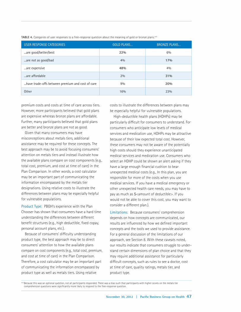
47November 30, 2012 | Pacific Business Group on Health
premium costs and costs at time of care across tiers. However, more participants believed that gold plans are expensive whereas bronze plans are affordable. Further, many participants believed that gold plans are better and bronze plans are not as good.
Given that many consumers may have misconceptions about metals tiers, additional assistance may be required for these concepts. The best approach may be to avoid focusing consumers’ attention on metals tiers and instead illustrate how the available plans compare on cost components (e.g., total cost, premium, and cost at time of care) in the Plan Comparison. In other words, a cost calculator may be an important part of communicating the information encompassed by the metals tier designations. Using relative costs to illustrate the differences between plans may be especially helpful for vulnerable populations.
Product Type: PBGH’s experience with the Plan Chooser has shown that consumers have a hard time understanding the differences between different benefit structures (e.g., high deductible, fixed copay, personal account plans, etc.).
Because of consumers’ difficulty understanding product type, the best approach may be to direct consumers’ attention to how the available plans compare on cost components (e.g., total cost, premium, and cost at time of care) in the Plan Comparison. Therefore, a cost calculator may be an important part of communicating the information encompassed by product type as well as metals tiers. Using relative
costs to illustrate the differences between plans may be especially helpful for vulnerable populations.
High-deductible health plans (HDHPs) may be particularly difficult for consumers to understand. For consumers who anticipate low levels of medical services and medication use, HDHPs may be attractive because of their low expected total cost. However, these consumers may not be aware of the potentially high costs should they experience unanticipated medical services and medication use. Consumers who select an HDHP could be shown an alert asking if they have a large enough financial cushion to bear unexpected medical costs (e.g., In this plan, you are responsible for more of the costs when you use medical services. If you have a medical emergency or other unexpected health care needs, you may have to pay as much as $<amount of deductible>. If you would not be able to cover this cost, you may want to consider a different plan.).
Limitations: Because consumers’ comprehension depends on how concepts are communicated, our results are influenced by how we defined important concepts and the tools we used to provide assistance. For a general discussion of the limitations of our approach, see Section 8. With these caveats noted, our results indicate that consumers struggle to under-stand certain dimensions of plan choice and that they may require additional assistance for particularly difficult concepts, such as rules to see a doctor, cost at time of care, quality ratings, metals tier, and product type.
xviii Because this was an optional question, not all participants responded. There was a bias such that participants with higher scores on the metals tier comprehension questions were significantly more likely to respond to the free-response question.
TABLE 4. Categories of user responses to a free-response question about the meaning of gold or bronze plans.xviii
USER RESPONSE CATEGORIES GOLD PLANS… BRONZE PLANS…
...are good/better/best 22% 6%
...are not as good/bad 4% 17%
...are expensive 48% 4%
...are affordable 2% 31%
...have trade-offs between premium and cost of care 9% 20%
Other 16% 23%

48 Decision Support Rules: Installment III | November 30, 2012
7. Evaluating and Improving Plan Choice
Track, evaluate, and improve the choice experience.Due to the complexity of the plan choice decision, it is important for Exchanges to monitor user experiences and adjust decision support services as evidence accumulates.
RATIONALE: Evaluating and Improving Plan Choice
Meet user preferences: Tracking consumers’ choice experience will help Exchanges to identify consumers’ plan needs and preferences. Decision support tools can then be improved to better meet consumers’ preferences.
Accomplish policy objectives: Tracking and evaluating consumers’ choice experience will help Exchanges to ensure that consumers choose high value health plans that meet their plan needs and preferences. This in turn will help to accomplish long-term objectives, such as improving health care quality while reducing its cost.
Exchange research evidence per Summer/Fall 2012 experiments:Over the course of the experiments we’ve conducted this year, we have identified key data that can be tracked and evaluated to improve consumers’ choice
experience. This data comes from different sources and illuminates different aspects of consumers’ choice experience (Figure 4).
USER FEEDBACK DOMAINS. User feedback can be used to evaluate four major aspects of plan choice.
User experience: Assess consumers’ experience with plan choice (e.g., decision confidence, understanding and use of website features, areas of difficulty and problems encountered). Identify strengths and weaknesses of the decision support tool to guide improvements to the tool.
Choice efficacy: Assess whether consumers select a high value health plan. Plan choice may be judged according to objective expert-identified criteria (e.g., plan has lowest price or highest quality ratings) and/or according to subjective user-identified criteria (i.e., plan meets consumers’ reported needs and preferences). Determine whether the tool helps consumers choose high value health plans and whether Exchanges are meeting long-term objectives of decreasing health care costs and improving health care quality. Identify strengths and weaknesses of the tool to guide improvements to the tool.
FIGURE 4. User feedback domains and data sources.

49November 30, 2012 | Pacific Business Group on Health
Plan Comprehension: Assess consumers’ understanding of their selected plan (i.e., dimensions of the selected plan, such as whether it includes a deductible, and how the selected plan compares to other available plans in terms of relative cost and quality). Determine whether the tool helps consumers understand plan choice. Identify strengths and weaknesses of the tool to guide improvements to the tool.
Individual differences: Assess whether any of the above systematically differ between populations. Identify vulnerable populations (e.g., new insurance customers or consumers with low numeracy, literacy, or health insurance literacy) and develop and test approaches to assist them and improve their choice experience. Additionally, any differences between populations (e.g., whether consumers chose a plan in the individual or SHOP Exchange, whether consumers are eligible for cost sharing reduction (CSR) plans or not) should be flagged to assess if and how population differences impact choice experience. Special attention should be paid to CSR-eligible consumers to assess the frequency with which they select CSR plans and their experiences choosing and using those plans.
SOURCES OF USER FEEDBACK DATA. User feedback data arises from three main sources. User data should be anonymously and confidentially recorded from Eligibility Determination through Plan Choice to the exit questionnaire to link data to assess user experi-ence, choice efficacy, plan comprehension, and individual differences.
Website analytics: Track site traffic, such as time on site and use of various features.
User record: Record user data during Eligibility Determination and Plan Choice. This includes user-entered data (e.g., health care needs, plan preferences, and plan selection) and user-determined plan data (e.g., plans displayed, features of displayed plans, plan dimensions shown, and adjustments to display of plans).
Exit questionnaire: Ask consumers to complete an optional post-choice exit questionnaire.
8. Limitations of Our Approach
Participants’ incentives may differ from those of Exchange subscribers. Although participants were encouraged to participate thoughtfully and “make [their] medical plan choice as if it were [their] actual choice”, they may also have been motivated to finish the study as quickly as possible to maximize their rate of pay. Additionally, because participants’ choices were hypothetical, they may have been less motivated to consider additional plans or plan dimensions to ensure they chose the best-fitting plan. However, we do have evidence that participants were engaged in the task and took plan choice seriously: Across studies, participants spent an average of six minutes on plan choice, compared to an average of seven minutes for real-world subscribers choosing their actual plan using PBGH’s Plan Chooser.
Our studies used a decision support tool based upon an actively used decision support tool (PBGH’s Plan Chooser). This served as the basis of our design and wording. Participants read an introduction to the study before providing consent to participate. They then reported their plan needs and preferences on a User Preferences page. Participants compared plans and indicated their plan selection on the Plan Comparison page. Lastly, they completed a post-choice exit questionnaire. The Plan Comparison page included a small set of plans (3, 6, or 9 plans, depend-ing on the study) that were designed based on real-world plan data. Some of our results may be dependent on the set of plans and plan features we used as well as how we displayed and described those plans and features to participants.
Our measures of choice efficacy are not independent. Because participants chose from a relatively small set of plans that were based on real-world plan data, there were correlations between plan features. For example, the gold plans were all HMOs that required referrals to see a specialist, whereas the bronze and silver plans were a combination of HDHPs and PPOs that did not require referrals. Our measures of choice efficacy are also coarse. For example, our assessment of relative total cost is dichotomous (i.e., lowest total cost or not); if a plan is more expensive, even by $1, it is not counted as the best plan on that dimension. Therefore,

50 Decision Support Rules: Installment III
our measures do not easily capture trade-offs or compromises participants may make among dimensions. Our measure of subjective choice efficacy is not exhaustive: we asked participants to rank their top dimensions from a list. Some participants’ top dimensions may not have been captured by this list. Additionally, some preferences cannot be scored easily (e.g., “the plan covers medical services I care about”). However, these flaws should bias all participants’ scores in the same direction and not affect comparisons between conditions.
Our measure of plan comprehension, participants’ scores on factual questions about their selected plan, assesses a combination of participants’ understanding of plan features, their memory for plan features, and their attention to plan features. Therefore, an incorrect answer may indicate that the participant either did not understand or remember how their plan com-pared to other available plans on that dimension, or that the participant did not attend to that dimension while choosing a plan. Additionally, participants may guess the right (or wrong) answer instead of using the “I don’t know” option. Although our measure of plan comprehension is imperfect, these flaws should bias scores for all participants in the same manner and not affect comparisons between conditions.
Appendix: Participant Demographics
Participants were either provided by a market-sampling firm or recruited from an online panel. Participants were compensated at standard rates. Participants were required to be over the age of 18 and fluent English speakers. Additionally, participants were screened based on self-reported income and education to ensure that the sample was similar to the presumed demographics of prospective Exchange users. In each study, 0-2% of participants did not complete the study in good faith, completing the study in less than two standard deviations from the mean completion time (e.g., taking less than 3.5 minutes to complete a 15-minute study). After data from these participants were excluded, each study had data from, on average, 124 participants per condition. As intended, these participants were
primarily low income and low education: across studies, all participants reported annual household incomes close to or below 400% of the federal poverty level and 43% of participants reported having a high school education or less. The sample was 63% female with a median age of 35 (M = 37.82, SD = 13.09). Fifty-one percent of participants were married or living together and average household size was 3.15 (SD = 1.84). Sixty-two percent of participants were enrolled in a health plan at the time of participation.

51November 30, 2012 | Pacific Business Group on Health
References
Consumers Union. (2012, January). What’s behind the door? Consumers’ difficulties selecting health plans. (Health Policy Brief). Yonkers, NY.
Consumers Union. (2012, October). The evidence is clear: Too many health insurance choices can impair, not help, consumer decision making. (Health Policy Report). Yonkers, NY.
Derose, K. P., Kanouse, D. E., Weidmer, B., Weech-Maldonado, R., Garcia, R. E., & Hays, R. D. (2007). Developing a Spanish-language consumer report for CAHPS ® health plan surveys. The Joint Commission Journal on Quality and Patient Safety, 33(11), 681-688.
Hibbard, J. H., Greene, J., Sofaer, S., Firminger, K., & Hirsh, J. (2012). An experiment shows that a well-designed report on costs and quality can help consumers choose high-value health care. Health Affairs, 31(3), 5605-5668.
Hibbard, J. H., Slovic, P., Peters, E., & Finucane, M. (2002). Strategies for reporting health plan performance information to consumers: Evidence from controlled studies. Health Services Research, 37(2), 291-313.
James, J. (2012, March). Public reporting on quality and costs. (Health Policy Brief No. 65) Bethesda, MD: Health Affairs & Robert Wood Johnson Foundation.
Johnson, E. J., Hassin, R., Baker, T., Bajger, A., & Treuer, G. (2012). Can consumers make affordable care affordable? The value of choice architecture. Manuscript submitted for publication.
Kolstad, J. T., & Chernew, M. E. (2008). Quality and consumer decision making in the market for health insurance and health care services. Medical Care Research and Review, 66(1), 28S-52S. doi: 10.1177/1077558708325887
Krughoff, R., Francis, W., & Ellis, R. (2012, February 29). Helping consumers choose health plans in exchanges: Best practice recommendations. Retrieved from http://healthaffairs.org/blog/2012/02/29/helping-consumers-choose-health-plans-in-exchanges-best-practice-recommendations/
Levin, I. P., & Gaeth, G. J. (1988). How consumers are affected by the framing of attribute information before and after consuming the product. Journal of Consumer Research, 15(3), 374-378.
Lichtenstein, S., & Slovic, P. (2006). The construction of preference. New York, NY: Cambridge University Press.
Lore, R., Gabel, J. R., McDevitt, R., & Slover, M. (2012, August). Choosing the “best” plan in a health insurance exchange: Actuarial value tells only part of the story. (Issue Brief Volume 23). Washington, D.C.: The Commonwealth Fund.
Simon, H. A. (1957). Models of man, social and rational: Mathematical essays on rational human behavior. New York, NY: Wiley.
Sinaiko, A. D., Eastman, D., & Rosenthal, M. B. (2012). How report cards on physicians, physician groups, and hospitals can have greater impact on consumer choices. Health Affairs, 31(3), 602-611.
Tversky, A., & Kahneman, D. (1981). The framing of decisions and the psychology of choice. Science, 211, 453-458.

© 2012 Pacific Business Group on Health. All Rights Reserved.
About the Pacific Business Group on Health
Founded in 1989, Pacific Business Group on Health (PBGH) is one of the nation’s leading non-profit business coalitions focused on health care. We help leverage the power of our 50 large purchaser members who spend 12 billion dollars annually to provide health care coverage to more than 3 million employees, retirees and dependents in California alone. PBGH works on many fronts to improve the quality and affordability of health care, often in close partnership with health insurance plans, physician groups, consumer organizations, and others concerned about our health care system. To learn more please visit www.pbgh.org.