consistent ui across android devices
TRANSCRIPT
Building a Consistent User
Experience Across a Range of
Android DevicesIrene Duke
Senior Android Engineer
Prolific Interactive
Feb. 3, 2015
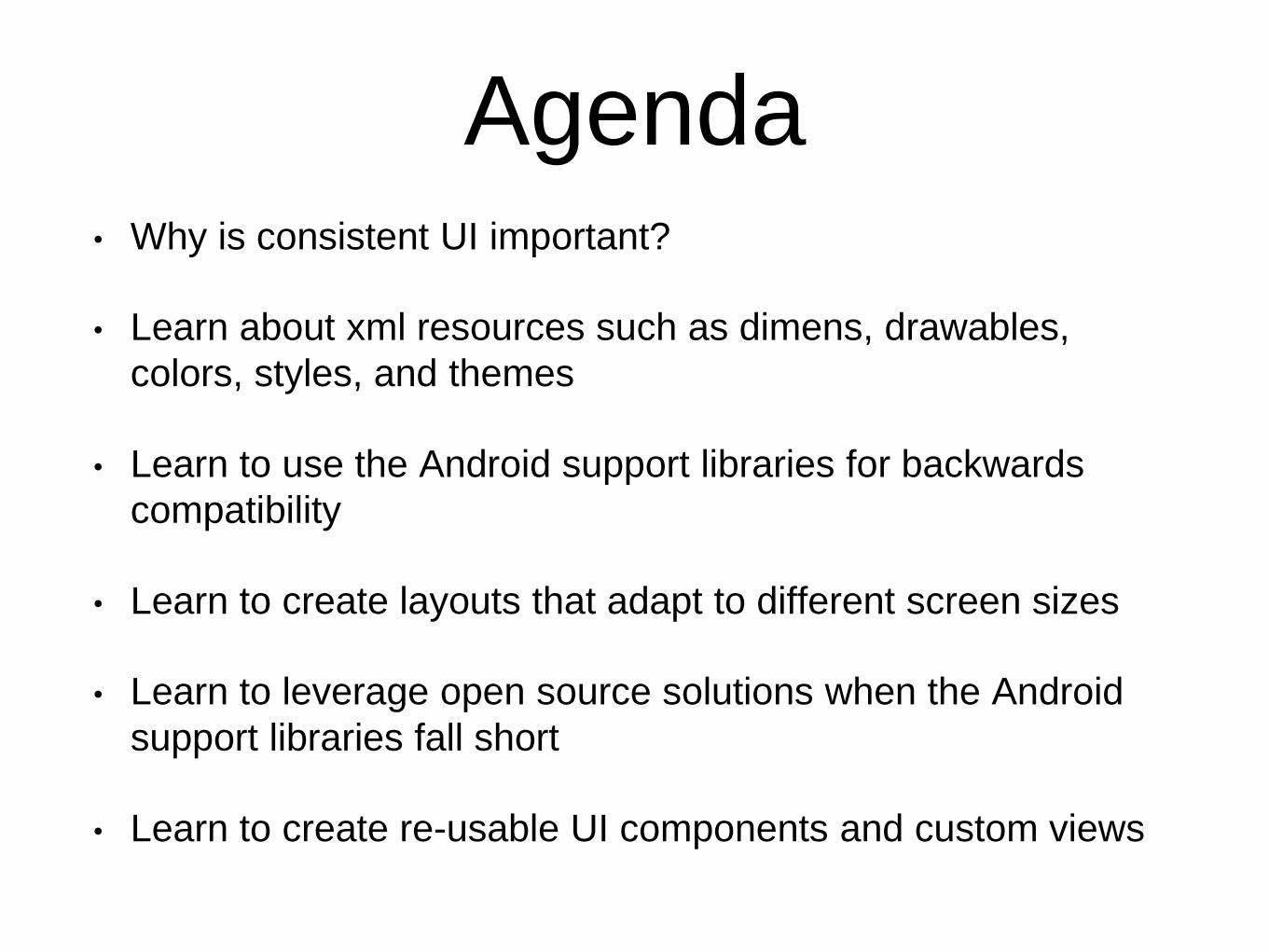
Agenda• Why is consistent UI important?
• Learn about xml resources such as dimens, drawables,
colors, styles, and themes
• Learn to use the Android support libraries for backwards
compatibility
• Learn to create layouts that adapt to different screen sizes
• Learn to leverage open source solutions when the Android
support libraries fall short
• Learn to create re-usable UI components and custom views
Why is this important?
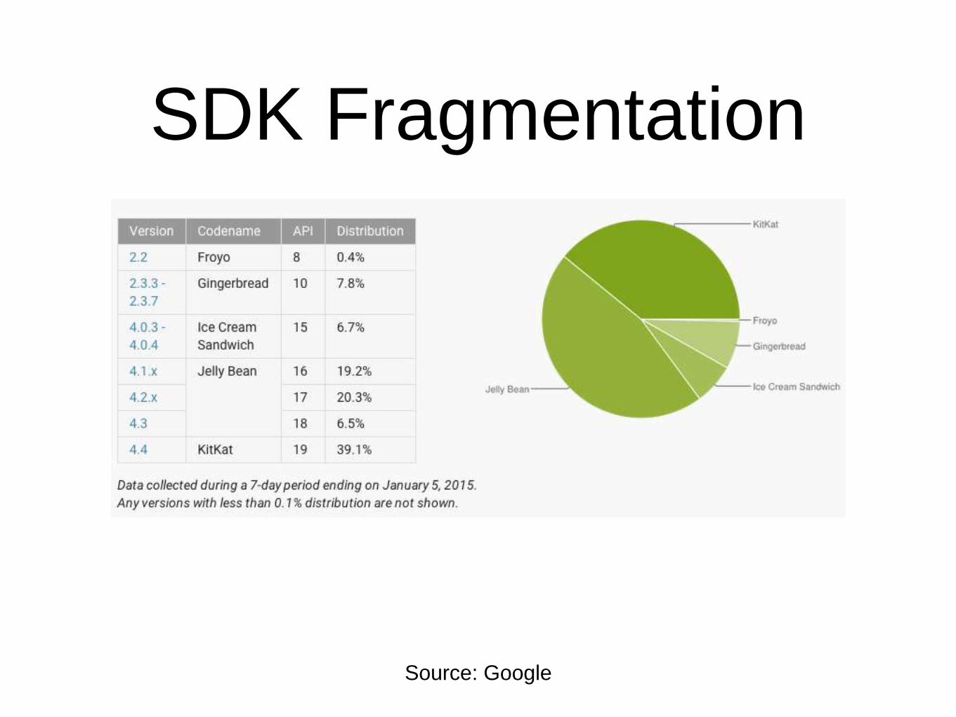
SDK Fragmentation
Source: Google
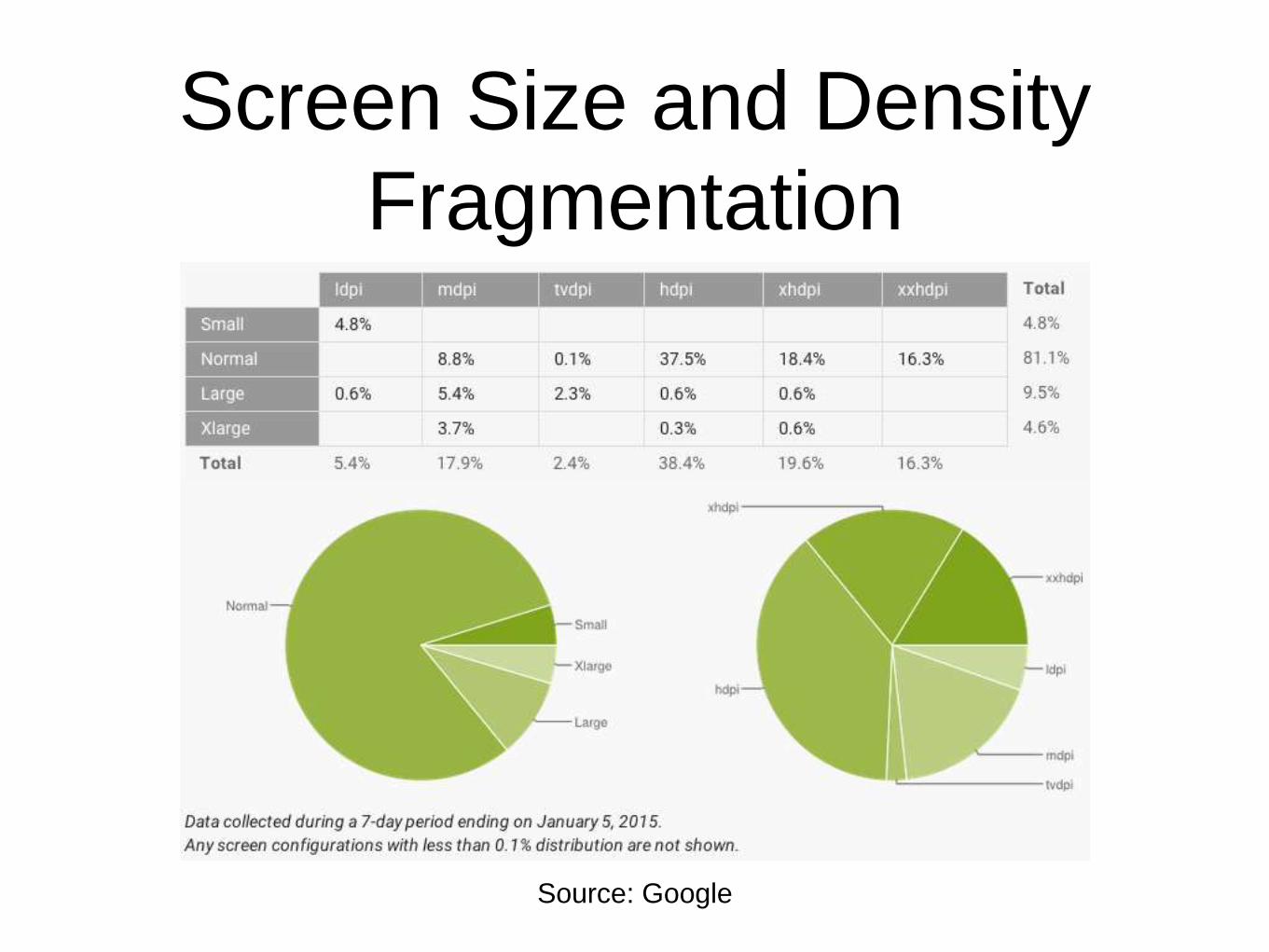
Screen Size and Density
Fragmentation
Source: Google
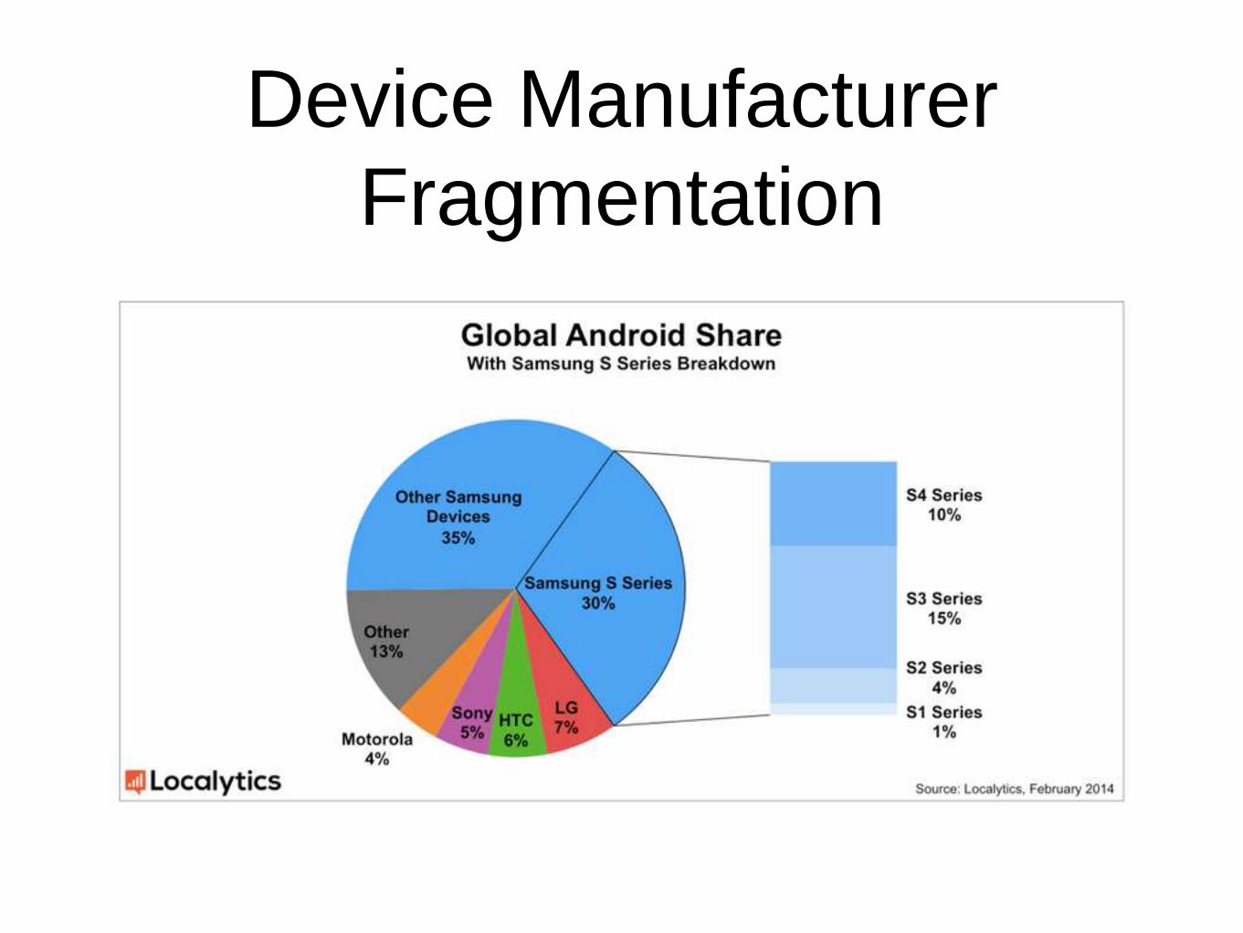
Device Manufacturer
Fragmentation

XML Resources and
Qualifiers
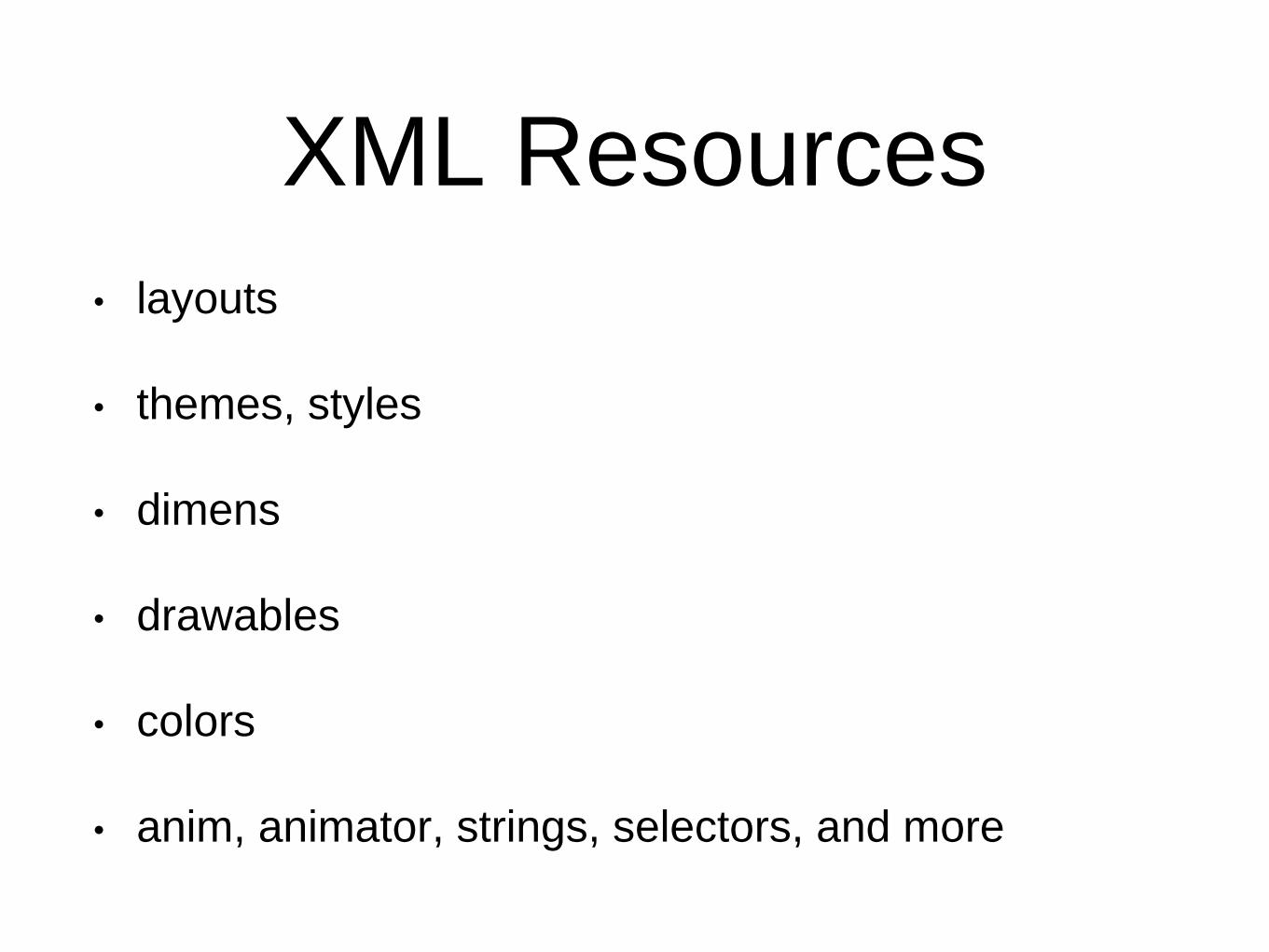
XML Resources
• layouts
• themes, styles
• dimens
• drawables
• colors
• anim, animator, strings, selectors, and more
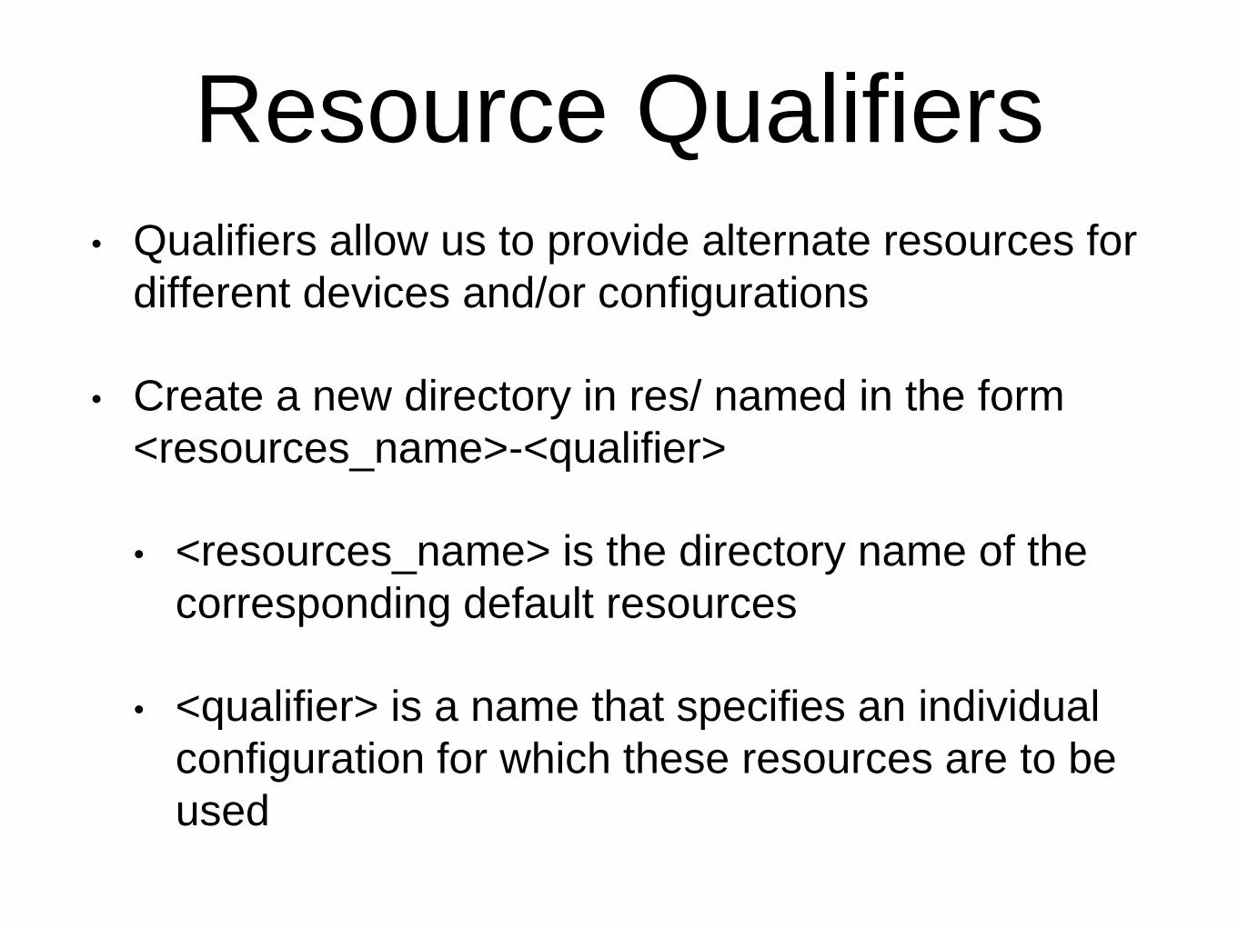
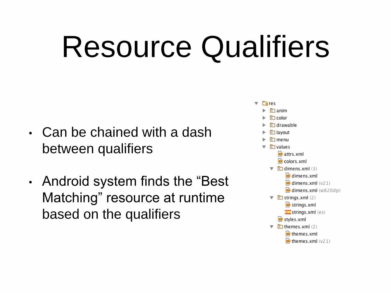
Resource Qualifiers• Qualifiers allow us to provide alternate resources for
different devices and/or configurations
• Create a new directory in res/ named in the form
<resources_name>-<qualifier>
• <resources_name> is the directory name of the
corresponding default resources
• <qualifier> is a name that specifies an individual
configuration for which these resources are to be
used
Resource Qualifiers
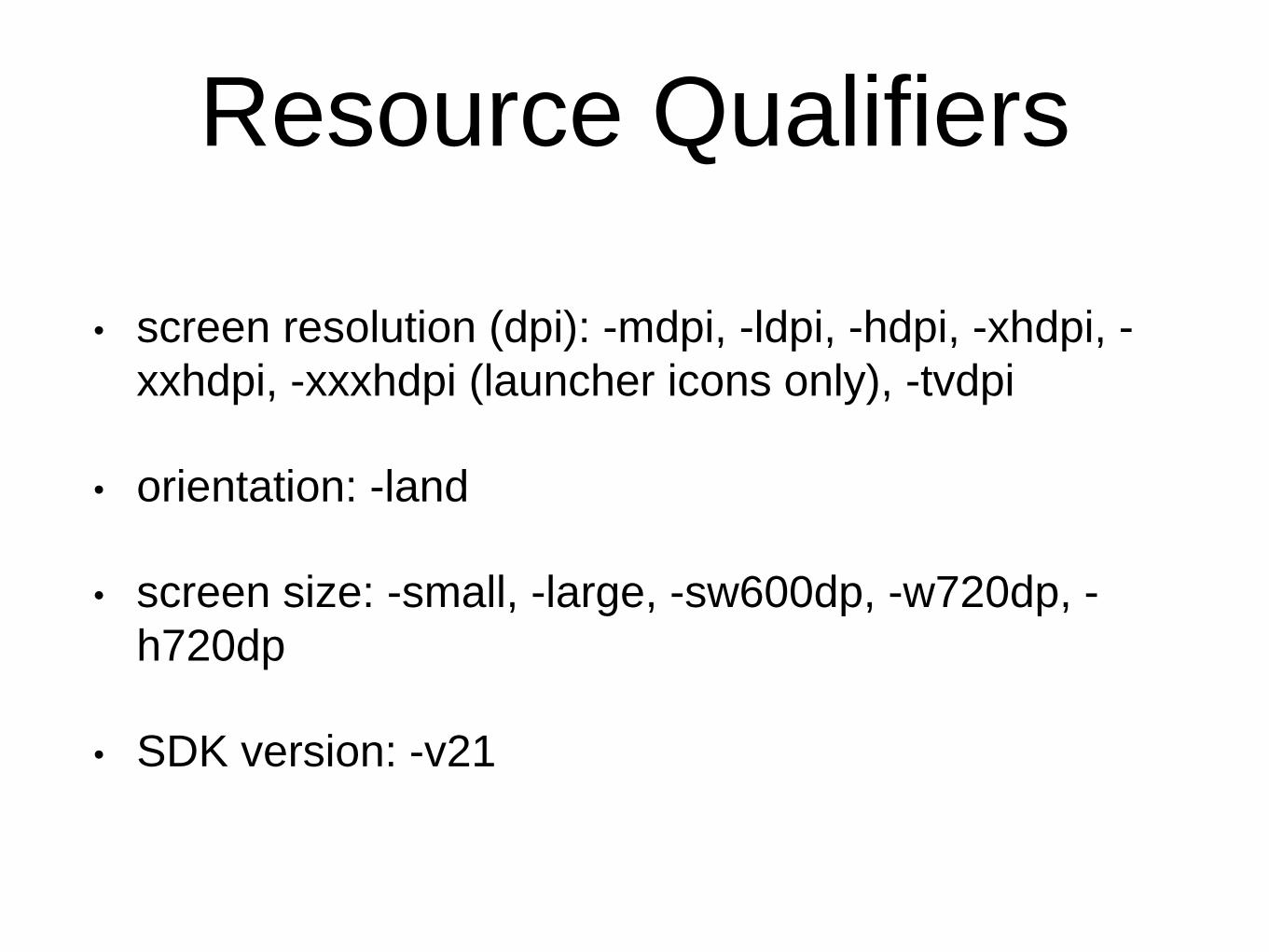
• Can be chained with a dash
between qualifiers
• Android system finds the “Best
Matching” resource at runtime
based on the qualifiers
Resource Qualifiers
• screen resolution (dpi): -mdpi, -ldpi, -hdpi, -xhdpi, -
xxhdpi, -xxxhdpi (launcher icons only), -tvdpi
• orientation: -land
• screen size: -small, -large, -sw600dp, -w720dp, -
h720dp
• SDK version: -v21
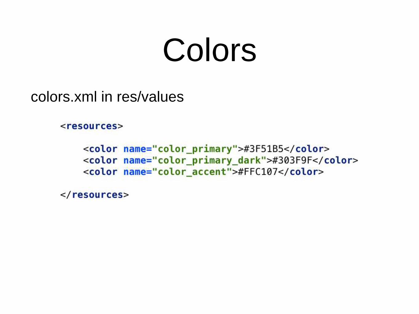
Colors
colors.xml in res/values
Colors
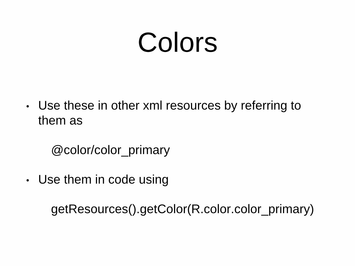
• Use these in other xml resources by referring to
them as
@color/color_primary
• Use them in code using
getResources().getColor(R.color.color_primary)
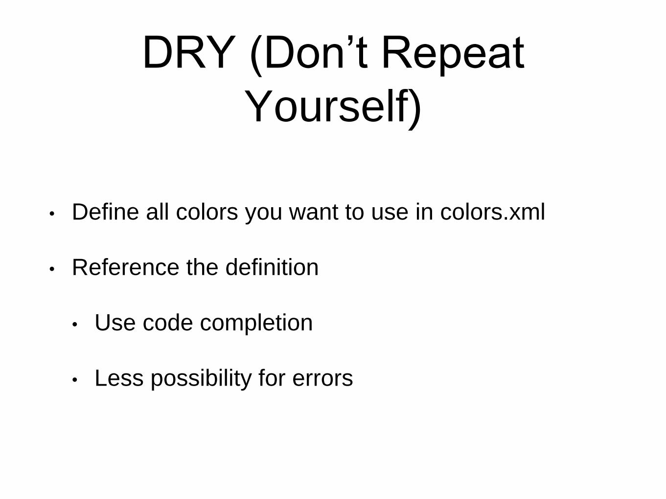
DRY (Don’t Repeat
Yourself)
• Define all colors you want to use in colors.xml
• Reference the definition
• Use code completion
• Less possibility for errors
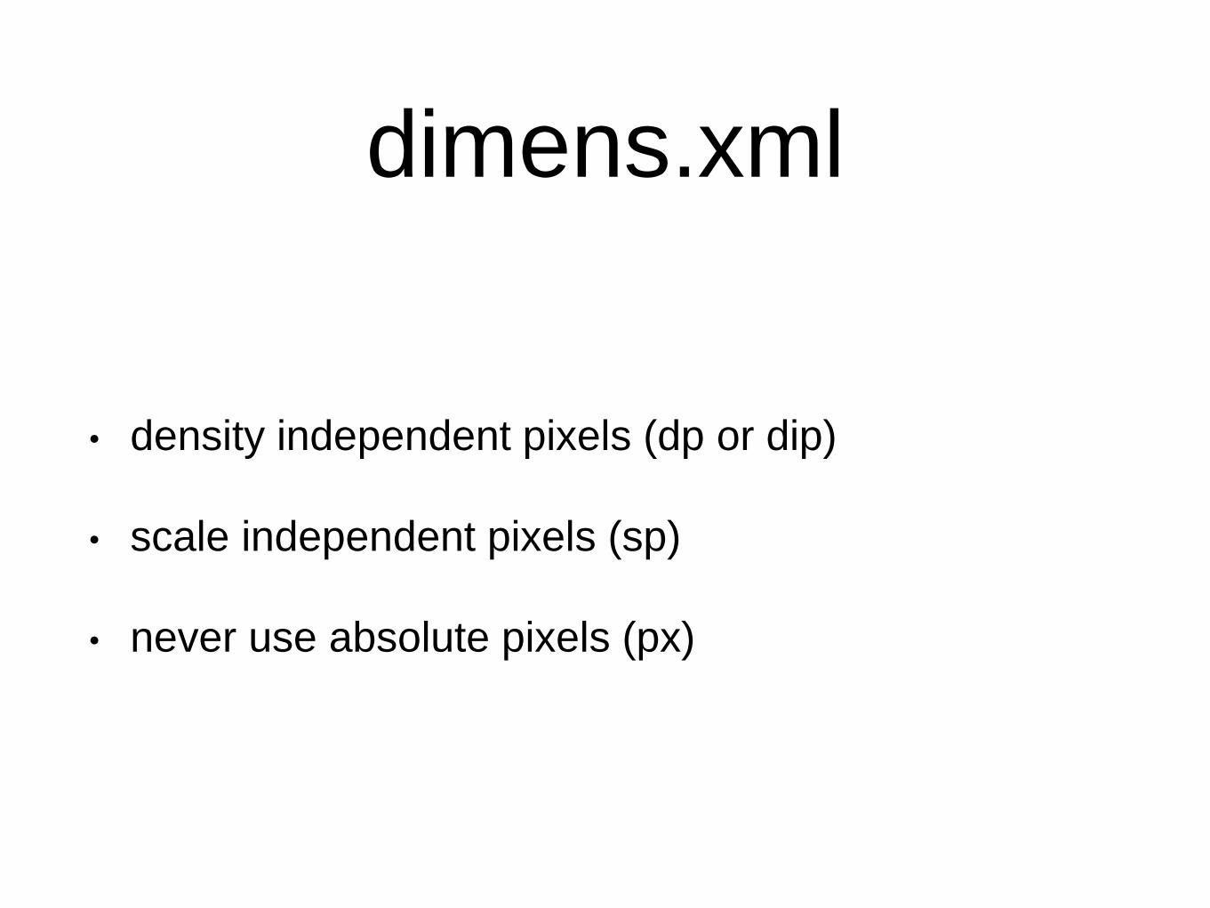
dimens.xml
• density independent pixels (dp or dip)
• scale independent pixels (sp)
• never use absolute pixels (px)
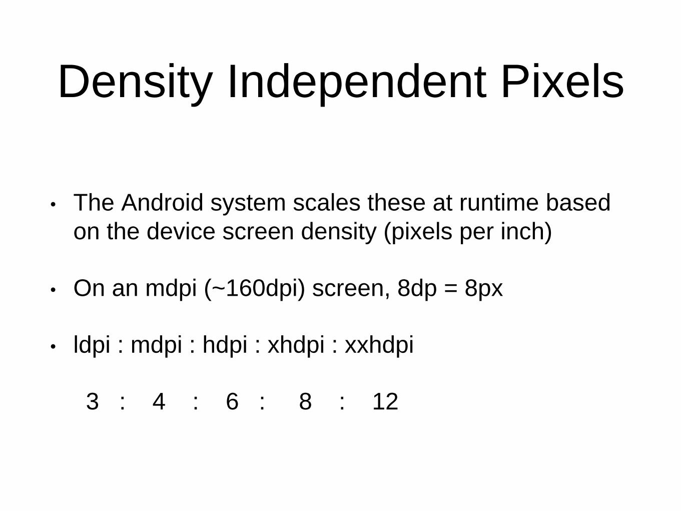
Density Independent Pixels
• The Android system scales these at runtime based
on the device screen density (pixels per inch)
• On an mdpi (~160dpi) screen, 8dp = 8px
• ldpi : mdpi : hdpi : xhdpi : xxhdpi
3 : 4 : 6 : 8 : 12
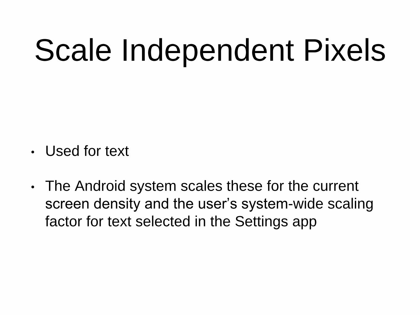
Scale Independent Pixels
• Used for text
• The Android system scales these for the current
screen density and the user’s system-wide scaling
factor for text selected in the Settings app
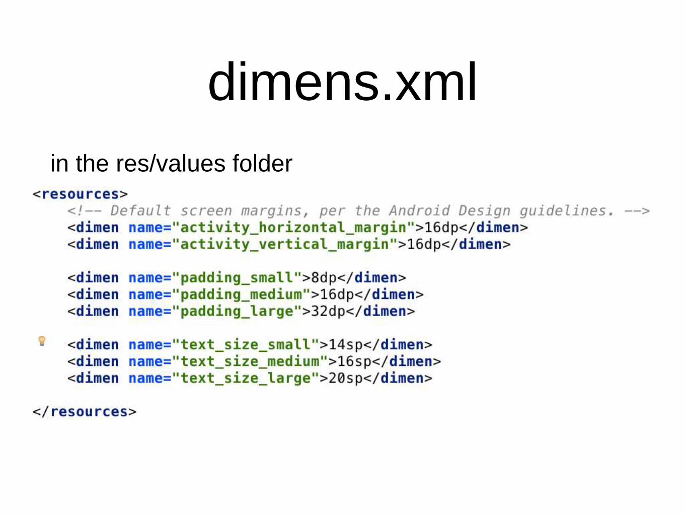
dimens.xml
in the res/values folder

dimens.xml
in the res/values-w820dp folder
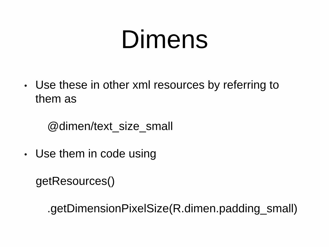
Dimens
• Use these in other xml resources by referring to
them as
@dimen/text_size_small
• Use them in code using
getResources()
.getDimensionPixelSize(R.dimen.padding_small)
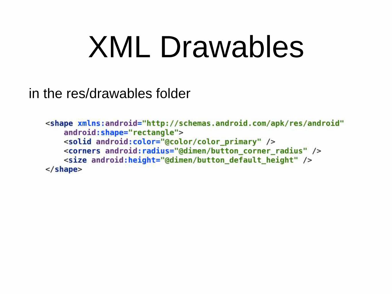
XML Drawables
in the res/drawables folder
PNG Drawables
• Android groups all actual screen densities into six
generalized densities: ldpi, mdpi, hdpi, xhdpi,
xxhdpi, and xxxhdpi
• Provide .png assets for each density you want to
target to prevent Android scaling images at runtime
• If apk size is a concern, provide xxhdpi and mdpi
only and let the Android system scale drawables for
other devices
Styles
• A collection of properties that customise the way a
view should be drawn
• Set properties such as padding, font size,
background color, and much more
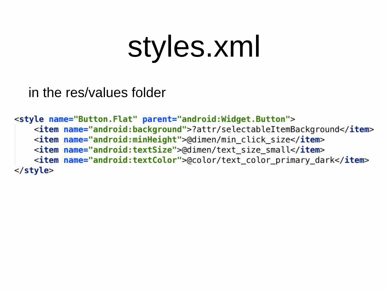
styles.xml
in the res/values folder
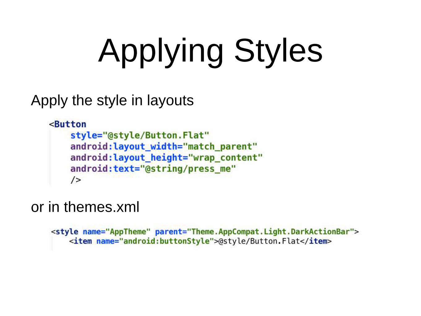
Applying Styles
Apply the style in layouts
or in themes.xml
DRY (Don’t Repeat
Yourself)
• Define styles for common components
• Reference the definition
• Use code completion
• Less possibility for errors

Themes
• Styles that are applied on an application or activity
level, usually in the AndroidManifest
• You shouldn’t have a ton of themes. Most activities
should use a consistent theme.
• For backwards compatibility, extend from
AppCompat themes in the support libraries
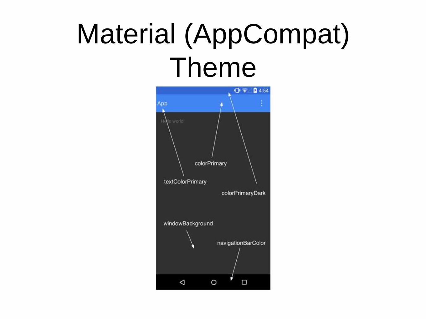
Material (AppCompat)
Theme
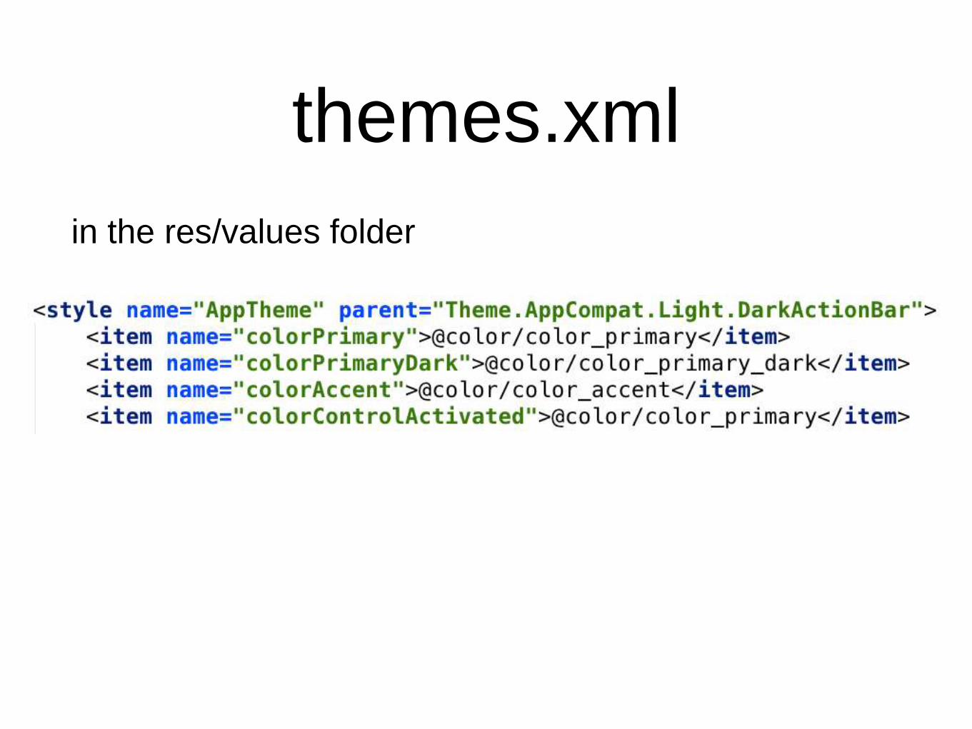
themes.xml
in the res/values folder
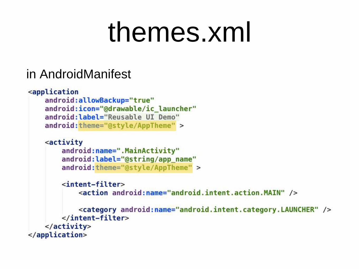
themes.xml
in AndroidManifest
Backwards
Compatibility
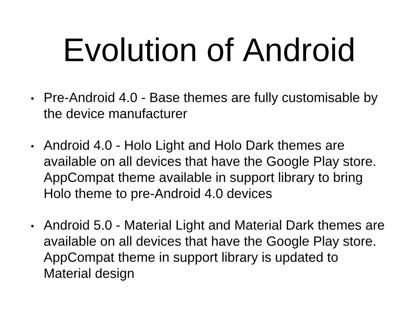
Evolution of Android
• Pre-Android 4.0 - Base themes are fully customisable by
the device manufacturer
• Android 4.0 - Holo Light and Holo Dark themes are
available on all devices that have the Google Play store.
AppCompat theme available in support library to bring
Holo theme to pre-Android 4.0 devices
• Android 5.0 - Material Light and Material Dark themes are
available on all devices that have the Google Play store.
AppCompat theme in support library is updated to
Material design
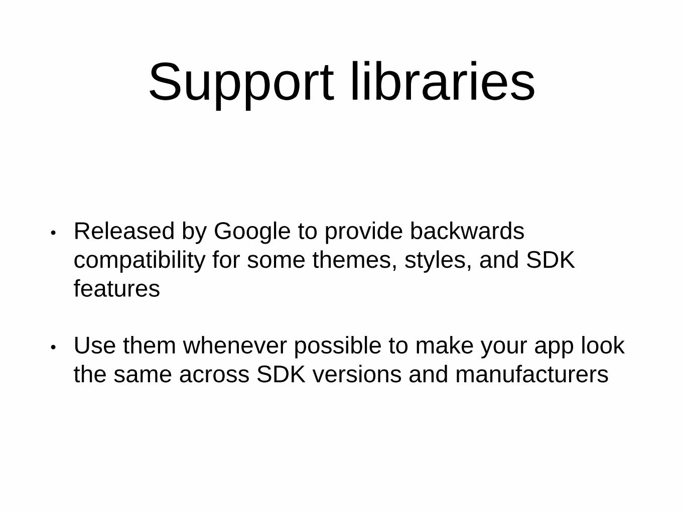
Support libraries
• Released by Google to provide backwards
compatibility for some themes, styles, and SDK
features
• Use them whenever possible to make your app look
the same across SDK versions and manufacturers
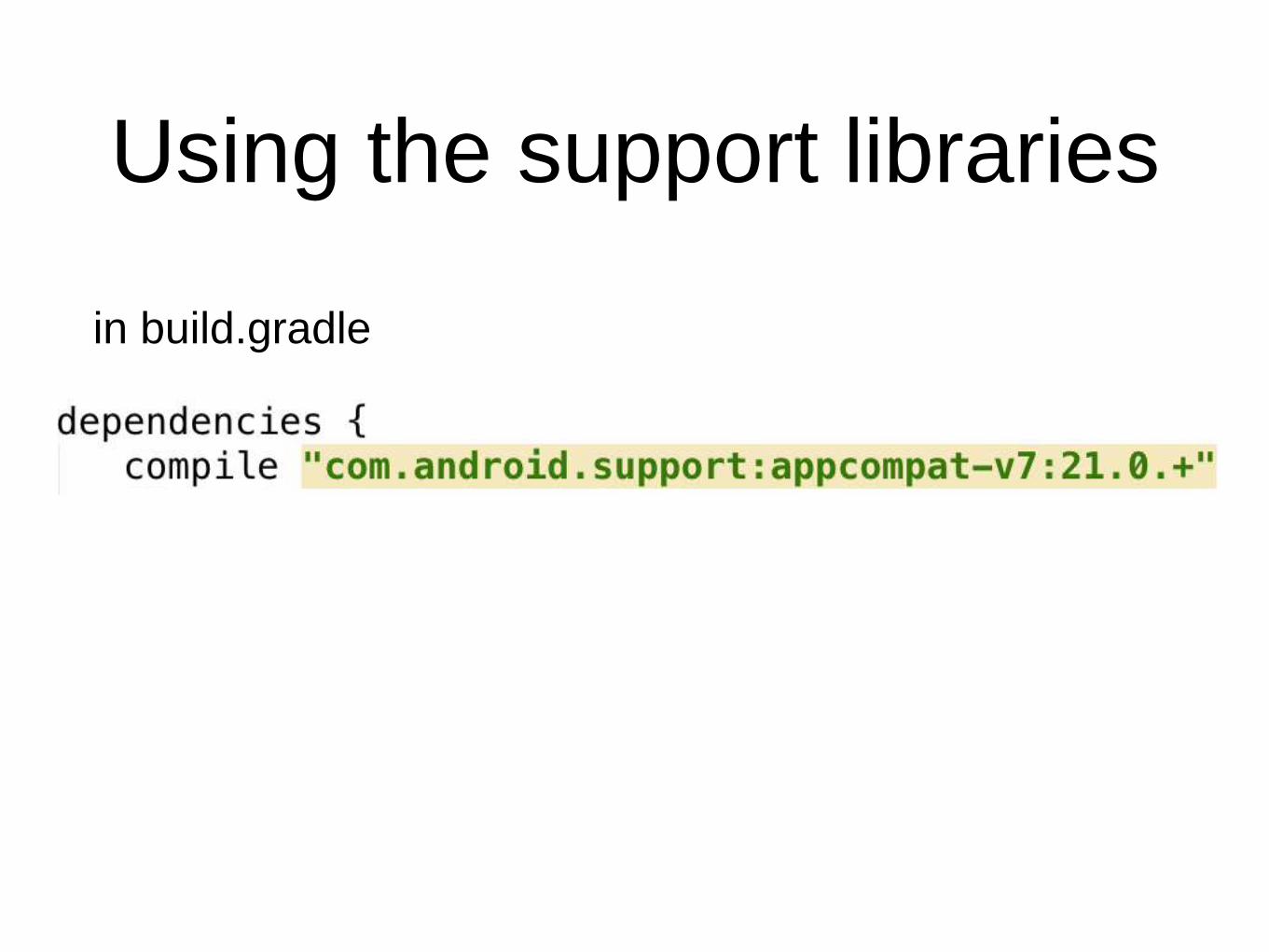
Using the support libraries
in build.gradle
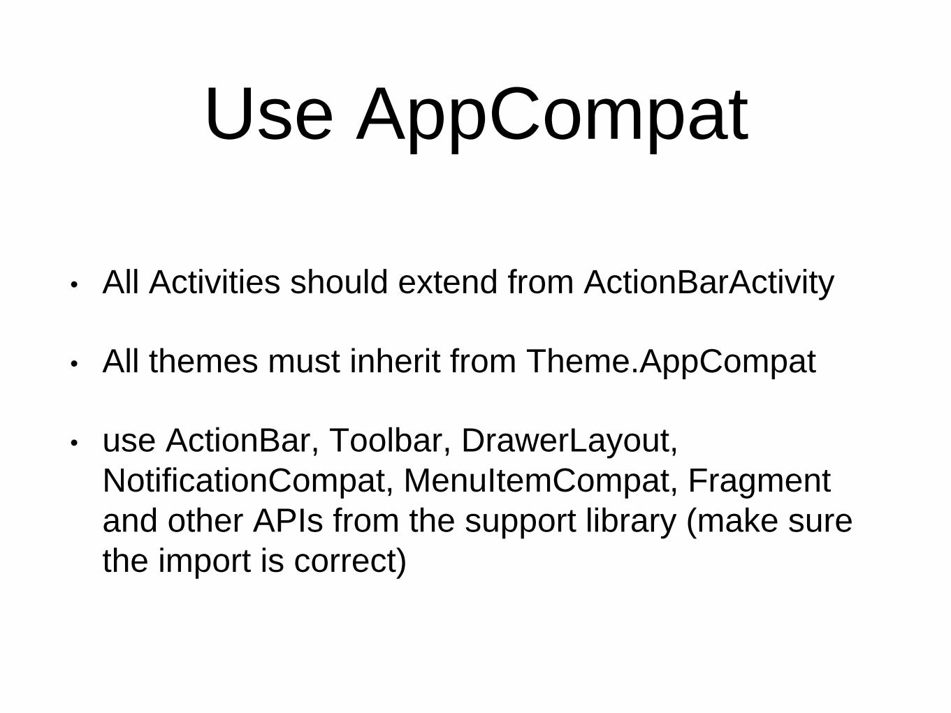
Use AppCompat
• All Activities should extend from ActionBarActivity
• All themes must inherit from Theme.AppCompat
• use ActionBar, Toolbar, DrawerLayout,
NotificationCompat, MenuItemCompat, Fragment
and other APIs from the support library (make sure
the import is correct)
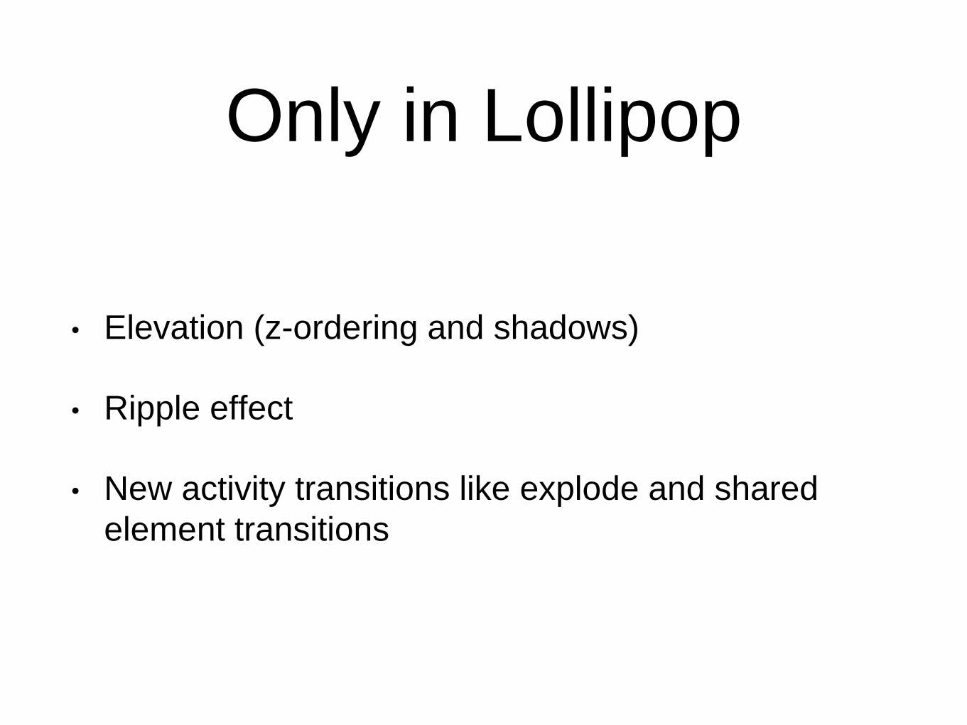
Only in Lollipop
• Elevation (z-ordering and shadows)
• Ripple effect
• New activity transitions like explode and shared
element transitions
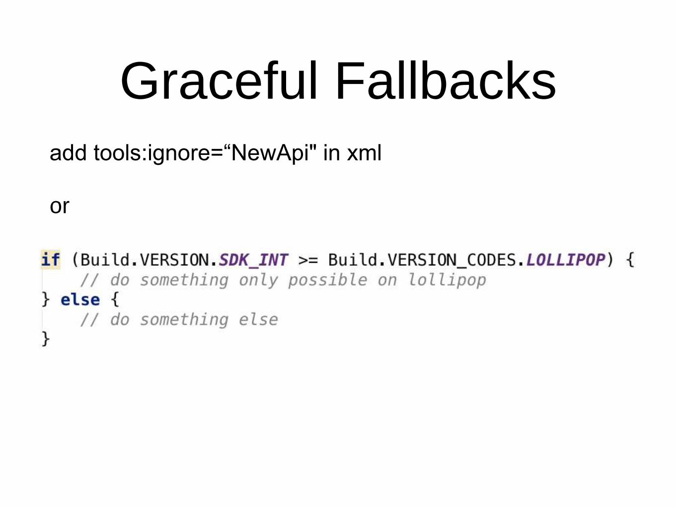
Graceful Fallbacksadd tools:ignore=“NewApi" in xml
or
Layouts
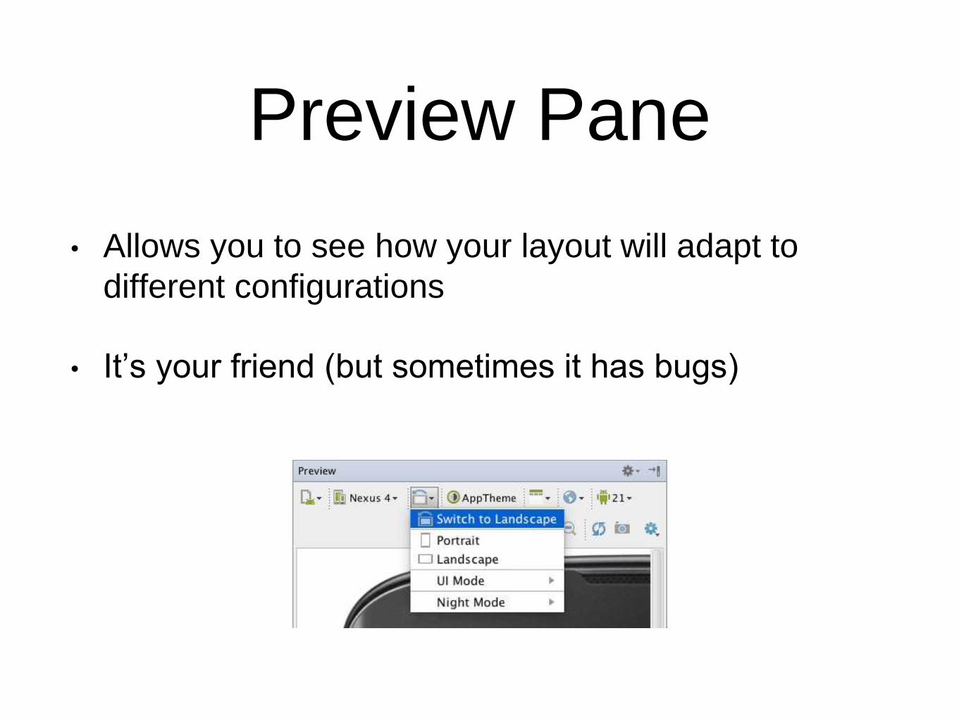
Preview Pane
• Allows you to see how your layout will adapt to
different configurations
• It’s your friend (but sometimes it has bugs)
Design Time Layout Attributes
(Tools Namespace)
• No runtime overhead
• All attributes you define in the tools namespace are
stripped during the build process
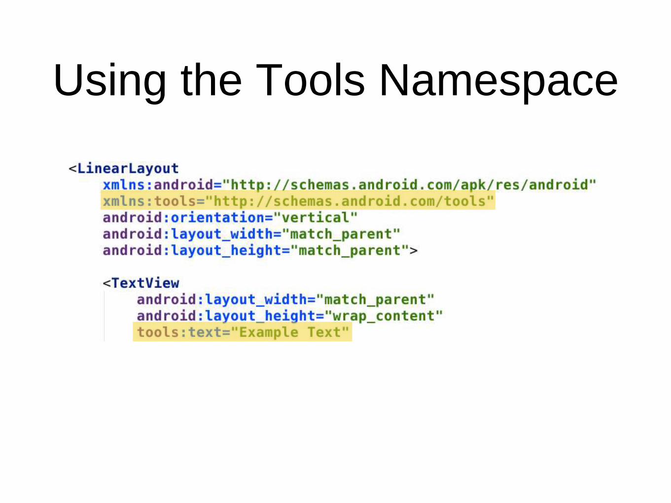
Using the Tools Namespace
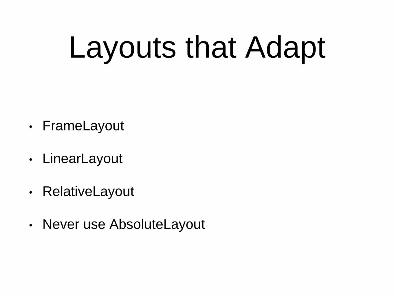
Layouts that Adapt
• FrameLayout
• LinearLayout
• RelativeLayout
• Never use AbsoluteLayout
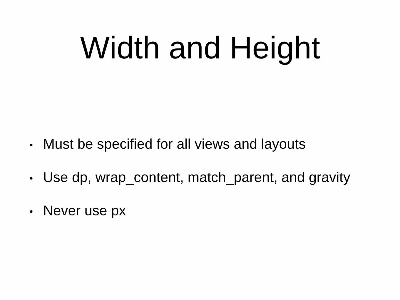
Width and Height
• Must be specified for all views and layouts
• Use dp, wrap_content, match_parent, and gravity
• Never use px
Gravity
• gravity - sets the gravity of the content within the
view (or layout) its used on
• layout_gravity - sets the gravity of the view (or
layout) within its parent
• This can be tricky (remember the preview pane is
your friend)
FrameLayout
• Views are layered in a frame
• Views can be centered or aligned with the edges of
the frame using layout_gravity
• Let’s take a look at some code
LinearLayout
• Views are drawn one after another, either
horizontally or vertically
• Weights can be used to change how much space a
view gets
• Let’s take a look at some code
LinearLayout
• Using weight with LinearLayout causes views to be
measured twice during layout.
• When a LinearLayout with non-zero weights is nested
inside another LinearLayout with non-zero weights, then
the number of measurements increase exponentially.
• Use 0dp instead of wrap_content or match_parent in
the direction this view should grow
• Flatten the hierarchy with RelativeLayout
RelativeLayout
• Most flexible layout
• Views can be positioned in relation to other views
• Let’s take a look at some code
3rd Party Libraries
Material Design
• Android L is missing implementations for some
components like floating action buttons, snackbars,
and more.
• Support libraries are missing backwards
compatibility for styling of some components like
alert dialogs, date and time pickers, progress
spinners, and more.
Open Source
• Don’t re-invent the wheel
• Many Android developers have released open source
solutions for the missing or imperfect components
• Floating Action Button
• Snackbar
• Alert Dialog
• Edit Text
What to Look for in an Open
Source Library
• Lots of stars
• Recent activity/releases
• Documentation, customisability
• Open source license like MIT or Apache
• Availability on maven central or other central repository
• Doesn’t throw warnings or cause crashes

Gradle
A build system that makes it easy to leverage open
source solutions
Calligraphy
• A library to help with fonts
• https://github.com/chrisjenx/Calligraphy
Material Dialog
• AlertDialog is styled differently on different platform
versions
• https://github.com/afollestad/material-dialogs
Material EditText
• EditText is styled differently on different platform
versions
• https://github.com/afollestad/material-dialogs
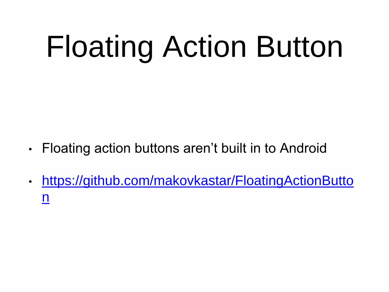
Floating Action Button
• Floating action buttons aren’t built in to Android
• https://github.com/makovkastar/FloatingActionButto
n
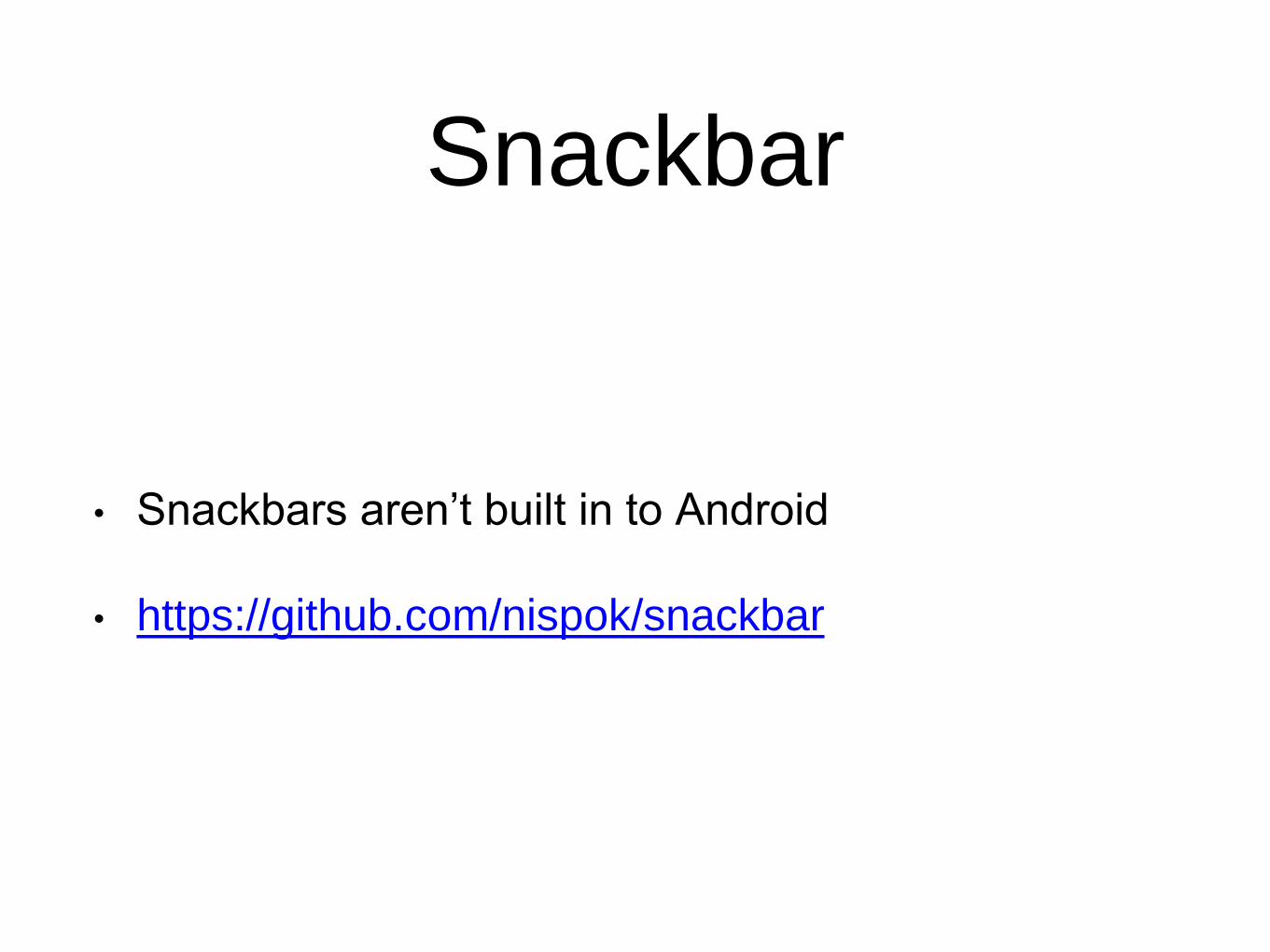
Snackbar
• Snackbars aren’t built in to Android
• https://github.com/nispok/snackbar
Re-Usable UI and
Custom Views
Custom Views
• Let’s take a look at some code