componentone cube for wpf
TRANSCRIPT

ComponentOne
Cube for WPF

Copyright 1987-2012 GrapeCity, Inc. All rights reserved.
ComponentOne, a division of GrapeCity
201 South Highland Avenue, Third Floor
Pittsburgh, PA 15206 • USA
Internet: [email protected]
Web site: http://www.componentone.com
Sales
E-mail: [email protected]
Telephone: 1.800.858.2739 or 1.412.681.4343 (Pittsburgh, PA USA Office)
Trademarks
The ComponentOne product name is a trademark and ComponentOne is a registered trademark of GrapeCity, Inc. All other trademarks used herein are the properties of their respective owners.
Warranty
ComponentOne warrants that the original CD (or diskettes) are free from defects in material and workmanship, assuming normal use, for a period of 90 days from the date of purchase. If a defect occurs during this time, you may return the defective CD (or disk) to ComponentOne, along with a dated proof of purchase, and ComponentOne will replace it at no charge. After 90 days, you can obtain a replacement for a defective CD (or disk) by sending it and a check for $25 (to cover postage and
handling) to ComponentOne.
Except for the express warranty of the original CD (or disks) set forth here, ComponentOne makes no other warranties, express or implied. Every attempt has been made to ensure that the information contained in this manual is correct as of the time it was
written. We are not responsible for any errors or omissions. ComponentOne’s liability is limited to the amount you paid for the product. ComponentOne is not liable for any special, consequential, or other damages for any reason.
Copying and Distribution
While you are welcome to make backup copies of the software for your own use and protection, you are not permitted to make
copies for the use of anyone else. We put a lot of time and effort into creating this product, and we appreciate your support in seeing that it is used by licensed users only.
This manual was produced using ComponentOne Doc-To-Help™.

iii
Table of Contents
ComponentOne Cube for WPF Overview ......................................................................................................1
Help with ComponentOne Studio for WPF .................................................................................................. 1
Key Features ................................................................................................................................................1
Cube for WPF Quick Start ............................................................................................................................3
Step 1 of 3: Creating the Cube Application .................................................................................................... 3
Step 2 of 3: Adding Content to the Cube Control .......................................................................................... 4
Step 3 of 3: Running the Cube Application ................................................................................................... 5
Working with Cube for WPF ........................................................................................................................9
Basic Properties .............................................................................................................................................. 9
Basic Events ................................................................................................................................................. 10
Basic Methods .............................................................................................................................................. 10
Cube Face..................................................................................................................................................... 11
Cube Interaction ........................................................................................................................................... 11
Cube Rotation .............................................................................................................................................. 12
Cube for WPF Layout and Appearance ....................................................................................................... 12
Layout in a Panel ......................................................................................................................................... 13
Cube for WPF Appearance Properties ......................................................................................................... 13
Color Properties .............................................................................................................................. 13
Alignment Properties ...................................................................................................................... 13
Border Properties ............................................................................................................................ 14
Size Properties ................................................................................................................................ 14
Cube Templates............................................................................................................................................ 14
Item Templates............................................................................................................................................. 15
Cube Styles ................................................................................................................................................... 16
Cube Visual States ........................................................................................................................................ 16
Cube for WPF Samples ............................................................................................................................... 17
Cube for WPF Task-Based Help .................................................................................................................. 17
Creating a Cube............................................................................................................................................ 17
Adding Items to a Cube ............................................................................................................................... 19

iv
Clearing Items in a Cube .............................................................................................................................. 20
Changing the Cube's Initial Rotation ........................................................................................................... 20
Allowing the Cube to be Dragged ................................................................................................................ 21
Rotating the Cube ........................................................................................................................................ 21
Showing a Cube Face ................................................................................................................................... 23

1
ComponentOne Cube for WPF
Overview ComponentOne Cube™ for WPF provides a 3D rotating cube for
innovative navigation in WPF. Cube for WPF allows you to present
information using a 3D metaphor. Cube for WPF includes one control,
C1Cube, that allows you to put UIElement objects on faces of a cube,
and then rotate the cube to show one element at a time.
For a list of the latest features added to ComponentOne Studio for
WPF, visit What's New in Studio for WPF.
This is a legacy product. The C1Cube control has been
moved into the C1.WPF.Legacy.dll assembly and is no longer in
active development. You can continue to use this control by
updating references to point to the C1.WPF.Legacy.dll assembly.
Getting Started
Get started with the following topics:
- Key Features (page 1)
- Quick Start (page 3)
- Task-Based Help (page 17)
Help with ComponentOne Studio for WPF Getting Started
For information on installing ComponentOne Studio for WPF, licensing, technical support, namespaces and creating a project with the control, please visit Getting Started with Studio for WPF.
What's New
For a list of the latest features added to ComponentOne Studio for WPF, visit What's New in Studio for WPF.
Key Features ComponentOne Cube for WPF allows you to create customized, rich applications. Make the most of Cube for
WPF by taking advantage of the following key features:
Cube Metaphor
Cube enables you to present information innovatively using a familiar mental model – that of a cube, or block.
Innovative 3D Navigation
Programmatically rotate the cube to show the UIElement attached to a specific page. The rotations are
animated and visually engaging.
Fully Interactive Navigation System
Users may interact with and rotate the cube using the mouse. Users can also interact with objects and controls on each cube face.


3
Cube for WPF Quick Start The following quick start guide is intended to get you up and running with Cube for WPF. In this quick start you'll
start in Visual Studio and create a new project, add a Cube for WPF control to your application, and customize the appearance and behavior of the control.
Step 1 of 3: Creating the Cube Application In this step you'll create a WPF application using Cube for WPF. When you add a C1Cube control to your application, you'll have a complete, functional cube-like interface that you can add images, controls, and other elements to. To set up your project and add a C1Cube control to your application, complete the following steps:
1. Create a new WPF project in Visual Studio. For more information about creating a WPF project, see Creating a .NET Project in Visual Studio.
2. In the Solution Explorer, right-click the References item and choose Add Reference. Select the C1.WPF,
C1.WPF.Legacy, and WPFToolkit assemblies and click OK to add references to your project.
3. Navigate to the Visual Studio Toolbox, and double-click the C1Cube icon to add the control to the window.
4. Resize the Window and reposition the C1Cube control in the Window.
5. Navigate to the Properties window and set the C1Cube control’s Height and Width to 200.
The XAML will appear similar to the following: <c1ext:C1Cube Name="C1Cube1" Margin="138,63,138,57" Height="200"
Width="200" />
The page's Design view should now look similar to the following image (with the C1Cube control selected on the form):

4
You've successfully set up your application's user interface, but if you run your application now a blank window will appear. This is because the C1Cube control currently contains no content. In the next step you'll add content to the C1Cube control, and then you'll add code to your application to add functionality to the control.
Step 2 of 3: Adding Content to the Cube Control In the previous step you created a WPF application and added the C1Cube control to your project. In this step you'll add content to the C1Cube control. To customize your project and add content to the C1Cube control in your application, complete the following steps:
1. Switch to XAML view. In the next steps you’ll add XAML markup to your application to add content to the cube.
2. Add a Grid to the C1Cube control, by updating the XAML markup so it appears similar to the following:. <c1ext:C1Cube Name="C1Cube1" Margin="138,63,138,57" Height="200"
Width="200">
<Grid c1ext:C1Cube.Face="Front">
<Grid.Background>
<RadialGradientBrush>
<GradientStop Color="#FFCF5B49"/>
<GradientStop Color="#FFA7210D" Offset="1"/>
</RadialGradientBrush>
</Grid.Background>
</Grid>
</c1ext:C1Cube>
You added a grid with a radial gradient background. Notice that the Face property was set in the grid tag. The Face property is an attached property that specifies the face the content appears on. See Cube Face (page 11) for more information.
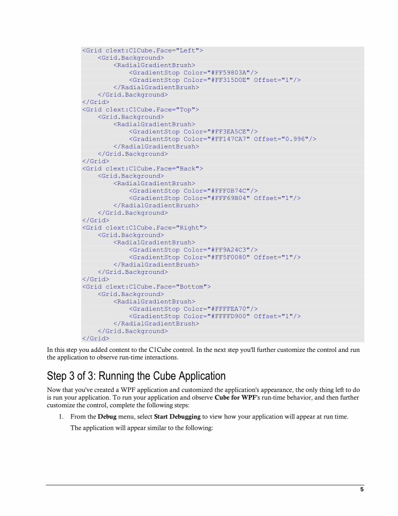
3. Add the following markup just after the </Grid> tag in the XAML markup you just added to add
content to each of the cube's faces :
5
<Grid c1ext:C1Cube.Face="Left">
<Grid.Background>
<RadialGradientBrush>
<GradientStop Color="#FF59803A"/>
<GradientStop Color="#FF315D0E" Offset="1"/>
</RadialGradientBrush>
</Grid.Background>
</Grid>
<Grid c1ext:C1Cube.Face="Top">
<Grid.Background>
<RadialGradientBrush>
<GradientStop Color="#FF3EA5CE"/>
<GradientStop Color="#FF147CA7" Offset="0.996"/>
</RadialGradientBrush>
</Grid.Background>
</Grid>
<Grid c1ext:C1Cube.Face="Back">
<Grid.Background>
<RadialGradientBrush>
<GradientStop Color="#FFF0B74C"/>
<GradientStop Color="#FFF69B04" Offset="1"/>
</RadialGradientBrush>
</Grid.Background>
</Grid>
<Grid c1ext:C1Cube.Face="Right">
<Grid.Background>
<RadialGradientBrush>
<GradientStop Color="#FF9A24C3"/>
<GradientStop Color="#FF5F0080" Offset="1"/>
</RadialGradientBrush>
</Grid.Background>
</Grid>
<Grid c1ext:C1Cube.Face="Bottom">
<Grid.Background>
<RadialGradientBrush>
<GradientStop Color="#FFFFEA70"/>
<GradientStop Color="#FFFFD900" Offset="1"/>
</RadialGradientBrush>
</Grid.Background>
</Grid>
In this step you added content to the C1Cube control. In the next step you'll further customize the control and run the application to observe run-time interactions.
Step 3 of 3: Running the Cube Application Now that you've created a WPF application and customized the application's appearance, the only thing left to do
is run your application. To run your application and observe Cube for WPF's run-time behavior, and then further
customize the control, complete the following steps:
1. From the Debug menu, select Start Debugging to view how your application will appear at run time.
The application will appear similar to the following:

6
The C1Cube control appears as a simple square. Notice that the red gradient that initially appears is the one added to the Front Face of the cube.
2. Try to click on the C1Cube control to interact with it. Notice that nothing happens. In the next step you'll return to the application to change the initial appearance of the control and make the cube interactive.
3. Close the window and return to the project in Visual Studio.
4. Select C1Cube1 in Design view and navigate to the Properties window.
5. In the Properties window, check the IsDraggable check box to allow the cube to be dragged at run time.
6. In the Properties window, change the initial angle of the cube by setting the RotationX, RotationY, and
RotationZ properties to 15.
The control will now appear similar to the following image in Design view:

7
7. From the Debug menu, select Start Debugging to view the application. Notice that the cube initially appears at an angle.
8. Click the cube and notice that you can now rotate the cube when performing a drag-and-drop operation:
Congratulations! You've completed the Cube for WPF quick start and created a simple WPF application, added
and customized a Cube for WPF control, and viewed some of the run-time capabilities of the control.


9
Working with Cube for WPF ComponentOne Cube for WPF includes the C1Cube control, a simple cube control that acts as a container, allowing you to add controls, images, and more to an interactive and visually engaging cube. When you add the C1Cube control to a XAML window, it exists as a container, similar to a panel, that can be customized and include added content.
The control's interface looks similar to the following image:
In the cube above, controls have been added to each face of the control.
Basic Properties ComponentOne Cube for WPF includes several properties that allow you to set the functionality of the control. Some of the more important properties are listed below. Note that you can see Cube for WPF Appearance Properties (page 13) for more information about properties that control appearance.
The following properties let you customize the C1Cube control:
Property Description
IsDraggable Gets or sets a value indicating whether the cube can be
rotated by dragging with the mouse. See Cube Interaction (page 11) for more information and Allowing the Cube to be
Dragged (page 21) for an example.
RotationX Gets or sets the rotation of the cube in the X-axis. See Cube
Rotation (page 12) for more information and Changing the Cube's Initial Rotation (page 20) for an example.
RotationY Gets or sets the rotation of the cube in the Y-axis. See Cube Rotation (page 12) for more information and Changing the

10
Cube's Initial Rotation (page 20) for an example.
RotationZ Gets or sets the rotation of the cube in the Z-axis. See Cube Rotation (page 12) for more information and Changing the
Cube's Initial Rotation (page 20) for an example.
ShowFaceDelay Gets or sets the time in seconds that it takes to go to a new
face when the current Face is set. See Showing a Cube Face (page 23) for an example.
Face An attached property that gets or sets the face of the cube on which an object is placed. See Cube Face (page 11) for
more details.
Basic Events ComponentOne Cube for WPF includes several events that allow you to set interaction and customize the
control. Some of the more important events are listed below.
The following events let you customize the C1Cube control:
Event Description
IsMouseOverChanged Event raised when the IsMouseOver property has changed.
RotationXChanged Event raised when the RotationX property has changed.
RotationYChanged Event raised when the RotationY property has changed.
RotationZChanged Event raised when the RotationZ property has changed.
Basic Methods ComponentOne Cube for WPF includes several methods that allow you to set interaction and customize the
control. Some of the more important methods are listed below.
The following methods let you customize the C1Cube control:
Method Description
GetFace Gets the value of the Face attached property for the specified element.
OnApplyTemplate Loads the relevant control template so that its parts can be referenced.
Rotate Rotates the cube. See Cube Rotation (page 12) for more information and Rotating the Cube (page 21) for an
example.
RotateTo Smoothly rotates the cube to a specified position. Rotates
the cube. See Cube Rotation (page 12) for more information and Rotating the Cube (page 21) for an
example.
SetFace Sets the value of the Face attached property for the
specified element. See Adding Items to a Cube (page 19) for an example.
ShowFace Smoothly rotates the cube so that a face faces forward. See Showing a Cube Face (page 23) for an example.
ShowItem Smoothly rotates the cube so that the face an item is in faces forward.

11
Cube Face C1Cube, as is typical of cubes, has six faces. To make it easier to define where content is placed, each face is
named. Faces are defined as Front, Back, Left, Right, Top, and Bottom. Each face has an opposite face, Front
and Back, Left and Right, and Top and Bottom are opposite pairs. By default, the Front face is initially visible. In
the image below the Front, Top, and Right faces are visible:
You can add content to each of Cube for WPF's faces by using the Face attached property. You would set the face
that an item appears, by setting the Face attached property on that item. For example, in the following XAML markup you can see that the button within the C1Cube control is placed on the front face of the cube:
<c1ext:C1Cube Name="c1cube1" Height="200">
<Button Content="Click Me!" MinHeight="50" c1ext:C1Cube.Face="Front"/>
</c1ext:C1Cube>
You can use the ShowFace method to smoothly rotate the cube so a particular face is facing forward. See Showing a Cube Face (page 23) for an example. You can also use the GetFace and SetFace methods to get or set the value of the Face attached property for the specified element. See Adding Items to a Cube (page 19) for an example.
Cube Interaction Users can interact with items in the cube, or the C1Cube control itself at run time. By default users can interact with controls placed within the cube. For example, if you place a button or drop-down box within the C1Cube control, it will be clickable by users at run time:

12
The C1Cube control itself can be dragged and manipulated at run time if the IsDraggable property is set to True
(by default False). When the IsDraggable property is set to True, the cube can be rotated at run time by performing
a drag-and-drop operation. When IsDraggable is True, however, items within the cube by default cannot be interacted with. So, for example, users would not be able to click the drop-down box or button in the image above.
Cube Rotation The C1Cube control can be rotated on the X, Y, and Z axes. You can control the initial rotation of the cube by
setting the RotationX, RotationY, and RotationZ properties. By default all three properties are set to 0 and only the front face of the cube is visible:
When the RotationX, RotationY, and RotationZ properties are all set to 20, however, the cube appears at an angle and three faces are visible:
You can also use the Rotate and RotateTo methods to rotate or smoothly rotate the cube to a specific angle. You can also use the RotationXChanged, RotationYChanged, and RotationZChanged events to customize what happens when the cube is rotated.
Cube for WPF Layout and Appearance The following topics detail how to customize the C1Cube control's layout and appearance. You can use built-in layout options to lay your controls out in panels such as Grids or Canvases. Themes allow you to customize the appearance of the grid and take advantage of WPF's XAML-based styling. You can also use templates to format
and lay out the control and to customize the control's actions.

13
Layout in a Panel You can easily lay out the C1Cube and other controls in your WPF application, using the attached layout
properties. For example, you can lay out your control in a Grid panel with its Row, ColumnSpan, and RowSpan
properties and in a Canvas panel with its Left and Top properties. For example, the C1Cube control includes the
following Layout properties when located within a Grid panel:
You can change the sizing, alignment, and location of the C1Cube control within the Grid panel.
Cube for WPF Appearance Properties ComponentOne Cube for WPF includes several properties that allow you to customize the appearance of the control. You can change the color, border, and height of the control. The following topics describe some of these
appearance properties.
Color Properties
The following properties let you customize the colors used in the control itself:
Property Description
Background Gets or sets a brush that describes the background of a control. This is a dependency property.
Alignment Properties
The following properties let you customize the control's alignment:
Property Description
HorizontalAlignment Gets or sets the horizontal alignment
characteristics applied to this element when it is composed within a parent element, such as a
panel or items control. This is a dependency property.

14
VerticalAlignment Gets or sets the vertical alignment characteristics
applied to this element when it is composed within a parent element such as a panel or items control.
This is a dependency property.
Border Properties
The following properties let you customize the control's border:
Property Description
BorderBrush Gets or sets a brush that describes the border
background of a control. This is a dependency property.
BorderThickness Gets or sets the border thickness of a control. This is a dependency property.
Size Properties
The following properties let you customize the size of the control:
Property Description
Height Gets or sets the suggested height of the element.
This is a dependency property.
MaxHeight Gets or sets the maximum height constraint of the
element. This is a dependency property.
MaxWidth Gets or sets the maximum width constraint of the
element. This is a dependency property.
MinHeight Gets or sets the minimum height constraint of the
element. This is a dependency property.
MinWidth Gets or sets the minimum width constraint of the
element. This is a dependency property.
Width Gets or sets the width of the element. This is a
dependency property.
Cube Templates One of the main advantages to using a WPF control is that controls are "lookless" with a fully customizable user interface. Just as you design your own user interface (UI), or look and feel, for WPF applications, you can provide
your own UI for data managed by ComponentOne Cube for WPF. Extensible Application Markup Language (XAML; pronounced "Zammel"), an XML-based declarative language, offers a simple approach to designing your UI without having to write code.
Accessing Templates
You can access templates in Microsoft Expression Blend by selecting the C1Cube control and, in the menu,
selecting Edit Template. Select Edit a Copy to create an editable copy of the current template or Create Empty, to
create a new blank template.

15
Once you've created a new template, the template will appear in the Objects and Timeline window:
Note: If you create a new template through the menu, the template will automatically be linked to that template's
property. If you manually create a template in XAML you will have to link the appropriate template property to the template you've created.
Note that you can use the Template property to customize the template.
Item Templates ComponentOne Cube for WPF's cube control is an ItemsControl and a container for other elements. As such,
C1Cube includes templates to customize items placed within the cube. These templates include an ItemTemplate
template. You use the ItemTemplate to specify the visualization of the data objects.
Accessing Templates
You can access these templates in Microsoft Expression Blend by selecting the C1Cube control and, in the menu,
selecting Edit Additional Templates. Choose Edit Generated Items (ItemTemplate) or Edit Layout of Items
(ItemsPanel) and select Create Empty to create a new blank template or Edit a Copy.

16
A dialog box will appear allowing you to name the template and determine where to define the template.
Cube Styles ComponentOne Cube for WPF's C1Cube control provides several style properties that you can use to change the appearance of the control. Some of the included styles are described in the table below:
Style Description
Style Gets or sets the style used by this element when it is rendered. This is a dependency property.
Cube Visual States In Microsoft Expression Blend, you can add custom states and state groups to define a different appearance for each state of your user control – for example, the visual state of the control could change on mouse over. You can view and edit visual states by creating a new template. Once you've done so the available visual states for that part
will be visible in the Visual States window:
Common states include Normal for the normal appearance of the item, MouseOver for the item on mouse over,
and Disabled for when the item is not enabled. Focus states include Unfocused for when the item is not in focus
and Focused when the item is in focus.

17
Cube for WPF Samples Please be advised that this ComponentOne software tool is accompanied by various sample projects and/or demos, which may make use of other ComponentOne development tools included with the ComponentOne
Studios. Samples can be accessed from the ComponentOne Studio for WPF ControlExplorer. To view samples,
on your desktop, click the Start button and then click All Programs | ComponentOne | Studio for WPF |
Samples | WPF ControlExplorer.
C# Samples
The following C# sample is included:
Sample Description
ControlExplorer The Cube page in the ControlExplorer sample demonstrates how to add content to and customize the C1Cube control.
Cube for WPF Task-Based Help The following task-based help topics assume that you are familiar with Visual Studio and Expression Blend and
know how to use the C1Cube control in general. If you are unfamiliar with the ComponentOne Cube for WPF
product, please see the Cube for WPF Quick Start (page 3) first.
Each topic in this section provides a solution for specific tasks using the ComponentOne Cube for WPF product. Most task-based help topics also assume that you have created a new WPF project and added a C1Cube control named "c1cube1" to the project – for information about creating the control, see Creating a Cube (page 17).
Creating a Cube You can easily create a C1Cube control at design time, in XAML, and in code. Note that if you create a C1Cube control as in the following steps, it will appear as an empty container. You will need to add items to the control for it to appear as a cube at run time. For an example, see Adding Items to a Cube (page 19).
At Design Time in Blend
To create a C1Cube control in Visual Studio, complete the following steps:
1. Click once on the design area of the window to select it.
2. Double-click the C1Cube icon in the Toolbox to add the control to the panel. The C1Cube control will now exist in your application.
3. If you choose, can customize the control by selecting it and setting properties in the Properties window.
In XAML
To create a C1Cube control using XAML markup, complete the following steps:
1. In the Visual Studio Solution Explorer, right-click the References folder in the project files list. In the
context menu choose Add Reference, select the C1.WPF.dll and C1.WPF.Legacy.dll assemblies, and
click OK.
1. Add a XAML namespace to your project by adding
xmlns:c1ext="http://schemas.componentone.com/wpf/C1Legacy" to the initial
<Window> tag. It will appear similar to the following:

18
<Window xmlns="http://schemas.microsoft.com/winfx/2006/xaml/presentation"
xmlns:x="http://schemas.microsoft.com/winfx/2006/xaml"
xmlns:c1ext="http://schemas.componentone.com/wpf/C1Legacy"
x:Class="C1CubeCS101909.Window1" Title="Window1" Height="358" Width="498">
2. Add a <c1ext:C1Cube> tag to your project within the <Grid> tag to create a C1Cube control. The
markup will appear similar to the following: <Grid>
<c1ext:C1Cube x:Name="c1cube1" Height="300" Width="300"/>
</c1ext:C1Cube>
</Grid>
This markup will create an empty C1Cube control named "c1cube1" and set the control's size.
In Code
To create a C1Cube control in code, complete the following steps:
1. In the Visual Studio Solution Explorer, right-click the References folder in the project files list. In the
context menu choose Add Reference, select the C1.WPF.dll and C1.WPF.Legacy.dll assemblies, and
click OK.
2. In XAML view, give the initial grid in the window a name, by updating the tag so it appears similar to the following:
<Grid x:Name="LayoutRoot">
3. Right-click within the Window1.xaml window and select View Code to switch to Code view
4. Add the following import statements to the top of the page:
Visual Basic Imports C1.WPF
Imports C1.WPF.Legacy
C# using C1.WPF;
using C1.WPF.Legacy;
5. Add code to the page's constructor to create the C1Cube control. It will look similar to the following:
Visual Basic Public Sub New()
InitializeComponent()
Dim c1cube1 as New C1Cube
c1cube1.Height = 300
c1cube1.Width = 300
LayoutRoot.Children.Add(c1cube1)
End Sub
C# public Window1()
{
InitializeComponent();
C1Cube c1cube1 = new C1Cube();
c1cube1.Height = 300;
c1cube1.Width = 300;
LayoutRoot.Children.Add(c1cube1);
}
This code will create an empty C1Cube control named "c1cube1", set the control's size, and add the control to the page.
What You've Accomplished

19
You've created a C1Cube control. Note that when you create a C1Cube control as in the above steps, it will appear as an empty container. You will need to add items to the control for it to appear as a cube at run time. For an example, see Adding Items to a Cube (page 19).
Adding Items to a Cube You can add any sort of arbitrary content to a C1Cube control. This includes text, images, layout panels, and other
standard and 3rd-party controls. In this example, you'll add a TextBlock control to a C1Cube control, but you can
customize the steps to add other types of content instead.
At Design Time in Blend
To add a TextBlock control to the cube in Blend, complete the following steps:
1. Click the C1Cube control once to select it.
2. Navigate to the Toolbox, and double-click the TextBlock item to add the control to the C1Cube control.
3. In the XAML view you can specify the face of the cube the TextBlock should appear in by adding
c1ext:C1Cube.Face="Front" to the <TextBlock/> tag so that it appears like the following: <TextBlock c1ext:C1Cube.Face="Front"/>
4. If you choose, can customize the C1Cube and TextBlock controls by selecting each control and setting
properties in the Properties window. For example, set the TextBlock's Text property to "Hello World!".
In XAML
For example, to add a TextBlock control to the cube add <TextBlock c1ext:C1Cube.Face="Front"
Text="Hello World!"/> within the <c1ext:C1Cube> tag so that it appears similar to the following: <c1ext:C1Cube x:Name="c1cube1" Height="300" Width="300">
<TextBlock c1ext:C1Cube.Face="Front" Text="Hello World!"/>
</c1ext:C1Cube>
In Code
For example, to add a TextBlock control to the cube, add code to the page's constructor so it appears like the following:
Visual Basic Public Sub New()
InitializeComponent()
Dim txt1 as New TextBlock
txt1.Text = "Hello World!"
C1Cube1.Items.Add(txt1)
C1Cube.SetFace(txt1, CubeFace.Top)
End Sub
C# public MainPage()
{
InitializeComponent();
TextBlock txt1 = new TextBlock();
txt1.Text = "Hello World!";
c1Cube1.Items.Add(txt1);
C1Cube.SetFace(txt1, CubeFace.Top);
}
What You've Accomplished
You've added a control to the C1Cube control. Run the application and observe that the TextBlock control has
been added to the front face of the C1Cube control. You can similarly add other content and controls.

20
Clearing Items in a Cube You may choose to allow users to clear all items from the C1Cube control at run time, or you may need to clear the items collection when binding and then rebinding the control to another data source.
For example, to clear the cube's content, add the following code to your project:
Visual Basic Me.C1Cube1.Items.Clear()
C# this.c1Cube1.Items.Clear();
What You've Accomplished
The control's content will be cleared. If you run the application, you will observe that the cube is blank.
Changing the Cube's Initial Rotation You can control the initial rotation of the cube by setting the RotationX, RotationY, and RotationZ properties. See Cube Rotation (page 12) for more information. By default only the front face of the cube is visible., but you can customize this by setting the rotation property at design time, in XAML, and in code.
At Design Time in Blend
To set the cube's initial rotation at design time, complete the following steps:
1. Click the C1Cube control once to select it.
2. Navigate to the Properties window and set the RotationX, RotationY, and RotationZ properties to 20.
In XAML
For example, to set the cube's initial rotation, add RotationX="20" RotationY="20" RotationZ="20"
to the <c1ext:C1Cube> tag so that it appears similar to the following: <c1ext:C1Cube x:Name="C1Cube1" Height="300" Width="300" RotationX="20"
RotationY="20" RotationZ="20">
In Code
For example, to set the cube's initial rotation, add the following code to your project in the page's constructor:
Visual Basic Me.C1Cube1.RotationX = "20"
Me.C1Cube1.RotationY = "20"
Me.C1Cube1.RotationZ = "20"
C# this.C1cube1.RotationX = "20";
this.C1cube1.RotationY = "20";
this.C1cube1.RotationZ = "20";
What You've Accomplished
You've changed the initial rotation of the cube. Run the application and observe that the cube appears at an angle and three faces are visible:

21
Allowing the Cube to be Dragged The C1Cube control can be dragged and manipulated at run time if the IsDraggable property is set to True. When
the IsDraggable property is set to True, the cube can be rotated at run time by performing a drag-and-drop
operation. See Cube Interaction (page 11) for more information.
Note: When IsDraggable is True, items within the cube by default cannot be interacted with.
The following steps customize the C1Cube control at design time, in XAML, and in code.
At Design Time
To set the IsDraggable property at design time, complete the following steps:
1. Click the C1Cube control once to select it.
2. Navigate to the Properties window and check the check box next to the IsDraggable item.
In XAML
For example, to set the IsDraggable property, add IsDraggable="True" to the <c1ext:C1Cube> tag so that
it appears similar to the following: <c1ext:C1Cube x:Name="C1Cube1" Height="300" Width="300"
IsDraggable="True">
In Code
For example, to set the IsDraggable property, add the following code to your project:
Visual Basic Me.C1Cube1.IsDraggable = True
C# this.c1Cube1.IsDraggable = true;
What You've Accomplished
The C1Cube control can now be dragged and manipulated at run time. Run the application and note that you can rotate the cube by performing a drag-and-drop operation.
Rotating the Cube You can use the Rotate and RotateTo methods to rotate or smoothly rotate the cube to a specific angle. For more information, see Cube Rotation (page 12). In this topic you'll add two buttons to your application, one that rotate the cube instantly using the Rotate method and one that will rotate the cube smoothly using the RotateTo method.
Complete the following steps:

22
1. Navigate to the Toolbox and double-click the Button item twice to add two Button controls to your application.
2. Move and resize the buttons so that they appear next to the cube.
3. Select Button1, navigate to the Properties window and set its Content property to "Rotate".
4. Select Button2, navigate to the Properties window and set its Content property to "RotateTo".
5. Double-click Button1 to create the Button_Click event handler and switch to Code view.
6. Return to Design view and repeat the previous step with the Button2 so each button has a Click event
handler specified.
The XAML markup will appear similar to the following:
<Button Height="23" HorizontalAlignment="Left" Margin="10,62,0,0"
Name="Button1" VerticalAlignment="Top" Width="75"
Click="Button1_Click">Rotate</Button>
<Button Height="23" HorizontalAlignment="Left" Margin="10,95,0,0"
Name="Button2" VerticalAlignment="Top" Width="75"
Click="Button2_Click">RotateTo</Button>
The page should now look similar to the following:
7. In Code view, add the following import statements to the top of the page:
Visual Basic Imports C1.WPF
Imports C1.WPF.Legacy
C# using C1.WPF;
using C1.WPF.Legacy;
8. Add code to the Click event handlers so they look like the following:

23
Visual Basic Private Sub Button1_Click(ByVal sender as Object, ByVal e as
RoutedEventArgs)
C1Cube1.Rotate(50,50,50)
End Sub
Private Sub Button2_Click(ByVal sender as Object, ByVal e as
RoutedEventArgs)
C1Cube1.RotateTo(200,200,200, 1)
End Sub
C# private void button1_Click(object sender, RoutedEventArgs e)
{
this.c1Cube1.Rotate(50,50,50);
}
private void button2_Click(object sender, RoutedEventArgs e)
{
this.c1Cube1.RotateTo(200,200,200, 1);
}
This code rotates the cube to a set location when the buttons are clicked.
What You've Accomplished
In this topic you used the Rotate and RotateTo methods to rotate or smoothly rotate the cube to a specific angle.
Run the application and click the Rotate button. Notice that the cube immediately turns to new location. Click the
RotateTo button, notice that the cube turns to the new location smoothly with the delay specified in code.
Showing a Cube Face In this topic you'll set the ShowFace method to smoothly rotate the cube so a particular face is facing forward. For
more information, see Cube Face (page 11). In this topic you'll add two buttons to your application to show particular faces. Note that you can also use the ShowItem method to similarly show a particular item on a cube face.
Complete the following steps:
1. Navigate to the Toolbox and double-click the Button item twice to add two Button controls to your application.
2. Move and resize the buttons so that they appear next to the cube.
3. Select Button1, navigate to the Properties window, and set its Content property to "Show Left".
4. Select Button2, navigate to the Properties window, and set its Content property to "Show Top".
5. Double-click Button1 to create the Button_Click event handler and switch to Code view.
6. Return to Design view and repeat the previous step with the Button2 so each button has a Click event handler specified.
The XAML markup will appear similar to the following:
<Button Height="23" HorizontalAlignment="Left" Margin="10,62,0,0"
Name="Show Left" VerticalAlignment="Top" Width="75"
Click="Button1_Click">Rotate</Button>
<Button Height="23" HorizontalAlignment="Left" Margin="10,95,0,0"
Name="Show Top" VerticalAlignment="Top" Width="75"
Click="Button2_Click">RotateTo</Button>

24
7. Switch to Code view and add the following import statements to the top of the page:
Visual Basic Imports C1.WPF
Imports C1.WPF.Legacy
C# using C1.WPF;
using C1.WPF.Legacy;
8. Add code to the Click event handlers so they look like the following:
Visual Basic Private Sub Button1_Click(ByVal sender as Object, ByVal e as
RoutedEventArgs)
Me.C1Cube1.ShowFaceDelay = "2"
Me.C1Cube1.ShowFace(CubeFace.Left)
End Sub
Private Sub Button2_Click(ByVal sender as Object, ByVal e as
RoutedEventArgs)
Me.C1Cube1.ShowFaceDelay = "5"
Me.C1Cube1.ShowFace(CubeFace.Top)
End Sub
C# private void button1_Click(object sender, RoutedEventArgs e)
{
this.c1Cube1.ShowFaceDelay = "5";
this.c1Cube1.ShowFace(CubeFace.Left);
}
private void button2_Click(object sender, RoutedEventArgs e)
{
this.c1Cube1.ShowFaceDelay = "5";
this.c1Cube1.ShowFace(CubeFace.Top);
}
This code rotates the cube to a specific face when each button is clicked.
What You've Accomplished
In this topic you used the ShowFace method to smoothly rotate the cube so a particular face is facing forward. You also set the ShowFaceDelay property to control how quickly the cube moved to the face. Run the application and
click the Show Left button. Notice that the cube turns to the Left face smoothly. Click the Show Top button, notice that the cube turns to the new location smoothly with a longer delay as specified in the code.