comparison to company
DESCRIPTION
sTRANSCRIPT

COMPARISON OF MY WORK TO EXSISITING
COMPETITOR

MY WORK

COMPETITORS (GLAMOUR)

SIMILARITIESPlacement of masthead and main image. The main images are both overlapping the masthead- this shows me following a convention.
The placement of the issue month and year is both just below the masthead.
Both covers have prominent main images, these are the main focus when you are reading the magazine.
Both sell lines have extra Information below them, this shows me followinga convention.
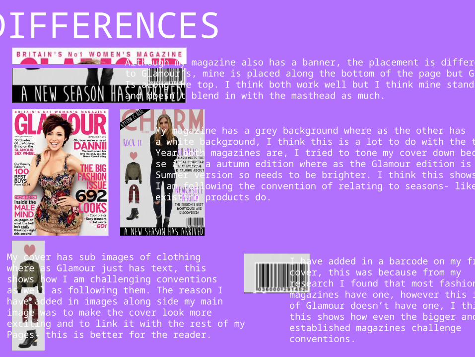
DIFFERENCESAlthough my magazine also has a banner, the placement is different to Glamour’s, mine is placed along the bottom of the page but Glamour'sIs along the top. I think both work well but I think mine stands out betterand doesn’t blend in with the masthead as much.
My magazine has a grey background where as the other hasa white background, I think this is a lot to do with the time of Year both magazines are, I tried to tone my cover down becau-se it is a autumn edition where as the Glamour edition is a Summer version so needs to be brighter. I think this shows howI am following the convention of relating to seasons- like how existing products do.
My cover has sub images of clothingwhere as Glamour just has text, this shows how I am challenging conventionsas well as following them. The reason I have added in images along side my main image was to make the cover look moreexciting and to link it with the rest of my Pages- this is better for the reader.
I have added in a barcode on my frontcover, this was because from my research I found that most fashion magazines have one, however this issueof Glamour doesn’t have one, I think this shows how even the bigger and established magazines challenge conventions.