coloured drawings analysis
TRANSCRIPT

Coloured drawings analysis
By Louis Taylor

Double page spreads Double spread one (positives)- I like this double spread firstly because of the yellow background behind the headline which will help catch the readers eyes - I also like this double page spread as it is not to complicated it has one photo and a Q and A making it easier for the reader to know what it is and not ignore the page because of to much detail.- My last reason for liking this double page spread is that the lay out is unique as the Q and A stretch's across the two pages which could be seen as a eye catcher to some readers
Double spread one (negatives)- The page may been seen as to plain to
the reader and may not catch their eye- A Q and A may not interest the reader
and they may want to hear in more detail about the artist and not just precise questions
- One picture of the artist may not be enough to get the reader interested in the page you may need various photos to help the reader recognize the person or to make the page more interesting
Double spread two (positives)- If a quote is used at the top of the page fans
will immediately recognize the quote and will be drawn into the page wanting to read it
- A photo spilling over the two pages will really catch the readers eye as it is a big image you cant really miss this may encourage the person read the page
- The yellow border around the photo of the artist will help highlight the photo on a dark background to help drag the reader in.
Double spread two (negatives)- As the article box is curved the border
going around the photo will look tacky as it will also have to curve and flow with the text box this will make the magazine look unprofessional
- By using a quote as the title it will only be relevant to some readers where others who don’t really know the artist will just ignore as they wont understand.
- By having one group photo to show a artist it isnt really making it clear who the article is about and may confuse some readers.

Contents pages
Contents page 1 (positives)- The layout is very neat and
professional on this contents page- With the background being black
the yellow features text box will catch the readers eye and make them want to read what's inside the magazine
- Variety of picture shots to make the page more interesting
Contents page 1 (negatives)- The space for where the
features are is to big and that amount of space may not be needed leaving a blank area
- The page may look to full up to a reader discouraging them to reading it
- The text box being so big for the features may no impede the background from being seen so that the yellow doesn’t even stand out on anything.
Contents page 2 (positives)- It was hard to show what I am
trying to do with the background but It is easy to have a faded background with gradient on Photoshop by using this it will make the page a lot more interesting
- Page is more spaced out so it is not to much for the reader to take in
- The photo of someone rapping is relevant to the genre of my magazine helping the reader understand what sorts of things will be in the mag
Contents page 2 (negatives)- The gradient used in the
background may be looked upon as unprofessional
- The page being to spread out may make the page look boring to the reader of the magazine
- The title is not very eye catching to the reader as it is so spaced out
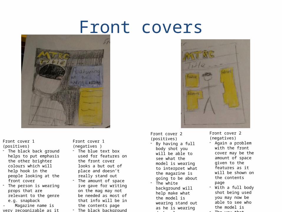
Front covers
Front cover 1 (positives)- The black back ground helps to
put emphasis the other brighter colours which will help hook in the people looking at the front cover
- The person is wearing props that are relevant to the genre e.g. snapback
- Magazine name is very recognizable as it stands out of the page.
Front cover 1 (negatives )- The blue text box used for
features on the front cover looks a but out of place and doesn’t really stand out
- The amount of space ive gave for writing on the mag may not be needed as most of that info will be in the contents page
- The black background may cancel out what the model is wearing not making him stand out
Front cover 2 (positives) - By having a full body
shot you will be able to see what the model is wearing to interpret what the magazine is going to be about
- The white background will help make what the model is wearing stand out as he is wearing dark colours
- The colour scheme of yellow and white fit into together well giving a professional look
Front cover 2 (negatives)- Again a problem with
the front cover may be the amount of space given to the features as it will be shown on the contents page
- With a full body shot being used you may now be able to see who the model is
- The way that this front cover is laid out gives it a unprofessional look from the positioning of the text etc.