color schemes - davis school district · split-complementary example: red, blue-green, yellow-green...
TRANSCRIPT


Color
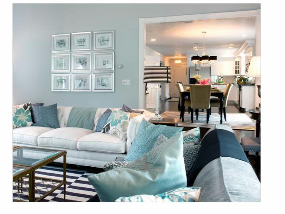
Schemeshttp://www.hgtv.com/video/warm-orange-livingdining-room-video/index.html

COLOR (Schemes)HARMONIES• A color (scheme) harmony is a pleasing
combination of colors based on their respective positions on the color wheel.
• The surest and easiest way to achieve a successful color design that is pleasing to the eye is to follow one of the standard 8 color harmonies.

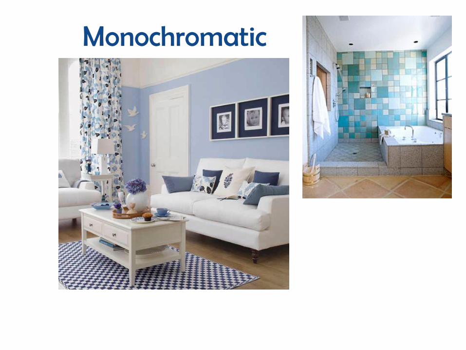
MONOCHROMATIC (Related)• Simplest scheme which uses
a single hue from the standard color wheel.– HINT: Mono = One
Chromatic = Color
• Using tints, tones or shades of the same hue.
• Accents of neutral colors can be used to add interest to the color scheme.
• Example: red, pink, burgundy, maroon, crimpson

MONOCHROMATIC
Red-violet
Violet
Blue-violetBlue
Blue-green
Green
Yellow-green
Yellow
Yellow-orange Orange
Red-orange
Red
Monochromatic

Monochromatic
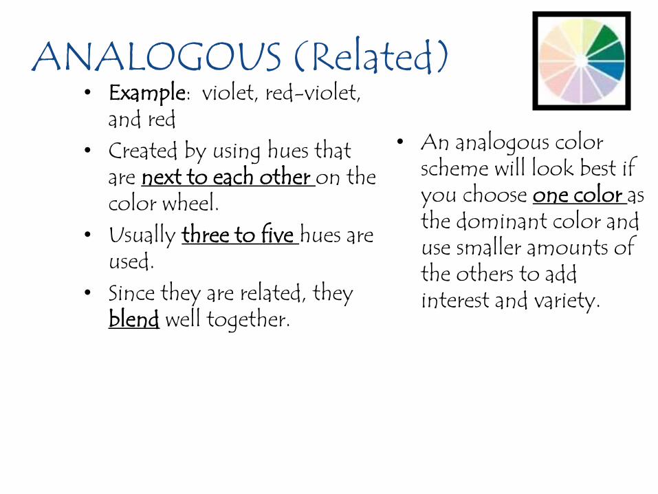
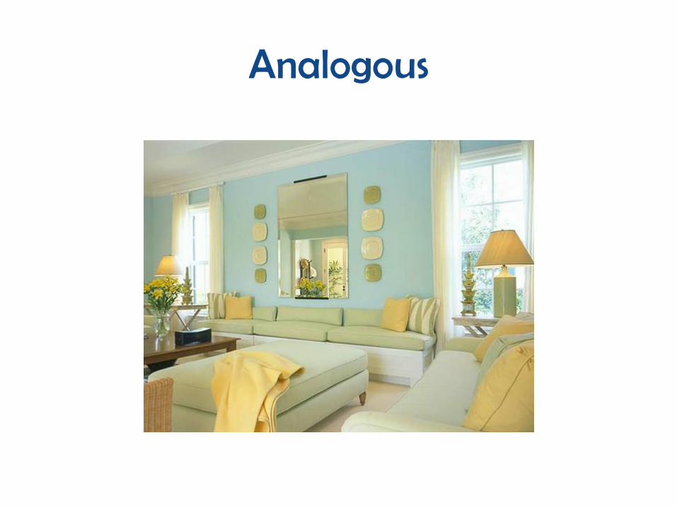
ANALOGOUS (Related)• Example: violet, red-violet,
and red • Created by using hues that
are next to each other on the color wheel.
• Usually three to five hues are used.
• Since they are related, they blend well together.
• An analogous color scheme will look best if you choose one color as the dominant color and use smaller amounts of the others to add interest and variety.

ANALOGOUS
Red-violet
Violet
Blue-violetBlue
Blue-green
Green
Yellow-green
Yellow
Yellow-orange Orange
Red-orange
Red
Analogous

Analogous

COMPLEMENTARY (Contrasting)
Example: Red and Green
Made by selecting two colors that are directly opposite each other on the color wheel.◦ Brightest and most
intense form of each color when these are used together.
A complementary scheme can make a room look bright and dramatic.

COMPLEMENTARY
Red-violet
Violet
Blue-violetBlue
Blue-green
Green
Yellow-green
Yellow
Yellow-orange Orange
Red-orange
Red

Complimentary

SPLIT-COMPLEMENTARY► Example: Red,
blue-green, yellow-green
Combining a color with the two colors found on either side of the color’s complement.◦ Blue’s complement is
Orange, so you would use the two colors on each side: yellow-orange, and red-orange.
With this color selection, the main color is the dominant one. The two colors on each side of the complement are accent colors.

Examples of Split-Complementary Schemes
Red-violet
Violet
Blue-violetBlue
Blue-green
Green
Yellow-green
Yellow
Yellow-orange Orange
Red-orange
Red
Split Complement
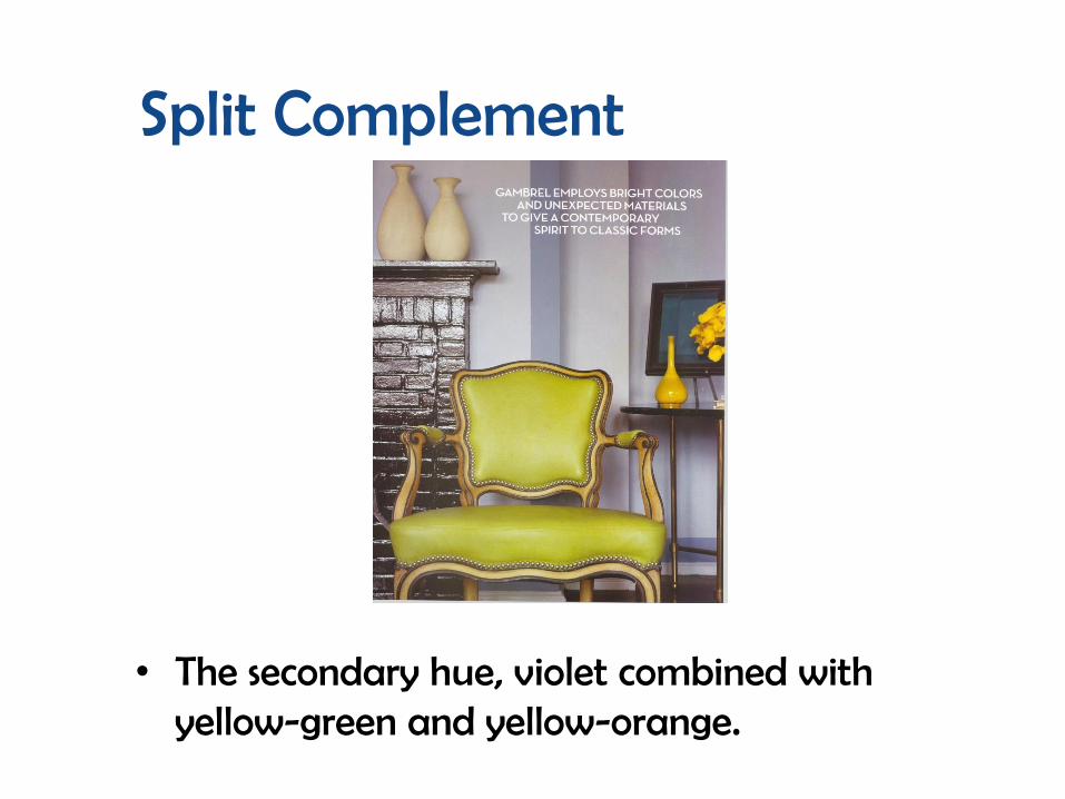
• The secondary hue, violet combined with yellow-green and yellow-orange.

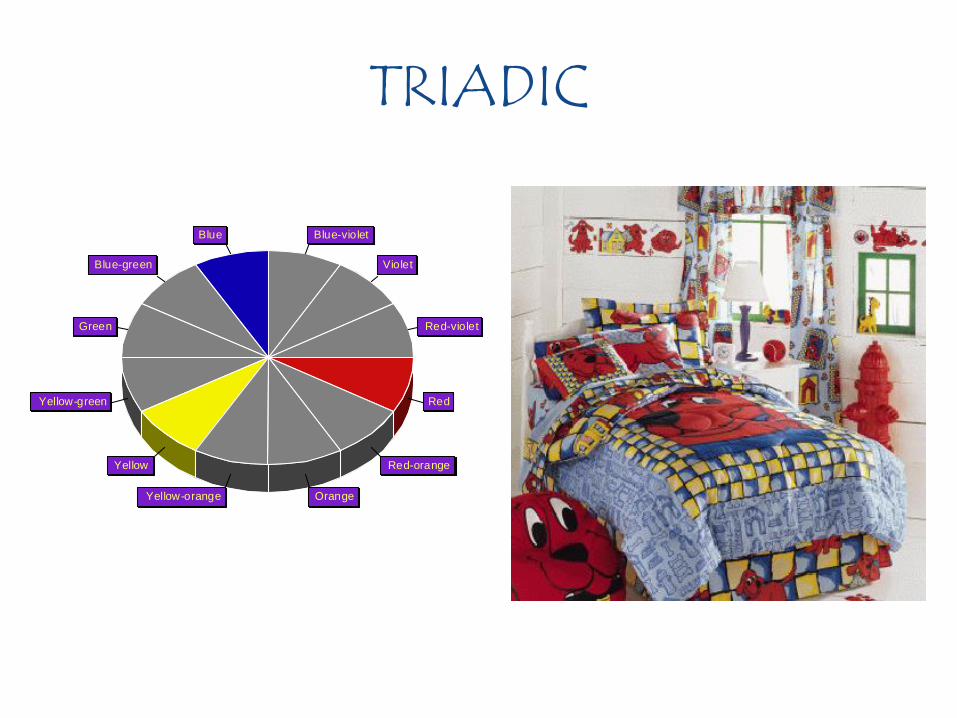
TRIADIC (Contrasting)
• Examples:– Red, Yellow, Blue– Green, Orange, Violet– Yellow-Orange, Red-Violet,
Blue-Green
• Uses any three colors that are equally distant from each other on the color wheel.
• Care and skill are needed to achieve pleasing Triadic harmonies.– Changing values and
intensities can lessen the sharp contrasts.
TRIADIC
Red-violet
Violet
Blue-violetBlue
Blue-green
Green
Yellow-green
Yellow
Yellow-orange Orange
Red-orange
Red

Triad

NEUTRAL Using only colors not found on the color wheel
Blacks, whites and grey (Achromatic Colors) – Can be used in a neutral color scheme.
Browns are considered neutral.
Neutral color schemes can be easier to live with than with vibrant color schemes.
To make this scheme look best, use a variety of textures and shapes to add interest. ◦ Black, grey, and white
◦ Brown, tan, and beige can also be used.

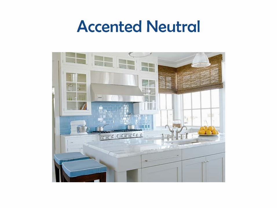
ACCENTED-NEUTRAL
• Small amounts of another color(s) added to a neutral color scheme to give the room more interest.
• Example: black, white, red

Accented Neutral
Accented Neutral

Double Complementary
• 2 combinations of complimentary colors.– Purple, yellow, blue, orange
The tetradic (double complementary) scheme is the richest of all the schemes because it uses four colors arranged into two complementary color pairs.
This scheme is hard to harmonize; if all four colors are used in equal amounts, the scheme may look unbalanced, so you should choose a color to be dominant or subdue the colors.


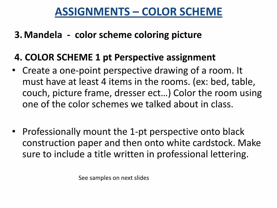
ASSIGNMENTS – COLOR SCHEME
3. Mandela - color scheme coloring picture
4. COLOR SCHEME 1 pt Perspective assignment
• Create a one-point perspective drawing of a room. It must have at least 4 items in the rooms. (ex: bed, table, couch, picture frame, dresser ect…) Color the room using one of the color schemes we talked about in class.
• Professionally mount the 1-pt perspective onto black construction paper and then onto white cardstock. Make sure to include a title written in professional lettering.
See samples on next slides

COMPLIMENTARY