chapter page layouts - itp homeexceltecc-itp.org/prinwebdes/principles of web design 5th...
TRANSCRIPT
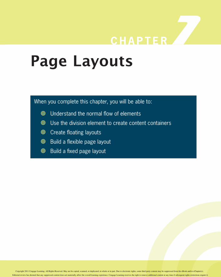
C H A P T E R 7Page Layouts
When you complete this chapter, you will be able to:
Understand the normal fl ow of elements
Use the division element to create content containers
Create fl oating layouts
Build a fl exible page layout
Build a fi xed page layout
Copyright 2011 Cengage Learning. All Rights Reserved. May not be copied, scanned, or duplicated, in whole or in part. Due to electronic rights, some third party content may be suppressed from the eBook and/or eChapter(s).
Editorial review has deemed that any suppressed content does not materially affect the overall learning experience. Cengage Learning reserves the right to remove additional content at any time if subsequent rights restrictions require it.

In a standard HTML document, the default positioning of elements is generally top to bottom and left to right. In the past, Web designers used tables to create multiple column layouts and gain more control of their page designs. HTML tables are not intended for page layout and are no longer in favor, although they still exist on many Web pages.Modern Web designs are built using the CSS layout capabilities. As you saw in Chapter 6, you can use fl oats to position content elements on a Web page and move them out of the normal fl ow of elements. In this chapter, you will learn how to expand on this concept by using fl oats to create multicolumn Web pages that can either be fl exible based on the browser size and screen resolution, or fi xed to a defi nite width. You will see how to resolve common fl oat problems, and you will get a chance to build both a fl exible and a fi xed page layout.
Understanding the Normal Flow of ElementsBy default, the browser normally displays elements on the page one after the other, depending on whether the elements are block-level or inline elements. Some elements fl oat to the left or right of other elements on the page, as you saw in Chapter 6. Element position can be aff ected by margin or padding properties, but generally the browser lays out element boxes from top to bottom and left to right until all elements that make up the Web page have been displayed.In the normal fl ow for block-level elements, boxes are laid out vertically one after the other, beginning at the top of the contain-ing block. Each box horizontally fi lls the browser window. Th e space between boxes is determined by the margin settings. Th e normal flow determines the sequence of element display with which you are familiar in standard HTML. For an example of normal fl ow, examine the following HTML code and the resulting normal fl ow diagram in Figure 7-1:<body> <h1>The Document Title</h1> <p>Lorem ipsum...</p> <p>Duis autem...</p> <p>Ut wisi enim...</p></body>
294
C H A P T E R 7 Page Layouts
Copyright 2011 Cengage Learning. All Rights Reserved. May not be copied, scanned, or duplicated, in whole or in part. Due to electronic rights, some third party content may be suppressed from the eBook and/or eChapter(s).
Editorial review has deemed that any suppressed content does not materially affect the overall learning experience. Cengage Learning reserves the right to remove additional content at any time if subsequent rights restrictions require it.

Figure 7-1 Block-level element normal fl ow
Th e <body> element is the containing element for the content sec-tion of the Web page. Th e elements within the <body> element are displayed exactly in the order they appear in the code from top to bottom, which in this example is an <h1> followed by three <p> elements. Elements do not appear next to each other unless they are fl oated (see Chapter 6) or have a display type of inline.In the normal fl ow for inline elements, boxes are laid out hori-zontally, beginning at the top left of the containing block. Th e inline boxes comprise the lines of text within, for example, a <p> element. Th e browser fl ows the text into the inline boxes, wrapping the text to the next line box as determined by the constraints of the containing box or the browser window size.When you float, or position an element, you take it out of the normal fl ow. Other elements that are not fl oated or positioned will still follow the normal fl ow, so you should check the results frequently as you are designing your layout using fl oats. Figure 7-2 shows a fl oated element on the left side of the page. Notice that
295
Understanding the Normal Flow of Elements
Copyright 2011 Cengage Learning. All Rights Reserved. May not be copied, scanned, or duplicated, in whole or in part. Due to electronic rights, some third party content may be suppressed from the eBook and/or eChapter(s).
Editorial review has deemed that any suppressed content does not materially affect the overall learning experience. Cengage Learning reserves the right to remove additional content at any time if subsequent rights restrictions require it.

the two other nonfl oating elements remain in the normal fl ow and still span the width of the browser window, even extending behind the fl oating elements. As you can see in the example, the text in the normal fl ow boxes appears in the correct position to the right of the fl oated element. Th is behavior allows text to wrap around fl oated elements such as images, which is a basic advantage of fl oats. However, when you start to use fl oats to build page layouts, the behavior of fl oats can cause problems. As you gain more expe-rience working with fl oating layouts, you will be able to anticipate and correct problems with fl oats as you code your page designs.
Nonfloating element text is displayed properly, but elements themselves actually extend behind floating element
Floating element is removedfrom the normal flow andaligned to the left of thebrowser window
Figure 7-2 Floating element is removed from the normal fl ow
Using the Division Element to Create Content ContainersTh e division element is your primary tool for creating sections of content in your Web page designs. Using the box properties you learned about in Chapter 6, you can create divisions that are any
296
C H A P T E R 7 Page Layouts
Copyright 2011 Cengage Learning. All Rights Reserved. May not be copied, scanned, or duplicated, in whole or in part. Due to electronic rights, some third party content may be suppressed from the eBook and/or eChapter(s).
Editorial review has deemed that any suppressed content does not materially affect the overall learning experience. Cengage Learning reserves the right to remove additional content at any time if subsequent rights restrictions require it.

shape you need to contain and segregate sections of content. You can create vertical columns containing content and control the white space between and within the columns. You can nest divi-sions within divisions and create interesting content presentations. Finally, you can create a division element to contain an entire Web page, often called a wrapper, to center a Web page within the browser window, regardless of screen resolution.Figure 7-3 shows a Web page created with multiple divisions. Th e wrapper division, outlined in red, contains all of the content of the Web page. Th e wrapper has three child division elements; header, navigation, and article. Each of these divisions will contain page content.
The wrapper division, outlined in red, contains all page elements
The header division, outlined in blue, contains the heading content
The article division, outlined in green, contains the article content
The navigation division, outlined in black, contains the navigation content
Figure 7-3 Web page with multiple content divisions
In Figure 7-4, you can see these same divisions with sample content. Th e banner division contains an <h1> element. Th e navigation division contains an <h2> heading and links. Th e main division contains an <h2> heading, an image and paragraph elements. Various margin and padding settings off set the content
297
Using the Division Element to Create Content Containers
Copyright 2011 Cengage Learning. All Rights Reserved. May not be copied, scanned, or duplicated, in whole or in part. Due to electronic rights, some third party content may be suppressed from the eBook and/or eChapter(s).
Editorial review has deemed that any suppressed content does not materially affect the overall learning experience. Cengage Learning reserves the right to remove additional content at any time if subsequent rights restrictions require it.

from the sides of the container elements. Th e wrapper element holds all the pieces together, and lets the page be centered in the browser window.
ImagePlaceholder
The wrapper division, outlined in red, contains all page elements
The banner division, outlined in blue, contains the heading content
The article division, outlined in green,contains the articlecontent
The navigationdivision, outlinedin black, contains the navigationcontent
Figure 7-4 Web page with multiple content divisions, fi lled with content
Creating Floating LayoutsTh e fl oat property lets you build columnar layouts by fl oating content elements to either the right or left side of the browser window. A typical Web page design can contain both fl oating and nonfl oating elements. For example, Figure 7-5 shows a Web page layout with a header, three columns of content, and a footer. Th e three columns are fl oating divisions, while the header and footer are nonfl oating. Th e nav and article columns are fl oating to the left, while the sidebar is fl oating to the right. All of the page elements are separated from each other with margin settings to provide gutters between the columns.
298
C H A P T E R 7 Page Layouts
Copyright 2011 Cengage Learning. All Rights Reserved. May not be copied, scanned, or duplicated, in whole or in part. Due to electronic rights, some third party content may be suppressed from the eBook and/or eChapter(s).
Editorial review has deemed that any suppressed content does not materially affect the overall learning experience. Cengage Learning reserves the right to remove additional content at any time if subsequent rights restrictions require it.

Nonfloating element
Nonfloating element
float: rightfloat: left
float: left orpositioned withmargin property
Figure 7-5 Floating and nonfl oating elements make up a Web page layout
Building fl oating layouts requires that you choose a method for containing the fl oating elements. Floats are designed to extend outside of their containing element. Th is is because the original concept of fl oating was to allow text to wrap around images, as you saw earlier in this chapter. When you start to build fl oat-ing layouts, you will often see that the fl oating elements extend beyond their containing elements, which will result in a “broken” layout as illustrated in Figure 7-6.
Floating elements must always have a specifi ed width or they will
expand to the size of the browser window.
299
Creating Floating Layouts
Copyright 2011 Cengage Learning. All Rights Reserved. May not be copied, scanned, or duplicated, in whole or in part. Due to electronic rights, some third party content may be suppressed from the eBook and/or eChapter(s).
Editorial review has deemed that any suppressed content does not materially affect the overall learning experience. Cengage Learning reserves the right to remove additional content at any time if subsequent rights restrictions require it.

Float extends outside of wrapper
Wrapper element should contain all content elements
Figure 7-6 Floating element extends outside of containing element
Th ere are two methods you can use to fi x this problem.
Solution 1: Using a Normal Flow ElementIf you have multiple columns, at least one needs to be nonfl oating (in the normal fl ow), and positioned with margin properties, as shown in Figure 7-7.
300
C H A P T E R 7 Page Layouts
Copyright 2011 Cengage Learning. All Rights Reserved. May not be copied, scanned, or duplicated, in whole or in part. Due to electronic rights, some third party content may be suppressed from the eBook and/or eChapter(s).
Editorial review has deemed that any suppressed content does not materially affect the overall learning experience. Cengage Learning reserves the right to remove additional content at any time if subsequent rights restrictions require it.

Wrapper element containsall content elements
Nonfloating element in the normal flow
margin-left: 200px;
float: left;width: 180px;
200 px
Figure 7-7 Using a normal fl ow element to contain fl oats
In this example, the article element is nonfl oating and has a 200-pixel left margin to position the element to the right of the fl oating nav element. Th e style rule for both the nav and the article elements looks like this:#nav { width: 180px; height: 300px; fl oat: left; border: solid thin black; margin-top: 20px; margin-left: 10px; margin-right: 10px; background-color: #fabf8f;}
#article { width: 740px; margin-left: 200px; border: solid thin black; background-color: #fff; margin-top: 20px; margin-bottom: 20px;}
301
Creating Floating Layouts
Copyright 2011 Cengage Learning. All Rights Reserved. May not be copied, scanned, or duplicated, in whole or in part. Due to electronic rights, some third party content may be suppressed from the eBook and/or eChapter(s).
Editorial review has deemed that any suppressed content does not materially affect the overall learning experience. Cengage Learning reserves the right to remove additional content at any time if subsequent rights restrictions require it.

Solution 2: Using the Clear PropertyIf you use a nonfl oating footer element (in the normal fl ow), with the clear property set to both, the containing wrapper will extend to contain all elements, as shown in Figure 7-8.
float: left float: right
Nonfloating element with clear property set to both
Nonfloating element
float: left
Figure 7-8 Using the clear property to contain fl oats
In this example, the footer element is nonfl oating and has the clear property set to both. Th is forces the wrapper to extend beyond the footer property and contain all of the content elements on the page. Th e style rule for the footer elements looks like this:#footer { width: 940px; height: 75px; margin-left: 10px; clear: both; border: solid thin black; background-color: #e5dfec;}
302
C H A P T E R 7 Page Layouts
Copyright 2011 Cengage Learning. All Rights Reserved. May not be copied, scanned, or duplicated, in whole or in part. Due to electronic rights, some third party content may be suppressed from the eBook and/or eChapter(s).
Editorial review has deemed that any suppressed content does not materially affect the overall learning experience. Cengage Learning reserves the right to remove additional content at any time if subsequent rights restrictions require it.

Because some type of footer is a consistent design feature in most Web sites, this second solution works very well. Your footer can be as simple as a horizontal rule <hr> element or a graphic contained with a footer division.
Floating Elements Within FloatsUsing fl oating elements gives you a wide variety of options for building interesting page layouts. For example, you can fl oat elements within fl oating elements, as shown in Figure 7-9.
Right margin offsets the pull quote from the containing element’s edge
Floating pull quote element within the floating article element
Figure 7-9 Floating element within a fl oat
In this example, a fl oating element within the article element con-tains a pull quote, a quotation or excerpt from the main article that would be used to draw the reader’s attention to the article. Th is element fl oats right within the article element, and is off set from the border of the article element with a right margin. An image element can also be fl oated using this same method.When you are fl oating an element within another element, the order of the elements is important. In the example in Figure 7-10, the fl oating pull quote element follows the heading element and precedes the paragraph content. If this order is not followed, the
303
Creating Floating Layouts
Copyright 2011 Cengage Learning. All Rights Reserved. May not be copied, scanned, or duplicated, in whole or in part. Due to electronic rights, some third party content may be suppressed from the eBook and/or eChapter(s).
Editorial review has deemed that any suppressed content does not materially affect the overall learning experience. Cengage Learning reserves the right to remove additional content at any time if subsequent rights restrictions require it.

pull quote would appear at the bottom of the article rather than in its correct position. Figure 7-10 shows the order of the elements within the article element.
1. Heading is first in order
3. Paragraphs are third in order
2. Pull Quote is second in order
Figure 7-10 Float order is important
In contrast, Figure 7-11 shows what happens to the layout when the correct fl oat order is not maintained. In this example, the order of the pull quote element and the paragraphs has been switched, with unintended results. Th e pull quote is pushed out of its container element because the paragraph elements take up all of the room in the article element.
304
C H A P T E R 7 Page Layouts
Copyright 2011 Cengage Learning. All Rights Reserved. May not be copied, scanned, or duplicated, in whole or in part. Due to electronic rights, some third party content may be suppressed from the eBook and/or eChapter(s).
Editorial review has deemed that any suppressed content does not materially affect the overall learning experience. Cengage Learning reserves the right to remove additional content at any time if subsequent rights restrictions require it.

1. Heading is first in order
2. Paragraphs are second in order
3. Pull Quote is third in order
Figure 7-11 Incorrect fl oat order causes layout problems
Fixing Column DropsColumn drops occur when the total width of the columnar elements in a page layout exceeds the width of their containing element. Th e width of a box element includes the total of its width value plus any left or right padding, border, and margins. Figure 7-12 shows an example of column drop caused by the total width of the contained columns being greater than the width of the containing wrapper element.
305
Creating Floating Layouts
Copyright 2011 Cengage Learning. All Rights Reserved. May not be copied, scanned, or duplicated, in whole or in part. Due to electronic rights, some third party content may be suppressed from the eBook and/or eChapter(s).
Editorial review has deemed that any suppressed content does not materially affect the overall learning experience. Cengage Learning reserves the right to remove additional content at any time if subsequent rights restrictions require it.

Container width 600 pixels
Width 180px+ 2px border+ 10px left margin= 192 pixels
Width 180px+ 2px border+ 10px left margin= 192 pixels
Width 200px+ 2px border+ 10px left margin+ 10px right margin= 222 pixels
Figure 7-12 Column drop caused by combined element width being greater than container width
If you total the width of the three elements (192 + 192 + 222 = 606), the sum is greater than 600 pixels, the width of the containing element, forcing Column 3 to drop below the other columns because the layout does not provide enough horizontal width. To solve this problem, the width of Column 3 can be reduced to 180 pixels, reducing the overall width of the columns to 586 pixels.
Clearing Problem FloatsWhen you are designing fl oat-based layouts, fl oats occasionally do not appear exactly where you want them to appear. Th e clear property can help you solve this problem. For example, in Figure 7-13a, the footer element fl oats left and should appear below Column 1, but instead it fl oats in order after Column 2. To move it down the page to its correct position, add the clear property set to a value of left to move the footer down the page and align it with the next clear left edge of the browser window, as shown in Figure 7-13b.
306
C H A P T E R 7 Page Layouts
Copyright 2011 Cengage Learning. All Rights Reserved. May not be copied, scanned, or duplicated, in whole or in part. Due to electronic rights, some third party content may be suppressed from the eBook and/or eChapter(s).
Editorial review has deemed that any suppressed content does not materially affect the overall learning experience. Cengage Learning reserves the right to remove additional content at any time if subsequent rights restrictions require it.

Footer element incorrectly positioned
Footer elementclearedto left edge
a. b.
Figure 7-13 Problem fl oats fi xed with the clear property
Building a Flexible Page LayoutFlexible layouts, sometimes known as liquid layouts, adapt to the size of the browser window. Flexible layouts shift as the user resizes the window, wrapping text or adding white space as neces-sary. In Figure 7-14, the fl exible layout contains three elements.
Header defaults to 100% of browser window
width: 80%; float: left;margin-left: 2%;
2% margin
width: 15%; float: left;
Figure 7-14 Flexible layout
307
Building a Flexible Page Layout
Copyright 2011 Cengage Learning. All Rights Reserved. May not be copied, scanned, or duplicated, in whole or in part. Due to electronic rights, some third party content may be suppressed from the eBook and/or eChapter(s).
Editorial review has deemed that any suppressed content does not materially affect the overall learning experience. Cengage Learning reserves the right to remove additional content at any time if subsequent rights restrictions require it.

Th e header element has no width set, so it defaults to the width of the browser window as any normal fl ow element would. Below the header element are two fl oating elements, nav and article. Th ese elements have fl exible widths set as well. Th e style rules for these three elements follows:#header { height: 75px; margin-top: 1em; margin-bottom: 10px; border: solid thin black; background-color: #e5dfec;}
#nav { width: 15%; height: 500px; fl oat: left; border: solid thin black; background-color: #fabf8f;}
#article { width: 80%; height: 500px; fl oat: left; margin-left: 2%; border: solid thin black; background-color: #fff;}
Notice that the two widths for the fl oating elements do not equal 100% because the borders and margin contribute to the width of each element. Setting the values to equal 100% would overfl ow the layout window. Th e nav and article elements both fl oat left. Th e article element has a 2% left margin, meaning that the margin changes size as the layout resizes to display a consistent gutter between the fl oating elements.Flexible layouts off er the advantage of adapting to the user’s browser size. From a design viewpoint, this can be less desirable because of the wide range of monitor sizes and resolutions. With a fl exible layout, your content has to adapt and look good at wide range of layout sizes, which can be diffi cult to achieve. (Refer to the Broads Authority Web site in Figures 2-8 through 2-11 in Chapter 2 as an example.) Figure 7-15 shows a simple fl exible layout at two widely diff erent screen resolutions. Notice how the content adapts to the diff erent resolutions. With a simple layout, fl exible Web sites resize gracefully, but with more complex content and page designs, you may want to restrict your design with the min-width and max-width properties described in the next section.
In the code example for Figure 7-14, note that the height property
is used in both the nav and article elements. You normally want to avoid using height on elements that contain varying lengths of content, as too much content will overfl ow a fi xed height.
308
C H A P T E R 7 Page Layouts
Copyright 2011 Cengage Learning. All Rights Reserved. May not be copied, scanned, or duplicated, in whole or in part. Due to electronic rights, some third party content may be suppressed from the eBook and/or eChapter(s).
Editorial review has deemed that any suppressed content does not materially affect the overall learning experience. Cengage Learning reserves the right to remove additional content at any time if subsequent rights restrictions require it.

1024 x 768 resolution
1366 x 768 resolution
Figure 7-15 Flexible layout adapts to different screen resolutions
309
Building a Flexible Page Layout
Copyright 2011 Cengage Learning. All Rights Reserved. May not be copied, scanned, or duplicated, in whole or in part. Due to electronic rights, some third party content may be suppressed from the eBook and/or eChapter(s).
Editorial review has deemed that any suppressed content does not materially affect the overall learning experience. Cengage Learning reserves the right to remove additional content at any time if subsequent rights restrictions require it.

Controlling Flexible Layout WidthYou can control the compression and expansion of your content in a fl exible layout by setting minimum and maximum widths for your content. As you saw in Chapter 6, the min-width and max-width properties let you set these properties for an element. You can add a wrapper element that contains the page elements, and then set the minimum and maximum sizes to control the bound-aries of the page layout.In the following style rule for the wrapper, the min-width value stops the shrinking of the layout at 750 pixels, which is an opti-mum width for an 800 x 600 monitor; the max-width value stops the expansion of the layout at 1220 pixels, the optimum width for a 1280 x 1024 display. Any monitor with a higher resolution will display the layout at 1220 pixels wide, maintaining the integrity of the layout.div.wrapper { width: 100%; min-width: 750px; max-width: 1220px;
}
You would then apply the wrapper to a <div> element that con-tains all other elements in your page layout. Th e following code shows a simplifi ed version of what the wrapper <div> looks like in HTML:<div id="wrapper"> <!—opens wrapper -->
<div id="header"> header content... </div><div id="nav"> nav content... </div><div id="article"> article content... </div>
</div> <!—closes wrapper -->
You will build a wrapper division to contain a page layout like this in the Hands-on Activities later in the chapter.
Activity: Creating a Flexible LayoutIn the following steps, you will build a fl exible two-column layout to practice using fl oating elements within a fl exible design. As you work through the steps, refer to Figure 7-19 to see the results you will achieve. New code that you will add is shown in blue. Save your fi le and test your work in a browser as you complete each step.
To avoid guess-ing screen measurements, use a share-ware tool
such as Screen Ruler, available from www.microfox.com,to easily measure pixels on your computer monitor.
310
C H A P T E R 7 Page Layouts
Copyright 2011 Cengage Learning. All Rights Reserved. May not be copied, scanned, or duplicated, in whole or in part. Due to electronic rights, some third party content may be suppressed from the eBook and/or eChapter(s).
Editorial review has deemed that any suppressed content does not materially affect the overall learning experience. Cengage Learning reserves the right to remove additional content at any time if subsequent rights restrictions require it.

To create the fl exible layout:1. Copy the fl exible_layout.htm fi le from the Chapter07
folder provided with your Data Files to the Chapter07 folder in your work folder. (Create the Chapter07 folder, if necessary.)
2. Open the fi le fl exible_layout.htm in your HTML editor, and save it in your work folder as fl exible_layout1.htm.
3. In your browser, open the fi le fl exible_layout1.htm. When you open the fi le, it looks like Figure 7-16.
Elements are displayed in the normal flow
Figure 7-16 Flexible layout activity Web page
When you fi rst look at the style rule you only see the basic formatting properties as shown:<style type="text/css">body {font-family: arial;}h3 {font-family: arial; margin-left: 10px;}.copy {margin-left: 20px}</style>
311
Activity: Creating a Flexible Layout
Copyright 2011 Cengage Learning. All Rights Reserved. May not be copied, scanned, or duplicated, in whole or in part. Due to electronic rights, some third party content may be suppressed from the eBook and/or eChapter(s).
Editorial review has deemed that any suppressed content does not materially affect the overall learning experience. Cengage Learning reserves the right to remove additional content at any time if subsequent rights restrictions require it.

Th ere are no style rules for any of the content elements, so all are displayed in the normal fl ow, top to bottom in order and left-aligned to the browser window.Each division element in the code already has the id names in place, as shown in the code for the header section:<div id="header"><h3>Header Text</h3></div>
Formatting the Header1. Begin by formatting the header division. Within the <style>
element, add a style rule that selects the id named header and sets the height to 80 pixels.#header {height: 80px;}
2. Add margins to off set the header from the top of the browser window and the content below by 10 pixels.#header { height: 80px; margin-top: 10px; margin-bottom: 10px;}
3. Align the text to the center of the header, add a solid thin black border, and apply light purple as the background color (#e5dfec).#header { height: 80px; margin-top: 10px; margin-bottom: 10px; text-align: center; border: solid thin black; background-color: #e5dfec;}
4. Save your fi le and preview the work in the browser. Th e header is now formatted, as shown in Figure 7-17.
312
C H A P T E R 7 Page Layouts
Copyright 2011 Cengage Learning. All Rights Reserved. May not be copied, scanned, or duplicated, in whole or in part. Due to electronic rights, some third party content may be suppressed from the eBook and/or eChapter(s).
Editorial review has deemed that any suppressed content does not materially affect the overall learning experience. Cengage Learning reserves the right to remove additional content at any time if subsequent rights restrictions require it.

Formatted header
Figure 7-17 Completed header division
Formatting the Nav Division1. Add a new selector for the id named nav, and set the
division to fl oat left with a width of 15%.#nav { fl oat: left; width: 15%;}
2. Set the height to 500 pixels and align the text to center.#nav { fl oat: left; width: 15%; height: 500px; text-align: center;}
3. Add a solid thin black border and set the background color to light orange (#fabf8f ).#nav { fl oat: left; width: 15%; height: 500px; text-align: center; border: solid thin black; background-color: #fabf8f;}
4. Save your fi le and preview the work in the browser. Th e nav division is now formatted, as shown in Figure 7-18. Th e article division needs some work, which you will do in the next set of steps.
313
Activity: Creating a Flexible Layout
Copyright 2011 Cengage Learning. All Rights Reserved. May not be copied, scanned, or duplicated, in whole or in part. Due to electronic rights, some third party content may be suppressed from the eBook and/or eChapter(s).
Editorial review has deemed that any suppressed content does not materially affect the overall learning experience. Cengage Learning reserves the right to remove additional content at any time if subsequent rights restrictions require it.

Formatted nav division
Figure 7-18 Completed nav division
Formatting the Article Division1. Within the <style> element, add a style rule that selects the
id named article and sets it to fl oat left with a width of 80%.#article { fl oat: left; width: 80%;}
2. Set a left margin of 2%. Th is allows the margin to adapt to diff erent browser widths. Also set a background-color of white (#ff f ).#article { fl oat: left; width: 80%; margin-left: 2%; background-color: #fff;}
3. Save your fi le and preview the work in the browser. Th e article division is now formatted, as shown in Figure 7-19, which completes the Web page layout. Notice as you shrink and expand the browser window the content adapts to fi ll the window.
314
C H A P T E R 7 Page Layouts
Copyright 2011 Cengage Learning. All Rights Reserved. May not be copied, scanned, or duplicated, in whole or in part. Due to electronic rights, some third party content may be suppressed from the eBook and/or eChapter(s).
Editorial review has deemed that any suppressed content does not materially affect the overall learning experience. Cengage Learning reserves the right to remove additional content at any time if subsequent rights restrictions require it.

Figure 7-19 Completed fl exible layout
Th e complete style sheet for the Web page in Figure 7-19 is as follows:<style type="text/css">body {font-family: arial;}h3 {font-family: arial; margin-left: 10px;}.copy {margin-left: 20px}
#header { height: 80px; margin-top: 10px; margin-bottom: 10px; text-align: center; border: solid thin black; background-color: #e5dfec;}
#nav { fl oat: left; width: 15%; height: 500px; text-align: center; border: solid thin black; background-color: #fabf8f;}
#article { fl oat: left;
315
Activity: Creating a Flexible Layout
Copyright 2011 Cengage Learning. All Rights Reserved. May not be copied, scanned, or duplicated, in whole or in part. Due to electronic rights, some third party content may be suppressed from the eBook and/or eChapter(s).
Editorial review has deemed that any suppressed content does not materially affect the overall learning experience. Cengage Learning reserves the right to remove additional content at any time if subsequent rights restrictions require it.

width: 80%; margin-left: 2%; background-color: #fff; }</style>
Building a Fixed Page LayoutFixed layouts remain constant despite the resizing of the browser in diff erent screen resolutions and monitor sizes. Many design-ers prefer fi xed layouts because they have more control over the fi nished design. Th ey can also build more complex layouts because they can be fairly sure of consistent results. Fixed layouts are nor-mally contained by a wrapper element that controls the page width and centers the page in the browser window. Within the wrap-per, you can choose whether to contain only fi xed-size elements, percentage elements, or a combination of the two. Because the outside width of the page is fi xed, the design is more precise, and content can fl ow down the page as necessary. Pixel measurements are favored by many designers when creating fi xed designs.Figure 7-20 shows a two-column layout that contains four elements.
Header element has fixed width
Wrapper element has fixed width that controls the width of the layout
Nav element floats left and has fixed width and height
Article element has a fixed width and left margin of 220 pixels
Figure 7-20 Two-column fi xed layout
Refer to Figures 2-12 and 2-13 (The Boston Vegetarian
Society Web site) for examples of a fi xed layout.
316
C H A P T E R 7 Page Layouts
Copyright 2011 Cengage Learning. All Rights Reserved. May not be copied, scanned, or duplicated, in whole or in part. Due to electronic rights, some third party content may be suppressed from the eBook and/or eChapter(s).
Editorial review has deemed that any suppressed content does not materially affect the overall learning experience. Cengage Learning reserves the right to remove additional content at any time if subsequent rights restrictions require it.

A wrapper division contains the other content elements and sets the fi xed width for the layout. Header, nav, and article elements contain the page content. Th e nav element fl oats to the left and has a fi xed width and height. Th e article element has a margin-left property that positions it on the page.Th e style rules for these four elements follows:#wrapper { width: 960px; margin-right: auto; margin-left: auto; border: thin solid black; background-color: #ffc;}
#header { width: 930px; height: 100px; margin-top: 10px; margin-left: 10px; border: thin solid black; background-color: #e5dfec;}
#nav { width: 200px; height: 450px; fl oat: left; border: thin solid black; margin: 20px 20px 0px 10px; text-align: center; background-color: #fabf8f;}
#article { width: 718px; border: thin solid black; margin: 20px 8px 20px 220px; background-color: #fff;}
317
Building a Fixed Page Layout
Copyright 2011 Cengage Learning. All Rights Reserved. May not be copied, scanned, or duplicated, in whole or in part. Due to electronic rights, some third party content may be suppressed from the eBook and/or eChapter(s).
Editorial review has deemed that any suppressed content does not materially affect the overall learning experience. Cengage Learning reserves the right to remove additional content at any time if subsequent rights restrictions require it.

Notice that the wrapper element has a fi xed width, but no fi xed height, allowing content to fl ow down the page as necessary. Th e 960 pixel value for the width refl ects the current base screen reso-lution of 1024 x 768; this may change based on your user’s needs.Th e header is in the normal fl ow and has a fi xed width and height. Th e nav division fl oats left and has a fi xed width and height as well. Th is element can be made more fl exible by removing the height property and letting the content determine the height of the element.Th e article element has a fi xed width but no height, allowing the height of the element to be based on the amount of its content. Th e article element has a left margin (the last value in the margin property) that off sets the article 220 pixels from the left side of the browser window.
Controlling Fixed Layout CenteringAnother benefi t of using a wrapper division to contain your lay-out is the ability to automatically center the layout horizontally in the browser. Th is is a great solution for wide-screen monitors, as your layout will always be centered regardless of the screen resolu-tion. Automatic centering is a simple use of the margin property. In the following style rule for the wrapper division in Figure 7-20, the margin-left and margin-right properties are set to auto, tell-ing the browser to automatically proportion the extra space in the browser window, resulting in a centered layout.#wrapper { width: 960px; margin-left: auto; margin-right: auto; border: thin solid black; background-color: #ffc;}
318
C H A P T E R 7 Page Layouts
Copyright 2011 Cengage Learning. All Rights Reserved. May not be copied, scanned, or duplicated, in whole or in part. Due to electronic rights, some third party content may be suppressed from the eBook and/or eChapter(s).
Editorial review has deemed that any suppressed content does not materially affect the overall learning experience. Cengage Learning reserves the right to remove additional content at any time if subsequent rights restrictions require it.

Figure 7-21 shows the centered two-column fi xed layout in a 1366 x 768 screen resolution.
Browser proportions the margin space automatically
Figure 7-21 Centered two-column fi xed layout
Activity: Creating a Fixed LayoutIn the following steps, you will build a fi xed three-column layout to practice using fl oating elements within a fi xed design. As you work through the steps, refer to Figure 7-28 to see the results you will achieve. New code that you will add is shown in blue. Save your fi le and test your work in a browser as you complete each step.To create the fi xed layout:
1. Copy the fi xed_layout.htm fi le from the Chapter07 folder provided with your Data Files to the Chapter07 folder in your work folder. (Create the Chapter07 folder, if necessary.)
2. Open the fi le fi xed_layout.htm in your HTML editor, and save it in your work folder as fi xed_layout1.htm.
3. In your browser, open the fi le fi xed_layout1.htm. When you open the fi le it looks like Figure 7-22.
319
Building a Fixed Page Layout
Copyright 2011 Cengage Learning. All Rights Reserved. May not be copied, scanned, or duplicated, in whole or in part. Due to electronic rights, some third party content may be suppressed from the eBook and/or eChapter(s).
Editorial review has deemed that any suppressed content does not materially affect the overall learning experience. Cengage Learning reserves the right to remove additional content at any time if subsequent rights restrictions require it.

Figure 7-22 Fixed layout activity Web page
When you fi rst look at the CSS style rules, you only see the basic formatting rules as shown:<style type="text/css">body {font-family: arial;}h1 {margin-left: 20px;}.copy {margin-left: 20px; margin-right: 10px;}.title {margin-left: 20px;}</style>
Th ere are no style rules for any of the content elements, so all are displayed in the normal fl ow, top to bottom in order and left-aligned to the browser window.
320
C H A P T E R 7 Page Layouts
Copyright 2011 Cengage Learning. All Rights Reserved. May not be copied, scanned, or duplicated, in whole or in part. Due to electronic rights, some third party content may be suppressed from the eBook and/or eChapter(s).
Editorial review has deemed that any suppressed content does not materially affect the overall learning experience. Cengage Learning reserves the right to remove additional content at any time if subsequent rights restrictions require it.

Creating the Wrapper Division1. Start the project by creating the wrapper division element
that will contain the Web page content. Add a style rule that selects an id named wrapper. Set the width of the element to 1220 pixels for a 1280 x 1024 resolution.#wrapper { width: 1220px;}
2. Add margin-right and margin-left properties, and set these to auto so the page is automatically centered in the browser window.#wrapper { width: 1220px; margin-right: auto; margin-left: auto;}
3. Add a thin solid border and a background color of light yellow (#ff c) to complete the wrapper style rule.#wrapper { width: 1220px; margin-right: auto; margin-left: auto; border: thin solid; background-color: #ffc;}
4. Save your work and view it in the browser. Figure 7-23 shows the completed wrapper division.
If you are working with a monitor that has a lower resolution,
such as 1024 x 768, you can adjust the width to a smaller width measurement, say 960 pixels. You will also have to adjust the widths of the contained division elements accordingly.
321
Building a Fixed Page Layout
Copyright 2011 Cengage Learning. All Rights Reserved. May not be copied, scanned, or duplicated, in whole or in part. Due to electronic rights, some third party content may be suppressed from the eBook and/or eChapter(s).
Editorial review has deemed that any suppressed content does not materially affect the overall learning experience. Cengage Learning reserves the right to remove additional content at any time if subsequent rights restrictions require it.

Wrapper division, outlined in black, contains all other content elements
Figure 7-23 Completed wrapper division
Creating the Header Division1. Add a style rule that selects an id named header. Set the
width to 1200 pixels and the height to 100 pixels.#header { width: 1200px; height: 100px;}
2. Add a top margin of 10 pixels and a left margin of 10 pixels.#header { width: 1200px; height: 100px; margin-top: 10px; margin-left: 10px;}
322
C H A P T E R 7 Page Layouts
Copyright 2011 Cengage Learning. All Rights Reserved. May not be copied, scanned, or duplicated, in whole or in part. Due to electronic rights, some third party content may be suppressed from the eBook and/or eChapter(s).
Editorial review has deemed that any suppressed content does not materially affect the overall learning experience. Cengage Learning reserves the right to remove additional content at any time if subsequent rights restrictions require it.

3. Finish the header division by adding a solid thin border and a background color of light purple (#e5dfec).#header { width: 1200px; height: 100px; margin-top: 10px; margin-left: 10px; border: thin solid; background-color: #e5dfec;}
4. Save your work and view it in the browser. Figure 7-24 shows the completed header division.
Header division
Figure 7-24 Completed header division
323
Building a Fixed Page Layout
Copyright 2011 Cengage Learning. All Rights Reserved. May not be copied, scanned, or duplicated, in whole or in part. Due to electronic rights, some third party content may be suppressed from the eBook and/or eChapter(s).
Editorial review has deemed that any suppressed content does not materially affect the overall learning experience. Cengage Learning reserves the right to remove additional content at any time if subsequent rights restrictions require it.

Creating the Nav Division1. Add a style rule that selects an id named nav. Set the width
to 200 pixels and the height to 600 pixels.#nav { width: 200px; height: 600px;}
2. Float the nav division to the left. Use the margin shorthand properties to set the following margin values: • Top margin: 20 pixels • Right margin: 14 pixels • Bottom margin: 0 pixels • Left margin: 10 pixels#nav { width: 200px; height: 600px; fl oat: left; margin: 20px 14px 0px 10px;}
3. Complete the nav division by aligning the text to the center, adding a thin solid border, and setting the back-ground color to light orange (#fabf8f ).#nav { width: 200px; height: 600px; fl oat: left; margin: 20px 14px 0px 10px; text-align: center; border: thin solid; background-color: #fabf8f;}
4. Save your work and view it in the browser. Figure 7-25 shows the completed nav division.
324
C H A P T E R 7 Page Layouts
Copyright 2011 Cengage Learning. All Rights Reserved. May not be copied, scanned, or duplicated, in whole or in part. Due to electronic rights, some third party content may be suppressed from the eBook and/or eChapter(s).
Editorial review has deemed that any suppressed content does not materially affect the overall learning experience. Cengage Learning reserves the right to remove additional content at any time if subsequent rights restrictions require it.

Nav division
Figure 7-25 Complete nav division
Creating the Article Division1. Add a style rule that selects an id named article. Set the
width to 778 pixels and fl oat the division to the left.#article { width: 778px; fl oat: left;}
2. Use the margin shorthand properties to set the following margin values: • Top margin: 20 pixels • Right margin: 0 pixels
325
Building a Fixed Page Layout
Copyright 2011 Cengage Learning. All Rights Reserved. May not be copied, scanned, or duplicated, in whole or in part. Due to electronic rights, some third party content may be suppressed from the eBook and/or eChapter(s).
Editorial review has deemed that any suppressed content does not materially affect the overall learning experience. Cengage Learning reserves the right to remove additional content at any time if subsequent rights restrictions require it.

• Bottom margin: 20 pixels • Left margin: 0 pixels#article { width: 778px; fl oat: left; margin: 20px 0px 20px 0px;}
3. Add a thin solid border and a background color of white (#ff f ) to complete the article division.#article { width: 778px; fl oat: left; margin: 20px 0px 20px 0px; border: thin solid; background-color: #fff;}
4. Save your work and view it in the browser. Figure 7-26 shows the completed article division.Notice that the fl oating elements are no longer properly contained within the wrapper division. You will fi x this when you create the footer division at the end of this activity.
Completed article division
Wrapper divisiondoes not containfloats correctly
Figure 7-26 Completed article division
326
C H A P T E R 7 Page Layouts
Copyright 2011 Cengage Learning. All Rights Reserved. May not be copied, scanned, or duplicated, in whole or in part. Due to electronic rights, some third party content may be suppressed from the eBook and/or eChapter(s).
Editorial review has deemed that any suppressed content does not materially affect the overall learning experience. Cengage Learning reserves the right to remove additional content at any time if subsequent rights restrictions require it.

Creating the Sidebar Division1. Add a style rule that selects an id named sidebar. Set the
width to 200 pixels and the height to 600 pixels.#sidebar { width: 200px; height: 600px;}
2. Float the sidebar division to the right.#sidebar { width: 200px; height: 600px; fl oat: right;}
3. Use the margin shorthand properties to set the following margin values: • Top margin: 20 pixels • Right margin: 8 pixels • Bottom margin: 0 pixels • Left margin: 0 pixels#sidebar { width: 200px; height: 600px; fl oat: right; margin: 20px 8px 0px 0px;}
4. Add a thin solid border and a background color of light blue (#c6d9f1) to complete the sidebar division.#sidebar { width: 200px; height: 600px; fl oat: right; margin: 20px 8px 0px 0px; border: solid thin; background-color: #c6d9f1;}
5. Save your work and view it in the browser. Figure 7-27 shows the completed sidebar division. Th e fl oating elements are still not properly contained within the wrapper division.
327
Building a Fixed Page Layout
Copyright 2011 Cengage Learning. All Rights Reserved. May not be copied, scanned, or duplicated, in whole or in part. Due to electronic rights, some third party content may be suppressed from the eBook and/or eChapter(s).
Editorial review has deemed that any suppressed content does not materially affect the overall learning experience. Cengage Learning reserves the right to remove additional content at any time if subsequent rights restrictions require it.

Wrapper divisiondoes not containfloats correctly
Completedsidebar division
Figure 7-27 Completed sidebar division
Creating the Footer Division and Containing the Floats1. Add a style rule that selects an id named footer. Set the
width to 1200 pixels and the height to 75 pixels.#footer { width: 1200px; height: 75px;}
2. Add the clear property and set the value to both. Th is will fi x the fl oat containment problem you have seen in the previous steps.#footer { width: 1200px; height: 75px; clear: both;}
328
C H A P T E R 7 Page Layouts
Copyright 2011 Cengage Learning. All Rights Reserved. May not be copied, scanned, or duplicated, in whole or in part. Due to electronic rights, some third party content may be suppressed from the eBook and/or eChapter(s).
Editorial review has deemed that any suppressed content does not materially affect the overall learning experience. Cengage Learning reserves the right to remove additional content at any time if subsequent rights restrictions require it.

3. Finish the footer by adding a solid thin border, setting the left and bottom margins to 10 pixels, and adding a back-ground color of pink (#efdfec).#footer { width: 1200px; height: 75px; clear: both; border: solid thin; margin-left: 10px; margin-bottom: 10px; background-color: #efdfec;}
4. Save your work and test the fi le in the browser. You will see that the wrapper now contains all of the fl oating elements, as shown in Figure 7-28.
Figure 7-28 Completed fi xed layout
329
Building a Fixed Page LayoutBuilding a Fixed Page Layout
Copyright 2011 Cengage Learning. All Rights Reserved. May not be copied, scanned, or duplicated, in whole or in part. Due to electronic rights, some third party content may be suppressed from the eBook and/or eChapter(s).
Editorial review has deemed that any suppressed content does not materially affect the overall learning experience. Cengage Learning reserves the right to remove additional content at any time if subsequent rights restrictions require it.

Chapter Summary
In this chapter, you learned to apply the CSS box properties to Web page design. You learned about the normal fl ow of elements in the document and how the fl oat property lets you remove elements from the normal fl ow. You learned how to create both fl exible and fi xed layouts, and to resolve problems such as dropped columns and incorrectly positioned fl oats. Finally, you applied what you learned by building two complete page layouts using the box properties. • Th e normal fl ow dictates the way in which elements normally
are displayed in the browser window.• When you remove an element from the normal fl ow, you may
see unexpected behavior from other elements that are following the normal fl ow.
• Remember to always use a width property for fl oating elements; otherwise, the element will extend across the page like elements in the normal fl ow.
• Remember to avoid using the height property unless you are containing elements such as images that do not change size.
• For fi xed layouts, content elements are usually contained with a wrapper element that sets the width for the page layout.
Key Termscolumn drop—A layout error that occurs when the total width of the columnar elements in a page layout exceeds the width of their containing element.
fixed layout—A layout that remains constant despite the resizing of the browser in diff erent screen resolutions and monitor sizes.
flexible layout—A layout that shifts as the user resizes the window, wrapping text or adding white space as necessary to adapt to the size of the browser window. Also called liquid layouts.
float—To position an element by taking it out of the normal fl ow of the Web page layout.
330
C H A P T E R 7 Page Layouts
Copyright 2011 Cengage Learning. All Rights Reserved. May not be copied, scanned, or duplicated, in whole or in part. Due to electronic rights, some third party content may be suppressed from the eBook and/or eChapter(s).
Editorial review has deemed that any suppressed content does not materially affect the overall learning experience. Cengage Learning reserves the right to remove additional content at any time if subsequent rights restrictions require it.

normal flow—Th e sequence of element display in standard HTML from top to bottom and left to right until all elements that make up the Web page have been displayed.
wrapper—A division element designed to contain an entire Web page.
Review Questions
1. What is the normal fl ow for block-level elements?
2. Which element is the primary tool for creating sections of content in a Web page?
3. What is the common name for the content container for a Web page?
4. Would you normally use the height property when designing Web pages? Why or why not?
5. What property would you use to add gutters between columns of text?
6. What are the two methods of properly containing fl oats on a Web page?
7. Can you fl oat elements within fl oating elements?
8. What causes column drops?
9. What property can be used to help position fl oating elements properly on a Web page?
10. What are the three possible values of the clear property?
11. What is the benefi t of fl exible layouts?
12. What is the benefi t of a fi xed layout?
13. What are the properties and values you would use to control fl exible layout width?
14. What are the properties and values you would use to automatically center a fi xed layout?
331
Review Questions
Copyright 2011 Cengage Learning. All Rights Reserved. May not be copied, scanned, or duplicated, in whole or in part. Due to electronic rights, some third party content may be suppressed from the eBook and/or eChapter(s).
Editorial review has deemed that any suppressed content does not materially affect the overall learning experience. Cengage Learning reserves the right to remove additional content at any time if subsequent rights restrictions require it.

Hands-On Projects
1. Create a fi xed three-column Web page with a header and a footer as shown in Figure 7-29. Th is page is designed for a 1024 x 768 resolution.
a. Copy the fi xed_columns.html fi le from the Chapter07 folder provided with your Data Files to the Chapter07 folder in your work folder. (Create the Chapter07 folder, if necessary.)
b. Open the fi le fi xed_columns.html in your HTML editor, and save it in your work folder as fi xed_columns1.html.
c. In your browser, open the fi le fi xed_columns1.html and examine the page layout.
d. Your goal is to use the values shown in Figure 7-29 to create a fi nished page with a fi xed three-column layout, a header, and a footer.
Width: 960 pxHeight: 60 pxNo margins
Width: 960 pxHeight: 40 pxNo margins
Width: 560 pxHeight: 400 pxNo margins
Width: 200 pxHeight: 400 pxNo margins
Width: 200 pxHeight: 400 pxNo margins
Figure 7-29 Fixed three-column Web page with a header and a footer
2. Fix the column drop shown in Figure 7-30. Th e completed Web page should look like Figure 7-31.
a. Copy the column_drop.html fi le from the Chapter07 folder provided with your Data Files to the Chapter07 folder in your work folder. (Create the Chapter07 folder, if necessary.)
332
C H A P T E R 7 Page Layouts
Copyright 2011 Cengage Learning. All Rights Reserved. May not be copied, scanned, or duplicated, in whole or in part. Due to electronic rights, some third party content may be suppressed from the eBook and/or eChapter(s).
Editorial review has deemed that any suppressed content does not materially affect the overall learning experience. Cengage Learning reserves the right to remove additional content at any time if subsequent rights restrictions require it.

b. Open the fi le column_drop.html in your HTML editor, and save it in your work folder as column_drop1.html.
c. In your browser, open the fi le column_drop1.html and examine the page layout.
d. Your goal is to adjust the values used for the columns to create the Web page shown in Figure 7-31.
Figure 7-30 Column drop problem
Figure 7-31 Column drop solution
333
Hands-On Projects
Copyright 2011 Cengage Learning. All Rights Reserved. May not be copied, scanned, or duplicated, in whole or in part. Due to electronic rights, some third party content may be suppressed from the eBook and/or eChapter(s).
Editorial review has deemed that any suppressed content does not materially affect the overall learning experience. Cengage Learning reserves the right to remove additional content at any time if subsequent rights restrictions require it.

3. Fix the fl oat problem shown in Figure 7-32. Th e completed Web page should look like Figure 7-33.
a. Copy the fl oat_problem.html fi le from the Chapter07 folder provided with your Data Files to the Chapter07 folder in your work folder. (Create the Chapter07 folder, if necessary.)
b. Open the fi le fl oat_problem.html in your HTML editor, and save it in your work folder as fl oat_problem1.html.
c. In your browser, open the fi le fl oat_problem1.html and examine the page layout.
d. Your goal is to use fl oating and nonfl oating elements to create the Web page shown in Figure 7-33.
Figure 7-32 Float problem
334
C H A P T E R 7 Page Layouts
Copyright 2011 Cengage Learning. All Rights Reserved. May not be copied, scanned, or duplicated, in whole or in part. Due to electronic rights, some third party content may be suppressed from the eBook and/or eChapter(s).
Editorial review has deemed that any suppressed content does not materially affect the overall learning experience. Cengage Learning reserves the right to remove additional content at any time if subsequent rights restrictions require it.

Figure 7-33 Float solution
Individual Case ProjectUse your design sketches from Chapter 6 and start to build wireframe page mockups for the diff erent page levels of your site. Decide on whether you are going to build a fi xed or fl exible design. Using the skills you learned in this chapter, build and submit page layouts for the diff erent levels of information your site will contain. For example, you need to build a home page mockup, an article page mockup, and a section page mockup. Remember to test your page mockups with some text content and at diff erent browser sizes and screen resolutions. Be prepared to explain your choices for your page layouts, such as why you chose fi xed or fl exible layouts.
335
Individual Case Project
Copyright 2011 Cengage Learning. All Rights Reserved. May not be copied, scanned, or duplicated, in whole or in part. Due to electronic rights, some third party content may be suppressed from the eBook and/or eChapter(s).
Editorial review has deemed that any suppressed content does not materially affect the overall learning experience. Cengage Learning reserves the right to remove additional content at any time if subsequent rights restrictions require it.

Team Case ProjectEach team member is responsible for diff erent page templates for the diff erent information levels of your Web site. Using the skills you learned in this chapter, build and submit page layouts for the diff erent levels of information your site will contain. For example, one team member is responsible for the home page design, one for the section page design, and one for the article-level page design. Remember to test your page template using the text content at diff erent browser sizes and screen resolutions. Be prepared to explain your choices for your page layouts, such as why you chose fi xed or fl exible layouts.
336
C H A P T E R 7 Page Layouts
Copyright 2011 Cengage Learning. All Rights Reserved. May not be copied, scanned, or duplicated, in whole or in part. Due to electronic rights, some third party content may be suppressed from the eBook and/or eChapter(s).
Editorial review has deemed that any suppressed content does not materially affect the overall learning experience. Cengage Learning reserves the right to remove additional content at any time if subsequent rights restrictions require it.