chapter 3 - latest.pdf
TRANSCRIPT

8/14/2019 CHAPTER 3 - latest.pdf
http://slidepdf.com/reader/full/chapter-3-latestpdf 1/13
3/31/201
DATA PRESENTATION
SEEING IS BELIEVING!
PREPARED BY
SANIZAH AHMAD
CHAPTER 3
1
LEARNING OUTCOMES
Construct a frequency table from raw data
Organize and graph qualitative data using pie,
bar and component bar charts
Use information contained in various charts to
make decisions
Organize and graph quantitative data such as
stem-and-leaf plot, histogram, ogive and use
these graphs to understand the problem and
make decisions
2
INTRODUCTION
Data can be summarized in tabular forms and
presented in pictorial form using graphs so that
important features can be grasped quickly and
effectively.
3
ORGANIZING AND GRAPHING DATA
QUALITATIVE DATA
Frequency distribution
Pie chart
Bar chart
Vertical (or horizontal)
bar chart Cluster bar chart
Stacked bar chart
Contingency table
QUANTITATIVE DATA
Stem-and Leaf plots
Frequency distribution for
ungrouped data
Frequency distribution for
grouped data
Histogram/polygon
Cumulative frequency
distribution and Ogive
4
8/14/2019 CHAPTER 3 - latest.pdf
http://slidepdf.com/reader/full/chapter-3-latestpdf 2/13
3/31/201
ORGANIZING & GRAPHING
QUALITATIVE DATA
5
Nominal and
Ordinal Data
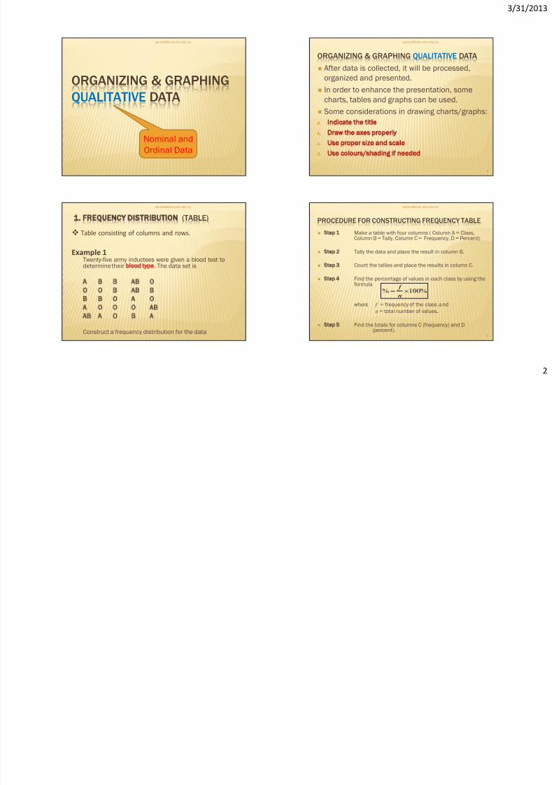
ORGANIZING & GRAPHING QUALITATIVE DATA
After data is collected, it will be processed,
organized and presented.
In order to enhance the presentation, some
charts, tables and graphs can be used.
Some considerations in drawing charts/graphs:
a. Indicate the title
b. Draw the axes properly
c. Use proper size and scale
d. Use colours/shading if needed
6
1 FREQUENCY DISTRIBUTION (TABLE)
Twenty-five army inductees were given a blood test todetermine their blood type. The data set is
A B B AB O
O O B AB BB B O A O
A O O O AB
AB A O B A
Construct a frequency distribution for the data
7
Table consisting of columns and rows.
Example 1
PROCEDURE FOR CONSTRUCTING FREQUENCY TABLE
Step 1 Make a table with four columns ( Column A = Class,Column B = Tally, Column C = Frequency, D = Percent).
Step 2 Tally the data and place the result in column B.
Step 3 Count the tallies and place the results in column C.
Step 4 Find the percentage of values in each class by using theformula
where f = frequency of the class and
n = total number of values.
Step 5 Find the totals for columns C (frequency) and D(percent).
8
%100%
n f
8/14/2019 CHAPTER 3 - latest.pdf
http://slidepdf.com/reader/full/chapter-3-latestpdf 3/13
3/31/201
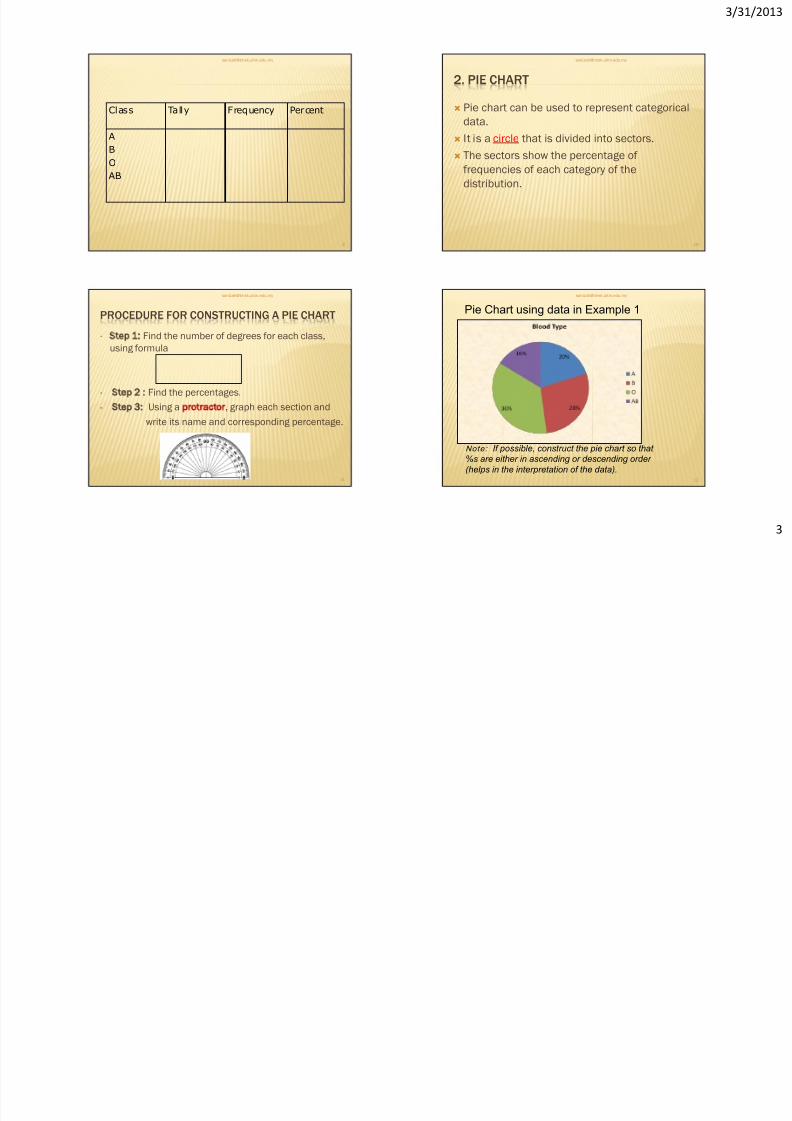
Class Tally Frequency Percent
AB
O
AB
9
2. PIE CHART
Pie chart can be used to represent categorical
data.
It is a circle that is divided into sectors.
The sectors show the percentage of
frequencies of each category of the
distribution.
10
PROCEDURE FOR CONSTRUCTING A PIE CHART
• Step 1: Find the number of degrees for each class,
using formula
• Step 2 : Find the percentages.
• Step 3: Using a protractor, graph each section and
write its name and corresponding percentage.
11
12
Pie Chart using data in Example 1
Note: If possible, construct the pie chart so that
%s are either in ascending or descending order
(helps in the interpretation of the data).
8/14/2019 CHAPTER 3 - latest.pdf
http://slidepdf.com/reader/full/chapter-3-latestpdf 4/13
3/31/201
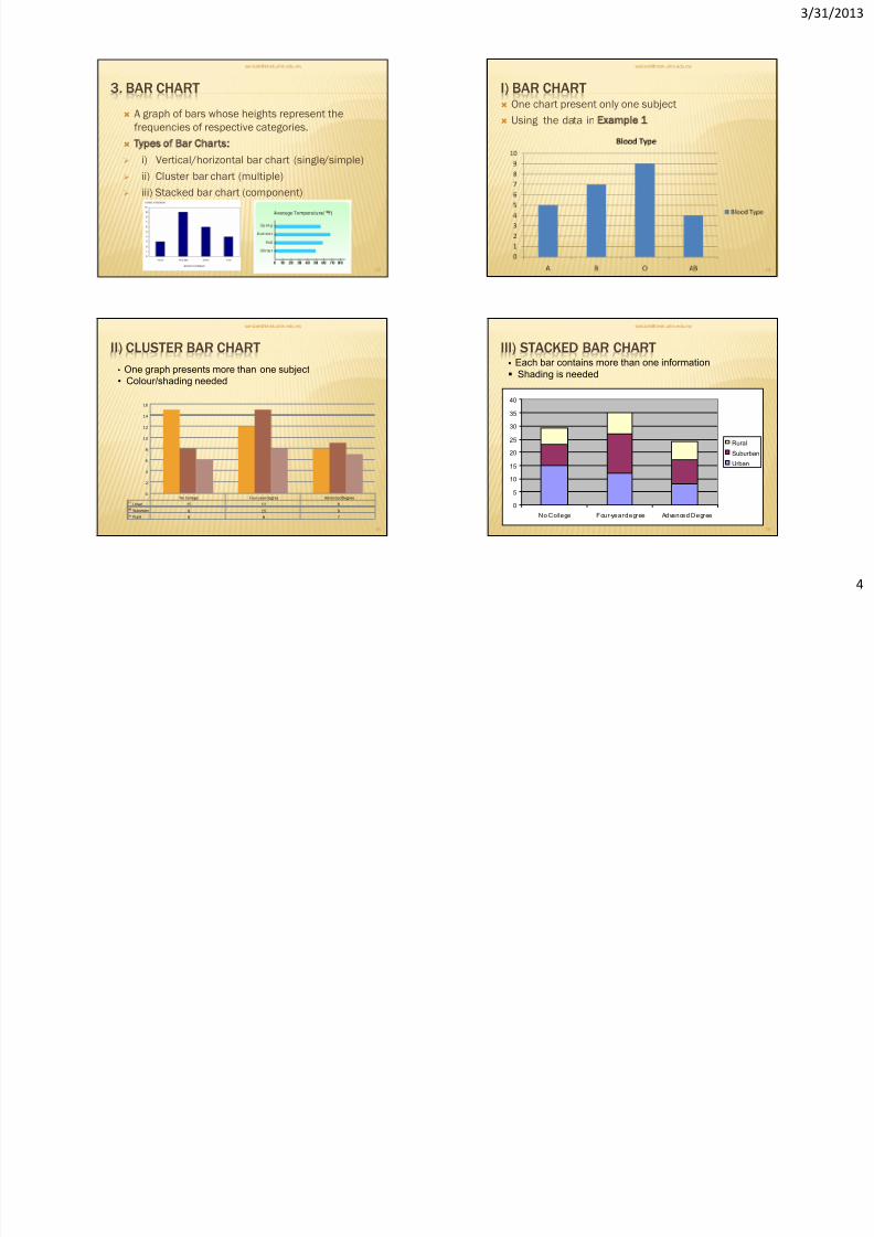
3. BAR CHART
A graph of bars whose heights represent the
frequencies of respective categories.
Types of Bar Charts:
i) Vertical/horizontal bar chart (single/simple)
ii) Cluster bar chart (multiple)
iii) Stacked bar chart (component)
13
I) BAR CHART One chart present only one subject
Using the data in Example 1
14
II) CLUSTER BAR CHART
No College Four-year degree Advanced Degree
Urban 15 12 8
Suburban 8 15 9
Rural 6 8 7
0
2
4
6
8
10
12
14
16
15
• One graph presents more than one subject
• Colour/shading needed
III) STACKED BAR CHART
0
5
10
15
20
25
30
35
40
No College Four-year degree Advanced Degree
Rural
Suburban
Urban
16
Each bar contains more than one information
Shading is needed
8/14/2019 CHAPTER 3 - latest.pdf
http://slidepdf.com/reader/full/chapter-3-latestpdf 5/13
3/31/201
EXAMPLE 2From the following table, construct:
i. Single(simple) bar chart for the year 2000
ii. Cluster(multiple) bar chart for the year 2000 and 2001
iii. Stacked(component) bar chart for the year 2000 and 2001
iv. Pie chart for the year 2001
17
Program Number of Students
Year 2000 Year 2001
A 450 600
B 1200 1500
C 800 1100
D 300 400
E 650 800
4. CROSS TABULATION/CONTINGENCY TABLE
A cross tabulation (often abbreviated as cross
tab) or cross-classification table is often used
to examine the categorical response in terms oftwo qualitative variables simultaneously.
Some data can be grouped according to two or
more criteria of classification or variables.
18
Cross tabs are frequently used because:
They are easy to understand. They appeal topeople who do not want to use moresophisticated measures.
They can be used with any level of data:nominal, ordinal, interval, or ratio
- cross tabs treat all data as if it is nominal.
A table can provide greater insight than singlestatistic.
It solves the problem of empty or sparse cells
They are simple to conduct.
19
EXAMPLE 3
Location No College Four-year
degree
Advanced
Degree
Total
Urban 5 12 8 35
Suburban 8 15 9 32
Rural 6 8 7 21
Total 29 35 24 88
20
Cross tabulation between location and education level
8/14/2019 CHAPTER 3 - latest.pdf
http://slidepdf.com/reader/full/chapter-3-latestpdf 6/13
3/31/201
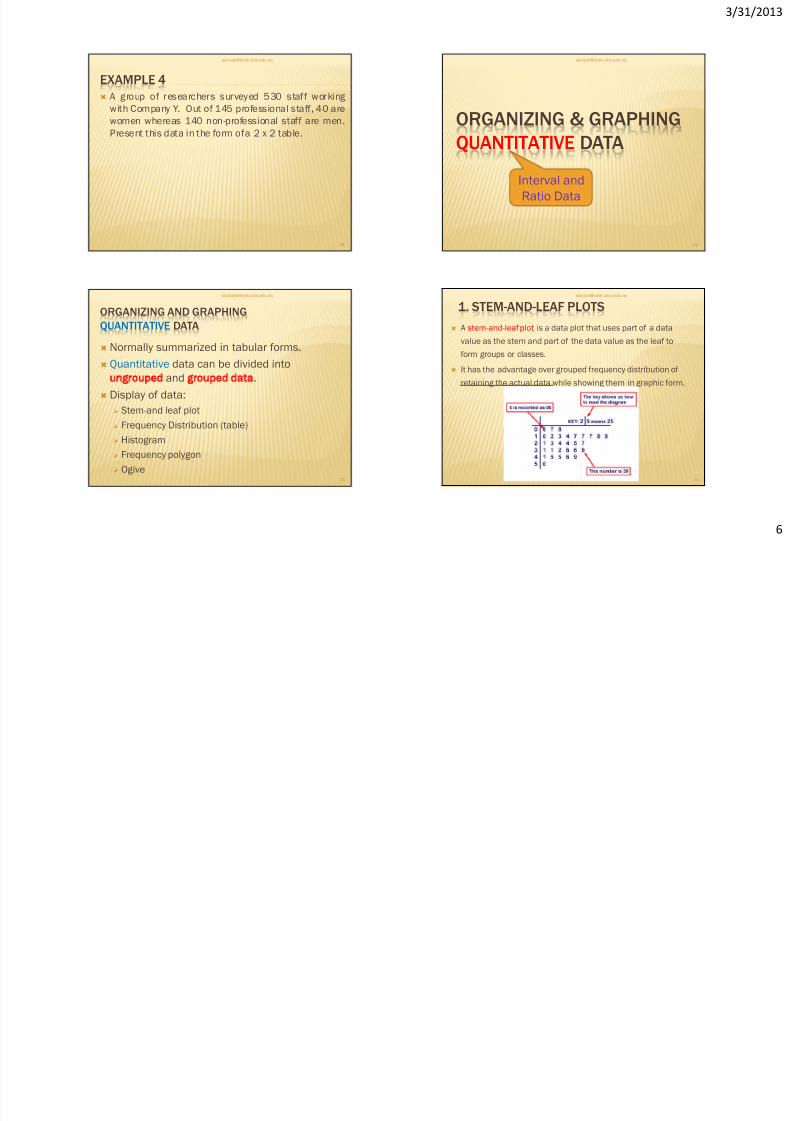
EXAMPLE 4
A group of researchers surveyed 530 staff working
with Company Y. Out of 145 professional staff, 40 are
women whereas 140 non-professional staff are men.
Present this data in the form ofa 2 x 2 table.
21
ORGANIZING & GRAPHING
QUANTITATIVE DATA
22
Interval and
Ratio Data
ORGANIZING AND GRAPHING
QUANTITATIVE DATA
Normally summarized in tabular forms.
Quantitative data can be divided into
ungrouped and grouped data.
Display of data:
Stem-and leaf plot Frequency Distribution (table)
Histogram
Frequency polygon
Ogive
23
1. STEM-AND-LEAF PLOTS
A stem-and-leaf plot is a data plot that uses part of a data
value as the stem and part of the data value as the leaf to
form groups or classes.
It has the advantage over grouped frequency distribution of
retaining the actual data while showing them in graphic form.
24

8/14/2019 CHAPTER 3 - latest.pdf
http://slidepdf.com/reader/full/chapter-3-latestpdf 7/13
3/31/201
PROCEDURE OF CONSTRUCTING STEM-AND-
LEAF PLOTSTEP 1
Split each score or value into two sets of digits. The first (or
leading) set of digits is the stem, and the second (or trailing) set
of digits is the leaf .
STEP 2
List all the possible stem digits
from the lowest to highest.
STEP 3
For each score in the dataset,
write down the leaf numbers on
the line labeled by the
appropriate number.
25
EXAMPLE 5 (UNGROUPED DATA)
At an outpatient testing center, the number ofcardiograms performed each day for 20 days is
shown. Construct a stem-and-leaf plot for the
data.
25 31 20 32 13
14 43 02 57 23
36 32 33 32 44
32 52 44 51 45
26
EXAMPLE 6 (GROUPED DATA)An insurance company researcher conducted a survey onthe number of car theft in a large city for a period of 30 dayslast summer. The raw data are shown.
Construct a stem-and-leaf plot by using classes 50-54,
55-59, 60-64, 65-69, 70-74 and 75-79.
52 62 51 50 69
58 77 66 53 57
75 56 55 67 73
79 59 68 65 72
57 51 63 69 75
65 53 78 66 55
27
EXAMPLE 7
The IQs of 30 students are listed below.
Construct a stem-and-leaf plot, using two lines
per stem and stems of 11, 12 and 13.
110 122 119 114 135
134 130 138 124 127
123 120 114 128 125113 131 117 128 116
123 117 114 132 128
121 132 137 117 126
28
8/14/2019 CHAPTER 3 - latest.pdf
http://slidepdf.com/reader/full/chapter-3-latestpdf 8/13
3/31/201
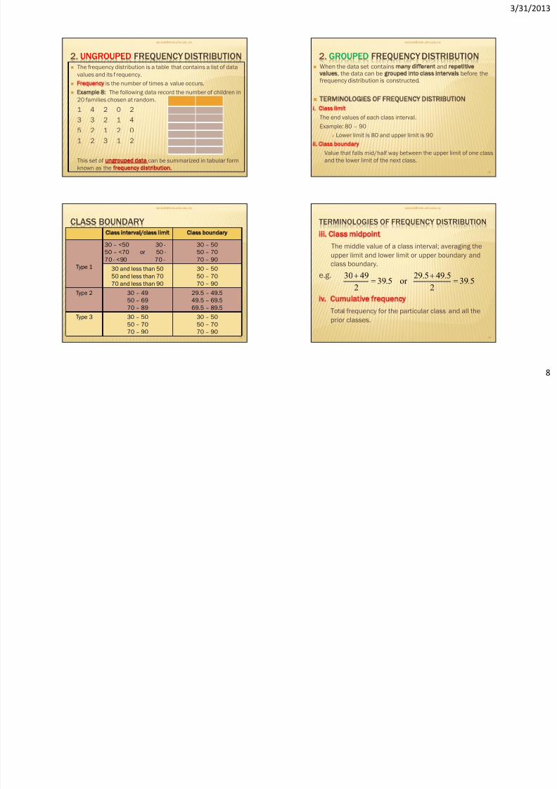
2. UNGROUPED FREQUENCY DISTRIBUTION The frequency distribution is a table that contains a list of data
values and its f requency.
Frequency is the number of times a value occurs.
Example 8: The following data record the number of children in
20 families chosen at random.
1 4 2 0 2
3 3 2 1 4
5 2 1 2 0
1 2 3 1 2
This set of ungrouped data can be summarized in tabular form
known as the frequency distribution.
29
2. GROUPED FREQUENCY DISTRIBUTION When the data set contains many different and repetitive
values, the data can be grouped into class intervals before thefrequency distribution is constructed.
TERMINOLOGIES OF FREQUENCY DISTRIBUTION
i. Class limit
The end values of each class interval.
Example: 80 – 90
Lower limit is 80 and upper limit is 90
ii. Class boundary
Value that falls mid/half way between the upper limit of one class
and the lower limit of the next class.
30
CLASS BOUNDARY
Class interval/class limit Class boundary
Type 1
30 – <50 30 -
50 – <70 or 50 -
70 - <90 70 -
30 – 50
50 – 70
70 – 90
30 and less than 50
50 and less than 70
70 and less than 90
30 – 50
50 – 70
70 – 90
Type 2 30 – 4950 – 69
70 – 89
29.5 – 49.549.5 – 69.5
69.5 – 89.5
Type 3 30 – 50
50 – 70
70 – 90
30 – 50
50 – 70
70 – 90
31
TERMINOLOGIES OF FREQUENCY DISTRIBUTION
iii. Class midpoint
The middle value of a class interval; averaging the
upper limit and lower limit or upper boundary and
class boundary.
e.g.
iv. Cumulative frequency
Total frequency for the particular class and all the
prior classes.
32
5.392
49.529.5or5.39
2
4930
8/14/2019 CHAPTER 3 - latest.pdf
http://slidepdf.com/reader/full/chapter-3-latestpdf 9/13
3/31/201
CONSTRUCTING A FREQUENCY DISTRIBUTION TABLE
Step 1 Determine the classes
a)Find the highest value, H and lowest value, L.
b) Find the range, R.
R = H Lc) Find the number of classes, k.
k = 1 + 3.3 log n
d) Find the class width:
e) Select a starting point for the lowest class limit
f) Add the width to the lowest class limit. Keep addinguntil k classes.
g) Find the class boundaries.
QMT412 Business Statistics
33
classesof Number
RWidth
CONSTRUCTING A FREQUENCY DISTRIBUTION
TABLE…CONT. Step 2
Tally the data
Step 3Find the numerical frequencies from
the tallies
Step 4
Find the cumulative frequencies(Extra step for cumulative frequency distribution ogive)
QMT412 Business Statistics
34
EXAMPLE 9:
These data represent the record of high temperatures in F for
each of the 50 states in the United States. Construct a groupedfrequency distribution for the data.
112 100 127 120 134 118 105 110 109 112
110 118 117 116 118 122 114 114 105 109
107 112 114 115 118 117 118 122 106 110
116 108 110 121 113 120 119 111 104 111
120 113 120 117 105 110 118 112 114 114
35
SOLUTION
Range : R = H L
= 134 – 100 = 34
Number of class interval:
k = 1 + 3.3 log n
= 1 + 3.3 log 50 = 6.6 7
Width = R/k
= 34/7 = 4.9 5
QMT412 Business Statistics 36
8/14/2019 CHAPTER 3 - latest.pdf
http://slidepdf.com/reader/full/chapter-3-latestpdf 10/13
3/31/201
1
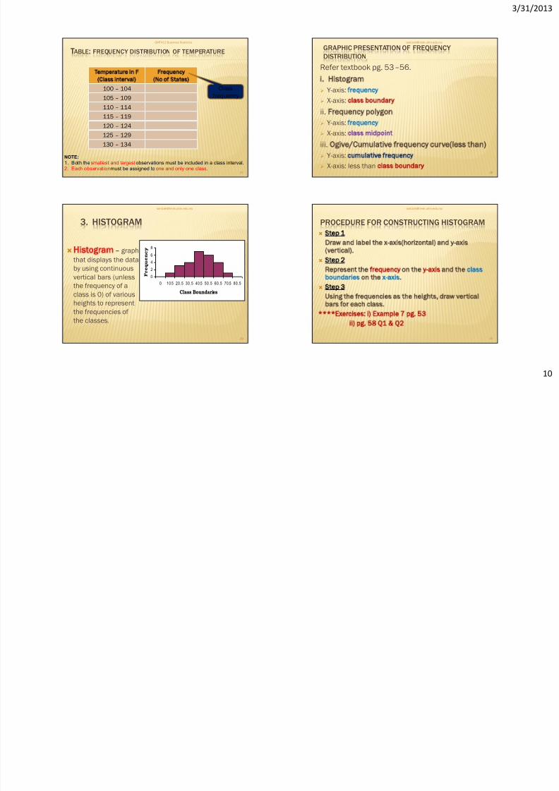
TABLE: FREQUENCY DISTRIBUTION OF TEMPERATURE
QMT412 Business Statistics
37
Temperature in F
(Class interval)
Frequency
(No of States)
100 – 104
105 – 109
110 – 114
115 – 119
120 – 124
125 – 129
130 – 134
NOTE:
1. Both the smallest and largest observations must be included in a class interval.2. Each observationmust be assigned to one and only one class.
Class
frequency
GRAPHIC PRESENTATION OF FREQUENCY
DISTRIBUTION
Refer textbook pg. 53–56.
i. Histogram
Y-axis: frequency
X-axis: class boundary
ii. Frequency polygon
Y-axis: frequency
X-axis: class midpoint
iii. Ogive/Cumulative frequency curve(less than)
Y-axis: cumulative frequency
X-axis: less than class boundary
38
3. HISTOGRAM
Histogram graph
that displays the data
by using continuous
vertical bars (unless
the frequency of a
class is 0) of variousheights to represent
the frequencies of
the classes.
0
2
4
6
8
0 10.5 20.5 30.5 40.5 50.5 60.5 70.5 80.5
Class Boundaries
F r e q u e n c y
39
PROCEDURE FOR CONSTRUCTING HISTOGRAM
Step 1
Draw and label the x-axis(horizontal) and y-axis
(vertical).
Step 2
Represent the frequency on the y-axis and the classboundaries on the x-axis.
Step 3
Using the frequencies as the heights, draw vertical
bars for each class.
****Exercises: i) Example 7 pg. 53
ii) pg. 58 Q1 Q2
40
8/14/2019 CHAPTER 3 - latest.pdf
http://slidepdf.com/reader/full/chapter-3-latestpdf 11/13
3/31/201
1
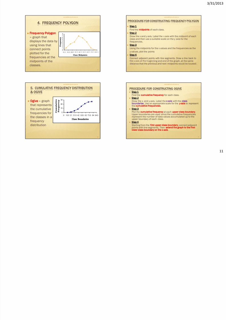
4. FREQUENCY POLYGON
Frequency Polygon
graph that
displays the data by
using lines that
connect points
plotted for the
frequencies at the
midpoints of the
classes.
0
1
2
3
45
6
7
8
0.5 10.5 20.5 30.5 40.5 50.5 60.5 70.5 80.5
Class Midpoints
F r e q u e n
c y
41
PROCEDURE FOR CONSTRUCTING FREQUENCY POLYGON
Step 1
Find the midpoints of each class.
Step 2
Draw the x and y axis. Label the x axis with the midpoint of each
class and then use a suitable scale on the y axis for thefrequencies.
Step 3
Using the midpoints for the x values and the frequencies as the
y values, plot the points
Step 4
Connect adjacent points with line segments. Draw a line back to
the x axis at the beginning and end of the graph, at the samedistance that the previous and next midpoints would be located.
42
5. CUMULATIVE FREQUENCY DISTRIBUTION
& OGIVE
Ogive graph
that represents
the cumulative
frequencies for
the classes in afrequency
distribution
0
10
20
30
0 1 0. 5 2 1 3 1. 5 4 2 5 2.5 6 3 7 3 .5 8 4 9 4 .5
Class Boundaries
C u m u l a t i v e
F r e q u e n c y
43
PROCEDURE FOR CONSTRUCTING OGIVE Step 1
Find the cumulative frequency for each class.
Step 2
Draw the x- and y-axis. Label the x-axis with the classboundaries. Use an appropriate scale for the y-axis to representthe cumulative frequencies.
Step 3
Plot the cumulative frequency at each upper class boundary.Upper boundaries are used since the cumulative frequenciesrepresent the number of data values accumulated up to the
upper boundary of each class. Step 4
Starting from the first upper class boundary, connect adjacentpoints with line segments. Then extend the graph to the firstlower class boundary on the x-axis.
44
8/14/2019 CHAPTER 3 - latest.pdf
http://slidepdf.com/reader/full/chapter-3-latestpdf 12/13
3/31/201
1
45
0
2
4
6
8
0 10.5 20. 5 30. 5 40.5 50. 5 60. 5 70.5 80. 5
Class Boundaries
F r e q u e n c y
0
1
2
3
4
5
6
7
8
0.5 10.5 20.5 30.5 40.5 50.5 60.5 70.5 80.5
Class Midpoints
F r e q u e n c
y
0
10
20
30
0 10.5 21 31.5 42 52.5 63 73.5 84 94.5
Class Boundaries
C u m u l a t i v e
F r e q u e n c y
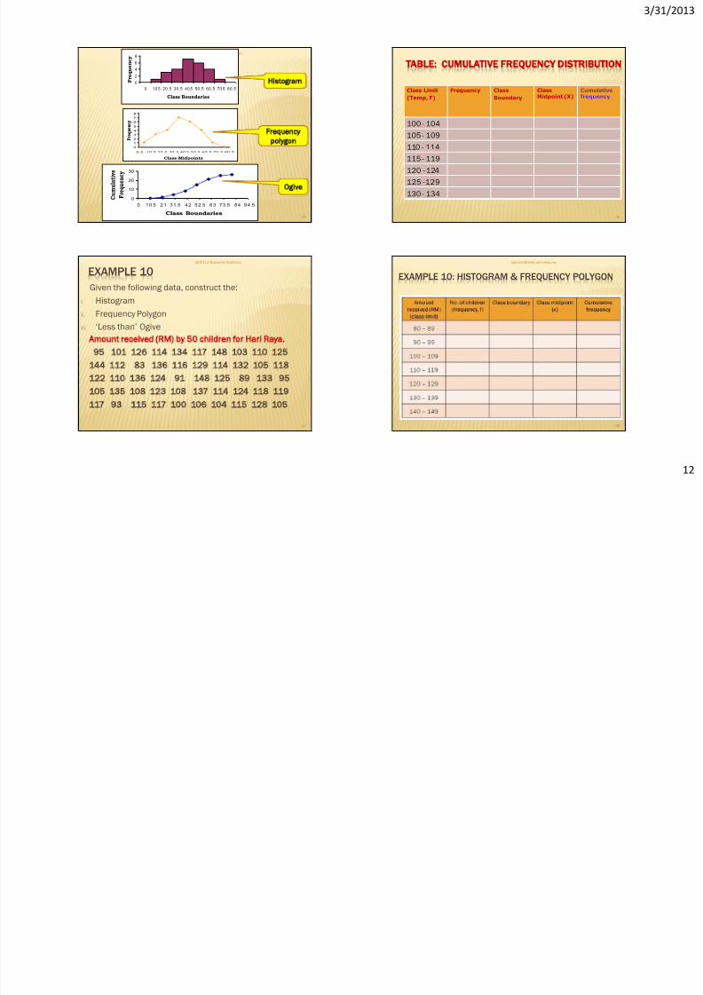
Histogram
Frequency
polygon
Ogive
46
TABLE: CUMULATIVE FREQUENCY DISTRIBUTION
Class Limit
(Temp, F)
Frequency Class
Boundary
ClassMidpoint (X)
Cumulativefrequency
100 - 104
105 - 109
110 - 114
115 - 119
120 - 124
125 -129
130 - 134
EXAMPLE 10
Given the following data, construct the:
i. Histogram
ii. Frequency Polygon
iii. ‘Less than’ Ogive
Amount received (RM) by 50 children for Hari Raya.
95 101 126 114 134 117 148 103 110 125
144 112 83 136 116 129 114 132 105 118122 110 136 124 91 148 125 89 133 95
105 135 108 123 108 137 114 124 118 119
117 93 115 117 100 106 104 115 128 105
QMT412 Business Statistics
47
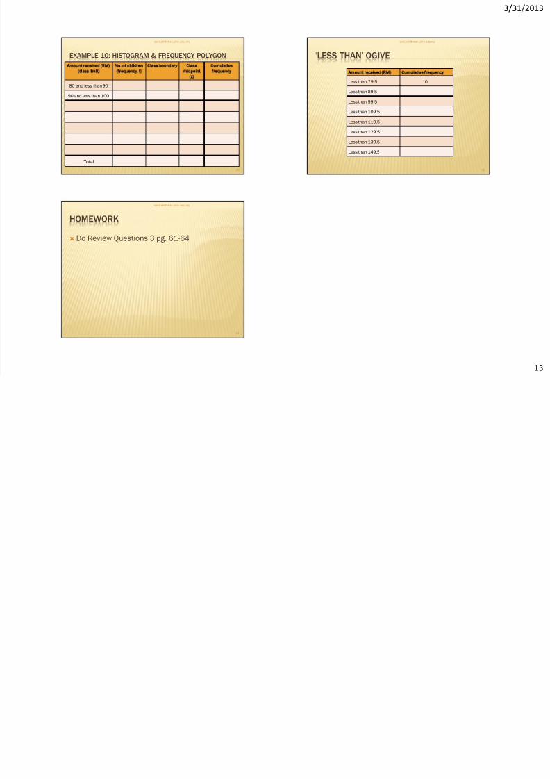
EXAMPLE 10: HISTOGRAM & FREQUENCY POLYGON
48
/ /
8/14/2019 CHAPTER 3 - latest.pdf
http://slidepdf.com/reader/full/chapter-3-latestpdf 13/13
3/31/201
1
EXAMPLE 10: HISTOGRAM & FREQUENCY POLYGON
Amount received (RM)
(class limit)
No. of children
(frequency, f)
C lass boundary Class
midpoint
(x)
Cumulative
frequency
80 and less than 90
90 and less than 100
Total
49
‘LESS THAN’ OGIVE
Amount received (RM) Cumulative frequency
Less than 79.5 0
Less than 89.5
Less than 99.5
Less than 109.5
Less than 119.5
Less than 129.5
Less than 139.5
Less than 149.5
50
HOMEWORK
Do Review Questions 3 pg. 61-64
51