cd booklet research
TRANSCRIPT

CD Booklet Research
Oasis, Blondie, One Direction, Arctic Monkeys, and The Neighbourhood

Oasis – (What’s The Story) Morning Glory

Front CoverThis is the front cover of the album; it shows two men passing each other on Berwick Street in London's Soho. The band said that this street was chosen because it was a popular location for record shops at the time.
The two men are DJ Sean Rowley and album sleeve designer Brian Cannon (who has his back to the camera).It has been pointed out that the album's producer, Owen Morris, can be seen in the background of the photo on the left footpath, holding the album's master tape in front of his face.

The First Page
This page is the main inspiration for the design of my Digipak, as I love the layout on the left-hand side; the lines separating each section of writing. The band members are all named, along with everyone involved with the process of making the album, on the front page in the same sized font as everything else, rather than it being on the back page in smaller font.

Inside The Booklet
The booklet features several ‘anonymous’ photos of the band members with their instruments on plain-ish backgrounds. The band focus more on their music than they do on their own image, which is seen on their album cover as they don’t feature on the front or the back; one band member, as seen above, puts his back to the camera, but he shows the front of the guitar as he stands out of focus.

The Back
The back of the CD is a shot of Sean Rowley (who appeared on the front cover) walking away from the camera, down the same street as the picture on the front cover. The street is slightly blurred and the man in the foreground is the main focus of the picture, implying his significance or important role in the making of the album.

Information Card
This card was inside the album, and is for fans of the band to fill out so they are able to keep up to date with tours, album and single releases, and just general information about the band – almost like an email subscription of its time.

Blondie – Parallel Lines

Front Cover
The front cover of the album uses the black and white colour scheme extremely well, and they use it throughout the rest of the booklet. The colour scheme is linked to the title of the album ‘Parallel Lines’, and the red font for the title stands out against the black and white background very effectively.
Inside Spread
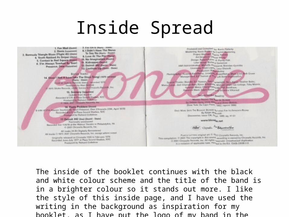
The inside of the booklet continues with the black and white colour scheme and the title of the band is in a brighter colour so it stands out more. I like the style of this inside page, and I have used the writing in the background as inspiration for my booklet, as I have put the logo of my band in the background of one of my pages.

Back Cover
Again, alike the rest of the album design, the colour scheme is continued onto the back cover. I think it fits extremely well and the constituency of it makes the album look professional even with its simplicity.

Blondie – Plastic Letters

Front CoverThis is the front cover of the album. The title is in all lower case and in a white font which stands out from the black background. The lead singer and lead guitarist are wearing bright colours, which, alike the page to the left, stand out against the black background. I like the image on the cover and how it links to their genre of music; they were a rock group in the 80’s (hence the black leather everything) and they are leaning on a police car, and one of the band members is smoking, showing their rebellion against the law, but also could suggest a rebellion against the restrictions of genres as the band were quite experimental with their sound on this album.

Booklet Back Page
This is the back page of the booklet inside of the album. The image is a shot of the band, with their name and role in the band next to their heads. I like how this page is set out, and the colour scheme is black and white with one or two bright colours which stand out from the rest, which is carried over from the front cover.

One Direction – What Makes You Beautiful

Front Cover and Booklet Back Cover
The back cover is extremely simple, with only 3 small drawings of shooting stars. These are courtesy of band member Zayn Malik, and he is credited for the drawings inside of the album booklet aswell. The mix of bright colours on the front cover contrast with the plainness of the back cover of the booklet, and makes the front cover stand out even more. The Autumn colours are there because this single was released in the Autumn season, so it is portraying that Autumn feeling. Also, the band are smiling and half laughing directly into the camera, which draws in the audience and makes it feel slightly more personal.

Back Cover
The back cover carries over with the Autumn colours, and uses an image from the scene of the video from the single for which this is the cover for.The back cover for this single is simple but effective, as it links with the music video for the song so the audience can immediately identify them with eachother.