by emilio dixon. line definition: a line is a mark made by a moving point and having psychological...
TRANSCRIPT

VISUAL COMPOSITION By Emilio Dixon
Line
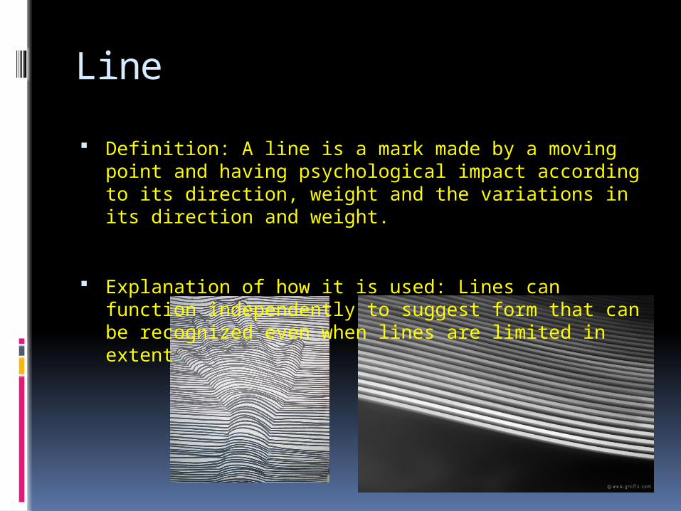
Definition: A line is a mark made by a moving point and having psychological impact according to its direction, weight and the variations in its direction and weight.
Explanation of how it is used: Lines can function independently to suggest form that can be recognized even when lines are limited in extent.

Tone
Definition: Lightness (sometimes called value or tone) is a property of a colour or a dimension, that is defined in a way to reflect the subjective brightness perception of a colour for humans along a lightness-darkness axis.
Explanation of how it is used: In subtractive color (for example paints) tone changes can be achieved by adding black or white to the color.
Shape
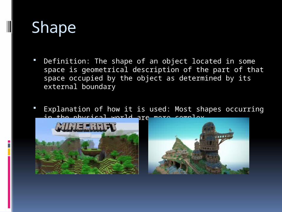
Definition: The shape of an object located in some space is geometrical description of the part of that space occupied by the object as determined by its external boundary
Explanation of how it is used: Most shapes occurring in the physical world are more complex.

Colour
Definition: Colour is the visual perceptual property corresponding in humans to the categories called Red, Blue, Yellow, Green and others.
Explanation of how it is used: Colour categories and physical specifications of colour are also associated with objects, materials, light sources, etc.., based on their physical properties such as light absorption.

Texture
Definition: Texture is the perceived surface quality of a work of art. It is an element of two-dimensional and three-dimensional design and is distinguished by its perceived and physical properties.
Explanation of how it is used: Physical texture, also known as actual texture or tactile texture, are the actual variations upon a surface. This can include but is not limited to fur, wood grain, sand, smooth surface or canvas or metal, glass, and leather.

Space
Definition: Space is the area provided for a particular purpose. Space includes the background, foreground and middleground. Space refers to the distances or areas, between and within things. It has two kinds: negative and positive.
Explanation of how it is used: The rule of space applies to artwork (photography, advertising, illustration) picturing objects to which the artist wants to apply the illusion of movement, or which is supposed to create a contextual bubble in the viewers mind.

Form
Definition: Form is any three-dimensional object. Form can be measured, from top to bottom (height), side to side (width), and from back to front (depth).
Explanation of how it is used: Form maybe created by the combining of two or more shapes. It maybe enhanced by tone, texture and color.

Size
Definition: The fifth element is Size, which is how big or small something is. In design, size can function, it can attract or it can organize.
Explanation of how it is used: When designing a piece, size plays an important role in making a layout functional, attractive and organize.

Balance
Definition: Balance is the concept of visual equilibrium, and relates to physical sense of balance. It is a reconciliation of opposing forces in a composition that results in visual stability. There are two types of balance: Symmetrical or Asymmetrical.
Explanation of it is used: Balance in a three-dimensional object is easy to understand; if balance isn’t achieved, the object tips over.
Emphasis
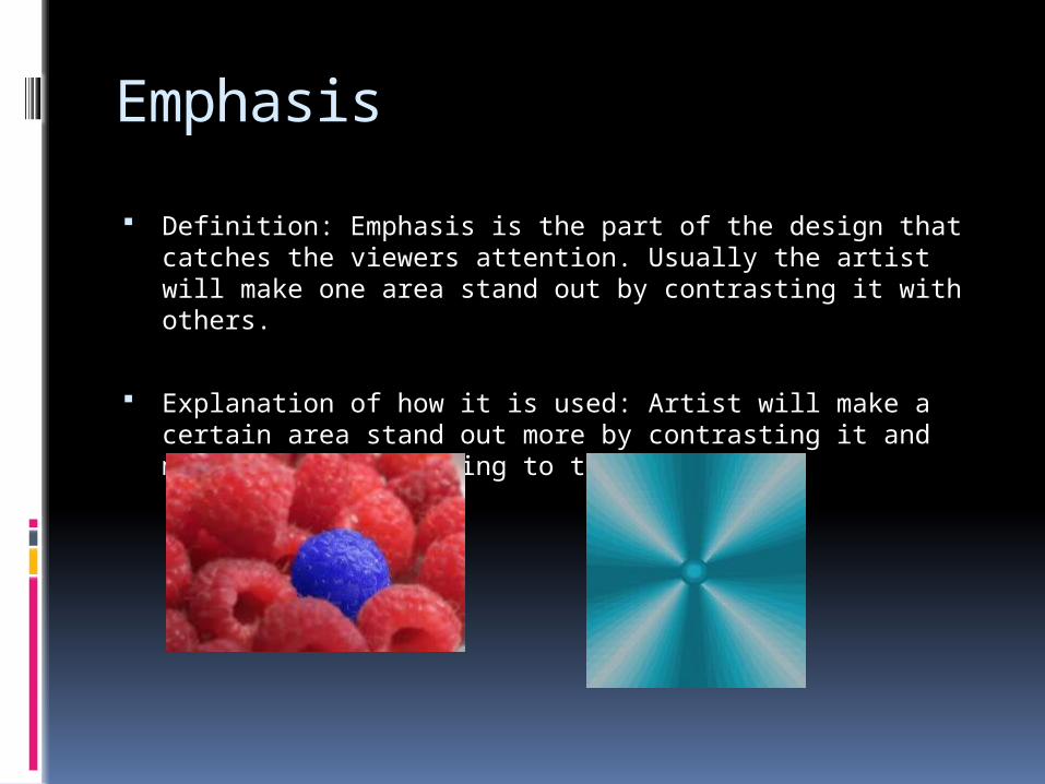
Definition: Emphasis is the part of the design that catches the viewers attention. Usually the artist will make one area stand out by contrasting it with others.
Explanation of how it is used: Artist will make a certain area stand out more by contrasting it and make it more appealing to the viewer.

Proportion
Definition: Proportion refers to the relative size and scale of the various elements in a design. The issue is the relationship between objects or parts of a whole.
Explanation of how it is used: A sofa in the form of a hand is startling because of the distortion of the expected proportion and becomes the center of attention in the room.

Repetition
Definition: Repeating visual elements such as line, color, shape, texture, value or image tends to unify the total effect of a work of art as well as create rhythm. Repetition can take form of an exact duplication (pattern), a near duplication, or duplication with variety
Explanation of how it is used: When looking at the photo of pennies what do you notice? What happens when the pennies are duplicated. Your eye travels around in the picture rather than staying in one place.

Unity
Definition: According to Alex White to achieve visual unity is a main goal of graphic design. When all elements are in agreement a design is considered unified.
Explanation of how it is used: No individual part is viewed as more important than the whole design. A good balance between unity and variety must be established to avoid a chaotic or lifeless design.
Contrast
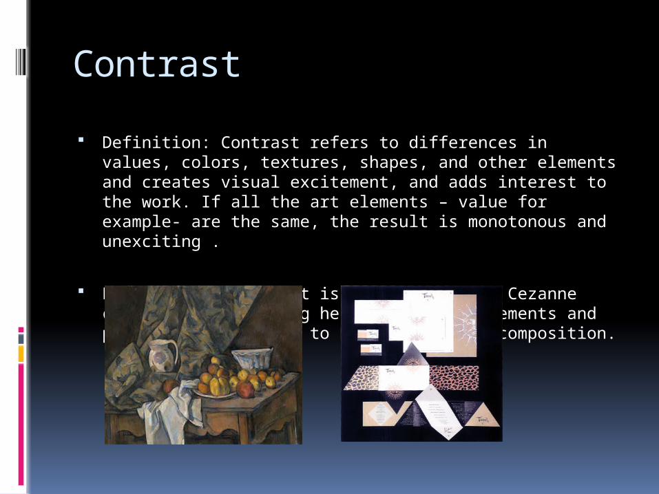
Definition: Contrast refers to differences in values, colors, textures, shapes, and other elements and creates visual excitement, and adds interest to the work. If all the art elements – value for example- are the same, the result is monotonous and unexciting .
Explanation of how it is used: When Paul Cezanne created this painting he used all the elements and principles of design to build a unified composition.

Proximity
Definition: Where items are placed in relation to each other is another important gestalt consideration. Proximity relationships will generally dominate over similarity relationships. Strongest control is available when the two are used together.
Explanation of how it is used: The general concept for proximity states that the closer items are to one another, the more likely they are to be seen as a group. The amount of space is relative.

Typography
Definition: Typography = form and (graphe) = writing) is the art and technique of arranging type in order to make language visible. The arrangement of type involves the selection of typefaces, point size, line length, leading(line spacing), adjusting the spaces between groups (tracking) and adjusting the space between pairs of letters (kerning).
Explanation of how it is used: