brunch & learn: email design best practices for desktop, mobile, tablet & beyond
TRANSCRIPT

Brunch & Learn:
Email Design Best Practices for Desktop,
Mobile, Tablet & Beyond
November 7, 2013
A special thank you to:
Thank you for joining us – we will be starting at 12:30 PM ET/9:30 AM PT
If you are unable to hear music at this time, please make sure that your computer speakers are turned on and that
your system has not been muted.
#DMIQWebinar

Today’s Speakers
Ethan Boldt Chief Content Officer
Direct Marketing IQ
Jason Rodriguez
Community Manager
Litmus
Author, Modern HTML Email
Moderator
#DMIQWebinar
Daniel Sears
Interaction Designer
Trendline Interactive

Tips for Webinar Attendees
• Technical difficulties? Let us know by using the “Q and A” box, or
trouble-shoot by clicking the “Help” widget below
→ Quick tip: Common problems (like loss of sound and/or stall in the
slides) can often be fixed by a quick refresh of your browser.
• Have a question for today’s speaker? Submit via the “Q and A”
box
• Please disable pop-up blockers
• See what this console can do! Click on the “Tips for Attendees”
widget for the complete rundown.
Don’t forget to “share” this webinar! #DMIQWebinar

Email in the Age of Touch Why mobile email matters
and how to optimize for touch.

@rodriguezcommaj
Some Quick Info
Jason Rodriguez
Community Manager at Litmus
Wrote Modern HTML Email
http://modernhtmlemail.com
Follow me on Twitter
@rodriguezcommaj

The Changing Face of Email Mobile is the new inbox.

@rodriguezcommaj
Mobile Opens Are Increasing
https://litmus.com/blog/48-of-emails-are-opened-on-mobile-gmail-opens-down-20-since-tabs
Change in Overall Opens

@rodriguezcommaj
Which Clients Matter?
iOS:
Mail for iPhone
Mail for iPad
Gmail
Mailbox
Sparrow
Android:
Mail App
Gmail for Android

@rodriguezcommaj
Know Your Audience
31% of marketers don‟t know
their mobile open-rate.
33% don‟t know their mobile
click-through rate.

@rodriguezcommaj
We Can Help With That
Use Litmus Email Analytics to
get in-depth metrics on clients,
rendering engines, devices,
locations, and interactions.
http://litmus.com/email-analytics

@rodriguezcommaj
Know Their Environment
Android Device Sizes iOS Device Sizes
http://opensignal.com/reports/fragmentation.php

It’s all about the
Subscriber Experience Not just how your emails look.

@rodriguezcommaj
The Subscriber Experience
3 Points in the Subscriber Experience
1. The Inbox
2. The Email
3. The Landing Page

@rodriguezcommaj
First Impressions
The inbox is the subscriber‟s first impression.
Keep your from name relevant and familiar.
Put your subject line to work.
User preheader text to elicit opens.

@rodriguezcommaj
Mobile Subject Lines
http://masstransmit.com/broadcast_blog/mobile-email-from-name-and-subject-line-displays-
infographic/
Test length on real devices.
Stay relevant and specific.
Create a sense of urgency.
Have a clear CTA.
Test different subject lines.
“When it comes to email
marketing, the best subject
lines tell what’s inside, and
the worst subject lines sell
what’s inside.”
- The MailChimp Crew
@rodriguezcommaj
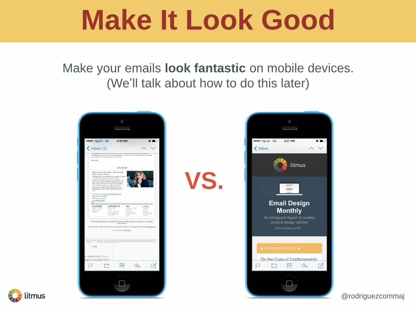
Make It Look Good
Make your emails look fantastic on mobile devices.
(We‟ll talk about how to do this later)
VS.

@rodriguezcommaj
Mobile Design Strategies
Choose a mobile design strategy that works for your team and audience.
Find a solution that works with your time table and resources.
3 Main Strategies
Mobile-Aware
Fluid
Responsive/Adaptive

@rodriguezcommaj
Mobile-Aware
One layout for all devices.
Keep mobile in mind from the
beginning.
Usually single-column.
Keep text, images, and CTAs
mobile-friendly.

@rodriguezcommaj
Fluid
Layout doesn’t change but
expands/contracts for
devices.
No swapping or restructuring of
content.
Uses fluid tables and images.
Relatively quick and easy to
implement.

@rodriguezcommaj
Responsive FTW
Email is restructured and
optimized for varying device
sizes.
Restructuring of content.
Uses media queries along with
fluid tables and images.
Can swap content for different
device sizes.

@rodriguezcommaj
Get Them To Take Action
Your job is to get subscribers to interact with the email.
Accomplish this with compelling content and
splendidly touchable CTAs.

@rodriguezcommaj
Mobile CTAs
Make your mobile CTAs touchable.
Value spacing around touch targets.
Make buttons at least 44x44 pixels.
Use compelling button text.
Supplement with symbols.
Use bulletproof buttons, not images.

@rodriguezcommaj
Follow Through
The subscriber experience doesn’t end at the email.
The email is there to get subscribers to take action,
which typically happens on the landing page.
If you don’t optimize your landing pages for mobile,
why even bother with optimizing your emails?

@rodriguezcommaj
Don’t Do This

@rodriguezcommaj
Do This Instead

@rodriguezcommaj
It’s About The Experience
Take into account the entire subscriber experience
- from inbox to email to landing page.
Optimize all three for mobile, it is increasingly
the most important platform.
Your job doesn‟t end with the email - coordinate with web teams
to optimize landing pages for mobile, too.

Quick Wins for Mobile Start with mobile in mind.

@rodriguezcommaj
Use Preheader Text
Don’t let your “view in the
browser” message be the first
thing subscribers see.
Use your preheader to entice
an open.
The inbox will show something - put it to use.

@rodriguezcommaj
Keep Text Big
Which one looks better?
Keep text big and readable.
iOS will automatically resize
text less than 13px in size.
You can disable this with:
-webkit-text-size-adjust:none;

@rodriguezcommaj
Keep Copy Simple
Short, concise copy makes
your message easy to
remember.
It forces you to distill your
message to its essence.
It keeps your design clean.
Use great, simple copy to get
subscribers to tap through to
where you want them - your
website.

@rodriguezcommaj
Design For Touch
Keep touch targets big and in range of thumbs.

@rodriguezcommaj
The One Thumb Rule
“People use their smartphones anywhere and
everywhere they can, which often means distracted
situations that require one-handed use and short bits of
partial concentration. Effective mobile designs not
only account for these one thumb/one eyeball
experiences but aim to optimize for them as well.”
- Luke Wroblewski
http://www.lukew.com/ff/entry.asp?1664

@rodriguezcommaj
Keep Android In Mind
Grid of Grim
Some Android mail clients won’t render
responsive designs or scale emails -
resulting in a zoomed out “Grid of
Grim”.
Design with CTAs on the left side of
the email.
http://stylecampaign.com/blog/2012/08/android-grid-of-grim/

@rodriguezcommaj
Test, Test, Test
Test your design in as many
clients and devices as
possible.
Litmus makes it easy.
Test on real devices when
you can.

If You Have the Time Level-up your mobile emails.

@rodriguezcommaj
At Least Go Fluid

@rodriguezcommaj
Fluid Tables
Fluid tables allow your email
structure to adapt to different
screen sizes.
Easy enough to implement:
width=“100%”
style=“max-width:600px;”

@rodriguezcommaj
Fluid Images
Fluid images allow your images to
scale with the email.
Easy enough to implement:
<img src=“” width=“” height=“” class=“image” />
img[class=“image”] {
height:auto !important;
max-width:600px !important;
width:100% !important;
}

@rodriguezcommaj
Go Responsive
Use responsive design for full
control across devices.
Combine fluid tables and fluid images
with media queries to control layout.
Swap out and customize content for
different screen sizes.

@rodriguezcommaj
The Media Query
CSS Media Queries allow you to set
conditions for altering styles.
Not a one-line solution, you need to think about
what you’re doing.
Allows you to toggle and swap content based
on screen size, orientation, aspect-ratio,
resolution, etc.

@rodriguezcommaj
Building a Media Query
@media only screen and (max-width:480px) {
img[class=“hide”] {
display:none !important;
}
}
Media Type Expression
Conditional CSS

@rodriguezcommaj
Limited Support
Media Queries are not universally
supported.
Android Gmail & Windows Phone
Best for heavy mobile audiences, mobile
apps, tech companies, or travel alerts.
http://stylecampaign.com/blog/2012/10/responsive-email-support/

@rodriguezcommaj
CSS 3 Goodies
If you have the audience, embellish your emails with CSS 3.
Text shadows
<span style=“text-shadow:2px 2px 2px #000;”> Text Shadows! </span>
Border Radius
<span style=“border-radius:8px;”> Text Shadows! </span>

@rodriguezcommaj
Push The Boundaries
SVG & CSS 3 Animations
Live Content
Video in Email
@rodriguezcommaj
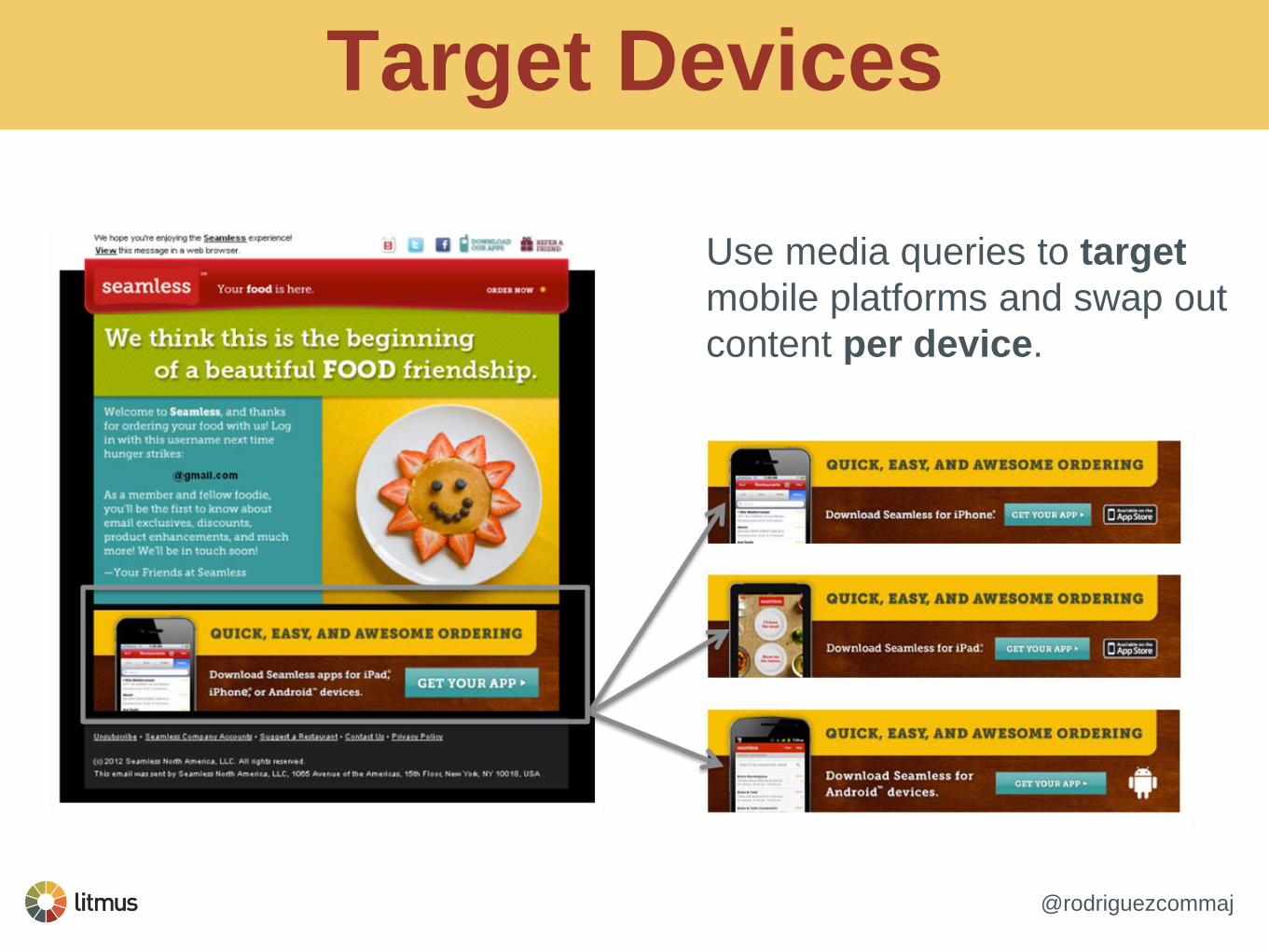
Target Devices
Use media queries to target
mobile platforms and swap out
content per device.

@rodriguezcommaj
Did I Mention To Test?

Resources It’s dangerous to go alone…

@rodriguezcommaj
Learn About RWD
Responsive Web Design
by Ethan Marcotte
Implementing Responsive Design
by Tim Kadlec
Modern HTML Email
by Jason Rodriguez (Me)
http://alistapart.com/article/responsive-web-design
http://alistapart.com/article/designing-for-breakpoints
Responsive Web Design
Designing For Breakpoints

@rodriguezcommaj
Some Frameworks
Antwort Email Framework
http://internations.github.io/antwort/
Zurb Responsive Email
http://zurb.com/playground/responsive-email-templates
Responsive Email Patterns
http://briangraves.github.io/ResponsiveEmailPatterns/

@rodriguezcommaj
Some Tools
Litmus Builder
http://litmusbuilder.com/
Litmus Scope
https://litmus.com/scope/
Guide To CSS Support
http://www.campaignmonitor.com/css/

@rodriguezcommaj
I’m Here To Help!
Continue the conversation
over on Twitter -
@rodriguezcommaj

Thank You!
The Screen Size Sweet Spot Tips for constructing flexible email layouts/elements
Daniel Sears Interaction Designer, Trendline Interactive

Overview

Responsive Design
• More than a “line of code”
• Set of conditional statements that enables specific styles
• If the screen size is x, then display y
• If the screen size is x, then increase headline size to y
• If screen size is x, then show image at 100%
• Detects screen size, not device type

Pros and Cons
Pros
• Restyle, resize or reorder elements
• Ability to hide/show desktop or mobile specific images/content
• Customized calls to action
• Adjust content based on various screen sizes, enhancing experience
Cons
• Coding learning curve
• Forces tough choices
• Increased production and QA time
• Checking rendering for multiple devices can force your hand

Fluid Layout
• Percentage-based widths
• Adapts to fill the screen it‟s viewed on; text wraps automatically
• Often fits better within a wide-range of devices/screen sizes

Pros and Cons
Pros
• Relatively simple execution
• Smaller learning curve
• No reliance on media queries
Cons
• Fewer design choices
• Very narrow or very wide emails can get awkward and hard to read

Width Inception
100%
90%
So „Meta!‟

Width Inception
100%
90%

The Sweet Spot

The Best of Both Worlds
• Allows content to flow freely based on screen size
• Also allows you to stipulate how content should be arranged once it reaches
certain sizes.
• Takes the load off of having multiple media queries
• Is the most flexible approach to target multiple screen sizes while catering
different experiences for screen sizes you‟d like to focus on.
Android Screen Size Fragmentation
Source: http://opensignal.com/reports/fragmentation-2013/

Some Quick Tips

Buttons
• Depends on your design approach
• CSS3 buttons enable fluidity, ease of use for templates, but not without
limitations
• Click area is a concern
• Image only buttons often become stifling for mobile, concern when images are
off
CSS3 styling on <a> tag
CSS3 styling on <td>

Images
• Consider how your images can/should be fluid with your layout
• Can they be sized dynamically? Do you want them to be cropped or swapped
at different screen sizes?
• Some devices have a higher pixel density (retina), consider the image quality

Retina Optimization
• My method: ensure the image is twice as large as you want it with a higher
resolution, compress it, resize in HTML/CSS to the correct size.
600px X 450px @ 70% compression
300px X 225px

Fonts
• In general, increase your font sizes by 25%
• Typography on retina displays is a must – avoid images for text unless it‟s a
part of your art
• Link farms or clustered links are difficult to tap unless they are larger, consider
alternatives (remember how wide the tip of your finger is)

Daniel Sears Interaction Designer, Trendline Interactive
@daniel_sears

Question & Answer Session
If you haven‟t done so already,
please take this time to submit
questions to our speakers using the
“Q&A” box on your console.
#DMIQWebinar

Thank You
#DMIQWebinar
Thank you for taking the time to attend our Webinar today.
For additional information about our Webinar series,
check out the following Website:
www.directmarketingiq.com/webinar
Please take a moment to fill out our
feedback survey. (It will open in a new browser window/tab momentarily!)