brand guidelines - visit...
TRANSCRIPT
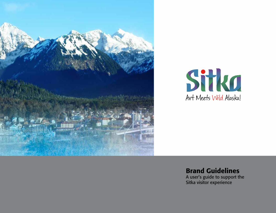
Brand GuidelinesA user’s guide to support the Sitka visitor experience

The Sitka BrandHow These Guidelines Work 1.1
What is a Destination Promise? 1.2
Our Destination Promise 1.3
Communicating the BrandOur Copy Style 2.1
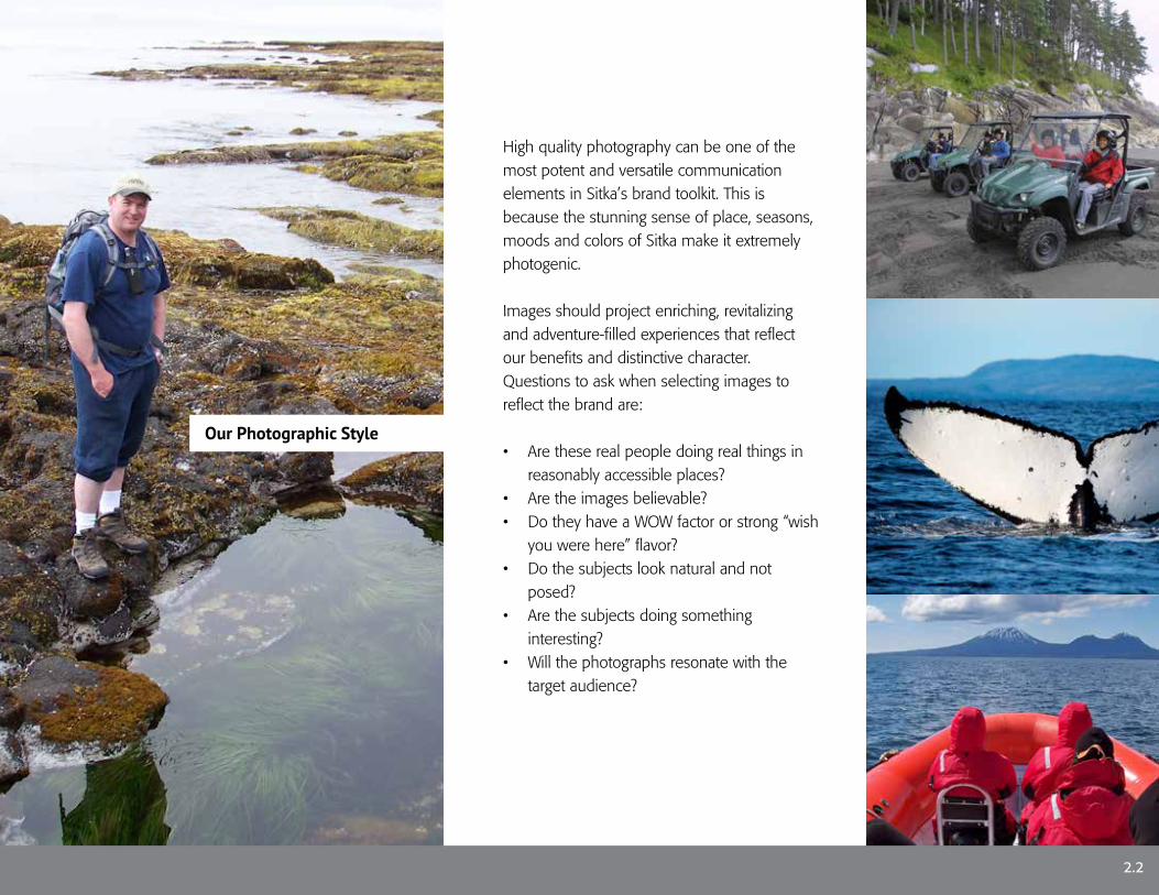
Our Photographic Style 2.3
Brand IdentityBrand Identity Inspiration 3.1
The Solid Sitka Wordmark 3.2
The Modeled Sitka Wordmark 3.3
The Sitka Raven 3.4
The Tagline 3.5
The Solid Sitka Wordmark with Tagline 3.6
The Modeled Sitka Wordmark with Tagline 3.7
Clearspace 3.8
Minimum Sizes 3.9
Prohibited Use 3.10
Special Treatments 3.11
Brand ElementsColors - Wordmark 4.1
Colors - Pattern 4.2
Typography 4.3
Tiled Patterns 4.4
The Applied BrandCups & Coasters 5.1
Apparel 5.2
Display Advertising 5.3
City Vehicles 5.4
Smart Device Apps 5.5
Visitor Guide 5.6
Business Cabinet 5.7
Contact Information 6.1

The Sitka Brand
Photo courtesy of Tillamook Design, all rights reserved

The Sitka Brand strategy provides direction for portraying and unifying Sitka visitor experiences. It acts as a guidance system in conjunction with the wayfinding signs to communicate with the visitor and direct them toward local experiences. The Brand strategy also provides direction to tourism and municipal officials as well as private tourism entrepreneurs for brand supportive product development and public policy.
The Sitka Brand strategy, verbal and visual elements will help shape what we want people to think and feel about Sitka, Alaska as a visitor destination.
These Brand Guidelines are simply a reference document that explains the proper usage of Sitka’s brand visuals such as the logo, colors, tagline and other graphic assets.
These guidelines are not necessarily meant to restrict creativity, rather they are meant to guide creativity to stay in concert with and to support the essence of the Sitka brand.
How These Guidelines Work
1.1

What is a Destination Brand?
1.2
A destination brand makes and fulfills a value promise. It is a unique blend of physical, intangible and emotional benefits which clearly differentiate a destination from other choices. Importantly, it acts as a guidance system to prioritize and influence every message, process, decision, communication, and investment.
Branding can be considered as the art and science of orchestrating the distinctive messages and experiences that we most want associated with Sitka to ensure that they are as unifying, compelling, and rewarding as possible.

Our Destination Promise
1.3
Our Promise:“While most places in Alaska are defined by big nature and frontier adventures, Sitka promises a very different perspective because of its charismatic mix of friendly people, and a delightful fusion of art, culture and wilderness.”
Our Commitment:We are dedicated to preserving, enjoying and sharing our authentic Alaska town and its surrounding natural environment while generating a sustainable visitor economy for resident employment and small businesses.We present transformational experiences that enable residents and visitors to interact with nature in ways that are compelling, environmentally sensitive and spiritually uplifting.

Photo courtesy of Tillamook Design, all rights reserved
Communicating the Brand

Our Copy Style
2.1
The Sitka brand will be embedded in the copy for brochures, web sites, advertising, online communications and collateral materials. Wherever possible, copy should describe experiences with action-oriented and evocative language to provide a feel for what the reader will experience. Importantly, it must make the reader feel as though they’re already enjoying the sights, sounds, smells, and sensations of the Sitka Region.
Copy should always be written in a friendly, relaxed, informative, and unpretentious manner to match our personality. It should be conversational and create the feel and tone of a one-on-one conversation.
It should be enticing and motivational, yet realistic and factual. It must not contain hype or exaggeration.
Our Photographic Style
2.2
High quality photography can be one of the most potent and versatile communication elements in Sitka’s brand toolkit. This is because the stunning sense of place, seasons, moods and colors of Sitka make it extremely photogenic.
Images should project enriching, revitalizing and adventure-filled experiences that reflect our benefits and distinctive character. Questions to ask when selecting images to reflect the brand are:
• Are these real people doing real things in reasonably accessible places?
• Are the images believable?• Do they have a WOW factor or strong “wish
you were here” flavor?• Do the subjects look natural and not
posed?• Are the subjects doing something
interesting? • Will the photographs resonate with the
target audience?

Brand Identity

Brand Identity Inspiration The final Sitka logo has evolved from several concepts that were inspired by the textures, colors and features from Sitka’s heritage and natural environment.
The basic Sitka logo is derived from three primary visual resources. The Haida/Tlinget art forms, Russian architecture and an existing font called FF Motter Festival.
Tlingit and Haida Totemic Art
FF Motter Festival Font
Russian Architecture
The Stylized Wordmark
3.1
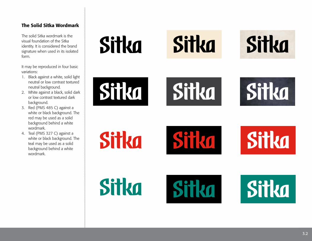
The Solid Sitka Wordmark
The solid Sitka wordmark is the visual foundation of the Sitka identity. It is considered the brand signature when used in its isolated form.
It may be reproduced in four basic variations:1. Black against a white, solid light
neutral or low contrast textured neutral background.
2. White against a black, solid dark or low contrast textured dark background.
3. Red (PMS 485 C) against a white or black background. The red may be used as a solid background behind a white wordmark.
4. Teal (PMS 327 C) against a white or black background. The teal may be used as a solid background behind a white wordmark.
3.2

Clear Tide PoolsMigrating Salmon
3.3
The Modeled Sitka Wordmark
The modeled Sitka wordmark is a special version of the Sitka identity. It should only be used as a featured graphic and not as a secondary signature that follows other featured imagery.
Its includes a custom pattern inspired by migrating salmon and the light refractions in clear coastal tide pools.
The red dot in the “i” is inspired by the berry or sun held in a raven’s beak from Haida/Tlinget folklore.
It may be reproduced in two basic variations:
1. Against 100% bright white.2. Against 100% jet black
The Modeled Sitka Wordmark against 100% blackThe Modeled Sitka Wordmark against 100% white

The Sitka Raven
A secondary companion graphic of the Sitka brand is the “charismatic” Sitka Raven. It was developed to be used as a playful embellishment to be used with or without the wordmark for special occasions.
The Sitka Raven may be used as an isolated graphic or as a wordmark companion.
It is not intended to serve as a stand alone brand graphic where the Sitka brand has not already been visually introduced.
3.4
Tlingit and Haida Folklore Raven
A raven as seen in the Sitka region

The Tagline
Sitka’s tagline provides a clear message of what Sitka’s brand is all about. It reinforces the brand’s message and helps connect an idea with Sitka’s audience.
The tagline may be isolated or used as a part of the full Sitka Logo but must never be used more than once on the same page or visual display.
The tagline’s form, either isolated or combined with the full Sitka logo, must never be reconstructed or altered. It can only be reproduced from the original production files.
3.5

The Solid Sitka Wordmark with Tagline
When the Sitka wordmark and the tagline are combined together as a consolidated graphic, the tagline must be positioned below the wordmark and sized as the same length.
The tagline may be used with any of the solid color versions as black, black with a red “Wild”, black with a teal “Wild” or in all red.
3.6

The Modeled Sitka Wordmark with the Raven and Tagline
When combined with the wordmark and the raven, the tagline must be positioned below the wordmark as in the solid versions but must always include black lettering with a red “Wild”.
3.7
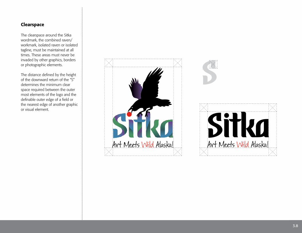
Clearspace
The clearspace around the Sitka wordmark, the combined raven/workmark, isolated raven or isolated tagline, must be maintained at all times. These areas must never be invaded by other graphics, borders or photographic elements.
The distance defined by the height of the downward return of the “S” determines the minimum clear space required between the outer most elements of the logo and the definable outer edge of a field or the nearest edge of another graphic or visual element.
3.8

7/8"
1/2"
7/8"
1/2"
Minimum Sizes
Minimum sizes have been determined for the all versions of the wordmark with and without the tagline.
When the wordmark is paired with the tagline, the minimum size is 7/8” measured from the left side of the tagline to the right side of the tagline. This proportion also applies to the tagline when it is used as an isolated graphic.
When the wordmark is used without the tagline, the minimum size is 1/2” measured from the left side of the “S” in the wordmark to the right side of the “a”. This proportion also applies to the Raven/wordmark composite.
3.9
Visit in Alaska
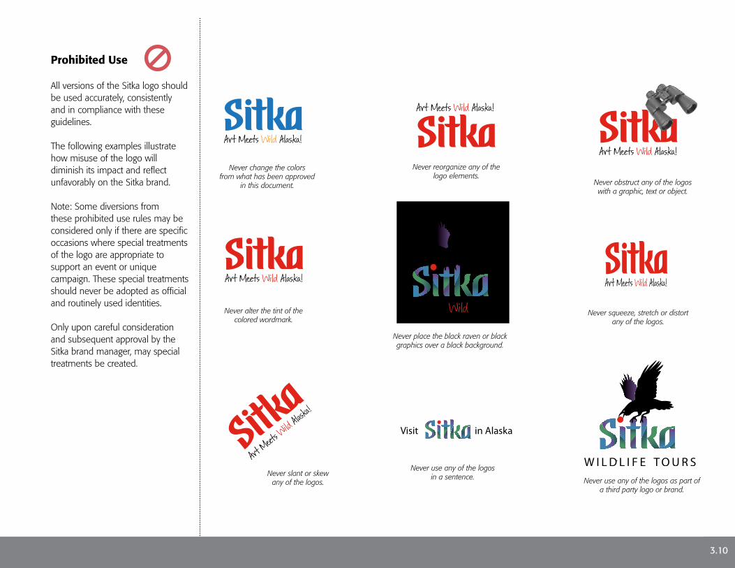
Prohibited Use
All versions of the Sitka logo should be used accurately, consistently and in compliance with these guidelines.
The following examples illustrate how misuse of the logo will diminish its impact and reflect unfavorably on the Sitka brand.
Note: Some diversions from these prohibited use rules may be considered only if there are specific occasions where special treatments of the logo are appropriate to support an event or unique campaign. These special treatments should never be adopted as official and routinely used identities.
Only upon careful consideration and subsequent approval by the Sitka brand manager, may special treatments be created.
Never change the colors from what has been approved
in this document.
Never reorganize any of the logo elements.
Never obstruct any of the logos with a graphic, text or object.
Never alter the tint of the colored wordmark.
Never place the black raven or black graphics over a black background.
Never squeeze, stretch or distort any of the logos.
Never slant or skew any of the logos.
Never use any of the logos in a sentence. Never use any of the logos as part of
a third party logo or brand.
3.10

Special Treatments
As a brand is used in the course of ongoing marketing campaigns, some diversions from the prohibited use rules on page 3.9 may be considered only if there are specific occasions where special treatments of the logo are appropriate to support an event or unique campaign. These special treatments should never be adopted as official and routinely used identities.
Only upon careful consideration and subsequent approval by the Sitka brand manager, may special treatments be created.
Examples of special treatments can be found on pages 5.1 and 5.2.
3.11

Brand Elements

Colors - Wordmark
The Sitka wordmark may be reproduced in any of the three primary colors.
All colors are broken down into reproduction formulas for print media (CMYK), digital (RGB) and web media (HEX).
Primary Secondary
4.1
70% 40% 30% 15%
CMYK 100/21/64/7RGB 0/151/117HEX 00/83/75
Turquoise
70% 40% 30% 15%
CMYK 5/98/100/.5RGB 226/35/26HEX E2/23/1A
Red
70% 40% 30% 15%
CMYK 0/0/0/100RGB 35/31/32HEX 23/1F/20
Black

Colors - Pattern
The Sitka pattern is composed by primary, secondary and blended color sets. These colors reflect the character of Sitka pattern and should never be altered.
All colors are broken down into reproduction formulas for print media (CMYK), digital (RGB) and web media (HEX).
Moss GreenForest ShadowBlue Ocean
Blend 4
Moss GreenBlue Ocean
Blend 3
70% 40% 30% 15%
CMYK 66/81/3/9RGB 105/72/144HEX 69/48/90
Purple Majesty
Purple MajestyRaven Black
Blend 1
Blue OceanPurple Majesty
Blend 2
Moss GreenForest Shadow
Blend 5
70% 40% 30% 15%
CMYK 68/26/4/21RGB 62/130/171HEX 3E/82/AB
Blue Ocean
70% 40% 30% 15%
CMYK 83/51/53/29RGB 46/88/92HEX 2E/58/5C
ForestShadow
70% 40% 30% 15%
CMYK 68/11/72/17RGB 74/14/98HEX 4A/93/62
Moss Green
70% 40% 30% 15%
CMYK 5/98/100/.5RGB 226/35/26HEX E2/23/1A
Red
70% 40% 30% 15%
CMYK 0/0/0/100RGB 35/31/32HEX 23/1F/20
Black
Primary Secondary Blends
4.2

Typography
Regulated typography is a powerful tool used to support the Sitka brand and should be used in all forms of visual communication to maintain a strong and unified brand expression.
The Formata Font FamilyFormata is the primary font family for the Sitka brand. It was selected out of thousands of fonts to be compatible with the Brand Identities. It includes 8 styles that can be used together or separately while avoiding visual competition within the brand applications.
Formata Bold
ABCDEFGHIJKLMNOPQRSTUVWXYZabcdefghijklmnopqrstuvwxyz1234567890
Formata Bold Italic
ABCDEFGHIJKLMNOPQRSTUVWXYZabcdefghijklmnopqrstuvwxyz1234567890
Formata Medium
ABCDEFGHIJKLMNOPQRSTUVWXYZabcdefghijklmnopqrstuvwxyz1234567890
Formata Medium Italic
ABCDEFGHIJKLMNOPQRSTUVWXYZabcdefghijklmnopqrstuvwxyz1234567890
Formata Regular
ABCDEFGHIJKLMNOPQRSTUVWXYZabcdefghijklmnopqrstuvwxyz1234567890
Formata Regular Italic
ABCDEFGHIJKLMNOPQRSTUVWXYZabcdefghijklmnopqrstuvwxyz1234567890
Formata Light
ABCDEFGHIJKLMNOPQRSTUVWXYZabcdefghijklmnopqrstuvwxyz1234567890
Formata Light Italic
ABCDEFGHIJKLMNOPQRSTUVWXYZabcdefghijklmnopqrstuvwxyz1234567890
4.3

Tiled Patterns
There will be occasions where graphic embellishments add helpful visual impact to a visual communication as long as they do not compete with or diminish the character of the brand.
Two tiled patterns have been developed. The square pattern can be tiled in all directions to create a continuous graphic background.
Side A1 matches to A2 and B1 matches to B2 respectively.
The pattern bar may be tiled on either side to create an expandable graphic rule. Such uses should be proposed to the brand manager for approval prior to implementation.
Side C1 matches to C2respectively.
Application examples can be seen on pages 5.4 and 5.7 in the following section.
4.4
A1
A2
B1 B2
C1 C2

The Applied Brand

Cups & Coasters
Coffee cups and drink coasters are popular items visitors buy as gifts and souvenirs.
Private vendors who want to use the Sitka Brand assets in their custom products must contact the Sitka CVB for a brand licensing release. Only after a submitted brand licensing release has been approved may a retailer use Sitka Brand assets for retail purposes.
5.1

Apparel
Sitka apparel is also an important retail vehicle. Depending on the target market, designs may need to be expressed more liberally.Creative interpretations of the brand assets can be explored but only under the guidance and approval of the Sitka brand manager.
5.2

Display Advertising
Advertising should be visually bold and use minimal copy.
It is recommended that ads incorporate full photographic hero imagery that represents key Sitka experiences. Inset imagery is used to compliment the message or promote additional experiences secondary to the impact of the primary image.
When possible, images should depict people engaged with the environment or art.
5.3
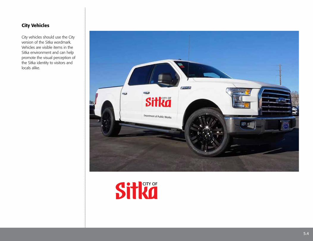
City Vehicles
City vehicles should use the City version of the Sitka wordmark. Vehicles are visible items in the Sitka environment and can help promote the visual perception of the Sitka identity to visitors and locals alike.
5.4
CITY OF
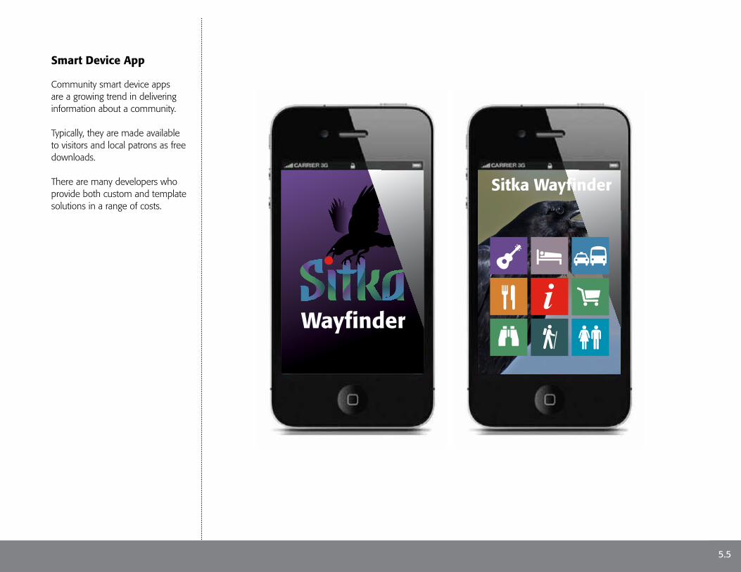
Smart Device App
Community smart device apps are a growing trend in delivering information about a community.
Typically, they are made available to visitors and local patrons as free downloads.
There are many developers who provide both custom and template solutions in a range of costs.
Sitka Wayfinder
Wayfinder
5.5

Visitor’s Guide
The visitor’s guide should be treated as a travel magazine. The articles within it tell the reader about key attractions and events in Sitka.
It also serves as a passive marketing tool, written in a positive and entertaining voice supported by professional photography and printed on magazine-grade paper stock.
P U B L I C AT I O N O F T H E S I T K A C O N V E N T I O N A N D V I S I TO R S B U R E A U
Grin and Bear ItGet up and close with a Grizzlyat Fortress of the Bear
The Russians Were HereWalk in the footsteps of our Russianancestors. See what they left behind
Tote Bags to TotemsShop under the shadow ofSitka’s grand totem in Totem Square
Talk to an EagleVisit Sitka’s Alaska Raptor Center
Visitor’s Guide
The Sitka wordmark may be used as solid white or as any of the recommended color versions describedon page 3.4 depending on the photo image used on a specific issue.
“Visitor’s Guide” is part of the masthead and its font, size and placement remains consistent in each issue.
Titles of key articles within the issue are featured on the cover with a short descriptive caption.
The organization credit remains a fixed element from issue to issue
5.6
Full bleed photographic imagery should be bold and relative to thefeatured article.
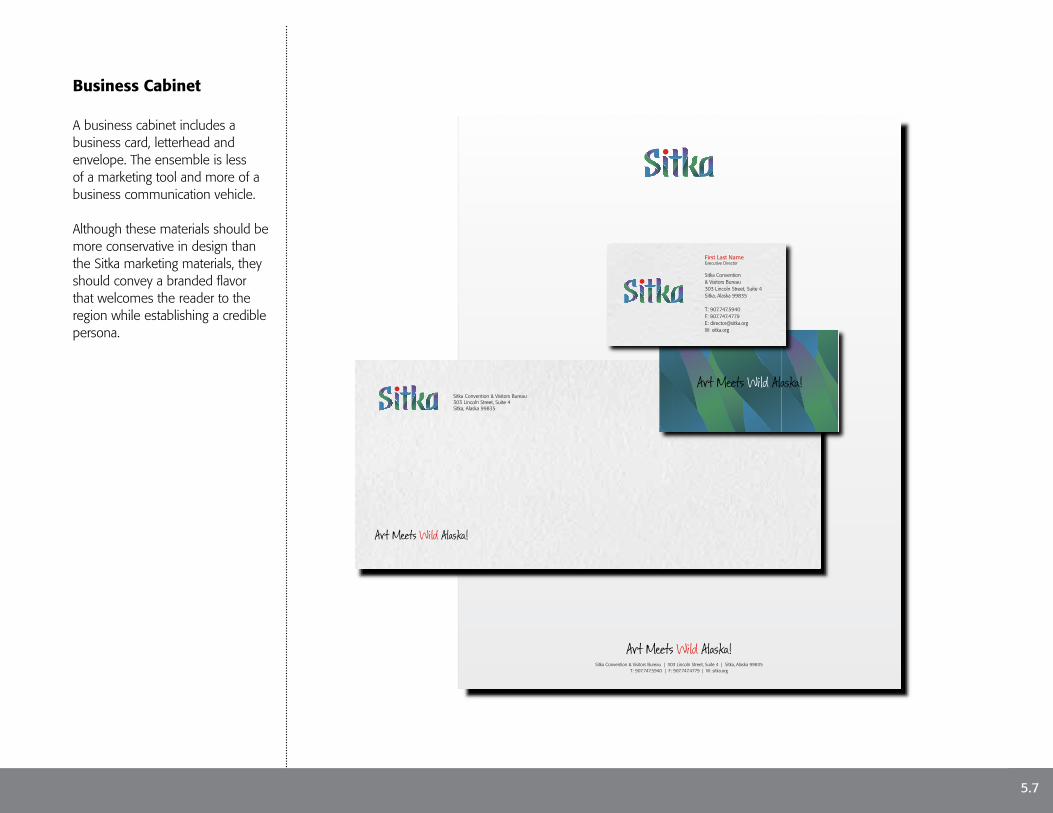
Business Cabinet
A business cabinet includes a business card, letterhead and envelope. The ensemble is less of a marketing tool and more of a business communication vehicle.
Although these materials should be more conservative in design than the Sitka marketing materials, they should convey a branded flavor that welcomes the reader to the region while establishing a credible persona.
First Last NameExecutive Director
Sitka Convention & Visitors Bureau303 Lincoln Street, Suite 4Sitka, Alaska 99835
T: 907.747.5940F: 907.747.4779E: [email protected]: sitka.org
Sitka Convention & Visitors Bureau303 Lincoln Street, Suite 4Sitka, Alaska 99835
Sitka Convention & Visitors Bureau | 303 Lincoln Street, Suite 4 | Sitka, Alaska 99835T: 907.747.5940 | F: 907.747.4779 | W: sitka.org
5.7

Contact Information
For information and assistance regarding adoption and use of the Sitka brand and visual identity, e-mail us at [email protected].
Visit us online at sitka.org
The Sitka brand strategy was created following extensive research and community consultation by Great Destination Strategies in collaboration with Total Destination Marketing and Axia Creative.
GreatDS.comDestinationBranding.comAxiaCreative.com
6.1