brand guidelines - bartle and gibson
TRANSCRIPT

Brand Guidelines
Bartle & Gibson Brand Guidelines | 2
Introduction ..............................................................3Corporate Logo
Introduction ...........................................................4Alternative Orientations ........................................5Alternative Orientations – Reverse Logo ..............6Logo Spacing ..........................................................7Logo Spacing – Reverse Logo ................................8Logo Alignment .....................................................9Logo Alignment – Reverse Logo ...........................10Logo Buffer Zone ....................................................11Logo Buffer Zone – Reverse Logo .........................12General Guidelines .................................................13General Guidelines – Reverse Logo .......................14Small Size Applications ..........................................15Scenarios To Avoid .................................................16Summary ................................................................17
Contents
Corporate Product Line ..........................................18Corporate Assets
Geometric Background ..........................................19Maple Leaf ..............................................................20
Corporate TypographyPrimary Header Font ..............................................21Primary Body Font ..................................................22Corporate Name Font ............................................23Summary ................................................................24
Corporate Colours ....................................................25Contact Information ...............................................26

Bartle & Gibson Brand Guidelines | 3
Welcome to the Bartle & Gibson Brand Guidelines. This document outlines the basic elements of our corporate identity and provides usage guidelines for a variety of applications. Adherence to these guidelines is essential in maintaining a consistent and professional public identity for Bartle & Gibson.
Our identity must be consistent across external and internal collateral in our Western Canadian offices, in presentations and at events.
Achieving an effective brand starts with a unified identity.
Introduction
Bartle & Gibson Brand Guidelines | 4
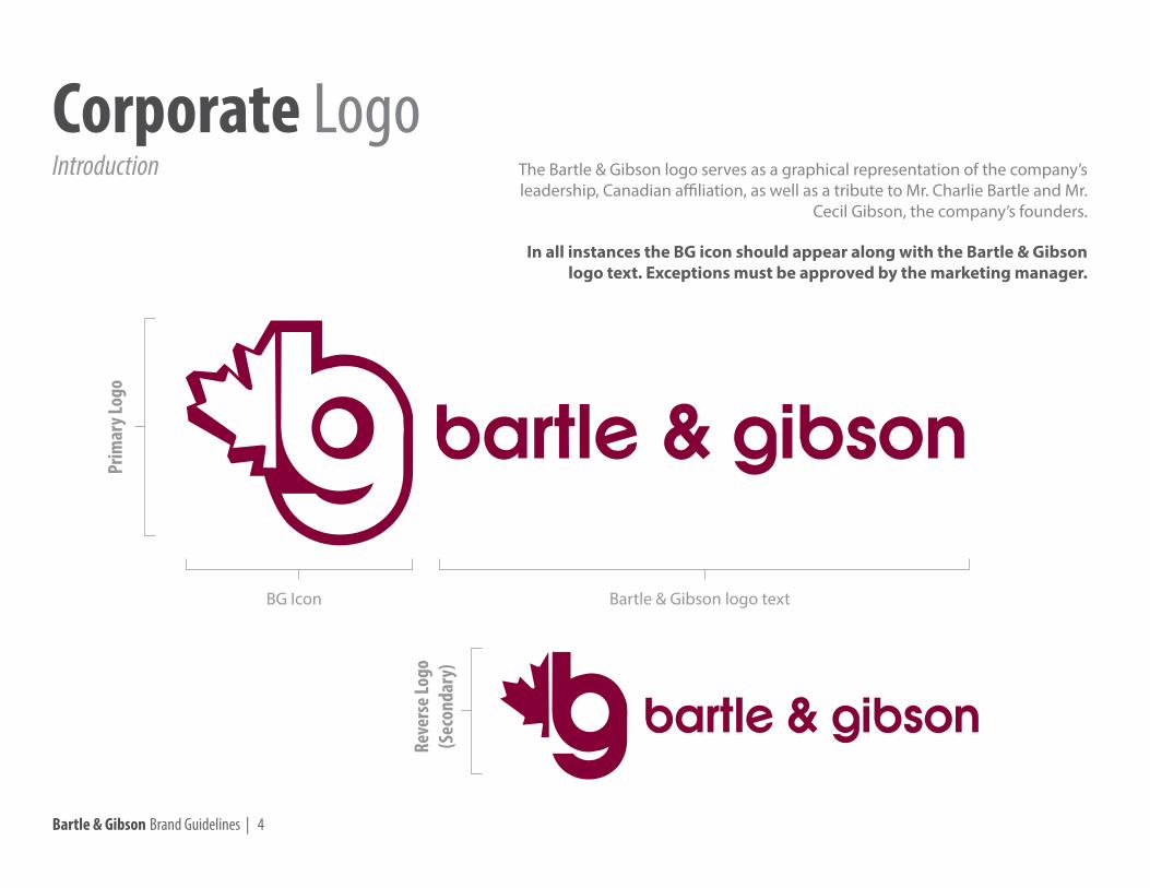
Corporate LogoIntroduction
BG Icon Bartle & Gibson logo text
The Bartle & Gibson logo serves as a graphical representation of the company’s leadership, Canadian affiliation, as well as a tribute to Mr. Charlie Bartle and Mr.
Cecil Gibson, the company’s founders.
In all instances the BG icon should appear along with the Bartle & Gibson logo text. Exceptions must be approved by the marketing manager.
Prim
ary L
ogo
Reve
rse L
ogo
(Sec
onda
ry)

Bartle & Gibson Brand Guidelines | 5
Alternative OrientationsCorporate Logo
Vertical Logo Horizontal Logo
Bartle & Gibson Brand Guidelines | 6
Vertical Logo Horizontal Logo
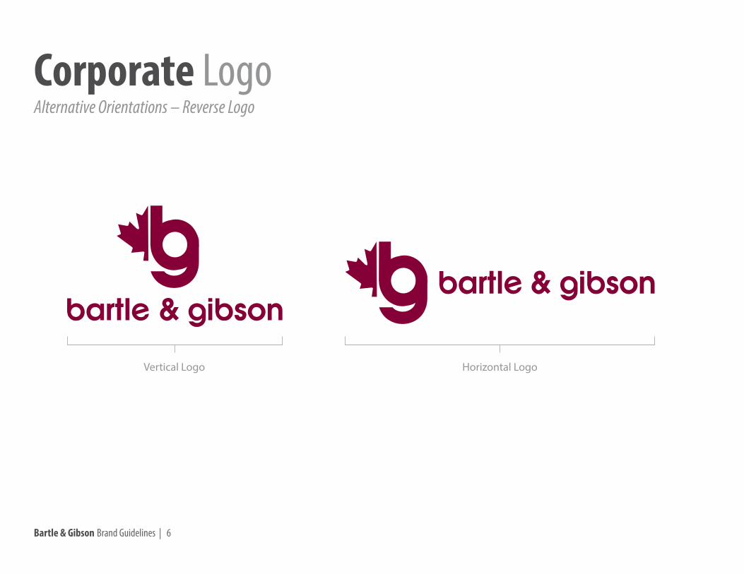
Alternative Orientations – Reverse LogoCorporate Logo

Bartle & Gibson Brand Guidelines | 7
Vertical Logo SpacingThis vertical orientation is equally acceptable as the horizontal orientation.
The BG icon should be the same distance above “bartle & gibson” as the horizontal space between the “e” and the “&” or as the “g” and the “&” in the logo text.
Horizontal Logo SpacingThis horizontal orientation is equally acceptable as the vertical orientation.
The BG icon should be the same distance left of “bartle & gibson” as the “e” and the “&” or as the “g” and the “&” in the logo text.
X
X X
X X X
Logo SpacingCorporate Logo

Bartle & Gibson Brand Guidelines | 8
X XX
X
X X
Logo Spacing – Reverse LogoCorporate Logo
Vertical Logo SpacingThis vertical orientation is equally acceptable as the horizontal orientation.
The BG icon should be the same distance above “bartle & gibson” as the horizontal space between the “e” and the “&” or as the “g” and the “&” in the logo text.
Horizontal Logo SpacingThis horizontal orientation is equally acceptable as the vertical orientation.
The BG icon should be the same distance left of “bartle & gibson” as the “e” and the “&” or as the “g” and the “&” in the logo text.

Bartle & Gibson Brand Guidelines | 9
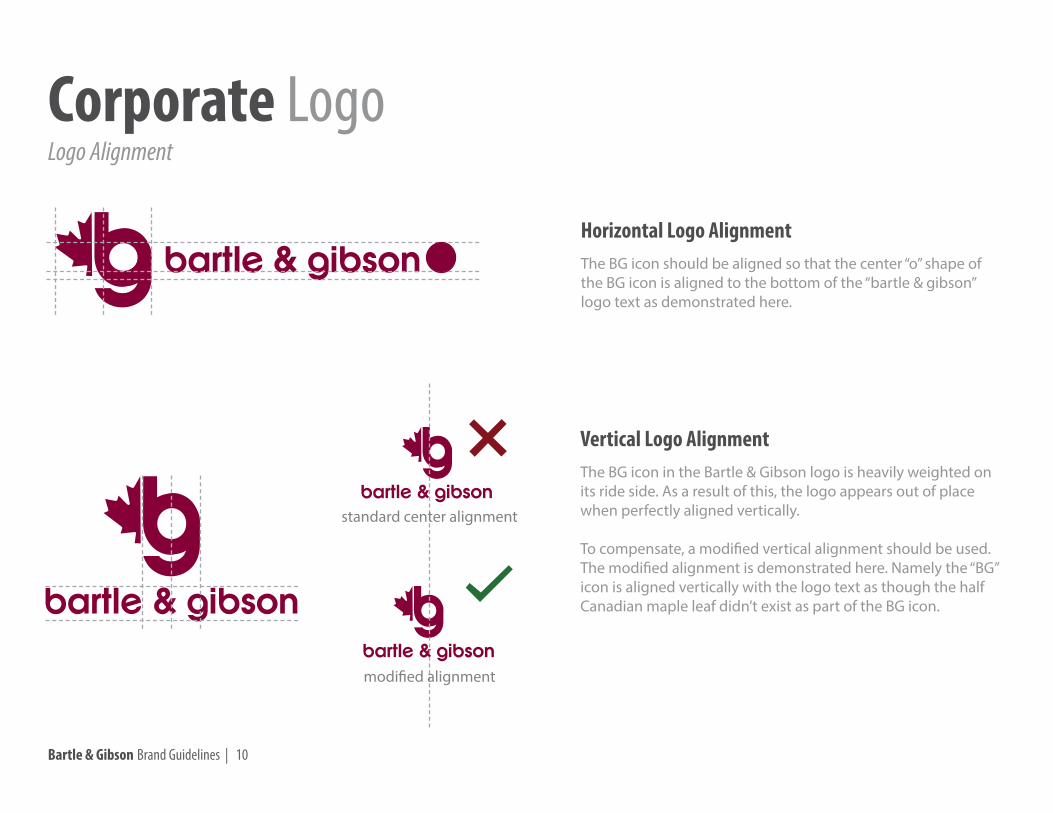
Horizontal Logo AlignmentThe BG icon should be aligned so that the center “o” shape of the BG icon is aligned to the bottom of the “bartle & gibson” logo text as demonstrated here.
Vertical Logo AlignmentThe BG icon in the Bartle & Gibson logo is heavily weighted on its ride side. As a result of this, the logo appears out of place when perfectly aligned vertically.
To compensate, a modified vertical alignment should be used. The modified alignment is demonstrated here. Namely the “BG” icon is aligned vertically with the logo text as though the half Canadian maple leaf didn’t exist as part of the BG icon.
standard center alignment
modified alignment
Logo AlignmentCorporate Logo
Bartle & Gibson Brand Guidelines | 10
Logo AlignmentCorporate Logo
Horizontal Logo AlignmentThe BG icon should be aligned so that the center “o” shape of the BG icon is aligned to the bottom of the “bartle & gibson” logo text as demonstrated here.
Vertical Logo AlignmentThe BG icon in the Bartle & Gibson logo is heavily weighted on its ride side. As a result of this, the logo appears out of place when perfectly aligned vertically.
To compensate, a modified vertical alignment should be used. The modified alignment is demonstrated here. Namely the “BG” icon is aligned vertically with the logo text as though the half Canadian maple leaf didn’t exist as part of the BG icon.
standard center alignment
modified alignment

Bartle & Gibson Brand Guidelines | 11
Horizontal Logo Buffer ZoneThe center “o” shape of the BG icon is the appropriate height and width to account for a buffer zone around the logo.
This is the minimum empty space required to be around the logo and is directly proportionate to the logo size.
Vertical Logo Buffer ZoneThe center “o” shape of the BG icon is the appropriate height and width to account for a buffer zone around the logo.
This is the minimum empty space required to be around the logo and is directly proportionate to the logo size
Logo Buffer ZoneCorporate Logo

Bartle & Gibson Brand Guidelines | 12
Horizontal Logo Buffer ZoneThe center “o” shape of the BG icon is the appropriate height and width to account for a buffer zone around the logo.
This is the minimum empty space required to be around the logo and is directly proportionate to the logo size.
Vertical Logo Buffer ZoneThe center “o” shape of the BG icon is the appropriate height and width to account for a buffer zone around the logo.
This is the minimum empty space required to be around the logo and is directly proportionate to the logo size
Logo Buffer Zone – Reverse LogoCorporate Logo
Bartle & Gibson Brand Guidelines | 13
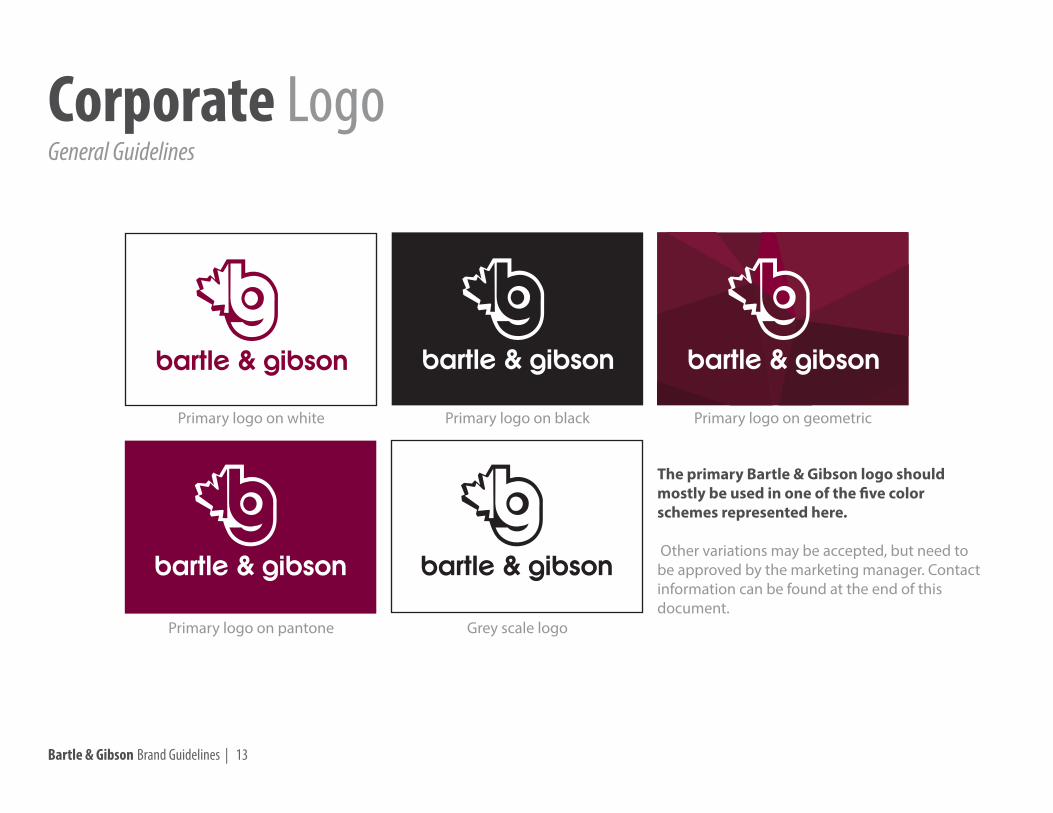
Primary logo on white Primary logo on black Primary logo on geometric
Primary logo on pantone Grey scale logo
The primary Bartle & Gibson logo should mostly be used in one of the five color schemes represented here.
Other variations may be accepted, but need to be approved by the marketing manager. Contact information can be found at the end of this document.
General GuidelinesCorporate Logo

Bartle & Gibson Brand Guidelines | 14
Reverse logo on white Reverse logo on black
Revese logo on pantone Grey scale logo
Reverse logo on geometric
The reverse Bartle & Gibson logo should mostly be used in one of the five color schemes represented here.
Other variations may be accepted, but need to be approved by the marketing manager. Contact information can be found at the end of this document.
General Guidelines – Reverse LogoCorporate Logo
Bartle & Gibson Brand Guidelines | 15
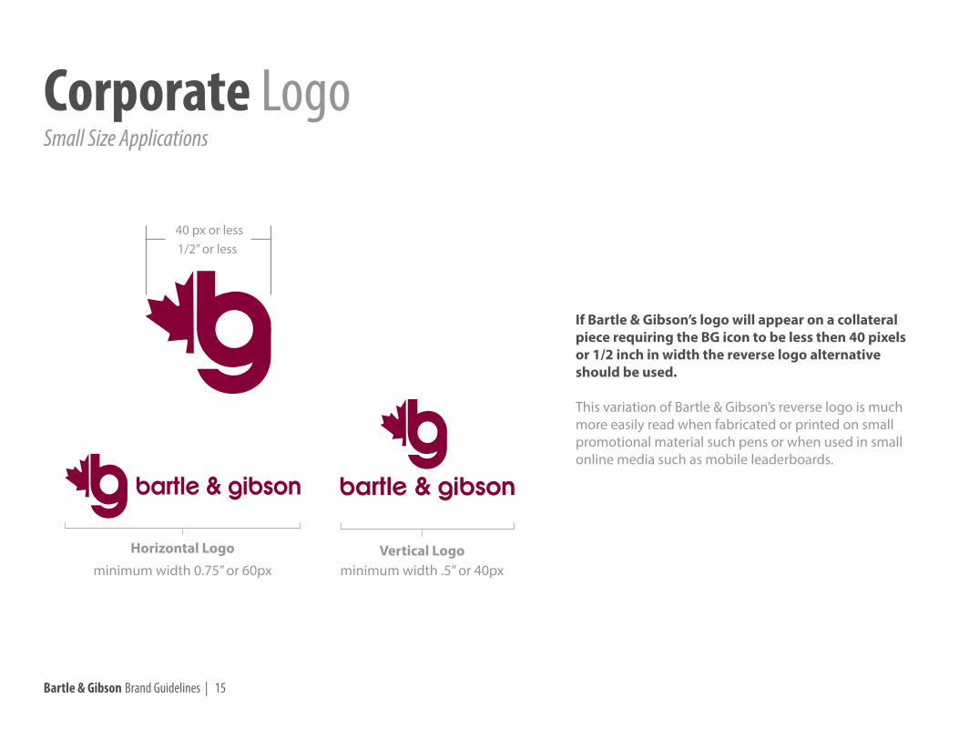
If Bartle & Gibson’s logo will appear on a collateral piece requiring the BG icon to be less then 40 pixels or 1/2 inch in width the reverse logo alternative should be used.
This variation of Bartle & Gibson’s reverse logo is much more easily read when fabricated or printed on small promotional material such pens or when used in small online media such as mobile leaderboards.
40 px or less1/2” or less
Vertical LogoHorizontal Logominimum width 0.75” or 60px minimum width .5” or 40px
Small Size ApplicationsCorporate Logo

Bartle & Gibson Brand Guidelines | 16
Skewing or stretching the logoin any way
Moving the location of the BG icon
Placing the logo on a photograph background
*Certain exceptions may be allowed, but must first be approved by the marketing manager
Changing the color of the logo
These examples demonstrate some scenarios that should be avoided when using the logo.
Changing the angle in which the logo appears
Placing the BG icon belowthe logo text
Scenarios to AvoidCorporate Logo
Bartle & Gibson Brand Guidelines | 17
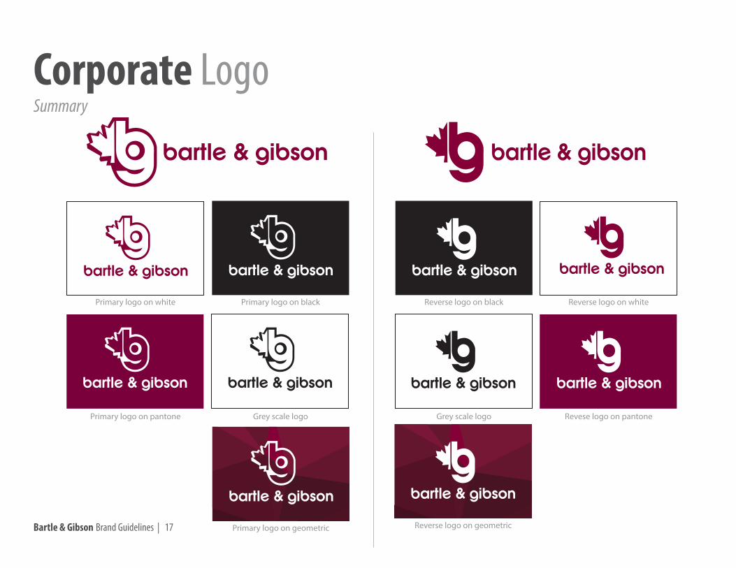
SummaryCorporate Logo
Primary logo on white Primary logo on black
Primary logo on geometric
Primary logo on pantone Grey scale logo
Reverse logo on whiteReverse logo on black
Revese logo on pantoneGrey scale logo
Reverse logo on geometric

Bartle & Gibson Brand Guidelines | 18
When using the “Plumbing | Heating | Electrical” tagline as part of the B&G logo, it must be placed next to the logo as shown here.
In instances where the product line cannot appear in one of the four formations, the marketing manager should be consulted for approval. Contact information can be found at the end of this document.
Plumbing | Heating | ElectricalCorporate Product Line

Bartle & Gibson Brand Guidelines | 19
The geometric asset is to be used as a background to Bartle & Gibson's logo placement only. A white version of the logo can be placed on top of the background as shown here.
Geometric BackgroundCorporate Assets

Bartle & Gibson Brand Guidelines | 20
The maple leaf icon is to be used as a graphic addition only. It is not to be touching the logo under any circumstance.
This icon should always be HEX #4C4C4E, but opacity may be adjusted depending on the use.
The leaf is to be displayed on a white or black background only, and the Bartle & Gibson website may be layered on top in the font "Bartle Bold".
See letterhead examples here.
Maple LeafCorporate Assets
bartlegibson.com
Bartle & Gibson Brand Guidelines | 21
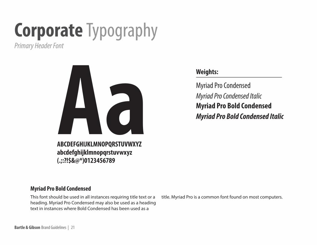
AaABCDEFGHIJKLMNOPQRSTUVWXYZabcdefghijklmnopqrstuvwxyz(.;:?!$&@*)0123456789
This font should be used in all instances requiring title text or a heading. Myriad Pro Condensed may also be used as a heading text in instances where Bold Condensed has been used as a
title. Myriad Pro is a common font found on most computers.
Myriad Pro CondensedMyriad Pro Condensed Italic
Myriad Pro Bold Condensed ItalicMyriad Pro Bold Condensed
Weights:
Myriad Pro Bold Condensed
Primary Header FontCorporate Typography
Bartle & Gibson Brand Guidelines | 22
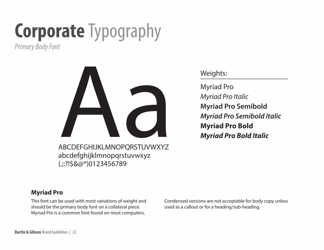
AaABCDEFGHIJKLMNOPQRSTUVWXYZabcdefghijklmnopqrstuvwxyz(.;:?!$&@*)0123456789
This font can be used with most variations of weight and should be the primary body font on a collateral piece.Myriad Pro is a common font found on most computers.
Condensed versions are not acceptable for body copy unless used as a callout or for a heading/sub-heading.
Myriad ProMyriad Pro ItalicMyriad Pro Semibold
Myriad Pro Bold Italic
Myriad Pro Semibold ItalicMyriad Pro Bold
Weights:
Myriad Pro
Primary Body FontCorporate Typography
Bartle & Gibson Brand Guidelines | 23
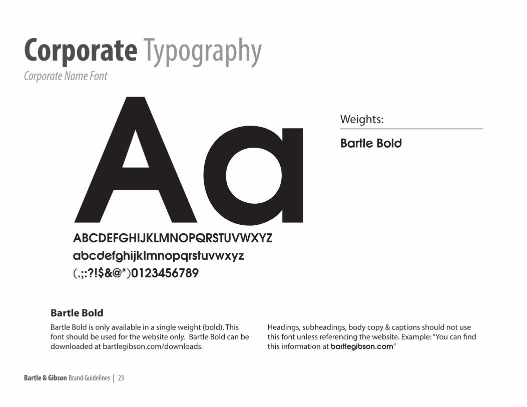
Bartle Bold is only available in a single weight (bold). This font should be used for the website only. Bartle Bold can be downloaded at bartlegibson.com/downloads.
Headings, subheadings, body copy & captions should not use this font unless referencing the website. Example: “You can find this information at bartlegibson.com”
Bartle Bold
Weights:
Bartle Bold
AaABCDEFGHIJKLMNOPQRSTUVWXYZabcdefghijklmnopqrstuvwxyz(.;:?!$&@*)0123456789
Corporate Name FontCorporate Typography

Bartle & Gibson Brand Guidelines | 24
Myriad ProMyriad Pro ItalicMyriad Pro Semibold
Myriad Pro Bold Italic
Myriad Pro Semibold ItalicMyriad Pro Bold
Primary Body Weights:Lorem ipsum dolor sit amet, consectetur adipiscing elit. In et purus est, ac adipiscing tortor. Vestibulum fermentum fermentum tincidunt. Ali-quam ut tortor elit. Nunc nisi mi, volutpat id vehicula in, blandit non ligula. Class aptent taciti sociosqu ad litora torquent per conubia nostra, per in-ceptos himenaeos. Proin mi mauris, fringilla eget fermentum et, vehicula vel nisi. Nulla lorem elit, accumsan ut commodo sed, fermentum ac ligula. Ut gravida placerat felis, ut volutpat nisl mollis eget. Vestibulum venenatis convallis vehicula. Proin sit amet justo eros.
Lorem ipsum dolor sit amet!Consectetur adipiscing elit. In et purus est, ac adipiscing tortor. Vestibulum fermentum fermentum tincidunt. Aliquam ut tortor elit. Nunc nisi.
Bartle Bold
Corporate Font Weights:bartlegibson.com
Myriad Pro CondensedMyriad Pro Condensed Italic
Myriad Pro Bold Condensed ItalicMyriad Pro Bold Condensed
Primary Header Weights:SummaryCorporate Typography
Bartle & Gibson Brand Guidelines | 25
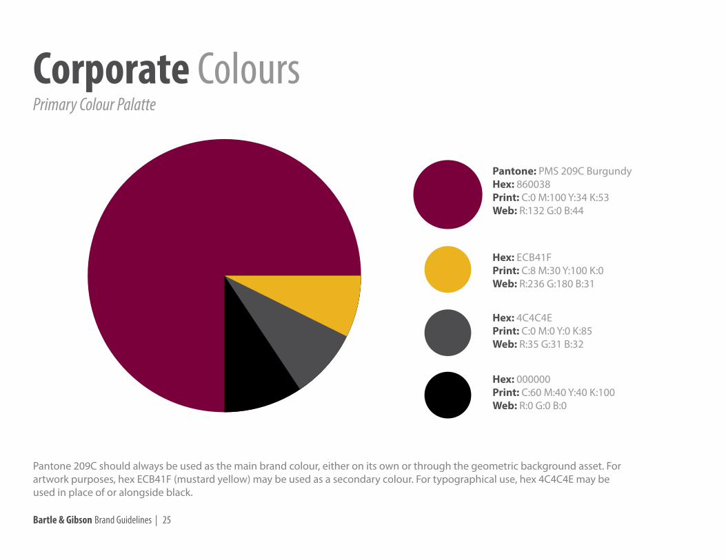
Pantone: PMS 209C BurgundyHex: 860038Print: C:0 M:100 Y:34 K:53Web: R:132 G:0 B:44
Hex: ECB41FPrint: C:8 M:30 Y:100 K:0Web: R:236 G:180 B:31
Hex: 4C4C4EPrint: C:0 M:0 Y:0 K:85Web: R:35 G:31 B:32
Hex: 000000Print: C:60 M:40 Y:40 K:100Web: R:0 G:0 B:0
Primary Colour PalatteCorporate Colours
Pantone 209C should always be used as the main brand colour, either on its own or through the geometric background asset. For artwork purposes, hex ECB41F (mustard yellow) may be used as a secondary colour. For typographical use, hex 4C4C4E may be used in place of or alongside black.
Bartle & Gibson Brand Guidelines | 26
All company communications should conform to the correct brand guidelinesFor specific questions, please contact Bartle & Gibson’s marketing department.
Contact Information
Joshua PedersenMarketing Manager
[email protected] ext 308
Cara O’DonnellMarketing Coordinator
[email protected] ext 300