brand guide - uttyler.edu · new strategic plan and branding initiatives to strengthen our efforts...
TRANSCRIPT
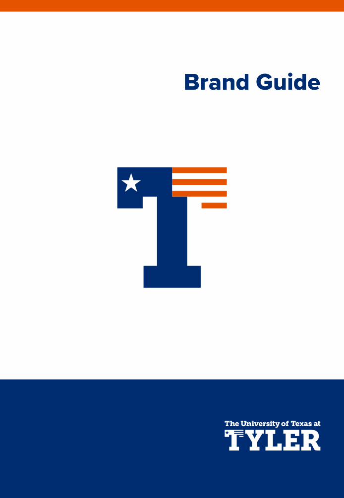
Brand Guide

Published By
Office of Marketing & CommunicationsThe University of Texas at Tyleruttyler.edu/marketing/
Table of Contents
INTRODUCTION 3Our Branding 4
OUR LOGOS 7Our Logo 8 Primary Usage 10Secondary Usage 12Secondary Academic Marks 14Size & Clear Space 15Primary Athletic Marks 16Secondary Athletic Marks 17Improper Usage 18Incorrect Versions of Flag-T 19Our Name 20
Locking up to the Brand 18College Sub-brands Lockups 19Department Lockups 20Alternative Lockups 21
OUR TYPOGRAPHY 21Our Typography Palette 22Proxima Nova 23Garamond 24
OUR COLORS 25Our Color Palette 26Patriot Colors 27Alternate Patriot Colors 28
COLLEGE & DEPARTMENT USAGE 29Social Media 30Email Signature 31
Introduction
3

36 OUR LOGOS | Subject
Founded by East Texas leaders in 1971 to improve lives through higher education, The University of Texas at Tyler fulfills this purpose with an unwavering commitment to student success; student engagement in both curricular and co-curricular pursuits; knowledge creation and expansion through scholarly research; and community service.
A component of the prestigious University of Texas System with more than 10,000 students, UT Tyler provides the advantages of a comprehensive public university, uniquely combined with personalized educational experiences characteristically associated with a smaller, private university.
We also hold the distinction of being the only University of Texas in the East Texas region. In that respect, we have a great responsibility to the communities we serve. Educational attainment, public healthiness, economic growth, average household income and quality of life all are positively impacted by a thriving higher education center.
Over the past year, UT Tyler has formed a new strategic plan and branding initiatives to strengthen our efforts and set new standards to help build a better future for East Texas and beyond. The strategic plan, along with a new vision and a new mission statement, was developed through months of open brainstorming, ideation and refinement sessions with UT Tyler students, faculty and staff.
This guidebook provides information and communication tools to assist the university community in conveying the UT Tyler brand.
OUR VISION
Our aspiration is to be the educational and economic driver of East Texas.
UT Tyler is the premier comprehensive, public university of East Texas, operating with the understanding that the well-being of the region and the success of the university are intertwined. Through the leveraging of our resources and the building of community partnerships and collaborations, the university is committed to strengthening the region educationally and economically.
OUR MISSION
UT Tyler is committed to student success by providing a uniquely balanced student experience in an environment of innovative teaching and research shaped to serve and advance the educational, economic, technological, and public interests of East Texas and beyond.
Based on this mission, the new strategic plan consists of four pillars, each involving college- and department-level strategic initiatives throughout the university:
Our BRANDING at The University of Texas at Tyler
4 INTRODUCTION | Our Branding
Student Success – We will support our students’ educational and career goals with data-driven strategies, including a universitywide focus on student service; innovative, student-centered teaching; expanded grant and scholarship-based financial aid; and career placement services to position students for success.
Student Engagement – Our initiatives for ensuring a rich, individualized educational experience for every student include encouraging their involvement in research and discovery; connecting them with successful alumni; and connecting them to campus through student life enhancements, expanded campus accommodations and an effort to advance athletics from NCAA DIII to DII membership.
Research and Scholarship – The university will foster discovery through scientific, technological, intellectual and creative expression with initiatives to expand the field of knowledge and enhance student research activities.
Community Engagement – UT Tyler seeks to engage in local and regional collaborations and partnerships to improve the quality of life in our communities. Our initiatives include strengthening and expanding partnerships between academic units and regional organizations, launching the East Texas Policy Summit and diversifying the procurement of products and services in all areas of campus.
OUR BRANDING
As UT Tyler began community discussions for a new strategic plan, one of the ideas that framed the discussion was the higher education “cycle of success” model.
The cycle of success model predicts institutional success as a reciprocating and ultimately self-perpetuating function of the relationship between 1) brand development, 2) alumni careers, 3) student development/success and 4) resource opportunity.
Just looking at the branding dimension of the cycle of success model shows how interlocking these attributes are. Great brand value from the name of the institution on one’s diploma helps alumni land in great careers, and alumni who have great careers help build a great brand for their alma mater.
A great brand also makes it easier for advancement officers to find resources opportunities, often from those successful alumni. Resource opportunities are critical for building student success (as measured by graduation rates and career preparedness), which also leads to satisfied, successful alumni, which builds more upon the brand value.
Recognizing that proper brand management serves as a catalyst for the cycle of success, new branding initiatives have been implemented, including a new, unified logo and a tagline.
OUR LOGO
The convergence of a new strategic direction focused on the cycle of success for the university along with a proposed move from NCAA Division III to Division II competition created a unique opportunity. Both the university mark and the athletic mark had just cause for redesign.
During the design phase, the community feedback process generated fruit: The suggestion was made that one mark, if properly designed, could fill the need of both the academic and athletic mark. A concept originally drafted in the Department of Marketing and Communications met the challenge. UT Tyler’s square mark and the Swoop logo could be replaced by the “Flag T” logo.
The use of the letter T in higher education logos is not uncommon in Texas. But what Flag T does that is unique is fuse the ideas of our athletic team name, Patriots, with a collegiate letter rendered that invokes both Texas and Tyler. The Flag T is versatile – serving as part of several brand constructs: UT Tyler, Tyler, The University of Texas at Tyler, and PATRIOTS. Additionally:
• Flag T represents both Texas and Tyler, symbolizing our distinction as the only University of Texas System school in the eastern region of the state.
• The Star of Texas in Flag T signifies our association with the prestigious University of Texas System.
• The star and stripes also refer to Old Glory, the greatest symbol of American patriotism, an invocation of the deeply patriotic culture of our home, East Texas.
INTRODUCTION | Our Branding 5

7
Our Logos
6 INTRODUCTION | Our Branding
• The school colors are displayed with dominance given to blue, a color often associated with depth and stability and patriotism. This represents our commitment to serving and sacrificing for our neighbors, communities, state and country – the defining quality of a true Patriot.
• The typeface is a heavy-weight variant of Museo Slab, a solid font representing our vision to serve as the foundational educational and economic driver of East Texas.
• The orange and white stripes represent UT Tyler’s seven colleges and our devotion to providing students a well-rounded university experience, designed for lifelong success.
OUR TAGLINE
As the primary educational and economic driver of the region of East Texas, The University of Texas at Tyler is passionate about supporting goals for success. Whether you are a first-generation college student, a professional seeking to advance your career or someone with an idea that will change the world, UT Tyler is here to power your success. Our new tagline is simply:
Your Success. Our Passion.

8 OUR LOGOS | Our Logo OUR LOGOS | Primary Logo 9
Our Logo The UT Tyler logo represents us at the very highest level and is vitally important to our brand. It acts as a signature, an identifier and a stamp of quality. It is, and should always be, the most consistent component in our communications.
In order to maintain this consistency, a few simple guidelines should be followed.
NOTE—The UT Tyler logo should never be recreated or typeset. Only official logo files should be used in communications.
Official logo files can be downloadedfrom uttyler.edu/marketing.
The UT Tyler logo as shown here will serve as the campus’ primary logo and trademark. Other campus trademarks may appear on merchandise producedby vendors specifically licensed to reproduce these trademarks. For more information and to view lists of ourtrademark licensees, please visit uttyler.edu/logo.
PRIMARY LOGO
The University of Texas at Tyler Museo Slab typeface is reserved for the academic &
athletic logos. It may also be used to create college, school or department lockups with
the master logo.

10 OUR LOGO | Primary Usage OUR LOGO | Primary Usage 11
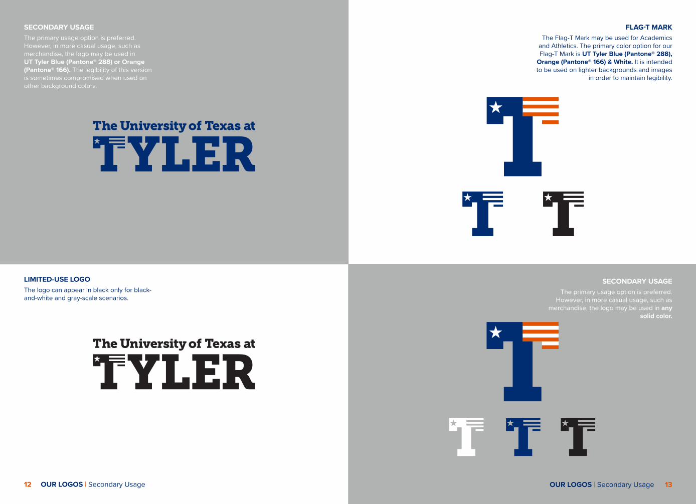
PRIMARY USAGE The primary color option for our logo is UT Tyler Blue (Pantone® 288), Orange (Pan-tone® 166) & White. It is intended to be used on lighter backgrounds and images in order to maintain legibility.
PRIMARY USAGE Another acceptable color option is to reverse the logo out to White on darker backgrounds
and images.
12 OUR LOGOS | Secondary Usage
SECONDARY USAGE The primary usage option is preferred. However, in more casual usage, such as merchandise, the logo may be used in UT Tyler Blue (Pantone® 288) or Orange (Pantone® 166). The legibility of this version is sometimes compromised when used on other background colors.
LIMITED-USE LOGOThe logo can appear in black only for black-and-white and gray-scale scenarios.
FLAG-T MARKThe Flag-T Mark may be used for Academics
and Athletics. The primary color option for our Flag-T Mark is UT Tyler Blue (Pantone® 288),
Orange (Pantone® 166) & White. It is intended to be used on lighter backgrounds and images
in order to maintain legibility.
SECONDARY USAGE The primary usage option is preferred.
However, in more casual usage, such as merchandise, the logo may be used in any
solid color.
OUR LOGOS | Secondary Usage 13

14 OUR LOGOS | Secondary Academic Marks OUR LOGOS | Size & Clear Space 15
SQUARE MARKThis square mark should be used to replace the previous academic square mark.
SECONDARY ACADEMIC MARKSThese alternative versions are acceptable for use when design considerations demand it.
SIZETo maintain full legibility, never reproduce the
academic and athletic word marks at widths smaller than 1 inch (for print) or 150 pixels (for screen). Also, never reproduce the Flag-T at
widths smaller than .25” (for print) or 75 pixels (for screen). There is no maximum size limit, but use discretion when sizing the logo. It should never
be the most dominant element on the page, but instead should live comfortably and clearly as an
identifying mark.
These minimum size guidelines apply only to the university primary and secondary logos without a
college or school lockup.
≥1˝ or 150 px ≥.25˝ or 75 px
CLEAR SPACETo ensure that clear space is maintained around
the logo for legibility and prominence, photos, text and graphic elements must follow the guidelines
illustrated here. Use the letter “B” as a measuring tool to help maintain clearance.
SECONDARY LOGO POLICYIt is the policy of The University of Texas at Tyler to invest in a single visual identity, rather than maintain multiple marks that may interfere with the university’s message. To strengthen the university’s visual identity, a central aspect of our brand, the creation of additional marks is restricted.
As a result, any new secondary mark must be submitted through an approval process prior to development and use. If your organization or department is currently using a secondary logo, you may be contacted by the Office of Marketing and Communications to provide proof of approval. If previous approval cannot be provided, the logo must be submitted through the approval process.

16 OUR LOGOS | Primary Athletic Marks OUR LOGOS | Secondary Athletic Marks 17
PRIMARY ATHLETIC MARKSThe UT Tyler Patriot marks may be used for athletics only. The primary color option is UT Tyler Blue (Pantone® 288), Orange (Pantone® 166) & White. They are intended to be used on lighter backgrounds and images in order to maintain legibility. There are solid blue, white & black versions available for appropriate color scenarios.
When the Patriot mark appears alone, it is never used with the full color T. The primary color option is UT Tyler Blue (Pantone® 288). It is intended to be used on lighter backgrounds and images in order to maintain legibility.
SECONDARY ATHLETIC MARKSThese alternative versions are acceptable for
use when design considerations demand it.

18 OUR LOGOS | Improper Usage OUR LOGOS | Incorrect Versions of Flag-T 19
IMPROPER USAGEHere are a few examples of practices to avoid with all academic and athletic marks.
Don’t stretch, condense or change the dimensions of the wordmarks.
Don’t alter the placement or scale of the elements.
Don’t crop the wordmarks.
Don’t add colors to individual elements of the wordmarks.
Don’t alter or replace the type-faces of the wordmarks.
Don’t skew or bend the word-marks in any way.
Don’t rotate the wordmarks. Don’t use colors other than those specified in this document on all wordmarks.
Don’t rearrange the placement of the type within the wordmarks.
Don’t add any extra elements to the wordmarks.
Don’t use drop shadows, strokes, patterns or visual effects.
Don’t attach or overlap text, shapes or frames to the wordmarks.
INCORRECT VERSIONS OF FLAG-THere are a few examples of practices
to avoid with Flag-T.
Don’t change the colors of the Flag-T.
Don’t stretch the Flag-T. Don’t recreate the icon.
Don’t write out a word with the Flag-T.
Don’t remove the white stripes or stars from the 3-color version of the Flag-T.
Don’t add any extra elements or words to the Flag-T.
With the approval of the Marketing & Communications Department the Flag-T can appear in any color.
TYLER

20 OUR LOGOS | Our Name 21
Our TypographyIn first references, use:
The University of Texas at Tyler™
In subsequent references, use:
UT Tyler™
Patriots™
UT Tyler Patriots™
Formal uses, such as diplomas, may use:
The University of Texas at Tyler™
Do not use:
University of Texas - Tyler
University of Texas, Tyler
U.T.
U.T.T.
U.T. at Tyler
U.T. - Tyler
OUR NAMEBecause of our rich heritage and our complex and diverse community, several names are used to represent the university. This section aims to clear up any confusion. Our logo clearly announces our name, with an emphasis on Tyler. It is just as important to keep our name consistent in content.
22 OUR TYPOGRAPHY | Our Typography Palette OUR TYPOGRAPHY | Proxima Nova 23
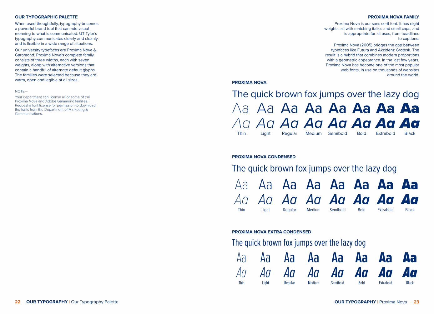
PROXIMA NOVA FAMILYProxima Nova is our sans serif font. It has eight
weights, all with matching italics and small caps, and is appropriate for all uses, from headlines
to captions. Proxima Nova (2005) bridges the gap between
typefaces like Futura and Akzidenz Grotesk. The result is a hybrid that combines modern proportions with a geometric appearance. In the last few years,
Proxima Nova has become one of the most popular web fonts, in use on thousands of websites
around the world.
The quick brown fox jumps over the lazy dog AaAa
Thin
AaAa
Light
AaAaRegular
AaAaMedium
AaAaSemibold
AaAa
Bold
AaAaExtrabold
AaAa
Black
PROXIMA NOVA
The quick brown fox jumps over the lazy dog
AaAa
Thin
AaAa
Light
AaAaRegular
AaAaMedium
AaAaSemibold
AaAa
Bold
AaAaExtrabold
AaAa
Black
PROXIMA NOVA CONDENSED
The quick brown fox jumps over the lazy dogAaAa
Thin
AaAa
Light
AaAaRegular
AaAaMedium
AaAaSemibold
AaAa
Bold
AaAaExtrabold
AaAa
Black
PROXIMA NOVA EXTRA CONDENSED
OUR TYPOGRAPHIC PALETTEWhen used thoughtfully, typography becomes a powerful brand tool that can add visual meaning to what is communicated. UT Tyler’s typography communicates clearly and cleanly, and is flexible in a wide range of situations. Our university typefaces are Proxima Nova & Garamond. Proxima Nova’s complete family consists of three widths, each with seven weights, along with alternative versions that contain a handful of alternate default glyphs. The families were selected because they are warm, open and legible at all sizes. NOTE—Your department can license all or some of the Proxima Nova and Adobe Garamond families. Request a font license for permission to download the fonts from the Department of Marketing & Communications.

24 OUR TYPOGRAPHY | Garamond 25
GARAMONDGaramond is our serif font. It is appropriate anywhere a serif font is needed, including headlines. It has 56 styles, including italics, condensed, extra wide and small caps. Regular, italic and bold are included in the Microsoft Suite for campus employee usage.
The Garamond font family is the typeface first created by the famed French printer Claude Garamond in the 16th century.
The Garamond design is considered one of the most versatile fonts available today and certainly one of the most attractive and graceful in print. It is also one of the most eco-friendly types to print because the letterforms use less ink than other similar faces.
The quick brown fox jumps over the lazy dogAaRegular
AaItalic
GARAMOND
Our Colors
AaBold
26 OUR COLORS | Our Color Palette OUR COLORS | Patriot Colors 27
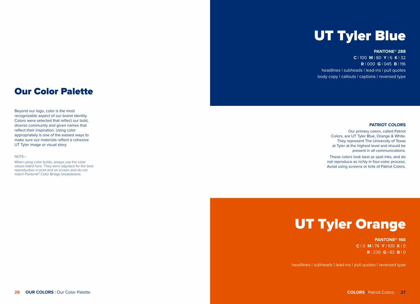
Our Color Palette
Beyond our logo, color is the most recognizable aspect of our brand identity. Colors were selected that reflect our bold, diverse community and given names that reflect their inspiration. Using color appropriately is one of the easiest ways to make sure our materials reflect a cohesive UT Tyler image or visual story.
NOTE—When using color builds, always use the color values listed here. They were adjusted for the best reproduction in print and on screen and do not match Pantone® Color Bridge breakdowns.
PATRIOT COLORSOur primary colors, called Patriot
Colors, are UT Tyler Blue, Orange & White. They represent The University of Texas
at Tyler at the highest level and should be present in all communications.
These colors look best as spot inks, and do not reproduce as richly in four-color process. Avoid using screens or tints of Patriot Colors.
UT Tyler OrangePANTONE® 166
C | 0 M | 76 Y | 100 K | 0R | 230 G | 83 B | 0
headlines | subheads | lead-ins | pull quotes | reversed type
UT Tyler Blue PANTONE® 288
C | 100 M | 80 Y | 6 K | 32R | 000 G | 045 B | 116
headlines | subheads | lead-ins | pull quotesbody copy | callouts | captions | reversed type

29
College &Department
Usage
ALTERNATE PATRIOT COLORSOur alternate heritage colors were created to expand the primary palette. They may be used to complement the primary heritage colors but should never completely replace them as mainrepresentations of UT Tyler.
UT Tyler Gray PANTONE® 421C | 13 M | 8 Y | 11 K | 26R | 178 G | 180 B | 178headlines | subheads | lead-ins | pull quotesbody copy | callouts | captions | reversed type
28 OUR COLORS | Alternate Patriot Colors

30 COLLEGE & DEPARTMENT USAGE | Social Media COLLEGE & DEPARTMENT USAGE | Email Signature 31
SOCIAL MEDIA Social media platforms capture the dynamic conversation of our university — that’s why it’s important to remember that when you refer to UT Tyler, you are representing the The University of Texas at Tyler brand. While these platforms are called “social” media and not “professional” media, be sure to use the correct university logos in your pages and messages to ensure a UT Tyler-branded look.
The Facebook and Twitter templates shown below will help with this effort.
The Office of Marketing and Communications is available to create a social media logo for your college, school or department if needed. Go to uttyler.edu/social media for the UT Tyler Social Media Guidelines.
EMAIL SIGNATURE Email is our most common form of
day-to-day communication and therefore one of the most visible ways we communicate with our audiences and each other. Clear,
consistent email identification strengthens the UT Tyler brand.
It is not necessary to use the full email signature on every email you send. It should
be included when representing yourself as part of the university, but it isn’t necessary for
day-to-day emails between coworkers.
Additions such as inspirational quotes and graphics are not permitted.
Follow the instructions on the uttyler website to generate your official UT Tyler email signa-
ture.
Samples:Samples:


CHAPTER NAME | Subject 2
uttyler.edu
version 2 - 03-12-18