brand design tested: how simple changes in page element aesthetics led to a 51% increase in...
TRANSCRIPT

Branded Design Tested:How simple changes in page element aesthetics led to a 51% increase in subscriptions

We’re sharing on Twitter!#WebClinic
Pamela JesseauSenior Director,MarketingMECLABS Institute
Austin McCrawSenior Director, Content ProductionMECLABS Institute
Today’s Speakers

Experiment: Background
Experiment ID: TP11081Record Location: MECLABS Research LibraryResearch Partner: Protected*
Background: A regional marketing commission.
Goal: To raise awareness of local activities and events, increasing number of travelers and tourist spending in [City].
Research Question: Which sign-up page will generate the most response?
Test Design: A/B split test
*Note: Test has been anonymized to protect partner confidentiality.

The control

Control
The control

The treatment

The treatment

Control Treatment
Side-by-side

Experiment: Results
Treatments Conversion RatePercent Relative
ChangeLevel of
Confidence
Control 56.4% -- --
Treatment 37.3% -33.94 99%
34% Decrease in conversionsThe treatment decreased conversion rates by a relative 33.94%.

Experiment: Results
Treatments Conversion RatePercent Relative
ChangeLevel of
Confidence
Control 56.4% 51.37% 99%
Treatment 37.3% -- --
51% Increase in conversionsThe control outperformed the treatment by a relative 51.37%.

Why did the branded treatment lose??
Key question

Research across many brands
Today we are going to review three elements that determine a brand’s effectiveness.
Today’s focus

ELEMENT #1:
Fostered conclusions
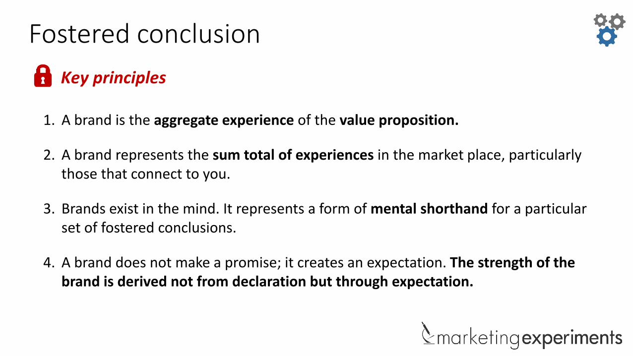
Fostered conclusion
1. A brand is the aggregate experience of the value proposition.
2. A brand represents the sum total of experiences in the market place, particularly those that connect to you.
3. Brands exist in the mind. It represents a form of mental shorthand for a particular set of fostered conclusions.
4. A brand does not make a promise; it creates an expectation. The strength of the brand is derived not from declaration but through expectation.
Key principles

Fostered conclusion
1. Brand is the aggregate experience of the value proposition
2. Brand, represents the sum total of experiences in the market place, particularly those that connect to you.
3. Brand exists in the mind. It represents a form of mental shorthand for a particular set of fostered conclusions.
4. Brand does not make a promise; it creates an expectation. The strength of the brand is derived not from declaration, but through expectation.
Key principles
To see a more in-depth Web clinic related to these principles and value proposition visit: MarketingExperiments.com/brand

What are the fostered conclusions?
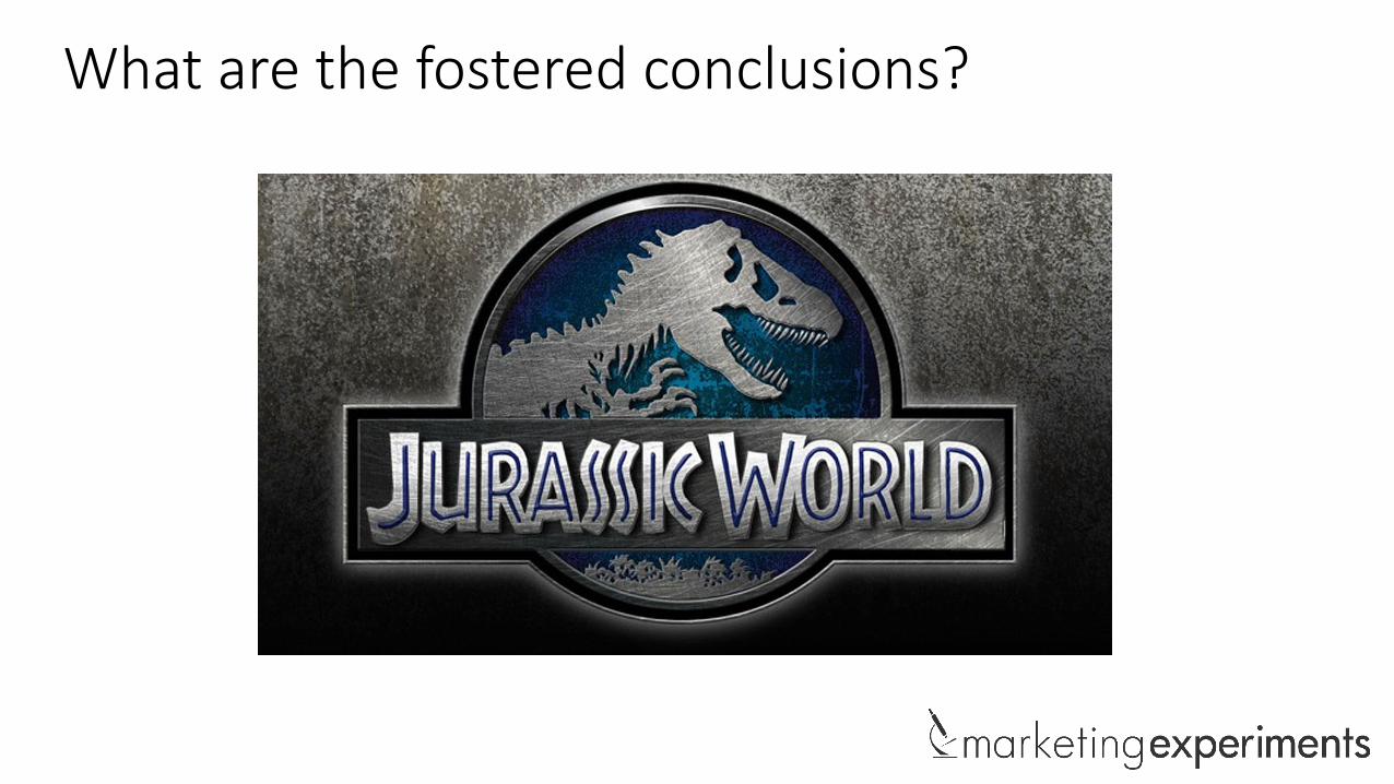
What are the fostered conclusions?
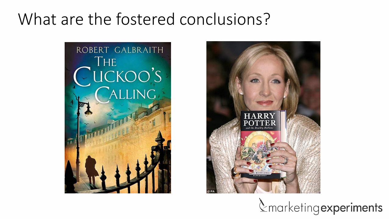
What are the fostered conclusions?
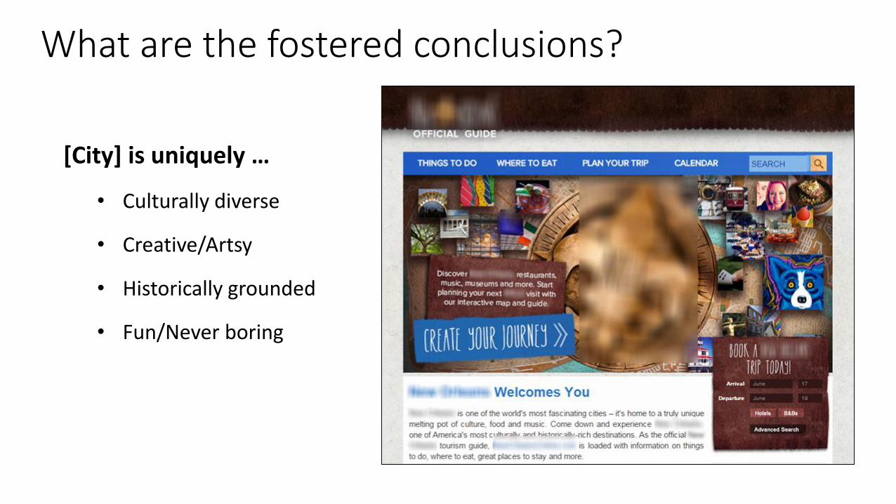
[City] is uniquely …
• Culturally diverse
• Creative/Artsy
• Historically grounded
• Fun/Never boring
What are the fostered conclusions?

ELEMENT #2:
Short-hand symbols

Short-hand symbols
1. A properly developed brand leverages short-hand symbols to stimulate a connection (auto-suggest) to a desired, fostered conclusion (the value proposition in action). Short-hand symbols typically take three forms:
• Voice – The written and/or spoken tone/personality of the message
Key principles

Voice


Voice

Voice

Voice

Voice

Voice

Short-hand symbols
1. A properly developed brand leverages short-hand symbols to stimulate a connection (auto-suggest) to a desired, fostered conclusion (the value proposition in action). Short-hand symbols typically take three forms:
• Voice – The written and/or spoken tone/personality of the message
• Style – The design approach/elements (colors, shapes, etc.) of the format
Key principles

Style

Reductive design approach
Style
Front-facing

Geometric shapes
Style
Straight hard shadows

Style

Style

Short-hand symbols
1. A properly developed brand leverages short-hand symbols to stimulate a connection (auto-suggest) to a desired, fostered conclusion (the value proposition in action). Short-hand symbols typically take three forms:
• Voice – The written and/or spoken tone/personality of the message
• Style – The design approach/elements (colors, shapes, etc.) of the format
• Marks – The iconic mark(s) associated with brand (logo, face, name, etc.)
Key principles

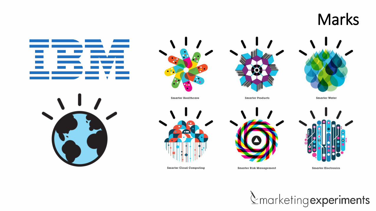
Examples of marks short-hand symbols
• Many brands have developed marks, which immediately evoke the essence of the brand.
• Marks can range from the logo mark itself to a specific name like a founder or CEO.
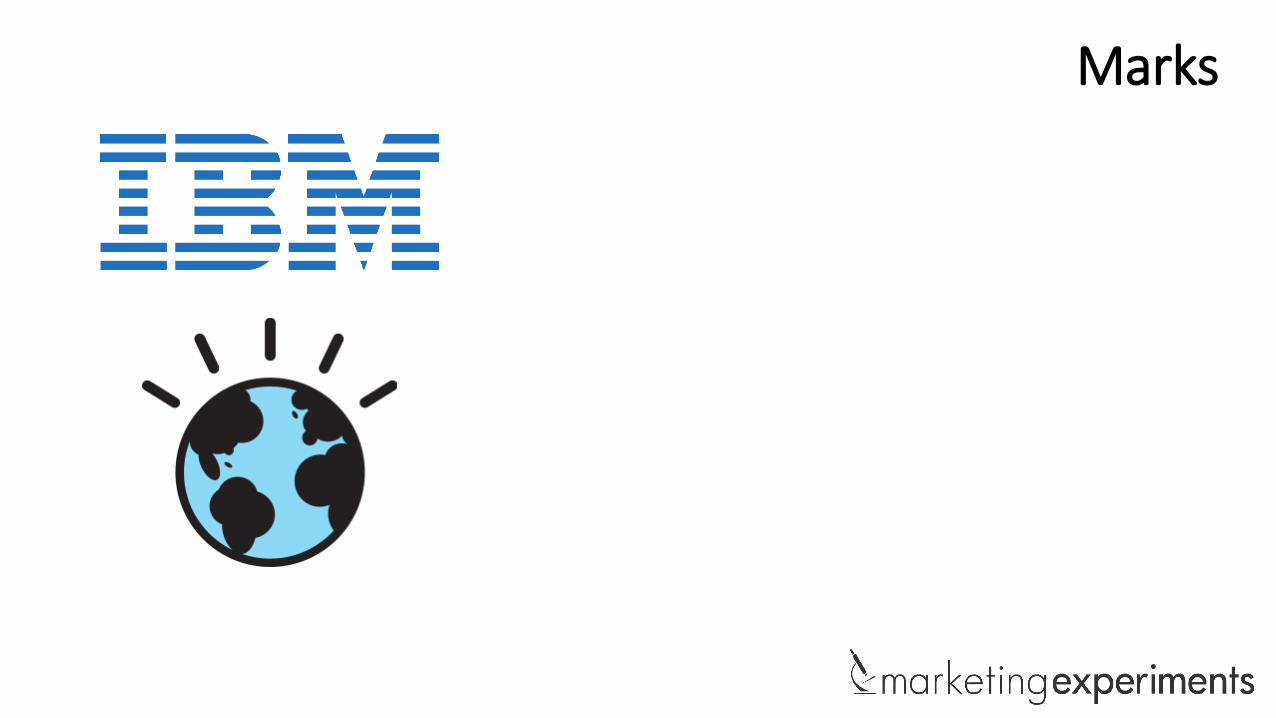
Marks
Marks
Marks

Marks

Marks

What short-hand symbols is [City] utilizing to foster the desired conclusion?
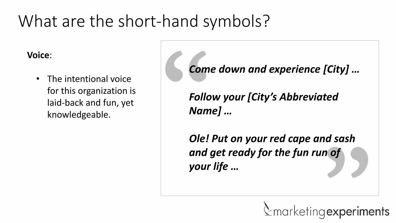
Come down and experience [City] …
Follow your [City’s Abbreviated Name] …
Ole! Put on your red cape and sash and get ready for the fun run of your life …
What are the short-hand symbols?
Voice:
• The intentional voice for this organization is laid-back and fun, yet knowledgeable.

What are the short-hand symbols?
Style:
• The company leverages font, colors, textures, imagery and tilts as short-hand symbols.
• This style is attempting to communicate cultural diversity, creativity and fun.

What are the short-hand symbols?
Mark:
• There are essentially two key marks for [City]: its abbreviated name and the emblem associated with the city.
Abbreviated Names: Emblems:

The treatment employs all of these elements. Why did the branded treatment lose?
Key question
ELEMENT #3:
Proper application
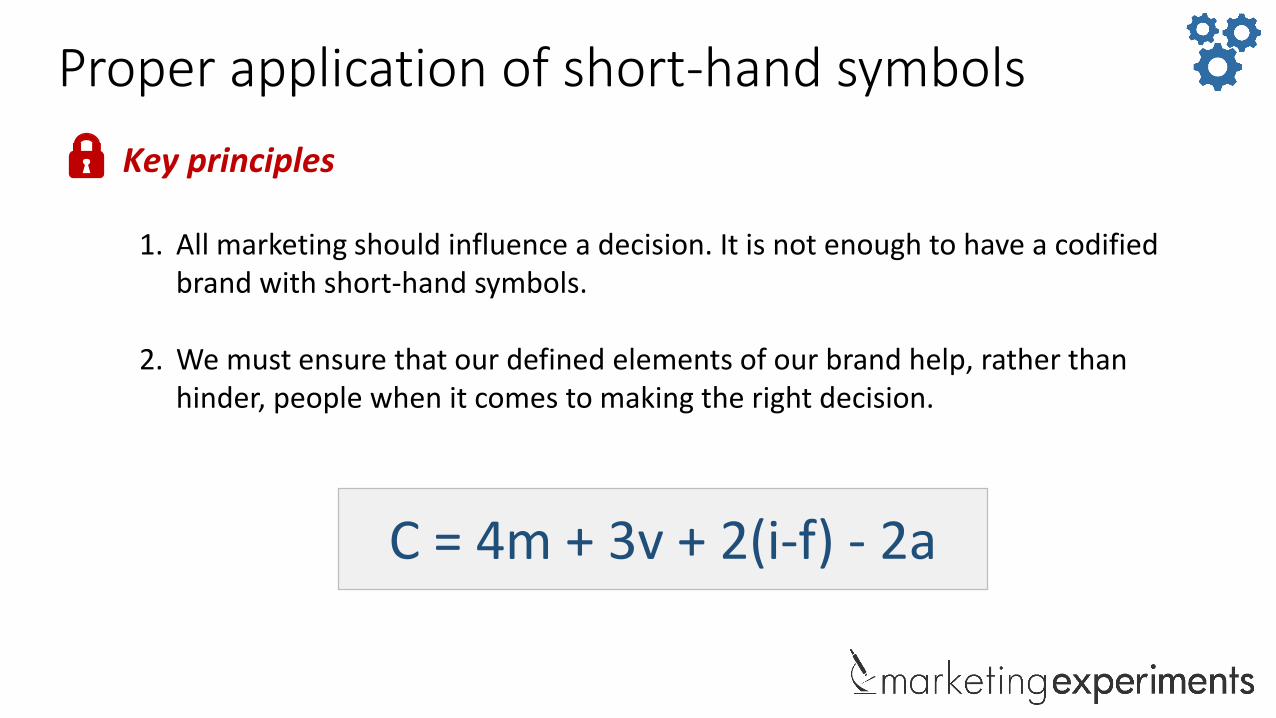
Proper application of short-hand symbols
1. All marketing should influence a decision. It is not enough to have a codified brand with short-hand symbols.
2. We must ensure that our defined elements of our brand help, rather than hinder, people when it comes to making the right decision.
Key principles
C = 4m + 3v + 2(i-f) - 2a

The treatmentTreatment
• First, notice how the treatment integrates many short-hand symbols of the brand.
• Imagery
• Colors
• Fonts

The treatment Treatment
• Notice how much difficulty was created by the additional layer of brand symbols:
• Images become hard to discern
• Headline becomes difficult to read
• Contrast makes it more difficult to read
C = 4m + 3v + 2(i-f) - 2a

The treatment Treatment
• Notice how much difficulty was created by the additional layer of brand symbols:
• Contrast and fonts becomes very difficult to ready
C = 4m + 3v + 2(i-f) - 2a
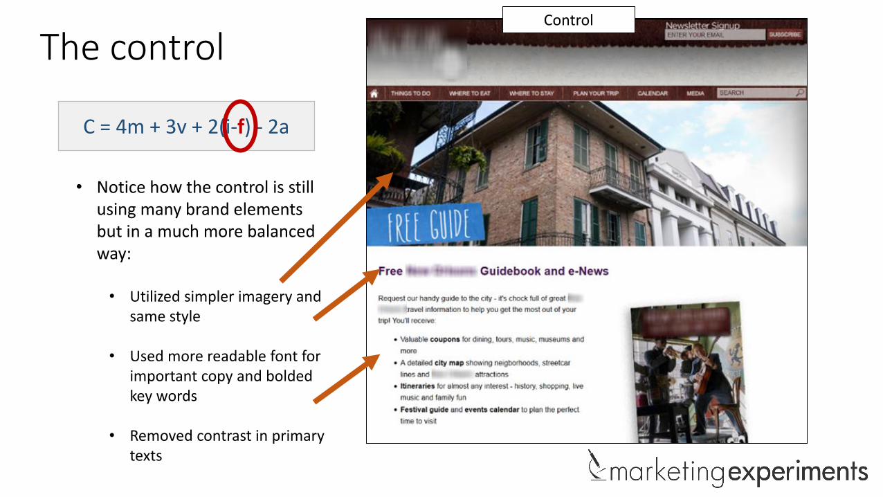
The controlControl
• Notice how the control is still using many brand elements but in a much more balanced way:
• Utilized simpler imagery and same style
• Used more readable font for important copy and bolded key words
• Removed contrast in primary texts
C = 4m + 3v + 2(i-f) - 2a

The controlControl
• Notice how the treatment is still using many brand elements but in a much more balanced way:
• Simplified the form (same number of fields) by making it black on white and using a more readable font
C = 4m + 3v + 2(i-f) - 2a

Control Treatment
Side-by-side
51% INCREASE IN CONVERSION

Summary: Key principles
1. Key Principle #1: A brand does not make a promise; it creates an expectation. Brands exist in the mind, representing the sum total of customer experiences in the marketplace.
2. Key Principle #2: A properly developed brand leverages short-hand symbols to stimulate a connection to a desired fostered conclusion. These short-hand symbols come in the form of voice (tone), style (design) and mark (logos, symbols, faces).
3. Key Principle #3: All marketing should influence a decision. We must ensure that our defined elements of our brand help, rather than hinder, people when it comes to making the right decision.


July Web clinic preview

#WebClinic
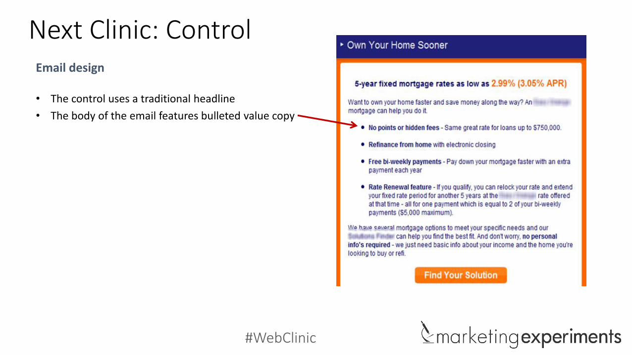
Next Clinic: ControlEmail design
• The control uses a traditional headline
#WebClinic
Next Clinic: ControlEmail design
• The control uses a traditional headline
• The body of the email features bulleted value copy
#WebClinic
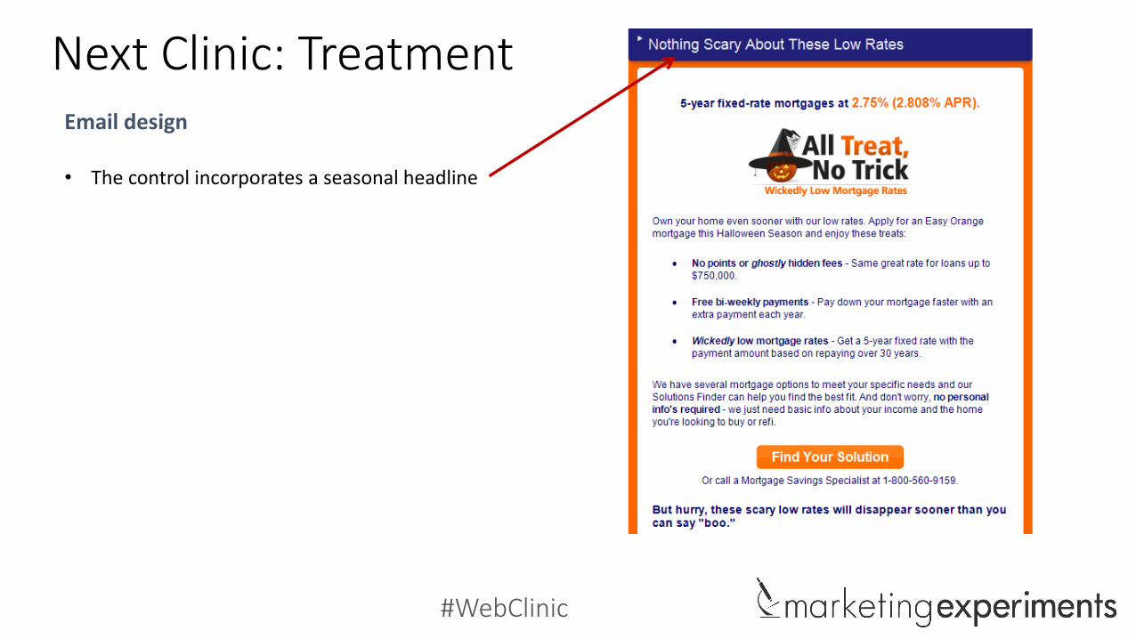
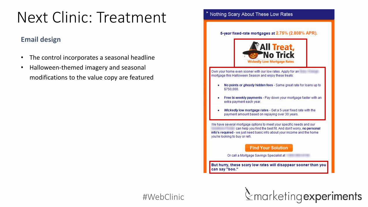
Next Clinic: TreatmentEmail design
• The control incorporates a seasonal headline
#WebClinic
Next Clinic: TreatmentEmail design
• The control incorporates a seasonal headline
• Halloween-themed imagery and seasonal
modifications to the value copy are featured

#WebClinic
Which treatment won?

#WebClinic
Live July 8th at 4 p.m. EDT
• The exact changes that resulted in a 25% change in clickthrough rate• Why those changes affected performance• How you can apply the same principles to your pages• Key strategies when incorporating seasonality
Join us for the next live 35-minute Web clinic to discover:
To see the results
To join live, register at the link below:
MarketingExperiments.com/seasonality
Customer Motivation