bollinger bands can be found in sharpcharts as a price overlay
DESCRIPTION
BOLLINGER BANDSTRANSCRIPT
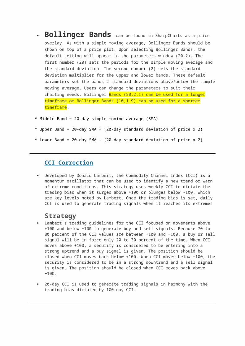
Bollinger Bands can be found in SharpCharts as a price overlay. As with a
simple moving average, Bollinger Bands should be shown on top of a price plot. Upon selecting Bollinger Bands, the default setting will appear in the parameters window (20,2). The first number (20) sets the periods for the simple moving average and the standard deviation. The second number (2) sets the standard deviation multiplier for the upper and lower bands. These default parameters set the bands 2 standard deviations above/below the simple moving average. Users can change the parameters to suit their charting needs. Bollinger Bands (50,2.1) can be used for a longer timeframe or Bollinger Bands (10,1.9) can be used for a shorter timeframe.
* Middle Band = 20-day simple moving average (SMA)
* Upper Band = 20-day SMA + (20-day standard deviation of price x 2)
* Lower Band = 20-day SMA - (20-day standard deviation of price x 2)
CCI Correction
Developed by Donald Lambert, the Commodity Channel Index (CCI) is a momentum oscillator that can be used to identify a new trend or warn of extreme conditions. This strategy uses weekly CCI to dictate the trading bias when it surges above +100 or plunges below -100, which are key levels noted by Lambert. Once the trading bias is set, daily CCI is used to generate trading signals when it reaches its extremes
Strategy Lambert's trading guidelines for the CCI focused on movements above +100 and below −100
to generate buy and sell signals. Because 70 to 80 percent of the CCI values are between +100 and −100, a buy or sell signal will be in force only 20 to 30 percent of the time. When CCI moves above +100, a security is considered to be entering into a strong uptrend and a buy signal is given. The position should be closed when CCI moves back below +100. When CCI moves below −100, the security is considered to be in a strong downtrend and a sell signal is given. The position should be closed when CCI moves back above −100.
20-day CCI is used to generate trading signals in harmony with the trading bias dictated by 100-day CCI.
Ichimoku
Tenkan-sen (Conversion Line):(9-period high + 9-period low)/2)) </b> On a daily chart, this line is the mid point of the 9-day high-low range, which is almost two weeks.
Kijun-sen (Base Line):(26-period high + 26-period low)/2)) </b> On a daily chart, this line is the mid point of the 26-day high-low range, which is almost one month.
Senkou Span A (Leading Span A): (Conversion Line + Base Line)/2)) </b> This is the midpoint between the Conversion Line and the Base Line. The Leading Span A forms one of the two Cloud boundaries. It is referred to as "Leading" because it is plotted 26 periods in the future and forms the faster Cloud boundary.
Senkou Span B (Leading Span B): (52-period high + 52-period low)/2)) </b> On the daily chart, this line is the mid point of the 52-day high-low range, which is a little less than 3 months. The default calculation setting is 52 periods, but can be adjusted. This value is plotted 26 periods in the future and forms the slower Cloud boundary.
Strategy
Chartists use the actual cloud to identify the overall trend and establish a trading bias. Once a trading bias is established, chartist will wait for a correction when prices cross the Base Line (red line). An actual signal triggers when prices cross the Conversion Line (blue line) to signal an end to the correction.
This trading strategy will set three criteria for a bullish signal. First, the trading bias is bullish when prices are above the lowest line of the cloud. In other words, prices are either above the cloud or remain above cloud support. Second, price moves below the Base Line to signal a pullback and improve the risk-reward ratio for new long positions. Third, a bullish signal triggers when prices reverse and move above the Conversion Line.
As you can see, the three criteria will not be met in just one day. There is a pecking order to the process. First, the trend is bullish as defined by the cloud. Second, the stock pulls back with a move below the Base Line. Third, the stock turns back up with a move above the Conversion Line.
Average Directional Index (ADX)
Introduction
The Average Directional Index (ADX), Minus Directional Indicator (-DI) and Plus Directional Indicator (+DI) represent a group of directional movement indicators that form a trading system developed by Welles Wilder. Wilder designed ADX with commodities and daily prices in mind, but these indicators can also be applied to stocks. The Average Directional Index (ADX) measures trend strength without regard to trend direction. The other two indicators, Plus Directional Indicator (+DI) and Minus Directional Indicator (-DI), complement ADX by defining trend direction. Used together, chartists can determine both the direction and strength of the trend.
Wilder features the Directional Movement indicators in his 1978 book, New Concepts in Technical Trading Systems. This book also includes details on Average True Range (ATR), the Parabolic SAR system and RSI. Despite being developed before the computer age, Wilder's indicators are incredible detailed in their calculation and have stood the test of time.
Directional Movement
Plus Directional Movement (+DM) and Minus Directional Movement (-DM) form the backbone of the Average Directional Index (ADX). Wilder determined directional movement by comparing the difference between two consecutive lows with the difference between the highs.
Directional movement is positive (plus) when the current high minus the prior high is greater than the prior low minus the current low. This so-called Plus Directional Movement (+DM) then equals the current high minus the prior high, provided it is positive. A negative value would simply be entered as zero.
Directional movement is negative (minus) when the prior low minus the current low is greater than the current high minus the prior high. This so-called Minus Directional Movement (-DM) equals the prior low minus the current low, provided it is positive. A negative value would simply be entered as zero.
The chart above shows four calculation examples for directional movement. The first pairing shows a big positive difference between the highs for a strong Plus Directional Movement (+DM). The second pairing shows an outside day with Minus Directional Movement (-DM) getting the edge. The third pairing shows a big difference between the lows for a strong Minus Directional Movement (-DM). The final pairing shows an inside day, which amounts to no directional movement (zero). Both Plus Directional Movement (+DM) and Minus Directional Movement (-DM) are negative and cancel out each other. Negative values revert to zero. All inside days will have zero directional movement.
Calculation
The calculation steps for the Average Directional Index (ADX) are detailed in each step. Average True Range (ATR) is not detailed because there is an entire ChartSchool article for this. Basically, ATR is Wilder's version of the two period trading range. Smoothed versions of Plus Directional Movement (+DM) and Minus Directional Movement (-DM) are divided by a smoothed version Average True Range (ATR) to reflect the true magnitude of a move. The example below is based on a 14-day ADX calculation.

1. Calculate the True Range (TR), Plus Directional Movement (+DM) and Minus Directional Movement (-DM) for each period.
2. Smooth these periodic values using the Wilder's smoothing techniques. These are explained in detail in the next section.
3. Divide the 14-day smoothed Plus Directional Movement (+DM) by the 14-day smoothed True Range to find the 14-day Plus Directional Indicator (+DI14). Multiply by 100 to move the decimal point two places. This +DI14 is the Plus Directional Indicator (green line) that is plotted along with ADX.
4. Divide the 14-day smoothed Minus Directional Movement (-DM) by the 14-day smoothed True Range to find the 14-day Minus Directional Indicator (-DI14). Multiply by 100 to move the decimal point two places. This -DI14 is the Minus Directional Indicator (red line) that is plotted along with ADX.
5. The Directional Movement Index (DX) equals the absolute value of +DI14 less - DI14 divided by the sum of +DI14 and - DI14.
6. After all these steps, it is time to calculate the Average Directional Index (ADX). The first ADX value is simply a 14-day average of DX. Subsequent ADX values are smoothed by multiplying the previous 14-day ADX value by 13, adding the most recent DX value and dividing this total by 14.
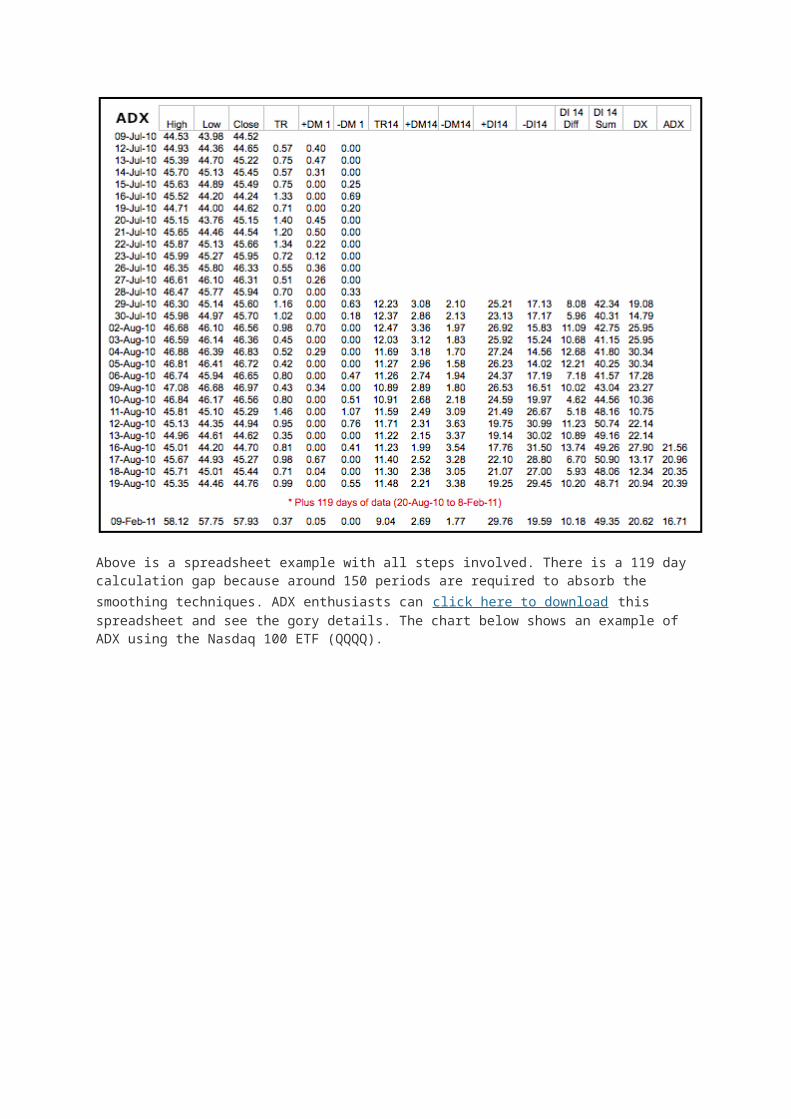
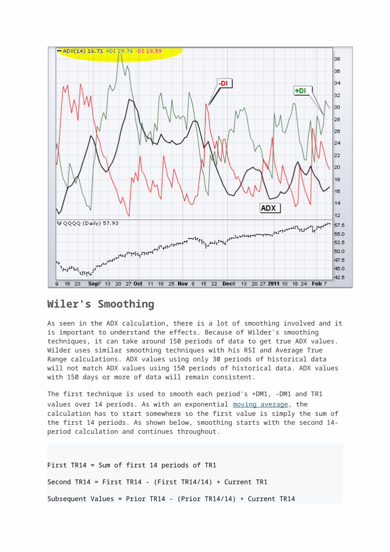
Above is a spreadsheet example with all steps involved. There is a 119 day calculation gap because around 150 periods are required to absorb the smoothing techniques. ADX enthusiasts can click here to download this spreadsheet and see the gory details. The chart below shows an example of ADX using the Nasdaq 100 ETF (QQQQ).

Wiler's Smoothing
As seen in the ADX calculation, there is a lot of smoothing involved and it is important to understand the effects. Because of Wilder's smoothing techniques, it can take around 150 periods of data to get true ADX values. Wilder uses similar smoothing techniques with his RSI and Average True Range calculations. ADX values using only 30 periods of historical data will not match ADX values using 150 periods of historical data. ADX values with 150 days or more of data will remain consistent.
The first technique is used to smooth each period's +DM1, -DM1 and TR1 values over 14 periods. As with an exponential moving average, the calculation has to start somewhere so the first value is simply the sum of the first 14 periods. As shown below, smoothing starts with the second 14-period calculation and continues throughout.
First TR14 = Sum of first 14 periods of TR1
Second TR14 = First TR14 - (First TR14/14) + Current TR1
Subsequent Values = Prior TR14 - (Prior TR14/14) + Current TR14
The second technique is used to smooth each period's DX value to finish with the Average Directional Index (ADX). First, calculate an average for the first 14 days as a starting point. The second and subsequent calculations use the smoothing technique below:
First ADX14 = 14 period Average of DX
Second ADX14 = (First ADX14 x 13) + Current DX Value
Subsequent ADX14 = (Prior ADX14 x 13) + Current DX Value
Interpretation
The Average Directional Index (ADX) is used to measure the strength or weakness of a trend, not the actual direction. Directional movement is defined by +DI and -DI. In general, the bulls have the edge when +DI is greater than - DI, while the bears have the edge when - DI is greater. Crosses of these directional indicators can be combined with ADX for a complete trading system.
Before looking at some signals with examples, keep in mind that Wilder was a commodity and currency trader. The examples in his books are based on these instruments, not stocks. This does not mean his indicators cannot be used with stocks. Some stocks have price characteristics similar to commodities, which tend to be more volatile with short and strong trends. Stocks with low volatility may not generate signals based on Wilder's parameters. Chartists will likely need to adjust the indicator settings or the signal parameters according to the characteristics of the security.
Trend Strength
At its most basic the Average Directional Index (ADX) can be used to determine if a security is trending or not. This determination helps traders choose between a trend following system or a non-trend following system. Wilder suggests that a strong trend is present when ADX is above 25 and no trend is present when below 20. There appears to be a gray zone between 20 and 25. As noted above, chartists may need to adjust the settings to increase sensitivity and signals. ADX also has a fair amount of lag because of all the smoothing techniques. Many technical analysts use 20 as the key level for ADX.
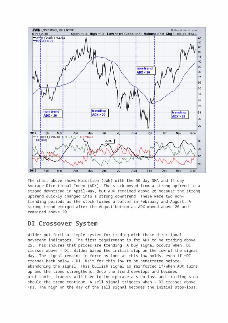
The chart above shows Nordstrom (JWN) with the 50-day SMA and 14-day Average Directional Index (ADX). The stock moved from a strong uptrend to a strong downtrend in April-May, but ADX remained above 20 because the strong uptrend quickly changed into a strong downtrend. There were two non-trending periods as the stock formed a bottom in February and August. A strong trend emerged after the August bottom as ADX moved above 20 and remained above 20.
DI Crossover System
Wilder put forth a simple system for trading with these directional movement indicators. The first requirement is for ADX to be trading above 25. This insures that prices are trending. A buy signal occurs when +DI crosses above - DI. Wilder based the initial stop on the low of the signal day. The signal remains in force as long as this low holds, even if +DI crosses back below - DI. Wait for this low to be penetrated before abandoning the signal. This bullish signal is reinforced if/when ADX turns up and the trend strengthens. Once the trend develops and becomes profitable, traders will have to incorporate a stop-loss and trailing stop should the trend continue. A sell signal triggers when - DI crosses above +DI. The high on the day of the sell signal becomes the initial stop-loss.

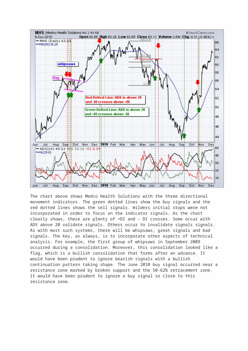
The chart above shows Medco Health Solutions with the three directional movement indicators. The green dotted lines show the buy signals and the red dotted lines shows the sell signals. Wilders initial stops were not incorporated in order to focus on the indicator signals. As the chart clearly shows, there are plenty of +DI and - DI crosses. Some occur with ADX above 20 validate signals. Others occur to invalidate signals signals. As with most such systems, there will be whipsaws, great signals and bad signals. The key, as always, is to incorporate other aspects of technical analysis. For example, the first group of whipsaws in September 2009 occurred during a consolidation. Moreover, this consolidation looked like a flag, which is a bullish consolidation that forms after an advance. It would have been prudent to ignore bearish signals with a bullish continuation pattern taking shape. The June 2010 buy signal occurred near a resistance zone marked by broken support and the 50-62% retracement zone. It would have been prudent to ignore a buy signal so close to this resistance zone.
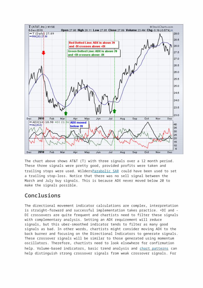
The chart above shows AT&T (T) with three signals over a 12 month period. These three signals were pretty good, provided profits were taken and trailing stops were used. WildersParabolic SAR could have been used to set a trailing stop-loss. Notice that there was no sell signal between the March and July buy signals. This is because ADX never moved below 20 to make the signals possible.
Conclusions
The directional movement indicator calculations are complex, interpretation is straight-forward and successful implementation takes practice. +DI and - DI crossovers are quite frequent and chartists need to filter these signals with complementary analysis. Setting an ADX requirement will reduce signals, but this uber-smoothed indicator tends to filter as many good signals as bad. In other words, chartists might consider moving ADX to the back burner and focusing on the Directional Indicators to generate signals. These crossover signals will be similar to those generated using momentum oscillators. Therefore, chartists need to look elsewhere for confirmation help. Volume-based indicators, basic trend analysis and chart patterns can help distinguish strong crossover signals from weak crossover signals. For example, chartists can focus on +DI buy signals when the bigger trend is up and - DI sell signals when the bigger trend is down.
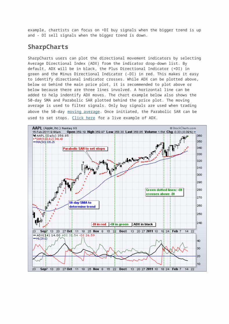
SharpCharts
SharpCharts users can plot the directional movement indicators by selecting Average Directional Index (ADX) from the indicator drop-down list. By default, ADX will be in black, the Plus Directional Indicator (+DI) in green and the Minus Directional Indicator (-DI) in red. This makes it easy to identify directional indicator crosses. While ADX can be plotted above, below or behind the main price plot, it
is recommended to plot above or below because there are three lines involved. A horizontal line can be added to help indentify ADX moves. The chart example below also shows the 50-day SMA and Parabolic SAR plotted behind the price plot. The moving average is used to filter signals. Only buy signals are used when trading above the 50-day moving average. Once initiated, the Parabolic SAR can be used to set stops. Click here for a live example of ADX.
Moving Average Convergence-Divergence (MACD)
Introduction
Advertisement
Developed by Gerald Appel in the late seventies, the Moving Average Convergence-Divergence (MACD) indicator is one of the simplest and most effective momentum indicators available. The MACD turns two trend-following indicators, moving averages, into a momentum oscillator by subtracting the longer moving average from the shorter moving average. As a result, the MACD offers the best of both worlds: trend following and momentum. The MACD fluctuates above and below the zero line as the moving averages converge, cross and diverge. Traders can look for signal line crossovers, centerline crossovers and divergences to generate signals. Because the MACD is unbounded, it is not particularly useful for identifying overbought and oversold levels.
Note: MACD can be pronounced as either "MAC-DEE" or "M-A-C-D".
Here is an example chart with the MACD indicator in the lower panel:
Click the chart to see a live example.
Calculation
MACD Line: (12-day EMA - 26-day EMA)
Signal Line: 9-day EMA of MACD Line
MACD Histogram: MACD Line - Signal Line
The MACD Line is the 12-day Exponential Moving Average (EMA) less the 26-day EMA. Closing prices are used for these moving averages. A 9-day EMA of the MACD Line is plotted with the indicator to act as a signal line and identify turns. The MACD Histogram represents the difference between MACD and its 9-day EMA, the Signal line. The histogram is positive when the MACD Line is above its Signal line and negative when the MACD Line is below its Signal line.
The values of 12, 26 and 9 are the typical setting used with the MACD, however other values can be substituted depending on your trading style and goals.
Interpretation
As its name implies, the MACD is all about the convergence and divergence of the two moving averages. Convergence occurs when the moving averages move towards each other. Divergence occurs when the moving averages move away from each other. The shorter moving average (12-day) is faster and responsible for most MACD movements. The longer moving average (26-day) is slower and less reactive to price changes in the underlying security.
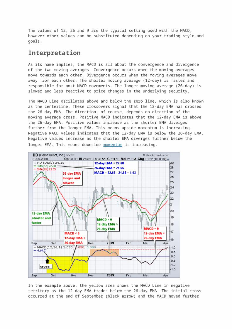
The MACD Line oscillates above and below the zero line, which is also known as the centerline. These crossovers signal that the 12-day EMA has crossed the 26-day EMA. The direction, of course, depends on direction of the moving average cross. Positive MACD indicates that the 12-day EMA is above the 26-day EMA. Positive values increase as the shorter EMA diverges further from the longer EMA. This means upside momentum is increasing. Negative MACD values indicates that the 12-day EMA is below the 26-day EMA. Negative values increase as the shorter EMA diverges further below the longer EMA. This means downside momentum is increasing.
In the example above, the yellow area shows the MACD Line in negative territory as the 12-day EMA trades below the 26-day EMA. The initial cross occurred at the end of September (black arrow) and the MACD moved further into negative territory as the 12-day EMA diverged further from the 26-day EMA. The orange area highlights a period of positive MACD values, which is when the 12-day EMA was above the 26-day EMA. Notice that the MACD Line remained below 1 during this period (red dotted line). This means the distance between the 12-day EMA and 26-day EMA was less than 1 point, which is not a big difference.
Signal Line Crossovers
Signal line crossovers are the most common MACD signals. The signal line is a 9-day EMA of the MACD Line. As a moving average of the indicator, it trails the MACD and makes it easier to spot MACD turns. A bullish crossover occurs when the MACD turns up and crosses above the signal line. A bearish crossover occurs when the MACD turns down and crosses below the signal line. Crossovers can last a few days or a few weeks, it all depends on the strength of the move.
Due diligence is required before relying on these common signals. Signal line crossovers at positive or negative extremes should be viewed with caution. Even though the MACD does not have upper and lower limits, chartists can estimate historical extremes with a simple visual assessment. It takes a strong move in the underlying security to push momentum to an extreme. Even though the move may continue, momentum is likely to slow and this will usually produce a signal line crossover at the extremities. Volatility in the underlying security can also increase the number of crossovers.
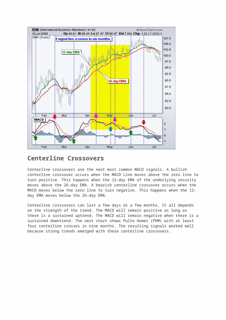
The chart below shows IBM with its 12-day EMA (green), 26-day EMA (red) and the 12,26,9 MACD in the indicator window. There were eight signal line crossovers in six months: four up and four down. There were some good signals and some bad signals. The yellow area highlights a period when the MACD Line surged above 2 to reach a positive extreme. There were two bearish signal line crossovers in April and May, but IBM continued trending higher. Even though upward momentum slowed after the surge, upward momentum was still stronger than downside momentum in April-May. The third bearish signal line crossover in May resulted in a good signal.

Centerline Crossovers
Centerline crossovers are the next most common MACD signals. A bullish centerline crossover occurs when the MACD Line moves above the zero line to turn positive. This happens when the 12-day EMA of the underlying security moves above the 26-day EMA. A bearish centerline crossover occurs when the MACD moves below the zero line to turn negative. This happens when the 12-day EMA moves below the 26-day EMA.
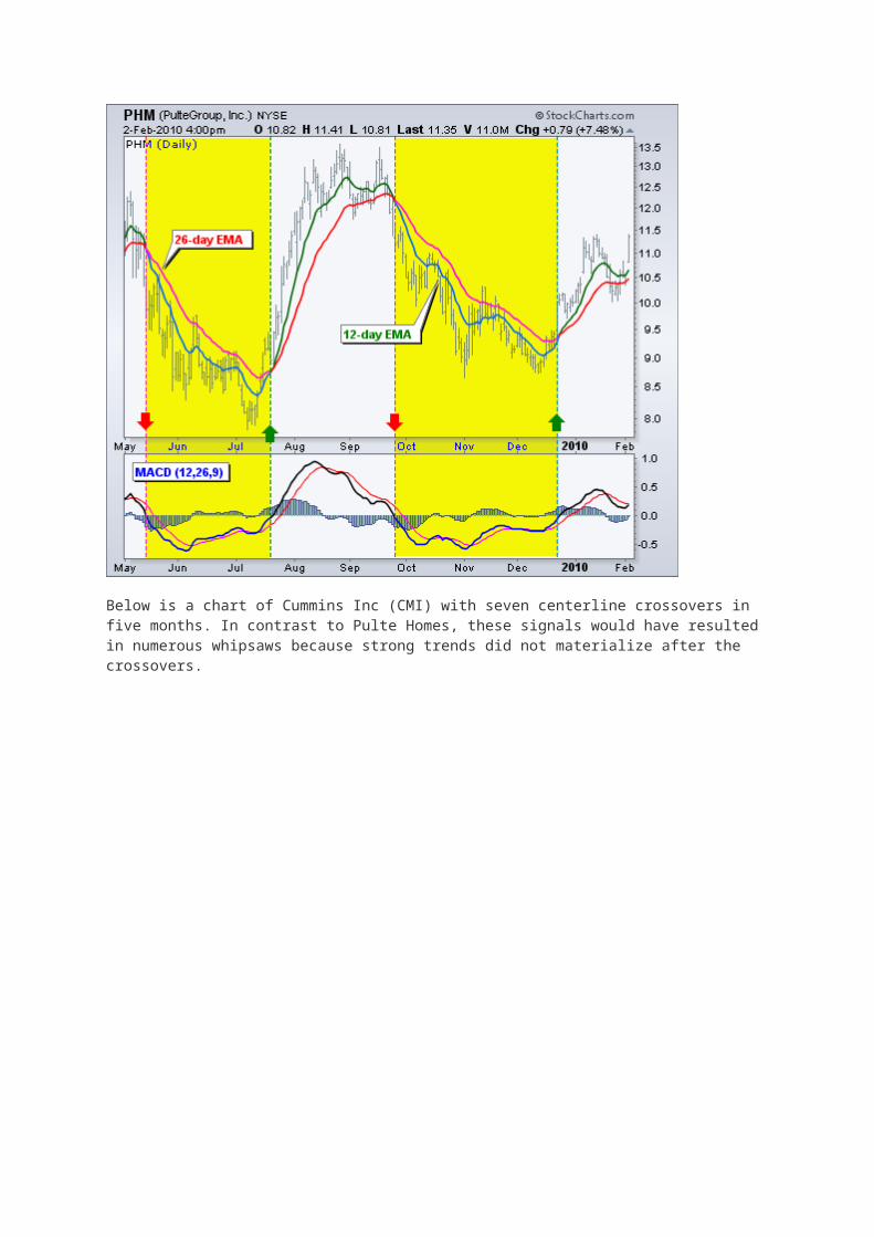
Centerline crossovers can last a few days or a few months. It all depends on the strength of the trend. The MACD will remain positive as long as there is a sustained uptrend. The MACD will remain negative when there is a sustained downtrend. The next chart shows Pulte Homes (PHM) with at least four centerline crosses in nine months. The resulting signals worked well because strong trends emerged with these centerline crossovers.
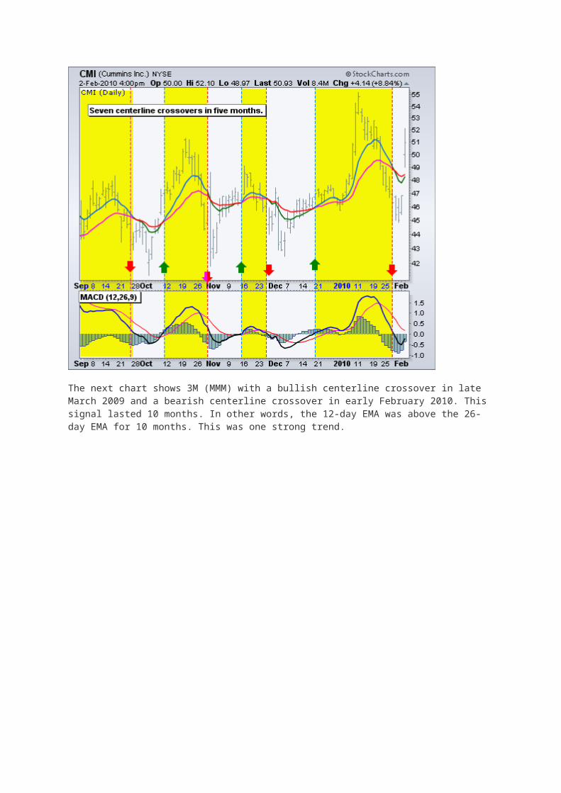
Below is a chart of Cummins Inc (CMI) with seven centerline crossovers in five months. In contrast to Pulte Homes, these signals would have resulted in numerous whipsaws because strong trends did not materialize after the crossovers.

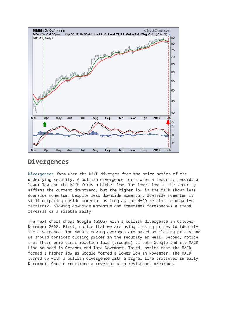
The next chart shows 3M (MMM) with a bullish centerline crossover in late March 2009 and a bearish centerline crossover in early February 2010. This signal lasted 10 months. In other words, the 12-day EMA was above the 26-day EMA for 10 months. This was one strong trend.
Divergences
Divergences form when the MACD diverges from the price action of the underlying security. A bullish divergence forms when a security records a lower low and the MACD forms a higher low. The lower low in the security affirms the current downtrend, but the higher low in the MACD shows less downside momentum. Despite less downside momentum, downside momentum is still outpacing upside momentum as long as the MACD remains in negative territory. Slowing downside momentum can sometimes foreshadows a trend reversal or a sizable rally.
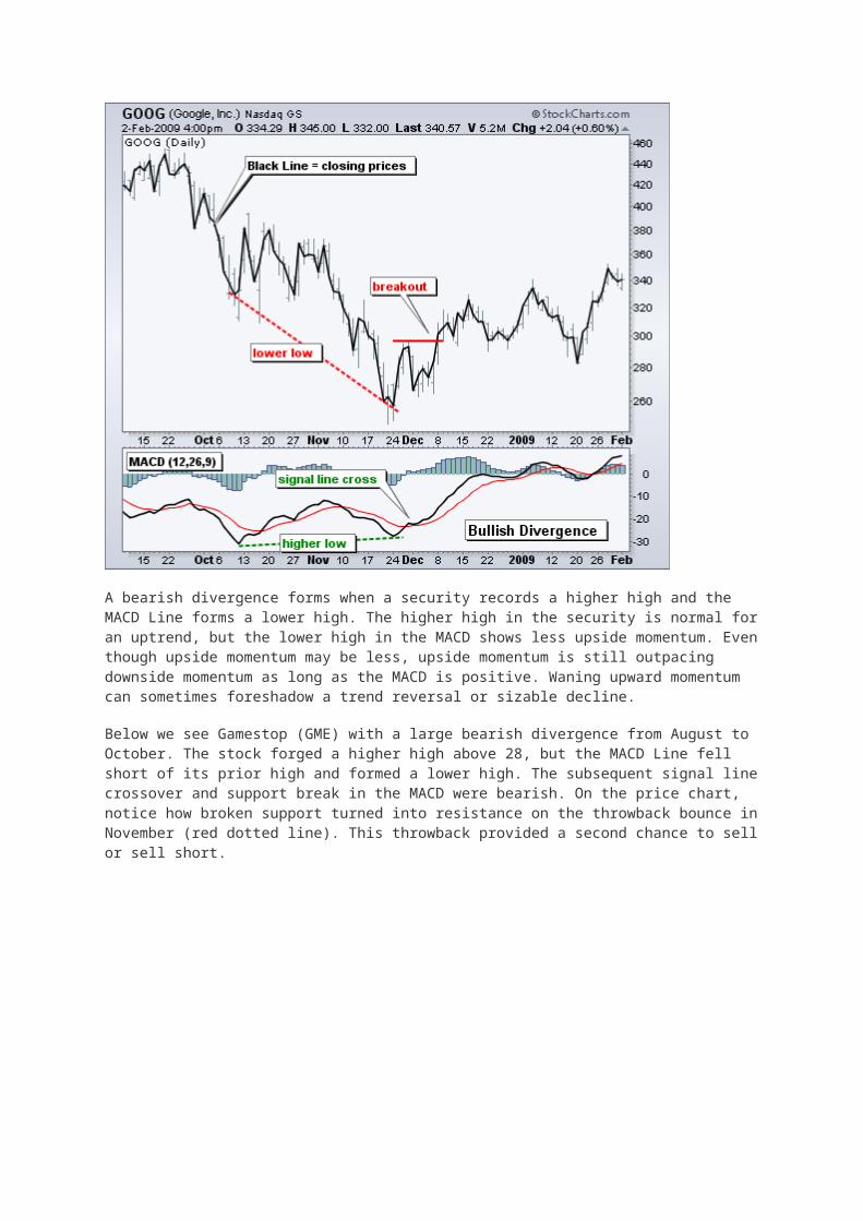
The next chart shows Google (GOOG) with a bullish divergence in October-November 2008. First, notice that we are using closing prices to identify the divergence. The MACD's moving averages are based on closing prices and we should consider closing prices in the security as well. Second, notice that there were clear reaction lows (troughs) as both Google and its MACD Line bounced in October and late November. Third, notice that the MACD formed a higher low as Google formed a lower low in November. The MACD turned up with a bullish divergence with a signal line crossover in early December. Google confirmed a reversal with resistance breakout.
A bearish divergence forms when a security records a higher high and the MACD Line forms a lower high. The higher high in the security is normal for an uptrend, but the lower high in the MACD shows less upside momentum. Even though upside momentum may be less, upside momentum is still outpacing downside momentum as long as the MACD is positive. Waning upward momentum can sometimes foreshadow a trend reversal or sizable decline.
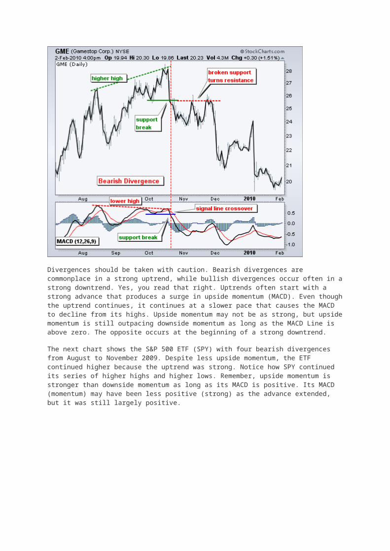
Below we see Gamestop (GME) with a large bearish divergence from August to October. The stock forged a higher high above 28, but the MACD Line fell short of its prior high and formed a lower high. The subsequent signal line crossover and support break in the MACD were bearish. On the price chart, notice how broken support turned into resistance on the throwback bounce in November (red dotted line). This throwback provided a second chance to sell or sell short.
Divergences should be taken with caution. Bearish divergences are commonplace in a strong uptrend, while bullish divergences occur often in a strong downtrend. Yes, you read that right. Uptrends often start with a strong advance that produces a surge in upside momentum (MACD). Even though the uptrend continues, it continues at a slower pace that causes the MACD to decline from its highs. Upside momentum may not be as strong, but upside momentum is still outpacing downside momentum as long as the MACD Line is above zero. The opposite occurs at the beginning of a strong downtrend.
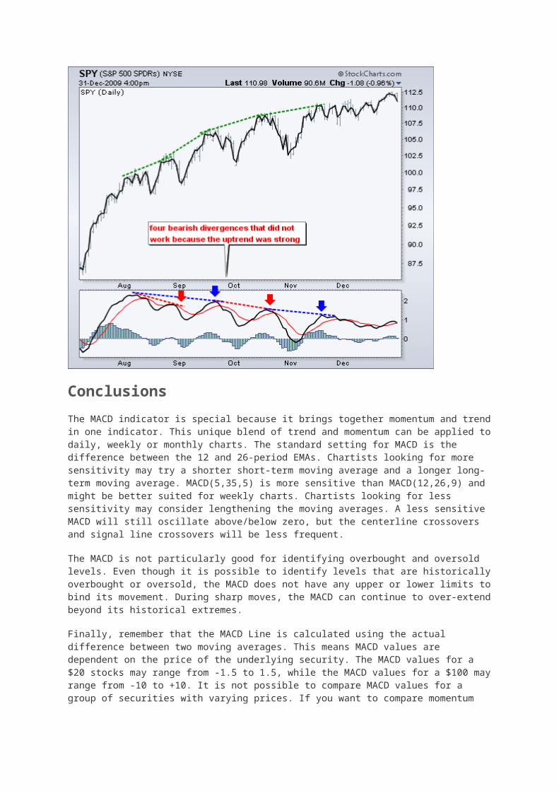
The next chart shows the S&P 500 ETF (SPY) with four bearish divergences from August to November 2009. Despite less upside momentum, the ETF continued higher because the uptrend was strong. Notice how SPY continued its series of higher highs and higher lows. Remember, upside momentum is stronger than downside momentum as long as its MACD is positive. Its MACD (momentum) may have been less positive (strong) as the advance extended, but it was still largely positive.
Conclusions
The MACD indicator is special because it brings together momentum and trend in one indicator. This unique blend of trend and momentum can be applied to daily, weekly or monthly charts. The standard setting for MACD is the difference between the 12 and 26-period EMAs. Chartists looking for more sensitivity may try a shorter short-term moving average and a longer long-term moving average. MACD(5,35,5) is more sensitive than MACD(12,26,9) and might be better suited for weekly charts. Chartists looking for less sensitivity may consider lengthening the moving averages. A less sensitive MACD will still oscillate above/below zero, but the centerline crossovers and signal line crossovers will be less frequent.
The MACD is not particularly good for identifying overbought and oversold levels. Even though it is possible to identify levels that are historically overbought or oversold, the MACD does not have any upper or lower limits to bind its movement. During sharp moves, the MACD can continue to over-extend beyond its historical extremes.
Finally, remember that the MACD Line is calculated using the actual difference between two moving averages. This means MACD values are dependent on the price of the underlying security. The MACD values for a $20 stocks may range from -1.5 to 1.5, while the MACD values for a $100 may range from -10 to +10. It is not possible to compare MACD values for a group of securities with varying prices. If you want to compare momentum readings, you should use the Percentage Price Oscillator (PPO), instead of the MACD.
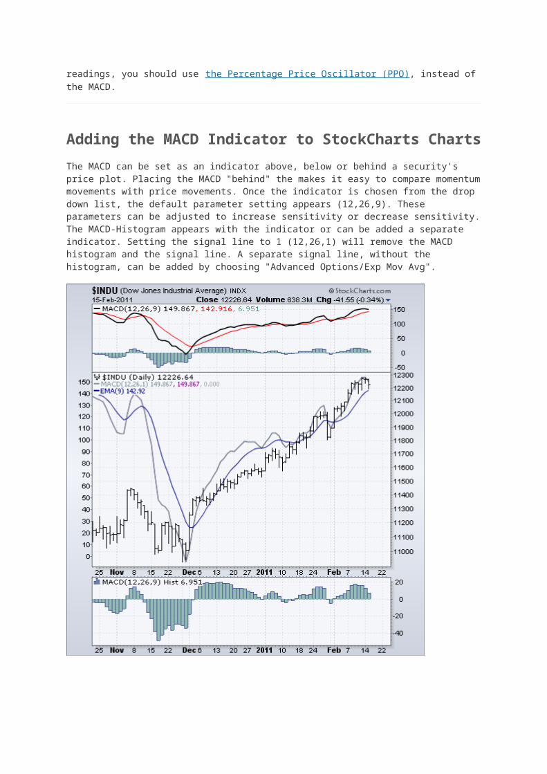
Adding the MACD Indicator to StockCharts Charts
The MACD can be set as an indicator above, below or behind a security's price plot. Placing the MACD "behind" the makes it easy to compare momentum movements with price movements. Once
the indicator is chosen from the drop down list, the default parameter setting appears (12,26,9). These parameters can be adjusted to increase sensitivity or decrease sensitivity. The MACD-Histogram appears with the indicator or can be added a separate indicator. Setting the signal line to 1 (12,26,1) will remove the MACD histogram and the signal line. A separate signal line, without the histogram, can be added by choosing "Advanced Options/Exp Mov Avg".
Click here for a live chart of the MACD indicator.
Using the MACD with StockCharts Scans
Here are some sample scans that StockCharts members can use to scan for various MACD signals:
MACD Bullish Signal Line Cross: This scan reveals stocks that are trading above their 200-day moving average and have a bullish signal line crossover in MACD. Also notice that MACD is required to be negative to insure this upturn occurs after a pullback. This scan is just meant as a starter for further refinement.
MACD Bearish Signal Line Cross: This scan reveals stocks that are trading below their 200-day moving average and have a bearish signal line crossover in MACD. Also notice that MACD is required to be positive to insure this downturn occurs after a bounce. This scan is just meant as a starter for further refinement.
Relative Strength Index (RSI)
Introduction
Developed J. Welles Wilder, the Relative Strength Index (RSI) is a momentum oscillator that measures the speed and change of price movements. RSI oscillates between zero and 100. Traditionally, and according to Wilder, RSI is considered overbought when above 70 and oversold when below 30. Signals can also be generated by looking for divergences, failure swings and centerline crossovers. RSI can also be used to identify the general trend.
RSI is an extremely popular momentum indicator that has been featured in a number of articles, interviews and books over the years. In particular, Constance Brown's book, Technical Analysis for the Trading Professional, features the concept of bull market and bear market ranges for RSI. Andrew Cardwell, Brown's RSI mentor, introduced positive and negative reversals for RSI. In addition, Cardwell turned the notion of divergence, literally and figuratively, on its head.
Wilder features RSI in his 1978 book, New Concepts in Technical Trading Systems. This book also includes the Parabolic SAR, Average True Range and the Directional Movement Concept (ADX). Despite being developed before the computer age, Wilder's indicators have stood the test of time and remain extremely popular.
Calculation
100
RSI = 100 - --------
1 + RS
RS = Average Gain / Average Loss
To simplify the calculation explanation, RSI has been broken down into its basic components: RS, Average Gain and Average Loss. This RSI calculation is based on 14 periods, which is the default suggested by Wilder in his book. Losses are expressed as positive values, not negative values.
The very first calculations for average gain and average loss are simple 14 period averages.
First Average Gain = Sum of Gains over the past 14 periods / 14. First Average Loss = Sum of Losses over the past 14 periods / 14
The second, and subsequent, calculations are based on the prior averages and the current gain loss:
Average Gain = [(previous Average Gain) x 13 + current Gain] / 14. Average Loss = [(previous Average Loss) x 13 + current Loss] / 14.
Taking the prior value plus the current value is a smoothing technique similar to that used in exponential moving average calculation. This also means that RSI values become more accurate as the calculation period extends. SharpCharts uses at least 250 data points prior to the starting date of any chart (assuming that much data exists) when calculating its RSI values. To exactly replicate our RSI numbers, a formula will need at least 250 data points.
Wilder's formula normalizes RS and turns it into an oscillator that fluctuates between zero and 100. In fact, a plot of RS looks exactly the same as a plot of RSI. The normalization step makes it easier to identify extremes because RSI is range bound. RSI is 0 when the Average Gain equals zero. Assuming a 14-period RSI, a zero RSI value means prices moved lower all 14 periods. There were no gains to measure. RSI is 100 when the Average Loss equals zero. This means prices moved higher all 14 periods. There were no losses to measure.
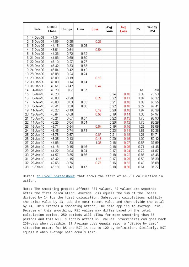
Here's an Excel Spreadsheet that shows the start of an RSI calculation in action.
Note: The smoothing process affects RSI values. RS values are smoothed after the first calculation. Average Loss equals the sum of the losses divided by 14 for the first calculation. Subsequent calculations multiply the prior value by 13, add the most recent value and then divide the total by 14. This creates a smoothing affect. The same applies to Average Gain. Because of this smoothing, RSI values may differ based on the total calculation period. 250 periods will allow for more smoothing than 30 periods and this will slightly affect RSI values. Stockcharts.com goes back 250-days when possible. If Average Loss equals zero, a "divide by zero" situation occurs for RS and RSI is set to 100 by definition. Similarly, RSI equals 0 when Average Gain equals zero.
Parameters
The default look-back period for RSI is 14, but this can be lowered to increase sensitivity or raised to decrease sensitivity. 10-day RSI is more likely to reach overbought or oversold levels than 20-day RSI. The look-back parameters also depend on a security's volatility. 14-day RSI for internet retailer Amazon (AMZN) is more likely to become overbought or oversold than 14-day RSI for Duke Energy (DUK), a utility.

RSI is considered overbought when above 70 and oversold when below 30. These traditional levels can also be adjusted to better fit the security or analytical requirements. Raising overbought to 80 or lowering oversold to 20 will reduce the number of overbought/oversold readings. Short-term traders sometimes use 2-period RSI to look for overbought readings above 80 and oversold readings below 20.
Overbought-Oversold
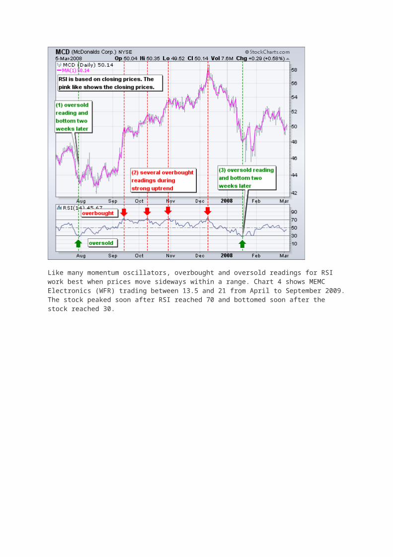
Wilder considered RSI overbought above 70 and oversold below 30. Chart 3 shows McDonalds with 14-day RSI. This chart features daily bars in gray with a 1-day SMA in pink to highlight closing prices because RSI is based on closing prices. Working from left to right, the stock became oversold in late July and found support around 44 (1). Notice that the bottom evolvedafter the oversold reading. The stock did not bottom as soon as the oversold reading appeared. Bottoming can be a process. From oversold levels, RSI moved above 70 in mid September to become overbought. Despite this overbought reading, the stock did not decline. Instead, the stock stalled for a couple weeks and then continued higher. Three more overbought readings occurred before the stock finally peaked in December (2). Momentum oscillators can become overbought (oversold) and remain so in a strong up (down) trend. The first three overbought readings foreshadowed consolidations. The fourth coincided with a significant peak. RSI then moved from overbought to oversold in January. The final bottom did not coincide with the initial oversold reading as the stock ultimately bottomed a few weeks later around 46 (3).
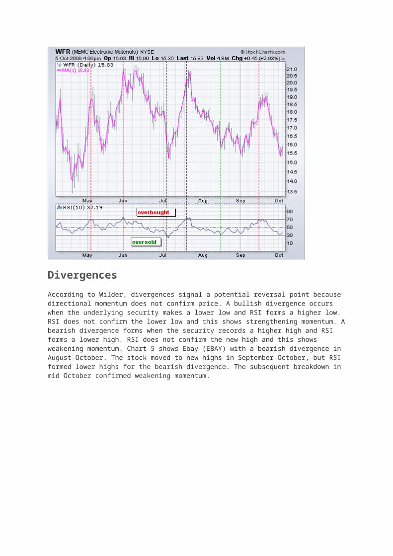
Like many momentum oscillators, overbought and oversold readings for RSI work best when prices move sideways within a range. Chart 4 shows MEMC Electronics (WFR) trading between 13.5 and 21 from April to September 2009. The stock peaked soon after RSI reached 70 and bottomed soon after the stock reached 30.
Divergences
According to Wilder, divergences signal a potential reversal point because directional momentum does not confirm price. A bullish divergence occurs when the underlying security makes a lower low and RSI forms a higher low. RSI does not confirm the lower low and this shows strengthening momentum. A bearish divergence forms when the security records a higher high and RSI forms a lower high. RSI does not confirm the new high and this shows weakening momentum. Chart 5 shows Ebay (EBAY) with a bearish divergence in August-October. The stock moved to new highs in September-October, but RSI formed lower highs for the bearish divergence. The subsequent breakdown in mid October confirmed weakening momentum.

A bullish divergence formed in January-March. The bullish divergence formed with Ebay moving to new lows in March and RSI holding above its prior low. RSI reflected less downside momentum during the February-March decline. The mid March breakout confirmed improving momentum. Divergences tend to be more robust when they form after an overbought or oversold reading.
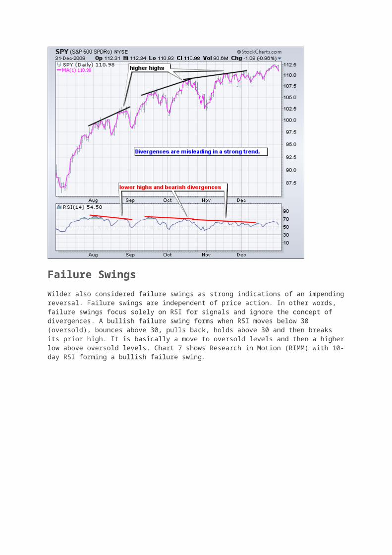
Before getting too excited about divergences as great trading signals, it must be noted that divergences are misleading in a strong trend. A strong uptrend can show numerous bearish divergences before a top actually materializes. Conversely, bullish divergences can appear in a strong downtrend - and yet the downtrend continues. Chart 6 shows the S&P 500 ETF (SPY) with three bearish divergences and a continuing uptrend. These bearish divergences may have warned of a short-term pullback, but there was clearly no major trend reversal.
Failure Swings
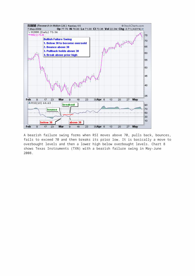
Wilder also considered failure swings as strong indications of an impending reversal. Failure swings are independent of price action. In other words, failure swings focus solely on RSI for signals and ignore the concept of divergences. A bullish failure swing forms when RSI moves below 30 (oversold), bounces above 30, pulls back, holds above 30 and then breaks its prior high. It is basically a move to oversold levels and then a higher low above oversold levels. Chart 7 shows Research in Motion (RIMM) with 10-day RSI forming a bullish failure swing.
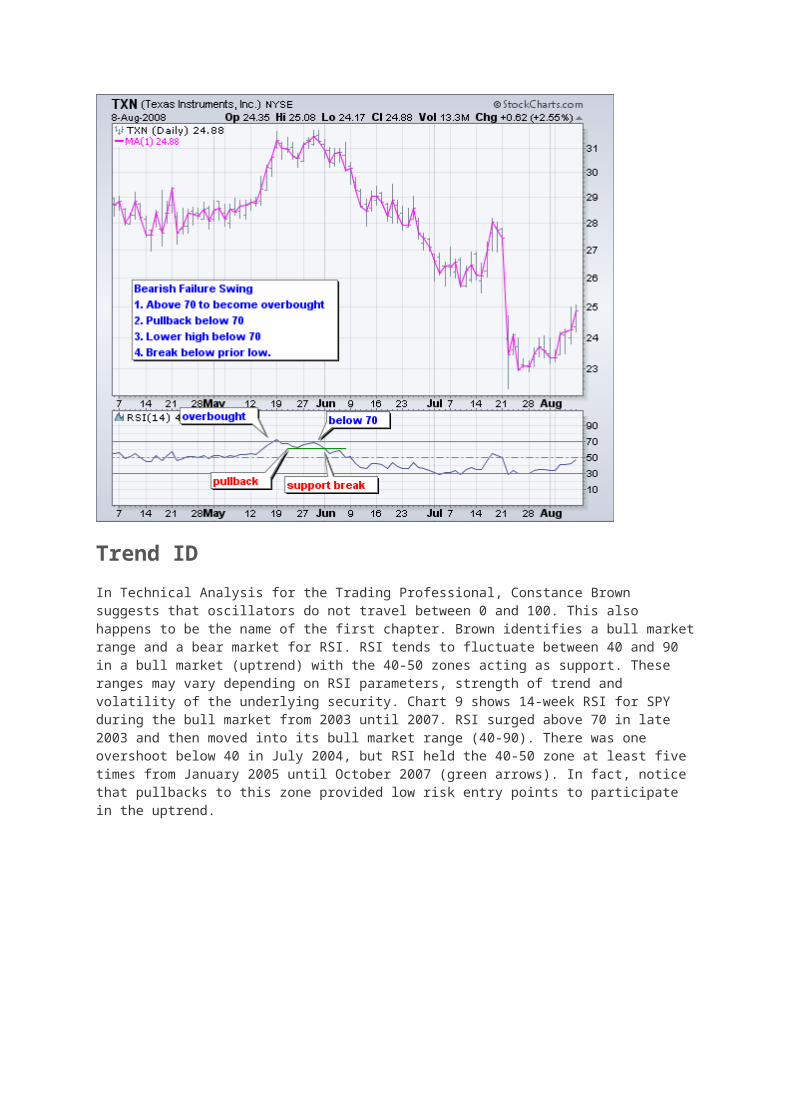
A bearish failure swing forms when RSI moves above 70, pulls back, bounces, fails to exceed 70 and then breaks its prior low. It is basically a move to overbought levels and then a lower high below overbought levels. Chart 8 shows Texas Instruments (TXN) with a bearish failure swing in May-June 2008.
Trend ID
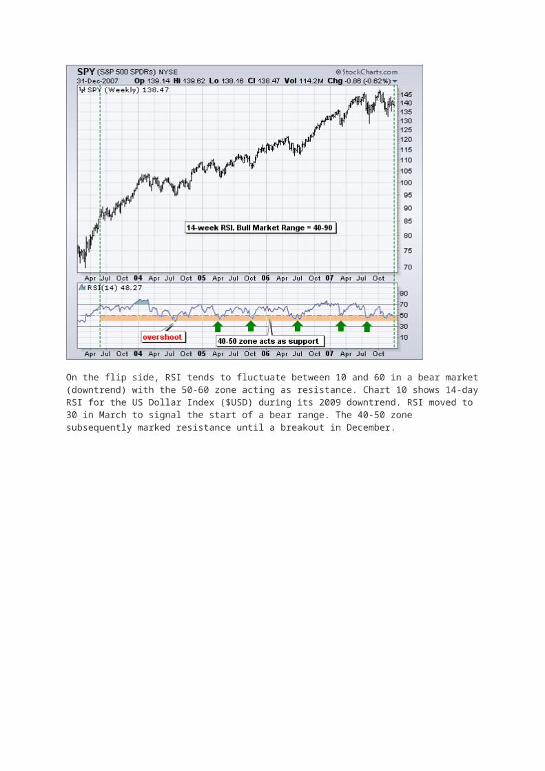
In Technical Analysis for the Trading Professional, Constance Brown suggests that oscillators do not travel between 0 and 100. This also happens to be the name of the first chapter. Brown identifies a bull market range and a bear market for RSI. RSI tends to fluctuate between 40 and 90 in a bull market (uptrend) with the 40-50 zones acting as support. These ranges may vary depending on RSI parameters, strength of trend and volatility of the underlying security. Chart 9 shows 14-week RSI for SPY during the bull market from 2003 until 2007. RSI surged above 70 in late 2003 and then moved into its bull market range (40-90). There was one overshoot below 40 in July 2004, but RSI held the 40-50 zone at least five times from January 2005 until October 2007 (green arrows). In fact, notice that pullbacks to this zone provided low risk entry points to participate in the uptrend.
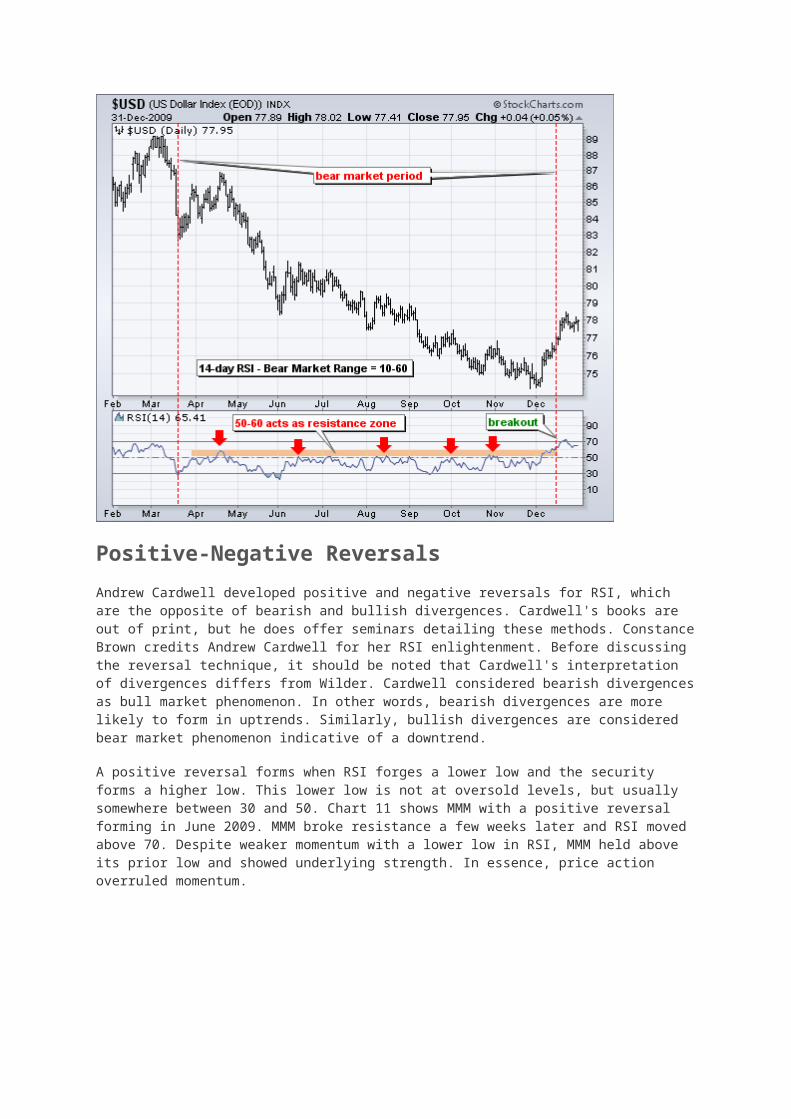
On the flip side, RSI tends to fluctuate between 10 and 60 in a bear market (downtrend) with the 50-60 zone acting as resistance. Chart 10 shows 14-day RSI for the US Dollar Index ($USD) during its 2009 downtrend. RSI moved to 30 in March to signal the start of a bear range. The 40-50 zone subsequently marked resistance until a breakout in December.

Positive-Negative Reversals
Andrew Cardwell developed positive and negative reversals for RSI, which are the opposite of bearish and bullish divergences. Cardwell's books are out of print, but he does offer seminars detailing these methods. Constance Brown credits Andrew Cardwell for her RSI enlightenment. Before discussing the reversal technique, it should be noted that Cardwell's interpretation of divergences differs from Wilder. Cardwell considered bearish divergences as bull market phenomenon. In other words, bearish divergences are more likely to form in uptrends. Similarly, bullish divergences are considered bear market phenomenon indicative of a downtrend.
A positive reversal forms when RSI forges a lower low and the security forms a higher low. This lower low is not at oversold levels, but usually somewhere between 30 and 50. Chart 11 shows MMM with a positive reversal forming in June 2009. MMM broke resistance a few weeks later and RSI moved above 70. Despite weaker momentum with a lower low in RSI, MMM held above its prior low and showed underlying strength. In essence, price action overruled momentum.
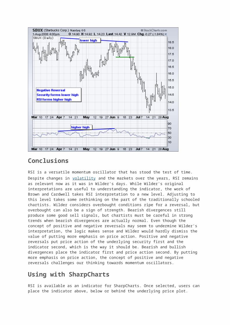
A negative reversal is the opposite of a positive reversal. RSI forms a higher high, but the security forms a lower high. Again, the higher high is usually just below overbought levels in the 50-70 area. Chart 12 shows Starbucks (SBUX) forming a lower high as RSI forms a higher high. Even though RSI forged a new high and momentum was strong, the price action failed to confirm as lower high formed. This negative reversal foreshadowed the big support break in late June and sharp decline.
Conclusions
RSI is a versatile momentum oscillator that has stood the test of time. Despite changes in volatility and the markets over the years, RSI remains as relevant now as it was in Wilder's days. While Wilder's original interpretations are useful to understanding the indicator, the work of Brown and Cardwell takes RSI interpretation to a new level. Adjusting to this level takes some rethinking on the part of the traditionally schooled chartists. Wilder considers overbought conditions ripe for a reversal, but overbought can also be a sign of strength. Bearish divergences still produce some good sell signals, but chartists must be careful in strong trends when bearish divergences are actually normal. Even though the concept of positive and negative reversals may seem to undermine Wilder's interpretation, the logic makes sense and Wilder would hardly dismiss the value of putting more emphasis on price action. Positive and negative reversals put price action of the underlying security first and the indicator second, which is the way it should be. Bearish and bullish divergences place the indicator first and price action second. By putting more emphasis on price action, the concept of positive and negative reversals challenges our thinking towards momentum oscillators.
Using with SharpCharts
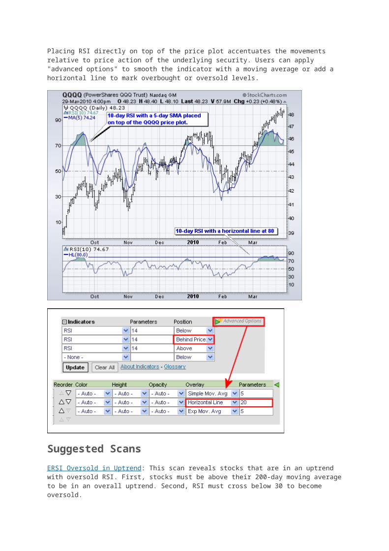
RSI is available as an indicator for SharpCharts. Once selected, users can place the indicator above, below or behind the underlying price plot. Placing RSI directly on top of the price plot accentuates the movements relative to price action of the underlying security. Users can apply "advanced options" to smooth the indicator with a moving average or add a horizontal line to mark overbought or oversold levels.
Suggested Scans
ERSI Oversold in Uptrend: This scan reveals stocks that are in an uptrend with oversold RSI. First, stocks must be above their 200-day moving average to be in an overall uptrend. Second, RSI must cross below 30 to become oversold.
RSI Overbought in Downtrend: This scan reveals stocks that are in a downtrend with overbought RSI turning down. First, stocks must be below their 200-day moving average to be in an overall downtrend. Second, CCI must cross above 70 to become overbought.
Force Index
Introduction
The Force Index is an indicator that uses price and volume to assess the power behind a move or identify possible turning points. Developed by Alexander Elder, the Force Index was introduced in his classic book, Trading for a Living. According to Elder, there are three essential elements to a stock's price movement: direction, extent and volume. The Force Index combines all three as an oscillator that fluctuates in positive and negative territory as the balance of power shifts. The Force Index can be used to reinforce the overall trend, identify playable corrections or foreshadow reversals with divergences.
Calculation
Force Index(1) = {Close (current period) - Close (prior period)} x Volume
Force Index(13) = 13-period EMA of Force Index(1)
Calculation for the one period Force Index is straight forward. Simply subtract the prior close from the current close and multiply by volume. The Force Index for more than one day is simply an exponential moving average of the 1-period Force Index. For example, a 13-Period Force Index is a 13-period EMA of the 1-period Force Index values for the last 13 periods.
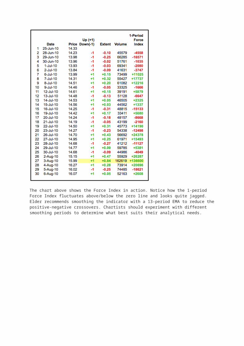
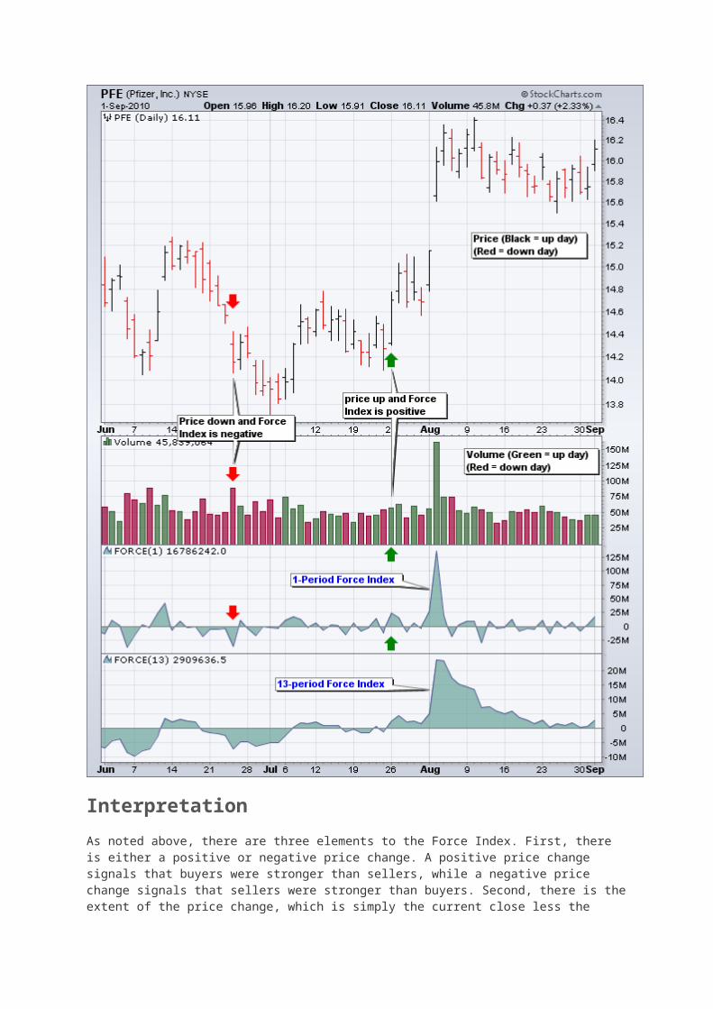
Three factors affect Force Index values. First, the Force Index is positive when the current close is above the prior close. The Force Index is negative when the current close is below the prior close. Second, the extent of the move determines the volume multiplier. Bigger moves warrant larger multipliers that influence the Force Index accordingly. Small moves produce small multipliers that reduce the influence. Third, volume plays a key role. A big move on big volume produces a high Force Index values. Small moves on low volume produce relatively low Force Index values. The table below shows the Force Index calculations for Pfizer (PFE). Line 27 marks the biggest move (+84 cents) and the biggest volume (162,619). This combination produces the biggest Force Index value on the table (136,600).
The chart above shows the Force Index in action. Notice how the 1-period Force Index fluctuates above/below the zero line and looks quite jagged. Elder recommends smoothing the indicator with a 13-period EMA to reduce the positive-negative crossovers. Chartists should experiment with different smoothing periods to determine what best suits their analytical needs.

Interpretation
As noted above, there are three elements to the Force Index. First, there is either a positive or negative price change. A positive price change signals that buyers were stronger than sellers, while a negative price change signals that sellers were stronger than buyers. Second, there is the extent of the price change, which is simply the current close less the prior close. The "extent" shows us just how far prices moved. A big advance shows strong buying pressure, while a big decline shows strong selling pressure. The third and final element is volume, which, according to Elder, measures
commitment. Just how committed are the buyers and sellers? A big advance on heavy volume shows a strong commitment from buyers. Likewise, a big decline on heavy volume shows a strong commitment from sellers. The Force Index quantifies these three elements into one indicator that measures buying and selling pressure.
Trend Identification
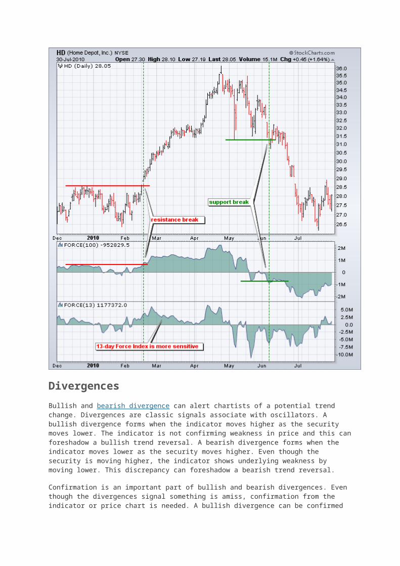
The Force Index can be used to reinforce or determine the trend. The trend in question, short-term, medium-term or long-term, depends on the Force Index parameters. While the default Force Index parameter is 13, chartists can use a higher number for more smoothing or a lower number for less smoothing. The chart below shows Home Depot with a 100-day Force Index and a 13-day Force Index. Notice how the 13-day Force Index is more volatile and jagged. The 100-day Force Index is smoother and crosses the zero line fewer times. In this regard, the 100-day Force Index can be used to determine the medium or long-term trend. Notice how a resistance breakout on the price chart corresponds to a resistance breakout on the 100-day Force Index. The 100-day Force Index moved into positive territory and broke resistance in mid February. The indicator remained positive during the entire uptrend and turned negative in mid May. The early June support break on the price chart was confirmed with a support break in the Force Index.
Divergences
Bullish and bearish divergence can alert chartists of a potential trend change. Divergences are classic signals associate with oscillators. A bullish divergence forms when the indicator moves higher as the security moves lower. The indicator is not confirming weakness in price and this can foreshadow a bullish trend reversal. A bearish divergence forms when the indicator moves lower as the security moves higher. Even though the security is moving higher, the indicator shows underlying weakness by moving lower. This discrepancy can foreshadow a bearish trend reversal.
Confirmation is an important part of bullish and bearish divergences. Even though the divergences signal something is amiss, confirmation from the indicator or price chart is needed. A bullish divergence can be confirmed with the Force Index moving into positive territory or a resistance breakout on the price chart. A bearish divergence can be confirmed with the Force Index moving into negative territory or a support break on the price chart. Chartists can also use candlesticks, moving average crosses, pattern breaks and other forms of technical analysis for confirmation.
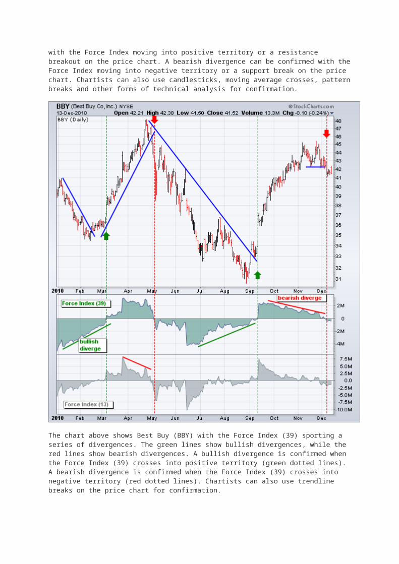
The chart above shows Best Buy (BBY) with the Force Index (39) sporting a series of divergences. The green lines show bullish divergences, while the red lines show bearish divergences. A bullish divergence is confirmed when the Force Index (39) crosses into positive territory (green dotted lines). A bearish divergence is confirmed when the Force Index (39) crosses into negative territory (red dotted lines). Chartists can also use trendline breaks on the price chart for confirmation.
This chart shows two versions of the Force Index. The Force Index (13) captures short-term fluctuations and is more sensitive. The Force Index (39) captures medium-term fluctuations and is smoother. The 39-day Force Index produces fewer zero line crossovers and these crossovers last longer. There is no right or wrong answer for these settings. It depends on trading objectives, time horizon and analytical style.
Identifying Corrections
The Force Index can be used in conjunction with a trend following indicator to identify short-term corrections within that trend. A pullback from overbought levels represents a short-term correction within an uptrend. An oversold bounce represents a short-term correction within a downtrend. Yes,
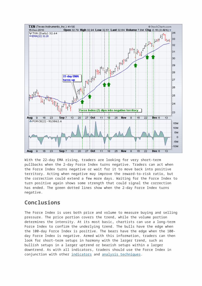
corrections can be up or down, it depends on the direction of the bigger trend. Alexander Elder recommends using a 22-day EMA for trend identification and a 2-day Force Index to identify corrections. The trend is up when the 22-day EMA is moving higher, which means the 2-day Force Index would be used to identify short-term pullbacks for buying. The trend is down when the 22-day EMA is moving lower, which means the 2-day Force Index would be used to identify short-term bounces for selling. This is an aggressive strategy best suiting for active traders. The timeframe can be adjusted by using a longer moving average and timeframe for the Force Index. For example, medium-term traders might experiment with a 100-day EMA and 10-day Force Index.
There are two-schools of thought regarding the correction play. Traders can either act as soon as the correction is evident or act when there is evidence the correction has ended. Let's look at an example with the 22-day EMA and 2-day Force Index. Keep in mind that this is designed to identify very short corrections within a bigger trend. The chart below shows Texas Instruments (TXN) with the 22-day EMA turning up in mid September.
With the 22-day EMA rising, traders are looking for very short-term pullbacks when the 2-day Force Index turns negative. Traders can act when the Force Index turns negative or wait for it to move back into positive territory. Acting when negative may improve the reward-to-risk ratio, but the correction could extend a few more days. Waiting for the Force Index to turn positive again shows some strength that could signal the correction has ended. The green dotted lines show when the 2-day Force Index turns negative.
Conclusions
The Force Index is uses both price and volume to measure buying and selling pressure. The price portion covers the trend, while the volume portion determines the intensity. At its most basic, chartists can use a long-term Force Index to confirm the underlying trend. The bulls have the edge when the 100-day Force Index is positive. The bears have the edge when the 100-day Force Index is negative. Armed with this information, traders can then look for short-term setups in harmony with the larger trend, such as bullish setups in a larger uptrend or bearish setups within a larger downtrend. As with all indicators, traders should use the Force Index in conjunction with other indicators and analysis techniques.
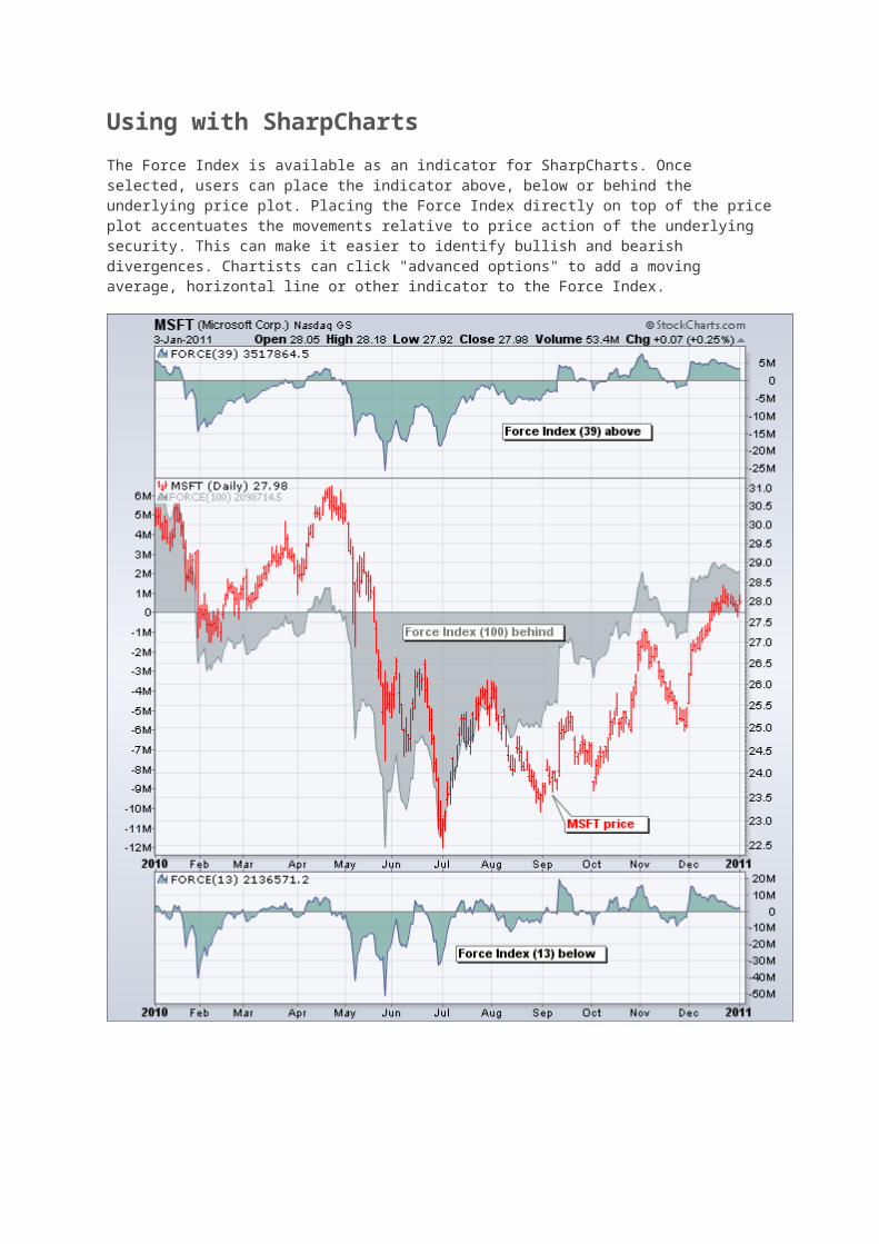
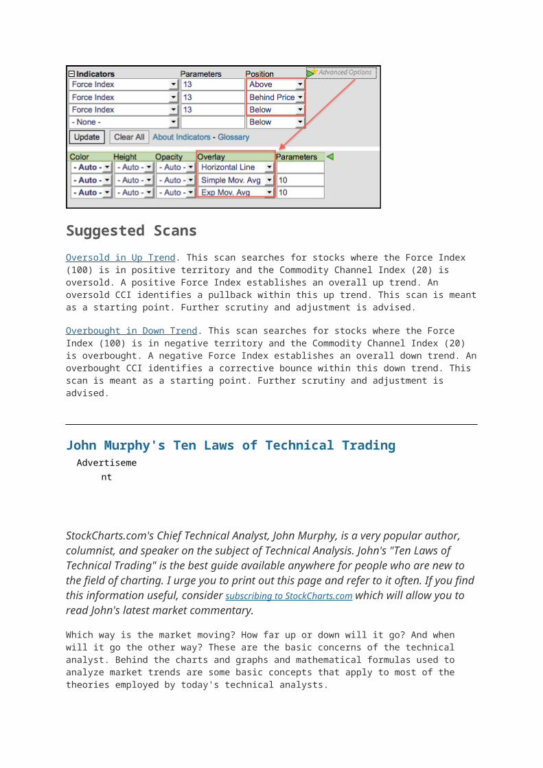
Using with SharpCharts
The Force Index is available as an indicator for SharpCharts. Once selected, users can place the indicator above, below or behind the underlying price plot. Placing the Force Index directly on top of the price plot accentuates the movements relative to price action of the underlying security. This can make it easier to identify bullish and bearish divergences. Chartists can click "advanced options" to add a moving average, horizontal line or other indicator to the Force Index.

Suggested Scans
Oversold in Up Trend. This scan searches for stocks where the Force Index (100) is in positive territory and the Commodity Channel Index (20) is oversold. A positive Force Index establishes an overall up trend. An oversold CCI identifies a pullback within this up trend. This scan is meant as a starting point. Further scrutiny and adjustment is advised.
Overbought in Down Trend. This scan searches for stocks where the Force Index (100) is in negative territory and the Commodity Channel Index (20) is overbought. A negative Force Index establishes an overall down trend. An overbought CCI identifies a corrective bounce within this down trend. This scan is meant as a starting point. Further scrutiny and adjustment is advised.
John Murphy's Ten Laws of Technical TradingAdvertisement
StockCharts.com's Chief Technical Analyst, John Murphy, is a very popular author, columnist, and speaker on the subject of Technical Analysis. John's "Ten Laws of Technical Trading" is the best guide available anywhere for people who are new to the field of charting. I urge you to print out this page and refer to it often. If you find this information useful, consider subscribing to StockCharts.com which will allow you to read John's latest market commentary.
Which way is the market moving? How far up or down will it go? And when will it go the other way? These are the basic concerns of the technical analyst. Behind the charts and graphs and mathematical formulas used to analyze market trends are some basic concepts that apply to most of the theories employed by today's technical analysts.
John Murphy, StockCharts.com's Chief Technical Analyst, has drawn upon his thirty years of experience in the field to develop ten basic laws of technical trading: rules that are designed to help explain the whole idea of technical trading for the beginner and to streamline the trading methodology for the more experienced practitioner. These precepts define the key tools of technical analysis and how to use them to identify buying and selling opportunities.
Before joining StockCharts, John was the technical analyst for CNBC-TV for seven years on the popular show Tech Talk, and has authored three best-selling books on the subject: Technical Analysis of the Financial Markets, Intermarket Analysis and The Visual Investor.
His most recent book demonstrates the essential visual elements of technical analysis. The fundamentals of John's approach to technical analysis illustrate that it is more important to determine where a market is going (up or down) rather than the why behind it.
The following are John's ten most important rules of technical trading:
1. Map the Trends 2. Spot the Trend and Go With It 3. Find the Low and High of It 4. Know How Far to Backtrack 5. Draw the Line 6. Follow That Average 7. Learn the Turns 8. Know the Warning Signs 9. Trend or Not a Trend? 10. Know the Confirming Signs
1. Map the Trends
Study long-term charts. Begin a chart analysis with monthly and weekly charts spanning several years. A larger scale map of the market provides more visibility and a better long-term perspective on a market. Once the long-term has been established, then consult daily and intra-day charts. A short-term market view alone can often be deceptive. Even if you only trade the very short term, you will do better if you're trading in the same direction as the intermediate and longer term trends.
2. Spot the Trend and Go With It
Determine the trend and follow it. Market trends come in many sizes – long-term, intermediate-term and short-term. First, determine which one you're going to trade and use the appropriate chart. Make sure you trade in the direction of that trend. Buy dips if the trend is up. Sell rallies if the trend is down. If you're trading the intermediate trend, use daily and weekly charts. If you're day trading, use daily and intra-day charts. But in each case, let the longer range chart determine the trend, and then use the shorter term chart for timing.
3. Find the Low and High of It
Find support and resistance levels. The best place to buy a market is near support levels. That support is usually a previous reaction low. The best place to sell a market is near resistance levels. Resistance is usually a previous peak. After a resistance peak has been broken, it will usually provide support on subsequent pullbacks. In other words, the old "high" becomes the new low. In the same way, when a support level has been broken, it will usually produce selling on subsequent rallies – the old "low" can become the new "high."
4. Know How Far to Backtrack
Measure percentage retracements. Market corrections up or down usually retrace a significant portion of the previous trend. You can measure the corrections in an existing trend in simple percentages. A fifty percent retracement of a prior trend is most common. A minimum retracement is usually one-third of the prior trend. The maximum retracement is usually two-thirds. Fibonacci retracements of 38% and 62% are also worth watching. During a pullback in an uptrend, therefore, initial buy points are in the 33-38% retracement area.
5. Draw the Line
Draw trend lines. Trend lines are one of the simplest and most effective charting tools. All you need is a straight edge and two points on the chart. Up trend lines are drawn along two successive lows. Down trend lines are drawn along two successive peaks. Prices will often pull back to trend lines
before resuming their trend. The breaking of trend lines usually signals a change in trend. A valid trend line should be touched at least three times. The longer a trend line has been in effect, and the more times it has been tested, the more important it becomes.
6. Follow that Average
Follow moving averages. Moving averages provide objective buy and sell signals. They tell you if existing trend is still in motion and help confirm a trend change. Moving averages do not tell you in advance, however, that a trend change is imminent. A combination chart of two moving averages is the most popular way of finding trading signals. Some popular futures combinations are 4- and 9-day moving averages, 9- and 18-day, 5- and 20-day. Signals are given when the shorter average line crosses the longer. Price crossings above and below a 40-day moving average also provide good trading signals. Since moving average chart lines are trend-following indicators, they work best in a trending market.
7. Learn the Turns
Track oscillators. Oscillators help identify overbought and oversold markets. While moving averages offer confirmation of a market trend change, oscillators often help warn us in advance that a market has rallied or fallen too far and will soon turn. Two of the most popular are the Relative Strength Index (RSI) and Stochastics. They both work on a scale of 0 to 100. With the RSI, readings over 70 are overbought while readings below 30 are oversold. The overbought and oversold values for Stochastics are 80 and 20. Most traders use 14-days or weeks for stochastics and either 9 or 14 days or weeks for RSI. Oscillator divergences often warn of market turns. These tools work best in a trading market range. Weekly signals can be used as filters on daily signals. Daily signals can be used as filters for intra-day charts.
8. Know the Warning Signs
Trade MACD. The Moving Average Convergence Divergence (MACD) indicator (developed by Gerald Appel) combines a moving average crossover system with the overbought/oversold elements of an oscillator. A buy signal occurs when the faster line crosses above the slower and both lines are below zero. A sell signal takes place when the faster line crosses below the slower from above the zero line. Weekly signals take precedence over daily signals. An MACD histogram plots the difference between the two lines and gives even earlier warnings of trend changes. It's called a "histogram" because vertical bars are used to show the difference between the two lines on the chart.
9. Trend or Not a Trend
Use ADX. The Average Directional Movement Index (ADX) line helps determine whether a market is in a trending or a trading phase. It measures the degree of trend or direction in the market. A rising ADX line suggests the presence of a strong trend. A falling ADX line suggests the presence of a trading market and the absence of a trend. A rising ADX line favors moving averages; a falling ADX favors oscillators. By plotting the direction of the ADX line, the trader is able to determine which trading style and which set of indicators are most suitable for the current market environment.
10. Know the Confirming Signs
Include volume and open interest. Volume and open interest are important confirming indicators in futures markets. Volume precedes price. It's important to ensure that heavier volume is taking place in the direction of the prevailing trend. In an uptrend, heavier volume should be seen on up days. Rising open interest confirms that new money is supporting the prevailing trend. Declining open interest is often a warning that the trend is near completion. A solid price uptrend should be accompanied by rising volume and rising open interest.
"11."

Technical analysis is a skill that improves with experience and study. Always be a student and keep learning.
- John Murphy
Definitions: Leonardo Fibonacci was a thirteenth century mathematician who "rediscovered" a precise and almost constant relationship between Hindu-Arabic numbers in a sequence (1,1,2,3,5,8,13,21,34,55,89,144,etc. to infinity). The sum of any two consecutive numbers in this sequence equals the next higher number. After the first four, the ratio of any number in the sequence to its next higher number approaches .618. That ratio was known to the ancient Greek and Egyptian mathematicians as the "Golden Mean" which had critical applications in art, architecture and in nature.
Stochastics - an oscillator popularized by George Lane in an article on the subject which appeared in 1984. It is based on the observation that as prices increase, closing prices tend to be closer to the upper end of the price range; conversely, in down trends, closing prices tend to be near the lower end of the range. Stochastics has slightly wider overbought and oversold boundaries than the RSI and is therefore a more volatile indicator. The term "stochastic" refers to the location of a current futures price in relation to its range over a set period of time (usually 14 days).
Donchian Trading Guidelines
Introduction
First published in 1934, many of the 20 trading guidelines from Richard Donchian are as relevant today as they were during the golden age of technical analysis. Considered by many as the father of trend following, Donchian developed one of the first trend following systems based on two different moving averages, which were cutting edge in the early thirties. Based on his experiences over time, Donchian developed 20 trading guidelines split into two groups: general and technical. The guidelines shown below have been paraphrased for a clearer explanation. The original guides are also shown in the bottom half of this page.
Eleven General Guidelines
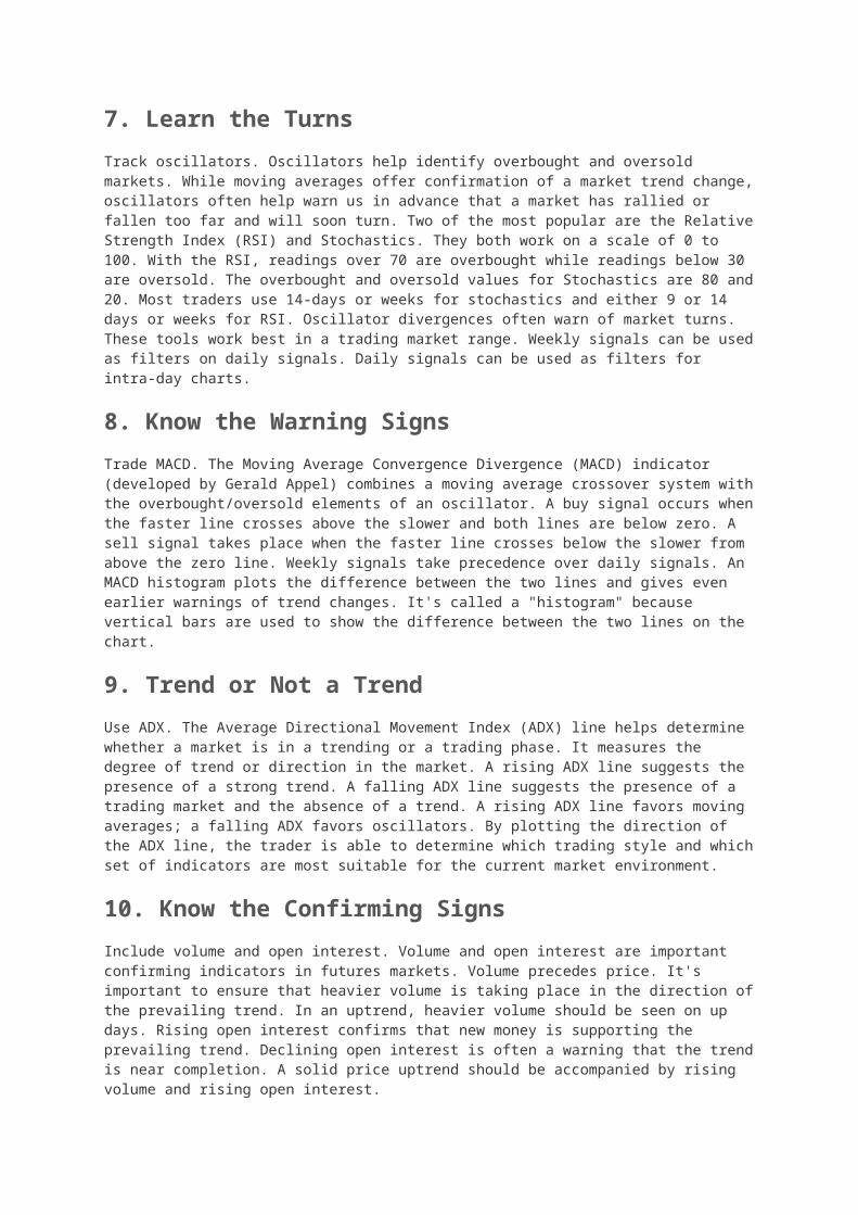
1. Be careful buying when the crowd is excessively bullish or selling when the crowd is excessively bearish. Even when the crowd is correct, excessive sentiment in one direction or another can delay a move.
2. When prices trade in a narrow range with little volatility, look for a volume increase to confirm the direction of the next move. Subsequent strength on higher volume is bullish, while subsequent weakness on higher volume is bearish.
3. Let your profits run and cut your losses short. This guideline overrides any other guideline.
4. Trade in smaller amounts during times of uncertainty. Trading losses and whipsaws can be reduced by focusing on solid setups and robust signals.
5. Do not chase a position after a three day move. Wait for a one-day reversal to improve the risk-reward ratio.
6. Use a stop-loss to limit losses and protect accrued profits. Stop-losses should be based on the trading pattern at work. A triangle pattern will have a different stop-loss structure than a rising wedge or head-and-shoulders pattern. 7. Due to the law of percentages, long positions should be larger than short positions during a broad uptrend. This assumes that the upswings will be larger than the downswings as a series of rising peaks and troughs evolves. A short position on a decline from 50 to 40 would produce a 20% profit, but a long position on an advance from 40 to 50 would produce a 25% profit. The percentage gain on advances will be greater and the trading amount should also be greater.
8. Use limit orders when initiating a position. Use market orders when closing a position.
9. Buy securities that are in uptrends and show relative strength. Sell securities that are in downtrends and show relative weakness. These two guidelines are subject to all other guidelines.
10. A broad market advance is more likely to continue when transportation stocks lead (Dow Transports). A broad market advance is suspect when transportation stocks lag.
11. A security's capitalization, its activity level in the marketplace and its trading characteristics are just as important as its fundamentals. (The interpretation of this guideline is rather difficult because it is unclear what Donchian means with "capitalization").
Nine Technical Guidelines
12. A consolidation or sideways trading range after an initial advance often leads to another advance of equal proportions. After this second advance, chartists can expect a counter move and decline back towards the consolidation. Similarly, a consolidation or sideways trading range after an initial decline often leads to another decline of equal proportions. After this second decline, chartists can expect a counter move and advance back towards the consolidation.

13. A long sideways consolidation after an advance marks future resistance. Expect resistance or a bearish reversal when prices decline and then return to this level. A long sideways consolidation after a decline marks future support. Expect support or a bullish reversal when prices advance and then return to this level. 14. Look for buying opportunities when prices decline to a trendline on average or low volume. Conversely, look for selling opportunities when prices advance to a trendline on average or low volume. Be careful if prices stall around the trendline (hug) or if the trendline has been touched too often.
15. Prepare for a bearish trendline break when prices decline to a rising trendline, fail to bounce and subsequently crawl along the trendline. Prepare for a bullish trendline break when prices advance to a falling trendline, hold most of their gains and crawl along the trendline. Repeated bumping of a trendline also increases the chances of a break.
16. Major trendlines define the longer trend. Minor trendlines define the shorter trend. When prices are above a major trendline (rising), use minor trendlines (falling) to define short pullbacks and generate buy signals with upside breaks. When prices are below a major trendline (falling), use minor trendlines (rising) to define short bounces and generate sell signals with downside breaks.
17. Triangles are usually broken on the flat side. This means an ascending triangle is usually broken with an upside breakout, while a descending triangle is usually broken to the downside. Chartists must look for other clues to determine if a triangle signals accumulation or distribution.
18. Look for a volume climax to signal the end of a long move. An extended advance sometimes ends with a volume surge that marks a blow-off . Conversely, an extended decline sometimes ends with a volume surge that marks a selling climax.
19. Not all gaps are filled. Breakaway gaps signal the start of a new trend and are not filled. Continuation gaps mark a continuation of the existing trend and are not filled. Exhaustion gaps mark a trend reversal and are filled. Chartists should not count on a gap being filled unless they can determine what kind of gap it is, which is easier said than done.
20. During an advance, initiate or add to long positions after a one day decline, no matter how small the decline and especially when the decline is on lower volume. During a decline, initiate or add to short positions after a one-day advance, no matter how big the bounce and especially if the bounce is on lower volume.
Conclusions
At least three themes emerge from these rules. First, direction of the underlying trend determines position preference. Chartists should focus on long positions during an uptrend and short positions during a downtrend. Second, volume plays an important part in the analysis process. Price moves in the direction of the bigger trend should be on higher volume, while counter trend moves should be on lower volume. However, note that volume climaxes can mark the end of an extended move. Third, trading ranges and consolidations are important chart patterns. Long consolidations can mark reversals and future support or resistance levels. Short consolidations often mark a rest in the ongoing trend.
Further Study

Trend Trading for a Living shows traders how to trade in the direction of the underlying trend. This hands-on book will also show readers how to configure a bullish and bearish watch list from which to set your entry and exit prices. Michael Covel's book introduces the fundamental concepts and techniques for a variety of trend following systems, including a system made famous by the Turtles. Covel shows why market prices contain all available information. Readers will learn how to interpret price movements and profit from trend following.
Trend Trading for a Living
Thomas Carr
Trend FollowingMichael Covel
Original Guides
A version of Donchian's original guidelines can be found on the Trading Tribe website (www.seykota.com). Ed Seykota is an original "market wizard" from Jack Schwager's book of the same name. He is a trend following disciple who credits Richard Donchian as a major influence in the development of his trading philosophy.
General Guides:
1. Beware of acting immediately on a widespread public opinion. Even if correct, it will usually delay the move.
2. From a period of dullness and inactivity, watch for and prepare to follow a move in the direction in which volume increases.
3. Limit losses and ride profits, irrespective of all other rules.
4. Light commitments are advisable when market position is not certain. Clearly defined moves are signaled frequently enough to make life interesting and concentration on these moves will prevent unprofitable whip-sawing.
5. Seldom take a position in the direction of an immediately preceding three-day move. Wait for a one-day reversal.
6. Judicious use of stop orders is a valuable aid to profitable trading. Stops may be used to protect profits, to limit losses, and, from certain formations such as triangular foci, to take positions. Stop orders are apt to be more valuable and less treacherous if used in proper relation to the chart formation.
7. In a market in which upswings are likely to equal or exceed downswings, heavier positions should be taken for the upswings for percentage reasons - a decline from 50 to 25 will net only 50% profit, whereas an advance from 25 to 50 will net 100%
8. In taking a position, price orders are allowable. In closing a position, use market orders.
9. Buy strong-acting, strong-background commodities and sell weak ones, subject to all other rules.
10. Moves in which rails lead or participate strongly are usually more worth following than moves in which rails lag.
11. A study of the capitalization of a company, the degree of activity of an issue, and whether an issue is a lethargic truck horse or a spirited race horse is fully as important as a study of statistical reports.
Technical Guides:
12. A move followed by a sideways range often precedes another move of almost equal extent in the same direction as the original move. Generally, when the second move from the sideways range has run its course, a counter move approaching the sideways range may be expected.
13. Reversal or resistance to a move is likely to be encountered upon reaching levels at which in the past the commodity has fluctuated for a considerable length of time within a narrow range or on approaching highs or lows.
14. Watch for good buying or selling opportunities when trend lines are approached, especially on medium or dull volume. Be sure such a line has not been hugged or hit too frequently.
15. Watch for "crawling along" or repeated bumping of minor or major trend lines and prepare to see such trend lines broken.
16. Breaking of minor trend lines counter to the major trend gives most other important position taking signals. Positions can be taken or reversed on stops at such places.
17. Triangles of ether slope may mean either accumulation or distribution depending on other considerations although triangles are usually broken on the flat side.
18. Watch for volume climaxes, especially after a long moves.
19. Don't count on gaps being closed unless you can distinguish between breakaway gaps, normal gaps and exhaustion gaps.
20. During a move, take or increase positions in the direction of the move at the market the morning following any one-day reversal, however slight the reversal may be, especially if volume declines on the reversal.