black networks after emancipation: evidence from reconstruction
TRANSCRIPT
Black Networks After Emancipation:Evidence from Reconstruction and the Great Migration ∗
Kenneth Chay† Kaivan Munshi‡
April 2012
Abstract
We find that southern blacks responded collectively to political and economic op-portunities after the Civil War, but only in places where strong social ties emerged asan unintended consequence of the antebellum organization of production. Black popu-lation densities varied substantially across counties in the postbellum South, dependingon the crops that were grown during and after slavery. In those counties where blackpopulation densities were large, social interactions would have been more frequent,resulting in stronger social ties. These social ties would have supported larger (andmore effective) networks, which, in turn, would have supported greater political partic-ipation during Reconstruction and the movement to northern cities during the GreatMigration. Our theoretical model places additional structure on this relationship: net-works will not form and there will be no association between population density andthe outcomes of interest up to a threshold density, followed by a positive associationabove the threshold. This specific nonlinearity, characterized by a slope discontinuityat a threshold, is central to our identification strategy. Voting and migration pat-terns across counties are consistent with the theory - there is no association with ourcrop-based measure of black population density up to a threshold point at which asteep, monotonic relationship begins. This finding is robust to rigorous testing, andthese tests show that competing hypotheses do not exhibit similar nonlinear patterns.Blacks from southern counties with large population densities accounted for a majorityof the northern migrants, and these migrants appear to have benefited from networkexternalities, as they moved to the same destination cities.
Keywords. African-American history. Slavery. Reconstruction. Great Migration.Networks. Social capital.JEL. D85. J62. L14. L22.
∗We are grateful to Jan Eeckhout, Seth Rockman, and Yuya Sasaki for many helpful discussions. BobMargo, Gavin Wright and numerous seminar participants provided comments that substantially improved thepaper. Many research assistants provided outstanding support over the course of this project. Dan Black,Seth Sanders, and Lowell Taylor graciously provided us with the Mississippi migration data and JeremyAtack and Bob Margo provided us with the railroads data. Research support from the National ScienceFoundation through grant SES-0617847 is gratefully acknowledged. We are responsible for any errors thatmay remain.†Brown University and NBER‡Brown University and NBER
1 Introduction
Were African-Americans able to overcome centuries of social dislocation and form viable
communities once they were free? This question has long been debated by social historians,
and is relevant both for contemporary social policy and for understanding the process of social
capital formation. The traditional view was that slavery, through forced separation and by
restricting social interaction, permanently undermined the black community (Du Bois 1908,
Frazier 1939, Stampp 1956). This was replaced by a revisionist history that documented
a stable, vibrant African-American family and community, both during and after slavery
(Blassingame 1972, Genovese 1974, Gutman 1976). More recently, Fogel (1989) and Kolchin
(1993) have taken a position between the traditional and the revisionist view; while other
social scientists have brought the literature around full circle by asserting that “[s]lavery
was, in fact, a social system designed to destroy social capital among slaves” (Putnam 2000:
294).
Despite the importance of and continuing interest in black social capital after slavery,
there has been virtually no quantitative investigation in this area. We cannot examine the
impact of slavery on social capital – i.e. the social capital that would have prevailed in
the absence of slavery. What we can study is the equally important question of whether
(and where) blacks formed networks soon after slavery ended. In the decades following
the Civil War, two significant opportunities arose for southern blacks to work together to
achieve common objectives. First, blacks were able to vote and elect their own leaders during
and just after Reconstruction, 1870-1890. Second, blacks were able to leave the South and
find jobs in northern cities during the Great Migration, 1916-1930. We find that southern
blacks did form networks in both these events, but only in places where specific historical
preconditions existed.
The identification of network effects is a challenging statistical problem. One issue that
often arises is that the size or density of the network could be correlated with unobserved
variables that directly determine the outcomes of its members. With our historical appli-
cation, an additional issue is that black networks after Emancipation cannot be directly
measured. Our solution to the statistical problem is to identify an exogenous variable that
plausibly determines the size and effectiveness of the network, and then to theoretically de-
rive and test the specific relationship between this variable and outcomes such as political
participation and migration that we expect to be affected by underlying networks.
The starting point for our analysis is the observation that black population densities
varied substantially across counties in the postbellum South, depending on the the crops
that were grown in the local area. Where labor intensive crops such as tobacco, cotton,
rice, and sugarcane were grown, black population densities tended to be large. Where crops
1
such as wheat and corn were grown, blacks were dispersed more widely. These cropping
patterns could be traced back to decisions made by white landowners in the antebellum
period. Variation in black population densities was an unintended consequence of those
decisions. In those counties where black population densities were large, social interactions
would naturally have been more frequent, resulting in stronger social ties. These social
ties would have supported larger (and more effective) networks, which, in turn, would have
supported greater political participation and migration, as described below:
population density → social ties → network size → political participation and migration.
While a positive relationship between population density and particular outcomes during
Reconstruction and the Great Migration may be consistent with the presence of underlying
black networks, other explanations are available. For example, racial conflict could have been
greater in counties with larger black population densities, resulting in greater black voter
turnout during Reconstruction and greater movement to northern cities during the Great
Migration. Alternatively, economic conditions in more densely populated counties could have
encouraged greater political participation and migration. Our strategy to identify a role for
networks is to place additional theoretical structure on the relationship derived above.
In the model developed in this paper, a group of blacks work together to provide a service
to a local political leader during Reconstruction or a northern firm during the Great Migra-
tion, receiving payoffs in return. Social ties allow the network to function more effectively.
Nevertheless, under reasonable conditions, networks will not form below a threshold level
of social ties. Above this threshold, the size of the largest network that can be supported
in equilibrium is increasing in social ties. These prediction are derived in terms of network
size and social ties, neither of which are directly observed. If we assume that outcomes such
as political participation and migration are increasing in network size and that social ties
are increasing in population density, then the predictions of the model can be restated in
terms of population density and the outcomes of interest. There should be no association
between these outcomes and population density up to a threshold and a positive association
thereafter. This specific nonlinearity, characterized by a slope discontinuity at a threshold,
is central to our identification strategy.
We derive and apply formal statistical tests of this prediction to the two outcomes of
interest. Blacks could vote and elect their own leaders for a brief period during and just
after Reconstruction (Morrison 1987, Foner 1988). They would have voted for the Republican
Party (the party of the Union) at this time; and so black political participation in each
county can be measured by the number of Republican votes. We find that Republican votes
in national and state-wide elections during the 1870s match the specific nonlinearity, with a
slope discontinuity, implied by the model. Since race-specific voting data are not available,
we also examine the relationship between population density and the probability that a
2
black leader was elected by the county to the State Senate or House. The patterns match
those of Republican votes, consistent with the presumption that black (Republican) voters
would have wanted to elect members of their own race. Southern blacks were gradually
disfranchised from the late 1880s through the 1890s as Jim Crow laws took effect. We find
no association between population density and Republican votes in 1900, which provides
further evidence that the nonlinear voting patterns of the 1870s were primarily driven by
blacks.
Although black disfranchisement was complete by 1900, a new opportunity arose with
the Great Migration. Over 400,000 blacks moved to the North between 1916 and 1918 (ex-
ceeding the total number who moved in the preceding 40 years), and over one million left by
1930 (Marks 1989). The standard explanation for this movement, which varied substantially
across southern counties, is that it was driven by the individual response to external factors
that include the increased demand for labor in the wartime economy (Mandle 1978, Got-
tlieb 1987); the decline in cotton acreage due to the boll weevil invasion (Marks 1983); the
segregation and racial violence that accompanied Jim Crow laws (Tolnay and Beck 1990);
and the arrival of the railroads (Wright 1986). Scant attention has been paid to the internal
forces that would have supported community-based migration. This is surprising given the
voluminous literature on networks in international and internal migration. Providing a new
perspective on the Great Migration, we find that the relationship between population density
and various measures of black migration match the predictions of our network-based model
once again - there is no correlation up to a threshold and a steep, monotonic association
thereafter.
Our primary measure of out-migration is derived from changes in the black population in
southern counties during the Great Migration, adjusting for natural changes due to births and
deaths. We cross-validate this measure with another one constructed from newly-available
data, which contain the city-of-residence in the 1970s (and after) of people born in Mississippi
between 1905 and 1925, as well as the person’s county of birth. While the year of migration
is unknown, these data provide a direct measure of migration at the county level. This
measure is highly correlated with the population change measure, and both variables show
the same nonlinear association with population density across Mississippi counties that we
observe across all southern counties.
Since the Mississippi data contain the (final) destination city of each migrant, we can test
another prediction of the theory. Migrants who are networked will move to the same place,
whereas those who move independently will be spread across the available destinations. If
variation in migration levels across southern counties is driven by underlying networks, then
this implies that the number of black migrants and the spatial concentration of these migrants
across destinations will track together. As predicted, the Herfindahl-Hirschman Index (HHI)
3
of spatial concentration across destination cities for the Mississippi migrants is uncorrelated
with population density up to the same point as the level of migration, and steeply increasing
in the density thereafter.
Our measure of black population density is based on the postbellum distribution of crops
in the county, taking into account differences in labor intensity (workers per acre) across
crops. The crop distribution can be traced back to decisions made by white landowners prior
to Emancipation and we verify that the results are robust to using that part of the variation
in the postbellum population density that can be explained by antebellum cropping patterns.
Having established the presence of a robust nonlinear relationship between (predetermined)
population density and both political participation and migration, this paper concludes
by considering alternative explanations that do not rely on a role for networks. The first
explanation posits that an external agency, such as the Republican Party or a Northern
labor recruiter, solved the commitment problem and organized black voters or migrants. A
related alternative explanation, which is most relevant during Reconstruction, is that blacks
would only turn out to vote when they were sufficiently sure they could elect their own
leader. As shown below, both explanations imply that voting and migration levels should
shift discontinuously at a threshold population density, which is inconsistent with the data.
Another possibility is that individuals vote and migrate independently in response to ex-
ternal forces that vary across counties. To generate the patterns we observe in the data there
must be little variation in these forces up to a threshold density and a positive association
with population density thereafter. We find that none of the push factors listed above that
are typically associated with the Great Migration exhibit a nonlinear relation with popula-
tion density; indeed their associations with population density are weak. While these factors
may have been important for individual decisions to migrate, they cannot explain why the
majority of black migrants came from high population density counties. We cannot rule out
the existence of unobserved factors that are correlated with both population density and
black migration in a way that would generate the same patterns predicted by our theory.
However, such factors would also need to explain the matching patterns in political partici-
pation fifty years earlier, as well as those we find for black church congregation size, which is
our most direct measure of network size. Even then, they would be hard pressed to account
for the nonlinear association between population density and the destination-city HHI of
blacks from Mississippi. If blacks’ migration decisions were based on factors that did not
include a coordination externality, then the probability of moving to the same destination
would not track migration levels so closely.
Our statistical tests consistently find that outcomes associated with black networks –
Republican votes, election of black leaders, black church size, black migration – have patterns
that match the restrictions of our theory. Variables that should not be associated with black
4
networks – e.g., railroad density, Republican votes after Reconstruction, white church size,
and white migration – do not. The implied magnitudes of the network effects are large -
for example, over half of the migrants to the North came from the third of southern blacks
who lived in the densest counties, while less than fifteen percent came from the third in the
least dense counties. Although anecdotal evidence suggests that networks linking southern
communities to northern cities did emerge (Gottlieb 1987, Grossman 1989), we are the first
to identify and quantify network effects in the Great Migration, an event of great interest
across many disciplines. This paper concludes by discussing the significance of this finding
for the subsequent evolution of black communities in northern cities.
2 Postbellum Opportunities and Constraints
This section begins by describing two new opportunities that presented themselves to African-
Americans in the postbellum period: (i) the opportunity to vote and elect their own leaders
during and just after Reconstruction, 1870-1890 and (ii) the opportunity to migrate to
northern cities during the Great Migration, 1916-1930. We subsequently discuss the crop-
based variation in black population density (and social ties) that would have constrained
the response to these opportunities across southern counties. The discussion concludes by
describing the construction of our density measure, together with an initial description of
the relationship between this measure and both political participation and migration.
2.1 Political Opportunities
Three amendments to the Constitution, passed in quick succession after the Civil War,
gave political representation to African-Americans. The 13th Amendment, passed in 1865,
abolished slavery. The 14th Amendment, passed in 1866, granted full rights of citizenship to
African-Americans. And the 15th Amendment, passed in 1869, gave them the right to vote.
This opportunity coincided with the Reconstruction Act of 1867, which put the Confederate
states under military (Federal) rule for the next decade. Blacks voted in large numbers
for the Republican party during this period and elected their own leaders. But Southern
Democrats began to reassert themselves soon after Reconstruction had ended, and southern
states began passing legislation from the early 1890s that effectively eliminated blacks from
the electorate by 1900 (Du Bois 1908, Morrison 1987, Valelly 2004).
Although external organizations such as the Freedmen’s Bureau and the Union League
were active during Reconstruction, the major impetus for African-American political par-
ticipation came from within (Stampp 1966, Foner 1988).1 “In record time they organized,
1At its peak in 1866, the Freedmen’s Bureau employed only 20 agents in Alabama and 12 in Mississippi.It ceased most of its activities by the end of 1868 and was officially abolished in 1872, before black political
5
sponsored independent black leaders, and committed themselves to active participation ...
It was now possible for blacks to not only field candidates for election but to influence the
outcome of elections by voting” (Morrison 1987: 35). During Reconstruction, as many as
600 blacks sat in state legislatures throughout the South.2 While this political success is
impressive, what is even more impressive is the discipline and courage shown by black voters
in continuing to vote Republican in large numbers and to elect their own leaders through
the 1880s and even into the 1890s, after Federal troops had left the South (Kolchin 1993).
Where did the black leaders come from? The church was the center of community life in
the postbellum period and it was natural that black political leaders would be connected to
this institution (Du Bois 1908, Woodson 1921, Frazier 1964, Dvorak 1988, Valelly 2004). “...
preachers came to play a central role in black politics during Reconstruction ... Even those
preachers who lacked ambition for political position sometimes found it thrust upon them”
(Foner 1988:93). African-American communities did not passively support these leaders.
The political support they provided gave them leverage, and benefits in return, until they
were disfranchised towards the end of the nineteenth century (Morrison 1987).
2.2 Economic Opportunities
The first major movement of blacks out of the South after the Civil War commenced in
1916. Over the course of the Great Migration, running from 1916 to 1930, over one million
blacks (one-tenth the black population of the United States) moved to northern cities (Marks
1983).3 This movement was driven by both pull and push factors. The increased demand
for labor in the wartime economy coupled with the closing of European immigration, gave
blacks new labor market opportunities (Mandle 1978, Gottlieb 1987). Around the same time,
the boll weevil invasion reduced the demand for labor in southern cotton-growing counties
(Marks 1989, Lange, Olmstead, and Rhode 2009). Adverse economic conditions in the South,
together with segregation and racial violence, encouraged many blacks to leave (Tolnay and
Beck 1990). Their movement was facilitated by the penetration of the railroad into the deep
South (Wright 1986). A confluence of favorable and unfavorable circumstances thus set the
stage for one of the largest internal migrations in history.
participation even began (Kolchin 1993).2About 50% of South Carolina’s lower house, 42% of Louisiana’s lower house, and 29% of Mississippi’s
lower house was black during Reconstruction. The corresponding statistics for the upper house were 19% inLouisiana and 15% in Mississippi. Blacks accounted for a sizeable fraction of state legislators even in statessuch as Virginia that did not witness a “radical” phase during Reconstruction (Valelly 2004).
3There were three phases in the Great Migration: an initial phase, 1916-1930; a slow down in the 1930s;and a subsequent acceleration, 1940-1970 (Carrington, Detragiache, and Vishwanath 1996). We focus on theinitial phase, as do many historians (e.g. Mandle 1978, Gottlieb 1987, Marks 1989) because we are interestedin black network formation in the decades after Emancipation. Future work discussed in the Conclusion willtrace the evolution of these networks in northern cities over the course of the twentieth century, linking ourproject to previous contributions in urban economics (e.g. Cutler, Glaeser, and Vigdor 1999, Boustan 2010).
6
How did rural blacks hear about new opportunities in northern cities? The first links
appear to have been established by recruiting agents acting on behalf of northern railroad
and mining companies (Henri 1975, Grossman 1991). Independent recruiters, who charged
migrants a fee for placing them in jobs, were soon operating throughout the South (Marks
1989). Apart from these direct connections, potential migrants also heard about jobs through
ethnic newspapers. For example, the Chicago Defender, which has received much attention
in the literature, increased its circulation from 33,000 in 1916 to 125,000 in 1918. Industries
throughout the Midwest sought to attract black southerners through classified advertise-
ments in that newspaper (Grossman 1991).
Although external sources of information such as newspapers and recruiting agents played
an important role in jump-starting the migration process, and agencies such as the Urban
League provided migrants with housing and job assistance at the destination, networks
linking southern communities to specific northern cities, and to neighborhoods within those
cities, soon emerged (Gottlieb 1987, Marks 1991, Carrington, Detragiache, and Vishwanath
1996). “[These] networks stimulated, facilitated, and helped shape the migration process at
all stages from the dissemination of information through the black South to the settlement
of black southerners in northern cities” (Grossman 1991: 67).4
Two broad classes of jobs were available to blacks in northern cities: unskilled service
and manufacturing jobs and skilled manufacturing jobs. Connections were needed to gain
access to the skilled jobs and many migrants did find positions with the help of referrals from
their network. However, much of the literature on black labor market networks during the
Great Migration focuses on information provision rather than job referrals (eg. Grossman
in Chicago and Gottlieb in Pittsburgh). “Unlike the kinship networks among European im-
migrants ... which powerfully influenced the hiring of foreign-born newcomers, the southern
blacks’ family and friends apparently had less leverage inside the workplace” (Gottlieb 1987:
79). A number of explanations are available for the apparent weakness of black networks.
First, discrimination by employers and the exclusion of blacks from labor unions could have
prevented them from entering skilled occupations in the numbers that were needed for net-
works to form (Grossman 1991, Collins 1997, Boustan 2009). Second, blacks may have been
less socially cohesive (on average) than arriving European migrants (Frazier 1939). A black-
white comparison is beyond the scope of this paper. But our analysis, based in the South,
will take a first step towards explaining variation in the strength of black networks across
northern destinations, as discussed in the Conclusion.
4Whether networks support or restrict migration will depend on the context. In the postbellum South,new networks would have formed to support migration. However, the same networks could have restrictedmigration (mobility) many decades later once they were established in northern cities.
7
2.3 Social Constraints
A distinctive feature of the antebellum South was the unequal size of slaveholdings and the
uneven distribution of the slave population across counties (Stampp 1956). One-quarter of
U.S. slaves resided in plantations with less than 10 slaves, one-half in plantations with 10-50
slaves, and the remaining in plantations with more than 50 slaves (Genovese 1974). This
variation arose as a natural consequence of geographically determined cropping patterns and
the organization of production under slavery (Wright 1978, 1986). Where plantation crops
such as cotton, tobacco, rice, and sugarcane could be grown, slaveholdings and the slave
population density tended to be large. However, a substantial fraction of slaves lived in
counties with widely dispersed family farms (Genovese 1974).5
Following the Civil War, while many blacks did move, most did not abandon their home
plantations and those who did traveled only a few miles (Mandle 1978, Foner 1988, Steckel
2000).6 The black population distribution remained stable, with the county-level population
correlation between 1860 and 1890 as high as 0.85. We will also see that antebellum cropping
patterns strongly predict postbellum patterns. This implies that black population densities
would have been relatively high in counties where labor intensive plantation crops – cotton,
tobacco, rice, and sugarcane – were grown historically and continued to be grown.
Social ties that support collective action and punish deviations from cooperative behav-
ior can only form if individuals interact with one another sufficiently frequently on a regular
basis. Forced separation would naturally have weakened social ties in the slave population
(Du Bois 1908, Frazier 1939).7 Nevertheless, the slave quarter and the independent informal
church that often formed within the quarter, have been identified as domains within which
cooperation, mutual assistance, and black solidarity did emerge (Blassingame 1972, Gen-
ovese 1974). “[Large plantations] permitted slaves to live together in close-knit communities
– the slave quarters – where they could develop a life of their own” (Fogel 1989: 170). Most
slaveholdings were too small to support such communities and interactions across planta-
tions were relatively infrequent (Stampp 1956). Social ties that covered a substantial area
5While just one or two slaves worked on a family farm growing wheat or corn, approximately 100 slavesworked on a rice or sugarcane plantation, 35 on a cotton plantation, and a somewhat smaller number ontobacco plantations (Fogel 1989).
6Federal assistance to former slaves who sought to acquire land was extremely limited (Kolchin 1993).40,000 blacks in Georgia and South Carolina were granted land for homesteading by General Sherman in1865, but the land was returned to their original owners by President Johnson. Similarly, only 4,000 blacks,most of whom resided in Florida, benefited from the Homestead Act of 1866. Apart from these limitedopportunities, white landowners could also have actively discouraged black sharecroppers and laborers frommoving (Naidu 2010).
7The inter-state slave trade frequently separated families and plantation communities. For example, closeto one million slaves moved to southwestern cotton states between 1790 and 1860 as production of that cropboomed (Fogel 1989, Kolchin 1993). Although Fogel and Engerman (1974) estimate that 84 percent of theslaves that moved west migrated with their owners, most other historians assign much greater weight to slavesales (Tadman, 1989, for instance, estimates that sales accounted for 70-80 percent of the slave movement).
8
and linked a sizeable population could thus have only formed after Emancipation, once the
restrictions on social interactions were lifted.
Reconstruction was more radical and persistent in the deep South (Kousser 1974, Kolchin
1993). During the Great Migration, the heaviest black out-migration occurred in an area that
had been dominated by the plantation cotton economy. “Some counties were characterized
by extremely high out-migration, while others maintained relatively stable black populations
... Such intra-state variation raises interesting questions about the causes of the differential
migration ... Was the cotton economy particularly depressed? Were blacks subjected to
more brutal treatment by whites in those areas? Did economic competition between blacks
and whites restrict economic opportunity, and thereby encourage out-migration?” (Tolnay
and Beck 1990: 350). Our explanation for (part of) this variation across counties is based
on internal rather than external forces. Following the discussion above, black population
densities would have been larger in counties where a greater fraction of land was allocated
to the four labor intensive plantation crops (not just cotton). Social interactions would have
been more frequent and social ties would have been stronger in those counties, allowing
blacks to form larger and more effective networks during Reconstruction and during the
Great Migration.
To test this hypothesis, the first step is to construct a measure of black population
density. The acreage allocated to crops with different labor intensities in a county would
have determined this density and so our crop-based measure is defined as follows:
Sit =∑j
βjAijtAit
,
where Sit is black population density in county i in year t, Aijt is the acreage allocated
to crop j, Ait is total acreage, and βj is the labor intensity (workers per acre) for crop j.
Although crop acreage at the county level is available from the 1880 census onward, our
baseline density measure is constructed in 1890, midway between Reconstruction and the
Great Migration. We verify that the results are robust to using the average of this measure
over the 1880-1900 period.
The baseline density measure restricts the set of crops to cotton, tobacco, rice, and
sugarcane, using labor intensities obtained from previously published farm studies. The
implicit assumption is that the labor intensity of black workers for other crops is small
enough to be ignored. To validate this assumption and to obtain independent estimates of
the labor intensities, we estimated the following equation over the 1880-1900 period:
Pit =∑j
βjAijt + α(Ait −∑j
Aijt) + fi + εijt,
where Pit is black population, fi is a county fixed effect, and εijt is a mean-zero disturbance
term. The fixed effect accounts for individuals who work off the land, which is relevant for
9
the few counties that were urban in the postbellum South, as well as for very young and very
old individuals outside the labor force. These individuals are not potential members of the
network and it is important to exclude them when constructing the population density mea-
sure. The labor intensities obtained from previously published farm studies and estimated
from the equation above are reported in Table 1. Although the two sets of statistics differ
to some extent, we verify that the results are robust to using either set. More importantly,
the α coefficient, which measures black labor intensity for other crops, is small enough that
it can be reasonably ignored.
Looking back at the Sit expression, the density measure can be reinterpreted as the
weighted average of the fraction of cultivated land allocated to each of the labor intensive
plantation crops, where the weights are now the labor intensities. This weighted statistic
is normalized to have the same mean and standard deviation as the unweighted statistic,∑j Aijt/Ait, in the empirical analysis.8 Normalization has no effect on the shape of the
relationship between our crop-based density measure and the outcomes of interest but it
allows us to conveniently interpret this measure as the fraction of land allocated to plantation
crops (adjusting for differences in labor intensity across those crops). We will often refer to
the density measure as the plantation share in the discussion that follows, emphasizing the
connection between black population density and cropping patterns.
Figure 1 describes the crop-based population density measure in the 15 southern states
in which slavery existed prior to Emancipation.9 The message to take away from the figure
is that there is substantial variation in this statistic across states and, more importantly,
across counties within states. We will take advantage of this variation to include state fixed
effects in all the results that we report, although the results are very similar with and without
fixed effects. Figure 2A provides preliminary evidence on the relationship between plantation
share and both political participation and migration. Political participation is measured by
the number of Republican votes in the county in the 1872 presidential election, at which
point in time blacks could freely vote and elect their own leaders. Migration is measured by
black population change in the county from 1910 to 1930 minus the corresponding change
from 1890 to 1910 (to control for natural changes in population across counties, as described
below). The nonparametric regressions presented in Figure 2A reveal a highly nonlinear
relationship between plantation share and both outcomes.10 Nonlinearities are commonly
8The normalization simply involves multiplying the weighted statistic by a constant and then addinganother constant term. After this normalization, observations with values exceeding 0.3 are dropped (theseoutliers account for 1.5 percent of all counties).
9The slave states are Alabama, Arkansas, Delaware, Florida, Georgia, Kentucky, Louisiana, Maryland,Mississippi, Missouri, North Carolina, South Carolina, Tennessee, Texas, and Virginia. Among these states,Kentucky, Missouri, Delaware, and Maryland did not join the Confederacy.
10State fixed effects are partialled out nonparametrically using a two-step procedure in Figure 2A and allthe figures that follow. In the first step, the outcome under consideration (political participation or migration)and each state dummy is separately regressed nonparametrically on plantation share. The residual from the
10
generated in models with network effects because there is an externality associated with
individual participation. The model that we develop below will provide a simple explanation,
based on differences in the size of underlying networks across counties, for the nonlinearity
we have uncovered in Figure 2A. It will also generate additional predictions that we can take
to the data.
3 Theory with a Test
The model developed in this section places additional structure on the nonlinear relation-
ship between black population density and both political participation and migration. We
subsequently proceed to develop statistical tests of the model’s predictions. These tests will
be used in Section 4 to formally validate the model and to rule out alternative explanations
for the empirical results that are obtained.
3.1 Individual Payoffs
There are many economic environments in which individuals cooperate to achieve a common
objective. For example, a group of individuals could form a cooperative to work together and
jointly produce a good. Alternatively, a group of individuals could form a mutual insurance
arrangement, pooling their incomes to smooth consumption on the basis of a pre-specified
sharing rule. In the applications that we consider, a group of blacks from a southern county
would have come together to provide a service to a principal, receiving benefits in return.
The principal could have been, for example, a local political leader during Reconstruction.
Members of the network would have canvassed potential voters and turned out themselves
in local, state, and federal elections. Once the leader was elected, the network would have
worked on his behalf, helping to provide goods and services to the electorate and increasing
his chances of reelection. In return for these services, the network would have received a
transfer of some sort. Alternatively, a group of black migrants could have worked diligently
as a team for one or more northern firms, and helped each other find jobs, during the Great
Migration. In a production environment where effort was unobserved by firms, such diligence
and mutual support would have resulted in improved employment prospects and favorable
wages for the members of the network.
Consistent with previous empirical results, e.g. Munshi (2003), the payoff W received
by each member of the network is increasing in its size, N . We assume that the size effects
are declining at the margin, perhaps due to congestion in the network. Social ties, λ are
introduced in the model by assuming that they make the network function more effectively.
first regression is then regressed on the residuals from the state-dummy regressions. Using the estimatedcoefficients, the state fixed effects can be differenced from the outcome under consideration. This differencedvariable is nonparametrically regressed on plantation share in the second step.
11
This could be because the members of the network work better together or because social ties
support collective punishments and ex post transfers that encourage them to help each other.
For analytical convenience, let N and λ be real numbers. The payoff each individual receives
from participation can then be expressed by the continuous function W (N, λ). Based on the
discussion above, WN(N, λ) > 0, WNN(N, λ) < 0, WλN(N, λ) > 0.
Let P be the population in the local area, which is defined to be small enough that only
a single network is active. Individuals outside the network operate independently and we
normalize so that their payoff is zero. Using the payoff in autarky as the benchmark, this
implies the following boundary condition:
C1. limλ→0
W (N, λ) = 0 ∀N
This is just saying that there is no additional payoff from belonging to a group, regardless
of its size, when social ties are absent (λ→ 0).
3.2 Maximum Stable Network Size
Given the payoffs described above, we now proceed to derive the maximum stable network
size, N , that can be supported in a local area. Social ties, λ, vary exogenously across local
areas, which are otherwise indistinguishable. Our objective is to derive the relationship
between λ and N . During Reconstruction, N would refer to the number of individuals who
would have worked together to support the local political leader. During the Great Migration,
N would refer to the size of the network that could be supported at the destination. Although
migration is a dynamic process, we can think of N as the stock of members at a given point
in time.
Since W (N, λ) is increasing in N and we have normalized so that the payoff in autarky
is zero, what prevents the entire population from joining the network? To place bounds on
network size, we assume that each member incurs a private effort cost c when it provides
the services described above to the principal. Benefits are received up front by the network,
with the expectation that each member will exert effort ex post. This could well describe the
timing of wage setting and work effort in northern jobs, as well as the sequence of transfers
(patronage) and community effort during Reconstruction. The commitment problem that
arises here is that a self-interested individual will renege on his obligation in a one-shot
game. This problem can be avoided if the network interacts repeatedly with the principal.
Based on the standard solution to an infinitely repeated game, cooperation can be sustained
if individuals are sufficiently patient, i.e. if the discount factor δ is large enough so that the
following condition is satisfied:
W (N, λ)− c1− δ
≥ W (N, λ).
12
The term on the left hand side is the present discounted value of cooperation for each in-
dividual. The right hand side describes the payoff from deviating. In the first period, the
deviator receives the usual per capita payoff without incurring the effort cost.11 Although
effort is not observed immediately, shirking is ultimately revealed to the principal at the end
of the period. A single network operates in each county and the usual assumption is that
deviators will be excluded from the group forever after. Since individuals operating inde-
pendently receive a zero per-period payoff, the continuation payoff is set to zero. Collecting
terms, the preceding inequality can be written as,
W (N, λ) ≥ c
δ.
From condition C1, this inequality cannot be satisfied for λ→ 0 even if the entire population
joins the network. This implies that all individuals must operate independently. As λ
increases, there will be a threshold λ∗ satisfying the condition,
W (P, λ∗) =c
δ.
As λ increases above λ∗, the condition can be satisfied for smaller networks becauseWλN(N, λ) >
0. But we are interested in the largest stable network. It follows that the entire population
will join the network for all λ ≥ λ∗. This unrealistic result is obtained because the continu-
ation payoff – set to zero – is independent of N . If cooperation can be sustained for a given
network size N , it follows that it can be sustained for any network size larger than N . Thus,
if cooperation can be sustained at all, the entire population will participate.
Genicot and Ray (2003) face the same problem in their analysis of mutual insurance. If
individual incomes are independent, then a larger network does a better job of smoothing risk,
and absent other constraints the entire population should join the insurance arrangement.
Genicot and Ray consequently turn to an alternative solution concept, the coalition-proof
Nash equilibrium of Bernheim, Peleg, and Whinston (1987), to place bounds on the size of
the group and we will do the same. An appealing and more realistic feature of this Nash
equilibrium refinement in the context of collective arrangements is that it allows sub-groups
rather than individuals to deviate. The continuation payoff is no longer constant because
deviating sub-groups can form arrangements of their own and we will see that this pins down
the maximum size that the network can attain.12
The coalition-proof Nash equilibrium places two restrictions on deviating sub-groups: (i)
only credible sub-groups, i.e. those that are stable in their own right, are permitted to pose
11Because N is a real number this is more correctly an infinitesimal number of deviators.12The canonical efficiency wage model solves the commitment problem by making the employer and the
individual worker interact repeatedly and by allowing the wage to adjust so that the gain from shirking inany period is just offset by the loss in future (permanent) income. In our model, the size of the group and,hence, the per capita payoff adjusts so that participants are indifferent between working and shirking.
13
a threat to the network. (ii) Only subsets of existing networks are permitted to deviate.13
The condition for cooperation can now be described by the expression,
W (N, λ)− c1− δ
≥ W (N, λ) +δ
1− δ[W (N ′, λ)− c] ,
where N ′ is the size of the deviating sub-group. The implicit assumption is that other
principals are available as long as the sub-group is stable. Collecting terms, the preceding
condition can be expressed as,
W (N, λ)−W (N ′, λ) ≥ 1− δδ
c.
The greatest threat to a group will be from a sub-group that is almost as large, N −N ′ → 0.
For analytical convenience assume that c is an infinitesimal number.14 If c is of the same
order as N − N ′, the ratio c ≡ c/(N − N ′) will be a finite number. Dividing both sides of
the preceding inequality by N −N ′, the condition for cooperation is now obtained as,
WN(N, λ) ≥ 1− δδ
c.
For a given λ, the left hand side of the inequality is decreasing in N since WNN(N, λ) < 0.
This implies that there is a maximum network size above which cooperation cannot be
sustained for each λ (if cooperation can be sustained at all as discussed below). This also
ensures that the deviating sub-group of size N ′ will be stable, as required by our solution
concept.15
Genicot and Ray show that the set of stable insurance arrangements is bounded above
once they allow for deviations by sub-groups. Our model, in which the network interacts
with an external principal, generates stronger predictions that match Figure 2A.
Proposition 1.Networks will not form below a threshold level of social ties, λ. Above that
threshold, the maximum stable network size, N∗, is increasing in social ties, λ.
To prove the first part of the proposition, we take advantage of condition C1, which
implies that limλ→0WN(N, λ) = 0. Cooperation cannot be supported for small λ. As λ
13Members of the deviating sub-group could, in principal, form a new coalition with individuals who wereoriginally operating independently. Bernheim, Peleg, and Whinston justify the restriction they impose onthe solution concept by arguing that asymmetric information about past deviations would prevent insidersand outsiders from joining together.
14This assumption, together with the assumption that N is a real number, allows us to differentiate theW function below. If we allowed c to be a finite number and N to be an integer, we would need to differenceinstead of differentiating, but it is straightforward to verify that the results that follow would be unchanged.
15Solve recursively to establish this result. Start with the smallest possible network of size N ′′. Deviatorsfrom this network are individuals and so are stable by definition. From the concavity of the W (N,λ) function,the condition for cooperation will be satisfied for N ′′ if it holds for some N > N ′′. This establishes that N ′′
is stable. Next, consider a network just larger than N ′′. Using the same argument establish that it is stable.Continue solving in this way until N ′ is reached to establish that it is stable.
14
increases, WλN(N, λ) > 0 implies that there will be a threshold λ at which cooperation can
be supported, but only for groups of infinitesimal size (N → 0). Above that threshold, since
N∗ is the largest group that can be supported in equilibrium for a given λ,
WN(N∗, λ) =1− δδ
c.
Applying the Implicit Function theorem,
dN∗
dλ=−WλN(N, λ)
WNN(N, λ)> 0
to complete the proof. Although Proposition 1 derives the relationship between λ and N∗,
both social ties and network size are not directly observed. Let social ties be increasing in
black population density, S. And let outcomes such as political participation and migration
be increasing in N∗ (support for this assumption will be provided below). Then Proposition
1 can be restated in terms of S: political participation and migration should be uncorrelated
with S up to a threshold S (not necessarily the same threshold) and increasing in S thereafter.
This places additional restrictions on the patterns observed in Figure 2A, which we test
formally below.
Multiple equilibria evidently exist above the threshold once we characterize individual
participation decisions as the solution to a noncooperative game. Apart from the equilibrium
derived above, no one participates in another equilibrium.16 We assume in the analysis that
follows that blacks were able to solve the coordination problem and so political participation
and migration in each local area is based on the maximum stable size N∗ derived above.
Reasonable restrictions on the payoff function W (N, λ) allow the model to generate re-
sults that are consistent with Figure 2A. Other assumptions or other models could generate
different results, but this is not a concern as long as they do not match the figure. For exam-
ple, we will see below that models in which blacks vote opportunistically above a threshold
or in which an external agency organizes black voters and migrants can generate a level
discontinuity. However, the slope discontinuity that is implied by our model turns out to be
more difficult to obtain.17
16There are no other equilibria in this noncooperative game. In particular, a network smaller than thelargest stable group is not an equilibrium because any individual operating independently would want todeviate and join it, making everyone better off without affecting its stability.
17A model of information diffusion in which individuals learn about new opportunities from their neighborscould generate a slope discontinuity, although this would still be a story about (information) networks. Incounties with low black population densities, individuals who took advantage of the new opportunity forexogenous reasons would be unable to transmit this information to the general population. In counties abovea threshold density, information would quickly spread through the population. While diffusion of informationabout labor markets in distant northern cities could explain some of the results we obtain during the GreatMigration, this explanation is less relevant during Reconstruction when information about local leaders andvoting opportunities was readily available. Social learning does not require explicit coordination, so thiswould also not explain variation in black church congregation size, our most direct measure of network size,across counties.
15
3.3 An Additional Implication of the Model
The model generates predictions for variation in the level of political participation and mi-
gration across local areas. The illustrative example presented below extends the model to
generate predictions for the distribution of migrants across northern destinations. Based
on the description of urban labor markets in Section 2, suppose that two types of jobs are
available to blacks in northern cities: skilled jobs with wage WS and unskilled jobs with wage
WNS < WS. Migrants are either educated or uneducated. Educated individuals get skilled
jobs with certainty. Uneducated individuals can only get skilled jobs with the support of a
network.
Because educated individuals can find skilled jobs in northern destinations with certainty,
their migration decision will depend on the skilled wage at the destination, their wage at the
origin, and the cost of migration. While there is heterogeneity in these costs, for analytical
convenience we assume that wages and the distribution of costs do not vary across origin
locations. This implies that a fixed number, NE, of educated individuals will migrate from
each origin location to M ≥ 2 destinations.18 As educated individuals can migrate without
the support of a network, they are randomly assigned across destinations in the model.
Let the wage at the origin for uneducated individuals be the same as the unskilled wage
at the destination. It follows that uneducated individuals will only migrate if they receive the
skilled job with sufficiently high probability. This will depend on the size of their network,
N∗, and the number of uneducated individuals who move with them. There is now a strategic
aspect to the migration decision and the number of uneducated migrants in equilibrium must
be derived as the solution to a fixed point problem. It is straightforward to show that this
number, NNE, is increasing in N∗ and, therefore, in S above the threshold (from Proposition
1).19 All of these individuals will move to the same destination, where their network is
located. Below the threshold S, the network does not form and so uneducated individuals
will not migrate.
Having derived the number and distribution of both educated and uneducated migrants
at the destination, we now proceed to compute the overall distribution of migrants. The
Herfindahl-Hirschman Index, which is defined as the sum of the squared share of migrants
18Let the moving cost for the marginal migrant be an increasing function of the number of migrants. Themarginal migrant is indifferent between moving and staying, which implies that WS − c(NE) = WE , whereWE is the wage obtained by educated individuals at each origin.
19As above, let the moving cost for the marginal migrant be an increasing function of the number ofmigrants. The expected wage at the destination minus moving costs is just equal to the wage at the originfor the marginal migrant. Assuming that the number of uneducated migrants NNE exceeds N∗,
NNE −N∗
NNEWNS +
N∗
NNEWS − C(NNE) = WNS .
Collecting terms and simplifying, it is straightforward to show that NNE is increasing in N∗.
16
across all destinations, can be conveniently used to measure this distribution. Below the
threshold S, NNE = 0. This implies that the Herfindahl-Hirschman Index, H(S) = M[NE/MNE
]2=
1/M , is uncorrelated with S. Above the threshold,
H(S) =
NE
M+NNE(S)
NE +NNE(S)
2 + (M − 1)
NE
M
NE +NNE(S)
2 .Differentiating this expression with respect to S,
HS(S) =2(M − 1)N
E
MNNE(S)NNE
S (S)
[NE +NNE(S)]3> 0,
since NNES (S) > 0 for S ≥ S from the discussion above. The specific nonlinear relationship
between the level of migration and plantation share that we derived in Proposition 1 should
apply to the distribution of migrants at the destination as well. Although we use an illustra-
tive example to derive this result, it will hold more generally as long as (potential) members
of the network cluster more at the destination than individuals who move independently.
Figure 2B describes migration to northern cities from counties in the state of Mississippi
as a function of the plantation share. These data are constructed by merging Medicare
records with social security records, as described below, allowing migrants from each Mis-
sissippi county during the Great Migration to be linked to northern destination cities.20
Providing independent support for the relationship we uncovered in Figure 2A across all
southern counties, there is no association between plantation share and the level of migra-
tion up to the same threshold as in that figure, after which a monotonic relationship begins.
More importantly, the level of migration and the concentration of migrants in northern cities,
measured by the Herfindahl-Hirschman Index (HHI), track very closely together in Figure
2B.21
We close this section by justifying the use of the number of voters and the number
of migrants as measures of political participation and migration, respectively. The model
derives network size as a function of social ties. The extension to the model discussed above
goes on to map network size to the number of migrants in equilibrium. This result follows
because the expected wage at the destination for uneducated individuals is a function of the
number of individuals who move with them. Apart from this theoretical justification, we will
also see that the specific nonlinear relationship between plantation share and the number of
voters and migrants is matched by the corresponding relationship between plantation share
20We are grateful to Dan Black, Seth Sanders, and Lowell Taylor for providing us with these data.21Although clustering is commonly associated with networks, it could also arise because migrants are
restricted to a limited number of destinations. The fact that the number and the concentration of migrantstrack together, however, is less easy to explain without a role for networks. For this the migrants from countieswith access to a relatively small number of destinations would need to have exceptional opportunities at thosedestinations, resulting in a greater overall level of migration.
17
and associated outcomes. These outcomes include the probability that a black leader was
elected by the county, the distribution of migrants at the destination (shown above) and
black church congregation size (our most direct measure of network size). This empirical
consistency further increases our confidence in the validity of the measures that have been
chosen.
3.4 Testing the Model
The model indicates that black population density has no association with political partic-
ipation and migration up to a threshold and a positive association thereafter. Following
standard practice when estimating threshold regression models, e.g. Hanson (1999), we esti-
mate a series of piecewise linear regressions that allow for a slope change at different assumed
thresholds. The pattern of coefficients that we estimate, with accompanying t-ratios, will
locate our best estimate of the true threshold and formally test the specific nonlinearity
implied by the model.
Ignoring the state fixed effects to simplify the discussion that follows, the piecewise linear
regression that we estimate for each assumed threshold, S, is specified as
yi = β0 + β1Si + β2Di(Si − S) + β3Di + εi (1)
where yi is political participation or migration in county i, Si is the plantation share in that
county, Di is a binary variable that takes the value one if Si ≥ S, and εi is a mean-zero
disturbance term. β1 is the baseline slope coefficient, β2 is the slope change coefficient, and
β3 is the level change coefficient (measuring the level discontinuity at the threshold). We
will estimate this regression for a large number of assumed shares, in increments of 0.001,
over the range [0, 0.3].
The slope coefficients, β1 and β2, can be directly linked to the predictions of the model:
β1 = 0 and β2 > 0. To derive the pattern of t-ratios on β1 and β2 that we expect to obtain
across the range of assumed thresholds when the data generating process is consistent with
the model, we generated a data set that consists of two variables: the actual plantation
share in our southern counties, Si, and a hypothetical outcome, yi, that is constructed to
be consistent with the model. The true threshold is specified to be 0.09. The value of
the hypothetical outcome in each county is then obtained by setting β0 = 670, β1 = 0,
β2 = 7700, β3 = 0, and S = 0.09 in equation (1) and then adding a mean-zero noise term.
These parameter values are derived from a piecewise linear regression of Republican votes in
the 1872 presidential election on plantation share, with state fixed effects and the break at
0.09.22 To verify that the data we have generated match the model, we nonparametrically
22We set the true threshold at 0.09 to be consistent with our best estimate of that threshold using thejoint-test that will be discussed below. The variance of the mean-zero noise term in the simulation is set tomatch the variance of the residuals from this piece-wise linear regression.
18
regress yi on Si in Figure 3A. All the nonparametric regressions in this paper are estimated
with a narrow bandwidth. Despite the noise that we have added to the outcome, a slope
change near the “true” threshold, 0.09, is clearly visible in the figure.
Having generated data that match the model, we next proceed to estimate equation
(1) sequentially over a large number of assumed thresholds. The t-ratios for the two slope
coefficients, β1 and β2, are reported in Figure 3B for each of these assumed thresholds. The
t-ratio for the baseline slope coefficient remains close to zero for all assumed thresholds
below the true threshold and starts to increase thereafter. The t-ratio for the slope change
coefficient starts close to zero, then increases steadily reaching a maximum well above two
where the assumed threshold coincides with the true threshold, and then declines thereafter.
To understand why the t-ratios follow this pattern, return to Figure 3A and consider the
piecewise linear regression line that would be drawn for an assumed threshold to the left of
the true threshold. The best fit to the data at that assumed threshold sets β1 = β3 = 0 and
β2 > 0. This implies that the t-ratio on the baseline slope coefficient will be zero and the
t-ratio on the slope-change coefficient will be positive. Now suppose we shifted the assumed
threshold slightly to the right. It is evident that we would continue to have β1 = β3 = 0
since there is no change in the slope to the left of the assumed threshold, but β2 would
increase and the regression line would do a better job of fitting the data to the right of
the threshold. The t-ratio on the baseline slope coefficient would remain at zero, while the
t-ratio on the slope-change coefficient would increase. This would continue as the assumed
threshold shifted gradually to the right until it reached the true threshold.
Once the assumed threshold crosses to the right of the true threshold, the piecewise
linear regression line that best fits the data will set β1 > 0. Although the magnitude of the
baseline slope coefficient will increase as the assumed threshold shifts further to the right, the
regression line will do an increasingly poor job of fitting the data to the left of the threshold.
This implies that the t-ratio on the baseline slope coefficient is not necessarily monotonically
increasing to the right of the true threshold, although it must be positive. In practice, this
t-ratio will increase monotonically with both political participation and migration.
To derive the corresponding change in the t-ratio for the slope change coefficient, recall
that the hypothetical outcome increases linearly to the right of the true threshold. Once the
level change coefficient is introduced, which must now be positive, β3 > 0, this implies that
the regression line to the right of the assumed threshold will perfectly fit the data, except for
the noise we have added to the outcome. This line maintains the same slope, and continues
to precisely match the data, as the assumed threshold shifts further to the right. However,
since the regression line to the left of the assumed threshold is growing steeper and is less
precisely estimated as the assumed threshold shifts to the right, the slope-change coefficient
and the t-ratio on that coefficient will unambiguously decline.
19
The preceding discussion and Figure 3B tell us what to expect when the data are consis-
tent with the model. They also locate our best estimate of the true threshold. This will be
the assumed threshold at which the t-ratio on the baseline coefficient starts to systematically
increase and the t-ratio on the slope change coefficient reaches its maximum value.23 Given
the noise in the outcome measures, however, it is sometimes difficult to assess whether or not
the t-ratios match the predictions of the model. This motivates a joint-test of the model’s
predictions, based on the two slope coefficients, which also provides us with a single best
estimate of the true threshold’s location.24
Following standard practice, the composite null, which we test by estimating equation
(1) at each assumed threshold, is set up to be inconsistent with the model:
H0 : β1 ≥ |εh| and β2 = 0,
where ε can be arbitrarily small and h is a scale parameter. β1 is thus bounded away from zero
under the null, while β2 is set to zero. β1 will be mechanically further away from zero when
the outcome variable has a larger mean or variance. To make the joint-test comparable across
outcomes, we thus set h to be the standard deviation of the outcome under consideration
multiplied by a constant.
Given the outcomes that we consider in this paper, the following data generating processes
are feasible when the null is rejected:
H1 : (i)β1 < |εh| and β2 > 0
(ii)β1 < |εh| and β2 = 0
(iii)β1 ≥ |εh| and β2 > 0.
The first data generating process is consistent with our model. With the second data generat-
ing process, there is no relationship between the outcome under consideration and plantation
share. With the third data generating process, the outcome is increasing monotonically in
plantation share (with a slope change at a threshold).
If we replaced the and statement under the null with an or statement, the parameter space
would expand and only our model would be feasible if the null were rejected. However, this
would introduce a new problem because any test statistic constructed to test the composite
hypothesis would have different values under the null, depending on which component was
relevant. We consequently retain the and statement, but we will see that our joint-test
statistic nevertheless has the power to distinguish between the alternative data generating
processes when the null is rejected.
23We could alternatively have plotted the baseline and slope change coefficients instead, over the rangeof assumed thresholds. The advantage of the t-ratios is that they allow us to test and compare the modelacross multiple outcomes.
24We are grateful to Yuya Sasaki for his help in deriving the test.
20
The joint-test statistic is constructed as follows:
T (β) = φ
(β1h
)β2,
where φ is a symmetric and continuous function that reaches its maximum value at zero
and the h parameter once again ensures that deviations in β1 away from zero are penalized
consistently across outcomes. By the delta method,
√n(T (β)− T (β)
)d−→ N (0, DT (β)V DT (β)′)
where V =
[Vβ1 Vβ1β2Vβ1β2 Vβ2
]and DT (β) =
[1hφ′(β1h
)β2 φ
(β1h
)].
T (β) = 0, under the null H0 because β2 = 0. Substituting the expressions for V and
DT (β), under the null
√nT (β)
d−→ N
0,
[φ
(β1h
)]2Vβ2
.Dividing by the standard deviation and then squaring,
n[T (β
]2[φ(β1h
)]2Vβ2
d−→ χ21.
Under the null, β1 has a range of values. We select the “least favorable” null, β1 = |εh|,which minimizes the value of the preceding statistic. If we do reject the null, this implies that
we would reject the null for any β1 ≥ |εh|. Following standard practice when implementing
the Wald test, we replace Vβ2 with Vβ2 . Substituting the expression for T (β), we arrive at
the statistic that is used for the joint test of the model,
n
[φ(β1h
)]2[φ(ε)]2
β22
Vβ2
d−→ χ21.
Because ε can be arbitrarily small, we set ε equal to zero when computing the joint-test
statistic. We will reject the null hypothesis if this test statistic exceeds the critical value for
the chi-squared distribution with one degree of freedom.
If the data generating process is consistent with the model, β1 = 0 for all assumed
thresholds to the left of the true threshold. However, β2 is increasing as we shift closer to
the true threshold and is more precisely estimated. This implies that our joint-test statistic
will be increasing in magnitude as the assumed threshold moves closer to the true threshold.
After reaching its maximum value at the true threshold, where we are most likely to reject
the null, the statistic will drop rapidly to zero if the φ function and the scale parameter,
h, together place sufficient penalty on deviations in β1 away from zero. Recall that β2 is
21
declining and less precisely estimated as the assumed threshold shifts further to the right of
the true threshold, reinforcing this effect. In contrast, the (multiplicative) joint-test statistic
that we have constructed will be zero when the data generating process is consistent with
model (ii), and we will not reject the null hypothesis, since β2 = 0. We will not reject the
null under model (iii) either, if β1 is sufficiently large and the φ function places sufficient
penalty on deviations from zero. Our test statistic thus distinguishes our model from other
data generating processes when the null is rejected.25
Figure 3C reports the joint-test statistic across the entire range of assumed thresholds,
in increments of 0.0001, with our simulated data. We use the density of the standard normal
distribution to characterize the φ function and set h equal to three-quarters of the standard
deviation of the outcome under consideration, in the simulation exercise and in the analysis
that follows.26 The joint-test statistic is increasing in the assumed threshold in Figure 3C
until it reaches its maximum value near the true threshold (0.09), declining steeply thereafter.
The 95 percent critical value for the chi-squared distribution with one degree of freedom is
3.84, which implies that we can reject the null hypothesis at conventional levels for a range
of assumed thresholds around the true threshold. We are nevertheless most likely to reject
the null hypothesis where the joint-test statistic reaches its maximum value, and this will be
our best estimate of the true threshold.27
4 Empirical Analysis
This section begins by describing the relationship between plantation share and the black
population. We subsequently verify that the response to political and economic opportu-
nities in the postbellum South across counties with different plantation shares matches the
predictions of the model. The empirical analysis concludes by considering alternative models
and establishing that they can match some but not all the patterns observed in the data.
4.1 Black Population
Variation in voting and migration across counties is generated in our model by internal
forces that restrict the size of the largest stable network that can form. Suppose, instead,
25In the empirical analysis that follows, we will consistently reject the null hypothesis for outcomes asso-ciated with black networks, where the data generating process based on the t-ratio test is consistent withmodel (i). In contrast, we will not reject the null for other outcomes where the t-ratio test indicates thatthe data generating process is consistent with model (ii) or model (iii).
26The results are robust to alternative multipliers (0.5, 1.0).27An alternative best-estimate of the true threshold would be the assumed threshold at which the sum of
squared errors of the piecewise linear regression was minimized (Hanson 1999). Our joint test is tied more
closely to the theory, locating the threshold at which the estimated slope coefficients – β1 and β2 – matchmost closely with the predictions of the model, i.e. β1 = 0 and β2 > 0.
22
that networks are absent, but the relationship between plantation share and black popula-
tion matches the patterns in Figure 2A; i.e. population is constant up to a threshold and
increasing thereafter. If a fixed fraction of the black population votes and migrates, this
would explain the patterns in Figure 2A without a role for networks.
To examine this possibility, we nonparametrically regress black population on plantation
share in Figure 4A at three points in time: 1860, 1870, and 1890. It is apparent from the
figure that black population is monotonically increasing in plantation share. The slope also
gets steeper over time, perhaps due to higher fertility in the high plantation share counties,
and we will return to this observation when constructing the migration statistics below.
To formally verify that black population is monotonically increasing in plantation share,
we report the results of the t-ratio test for 1870 (the other years are the same) in Figure 4B.
If the relationship were linear, the t-ratio on the baseline slope coefficient would be greater
than two and constant, while the slope change coefficient would be zero. What we see is
that the baseline slope coefficient is always greater than two and that it is increasing in
plantation share. While this indicates that the relationship is nonlinear, black population
is still increasing in plantation share everywhere. The joint test, reported in Figure 4C,
confirms this conclusion. We cannot reject the null anywhere, presumably because the φ
function places sufficient penalty on deviations in β1 away from zero.
The increase in voting and migration above a plantation share threshold that we will
observe below can be explained by the accompanying increase in the black population. The
absence of such an association below the threshold, despite the fact that the black population
is getting larger, is less easy to explain without a role for coordination.
4.2 Response to Political Opportunities
Larger black networks in a county during Reconstruction would have generated greater po-
litical participation in the population. While political participation by race is not available,
voter turnout by party is available from U.S. Historical Election Returns (ICPSR). Because
blacks would have voted Republican at this time, our primary measure of political partici-
pation is the number of Republican votes in the county. This statistic is reported at three
points in time in Figure 5A, for the 1872, 1880, and 1900 presidential elections. The pattern
of votes in 1872, which is at the height of black political power, was reported earlier in
Figure 2A. Although Southern Democrats started to take control and blacks were gradually
disfranchised once Reconstruction ended in 1877, blacks continued to vote and to elect their
own leaders, with less and less success, into the 1890s. As expected, the increase in Repub-
lican votes past the plantation share threshold is weaker in 1880 than in 1872. However, the
specific nonlinearity implied by the model continues to be obtained. This contrasts with the
pattern in 1900, by which point in time blacks would have been completely disfranchised
23
and where we see no relationship between the number of Republican votes and plantation
share.
Figure 5B formally tests whether the nonlinear relationship that we uncovered in 1872
in Figure 5A matches the model. The t-ratio on the baseline slope coefficient is close to
zero up to a threshold plantation share and increasing thereafter. The t-ratio on the slope
change coefficient increases steadily up to the same threshold, reaching a maximum value
of four, and then declines thereafter. Figure 5C reports the joint-test statistic across the
range of plantation shares. This statistic reaches its maximum value, well above the 95
percent critical value for the chi-squared distribution with one degree of freedom, close to
the threshold in Figure 5B. It declines steeply, on both sides, away from our best estimate
of the true threshold (around 0.09). These patterns match the model’s predictions and the
simulations in Figures 3B and 3C. This contrasts with what we observed for black population
in Figures 4B and 4C.
We next proceed to establish the robustness of this result to alternative measures of the
plantation share variable and non-presidential elections. Figure 5D reports nonparametric
estimates where (i) the 1890 plantation share is replaced by the average plantation share
over the 1880-1900 period, and (ii) labor intensities obtained from previously published farm
studies are replaced by our estimates (reported in Table 1). Federal, state, and local elections
are synchronized in the American political system and so the voter turnout across counties
that we observe for presidential elections should also apply to local elections occurring at the
same time, where the implications of the model may be more relevant. Figure 5E regresses
Republican votes in gubernatorial and congressional elections (separately) on plantation
share, uncovering the same pattern that we obtained with 1872 presidential elections.28 The
relationship between plantation share and Republican votes is robust to the type of election
and we expect that the same relationship would be obtained with state and local elections,
although those data are unavailable.
Our analysis takes advantage of the fact that cropping patterns in the South were initially
put in place by white landowners. Variation in black population density in the antebellum
period was an unintended consequence of those decisions. Once blacks were free, however,
they could have moved to counties where networks were strongly, changing existing cropping
patterns. To account for such endogenous sorting as well as for differential fertility across
counties in the postbellum period, we estimate regressions that use that part of the variation
in 1890 plantation share that can be explained by 1860 cropping patterns.
The two-step estimation procedure that we implement is based on the nonparametric
28Republican votes in gubernatorial and congressional elections are available, by county, from ICPSR.Gubernatorial elections were held at four-year intervals but were not synchronized across states. Figure 5Eis thus based on all gubernatorial elections held between 1871 and 1873. Data on congressional elections areobtained for 1872.
24
instrumental variable procedure suggested by Newey, Powell, and Vella (1999), except that
we do not claim that 1860 cropping patterns satisfy the exclusion restriction. Our iden-
tification comes from the specific nonlinear relationship between plantation share and the
outcomes of interest that we estimate. In the first step, we regress 1890 plantation share
on a full set of state dummies and a flexible (polynomial) function of either the size of the
median slaveholding in 1860 or production levels of the four plantation crops in 1860.29 The
goodness of fit (R-squared) in both regressions exceeds 0.5, consistent with the view that
postbellum cropping patterns could be traced back to antebellum decisions. In the second
step, we nonparametrically regress 1872 Republican votes on plantation share, partialling
out state fixed effects (as usual) as well as a flexible (fifth-order polynomial) function of the
first-stage residuals. By including the first-stage residuals in the second step, we effectively
regress political participation on the predicted plantation share (based on 1860 cropping
conditions) and we see in Figure 5F that the results are very similar to what we obtained in
Figure 5A.
While the robust nonlinear relationship between Republican votes and plantation share
we have uncovered is consistent with the model, we do not have direct evidence that the
increase in Republican votes above the threshold was driven by black voters. White “car-
petbaggers” from the North and white “scalawags” from the South also voted Republican in
southern counties at this time. If the number of white Republican votes was correlated with
plantation share, this could confound our interpretation of the results in Figure 5A. One ob-
servation from that figure that goes against this alternative explanation is that the number
of Republican votes and plantation share are unrelated in 1900, by which time blacks were
effectively disfranchised. To provide further support for our hypothesis, we take advantage
of the fact that an increase in black votes would have generated an increase in black leaders,
to the extent that blacks wanted to elect members of their own race.
Foner (1993) provides a complete list of black officeholders during Reconstruction. Almost
all of these officeholders were elected to positions in state government. We therefore construct
two measures of leadership based on his data: whether a black state representative and
whether a black state senator was elected from each county in this period. These measures
are regressed nonparametrically on plantation share in Figure 6A. The probability that a
black leader, especially a state representative, was elected from a county tracks closely with
29The 1860 population census provides the number of slaveholdings by size-category in each county. Thesecategories are all integers up to 9, 10-14, 15-19, 20-29, 30-39, 40-49, 50-69, 70-99, 100-200, 200-300, 300-500,and greater than 500. A hypothetical ranking of all slaves in a county can be constructed based on thesize of the plantation to which they were assigned, which allows us, in turn, to compute the size of theslaveholding associated with the median slave. We regress 1890 plantation share on a quartic function ofthis median slaveholding in one first-stage specification. Although crop acreage at the county level is notavailable prior to 1880, crop production data go back to 1840. In a second first-stage specification, we regress1890 plantation share on a cubic function of 1860 production for each of the four plantation crops, additivelyand without interaction terms.
25
the pattern of Republican votes in 1872 and 1880, indicating that voting patterns in those
years were indeed being driven by black voters. Figure 6B formally tests the nonlinear
relationship with plantation share obtained for state representatives (who accounted for
most black leaders). Matching Figure 5B, which tests the corresponding relationship for
Republican votes, the t-ratio for the baseline slope coefficient is zero up to the same threshold
share and increasing thereafter. The t-ratio on the slope change coefficient increases up to
that threshold, reaching a maximum above five, and then declines. We observe two peaks
in Figure 6C, which reports the corresponding joint test, perhaps because the probability of
election is a noisy measure of leadership. Notice that the location of the peak to the right
coincides with our best estimate of the true threshold for 1872 Republican votes in Figure
5C. The single peak that we obtain with the joint test for state senators (not reported)
is also located at the same place, and we can comfortably reject the null with 95 percent
confidence for both state representatives and state senators. Voting patterns and black
leadership during Reconstruction match closely with our model of network formation.
A county can cover a large area. Given the high transportation and communication
costs at the time, it would have been difficult for black residents across an entire county
to work together in support of a political agenda. Coordination within local communities,
with accompanying local political participation, would have aggregated up to the political
participation we observe at the county level. As described in Section 2, community life in
the postbellum period centered on the church, and African-American churches played an
important political role during Reconstruction (DuBois 1908, Frazier 1964, Dvorak 1988).
African-American politicians were often drawn from the clergy and church congregations
worked together to support local leaders (Woodson 1921, Foner 1988). The level of local
coordination, characterized by the largest stable network in the model, may thus be con-
veniently measured by black church congregation size. This allows us to test the theory
more directly at the local level and also provides micro-foundations for county-level political
participation.
While slaves worshipped in biracial churches for the most part, they did appear to have
some autonomy in the choice of denomination and most were formally affiliated with either
the Baptist or Methodist church (Woodson 1921, Genovese 1974). Once free, they quickly
formed independent congregations within those denominations (Boles 1988, Kolchin 1993).
Southern blacks could remain part of the mainstream Baptist and Methodist denominations
they belonged to as slaves, or they could affiliate with exclusively black sub-denominations,
that spread throughout the South after the Civil War. Some of these sub-denominations,
such as the African Methodist Episcopalian (AME) Church and the African Methodist Epis-
copalian Zion (AMEZ) Church, were established by freed blacks in northern cities at the
beginning of the nineteenth century (Du Bois 1908). Black Baptist sub-denominations coa-
26
lesced much later (Frazier 1964).
The Census of Religious Bodies (CRB) provides information on the number of churches
in each county, by denomination, at roughly ten-year intervals from 1860 onwards.30 We
measure average congregation size in each denomination by the ratio of church members to
the number of churches. The 1890 census is the only round in the postbellum period that
recorded information on the number of church members in each denomination and that sep-
arately identified the black sub-denominations within the Baptists and Methodists. The ad-
vantage of having information on these sub-denominations is that the average congregation-
size we compute for them will be based entirely on black congregations. Southern whites,
like southern blacks, were most often Baptist or Methodist (Kolchin 1993). The average
congregation-size that we compute for the Baptists and the Methodists as a whole will thus be
based on black as well as white congregations. For this reason, the analysis of congregation-
size that follows will be restricted to the 1890 census and will separately consider Baptists
and Methodists, black sub-denominations among the Baptists and Methodists, and other
non-black denominations such as the Presbyterians, Episcopalians, and Catholics.31
Figure 7A nonparameterically regresses average congregation size in each set of denom-
inations described above on plantation share. The pattern for the Baptists and Methodists
and for the black sub-denominations matches the corresponding pattern for black politi-
cal participation and leadership that we obtained earlier, except that it is noisier: there is
no association between average congregation size and plantation share up to a threshold
and a positive association thereafter. Notice that the increase in congregation size past the
threshold is greater for the black sub-denominations than for Baptists and Methodists as a
whole. This implies that the results are not being driven by variation in the size of white
congregations across counties. Consistent with this interpretation, no particular relationship
between congregation size and plantation share is observed for other (non-black) denomina-
tions. Figure 7B formally tests whether the nonlinear pattern observed in Figure 7A for the
black sub-denominations is consistent with the model. The t-ratios for the baseline slope and
slope change coefficients display the familiar pattern, except that the slope change coefficient
is less precisely estimated at its peak. Figure 7C reports the corresponding joint test. The
joint-test statistic increases steeply in the assumed threshold until it reaches its maximum
value and declines steeply thereafter. Although we cannot reject the null hypothesis at con-
ventional levels (we can with 90 percent confidence), our best estimate of the true threshold
30The CRB was conducted as part of the population census from 1860 to 1890, with census enumeratorscollecting information from individual churches in each county. Subsequently, the U.S. Bureau of the Censusconducted the CRB separately from the population census in ten-year intervals from 1906 to 1936.
31The black sub-denominations included in the 1890 CRB are Regular Baptist (colored), African MethodistEpiscopal, African Methodist Episcopalian Zion, Colored Methodist Episcopalian, and Colored CumberlandPresbyterian. Among these sub-denominations, only the Cumberland Presbyterians, who had a small fol-lowing, fell outside the umbrella of the Baptists and the Methodists.
27
is close to what we obtained earlier for voting and black leadership.32 The analysis of church
size thus provides micro-foundations, based on our most direct measure of network size, for
variation in political participation and black leadership across counties.
Table 2 completes the analysis of political participation by reporting regression results at
our best estimate of the true threshold (from the joint-test). The baseline slope coefficient
and the slope change coefficient are both significant in Column 1 with black population in
1870 as the dependent variable. In contrast, the baseline slope coefficient is insignificant in
Columns 3-7 for all political outcomes and for church size. The slope change coefficient is
large and precisely estimated in Columns 3-7, although it fails to achieve statistical signif-
icance at conventional levels for church size. Notice also that the level change coefficient,
estimated at the threshold, is always insignificant. This result will be useful below when
ruling out alternative explanations.
4.3 Response to Economic Opportunities
We now proceed to examine the relationship between plantation share and the level of
migration across southern counties. Since the population census does not provide the county
of birth, the birth-location of blacks residing in northern cities in 1920 and 1930 cannot be
used to measure the level of migration from each southern county. The census survivor ratio
method has been proposed in the historical demography literature to deal with this problem
(e.g. Lee et al. 1957, Collins 1997). In our application, this method would predict what a
southern county’s population would have been at the end of a given decade in the absence of
migration – based on the age and sex distribution, each cohort’s survival ratio (determined
by mortality at the national or regional level) and fertility (for the youngest cohort). The
difference between this predicted population and the actual population would provide an
estimate of intercensal migration. We do not use this procedure for two reasons. First, the
age distribution is not available at the county-level for census rounds between 1870 and 1930.
Second, even if these data were available, a single survival ratio and fertility rate could not
be applied since we saw in Figure 4A that the black population was growing more rapidly
in high plantation share counties (than in low share counties) in the postbellum period.
Our approach – which we will validate with an independent migration measure discussed
below – uses county-level population changes just prior to the Great Migration to “non-
parametrically” predict the changes that would have occurred in the absence of northern
migration during that period. The first major movement to the North commenced in 1916.
The population change in the preceding decade, P1900−P1910, predicts the change that would
32Appendix Figure A1 reports robustness tests with different measures of the plantation share and Ap-pendix Figure A2 reports results using that part of the variation in 1890 plantation share that can beexplained by 1860 cropping patterns. As with Republican votes, the results remain at least as strong.
28
have occurred in the next decade in the absence of migration. The “short” double-difference,
(P1910−P1920)−(P1900−P1910), is thus our best estimate of northern migration in each county
between 1916 and 1920. The “long” double-difference, (P1910−P1930)−(P1890−P1910), which
was used in Figure 1, provides an analogous measure over the course of the Great Migration.
Figure 8A nonparametrically regresses the change in population, P1910−P1920 and P1900−P1910, separately for black and whites, on plantation share. P1900−P1910 for blacks is negative
everywhere and mildly declining in plantation share. This implies that the black population
was increasing on net throughout the South prior to the Great Migration, particularly in
counties with large plantation shares, which is consistent with the changes over time observed
in Figure 4A. This relationship is reversed in the subsequent decade. There is no population
change up to a threshold plantation share and a large decline in the population thereafter,
which we attribute to migration. In contrast, population change for the whites is stable over
the two decades, providing a useful benchmark for the results we obtain for the blacks.
Figure 8B adjusts for natural population change by nonparametrically regressing the short
double-difference, (P1910 − P1920) − (P1900 − P1910), and the long double-difference, (P1910 −P1930)− (P1890 − P1910), on plantation share. The regression with the long double-difference
was reported earlier in Figure 2A and we see that the same pattern is obtained with the
short double-difference. There is no association between plantation share and our measure
of black migration up to a threshold and a positive association thereafter thereafter. This
contrasts with white migration, where a monotonically declining relationship with plantation
share is observed. Figures 8C and 8D formally test the predictions of the model with the
long double-difference. The t-ratios for the baseline slope coefficient and the slope change
coefficient are consistent with the model in Figure 8C. As with voting and church size, the
joint-test statistic in Figure 8D spikes close to the point where the baseline coefficient starts
to increase away from zero and the slope change coefficient reaches its maximum value. The
maximum value of the joint-test statistic easily exceeds the 95 percent critical value for the
chi-squared distribution with one degree of freedom, providing further support for the model.
Figure 8E validates our migration measure by regressing long double-differences con-
structed at other points in time on plantation share. One statistic, (P1860 − P1880) −(P1840 − P160), provides a measure of migration just after Emancipation. A second statistic,
(P1880 − P1900) − (P1860 − P1880), measures migration around the period of Reconstruction.
The relationship between neither of these statistics and plantation share matches what we
observe during the Great Migration, (P1910 − P1930) − (P1890 − P1910), where there is no
association up to a threshold and a positive association thereafter.33
33Appendix Figure A3 reports robustness tests with different measures of the plantation share and Ap-pendix Figure A4 reports results using that part of the variation in 1890 plantation share that can beexplained by 1860 cropping patterns. As with Republican votes and black church size, the results remain atleast as strong.
29
Although it does account for natural population change, the double-differenced statistic
is still an indirect measure of migration. To verify the robustness of the results in Figure 8
we consequently utilize newly available data from the state of Mississippi that link southern
counties to northern destinations. These data include the zip code of residence of all recipi-
ents of Medicare Part B between 1976 and 2001. The Medicare records, which are reliably
available from the 1905 birth-cohort onward, were merged with social security records (the
Numident file), which include the town of birth. Under the assumption that individuals
remained in the city (MSA) to which they moved, we can compute the number of migrants
and the distribution of migrants across northern cities, by race, for each Mississippi county.
These statistics are computed for individuals born between 1905 and 1925 because these
are the individuals most likely to have migrated between 1910 and 1930, either as young
adults or as children with their parents. While the large number of cohorts allows us to
measure migration from each southern county with precision, this also implies that some
individuals who moved after the Great Migration will be included in these cohorts. This will
not qualitatively change the analysis that follows, because southern counties that channeled
their members to particular northern destinations during the Great Migration would have
continued to do so thereafter.
Figure 9A nonparametrically regresses the short and long double-difference statistics that
we use to indirectly measure migration, and a direct measure based on the 1905-1925 birth
cohorts, on plantation share across Mississippi counties.34 Reassuringly, these measures of
migration track closely together and, moreover, match the pattern that was obtained across
all southern counties. Although not reported, this pattern is obtained across Mississippi
counties for Republican votes in 1872, the probability that a state representative was elected,
and black church congregation size. Figure 9B reports nonparametric regressions with the
number of migrants and the distribution of migrants, measured by the Herfindahl-Hirschman
Index. As observed in Figure 2B, both statistics for blacks are uncorrelated with plantation
share up to the same threshold and increasing in plantation share thereafter. In contrast,
the number and the distribution of white migrants is uncorrelated with plantation share.
The specific nonlinearity we have uncovered appears consistently across multiple outcomes
associated with black networks. Notice that it is not obtained with other outcomes such as
church size in non-black denominations and white migration.
34All the nonparametric regressions up to this point in the analysis have included state fixed effects. Sincewe are now focussing on a single state, the two-step procedure used to partial out the state fixed effects isno longer required.
30
4.4 Alternative Explanations
The first alternative that we consider assumes that an external agency solves the commitment
problem and organizes political participation during Reconstruction and the movement north
during the Great Migration. Depending on the context, this agency could be the Republican
party or a northern labor recruiter. The value to the agency V (N) is an increasing function
of the number of individuals, N , that it can mobilize. It is reasonable to assume that N is an
increasing function of the black population of the county, which was shown to be increasing
in the plantation share S. N is thus an increasing function of S, N(S).
The alternative explanation can explain the increase in Republican votes and migration to
the right of a plantation share threshold, simply because there is a larger black population
to draw from. To explain the absence of such a relationship to the left of the threshold,
introduce a fixed cost k. The external agency will only enter counties where it expects to
mobilize a sufficiently large number of individuals. Because V is increasing in N , and N is
increasing in S, there exists a threshold S below which there is no entry.35 N is constant
(zero) to the left of S and increasing in S to the right of S.
This alternative centralized explanation has many features in common with our model of
decentralized network formation. What distinguishes the alternative explanation from our
model is a level discontinuity at the threshold (a discrete jump to N(S)) which is needed to
just offset the fixed cost and which is not implied by our model. We do not observe a discrete
jump at the threshold in any of the figures presented in this paper. What we observe instead
is a change in the slope at the threshold. Formal tests of the model at our best estimate of
the true threshold, reported in Table 1, are also consistent with this observation. We will
see momentarily that the level change coefficient estimated at the threshold is insignificant
with migration as well.
A related alternative explanation focuses on the interaction between blacks and whites.
Consider a model, which is especially relevant during Reconstruction, in which blacks only
mobilize when they expect to win (and elect their own leader) with sufficiently high prob-
ability. Because black population and the share of blacks in the population (not reported)
are both increasing in plantation share, blacks will not turn out to vote until a threshold
share, which is consistent with the voting patterns that we observe. However, this model
also implies that there will be a discrete jump in voter turnout (sufficient to win the election)
at the threshold. As noted, formal tests reject the presence of a level discontinuity at the
threshold.
The second set of alternative explanations that we consider assumes that individuals
vote and migrate independently in response to external forces that vary across counties. For
35This threshold must satisfy the condition V (N(S)) = k. V (N(S)) < k for S < S since VS(N(S)) > 0and so there is no entry below the threshold.
31
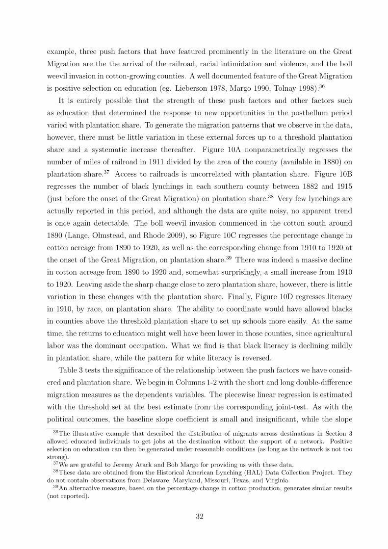
example, three push factors that have featured prominently in the literature on the Great
Migration are the the arrival of the railroad, racial intimidation and violence, and the boll
weevil invasion in cotton-growing counties. A well documented feature of the Great Migration
is positive selection on education (eg. Lieberson 1978, Margo 1990, Tolnay 1998).36
It is entirely possible that the strength of these push factors and other factors such
as education that determined the response to new opportunities in the postbellum period
varied with plantation share. To generate the migration patterns that we observe in the data,
however, there must be little variation in these external forces up to a threshold plantation
share and a systematic increase thereafter. Figure 10A nonparametrically regresses the
number of miles of railroad in 1911 divided by the area of the county (available in 1880) on
plantation share.37 Access to railroads is uncorrelated with plantation share. Figure 10B
regresses the number of black lynchings in each southern county between 1882 and 1915
(just before the onset of the Great Migration) on plantation share.38 Very few lynchings are
actually reported in this period, and although the data are quite noisy, no apparent trend
is once again detectable. The boll weevil invasion commenced in the cotton south around
1890 (Lange, Olmstead, and Rhode 2009), so Figure 10C regresses the percentage change in
cotton acreage from 1890 to 1920, as well as the corresponding change from 1910 to 1920 at
the onset of the Great Migration, on plantation share.39 There was indeed a massive decline
in cotton acreage from 1890 to 1920 and, somewhat surprisingly, a small increase from 1910
to 1920. Leaving aside the sharp change close to zero plantation share, however, there is little
variation in these changes with the plantation share. Finally, Figure 10D regresses literacy
in 1910, by race, on plantation share. The ability to coordinate would have allowed blacks
in counties above the threshold plantation share to set up schools more easily. At the same
time, the returns to education might well have been lower in those counties, since agricultural
labor was the dominant occupation. What we find is that black literacy is declining mildly
in plantation share, while the pattern for white literacy is reversed.
Table 3 tests the significance of the relationship between the push factors we have consid-
ered and plantation share. We begin in Columns 1-2 with the short and long double-difference
migration measures as the dependents variables. The piecewise linear regression is estimated
with the threshold set at the best estimate from the corresponding joint-test. As with the
political outcomes, the baseline slope coefficient is small and insignificant, while the slope
36The illustrative example that described the distribution of migrants across destinations in Section 3allowed educated individuals to get jobs at the destination without the support of a network. Positiveselection on education can then be generated under reasonable conditions (as long as the network is not toostrong).
37We are grateful to Jeremy Atack and Bob Margo for providing us with these data.38These data are obtained from the Historical American Lynching (HAL) Data Collection Project. They
do not contain observations from Delaware, Maryland, Missouri, Texas, and Virginia.39An alternative measure, based on the percentage change in cotton production, generates similar results
(not reported).
32
change coefficient is large and precisely estimated. The level change coefficient at the thresh-
old is once again insignificant. Because the push factors we consider are supposed to provide
an alternative explanation for the patterns of migration we uncover, Columns 3-7 regress our
measures of these push factors on plantation share, with the threshold set to coincide with
our best estimate of the threshold for migration (the long double-difference). Matching the
figures reported above, the baseline slope coefficient, the slope change coefficient, and the
level change coefficient are all insignificant in Columns 3-7. The same absence of significance
is obtained (not reported) using the best estimate of the threshold from the joint-test for
each push factor. Moreover, as shown in Appendix Figure A5, the joint-test does not lo-
cate a statistically significant interior maximum with any of these alternative explanations.
Based on the discussion in Section 3, this is what we would expect when the slope change
coefficient β2 is zero. The same pattern is observed for outcomes such as Republican votes
in 1900, church size in other denominations, and white migration, that are not associated
with black networks.
While the push factors we consider may have been important for individual decisions
to migrate, they cannot explain the specific nonlinear relationship between plantation share
and black migration. However, it is possible that our measures do not fully capture the push
factors that were relevant during the Great Migration. For example, it has been argued that
the loss of economies of scale in agricultural production after slavery resulted in a dramatic
decline in productivity (Fogel and Engerman 1974, Goldin and Lewis 1975, Moen 1992, Irwin
1994). This decline may have been particularly severe in the high plantation share coun-
ties, resulting in increased black migration to northern cities. It is also possible that white
landowners selected particular types of slaves in those counties. An alternative explanation
based on independent individual actions or characteristics would need to explain political
outcomes many decades earlier. All of the push factors that we consider, for example, would
not apply to political participation during Reconstruction.40 More importantly, external
forces that increased the propensity of individuals to migrate (independently) in some coun-
ties would not necessarily channel them to a restricted number of northern destinations. The
observation that the level of migration and the concentration of migrants across destinations
track closely together is difficult to explain without a model of underlying coordination.
Variation in the size of the black church congregation is also difficult to explain without a
role for local coordination.
40The boll weevil invasion and the arrival of the railroad occurred after Reconstruction. Although blackswere quick to invest in education after Emancipation, slaves were largely illiterate (Du Bois 1908). Wewould thus expect little variation in black (adult) literacy rates across southern counties in 1872. Becausethe South was under Federal rule at that time, we would expect racial violence and intimidation to havebeen less relevant as well.
33
5 Conclusion
The development process has historically been characterized, and continues to be charac-
terized, by the movement of entire groups across space and occupations. The analysis in
this paper highlights the interaction between historical preconditions and new opportunities
in shaping such group mobility. Despite the adverse circumstances that they faced under
slavery, blacks were able to solve the coordination problem and respond as a group to new
political and economic opportunities when they became available in the postbellum period.
It is worth emphasizing, however, that the collective response we uncover is restricted to
southern counties where specific preconditions, determined by the organization of agricul-
tural production under slavery and thereafter, were satisfied. Over 50 percent of southern
counties and one-third of the black population were situated below the threshold at which
networks could form (at a plantation share around 0.09).
Black migrants from counties below the threshold would have moved to northern cities
with relatively little social support. Blacks from counties above the threshold would have
moved in large groups to a small number of northern destinations. This variation in the
pattern of out-migration would have had consequences for the formation and evolution of
black communities in northern cities. Relatively weak communities would have formed in
destinations that received migrants who moved independently from diverse origin locations.
In contrast, the small number of northern destinations that received the bulk of their migrants
from southern counties above the threshold would have formed more cohesive communities.
This variation in initial conditions would, in turn, have shaped the evolution of African-
American communities over the course of the twentieth century.
Differential out-migration could also have had consequences for the evolution of black
communities in southern counties. Given the well documented positive selection on education
among northern migrants, counties above the threshold would have lost the bulk of their most
able residents over the first half of the twentieth century. The resulting social dislocation
could then explain Putnam’s observation that those counties have relatively low social capital
today. Wilson (1987) famously argued that the exit of educated black professionals from
northern neighborhoods after Civil Rights and desegregation resulted in social dislocation
and the concentration of poverty in inner-cities. A similar dynamic process may well have
occurred in certain southern counties at the beginning of the twentieth century, paradoxically
because they were better positioned to support collective migration. Slavery did have long-
term effects on individual and institutional outcomes, but this worked through channels that
have previously been unexplored and which we will examine in future research.
34
References
[1] Bernheim, Douglas B., Bezalel Peleg, and Michael D. Whinston. 1987. Coalition-Proof
Nash Equilibria. I. Concepts, Journal of Economic Theory 42: 1-12.
[2] Blassingame, John W. 1972. The Slave Community: Plantation Life in the Antebellum
South. New York and Oxford: Oxford University Press.
[3] Boles, John B. 1988. Introduction, in Masters and Slaves in the House of the Lord:
Race and Religion in the American South, 1740-1870, ed. John B. Boles, Lexington:
The University Press of Kentucky.
[4] Boustan, Leah Platt. 2009. Competition in the Promised Land: Black Migration and
Racial Wage Convergence in the North, 1940-1970, Journal of Economic History 69(3):
755-782.
[5] Boustan, Leah Platt. 2010. Was Postwar Suburbanization “White Flight”? Evidence
from the Black Migration, Quarterly Journal of Economics 125(1): 417-443.
[6] Carrington, William J., Enrica Detragiache, and Tara Vishwanath. 1996. Migration
with Endogenous Moving Costs, American Economic Review 86(4): 909-930.
[7] Collins, William J. 1997. When the Tide Turned: Immigration and the Delay of the
Great Black Migration, Journal of Economic History 57(3): 607-632.
[8] Cutler, David M., Edward L. Glaeser, and Jacob L. Vigdor. 1999. The Rise and Decline
of the American Ghetto, Journal of Political Economy 107(3): 455-506.
[9] Du Bois, W.E.B. 1908. The Negro American Family. New York: Negro Universities
Press.
[10] Dvorak, Katherine L. 1988. After Apocalypse, Moses, in Masters and Slaves in the
House of the Lord: Race and Religion in the American South, 1740-1870, ed. John B.
Boles, Lexington: The University Press of Kentucky.
[11] Earle, Carville. 1992. Geographical Inquiry and American Historical Problems, Palo
Alto: Stanford University Press.
[12] Fogel, Robert W. 1989. Without Consent or Contract: The Rise and Fall of American
Slavery. New York : W.W. Norton and Company.
[13] Fogel, Robert W. and Stanley L. Engerman. 1974. Time on the Cross: The Economics
of American Negro Slavery. Boston: Little, Brown.
35
[14] Foner, Eric. 1988. Reconstruction, America’s Unfinished Revolution, 1863-1877. New
York: Harper and Row.
[15] Foner, Eric. 1993. Freedom’s lawmakers: a directory of Black officeholders during Re-
construction. New York: Oxford University Press, 1993.
[16] Frazier, Franklin E. 1939. The Negro Family in the United States. Chicago: University
of Chicago Press.
[17] Frazier, Franklin E. 1964. The Negro Church in America. Liverpool: Liverpool Univer-
sity Press.
[18] Genicot, Garance and Debraj Ray. 2003. Group Formation in Risk-Sharing Arrange-
ments, Review of Economic Studies 70(1): 87-113.
[19] Genovese, Eugene D. 1974. Roll, Jordan, Roll: The World the Slaves Made. New York:
Pantheon Books.
[20] Goldin, Claudia D. and Frank D. Lewis. 1975. The Economic Cost of the American
Civil War: Estimates and Implications, Journal of Economic History 35(2): 299-326
[21] Gottlieb, Peter. 1987. Making Their Own Way: Southern Blacks’ Migration to Pitts-
burgh, 1916-30. Urbana and Chicago: University of Illinois Press.
[22] Grossman, James R. 1989. Land of Hope: Chicago, Black Southerners, and the Great
Migration. Chicago: University of Chicago Press.
[23] Gutman, Herbert G. 1976. The Black Family in Slavery and Freedom, 1750-1925. New
York: Vintage Books.
[24] Hanson, Bruce E. 1999. Threshold Effects in Non-Dynamic Panels: Estimation, Testing
and Inference, Journal of Econometrics 93: 345-368.
[25] Henri, Florette. 1975. Black Migration: Movement North 1900-1920. Garden City, New
York : Anchor Press/Doubleday.
[26] House, Albert W. 1954. Labor Management Problems on Georgia Rice Plantations,
1840-1860, Agricultural History 28(4): 149-155
[27] Irwin, James R. 1994. Explaining the Decline in Southern per Capita Output after
Emancipation, Explorations in Economic History 31: 336-356.
[28] Kolchin, Peter. 1993. American Slavery, 1619-1877. New York: Hill and Wang.
36
[29] Kousser, J. Morgan. 1974. The Shaping of Southern Politics: Suffrage Restrictions and
the Establishment of the One-Party South, 1880-1910, New Haven and London: Yale
University Press.
[30] Lange, Fabian, Alan L. Olmstead, and Paul W. Rhode. 2009. The Impact of the Boll
Weevil, 1892-1932, Journal of Economic History 69(3): 685-718.
[31] Lee, Everett S., Ann Ratner Miller, Carol P. Brainerd, and Richard Easterlin. 1957. Pop-
ulation Redistribution and Economic Growth, United States 1870-1950, Vol. 1: Method-
ological Considerations and Reference Tables, Philadelphia: American Philosophical
Society.
[32] Lieberson, Stanley. 1978. Selective Migration from the South: A Historical View, in The
Demography of Racial and Ethnic Groups, eds. Frank D. Bean and W. Parker Frisbie,
Academic Press.
[33] Mandle, Jay R. 1978. The Roots of Black Poverty: The Southern Plantation Economy
After the Civil War. Durham, North Carolina: Duke University Press.
[34] Margo, Robert. 1990. Race and Schooling in the South, 1880-1950. Chicago: University
of Chicago Press.
[35] Marks, Carole. 1983. Lines of Communication, Recruitment Mechanisms, and the Great
Migration of 1916-1918, Social Problems 31(1): 73-83.
[36] Marks, Carol. 1989. Farewell – We’re Good and Gone: The Great Black Migration.
Bloomington and Indianapolis: Indiana University Press.
[37] Marks, Carol. 1991. The Social and Economic Life of Southern Blacks During the Mi-
gration, in Black Exodus: The Great Migration from the American South, ed. Alferdteen
Harrison, Jackson and London: University Press of Mississippi.
[38] Moen, Jon R. 1992. Changes in the Productivity of Southern Agriculture between 1860
and 1880, in Without Consent or Contract: The Rise and Fall of American Slavery;
Markets and Production Technical Papers, Volume 1, eds. Robert William Fogel and
Stanley L. Engerman, New York : W.W. Norton and Company.
[39] Morrison, Minion K.C. 1987. Black Political Mobilization: Leadership, Power, and Mass
Behavior. Albany: State University of New York Press.
[40] Munshi, Kaivan. 2003. Networks in the Modern Economy: Mexican Migrants in the
U.S. Labor Market, Quarterly Journal of Economics 118(2): 549-597.
37
[41] Naidu, Suresh. 2010. Recruitment Restrictions and Labor Markets: Evidence from the
Postbellum U.S. South, Journal of Labor Economics 28(2): 413-445.
[42] Newey, Whitney K., James L. Powell and Francis Vella. 1999. Nonparametric Estimation
of Triangular Simultaneous Equations Models, Econometrica 67(3): 565-603.
[43] Niles Weekly Register. 1835. “Culture of Sugar Cane” from the New Orleans Bulletin,
Volume 49: 129 (October 23).
[44] Olstead, Alan and Paul W. Rhode. 2010. Slave Productivity in Cotton Production by
Gender, Age, Season, and Scale, University of California, Davis, typescript.
[45] Putnam, Robert D. 2000. Bowling Alone: The Collapse and Revival of American Com-
munity. New York: Simon and Schuster.
[46] Stampp, Kenneth M. 1956. The Peculiar Institution: Slavery in the Ante-Bellum South.
New York: Alfred A. Knopf.
[47] Stampp, Kenneth M. 1966. The Era of Reconstruction, 1865-1877. New York: Alfred
A. Knopf.
[48] Steckel, Richard H. 2000. The African American Population of the United States, 1790-
1920, in A Population History of North America, eds. Michael Haines and Richard H.
Steckel, New York: Cambridge University Press.
[49] Tadman, Michael. 1989. Speculators and Slaves: Masters, Traders, and Slaves in the
Old South. Madison: University of Wisconsin Press.
[50] Tolnay, Stewart E. and E.M. Beck. 1990. Lethal Violence and the Great Migration,
1900-1930, Social Science History 14(3): 347-370.
[51] Tolnay, Stuart E. 1998. Educational Selection in the Migration of Southern Blacks,
1880-1990, Social Forces 77(3): 487-514.
[52] Valelly, Richard M. 2004. The Two Reconstructions. Chicago and London: University
of Chicago Press.
[53] Wilson, William Julius. 1987. The Truly Disadvantaged: The Inner City, the Underclass,
and Public Policy. Chicago: University of Chicago Press.
[54] Woodson, Carter G. 1921. The History of the Negro Church. Washington, D.C.: The
Associated Publishers.
38

[55] Wright, Gavin. 1978. The Political Economy of the Cotton South: Households, Markets,
and Wealth in the Nineteenth Century, New York: W.W. Norton and Company.
[56] Wright, Gavin. 1986. Old South, New South: Revolutions in the Southern Economy
Since the Civil War, New York: Basic Books, Inc.
39
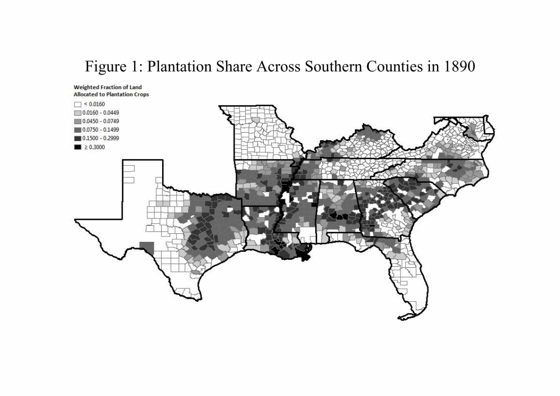
Figure 1: Plantation Share Across Southern Counties in 1890
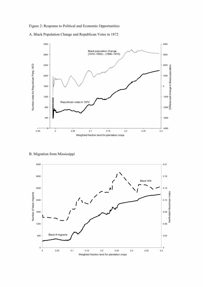
Figure 2: Response to Political and Economic Opportunities
A. Black Population Change and Republican Votes in 1872
B. Migration from Mississippi
-4000
-3000
-2000
-1000
0
1000
2000
3000
4000
0
400
800
1200
1600
2000
2400
2800
3200
-0.05 0 0.05 0.1 0.15 0.2 0.25 0.3
Differenced change in Black population
Number votes for Republican Party, 1872
Weighted fraction land for plantation crops
Black population change,(1910–1930) – (1890–1910)
Republican votes in 1872
0
600
1200
1800
2400
3000
3600
4200
0 0.05 0.1 0.15 0.2 0.25 0.3 0.35 0.4
Weighted fraction land for plantation crops
Number of black migrants
0
0.03
0.06
0.09
0.12
0.15
0.18
0.21
Herfindahl-Hirschman Index
Black # migrants
Black HHI
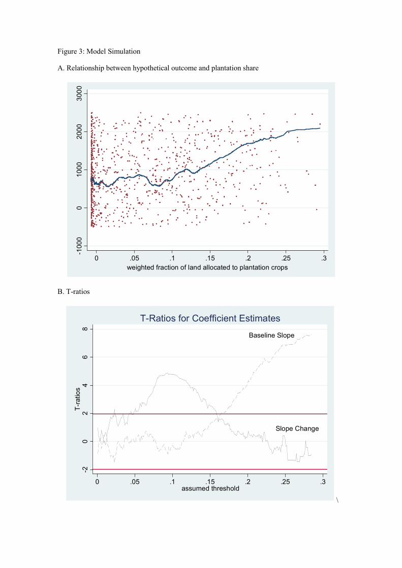
Figure 3: Model Simulation
A. Relationship between hypothetical outcome and plantation share
B. T-ratios
\
-1000
01000
2000
3000
0 .05 .1 .15 .2 .25 .3
weighted fraction of land allocated to plantation crops
Baseline Slope
Slope Change
-20
24
68
T-ratios
0 .05 .1 .15 .2 .25 .3assumed threshold
T-Ratios for Coefficient Estimates
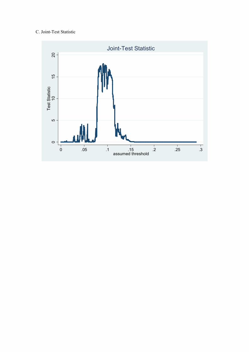
C. Joint-Test Statistic
05
10
15
20
Test Statistic
0 .05 .1 .15 .2 .25 .3assumed threshold
Joint-Test Statistic
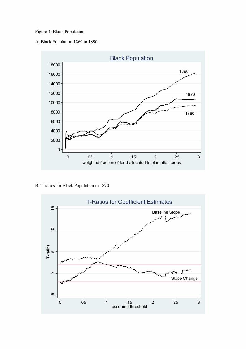
Figure 4: Black Population
A. Black Population 1860 to 1890
B. T-ratios for Black Population in 1870
1890
1860
1870
0
2000
4000
6000
8000
10000
12000
14000
16000
18000
0 .05 .1 .15 .2 .25 .3
weighted fraction of land allocated to plantation crops
Black Population
Slope Change
Baseline Slope
-50
510
15
T-ratios
0 .05 .1 .15 .2 .25 .3assumed threshold
T-Ratios for Coefficient Estimates
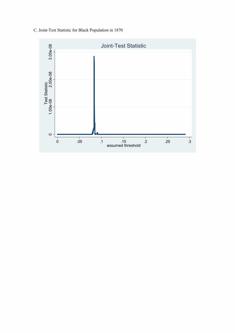
C. Joint-Test Statistic for Black Population in 1870
01.00e-08
2.00e-08
3.00e-08
Test Statistic
0 .05 .1 .15 .2 .25 .3assumed threshold
Joint-Test Statistic
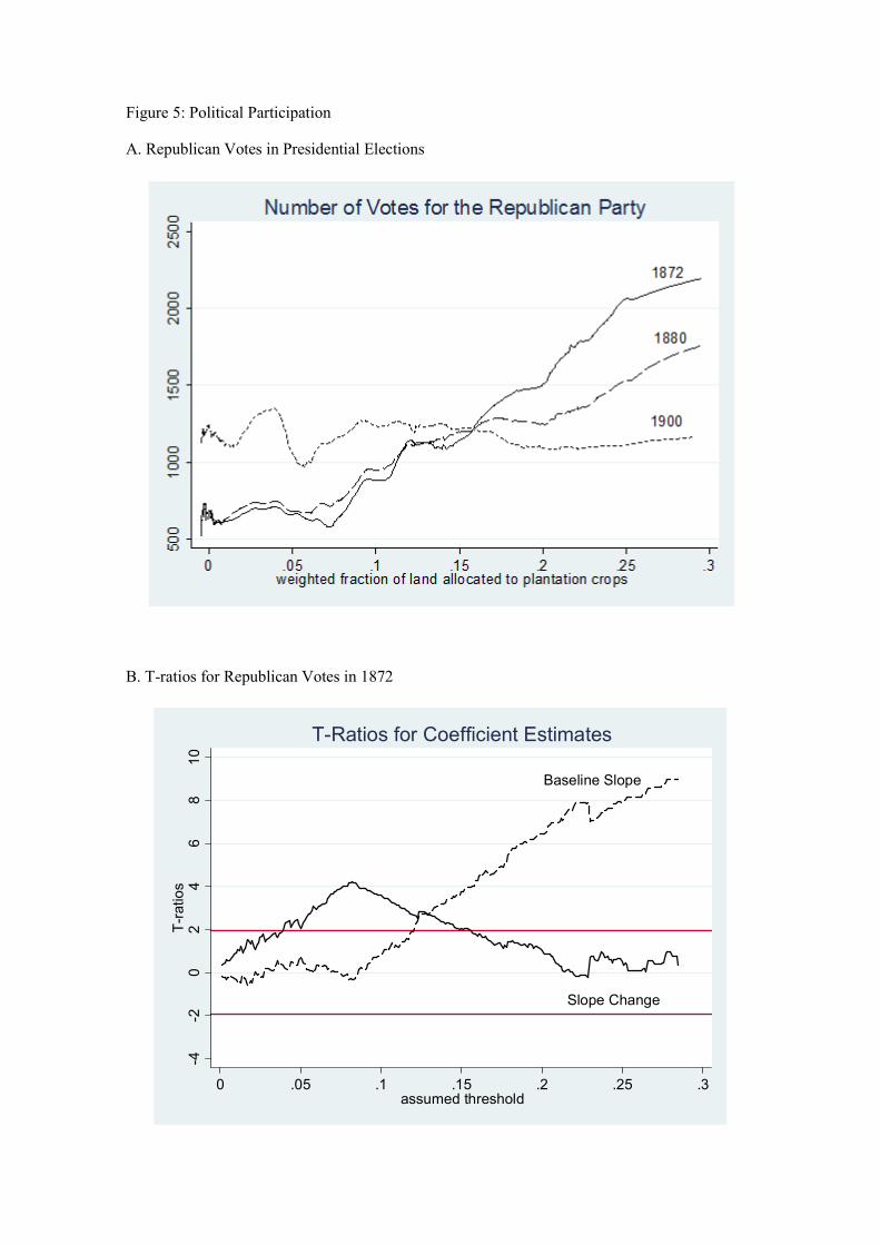
Figure 5: Political Participation
A. Republican Votes in Presidential Elections
B. T-ratios for Republican Votes in 1872
Baseline Slope
Slope Change
-4-2
02
46
810
T-ratios
0 .05 .1 .15 .2 .25 .3assumed threshold
T-Ratios for Coefficient Estimates
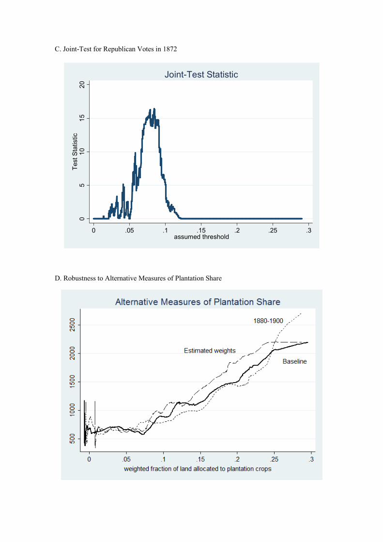
C. Joint-Test for Republican Votes in 1872
D. Robustness to Alternative Measures of Plantation Share
05
10
15
20
Test Statistic
0 .05 .1 .15 .2 .25 .3assumed threshold
Joint-Test Statistic
E. Congressional and Gubernatorial Elections
F. Instrumental Variable Estimates
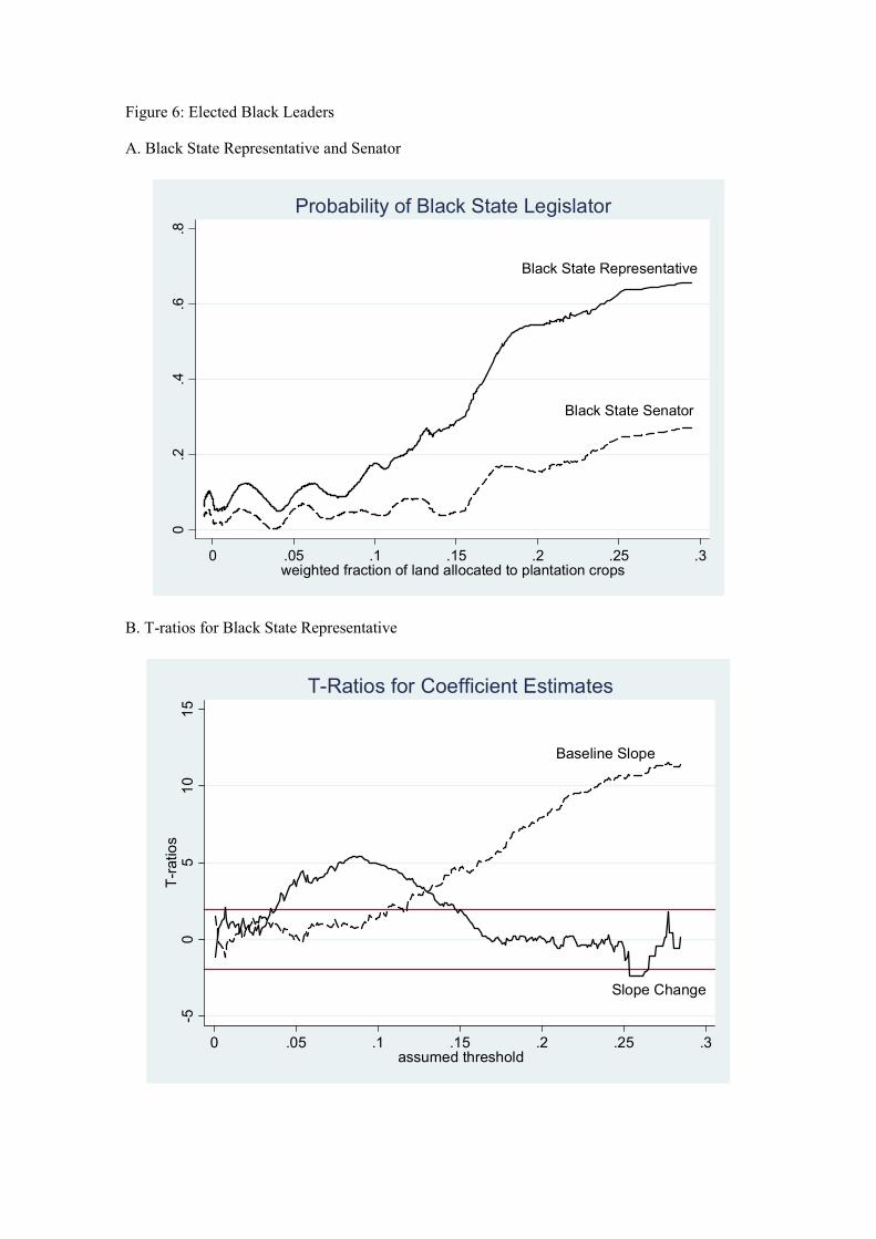
Figure 6: Elected Black Leaders
A. Black State Representative and Senator
B. T-ratios for Black State Representative
Black State Representative
Black State Senator
0.2
.4.6
.8
0 .05 .1 .15 .2 .25 .3weighted fraction of land allocated to plantation crops
Probability of Black State Legislator
Slope Change
Baseline Slope
-50
510
15
T-ratios
0 .05 .1 .15 .2 .25 .3assumed threshold
T-Ratios for Coefficient Estimates
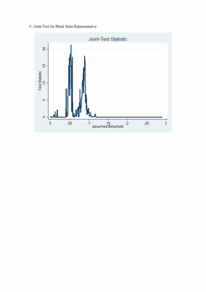
C. Joint-Test for Black State Representative
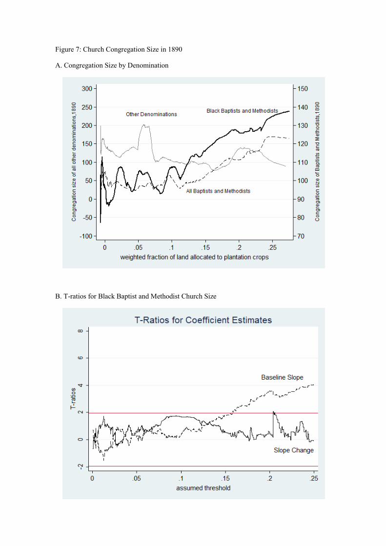
Figure 7: Church Congregation Size in 1890
A. Congregation Size by Denomination
B. T-ratios for Black Baptist and Methodist Church Size
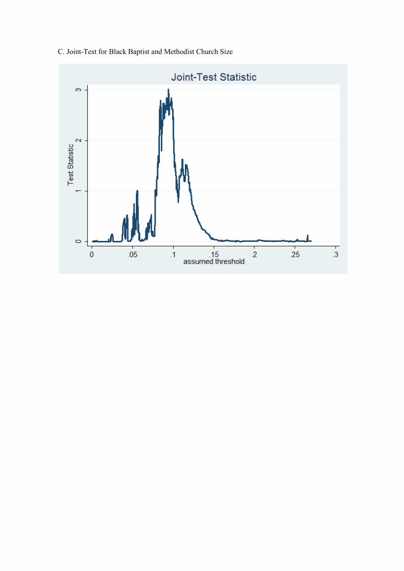
C. Joint-Test for Black Baptist and Methodist Church Size
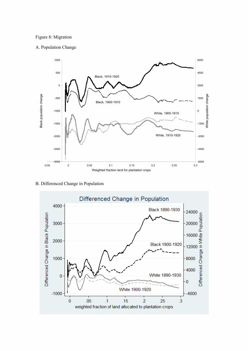
Figure 8: Migration
A. Population Change
B. Differenced Change in Population
-3000
-2500
-2000
-1500
-1000
-500
0
500
1000
-0.05 0 0.05 0.1 0.15 0.2 0.25 0.3
Weighted fraction land for plantation crops
Black population change
-6000
-4500
-3000
-1500
0
1500
3000
4500
6000
White population change
Black, 1900-1910
White, 1910-1920
Black, 1910-1920
White, 1900-1910
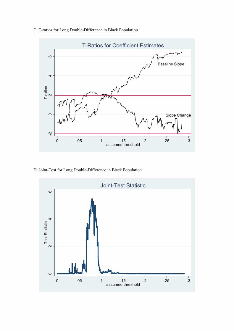
C. T-ratios for Long Double-Difference in Black Population
D. Joint-Test for Long Double-Difference in Black Population
Baseline Slope
Slope Change
-20
24
6T-ratios
0 .05 .1 .15 .2 .25 .3assumed threshold
T-Ratios for Coefficient Estimates0
24
6Test Statistic
0 .05 .1 .15 .2 .25 .3assumed threshold
Joint-Test Statistic
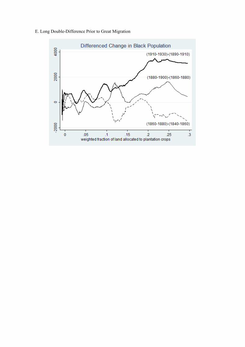
E. Long Double-Difference Prior to Great Migration
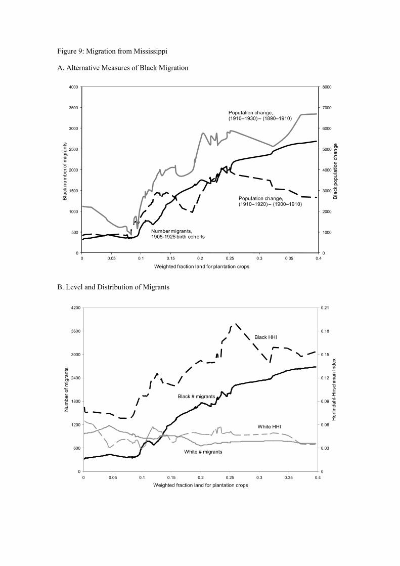
Figure 9: Migration from Mississippi
A. Alternative Measures of Black Migration
B. Level and Distribution of Migrants
0
1000
2000
3000
4000
5000
6000
7000
8000
0
500
1000
1500
2000
2500
3000
3500
4000
0 0.05 0.1 0.15 0.2 0.25 0.3 0.35 0.4
Black population change
Black number of migrants
Weighted fraction land for plantation crops
Number migrants,1905-1925 birth cohorts
Population change,(1910–1920) – (1900–1910)
Population change,(1910–1930) – (1890–1910)
0
600
1200
1800
2400
3000
3600
4200
0 0.05 0.1 0.15 0.2 0.25 0.3 0.35 0.4
Weighted fraction land for plantation crops
Number of migrants
0
0.03
0.06
0.09
0.12
0.15
0.18
0.21
Herfindahl-Hirschman Index
Black # migrants
White # migrants
Black HHI
White HHI
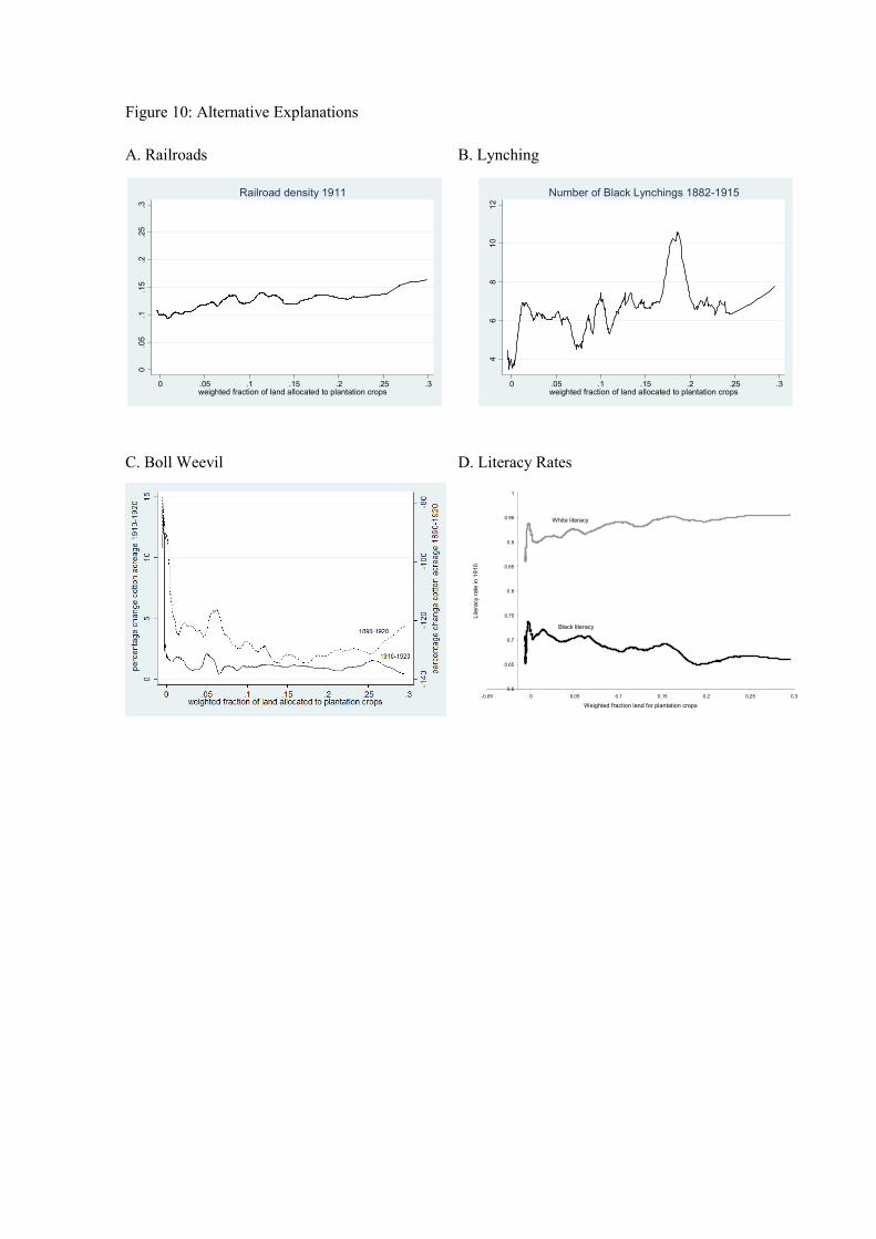
Figure 10: Alternative Explanations
A. Railroads B. Lynching
C. Boll Weevil D. Literacy Rates
0.05
.1.15
.2.25
.3
0 .05 .1 .15 .2 .25 .3weighted fraction of land allocated to plantation crops
Railroad density 1911
46
810
12
0 .05 .1 .15 .2 .25 .3weighted fraction of land allocated to plantation crops
Number of Black Lynchings 1882-1915
0.6
0.65
0.7
0.75
0.8
0.85
0.9
0.95
1
-0.05 0 0.05 0.1 0.15 0.2 0.25 0.3
Weighted fraction land for plantation crops
Literacy rate in 1910
Black literacy
White literacy
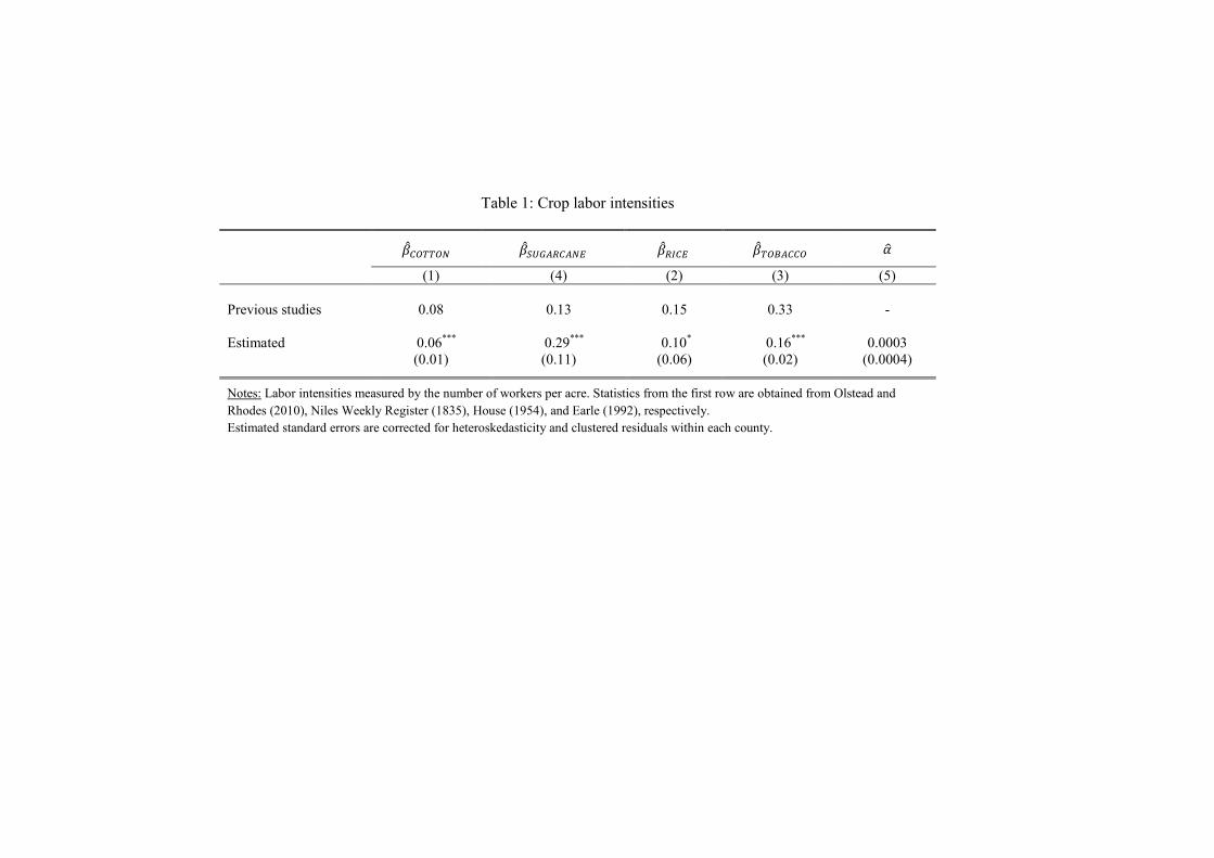
Table 1: Crop labor intensities
�������� �������� ��� �� �������� ��
(1) (4) (2) (3) (5)
Previous studies 0.08 0.13 0.15 0.33 -
Estimated 0.06***
0.29***
0.10*
0.16***
0.0003
(0.01) (0.11) (0.06) (0.02) (0.0004)
Notes: Labor intensities measured by the number of workers per acre. Statistics from the first row are obtained from Olstead and
Rhodes (2010), Niles Weekly Register (1835), House (1954), and Earle (1992), respectively.
Estimated standard errors are corrected for heteroskedasticity and clustered residuals within each county.
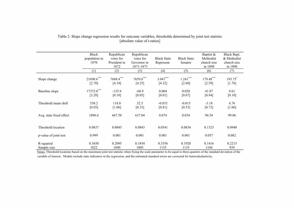
Table 2: Slope change regression results for outcome variables, thresholds determined by joint test statistic
[absolute value of t-ratios]
Black
population in
1870
Republican
votes for
President in
1872
Republican
votes for
Governor in
1871-1873
Black State
Represent.
Black State
Senator
Baptist &
Methodist
church size
in 1890
Black Bapt.
& Methodist
church size
in 1890
(1) (2) (3) (4) (5) (6) (7)
Slope change 21698.6***
7688.4***
7659.8***
3.047***
1.241***
179.48***
193.75*
[2.70] [4.10] [4.25] [4.32] [2.60] [2.59] [1.76]
Baseline slope 17372.0***
-135.9 -60.9 0.004 0.020 41.87 9.61
[3.20] [0.10] [0.05] [0.01] [0.07] [0.94] [0.10]
Threshold mean shift 530.2 118.8 32.5 -0.033 -0.015 -3.18 6.76
[0.95] [1.06] [0.33] [0.81] [0.53] [0.73] [1.06]
Avg. state fixed effect 1896.6 667.58 637.04 0.074 0.034 94.54 99.06
Threshold location 0.0837 0.0845 0.0843 0.0541 0.0834 0.1323 0.0940
p-value of joint test 0.999 0.001 0.001 0.001 0.001 0.057 0.082
R-squared 0.3650 0.2095 0.1854 0.3356 0.1920 0.1416 0.2215
Sample size 1022 1040 1005 1135 1135 1104 939
Notes: Threshold locations based on the maximum joint test statistic when fixing the scale parameter to be equal to three-quarters of the standard deviation of the
variable of interest. Models include state indicators in the regression, and the estimated standard errors are corrected for heteroskedasticity.
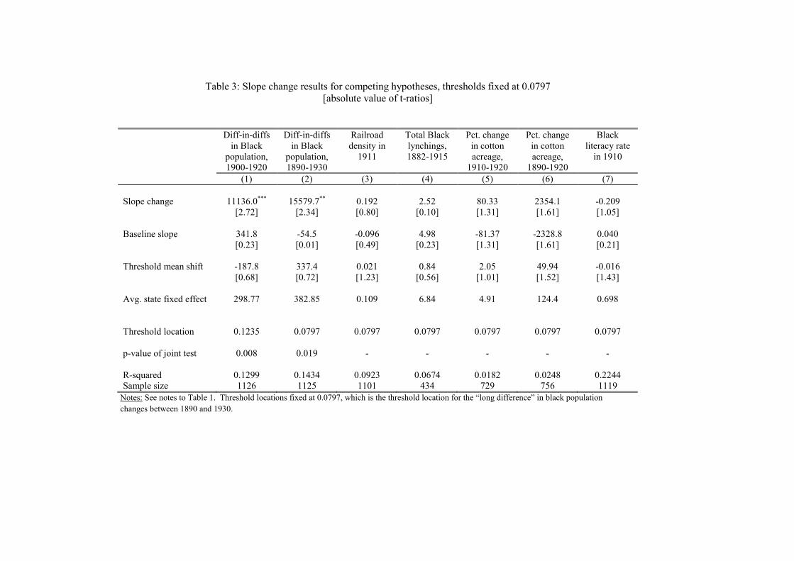
Table 3: Slope change results for competing hypotheses, thresholds fixed at 0.0797
[absolute value of t-ratios]
Diff-in-diffs
in Black
population,
1900-1920
Diff-in-diffs
in Black
population,
1890-1930
Railroad
density in
1911
Total Black
lynchings,
1882-1915
Pct. change
in cotton
acreage,
1910-1920
Pct. change
in cotton
acreage,
1890-1920
Black
literacy rate
in 1910
(1) (2) (3) (4) (5) (6) (7)
Slope change 11136.0***
15579.7**
0.192 2.52 80.33 2354.1 -0.209
[2.72] [2.34] [0.80] [0.10] [1.31] [1.61] [1.05]
Baseline slope 341.8 -54.5 -0.096 4.98 -81.37 -2328.8 0.040
[0.23] [0.01] [0.49] [0.23] [1.31] [1.61] [0.21]
Threshold mean shift -187.8 337.4 0.021 0.84 2.05 49.94 -0.016
[0.68] [0.72] [1.23] [0.56] [1.01] [1.52] [1.43]
Avg. state fixed effect 298.77 382.85 0.109 6.84 4.91 124.4 0.698
Threshold location 0.1235 0.0797 0.0797 0.0797 0.0797 0.0797 0.0797
p-value of joint test 0.008 0.019 - - - - -
R-squared 0.1299 0.1434 0.0923 0.0674 0.0182 0.0248 0.2244
Sample size 1126 1125 1101 434 729 756 1119
Notes: See notes to Table 1. Threshold locations fixed at 0.0797, which is the threshold location for the “long difference” in black population
changes between 1890 and 1930.
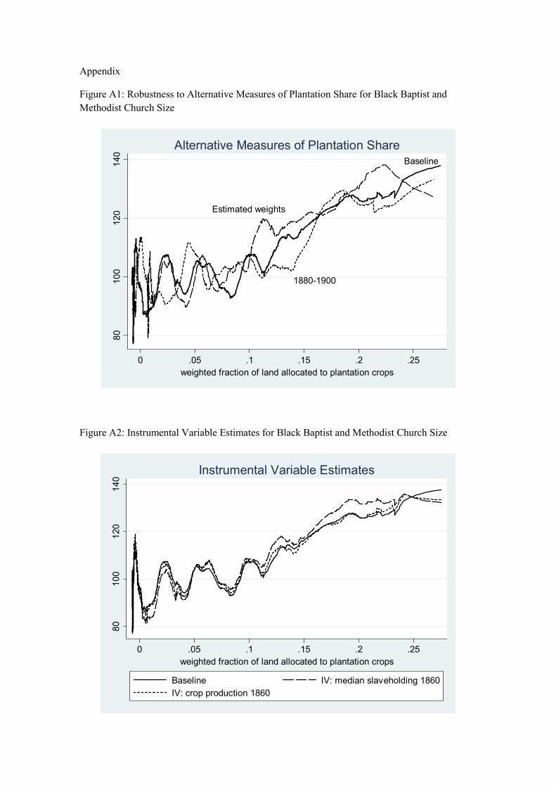
Appendix
Figure A1: Robustness to Alternative Measures of Plantation Share for Black Baptist and
Methodist Church Size
Figure A2: Instrumental Variable Estimates for Black Baptist and Methodist Church Size
Baseline
Estimated weights
1880-1900
80
100
120
140
0 .05 .1 .15 .2 .25
weighted fraction of land allocated to plantation crops
Alternative Measures of Plantation Share
80
100
120
140
0 .05 .1 .15 .2 .25
weighted fraction of land allocated to plantation crops
Baseline IV: median slaveholding 1860
IV: crop production 1860
Instrumental Variable Estimates
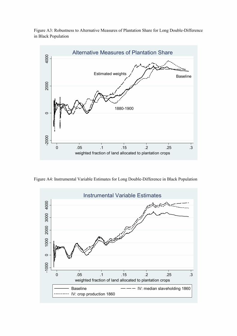
Figure A3: Robustness to Alternative Measures of Plantation Share for Long Double-Difference
in Black Population
Figure A4: Instrumental Variable Estimates for Long Double-Difference in Black Population
Estimated weightsBaseline
1880-1900
-2000
02000
4000
0 .05 .1 .15 .2 .25 .3
weighted fraction of land allocated to plantation crops
Alternative Measures of Plantation Share
-1000
01000
2000
3000
4000
0 .05 .1 .15 .2 .25 .3
weighted fraction of land allocated to plantation crops
Baseline IV: median slaveholding 1860
IV: crop production 1860
Instrumental Variable Estimates
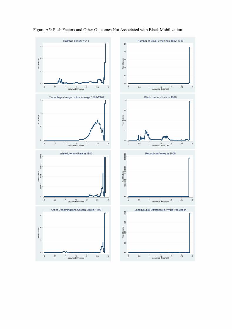
Figure A5: Push Factors and Other Outcomes Not Associated with Black Mobilization
01
23
Test Statistic
0 .05 .1 .15 .2 .25 .3assumed threshold
Railroad density 1911
02
46
810
Test Statistic
0 .05 .1 .15 .2 .25 .3assumed threshold
Number of Black Lynchings 1882-19150
.1.2
.3Test Statistic
0 .05 .1 .15 .2 .25 .3assumed threshold
Percentage change cotton acreage 1890-1920
01
23
4Test Statistic
0 .05 .1 .15 .2 .25 .3assumed threshold
Black Literacy Rate in 1910
0.00005
.0001
.00015
.0002
Test Statistic
0 .05 .1 .15 .2 .25 .3assumed threshold
White Literacy Rate in 1910
01000000
2000000
3000000
Test Statistic
0 .05 .1 .15 .2 .25 .3assumed threshold
Republican Votes in 1900
02
46
Test Statisic
0 .05 .1 .15 .2 .25 .3assumed threshold
Other Denominations Church Size in 1890
050
100
150
200
Test Statistic
0 .05 .1 .15 .2 .25 .3assumed threshold
Long Double-Difference in White Population