bi dashboard best practices (webinar slides 2015)
TRANSCRIPT

Dashboard Best Practices

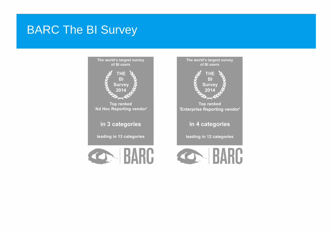
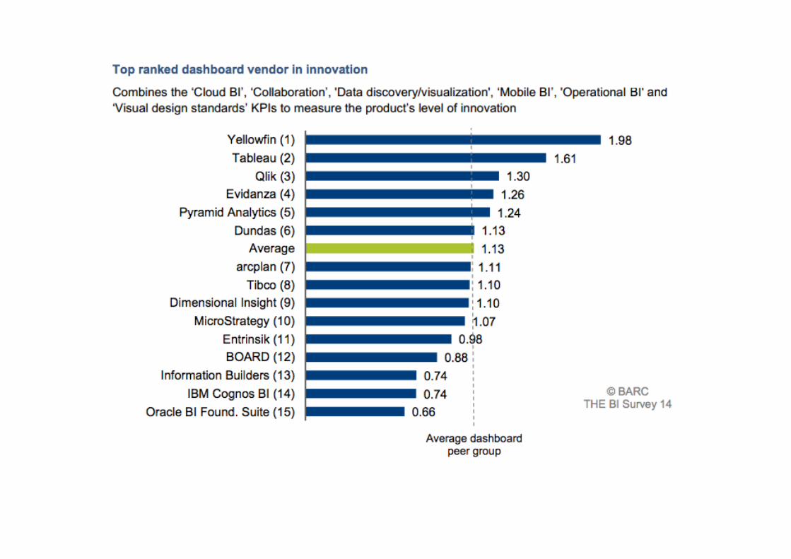
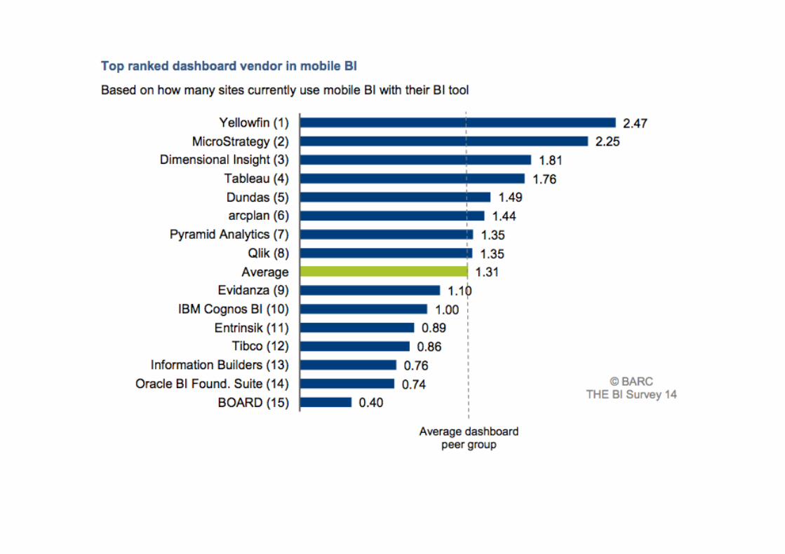
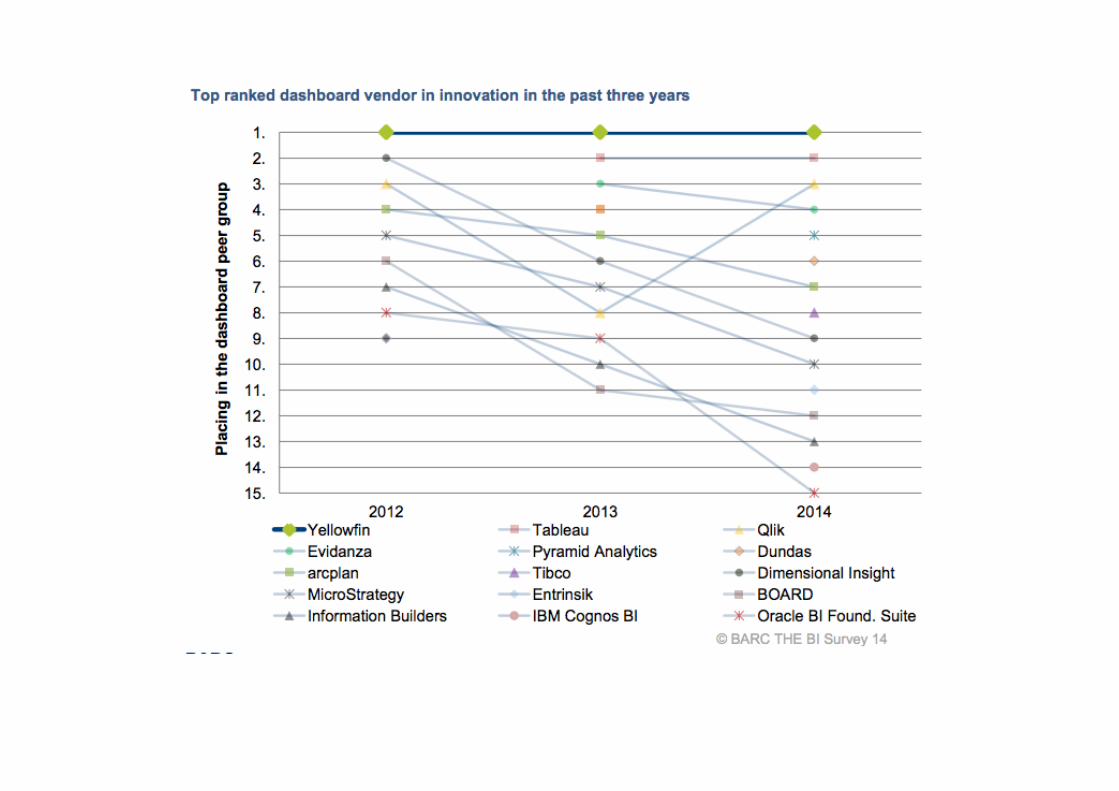
BARC The BI Survey


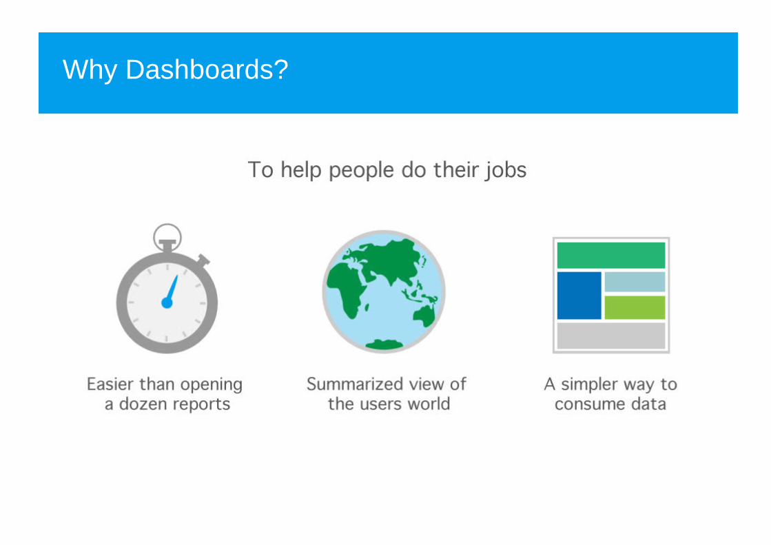
Why Dashboards?

2 types of BI users

What do business-users want?
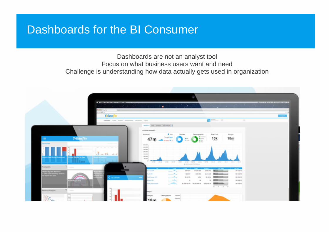
Dashboards for the BI Consumer
Dashboards are not an analyst toolFocus on what business users want and need
Challenge is understanding how data actually gets used in organization

Today's Session
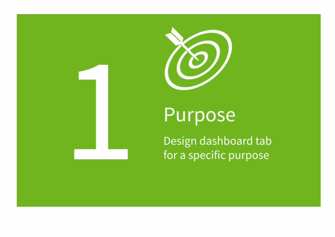
1 - Purpose

Who is the dashboard for?
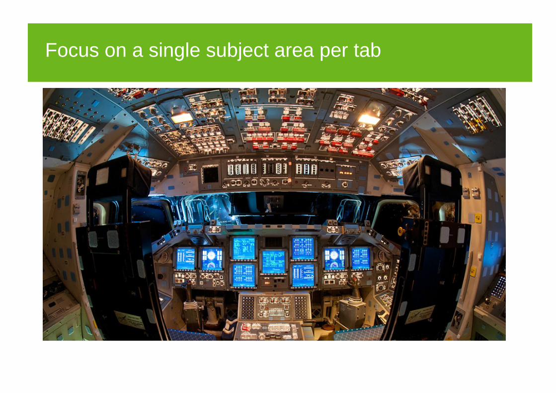
Focus on a single subject area per tab
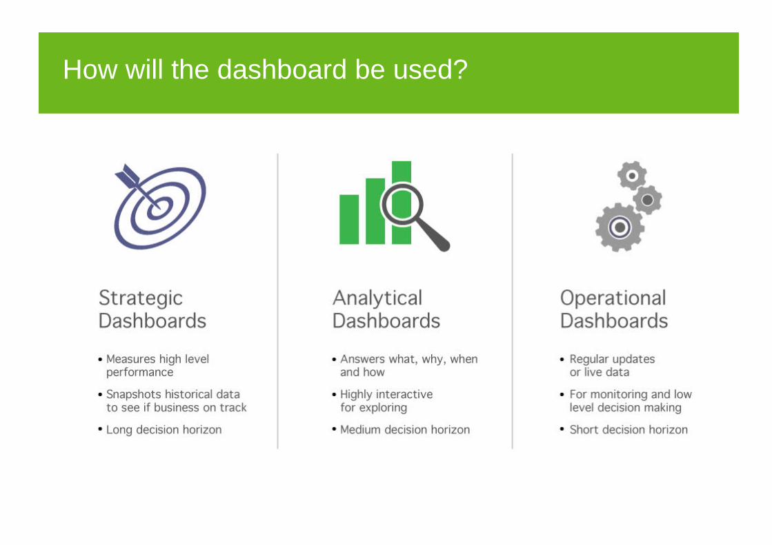
How will the dashboard be used?

Planning your dashboard
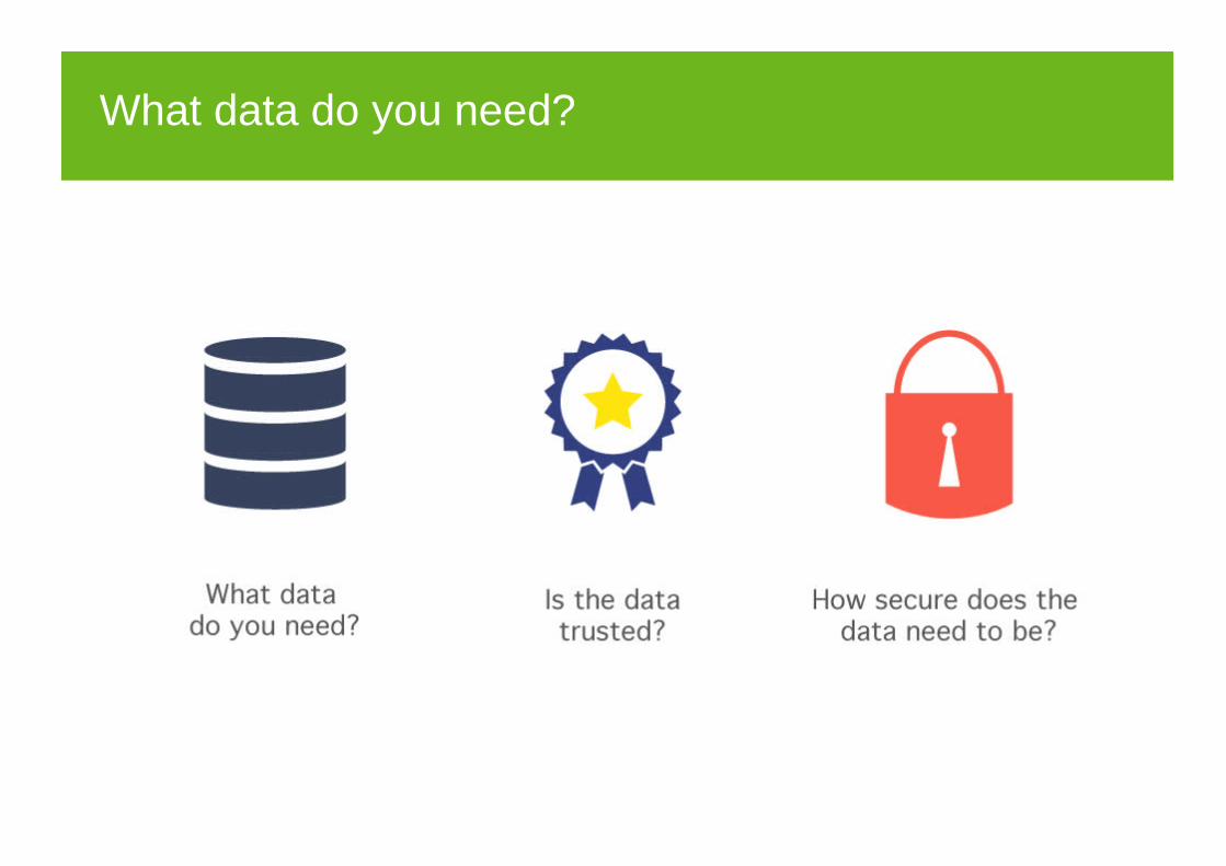
What data do you need?

2 - Summarize

Do not overwhelm
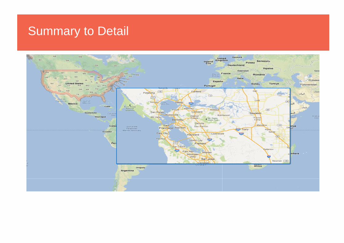
Summary to Detail
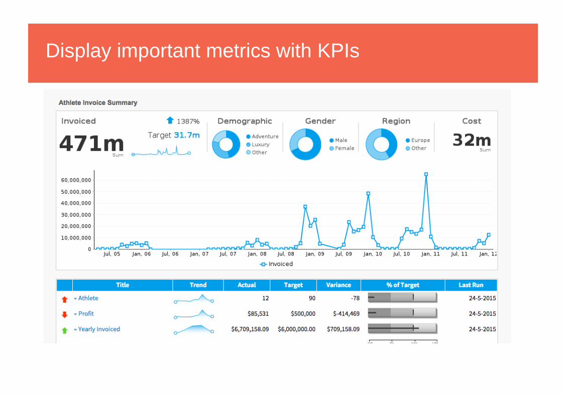
Display important metrics with KPIs
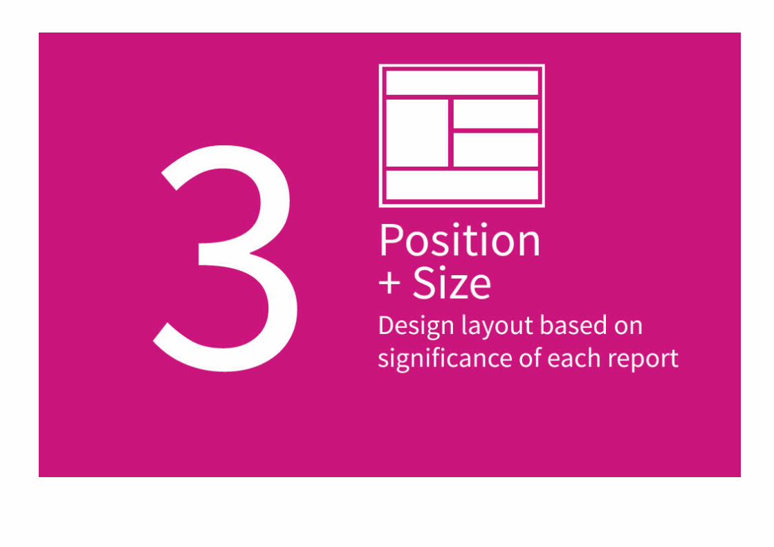
3 - Layout
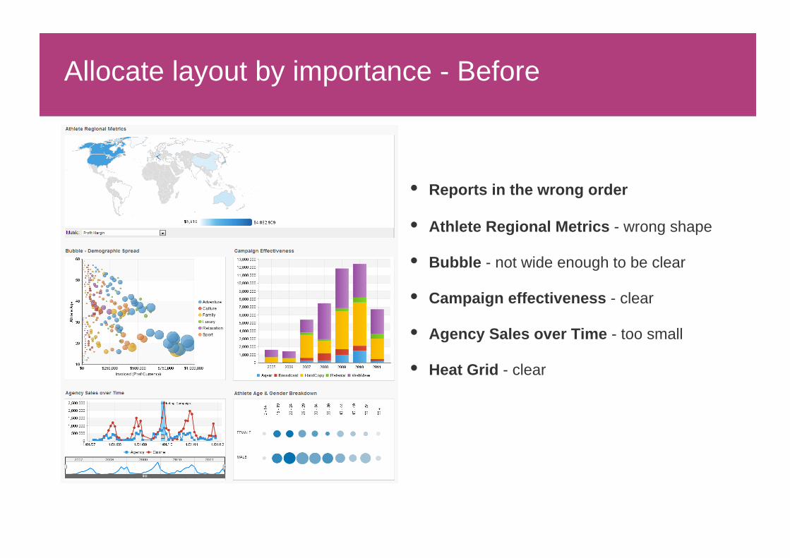
Allocate layout by importance - Before
Reports in the wrong order
Athlete Regional Metrics - wrong shape
Bubble - not wide enough to be clear
Campaign effectiveness - clear
Agency Sales over Time - too small
Heat Grid - clear
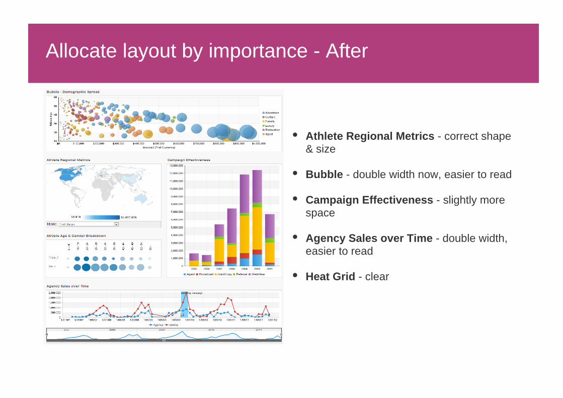
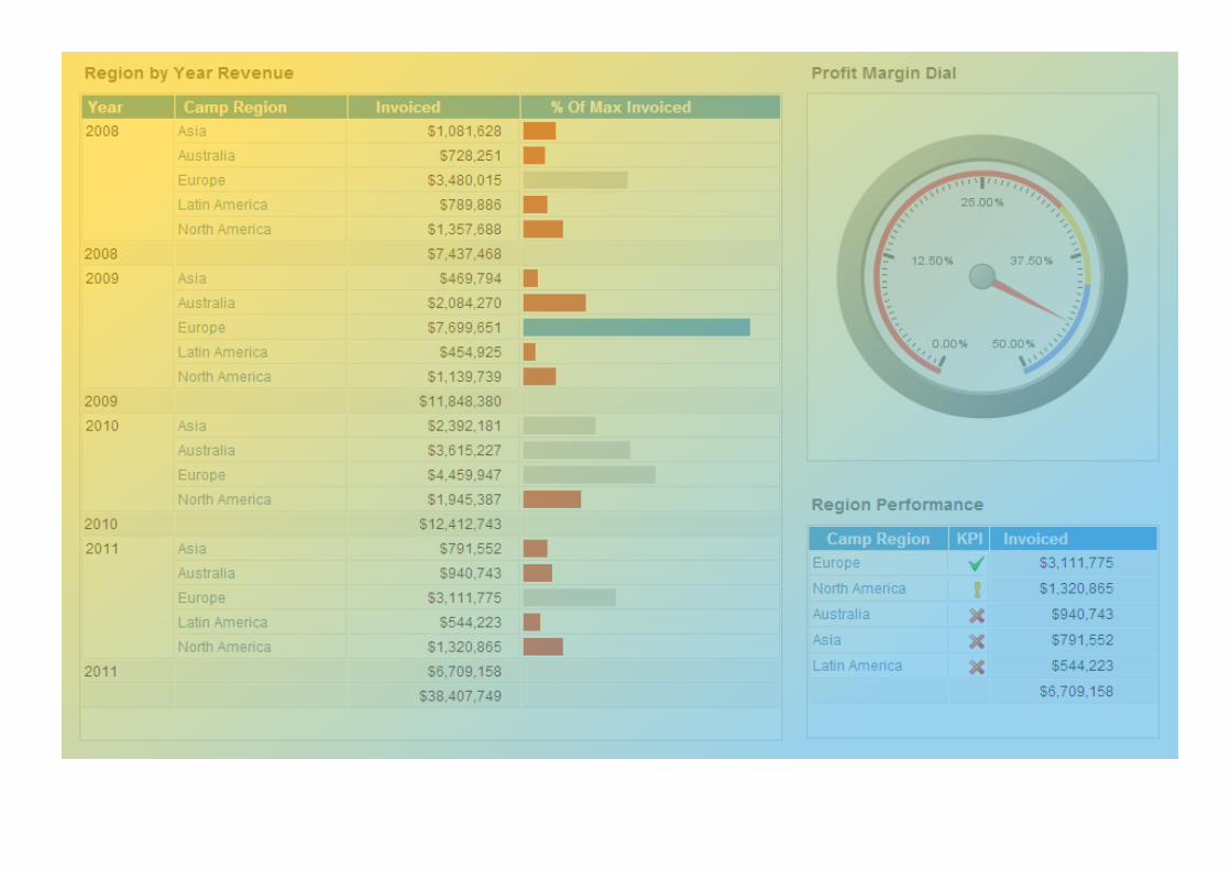
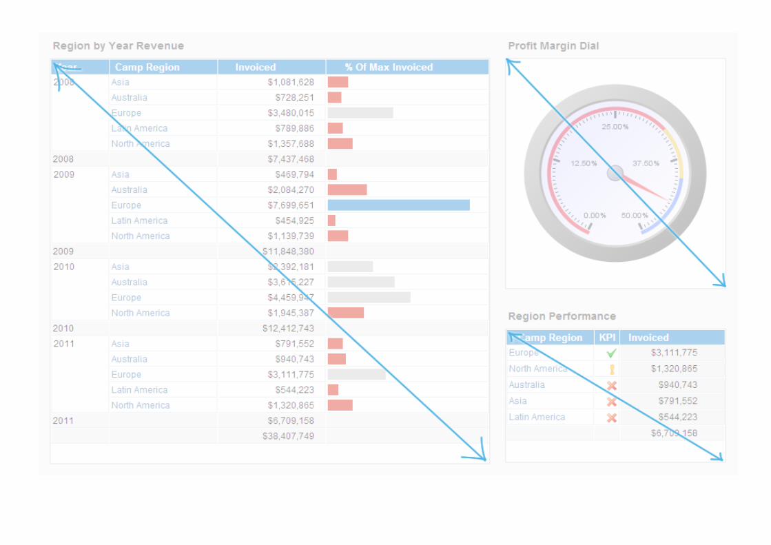
Allocate layout by importance - After
Athlete Regional Metrics - correct shape & size
Bubble - double width now, easier to read
Campaign Effectiveness - slightly more space
Agency Sales over Time - double width, easier to read
Heat Grid - clear
4 - Clarity

Titles
What does this chart represent?
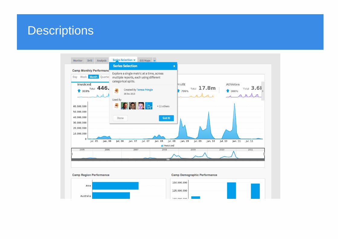
Descriptions
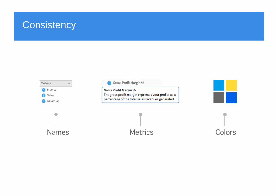
Consistency
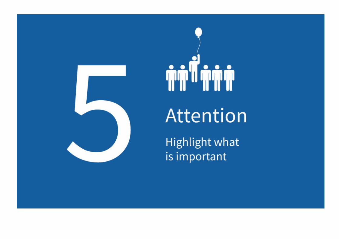
5 - Attention

Conditional Formatting
Rank Flag Camp Country Invoiced Profit Cost Rating % of Max
1 Italy $8,882,013.53
2 Austria $7,447,954.66
3 USA $5,642,422.04
4 Australia $4,490,174.68
5 New Zealand $3,637,444.43
6 Japan $2,185,357.28
7 Germany $1,681,510.02
8 Canada $1,458,473.15
9 Armenia $1,296,521.07
10 Finland $1,145,911.31
Colours to highlight extremesIcon alerts
Flags
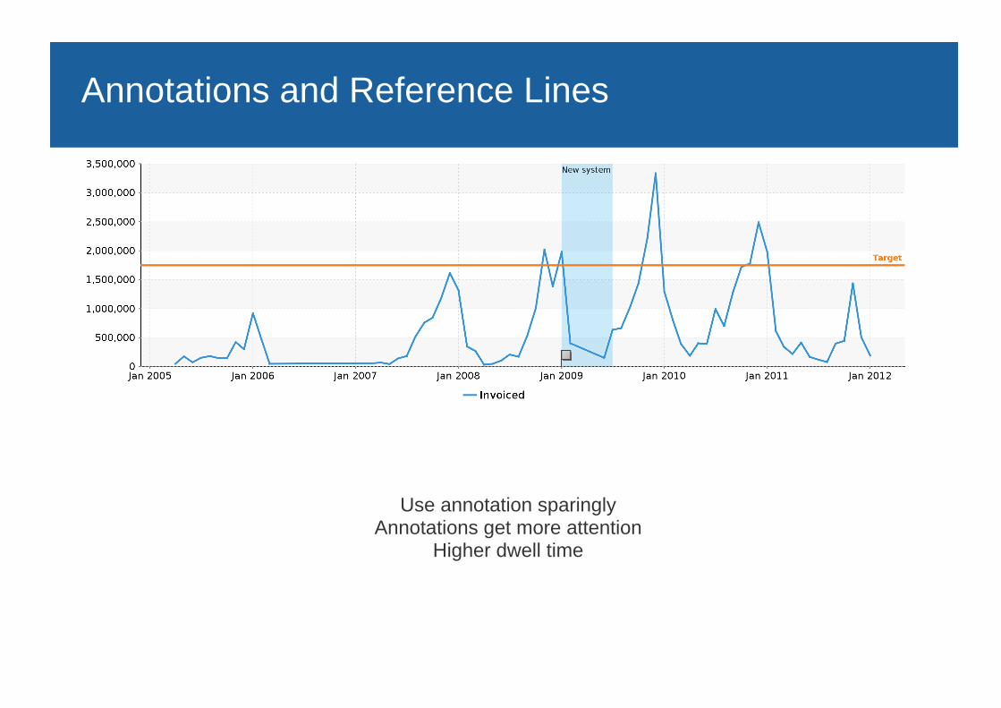
Annotations and Reference Lines
Use annotation sparinglyAnnotations get more attention
Higher dwell time
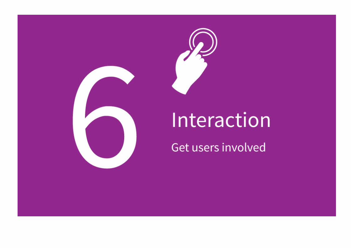
6 - Interaction
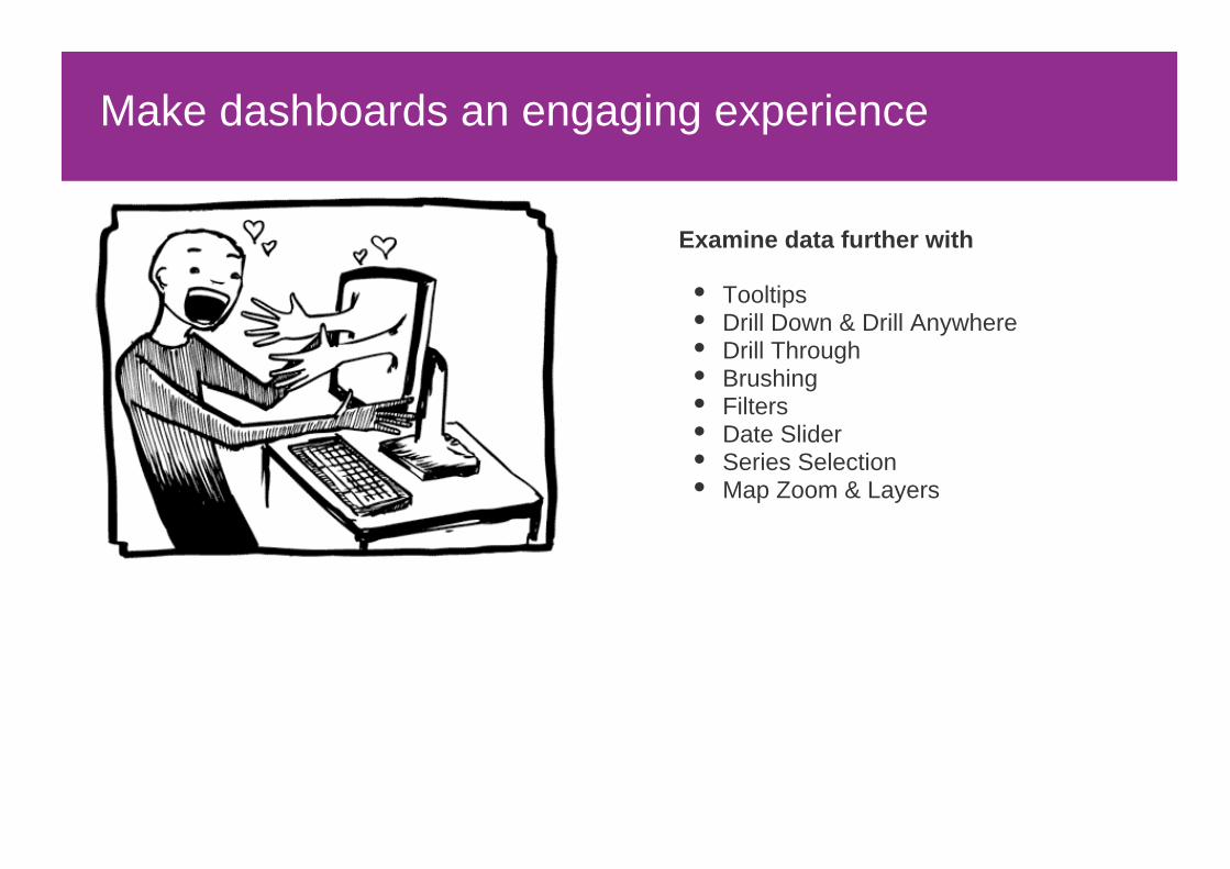
Make dashboards an engaging experience
Examine data further with
TooltipsDrill Down & Drill AnywhereDrill ThroughBrushingFiltersDate SliderSeries SelectionMap Zoom & Layers
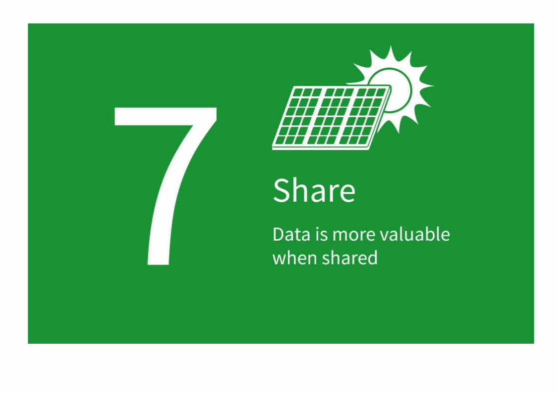
7 - Share and Collaborate

Any Platform, Any Device

Data-Driven Decisions

summary