beyond email open rates: how to unlock the potential in your audience
TRANSCRIPT

Justine Jordan & Kevin Mandeville
Beyond Email Open Rates How to Unlock the Potential of Your Audience

@thuelmadsen #KISSwebinar
Join the conversation
Who are we?
Justine Jordan Marketing Director, Litmus @meladorri

Who are we?
Kevin Mandeville Content Designer, Litmus @KevinMandeville

@litmusapp #KISSwebinar
Tweet along with us!

WATCH WEBINAR RECORDING NOW

Your standard metrics

// @meladorri
#KISSwebinar
The missing metrics

campaignmonitor.com/css

Don’t spend 90% of development time to satisfy 10% of users.
Know your audience. Choose your ba!les.
emailclientmarketshare.com
#KISSwebinar

1 Desktop, Webmail, or Mobile?
2 Email programs + rendering engines
3
Geotargeting
We’re gonna talk about…
4 Progressive enhancement
5
Responsive and mobile-friendly email
#KISSwebinar
Lots of other stuff along the way!6

Mobile Email+500% since 2011
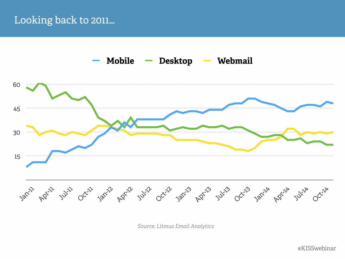
Looking back to 2011…
#KISSwebinar
Source: Litmus Email Analytics
15
30
45
60
Jan-11
Apr-11
Jul-1
1Oct-
11
Jan-12
Apr-12
Jul-1
2Oct-
12Ja
n-13
Apr-13
Jul-1
3Oct-
13Ja
n-14
Apr-14
Jul-1
4Oct-
14
Mobile Desktop Webmail

Mobile has seen crazy growth
#KISSwebinar
Source: Litmus Email Analytics
15
30
45
60
Jan-11
Apr-11
Jul-1
1Oct-
11
Jan-12
Apr-12
Jul-1
2Oct-
12Ja
n-13
Apr-13
Jul-1
3Oct-
13Ja
n-14
Apr-14
Jul-1
4Oct-
1410%
48%
33%

Litmus
32%
57%
11%
Mobile Desktop Webmail
Average Retailer
10%
30%
60%
What does your data say?
#KISSwebinar

Litmus
32%
57%
11%
MobileDesktopWebmail
Average Retailer
10%
30%
60%
What does your data say?
Desktop-Heavy
Outlook 2000, 2003 Outlook 2007, 2010, 2013
Outlook 2011, 2016 Apple Mail
Lotus Notes Thunderbird

Word
Outlook 2007 Outlook 2013Outlook 2010 Outlook for Mac 2011 and 2015
Early Outlook Versions 2000 and 2003
Rendering in Outlook
#KISSwebinar

<table>
<td>
<td>
px
style=“font-face”
bgcolor
padding
Web
<div>
<h1>
<p>
em
<style>
background-color
margin
#KISSwebinar

Use this
#ffffff
bgcolor
individual properties
width=“100”
<b>
px
align=“le#”
Not this
#fff or rgb
background-color
shorthand
width:100px
<strong>
em
text-align:le#
#KISSwebinar

<h1>
<p>
<img>
<button>
✘
#KISSwebinar

<td>
<td>
<td>
<td>
✔
#KISSwebinar

#KISSwebinar
Animated GIFs and Outlook 2007+
Outlook 2007+ shows the 1st frame Other programs show the animation

#KISSwebinar
Animated GIFs and Outlook 2007+
Outlook 2007+ shows the 1st frame Other programs show the animation

#KISSwebinar
Animated GIFs and Outlook 2007+
Be sure the first frame communicates your message
(and isn’t blank)

We can easily target Microso" Outlook…
#KISSwebinar
Outlook 2000-2003
Outlook 2007-2013
<!--[if (IE)]> /* Insert HTML or CSS here */
<![endif]—>
<!—[if mso]> /* Insert HTML or CSS here */
<![endif]—>

Outlook conditional statements
#KISSwebinar
lt = less than a specific version gt = greater than a specific version lte = less than or equal to a specific version gte = greater than or equal to a specific version

Outlook version numbers
#KISSwebinar
9 = Outlook 2000 10 = Outlook 2002 11 = Outlook 2003 12 = Outlook 2007 14 = Outlook 2010 15 = Outlook 2013

Outlook conditional statements
#KISSwebinar
<!--[if mso 12]> = targets only Outlook 2007 <!--[if gte mso 12]> = targets Outlook 2007 and above <!--[if gt mso 12]> = targets above Outlook 2007 (Outlook 2010/2013) <!--[if lte mso 12]> = targets Outlook 2007 and below <!--[if lt mso 12]> = targets below Outlook 2007 (Outlook 2000/2002/2003)

Did you know?
#KISSwebinar
Outlook also has 200+ mso/-ms unique CSS properties.
https://litmus.com/community/learning/8-outlook-overview
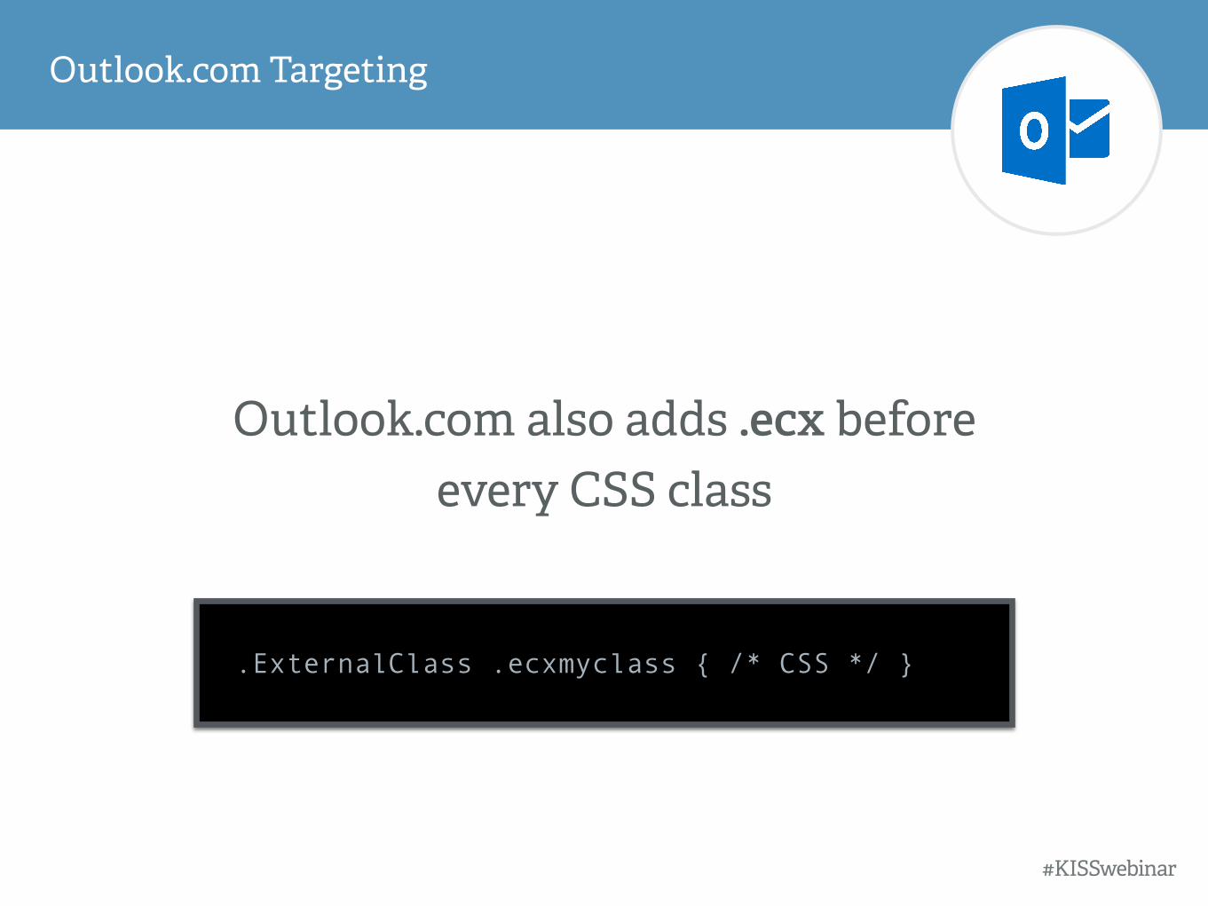
Outlook.com Targeting
#KISSwebinar
Outlook.com also adds .ecx before every CSS class
.ExternalClass .ecxmyclass { /* CSS */ }

Apple Mail + Outlook for Mac
#KISSwebinar
Apple Mail and Outlook 2011 / 2016 use WebKit as a rendering engine.
WebKit has amazing CSS support and enables progressive enhancement in email.

WebKit Targeting Media Query
#KISSwebinar
@media screen and (-webkit-min-device-pixel-ratio: 0) { /* Insert CSS here */ }

WebKit supports HTML5 video in email (except for iOS 8)

Litmus
32%
57%
11%
MobileDesktopWebmail
Average Retailer
10%
30%
60%
What does your data say?
Webmail
Gmail Yahoo AOL
Outlook.com Office 365
Chrome, Firefox, Safari, Internet Explorer

Gmail Rendering
#KISSwebinar
Gmail strips out all classes and id’s in CSS. This is the reason we need to inline
all CSS for email.
https://putsmail.com/inliner
http://templates.mailchimp.com/resources/inline-css/
http://inliner.cm/

best case scenario: some lost forma#ing
Gmail strips CSS from the <head> of emails
#KISSwebinar

worst case scenario: whoa
Gmail strips CSS from the <head> of emails
#KISSwebinar

Inline CSS for Gmail
#KISSwebinar
<style type="text/css"> .body {font-size: 22px; font-family: Arial, sans-serif;
color: #222222;} </style>
<body style="font-size: 22px; font-family: Arial, sans-serif; color: #222222;">
Instead of:
We must use:
https://litmus.com/blog/understanding-gmail-and-css-part-1

Blue borders with <a> and <img>
#KISSwebinar
<a href="http://litmus.com"><img src="http://litmus.com/image.jpg" width="450" height="216" border="0"></a>

Gaps under images
#KISSwebinar
<img src="http://litmus.com/image.jpg" width="450" height="216" border="0" style="display: block;">

Litmus
32%
57%
11%
MobileDesktopWebmail
Average Retailer
10%
30%
60%
What does your data say?
Mobile-Heavy
iPhone Android Tablets
Gmail mobile app Inbox by Gmail

iOS Rendering
#KISSwebinar
Email apps for the iPhone and iPad use WebKit as a rendering engine.
WebKit has amazing CSS support and enables progressive enhancement in email.

Mobile First
Fluid
Responsive
3 strategies for approaching mobile:
1
2
3

You can’t say “responsive email works on an iPhone.”
When clients say “it looks like crap on my Android.”
You should ask “what email app are you using?”
#KISSwebinar
Device ≠ App support

Yahoo! (iOS + Android) yes
Mailbox (iOS) no
Gmail (iOS + Android) no
Inbox by Gmail (iOS + Android) no
BlackBerry Z10 yes
Windows Phone 7 no
Windows Phone 7.5 yes
Windows Phone 8 sometimes
#KISSwebinar
Media query support in mobile email apps
iPhone / iPad: Email app yes
Android 2.1: Email app no
Android 2.2: Email app yes
Android 2.3: Email app yes
Android 4.0, 4.1, 4.2: Email app yes
Android 4.3, 4.4: Email app sometimes
Kindle Fire yes
http://stylecampaign.com/blog/2012/10/responsive-email-support/

LOG IN WITH GOOGLE
Start Your Free KISSmetrics Trial

strategy #1
mobile first aka agnostic, aware, scalable

Strategy #1: Mobile first
Considers the mobile user a priority
• One layout for all screen sizes
• Single column design
• 320-500px
• Large text & bu#ons
• Generous white space
• Clear calls to action
• Short, concise body copy

Strategy #1: Mobile first

strategy #2
fluid

Strategy #2: Fluid
Email width changes to fit within the window it’s viewed in
• Percentage-based widths
• Adapts to fit the screen
• Text wraps automatically #KISSwebinar

Strategy #2: Fluid
• Shorter learning curve
• Best for text-heavy emails

strategy #3
responsive

Strategy #3: Responsive

Strategy #3: Responsive
• Resize content: make images fit, make text larger
• Hide content on mobile
• Stack columns
• Move a two-column design to a one-column design
https://litmus.com/blog/the-how-to-guide-to-responsive-email-design-infographic

Strategy #3: Responsive
• More than a “line of code”
• Set of conditional statement that enables specific styles
• If the screen size is x, then display y
• If the screen size is x, then increase headline size to y
• If screen size is x, then show image at 100%
• Detects screen size, not device type
Uses media queries to detect screen size and alter content accordingly
#KISSwebinar

Responsive designis not supported everywhere.
Did you know?
#KISSwebinar

image: webdesignerdepot.com
Body copy 16px+
Headlines: 22px+
Bu#ons: 44px by 44px
White space: 40px+
Tappable touch targets
Mobile-Friendly Email

#KISSwebinar
Font resizing on iOS
Fonts smaller than 13px will be resized

#KISSwebinar
Font resizing in the Gmail app
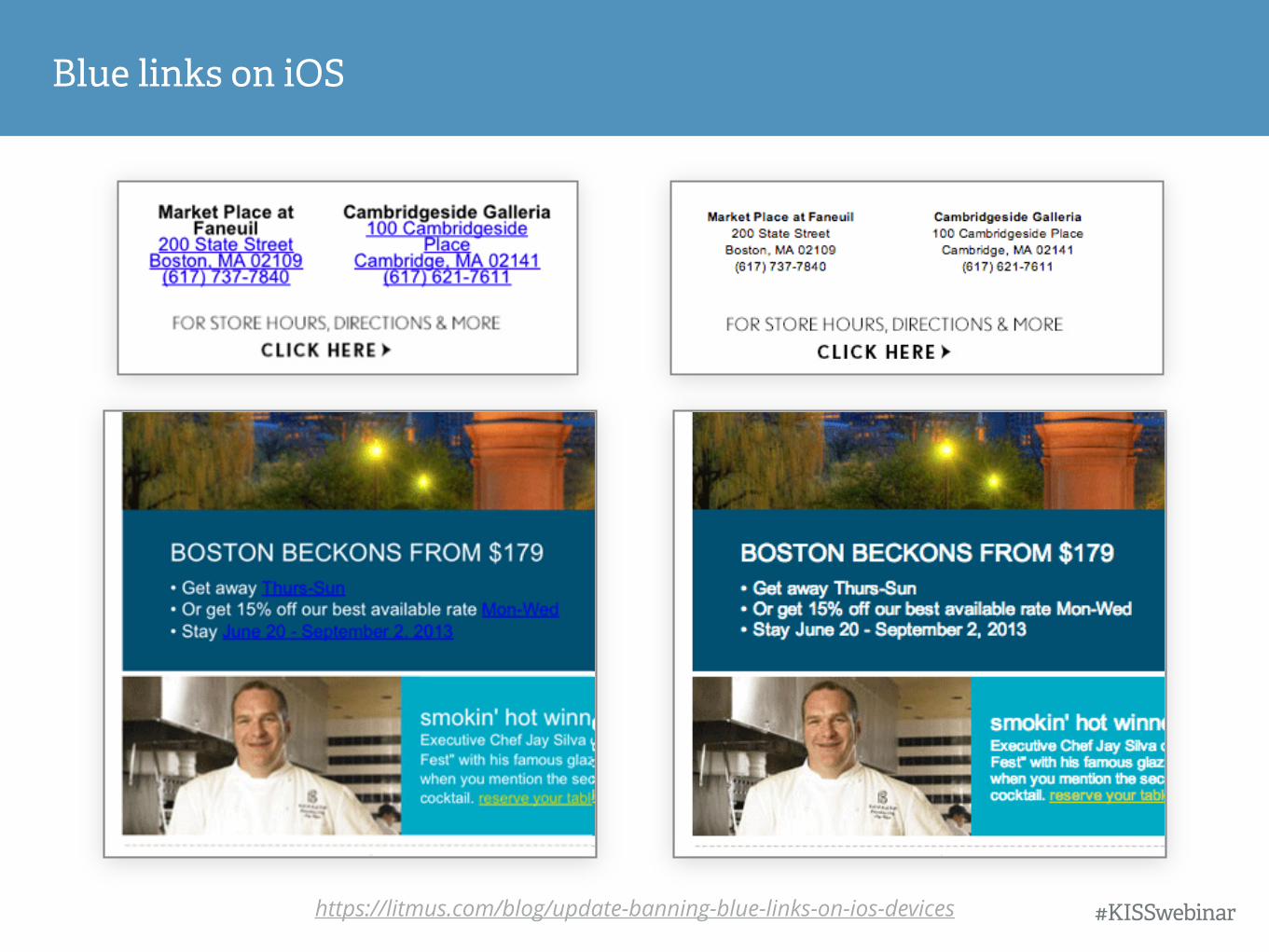
Blue links on iOS
https://litmus.com/blog/update-banning-blue-links-on-ios-devices #KISSwebinar

#KISSwebinar
Impact of responsive email on click rates
https://litmus.com/blog/the-science-of-email-clicks-the-impact-of-responsive-design-inbox-testing

Impact of responsive email on click rates
#KISSwebinar
Responsive design results in a 15% increase in unique clicks for mobile users.
https://litmus.com/blog/the-science-of-email-clicks-the-impact-of-responsive-design-inbox-testing

Open Click SRLs
Control Email 5.1% 5.0% 30
Responsive Email 4.4%% 11.5% 58
Difference -13.7% 130% 93.3%
Act-On Case Study

image blocking

#KISSwebinar
Automatic image blocking

43%of users view email with images off
#KISSwebinar
Automatic image blocking
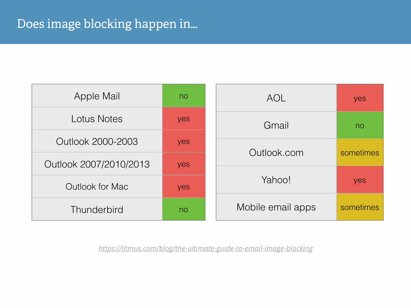
AOL yes
Gmail no
Outlook.com sometimes
Yahoo! yes
Mobile email apps sometimes
Apple Mail no
Lotus Notes yes
Outlook 2000-2003 yes
Outlook 2007/2010/2013 yes
Outlook for Mac yes
Thunderbird no
Does image blocking happen in…
https://litmus.com/blog/the-ultimate-guide-to-email-image-blocking

Guide to styled ALT text: h#p://bit.ly/styledALT Guide to image blocking: h#p://bit.ly/image-block
<img alt="Litmus" width="200" height="50" style=“font-family: Arial; color: #ffffff; font-size:20px" border="0">
#KISSwebinar
Styled ALT text

#KISSwebinar
Styled ALT text

#KISSwebinar
Styled ALT text

#KISSwebinar
Background color pixel art

#SearchLove @meladorri
#KISSwebinar
Images as bu#ons = bad
https://litmus.com/blog/a-guide-to-bulletproof-buttons-in-email-design
buttons.cm

geotargeting

Where are opens happening?

Where are opens happening?

Where are opens happening?

Where are opens happening?

Where are opens happening?

Geotargeting

Geotargeting
62% open rate 58 tickets sold in ~48 hours

progressive enhancement

WebKit Targeting Media Query
#KISSwebinar
@media screen and (-webkit-min-device-pixel-ratio: 0) { /* Insert CSS here */ }
h#ps://litmus.com/blog/a-bulletproof-guide-to-using-html5-and-css3-in-email

SVG Animation

Animated Snow

Dynamic Gravatar Animation h!ps://litmus.com/blog/behind-the-email-launching-community

Interactive Carousel
#KISSwebinar

Interactive Tour
#KISSwebinar

HTML5 Video Background
#KISSwebinar
h!ps://litmus.com/blog/how-to-code-html5-video-background-in-email
read rate

Dynamic Twi#er Feed
#KISSwebinar
h!ps://litmus.com/blog/how-to-code-a-live-dynamic-twi!er-feed-in-html-email

How long did readers spend on your email?

Watch

Email on the Apple Watch
Apple Watch shows the plain text version.
#KISSwebinar

Email on the Apple Watch
#KISSwebinar

A personal device that favors personal messages.
Links are disabled. No open or click tracking.
#KISSwebinar

// @meladorri
#KISSwebinar
The missing metrics

14-DAY TRIAL
KISSDATAlitmus.com/gi"card

2015 KISSmetrics Guide KISSmetrics Demo
h#p://kiss.ly/growth h#p://kiss.ly/demo

Questions?
Justine Jordan Marketing Director
Litmus @meladorri
Kevin Mandeville Content Designer
Litmus @KevinMandeville