atlas of united states mortality - centers for disease … for disease control and prevention...
TRANSCRIPT

CENTERS FOR DISEASE CONTROL
AND PREVENTION
Centers for Disease Control and Prevention
National Center for Health Statistics
U.S. DEPARTMENT OF HEALTH AND HUMAN SERVICES
Atlas ofUnited StatesMortality
From the CENTERS FOR DISEASE CONTROL AND PREVENTION
National Center for Health Statistics

U.S. DEPARTMENT OF HEALTH AND HUMAN SERVICES
Public Health Service
Centers for Disease Control and Prevention
National Center for Health Statistics
Hyattsville, Maryland
December 1996
DHHS Publication No. (PHS) 97-1015
Linda Williams Pickle
Michael Mungiole
Gretchen K. Jones
Andrew A. White
Atlas of
United States
Mortality

ii
National Center for Health Statistics
Edward J. Sondik, Ph.D., Director
Jack R. Anderson, Deputy Director
Jack R. Anderson, Acting Associate Director forInternational Statistics
Lester R. Curtin, Ph.D., Acting Associate Director forResearch and Methodology
Jacob J. Feldman, Ph.D., Associate Director for Analysis,Epidemiology, and Health Promotion
Gail F. Fisher, Ph.D., Associate Director for DataStandards, Program Development, and ExtramuralPrograms
Edward L. Hunter, Associate Director for Planning,Budget, and Legislation
Jennifer H. Madans, Ph.D., Acting Associate Director forVital and Health Statistics Systems
Stephen E. Neiberding, Associate Director forManagement
Charles J. Rothwell, Associate Director for DataProcessing and Services
Copyright informationAll material appearing in this report is in the publicdomain and may be reproduced or copied withoutpermission; citation as to source, however, isappreciated.
Suggested citationPickle LW, Mungiole M, Jones GK, White AA. Atlasof United States mortality. Hyattsville, Maryland:National Center for Health Statistics. 1996.
Library of Congress Cataloging–in–Publication DataAtlas of United States mortality / Linda Williams Pickle ... [et al.].
p. cm.Includes bibliographical references.ISBN 0-8406-0521-81. Mortality–United States–Maps. 2. United States–Statistics,
Vital–Maps. I. Pickle, Linda Williams. II. National Center forHealth Statistics (U.S.)
[DNLM: 1. Mortality–United States–maps. WA 900 AA1 A881 1996]G1201.E24 A8 1996 <G&M>304.6’4’0973022–DC21 96-45521
CIPMAPS

iii
No project of this magnitude can beaccomplished without the assistance of many others.The authors wish to thank the following people whocontributed greatly to making this atlas a reality:
Manning Feinleib, who as former Director ofthe National Center for Health Statistics (NCHS), hadthe vision and made the decision to produce an NCHSatlas;
Charles M. Croner, who laid the foundation forthe project during its early years and served as avaluable link to the professional geographer community;
Monroe Sirken, who gave the project a highpriority on a crowded research agenda andencouraged us to examine the cognitive aspects ofstatistical mapping;
Harry M. Rosenberg and Jeffrey D. Maurer, whoprovided valuable feedback throughout the course ofthis project and critiqued prototype map designs;
Douglas Herrmann, who helped lead theCognitive Aspects of Graphs and Maps working groupand provided valuable insight into the cognitiveinterpretation of mapped information;
Michelle L. Canham, Association of Schools ofPublic Health Intern, who conducted the literaturereviews of the causes of death included in this atlasand summarized this background material for theinitial drafts of the “Results” section;
Lester R. Curtin, for valuable discussionsconcerning statistical models and demography andmany helpful suggestions during the peer reviewprocess;
Russell D. Wolfinger, SAS Institute, Inc., whoprovided valuable technical assistance in themodeling effort;
Joseph Sedransk, Case Western ReserveUniversity, for insightful discussions concerningparametric estimation methods;
Jimmie D. Givens, who ensured that theauthors had sufficient computer resources for thisproject;
Diane M. Makuc and Deborah D. Ingram, whoprovided the Health Service Area definitions and
chose names for Health Service Areas for this atlasproject;
Barbara Foley Wilson, for leading focus groupdiscussions and experiments of statistical mapreading;
Karen R. Whitaker, for helping with recruitmentand preparation of test materials for in-housecognitive experiments;
NCHS staff, who served as technical reviewersand advisors: Ronette R. Briefel; Charles M. Croner;Lester R. Curtin; Lois A. Fingerhut; Katherine Flegal;Mary Anne Freedman; Richard F. Gillum; Deborah D.Ingram; Lillian M. Ingster; Felicia LeClere; Diane M.Makuc; Jeffrey D. Maurer; Margaret A. McDowell;Geraldine M. McQuillan; Harry M. Rosenberg; Diane K.Wagener; Ronald W. Wilson; and Karen A. Johnson,National Institutes of Health;
Numerous other NCHS staff members, whoparticipated in focus group discussions andexperiments of the cognitive aspects of statisticalmap interpretation;
John T. Behrens, Arizona State University;Cynthia A. Brewer, The Pennsylvania State University;Melody Carswell, University of Kentucky; Daniel B.Carr, George Mason University; Reid Hastie, Universityof Colorado; Stephan Lewandowsky, University ofWestern Australia; Alan M. MacEachren, ThePennsylvania State University; and Katherine HansenSimonson, Sandia National Laboratories, whosecollaborative research with NCHS, specificallyreferenced in the “Graphical design” and “Statisticalmethods” sections, enabled us to add innovativedesign and analytic elements to this atlas;
Mark Wherley and William P. Vancura of theDeasy GeoGraphics Laboratory, Department ofGeography, The Pennsylvania State University, whoprocessed and enhanced the draft map files toproduce the high quality images included in thispublication; and finally,
Patricia A. Vaughan, visual informationspecialist, for her many creative ideas and dedicationduring the design and production phases for thisproject and Patricia Keaton-Williams, editor, forreviewing the text and graphics.

v
Maps .................................................................... 32Heart disease ............................................. 32All cancer .................................................. 40Lung cancer ............................................... 48Colorectal cancer ....................................... 56Prostate cancer ......................................... 64Breast cancer ............................................ 68Stroke ....................................................... 72Unintentional injuries.................................. 80Motor vehicle injuries ................................. 88COPD......................................................... 96Pneumonia & influenza ............................. 104Diabetes .................................................. 112Suicide .................................................... 120Firearm suicide ........................................ 128Liver disease ............................................ 136HIV .......................................................... 144Homicide ................................................. 152Firearm homicide...................................... 160All causes ................................................ 168
References ......................................................... 179
Appendix I. Health Service Areas ......................... 187
Appendix II. Statistical Modeling ......................... 199
Appendix III. Supplemental Maps ......................... 203
Introduction ............................................................ 1
Methods ................................................................. 3Data sources................................................ 3Causes of death ........................................... 3Geographic unit ............................................ 5Reader’s guide ............................................ 7Graphical design .......................................... 8Statistical methods ...................................... 9
Results ................................................................. 13Heart disease ............................................. 20All cancer .................................................. 20Lung cancer ............................................... 21Colorectal cancer ....................................... 21Prostate cancer ......................................... 22Breast cancer ............................................ 22Stroke ....................................................... 23Unintentional injuries.................................. 23Motor vehicle injuries ................................. 24Chronic obstructive pulmonary diseases ...... 24Pneumonia & influenza ............................... 24Diabetes .................................................... 25Suicide ...................................................... 25Firearm suicide .......................................... 26Liver disease .............................................. 26Human immunodeficiency virus infection ..... 26Homicide ................................................... 27Firearm homicide........................................ 27All causes .................................................. 27

vi
Table 1. Causes of death for the NCHS mortalityatlas: Definitions and map titles. ............................. 4
Table 2. Standard million population used for ageadjustment, proportional to total U.S. populationin 1940................................................................... 9
Table 3. Average annual number of deaths bycause, race, and sex during 1988–92. ................... 13

vii
Figure 1. Graphical components of the two-pageatlas layout. ............................................................ 7
Figure 2. Age-adjusted death rates by cause,race, and sex. ....................................................... 14
Figure 3. U.S. death rate per 100,000 populationby age, cause, race, and sex. ................................ 15
Figure 4. Comparison of HSA rates with U.S. ratesby cause–white male. ............................................ 16
black male. ........................................... 17
white female. ......................................... 18
black female. ......................................... 19
Figure 5. Population by HSA, 1990. .................... 205
Figure 6. Percent of total HSA white populationin each representative age group, 1988–92. ........ 206
Figure 7. Percent of total HSA black populationin each representative age group, 1988–92. ........ 207
Figure 8. Correlate variables by county, 1990. .... 208
Figure 9. Correlate variables by State, 1991. ...... 209
1
Maps have played a fundamental role in publichealth since the mid-1800’s. Soon after a call forstudying the geographic patterns of disease (1), Dr.John Snow linked the London cholera epidemic to acontaminated water supply (2). For over a hundredyears afterward, however, the usefulness of mappinghealth outcomes in the United States was limited toeither detailed views of a single area or national mapsat a State or regional level. Then in 1975, whencomputer systems had become sufficiently powerful toautomate the mapping process, the National CancerInstitute published maps of U.S. cancer death rates atthe small-area level (3). Previously unnoticed clustersof high-rate counties on these maps led to numerousfield studies, which uncovered, for example, the linksbetween shipyard asbestos exposure and lung cancer(4) and snuff dipping and oral cancer (5). This firstatlas demonstrated that mapping small-area deathrates could be a valuable public health tool bygenerating etiologic hypotheses and identifying high-rate communities where intervention efforts might bewarranted. Its publication was followed by others fromthe National Cancer Institute (6–9) and instigatedsimilar efforts around the world (10). Following thesuccess of these atlases in advancing theunderstanding of cancer etiology, this monographpresents maps of the leading causes of death in theUnited States for the period 1988–92.
The research underlying this project has led toimproved statistical methods for modeling death ratesand innovative presentation formats for maps andgraphics based on cognitive research (11). In thisatlas, information previously available only in tabularform or summarized on a single map is presented onmultiple maps and graphs. Broad geographic patternsby age group are highlighted by application of a newsmoothing algorithm, and the geographic unit formapping is defined on the basis of patterns of healthcare. These new features allow the public healthresearcher to examine the data at several geographiclevels – to read an approximate rate for an area, todiscern clusters of similar-rate areas, to visualizebroad geographic patterns, and to compare regionalrates. With these additional tools, importantgeographic patterns of cause-specific mortality in theUnited States can more easily be identified.
Although many causes of death included in thisatlas have been mapped before, previous efforts havefocused on a limited range of causes (3, 6–9, 12) orhave presented data only at the State level (13). Thisis the first publication of maps of all leading causes ofdeath in the United States on a small-area scale.Comparisons of map patterns across causes of death,sex, or race can provide clues to disease etiology. Forthis reason unlike many earlier atlases, separatemaps by sex and race are included in the samevolume, using consistent methods of presentation.

3
The death rates mapped in this volume werecalculated from information recorded on all U.S. deathcertificates to residents of the 50 States and theDistrict of Columbia for 1988–92 and from populationdata for 1990.
Mortality. Numbers of deaths by age, race,sex, place of residence, and cause of death are basedon original death certificates reported to the NationalCenter for Health Statistics (NCHS) from the States.Death certificates with age not stated were excluded(0.025 percent of total). Race was classified followingstandard procedures for all United States vitalstatistics (14). Hispanic origin is classified separatelyfrom race. Hispanics are included in the data mappedin this atlas according to their race (white or black)as reported on the death certificate; but Hispanicswith no racial designation are included in the “White”category. Deaths of persons of races classified asother than white or black were not mapped. Furtherdetails on the methods of data collection andprocessing of death certificates may be found in theTechnical Appendix of Vital Statistics of the UnitedStates, 1990, Volume II, Mortality, Part A (14).
Population. Population counts from the 1990Census (15), classified by age, race, sex, and county,were multiplied by 5 to create a denominatorcorresponding to the 5 years of mortality data. Ratescomputed using such a “person years at risk”denominator are often termed “average annual” rates.In the few instances where the calculated number ofperson years was less than the reported number ofdeaths, as when deaths occurred in a sparselypopulated county before census enumeration, theperson years at risk were inflated to equal the totalnumber of deaths due to any cause.
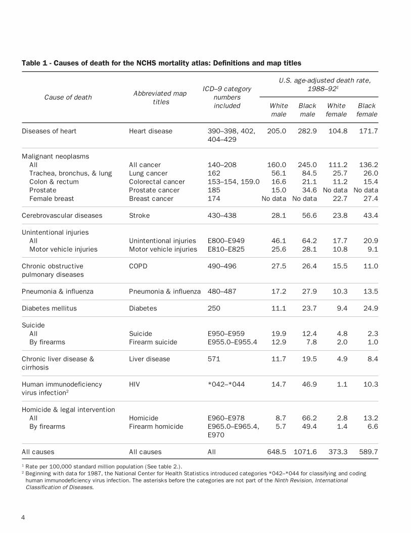
Mapped causes. The underlying causes ofdeath were initially coded according to the NinthRevision, International Classification of Diseases(ICD–9)(16) then aggregated according to the “List of72 Selected Causes of Death,” which is used in NCHSpublications of tabular mortality statistics. This atlasincludes maps of rates for the top ranking 11 causesof death from this 72-cause list (14), based onnumbers of deaths in 1988–92, as well as the fourleading cancer sites, motor vehicle injuries, andsuicide and homicide by firearms—for a total of 18causes of death. Specific definitions of the mappedcauses of death are provided in table 1. Total
mortality rates due to any cause of death are alsomapped. Unintentional injuries, homicides, andsuicides are referred to as “external” causes of death.The other causes are referred to as “natural” causes.Death rates for a number of these causes are beingused to monitor the health status of Americans at theState and national levels (17).
Quality of data. The issue of accuracy of cause-of-death statistics is fundamental to the interpretationof patterns shown on these maps (18–20). Becausethis accuracy has been challenged with regard topreviously published mortality atlases, what follows isa discussion of potential sources of error in deathcertificate processing and reporting, and the meansby which NCHS sought to compensate for theseerrors.
The quality of cause-of-death determination inthe United States is affected by the accuracy andcompleteness of information—from medical diagnosisto final coding and processing of underlying cause ofdeath. Beginning with mortality data for 1968, theunderlying cause of death has been determined by anNCHS computerized system that consistently appliesWorld Health Organization coding and selection rulesto each death certificate using all conditions reportedby the medical certifier (21). This system was lastamended to incorporate the classification for Humanimmunodeficiency virus (HIV) infection, beginning withdata year 1987. Automation of this task and cross-verification of medical condition coding has reducederrors in assigning underlying cause from deathcertificate information to less than 1 percent (20).However, the completeness and accuracy of theinformation supplied on the certificate and thedecedent’s medical diagnosis remain as potentialsources of error (22).
There are indications that the quality ofmedical information on the death certificate hasimproved over time. In particular, there has been asteady reduction of deaths assigned to the residualand nonspecific category of Symptoms, signs, and ill-defined conditions (ICD–9 categories 780–799) from1.5 percent before 1988 to 1.07 percent in 1992(14). In addition, the number of medical conditionsreported on death certificates has increasedsuggesting more detailed diagnostic information andgreater care in completing the medical certification ofdeath (23). Validation studies suggest that, for mostbroad categories, the reported underlying cause ofdeath agrees well with hospital records of thedecedents (24–26). However, for deaths that occuraway from a medical setting—as for an unobservedsudden death—the medical certifier may not have
4
Table 1 - Causes of death for the NCHS mortality atlas: Definitions and map titles
U.S. age-adjusted death rate,ICD–9 category 1988–921
Cause of death Abbreviated map numbers titles included White Black White Black
male male female female
Diseases of heart Heart disease 390–398, 402, 205.0 282.9 104.8 171.7404–429
Malignant neoplasmsAll All cancer 140–208 160.0 245.0 111.2 136.2Trachea, bronchus, & lung Lung cancer 162 56.1 84.5 25.7 26.0Colon & rectum Colorectal cancer 153–154, 159.0 16.6 21.1 11.2 15.4Prostate Prostate cancer 185 15.0 34.6 No data No dataFemale breast Breast cancer 174 No data No data 22.7 27.4
Cerebrovascular diseases Stroke 430–438 28.1 56.6 23.8 43.4
Unintentional injuriesAll Unintentional injuries E800–E949 46.1 64.2 17.7 20.9Motor vehicle injuries Motor vehicle injuries E810–E825 25.6 28.1 10.8 9.1
Chronic obstructive COPD 490–496 27.5 26.4 15.5 11.0pulmonary diseases
Pneumonia & influenza Pneumonia & influenza 480–487 17.2 27.9 10.3 13.5
Diabetes mellitus Diabetes 250 11.1 23.7 9.4 24.9
SuicideAll Suicide E950–E959 19.9 12.4 4.8 2.3By firearms Firearm suicide E955.0–E955.4 12.9 7.8 2.0 1.0
Chronic liver disease & Liver disease 571 11.7 19.5 4.9 8.4cirrhosis
Human immunodeficiency HIV *042–*044 14.7 46.9 1.1 10.3virus infection2
Homicide & legal interventionAll Homicide E960–E978 8.7 66.2 2.8 13.2By firearms Firearm homicide E965.0–E965.4, 5.7 49.4 1.4 6.6
E970
All causes All causes All 648.5 1071.6 373.3 589.7
1 Rate per 100,000 standard million population (See table 2.).2 Beginning with data for 1987, the National Center for Health Statistics introduced categories *042–*044 for classifying and coding
human immunodeficiency virus infection. The asterisks before the categories are not part of the Ninth Revision, InternationalClassification of Diseases.
5
atlases demonstrates the utility of mapping thesedata (30).
Deaths were initially assigned to a county (orequivalent administrative unit, such as independentcity or parish) according to the residence of thedeceased, regardless of the place of death. These3,141 geographic units were then aggregated intoHealth Service Areas (HSA’s) by a cluster analysis ofwhere residents aged 65 years and over obtainedroutine short-term hospital care in 1988 (31)(appendix I). An HSA may be thought of as an areathat is relatively self-contained with respect tohospital care. The original 802 HSA’s defined byMakuc et al. (31) were supplemented to includeAlaska and Hawaii. Also, several of the original HSA’swere combined to achieve a minimum HSA size of 250square miles for better visibility on the maps. OnlyNew York City remains as a small but populous HSA;its HSA is enlarged for visibility east of its actuallocation and is labeled “NYC” on the maps. Severalother major cities, such as Washington, D.C., weregrouped with surrounding counties by the originalcluster analysis. The final boundary file includes 805HSA’s.
HSA’s are a compromise—in size andnumber—between the 3,141 counties and 50 States.Data for many of the causes included in this atlas aretoo sparse to provide stable 5-year rates at the countylevel, but mapping at the State level would maskmany interesting geographic patterns in the data. (Infact, mapping at the HSA or county level may maskinteresting local variations in the data. However, inaddition to sparse data and confidentiality concerns,most States do not geocode death certificateaddresses below the county level.)
Previously published cancer atlases (3, 6, 8, 9)mapped according to county or State Economic Area,aggregations of counties according to demographicand economic conditions in 1960. HSA’s, defined onthe basis of 1988 health care utilization, are morelikely relevant for mapping current death rates andprovide a reasonable spatial filter for detectingvariations in death rates across the United States.
A map of the HSA boundaries is provided inappendix I, along with a listing of HSA names keyedto the boundary map by number. Each HSA nameincludes at least one county name and, in somecases, the name of a major city or town. These areprovided for convenience in identifying HSA’s on themaps. Each HSA that included counties from two
sufficient information about the decedent’s medicalhistory to correctly report the underlying andcontributing causes of death. For example, long-termdiabetics are at high risk of heart disease and strokeas a consequence of their disease, but studies haveshown substantial underreporting of diabetes on theirdeath certificates (27). Other errors may occur wherethe cause of death is classified to a related, butincorrect, disorder or to a nonspecific diseasecategory. The latter type of error can be addressed bygrouping the related causes that are often confused orby not subsetting the broadly specified disease foranalysis.
The potential for errors in assigning underlyingcause of death was considered in defining the causesto map. Cause groups were created for this projectthat were broad enough to avoid these problems, yetspecific enough to be meaningful for etiologicresearch. For example, cancers of the colon andrectum were combined because of the potential formisclassification between these diagnoses (25). Allchronic obstructive pulmonary diseases (COPD)(including chronic bronchitis, emphysema, andasthma, ICD–9 categories 490–496) were combinedfor mapping because approximately 75 percent of allCOPD deaths were coded as “Other,” with themajority of these coded as “Not otherwise specified.”
Amended data. The numbers of deaths thatoccurred in Alabama, Alaska, Hawaii, and New Jerseyfor the years 1988–92 are in error, because NCHS didnot receive changes to the causes of death made atthe State level (14, 28, 29). These differences areconcentrated among selected causes of death,primarily the external causes. For example, thelargest discrepancy found was for suicides in Alaska— State records indicated 360 suicides during 1988–92, compared to 237 suicides reported to NCHS, a 34-percent deficit. A comparison of annual death ratesfor 1979–92 due to unintentional injuries, motorvehicle injuries, suicides, and homicides in Alaskashows that rates for 1988–92 are in line with previousyears except for suicides, which may be understatedin this atlas. The reader is cautioned againstoverinterpretation of small-area rates for externalcauses in the previously mentioned States.
Incidence versus mortality. Although publichealth researchers would prefer to examine patternsof incidence rather than mortality, no nationwideregistries exist for noncommunicable diseases.Though some problems surely remain in the mortalitydata presented here, the experience of NationalCancer Institute epidemiologists in successfullyfollowing leads generated by cancer mortality

6
Census Regions (Northeast, Midwest, South, andWest). Fourteen regions for whites and 12 regions forblacks were created by subdividing the nine CensusDivisions (appendix I). For whites, the original SouthAtlantic, West North Central, and Mountain divisionswere subdivided so that no region contained morethan six States. Because of sparse populations, onlythe South Atlantic Division was subdivided for blacks.For whites and blacks, Alaska and Hawaii wereconsidered as separate regions, apart from theremainder of the Pacific Division. Note that becausean HSA can include counties from two States, theregional boundaries (appendix I) do not strictly followState lines.
States (77 of 805 HSA’s) was assigned to the Statewhere the majority of its population lived. Furtherdetails are provided in appendix I.
For simplicity of presentation, boundary lineson the base map have been smoothed to within 5miles of their original location (32). In addition,islands that were combined with a continental HSA tomeet minimum size requirements are not shown;deaths among these island residents are included inthe rates of the larger continental HSA. All maps weredrawn using an Albers equal area projection (33).
This report examines the geographic effects ofregion as well as HSA. In this atlas, “region” is usedin the generic sense and is not to be confused with

7
To aid the reader, the layout of graphicalelements on each two-page set is fixed in terms ofplacement on the page, titles, and colors. It takesonly a few minutes to become familiar with this
standard page layout (figure 1) and to read the“Graphical design” and “Statistical methods”sections, which explain the components below. Thereader who does so will make full use of theintegrated graphical presentation.
Age-adjusted
Rate per100,000
population
Comparativemortality ratio(HSA to U.S.)
(U.S. rate = 205.0)
1.60
1.24
1.16
1.05
0.98
0.88
0.81
1.24
1.16
1.05
0.98
0.88
0.81
0.55
–
–
–
–
–
–
–
328.6
253.7
236.7
215.1
199.8
179.4
166.6
253.8
236.8
215.2
199.9
179.5
166.7
112.4
–
–
–
–
–
–
–
ICD–9 Categories 390–398, 402, 404–429
SOURCE: CDC/NCHS
NYC
SOURCE: CDC/NCHS SOURCE: CDC/NCHS
NOTE: Brackets indicate 95% confidence limits.SOURCE: CDC/NCHSSOURCE: CDC/NCHS
Not significant
Other low
80 lowest*
80 highest*
Other high
Age-adjusted rate per100,000 population
Significantly higher
Significantly lower
U.S. rate = 205.0
* See text
NYC
NYC NYC
>1408.3
>1322.0
>1250.3
>1157.8
979.8
1586.6
1408.3
1322.0
1250.3
1157.8
–
–
–
–
–
Age-specific rate per100,000 population
>53.0
>47.8
>42.3
>37.4
28.7
63.8
53.0
47.8
42.3
37.4
–
–
–
–
–
Age-specific rate per100,000 population
150 200 250 300
Distribution of HSA ratesper 100,000 population
Pro
port
ion
0.015
0.010
0.005
0.0
New EnglandMiddle Atlantic
S. Atlantic-NorthS. Atlantic-South
E. S. CentralE. N. Central
W. N. Central-NorthW. N. Central-South
W. S. CentralMountain-SouthMountain-North
Pacific
Map legend
Age 40 Age 70
Age-specific rate per 100,000 population
[[
[[
[[
[[
[[
[[
]]
]]
]]
]]
]]
]]
[[
[[
[[
[[
[[[
[
]]]
]]
]]
]]
]]]
30 40 50 60 1000 1200 1400 1600
(a)
(d)
(b)
(e)
(c)

8
One of the unique features of this atlas is theuse of cognitive research to guide its design. Earlycognitive interviews and focus groups with typicalatlas users at NCHS demonstrated a clear effect of amap’s graphical design and page layout on the user’sunderstanding of the underlying statistical information(34). Although any map could be used after somestudy, only easy-to-use maps encouraged repeateduse and exploration of the data. To follow up on theseearly findings, the NCHS Office of Research andMethodology initiated a research effort by aninterdisciplinary team of statisticians, psychologists,and geographers to examine how users cognitivelyprocess mapped information (11).
Before this research, few empirical studies hadbeen conducted to evaluate the disparate map stylesrecommended in the literature, and none of thesestudies considered maps as complex as those in anational small-area mortality atlas. NCHS researchrevealed that the typical atlas audience ofepidemiologists and other public health professionalswanted to (a) read an approximate HSA rate from amap, (b) identify clusters of areas with similar ratesand regional patterns on the map, and (c) comparepatterns across maps by cause, race, or sex. NCHSconducted collaborative and in-house experiments toexamine the effects of basic map style, color scheme,pattern combination, and legend design on the abilityof users to perform these specific tasks.
Basic map style. Experiments comparedperformance and preference using maps where rateswere represented by area shading (choropleth),symbols, dot density, and color-coded lines (isopleth).These experiments showed the clear advantage ofclassed (categorized rate) choropleth maps overcompeting map styles. A symbol map is not a feasibledesign for hundreds of small areas, and the mapaudience was unsure how to interpret lines and dotdensity for aggregated data mapped to variable-sizedgeographic units (35, 36). Map style preferencediffered somewhat by professional discipline (37)although performance did not (38, 39).
Attempts to convey more specific informationabout the distribution of mapped rates through theuse of unclassed maps (for example, where“darkness” of color is proportional to the actual rate)failed. Users also rejected proportional legend designswhere the height of the legend box reflects the widthof the rate interval. Map readers were either confusedby the unfamiliar design (40) or were unable todistinguish among similar shades on the map (35).
Therefore, information about the rate distribution isseparated from the legend in this atlas and showninstead as a density plot beneath the main map(figure 1a).
Color. Comparisons of color schemesconfirmed cartographers’ recommendations (33) thatdistinct hues or patterns facilitated reading a ratefrom the map but that a sequence of increasing“darkness” of a single hue associated with increasingrates facilitated identification of clusters or broadpatterns (36, 41, 42). A double-ended scheme, whereeach of two hues represents rates above and belowthe median rate with levels of darkness increasingequally from the middle category to both extremes,can be used accurately for both tasks (43, 44).Therefore, a double-ended scheme was used for theage-adjusted maps (figures 1a, 1b), where identifyingthe value for a single HSA might be necessary, and asingle-ended (monochromatic) scheme was used forthe smoothed maps (figures 1d, 1e), where spatialpattern recognition is more important.
Final atlas map colors were chosen to avoidcommon color vision deficiencies and to balancelevels of darkness (or lightness) so that no singlecolor visually dominated a map (44). From a list ofacceptable single and paired hues, colors for each ofthe three types of maps in this atlas were chosen sothat no specific color appeared on more than one mapand a hue was used consistently wherever it appeared(for example, reds for high rates and blues and greensfor low rates).
Hatching. The addition of hatched lines overHSA’s was found to accurately convey rate varianceinformation to readers without hampering their abilityto identify the underlying colors, and hence thepatterns, on the maps (39, 45). Double-hatching withparallel white and black hatch lines allows visibility ofthe hatching over light and dark colors (figure 1a).Note that the map for white male heart disease (figure1a) did not require hatching.
Regional rates. In several of the cognitiveexperiments, map users were asked to compare theirestimates of average rates for several regions (35,41). The variation of responses indicated that thiswas the most difficult of the questions posed to them.Therefore, to aid in evaluating broad spatial patterns,a rowplot (46) has been included to show confidencelimits of model-based regional rates along with eachmap set (figure 1c).
Page layout. The final composite page layoutfor this atlas, with its combination of plots and severaltypes of maps (figure 1), may initially seem complex.However, the variety of innovative presentation

9
formats for each set of rates accommodates multipleuses of the maps and different backgrounds of theusers. For example, the pattern of age-adjusted ratescan be seen on the full page map, and approximaterates can be determined for HSA’s (figure 1a). Themap in figure 1b indicates where rates aresignificantly different from the U.S. rate. Thesmoothed maps illustrate the broad patterns in age-specific rates (figures 1d, 1e), and the graphic (figure1c) allows comparison of modeled regional effects.
The statistics mapped in this volume werecomputed by traditional methods and innovativestatistical models. The new models permitexamination of age-specific patterns, providinginformation that may be hidden by use of thetraditional summary age-adjusted rate. All ratesshown are death rates per 100,000 population. Age-adjusted rates were computed by the direct method(47) using the U.S. standard million population (table2); these are mapped (figure 1a) and tested forsignificance compared to the U.S. rate (figure 1b).
Table 2. Standard million population used for ageadjustment, proportional to total U.S. populationin 1940
Age StandardPopulation
0–4 years 80,061
5–14 years 170,355
15–24 years 181,677
25–34 years 162,066
35–44 years 139,237
45–54 years 117,811
55–64 years 80,294
65–74 years 48,426
75–84 years 17,303
85 years 2,770 and over
Total 1,000,000
In addition, the age-specific numbers of deathswere modeled for each combination of race, sex,
cause, and place using mixed effects generalizedlinear models (48). Briefly, logarithms of the age-specific rates were modeled as a function of age,allowing each HSA to have a random intercept and,where possible, a random slope, within its particularregion. Model results were used to compute improvedvariance estimates for the age-adjusted ratescompared to traditional methods, to estimate regionaleffects, and to produce smoothed age-specific mapsthat reflected the broad spatial patterns in the data.Further details of this modeling effort are provided inappendix II.
Statistical methods used for each componentof the two-page layout (figure 1) are discussed below.
Age-adjusted death rates by HSA, 1988–92.The age-adjusted rate map (figure 1a) presents thedirectly adjusted death rates for each HSA. An HSAhas an overlaid hatch pattern if its rate has acoefficient of variation at least 23 percent. (Thecoefficient of variation is defined as the standard errorof the rate divided by the rate, then multiplied by 100and expressed as a percentage.) These rates have alarge standard error because they are based on sparsedata, typically fewer than 20 deaths, and thereforeshould be interpreted with caution. Note that thevariance used for this calculation is the standardbinomial variance estimator for directly age-adjustedrates (49) corrected by the model-based dispersionestimator. Refer to appendix II for details.
The rates are categorized according to percen-tiles of the rate distribution; the seven categoriesinclude, from minimum to maximum rate, respectively,10 percent, 10 percent, 20 percent, 20 percent, 20percent, 10 percent, and 10 percent of the 805 rates.These exact distributional percentiles were adjustedfor mapping, if necessary, so that the legendsaccurately list the ranges of rates in each category,rounded to the number of digits shown. For example, a
��yy
Age-adjusted
Rate per100,000
population
Comparativemortality ratio(HSA to U.S.)
Hatching indicatessparse data
(U.S. rate = 205.0)
1.60
1.24
1.16
1.05
0.98
0.88
0.81
1.24
1.16
1.05
0.98
0.88
0.81
0.55
–
–
–
–
–
–
–
328.6
253.7
236.7
215.1
199.8
179.4
166.6
253.8
236.8
215.2
199.9
179.5
166.7
112.4
–
–
–
–
–
–
–
ICD–9 Categories 390–398, 402, 404–429
NYC

10
legend range of 5.2 to 10.3 includes all rates from5.150 to 10.349.
In instances where over 10 percent of the 805rates are zero (no deaths occurred), all HSA’s withzero rates are assigned to the darkest green category.The percentage in the next category is reduced toreflect only nonzero rates up to the next percentilecutpoint. If more than 20 percent (or 40 percent) ofthe 805 rates are zero, all HSA’s with zero rates areassigned to the lowest category as above; but thesecond (and third, if necessary) lowest category islabeled “No HSA” in the legend to indicate that thiscolor category does not appear on the map. The exactpercentage of zero rates is shown in a density plot foreach age-adjusted rate map.
The legend also shows ranges for thecomparative mortality ratio, defined as the HSA age-adjusted rate divided by the U.S. age-adjusted rate.For example, for an HSA rate range of 100 to 150 per100,000 population and a U.S. rate of 100 per100,000 population, the comparative mortality ratiorange would be 1.00 (100/100) to 1.50 (150/100),indicating rates that are at least equal to, but no morethan 50 percent greater than, the U.S. rate. Althoughthe ratio ranges on the right side of the legend mayappear to overlap, this is just the result of roundingafter dividing the rate ranges by the constant U.S.rate.
Distribution of HSA death rates. Thedistribution of HSA death rates is shown graphicallybelow the age-adjusted rate map. This density plot,which may be interpreted as a smoothed histogram,provides the proportion of the 805 rates with aparticular value. The area under the curve sums to1.0. In the example shown below, 1.2 percent (or 10)of the HSA rates are approximately equal to 200.The color bar below this graph shows thecorrespondence of the mapped rate categories (figure1a) to the density plot (for example, the endpoints ofeach segmentof the color barcorrespond tothe cutpointsof the legendcategories).For causeswith extremelyhigh outliers,the highestcategory on theplot is truncated at the 99th percentile of thedistribution, and the actual maximum rate is indicatedabove the rightmost color bar. This was done so that
the reader could see the shape of the distribution forevery cause of death among blacks and for HIV amongwhites. For causes of death with no observed deathsin some HSA’s, the proportion of zero rates isindicated by the height of a vertical line at zero (or anarrow to indicate that this proportion is beyond thescale of the graph).
Death rates of each HSA compared with theU.S. rate. This map (figure 1b) indicates whether eachHSA rate is significantly different from the U.S. age-adjusted rate (α=0.05), which is shown below and tothe left of the map legend. The significantly high ratesare further subdivided into the highest 80 rates andother significantly high rates; significantly low ratesare similarly subdivided. Note that the variance usedfor this hypothesis test is the standard binomialvariance estimator for directly age-adjusted rates (49)corrected by the model-based dispersion estimator.Refer to appendix II for details.
150 200 250 300
Distribution of HSA ratesper 100,000 population
Pro
port
ion
0.015
0.010
0.005
0.0
Not significant
Other low
80 lowest*
80 highest*
Other high
Age-adjusted rate per100,000 population
Significantly higher
Significantly lower
U.S. rate = 205.0
* See text
NYC
Smoothed rate maps and graphs. Theremainder of the second page in each set (figures 1c,1d, 1e) presents results from the statistical models(see appendix II). The geographic hierarchy includedin the models provides estimates of the age-specificrates for each region and HSA. Separate graphs(figure 1c) or maps (figures 1d, 1e) are shown for tworepresentative age groups. Ages 40 and 70 years areshown for natural causes of death, and ages 20 and70 years are shown for external causes of death,which generally have higher rates for younger adults.
Predicted regional rates for smoothed ratemaps. This plot provides the point estimates and 95-percent confidence limits for the predicted age-specific regional rates. As was done for the age-adjusted rate map, a color bar is included reproducing

11
the legends of the corresponding smoothed age-specific maps (figures 1d, 1e). In instances where themaximum mapped HSA rate (figures 1d, 1e) is overfour times the maximum predicted regional rate(figure 1c), this category bar is truncated on thegraph and the actual maximum mapped HSA rate isshown inside the color bar.
Smoothed death rates for age 20, 40, or 70years. These maps illustrate the broad spatialpatterns in the age-specific death rates. HSA ratespredicted by the models for the two representativeages (ages 40 and 70 years for natural causes andages 20 and 70 years for external causes) werefurther smoothed using a two-dimensional weightedmedian smoothing algorithm and then categorized intoquintiles of the rate distribution. Unlike the age-adjusted rate maps, these cutpoints were notadjusted to permit accurate reading of an HSA’s rate,because the purpose of these maps is to show broadpatterns. Instead, the legend ranges are shown as, forexample, >12.2–14.0, where the upper limit of thenext lower quintile is 12.2 (rounded to one decimal
place). Because the rates are color coded to show therelative ranking of the 805 HSA rates, the reader iscautioned to examine the legends carefully so as notto be misled by the usually great differences in thelevels of rates for the younger and older age groups.
The original implementation of the smoothingalgorithm (50) has been shown to retain importantfeatures of the data pattern better than competitivemethods (51). The modification to include inversestandard error weights (52) gives more weight torates based on large numbers of deaths, so thatreliably estimated rates are less likely to be“smoothed out” of the map, even when they differfrom rates in surrounding areas. Conversely, ratesbased on few deaths are more likely to be modified bythe algorithm to appear similar to surrounding arearates. Thus, the smoothed map rates may not reflectthe observed age-specific rate in a particular HSA. Thereader is cautioned that although these mapsaccurately depict the expected level of age-specificrates in broad areas, they should not be used toestimate a rate for a single HSA.
NYC
>53.0
>47.8
>42.3
>37.4
28.7
63.8
53.0
47.8
42.3
37.4
–
–
–
–
–
Age-specific rate per100,000 population
New EnglandMiddle Atlantic
S. Atlantic-NorthS. Atlantic-South
E. S. CentralE. N. Central
W. N. Central-NorthW. N. Central-South
W. S. CentralMountain-SouthMountain-North
Pacific
Map legend
Age 40 Age 70
Age-specific rate per 100,000 population
[[
[[
[[
[[
[[
[[
]]
]]
]]
]]
]]
]]
[[
[[
[[
[[
[[[
[
]]]
]]
]]
]]
]]]
30 40 50 60 1000 1200 1400 1600