association, and correlation - university of...
TRANSCRIPT

1
Chapter 7
! Scatterplots, Association, and Correlation

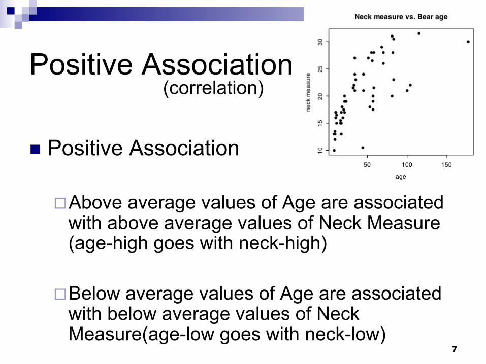
! Here, we see a positive relationship between a bear’s age and its neck diameter.
2
Scatterplots & Correlation
As a bear gets older, it tends to have a larger neck.

Negative Association
3
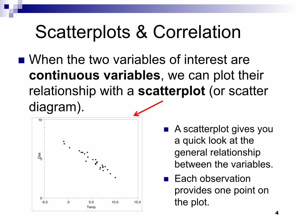
! Outside temperature and amount of natural gas used.
! These variables have a negative correlation… " Days with higher
temperature tend to use less natural gas.
" Higher temperature# Less gas used
0
5
10
Gas
-5.0 .0 5.0 10.0 15.0
Temp
4
Scatterplots & Correlation ! When the two variables of interest are
continuous variables, we can plot their relationship with a scatterplot (or scatter diagram).
! A scatterplot gives you a quick look at the general relationship between the variables.
! Each observation provides one point on the plot. 0
5
10
Gas
-5.0 .0 5.0 10.0 15.0
Temp

5
! Response variable – plotted on the vertical axis. ! Also called the dependent variable.
! Explanatory variable – plotted on the horizontal axis. ! Used to try to explain variation in the response variable. ! Also called the independent variable.
50 100 150 200 250 300
2025
3035
4045
50
Engine HorsePower
Hig
hway
MP
G
HWY-mpg is the response variable
Engine Horsepower is the explanatory variable
Here, we use Engine HPW to explain the variability in HWY-mpg.
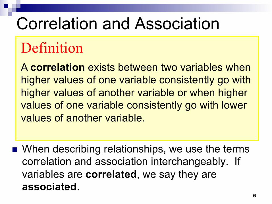
Correlation and Association
! When describing relationships, we use the terms correlation and association interchangeably. If variables are correlated, we say they are associated.
6
Definition
A correlation exists between two variables when higher values of one variable consistently go with higher values of another variable or when higher values of one variable consistently go with lower values of another variable.
7
Positive Association
! Positive Association
" Above average values of Age are associated with above average values of Neck Measure (age-high goes with neck-high)
" Below average values of Age are associated with below average values of Neck Measure(age-low goes with neck-low)
(correlation)

8
Negative Association
! Negative Association
" Below average values of Engine HPW are associated with above average values of HWY-mpg (HPW-low goes with MPG-high).
" Above average values of Engine HPW are associated with below average values of HWY-mpg (HPW-high goes with MPG-low).
50 100 150 200 250 300
2025
3035
4045
50
Engine HorsePower
Hig
hway
MP
G(correlation)

Strength of Association
9
! Correlation applies only to quantitative (continuous) variables.
! Correlation measures the strength of linear association.
! The correlation coefficient (r) gives the direction of the linear association and quantifies the strength of the linear association between two quantitative variables.
! Correlation is a `unitless’ quantity (not in ‘feet’ or ‘inches’… no units)

10 10
Strength of Association
1.0 -1.0 0.0
Very Weak or No Linear
Relationship
Strong Positive Linear
Relationship
Strong Negative Linear
Relationship
Correlation Coefficient (r) will be between -1 and 1.

11
r = ?
r =0.3 r =0.7 r =1
r = – 1
r =0.0
r = – 0.3 r = – 0.7
weak (fuzzy)
weak (fuzzy)
none
stronger (more clear)
stronger (more clear)
r not meaningful, this is non-linear
super strong
super strong

12
Things to look for in a scatterplot
! 1. Direction of association ! Positive or negative.
! 2. Form of association ! Linear, curved, clustered, scattered (no relationship).
! 3. Strength of association ! How closely the points follow a clear form.
! 4. Outliers ! A point that lies outside of the general pattern.
2520151050
2.0
1.5
1.0
0.5
0.0
Tar (mg)
Nic
otin
e (m
g)
Nicotine Content vs. Tar Content

13
Association vs. Causation
! The existence of an association does not equate to causation.
! To imply that a change in one variable causes a change in another is a very strong statement – use ‘association’ for our relationships in this class.

14 14
Beware of lurking variables
! Lurking variable – a hidden variable that stands behind a relationship and affects the other two variables.
Number of firefighters at scene
fire
dam
age
(dol
lars
$)
Size of fire?

! Increasing the size of the fire will cause greater damage.
! Increasing the number of firefighters at the fire will not cause greater damage, but we do tend to see more firefighters at larger fires.
! Correlation does NOT imply causality. 15
Association vs. Causation

16 16
Correlation Cautions
! Don’t confuse correlation with causation. " There is a strong positive correlation between
shoe size and intelligence.
! Beware of lurking variables.
! Beware of totally coincidental associations… (next slide)

17 http://io9.gizmodo.com/our-new-favorite-website-spurious-correlations-1574464459

Simpson’s Paradox
! A statistical relationship between two variables can be reversed by including additional factors in the analysis.
! Sometimes a simple Y vs. X plot can give a false impression (be careful).
18
Example: SAT score vs. public $$$ spent on education
! In setting public policy, we may often hear something like…
19
“State spending on education is positively correlated with SAT scores and therefore we should increase our state’s spending on education.”

Example: SAT score vs. public $$$ spent on education ! Data was taken from the 1997 Digest of
Education Statistics, an annual publication of the U.S. Department of Education.
20 4 6 8 10
800
900
1000
1100
1200
SAT score vs. money spent on students by state
Expenditures per Pupil in $1000s
Tot
al S
AT
sco
re
Are you surprised by the relationship in this plot? What could be going on here?
r = −0.3805

Example: SAT score vs. public $$$ spent on education ! First, just looking at this scatterplot, would we
21 4 6 8 10
800
900
1000
1100
1200
SAT score vs. money spent on students by state
Expenditures per Pupil in $1000s
Tot
al S
AT
sco
re
interpret it as “Increasing expenditures causes a decrease in SAT scores?”
NO.
r = −0.3805

4 6 8 10
800
900
1000
1100
1200
SAT score vs. money spent on students by state
Expenditures per Pupil in $1000s
Tot
al S
AT
sco
re
Alaska
Iowa
Minnesota
New Jersey
North Dakota
Utah Wisconsin
Connecticut
Idaho
New York
South Carolina
Example: SAT score vs. public $$$ spent on education ! Let’s ask… do ALL students in these states
22
take the SAT? It turns out that the answer is ‘no’ and this REALLY matters…
r = −0.3805

4 6 8 10
800
900
1000
1100
1200
SAT score vs. money spent on students by state
Expenditures per Pupil in $1000s
Tot
al S
AT
sco
re
% of students taking SAT<9%9-10%11%-20%21%-40%41%-60%61%-69%70%-81%
Example: SAT score vs. public $$$ spent on education
23
Does the percent of students
taking the SAT in a
state help explain the paradox?
YES!
Low percentage
high percentage

4 6 8 10
800
900
1000
1100
1200
SAT score vs. money spent on students by state
Expenditures per Pupil in $1000s
Tot
al S
AT
sco
re
% of students taking SAT<9%9-10%11%-20%21%-40%41%-60%61%-69%70%-81%
Example: SAT score vs. public $$$ spent on education
24
Within states with the same %
taking the SAT, we
actually see a positive
relationship!!
Low percentage
high percentage

25
When only a few students take the SAT in a state, who are these students? (best students)
4 6 8 10
800
900
1000
1100
1200
SAT score vs. money spent on students by state
Expenditures per Pupil in $1000s
Tot
al S
AT
sco
re
% of students taking SAT<9%9-10%11%-20%21%-40%41%-60%61%-69%70%-81%
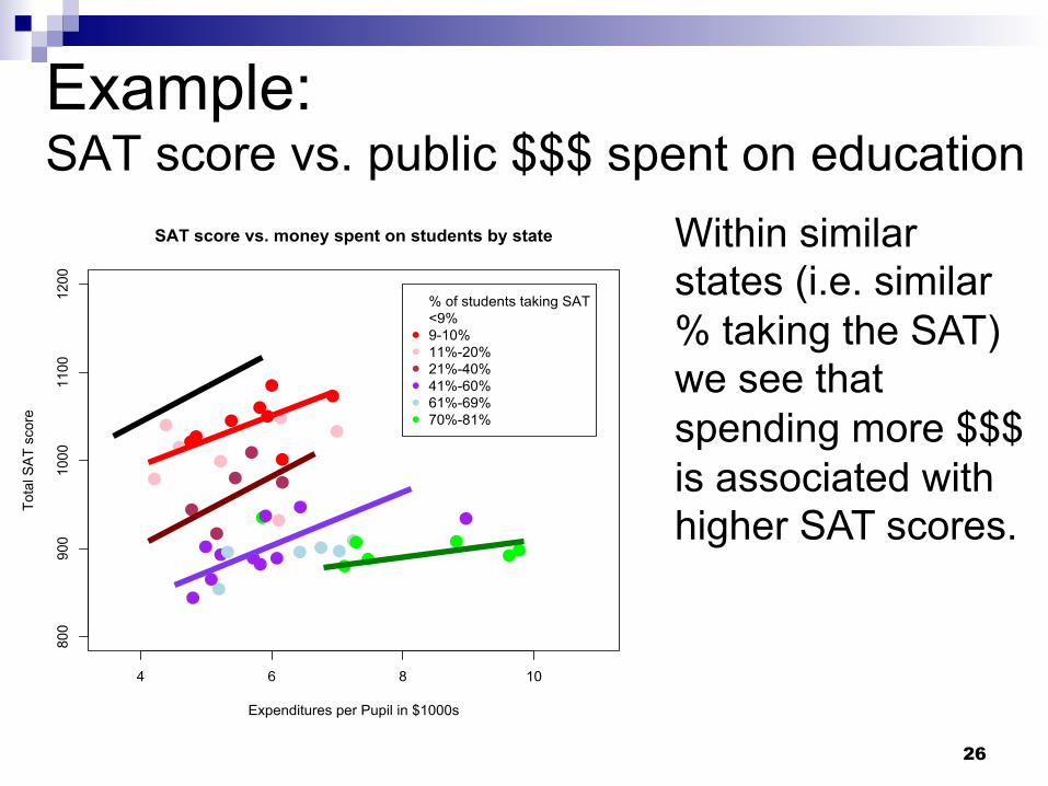
Example: SAT score vs. public $$$ spent on education
If you have ALL students in a state taking the SAT, then you won’t be grabbing just the ‘good students’… and the average SAT will be lower compared to states with a small percentage of their ‘best’ students taking the SAT (is this a fair state-to-state comparison?)
26
Within similar states (i.e. similar % taking the SAT) we see that spending more $$$ is associated with higher SAT scores.
4 6 8 10
800
900
1000
1100
1200
SAT score vs. money spent on students by state
Expenditures per Pupil in $1000s
Tot
al S
AT
sco
re
% of students taking SAT<9%9-10%11%-20%21%-40%41%-60%61%-69%70%-81%
Example: SAT score vs. public $$$ spent on education

Simpson’s Paradox
! A statistical relationship between two variables can be reversed by including additional factors in the analysis.
" By including the variable called “% of students taking the SAT”, we saw a reversal of the relationship shown in the original scatterplot between SAT score and $$$ spent per student.
27

Interpret correlation with caution
! Remember that correlation is a simple summary of a sometimes complex situation.
! Scatterplots are useful, but they do have limitations when many variables impact each other in a complex manner.
28

29
The SAT score and expenditure information was a modification of material available at:
www.stat.ucla.edu/labs/pdflabs/sat.pdf

Food for thought… Should we reward school teachers based on student’s standardized test scores?
30
0 20 40 60 80 100
0200
400
600
800
1000
1200
Test Scores vs. teaching ability and effort
Teacher's genuine ability and effort
Stu
dent
's n
atio
nal t
est s
core
s What might this scatterplot look like? If students score high, was the teacher good? If students score low, was the teacher bad?