asp.net 2.0 training - dcpehvpm.org
TRANSCRIPT
Venky
ASP.Net 2.0 Training
VS File Management
ASP.Net Image
ASP.Net Checkbox
ASP.Net ImageButton
ASP.Net RadioButton
ASP.Net Literal
ASP.Net Panel
ASP.Net LinkButton
ASP.Net Calendar
ASP.Net BulletedList
ASP.Net FileUpload
ASP.Net User Controls
ASP.Net PlaceHolder
ASP.Net Lists
ASP.Net CheckBoxList
ASP.Net DropDownList
ASP.Net Data Access
ASP.Net DetailsView
ASP.Net FormView
ASP.Net Repeater Control
ASP.Net:Master Pages
Sending EMail
MultiView
Tabbed MultiView
ASP.Net:Wizard Control
Login Controls 1
ASP.Net:Site Navigation
ASP.Net:Classes
ASP.Net:SQLDataSource Control
ASP.Net:Error Handling
ASP.Net:dataTables
ASP.Net:datasets
ASP.Net Tutorial Step by Step instructions with plenty of pictures. Learn to create ASP.Net websites using
Visual Studio quickly and easily. Visual Studio makes creating database connected websites easier than ever. Connection your website to SQL Server or Access sometimes without writing any code. Learn ASP.Net online for free. Learn how to do it in code as well as how to do it the EASY way.
ASP.Net Training Not just code examples, but step by step training in ASP.Net
ASP.Net is Microsoft’s latest version of ASP All the controls are covered in detail Including the data bound controls
ADO.Net tutorial Currently I have tutorials for the data Bound controls but I also plan to add complete
ADO.Net training and tutorials.
Venky
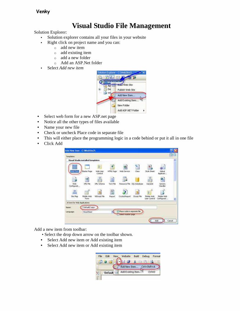
Visual Studio File Management Solution Explorer:
• Solution explorer contains all your files in your website • Right click on project name and you can:
o add new item o add existing item o add a new folder o Add an ASP.Net folder
• Select Add new item
• Select web form for a new ASP.net page • Notice all the other types of files available • Name your new file • Check or uncheck Place code in separate file • This will either place the programming logic in a code behind or put it all in one file • Click Add
Add a new item from toolbar: • Select the drop down arrow on the toolbar shown. • Select Add new item or Add existing item • Select Add new item or Add existing item
Venky
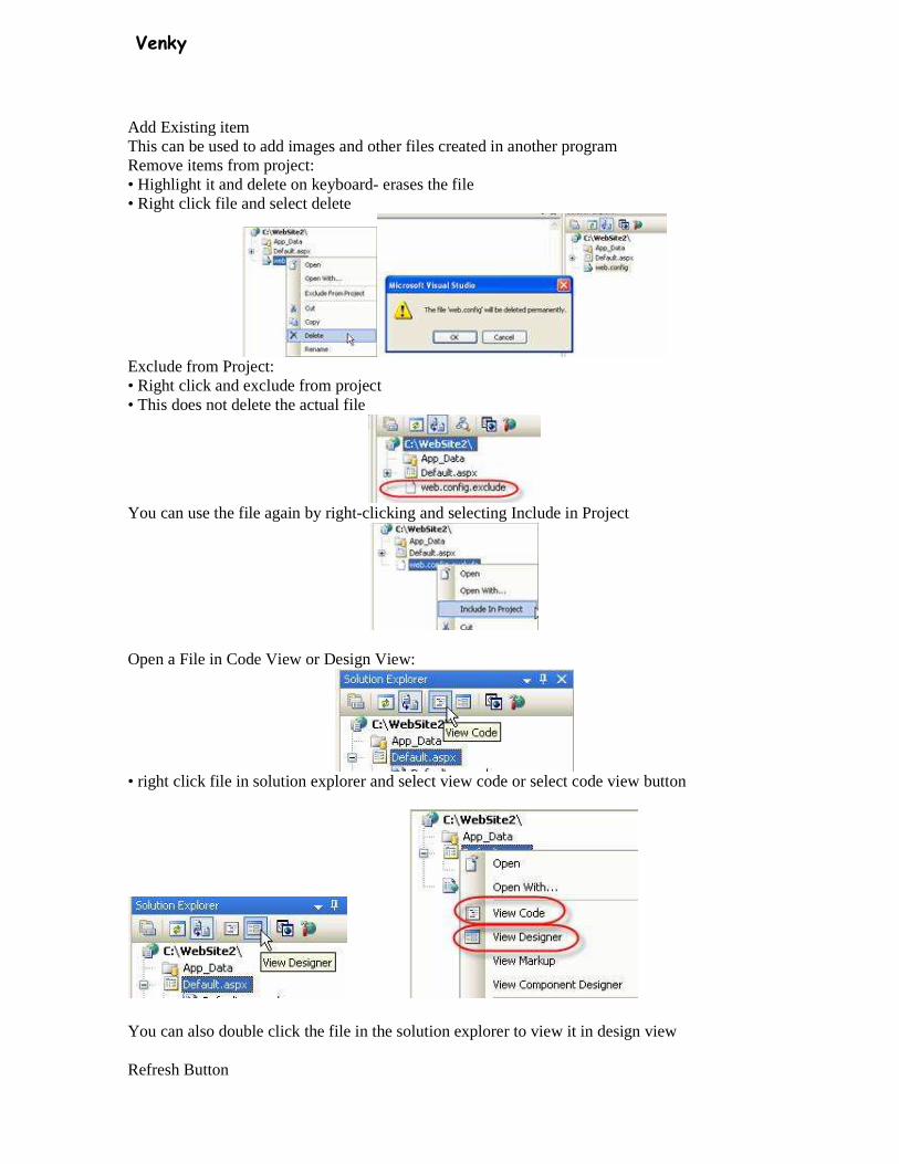
Add Existing item This can be used to add images and other files created in another program Remove items from project: • Highlight it and delete on keyboard- erases the file • Right click file and select delete
Exclude from Project: • Right click and exclude from project • This does not delete the actual file
You can use the file again by right-clicking and selecting Include in Project
Open a File in Code View or Design View:
• right click file in solution explorer and select view code or select code view button
You can also double click the file in the solution explorer to view it in design view
Refresh Button

Venky
Properties window: Setting project properties: • Select the project within solution explorer and properties show up in the properties panel • Right click on projects title and select properties
Use this dialog box for advanced property settings of your web site project You can also set properties in the Properties Window while selecting the project name Code View • In code view you can access any class by the first dropdown • You can reference any method and events from the second dropdown
ASP.Net 2.0 uses partial classes so you no longer have to include lines of generated code in all your files
Venky
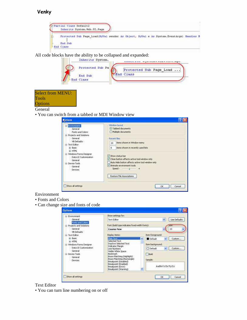
All code blocks have the ability to be collapsed and expanded:
Select from MENU: Tools Options General • You can switch from a tabbed or MDI Window view
Environment • Fonts and Colors • Can change size and fonts of code
Text Editor • You can turn line numbering on or off

Venky
Intellisense • While typing code Visual Studio will add a pop up box when you click the dot
ASP: Image
• The Image control is used to display an image.

Venky
Property Description AlternateText An alternate text for the image Enabled Specifies whether this control is enabled Font Specifies the font for the alternate text id A unique id for the control ImageAlign Specifies the alignment of the image. Legal values are:
• NotSet ,AbsBottom, AbsMiddle, BaseLine, Bottom • Left, Middle, Right, TextTop, Top
ImageUrl The URL of the image to display for the link Runat Specifies that the control is a server control. Must be set to "server"
Download the following image:http://www.morosko.com/comics1.gif save it to the c:\inetpub\wwwroot directory 1 <html><body> 2 <form runat="server"> 3 <asp:Image runat="server" AlternateText="Ad" ImageUrl=" comics1.gif " /> 4 </form></body> 5 </html> Save as: ImageEx.aspx
Try this in Visual Studio: • Open Visual Studio->Add a new web form->Name it ImageEx.aspx • Add an Image control
• In the properties window change the AlternateText property to Ad • Add an existing item and select the comics1.gif file • Select the image control again • Click on the ellipsis in the imageURL property
• Add the Comics1.gif image file • Test it

Venky
Checkbox
• The CheckBox control is used to display a check box.
Property Description AutoPostBack A Boolean value that specifies whether the form should be posted
immediately after the Checked property has changed or not. Default is false
Checked A Boolean value that specifies whether the check box is checked or not
id A unique id for the control OnCheckedChanged The name of the function to be executed when the Checked property has
changed runat Specifies that the control is a server control. Must be set to "server"
Text The text next to the check box TextAlign On which side of the check box the text should appear (right or left)
1 <script runat="server"> 2 Sub Check(sender As Object, e As EventArgs) 3 if check1.Checked then 4 work.Text=home.Text 5 else 6 work.Text="" 7 end if 8 End Sub 9 </script> 10 <html> 11 <body> 12 <form runat="server"> 13 <p>Home Phone: 14 <asp:TextBox id="home" runat="server" /> 15 <br /> 16 Work Phone: 17 <asp:TextBox id="work" runat="server" /> 18 <asp:CheckBox id="check1" Text="Same as home phone" TextAlign="Right"
AutoPostBack="True" OnCheckedChanged="Check" runat="server" /> 19 </p> 20 </form> 21 </body> 22 </html> Save as: Checkbox.aspx
Venky
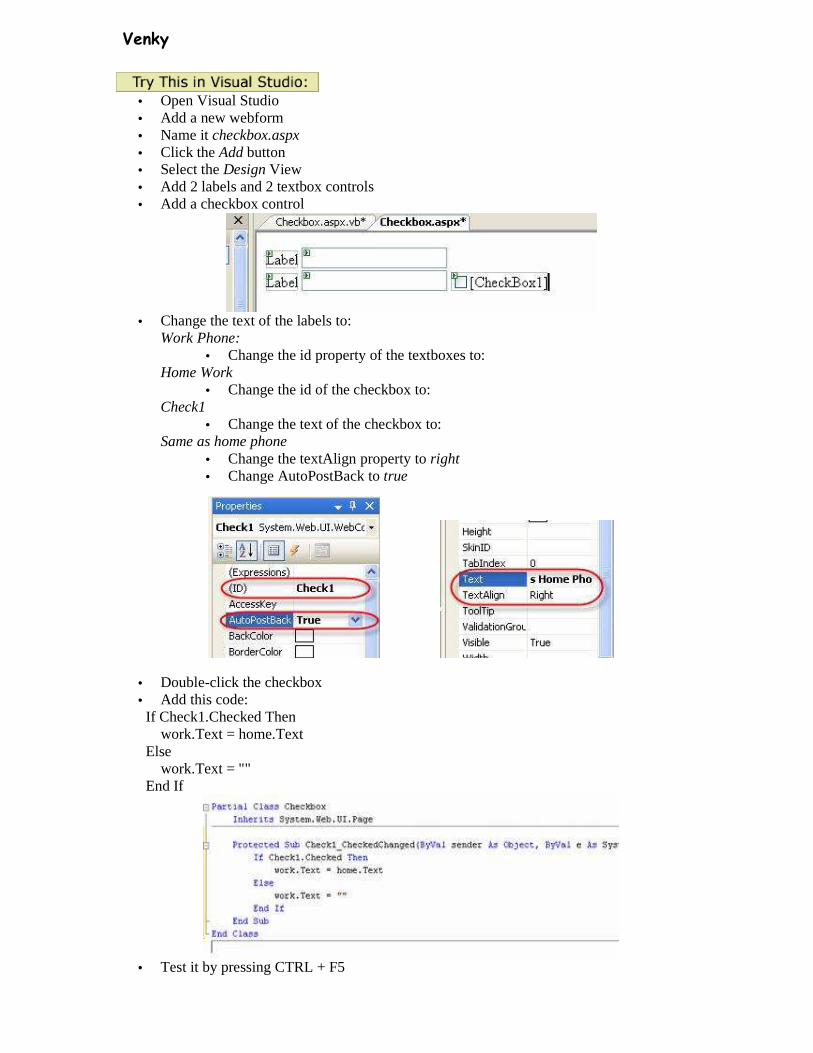
• Open Visual Studio • Add a new webform • Name it checkbox.aspx • Click the Add button • Select the Design View • Add 2 labels and 2 textbox controls • Add a checkbox control
• Change the text of the labels to:
Work Phone: • Change the id property of the textboxes to:
Home Work • Change the id of the checkbox to:
Check1 • Change the text of the checkbox to:
Same as home phone • Change the textAlign property to right • Change AutoPostBack to true
• Double-click the checkbox • Add this code:
If Check1.Checked Then work.Text = home.Text Else work.Text = "" End If
• Test it by pressing CTRL + F5

Venky
ImageButton
• The ImageButton control is used to display a clickable image.
Property Description CausesValidation By default, a page is validated when a Button control is clicked. To
prevent a page from being validated when clicking on a Button control, set this property to "false"
id A unique id for the control ImageUrl The URL of the image to display OnClick The name of the function to be executed when the image is clicked
runat Specifies that the control is a server control. Must be set to "server"
• Open Visual Studio • Add a new webform • Name it imageButton.aspx • Click the Add button • Select the Design View • Add an ImageButton control to the webform • Name it smallImage1 • Repeat it 3 more times, naming it smallImage2, smallImage3, smallImage4 • Add 4 images to your site • Select the ellipsis in the ImageURL property and select the image in each imageButton •
• Using the cursor change the size of the imageButtons down to a small button
• Add an Image control and name it bigImage
• Double click the imageButton and add this code:
Venky
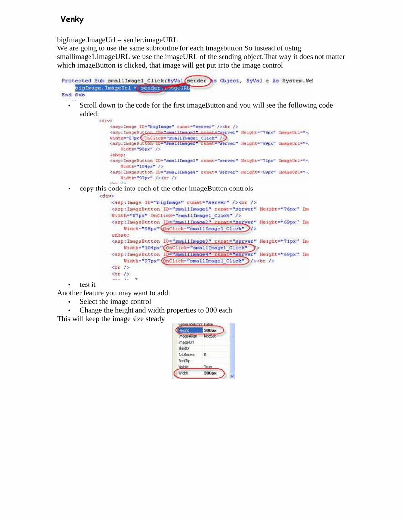
bigImage.ImageUrl = sender.imageURL We are going to use the same subroutine for each imagebutton So instead of using smallimage1.imageURL we use the imageURL of the sending object.That way it does not matter which imageButton is clicked, that image will get put into the image control
• Scroll down to the code for the first imageButton and you will see the following code
added:
• copy this code into each of the other imageButton controls
• test it
Another feature you may want to add: • Select the image control • Change the height and width properties to 300 each
This will keep the image size steady
Venky
RadioButton
• The RadioButton control is used to display a radio button. • RadioButtons are usually used in groups to allow the user to pick one from the group. • All radioButtons in the same group must have the same groupName property
Property Description AutoPostBack A Boolean value that specifies whether the form should be posted
immediately after the Checked property has changed or not. Default is false Checked A Boolean value that specifies whether the radio button is checked or not Id A unique id for the control GroupName The name of the group to which this radio button belongs OnCheckedChanged The name of the function to be executed when the Checked property has
changed runat Specifies that the control is a server control. Must be set to "server" Text The text next to the radio button TextAlign On which side of the radio button the text should appear (right or left) <script runat="server"> Sub submit(Sender As Object, e As EventArgs) if red.Checked then Label1.Text="You selected " & red.Text elseIf green.Checked then Label1.Text="You selected " & green.Text elseIf blue.Checked then Label1.Text="You selected " & blue.Text end if End Sub </script> <html><body> <form runat="server"> Select your favorite color: <br /> <asp:RadioButton id="red" Text="Red" Checked="True" GroupName="colors"
runat="server"/> <br /> <asp:RadioButton id="green" Text="Green" GroupName="colors" runat="server"/> <br />
<asp:RadioButton id="blue" Text="Blue" GroupName="colors" runat="server"/> <br /> <asp:Button text="Submit" OnClick="submit" runat="server"/> <p><asp:Label id="Label1" runat="server"/></p> </form> </body></html> Determining if radioButton was checked: Save as: RadioButton.aspx If radioButtonName.checked then ‘do code if checked End if
• Open Visual Studio • Add a new webform • Name it radioEx.aspx • Click the Add button
Venky
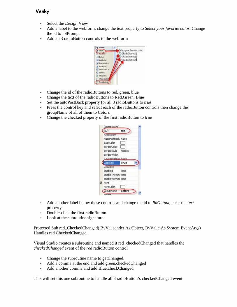
• Select the Design View • Add a label to the webform, change the text property to Select your favorite color. Change
the id to lblPrompt • Add an 3 radioButton controls to the webform
• Change the id of the radioButtons to red, green, blue • Change the text of the radioButtons to Red,Green, Blue • Set the autoPostBack property for all 3 radioButtons to true • Press the control key and select each of the radioButton controls then change the
groupName of all of them to Colors • Change the checked property of the first radioButton to true
• Add another label below these controls and change the id to lblOutput, clear the text property
• Double-click the first radioButton • Look at the subroutine signature:
Protected Sub red_CheckedChanged( ByVal sender As Object, ByVal e As System.EventArgs) Handles red.CheckedChanged
Visual Studio creates a subroutine and named it red_checkedChanged that handles the checkedChanged event of the red radioButton control
• Change the subroutine name to getChanged. • Add a comma at the end and add green.checkedChanged • Add another comma and add Blue.checkChanged
This will set this one subroutine to handle all 3 radioButton’s checkedChanged event
Venky
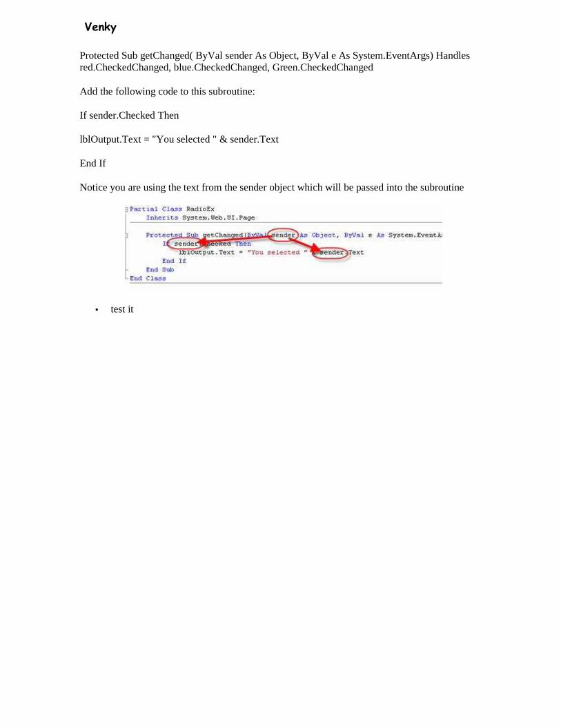
Protected Sub getChanged( ByVal sender As Object, ByVal e As System.EventArgs) Handles red.CheckedChanged, blue.CheckedChanged, Green.CheckedChanged
Add the following code to this subroutine:
If sender.Checked Then
lblOutput.Text = "You selected " & sender.Text
End If
Notice you are using the text from the sender object which will be passed into the subroutine
• test it
Venky
Literal Control • The Literal control is used to display text on a page. The text is programmable. • This control does not let you apply styles to its content!
Property Description id A unique id for the control runat Specifies that the control is a server control. Must be set to
"server" Text Specifies the text to display
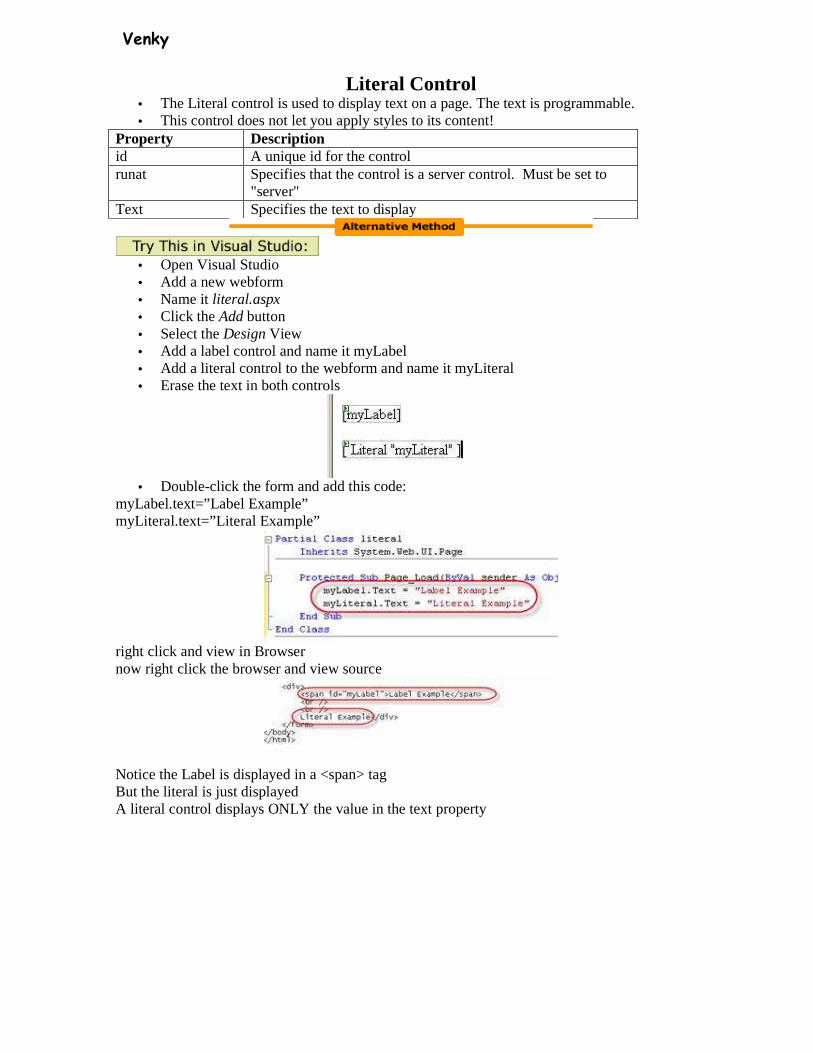
• Open Visual Studio • Add a new webform • Name it literal.aspx • Click the Add button • Select the Design View • Add a label control and name it myLabel • Add a literal control to the webform and name it myLiteral • Erase the text in both controls
• Double-click the form and add this code:
myLabel.text=”Label Example” myLiteral.text=”Literal Example”
right click and view in Browser now right click the browser and view source
Notice the Label is displayed in a <span> tag But the literal is just displayed A literal control displays ONLY the value in the text property
Venky
Panel Control • The Panel control is used as a container for other controls. • This control is often used to generate controls by code and to display and hide groups of
controls. • This control renders as an HTML <div> element.
Property Description BackImageUrl Specifies a URL to an image file to display as a background
for this control HorizontalAlign Specifies the horizontal alignment of the content. Legal values
are: Center ,Justify ,Left ,NotSet ,Right. id A unique id for the control runat Specifies that the control is a server control. Must be set to
"server" Wrap A Boolean value that specifies whether the content should
wrap or not Try this: 1 <script runat="server"> 2 Sub Page_Load(sender As Object, e As EventArgs) 3 if check1.Checked then 4 panel1.Visible=false 5 else 6 panel1.Visible=true 7 end if 8 End Sub 9 </script> 10 <html> 11 <body> 12 <form runat="server"> 13 <asp:Panel id="panel1" runat="server" BackColor="#ff0000" Height="100px"
Width="100px"> 14 Hello World! 15 </asp:Panel> 16 <asp:CheckBox id="check1" Text="Hide Panel control" runat="server"/> 17 <br /><br /> 18 <asp:Button Text="Reload" runat="server" /> 19 </form> 20 </body> 21 </html> Save as: Panel.aspx
• Open Visual Studio • Add a new webform • Name it Panel.aspx • Click the Add button • Select the Design View • Add a checkbox control and name it chkDisplay • Add a panel control and name it pnlDisplay
o You can make it larger by dragging the corners out
Venky
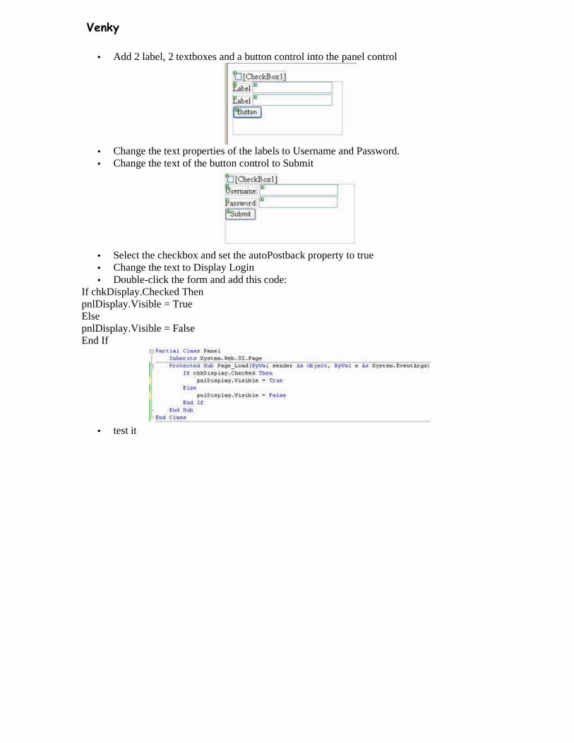
• Add 2 label, 2 textboxes and a button control into the panel control
• Change the text properties of the labels to Username and Password. • Change the text of the button control to Submit
• Select the checkbox and set the autoPostback property to true • Change the text to Display Login • Double-click the form and add this code:
If chkDisplay.Checked Then pnlDisplay.Visible = True Else pnlDisplay.Visible = False End If
• test it
Venky
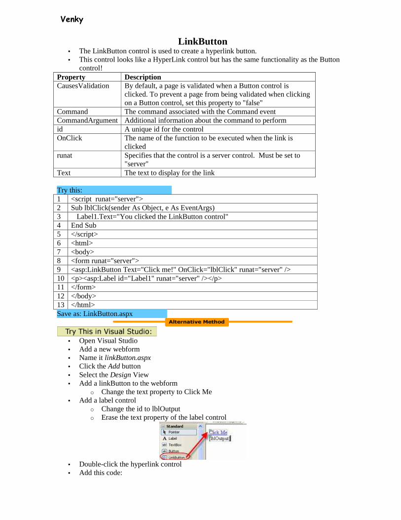
LinkButton • The LinkButton control is used to create a hyperlink button. • This control looks like a HyperLink control but has the same functionality as the Button
control! Property Description CausesValidation By default, a page is validated when a Button control is
clicked. To prevent a page from being validated when clicking on a Button control, set this property to "false"
Command The command associated with the Command event CommandArgument Additional information about the command to perform id A unique id for the control OnClick The name of the function to be executed when the link is
clicked runat Specifies that the control is a server control. Must be set to
"server" Text The text to display for the link Try this: 1 <script runat="server"> 2 Sub lblClick(sender As Object, e As EventArgs) 3 Label1.Text="You clicked the LinkButton control" 4 End Sub 5 </script> 6 <html> 7 <body> 8 <form runat="server"> 9 <asp:LinkButton Text="Click me!" OnClick="lblClick" runat="server" /> 10 <p><asp:Label id="Label1" runat="server" /></p> 11 </form> 12 </body> 13 </html> Save as: LinkButton.aspx
• Open Visual Studio • Add a new webform • Name it linkButton.aspx • Click the Add button • Select the Design View • Add a linkButton to the webform
o Change the text property to Click Me • Add a label control
o Change the id to lblOutput o Erase the text property of the label control
• Double-click the hyperlink control • Add this code:

Venky
lblOutput.text=”You clicked the linkButton.”
• test it
Calendar • The Calendar control is used to display a calendar in the browser. • This control displays a one-month calendar that allows the user to select dates and move to
the next and previous months. Property Description CellPadding The space, in pixels, between the cell walls and contents CellSpacing The space, in pixels, between cells DayHeaderStyle The style for displaying the names of the days DayNameFormat The format for displaying the names of the days. Can take
one of the following values: • FirstLetter • FirstTwoLetters • Full • Short
DayStyle The style for displaying days FirstDayOfWeek What should be the first day of week. Can take one of the
following values: • Default • Monday • Tuesday • Wednesday • Thursday • Friday • Saturday • Sunday
id A unique id for the control NextMonthText The text displayed for the next month link NextPrevFormat The format of the next and previous month links. Can take
one of the following values: • ShortMonth • FullMonth • CustomText
NextPrevStyle The style for displaying next and previous month links OnDayRender The name of the function to be executed when when each
day cell is created OnSelectionChanged The name of the function to be executed when the user
selects a day, week, or month OnVisibleMonthChanged The name of the function to be executed when the user
navigates to a different month OtherMonthDayStyle The style for displaying days that are not in the current
month PrevMonthText The text displayed for the previous month link runat Specifies that the control is a server control. Must be set to
Venky
"server" SelectedDate The selected date SelectedDates The selected dates SelectedDayStyle The style for selected days SelectionMode How a user is allowed to select dates. Can take one of the
following values: • None • Day • DayWeek • DayWeekMonth
SelectMonthText The text displayed for the month selection link SelectorStyle The style for the month and weeks selection links SelectWeekText The text displayed for the week selection link ShowDayHeader A Boolean value that specifies whether the days of the
week header should be shown ShowGridLines A Boolean value that specifies whether the grid lines
between days should be shown ShowNextPrevMonth A Boolean value that specifies whether the next and
previous month links should be shown ShowTitle A Boolean value that specifies whether the title of the
calendar should be shown TitleFormat The format for the title of the calendar. Can take one of the
following values: • Month • MonthYear
TitleStyle The style of the title of the calendar TodayDayStyle The style for today's date TodaysDate Today's date VisibleDate The date that specifies the month that is currently visible in
the calendar WeekendDayStyle The style for weekends
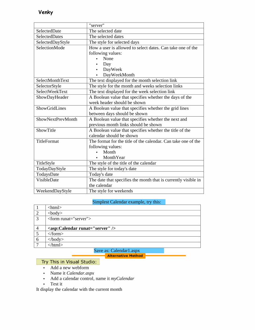
Simplest Calendar example, try this:
1 <html> 2 <body> 3 <form runat="server">
4 <asp:Calendar runat="server" /> 5 </form> 6 </body> 7 </html>
Save as: Calendar1.aspx
• Add a new webform • Name it Calendar.aspx • Add a calendar control, name it myCalendar • Test it
It display the calendar with the current month
Venky
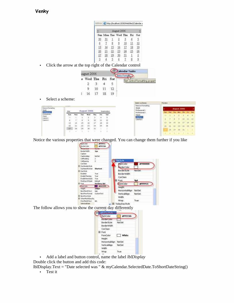
• Click the arrow at the top right of the Calendar control
• Select a scheme:
Notice the various properties that were changed. You can change them further if you like
The follow allows you to show the current day differently
• Add a label and button control, name the label lblDisplay
Double click the button and add this code: lblDisplay.Text = "Date selected was " & myCalendar.SelectedDate.ToShortDateString()
• Test it
Venky
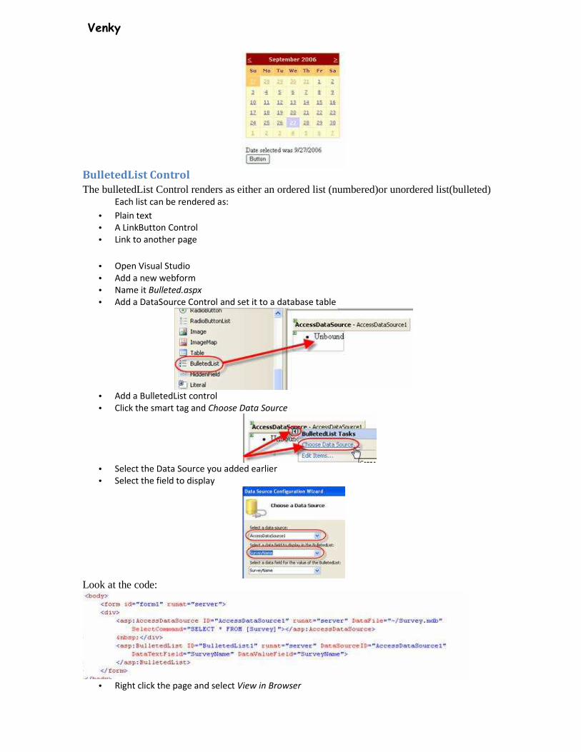
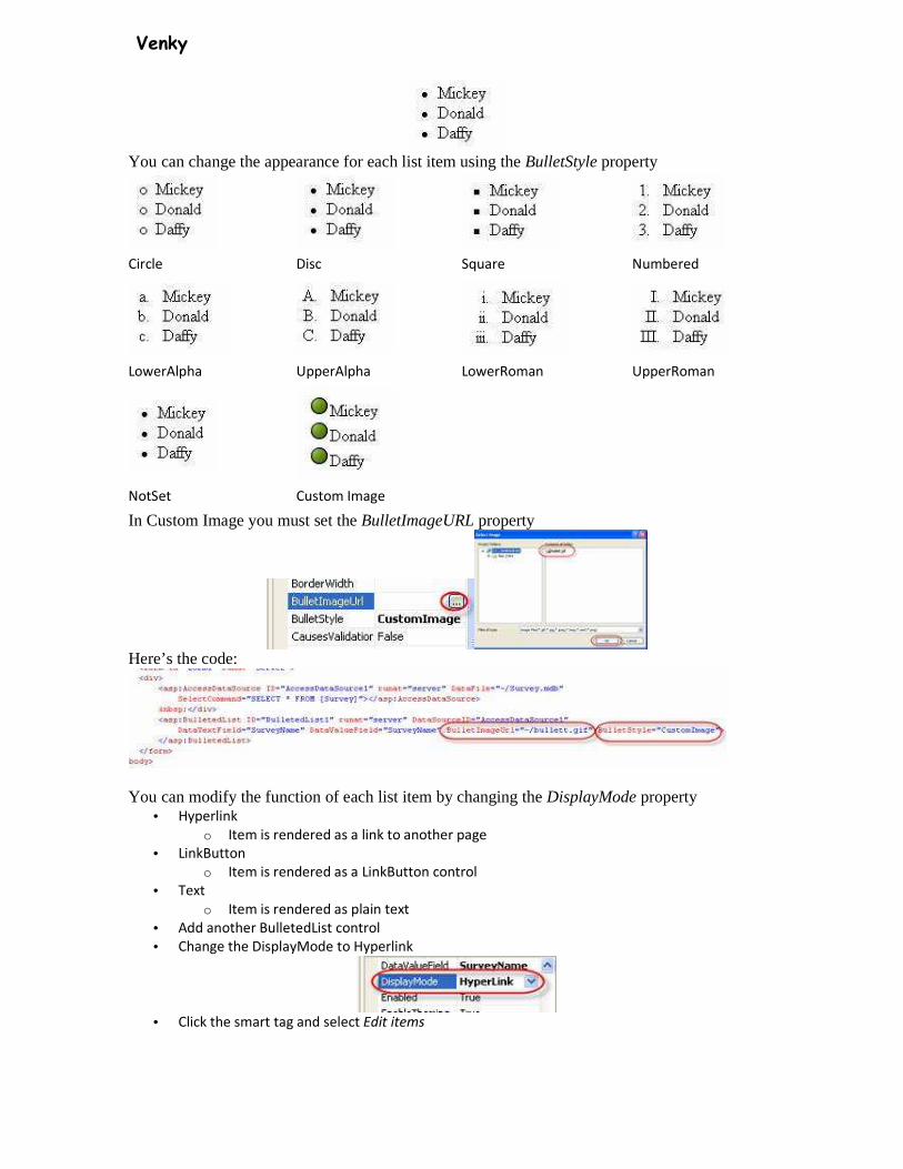
BulletedList Control
The bulletedList Control renders as either an ordered list (numbered)or unordered list(bulleted) Each list can be rendered as:
• Plain text
• A LinkButton Control
• Link to another page
• Open Visual Studio
• Add a new webform
• Name it Bulleted.aspx
• Add a DataSource Control and set it to a database table
• Add a BulletedList control
• Click the smart tag and Choose Data Source
• Select the Data Source you added earlier
• Select the field to display
Look at the code:
• Right click the page and select View in Browser
Venky
You can change the appearance for each list item using the BulletStyle property
Circle Disc Square Numbered
LowerAlpha UpperAlpha LowerRoman UpperRoman
NotSet Custom Image
In Custom Image you must set the BulletImageURL property
Here’s the code:
You can modify the function of each list item by changing the DisplayMode property
• Hyperlink
o Item is rendered as a link to another page
• LinkButton
o Item is rendered as a LinkButton control
• Text
o Item is rendered as plain text
• Add another BulletedList control
• Change the DisplayMode to Hyperlink
• Click the smart tag and select Edit items
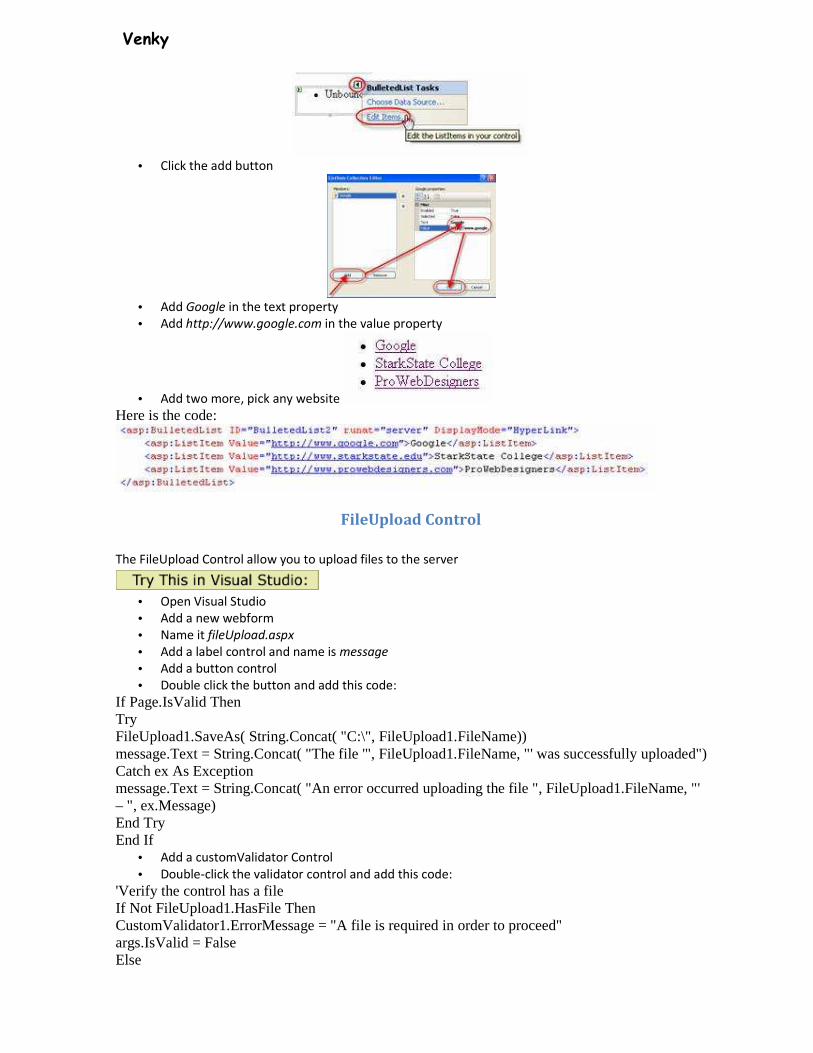
Venky
• Click the add button
• Add Google in the text property
• Add http://www.google.com in the value property
• Add two more, pick any website
Here is the code:
FileUpload Control
The FileUpload Control allow you to upload files to the server
• Open Visual Studio
• Add a new webform
• Name it fileUpload.aspx
• Add a label control and name is message
• Add a button control
• Double click the button and add this code:
If Page.IsValid Then Try FileUpload1.SaveAs( String.Concat( "C:\", FileUpload1.FileName)) message.Text = String.Concat( "The file '", FileUpload1.FileName, "' was successfully uploaded") Catch ex As Exception message.Text = String.Concat( "An error occurred uploading the file ", FileUpload1.FileName, "' – ", ex.Message) End Try End If
• Add a customValidator Control
• Double-click the validator control and add this code:
'Verify the control has a file If Not FileUpload1.HasFile Then CustomValidator1.ErrorMessage = "A file is required in order to proceed" args.IsValid = False Else
Venky
Dim ext As String = System.Web.VirtualPathUtility.GetExtension(FileUpload1.FileName).ToUpper() If Not ext = ".GIF" And Not ext = ".JPG" Then CustomValidator1.ErrorMessage = String.Concat( "Invalid file type '", etx, "' - must be .gif or .jpg to continue") args.IsValid = False Else args.IsValid = True End If End If
• Test it
User Controls
A user control allows you to package frequently used user interfaces and the processing logic in a way that can be used as a pluggable component
Use Web User Controls to create reusable page elements
• Headers
• Footers
• Navigation bars
• Menus
You can also use them to create new controls out of other multiple controls
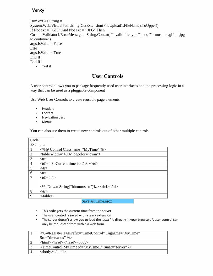
Code Example: 1 <%@ Control Classname=”MyTime” %> 2 <table width=”40%” bgcolor=”cyan”> 3 <tr> 4 <td><h3>Current time is:</h3></td> 5 </tr> 6 <tr> 7 <td><h4>
<%=Now.toString(“hh:mm:ss tt”)%> </h4></td> 8 </tr> 9 </table>
Save as: Time.ascx
• This code gets the current time from the server
• The user control is saved with a .ascx extension
• The server doesn’t allow you to load the .ascx file directly in your browser. A user control can
only be requested from within a web form
1 <%@Register TagPrefix=”TimeControl” Tagname=”MyTime” Src=”time.ascx” %>
2 <html><head></head><body> 3 <TimeControl:MyTime id=”MyTime1” runat=”server” /> 4 </body></html>
Venky
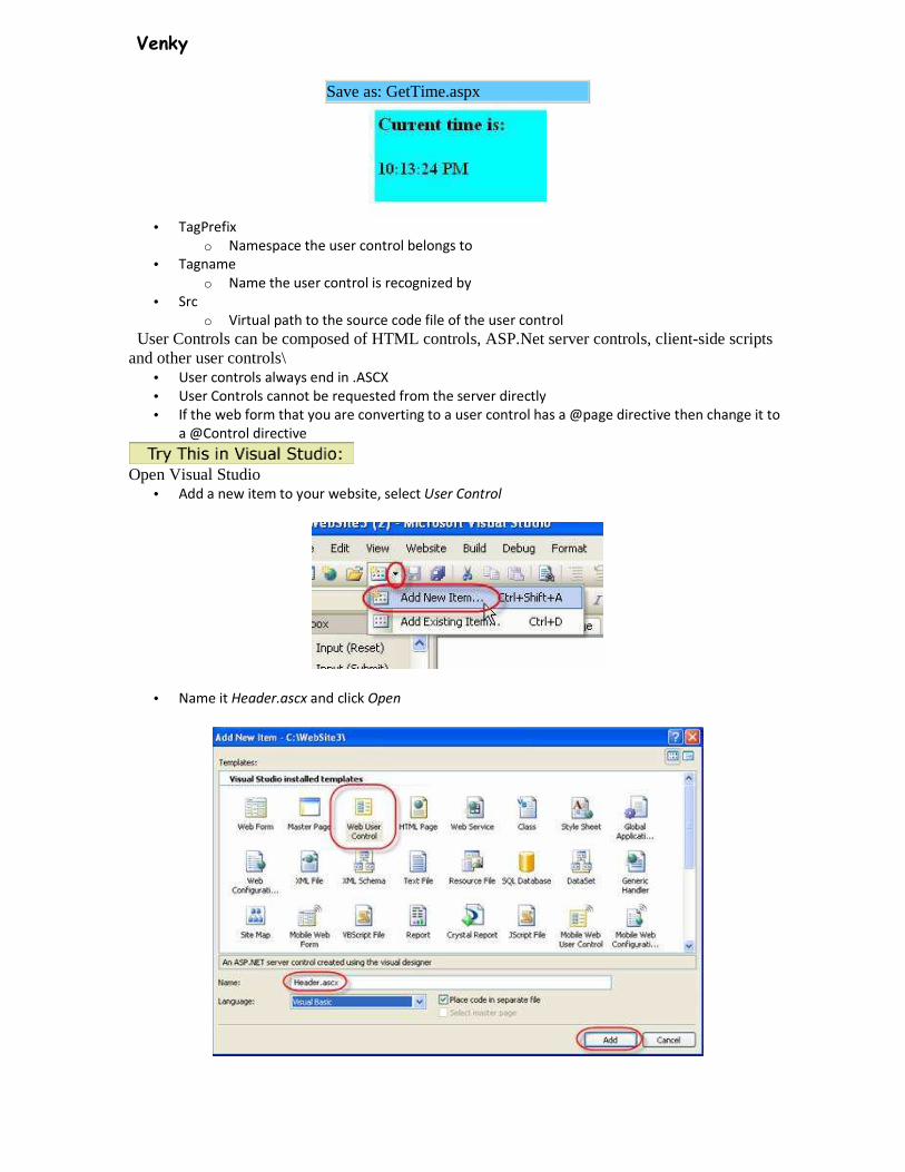
Save as: GetTime.aspx
• TagPrefix
o Namespace the user control belongs to
• Tagname
o Name the user control is recognized by
• Src
o Virtual path to the source code file of the user control
User Controls can be composed of HTML controls, ASP.Net server controls, client-side scripts and other user controls\
• User controls always end in .ASCX
• User Controls cannot be requested from the server directly
• If the web form that you are converting to a user control has a @page directive then change it to
a @Control directive
Open Visual Studio
• Add a new item to your website, select User Control
• Name it Header.ascx and click Open
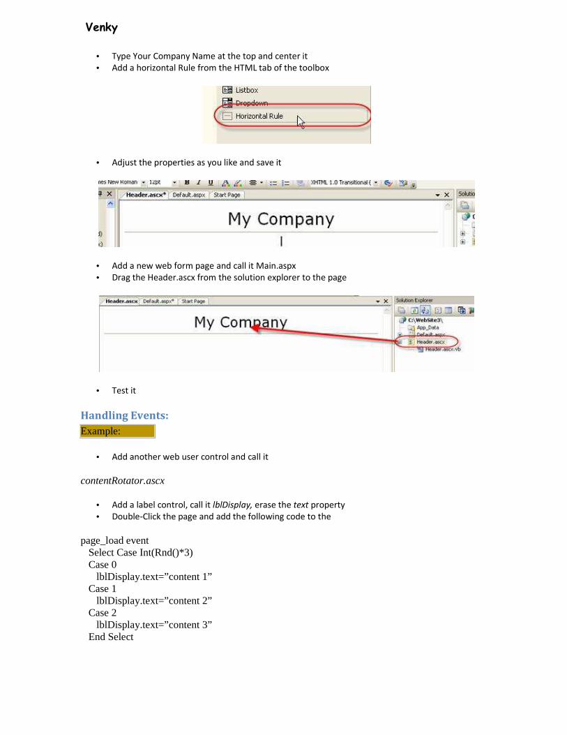
Venky
• Type Your Company Name at the top and center it
• Add a horizontal Rule from the HTML tab of the toolbox
• Adjust the properties as you like and save it
• Add a new web form page and call it Main.aspx
• Drag the Header.ascx from the solution explorer to the page
• Test it
Handling Events:
Example:
• Add another web user control and call it
contentRotator.ascx
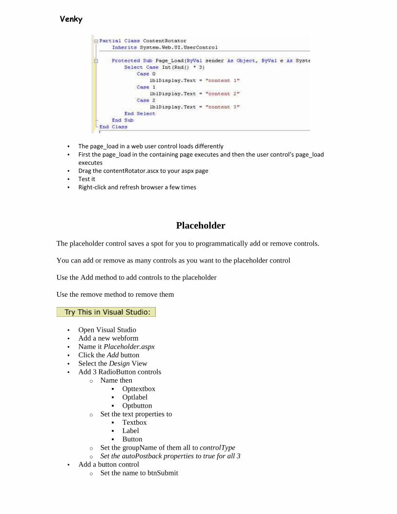
• Add a label control, call it lblDisplay, erase the text property
• Double-Click the page and add the following code to the
page_load event Select Case Int(Rnd()*3) Case 0 lblDisplay.text=”content 1” Case 1 lblDisplay.text=”content 2” Case 2 lblDisplay.text=”content 3” End Select
Venky
• The page_load in a web user control loads differently
• First the page_load in the containing page executes and then the user control’s page_load
executes
• Drag the contentRotator.ascx to your aspx page
• Test it
• Right-click and refresh browser a few times
Placeholder
The placeholder control saves a spot for you to programmatically add or remove controls.
You can add or remove as many controls as you want to the placeholder control
Use the Add method to add controls to the placeholder
Use the remove method to remove them
• Open Visual Studio • Add a new webform • Name it Placeholder.aspx • Click the Add button • Select the Design View • Add 3 RadioButton controls
o Name then � Opttextbox � Optlabel � Optbutton
o Set the text properties to � Textbox � Label � Button
o Set the groupName of them all to controlType o Set the autoPostback properties to true for all 3
• Add a button control o Set the name to btnSubmit
Venky
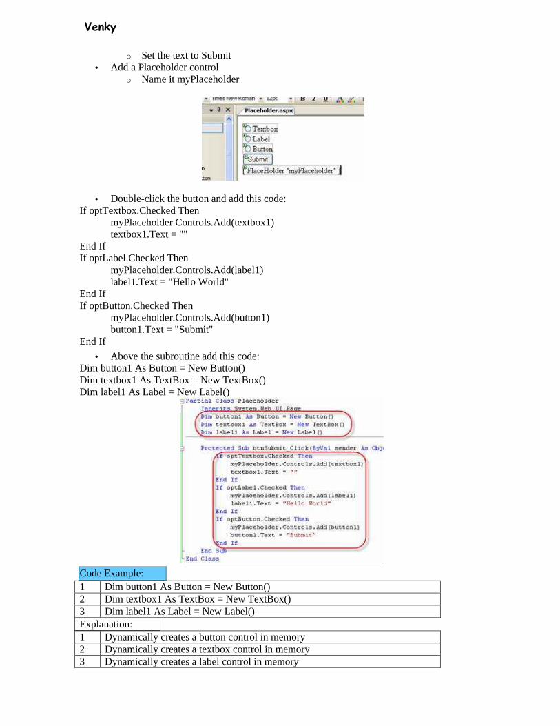
o Set the text to Submit • Add a Placeholder control
o Name it myPlaceholder
• Double-click the button and add this code: If optTextbox.Checked Then
myPlaceholder.Controls.Add(textbox1) textbox1.Text = ""
End If If optLabel.Checked Then
myPlaceholder.Controls.Add(label1) label1.Text = "Hello World"
End If If optButton.Checked Then
myPlaceholder.Controls.Add(button1) button1.Text = "Submit"
End If
• Above the subroutine add this code: Dim button1 As Button = New Button() Dim textbox1 As TextBox = New TextBox() Dim label1 As Label = New Label()
Code Example: 1 Dim button1 As Button = New Button() 2 Dim textbox1 As TextBox = New TextBox() 3 Dim label1 As Label = New Label() Explanation: 1 Dynamically creates a button control in memory 2 Dynamically creates a textbox control in memory 3 Dynamically creates a label control in memory
Venky
Code Example: 1 If optTextbox.Checked Then 2 myPlaceholder.Controls.Add(textbox1) 3 textbox1.Text = "" 4 End If 5 If optLabel.Checked Then 6 myPlaceholder.Controls.Add(label1) 7 label1.Text = "Hello World" 8 End If 9 If optButton.Checked Then 10 myPlaceholder.Controls.Add(button1) 11 button1.Text = "Submit" 12 End If Explanation: 1 Check to see if the first radioButton is checked 2 If it is checked add the textbox control that was created dynamically to the
controls collection of the placeholder 3 Erase the default text on the textbox 4 End the if statement 5 Check to see if the second radioButton is checked 6 If it is checked add the label control that was created dynamically to the
controls collection of the placeholder 7 Change the default text on the label to Hello World 8 End the if statement 9 Check to see if the third radioButton is checked 10 If it is checked add the button control that was created dynamically to the
controls collection of the placeholder 11 Change the default text on the button to Submit 12 End the if statement
Lesson 6: A few more elements Did you manage to make a few pages on your own? If not, here is an example: <html> <head> <title>My website</title> </head> <body> <h1>A Heading</h1> <p>text, text text, text</p> <h2>Subhead</h2> <p>text, text text, text</p> </body> </html>
Now what?
Now it is time to learn seven new elements. In the same way you emphasise the text by putting it between the openning tag <em> and the closing tag </em>, you can give stronger emphasis by using the openning tag <strong> and the closing tag </strong>.

Venky
Example 1: <strong>Stronger emphasis.</strong> Will look like this in the browser:
Stronger emphasis.
Likewise, you can make your text smaller using small: Example 2: <small>This should be in small.</small> Will look like this in the browser: This should be in small.
Can I use several elements at the same time?
You can easily use several elements at the same time as long as you avoid overlapping elements. This is best illustrated by an example: Example 3: If you want to emphasise small text, it must be done like this: <em><small>Emphasised small text</small></em> And NOT like this: <em><small>Emphasise small text</em></small>
The difference is that in the first example, we closed the tag we first opened last. This way we avoid confusing both ourselves and the browser. More elements!
As mentioned in Lesson 3 there are elements which are opened and closed in the same tag. These so-called empty elements are not connected to a specific passage in the text but rather are isolated labels. An example of such a tag is <br /> which creates a forced line break: Example 4: Some text<br /> and some more text in a new line Will look like this in the browser: Some text
and some more text in a new line
Notice that the tag is written as a contraction of an opening and closing tag with an empty space and a forward slash at the end: <br />. Another element that is opened and closed in the same tag is <hr /> which is used to draw a horizontal line ("hr" stands for "horizontal rule"): Example 5: <hr /> Will look like this in the browser:
Examples of elements that needs both an opening tag and a closing tag - as most elements do - is ul, ol and li. These elements are used when you want to make lists. ul is short for "unordered list" and inserts bullets for each list item. ol is short for "ordered list" and numbers each list item. To make items in the list use the li tag ("list item"). Confused? See the examples: Example 7: <ul> <li>A list item</li> <li>Another list item</li> </ul> will look like this in the browser:
• A list item
• Another list item
Example 8:

Venky
<ol> <li>First list item</li> <li>Second list item</li> </ol> will look like this in the browser:
1. First list item
2. Second list item
Phew! Is that all?
That is all for now. Again, experiment and make your own pages using some of the seven new elements you learned in this lesson: <strong>Stronger emphasis</strong> <small>Small text</small> <br /> Line shift <hr /> Horizontal line <ul>List</ul> <ol>Ordered list</ol> <li>List item</li>
Lists
ArrayList-A collection of items containing a single data value. Use the Add method to add items to the ArrayList
Example: 1 <script runat="server"> 2 Sub Page_Load 3 if Not Page.IsPostBack then 4 dim Munsters=New ArrayList
5 Munsters.Add("Herman") 6 Munsters.Add("Lily") 7 Munsters.Add("Grandpa") 8 Munsters.Add("Eddie") 9 Munsters.Add("Marylyn") 10 end if 11 end sub 12 </script>
An ArrayList object contains 16 entries by default. You can resize an ArrayList with the TrimToSize() method:
Example: 1 <script runat="server"> 2 Sub Page_Load 3 if Not Page.IsPostBack then 4 dim Munsters=New ArrayList
5 Munsters.Add("Herman") 6 Munsters.Add("Lily") 7 Munsters.Add("Grandpa") 8 Munsters.Add("Eddie")

Venky
9 Munsters.Add("Marylyn") 10 Munsters.TrimToSize() 11 end if 12 end sub 13 </script>
You can sort an ArrayList alphabetically or numerically with Sort()
Example: 1 <script runat="server"> 2 Sub Page_Load 3 if Not Page.IsPostBack then 4 dim Munsters=New ArrayList 5 Munsters.Add("Herman") 6 Munsters.Add("Lily") 7 Munsters.Add("Grandpa") 8 Munsters.Add("Eddie") 9 Munsters.Add("Marylyn") 10 Munsters.TrimToSize() 11 Munsters.Sort() 12 end if 13 end sub 14 </script>
You can sort in reverse order using Reverse() after the Sort() method
Example: 1 <script runat="server"> 2 Sub Page_Load 3 if Not Page.IsPostBack then 4 dim Munsters=New ArrayList 5 Munsters.Add("Herman") 6 Munsters.Add("Lily") 7 Munsters.Add("Grandpa") 8 Munsters.Add("Eddie") 9 Munsters.Add("Marylyn") 10 Munsters.TrimToSize() 11 Munsters.Sort() 12 Munsters.Reverse() 13 end if 14 end sub 15 </script>
Venky
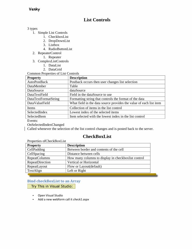
List Controls
3 types 1. Simple List Controls
1. CheckboxList 2. DropDownList 3. Listbox 4. RadioButtonList
2. RepeaterControl 1. Repeater
3. ComplexListControls 1. DataList 2. DataGrid
Common Properties of List Controls Property Description AutoPostBack Postback occurs then user changes list selection DataMember Table DataSource dataSource DataTextField Field in the dataSource to use DataTextFormatString Formatting string that controls the format of the data DataValueField What field in the data source provides the value of each list item Items Collection of items in the list control SelectedIndex Lowest index of the selected items SelectedItem Item selected with the lowest index in the list control Events: OnSelectedIndexChanged Called whenever the selection of the list control changes and is posted back to the server.
CheckBoxList Properties ofCheckBoxList Property Description CellPadding Between border and contents of the cell CellSpacing Distance between cells RepeatColumns How many columns to display in checkboxlist control RepeatDirection Vertical or Horizontal RepeatLayout Flow or Layout(default) TextAlign Left or Right
Bind checkBoxList to an Array
• Open Visual Studio
• Add a new webform call it check1.aspx
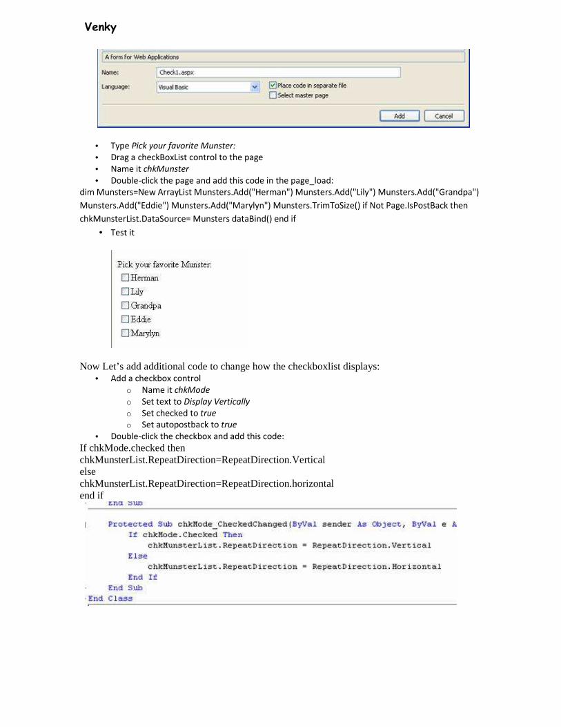
Venky
• Type Pick your favorite Munster:
• Drag a checkBoxList control to the page
• Name it chkMunster
• Double-click the page and add this code in the page_load:
dim Munsters=New ArrayList Munsters.Add("Herman") Munsters.Add("Lily") Munsters.Add("Grandpa")
Munsters.Add("Eddie") Munsters.Add("Marylyn") Munsters.TrimToSize() if Not Page.IsPostBack then
chkMunsterList.DataSource= Munsters dataBind() end if
• Test it
Now Let’s add additional code to change how the checkboxlist displays: • Add a checkbox control
o Name it chkMode
o Set text to Display Vertically
o Set checked to true
o Set autopostback to true
• Double-click the checkbox and add this code:
If chkMode.checked then chkMunsterList.RepeatDirection=RepeatDirection.Vertical else chkMunsterList.RepeatDirection=RepeatDirection.horizontal end if
Venky
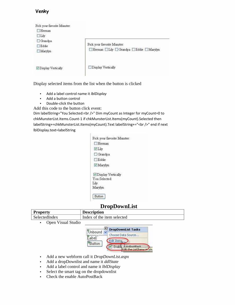
Display selected items from the list when the button is clicked
• Add a label control name it lblDisplay
• Add a button control
• Double-click the button
Add this code to the button click event: Dim labelString="You Selected:<br />" Dim myCount as Integer for myCount=0 to
chkMunsterList.Items.Count-1 if chkMunsterList.Items(myCount).Selected then
labelString+=chkMunsterList.Items(myCount).Text labelString+="<br />" end if next
lblDisplay.text=labelString
DropDownList Property Description SelectedIndex Index of the item selected
• Open Visual Studio
• Add a new webform call it DropDownList.aspx • Add a dropDownlist and name it ddlState • Add a label control and name it lblDisplay • Select the smart tag on the dropdownlist • Check the enable AutoPostBack
Venky
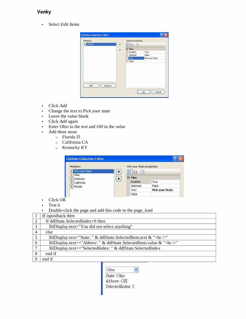
• Select Edit Items
• Click Add • Change the text to Pick your state • Leave the value blank • Click Add again • Enter Ohio in the text and OH in the value • Add three more
o Florida Fl o California CA o Kentucky KY
• Click OK • Test it • Double-click the page and add this code to the page_load
1 If ispostback then 2 If ddlState.SelectedIndex=0 then 3 lblDisplay.text="You did not select anything" 4 else 5 lblDisplay.text="State: " & ddlState.SelectedItem.text & "<br />" 6 lblDisplay.text+="Abbrev: " & ddlState.SelectedItem.value & "<br />" 7 lblDisplay.text+="SelectedIndex: " & ddlState.SelectedIndex 8 end if 9 end if
Venky
Data Access There are 3 main types of dataBound controls
1. List Controls 2. Tabular databound controls 3. Hierarchical databound controls
List Controls: 1. BulletedList 2. CheckboxList 3. DropDownList 4. Listbox 5. RadioButtonList
Tabular DataBound Controls 1. Display a set of data
1. GridView 2. DataList 3. Repeater
2. Display a single data item at a time 1. DetailsView 2. FormView
The DataGrid is included in ASP.Net 2.0 for backward compatibility. It is not recommended to use it Hierarchical DataBound Controls
1. Menu 2. TreeView
Both of these controls are bound to an XMLDataSource Control You can bind any control to these data items You can also bind any control to a data item by adding the control to a template DataSource Controls
1. SQLDataSource 1. Retrieve data from a SQL relational database
� SQL Server � Oracle � DB2
1. AccessDataSOurce 1. Retrieve from a Microsoft Access database
2. ObjectDataSource 1. Retrieve data from a business object
3. XMLDataSource 1. Retrieve data from an XML document
4. SiteMapDataSOurce 1. Data retrieved from a sitemap provider
These fall within one of two categories Represent tabular data:
• SQLDataSource • AccessDataSource • ObjectDataSource
Represent tabular and hierarchical data • XMLDataSource • SiteMapDataSource
Databound controls are associated with one of these dataSources with its DataSourceID property DataSource Controls and Parameters

Venky
SQLDataSource, AccessdataSOurce and ObjectDataSOurce can use the following parameters: • Paremeter
o Static value • ControlParameter
o Value of a control or page property • CookieParameter
o Value of a browser cookie • FormParameter
o Value of an HTML form field • ProfileParameter
o Value of a profile property • QueryStringParameter
o Value of a querystring field • SessionParameter
o Value of an item stored in a session A parameter in SQLDataSource represents an ADO.Net parameter A parameter in ObjectDataSource represents a method parameter
This example allows the user to select a record from a dropDownList and displays the details in a gridView. The second data source control uses a controlparameter in the where clause
• Download the following file http://www.prowebdesigners.com/aspnet/resources/database.mdf
• Open Visual Studio • Add a new webform • Add an existing item, select the database file you just downloaded • Add it to the App_Data directory
• Add a SQLDataSource control to the page(from the data tab in the toolbox)
Venky
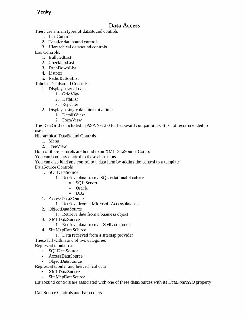
• Click the smart tag and select Configure Data Source • From the dropdown list select the database.mdf file • Visual Studio will recommend saving your connection string in your configuration file.
This is a very good practice. Click Next.
• Select your table and the columns you want. Click * to select all columns. • Click OrderBy to sort the data • Select the column you want to sort by in the dropdown list
• Click Next
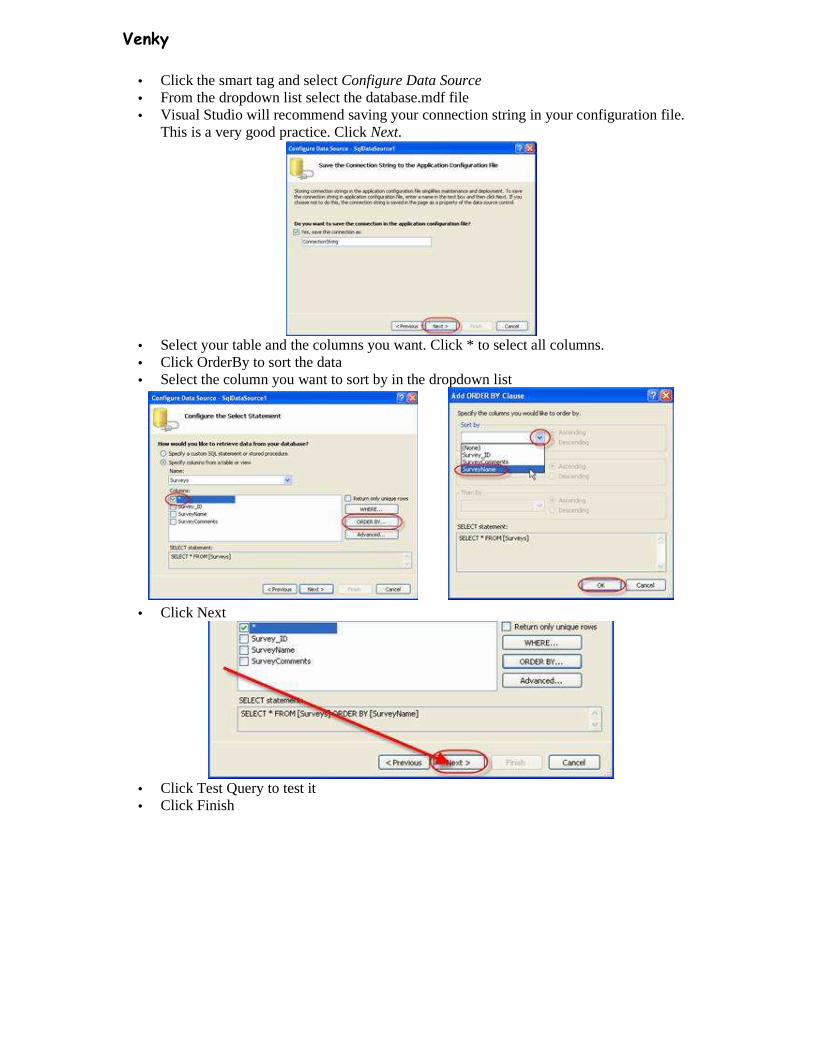
• Click Test Query to test it • Click Finish
Venky
Here is the code:
• Add a dropDownList Control • Select Choose Data Source
• Select the SQLDataSource you just set up
Select the field you want to display in the dropDownList then the field you want to pass when submitted. Select SurveyName to display Select Survey_id to pass when submitted. This will uniquely identify the selected row

Venky
• Click OK • Set the AutoPostBack property to True • Test it
Here is the code:
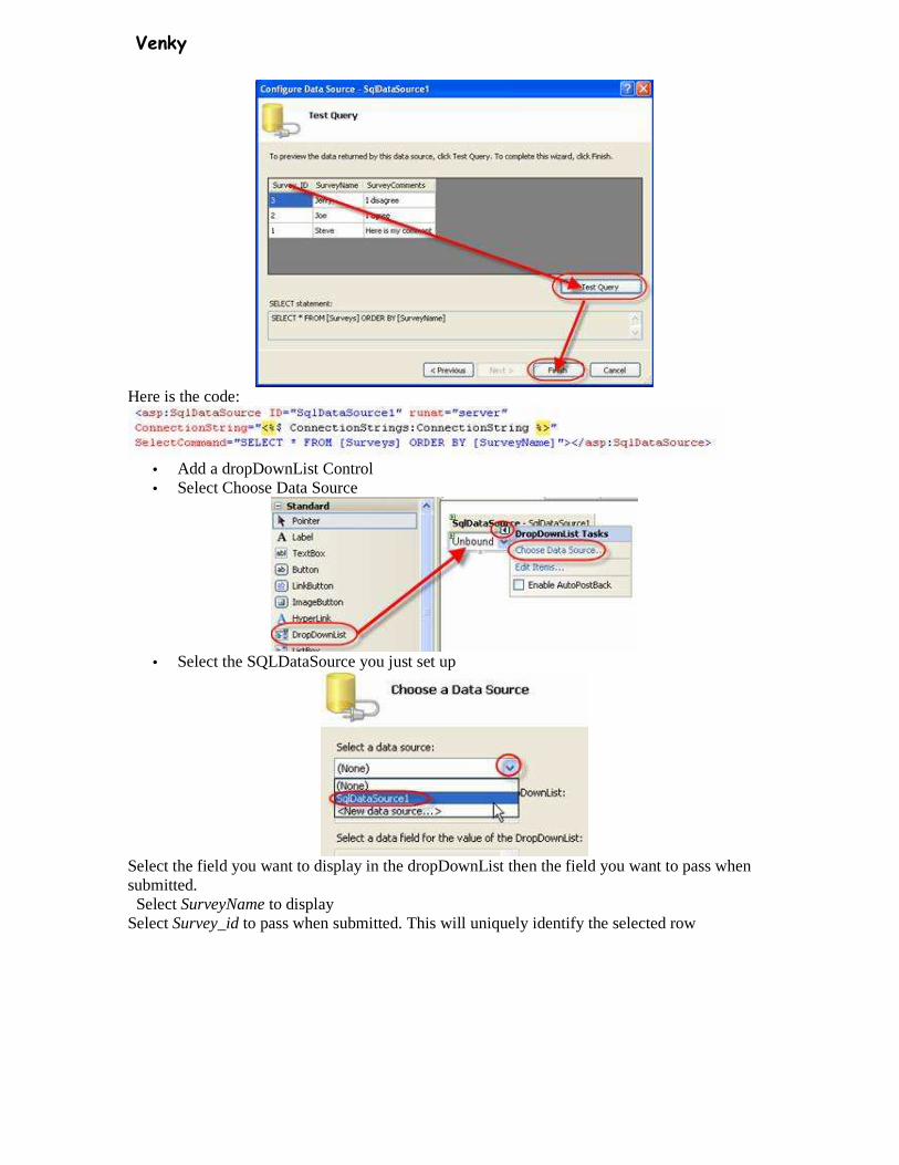
• Add another SQLDataSource control • Select Configure Data Source
• Select the connection string you created in the last data Source
• Select all columns and then click the Where button
Venky
• Select Survey_Id as the column • Make sure = is selected in the second dropdownList • Select control as the Source
This will retrieve the parameter from a control. Once you select this more options appear • Select the dropDownList control • Click Add
It adds the code for your parameter • Click OK
You where clause is now complete
• Click Next
• Click Finish
Here is the code:
• Add a gridView control • Click Choose Data Source
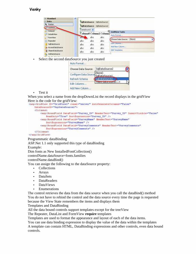
Venky
• Select the second dataSource you just created
• Test it
When you select a name from the dropDownList the record displays in the gridView Here is the code for the gridView:
Programmatic dataBinding ASP.Net 1.1 only supported this type of dataBinding Example: Dim fonts as New InstalledFontCollection() controlName.dataSource=fonts.families controlName.dataBind() You can assign the following to the dataSource property:
• Collections • Arrays • DataSets • DataReaders • DataViews • Enumerations
The control retrieves the data from the data source when you call the dataBind() method You do not have to rebind the control and the data source every time the page is requested because the View State remembers the items and displays them Templates and DataBinding All the data bound controls support templates except for the treeView The Repeater, DataList and FormView require templates Templates are used to format the appearance and layout of each of the data items. You can use data binding expression to display the value of the data within the templates A template can contain HTML, DataBinding expressions and other controls, even data bound controls.
Venky
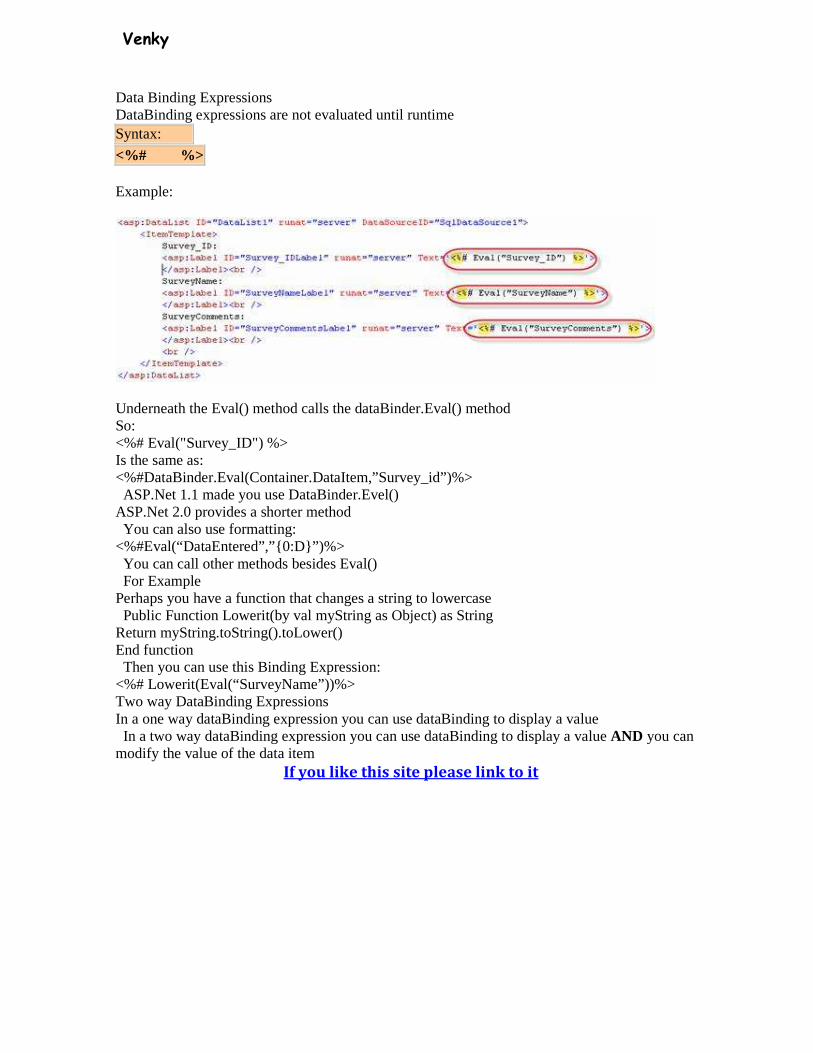
Data Binding Expressions DataBinding expressions are not evaluated until runtime Syntax:
<%# %>
Example:
Underneath the Eval() method calls the dataBinder.Eval() method So: <%# Eval("Survey_ID") %> Is the same as: <%#DataBinder.Eval(Container.DataItem,”Survey_id”)%> ASP.Net 1.1 made you use DataBinder.Evel() ASP.Net 2.0 provides a shorter method You can also use formatting: <%#Eval(“DataEntered”,”{0:D}”)%> You can call other methods besides Eval() For Example Perhaps you have a function that changes a string to lowercase Public Function Lowerit(by val myString as Object) as String Return myString.toString().toLower() End function Then you can use this Binding Expression: <%# Lowerit(Eval(“SurveyName”))%> Two way DataBinding Expressions In a one way dataBinding expression you can use dataBinding to display a value In a two way dataBinding expression you can use dataBinding to display a value AND you can modify the value of the data item
If you like this site please link to it
Venky
Detailsview Control The DetailsView control in ASP.Net 2.0 is used to create an HTML table that displays the contents of a single database record. Displaying Data with the Details View Control in ASP.Net 2.0
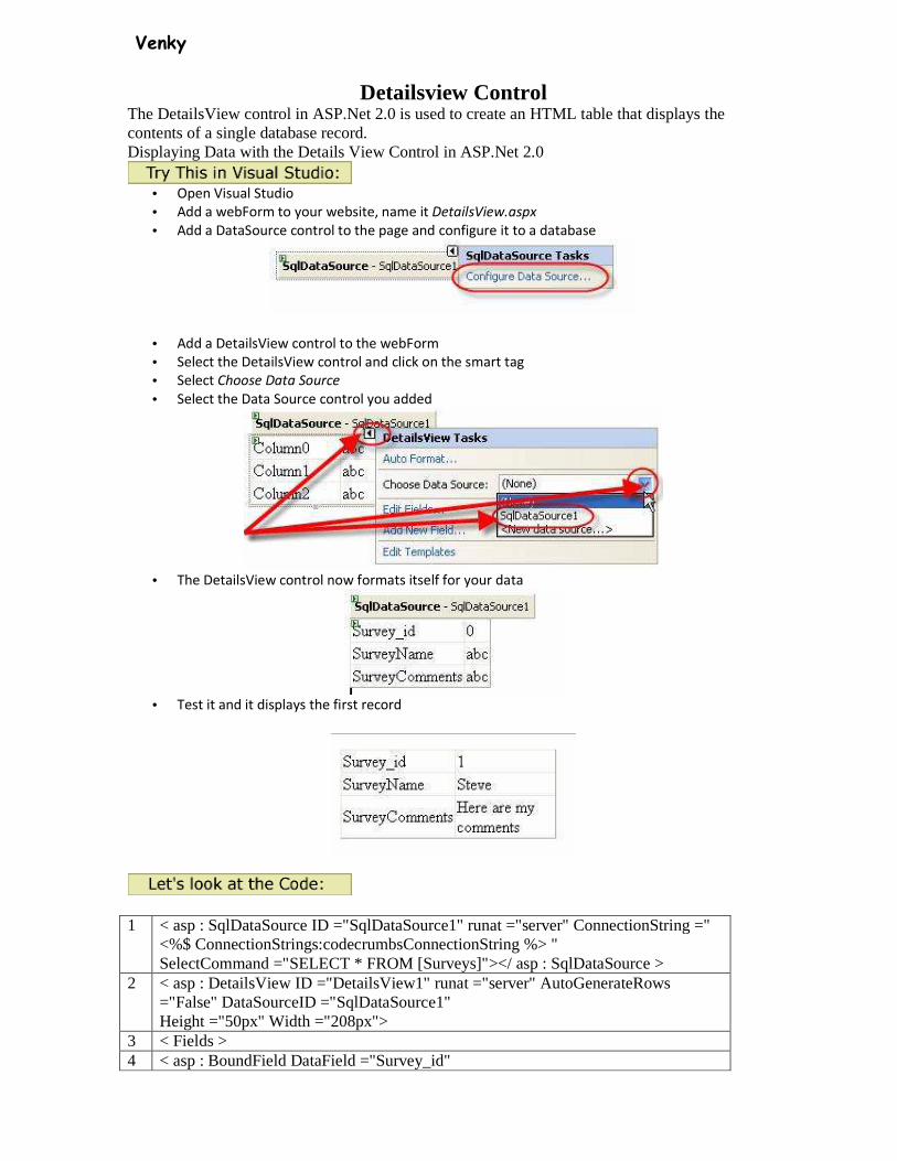
• Open Visual Studio
• Add a webForm to your website, name it DetailsView.aspx
• Add a DataSource control to the page and configure it to a database
• Add a DetailsView control to the webForm
• Select the DetailsView control and click on the smart tag
• Select Choose Data Source
• Select the Data Source control you added
• The DetailsView control now formats itself for your data
• Test it and it displays the first record
1 < asp : SqlDataSource ID ="SqlDataSource1" runat ="server" ConnectionString =" <%$ ConnectionStrings:codecrumbsConnectionString %> " SelectCommand ="SELECT * FROM [Surveys]"></ asp : SqlDataSource >
2 < asp : DetailsView ID ="DetailsView1" runat ="server" AutoGenerateRows ="False" DataSourceID ="SqlDataSource1" Height ="50px" Width ="208px">
3 < Fields > 4 < asp : BoundField DataField ="Survey_id"
Venky
HeaderText ="Survey_id" InsertVisible ="False" ReadOnly ="True" SortExpression ="Survey_id" />
5 < asp : BoundField DataField ="SurveyName" HeaderText ="SurveyName" SortExpression ="SurveyName" />
6 < asp : BoundField DataField ="SurveyComments" HeaderText ="SurveyComments" SortExpression ="SurveyComments" />
7 </ Fields > 8 </ asp : DetailsView >
1 SQL Sata Source Control
Connection String to the database SelectCommand contains the SQL statement to retrieve the data
2 Open DetailsView Control Set the dataSourceID to our SQL Data Source
3 Set up fields 4 Create a dataBound field
The HeaderText is SurveyID – This is the text that is used to label the textbox The dataField is set to the Survey_Id database field
5 Create a dataBound field The HeaderText is SurveyName – This is the text that is used to label the textbox The dataField is set to the SurveyName database field
6 Create a dataBound field The HeaderText is SurveyComments – This is the text that is used to label the textbox The dataField is set to the SurveyComments database field
7 Close the Fields 8 Close the DetailsView Control DetailsView Fields in ASP.Net 2.0
You can control the appearance of the DetailsView The DetailView control supports the following Fields
BoundField Displays the value of a data item as text CheckBoxField Displays the value of the data item as a check box CommandField Displays links for editing, deleting and selecting rows ButtonField Displays the value of a data item as a button, imagebutton,
linkbutton HyperlinkField Displays the value of a data item as a link ImageField Displays the value of a data item as an image TemplateField Customize the appearance of a data item
Change the text describing each row
• Click on the DetailsView smart tag
• Select Edit Fields

Venky
• Select any of the fields
• Select HeaderText
• Change the value to whatever you want displayed to the left of the data field
<asp:BoundField DataField="SurveyName" HeaderText="Survey Name" SortExpression="SurveyName" /> You can also choose to not display a field
• Select the field you do not want to display
Venky
Insert Visible – Determine if this field will be displayed when the detailsView’s mode is set to insert ShowHeader – Determines if this field will display a header text Visible – Determines if this field will be displayed
<asp:BoundField DataField="Survey_id" HeaderText="Survey_id" InsertVisible="False" ReadOnly="True" SortExpression="Survey_id" ShowHeader="False" Visible="False" /> Formatting Data
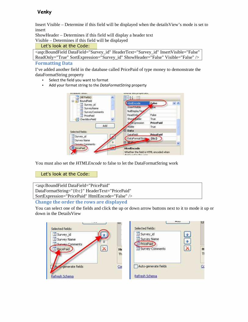
I’ve added another field in the database called PricePaid of type money to demonstrate the dataFormatString property
• Select the field you want to format
• Add your format string to the DataFormatString property
You must also set the HTMLEncode to false to let the DataFormatString work
<asp:BoundField DataField="PricePaid" DataFormatString="{0:c}" HeaderText="PricePaid" SortExpression="PricePaid" HtmlEncode="False" /> Change the order the rows are displayed
You can select one of the fields and click the up or down arrow buttons next to it to mode it up or down in the DetailsView
Venky
Displaying a message when there is no data
There are two ways to display a message when the data source is returning no results. 1. EmptyDataText Property
2. EmptyDataTemplate Property
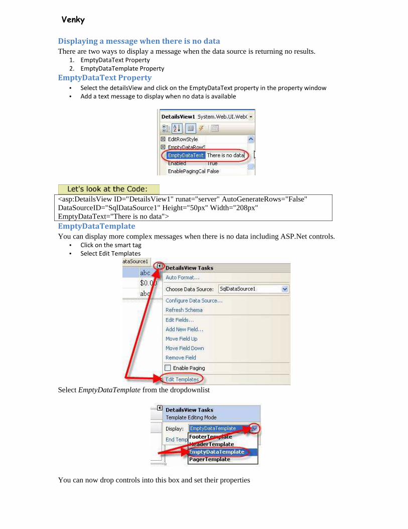
EmptyDataText Property
• Select the detailsView and click on the EmptyDataText property in the property window
• Add a text message to display when no data is available
<asp:DetailsView ID="DetailsView1" runat="server" AutoGenerateRows="False" DataSourceID="SqlDataSource1" Height="50px" Width="208px" EmptyDataText="There is no data"> EmptyDataTemplate
You can display more complex messages when there is no data including ASP.Net controls. • Click on the smart tag
• Select Edit Templates
Select EmptyDataTemplate from the dropdownlist
You can now drop controls into this box and set their properties
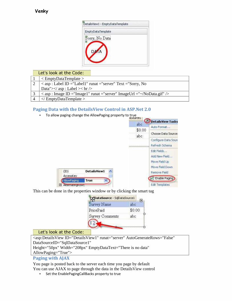
Venky
1 < EmptyDataTemplate > 2 < asp : Label ID ="Label1" runat ="server" Text ="Sorry, No
Data"></ asp : Label >< br /> 3 < asp : Image ID ="Image1" runat ="server" ImageUrl ="~/NoData.gif" /> 4 </ EmptyDataTemplate > Paging Data with the DetailsView Control in ASP.Net 2.0
• To allow paging change the AllowPaging property to true
This can be done in the properties window or by clicking the smart tag
<asp:DetailsView ID="DetailsView1" runat="server" AutoGenerateRows="False" DataSourceID="SqlDataSource1" Height="50px" Width="208px" EmptyDataText="There is no data" AllowPaging="True"> Paging with AJAX
You page is posted back to the server each time you page by default You can use AJAX to page through the data in the DetailsView control
• Set the EnablePagingCallBacks property to true

Venky
Now the paging is done on the client-side To test this let’s add a label control to the page Name it showTime Clear the text property Double click on the page and add this line of code in the page_load method showTime.text=DateTime.Now
Test the page and do some paging, notice the date and time does not change. This shows that the page never posted back to the server. Customize the DetailsView Paging Interface
By default, numbers are displayed for paging You can change that by changing the PagerSettings property Click the plus sign next to the pagerSettings in the properties window
You can add a URL for an image in the following properties: • FirstPageImageURL
• LastPageImageURL
• NextPageImageURL
• PreviousPageImageURL
You can change the text links in the following properties: • FirstPageText
• LastPageText
• Next PageText
• Previous PageText
You can change the format or the pager by changing the Mode property Possible Values are:
• Numeric (default)
• NextPrevious
• NextPreviousFirstLast
• NumericFirstLast
Venky
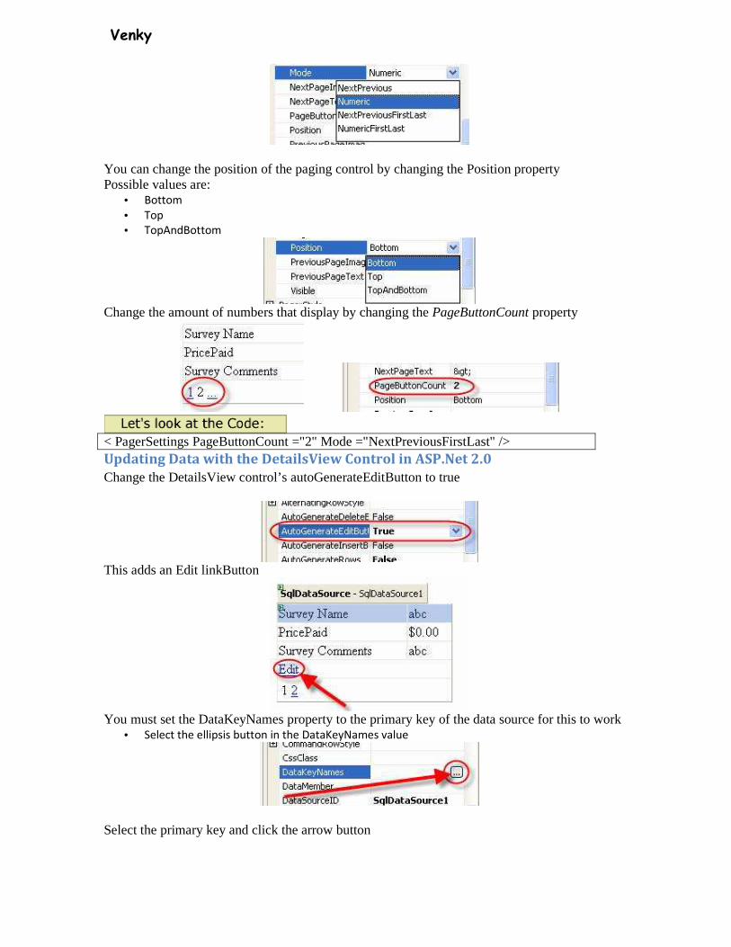
You can change the position of the paging control by changing the Position property Possible values are:
• Bottom
• Top
• TopAndBottom
Change the amount of numbers that display by changing the PageButtonCount property
< PagerSettings PageButtonCount ="2" Mode ="NextPreviousFirstLast" /> Updating Data with the DetailsView Control in ASP.Net 2.0
Change the DetailsView control’s autoGenerateEditButton to true
This adds an Edit linkButton
You must set the DataKeyNames property to the primary key of the data source for this to work
• Select the ellipsis button in the DataKeyNames value
Select the primary key and click the arrow button

Venky
The control will automatically generate textboxes to allow the user to change the values
It also automatically creates a Update and Cancel linkButton You must also add an UpdateCommand in your dataSource control Select the data Source control and click on the UpdateQuery property in the properties window
Add your query into the UpdateCommand
By default the detailsView uses the name of each field as the parameter name, you only need put an @ symbol in front of it (For SQL Server) You can force the DetailsView control to appear in the Edit mode by setting the defaultMode to Edit
<asp:SqlDataSource ID="SqlDataSource1" runat="server" ConnectionString=" <%$ ConnectionStrings:codecrumbsConnectionString %>" SelectCommand="SELECT * FROM [Surveys]" UpdateCommand="Update Surveys set SurveyName=@SurveyName, SurveyComments=@SurveyComments,PricePaid=@PricePaid where Survey_ID=@Survey_ID"> </asp:SqlDataSource> <asp:DetailsView ID="DetailsView1" runat="server" AutoGenerateRows="False" DataSourceID="SqlDataSource1" Height="50px" Width="208px" EmptyDataText="There is no data" AllowPaging="True" EnablePagingCallbacks="True" AutoGenerateEditButton="True" DataKeyNames="Survey_id">
Venky
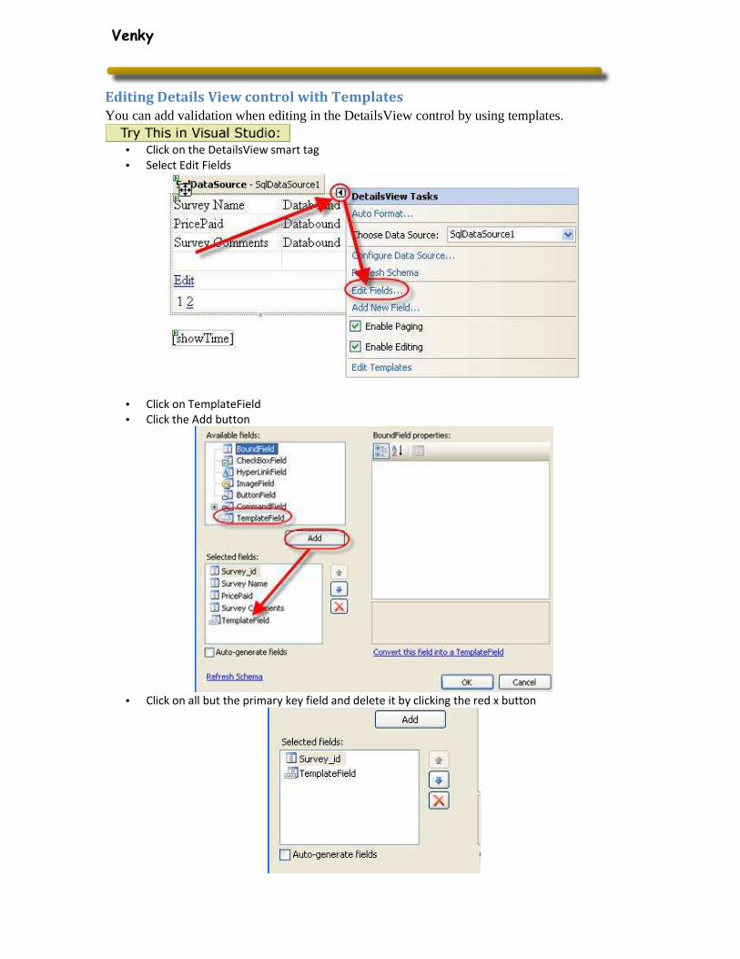
Editing Details View control with Templates
You can add validation when editing in the DetailsView control by using templates.
• Click on the DetailsView smart tag
• Select Edit Fields
• Click on TemplateField
• Click the Add button
• Click on all but the primary key field and delete it by clicking the red x button
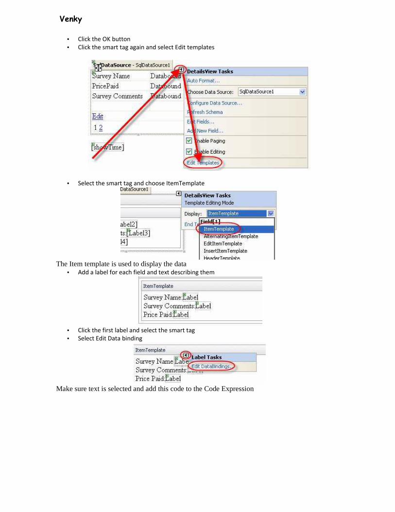
Venky
• Click the OK button
• Click the smart tag again and select Edit templates
• Select the smart tag and choose ItemTemplate
The Item template is used to display the data
• Add a label for each field and text describing them
• Click the first label and select the smart tag
• Select Edit Data binding
Make sure text is selected and add this code to the Code Expression
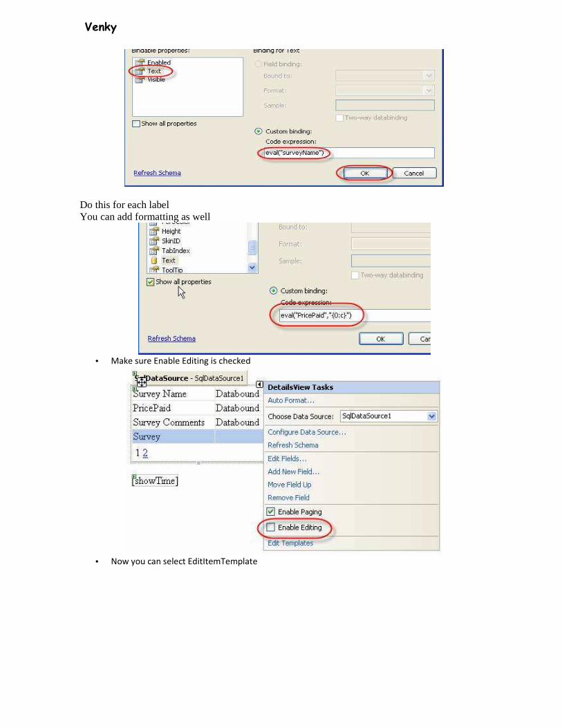
Venky
Do this for each label You can add formatting as well
• Make sure Enable Editing is checked
• Now you can select EditItemTemplate
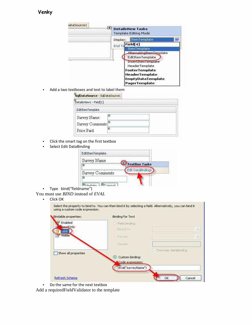
Venky
• Add a two textboxes and text to label them
• Click the smart tag on the first textbox
• Select Edit DataBinding
• Type bind(“fieldname”)
You must use BIND instead of EVAL • Click OK
• Do the same for the next textbox
Add a requiredFieldValidator to the template
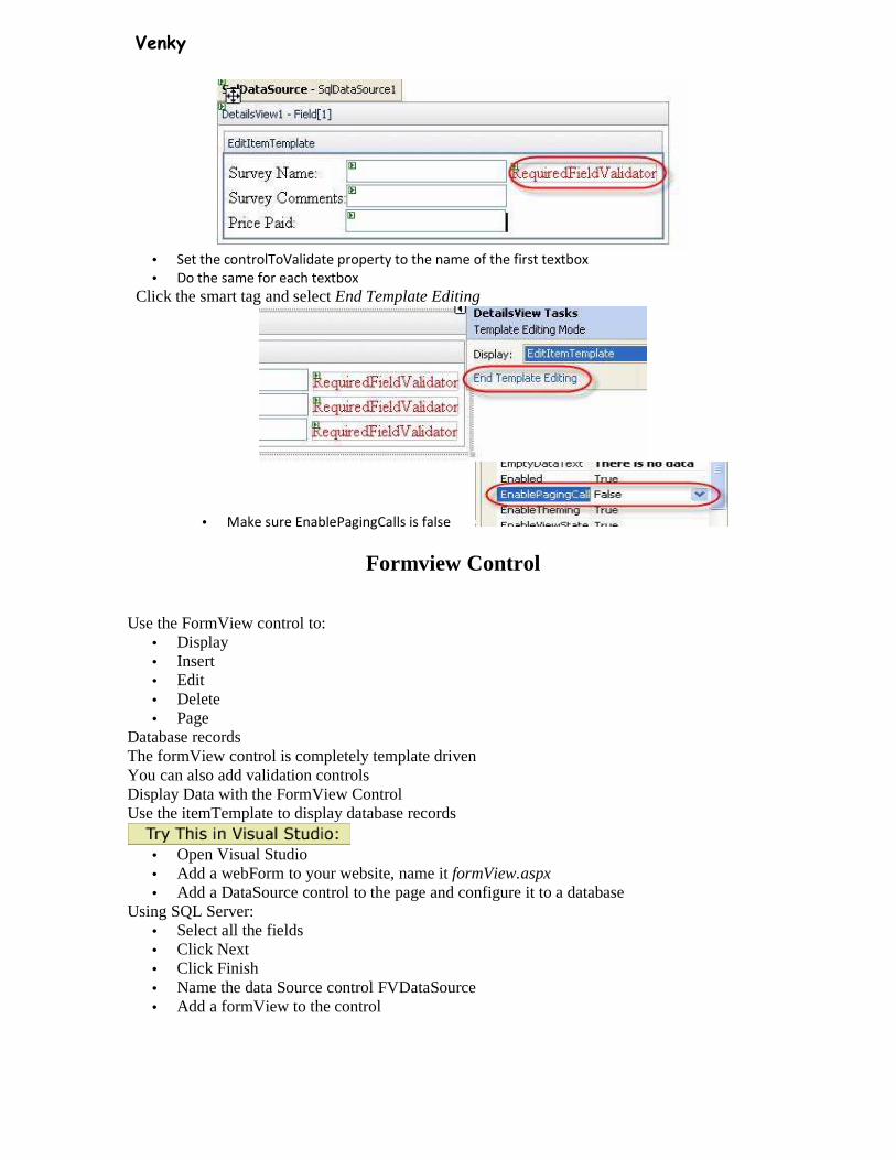
Venky
• Set the controlToValidate property to the name of the first textbox
• Do the same for each textbox
Click the smart tag and select End Template Editing
• Make sure EnablePagingCalls is false
Formview Control
Use the FormView control to:
• Display • Insert • Edit • Delete • Page
Database records The formView control is completely template driven You can also add validation controls Display Data with the FormView Control Use the itemTemplate to display database records
• Open Visual Studio • Add a webForm to your website, name it formView.aspx • Add a DataSource control to the page and configure it to a database
Using SQL Server: • Select all the fields • Click Next • Click Finish • Name the data Source control FVDataSource • Add a formView to the control
Venky
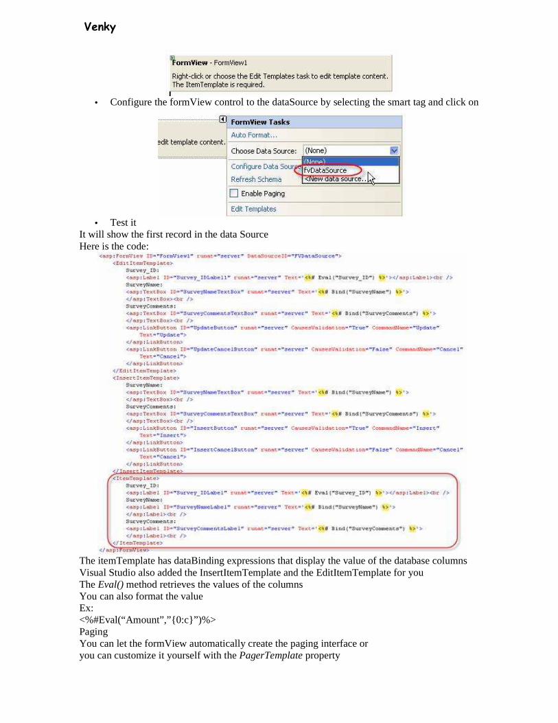
• Configure the formView control to the dataSource by selecting the smart tag and click on
• Test it
It will show the first record in the data Source Here is the code:
The itemTemplate has dataBinding expressions that display the value of the database columns Visual Studio also added the InsertItemTemplate and the EditItemTemplate for you The Eval() method retrieves the values of the columns You can also format the value Ex: <%#Eval(“Amount”,”{0:c}”)%> Paging You can let the formView automatically create the paging interface or you can customize it yourself with the PagerTemplate property
Venky
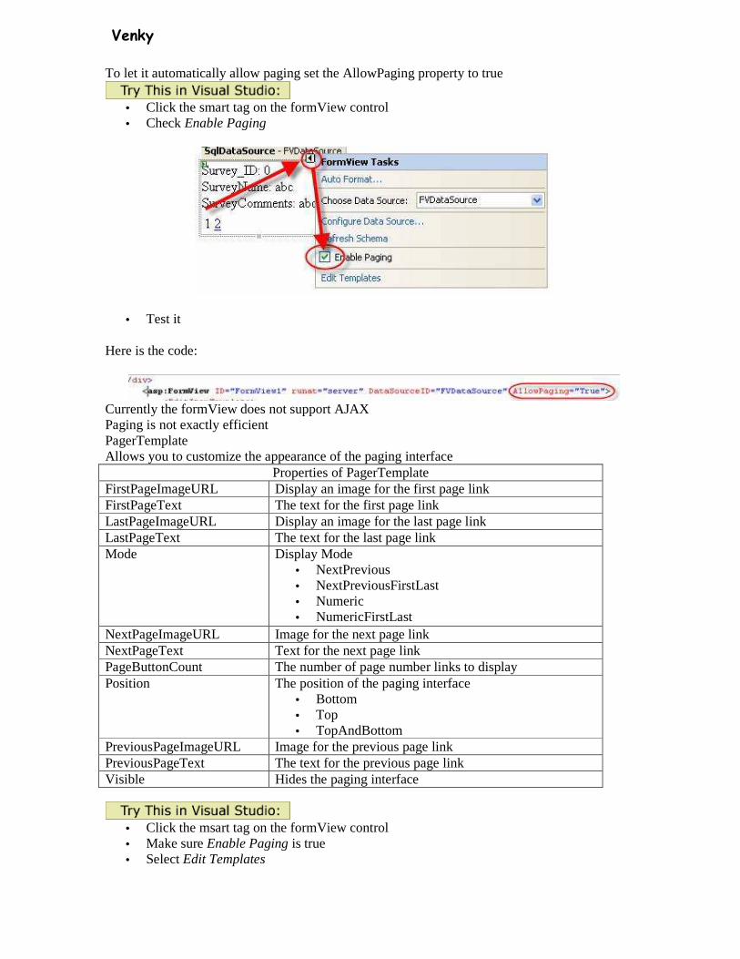
To let it automatically allow paging set the AllowPaging property to true
• Click the smart tag on the formView control • Check Enable Paging
• Test it
Here is the code:
Currently the formView does not support AJAX Paging is not exactly efficient PagerTemplate Allows you to customize the appearance of the paging interface
Properties of PagerTemplate FirstPageImageURL Display an image for the first page link FirstPageText The text for the first page link LastPageImageURL Display an image for the last page link LastPageText The text for the last page link Mode Display Mode
• NextPrevious • NextPreviousFirstLast • Numeric • NumericFirstLast
NextPageImageURL Image for the next page link NextPageText Text for the next page link PageButtonCount The number of page number links to display Position The position of the paging interface
• Bottom • Top • TopAndBottom
PreviousPageImageURL Image for the previous page link PreviousPageText The text for the previous page link Visible Hides the paging interface
• Click the msart tag on the formView control • Make sure Enable Paging is true • Select Edit Templates

Venky
• Click the dropdownlist and select PageTemplate
• Add a LinkButton control, name it btnPrev • Set the text property to Previous Page • Set the CommandName property to Page • Set the CommandArgument to Prev
Add another LinkButton control, name it btnNext • Set the text property to Next Page • Set the CommandName property to Page • Set the CommandArgument to Next • Click the smart tag again and select End Template Editing
Each button you has a CommandName and CommandArgument property CommandName is set to Page CommandArgument is set to one of the following
CommandArgument values First Navigate to the first page Last Navigate to the last page Prev Navigate to the previous page Next Navigate to the next page
Venky
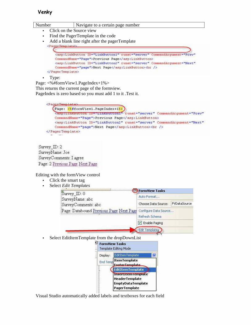
Number Navigate to a certain page number • Click on the Source view • Find the PagerTemplate in the code • Add a blank line right after the pagerTemplate
• Type:
Page: <%#formView1.PageIndex+1%> This returns the current page of the formview. PageIndex is zero based so you must add 1 to it .Test it.
Editing with the formView control
• Click the smart tag • Select Edit Templates
• Select EditItemTemplate from the dropDownList
Visual Studio automatically added labels and textboxes for each field

Venky
You can change these to other controls if you want
It also adds Update and Cancel linkbuttons with the functionality already added Here is the code:
• All you have to do is add a button to get to this template • Click the smarttag • Select Edit Templates • Select ItemTemplate • Add a button to the itemTemplate and change the text to Edit • Change the CommandName to Edit
When the user clicks the button it will take them to the EditItemTemplate But first your datasource control needs to be configured for updating and deleting for this to work Select the formView and double click on the dataKeyNames
• Select the column with your primary key and click OK
Add this to the Data Source Control
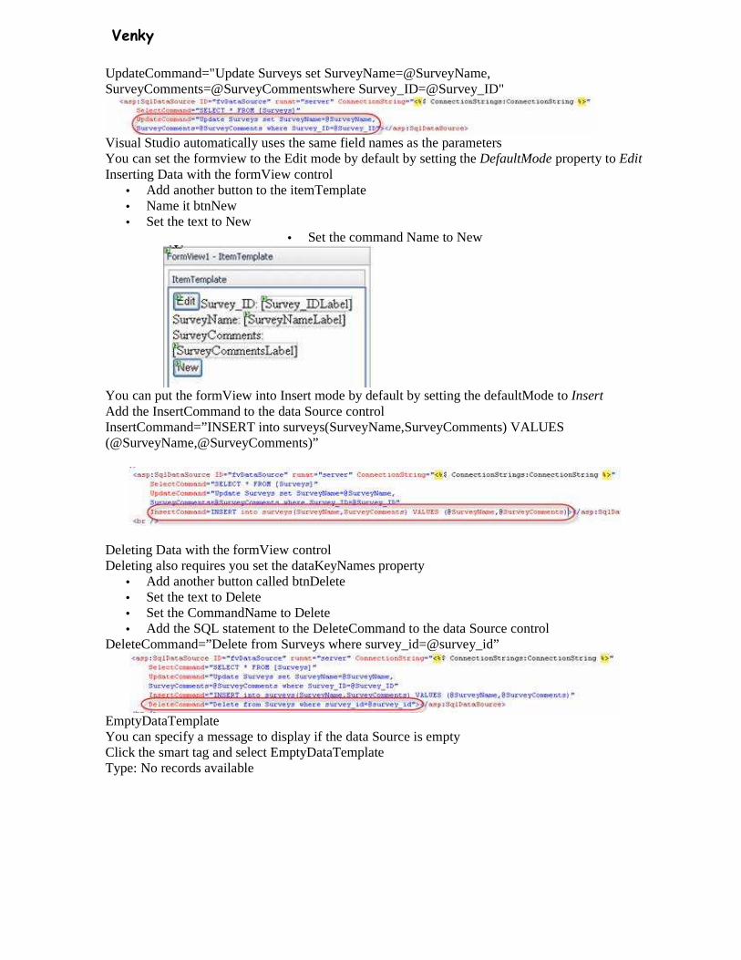
Venky
UpdateCommand="Update Surveys set SurveyName=@SurveyName, SurveyComments=@SurveyCommentswhere Survey_ID=@Survey_ID"
Visual Studio automatically uses the same field names as the parameters You can set the formview to the Edit mode by default by setting the DefaultMode property to Edit Inserting Data with the formView control
• Add another button to the itemTemplate • Name it btnNew • Set the text to New
• Set the command Name to New
You can put the formView into Insert mode by default by setting the defaultMode to Insert Add the InsertCommand to the data Source control InsertCommand=”INSERT into surveys(SurveyName,SurveyComments) VALUES (@SurveyName,@SurveyComments)”
Deleting Data with the formView control Deleting also requires you set the dataKeyNames property
• Add another button called btnDelete • Set the text to Delete • Set the CommandName to Delete • Add the SQL statement to the DeleteCommand to the data Source control
DeleteCommand=”Delete from Surveys where survey_id=@survey_id”
EmptyDataTemplate You can specify a message to display if the data Source is empty Click the smart tag and select EmptyDataTemplate Type: No records available

Venky
• Click the smart tag again and select End Template Editing This message will show if no records are availabe The Repeater Control
The repeater control is driven completely by templates. This allows you to output the control anyway you
want it.
Templates of the repeater control • ItemTemplate
o Required to display data
o Formats each item from the datasource
• HeaderTemplate
o Formats the content before the items from the dataSource
• FooterTemplate
o Formats the content after the items from the dataSOurce
• AlternatingItemTemplate
o Formats every other item from the dataSource
• SeperatorTemplate
o Formats between each item from the dataSource
Displaying Data
Use the itemTemplate to display data
This template is the only required template, all others are optional.
• Start a new WebSite in Visual Studio 2005
• Add a webform
• Drag a DataSource control to the page and configure it to a dataSource
• Drag a repeater control to the page
• Click the smart tag and configure it to the dataSource control
• Open the Source code view

Venky
• Type a
< you choices show up in intellisense
• Select ItemTemplate
Now you can add any formatting code you want as well as fields from the database
Add:<%#Eval(“fieldname”)%>
Example:
The headerTemplate and footerTemplate can be used to start and stop tables or add other items to the beginning and the end of your data
Add an AlternatingItemTemplate tag
The order you declare the templates does not matter

Venky
Copy the same content from the itemtemplate
Add a class to the <tr> tag in the alternatingItemTemplate
Add a style in the head of the document <style type=”text/css”> .alternate { background-color:#cccccc; } </style>
The seperatorTemplate is used to add items between each data item
Venky
Events
• DataBinding
o When repeater control bound to its dataSOurce
• ItemCommand
o When a control in the repeaterControl raises an event
• ItemCreated
o When each repeatercontrol item is created
• ItemDataBound
o When each item is bound
Master Pages
Master pages give your site a steady look and feel Master pages contain both HTML and a code part They create a common template that can be used on many pages Updating the master page automatically updates all pages using it A master page has 2 parts
1. Content that appears on each page that inherits the master page 2. Regions that can be customized by the pages inheriting the master page
Master pages can contain HTML, Web controls and server side source code
• Open Visual Studio • Add a new item • Select Master Page

Venky
Master pages end with .Master
BY default visual studio names the master page masterPage.master
A Master page need to specify both the parts common to all pages and the parts that are customizable
Items you add to the master page appear on all pages that inherit it
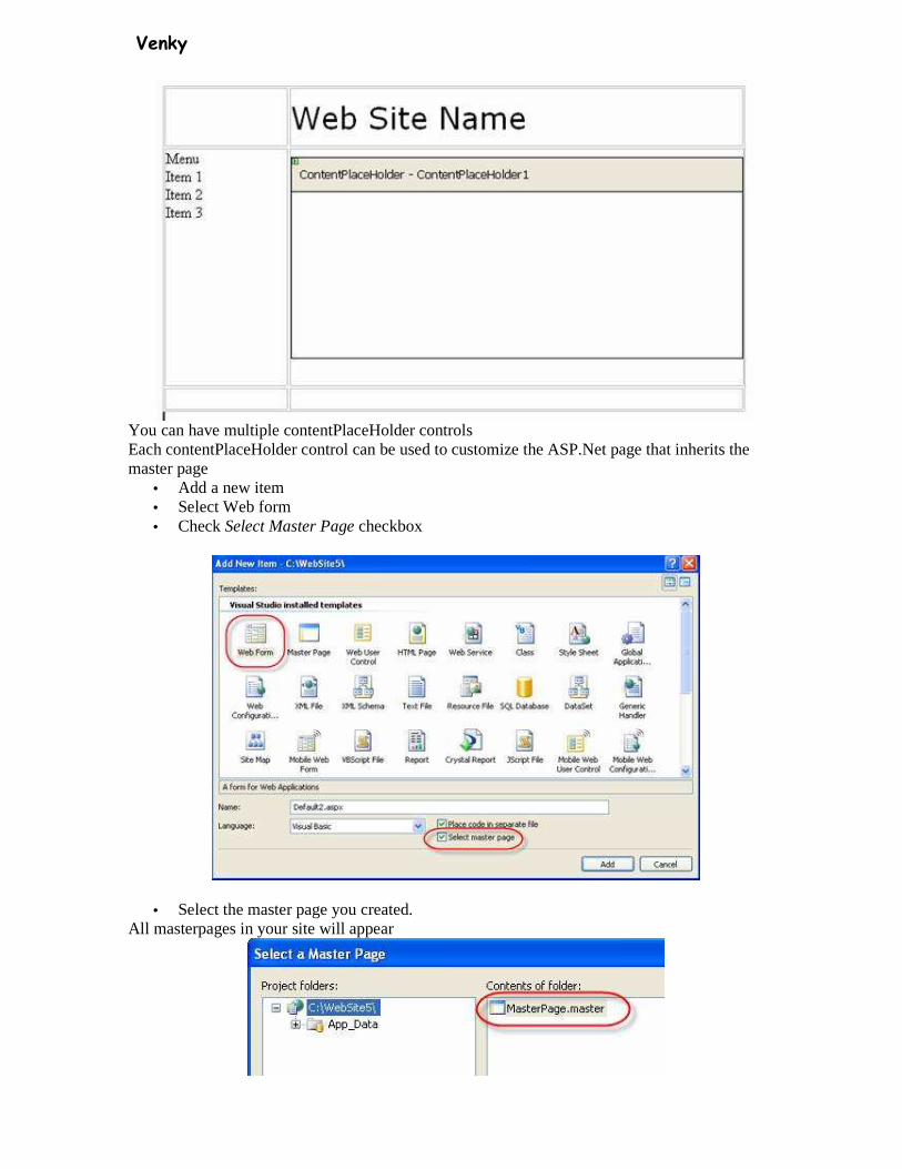
Use contentPlaceHolder controls to specify a region that can be customized
Add a table to the Master page
It adds on ContentPlaceHolder by default If you place controls outside the content placeholders they will be displayed on all pages
Venky
You can have multiple contentPlaceHolder controls Each contentPlaceHolder control can be used to customize the ASP.Net page that inherits the master page
• Add a new item • Select Web form • Check Select Master Page checkbox
• Select the master page you created. All masterpages in your site will appear
Venky
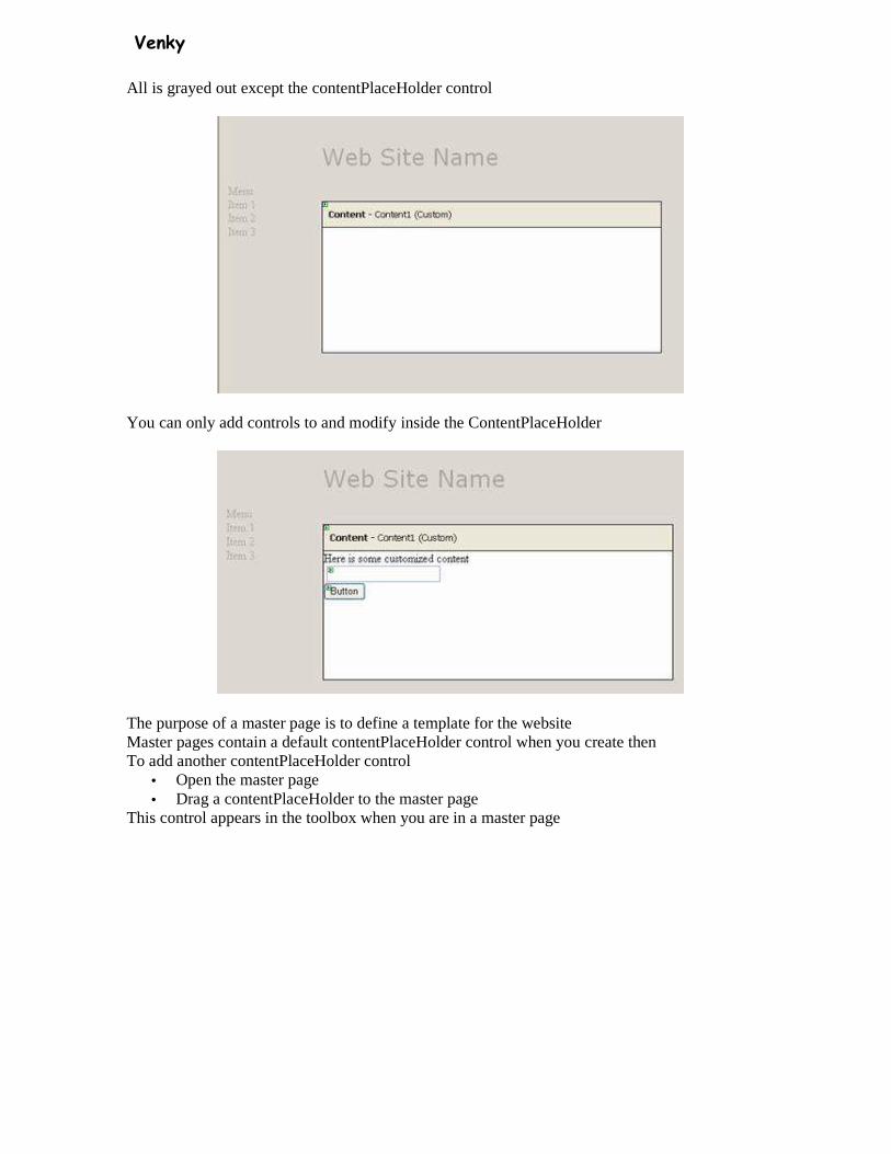
All is grayed out except the contentPlaceHolder control
You can only add controls to and modify inside the ContentPlaceHolder
The purpose of a master page is to define a template for the website Master pages contain a default contentPlaceHolder control when you create then To add another contentPlaceHolder control
• Open the master page • Drag a contentPlaceHolder to the master page
This control appears in the toolbox when you are in a master page

Venky
Master pages start with <%@ Master %> directive instead of a <%@Page %> directive
Websites can have more than one master page
Using a table for layout
• Add a new Master page
Select from MENU: Layout Insert Table
• Select the table settings • Pick the number of rows and columns, alignment, width, height etc • Select Header,Footer, and Side setting from the template
• Drag the contentPlaceHolder into one of the table cells
Format a table Cell • Click inside a table cell • Click on the style property
This opens the style builder
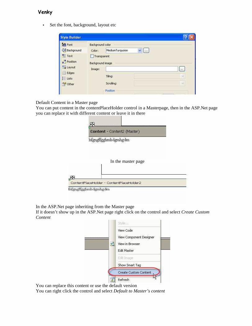
Venky
• Set the font, background, layout etc
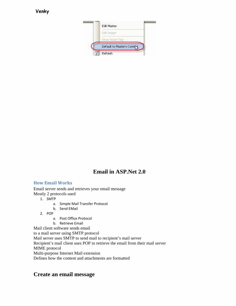
Default Content in a Master page You can put content in the contentPlaceHolder control in a Masterpage, then in the ASP.Net page you can replace it with different content or leave it in there
In the master page
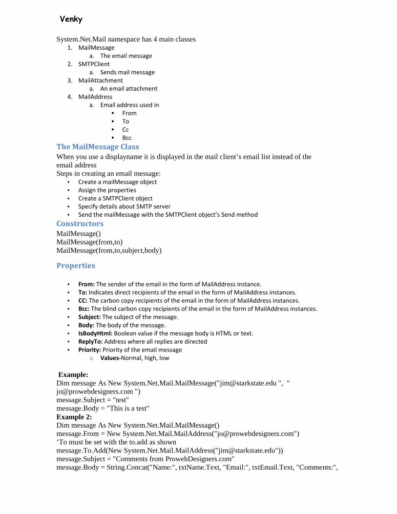
In the ASP.Net page inheriting from the Master page If it doesn’t show up in the ASP.Net page right click on the control and select Create Custom Content
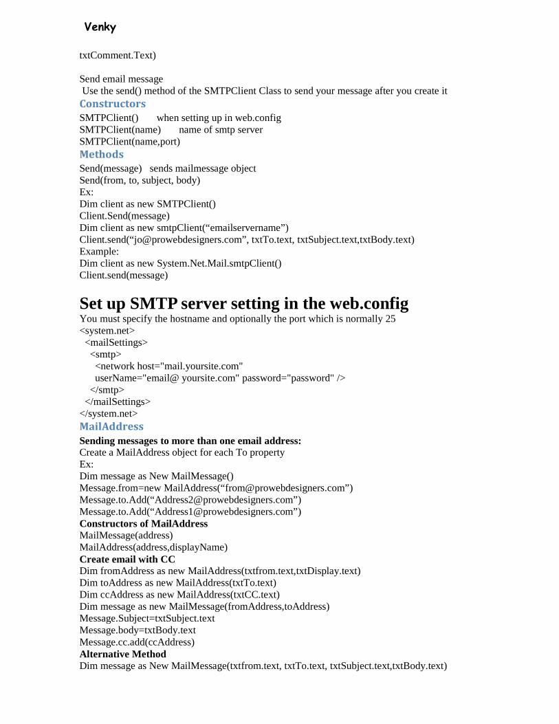
You can replace this content or use the default version You can right click the control and select Default to Master’s content
Venky
Email in ASP.Net 2.0
How Email Works
Email server sends and retrieves your email message Mostly 2 protocols used
1. SMTP
a. Simple Mail Transfer Protocol
b. Send EMail
2. POP
a. Post Office Protocol
b. Retrieve Email
Mail client software sends email to a mail server using SMTP protocol Mail server uses SMTP to send mail to recipient’s mail server Recipient’s mail client uses POP to retrieve the email from their mail server MIME protocol Multi-purpose Internet Mail extension Defines how the content and attachments are formatted
Create an email message
Venky
System.Net.Mail namespace has 4 main classes 1. MailMessage
a. The email message
2. SMTPClient
a. Sends mail message
3. MailAttachment
a. An email attachment
4. MailAddress
a. Email address used in
� From
� To
� Cc
� Bcc
The MailMessage Class
When you use a displayname it is displayed in the mail client’s email list instead of the email address Steps in creating an email message:
• Create a mailMessage object
• Assign the properties
• Create a SMTPClient object
• Specify details about SMTP server
• Send the mailMessage with the SMTPClient object’s Send method
Constructors
MailMessage() MailMessage(from,to) MailMessage(from,to,subject,body)
Properties
• From: The sender of the email in the form of MailAddress instance.
• To: Indicates direct recipients of the email in the form of MailAddress instances.
• CC: The carbon copy recipients of the email in the form of MailAddress instances.
• Bcc: The blind carbon copy recipients of the email in the form of MailAddress instances.
• Subject: The subject of the message.
• Body: The body of the message.
• IsBodyHtml: Boolean value if the message body is HTML or text.
• ReplyTo: Address where all replies are directed
• Priority: Priority of the email message
o Values-Normal, high, low
Example: Dim message As New System.Net.Mail.MailMessage("[email protected] ", " [email protected] ") message.Subject = "test" message.Body = "This is a test" Example 2: Dim message As New System.Net.Mail.MailMessage() message.From = New System.Net.Mail.MailAddress("[email protected]") ‘To must be set with the to.add as shown message.To.Add(New System.Net.Mail.MailAddress("[email protected]")) message.Subject = "Comments from ProwebDesigners.com" message.Body = String.Concat("Name:", txtName.Text, "Email:", txtEmail.Text, "Comments:",
Venky
txtComment.Text) Send email message Use the send() method of the SMTPClient Class to send your message after you create it Constructors
SMTPClient() when setting up in web.config SMTPClient(name) name of smtp server SMTPClient(name,port) Methods
Send(message) sends mailmessage object Send(from, to, subject, body) Ex: Dim client as new SMTPClient() Client.Send(message) Dim client as new smtpClient(“emailservername”) Client.send(“[email protected]”, txtTo.text, txtSubject.text,txtBody.text) Example: Dim client as new System.Net.Mail.smtpClient() Client.send(message)
Set up SMTP server setting in the web.config You must specify the hostname and optionally the port which is normally 25 <system.net> <mailSettings> <smtp> <network host="mail.yoursite.com" userName="email@ yoursite.com" password="password" /> </smtp> </mailSettings> </system.net> MailAddress
Sending messages to more than one email address: Create a MailAddress object for each To property Ex: Dim message as New MailMessage() Message.from=new MailAddress(“[email protected]”) Message.to.Add(“[email protected]”) Message.to.Add(“[email protected]”) Constructors of MailAddress MailMessage(address) MailAddress(address,displayName) Create email with CC Dim fromAddress as new MailAddress(txtfrom.text,txtDisplay.text) Dim toAddress as new MailAddress(txtTo.text) Dim ccAddress as new MailAddress(txtCC.text) Dim message as new MailMessage(fromAddress,toAddress) Message.Subject=txtSubject.text Message.body=txtBody.text Message.cc.add(ccAddress) Alternative Method Dim message as New MailMessage(txtfrom.text, txtTo.text, txtSubject.text,txtBody.text)

Venky
Message.cc.add(new MailMessage(ccAddress) Attachments-collection of attachment objects
Add Attachment to email message Attachment is file sent with email message SMTP is designed to send text messages not binary files You must convert them to text before it can be sent Then it is converted back to binary when received By default it uses UUEncode to convert it Ex: New attachment(filename) Ex: Dim myfilename as string Myfilename=”C:\myfiles\Document.doc” Dim myattach as new attachment(filename) Dim message as new mailMessage(txtfrom.text, txtTo.text, txtSubject.text,txtBody.text) Message.attachments.add(myattach) Alternative method Dim myfilename as string Myfilename=”C:\myfiles\Document.doc” Message.attachments.add(new attachment(myfilename)) Using FileUpload control to add attachments
Add a fileupload control to the page Add this code: If FileUpload1.HasFile Then Try FileUpload1.SaveAs(String.Concat("D:\yourpath\attachments\", FileUpload1.FileName)) Catch ex As Exception ‘add error handling here End Try Dim filename As String filename = (String.Concat("D:\yourpath\attachments\", FileUpload1.FileName)) Dim myattach As New System.Net.Mail.Attachment(filename) message.Attachments.Add(myattach) End If Create an HTML message
Set the isBodyHTML to true Then you can use HTML in the message that you assign to the body property message.IsBodyHtml = True message.Body = String.Concat("Name:", txtName.Text, "<br>Email:", txtEmail.Text, "<br>Comments:", txtComment.Text)
Displaying a Multi-Part Form
The Multiview contol can be used to divide a page into multiple sub pages MultiView control has following commands NextView Activate the next view control PrevView Activate the previous view control SwitchViewByID Activate the view identified by the button
control’s commandArgument

Venky
SwitchViewByIndex Activate the view identified by the button control’s commandArgumen
• Open Visual Studio • Create a web page • Drag a multiView control to the page, name it multi1 • Add 3 view controls in the mutliview control
• Set the MultiView’s activeViewIndex to 0 • In View1
o Add a textbox control � Name it txtName
o add a label above the textbox � Set the label’s text to Enter your name � Set the label’s id to lblName � Set the label’s associatedControlID to txtName
o Add a button control � Set the text to Next � Set the commandName to NextView
• In View 2 o Add a textbox control
� Name it txtEmail o Add a label
� Name it lblEmail � Set the text to Enter your email � Set the associatedControlId to txtEmail
o Add a button control � Set the text to Next � Set the commandName to NextView
• In view 3 o Type Name: o add a label
� name it lblResultName o Press enter o Type Email: o Add a label
� Name it lblResultEmail
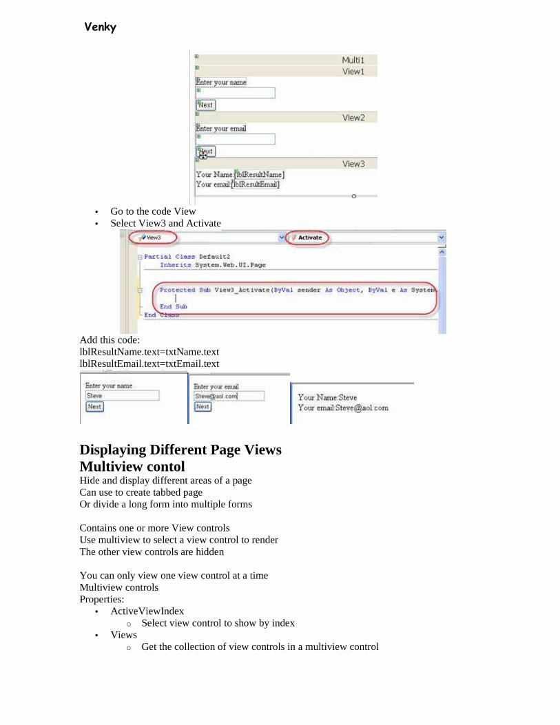
Venky
• Go to the code View • Select View3 and Activate
Add this code: lblResultName.text=txtName.text lblResultEmail.text=txtEmail.text
Displaying Different Page Views Multiview contol Hide and display different areas of a page Can use to create tabbed page Or divide a long form into multiple forms Contains one or more View controls Use multiview to select a view control to render The other view controls are hidden You can only view one view control at a time Multiview controls Properties:
• ActiveViewIndex o Select view control to show by index
• Views o Get the collection of view controls in a multiview control
Venky
Methods: • getActiveVIew
o get the selected view control • setActiveView
o select the active view Event:
• activeViewChanged o fired when a new view is selected
View Control Container for other controls Events:
• Activate o When view gets selected
• Deactivate o When view loses selection
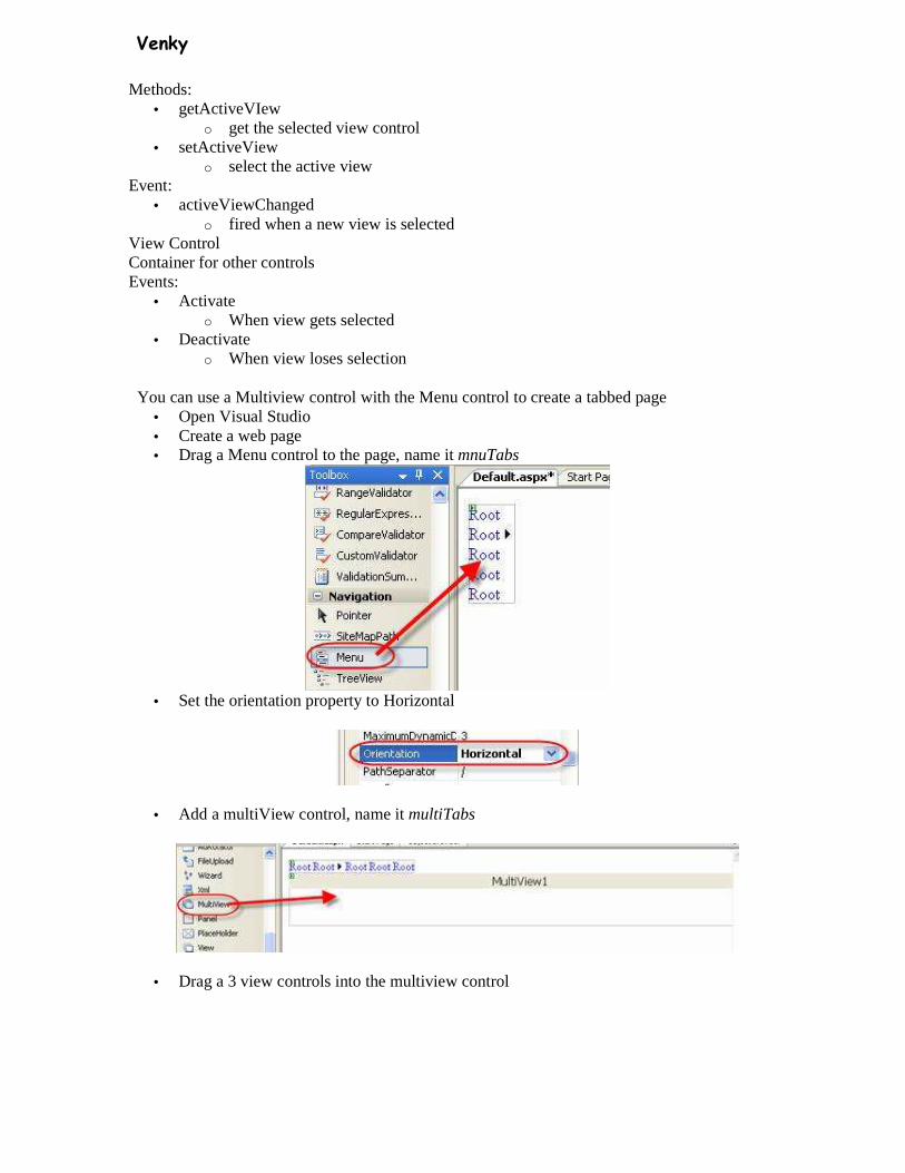
You can use a Multiview control with the Menu control to create a tabbed page • Open Visual Studio • Create a web page • Drag a Menu control to the page, name it mnuTabs
• Set the orientation property to Horizontal
• Add a multiView control, name it multiTabs
• Drag a 3 view controls into the multiview control
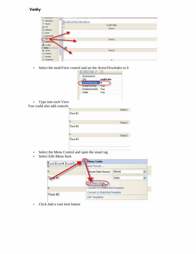
Venky
• Select the multiView control and set the ActiveViewIndex to 0
• Type into each View
You could also add controls
• Select the Menu Control and open the smart tag • Select Edit Menu Item
• Click Add a root item button
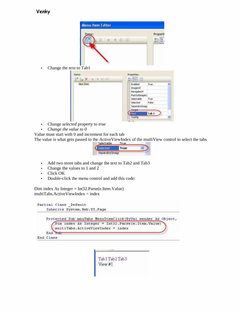
Venky
• Change the text to Tab1
• Change selected property to true • Change the value to 0
Value must start with 0 and increment for each tab The value is what gets passed to the ActiveViewIndex of the mutliView control to select the tabs
• Add two more tabs and change the text to Tab2 and Tab3 • Change the values to 1 and 2 • Click OK • Double-click the menu control and add this code:
Dim index As Integer = Int32.Parse(e.Item.Value) multiTabs.ActiveViewIndex = index
Venky
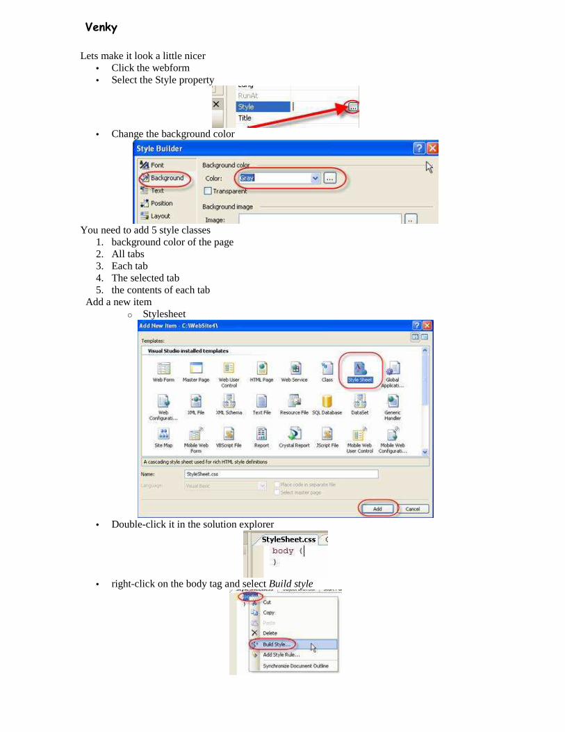
Lets make it look a little nicer • Click the webform • Select the Style property
• Change the background color
You need to add 5 style classes
1. background color of the page 2. All tabs 3. Each tab 4. The selected tab 5. the contents of each tab
Add a new item o Stylesheet
• Double-click it in the solution explorer
• right-click on the body tag and select Build style
Venky
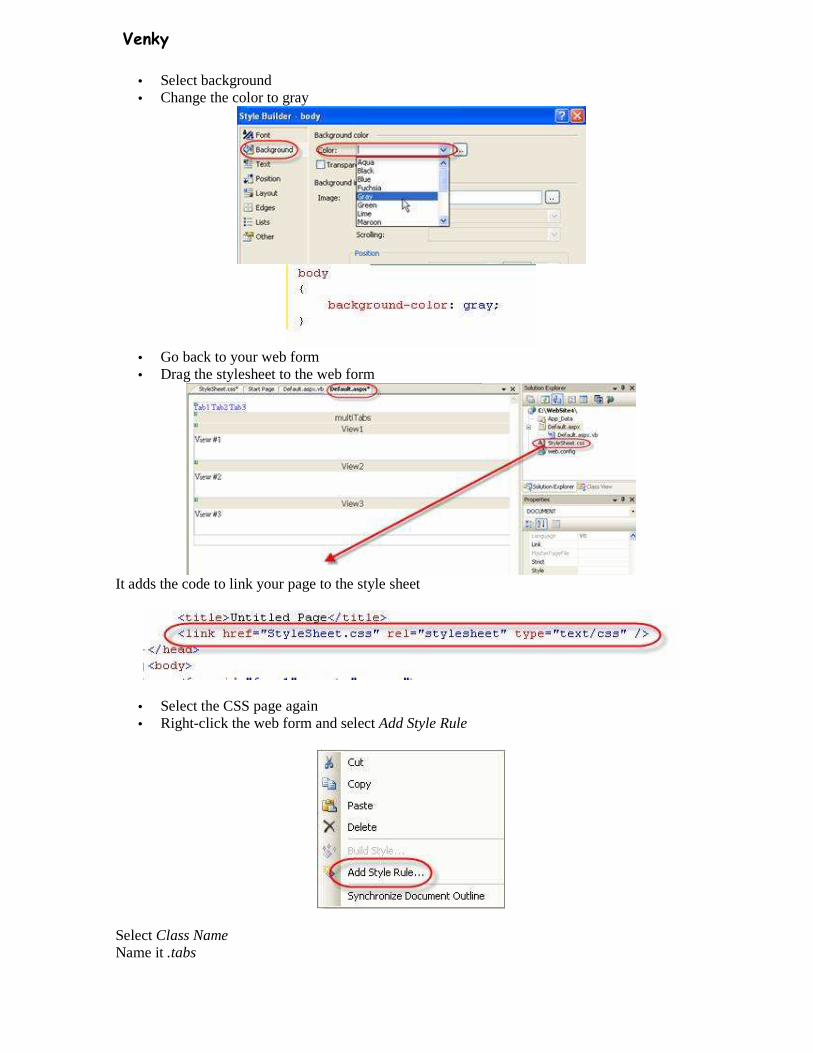
• Select background • Change the color to gray
• Go back to your web form • Drag the stylesheet to the web form
It adds the code to link your page to the style sheet
• Select the CSS page again • Right-click the web form and select Add Style Rule
Select Class Name Name it .tabs
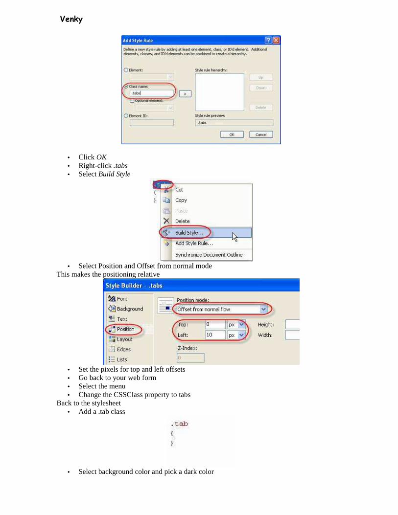
Venky
• Click OK • Right-click .tabs • Select Build Style
• Select Position and Offset from normal mode
This makes the positioning relative
• Set the pixels for top and left offsets • Go back to your web form • Select the menu • Change the CSSClass property to tabs
Back to the stylesheet • Add a .tab class
• Select background color and pick a dark color
Venky
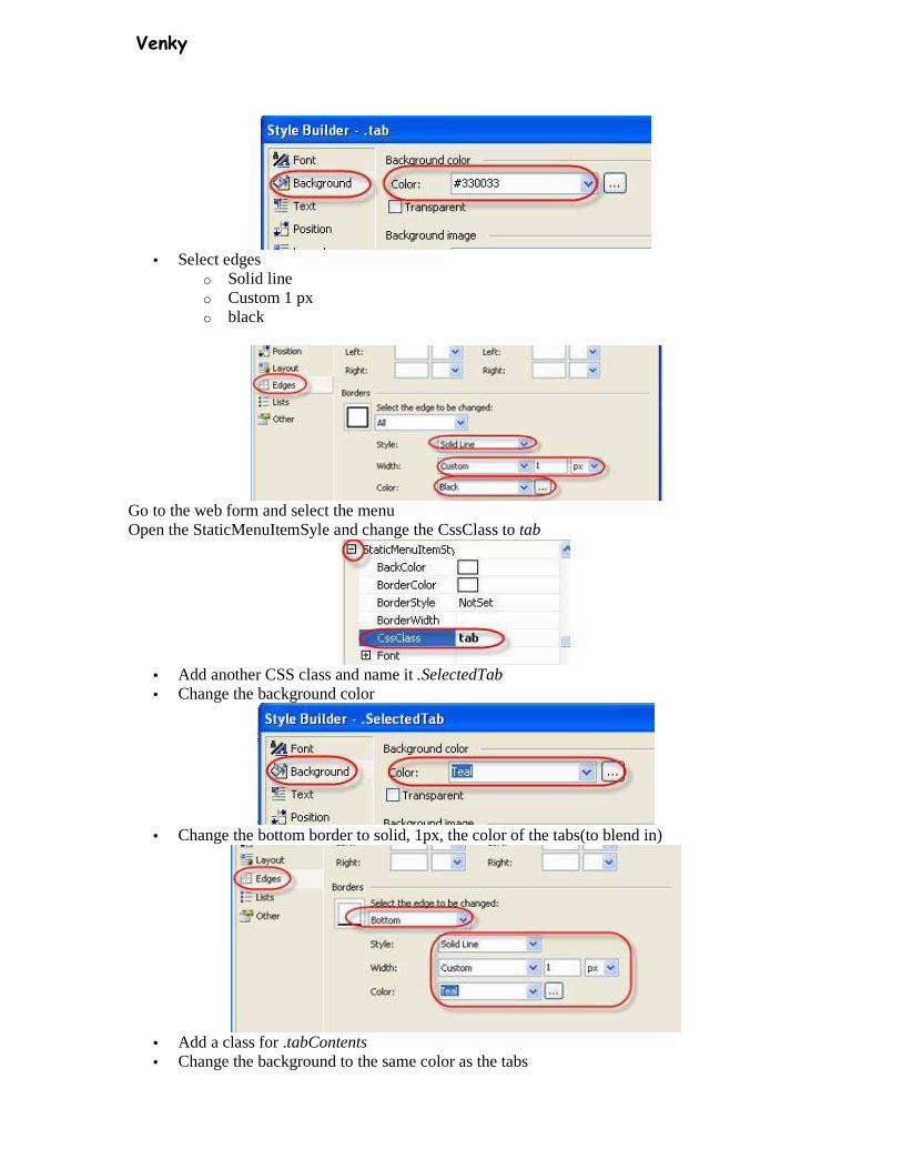
• Select edges
o Solid line o Custom 1 px o black
Go to the web form and select the menu Open the StaticMenuItemSyle and change the CssClass to tab
• Add another CSS class and name it .SelectedTab • Change the background color
• Change the bottom border to solid, 1px, the color of the tabs(to blend in)
• Add a class for .tabContents • Change the background to the same color as the tabs

Venky
• Change all the padding to 10px • Change all border to solid, 1px, black
• Go back to the web form • Select the menu • Open StaticSelectedStyle and change the cssClass to selectedTab
• Open the code view • Select the <div> tab around the multiView control • Change the Class property to tabContents
• Select the StaticSelectedStyle and change the horizontal Padding to 20px
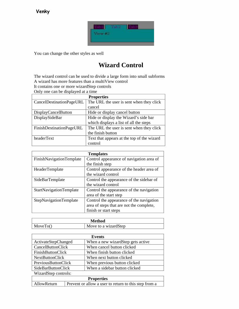
Venky
You can change the other styles as well
Wizard Control
The wizard control can be used to divide a large form into small subforms A wizard has more features than a multiView control It contains one or more wizardStep controls Only one can be displayed at a time
Properties CancelDestinationPageURL The URL the user is sent when they click
cancel DisplayCancelButton Hide or display cancel button DisplaySideBar Hide or display the Wizard’s side bar
which displays a list of all the steps FinishDestinationPageURL The URL the user is sent when they click
the finish button headerText Text that appears at the top of the wizard
control
Templates FinishNavigationTemplate Control appearance of navigation area of
the finish step HeaderTemplate Control appearance of the header area of
the wizard control SideBarTemplate Control the appearance of the sidebar of
the wizard control StartNavigationTemplate Control the appearance of the navigation
area of the start step StepNavigationTemplate Control the appearance of the navigation
area of steps that are not the complete, finish or start steps
Method
MoveTo() Move to a wizardStep
Events ActivateStepChanged When a new wizardStep gets active CancelButtonClick When cancel button clicked FinishButtonClick When finish button clicked NextButtonClick When next button clicked PreviousButtonClick When previous button clicked SideBarButtonClick When a sidebar button clicked WizardStep controls:
Properties AllowReturn Prevent or allow a user to return to this step from a

Venky
future step StepType • Auto – default, position determines the setting
• Complete – no buttons • Finish – previous and finish buttons • Start - no previous button • Step – previous and next buttons
Title Title displayed in sidebar
• Add a new webform • Name it wizard.aspx • Add a wizard control, name it wizard1
• Change the headerText property to Survey
• Click in the wizard control and a container box lets you add to it
• Click on step2 • Add a label control • Set the text to Enter your name • Add a textbox • Name it txtName • Change the label’s associatedControlID to txtname
• Click the smart tag and select Add/Remove Wizard Steps
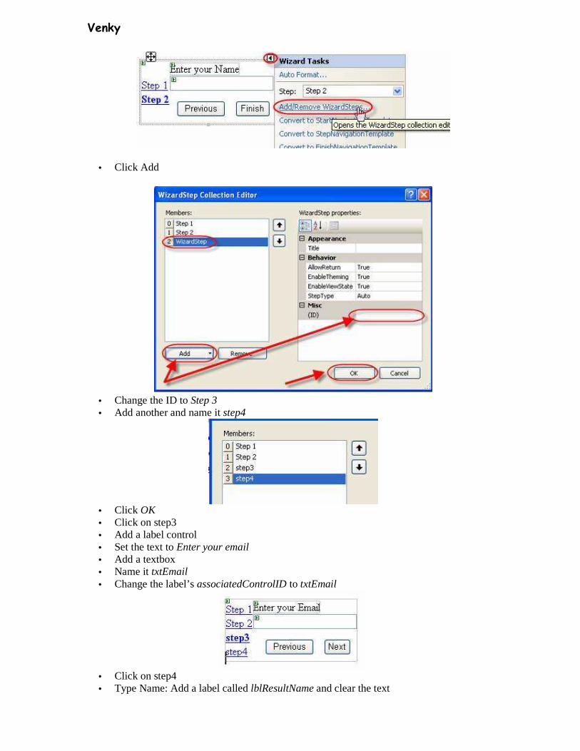
Venky
• Click Add
• Change the ID to Step 3 • Add another and name it step4
• Click OK • Click on step3 • Add a label control • Set the text to Enter your email • Add a textbox • Name it txtEmail • Change the label’s associatedControlID to txtEmail
• Click on step4 • Type Name: Add a label called lblResultName and clear the text

Venky
• Type Email: Add a label called lblResultEmail and clear the text
• Go to the code view • Select wizard1 and FinishButtonClick event
• Add this code: lblResultName.text=txtName.text lblResultEmail.text=txtEmail.text
• Select the smart tab and click on autoformat • Pick a format
To enhance the behavior:
• Select the smart tag • Add/remove wizard steps • Click step3 • Change the stepType to Finish
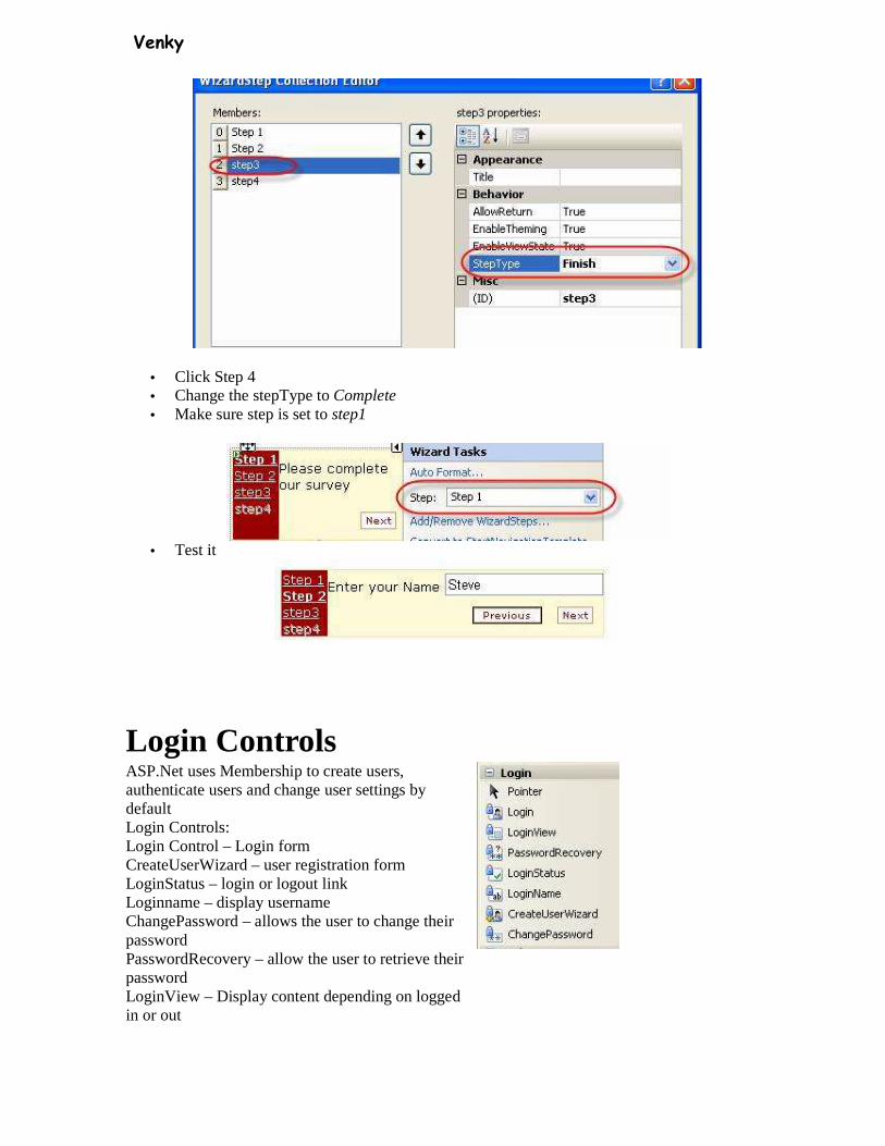
Venky
• Click Step 4 • Change the stepType to Complete • Make sure step is set to step1
• Test it
Login Controls ASP.Net uses Membership to create users, authenticate users and change user settings by default Login Controls: Login Control – Login form CreateUserWizard – user registration form LoginStatus – login or logout link Loginname – display username ChangePassword – allows the user to change their password PasswordRecovery – allow the user to retrieve their password LoginView – Display content depending on logged in or out

Venky
Web.Config
Web applications are set up for Windows authentication by default
You must change it to forms authentication
Login Control
Create a new folder
Name it PrivateFiles
With the folder selected, add a new webform, name is secretpage.aspx
Write This is the secret page on this page
First we will password protect the page and all other page sin this folder
Make sure authentication Mode is set to forms in the web.config in the root folder
Add a web.config file to the folder

Venky
To restrict users from viewing the contents of a folder you must configure the authorization of the folder
Add the following code
<authorization>
<deny users=”?” />
</authorization>
Now if you attempt to request any file in the PrivateFiles folder you will be redirected to login.aspx
Next you have to create the Login.aspx page Add a login control and save the page
Create another page named CreateUser.aspx
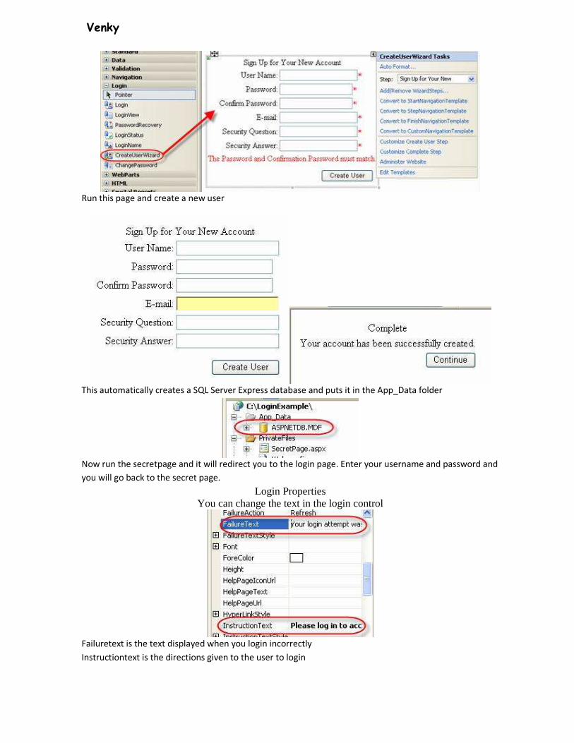
Venky
Run this page and create a new user
This automatically creates a SQL Server Express database and puts it in the App_Data folder
Now run the secretpage and it will redirect you to the login page. Enter your username and password and
you will go back to the secret page.
Login Properties You can change the text in the login control
Failuretext is the text displayed when you login incorrectly
Instructiontext is the directions given to the user to login
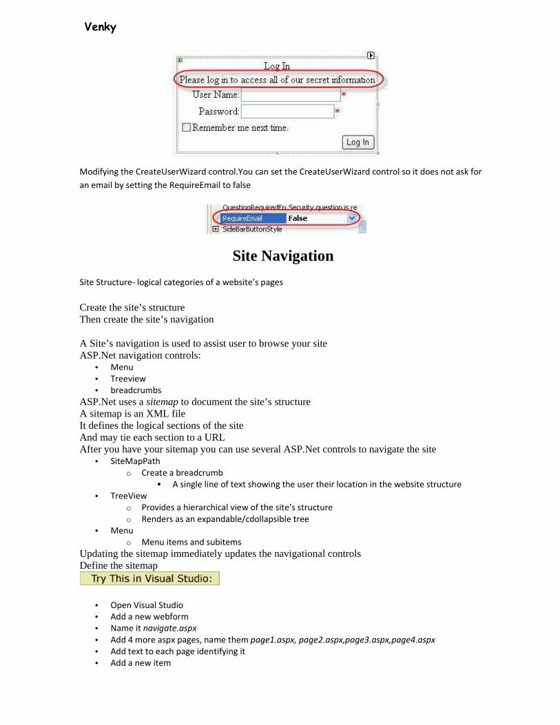
Venky
Modifying the CreateUserWizard control.You can set the CreateUserWizard control so it does not ask for
an email by setting the RequireEmail to false
Site Navigation
Site Structure- logical categories of a website’s pages
Create the site’s structure Then create the site’s navigation
A Site’s navigation is used to assist user to browse your site ASP.Net navigation controls:
• Menu
• Treeview
• breadcrumbs
ASP.Net uses a sitemap to document the site’s structure A sitemap is an XML file It defines the logical sections of the site And may tie each section to a URL After you have your sitemap you can use several ASP.Net controls to navigate the site
• SiteMapPath
o Create a breadcrumb
� A single line of text showing the user their location in the website structure
• TreeView
o Provides a hierarchical view of the site’s structure
o Renders as an expandable/cdollapsible tree
• Menu
o Menu items and subitems
Updating the sitemap immediately updates the navigational controls Define the sitemap
• Open Visual Studio
• Add a new webform
• Name it navigate.aspx
• Add 4 more aspx pages, name them page1.aspx, page2.aspx,page3.aspx,page4.aspx
• Add text to each page identifying it
• Add a new item
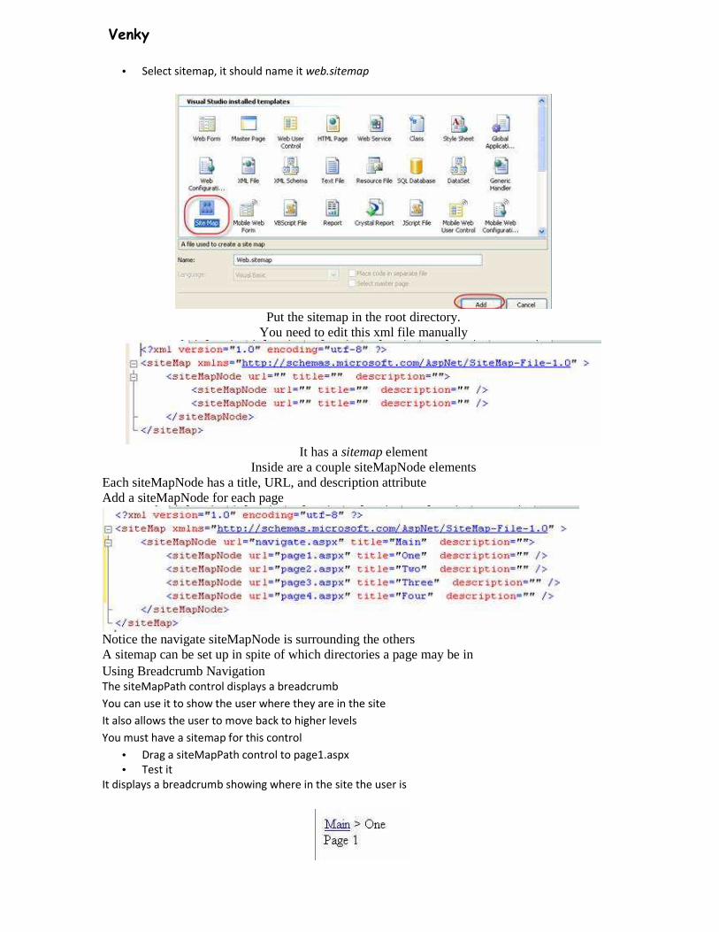
Venky
• Select sitemap, it should name it web.sitemap
Put the sitemap in the root directory.
You need to edit this xml file manually
It has a sitemap element
Inside are a couple siteMapNode elements Each siteMapNode has a title, URL, and description attribute Add a siteMapNode for each page
Notice the navigate siteMapNode is surrounding the others A sitemap can be set up in spite of which directories a page may be in
Using Breadcrumb Navigation The siteMapPath control displays a breadcrumb
You can use it to show the user where they are in the site
It also allows the user to move back to higher levels
You must have a sitemap for this control
• Drag a siteMapPath control to page1.aspx
• Test it
It displays a breadcrumb showing where in the site the user is
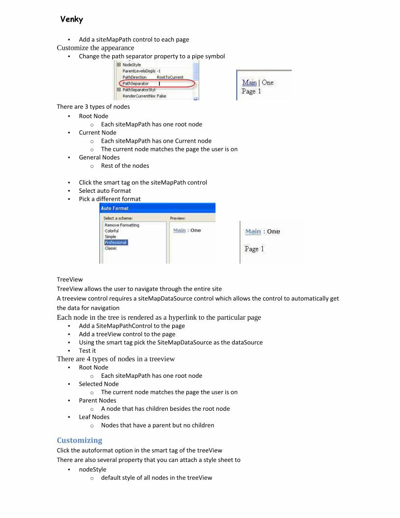
Venky
• Add a siteMapPath control to each page
Customize the appearance • Change the path separator property to a pipe symbol
There are 3 types of nodes
• Root Node
o Each siteMapPath has one root node
• Current Node
o Each siteMapPath has one Current node
o The current node matches the page the user is on
• General Nodes
o Rest of the nodes
• Click the smart tag on the siteMapPath control
• Select auto Format
• Pick a different format
TreeView
TreeView allows the user to navigate through the entire site
A treeview control requires a siteMapDataSource control which allows the control to automatically get
the data for navigation
Each node in the tree is rendered as a hyperlink to the particular page • Add a SiteMapPathControl to the page
• Add a treeView control to the page
• Using the smart tag pick the SiteMapDataSource as the dataSource
• Test it
There are 4 types of nodes in a treeview • Root Node
o Each siteMapPath has one root node
• Selected Node
o The current node matches the page the user is on
• Parent Nodes
o A node that has children besides the root node
• Leaf Nodes
o Nodes that have a parent but no children
Customizing
Click the autoformat option in the smart tag of the treeView
There are also several property that you can attach a style sheet to
• nodeStyle
o default style of all nodes in the treeView
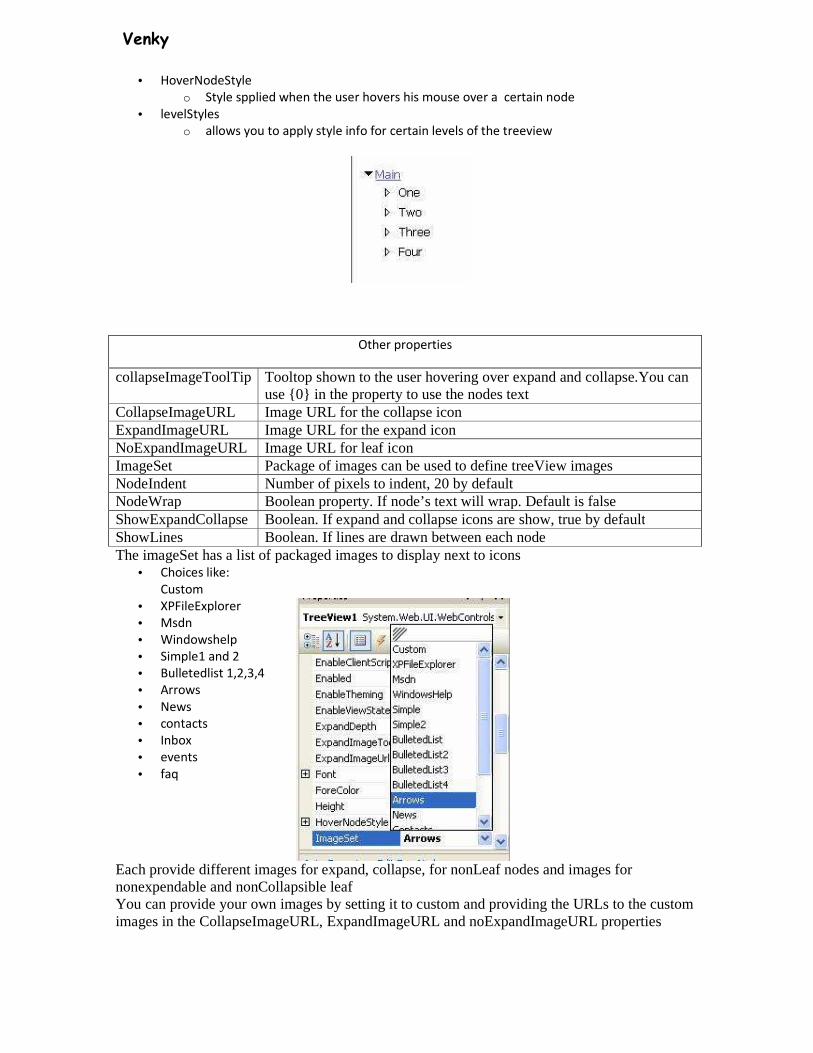
Venky
• HoverNodeStyle
o Style spplied when the user hovers his mouse over a certain node
• levelStyles
o allows you to apply style info for certain levels of the treeview
Other properties
collapseImageToolTip Tooltop shown to the user hovering over expand and collapse.You can use {0} in the property to use the nodes text
CollapseImageURL Image URL for the collapse icon ExpandImageURL Image URL for the expand icon NoExpandImageURL Image URL for leaf icon ImageSet Package of images can be used to define treeView images NodeIndent Number of pixels to indent, 20 by default NodeWrap Boolean property. If node’s text will wrap. Default is false ShowExpandCollapse Boolean. If expand and collapse icons are show, true by default ShowLines Boolean. If lines are drawn between each node The imageSet has a list of packaged images to display next to icons
• Choices like:
Custom
• XPFileExplorer
• Msdn
• Windowshelp
• Simple1 and 2
• Bulletedlist 1,2,3,4
• Arrows
• News
• contacts
• Inbox
• events
• faq
Each provide different images for expand, collapse, for nonLeaf nodes and images for nonexpendable and nonCollapsible leaf You can provide your own images by setting it to custom and providing the URLs to the custom images in the CollapseImageURL, ExpandImageURL and noExpandImageURL properties
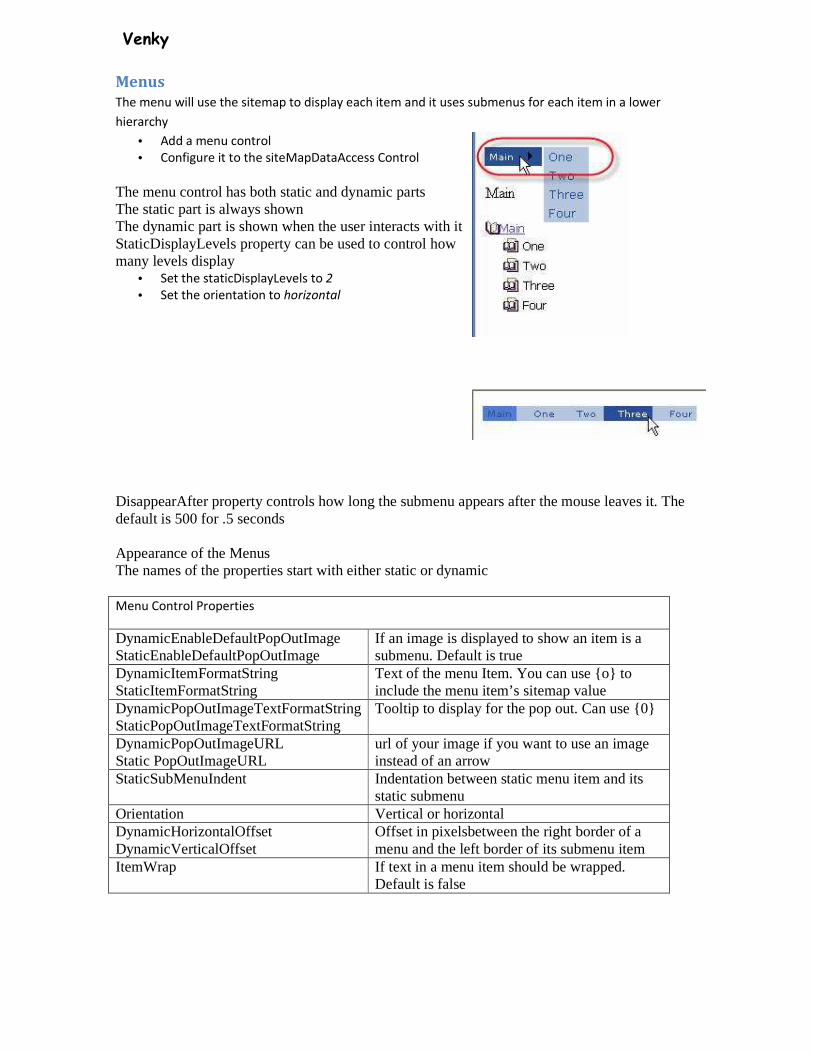
Venky
Menus
The menu will use the sitemap to display each item and it uses submenus for each item in a lower
hierarchy
• Add a menu control
• Configure it to the siteMapDataAccess Control
The menu control has both static and dynamic parts The static part is always shown The dynamic part is shown when the user interacts with it StaticDisplayLevels property can be used to control how many levels display
• Set the staticDisplayLevels to 2
• Set the orientation to horizontal
DisappearAfter property controls how long the submenu appears after the mouse leaves it. The default is 500 for .5 seconds Appearance of the Menus The names of the properties start with either static or dynamic
Menu Control Properties
DynamicEnableDefaultPopOutImage StaticEnableDefaultPopOutImage
If an image is displayed to show an item is a submenu. Default is true
DynamicItemFormatString StaticItemFormatString
Text of the menu Item. You can use {o} to include the menu item’s sitemap value
DynamicPopOutImageTextFormatString StaticPopOutImageTextFormatString
Tooltip to display for the pop out. Can use {0}
DynamicPopOutImageURL Static PopOutImageURL
url of your image if you want to use an image instead of an arrow
StaticSubMenuIndent Indentation between static menu item and its static submenu
Orientation Vertical or horizontal DynamicHorizontalOffset DynamicVerticalOffset
Offset in pixelsbetween the right border of a menu and the left border of its submenu item
ItemWrap If text in a menu item should be wrapped. Default is false

Venky
Classes Classes let you reuse application logic on multiple pages or even multiple applications. If you need to write the same method more than once it should be in a class. Access Modifiers
Used when declaring a class, method or property Access modifiers determine who can have access to what in your classes
• Public
o No restrictions, everyone has access
• Private
o Can only be accessed from within THIS class
• Protected
o Can be accessed from only THIS class or a derived class
• Friend
o Can be accessed only from a class within the same assembly (.DLL). In ASP.Net this would
be everything in the same subdirectory.
• Protected Friend
o Can be accessed from the class, a derived class or another other class in the same
assembly
Let’s build a basic example: • Add a new item
• Select Class
Visual Studio recommend putting all your classes in a special folder called App_Code
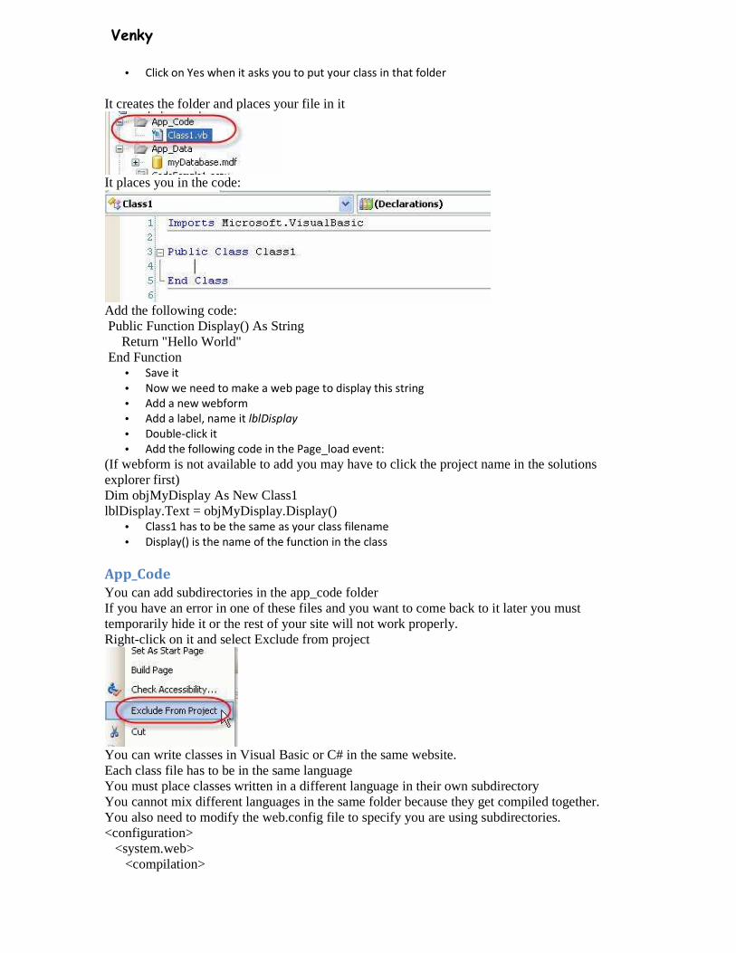
Venky
• Click on Yes when it asks you to put your class in that folder
It creates the folder and places your file in it
It places you in the code:
Add the following code: Public Function Display() As String Return "Hello World" End Function
• Save it
• Now we need to make a web page to display this string
• Add a new webform
• Add a label, name it lblDisplay
• Double-click it
• Add the following code in the Page_load event:
(If webform is not available to add you may have to click the project name in the solutions explorer first) Dim objMyDisplay As New Class1 lblDisplay.Text = objMyDisplay.Display()
• Class1 has to be the same as your class filename
• Display() is the name of the function in the class
App_Code
You can add subdirectories in the app_code folder If you have an error in one of these files and you want to come back to it later you must temporarily hide it or the rest of your site will not work properly. Right-click on it and select Exclude from project
You can write classes in Visual Basic or C# in the same website. Each class file has to be in the same language You must place classes written in a different language in their own subdirectory You cannot mix different languages in the same folder because they get compiled together. You also need to modify the web.config file to specify you are using subdirectories. <configuration> <system.web> <compilation>
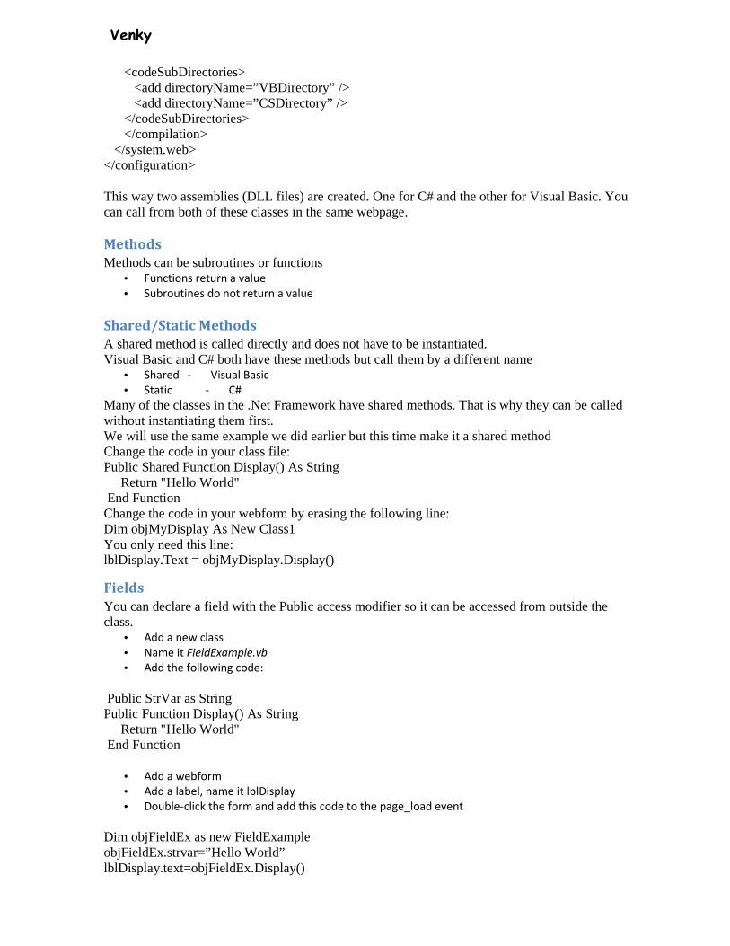
Venky
<codeSubDirectories> <add directoryName=”VBDirectory” /> <add directoryName=”CSDirectory” /> </codeSubDirectories> </compilation> </system.web> </configuration>
This way two assemblies (DLL files) are created. One for C# and the other for Visual Basic. You can call from both of these classes in the same webpage.
Methods
Methods can be subroutines or functions • Functions return a value
• Subroutines do not return a value
Shared/Static Methods
A shared method is called directly and does not have to be instantiated. Visual Basic and C# both have these methods but call them by a different name
• Shared - Visual Basic
• Static - C#
Many of the classes in the .Net Framework have shared methods. That is why they can be called without instantiating them first. We will use the same example we did earlier but this time make it a shared method Change the code in your class file: Public Shared Function Display() As String Return "Hello World" End Function Change the code in your webform by erasing the following line: Dim objMyDisplay As New Class1 You only need this line: lblDisplay.Text = objMyDisplay.Display()
Fields
You can declare a field with the Public access modifier so it can be accessed from outside the class.
• Add a new class
• Name it FieldExample.vb
• Add the following code:
Public StrVar as String Public Function Display() As String Return "Hello World" End Function
• Add a webform
• Add a label, name it lblDisplay
• Double-click the form and add this code to the page_load event
Dim objFieldEx as new FieldExample objFieldEx.strvar=”Hello World” lblDisplay.text=objFieldEx.Display()
Venky
Properties
Properties give you a way to set or retrieve a variable from a class and apply validation to it. With properties you make the variable private so it can only be access from within the class Then the property is made public so it can be accessed. The property does the retrieving (GET) and modifying (SET). This way error checking can be added. You can leave out the SET and it becomes a readOnly property It is customary to begin a provate member of a class with an underscore (_)
• Add a new class
• Call it propertyEx.vb
• Add
Imports System • To line 1
• Add the following code in the class
Private _strVar as string Public Property Display() as String Get Return _strVar End Get Set (ByVal Value as String) If Value.Length > 10 then Throw new exception(“Example error”) End if _strvar=Value End Set
Public Function Display() As String Return _strVar End Function
• Add a webform
• Add a label named lblDisplay
• Add this code to the page_load
Dim objPropertyVar as new PropertyEx objPropertyVar.strVar=”Hello” lblDisplay.text= objPropertyVar.Display()
Overloading Methods
Overloading is when you have two methods with the same name in a class. The methods have different signatures. Signature are the order and type of parameters the method accepts. Example Public class OverloadExample Public Sub Example(ByVal name as String) ‘ do something End Sub Public Sub Example(ByVal Name as String, ByVal age as integer) ‘do something End Sub End Class You can call the Example subroutine by passing a String or a String and an Integer

Venky
Partial Classes You can define a class that spans two or more files Include Partial in the class declaration Code-behind pages in ASP.net use partial classes Example: Partial Public Class Parts Public StrVar as String End Class Partial Public Class Parts Public Function Display() As String Return "Hello World" End Function End Class
Inheritance
One class can inherit from another class When it does it includes all the non-private methods and properties of the parent class. .Net uses inheritance extensively All classes derive from the System.Object class ASP.Net classes derive from System.Web.UI.Page class
Example: Public Class FirstClass Private _price As Decimal Public Property Price() As Decimal Get Return _price End Get Set(ByVal value As Decimal) _price = value End Set End Property End Class
Public Class secondClass Inherits FirstClass Private _tax As Decimal Public Property Tax() As Decimal Get Return Tax End Get Set(ByVal value As Decimal) _tax = value * Price() End Set End Property End Class
The second class inheritas from the firstclass and is able to retrieve the price from the first class
Overriding Classes
You can overrise a method or proerty when inheriting a class.

Venky
The class that is inherited from is called the base class.
Example: Public Class FirstClass Private _price As Decimal Public Overridable Property Price() As Decimal Get Return _price End Get Set(ByVal value As Decimal) _price = value End Set End Property End Class Public Class secondClass Inherits FirstClass Public Overrides Property Price() As Decimal Get Return MyBase.Price * 0.78 End Get Set(ByVal value As Decimal) MyBase.Price = value End Set End Property End Class
MyBase.Price refers to the base class’s Property
Abstract Classes
You can use MustInherit to create an abstract class that must be inherited. An abstract class cannot be instantiates by itself. Example: Public MustInherit Class FirstClass Private _price As Decimal Public MustOverride ReadOnly Property Price() As Decimal End Class
Public Class secondClass Inherits FirstClass Public Overrides ReadOnly Property Price() As Decimal Get Return 20.00 End Get End Property End Class
This example create an abstract class called firstClass that must be overridden The second class overrides it

Venky
SQLDataSource Control
The SQL Server Data Source Control gives you the ability to quickly and easily use a SQL Server database in a website. The control is build for working with SQL Server 7 or newer. You can use it for the following databases: Microsoft SQL Server Microsoft SQL Server Express Microsoft Access Oracle DB2 MySQL Most other databases If you want to use a database other than SQL Server you have to reconfigure the control It is a non-visual control. You use it with other controls. Important parts of the SQLDataSource Control
� Id
� name of the control
� SelectCommand
� Select statement to use to connect to the database
� ConnectionString
� Source of the database
• Drag a SQLDataSource control to a webform
• Click the SmartTag
• Select Configure Data Source
• Click New Connection
If you want another dataProvider click on change
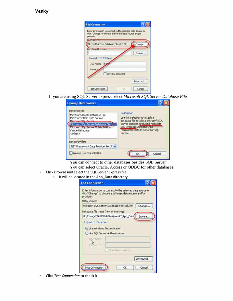
Venky
If you are using SQL Server express select Microsoft SQL Server Database File
You can connect to other databases besides SQL Server
You can select Oracle, Access or ODBC for other databases. • Click Browse and select the SQL Server Express file
o It will be located in the App_Data directory
• Click Test Connection to check it

Venky
• Click OK
• Click Next
Click Next again to save the connection in your web.config file
Storing connection strings in the web.config is more secure than storing them on each of your web
pages. By storing your data in the web.config you can easily change it for all pages at once and allow connection pooling for better performance.
• Select Specify columns from a table or view
• Select your table
• Click * to select all columns
• Click the Advanced button
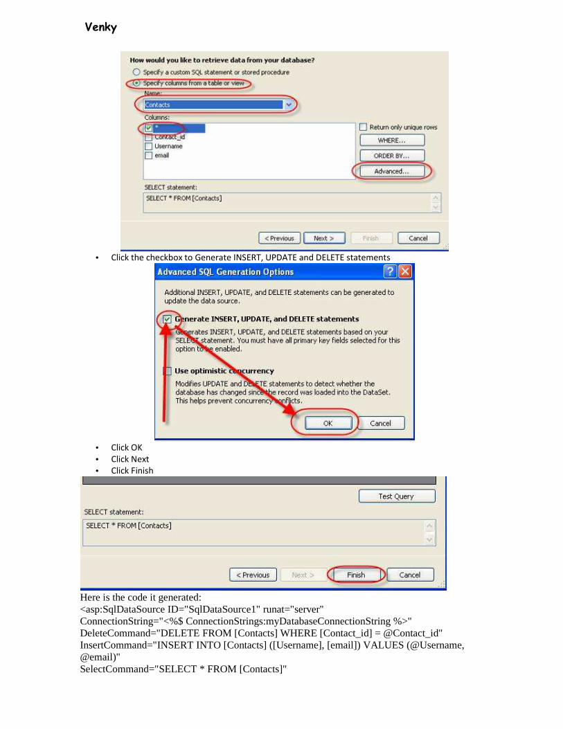
Venky
• Click the checkbox to Generate INSERT, UPDATE and DELETE statements
• Click OK
• Click Next
• Click Finish
Here is the code it generated: <asp:SqlDataSource ID="SqlDataSource1" runat="server" ConnectionString="<%$ ConnectionStrings:myDatabaseConnectionString %>" DeleteCommand="DELETE FROM [Contacts] WHERE [Contact_id] = @Contact_id" InsertCommand="INSERT INTO [Contacts] ([Username], [email]) VALUES (@Username, @email)" SelectCommand="SELECT * FROM [Contacts]"
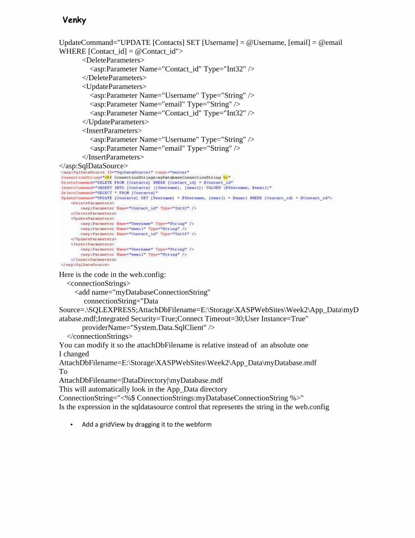
Venky
UpdateCommand="UPDATE [Contacts] SET [Username] = @Username, [email] = @email WHERE [Contact_id] = @Contact_id"> <DeleteParameters> <asp:Parameter Name="Contact_id" Type="Int32" /> </DeleteParameters> <UpdateParameters> <asp:Parameter Name="Username" Type="String" /> <asp:Parameter Name="email" Type="String" /> <asp:Parameter Name="Contact_id" Type="Int32" /> </UpdateParameters> <InsertParameters> <asp:Parameter Name="Username" Type="String" /> <asp:Parameter Name="email" Type="String" /> </InsertParameters> </asp:SqlDataSource>
Here is the code in the web.config: <connectionStrings> <add name="myDatabaseConnectionString" connectionString="Data Source=.\SQLEXPRESS;AttachDbFilename=E:\Storage\XASPWebSites\Week2\App_Data\myDatabase.mdf;Integrated Security=True;Connect Timeout=30;User Instance=True" providerName="System.Data.SqlClient" /> </connectionStrings> You can modify it so the attachDbFilename is relative instead of an absolute one I changed AttachDbFilename=E:\Storage\XASPWebSites\Week2\App_Data\myDatabase.mdf To AttachDbFilename=|DataDirectory|\myDatabase.mdf This will automatically look in the App_Data directory ConnectionString="<%$ ConnectionStrings:myDatabaseConnectionString %>" Is the expression in the sqldatasource control that represents the string in the web.config
• Add a gridView by dragging it to the webform
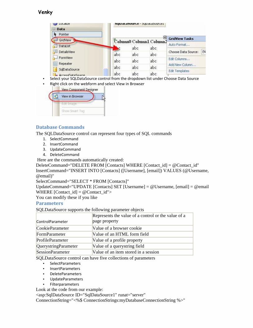
Venky
• Select your SQLDataSource control from the dropdown list under Choose Data Source
• Right click on the webform and select View in Browser
Database Commands
The SQLDataSource control can represent four types of SQL commands 1. SelectCommand
2. InsertCommand
3. UpdateCommand
4. DeleteCommand
Here are the commands automatically created: DeleteCommand="DELETE FROM [Contacts] WHERE [Contact_id] = @Contact_id" InsertCommand="INSERT INTO [Contacts] ([Username], [email]) VALUES (@Username, @email)" SelectCommand="SELECT * FROM [Contacts]" UpdateCommand="UPDATE [Contacts] SET [Username] = @Username, [email] = @email WHERE [Contact_id] = @Contact_id"> You can modify these if you like Parameters
SQLDataSource supports the following parameter objects
ControlParameter
Represents the value of a control or the value of a page property
CookieParameter Value of a browser cookie FormParameter Value of an HTML form field ProfileParameter Value of a profile property QuerystringParameter Value of a querystring field SessionParameter Value of an item stored in a session SQLDataSource control can have five collections of parameters
• SelectParameters
• InsertParameters
• DeleteParameters
• UpdateParameters
• Filterparameters
Look at the code from our example: <asp:SqlDataSource ID="SqlDataSource1" runat="server" ConnectionString="<%$ ConnectionStrings:myDatabaseConnectionString %>"
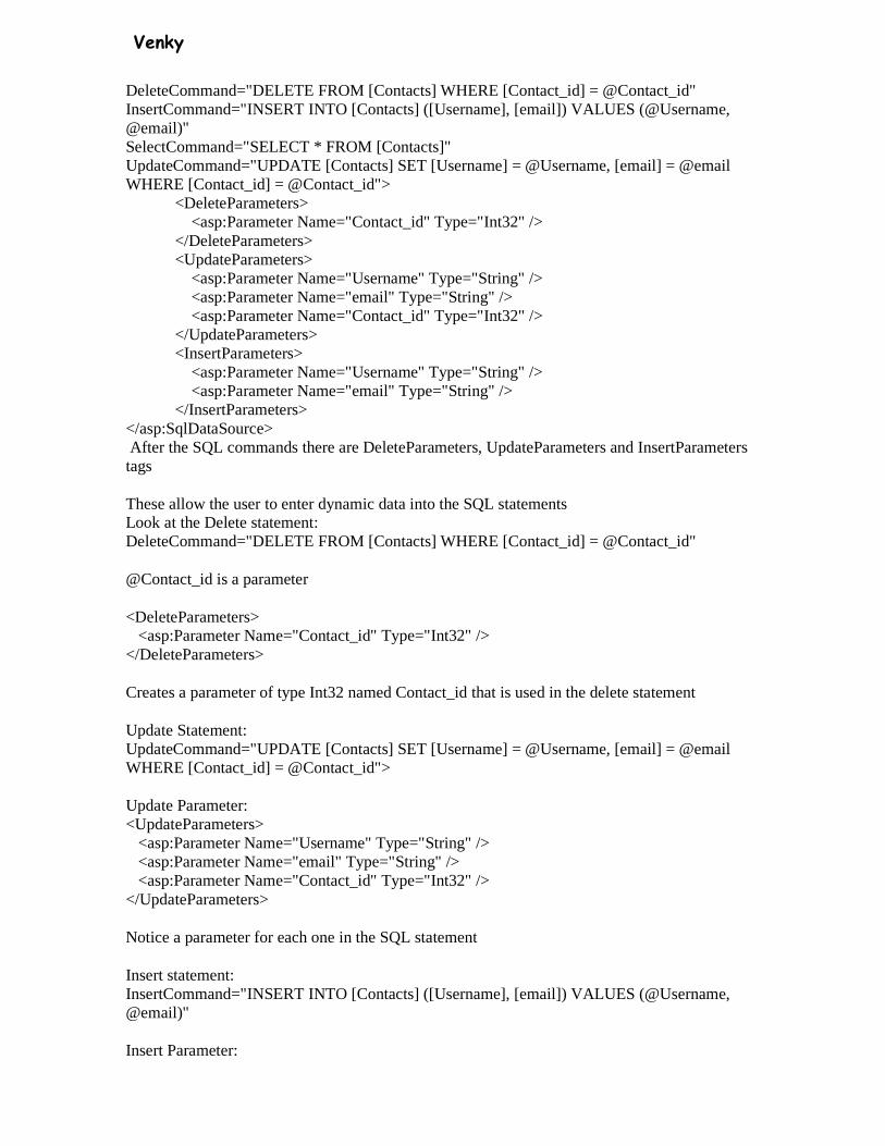
Venky
DeleteCommand="DELETE FROM [Contacts] WHERE [Contact_id] = @Contact_id" InsertCommand="INSERT INTO [Contacts] ([Username], [email]) VALUES (@Username, @email)" SelectCommand="SELECT * FROM [Contacts]" UpdateCommand="UPDATE [Contacts] SET [Username] = @Username, [email] = @email WHERE [Contact_id] = @Contact_id"> <DeleteParameters> <asp:Parameter Name="Contact_id" Type="Int32" /> </DeleteParameters> <UpdateParameters> <asp:Parameter Name="Username" Type="String" /> <asp:Parameter Name="email" Type="String" /> <asp:Parameter Name="Contact_id" Type="Int32" /> </UpdateParameters> <InsertParameters> <asp:Parameter Name="Username" Type="String" /> <asp:Parameter Name="email" Type="String" /> </InsertParameters> </asp:SqlDataSource> After the SQL commands there are DeleteParameters, UpdateParameters and InsertParameters tags
These allow the user to enter dynamic data into the SQL statements Look at the Delete statement: DeleteCommand="DELETE FROM [Contacts] WHERE [Contact_id] = @Contact_id"
@Contact_id is a parameter
<DeleteParameters> <asp:Parameter Name="Contact_id" Type="Int32" /> </DeleteParameters>
Creates a parameter of type Int32 named Contact_id that is used in the delete statement
Update Statement: UpdateCommand="UPDATE [Contacts] SET [Username] = @Username, [email] = @email WHERE [Contact_id] = @Contact_id">
Update Parameter: <UpdateParameters> <asp:Parameter Name="Username" Type="String" /> <asp:Parameter Name="email" Type="String" /> <asp:Parameter Name="Contact_id" Type="Int32" /> </UpdateParameters>
Notice a parameter for each one in the SQL statement
Insert statement: InsertCommand="INSERT INTO [Contacts] ([Username], [email]) VALUES (@Username, @email)"
Insert Parameter:
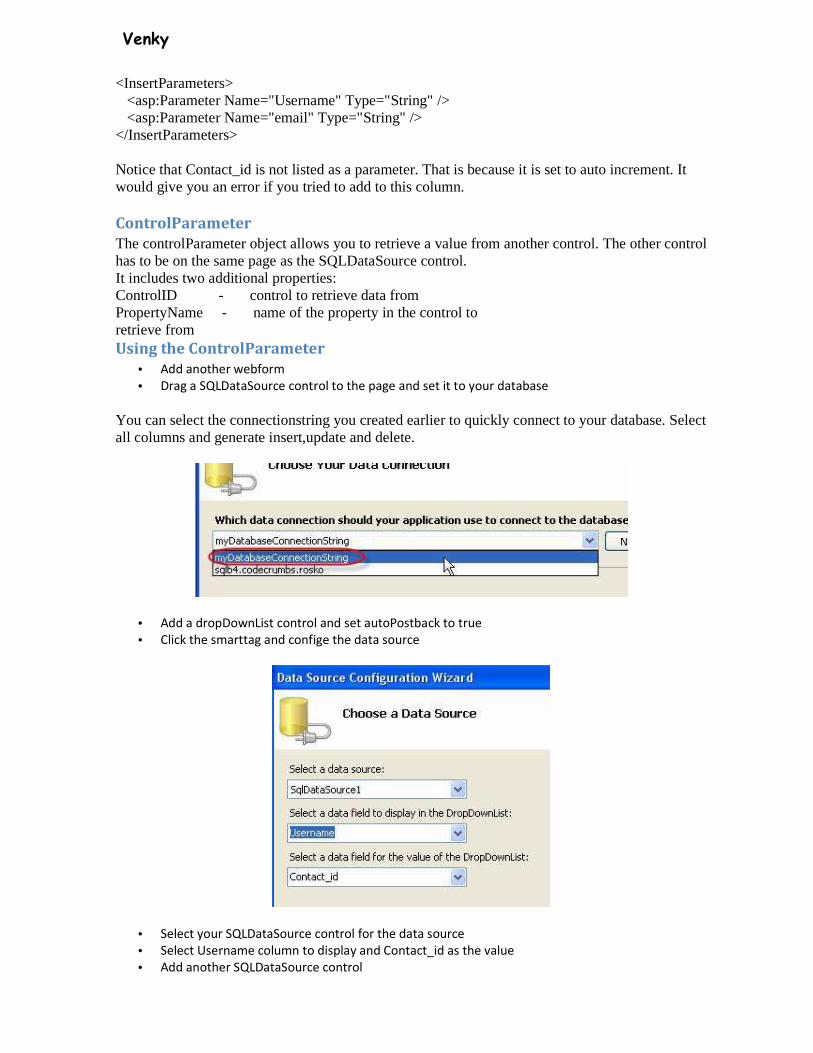
Venky
<InsertParameters> <asp:Parameter Name="Username" Type="String" /> <asp:Parameter Name="email" Type="String" /> </InsertParameters>
Notice that Contact_id is not listed as a parameter. That is because it is set to auto increment. It would give you an error if you tried to add to this column.
ControlParameter
The controlParameter object allows you to retrieve a value from another control. The other control has to be on the same page as the SQLDataSource control. It includes two additional properties: ControlID - control to retrieve data from PropertyName - name of the property in the control to retrieve from Using the ControlParameter
• Add another webform
• Drag a SQLDataSource control to the page and set it to your database
You can select the connectionstring you created earlier to quickly connect to your database. Select all columns and generate insert,update and delete.
• Add a dropDownList control and set autoPostback to true
• Click the smarttag and confige the data source
• Select your SQLDataSource control for the data source
• Select Username column to display and Contact_id as the value
• Add another SQLDataSource control

Venky
• Configure your data source by selecting the connection string and Select all columns.
• This time click on the Where button
• Select Contact_id as the column
• Select Control as the source
• Select your dropDownList as your controlID
• Then click on Add
• Click Next
• Click Finish
• Add a detailsView control and set the data source to the second SQLDataSource control
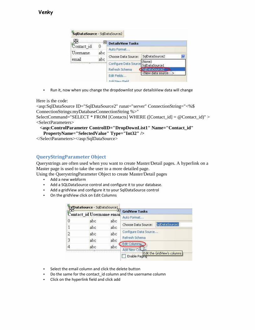
Venky
• Run it, now when you change the dropdownlist your detailsView data will change
Here is the code: <asp:SqlDataSource ID="SqlDataSource2" runat="server" ConnectionString="<%$ ConnectionStrings:myDatabaseConnectionString %>" SelectCommand="SELECT * FROM [Contacts] WHERE ([Contact_id] = @Contact_id)" > <SelectParameters> <asp:ControlParameter ControlID="DropDownList1" Name="Contact_id" PropertyName="SelectedValue" Type="Int32" /> </SelectParameters></asp:SqlDataSource>
QueryStringParameter Object
Querystrings are often used when you want to create Master/Detail pages. A hyperlink on a Master page is used to take the user to a more detailed page. Using the QuerystringParameter Object to create Master/Detail pages
• Add a new webform
• Add a SQLDataSource control and configure it to your database.
• Add a gridView and configure it to your SqlDataSource control
• On the gridView click on Edit Columns
• Select the email column and click the delete button
• Do the same for the contact_id column and the username column
• Click on the hyperlink field and click add

Venky
• Click on the dataTextField and select username
• Click on dataNavigateURLField and select contact_id
• Add this line to the dataNavigateURLFormatString:
detailsPage.aspx?id={0}
• test it
Now if you clicked on one of the hyperlinks it would send you to details.aspx and also send a querystring
Here is the code created for the gridView: <asp:GridView ID="GridView1" runat="server" AutoGenerateColumns="False" DataKeyNames="Contact_id" DataSourceID="SqlDataSource1"> <Columns> <asp:HyperLinkField DataNavigateUrlFields="contact_id" DataNavigateUrlFormatString="detailsPage.aspx?id={0}" DataTextField="Username" HeaderText="Select" /> </Columns> </asp:GridView>
Next we must create the details.aspx page • Add another webform and name it detailsPage.aspx
• Add a SQLDataSource control and configure it to your connectionstring
• Add all the columns
• Click on the where button
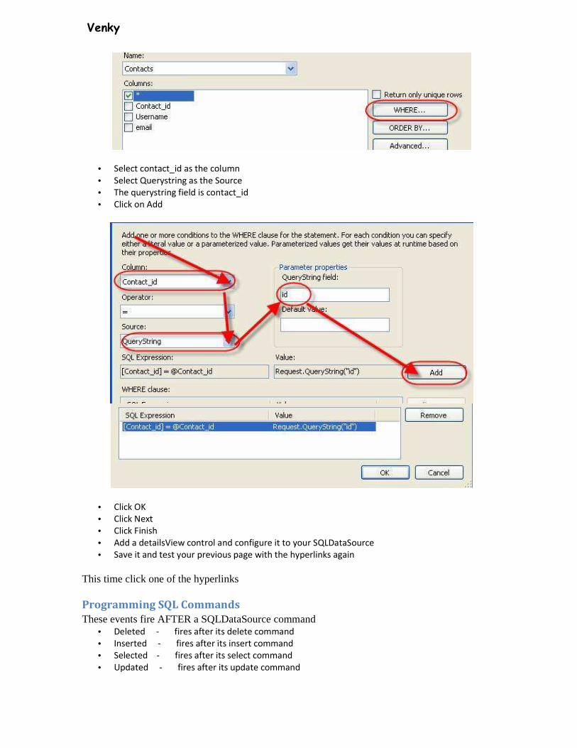
Venky
• Select contact_id as the column
• Select Querystring as the Source
• The querystring field is contact_id
• Click on Add
• Click OK
• Click Next
• Click Finish
• Add a detailsView control and configure it to your SQLDataSource
• Save it and test your previous page with the hyperlinks again
This time click one of the hyperlinks
Programming SQL Commands
These events fire AFTER a SQLDataSource command • Deleted - fires after its delete command
• Inserted - fires after its insert command
• Selected - fires after its select command
• Updated - fires after its update command
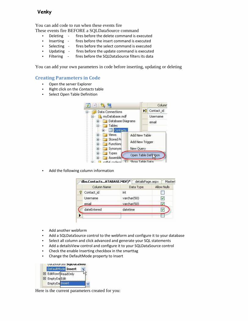
Venky
You can add code to run when these events fire These events fire BEFORE a SQLDataSource command
• Deleting - fires before the delete command is executed
• Inserting - fires before the insert command is executed
• Selecting - fires before the select command is executed
• Updating - fires before the update command is executed
• Filtering - fires before the SQLDataSource filters its data
You can add your own parameters in code before inserting, updating or deleting
Creating Parameters in Code
• Open the server Explorer
• Right click on the Contacts table
• Select Open Table Definition
• Add the following column information
• Add another webform
• Add a SQLDataSource control to the webform and configure it to your database
• Select all column and click advanced and generate your SQL statements
• Add a detailsView control and configure it to your SQLDataSource control
• Check the enable Inserting checkbox in the smarttag
• Change the DefaultMode property to Insert
Here is the current parameters created for you:
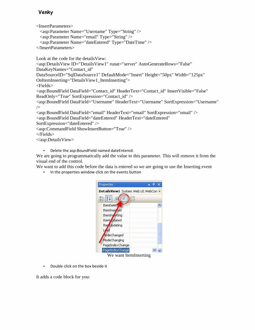
Venky
<InsertParameters> <asp:Parameter Name="Username" Type="String" /> <asp:Parameter Name="email" Type="String" /> <asp:Parameter Name="dateEntered" Type="DateTime" /> </InsertParameters>
Look at the code for the detailsView: <asp:DetailsView ID="DetailsView1" runat="server" AutoGenerateRows="False" DataKeyNames="Contact_id" DataSourceID="SqlDataSource1" DefaultMode="Insert" Height="50px" Width="125px" OnItemInserting="DetailsView1_ItemInserting"> <Fields> <asp:BoundField DataField="Contact_id" HeaderText="Contact_id" InsertVisible="False" ReadOnly="True" SortExpression="Contact_id" /> <asp:BoundField DataField="Username" HeaderText="Username" SortExpression="Username" /> <asp:BoundField DataField="email" HeaderText="email" SortExpression="email" /> <asp:BoundField DataField="dateEntered" HeaderText="dateEntered" SortExpression="dateEntered" /> <asp:CommandField ShowInsertButton="True" /> </Fields> </asp:DetailsView>
• Delete the asp:BoundField named dateEntered.
We are going to programmatically add the value to this parameter. This will remove it from the visual end of the control. We want to add this code before the data is entered so we are going to use the Inserting event
• In the properties window click on the events button
We want ItemInserting
• Double click on the box beside it
It adds a code block for you:
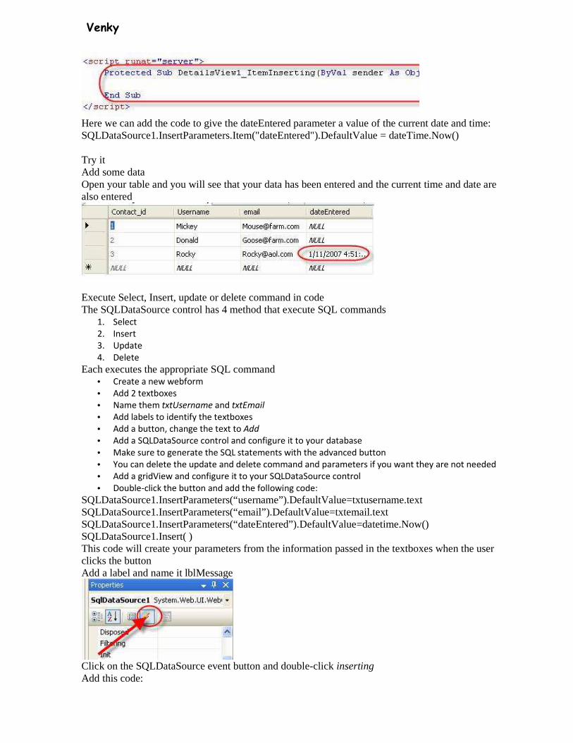
Venky
Here we can add the code to give the dateEntered parameter a value of the current date and time: SQLDataSource1.InsertParameters.Item("dateEntered").DefaultValue = dateTime.Now()
Try it Add some data Open your table and you will see that your data has been entered and the current time and date are also entered
Execute Select, Insert, update or delete command in code The SQLDataSource control has 4 method that execute SQL commands
1. Select
2. Insert
3. Update
4. Delete
Each executes the appropriate SQL command • Create a new webform
• Add 2 textboxes
• Name them txtUsername and txtEmail
• Add labels to identify the textboxes
• Add a button, change the text to Add
• Add a SQLDataSource control and configure it to your database
• Make sure to generate the SQL statements with the advanced button
• You can delete the update and delete command and parameters if you want they are not needed
• Add a gridView and configure it to your SQLDataSource control
• Double-click the button and add the following code:
SQLDataSource1.InsertParameters(“username”).DefaultValue=txtusername.text SQLDataSource1.InsertParameters(“email”).DefaultValue=txtemail.text SQLDataSource1.InsertParameters(“dateEntered”).DefaultValue=datetime.Now() SQLDataSource1.Insert( ) This code will create your parameters from the information passed in the textboxes when the user clicks the button Add a label and name it lblMessage
Click on the SQLDataSource event button and double-click inserting Add this code:
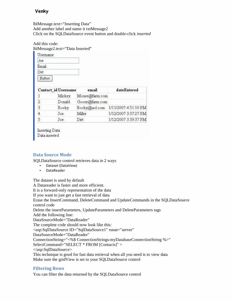
Venky
lblMessage.text=”Inserting Data” Add another label and name it txtMessage2 Click on the SQLDataSource event button and double-click inserted
Add this code: lblMessage2.text=”Data Inserted”
Data Source Mode
SQLDataSource control retrieves data in 2 ways • Dataset (DataView)
• DataReader
The dataset is used by default A Datareader is faster and more efficient. It is a forward-only representation of the data If you want to just get a fast retrieval of data Erase the InsertCommand, DeleteCommand and UpdateCommands in the SQLDataSource control code Delete the insertParameters, UpdateParameters and DeleteParameters tags Add the following line: DataSourceMode="DataReader" The complete code should now look like this: <asp:SqlDataSource ID="SqlDataSource1" runat="server" DataSourceMode="DataReader" ConnectionString="<%$ ConnectionStrings:myDatabaseConnectionString %>" SelectCommand="SELECT * FROM [Contacts]" > </asp:SqlDataSource> This technique is good for fast data retrieval when all you need is to view data Make sure the gridView is set to your SQLDataSource control
Filtering Rows
You can filter the data returned by the SQLDataSource control

Venky
• Add a new webform
• Add a textbox, button, SQLDataSource and gridView control
• Name the textbox control txtFilter
• Configure the SQLDataSource control for your connection string
• Select all columns
• Configure the gridView to the SQLDataSource
• Look at the code for the SQLDataSource control:
<asp:SqlDataSource ID="SqlDataSource1" runat="server" ConnectionString="<%$ ConnectionStrings:myDatabaseConnectionString %>" SelectCommand="SELECT * FROM [Contacts]"> </asp:SqlDataSource> Add a filter expression:
<asp:SqlDataSource ID="SqlDataSource1" runat="server" ConnectionString="<%$ ConnectionStrings:myDatabaseConnectionString %>" FilterExpression=”Username like ‘{0}%’ ” SelectCommand="SELECT * FROM [Contacts]"> </asp:SqlDataSource>
Then add a FilterParameter tag between the SQLDataSource tags: <asp:SqlDataSource ID="SqlDataSource1" runat="server" ConnectionString="<%$ ConnectionStrings:myDatabaseConnectionString %>" FilterExpression=”Username like ‘{0}%’ ” SelectCommand="SELECT * FROM [Contacts]"> <FilterParameters> <asp:controlParameter Name=”username” controlID=”txtFilter” /> </FilterParameters> </asp:SqlDataSource>
Stored procedures
You can assign the value StoredProcedure in any of the following properties 1. SelectCommandType
2. InsertCommandType
3. UpdateCommandType
4. DeleteCommandType
Creating a stored procedure in Visual Studio • Open the server explorer

Venky
• Expand the database until you see Stored Procedures
• Right-click on stored procedures and select Add New Stored Procedure
From here you can add a stored procedure
Type:
CREATE PROCEDURE myStoredProcedure AS Select Count(*) as NumUsers from Contacts
• Add a new webform
• Add a SQLDataSOurce control and configure it to your connectionstring
• Select Specify a custom SQL statement or stored procedure
• Click Next
• Select the Stored Procedure option
• Select your stored procedure from the dropdown list
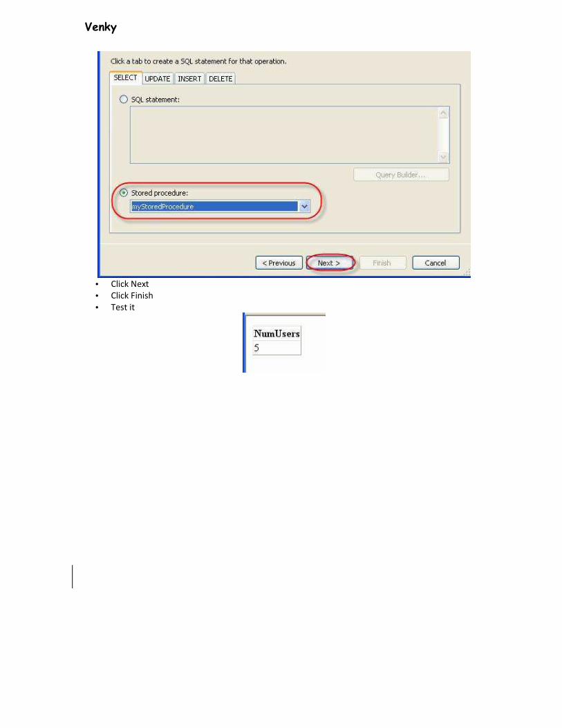
Venky
• Click Next
• Click Finish
• Test it
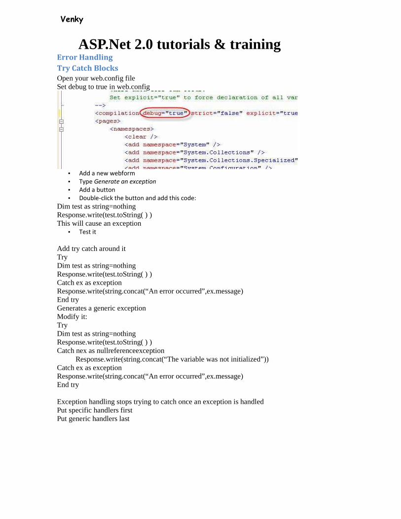
Venky
ASP.Net 2.0 tutorials & training Error Handling
Try Catch Blocks
Open your web.config file Set debug to true in web.config
• Add a new webform
• Type Generate an exception
• Add a button
• Double-click the button and add this code:
Dim test as string=nothing Response.write(test.toString( ) ) This will cause an exception
• Test it
Add try catch around it Try Dim test as string=nothing Response.write(test.toString( ) ) Catch ex as exception Response.write(string.concat(“An error occurred”,ex.message) End try Generates a generic exception Modify it: Try Dim test as string=nothing Response.write(test.toString( ) ) Catch nex as nullreferenceexception Response.write(string.concat(“The variable was not initialized”)) Catch ex as exception Response.write(string.concat(“An error occurred”,ex.message) End try Exception handling stops trying to catch once an exception is handled Put specific handlers first Put generic handlers last

Venky
Error Handling
Try Catch Blocks
Open your web.config file Set debug to true in web.config
• Add a new webform
• Type Generate an exception
• Add a button
• Double-click the button and add this code:
Dim test as string=nothing Response.write(test.toString( ) ) This will cause an exception Add try catch around it Try Dim test as string=nothing Response.write(test.toString( ) ) Catch ex as exception Response.write(string.concat(“An error occurred”,ex.message) End try Generates a generic exception Modify it: Try Dim test as string=nothing Response.write(test.toString( ) ) Catch nex as nullreferenceexception Response.write(string.concat(“The variable was not initialized”)) Catch ex as exception Response.write(string.concat(“An error occurred”,ex.message) End try Exception handling stops trying to catch once an exception is handled Put specific handlers first Put generic handlers last
Venky
DataSet Object in ADO.Net 2.0 The dataset object is an in-memory representation of data The dataset object has a collection of dataTables and dataRelation objects The dataset can contain one or more dataTables Example: The following example shows how you can have two dataTables in a single dataset and add a dataRelation Add this line above the page_load Imports System.data Add this to the page_load 'create new dataset Dim ShoppingCart As New DataSet("Cart") 'create dataTable Dim products As DataTable = ShoppingCart.Tables.Add("Products") 'add columns products.Columns.Add("product_ID", GetType(Guid)) products.Columns.Add("ProductName", GetType(String)) products.Columns.Add("Price", GetType(Integer)) products.Columns.Add("cat_id", GetType(Guid)) 'add primary key products.PrimaryKey = New DataColumn() {products.Columns("product_ID")} 'create second dataTable Dim category As DataTable = ShoppingCart.Tables.Add("category") 'add columns category.Columns.Add("cat_id", GetType(Guid)) category.Columns.Add("catName", GetType(String)) 'add primary key category.PrimaryKey = New DataColumn() {category.Columns("cat_id")} 'create data relation ShoppingCart.Relations.Add("shoppingcart_Products", _ category.Columns("cat_id"),products.Columns("cat_id") ) Add some sample data 'add data Dim shop, cat As Guid 'get new guids shop = Guid.NewGuid() cat = Guid.NewGuid() 'add row to category table category.Rows.Add(cat, "household") 'Add row to products products.Rows.Add(shop, "toaster", 25.21, cat) 'get another guid shop = Guid.NewGuid() 'Add another row to products products.Rows.Add(shop, "microwave", 250.0, cat) 'get another guid shop = Guid.NewGuid() 'Add another row to products products.Rows.Add(shop, "Silverware", 27.5, cat) 'get two new guids cat = Guid.NewGuid() shop = Guid.NewGuid()

Venky
'add another row to category category.Rows.Add(cat, "electronics") 'Add another row to products products.Rows.Add(shop, "television", 300.0, cat) 'get another guid shop = Guid.NewGuid() 'Add another row to products products.Rows.Add(shop, "VCR", 250.0, cat) Add 2 gridVIews to the webform Add this code 'bind to first gridView GridView1.DataSource = ShoppingCart GridView1.DataMember = "products" GridView1.DataBind() 'bind to second gridView GridView2.DataSource = ShoppingCart GridView2.DataMember = "category" GridView2.DataBind() Since a dataset can have more than one dataTable you must set the datasource to the dataset and the dataMember to each dataTable
Serialize dataSet as XML
Use the dataset’s writeXML method to serialize a dataset to XML Add this code ShoppingCart.WriteXml(MapPath("Cart.xml")) Here is the XML is created: <?xml version="1.0" standalone="yes"?> <Cart> <Products> <product_ID>9e5ff882-9f22-4ca2-a114-84b93abac05d</product_ID> <ProductName>toaster</ProductName> <Price>25</Price> <cat_id>231a895d-0094-4cb5-bd82-c1ac40c1f0e9</cat_id> </Products> <Products> <product_ID>4a13fd47-cfd1-4b78-a516-ea7c069b2ea2</product_ID> <ProductName>microwave</ProductName> <Price>250</Price> <cat_id>231a895d-0094-4cb5-bd82-c1ac40c1f0e9</cat_id> </Products> <Products> <product_ID>5ae1f57d-8ee1-47f8-b32c-9629cb64e9ec</product_ID> <ProductName>Silverware</ProductName> <Price>28</Price> <cat_id>231a895d-0094-4cb5-bd82-c1ac40c1f0e9</cat_id> </Products> <Products> <product_ID>9a14e5e7-c569-4ae1-8e76-a2809a6a8ed8</product_ID> <ProductName>television</ProductName> <Price>300</Price> <cat_id>c35ef4d4-b702-4fec-89b8-8620a24ffd24</cat_id> </Products>
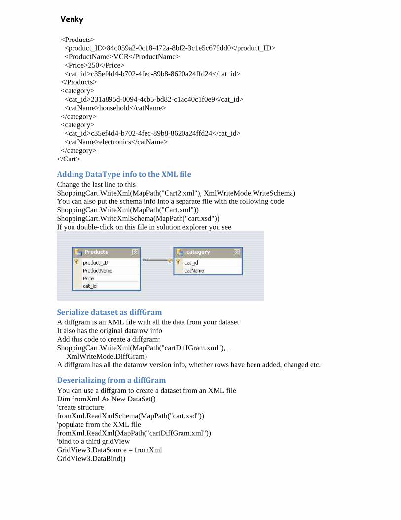
Venky
<Products> <product_ID>84c059a2-0c18-472a-8bf2-3c1e5c679dd0</product_ID> <ProductName>VCR</ProductName> <Price>250</Price> <cat_id>c35ef4d4-b702-4fec-89b8-8620a24ffd24</cat_id> </Products> <category> <cat_id>231a895d-0094-4cb5-bd82-c1ac40c1f0e9</cat_id> <catName>household</catName> </category> <category> <cat_id>c35ef4d4-b702-4fec-89b8-8620a24ffd24</cat_id> <catName>electronics</catName> </category> </Cart>
Adding DataType info to the XML file
Change the last line to this ShoppingCart.WriteXml(MapPath("Cart2.xml"), XmlWriteMode.WriteSchema) You can also put the schema info into a separate file with the following code ShoppingCart.WriteXml(MapPath("Cart.xml")) ShoppingCart.WriteXmlSchema(MapPath("cart.xsd")) If you double-click on this file in solution explorer you see
Serialize dataset as diffGram
A diffgram is an XML file with all the data from your dataset It also has the original datarow info Add this code to create a diffgram: ShoppingCart.WriteXml(MapPath("cartDiffGram.xml"), _ XmlWriteMode.DiffGram) A diffgram has all the datarow version info, whether rows have been added, changed etc.
Deserializing from a diffGram
You can use a diffgram to create a dataset from an XML file Dim fromXml As New DataSet() 'create structure fromXml.ReadXmlSchema(MapPath("cart.xsd")) 'populate from the XML file fromXml.ReadXml(MapPath("cartDiffGram.xml")) 'bind to a third gridView GridView3.DataSource = fromXml GridView3.DataBind()