artists’ laboratory stephen farthing...
TRANSCRIPT

Artists’ Laboratory Stephen Farthing RA
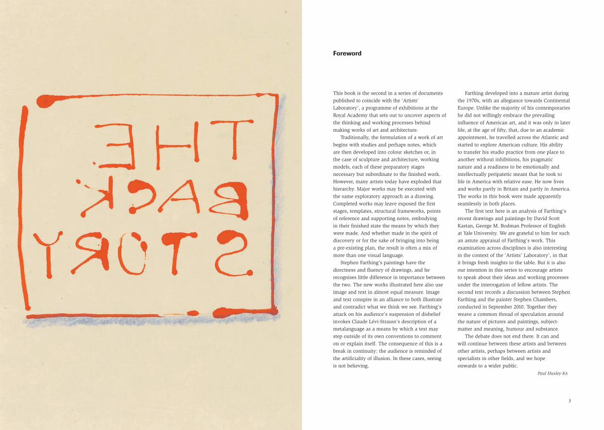
The Back Story
Royal Academy of Arts
This book is the second in a series of documentspublished to coincide with the ‘Artists’Laboratory’, a programme of exhibitions at theRoyal Academy that sets out to uncover aspects ofthe thinking and working processes behindmaking works of art and architecture.
Traditionally, the formulation of a work of artbegins with studies and perhaps notes, which are then developed into colour sketches or, in the case of sculpture and architecture, workingmodels, each of these preparatory stagesnecessary but subordinate to the finished work.However, many artists today have exploded thathierarchy. Major works may be executed with the same exploratory approach as a drawing.Completed works may leave exposed the firststages, templates, structural frameworks, points of reference and supporting notes, embodying in their finished state the means by which theywere made. And whether made in the spirit ofdiscovery or for the sake of bringing into being a pre-existing plan, the result is often a mix ofmore than one visual language.
Stephen Farthing’s paintings have thedirectness and fluency of drawings, and herecognises little difference in importance betweenthe two. The new works illustrated here also useimage and text in almost equal measure. Imageand text conspire in an alliance to both illustrateand contradict what we think we see. Farthing’sattack on his audience’s suspension of disbeliefinvokes Claude Lévi-Strauss’s description of ametalanguage as a means by which a text maystep outside of its own conventions to commenton or explain itself. The consequence of this is abreak in continuity: the audience is reminded ofthe artificiality of illusion. In these cases, seeing is not believing.
Farthing developed into a mature artist duringthe 1970s, with an allegiance towards ContinentalEurope. Unlike the majority of his contemporarieshe did not willingly embrace the prevailinginfluence of American art, and it was only in laterlife, at the age of fifty, that, due to an academicappointment, he travelled across the Atlantic andstarted to explore American culture. His ability to transfer his studio practice from one place toanother without inhibitions, his pragmatic nature and a readiness to be emotionally andintellectually peripatetic meant that he took to life in America with relative ease. He now livesand works partly in Britain and partly in America.The works in this book were made apparentlyseamlessly in both places.
The first text here is an analysis of Farthing’srecent drawings and paintings by David ScottKastan, George M. Bodman Professor of Englishat Yale University. We are grateful to him for suchan astute appraisal of Farthing’s work. Thisexamination across disciplines is also interestingin the context of the ‘Artists’ Laboratory’, in thatit brings fresh insights to the table. But it is alsoour intention in this series to encourage artists to speak about their ideas and working processesunder the interrogation of fellow artists. Thesecond text records a discussion between StephenFarthing and the painter Stephen Chambers,conducted in September 2010. Together theyweave a common thread of speculation aroundthe nature of pictures and paintings, subject-matter and meaning, humour and substance.
The debate does not end there. It can and will continue between these artists and betweenother artists, perhaps between artists andspecialists in other fields, and we hope onwards to a wider public.
Paul Huxley RA
Foreword
3

and work our way down a page, but an imagewill direct our eye differently. Words belong to the ‘left brain’, images to the ‘right’. That’s whatneurobiologists tell us. Farthing undoes thislateralisation, making us see what we expect to read, and read what we merely expect to see.Sense and senses collide and ultimately collude.
Boucher: The Back Story (page 31) is a perfectexample: a painting that is at once a brilliantcritique of François Boucher’s Girl Reclining(Louise O’Murphy), 1751 – a small (59 x 73 cm)nude portrait of the young girl who would soonbecome the mistress of Louis XV (indeed possiblyat the prompt of the painting, which seems tohave been intended to exhibit her to the King) –and a ravishing formal experiment in Farthing’sown terms. In the significantly larger scale ofFarthing’s painting, the girl’s oddly drawn rightleg in the original becomes apparent, as does the position of her derrière at the very centre of the canvas.
But Farthing is less interested in Boucher’sartistic or moral failings than in the painting as aprovocation for his own formal experimentation.Enlarged, and also distorted by the gauze ofmirror writing on the picture plane, in Farthing’spainting figuration becomes abstract and gestural:vivid patches of colour come to dominate line.The mirror writing confirms the canvas as a two-dimensional surface, even as the letters help tocreate volume by floating in front of the figure(space made even more complex as the reversedwriting suggests that the words would only beproperly legible from behind the canvas, wittilyliteralising the idea of the ‘back story’).
It is a good joke, but it is a better painting.Abstraction becomes a mode of moral as well asformal purification: what is meant here to seduceis not the (creepy) display of a pubescent girl’s
body, but the confident presentation of a matureartist’s imagination. And seductive it is, offeringitself sensuously for our delight, even as it teases us with its conceptual sophistication (not, I suspect, the young mistress’s strong suit).
Or think of The Drawn History of Paintingseries (pages 20–29), especially the map of thathistory (pages 20–21), which adapts the familiardiagram of the London Underground for amonumental historical task. Again the conceptualand pictorial, word and image, line and colour,idea and act, exist in tension, but not incontradiction. Each half of these pairs informsand energises the other, as is evident in this suiteof drawings that does what good drawings alwaysdo: use line to activate the picture surface andengage the viewer’s eye. And of course againthere is the wit: this is Art History, but less ashistory than as art.
But the joke has a serious aim (as good jokesinevitably do). The Drawn History is pointedly a history that is not linear. The history ofpainting, as artists have always known, doesn’tcelebrate – or demand – an inevitable progresstowards the new. Indeed, the Underground isarguably a perfect metaphor for the recycling of forms that is art’s history: it allows differentpeople to get on a train that continuously retracesits route, regularly stopping at stations that havelong been in use. The Drawn History is a historywithout a beginning and without an end. This is not to fall back upon a banal assertion of art’stimelessness; it is simply to resist a developmentalmodel of the history of forms, which wouldalways push artists towards the next avant-garde.
Farthing knows better than that, but he knows also that the question of whether art mayproperly be said to have a history at all (or inwhat sense it might) is arguably more urgent for
Most artists have a clear and fixed hierarchy offormal activities in their head. Paintings usuallyare on top. They are what is finished and fully realised. They are (so their artists hope) what will sell. Drawing is normally a lesser form,casual and exploratory, often preliminary. Writingmay be limited to a signature (and these days,even if something is signed, it is rarely on thepicture plane). And mapping . . . well, mapping is someone else’s business: schematic andinstrumental, not an artistic activity at all.
But that isn’t how Stephen Farthing thinks orhow he works. Although he continues to producebig, beautiful and ambitiously ‘painterly’ canvases(like Painting the Atlantic, page 7), these exist –indeed become most compelling – in the contextof a rich, ongoing visual meditation on howvarious graphic practices relate to one anotherand to the roles each has traditionally played inthe history of art.
Every work reproduced in this book is part of that meditation. Writing, for example, appearsthroughout, welcomed into the artist’s repertoireof forms rather than sequestered, set apart fromthem. Words are not captions (no more thanimages are illustrations). Neither word nor imagehas primacy here. They mingle in Farthing’s work;in fact they miscegenate, both refusing to accepttheir difference. Words remain recognisable astext – indeed, aggressively insist upon themselvesas such – but often as a text that can’t be read,the illegibility turning the words into imagesrather than linguistic signs, collapsing the familiardistinction between the two and undoing theprotocols of seeing that are attached to each(although, it should be said, these protocols existin opposition mainly in the West; an ‘Eastern’calligraphic tradition had long ago effected thecollapse). We usually read words from left to right
5
Stephen FarthingDrawing–Writing–Mapping–Painting
David Scott Kastan, Yale University
He had to choose. But it was not a choiceBetween excluding things. It was not a choice
Between, but of. He chose to include the thingsThat in each other are included, The whole, the complicate, the amassing harmony.
Wallace Stevens, ‘Notes Towards a Supreme Fiction’

artists than for art historians. But he will find and propose his answer in his art, hence a‘Drawn History’. And in fact, although he isamong those contemporary artists who haveconsistently written, and written well, about art, he characteristically thinks in images andimagines ideas. The paintings and drawings here offer visual solutions to urgent conceptualproblems, even as they suggest conceptualsolutions to no less urgent visual problems.Wallace Stevens would have recognised in themthe ‘enchantments of intelligence’. For Farthing,seeing and thinking are not discrete activities;each is invigorated by the pressure of the other.Paired, they become both a mode of inquiry and a means of play.
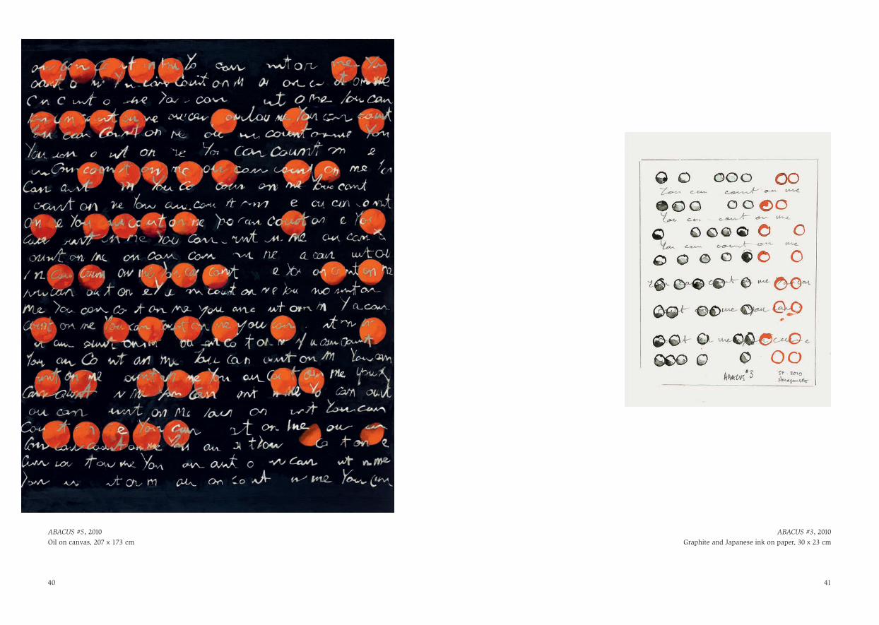
In the large canvas ABACUS #5 (page 40), one can see the persistent concerns of Farthing’s art come convincingly together. The simplifiedsurface of the painting clarifies its complexconceptual and painterly interests. On a blackground, orange balls are arranged in parallel lines, the painted canvas defining the frame of the abacus. Echoing the rods on which the ballsare hung (though existing apparently in front ofthem) is the recurring phrase ‘you can count onme’. It is a visually arresting painting: the orangepops against the black, the abacus provides a firmstructure for the irruption of colour and the greytext of the pun organises the picture field. Thepainting’s structure is stable and secure; a viewerstands comfortably in front of it knowing whereand how to look. ‘You can count on me,’ thepicture says, a formal promise seemingly offeredwith no less conviction than that offered literallyby the abacus itself. ‘You can count on me.’
But of course it is a promise that cannot befulfilled. The abacus is merely the representationof an abacus: Ceci n’est pas un abaque, Farthing
might have written. But that’s been done, and, in any case, his point is more complicated thanMagritte’s. The illusion of depth created by thescript appearing to hover in front of the orangeballs further undoes the formal guarantee. As indeed does the pun itself, a mischievousinsistence upon that which language always tries to deny: the instability of its referentialsystem. We know that words may have more than one meaning; but this seems an arbitraryfact of language, and normally we speak or write to preclude the possibility of confusion.Farthing, however, invents a context that makesthe ambiguity inescapable. The interpreter is unable to choose which sense of ‘count on’is intended and is left to experience an oscillationin semantic space that is parallel to that of theunresolved pictorial space. And the irony shouldnot be missed that ‘Abacus’ was the name of asophisticated investment instrument thatGoldman Sachs aggressively marketed to itsclients between 2004 and 2007. ‘You can count on me,’ the firm in essence promised, althoughAbacus turned out to be one of the most toxicassets in the subsequent meltdown of thefinancial markets.
That is Farthing at his very best: formallyinventive and conceptually bold, producing apainting that is beautiful to look at and in variousways unsettling to consider. But that’s what artdoes, what it should do anyhow. Beauty on itsown is static, mere decoration. But Farthing’s art is always in motion, finished but never still.Each piece offers itself less as statement than asquestion, as an exploration of possibility ratherthan the triumph of technique. Each is engaged in a conversation with other art and with otherartists, and always with the world. And eachacknowledges that there still is more to say.
76
Stephen Farthing working on Painting the Atlanticat Chelsea Futurespace, London, 2005

98
Atlantic Water #45, 2005Acrylic on board, 26 x 20 cm
Atlantic Water #31, 2005Acrylic on board, 26 x 20 cm
Thames Water #29, 2005Acrylic on board, 26 x 20 cm

Atlantic Water Sample, 2006Ink on card, 25 x 20 cm
Thames Water Sample, 2006Ink on card, 25 x 20 cm
11
Hudson Water Sample, 2006Ink on card, 25 x 20 cm

SF Yes, but only in so far as I thought becominga ‘judge’ might taint what my audiencethinks of my commitment to being an artist.In a more positive way, I saw it as anopportunity to stand back and see the biggerpicture, to meet new people and paintingsand to take seriously the achievements ofothers, so not a distraction – a time forreflection.
SC I asked because the paintings you have madein recent years, dare I say, since writing thebook, seem to be the most succinct of allyour work. It almost feels as if the morepaintings you looked at, the more you wereable to omit from your own work.
SF I hope you are right, because that’s what I wanted. When I was a student at the Royal College of Art in the early seventies,Peter de Francia, who was then Professor of Painting and I think quite liked mypaintings, told me during a tutorial thatwhen I painted I had ‘a surfeit of language’. I think this was a polite way of telling methat I could afford to make my paintings less complicated; forty years later I’m gladyou think I’m getting there.
SC In writing about a painting you have to askyourself a sequence of questions, becauseyou need to say something, but when youengage with that same work by painting a ‘conversation’ with it, as you did in The Back Story series, you will, I am sure,find things that you would not have knownsimply by writing or just looking. Can youexplain the difference between looking,writing and doing?
SF I like the idea of it being a ‘conversation’ –that’s exactly the way I view it. Yes, for mepainting ‘about’ another artist’s painting isvery different than simply looking at, orwriting about or indeed drawing from it. In a hierarchical order I would put ‘just looking’at the bottom of the heap, and writing,painting and drawing equal first at the top.Each of these approaches to a conversationwith someone else’s painting reveals for medifferent layers and types of meaning, allequally useful to my mind. Writing aboutBoucher’s painting of a naked fourteen-year-old girl (Louise O’Murphy, a mistress ofLouis XV) led me to understand exactly how coercive the image was. Painting aboutit on a much bigger scale made me realisehow unresolved the anatomy on the rightside of the girl’s body is. Drawing enabledme to see how you can get away with a lotof inaccuracies on a smaller scale. Sopractical engagements tended to unearthphysical problems, and the written moreemotional and intellectual issues.
SC As a student you went through art schoolwhen the American art critic ClementGreenberg was King Kong (I, being ten years younger, caught the tail end of his hold over artistic theory and practice). How much do you feel his emphasis on the formal construction of a painting has to do with the decisions you make when‘building’ a painting?
SF My art education had a constructiveschizophrenia or, as it was called at the time,dialectic, built into it. I was taught by twovery different types of artists. On one side
SC When you choose to write about a paintingthat interests you, as you did in your book1001 Paintings You Must See Before You Die,you will, by putting it into words, see thatpainting in a slightly different way than youwould during the more usual silent dialoguebetween eyes/brain and the painting in frontof you.
SF Yes that is my experience too, but I wouldtake it even further – I believe I can actuallysee a painting better once I have writtenabout it.
SC The book was obviously an importantcatalyst for recent work, The Back Storyand The Drawn History of Painting series, for example. Can you explain why?
SF As a ‘free’ painter, and by that I meansomeone who seldom works to commission,I am able to choose my subject-matter. Thisfreedom, I have noticed over time, hasresulted in me working with subjects thatreflect not just what is going on in my life,but also the way it’s going. So having, for the best part of a year, reflected on whatmight be my top 1001 paintings, it didn’tsurprise me that in the end this experiencebegan to shape my activities as a painter, not just in terms of subject-matter andcontent, but also image and text.
SC I have often thought about the repercussionsfor a writer of being a Booker Prize judge,about how to return to ‘self’. When you were mid-way through your research for 1001 Paintings did you ever consider what it might do to your own work?
13
Stephen Farthing RA and Stephen Chambers RA
in conversation

SC In many of the paintings with people in youhave edited out their heads, frequently at the high-neck level, as in the Standing Ladypaintings. This gives the viewer vampire’seyes, in a shift from the more familiar eye-to-eye connection. Could you explain thethoughts behind this anonymity?
SF I went to art school during the late sixtiesand early seventies, just as Americanabstraction peaked and Pop Art began tothrive. I knew I wanted to be a modern artistbut never felt totally comfortable dispensingwith the human presence. The figure hasalways been there in my paintings, even ifI’ve reduced it to an empty chair or a stringof words. That said, I think the humanpresence has had a rough and uncomfortableride in modern art, not least in my ownwork. In the Standing Lady series I reducemy protagonists to decapitated statues,possibly tailors’ dummies, not to be mean or sinister, but to throw the focus onto whatinterests me most – the background and theirclothing. It’s not people but their faces thatseem to get in the way.
SC There is a difference between a painting anda picture, and you are very much involved in making paintings. One of the conundrumsfor a painter utilising recognisable images ishow to avoid a painting becoming just apicture, merely illustrative. I think thatbecause you are acutely aware of thispainterly problem, throughout your careeryou have employed riddles: the fourth wall –that indescribable wall through which theviewer sees the action – camouflage, splitfocal points. You have described one series
as the Gaming Paintings. Would I be way off the mark to say that to some extent there has always been a game going on with the viewer?
SF Yes, for me that’s the point, I’m giving the viewer something to think about –something that I can exercise my wit andimagination on once I’ve set out the idea.When we start to paint we imagine it is allabout realising the image – once we’velearned to do that reasonably well, most of us get bored with simply picturing things and places, bore others by doing it, or move on. I know you and I have bothmoved on. Good painters, once they havelearned the rules, become interested in what happens when they break them. Theywant to know what happens when they addtoo much of ‘x’ or obliterate ‘y’ and turn theconcept upside down. The Gaming Paintingsexplore how objects and colour can be usedto confound our ability to read text, thenhow text can be reduced to an image. Youare right it is a game, but unlike professionalsportsmen we don’t need to play the samegame every day.
SC The text that appears in these and otherrecent works, frequently in reverse, gives us something else to think about, but it alsoacts as an invasive foil, or gauze, a type ofelectric shock that disrupts the viewer. Didyou begin to use text to distance the viewerfrom the image? Were you thinking of waysof keeping the image at a distance?
SF That’s it in a nutshell! In Boucher: The BackStory, for example, I wanted the words to sit
there were the Royal Academicians, whowere inclined to steer you towards Europe,and on the other a generally younger group,who as you suggest were mostly followers of Greenberg and inclined towards America.The way I paint is the product of my interestin both sides. I liked listening to RuskinSpear talk about the portraits he painted, just as I was impressed by John Edwardsdiscussing the importance of the ‘edge’ of the painting. Sensible students seemed to take one road or the other; I took themiddle path. Which is most probably whyDe Francia thought I had a surfeit oflanguage.
SC Charcoal Black. What is it that this colourmeans for you? Many of your paintings, oftenthe views into interiors, deploy an almostframe-like soft black harnessing. I am
thinking of paintings like Gaddafi’s Tent,Dumonair’s Failure, or the paintings of MaryQueen of Scots. I guess that this is partlyblack as infinity, but you also appear to useit to steer the eye around the painting?
SF Black for me is infinity, black is when I don’tknow what’s there. Grey is where I start, thesurface of the painting, and black is furtheraway than grey. The grey I start with getsdetailed with other greys, some lighter somedarker. Towards the end I put in the blacksand whites, then finally, once I think I knowwhat I’m doing, I introduce colour. Althoughsometimes my pictures are physically madeas I have just described them, more oftenwhat I have described is a thought processthat takes place, as I work my way towards a strategy for starting a painting.
SC Some of your recent paintings have people in them, and these people are often doingthings. But they are not narrative paintings,are they? They are more like invitations toexplore your mind, provocations to inquire...
SF I’m glad you see that in them. I consciouslymake paintings that can be looked at for long periods of time, over and over again. I would like my audience to relate to them as icons. Going back to a previous question,perhaps what I believe in most of all is the capacity of line, form and colour to not just endlessly entertain the eye, but also stimulate patterns of intellectuallychallenging thought – good old formaliststuff! Add to that a fearless attitude towardssubject-matter – which Greenberg didn’thave – and you have my paintings.
1514
Gaddafi’s Tent, 1996Oil on canvas, 173 x 207 cm

England featured top-right and the Hudsonflowed into the painting mid-left – but itsimply looked wrong, it was all too twisted.So rather than keep banging my head againsta brick wall, I just did away with the riversand coastlines and let the water speak foritself.
SC Are you aware of a difference betweenmaking a painting in London and makingone on Long Island?
SF Although London is technically my home,the place where I was born, strangely,because I do believe that being an artist isessentially an urban occupation, I feel moreat home by the ocean than I do living next to Chelsea’s football stadium. At the beach,time doesn’t matter, my phone seldom rings and the weather is usually the mostexciting thing on the menu. I paint in bothplaces – the difference is that in London it’swork, on Long Island it’s life the way I like to live it.
SC Because you’ve split your time between theUK and the USA for such a long time, do you sometimes forget where the paintingsare made, or can you tell from the way awork looks?
SF No, never, I always remember where theywere made. Sometimes I’ll be working ontwo paintings that are part of the sameseries, one in the UK, the other in the USA,but I never forget which one was madewhere. The colours I use in each place aresubtly different, not by choice so much ascircumstance. I’m less fun in the city, more
restless, I take fewer chances. By the oceanthe light is sharper, the colour is deeper andI’m warmer. It’s all that stuff that fine-tunesthe final look of my painting, and stops mefrom cheating on it.
SC You paint a lot of jewellery, and the reasonis…?
SF Jewellery is the wealthy cousin of the tattoo.In Western culture one is no less primitivethan the other. Their purpose is both to catchthe eye and distract. Jewellery is exciting topaint; tattoos to my mind work better onflesh.
SC Sometimes I look at your works and thinkthey are funny: fat King Henry with hisbling, lines of ducks in a row. What are your thoughts on humour as an ignition?
between us as viewers and the recliningnaked figure, for the words to act as a screenthat both informed and restricted our gaze.
SC So it doesn’t matter if the viewer is unable to read them?
SF The viewer just has to know the words arethere, to ‘see’ them. They can read them ifthey wish – but there’s no need. In somepaintings I obscure the meaning of the textby writing it backwards, in others I do it by creating chaos around it. The goal is forthe text to become part of the image. If thepainting ‘works’, the text should not describe the image.
SC I see the text as a type of bass beat. There,everywhere and inescapable, without beingfully aware of its underpinning presence. It sets a rhythm.
SF I had never thought of it in that way – yesit’s the bass, but the bass you are aware of,the one that has more to it than just a basicrhythm: it has some melody.
SC I know that the decorative and theintellectual are not exclusive, that they cancoexist. Am I correct in imagining that youdon’t spend too much time worrying aboutthe balance, or is that too simple?
SF This is one area where I rely heavily onintuition. The dash of cranberry juice thatturns the vodka just pink is what I’m after. If you don’t add enough it still looks andtastes like raw spirit, if you add too much it’s a big pink drink that’s too sweet.
SC Even your busiest works, interiors likeGaddafi’s Tent or the panoramic scenes over Aston Villa’s stadium, are whittleddown to as few elements as possible. Whenyou painted ABACUS, was a part of youthinking to see how reduced, simple, apainting might be?
SF Yes, simplicity is a state I crave but far tooseldom achieve. Most of the time I amincapable of reducing what I am working on to a more simple state – but it’s alwaysthe goal. With some of the later versions of ABACUS I feel I achieved that.
SC Your work Painting the Atlantic depicts the link between London and Long Island,the space between your two homes. What isinteresting about the work is your resistanceto describing the borders of the twocountries. Like the horizon the water goes on and on. Were you always certain thatthere would be no acknowledgment of either coastline?
SF I started Painting the Atlantic with a sense of certainty over what the painting wouldcontain – a lot of waves would fill the spacebetween two coastlines, the UK on the rightand the USA on the left. I had a title for thepainting – Thames & Hudson – knew therewouldn’t be any boats and knew the waveswould look like Arabic writing. I could not,however, find a way of describing the twocoastlines. The reason I think was becausethe two rivers, which to my mind were the start and end of the Atlantic, flowed in the same direction, basically west to east.There was a time when the south coast of
1716
Henry, 2004Oil on canvas, 102 x 127 cm

SC Sometimes when I am working andreminding myself to keep it simple, I call on Miro’s painting of a fine line in a mass of blue. Sometimes when I think I’m movingdangerously close to pomposity I mutterDorothy Parker subversions to myself. This is the idiosyncratic nature of our solitarypractice. Do you have any of these consistentreference points? That you are prepared toadmit at least!
SF I was once one of a group of artistsreviewing the paintings of second-yearstudents at a polytechnic in the north ofEngland. As the last tutorial before morningcoffee drew to a close and a student burstinto tears, it became clear the tutorial hadgone horribly wrong. After no more than
two seconds of tears and perhaps the third sob, Martin, a visiting artist from the Art Institute of Chicago turned on hiscolleagues and said very calmly in his warmmid-western accent: ‘For God’s sake you lot,it’s not bloody brain surgery! A bad paintingnever killed anyone … give her a break!’Raising the bar a little higher, I often thinkabout Uccello’s The Hunt in the Forest in the Ashmolean and how clean it is.
SC In three out of the five years that I have beenan Academician we have faced one anotherin the Summer Exhibition catalogue. What’sall that about then?
SF Magnetism.
SF If art is supposed to function as a containerof all emotions then I suspect humour andfun are illusive. As much as I enjoy to joke, I have never painted a joke on purpose andI’m not sure anyone else has. When was thelast time you saw someone laughing in anart gallery? I look upon humour as ananalytical tool. It’s not a weakness, it’s a tool that opens up weaknesses, cuts throughrhetoric and either puts people at ease ormakes them feel very uncomfortable, allgood stuff if you are interested incommunication.
SC Yes, yes, I don’t for an instant see you as a comical artist. Art that has a punchline
becomes dull; once the joke is understoodthe art is over. That’s been my problem with,say, Magritte. Take his painting Empire ofLight, the nocturnal house set between treeswhile daylight shines overhead: once we’veclocked the disjunction, it’s hard to knowwhere to go. My use of the word ‘ignition’was unhelpful. Perhaps I could say, intackling weighty subjects, political in theinstance of Gaddafi’s Tent, or historical inthe case of the paintings of the Battle ofTrafalgar, you use an audacious, inventive,sometimes playful counterbalance?
SF I suspect at this point you are asking me to dig a little deeper into not so much‘how’ or ‘why’ the pictures get made, buthow my deeper emotional framework getsdownloaded into them. Beyond painting,humour has been important to me. Thatsaid, I’ve never had a desire either on or off the canvas to be a jester or a clown –they are both sad roles to play. I survived in a fairly rough, at times almost brutal,secondary school in south London by further developing what I think was an ability inherited from my mother’s side of the family, to make loads lighter. Humour doesn’t always work, but when it does it helps us see situations anew;humour can change the air in a room. It emerges during the course of making my paintings, it is never there from the start, it is involuntary and a part of the way that I handle information and difficultsituations. It is said that Ned Kelly’s finalwords to those attending his hanging at the Old Melbourne Gaol were ‘such is life’.
1918
Drawn Ducks, 2007Gesso on canvas, 207 x 173 cm

21The Drawn History of Painting: The Map, 2009Ink on Japanese paper, 100 x 150 cm

22 23
Van Gogh, 2010Ink, pencil and gouache on Japanese paper, 58 x 45 cm
Boucher, 2010Ink, pencil and gouache on Japanese paper, 58 x 45 cm

25
Raeburn, 2010 (details)Ink, pencil and gouache on Japanese paper, 50 x 71 cm

2726
De Chirico, 2010 (details)Ink, pencil and gouache
on Japanese paper, 50 x 71 cm
Balthus, 2010 (details)Ink, pencil and gouache on Japanese paper, 50 x 71 cm

Malevich, 2010 (details)Ink, pencil and gouache on Japanese paper, 50 x 71 cm
28

30
Boucher: The Back Story, 2010Oil on canvas, 173 x 207 cm

Boucher: The Back Story #3, 2009Ink, pencil and gouache
on Japanese paper, 10 x 21 cm
Boucher: The Back Story #5, 2009Ink, pencil and gouache
on Japanese paper, 10 x 21 cm
32 33
The Back Story, 2009Ink and pencil on Japanese paper, 22 x 16 cm

A Perfect Hand, 2007 Oil on canvas, 207 x 173 cm
3 Perfect Hands, 2004 Crayon and Japanese ink on paper, 30 x 23 cm
34 35

A High Denomination Playing Card, 2005 Ink and pencil on Japanese paper, 30 x 23 cm
A Perfect Hand #2, 2004 Crayon and Japanese ink on paper, 30 x 23 cm
36 37

ABACUS #5, 2010Oil on canvas, 207 x 173 cm
40 41
ABACUS #3, 2010 Graphite and Japanese ink on paper, 30 x 23 cm

42
Mohegan Sun, 2010Oil on canvas, 100 x 66 cm
Mohegan Sun #3, 2010Crayon and Japanese ink on paper, 36 x 28 cm

44
Crazy Horse #2, 2010Graphite and Japanese ink on paper, 36 x 28 cm
Wild Horse, 2010Oil on canvas, 100 x 66 cm
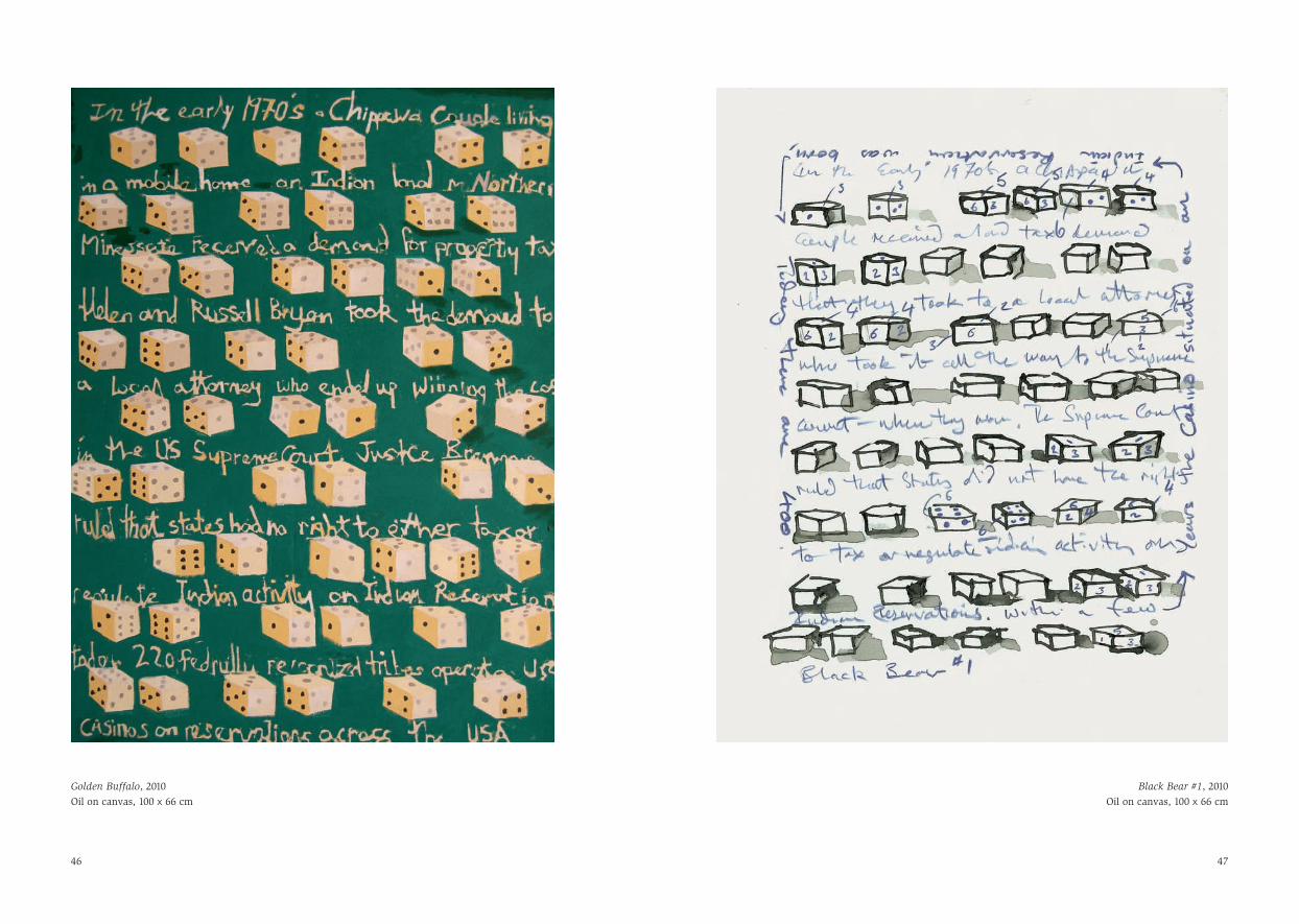
Golden Buffalo, 2010Graphite and Japanese ink on paper, 36 x 28 cm
45
47
Golden Buffalo, 2010Oil on canvas, 100 x 66 cm
Black Bear #1, 2010Oil on canvas, 100 x 66 cm
46

48
First published on the occasion of the exhibition‘Artists’ Laboratory 02: Stephen Farthing RA’, Royal Academy of Arts, London, 10 November – 19 December 2010
This publication has been made possible through the generosity of Inna Vainschtock and Cathy Wills of the Royal Academy’s Contemporary Circle.
General EditorPaul Huxley RA
DesignMaggi Smith
Colour Origination and PrintingTradewinds
IllustrationsPage 2: The Back Story, 2009 (detail)Pages 38–39: ABACUS #5, 2010 (detail)
AcknowledgementsThe artist acknowledges the support of Purdy HicksGallery. Photographs are courtesy of Doug Kurtz (USA),Alex Madjitey (UK) and Donald Smith (page 7).
Limited EditionThis book is also published in a limited edition of 25 copies, each of which includes a print, signed and numbered by the artist, ABACUS #6, 2010, produced by Coriander Press.
Copyright © 2010 Royal Academy of Arts, LondonAll images copyright © 2010 Stephen Farthing
‘Stephen Farthing: Drawing – Writing – Mapping – Painting’ copyright © 2010 David Scott Kastan
Stephen Farthing RA and Stephen Chambers RAin conversation copyright © the artists
Any copy of this book issued by the publisher is soldsubject to the condition that it shall not by way of trade or otherwise be lent, re-sold, hired out or otherwisecirculated without the publisher’s prior consent in anyform of binding or cover other than that in which it ispublished and without a similar condition including these words being imposed on a subsequent purchaser.
All Rights Reserved. No part of this publication may bereproduced or transmitted in any form or by any means,electronic or mechanical, including photography, recordingor any other information storage and retrieval system,without prior permission in writing from the publisher.
British Library Cataloguing-in-Publication DataA catalogue record of this book is available from the British Library
ISBN 978-1-907533-02-0 (standard edition)ISBN 978-1-907533-03-7 (limited edition)
Distributed outside the United States and Canada by Thames & Hudson Ltd, LondonDistributed in the United States and Canada by Harry N. Abrams, Inc., New York