application development process -...
TRANSCRIPT

Application development process
Interaction Design Principles

Overview
• Good/Bad UI Design
• Interaction Design Principles
• Screen layouts
• Navigation Patterns
• Screen Flows
• Prototyping

Preview of UI Analysis/Design Process
• UI Design• Inputs: Use Cases
• Activities: Validate Technical Feasibility, Customer Validation, User Validation
• Deliverables: Proof of Concept Wire Frames, Storyboards, Prototypes
• Document• Inputs: Data Requirements, Business Rules, Use Case
• Activities: Write UI Specifications, Conduct Review Meetings
• Deliverables: UI Specification (Navigation Flow, Screen Captures, Controls w/ Behaviors, Error Messages), Detailed Usability Test Plans
• Refinement• Inputs: UI Specification, Prior Research, Code
• Activities: Formal Usability Testing
• Deliverables: Test Results Report

Bad UI Design

Bad UI Design

Good UI Design

Good UI Design

Good UI Design
• Good UI Design:
• Aesthetically pleasing
• Familiar
• Logical
• Functional
• Efficient
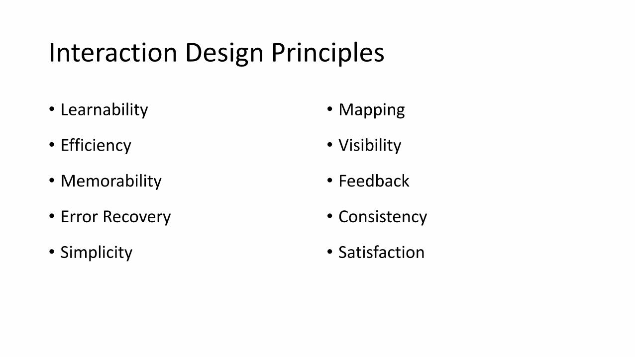
Interaction Design Principles
• Learnability
• Efficiency
• Memorability
• Error Recovery
• Simplicity
• Mapping
• Visibility
• Feedback
• Consistency
• Satisfaction

Learnability
• An interface should be easy to use
from the first time a user interacts
with it.
• Amount of functionality presented to
the user should be limited to exactly
what the user requires to get the goal
done.

Efficiency
• Number of steps it takes
for a user to complete a
task.
• Key tasks should be made
as efficient as possible.

Efficiency

Memorability
• Interface should be easier
to use each time the user
interacts with it.
• Frequency of use is the key
factor in memorability.

Error Recovery
• In perfect user interface, user should never be allowed to make a mistake.

Simplicity
• Usual tasks should be easy and
less common tasks should be
possible.
• Avoid unnecessary
functionality and keep the
visual design and layout
uncluttered.

Mapping
• What the user expects to happen when they interact with the user interface is exactly what should happen.

Visibility
• Important information
should be the most visible.
• Less important information
should be less visible.
• Understanding the users’
goals is critical.

Feedback
• User should always be in control of the user interface and not the other way around.

Consistency
• Like-items should always be
displayed and act the same
way across the entire
application (and even
between applications).
• UI standards.

Satisfaction
• How much the user enjoys or dislikes the software.

Screen Design
• The basic layout and flow of screens should be designed before any implementation begins.
• This will save work that would result in changed screen designs later.
• The screen design should give the developer, client, and end user a basic idea of how the app will look, feel, and function.

What makes good Navigation?
•Primary navigation patterns:• Springboard• List Menu• Tab Menu•Gallery•Dashboard •Metaphor•Mega Menu

Primary navigation patterns

Springboard
• The Springboard pattern is OS neutral, working equally well across devices. • It is also
sometimes referred to as a Launchpad.

Springboard
• The Springboard is characterized by a landing page of menu options that act as a jumping off point into the application.

Springboard
• Facebook followed the Springboard design of the iOS home screen, and they were quickly emulated by other applications.

Springboard
•Personalized Springboards can be used to display personal profile information inline with the menu options.
• Typically a customization feature is available for changing the Springboard layout.

Grids layouts for Springboard
- Use a grid layout for items of equal importance, or an irregular layout to emphasize some items more than others. - Consider personalization and customization options.

2x2 grid layout, Norton Mobile; irregular layout, Masters

List Menu
• The List Menu is similar to that Springboard in that each is a jumping off point into the application.

List Menu
• There are numerous variations of this pattern including personalized list menus, grouped lists, and enhanced lists.

List Menu
• Enhanced lists are simple List Menus with additional features for searching, browsing or filtering.

List Menu• List Menus work well
for long titles or those that require sub text.
• Applications using List Menus should offer an option on all internal screens for returning to the List Menu, usually a button in the title bar with a list icon or the word “menu.”

Tabs
• Tab navigation is not OS neutral since each OS has their own guidelines for tab location and design.
•When choosing this pattern for your application, be prepared to customize the tab location for the different OSs.

Tabs
•Bottom tabs, favored by iOS, WebOS, and BlackBerry, are the most thumb friendly option.

Tabs
•Horizontally scrolling bottom tabs, as shown in the Starbucks and Blue Mobile apps, provide a useful mechanism for offering more options without having to open up a More...screen.

Tabs• Top tabs, favored by
Android, Symbian, and Windows, look familiar since they are modeled after standard website navigation patterns.
•Nokia and Windows both use scrolling top tabs that you can flick to reveal more menu options.

Tabs
•Clearly indicate the selected menu item by visually differentiating the selected tab from the others. •Use easy to recognize
icons or icons with labels.

Gallery
• The Gallery pattern surfaces individual pieces of content for navigation.
•Content is usually individual articles, recipes, photos, or products and can be arranged in a carousel, grid, or slideshow.

Gallery
• The Gallery pattern works best for frequently updated content that people want to browse.

Gallery
• Sometimes the content will be easier to browse if it is grouped.
•Dwell use side tabs to organize gallery content into manageable chunks.

Dashboard
• Dashboards provide a roll-up of key performance indicators, KPIs. Each metric can be drilled into for additional information.
• This primary navigation pattern is useful for financial applications, analytics tools and sales and marketing applications.
• Don’t overload the dashboard; conduct research to determine the key metrics to include.

Metaphor
• This pattern is characterized by a landing page modeled to reflect the application’s metaphor.

Metaphor
• This is used primarily in games, but can also be seen in applications that help people catalog and categorize items, like notes, books, wine, etc.

Metaphor
Use the Metaphor pattern judiciously, as a poorly implemented metaphor can look a lot like the Novel Notion anti-pattern .

Mega Menu
•A mobile Mega Menu islike the web Mega Menu, a big overlay panel withcustom formatting and grouping of the menu options.
• The RipCurl website uses a mega menu for navigatinginto sub categories of clothing.

Mega Menu
• The webOS version of Facebook uses a megamenu for streamlined navigation, avoiding the extra navigation found in a Springboard pattern.
•Walmart uses this same pattern in their Android app.

Mega Menu
•Determine your information architecture before choosing the navigation pattern.
•Choose a more appropriate pattern, like Tabs, if there are only a few major sections in the app.

Secondary Navigation Patterns

Page Carousel
• This pattern can be used to quickly navigate a discreet set of pages using the flick gesture.
• The page Image Carouselindicator (the iOS term for the little dots) displays how many pages are in the carousel; flicking displays the next page.
• All four examples use the page carousel within a selected tab.

Page Carousel• The page carousel pattern has
its limits.
• Consider using a list for navigating more than eight pages.
• The page carousel works best for navigating a small number of pages.
• Use a visual indicator to reflect the number of screens, and current screen.
• Flick is the common gesture to navigate the carousel.

Image Carousel
• The image carousel may be a 2D carousel or more like the iTunes coverflow.
• IMDB uses the image carousel to surface the most viewed movies.
• We used it to display featured products in the retail application.

Image Carousel
• The Image Carousel works best for displaying fresh visual content, like articles, products, and photos.
•Provide visual affordance, either with arrows, partial images or page indicators (dots) that more content can be accessed.

Expanding List
• The Expanding List allows a single screen drill down to reveal more information.
• Android Gingerbread uses this pattern in the call log.
• All calls from the same number are collapsed into one row.
• Tapping the icon expands the list to show the individual instances.

Expanding List• This pattern is more common in
mobile optimized websites than mobile applications, but can work well in both cases.
• Take for example the Gap.com mobile site. The Expanding List is used instead of a Cascading List to disclose all of the Women’s clothing categories.
• The Expanding List pattern works best for progressively disclosing more details or options for an object.

Screen Flows
•Most apps will consist of more than one screen.
•The transition between these screens is known as a screen flow.
•Screen flows should be logical and predictable.
•For example, pressing the back button should take the user to the previous screen, not to another unexpected screen.

CommBank App Screen Flow
Clouds indicate links to other apps or URLs.

Task-centred Design
•Generally when a user uses an app they want to accomplish a task.
•There may be several different tasks that users perform with the app.
• Identifying these tasks can help us to design the application.
•A sample scenario follows…

Case study: Bus Timetable App
•A timetabling app is required for Zied Buslines.
•What are some of the tasks a user would perform with the app?
•Hints:• What are some common scenarios where a user would
need the app?• What information does the user have and what do they
need to know?

Case study: Tasks/Scenarios
1. User wants to get from A to B leaving at a certain time.• User needs to be able to find out what buses pass through
A and which of those also pass through B.
2. User knows which bus they want to catch at point A, but wants to know what times it will leave.
3. User knows which bus they want to catch and want to find out what times it arrives at B.

UI Design
• In each scenario the user knows at least one bus stop:• App could begin with a list of bus stops.• User selects bus stop.
• In each scenario the user also needs to know the buses for the bus stop:• Display buses and times for the selected bus stop.
• Selecting bus displays the timetable for that bus including the time it will arrive at each stop on the journey.

Screen flow

Screen Design

Improvements
•What could be improved?•Company logo and colours•Search box for bus stops, bus numbers•Tabs down the bottom for more options, such as list of bus numbers.•Maps•GPS to automatically detect which bus stop you are at

Prototyping
•Use prototyping software for:• Representing screen flow• Designing layouts• Simulating interactions such as links between screens
• Software:• iRise• Justinmind Prototyper• Xcode• Codiqa

Justinmind Prototyper

Xcode
Xcode also includes support for storyboards:

Codiqa (New CREATOR)For prototyping jQuery Mobile apps\sites

Summary
•UI design is an important and vital part of the development process.
• Final project will require identification of user tasks, screen designs, screen flow, and prototype.
•A UI Design doesn’t require final graphics, the focus is on layout and flow.
•However, having a look and feel close to the final product can help.