analysis & drafts 13 10-13
TRANSCRIPT

•Poster/Magazine Analysis.
•Drafts.

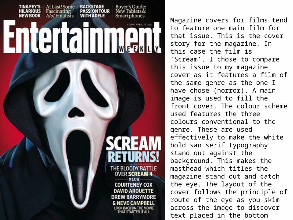
Magazine covers for films tend to feature one main film for that issue. This is the cover story for the magazine. In this case the film is ‘Scream’. I chose to compare this issue to my magazine cover as it features a film of the same genre as the one I have chose (horror). A main image is used to fill the front cover. The colour scheme used features the three colours conventional to the genre. These are used effectively to make the white bold san serif typography stand out against the background. This makes the masthead which titles the magazine stand out and catch the eye. The layout of the cover follows the principle of route of the eye as you skim across the image to discover text placed in the bottom right corner. This is conventional to have this area of text as commonly it is the last piece you read before turning over making it memorable. The props used on the cover fit with the genre conventions as the mask suggest anonymity hiding the killers identity. Also the expression of the mask connotes fear and disharmony.

Posters designed to advertise films are used to entice the view to go and watch the film. This use of print media tends to provoke thought and emotion. This poster for sinister instantly provokes thought and fear as the wall is covered in blood which is also a conventional part of mise-en-scene for the horror genre. Amongst this blood appears to be a face with piercing eyes giving the view the ability to use there imagination as to what has happened making them want to go and watch the film. The title is placed centrally in a serif font which appears to have been distorted. This links to the idea of possession which then subconsciously links the typography to the plot of the film. The image features a female, however we do not see her face which promotes the idea of anonymity which is conventional to the horror genre. This girl appears to be young which also allows the audience to sympathies as humans we tend to feel more emotions to the young and the old. At the bottom of the poster there is a billing block in smaller font which gives details of producers and actors involved with the film giving them credit and informing the viewer of the poster. This may also act as a persuasive device to get the viewer to go and watch the film as if well known actors are used the film may been seen as more credible and give it more reason to be watched.

Draft - PosterA main image will fill the centre of the poster. The image will be directly linked to my film as this type of media is designed to promote the product. The image will be eye catching and stereotypical to the horror genre trying to
provoke thought and the scare factor!
A small amount of text will be used at the bottom of the poster to give more details about the film. But this will be brief fitting in poster conventions as they are supposed to
be short and snappy to understand at a quick glance enticing the viewer into wanting to watch the film.
The title of the film ( ‘Mummy’ ) will be placed centrally on the poster so that is quick to understand what the magazine
is for. This will also feature a slogan or tag line which will
A billing block will be used at the very bottom of the poster to keep conventional. The billing block will feature the
names of producers and actors with relevance to my film.

Draft - MagazineOne main image will fill the front of the magazine cover to keep it conventional to the type of advertising media it is.
This image will be linked to the horror genre and have relevance to my film in order to promote in. However detail
of the storyline will not be given away in order for the image to provoke imagination for the viewer to want and go
see the film.
A box out or small area of text will be featured in the bottom right corner of the magazine at the end of where
the route of the eye is. This is because this text is usually the most memorable if it is the last read. This will give details of
my film and a incite into the idea.
A bold mast head will be seen at the top of the magazine to show what the magazine is for. This will be followed by a sub heading for the cover story which will focus on my film. Other small areas of text will be placed around the image talking about other content of the magazine. However the
majority of the focus will be on my film in order to promote my product. This is convectional as commonly
magazines focus on one new release.