all boards
DESCRIPTION
All BoardsTRANSCRIPT

OU
GD
503
C
onte
nts
D
esig
n boa
rds
for
all brief
s
Chr
is S
hutt
lew
orth Contents
Secret 7” 28 - 29
Leeds Remote 30 - 33
L’artisan Parfumeur 35 - 42
Click content titles to quickly navigate to specific projects
fin
al
des
ign
s
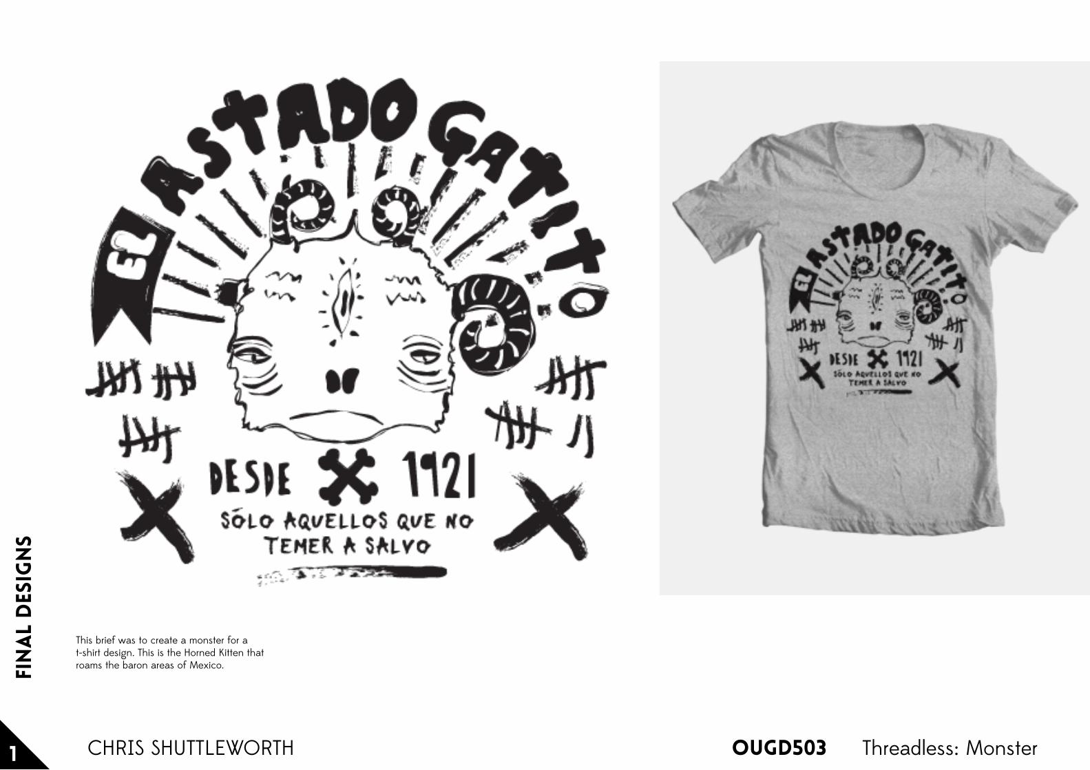
OUGD5031 Threadless: MonsterCHRIS SHUTTLEWORTH
This brief was to create a monster for a t-shirt design. This is the Horned Kitten that roams the baron areas of Mexico.

OUGD503
Visu
al
rese
arc
h
1 ARCADE FIRE T-SHIRT DESIGNCHRIS SHUTTLEWORTH

Fin
al
des
ign
s
OUGD5032 ARCADE FIRE T-SHIRT DESIGNCHRIS SHUTTLEWORTH
This design is heavily influenced by (Antichrist Television Blues). It is about escaping from everyday life and taking away the elements that are making it monotonous and repetitive.The image tells a story of somebody who has had enough of the stories they are being fed through the television and have decided to axe down the electricity cables and walking off to experience a fuller and more worthwhile life.

fin
al
des
ign
s
OUGD5033 ARCADE FIRE T-SHIRT DESIGNCHRIS SHUTTLEWORTH
This design is about 'wasting' time with the people that you love and not getting bogged down with the stresses and strains of everyday life. It is about running away and not worrying about the consequences.The image shows two bags falling to the ground with no people near them, as they have already legged it.

fin
al
des
ign
s
OUGD5034 ARCADE FIRE T-SHIRT DESIGNCHRIS SHUTTLEWORTH
"To me Arcade Fire represent a rebellion against society and any form of soul-less activity.In this design I have removed the keys that are used to spell Arcade Fire from the typewriter which represents a bigger, industrial machine."
OUGD503
the
brie
fs
1 Design Crowd CompetitionsCHRIS SHUTTLEWORTH
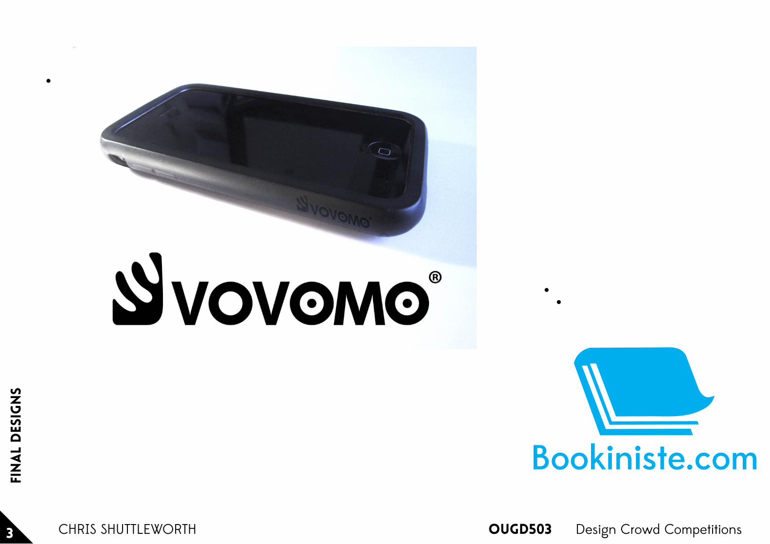
Vovomo
This brief was to design a logo specifically for smart phone cases. They asked for an abstract icon that, in some way, represents ‘courage to change’.After submitting my design - for a company that makes smart phones (see next boards) - they changed the brief to:
“We need a logo design for a new brand called 'vovomo'. Our products are beautiful fashion Handbags & Accessories. The logo must be stylish, posh and good to Imprinted on all kind of our fashion products”
After asking them about this change they confirmed that they apparently dabble in everything.
Bookiniste
This brief was to create the logo for an eBook company:
“I want a logo for a corporation that will manage a online site related to the sale of electronic books (ebooks). The name of the corp will be Bookiniste and the site Bookiniste.com but the logo does not necessarily have to comprise the name. A design with the name written under it would be fine ... obviously book related. It will be targeted to French and English speaking public.”
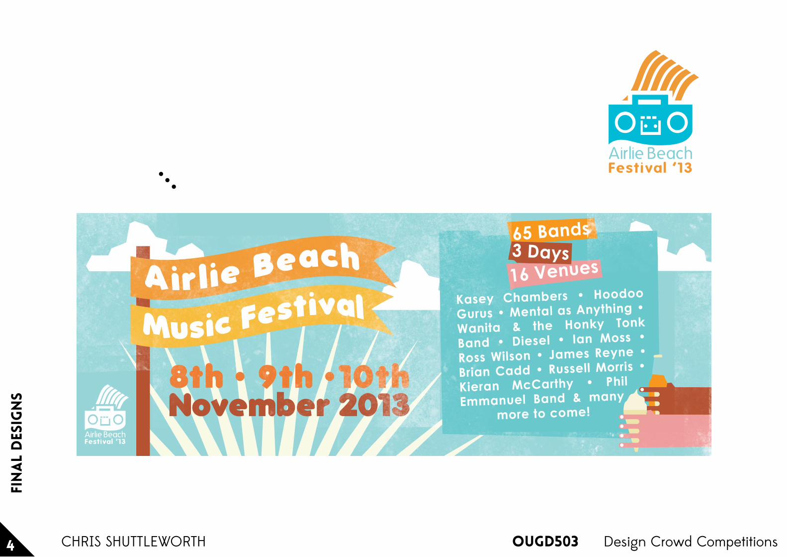
Airlie Beach Music Festival
This brief was to create the logo for an Australian music festival:
“Need a design for webpage header and facebook a music festival that fits the location.
A logo type header that can overly on header with Airlie Beach Music Festival in it !
the location is airlie beach whitsundays and it is called the
Airlie Beach Music Festival8th/9th/10th November 201365 bands over 3 days 16 venues”
All competition submissions on these design boards have been completed as short scale competition submissions with only one day deadlines.
Dev
elo
pmen
t
OUGD5032 Design Crowd CompetitionsCHRIS SHUTTLEWORTH
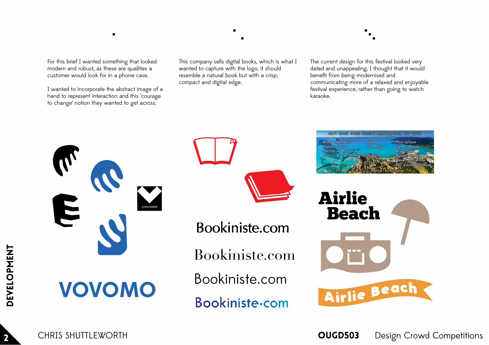
For this brief I wanted something that looked modern and robust, as these are qualities a customer would look for in a phone case.
I wanted to incorporate the abstract image of a hand to represent interaction and this ‘courage to change’ notion they wanted to get across.
This company sells digital books, which is what I wanted to capture with the logo, it should resemble a natural book but with a crisp, compact and digital edge.
The current design for this festival looked very dated and unappealing, I thought that it would benefit from being modernised and communicating more of a relaxed and enjoyable festival experience, rather than going to watch karaoke.
vovomo
VOVOMO
AirlieBeach
Bookiniste.com
Bookiniste.com
fin
al
des
ign
s
OUGD5033 Design Crowd CompetitionsCHRIS SHUTTLEWORTH
Bookiniste.com
fin
al
des
ign
s
OUGD5034 Design Crowd CompetitionsCHRIS SHUTTLEWORTH
Airlie BeachFestival ‘13
OUGD503
the
brie
fs
1 Design Crowd CompetitionsCHRIS SHUTTLEWORTH
New Media Illustrations
We need a set of 4 simple but bold illustrations for our website, which illustrate our services - Advertising, Bespoke Publishing, Content Marketing, and Data Visualization. These illustrations will be used across our marketing collateral.
They have to be simple as each individual illustration needs to be clearly visible when scaled down to 1.5" x 1.5". I have attached a file to illustrate the sort of style we are looking for.
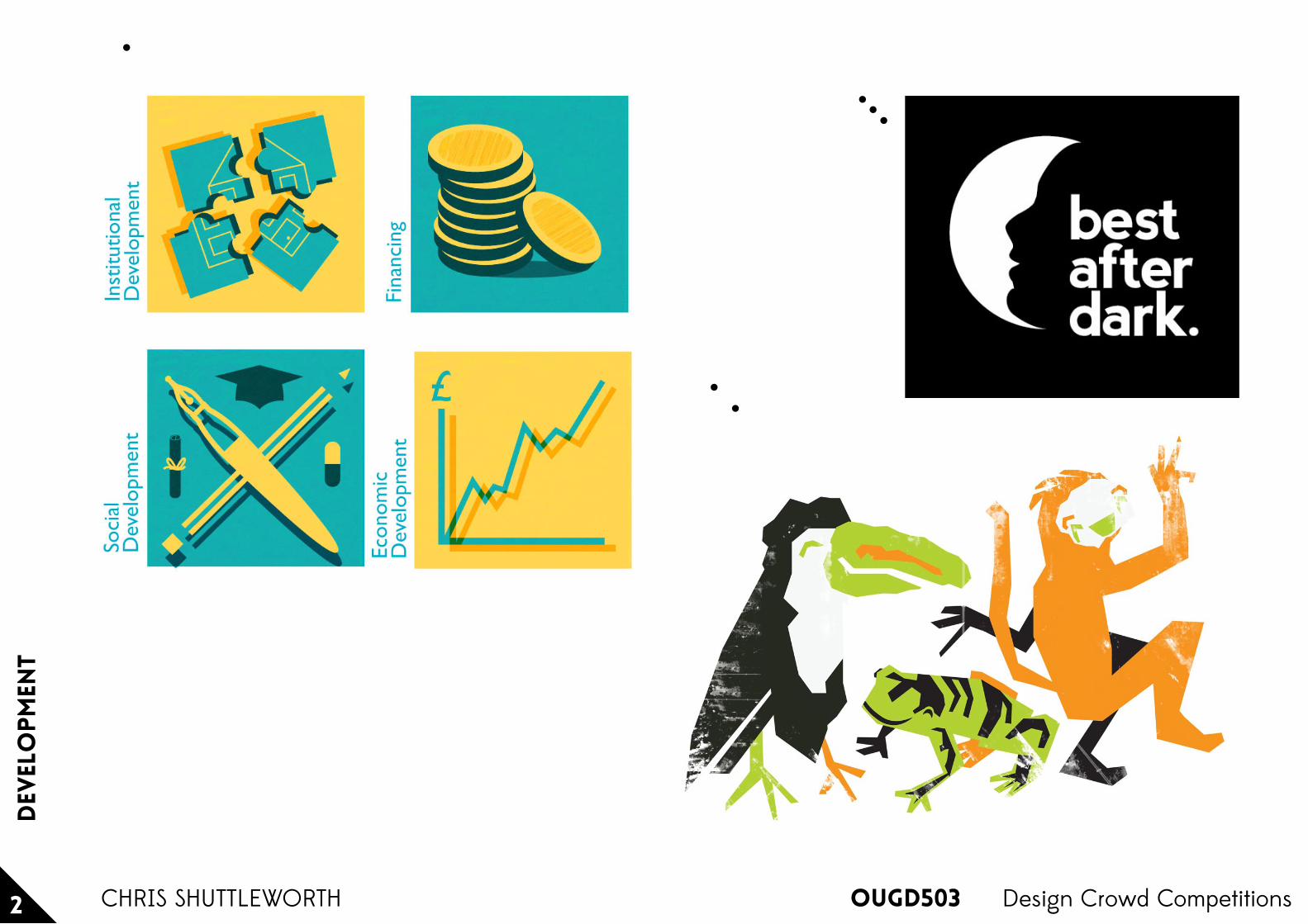
Character Illustrations
We are looking to establish 3 animal characters. After we have awarded the creative we'll be paying a bit extra to draw the characters in different poses as described further on in this brief.
The characters should be:Poison Arrow Frog, Toucan & Monkey.
Best After Dark
We need a logo design for our website which is an event, music & nightlife directory for individuals who are interested in knowing the latest hot spots & events to go to within the New England (US) area. BestAfterDark.com users will be able to find out where to go, browse through pictures, search for hotels, log into a dating site.
We would like to see the the colors royal blue, black and/or white in the design. The final design should communicate nightlife, having fun, dancing late at night, or maybe a skyline in the background
All competition submissions on these design boards have been completed as short scale competition submissions with only one day deadlines.
Dev
elo
pmen
t
OUGD5032 Design Crowd CompetitionsCHRIS SHUTTLEWORTH

OU
GD
503
B
rief
ing
Cre
ativ
e N
etw
orks
x Lee
ds
Bre
wer
y
C
hris
Shu
ttle
wor
th
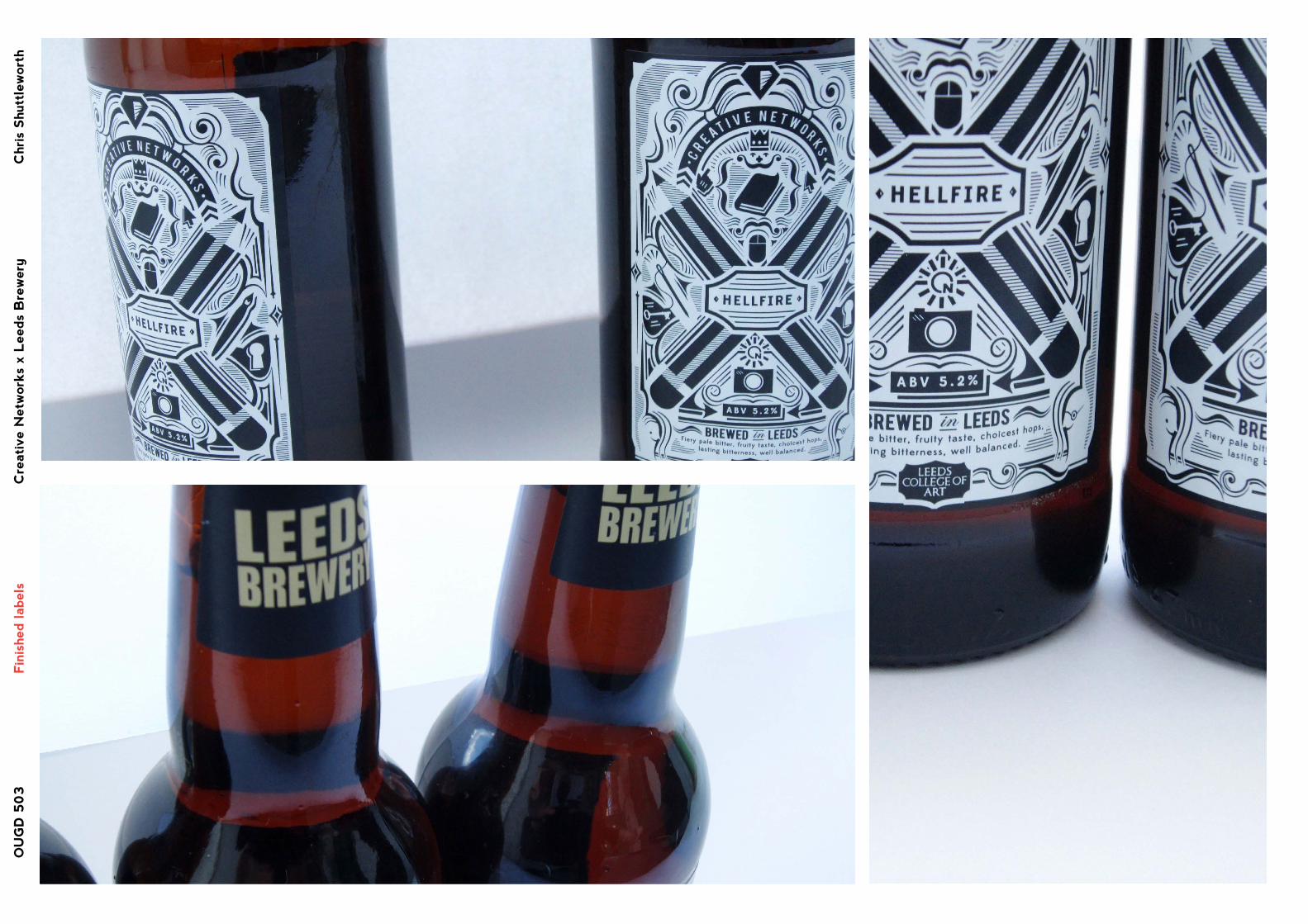
Creative Networks host events in which respected members of the Art & Design fields give talks and seminars for local creatives and students alike.These events are a great way to discover new things and new people. To build more of an identity for the event Creative Networks have joined with Leeds Brewery to create a beer for the event.The design of the label was open to Leeds College of Art Students and this is the chosen solution. My design features various imagery related to creative disciplines as well as imagery that suggests making links in industry and networking.
The Brief

OU
GD
503
Pro
pos
ed A
ccom
pan
ying
Coa
ster
s
Cre
ativ
e N
etw
orks
x Lee
ds
Bre
wer
y
C
hris
Shu
ttle
wor
th
I have designed these coasters to match and complement the label design. The reverse simply features the links to Creative Networks social media outlets.I have used the colours that currently make up the Creative Networks brand to tie them together with the imagery on the websites.Custom coasters could be made for specific events (using the same style) that convey the specialism of the guest speaker with the web information of the artist or designer on the rear as well as the CN information.

OU
GD
503
F
inis
hed lab
els
Cre
ativ
e N
etw
orks
x Lee
ds
Bre
wer
y
C
hris
Shu
ttle
wor
th

OU
GD
503
F
inis
hed lab
els
Cre
ativ
e N
etw
orks
x Lee
ds
Bre
wer
y
C
hris
Shu
ttle
wor
th
OU
GD
503
F
inis
hed lab
els
Cre
ativ
e N
etw
orks
x Lee
ds
Bre
wer
y
C
hris
Shu
ttle
wor
th
1320
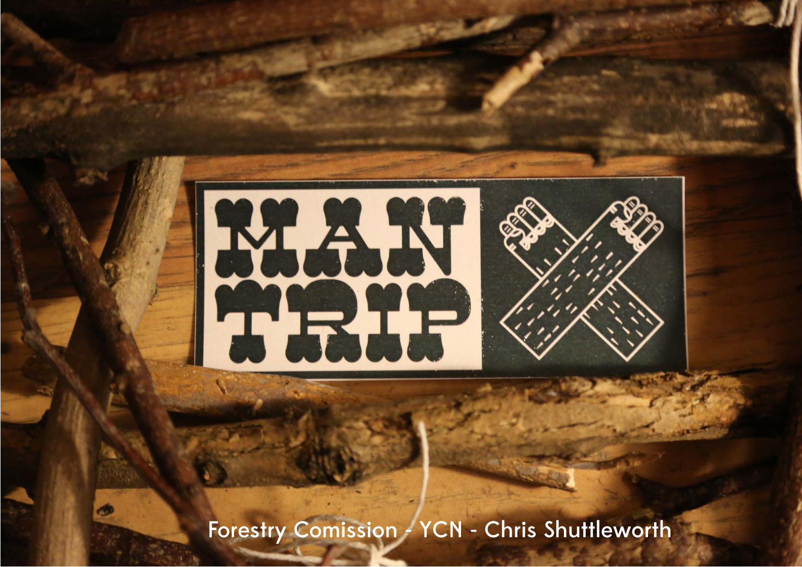
Chris Shuttleworth OUGD503 Responsive Forestry ComissionForestry Comission - YCN - Chris Shuttleworth
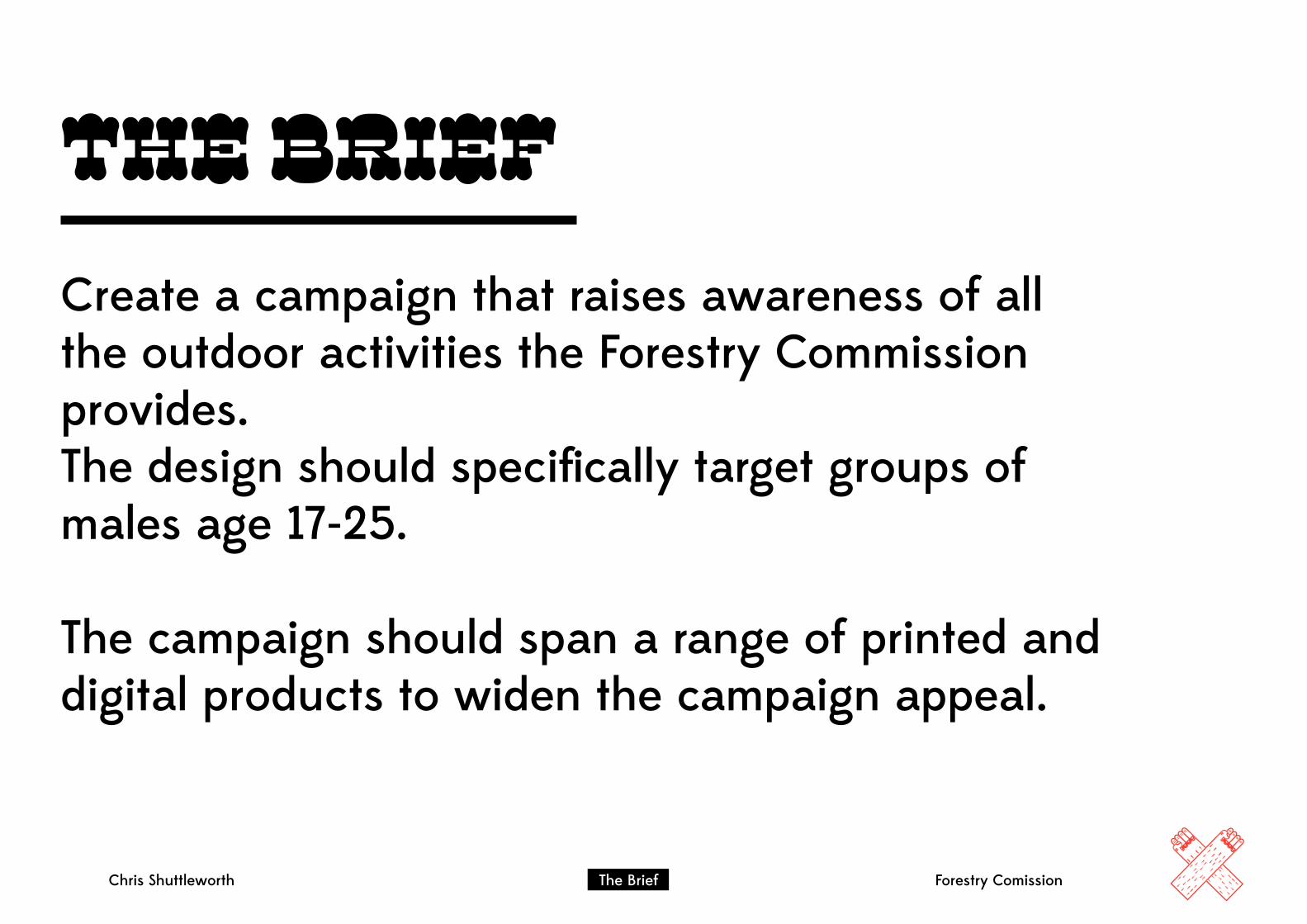
Chris Shuttleworth The Brief Forestry Comission
The BriefCreate a campaign that raises awareness of all the outdoor activities the Forestry Commission provides.The design should specifically target groups of males age 17-25.
The campaign should span a range of printed and digital products to widen the campaign appeal.
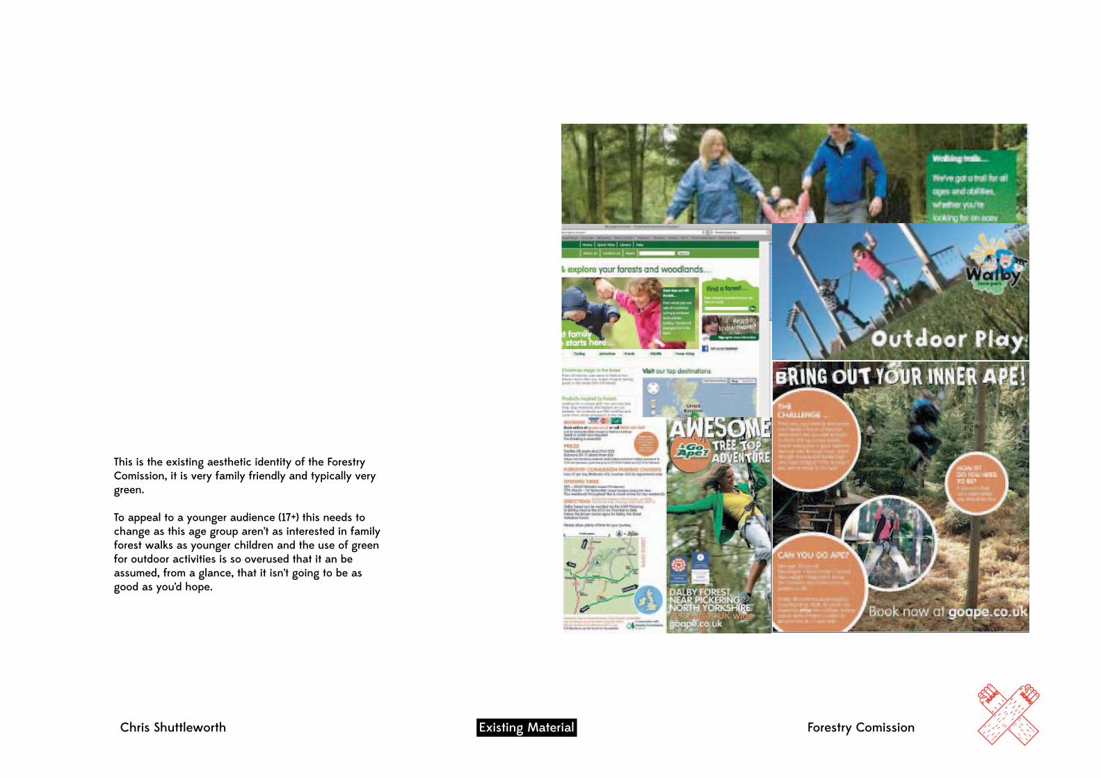
Chris Shuttleworth Existing Material Forestry Comission
This is the existing aesthetic identity of the Forestry Comission, it is very family friendly and typically very green.
To appeal to a younger audience (17+) this needs to change as this age group aren’t as interested in family forest walks as younger children and the use of green for outdoor activities is so overused that it an be assumed, from a glance, that it isn’t going to be as good as you’d hope.
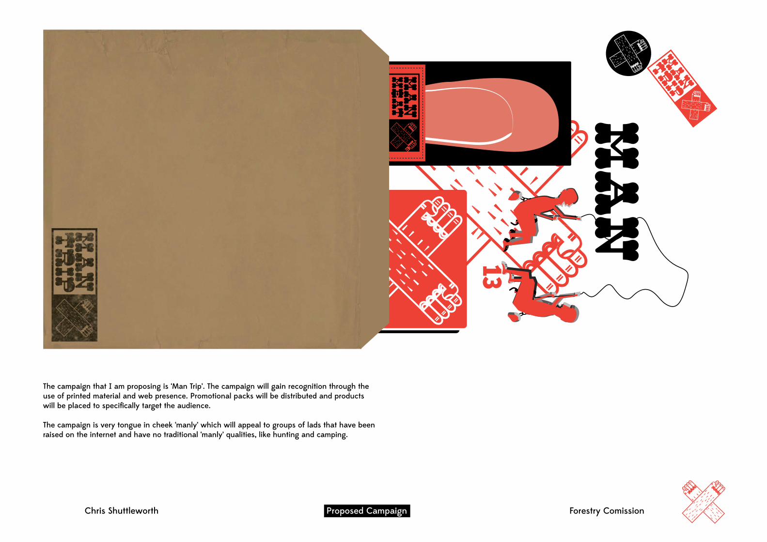
Chris Shuttleworth Proposed Campaign Forestry Comission
1320
Mountain biking, paintballing, rock clim
bing, illuminated trails, den building,
forest segway, safari, concerts, tree top advenutre, w
atersports & more
Plan a Man Trip today.
Forestry.gov.uk4
RA
SH
ER
SK
EEP REFR
IGER
ATED 5ºC
The campaign that I am proposing is ‘Man Trip’. The campaign will gain recognition through the use of printed material and web presence. Promotional packs will be distributed and products will be placed to specifically target the audience.
The campaign is very tongue in cheek ‘manly’ which will appeal to groups of lads that have been raised on the internet and have no traditional ‘manly’ qualities, like hunting and camping.
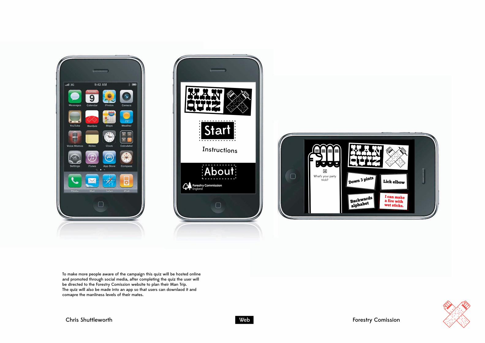
Chris Shuttleworth Web Forestry Comission
ManQuiz
StartInstructions
About
To make more people aware of the campaign this quiz will be hosted online and promoted through social media, after completing the quiz the user will be directed to the Forestry Comission website to plan their Man Trip.The quiz will also be made into an app so that users can downlaod it and comapre the manliness levels of their mates.

Chris Shuttleworth Web Forestry Comission
Resu
lts:
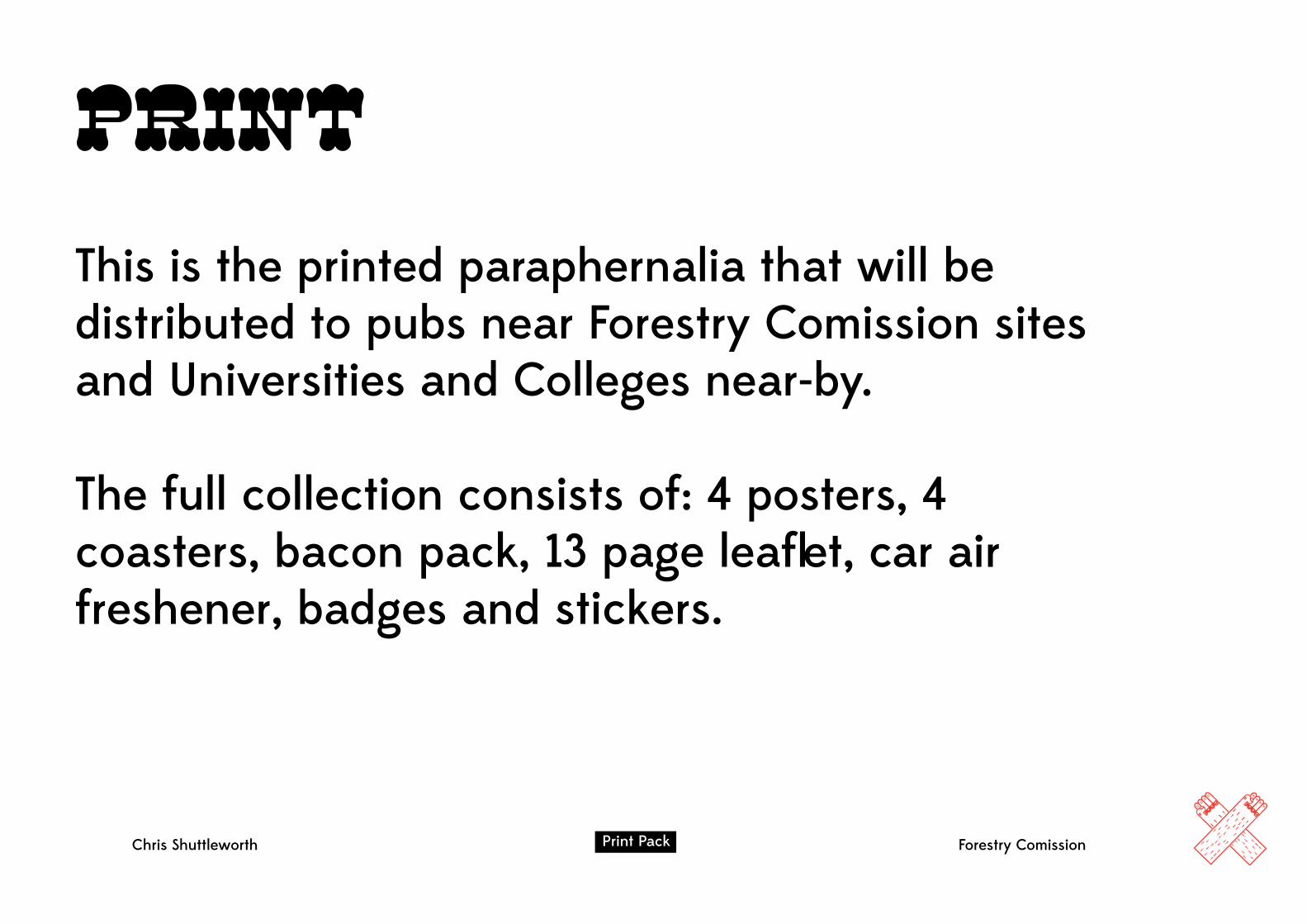
PrintThis is the printed paraphernalia that will be distributed to pubs near Forestry Comission sites and Universities and Colleges near-by.
The full collection consists of: 4 posters, 4 coasters, bacon pack, 13 page leaflet, car air freshener, badges and stickers.
Chris Shuttleworth The Brief Forestry ComissionPrint Pack


fin
al
des
ign
s
OUGD5031 Secret 7”CHRIS SHUTTLEWORTH
Nick Drake Laura Marling
These are my two submissions for the Secret 7” competition to design artwork for Nick Drake and Laura Marling, out of these 2 the Nick Drake entry was successful

CHRIS SHUTTLEWORTH
Record sleeve on display at Mother in Shoreditch, April 13th & 14th
OUGD503 Secret 7” 2


Photographing mock ups also allowed me to photoshop the designs that Sam produced onto models to see which one is most effective and delivers the most visual impact.
I edited an existing net to make the base square and the right dimensions to fit the 50 ml dropper bottles. Using mock ups regularly allowed me to assure that all components will work together.
I mocked up numerous nets, that had potential to house our bottles, out of paper to make sure that they would work on more suitable stock. Taking the most successful nets I took them forward to see if they would work with the rest of the products.
To determine the most effecive packaging solution for our perfume I researched existing nets and what was available for us to adapt and edit.
Nets
Chr
is S
hutt
lew
orth
O
UG
D50
3
Col
lab
orat
ive
Bri
ef
In
div
idua
l Con
trib
utio
n
1
5of

This is the finished base that holds all of the perfume bottles. It is a solid structure and I think it is much mroe suitable and effective than the original plastic moulding idea.
I thought that embossing the front side of the box base would look really effective when in the box and could also be used as a display stand when the perfume was finished. We tested numerous embossing techniques until we found one that worked almost every time.
The initial support I tried didn’t hold the bottle very firmly and looked clunky and badly crafted. I modified this by cutting a single circle into the support to hold the bottle.
I originally suggested that we could vacuum form the base to give the bottles solid support and also look medical and well polished. When this didn’t turn out as planned due to vacuum forming restrictions I moved onto designing a paper based base.
Base Support
Chr
is S
hutt
lew
orth
O
UG
D50
3
Col
lab
orat
ive
Bri
ef
In
div
idua
l Con
trib
utio
n
3
5of

Chr
is S
hutt
lew
orth
O
UG
D50
3
Col
lab
orat
ive
Bri
ef
In
div
idua
l Con
trib
utio
n
There are 2 sets of leaflets, 1 for the perfume and 1 for the tablets. All information is translated into languages that are common where all L’artisan Parfumeur products are distributed.
Printing out mock ups allowed me to get the layout correct and proof read for any errors. Other problems that arose was colour matching due to different printers, the best way to sort this out was to change the colour on screen and use trial and error to determine a close compromise.
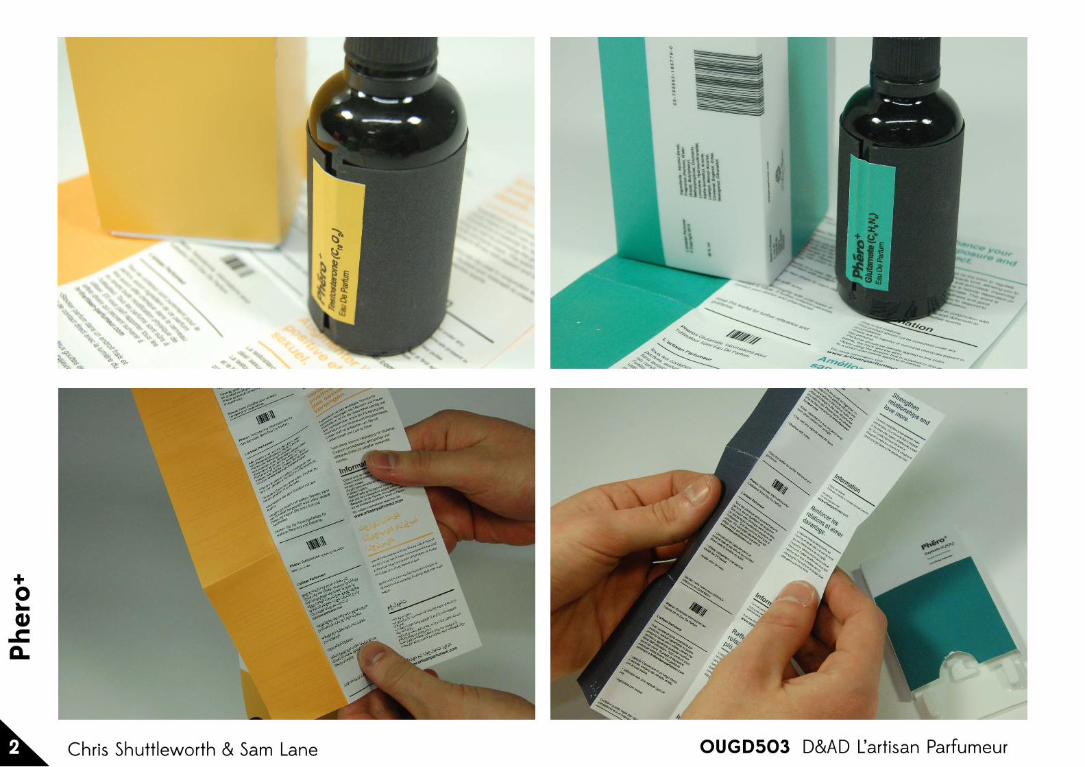
This involved writing a custom paragraph that describes and sells each scent. I used existing medical leaflets as inspiration to design a strict grid that delivers all the information in a clear and logical fashion.
To accompany each perfume I designed a leaflet that delivers information and health and safety guidelines about the product.
Leaflets
Chr
is S
hutt
lew
orth
O
UG
D50
3
Col
lab
orat
ive
Bri
ef
In
div
idua
l Con
trib
utio
n
2
5of

These are the final labels that are simple and effective, I think they are strong on their own as well as being coherent as a set and in their packaging.
The idea that we both agreed would work the best was to simply emboss a piece of black card with the logo and hold it together with a sticker that was coloured the same as the specific fragrance.
After testing a few ideas I thought that the most effective design, in comparison to the dominantly light coloured box and leaflet, would be a dark bottle to stand out.
Sam had designed the aesthetic groove of the project and I was in charge of designing a label that compliment this.
Bottle Label
Chr
is S
hutt
lew
orth
O
UG
D50
3
Col
lab
orat
ive
Bri
ef
In
div
idua
l Con
trib
utio
n
4
5of
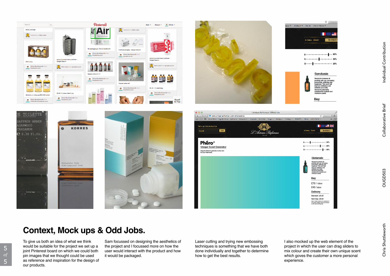
I also mocked up the web element of the project in which the user can drag sliders to mix colour and create their own unique scent which goves the customer a more personal experience.
Laser cutting and trying new embossing techniques is something that we have both done individually and together to determine how to get the best results.
Sam focussed on designing the aesthetics of the project and I focussed more on how the user would interact with the product and how it would be packaged.
To give us both an idea of what we think would be suitable for the project we set up a joint Pinterest board on which we could both pin images that we thought could be used as reference and inspiration for the design of our products.
Context, Mock ups & Odd Jobs.
Chr
is S
hutt
lew
orth
O
UG
D50
3
Col
lab
orat
ive
Bri
ef
In
div
idua
l Con
trib
utio
n
5
5of

OUGD503
Pher
o +
1 D&AD L’artisan ParfumeurChris Shuttleworth & Sam Lane
Chris Shuttleworth & Sam Lane OUGD503 D&AD L’artisan Parfumeur 2
Pher
o+

Chris Shuttleworth & Sam Lane OUGD503 D&AD L’artisan Parfumeur 2
Pher
o+
