alessandra pascucci cv+portfolio
DESCRIPTION
ÂTRANSCRIPT

ALESSANDRA PASCUCCICV and PORTFOLIO

ALESSANDRA PASCUCCIborn January 24, 1986viale Bligny 54, 20136, Milan, [email protected]+39 338 6010374
WORK EXPERIENCE
May 2012-July 2015 ARCHITECT ANDREA TOGNON ARCHITECTURE, Milan, IT January 2012-April 2012 TUTOR ASSISTANT at “Laboratorio tematico opzionale”, Prof. Della Torre MILAN POLYTECHNIC, Architecture Faculty February 2011-April 2011 ASSISTANT/COLLABORATOR ANDREA TOGNON ARCHITECTURE, Milan, IT
April 2008-May 2008 DESIGNER ASSISTANT CENTIMETROQUADROSTUDIO, Seregno (MB), IT
EDUCATION
February 2015 PASSED THE GOVERNMENT EXAM AND LICENSED AS A PROFESSIONAL ARCHITECT
September 2008-December 2011 MASTER DEGREE IN ARCHITECTURE with full marks MILAN POLYTECHNIC
October 2008-September 2009 ERASMUS EXCHANGE PROGRAM ÉCOLE NATIONALE SUPÉRIEURE D’ARCHITECTURE PARIS-VAL DE SEINE September 2005-September 2008 BACHELOR IN ARCHITECTURE with full marks MILAN POLYTECHNIC
June 2004 HIGH SCHOOL DIPLOMA with full marks LICEO CLASSICO STATALE “T. MAMIANI”, Pesaro, IT
WORKSHOPS
14-28 April 2012 “REWORKING THE BAUHAUS” _Optimizing the energy efficiency in the housing estate Törten BAUHAUS, Dessau, DE
TECHNICAL SKILLS
CAD and Design AutoCAD +++++ Vectorworks ++
Images Elaboration, Graphic, Publishing Photoshop ++++ Illustrator +++ InDesign +++
3D modeling and rendering 3D Studio Max+VRay ++++ SketchUp ++++ Revit ++ ArchiCAD ++ Microsoft Office Package Word +++++ Excel +++++ PowerPoint +++++
LANGUAGE SKILLS Mother tongue Italian +++++ TOEIC certification English ++++ French +++
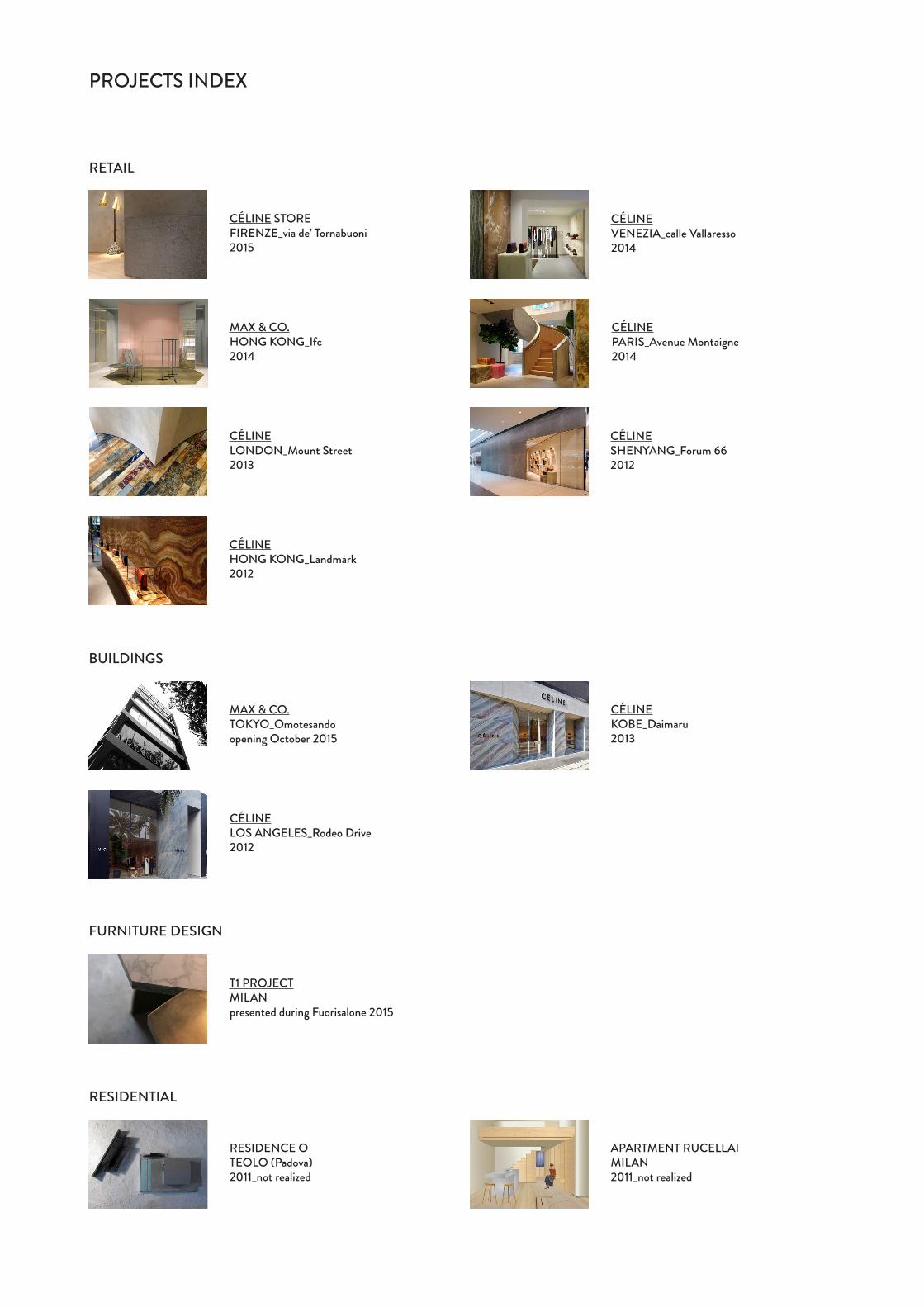
PROJECTS INDEX
FURNITURE DESIGN
RESIDENTIAL
BUILDINGS
RETAIL
CÉLINE STOREFIRENZE_via de’ Tornabuoni2015
T1 PROJECTMILANpresented during Fuorisalone 2015
CÉLINE LOS ANGELES_Rodeo Drive2012
CÉLINEKOBE_Daimaru2013
MAX & CO.TOKYO_Omotesandoopening October 2015
CÉLINE VENEZIA_calle Vallaresso2014
CÉLINE PARIS_Avenue Montaigne2014
CÉLINE LONDON_Mount Street2013
CÉLINESHENYANG_Forum 662012
CÉLINEHONG KONG_Landmark2012
MAX & CO. HONG KONG_Ifc2014
APARTMENT RUCELLAIMILAN2011_not realized
RESIDENCE OTEOLO (Padova)2011_not realized

This is the most recent project we designed for the brand Céline (LVMH group), opened in June 2015. It’s about an historic building, placed in the very center of Florence, where many others luxury brands’ stores take place.Before this commission, the space housed a store at the ground floor, and offices and storages at the mezzanine. The ownership wanted to totally renew the store, following the new concept of Céline, expanding it till the mezzanine floor. We worked on the structure, to make the spaces able to host a commercial activity, still respecting the building character. The main topic of this project was the staircase: the aim was to place it in a congenial space, where it could be well visible to customers to suggest that the store was continuing upstairs, and attractive to invite people to visit the upper floor. After finding many restrictions due to the building’s structure, we placed the stair where it could be visible from the entrance, and from one of the shop-windows. It was conceived as a sculpture, with a soft and cozy shape that accompanies the customer through the different floors, and built in concrete panels with wood steps. A long research was done to find the right material to build the stair, as for all the other elements that we designed for this concept.
GROUND FLOOR PLAN FIRST FLOOR PLAN
SECTION BB
SECTION AAFACADE RENDER
CÉLINE FIRENZE_via de’ Tornabuoni

CÉLINE FIRENZE_via de’ Tornabuoni

CÉLINE FIRENZE_via de’ Tornabuoni

CÉLINE FIRENZE_via de’ Tornabuoni

CÉLINE VENEZIA_calle Vallaresso
This is another recent store designed for Céline, opened in July 2014. It’s a little space in Calle Vallaresso, one of the many typical narrow streets in the center of Venice.One of the main topics was not to make visible the storage’s entrance, in such a small space. So we designed two precious onyx wings, just in front of the entrance: one is fixed, and the other is a not recognizable electronic door, but together they build a scenographic background.Another characteristic element is the onyx wall placed in front of the right shop-window: this wall was conceived to be a wing for the window, preventing the fitting room’s view from the street, but capable also to display inwards as much products as possible, considering the little space available.
PLAN
FACADE
SECTION AA’
SECTION BB’

CÉLINE VENEZIA_calle Vallaresso
STOCK ENTRANCE PLAN
STOCK ENTRANCE SECTIONSTOCK ENTRANCE RENDER_door opened
STOCK ENTRANCE RENDER_door closed

CÉLINE VENEZIA_calle Vallaresso

CÉLINE VENEZIA_calle Vallaresso

MAX & CO. HONG KONG_Ifc
Placed in a shopping center in Honk Kong, this is a special Max&Co. store: in fact, we were asked to design a ‘luxury’ version of the Max&Co. concept.The palette is quite different from the one we usually use for the Max&Co. normal stores, both for the colours, and for the introduction of the stone, never used in those stores before. Here we used two kind of marbles, one (Lumen Top) to frame the facade and one (Cipollino) to do an insert in the floor, and a precious green onyx to build some triangles elements placed behind the right shop window and in the curved back wall. We used some typical elements of the ‘standard’ concept, but interpreted in a more elegant style, using different materials and colours. We also designed some special furniture pieces, as the cash furniture, built with glass and brass frames and used also to display products.
FACADE
PLAN

MAX & CO. HONG KONG_Ifc
FACADE’S TRIANGLES PLAN
FACADE’S TRIANGLE SECTION AA’
FACADE’S TRIANGLE SECTION BB’ FACADE’S TRIANGLE SECTION CC’
FACADE’S TRIANGLES_PLAN’S RENDER FACADE’S TRIANGLES_RENDER’S VIEW FACADE’S TRIANGLES_RENDER’S VIEW

MAX & CO. HONG KONG_Ifc
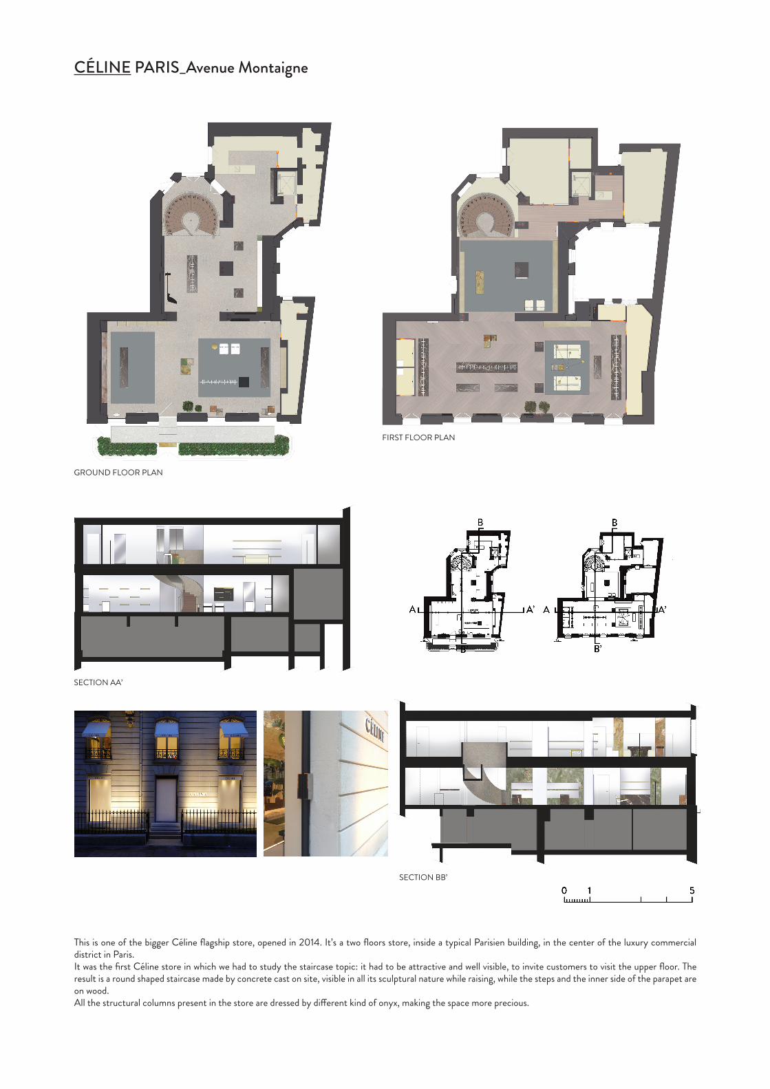
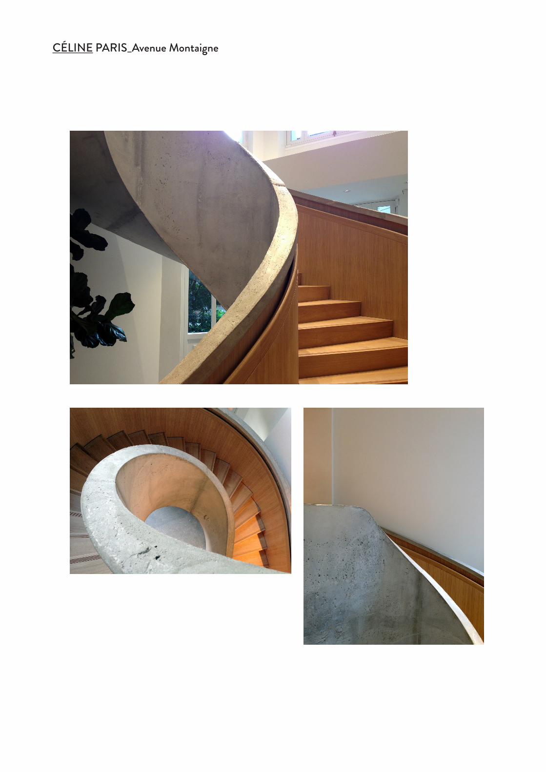
This is one of the bigger Céline flagship store, opened in 2014. It’s a two floors store, inside a typical Parisien building, in the center of the luxury commercial district in Paris.It was the first Céline store in which we had to study the staircase topic: it had to be attractive and well visible, to invite customers to visit the upper floor. The result is a round shaped staircase made by concrete cast on site, visible in all its sculptural nature while raising, while the steps and the inner side of the parapet are on wood.All the structural columns present in the store are dressed by different kind of onyx, making the space more precious.
CÉLINE PARIS_Avenue Montaigne
GROUND FLOOR PLAN
FIRST FLOOR PLAN
SECTION AA’
SECTION BB’

CÉLINE PARIS_Avenue Montaigne
CÉLINE PARIS_Avenue Montaigne
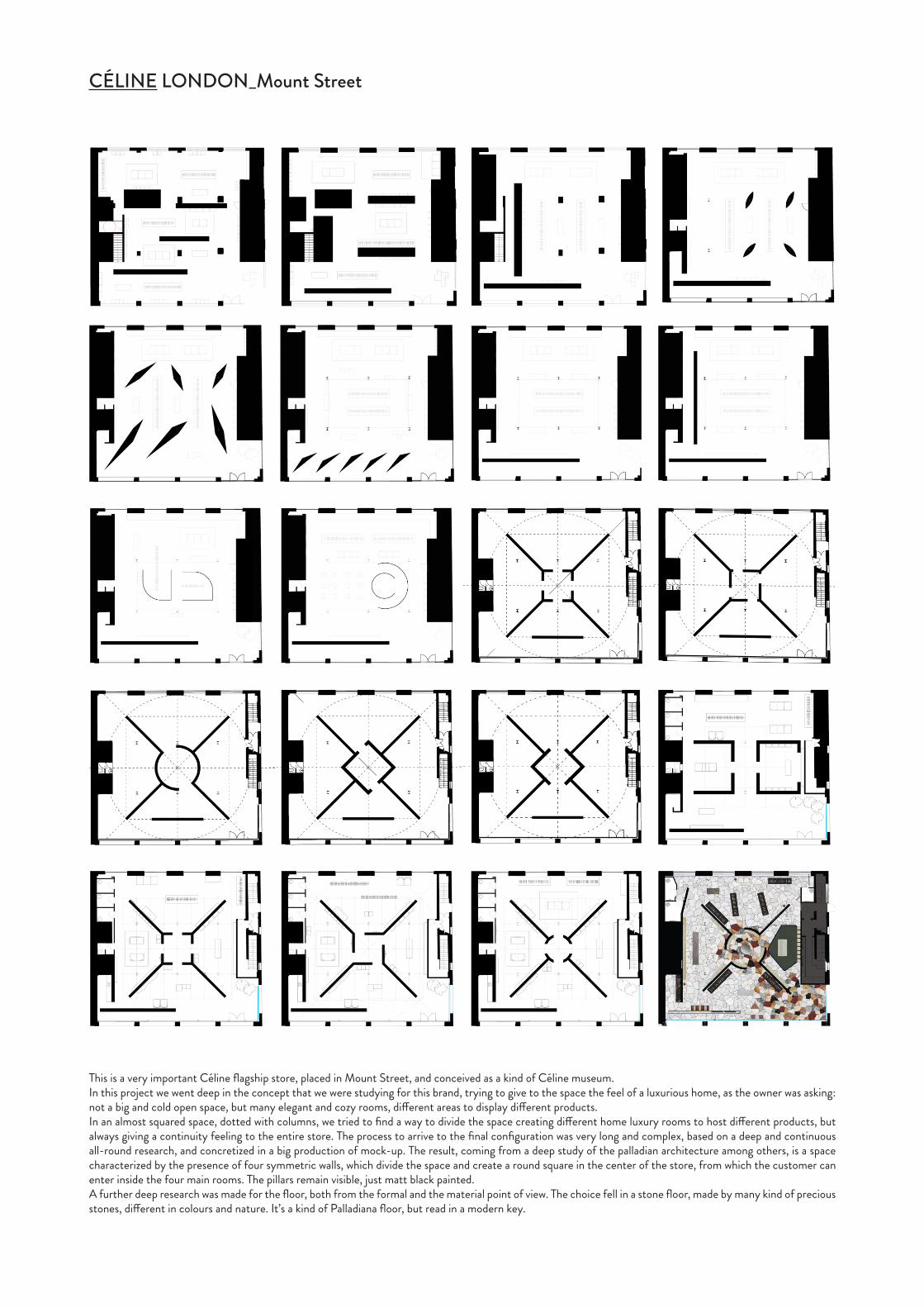
CÉLINE LONDON_Mount Street
This is a very important Céline flagship store, placed in Mount Street, and conceived as a kind of Céline museum.In this project we went deep in the concept that we were studying for this brand, trying to give to the space the feel of a luxurious home, as the owner was asking: not a big and cold open space, but many elegant and cozy rooms, different areas to display different products.In an almost squared space, dotted with columns, we tried to find a way to divide the space creating different home luxury rooms to host different products, but always giving a continuity feeling to the entire store. The process to arrive to the final configuration was very long and complex, based on a deep and continuous all-round research, and concretized in a big production of mock-up. The result, coming from a deep study of the palladian architecture among others, is a space characterized by the presence of four symmetric walls, which divide the space and create a round square in the center of the store, from which the customer can enter inside the four main rooms. The pillars remain visible, just matt black painted.A further deep research was made for the floor, both from the formal and the material point of view. The choice fell in a stone floor, made by many kind of precious stones, different in colours and nature. It’s a kind of Palladiana floor, but read in a modern key.

CÉLINE LONDON_Mount Street

CÉLINE SHENYANG_Forum 66
This store is one of the first that we designed for Céline. Placed inside a shopping center in Shenyang, China, the space was characterized by an irregular shape. First of all we worked on the facade. We didn’t want to have a simple shop-window, so we designed a stone wall, made by pietra di Vicenza panels, framing two different shop-windows. The bigger one, where the entrance is, is partly covered by a thick onyx wall which shows one of the two brand’s logos (the other is en-graved on the pietra di Vicenza’s facade). This wall becomes the main element of the shop window, an architectural wing, a precious and recognizable element of the Céline concept that we studied. At the same time, it is a furniture piece that can display products: in fact, it has, on the inner side, two onyx shelves. An architectural element that is, at the same time, architecture and products’ display.
PLAN
SECTION BB’
SECTION AA’
SECTION CC’

The Céline store in Landmark shopping mall is the first project we designed for this brand. The space was characterized by a long curve shop window. We decided to treat it as a building’s facade: part of the curve becomes a pietra di Vi-cenza’s wall, the remaining part is a shop window. It’s in this store that we conceived the onyx wall as one of the main element of a Céline store’s facade: it becomes a scenographic wing of the shop window, but also a products’ display in the inner side, thanks to an onyx shelf. In this store, the onyx wall is characterized by the same curvature of the shop window: it’s a kind of sculpture but also a materic architectural element, so strong and characterizing.In the inner space we respected the curvature of the shop window, simply rotating it a little bit every time we were proposing it again. The curved back wall is a wing behind which take place the storage and, on the opposite part, the fitting rooms.
FACADE
INTERIOR FACADEPLAN
SECTION AA’ SECTION BB’
CÉLINE HONG KONG_Landmark
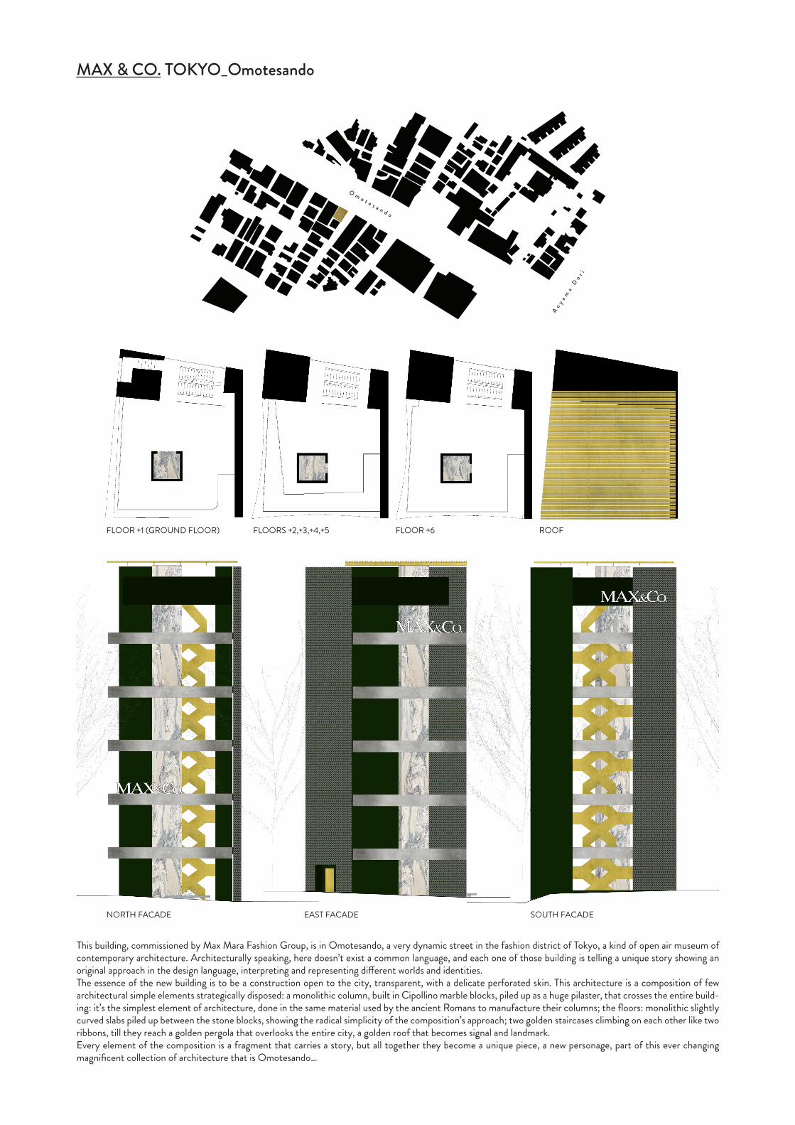
MAX & CO. TOKYO_Omotesando
This building, commissioned by Max Mara Fashion Group, is in Omotesando, a very dynamic street in the fashion district of Tokyo, a kind of open air museum of contemporary architecture. Architecturally speaking, here doesn’t exist a common language, and each one of those building is telling a unique story showing an original approach in the design language, interpreting and representing different worlds and identities.The essence of the new building is to be a construction open to the city, transparent, with a delicate perforated skin. This architecture is a composition of few architectural simple elements strategically disposed: a monolithic column, built in Cipollino marble blocks, piled up as a huge pilaster, that crosses the entire build-ing: it’s the simplest element of architecture, done in the same material used by the ancient Romans to manufacture their columns; the floors: monolithic slightly curved slabs piled up between the stone blocks, showing the radical simplicity of the composition’s approach; two golden staircases climbing on each other like two ribbons, till they reach a golden pergola that overlooks the entire city, a golden roof that becomes signal and landmark.Every element of the composition is a fragment that carries a story, but all together they become a unique piece, a new personage, part of this ever changing magnificent collection of architecture that is Omotesando…
FLOOR +1 (GROUND FLOOR) FLOORS +2,+3,+4,+5 FLOOR +6 ROOF
NORTH FACADE SOUTH FACADEEAST FACADE

MAX & CO. TOKYO_Omotesando

PLAN_pink onyx PLAN_azul
FACADE_pink onyx FACADE_azul
FACADE_pink onyx & pietra di Vicenza FACADE_azul version & pietra di Vicenza
When we were asked to study the facade of this Céline flagship store in Kobe, Japan, after many studies and researches we proposed a concept that could be read as a new interpretation of the Céline Beverly Hills facade. We maintained the idea of the pillar and the architrave, but here the supports become three: one is an already existing column, that we reshaped; the other two elements are the entrance side walls that we completely redesigned on both sides of the facade. We shaped the three elements playing with the inclination of their sides, to create a precious stone’s ‘tunnel’ inviting people to enter the store.We did a long research with materials, playing with the facade’s elements. Finally the choice fell in this last version: the architrave is in pietra di Vicenza, while the three elements are in Azul marble.
CÉLINE KOBE_Daimaru

CÉLINE LOS ANGELES_Rodeo Drive
This flagship store, placed in the famous Rodeo Drive, in Beverly Hills, is a one floor building. In this case we had to design the entire building and the facade was the most important topic of this project.Enclosed between two buildings, in the middle of a commercial street, worldwide known, in which every brand tries to make its store more fancy and famous then the others, the challenge was to make the Céline building distinguishable from the others, respecting the brand’s nature and philosophy.We worked on the facade’ shape and materials, reaching a really simple but strong concept: a majestic column surmounted by a big architrave, dressed by a precious stone (Azul Imperiale), referring to the classical architecture. The asymmetric position of the big pillar divides the shop-window into two parts: the entrance and a big shop-window.In the inside, the space is characterized and divided in two main rooms by an onyx volume which hosts two fitting rooms.
PLAN
SECTION DD’
SECTION AA’
FACADE
SECTION BB’ SECTION CC’

CÉLINE LOS ANGELES_Rodeo Drive

CÉLINE LOS ANGELES_Rodeo Drive

T1 PROJECT
T1 PROJECT is a collection of six unique pieces that Andrea Tognon Architecture presented for the first time at the Fuorisalone 2015: three tables and three lamps that reflect on the topic of heaviness, lightness and form.Built in Cipollino and Calacatta marbles, in pietra di Vicenza and brass metal, in Palissandro and Verde Alpi marbles, the pieces play with the perception of the viewer.Designed by the intersection between mixed geometries, moving around them they constantly give the impression of changing form and a feeling of fluidity and cantilevered equilibrium. The pieces are part of a constant research done on construction, form and materials at different scales.

T1 PROJECT_TI eat brass, TI eat stone
TI eat brass
TI eat stone

T1 PROJECT_TI tea

T1 PROJECT_TI b

T1 PROJECT_TI bs

T1 PROJECT_TI bt

RESIDENCE O_Teolo (Padova)
Residence O is the guesthouse addition to the property of Casa O, already realized and designed by Andrea Tognon. We were asked to create two autonomous apartments for guests. We decided to create a simple ‘bungalow’ made by three parallel walls positioned in a way that allow to have maximum privacy and nice views of the surrounding.
Planimetry
PlanimetryReferences
Maquette

RESIDENCE O_Teolo (Padova)
Version 1_Black painted wall Version 2_Stone
Version 3_Corten steel Version 4_Concrete

APARTMENT RUCELLAI_Milano
This little bilocal, in the periphery of Milan, was designed to create an apartement-studio, saving as much space as possible. The idea was to create a mezzanine in the first room, over the kitchen, in which to have just a double bed, using the space over the bathroom’s false ceiling as wardrobe.The second room was studied to become both a living room and a studio: a raised wood platform, reachable climbing few steps, is at the same time the living room’s floor and the office’s table. At the normal floor’s level there’s the office. The space under the platform can be used as stock.
Ground floor Mezzanine floor
Section AA’

THANK YOU