akamai logo usage guidelines · pdf file2 the logo consists of two basic elements: the blue...
TRANSCRIPT
AkamaiLogo Usage Guidelines
©2016 Akamai Technologies

Akamai Logo Usage Guidelines1
It is important to remember, however, that our brand is bigger than a logo – just as a country is much more than just its flag. Our brand encom-passes Akamai's character and relationships as well – the ways in which we interact with our customersand how we work with one another.
Proper use of the logo is central to the branding process. The Akamai logo, materials, and templates are now in your hands, and it’s up to you to use them responsibly. We’ve done our best to make this easy: every office has been provided with the guidelines in a written form, and they’re also available on Aloha. Consider them a work in progress, one that we’ll adjust and update as we need additional requirements or discover new opportunities for the Akamai brand.
Today, both at home and at work – people demand instant access to everything, everywhere, on any device. And friends and colleagues expect them to have it. Innovators are taking advantage of this hyperconnectivity to drive their businesses – and are monetizing it every step of the way. Akamai makes sure technology doesn’t obstruct your ability to drive your business faster forward – to seize the opportunities created by our hyperconnected world. In this light, Akamai's blue wave becomes a powerful symbol, representing power, growth, and intercon-nectedness. The wave-like form echoes Akamai's expansive nature. It introduces the idea of movement, representing our influence on the flow of content and applications to every corner of the globe. The orange logotype extends out from the eye of the wave, creating a sense of forward-movement and excitement. All of these elements are reinforced by our tagline: Faster Forward.
A good logo is the essence of an organization, reduced to its simplest visual form. It says not only who a company is, but also what it may become. Think of it as an ambassador to our customers and the outside world: building credibility, encouraging positive associations, and enhancing a company's professionalism. But to take full advantage of this powerful marketing tool, the company must use it in a consistent manner, maximizing its impact and strengthening the company brand.
About the Logo
2
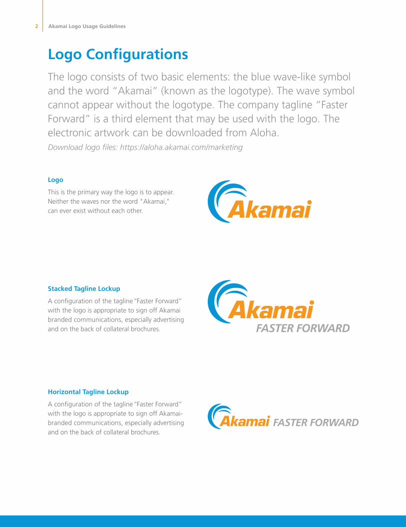
The logo consists of two basic elements: the blue wave-like symbol and the word “Akamai” (known as the logotype). The wave symbol cannot appear without the logotype. The company tagline “Faster Forward” is a third element that may be used with the logo. The electronic artwork can be downloaded from Aloha.Download logo files: https://aloha.akamai.com/marketing
Horizontal Tagline Lockup
”drawroF retsaF“ enilgat eht fo noitarugfinoc A with the logo is appropriate to sign off Akamai-branded communications, especially advertising and on the back of collateral brochures.
Stacked Tagline Lockup
”drawroF retsaF“ enilgat eht fo noitarugfinoc A with the logo is appropriate to sign off Akamai branded communications, especially advertising and on the back of collateral brochures.
Logo
This is the primary way the logo is to appear. Neither the waves nor the word "Akamai," can ever exist without each other.
Logo Configurations
Akamai Logo Usage Guidelines
3
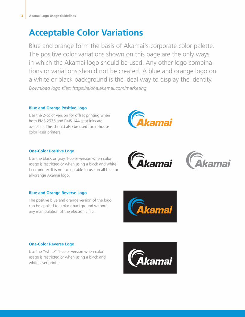
One-Color Positive Logo
Use the black or gray 1-color version when color usage is restricted or when using a black and white laser printer. It is not acceptable to use an all-blue or all-orange Akamai logo.
Blue and Orange Positive Logo
Use the 2-color version for offset printing when both PMS 2925 and PMS 144 spot inks are available. This should also be used for in-house color laser printers.
One-Color Reverse Logo
Use the “white” 1-color version when color usage is restricted or when using a black and white laser printer.
Blue and Orange Reverse Logo
The positive blue and orange version of the logo can be applied to a black background without any manipulation of the electronic file.
Blue and orange form the basis of Akamai's corporate color palette. The positive color variations shown on this page are the only ways in which the Akamai logo should be used. Any other logo combina-tions or variations should not be created. A blue and orange logo on a white or black background is the ideal way to display the identity. Download logo files: https://aloha.akamai.com/marketing
Acceptable Color Variations
Akamai Logo Usage Guidelines

4
The Akamai logo should never be broken into pieces. They should never be recolored or distorted in any way. Never redraw or reconstruct any part of the logo or lockup.
Never distort the logo
The logo cannot be stretched in any way.
Never recolor the logo
The logo cannot be used in any color other than the options laid out on page 5.
What Not to Do
Akamai Logo Usage Guidelines
5
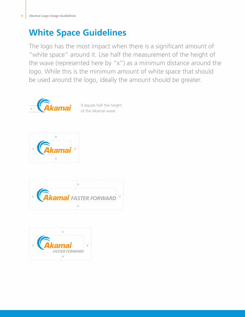
X equals half the height of the Akamai wave.
x
x
x
x
x
x
x
x
x
x x
x
x
The logo has the most impact when there is a significant amount of “white space” around it. Use half the measurement of the height of the wave (represented here by “x”) as a minimum distance around the logo. While this is the minimum amount of white space that should be used around the logo, ideally the amount should be greater.
White Space Guidelines
Akamai Logo Usage Guidelines
6
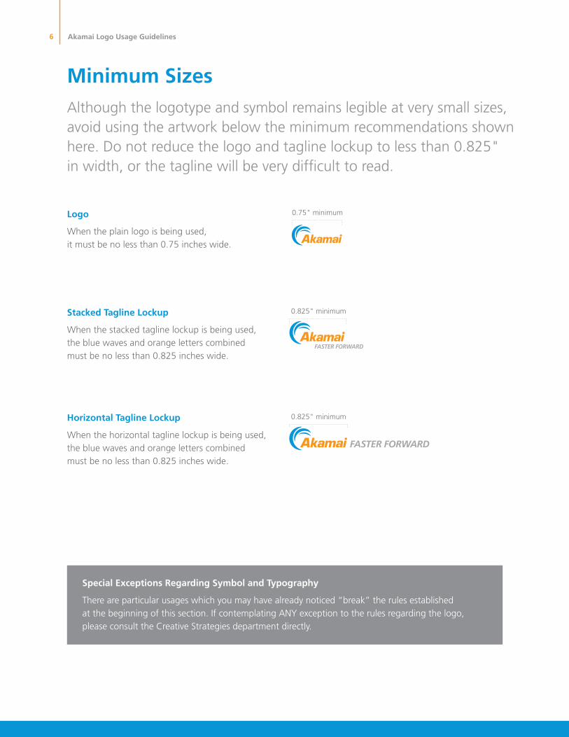
0.75" minimum
0.825" minimum
0.825" minimum
Although the logotype and symbol remains legible at very small sizes, avoid using the artwork below the minimum recommendations shown here. Do not reduce the logo and tagline lockup to less than 0.825" in width, or the tagline will be very difficult to read.
Minimum Sizes
Special Exceptions Regarding Symbol and Typography
There are particular usages which you may have already noticed “break” the rules established at the beginning of this section. If contemplating ANY exception to the rules regarding the logo, please consult the Creative Strategies department directly.
Horizontal Tagline Lockup
When the horizontal tagline lockup is being used, the blue waves and orange letters combined must be no less than 0.825 inches wide.
Stacked Tagline Lockup
When the stacked tagline lockup is being used, the blue waves and orange letters combined must be no less than 0.825 inches wide.
Logo
When the plain logo is being used, it must be no less than 0.75 inches wide.
Akamai Logo Usage Guidelines
Akamai is headquartered in Cambridge, Massachusetts in the United States with operations in more than 57 offices around the world. Our services and renowned customer care are designed to enable businesses
to provide an unparalleled Internet experience for their customers worldwide. Addresses, phone numbers, and contact information for all locations are listed on www.akamai.com/locations.
©2016 Akamai Technologies, Inc. All Rights Reserved. Reproduction in whole or in part in any form or medium without express written permission is prohibited. Akamai and the Akamai wave logo are
registered trademarks. Other trademarks contained herein are the property of their respective owners. Akamai believes that the information in this publication is accurate as of its publication date; such
information is subject to change without notice. Published 05/16.
As the global leader in Content Delivery Network (CDN) services, Akamai makes the Internet fast, reliable, and secure for its customers. The company’s advanced web performance, mobile performance, cloud security, and media delivery solutions are revolutionizing how businesses optimize consumer, enterprise, and entertainment experiences for any device, anywhere. To learn how Akamai solutions and its team of Internet experts are helping businesses move faster forward, please visit www.akamai.com or blogs.akamai.com, and follow @Akamai on Twitter.