advertisments
TRANSCRIPT

The first screen shot shows my font with the real Olympic logo. After that I vectored the image in order for me to just simply have the outline of it. To make this my own I then filled in all the colours of five different colours and matched the text up with it in order for it to mix well together; I also decided to add the word ‘sales’ to the end so that all the colours in the logo would fit the wording of it.

After creating a new logo and typeface I decided to add a background in order for the advertisement to look like a real one. I took a trip to London in order for me to take a photograph of the Olympic stadium as shown. For the final image of it I faded the photo and put it behind what I already had to create my main final advertisement for my double page.
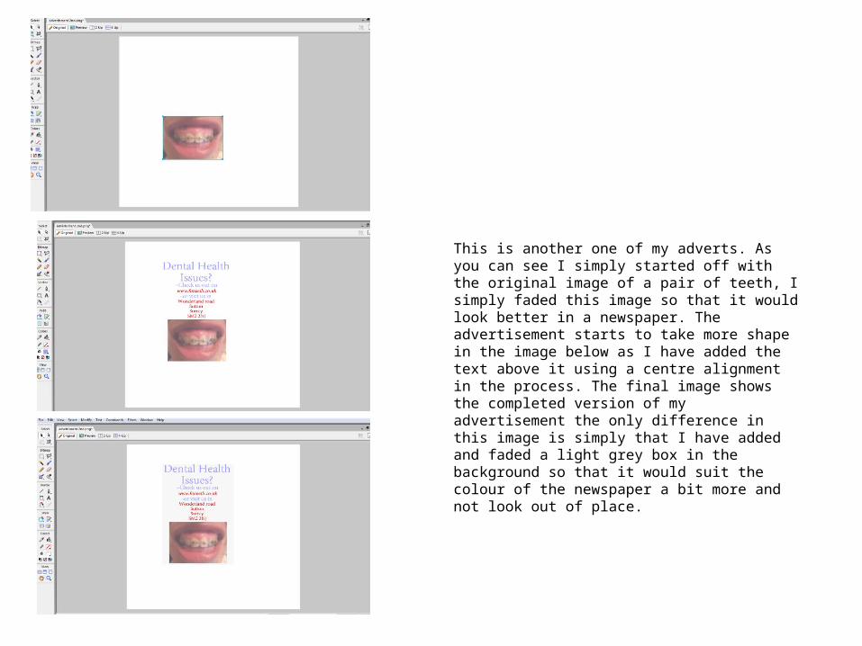
This is another one of my adverts. As you can see I simply started off with the original image of a pair of teeth, I simply faded this image so that it would look better in a newspaper. The advertisement starts to take more shape in the image below as I have added the text above it using a centre alignment in the process. The final image shows the completed version of my advertisement the only difference in this image is simply that I have added and faded a light grey box in the background so that it would suit the colour of the newspaper a bit more and not look out of place.
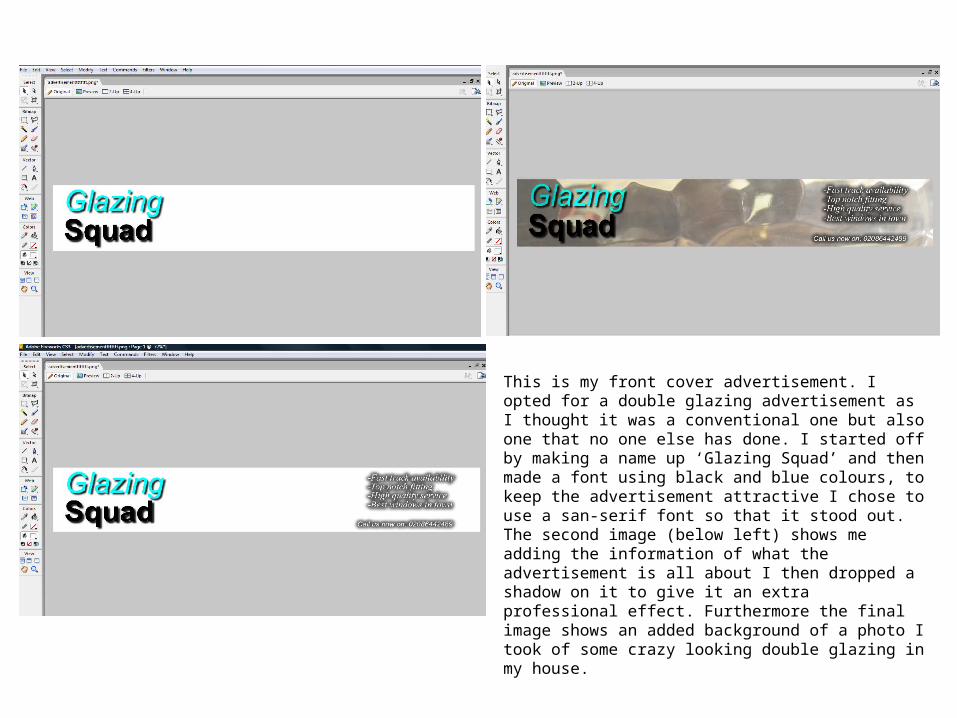
This is my front cover advertisement. I opted for a double glazing advertisement as I thought it was a conventional one but also one that no one else has done. I started off by making a name up ‘Glazing Squad’ and then made a font using black and blue colours, to keep the advertisement attractive I chose to use a san-serif font so that it stood out. The second image (below left) shows me adding the information of what the advertisement is all about I then dropped a shadow on it to give it an extra professional effect. Furthermore the final image shows an added background of a photo I took of some crazy looking double glazing in my house.

This is another advertisement shown in my double page spread. The first step shows me simply adding the text in with bright colours in order for it to stand out. The second image shows me adding in the image I took of a television, I placed this with centre alignment in order for it to look more dominant as all the text is placed on the side form left to right. The last two image show me adding the foremost text at the top, this piece of text will draw the reader/ lookers in; finally the last image is just me adding in a light grey background so that it suits
that of a newspaper and doesn’t look out of place with a pure white background.