adverse event data- g aphically - cytel eu 2018/adverse event data... · dverse event data- g...
TRANSCRIPT

Adverse Event Data- g aphically
DV11
Lina Rajput Prajakta Chitale
PhUSE EU Connect 2018 The Clinical Data Science Conference

Contents
• Introduction
• Heat Map
• Volcano Plot
• Summary
• Q & A
2

Introduction
• Adverse event (AE) is any untoward medical occurrence including:
undesirable signs & symptoms
disease or accidents
abnormal lab findings
• AEs are graded as per severity and seriousness.
• Treatment Emergent AEs are events that:
occurred after dosing
already existed but worsened after dosing
• Heat maps are charts with values described using colours
• Volcano Plot is a type of scatter-plot; used to quickly identify changes in large
data sets
3
4
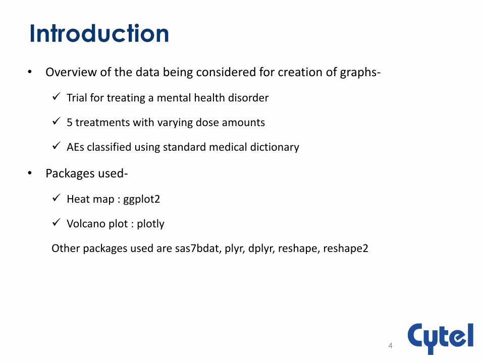
Introduction
• Overview of the data being considered for creation of graphs-
Trial for treating a mental health disorder
5 treatments with varying dose amounts
AEs classified using standard medical dictionary
• Packages used-
Heat map : ggplot2
Volcano plot : plotly
Other packages used are sas7bdat, plyr, dplyr, reshape, reshape2

• Plot SOCs on Y axis
• Plot Treatments on X axis
• Number of events >= 50 being plotted
• SOCs are arranged in decreasing order w.r.t events.
• White tile represents no event occurred
5
Heat Map for Number of AEs per System
Organ Class (SOC) per Treatment
6
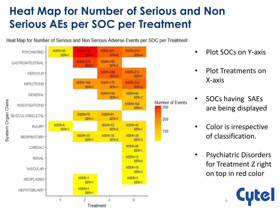
• Plot SOCs on Y-axis • Plot Treatments on
X-axis
• SOCs having SAEs are being displayed
• Color is irrespective of classification.
• Psychiatric Disorders for Treatment Z right on top in red color
Heat Map for Number of Serious and Non
Serious AEs per SOC per Treatment

7
• Plot AEs on Y-axis • Plot Treatment on
X-axis
• Number of events > 10 are being plotted
• Count > 40 are marked in white
Heat Map for Number of AEs per Treatment for
a Single SOC
8
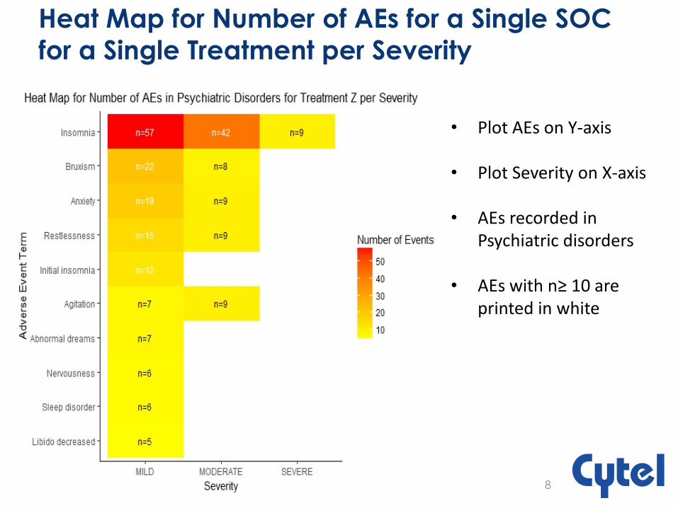
• Plot AEs on Y-axis • Plot Severity on X-axis
• AEs recorded in
Psychiatric disorders
• AEs with n≥ 10 are printed in white
Heat Map for Number of AEs for a Single SOC
for a Single Treatment per Severity
9
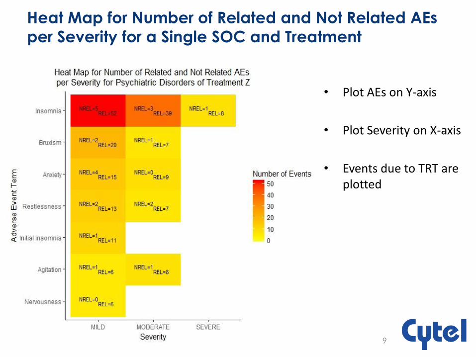
• Plot AEs on Y-axis
• Plot Severity on X-axis
• Events due to TRT are plotted
Heat Map for Number of Related and Not Related AEs
per Severity for a Single SOC and Treatment

10
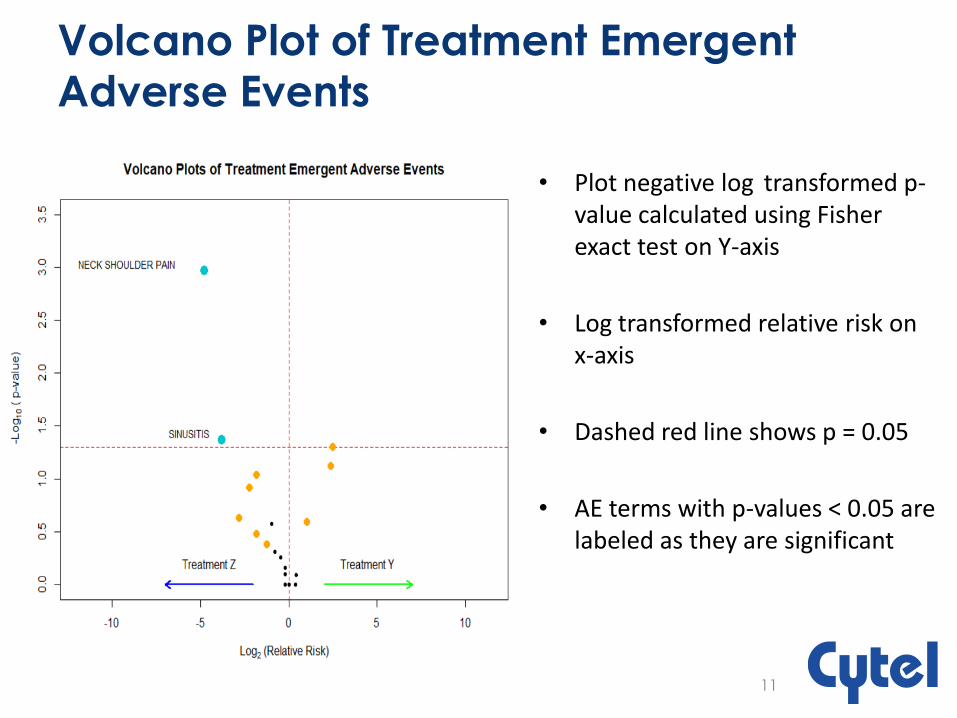
Volcano Plot of Treatment Emergent
Adverse Events
Treatment Y (n=A) Treatment Z (n=B)
Subjects with AE a b
Subjects without AE c d
Relative Risk (RR): • A measure of the risk of a certain event happening in one group compared
to the risk of the same event happening in another group. • Calculate RR, RR = [a/(A)] / [b/(B)]
Volcano Plot of Treatment Emergent
Adverse Events
• Plot negative log transformed p-value calculated using Fisher exact test on Y-axis
• Log transformed relative risk on x-axis
• Dashed red line shows p = 0.05
• AE terms with p-values < 0.05 are labeled as they are significant
11

Bubble Plot of -Log (p-value) by Relative
Risk, Sized by Counts
• Each bubble represents an AE
• Bubble size represents the total number of occurrences of the AE
• Headache is the most commonly occurring AE
• Log2 (RR) =0; represents no difference
12
Limitations
• Heat maps are a basic tool of visualizing any data. More exploration needs to be done to perform complex analysis using heat maps.
• In volcano plots, treatments are compared in a pair wise fashion resulting in only two treatments being compared at any given instance.
13
Summary
• Graphical displays could be given more consideration in the analysis of safety
data
• They help us to identify any areas of interest or concern in the data
• Heat maps are useful to understand the spread of the adverse event data
• Volcano plots are space-saving tools that emphasize important differences
between the adverse event profiles of two treatment arms
• Future scope- R Shiny applications can be developed to generate various
types of plots discussed
14
References
• https://www.nature.com/articles/srep24955
• https://ggplot2.tidyverse.org/reference/index.html
• https://plot.ly/r/reference/#scatter
• https://community.plot.ly/
15

Any Questions ?
16

Thank you
17