ad hoc and statistical model visualization using jmp®, sas® and
TRANSCRIPT

WHITE PAPER
Ad Hoc and Statistical Model Visualization Using JMP®, SAS® and Microsoft ExcelJon T. Weisz, SAS Institute, Cary, NC

i
Ad Hoc And StAtiSticAl ModEl ViSUAlizAtion USing JMP®, SAS® And MicroSoft ExcEl
Table of Contents
Abstract........................................................................................................ 1Introduction ................................................................................................. 1Spreadsheet Model ...................................................................................... 2Statistical Model .......................................................................................... 6Scientific Model ........................................................................................... 9Conclusion ................................................................................................. 13References ................................................................................................ 13Acknowledgments .................................................................................... 13Contact Information ................................................................................... 13

Ad Hoc And StAtiSticAl ModEl ViSUAlizAtion USing JMP®, SAS® And MicroSoft ExcEl
Abstract
Generally speaking, models are abstractions of real-life systems used to facilitate understanding and to aid in decision making. However, models mean different things in different disciplines. Engineers, financial analysts and statisticians all employ modeling, as a core tool, but each discipline would define models differently. Even with the differences in how models are defined and developed, all disciplines need ways to communicate models, perform what-if analyses and simulations. This paper will highlight the use of the different model profilers in JMP to visualize and perform what-if analysis and Monte Carlo simulation for models defined using SAS/STAT®, Microsoft Excel and engineering tools.
Introduction
In this paper, we will use Excel and SAS’ JMP software to examine examples of three types of models. We will explore various ways each model can be created, visualized and used to communicate results to people who do not create models themselves, but who base decisions on information gleaned from models. With the methods detailed in this paper, creators of the three different models types can more effectively communicate with one another.
Let’s start by defining models as used in this paper. Models can be thought of as representations of real things that can be manipulated, analyzed and used in experimentation.
• SCIENTIFIC MODELS – These models tend to be heuristically or theoretically derived. Many scientific disciplines think of models in theoretical, deterministic terms. For example, bacterial growth rates are modeled in four phases; lag, exponential, stationary, death with mathematical models detailing growth rates for each phase. This model is based upon cell division models, available nutrients, etc. Before an experiment investigating how bacteria grow starts, a theoretical model is known. The data is then collected about actual growth and fit to the theoretical model. If there are large discrepancies between the model’s predictions and experimental results, collection methods are often suspected or measurements are rechecked.
• SPREADSHEET MODELS – These models are often mathematical representation of key financial and operational relationships. Spreadsheet models often comprise one or several sets of equations. These models can be used to analyze how an organization will react to different economic situations or events. Consider a spreadsheet that contains an organization’s sales forecast. It is a codification of the creator’s belief about how sales will occur at some future time period. The model/spreadsheet is created based upon historical data, experience and input from sales management. It can be manipulated to form various what-if scenarios that, when analyzed, can guide decision about budgets and sales territory management, etc.
1

2
Ad Hoc And StAtiSticAl ModEl ViSUAlizAtion USing JMP®, SAS® And MicroSoft ExcEl
• STATISTICAL MODELS – These models are used to describe data or make predictions about new data when no theoretical model is known. Statistical models contain deterministic elements derived from observed data and also contain stochastic elements used to represent uncertainty. Imagine a model created using historical data, but used with new data to predict specific outcomes – for example, items that a consumer might want to purchase from an online vendor at checkout time. Linear statistical models are a very commonly used model form and use the idea that any function can be expressed as a Taylor Series. So linear models use some form of a polynomial in the form y = b0 + b1x1 + b2x2 + b1b2x1x2 +…. When the underlying function is not known, statisticians feel free to use the Taylor Series idea to fit polynomials to data as approximate representations of the true, but unknown, underlying function.
Spreadsheet Model
I have an ongoing debate with my wife that has persisted for most of our marriage. When she asks when I will be home from work, I answer, like a good statistician, “not later than 6:30 p.m.” The reason I preface my answer with “not later than…” is that I understand that my arrival time will vary due to normal circumstances. I will usually arrive earlier than 6:30 and, on average, several minutes earlier, with any luck.
The usual scenario for my commute home starts with me leaving whatever I am working on at the end of the day and getting up from my desk chair. This is not an easy task; I get caught up in work and find it hard to break away. So I set an alarm in an effort to be consistent about when I leave the office. However, I often get involved in (often important) hallway conversations. In the parking lot, I sometimes find myself discussing work issues with colleagues. After I’m finally in my car, I have a short commute home, but there are two traffic lights and varying numbers of vehicles on the road. So my arrival time at home is not a simple sum of initial time and durations.
Consider the following simple model of my commute home.
Office Departure Time
Hallway Conversations
Parking LotConversations
Driving Commute
Home Arrival Times
Best Case 5:00 p.m. 0:00:00 0:00:00 0:10:00 5:10 p.m.
Worst Case 6:00 p.m. 0:10:00 0:10:00 0:15:00 6:35 p.m.
I could have collected data about when I leave the office, how long I talk in the hallway, etc. With data I could construct a more precise model, use regression or fit a fancy traffic/transportation model. But the data could be incriminating, so I have created rows for the best- and worst-case scenarios that reflect my, maybe biased, belief in how my schedule works.
2
Ad Hoc And StAtiSticAl ModEl ViSUAlizAtion USing JMP®, SAS® And MicroSoft ExcEl
Then I entered data detailing my best guess at each. The home arrival times are simply the sum of the initial time and the delays along the way home. I find that I should never arrive home before 5:10 or later than 6:30. Would the average arrival time be 5:52? How often would I get home later than 6:30? If I were to change any of the best/worst-case values in the model, which factor would have the greatest impact on my arrival time at home?
This model does not seem to answer these questions. I could change values of departure times, hallway conversation times, etc., and see the results on any spreadsheet program. This “sensitivity” analysis is a common way to analyze these kinds of what-if models. A lot of the world’s business processes are analyzed in this manner.
Let’s consider a way to enhance our knowledge of what this model can tell us about my home commute process. To both visualize and analyze the time-to-get-home model I am going to use the JMP 9 Excel Add-In.
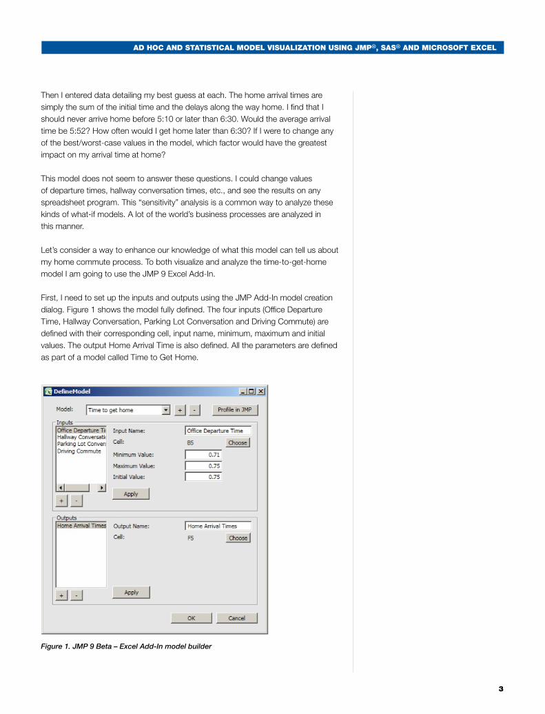
First, I need to set up the inputs and outputs using the JMP Add-In model creation dialog. Figure 1 shows the model fully defined. The four inputs (Office Departure Time, Hallway Conversation, Parking Lot Conversation and Driving Commute) are defined with their corresponding cell, input name, minimum, maximum and initial values. The output Home Arrival Time is also defined. All the parameters are defined as part of a model called Time to Get Home.
Figure 1. JMP 9 Beta – Excel Add-In model builder
3

4
Ad Hoc And StAtiSticAl ModEl ViSUAlizAtion USing JMP®, SAS® And MicroSoft ExcEl
Now that the model is defined, we can use the JMP Profiler to visualize the model, as shown in Figure 2, below. Note the solid black lines in the plot for each input. These lines show all the possible what-if scenarios if that input were to change and all other inputs were held constant. It is very easy to see that the input that has the biggest impact on when I get home is, indeed, the time I leave my office. The relatively steep line shows the importance of my office departure for Office Departure Time compared to the other values.
Figure 2. JMP’s Profiler visualizing a model in Excel
Now let’s try to answer the questions we could not answer from the simple Excel model and analysis:
1. Would the average arrival time be 5:52?
2. How often would I get home later than 6:30?
3. If I were to change any of the best- or worst-case values in the model, which would have the greatest impact on my arrival time at home?
We have answered the third question already. The JMP Profiler shows us that Office Departure Time has the greatest impact on my home arrival time. To answer questions 1 and 2, we need to employ an analysis called Monte Carlo Simulation. Monte Carlo Simulation is a simple mathematical process of sampling from distributions for each input, evaluating the model and then collecting the results – in this case, Home Arrival Time. The collected results over many hundreds or thousands of iterations of this process form a distribution of forecasts about my home arrival time based upon varying the inputs in a special way that reflects how I view the uncertainty of those inputs. So, If I think that most of the time I will leave my office at 5:30 p.m. and very rarely will I leave at 5 or 6 p.m., then I may reflect that belief with a shape that is high in the middle (5:30) and low at both ends (5 and 6 p.m.). A shape that is often used is shown in Figure 3; statisticians call this shape the normal distribution.

Ad Hoc And StAtiSticAl ModEl ViSUAlizAtion USing JMP®, SAS® And MicroSoft ExcEl
5
Figure 3. Normal distribution as a model for my office departure time
Next, I need to define my uncertainty for each of the inputs and then run the Monte Carlo simulation process. Using the JMP Profiler, I get the results shown in Figure 4, below. Examining Figure 4 helps me now answer questions 1 and 2. The average of the arrival times is 5:52 p.m., and on average I will be late 28 percent of the time. So, on average I get home eight minutes early, but I am late almost one-third of the time. Modeling uncertainty allows me to estimate the risk of arriving late – a very important risk! Just entering values into the spreadsheet model did not give me a good handle of the risk of my commute. What can I do to improve the process? By being much more consistent about leaving the office at 5:30 p.m., I can reduce my chance of arriving late to almost zero, although I probably should have known that ahead of time!
Figure 4. JMP’s Profiler used to simulate the distribution of home arrival times
The use of the Profiler in conjunction with a spreadsheet model in Excel results in easy understanding of what variables have the most impact on the model results. This analysis method also allows the model inputs to be distributions rather than specific numbers, hence adding the modeling of risk or uncertainty to the spreadsheet model. Having a distribution of outcomes rather than “the number” allows for much more informed decision-making based upon spreadsheet models and allows statements like “I will be home on time, on the average, but will be late 28% of the time.” The previous statement will not create domestic bliss, but telling a CEO “we are forecasting $2 per share earnings, but have a 25 percent chance of a losing model this year” certainly is more information than “we are forecasting a $2 per share earnings this year.” The first statement can be made if the analysis outlined in this paper is used, but the second is the statement most often given, just the numbers, no distribution of results.

6
Ad Hoc And StAtiSticAl ModEl ViSUAlizAtion USing JMP®, SAS® And MicroSoft ExcEl
Statistical Model
Let’s consider a different kind of model. A statistical model is based upon domain knowledge and historical data, and can be used to discover more about a given phenomenon or to make predictions about future behaviors.
We’ll start with some data from the US National Oceanic and Atmospheric Administration. The data provides average monthly temperatures for 270 cities based on a 30-year average (1971-2000). The graphic below shows the cities as bubbles; each bubble is colored by July temperature and sized by January mean temperature. Warmer temperatures are redder, and cooler temperatures are bluer. Larger bubbles reflect warmer Januaries, while small bubbles reflect cold Januaries. There are some trends that can be seen, but also a lot of variability. A model that uses the city data and makes predictions about monthly temperatures would enable selection of the most temperate, comfortable areas of the country.
Figure 5. Bubble Plot of individual city temperatures. Colors reflect July 30-Year average temperatures. The reds are warmer. The blues are cooler.
Ad Hoc And StAtiSticAl ModEl ViSUAlizAtion USing JMP®, SAS® And MicroSoft ExcEl
7
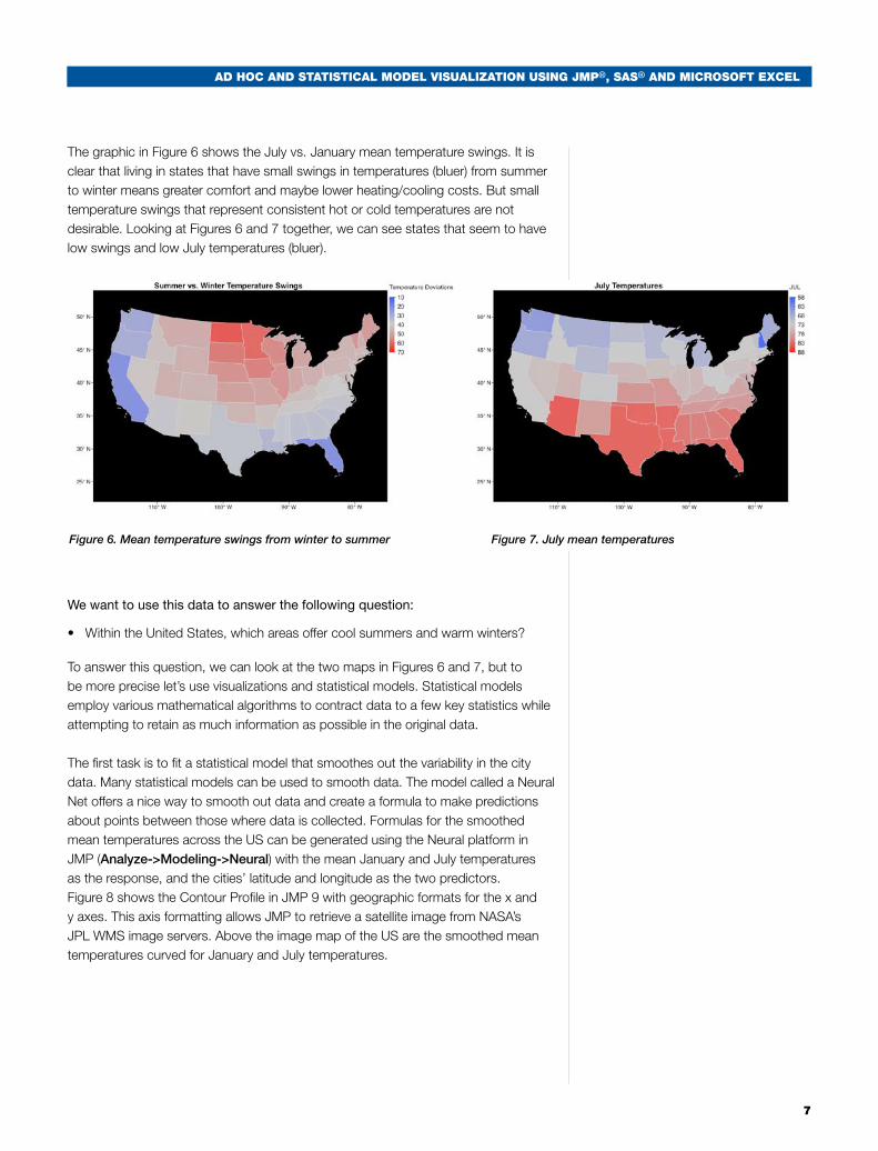
The graphic in Figure 6 shows the July vs. January mean temperature swings. It is clear that living in states that have small swings in temperatures (bluer) from summer to winter means greater comfort and maybe lower heating/cooling costs. But small temperature swings that represent consistent hot or cold temperatures are not desirable. Looking at Figures 6 and 7 together, we can see states that seem to have low swings and low July temperatures (bluer).
We want to use this data to answer the following question:
• WithintheUnitedStates,whichareasoffercoolsummersandwarmwinters?
To answer this question, we can look at the two maps in Figures 6 and 7, but to be more precise let’s use visualizations and statistical models. Statistical models employ various mathematical algorithms to contract data to a few key statistics while attempting to retain as much information as possible in the original data.
The first task is to fit a statistical model that smoothes out the variability in the city data. Many statistical models can be used to smooth data. The model called a Neural Net offers a nice way to smooth out data and create a formula to make predictions about points between those where data is collected. Formulas for the smoothed mean temperatures across the US can be generated using the Neural platform in JMP (Analyze->Modeling->Neural) with the mean January and July temperatures as the response, and the cities’ latitude and longitude as the two predictors. Figure 8 shows the Contour Profile in JMP 9 with geographic formats for the x and y axes. This axis formatting allows JMP to retrieve a satellite image from NASA’s JPL WMS image servers. Above the image map of the US are the smoothed mean temperatures curved for January and July temperatures.
Figure 7. July mean temperaturesFigure 6. Mean temperature swings from winter to summer

8
Ad Hoc And StAtiSticAl ModEl ViSUAlizAtion USing JMP®, SAS® And MicroSoft ExcEl
By setting response contour lines to 40 degrees for a warm January and 72.5 for a balmy July, we get contour lines indicating that the Northwest and mid-Atlantic regions are good possibilities for meeting our criteria. Now we set a lower limit for January mean temperatures to 33 (above freezing) and a narrow, comfortable range of 70 to 75 degrees for July mean temperatures. Now the answer becomes clearer. The San Francisco Bay area of northern California and areas near the coast of the Chesapeake Bay are the most livable places in the US, according to my criteria. This technique shows a nice use of predictive statistical modeling and visualization techniques to make sense of some messy original data.
Figure 8. JMP’s Contour Profiler with a US map showing lines and zones of January and July 30 average temperatures. The areas that fit the predicted January and July temperature criteria are highlighted with white circles.
The use of the Contour Profiler and JMP 9 Neural Net capabilities give a unique visual way to integrate smoothed data (Neural Net) and what-if analysis. The Contour Profiler allows the user to visualize bands and specific values of many response variables from a model. Real time what-if analysis by manipulating the sliders and bandwidths allows identification of feasible regions for the desired results.

Ad Hoc And StAtiSticAl ModEl ViSUAlizAtion USing JMP®, SAS® And MicroSoft ExcEl
99
Scientific Model
In April 2009, for my 46th birthday, I got a puppy. I have four daughters and thought a dog would be a nice addition to the family, good for the kids, etc. I also thought that getting a male dog would increase the “maleness” of my family by 71 percent. (I am a stat geek.)
So over spring break last year, we drove to Maine and got an energetic, 20-pound, 10-week-old black Labrador retriever. This was our first dog, and an immediate question was, “How big is he going to get?” His paws were huge, and everyone said he would grow up to be a large dog. To predict how big the dog will be at full growth, I could ask a few dog owners and build a spreadsheet model with their consensus full growth weight as a percent of birth weight and make a guess of Darcy’s full growth weight. I could also fit a standard regression model of weight vs. age, or I could try to find a theoretical, biologically based model. If a theoretical model is available, my prediction will probably be more accurate. So I made a visit to the oracle of all knowledge, “the Google,” and found an article in the Journal of Animal Science that detailed a mathematical growth model for Labradors. The model is shown in Equation 1 and is called the Gompertz function.
Equation 1. Gompertz 3 parameter logistic growth model
Now all I needed was some data and a way to fit the data to the Gompertz growth function. When I took Darcy (as we named our pooch) to the vet on May 7 for our first puppy visit, he already weighed 28.3 pounds, or almost 50 percent more than he had weighed when we got him a month earlier. Over the next few months, I recorded Darcy’s weight. Table 1 shows the recorded data through the end of August 2009.
Table 1. Darcy’s weight chart
10
Ad Hoc And StAtiSticAl ModEl ViSUAlizAtion USing JMP®, SAS® And MicroSoft ExcEl
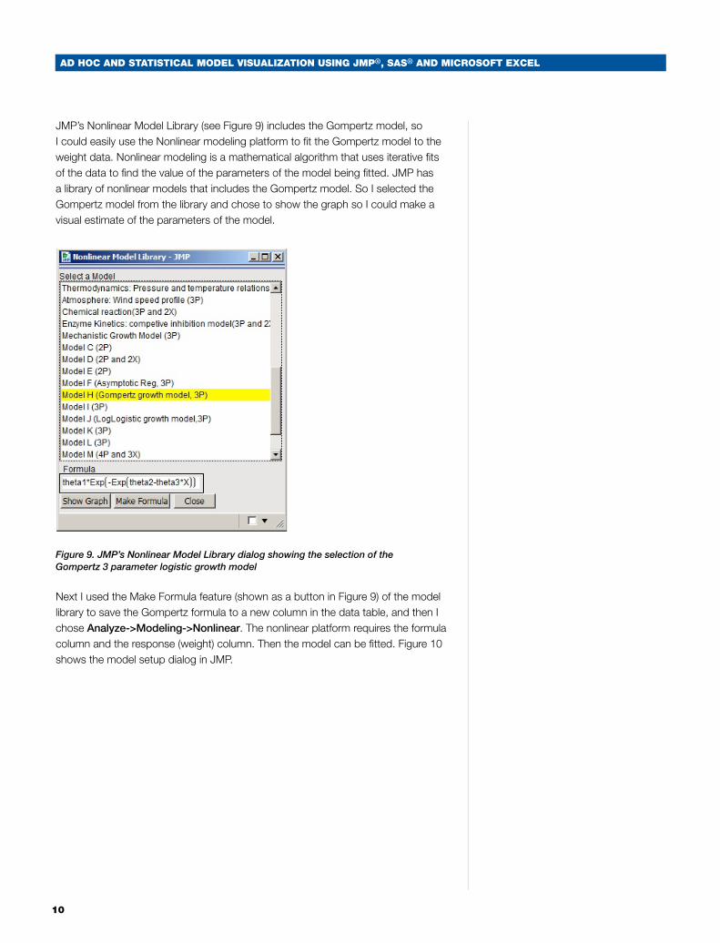
JMP’s Nonlinear Model Library (see Figure 9) includes the Gompertz model, so I could easily use the Nonlinear modeling platform to fit the Gompertz model to the weight data. Nonlinear modeling is a mathematical algorithm that uses iterative fits of the data to find the value of the parameters of the model being fitted. JMP has a library of nonlinear models that includes the Gompertz model. So I selected the Gompertz model from the library and chose to show the graph so I could make a visual estimate of the parameters of the model.
Figure 9. JMP’s Nonlinear Model Library dialog showing the selection of the Gompertz 3 parameter logistic growth model
Next I used the Make Formula feature (shown as a button in Figure 9) of the model library to save the Gompertz formula to a new column in the data table, and then I chose Analyze->Modeling->Nonlinear. The nonlinear platform requires the formula column and the response (weight) column. Then the model can be fitted. Figure 10 shows the model setup dialog in JMP.

Ad Hoc And StAtiSticAl ModEl ViSUAlizAtion USing JMP®, SAS® And MicroSoft ExcEl
11
Figure 10. Nonlinear model setup in JMP for the Gompertz growth model
In this case, I needed JMP to find the best values of Wmax, b and c for the Gompertz function. Wmax will be Darcy’s predicted weight at full growth, b is a parameter that is proportional to his growth period, and c is his age in days when his growth starts slowing down (inflection point). Figure 11 shows the actual changes in Darcy’s weight through November. The model seems to indicate that he has some more growing to go, but the Wmax value is estimated to be 70.5 pounds, and Darcy’s weight has varied between 69 and 70 pounds since August. So the model was very accurate in predicting his full weight.
Figure 11. Plot of actual weights vs. predicted weights from the Gompertz growth model

12
Ad Hoc And StAtiSticAl ModEl ViSUAlizAtion USing JMP®, SAS® And MicroSoft ExcEl
Using the Prediction Profiler, it is very easy to see the Gompertz growth model fitted to my dog. The Profiler in Figure 12 is set to the point of inflection, or when the growth rate starts to slow down. Before 90 days, my dog’s growth rate was increasing, but after 90 days the rate can be seen to decrease. It is also very easy to see the max weight of 70 pounds.
Figure 12. Prediction Profiler for the Gompertz growth model
Even if you know the theoretical model for a Labrador’s growth pattern, you still need to collect some data and fit the model to the specific individual. This process is used in many scientific investigations like the growth models used in this paper. Another example is pharmacokinetic models that show how drugs move through the human bodies systems. There are good theoretical models for how drugs are absorbed into the blood stream, but these models need to be fit to specific subjects and specific drugs. Knowing how fast a drug is absorbed into the blood and how long the drug stays in the blood is important when determining how to deliver the drug and what the dose of the drug should be for a particular patient.

Ad Hoc And StAtiSticAl ModEl ViSUAlizAtion USing JMP®, SAS® And MicroSoft ExcEl
13
Conclusion
By understanding how to use, visualize and analyze different kinds of models, analysts can easily move between working with statisticians, scientific investigators and people using Excel models. Understanding how to use the JMP Profilers with these various models will help to communicate results and lead to better analytic effectiveness. If you understand the model but others can’t, you can’t expect others to act upon the model’s predictions.
It is also very important to model uncertainty in the model assumptions or inputs. This is performed through the use of Monte Carlo simulation and specification of distributions for the inputs rather than single numbers.
References
• S.K.Helmink,R.D.ShanksandE.A.Leighton, “Breed and sex differences in growth curves for two breeds of dog guides,” J Anim Sci 2000. 78:27-32.
• NationalOceanicandAtmosphericAdministration,Citytemperaturedata, www.ncdc.noaa.gov/oa/climate/online/ccd/nrmavg.txt
Acknowledgments
I would like to thank Paul Nelson of SAS’ JMP development group for his amazing work on the JMP 9 Excel Add-In and Xan Gregg of SAS’ JMP development group for his invention of the JMP Graph Builder and the map features in JMP 9.
Contact Information
Your comments and questions are valued and encouraged. Contact the author at:
Jon T. WeiszSASSAS Campus DriveCary, NC 27513Work Phone: 919-531-3576Fax: 919-677-4444E-mail: [email protected]: www.sas.com, www.jmp.com

SAS Institute Inc. World Headquarters +1 919 677 8000To contact your local JMP office, please visit: www.jmp.com...........
SAS and all other SAS Institute Inc. product or service names are registered trademarks or trademarks of SAS Institute Inc. in the USA and other countries. ® indicates USA registration. Other brand and product names are trademarks of their respective companies. Copyright © 2010, SAS Institute Inc. All rights reserved. 104653_S60306.0810