about this guide - software fx
TRANSCRIPT
INTRODUCTION
Today, companies must make decisions based on information that’s easy to read and comprehend, focusing on business priorities and filtering out information that isn’t relevant. In a maze of business intelligence products on the market today, it’s hard to sort between the Scorecards, KPIs, EIS applications and digital dashboards, among others.
In essence, most of these terms and products refer to visual information packages depicting a real-time and visual summary of the state of a business or process using understandable elements such as tables, charts and gauges.
As opposed to tables and charts which are used to display large and/or historical data sets in a tabular and graphical format; gauges are commonly used to display a single variable within a range of possible values at a specific moment in time. For example, there are gauges on the dashboard of a car to indicate the rpm of the engine, the temperature and available fuel.
In the business world, gauges can easily answer questions such as: what is my revenue year-to-date? What is my inventory for Product A? Or, what are my month-to-date payables? In essence, gauges display real-time measurements and are specifically designed to convey status quickly, accurately and effectively.
Chart FX Gauges delivers a set of .NET components allowing developers to quickly and effectively integrate gauges into their client-server and web-based applications. With the addition of Gauges to the Chart FX family of products, developers can easily create digital dashboards with the productivity, consistency and reliability they’ve come to appreciate from other Software FX products.
About this guideThis Quick Start guide will introduce Chart FX Gauges and some of its basic features as well as the design time experience when used within Visual Studio. If you want additional product information, you can access the API Reference or review the included samples.
CHART FX GAUGES DEFAULTS
The Chart FX Gauges default gauge is precustomized based on the desired gauge type you have selected. Carefully selected cosmetics such as gradients and color palettes as well as other important gauge elements such as borders, needles, indicators and other elements will be applied based on the selected gauge and size for maximizing visual appeal with minimal intervention. This feature allows developers to focus their attention on the functional aspect of the application rather than having to configure visuals or other platform specific issues.
To integrate a gauge into your form, simply select one of the gauge component icons and drop or drag it into your form. As soon as this is done, you will be able to customize the functional and visual aspects of the component using the powerful property grid editors as described later in this chapter.
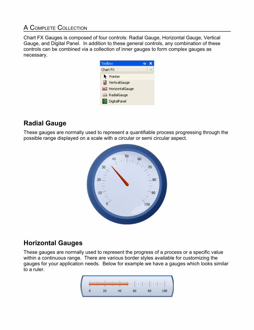
A COMPLETE COLLECTION
Chart FX Gauges is composed of four controls: Radial Gauge, Horizontal Gauge, Vertical Gauge, and Digital Panel. In addition to these general controls, any combination of these controls can be combined via a collection of inner gauges to form complex gauges as necessary.
Radial GaugeThese gauges are normally used to represent a quantifiable process progressing through the possible range displayed on a scale with a circular or semi circular aspect.
Horizontal GaugesThese gauges are normally used to represent the progress of a process or a specific value within a continuous range. There are various border styles available for customizing the gauges for your application needs. Below for example we have a gauges which looks similar to a ruler.

Vertical GaugesSimilar to Horizontal gauges mentioned above, Vertical gauges offer a wide range of unique applications. Some for example, as shown below, are thermometers.
Digital PanelDigital panels are used for both numeric and alphanumeric displays. These panels are commonly prevalent in the world such as watches, registrars, information kiosks, alarm clocks, etc. There are three common styles of digital panels, two segment based and one LED based. The two segment based digital panels are usually referred to by the number of segments necessary to compose a character or digit as illustrated below.
7-Segment Digital Panel: This uses a combination of segments (at most 7) for formating numeric characters from 0 to 9 when displaying values. This style is normally used in point-of-sale, instrumentation as well as other applications requiring numerical display. In addition, this style dash (–), the colon (:), and the period (.) symbols to support date, time, and currency displays respectively.
14-Segment Digital Panel: This style uses a combination of segments (at most 14) for formatting numeric and alphanumeric characters. This format has the capability of display 44
commonly used characters, including the ten numerals, the uppercase alphabet and other symbols for use in point-of-sale, instrumentation and other applications with the capability of displaying alphanumeric messages.
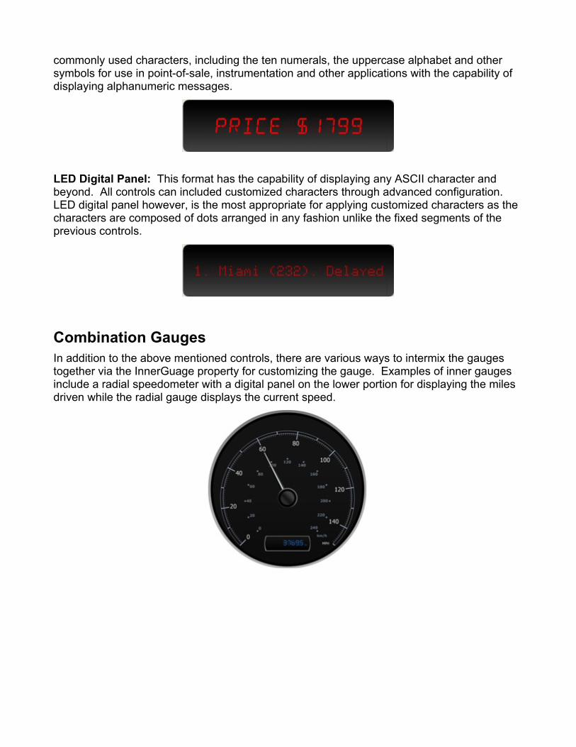
LED Digital Panel: This format has the capability of displaying any ASCII character and beyond. All controls can included customized characters through advanced configuration. LED digital panel however, is the most appropriate for applying customized characters as the characters are composed of dots arranged in any fashion unlike the fixed segments of the previous controls.
Combination GaugesIn addition to the above mentioned controls, there are various ways to intermix the gauges together via the InnerGuage property for customizing the gauge. Examples of inner gauges include a radial speedometer with a digital panel on the lower portion for displaying the miles driven while the radial gauge displays the current speed.
VISUALLY RICH
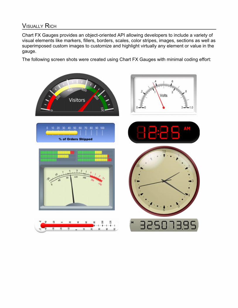
Chart FX Gauges provides an object-oriented API allowing developers to include a variety of visual elements like markers, fillers, borders, scales, color stripes, images, sections as well as superimposed custom images to customize and highlight virtually any element or value in the gauge.
The following screen shots were created using Chart FX Gauges with minimal coding effort:
ARCHITECTURALLY SOUND
Chart FX Gauges uses the powerful, vector-based imaging standard, SVG. The SVG platform provides many benefits.
1) Retain the resolution independent capabilities of vector graphics. This allows the programmer to resize the gauges to whatever size his application or web page without compromising the quality of the rendered gauge.
2) Customization allowing for new designs and styles. Despite having hundreds of styles to choose ranging from borders, tickmarks, scales, needles, etc. Software FX offers design services that can accommodate many gauge designs not currently provided in the product. For additional information on design services, please contact us at [email protected].
3) Accommodate future standards such as the Windows Presentation Foundation (a.k.a. Avalon, XAML) since gauge objects are fully vectorized and are similar to SVG paths.
In addition, for web-based applications, Chart FX Gauges takes advantage of the powerful Chart FX server rendering engine which:
1) Supports a variety of output formats, including but not limited to JPEGs, PNG, GIF, TIFF, etc.
2) Can be easily deployed to complex web server architectures like Web Farms.
3) Easily integrates with modern technologies such as (AJAX) allowing for out-of-band callbacks in Visual Studio 2005.
Finally, Chart FX Gauges provides an object-oriented API that makes it easy to code and integrate into your existing client server and web-based applications. This API is not only consistent and compatible with other Chart FX products, but also makes it much easier to code and maintain when coding your data visualization applications.

SUPERIOR DESIGN-TIME EXPERIENCE
Chart FX Gauges introduces an extensive and graphical properties list providing a rich and intuitive design time experience. All gauge elements and items are configured visually, right in the properties list without the need for modal dialogs or separate designers which alienate Visual Studio’s development experience and ultimately leading to confusion and disparate development practices when using out-of-the-box controls.
This powerful feature allows you to add rich and attractive gauges to your form in minutes by manipulating:
Look & Feel: Providing access to the styles of any of the elements (borders, needles, caps and other visual elements), which comprise a gauge.
Palettes & Colors: Sets the color of all elements in a gauge at once and allows you to preview its appearance with a single click of a button without running the application. Actually, the palettes are similar to AutoFormat, which allows you to choose one of the many options and apply it to the gauge. Chart FX Gauges provides pallets similar to other Software FX products so visual consistency is maintained when used in conjunction with other data visualization controls.

Layout: Sets the position of different elements in the gauge relative to the border of the control or by using a graphical anchor point based on the border shape. For elements requiring angles, a graphical selector allows you to position elements and scales accurately for both web forms and windows forms applications.
You will find within minutes of using these designers, you will have a complete handle on how to create the most visually appealing gauges for your applications.
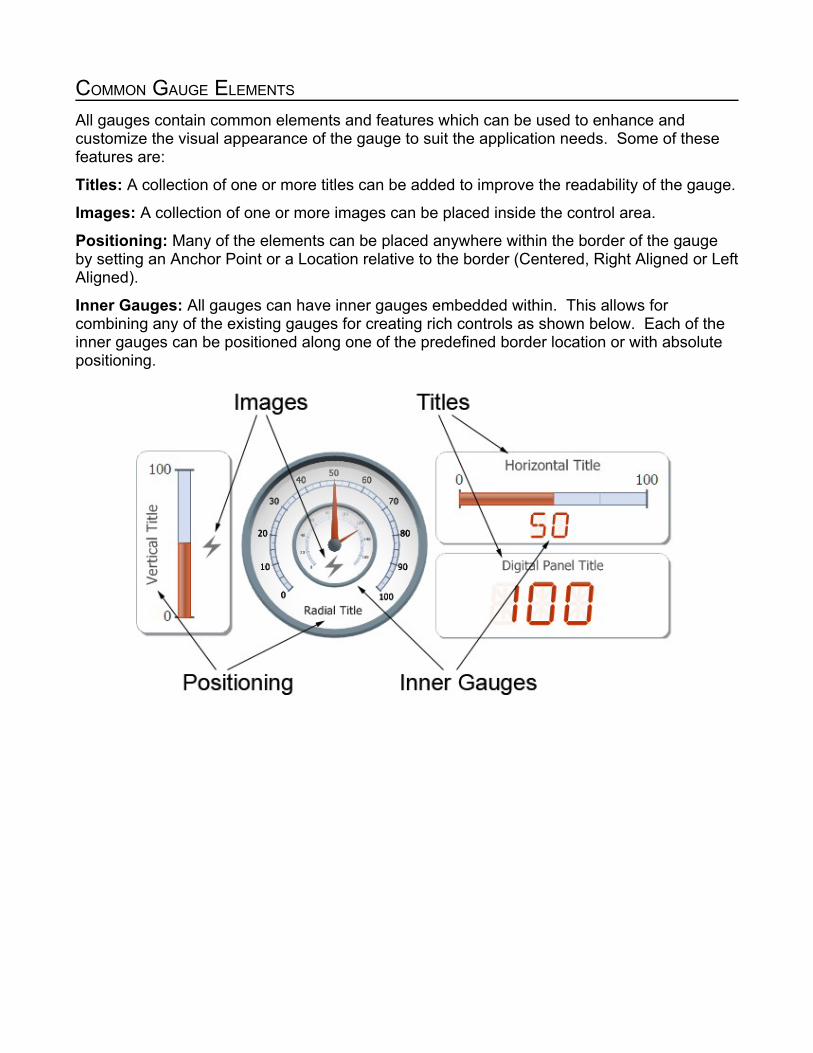
COMMON GAUGE ELEMENTS
All gauges contain common elements and features which can be used to enhance and customize the visual appearance of the gauge to suit the application needs. Some of these features are:
Titles: A collection of one or more titles can be added to improve the readability of the gauge.
Images: A collection of one or more images can be placed inside the control area.
Positioning: Many of the elements can be placed anywhere within the border of the gauge by setting an Anchor Point or a Location relative to the border (Centered, Right Aligned or Left Aligned).
Inner Gauges: All gauges can have inner gauges embedded within. This allows for combining any of the existing gauges for creating rich controls as shown below. Each of the inner gauges can be positioned along one of the predefined border location or with absolute positioning.

ANATOMY OF A DIGITAL PANEL
Aside from containing common elements and features present in other gauges, the Digital Panel component provides the following main elements among others:
Border: Can be used to enclose control in simple or realistic borders supporting solid or gradient backgrounds as well as special effects like glare.
Digital Appearance: Allows for configuring the digit style: 7-Segment, 14-Segment, LED as well as the relative position of the digits relative to the panel.
A Digital Panel can also be combined with other horizontal, vertical or radial gauges via the InnerGauge property to highlight special values or to achieve more complex gauges for your Windows Forms or Web Forms applications.
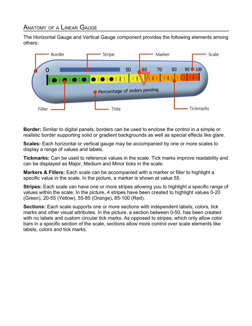
ANATOMY OF A LINEAR GAUGE
The Horizontal Gauge and Vertical Gauge component provides the following elements among others:
Border: Similar to digital panels, borders can be used to enclose the control in a simple or realistic border supporting solid or gradient backgrounds as well as special effects like glare.
Scales: Each horizontal or vertical gauge may be accompanied by one or more scales to display a range of values and labels.
Tickmarks: Can be used to reference values in the scale. Tick marks improve readability and can be displayed as Major, Medium and Minor ticks in the scale.
Markers & Fillers: Each scale can be accompanied with a marker or filler to highlight a specific value in the scale. In the picture, a marker is shown at value 55.
Stripes: Each scale can have one or more stripes allowing you to highlight a specific range of values within the scale. In the picture, 4 stripes have been created to highlight values 0-20 (Green), 20-55 (Yellow), 55-85 (Orange), 85-100 (Red).
Sections: Each scale supports one or more sections with independent labels, colors, tick marks and other visual attributes. In the picture, a section between 0-50, has been created with no labels and custom circular tick marks. As opposed to stripes, which only allow color bars in a specific section of the scale, sections allow more control over scale elements like labels, colors and tick marks.
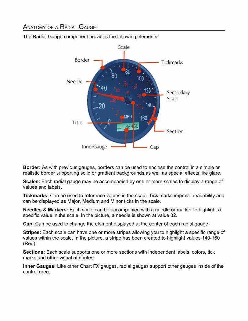
ANATOMY OF A RADIAL GAUGE
The Radial Gauge component provides the following elements:
Border: As with previous gauges, borders can be used to enclose the control in a simple or realistic border supporting solid or gradient backgrounds as well as special effects like glare.
Scales: Each radial gauge may be accompanied by one or more scales to display a range of values and labels.
Tickmarks: Can be used to reference values in the scale. Tick marks improve readability and can be displayed as Major, Medium and Minor ticks in the scale.
Needles & Markers: Each scale can be accompanied with a needle or marker to highlight a specific value in the scale. In the picture, a needle is shown at value 32.
Cap: Can be used to change the element displayed at the center of each radial gauge.
Stripes: Each scale can have one or more stripes allowing you to highlight a specific range of values within the scale. In the picture, a stripe has been created to highlight values 140-160 (Red).
Sections: Each scale supports one or more sections with independent labels, colors, tick marks and other visual attributes.
Inner Gauges: Like other Chart FX gauges, radial gauges support other gauges inside of the control area.

PERFORMANCE AND SCALABILITY
IntroductionIn most cases, gauges are used to report real time data and as a consequence, the gauges are continually refreshed with new data with varying rates of change. While Chart FX Gauges has been optimized for such scenarios, there may be times where additional developer intervention is necessary to achieve the responsiveness desired. The section provides insight on the various performance related tweaks a developer can apply in order to scale Chart FX Gauges as necessary to achieve the needs and goals of the containing application.
SVG ComplexityIn order to maximize the quality of the gauge regardless of the physical dimension of the gauge, SVG was chosen as the underlying standard for describing the gauge. SVG's are scalable specifically because the image is composed of explicit geometry based instructions on how to render lines, curves, and other elements along with attributes for angles, length, thickness, etc. This method of graphic definition allows for an image to easily scale to larger sizes without loss of quality unlike a bitmap or raster type image. As a consequence, the SVG standard has the ability sustain a wide range of detail from the very rich detail discernible only in zoomed scenarios to very sparse images. In both cases however, they can easy scale to any size or zoom level without appearing jagged as bitmap or raster type image would be.
The drawing performance is directly proportional to the detail level of the SVG. Fortunately rendering SVG is highly optimized and only in very extremely detailed SVGs will there be any noticeable difference. Despite this however, if the Gauge's dimension is increased, the rendering time is increased significantly as mentioned previously, but more so with complex SVGs because all the elements of the SVG have a corresponding increased time of GDI drawing.
Since the border, as with other elements, is composed of an SVG and is always included as part of a gauge, the design time experience was enhanced for assisting the developer in choosing the correctly performing border.
To better inform the developer of the runtime performance implications of the various borders available, the design time experience for choosing borders aggregates the various available borders into three categories: High performing, Medium, and Low. This has dual benefit in both allowing you to choose a border based on your performance needs while also making developers aware of such performance implications present with borders who may have not known otherwise.
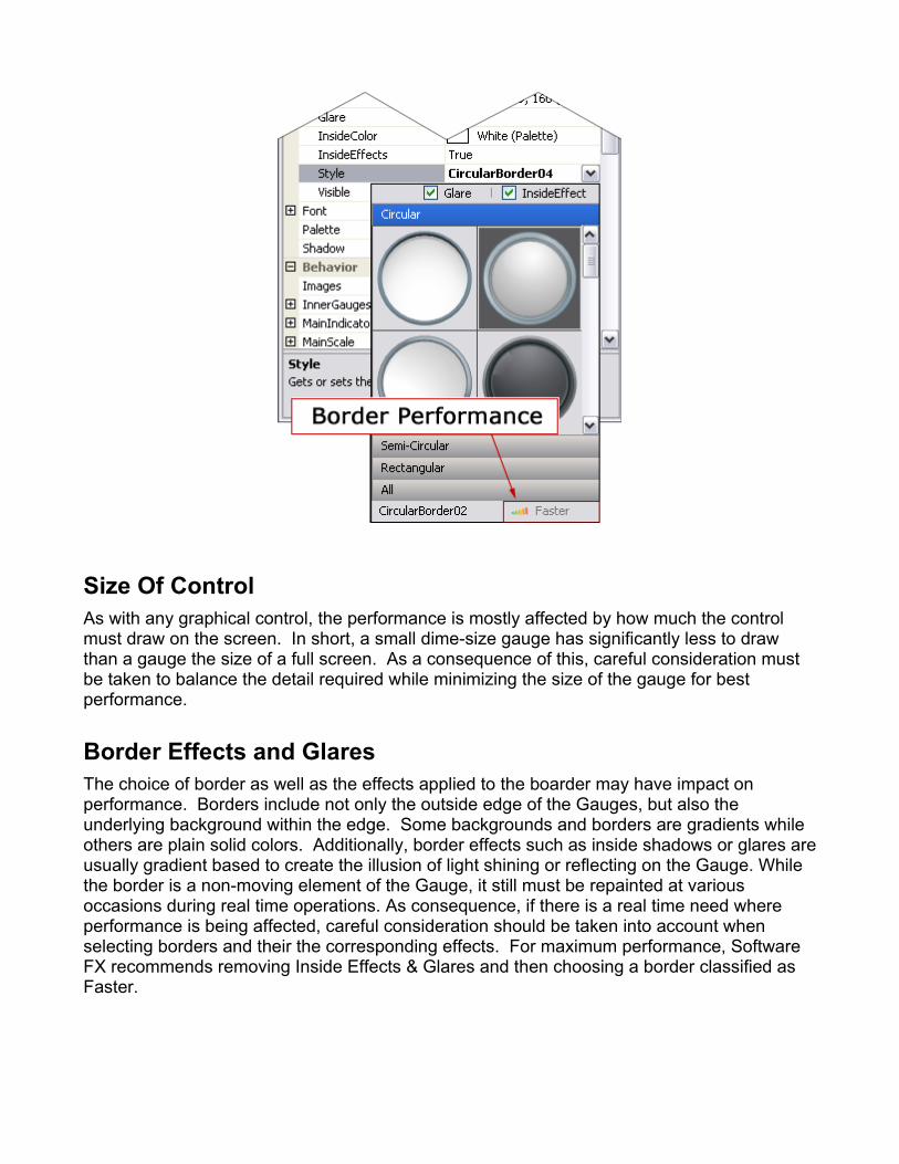
Size Of ControlAs with any graphical control, the performance is mostly affected by how much the control must draw on the screen. In short, a small dime-size gauge has significantly less to draw than a gauge the size of a full screen. As a consequence of this, careful consideration must be taken to balance the detail required while minimizing the size of the gauge for best performance.
Border Effects and GlaresThe choice of border as well as the effects applied to the boarder may have impact on performance. Borders include not only the outside edge of the Gauges, but also the underlying background within the edge. Some backgrounds and borders are gradients while others are plain solid colors. Additionally, border effects such as inside shadows or glares are usually gradient based to create the illusion of light shining or reflecting on the Gauge. While the border is a non-moving element of the Gauge, it still must be repainted at various occasions during real time operations. As consequence, if there is a real time need where performance is being affected, careful consideration should be taken into account when selecting borders and their the corresponding effects. For maximum performance, Software FX recommends removing Inside Effects & Glares and then choosing a border classified as Faster.

Applying ShadowsWhen working with gauges, you will notice many of the gauges and default styles look highly realistic. Shadowing is one of the many techniques used to simulate real lighting conditions by simulating the look of a 3D image on a 2D surface. Depending on the size of the gauge as well as the number of elements with shadows applied, real time performance may be affected.
Developers generally have three options for shadows: Realistic, Plain, and None
Realistic, as shown below on the needle, creates a shadow which decays logarithmically creating an effect similar to real world shadows. Realistic is the most costly to compute.
Plain creates a related transparent black element slightly shifted. While this still has a realistic appearance, the shadow is solid instead of decaying as in the realistic setting. Plain significantly reduces the cost to compute and is recommended if realistic seems to cause performance issues.
None eliminates all shadows and is the default setting.
For fasted performance, Software FX recommends the default setting of None.
radialGauge1.Shadow = ChartFX.WinForms.Gauge.ShadowEffect.None;
General OptimizationsWhile there are many ways for configuring properties of the gauges, there are some recommended ways for achieving common goals which are optimized and enhance performance if used correctly.
Once such example is the use of the indicator value formatting parameter on the title or tool tips. Instead of handling the ValueChanged event for setting the title to match the indicator's

currently value for every change event fired for example, it's recommended to use the %V value format parameter as part of the as follows:
radialGauge1.Title = "Current value is %V";
This keeps the title optimally in sync with the value.
Alternate ConfigurationsWhile Chart FX Gauges allows for the nesting of Gauges in a hierarchal way, sometimes the desired effect can be accomplished by using other customizable features. Take for example the following Gauge which includes an inner gauge below the main gauge. While this is perfectly valid, the inner gauge is a full instance of a gauge so all related orientation algorithms pertaining to a full gauge are still performed on the inner gauge. Many of these algorithms are usually not necessary for basic features. As a result a similar effect can be achieved by using the multiple scales feature. For example, the two gauges below were created using both techniques. The gauge on the right uses an additional scale and an associated needle while using the pivot and size properties for proper fitting.
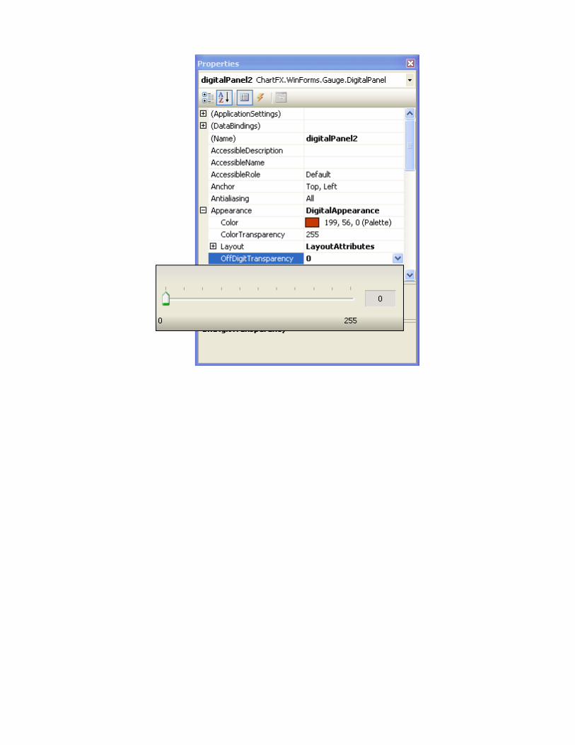
TransparencyElements on the gauge can have transparency applied. This creates a translucent effect where elements below are still visible such as the title or inner gauge under a thick needle. While the benefits are obvious in the readability of the underlying elements, there are intensive algorithms working under the scenes for creating such effects and these algorithms multiply with the number of repaints occurring with moving elements such as the indicators. So careful attention should be paid when applying transparency effects.
Similarly, unlike Gauges where the indicators are completely visible and stand alone, other forms of gauges such as the digital gauge rely on the contrasting background for proper

interpretation. This is best explained with an example. Below we have two types of gauges with three types of transparency settings for the contrasting background. Notice how the transparency affects the readability due to the contrasting background. This contrasting background is also necessary for real world effect since in many cases such as a clock natural daylight reveals the elements which are not illuminated. In the sample below for example, A is more like a clock than B. To accomplish this effect however the gauge works extra in painting not only areas where the value is not present, but also with a transparency effect which is more costly to compute than a solid color.
Since this affects performance significantly for digital panels, Software FX recommends turning off the transparency for the non-illuminated segments or dots. This can be accomplished by using the OffDigitTransparency within the designer or through code as follows:
digitalPanel1.Appearance.OffDigitTransparency = 0;
ADVANCED GAUGE CUSTOMIZATION
Chart FX Gauges can be enhanced to suit your development needs through various customizable features such as the Palettes, Styles, and Digits.
PalettesAlthough Chart FX Gauges includes a very rich set of palettes suiting most development needs, there may be times where specific pallets are desired. The palettes, along with other elements mentioned below, can be customized.
SVG StylesDespite the hundreds of built-in styles, all the controls have various elements which can be enhanced with custom SVGs.
Radial Gauges utilize the following customizable styles: Borders, Needles, Markers, Tickmarks, and needle Caps.
Horizontal and Vertical Gauges utilize the following customizable styles: Borders, Fillers, Markers, & Tickmarks.
Digital Panels utilize the following customizable styles: Borders and Digits.
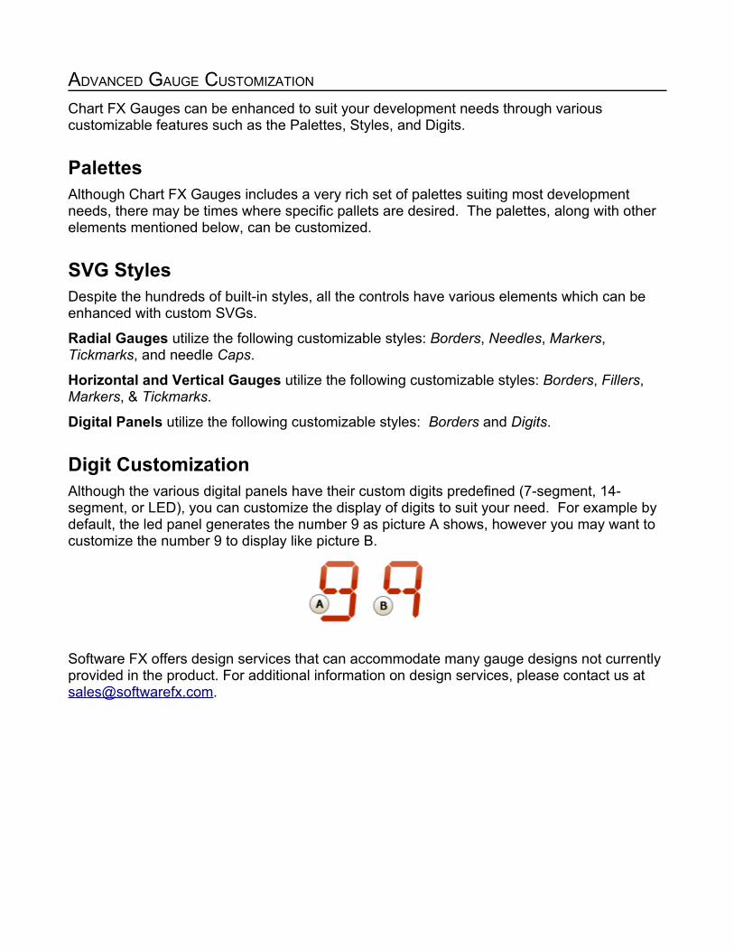
Digit CustomizationAlthough the various digital panels have their custom digits predefined (7-segment, 14-segment, or LED), you can customize the display of digits to suit your need. For example by default, the led panel generates the number 9 as picture A shows, however you may want to customize the number 9 to display like picture B.
Software FX offers design services that can accommodate many gauge designs not currently provided in the product. For additional information on design services, please contact us at [email protected].

DIGIT STYLES
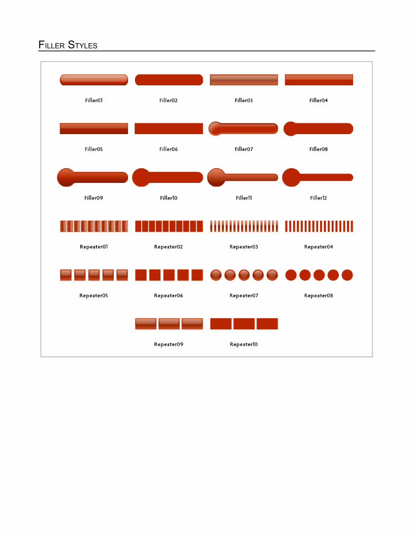
FILLER STYLES

LINEAR BORDER STYLES

MARKER STYLES

NEEDLE STYLES
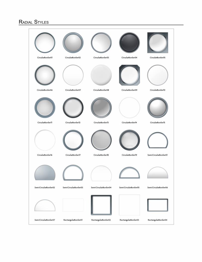
RADIAL STYLES
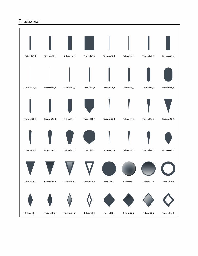
TICKMARKS

NEEDLE CAPS